Wszystkie wpisy, których autorem jest admin

Unleashing Creativity: A Comprehensive Review of the Huion Kamvas 16 for Graphic Designers

Post pobrano z: Unleashing Creativity: A Comprehensive Review of the Huion Kamvas 16 for Graphic Designers

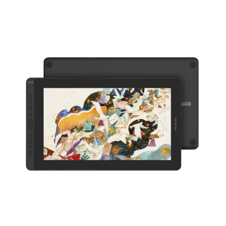
The Huion Kamvas 16 is a versatile drawing tablet that has garnered attention in the graphic design community for its impressive features and performance. Having used this product extensively, I can provide a comprehensive review that highlights its strengths and areas for improvement.

Design and Build Quality

The Kamvas 16 boasts a sleek and modern design, featuring a 15.6-inch full HD display with a resolution of 1920 x 1080 pixels. The screen is framed by slim bezels, making it visually appealing and maximizing the drawing area. The tablet is lightweight, which enhances portability, allowing artists to work comfortably in various settings.The build quality is solid, with a durable plastic casing that feels robust without being overly heavy. The anti-glare glass surface provides a smooth drawing experience while reducing reflections, which is particularly beneficial for those who work in brightly lit environments. Additionally, the tablet comes with an adjustable stand that allows users to find their preferred drawing angle, promoting ergonomic comfort during long sessions.

Display Performance

One of the standout features of the Kamvas 16 is its vibrant display. With 120% sRGB color gamut coverage, colors appear vivid and true to life, making it an excellent choice for graphic designers who require accurate color representation. The brightness levels are adjustable, ensuring visibility even in well-lit conditions.The 178-degree viewing angle ensures that colors remain consistent from various perspectives, which is essential when collaborating with clients or colleagues. The screen’s responsiveness is impressive; it supports up to 60Hz refresh rate, providing a smooth visual experience that complements the drawing process.

Drawing Experience

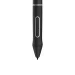
The drawing experience on the Kamvas 16 is exceptional. It comes equipped with Huion’s advanced pen technology, which features 8192 levels of pressure sensitivity. This allows for precise control over line thickness and opacity, enabling artists to create intricate details with ease. The pen also has tilt recognition capabilities, which adds another layer of versatility for shading and brush techniques.I found the pen to be comfortable to hold during extended use, thanks to its lightweight design and ergonomic shape. The lack of lag when drawing is notable; strokes appear on the screen almost instantaneously, which significantly enhances the workflow for artists accustomed to traditional mediums.Moreover, the tablet supports customizable shortcut keys that can be programmed for various functions such as undo, zoom in/out, or switching between brushes. This feature streamlines the creative process by allowing users to access essential tools quickly without interrupting their flow.

Compatibility and Software

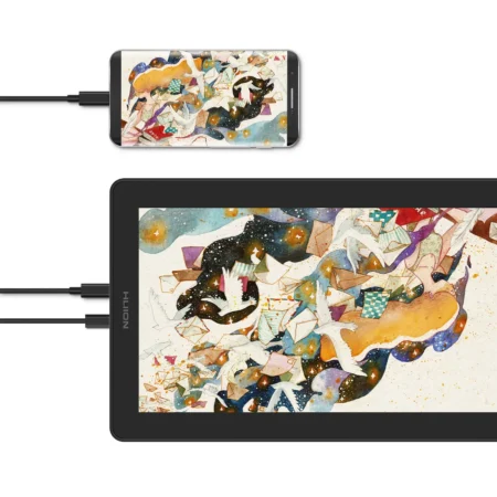
The Kamvas 16 is compatible with major operating systems including Windows, macOS, and even Linux. It works seamlessly with popular graphic design software such as Adobe Photoshop, Illustrator, CorelDRAW, and Clip Studio Paint. This wide compatibility ensures that artists can integrate the tablet into their existing workflows without any hassle.Setting up the tablet was straightforward; I connected it via USB-C to my laptop and installed the necessary drivers from Huion’s website. The installation process was smooth, and I was able to start using the tablet within minutes. Additionally, Huion provides regular updates for drivers and software compatibility, which is a significant advantage for users who want to ensure optimal performance over time.

Performance in Different Use Cases

Throughout my usage of the Kamvas 16, I explored various applications ranging from digital painting to graphic design tasks like logo creation and photo editing. In digital painting scenarios, the pen’s pressure sensitivity allowed me to achieve natural brush strokes that closely mimic traditional painting techniques.For graphic design tasks, the tablet’s precision made it easy to create clean lines and shapes. The customizable shortcut keys were particularly helpful when working on complex projects that required frequent tool changes or adjustments.In terms of performance during intensive tasks such as high-resolution image editing or large canvas painting sessions, the Kamvas 16 held up remarkably well without any noticeable lag or performance drops.

Areas for Improvement

While the Kamvas 16 excels in many aspects, there are a few areas where it could improve. One notable aspect is the lack of wireless connectivity; this limits mobility compared to some competitors that offer wireless options. For artists who prefer a clutter-free workspace or those who like to draw from a distance, this could be a drawback.Additionally, while the adjustable stand is a great inclusion, it could be improved by offering more height adjustment options for better ergonomics during prolonged use.

Conclusion

Overall, the Huion Kamvas 16 is an outstanding choice for both amateur and professional graphic designers looking for a reliable drawing tablet. Its combination of vibrant display quality, responsive drawing capabilities, and extensive software compatibility makes it a valuable tool in any artist’s arsenal. While there are minor areas for improvement regarding wireless functionality and stand adjustability, these do not significantly detract from its overall performance.For anyone seeking an affordable yet high-quality drawing tablet that meets professional standards, the Kamvas 16 stands out as an excellent investment that can enhance creativity and productivity in graphic design work.

The post Unleashing Creativity: A Comprehensive Review of the Huion Kamvas 16 for Graphic Designers appeared first on Designer Daily: graphic and web design blog.

12 Insanely Creative Ads For Your Inspiration

Post pobrano z: 12 Insanely Creative Ads For Your Inspiration

In the relentless tide of modern marketing, where consumers are bombarded with thousands of advertisements daily, creativity stands as the vital force that separates memorable campaigns from forgettable noise. It’s no longer enough for advertisements to simply showcase products or services – they must tell compelling stories, evoke emotions, and forge genuine connections with audiences. Creativity in advertising isn’t merely about artistic expression; it’s the strategic catalyst that transforms commercial messages into cultural moments, driving both brand recognition and business results.

The most impactful advertising campaigns of our time have all shared one fundamental characteristic: they dared to break conventional boundaries. From Apple’s legendary “1984” commercial to Dove’s “Real Beauty” campaign, creative innovation has consistently proven its ability to not only capture attention but also reshape societal conversations. In today’s digital age, where consumers can easily skip, block, or ignore traditional advertising, creativity has become even more crucial as the key to voluntary engagement.

Research consistently demonstrates that creative advertisements generate significantly higher recall rates and positive brand associations. A study by Nielsen found that creative quality can be responsible for up to 47% of sales contribution, making it the single most important factor in advertising effectiveness. Yet creativity in advertising extends beyond mere artistic flair – it encompasses innovative media usage, unexpected storytelling approaches, and the ability to present familiar concepts from fresh perspectives.

Moreover, creativity serves as the bridge between brands and human experience, transforming product features into emotional benefits and corporate messages into shared values. In an era where authenticity and relevance reign supreme, creative advertising has evolved from being a luxury to becoming an absolute necessity. It’s the difference between speaking at audiences and speaking with them, between pushing products and sharing visions.

1. Timex

Timex takes a jab at smart watches in this clever ad, subtly pointing at one of the main defaults of smart watches, the fact that they are somewhat stressing you.

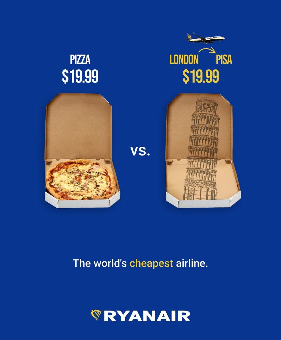
2. Ryanair

The company, which specializes in cheap flights, brilliantly demonstrates just how cheap its flights are by comparing the price of a flight with the price of a pizza.

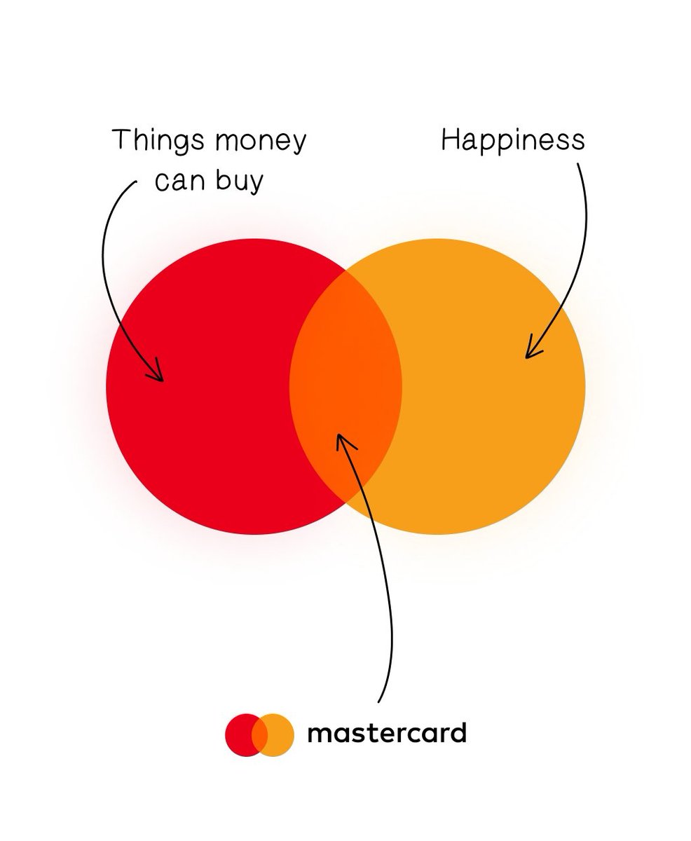
3. Mastercard

Masterclass capitilizes on its existing slogans to deliver a simple but powerful message.

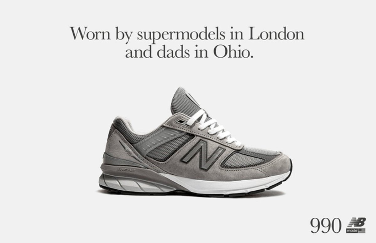
4. New Balance

A simple observation that send the best message: these shoes are for everyone.

5. Durex

Durex shows how expensive it can be to forget to wear a condom, compares it with the price of its product.

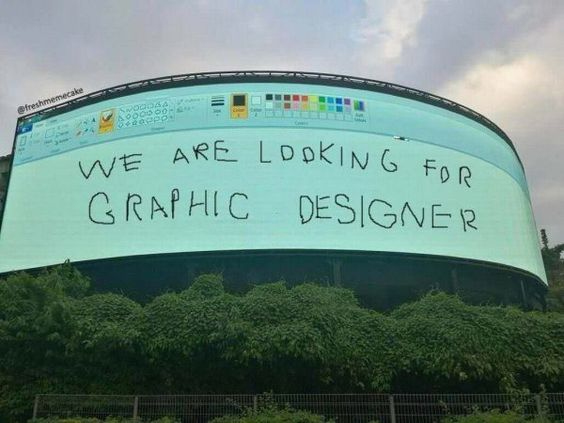
6. Sam

A very clever ad, showing what it could look like if you don’t have a graphic designer.

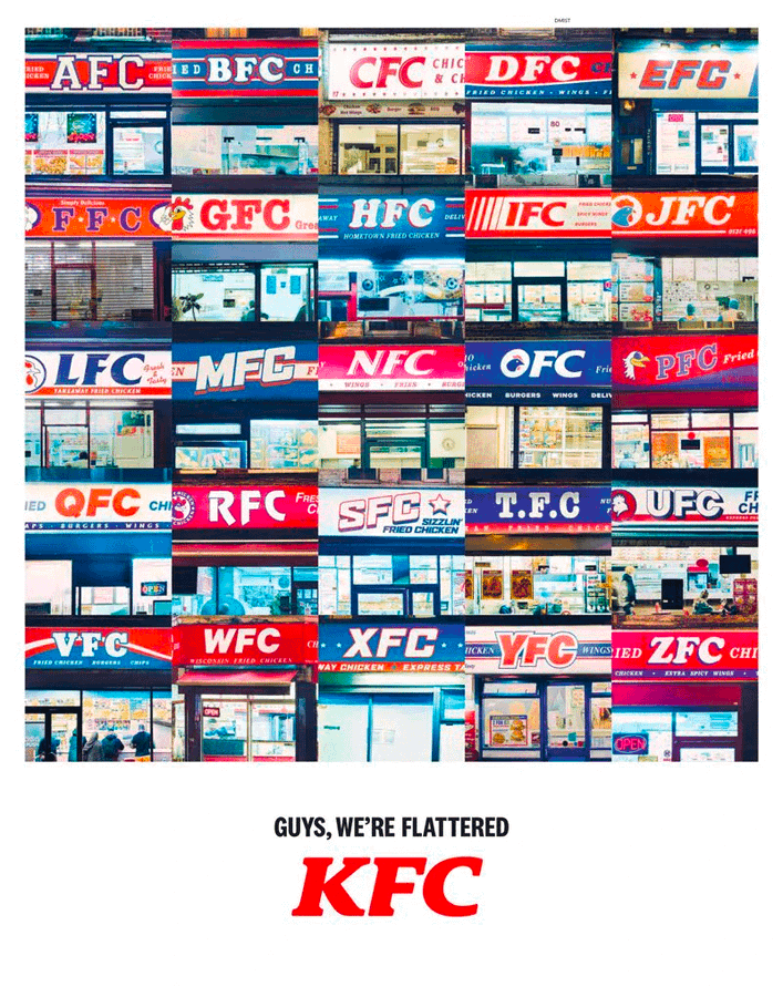
7. KFC

Imitation is the ultimate flattery, KFC knows it and uses it as a sales argument.

8. Reykjavík Metropolitan Police

Visually unappealing, this ad is still powerful and doesn’t leave any space for doubt.

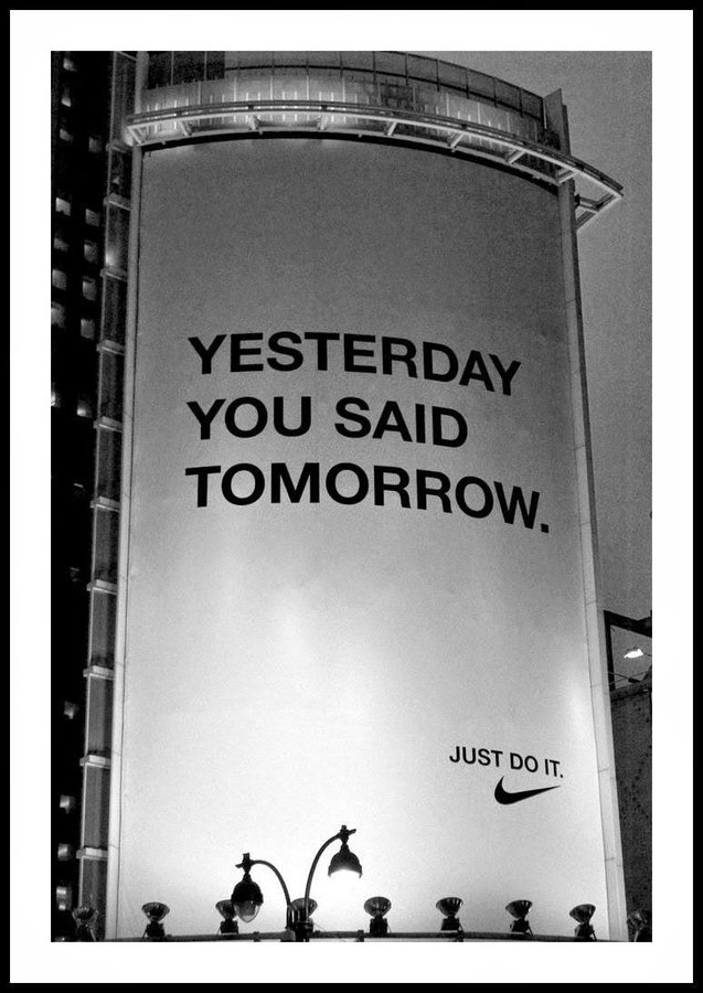
9. Nike

Nike’s “Just do it” slogan is very clear, this ad makes it even clearer. No excuses!

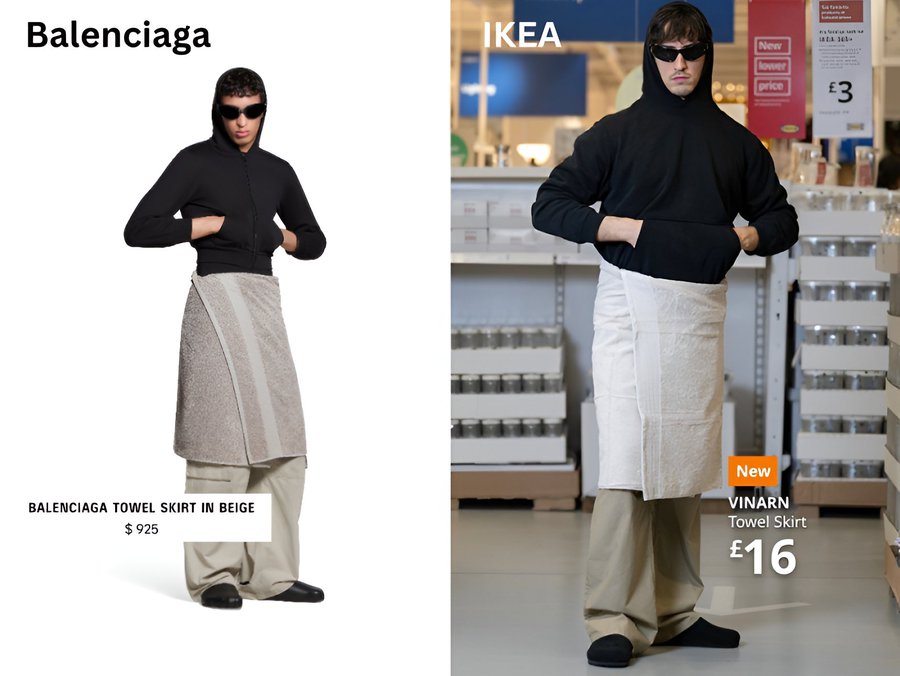
10. IKEA

A funny parody of Balenciaga’s fashion by IKEA, demonstrating that you don’t need to spend a lot of money to wear ugly clothes.

11. Tesla

Tesla’s marketing managers know what you will read first and took advantage of it for this campaign, letting you feel exactly how fast Tesla’s cars accelerate.

12. Raid

A bit brutal, but the most visual way to let you understand exactly how powerful Raid’s products are.

The post 12 Insanely Creative Ads For Your Inspiration appeared first on Designer Daily: graphic and web design blog.

12 Insanely Creative Ads For Your Inspiration

Post pobrano z: 12 Insanely Creative Ads For Your Inspiration

In the relentless tide of modern marketing, where consumers are bombarded with thousands of advertisements daily, creativity stands as the vital force that separates memorable campaigns from forgettable noise. It’s no longer enough for advertisements to simply showcase products or services – they must tell compelling stories, evoke emotions, and forge genuine connections with audiences. Creativity in advertising isn’t merely about artistic expression; it’s the strategic catalyst that transforms commercial messages into cultural moments, driving both brand recognition and business results.

The most impactful advertising campaigns of our time have all shared one fundamental characteristic: they dared to break conventional boundaries. From Apple’s legendary “1984” commercial to Dove’s “Real Beauty” campaign, creative innovation has consistently proven its ability to not only capture attention but also reshape societal conversations. In today’s digital age, where consumers can easily skip, block, or ignore traditional advertising, creativity has become even more crucial as the key to voluntary engagement.

Research consistently demonstrates that creative advertisements generate significantly higher recall rates and positive brand associations. A study by Nielsen found that creative quality can be responsible for up to 47% of sales contribution, making it the single most important factor in advertising effectiveness. Yet creativity in advertising extends beyond mere artistic flair – it encompasses innovative media usage, unexpected storytelling approaches, and the ability to present familiar concepts from fresh perspectives.

Moreover, creativity serves as the bridge between brands and human experience, transforming product features into emotional benefits and corporate messages into shared values. In an era where authenticity and relevance reign supreme, creative advertising has evolved from being a luxury to becoming an absolute necessity. It’s the difference between speaking at audiences and speaking with them, between pushing products and sharing visions.

1. Timex

Timex takes a jab at smart watches in this clever ad, subtly pointing at one of the main defaults of smart watches, the fact that they are somewhat stressing you.

2. Ryanair

The company, which specializes in cheap flights, brilliantly demonstrates just how cheap its flights are by comparing the price of a flight with the price of a pizza.

3. Mastercard

Masterclass capitilizes on its existing slogans to deliver a simple but powerful message.

4. New Balance

A simple observation that send the best message: these shoes are for everyone.

5. Durex

Durex shows how expensive it can be to forget to wear a condom, compares it with the price of its product.

6. Sam

A very clever ad, showing what it could look like if you don’t have a graphic designer.

7. KFC

Imitation is the ultimate flattery, KFC knows it and uses it as a sales argument.

8. Reykjavík Metropolitan Police

Visually unappealing, this ad is still powerful and doesn’t leave any space for doubt.

9. Nike

Nike’s “Just do it” slogan is very clear, this ad makes it even clearer. No excuses!

10. IKEA

A funny parody of Balenciaga’s fashion by IKEA, demonstrating that you don’t need to spend a lot of money to wear ugly clothes.

11. Tesla

Tesla’s marketing managers know what you will read first and took advantage of it for this campaign, letting you feel exactly how fast Tesla’s cars accelerate.

12. Raid

A bit brutal, but the most visual way to let you understand exactly how powerful Raid’s products are.

The post 12 Insanely Creative Ads For Your Inspiration appeared first on Designer Daily: graphic and web design blog.
Follow Up: We Officially Have a CSS Logo!

Post pobrano z: Follow Up: We Officially Have a CSS Logo!

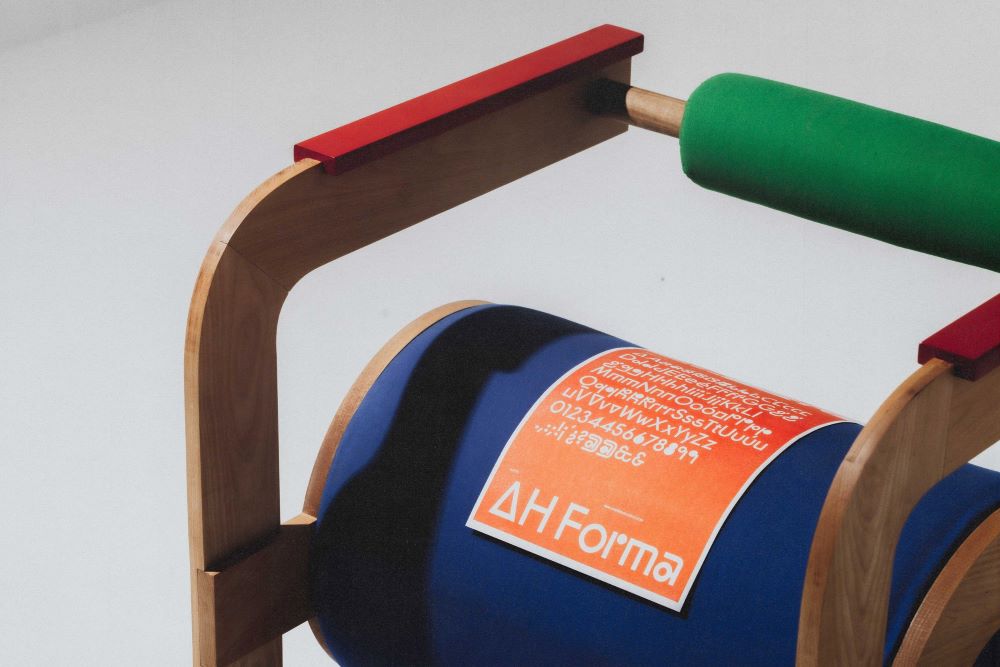
As a follow up to the search for a new CSS logo, it looks like we have a winner!

new CSS logo in three colors, rebeccapurple, white, and black

Since our last post, the color shifted away from a vibrant pink to a color with a remarkable history among the CSS community: rebeccapurple

CodePen Embed Fallback

With 400 votes on GitHub, I think the community has chosen well.

Check out Adam’s post on selecting the winner!


Follow Up: We Officially Have a CSS Logo! originally published on CSS-Tricks, which is part of the DigitalOcean family. You should get the newsletter.

Follow Up: We Officially Have a CSS Logo!

Post pobrano z: Follow Up: We Officially Have a CSS Logo!

As a follow up to the search for a new CSS logo, it looks like we have a winner!

new CSS logo in three colors, rebeccapurple, white, and black

Since our last post, the color shifted away from a vibrant pink to a color with a remarkable history among the CSS community: rebeccapurple

CodePen Embed Fallback

With 400 votes on GitHub, I think the community has chosen well.

Check out Adam’s post on selecting the winner!


Follow Up: We Officially Have a CSS Logo! originally published on CSS-Tricks, which is part of the DigitalOcean family. You should get the newsletter.

Alt Text: Not Always Needed

Post pobrano z: Alt Text: Not Always Needed

Alt text is one of those things in my muscle memory that pops up anytime I’m working with an image element. The attribute almost writes itself.

<img src="image.jpg" alt="">

Or if you use Emmet, that’s autocompleted for you. Don’t forget the alt text! Use it even if there’s no need for it, as an empty string is simply skipped by screen readers. That’s called “nulling” the alternative text and many screen readers simply announce the image file name. Just be sure it’s truly an empty string because even a space gets picked up by some assistive tech, which causes a screen reader to completely skip the image:

<!-- Not empty -->
<img src="image.jpg" alt=" ">

But wait… are there situations where an image doesn’t need alt text? I tend to agree with Eric that the vast majority of images are more than decorative and need to be described. Your images are probably not decorative and ought to be described with alt text.

Probably is doing a lot of lifting there because not all images are equal when it comes to content and context. Emma Cionca and Tanner Kohler have a fresh study on those situations where you probably don’t need alt. It’s a well-written and researched piece and I’m rounding up some nuggets from it.

What Users Need from Alt Text

It’s the same as what anyone else would need from an image: an easy path to accomplish basic tasks. A product image is a good example of that. Providing a visual smooths the path to purchasing because it’s context about what the item looks like and what to expect when you get it. Not providing an image almost adds friction to the experience if you have to stop and ask customer support basic questions about the size and color of that shirt you want.

So, yes. Describe that image in alt! But maybe “describe” isn’t the best wording because the article moves on to make the next point…

Quit Describing What Images Look Like

The article gets into a common trap that I’m all too guilty of, which is describing an image in a way that I find helpful. Or, as the article says, it’s a lot like I’m telling myself, “I’ll describe it in the alt text so screen-reader users can imagine what they aren’t seeing.”

That’s the wrong way of going about it. Getting back to the example of a product image, the article outlines how a screen reader might approach it:

For example, here’s how a screen-reader user might approach a product page:

  1. Jump between the page headers to get a sense of the page structure.
  2. Explore the details of a specific section with the heading label Product Description.
  3. Encounter an image and wonder “What information that I might have missed elsewhere does this image communicate about the product?

Interesting! Where I might encounter an image and evaluate it based on the text around it, a screen reader is already questioning what content has been missed around it. This passage is one I need to reflect on (emphasis mine):

Most of the time, screen-reader users don’t wonder what images look like. Instead, they want to know their purpose. (Exceptions to this rule might include websites presenting images, such as artwork, purely for visual enjoyment, or users who could previously see and have lost their sight.)

OK, so how in the heck do we know when an image needs describing? It feels so awkward making what’s ultimately a subjective decision. Even so, the article presents three questions to pose to ourselves to determine the best route.

  1. Is the image repetitive? Is the task-related information in the image also found elsewhere on the page?
  2. Is the image referential? Does the page copy directly reference the image?
  3. Is the image efficient? Could alt text help users more efficiently complete a task?

This is the meat of the article, so I’m gonna break those out.

Is the image repetitive?

Repetitive in the sense that the content around it is already doing a bang-up job painting a picture. If the image is already aptly “described” by content, then perhaps it’s possible to get away with nulling the alt attribute.

This is the figure the article uses to make the point (and, yes, I’m alt-ing it):

Showing a caption describing an image located directly above it.

The caption for this image describes exactly what the image communicates. Therefore, any alt text for the image will be redundant and a waste of time for screen-reader users. In this case, the actual alt text was the same as the caption. Coming across the same information twice in a row feels even more confusing and unnecessary.

The happy path:

<img src="image.jpg" alt="">

But check this out this image about informal/semi-formal table setting showing how it is not described by the text around it (and, no, I’m not alt-ing it):

If I was to describe this image, I might get carried away describing the diagram and all the points outlined in the legend. If I can read all of that, then a screen reader should, too, right? Not exactly. I really appreciate the slew of examples provided in the article. A sampling:

  1. Bread plate and butter knife, located in the top left corner. 
  2. Dessert fork, placed horizontally at the top center. 
  3. Dessert spoon, placed horizontally at the top center, below the dessert fork.

That’s way less verbose than I would have gone. Talking about how long (or short) alt ought to be is another topic altogether.

Is the image referential?

The second image I dropped in that last section is a good example of a referential image because I directly referenced it in the content preceding it. I nulled the alt attribute because of that. But what I messed up is not making the image recognizable to screen readers. If the alt attribute is null, then the screen reader skips it. But the screen reader should still know it’s there even if it’s aptly described.

The happy path:

<img src="image.jpg" alt="">

Remember that a screen reader may announce the image’s file name. So maybe use that as an opportunity to both call out the image and briefly describe it. Again, we want the screen reader to announce the image if we make mention of it in the content around it. Simply skipping it may cause more confusion than clarity.

Is the image efficient?

My mind always goes to performance when I see the word efficient pop up in reference to images. But in this context the article means whether or not the image can help visitors efficiently complete a task.

If the image helps complete a task, say purchasing a product, then yes, the image needs alt text. But if the content surrounding it already does the job then we can leave it null (alt="") or skip it (alt=" ") if there’s no mention of it.

Wrapping up

I put a little demo together with some testing results from a few different screen readers to see how all of that shakes out.

CodePen Embed Fallback

Alt Text: Not Always Needed originally published on CSS-Tricks, which is part of the DigitalOcean family. You should get the newsletter.

Alt Text: Not Always Needed

Post pobrano z: Alt Text: Not Always Needed

Alt text is one of those things in my muscle memory that pops up anytime I’m working with an image element. The attribute almost writes itself.

<img src="image.jpg" alt="">

Or if you use Emmet, that’s autocompleted for you. Don’t forget the alt text! Use it even if there’s no need for it, as an empty string is simply skipped by screen readers. That’s called “nulling” the alternative text and many screen readers simply announce the image file name. Just be sure it’s truly an empty string because even a space gets picked up by some assistive tech, which causes a screen reader to completely skip the image:

<!-- Not empty -->
<img src="image.jpg" alt=" ">

But wait… are there situations where an image doesn’t need alt text? I tend to agree with Eric that the vast majority of images are more than decorative and need to be described. Your images are probably not decorative and ought to be described with alt text.

Probably is doing a lot of lifting there because not all images are equal when it comes to content and context. Emma Cionca and Tanner Kohler have a fresh study on those situations where you probably don’t need alt. It’s a well-written and researched piece and I’m rounding up some nuggets from it.

What Users Need from Alt Text

It’s the same as what anyone else would need from an image: an easy path to accomplish basic tasks. A product image is a good example of that. Providing a visual smooths the path to purchasing because it’s context about what the item looks like and what to expect when you get it. Not providing an image almost adds friction to the experience if you have to stop and ask customer support basic questions about the size and color of that shirt you want.

So, yes. Describe that image in alt! But maybe “describe” isn’t the best wording because the article moves on to make the next point…

Quit Describing What Images Look Like

The article gets into a common trap that I’m all too guilty of, which is describing an image in a way that I find helpful. Or, as the article says, it’s a lot like I’m telling myself, “I’ll describe it in the alt text so screen-reader users can imagine what they aren’t seeing.”

That’s the wrong way of going about it. Getting back to the example of a product image, the article outlines how a screen reader might approach it:

For example, here’s how a screen-reader user might approach a product page:

  1. Jump between the page headers to get a sense of the page structure.
  2. Explore the details of a specific section with the heading label Product Description.
  3. Encounter an image and wonder “What information that I might have missed elsewhere does this image communicate about the product?

Interesting! Where I might encounter an image and evaluate it based on the text around it, a screen reader is already questioning what content has been missed around it. This passage is one I need to reflect on (emphasis mine):

Most of the time, screen-reader users don’t wonder what images look like. Instead, they want to know their purpose. (Exceptions to this rule might include websites presenting images, such as artwork, purely for visual enjoyment, or users who could previously see and have lost their sight.)

OK, so how in the heck do we know when an image needs describing? It feels so awkward making what’s ultimately a subjective decision. Even so, the article presents three questions to pose to ourselves to determine the best route.

  1. Is the image repetitive? Is the task-related information in the image also found elsewhere on the page?
  2. Is the image referential? Does the page copy directly reference the image?
  3. Is the image efficient? Could alt text help users more efficiently complete a task?

This is the meat of the article, so I’m gonna break those out.

Is the image repetitive?

Repetitive in the sense that the content around it is already doing a bang-up job painting a picture. If the image is already aptly “described” by content, then perhaps it’s possible to get away with nulling the alt attribute.

This is the figure the article uses to make the point (and, yes, I’m alt-ing it):

Showing a caption describing an image located directly above it.

The caption for this image describes exactly what the image communicates. Therefore, any alt text for the image will be redundant and a waste of time for screen-reader users. In this case, the actual alt text was the same as the caption. Coming across the same information twice in a row feels even more confusing and unnecessary.

The happy path:

<img src="image.jpg" alt="">

But check this out this image about informal/semi-formal table setting showing how it is not described by the text around it (and, no, I’m not alt-ing it):

If I was to describe this image, I might get carried away describing the diagram and all the points outlined in the legend. If I can read all of that, then a screen reader should, too, right? Not exactly. I really appreciate the slew of examples provided in the article. A sampling:

  1. Bread plate and butter knife, located in the top left corner. 
  2. Dessert fork, placed horizontally at the top center. 
  3. Dessert spoon, placed horizontally at the top center, below the dessert fork.

That’s way less verbose than I would have gone. Talking about how long (or short) alt ought to be is another topic altogether.

Is the image referential?

The second image I dropped in that last section is a good example of a referential image because I directly referenced it in the content preceding it. I nulled the alt attribute because of that. But what I messed up is not making the image recognizable to screen readers. If the alt attribute is null, then the screen reader skips it. But the screen reader should still know it’s there even if it’s aptly described.

The happy path:

<img src="image.jpg" alt="">

Remember that a screen reader may announce the image’s file name. So maybe use that as an opportunity to both call out the image and briefly describe it. Again, we want the screen reader to announce the image if we make mention of it in the content around it. Simply skipping it may cause more confusion than clarity.

Is the image efficient?

My mind always goes to performance when I see the word efficient pop up in reference to images. But in this context the article means whether or not the image can help visitors efficiently complete a task.

If the image helps complete a task, say purchasing a product, then yes, the image needs alt text. But if the content surrounding it already does the job then we can leave it null (alt="") or skip it (alt=" ") if there’s no mention of it.

Wrapping up

I put a little demo together with some testing results from a few different screen readers to see how all of that shakes out.

CodePen Embed Fallback

Alt Text: Not Always Needed originally published on CSS-Tricks, which is part of the DigitalOcean family. You should get the newsletter.

Sophisticated Remodeling Trends for the Discerning Homeowner

Post pobrano z: Sophisticated Remodeling Trends for the Discerning Homeowner

In San Diego, sophisticated remodeling trends blend coastal charm with modern luxury. Custom cabinetry, natural stone finishes, and eco-friendly materials are key. Open-concept layouts maximize space and natural light, perfect for the sunny climate. Features like outdoor kitchens, spa-inspired bathrooms, and smart-home technology elevate homes with lasting style. Speaking to San Diego home remodeling experts can provide further clarity on the ongoing and outgoing trends. 

People who own homes always want to improve their living areas to show off their taste and keep up with conveniences. Home renovation trends are always shifting, and there are always new ideas for those who want a mix of style and usefulness. This article delves into the trends that are turning houses into retreats filled with luxury. 

Renovating Responsibly: Making Decisions for Home Improvements

Nowadays, sustainability is a factor to consider in home renovations. Using eco-friendly materials and energy systems not only helps reduce the impact on the environment but also increases a home’s value. Bamboo flooring, reclaimed wood, and fixtures made from recycled metal are favored options by homeowners who care about the environment. Moreover, installing panels and smart thermostats can substantially decrease energy expenses while improving efficiency. Embracing these practices goes hand in hand with the trend towards eco-friendly living, making them a priority for many people.

Exploring the Benefits of Open Floor Plans

Open floor plans are becoming increasingly popular. They create connected spaces within a home by eliminating walls to promote a seamless flow between areas. This enhances natural light and encourages social interactions among residents and guests. The integration of spaces, such as dining and kitchen areas, provides a sense of openness and spaciousness. This layout is ideal for those who frequently host gatherings, allowing guests to move freely without obstructions. Additionally, the open-concept design offers flexibility to modify the arrangement of spaces over time to adapt to changing needs. It’s a modern approach to functional and inviting home design.

Enhancing Your Bathroom with Luxury Upgrades 

In recent times, bathrooms have evolved into havens of tranquility and luxury for people at home. Homeowners are now more inclined towards creating spa bathrooms that include elements such as rain showers and stand-alone bathtubs along with heated floors for added comfort. The use of premium materials like marble or quartz for countertops adds a touch of elegance and sophistication to these spaces.

The Emergence of Intelligent Home Technology 

Advanced homes epitomize contemporary living at its finest, with technology seamlessly integrated to improve security and convenience while optimizing energy usage. Voice-controlled assistants manage lighting ambiance adjustments and temperature settings alongside entertainment options for smoother operations. Enhanced security measures, including monitoring and intelligent locks, provide a sense of reassurance. As technology progresses further, homes will increasingly cater to the needs of individuals seeking innovative lifestyle solutions. 

Eternal Kitchen Styles

In every household’s heartbeat lies the kitchen’s essence. An evolving blend of beauty and practicality, its design approach stands the test of time by embracing elements like stone countertops and wooden cabinetry for a touch of nature indoors. Soft hues and shades create a sound ambiance within these spaces, while splashes of colors inject individuality and character. Modern appliances harmoniously integrate into the kitchen environment, marrying fashion with functionality. A focus on storage solutions ensures that kitchens maintain their charm and allure by keeping clutter at bay. 

Al Fresco Areas for Relaxing Outdoors

Turning spaces into additions to homes has become increasingly popular among homeowners lately. Headquarters for relaxation and social gatherings are provided by patios, gardens, and decks. Outdoor kitchens, firesides, and cozy seating areas enhance the pleasure throughout the year. Landscaping is pivotal in crafting relaxing atmospheres, and flora and eco-friendly watering systems are taking the lead. These outdoor oases provide a sanctuary for homeowners looking to commune with nature while staying on their property. 

Tailored Interior Decorating

Home renovation continues to be influenced by the desire for customization as people look to create living spaces that mirror their style and preferences. Custom-made furniture and unique artwork add a touch to homes and bring out their personality. Tailoring color palettes and incorporating design elements into each room helps tell a story. This trend highlights the importance of expressing individuality and imagination by designing living spaces. 

In Summary 

Modern home improvement trends provide homeowners with the chance to design living areas that combine sophistication with eco-friendliness and high-tech features effectively. By embracing these ideas and designs in home renovation projects, you can turn your living spaces into retreats that cater to contemporary lifestyles and reflect your individual tastes. Whether it’s opting for materials or embracing open-plan layouts and smart home devices, the latest trends in home renovation point toward the direction of tomorrow’s living spaces. Homeowners who value these aspects will undoubtedly elevate the ambiance of their home, drawing a balance between coziness and elegance.

The post Sophisticated Remodeling Trends for the Discerning Homeowner appeared first on Designer Daily: graphic and web design blog.

Sophisticated Remodeling Trends for the Discerning Homeowner

Post pobrano z: Sophisticated Remodeling Trends for the Discerning Homeowner

In San Diego, sophisticated remodeling trends blend coastal charm with modern luxury. Custom cabinetry, natural stone finishes, and eco-friendly materials are key. Open-concept layouts maximize space and natural light, perfect for the sunny climate. Features like outdoor kitchens, spa-inspired bathrooms, and smart-home technology elevate homes with lasting style. Speaking to San Diego home remodeling experts can provide further clarity on the ongoing and outgoing trends. 

People who own homes always want to improve their living areas to show off their taste and keep up with conveniences. Home renovation trends are always shifting, and there are always new ideas for those who want a mix of style and usefulness. This article delves into the trends that are turning houses into retreats filled with luxury. 

Renovating Responsibly: Making Decisions for Home Improvements

Nowadays, sustainability is a factor to consider in home renovations. Using eco-friendly materials and energy systems not only helps reduce the impact on the environment but also increases a home’s value. Bamboo flooring, reclaimed wood, and fixtures made from recycled metal are favored options by homeowners who care about the environment. Moreover, installing panels and smart thermostats can substantially decrease energy expenses while improving efficiency. Embracing these practices goes hand in hand with the trend towards eco-friendly living, making them a priority for many people.

Exploring the Benefits of Open Floor Plans

Open floor plans are becoming increasingly popular. They create connected spaces within a home by eliminating walls to promote a seamless flow between areas. This enhances natural light and encourages social interactions among residents and guests. The integration of spaces, such as dining and kitchen areas, provides a sense of openness and spaciousness. This layout is ideal for those who frequently host gatherings, allowing guests to move freely without obstructions. Additionally, the open-concept design offers flexibility to modify the arrangement of spaces over time to adapt to changing needs. It’s a modern approach to functional and inviting home design.

Enhancing Your Bathroom with Luxury Upgrades 

In recent times, bathrooms have evolved into havens of tranquility and luxury for people at home. Homeowners are now more inclined towards creating spa bathrooms that include elements such as rain showers and stand-alone bathtubs along with heated floors for added comfort. The use of premium materials like marble or quartz for countertops adds a touch of elegance and sophistication to these spaces.

The Emergence of Intelligent Home Technology 

Advanced homes epitomize contemporary living at its finest, with technology seamlessly integrated to improve security and convenience while optimizing energy usage. Voice-controlled assistants manage lighting ambiance adjustments and temperature settings alongside entertainment options for smoother operations. Enhanced security measures, including monitoring and intelligent locks, provide a sense of reassurance. As technology progresses further, homes will increasingly cater to the needs of individuals seeking innovative lifestyle solutions. 

Eternal Kitchen Styles

In every household’s heartbeat lies the kitchen’s essence. An evolving blend of beauty and practicality, its design approach stands the test of time by embracing elements like stone countertops and wooden cabinetry for a touch of nature indoors. Soft hues and shades create a sound ambiance within these spaces, while splashes of colors inject individuality and character. Modern appliances harmoniously integrate into the kitchen environment, marrying fashion with functionality. A focus on storage solutions ensures that kitchens maintain their charm and allure by keeping clutter at bay. 

Al Fresco Areas for Relaxing Outdoors

Turning spaces into additions to homes has become increasingly popular among homeowners lately. Headquarters for relaxation and social gatherings are provided by patios, gardens, and decks. Outdoor kitchens, firesides, and cozy seating areas enhance the pleasure throughout the year. Landscaping is pivotal in crafting relaxing atmospheres, and flora and eco-friendly watering systems are taking the lead. These outdoor oases provide a sanctuary for homeowners looking to commune with nature while staying on their property. 

Tailored Interior Decorating

Home renovation continues to be influenced by the desire for customization as people look to create living spaces that mirror their style and preferences. Custom-made furniture and unique artwork add a touch to homes and bring out their personality. Tailoring color palettes and incorporating design elements into each room helps tell a story. This trend highlights the importance of expressing individuality and imagination by designing living spaces. 

In Summary 

Modern home improvement trends provide homeowners with the chance to design living areas that combine sophistication with eco-friendliness and high-tech features effectively. By embracing these ideas and designs in home renovation projects, you can turn your living spaces into retreats that cater to contemporary lifestyles and reflect your individual tastes. Whether it’s opting for materials or embracing open-plan layouts and smart home devices, the latest trends in home renovation point toward the direction of tomorrow’s living spaces. Homeowners who value these aspects will undoubtedly elevate the ambiance of their home, drawing a balance between coziness and elegance.

The post Sophisticated Remodeling Trends for the Discerning Homeowner appeared first on Designer Daily: graphic and web design blog.

Choosing the right payment tool for ads: the ultimate solution for digital teams

Post pobrano z: Choosing the right payment tool for ads: the ultimate solution for digital teams

To pick the right payment tool for advertising, you need to take a few key steps. First, analyze the market. Second, define the goals of your ad campaigns. Third, be ready to test different options. Right now, virtual cards are the most reliable tool for ad payments. They offer secure, hassle-free transactions, help prevent payment blocks, and make budgeting easier.

In this article, we’ll explore how to choose virtual cards for your digital campaigns. We’ll break down the key features to look for, using examples from three top-rated virtual card providers with positive user feedback.

Read on for a review of PSTNET, Ezzocard, and Abcard.

1. PSTNET

PSTNET is a financial platform that issues different types of Visa and Mastercard virtual cards. For ad payments, it offers segmented cards tailored to specific platforms, a universal ad card, and even premium credit cards for advertising.

The service provides 25+ trusted BINs from U.S. and European banks, which helps minimize the risk of encountering blocked or flagged payments. You can issue unlimited cards with zero transaction fees, and there’s no charge for frozen or blocked card operations.

PST.NET also includes a BIN-checker called “Pulse.” This tool lets you check card type, issuing region, billing thresholds, average monthly spending, and approval/rejection rates.

Key Features:

  • Card Funding: Supports 18 cryptocurrencies (BTC, USDT TRC20, ERC20, and others), SWIFT/SEPA bank transfers, and other Visa/Mastercard cards
  • Withdrawals: 0% commission in USDT
  • Team Collaboration Tools: Assign tasks, set roles, manage card limits, and access detailed financial reports
  • 3D Secure Technology: Ensures secure transactions
  • Telegram Bot: Get 3D Secure codes and service updates in real time
  • Registration: Sign up via Apple ID, Google, Telegram, WhatsApp, or email
  • Support: Instant assistance via Telegram, WhatsApp, or live chat

2. Ezzocard

Ezzocard specializes in prepaid Visa and Mastercard virtual cards for online payments. The standout feature of Ezzocard is its simplicity and speed of card issuance. Users don’t need to complete a verification process, making it easy to get started. The cards come with BINs from U.S., U.K., and European banks.

While Ezzocard doesn’t charge transaction fees, there’s a card issuance fee based on the card’s value and type. Cards are available in denominations ranging from $10 to $2,000.

Key Features:

  • Card Funding: Supports 9 cryptocurrencies (BTC, USDT TRC20, ERC20, and others) and popular crypto wallets
  • Withdrawals: Available on select cards
  • Team Collaboration Tools: Not available
  • 3D Secure Technology: Supported on some cards
  • Registration: No data verification required; registration takes just one minute
  • Support: Available via live chat on the website or email

    3. AnyBill

    AnyBill focuses on virtual cards designed for advertising. Its cards are compatible with Visa, Mastercard, and UnionPay systems. Users can choose from 5 trusted BINs from U.K., U.S., and European banks.

    You can issue unlimited cards, but each card requires a minimum deposit of $500. Abcard charges zero transaction fees and has a 4.5% fee for card balance top-ups.

    Key Features:

    • Card Funding: USDT only (TRC20, ERC20)
    • Withdrawals: Available in USDT
    • Team Collaboration Tools: Assign roles, manage tasks, and access financial reports
    • 3D Secure Technology: Supported on select BINs
    • Registration: Standard form with quick account verification via Telegram bot
    • Support: Assistance available via live chat on the website or email

    Virtual cards are a game-changer for digital teams, helping minimize payment blocks on ad platforms, simplify budget management, and save valuable time.

    Choosing the right provider depends on your specific needs. Key factors to consider include fees, limits, funding and withdrawal options, team tools, and advanced security features like 3D Secure.

    Each team has unique goals, so the “perfect” card is the one that aligns with your objectives. All the providers in this review are well-suited for ad payments thanks to their specialized features.

    PSTNET offers extensive tools for large ad teams, including trusted BINs and cashback options. Ezzocard is ideal for a quick start without verification, while Abcard stands out for its streamlined dashboard and focused crypto functionality.

    Ultimately, every service has its strengths. Test and choose the one that fits your goals best.

    The post Choosing the right payment tool for ads: the ultimate solution for digital teams appeared first on Designer Daily: graphic and web design blog.