Archiwum kategorii: CSS

Everything and Nothing

Post pobrano z: Everything and Nothing

I’ve been thinking about the question for a solid month now. What about building websites has you interested this year? The question pervaded my solitary thoughts and played in the background during my conversations. I’d love to just tell you the answer I’ve come to, but the more interesting part was my thought journey in getting there.

I jumped at the opportunity to write up my thoughts on this because in general, I am delighted to dive into a conversation about anything that gets me excited. Writing, though, is heavy with irony in my life. There are so many exciting things that I’d love to write about, but I never get asked to write about them. That is of course, until I do, and my mind goes blank.

Even when I properly sat down, cleared my desk, and got out a fresh notebook out to brainstorm and reflect… I still couldn’t really come up with an answer. It worried me.

I thought that maybe my answer would be too meta. Or maybe I couldn’t really notice the thing I’m interested in the most because it’s already seamlessly integrated into my workflow? Nonetheless, I started by collecting thoughts by way of the insta-question-answer technique, where you rapid-fire ask yourself a bunch of questions and say the first thing that comes to mind. This is a great technique when you want to get a quick, reasonably honest answer about something. If you can go fast enough, your brain’s first answer is fairly genuine and generally, the one you have, consciously or subconsciously, spent time thinking about. You also have to place an injunction on your rational brain’s inherent desire to veto your real answers (what if someone sees!) and replace them with more polished ones.

Let’s Play: This Year’s Favorites

What’s your favorite song from this year?
Old Town Road. I want more black cowboys wearing yellow to exist. I didn’t realize how much I wanted that to exist until I saw that performance.

What movie did you like the most?
Godzilla: King of the Monsters. Obviously, even though that little girl should have died like 20 times. I know I probably should have said Avengers End Game because that movie was everything but it’s Godzilla. King of the Monsters. So he has to win.

Favorite tech upgrade?
Automating my lights. I was a little behind the curve on this one but it’s been great.

Mobile App?
Kami 2. Super fun to play.

What about building websites has interested you this year?
Um…

My brain shut down. There was no answer, only silence.

I thought of the answers I should want to say. That the increased focus on accessibility is encouraging. That the new edition of Ember feels pretty nice once you get over not having magic anymore. That design systems done right, paired with a framework done right, is pure productivity bliss.

Truth is, I probably could have made any of those answers work, and no one would be the wiser. After all, they are satisfying answers. Deeply satisfying. Years of passion, patience, and persistence is yielding the fruits of our labor. But none of these answers set isInteresting to true for me. So I kept thinking. Surely the answer would come to me if I let it hang around in my sub-conscious a little more.

A week came and went, but there was still nothing.

I started to become a little anxious. What did it mean? Was I burnt out? Was I just not interested in building websites anymore? Have I lost the spark? Maybe I was just not talented enough to write an article like this? Did I say "yes" to the wrong thing? As tempting as it was to crawl into bed under my covers and continue this downward spiral into the endless black hole „what does it all mean”, I decided to make a strong cup of tea and lean on the skills I have developed over the last 20 plus years of building for the web.

Problem Solving Skills

We already have everything we need. There is no need for self-improvement. All these trips that we lay on ourselves—the heavy-duty fearing that we’re bad and hoping that we’re good, the identities that we so dearly cling to, the rage, the jealousy and the addictions of all kinds—never touch our basic wealth. They are like clouds that temporarily block the sun. But all the time our warmth and brilliance are right here. This is who we really are. We are one blink of an eye away from being fully awake.

This quote is from a prominent Zen Buddhist and one that I reach for when I get stuck inside myself. I remind myself that I already know the answer, I just need to use the tools I have to bring it out and let it shine. I needed to trust the process that has worked time and time again for me: slow up, write everything down, and just ship it.

Part 1) Slow Up

I had become so engrossed in the every-day mundane I was missing the inspiration. It’s easy to get bogged down in lines of code, JIRA tickets, and quarterly goals, all the while explaining ad nauseum that developers should reach for semantic HTML first. I recognize the signs now and knew what I needed to do. I needed to slow down to get faster. Sounds counter-intuitive, right? But it’s the same in software engineering: slow is fast. We have proven, time and time again, that when we rush solutions we incur technical debt that we are unlikely to ever repay.

So I took some time to catch my breath and feed my creativity.

I read a book. I watched an interview with an author. I learned from a video series about a standup comedian talking about their process in creating. I sat still and listened to some cello music.

Part 2) Write Everything Down

The next part of my process is to write things down. When creative inspiration is missing, I turn to functional discipline. I have learned that they are the yin and yang of my creative process as a whole. So, I started to make lists. I listed all of the things I have shipped so far this year. I listed all of the conferences where I gave talks and the conferences where I wanted to give talks but didn’t. I wrote down the things that gave me confidence this past year and the things that made me feel like an imposter. I looked at my goals from the start of the year and made a list of the things I’d done for each goal.

Then I started writing a little more, this time in paragraphs. I transcribed one of my talks and took notes on where I would do better next time. I write a review of one of my annual goals and thought a bit more deeply about what motivates and inspires me.

Part 3) Just Ship It

Then it came to me. I knew the answer.

It was nothing, but it was everything.

Nothing specifically about building websites has specifically interested me this year – but I’m still as interested as ever in building them. The answer to „what about building websites has interested you this year” is simply a resounding „Yes”.

Yes, because I still love thinking about design, components, and the perfect information architecture. Yes, because as much as I swear at my code, I keep coming back to it, keep finding new things to love about it, keep feeling energized when that idea just clicks and something great happens. Yes, because despite doing this for 22 years, I still want to get up and do it again tomorrow.

And that’s when I knew that I could just ship it.

The tech of today, the tech of tomorrow

We are at a specific time and place in tech. Those of us who are building for the web have become more aware of how the tech we create effects those around us. We are starting to accept our responsibility for the lines of code that we write, and see that we cannot merely pass the buck to our supervisors and bosses to make ethical decisions. We are demanding more of ourselves, demanding more from the code we write and the systems we use, demanding more from the giants of technology who seek to abdicate responsibility for how their tech is used.

At the same time, we are figuring out how to climb the proverbial mountain together, while recapturing the fun we had back in the days we called ourselves „webmasters”. We are learning to be kinder to ourselves and others. We are figuring out how to make creating for the web easier to learn and to do and we are breaking down the walls that kept far too many people out for too long.

I was watching my son while he was absorbed in lightsaber battles in virtual reality and thinking about how his childhood is so different than mine. The tech I had back then isn’t anything near the tech I have today, and the tech he has today won’t be the tech he has as an adult. What do I imagine that will look like? Even bigger than that, what do I want to help bring into existence?

The truth is, it’s all interesting to me. All of it. I can’t wait to see we do next and I’m so here for it.

The post Everything and Nothing appeared first on CSS-Tricks.
JAMstack CMSs Have Finally Grown Up!

Post pobrano z: JAMstack CMSs Have Finally Grown Up!

This article is based on Brian’s presentation at Connect.Tech 2019. Slides with speaker notes from that presentation are available to download.

In my experience, developers generally find the benefits of the JAMstack easy to comprehend. Sites are faster because the resources are static and served from a CDN. Sites are more secure because there is no framework, application server or database to compromise. Development and deployment can be optimized because all of the pieces that make up the stack are unbundled. And so on.

What can be more difficult for developers to comprehend are the trade-offs that this can often require for the folks who create and edit content. Traditional, monolithic content management systems have often been ridiculed by developers (yes, even WordPress) who became frustrated trying to bend the tool to their will in order to meet project requirements. But, until recently, the JAMstack largely just passed that burden onto the non-technical content creators and editors.

By developers, for developers

Static site generators (i.e. tools like Jekyll, Hugo and Gatsby) grew enormously in popularity in large part because developers adopted them for projects. They became common solutions for things like blogs, documentation or simple static pages. By and large, these were sites created by developers, maintained by developers and with the content primarily written and edited by developers.

When I first wrote about these tools in a report for O’Reilly in 2015, this is what I said:

Just in case this isn’t already clear, I want to emphasize that static site generators are built for developers. This starts with the development of the site all the way through to adding content. It’s unlikely that non-developers will feel comfortable writing in Markdown with YAML or JSON front matter, which is the metadata contained at the beginning of most static site engine content or files. Nor would non- technical users likely feel comfortable editing YAML or JSON data files.

—Me (Static Site Generators report for O’Reilly 2015)

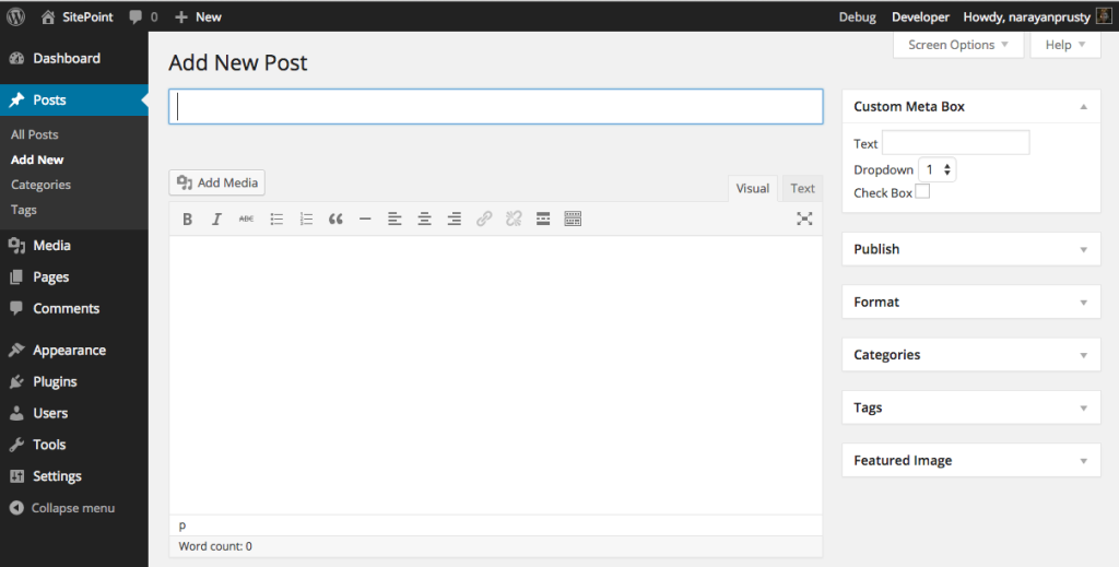
When, two years later, I wrote a book for O’Reilly on the topic (with my friend Raymond Camden), not too much had changed. There were some tools at the very early stages, including Jekyll Admin and Netlify CMS, but they had not matured to a point that they could realistically compete with the sort of WYSIWYG tooling that content editors were used to in tools like WordPress.

The WordPress editor showing a field for the post title and a text area for the post content.
The WordPress editing experience

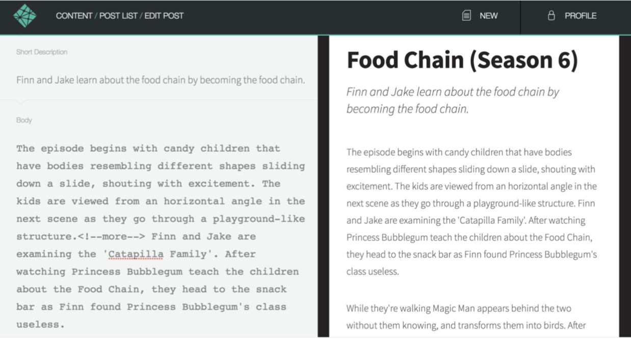
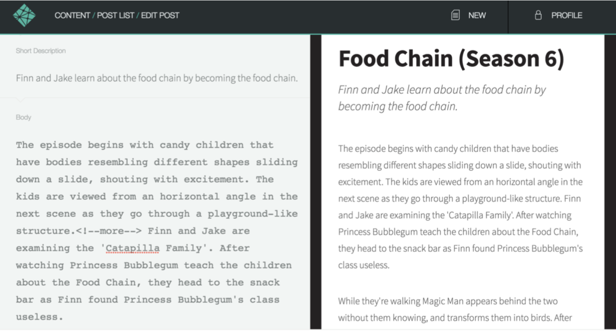
By contrast, the editing experience of static CMSs still required an understanding of Markdown and other markup (YAML, Liquid, etc.).

An editing screen in Netlify showing post fields on the left and a preview of the post on the right.
The Netlify CMS editing experience in 2017

Suffice it to say, whatever the technical merits of the architecture at the time, from a content editing standpoint, this was not a toolset that was ready for mainstream adoption.

The awkward teenage years

Over the ensuing two years, a combination of a couple of trends started to make the JAMstack a viable solution for mainstream content sites with non-technical editors. The first was that the static CMS matured into what we now generally refer to as git-based CMS solutions. The second was the rise of the headless, API-first CMS as a solution adopted by enterprises.

Let’s take a look at the first trend… well… first. Netlify CMS, an open-source project from Netlify, is an example of a git-based CMS. A git-based CMS doesn’t store your content, as a traditional CMS would, but it has tools that understand how to edit things like Markdown, YAML, JSON and other formats that make up a JAMstack site. This gives the content editors tools they feel comfortable with, but, behind the scenes, their content changes are simply committed back into the repository, forcing a rebuild of the site. While Netlify CMS is installed on the site itself, other popular git-based CMS options are web-based, including Forestry and DatoCMS.

An editing screen in Netlify from 2017 showing post fields on the left and a preview of the post on the right.
The current editing experience in Netlify CMS

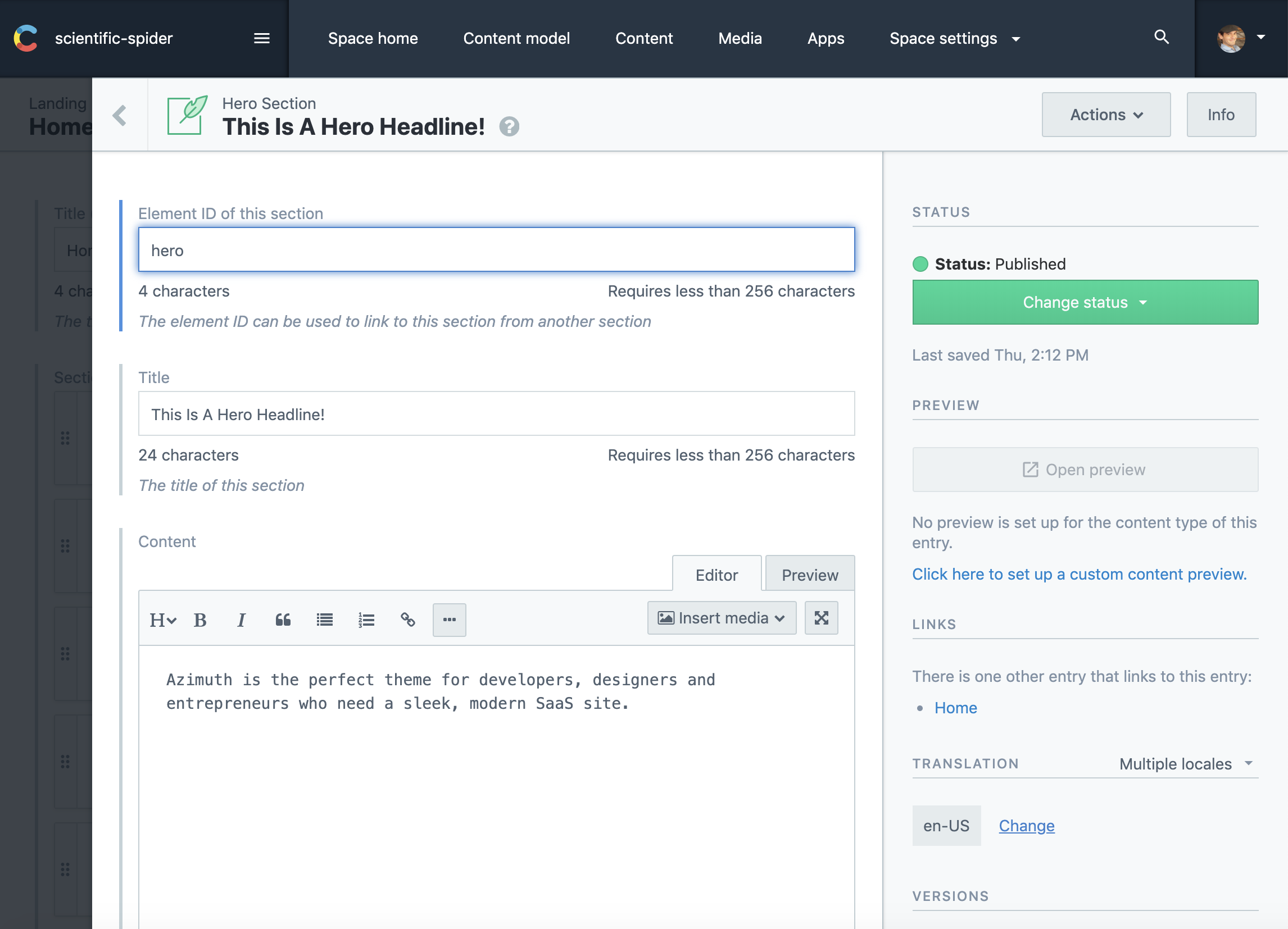
The headless, API-first CMS functions much more like the editing experience in a traditional CMS. It not only offers tools for creating and editing content, but it stores that content. However, it makes that content available to the front end – any front-end – via an API. While not limited to JAMstack in any way, an API-first CMS works well with it because the creation and management of the content is separate from the display of that content on the front end. In addition, many API-first CMSs offer pre-built integrations with some of the most widely used static site generators. Popular API-first options include Contentful and Sanity.

The Contentful admin, showing post fields on the left and post settings on the right.
Contentful

HeadlessCMS.org is a site maintained by Netlify that has a comprehensive list of all the available tools, both git-based and API-first. For a good look at the differences, pros and cons between choosing a git-based versus an API-first CMS, check out this post by Bejamas.

Both git-based and API-first headless CMS options began to give non-technical content editors the tools they needed on the backend to create content. The awkwardness of these „teenage years” comes from the fact that the tooling is still disconnected from the frontend. This makes it difficult to see how changes you’ve made in the backend will impact the frontend until those changes are actually committed to the repo or pushed live via the API. Add in the time cost of a rebuild and you have a less than ideal editing experience where mistakes can more easily make it to the live site.

A Look at the future

So what does the future look like when the JAMstack CMS is finally grown up? Well, we got a good look at this year’s JAMstack_conf_sf. Coincidentally, there were two presentations demonstrating new tools that are bringing the content editing experience to the frontend, letting content editors see what they are changing, how their changes will look and how they will impact the layout of the site.

The first presentation was by Scott Gallant of Forestry. In it, he introduced an new open source projects from Forestry called TinaCMS that brings a WYSIWYG style content editing experience to the frontend of sites that use a git-based CMS and Gatsby or Next.js (both React-based tools).

Animated flow for editing a page on the front end with Tina CMS.
TinaCMS

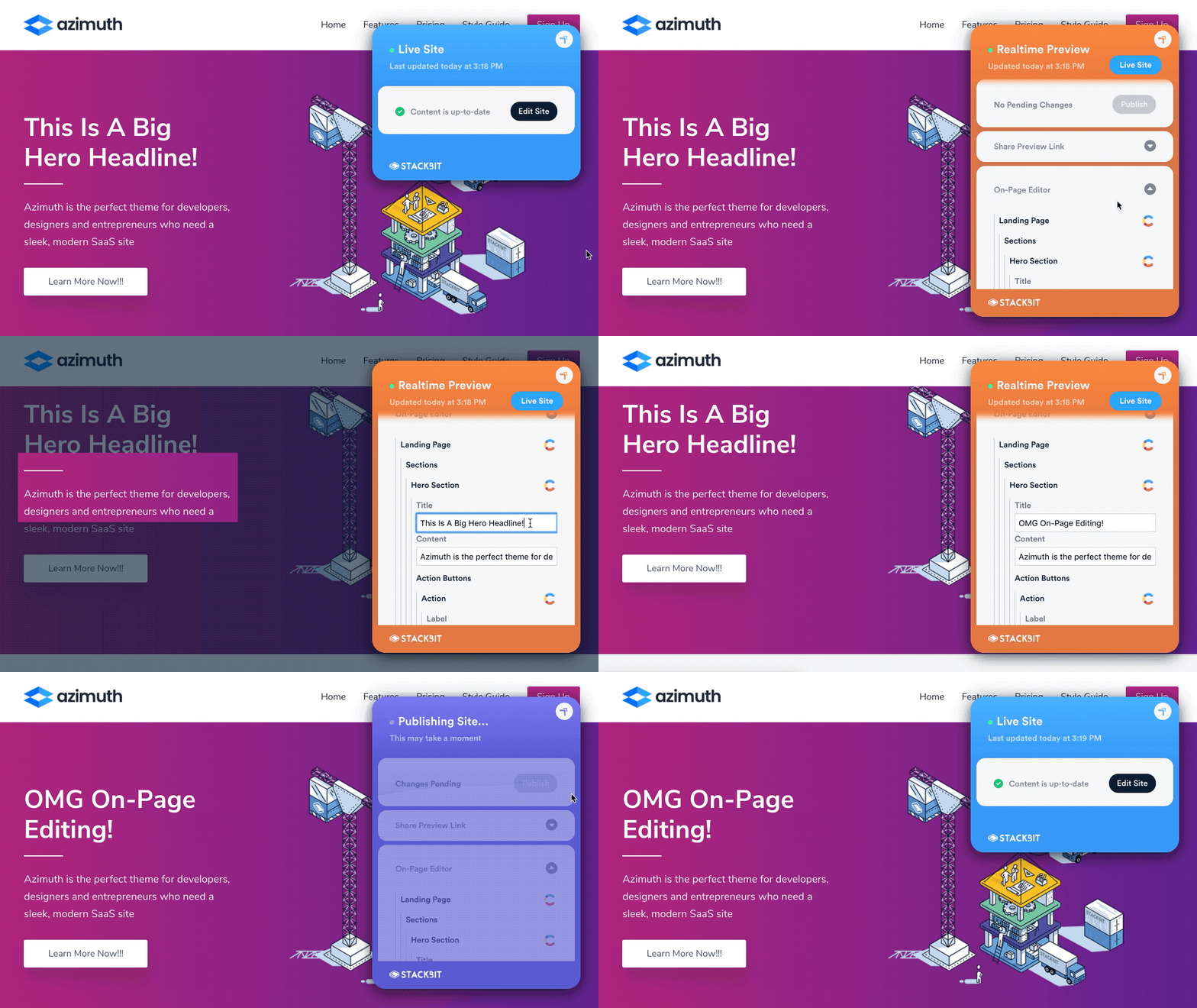
The second presentation was by Ohad Eder-Pressman of Stackbit (full disclosure: I work as a Developer Advocate for Stackbit) that introduced an upcoming set of tools called Stackbit Live. Stackbit Live is designed to be CMS and static site generator agnostic, while still allowing on-page editing and previewing of a JAMstack site.

Animation of editing a page on the front end with Stackbit Love
Stackbit Live

What both these tools demonstrated is that we’re at a point where a „JAMStack + headless” architecture is a real alternative to a traditional CMS. I believe we’ve reached the tipping point whereby we’re no longer trading a great developer experience for an uncomfortable editing experience for content authors. By 2020, JAMstack CMS will officially be all grown up. 👩🏽‍🎓

The post JAMstack CMSs Have Finally Grown Up! appeared first on CSS-Tricks.
The Amazingly Useful Tools from Yoksel

Post pobrano z: The Amazingly Useful Tools from Yoksel

I find myself web searching for some tool by Yoksel at least every month. I figured I’d list out some of my favorites here in case you aren’t aware of them.

The post The Amazingly Useful Tools from Yoksel appeared first on CSS-Tricks.
How We Perform Frontend Testing on StackPath’s Customer Portal

Post pobrano z: How We Perform Frontend Testing on StackPath’s Customer Portal

Nice post from Thomas Ladd about how their front-end team does testing. The list feels like a nice place to be:

  1. TypeScript – A language, but you’re essentially getting various testing for free (passing the right arguments and types of variables)
  2. Jest – Unit tests. JavaScript functions are doing the right stuff. Works with React.
  3. Cypress – Integration tests. Page loads, do stuff with page, expected things happen in DOM. Thomas says their end-to-end tests (e.g. hitting services) are also done in Cypress with zero mocking of data.

I would think this is reflective of a modern setup making its way across lots of front-end teams. If there is anything to add to it, I’d think visual regression testing (e.g. with a tool like Percy) would be the thing to add.

As an alternative to Cypress, jest-puppeteer is also worth mentioning because (1) Jest is already in use here and (2) Puppeteer is perhaps a more direct way of controlling the browser — no middleman language or Electron or anything.

Thomas even writes that there’s a downside here: too-many-tools:

Not only do we have to know how to write tests in these different tools; we also have to make decisions all the time about which tool to use. Should I write an E2E test covering this functionality or is just writing an integration test fine? Do I need unit tests covering some of these finer-grain details as well?

There is undoubtedly a mental load here that isn’t present if you only have one choice. In general, we start with integration tests as the default and then add on an E2E test if we feel the functionality is particularly critical and backend-dependent.

I’m not sure we’ll ever get to a point where we only have to write one kind of test, but having unit and integration tests share some common language is nice. I’m also theoretically opposite in my conclusion: integration/E2E tests are a better default, since they are closer to reality and prove that a ton is going right in just testing one thing. They should be the default. However, they are also slower and flakier, so sad trombone.

Direct Link to ArticlePermalink

The post How We Perform Frontend Testing on StackPath’s Customer Portal appeared first on CSS-Tricks.

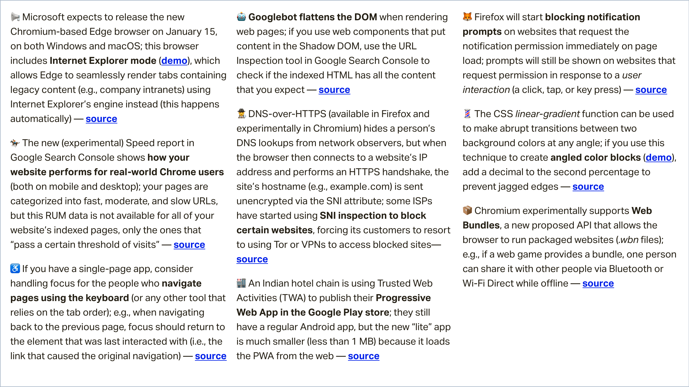
Weekly Platform News: Internet Explorer Mode, Speed Report in Search Console, Restricting Notification Prompts

Post pobrano z: Weekly Platform News: Internet Explorer Mode, Speed Report in Search Console, Restricting Notification Prompts

In this week’s roundup: Internet Explorer finds its way into Edge, Google Search Console touts a new speed report, and Firefox gives Facebook’s notification the silent treatment.

Let’s get into the news!

Edge browser with new Internet Explorer mode launches in January

Microsoft expects to release the new Chromium-based Edge browser on January 15, on both Windows and macOS. This browser includes a new Internet Explorer mode that allows Edge to automatically and seamlessly render tabs containing specific legacy content (e.g., a company’s intranet) using Internet Explorer’s engine instead of Edge’s standard engine (Blink).

Here’s a sped-up excerpt from Fred Pullen’s presentation that shows the new Internet Explorer mode in action:

(via Kyle Pflug)

Speed report experimentally available in Google Search Console

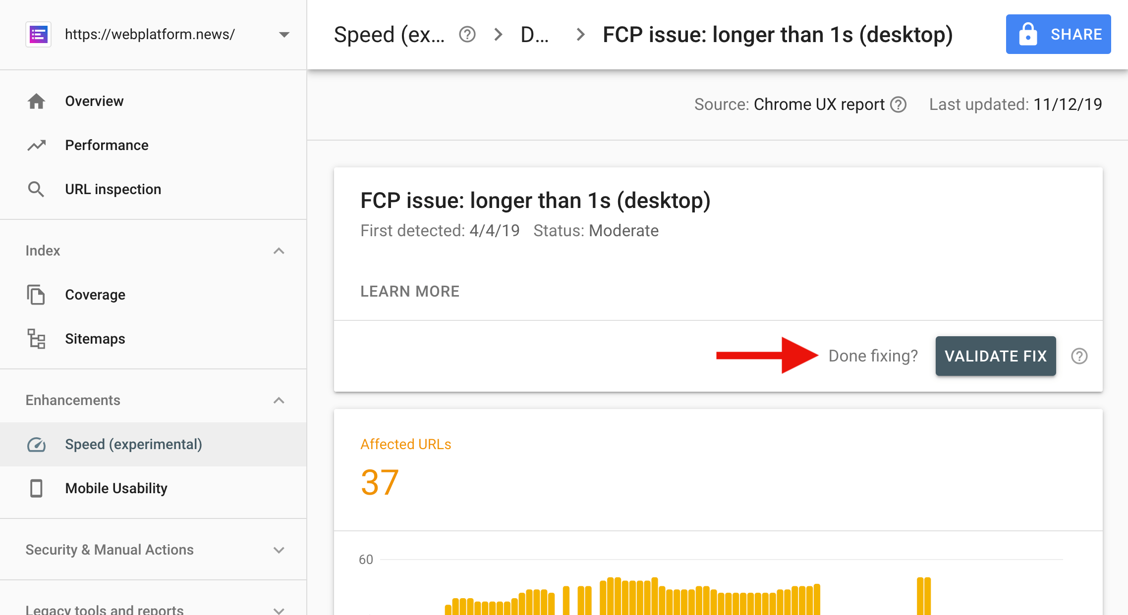
The new Speed report in Google’s Search Console shows how your website performs for real-world Chrome users (both on mobile and desktop). Pages that „pass a certain threshold of visits” are categorized into fast, moderate, and slow pages.

Tip: After fixing a speed issue, use the “Validate fix” button to notify Google Search. Google will verify the fix and re-index the pages if the issue is resolved.

(via Google Webmasters)

Facebook’s notification prompt will disappear in Firefox

Firefox will soon start blocking notification prompts on websites that request the notification permission immediately on page load (Facebook does this). Instead of the prompt, a small “speech balloon” icon will be shown in the URL bar.

Websites will still be able to show a notification prompt in Firefox as long as they request permission in response to a user interaction (a click, tap, or key press).

(via Marcos Càceres)

More news…

Read more news in my weekly newsletter for web developers. Pledge as little as $2 per month to get the latest news from me via email every Monday.

More News →

The post Weekly Platform News: Internet Explorer Mode, Speed Report in Search Console, Restricting Notification Prompts appeared first on CSS-Tricks.

Two-Value Display Syntax (and Sometimes Three)

Post pobrano z: Two-Value Display Syntax (and Sometimes Three)

You know the single-value syntax: .thing { display: block; }. The value „block” being a single value. There are lots of single values for display. For example, inline-flex, which is like flex in that it becomse a flex container, but behaves like an inline-level element rather than a block-level element. Somewhat intuitive, but much better served by a two-value system that can apply that same concept more broadly and just as intuitively.

For a deep look, you should read Rachel Andrew’s blog post The two-value syntax of the CSS Display property. The spec is also a decent read, as is this video from Miriam:

This is how it maps in my brain

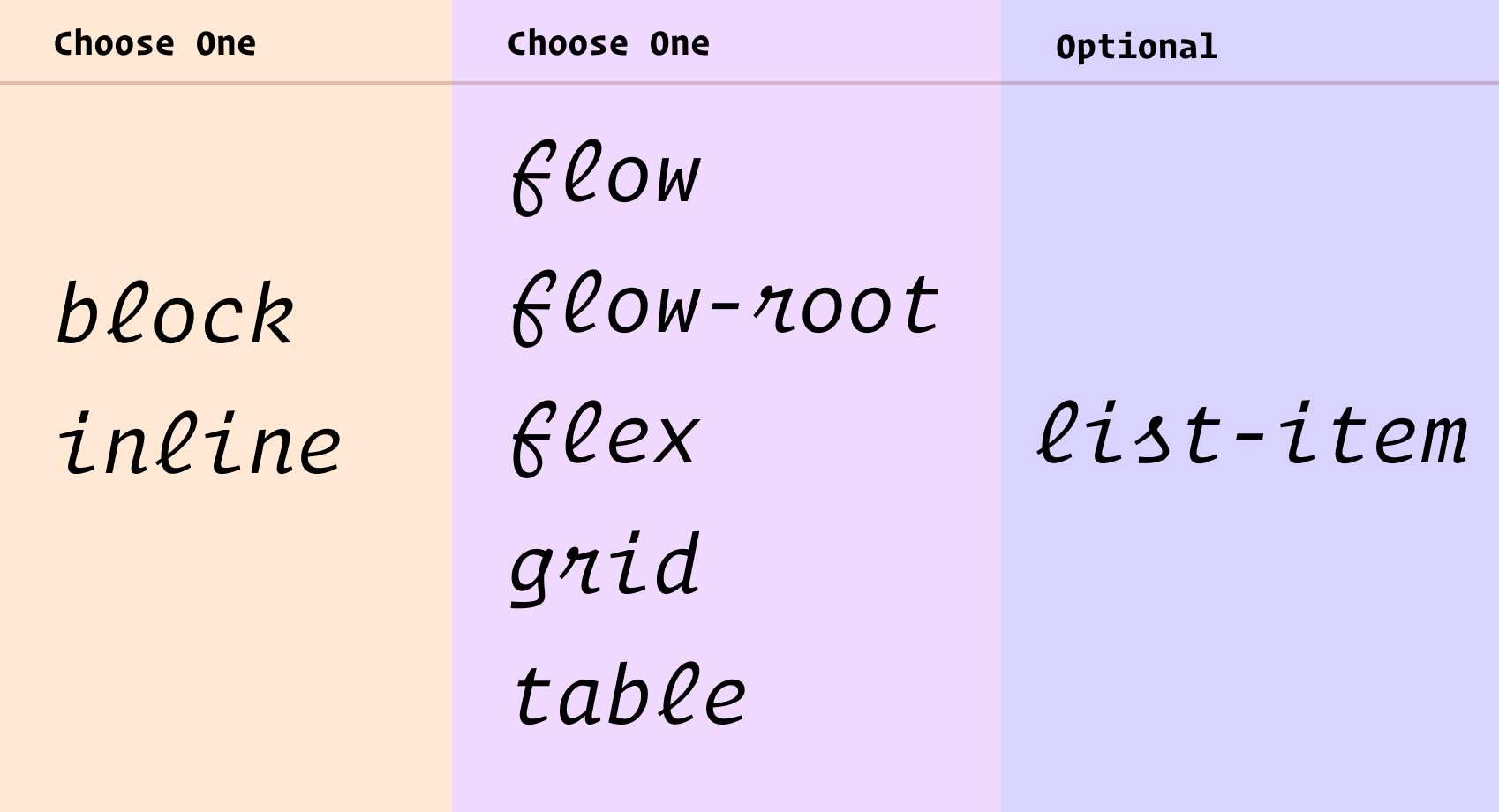
Choose block or inline, then choose flow, flow-root, flex, grid, or table. If it’s a list-item that’s a third thing.

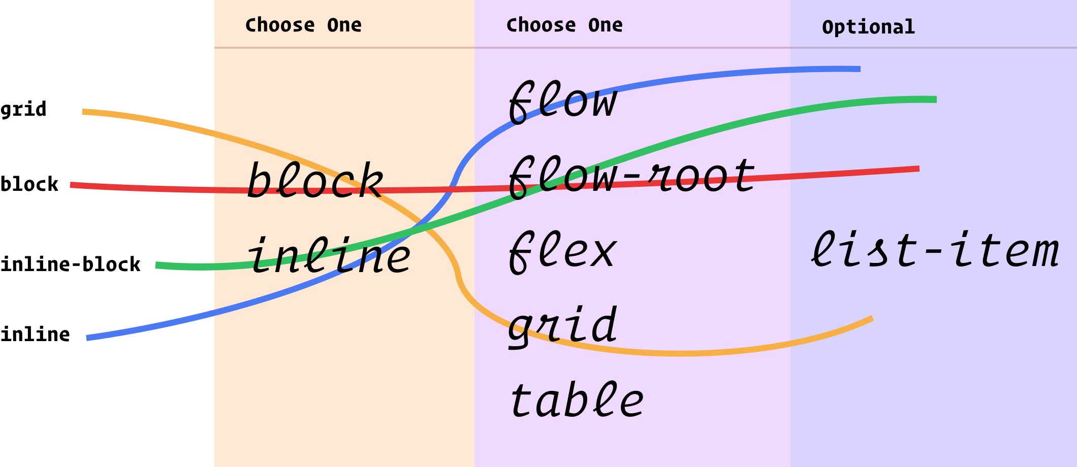
You essentially pick one from each column to describe the layout you want. So the existing values we use all the time map out something like this:

Another way to think about those two columns I have there is „outside” and „inside” display values. Outside, as in, how it flows with other elements around it. Inside, as in, how layout happens inside those elements.

Can you actually use it?

Not really. Firefox 70 is first out of the gate with it, and there are no other signals for support from Chrome-land or Safari-land that I know about. It’s a great evolution of CSS, but as far as day-to-day usage, it’ll be years out. Something as vital as layout isn’t something you wanna let fail just for this somewhat minor descriptive benefit. Nor is it probably worth the trouble to progressively enhance with @supports and such.

Weirdnesses

  • You can’t block flow because that doesn’t really make sense. It’ll be reset to block flow-root.
  • There is implied shorthand. Like if you inline list-item, that’s really inline flow list-item whereas list-item is block flow list-item. Looks all fairly intuitive.
  • You still use stuff like table-row and table-header-group. Those are single-value deals, as is contents and none.
  • Column one technically includes run-in too, but as far as I know, no browser has ever supported run-in display.
  • Column two technically includes ruby, but I have never understood what that even is.

How we talk about CSS

I like how Rachel ties this change to a more rational mental and teaching model:

… They properly explain the interaction of boxes with other boxes, in terms of whether they are block or inline, plus the behavior of the children. For understanding what display is and does, I think they make for a very useful clarification. As a result, I’ve started to teach display using these two values to help explain what is going on when you change formatting contexts.

It is always exciting to see new features being implemented, I hope that other browsers will also implement these two-value versions soon. And then, in the not too distant future we’ll be able to write CSS in the same way as we now explain it, clearly demonstrating the relationship between boxes and the behavior of their children.

The post Two-Value Display Syntax (and Sometimes Three) appeared first on CSS-Tricks.

Diana Smith’s Pure CSS Artwork “Lace”

Post pobrano z: Diana Smith’s Pure CSS Artwork “Lace”

Diana is at it again with her absolutely unbelievable CSS paintings. This latest one is called Lace. Past paintings are Francine, Vignes, and Zigario.

She wrote for us last year if you’d like a little insight into her thinking.

Andy Baio looked at the painting in a variety of older and incompatible browsers, and the results are hilarious and amazing.

IE 8
Safari 13

Direct Link to ArticlePermalink

The post Diana Smith’s Pure CSS Artwork “Lace” appeared first on CSS-Tricks.

Working with Fusebox and React

Post pobrano z: Working with Fusebox and React

If you are searching for an alternative bundler to webpack, you might want to take a look at FuseBox. It builds on what webpack offers — code-splitting, hot module reloading, dynamic imports, etc. — but code-splitting in FuseBox requires zero configuration by default (although webpack will offer the same as of version 4.0).

Instead, FuseBox is built for simplicity (in the form of less complicated configuration) and performance (by including aggressive caching methods). Plus, it can be extended to use tons of plugins that can handle anything you need above and beyond the defaults.

Oh yeah, and if you are a fan of TypeScript, you might be interested in knowing that FuseBox makes it a first-class citizen. That means you can write an application in Typescript — with no configuration! — and it will use the Typescript transpiler to compile scripts by default. Don’t plan on using Typescript? No worries, the transpiler will handle any JavaScript. Yet another bonus!

To illustrate just how fast it is to to get up and running, let’s build the bones of a sample application that’s usually scaffolded with create-react-app. Everything we’re doing will be on GitHub if you want to follow along.

FuseBox is not the only alternative to webpack, of course. There are plenty and, in fact, Maks Akymenko has a great write-up on Parcel which is another great alternative worth looking into.

The basic setup

Start by creating a new project directory and initializing it with npm:

## Create the directory
mkdir csstricks-fusebox-react && $_
## Initialize with npm default options
npm init -y

Now we can install some dependencies. We’re going to build the app in React, so we’ll need that as well as react-dom.

npm install --save react react-dom

Next, we’ll install FuseBox and Typescript as dependencies. We’ll toss Uglify in there as well for help minifying our scripts and add support for writing styles in Sass.

npm install --save-dev fuse-box typescript uglify-js node-sass

Alright, now let’s create a src folder in the root of the project directory (which can be done manually). Add the following files (`app.js and index.js) in there, including the contents:

// App.js

import * as React from "react";
import * as logo from "./logo.svg";

const App = () => {
  return (
    <div className="App">
      <header className="App-header">
        <img src={logo} className="App-logo" alt="logo" />
        <h1 className="App-title">Welcome to React</h1>
      </header>
      <p className="App-intro">
        To get started, edit `src/App.js` and save to reload.
      </p>
    </div>
  )
};

export default App;

You may have noticed that we’re importing an SVG file. You can download it directly from the GitHub repo.

// index.js

import * as React from "react";
import * as ReactDOM from "react-dom";
import App from "./App"

ReactDOM.render(
  <App />, document.getElementById('root')
);

You can see that the way we handle importing files is a little different than a typical React app. That’s because FuseBox does not polyfill imports by default.

So, instead of doing this:

import React from "react";

…we’re doing this:

import * as React from "react";
<!-- ./src/index.html -->

<!DOCTYPE html>
<html lang="en">
  <head>
    <title>CSSTricks Fusebox React</title>
    $css
  </head>

  <body>
    <noscript>
      You need to enable JavaScript to run this app.
    </noscript>
    <div id="root"></div>
    $bundles
  </body>
</html>

Styling isn’t really the point of this post, but let’s drop some in there to dress things up a bit. We’ll have two stylesheets. The first is for the App component and saved as App.css.

/* App.css */

.App {
  text-align: center;
}

.App-logo {
  animation: App-logo-spin infinite 20s linear;
  height: 80px;
}

.App-header {
  background-color: #222;
  height: 150px;
  padding: 20px;
  color: white;
}

.App-intro {
  font-size: large;
}

@keyframes App-logo-spin {
  from {
    transform: rotate(0deg);
  }
  to {
    transform:
        rotate(360deg);
  }
}

The second stylesheet is for index.js and should be saved as index.css:

/* index.css */
body {
  margin: 0;
  padding: 0;
  font-family: sans-serif;
}

OK, we’re all done with the initial housekeeping. On to extending FuseBox with some goodies!

Plugins and configuration

We said earlier that configuring FuseBox is designed to be way less complex than the likes of webpack — and that’s true! Create a file called fuse.js in the root directory of the application.

We start with importing the plugins we’ll be making use of, all the plugins come from the FuseBox package we installed.

const { FuseBox, CSSPlugin, SVGPlugin, WebIndexPlugin } = require("fuse-box");

Next, we’ll initialize a FuseBox instance and tell it what we’re using as the home directory and where to put compiled assets:

const fuse = FuseBox.init({
  homeDir: "src",
  output: "dist/$name.js"
});

We’ll let FuseBox know that we intend to use the TypeScript compiler:

const fuse = FuseBox.init({
  homeDir: "src",
  output: "dist/$name.js",
  useTypescriptCompiler: true,
});

We identified plugins in the first line of the configuration file, but now we’ve got to call them. We’re using the plugins pretty much as-is, but definitely check out what the CSSPlugin, SVGPlugin and WebIndexPlugin have to offer if you want more fine-grained control over the options.

const fuse = FuseBox.init({
  homeDir: "src",
  output: "dist/$name.js",
  useTypescriptCompiler: true,
  plugins: [ // HIGHLIGHT
    CSSPlugin(),
    SVGPlugin(),
    WebIndexPlugin({
      template: "src/index.html"
    })
  ]
});

const { FuseBox, CSSPlugin, SVGPlugin, WebIndexPlugin } = require("fuse-box");

const fuse = FuseBox.init({
  homeDir: "src",
  output: "dist/$name.js",
  useTypescriptCompiler: true,
  plugins: [
    CSSPlugin(),
    SVGPlugin(),
    WebIndexPlugin({
      template: "src/index.html"
    })
  ]
});
fuse.dev();
fuse
  .bundle("app")
  .instructions(`>index.js`)
  .hmr()
  .watch()

fuse.run();

FuseBox lets us configure a development server. We can define ports, SSL certificates, and even open the application in a browser on build.

We’ll simply use the default environment for this example:

fuse.dev();

It is important to define the development environment *before* the bundle instructions that come next:

fuse
  .bundle("app")
  .instructions(`>index.js`)
  .hmr()
  .watch().

What the heck is this? When we initialized the FuseBox instance, we specified an output using dist/$name.js. The value for $name is provided by the bundle() method. In our case, we set the value as app. That means that when the application is bundled, the output destination will be dist/app.js.

The instructions() method defines how FuseBox should deal with the code. In our case, we’re telling it to start with index.js and to execute it after it’s loaded.

The hmr() method is used for cases where we want to update the user when a file changes, this usually involves updating the browser when a file changes. Meanwhile, watch() re-bundles the bundled code after every saved change.

With that, we’ll cap it off by launching the build process with fuse.run() at the end of the configuration file. Here’s everything we just covered put together:

const { FuseBox, CSSPlugin, SVGPlugin, WebIndexPlugin } = require("fuse-box");

const fuse = FuseBox.init({
  homeDir: "src",
  output: "dist/$name.js",
  useTypescriptCompiler: true,
  plugins: [
    CSSPlugin(),
    SVGPlugin(),
    WebIndexPlugin({
      template: "src/index.html"
    })
  ]
});
fuse.dev();
fuse
  .bundle("app")
  .instructions(`>index.js`)
  .hmr()
  .watch()

fuse.run();

Now we can run the application from the terminal by running node fuse. This will start the build process which creates the dist folder that contains the bundled code and the template we specified in the configuration. After the build process is done, we can point the browser to http://localhost:4444/ to see our app.

Running tasks with Sparky

FuseBox includes a task runner that can be used to automate a build process. It’s called Sparky and you can think of it as sorta like Grunt and Gulp, the difference being that it is built on top of FuseBox with built-in access to FuseBox plugins and the FuseBox API.

We don’t have to use it, but task runners make development a lot easier by automating things we’d otherwise have to do manually and it makes sense to use what’s specifically designed for FuseBox.

To use it, we’ll update the configuration we have in fuse.js, starting with some imports that go at the top of the file:

const { src, task, context } = require("fuse-box/sparky");

Next, we’ll define a context, which will look similar to what we already have. We’re basically wrapping what we did in a context and setConfig(), then initializing FuseBox in the return:

context({
  setConfig() {
    return FuseBox.init({
      homeDir: "src",
      output: "dist/$name.js",
      useTypescriptCompiler: true,
      plugins: [
        CSSPlugin(),
        SVGPlugin(),
        WebIndexPlugin({
          template: "src/index.html"
        })
      ]
    });
  },
  createBundle(fuse) {
    return fuse
      .bundle("app")
      .instructions(`> index.js`)
      .hmr();
  }
});

It’s possible to pass a class, function or plain object to a context. In the above scenario, we’re passing functions, specifically setConfig() and createBundle(). setConfig() initializes FuseBox and sets up the plugins. createBundle() does what you might expect by the name, which is bundling the code. Again, the difference from what we did before is that we’re embedding both functionalities into different functions which are contained in the context object.

We want our task runner to run tasks, right? Here are a few examples we can define:

task("clean", () => src("dist").clean("dist").exec());
task("default", ["clean"], async (context) => {
  const fuse = context.setConfig();
  fuse.dev();
  context.createBundle(fuse);
  await fuse.run()
});

The first task will be responsible for cleaning the dist directory. The first argument is the name of the task, while the second is the function that gets called when the task runs.
To call the first task, we can do node fuse clean from the terminal.

When a task is named default (which is the first argument as in the second task), that task will be the one that gets called by default when running node fuse — in this case, that’s the second task in our configuration. Other tasks need to be will need to be called explicitly in terminal, like node fuse <task_name>.

So, our second task is the default and three arguments are passed into it. The first is the name of the task (`default`), the second (["clean"]) is an array of dependencies that should be called before the task itself is executed, and the third is a function (fuse.dev()) that gets the initialized FuseBox instance and begins the bundling and build process.

Now we can run things with node fuse in the terminal. You have the option to add these to your package.json file if that’s more comfortable and familiar to you. The script section would look like this:

"scripts": {
  "start": "node fuse",
  "clean": "node fuse clean"
},

That’s a wrap!

All in all, FuseBox is an interesting alternative to webpack for all your application bundling needs. As we saw, it offers the same sort of power that we all tend to like about webpack, but with a way less complicated configuration process that makes it much easier to get up and running, thanks to built-in Typescript support, performance considerations, and a task runner that’s designed to take advantage of the FuseBox API.

What we look at was a pretty simple example. In practice, you’re likely going to be working with more complex applications, but the concepts and principles are the same. It’s nice to know that FuseBox is capable of handling more than what’s baked into it, but that the initial setup is still super streamlined.

If you’re looking for more information about FuseBox, it’s site and documentation are obviously great starting point. the following links are also super helpful to get more perspective on how others are setting it up and using it on projects.

The post Working with Fusebox and React appeared first on CSS-Tricks.

Weekly Platform News: Web Apps in Galaxy Store, Tappable Stories, CSS Subgrid

Post pobrano z: Weekly Platform News: Web Apps in Galaxy Store, Tappable Stories, CSS Subgrid

In this week’s roundup: Firefox gains locksmith-like powers, Samsung’s Galaxy Store starts supporting Progressive Web Apps, CSS Subgrid is shipping in Firefox 70, and a new study confirms that users prefer to tap into content rather than scroll through it.

Let’s get into the news.

Securely generated passwords in Firefox

Firefox now suggests a securely generated password when the user focuses an <input> element that has the autocomplete="new-password" attribute value. This option is also available via the context menu on any password field.


(via The Firefox Frontier)

Web apps in Samsung’s app store

Samsung has started adding Progressive Web Apps (PWA) to its app store, Samsung Galaxy Store, which is available on Samsung devices. The new “Web apps” category is visible initially only in the United States. If you own a PWA, you can send its URL to pwasupport@samsung.com, and Samsung will help you get onboarded into Galaxy Store.

(via Ada Rose Cannon)

Tappable stories on the mobile web

According to a study commissioned by Google, the majority of people prefer tappable stories over scrolling articles when consuming content on the mobile web. Google is using this study to promote AMP Stories, which is a format for tappable stories on the mobile web.

Both studies had participants interact with real-world examples of tappable stories on the mobile web as well as scrolling article equivalents. Forrester found that 64% of respondents preferred the tappable mobile web story format over its scrolling article equivalent.

(via Alex Durán)

The grid form use-case for CSS Subgrid

CSS Subgrid is shipping in Firefox next month. This new feature enables grid items of nested grids to be put onto the outer grid, which is useful in situations where the wanted grid items are not direct children of the grid container.

(via Šime Vidas)

The post Weekly Platform News: Web Apps in Galaxy Store, Tappable Stories, CSS Subgrid appeared first on CSS-Tricks.

Comparing the Different Types of Native JavaScript Popups

Post pobrano z: Comparing the Different Types of Native JavaScript Popups

JavaScript has a variety of built-in popup APIs that display special UI for user interaction. Famously:

alert("Hello, World!");

The UI for this varies from browser to browser, but generally you’ll see a little window pop up front and center in a very show-stopping way that contains the message you just passed. Here’s Firefox and Chrome:

Native popups in Firefox (left) and Chrome (right). Note the additional UI preventing additional dialogs in Firefox from triggering it more than once. You can also see how Chrome is pinned to the top of the window.

There is one big problem you should know about up front

JavaScript popups are blocking.

The entire page essentially stops when a popup is open. You can’t interact with anything on the page while one is open — that’s kind of the point of a “modal” but it’s still a UX consideration you should be keenly aware of. And crucially, no other main-thread JavaScript is running while the popup is open, which could (and probably is) unnecessarily preventing your site from doing things it needs to do.

Nine times out of ten, you’d be better off architecting things so that you don’t have to use such heavy-handed stop-everything behavior. Native JavaScript alerts are also implemented by browsers in such a way that you have zero design control. You can’t control *where* they appear on the page or what they look like when they get there. Unless you absolutely need the complete blocking nature of them, it’s almost always better to use a custom user interface that you can design to tailor the experience for the user.

With that out of the way, let’s look at each one of the native popups.

window.alert();

window.alert("Hello World");

<button onclick="alert('Hello, World!');">Show Message</button>

const button = document.querySelectorAll("button");
button.addEventListener("click", () => {
  alert("Text of button: " + button.innerText);
});

See the Pen
alert("Example");
by Elliot KG (@ElliotKG)
on CodePen.

What it’s for: Displaying a simple message or debugging the value of a variable.

How it works: This function takes a string and presents it to the user in a popup with a button with an “OK” label. You can only change the message and not any other aspect, like what the button says.

The Alternative: Like the other alerts, if you have to present a message to the user, it’s probably better to do it in a way that’s tailor-made for what you’re trying to do.

If you’re trying to debug the value of a variable, consider console.log(<code>"`Value of variable:"`, variable); and looking in the console.

window.confirm();

window.confirm("Are you sure?");

<button onclick="confirm('Would you like to play a game?');">Ask Question</button>

let answer = window.confirm("Do you like cats?");
if (answer) {
  // User clicked OK
} else {
  // User clicked Cancel
}

See the Pen
confirm("Example");
by Elliot KG (@ElliotKG)
on CodePen.

What it’s for: “Are you sure?”-style messages to see if the user really wants to complete the action they’ve initiated.

How it works: You can provide a custom message and popup will give you the option of “OK” or “Cancel,” a value you can then use to see what was returned.

The Alternative: This is a very intrusive way to prompt the user. As Aza Raskin puts it:

…maybe you don’t want to use a warning at all.”

There are any number of ways to ask a user to confirm something. Probably a clear UI with a <button>Confirm</button> wired up to do what you need it to do.

window.prompt();

window.prompt("What’s your name?"); 

let answer = window.prompt("What is your favorite color?");
// answer is what the user typed in, if anything

See the Pen
prompt("Example?", "Default Example");
by Elliot KG (@ElliotKG)
on CodePen.

What it’s for: Prompting the user for an input. You provide a string (probably formatted like a question) and the user sees a popup with that string, an input they can type into, and “OK” and “Cancel” buttons.

How it works: If the user clicks OK, you’ll get what they entered into the input. If they enter nothing and click OK, you’ll get an empty string. If they choose Cancel, the return value will be null.

The Alternative: Like all of the other native JavaScript alerts, this doesn’t allow you to style or position the alert box. It’s probably better to use a <form> to get information from the user. That way you can provide more context and purposeful design.

window.onbeforeunload();

window.addEventListener("beforeunload", () => {
  // Standard requires the default to be cancelled.
  event.preventDefault();
  // Chrome requires returnValue to be set (via MDN)
  event.returnValue = '';
});

See the Pen
Example of beforeunload event
by Chris Coyier (@chriscoyier)
on CodePen.

What it’s for: Warn the user before they leave the page. That sounds like it could be very obnoxious, but it isn’t often used obnoxiously. It’s used on sites where you can be doing work and need to explicitly save it. If the user hasn’t saved their work and is about to navigate away, you can use this to warn them. If they *have* saved their work, you should remove it.

How it works: If you’ve attached the beforeunload event to the window (and done the extra things as shown in the snippet above), users will see a popup asking them to confirm if they would like to “Leave” or “Cancel” when attempting to leave the page. Leaving the site may be because the user clicked a link, but it could also be the result of clicking the browser’s refresh or back buttons. You cannot customize the message.

MDN warns that some browsers require the page to be interacted with for it to work at all:

To combat unwanted pop-ups, some browsers don’t display prompts created in beforeunload event handlers unless the page has been interacted with. Moreover, some don’t display them at all.

The Alternative: Nothing that comes to mind. If this is a matter of a user losing work or not, you kinda have to use this. And if they choose to stay, you should be clear about what they should to to make sure it’s safe to leave.

Accessibility

Native JavaScript alerts used to be frowned upon in the accessibility world, but it seems that screen readers have since become smarter in how they deal with them. According to Penn State Accessibility:

The use of an alert box was once discouraged, but they are actually accessible in modern screen readers.

It’s important to take accessibility into account when making your own modals, but there are some great resources like this post by Ire Aderinokun to point you in the right direction.

General alternatives

There are a number of alternatives to native JavaScript popups such as writing your own, using modal window libraries, and using alert libraries. Keep in mind that nothing we’ve covered can fully block JavaScript execution and user interaction, but some can come close by greying out the background and forcing the user to interact with the modal before moving forward.

You may want to look at HTML’s native <dialog> element. Chris recently took a hands-on look) at it. It’s compelling, but apparently suffers from some significant accessibility issues. I’m not entirely sure if building your own would end up better or worse, since handling modals is an extremely non-trivial interactive element to dabble in. Some UI libraries, like Bootstrap, offer modals but the accessibility is still largely in your hands. You might to peek at projects like a11y-dialog.

Wrapping up

Using built-in APIs of the web platform can seem like you’re doing the right thing — instead of shipping buckets of JavaScript to replicate things, you’re using what we already have built-in. But there are serious limitations, UX concerns, and performance considerations at play here, none of which land particularly in favor of using the native JavaScript popups. It’s important to know what they are and how they can be used, but you probably won’t need them a heck of a lot in production web sites.

The post Comparing the Different Types of Native JavaScript Popups appeared first on CSS-Tricks.