Interesting research from Jonathan Sampson, where he watches the network requests a browser makes the very first time you launch it on a fresh install, and otherwise do nothing. This gives you a little insight into what kind of information that browser wants to collect and disseminate.
This was all shared as tweets, but I’m linking to an unrolled thread if there’s one available:
In this week’s roundup: fighting shifty layouts, some videos might be a bit stalled, and a new way to take screenshots in Firefox.
Let’s get into the news!
Identifying the causes of layout shifts during page load
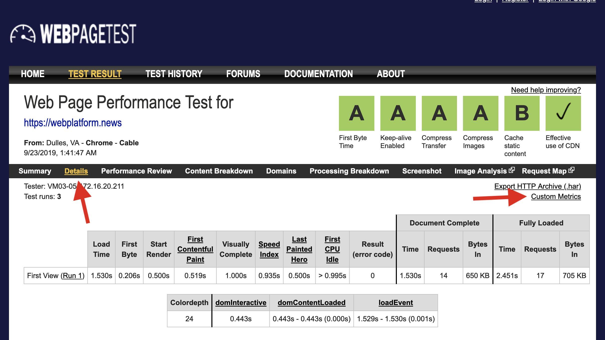
You can now use WebPageTest to capture any layout shifts that occur on your website during page load, and identify what caused them.
Step 1: Paste a snippet
Paste the following snippet into the “Custom Metrics” on webpagetest.org in field in the Custom tab (under Advanced Settings) and make sure that a Chrome browser is selected.
[LayoutShifts]
return new Promise(resolve => {
  new PerformanceObserver(list => {
    resolve(JSON.stringify(list.getEntries().filter(entry => !entry.hadRecentInput)));
  }).observe({type: "layout-shift", buffered: true});
});
Step 2: Inspect entries
After completing the test, inspect the captured LayoutShifts entries on the Custom Metrics page, which is linked from the Details section.
Step 3: Check the filmstrip
Based on the "startTime" and "value" numbers in the data, use WebPageTest’s filmstrip view to pinpoint the individual layout shifts and identify their causes.
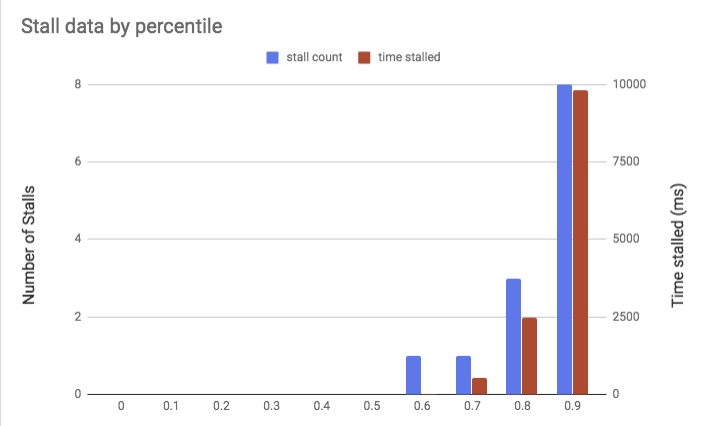
If you serve videos for your website from your own web server, keep an eye on the video bitrate (the author suggests FFmpeg and streamclarity.com). If your video has a bitrate of over 1.5 Mbps, playback may stall one or more times for people on 3G connections, depending on the video’s length.
50% of videos in this study have a bitrate that is greater than the downlink speed of a 3G connection — meaning that video playback will be delayed and contain stalls.
Firefox’s DevTools console includes a powerful command for capturing screenshots of the current web page. Like in Chrome DevTools, you can capture a screenshot of an individual element, the current viewport, or the full page, but Firefox’s :screenshot command also provides advanced options for adjusting the device pixel ratio and setting a delay.
// capture a full-page screenshot at a device pixel ratio of 2
:screenshot --fullpage --dpr 2

// capture a screenshot of the viewport with a 5-second delay
:screenshot --delay 5
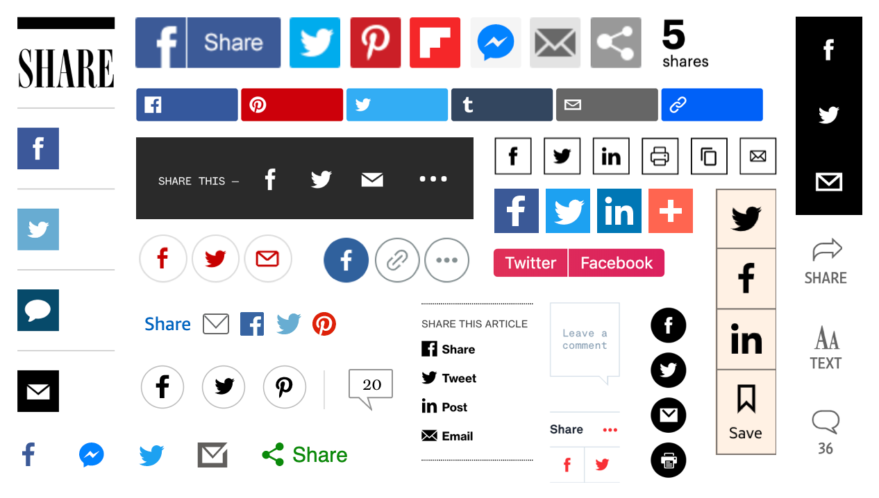
From trashy clickbait sites to the most august of publications, share buttons have long been ubiquitous across the web. And yet it is arguable that these buttons aren’t needed. All mobile browsers — Firefox, Edge, Safari, Chrome, Opera Mini, UC Browser, Samsung Internet — make it easy to share content directly from their native platforms. They all feature a built-in button to bring up a „share sheet” — a native dialog for sharing content. You can also highlight text to share an excerpt along with the link.
The ubiquitous share button, as seen at the BBC, Wired, BuzzFeed, PBS, The Wall Street Journal and elsewhere.
Given that users can share by default, are custom buttons taking up unnecessary space and potentially distracting users from more important actions? And do people actually use them?
A (unscientific) poll of 12,500 CSS-Tricks readers found that 60% of its readers never used custom share buttons. That was in 2014 and native methods for sharing have only improved since then. A more recent poll from Smashing Magazine found much the same thing.
How often do you use social sharing buttons on your mobile device?
Users come with varying technological proficiency. Not everybody knows their way around there own mobile phone or browser meaning some users would struggle to find the native share button. It’s also worth thinking about what happens on desktop. Desktop browsers generally (with Safari as one exception) offer no built-in sharing functionality — users are left to copy and paste the link into their social network of choice.
Some data suggests that clickthrough rates are relatively low. However, clickthrough rates aren’t the best metric. For technically savvy users aware of how to share without assistance, the buttons can still act as a prompt — a visual reminder to share the content. Regardless of how the link is ultimately shared, a custom share button can still provide a cue, or a little nudge to elicit the share. For this reason, measuring click rates on the buttons themselves may not be entirely fair — people may see the button, feel encouraged to share the content, but then use the browsers built-in share button. A better metric would be whether shares increase after the addition of share buttons, regardless of how they’re shared.
We’ve established that having a share button is probably useful. Websites have traditionally featured separate buttons for two or three of the most popular social networks. With a new-ish API, we can do better. While browser support is currently limited to Chrome for Android and Safari, those two browsers alone make up the vast majority of web traffic.
The Web Share API
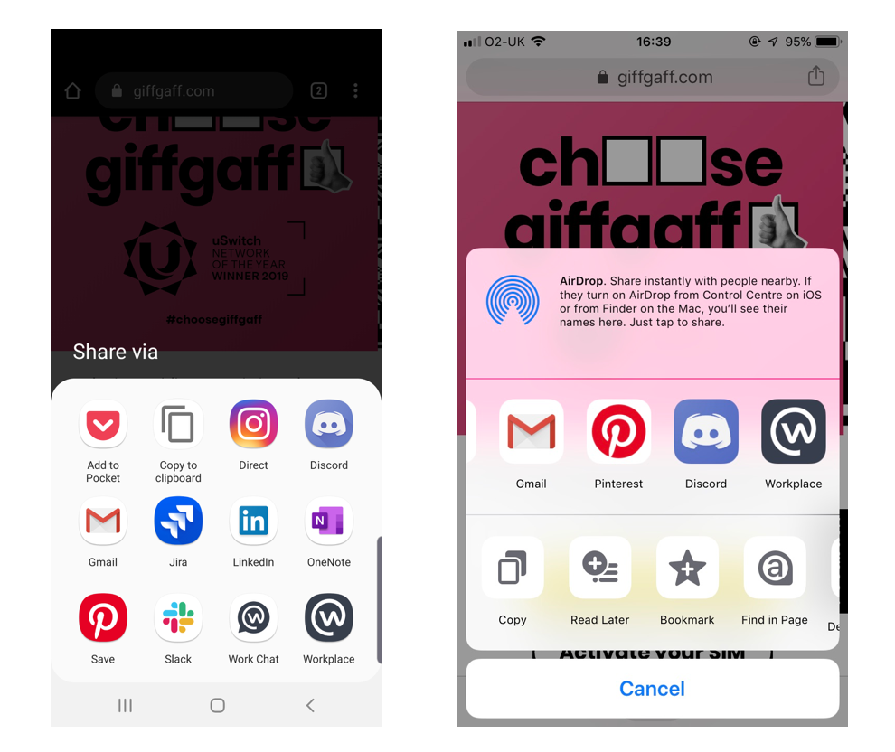
The Web Share API offers a simple way to bring up a share sheet — the native bit of UI that’s used for sharing. Rather than offering a standard list of popular social networks to share to (which the user may or may not be a member of), the options of the share sheet are catered to the individual. Only applications they have installed on their phone will be shown. Rather than a uniform list, the user will be shown only the option to share on networks they actually use — whether that be Twitter and Facebook or something more esoteric.
Not showing the user irrelevant networks is obviously a good thing. Unfortunately, this is counterbalanced by the fact that some users visit social media websites rather than downloading them as apps. If you use twitter.com, for example, but haven’t installed the Twitter application natively, then Twitter will not be listed as a sharing option. Currently, only native apps are listed but PWAs will be supported in the future.
The API requires user interaction (such as a button click as shown in the above code) to bring up the share sheet. This means you can’t do something obnoxious like bring up the share sheet on page load.
The text might be a short excerpt or a summation of the page. The title is used when sharing via email but will be ignored when sharing to social networks.
Native sharesheet dialog on Android (left) and iOS (right). The apps listed here are dependent on which apps you have installed on your device.
Sharing on desktop
While we are pretty happy with the Web Share API for mobile, its implementation for desktop is currently limited to Safari and leaves a lot to be desired. (Chrome is planning to ship support eventually, but there is no clear timescale).
The provided options — Mail, Message, Airdrop, Notes, Reminders — omit social networks. Native apps for Twitter and Facebook are common on phones, but rare on other devices.
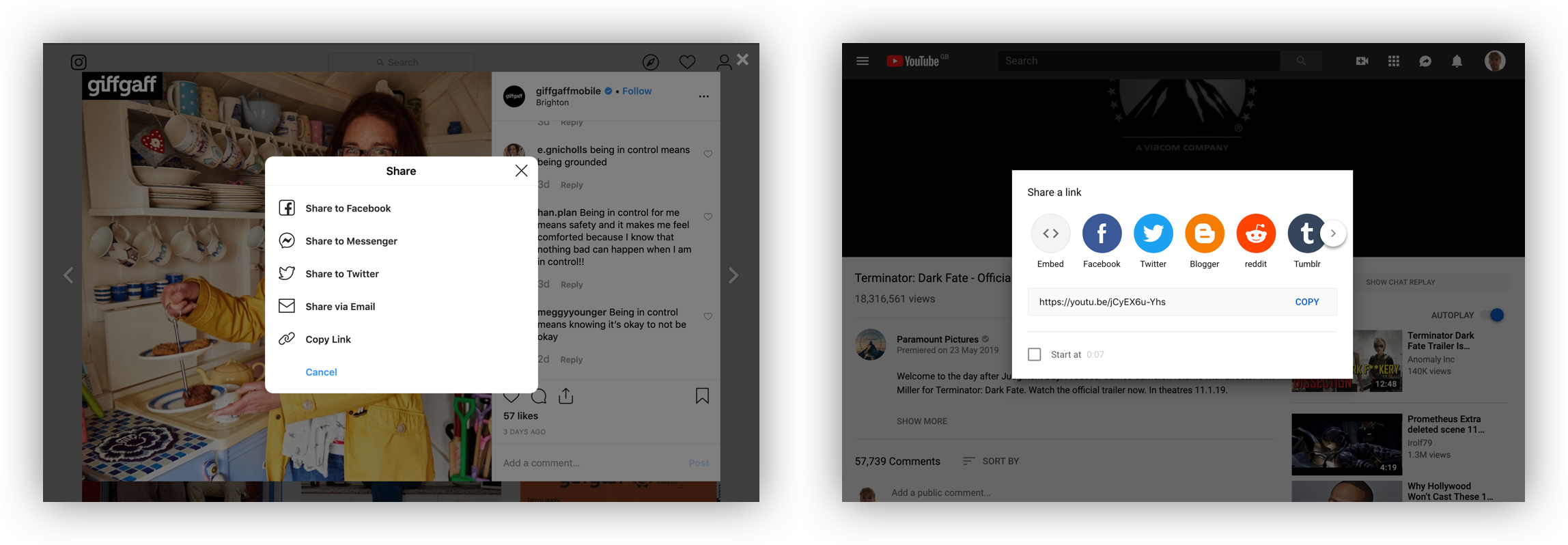
Instead of relying on the Web Share API for desktop, its relatively common to have a generic share button that opens a modal that offers more multiple sharing options. This is the approach adopted by YouTube, Instagram and Pinterest, among others.
Instagram (left) compared to YouTube (right)
Facebook and Twitter account for the vast majority of sharing online, so offering an exhaustive list of social networks to choose from doesn’t feel necessary. (An option for Instagram would be ideal, but it is currently not technically possible to share to Instagram from a website.) It is also relatively common to include an email option. For anyone using a web-based email client like gmail.com or outlook.com rather than the operating system’s default email application, this is problematic.
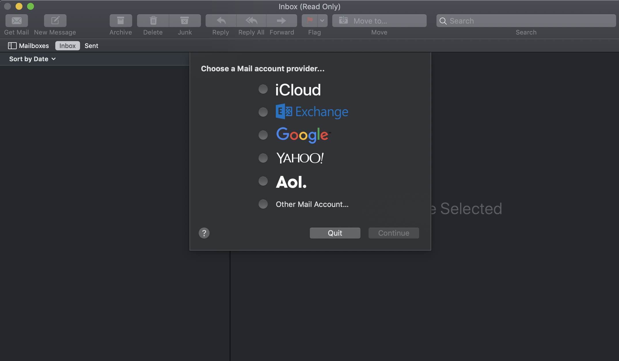
Many people make use of web-based email client’s gmail.com or outlook.com. A share-by-email button will open the operating system’s default email application. Users will be greeted by a prompt to set this up, which is far more effort than simply copy and pasting the URL. It is therefore advisable to omit the email option and instead include a button to copy the link to the clipboard, which is only infinitesimally easier than doing a copy in the address bar with the keyboard.
A prompt to set up the default email application on Mac
Prompting the user to set up an application they never use is far more effort than simply copy and pasting a URL into my preferred email client.
Choosing a share icon
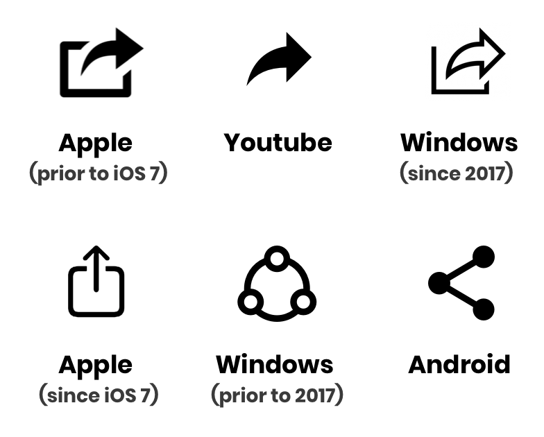
There have been plenty of other share icons over the years.
There is no universal standardized share icon — far from it. While the Android symbol might not be recognizable to long-term iPhone users, the iOS icon is problematic. It is identical to the download icon — but with the arrow in the opposite direction, which would imply uploading, not sharing.
Where I work at giffgaff, we polled 69 of our colleagues on whether they recognized the current iOS icon or the current Android icon as representing sharing. The Android icon was an overwhelming winner with 58 votes. While our sample did include iPhone users, some long-term iPhone users may not be familiar with this symbol (even though it has been adopted by some websites). Then there is the forward arrow, an icon that was abandoned by Apple, but adopted elsewhere. Reminiscent of the icon for forwarding an email, this symbol has been made recognizable by its usage on youtube.com. The icon was adopted by Microsoft in 2017 after A/B testing found a high level of familiarity.
It’s also possible to take a contextual approach. Twitter will change the icon used depending on the platform of the user. This approach is also taken by the icon library Ionicons.
Android (left) and Mac/iOS (right)
Given the lack of a universally understood icon, this seems like a good approach. Alternatively, make sure to include a label alongside the icon to really spell things out to the user.
„Expando Rows” is a concept where multiple related rows in a <table> are collapsed until you open them. You’d call that „progressive disclosure” in interaction design parlance.
After all these years on CSS-Tricks, I have a little better eye for what the accessibility concerns of a design/interactivity feature are. I’m not entirely sure how I would have approached this problem myself, but there is a good chance that whatever I would have tried wouldn’t have hit the bullseye with accessibility.
That’s why I’m extra happy when someone like Adrian Roselli tackles problems like this, because the accessibility is handled right up front (see the videos in all the major screen readers).
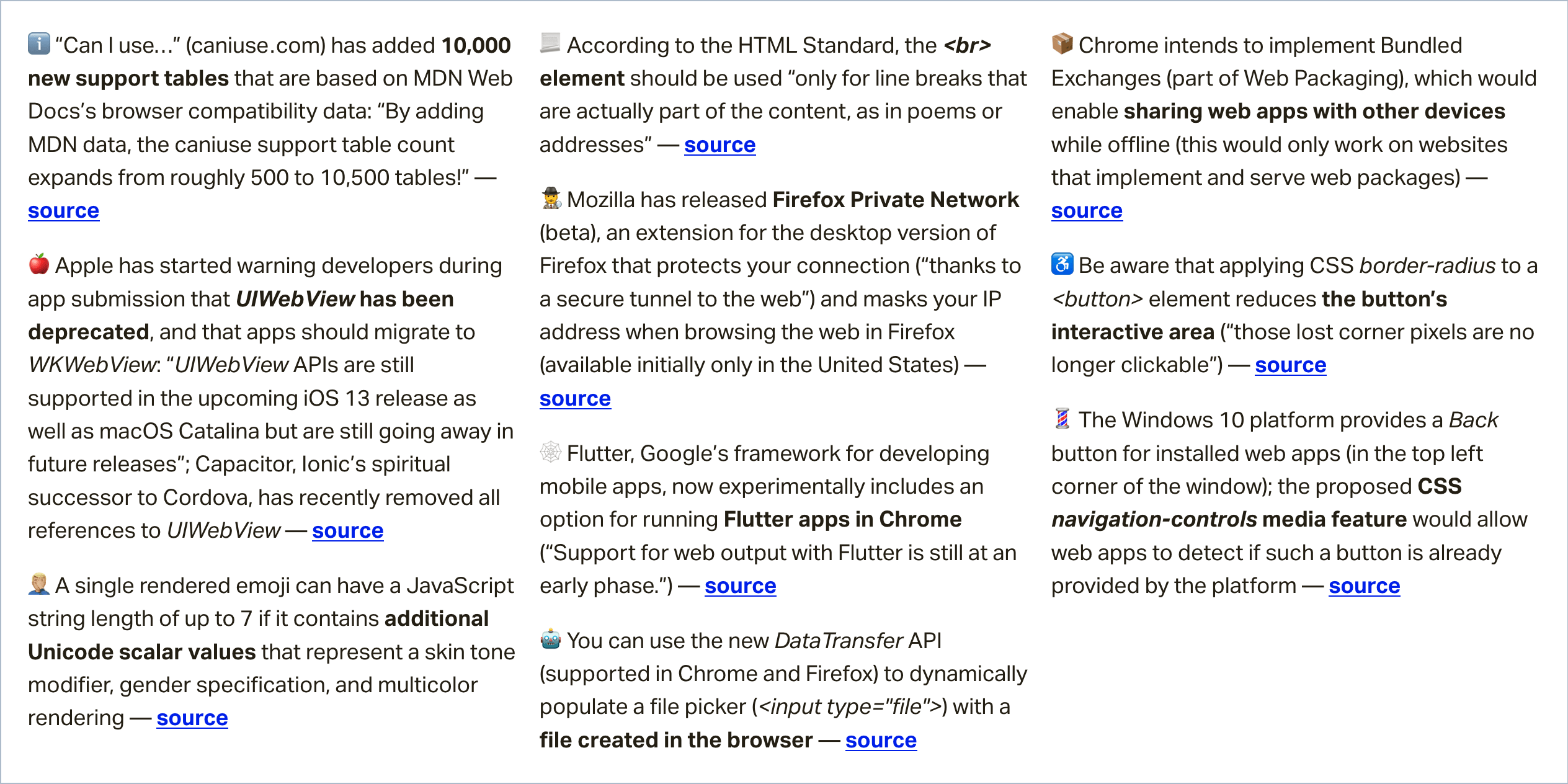
In this week’s roundup, the string length of two emojis is not always equal, something to consider before making that rounded button, and we may have a new way to share web apps between devices, even when they are offline.
The JavaScript string length of emoji characters
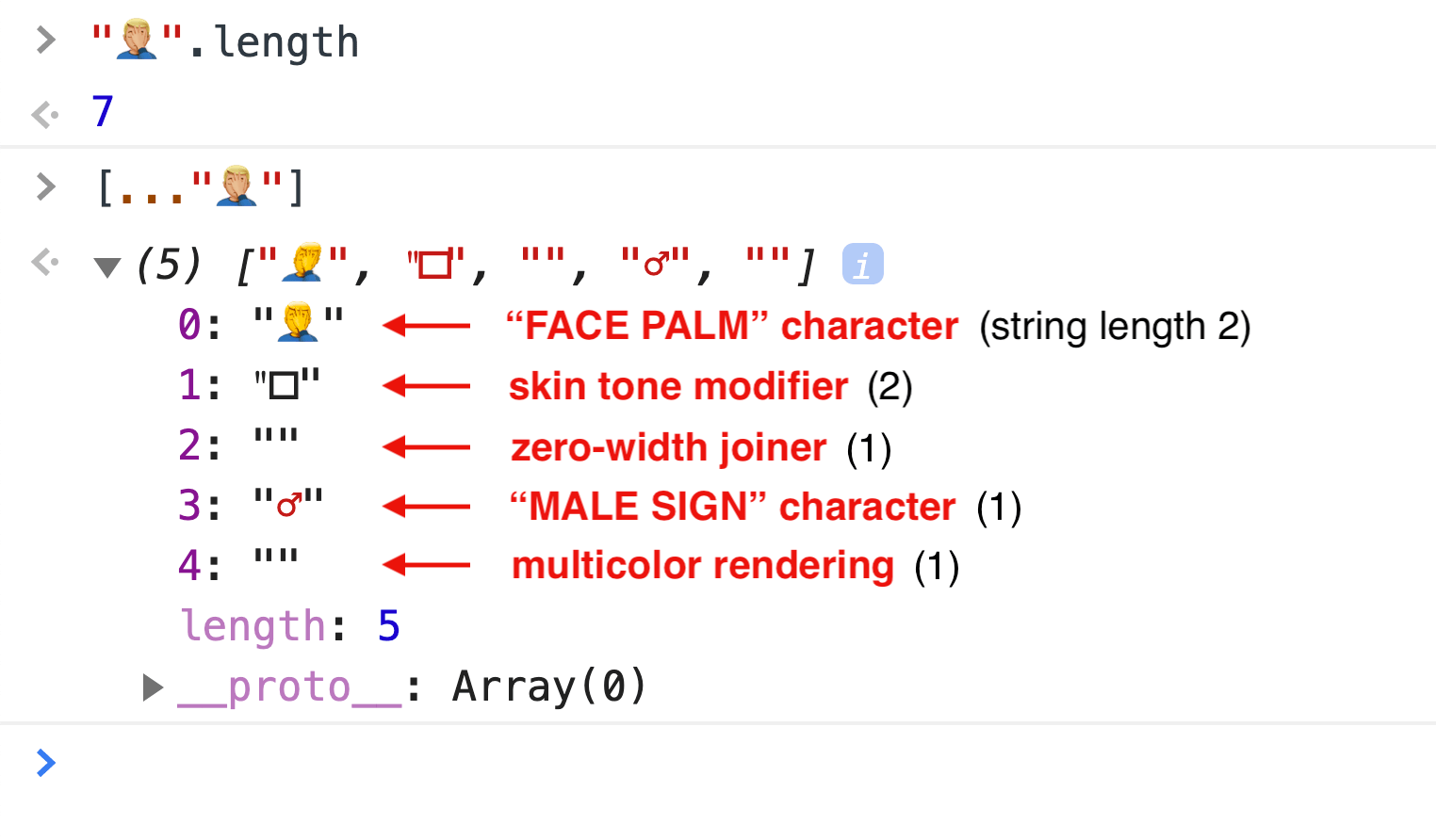
A single rendered emoji can have a JavaScript string length of up to 7 if it contains additional Unicode scalar values that represent a skin tone modifier, gender specification, and multicolor rendering.
Be aware that applying CSS border-radius to a <button> element reduces the button’s interactive area (“those lost corner pixels are no longer clickable”).
You can avoid this accessibility issue in CSS, e.g., by emulating rounded corners via border-image instead, or by overlaying the button with an absolutely positioned, transparent ::before pseudo-element.
Sharing web pages while offline with Bundled Exchanges
Chrome plans to add support for navigation to Bundled Exchanges (part of Web Packaging). A bundled exchangeis a collection of HTTP request/response pairs, and it can be used to bundle a web page and all of its resources.
The browser should be able to parse and verify the bundle’s signature and then navigate to the website represented by the bundle without actually connecting to the site as all the necessary subresources could be served by the bundle.
Kinuko Yasuda from Google has posted a video that demonstrates how Bundled Exchanges enable sharing web pages (e.g., a web game) with other devices while offline.
Read even more news in my weekly Sunday issue, which can be delivered to you via email every Monday morning. Visit webplatform.news for more information.
Here’s a little direct product endorsement for ya: I literally use Buddy for deployment on all my projects.
Buddy isn’t just a deployment tool, we’ll get to that, but it’s something that Buddy does very well and definitely a reason you might look at picking it up yourself if you’re looking around for a reliable, high-quality deployment service.
Here’s my current setup:
CSS-Tricks is WordPress site.
The whole wp-content folder is a private repository on GitHub.
The hosting is on Flywheel, which gives me SFTP access to the server.
When I push to the Master branch, Buddy automatically deploys the changed files over SFTP. This is fast because the fact it’s only dealing with changed files.
The setup on Buddy for this is incredibly nice and simple and I’ve never once had any problems with it. You may want to look at zero-downtime deployments as well, where files are uploaded to a separate directory first and swapped out with the destination directories if the entire upload is successful.
And I don’t just use this setup for CSS-Tricks but all my sites that need this kind of deployment.
But like I said, Buddy isn’t just deployment. Buddy is all about pipelines. You (visually) configure a bunch of tasks that you want Buddy to do for you and the trigger that kicks it off. Pushing to Master is just one possible trigger, you can also kick them off manually or on a timer.
What tasks? Well, a common one would be running your tests. You know: Continuous Integration (CI) and Continuous Development (CD). You can tell Buddy to run whatever terminal commands you want (they’ll spin up a Docker container for you), so however you run tests and get output will work just fine.
You could have it shoot you an email, hit some other web service, or run a build process.
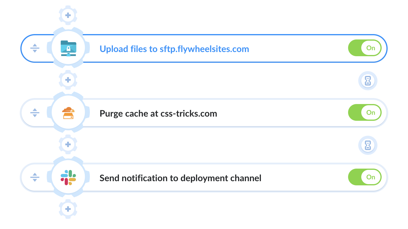
Here’s the actual tasks I run in my pipeline right now:
Upload the files over SFTP
Tell Cloudflare to purge all the cache on the site
Send a message to a particular channel on Slack (also do that on failure)
So useful.
It’s so easy to set up it almost encourages doing more with your pipelines. I need to get some Cypress tests in there and I’d love to integrate an action to automatically optimize all images in the commits.
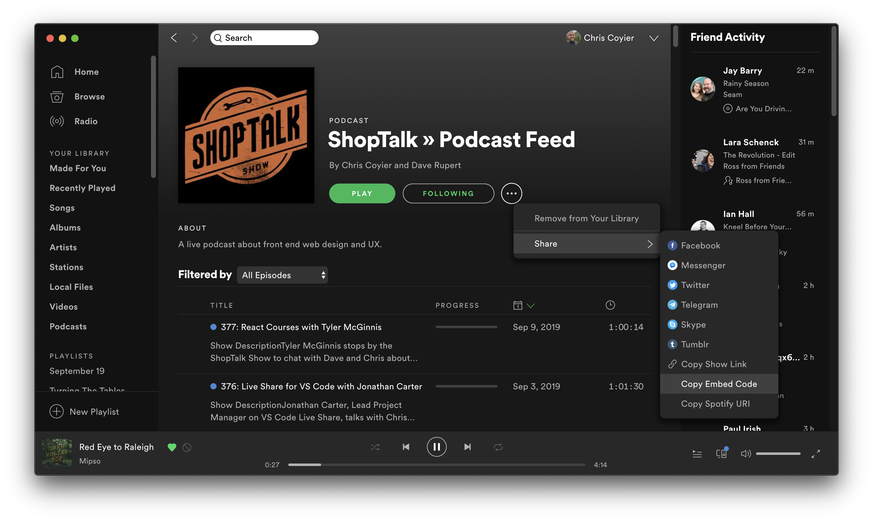
…that would make sense. It’s a web URL anyway, so it will work for anyone and has information about the podcast, as well as a list of recent shows you can even listen to right there. For Apple folks, you might be redirected in-app (mobile) or it becomes one click away (desktop). But for folks on Android or Linux or Windows or something, that’s not particularly useful.
What are the other possibilities?
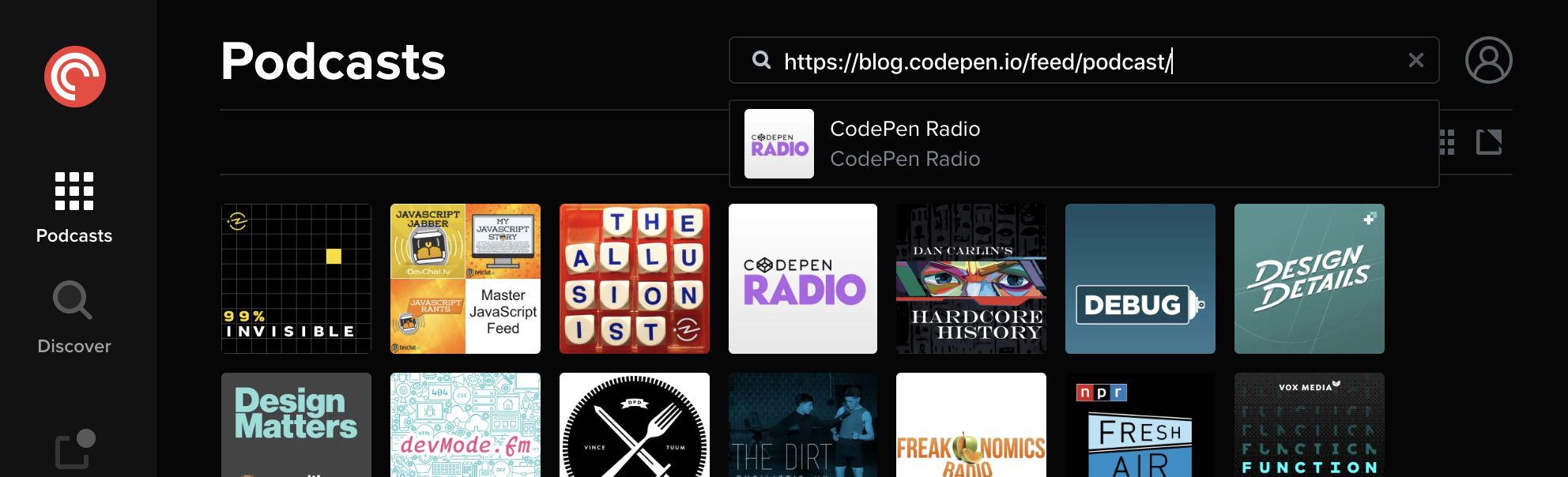
Podcasts are essentially dressed up RSS, so giving people a link to the feed isn’t out of the question. We do that on both ShopTalk and CodePen Radio:
I like PocketCasts for my podcasts. I feel like this used to be more obvious, but pasting in an RSS link to search does seem to find the feeds.
I would think (and hope!) that most podcast apps have some way to subscribe manually via feed. But… pretty nerdy and probably a little too dangerous for just a „Subscribe to Podcast” link.
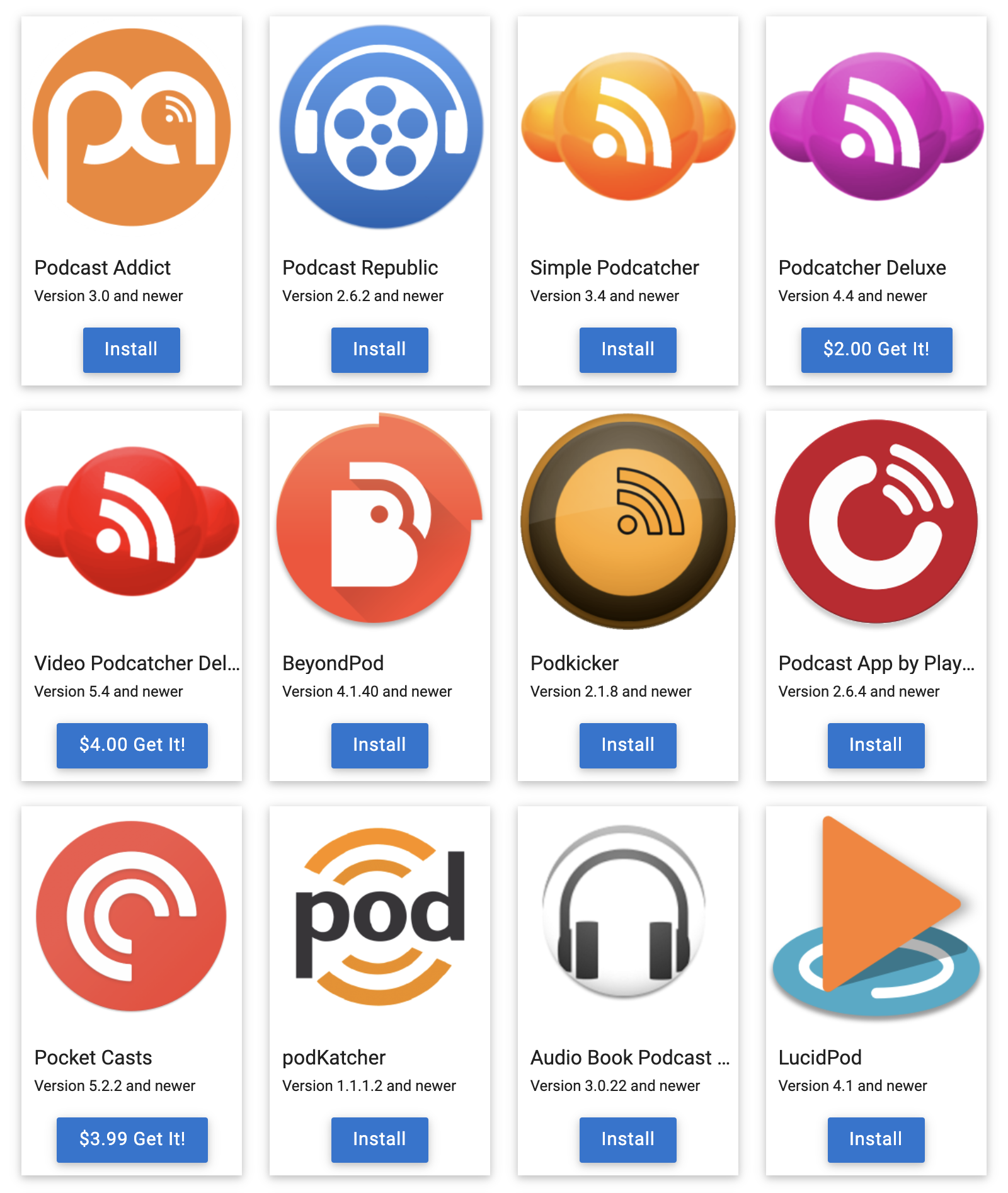
For Android specifically, there is a site where you can put your feed URL after „subscribeonandroid.com” and get a special page just for that:
If the listener has a one click supported app on their android device, the App will load automatically.
And clearly there are some options:
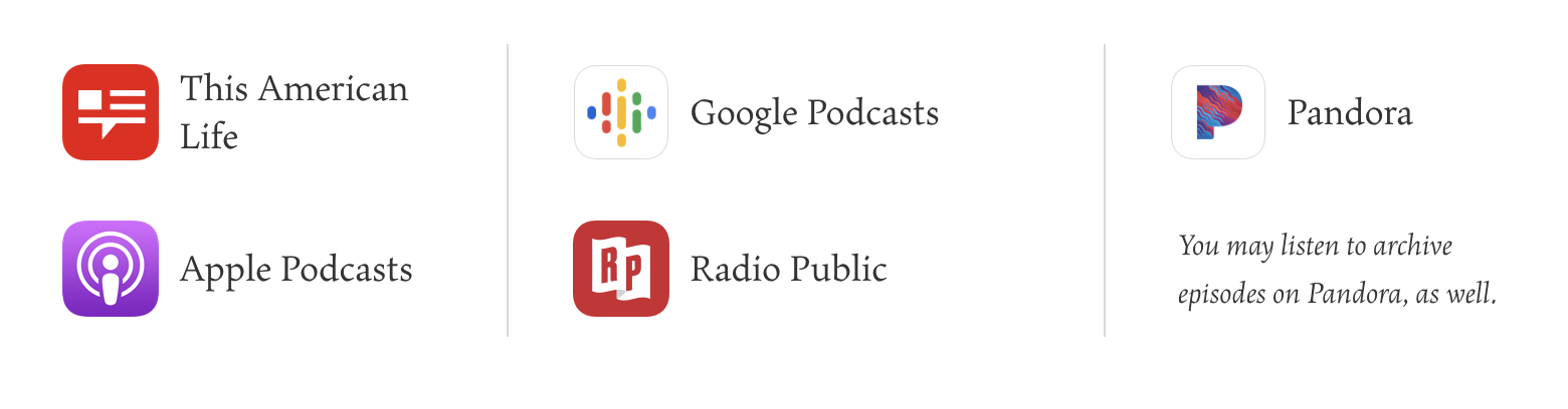
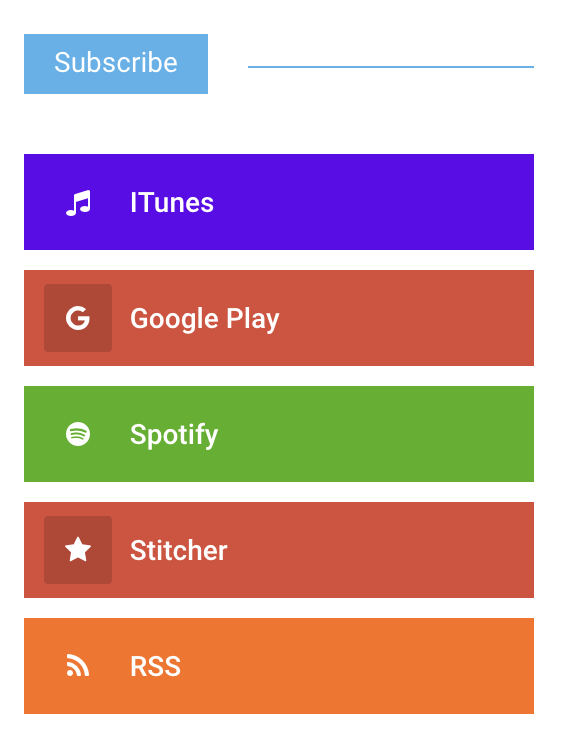
I find the most common option on podcasts is to link to a soup of popular options:
I think that’s probably a safe thing to do. For one, it signals that you’re on top of your game a bit and that your show is working on major platforms. But more importantly, podcast listeners probably know what platform they mainly use and clicking on a link specifically for that platform is probably quite natural.
Speaking of major platforms, Spotify is going big on podcasts, so linking directly to Spotify probably isn’t the worst choice you could make.
But there are situations where you only get one link. Instagram is notable for this. No links on posts — only the one link on your profile. You could send them to your website, but of course, with podcasts, the name of the game is making it easy to subscribe. That means getting people right there is best. But also with stuff like tweets, you can’t always deliver a smorgasbord of links. Hence the title of this blog post. If you gotta link to just one place to subscribe, where should it be?
Visiting on desktop gets you the smorgasbord of links. Visiting on my iPhone, I get a direct link to Apple Podcasts.
That’s what they do:
Auto-open installed Podcast Apps native to listener’s iOS, Android, and other mobile and smart watch devices. Each smart link also has a Show Page that desktop users will see with links to that show in Apps like Apple & Google Podcasts, Spotify, Stitcher, Overcast, and other podcatchers.
They apparently use all kinds of data to figure it out.
… will detect the listener’s device, geo, and other factors and send them to your show in pre-installed podcast apps.
Anybody can make a redirect link to particular platforms. Like, we could have built shoptalkshow.com/spotify and shoptalkshow.com/itunes and redirected to those places, but what you get here is fancy auto-detection in a single link.
I signed up for it for ShopTalk, so we’ll see if we end up using it much or not.
…that would make sense. It’s a web URL anyway, so it will work for anyone and has information about the podcast, as well as a list of recent shows you can even listen to right there. For Apple folks, you might be redirected in-app (mobile) or it becomes one click away (desktop). But for folks on Android or Linux or Windows or something, that’s not particularly useful.
What are the other possibilities?
Podcasts are essentially dressed up RSS, so giving people a link to the feed isn’t out of the question. We do that on both ShopTalk and CodePen Radio:
I like PocketCasts for my podcasts. I feel like this used to be more obvious, but pasting in an RSS link to search does seem to find the feeds.
I would think (and hope!) that most podcast apps have some way to subscribe manually via feed. But… pretty nerdy and probably a little too dangerous for just a „Subscribe to Podcast” link.
For Android specifically, there is a site where you can put your feed URL after „subscribeonandroid.com” and get a special page just for that:
If the listener has a one click supported app on their android device, the App will load automatically.
And clearly there are some options:
I find the most common option on podcasts is to link to a soup of popular options:
I think that’s probably a safe thing to do. For one, it signals that you’re on top of your game a bit and that your show is working on major platforms. But more importantly, podcast listeners probably know what platform they mainly use and clicking on a link specifically for that platform is probably quite natural.
Speaking of major platforms, Spotify is going big on podcasts, so linking directly to Spotify probably isn’t the worst choice you could make.
But there are situations where you only get one link. Instagram is notable for this. No links on posts — only the one link on your profile. You could send them to your website, but of course, with podcasts, the name of the game is making it easy to subscribe. That means getting people right there is best. But also with stuff like tweets, you can’t always deliver a smorgasbord of links. Hence the title of this blog post. If you gotta link to just one place to subscribe, where should it be?
Visiting on desktop gets you the smorgasbord of links. Visiting on my iPhone, I get a direct link to Apple Podcasts.
That’s what they do:
Auto-open installed Podcast Apps native to listener’s iOS, Android, and other mobile and smart watch devices. Each smart link also has a Show Page that desktop users will see with links to that show in Apps like Apple & Google Podcasts, Spotify, Stitcher, Overcast, and other podcatchers.
They apparently use all kinds of data to figure it out.
… will detect the listener’s device, geo, and other factors and send them to your show in pre-installed podcast apps.
Anybody can make a redirect link to particular platforms. Like, we could have built shoptalkshow.com/spotify and shoptalkshow.com/itunes and redirected to those places, but what you get here is fancy auto-detection in a single link.
I signed up for it for ShopTalk, so we’ll see if we end up using it much or not.
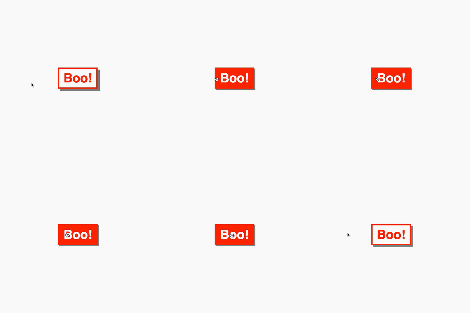
It would surprise me if you’d never come across a ghost button 👻. You know the ones: they have a transparent background that fills with a solid color on hover. Smashing Magazine has a whole article going into the idea. In this article, we’re going to build a ghost button, but that will be the easy part. The fun and tricky part will be animating the fill of that ghost button such that the background fills up in the direction from which a cursor hovers over it.
In most cases, the background-color has a transition to a solid color. There are designs out there where the button might fill from left to right, top to bottom, etc., for some visual flair. For example, here’s left-to-right:
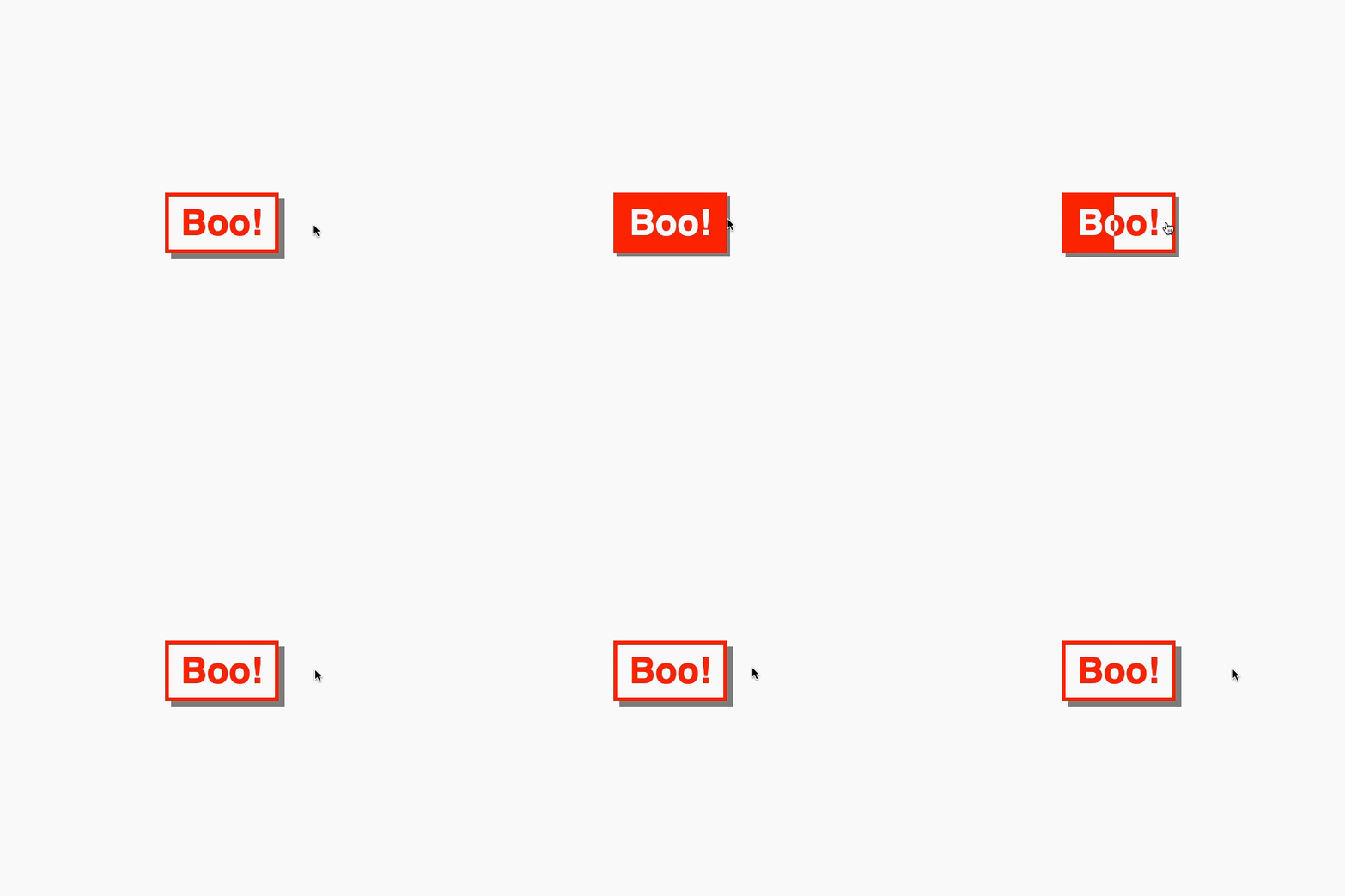
There’s a UX nitpick here. It feels off if you hover against the fill. Consider this example. The button fills from the left while you hover from the right.
Hover feels off 👎
It is better if the button fills from our initial hover point.
Hover feels good 👍
So, how can we give the button directional awareness? Your initial instinct might be to reach for a JavaScript solution, but we can create something with CSS and a little extra markup instead.
For those in camp TL;DR, here are some pure CSS ghost buttons with directional awareness!
Let’s start by creating the foundations of our ghost button. The markup is straightforward.
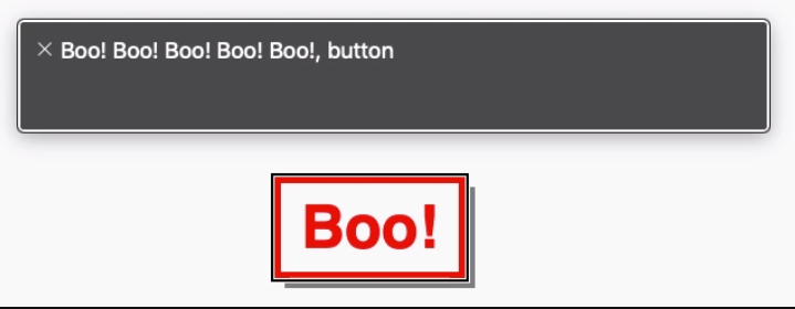
<button>Boo!</button>
Our CSS implementation will leverage CSS custom properties. These make maintenance easier. They also make for simple customization via inline properties.
Great! We have a button and a hover effect, but no fill to go with it. Let’s do that next.
Adding a fill
To do this, we create elements that show the filled state of our ghost button. The trick is to clip those elements with clip-path and hide them. We can reveal them when we hover over the button by transitioning the clip-path.
Child element with a 50% clip
They must line up with the parent button. Our CSS variables will help a lot here.
At first thought, we could have reached for pseudo-elements. There won’t be enough pseudo-elements for every direction though. They will also interfere with accessibility… but more on this later.
Let’s start by adding a basic fill from left to right on hover. First, let’s add a span. That span will need the same text content as the button.
<button>Boo!
  <span>Boo!</span>
</button>
Now we need to line our span up with the button. Our CSS variables will do the heavy lifting here.
Finally, we clip the span out of view and add a rule that will reveal it on hover by updating the clip. Defining a transition will give it that cherry on top.
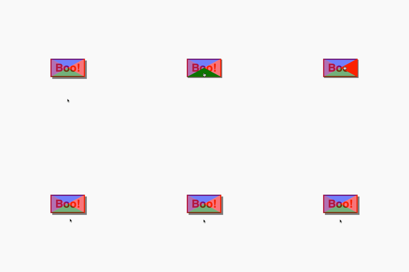
So, how might we add directional awareness? We need four elements. Each element will be responsible for detecting a hover entry point. With clip-path, we can split the button area into four segments.
Four :hover segments
Let’s add four spans to a button and position them to fill the button.
Uh-oh. There’s an issue here. If we enter and hover one segment but then hover over another, the fill direction would change. That’s going to look off. To fix this, we can set a z-index and clip-path on hover so that a segment fills the space.
Now, we can update the CSS. Referring to our left-to-right fill, we can reuse the styling. We only need to set a specific clip-path for each element. I’ve approached the ordering the same as some property values. The first child is top, the second is right, and so on.
With a little extra markup and some CSS trickery, we can create ghost buttons with directional awareness. Use a preprocessor or put together a component in your app and you won’t need to write out all the HTML, too.
Here’s a demo making use of inline CSS variables to control the button color.
In this week’s roundup, Apple gets into web components, how Instagram is insta-loading scripts, and some food for thought for self-hosting critical resources.
Apple deploys web components built using Stencil
The new Apple Music web app (beta) uses a JavaScript framework (Ember.js) but also standard web components such as <apple-music-video-player> that are built using Stencil, a web component compiler.
Stencil is a build-time tool that generates standard web components with minimal overhead, while providing core features such as templating, state management, and routing, as well as performance features such as code-splitting and lazy-loading.
Apple just deployed into production nearly 50 web components powering a major app they have a significant amount of revenue and strategic value riding on. You can’t say that “no one uses web components” or they are “solving problems that don‘t exist or have been solved better in user land” with a straight face anymore.
Instagram makes use of chunked transfer encoding and progressive HTML rendering
Instagram’s website uses HTTP chunked transfer encoding to stream the contents of the HTML document to the browser as each part of the page is generated on the server.
We can flush the HTML <head> to the browser almost immediately … This allows the browser to start downloading scripts and stylesheets while the server is busy generating the dynamic data in the rest of the page.
They also use this technique to flush JSON data to the page in <script> elements. The client script waits for this data (using Promise) instead of requesting it via XHR.
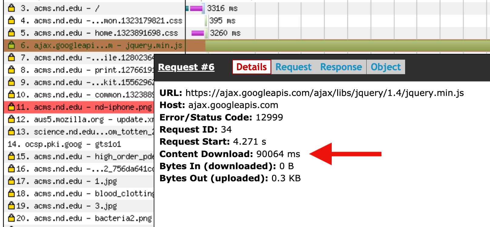
One section of University of Notre Dame’s website used to load jQuery from Google’s CDN, which could result in very long loading times (100+ seconds) when visiting the site from China. They’ve resolved the issue by self-hosting jQuery instead.