I recently found a solution to dynamically update the color of any product image. So with just one <img> of a product, we can colorize it in different ways to show different color options. We don’t even need any fancy SVG or CSS to get it done!
We’ll be using an image editor (e.g. Photoshop or Sketch) and the image transformation service imgix. (This isn’t a sponsored post and there is no affiliation here — it’s just a technique I want to share.)
I work with a travel software company called CarTrawler on the engineering team, and I recently undertook a project a revamp our car images library that we use to display car rental search results. I wanted to take this opportunity to introduce dynamically colored cars.
We may sometimes load up to 200 different cars at the same time, so speed and performance are key requirements. We also have five different products throughout unique code bases, so avoiding over-engineering is vital to success.
I wanted to be able to dynamically change the color of each of these cars without needing additional front-end changes to the code.
Step 1: The Base Layer
I’m using car photos here, but this technique could be applied to any product. First we need a base layer. This is the default layer we would display without any color and it should look good on its own.
Step 2: The Paint Layer
Next we create a paint layer that is the same dimensions as the base layer, but only contains the areas where the colors should change dynamically.
A light color is key for the paint layer. Using white or a light shade of gray gives us a great advantage because we are ultimately “blending” this image with color. Anything darker or in a different hue would make it hard to mix this base color with other colors.
Step 3: Using the imgix API
This is where things get interesting. I’m going to leverage multiple parameters from the imgixAPI. Let’s apply a black to our paint layer.
If you noticed the URL of the image above, you might be wondering: What the heck are all those parameters? The imgix API docs have a lot of great information, so no need to go into greater detail here. But I will explain the parameters I used.
w. The width I want the image to be
bri. Adjusts the brightness level
con. Adjusts the amount of contrast
monochrome. The dynamic hex color
Because we are going to stack our layers via imgix we will need to encode our paint layer. That means replacing some of the characters in the URL with encoded values — like we’d do if we were using inline SVG as a background image in CSS.
That’s it! There are certainly other ways to accomplish the same thing, but this seems so straightforward that it’s worth sharing. There was no need code a bunch of additional functionality. No complex libraries to manage or wrangle. All we need is a couple of images that an online tool will stack and blend for us. Seems like a pretty reasonable solution!
I recently found a solution to dynamically update the color of any product image. So with just one <img> of a product, we can colorize it in different ways to show different color options. We don’t even need any fancy SVG or CSS to get it done!
We’ll be using an image editor (e.g. Photoshop or Sketch) and the image transformation service imgix. (This isn’t a sponsored post and there is no affiliation here — it’s just a technique I want to share.)
I work with a travel software company called CarTrawler on the engineering team, and I recently undertook a project a revamp our car images library that we use to display car rental search results. I wanted to take this opportunity to introduce dynamically colored cars.
We may sometimes load up to 200 different cars at the same time, so speed and performance are key requirements. We also have five different products throughout unique code bases, so avoiding over-engineering is vital to success.
I wanted to be able to dynamically change the color of each of these cars without needing additional front-end changes to the code.
Step 1: The Base Layer
I’m using car photos here, but this technique could be applied to any product. First we need a base layer. This is the default layer we would display without any color and it should look good on its own.
Step 2: The Paint Layer
Next we create a paint layer that is the same dimensions as the base layer, but only contains the areas where the colors should change dynamically.
A light color is key for the paint layer. Using white or a light shade of gray gives us a great advantage because we are ultimately “blending” this image with color. Anything darker or in a different hue would make it hard to mix this base color with other colors.
Step 3: Using the imgix API
This is where things get interesting. I’m going to leverage multiple parameters from the imgixAPI. Let’s apply a black to our paint layer.
If you noticed the URL of the image above, you might be wondering: What the heck are all those parameters? The imgix API docs have a lot of great information, so no need to go into greater detail here. But I will explain the parameters I used.
w. The width I want the image to be
bri. Adjusts the brightness level
con. Adjusts the amount of contrast
monochrome. The dynamic hex color
Because we are going to stack our layers via imgix we will need to encode our paint layer. That means replacing some of the characters in the URL with encoded values — like we’d do if we were using inline SVG as a background image in CSS.
That’s it! There are certainly other ways to accomplish the same thing, but this seems so straightforward that it’s worth sharing. There was no need code a bunch of additional functionality. No complex libraries to manage or wrangle. All we need is a couple of images that an online tool will stack and blend for us. Seems like a pretty reasonable solution!
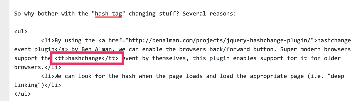
I say „was” because it’s deprecated. It may still „work” (like everybody’s favorite <marquee> in some browsers), but it could stop working anytime, they say. The whole purpose of it was to display text in a monospace font, like the way Teletype machines used to.
Dave used it jokingly the other day.
Per recent events: As you can see by this official transcript, Dave Rupert LLC has done nothing wrong…
<tt> Client: This is the greatest call I've ever been on. Dave Rupert LLC: Definitely and we didn't even do anything illegal or quid pro quo'y. </tt>
Right here on CSS-Tricks. See, in my early days, I learned about that element and how its job is to set text as monospace. I thought, oh! like code! and then for years that’s how I marked up code on this site. I had never heard of the <code> element! When I did, I switched over to that. But I still haven’t updated every single article from <tt> to <code>. It lingers in articles like this:
I bring this up just because it’s a funny little example of not knowing what you don’t know. It’s worth having a little sympathy for people early in their journey and just doing things that get the job done because that’s all they know. We’ve all been there… and are always still there to some degree.
Andy covers a technique where a semantic <button> is used within a card component, but really, the whole card is clickable. The trick is to put a pseudo-element that goes beyond the button, covering the entire card. The tradeoff is that the pseudo-element sits on top of the text, so text selection is hampered a bit. I believe this is better than making the whole dang area a <button> because that would sacrifice semantics and likely cause extreme weirdness for assistive technology.
You could do the same thing if your situation requires an <a> link instead of a <button>, but if that’s the case, you actually can wrap the whole area in the link without much grief then wrap the part that appears to be a button in a span or something to make it look like a button.
This reminds me of the nested link problem: a large linked block that contains other different linked areas in it. Definitely can’t nest anchor links. Sara Soueidan had the best answer where the „covering” link is placed within the card and absolutely positioned to cover the area while other links inside could be be layered on top with z-index.
Andy covers a technique where a semantic <button> is used within a card component, but really, the whole card is clickable. The trick is to put a pseudo-element that goes beyond the button, covering the entire card. The tradeoff is that the pseudo-element sits on top of the text, so text selection is hampered a bit. I believe this is better than making the whole dang area a <button> because that would sacrifice semantics and likely cause extreme weirdness for assistive technology.
You could do the same thing if your situation requires an <a> link instead of a <button>, but if that’s the case, you actually can wrap the whole area in the link without much grief then wrap the part that appears to be a button in a span or something to make it look like a button.
This reminds me of the nested link problem: a large linked block that contains other different linked areas in it. Definitely can’t nest anchor links. Sara Soueidan had the best answer where the „covering” link is placed within the card and absolutely positioned to cover the area while other links inside could be be layered on top with z-index.
Most static site generators make installation easy, but each project still requires configuration after installation. When you build a lot of similar projects, you may duplicate effort during the setup phase. GitHub template repositories may save you a lot of time if you find yourself:
creating the same folder structures from previous projects,
copying and pasting config files from previous projects, and
copying and pasting boilerplate code from previous projects.
Unlike forking a repository, which allows you to use someone else’s code as a starting point, template repositories allow you to use your own code as a starting point, where each new project gets its own, independent Git history. Check it out!
Let’s take a look at how we can set up a convenient workflow. We’ll set up a boilerplate Eleventy project, turn it into a Git repository, host the repository on GitHub, and then configure that repository to be a template. Then, next time you have a static site project, you’ll be able to come back to the repository, click a button, and start working from an exact copy of your boilerplate.
Are you ready to try it out? Let’s set up our own static site using GitHub templates to see just how much templates can help streamline a static site project.
I’m using Eleventy as an example of a static site generator because it’s my personal go-to, but this process will work for Hugo, Jekyll, Nuxt, or any other flavor of static site generator you prefer.
We’re going to kick things off by running each of these in the command line:
cd ~
mkdir static-site-template
cd static-site-template
These three commands change directory into your home directory (~ in Unix-based systems), make a new directory called static-site-template, and then change directory into the static-site-template directory.
Next, we’ll initialize the Node project
In order to work with Eleventy, we need to install Node.js which allows your computer to run JavaScript code outside of a web browser.
Node.js comes with node package manager, or npm, which downloads node packages to your computer. Eleventy is a node package, so we can use npm to fetch it.
Assuming Node.js is installed, let’s head back to the command line and run:
npm init
This creates a file called package.json in the directory. npm will prompt you for a series of questions to fill out the metadata in your package.json. After answering the questions, the Node.js project is initialized.
Now we can install Eleventy
Initializing the project gave us a package.json file which lets npm install packages, run scripts, and do other tasks for us inside that project. npm uses package.json as an entry point in the project to figure out precisely how and what it should do when we give it commands.
We can tell npm to install Eleventy as a development dependency by running:
npm install -D @11ty/eleventy
This will add a devDependency entry to the package.json file and install the Eleventy package to a node_modules folder in the project.
The cool thing about the package.json file is that any other computer with Node.js and npm can read it and know to install Eleventy in the project node_modules directory without having to install it manually. See, we’re already streamlining things!
Configuring Eleventy
There are tons of ways to configure an Eleventy project. Flexibility is Eleventy’s strength. For the purposes of this tutorial, I’m going to demonstrate a configuration that provides:
A folder to cleanly separate website source code from overall project files
An HTML document for a single page website
CSS to style the document
JavaScript to add functionality to the document
Hop back in the command line. Inside the static-site-template folder, run these commands one by one (excluding the comments that appear after each # symbol):
mkdir src           # creates a directory for your website source code
mkdir src/css       # creates a directory for the website styles
mkdir src/js        # creates a directory for the website JavaScript
touch index.html    # creates the website HTML document
touch css/style.css # creates the website styles
touch js/main.js    # creates the website JavaScript
This creates the basic file structure that will inform the Eleventy build. However, if we run Eleventy right now, it won’t generate the website we want. We still have to configure Eleventy to understand that it should only use files in the src folder for building, and that the css and js folders should be processed with passthrough file copy.
You can give this information to Eleventy through a file called .eleventy.js in the root of the static-site-template folder. You can create that file by running this command inside the static-site-template folder:
touch .eleventy.js
Edit the file in your favorite text editor so that it contains this:
Lines 2 and 3 tell Eleventy to use passthrough file copy for CSS and JavaScript. Line 6 tells Eleventy to use only the src directory to build its output.
Eleventy will now give us the expected output we want. Let’s put that to the test by putting this In the command line:
npx @11ty/eleventy
The npx command allows npm to execute code from the project node_module directory without touching the global environment. You’ll see output like this:
Writing _site/index.html from ./src/index.html.
Copied 2 items and Processed 1 file in 0.04 seconds (v0.9.0)
The static-site-template folder should now have a new directory in it called _site. If you dig into that folder, you’ll find the css and js directories, along with the index.html file.
This _site folder is the final output from Eleventy. It is the entirety of the website, and you can host it on any static web host.
Without any content, styles, or scripts, the generated site isn’t very interesting:
Let’s create a boilerplate website
Next up, we’re going to put together the baseline for a super simple website we can use as the starting point for all projects moving forward.
It’s worth mentioning that Eleventy has a ton of boilerplate files for different types of projects. It’s totally fine to go with one of these though I often find I wind up needing to roll my own. So that’s what we’re doing here.
We may as well style things a tiny bit, so let’s add this to src/css/style.css:
body {
  font-family: sans-serif;
}
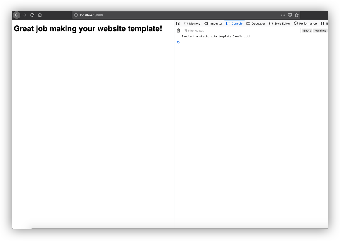
And we can confirm JavaScript is hooked up by adding this to src/js/main.js:
(function() {
  console.log('Invoke the static site template JavaScript!');
})();
Want to see what we’ve got? Run npx @11ty/eleventy --serve in the command line. Eleventy will spin up a server with Browsersync and provide the local URL, which is probably something like localhost:8080.
Even the console tells us things are ready to go!
Let’s move this over to a GitHub repo
Git is the most commonly used version control system in software development. Most Unix-based computers come with it installed, and you can turn any directory into a Git repository by running this command:
git init
We should get a message like this:
Initialized empty Git repository in /path/to/static-site-template/.git/
That means a hidden .git folder was added inside the project directory, which allows the Git program to run commands against the project.
Before we start running a bunch of Git commands on the project, we need to tell Git about files we don’t want it to touch.
Inside the static-site-template directory, run:
touch .gitignore
Then open up that file in your favorite text editor. Add this content to the file:
_site/
node_modules/
This tells Git to ignore the node_modules directory and the _site directory. Committing every single Node.js module to the repo could make things really messy and tough to manage. All that information is already in package.json anyway.
Similarly, there’s no need to version control _site. Eleventy can generate it from the files in src, so no need to take up space in GitHub. It’s also possible that if we were to:
version control _site,
change files in src, or
forget to run Eleventy again,
then _site will reflect an older build of the website, and future developers (or a future version of yourself) may accidentally use an outdated version of the site.
Git is version control software, and GitHub is a Git repository host. There are other Git host providers like BitBucket or GitLab, but since we’re talking about a GitHub-specific feature (template repositories), we’ll push our work up to GitHub. If you don’t already have an account, go ahead and join GitHub. Once you have an account, create a GitHub repository and name it static-site-template.
GitHub will ask a few questions when setting up a new repository. One of those is whether we want to create a new repository on the command line or push an existing repository from the command line. Neither of these choices are exactly what we need. They assume we either don’t have anything at all, or we have been using Git locally already. The static-site-template project already exists, has a Git repository initialized, but doesn’t yet have any commits on it.
So let’s ignore the prompts and instead run the following commands in the command line. Make sure to have the URL GitHub provides in the command from line 3 handy:
This adds the entire static-site-template folder to the Git staging area. It commits it with the message „first commit,” adds a remote repository (the GitHub repository), and then pushes up the master branch to that repository.
Let’s template-ize this thing
OK, this is the crux of what we have been working toward. GitHub templates allows us to use the repository we’ve just created as the foundation for other projects in the future — without having to do all the work we’ve done to get here!
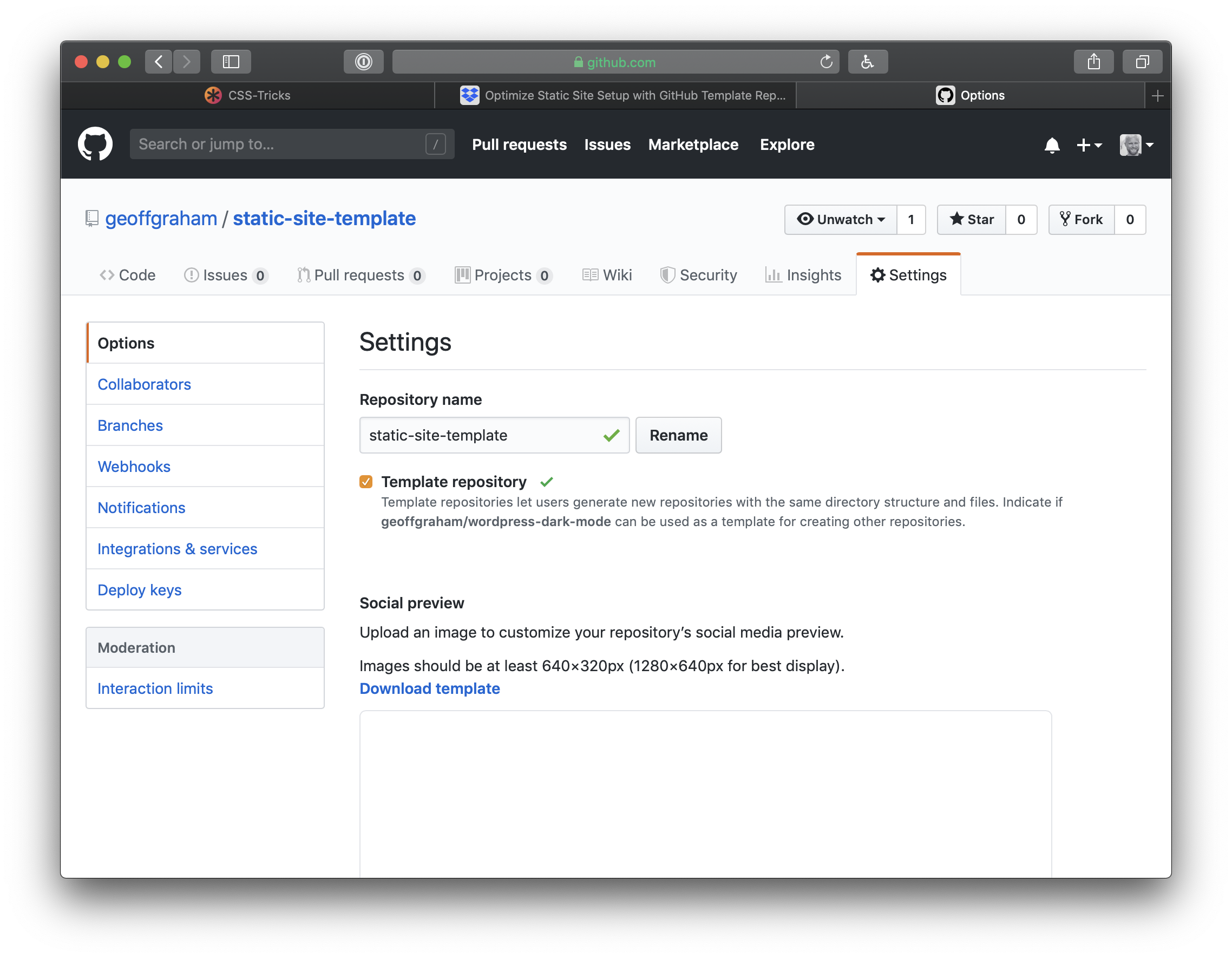
Click Settings on the GitHub landing page of the repository to get started. On the settings page, check the button for Template repository.
Now when we go back to the repository page, we’ll get a big green button that says Use this template. Click it and GitHub will create a new repository that’s a mirror of our new template. The new repository will start with the same files and folders as static-site-template. From there, download or clone that new repository to start a new project with all the base files and configuration we set up in the template project.
We can extend the template for future projects
Now that we have a template repository, we can use it for any new static site project that comes up. However, You may find that a new project has additional needs than what’s been set up in the template. For example, let’s say you need to tap into Eleventy’s templating engine or data processing power.
Go ahead and build on top of the template as you work on the new project. When you finish that project, identify pieces you want to reuse in future projects. Perhaps you figured out a cool hover effect on buttons. Or you built your own JavaScript carousel element. Or maybe you’re really proud of the document design and hierarchy of information.
If you think anything you did on a project might come up again on your next run, remove the project-specific details and add the new stuff to your template project. Push those changes up to GitHub, and the next time you use static-site-template to kick off a project, your reusable code will be available to you.
There are some limitations to this, of course
GitHub template repositories are a useful tool for avoiding repetitive setup on new web development projects. I find this especially useful for static site projects. These template repositories might not be as appropriate for more complex projects that require external services like databases with configuration that cannot be version-controlled in a single directory.
Template repositories allow you to ship reusable code you have written so you can solve a problem once and use that solution over and over again. But while your new solutions will carry over to future projects, they won’t be ported backwards to old projects.
This is a useful process for sites with very similar structure, styles, and functionality. Projects with wildly varied requirements may not benefit from this code-sharing, and you could end up bloating your project with unnecessary code.
Wrapping up
There you have it! You now have everything you need to not only start a static site project using Eleventy, but the power to re-purpose it on future projects. GitHub templates are so handy for kicking off projects quickly where we otherwise would have to re-build the same wheel over and over. Use them to your advantage and enjoy a jump start on your projects moving forward!
Here’s one of the best essays I’ve ever read about why progressive web apps are important, how they work, and what impact they have on a business:
PWAs are powerful, effective, fast and app-like.
It’s hard to imagine a mobile web property that could not be significantly improved via PWA implementation. They can also potentially eliminate the need for many “vanity” native apps that exist today.
My only small disagreement with this piece is their use of the term “mobile web.” I know it’s a tiny thing to get persnickety over but my hot take after reading it is this: it’s important to remember that progressive web apps are for everyone, desktop and mobile users alike. I think it’s important to reiterate that there is no mobile web. And that our goal is to be better than native.
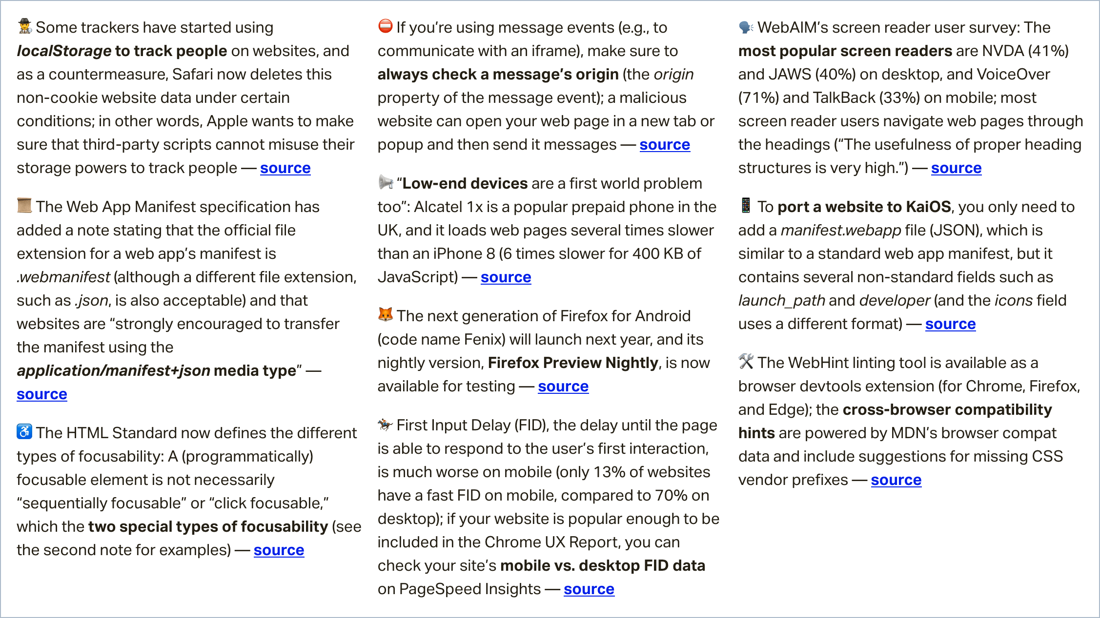
In this week’s roundup, Safari takes on cross-site tracking, the delay between load and user interaction is greater on mobile, and a new survey says headings are a popular way for screen readers to navigate a webpage.
Let’s get into the news.
Safari’s tracking prevention limits web storage
Some social networks and other websites that engage in cross-site tracking add a query string or fragment to external links for tracking purposes. (Apple calls this „abuse of link decoration.”)
When people navigate from websites with tracking abilities to other websites via such „decorated” links, Safari will expire the cookies that are created on the loaded web pages after 24 hours. This has led some trackers to start using other types of storage (e.g. localStorage) to track people on websites.
As a new countermeasure, Safari will now delete all non-cookie website data in these scenarios if the user hasn’t interacted with the website for seven days.
The reason why we cap the lifetime of script-writable storage is simple. Site owners have been convinced to deploy third-party scripts on their websites for years. Now those scripts are being repurposed to circumvent browsers’ protections against third-party tracking. By limiting the ability to use any script-writable storage for cross-site tracking purposes, [Safari’s tracking prevention] makes sure that third-party scripts cannot leverage the storage powers they have gained over all these websites.
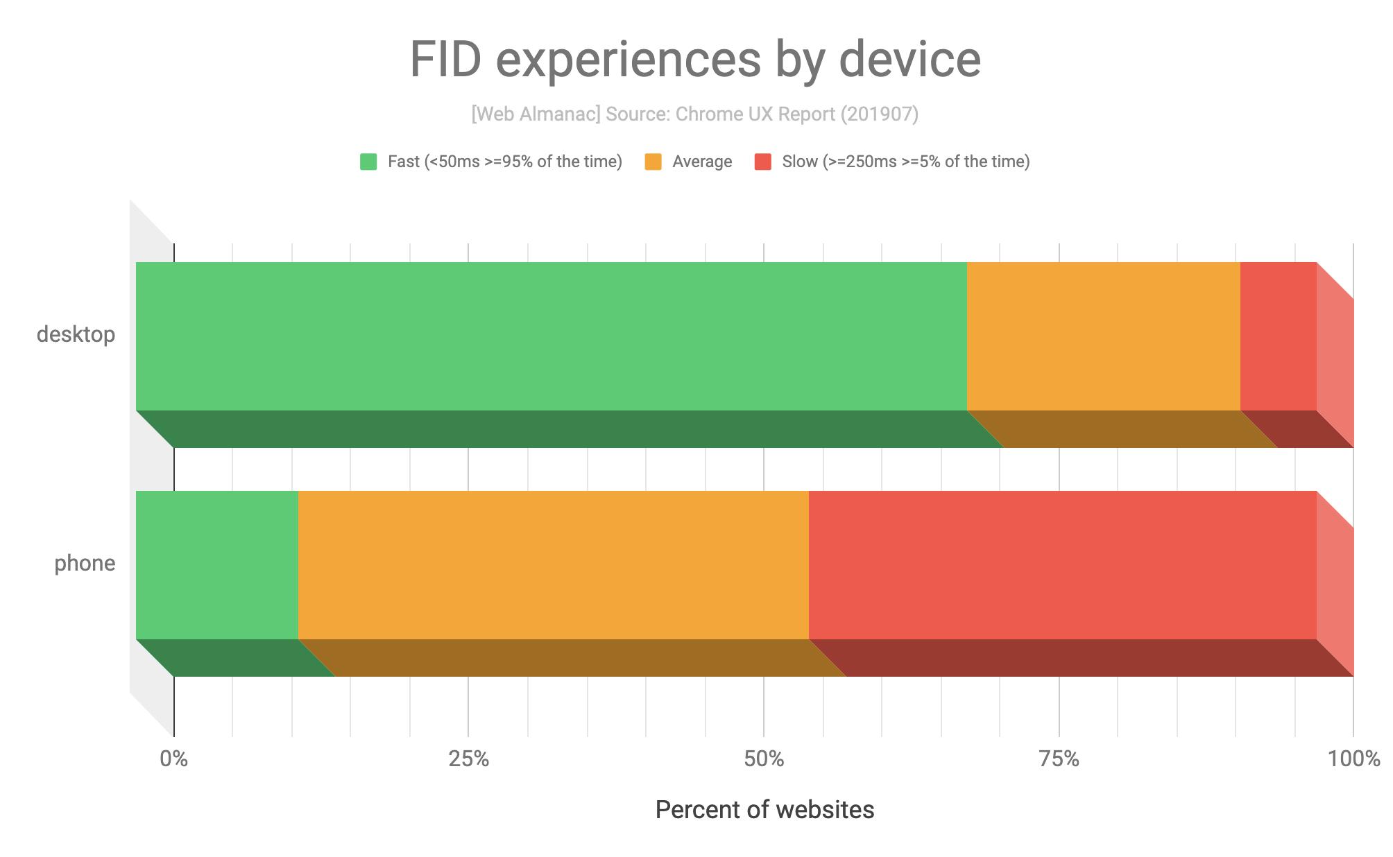
Tip: If your website is popular enough to be included in the Chrome UX Report, you can check your site’s mobile vs. desktop FID data on PageSpeed Insights.
Screen reader users navigate web pages by headings
According to WebAIM’s recent screen reader user survey, the most popular screen readers are NVDA (41%) and JAWS (40%) on desktop (primary screen reader) and VoiceOver (71%) and TalkBack (33%) on mobile (commonly used screen readers).
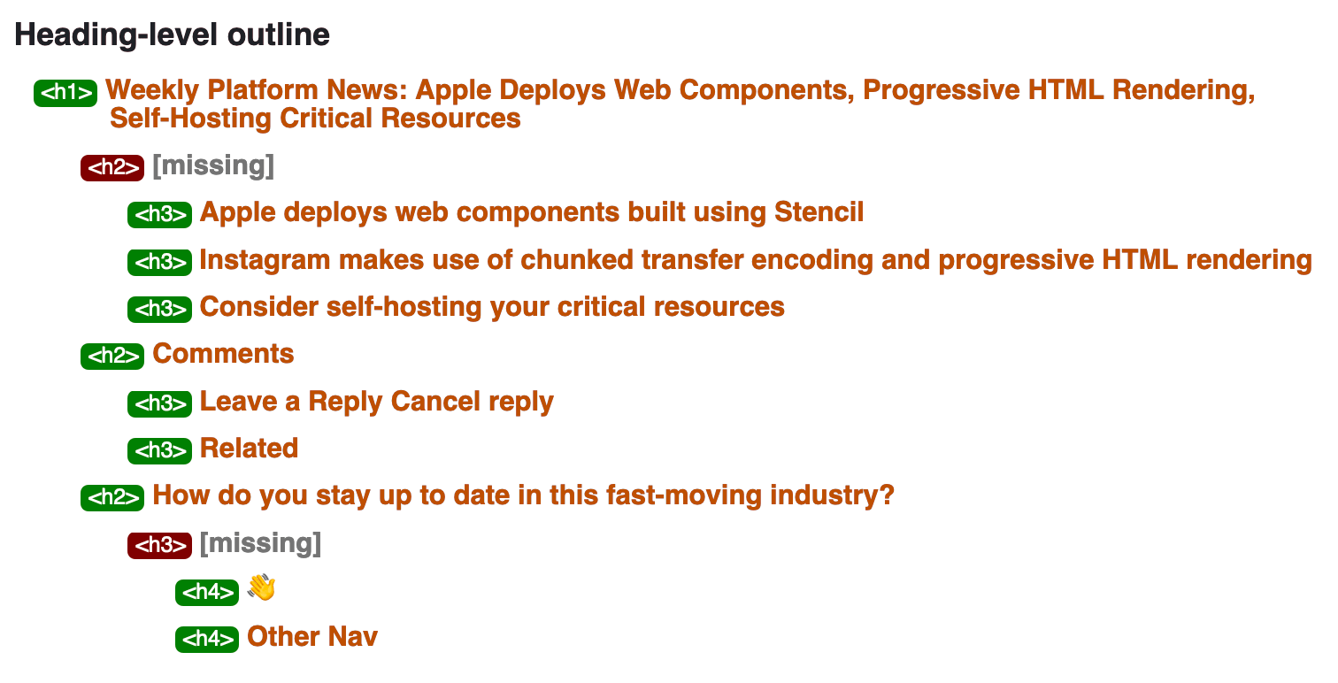
When trying to find information on a web page, most screen reader users navigate the page through the headings (<h1>, <h2>, <h3>, etc.).
The usefulness of proper heading structures is very high, with 86.1% of respondents finding heading levels very or somewhat useful.
Tip: You can check a web page’s heading structure with W3C’s Nu Html Checker (enable the „outline” option).
The typical journey for a person browsing a website: view a page, click a link, browser loads new page. That’s assuming no funny business like a Single Page App, which still follows that journey, but the browser doesn’t load a new page — the client fakes it for the sake of a snappier transition.
What if you could load that new page before the person clicks the link so that, when they do, the loading of that next page is much faster? There are two notable projects that try to help with that:
quicklink: detects visible links, waits for the browser to be idle and if it isn’t on slow connection, it prefetches those links.
instant.page: if you hover over a link for 65ms, it preloads that link. The new Version 2 allows you to configure of the time delay or whether to wait for a click or press before preloading.
Combine those things with technological improvements like paint holding, and building a SPA architecture just for the speed benefits may become unnecessary (though it may still be desirable for other reasons, like code-splitting, putting the onus of routing onto front-end developers, etc.).
I woke up one morning and realized that I had it all wrong. I discovered that code and design are unable to solve every problem on a design systems team, even if many problems can be solved by coding and designing in a dark room all day. Wait, huh? How on earth does that make any sense? Well, that’s because good design systems work is about hiring, too.
Let me explain.
First, let’s take a look at some common design systems issues. One might be that your components are a thick div soup which is causing issues for users and is all-round bad for accessibility. Another issue might be that you have a large number of custom components that are fragile and extremely difficult to use. Or maybe you have eight different illustration styles and four different modal components. Maybe you have a thousand different color values that are used inconsistently.
Everyone in an organization can typically feel these problems but they’re really hard to describe. Folks can see that it takes way longer to build things than it should and miscommunication is rampant. Our web app might have bad web performance, major accessibility issues and wildly inconsistent design. But why is this? What’s the root cause of all these dang problems?
The strange thing about design systems is it’s difficult to see what the root cause of all these inconsistencies and issues might be. And even the answer isn’t always entirely obvious once you see the problem.
A design systems team can write component documentation to fix these issues, or perhaps refactor things, audit patterns, refactor even more things, redesign components, and provide training and guidance. But when apps get to a certain size then one person (or even a whole team of people) tackling these problems isn’t enough to solve them.
Sure a design systems team can spend a whole bunch of time helping fix an issue but is that really the best use of their time? What if they convinced another team in the company to instead hire a dedicated front-end engineer to build a sustainable working environment? What if they hired an illustrator to make things consistent and ensure high quality across the entire app?
This is why design systems work is also about hiring.
A design systems team is in the perfect place to provide guidance around hiring because they’ll be the first to spot issues across an organization. They’ll see how components are being hacked together or where there’s too many unnecessary custom components that are not part of a library or style guide. The design systems team will see weaknesses in the codebase that no one else can see and they can show which teams are missing which particular skill sets — and fix that issue by hiring folks with skills in those specific areas.
If you’re in management and don’t see all those inconsistencies every day, then it’s likely nothing will get done about it. We’re unlikely to fix the issues we cannot see.
So as design systems folks, we ultimately need to care about hiring because of this: a codebase is a neighborhood and a community.
And the only way we can fix the codebase is by fixing the community.