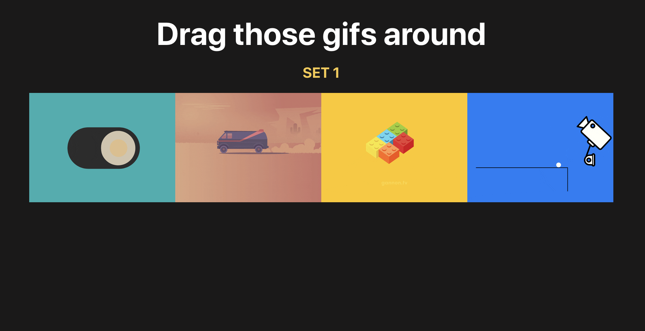
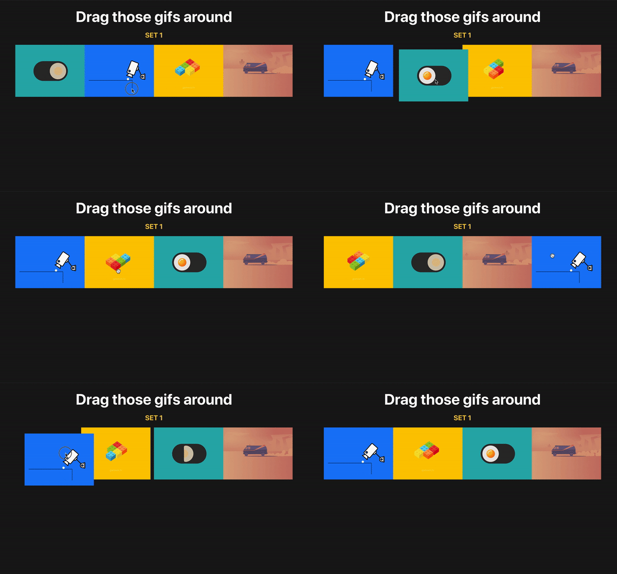
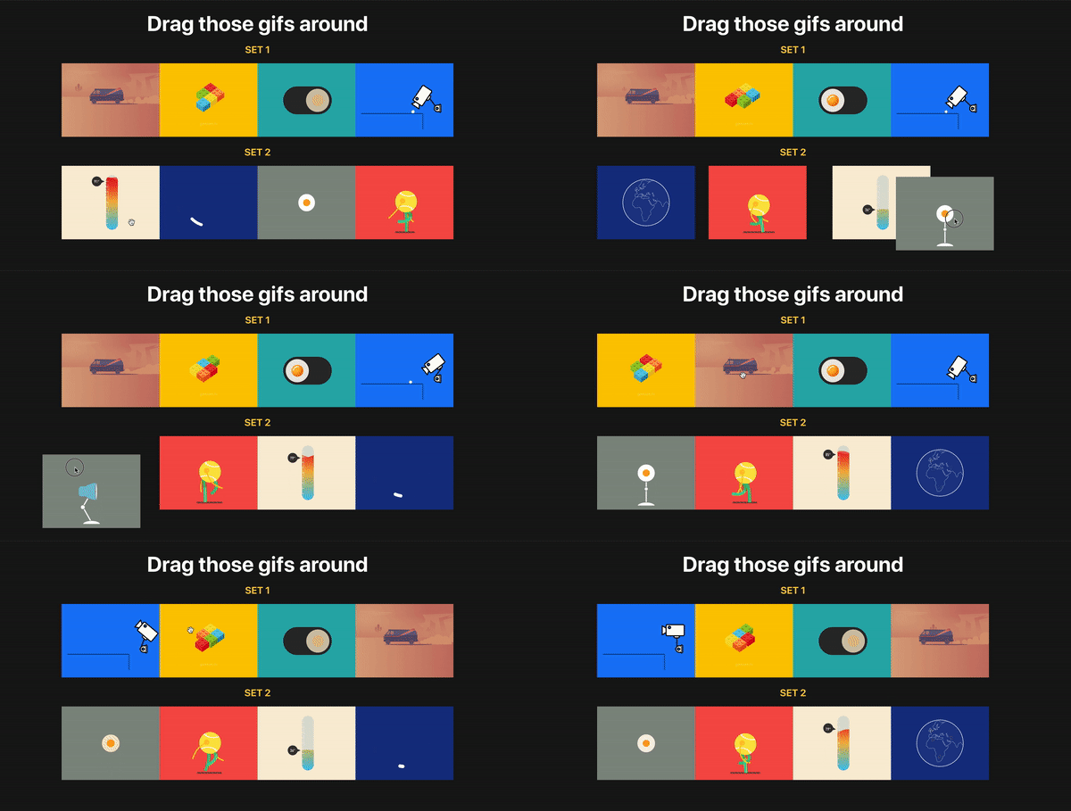
The React ecosystem offers us a lot of libraries that all are focused on the interaction of drag and drop. We have react-dnd, react-beautiful-dnd, react-drag-n-drop and many more, but some of them require quite a lot of work to build even a simple drag and drop demo, and some do not provide you with more complex functionality (e.g. multiple drag and drop instances), and if they do, it becomes very complex.
Let’s create a simple app and add drag-n-drop functionality to it. We’re going to use create-react-app to spin up a new React project:
npx create-react-app your-project-name
Now let’s change to the project directory and install react-sorting-hoc and array-move. The latter is needed to move items in an array to different positions.
cd your-project-name
yarn add react-sortable-hoc array-move
Adding styles, data and GIF component
For simplicity’s sake, we are going to write all styles in our App.css file. You can overwrite styles you have there with the following ones:
Go to http://localhost:3000/ to see what the app looks like now:
A screenshot of react-sortable-hoc-article-app
Onto the drag-n-drop stuff
Alright, it’s time make our GIFs draggable! And droppable.
To start, we need two HOCs from react-sortable-hoc, and the >arrayMove method from the array-move library to modify our new array after dragging happens. We want our GIFs to stay on their new positions, right? Well, that’s what this is going to allow us to do.
Let’s import them:
import { sortableContainer, sortableElement } from 'react-sortable-hoc';
import arrayMove from 'array-move';
As you might have guessed, those components will be wrappers which will expose functionality needed for us.
sortableContainer is a container for our sortable elements.
sortableElement is a container for each single element we are rendering.
We’ve just created a container for our children elements that would be passed inside our SortableGifsContainer and also created wrapper for a single Gif component.
If it’s a bit unclear to you, no worries — you will understand right after we implement it.
💡Note: You need to wrap your children in a div or any other valid HTML element.
It’s time to wrap our GIFs into the SortableGifsContainer and replace the Gif component with our newly created SortableGif:
<SortableGifsContainer axis="x" onSortEnd={onSortEnd}>
  {gifs.map((gif, i) =>
    <SortableGif
    // don't forget to pass index prop with item index
      index={i}
      key={gif}
      gif={gif}
    />
  )}
</SortableGifsContainer>
It’s important to note that you need to pass the index prop to your sortable element so the library can differentiate items. It’s similar to adding keys to the lists in React).
We add axis because our items are positioned horizontally and we want to drag them horizontally, while default is vertical dragging. In other words, we’re limiting dragging along the horizontal x-axis. As you can see we also add an onSortEnd function, which triggers every time we drag or sort our items around. There are, of course, a lot more events but you can find more info in the documentation which already does an excellent job of covering them.
Time to implement it! Add the following line above the return statement:
I want to explain one more thing: our function received an old and new index of the item which was dragged and, of course, each time after we move items around we modify our initial array with the help of arrayMove.
Tada! Now you know how to implement drag-n-drop in your project. Now go and do it! 🎉 🎉 🎉
What if we have multiple lists of items?
As you can see, the previous example was relatively simple. You basically wrap each of the items in a sortable HOC and wrap it around with sortableContainer and, bingo, you’ve got basic drag and drop.
But how will we do it with multiple lists? The good news is that react-sortable-hoc provides us with a collection prop so we can differentiate between lists.
If you want to see them before we move next, add the following lines after the SortableGifsContainer closing tag:
{newGifs.map(gif => <Gif key={gif} gif={gif} />)}
Alright, time to replace it with a draggable version.
Implementation is the same as in first example besides one thing — we have added a collection prop to our SortableGif. Of course, you can come up with any name for the collection, just remember, we’re gonna need it in for our onSortEnd function.
Next we need to add the collection prop to our first list. I’ve chosen the name GIFs for the first list of items, but it’s up to you!
Now we need to to change our onSortEnd function. Our function received old and new indexes, but we can also destructure a collection from it. Right, exactly the one we’ve added to our SortableGif.
So all we have to do now is write a JavaScript switch statement to check for the collection name and to modify the right array of GIFs on drag.
As you can see, we now have two separate lists of GIFs and we can drag and sort. Moreover, they are independent meaning items from different lists won’t be mixed up.
Exactly what we wanted to do! Now you know how to create and handle drag and drop with multiple lists of items. Congratulations 🎉
Hope you’ve enjoyed it as much as I did writing it! If you’d like to reference the complete code, it’s all up on GitHub here. If you have any questions, feel free to contact me via email.
This week I’ve been brooding about web performance and accessibility. It all began when Ethan Marcotte made a lot of great notes about the accessibility issues that are common with AMP:
In the recordings above, I’m trying to navigate through the AMP Story. And as I do, VoiceOver describes a page that’s impossible to understand: the arrows to go back or forward are simply announced as “button”; most images are missing text equivalents, which is why the screen reader spells out each and every character of their filenames; and when a story’s content is visible on screen, it’s almost impossible to access. I’d like to say that this one AMP Story was an outlier, but each of the nine demos listed on the AMP Stories website sound just as incomprehensible in VoiceOver.
Ethan continues to argue that these issues are so common in AMP that accessibility must not be a priority at all:
Since the beginning, Google has insisted AMP is the best solution for the web’s performance problem. And Google’s used its market dominance to force publishers to adopt the framework, going so far as to suggest that AMP’s the only format you need to publish pages on the web. But we’ve reached a point where AMP may “solve” the web’s performance issues by supercharging the web’s accessibility problem, excluding even more people from accessing the content they deserve.
I’ve been thinking a lot about this lately — about how accessibility work is often seen as an additional feature that can be tacked onto a project later — rather than accessibility work being a core principle or standard of working on the web.
And I’ve seen this sentiment expressed time and time again, in the frameworks, on Twitter, in the design process, in the development process, and so much so that arguing about the importance of accessibility can get pretty exhausting. Because at some point we’re not arguing about the importance of accessibility but the importance of front-end development itself as a series of worthy skills to have. Skills that can’t be replaced.
I love fast software. That is, software speedy both in function and interface. Software with minimal to no lag between wanting to activate or manipulate something and the thing happening. Lightness.
Later in the piece, Mod describes fast software as being the very definition of good software and argues that every action on a computer — whether that’s a website or an app — should feel as if you’re moving without any latency whatsoever. And I couldn’t agree more; every loading screen and wait time is in some degree a mark of failure.
The takeaway here is that you literally can’t afford desktop or iPhone levels of JS if you’re trying to make good web experiences for anyone but the world’s richest users, and that likely means re-evaluating your toolchain.
I’m sort of a jerk when it comes to this stuff. I don’t think a website can be good until it’s fast. The kind of fast that takes your breath away. As fast as human thought, or even faster. And so my point here is that web performance isn’t something we should aspire to, it should be the standard. The status quo. The baseline that our work is judged by. It ought to be un-shippable until the thing is fast.
The good news is that it’s easier than ever to ship a website with these base requirements of unparalleled speed and accessibility! We have Page Speed Insights, and Web Page Test, not to mention the ability to have Lighthouse perform audits with every commit in GitHub automatically as we work. Ire Aderinokun showed us how to do this not so long ago by setting up a performance budget and learning how to stick to it.
The tools to make our websites fast and accessible are here but we’re not using them. And that’s what makes me mad.
While I’m on this rant — and before I get off my particularly high horse — I think it’s important to make note of Deb Chachra’s argument that “any sufficiently advanced negligence is indistinguishable from malice.” With that in mind, it’s not just bad software design and development if a website is slow. Performance and accessibility aren’t features that can linger at the bottom of a Jira board to be considered later when it’s convenient.
Instead we must start to see inaccessible and slow websites for what they are: a form of cruelty. And if we want to build a web that is truly a World Wide Web, a place for all and everyone, a web that is accessible and fast for as many people as possible, and one that will outlive us all, then first we must make our websites something else altogether; we must make them kind.
In this week’s roundup of platform news, Chrome introduces a new attribute for loading, accessibility specifications for web developers, and the BBC moves visualizations to the Shadow DOM.
Chrome ships the loading attribute
The HTML loading attribute for lazy-loading images and iframes is now supported in Chrome. You can add loading="lazy" to defer the loading of images and iframes that are below the viewport until the user scrolls near them.
Google suggests either treating this feature as a progressive enhancement or using it on top of your existing JavaScript-based lazy-loading solution.
This feature has not yet been added to the HTML Standard (but there is an open pull request), and multiple links to Google’s documentation are listed on its Chrome Status page.
Provides practical advice on how to use ARIA in HTML, with an emphasis on dynamic content and advanced UI controls (the “five rules of ARIA use” are defined here)
The BBC has moved from <iframe> to Shadow DOM for the embedded interactive visualizations on its website. This has resulted in significant improvements in load performance (“more than 25% faster”).
The available Shadow DOM polyfills didn’t reliably prevent styles from leaking across the Shadow DOM boundary, so they decided to instead fall back to <iframe> in browsers that don’t support Shadow DOM.
Shadow DOM […] can deliver content in a similar way to iframes in terms of encapsulation but without the negative overheads […] We want encapsulation of an element whose content will appear seamlessly as part of the page. Shadow DOM gives us that without any need for a custom element.
One major drawback of this new approach is that CSS media queries can no longer be used to conditionally apply styles based on the content’s width (since the content no longer loads in a separate, embedded document).
With iframes, media queries would give us the width of our content; with Shadow DOM, media queries give us the width of the device itself. This is a huge challenge for us. We now have no way of knowing how big our content is when it’s served.
The next version of Chrome will introduce the Largest Contentful Paint performance metric; this new metric is a more accurate replacement for First Meaningful Paint, and it measures when the largest element is rendered in the viewport (usually, the largest image or paragraph of text) (via Phil Walton)
Microsoft has created a prototype of a new tool for viewing a web page’s DOM in 3D; this tool is now experimentally available in the preview version of Edge (via Edge DevTools)
Tracking prevention has been enabled by default in the preview versions of Edge; it is set to balanced by default, which “blocks malicious trackers and some third-party trackers” (via Techdows)
Read more news in my new, weekly Sunday issue. Visit webplatform.news for more information.
It is technically true that anyone can cook. But there’s a difference between actually knowing how to prepare a delicious meal and hoping for the best as you throw a few ingredients in a pot. Just like web development, you might know the ingredients—<span>, background-color, .heading-1—but not everyone knows how to turn those ingredients into a beautiful, easy-to-use website.
Whenever you use HTML and CSS, you are designing—giving form and structure to content so it can be understood by someone else. People have been designing for centuries and have developed principles along the way that are applicable to digital interfaces today. These principles manifest in three key areas: how words are displayed (typography), how content is arranged (spacing), and how personalty is added (color). Let’s discover how to use each of these web design ingredients through the mindset of a developer with CSS properties and guidelines to take the guesswork out of web design.
Websites that are easy to read don’t happen by mistake. In fact, Taimur Abdaal wrote an entire article on the topic that’s chock-full of advice for developers working with type. We’re going to focus specifically on two fundamental principles of design that can help you display words in a more visually pleasing and easy-to-read way: repetition and hierarchy.
Use repetition for consistency and maintainability
Repetition comes fairly naturally on the web thanks to the importance of reusability in software. For example, CSS classes allow you to define a particular style for text and then reuse that style across the site. This results in repeating, consistent text styles for similar content which helps users navigate the site.
If, for example, you are working on styles for a new paragraph, first consider if there is existing content that has a similar style and try to use the same CSS class. If not, you can create a new class with a generic name that can be repeated elsewhere in your site. Think .paragraph--emphasize as opposed to .footer__paragraph--emphasize or .heading-1 as opposed to .hero__site-title. The first examples can be used across your site as opposed to the second which are scoped to specific components. You can even add a prefix like text- to indicate that the class is used specifically for text styles. This method will reduce the CSS file size and complexity while making it much easier to update global styles in the future.
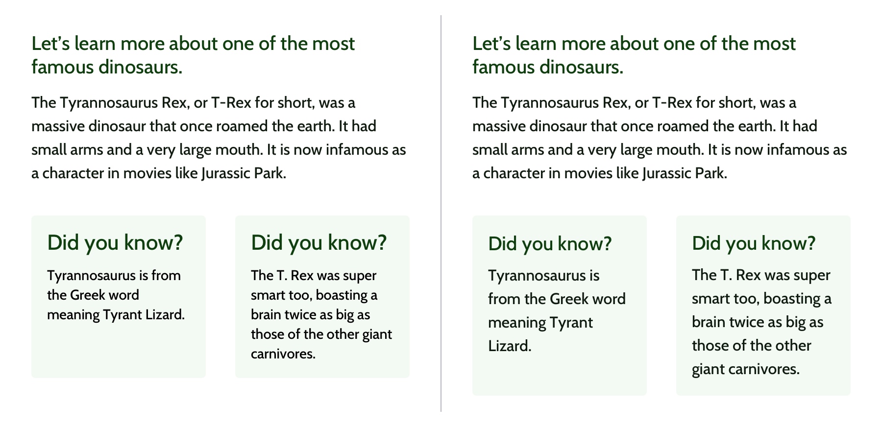
Left: The black text is similar but uses a slightly different font size and line height. Right: The black text uses the same styles and therefore can use the same CSS class. Reducing the amount of CSS needed and adding repetition and consistency.
In design, there are endless ways to experiment with styles. Designers can sometimes go a little crazy with their font styles by creating numerous slight variations of similar styles. However, in code, it’s valuable to restrict text styles to a minimum. Developers should urge designers to combine similar styles in order to reduce code weight and increase reusability and consistency.
These headings look very similar but are slightly different and would require three separate CSS classes to style them. They could probably be combined into one and styled with a single class.
Hierarchy provides a clear visual order to content
Hierarchy is something you really only notice when it’s not there. In typography, hierarchy refers to the visual difference between various pieces of text. It’s the distinction between headings, paragraphs, links, and other text styles. This distinction is made by choosing different fonts, colors, size, capitalization, and other properties for each type of text content. Good hierarchy makes complex information easier to digest and guides users through your content.
Left: Poor hierarchy. There’s not much differentiation in the size or color of the text to help users digest the content. Right: Better hierarchy that uses more variety in font size, color, and spacing to help users quickly navigate the content.
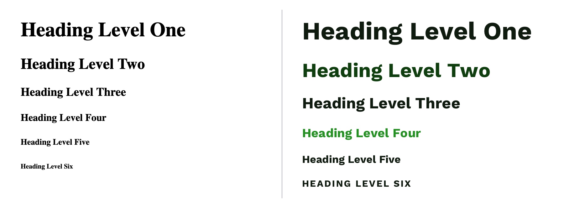
Out of the box, HTML provides some hierarchy (like how the font size of headings gets smaller as you go from <h1> to <h6>), but CSS opens the door for even more creativity. By giving <h1> tags an even larger font size, you can quickly establish greater difference in size between heading levels—and therefore more hierarchy. To create more variety, you can also change the color, text-align, and text-transform properties.
A comparison of the way HTML headings look without styles versus adding more contrast with CSS.
A note on choosing fonts
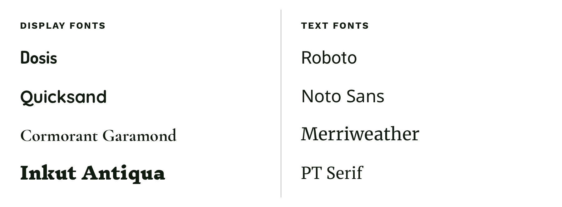
With typography, we need to make sure it is as easy to read as possible. The greatest overall factor in readability is the font you choose—which is a huge topic. There are many factors that determine how „readable” a font is. Some fonts are made specifically to be used as headings or short lines of text; these are called „display” fonts, and they often have more personality than fonts designed to be used for text. Unique flourishes and quirks make display fonts harder to read at small sizes and when part of a large paragraph. As a rule of thumb, use a more straightforward font for text and only use display fonts for headings.
Left: Examples of display fonts that work better as headings. Right: Examples of text fonts that are more readable and can be used for headings, paragraphs, and any other text that needs to be easy to read.
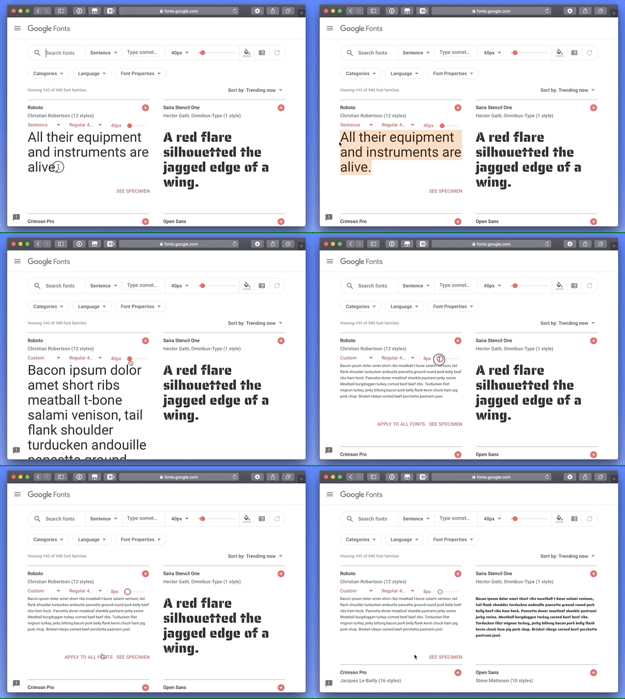
If you’re in a pinch and need a readable font, try Google Fonts. Add a paragraph of text to the preview field and size it roughly how it will display on your website. You can then narrow down your results to serif or sans-serif and scan the list of fonts for one that is easy to read. Roboto, Noto Sans, Merriweather, and PT Serif are all very readable options.
CSS properties for better readability
The main paragraph font-size should be between 16pxand 18px (1em and 1.25em) depending on the font you choose.
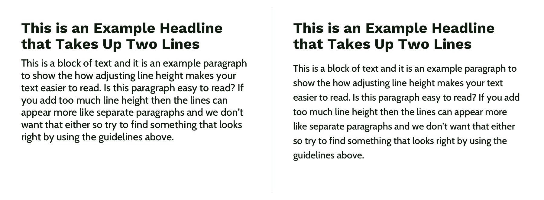
Manually set line-height (the vertical space between two lines of text) to make your text less cramped and easier to read. Start with line-height: 1.25 (that is 1.25 times the font-size) for headings and at least 1.5 for paragraphs (but no more than 1.9) and adjust from there. The longer the line of text, the larger the line-height should be. To keep your text flexible, avoid adding a unit to your line-height. Without a unit the line-height you set will be proportional to your font-size. For example, line-height: 1.5 and font-size: 18px would give you a line height of 27 pixels. If you changed your font size to font-size: 16px on smaller screens, the computed line height would then change to 24 pixels automatically.
Left: line-height is 1.1 for the heading and 1.2 for the paragraph, which is roughly the default setting. Right: line-height is 1.25 for the headings and 1.5 for the paragraph.
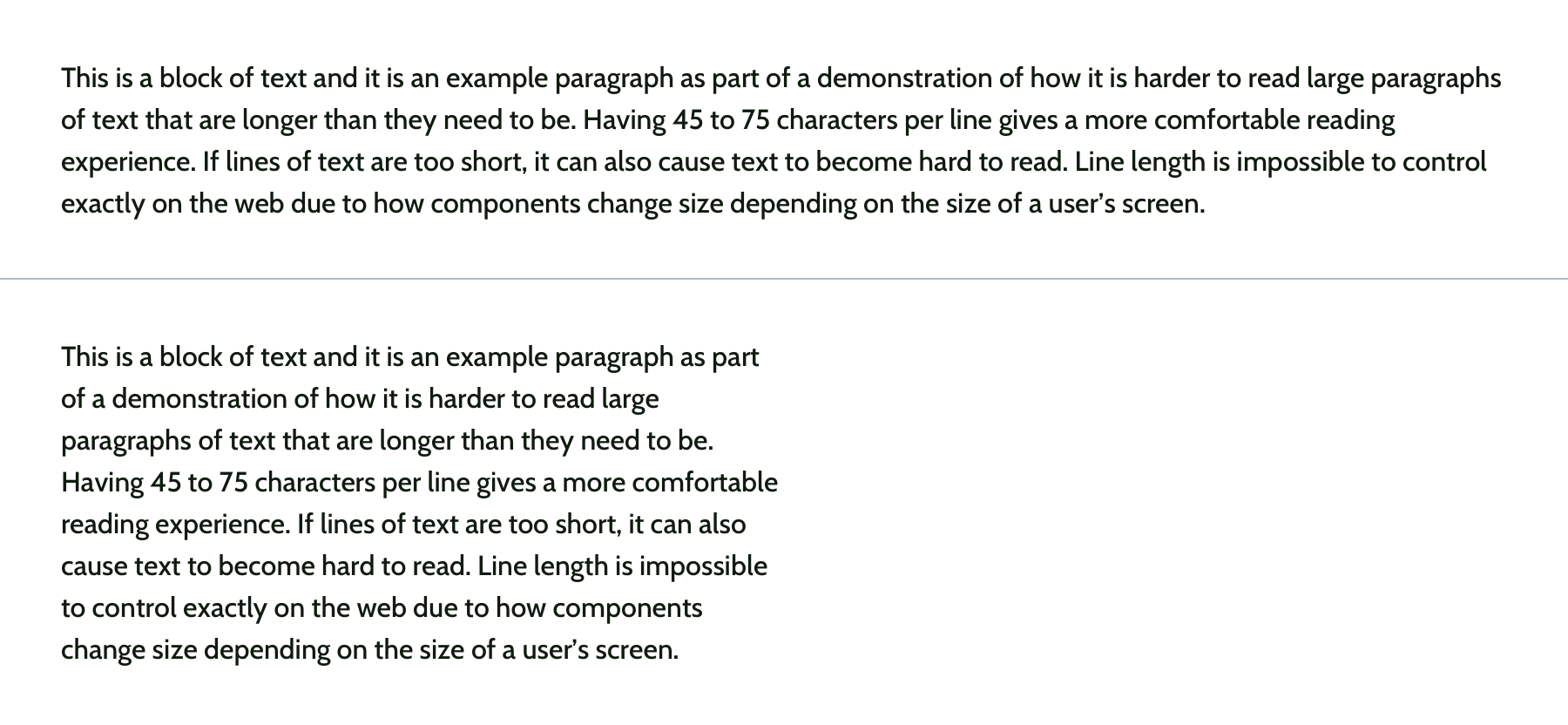
Pay attention to how many characters are in a line of text and aim for 45 and 75 characters long (including punctuation and spaces). Doing so reduces reading fatigue for your users by limiting the eye and head movement needed to follow a line of text. With the variable nature of the web, it’s impossible to completely control line length, but you can use max-width values and breakpoints to prevent lines of text from getting too long. Generally speaking, the shorter the line of text, the faster it will be to scan for quick reading. And don’t worry too much about counting the characters in every line. Once you do it a few times, you’ll develop a sense for what looks right.
Top: line length of around 125 characters. Bottom: line length of around 60 characters.
Spacing
After looking at typography, you can take a step back and examine the layout, or spacing, of your content. Movement and proximity are two design principles that relate to spacing.
Movement is about content flow
Movement refers to how your eye moves through the page or the flow of the page. You can use movement to direct a user’s eye in order to tell a story, point to a main action item, or encourage them to scroll. This is done by structuring the content within individual components and then arranging those components to form the layout of the page. By paying attention to how your eye moves through content, you can help users know where to look as they scan the page.
Unlike books, which tend to have very linear structure, websites can be more creative with their layout—in literally endless ways. It is important to make sure you are intentional with how you layout content and do so in a way which guides users through your content as easily as possible.
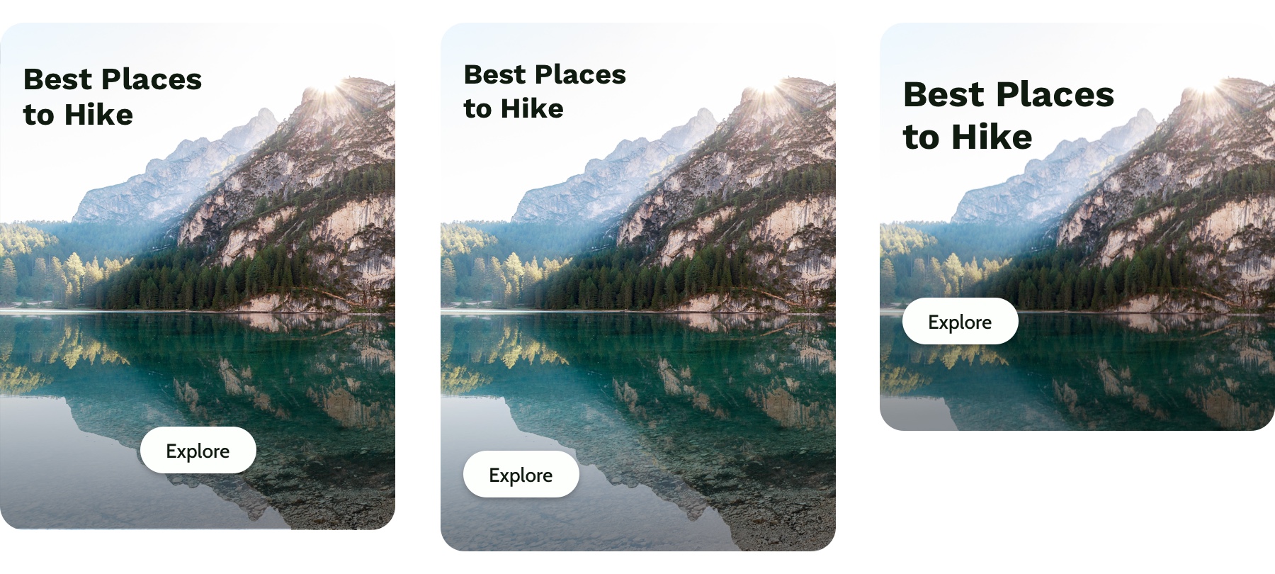
Three potential ways to arrange a heading, image, and button.
Consider these three examples above. Which is the easiest to follow? The arrangement on the left draws your eye off the screen to the left due to how the image is positioned which makes it hard to find the button. In the center option, it’s easy to skip over the headline because the image is too large in comparison. On the right, the heading draws your attention first and the image is composed so that it points to the main action item—the button.
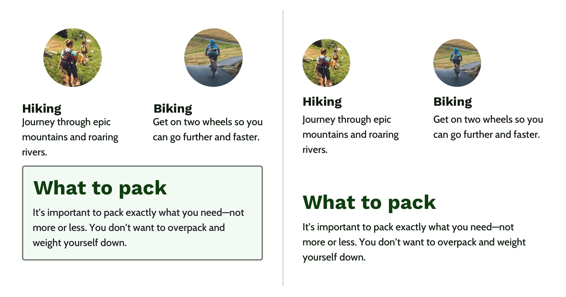
White space is a helpful tool for creating strong movement, but it’s easy to use too much or too little. Think about how you are using it to direct the user’s eye and divide your content. When used well, users won’t notice the whitespace itself but will be able to better focus on the content you are presenting. For example, you can use whitespace to separate content (instead of a colored box) which results in a less cluttered layout.
Left: Using a graphic element to separate content and aligning images in the center. Right: Using whitespace to separate content and aligning images on the left to let the whitespace flow better around groups of related content and create a cleaner layout.
Proximity establishes relationships
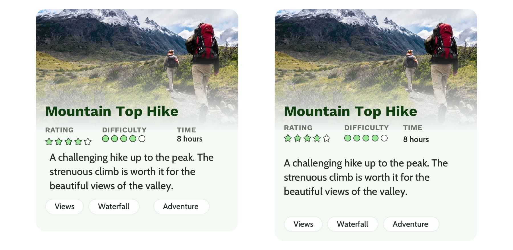
When objects are closer together, they are perceived as being related. By controlling spacing around elements, you can imply relationships between them. It can be helpful to create a system for spacing to help build consistency through repetition and avoid the use of random numbers. This system is based off the default browser font size (1rem or 16px) and uses distinct values that cover most scenarios:
0.25rem (4px)
0.5rem (8px)
1rem (16px)
2rem (32px)
4rem (64px)
You can use Sass or CSS variables so that the values are kept consistent across the project. A system might look like this—but use whatever you’re comfortable with because naming things is hard:
$space-sm
$space-med
$space-lg
$space-xl
$space-xxl
Left: A component with uneven spacing between elements. Right: A component that uses consistent spacing.
Color conveys personality and calls attention
Color greatly affects a website’s personality. When used well, it gives pages life and emotion; used poorly, it can distract from the content, or worse, make it inaccessible. Color goes hand in hand with most design principles. It can be used to create movement by directing users’ eyes and can be used to create emphasis by calling attention to the most important action items.
A note on choosing colors
With color, it can be hard to know where to start. To help, you can use a four-step process to guide your color choices and build a color palette for the site.
Step 1: Know your mood
You have to know the mood or attitude of your site and brand before choosing colors. Look at your content and decide what you are trying to communicate. Is it funny, informative, retro, loud, somber? Typically, you can boil down the mood of your site to a few adjectives. For example, you might summarize The North Face as adventurous and rugged while Apple would be minimalistic and beautiful.
Step 2: Find your main color
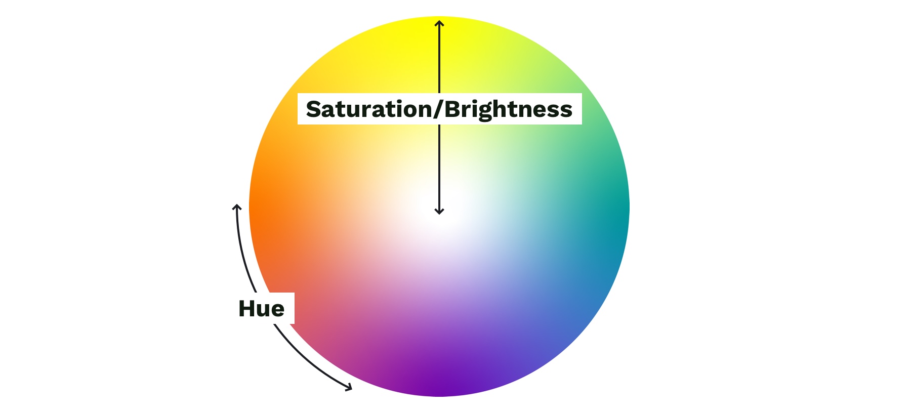
With your mood in mind, try to visualize a color that represents it. Start with the color’s saturation (how intense the color is) and brightness (how close the color is to white or black). If your mood is upbeat or flashy, a lighter (more saturated) color is probably best. If your mood is serious or reserved, a darker (less saturated) color is better.
Next, choose a hue. Hue refers to what most people think of as colors—where does is fall on the rotation of the color wheel? The hue of a color is what gives it the most meaning. People tend to associate hues with certain ideas. For instance, red is often associated with power or danger and green relates to money or nature. It can be helpful to look at similar websites or brands to see what colors they use—although you don’t need to follow their lead. Don’t be afraid to experiment!
Color wheel showing saturation and brightness versus hue.
Step 3: Add supporting colors
Sometimes, two or three main colors are needed, but this is not necessary. Think about the colors of different brands. Some use a single color, and others have a main color and one or two that support it. Coca-Cola uses its distinct red. IKEA is mostly blue with some yellow. Tide is orange with some blue and yellow. Depending on your site’s mood, you might need a few colors. Try using a tool like Adobe Color or Coolors), both of which allow you to add a main color and then try different color relationships, like complementary or monochromatic, to quickly see if any work well.
Step 4: Expand your palette
Now that you’ve narrowed things down and found your main color(s), it’s time to expand your scope with a palette that gives your project versatility and constraint—here’s a methodology I’ve found helpful. Tints and shades are the trick here. Tints are made by mixing your main color(s) with white, and shades are made by mixing with black. You can quickly create an organized system with Sass color functions:
A palette of color options created with Sass color functions. Make sure to use percent values for the functions that create distinct colors—not too similar to the main color.
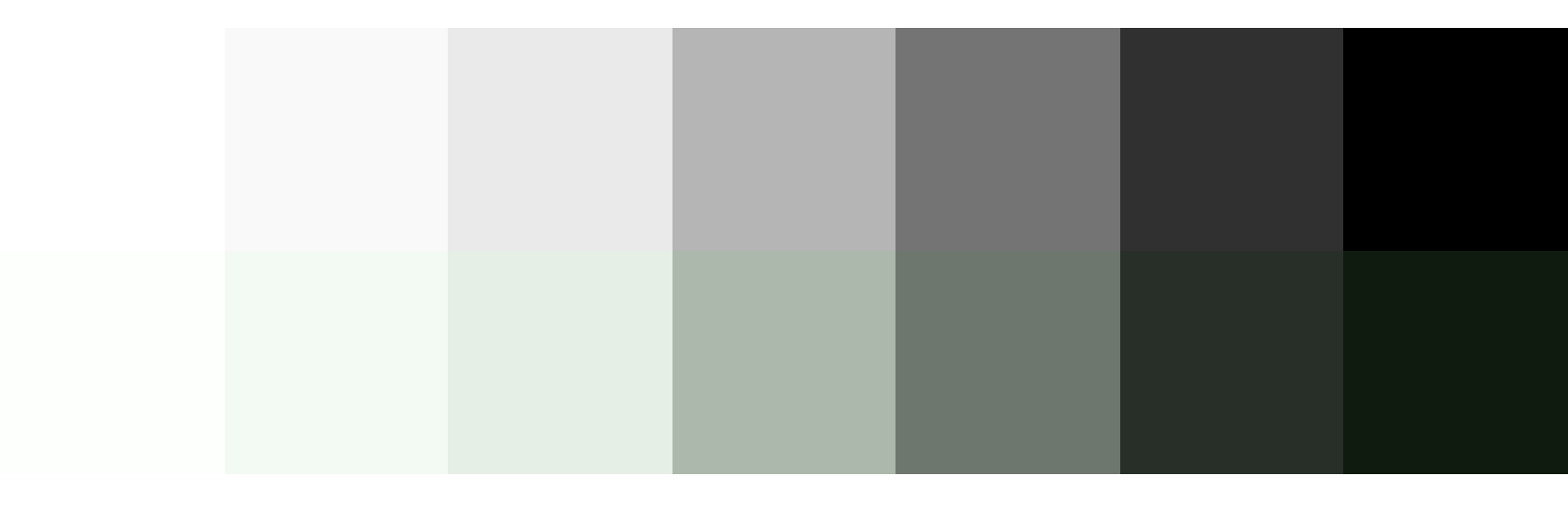
To round out your palette, you’ll need a few more colors, like a white and black. Try creating a „rich black” using a dark, almost black shade of your main color and, on the other end of the spectrum, pick a few light grays that are tinted with your main color. Tinting the white and black adds a little more personality to your page and helps create a cohesive look and feel.
Top: Basic white, gray, and black. Bottom: Tinted white, grays, and black to match the main color.
Last but not least, if you are working on an interactive product, you should add colors for success, warning, and error states. Typically a green, yellow, and red work for these but consider how you can adjust the hue to make them fit better with your palette. For example, if your mood is friendly and your base color is green, you might want to desaturate the error state colors to make the red feel less negative.
You can do this with the mix Sass color function by giving it your base color, the default error color, and the percentage of base color that you want to mix in with the error color. Adding desaturate functions helps tone down the colors:
Top: Default colors for success, warning, and error states. Bottom: Tinted and desaturated colors for the success, warning and error states.
When it comes to the web, there’s one color principle that you have to pay extra attention to: contrast. That’s what we’ll cover next.
Contrast
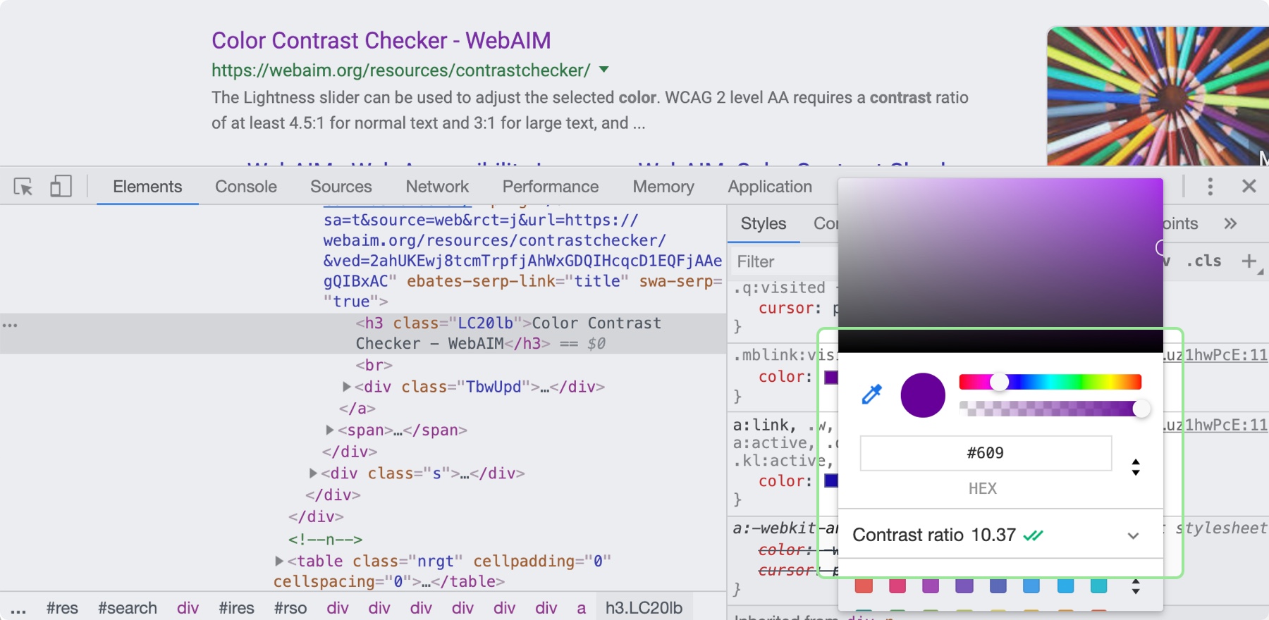
Color contrast—the difference in saturation, brightness, and hue between two colors—is an important design principle for ensuring the web is accessible to those with low vision or color blindness. By ensuring there is enough contrast between your text and whatever is behind it on your site will be more accessible for all sighted users. When looking at accessibility, be sure to follow the color contrast guidelines provided by W3C’s Web Content Accessibility Guidelines (WCAG). There are many tools that can help you follow these guidelines, including the inspect panel in Chrome’s dev tools.
By clicking on the color property in the Chrome Inspect tool, you can see the contrast ratio and whether it is passing.
Now, it’s time to put these principles to practice! You can use these processes and CSS tips to help take the guesswork out of design and create better solutions. Start with what you are familiar with, and eventually, the design principles mentioned here will become second nature.
It is technically true that anyone can cook. But there’s a difference between actually knowing how to prepare a delicious meal and hoping for the best as you throw a few ingredients in a pot. Just like web development, you might know the ingredients—<span>, background-color, .heading-1—but not everyone knows how to turn those ingredients into a beautiful, easy-to-use website.
Whenever you use HTML and CSS, you are designing—giving form and structure to content so it can be understood by someone else. People have been designing for centuries and have developed principles along the way that are applicable to digital interfaces today. These principles manifest in three key areas: how words are displayed (typography), how content is arranged (spacing), and how personalty is added (color). Let’s discover how to use each of these web design ingredients through the mindset of a developer with CSS properties and guidelines to take the guesswork out of web design.
Websites that are easy to read don’t happen by mistake. In fact, Taimur Abdaal wrote an entire article on the topic that’s chock-full of advice for developers working with type. We’re going to focus specifically on two fundamental principles of design that can help you display words in a more visually pleasing and easy-to-read way: repetition and hierarchy.
Use repetition for consistency and maintainability
Repetition comes fairly naturally on the web thanks to the importance of reusability in software. For example, CSS classes allow you to define a particular style for text and then reuse that style across the site. This results in repeating, consistent text styles for similar content which helps users navigate the site.
If, for example, you are working on styles for a new paragraph, first consider if there is existing content that has a similar style and try to use the same CSS class. If not, you can create a new class with a generic name that can be repeated elsewhere in your site. Think .paragraph--emphasize as opposed to .footer__paragraph--emphasize or .heading-1 as opposed to .hero__site-title. The first examples can be used across your site as opposed to the second which are scoped to specific components. You can even add a prefix like text- to indicate that the class is used specifically for text styles. This method will reduce the CSS file size and complexity while making it much easier to update global styles in the future.
Left: The black text is similar but uses a slightly different font size and line height. Right: The black text uses the same styles and therefore can use the same CSS class. Reducing the amount of CSS needed and adding repetition and consistency.
In design, there are endless ways to experiment with styles. Designers can sometimes go a little crazy with their font styles by creating numerous slight variations of similar styles. However, in code, it’s valuable to restrict text styles to a minimum. Developers should urge designers to combine similar styles in order to reduce code weight and increase reusability and consistency.
These headings look very similar but are slightly different and would require three separate CSS classes to style them. They could probably be combined into one and styled with a single class.
Hierarchy provides a clear visual order to content
Hierarchy is something you really only notice when it’s not there. In typography, hierarchy refers to the visual difference between various pieces of text. It’s the distinction between headings, paragraphs, links, and other text styles. This distinction is made by choosing different fonts, colors, size, capitalization, and other properties for each type of text content. Good hierarchy makes complex information easier to digest and guides users through your content.
Left: Poor hierarchy. There’s not much differentiation in the size or color of the text to help users digest the content. Right: Better hierarchy that uses more variety in font size, color, and spacing to help users quickly navigate the content.
Out of the box, HTML provides some hierarchy (like how the font size of headings gets smaller as you go from <h1> to <h6>), but CSS opens the door for even more creativity. By giving <h1> tags an even larger font size, you can quickly establish greater difference in size between heading levels—and therefore more hierarchy. To create more variety, you can also change the color, text-align, and text-transform properties.
A comparison of the way HTML headings look without styles versus adding more contrast with CSS.
A note on choosing fonts
With typography, we need to make sure it is as easy to read as possible. The greatest overall factor in readability is the font you choose—which is a huge topic. There are many factors that determine how „readable” a font is. Some fonts are made specifically to be used as headings or short lines of text; these are called „display” fonts, and they often have more personality than fonts designed to be used for text. Unique flourishes and quirks make display fonts harder to read at small sizes and when part of a large paragraph. As a rule of thumb, use a more straightforward font for text and only use display fonts for headings.
Left: Examples of display fonts that work better as headings. Right: Examples of text fonts that are more readable and can be used for headings, paragraphs, and any other text that needs to be easy to read.
If you’re in a pinch and need a readable font, try Google Fonts. Add a paragraph of text to the preview field and size it roughly how it will display on your website. You can then narrow down your results to serif or sans-serif and scan the list of fonts for one that is easy to read. Roboto, Noto Sans, Merriweather, and PT Serif are all very readable options.
CSS properties for better readability
The main paragraph font-size should be between 16pxand 18px (1em and 1.25em) depending on the font you choose.
Manually set line-height (the vertical space between two lines of text) to make your text less cramped and easier to read. Start with line-height: 1.25 (that is 1.25 times the font-size) for headings and at least 1.5 for paragraphs (but no more than 1.9) and adjust from there. The longer the line of text, the larger the line-height should be. To keep your text flexible, avoid adding a unit to your line-height. Without a unit the line-height you set will be proportional to your font-size. For example, line-height: 1.5 and font-size: 18px would give you a line height of 27 pixels. If you changed your font size to font-size: 16px on smaller screens, the computed line height would then change to 24 pixels automatically.
Left: line-height is 1.1 for the heading and 1.2 for the paragraph, which is roughly the default setting. Right: line-height is 1.25 for the headings and 1.5 for the paragraph.
Pay attention to how many characters are in a line of text and aim for 45 and 75 characters long (including punctuation and spaces). Doing so reduces reading fatigue for your users by limiting the eye and head movement needed to follow a line of text. With the variable nature of the web, it’s impossible to completely control line length, but you can use max-width values and breakpoints to prevent lines of text from getting too long. Generally speaking, the shorter the line of text, the faster it will be to scan for quick reading. And don’t worry too much about counting the characters in every line. Once you do it a few times, you’ll develop a sense for what looks right.
Top: line length of around 125 characters. Bottom: line length of around 60 characters.
Spacing
After looking at typography, you can take a step back and examine the layout, or spacing, of your content. Movement and proximity are two design principles that relate to spacing.
Movement is about content flow
Movement refers to how your eye moves through the page or the flow of the page. You can use movement to direct a user’s eye in order to tell a story, point to a main action item, or encourage them to scroll. This is done by structuring the content within individual components and then arranging those components to form the layout of the page. By paying attention to how your eye moves through content, you can help users know where to look as they scan the page.
Unlike books, which tend to have very linear structure, websites can be more creative with their layout—in literally endless ways. It is important to make sure you are intentional with how you layout content and do so in a way which guides users through your content as easily as possible.
Three potential ways to arrange a heading, image, and button.
Consider these three examples above. Which is the easiest to follow? The arrangement on the left draws your eye off the screen to the left due to how the image is positioned which makes it hard to find the button. In the center option, it’s easy to skip over the headline because the image is too large in comparison. On the right, the heading draws your attention first and the image is composed so that it points to the main action item—the button.
White space is a helpful tool for creating strong movement, but it’s easy to use too much or too little. Think about how you are using it to direct the user’s eye and divide your content. When used well, users won’t notice the whitespace itself but will be able to better focus on the content you are presenting. For example, you can use whitespace to separate content (instead of a colored box) which results in a less cluttered layout.
Left: Using a graphic element to separate content and aligning images in the center. Right: Using whitespace to separate content and aligning images on the left to let the whitespace flow better around groups of related content and create a cleaner layout.
Proximity establishes relationships
When objects are closer together, they are perceived as being related. By controlling spacing around elements, you can imply relationships between them. It can be helpful to create a system for spacing to help build consistency through repetition and avoid the use of random numbers. This system is based off the default browser font size (1rem or 16px) and uses distinct values that cover most scenarios:
0.25rem (4px)
0.5rem (8px)
1rem (16px)
2rem (32px)
4rem (64px)
You can use Sass or CSS variables so that the values are kept consistent across the project. A system might look like this—but use whatever you’re comfortable with because naming things is hard:
$space-sm
$space-med
$space-lg
$space-xl
$space-xxl
Left: A component with uneven spacing between elements. Right: A component that uses consistent spacing.
Color conveys personality and calls attention
Color greatly affects a website’s personality. When used well, it gives pages life and emotion; used poorly, it can distract from the content, or worse, make it inaccessible. Color goes hand in hand with most design principles. It can be used to create movement by directing users’ eyes and can be used to create emphasis by calling attention to the most important action items.
A note on choosing colors
With color, it can be hard to know where to start. To help, you can use a four-step process to guide your color choices and build a color palette for the site.
Step 1: Know your mood
You have to know the mood or attitude of your site and brand before choosing colors. Look at your content and decide what you are trying to communicate. Is it funny, informative, retro, loud, somber? Typically, you can boil down the mood of your site to a few adjectives. For example, you might summarize The North Face as adventurous and rugged while Apple would be minimalistic and beautiful.
Step 2: Find your main color
With your mood in mind, try to visualize a color that represents it. Start with the color’s saturation (how intense the color is) and brightness (how close the color is to white or black). If your mood is upbeat or flashy, a lighter (more saturated) color is probably best. If your mood is serious or reserved, a darker (less saturated) color is better.
Next, choose a hue. Hue refers to what most people think of as colors—where does is fall on the rotation of the color wheel? The hue of a color is what gives it the most meaning. People tend to associate hues with certain ideas. For instance, red is often associated with power or danger and green relates to money or nature. It can be helpful to look at similar websites or brands to see what colors they use—although you don’t need to follow their lead. Don’t be afraid to experiment!
Color wheel showing saturation and brightness versus hue.
Step 3: Add supporting colors
Sometimes, two or three main colors are needed, but this is not necessary. Think about the colors of different brands. Some use a single color, and others have a main color and one or two that support it. Coca-Cola uses its distinct red. IKEA is mostly blue with some yellow. Tide is orange with some blue and yellow. Depending on your site’s mood, you might need a few colors. Try using a tool like Adobe Color or Coolors), both of which allow you to add a main color and then try different color relationships, like complementary or monochromatic, to quickly see if any work well.
Step 4: Expand your palette
Now that you’ve narrowed things down and found your main color(s), it’s time to expand your scope with a palette that gives your project versatility and constraint—here’s a methodology I’ve found helpful. Tints and shades are the trick here. Tints are made by mixing your main color(s) with white, and shades are made by mixing with black. You can quickly create an organized system with Sass color functions:
A palette of color options created with Sass color functions. Make sure to use percent values for the functions that create distinct colors—not too similar to the main color.
To round out your palette, you’ll need a few more colors, like a white and black. Try creating a „rich black” using a dark, almost black shade of your main color and, on the other end of the spectrum, pick a few light grays that are tinted with your main color. Tinting the white and black adds a little more personality to your page and helps create a cohesive look and feel.
Top: Basic white, gray, and black. Bottom: Tinted white, grays, and black to match the main color.
Last but not least, if you are working on an interactive product, you should add colors for success, warning, and error states. Typically a green, yellow, and red work for these but consider how you can adjust the hue to make them fit better with your palette. For example, if your mood is friendly and your base color is green, you might want to desaturate the error state colors to make the red feel less negative.
You can do this with the mix Sass color function by giving it your base color, the default error color, and the percentage of base color that you want to mix in with the error color. Adding desaturate functions helps tone down the colors:
Top: Default colors for success, warning, and error states. Bottom: Tinted and desaturated colors for the success, warning and error states.
When it comes to the web, there’s one color principle that you have to pay extra attention to: contrast. That’s what we’ll cover next.
Contrast
Color contrast—the difference in saturation, brightness, and hue between two colors—is an important design principle for ensuring the web is accessible to those with low vision or color blindness. By ensuring there is enough contrast between your text and whatever is behind it on your site will be more accessible for all sighted users. When looking at accessibility, be sure to follow the color contrast guidelines provided by W3C’s Web Content Accessibility Guidelines (WCAG). There are many tools that can help you follow these guidelines, including the inspect panel in Chrome’s dev tools.
By clicking on the color property in the Chrome Inspect tool, you can see the contrast ratio and whether it is passing.
Now, it’s time to put these principles to practice! You can use these processes and CSS tips to help take the guesswork out of design and create better solutions. Start with what you are familiar with, and eventually, the design principles mentioned here will become second nature.
There was a fun article in The New York Times the other day describing the fancy way Elizabeth Warren and her staff let people take a selfie with Warren. But… the pictures aren’t actually selfies because they are taken by someone else. The article has his hilarious line of text that wiggles by on a curved line as you scroll down the page.
Let’s look at how they did it.
Movie:
The curved line is drawn in SVG as a <path>, and the <text> is set upon it by a <textPath>:
The movement trick happens by adjusting the startOffset attribute of the textPath element.
I’m not 100% sure how they did it, but we can do some quick hacky math by watching the scroll position of the page and setting that attribute in a way that makes it move about as fast and far as we want.
const textPath = document.querySelector("#text-path");

const h = document.documentElement,
      b = document.body,
      st = 'scrollTop',
      sh = 'scrollHeight';

document.addEventListener("scroll", e => {
  let percent = (h[st]||b[st]) / ((h[sh]||b[sh]) - h.clientHeight) * 100;
  textPath.setAttribute("startOffset", (-percent * 40) + 1200)
});
There was a fun article in The New York Times the other day describing the fancy way Elizabeth Warren and her staff let people take a selfie with Warren. But… the pictures aren’t actually selfies because they are taken by someone else. The article has his hilarious line of text that wiggles by on a curved line as you scroll down the page.
Let’s look at how they did it.
Movie:
The curved line is drawn in SVG as a <path>, and the <text> is set upon it by a <textPath>:
The movement trick happens by adjusting the startOffset attribute of the textPath element.
I’m not 100% sure how they did it, but we can do some quick hacky math by watching the scroll position of the page and setting that attribute in a way that makes it move about as fast and far as we want.
const textPath = document.querySelector("#text-path");

const h = document.documentElement,
      b = document.body,
      st = 'scrollTop',
      sh = 'scrollHeight';

document.addEventListener("scroll", e => {
  let percent = (h[st]||b[st]) / ((h[sh]||b[sh]) - h.clientHeight) * 100;
  textPath.setAttribute("startOffset", (-percent * 40) + 1200)
});
One of my favorite developments in software development has been the advent of serverless. As a developer who has a tendency to get bogged down in the details of deployment and DevOps, it’s refreshing to be given a mode of building web applications that simply abstracts scaling and infrastructure away from me. Serverless has made me better at actually shipping projects!
That being said, if you’re new to serverless, it may be unclear how to translate the things that you already know into a new paradigm. If you’re a front-end developer, you may have no experience with what serverless purports to abstract away from you – so how do you even get started?
Today, I’ll try to help demystify the practical part of working with serverless by taking a project from idea to production, using Cloudflare Workers. Our project will be a daily leaderboard, called „Repo Hunt” inspired by sites like Product Hunt and Reddit, where users can submit and upvote cool open-source projects from GitHub and GitLab. You can see the final version of the site, published here.
Workers is a serverless application platform built on top of Cloudflare’s network. When you publish a project to Cloudflare Workers, it’s immediately distributed across 180 (and growing) cities around the world, meaning that regardless of where your users are located, your Workers application will be served from a nearby Cloudflare server with extremely low latency. On top of that, the Workers team has gone all-in on developer experience: our newest release, at the beginning of this month, introduced a fully-featured command line tool called Wrangler, which manages building, uploading, and publishing your serverless applications with a few easy-to-learn and powerful commands.
The end result is a platform that allows you to simply write JavaScript and deploy it to a URL – no more worrying about what „Docker” means, or if your application will fall over when it makes it to the front page of Hacker News!
If you’re the type that wants to see the project ahead of time, before hopping into a long tutorial, you’re in luck! The source for this project is available on GitHub. With that, let’s jump in to the command-line and build something rad.
Installing Wrangler and preparing our workspace
Wrangler is the command-line tool for generating, building, and publishing Cloudflare Workers projects. We’ve made it super easy to install, especially if you’ve worked with npm before:
npm install -g @cloudflare/wrangler
Once you’ve installed Wrangler, you can use the generate command to make a new project. Wrangler projects use „templates” which are code repositories built for re-use by developers building with Workers. We maintain a growing list of templates to help you build all kind of projects in Workers: check out our Template Gallery to get started!
In this tutorial, we’ll use the „Router” template, which allows you to build URL-based projects on top of Workers. The generate command takes two arguments: first, the name of your project (I’ll use repo-hunt), and a Git URL. This is my favorite part of the generate command: you can use all kinds of templates by pointing Wrangler at a GitHub URL, so sharing, forking, and collaborating on templates is super easy. Let’s run the generate command now:
wrangler generate repo-hunt https://github.com/cloudflare/worker-template-router
cd repo-hunt
The Router template includes support for building projects with webpack, so you can add npm modules to your project, and use all the JavaScript tooling you know and love. In addition, as you might expect, the template includes a Router class, which allows you to handle routes in your Worker, and tie them to a function. Let’s look at a simple example: setting up an instance of Router, handling a GET request to /, and returning a response to the client:
// index.js
const Router = require('./router')

addEventListener('fetch', event => {
  event.respondWith(handleRequest(event.request))
})

async function handleRequest(request) {
  try {
    const r = new Router()
    r.get('/', () => new Response("Hello, world!"))
    const resp = await r.route(request)
    return resp
  } catch (err) {
    return new Response(err)
  }
}
All Workers applications begin by listening to the fetch event, which is an incoming request from a client to your application. Inside of that event listener, it’s common practice to call a handleRequest function, which looks at the incoming request and determines how to respond. When handling an incoming fetch event, which indicates an incoming request, a Workers script should always return a Response back to the user: it’s a similar request/response pattern to many web frameworks, like Express, so if you’ve worked with web frameworks before, it should feel quite familiar!
In our example, we’ll make use of a few routes: a „root” route (/), which will render the homepage of our site; a form for submitting new repos, at /post, and a special route for accepting POST requests, when a user submits a repo from the form, at /repo.
Building a route and rendering a template
The first route that we’ll set up is the „root” route, at the path /. This will be where repos submitted by the community will be rendered. For now, let’s get some practice defining a route, and returning plain HTML. This pattern is common enough in Workers applications that it makes sense to understand it first, before we move on to some more interesting bits!
To begin, we’ll update index.js to set up an instance of a Router, handle any GET requests to /, and call the function index, from handlers/index.js (more on that shortly):
// index.js
const Router = require('./router')
const index = require('./handlers/index')

addEventListener('fetch', event => {
  event.respondWith(handleRequest(event.request))
})

function handleRequest(request) {
  try {
    const r = new Router()
    r.get('/', index)
    return r.route(request)
  } catch (err) {
    return new Response(err)
  }
}
As with the example index.js in the previous section, our code listens for a fetch event, and responds by calling the handleRequest function. The handleRequest function sets up an instance of Router, which will call the index function on any GET requests to /. With the router setup, we route the incoming request, using r.route, and return it as the response to the client. If anything goes wrong, we simply wrap the content of the function in a try/catch block, and return the err to the client (a note here: in production applications, you may want something more robust here, like logging to an exception monitoring tool).
To continue setting up our route handler, we’ll create a new file, handlers/index.js, which will take the incoming request and return a HTML response to the client:
Our handler function is simple: it returns a new instance of Response with the text „Hello, world!” as well as a headers object that sets the Content-Type header to text/html – this tells the browser to render the incoming response as an HTML document. This means that when a client makes a GET request to the route /, a new HTML response will be constructed with the text „Hello, world!” and returned to the user.
Wrangler has a preview function, perfect for testing the HTML output of our new function. Let’s run it now to ensure that our application works as expected:
wrangler preview
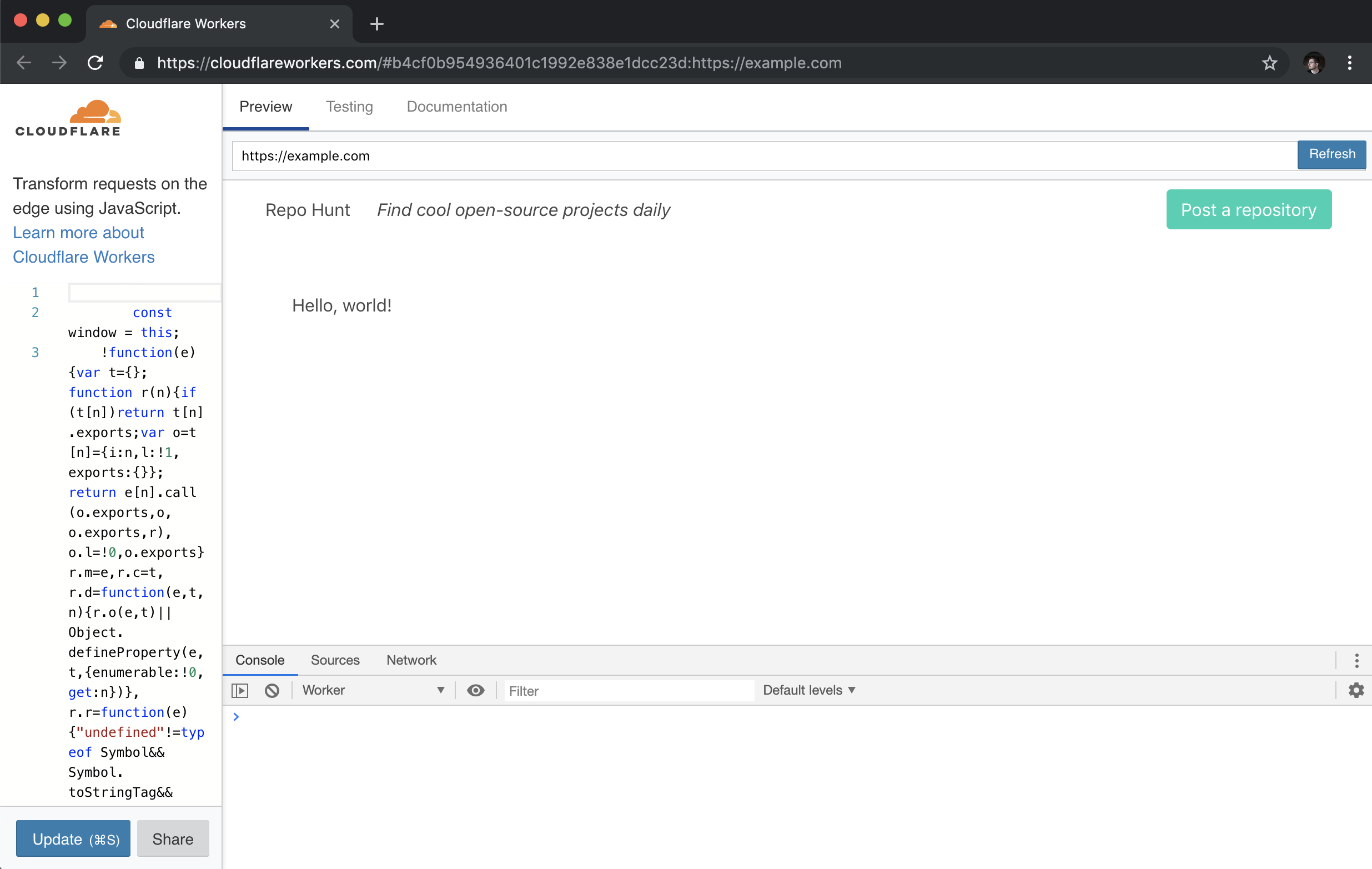
The preview command should open up a new tab in your browser, after building your Workers application and uploading it to our testing playground. In the Preview tab, you should see your rendered HTML response:
With our HTML response appearing in browser, let’s make our handler function a bit more exciting, by returning some nice looking HTML. To do this, we’ll set up a corresponding index „template” for our route handler: when a request comes into the index handler, it will call the template and return an HTML string, to give the client a proper user interface as the response. To start, let’s update handlers/index.js to return a response using our template (and, in addition, set up a try/catch block to catch any errors, and return them as the response):
As you might imagine, we need to set up a corresponding template! We’ll create a new file, templates/index.js, and return an HTML string, using ES6 template strings:
Our template function returns a simple HTML string, which is set to the body of our Response, in handlers/index.js. For our final snippet of templating for our first route, let’s do something slightly more interesting: creating a templates/layout.js file, which will be the base „layout” that all of our templates will render into. This will allow us to set some consistent styling and formatting for all the templates. In templates/layout.js:
This is a big chunk of HTML code, but breaking it down, there’s only a few important things to note: first, this layout variable is a function! A body variable is passed in, intended to be included inside of a div right in the middle of the HTML snippet. In addition, we include the Bulmahttps://bulma.io) CSS frameworkhttps://bulma.io), for a bit of easy styling in our project, and a navigation bar, to tell users *what* this site is, with a link to submit new repositories.
To use our layout template, we’ll import it in templates/index.js, and wrap our HTML string with it:
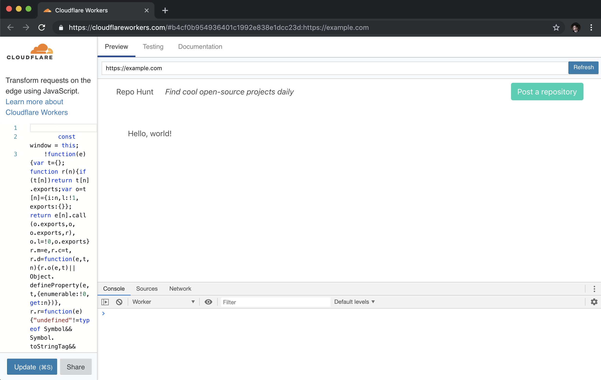
With that, we can run wrangler preview again, to see our nicely rendered HTML page, with a bit of styling help from Bulma:
Storing and retrieving data with Workers KV
Most web applications aren’t very useful without some sort of data persistence. Workers KV is a key-value store built for use with Workers – think of it as a super-fast and globally distributed Redis. In our application, we’ll use KV to store all of the data for our application: each time a user submits a new repository, it will be stored in KV, and we’ll also generate a daily array of repositories to render on the home page.
A quick note: at the time of writing, usage of Workers KV requires a paid Workers plan. Read more in the „Pricing” section of the Workers docs here.
Inside of a Workers application, you can refer to a pre-defined KV namespace, which we’ll create inside of the Cloudflare UI, and bind to our application once it’s been deployed to the Workers application. In this tutorial, we’ll use a KV namespace called REPO_HUNT, and as part of the deployment process, we’ll make sure to attach it to our application, so that any references in the code to REPO_HUNT will correctly resolve to the KV namespace.
Before we hop into creating data inside of our namespace, let’s look at the basics of working with KV inside of your Workers application. Given a namespace (e.g. REPO_HUNT), we can set a key with a given value, using put:
The API is super simple, which is great for web developers who want to start building applications with the Workers platform, without having to dive into relational databases or any kind of external data service. In our case, we’ll store the data for our application by saving:
A repo object, stored at the key repos:$id, where $id is a generated UUID for a newly submitted repo.
A day array, stored at the key $date (e.g. "6/24/2019"), containing a list of repo IDs, which indicate the submitted repos for that day.
We’ll begin by implementing support for submitting repositories, and making our first writes to our KV namespace by saving the repository data in the object we specified above. Along the way, we’ll create a simple JavaScript class for interfacing with our store – we’ll make use of that class again, when we move on to rendering the homepage, where we’ll retrieve the repository data, build a UI, and finish our example application.
Allowing user-submitted data
No matter what the application is, it seems that web developers always end up having to write forms. In our case, we’ll build a simple form for users to submit repositories.
At the beginning of this tutorial, we set up index.js to handle incoming GET requests to the root route (`/). To support users adding new repositories, we’ll add another route, GET /post, which will render a form template to users. In index.js:
// index.js

// ...

const post = require('./handlers/post')

// ...

function handleRequest(request) {
  try {
    const r = new Router()
    r.get('/', index)
    r.get('/post', post)
    return r.route(request)
  } catch (err) {
    return new Response(err)
  }
}
In addition to a new route handler in index.js, we’ll also add handlers/post.js, a new function handler that will render an associated template as an HTML response to the user:
The final piece of the puzzle is the HTML template itself – like our previous template example, we’ll re-use the layout template we’ve built, and wrap a simple three-field form with it, exporting the HTML string from templates/post.js:
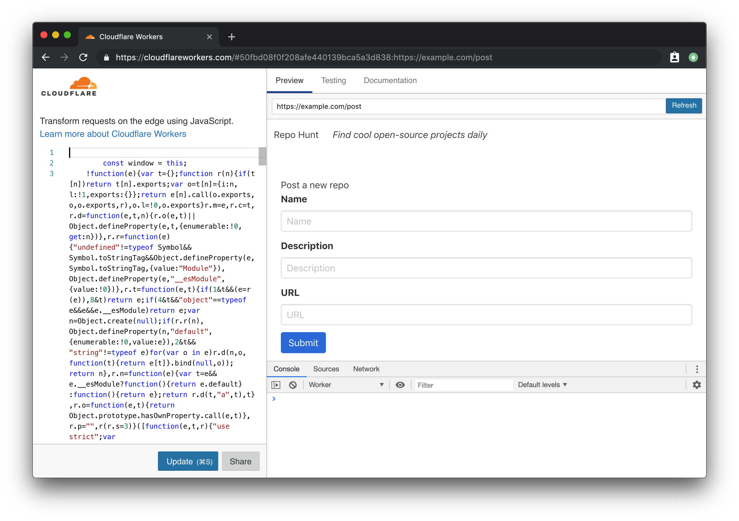
Using wrangler preview, we can navigate to the path /post and see our rendered form:
If you look at the definition of the actual form tag in our template, you’ll notice that we’re making a POST request to the path /repo. To receive the form data, and persist it into our KV store, we’ll go through the process of adding another handler. In index.js:
// index.js

// ...

const create = require('./handlers/create')

// ...

function handleRequest(request) {
  try {
    const r = new Router()
    r.get('/', index)
    r.get('/post', post)
    r.post('/repo', create)
    return r.route(request)
  } catch (err) {
    return new Response(err)
  }
}
When a form is sent to an endpoint, it’s sent as a query string. To make our lives easier, we’ll include the qs library in our project, which will allow us to simply parse the incoming query string as a JS object. In the command line, we’ll add qs simply by using npm. While we’re here, let’s also install the node-uuid package, which we’ll use later to generate IDs for new incoming data. To install them both, use npm’s install --save subcommand:
npm install --save qs uuid
With that, we can implement the corresponding handler function for POST /repo. In handlers/create.js:
// handlers/create.js
const qs = require('qs')

const handler = async request => {
  try {
    const body = await request.text()

    if (!body) {
      throw new Error('Incorrect data')
    }

    const data = qs.parse(body)

    // TODOs:
    // - Create repo
    // - Save repo
    // - Add to today's repos on the homepage

    return new Response('ok', { headers: { Location: '/' }, status: 301 })
  } catch (err) {
    return new Response(err, { status: 400 })
  }
}

module.exports = handler
Our handler function is pretty straightforward — it calls text on the request, waiting for the promise to resolve to get back our query string body. If no body element is provided with the request, the handler throws an error (which returns with a status code of 400, thanks to our try/catch block). Given a valid body, we call parse on the imported qs package, and get some data back. For now, we’ve stubbed out our intentions for the remainder of this code: first, we’ll create a repo, based on the data. We’ll save that repo, and then add it to the array of today’s repos, to be rendered on the home page.
To write our repo data into KV, we’ll build two simple ES6 classes, to do a bit of light validation and define some persistence methods for our data types. While you could just call REPO_HUNT.put directly, if you’re working with large amounts of similar data, it can be nice to do something like new Repo(data).save() – in fact, we’ll implement something almost exactly like this, so that working with a Repo is incredibly easy and consistent.
Let’s define store/repo.js, which will contain a Repo class. With this class, we can instantiate new Repo objects, and using the constructor method, we can pass in data, and validate it, before continuing to use it in our code.
// store/repo.js
const uuid = require('uuid/v4')

class Repo {
  constructor({ id, description, name, submitted_at, url }) {
    this.id = id || uuid()
    this.description = description

    if (!name) {
      throw new Error(`Missing name in data`)
    } else {
      this.name = name
    }

    this.submitted_at = submitted_at || Number(new Date())

    try {
      const urlObj = new URL(url)
      const whitelist = ['github.com', 'gitlab.com']

      if (!whitelist.some(valid => valid === urlObj.host)) {
        throw new Error('The URL provided is not a repository')
      }
    } catch (err) {
      throw new Error('The URL provided is not valid')
    }

    this.url = url
  }

  save() {
    return REPO_HUNT.put(`repos:${this.id}`, JSON.stringify(this))
  }
}

module.exports = Repo
Even if you aren’t super familiar with the constructor function in an ES6 class, this example should still be fairly easy to understand. When we want to create a new instance of a Repo, we pass the relevant data to constructor as an object, using ES6’s destructuring assignment to pull each value out into its own key. With those variables, we walk through each of them, assigning this.$key (e.g. this.name, this.description, etc) to the passed-in value.
Many of these values have a „default” value: for instance, if no ID is passed to the constructor, we’ll generate a new one, using our previously-saved uuid package’s v4 variant to generate a new UUID, using uuid(). For submitted_at, we’ll generate a new instance of Date and convert it to a Unix timestamp, and for url, we’ll insure that the URL is both valid *and* is from github.com or gitlab.com to ensure that users are submitting genuine repos.
With that, the save function, which can be called on an instance of Repo, inserts a JSON-stringified version of the Repo instance into KV, setting the key as repos:$id. Back in handlers/create.js, we’ll import the Repo class, and save a new Repo using our previously parsed data:
With that, a new Repo based on incoming form data should actually be persisted into Workers KV! While the repo is being saved, we also want to set up another data model, Day, which contains a simple list of the repositories that were submitted by users for a specific day. Let’s create another file, store/day.js, and flesh it out:
Note that the code for this isn’t even a class — it’s an object with key-value pairs, where the values are functions! We’ll add more to this soon, but the single function we’ve defined, add, loads any existing repos from today’s date (using the function today to generate a date string, used as the key in KV), and adds a new Repo, based on the id argument passed into the function. Back inside of handlers/create.js, we’ll make sure to import and call this new function, so that any new repos are added immediately to today’s list of repos:
Our repo data now persists into KV and it’s added to a listing of the repos submitted by users for today’s date. Let’s move on to the final piece of our tutorial, to take that data, and render it on the homepage.
Rendering data
At this point, we’ve implemented rendering HTML pages in a Workers application, as well as taking incoming data, and persisting it to Workers KV. It shouldn’t surprise you to learn that taking that data from KV, and rendering an HTML page with it, our homepage, is quite similar to everything we’ve done up until now. Recall that the path / is tied to our index handler: in that file, we’ll want to load the repos for today’s date, and pass them into the template, in order to be rendered. There’s a few pieces we need to implement to get that working – to start, let’s look at handlers/index.js:
// handlers/index.js

// ...
const Day = require('../store/day')

const handler = async () => {
  try {
    let repos = await Day.getRepos()
    return new Response(template(repos), { headers })
  } catch (err) {
    return new Response(`Error! ${err} for ${JSON.stringify(repos)}`)
  }
}

// ...
While the general structure of the function handler should stay the same, we’re now ready to put some genuine data into our application. We should import the Day module, and inside of the handler, call await Day.getRepos to get a list of repos back (don’t worry, we’ll implement the corresponding functions soon). With that set of repos, we pass them into our template function, meaning that we’ll be able to actually render them inside of the HTML.
Inside of Day.getRepos, we need to load the list of repo IDs from inside KV, and for each of them, load the corresponding repo data from KV. In store/day.js:
The getRepos function reuses our previously defined todayData function, which returns a list of ids. If that list has *any* IDs, we want to actually retrieve those repositories. Again, we’ll call a function that we haven’t quite defined yet, importing the Repo class and calling Repo.findMany, passing in our list of IDs. As you might imagine, we should hop over to store/repo.js, and implement the accompanying function:
To support finding all the repos for a set of IDs, we define two class-level or static functions, find and findMany which uses Promise.all to call find for each ID in the set, and waits for them all to finish before resolving the promise. The bulk of the logic, inside of find, looks up the repo by its ID (using the previously-defined key, repos:$id), parses the JSON string, and returns a newly instantiated instance of Repo.
Now that we can look up repositories from KV, we should take that data and actually render it in our template. In handlers/index.js, we passed in the repos array to the template function defined in templates/index.js. In that file, we’ll take that repos array, and render chunks of HTML for each repo inside of it:
Breaking this file down, we have two primary functions: template (an updated version of our original exported function), which takes an array of repos, maps through them, calling repoTemplate, to generate an array of HTML strings. If repos is an empty array, the function simply returns a p tag with an empty state. The repoTemplate function uses destructuring assignment to set the variables description, name, submitted_at, and url from inside of the repo object being passed to the function, and renders each of them into fairly simple HTML, leaning on Bulma’s CSS classes to quickly define a media object layout.
And with that, we’re done writing code for our project! After coding a pretty comprehensive full-stack application on top of Workers, we’re on the final step: deploying the application to the Workers platform.
Deploying your site to workers.dev
Every Workers user can claim a free Workers.dev subdomain, after signing up for a Cloudflare account. In Wrangler, we’ve made it super easy to claim and configure your subdomain, using the subdomain subcommand. Each account gets one Workers.dev subdomain, so choose wisely!
wrangler subdomain my-cool-subdomain
With a configured subdomain, we can now deploy our code! The name property in wrangler.toml will indicate the final URL that our application will be deployed to: in my codebase, the name is set to repo-hunt, and my subdomain is signalnerve.workers.dev, so my final URL for my project will be repo-hunt.signalnerve.workers.dev. Let’s deploy the project, using the publish command:
wrangler publish
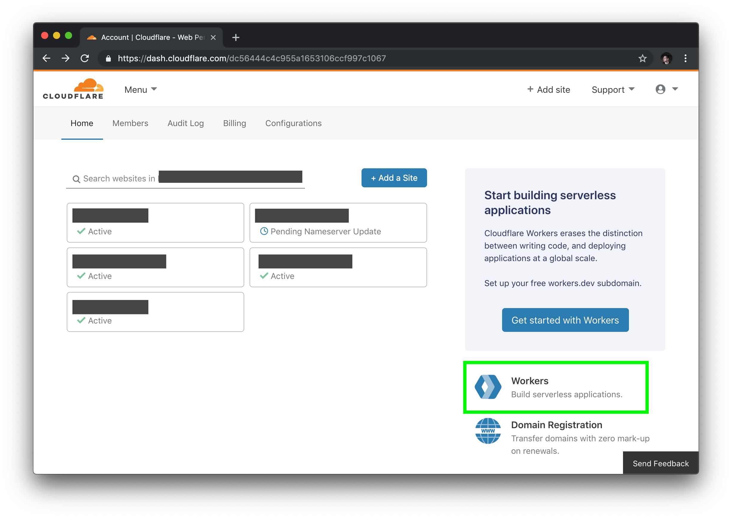
Before we can view the project in browser, we have one more step to complete: going into the Cloudflare UI, creating a KV namespace, and binding it to our project. To start this process, log into your Cloudflare dashboard, and select the „Workers” tab on the right side of the page.
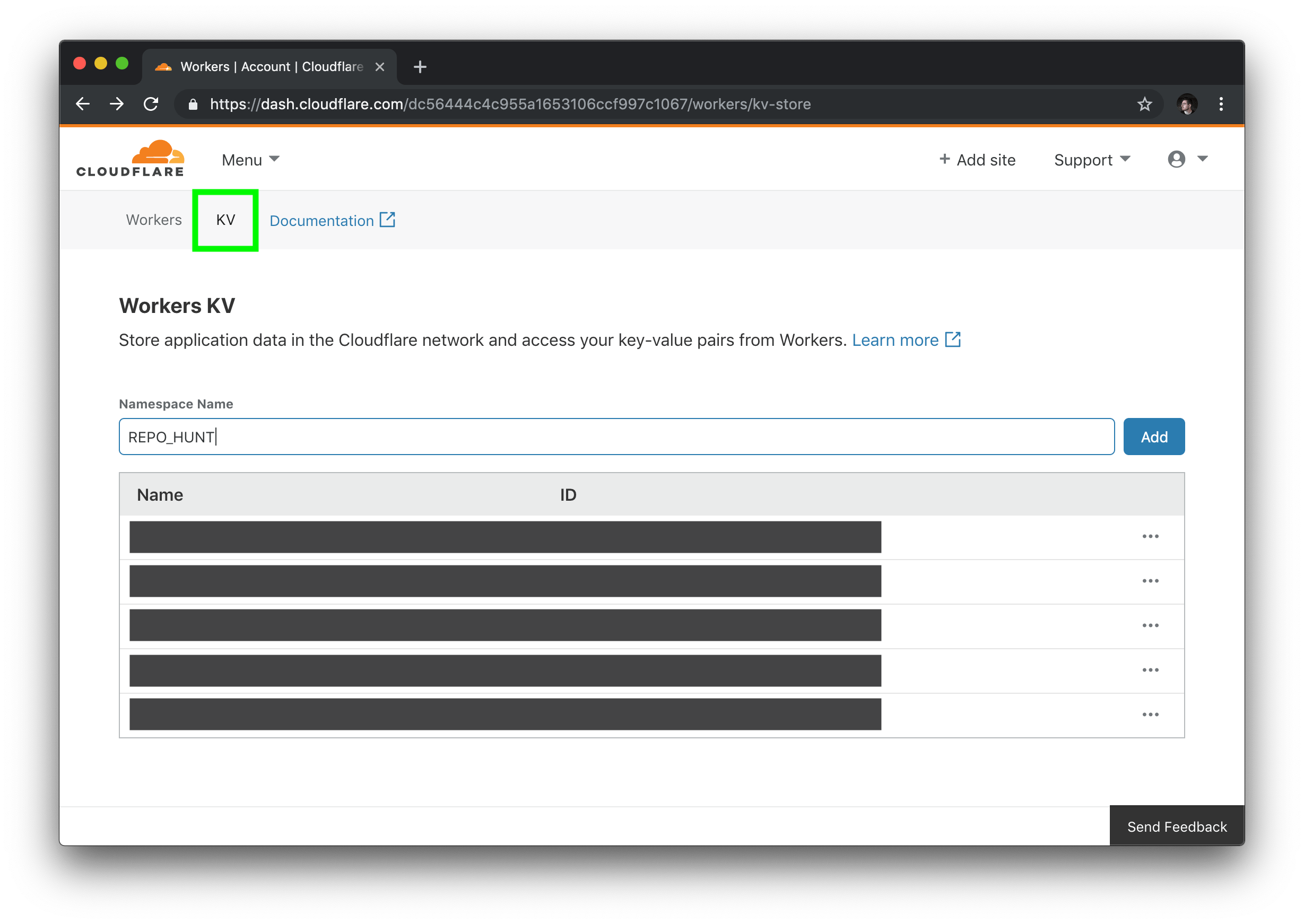
Inside of the Workers section of your dashboard, find the „KV” menu item, and create a new namespace, matching the namespace you used in your codebase (if you followed the code samples, this will be REPO_HUNT).
In the listing of KV namespaces, copy your namespace ID. Back in our project, we’ll add a `kv-namespaces` key to our `wrangler.toml`, to use our new namespace in the codebase:
# wrangler.toml
[[kv-namespaces]]
binding = "REPO_HUNT"
id = "$yourNamespaceId"
To make sure your project is using the new KV namespace, publish your project one last time:
wrangler publish
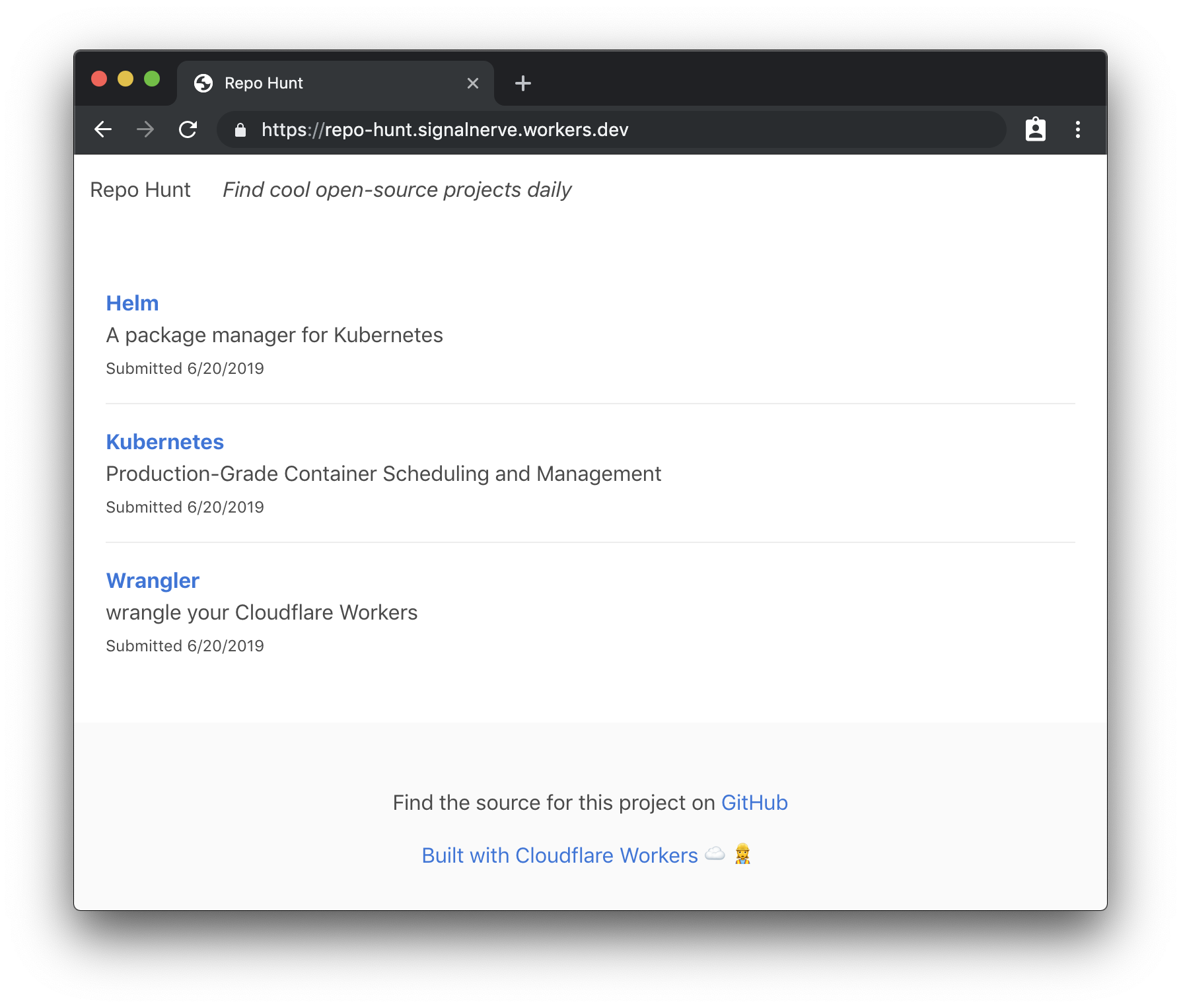
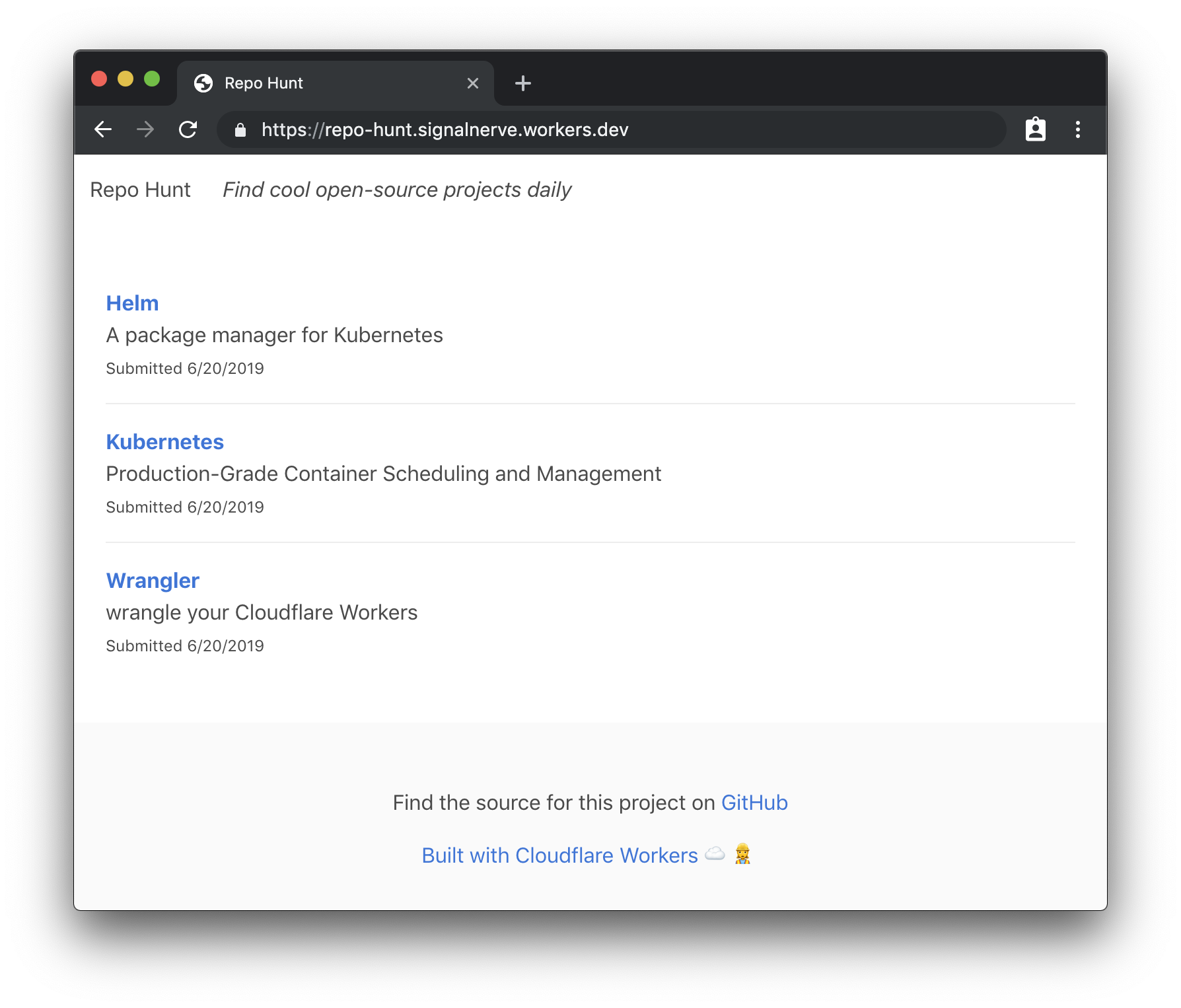
With that, your application should be able to successfully read and write from your KV namespace. Opening my project’s URL should show the final version of our project — a full, data-driven application without needing to manage any servers, built entirely on the Workers platform!
What’s next?
In this tutorial, we built a full-stack serverless application on top of the Workers platform, using Wrangler, Cloudflare’s command-line tool for building and deploying Workers applications. There’s a ton of things that you could do to continue to add to this application: for instance, the ability to upvote submissions, or even to allow comments and other kinds of data. If you’d like to see the finished codebase for this project, check out the GitHub repo!
The Workers team maintains a constantly growing list of new templates to begin building projects with – if you want to see what you can build, make sure to check out our Template Gallery. In addition, make sure to check out some of the tutorials in the Workers documentation, such as building a Slack bot, or a QR code generator.
If you went through the whole tutorial (or if you’re building cool things you want to share), I’d love to hear about how it went on Twitter. If you’re interested in serverless and want to keep up with any new tutorials I’m publishing, make sure to join my newsletter and subscribe to my YouTube channel!
One of my favorite developments in software development has been the advent of serverless. As a developer who has a tendency to get bogged down in the details of deployment and DevOps, it’s refreshing to be given a mode of building web applications that simply abstracts scaling and infrastructure away from me. Serverless has made me better at actually shipping projects!
That being said, if you’re new to serverless, it may be unclear how to translate the things that you already know into a new paradigm. If you’re a front-end developer, you may have no experience with what serverless purports to abstract away from you – so how do you even get started?
Today, I’ll try to help demystify the practical part of working with serverless by taking a project from idea to production, using Cloudflare Workers. Our project will be a daily leaderboard, called „Repo Hunt” inspired by sites like Product Hunt and Reddit, where users can submit and upvote cool open-source projects from GitHub and GitLab. You can see the final version of the site, published here.
Workers is a serverless application platform built on top of Cloudflare’s network. When you publish a project to Cloudflare Workers, it’s immediately distributed across 180 (and growing) cities around the world, meaning that regardless of where your users are located, your Workers application will be served from a nearby Cloudflare server with extremely low latency. On top of that, the Workers team has gone all-in on developer experience: our newest release, at the beginning of this month, introduced a fully-featured command line tool called Wrangler, which manages building, uploading, and publishing your serverless applications with a few easy-to-learn and powerful commands.
The end result is a platform that allows you to simply write JavaScript and deploy it to a URL – no more worrying about what „Docker” means, or if your application will fall over when it makes it to the front page of Hacker News!
If you’re the type that wants to see the project ahead of time, before hopping into a long tutorial, you’re in luck! The source for this project is available on GitHub. With that, let’s jump in to the command-line and build something rad.
Installing Wrangler and preparing our workspace
Wrangler is the command-line tool for generating, building, and publishing Cloudflare Workers projects. We’ve made it super easy to install, especially if you’ve worked with npm before:
npm install -g @cloudflare/wrangler
Once you’ve installed Wrangler, you can use the generate command to make a new project. Wrangler projects use „templates” which are code repositories built for re-use by developers building with Workers. We maintain a growing list of templates to help you build all kind of projects in Workers: check out our Template Gallery to get started!
In this tutorial, we’ll use the „Router” template, which allows you to build URL-based projects on top of Workers. The generate command takes two arguments: first, the name of your project (I’ll use repo-hunt), and a Git URL. This is my favorite part of the generate command: you can use all kinds of templates by pointing Wrangler at a GitHub URL, so sharing, forking, and collaborating on templates is super easy. Let’s run the generate command now:
wrangler generate repo-hunt https://github.com/cloudflare/worker-template-router
cd repo-hunt
The Router template includes support for building projects with webpack, so you can add npm modules to your project, and use all the JavaScript tooling you know and love. In addition, as you might expect, the template includes a Router class, which allows you to handle routes in your Worker, and tie them to a function. Let’s look at a simple example: setting up an instance of Router, handling a GET request to /, and returning a response to the client:
// index.js
const Router = require('./router')

addEventListener('fetch', event => {
  event.respondWith(handleRequest(event.request))
})

async function handleRequest(request) {
  try {
    const r = new Router()
    r.get('/', () => new Response("Hello, world!"))
    const resp = await r.route(request)
    return resp
  } catch (err) {
    return new Response(err)
  }
}
All Workers applications begin by listening to the fetch event, which is an incoming request from a client to your application. Inside of that event listener, it’s common practice to call a handleRequest function, which looks at the incoming request and determines how to respond. When handling an incoming fetch event, which indicates an incoming request, a Workers script should always return a Response back to the user: it’s a similar request/response pattern to many web frameworks, like Express, so if you’ve worked with web frameworks before, it should feel quite familiar!
In our example, we’ll make use of a few routes: a „root” route (/), which will render the homepage of our site; a form for submitting new repos, at /post, and a special route for accepting POST requests, when a user submits a repo from the form, at /repo.
Building a route and rendering a template
The first route that we’ll set up is the „root” route, at the path /. This will be where repos submitted by the community will be rendered. For now, let’s get some practice defining a route, and returning plain HTML. This pattern is common enough in Workers applications that it makes sense to understand it first, before we move on to some more interesting bits!
To begin, we’ll update index.js to set up an instance of a Router, handle any GET requests to /, and call the function index, from handlers/index.js (more on that shortly):
// index.js
const Router = require('./router')
const index = require('./handlers/index')

addEventListener('fetch', event => {
  event.respondWith(handleRequest(event.request))
})

function handleRequest(request) {
  try {
    const r = new Router()
    r.get('/', index)
    return r.route(request)
  } catch (err) {
    return new Response(err)
  }
}
As with the example index.js in the previous section, our code listens for a fetch event, and responds by calling the handleRequest function. The handleRequest function sets up an instance of Router, which will call the index function on any GET requests to /. With the router setup, we route the incoming request, using r.route, and return it as the response to the client. If anything goes wrong, we simply wrap the content of the function in a try/catch block, and return the err to the client (a note here: in production applications, you may want something more robust here, like logging to an exception monitoring tool).
To continue setting up our route handler, we’ll create a new file, handlers/index.js, which will take the incoming request and return a HTML response to the client:
Our handler function is simple: it returns a new instance of Response with the text „Hello, world!” as well as a headers object that sets the Content-Type header to text/html – this tells the browser to render the incoming response as an HTML document. This means that when a client makes a GET request to the route /, a new HTML response will be constructed with the text „Hello, world!” and returned to the user.
Wrangler has a preview function, perfect for testing the HTML output of our new function. Let’s run it now to ensure that our application works as expected:
wrangler preview
The preview command should open up a new tab in your browser, after building your Workers application and uploading it to our testing playground. In the Preview tab, you should see your rendered HTML response:
With our HTML response appearing in browser, let’s make our handler function a bit more exciting, by returning some nice looking HTML. To do this, we’ll set up a corresponding index „template” for our route handler: when a request comes into the index handler, it will call the template and return an HTML string, to give the client a proper user interface as the response. To start, let’s update handlers/index.js to return a response using our template (and, in addition, set up a try/catch block to catch any errors, and return them as the response):
As you might imagine, we need to set up a corresponding template! We’ll create a new file, templates/index.js, and return an HTML string, using ES6 template strings:
Our template function returns a simple HTML string, which is set to the body of our Response, in handlers/index.js. For our final snippet of templating for our first route, let’s do something slightly more interesting: creating a templates/layout.js file, which will be the base „layout” that all of our templates will render into. This will allow us to set some consistent styling and formatting for all the templates. In templates/layout.js:
This is a big chunk of HTML code, but breaking it down, there’s only a few important things to note: first, this layout variable is a function! A body variable is passed in, intended to be included inside of a div right in the middle of the HTML snippet. In addition, we include the Bulmahttps://bulma.io) CSS frameworkhttps://bulma.io), for a bit of easy styling in our project, and a navigation bar, to tell users *what* this site is, with a link to submit new repositories.
To use our layout template, we’ll import it in templates/index.js, and wrap our HTML string with it:
With that, we can run wrangler preview again, to see our nicely rendered HTML page, with a bit of styling help from Bulma:
Storing and retrieving data with Workers KV
Most web applications aren’t very useful without some sort of data persistence. Workers KV is a key-value store built for use with Workers – think of it as a super-fast and globally distributed Redis. In our application, we’ll use KV to store all of the data for our application: each time a user submits a new repository, it will be stored in KV, and we’ll also generate a daily array of repositories to render on the home page.
A quick note: at the time of writing, usage of Workers KV requires a paid Workers plan. Read more in the „Pricing” section of the Workers docs here.
Inside of a Workers application, you can refer to a pre-defined KV namespace, which we’ll create inside of the Cloudflare UI, and bind to our application once it’s been deployed to the Workers application. In this tutorial, we’ll use a KV namespace called REPO_HUNT, and as part of the deployment process, we’ll make sure to attach it to our application, so that any references in the code to REPO_HUNT will correctly resolve to the KV namespace.
Before we hop into creating data inside of our namespace, let’s look at the basics of working with KV inside of your Workers application. Given a namespace (e.g. REPO_HUNT), we can set a key with a given value, using put:
The API is super simple, which is great for web developers who want to start building applications with the Workers platform, without having to dive into relational databases or any kind of external data service. In our case, we’ll store the data for our application by saving:
A repo object, stored at the key repos:$id, where $id is a generated UUID for a newly submitted repo.
A day array, stored at the key $date (e.g. "6/24/2019"), containing a list of repo IDs, which indicate the submitted repos for that day.
We’ll begin by implementing support for submitting repositories, and making our first writes to our KV namespace by saving the repository data in the object we specified above. Along the way, we’ll create a simple JavaScript class for interfacing with our store – we’ll make use of that class again, when we move on to rendering the homepage, where we’ll retrieve the repository data, build a UI, and finish our example application.
Allowing user-submitted data
No matter what the application is, it seems that web developers always end up having to write forms. In our case, we’ll build a simple form for users to submit repositories.
At the beginning of this tutorial, we set up index.js to handle incoming GET requests to the root route (`/). To support users adding new repositories, we’ll add another route, GET /post, which will render a form template to users. In index.js:
// index.js

// ...

const post = require('./handlers/post')

// ...

function handleRequest(request) {
  try {
    const r = new Router()
    r.get('/', index)
    r.get('/post', post)
    return r.route(request)
  } catch (err) {
    return new Response(err)
  }
}
In addition to a new route handler in index.js, we’ll also add handlers/post.js, a new function handler that will render an associated template as an HTML response to the user:
The final piece of the puzzle is the HTML template itself – like our previous template example, we’ll re-use the layout template we’ve built, and wrap a simple three-field form with it, exporting the HTML string from templates/post.js:
Using wrangler preview, we can navigate to the path /post and see our rendered form:
If you look at the definition of the actual form tag in our template, you’ll notice that we’re making a POST request to the path /repo. To receive the form data, and persist it into our KV store, we’ll go through the process of adding another handler. In index.js:
// index.js

// ...

const create = require('./handlers/create')

// ...

function handleRequest(request) {
  try {
    const r = new Router()
    r.get('/', index)
    r.get('/post', post)
    r.post('/repo', create)
    return r.route(request)
  } catch (err) {
    return new Response(err)
  }
}
When a form is sent to an endpoint, it’s sent as a query string. To make our lives easier, we’ll include the qs library in our project, which will allow us to simply parse the incoming query string as a JS object. In the command line, we’ll add qs simply by using npm. While we’re here, let’s also install the node-uuid package, which we’ll use later to generate IDs for new incoming data. To install them both, use npm’s install --save subcommand:
npm install --save qs uuid
With that, we can implement the corresponding handler function for POST /repo. In handlers/create.js:
// handlers/create.js
const qs = require('qs')

const handler = async request => {
  try {
    const body = await request.text()

    if (!body) {
      throw new Error('Incorrect data')
    }

    const data = qs.parse(body)

    // TODOs:
    // - Create repo
    // - Save repo
    // - Add to today's repos on the homepage

    return new Response('ok', { headers: { Location: '/' }, status: 301 })
  } catch (err) {
    return new Response(err, { status: 400 })
  }
}

module.exports = handler
Our handler function is pretty straightforward — it calls text on the request, waiting for the promise to resolve to get back our query string body. If no body element is provided with the request, the handler throws an error (which returns with a status code of 400, thanks to our try/catch block). Given a valid body, we call parse on the imported qs package, and get some data back. For now, we’ve stubbed out our intentions for the remainder of this code: first, we’ll create a repo, based on the data. We’ll save that repo, and then add it to the array of today’s repos, to be rendered on the home page.
To write our repo data into KV, we’ll build two simple ES6 classes, to do a bit of light validation and define some persistence methods for our data types. While you could just call REPO_HUNT.put directly, if you’re working with large amounts of similar data, it can be nice to do something like new Repo(data).save() – in fact, we’ll implement something almost exactly like this, so that working with a Repo is incredibly easy and consistent.
Let’s define store/repo.js, which will contain a Repo class. With this class, we can instantiate new Repo objects, and using the constructor method, we can pass in data, and validate it, before continuing to use it in our code.
// store/repo.js
const uuid = require('uuid/v4')

class Repo {
  constructor({ id, description, name, submitted_at, url }) {
    this.id = id || uuid()
    this.description = description

    if (!name) {
      throw new Error(`Missing name in data`)
    } else {
      this.name = name
    }

    this.submitted_at = submitted_at || Number(new Date())

    try {
      const urlObj = new URL(url)
      const whitelist = ['github.com', 'gitlab.com']

      if (!whitelist.some(valid => valid === urlObj.host)) {
        throw new Error('The URL provided is not a repository')
      }
    } catch (err) {
      throw new Error('The URL provided is not valid')
    }

    this.url = url
  }

  save() {
    return REPO_HUNT.put(`repos:${this.id}`, JSON.stringify(this))
  }
}

module.exports = Repo
Even if you aren’t super familiar with the constructor function in an ES6 class, this example should still be fairly easy to understand. When we want to create a new instance of a Repo, we pass the relevant data to constructor as an object, using ES6’s destructuring assignment to pull each value out into its own key. With those variables, we walk through each of them, assigning this.$key (e.g. this.name, this.description, etc) to the passed-in value.
Many of these values have a „default” value: for instance, if no ID is passed to the constructor, we’ll generate a new one, using our previously-saved uuid package’s v4 variant to generate a new UUID, using uuid(). For submitted_at, we’ll generate a new instance of Date and convert it to a Unix timestamp, and for url, we’ll insure that the URL is both valid *and* is from github.com or gitlab.com to ensure that users are submitting genuine repos.
With that, the save function, which can be called on an instance of Repo, inserts a JSON-stringified version of the Repo instance into KV, setting the key as repos:$id. Back in handlers/create.js, we’ll import the Repo class, and save a new Repo using our previously parsed data:
With that, a new Repo based on incoming form data should actually be persisted into Workers KV! While the repo is being saved, we also want to set up another data model, Day, which contains a simple list of the repositories that were submitted by users for a specific day. Let’s create another file, store/day.js, and flesh it out:
Note that the code for this isn’t even a class — it’s an object with key-value pairs, where the values are functions! We’ll add more to this soon, but the single function we’ve defined, add, loads any existing repos from today’s date (using the function today to generate a date string, used as the key in KV), and adds a new Repo, based on the id argument passed into the function. Back inside of handlers/create.js, we’ll make sure to import and call this new function, so that any new repos are added immediately to today’s list of repos:
Our repo data now persists into KV and it’s added to a listing of the repos submitted by users for today’s date. Let’s move on to the final piece of our tutorial, to take that data, and render it on the homepage.
Rendering data
At this point, we’ve implemented rendering HTML pages in a Workers application, as well as taking incoming data, and persisting it to Workers KV. It shouldn’t surprise you to learn that taking that data from KV, and rendering an HTML page with it, our homepage, is quite similar to everything we’ve done up until now. Recall that the path / is tied to our index handler: in that file, we’ll want to load the repos for today’s date, and pass them into the template, in order to be rendered. There’s a few pieces we need to implement to get that working – to start, let’s look at handlers/index.js:
// handlers/index.js

// ...
const Day = require('../store/day')

const handler = async () => {
  try {
    let repos = await Day.getRepos()
    return new Response(template(repos), { headers })
  } catch (err) {
    return new Response(`Error! ${err} for ${JSON.stringify(repos)}`)
  }
}

// ...
While the general structure of the function handler should stay the same, we’re now ready to put some genuine data into our application. We should import the Day module, and inside of the handler, call await Day.getRepos to get a list of repos back (don’t worry, we’ll implement the corresponding functions soon). With that set of repos, we pass them into our template function, meaning that we’ll be able to actually render them inside of the HTML.
Inside of Day.getRepos, we need to load the list of repo IDs from inside KV, and for each of them, load the corresponding repo data from KV. In store/day.js:
The getRepos function reuses our previously defined todayData function, which returns a list of ids. If that list has *any* IDs, we want to actually retrieve those repositories. Again, we’ll call a function that we haven’t quite defined yet, importing the Repo class and calling Repo.findMany, passing in our list of IDs. As you might imagine, we should hop over to store/repo.js, and implement the accompanying function:
To support finding all the repos for a set of IDs, we define two class-level or static functions, find and findMany which uses Promise.all to call find for each ID in the set, and waits for them all to finish before resolving the promise. The bulk of the logic, inside of find, looks up the repo by its ID (using the previously-defined key, repos:$id), parses the JSON string, and returns a newly instantiated instance of Repo.
Now that we can look up repositories from KV, we should take that data and actually render it in our template. In handlers/index.js, we passed in the repos array to the template function defined in templates/index.js. In that file, we’ll take that repos array, and render chunks of HTML for each repo inside of it:
Breaking this file down, we have two primary functions: template (an updated version of our original exported function), which takes an array of repos, maps through them, calling repoTemplate, to generate an array of HTML strings. If repos is an empty array, the function simply returns a p tag with an empty state. The repoTemplate function uses destructuring assignment to set the variables description, name, submitted_at, and url from inside of the repo object being passed to the function, and renders each of them into fairly simple HTML, leaning on Bulma’s CSS classes to quickly define a media object layout.
And with that, we’re done writing code for our project! After coding a pretty comprehensive full-stack application on top of Workers, we’re on the final step: deploying the application to the Workers platform.
Deploying your site to workers.dev
Every Workers user can claim a free Workers.dev subdomain, after signing up for a Cloudflare account. In Wrangler, we’ve made it super easy to claim and configure your subdomain, using the subdomain subcommand. Each account gets one Workers.dev subdomain, so choose wisely!
wrangler subdomain my-cool-subdomain
With a configured subdomain, we can now deploy our code! The name property in wrangler.toml will indicate the final URL that our application will be deployed to: in my codebase, the name is set to repo-hunt, and my subdomain is signalnerve.workers.dev, so my final URL for my project will be repo-hunt.signalnerve.workers.dev. Let’s deploy the project, using the publish command:
wrangler publish
Before we can view the project in browser, we have one more step to complete: going into the Cloudflare UI, creating a KV namespace, and binding it to our project. To start this process, log into your Cloudflare dashboard, and select the „Workers” tab on the right side of the page.
Inside of the Workers section of your dashboard, find the „KV” menu item, and create a new namespace, matching the namespace you used in your codebase (if you followed the code samples, this will be REPO_HUNT).
In the listing of KV namespaces, copy your namespace ID. Back in our project, we’ll add a `kv-namespaces` key to our `wrangler.toml`, to use our new namespace in the codebase:
# wrangler.toml
[[kv-namespaces]]
binding = "REPO_HUNT"
id = "$yourNamespaceId"
To make sure your project is using the new KV namespace, publish your project one last time:
wrangler publish
With that, your application should be able to successfully read and write from your KV namespace. Opening my project’s URL should show the final version of our project — a full, data-driven application without needing to manage any servers, built entirely on the Workers platform!
What’s next?
In this tutorial, we built a full-stack serverless application on top of the Workers platform, using Wrangler, Cloudflare’s command-line tool for building and deploying Workers applications. There’s a ton of things that you could do to continue to add to this application: for instance, the ability to upvote submissions, or even to allow comments and other kinds of data. If you’d like to see the finished codebase for this project, check out the GitHub repo!
The Workers team maintains a constantly growing list of new templates to begin building projects with – if you want to see what you can build, make sure to check out our Template Gallery. In addition, make sure to check out some of the tutorials in the Workers documentation, such as building a Slack bot, or a QR code generator.
If you went through the whole tutorial (or if you’re building cool things you want to share), I’d love to hear about how it went on Twitter. If you’re interested in serverless and want to keep up with any new tutorials I’m publishing, make sure to join my newsletter and subscribe to my YouTube channel!
In this week’s roundup, variable fonts get oblique, a new browser extension for linting, and the very first version of CSS Modules.
Use font-style: oblique on variable fonts
Some popular variable fonts have a 'wght' (weight) axis for displaying text at different font weights and a 'slnt' (slant) axis for displaying slanted text. This enables creating many font styles using a single variable font file (e.g., see the „Variable Web Typography” demo page).
You can use font-style: oblique instead of the lower-level font-variation-settings property to display slanted text in variable fonts that have a 'slnt' axis. This approach works in Chrome, Safari, and Firefox.
The webhint linting tool is now available as a browser devtools extension for Chrome, Edge, and Firefox (read Microsoft’s announcement). Compared to Lighthouse, one distinguishing feature of webhint are its cross-browser compatibility hints.
In other news…
CSS Modules V1 is a new proposal from Microsoft that would extend the JavaScript modules infrastructure to allow importing a CSSStyleSheet object from a CSS file (e.g., import styles from "styles.css";) (via Thomas Steiner)
Web apps installed in the desktop version of Chrome can be uninstalled on the about:apps page (right-click on an app’s icon to reveal the Remove... option) (via Techdows)
Because of AMP’s unique requirements, larger news sites such as The Guardian should optimally have two separate codebases (one for the AMP pages and one for the regular website) (via The Guardian)
Read more news in my new, weekly Sunday issue. Visit webplatform.news for more information.