In this week’s roundup, variable fonts get oblique, a new browser extension for linting, and the very first version of CSS Modules.
Use font-style: oblique on variable fonts
Some popular variable fonts have a 'wght' (weight) axis for displaying text at different font weights and a 'slnt' (slant) axis for displaying slanted text. This enables creating many font styles using a single variable font file (e.g., see the „Variable Web Typography” demo page).
You can use font-style: oblique instead of the lower-level font-variation-settings property to display slanted text in variable fonts that have a 'slnt' axis. This approach works in Chrome, Safari, and Firefox.
The webhint linting tool is now available as a browser devtools extension for Chrome, Edge, and Firefox (read Microsoft’s announcement). Compared to Lighthouse, one distinguishing feature of webhint are its cross-browser compatibility hints.
In other news…
CSS Modules V1 is a new proposal from Microsoft that would extend the JavaScript modules infrastructure to allow importing a CSSStyleSheet object from a CSS file (e.g., import styles from "styles.css";) (via Thomas Steiner)
Web apps installed in the desktop version of Chrome can be uninstalled on the about:apps page (right-click on an app’s icon to reveal the Remove... option) (via Techdows)
Because of AMP’s unique requirements, larger news sites such as The Guardian should optimally have two separate codebases (one for the AMP pages and one for the regular website) (via The Guardian)
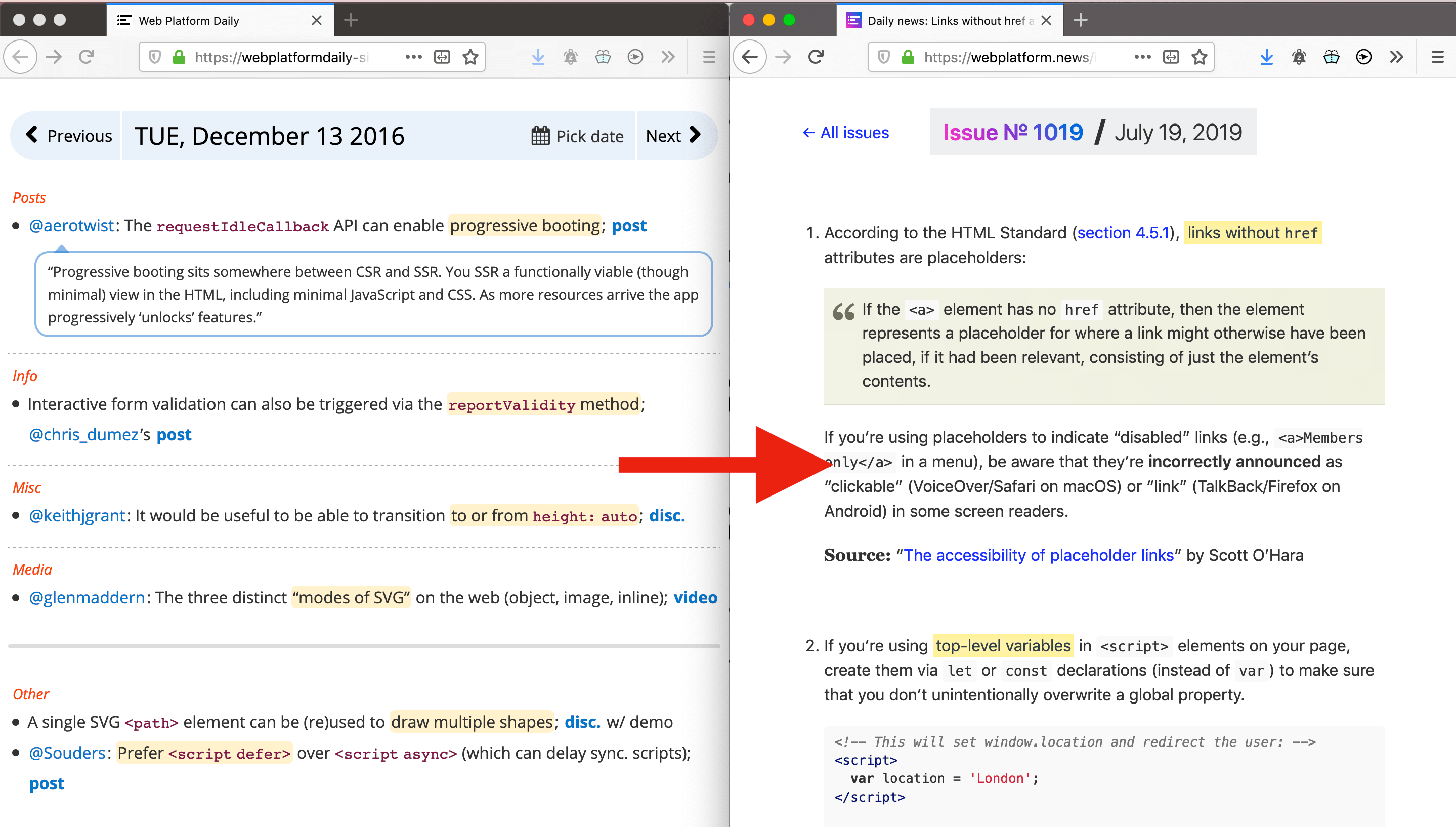
Read more news in my new, weekly Sunday issue. Visit webplatform.news for more information.
I’m in love with SVG. Sure, the code can look dense and difficult at first, but you’ll see the beauty in the results when you get to know it. The bonus is that those results are in code, so it can be hooked up to a CMS. Your designers can rest easy knowing they don’t have to reproduce an effect for every article or product on your site.
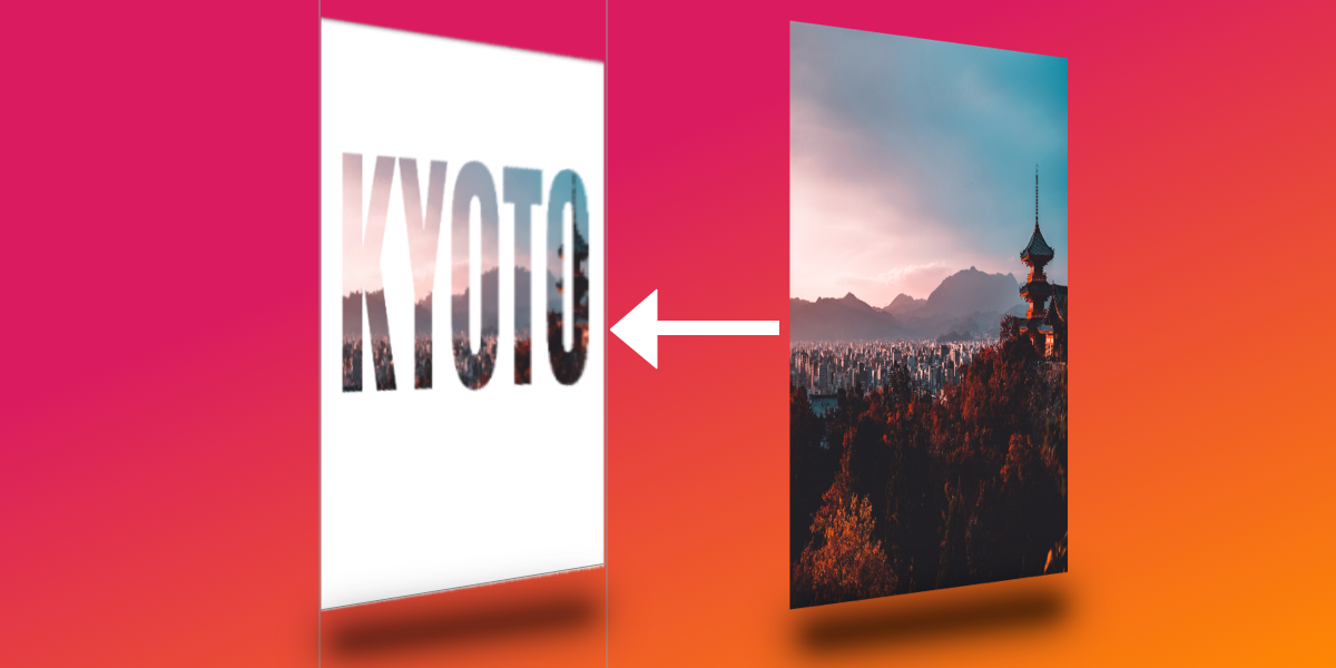
Today I would like to show you how I came up with this glass text effect.
Step 0: Patience and space
SVG can be a lot to take on, especially when you’re just starting to learn it (and if you are, Chris’ book is a good place to start). It’s practically a whole new language and, especially for people who lack design chops, there are lots of new techniques and considerations to know about. Like HTML, though, you’ll find there are a handful of tools that we can reach for to help make SVG much easier to grasp., so be patient and keep trying!
Also, give yourself space. Literally. SVG code is dense so I like to use two or three new lines to space things out. It makes the code easier to read and helps me see how different pieces are separated with less visual distraction. Oh, and use comments to mark where you are in the document, too. That can help organize your thoughts and document your findings.
I’ve made demos for each step we’re going to cover in the process of learning this glass effect as a way to help solidify the things we’re covering as we go.
OK, now that we’re mentally prepared, let’s get into the meat of it!
Step 1: Get the basic image in place
First things first: we need an image as the backdrop for our glass effect. Here we have an <svg> element and an <image> within it. This is similar to adding an <img> in HTML. You’ll notice the dimensions of the viewBox attribute and <image> element in the SVG element are the same. This ensures that the <image> is exactly the same size as the actual picture we’re linking to.
That’s a key distinction to note: we’re linking to an image. The SVG file itself does not draw a raster image, but we can reference one in the SVG code and make sure that asset is in the location we point to. If you’ve worked with Adobe InDesign before, it’s a lot like linking to an image asset in a layout — the image is in the InDesign layout, but the asset itself actually lives somewhere else.
Straightforward so far, but this is where things get complicated because we’re going to add a filter to the image we just inserted. This filter is going to distort the image. If you look closely at the difference between the demo in the last step and the one in this step, you’ll see that the edges of objects in the image are a little rough and wavy. That’s the filter at work!
First, we create another <svg> to hold filter. This means that if we ever want to reuse our filter — for example on multiple elements on the page — then we totally can!
Our first filter (#displacement) is going to distort our image. We’re going to use feTurbulence and feDisplacementMap, each explained by Sara Soueidan much better than I can in this post. Beau Jackson also wrote up a nice piece that shows how they can be used to make a cloud effect. Suffice to say, these two filters tend to go together and I like to think of them as when something needs to appear „wobbly.”
With our filter container in place, we just need to apply that filter to our image with a filter attribute on the <image>, magic!
We don’t want the entire image to be distorted though. We’re going to clip the shape of our distorted <image> to the shape of some text. This will essentially be the portion of the picture seen „through” the glass.
To do this, we need to add a <text> element in a <clip-path> and give it an id. Calling this id in the clip-path of our <image> now restricts its shape to that of our <text>. Wonderful!
OK, so it’s bueno that we have the distorted <image> clipped to the <text>, but now the rest of the image is gone. No bueno.
We can counteract this by adding a copy of the same <image> but without the clip-path or filter attributes before our existing <image>. This is where I like to add some nice comments to keep things neat. The idea is like placing a transparent layer over what we have so far.
I know, I know, this isn’t very neat, and we’re repeating ourselves. Ideally, we would set our filter straight on the <text> element and use the in="BackgroundImage property for feDisplacementMap to warp what’s behind the text, without the need for extra elements. Unfortunately, this has poor browser support, so we’re going to go with multiple images.
Next, we’re going to duplicate our text just as we did for the image in the last step. Unfortunately, because the text is in a clip-path, it’s now not available for rendering. This is the last time we’re going to duplicate content like this, I promise!
Now we should have something that looks like a normal image with black text over it. If the distortion filter on the <image> we’ve already made is what we can see „through” the glass, then our new <text> is going to be the glass itself.
<svg>

  <!-- more stuff -->

  <!-- TEXT - clipped -->
  <clipPath id="clip">
    <text x="50%" y ="50%" dominant-baseline="middle" text-anchor="middle">KYOTO</text>
  </clipPath>

  <!-- TEXT - visible -->
  <text x="50%" y ="50%" dominant-baseline="middle" text-anchor="middle">KYOTO</text>

<!-- more stuff -->

</svg>
This is where things start to get exciting, at least for me! 🤓
We want to create a dark edge along the text element which, when paired with a light edge (we’ll look at that next), will add depth to the appearance of the text against the image.
We want a new filter for our <text>, so let’s create one in our filter’s SVG element and give it an id="textFilter and link it to the filter attribute of the <text> element.
SVG works from the background to the foreground, so the first thing we’re going put in our filter is the shadow that the glass would have, as that is furthest back. I’m gonna level with you, this one is pretty complex, but we’re going to go through it one step at a time.
For this effect, we’re using four filter primitives: feMorphology, feOffset, feFlood and feComposite.
feMorphology is first. We’re using this to make the text fatter. In the demo below, comment out the next three primitives ( feOffset, feFlood, feComposite ) and play with it. I have the value radius="4" to achieve the glass effect, but see what happens if you set it to 1… or 100!
feOffset is used to move all the „pixels” in the previous primitive ( feMorphology ) across the x- or y-axis. The values dx="5" and dy="5" move the „pixels” right on the x-axis and y-axis, respectively. The higher the number, the further they move. Put in negative numbers for dx and the „pixels” will move left. Negative dy and they’ll move up! Again, the is the sort of thing you start to learn as you play around with them.
The reason I have quotes around „pixels” is because they’re not screen pixels like you might expect in CSS. Rather, they refer to the dimensions we set on the parent <svg>. I think of them as percentages. We have used these settings viewBox="0 0 1890 1260" in our example. This means our <svg> is 1890 „pixels” wide. If we set dx="189" it means we’ll move our element 10% of the way across the SVG (1890 divided by 189).
feFlood is great. If you want to fill the screen with color, this is the primitive you need! You might wonder why we can’t read our text now when we apply it. That’s because you can only see the result of the last filter primitive that was created. The result of each of the previous primitives was related to our <text> element. The result of feFlood is just like its name: a flood of color. It doesn’t know what you did before and it doesn’t care — it’s merely going to fill an area with color.
This is where some people start getting frustrated with SVG. It’s hard to work on something when you can’t see it! Trust me, as you work with SVG more you’ll get used to this. In fact, the next few steps will need us to rely on this and trust that everything is still in place.
feComposite is going to solve this issue for us. What does it do? MDN describes it as:
The SVG filter primitive performs the combination of two input images pixel-wise in image space using one of the Porter-Duff compositing operations: over, in, atop, out, xor, and lighter.
That to me is jibba-jabba. I think of it as affecting the alpha layer of in with the color/alpha of in2.
With this in place we can once again see our text spelled out and, because the color we used is slightly transparent, we can even see the distorted „glass” effect coming through. Great!
This is essentially the same as what we literally just did, but we’re going to shift the shape up and to the left using negative dx/dy values. We’re also setting a slightly white color this time. We’re aiming for a nice depth effect.
We’re again in a position where what we can see is the most recent result from a filter primitive, but we can’t see our dark edge! feComposite isn’t what we want to use to bring them together because we don’t want the alpha of the dark edge colored by the light edge… we want to see both! Which leads us to…
feMerge! It’s a hero. It lets us take any number of primitive results and merge them, making a new image. Woohoo, we can now see both dark and light edges together!
However, we do want them to be edges rather than both filling up the entire text, so we need to remove the space that the original <text> takes up. What we need next is another feComposite to chop out the original SourceGraphic. Because we used feMorphology to fatten the letters for our edges, we can now chop the original letter shapes out of the result of our feMerge.
Now we’re starting to look like glass, with just one piece missing.
Step 9: Yes, a bevel
We have a pretty good 3D-looking glass effect. However, the letters look flat. Let’s add one more effect and make them look more rounded.
To achieve this we’re going to create a bevelled effect.
First we’re going to use feGaussianBlur. This will blur our existing filters slightly. We’re going to use this blurred result as basis to add some feSpecularLighting. As usual, feel free to play with the numbers here and see what effects you can get! The main one you might want to change is the lighting-color attribute. The image that we’re using here is slightly dark, so we’re using a bright lighting-color. If your image was very bright, this would make the letters hard to read, so you might use a darker lighting-color in that case.
I like the term Front-End Developer. It’s encapsulates the nature of your job if your concerns are:
Building UIs for web browsers
The spectrum of devices and platforms those web browsers run on
The people who use those web browsers and related assistive technology
The breadth of knowledge for all-things front-end development has gotten super deep. I’ve found that front-end developers that have stretched themselves to the point they are thinking of themselves as full-stack developers more and more. I think that’s kinda cool and empowering, but it doesn’t mean that everyone needs to go that wide.
Brad Frost referred to sides of the spectrum as „back of the front” and „front of the front.” I once drew the line, in The Great Divide, as heavy JavaScript vs. not. These distinctions aren’t to divide people, but to acknowledge the spectrum and that there are people all over it.
In a new article called „Frontend Design, React, and a Bridge over the Great Divide,” Brad makes the point that the role of „Front-End Designer” exists on the spectrum right smack in the middle between design and development, where „development” refers to the back-end or deeper JavaScript stuff.
The jobs?
Crafting semantic HTML markup
Creating CSS code
Authoring JavaScript that primarily manipulates objects in the DOM
Testing across browsers and devices
Optimizing the performance of front-end code
Working with designers
Working with back-end and application developers
That sounds like the „traditional” explanation of a front-end developer to me — if there is such a thing — but it makes sense to rename that role since front-end development is the term that got so wide.
Brad adds these responsibilties to the list:
Create a library of presentational UI components
Author and document a robust, intuitive component API for each presentational component
Determine how flexible or rigid the component library should be
Maintain the presentational components as a product
That’s where I think this metaphor comes in:
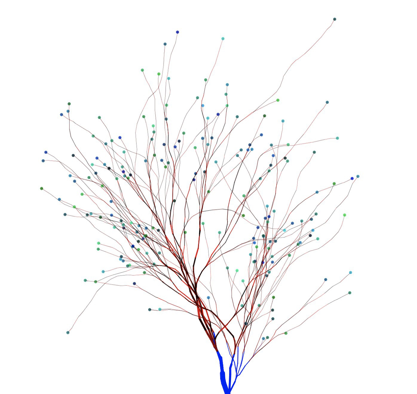
Me, Brad and a slew of you out there are front-end developers. We work in browsers and we care about the users and where and how they interact with those browsers. We do the things on Brad’s first list like craft HTML and CSS, work with designs and do testing. We share that common trunk of skills on the tree above.
But Brad is more of a systems designer than I am. His dot lands somewhere differently on that tree. I don’t know if I’m particularly skilled at anything, but my dot definitely falls elsewhere on that tree. Perhaps on an entirely different branch, as I quite like working with JavaScript tooling and logic and APIs and such. The bulk of Brad’s article is about React and finding a place in the realm of front-end development where the job isn’t ignoring React, but working with it in such a way that doesn’t mean every other aspect of development doesn’t have to come along for the ride.
I like the term Front-End Developer. It’s encapsulates the nature of your job if your concerns are:
Building UIs for web browsers
The spectrum of devices and platforms those web browsers run on
The people who use those web browsers and related assistive technology
The breadth of knowledge for all-things front-end development has gotten super deep. I’ve found that front-end developers that have stretched themselves to the point they are thinking of themselves as full-stack developers more and more. I think that’s kinda cool and empowering, but it doesn’t mean that everyone needs to go that wide.
Brad Frost referred to sides of the spectrum as „back of the front” and „front of the front.” I once drew the line, in The Great Divide, as heavy JavaScript vs. not. These distinctions aren’t to divide people, but to acknowledge the spectrum and that there are people all over it.
In a new article called „Frontend Design, React, and a Bridge over the Great Divide,” Brad makes the point that the role of „Front-End Designer” exists on the spectrum right smack in the middle between design and development, where „development” refers to the back-end or deeper JavaScript stuff.
The jobs?
Crafting semantic HTML markup
Creating CSS code
Authoring JavaScript that primarily manipulates objects in the DOM
Testing across browsers and devices
Optimizing the performance of front-end code
Working with designers
Working with back-end and application developers
That sounds like the „traditional” explanation of a front-end developer to me — if there is such a thing — but it makes sense to rename that role since front-end development is the term that got so wide.
Brad adds these responsibilties to the list:
Create a library of presentational UI components
Author and document a robust, intuitive component API for each presentational component
Determine how flexible or rigid the component library should be
Maintain the presentational components as a product
That’s where I think this metaphor comes in:
Me, Brad and a slew of you out there are front-end developers. We work in browsers and we care about the users and where and how they interact with those browsers. We do the things on Brad’s first list like craft HTML and CSS, work with designs and do testing. We share that common trunk of skills on the tree above.
But Brad is more of a systems designer than I am. His dot lands somewhere differently on that tree. I don’t know if I’m particularly skilled at anything, but my dot definitely falls elsewhere on that tree. Perhaps on an entirely different branch, as I quite like working with JavaScript tooling and logic and APIs and such. The bulk of Brad’s article is about React and finding a place in the realm of front-end development where the job isn’t ignoring React, but working with it in such a way that doesn’t mean every other aspect of development doesn’t have to come along for the ride.
Building and maintaining your own website is a great idea. Not only do you own your platform, but you get to experiment with web technologies along the way. Recently, I dug into a concept called serverless functions, starting with my own website. I’d like to share the results and what I learned along the way, so you can get your hands dirty, too!
But first, a 1-minute intro to serverless functions
A serverless function (sometimes called a lambda function or cloud function) is a piece of code that you can write, host, and run independently of your website, app, or any other code. Despite the name, serverless functions do, indeed, run on a server; but it’s a server you don’t have to build or maintain. Serverless functions are exciting because they take a lot of the legwork out of making powerful, scalable, apps.
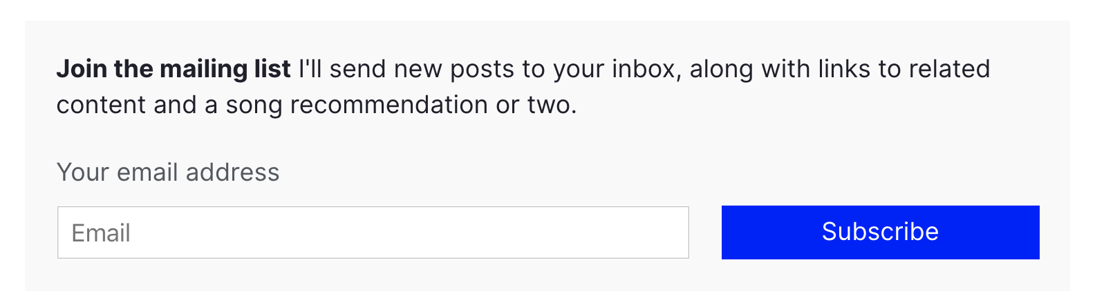
I started my journey with a challenge: I wanted to have an email list sign-up form on my site. The rules are as follows:
It should work without JavaScript. I’d like to see how much I can get by with just CSS and HTML. Progressive enhancements are OK.
It shouldn’t require external dependencies. This is a learning project, so I want to write 100% of the code if possible.
It should use serverless functions. Instead of sending data to my email list service client-side, let’s do it server(less)-side!
Meet the team: 11ty, Netlify, and Buttondown
My website is built using a static site framework called 11ty. 11ty allows me to write templates and components in HTML, so that’s how we’ll build our email form. (Chris recently wrote a great article about his experience with 11ty if you’re interested in learning more.)
The website is then deployed using a service called Netlify) and it is the key player on our team here: the point guard, the quarterback, the captain. That’s because Netlify has three features that work together to produce serverless excellence:
Netlify can deploy automatically from a GitHub repo. This means I can write my code, create a pull request, and instantly see if my code works. While there are tools to test serverless functions locally, Netlify makes it super easy to test live.
Netlify Forms handles any form submissions my site gets. This is one part of the serverless equation: instead of writing code to collect submissions, I’ll configure the HTML with a few simple attributes and let Netlify handle the rest.
Netlify Functions allows me to take action with the data from my forms. I’ll write some code to send emails off to my email list provider, and tell Netlify when to run that code.
Finally, I’ll manage my email list with a service called Buttondown. It’s a no-frills email newsletter provider, with an easy-to-use API.
Bonus: for personal sites like mine, 11ty, Netlify, and Buttondown are free. You can’t beat that.
The form
The HTML for my email subscription form is very minimal, with a few extras for Netlify Forms to work.
<form class="email-form" name="newsletter" method="POST" data-netlify="true" netlify-honeypot="bot-field">
  <div hidden aria-hidden="true">
    <label>
      Don’t fill this out if you're human:
      <input name="bot-field" />
    </label>
  </div>
  <label for="email">Your email address</label>
  <div>
    <input type="email" name="email" placeholder="Email"  id="email" required />
    <button type="submit">Subscribe</button>
  </div>
</form>
First, I set the data-netlify attribute to true to tell Netlify to handle this form.
The first input in the form is named bot-field. This tricks robots into revealing themselves: I tell Netlify to watch for any suspicious submissions by setting the netlify-honeypot attribute to bot-field. I then hide the field from humans using the html hidden and aria-hidden values — users with and without assistive technology won’t be able to fill out the fake input.
If the form gets submitted with anything in the bot-field input, Netlify knows it’s coming from a robot, and ignores the input. In addition to this layer of protection, Netlify automatically filters suspicious submissions with Askimethttps://www.netlify.com/blog/2019/02/12/improved-netlify-forms-spam-filtering-using-akismet/). I don’t have to worry about spam!
The next input in the form is named email. This is where the email address goes! I’ve specified the input-type as email, and indicated that is required; this means that the browser will do all my validation for me, and won’t let users submit anything other than a valid email address.
Progressive enhancement with JavaScript
One neat feature of Netlify Forms is the ability to automatically redirect users to a “thank you” page when they submit a form. But ideally, I’d like to keep my users on the page. I wrote a short function to submit the form without a redirect.
const processForm = form => {
  const data = new FormData(form)
  data.append('form-name', 'newsletter');
  fetch('/', {
    method: 'POST',
    body: data,
  })
  .then(() => {
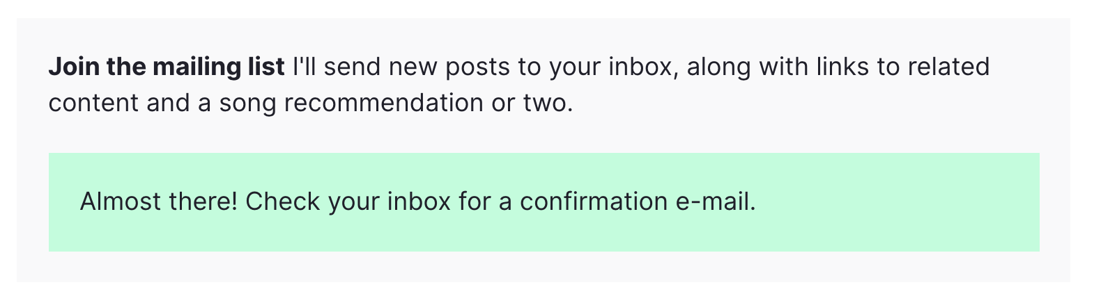
    form.innerHTML = `<div class="form--success">Almost there! Check your inbox for a confirmation e-mail.</div>`;
  })
  .catch(error => {
    form.innerHTML = `<div class="form--error">Error: ${error}</div>`;
  })
}
When I provide the content of my email form to this function via the form value, it submits the form using JavaScript’s built-in Fetch API. If the function was successful, it shows a pleasant message to the user. If the function hits a snag, it’ll tell my users that something went wrong.
This function is called whenever a user clicks the “submit” button on the form:
const emailForm = document.querySelector('.email-form')
if (emailForm) {
  emailForm.addEventListener('submit', e => {
    e.preventDefault();
    processForm(emailForm);
  })
}
This listener progressively enhances the default behavior of the form. This means that if the user has JavaScript disabled, the form still works!
The serverless function
Now that we have a working email submission form, it’s time to do some automation with a serverless function.
The way Netlify functions work is as follows:
Write the function in a JavaScript file in your project.
Tell Netlify where to look for your function via the netlify.toml file in your project.
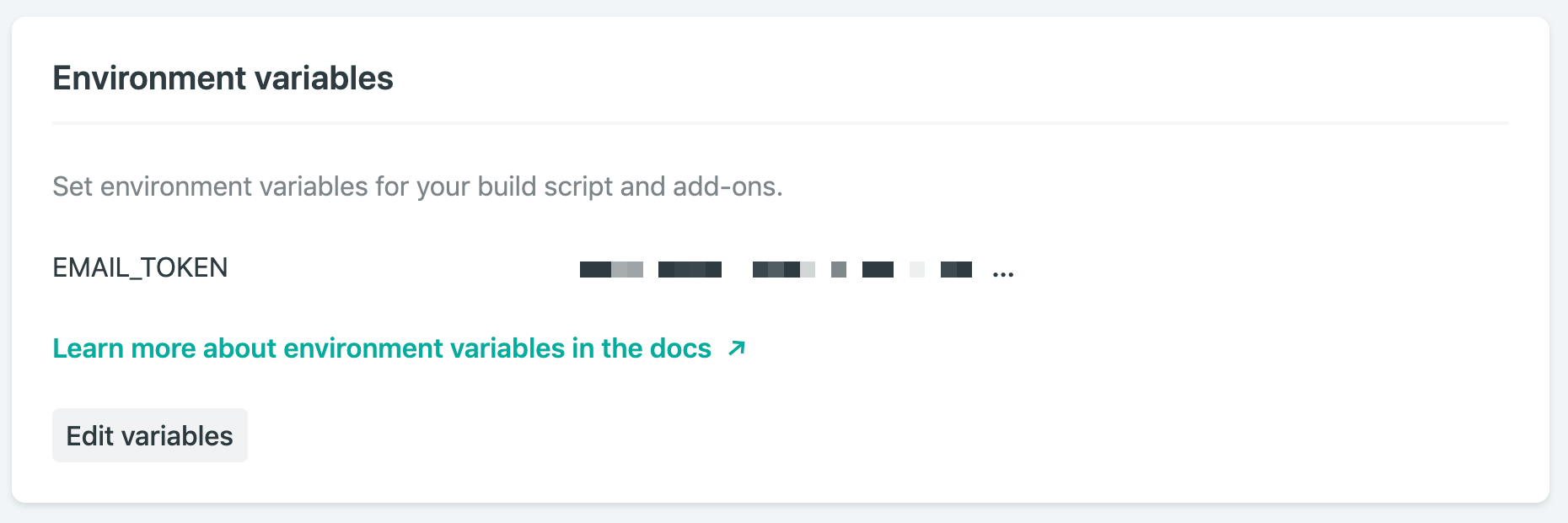
Add any environment variables you’ll need via Netlify’s admin interface. An environment variable is something like an API key that you need to keep secret.
That’s it! The next time you deploy your site, the function will be ready to go.
The function for my site is going to be in the functions folder, so I have the following in my netlify.toml file:
[build]
  base = "."
  functions = "./functions"
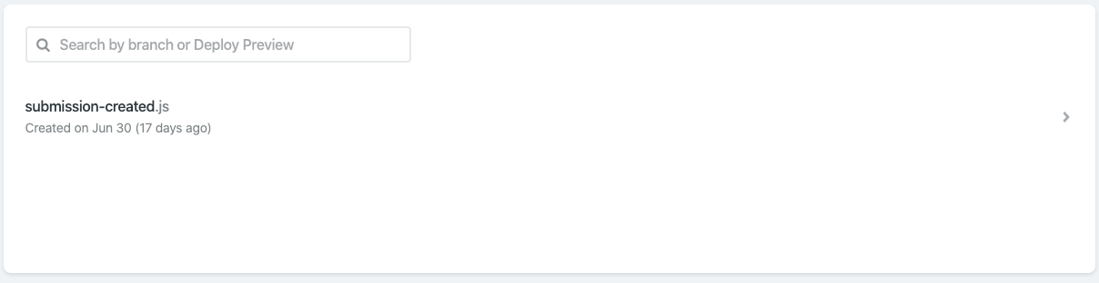
Then, I’ll add a file in the functions folder called submission-created.js. It’s important to name the file submission-created so that Netlify knows to run it every time a new form submission occurs. A full list of events you can script against can be found in Netlify’s documentation. If you’ve correctly named and configured your function, you should see it on Netlify’s Functions dashboard:
Netlify’s Functions dashboard shows I’ve correctly configured my submission-created function
The content in submission-created.js looks like this:
Line 1 includes a library called dotenv. This will help me use environment variables. Environment variables are useful to hold information that I don’t want to make public, like an API key. If I’m running my project locally, I set my environment variables with a .env file in the repo, and make sure it’s listed my .gitignore file. In order to deploy on Netlify, I also set up environment variables in Netlify’s web interface.
On line 2, I add a small library called node-fetch. This allows me to use Javascript’s Fetch API in node, which is how we’ll send data to Buttondown. Netlify automatically includes this dependency, as long as it’s listed in my project’s package.json file.
On line 3, I import my API key from the environment variables object, process.env.
Line 4 is where the function is defined. The exports.handler value is where Netlify expects to find our function, so we define it there. The only input we’ll need is the event value, which will contain all of the data from the form submission.
After retrieving the email address from the event value using JSON.parse, I’m ready to send it off to Buttondown. Here’s where I use the node-fetch library I imported earlier: I send a POST request to https://api.buttondown.email/v1/subscribers, including my API key in the header. Buttondown’s API doesn’t have many features, so it doesn’t take long to read through the documentation if you’d like to learn more.
The body of my POST request consists of the email address we retrieved.
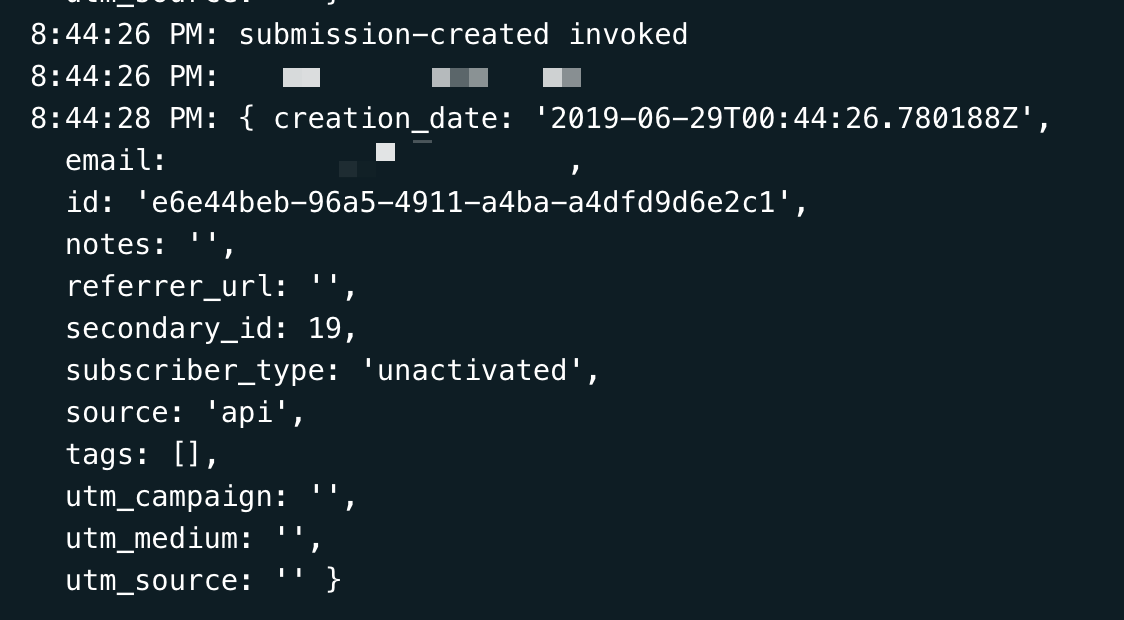
Then (using the neat .then() syntax), I collect the response from Buttondown’s server. I do this so I can diagnose any issues that are happening with the process — Netlify makes it easy to check your function’s logs, so use console.log often!
Deploying the function
Now that I’ve written my function, configured my netlify.toml file, and added my environment variables, everything is ready to go. Deploying is painless: just set up Netlify’s GitHub integration, and your function will be deployed when your project is pushed.
Netlify projects can also be tested locally using Netlify Dev. Depending on the complexity of your code, it can be faster to develop locally: just run npm i netlify -g, then netlify dev. Netlify Dev will use the netlify.toml file to configure and run the project locally, including any serverless functions. Neat, right? One caveat: Netlify Dev currently can’t trigger serverless functions on form submissions, so you’ll have to test that using preview builds.
An idea for the future
Buttondown’s API has a few possible responses when I submit a new email. For instance, if a user submits an email that’s already subscribed to the list, I’d love to be able to tell them as soon as they submit the form.
Conclusion
All in all, I only had to write about 50 lines of code to have a functional email newsletter sign-up form available on my website. I wrote it all in HTML, CSS, and JavaScript, without having to fret with the server side of the equation. The form handles spam, and my readers get a nice experience whether they have JavaScript enabled or not.
In this week’s week roundup of browser news, a trick for loading images conditionally using the picture element, your chance to tell bowser vendors about the web you want, and the styles applied to inline SVG elements are, well, not scoped only to that SVG.
Let’s turn to the headlines…
Preventing image loads with the picture element
You can use the <picture> element to prevent an image from loading if a specific media query matches the user’s environment (e.g., if the viewport width is larger or smaller than a certain length value). [Try out the demo:
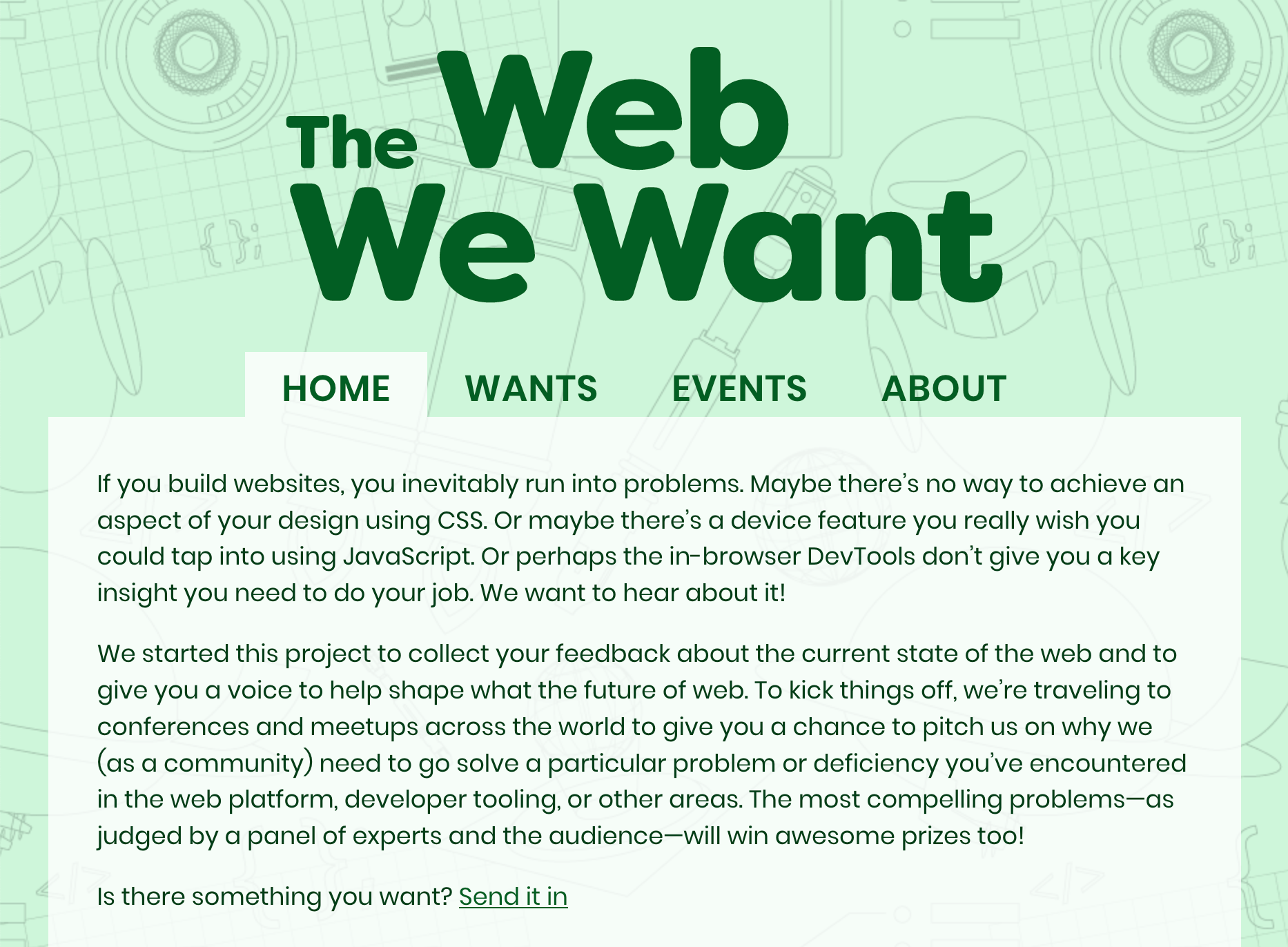
The Web We Want (webwewant.fyi) is a new collaboration between browser vendors that aims to collect feedback from web developers about the current state of the web. You can submit a feature request on the website („What do you want?””) and get a chance to present it at an event (An Event Apart, Smashing Conference, etc.).
Firefox supports a non-standard Boolean parameter for the location.reload method that can be used to hard-reload the page (bypassing the browser’s HTTP cache) [via Wilson Page]
If you use inline <svg> elements that itself have inline CSS code (in <style> elements), be aware that those styles are not scoped to the SVG element but global, so they affect other SVG elements as well [via Sara Soueidan]
XSS Auditor, a Chrome feature that detects cross-site scripting vulnerabilities, has been deemed ineffective and will be removed from Chrome in a future version. You may still want to set the HTTP X-Xss-Protection: 1; mode=block header for legacy browsers [via Scott Helme]
Read more news in my new, weekly Sunday issue. Visit webplatform.news for more information.
Let me just frame this for you: we’re going to take a piece of production UI from a Sketch file, break it down into pieces of information and then build it up into a story we tell our friends. Our friends might be hearing, or seeing, or touching the story so we are going to interpret and translate the same information for different people. We’re going to interpret the colors and the typography and even the sizes, and express them in different ways. And we really want everyone to pay attention. This story mustn’t be boring or frustrating; it’s got to be easy to follow, understand and remember. And it’s got to, got to, make sense, from beginning to end.
I’ve asked my colleague Katie to choose a component she has designed in Sketch. I’ll go through and mark it up (we mainly use SCSS, Twig and Craft but the templating language is not very important), then she will respond briefly. Hopefully I’ll get most of it right, and then one or two things wrong, so we can look at how things get lost during handoff.
In white label or framework type front-end, the focus is on building pieces that are as flexible and adaptable as possible, as content and style-agnostic as possible (within the scope of the product), because you simply will never know where the code is going and for what, ultimately it is being used. But recently I moved to a web design agency, which has a complete inversion of this focus. It is particular. It is bespoke. It’s all about really deeply engaging with the particular client you have and the particular clients they have, and designing something that suits them, as a tailor would.
Working so closely with a graphic designer like Katie, with highly finished pixel-spaced UI, instead of directly from wireframes or stories is an adjustment and an education, but there are still lots of things I can bring to the table. Chiefly: document design.
Document design, which admittedly is just the old semantic web with an accessibility hat on, is really looking at graphic design, engaging with it as a system of communication, and translating the underlying purpose of the colors/type/layout into an accessible, linearizable, and traversable DOM. It’s HTML, kids. It’s just HTML. You’d think we all knew it by now… but look around you. You’d be wrong!
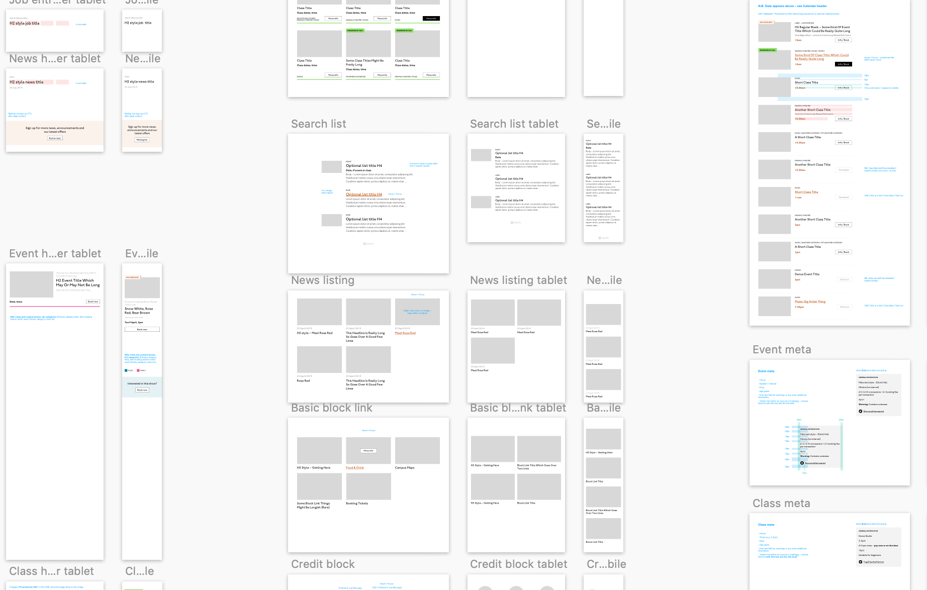
Katie has slung me a Sketch file chock full of artboards, and she’s pretty great at writing out what she wants so I don’t have to think too hard:
Event card
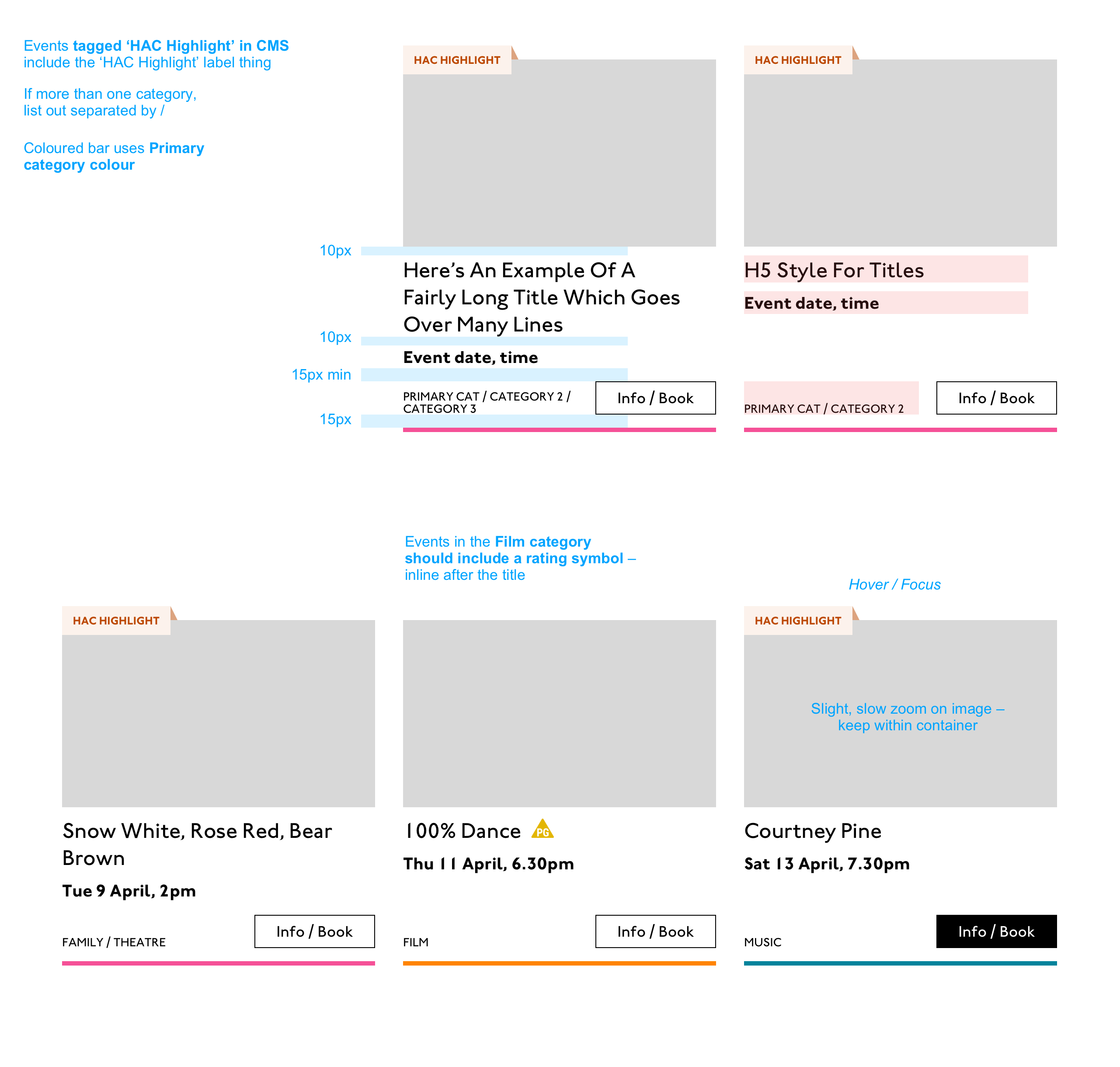
First I look through the whole UI file and figure out what is actually a card on this site — it turns out there are six or seven components that use this paradigm. Let’s make some observations:
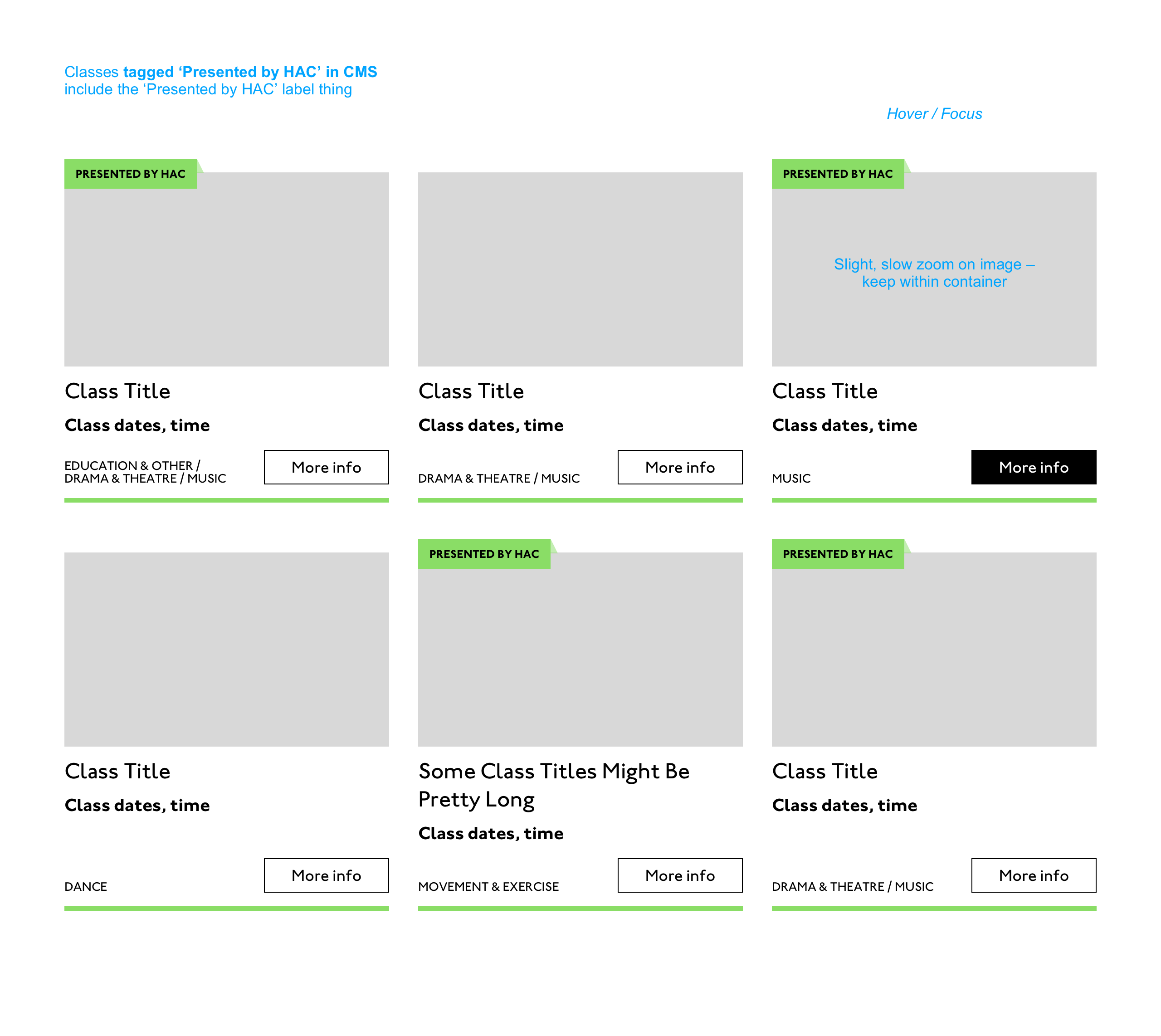
Zoom out on section of artboardsAnother card, classes this time.
A card is a block of meta data about a page on the site.
It has an image/media and metadata — it’s a media object.
It’s shown in a group of objects.
That group is always typed (there’s no view where there are search results and news articles and classes are all mixed up).
Each object has a single link to a page and no other actions.
Each object has a call to action (Book, etc.).
Each object may have times, categories, badges, and calls to action.
Each object must have media, title, and link.
So a card is the major way my user is going to find their way around this site. They are going to be clicking through guided pathways where they get a set of cards they can choose from, based on top pages like „what’s on” or „classes.” They’re not getting options on this card. It’s not really an interactive element — it’s a guide, an index card, that sets her onto her path: in this case a purchase path where she books a ticket for a show at this arts centre.
Before going on, let me just frame this for you:
Imagine you were looking at a flyer for a show and discussing it on the phone. If you actually wanted to go to this show in real life. What would you do? You wouldn’t just read the flyer out, would you? That’s the text. And it might have all kinds of random stuff on it if you started literally at the top. You wouldn’t start with „Twentieth Century Fox” or „Buy Hot Dog Get Cola Free” or „Comedy Drama Musical Family Friendly.” (I would actually hang up on you if you did!) And you wouldn’t simply describe the color or fonts. That’s the CSS. You’d talk through the information on the flyer. You’d say, „It’s The Greatest Showman and it’s on Tuesday, starts at 7:30. It’s at the Odeon on Oxford Street by the tram.” Right?
This is the document. Keep that person on the phone in your mind.
Count, group, and name
So let’s say we’ll deliver a card as the inside of a list item. We want a group and that group should be countable. We’ve already named the page with an <h1> so we’ll introduce and describe the group with a heading, an <h2>. First we’ll name it, then we’ll deliver it, so someone using a screen reader can:
Get the list signaled in the headings overview.
Get a count up front of the number of items on a page.
Know they can skip to the next list item to get the next card.
Know they can skip the group at any point and go to the next page — the pagination is the very next element and it will be labelled as a landmark.
In this particular case, I’m gonna wrap this whole card in an anchor element (<a>). There’s only one link on the card and I want to front load that information so someone can click as soon as they know it’s the right card, instead of having to search forward for the action. A big clickable area is nice too, though of course that can be taken too far and make an interface a sort of booby trap! But these cards are not too enormous and I can see they have a nice gutter around them, so there’s a rest space that will reduce accidental clicking for people with more limited dexterity.
Title
Event card „title” element
Then we’ll jump down a heading level and mark up the name of each show as a heading, an <h3>. The designer has made this type the focus and we will too. Some people browse super fast by jumping to the next heading, then next heading, so I’m not going to put any important information before the heading — they’ll jump right over it. I will put the image there, though, as I know in this case, I can’t get meaningful image descriptions from the API so those images are hidden and have empty alt attributes. Now the user can guess (correctly in my case) that the developer is actually describing the content in some meaningful way and might flip back to headings overview (list headings level 3) and just get a list of the shows.
Now let’s deliver our metadata. Let’s list it:
Badge
Date/Time
Categories
Badge
Event card „badge” element
This seems to be something the venue adds to a card to highlight it. As a developer, I can’t immediately see why a user would look for this, but it’s emphasized strongly by the designer, so I’ll make sure it stays in. Katie has moved the badge up out of the flow, but I know that with a headings jump our user could miss it. So I’ll just put the wording directly after the title, I think. I’ll either put it first or last, so make it easier to account for in a non-visual browse and not be too crazy paving in a tabbing, visual browse.
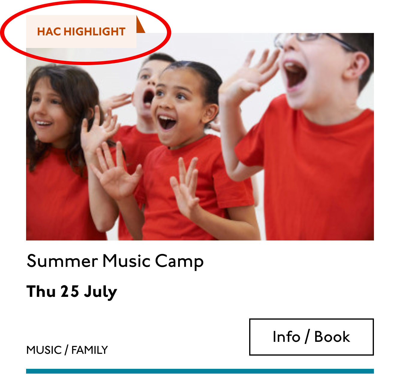
<p class="c-card__badge"><abbr title="Harrow Arts Centre">HAC</abbr> Highlight.</p>
…But on second thought, I won’t put an <abbr> after all. It’s the brand color, so it’s really a statement of ownership by this venue, and we’ve already said HAC a million times by now, so the user knows where they are.
A quick aside: the 'badging’ is very specific to this organisation. They want to show people clearly and quickly which events they’ve programmed themselves, and which are run by other organizations who’ve hired their venue.
Date/Time
Event card „date/time” element
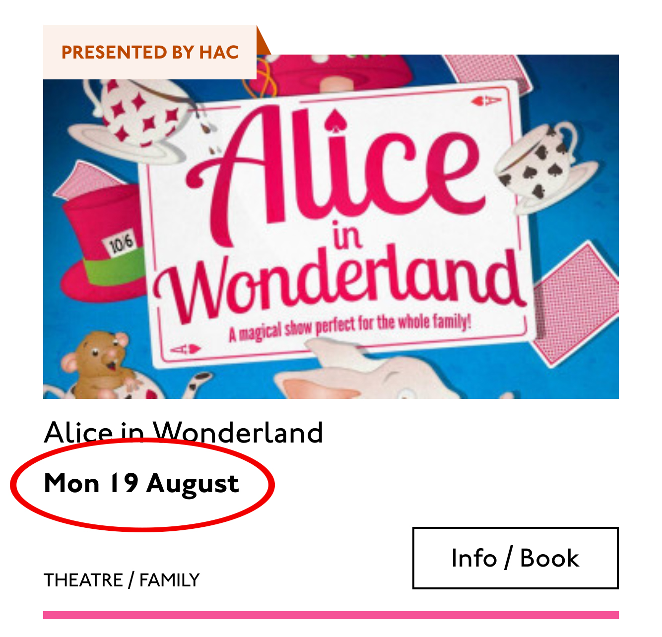
Now date and time. Katie is keying me in to this decision point by styling the dates in bold. Dates are important. I’m going to pop it in an <h4>, because I’m thinking it looks like someone might be quickly scanning a page of events looking for the matinee, for example, or looking for a news article published on a particular day. I don’t always put dates into headings, especially if there are millions on a page, but I do always make sure they’re in a <time> element with a complete value so the <time>Thu</time> or <time>Mon</time> Katie has specified is read out as comprehensible English words „Thursday” instead of garblage. I could also have used hidden completion or <abbr> with a title.
Categories/ Tags
Event card „categories/tags” element
Next come the categories, and I’m putting them after badge and date. This section is next in the visual order reading top-to-bottom, left-to-right, of course, but it also seems to be deprioritized: it’s been pushed down on the left and the type is smaller. This works for our linear storytelling. As a rule, we don’t want people to sit through repeated or more general content (cinema, cinema, cinema) to get to unique or more specific content (Monday, Tuesday, Wednesday). Remember, we are inside our card: we know it has already been sorted in a few general ways (news, show, class, etc), so it’s likely to have a lot of repeated pieces. We want to ensure that the user will go from specific to general if we can.
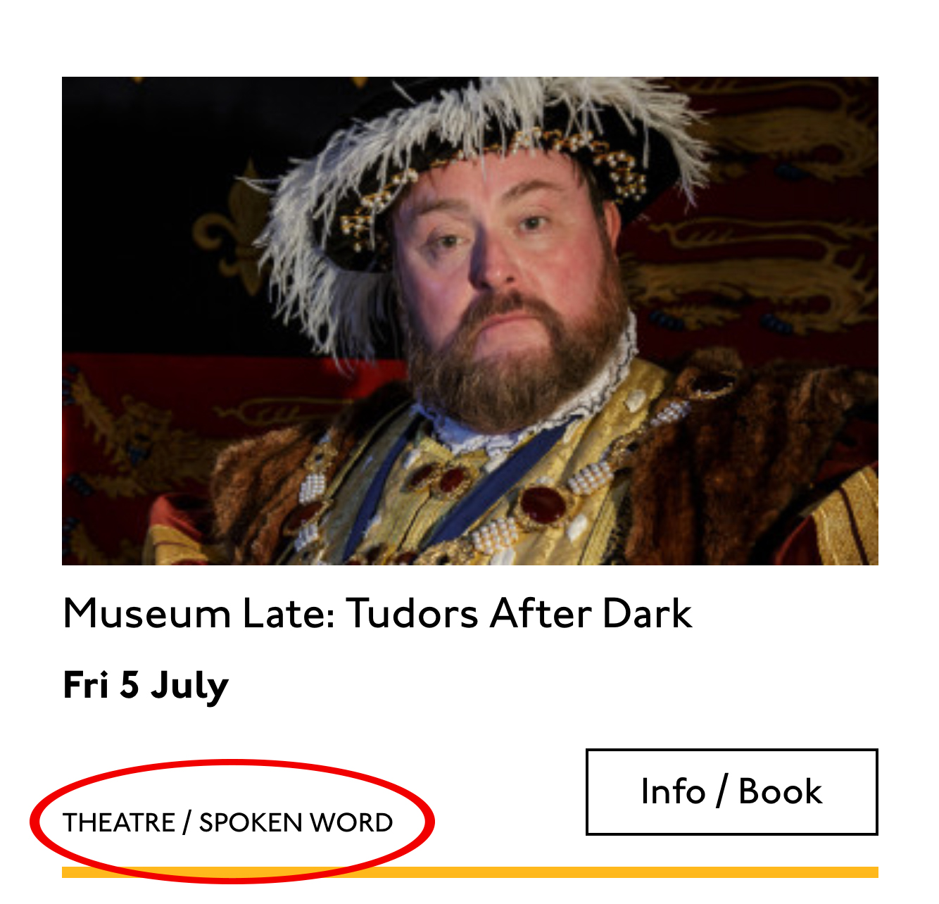
There is a primary category that is sorted first and then some other categories sometimes. I won’t deliver this as a countable list as there’s mostly just one category, and loads of lists of one item is not much use. But I will put a little tag beforehand because otherwise, it’s a slightly impenetrable announcement. MOVEMENT! SPOKEN WORD! (I mean, you can work it out retrospectively, but we always try to name things first and then show them, in linear order. This isn’t Memento.) I used to use title="" fairly heavily but I’ve gotten complaints about the tooltip so I route around. Note the use of colon or full stop to give us a „breath.” That’s a nice bit of polish.
<p class="c-card__tags h-text--label>
  <span class="h-accessibility">Categories: </span>
{% for category in categories.all() %}
  <span class="c-card__tag c-tag">{{category}}{% if not loop.last %} / {% endif %}</span>
{% endfor %}</p>
Also I’m hard-coding in my spaces to make sure the categories never run together into complete garblage even with text compression or spaceless rendering turned on somewhere down the pipeline. (This can happen with screen readers and spans and it’s rather alarming!)
There’s a piece of this design I will do in the CSS but haven’t really pulled into the document design: the color-coding on primary category. I am not describing the color to the reader as it seems arbitrary, not evocative. If there were some subtextual element to the color coding beyond tagging categories (if horticultural classes were green, say), then I might bring it through, but in this case it’s a non-verbal key to a category, so we don’t want it in our verbal key.
I’m sorting the primary category to the front of the category paragraph, but I’m not labeling it as primary. This is because there’s a sorting filter before this list that sorts on primary category, and it’s my surmise that it would be easier and less annoying to select a category from that dropdown than to read through each card saying Categories Primary Category Music Secondary Categories Dance. I could be wrong about that! Striking a balance between useful and too much labeling is sometimes a bit tricky. You have to consider the page context. We may be building components but our user is on a page.
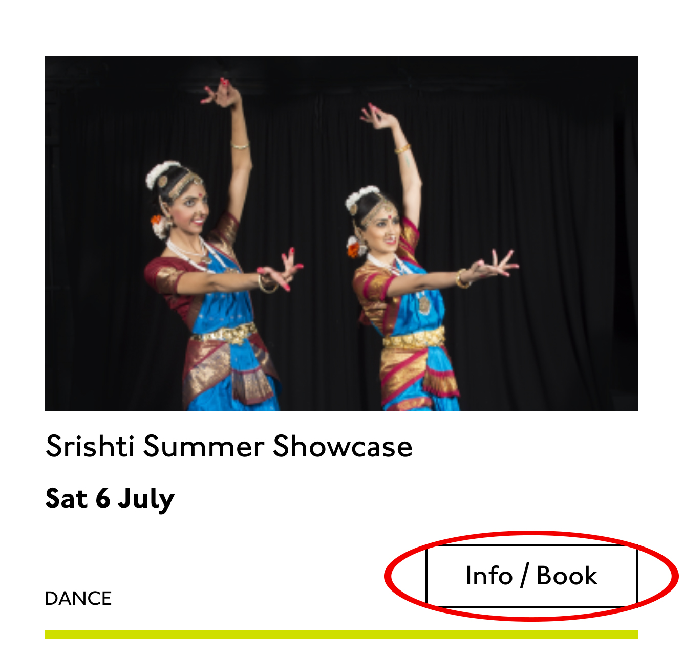
Last, the action. The direction to the user, to Book, or Learn More, or whatever it is, has been styled as a button. It’s not actually a button, it’s just a direction, so I’ll mark it up as a span in this case. I definitely want this to come last in the linear document. It’s a call to action and also a signal that we’ve reached the end of this card. The action is the exit point in both cases: if the user acts, we go to the target entry; if they do not, we go to the next card. We definitely never want any data to come after the action, as they might have left by then.
This markup, which counts, groups, and names data, delivers linear and non-linear interactions. The page makes sense if you read it top to bottom, makes sense if you read parts of it out of context, and helps you jump around.
Katie, over to you…
Katie Parry, designer
What an ace article! Really interesting. (I particularly like that „Mon,” „Tue,” etc. on cards are read as „Monday,” „Tuesday”… smart!)
One thing that struck me is that using assistive tech means users get information served to them in a „set” order that we’ve decided. So, unless there’s a filter, someone browsing for dance events, for example, has to sit/tab through a title, badge, dates, and maybe several other categories to find out whether an event’s for them or not. Bit tiresome. But that’s not something you’ve got wrong — it’s just how the internet works. Something for me to think about in the future.
Most of our clients are arts and cultural venues that need to sell tickets for events so I design a lot of event cards. They’re one of the very first things I’ll work on when designing a site. (Before even settling on a type hierarchy for the rest of the site.)
Thinking visually, here’s how I’d describe the general conventions of an event card:
It must look like a list – so people understand how to use it.
It needs to provide enough information for folks to decide if they’re interested or not. (The minimum information is likely an image, title, date, and link.)
It needs to include a clear call to action — usually a link to find out more information.
It needs to be easily scannable, visually.
Making information visually scannable is a pretty straightforward case of ensuring every information type (e.g. image, title, date, category, link) is sitting in the same place on every card and follows a clear hierarchy.
I focus a lot on typography in my work anyway but clearly: titles are styled to be highly prominent; dates are styled the same as each other but are different from titles; categories look different again – so that folks can easily pick-out the information they’re interested in from simply scanning the page. I’m composing the card for the user, saying, „Hey, look here’s the event’s name, this is when it’s on — and here’s where you go to get your tickets!”
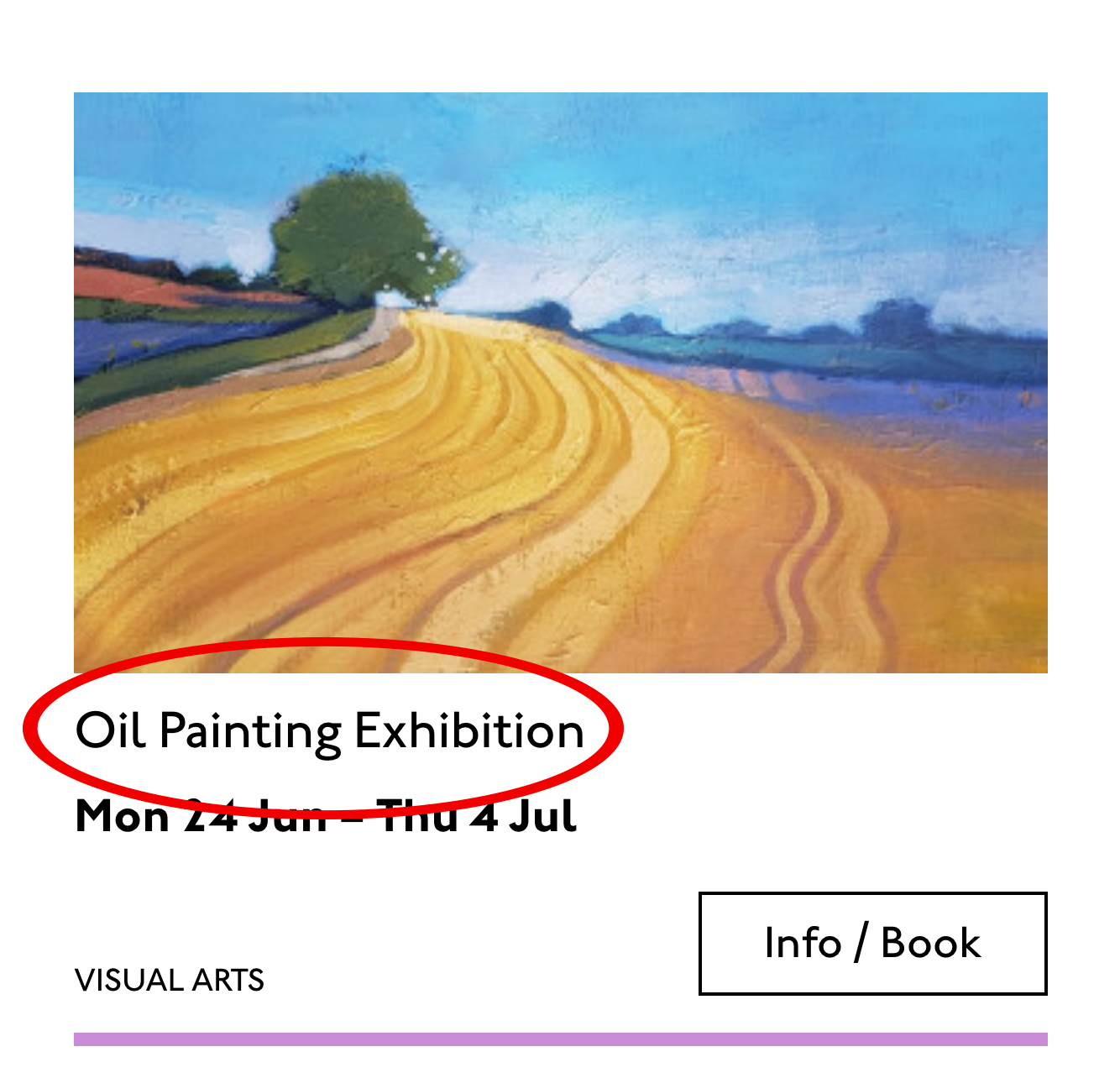
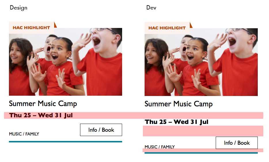
The type styles – and particularly the spacing between them – are doing a lot of work, so I will point out here that the spacings are not quite right in the code sample:
Spacing between the title and dates, dates and button, and button and piping don’t match the design.
This is important. Users need to be able to scan information quickly as they aren’t all looking for the same thing in order to make the decision to go to an event. Too much or too little space between elements can be distracting.
Some people just want a general mooch at what’s coming up at their local venue. Others may have seen an advert for a specific show that tickles their fancy, and want to buy tickets. There are people who love music but don’t care for theatre who just want a list of gigs; nothing else. And some folks who feel like going out at the weekend but aren’t that fussed about what it is they go to. So, I design cards to be easy to scan — because most users aren’t at all reading from top to bottom.
Despite the conventions I just laid out, cards certainly don’t all look the same — or work in the same way — across projects.
There is always a tension in web design between making an interface familiar to the user and original to the client. Custom typefaces and color palettes do a lot here, but the other piece of it is through discovery.
I spend time reading-up about a client, including who their audience is by reading what they say on review sites and social media, as well as working directly with the client. Listening to people talk through how they work, what feedback they get from their audience/users often uncovers some interesting little nuggets which influence a design. Developers aren’t typically involved much in discovery, which is something I’d like to change, but for now, I need to make it super-clear to Sally what’s special about this event card for each new project. I write many, many (many) notes on Sketch files, but find they can tend to get lost, so sometimes we have a spreadsheet defining particular functionality.
Let me just frame this for you: we’re going to take a piece of production UI from a Sketch file, break it down into pieces of information and then build it up into a story we tell our friends. Our friends might be hearing, or seeing, or touching the story so we are going to interpret and translate the same information for different people. We’re going to interpret the colors and the typography and even the sizes, and express them in different ways. And we really want everyone to pay attention. This story mustn’t be boring or frustrating; it’s got to be easy to follow, understand and remember. And it’s got to, got to, make sense, from beginning to end.
I’ve asked my colleague Katie to choose a component she has designed in Sketch. I’ll go through and mark it up (we mainly use SCSS, Twig and Craft but the templating language is not very important), then she will respond briefly. Hopefully I’ll get most of it right, and then one or two things wrong, so we can look at how things get lost during handoff.
In white label or framework type front-end, the focus is on building pieces that are as flexible and adaptable as possible, as content and style-agnostic as possible (within the scope of the product), because you simply will never know where the code is going and for what, ultimately it is being used. But recently I moved to a web design agency, which has a complete inversion of this focus. It is particular. It is bespoke. It’s all about really deeply engaging with the particular client you have and the particular clients they have, and designing something that suits them, as a tailor would.
Working so closely with a graphic designer like Katie, with highly finished pixel-spaced UI, instead of directly from wireframes or stories is an adjustment and an education, but there are still lots of things I can bring to the table. Chiefly: document design.
Document design, which admittedly is just the old semantic web with an accessibility hat on, is really looking at graphic design, engaging with it as a system of communication, and translating the underlying purpose of the colors/type/layout into an accessible, linearizable, and traversable DOM. It’s HTML, kids. It’s just HTML. You’d think we all knew it by now… but look around you. You’d be wrong!
Katie has slung me a Sketch file chock full of artboards, and she’s pretty great at writing out what she wants so I don’t have to think too hard:
Event card
First I look through the whole UI file and figure out what is actually a card on this site — it turns out there are six or seven components that use this paradigm. Let’s make some observations:
Zoom out on section of artboardsAnother card, classes this time.
A card is a block of meta data about a page on the site.
It has an image/media and metadata — it’s a media object.
It’s shown in a group of objects.
That group is always typed (there’s no view where there are search results and news articles and classes are all mixed up).
Each object has a single link to a page and no other actions.
Each object has a call to action (Book, etc.).
Each object may have times, categories, badges, and calls to action.
Each object must have media, title, and link.
So a card is the major way my user is going to find their way around this site. They are going to be clicking through guided pathways where they get a set of cards they can choose from, based on top pages like „what’s on” or „classes.” They’re not getting options on this card. It’s not really an interactive element — it’s a guide, an index card, that sets her onto her path: in this case a purchase path where she books a ticket for a show at this arts centre.
Before going on, let me just frame this for you:
Imagine you were looking at a flyer for a show and discussing it on the phone. If you actually wanted to go to this show in real life. What would you do? You wouldn’t just read the flyer out, would you? That’s the text. And it might have all kinds of random stuff on it if you started literally at the top. You wouldn’t start with „Twentieth Century Fox” or „Buy Hot Dog Get Cola Free” or „Comedy Drama Musical Family Friendly.” (I would actually hang up on you if you did!) And you wouldn’t simply describe the color or fonts. That’s the CSS. You’d talk through the information on the flyer. You’d say, „It’s The Greatest Showman and it’s on Tuesday, starts at 7:30. It’s at the Odeon on Oxford Street by the tram.” Right?
This is the document. Keep that person on the phone in your mind.
Count, group, and name
So let’s say we’ll deliver a card as the inside of a list item. We want a group and that group should be countable. We’ve already named the page with an <h1> so we’ll introduce and describe the group with a heading, an <h2>. First we’ll name it, then we’ll deliver it, so someone using a screen reader can:
Get the list signaled in the headings overview.
Get a count up front of the number of items on a page.
Know they can skip to the next list item to get the next card.
Know they can skip the group at any point and go to the next page — the pagination is the very next element and it will be labelled as a landmark.
In this particular case, I’m gonna wrap this whole card in an anchor element (<a>). There’s only one link on the card and I want to front load that information so someone can click as soon as they know it’s the right card, instead of having to search forward for the action. A big clickable area is nice too, though of course that can be taken too far and make an interface a sort of booby trap! But these cards are not too enormous and I can see they have a nice gutter around them, so there’s a rest space that will reduce accidental clicking for people with more limited dexterity.
Title
Event card „title” element
Then we’ll jump down a heading level and mark up the name of each show as a heading, an <h3>. The designer has made this type the focus and we will too. Some people browse super fast by jumping to the next heading, then next heading, so I’m not going to put any important information before the heading — they’ll jump right over it. I will put the image there, though, as I know in this case, I can’t get meaningful image descriptions from the API so those images are hidden and have empty alt attributes. Now the user can guess (correctly in my case) that the developer is actually describing the content in some meaningful way and might flip back to headings overview (list headings level 3) and just get a list of the shows.
Now let’s deliver our metadata. Let’s list it:
Badge
Date/Time
Categories
Badge
Event card „badge” element
This seems to be something the venue adds to a card to highlight it. As a developer, I can’t immediately see why a user would look for this, but it’s emphasized strongly by the designer, so I’ll make sure it stays in. Katie has moved the badge up out of the flow, but I know that with a headings jump our user could miss it. So I’ll just put the wording directly after the title, I think. I’ll either put it first or last, so make it easier to account for in a non-visual browse and not be too crazy paving in a tabbing, visual browse.
<p class="c-card__badge"><abbr title="Harrow Arts Centre">HAC</abbr> Highlight.</p>
…But on second thought, I won’t put an <abbr> after all. It’s the brand color, so it’s really a statement of ownership by this venue, and we’ve already said HAC a million times by now, so the user knows where they are.
A quick aside: the 'badging’ is very specific to this organisation. They want to show people clearly and quickly which events they’ve programmed themselves, and which are run by other organizations who’ve hired their venue.
Date/Time
Event card „date/time” element
Now date and time. Katie is keying me in to this decision point by styling the dates in bold. Dates are important. I’m going to pop it in an <h4>, because I’m thinking it looks like someone might be quickly scanning a page of events looking for the matinee, for example, or looking for a news article published on a particular day. I don’t always put dates into headings, especially if there are millions on a page, but I do always make sure they’re in a <time> element with a complete value so the <time>Thu</time> or <time>Mon</time> Katie has specified is read out as comprehensible English words „Thursday” instead of garblage. I could also have used hidden completion or <abbr> with a title.
Categories/ Tags
Event card „categories/tags” element
Next come the categories, and I’m putting them after badge and date. This section is next in the visual order reading top-to-bottom, left-to-right, of course, but it also seems to be deprioritized: it’s been pushed down on the left and the type is smaller. This works for our linear storytelling. As a rule, we don’t want people to sit through repeated or more general content (cinema, cinema, cinema) to get to unique or more specific content (Monday, Tuesday, Wednesday). Remember, we are inside our card: we know it has already been sorted in a few general ways (news, show, class, etc), so it’s likely to have a lot of repeated pieces. We want to ensure that the user will go from specific to general if we can.
There is a primary category that is sorted first and then some other categories sometimes. I won’t deliver this as a countable list as there’s mostly just one category, and loads of lists of one item is not much use. But I will put a little tag beforehand because otherwise, it’s a slightly impenetrable announcement. MOVEMENT! SPOKEN WORD! (I mean, you can work it out retrospectively, but we always try to name things first and then show them, in linear order. This isn’t Memento.) I used to use title="" fairly heavily but I’ve gotten complaints about the tooltip so I route around. Note the use of colon or full stop to give us a „breath.” That’s a nice bit of polish.
<p class="c-card__tags h-text--label>
  <span class="h-accessibility">Categories: </span>
{% for category in categories.all() %}
  <span class="c-card__tag c-tag">{{category}}{% if not loop.last %} / {% endif %}</span>
{% endfor %}</p>
Also I’m hard-coding in my spaces to make sure the categories never run together into complete garblage even with text compression or spaceless rendering turned on somewhere down the pipeline. (This can happen with screen readers and spans and it’s rather alarming!)
There’s a piece of this design I will do in the CSS but haven’t really pulled into the document design: the color-coding on primary category. I am not describing the color to the reader as it seems arbitrary, not evocative. If there were some subtextual element to the color coding beyond tagging categories (if horticultural classes were green, say), then I might bring it through, but in this case it’s a non-verbal key to a category, so we don’t want it in our verbal key.
I’m sorting the primary category to the front of the category paragraph, but I’m not labeling it as primary. This is because there’s a sorting filter before this list that sorts on primary category, and it’s my surmise that it would be easier and less annoying to select a category from that dropdown than to read through each card saying Categories Primary Category Music Secondary Categories Dance. I could be wrong about that! Striking a balance between useful and too much labeling is sometimes a bit tricky. You have to consider the page context. We may be building components but our user is on a page.
Last, the action. The direction to the user, to Book, or Learn More, or whatever it is, has been styled as a button. It’s not actually a button, it’s just a direction, so I’ll mark it up as a span in this case. I definitely want this to come last in the linear document. It’s a call to action and also a signal that we’ve reached the end of this card. The action is the exit point in both cases: if the user acts, we go to the target entry; if they do not, we go to the next card. We definitely never want any data to come after the action, as they might have left by then.
This markup, which counts, groups, and names data, delivers linear and non-linear interactions. The page makes sense if you read it top to bottom, makes sense if you read parts of it out of context, and helps you jump around.
Katie, over to you…
Katie Parry, designer
What an ace article! Really interesting. (I particularly like that „Mon,” „Tue,” etc. on cards are read as „Monday,” „Tuesday”… smart!)
One thing that struck me is that using assistive tech means users get information served to them in a „set” order that we’ve decided. So, unless there’s a filter, someone browsing for dance events, for example, has to sit/tab through a title, badge, dates, and maybe several other categories to find out whether an event’s for them or not. Bit tiresome. But that’s not something you’ve got wrong — it’s just how the internet works. Something for me to think about in the future.
Most of our clients are arts and cultural venues that need to sell tickets for events so I design a lot of event cards. They’re one of the very first things I’ll work on when designing a site. (Before even settling on a type hierarchy for the rest of the site.)
Thinking visually, here’s how I’d describe the general conventions of an event card:
It must look like a list – so people understand how to use it.
It needs to provide enough information for folks to decide if they’re interested or not. (The minimum information is likely an image, title, date, and link.)
It needs to include a clear call to action — usually a link to find out more information.
It needs to be easily scannable, visually.
Making information visually scannable is a pretty straightforward case of ensuring every information type (e.g. image, title, date, category, link) is sitting in the same place on every card and follows a clear hierarchy.
I focus a lot on typography in my work anyway but clearly: titles are styled to be highly prominent; dates are styled the same as each other but are different from titles; categories look different again – so that folks can easily pick-out the information they’re interested in from simply scanning the page. I’m composing the card for the user, saying, „Hey, look here’s the event’s name, this is when it’s on — and here’s where you go to get your tickets!”
The type styles – and particularly the spacing between them – are doing a lot of work, so I will point out here that the spacings are not quite right in the code sample:
Spacing between the title and dates, dates and button, and button and piping don’t match the design.
This is important. Users need to be able to scan information quickly as they aren’t all looking for the same thing in order to make the decision to go to an event. Too much or too little space between elements can be distracting.
Some people just want a general mooch at what’s coming up at their local venue. Others may have seen an advert for a specific show that tickles their fancy, and want to buy tickets. There are people who love music but don’t care for theatre who just want a list of gigs; nothing else. And some folks who feel like going out at the weekend but aren’t that fussed about what it is they go to. So, I design cards to be easy to scan — because most users aren’t at all reading from top to bottom.
Despite the conventions I just laid out, cards certainly don’t all look the same — or work in the same way — across projects.
There is always a tension in web design between making an interface familiar to the user and original to the client. Custom typefaces and color palettes do a lot here, but the other piece of it is through discovery.
I spend time reading-up about a client, including who their audience is by reading what they say on review sites and social media, as well as working directly with the client. Listening to people talk through how they work, what feedback they get from their audience/users often uncovers some interesting little nuggets which influence a design. Developers aren’t typically involved much in discovery, which is something I’d like to change, but for now, I need to make it super-clear to Sally what’s special about this event card for each new project. I write many, many (many) notes on Sketch files, but find they can tend to get lost, so sometimes we have a spreadsheet defining particular functionality.
Have you ever had a form that needed to accept a short, arbitrary bit of text? Like a name or whatever. That’s exactly what <input type="text"> is for. There are lots of different input types (and modes!), and picking the right one is a great idea.
But this little story is about something else and applies to any of them.
What if the text needs to be arbitrary (like „What’s your favorite color?”) so people can type in whatever, but you also want to be helpful. Perhaps there are a handful of really popular answers. Wouldn’t it be nice if people could just select one? Not a <select>, but a hybrid between an input and a dropdown. Hold on though. Don’t make your own custom React element just yet.
That’s what <datalist> is for. I just used it successfully the other day so I figured I’d blog it because blogging is cool.
One <input type="text"> for a „flag” (an aribtrary string representing a permission)
I probably wouldn’t do a <datalist> for every username in a database. I don’t think there is a limit, but this is sitting in your HTML, so I’d say it works best at maybe 100 options or less.
But for that second one, we only had maybe 3-4 unique flags we were dealing with at the time, so a datalist for those made perfect sense. You can type in whatever you want, but this UI helps you select the most common choices. So dang useful. Maybe this could be useful for something like a gender input, where there is a list of options you can choose, but it doesn’t enforce you actually choose one of them.
Even lesser known than the fact that <datalist> exists? The fact that it works for all sorts of inputs besides just text, like date, range, and even color.
In this week’s roundup, WebKit’s method for truncating multi-line text gets some love, a note on calculations using custom properties, and a new OpenType feature that prevents typographic logjams.
Truncating mutli-line text
The CSS -webkit-line-clamp property for truncating multi-line text is now widely supported (see my usage guide). If you use Autoprefixer, update it to the latest version (9.6.1). Previous versions would remove -webkit-box-orient: vertical, which caused this CSS feature to stop working.
Note that Autoprefixer doesn’t generate any prefixes for you in this case. You need to use the following four declarations exactly (all are required):
.line-clamp {
  overflow: hidden;
  display: -webkit-box;
  -webkit-box-orient: vertical;
  -webkit-line-clamp: 3; /* or any other integer */
}
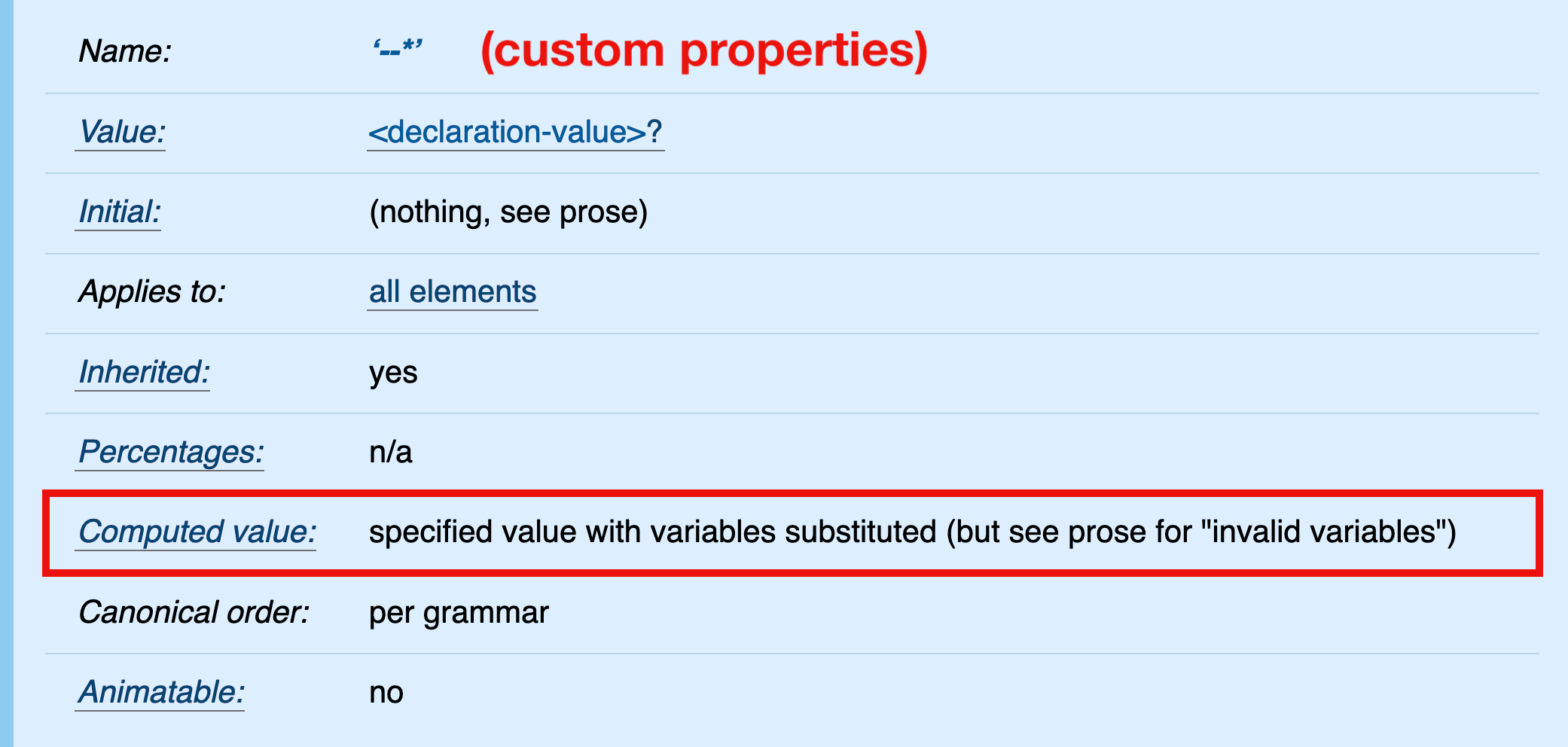
In CSS, it is currently not possible to pre-calculate custom property values (spec). The computed value of a custom property is its specified value (with variables substituted); therefore, relative values in calc() expressions are not „absolutized” (e.g., em values are not computed to pixel values).
It may appear that the calculation in the above example is performed on the root element, specifically that the relative value 1em is computed and added to the absolute value 10px. Under default conditions (where 1em equals 16px on the root element), the computed value of --large would be 26px.
But that’s not what’s happening here. The computed value of --large is its specified value, calc(1em + 10px). This value is inherited and substituted into the value of the font-size property on the <blockquote> element.
blockquote {
  /* the declaration after variable substitution */
  font-size: calc(1em + 10px);
}
Finally, the calculation is performed and the relative 1em value absolute-ized in the scope of the <blockquote> element — not the root element where the calc() expression is declared.
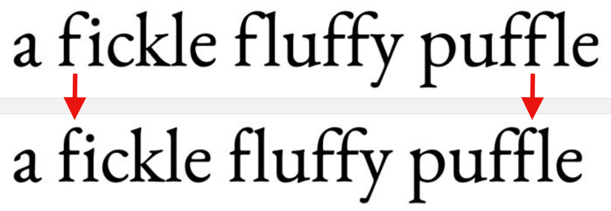
The „Contextual Alternates” OpenType feature ensures that characters don’t overlap or collide when ligatures are turned off. You can check if your font supports this feature on wakamaifondue.com and enable it (if necessary) via the CSS font-variant-ligatures: contextual declaration.