👋 Hey folks! Silvestar pitched this post to us because he is genuinely enthusiastic about JAMstack and all of the opportunities it opens up for front-end development. We wanted to call that out because, although some of the points in here might come across as sponsored content and Netlify is indeed a CSS-Tricks sponsor, it’s completely independent of Netlify.
Being a JAMstack developer in 2019 makes me feel like I am living in a wonderland. All these modern frameworks, tools, and services make our lives as JAMstack developers quite enjoyable. In fact, Chris would say they give us superpowers.
Yet, there is one particular platform that stands out with its formidable products and features — Netlify. You’re probably pretty well familiar with Netlify if you read CSS-Tricks regularly. There’s a slew of articles on it. There are even two CSS-Tricks microsites that use it.
This article is more of a love letter to Netlify and all of the great things it does. I decided to sit down and list my most favorite things about it. So that’s what I’d like to share with you here. Hopefully, this gives you a good idea not only what Netlify is capable of doing, but helps you get the most out of it as well.
You can customize your site’s Netlify subdomain.
When creating a new project on Netlify, you start by either:
choosing a repository from a Git provider, or
uploading a folder.
The project should be ready in a matter of minutes, and you could start configuring it for your needs right away. Start by choosing the site name.
The site name determines the default URL for your site. Only alphanumeric characters and hyphens are allowed.
Netlify randomly creates a default name for a new project. If you don’t like the name, choose your own and make it one that would be much easier for you to remember.
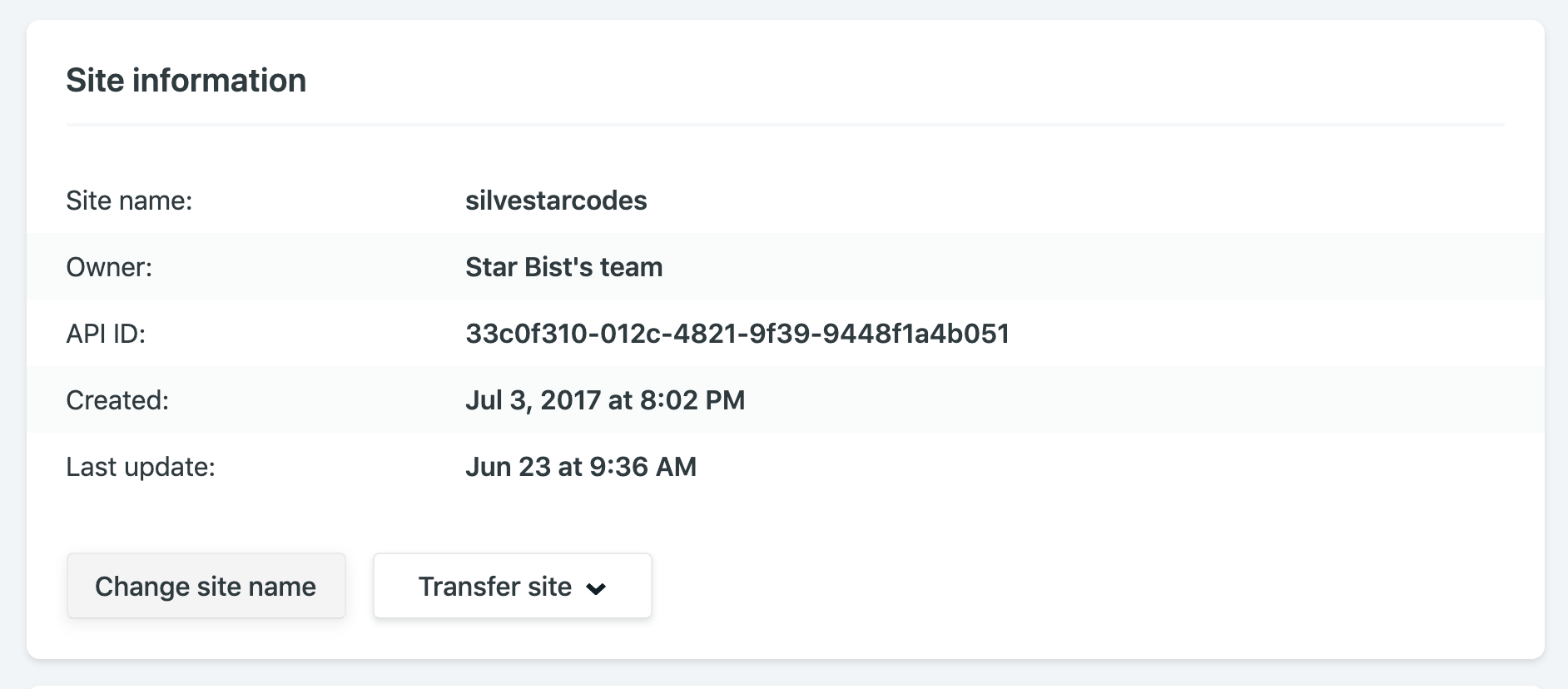
The „Site information” section of the Netlify dashboard.
For example, my site name is silvestarcodes, and I could access my site by visiting silvestarcodes.netlify.com.
You can manage all your DNS on Netlify.
If you are setting up an actual site, you would want to add a custom domain. From the domain management panel, go to the custom domains section, click on the „Add custom domain” button, enter your domain, and click the „Verify” button.
Now you have two options:
Point your DNS records to Netlify load balancer IP address
For the second option, you should add or update the nameservers on your domain registrar. If you didn’t buy the domain already, you could register it right from the dashboard.
Netlify has a service for provisioning DNS records called Netlify DNS.
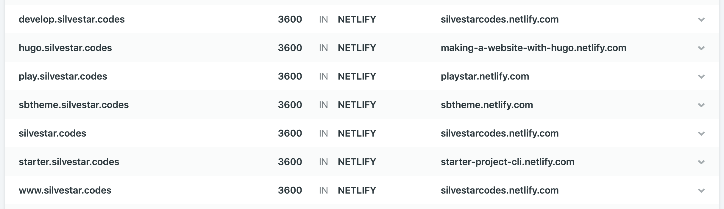
Once you have configured the custom domain, you could handle your DNS records from the Netlify dashboard.
The „DNS” section of the Netlify dashboard.
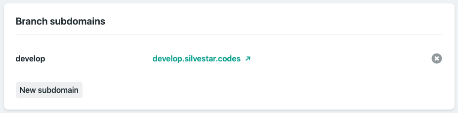
If you want to set up a dev subdomain for your dev branch to preview development changes for your site, you could do it automatically. From the Domain Management section in the Settings section of your site, select the dev branch and Netlify would add a new subdomain dev for you automagically. Now you could see the previews by visiting dev subdomain.
The „Subdomains” section of the Netlify dashboard.
You could configure a subdomain for a different website. To achieve this, create a new Netlify site, enter a new subdomain as a custom domain, and Netlify would automatically add the records for you.
As an icing on the DNS management cake, Netlify lets you create Let’s Encrypt certificates for your domain automatically… for free.
You can inject snippets into pages, which is sort of like a Tag Manager.
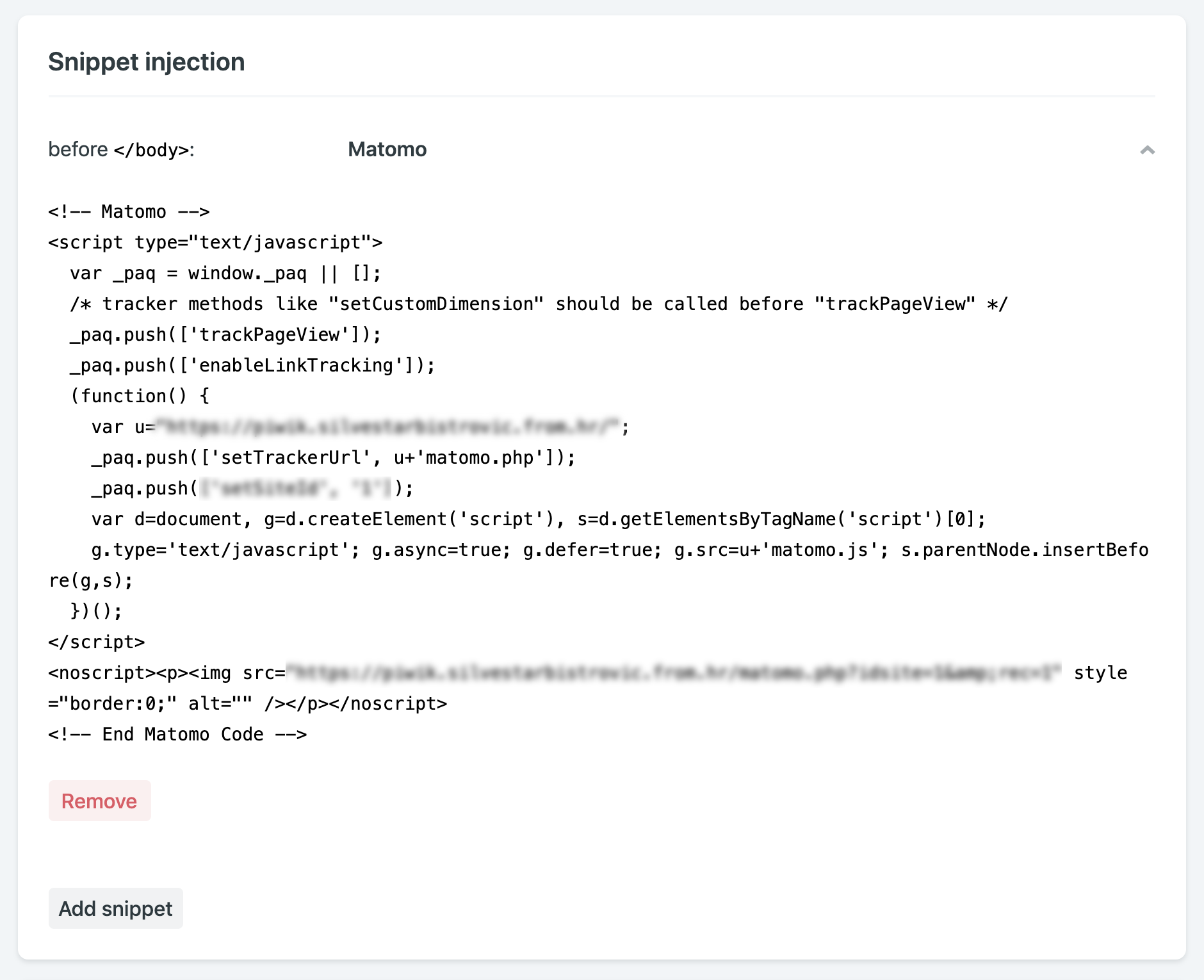
Snippet injection is another excellent feature. I am using it mostly for inserting analytics, but you could use it for adding meta tags for responsive behavior, favicon tags, or Webmention.io tags.
The „Snippet injection” section of the Netlify dashboard.
When inserting snippets, you could choose to append the code fragment at the end of the <head> block, or at the end of the <body> block.
They are immutable deployments that live on forever.
— Phil Hawksworth
I found this feature useful when completing tasks and sending the preview links to the clients. If there is a person in charge of handling Git-related tasks, like publishing to production, these preview links could be convenient to understand what to expect during the merge. You could even set up the preview builds for every pull request.
Netlify allows for the cleanest and most responsible A/B testing you can do.
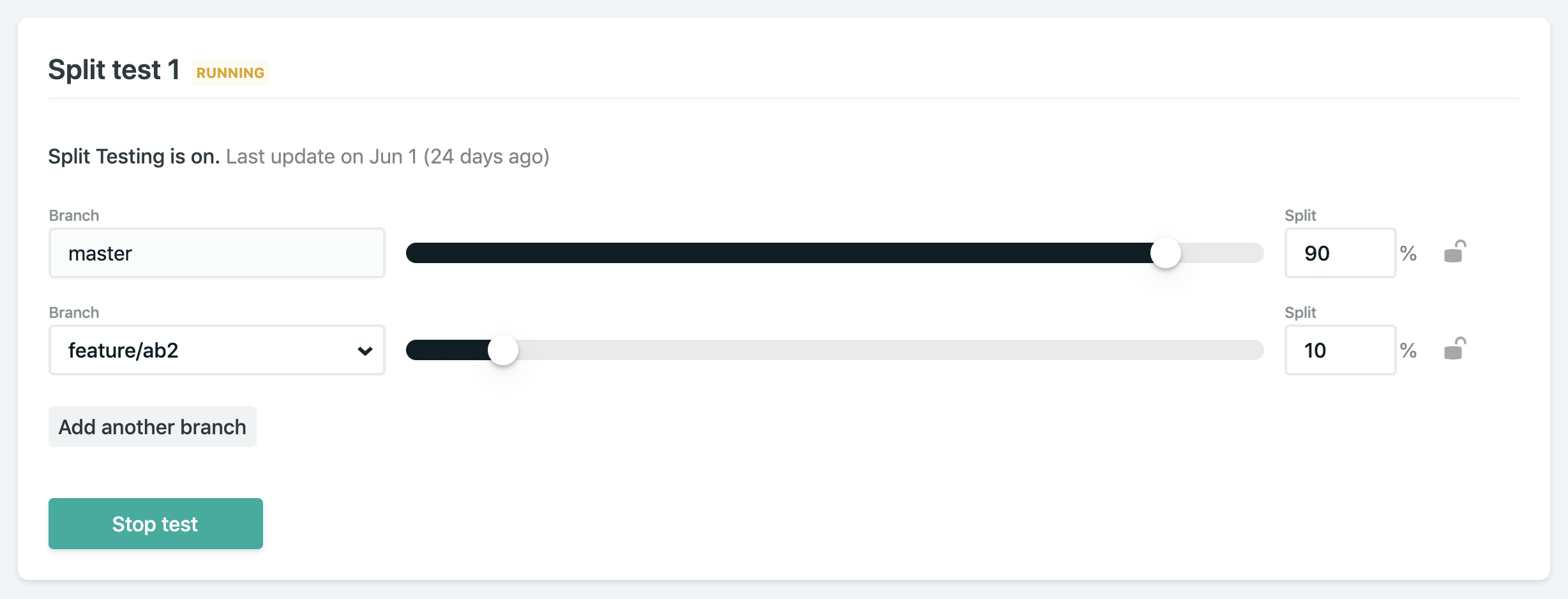
If you ever wanted to run A/B tests on your site, you would find that Netlify makes running A/B tests quite straightforward. Split testing on Netlify allows you to display different versions of your website from different Git branches without any hackery.
The „Split testing” section of the Netlify dashboard.
Start by adding and publishing a separate branch with desired changes. From “Split testing” panel, select which branches to test, set a split percentage, and start the test. You could even set a variable in analytics code to track which branch is currently displayed. You might need to active branch deploys if you didn’t do this already.
Netlify’s Split Testing lets you divide traffic to your site between different deploys, straight from our CDN network, without losing any download performance, and without installing any third party JavaScript library.
— Netlify documentation
I have been using A/B testing on my site for a few different features so far:
Testing different versions of contact forms
Displaying different versions of banners
Tracking user behavior, like heatmaps
If you want to track split testing information, you could set up the process environment variable for this purpose. You could learn more about it in the official documentation. The best part? Most A/B testing services use client-side JavaScript to do it, which is unreliable and not great for performance. Doing it at the load balancer level like this is so much better.
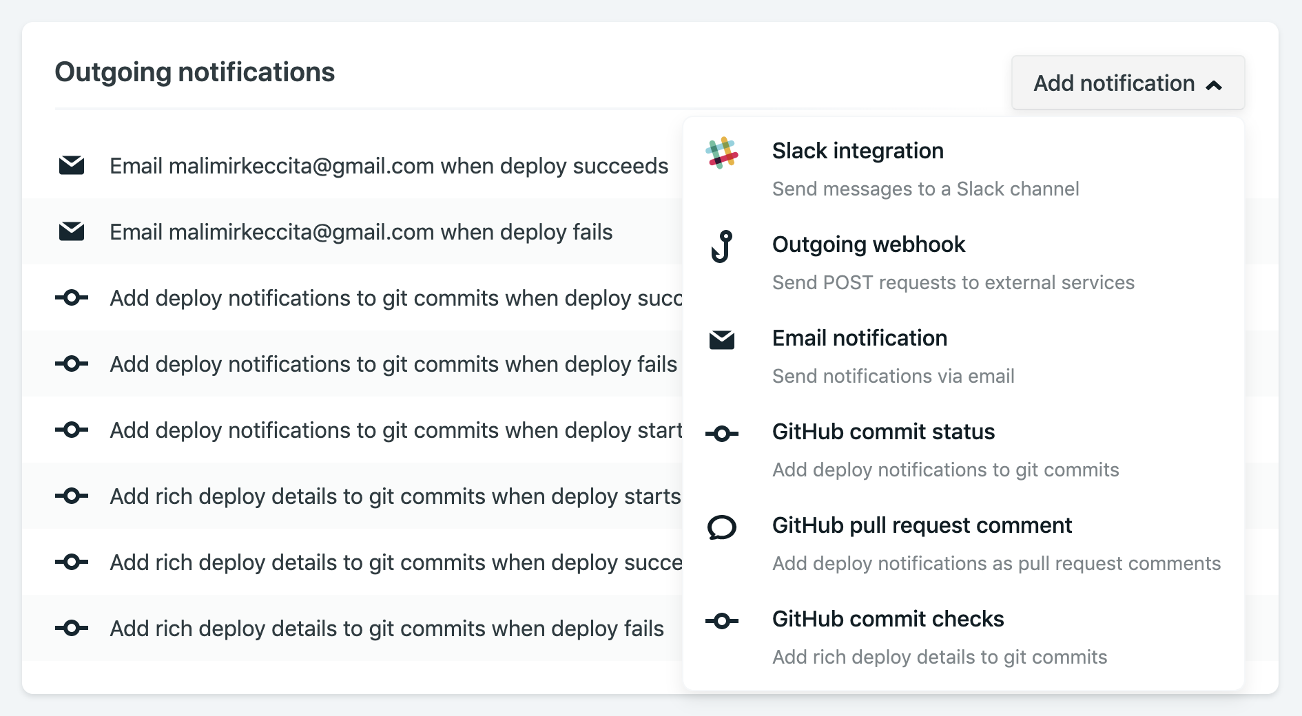
There are lots of options for notifications, like email and Slack.
If you want to receive a notification when something happens with your Netlify project, you could choose from a wide variety of notification options. I prefer getting an email for every successful or failed build.
The „Notifications” section of the Netlify dashboard.
If you are using Gmail, you could notice „See the changes live” link for every successful build when hovering your message in Gmail inbox. That means you could open a preview link without opening the email. There are other links like „See full deploy logs” when your build have any issues or „Check usage details” when your plan is near its limits. How awesome is that?
Netlify email notifications include a preview link.
If you want to set up a hook for third-party services, all you need is a URL (JWS secret token is optional). Slack hooks are built-in with Netlify and could be set up within seconds if you know your Slack incoming webhook URL.
Conclusion
All of the features mentioned above are part of the free Netlify plan. I cannot even imagine the effort invested in providing a seamless experience as it is now. But Netlify doesn’t stop there. They are introducing more and more new and shiny features, like Netlify Dev CLI for local development and deploy cancelations. Netlify has established as an undoubtedly game-changing platform in modern web development of static websites, and it is a big part of the growth and popularity of static sites.
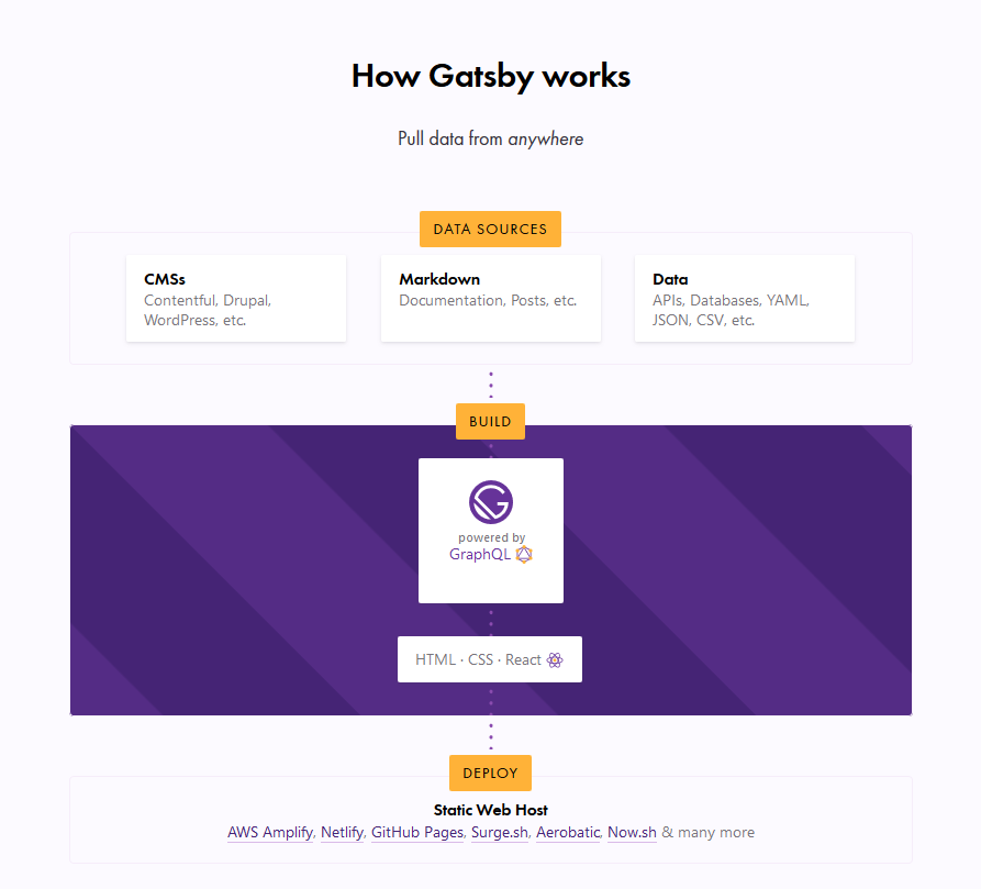
I’m assuming most of you have already heard about Gatsby, and at least loosely know that it’s basically a static site generator for React sites. It generally runs like this:
Data Sources → Pull data from anywhere.
Build → Generate your website with React and GraphQL.
Deploy → Send the site to any static site host.
What this typically means is that you can get your data from any recognizable data source — CMS, markdown, file systems and databases, to name a few — manage the data through GraphQL to build your website, and finally deploy your website to any static web host (such as Netlify or Zeit).
The Gatsby homepage illustration of the Gatsby workflow.
In this article, we are concerned with the build process, which is powered by GraphQL. This is the part where your data is managed. Unlike traditional REST APIs where you often need to send anonymous data to test your endpoints, GraphQL consolidates your APIs into a self-documenting IDE. Using this IDE, you can perform GraphQL operations such as queries, mutations, and subscriptions, as well as view your GraphQL schema, and documentation.
GraphQL has an IDE built right into it, but what if we want something a little more powerful? That’s where GraphQL Playground comes in and we’re going to walk through the steps to switch from the default over to GraphQL Playground so that it works with Gatsby.
GraphiQL and GraphQL Playground
GraphiQL is GraphQL’s default IDE for exploring GraphQL operations, but you could switch to something else, like GraphQL Playground. Both have their advantages. For example, GraphQL Playground is essentially a wrapper over GraphiQL but includes additional features such as:
Interactive, multi-column schema documentation
Automatic schema reloading
Support for GraphQL Subscriptions
Query history
Configuration of HTTP headers
Tabs
Extensibility (themes, etc.)
Choosing either GraphQL Playground or GraphiQL most likely depends on whether you need to use those additional features. There’s no strict rule that will make you write better GraphQL operations, or build a better website or app.
This post isn’t meant to sway you toward one versus the other. We’re looking at GraphQL Playground in this post specifically because it’s not the default IDE and there may be use cases where you need the additional features it provides and needs to set things up to work with Gatsby. So, let’s dig in and set up a new Gatsby project from scratch. We’ll integrate GraphQL Playground and configure it for the project.
Setting up a Gatsby Project
To set up a new Gatsby project, we first need to install the gatsby-cli. This will give us Gatsby-specific commands we can use in the Terminal.
npm install -g gatsby-cli
Now, let’s set up a new site. I’ve decided to call this example „gatsby-playground” but you can name it whatever you’d like.
gatsby new gatsby-playground
Let’s navigate to the directory where it was installed.
cd gatsby-playground
And, finally, flip on our development server.
gatsby develop
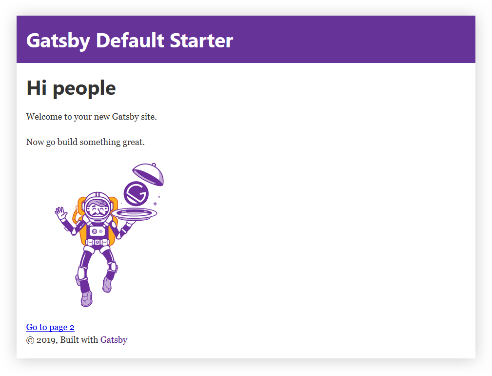
Head over to http://localhost:8000 in the browser for the opening page of the project. Your Gatsby GraphQL operations are going to be located at http://localhost:8000/___graphql.
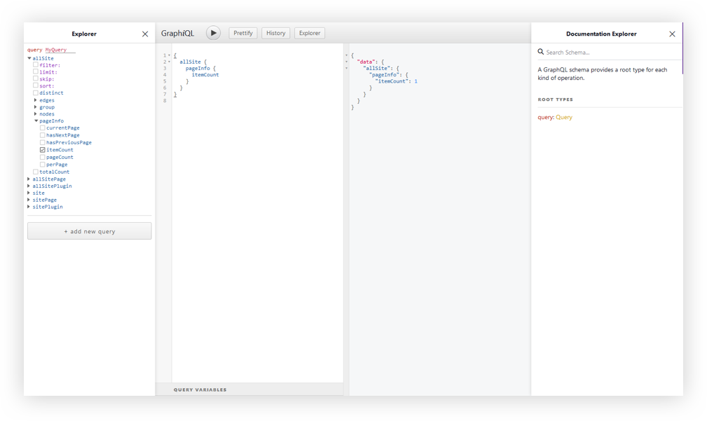
The GraphiQL interface.
At this point, I think it’s worth calling out that there is a desktop app for GraphQL Playground. You could just access your Gatsby GraphQL operations with the URL Endpoint localhost:8000/___graphql without going any further with this article. But, we want to get our hands dirty and have some fun under the hood!
Since we’re not going to be relying on the desktop app, we’ll need to do a little bit of Environmental Variable setup.
Environmental Variables are variables used specifically to customize the behavior of a website in different environments. These environments could be when the website is in active development, or perhaps when it is live in production and available for the world to see. We can have as many environments as we want, and define different Environmental Variables for each of the environments.
Gatsby supports two environments: development and production. To set a development environmental variable, we need to have a .env.development file at the root of the project. Same sort of deal for production, but it’s .env.production.
To swap out both environments, we’ll need to set an environment variable in a cross-platform compatible way. Let’s create a .env.development file at the root of the project. Here, we set a key/value pair for our variables. The key will be GATSBY_GRAPHQL_IDE, and the value will be playground, like so:
GATSBY_GRAPHQL_IDE=playground
Accessing Environment Variables in JavaScript
In Gatsby, our Environmental Variables are only available at build time, or when Node.JS is running (what we’ll call run time). Since the variables are loaded client-side at build time, we need to use them dynamically at run time. It is important that we restart our server or rebuild our website every time we modify any of these variables.
To load our environmental variables into our project, we need to install a package:
And that’s it! But, hey, remember to restart the server since we change the variable.
yarn start // npm run develop
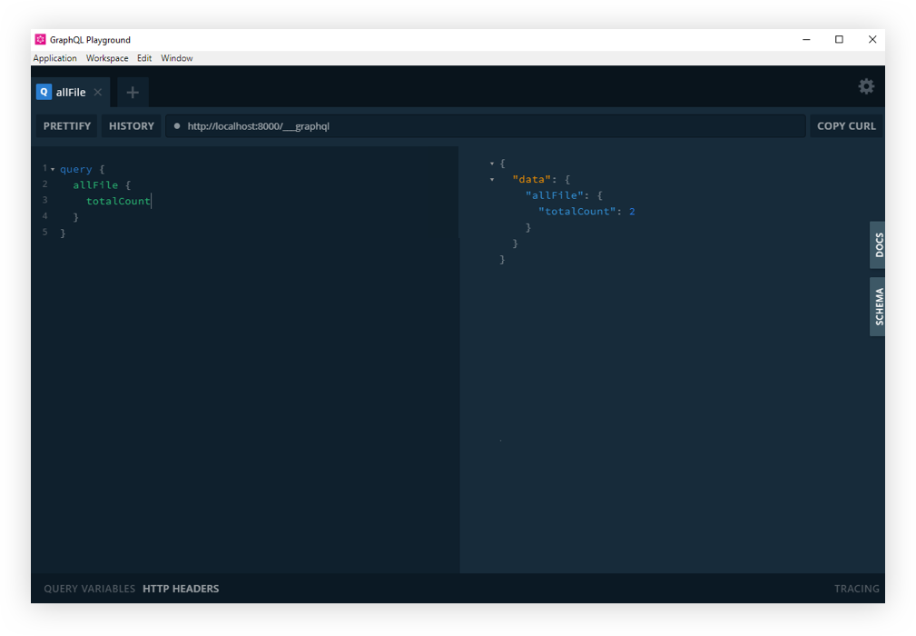
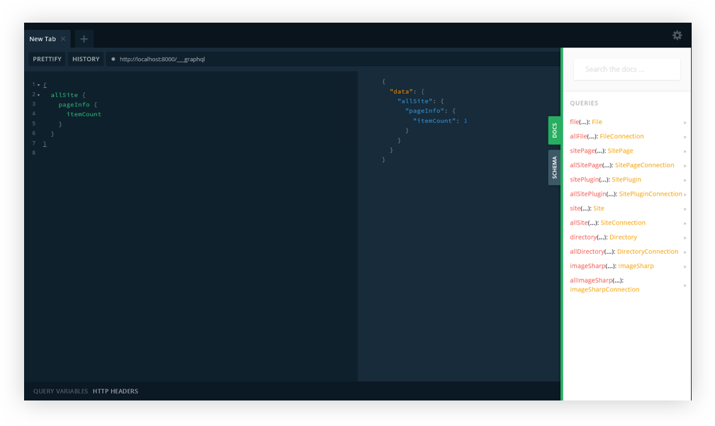
If you refresh the http://localhost:8000/___graphql in the browser, you should now see GraphQL playground. Cool? Cool!
GraphQL Playground with Gatsby.
And that’s how we get GraphQL Playground to work with Gatsby!
So that’s how we get from GraphQL’s default GraphiQL IDE to GraphQL Playground. Like we covered earlier, the decision of whether or not to make the switch at all comes down to whether the additional features offered in GraphQL Playground are required for your project. Again, we’re basically working with a GraphiQL wrapper that piles on more features.
Resources
Here are some additional articles around the web to get you started with Gatsby and more familiar with GraphiQL, GraphQL Playground, and Environment Variables.
I recently drew up a wireframe for a code beautifier. The next day, I decided to turn it into a real tool. The whole project took less than two days to complete.
I’d been thinking about building a new code beautifier for a while. The idea isn’t unique, but every time I use someone else’s tool, I find myself reapplying the same settings and dodging advertisements every single time. 🤦🏻
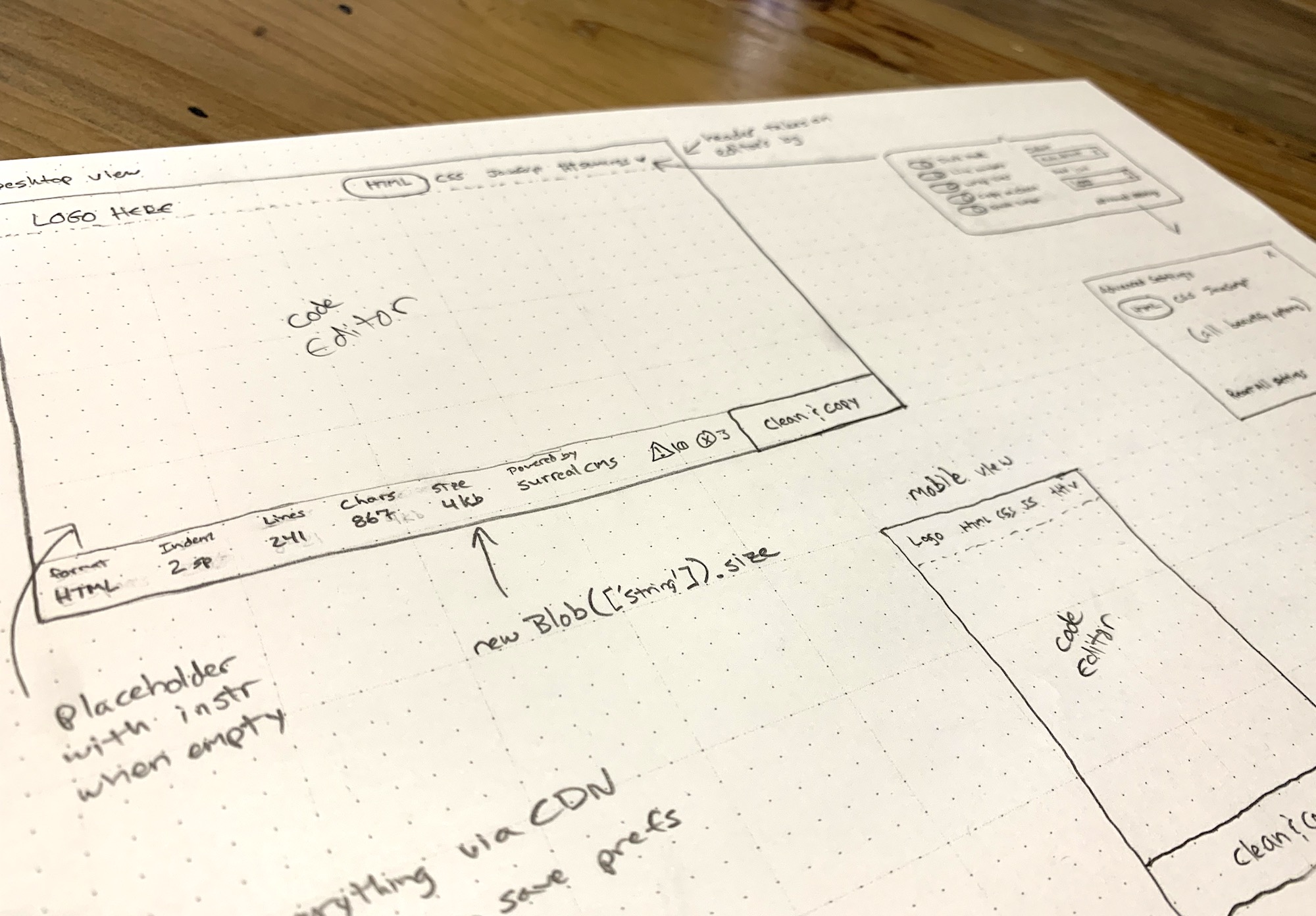
I wanted a simple tool that worked well without the hassle, so last week I grabbed some paper and started sketching one out. I’m a huge fan of wireframing by hand. There’s just something about pencil and paper that makes the design part of my brain work better than staring at a screen.
I kicked off the design process by hand-drawing wireframes for the app.
I was immediately inspired after drawing the wireframe. The next day, I took a break from my usual routine to turn it into a something real. 👨🏻💻
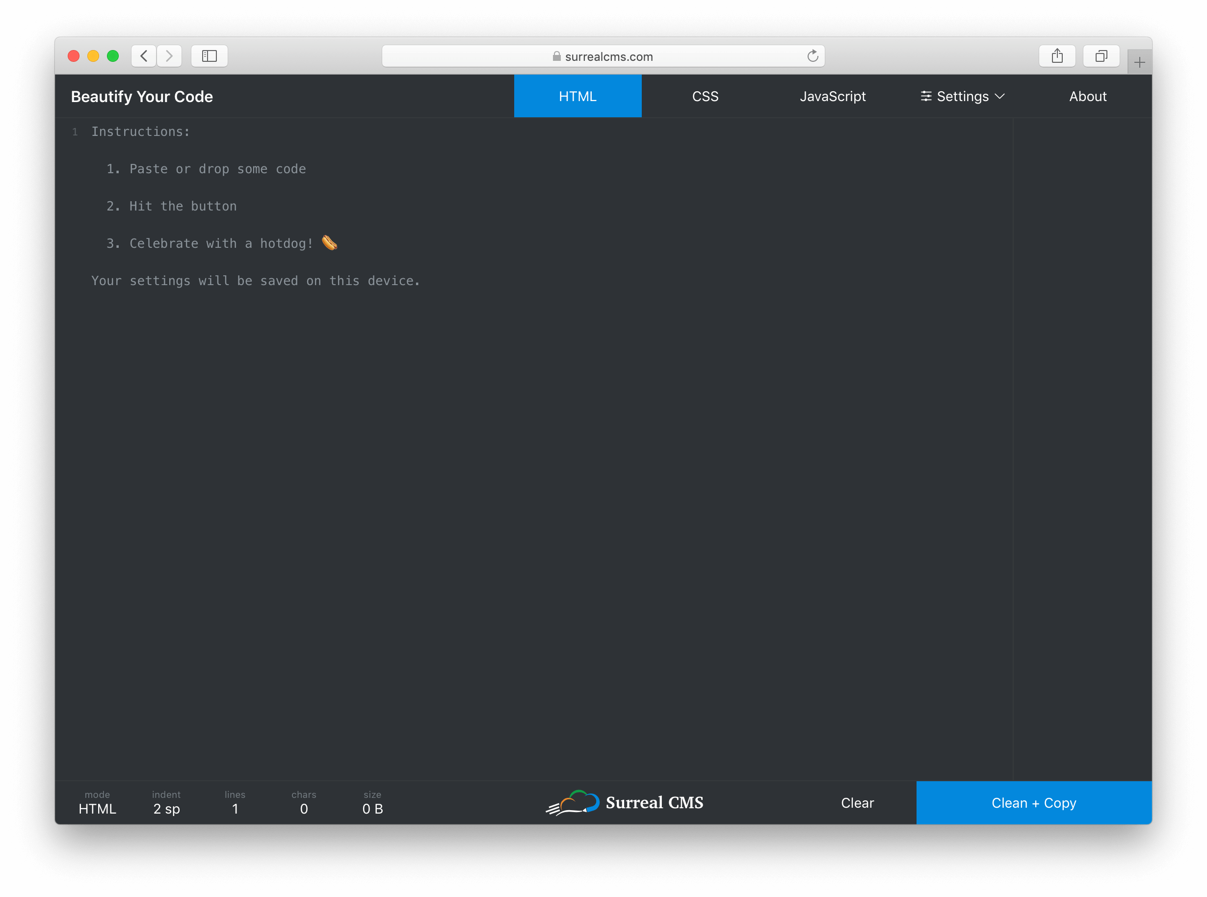
I knew I wanted the code editor to be the main focus of the tool, so I created a thin menu bar at the top that controls the mode (i.e. HTML, CSS, JavaScript) and settings. I eventually added an About button too.
The editor itself takes up most of the screen, but it blends in so you don’t really notice it. Instead of wasting space with instructions, I used a placeholder that disappears when you start typing.
The Dark Mode UI is based on a toggle that updates the styles.
At the bottom, I created a status bar that shows live stats about the code including the current mode, indentation settings, number of lines, number of characters, and document size in bytes. The right side of the status bar has a „Clear” and „Clean + Copy” button. The center has a logo shamelessly plugging my own service.
I don’t think many developers really code on phones, but I wanted this to work on mobile devices anyway. Aside from the usual responsive techniques, I had to watch the window size and adjust the tab position when the screen becomes too narrow.
I’m using flexbox and viewport units for vertical sizing. This was actually pretty easy to do with the exception of a little iOS quirk. Here’s a pen showing the basic wireframe. Notice how the textarea stretches to fill the unused space between the header and footer.
If you look at the JavaScript tab, you’ll see the iOS quirk and the workaround. I’m not sure how to feature detect something like this, so for now it’s just a simple device check.
Handling settings
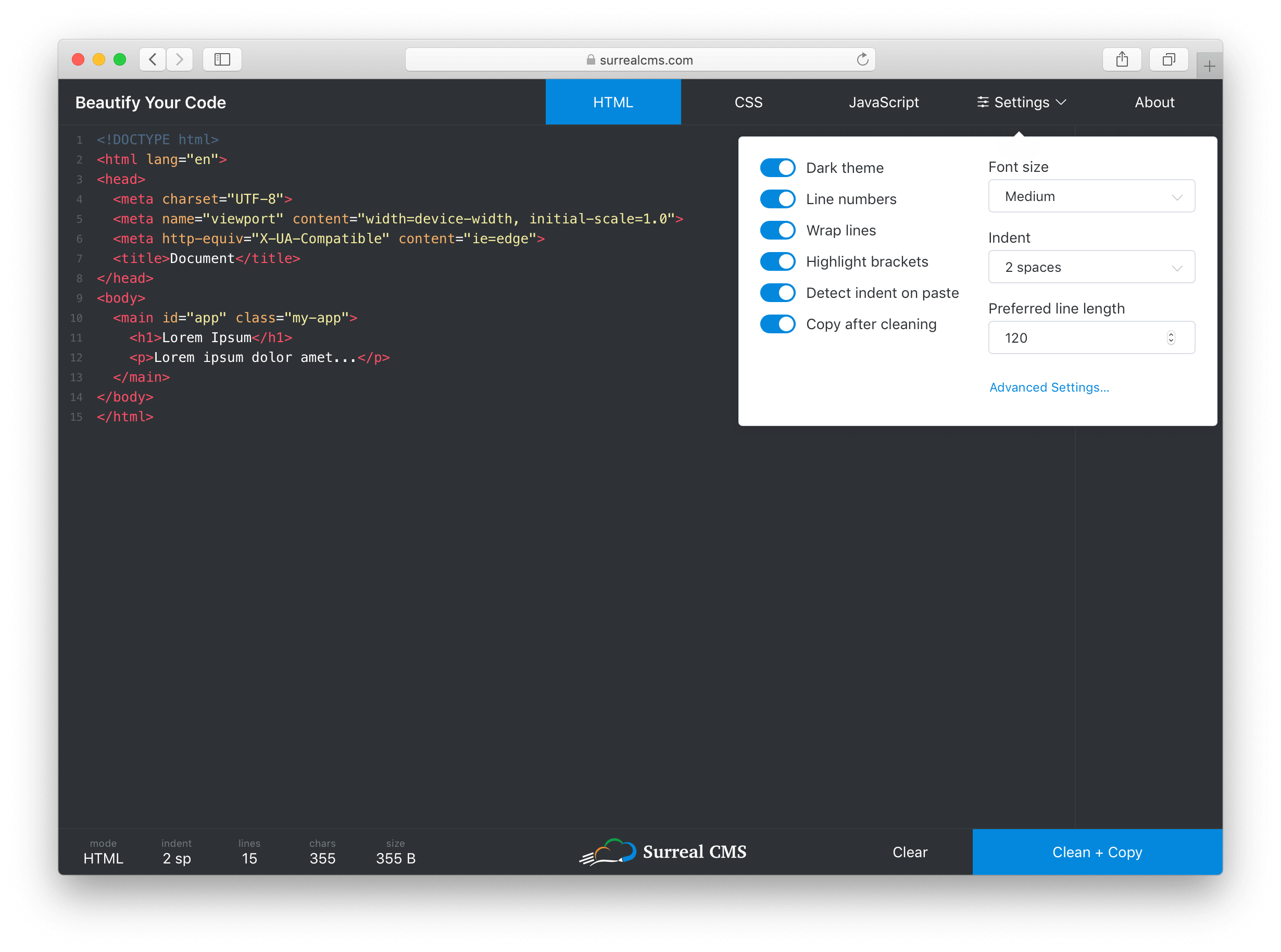
I wanted to keep the most commonly used settings easy to access, but also expose advanced settings for each mode. To do this, I made the settings button a popover with a link to more advanced settings inside. When a setting is changed, the UI updates immediately and the settings are persisted to localStorage.
The most common settings are contained in a small panel that provides quick access to them, while advanced settings are still accessible via a link in the panel.
I took advantage of Vue.js here. Each setting gets mapped to a data property, and when one of them changes, the UI updates (if required) and I call saveSettings(). It works something like this.
function saveSettings() {
  const settings = {};

  // settingsToStore is an array of property names that will be persisted
  // and "this" is referencing the current Vue model
  settingsToStore.map(key => settings[key] = this[key]);
  localStorage.setItem('settings', JSON.stringify(settings);
}
Every setting is a data property that gets synced to localStorage. This is a rather primitive way to store state, so I might update the app to use a state management library such as Vuex later on.
To restore settings, I have a restoreSettings() function that runs when the app starts up.
function restoreSettings() {
  const json = localStorage.getItem('settings');

  if (json) {
    try {
      const settings = JSON.parse(json);

      Object.keys(settings).forEach(key => {
        if (settingsToStore.includes(key)) {
          this[key] = settings[key];
        }
      });
    } catch (err) {
      window.alert('There was an error loading your previous settings');
    }
  }
}
The function fetches settings from localStorage, then applies them one by one ensuring only valid settings in settingsToStore get imported.
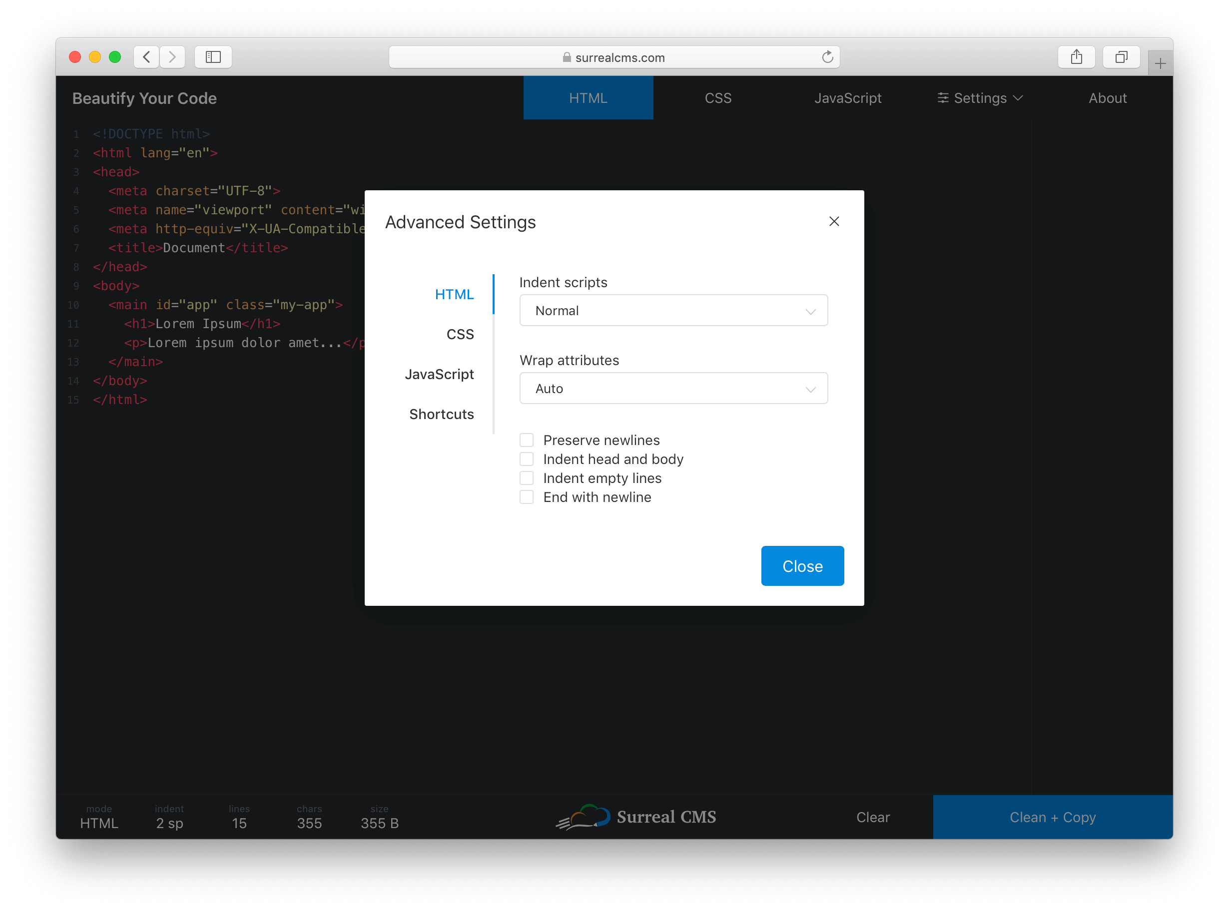
The Advanced Settings link opens a dialog with tabs for each mode. Despite having over 30 settings total, everything is organized and easy to access so users won’t feel overwhelmed.
Clicking the „Advanced Settings” link opens up language-specific preferences and shortcuts.
Applying themes
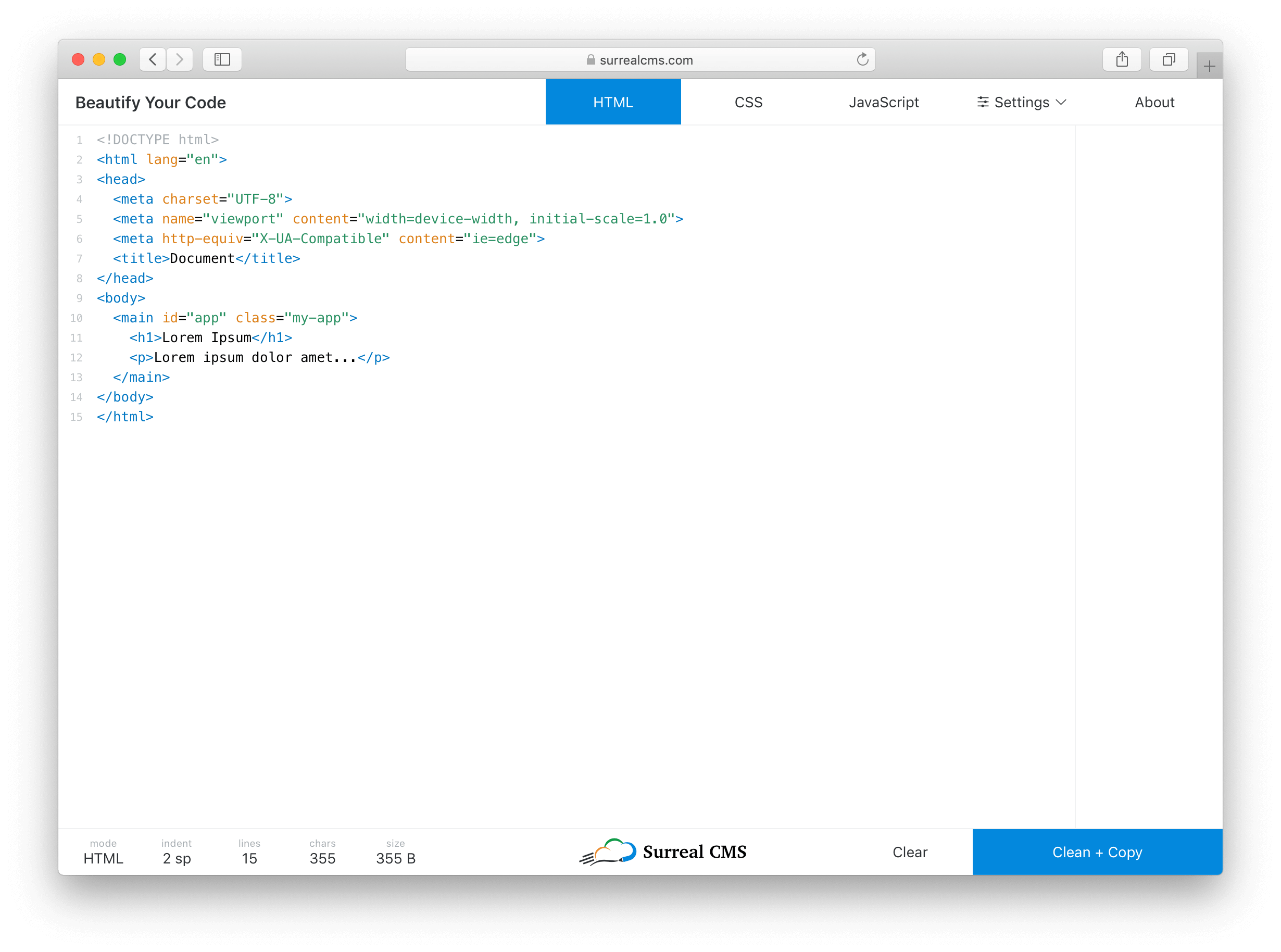
Dark mode is all the rage these days, so it’s enabled by default. There’s also a light theme for those who prefer it. The entire UI changes, except for popovers and dialogs.
I considered using prefers-color-scheme, which coincidentally landed in Firefox 67 recently, but I decided a toggle would probably be better. Browser support for the color theme preference query isn’t that great yet, plus developers are weird. (For example, I use macOS with the light theme, but my text editor is dark.)
The app with Light Mode UI enabled.
Defining features
Coming up with feature ideas is fairly easy. It’s limiting features for an initial release that’s hard. Here are the most relevant features I shipped right away:
Beautifies HTML, CSS, and JavaScript code
Syntax highlighting with tag/bracket matching
Paste or drop files to load code
Auto-detects indentation preference based on pasted code or dropped file
Light and dark themes
Clean and copy in one click
Keyboard shortcuts
Most JS Beautify options are configurable
Settings get stored indefinitely in localStorage
Minimal UI without ads (just an unobtrusive plug to my own service) 🙈
I also threw in a few easter eggs for fun. Try refreshing the page, exploring shortcuts, and sharing it on Facebook or Twitter to find them. 😉
The tools and libraries I used
I’m a big fan of Vue.js. It’s probably overkill for this project, but the Vue CLI let me start building with all the latest tooling via one simple command.
vue create beautify-code
I didn’t have to waste any time scaffolding, which helped me build this out quickly. Plus, Vue came in handy for things like live stats, changing themes, toggling settings, etc. I used various Element UI components for things like buttons, form elements, popovers, and dialogs.
The editor is powered by CodeMirror using custom styles. It’s a well-supported and fantastic project that I can’t recommend enough for in-browser code editing.
The library that does all the beautifying is called JS Beautify, which handles JavaScript, HTML, and CSS. JS Beautify runs on the client-side, so there’s really no backend to this app — your browser does all the work!
JS Beautify is incredibly easy to use. Install it with npm install js-beautify and run your code through the appropriate function.
import beautify from 'js-beautify';

const code = 'Your code here';
const settings = {
  // Your settings here
};

// HTML
const html = beautify.html(code, settings)

// CSS
const css = beautify.css(code, settings)

// JavaScript
const js = beautify.js(code, settings)
Each function returns a string containing the beautified code. You can change how each language is output by passing in your own settings.
I’ve been asked a few times about Prettier, which is a comparable tool, so it’s worth mentioning that I chose JS Beautify because it’s less opinionated and more configurable. If there’s enough demand, I’ll consider adding an option to toggle between JS Beautify and Prettier.
I’ve used all of these libraries before, so integration was actually pretty easy. 😅
This project was made possible by my app, Surreal CMS. If you’re looking for a great CMS for static websites, check it out — it’s free for personal, educational, and non-profit websites!
Oh, and if you’re wondering what editor I used… it’s Visual Studio Code. 👨🏻💻
This isn’t our first rodeo! I started ARTIFACT back in 2013 with Christopher Schmitt and Ari Stiles (the team behind the legendary In Control and CSS Dev conferences). At that time, the sudden avalanche of web-enabled mobile devices was throwing the web design community for a loop. How do we best leverage the recently-introduced Responsive Design techniques to adapt our designs to a spectrum of screen sizes?! What does that do to our workflows?! What happens to our beloved Photoshop comps?! How do we educate our clients and structure our billing cycles?! It was an exciting time when we needed to adjust our processes quickly to take on a radically new web viewing environment.
After four events in 2013 and 2014, ARTIFACT took a little hiatus, but we are back for a five-year reunion in 2019. We are returning to a landscape where a lot of the challenges we faced in 2013 have been figured out or, at the very least, have settled down (although there is always room for innovation and improvement).
Is our work making the web better done? Not by a long shot! Now that we’ve got a handle on the low-bar requirement of getting something readable on all those screens, we can focus our energy on higher-order challenges. How do we make our sites work easier for people of all abilities? How do we make our content, products, and services welcoming to everyone? Does our code need to be so bloated and complicated? How can we make our sites simpler and faster? How can I put new tools like CSS Grid, Progressive Web Apps, static sites, and animation to good use?
To that end, this time around ARTIFACT is expanding its focus from “designing for all the devices” to “designing for all the people.” Simply put, we want a web that doesn’t leave anyone out, and we’ve curated our program to address inclusivity, performance, and the ways that new possibilities on the web affect our workflow.
A web for everyone
Inclusive design—including accessibility, diversity, and internationalization—has been bubbling to the top of the collective consciousness of the web-crafting community. I’m incredibly encouraged to see articles, conference talks, and podcasts devoted to improving the reach of the web. At ARTIFACT, inclusivity is a major theme that winds its way throughout our program.
Photo by Jopwell from Pexels
Benjamin Evans will talk about his efforts as the Inclusive Design Lead at AirBnB to create a user experience that does not alienate minority communities.
Accessibility expert Elle Waters will share best practices for integrating accessibility measures into our workflows..
We’ll also hear from David Dylan Thomas on how to recognize and address cognitive bias that can affect content and the overall user experience.
Even better performance
Visitors may also be turned away from our sites if pages take too long to load or use too much data. We know performance matters, yet sites on the whole grow more bloated with every passing year. Tim Kadlec (who knows more about performance than just about anybody) will examine the intersection of performance and inclusion in his talk “Outside Looking In” with lots of practical code examples for how to do better. We’ll also look at performance through the lens of Progressive Web Apps (presented by Jason Grigsby of Cloud Four). In fact, improving performance is a subtext to many of our developer-oriented talks.
Leveraging the modern browser
In the Good News Department, another big change since the first ARTIFACT is that browsers offer a lot more features out of the box, allowing us to leverage native browser behavior and simplify our code (Viva Performance!). Chris Ferdinandi will be demonstrating exactly that in his talk “Lean Web Development,” where he’ll point out ways that taking advantage of built-in browser functionality and writing JavaScript for just the interactivity you need may make a big framework unnecessary. Better native browser features also means un-learning some of our old coping mechanisms. We’ll get to delight at all the polyfills and workarounds that have been kicked to the curb since 2012 in Dave Rupert’s tale of “The Greatest Redesign Ever Told,” and we’ll see what best practices make sense going forward.
Workflow and process
One thing that hasn’t changed—and likely never will—is that never-ending hamster wheel of trying to keep up with an ever-changing web development landscape. I’m guessing that if you are reading CSS-Tricks right now, you know that feeling. The methods we use to build the web are always evolving with new tools, approaches, and possibilities, which is why best practices for adapting our workflows and processes have always been a central focus at ARTIFACT. This year is no different. Jen Simmons will share her thinking process for designing a CSS grid-based layout by live-coding a site before our very eyes. Design systems, which have become a cornerstone of large-scale site production, get the treatment in talks by Kim Williams, Dan Mall, and Brad Frost. (Dan and Brad are also running their acclaimed “Designer + Developer Collaboration Workflow” workshop on October 3.) Divya Sasidharan will show off the possibilities and performance advantages of static sites in her “JAMstackin” presentation, and we’ll get a glimpse of the future of web animation from Sarah Drasner. (She’s bringing her popular “Design for Developers” workshop on October 3 as well).
The web can always do better to serve the people who use it. We’re proud to provide an occasion for designers and developers who care about putting their users front and center to mingle and share ideas. And yes, there will be milkshakes! The very best milkshakes.
Šime posts regular content for web developers on webplatform.news.
In this week’s roundup: datepickers are giving keyboard users headaches, a new web component compiler that helps fight FOUC, we finally get our hands on styling list item markers, and four steps to getting webmentions on your site.
Using plain text fields for date input
Keyboard users prefer regular text fields over complex date pickers, and voice users are frustrated by the native control (<input type="date">).
Previously, I have relied on plain text inputs as date fields with custom validation for the site, typically using the same logic on the client and the server. For known dates — birthdays, holidays, anniversaries, etc. — it has tested well.
Stencil is a “web component compiler” that can be used to pre-render web components (including Shadow DOM) or hide them until they are fully styled to avoid the flash of unstyled content (FOUC).
This tool also makes sure that polyfills are only loaded when needed, and its Component API includes useful decorators and hooks that make writing web components easier (e.g., the Prop decorator handles changes to attributes).
import { Component, Prop, h } from "@stencil/core";

@Component({
  tag: "my-component"
})
export class MyComponent {
  @Prop() age: number = 0;

  render() {
    return <div>I am {this.age} years old</div>;
  }
}
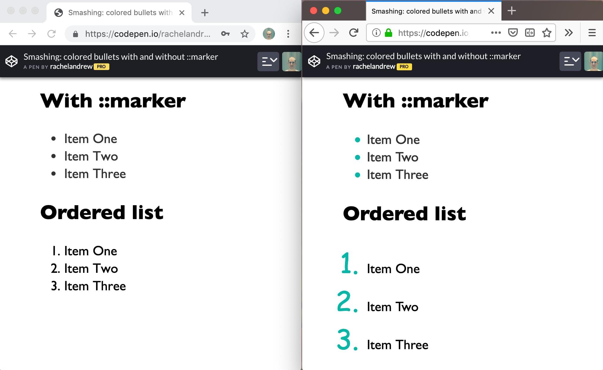
When the CSS display: list-item declaration is applied to an element, the element generates a marker box containing a marker, e.g., a list bullet (the <li> and <summary> elements have markers by default).
Markers can be styled via the ::marker pseudo-element (useful for changing the color or font of the marker), but this CSS feature is currently only supported in Firefox.
In this week’s look around the world of web platform news, Google Search Console makes it easier to view crawled markup, we learn that custom properties aren’t computing hogs, variables defined at the top-level in JavaScript are global to other page scripts, and Babel env now supports the defaults query — plus all of last month’s news compiled into a single package for you.
Easier HTML inspection in Google Search Console
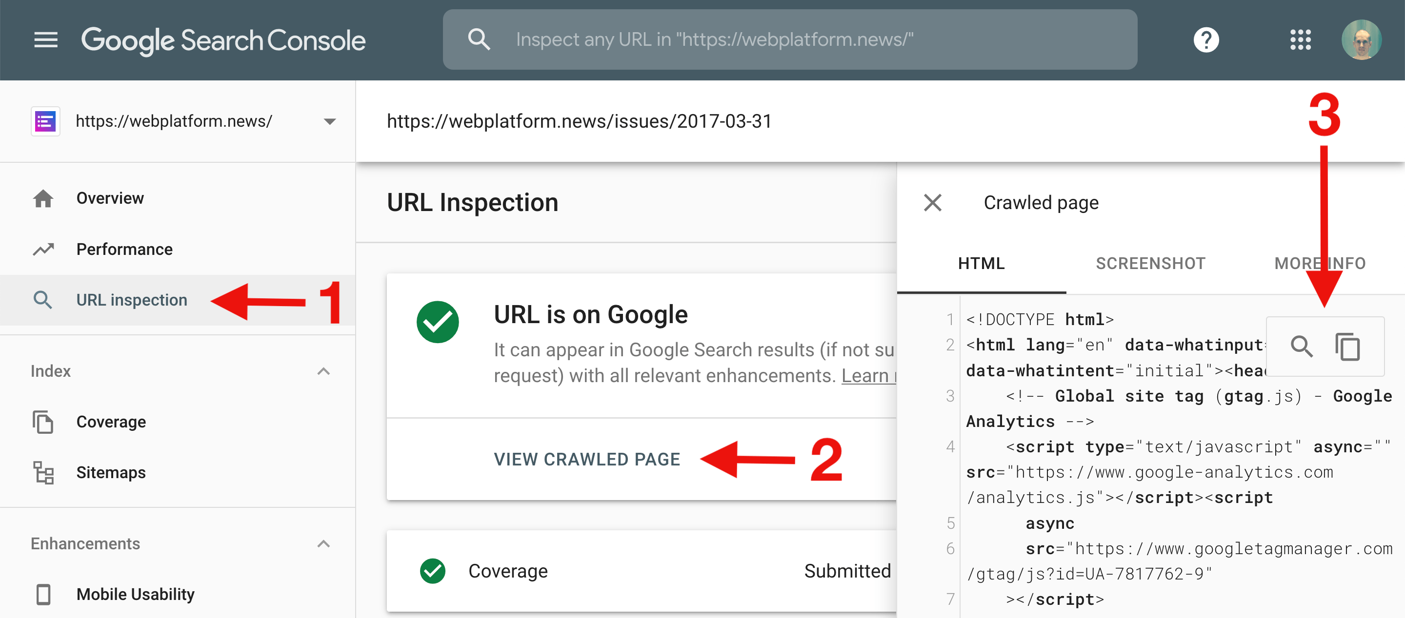
The URL Inspection tool in Google Search Console now includes useful controls for searching within and copying the HTML code of the crawled page.
Note: The URL Inspection tool provides information about Google’s indexed version of a specific page. You can access Google Search Console at https://search.google.com/search-console.
The value of a CSS custom property is computed once per element. If you define a custom property --func on the <html> element that uses the value of another custom property --val, then re-defining the value of --val on a nested DOM element that uses --func won’t have any effect because the inherited value of --func is already computed.
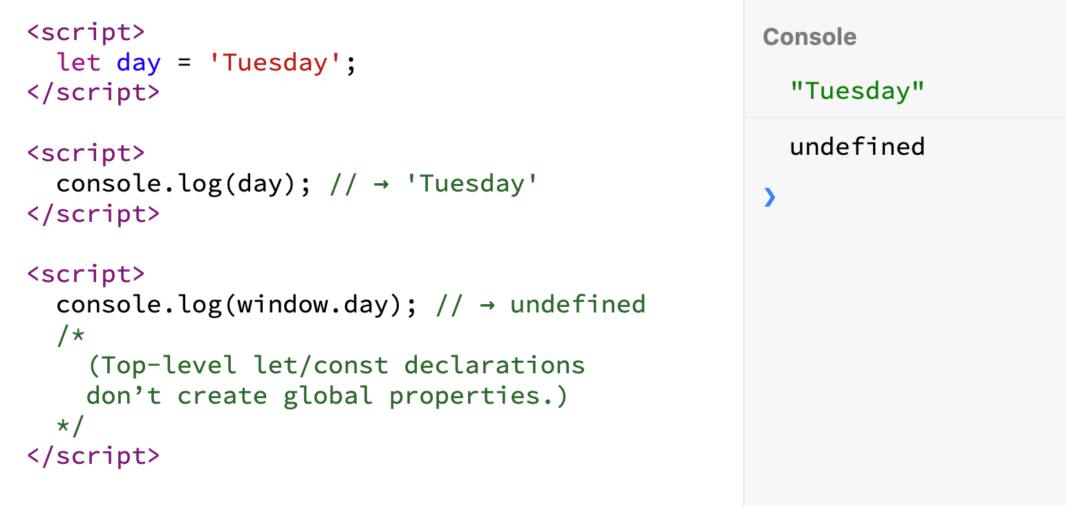
JavaScript variables created via let, const, or class declarations at the top level of a script (<script> element) continue to be defined in subsequent scripts included in the page.
Babel’s env preset (@babel/preset-env) now allows you to target browserslist’s default browsers (which are listed at browsersl.ist). Note that if you don’t specify your target browsers, Babel env will run every syntax transform on your code.
Authentication is a necessary part of every web application. It is a handy means by which we can personalize experiences and load content specific to a user — like a logged in state. It can also be used to evaluate permissions, and prevent otherwise private information from being accessed by unauthorized users.
A common practice that applications use to protect content is to house them under specific routes and build redirect rules that navigate users toward or away from a resource depending on their permissions. To gate content reliably behind protected routes, they need to build to separate static pages. This way, redirect rules can properly handle redirects.
In the case of Single Page Applications (SPAs) built with modern front-end frameworks, like Vue, redirect rules cannot be utilized to protect routes. Because all pages are served from a single entry file, from a browser’s perspective, there is only one page: index.html. In a SPA, route logic generally stems from a routes file. This is where we will do most of our auth configuration for this post. We will specifically lean on Vue’s navigation guards to handle authentication specific routing since this helps us access selected routes before it fully resolves. Let’s dig in to see how this works.
Roots and Routes
Navigation guards are a specific feature within Vue Router that provide additional functionality pertaining to how routes get resolved. They are primarily used to handle error states and navigate a user seamlessly without abruptly interrupting their workflow.
There are three main categories of guards in Vue Router: Global Guards, Per Route Guards and In Component Guards. As the names suggest, Global Guards are called when any navigation is triggered (i.e. when URLs change), Per Route Guards are called when the associated route is called (i.e. when a URL matches a specific route), and Component Guards are called when a component in a route is created, updated or destroyed. Within each category, there are additional methods that gives you more fine grained control of application routes. Here’s a quick break down of all available methods within each type of navigation guard in Vue Router.
Global Guards
beforeEach: action before entering any route (no access to this scope)
beforeResolve: action before the navigation is confirmed, but after in-component guards (same as beforeEach with this scope access)
afterEach: action after the route resolves (cannot affect navigation)
Per Route Guards
beforeEnter: action before entering a specific route (unlike global guards, this has access to this)
Component Guards
beforeRouteEnter: action before navigation is confirmed, and before component creation (no access to this)
beforeRouteUpdate: action after a new route has been called that uses the same component
beforeRouteLeave: action before leaving a route
Protecting Routes
To implement them effectively, it helps to know when to use them in any given scenario. If you wanted to track page views for analytics for instance, you may want to use the global afterEach guard, since it gets fired when the route and associated components are fully resolved. And if you wanted to prefetch data to load onto a Vuex store before a route resolves, you could do so using the beforeEnter per route guard.
Since our example deals with protecting specific routes based on a user’s access permissions, we will use in component navigation guards, namely the beforeEnter hook. This navigation guard gives us access to the proper route before the resolve completes; meaning that we can fetch data or check that data has loaded before letting a user pass through. Before diving into the implementation details of how this works, let’s briefly look at how our beforeEnter hook fits into our existing routes file. Below, we have our sample routes file, which has our protected route, aptly named protected. To this, we will add our beforeEnter hook to it like so:
The anatomy of a beforeEnter is not much different from other available navigation guards in Vue Router. It accepts three parameters: to, the “future” route the app is navigating to; from, the “current/soon past” route the app is navigating away from and next, a function that must be called for the route to resolve successfully.
Generally, when using Vue Router, next is called without any arguments. However, this assumes a perpetual success state. In our case, we want to ensure that unauthorized users who fail to enter a protected resource have an alternate path to take that redirects them appropriately. To do this, we will pass in an argument to next. For this, we will use the name of the route to navigate users to if they are unauthorized like so:
next({
  name: "dashboard"
})
Let’s assume in our case, that we have a Vuex store where we store a user’s authorization token. In order to check that a user has permission, we will check this store and either fail or pass the route appropriately.
beforeEnter(to, from, next) {
  // check vuex store //
  if (store.getters["auth/hasPermission"]) {
    next()
  } else {
    next({
      name: "dashboard" // back to safety route //
    });
  }
}
In order to ensure that events happen in sync and that the route doesn’t prematurely load before the Vuex action is completed, let’s convert our navigation guards to use async/await.
async beforeEnter(to, from, next) {
  try {
    var hasPermission = await store.dispatch("auth/hasPermission");
    if (hasPermission) {
      next()
    }
  } catch (e) {
    next({
      name: "dashboard" // back to safety route //
    })
  }
}
Never forget where you came from
So far our navigation guard fulfills its purpose of preventing unauthorized users access to protected resources by redirecting them to where they may have come from (i.e. the dashboard page). Even so, such a workflow is disruptive. Since the redirect is unexpected, a user may assume user error and attempt to access the route repeatedly with the eventual assumption that the application is broken. To account for this, let’s create a way to let users know when and why they are being redirected.
We can do this by passing in a query parameter to the next function. This allows us to append the protected resource path to the redirect URL. So, if you want to prompt a user to log into an application or obtain the proper permissions without having to remember where they left off, you can do so. We can get access to the path of the protected resource via the to route object that is passed into the beforeEnter function like so: to.fullPath.
async beforeEnter(to, from, next) {
  try {
    var hasPermission = await store.dispatch("auth/hasPermission");
    if (hasPermission) {
      next()
    }
  } catch (e) {
    next({
      name: "login", // back to safety route //
      query: { redirectFrom: to.fullPath }
    })
  }
}
Notifying
The next step in enhancing the workflow of a user failing to access a protected route is to send them a message letting them know of the error and how they can solve the issue (either by logging in or obtaining the proper permissions). For this, we can make use of in component guards, specifically, beforeRouteEnter, to check whether or not a redirect has happened. Because we passed in the redirect path as a query parameter in our routes file, we now can check the route object to see if a redirect happened.
beforeRouteEnter(to, from, next) {
  if (to.query.redirectFrom) {
    // do something //
  }
}
As I mentioned earlier, all navigation guards must call next in order for a route to resolve. The upside to the next function as we saw earlier is that we can pass an object to it. What you may not have known is that you can also access the Vue instance within the next function. Wuuuuuuut? Here’s what that looks like:
next(() => {
  console.log(this) // this is the Vue instance
})
You may have noticed that you don’t technically have access to the this scope when using beforeEnter. Though this might be the case, you can still access the Vue instance by passing in the vm to the function like so:
next(vm => {
  console.log(vm) // this is the Vue instance
})
This is especially handy because you can now create and appropriately update a data property with the relevant error message when a route redirect happens. Say you have a data property called errorMsg. You can now update this property from the next function within your navigation guards easily and without any added configuration. Using this, you would end up with a component like this:
<template>
  <div>
    <span>{{ errorMsg }}</span>
    <!-- some other fun content -->
    ...
    <!-- some other fun content -->
  </div>
</template>
<script>
export default {
  name: "Error",
  data() {
    return {
      errorMsg: null
    }
  },
  beforeRouteEnter(to, from, next) {
    if (to.query.redirectFrom) {
      next(vm => {
        vm.errorMsg =
          "Sorry, you don't have the right access to reach the route requested"
      })
    } else {
      next()
    }
  }
}
</script>
Conclusion
The process of integrating authentication into an application can be a tricky one. We covered how to gate a route from unauthorized access as well as how to put workflows in place that redirect users toward and away from a protected resource based on their permissions. The assumption thus far has been that you already have authentication configured in your application. If you don’t yet have this configured and you’d like to get up and running fast, I highly recommend working with authentication as a service. There are providers like Netlify’s Identity Widget or Auth0’s lock.
You can’t position: sticky; a <thead>. Nor a <tr>. But you can sticky a <th>, which means you can make sticky headers inside a regular ol’ <table>. This is tricky stuff, because if you didn’t know this weird quirk, it would be hard to blame you. It makes way more sense to sticky a parent element like the table header rather than each individiaul element in a row.
The issue boils down to the fact that stickiness requires position: relative to work and that doesn’t apply to <thead> and <tr> in the CSS 2.1 spec.
There are two very extreme reactions to this, should you need to implement sticky table headers and not be aware of the <th> workaround.
Don’t use table markup at all. Instead, use different elements (<div>s and whatnot) and other CSS layout methods to replicate the style of a table, but not locked out of using position: relative and creating position: sticky parent elements.
Use table elements, but totally remove all their styling defaults with new display values.
The first is dangerous because you aren’t using semantic and accessible elements for the content to be read and navigated. The second is almost the same. You can go that route, but need to be really careful to re-apply semantic roles.
Anyway, none of that matters if you just stick (get it?!) to using a sticky value on those <th> elements.
It’s probably a bit weird to have table headers as a row in the middle of a table, but it’s just illustrating the idea. I was imagining colored header bars separating players on different sports teams or something.
Anytime I think about data tables, I also think about how tricky it can be to make them responsive. Fortunately, there are a variety of ways, all depending on the best way to group and explore the data in them.
In this article, we’ll be taking a look at the structure inside <input type='color'> elements, browser inconsistencies, why they look a certain way in a certain browser, and how to dig into it. Having a good understanding of this input allows us to evaluate whether a certain cross-browser look can be achieved and how to do so with a minimum amount of effort and code.
Here’s exactly what we’re talking about:
But before we dive into this, we need to get into…
Accessibility issues!
We’ve got a huge problem here: for those who completely rely on a keyboard, this input doesn’t work as it should in Safari and in Firefox on Windows, but it does work in Firefox on Mac and Linux (which I only tested on Fedora, so feel free to yell at me in the comments if it doesn’t work for you using another distribution).
In Firefox on Windows, we can Tab to the input to focus it, press Enter to bring up a dialog… which we then cannot navigate with the keyboard!
I’ve tried tabbing, arrow keys, and every other key available on the keyboard… nothing! I could at least close the dialog with good old Alt + F4. Later, in the bug ticket I found for this on Bugzilla, I also discovered a workaround: Alt + Tab to another window, then Alt + Tab back and the picker dialog can be navigated with the keyboard.
Things are even worse in Safari. The input isn’t even focusable (bug ticket) if VoiceOver isn’t on. And even when using VoiceOver, tabbing through the dialog the inputs opens is impossible.
If you’d like to use <input type='color'> on an actual website, please let browsers know this is something that needs to be solved!
How to look inside
In Chrome, we need to bring up DevTools, go to Settings and, in the Preferences section under Elements, check the Show user agent shadow DOM option.
How to view the structure inside an input in Chrome.
Then, when we return to inspect our element, we can see inside its shadow DOM.
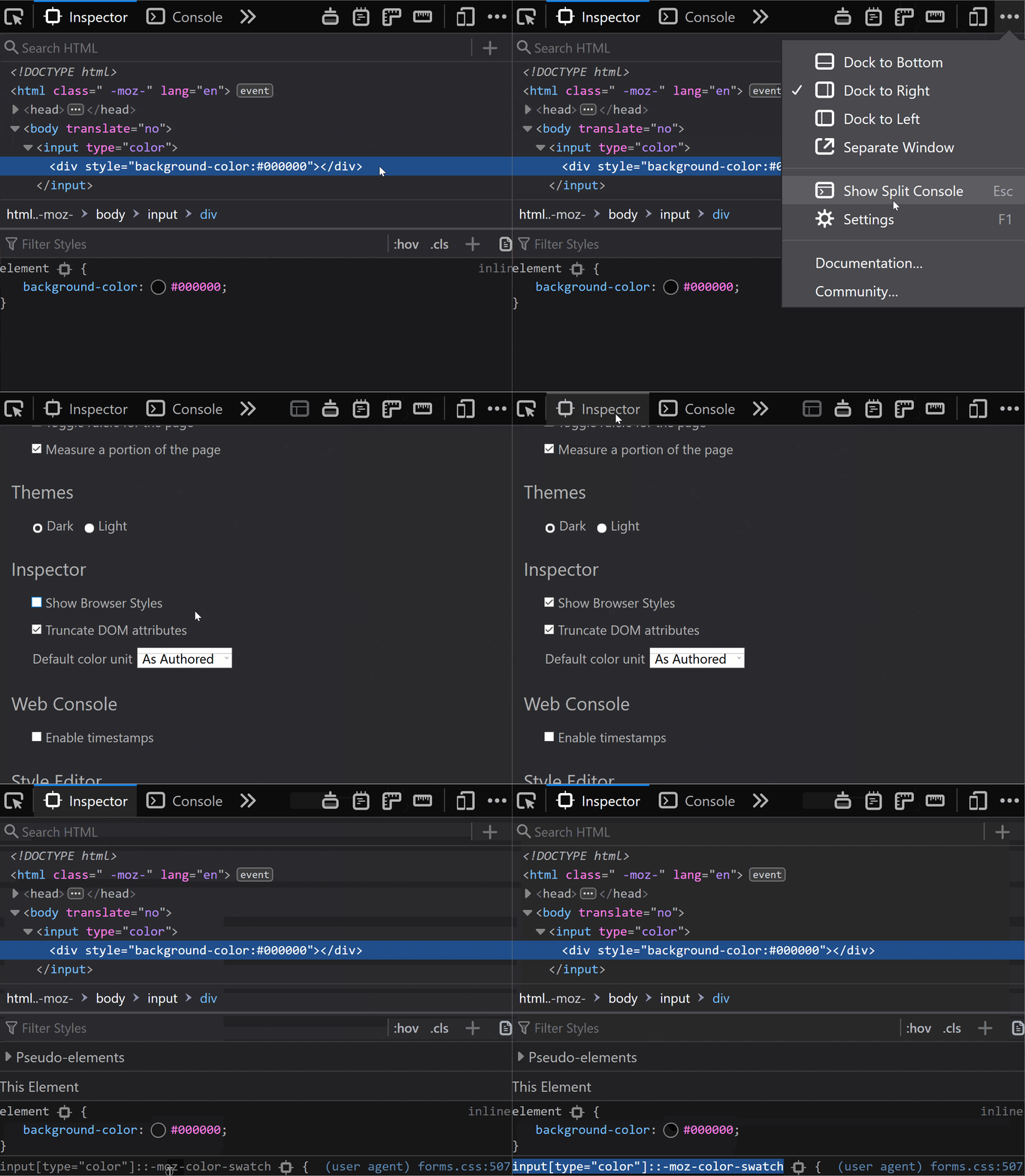
In Firefox, we need to go to about:config and ensure the devtools.inspector.showAllAnonymousContent flag is set to true.
How to view the structure inside an input in Firefox.
Then, we close the DevTools and, when we inspect our input again, we can see inside our input.
Sadly, we don’t seem to have an option for this in pre-Chromium Edge.
The structure inside
The structure revealed in DevTools differs from browser to browser, just like it does for range inputs.
In Chrome, at the top of the shadow DOM, we have a <div> wrapper that we can access using ::-webkit-color-swatch-wrapper.
Inside it, we have another <div> we can access with ::-webkit-color-swatch.
Inner structure in Chrome.
In Firefox, we only see one <div>, but it’s not labeled in any way, so how do we access it?
On a hunch, given this <div> has the background-color set to the input’s value attribute, just like the ::-webkit-color-swatch component, I tried ::-moz-color-swatch. And it turns out it works!
Inner structure in Firefox.
However, I later learned we have a better way of figuring this out for Firefox!
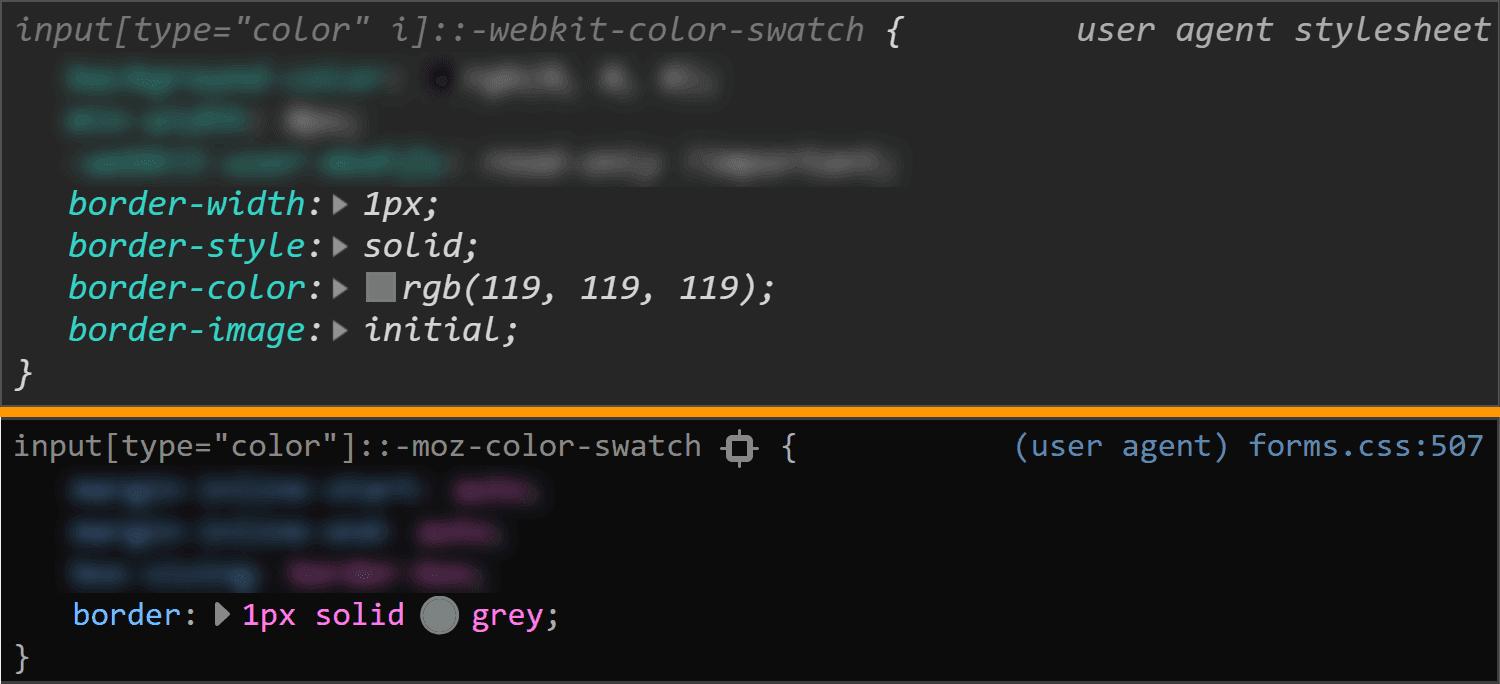
We can go into the Firefox DevTools Settings and, in the Inspector section, make sure the „Show Browser Styles” option is checked. Then, we go back to the Inspector and select this <div> inside our <input type='color'>. Among the user agent styles, we see a rule set for input[type='color']::-moz-color-swatch!
Enable viewing browser styles in Firefox DevTools.
In pre-Chromium Edge, we cannot even see what kind of structure we have inside. I gave ::-ms-color-swatch a try, but it didn’t work and neither did ::-ms-swatch (which I considered because, for an input type='range', we have ::-webkit-slider-thumb and ::-moz-range thumb, but just ::-ms-thumb).
After a lot of searching, all I found was this issue from 2016. Pre-Chromium Edge apparently doesn’t allow us to style whatever is inside this input. Well, that’s a bummer.
How to look at the browser styles
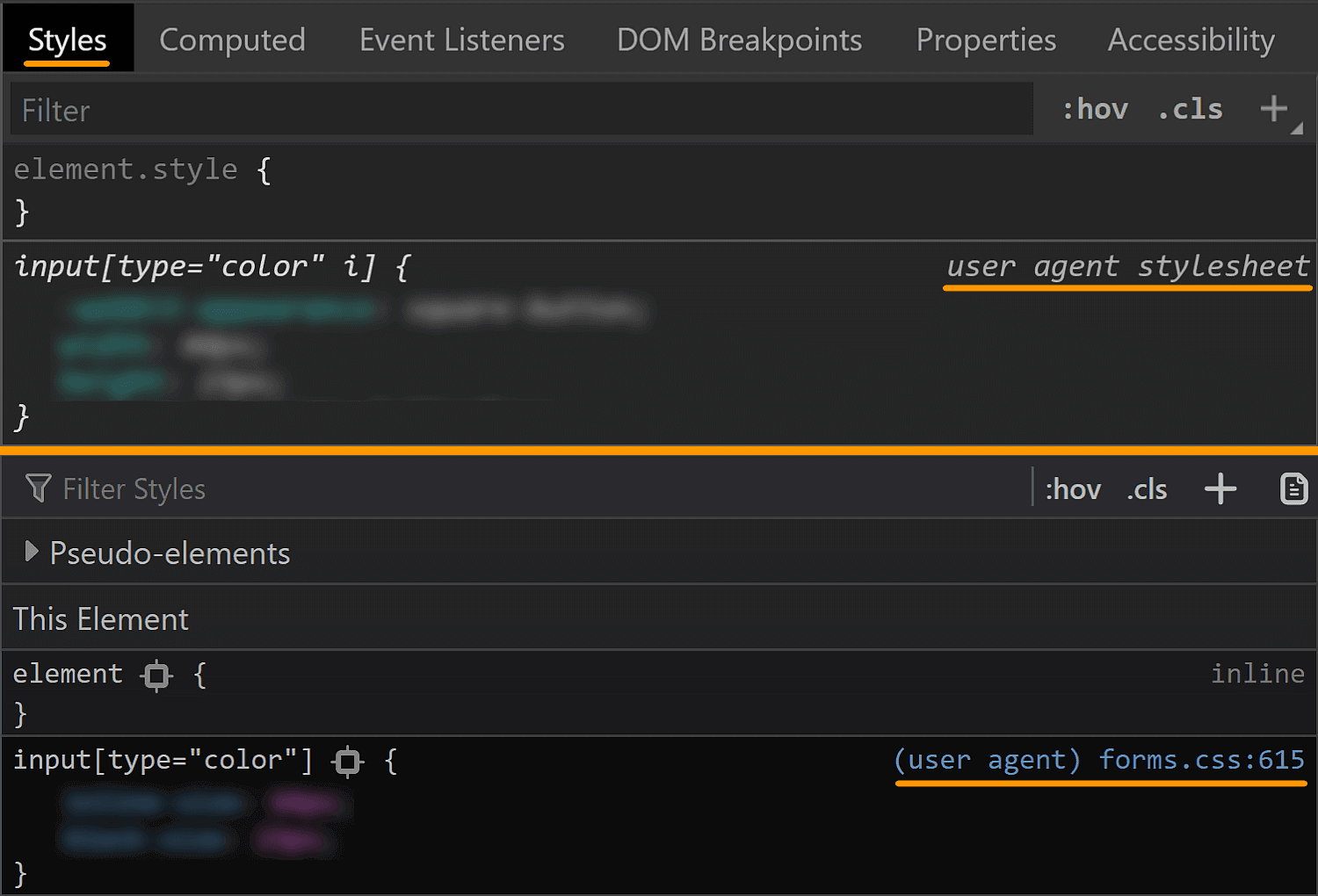
In all browsers, we have the option of not applying any styles of our own and then looking at the computed styles.
In Chrome and Firefox, we can also see the user agent stylesheet rule sets that are affecting the currently selected element (though we need to explicitly enable this in Firefox, as seen in the previous section).
Checking browser styles in Chrome and Firefox.
This is oftentimes more helpful than the computed styles, but there are exceptions and we should still always check the computed values as well.
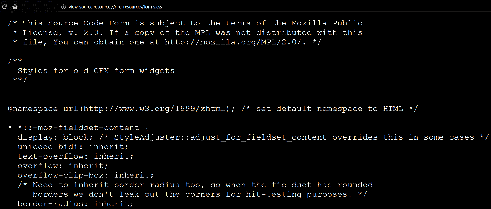
In Firefox, we can also see the CSS file for the form elements at view-source:resource://gre-resources/forms.css.
Checking browser styles in Firefox.
The input element itself
We’ll now be taking a look at the default values of a few properties in various browsers in order to get a clear picture of what we’d really need to set explicitly in order to get a custom cross-browser result.
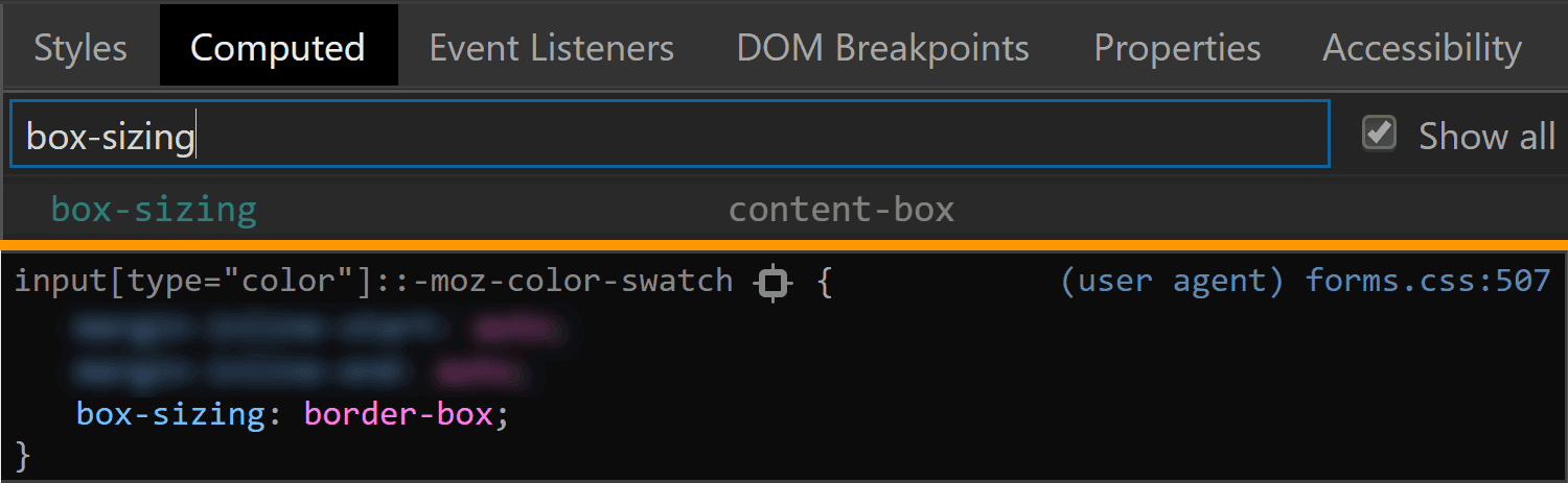
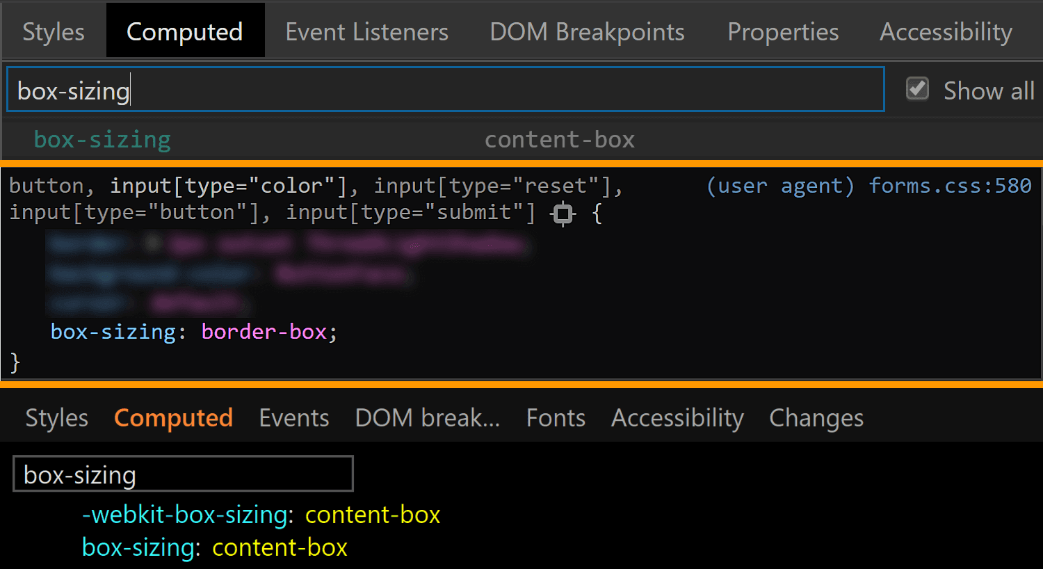
The first property I always think about checking when it comes to <input> elements is box-sizing. The initial value of this property is border-box in Firefox, but content-box in Chrome and Edge.
The box-sizing values for <input type='color'> compared in Chrome, Firefox and Edge (from top-to-bottom).
We can see that Firefox is setting it to border-box on <input type='color'>, but it looks like Chrome isn’t setting it at all, so it’s left with the initial value of content-box (and I suspect the same is true for Edge).
In any event, what it all means is that, if we are to have a border or a padding on this element, we also need to explicitly set box-sizing so that we get a consistent result across all these browsers.
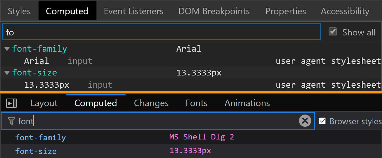
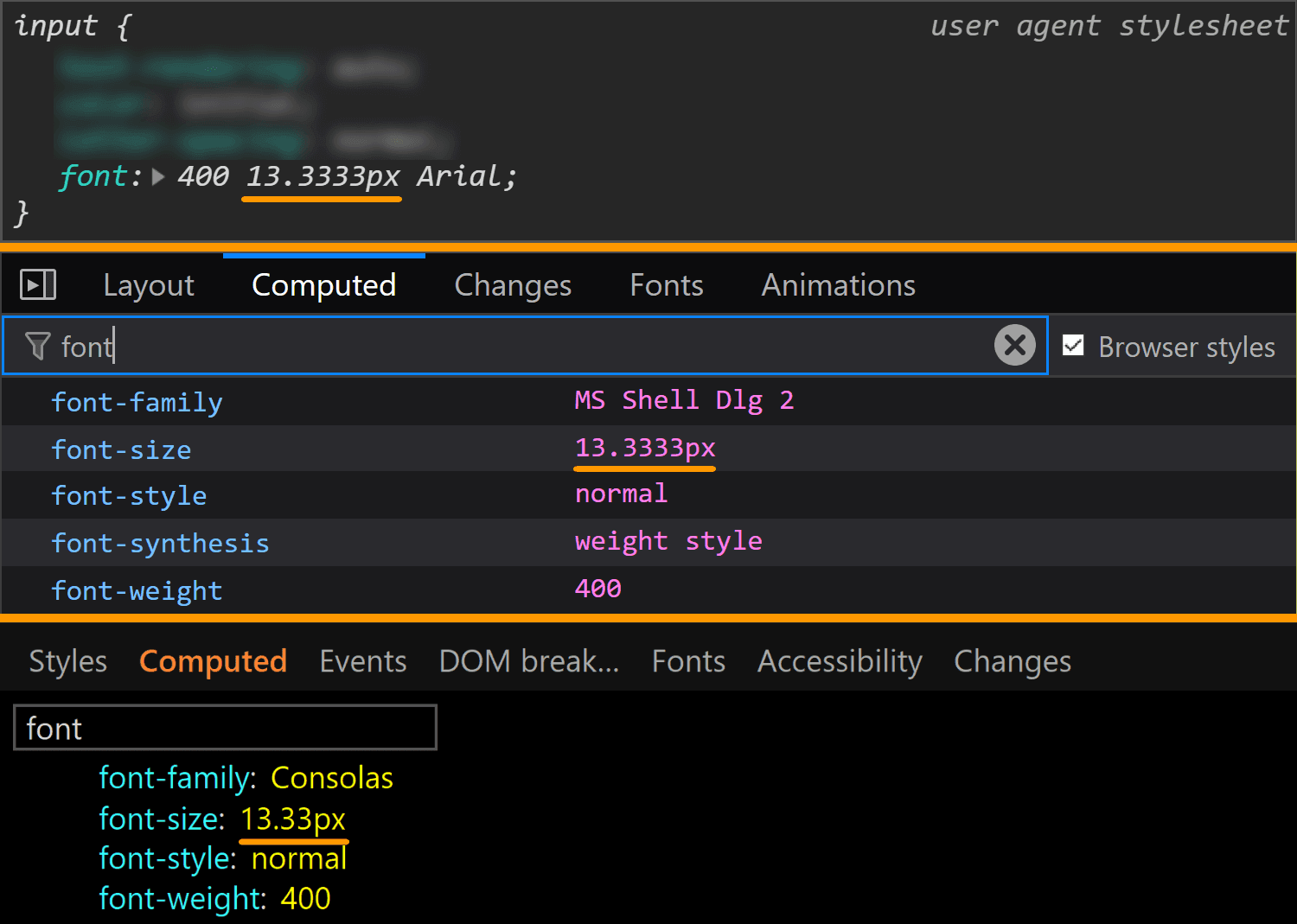
The font property value is different for every browser, but since we don’t have text inside this input, all we really care about is the font-size, which is consistent across all browsers I’ve checked: 13.33(33)px. This is a value that really looks like it came from dividing 40px by 3, at least in Chrome.
The font values for <input type='color'> compared in Chrome, Firefox and Edge (from top-to-bottom).
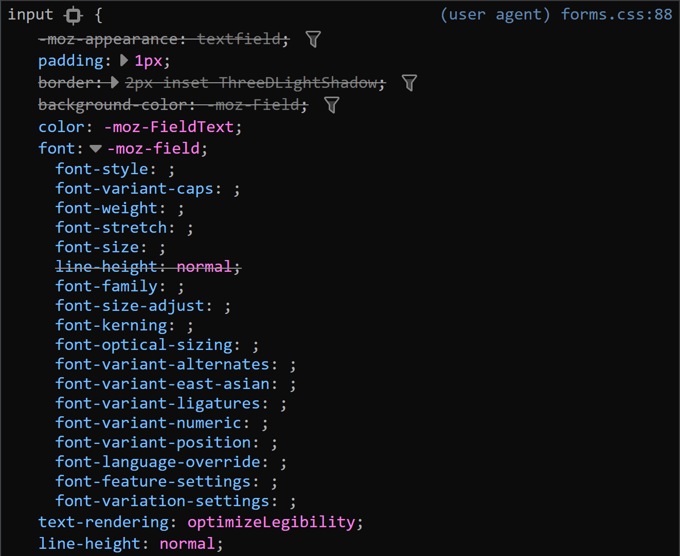
This is a situation where the computed styles are more useful for Firefox, because if we look at the browser styles, we don’t get much in terms of useful information:
Sometimes the browser styles are pretty much useless (Firefox screenshot).
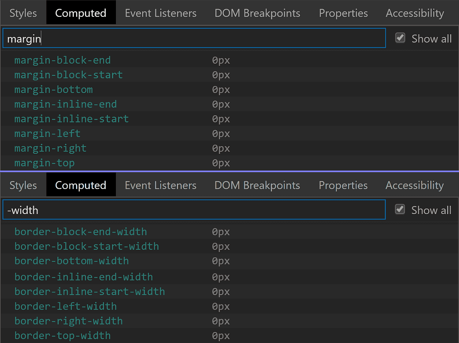
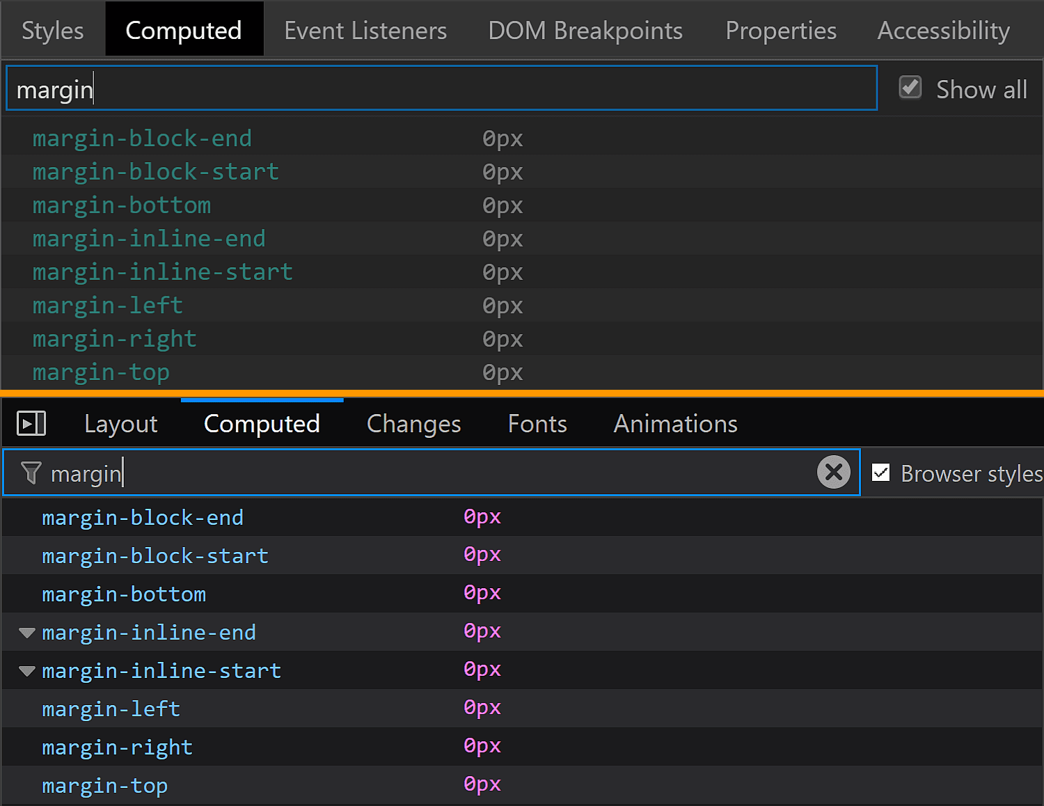
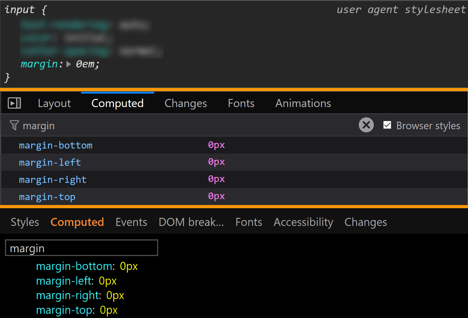
The margin is also consistent across all these browsers, computing to 0.
The margin values for <input type='color'> compared in Chrome, Firefox and Edge (from top-to-bottom).
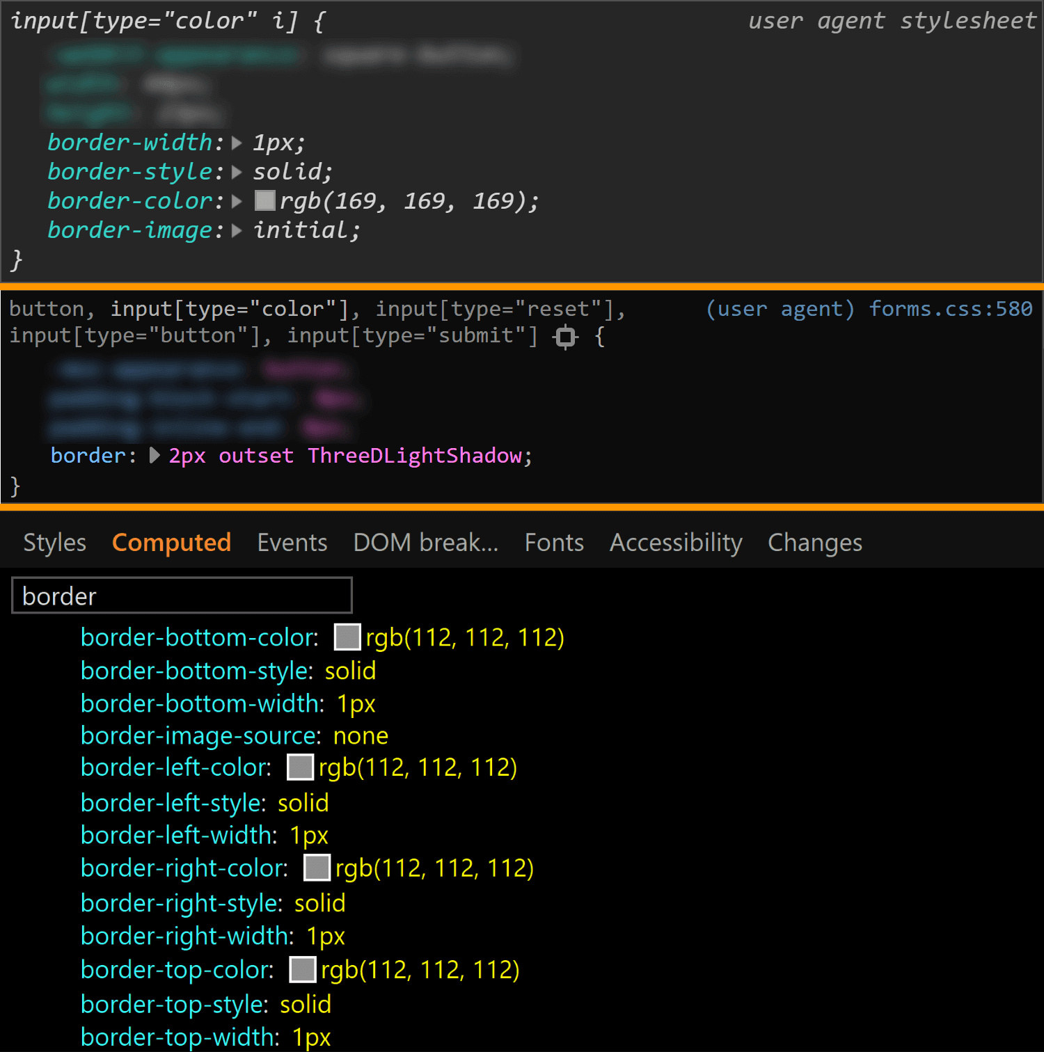
The border is different for every single browser. In both Chrome and Edge, we have a solid 1px one, but the border-color is different (rgb(169, 169, 169) for Chrome and rgb(112, 112, 112) for Edge). In Firefox, the border is an outset 2px one, with a border-color of… ThreeDLightShadow?!
The border values for <input type='color'> compared in Chrome, Firefox and Edge (from top-to-bottom).
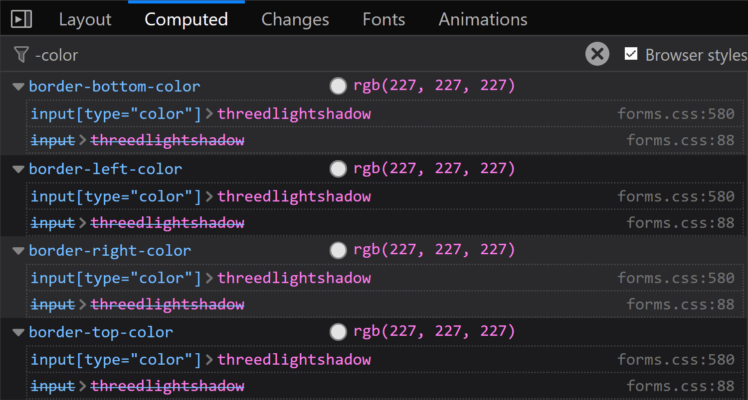
What’s the deal with ThreeDLightShadow? If it doesn’t sound familiar, don’t worry! It’s a (now deprecated) CSS2 system value, which Firefox on Windows shows me to be rgb(227, 227, 227) in the Computed styles tab.
Computed border-color for <input type='color'> in Firefox on Windows.
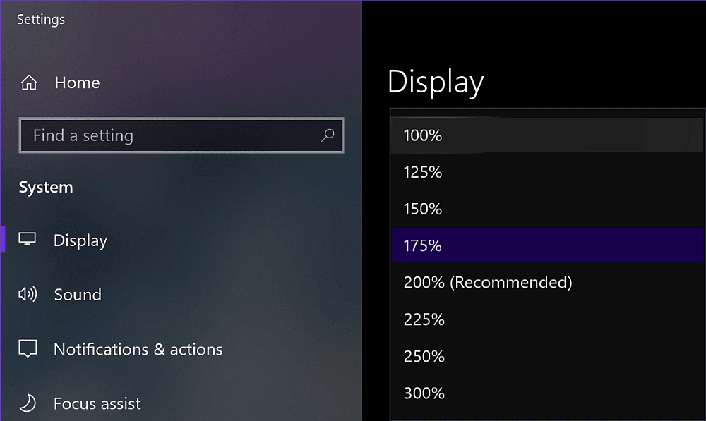
Note that in Firefox (at least on Windows), the operating system zoom level (Settings → System → Display → Scale and Layout → Change the size of text, apps and other items) is going to influence the computed value of the border-width, even though this doesn’t seem to happen for any other property I’ve checked and it seems to be partially related to the border-style.
Zoom level options on Windows.
The strangest thing is the computed border-width values for various zoom levels don’t seem to make any sense. If we keep the initial border-style: outset, we have:
1.6px for 125%
2px for 150%
1.7px for 175%
1.5px for 200%
1.8px for 225%
1.6px for 250%
1.66667px for 300%
If we set border-style: solid, we have a computed border-width of 2px, exactly as it was set, for zoom values that are multiples of 50% and the exact same computed values as for border-style: outset for all the other zoom levels.
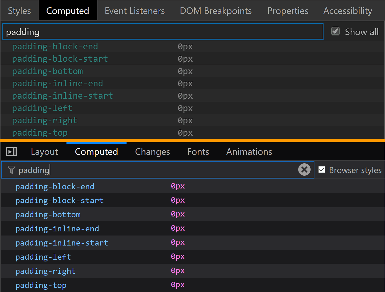
The padding is the same for Chrome and Edge (1px 2px), while Firefox is the odd one out again.
The padding values for <input type='color'> compared in Chrome, Firefox and Edge (from top-to-bottom).
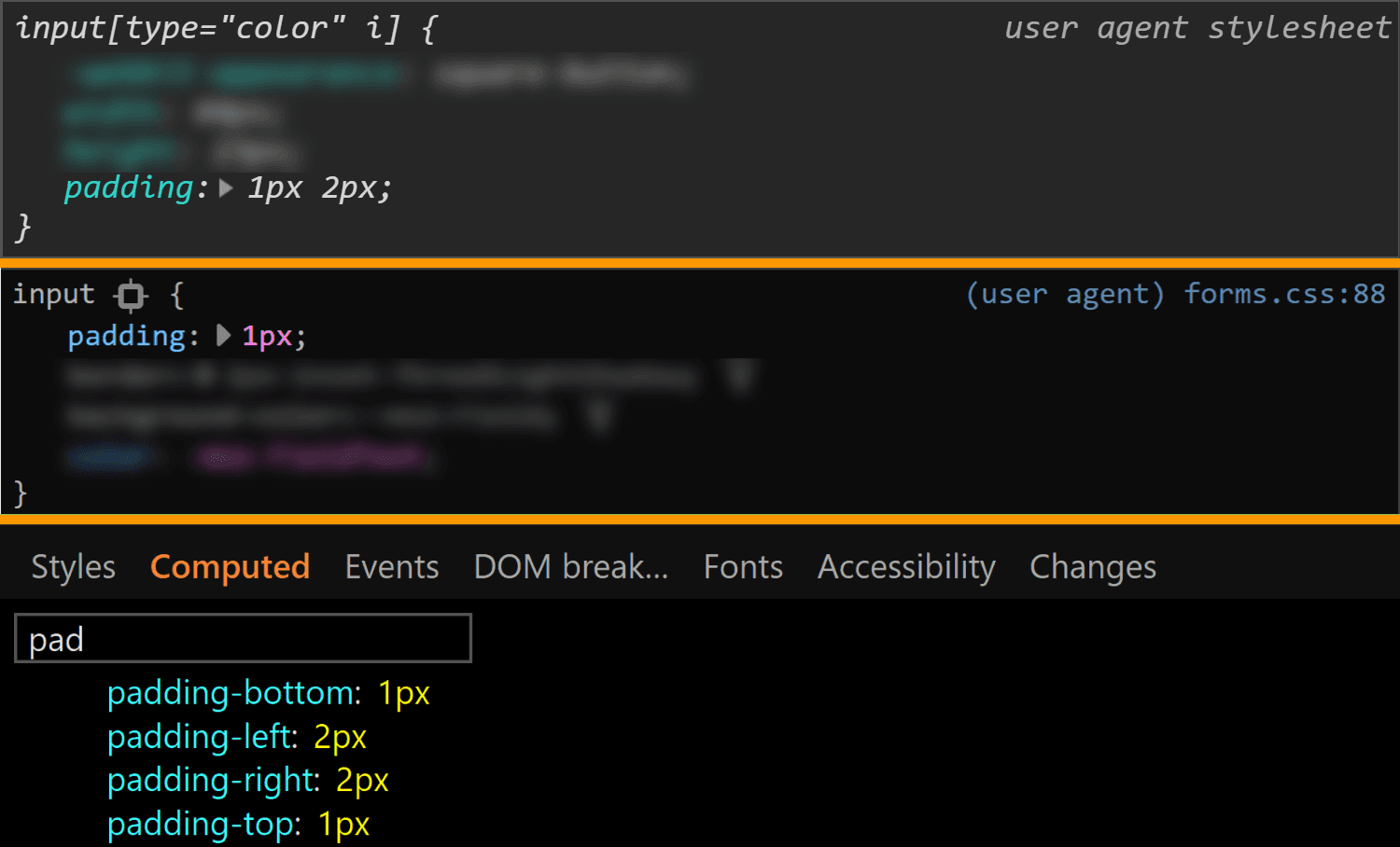
It may look like the Firefox padding is 1px. That’s what it is set to and there’s no indication of anything overriding it — if a property is overridden, then it’s shown as grey and with a strike-through.
Spotting overrides in Firefox.
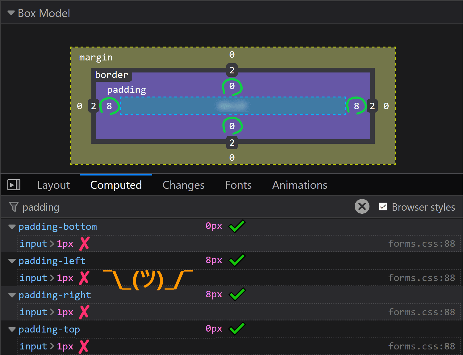
But the computed value is actually 0 8px! Moreover, this is a value that doesn’t depend on the operating system zoom level. So, what the hairy heck is going on?!
Computed value for padding in Firefox doesn’t match the value that was set on input.
Now, if you’ve actually tried inspecting a color input, took a close look at the styles set on it, and your brain works differently than mine (meaning you do read what’s in front of you and don’t just scan for the one thing that interests you, completely ignoring everything else…) then you’ve probably noticed there is something overriding the 1px padding (and should be marked as such) — the flow-relative padding!
Flow-relative padding overrides in Firefox.
Dang, who knew those properties with lots of letters were actually relevant? Thanks to Zoltan for noticing and letting me know. Otherwise, it probably would have taken me two more days to figure this one out.
This raises the question of whether the same kind of override couldn’t happen in other browsers and/or for other properties.
Edge doesn’t support CSS logical properties, so the answer is a „no” in that corner.
In Chrome, none of the logical properties for margin, border or padding are set explicitly for <input type='color'>, so we have no override.
Concerning other properties in Firefox, we could have found ourselves in the same situation for margin or for border, but with these two, it just so happens the flow-relative properties haven’t been explicitly set for our input, so again, there’s no override.
Even so, it’s definitely something to watch out for in the future!
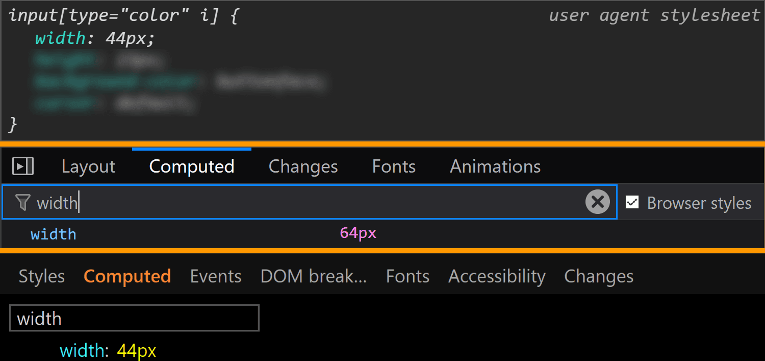
Moving on to dimensions, our input’s width is 44px in Chrome and Edge and 64px in Firefox.
The width values for <input type='color'> compared in Chrome, Firefox and Edge (from top-to-bottom).
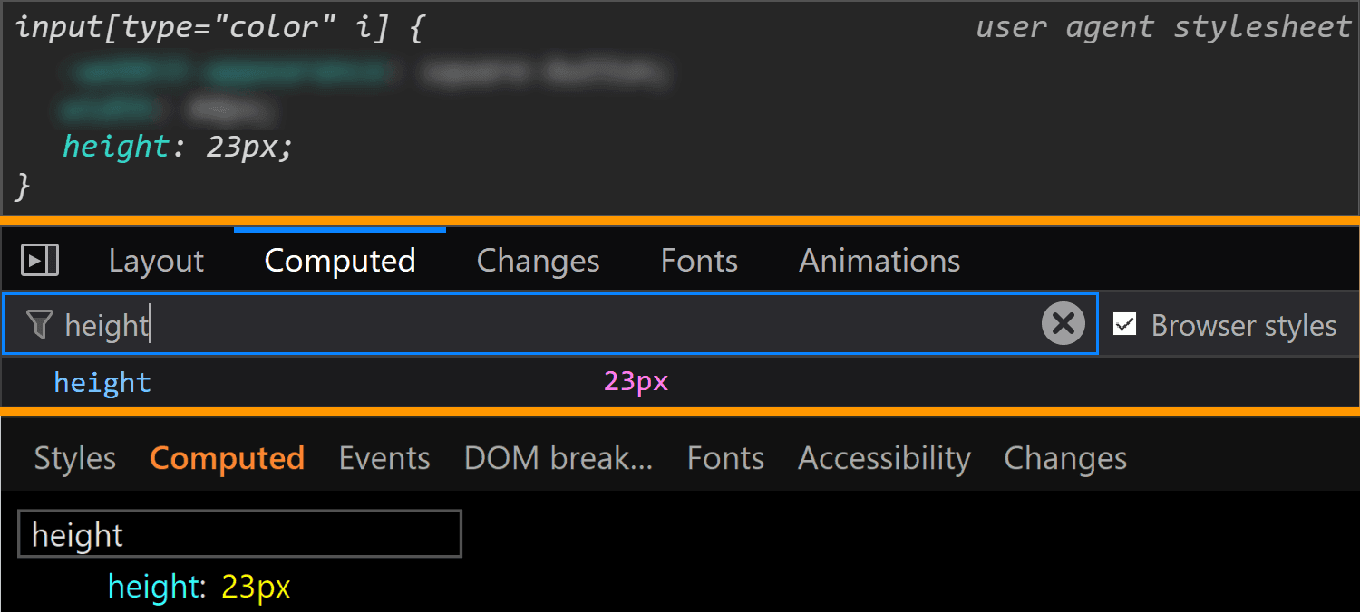
Its height is 23px in all three browsers.
The height values for <input type='color'> compared in Chrome, Firefox and Edge (from top-to-bottom).
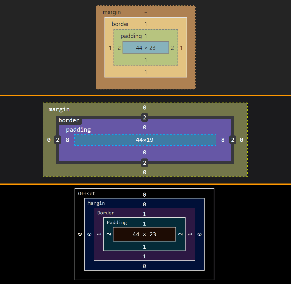
Note that, since Chrome and Edge have a box-sizing of content-box, their width and height values do not include the padding or border. However, since Firefox has box-sizing set to border-box, its dimensions include the padding and border.
The layout boxes for <input type='color'> compared in Chrome, Firefox and Edge (from top-to-bottom).
This means the content-box is 44pxx23px in Chrome and Edge and 44xpxx19px in Firefox, the padding-box is 48pxx25 in Chrome and Edge and 60pxx19px in Firefox and the border-box is 50pxx27px in Chrome and Edge and 64pxx23 in Firefox.
We can clearly see how the dimensions were set in Chrome and I’d assume they were set in the same direct way in Edge as well, even if Edge doesn’t allow us to trace this stuff. Firefox doesn’t show these dimensions as having been explicitly set and doesn’t even allow us to trace where they came from in the Computed tab (as it does for other properties like border, for example). But if we look at all the styles that have been set on input[type='color'], we discover the dimensions have been set as flow-relative ones (inline-size and block-size).
How <input type='color'> dimensions have been set in Firefox.
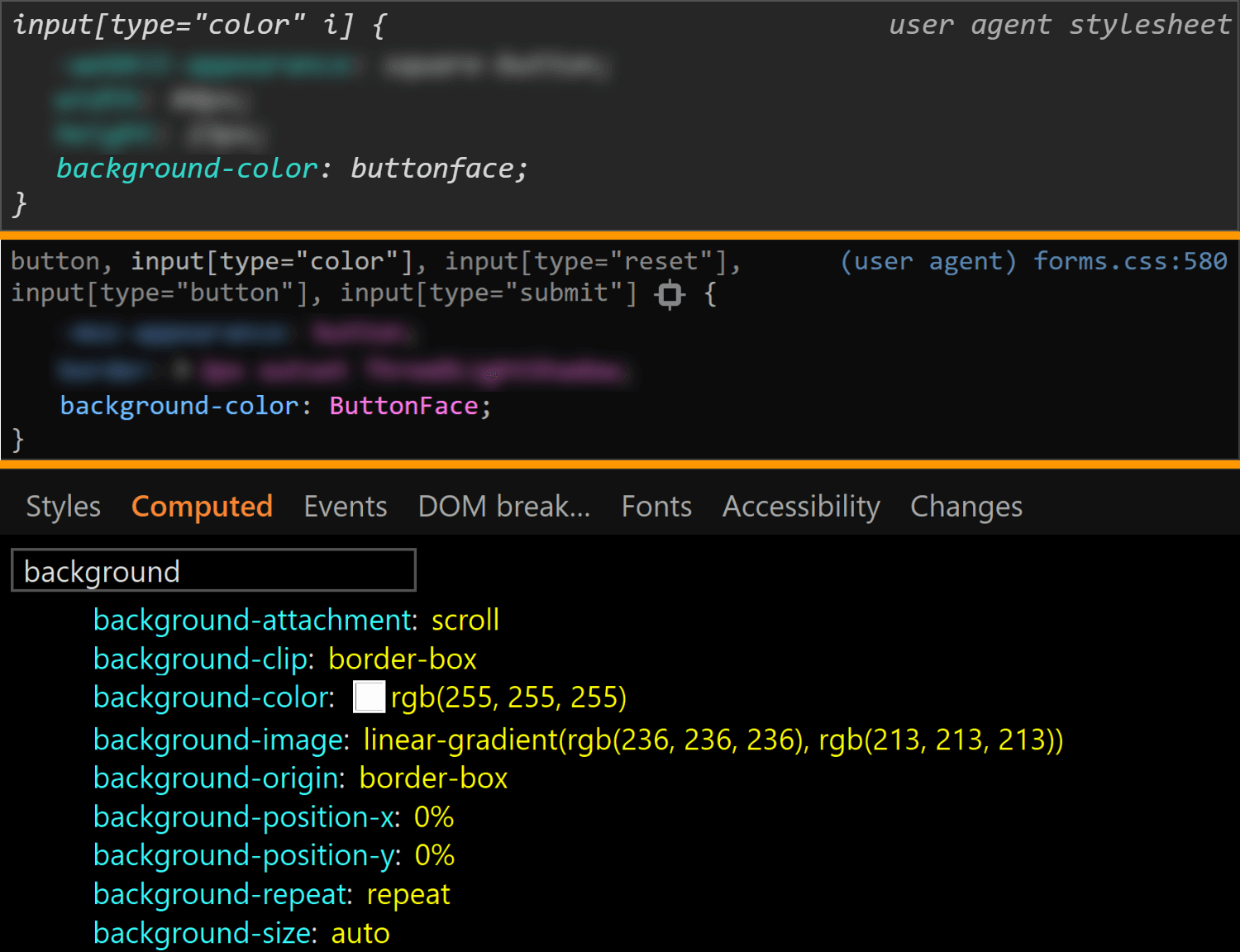
The final property we check for the normal state of the actual input is background. Here, Edge is the only browser to have a background-image (set to a top to bottom gradient), while Chrome and Firefox both have a background-color set to ButtonFace (another deprecated CSS2 system value). The strange thing is this should be rgb(240, 240, 240) (according to this resource), but its computed value in Chrome is rgb(221, 221, 221).
The background values for <input type='color'> compared in Chrome, Firefox and Edge (from top-to-bottom).
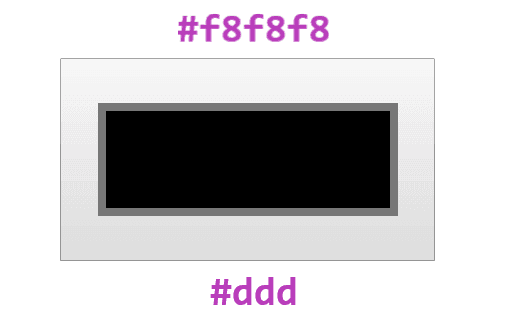
What’s even stranger is that, if we actually look at our input in Chrome, it sure does look like it has a gradient background! If we screenshot it and then use a picker, we get that it has a top to bottom gradient from #f8f8f8 to #ddd.
What the actual input looks like in Chrome. It appears to have a gradient, in spite of the info we get from DevTools telling us it doesn’t.
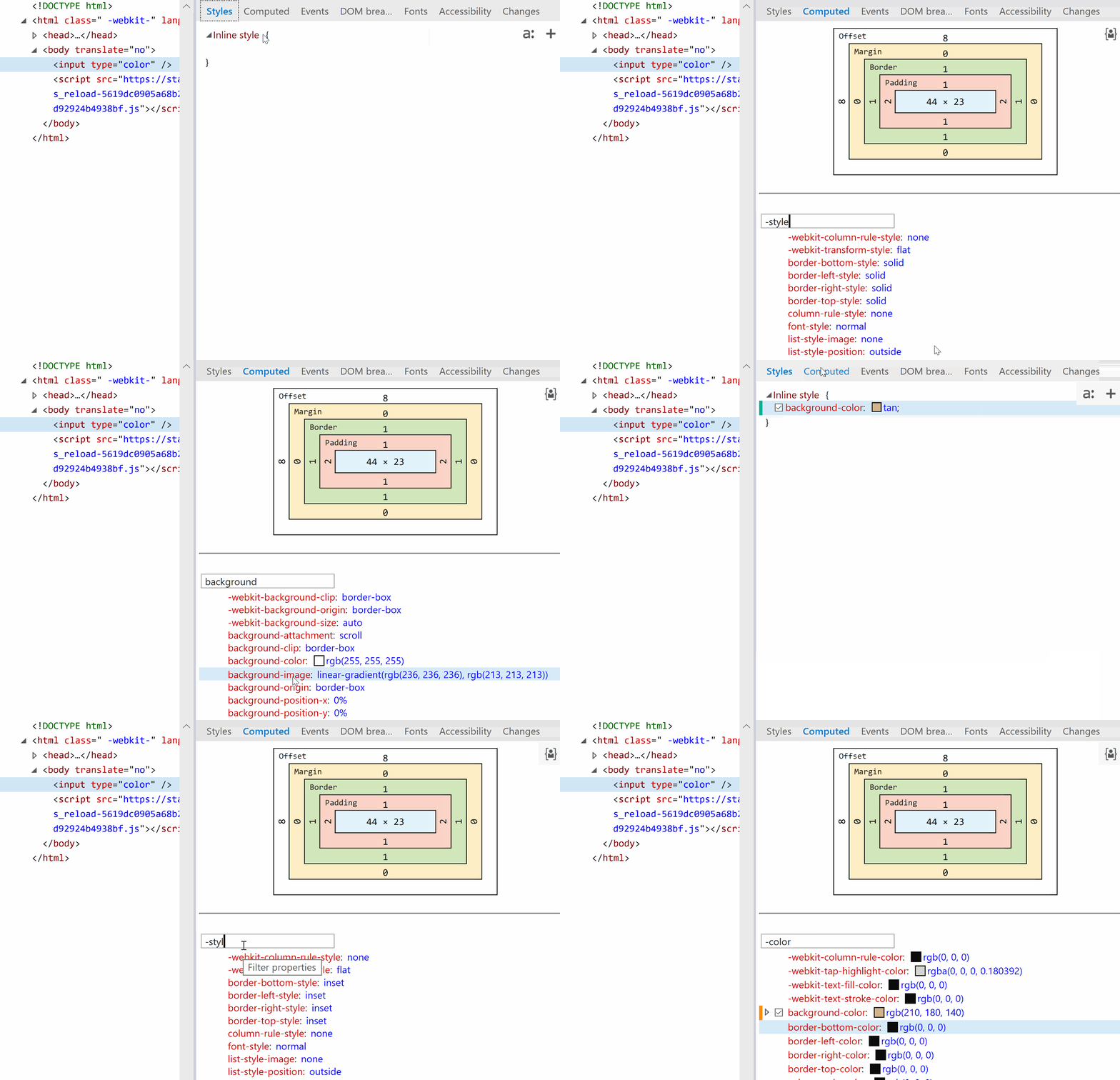
Also, note that changing just the background-color (or another property not related to dimensions like border-radius) in Edge also changes the background-image, background-origin, border-color or border-style.
Edge: side-effects of changing background-color.
Other states
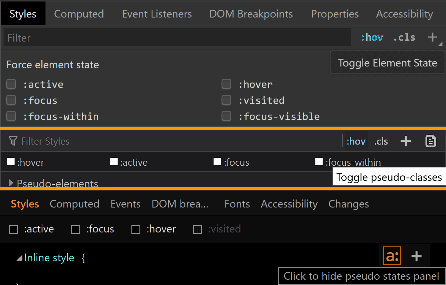
We can take a look at the styles applied for a bunch of other states of an element by clicking the :hov button in the Styles panel for Chrome and Firefox and the a: button in the same Styles panel for Edge. This reveals a section where we can check the desired state(s).
Taking a look at other states in Chrome, Firefox, Edge (from top to bottom).
Note that, in Firefox, checking a class only visually applies the user styles on the selected element, not the browser styles. So, if we check :hover for example, we won’t see the :hover styles applied on our element. We can however see the user agent styles matching the selected state for our selected element shown in DevTools.
Also, we cannot test for all states like this and let’s start with such a state.
:disabled
In order to see how styles change in this state, we need to manually add the disabled attribute to our <input type='color'> element.
Hmm… not much changes in any browser!
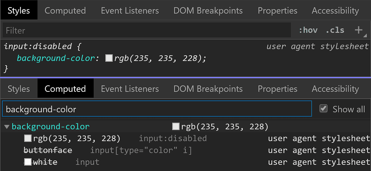
In Chrome, we see the background-color is slightly different (rgb(235, 235, 228) in the :disabled state versus rgb(221, 221, 221) in the normal state).
Chrome :disabled styling.
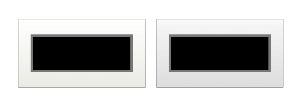
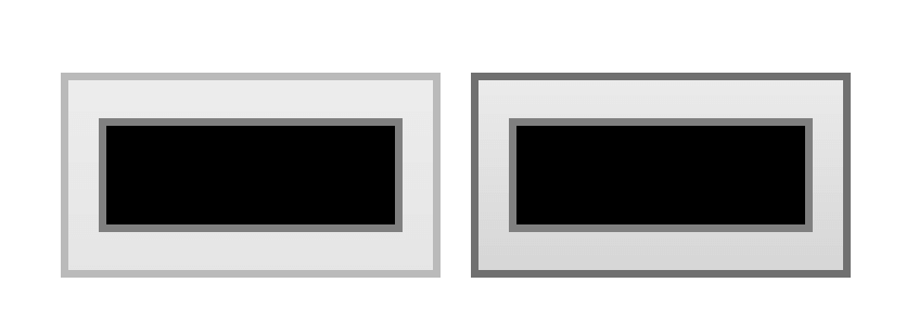
But the difference is only clear looking at the info in DevTools. Visually, I can tell tell there’s a slight difference between an input that’s :disabled and one that’s not if they’re side-by-side, but if I didn’t know beforehand, I couldn’t tell which is which just by looking at them, and if I just saw one, I couldn’t tell whether it’s enabled or not without clicking it.
Disabled (left) versus enabled (right) <input type='color'> in Chrome.
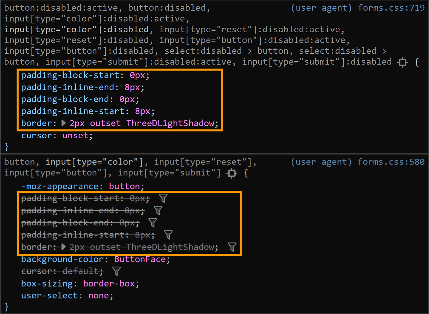
In Firefox, we have the exact same values set for the :disabled state as for the normal state (well, except for the cursor, which realistically, isn’t going to produce different results save for exceptional cases anyway). What gives, Firefox?!
Firefox :disabled (top) versus normal (bottom) styling.
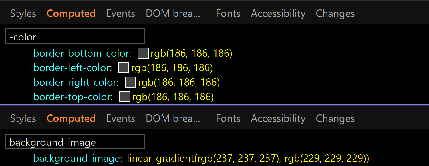
In Edge, both the border-color and the background gradient are different.
Clearly different if we look at the code and visually better than Chrome, though it still may not be quite enough:
Disabled (left) versus enabled (right) <input type='color'> in Edge.
:focus
This is one state we can test by toggling the DevTools pseudo-classes. Well, in theory. In practice, it doesn’t really help us in all browsers.
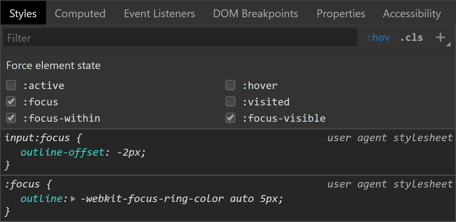
Starting with Chrome, we can see that we have an outline in this state and the outline-color computes to rgb(77, 144, 254), which is some kind of blue.
Chrome :focus styling.
Pretty straightforward and easy to spot.
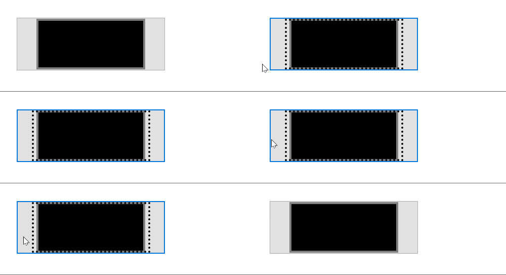
Moving on to Firefox, things start to get hairy! Unlike Chrome, toggling the :focus pseudo-class from DevTools does nothing on the input element, though by focusing it (by tab click), the border becomes blue and we get a dotted rectangle within — but there’s no indication in DevTools regarding what is happening.
What happens in Firefox when tabbing to our input to :focus it.
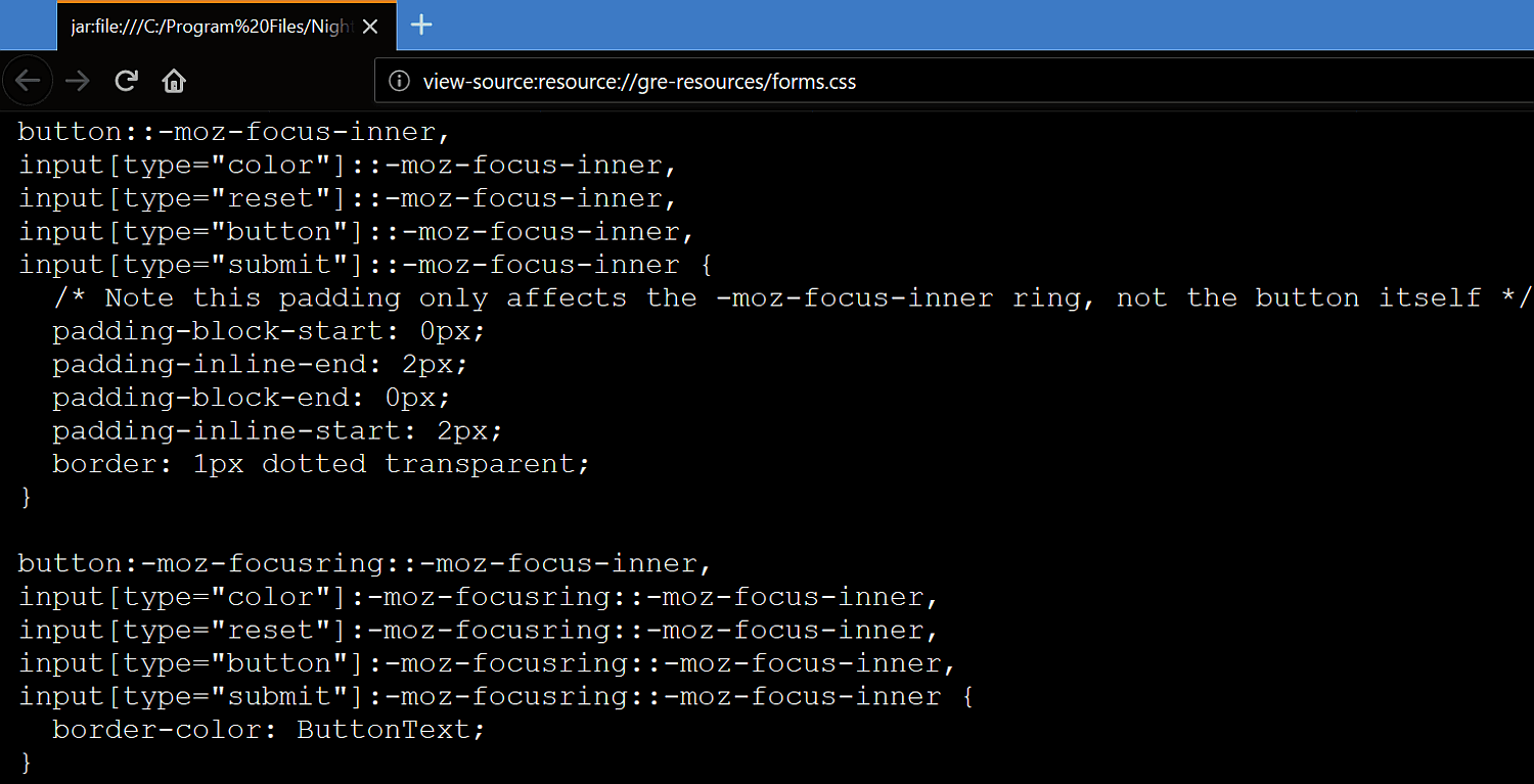
If we check Firefox’s forms.css, it provides an explanation for the dotted rectangle. This is the dotted border of a pseudo-element, ::-moz-focus-inner (a pseudo-element which, for some reason, isn’t shown in DevTools inside our input as ::-moz-color-swatch is). This border is initially transparent and then becomes visible when the input is focused — the pseudo-class used here (:-moz-focusring) is pretty much an old Firefox version of the new standard (:focus-visible), which is currently only supported by Chrome behind the Experimental Web Platform features flag.
Firefox: where the inner dotted rectangle on :focus comes from.
What about the blue border? Well, it appears this one isn’t set by a stylesheet, but at an OS level instead. The good news is we can override all these styles should we choose to do so.
In Edge, we’re faced with a similar situation. Nothing happens when toggling the :focus pseudo-class from DevTools, but if we actually tab to our input to focus it, we can see an inner dotted rectangle.
What happens in Edge when tabbing to our input to :focus it.
Even though I have no way of knowing for sure, I suspect that, just like in Firefox, this inner rectangle is due to a pseudo-element that becomes visible on :focus.
:hover
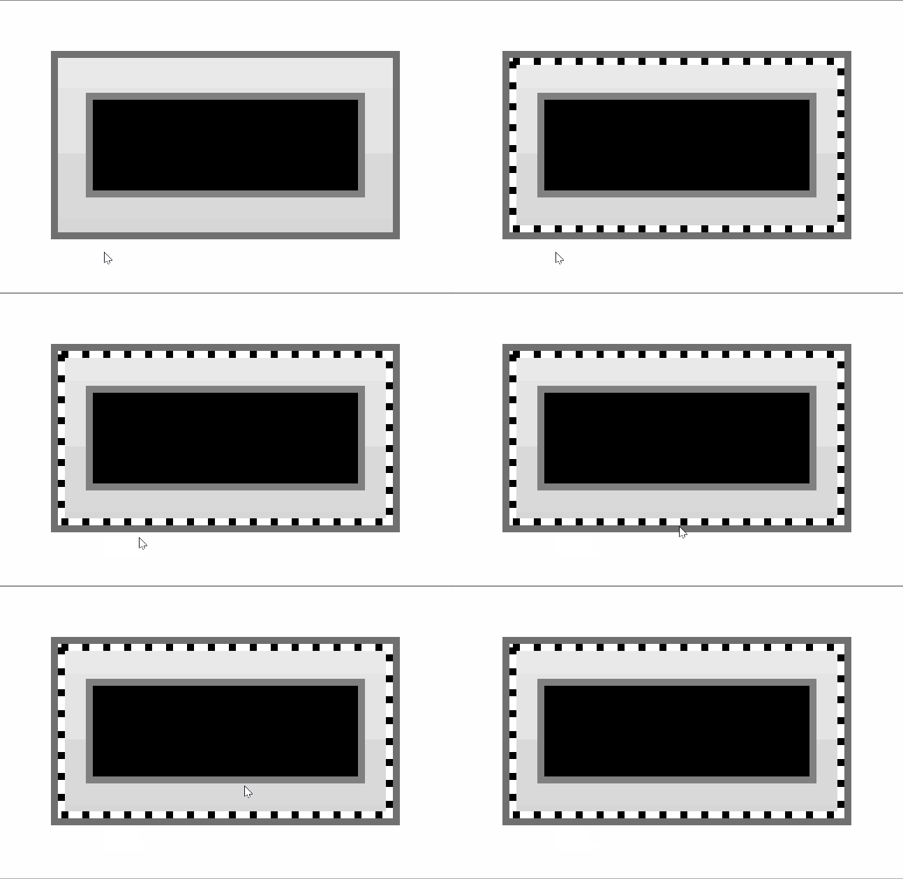
In Chrome, toggling this pseudo-class doesn’t reveal any :hover-specific styles in DevTools. Furthermore, actually hovering the input doesn’t appear to change anything visually. So it looks like Chrome really doesn’t have any :hover-specific styles?
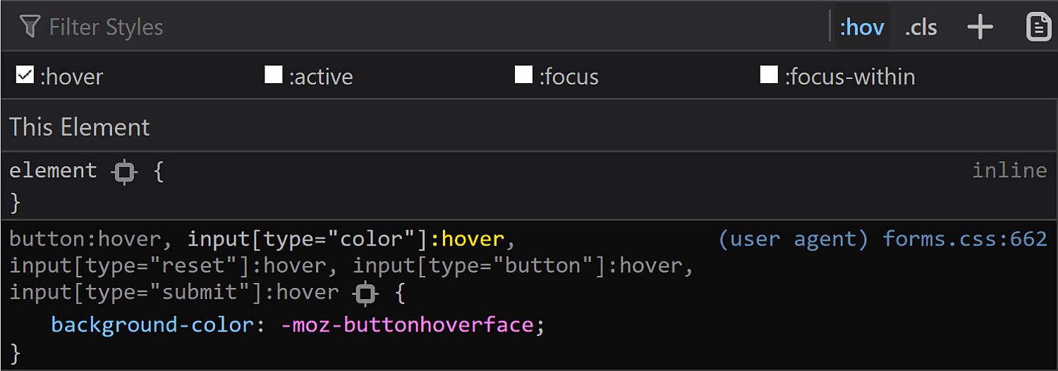
In Firefox, toggling the :hover pseudo-class from DevTools reveals a new rule in the styles panel:
Firefox :hover styling as seen in DevTools.
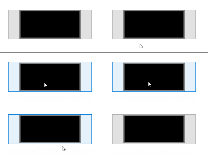
When actually hovering the input, we see the background turns light blue and the border blue, so the first thought would be that light blue is the -moz-buttonhoverface value and that the blue border is again set at an OS level, just like in the :focus case.
What actually happens in Firefox on :hover.
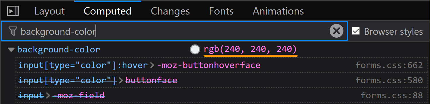
However, if we look at the computed styles, we see the same background we have in the normal state, so that blue background is probably really set at an OS level as well, in spite of having that rule in the forms.css stylesheet.
Firefox: computed background-color of an <input type='color'> on :hover.
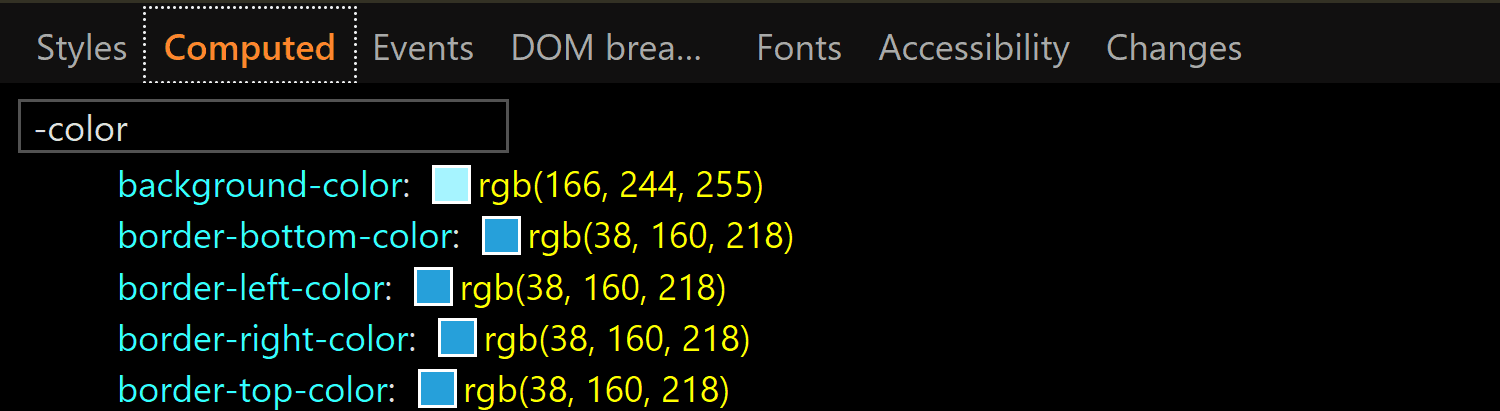
In Edge, toggling the :hover pseudo-class from DevTools gives our input a light blue (rgb(166, 244, 255)) background and a blue (rgb(38, 160, 218)) border, whose exact values we can find in the Computed tab:
Edge: computed background-color and border-color of an <input type='color'> on :hover.
:active
Checking the :active state in the Chrome DevTools does nothing visually and shows no specific rules in the Styles panel. However, if we actually click our input, we see that the background gradient that doesn’t even show up in DevTools in the normal state gets reversed.
What the actual input looks like in Chrome in the :active state. It appears to have a gradient (reversed from the normal state), in spite of the info we get from DevTools telling us it doesn’t.
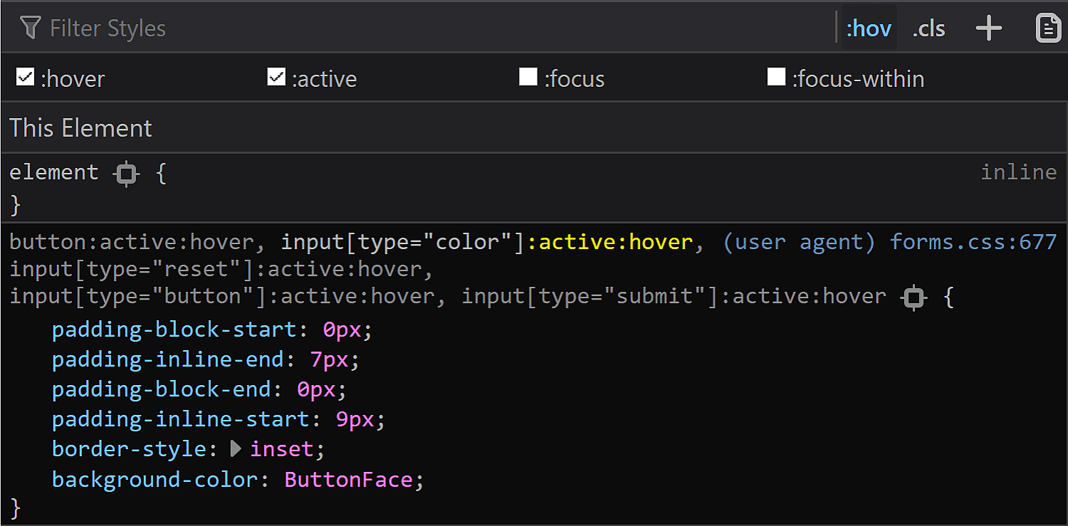
In Firefox DevTools, toggling the :active state on does nothing, but if we also toggle the :hover state on, then we get a rule set that changes the inline padding (the block padding is set to the same value of 0 it has in all other states), the border-style and sets the background-color back to our old friend ButtonFace.
Firefox :active styling as seen in DevTools.
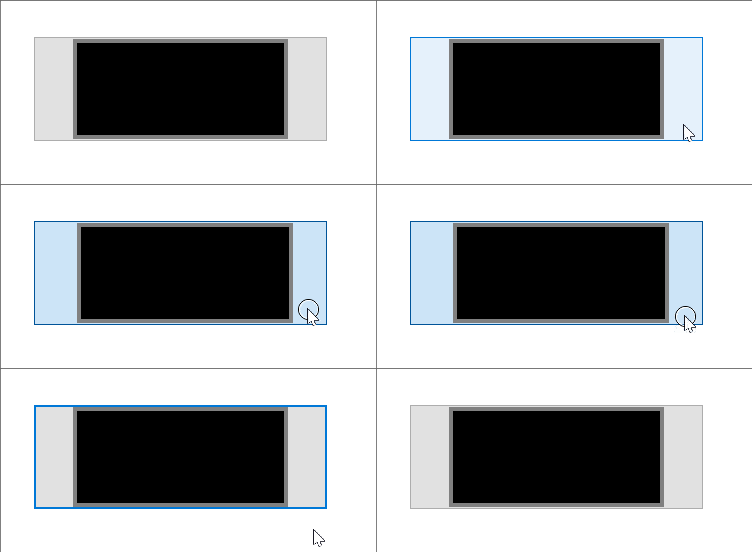
In practice, however, the only thing that matches the info we get from DevTools is the inline shift given by the change in logical padding. The background becomes a lighter blue than the :hover state and the border is blue. Both of these changes are probably happening at an OS level as well.
What actually happens in Firefox in an :active state.
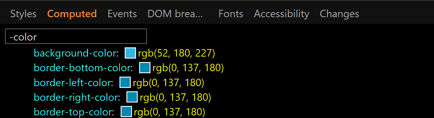
In Edge, activating the :active class from DevTools gives us the exact same styles we have for the :hover state. However, if we have both the :hover and the :active states on, things change a bit. We still have a light blue background and a blue border, but both are darker now (rgb(52, 180, 227) for the background-color and rgb(0, 137, 180) for the border-color):
The computed background-color and border-color of an <input type='color'> on :active viewed in Edge.
This is the takeaway: if we want a consistent cross-browser results for <input type='color'>, we should define our own clearly distinguishable styles for all these states ourselves because, fortunately, almost all the browser defaults — except for the inner rectangle we get in Edge on :focus — can be overridden.
The swatch wrapper
This is a component we only see in Chrome, so if we want a cross-browser result, we should probably ensure it doesn’t affect the swatch inside — this means ensuring it has no margin, border, padding or background and that its dimensions equal those of the actual input’s content-box.
In order to know whether we need to mess with these properties (and maybe others as a result) or not, let’s see what the browser defaults are for them.
Fortunately, we have no margin or border, so we don’t need to worry about these.
The margin and border values for the swatch wrapper in Chrome.
We do however have a non-zero padding (of 4px 2px), so this is something we’ll need to zero out if we want to achieve a consistent cross-browser result.
The padding values for the swatch wrapper in Chrome.
The dimensions are both conveniently set to 100%, which means we won’t need to mess with them.
The size values for the swatch wrapper in Chrome.
Something we need to note here is that we have box-sizing set to border-box, so the padding gets subtracted from the dimensions set on this wrapper.
The box-sizing value for the swatch wrapper in Chrome.
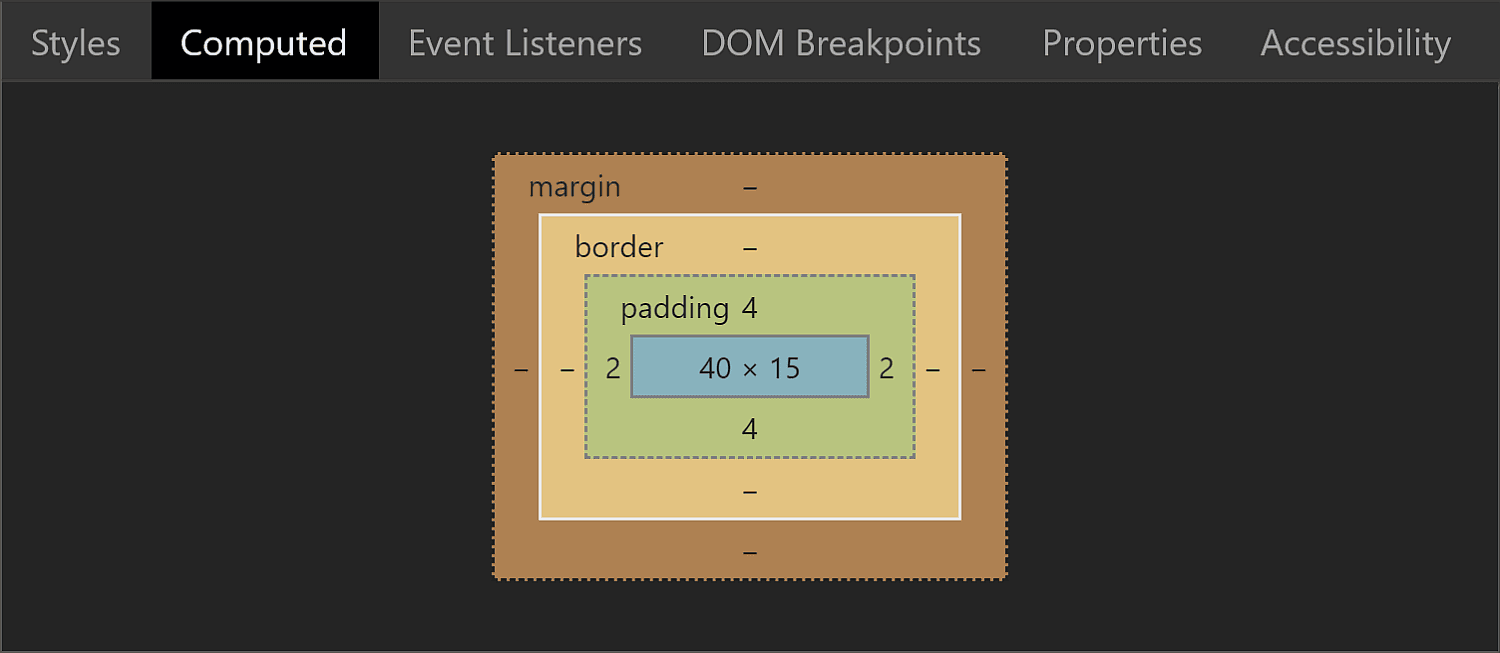
This means that while the padding-box, border-box and margin-box of our wrapper (all equal because we have no margin or border) are identical to the content-box of the actual <input type='color'> (which is 44pxx23px in Chrome), getting the wrapper’s content-box involves subtracting the padding from these dimensions. It results that this box is 40pxx15px.
The box model for the swatch wrapper in Chrome.
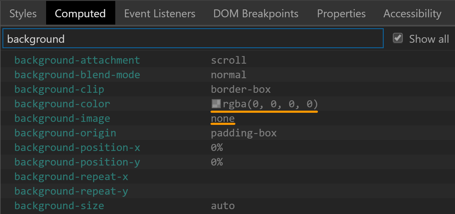
The background is set to transparent, so that’s another property we don’t need to worry about resetting.
The background values for the swatch wrapper in Chrome.
There’s one more property set on this element that caught my attention: display. It has a value of flex, which means its children are flex items.
The display value for the swatch wrapper in Chrome.
The swatch
This is a component we can style in Chrome and Firefox. Sadly, Edge doesn’t expose it to allow us to style it, so we cannot change properties we might want to, such as border, border-radius or box-shadow.
The box-sizing property is one we need to set explicitly if we plan on giving the swatch a border or a padding because its value is content-box in Chrome, but border-box in Firefox.
The box-sizing values for the swatch viewed in Chrome (top) and Firefox (bottom).
Fortunately, the font-size is inherited from the input itself so it’s the same.
The font-size values for the swatch viewed in Chrome (top) and Firefox (bottom).
The margin computes to 0 in both Chrome and Firefox.
The margin values for the swatch viewed in Chrome (top) and Firefox (bottom).
This is because most margins haven’t been set, so they end up being 0 which is the default for <div> elements. However, Firefox is setting the inline margins to auto and we’ll be getting to why that computes to 0 in just a little moment.
The inline margin for the swatch being set to auto in Firefox.
The border is solid 1px in both browsers. The only thing that differs is the border-color, which is rgb(119, 119, 119) in Chrome and grey (or rgb(128, 128, 128), so slightly lighter) in Firefox.
The border values for the swatch viewed in Chrome (top) and Firefox (bottom).
Note that the computed border-width in Firefox (at least on Windows) depends on the OS zoom level, just as it is in the case of the actual input.
The padding is luckily 0 in both Chrome and Firefox.
The padding values for the swatch viewed in Chrome (top) and Firefox (bottom).
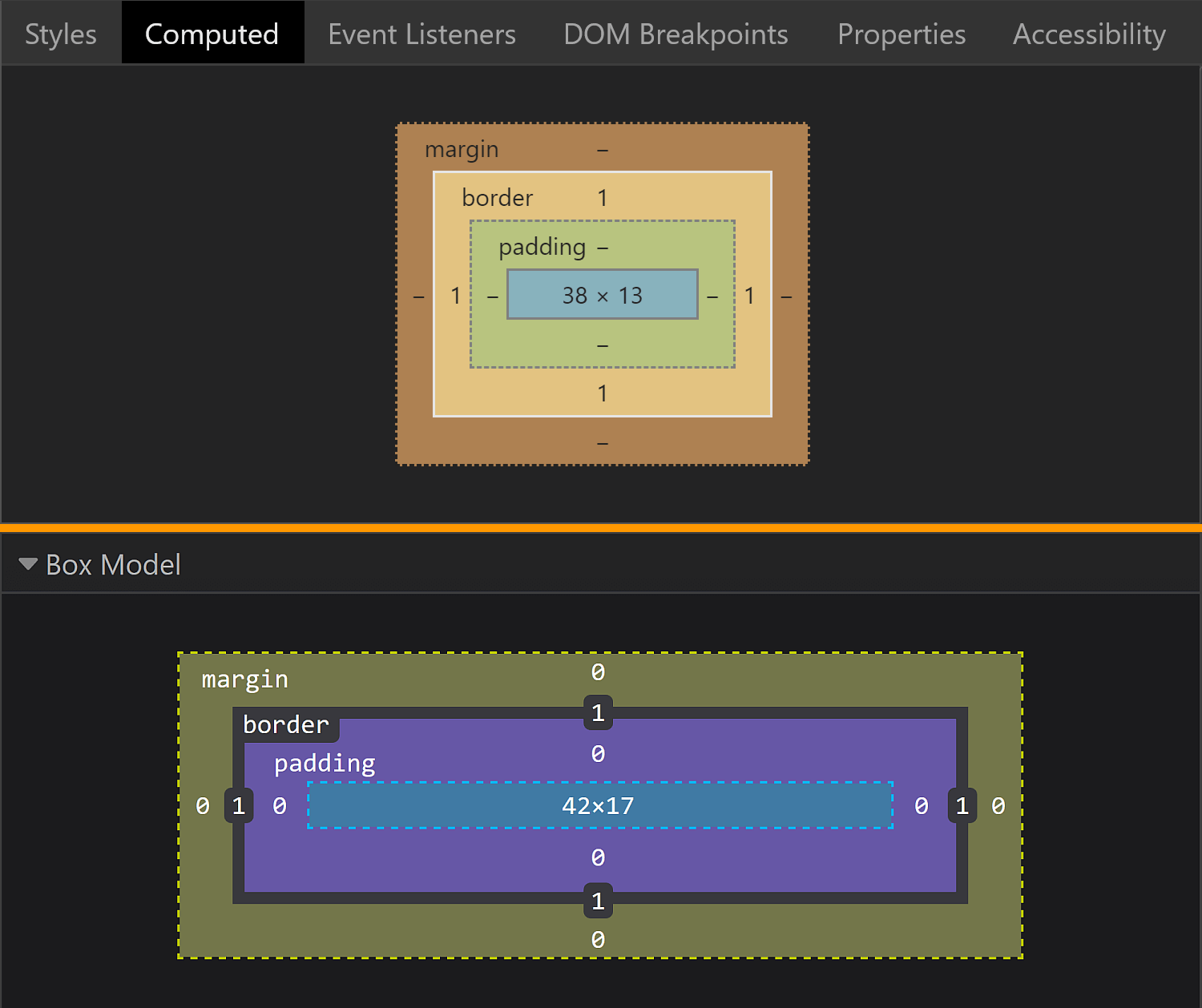
The dimensions end up being exactly what we’d expect to find, assuming the swatch covers its parent’s entire content-box.
The box model for the swatch viewed in Chrome (top) and Firefox (bottom).
In Chrome, the swatch parent is the <div> wrapper we saw earlier, whose content-box is 4pxx15px. This is equal to the margin-box and the border-box of the swatch (which coincide as we have no margin). Since the padding is 0, the content-box and the padding-box for the swatch are identical and, subtracting the 1px border, we get dimensions that are 38pxx13px.
In Firefox, the swatch parent is the actual input, whose content-box is 44pxx19px one. This is equal to the margin-box and the border-box of the swatch (which coincide as we have no margin). Since the padding is 0, the content-box and the padding-box for the swatch are identical and, subtracting the 1px border, we get that their dimensions are 42pxx17px.
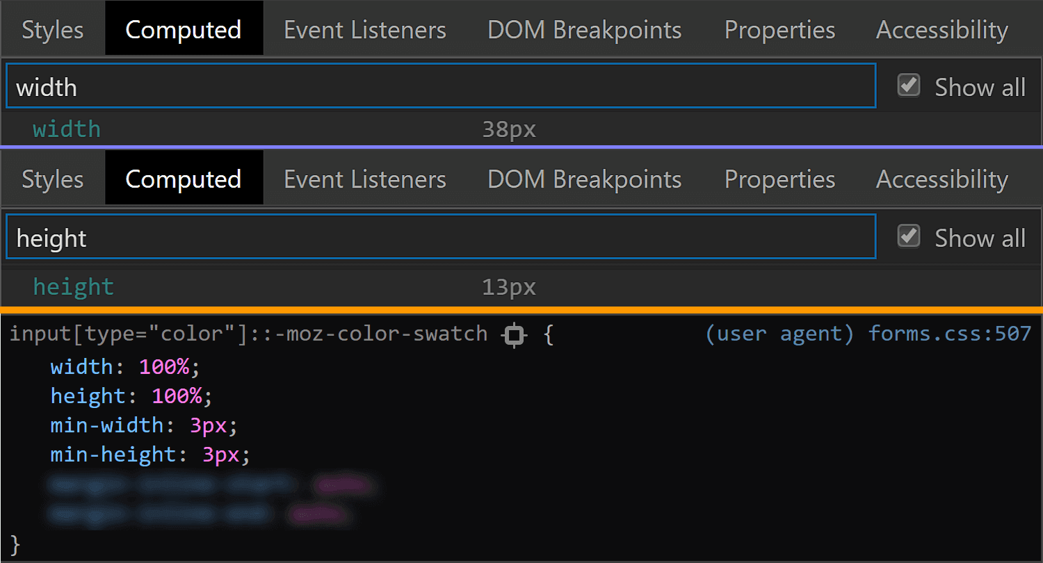
In Firefox, we see that the swatch is made to cover its parent’s content-box by having both its dimensions set to 100%.
The size values for the swatch viewed in Chrome (top) and Firefox (bottom).
This is the reason why the auto value for the inline margin computes to 0.
But what about Chrome? We cannot see any actual dimensions being set. Well, this result is due to the flex layout and the fact that the swatch is a flex item that’s made to stretch such that it covers its parent’s content-box.
The flex value for the swatch wrapper in Chrome.
Final thoughts
Phew, we covered a lot of ground here! While it may seem exhaustive to dig this deep into one specific element, this is the sort of exercise that illustrates how difficult cross-browser support can be. We have our own styles, user agent styles and operating system styles to traverse and some of those are always going to be what they are. But, as we discussed at the very top, this winds up being an accessibility issue at the end of the day, and something to really consider when it comes to implementing a practical, functional application of a color input.
Remember, a lot of this is ripe territory to reach out to browser vendors and let them know how they can update their implementations based on your reported use cases. Here are the three tickets I mentioned earlier where you can either chime in or reference to create a new ticket:
I first heard of Flywheel through their product Local, which is a native app for working on WordPress sites. If you ask around for what people use for that kind of work, you’ll get all sorts of answers, but an awful lot of very strong recommendations for Local. I’ve become one of them! We ultimately did a sponsored post for Local, but that’s based on the fact that now 100% of my local WordPress development work is done using it and I’m very happy with it.
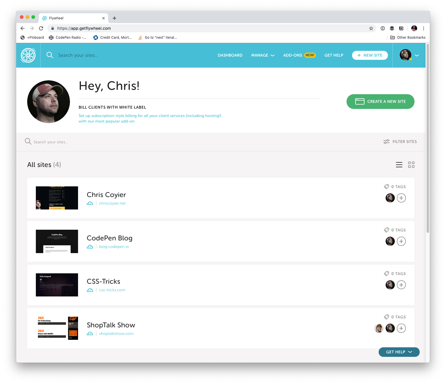
Now I’ve taken the next step and moved all my production sites to Flywheel hosting!
Full disclosure here, Flywheel is now a sponsor of CSS-Tricks. I’ve been wanting to work with them for a while. I’ve been out to visit them in Omaha! (👋 at Jamie, Christi, Karissa, and everybody I’ve worked with over there.) Part of our deal includes the hosting. But I was a paying customer and user of Flywheel before this on some sites, and my good experiences there are what made me want to get this sponsorship partnership cooking! There has been big recent news that Flywheel was acquired by WP Engine. I’m also a fan of WP Engine, being also a premium WordPress host that has done innovative things with hosting, so I’m optimistic that a real WordPress hosting powerhouse is being formed and I’ve got my sites in the right place.
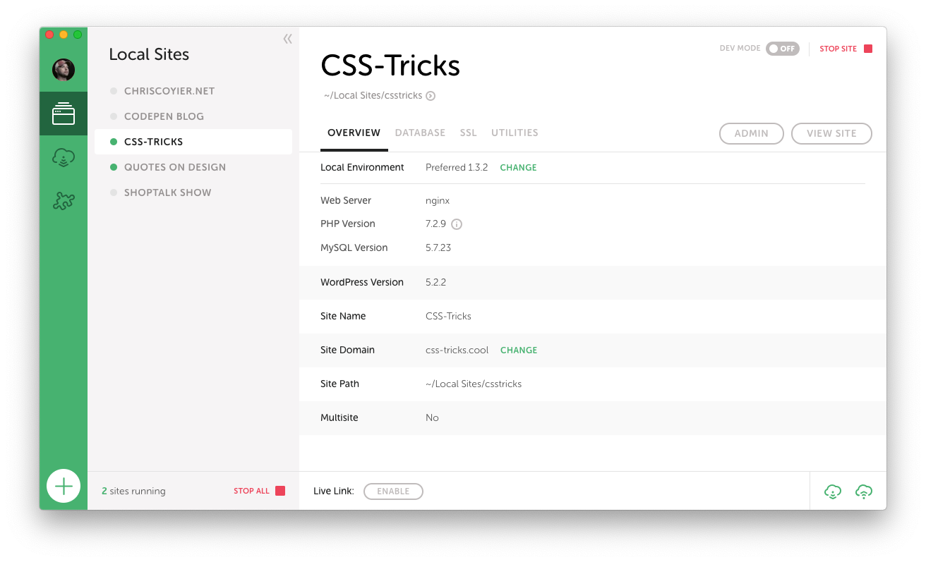
Developing on Local is a breeze
It feels like a breath of fresh air to me, as running all the dev dependencies for WordPress has forever been a bit of a pain in the butt. Sometimes you have it going fine, but then something breaks in the most inscrutable possible way and it takes forever to get going again. Whatever, you know what I mean. At this point, I’ve been running Local for over a year and have had almost no issues with it.
There are all kinds of features worth checking out here. Here’s one that is very likely useful to bigger teams. Say you have a Flywheel account with a bunch of production sites on it. Then a new person starts working with you and they have their own computer. You connect Local to Flywheel, and you can pull down the site and have it ready to work on. That’s pretty sweet.
Local doesn’t lock you into anything either. You can use Local for local development and literally use nothing else. Local can push a site up to Flywheel hosting too, which I’ve found to be mighty useful particularly for that first deployment of a new site, but you don’t have to use that if you don’t want. I’ll cover more about workflow below.
Other features that I find worthy of note:
Spinning up a new site takes just a second. A quick walkthrough through a wizard where they ask you some login details but otherwise offer smart-but-customizable defaults.
Dealing with HTTPS locally is easy. It will create a certificate for you and trust it locally with one click.
You can flip on „Live Link”, which uses ngrok to create a live, sharable URL to your localhost site. Great for temporarily showing a client or co-worker something without having to move anything.
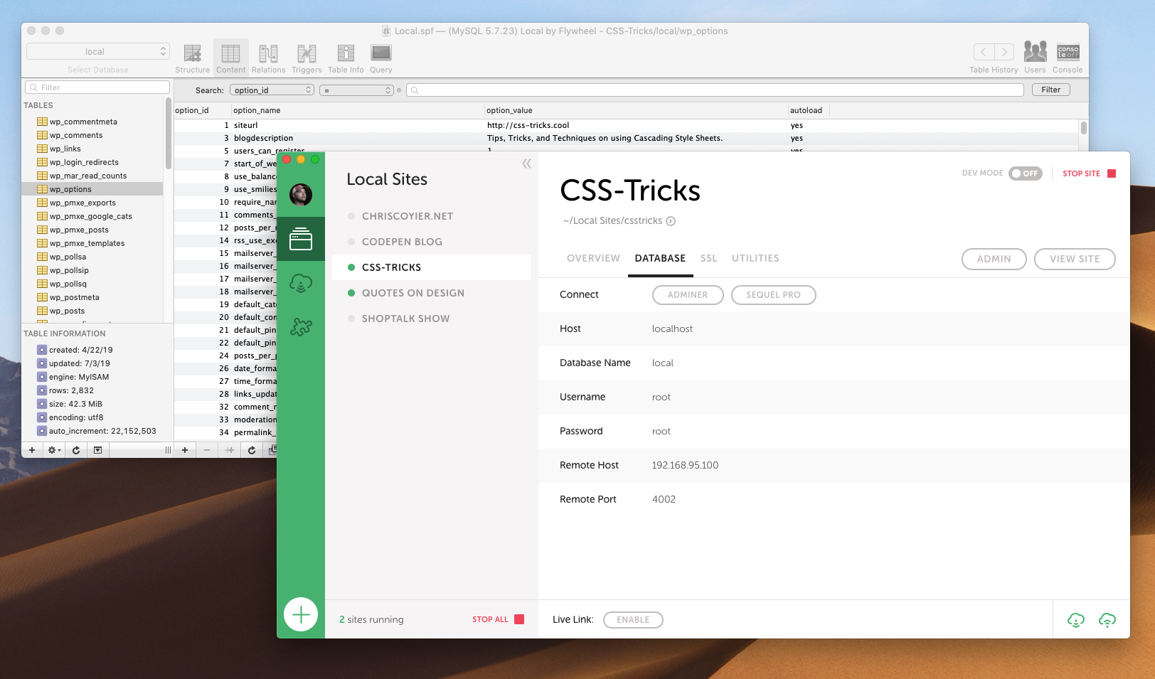
One click to pop open the database in Sequel Pro, my favorite free database tool. Much easier than trying to spin up phpMyAdmin or whatever on the web to manage from there.
Flywheel’s Dashboard is so clear
I love the simple UI of Local, and I really like how that same design and spirit carries over into the Flywheel hosting dashboard.
There are so many things the dashboard makes easy:
You need an SSL cert? Click some buttons.
Wanna force HTTPS? Flip a switch.
Wanna convert the site to Multisite? Hit a button.
Need to edit the database? There is a UI around it built in.
Want a CDN? Toggle a thing.
Need to invite a collaborator on a site? Go for it.
Need a backup? There are in there, download it or restore to that point.
It’s a big deal when everything is simple and works. It means you aren’t burning hours fighting with tools and you can use them doing work that pushes you forward.
Workflow
When I set up my new CSS-Tricks workflow, I had Flywheel move the site for me (thanks gang!) (no special treatment either, they’ll do that for anybody).
I’ve got Local already, so my local development process is the same. But I needed to update my deployment workflow for the new hosting. Local can push a site up to Flywheel hosting, but it just zips everything up and sends it all up. Great for first deployment but not perfect for tiny little changes like 95% of the work I do. There is a new Local for Teams feature, which uses what they call MagicSync for deployment, which only deploys changed files. That’s very cool, but I like working with a Git-based system, where ultimately merges to master are what trigger deployment of the changed files.
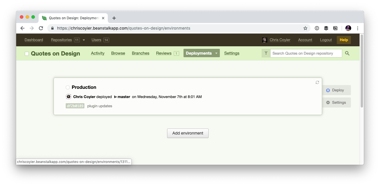
For years I’ve used Beanstalk for Git-based deployment over SFTP. I still am using Beanstalk for many sites and think it’s a great choice, but Beanstalk has the limitation that the Git-repo is basically a private Git repo hosted by Beanstalk itself.
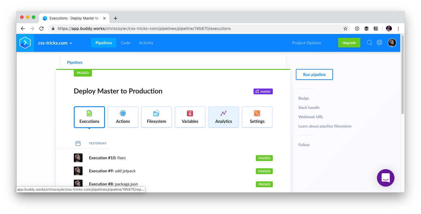
During this change, I needed to switch up what the root of the repo is (more on that in a second) so I wanted to create a new repo. I figured rather than doing that on Beanstalk, I’d make a private GitHub repo and set up deployment from there. There are services like DeployHQ and DeployBot that will work well for that, but I went with Buddy, which has a really really nice UI for managing all this stuff, and is capable of much more than just deployment should I ultimately need that.
Regarding the repo itself, one thing that I’ve always done with my WordPress sites is just make the repo the whole damn thing starting at the root. I think it’s just a legacy/comfort thing. I had some files at the root I wanted to deploy along with everything else and that seemed like the easiest way. In WordPress-land, this isn’t usually how it’s done. It’s more common to have the /wp-content/ folder be the root of the repo, as those are essentially the only files unique to your installation. I can imagine setups where even down to individual themes are repos and deployed alone.
I figured I’d get on board with a more scoped deployment, but also, I didn’t have much of a choice. Flywheel literally locks down all WordPress core files, so if your deployment system tries to override them, it will just fail. That actually sounds great to me. There is no reason anyone from the outside should alter those files, might as well totally remove it as an attack vector. Flywheel itself keeps the WordPress version up to date. So I made a new repo with /wp-content/ at the root, and I figured I’d make it on GitHub instead just because that’s such an obvious hub of developer activity and keeps my options wide open for deployment choices.
Maybe I’ll open source it all one day when I’ve had a chance to comb through it.
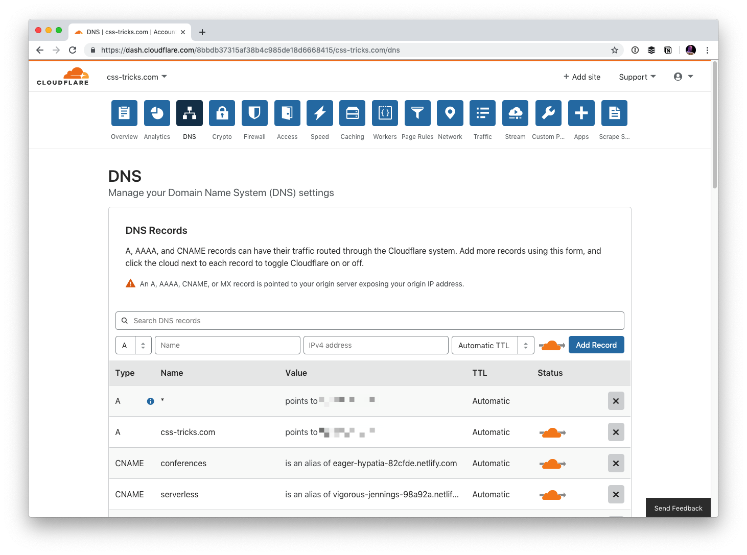
For the same kind of spiritual reasons, during the the move, I moved the DNS over to Cloudflare. This gives me control over DNS from a third-party so it’s easy for me to point things where I need them. Kind of a decentralization of concerns. That’s not for everyone, but it’s great for me on this project. While now I might suffer from Cloudflare outages (rare, but it literally just happened), I benefit from all sorts of additional security and performance that Cloudflare can provide.
So the workflow is Local > GitHub > Buddy > Flywheel.
And the hosting is Cloudflare > Flywheel with image assets on Cloudinary.
And I’ve got backups from both Flywheel and Jetpack/VaultPress.











![Screenshot of Firefox DevTools highlighting how the border set on input[type='color'] overrides the one set on input and the look (grey + strike-through) of overridden properties.](https://css-tricks.com/wp-content/uploads/2019/05/override_firefox.png)
![Screenshot of Firefox DevTools showing the flow-relative padding overriding the old padding due to higher specificity of selector (input[type='color'] vs. input).](https://css-tricks.com/wp-content/uploads/2019/05/default_l0_padding_firefox.png)
![Screenshot of the Firefox user agent styles showing flow relative dimensions being set on input[type='color'].](https://css-tricks.com/wp-content/uploads/2019/05/default_l0_dim_firefox_logical.png)