In the world of likes and social statistics, reviews are very important method for leaving feedback. Users often like to know the opinions of others before deciding on items to purchase themselves, or even articles to read, movies to see, or restaurants to dine.
Developers often struggle with with reviews — it is common to see inaccessible and over-complicated implementations. Hey, CSS-Tricks has a snippet for one that’s now bordering on a decade.
Let’s walk through new, accessible and maintainable approaches for this classic design pattern. Our goal will be to define the requirements and then take a journey on the thought-process and considerations for how to implement them.
Scoping the work
Did you know that using stars as a rating dates all the way back to 1844 when they were first used to rate restaurants in Murray’s Handbooks for Travellers — and later popularized by Michelin Guides in 1931 as a three-star system? There’s a lot of history there, so no wonder it’s something we’re used to seeing!
There are a couple of good reasons why they’ve stood the test of time:
Clear visuals (in the form of five hollow or filled stars in a row)
A straightforward label (that provides an accessible description, like aria-label)
When we implement it on the web, it is important that we focus meeting both of those outcomes.
It is also important to implement features like this in the most versatile way possible. That means we should reach for HTML and CSS as much as possible and try to avoid JavaScript where we can. And that’s because:
JavaScript solutions will always differ per framework. Patterns that are typical in vanilla JavaScript might be anti-patterns in frameworks (e.g. React prohibits direct document manipulation).
Languages like JavaScript evolve fast, which is great for community, but not so great articles like this. We want a solution that’s maintainable and relevant for the long haul, so we should base our decisions on consistent, stable tooling.
Methods for creating the visuals
One of the many wonderful things about CSS is that there are often many ways to write the same thing. Well, the same thing goes for how we can tackle drawing stars. There are five options that I see:
Which one to choose? It depends. Let’s check them all out.
Method 1: Using an image file
Using images means creating elements — at least 5 of them to be exact. Even if we’re calling the same image file for each star in a five-star rating, that’s five total requests. What are the consequences of that?
More DOM nodes make document structure more complex, which could cause a slower page paint. The elements themselves need to render as well, which means either the server response time (if SSR) or the main thread generation (if we’re working in a SPA) has to increase. That doesn’t even account for the rendering logic that has to be implemented.
It does not handle fractional ratings, say 2.3 stars out of 5. That would require a second group of duplicated elements masked with clip-path on top of them. This increases the document’s complexity by a minimum of seven more DOM nodes, and potentially tens of additional CSS property declarations.
Optimized performance ought to consider how images are loaded and implementing something like lazy-loading) for off-screen images becomes increasingly harder when repeated elements like this are added to the mix.
It makes a request, which means that caching TTLs should be configured in order to achieve an instantaneous second image load. However, even if this is configured correctly, the first load will still suffer because TTFB awaits from the server. Prefetch, pre-connect techniques or the service-worker should be considered in order to optimize the first load of the image.
It creates minimum of five non-meaningful elements for a screen reader. As we discussed earlier, the label is more important than the image itself. There is no reason to leave them in the DOM because they add no meaning to the rating — they are just a common visual.
The images might be a part of manageable media, which means content managers will be able to change the star appearance at any time, even if it’s incorrect.
It allows for a versatile appearance of the star, however the active state might only be similar to the initial state. It’s not possible to change the image src attribute without JavaScript and that’s something we’re trying to avoid.
Wondering how the HTML structure might look? Probably something like this:
<div class="Rating" aria-label="Rating of this item is 3 out of 5">
  <img src="/static/assets/star.png" class="Rating--Star Rating--Star__active">
  <img src="/static/assets/star.png" class="Rating--Star Rating--Star__active">
  <img src="/static/assets/star.png" class="Rating--Star Rating--Star__active">
  <img src="/static/assets/star.png" class="Rating--Star">
  <img src="/static/assets/star.png" class="Rating--Star">
</div>
In order to change the appearance of those stars, we can use multiple CSS properties. For example:
.Rating--Star {
  filter: grayscale(100%); // maybe we want stars to become grey if inactive
  opacity: .3; // maybe we want stars to become opaque
}
An additional benefit of this method is that the <img> element is set to inline-block by default, so it takes a little bit less styling to position them in a single line.
This was once a fairly common implementation. That said, it still has its pros and cons.
For example:
Sure, it’s only a single server request which alleviates a lot of caching needs. At the same time, we now have to wait for three additional events before displaying the stars: That would be (1) the CSS to download, (2) the CSSOM to parse, and (3) the image itself to download.
It’s super easy to change the state of a star from empty to filled since all we’re really doing is changing the position of a background image. However, having to crack open an image editor and re-upload the file anytime a change is needed in the actual appearance of the stars is not the most ideal thing as far as maintenance goes.
We can use CSS properties like background-repeat property and clip-path to reduce the number of DOM nodes. We could, in a sense, use a single element to make this work. On the other hand, it’s not great that we don’t technically have good accessible markup to identify the images to screen readers and have the stars be recognized as inputs. Well, not easily.
In my opinion, background images are probably best used complex star appearances where neither CSS not SVG suffice to get the exact styling down. Otherwise, using background images still presents a lot of compromises.
SVG is great! It has a lot of the same custom drawing benefits as raster images but doesn’t require a server call if it’s inlined because, well, it’s simply code!
We could inline five stars into HTML, but we can do better than that, right? Chris has shown us a nice approach that allows us to provide the SVG markup for a single shape as a <symbol> and call it multiple times with with <use>.
<!-- Draw the star as a symbol and remove it from view -->
<svg xmlns="http://www.w3.org/2000/svg" style="display: none;">
  <symbol id="star" viewBox="214.7 0 182.6 792">
    <!-- <path>s and whatever other shapes in here -->
  </symbol>
</svg>

<!-- Then use anywhere and as many times as we want! -->
<svg class="icon">
  <use xlink:href="#star" />
</svg>

<svg class="icon">
  <use xlink:href="#star" />
</svg>

<svg class="icon">
  <use xlink:href="#star" />
</svg>

<svg class="icon">
  <use xlink:href="#star" />
</svg>

<svg class="icon">
  <use xlink:href="#star" />
</svg>
What are the benefits? Well, we’re talking zero requests, cleaner HTML, no worries about pixelation, and accessible attributes right out of the box. Plus, we’ve got the flexibility to use the stars anywhere and the scale to use them as many times as we want with no additional penalties on performance. Score!
The ultimate benefit is that this doesn’t require additional overhead, either. For example, we don’t need a build process to make this happen and there’s no reliance on additional image editing software to make further changes down the road (though, let’s be honest, it does help).
This method is very similar to background-image method, though improves on it by optimizing drawing the shape with CSS properties rather than making a call for an image. We might think of CSS as styling elements with borders, fonts and other stuff, but it’s capable of producing ome pretty complex artwork as well. Just look at Diana Smith’s now-famous “Francine” portrait.
Francine, a CSS replica of an oil painting done in CSS by Diana Smith (Source)
We’re not going to get that crazy, but you can see where we’re going with this. In fact, there’s already a nice demo of a CSS star shape right here on CSS-Tricks.
Or, hey, we can get a little more crafty by using the clip-path property to draw a five-point polygon. Even less CSS! But, buyer beware, because your cross-browser support mileage may vary.
This method is very nice, but very limited in terms of appearance. Why? Because the appearance of the star is set in stone as a Unicode character. But, hey, there are variations for a filled star (★) and an empty star (☆) which is exactly what we need!
Unicode characters are something you can either copy and paste directly into the HTML:
We can use font, color, width, height, and other properties to size and style things up a bit, but not a whole lot of flexibility here. But this is perhaps the most basic HTML approach of the bunch that it almost seems too obvious.
Instead, we can move the content into the CSS as a pseudo-element. That unleashes additional styling capabilities, including using custom properties to fill the stars fractionally:
Let’s break this last example down a bit more because it winds up taking the best benefits from other methods and splices them into a single solution with very little drawback while meeting all of our requirements.
Let’s start with HTML. there’s a single element that makes no calls to the server while maintaining accessibility:
<div class="stars" style="--rating: 2.3;" aria-label="Rating of this product is 2.3 out of 5."></div>
As you may see, the rating value is passed as an inlined custom CSS property (--rating). This means there is no additional rendering logic required, except for displaying the same rating value in the label for better accessibility.
Let’s take a look at that custom property. It’s actually a conversion from a value value to a percentage that’s handled in the CSS using the calc() function:
--percent: calc(var(--rating) / 5 * 100%);
I chose to go this route because CSS properties — like width and linear-gradient — do not accept <number> values. They accept <length> and <percentage> instead and have specific units in them, like % and px, em. Initially, the rating value is a float, which is a <number> type. Using this conversion helps ensure we can use the values in a number of ways.
Filling the stars may sound tough, but turns out to be quite simple. We need a linear-gradient background to create hard color stops where the gold-colored fill should end:
Note that I am using custom variables for colors because I want the styles to be easily adjustable. Because custom properties are inherited from the parent elements styles, you can define them once on the :root element and then override in an element wrapper. Here’s what I put in the root:
The last thing I did was clip the background to the shape of the text so that the background gradient takes the shape of the stars. Think of the Unicode stars as stencils that we use to cut out the shape of stars from the background color. Or like a cookie cutters in the shape of stars that are mashed right into the dough:
Of the five methods we covered, two are my favorites: using SVG (Method 3) and using Unicode characters in pseudo-elements (Method 5). There are definitely use cases where a background image makes a lot of sense, but that seems best evaluated case-by-case as opposed to a go-to solution.
You have to always consider all the benefits and downsides of a specific method. This is, in my opinion, is the beauty of front-end development! There are multiple ways to go, and proper experience is required to implement features efficiently.
In the world of likes and social statistics, reviews are very important method for leaving feedback. Users often like to know the opinions of others before deciding on items to purchase themselves, or even articles to read, movies to see, or restaurants to dine.
Developers often struggle with with reviews — it is common to see inaccessible and over-complicated implementations. Hey, CSS-Tricks has a snippet for one that’s now bordering on a decade.
Let’s walk through new, accessible and maintainable approaches for this classic design pattern. Our goal will be to define the requirements and then take a journey on the thought-process and considerations for how to implement them.
Scoping the work
Did you know that using stars as a rating dates all the way back to 1844 when they were first used to rate restaurants in Murray’s Handbooks for Travellers — and later popularized by Michelin Guides in 1931 as a three-star system? There’s a lot of history there, so no wonder it’s something we’re used to seeing!
There are a couple of good reasons why they’ve stood the test of time:
Clear visuals (in the form of five hollow or filled stars in a row)
A straightforward label (that provides an accessible description, like aria-label)
When we implement it on the web, it is important that we focus meeting both of those outcomes.
It is also important to implement features like this in the most versatile way possible. That means we should reach for HTML and CSS as much as possible and try to avoid JavaScript where we can. And that’s because:
JavaScript solutions will always differ per framework. Patterns that are typical in vanilla JavaScript might be anti-patterns in frameworks (e.g. React prohibits direct document manipulation).
Languages like JavaScript evolve fast, which is great for community, but not so great articles like this. We want a solution that’s maintainable and relevant for the long haul, so we should base our decisions on consistent, stable tooling.
Methods for creating the visuals
One of the many wonderful things about CSS is that there are often many ways to write the same thing. Well, the same thing goes for how we can tackle drawing stars. There are five options that I see:
Which one to choose? It depends. Let’s check them all out.
Method 1: Using an image file
Using images means creating elements — at least 5 of them to be exact. Even if we’re calling the same image file for each star in a five-star rating, that’s five total requests. What are the consequences of that?
More DOM nodes make document structure more complex, which could cause a slower page paint. The elements themselves need to render as well, which means either the server response time (if SSR) or the main thread generation (if we’re working in a SPA) has to increase. That doesn’t even account for the rendering logic that has to be implemented.
It does not handle fractional ratings, say 2.3 stars out of 5. That would require a second group of duplicated elements masked with clip-path on top of them. This increases the document’s complexity by a minimum of seven more DOM nodes, and potentially tens of additional CSS property declarations.
Optimized performance ought to consider how images are loaded and implementing something like lazy-loading) for off-screen images becomes increasingly harder when repeated elements like this are added to the mix.
It makes a request, which means that caching TTLs should be configured in order to achieve an instantaneous second image load. However, even if this is configured correctly, the first load will still suffer because TTFB awaits from the server. Prefetch, pre-connect techniques or the service-worker should be considered in order to optimize the first load of the image.
It creates minimum of five non-meaningful elements for a screen reader. As we discussed earlier, the label is more important than the image itself. There is no reason to leave them in the DOM because they add no meaning to the rating — they are just a common visual.
The images might be a part of manageable media, which means content managers will be able to change the star appearance at any time, even if it’s incorrect.
It allows for a versatile appearance of the star, however the active state might only be similar to the initial state. It’s not possible to change the image src attribute without JavaScript and that’s something we’re trying to avoid.
Wondering how the HTML structure might look? Probably something like this:
<div class="Rating" aria-label="Rating of this item is 3 out of 5">
  <img src="/static/assets/star.png" class="Rating--Star Rating--Star__active">
  <img src="/static/assets/star.png" class="Rating--Star Rating--Star__active">
  <img src="/static/assets/star.png" class="Rating--Star Rating--Star__active">
  <img src="/static/assets/star.png" class="Rating--Star">
  <img src="/static/assets/star.png" class="Rating--Star">
</div>
In order to change the appearance of those stars, we can use multiple CSS properties. For example:
.Rating--Star {
  filter: grayscale(100%); // maybe we want stars to become grey if inactive
  opacity: .3; // maybe we want stars to become opaque
}
An additional benefit of this method is that the <img> element is set to inline-block by default, so it takes a little bit less styling to position them in a single line.
This was once a fairly common implementation. That said, it still has its pros and cons.
For example:
Sure, it’s only a single server request which alleviates a lot of caching needs. At the same time, we now have to wait for three additional events before displaying the stars: That would be (1) the CSS to download, (2) the CSSOM to parse, and (3) the image itself to download.
It’s super easy to change the state of a star from empty to filled since all we’re really doing is changing the position of a background image. However, having to crack open an image editor and re-upload the file anytime a change is needed in the actual appearance of the stars is not the most ideal thing as far as maintenance goes.
We can use CSS properties like background-repeat property and clip-path to reduce the number of DOM nodes. We could, in a sense, use a single element to make this work. On the other hand, it’s not great that we don’t technically have good accessible markup to identify the images to screen readers and have the stars be recognized as inputs. Well, not easily.
In my opinion, background images are probably best used complex star appearances where neither CSS not SVG suffice to get the exact styling down. Otherwise, using background images still presents a lot of compromises.
SVG is great! It has a lot of the same custom drawing benefits as raster images but doesn’t require a server call if it’s inlined because, well, it’s simply code!
We could inline five stars into HTML, but we can do better than that, right? Chris has shown us a nice approach that allows us to provide the SVG markup for a single shape as a <symbol> and call it multiple times with with <use>.
<!-- Draw the star as a symbol and remove it from view -->
<svg xmlns="http://www.w3.org/2000/svg" style="display: none;">
  <symbol id="star" viewBox="214.7 0 182.6 792">
    <!-- <path>s and whatever other shapes in here -->
  </symbol>
</svg>

<!-- Then use anywhere and as many times as we want! -->
<svg class="icon">
  <use xlink:href="#star" />
</svg>

<svg class="icon">
  <use xlink:href="#star" />
</svg>

<svg class="icon">
  <use xlink:href="#star" />
</svg>

<svg class="icon">
  <use xlink:href="#star" />
</svg>

<svg class="icon">
  <use xlink:href="#star" />
</svg>
What are the benefits? Well, we’re talking zero requests, cleaner HTML, no worries about pixelation, and accessible attributes right out of the box. Plus, we’ve got the flexibility to use the stars anywhere and the scale to use them as many times as we want with no additional penalties on performance. Score!
The ultimate benefit is that this doesn’t require additional overhead, either. For example, we don’t need a build process to make this happen and there’s no reliance on additional image editing software to make further changes down the road (though, let’s be honest, it does help).
This method is very similar to background-image method, though improves on it by optimizing drawing the shape with CSS properties rather than making a call for an image. We might think of CSS as styling elements with borders, fonts and other stuff, but it’s capable of producing ome pretty complex artwork as well. Just look at Diana Smith’s now-famous “Francine” portrait.
Francine, a CSS replica of an oil painting done in CSS by Diana Smith (Source)
We’re not going to get that crazy, but you can see where we’re going with this. In fact, there’s already a nice demo of a CSS star shape right here on CSS-Tricks.
Or, hey, we can get a little more crafty by using the clip-path property to draw a five-point polygon. Even less CSS! But, buyer beware, because your cross-browser support mileage may vary.
This method is very nice, but very limited in terms of appearance. Why? Because the appearance of the star is set in stone as a Unicode character. But, hey, there are variations for a filled star (★) and an empty star (☆) which is exactly what we need!
Unicode characters are something you can either copy and paste directly into the HTML:
We can use font, color, width, height, and other properties to size and style things up a bit, but not a whole lot of flexibility here. But this is perhaps the most basic HTML approach of the bunch that it almost seems too obvious.
Instead, we can move the content into the CSS as a pseudo-element. That unleashes additional styling capabilities, including using custom properties to fill the stars fractionally:
Let’s break this last example down a bit more because it winds up taking the best benefits from other methods and splices them into a single solution with very little drawback while meeting all of our requirements.
Let’s start with HTML. there’s a single element that makes no calls to the server while maintaining accessibility:
<div class="stars" style="--rating: 2.3;" aria-label="Rating of this product is 2.3 out of 5."></div>
As you may see, the rating value is passed as an inlined custom CSS property (--rating). This means there is no additional rendering logic required, except for displaying the same rating value in the label for better accessibility.
Let’s take a look at that custom property. It’s actually a conversion from a value value to a percentage that’s handled in the CSS using the calc() function:
--percent: calc(var(--rating) / 5 * 100%);
I chose to go this route because CSS properties — like width and linear-gradient — do not accept <number> values. They accept <length> and <percentage> instead and have specific units in them, like % and px, em. Initially, the rating value is a float, which is a <number> type. Using this conversion helps ensure we can use the values in a number of ways.
Filling the stars may sound tough, but turns out to be quite simple. We need a linear-gradient background to create hard color stops where the gold-colored fill should end:
Note that I am using custom variables for colors because I want the styles to be easily adjustable. Because custom properties are inherited from the parent elements styles, you can define them once on the :root element and then override in an element wrapper. Here’s what I put in the root:
The last thing I did was clip the background to the shape of the text so that the background gradient takes the shape of the stars. Think of the Unicode stars as stencils that we use to cut out the shape of stars from the background color. Or like a cookie cutters in the shape of stars that are mashed right into the dough:
Of the five methods we covered, two are my favorites: using SVG (Method 3) and using Unicode characters in pseudo-elements (Method 5). There are definitely use cases where a background image makes a lot of sense, but that seems best evaluated case-by-case as opposed to a go-to solution.
You have to always consider all the benefits and downsides of a specific method. This is, in my opinion, is the beauty of front-end development! There are multiple ways to go, and proper experience is required to implement features efficiently.
Now that we’re running this, I’ve got loads of Pull Requests for conferences all around the world. I didn’t realize that many (most?) conferences use the template at confcodeofconduct.com. In fact, many of them just link to it and call it a day.
That’s why I’m very happy to see there is a new, bold warning about doing just that.
Important notice
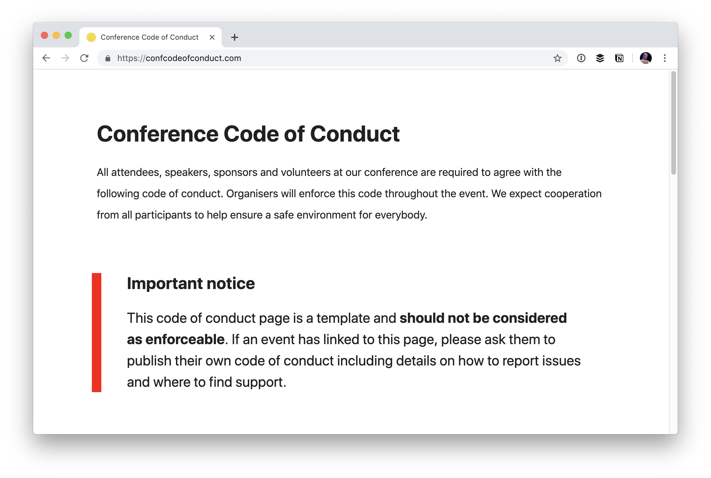
This code of conduct page is a template and should not be considered as enforceable. If an event has linked to this page, please ask them to publish their own code of conduct including details on how to report issues and where to find support.
It’s great that this site exists to give people some starter language for thinking about the idea of a code of conduct, but I can attest to the fact that many conferences used it as a way to appear to have a code of conduct before this warning while make zero effort to craft their own.
The primary concern about linking directly to someone else’s code of conduct or copy and pasting it to a new page verbatim is that there is nothing about what to do in case of problems. So, should a conduct incident occur, there is no documented information for what people should do in that event. Without actionable follow-through, a code of conduct is close to meaningless. It’s soul-less placating.
This is just one example:
It’s not to single someone out. It’s just one example of at least a dozen.
I heard from quite a few people about this, and I agree that it’s potentially a serious issue. I’ve tried to be clear about it: I won’t merge a Pull Request if the conference is missing a code of conduct or it simply links to confcodeofconduct.com (or uses a direct copy of it with no actionable details).
I know the repo is looking for help translating the new warning into different languages. If you can help with that, I’m sure they’d love a PR to the appropriate index HTML file.
CSS-Tricks is 12 years old! Firmly into that Early Adolescence stage, I’d say 😉 As we do each year, let’s reflect upon the past year. I’d better have something to say, right? Otherwise, John Prine would get mad at me.
How the hell can a person go to work in the morning
And come home in the evening and have nothing to say.
– Angel From Montgomery
Easily the biggest change this year was design v17
We redesign most years, so it’s not terribly shocking I suppose that we did this year, but I think it’s fairly apparent that this was a big one. The biggest since v10.
The aesthetics of it still feel fresh to me, 6 months later. There are no plans at all yet for what the next version will be. I imagine this one will last a good couple of years with tweaks along the way. I’m always working on it. Just in the last few days, I have several commits cleaning things up, adding little features, and optimizing. That work is never done. v18 might just be a more thorough scrubbing of what is here. Might be a good release to focus on the back-end tech. I’ve always wanted to try some sort of MVC setup.
In a way, things feel easier.
There is a lot going right around here. We’ve got a great staff. Our editorial workflow, led by Geoff, has been smooth. There are ebbs and flows of how many great guest posts are in the pipeline, but it never seems to run dry and these days we stay more ahead than we ever have.
We stay quite organized with Notion. In fact, I still use it heavily across all the teams I’m on. It’s just as fundamental as Slack and email.
We’re still working with BuySellAds as a partner to help us sell advertising and sponsorship partnerships. We’ve worked with them for ages and they really do a good job with clean ad tech, smooth integration workflows, and finding good companies that want to run campaigns.
On the 10th anniversary I wrote:
If you do all the work, the hope is that you just keep to keep on keeping on. Everyone gets paid for their effort. This is not a hockey-stick growth kind of site. It’s a modest publication.
Yep.
Check out a year over year chart from Google Analytics:
I can look at that and celebrate the moments with growth. Long periods of 20% year over year growth, which is cool. Then if you look at just this last month, we’re more even or a little bit under 2018 (looking at only pageviews). Good to know, kinda, but I never put much stock in this kind of generic analytics. I’m glad we record them. I would want to know if we started tanking or growing hugely. But we never do. We have long slow steady growth and that is a comfortable place for me.
Thinking on ads
The world of advertising is tightly integrated around here, of course. I’m sure many of you look at this site and go JEEZ, LITTLE HEAVY ON THE ADS, EH? I hope it’s not too big a turnoff, as I really try to be tasteful with them. But another thing you should know is that the ad tech is clean. No tracking stuff. No retargetting. No mysterious third-party JavaScript. There might be an impression-tracking pixel here and there, but that’s about it. No slew of 100’s of requests doing god-knows-what.
That’s not by accident. It’s clear to me now how to go down that other road, and that road has money on it. Twice as much. But I look at it as what would be short term gains. Nobody is going to be more mad at me than you if I slap 80 tracking scripts on this site, my credibility amongst devs goes out the window along with any hopes of sustaining or growing this site. It’s no surprise to me that on sites without developers as an audience, the tendency is to go down the golden road of tracking scripts.
Even the tech is easier.
Just starting in July I’ve gotten all my sites on Flywheel hosting, and I’ve written about that here just today. Flywheel is a new sponsor here to the site, and I’m equally excited about that as I am in actually using it. Between using Local for local WordPress development, GitHub for repos, Buddy for deployment, Cloudflare for DNS/CDN… everything just feels smooth and easy right now.
The way I feel about tech at the moment is that nearly anything is doable. Even stuff that feels insurmountable. It’s just work. Do a bunch of work, get the thing done.
Fancy posts
One thing that we snuck in this year is the idea of posts that have special design applied to them. The term „Art-directed articles” seems to be the term that has stuck for that, for better or worse, and we’ve added to that.
There are posts like The Great Divide that I intentionally wanted to make stand out.
And now we’ve taken that and turned it into a template. The point of an art-directed article is to do something unique, so a template is a little antithetical to that, but I think this strikes a nice middle ground. The template assumes a big full-width header with background image under big title and then is otherwise just a centered column of type on white. The point is to use the template, then apply custom styles on top of it as needed to do something special for the post. I have a good feeling we’ll keep using it and have fun with it, and that it won’t be too burdensome for future designs.
Elsewhere
Last year at this time I was just settling into living in Bend, Oregon. It still feels that way. I’m in a new house now, that we’ve bought, and it feels like this is a very permanent living situation. But we’re less than a year into the new house so there is plenty of dust to settle. I’m still honeymooning on Bend as I just love it here so much. My daughter is just over a year and a half now so stability is very much what we’re after.
Professionally, most of my time is on CodePen, of course. There is a lot of overlap, like the fact that we work with BuySellAds on both sites and often sell across both. Plus working on CSS-Tricks always has me in CodePen anyway ;). Miraculously, Dave Rupert and I almost never miss a week on ShopTalk Show. Going strong after all these years. Never a shortage of stuff to talk about when it comes to websites.
Thank you
A big hearty thanks from me! Y’all reading this site is what makes it possible.
Animating elements, at its most basic, is fairly straightforward. Define the keyframes. Name the animation. Call it on an element.
But sometimes we need something a little more complex to get the right “feel” for the way things move. For example, a sound equalizer might use the same animation on each bar, but they are staggered to give the illusion of being animated independently.
I was recently building a dashboard and wanted the items in one of the widgets to flow into view with a staggered animation.
Just like the sound equalizer above, I started going down the :nth-child route. I used the unordered list (<ul>) as the parent container, gave it a class and employed the :nth-child pseudo selector to offset each list item with animaton-delay.
.my-list li {
  animation: my-animation 300ms ease-out;
}

.my-list li:nth-child(1) {
  animation-delay: 100ms;
}

.my-list li:nth-child(2) {
  animation-delay: 200ms;
}

.my-list li:nth-child(3) {
  animation-delay: 300ms;
}

/* and so on */
This technique does indeed stagger items well, particularly if you know how many items are going to be in the list at any given time. Where things fall apart, however, is when the number of items is unpredictable, which was the case for the widget I was building for the dashboard. I really didn’t want to come back to this piece of code every time the number of items in the list changed, so I knocked out a quick Sass loop that accounts for up to 50 items and increments the animation delay with each item:
.my-list {
  li {
    animation: my-animation 300ms ease-out;

    @for $i from 1 through 50 {
      &:nth-child(#{$i}) {
        animation-delay: 100ms * $i;
      }
    }
  }
}
That should do it! Yet, it feels way too hacky. Sure, it doesn’t add that much weight to the file, but you know the compiled CSS will include a bunch of unused selectors, like nth-child(45).
There must be a better way. This is where I would normally reach for JavaScript to find all of the items and add a delay but… this time I spent a little time exploring to see if there is a way to do it with CSS alone.
How about CSS counters?
The first thing I thought of was using a CSS counter in combination with the calc() function:
The browser support isn’t all that bad (pokes stick at Internet Explorer).
This browser support data is from Caniuse, which has more detail. A number indicates that browser supports the feature at that version and up.
Desktop
Chrome
Opera
Firefox
IE
Edge
Safari
49
36
31
No
16
9.1
Mobile / Tablet
iOS Safari
Opera Mobile
Opera Mini
Android
Android Chrome
Android Firefox
9.3
46
No
67
75
67
One of the great features of CSS is that it will ignore things it doesn’t understand, thanks to the cascade. That means everything will animate in into view together. If that’s not your bag, you can add a feature query to override a default animation:
.my-list li {
  animation: fallback-animation;
}

@supports (--variables) {
  .my-list li {
    animation: fancy-animation;
    animation-delay: calc(var(--animation-order) * 100ms);
  }
}
Vanilla CSS FTW
The more I stop and ask myself whether I need JavaScript, the more I’m amazed what CSS can do on its own. Sure, it would be nice if CSS counters could be used in a calc() function and it would be a pretty elegant solution. But for now, inline custom properties provide both a powerful and flexible way to solve this problem.
Šime posts regular content for web developers on webplatform.news.
In this week’s news, Wikipedia helps identify three slow click handlers, Google Earth comes to the web, SVG properties in CSS get more support, and what to do in the event of zombie cookies.
Tracking down slow event handlers with Event Timing
Event Timing is experimentally available in Chrome (as an Origin Trial) and Wikipedia is taking part in the trial. This API can be used to accurately determine the duration of event handlers with the goal of surfacing slow events.
We quickly identified 3 very frequent slow click handlers experienced frequently by real users on Wikipedia. […] Two of those issues are caused by expensive JavaScript calls causing style recalculation and layout.
The preview version of Google Earth for Web (powered by WebAssembly) is now available. You can try it out in Chromium-based browsers and Firefox — it runs single-threaded in browsers that don’t yet have (re-)enabled SharedArrayBuffer — but not in Safari because of its lack of full support for WebGL2.
Firefox Nightly has implemented SVG geometry properties (x, y, r, etc.) in CSS. This feature is already supported in Chrome and Safari and is expected to ship in Firefox 69 in September.
Chrome and Firefox allow users to restore the previous browser session on startup. With this option enabled, closing the browser will not delete the user’s session cookies, nor empty the sessionStorage of web pages.
Given this session resumption behavior, it’s more important than ever to ensure that your site behaves reasonably upon receipt of an outdated session cookie (e.g. redirect the user to the login page instead of showing an error).
Matthias Ott, relaying an idea he heard from Derek Sivers:
Many personal websites, including this one here, have an “about” page. It’s a page that tells you something about the background of a person or about the services provided. But what this page often doesn’t answer – and neither do Twitter or Facebook pages – is what this person really is up to at the moment. A page that answers questions like: What are you focused on at this point in your life? What have you just started working on that excites you like nothing else? Did you just move to a new town? Did you start a new career as a Jengascript wrangler? To answer all those questions, Derek suggests to create a “now page”. A page that tells visitors of your site “what you’d tell a friend you hadn’t seen in a year.”
Very cool idea! Derek has a directory page of people who have done this.
I have more scattered thoughts:
It’s funny how social media sites aren’t very helpful with this. You’d think looking at someone’s social media profile would be the quickest and easiest way to catch up with what they are doing right now, but it just ain’t. That’s true for me, too. Random statements of what you’re working on don’t make very good social media posts. Maybe a pinned tweet could be like a „now” page, though.
I wonder if more homepages on people’s personal sites should be this. As I browse around some of the sites, I like a lot of the „now” pages more than I like the homepage.
I went with a „what I want you to do” section on my personal site. It’s a different vibe, but it almost doubles as a „now” page, as the things I want you to do are fairly related to the things I’m doing. Maybe the idea of a do page has some legs.
Note the interesting caveat: only vote in the poll if you don’t know CSS well.
The winning answer was D! You gotta wonder if the result would have been different if the request for non-CSS experts wasn’t there.
I like to think I know CSS OK, so I didn’t vote. My brain goes like this:
I think he’s asking „by default,” so the answer may assume there’s no other CSS doing anything to that text.
I wish I knew why the box was that particular width, but I guess I’ll just assume it’s a set width.
It’s not B because ellipsis stuff requires extra stuff, and doesn’t work on multiple lines like that — unless we’re talking line clamping, which is even weirder.
It’s not C because that requires hiding overflow which is never really a default — that is, except off the top and left of the browser window, I guess. Or in an iframe.
It’s not D because words just don’t break like that unless you do pretty specific stuff.
A actually makes decent sense. It’s weird to look at, but I’ve been dealing with stuff busting out of containers my whole career. C’est la vie.
Remember, we’ve done a deep dive into CSS IS AWESOME before and how it interestingly captures the weirdness of CSS.
WordPress released their anticipated over to the post editor, nicknamed Gutenberg, which is also referred to as the block editor. It transforms a WordPress post into a collection of blocks that you can add, edit, remove and re-order in the layout. Before the official release, Gutenberg was available as a plugin and, during that time, I was interested in learning how to create custom blocks for the editor. I was able to learn a lot about Gutenberg that I decided to put together a course that discusses almost everything you need to know to develop blocks for Gutenberg.
In this article, we will discuss metaboxes and metafields in WordPress. Specifically, we’ll cover how to replace the old PHP metaboxes in Gutenberg and extend Gutenberg’s sidebar to add a React component that will be used to manipulate the metadata using the global JavaScript Redux-like stores. Note that metadata in Gutenberg can also be manipulated using blocks. And both ways are discussed in my course, however, in this article I am going to focus on managing metadata in the sidebar since I believe this method will be used more often.
This article assumes some familiarity with ReactJS and Redux. Gutenberg relies heavily on these technologies to render UI and manage state. You can also check out the CSS-Tricks guide to learning Gutenberg for an intro to some of the concepts we’ll cover here.
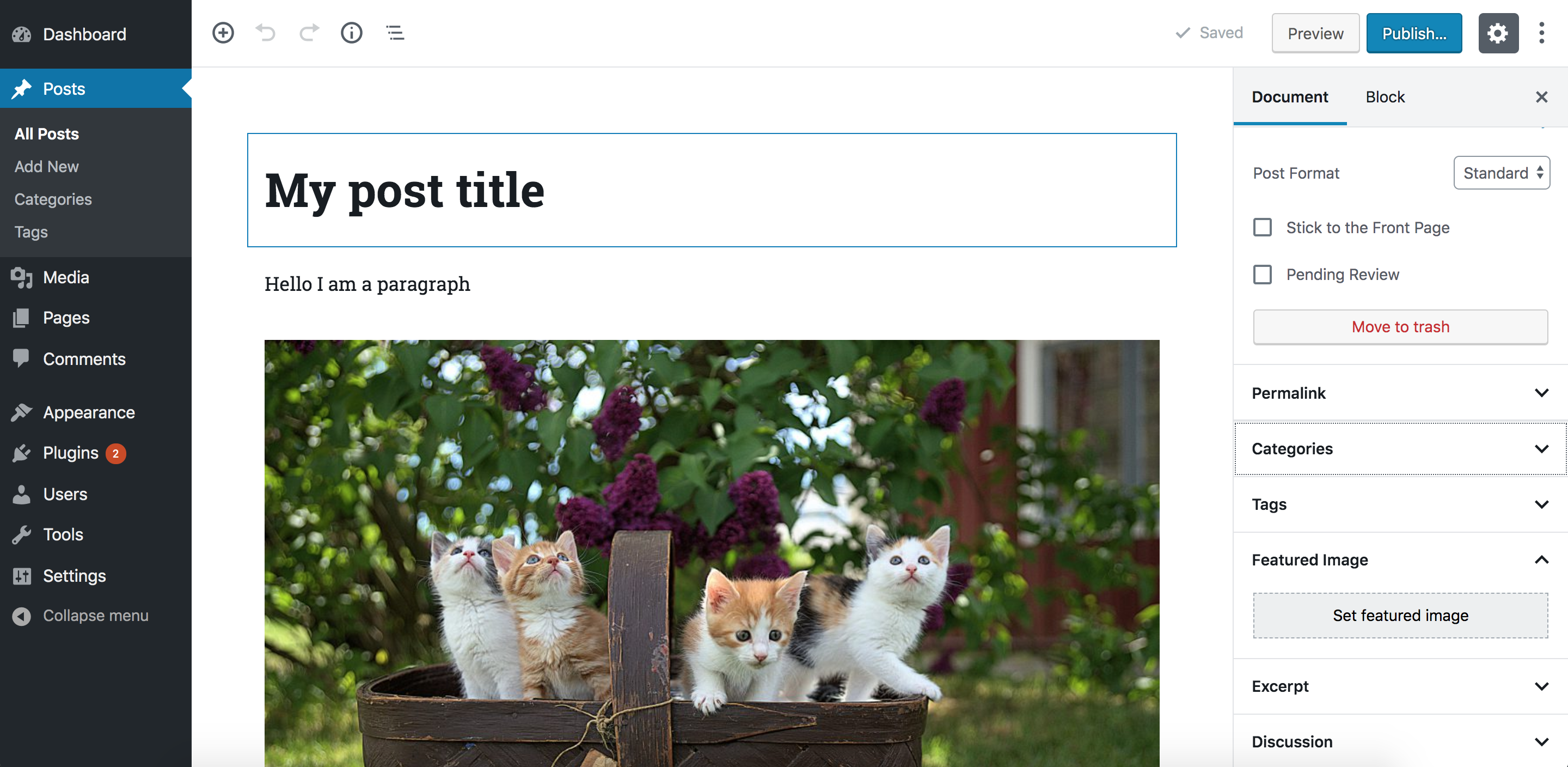
The block editor interface
Gutenberg is a React application
At its core, Gutenberg is a ReactJS application. Everything you see in the editor is rendered using a React component. The post title, the content area that contains the blocks, the toolbar at the top and the right sidebar are all React components. Data or application states in this React application are stored in centralized JavaScript objects, or „stores.” These stores are managed by WordPress’ data module. This module shares a lot of core principles with Redux. So, concepts like stores, reducers, actions, action creators, etc., also exist in this module. I will sometimes refer to these stores as „Redux-like” stores.
These stores do not only store any data about the current post, like the post content (the blocks), the post title, and the selected categories, but it also stores global information about a WordPress website, like all the categories, tags, posts, attachments and so on. In addition to that, UI state information like,”is the sidebar opened or closed?” are also stored in these global stores. One of the jobs of the „data module” is to retrieve data from these stores and also change data in the stores. Since these stores are global and can be used by multiple React components changing data in any store will be reflected in any Gutenberg UI part (including blocks) that uses this piece of data.
Once a post is saved, the WordPress REST API will be used to update the post using the data stored in these global stores. So the post title, the content, categories etc., that are stored in these global stores will be sent as payload in the WP REST API endpoint that updates the post. And thus if we are able to manipulate data in these stores, once the user clicks save, the data that we manipulated will be stored in the database by the API without us having to do anything.
One of the things that is not managed by these global stores in Gutenberg is metadata. If you have some metafields that you used to manage using a metabox in the pre-Gutenberg „classic” editor, those will not be stored and manipulated using the global Redux-like stores by default. However, we can opt-in to manage metadata using JavaScript and the Redux-like stores. Although those old PHP metaboxes will still appear in Gutenberg, WordPress recommends porting these PHP metaboxes to another approach that uses the global stores and React components. And this will ensure a more unified and consistent experience. You can read more about problems that could occur by using PHP metaboxes in Gutenberg.
So before we start, let’s take a look at the Redux-like stores in Gutenberg and how to use them.
Retrieving and changing data in Gutenberg’s Redux-like stores
We now know that the Gutenberg page is managed using these Redux-like stores. We have some default „core” stores that are defined by WordPress. Additionally, we can also define our own stores if we have some data that we would like to share between multiple blocks or even between blocks and other UI elements in the Gutenberg page, like the sidebar. Creating your own stores is also discussed in my course and you can read about it in the official docs. However, in this article we will focus on how to use the existing stores. Using the existing stores lets us manipulate metadata; therefore we will not need to create any custom stores.
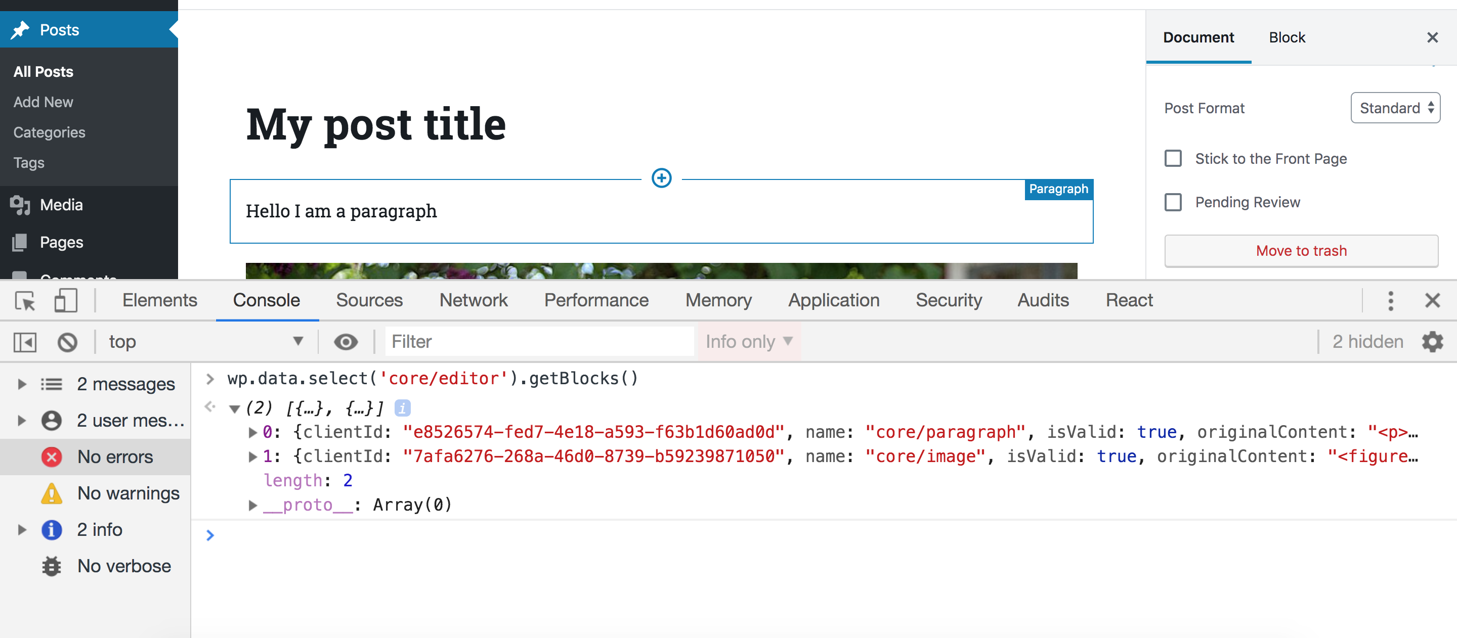
In order to access these stores, make sure you have the latest WordPress version with Gutenberg active and edit any post or page. Then, open your browser console an type the following statement:
wp.data.select('core/editor').getBlocks()
You should get something like this:
Let’s break this down. First, we access the wp.data module which (as we discussed) is responsible for managing the Redux-like stores. This module will be available inside the global wp variable if you have Gutenberg in your WordPress installation. Then, inside this module, we call a function called select. This function receives a store name as an argument and returns all the selectors for this store. A selector is a term used by the data module and it simply means a function that gets some data from the store. So, in our example, we accessed the core/editor store, and this will return a bunch of functions that can be used to get data from this store. One of these functions is getBlocks() which we called above. This function will return an array of objects where each object represents a block in your current post. So depending on how many blocks you have in your post, this array will change.
As we’ve seen, we accessed a store called core/editor. This store contains information about the current post that you are editing. We’ve also seen how to get the blocks in the current post but we can also get a lot of other stuff. We can get the title of the current post, the current post ID, the current post post type and pretty much everything else we might need.
But in the example above, we were only able to retrieve data. What if we want to change data? Let’s take a look at another selector in the ‘core/editor’ store. Let’s run this selector in our browser console:
This should return the title of the post currently being edited:
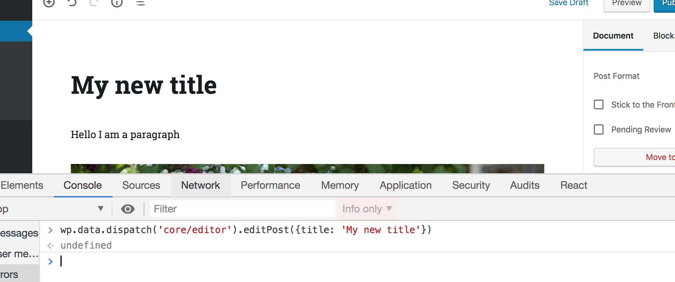
Great! Now what if we want to change the title using the data module? Instead of calling select(), we can call dispatch() which will also receive a store name and return some actions that you can dispatch. If you are familiar with Redux, terms like „actions” and „dispatch” will sound familiar to you. If this sounds new to you, all you need to know is that dispatching a certain action simply means changing some data in a store. In our case, we want to change the post title in the store, so we can call this function:
wp.data.dispatch('core/editor').editPost({title: 'My new title'})
Now take a look at the post title in the editor — it will be changed accordingly!
That’s how we can manipulate any piece of data in the Gutenberg interface. Wan retrieve the data using selectors and change that data using actions. Any change will be reflected in any part of the UI that uses this data.
There are, of course, other stores in Gutenberg that you can checkout on this page. So, let’s take a quick look at a couple of more stores before we move on.
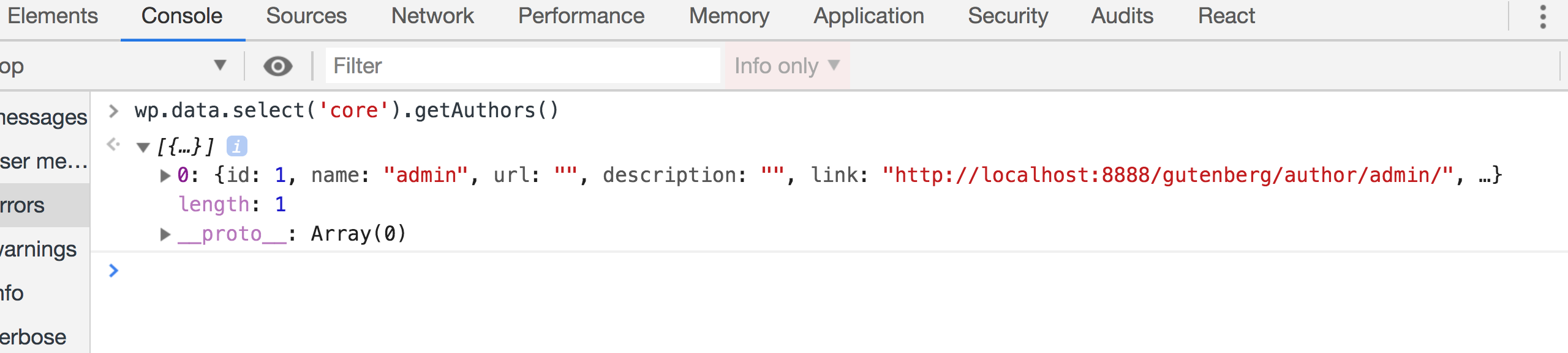
The stores that you will use the most are the core/editor which we just looked at, and the core store. Unlike core/editor, the core store contains information, not only about the currently edited post, but also about the whole WordPress website in general. So, for instance, we can get all the authors on the website using:
wp.data.select('core').getAuthors()
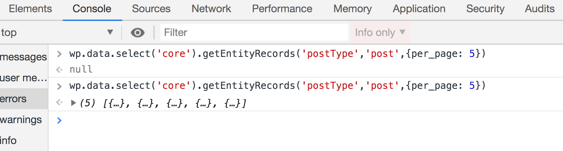
We can also get some posts from the website like so:
Make sure to run this twice if the first result was null. Some selectors like this one will send an API call first to get your post. That means the the returned value will initially be null until the API request is fulfilled:
Let’s look at one more store: edit-post. This store is responsible for the UI information in the actual editor. For example, we can have selectors that check if the sidebar is currently open:
This will return true if the sidebar is opened. But try closing the sidebar, run this function again, and it should return false.
We can also open and close the sidebar by dispatching actions in this store. Having the sidebar open and running this action in the browser console, the sidebar should be closed:
You will unlikely need to use this store, but it’s good to know that this is what Gutenberg does when you click on the sidebar icon to close it.
There are some more stores that you might need to take a look at. The core/notices store, for instance, could be useful. This can help you display error, warning and success messages in the Gutenberg page. You can also check all the other stores here.
Try to play around with these stores in your browser until you feel comfortable using them. After that, we can see how to use them in real code outside the browser.
Let’s setup a WordPress plugin to add a Gutenberg sidebar
Now that we know how to use the Redux-like stores in Gutenberg, the next step is to add a React sidebar component in the editor. This React component will be connected to the core/editor store and it will have some input that, when changed, will dispatch some action that will manipulate metadata — like the way we manipulated the post title earlier. But to do that, we need to create a WordPress plugin that holds our code.
Let’s create a new folder inside wp-content/plugins directory of the WordPress installation. I am going to call it gutenberg-sidebar. Inside this folder, let’s create the entry point for our plugin. The entry point is the PHP file that will be run when activating your plugin. It can be called index.php or plugin.php. We’re going to use plugin.php for this example and put some information about the plugin at the top as well as add some code that avoids direct access:
You should find your plugin on the Plugins screen in the WordPress admin. Click on „Activate” in order for the code to run.
As you might imagine, we will write a lot of JavaScript and React from this point, forward. And in order to code React components easily we will need to use JSX. And JSX is not valid JavaScript that can run in your browser, it needs to be converted into plain JavaScript. We might also need to use ESNext features and import statements for importing and exporting modules.
And these features will not work on all browsers, so it’s better to transform our code into old ES5 JavaScript. Thankfully, there are a lot of tools that can help us achieve that. A famous one is webpack. webpack, however, is a big topic in itself and it won’t fit the scope of this article. Therefore, we are going to use another tool that WordPress provides which is @wordpress/scripts. By installing this package, we will get a recommended webpack configuration without having to do anything in webpack ourselves. Personally, I recommend that you learn webpack and try to do the configuration yourself. This will help you understand what’s going on and give you more control. You can find a lot of resources online and it’s also discussed in my course. But for now, let’s install the WordPress webpack configuration tool.
Change to your plugin folder in Terminal:
cd path/to/your/theme/folder
Next, we need to initialize npm in that folder in order to install @wordpress/scripts. This can be done by running this command:
npm init
This command will ask you some questions like the package name, version, license, etc. You can keep hitting Enter and leave the default values. You should have a package.json file in your folder and we can start installing npm packages. Let’s install @wordpress/scripts by running the following command:
npm install @wordpress/scripts --save-dev
This package will expose a CLI called wp-scripts which you can use in your npm scripts. There are different commands that you can run. We will focus on the build and start commands for now. The <code>build script will transform your files so that they are minified and ready for production. Your source code’s entry point is configured in src/index.js and the transformed output will be at build/index.js. Similarly, the start script will transform your code in src/index.js to build/index.js, however, this time, the code will not be minified to save time and memory — the command will also watch for changes in your files and re-build your files every time something is changed. The start command is suitable to be used for development while the build command is for production. To use these commands, we will replace the scripts key in the package.json file which will look something like this if you used the default options when we initialized npm.
Change this:
"scripts": {
  "test": "echo "Error: no test specified" && exit 1"
},
Now we can run npm start and npm run build to start development or build files, respectively.
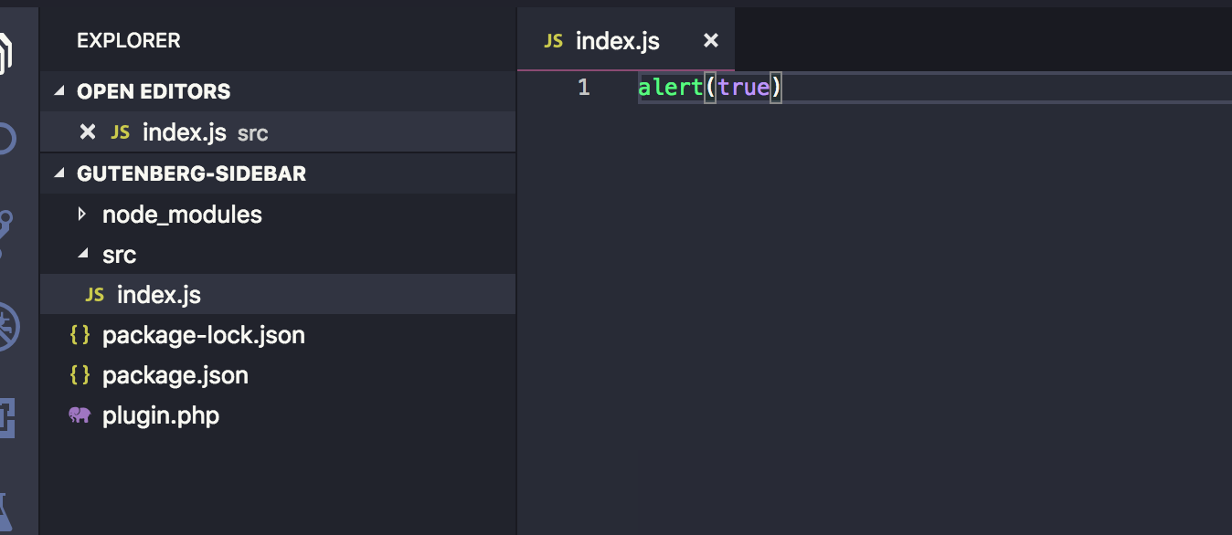
Let’s create a new folder in the plugin’s root called src and add an index.js file in it. We can see it things are working by sprinkling in a little JavaScript. We’ll try an alert.
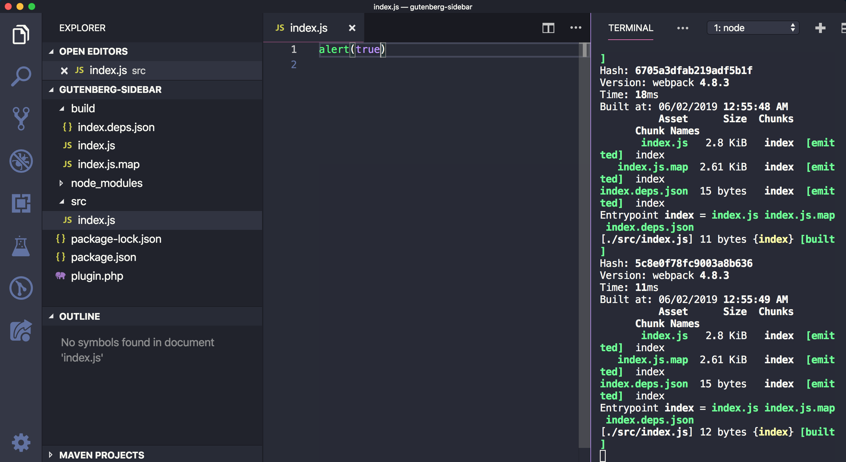
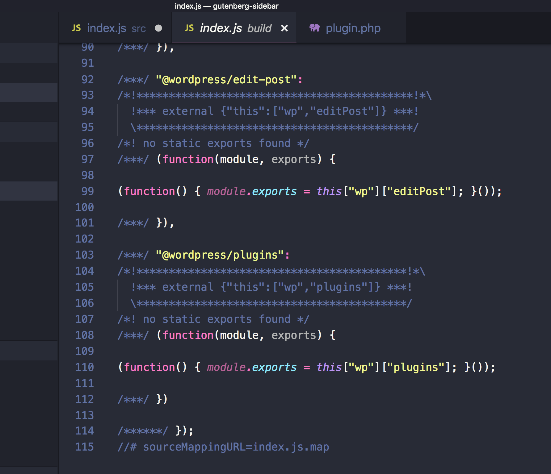
Now run npm start in Terminal. You should find the build folder created with the compiled index.js and also sourcemap files. In addition to that, you will notice that the build/index.js file is not minified and webpack will be watching for changes. Try changing the src/index.js file and save again. The build/index.js file will re-generated:
If you stop the watch (Ctrl + C ) in Terminal and run npm run build, the build/index.js file should now be minified.
Now that we have our JavaScript bundle, we need to enqueue this file in the Gutenberg editor. To do that we can use the hoo enqueue_block_editor_assets which will insure that the files are enqueued only in the Gutenberg page and not in other wp-admin pages where it isn’t needed.
We can enqueue our file like so in plugin.php:
// Note that it’s a best practice to prefix function names (e.g. myprefix)
function myprefix_enqueue_assets() {
  wp_enqueue_script(
    'myprefix-gutenberg-sidebar',
    plugins_url( 'build/index.js', __FILE__ )
  );
}
add_action( 'enqueue_block_editor_assets', 'myprefix_enqueue_assets' );
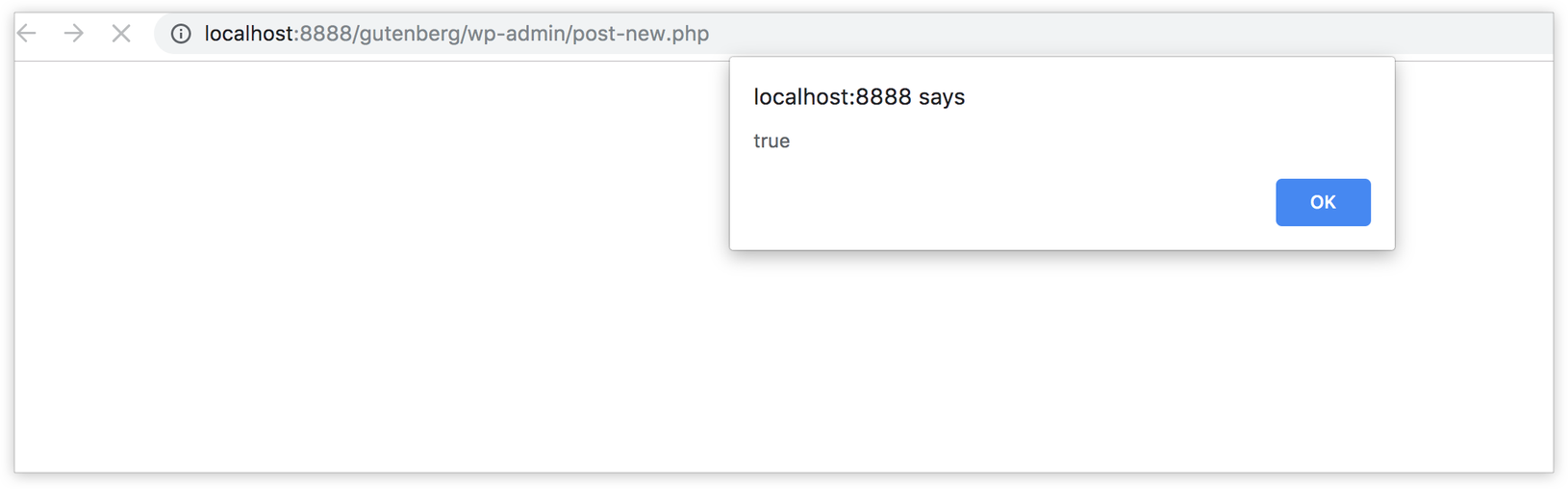
Visit the Gutenberg page. If all is well, you should get an alert, thanks to what we added to src/index.js earlier.
Fantastic! We’re ready to write some JavaScript code, so let’s get started!
Importing WordPress JavaScript packages
In order to add some content to the existing Gutenberg sidebar or create a new blank sidebar, we need to register a Gutenberg JavaScript plugin — and in order to do that, we need to use some functions and components from packages provided by WordPress: wp-plugins, wp-edit-post and wp-i18n. These packages will be available in the wp global variable in the browser as wp.plugins, wp.editPost and wp.i18n.
We can import the functions that we need into src/index.js. Specifically, those functions are: registerPlugin and PluginSidebar.
It’s worth noting that we need to make sure that we have these files as dependencies when we enqueue our JavaScript file in order to make sure that our index.js file will be loaded after the wp-plugins, wp-edit-posts and wp-i18n packages. Let’s add those to plugin.php:
Notice that I added wp-element in there as a dependency. I did that because we will write some React components using JSX. Typically, we’d import the entire React library when making React components. However, wp-element is an abstraction layer atop React so we never have to install or import React directly. Instead, we use wp-element as a global variable.
These packages are also available as npm packages. Instead of importing functions from the global wp variable (which will only be available in the browser that your code editor knows nothing about), we can simply install these packages using npm and import them in our file. These WordPress packages are usually prefixed with @wordpress.
import { registerPlugin } from "@wordpress/plugins";
import { PluginSidebar } from "@wordpress/edit-post";
import { __ } from "@wordpress/i18n";
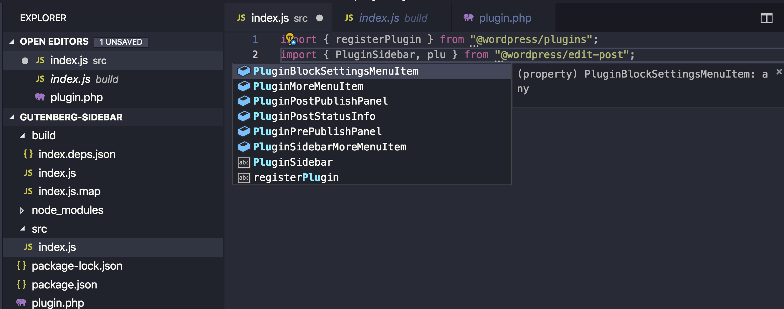
The advantage of importing the packages this way is that your text editor knows what @wordpress/edit-post and @wordpress/plugins are and it can autocomplete functions and components for you — unlike importing from wp.plugins and wp.editPost which will only be available in the browser while the text editor has no clue what wp is.
Your text editor can autocomplete component names for you.
You might also think that importing these packages in your bundle will increase your bundle size, but there’s no worries there. The webpack config file that comes with @wordpress/scripts is instructed to skip bundling these @wordpress packages and depend of the wp global variable instead. As a result, the final bundle will not actually contain the various packages, but reference them via the wp variable.
Great! so I am going to stick to importing packages using npm in this article, but you are totally welcome to import from the global wp variable if you prefer. Let’s now use the functions that we imported!
Registering a Gutenberg Plugin
In order to add a new custom sidebar in Gutenberg, we first need to register a plugin — and that’s what the registerPlugin function that we imported will do. As a first argument, registerPlugin will receive a unique slug for this plugin. We can have an array of options as a second argument. Among these options, we can have an icon name (from the dashicons library) and a render function. This render function can return some components from the wp-edit-post package. In our case. we imported the PluginSidebar component from wp-edit-post and created a sidebar in the Gutenberg editor by returning this component in the render function. I also added PluginSidebar inside a React fragment since we can add other components in the render function as well. Also, the __ function imported from wp-i18n will be used so we can translate any string that we output:
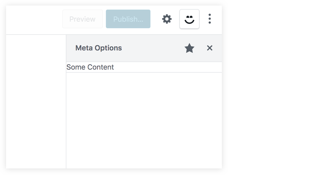
You should now have a new icon beside the cog icon in the Gutenberg editor screen. This smiley icon will toggle our new sidebar which will have whatever content we have inside the PluginSidebar component:
If you were to click on that star icon beside the sidebar title, the sidebar smiley icon will be removed from the top toolbar. Therefore, we need to add another way to access our sidebar in case the user un-stars it from the top toolbar, and to do that, we can import a new component from wp-edit-post called PluginSidebarMoreMenuItem. So, let’s modify out import statement:
import { PluginSidebar, PluginSidebarMoreMenuItem } from "@wordpress/edit-post";
The PluginSidebarMoreMenuItem will allow us to add an item in the Gutenberg menu that you can toggle using the three dots icon at the top-right of the page. We want to modify our plugin to include this component. We need to give PluginSidebar a name prop and give PluginSidebarMoreMenuItem a target prop with the same value:
In the menu now, we will have a „Meta Options” item with our smiley icon. This new item should toggle our custom sidebar since they are linked using the name and the target props:
Great! Now we have a new space in our Gutenberg page. We can replace the „some content” text in PluginSidebar and add some React components of our own!
Also, let’s make sure to check the edit-post package documentation. This package contains a lot of other components that you can add in your plugin. These components can allow you to extend the existing default sidebar and add your own components in it. Also, we can find components that allow us to add items in the Gutenberg top-right menu and also for the blocks menu.
Handling metadata in the classic editor
Let’s take a quick look at how we used to manage metadata in the classic editor using metaboxes. First, install and activate the classic editor plugin in order to switch back to the classic editor. Then, add some code that will add a metabox in the editor page. This metabox will manage a custom field that we’ll call _myprefix_text_metafield. This metafield will just be a text field that accepts HTML markup. You can add this code in plugin.php or put it in a separate file and include it plugin.php:
Rendering an HTML input using the myprefix_post_options_metabox_html function
Controlling the metafield, called _myprefix_text_metafield
Using the save_post action hook to get the HTML input value and update the field using update_post_meta.
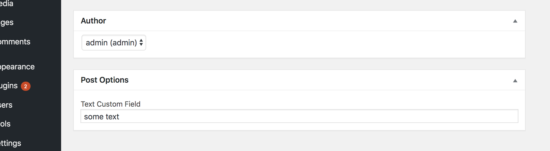
If you have the classic editor plugin installed, then you should see the metafield in the post editor:
Note that the field is prefixed with an underscore (_myprefix_text_metafield) which prevents it from being edited using the custom fields metabox that comes standard in WordPress. We add this underscore because we intend to manage the field ourselves and because it allows us to hide it from the standard Custom Fields section of the editor.
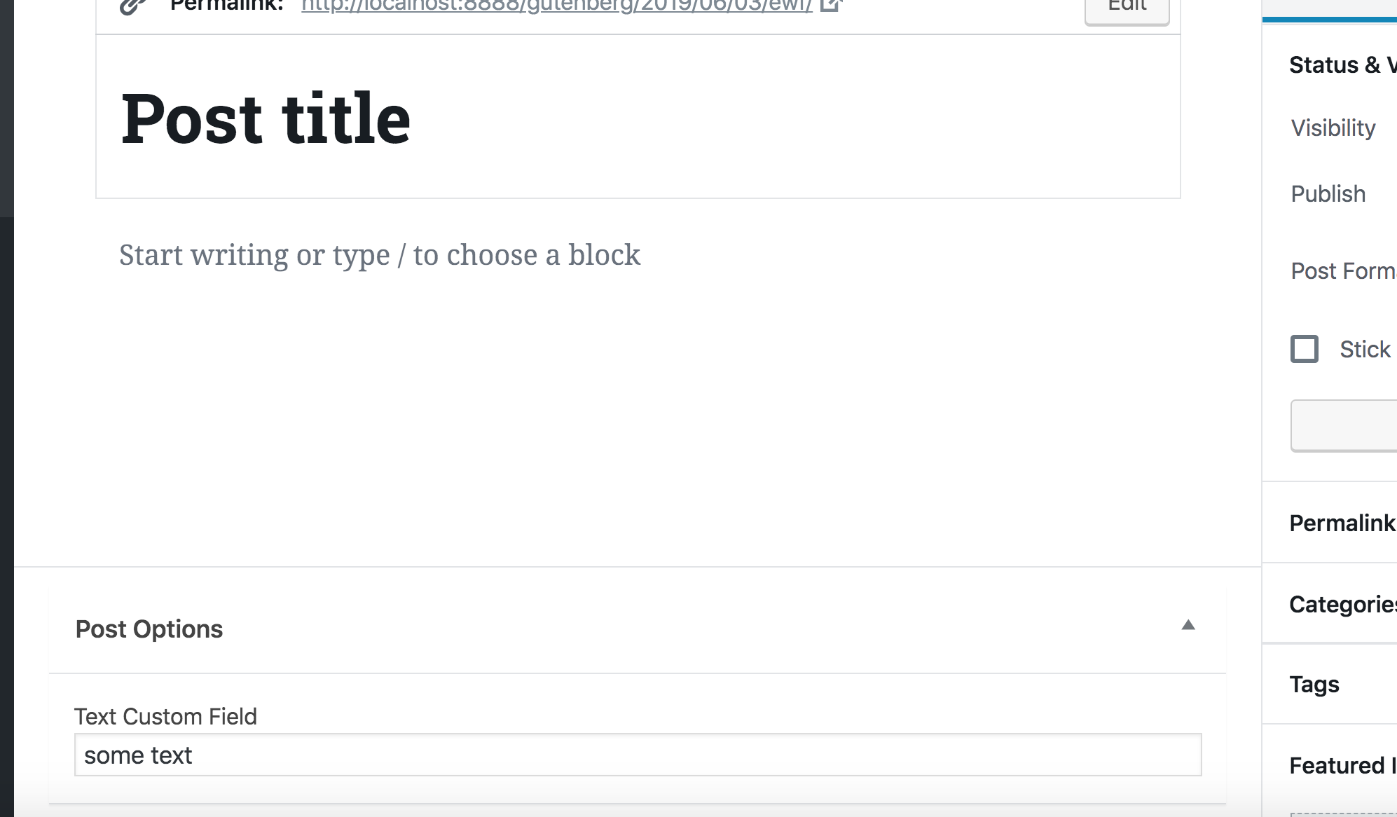
Now that we have a way to manage the field in the classic editor, let’s go ahead and deactivate the classic editor plugin and switch back to Gutenberg. The metabox will still appear in Gutenberg. However, as we discussed earlier, WordPress recommends porting this PHP-based metabox using a JavaScript approach.
That’s what we will do in the rest of the article. Now that we know how to use the Redux-like stores to manipulate data and how to add some React content in the sidebar, we can finally create a React component that will manipulate our metafield and add it in the sidebar of the Gutenberg editor.
We don’t want to completely get rid of the PHP-based field because it’s still helpful in the event that we need to use the classic editor for some reason. So, we’re going to hide the field when Gutenberg is active and show it when the classic editor is active. We can do that by updating the myprefix_add_meta_box function to use the __back_compat_meta_box option:
Let’s move on to creating the React component that manages the metadata.
Getting and setting metadata using JavaScript
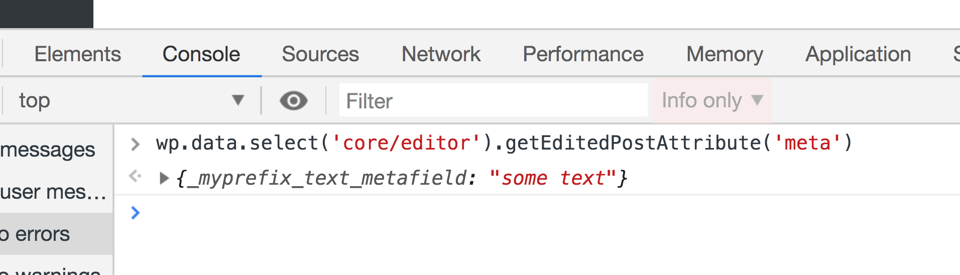
We have seen how to get the post title and how to change it using the wp-data module. Let’s take a look at how to do the same for custom fields. To get metafields, we can call the save selector getEditedPostAttribute. But this time we will pass it a value of meta instead of title.
Once that’s done, test it out in the browser console:
As you will see, this function will return an empty array, although we are sure that we have a custom field called _myprefix_text_metafield that we are managing using the classic editor. To make custom fields manageable using the data module, we first have to register the field in the plugin.php.
Make sure to set the show_in_rest option to true. WordPress will fetch the fields using the WP REST API. That means, we need to enable the show_in_rest option to expose it.
Run the console test again and we will have an object with all of our custom fields returned.
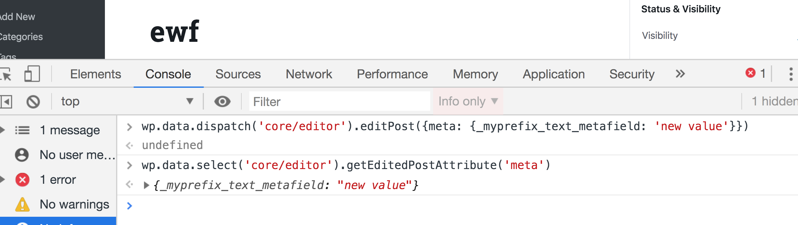
Amazing! We are able to get our custom field value, so now let’s take a look at how can we change the value in the store. We can dispatch the editPost action in the core/editor store and pass it an object with a meta key, which will be another object with the fields that we need to update:
Now try running the getEditedPostAttribute selector again and the value should be updated to new value.
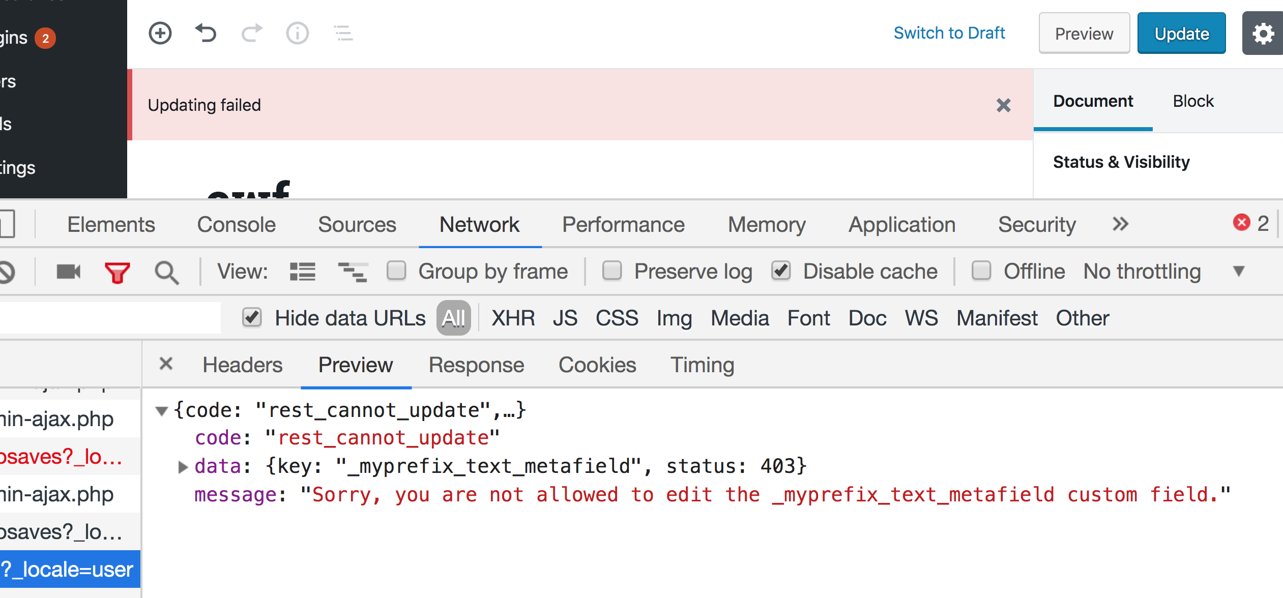
If you try saving a post after updating the field using Redux, you will get an error. And if you take a look at the Network tab in DevTools, you will find that the error is returned from the wp-json/wp/v2/posts/{id} REST endpoint that says that we are not allowed to update _myprefix_text_metafield.
This because WordPress treats any field that is prefixed with an underscore as a private value that cannot be updated using the REST API. We can, however, specify an auth_callback option that will allow updating this field using the REST API when it returns true as long as the editor is capable of editing posts. We can also add the sanitize_text_field function to sanitize the value before saving to the database:
Does the new value show up in the console? If so, great! Now we know how to get and set the meta field value using Redux and we are ready to create a react component in the sidebar to do that.
Creating a React component to manage the custom fields
What we need to do next is create a React component that contains a text field that is controlled by the value of the metafield in the Redux store. It should have the value of the meta field…and hey, we already know how to get that! We can create the component in a separate file and then import it index.js. However I am simply going to create directly in index.js since we’re dealing with a very small example.
Again, we’re only working with a single text field, so let’s import a component provided by a WordPress package called @wordpress/components. This package contains a lot of reusable components that are Gutenberg-ready without us having to write them from scratch. It’s a good idea to use components from this package in order to be consistent with the rest of the Gutenberg UI.
First, let’s install this package:
npm install --save @wordpress/components
We’ll import TextControl and PanelBody at the top of index.js to fetch the two components we need from the package:
import { PanelBody, TextControl } from "@wordpress/components";
Now let’s create our component. I am going to create a React functional component and call it PluginMetaFields, but you can use a class component if you’d prefer that.
PanelBody takes title, icon and initialOpen props. Title and icon are pretty self-explanatory. initialOpen puts the panel in an open/expanded state by default. Inside the panel, we have TextControl. which receives a label and a value for the input. As you can see in the snippet above, we get the value from the global store by accessing the _myprefix_text_metafield field from the object returned by wp.data.select('core/editor').getEditedPostAttribute('meta').
Notice that we are now depending on @wordpress/components and use wp.data. We must add these packages as dependencies when we enqueue our file in plugin.php:
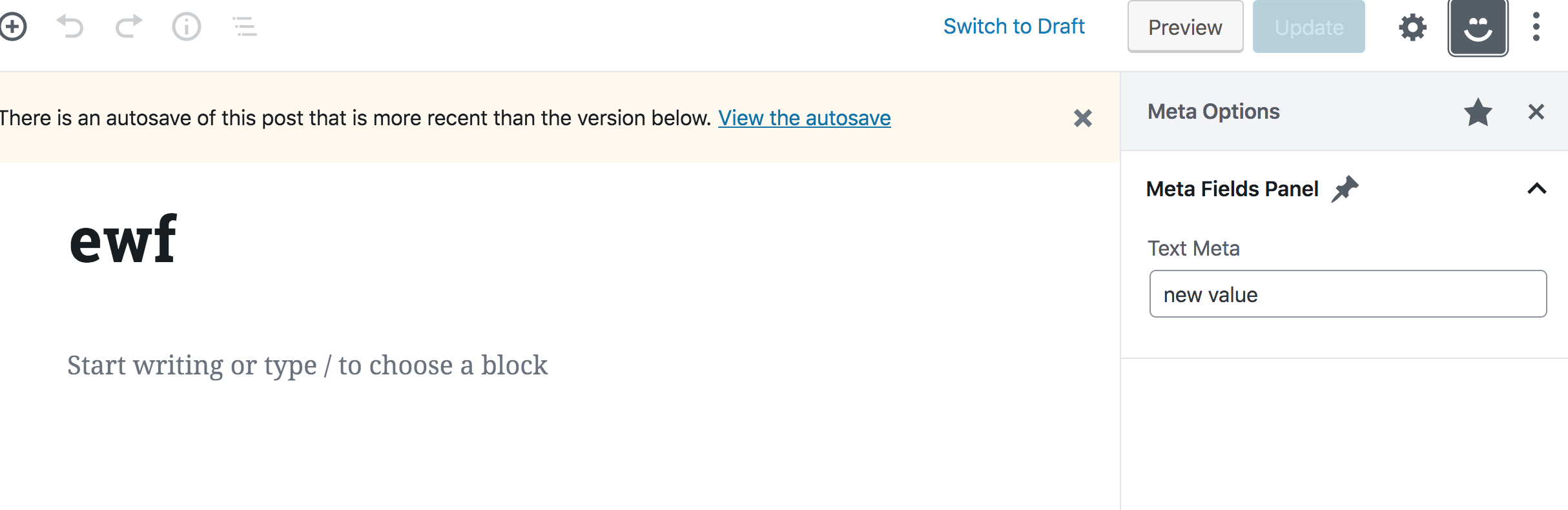
This should should give you a „Meta Options” panel that contains a „Meta Fields” title, a pin icon, and a text input with a „Test Meta” label and default value of „new value.”
Nothing will happen when you type into the text input because we are not yet handling updating the field. We’ll do that next, however, we first need to take care of another problem. Try to run editPost in the DevTools console again, but with a new value:
wp.data.dispatch('core/editor').editPost({meta: {_myprefix_text_metafield: 'a newer value'}})
You will notice that the value in the text field will not update to the new value. That’s the problem. We need the field to be controlled by the value in the Redux store, but we don’t see that reflected in the component. What’s up with that?
If you have used Redux with React before, then you probably know that we need to use a higher order component called connect in order to use Redux store values in a React component. The same goes for React components in Gutenberg — we have to use some higher order component to connect our component with the Redux-like store. Unfortunately, we are unable to simply call wp.data.select directly as we did before. This higher order component lives in the wp.data global variable which is also available as an npm package called @wordpress.data. So let’s install it to help us solve the issue.
npm install --save @wordpress/data
The higher order component we need is called withSelect, so let’s import it in index.js.
import { withSelect } from "@wordpress/data";
Remember that we already added wp-data as a dependency in wp_enqueue_script, so we can just use it by wrapping our component with it, like so:
Here, we’re overriding our PluginMetaFields component and assigning it the same component, now wrapped with the withSelect higher order component. withSelect will receive a function as an argument. This function will receive the select function (which we used to access wp.data.select) and it should return an object. Each key in this object will be injected as a prop in the component (similar to connect in Redux). withSelect will return a function that we can pass it the component (PluginMetaFields) again as seen above. So, by having this higher order component, we now get text_metafield as a prop in the component, and whenever the meta value in the redux store is updated, the prop will also get updated — thus, the component will update since components update whenever a prop is changed.
If you now try and run editPost with a new meta value in your browser, the value of the text field in the sidebar should also be updated accordingly!
So far, so good. Now we know how to connect our React components with our Redux-like stores. We are now left with updating the meta value in the store whenever we type in the text field.
Dispatching actions in React components
We now need to dispatch the editPost action whenever we type into the text field. Similar to wp.data.select, we also should not call wp.data.dispatch directly in our component like so:
// Do not do this
<TextControl
    value={props.text_metafield}
    label={__("Text Meta", "textdomain")}
    onChange={(value) => wp.data.dispatch('core/editor').editPost({meta: {_myprefix_text_metafield: value}})
    }
/>
We will instead wrap our component with another higher order component from the @wordpress.data package called withDispatch. We’ve gotta import that, again, in plugin.js:
import { withSelect, withDispatch } from "@wordpress/data";
In order to use it, we can wrap our component — which is already wrapped with withSelect and again with withDispatch — like so:
You can check out yet another WordPress package called @wordpress/compose. It makes using multiple high order components a bit cleaner for use in a single component. But I will leave that to you to try out for the sake of keeping our example simple.
withDispatch is similar to withSelect in that it will receive a function that has the dispatch function as an argument. That allows us to return an object from this function that contains functions that will be available inside the component’s props. I went about this by creating a function with an arbitrary name (onMetaFieldChange) that will receive a value, dispatch the editPost action, and set the meta value in the Redux store to the value received in the function’s argument. We can call this function in the component and pass it the value of the text field inside the onChange callback:
Confirm everything is working fine by opening the custom sidebar in the WordPress post editor, updating the field, saving the post and then refreshing the page to make sure the value is saved in the database!
Let’s add a color picker
It should be clear now that can we update a meta field using JavaScript, but we’ve only looked at simple text field so far. The @wordpress/components library provides a lot of very useful components, including dropdowns, checkboxes, radio buttons, and so on. Let’s level up and conclude this tutorial by taking a look at how we can use the color picker component that’s included in the library.
You probably know what to do. First, we, import this component in index.js:
import { PanelBody, TextControl, ColorPicker } from "@wordpress/components";
Now, instead of registering a new custom field, let’s aim for simplicity and assume that this color picker will be controlled by the same _myprefix_text_metafield field we worked with earlier. We can use the ColorPicker component inside our PanelBody and it will be very similar to what we saw with TextControl, but the prop names will be slightly different. We have a color prop instead of value and onChangeComplete instead on onChange. Also, onChangeComplete will receive a color object that contains some information about the chosen color. This object will have a hex property we can use to store the color value in the _myprefix_text_metafield field.
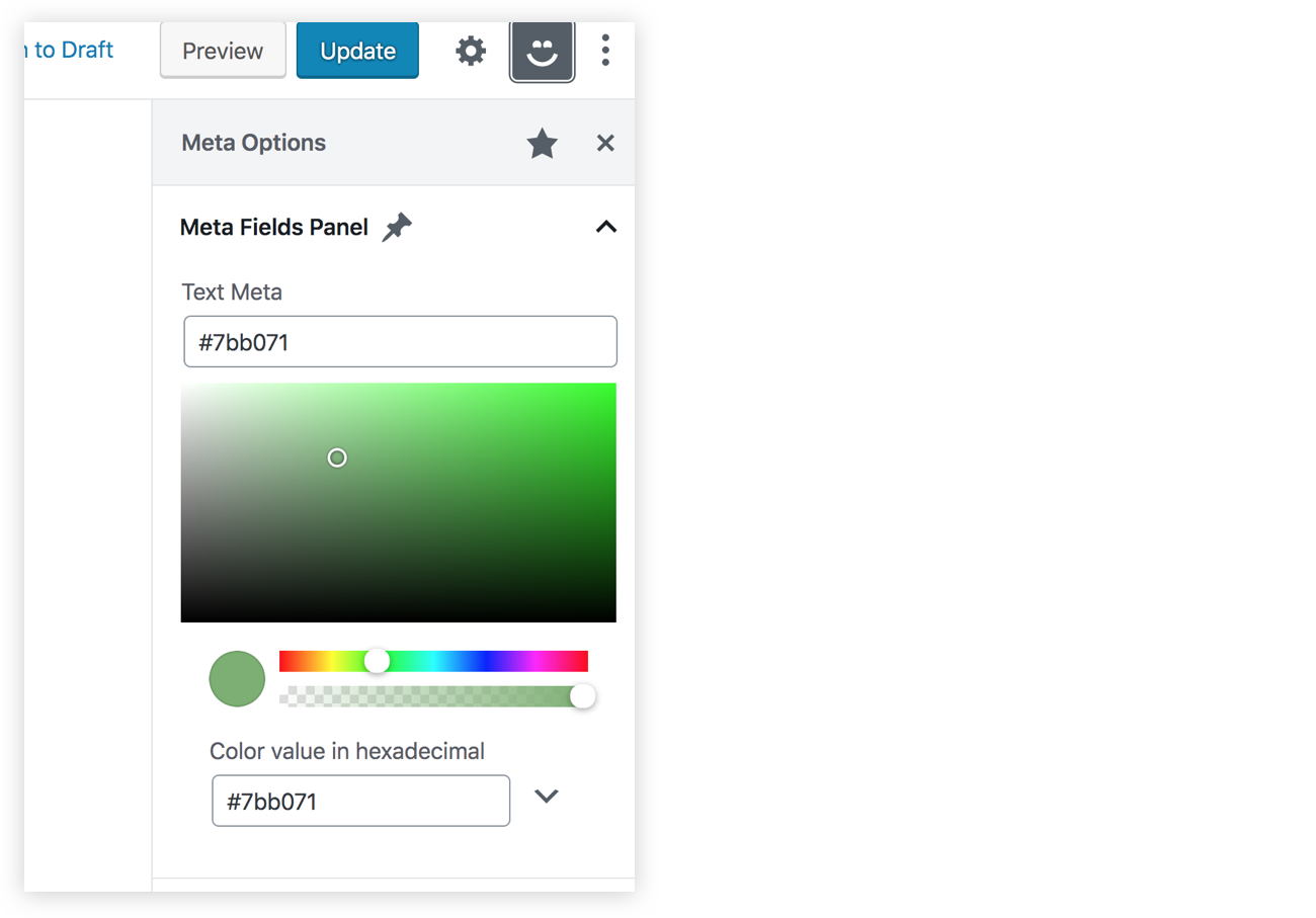
We should now have a color picker in our sidebar, and since it’s controlling the same meta field as the TextControl component, our old text field should update whenever we pick a new color.
That’s a wrap!
If you have reached this far in the article, then congratulations! I hope you enjoyed it. Make sure to check out my course if you want to learn more about Gutenberg and custom blocks. You can also find the final code for this article over at GitHub.
WordPress released their anticipated over to the post editor, nicknamed Gutenberg, which is also referred to as the block editor. It transforms a WordPress post into a collection of blocks that you can add, edit, remove and re-order in the layout. Before the official release, Gutenberg was available as a plugin and, during that time, I was interested in learning how to create custom blocks for the editor. I was able to learn a lot about Gutenberg that I decided to put together a course that discusses almost everything you need to know to develop blocks for Gutenberg.
In this article, we will discuss metaboxes and metafields in WordPress. Specifically, we’ll cover how to replace the old PHP metaboxes in Gutenberg and extend Gutenberg’s sidebar to add a React component that will be used to manipulate the metadata using the global JavaScript Redux-like stores. Note that metadata in Gutenberg can also be manipulated using blocks. And both ways are discussed in my course, however, in this article I am going to focus on managing metadata in the sidebar since I believe this method will be used more often.
This article assumes some familiarity with ReactJS and Redux. Gutenberg relies heavily on these technologies to render UI and manage state. You can also check out the CSS-Tricks guide to learning Gutenberg for an intro to some of the concepts we’ll cover here.
The block editor interface
Gutenberg is a React application
At its core, Gutenberg is a ReactJS application. Everything you see in the editor is rendered using a React component. The post title, the content area that contains the blocks, the toolbar at the top and the right sidebar are all React components. Data or application states in this React application are stored in centralized JavaScript objects, or „stores.” These stores are managed by WordPress’ data module. This module shares a lot of core principles with Redux. So, concepts like stores, reducers, actions, action creators, etc., also exist in this module. I will sometimes refer to these stores as „Redux-like” stores.
These stores do not only store any data about the current post, like the post content (the blocks), the post title, and the selected categories, but it also stores global information about a WordPress website, like all the categories, tags, posts, attachments and so on. In addition to that, UI state information like,”is the sidebar opened or closed?” are also stored in these global stores. One of the jobs of the „data module” is to retrieve data from these stores and also change data in the stores. Since these stores are global and can be used by multiple React components changing data in any store will be reflected in any Gutenberg UI part (including blocks) that uses this piece of data.
Once a post is saved, the WordPress REST API will be used to update the post using the data stored in these global stores. So the post title, the content, categories etc., that are stored in these global stores will be sent as payload in the WP REST API endpoint that updates the post. And thus if we are able to manipulate data in these stores, once the user clicks save, the data that we manipulated will be stored in the database by the API without us having to do anything.
One of the things that is not managed by these global stores in Gutenberg is metadata. If you have some metafields that you used to manage using a metabox in the pre-Gutenberg „classic” editor, those will not be stored and manipulated using the global Redux-like stores by default. However, we can opt-in to manage metadata using JavaScript and the Redux-like stores. Although those old PHP metaboxes will still appear in Gutenberg, WordPress recommends porting these PHP metaboxes to another approach that uses the global stores and React components. And this will ensure a more unified and consistent experience. You can read more about problems that could occur by using PHP metaboxes in Gutenberg.
So before we start, let’s take a look at the Redux-like stores in Gutenberg and how to use them.
Retrieving and changing data in Gutenberg’s Redux-like stores
We now know that the Gutenberg page is managed using these Redux-like stores. We have some default „core” stores that are defined by WordPress. Additionally, we can also define our own stores if we have some data that we would like to share between multiple blocks or even between blocks and other UI elements in the Gutenberg page, like the sidebar. Creating your own stores is also discussed in my course and you can read about it in the official docs. However, in this article we will focus on how to use the existing stores. Using the existing stores lets us manipulate metadata; therefore we will not need to create any custom stores.
In order to access these stores, make sure you have the latest WordPress version with Gutenberg active and edit any post or page. Then, open your browser console an type the following statement:
wp.data.select('core/editor').getBlocks()
You should get something like this:
Let’s break this down. First, we access the wp.data module which (as we discussed) is responsible for managing the Redux-like stores. This module will be available inside the global wp variable if you have Gutenberg in your WordPress installation. Then, inside this module, we call a function called select. This function receives a store name as an argument and returns all the selectors for this store. A selector is a term used by the data module and it simply means a function that gets some data from the store. So, in our example, we accessed the core/editor store, and this will return a bunch of functions that can be used to get data from this store. One of these functions is getBlocks() which we called above. This function will return an array of objects where each object represents a block in your current post. So depending on how many blocks you have in your post, this array will change.
As we’ve seen, we accessed a store called core/editor. This store contains information about the current post that you are editing. We’ve also seen how to get the blocks in the current post but we can also get a lot of other stuff. We can get the title of the current post, the current post ID, the current post post type and pretty much everything else we might need.
But in the example above, we were only able to retrieve data. What if we want to change data? Let’s take a look at another selector in the ‘core/editor’ store. Let’s run this selector in our browser console:
This should return the title of the post currently being edited:
Great! Now what if we want to change the title using the data module? Instead of calling select(), we can call dispatch() which will also receive a store name and return some actions that you can dispatch. If you are familiar with Redux, terms like „actions” and „dispatch” will sound familiar to you. If this sounds new to you, all you need to know is that dispatching a certain action simply means changing some data in a store. In our case, we want to change the post title in the store, so we can call this function:
wp.data.dispatch('core/editor').editPost({title: 'My new title'})
Now take a look at the post title in the editor — it will be changed accordingly!
That’s how we can manipulate any piece of data in the Gutenberg interface. Wan retrieve the data using selectors and change that data using actions. Any change will be reflected in any part of the UI that uses this data.
There are, of course, other stores in Gutenberg that you can checkout on this page. So, let’s take a quick look at a couple of more stores before we move on.
The stores that you will use the most are the core/editor which we just looked at, and the core store. Unlike core/editor, the core store contains information, not only about the currently edited post, but also about the whole WordPress website in general. So, for instance, we can get all the authors on the website using:
wp.data.select('core').getAuthors()
We can also get some posts from the website like so:
Make sure to run this twice if the first result was null. Some selectors like this one will send an API call first to get your post. That means the the returned value will initially be null until the API request is fulfilled:
Let’s look at one more store: edit-post. This store is responsible for the UI information in the actual editor. For example, we can have selectors that check if the sidebar is currently open:
This will return true if the sidebar is opened. But try closing the sidebar, run this function again, and it should return false.
We can also open and close the sidebar by dispatching actions in this store. Having the sidebar open and running this action in the browser console, the sidebar should be closed:
You will unlikely need to use this store, but it’s good to know that this is what Gutenberg does when you click on the sidebar icon to close it.
There are some more stores that you might need to take a look at. The core/notices store, for instance, could be useful. This can help you display error, warning and success messages in the Gutenberg page. You can also check all the other stores here.
Try to play around with these stores in your browser until you feel comfortable using them. After that, we can see how to use them in real code outside the browser.
Let’s setup a WordPress plugin to add a Gutenberg sidebar
Now that we know how to use the Redux-like stores in Gutenberg, the next step is to add a React sidebar component in the editor. This React component will be connected to the core/editor store and it will have some input that, when changed, will dispatch some action that will manipulate metadata — like the way we manipulated the post title earlier. But to do that, we need to create a WordPress plugin that holds our code.
Let’s create a new folder inside wp-content/plugins directory of the WordPress installation. I am going to call it gutenberg-sidebar. Inside this folder, let’s create the entry point for our plugin. The entry point is the PHP file that will be run when activating your plugin. It can be called index.php or plugin.php. We’re going to use plugin.php for this example and put some information about the plugin at the top as well as add some code that avoids direct access:
You should find your plugin on the Plugins screen in the WordPress admin. Click on „Activate” in order for the code to run.
As you might imagine, we will write a lot of JavaScript and React from this point, forward. And in order to code React components easily we will need to use JSX. And JSX is not valid JavaScript that can run in your browser, it needs to be converted into plain JavaScript. We might also need to use ESNext features and import statements for importing and exporting modules.
And these features will not work on all browsers, so it’s better to transform our code into old ES5 JavaScript. Thankfully, there are a lot of tools that can help us achieve that. A famous one is webpack. webpack, however, is a big topic in itself and it won’t fit the scope of this article. Therefore, we are going to use another tool that WordPress provides which is @wordpress/scripts. By installing this package, we will get a recommended webpack configuration without having to do anything in webpack ourselves. Personally, I recommend that you learn webpack and try to do the configuration yourself. This will help you understand what’s going on and give you more control. You can find a lot of resources online and it’s also discussed in my course. But for now, let’s install the WordPress webpack configuration tool.
Change to your plugin folder in Terminal:
cd path/to/your/theme/folder
Next, we need to initialize npm in that folder in order to install @wordpress/scripts. This can be done by running this command:
npm init
This command will ask you some questions like the package name, version, license, etc. You can keep hitting Enter and leave the default values. You should have a package.json file in your folder and we can start installing npm packages. Let’s install @wordpress/scripts by running the following command:
npm install @wordpress/scripts --save-dev
This package will expose a CLI called wp-scripts which you can use in your npm scripts. There are different commands that you can run. We will focus on the build and start commands for now. The <code>build script will transform your files so that they are minified and ready for production. Your source code’s entry point is configured in src/index.js and the transformed output will be at build/index.js. Similarly, the start script will transform your code in src/index.js to build/index.js, however, this time, the code will not be minified to save time and memory — the command will also watch for changes in your files and re-build your files every time something is changed. The start command is suitable to be used for development while the build command is for production. To use these commands, we will replace the scripts key in the package.json file which will look something like this if you used the default options when we initialized npm.
Change this:
"scripts": {
  "test": "echo "Error: no test specified" && exit 1"
},
Now we can run npm start and npm run build to start development or build files, respectively.
Let’s create a new folder in the plugin’s root called src and add an index.js file in it. We can see it things are working by sprinkling in a little JavaScript. We’ll try an alert.
Now run npm start in Terminal. You should find the build folder created with the compiled index.js and also sourcemap files. In addition to that, you will notice that the build/index.js file is not minified and webpack will be watching for changes. Try changing the src/index.js file and save again. The build/index.js file will re-generated:
If you stop the watch (Ctrl + C ) in Terminal and run npm run build, the build/index.js file should now be minified.
Now that we have our JavaScript bundle, we need to enqueue this file in the Gutenberg editor. To do that we can use the hoo enqueue_block_editor_assets which will insure that the files are enqueued only in the Gutenberg page and not in other wp-admin pages where it isn’t needed.
We can enqueue our file like so in plugin.php:
// Note that it’s a best practice to prefix function names (e.g. myprefix)
function myprefix_enqueue_assets() {
  wp_enqueue_script(
    'myprefix-gutenberg-sidebar',
    plugins_url( 'build/index.js', __FILE__ )
  );
}
add_action( 'enqueue_block_editor_assets', 'myprefix_enqueue_assets' );
Visit the Gutenberg page. If all is well, you should get an alert, thanks to what we added to src/index.js earlier.
Fantastic! We’re ready to write some JavaScript code, so let’s get started!
Importing WordPress JavaScript packages
In order to add some content to the existing Gutenberg sidebar or create a new blank sidebar, we need to register a Gutenberg JavaScript plugin — and in order to do that, we need to use some functions and components from packages provided by WordPress: wp-plugins, wp-edit-post and wp-i18n. These packages will be available in the wp global variable in the browser as wp.plugins, wp.editPost and wp.i18n.
We can import the functions that we need into src/index.js. Specifically, those functions are: registerPlugin and PluginSidebar.
It’s worth noting that we need to make sure that we have these files as dependencies when we enqueue our JavaScript file in order to make sure that our index.js file will be loaded after the wp-plugins, wp-edit-posts and wp-i18n packages. Let’s add those to plugin.php:
Notice that I added wp-element in there as a dependency. I did that because we will write some React components using JSX. Typically, we’d import the entire React library when making React components. However, wp-element is an abstraction layer atop React so we never have to install or import React directly. Instead, we use wp-element as a global variable.
These packages are also available as npm packages. Instead of importing functions from the global wp variable (which will only be available in the browser that your code editor knows nothing about), we can simply install these packages using npm and import them in our file. These WordPress packages are usually prefixed with @wordpress.
import { registerPlugin } from "@wordpress/plugins";
import { PluginSidebar } from "@wordpress/edit-post";
import { __ } from "@wordpress/i18n";
The advantage of importing the packages this way is that your text editor knows what @wordpress/edit-post and @wordpress/plugins are and it can autocomplete functions and components for you — unlike importing from wp.plugins and wp.editPost which will only be available in the browser while the text editor has no clue what wp is.
Your text editor can autocomplete component names for you.
You might also think that importing these packages in your bundle will increase your bundle size, but there’s no worries there. The webpack config file that comes with @wordpress/scripts is instructed to skip bundling these @wordpress packages and depend of the wp global variable instead. As a result, the final bundle will not actually contain the various packages, but reference them via the wp variable.
Great! so I am going to stick to importing packages using npm in this article, but you are totally welcome to import from the global wp variable if you prefer. Let’s now use the functions that we imported!
Registering a Gutenberg Plugin
In order to add a new custom sidebar in Gutenberg, we first need to register a plugin — and that’s what the registerPlugin function that we imported will do. As a first argument, registerPlugin will receive a unique slug for this plugin. We can have an array of options as a second argument. Among these options, we can have an icon name (from the dashicons library) and a render function. This render function can return some components from the wp-edit-post package. In our case. we imported the PluginSidebar component from wp-edit-post and created a sidebar in the Gutenberg editor by returning this component in the render function. I also added PluginSidebar inside a React fragment since we can add other components in the render function as well. Also, the __ function imported from wp-i18n will be used so we can translate any string that we output:
You should now have a new icon beside the cog icon in the Gutenberg editor screen. This smiley icon will toggle our new sidebar which will have whatever content we have inside the PluginSidebar component:
If you were to click on that star icon beside the sidebar title, the sidebar smiley icon will be removed from the top toolbar. Therefore, we need to add another way to access our sidebar in case the user un-stars it from the top toolbar, and to do that, we can import a new component from wp-edit-post called PluginSidebarMoreMenuItem. So, let’s modify out import statement:
import { PluginSidebar, PluginSidebarMoreMenuItem } from "@wordpress/edit-post";
The PluginSidebarMoreMenuItem will allow us to add an item in the Gutenberg menu that you can toggle using the three dots icon at the top-right of the page. We want to modify our plugin to include this component. We need to give PluginSidebar a name prop and give PluginSidebarMoreMenuItem a target prop with the same value:
In the menu now, we will have a „Meta Options” item with our smiley icon. This new item should toggle our custom sidebar since they are linked using the name and the target props:
Great! Now we have a new space in our Gutenberg page. We can replace the „some content” text in PluginSidebar and add some React components of our own!
Also, let’s make sure to check the edit-post package documentation. This package contains a lot of other components that you can add in your plugin. These components can allow you to extend the existing default sidebar and add your own components in it. Also, we can find components that allow us to add items in the Gutenberg top-right menu and also for the blocks menu.
Handling metadata in the classic editor
Let’s take a quick look at how we used to manage metadata in the classic editor using metaboxes. First, install and activate the classic editor plugin in order to switch back to the classic editor. Then, add some code that will add a metabox in the editor page. This metabox will manage a custom field that we’ll call _myprefix_text_metafield. This metafield will just be a text field that accepts HTML markup. You can add this code in plugin.php or put it in a separate file and include it plugin.php:
Rendering an HTML input using the myprefix_post_options_metabox_html function
Controlling the metafield, called _myprefix_text_metafield
Using the save_post action hook to get the HTML input value and update the field using update_post_meta.
If you have the classic editor plugin installed, then you should see the metafield in the post editor:
Note that the field is prefixed with an underscore (_myprefix_text_metafield) which prevents it from being edited using the custom fields metabox that comes standard in WordPress. We add this underscore because we intend to manage the field ourselves and because it allows us to hide it from the standard Custom Fields section of the editor.
Now that we have a way to manage the field in the classic editor, let’s go ahead and deactivate the classic editor plugin and switch back to Gutenberg. The metabox will still appear in Gutenberg. However, as we discussed earlier, WordPress recommends porting this PHP-based metabox using a JavaScript approach.
That’s what we will do in the rest of the article. Now that we know how to use the Redux-like stores to manipulate data and how to add some React content in the sidebar, we can finally create a React component that will manipulate our metafield and add it in the sidebar of the Gutenberg editor.
We don’t want to completely get rid of the PHP-based field because it’s still helpful in the event that we need to use the classic editor for some reason. So, we’re going to hide the field when Gutenberg is active and show it when the classic editor is active. We can do that by updating the myprefix_add_meta_box function to use the __back_compat_meta_box option:
Let’s move on to creating the React component that manages the metadata.
Getting and setting metadata using JavaScript
We have seen how to get the post title and how to change it using the wp-data module. Let’s take a look at how to do the same for custom fields. To get metafields, we can call the save selector getEditedPostAttribute. But this time we will pass it a value of meta instead of title.
Once that’s done, test it out in the browser console:
As you will see, this function will return an empty array, although we are sure that we have a custom field called _myprefix_text_metafield that we are managing using the classic editor. To make custom fields manageable using the data module, we first have to register the field in the plugin.php.
Make sure to set the show_in_rest option to true. WordPress will fetch the fields using the WP REST API. That means, we need to enable the show_in_rest option to expose it.
Run the console test again and we will have an object with all of our custom fields returned.
Amazing! We are able to get our custom field value, so now let’s take a look at how can we change the value in the store. We can dispatch the editPost action in the core/editor store and pass it an object with a meta key, which will be another object with the fields that we need to update:
Now try running the getEditedPostAttribute selector again and the value should be updated to new value.
If you try saving a post after updating the field using Redux, you will get an error. And if you take a look at the Network tab in DevTools, you will find that the error is returned from the wp-json/wp/v2/posts/{id} REST endpoint that says that we are not allowed to update _myprefix_text_metafield.
This because WordPress treats any field that is prefixed with an underscore as a private value that cannot be updated using the REST API. We can, however, specify an auth_callback option that will allow updating this field using the REST API when it returns true as long as the editor is capable of editing posts. We can also add the sanitize_text_field function to sanitize the value before saving to the database:
Does the new value show up in the console? If so, great! Now we know how to get and set the meta field value using Redux and we are ready to create a react component in the sidebar to do that.
Creating a React component to manage the custom fields
What we need to do next is create a React component that contains a text field that is controlled by the value of the metafield in the Redux store. It should have the value of the meta field…and hey, we already know how to get that! We can create the component in a separate file and then import it index.js. However I am simply going to create directly in index.js since we’re dealing with a very small example.
Again, we’re only working with a single text field, so let’s import a component provided by a WordPress package called @wordpress/components. This package contains a lot of reusable components that are Gutenberg-ready without us having to write them from scratch. It’s a good idea to use components from this package in order to be consistent with the rest of the Gutenberg UI.
First, let’s install this package:
npm install --save @wordpress/components
We’ll import TextControl and PanelBody at the top of index.js to fetch the two components we need from the package:
import { PanelBody, TextControl } from "@wordpress/components";
Now let’s create our component. I am going to create a React functional component and call it PluginMetaFields, but you can use a class component if you’d prefer that.
PanelBody takes title, icon and initialOpen props. Title and icon are pretty self-explanatory. initialOpen puts the panel in an open/expanded state by default. Inside the panel, we have TextControl. which receives a label and a value for the input. As you can see in the snippet above, we get the value from the global store by accessing the _myprefix_text_metafield field from the object returned by wp.data.select('core/editor').getEditedPostAttribute('meta').
Notice that we are now depending on @wordpress/components and use wp.data. We must add these packages as dependencies when we enqueue our file in plugin.php:
This should should give you a „Meta Options” panel that contains a „Meta Fields” title, a pin icon, and a text input with a „Test Meta” label and default value of „new value.”
Nothing will happen when you type into the text input because we are not yet handling updating the field. We’ll do that next, however, we first need to take care of another problem. Try to run editPost in the DevTools console again, but with a new value:
wp.data.dispatch('core/editor').editPost({meta: {_myprefix_text_metafield: 'a newer value'}})
You will notice that the value in the text field will not update to the new value. That’s the problem. We need the field to be controlled by the value in the Redux store, but we don’t see that reflected in the component. What’s up with that?
If you have used Redux with React before, then you probably know that we need to use a higher order component called connect in order to use Redux store values in a React component. The same goes for React components in Gutenberg — we have to use some higher order component to connect our component with the Redux-like store. Unfortunately, we are unable to simply call wp.data.select directly as we did before. This higher order component lives in the wp.data global variable which is also available as an npm package called @wordpress.data. So let’s install it to help us solve the issue.
npm install --save @wordpress/data
The higher order component we need is called withSelect, so let’s import it in index.js.
import { withSelect } from "@wordpress/data";
Remember that we already added wp-data as a dependency in wp_enqueue_script, so we can just use it by wrapping our component with it, like so:
Here, we’re overriding our PluginMetaFields component and assigning it the same component, now wrapped with the withSelect higher order component. withSelect will receive a function as an argument. This function will receive the select function (which we used to access wp.data.select) and it should return an object. Each key in this object will be injected as a prop in the component (similar to connect in Redux). withSelect will return a function that we can pass it the component (PluginMetaFields) again as seen above. So, by having this higher order component, we now get text_metafield as a prop in the component, and whenever the meta value in the redux store is updated, the prop will also get updated — thus, the component will update since components update whenever a prop is changed.
If you now try and run editPost with a new meta value in your browser, the value of the text field in the sidebar should also be updated accordingly!
So far, so good. Now we know how to connect our React components with our Redux-like stores. We are now left with updating the meta value in the store whenever we type in the text field.
Dispatching actions in React components
We now need to dispatch the editPost action whenever we type into the text field. Similar to wp.data.select, we also should not call wp.data.dispatch directly in our component like so:
// Do not do this
<TextControl
    value={props.text_metafield}
    label={__("Text Meta", "textdomain")}
    onChange={(value) => wp.data.dispatch('core/editor').editPost({meta: {_myprefix_text_metafield: value}})
    }
/>
We will instead wrap our component with another higher order component from the @wordpress.data package called withDispatch. We’ve gotta import that, again, in plugin.js:
import { withSelect, withDispatch } from "@wordpress/data";
In order to use it, we can wrap our component — which is already wrapped with withSelect and again with withDispatch — like so:
You can check out yet another WordPress package called @wordpress/compose. It makes using multiple high order components a bit cleaner for use in a single component. But I will leave that to you to try out for the sake of keeping our example simple.
withDispatch is similar to withSelect in that it will receive a function that has the dispatch function as an argument. That allows us to return an object from this function that contains functions that will be available inside the component’s props. I went about this by creating a function with an arbitrary name (onMetaFieldChange) that will receive a value, dispatch the editPost action, and set the meta value in the Redux store to the value received in the function’s argument. We can call this function in the component and pass it the value of the text field inside the onChange callback:
Confirm everything is working fine by opening the custom sidebar in the WordPress post editor, updating the field, saving the post and then refreshing the page to make sure the value is saved in the database!
Let’s add a color picker
It should be clear now that can we update a meta field using JavaScript, but we’ve only looked at simple text field so far. The @wordpress/components library provides a lot of very useful components, including dropdowns, checkboxes, radio buttons, and so on. Let’s level up and conclude this tutorial by taking a look at how we can use the color picker component that’s included in the library.
You probably know what to do. First, we, import this component in index.js:
import { PanelBody, TextControl, ColorPicker } from "@wordpress/components";
Now, instead of registering a new custom field, let’s aim for simplicity and assume that this color picker will be controlled by the same _myprefix_text_metafield field we worked with earlier. We can use the ColorPicker component inside our PanelBody and it will be very similar to what we saw with TextControl, but the prop names will be slightly different. We have a color prop instead of value and onChangeComplete instead on onChange. Also, onChangeComplete will receive a color object that contains some information about the chosen color. This object will have a hex property we can use to store the color value in the _myprefix_text_metafield field.
We should now have a color picker in our sidebar, and since it’s controlling the same meta field as the TextControl component, our old text field should update whenever we pick a new color.
That’s a wrap!
If you have reached this far in the article, then congratulations! I hope you enjoyed it. Make sure to check out my course if you want to learn more about Gutenberg and custom blocks. You can also find the final code for this article over at GitHub.