Here’s a bonafide CSS/HTML trick from Brad Frost and Dave Rupert where they use the <picture> element to switch out a GIF file with an image if the user has reduced motion enabled. This is how Brad goes about implementing that:
<picture>
  <!-- This image will be loaded if the media query is true  -->
  <source srcset="no-motion.jpg" media="(prefers-reduced-motion: reduce)"></source>

  <!--  Otherwise, load this gif -->
  <img srcset="animated.gif" alt="brick wall"/>
</picture>
How nifty is this? It makes me wonder if there are other ways this image-switching technique can be used besides accessibility and responsive images…
Also, it’s worth noting that Eric Bailey wrote about the reduced motion media query a while back where he digs into its history and various approaches to use it.
You can have the best open source project in the world but, if it doesn’t have good documentation, chances are it’ll never take off. In the office, good documentation could save you having to repeatedly answer the same questions. Documentation ensures that people can figure out how things work if key employees decide to leave the company or change roles. Well documented coding guidelines help bring consistency to a codebase.
If you’re writing long-form text, Markdown is clearly a great alternative to authoring HTML. Sometimes though, Markdown syntax isn’t enough. It’s always been possible to write straight HTML inside of Markdown documents. This includes custom elements so, if you’re building a design system with native web components, it’s easy to incorporate them inside your text-based documentation. If you’re working with React (or any other framework that speaks JSX, like Preact or Vue), you can do the same thing by using MDX.
This article is a broad overview of the tools available for writing documentation and for building style guides. Not all the tools listed here make use of MDX but it’s increasingly being incorporated into documentation tooling.
What is MDX?
A .mdx file has exactly the same syntax as a regular Markdown file, but lets you import interactive JSX components and embed them within your content. Support for Vue components is in alpha. It’s easy to get MDX set up with Create React App. There are MDX plugins for Next.js and Gatsby. The forthcoming version two release of Docusaurus will also come with built-in support.
Writing documentation with Docusaurus
Docusaurus is made by Facebook and used by every Facebook open source project, apart from React. It’s also used by many major open source projects outside of Facebook, including Redux, Prettier, Gulp and Babel.
Projects making use of Docusaurus.
You can use Docusaurus to document anything — it isn’t front-end specific. Docusaurus uses React under the hood, but you don’t have to know that framework to make use of it. It’ll take your Markdown files and turn them into a nicely-structured, well-formatted and readable documentation site, with a nice design right out of the box.
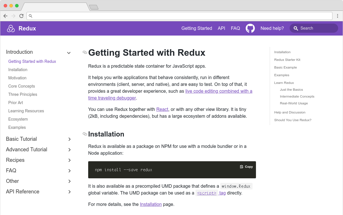
The Redux site shows the typical Docusaurus layout
Sites created with Docusaurus can also include a Markdown-based blog. Prism.js is included by default for zero-setup syntax highlighting. While relatively new, Docusaurus has proven popular, being voted the number one new tool of 2018 on StackShare.
Other options for written content
Docusaurus specifically caters to building documentation. Of course, there are a million and one ways to make a website — so you could roll your own solution with any back-end language, CMS, or static site generator.
The documentation sites for React, IBM’s design system, Apollo and Ghost CMS use Gatsby, for example — a generic static site generator often used for blogs. If you work with the Vue framework, VuePress is becoming a popular option. MkDocs is an open source static site generator for creating documentation, written in Python and configured with a single YAML file. GitBook is a popular paid product that’s free for open-source and non-profit teams. If you’re building internal documentation and want something easy, the reading experience on GitHub itself isn’t half bad, so you could just commit some Markdown files and leave it at that.
Documenting components: Docz, Storybook and Styleguidist
Style guides, design systems, pattern libraries — whatever you want to call them — have become a hugely popular area of concern in the last decade. What’s really made the difference in turning them from vanity projects into useful tools isn’t the pontificating of thought leaders but the emergence of component-driven frameworks, like React, and the tools mentioned here.
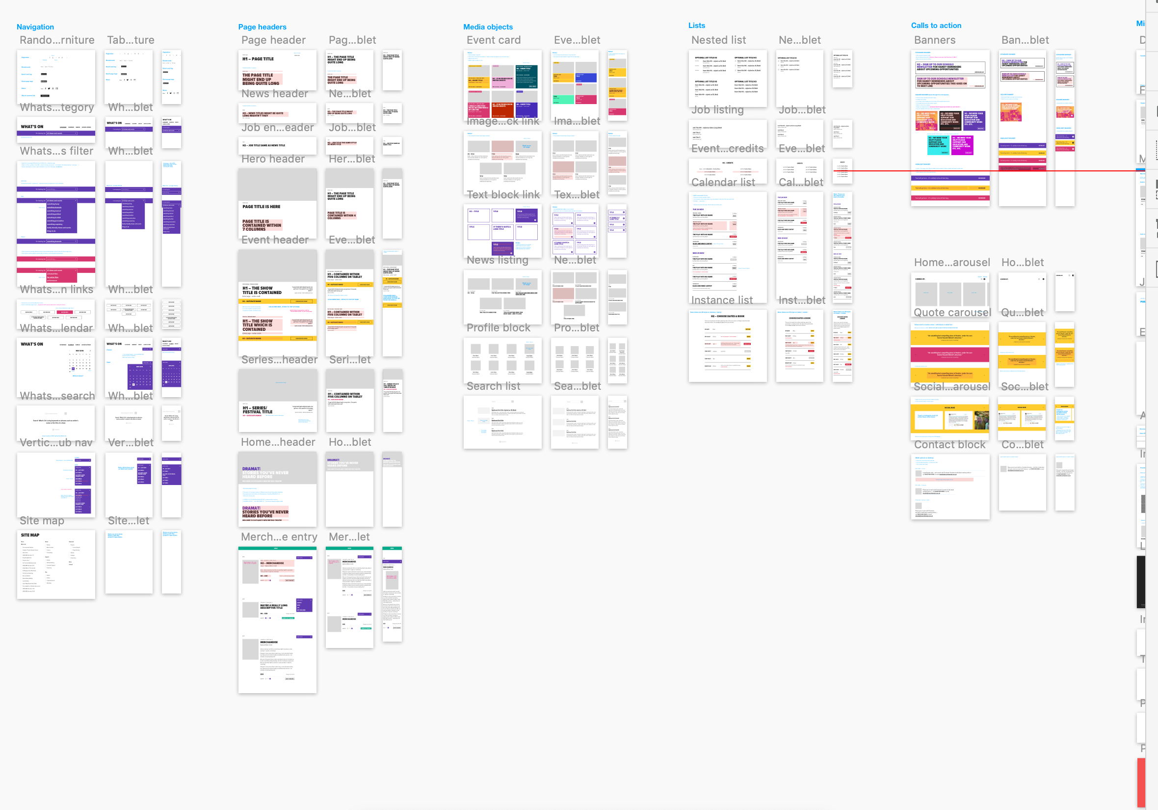
Storybook, Docz and Styleguidist all do much the same thing: display interactive UI components and document their API. A project may have dozens or even hundreds of components to keep track of — all with a variety to states and styles. If you want components to be reused, people have to know that they exist. We aid discoverability when we catalog components. A style guide gives an easily searchable and scannable overview of all your UI components. This helps to maintain visual consistency and avoid duplicating work.
These tools provide a convenient way to review different states. It can be difficult to reproduce every state of a component in the context of a real application. Rather than needing to click through an actual app, developing a component in isolation can be helpful. Hard-to-reach states (like a loading state, for example) can be mocked.
Dan Green wrote a nice synopsis of the benefits of using Storybook, but it applies equally to Docz and Styleguidist:
„Storybook has made it really easy for designers who code to collaborate with engineers. By working in storybook they don’t need to get a whole environment running (docker container, etc). For Wave, we have many important components that are only visible in the middle of a process that is short lived and time consuming to reproduce (i.e. a loading screen that only shows while a user is having their payment account set up). Before Storybook, we didn’t have a good way to work on these components and were forced to temporary hacks in order to make them visible. Now, with Storybook we have an isolated place to easily work on them, which has the bonus feature of being easily accessible for designers and PMs. It also makes it really easy for us to show off these states in sprint demos.”
– Dan Green, Wave Financial
As well as visualizing different states side-by-side and listing props, its often helpful to have written content about a component — whether its explaining the design rationale, use-cases, or describing the results of user-testing. Markdown is easy enough for *anybody* to learn — ideally a style guide should be a joint resource for designers and developers that both disciplines contribute to. Docz, Styleguidist and Storybook all offer a way to seamlessly intermingle Markdown with the components themselves.
Docz
Currently, Docz is a React-only project, but is working on support for Preact, Vue and web components. Docz is the newest of the three tools, but has already amounted over 14,000+ stars on GitHub. It is, to my mind, the easiest solution to work with. Docz provides two components — <Playground> and <Props>. These are imported and used directly in .mdx files.
import { Playground, Props } from "docz";
import Button from "../src/Button";

## You can _write_ **markdown**
### You can import and use components

<Button>click</Button>
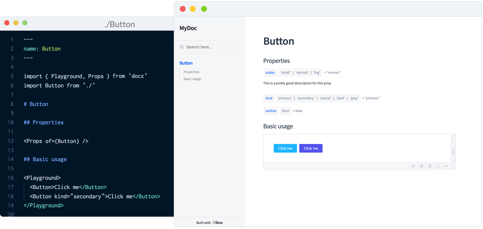
You can wrap your own React components with <Playground> to create the equivalent of an embedded CodePen or CodeSandbox — a view of your component alongside editable code.
<Playground>
  <Button>click</Button>
</Playground>
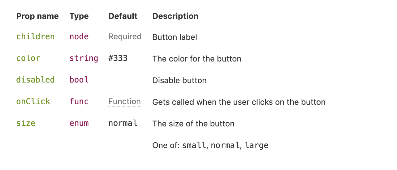
<Props> will show all the available props for a given React component, default values, and whether the prop is required.
<Props of={Button} />
I personally find this MDX-based approach the simplest to understand and the easiest to work with.
Just like with Docz, examples are written using Markdown syntax. Styleguidist uses Markdown code blocks (triple backticks) in regular .md files rather than MDX:
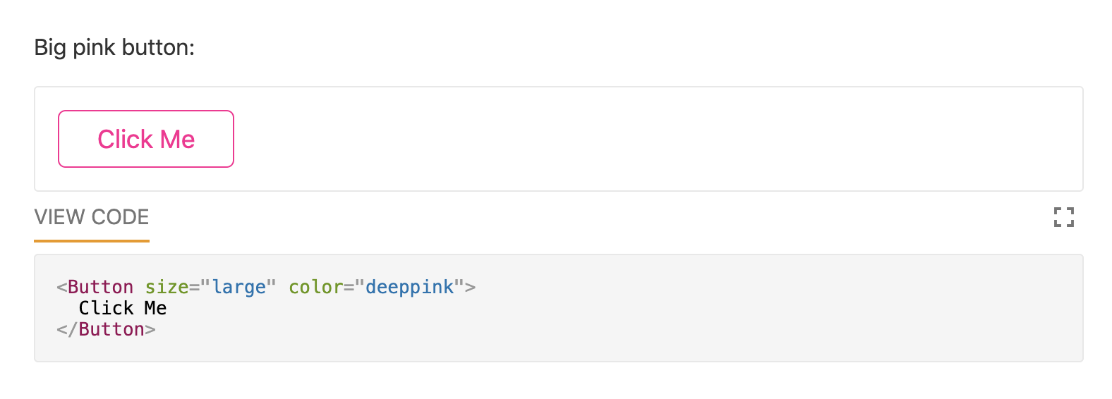
Code blocks in Markdown usually just show the code. With Styleguidist, any code block with a language tag of js, jsx or javascript will be rendered as a React component along with the code. Just like with Docz, the code is editable — you can change props and instantly see the result.
Styleguidist will automatically create a table of props from either PropTypes, Flow or Typescript declarations.
Styleguidist currently supports React and Vue.
Storybook
Storybook markets itself as „a development environment for UI components.” Rather than writing examples of components inside Markdown or MDX files, you write *stories* inside Javascript files. A *story* documents a particular state of a component. A component might have stories for a loading state and a disabled state, for example.
Storybook is less straightforward to use than Styleguidist and Docz. At over 36,000 GitHub stars though, it’s the most popular option. It’s an open source project with 657 contributors and a full-time maintainer. It is used by, among others, Airbnb, Algolia, Atlassian, Lyft, and Salesforce. Storybook supports more frameworks than any other offering — React, React Native, Vue, Angular, Mithril, Ember, Riot, Svelte and plain HTML are all supported.
Writing documentation about components currently requires addons. In a future release, Storybook is taking inspiration from Docz and adopting MDX.
# Button

Some _notes_ about your button written with **markdown syntax**.

<Story name="disabled">
  <Button disabled>lorem ipsum</Button>
</Story>
Storybook’s new Docs feature is being rolled out incrementally over the next couple of months and looks set to be a big step forward.
Do you use @storybookjs for component docs or design systems? You're gonna love DocBlocks: 📦 Drop into MDX 🏗 Modular and composable 🤝 Compatible w/ @gatsbyjs, #nextjs, etc
The benefits of pattern libraries have been extolled at nauseating length in a million Medium articles. When done well, they aid visual consistency and facilitate the creation of cohesive products. Of course, none of these tools can magic up a design system. That takes careful thought about both design and CSS. But when it comes time to communicate that system to the rest of an organization, Docz, Storybook and Styleguidist are all great options.
I work for Supercool, a fast-moving design agency that makes custom built sites for arts clients, powered by the off-the-shelf system, Craft CMS; it’s high-spec graphic design with relatively demanding typography and art direction. Over the past few months we’ve been moving to CSS grid. We’re transitioning slowly, allowing ourselves to discover new paradigms and design methods, instead of simply porting old habits to a new syntax.
So far, we’ve developed a number of really useful strategies for keeping track of the layout. I’ve written a couple of surprisingly nifty mixins, using named areas and templates, and we’ve hit upon some basic conventions to create highly readable code. I thought it would be valuable to walk through a fully-developed production implementation of a single major component using grid, digging in to some of the design questions it throws up and steering you away from some pitfalls we’ve encountered. CSS grid is a large spec, with lots of possible approaches and lots of right ways to do things, but at some point you have to lock down your method and get it live.
I’m expecting some basic familiarity with CSS, Sass, BEM, and some interest in the task of prototyping fully-realized, accessible, custom frameworks with 50+ components from Sketch or Photoshop-type documents on a tight timeline (say, a week).
First, let’s identify and separate out the design into distinct coding tasks and plan how we’ll approach them:
Type: The designer has already defined a type system.
Colors: First, we build a theme model and then include that in the partial.
Content: What elements are in this block? What are its variations? This is where our BEM mixin comes in.
Layout: This is how the content is placed in the block. You might want to skip directly to this.
Conventions: This is exactly how we choose to write all the above. There are many right answers in CSS, so what is important is that we all just agree to a convention, the rules of the road. This really comes first, but for the sake of this article, we’ll conclude here.
Type system
We use utility classes (e.g. h-text--h1, h-text--badge) for type styles. There may be a hundred type styles in a project. We export those styles from Sketch right into our Patternlab using Typex. That’s a whole other article on its own, so let’s just stipulate type as handled. We won’t bring type into our component partial.
Theming is a few tiny mixins dropped in, so we ideally won’t see a ton of color rules in our partial. We store them all together in a _themer.scss partial in our „Mixins and Models” library, so we can be sure to follow the design system of the site. This way, when someone comes back to the build later on, they have a key reference partial describing the design and branding rules. When building and maintaining numerous sites in broadly the same market — but each all with different brand spec — you’ve gotta make sure you don’t mix up one brand with another! So, much like type, we abstract the color rules away from the partial. In essence, we’re really only looking at layout (as much as possible) in our _header.scss file.
Given that we agree the convention to always theme using our mixin, this is how it would be included on an element:
@include var($property, $value);
Then we’ll set a theme model, of how colors work on this particular site and apply that theme to a component with:
@include theme;
Here’s the sample theme model we’re going to use with this page header. It’s super simple.
We’re pairing a color with black or white. We depend on a contrast rule and flip them for emphasis, maybe on events, like hover, or a highlighted call to action. This is all we need to do to make that happen and now we have a document of how color should really work on this site. We can go to and check against if we need to debug or expand the UI.
We also want to prep inheritance to help us, so let’s identify some helpful conventions:
Using this theme model, we might generate any number of themes, perhaps storing them as utility classes, or looping over a list of modifiers inside a component, or just allowing the user to set variables right on the block in the CMS. When IE 11 drops below 1% in our stats, we can do much more with variables, but this is enough for our current purposes.
Let’s not get side-tracked. What about grid?!
Content components
Grid lets us describe exactly what content we have in each partial in a new way. It’s really a game changer for design agencies building new UI for every project and we’re discovering new (and fun) applications for it as we explore.
To give context: we customize each interface for our clients, with custom fields made to suit their specific needs and their content model, using Craft CMS. We have internal tools that pull in events from ticketing APIs and create entries from that data, which may then be edited and expanded (or created entirely) in the CMS. The client can fill in or edit named fields in permanent page regions, and also add in whole designed, branded content blocks into the layout of each page as they build them.
There’s a lot of UI. The clients have a lot of control over content and we have a lot of control over the HTML, so we can ensure a high standard of accessible, semantic code on the page. We develop the content model together during discovery and then turn ’em loose on content creation. They add what they want and we ensure that it works and always looks right. Better than right! Super. (Sorry! :P)
Accessible, logical HTML is my jam. At minimum, I require a green accessibility score on Lighthouse score for my projects. (Who am I kidding, I want that delicious 100!) Core paths and pages are tested with a couple of screen readers, the keyboard tab, keyboard navigation), low vision simulators, dasher, voice access and binary switch. (I also work for Robots and Cake so this is a big part of my development.) I add giant clickable phone numbers and email addresses to pages over and over. I just want to get people where they are going.
I’ve been concerned about the way content can be re-ordered with grid (and flexbox, for that matter). Having gone through a few builds now, I actually think grid can help us with this problem. With CSS Grid, there’s no reason to move around HTML in service to the layout. We can go back to thinking about the whole document as a logical, linear sequence as our first concern.
Branding vs. Performance vs. Maintenance
Arts venues require high-spec graphic design, unified across print and web, and have constantly changing materials (e.g. programs, brochures, tickets, posters, microsites, etc.) they need to get out to their audiences, including contractual marketing obligations that must be met. As you can imagine, we have a lot of high quality large images we have to prioritize and typically come with strong print-led branding. That means we may be serving around fifteen custom fonts (including weight variations, display faces, etc.) and complex CSS to the page as well. We have to keep ourselves as lean as we can. We are shipping CSS that’s around 20 KB nano Gzipped at the moment but I’m working on reducing it further.
However, we do keep the grid area names full length by setting reduce identifiers to false in our PostCSS task. It’s vastly more useful to have the layout maps available in DevTools than it is to save those few bytes. For maintenance, self-documentation, and the sake of your future self who is debugging this site without repo access on a delayed train in Sowerby Bridge: keep the maps.
Code health
The way to balance all these competing needs is to articulate and agree on conventions so that there’s less to fix in testing and so that solved problems stay solved. We examine all the components we build and make sure they always start with a heading, that links go places, and buttons trigger actions, that countable objects are delivered as a list and preceded by a landmark heading, that navs are <nav> and times are <time> and div soup is eaten for breakfast— the basics.
With CSS Grid, there’s no excuse to move aroundHTMLin service to the layout. Your content can always flow logically while changes in layout happen in CSS. And, as there’s no need for margins or padding to create gutters, you can simply declare:
.o-grid .o-grid { width:100%; }
…to be sure any number of nested groups all visually occupy the same page grid. The HTML can be a clearer guide to what things really are: a closer document.
There’s a lot to manage between the heading and the action, and it’s my challenge to keep track of all these fields in all those components and make it traversable, scannable, linearizable, and easily read in some kind of logical, understandable manner, while making sure I’m faithfully executing the design spec.
Let’s bring in my first, surprisingly useful, grid mixin.
Each component partial now starts out with a list of all its possible elements, which is a very handy piece of documentation, especially when Twigging the actual front-end component.
The mixin takes care of assigning the grid areas.
Element and component names stay consistent across Sketch, CSS, and HTML and any inconsistencies will be very obvious, as the layout will fail. I’m firm, but fair.
BEM naming is enforced automatically but isn’t muddling things up in the partial.
Now, in the partial, we will just declare grid-template-areas, using normal English words, giving us a series of maps of the layouts that also match the database fields. Super readable!
We decided to stick to named areas for internal grids because I read a great article on this very site explaining how Autoprefixer can handle grid for IE 11 if you stick to the listed supported properties — and it does for the most part. If you view this test case with Autoprefixer applied in the super useful Debug Mode in a browser test, you’ll see it working.
So far, so good.
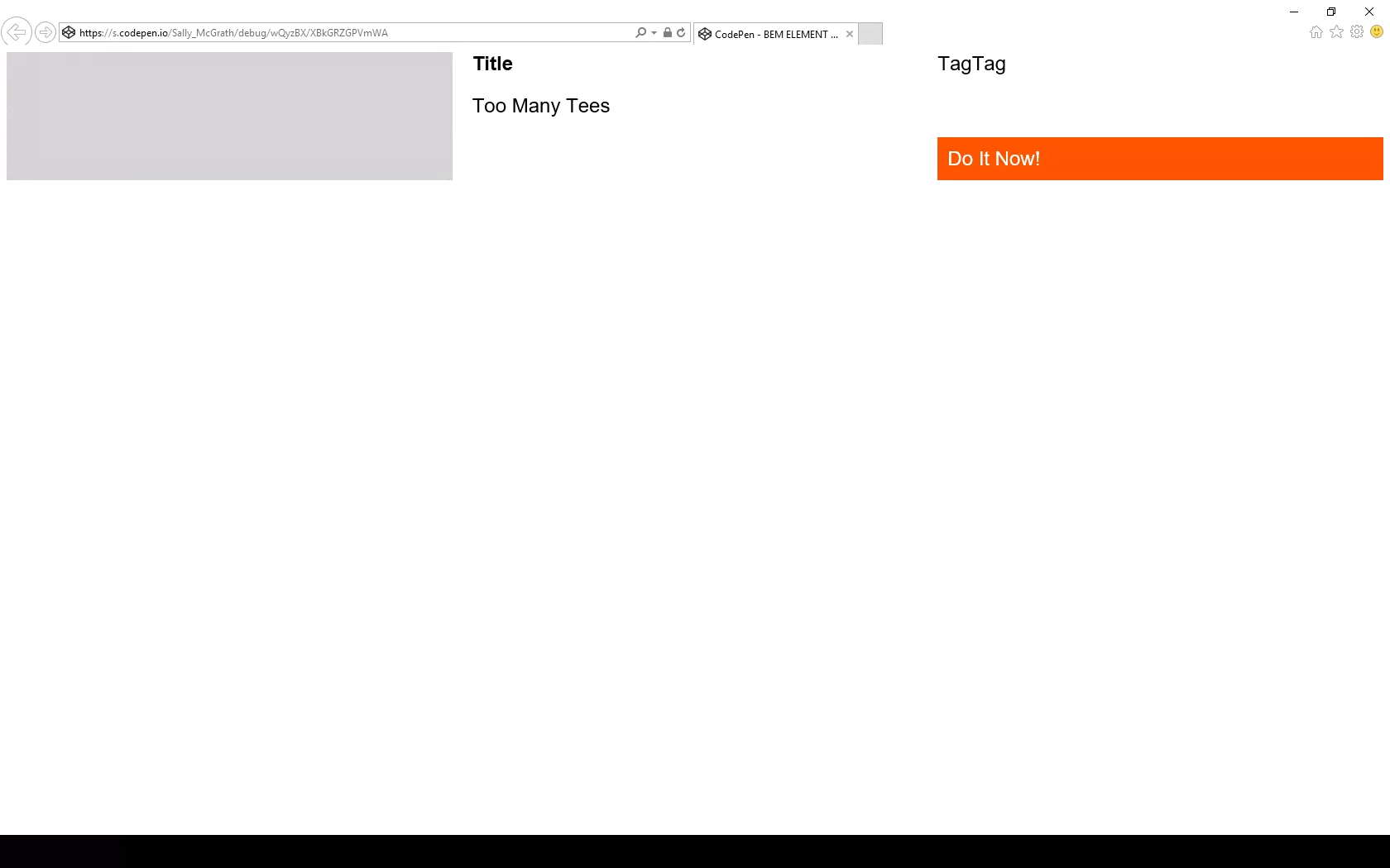
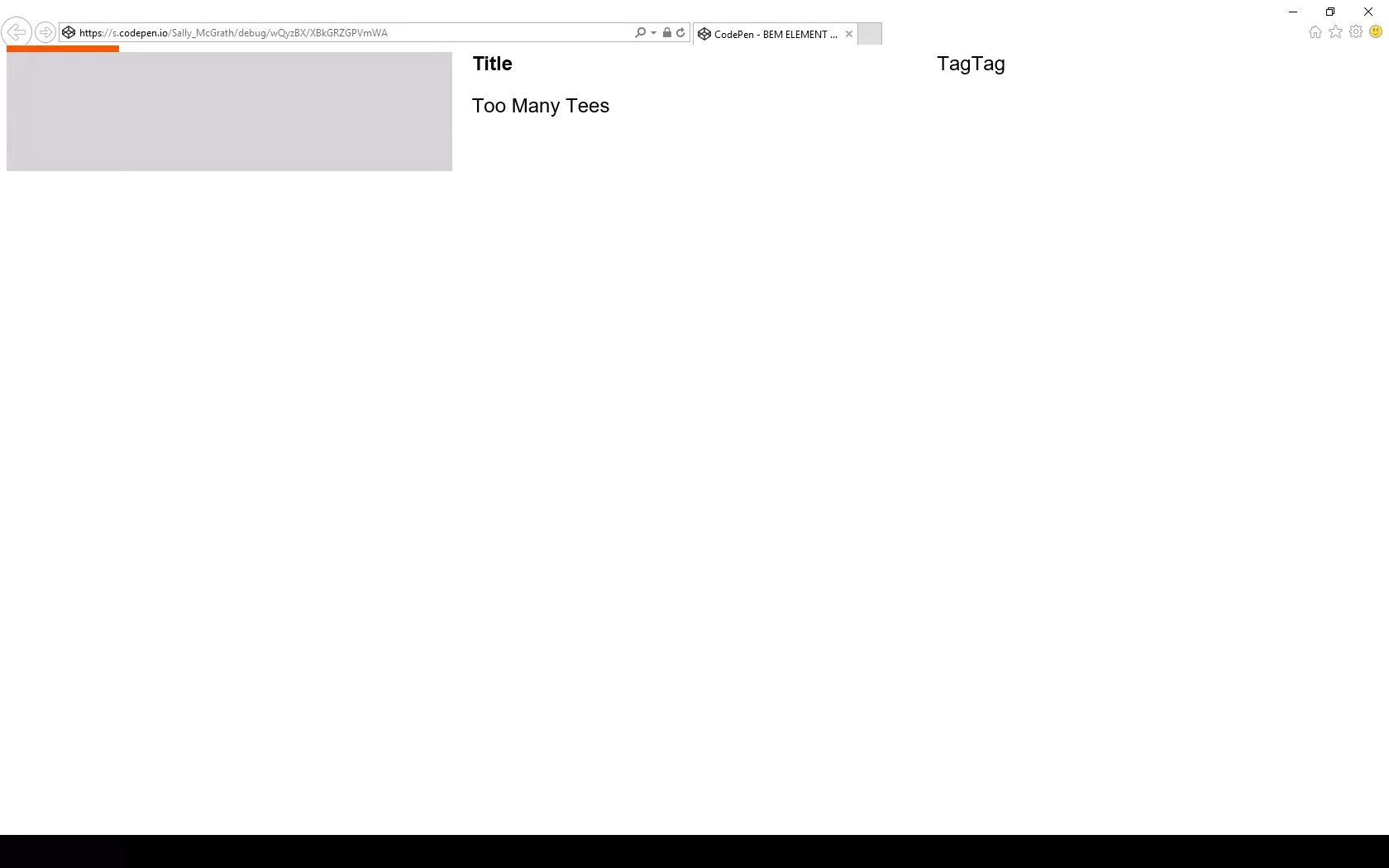
But there are pitfalls! You must set inline elements to block to make sure they always operate as grid cells in IE 11. Comment out the marked line in the example to see what happens otherwise:
Debug has caught an issue.
Ouch! Be careful with those blocks. You may find some versions of IE 11 don’t even pick up this fix, in which case you might try just using plain ol’ <p> tags… sigh.
I don’t include display:grid in this mixin because there are scenarios where the actual grid is set on an inner container, for example, but we’d still want the grid-areas to match on the correct BEM class.
Let’s identify a few more rules of the road to ensure this component slides right into a page layout without hassle. At time of writing, there’s no subgrid) available (but there will be!), so this component knows nothing of the parent grid it’s living in. This happens to match the BEM component approach well — as each component is written flat, and orphaned, to limit inheritance. I’m not advocating for BEM (or BEM-ish as we obviously use) here — I’m just saying that if you’re already using it, this is a bonus.
In this example, the designer has set a page layout of 12 column grid with 20px (1.25rem) gutters, site-wide, with no offset pieces. Our component is a page region and will occupy all 12 grid columns. In this transitional period, we’re still using this kind of set grid as we have a ton of systems still based on this idea that we have to integrate with. So, here’s our convention for this condition: for a full width region drop the grip gap and write the grid template columns as fractional units (fr) of 12.
Doing things this way means:
the sight lines of this internal grid broadly follow the grid it sits within;
it’s easy to see the underlying design rules in the code; and
it’s easy to line things up exactly, if required.
A quick note on „lining up”
Wait… what do I mean 'to have things line up exactly’? Doesn’t it already line up exactly?
Two equal columns split mid-gutter of the parent 12-column grid.
Well, no. The fractional units approach divides across the space perfectly, so you end up in the gutter. Two even columns lands you halfway across the gutter. Two columns where one is 2/3 and the other is 1/3 will split 1/3 of the way across that gutter, and so on.
Two unequal columns (set to 2fr and 1fr, respectively) split a third of the way into a gutter of the 12-column parent grid.
It’s not exactly hard to fix the alignment, as we know the width of our page grid gutter. For example, on an even split, we could include the grid gap.
However, we can’t do that with any other division. What we can do is add that gap as a margin — the margin is added inside no matter what box sizing you have set. In this example, we have three columns (two named areas and one empty space), splitting our gutter into thirds:
This is how to calculate those margins: Make sure the total fr units sum results in 12. Divide the grid gap by the number of columns in the parent grid, then multiply that like so:
The right margin multiplier of n is equal to the sum of the fr units to the right of n. The left margin of n is equal to the sum of the fr units to the left of n.
So, for grid-template-columns with a value of 2fr 3fr 2fr 4fr 1fr:
I’m sure you can think of other solutions, like switching to named lines, or adding in extra fixed-width columns or even writing all maps with 12 named areas per row. There are so many ways you can deal with this, but I think a lot of them remove the advantage of named areas. Areas give us a readable layout map that contains what our future selves need to know. It is code as documentation.
To be clear, the design problem I’m walking us through is not one of alignment. Alignment is easy with grid. The question is not of solving the immediate, trivial, layout problem, but of solving it in a way that supports our goal of being able to come back in six months and grasp:
What elements are in the component.
How they are laid out.
Why the code is written in this way.
The grid specification is huge and it’s easy to get lost in the options. Perhaps it’s a better plan to reset to a 12-column grid and use the number spec (i.e. explicitly link to our page grid, which uses the number spec) when absolute alignment is required — but I do feel there’s a smarter, simpler solution waiting to be found. For this site, we ended up writing a page grid object and added nested internal grid cells to it with classes: .o-page-grid__sidebar.
What do you all think? I definitely foresee differing perspectives on this. 🤦♀️
What next? A themed event header with a full width info bar that sticks and an internal button that lines up with the sidebar on the parent grid? You bet. I’ll include a parent grid so it’s easier to see:
Here’s a demo of all these variations as one partial. Yes, it’s a map! And it’s a wrap!
Conventions
Phew, we covered a lot! But you can see how flexible and self-documenting a system like this can be, right?
Type is handled with a separate type system.
Colors are handled by a theme partial that describes the underlying color rules of the design, rather than simply coloring elements ad hoc.
Elements are called what they are, in English, and included as a list at the top of the partial with the template mixin. This list can be taken into Twig or a template as a reference.
Correct HTML is always used and nesting doesn’t break grid. That means you can apply any number of nested grids to the same layout space by setting a convention.
Precise alignment is done in a number spec, and not a name spec (but note that alignment is possible with name spec).
IE 11 is supported.
I do have one more quick note and example of another component built with named areas. In this example, cards are not regions, but components placed in a grid, so there’s no reason to use the fr of 12 convention. You can expect a media object partial to look like this:
.c-card {
  &--news {
    align-content: start;
    grid-template-areas:
      "image"
      "datetime"
      "title";
  }

  &--search {
    justify-content: start;
    grid-template-columns: 1fr 3fr;
    grid-template-areas:
      "image page"
      "image title"
      "image summary";
  }

  &--merchandise {
    grid-gap: 0;
    grid-template-columns: $b 1fr 1fr $b;
    grid-template-areas:
      "image image   image   image"
      ".     title   title   ."
      ".     summary summary ."
      ".     price   action  .";
  }

  &--donations {
    // donations thanks button is too long and must take up more space than input
    grid-gap: 0;
    grid-template-columns: $b 1fr 2fr $b;
    grid-template-areas:
      "image image   image   image"
      ".     title   title   ."
      ".     summary summary ."
      ".     input   action  .";
  }
}

// ...
I work for Supercool, a fast-moving design agency that makes custom built sites for arts clients, powered by the off-the-shelf system, Craft CMS; it’s high-spec graphic design with relatively demanding typography and art direction. Over the past few months we’ve been moving to CSS grid. We’re transitioning slowly, allowing ourselves to discover new paradigms and design methods, instead of simply porting old habits to a new syntax.
So far, we’ve developed a number of really useful strategies for keeping track of the layout. I’ve written a couple of surprisingly nifty mixins, using named areas and templates, and we’ve hit upon some basic conventions to create highly readable code. I thought it would be valuable to walk through a fully-developed production implementation of a single major component using grid, digging in to some of the design questions it throws up and steering you away from some pitfalls we’ve encountered. CSS grid is a large spec, with lots of possible approaches and lots of right ways to do things, but at some point you have to lock down your method and get it live.
I’m expecting some basic familiarity with CSS, Sass, BEM, and some interest in the task of prototyping fully-realized, accessible, custom frameworks with 50+ components from Sketch or Photoshop-type documents on a tight timeline (say, a week).
First, let’s identify and separate out the design into distinct coding tasks and plan how we’ll approach them:
Type: The designer has already defined a type system.
Colors: First, we build a theme model and then include that in the partial.
Content: What elements are in this block? What are its variations? This is where our BEM mixin comes in.
Layout: This is how the content is placed in the block. You might want to skip directly to this.
Conventions: This is exactly how we choose to write all the above. There are many right answers in CSS, so what is important is that we all just agree to a convention, the rules of the road. This really comes first, but for the sake of this article, we’ll conclude here.
Type system
We use utility classes (e.g. h-text--h1, h-text--badge) for type styles. There may be a hundred type styles in a project. We export those styles from Sketch right into our Patternlab using Typex. That’s a whole other article on its own, so let’s just stipulate type as handled. We won’t bring type into our component partial.
Theming is a few tiny mixins dropped in, so we ideally won’t see a ton of color rules in our partial. We store them all together in a _themer.scss partial in our „Mixins and Models” library, so we can be sure to follow the design system of the site. This way, when someone comes back to the build later on, they have a key reference partial describing the design and branding rules. When building and maintaining numerous sites in broadly the same market — but each all with different brand spec — you’ve gotta make sure you don’t mix up one brand with another! So, much like type, we abstract the color rules away from the partial. In essence, we’re really only looking at layout (as much as possible) in our _header.scss file.
Given that we agree the convention to always theme using our mixin, this is how it would be included on an element:
@include var($property, $value);
Then we’ll set a theme model, of how colors work on this particular site and apply that theme to a component with:
@include theme;
Here’s the sample theme model we’re going to use with this page header. It’s super simple.
We’re pairing a color with black or white. We depend on a contrast rule and flip them for emphasis, maybe on events, like hover, or a highlighted call to action. This is all we need to do to make that happen and now we have a document of how color should really work on this site. We can go to and check against if we need to debug or expand the UI.
We also want to prep inheritance to help us, so let’s identify some helpful conventions:
Using this theme model, we might generate any number of themes, perhaps storing them as utility classes, or looping over a list of modifiers inside a component, or just allowing the user to set variables right on the block in the CMS. When IE 11 drops below 1% in our stats, we can do much more with variables, but this is enough for our current purposes.
Let’s not get side-tracked. What about grid?!
Content components
Grid lets us describe exactly what content we have in each partial in a new way. It’s really a game changer for design agencies building new UI for every project and we’re discovering new (and fun) applications for it as we explore.
To give context: we customize each interface for our clients, with custom fields made to suit their specific needs and their content model, using Craft CMS. We have internal tools that pull in events from ticketing APIs and create entries from that data, which may then be edited and expanded (or created entirely) in the CMS. The client can fill in or edit named fields in permanent page regions, and also add in whole designed, branded content blocks into the layout of each page as they build them.
There’s a lot of UI. The clients have a lot of control over content and we have a lot of control over the HTML, so we can ensure a high standard of accessible, semantic code on the page. We develop the content model together during discovery and then turn ’em loose on content creation. They add what they want and we ensure that it works and always looks right. Better than right! Super. (Sorry! :P)
Accessible, logical HTML is my jam. At minimum, I require a green accessibility score on Lighthouse score for my projects. (Who am I kidding, I want that delicious 100!) Core paths and pages are tested with a couple of screen readers, the keyboard tab, keyboard navigation), low vision simulators, dasher, voice access and binary switch. (I also work for Robots and Cake so this is a big part of my development.) I add giant clickable phone numbers and email addresses to pages over and over. I just want to get people where they are going.
I’ve been concerned about the way content can be re-ordered with grid (and flexbox, for that matter). Having gone through a few builds now, I actually think grid can help us with this problem. With CSS Grid, there’s no reason to move around HTML in service to the layout. We can go back to thinking about the whole document as a logical, linear sequence as our first concern.
Branding vs. Performance vs. Maintenance
Arts venues require high-spec graphic design, unified across print and web, and have constantly changing materials (e.g. programs, brochures, tickets, posters, microsites, etc.) they need to get out to their audiences, including contractual marketing obligations that must be met. As you can imagine, we have a lot of high quality large images we have to prioritize and typically come with strong print-led branding. That means we may be serving around fifteen custom fonts (including weight variations, display faces, etc.) and complex CSS to the page as well. We have to keep ourselves as lean as we can. We are shipping CSS that’s around 20 KB nano Gzipped at the moment but I’m working on reducing it further.
However, we do keep the grid area names full length by setting reduce identifiers to false in our PostCSS task. It’s vastly more useful to have the layout maps available in DevTools than it is to save those few bytes. For maintenance, self-documentation, and the sake of your future self who is debugging this site without repo access on a delayed train in Sowerby Bridge: keep the maps.
Code health
The way to balance all these competing needs is to articulate and agree on conventions so that there’s less to fix in testing and so that solved problems stay solved. We examine all the components we build and make sure they always start with a heading, that links go places, and buttons trigger actions, that countable objects are delivered as a list and preceded by a landmark heading, that navs are <nav> and times are <time> and div soup is eaten for breakfast— the basics.
With CSS Grid, there’s no excuse to move aroundHTMLin service to the layout. Your content can always flow logically while changes in layout happen in CSS. And, as there’s no need for margins or padding to create gutters, you can simply declare:
.o-grid .o-grid { width:100%; }
…to be sure any number of nested groups all visually occupy the same page grid. The HTML can be a clearer guide to what things really are: a closer document.
There’s a lot to manage between the heading and the action, and it’s my challenge to keep track of all these fields in all those components and make it traversable, scannable, linearizable, and easily read in some kind of logical, understandable manner, while making sure I’m faithfully executing the design spec.
Let’s bring in my first, surprisingly useful, grid mixin.
Each component partial now starts out with a list of all its possible elements, which is a very handy piece of documentation, especially when Twigging the actual front-end component.
The mixin takes care of assigning the grid areas.
Element and component names stay consistent across Sketch, CSS, and HTML and any inconsistencies will be very obvious, as the layout will fail. I’m firm, but fair.
BEM naming is enforced automatically but isn’t muddling things up in the partial.
Now, in the partial, we will just declare grid-template-areas, using normal English words, giving us a series of maps of the layouts that also match the database fields. Super readable!
We decided to stick to named areas for internal grids because I read a great article on this very site explaining how Autoprefixer can handle grid for IE 11 if you stick to the listed supported properties — and it does for the most part. If you view this test case with Autoprefixer applied in the super useful Debug Mode in a browser test, you’ll see it working.
So far, so good.
But there are pitfalls! You must set inline elements to block to make sure they always operate as grid cells in IE 11. Comment out the marked line in the example to see what happens otherwise:
Debug has caught an issue.
Ouch! Be careful with those blocks. You may find some versions of IE 11 don’t even pick up this fix, in which case you might try just using plain ol’ <p> tags… sigh.
I don’t include display:grid in this mixin because there are scenarios where the actual grid is set on an inner container, for example, but we’d still want the grid-areas to match on the correct BEM class.
Let’s identify a few more rules of the road to ensure this component slides right into a page layout without hassle. At time of writing, there’s no subgrid) available (but there will be!), so this component knows nothing of the parent grid it’s living in. This happens to match the BEM component approach well — as each component is written flat, and orphaned, to limit inheritance. I’m not advocating for BEM (or BEM-ish as we obviously use) here — I’m just saying that if you’re already using it, this is a bonus.
In this example, the designer has set a page layout of 12 column grid with 20px (1.25rem) gutters, site-wide, with no offset pieces. Our component is a page region and will occupy all 12 grid columns. In this transitional period, we’re still using this kind of set grid as we have a ton of systems still based on this idea that we have to integrate with. So, here’s our convention for this condition: for a full width region drop the grip gap and write the grid template columns as fractional units (fr) of 12.
Doing things this way means:
the sight lines of this internal grid broadly follow the grid it sits within;
it’s easy to see the underlying design rules in the code; and
it’s easy to line things up exactly, if required.
A quick note on „lining up”
Wait… what do I mean 'to have things line up exactly’? Doesn’t it already line up exactly?
Two equal columns split mid-gutter of the parent 12-column grid.
Well, no. The fractional units approach divides across the space perfectly, so you end up in the gutter. Two even columns lands you halfway across the gutter. Two columns where one is 2/3 and the other is 1/3 will split 1/3 of the way across that gutter, and so on.
Two unequal columns (set to 2fr and 1fr, respectively) split a third of the way into a gutter of the 12-column parent grid.
It’s not exactly hard to fix the alignment, as we know the width of our page grid gutter. For example, on an even split, we could include the grid gap.
However, we can’t do that with any other division. What we can do is add that gap as a margin — the margin is added inside no matter what box sizing you have set. In this example, we have three columns (two named areas and one empty space), splitting our gutter into thirds:
This is how to calculate those margins: Make sure the total fr units sum results in 12. Divide the grid gap by the number of columns in the parent grid, then multiply that like so:
The right margin multiplier of n is equal to the sum of the fr units to the right of n. The left margin of n is equal to the sum of the fr units to the left of n.
So, for grid-template-columns with a value of 2fr 3fr 2fr 4fr 1fr:
I’m sure you can think of other solutions, like switching to named lines, or adding in extra fixed-width columns or even writing all maps with 12 named areas per row. There are so many ways you can deal with this, but I think a lot of them remove the advantage of named areas. Areas give us a readable layout map that contains what our future selves need to know. It is code as documentation.
To be clear, the design problem I’m walking us through is not one of alignment. Alignment is easy with grid. The question is not of solving the immediate, trivial, layout problem, but of solving it in a way that supports our goal of being able to come back in six months and grasp:
What elements are in the component.
How they are laid out.
Why the code is written in this way.
The grid specification is huge and it’s easy to get lost in the options. Perhaps it’s a better plan to reset to a 12-column grid and use the number spec (i.e. explicitly link to our page grid, which uses the number spec) when absolute alignment is required — but I do feel there’s a smarter, simpler solution waiting to be found. For this site, we ended up writing a page grid object and added nested internal grid cells to it with classes: .o-page-grid__sidebar.
What do you all think? I definitely foresee differing perspectives on this. 🤦♀️
What next? A themed event header with a full width info bar that sticks and an internal button that lines up with the sidebar on the parent grid? You bet. I’ll include a parent grid so it’s easier to see:
Here’s a demo of all these variations as one partial. Yes, it’s a map! And it’s a wrap!
Conventions
Phew, we covered a lot! But you can see how flexible and self-documenting a system like this can be, right?
Type is handled with a separate type system.
Colors are handled by a theme partial that describes the underlying color rules of the design, rather than simply coloring elements ad hoc.
Elements are called what they are, in English, and included as a list at the top of the partial with the template mixin. This list can be taken into Twig or a template as a reference.
Correct HTML is always used and nesting doesn’t break grid. That means you can apply any number of nested grids to the same layout space by setting a convention.
Precise alignment is done in a number spec, and not a name spec (but note that alignment is possible with name spec).
IE 11 is supported.
I do have one more quick note and example of another component built with named areas. In this example, cards are not regions, but components placed in a grid, so there’s no reason to use the fr of 12 convention. You can expect a media object partial to look like this:
.c-card {
  &--news {
    align-content: start;
    grid-template-areas:
      "image"
      "datetime"
      "title";
  }

  &--search {
    justify-content: start;
    grid-template-columns: 1fr 3fr;
    grid-template-areas:
      "image page"
      "image title"
      "image summary";
  }

  &--merchandise {
    grid-gap: 0;
    grid-template-columns: $b 1fr 1fr $b;
    grid-template-areas:
      "image image   image   image"
      ".     title   title   ."
      ".     summary summary ."
      ".     price   action  .";
  }

  &--donations {
    // donations thanks button is too long and must take up more space than input
    grid-gap: 0;
    grid-template-columns: $b 1fr 2fr $b;
    grid-template-areas:
      "image image   image   image"
      ".     title   title   ."
      ".     summary summary ."
      ".     input   action  .";
  }
}

// ...
I work for Supercool, a fast-moving design agency that makes custom built sites for arts clients, powered by the off-the-shelf system, Craft CMS; it’s high-spec graphic design with relatively demanding typography and art direction. Over the past few months we’ve been moving to CSS grid. We’re transitioning slowly, allowing ourselves to discover new paradigms and design methods, instead of simply porting old habits to a new syntax.
So far, we’ve developed a number of really useful strategies for keeping track of the layout. I’ve written a couple of surprisingly nifty mixins, using named areas and templates, and we’ve hit upon some basic conventions to create highly readable code. I thought it would be valuable to walk through a fully-developed production implementation of a single major component using grid, digging in to some of the design questions it throws up and steering you away from some pitfalls we’ve encountered. CSS grid is a large spec, with lots of possible approaches and lots of right ways to do things, but at some point you have to lock down your method and get it live.
I’m expecting some basic familiarity with CSS, Sass, BEM, and some interest in the task of prototyping fully-realized, accessible, custom frameworks with 50+ components from Sketch or Photoshop-type documents on a tight timeline (say, a week).
First, let’s identify and separate out the design into distinct coding tasks and plan how we’ll approach them:
Type: The designer has already defined a type system.
Colors: First, we build a theme model and then include that in the partial.
Content: What elements are in this block? What are its variations? This is where our BEM mixin comes in.
Layout: This is how the content is placed in the block. You might want to skip directly to this.
Conventions: This is exactly how we choose to write all the above. There are many right answers in CSS, so what is important is that we all just agree to a convention, the rules of the road. This really comes first, but for the sake of this article, we’ll conclude here.
Type system
We use utility classes (e.g. h-text--h1, h-text--badge) for type styles. There may be a hundred type styles in a project. We export those styles from Sketch right into our Patternlab using Typex. That’s a whole other article on its own, so let’s just stipulate type as handled. We won’t bring type into our component partial.
Theming is a few tiny mixins dropped in, so we ideally won’t see a ton of color rules in our partial. We store them all together in a _themer.scss partial in our „Mixins and Models” library, so we can be sure to follow the design system of the site. This way, when someone comes back to the build later on, they have a key reference partial describing the design and branding rules. When building and maintaining numerous sites in broadly the same market — but each all with different brand spec — you’ve gotta make sure you don’t mix up one brand with another! So, much like type, we abstract the color rules away from the partial. In essence, we’re really only looking at layout (as much as possible) in our _header.scss file.
Given that we agree the convention to always theme using our mixin, this is how it would be included on an element:
@include var($property, $value);
Then we’ll set a theme model, of how colors work on this particular site and apply that theme to a component with:
@include theme;
Here’s the sample theme model we’re going to use with this page header. It’s super simple.
We’re pairing a color with black or white. We depend on a contrast rule and flip them for emphasis, maybe on events, like hover, or a highlighted call to action. This is all we need to do to make that happen and now we have a document of how color should really work on this site. We can go to and check against if we need to debug or expand the UI.
We also want to prep inheritance to help us, so let’s identify some helpful conventions:
Using this theme model, we might generate any number of themes, perhaps storing them as utility classes, or looping over a list of modifiers inside a component, or just allowing the user to set variables right on the block in the CMS. When IE 11 drops below 1% in our stats, we can do much more with variables, but this is enough for our current purposes.
Let’s not get side-tracked. What about grid?!
Content components
Grid lets us describe exactly what content we have in each partial in a new way. It’s really a game changer for design agencies building new UI for every project and we’re discovering new (and fun) applications for it as we explore.
To give context: we customize each interface for our clients, with custom fields made to suit their specific needs and their content model, using Craft CMS. We have internal tools that pull in events from ticketing APIs and create entries from that data, which may then be edited and expanded (or created entirely) in the CMS. The client can fill in or edit named fields in permanent page regions, and also add in whole designed, branded content blocks into the layout of each page as they build them.
There’s a lot of UI. The clients have a lot of control over content and we have a lot of control over the HTML, so we can ensure a high standard of accessible, semantic code on the page. We develop the content model together during discovery and then turn ’em loose on content creation. They add what they want and we ensure that it works and always looks right. Better than right! Super. (Sorry! :P)
Accessible, logical HTML is my jam. At minimum, I require a green accessibility score on Lighthouse score for my projects. (Who am I kidding, I want that delicious 100!) Core paths and pages are tested with a couple of screen readers, the keyboard tab, keyboard navigation), low vision simulators, dasher, voice access and binary switch. (I also work for Robots and Cake so this is a big part of my development.) I add giant clickable phone numbers and email addresses to pages over and over. I just want to get people where they are going.
I’ve been concerned about the way content can be re-ordered with grid (and flexbox, for that matter). Having gone through a few builds now, I actually think grid can help us with this problem. With CSS Grid, there’s no reason to move around HTML in service to the layout. We can go back to thinking about the whole document as a logical, linear sequence as our first concern.
Branding vs. Performance vs. Maintenance
Arts venues require high-spec graphic design, unified across print and web, and have constantly changing materials (e.g. programs, brochures, tickets, posters, microsites, etc.) they need to get out to their audiences, including contractual marketing obligations that must be met. As you can imagine, we have a lot of high quality large images we have to prioritize and typically come with strong print-led branding. That means we may be serving around fifteen custom fonts (including weight variations, display faces, etc.) and complex CSS to the page as well. We have to keep ourselves as lean as we can. We are shipping CSS that’s around 20 KB nano Gzipped at the moment but I’m working on reducing it further.
However, we do keep the grid area names full length by setting reduce identifiers to false in our PostCSS task. It’s vastly more useful to have the layout maps available in DevTools than it is to save those few bytes. For maintenance, self-documentation, and the sake of your future self who is debugging this site without repo access on a delayed train in Sowerby Bridge: keep the maps.
Code health
The way to balance all these competing needs is to articulate and agree on conventions so that there’s less to fix in testing and so that solved problems stay solved. We examine all the components we build and make sure they always start with a heading, that links go places, and buttons trigger actions, that countable objects are delivered as a list and preceded by a landmark heading, that navs are <nav> and times are <time> and div soup is eaten for breakfast— the basics.
With CSS Grid, there’s no excuse to move aroundHTMLin service to the layout. Your content can always flow logically while changes in layout happen in CSS. And, as there’s no need for margins or padding to create gutters, you can simply declare:
.o-grid .o-grid { width:100%; }
…to be sure any number of nested groups all visually occupy the same page grid. The HTML can be a clearer guide to what things really are: a closer document.
There’s a lot to manage between the heading and the action, and it’s my challenge to keep track of all these fields in all those components and make it traversable, scannable, linearizable, and easily read in some kind of logical, understandable manner, while making sure I’m faithfully executing the design spec.
Let’s bring in my first, surprisingly useful, grid mixin.
Each component partial now starts out with a list of all its possible elements, which is a very handy piece of documentation, especially when Twigging the actual front-end component.
The mixin takes care of assigning the grid areas.
Element and component names stay consistent across Sketch, CSS, and HTML and any inconsistencies will be very obvious, as the layout will fail. I’m firm, but fair.
BEM naming is enforced automatically but isn’t muddling things up in the partial.
Now, in the partial, we will just declare grid-template-areas, using normal English words, giving us a series of maps of the layouts that also match the database fields. Super readable!
We decided to stick to named areas for internal grids because I read a great article on this very site explaining how Autoprefixer can handle grid for IE 11 if you stick to the listed supported properties — and it does for the most part. If you view this test case with Autoprefixer applied in the super useful Debug Mode in a browser test, you’ll see it working.
So far, so good.
But there are pitfalls! You must set inline elements to block to make sure they always operate as grid cells in IE 11. Comment out the marked line in the example to see what happens otherwise:
Debug has caught an issue.
Ouch! Be careful with those blocks. You may find some versions of IE 11 don’t even pick up this fix, in which case you might try just using plain ol’ <p> tags… sigh.
I don’t include display:grid in this mixin because there are scenarios where the actual grid is set on an inner container, for example, but we’d still want the grid-areas to match on the correct BEM class.
Let’s identify a few more rules of the road to ensure this component slides right into a page layout without hassle. At time of writing, there’s no subgrid) available (but there will be!), so this component knows nothing of the parent grid it’s living in. This happens to match the BEM component approach well — as each component is written flat, and orphaned, to limit inheritance. I’m not advocating for BEM (or BEM-ish as we obviously use) here — I’m just saying that if you’re already using it, this is a bonus.
In this example, the designer has set a page layout of 12 column grid with 20px (1.25rem) gutters, site-wide, with no offset pieces. Our component is a page region and will occupy all 12 grid columns. In this transitional period, we’re still using this kind of set grid as we have a ton of systems still based on this idea that we have to integrate with. So, here’s our convention for this condition: for a full width region drop the grip gap and write the grid template columns as fractional units (fr) of 12.
Doing things this way means:
the sight lines of this internal grid broadly follow the grid it sits within;
it’s easy to see the underlying design rules in the code; and
it’s easy to line things up exactly, if required.
A quick note on „lining up”
Wait… what do I mean 'to have things line up exactly’? Doesn’t it already line up exactly?
Two equal columns split mid-gutter of the parent 12-column grid.
Well, no. The fractional units approach divides across the space perfectly, so you end up in the gutter. Two even columns lands you halfway across the gutter. Two columns where one is 2/3 and the other is 1/3 will split 1/3 of the way across that gutter, and so on.
Two unequal columns (set to 2fr and 1fr, respectively) split a third of the way into a gutter of the 12-column parent grid.
It’s not exactly hard to fix the alignment, as we know the width of our page grid gutter. For example, on an even split, we could include the grid gap.
However, we can’t do that with any other division. What we can do is add that gap as a margin — the margin is added inside no matter what box sizing you have set. In this example, we have three columns (two named areas and one empty space), splitting our gutter into thirds:
This is how to calculate those margins: Make sure the total fr units sum results in 12. Divide the grid gap by the number of columns in the parent grid, then multiply that like so:
The right margin multiplier of n is equal to the sum of the fr units to the right of n. The left margin of n is equal to the sum of the fr units to the left of n.
So, for grid-template-columns with a value of 2fr 3fr 2fr 4fr 1fr:
I’m sure you can think of other solutions, like switching to named lines, or adding in extra fixed-width columns or even writing all maps with 12 named areas per row. There are so many ways you can deal with this, but I think a lot of them remove the advantage of named areas. Areas give us a readable layout map that contains what our future selves need to know. It is code as documentation.
To be clear, the design problem I’m walking us through is not one of alignment. Alignment is easy with grid. The question is not of solving the immediate, trivial, layout problem, but of solving it in a way that supports our goal of being able to come back in six months and grasp:
What elements are in the component.
How they are laid out.
Why the code is written in this way.
The grid specification is huge and it’s easy to get lost in the options. Perhaps it’s a better plan to reset to a 12-column grid and use the number spec (i.e. explicitly link to our page grid, which uses the number spec) when absolute alignment is required — but I do feel there’s a smarter, simpler solution waiting to be found. For this site, we ended up writing a page grid object and added nested internal grid cells to it with classes: .o-page-grid__sidebar.
What do you all think? I definitely foresee differing perspectives on this. 🤦♀️
What next? A themed event header with a full width info bar that sticks and an internal button that lines up with the sidebar on the parent grid? You bet. I’ll include a parent grid so it’s easier to see:
Here’s a demo of all these variations as one partial. Yes, it’s a map! And it’s a wrap!
Conventions
Phew, we covered a lot! But you can see how flexible and self-documenting a system like this can be, right?
Type is handled with a separate type system.
Colors are handled by a theme partial that describes the underlying color rules of the design, rather than simply coloring elements ad hoc.
Elements are called what they are, in English, and included as a list at the top of the partial with the template mixin. This list can be taken into Twig or a template as a reference.
Correct HTML is always used and nesting doesn’t break grid. That means you can apply any number of nested grids to the same layout space by setting a convention.
Precise alignment is done in a number spec, and not a name spec (but note that alignment is possible with name spec).
IE 11 is supported.
I do have one more quick note and example of another component built with named areas. In this example, cards are not regions, but components placed in a grid, so there’s no reason to use the fr of 12 convention. You can expect a media object partial to look like this:
.c-card {
  &--news {
    align-content: start;
    grid-template-areas:
      "image"
      "datetime"
      "title";
  }

  &--search {
    justify-content: start;
    grid-template-columns: 1fr 3fr;
    grid-template-areas:
      "image page"
      "image title"
      "image summary";
  }

  &--merchandise {
    grid-gap: 0;
    grid-template-columns: $b 1fr 1fr $b;
    grid-template-areas:
      "image image   image   image"
      ".     title   title   ."
      ".     summary summary ."
      ".     price   action  .";
  }

  &--donations {
    // donations thanks button is too long and must take up more space than input
    grid-gap: 0;
    grid-template-columns: $b 1fr 2fr $b;
    grid-template-areas:
      "image image   image   image"
      ".     title   title   ."
      ".     summary summary ."
      ".     input   action  .";
  }
}

// ...
Šime posts regular content for web developers on webplatform.news.
Mozilla WebThings provides complete privacy for user data
If you, like many we surveyed, are also concerned about the security & privacy of you smart home check out @MozillaIoT's decentralized, open source solution for keeping your smarthome devices at bay—or learn more dropping by our Bay Area Maker Faire booth! https://t.co/rUcYpjBySH
Josephine Lau: Smart home companies require that users’ data goes through their servers, which means that people are giving up their privacy for the convenience of a smart home device (e.g., smart light bulb).
We’ve learned that people are concerned about the privacy of their smart home data. And yet, when there’s no alternative, they feel the need to trade away their privacy for convenience.
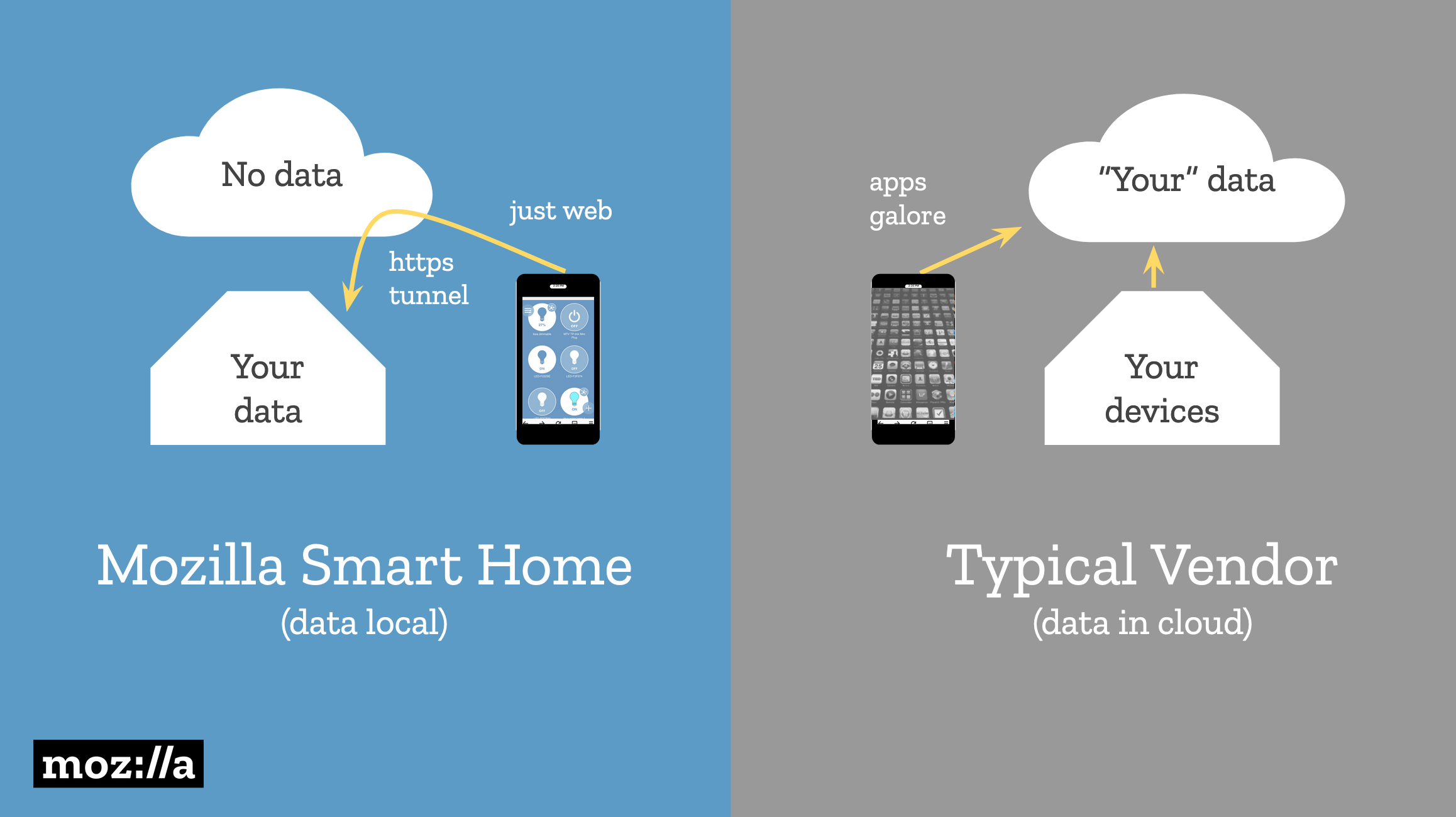
Mozilla WebThings is an alternative approach to the Internet of Things that stores user data in the user’s home. Devices can be controlled locally via a web interface, and the data is tunneled through a private HTTPS connection.
A diagram showing how Mozilla doesn’t store user data in the cloud, unlike smart home vendors.
An Internet Explorer mode is coming to Edge
Still have questions on the recently announced IE mode? Our very own Fred Pullen has all the answers. Check out his in-depth breakdown on how the new IE mode works, and the benefits it will bring to our enterprise community once it goes live.https://t.co/RgewXGC1G2
Fred Pullen: The next version of Edge will include an Internet Explorer mode for backward compatibility with legacy websites. Edge will also for the first time be available on older versions of Windows (including Windows 7 and 8.1).
By introducing Internet Explorer mode, we’re effectively blurring the lines between the browsers. From an end-user standpoint, it seems like a single browser. … You can use IE mode to limit the sites that instantiate Internet Explorer just to the sites that you approved.
Navigating from one page to another in a client-side web app provides no feedback by default in virtually all popular routing solutions across the client-side ecosystem.
Their goal is to make Ember’s router more accessible and screen reader friendly.
Read the last section („Intrinsic and extrinsic sizing”). All three columns have the size 1fr but the middle one is wider because of its content. This can be prevented by using the size minmax(0, 1fr) instead.
Instead of loading from top to bottom, progressive images appear blurry at first and become sharper as more data loads.
The benefits of progressive rendering are unique to JPEG (supported in all browsers) and JPEG 2000 (supported in Safari). GIF and PNG have interlaced modes, but these modes come at a cost of worse compression. WebP doesn’t even support progressive rendering at all. This creates a dilemma: WebP is usually 20%-30% smaller than a JPEG of equivalent quality, but progressive JPEG appears to load 50% faster.
Šime posts regular content for web developers on webplatform.news.
Mozilla WebThings provides complete privacy for user data
If you, like many we surveyed, are also concerned about the security & privacy of you smart home check out @MozillaIoT's decentralized, open source solution for keeping your smarthome devices at bay—or learn more dropping by our Bay Area Maker Faire booth! https://t.co/rUcYpjBySH
Josephine Lau: Smart home companies require that users’ data goes through their servers, which means that people are giving up their privacy for the convenience of a smart home device (e.g., smart light bulb).
We’ve learned that people are concerned about the privacy of their smart home data. And yet, when there’s no alternative, they feel the need to trade away their privacy for convenience.
Mozilla WebThings is an alternative approach to the Internet of Things that stores user data in the user’s home. Devices can be controlled locally via a web interface, and the data is tunneled through a private HTTPS connection.
A diagram showing how Mozilla doesn’t store user data in the cloud, unlike smart home vendors.
An Internet Explorer mode is coming to Edge
Still have questions on the recently announced IE mode? Our very own Fred Pullen has all the answers. Check out his in-depth breakdown on how the new IE mode works, and the benefits it will bring to our enterprise community once it goes live.https://t.co/RgewXGC1G2
Fred Pullen: The next version of Edge will include an Internet Explorer mode for backward compatibility with legacy websites. Edge will also for the first time be available on older versions of Windows (including Windows 7 and 8.1).
By introducing Internet Explorer mode, we’re effectively blurring the lines between the browsers. From an end-user standpoint, it seems like a single browser. … You can use IE mode to limit the sites that instantiate Internet Explorer just to the sites that you approved.
Navigating from one page to another in a client-side web app provides no feedback by default in virtually all popular routing solutions across the client-side ecosystem.
Their goal is to make Ember’s router more accessible and screen reader friendly.
Read the last section („Intrinsic and extrinsic sizing”). All three columns have the size 1fr but the middle one is wider because of its content. This can be prevented by using the size minmax(0, 1fr) instead.
Instead of loading from top to bottom, progressive images appear blurry at first and become sharper as more data loads.
The benefits of progressive rendering are unique to JPEG (supported in all browsers) and JPEG 2000 (supported in Safari). GIF and PNG have interlaced modes, but these modes come at a cost of worse compression. WebP doesn’t even support progressive rendering at all. This creates a dilemma: WebP is usually 20%-30% smaller than a JPEG of equivalent quality, but progressive JPEG appears to load 50% faster.
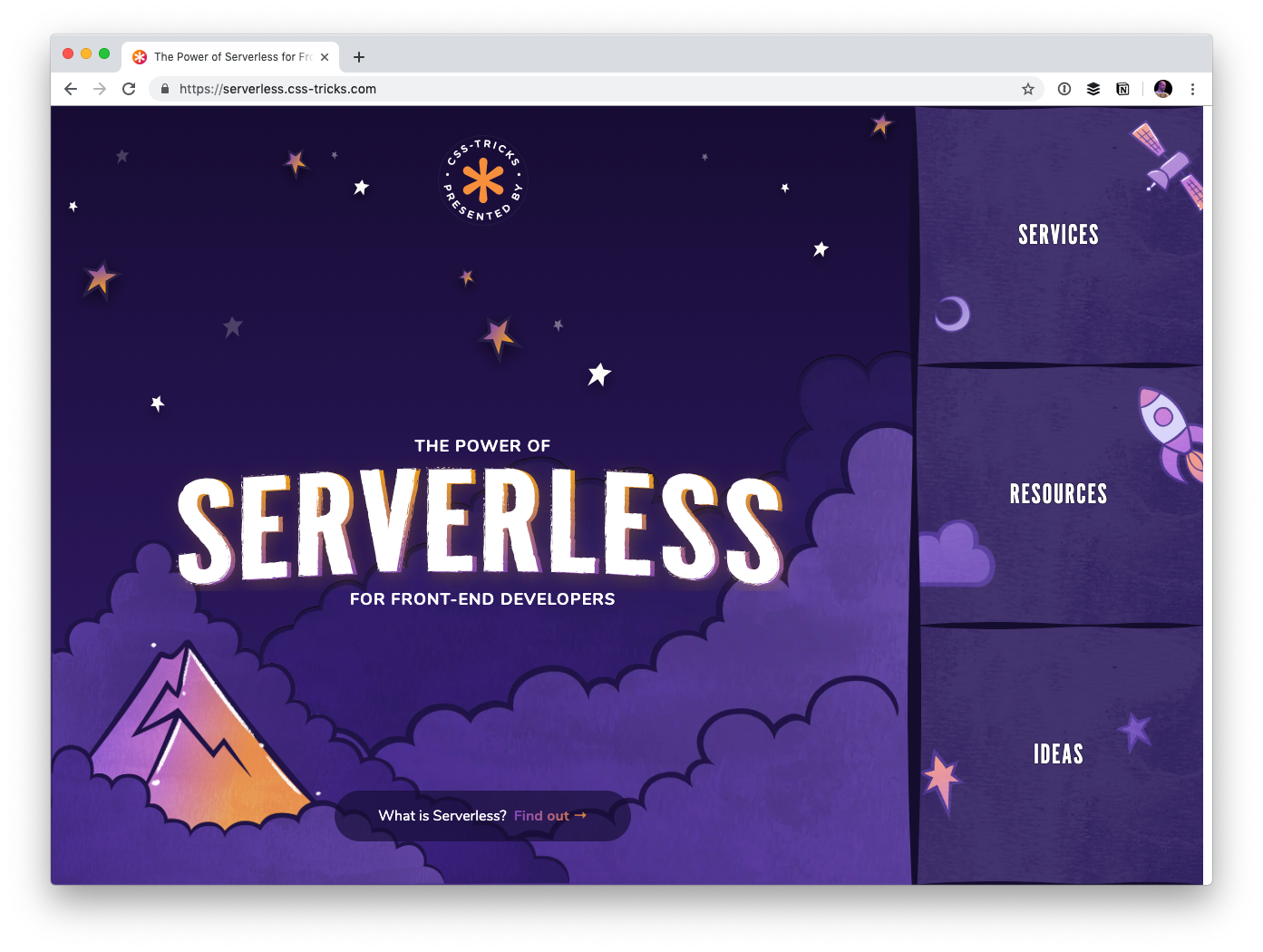
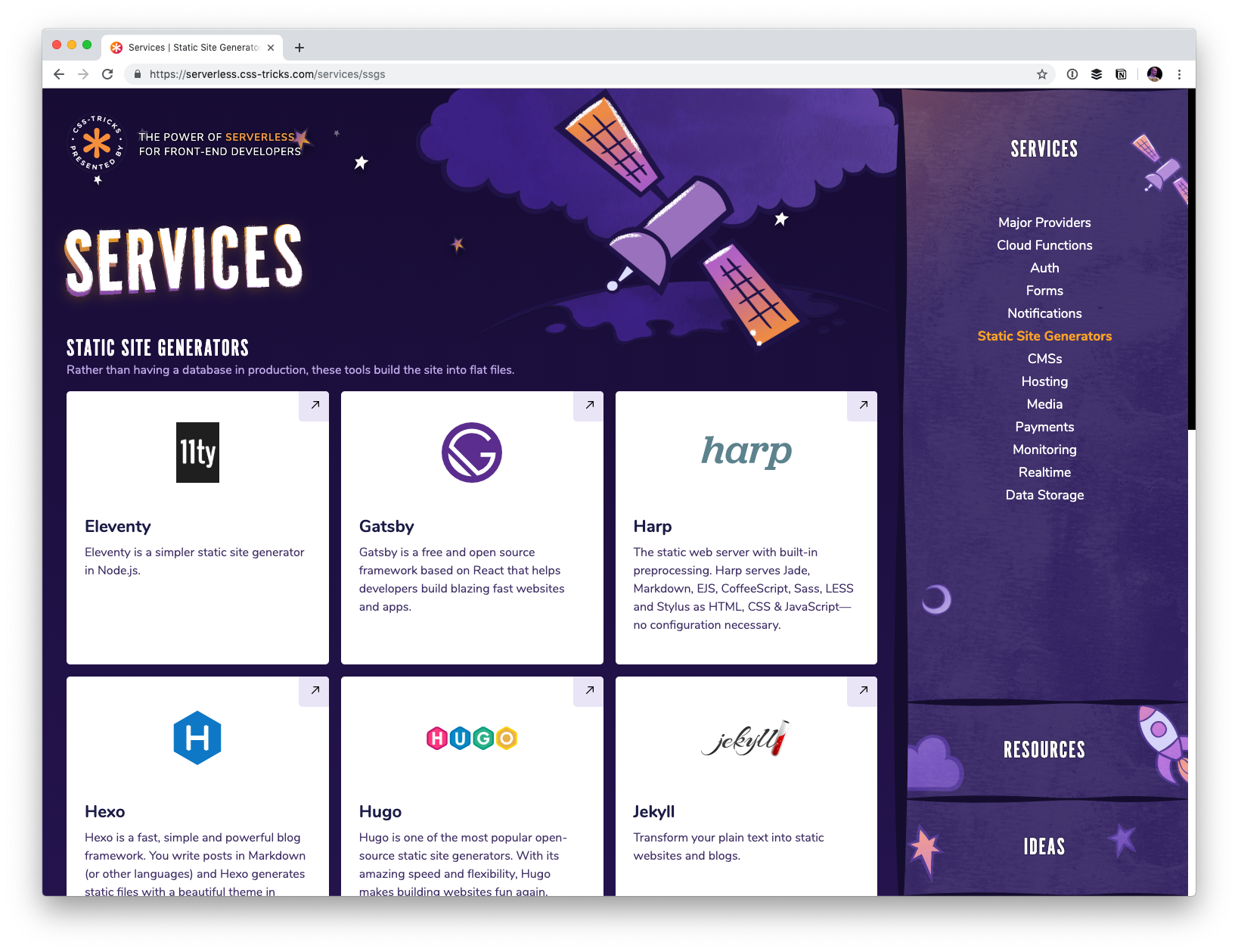
I created a website called The Power of Serverless for Front-End Developers over at thepowerofserverless.info a little while back while I was learning about that whole idea. I know a little more now but still have an endless amount to learn. Still, I felt like it was time to revamp that site a bit.
For one thing, just like our little conferences website, the new site is a subdomain of this very site:
The whole idea behind the serverless buzzword is a pretty big deal. Rather than maintaining your own servers, which you already buy from some other company, you architect your app such that everything is run on commoditized servers you access on-demand instead.
Hosting becomes static, which is rife with advantages. Just look at Netlify who offer blazing-fast static hosting and innovate around the developer experience. The bits you still need back-end services for run in cloud functions that are cheap and efficient.
But you still need to know how to string it all together. Who do you use to process forms? Where do you store the data? What can I use for user authentication? What content management systems are available in this world? That’s what this site is all about! I’d like the site to be able to explain the concept and offer resources, but more importantly, be a directory to the slew of services out there that make up this new serverless world.
The site also features a section containing ideas that might help you figure out how you might use serverless technology. Perhaps you’ll even take a spin making a serverless site.
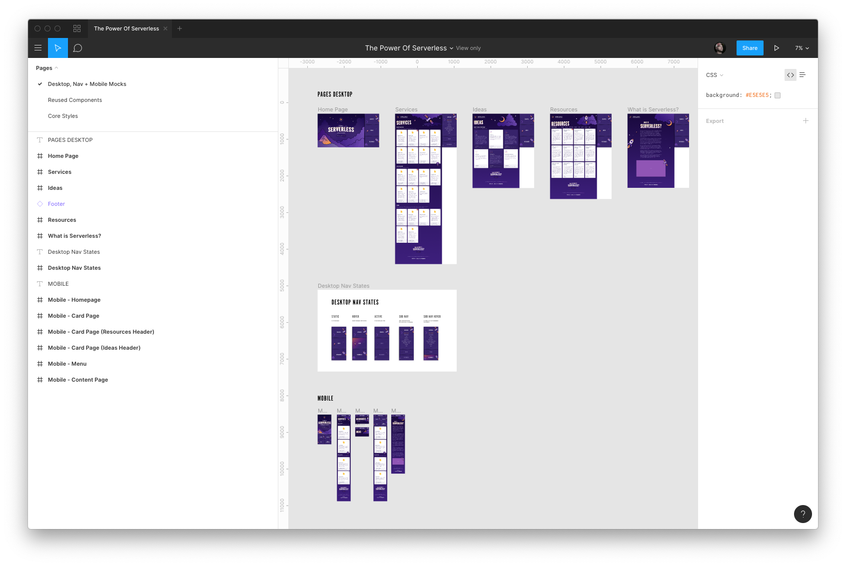
Design by Kylie Timpani and illustration by Geri Coady
Kylie Timpani (yes, the same Kylie who worked on the v17 design of this site!) did all the visual design for this project.
If anything looks off or weird, blame my poor implementation of their work. I’m still making my way through checklists of improvements as we speak. Sometimes you just gotta launch things and improve as you go.
Everything is on GitHub and contributions are welcome
I’d appreciate any help cleaning up copy, adding services, making it more accessible… really anything you think would improve the site. Feel free to link up your own work, although I tend to find that contributions are stronger when you are propping up someone else rather than yourself. It’s ultimately my call whether your pull request is accepted. That might be subjective sometimes.
Before doing anything dramatic, probably best to talk it out by emailing me or opening an issue. There’s already a handful of issues in there.
I suspect companies that exist in this space will be interested in being represented in here somewhere, and I’m cool with that. Go for it. Perhaps we can open up some kind of sponsorship opportunities as well.
Creating with components: A good idea
I went with Gatsby for this project. A little site like this (a couple of pages of static content) deserves to be rendered entirely server-side. Gatsby does that, even though you work entirely in React, which is generally thought of as a client-side technology. Next.js and react-static are similar in spirit.
I purposely wanted to work in JavaScript because I feel like JavaScript has been doing the best job around the idea of architecting sites in components. Sure, you could sling some partials and pass local variables in Rails partials or Nunjucks includes, but it’s a far cry from the versatility you get in a framework like React, Vue or Angular that are designing entirely to help build components for the front end.
The fact that these JavaScript frameworks are getting first-class server-side rendering stories is big. Plus, after the site’s initial render, the site „hydrates” and you end up getting that SPA feel anyway… fantastic. Yet another thing that shows how a JavaScript-focused front-end developer is getting more and more powerful.
As an aside: I don’t have much experience with more complicated content data structures and JAMstack sites. I suspect once you’ve gone past this „little simple cards of data” structure, you might be beyond what front-matter Markdown files are best suited toward and need to get into a more full-fledged CMS situation, hopefully with a GraphQL endpoint to get whatever you need. Ripe space, for sure.
In a perfect world, our projects would have unlimited resources and time. Our teams would begin coding with well thought out and highly refined UX designs. There would be consensus among developers about the best way to approach styling. There’d be one or more CSS gurus on the team who could ensure that functionality and style could roll out simultaneously without it turning into a train-wreck.
I’ve actually seen this happen in large enterprise environments. It’s a beautiful thing. This article is not for those people.
On the flip side of the coin is the tiny startup that has zero funding, one or two front-end developers, and a very short timeline to demonstrate some functionality. It doesn’t have to look perfect, but it should at least render reasonably well on desktop, tablet, and mobile. This gets them to a point where it can be shown to advisors and early users; maybe even potential investors who’ve expressed an interest in the concept. Once they get some cashflow from sales and/or investment, they can get a dedicated UX designer and polish the interface.
What follows is for this latter group.
Project Kickoff Meeting
Let’s invent a company to get the ball rolling.
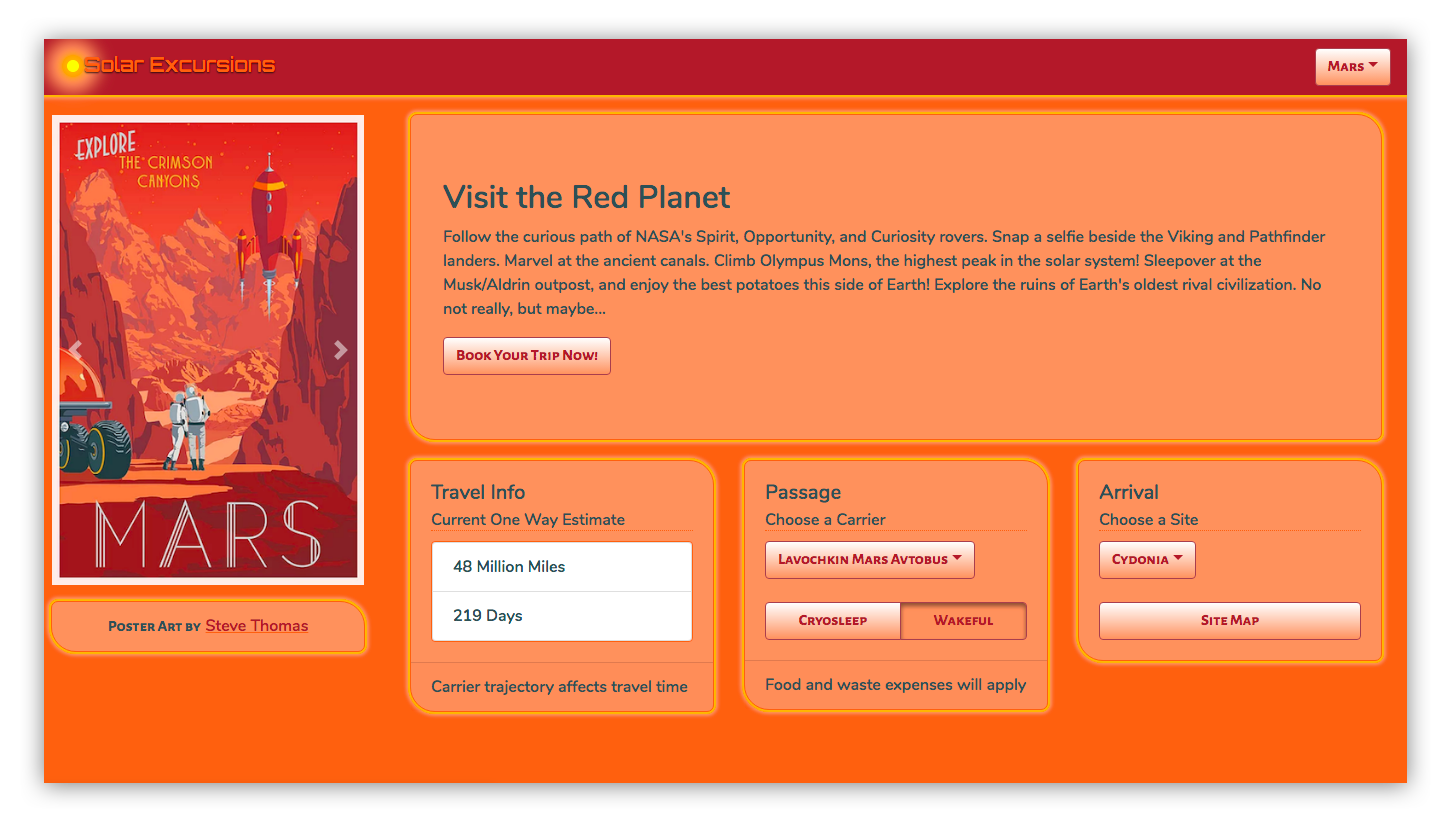
Solar Excursions is a small travel agency aiming to serve the near-future’s burgeoning space tourism industry.
Our tiny development team has agreed that React will be used for the UI. One of our front-end developers is big on Sass, and the other is enamored with CSS in JavaScript. But they’ll be hard pressed to knock out their initial sprint goals; there’s certainly no time for arguing about the best possible styling approach. Both coders agree the choice doesn’t matter much in the long run, as long as its consistently executed. They’re certain that implementing the styling from scratch under the gun now will incur technical debt that will have to be cleaned up later.
After some discussion, the team opts to plan for one or more „styling refactor” sprints. For now, we’ll just focus on getting something up on the screen using React-Bootstrap. That way we’ll be able to quickly build working desktop and mobile layouts without much fuss.
The less time spent on front-end styling the better, because we’ll also need the UI to hook up to the services our backend developer will be cranking out. And, as our application architecture begins to take shape, both front-enders agree it’s important that it be unit tested. They have a lot on their plate.
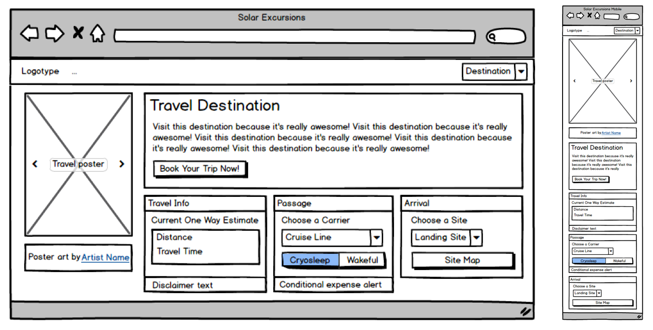
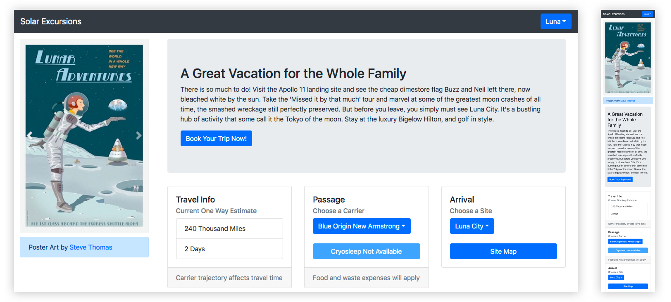
Based on my discussions with the Powers That Be, as a dedicated project manager, I slaved over Balsamiq for at least ten minutes to provide the team with mockups for the booking page on desktop and mobile. I assume they’ll make tablet meet in the middle and look reasonable.
Initial mockups for the Solar Excursions Trip Booking Page on desktop (left) and mobile (right).
Sprint Zero: Review Meeting
Pizza all around! The team worked really hard to hit its goals, and we now have a booking page with a layout that approximates the mockups. The infrastructure for services is coming together, but there’s quite a way to go before we can connect the UI to it. In the interim, the front-enders are using a hardcoded mock data structure.
The first iteration of the page in code using react-bootstrap.
Here’s a look at our UI code so far:
This is all straightforward React. We’re using some of that Hooks hotness, but it’s probably passé to most of you by now.
The key takeaway to notice here is how four of our five application components import and use components from react-bootstrap. Only the main App component is unaffected. That’s because it just composes the top level view with our custom components.
// App.js imports
import React, { useState } from "react";
import Navigation from "./Navigation";
import Page from "./Page";

// Navigation.js imports
import React from "react";
import { Navbar, Dropdown, Nav } from "react-bootstrap";

// Page.js imports
import React from "react";
import PosterCarousel from "./PosterCarousel";
import DestinationLayout from "./DestinationLayout";
import { Container, Row, Col } from "react-bootstrap";

// PosterCarousel.js imports
import React from "react";
import { Alert, Carousel, Image } from "react-bootstrap";

// DestinationLayout.js imports
import React, { useState, useEffect } from "react";
import {
  Button,
  Card,
  Col,
  Container,
  Dropdown,
  Jumbotron,
  ListGroup,
  Row,
  ToggleButtonGroup,
  ToggleButton
} from "react-bootstrap";
The decision to move fast with Bootstrap has allowed us to hit our sprint goals, but we’re already accumulating technical debt. This is just four affected components, but as the application grows, it’s clear the „styling refactor” sprints that we planned for are going to become exponentially harder. And we haven’t even customized these components much. Once we have tens of components, all using Bootstrap with lots of inline styling to pretty them up, refactoring them to remove react-bootstrap dependencies will be a scary proposition indeed.
Rather than building more of the booking pipeline pages, the team decides that we’ll spend the next sprint working to isolate the react-bootstrap usage in a custom component kit since our services are still under construction. Application components will only use components from this kit. That way, when it comes time to ween ourselves from react-bootstrap, the process will be much easier. We won’t have to refactor thirty usages of the react-bootstrap Button throughout the app, we’ll just rewrite the internals of our KitButton component.
Sprint One: Review Meeting
Well, that was easy. High-fives. No change to the visual appearance of the UI, but we now have a „kit” folder that’s sibling to „components” in our React source. It has a bunch of files like KitButton.js, which basically export renamed react-bootstrap components.
An example component from our kit looks like this:
We wrap those all kit components up into a module like this:
// kit/index.js
import { KitCard } from "./KitCard";
import { KitHero } from "./KitHero";
import { KitList } from "./KitList";
import { KitImage } from "./KitImage";
import { KitCarousel } from "./KitCarousel";
import { KitDropdown } from "./KitDropdown";
import { KitAttribution } from "./KitAttribution";
import { KitNavbar, KitNav } from "./KitNavbar";
import { KitContainer, KitRow, KitCol } from "./KitContainer";
import { KitButton, KitToggleButton, KitToggleButtonGroup } from "./KitButton";
export {
  KitCard,
  KitHero,
  KitList,
  KitImage,
  KitCarousel,
  KitDropdown,
  KitAttribution,
  KitButton,
  KitToggleButton,
  KitToggleButtonGroup,
  KitContainer,
  KitRow,
  KitCol,
  KitNavbar,
  KitNav
};
And now our application components are completely free of react-bootstrap. Here are the imports for the affected components:
// Navigation.js imports
import React from "react";
import { KitNavbar, KitNav, KitDropdown } from "../kit";


// Page.js imports
import React from "react";
import PosterCarousel from "./PosterCarousel";
import DestinationLayout from "./DestinationLayout";
import { KitContainer, KitRow, KitCol } from "../kit";


// PosterCarousel.js imports
import React from "react";
import { KitAttribution, KitImage, KitCarousel } from "../kit";


// DestinationLayout.js imports
import React, { useState, useEffect } from "react";
import {
  KitCard,
  KitHero,
  KitList,
  KitButton,
  KitToggleButton,
  KitToggleButtonGroup,
  KitDropdown,
  KitContainer,
  KitRow,
  KitCol
} from "../kit";
Here’s the front-end codebase now:
Although we’ve corralled all of the react imports into our kit components, our application components still rely a bit on the react-bootstrap implementation because the attributes we place on our kit component instances are the same as those of react-bootstrap. That constrains us when it comes to re-implementing the kit components, because we need to adhere to the same API. For instance:
// From Navigation.js
<KitNavbar bg="dark" variant="dark" fixed="top">
Ideally, we wouldn’t have to add those react-bootstrap specific attributes when we instantiate our KitNavbar.
The front-enders promise to refactor those out as we go, now that we’ve identified them as problematic. And any new references to react-bootstrap components will go into our kit instead of directly into the application components.
Meanwhile, we’ve shared our mock data with the server engineer, who is working hard to build separate server environments, implement the database schema, and expose some services to us.
That gives us time to add some gloss to our UI in the next sprint — which is good because the Powers That Be would like to see separate themes for each destination. As the user browses destinations, we need to have the UI color scheme change to match the displayed travel poster. Also, we want to try and spiff up those components a bit to begin evolving our own look and feel. Once we have some money coming in, we’ll get a designer to do a complete overhaul, but hopefully we can reach a happy medium for our early users.
Sprint Two: Review Meeting
Wow! The team really pulled out all the stops this sprint. We got per-destination themes, customized components, and a lot of the lingering react-bootstrap API implementations removed from the application components.
Here’s what the desktop looks like now:
Check out the solarized theme for the red planet!
In order to pull this off, the front-enders brought in the Styled Components library. It made styling the individual kit components a breeze, as well as adding support for multiple themes.
Let’s look at a few highlights of their changes for this sprint.
First, for global things like pulling in fonts and setting the page body styles, we have a new kit component called KitGlobal.
It uses the createGlobalStyle helper to define the CSS for the body element. That imports our desired web fonts from Google, sets the background color to whatever the current theme’s „foreground” value is, and turns off overflow in the x-direction to eliminate a pesky horizontal scrollbar. We use that KitGlobal component in the render method of our App component.
Also in the App component, we import ThemeProvider from styled-components, and something called „themes” from ../theme. We use React’s useState to set the initial theme to themes.luna and React’s useEffect to call setTheme whenever the „destination” changes. The returned component is now wrapped in ThemeProvider, which is passed „theme” as a prop. Here’s the App component in its entirety.
KitGlobal is rendering like any other component. Nothing special there, only that the body tag is affected. ThemeProvider is using the React Context API to pass theme down to whatever components need it (which is all of them). In order to fully understand that, we also need to take a look at what a theme actually is.
To create a theme, one of our front-enders took all the travel posters and created palettes for each by extracting the prominent colors. That was fairly simple.
Obviously, we weren’t going to use all the colors. The approach was mainly to dub the most used two colors foreground and background. Then we took three more colors, generally ordered from lightest to darkest as accent1, accent2, and accent3. Finally, we picked two contrasting colors to call text1 and text2. For the above destination, that looked like:
Once we have a theme for each destination, and it is being passed into all the components (including the kit components that our application components are now built from), we need to use styled-components to apply those theme colors as well as our custom visual styling, like the panel corners and „border glow.”
This is a simple example where we made our KitHero component apply the theme and custom styles to the Bootstrap Jumbotron:
Then there are more complex cases where we want to preset some attributes on the react-bootstrap component. For instance, the KitNavbar component which we identified earlier as having a bunch of react-bootstrap attributes that we’d rather not pass from the application’s declaration of the component.
First, we create a component called StyledBootstrapNavbar using styled-components. We were able to handle some of the attributes with the CSS we passed to styled-components. But in order to continue leveraging (for now) the reliable stickiness of the component to the top of the screen while everything else is scrolled, our front-enders elected to continue using react-bootstrap’s fixed attribute. In order to do that, we had to create a KitNavbar component that rendered an instance of StyledBootstrapNavbar with the fixed=top attribute. We also passed through all the props, which includes its children.
We only have to create a separate class that renders styled-component’s work and passes props through to it if we want to explicitly set some attributes in our kit component by default. In most cases, we can just name and return styled-component’s output and use it as we did with KitHero above.
Now, when we render the KitNavbar in our application’s Navigation component, it looks like this:
Finally, we took our first stabs at refactoring our kit components away from react-bootstrap. The KitAttribution component is a Bootstrap Alert which, for our purposes, is little more than an ordinary div. We were able to easily refactor to remove its dependency on react-bootstrap.
This is the component as it emerged from the previous sprint:
After three sprints, our team is well on its way to having a scalable component architecture in place for the UI.
We are moving quickly thanks to react-bootstrap, but are no longer piling up loads of technical debt as a result of it.
Thanks to styled-components, we were able to implement multiple themes (like how almost every app on the Internet these days sports dark and light modes). We also don’t look like an out-of-the-box Bootstrap app anymore.
By implementing a custom component kit that contains all references to react-bootstrap, we can refactor away from it as time permits.
I’ve heard people say that the #1 most exciting and important thing that came out of Google I/O this year was the evergreen Googlebot:
Today, we are happy to announce that Googlebot now runs the latest Chromium rendering engine (74 at the time of this post) when rendering pages for Search. Moving forward, Googlebot will regularly update its rendering engine to ensure support for latest web platform features.
Before this, I guess I never even thought about it.
I guess part of it is that some people did already know that the old version didn’t support some newfangled JavaScript stuff, and thus literally packaged their app with old JavaScript to be more SEO-friendly.
A bunch of people were apparently shipping older code simply for the sake of Googlebot, and now they don’t have to. Sure, I’ll call that a win.
Don’t read this news as „don’t worry about your JavaScript-rendered pages and SEO” though, because Google Webmasters is still telling us that pages with content that requires JavaScript to render are put into a special slower queue for both initial crawling and for updates. Not necessarily a penalty, but certainly a delay. I’m sure that’s enough to make server-side rendering a priority for sites where SEO is the whole ballgame.