Šime posts regular content for web developers on webplatform.news.
In this week’s roundup, Chrome is adding an install option for Progressive Web Apps, Opera GX comes to Windows, the ECMAScript proposals get an update, and CSS Scroll Snap is coming to a Firefox browser near you.
An install icon is coming to Chrome on desktop
Pete LePage: The next version of Chrome will automatically show an install icon in the address bar on desktop if the site meets Chrome’s PWA „installability” criteria. You can listen for the appinstalled event to detect if the user installed your PWA.
Opera GX is available on Windows
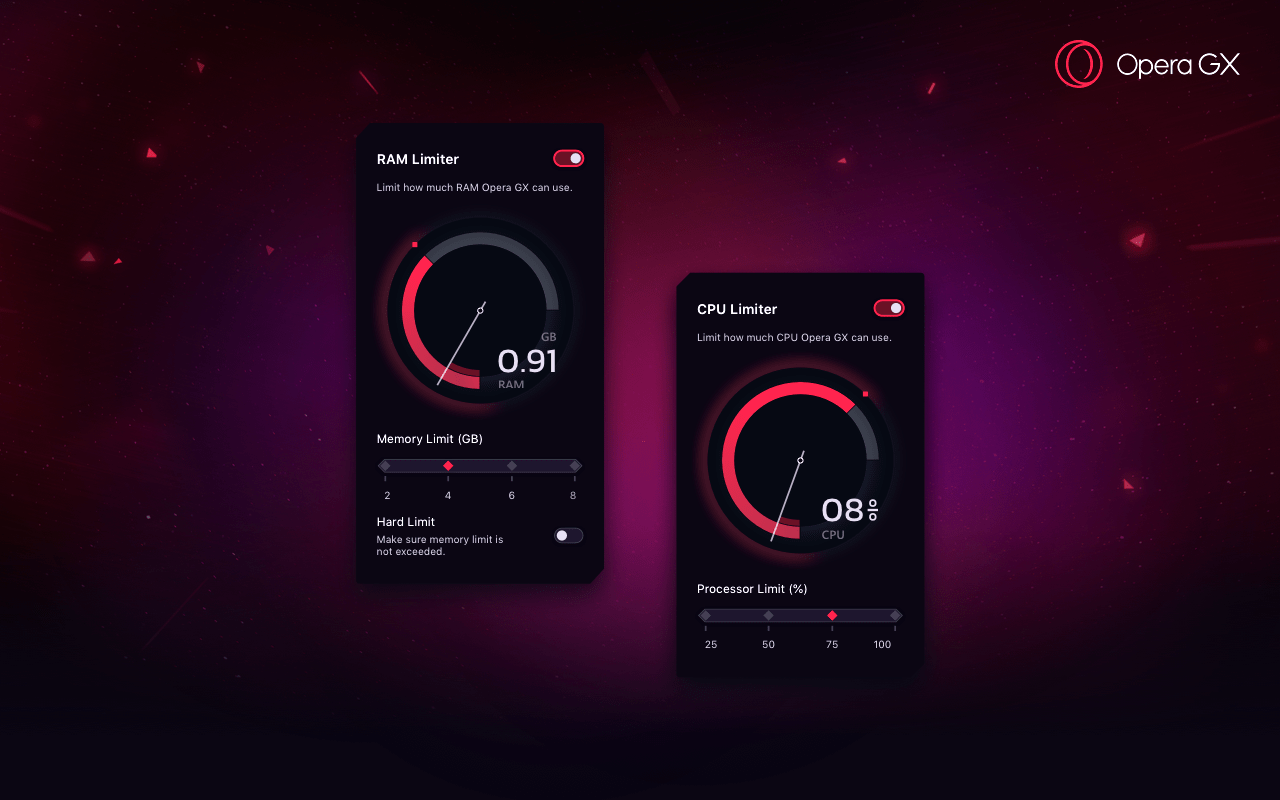
Maciej Kocemba: The preview version of Opera GX for Windows is now available. This is a special version of Opera that lets users limit how much CPU and RAM is available to the browser.
Updated ECMAScript proposals
Azu The JavaScript optional chaining operator (obj?.prop) and null-ish coalescing operator (x ?? y) proposals have been moved to Stage 2 of the TC39 process. (See Web Platform News issue 902 for more information about the TC39 process.)
// BEFORE
let text = response.settings && response.settings.headerText;
if (text == null) text = "Hello, world!";

// AFTER
let text = response.settings?.headerText ?? "Hello, world!";
CSS Scroll Snap is coming to Firefox
Šime Vidas: CSS Scroll Snap is supported in Chrome, Safari, and the next version of Firefox. Scroll snapping works well on touch screen devices but there are some usability issues on desktop platforms.
Šime posts regular content for web developers on webplatform.news.
In this week’s roundup, Chrome is adding an install option for Progressive Web Apps, Opera GX comes to Windows, the ECMAScript proposals get an update, and CSS Scroll Snap is coming to a Firefox browser near you.
An install icon is coming to Chrome on desktop
Pete LePage: The next version of Chrome will automatically show an install icon in the address bar on desktop if the site meets Chrome’s PWA „installability” criteria. You can listen for the appinstalled event to detect if the user installed your PWA.
Opera GX is available on Windows
Maciej Kocemba: The preview version of Opera GX for Windows is now available. This is a special version of Opera that lets users limit how much CPU and RAM is available to the browser.
Updated ECMAScript proposals
Azu The JavaScript optional chaining operator (obj?.prop) and null-ish coalescing operator (x ?? y) proposals have been moved to Stage 2 of the TC39 process. (See Web Platform News issue 902 for more information about the TC39 process.)
// BEFORE
let text = response.settings && response.settings.headerText;
if (text == null) text = "Hello, world!";

// AFTER
let text = response.settings?.headerText ?? "Hello, world!";
CSS Scroll Snap is coming to Firefox
Šime Vidas: CSS Scroll Snap is supported in Chrome, Safari, and the next version of Firefox. Scroll snapping works well on touch screen devices but there are some usability issues on desktop platforms.
I’d like to tell you how I see code and design intersect and support one another. Specifically, I want to cover how designers can use code in their everyday work. I suggest this not because it’s a required skill, but because even a baseline understanding of coding can make designs better and the hand-off from design to development smoother.
As a UX Designer, I am always looking for good ways to both explore my UX design problems and communicate the final designs to others. Over the past 30 years, my work has always involved working alongside developers, but generally there has been a great divide between what I do and what developers do.
I can code at a basic level. For example, I’ve helped teach C to undergraduates back when I was a post-graduate student. I’ve worked on the usability of JDeveloper Oracle’s Integrated Development Environment (IDE) for Java. I also worked for a very short while on simplifying the UX of a WordPress content management environment to make it accessible to less technical users. This required a good understanding of HTML and CSS. I also volunteered on the design of the PHP website and had to develop some understanding of the server side of web development.
But even given these experiences, I am not a developer in any true sense of the word. If I happen to be looking at code, it’s in a “just in time” learning model — I look up what I need and then hack it until it works. Learning this way has often been frowned upon, a bit like learning to drive without lessons. You pick up bad development habits but maybe that’s OK for the work I do.
So, no I don’t develop or write code. My day-to-day work is mostly been spent drawing, talking and gathering requirements. As far as design goes, I’ll start by sketching concepts in a notebook or using Balsamiq. Then I draw up UX wireframes and prototypes using tools like Axure, Adobe XD, InVision Studio, Figma and Sketch. By the time I’m ready to hand off my deliverables to development, all the visual assets and documentation have been defined and communicated. But I don’t step over the line into code development. That is just not my area of expertise.
So, why should designers know code?
We’ve already established that I’m no developer, but I have recently become an advocate for designers getting a good feel for how design and code interact.
In fact, I’d call it “playing with code.” I am definitely not suggesting that UX designers become developers, but at the very least, I think designers would benefit by becoming comfortable with a basic understanding of what is currently possible with CSS and best practices in HTML.
Being experimental is a huge part of doing design. Code is just another medium with which we can experiment and build beautiful solutions. So, we’re going to look at a couple of ways designers can experiment with code, even with a light understanding of it. What we’re covering here may be obvious to developers, but there are plenty of designers out there who have never experimented with code and will be seeing these for the first time.
So, it’s for them (and maybe a refresher for you) that we look at the following browser tools.
DevTools: The ultimate code playground
One of the concerns a UX designer might have is knowing how a design holds up once it’s in the browser. Are the colors accurate? Are fonts legible throughout? How do the elements respond on various devices? Will my grey hover state work with the white/grey zebra striping on my application grids in practice? These are some of the styling and interaction issues designers are thinking about when we hand our work off for development.
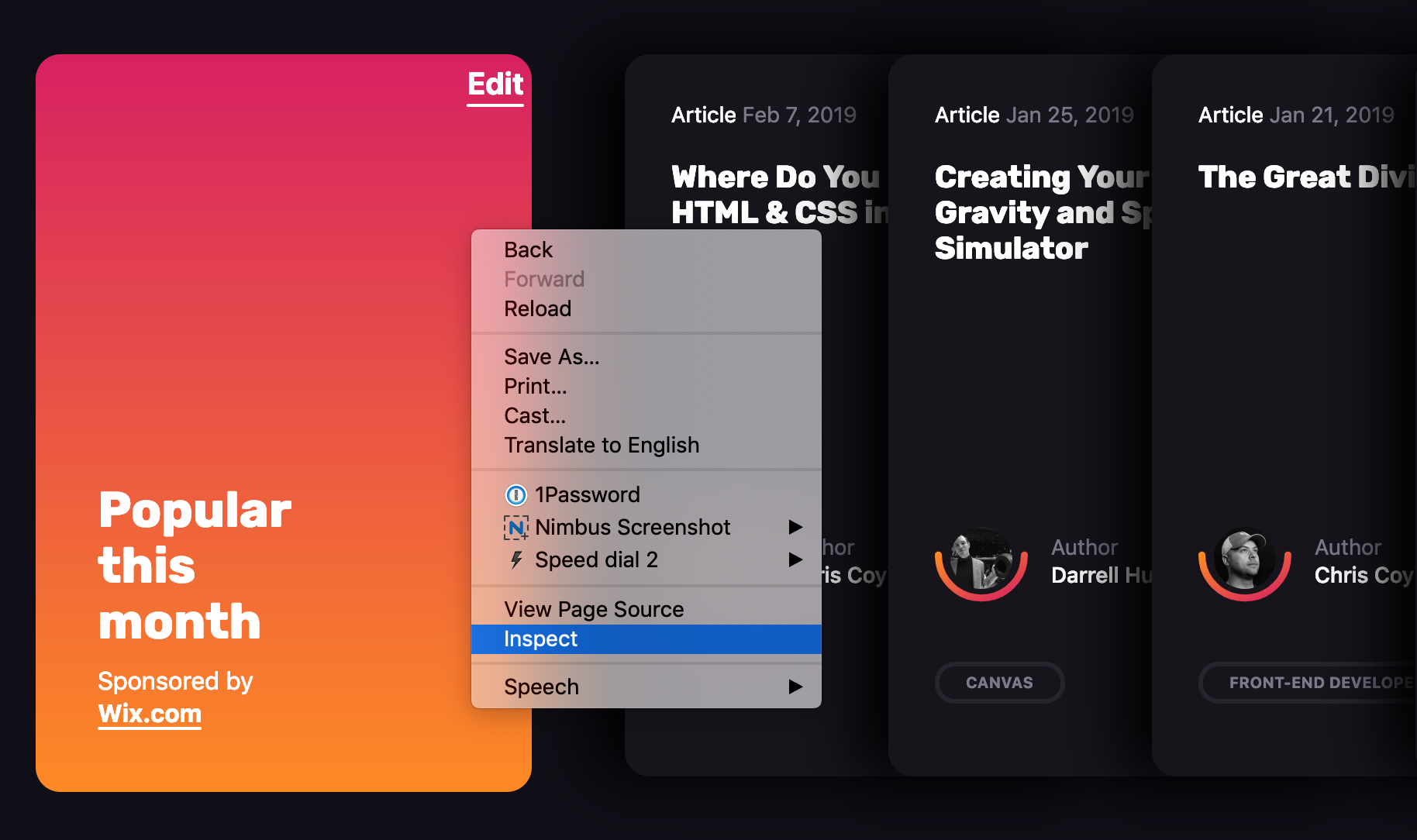
This is where DevTools can be a designer’s best friend. Every browser has its own version of it. You may have already played with such tools before. It’s that little “Inspect” option when right clicking on the screen.
Entering the wonderful world of DevTools can be done from any webpage.
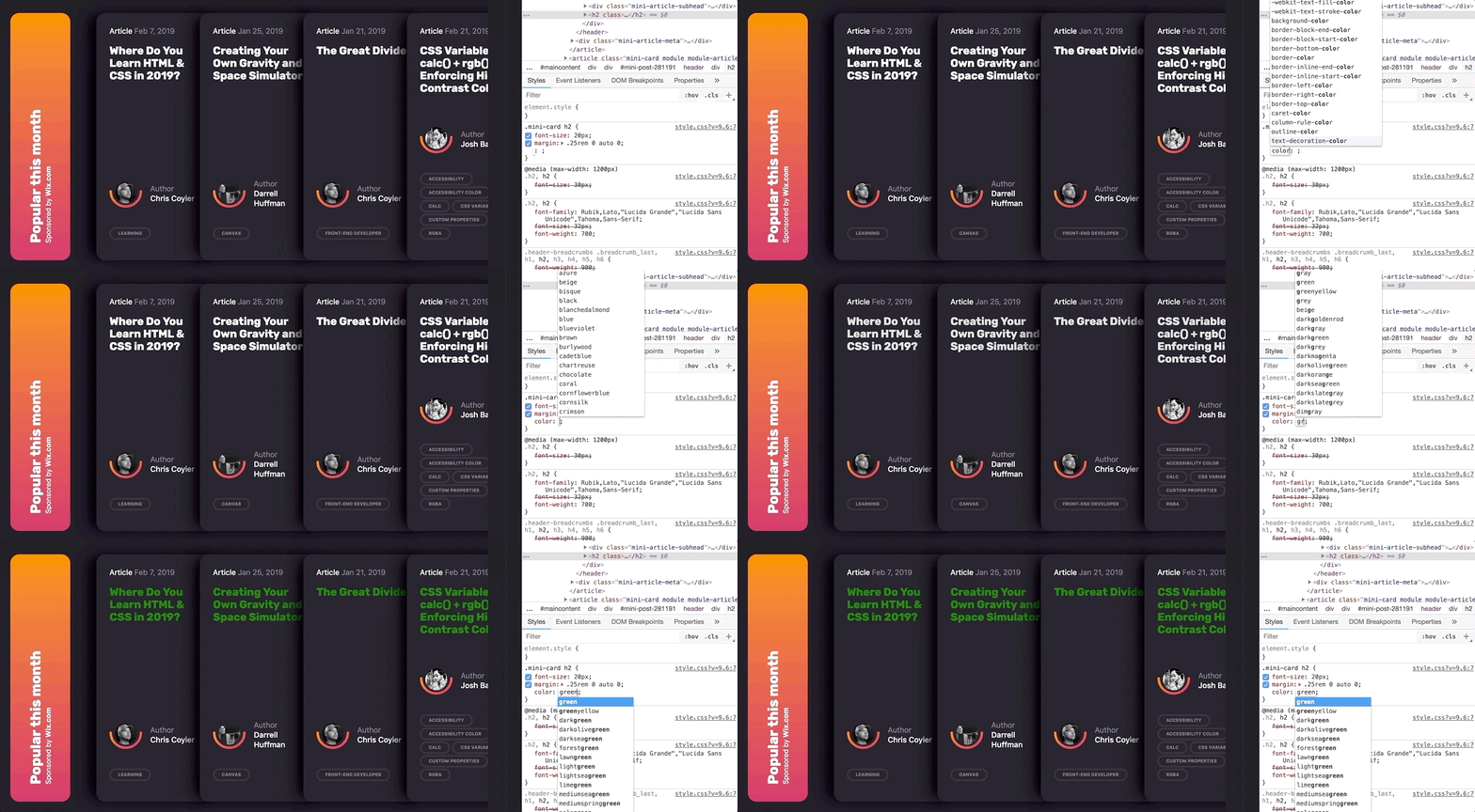
What makes DevTools such a wonderful resource is that it provides a way to manipulate the code of a live website or web application without having to set up a development environment. And it’s disposable. Any edits you make are for your eyes only and are washed away the very moment the browser refreshes.
Editing code in DevTools makes changes to the page on the fly.
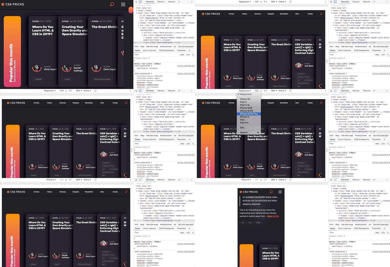
Further, DevTools can mimic other devices.
Need to see how a page or changes to it look on other devices? DevTools can give you an idea.
And, if you haven’t seen it yet, Firefox released a wonderful new shape path editor that’s very valuable for exploring interesting designs.
Over the past few months, I have been working on a complex web client for an enterprise-level application. Last sprint, my UX design story was to explore the look of the entry page of the web application and how to introduce a new color scheme. It was hard to envision how the changes I was making were going to impact the tool as a whole as some of the components I was changing are used throughout the product.
One day, when discussing a design decision, one of the developers tested out my suggested change to a component using the latest DevTools in his browser. I was amazed by how much DevTools has grown and expanded since I last remember it. I could immediately see the impact of that change across our whole web application and how different design decisions interacted with the existing design. I started to experiment with DevTools myself and was able to preview and experiment with how my own simple CSS changes to components would impact the whole web application. Super helpful!
However, it was also a little frustrating to not be able store my experiments and changes for future reference. So, I went exploring to see what else was out there to support my design process.
Chrome browser extensions
DevTools is are amazing right out of the box, but experimenting with code gets even more awesome when browser extensions are added to the mix. Chrome, in particular, has a couple that I really like.
Chrome Extension 1: User CSS
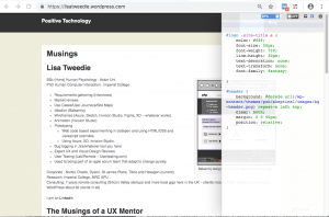
User CSS is a Chrome browser extension that allows you to save the changes you make in DevTools in an editable CSS code tab. These CSS changes are automatically executed on that page if User CSS is enabled. This means that you can set up CSS overrides for any page on the web, view them later, and share them with others. This can be an incredible tool when, say, doing a design review of a staging site prior to release, or really any design exploration for a web application or website that is viewable in a browser.
User CSS has a nice built-in code editor, so my code is always well formatted and includes syntax highlighting so I don’t have to worry about that sort of thing. I particularly like the fact that overrides are executed immediately so you can see changes on the fly. It also has a useful switch that allows you to turn your overrides on and off. This makes it very simple to demonstrate a set of changes to a team. This extension has allowed me to easily present a comparison between an existing page design and proposed changes. I’ve even used it to make a simple video demonstrating the proposed design changes.
In this video I make some simple edits to my web page and then show how I can turn on and off the edits by simply clicking the on/off button on User CSS:
This extension is a perfect if you all you need to do is edit CSS, particularly if you have some very simple design changes to make want to those changes to persist. However, the complexity of a design increases, I have found myself wanting to save more than one snippet of code at a time. Copying and pasting code in and out of the User CSS editor was becoming a pain. I wanted something with more flexibility and freedom to experiment. I also wanted to be able to look at simple changes to the HTML of my web application and even play with a bit of JavaScript.
That’s where the next extension comes into play.
Chrome Extension 2: Web Overrides
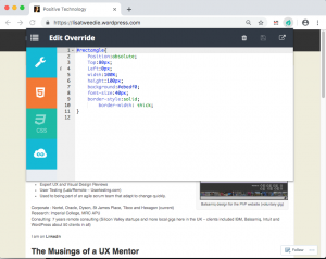
The second Chrome extension I found is called Web Override and it provides a way to override HTML, CSS and JavaScript. All of them! This is presented as three tabs, much the same way CodePen does, which makes it a very powerful tool for creating rough working design prototypes.
Web Overrides also allows you to save multiple files so that you can switch different parts of a design on or off in different combinations. It also quickly switches between the different options to show off different design concepts.
This video shows how I added an HTML element into a page and edited the new element with some basic CSS:
Using the HTML tab makes it possible to edit any element on the page, like swap out a logo, remove unnecessary elements, or add new ones. The JavaScript tab is similar in that I can do simple changes, like inject additional text into the website title so that I can test how dynamic changes might affect the layout — this can be useful for testing different scenarios, such as differences with internationalization.
These edits may be trivial from a coding perspective, but they allow me to explore hundreds of alternative designs in a much shorter time and with a lot less risk than scooting pixels around in a design application. I literally could not explore as many ideas as quickly using my traditional UX prototyping tools as I can with this one extension.
And, what is more, both me and my team have confidence in the design deliverables because we tested them early on in the browser. Even the most pixel-perfect Photoshop file can get lost in translation when the design is in the browser because it’s really just a snapshot of a design in a static state. Testing designs first in the browser using these extensions prove that what we have designed is possible.
On the flip side of this, you might want to check out how Jon Kantner used similar browser extensions to disable CSS as a means to audit the semantic markup various sites. It’s not exactly design-related, but interesting to see how these tools can have different use cases.
What I’ve learned so far
I am excited about what I have learned since leaning into DevTools and browser extensions. I believe my designs are so much better as a result. I also find myself able to have more productive conversations with developers because we now have a way to communicate well. The common ground between design and code in rapid prototypes really helps facilitate discussion. And, because I am playing around with actual code, I have a much better sense about how the underlying code will eventually be written and can empathize a lot more with the work developers do — and perhaps how I can make their jobs easier in the process.
It has also created a culture of collaborative rapid prototyping on my team which is a whole other story.
Playing with code has opened up new ideas and encouraged me to adapt my work to the context of the web. It’s been said that getting into the browser earlier in the design process is ideal and these are the types of tools that allow me (and you) to do just that!
Do you have other tools or processes that you use to facilitate the collaboration between design and code? Please share them in the comments!
I’d like to tell you how I see code and design intersect and support one another. Specifically, I want to cover how designers can use code in their everyday work. I suggest this not because it’s a required skill, but because even a baseline understanding of coding can make designs better and the hand-off from design to development smoother.
As a UX Designer, I am always looking for good ways to both explore my UX design problems and communicate the final designs to others. Over the past 30 years, my work has always involved working alongside developers, but generally there has been a great divide between what I do and what developers do.
I can code at a basic level. For example, I’ve helped teach C to undergraduates back when I was a post-graduate student. I’ve worked on the usability of JDeveloper Oracle’s Integrated Development Environment (IDE) for Java. I also worked for a very short while on simplifying the UX of a WordPress content management environment to make it accessible to less technical users. This required a good understanding of HTML and CSS. I also volunteered on the design of the PHP website and had to develop some understanding of the server side of web development.
But even given these experiences, I am not a developer in any true sense of the word. If I happen to be looking at code, it’s in a “just in time” learning model — I look up what I need and then hack it until it works. Learning this way has often been frowned upon, a bit like learning to drive without lessons. You pick up bad development habits but maybe that’s OK for the work I do.
So, no I don’t develop or write code. My day-to-day work is mostly been spent drawing, talking and gathering requirements. As far as design goes, I’ll start by sketching concepts in a notebook or using Balsamiq. Then I draw up UX wireframes and prototypes using tools like Axure, Adobe XD, InVision Studio, Figma and Sketch. By the time I’m ready to hand off my deliverables to development, all the visual assets and documentation have been defined and communicated. But I don’t step over the line into code development. That is just not my area of expertise.
So, why should designers know code?
We’ve already established that I’m no developer, but I have recently become an advocate for designers getting a good feel for how design and code interact.
In fact, I’d call it “playing with code.” I am definitely not suggesting that UX designers become developers, but at the very least, I think designers would benefit by becoming comfortable with a basic understanding of what is currently possible with CSS and best practices in HTML.
Being experimental is a huge part of doing design. Code is just another medium with which we can experiment and build beautiful solutions. So, we’re going to look at a couple of ways designers can experiment with code, even with a light understanding of it. What we’re covering here may be obvious to developers, but there are plenty of designers out there who have never experimented with code and will be seeing these for the first time.
So, it’s for them (and maybe a refresher for you) that we look at the following browser tools.
DevTools: The ultimate code playground
One of the concerns a UX designer might have is knowing how a design holds up once it’s in the browser. Are the colors accurate? Are fonts legible throughout? How do the elements respond on various devices? Will my grey hover state work with the white/grey zebra striping on my application grids in practice? These are some of the styling and interaction issues designers are thinking about when we hand our work off for development.
This is where DevTools can be a designer’s best friend. Every browser has its own version of it. You may have already played with such tools before. It’s that little “Inspect” option when right clicking on the screen.
Entering the wonderful world of DevTools can be done from any webpage.
What makes DevTools such a wonderful resource is that it provides a way to manipulate the code of a live website or web application without having to set up a development environment. And it’s disposable. Any edits you make are for your eyes only and are washed away the very moment the browser refreshes.
Editing code in DevTools makes changes to the page on the fly.
Further, DevTools can mimic other devices.
Need to see how a page or changes to it look on other devices? DevTools can give you an idea.
And, if you haven’t seen it yet, Firefox released a wonderful new shape path editor that’s very valuable for exploring interesting designs.
Over the past few months, I have been working on a complex web client for an enterprise-level application. Last sprint, my UX design story was to explore the look of the entry page of the web application and how to introduce a new color scheme. It was hard to envision how the changes I was making were going to impact the tool as a whole as some of the components I was changing are used throughout the product.
One day, when discussing a design decision, one of the developers tested out my suggested change to a component using the latest DevTools in his browser. I was amazed by how much DevTools has grown and expanded since I last remember it. I could immediately see the impact of that change across our whole web application and how different design decisions interacted with the existing design. I started to experiment with DevTools myself and was able to preview and experiment with how my own simple CSS changes to components would impact the whole web application. Super helpful!
However, it was also a little frustrating to not be able store my experiments and changes for future reference. So, I went exploring to see what else was out there to support my design process.
Chrome browser extensions
DevTools is are amazing right out of the box, but experimenting with code gets even more awesome when browser extensions are added to the mix. Chrome, in particular, has a couple that I really like.
Chrome Extension 1: User CSS
User CSS is a Chrome browser extension that allows you to save the changes you make in DevTools in an editable CSS code tab. These CSS changes are automatically executed on that page if User CSS is enabled. This means that you can set up CSS overrides for any page on the web, view them later, and share them with others. This can be an incredible tool when, say, doing a design review of a staging site prior to release, or really any design exploration for a web application or website that is viewable in a browser.
User CSS has a nice built-in code editor, so my code is always well formatted and includes syntax highlighting so I don’t have to worry about that sort of thing. I particularly like the fact that overrides are executed immediately so you can see changes on the fly. It also has a useful switch that allows you to turn your overrides on and off. This makes it very simple to demonstrate a set of changes to a team. This extension has allowed me to easily present a comparison between an existing page design and proposed changes. I’ve even used it to make a simple video demonstrating the proposed design changes.
In this video I make some simple edits to my web page and then show how I can turn on and off the edits by simply clicking the on/off button on User CSS:
This extension is a perfect if you all you need to do is edit CSS, particularly if you have some very simple design changes to make want to those changes to persist. However, the complexity of a design increases, I have found myself wanting to save more than one snippet of code at a time. Copying and pasting code in and out of the User CSS editor was becoming a pain. I wanted something with more flexibility and freedom to experiment. I also wanted to be able to look at simple changes to the HTML of my web application and even play with a bit of JavaScript.
That’s where the next extension comes into play.
Chrome Extension 2: Web Overrides
The second Chrome extension I found is called Web Override and it provides a way to override HTML, CSS and JavaScript. All of them! This is presented as three tabs, much the same way CodePen does, which makes it a very powerful tool for creating rough working design prototypes.
Web Overrides also allows you to save multiple files so that you can switch different parts of a design on or off in different combinations. It also quickly switches between the different options to show off different design concepts.
This video shows how I added an HTML element into a page and edited the new element with some basic CSS:
Using the HTML tab makes it possible to edit any element on the page, like swap out a logo, remove unnecessary elements, or add new ones. The JavaScript tab is similar in that I can do simple changes, like inject additional text into the website title so that I can test how dynamic changes might affect the layout — this can be useful for testing different scenarios, such as differences with internationalization.
These edits may be trivial from a coding perspective, but they allow me to explore hundreds of alternative designs in a much shorter time and with a lot less risk than scooting pixels around in a design application. I literally could not explore as many ideas as quickly using my traditional UX prototyping tools as I can with this one extension.
And, what is more, both me and my team have confidence in the design deliverables because we tested them early on in the browser. Even the most pixel-perfect Photoshop file can get lost in translation when the design is in the browser because it’s really just a snapshot of a design in a static state. Testing designs first in the browser using these extensions prove that what we have designed is possible.
On the flip side of this, you might want to check out how Jon Kantner used similar browser extensions to disable CSS as a means to audit the semantic markup various sites. It’s not exactly design-related, but interesting to see how these tools can have different use cases.
What I’ve learned so far
I am excited about what I have learned since leaning into DevTools and browser extensions. I believe my designs are so much better as a result. I also find myself able to have more productive conversations with developers because we now have a way to communicate well. The common ground between design and code in rapid prototypes really helps facilitate discussion. And, because I am playing around with actual code, I have a much better sense about how the underlying code will eventually be written and can empathize a lot more with the work developers do — and perhaps how I can make their jobs easier in the process.
It has also created a culture of collaborative rapid prototyping on my team which is a whole other story.
Playing with code has opened up new ideas and encouraged me to adapt my work to the context of the web. It’s been said that getting into the browser earlier in the design process is ideal and these are the types of tools that allow me (and you) to do just that!
Do you have other tools or processes that you use to facilitate the collaboration between design and code? Please share them in the comments!
Šime posts regular content for web developers on webplatform.news.
New Feature Policy API in Chrome
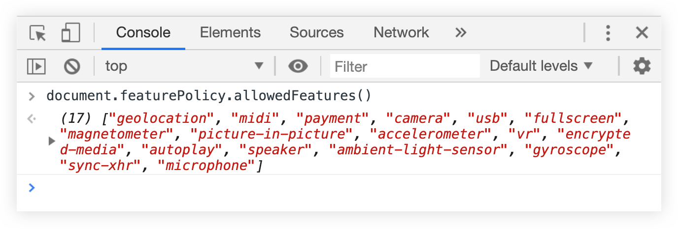
Pete LePage: You can use the document.featurePolicy.allowedFeatures method in Chrome to get a list of all Feature Policy-controlled features that are allowed on the current page.
This API can be useful when implementing a feature policy (and updating an existing feature policy) on your website.
Open your site in Chrome and run the API in the JavaScript console to check which Feature Policy-controlled features are allowed on your site.
Read about individual features on featurepolicy.info and decide which features should be disabled ('none' value), and which features should be disabled only in cross-origin <iframe> elements ('self' value).
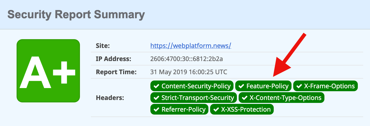
Add the Feature-Policy header to your site’s HTTP responses (policies are separated by semicolons).
Repeat Step 1 to confirm that your new feature policy is in effect. You can also scan your site on securityheaders.com.
In other news…
Dave Camp: Firefox now blocks cookies from known trackers by default (when the cookie is used in a third-party context). This change is currently in effect only for new Firefox users; existing users will be automatically updated to the new policy „in the coming months.”
Pete LePage: Chrome for Android now allows websites to share images (and other file types) via the navigator.share method. See Web Platform News Issue 1014 for more information about the Web Share API. Ayooluwa Isaiah’s post from yesterday is also a good reference on how to use it.
Valerie Young: The ECMAScript Internationalization APIs for date and time formatting (Intl.DateTimeFormat constructor), and number formatting (Intl.NumberFormat constructor) are widely supported in browsers.
Alan Jeffrey: Patrick Walton from Mozilla is working on a vector graphics renderer that can render text smoothly at all angles when viewed with an Augmented Reality (AR) headset. We plan to use it in our browsers for AR headsets (Firefox Reality).
Pinterest Engineering: Our progressive web app is now available as a standalone desktop application on Windows 10. It can be installed via the Microsoft Store, which „treats the packaged PWA as a first class citizen with access to Windows 10 feature APIs.”
Jonathan Davis: The flow-root value for the CSS display property has landed in Safari Technology Preview. This value is already supported in Chrome and Firefox. See Web Platform News Issue 871 for a use case.
Ire Aderinokun writes about a new way to set a performance budget (and stick to it) with Lighthouse, Google’s suite of tools that help developers see how performant and accessible their websites are:
Until recently, I also hadn’t setup an official performance budget and enforced it. This isn’t to say that I never did performance audits. I frequently use tools like PageSpeed Insights and take the feedback to make improvements. But what I had never done was set a list of metrics that I needed the site to meet, and enforce them using some automated tool.
The reasons for this were a combination of not knowing what exact numbers I should use for budgets as well as there being a disconnect between setting a budget and testing/enforcing it. This is why I was really excited when, at Google I/O this year, the Lighthouse team announced support for performance budgets that can be integrated with Lighthouse. We can now define a simple performance budget in a JSON file, which will be tested as part of the lighthouse audit!
I completely agree with Ire, and much in the same way I’ve tended to neglect sticking to a performance budget simply because the process of testing was so manual and tedious. But no more! As Ire shows in this post, you can even set Lighthouse up to test your budget with every PR in GitHub. That tool is called lighthousebot and it’s just what I’ve been looking for – an automated and predictable way to integrate a performance budget into every change that I make to a codebase.
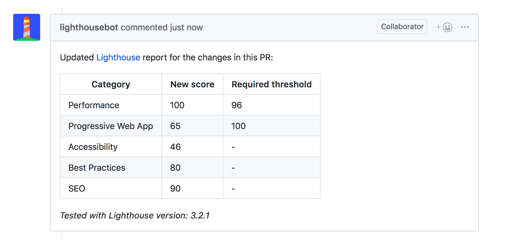
Today lighthousebot will comment on your PR after a test is complete and it will show you the before and after score:
How neat is that? This reminds me of Gareth Clubb’s recent post about improving web performance and building a culture around budgets in an organization. What better way to remind everyone about performance than right in GitHub after each and every change that they make?
Say you have an image you’re using in an <img> that is 800×600 pixels. Will it actually display as 800px wide on your site? It’s very likely that it will not. We tend to put images into flexible container elements, and the image inside is set to width: 100%;. So perhaps that image ends up as 721px wide, or 381px wide, or whatever. What doesn’t change is that image’s aspect ratio, lest you squish it awkwardly (ignoring the special use-case object-fit scenario).
The main point is that we don’t know how much vertical space an image is going to occupy until that image loads. This is the cause of jank! Terrible jank! It’s everywhere and it’s awful.
There are ways to create aspect-ratio sized boxes in HTML/CSS today. None of the options are particularly elegant because they rely on the „hack” of setting a zero height and pushing the boxes height with padding. Wouldn’t it be nicer to have a platform feature to help us here? The first crack at fixing this problem that I know about is an intrinsicsize attribute. Eric Portis wrote about how this works wonderfully in Jank-Free Image Loads.
We’d get this:
<img src="image.jpg" intrinsicsize="800x600" />
This is currently behind a flag in Chrome 71+, and it really does help solve this problem.
But…
The intrinsicsize property is brand new. It will only help on sites where the developers know about it and take the care to implement it. And it’s tricky! Images tend to be sized arbitrarily, and the intrinsicsize attribute will need to be custom on every image to be accurate and do its job. That is, if it makes it out of standards at all.
There is another possibility! Eric also talked about the aspect-ratio property in CSS as a potential solution. It’s also still just a draft spec. You might say, but how is this helpful? It needs to be just as bespoke as intrinsicsize does, meaning you’d have to do it as inline styles to be helpful. Maybe that’s not so bad if it solves a big problem, but inline styles are such a pain to override and it seems like the HTML attribute approach is more inline with the spirit of images. Think of how srcset is a hint to browsers for what images are available to download, allowing the browser to pick the best one for the scenario. Telling the browser about the aspect-ratio upfront is similarly useful.
I heard from Jen Simmons about an absolutely fantastic way to handle this: put a default aspect ratio into the UA stylesheet based on the elements existing width and height attributes. Like this:
img, video {
  aspect-ratio: attr(width) / attr(height);
}
Let that soak in.
Now if you already have:
<img src="image.jpg" width="800" height="600" />
It automatically has the correct aspect ratio as the page loads. That’s awesome.
It’s easy to understand.
A ton of the internet already has these attributes sitting on their images.
New developers will have no trouble understanding this, and old developers will be grateful there is little (if any) work to do here.
I like the idea of the CSS feature. But I like 100 times more the idea of putting it into the UA</abbr? stylesheet so that the entire web benefits. I'm sure that changing a UA stylesheet is no small thing to consider — and I’m not qualified to understand all the implications of that — but it feels like a very awesome thing at first consideration.
This post covers how I built a typography grid for a design system using Vue render functions. Here’s the demo and the code. I used render functions because they allow you to create HTML with a greater level of control than regular Vue templates, yet surprisingly I couldn’t find very much when I web searched around for real-life, non-tutorial applications of them. I’m hoping this post will fill that void and provide a helpful and practical use case on using Vue render functions.
I’ve always found render functions to be a little out-of-character for Vue. While the rest of the framework emphasizes simplicity and separation of concerns, render functions are a strange and often difficult-to-read mix of HTML and JavaScript.
I suspect that this syntax turns some people off, since ease-of-use is a key reason to reach for Vue in the first place. This is a shame because render functions and functional components are capable of some pretty cool, powerful stuff. In the spirit of demonstrating their value, here’s how they solved an actual business problem for me.
Quick disclaimer: It will be super helpful to have the demo open in another tab to reference throughout this post.
Defining criteria for a design system
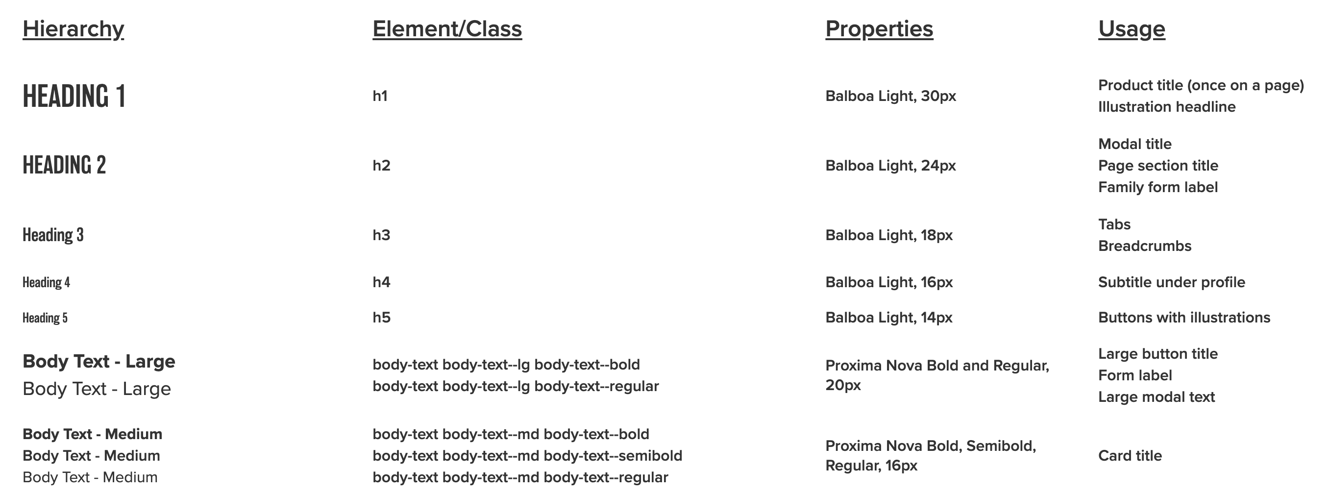
My team wanted to include a page in our VuePress-powered design system showcasing different typography options. This is part of a mockup that I got from our designer.
And here’s a sample of some of the corresponding CSS:
Headings are targeted with tag names. Other items use class names, and there are separate classes for weight and size.
Before writing any code, I created some ground rules:
Since this is really a data visualization, the data should be stored in a separate file.
Headings should use semantic heading tags (e.g. <h1>, <h2>, etc.) instead of having to rely on a class.
Body content should use paragraph (<p>) tags with the class name (e.g. <p class="body-text--lg">).
Content types that have variations should be grouped together by wrapping them in the root paragraph tag, or corresponding root element, without a styling class. Children should be wrapped with <span> and the class name.
Class names should only need to be written once for each cell that’s demonstrating styling.
Why render functions make sense
I considered a few options before starting:
Hardcoding
I like hardcoding when appropriate, but writing my HTML by hand would have meant typing out different combinations of the markup, which seemed unpleasant and repetitive. It also meant that data couldn’t be kept in a separate file, so I ruled out this approach.
Here’s what I mean:
<div class="row">
  <h1>Heading 1</h1>
  <p class="body-text body-text--md body-text--semibold">h1</p>
  <p class="body-text body-text--md body-text--semibold">Balboa Light, 30px</p>
  <p class="group body-text body-text--md body-text--semibold">
    <span>Product title (once on a page)</span>
    <span>Illustration headline</span>
  </p>
</div>
Using a traditional Vue template
This would normally be the go-to option. However, consider the following:
– An <h1>> tag rendered as-is.
– A <p> tag that groups some <span> children with text, each with a class (but no special class on the <p> tag).
– A <p> tag with a class and no children.
The result would have meant many instances of v-if and v-if-else, which I knew would get confusing fast. I also disliked all of that conditional logic inside the markup.
Because of these reasons, I chose render functions. Render functions use JavaScript to conditionally create child nodes based on all of the criteria that’s been defined, which seemed perfect for this situation.
Data model
As I mentioned earlier, I’d like to keep typography data in a separate JSON file so I can easily make changes later without touching markup. Here’s the raw data.
Each object in the file represents a different row.
{
  "text": "Heading 1",
  "element": "h1", // Root wrapping element.
  "properties": "Balboa Light, 30px", // Third column text.
  "usage": ["Product title (once on a page)", "Illustration headline"] // Fourth column text. Each item is a child node.
}
The object above renders the following HTML:
<div class="row">
  <h1>Heading 1</h1>
  <p class="body-text body-text--md body-text--semibold">h1</p>
  <p class="body-text body-text--md body-text--semibold">Balboa Light, 30px</p>
  <p class="group body-text body-text--md body-text--semibold">
    <span>Product title (once on a page)</span>
    <span>Illustration headline</span>
  </p>
</div>
Let’s look at a more involved example. Arrays represent groups of children. A classes object can store classes. The base property contains classes that are common to every node in the cell grouping. Each class in variants is applied to a different item in the grouping.
{
  "text": "Body Text - Large",
  "element": "p",
  "classes": {
    "base": "body-text body-text--lg", // Applied to every child node
    "variants": ["body-text--bold", "body-text--regular"] // Looped through, one class applied to each example. Each item in the array is its own node.
  },
  "properties": "Proxima Nova Bold and Regular, 20px",
  "usage": ["Large button title", "Form label", "Large modal text"]
}
We have a parent component, TypographyTable.vue, which contains the markup for the wrapper table element, and a child component, TypographyRow.vue, which creates a row and contains our render function.
I loop through the row component, passing the row data as props.
<template>
  <section>
    <!-- Headers hardcoded for simplicity -->
    <div class="row">
      <p class="body-text body-text--lg-bold heading">Hierarchy</p>
      <p class="body-text body-text--lg-bold heading">Element/Class</p>
      <p class="body-text body-text--lg-bold heading">Properties</p>
      <p class="body-text body-text--lg-bold heading">Usage</p>
    </div>
    <!-- Loop and pass our data as props to each row -->
    <typography-row
      v-for="(rowData, index) in $options.typographyData"
      :key="index"
      :row-data="rowData"
    />
  </section>
</template>
<script>
import TypographyData from "@/data/typography.json";
import TypographyRow from "./TypographyRow";
export default {
  // Our data is static so we don't need to make it reactive
  typographyData: TypographyData,
  name: "TypographyTable",
  components: {
    TypographyRow
  }
};
</script>
One neat thing to point out: the typography data can be a property on the Vue instance and be accessed using $options.typographyData since it doesn’t change and doesn’t need to be reactive. (Hat tip to Anton Kosykh.)
Making a functional component
The TypographyRow component that passes data is a functional component. Functional components are stateless and instanceless, which means that they have no this and don’t have access to any Vue lifecycle methods.
The empty starting component looks like this:
// No <template>
<script>
export default {
  name: "TypographyRow",
  functional: true, // This property makes the component functional
  props: {
    rowData: { // A prop with row data
      type: Object
    }
  },
  render(createElement, { props }) {
    // Markup gets rendered here
  }
}
</script>
The render method takes a context argument, which has a props property that’s de-structured and used as the second argument.
The first argument is createElement, which is a function that tells Vue what nodes to create. For brevity and convention, I’ll be abbreviating createElement as h. You can read about why I do that in Sarah’s post.
h takes three arguments:
An HTML tag (e.g. div)
A data object with template attributes (e.g. { class: 'something'})
Text strings (if we’re just adding text) or child nodes built using h
render(h, { props }) {
  return h("div", { class: "example-class" }, "Here's my example text")
}
OK, so to recap where we are at this point, we’ve covered creating:
a file with the data that’s going to be used in my visualization;
a regular Vue component where I’m importing the full data file; and
the beginning of a functional component that will display each row.
To create each row, the data from the JSON file needs to be passed into arguments for h. This could be done all at once, but that involves a lot of conditional logic and is confusing.
Instead, I decided to do it in two parts:
Transform the data into a predictable format.
Render the transformed data.
Transforming the common data
I wanted my data in a format that would match the arguments for h, but before doing this, I wrote out how I wanted things structured:
// One cell
{
  tag: "", // HTML tag of current level
  cellClass: "", // Class of current level, null if no class exists for that level
  text: "", // Text to be displayed
  children: [] // Children each follow this data model, empty array if no child nodes
}
Each object represents one cell, with four cells making up each row (an array).
function createRow(data) { // Pass in the full row data and construct each cell
  let { text, element, classes = null, properties, usage } = data;
  let row = [];
  row[0] = createCellData(data) // Transform our data using some shared function
  row[1] = createCellData(data)
  row[2] = createCellData(data)
  row[3] = createCellData(data)

  return row;
}
Let’s take another look at our mockup.
The first column has styling variations, but the rest seem to follow the same pattern, so let’s start with those.
This gives us a tree-like structure for each cell since some cells have groups of children. Let’s use two functions to create the cells.
createNode takes each of our desired properties as arguments.
createCell wraps around createNode so that we can check if the text that we’re passing in is an array. If it is, we build up an array of child nodes.
// Model for each cell
function createCellData(tag, text) {
  let children;
  // Base classes that get applied to every root cell tag
  const nodeClass = "body-text body-text--md body-text--semibold";
  // If the text that we're passing in as an array, create child elements that are wrapped in spans.
  if (Array.isArray(text)) {
    children = text.map(child => createNode("span", null, child, children));
  }
  return createNode(tag, nodeClass, text, children);
}
// Model for each node
function createNode(tag, nodeClass, text, children = []) {
  return {
    tag: tag,
    cellClass: nodeClass,
    text: children.length ? null : text,
    children: children
  };
}
Now, we can do something like:
function createRow(data) {
  let { text, element, classes = null, properties, usage } = data;
  let row = [];
  row[0] = ""
  row[1] = createCellData("p", ?????) // Need to pass in class names as text
  row[2] = createCellData("p", properties) // Third column
  row[3] = createCellData("p", usage) // Fourth column

  return row;
}
We pass properties and usage to the third and fourth columns as text arguments. However, the second column is a little different; there, we’re displaying the class names, which are stored in the data file like:
Additionally, remember that headings don’t have classes, so we want to show the heading tag names for those rows (e.g. h1, h2, etc.).
Let’s create some helper functions to parse this data into a format that we can use for our text argument.
// Pass in the base tag and class names as arguments
function displayClasses(element, classes) {
  // If there are no classes, return the base tag (appropriate for headings)
  return getClasses(classes) ? getClasses(classes) : element;
}

// Return the node class as a string (if there's one class), an array (if there are multiple classes), or null (if there are none.)
// Ex. "body-text body-text--sm" or ["body-text body-text--sm body-text--bold", "body-text body-text--sm body-text--italic"]
function getClasses(classes) {
  if (classes) {
    const { base, variants = null } = classes;
    if (variants) {
      // Concatenate each variant with the base classes
      return variants.map(variant => base.concat(`${variant}`));
    }
    return base;
  }
  return classes;
}
Now we can do this:
function createRow(data) {
  let { text, element, classes = null, properties, usage } = data;
  let row = [];
  row[0] = ""
  row[1] = createCellData("p", displayClasses(element, classes)) // Second column
  row[2] = createCellData("p", properties) // Third column
  row[3] = createCellData("p", usage) // Fourth column

  return row;
}
Transforming the demo data
This leaves the first column that demonstrates the styles. This column is different because we’re applying new tags and classes to each cell instead of using the class combination used by the rest of the columns:
Rather than try to do this in createCellData or createNodeData, let’s make another function to sit on top of these base transformation functions and handle some of the new logic.
function createDemoCellData(data) {
  let children;
  const classes = getClasses(data.classes);
  // In cases where we're showing off multiple classes, we need to create children and apply each class to each child.
  if (Array.isArray(classes)) {
    children = classes.map(child =>
      // We can use "data.text" since each node in a cell grouping has the same text
      createNode("span", child, data.text, children)
    );
  }
  // Handle cases where we only have one class
  if (typeof classes === "string") {
    return createNode("p", classes, data.text, children);
  }
  // Handle cases where we have no classes (ie. headings)
  return createNode(data.element, null, data.text, children);
}
Now we have the row data in a normalized format that we can pass to our render function:
function createRow(data) {
  let { text, element, classes = null, properties, usage } = data
  let row = []
  row[0] = createDemoCellData(data)
  row[1] = createCellData("p", displayClasses(element, classes))
  row[2] = createCellData("p", properties)
  row[3] = createCellData("p", usage)

  return row
}
Rendering the data
Here’s how we actually render the data to display:
// Access our data in the "props" object
const rowData = props.rowData;

// Pass it into our entry transformation function
const row = createRow(rowData);

// Create a root "div" node and handle each cell
return h("div", { class: "row" }, row.map(cell => renderCells(cell)));

// Traverse cell values
function renderCells(data) {

  // Handle cells with multiple child nodes
  if (data.children.length) {
    return renderCell(
      data.tag, // Use the base cell tag
      { // Attributes in here
        class: {
          group: true, // Add a class of "group" since there are multiple nodes
          [data.cellClass]: data.cellClass // If the cell class isn't null, apply it to the node
        }
      },
      // The node content
      data.children.map(child => {
        return renderCell(
          child.tag,
          { class: child.cellClass },
          child.text
        );
      })
    );
  }

  // If there are no children, render the base cell
  return renderCell(data.tag, { class: data.cellClass }, data.text);
}

// A wrapper function around "h" to improve readability
function renderCell(tag, classArgs, text) {
  return h(tag, classArgs, text);
}
It’s worth pointing out that this approach represents an experimental way of addressing a relatively trivial problem. I’m sure many people will argue that this solution is needlessly complicated and over-engineered. I’d probably agree.
Despite the up-front cost, however, the data is now fully separated from the presentation. Now, if my design team adds or removes rows, I don’t have to dig into messy HTML — I just update a couple of properties in the JSON file.
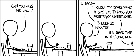
Is it worth it? Like everything else in programming, I guess it depends. I will say that this comic strip was in the back of my mind as I worked on this:
Maybe that’s an answer. I’d love to hear all of your (constructive) thoughts and suggestions, or if you’ve tried other ways of going about a similar task.
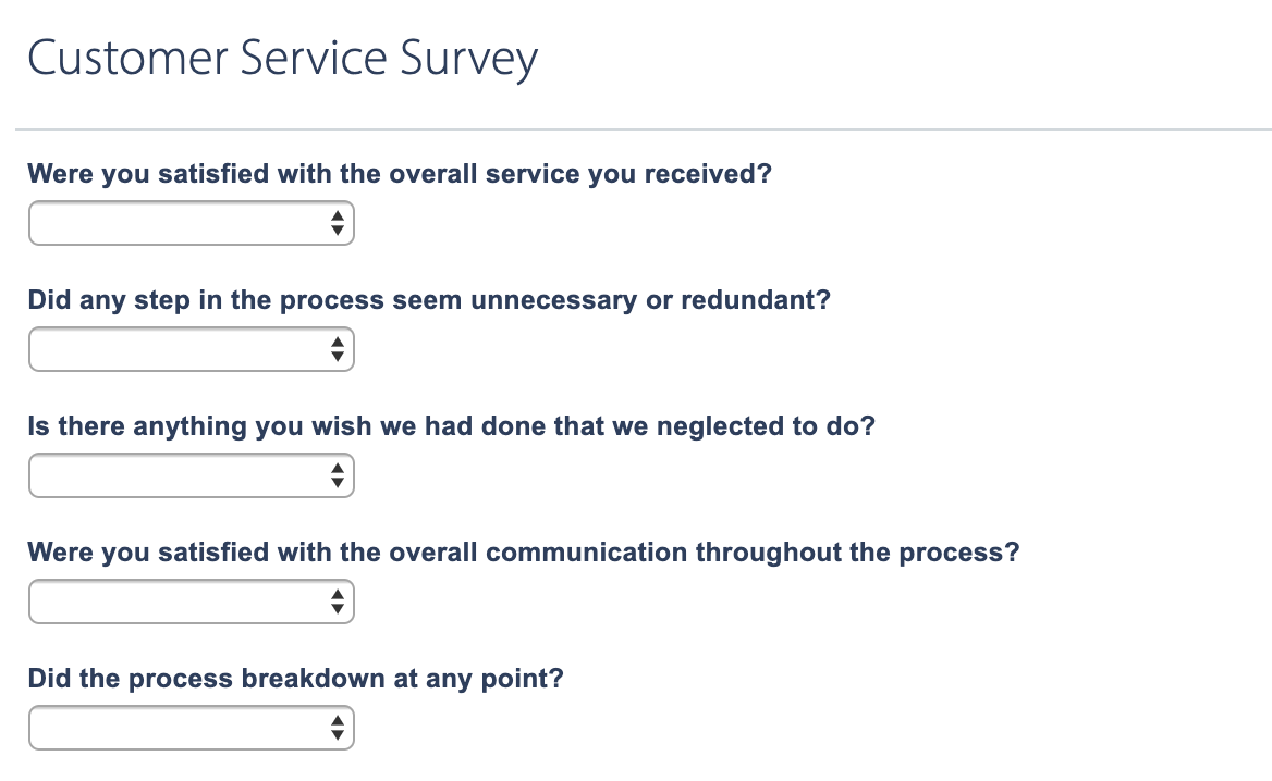
I was once tasked to create a makeshift customer service survey that would allow an employee to receive a customer call and send a survey to the custom once the call ended. The goal was to track customer satisfaction, which is a totally legit thing to want.
There are some solutions out there that do this out of the box. The problem was that my client neither had the desire or budget to use them. They did, however already use Campaign Monitor for sending emails and Wufoo for embedded forms. I figured, hey, if MacGyver can create complex gadgets out of bubble gum and paper clips, then I can cobble something together with these two robust tools. Right?
Right!
Knowing the data
The biggest challenge for a phone call is that it’s sometimes difficult to track down an email address during the call. Without that, there’s nowhere to send the survey, so that’s a big bummer. That means the employee needs to capture the address, whether it’s getting a custom ID at the start of the call or straight up asking for it.
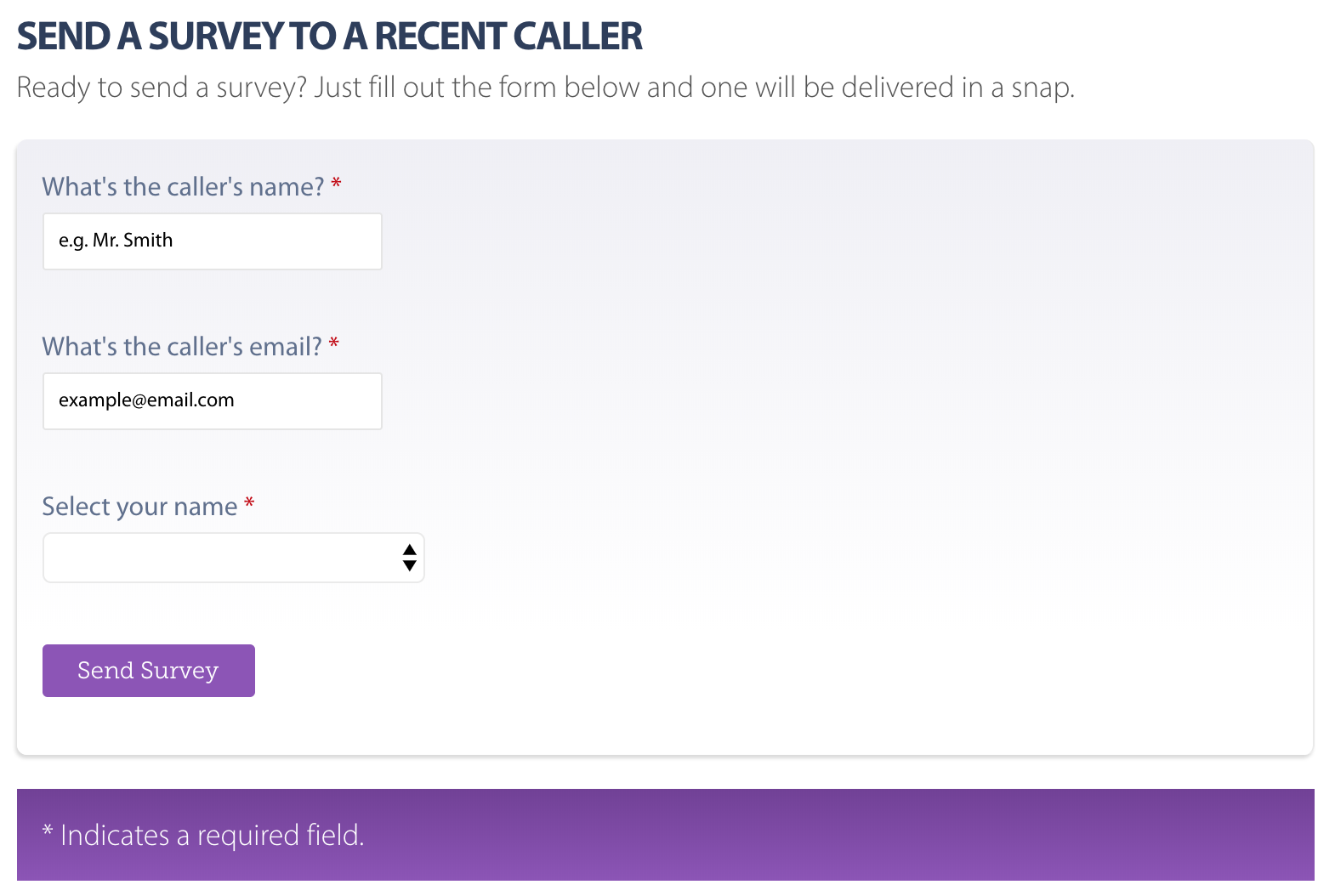
I decided I would spin up Wufoo to create an internal form that employees can use to capture the data. Nothing fancy, only the following fields:
Employee Name: Used to associate the employee with the call
Customer Name: Used to personalize the email sent containing the survey link
Customer Email: Used to send the survey link
Wufoo makes this trivial, of course. Create a new form, add a few text fields, copy and paste the snippet onto a page. Voilà! We have a form! We could make it a little simpler (and dummy-proof) by creating a select field containing all employee names so the data remains consistent. We can also make the fields required and use Wufoo’s built-in validation to ensure the email address is properly formatted.
There’s also a lot of flexibility with the styling to boot, meaning the form can look like a native part of the site.
The employee can now fill that out during the call and submit it once the call is done. Plus, the form is embedded on a private page that can’t accidentally get out to others.
Sending the survey
Did you know Wufoo can auto-send emails anywhere once a form is completed? Well, now you do!
This is super handy for most cases and I really wanted to use it for this task, but decided to go with Campaign Monitor because there’s one little snag which is…
Each employee needs a unique survey form
Yep, that’s a thing. Otherwise, we’d have to ask the customer to identify the employee’s name in the survey, which we can’t expect them to know. Sure, we could use another select field, but that requires the customer to recall the name as well, and not having the employee name makes it difficult to associate customer satisfaction results with specific employees for tracking.
So, the email needs to contain a unique link that goes to a form that’s associated with a specific employee. Again, there are solutions for this stuff, but we’re MacGyver’ing this thing.
I’m so glad Wufoo makes building forms so simple. All I needed to do was create one form, duplicate it for each employee, and change the employee value in each one.
On that note, we don’t necessarily need to display the employee’s name in the survey form. Wufoo accepts custom CSS which means we can hide any field! Plus, it allows us to pre-populate a field, so that gives us hidden fields that already contains the values we need to associate the survey data with a specific employee and create a webpage containing the form for that employee. 💥
Hidden fields are, well…hidden!
Now that there’s a survey for each employee, all I needed to do was create webpages where I could embed each employee form and use those as the survey links.
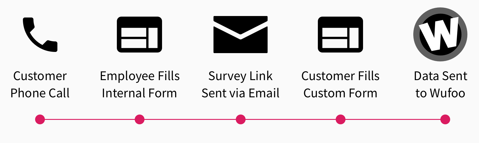
Here’s the flow:
Auto-sending the survey link
Let’s go back to the first form for a moment. Remember, that’s the one an employee fills out and submits once the call has ended. This should send an email to the customer containing a link to the webpage that has the survey form for that employee.
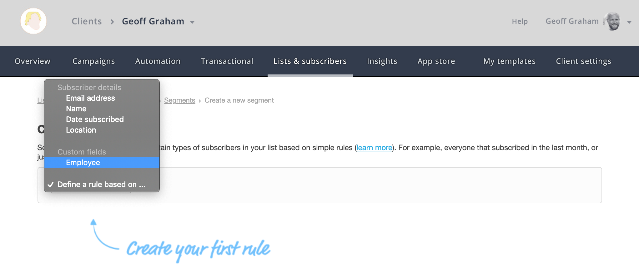
Campaign Monitor can segment lists by custom variables. In other words, we can create one list that contains all of the customers who have called in and create sub-lists that are divided by employee since we have that as a value in the internal employee form. And, since Campaign Monitor and Wufoo play nice together, all of the data we capture is contained in both places.
The other thing Campaign Monitor can do is trigger emails to send based on conditions. So, if the employee submits the internal form, Campaign Monitor can be configured to send a specific email template/campaign to a new subscriber that is added to the list. If we set up a trigger to send an email to any new customer who is added to the list, we can personalize the email to contain the link for the employee who took the call.
Watch the data roll in!
Great! We have a form employees can use to send a survey, surveys set up on webpages for each employee, and an auto-triggered email that’s sent to a customer containing the survey link for the employee who submitted the internal survey.
All that’s left is to monitor the data and — wouldn’t you know it — Wufoo has reporting built right into it where all of that can be accessed and monitored 24/7. Heck, it even permits us to create custom reporting dashboards on a per-survey basis.
Wrapping up
Was this the best way to hack things together? Probably not. Is it bulletproof from incorrect data or misuse? Not entirely. But the fact that Wufoo could intervene at all and is flexible enough to power this sort of thing is awesome. It’s more than awesome; it’s amazing. It sure wasn’t intended to be used that way, but it did the trick anyway.
Šime posts regular content for web developers on webplatform.news.
Google posts guidelines for defining favicons
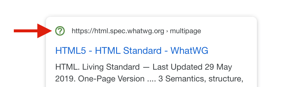
Jamie Leach: Google Search now displays favicons in search results on mobile. Your favicon should be a multiple of 48×48 (Google will re-scale it to 16×16 for use in search results). If a website doesn’t have a favicon or Google deems the favicon inappropriate, a generic globe icon will be displayed instead.
Your favicon should be a visual representation of your website’s brand, in order to help users quickly identify your site when they scan through search results.
Top websites are surprisingly inconsistent in the way they declare icons (via <link> elements in the page’s head). Twitter and Pinterest, two relatively modern progressive web apps, provide icons in two sizes.
<!-- example -->
<link rel="icon" href="/icon-32x32.png">
<link rel="apple-touch-icon" href="/icon-192x192.png">
The Paciello Group releases ARC Toolkit
In honor of Global Accessibility Awareness Day, TPG is releasing our professional-level accessibility testing tool to the public. Learn all about it at https://t.co/ol33pizq2v and download it from the Google Chrome store today. #GAAD
— The Paciello Group (@paciellogroup) May 16, 2019
The Paciello Group: ARC Toolkit, our professional-level accessibility testing tool, is now available as a Chrome DevTools extension. This tool detects issues related to the WCAG 2.1 guidelines. You can run the test on the entire page or just the node selected in the DevTools Elements panel.
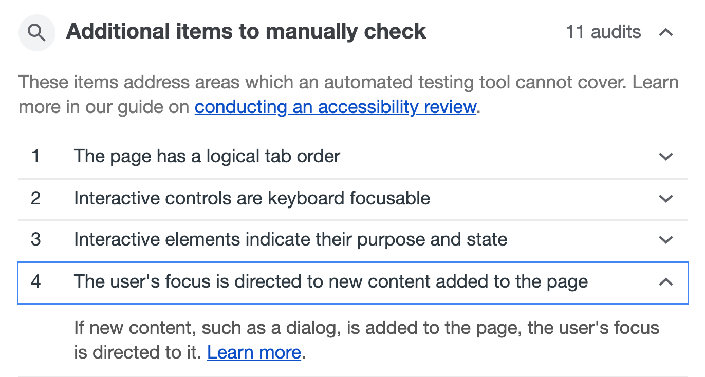
Remember, automated accessibility tools are only able to find some accessibility issues, and manual testing is necessary to ensure full accessibility. Lighthouse (via the Audits panel) suggests manual checks after performing an accessibility audit.
Other news
Jeff Jaffe: W3C and WHATWG have reached an agreement to collaborate on the development of HTML. „W3C shall encourage the community … to contribute directly to the WHATWG HTML and DOM repositories; raising issues, proposing solutions, commenting on proposed solutions, and indicating support or otherwise for proposals.”
Paul Calvano: „There is a significant gap in the first- vs. third-party resource age of CSS and web fonts. 95% of first-party fonts are older than one week compared to 50% of third-party fonts … This makes a strong case for self-hosting web fonts!”
Rachel Andrew: The CSS subgrid value is a relatively straightforward addition to grid layout. For example, if you have nested grids, and you apply grid-template-rows: subgrid to the child grid, then this grid will use the row tracks of the parent grid instead of creating its own row tracks. That’s all there is to it. (This feature is currently only supported in Firefox Nightly.)
GitHub Blog: GitHub can now generate automated security fixes for your dependencies with known security vulnerabilities. On GitHub’s website, check your repository’s Security tab for security alerts. If you open an alert and press the „Create automated security fix” button, GitHub will create an automated pull request that fixes the security vulnerability.
Rick Viscomi: HTTP Archive plans to release the first annual Web Almanac in November, a report of the state of the web with interesting insights written by different experts. About 50 volunteers from the web community are currently working on it, and they are looking for more contributors.