Archiwum kategorii: CSS

Writing Animations That Bring Your Site to Life

Post pobrano z: Writing Animations That Bring Your Site to Life

Web animation is one of the factors that can strongly enhance your website’s look and feel. Sadly, unlike mobile apps, there aren’t as many websites using animation to their benefit as you would think. We don’t want to count yours among those, so this article is for you and anyone else looking for ways to use animation for a better user experience! Specifically, we’re going to learn how to make web interactions delightful using CSS animations.

Here’s what we’re going to build together:


Before we move ahead, it’s worth mentioning that I’m going to assume you have at least some familiarity with modern front-end frameworks and a basic understanding of CSS animations. If you don’t, then no fear! CSS-Tricks has a great guides on React and Vue, as well as a thorough almanac post on the CSS animation property.

Good? OK, let’s talk about why we’d want to use animation in the first place and cover some baseline information about CSS animations.

Why would we to animate anything?

We could probably do an entire post on this topic alone. Oh, wait! Sarah Drasner already did that and her points are both poignant and compelling.

But, to sum things up based on my own experiences:

  • Animations enhance the way users interact with an interface. For example, smart animations can reduce cognitive load by giving users better context between page transitions.
  • They can provide clear cues to users, like where we want them to focus attention.
  • Animations serve as another design pattern in and of themselves, helping users to get emotionally attached to and engage with the interface.
  • Another benefit of using animations is that they can create a perception that a site or app loads faster than it actually does.

A couple of house rules with animations

Have you ever bumped into a site that animates all the things? Wow, those can be jarring. So, here’s a couple of things to avoid when working with animations so our app doesn’t fall into the same boat:

  • Avoid animating CSS properties other than transform and opacity. If other properties have to be animated, like width or height, then make sure there aren’t a lot of layout changes happening at the same time. There’s actually a cost to animations and you can see exactly how much by referring to CSS Triggers.
  • Also, just because animations can create perceived performance gains, there’s actually a point of diminishing return when it comes to using them. Animating too many elements at the same time may result in decreased performance.

Now we can get our hands dirty with some code!

Let’s build a music app

We’re going to build the music app we looked at earlier, which is inspired by Aurélien Salomon’s Dribbble shot. I chose this example so that we can focus on animations, not only within a component, but also between different routes. We’ll build this app using Vue and create animations using vanilla (i.e. no framework) CSS.

Animations should go hand-in-hand with UI development. Creating UI before defining their movement is likely to cost much more time. In this case, the Dribbble shot provides that scope for us.

Let’s start with the development.

Step 1: Spin up the app locally

First things first. We need to set up a new Vue project. Again, we’re assuming some base-level understanding of Vue here, so please check out the Learning Vue guide for more info on setting up.

We need a couple of dependencies for our work, notably vue-router for transitioning between views and sass-loader so we can write in Sass and compile to CSS. Here’s a detailed tutorial on using routes and Sass can be installed by pointing the command line at the project directory and using npm install -D sass-loader node-sass.

We have what we need!

Step 2: Setting up routes

For creating routes, we’re first going to create two bare minimum components — Artists.vue and Tracks.vue. We’ll drop a new file in the src folder called router.js and add routes for these components as:

import Vue from 'vue'
import Router from 'vue-router'
import Artists from './components/Artists.vue'
import Tracks from './components/Tracks.vue'

Vue.use(Router)
export default new Router({
	mode: 'history',
	routes: [
		{
			path: '/',
			name: 'artists',
			component: Artists
		},
		{
			path: '/:id',
			name: 'tracks',
			component: Tracks
		}
	]
})

Import router.js into the main.js and inject it to the Vue instance. Lastly, replace the content of your App.vue by <router-view/>.

Step 3: Create the components and content for the music app

We need two components that we’ll transition between with animation. Those are going to be:

  1. Artists.vue: a grid of artists
  2. Tracks.vue: An artist image with a back button

If you wanna jump ahead a bit, here are some assets to work with:

  1. Images and sample data in JSON format.
  2. Content for the components

When all is said and done, the two views will come out to something like this:
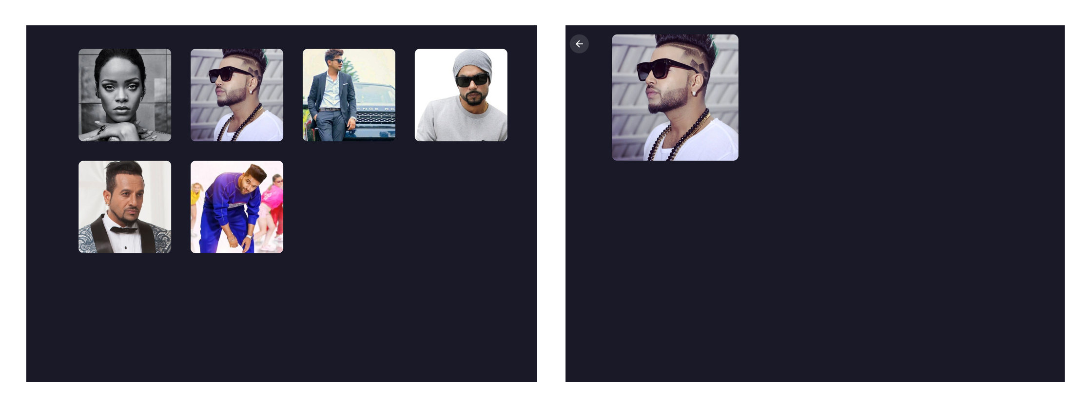
Artists.vue (left) and Tracks.vue (right)

Step 4: Animate!

Here we are, the part we’ve really wanted to get to all this time. The most important animation in the app is transitioning from Artists to Tracks when clicking on an artist. It should feel seamless where clicking on an artist image puts that image in focus while transitioning from one view into the next. This is exactly the type of animation that we rarely see in apps but can drastically reduce cognitive load for users.

To make sure we’re all on the same page, we’re going to refer to the first image in the sequence as the “previous” image and the second one as the „current” image. Getting the effect down is relatively easy as long as we know the dimensions and position of the previous image in the transition. We can animate the current image by transforming it as per previous image.

The formula that I’m using is transform: translate(x, y) scale(n), where n is equal to the size of previous image divided by the size of current image. Note that we can use a static value of n since the dimensions are fixed for all the images. For example, the image size in the Artists view is 190x190 and 240x240 in the Tracks view. Thus, we can replace n by 190/240 = 0.791. That means the transform value becomes translate(x, y) scale(0.791) in our equation.
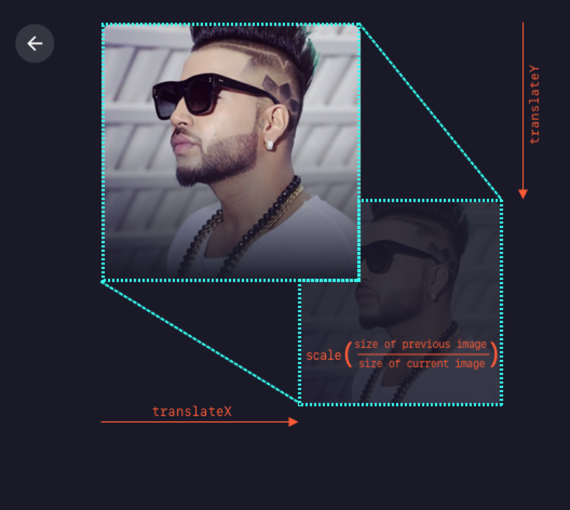
Animating from Artists to Tracks

Next thing is to find x and y. We can get these values though click event in the Artists view as:

const {x, y} = event.target.getBoundingClientRect()

…and then send these values to the Tracks view, all while switching the route. Since we aren’t using any state management library, the two components will communicate via their parent component, which is the top level component, App.vue. In App.vue, let’s create a method that switches the route and sends the image info as params.

gotoTracks(position, artistId) {
	this.$router.push({
		name: 'tracks',
		params: {
			id: artistId,
			position: position
		}
	})
}

Here’s the relevant code from the repo to reference, in case you’re interested.

Since we have received the position and ID of the image in Tracks, we have all the required data to show and animate it. We’ll first fetch artist information (specifically the name and image URL) using artist ID.

To animate the image, we need to calculate the transform value from the image’s starting position. To set the transform value, I’m using CSS custom properties, which can be done with CSS-in-JS techniques as well. Note that the image’s position that we received through props will be relative to window. Therefore we’ll have to subtract some fixed offset caused by the padding of the container <div> to even out our math.

const { x, y } = this.$route.params.position
// padding-left
const offsetLeft = 100
// padding-top
const offsetTop = 30

// Set CSS custom property value
document.documentElement.style.setProperty(
	'--translate', 
	`translate(${x - offsetLeft}px, ${y - offsetTop}px) scale(0.792)`
)

We’ll use this value to create a keyframe animation to move the image:

@keyframes move-image {
	from {
		transform: var(--translate);
	}
}

This gets assigned to the CSS animation:

.image {
	animation: move-image 0.6s;
}

…and it will animate the image from this transform value to its original position on component load.

Transitioning from Artists to Tracks

We can use the same technique when going the opposite direction, Tracks to Artists. As we already have the clicked image’s position stored in the parent component, we can pass it to props for Artists as well.

Transitioning from Tracks to Artists

Step 5: Show the tracks!

It’s great that we can now move between our two views seamlessly, but the Tracks view is pretty sparse at the moment. So let’s add the track list for the selected artist.

We’ll create an empty white box and a new keyframe to slide it upwards on page load. Then we’ll add three subsections to it: Recent Tracks, Popular Tracks, and Playlist. Again, if you want to jump ahead, feel free to either reference or copy the final code from the repo.
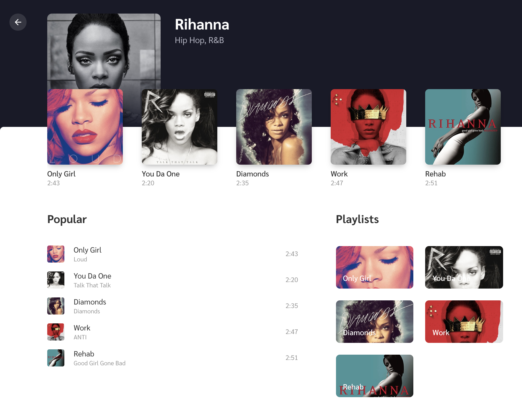
The Tracks view with content

Recent Tracks is the row of thumbnails just below the artist image where each thumbnail includes the track name and track length below it. Since we’re covering animations here, we’ll create a scale-up animation, where the image starts invisible (opacity: 0) and a little smaller than it’s natural size (scale(0.7)), then is revealed (opacity: 1 )and scales up to its natural size (transform: none).

.track {
	opacity: 0;
	transform: scale(0.7);
	animation: scale-up 1s ease forwards;
}

@keyframes scale-up {
	to {
		opacity: 1;
		transform: none;
	}
}

The Popular Tracks list and Playlist sit side-by-side below the Recent Tracks, where Popular tracks takes up most of the space. We can slide them up a bit on initial view with another set of keyframes:

.track {
	...
	animation: slide-up 1.5s;
}

@keyframes slide-up {
	from {
		transform: translateY(140px);
	}
}

To make the animation feel more natural, we’ll create a stagger effect so the Recent Tracks lead a little ahead of the Popular Tracks and Playlist using an incremental animation delay to each item.

@for $i from 1 to 5 {
	&:nth-child(#{$i + 1}) {
		animation-delay: #{$i * 0.05}s;
	}
}

The code above is basically looking for each child element, then adding a 0.05 second delay to each element it finds. So, for example, the first child gets a 0.05 second delay, the second child gets a 0.10 second delay and so on.

Check out how nice and natural this all looks:

Bonus: micro-interactions!

One of the fun things about working with animations is thinking through the small details because they’re what tie things together and add delight to the user experience. We call these micro-interactions and they serve a good purpose by providing visual feedback when an action is performed.

Depending on the complexity of the animations, we might need a library like anime.js or GSAP. This example is pretty straightforward, so we can accomplish everything we need by writing some CSS.

First micro-interaction: The volume icon

Let’s first get a volume icon in SVG format (Noun Project and Material Design are good sources). On click, we’ll animate-in and out its path element to show the level of volume. For this, we’ll create a method which switches its CSS class according to the volume level.

<svg @click="changeVolume">
	<g :class="`level-${volumeLevel}`">
		<path d="..."/> <!-- volume level 1 -->
		<path d="..."/> <!-- volume level 2 -->
		<path d="..."/> <!-- volume level 3 -->
		<polygon points="..."/>
	</g>
</svg>

Based on this class, we can show and hide certain path elements as:

path {
	opacity: 0;
	transform-origin: left;
	transform: translateX(-5px) scale(0.6);
	transition: transform 0.25s, opacity 0.2s;
}

.level-1 path:first-child,
.level-2 path:first-child,
.level-2 path:nth-child(2),
.level-3 path {
	opacity: 1;
	transform: none;
}

The animated volume control

Second micro-interaction: The favorite icon

Do you like it when you click on Twitter’s heart button? That’s because it feels unique and special by the way it animates on click. We’ll make something similar but real quick. For this, we first get an SVG heart icon and add it to the the markup. Then we’ll add a bouncy animation to it that’s triggered on click.

@keyframes bounce {
	0%, 100% {
		transform: none;
	}
	30% {
		transform: scale(1.3);
	}
	60% {
		transform: scale(0.9);
	}
}

Another fun thing we can do is add other small heart icons around it with random sizes and positions. Ideally, we’d add a few absolute-positioned HTML elements that a heart as the background. Let’s Arrange each of them as below by setting their left and bottom values.

We’ll also include a fade away effect so the icons appear to dissolve as they move upward by adding a keyframe animation on the same click event.

@keyframes float-upwards {
	0%, 100% {
		opacity: 0;
	}
	50% {
		opacity: 0.7;
	}
	50%, 100% {
		transform: translate(-1px, -5px);
	}
}

The animated favorite button

Summing up

That’s all! I hope you find all this motivating to try animations on your own websites and projects.

While writing this, I also wanted to expand on the fundamental animation principles we glossed over earlier because I believe that they help choose animation durations, and avoid non-meaningful animations. That’s important to discuss because doing animations correctly is better than doing them at all. But this sounds like a whole another topic to be covered in a future article.

The post Writing Animations That Bring Your Site to Life appeared first on CSS-Tricks.

Blobs!

Post pobrano z: Blobs!

I was recently a guest editor for an issue of Bizarro Devs. It’s a great newsletter! Go sign up! I put in a bunch of links around blobs. Like those weird squishy random shapes that are so „in” right now. Here are those links as well. I’m always a fan of publishing stuff I write 😉

Blobs! Blobs are in! Blobs are — ahem — a bit bizarre. I’ll bask in a design like this annual report cover by Matt Pamer all day. I enjoy watching a design trend like this manifest itself in design tooling and become applied in lots of creative and crafty different ways.

We could start with <svg> and draw our own blob using the Pen tool that is pretty much stock in every vector design application. I’m a cheater though, and would probably wind up checking The Noun Project for some blob examples and steal the SVG from there. But sadly, there isn’t much there, at least as far as blobs go.

Thank god for… (wait for it)… THE BLOBMAKER:

Once we have a blob, it’s just begging to be moved around. Monica Dinculescu shows how to do just that with pure CSS and liberal use of various CSS transforms in a keyframe animation:

See the Pen
CSS only morphing blob
by Monica Dinculescu (@notwaldorf)
on CodePen.

Or we can use a JavaScript library like KUTE.js to get all morph-y, like Heartbeat has done here:

See the Pen
Morphing shapes with KUTE.js
by Heartbeat.UA (@hbagency)
on CodePen.

A library like Greensock could help moving and morphing the blobs around. Greensock even has a plugin that is probably the most powerful morphing tool out there. This Pen uses Greensock, but adds some native SVG filters so that the blobs squish into each other satisfyingly. We could call it the gooey effect:

See the Pen
SVG blob mask
by ATCOM (@Atcom)
on CodePen.

We’ve only looked at SVG so far, but don’t rule out <canvas>! Liam Egan has make this canvas-based blob downright jiggly:

See the Pen
Blob
by Liam Egan (@shubniggurath)
on CodePen.

Why not add a little physics to the party, like gravity, and let them blobs get squishy that way! Hakim El Hattab got it done here:

See the Pen
Blob
by Hakim El Hattab (@hakimel)
on CodePen.

And blobs don’t have to be alone! Blobs that are squished together are like fluid. You might get a kick out of Peeke Kuepers article Simulating blobs of fluid.

The post Blobs! appeared first on CSS-Tricks.

Deliver your best work with the help of monday.com

Post pobrano z: Deliver your best work with the help of monday.com

(This is a sponsored post.)

Here’s the situation: You’ve bashed out a complicated design over two weeks of near full-time effort, gotten everything down to the exact spec of the design file, turn it in for stakeholder review and… you’re way off scope. Turns out a few folks on the team put their heads together, made some changes, and never sent you an updated comp.

Boo!

The unfortunate truth is that this happens all too often in front-end development, but it’s really no one person’s fault because it boils down to simple collective miscommunication and a lack of transparency on the team.

Well, that’s where a project management platform like monday.com comes into play. Even if you’re on a remote team or sitting in an office with cubicle walls up to the ceiling, monday.com bridges gaps and tears down walls that could throw a project off-track. With powerful and intuitive tools, like instant messaging for those ad hoc meetings, file storage for a centralized repository of assets, and an activity dashboard for catching up on the status of a project at a glance, monday.com brings project out into the light so everyone is in the loop and on the same page.

Czytaj dalej Deliver your best work with the help of monday.com →

Getting to Grips with the Airtable API

Post pobrano z: Getting to Grips with the Airtable API

The Airtable web app is pretty neat. You can use it like a spreadsheet but it’s useful for all sorts of other things too. The neatest thing about it for me is that it has an API so that you can treat it like a database.

I’ve been thinking about making weekly notes for the different teams I work with at Gusto to read about what the design systems team is working on, things we’ve fixed, and any bugs we’ve encountered during that might impact other designers and engineers across our organization. I’ve spent a couple of hours thinking about how we might use Airtable to collect a whole bunch of data and then use its API to extract that info and show it in a web app.

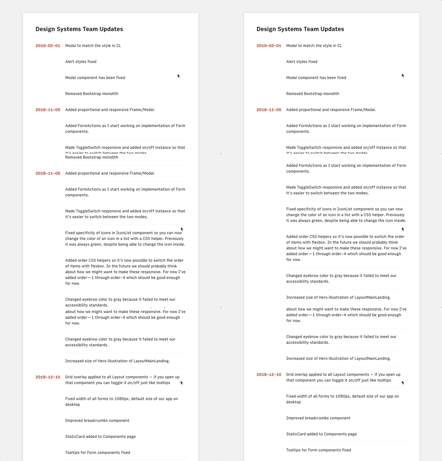
Here’s an example of what we’ll end up building, which is basically a React web app that’s using Airtable as a nifty sorta CMS:

To get started, we have to head on over to the command line and run the following (but first make sure npm is installed):

npx create-react-app airtable-test

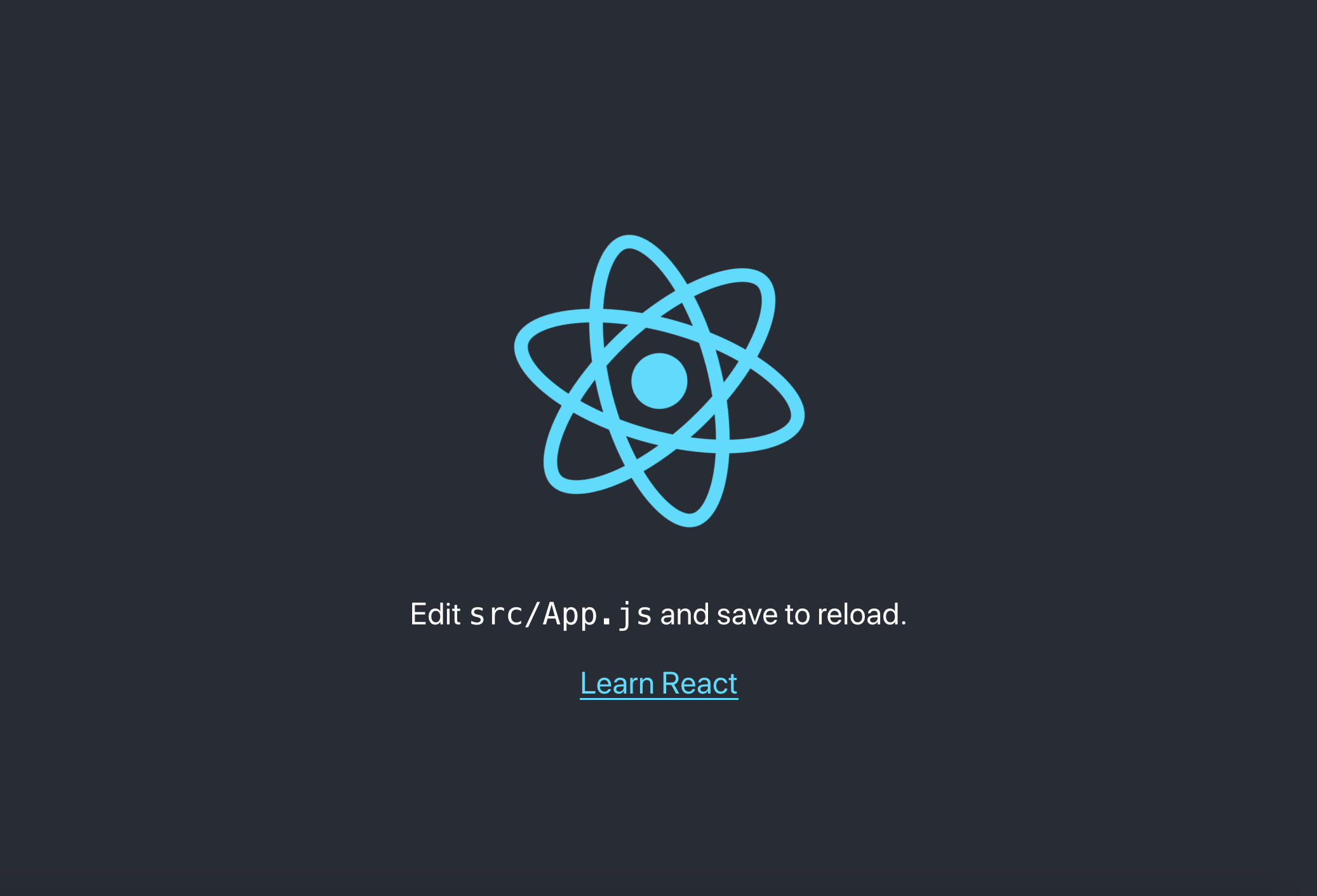
This will create a new directory called airtable-test which is where we’ll be making our little React app. If we run yarn start in the command line after that’s finished installing, then we’ll see the default page for the project:

And, if we open up src/App.js in that airtable-test directory, we can see how this page is being rendered with React:

import React, { Component } from 'react';
import logo from './logo.svg';
import './App.css';

class App extends Component {
  render() {
    return (
      <div className="App">
        <header className="App-header">
          <img src={logo} className="App-logo" alt="logo" />
          <p>
            Edit src/App.js and save to reload.
          </p>
          <a
            className="App-link"
            href="https://reactjs.org"
            target="_blank"
            rel="noopener noreferrer"
          >
            Learn React
          
        </header>
      </div>
    );
  }
}

export default App;

Now that we have React up and running, we can go ahead and install airtable in the command line which will let us interact with the Airtable API:

npm i airtable

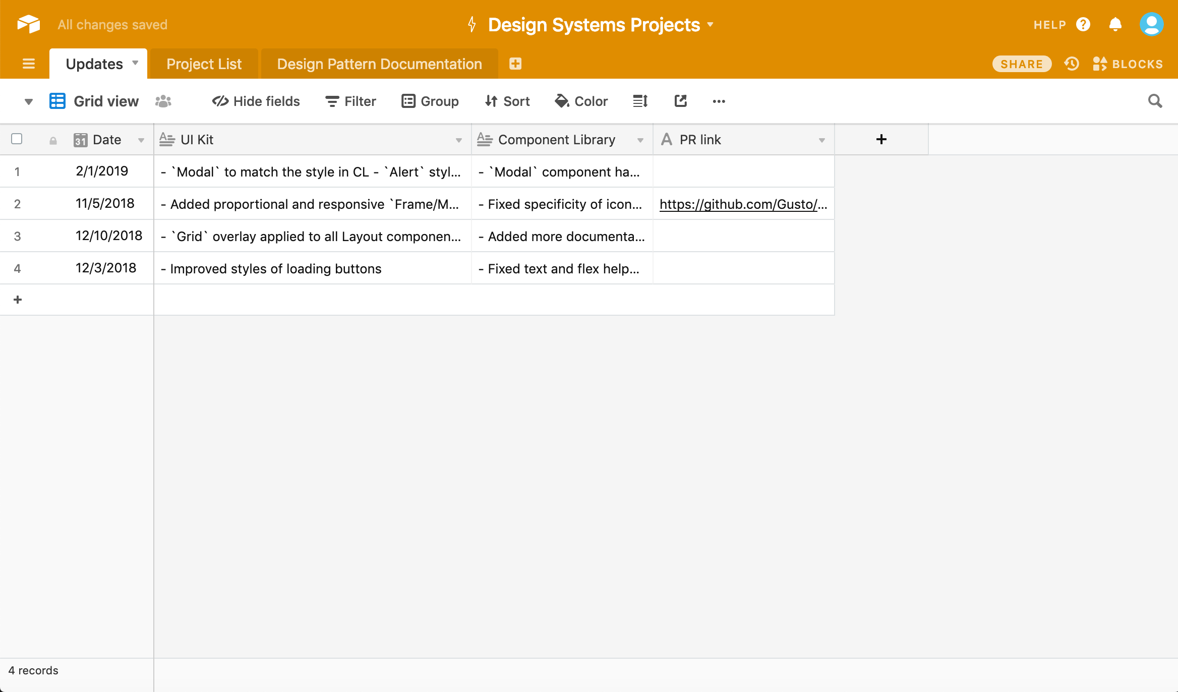
Once we’ve done that, we’ll need to create an Airtable account and create a project. We should wind up with something like this spreadsheet:

A screenshot of a spreadsheet. The header is a bright orange and the sheet contains four rows and four columns of content, ordered by date.

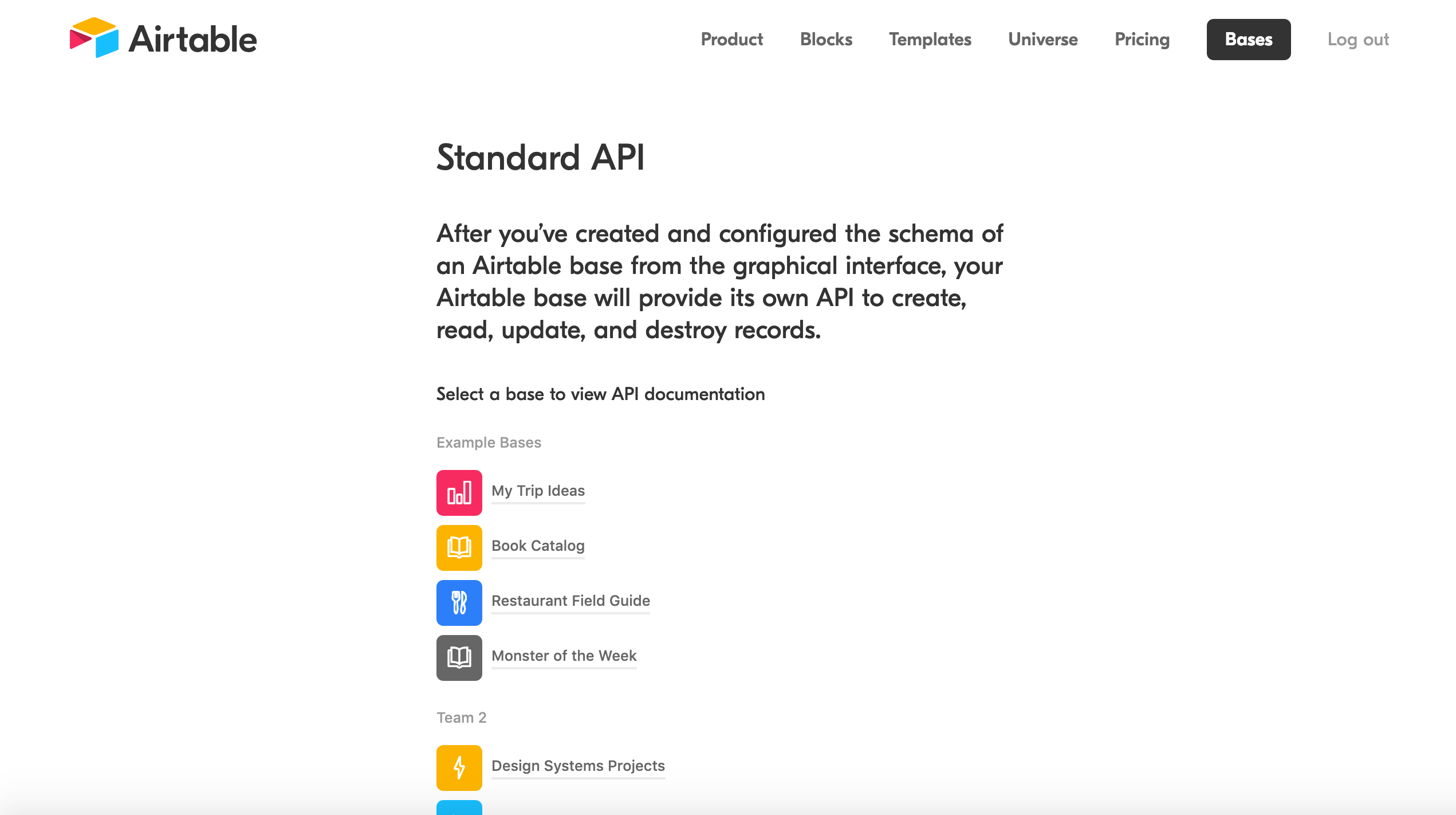
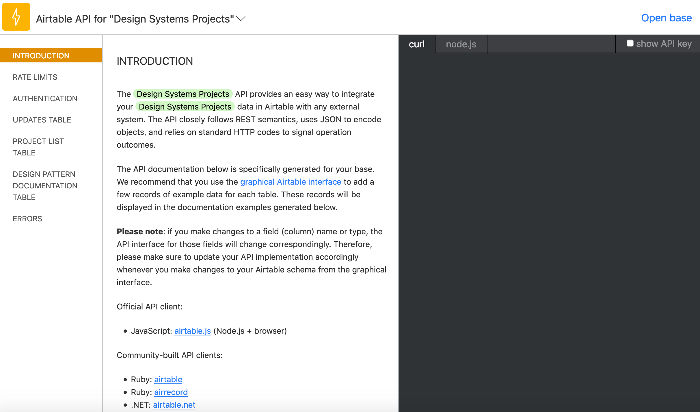
Now we can then head to airtable.com/api and select our project so that is serves as data we’re pulling from. In this case, I selected “Design Systems Projects” which you can see right at the bottom here:

This will send us to a handy docs website that gives us an incredibly easy to read API for our specific project! Scrolling down we’ll find our API key which we’ll need to access this data as well as a ton of examples that we can use to manipulate the data we get back:

A screenshot of the Airtable API webpage. The heading says Standard API and a list of options, including example projects, is provided. Below the example projects is the project configured in this post, called Design Systems Project.

Let’s head back to App.js in our airtable-test directory, delete all the code in that file, and replace it with the following:

import React, { Component } from 'react';
import Airtable from 'airtable';
const base = new Airtable({ apiKey: 'XXXXXXXXXXX' }).base('XXXXXXXXXXX');

Make sure to replace those Xs with the details that you can see in that Airtable API doc we just opened. But now that we’ve done all the setup, we can finally get around to creating our interface by calling data from our spreadsheet.

In App.js we can start to construct the App component:

class App extends Component {
  constructor(props) {
    super(props);
    this.state = {
      records: []
    };
  }
  render() {
    return {
      <div className="App">Hello</div>		}
    }
  }
}

All this will do for now is setup the app’s state and then render “Hello” on the page. Next up, we’ll be add each record from Airtable to that state.

First thing that’s important to note below: in componentDidMount() we’ll be selecting Updates which is just a way of telling Airtable that we want the spreadsheet called Updates. Make sure that this name is the same name as the spreadsheet. We’ll also be looping through all the records, or rows, of our table in that function too:

class App extends Component {
  constructor(props) {
    super(props);
    this.state = {
      records: []
    };
  }
  componentDidMount() {
    base('Updates').select({view: 'Grid view'})
    .eachPage(
      (records, fetchNextPage) => {
        this.setState({
          records
        });
        console.log(records);
        fetchNextPage();
      }
    );
  }
  render() {
    return (
      <div className="App">
        <div>Hello</div>
      </div>
    );
  }
}

fetchNextPage() is the Airtable API’s way of giving us the next record in our spreadsheet and it’s neat that it will keep going until there are no more records. Again, we’re not doing anything with that data yet; we only want to make sure everything is working correctly at this point.

Open up the console in DevTools and we should see something like this:

Array(4) [ {…}, {…}, {…}, {…} ]

And if we dive through each of the objects in this array, then we should find all the data from the spreadsheet! Doing this bit always feels like magic to me.

Anyway, next up we can update our render() function like so:

render() {
  return (
    <div className="App">
      {this.state.records.length > 0 ? (
        this.state.records.map((record, index) =>
          <div key={index}>
            <h2>{record.fields['Date']}</h2>
            {record.fields['UI Kit']}
            {record.fields['Component Library']}
          </div>
        )
        ) : (
          <p>Loading...</p>
        )}
      </div>
    </div>
  );
}

We’re going to be looping through the state that we setup earlier and then rendering the record.fields[] for each column in our spreadsheet. We have a Date, UI Kit, and Component Library column, and once we’ve updated our App.js with the code above, we should see all the content from our spreadsheet!

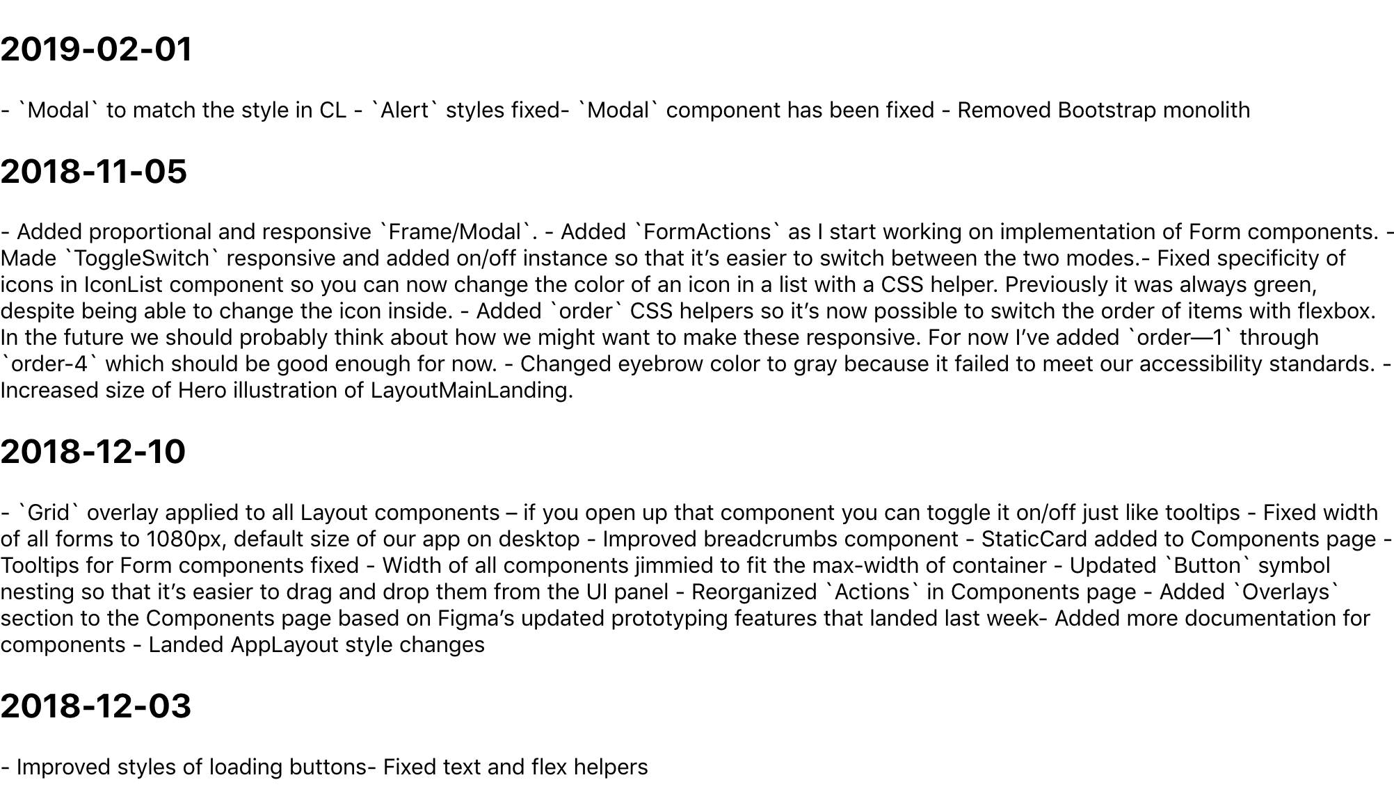
A screenshot of a default webpage with no styling with four headings containing dates in year/month/day numeric format following by a block of text containing content from the spreadsheet.

It’s like magic! But why does this data look so weird? Well, it’s because I wanted to write Markdown in each cell, so now we’ll need to use a parser to convert that data into good ol’ fashioned HTML. First, we need to head back to the command line though:

npm i showdown 

showdown will help us parse all that Markdown we’ve written in our Airtable spreadsheet. After installing it, we only need to import it at the top of our App.js file, like this:

import showdown from 'showdown';
const markdownConverter = new showdown.Converter();

After the componentDidMount() function, we can create another function that will create our HTML using showdown:

createHTML(markdown){
  return(
    markdownConverter.makeHtml(markdown)
  )
}

It’s a little iffy, but it makes me feel like the code is a bit tidier this way. Now we can update our render() function:

  render() {
  return (
    <div className="App">
      {this.state.records.length > 0 ? (
        this.state.records.map((record, index) =>
          <div key={index}>
            <h2>{new Date(record.fields['Date']).toISOString().split('T', 1)}</h2>
            <div dangerouslySetInnerHTML={{__html: this.createHTML(record.fields['UI Kit'])}} />
            <div dangerouslySetInnerHTML={{__html: this.createHTML(record.fields['Component Library'])}} />
          </div>
        )
      ) : (
        <p>Loading...</p>
      )}
    </div>
  );
}

We’re doing a couple of new things here: we’re using dangerouslySetInnerHTML in each div which, in turn, uses our createHTML function to convert the data from each column (specifically, the UI Kit and Component Library columns). We’re also converting the dates of each row into headings to make things a bit easier to read.

And with that we’re pretty much done! Here’s the final App.js:

import React, { Component } from 'react';
import Airtable from 'airtable';
import showdown from 'showdown';

const markdownConverter = new showdown.Converter();

const base = new Airtable({ apiKey: 'xxxxxxx' }).base('xxxxxxx');

class App extends Component {
  constructor(props) {
    super(props);
    this.state = {
      records: []
    };
  }
  componentDidMount() {
    base('Updates').select({view: 'Grid view'})
    .eachPage(
      (records, fetchNextPage) => {
        this.setState({
          records
        });
        fetchNextPage();
      }
    );
  }
  createHTML(markdown){
    return(
      markdownConverter.makeHtml(markdown)
    )
  }
  render() {
    return (
      <div className="App">
        {this.state.records.length > 0 ? (
          this.state.records.map((record, index) =>
            <div key={index}>
              <h2>{new Date(record.fields['Date']).toISOString().split('T', 1)}</h2>
              <div dangerouslySetInnerHTML={{__html: this.createHTML(record.fields['UI Kit'])}} />
              <div dangerouslySetInnerHTML={{__html: this.createHTML(record.fields['Component Library'])}} />
            </div>
          )
        ) : (
          <p>Loading...</p>
        )}
      </div>
    );
  }
}

export default App;

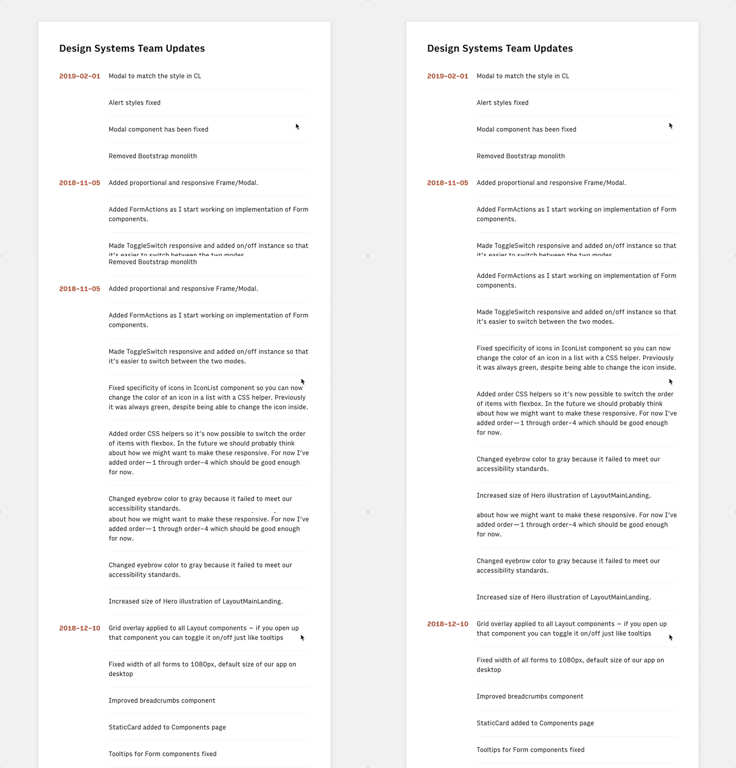
There’s still a ton of updates we could make to improve things. I took a first pass at styling, but we probably want to do things like improve the date format and maybe have some kind of indication as to which updates refer to which rows in the spreadsheet. Maybe we could even toggle showing which information to show depending on whether you’re a designer or engineer.

An animating screenshot of the final result which contains the same content as the earlier example but with extra spacing between sections and the column headings in dark orange and flushed to the left of the content instead of above it.

Anyway! I think this is a good start to getting to grips with the Airtable API and I’d love to hear about how you use it in the comments below.

The post Getting to Grips with the Airtable API appeared first on CSS-Tricks.

Use monday.com to manage and share projects all in one place

Post pobrano z: Use monday.com to manage and share projects all in one place

(This is a sponsored post.)

We’ve talked quite a bit about project management and workflows around here at CSS-Tricks, not because it’s the core of what we do as designers and developers, but because we all play a role in it as part of a team and because it impacts the quality of our work at the end of the day.

That’s why having a good system in place is such a benefit both to us and to teams as a whole. Where can you find a system like that? You might want to start by looking at monday.com. Yes, it’s a project management tool but it actually goes way beyond that. Where some other platforms out there stop at task lists, calendars, and milestones, monday.com does those plus team collaboration.

If you’ve ever felt out of the loop on a project, had a surprise change in scope, or even been curious what other folks on your team have been up to, that’s where monday.com really shines. It’s people-centric, giving you and others insight into activity across an entire project through news feeds, messaging, shared assets, clearly defined user roles, among any other things. It’s what a healthy, transparent, and collaborative team environment looks like.

We’ve only scratched the surface here, but lucky for you, there’s a free 14-day trial to check out everything that monday.com has to offer. Go for it!

Try it Now

Direct Link to Article — Permalink

The post Use monday.com to manage and share projects all in one place appeared first on CSS-Tricks.
The Magic of React-Based Multi-Step Forms

Post pobrano z: The Magic of React-Based Multi-Step Forms

One way to deal with long, complex forms is to break them up into multiple steps. You know, answer one set of questions, move on to another, then maybe another, and so on and so forth. We often refer to these as multi-step forms (for obvious reasons), but others also take to calling it a “wizard” form.

Multi-step forms can be a great idea! By only showing a few inputs on a screen at a time, the form may feel more digestible and prevent users from feeling overwhelmed by a sea of form fields. Although I haven’t looked it up, I’m willing to say no one enjoys completing a ginormous form — that’s where multiple steps can come in handy.

The problem is that multi-step forms — while reducing perceived complexity on the front end — can feel complex and overwhelming to develop. But, I’m here to tell you that it’s not only achievable, but relatively straightforward using React as the base. So, that’s what we’re going to build together today!

Here’s the final product:

See the Pen
React Simple Wizard Form
by Nathan Sebhastian (@nathansebhastian)
on CodePen.

Let’s build it!

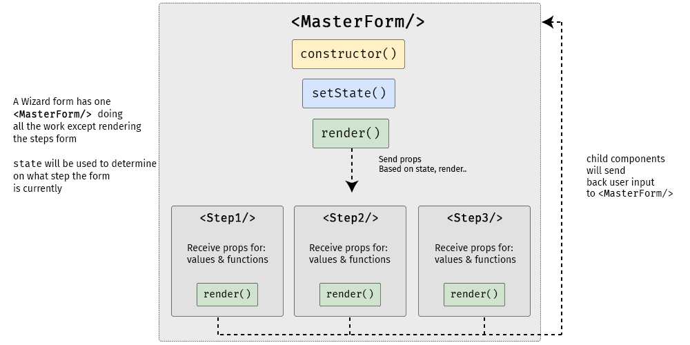
The easiest way to create a multi-step form is to create a container form element that contains all the steps inside of it as components. Here’s a visual showing that container (<MasterForm/>), the components inside of it (<Step1/>, <Step2/>, <Step3/>) and the way states and props are passed between them.

A diagram showing the master form component above three rectangles representing the three steps of the form, from left to right. Between the master form and the steps is a constructor, setState, and render.
<MasterForm/> serves as the container while three child components inside of it act as each step of the form.

Although it seems to be more complex than a regular form, a multi-step form still uses the same principles as a React form:

  • State is used for storing data and user inputs.
  • Component is used for writing methods and the interface.
  • Props are used for passing data and function into elements.

Instead of having one form component, we will have one parent component and three child components. In the diagram above, <MasterForm/> will send data and functions to the child components via props, and in turn, the child components will trigger a handleChange() function to set values in the state of <MasterForm/>. It’s one big happy family over here!

We’ll need a function to move the form from one step to another as well, and we’ll get to that a little later.

The step child (get it?) components will receive props from the <MasterForm/> parent component for value and onChange props.

  • <Step1/> component will render an email address input
  • <Step2/> will render a username input
  • <Step3/> will render a password input and a submit button

<MasterForm/> will supply both data and function into child components, and child components will pass user inputs back to the parent using its props.

Creating the step (child) components

First, we’ll create the form’s child components. We’re keeping things pretty barebones for this example by only using one input per step, but each step could really be as complex as we’d like. Since the child components look almost similar between one another, I’m just gonna show one of them here. But be sure to take a look at the demo for the full code.

class Step1 extends React.Component {
  render() {
    if (this.props.currentStep !== 1) { // Prop: The current step
      return null
    }
    // The markup for the Step 1 UI
    return(
      <div className="form-group">
        <label htmlFor="email">Email address</label>
        <input
          className="form-control"
          id="email"
          name="email"
          type="text"
          placeholder="Enter email"
          value={this.props.email} // Prop: The email input data
          onChange={this.props.handleChange} // Prop: Puts data into state
        />
      </div>
    )
  }
}

Now we can put this child component into the form’s render() function and pass in the necessary props. Just like in React’s form documentation, we can still use handleChange() to put the user’s submitted data into state with setState(). A handleSubmit() function will run on form submit.

Next up, the parent component

Let’s make the parent component — which we’re all aware by now, we’re calling <MasterForm/> — and initialize its state and methods.

We’re using a currentStep state that will be initialized with a default value of 1, indicating the first step (<Step1/>) of the form. We’ll update the state as the form progresses to indicate the current step.

class MasterForm extends Component {
  constructor(props) {
    super(props)
    // Set the initial input values
    this.state = {
      currentStep: 1, // Default is Step 1
      email: '',
      username: '',
      password: '', 
    }
    // Bind the submission to handleChange() 
    this.handleChange = this.handleChange.bind(this)
  }

  // Use the submitted data to set the state
  handleChange(event) {
    const {name, value} = event.target
    this.setState({
      [name]: value
    })    
  }
  
  // Trigger an alert on form submission
  handleSubmit = (event) => {
    event.preventDefault()
    const { email, username, password } = this.state
    alert(`Your registration detail: \n 
      Email: ${email} \n 
      Username: ${username} \n
      Password: ${password}`)
  }
  
  // Render UI will go here...
}

OK, that’s the baseline functionality we’re looking for. Next, we want to create the shell UI for the actual form add call the child components in it, including the required state props that will be passed from <MasterForm/> via handleChange().

render() {    
return (
  <React.Fragment>
  <h1>A Wizard Form!</h1>
  <p>Step {this.state.currentStep} </p> 
    
  <form onSubmit={this.handleSubmit}>
  
    // Render the form steps and pass in the required props
    <Step1 
      currentStep={this.state.currentStep} 
      handleChange={this.handleChange}
      email={this.state.email}
    />
    <Step2 
      currentStep={this.state.currentStep} 
      handleChange={this.handleChange}
      username={this.state.username}
    />
    <Step3 
      currentStep={this.state.currentStep} 
      handleChange={this.handleChange}
      password={this.state.password}
    />       

  </form>
  </React.Fragment>
)
}

One step at a time

So far, we’ve allowed users to fill the form fields, but we’ve provided no actual way to proceed to the next step or head back to the previous one. That calls for next and previous functions that check if the current step has a previous or next step; and if it does, push the currentStep prop up or down accordingly.

class MasterForm extends Component {
  constructor(props) {
    super(props)
    // Bind new functions for next and previous
    this._next = this._next.bind(this)
    this._prev = this._prev.bind(this)
  }

  // Test current step with ternary
  // _next and _previous functions will be called on button click
  _next() {
    let currentStep = this.state.currentStep
    // If the current step is 1 or 2, then add one on "next" button click
    currentStep = currentStep >= 2? 3: currentStep + 1
    this.setState({
      currentStep: currentStep
    })
  }
    
  _prev() {
    let currentStep = this.state.currentStep
    // If the current step is 2 or 3, then subtract one on "previous" button click
    currentStep = currentStep <= 1? 1: currentStep - 1
    this.setState({
      currentStep: currentStep
    })
  }
}

We’ll use a get function that will check whether the current step is 1 or 3. This is because we have three-step form. Of course, we can change these checks as more steps are added to the form. We also want to display the next and previous buttons only if there actually are next and previous steps to navigate to, respectively.

// The "next" and "previous" button functions
get previousButton(){
  let currentStep = this.state.currentStep;
  // If the current step is not 1, then render the "previous" button
  if(currentStep !==1){
    return (
      <button 
        className="btn btn-secondary" 
        type="button" onClick={this._prev}>
      Previous
      </button>
    )
  }
  // ...else return nothing
  return null;
}

get nextButton(){
  let currentStep = this.state.currentStep;
  // If the current step is not 3, then render the "next" button
  if(currentStep <3){
    return (
      <button 
        className="btn btn-primary float-right" 
        type="button" onClick={this._next}>
      Next
      </button>        
    )
  }
  // ...else render nothing
  return null;
}

All that’s left is to render those buttons:

// Render "next" and "previous" buttons
render(){
  return(
    <form onSubmit={this.handleSubmit}>
      {/* 
        ... other codes
      */}
      
      {this.previousButton}
      {this.nextButton}
      
    </form>
  )
}

Congrats, you’re a form wizard! 🧙

That was the last step in this multi-step tutorial on multi-step forms. Whoa, how meta! While we didn’t go deep into styling, hopefully this gives you a solid overview of how to go about making complex forms less… complex!

Here’s that final demo again so you can see all the code in it’s full and glorious context:

See the Pen
React Simple Wizard Form
by Nathan Sebhastian (@nathansebhastian)
on CodePen.

React was made for this sort of thing considering it makes use of states, property changes, reusable components and such. I know that React may seem like a high barrier to entry for some folks, but I’ve written a book that makes it a much lower hurdle. I hope you check it out!

The post The Magic of React-Based Multi-Step Forms appeared first on CSS-Tricks.

The #StateOfCSS 2019 Survey

Post pobrano z: The #StateOfCSS 2019 Survey

You know about the State of JavaScript survey, where thousands upon thousands of developers were surveyed about all-things-JS, from frameworks to testing and many other things in between? Well, Sacha Greif has launched one focused entirely on CSS.

This is super timely given a lot of the content we and other sites have been posting lately centered around learning, complexity, changing roles, and more. Sacha captures it nicely:

This is especially interesting since it comes at a time where many are talking about a “Great Divide” between the “front” of the front-end (HTML, CSS) and the “back” of the front-end (JavaScript and its many frameworks and libraries). […] [T]he survey will be a great chance to take a snapshot of the community as it currently exists, and see how this evolves over the next couple years.

Sounds like a good goal. Let’s help by putting some responses in there!

Take Survey

Direct Link to Article — Permalink

The post The #StateOfCSS 2019 Survey appeared first on CSS-Tricks.

Come to An Event Apart in 2019

Post pobrano z: Come to An Event Apart in 2019

The 2019 season for An Event Apart (the premiere web and interaction design conference) is about to kick off!

  1. Seattle – March 4–6, 2019
  2. Boston – May 6–8, 2019
  3. Washington DC – July 29–31, 2019
  4. Chicago – August 26–28, 2019
  5. Denver – October 28–30, 2019
  6. San Francisco – December 9–11, 2019

I’ll be there in Seattle for the kickoff, giving a talk about how to think like a front-end developer. I’ve been working on it for ages, and I think I have a talk ready that helps set the stage for where we are at in the world of front-end development, through the lens of tons of other front-end developers I admire in this industry. I hope it’ll be an entertaining romp through all their minds and how they think.

Seattle, March 4-6, 2019, three days of design, code, and content.

Just check out this Seattle lineup!

This is like my dream lineup. Except that jerk who kicks off Day 2.

  1. Jeffrey Zeldman
    The Zen of Whitespace: Slow Design for an Anxious World
  2. Margot Bloomstein
    Designing for Slow Experiences
  3. Sarah Parmenter
    Designing for Personalities
  4. Eric Meyer
    Generation Style
  5. Rachel Andrew
    Making Things Better: Redefining the Technical Possibilities of CSS
  6. Jen Simmons
    Designing Intrinsic Layouts
  7. Chris Coyier (me!!!)
    How to Think Like a Front-End Developer
  8. Una Kravets
    From Ideation to Iteration: Design Thinking for Work and for Life
  9. Scott Jehl
    Move Fast and Don’t Break Things
  10. Luke Wroblewski
    Mobile Planet
  11. Beth Dean
    Unsolved Problems
  12. Dan Mall
    Putting the ‘Design’ in Design Systems
  13. Jeremy Keith
    Going Offline
  14. Sarah Drasner
    Animation on the Bleeding Edge
  15. Val Head
    Making Motion Inclusive
  16. Derek Featherstone
    Inclusive, by Design
  17. Gerry McGovern
    The Customer-Obsessed Professional

Another neat little feature of the 2019 lineup is a screening of the documentary Rams that after lunch on Day 2. Like movie night. For us designer types. During the day. It’s gonna be awesome.

See y’all there, I hope!

The post Come to An Event Apart in 2019 appeared first on CSS-Tricks.

Where Do You Learn HTML & CSS in 2019?

Post pobrano z: Where Do You Learn HTML & CSS in 2019?

The topic of how accessible it is for newbies and seasoned developers alike to learn CSS has been gaining steam as the complexity of the tools around it has become skewed more toward traditional programming. Rachel Andrew has much more to say about this in her post, HTML, CSS and our vanishing industry entry points. Robin also has thoughts on where and how to learn CSS in the modern age.

The question of how and where to learn CSS is a highly reasonable thing to ask. The answer depends on all sorts of things: how serious you are, your current foundation, what other resources are available to you, what you hope to do with what you learn, and how much time you have, among probably a zillion other things.

Let me dump a bunch of possible answers here and you can apply all those “well, that depends” caveats as you see fit.


You could read a book.

There are a ton of books out there that cover HTML and CSS (and often together). They probably all do a fine job. There’s no need to chronicle all the choices here. These two are my personal recommendations. You probably don’t even need both.

Jon Duckett’s is incredibly well-designed and approachable:

Jennifer Robbins’ covers a bit more ground and is designed to be useful for either personal reading or classroom learning.

You could read through all the posts in our Beginner’s Guide.

We have a guide (a collection of articles, videos, and links) called Just Starting Out with CSS & HTML. I hope there is stuff in there that can help kickstart or augment your early learning because that’s the intent.

You could go through other free online guides.

freeCodeCamp is probably the biggest and best out there. Definitely check them out.

Oliver James has a wonderful online course called Internetting is Hard (But it doesn’t have to be).

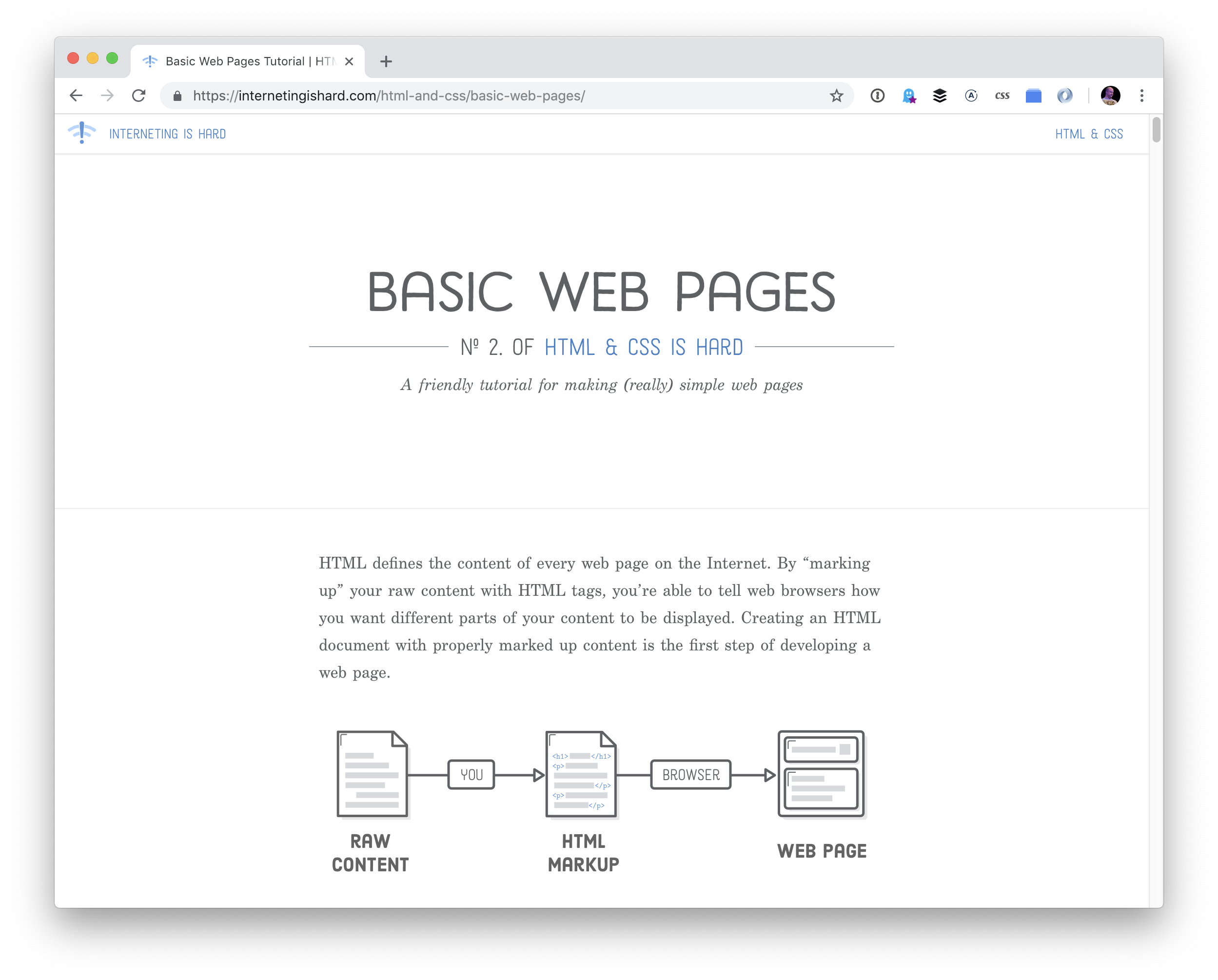
We designed HTML & CSS Is Hard to be the only introduction to HTML and CSS that you’ll ever need. If you put in the effort to read every section and write every code snippet, this tutorial has the potential to replace hundreds or even thousand of dollars worth of online courses and live training.

A screenshot of a webpage with a white background and large heading that says Basic Web Pages.

Prefer video? Jessica Hische and Russ Maschmeyer’s Don’t Fear the Internet is a super eight-part series that gets you going with HTML & CSS — it even delves into the all-important topic of typography.

A screenshot of the Don’t Fear the Internet webpage, which is sage green, has a large heading with the course title, two columns of text and a video player.

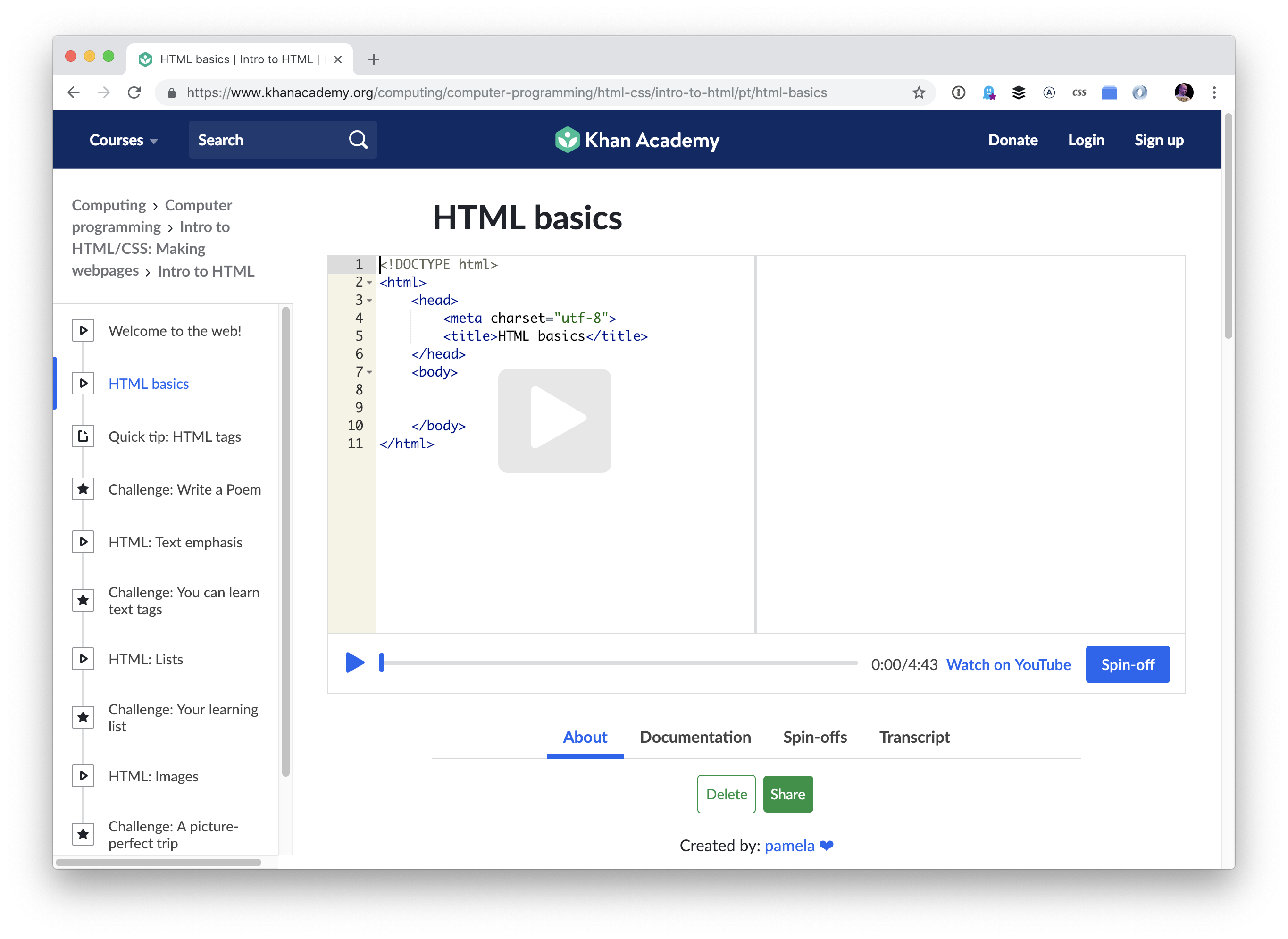
Khan Academy has an Intro to HTML/CSS: Making webpages course that’s packaged in a super cool format. It’s like video in that you get to hear the instructor talk you through the learning, but what you see is a real live text editor and real live output. Sometimes the teacher is controlling the code, and then sometimes it breaks for challenges in which you take over and edit the code yourself.

A screenshot of the Khan Academy course. It has a white background, blue navigation bar across the top, sidebar containing the course contents, and a video player in the main area.

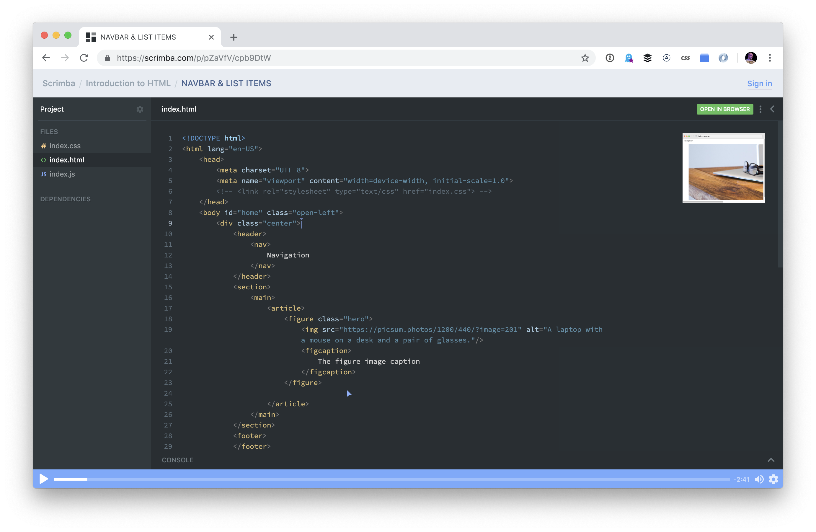
Eric Tirado has an Intro to HTML course on Scrimba, which is also a neat platform in that Eric’s voice guides you through the course, but visually it’s a combination of slides with a real code editor and preview.

A screenshot of the Scrimba course. It resembles a code editor with a dark gray background, sidebar outlining web assets, and an editor with code in the main area.

You could find and take a paid online course.

I often join gyms because the accountability of paying for something gets me to do it. I know I can do situps, pushups, and go for a jog for free, but the gym membership makes a thing of it. Well, same could be said about paying for a course on HTML and CSS.

These are broad generalizations, but good places to start:

You could go to a code school or coding bootcamp

If you wanna put even more skin in the game, you could consider literally going to school. If you don’t have a college degree, that’s an option, although you’ll be looking at a broad education rather than a ticket to leveling up your web design and development skills alone. I’m a fan of that just for the general mind-broadening it involves.

But assuming you’re going to go to a coding-specific school…

There are probably dozens — if not hundreds — more, so this is more to inform you of the possibility of schooling. You don’t even have to go to a physical school since plenty of these offer online courses, too (but with the advantage of live instruction and cohorts). For example, LambdaSchool has the novelty of being free to start and paid later in the form of letting them take a portion of your salary after you get a job in the industry.

You could practice on CodePen.

Not every second of your learning should be strictly following some course laid out by a book, class, or teacher. It wouldn’t even be that way if you tried. You might as well embrace that. If something tickles your muse, go play! I hope CodePen is a rewarding place to do that, making it both easy and useful, while providing a place to connect with other folks in the field.

You could build a personal site and learn what you need to get it done.

That’s how absolutely countless developers have cut their teeth, including me. I wanted a personal website years ago, and I struggled through getting a self-hosted WordPress site online so I could have full control over everything and bend it to my will. Once you have an actual website online, and you know at least some people are seeing it, it gives you all the motivation in the world to keep going and evolve further.

The way you actually learn is going to be a combination of all this stuff.

People are obsessed with asking musicians if they’re self-taught. Like, if they are, their amazingness triples because it means their creative genius was delivered by a lightning bolt at birth. They don’t need anyone else to learn; they merely look at those guitar strings and know what to do.

And if they were taught by a teacher, then, well, that’s all out the door. If they are good at all, then it’s because the teacher delivered that to them.

Total nonsense.

People learn anything — music and web development included — inside a hurricane of influences. Let’s stick with music for a second. Learning to play comes in many forms. You learn by listening to music an awful lot. You can do fundamental practice, like finger exercises and going up and down scales. You can learn to transpose chords on a chalkboard. You can watch YouTube all day and night. You can sign up for online courses. You can go to local jams to watch and play along. You can join a band. You can take lessons from someone advertising on Craigslist. You can go to a local music school. You can read books about music.

You get the idea.

You can and probably will do all of that. With learning web design and development, getting anywhere will involve all sorts of ways. There’s no silver bullet. It takes bashing on it lots of different ways. There’s no requirement to sprinkle money on it, but you do need multiple angles, time, and motivation.

Go forth and build websites, the ol’ ShopTalk mantra!

The post Where Do You Learn HTML & CSS in 2019? appeared first on CSS-Tricks.

Using Dotfiles for Managing Development and Many Other Magical Things

Post pobrano z: Using Dotfiles for Managing Development and Many Other Magical Things

Howdy folks! 🎉 I’m Simon Owen, and over the years, I’ve loved being a part of and learning from the dotfiles community. I spend a lot of time teaching developers and running workshops. In those sessions, demonstrating how I set up my development environment is often one of things that folks appreciated the most.

Dotfiles are a key part of my development environment. Haven’t heard of them? Well, even if you have, it’s a good idea to walk through what they are and the benefits of using them.

Last year, I set myself a goal to create a screencast series. If you like this article and want to find out more, please subscribe to the mailing list and get the download link. If you really like it, you can also 🦄 donate here! 🦄

A dot-what-file?

If you’re hearing about dotfiles for the first time, it’s totally fine to be confused about what they are and what they do. I recall that it took me a considerable amount of time before I realized a dotfile is simply a file that has a dot in front of the file name!

There are two common examples of dotfiles. First, the ones you might already be familiar with are those often found at the root of many open source projects — for example, .editorconfig contains code editor preferences to help maintain consistent coding styles for a project. You may also have seen .stylelintrc and .eslintrc floating around, which set CSS and JavaScript rules, respectively.

Second (and the ones we’re looking at today), are dotfiles that can live at the root level of a user directory (i.e. /Users/<username> ). One such dotfile is .aliases, which contains custom named commands that can speed up work in the Terminal. Another is .bash_prompt, which is used to change the $ in Terminal to something a little more fun. In my case, I set it so this dude pops up to make me smile when things get tough:

༼ つ ◕_◕ ༽つ

Hopefully, you’re already starting to get a good sense of how useful dotfiles can be. They’re sort of like hidden gems (literally, since they’re hidden from views by default) that unlock superpowers for your machine to help with development. We’re talking about automation, optimizations, and efficient workflows, among other things.

First, I want to give props to the dotfiles community

Before we dig into dotfiles, it’s worth calling out how great the community behind them is. When I first forked Paul Irish’s dotfile repo, there was a lot going on in there I didn’t understand. Mathias Bynens and Paul Irish helped me immensely by answering questions about the code and it was their willingness to help that served as one of the reasons I became drawn to both the concept and the community.

Sometimes, I’ll post something to the community that I’d like to automate, but can’t figure it out for the life of me. And, without fail, I’ll get a helpful reply. Case in point: Eric Czarny wrote an app for me to automate my Spectacle settings and Mathias also contributed a code snippet. How cool is that?!

Then there are things like macOS updates. The dotfiles community is often on top of this and provide useful advice on GitHub comments regarding anything that no longer works or other useful information. You can then amend your dotfiles accordingly, such as adding the following code that increases the sound quality for Bluetooth headphones/headsets:

defaults write com.apple.BluetoothAudioAgent "Apple Bitpool Min (editable)" -int 40

Digging into dotfiles

The code example above might look a bit familiar to you. It’s along the same lines as this often-used one to show hidden files:

defaults write com.apple.finder AppleShowAllFiles -bool true

…or this one to add spaces to the dock:

defaults write com.apple.dock persistent-apps -array-add '{"tile-type"="spacer-tile";}'; killall Dock

These commands can be pasted directly into the Terminal. As you might expect, something like -bool true will change a boolean value from false to true and reset the command for later use.

If you’e like me and have a lot of these commands, then this is where the .macos (previously .osx) dotfile becomes especially useful. Instead of copying and pasting each command individually, we can automate and run all of them in one go.

Let’s walk through some examples

There are so many awesome things we can do in dotfiles. Here are some practical use cases that I rely on for my day-to-day work.

Setting aliases for default commands (.aliases)

Navigating between directories in the Terminal can be cumbersome and it’s easy to get lost in cd madness.

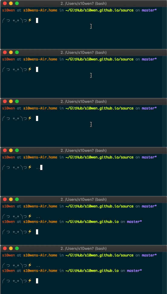
We can replace the standard “change directory” (cd) command with a custom command in the .aliases dotfile. For example, use this alias to ditch the cd prefix altogether when using the command cd .. to move up a directory in favor of .. by itself.

alias ..="cd .."

Sure, it’s only dropping two letters, but how much easier is that to remember?

An animated screenshot of a Terminal window typing two periods instead of the full cd command to move up a level in the directory.

We can do the same thing to make shortcuts to certain directories:

alias dl="cd ~/Downloads"

Or, create aliases for shorthand command tasks:

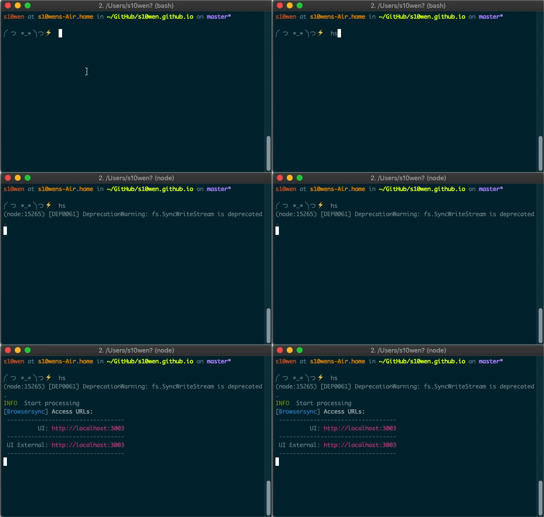
alias hs="hexo serve"
An animated screenshot of a Terminal window typing a command called hs instead of typing out hexo serve in full.

Oh, here’s another one! List only directories:

alias lsd="ls -lF ${colorflag} | grep --color=never '^d'"

Make a custom bash prompt for a personal touch to the Terminal (.bash_prompt)

I referenced this a little earlier, but here’s how I turned my bash prompt ($) into a little dude that’s way more fun to look at it. This is done directly in the .bash_prompt dotfile.

PS1="༼ つ ◕_◕ ༽つ"

Create Git shortcuts to speed up commits (.gitconfig)

We can make it a little more efficient to commit all changes at once in the .gitconfig dotfile. Using ca is a lot more concise than !git add -A && git commit -av .

ca = !git add -A && git commit -av

Another handy shortcut: find commits by commit message.

fm = "!f() { git log --pretty=format:'%C(yellow)%h  %Cblue%ad  %Creset%s%Cgreen  [%cn] %Cred%d' --decorate --date=short --grep=$1; }; f"

Automate common Homebrew tasks (brew.sh)

Use Homebrew for package management? Although not strictly a dotfile (it doesn’t have a dot before the file name), Homebrew gives us the brew.sh shell script file. This file automates the installation and management of Apps and Tools:

brew install git
brew install tree
brew cask install google-chrome
brew cask install iterm2
brew cask install sublime-text

Protect your Git credentials (.extra)

Hide information you don’t want to share publicly in one file in a private repo and bring it in for you alone. For example, a good idea for this file is anything that’s specific to you, such as your Git credentials. This will prevent people from cloning, running your dotfiles, then committing as you!

# Git credentials
# Not in the repository, to prevent people from accidentally committing under my name
GIT_AUTHOR_NAME="Simon Owen"
GIT_COMMITTER_NAME="$GIT_AUTHOR_NAME"
git config --global user.name "$GIT_AUTHOR_NAME"
GIT_AUTHOR_EMAIL="<ADD-YOUR-EMAIL-HERE>"
GIT_COMMITTER_EMAIL="$GIT_AUTHOR_EMAIL"
git config --global user.email "$GIT_AUTHOR_EMAIL"

Write custom functions for tasks (.functions)

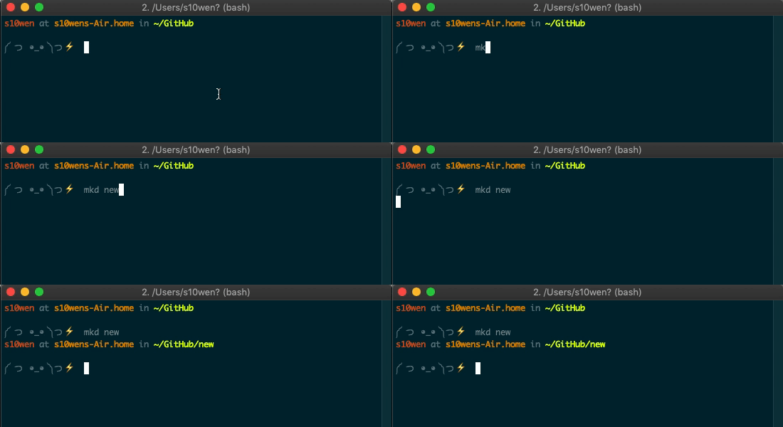
Dotfiles are more than shortcuts and aliases. We can also make custom functions in .functions that do more advanced lifting. For example, create a new directory and change directory to it:

function mkd() {
  mkdir -p "$@" && cd "$_";
}
An animated screenshot of a Terminal window typing mkd new to trigger the creation of a new folder and navigating to it.

Or, we can open a given location in Finder with a one-letter command (o):

function o() {
  if [ $#-eq 0 ]; then
    open .;
  else
    open "$@";
  fi;
}

Specify your $PATH and keep private (.path)

$PATH allows the running of executable files. Instead of navigating to each path manually in Terminal, here we can set the file paths so they can run the executable files directly. It might be the case that this file contains sensitive information. As such, this file is often kept in a private repo.

Here’s an example adding ~/utils to the $PATH:

export PATH="$HOME/utils:$PATH"

Force Vim to use a particular theme (.vimrc)

Editor config files are great for ensuring consistent formatting across projects, but we can also tell a Vim editor to use a specific theme in a .vimrc file:

" Use the Solarized Dark theme
set background=dark
colorscheme solarized
let g:solarized_termtrans=1

Bonus: Helpful Terminal recipes for macOS

OK, so here’s a little bit of a bonus for Mac users that isn’t related to dotfiles, but are things we can do in the Terminal to give macOS superpowers to do pretty awesome things that make day-to-day use a little easier and more pleasant.

First off, we can show hidden files by default in the Finder so dotfiles are visible all the time by typing this into the Terminal:

defaults write com.apple.finder AppleShowAllFiles -bool true

Find the way that scrollbars toggle on and off in Finder jarring? Let’s make them visible at all times:

defaults write NSGlobalDomain AppleShowScrollBars -string "Always"

By default, macOS checks for software updates once per week. But maybe we want to check once a day or at some other interval:

defaults write com.apple.SoftwareUpdate ScheduleFrequency -int 1

You know how holding down on a keyboard key repeats that character? Well, it repeats at a determined speed that we can supercharge to blazingly fast:

defaults write NSGlobalDomain KeyRepeat -int 0

Some people love the way macOS includes a box shadow when taking a screenshot of a window. Others don’t. Here’s how to turn it off:

defaults write com.apple.screencapture disable-shadow -bool true

And, in this example, we can automate the size of icons in the Dock:

defaults write com.apple.dock tilesize -int 36

This is only the tip of the iceberg! In my screencast series I go over more than one hundred of them.

Conclusion

Web development is increasingly more complicated as time goes on. We all have ways of making our development workflow a little easier and comfortable based on personal preferences.

You may be a seasoned developer and aware of such things as Node, npm, and Git but still find yourself stuck in a Terminal window with a bunch of errors. Or, you might be starting out and find these, and other tools, complex and tough to grasp.

Either way, hopefully knowing more about dotfiles and what they’re capable of doing gives you a new weapon in your arsenal to make your development environment tailored to you, speed up your workflow and give your machine added superpowers!

As a reminder, my screencast series will give you more tips and tricks, plus a good idea of how to get your development environment set up. This is the first in the series. Going forwards, I’m going to look at expanding on it, so please let me know if there’s anything else you’d like me to cover!

The post Using Dotfiles for Managing Development and Many Other Magical Things appeared first on CSS-Tricks.