Archiwum kategorii: CSS

Using Dotfiles for Managing Development and Many Other Magical Things

Post pobrano z: Using Dotfiles for Managing Development and Many Other Magical Things

Howdy folks! 🎉 I’m Simon Owen, and over the years, I’ve loved being a part of and learning from the dotfiles community. I spend a lot of time teaching developers and running workshops. In those sessions, demonstrating how I set up my development environment is often one of things that folks appreciated the most.

Dotfiles are a key part of my development environment. Haven’t heard of them? Well, even if you have, it’s a good idea to walk through what they are and the benefits of using them.

Last year, I set myself a goal to create a screencast series. If you like this article and want to find out more, please subscribe to the mailing list and get the download link. If you really like it, you can also 🦄 donate here! 🦄

A dot-what-file?

If you’re hearing about dotfiles for the first time, it’s totally fine to be confused about what they are and what they do. I recall that it took me a considerable amount of time before I realized a dotfile is simply a file that has a dot in front of the file name!

There are two common examples of dotfiles. First, the ones you might already be familiar with are those often found at the root of many open source projects — for example, .editorconfig contains code editor preferences to help maintain consistent coding styles for a project. You may also have seen .stylelintrc and .eslintrc floating around, which set CSS and JavaScript rules, respectively.

Second (and the ones we’re looking at today), are dotfiles that can live at the root level of a user directory (i.e. /Users/<username> ). One such dotfile is .aliases, which contains custom named commands that can speed up work in the Terminal. Another is .bash_prompt, which is used to change the $ in Terminal to something a little more fun. In my case, I set it so this dude pops up to make me smile when things get tough:

༼ つ ◕_◕ ༽つ

Hopefully, you’re already starting to get a good sense of how useful dotfiles can be. They’re sort of like hidden gems (literally, since they’re hidden from views by default) that unlock superpowers for your machine to help with development. We’re talking about automation, optimizations, and efficient workflows, among other things.

First, I want to give props to the dotfiles community

Before we dig into dotfiles, it’s worth calling out how great the community behind them is. When I first forked Paul Irish’s dotfile repo, there was a lot going on in there I didn’t understand. Mathias Bynens and Paul Irish helped me immensely by answering questions about the code and it was their willingness to help that served as one of the reasons I became drawn to both the concept and the community.

Sometimes, I’ll post something to the community that I’d like to automate, but can’t figure it out for the life of me. And, without fail, I’ll get a helpful reply. Case in point: Eric Czarny wrote an app for me to automate my Spectacle settings and Mathias also contributed a code snippet. How cool is that?!

Then there are things like macOS updates. The dotfiles community is often on top of this and provide useful advice on GitHub comments regarding anything that no longer works or other useful information. You can then amend your dotfiles accordingly, such as adding the following code that increases the sound quality for Bluetooth headphones/headsets:

defaults write com.apple.BluetoothAudioAgent "Apple Bitpool Min (editable)" -int 40

Digging into dotfiles

The code example above might look a bit familiar to you. It’s along the same lines as this often-used one to show hidden files:

defaults write com.apple.finder AppleShowAllFiles -bool true

…or this one to add spaces to the dock:

defaults write com.apple.dock persistent-apps -array-add '{"tile-type"="spacer-tile";}'; killall Dock

These commands can be pasted directly into the Terminal. As you might expect, something like -bool true will change a boolean value from false to true and reset the command for later use.

If you’e like me and have a lot of these commands, then this is where the .macos (previously .osx) dotfile becomes especially useful. Instead of copying and pasting each command individually, we can automate and run all of them in one go.

Let’s walk through some examples

There are so many awesome things we can do in dotfiles. Here are some practical use cases that I rely on for my day-to-day work.

Setting aliases for default commands (.aliases)

Navigating between directories in the Terminal can be cumbersome and it’s easy to get lost in cd madness.

We can replace the standard “change directory” (cd) command with a custom command in the .aliases dotfile. For example, use this alias to ditch the cd prefix altogether when using the command cd .. to move up a directory in favor of .. by itself.

alias ..="cd .."

Sure, it’s only dropping two letters, but how much easier is that to remember?
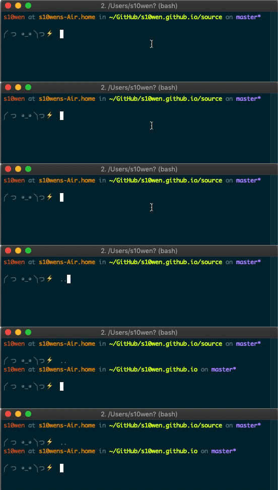
An animated screenshot of a Terminal window typing two periods instead of the full cd command to move up a level in the directory.

We can do the same thing to make shortcuts to certain directories:

alias dl="cd ~/Downloads"

Or, create aliases for shorthand command tasks:

alias hs="hexo serve"
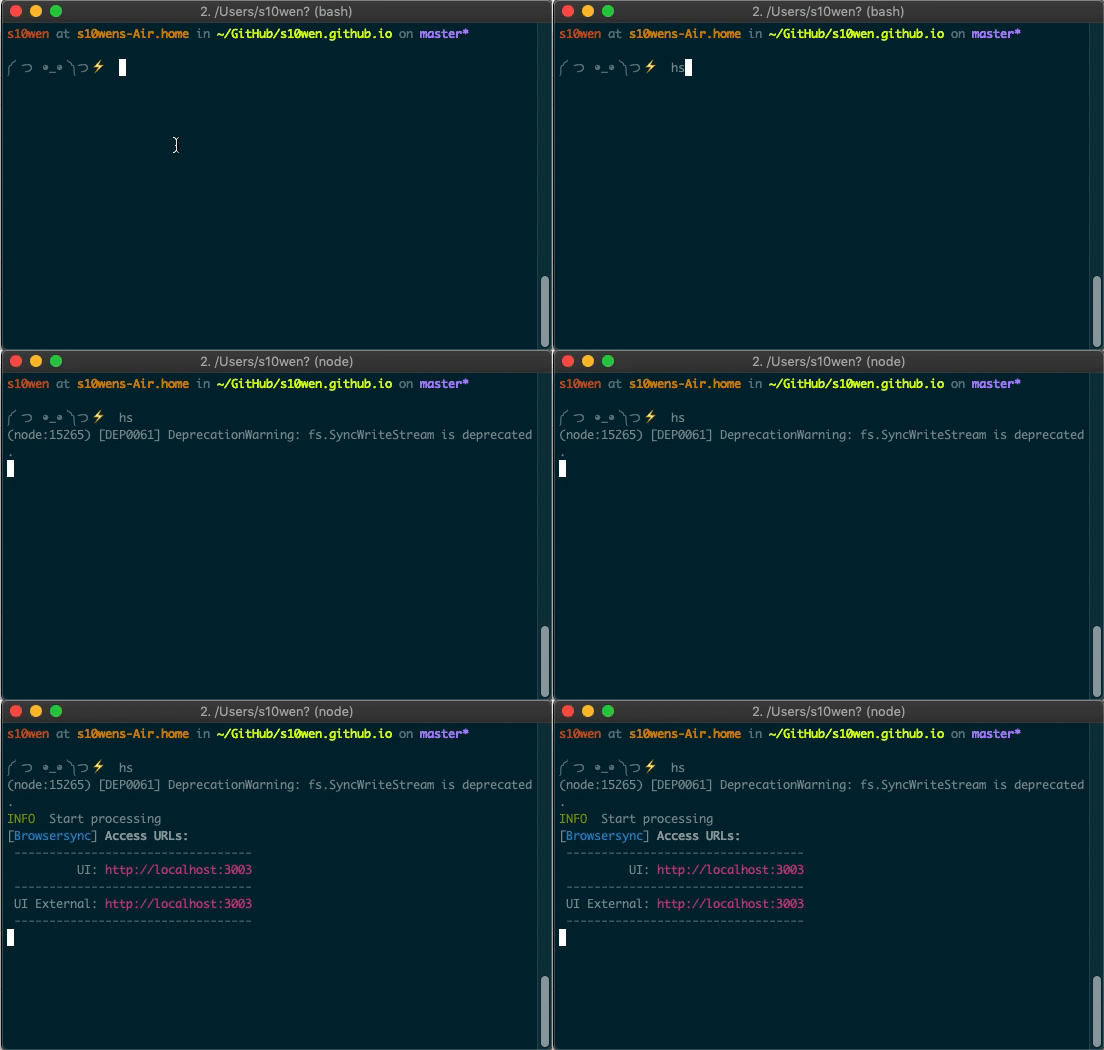
An animated screenshot of a Terminal window typing a command called hs instead of typing out hexo serve in full.

Oh, here’s another one! List only directories:

alias lsd="ls -lF ${colorflag} | grep --color=never '^d'"

Make a custom bash prompt for a personal touch to the Terminal (.bash_prompt)

I referenced this a little earlier, but here’s how I turned my bash prompt ($) into a little dude that’s way more fun to look at it. This is done directly in the .bash_prompt dotfile.

PS1="༼ つ ◕_◕ ༽つ"

Create Git shortcuts to speed up commits (.gitconfig)

We can make it a little more efficient to commit all changes at once in the .gitconfig dotfile. Using ca is a lot more concise than !git add -A && git commit -av .

ca = !git add -A && git commit -av

Another handy shortcut: find commits by commit message.

fm = "!f() { git log --pretty=format:'%C(yellow)%h  %Cblue%ad  %Creset%s%Cgreen  [%cn] %Cred%d' --decorate --date=short --grep=$1; }; f"

Automate common Homebrew tasks (brew.sh)

Use Homebrew for package management? Although not strictly a dotfile (it doesn’t have a dot before the file name), Homebrew gives us the brew.sh shell script file. This file automates the installation and management of Apps and Tools:

brew install git
brew install tree
brew cask install google-chrome
brew cask install iterm2
brew cask install sublime-text

Protect your Git credentials (.extra)

Hide information you don’t want to share publicly in one file in a private repo and bring it in for you alone. For example, a good idea for this file is anything that’s specific to you, such as your Git credentials. This will prevent people from cloning, running your dotfiles, then committing as you!

# Git credentials
# Not in the repository, to prevent people from accidentally committing under my name
GIT_AUTHOR_NAME="Simon Owen"
GIT_COMMITTER_NAME="$GIT_AUTHOR_NAME"
git config --global user.name "$GIT_AUTHOR_NAME"
GIT_AUTHOR_EMAIL="<ADD-YOUR-EMAIL-HERE>"
GIT_COMMITTER_EMAIL="$GIT_AUTHOR_EMAIL"
git config --global user.email "$GIT_AUTHOR_EMAIL"

Write custom functions for tasks (.functions)

Dotfiles are more than shortcuts and aliases. We can also make custom functions in .functions that do more advanced lifting. For example, create a new directory and change directory to it:

function mkd() {
  mkdir -p "$@" && cd "$_";
}
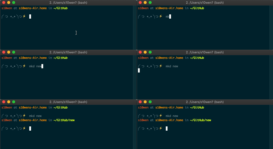
An animated screenshot of a Terminal window typing mkd new to trigger the creation of a new folder and navigating to it.

Or, we can open a given location in Finder with a one-letter command (o):

function o() {
  if [ $#-eq 0 ]; then
    open .;
  else
    open "$@";
  fi;
}

Specify your $PATH and keep private (.path)

$PATH allows the running of executable files. Instead of navigating to each path manually in Terminal, here we can set the file paths so they can run the executable files directly. It might be the case that this file contains sensitive information. As such, this file is often kept in a private repo.

Here’s an example adding ~/utils to the $PATH:

export PATH="$HOME/utils:$PATH"

Force Vim to use a particular theme (.vimrc)

Editor config files are great for ensuring consistent formatting across projects, but we can also tell a Vim editor to use a specific theme in a .vimrc file:

" Use the Solarized Dark theme
set background=dark
colorscheme solarized
let g:solarized_termtrans=1

Bonus: Helpful Terminal recipes for macOS

OK, so here’s a little bit of a bonus for Mac users that isn’t related to dotfiles, but are things we can do in the Terminal to give macOS superpowers to do pretty awesome things that make day-to-day use a little easier and more pleasant.

First off, we can show hidden files by default in the Finder so dotfiles are visible all the time by typing this into the Terminal:

defaults write com.apple.finder AppleShowAllFiles -bool true

Find the way that scrollbars toggle on and off in Finder jarring? Let’s make them visible at all times:

defaults write NSGlobalDomain AppleShowScrollBars -string "Always"

By default, macOS checks for software updates once per week. But maybe we want to check once a day or at some other interval:

defaults write com.apple.SoftwareUpdate ScheduleFrequency -int 1

You know how holding down on a keyboard key repeats that character? Well, it repeats at a determined speed that we can supercharge to blazingly fast:

defaults write NSGlobalDomain KeyRepeat -int 0

Some people love the way macOS includes a box shadow when taking a screenshot of a window. Others don’t. Here’s how to turn it off:

defaults write com.apple.screencapture disable-shadow -bool true

And, in this example, we can automate the size of icons in the Dock:

defaults write com.apple.dock tilesize -int 36

This is only the tip of the iceberg! In my screencast series I go over more than one hundred of them.

Conclusion

Web development is increasingly more complicated as time goes on. We all have ways of making our development workflow a little easier and comfortable based on personal preferences.

You may be a seasoned developer and aware of such things as Node, npm, and Git but still find yourself stuck in a Terminal window with a bunch of errors. Or, you might be starting out and find these, and other tools, complex and tough to grasp.

Either way, hopefully knowing more about dotfiles and what they’re capable of doing gives you a new weapon in your arsenal to make your development environment tailored to you, speed up your workflow and give your machine added superpowers!

As a reminder, my screencast series will give you more tips and tricks, plus a good idea of how to get your development environment set up. This is the first in the series. Going forwards, I’m going to look at expanding on it, so please let me know if there’s anything else you’d like me to cover!

The post Using Dotfiles for Managing Development and Many Other Magical Things appeared first on CSS-Tricks.
Revisiting the abbr element

Post pobrano z: Revisiting the abbr element

An irresistible HTML element deep dive from Ire Aderinokun, this time on the <abbr title=""> element for abbreviations. You can kinda just use it (JUI) and it works fine, but if you’re hoping to make a tooltip for them (which works on touchscreens as well), then it’s much more complicated.

The end result is leaving the semantic HTML alone and progressively enhancing with ~50 lines of JavaScript that adds interactive wrapper elements and event handlers.

I feel like this is the perfect sort of thing to be made into a web component that could/should be widely distributed for use. Maybe a <a11y-abbr> component or something. Can you have web components extend other native HTML elements though? If not, I guess it’s kinda falling back to what is essentially a <span>, so maybe that’s not ideal.

Dare I say it, this is also the kind of thing where React can excel. For example, I use Reach Router, and by default, when creating links (<Link>s that turn into <a>s), they get the proper aria-current attribute when it’s the current page. That’s good accessibility you’re getting for free because the library was good enough to get that detail right. As much as libraries like React get pointed at for problematic accessibility, there is a lot of potential for accessibility improvements through abstraction. Sort of like the way Brad Frost has been enforcing accessibility best practices in React components.

Direct Link to Article — Permalink

The post Revisiting the abbr element appeared first on CSS-Tricks.

Revisiting the abbr element

Post pobrano z: Revisiting the abbr element

An irresistible HTML element deep dive from Ire Aderinokun, this time on the <abbr title=""> element for abbreviations. You can kinda just use it (JUI) and it works fine, but if you’re hoping to make a tooltip for them (which works on touchscreens as well), then it’s much more complicated.

The end result is leaving the semantic HTML alone and progressively enhancing with ~50 lines of JavaScript that adds interactive wrapper elements and event handlers.

I feel like this is the perfect sort of thing to be made into a web component that could/should be widely distributed for use. Maybe a <a11y-abbr> component or something. Can you have web components extend other native HTML elements though? If not, I guess it’s kinda falling back to what is essentially a <span>, so maybe that’s not ideal.

Dare I say it, this is also the kind of thing where React can excel. For example, I use Reach Router, and by default, when creating links (<Link>s that turn into <a>s), they get the proper aria-current attribute when it’s the current page. That’s good accessibility you’re getting for free because the library was good enough to get that detail right. As much as libraries like React get pointed at for problematic accessibility, there is a lot of potential for accessibility improvements through abstraction. Sort of like the way Brad Frost has been enforcing accessibility best practices in React components.

Direct Link to Article — Permalink

The post Revisiting the abbr element appeared first on CSS-Tricks.

The Many Ways to Change an SVG Fill on Hover (and When to Use Them)

Post pobrano z: The Many Ways to Change an SVG Fill on Hover (and When to Use Them)

SVG is a great format for icons. Vector formats look crisp and razor sharp, no matter the size or device — and we get tons of design control when using them inline.

SVG also gives us another powerful feature: the ability to manipulate their properties with CSS. As a result, we can make quick and simple interactions where it used to take crafty CSS tricks or swapping out entire image files.

Those interactions include changing color on hover states. It sounds like such a straightforward thing here in 2019, but there are actually a few totally valid ways to go about it — which only demonstrates the awesome powers of SVG more.

First off, let’s begin with a little abbreviated SVG markup:

<svg class="icon">
  <path .../>
</svg>

Target the .icon class in CSS and set the SVG fill property on the hover state to swap colors.

.icon:hover {
  fill: #DA4567;
}

This is by far the easiest way to apply a colored hover state to an SVG. Three lines of code!

SVGs can also be referenced using an <img> tag or as a background image. This allows the images to be cached and we can avoid bloating your HTML with chunks of SVG code. But the downside is a big one: we no longer have the ability to manipulate those properties using CSS. Whenever I come across non-inline icons, my first port of call is to inline them, but sometimes that’s not an option.

I was recently working on a project where the social icons were a component in a pattern library that everyone was happy with. In this case, the icons were being referenced from an <img> element. I was tasked with applying colored :focus and :hover styles, without adjusting the markup.

So, how do you go about adding a colored hover effect to an icon if it’s not an inline SVG?

CSS Filters

CSS filters allow us to apply a whole bunch of cool, Photoshop-esque effects right in the browser. Filters are applied to the element after the browser renders layout and initial paint, which means they fall back gracefully. They apply to the whole element, including children. Think of a filter as a lens laid over the top of the element it’s applied to.

These are the CSS filters available to us:

  • brightness(<number-percentage>);
  • contrast(<number-percentage>);
  • grayscale(<number-percentage>);
  • invert(<number-percentage>);
  • opacity(<number-percentage>);
  • saturate(<number-percentage>);
  • sepia(<number-percentage>);
  • hue-rotate(<angle>);
  • blur(<length>);
  • drop-shadow(<length><color>);

All filters take a value which can be changed to adjust the effect. In most cases, this value can be expressed in either a decimal or percent units (e.g. brightness(0.5) or brightness(50%)).

Straight out of the box, there’s no CSS filter that allows us to add our own specific color.
We have hue-rotate(), but that only adjusts an existing color; it doesn’t add a color, which is no good since we’re starting with a monochromatic icon.

The game-changing bit about CSS filters is that we don’t have to use them in isolation. Multiple filters can be applied to an element by space-separating the filter functions like this:

.icon:hover {
  filter: grayscale(100%) sepia(100%);
}

If one of the filter functions doesn’t exist, or has an incorrect value, the whole list is ignored and no filter will be applied to the element.

When applying multiple filter functions to an element, their order is important and will affect the final output. Each filter function will be applied to the result of the previous operation.

So, in order to colorize our icons, we have to find the right combination.

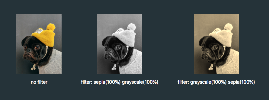
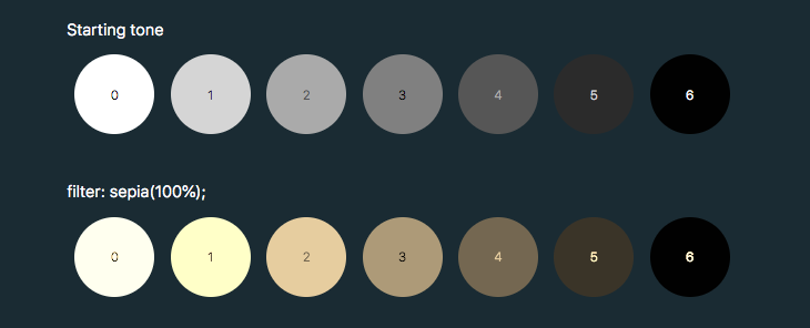
To make use of hue-rotate(), we need to start off with a colored icon. The sepia() filter is the only filter function that allows us to add a color, giving the filtered element a yellow-brown-y tinge, like an old photo.

The output color is dependent on the starting tonal value:

In order to add enough color with sepia(), we first need to use invert() to convert our icon to a medium grey:

.icon:hover {
  filter: invert(0.5)
}

We can then add the yellow/brown tone with sepia():

.icon:hover {
  filter: invert(0.5) sepia(1);
}

…then change the hue with hue-rotate():

.icon:hover {
  filter: invert(0.5) sepia(1) hue-rotate(200deg);                                  
}

Once we have the rough color we want, we can tweak it with saturation() and brightness():

.icon:hover {
  filter: 
    invert(0.5)
    sepia(1)
    hue-rotate(200deg)
    saturate(4)
    brightness(1);
}

I’ve made a little tool for this to make your life a little easier, as this is a pretty confusing process to guesstimate.

See the Pen CSS filter example by Cassie Evans (@cassie-codes)
on CodePen.

Even with the tool, it’s still a little fiddly, not supported by Internet Explorer, and most importantly, you’re unable to specify a precise color.

This browser support data is from Caniuse, which has more detail. A number indicates that browser supports the feature at that version and up.

Desktop

Chrome Opera Firefox IE Edge Safari
18* 15* 35 No 18 6*

Mobile / Tablet

iOS Safari Opera Mobile Opera Mini Android Android Chrome Android Firefox
6.0-6.1* 46 No 4.4* 71 64

So, what do we do if we need a specific hex code?

SVG Filters

If we need more precise control (and better browser support) than CSS filters can offer, then it’s time to turn to SVG.

Filters originally came from SVG. In fact, under the hood, CSS filters are just shortcuts to SVG filters with a particular set of values baked in.

Unlike CSS, the filter isn’t predefined for us, so we have to create it. How do we do this?

This is the syntax to define a filter:

<svg xmlns="<http://www.w3.org/2000/svg>" version="1.1">
  <defs>
    <filter id="id-of-your-filter">
      ...          
      
      ...
    </filter>
    ...
  </defs>
</svg>

Filters are defined by a <filter> element, which goes inside the <defs> section of an SVG.

SVG filters can be applied to SVG content within the same SVG document. Or, the filter can be referenced and applied to HTML content elsewhere.

To apply an SVG filter to HTML content, we reference it the same way as a CSS filter: by using the url() filter function. The URL points to the ID of the SVG filter.

.icon:hover {
  filter: url('#id-of-your-filter');
}

The SVG filter can be placed inline in the document or the filter function can reference an external SVG. I prefer the latter route as it allows me to keep my SVG filters tidied away in an assets folder.

.icon:hover {
  filter: url('assets/your-SVG.svg#id-of-your-filter');
}

Back to the <filter> element itself.

<filter id="id-of-your-filter">
  ...          
  
  ...
</filter>

Right now, this filter is empty and won’t do anything as we haven’t defined a filter primitive. Filter primitives are what create the filter effects. There are a number of filter primitives available to us, including:

  • [<feBlend>]
  • [<feColorMatrix>]
  • [<feComponentTransfer>]
  • [<feComposite>]
  • [<feConvolveMatrix>]
  • [<feDiffuseLighting>]
  • [<feDisplacementMap>]
  • [<feDropShadow>]
  • [<feFlood>]
  • [<feGaussianBlur>]
  • [<feImage>]
  • [<feMerge>]
  • [<feMorphology>]
  • [<feOffset>]
  • [<feSpecularLighting>]
  • [<feTile>]
  • [<feTurbulence>]

Just like with CSS filters, we can use them on their own or include multiple filter primitives in the <filter> tag for more interesting effects. If more than one filter primitive is used, then each operation will build on top of the previous one.

For our purposes we’re just going to use feColorMatrix, but if you want to know more about SVG filters, you can check out the specs on MDN or this (in progress, at the time of this writing) article series that Sara Soueidan has kicked off.

feColourMatrix allows us to change color values on a per-channel basis, much like channel mixing in Photoshop.

This is what the syntax looks like:

<svg xmlns="<http://www.w3.org/2000/svg>" version="1.1">
  <defs>
    <filter id="id-of-your-filter">
      <feColorMatrix
        color-interpolation-filters="sRGB"
        type="matrix"
        values="1 0 0 0 0
                0 1 0 0 0
                0 0 1 0 0
                0 0 0 1 0 "/>
    </filter>
    ...
  </defs>
</svg>

The color-interpolation-filters attribute specifies our color space. The default color space for filter effects is linearRGB, whereas in CSS, RGB colors are specified in the sRGB color space. It’s important that we set the value to sRGB in order for our colors to match up.

Let’s have a closer look at the color matrix values.

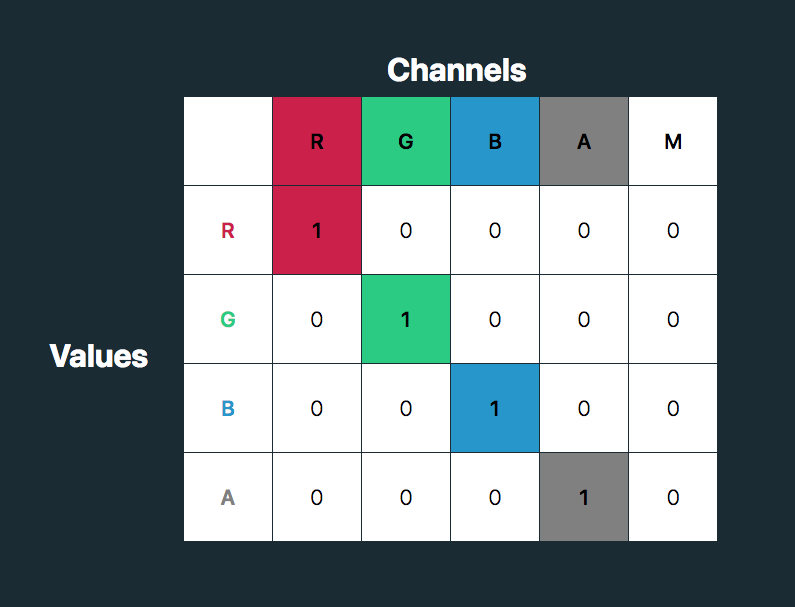
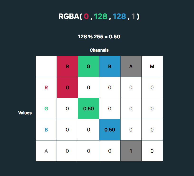
The first four columns represent the red, green and blue channels of color and the alpha (opacity) value. The rows contain the red, green, blue and alpha values in those channels.

The M column is a multiplier — we don’t need to change any of these values for our purposes here. The values for each color channel are represented as floating point numbers in the range 0 to 1.

We could write these values as a CSS RGBA color declaration like this:

rgba(255, 255, 255, 1)

The values for each color channel (red, green and blue) are stored as integers in the range 0 to 255. In computers, this is the range that one 8-bit byte can offer.

By dividing these color channel values by 255, the values can be represented as a floating point number which we can use in the feColorMatrix.

And, by doing this, we can create a color filter for any color with an RGB value!

Like teal, for example:

rgba(0, 128, 128, 1). 128%255=0.50

See the Pen
SVG filter – teal hover
by Cassie Evans (@cassie-codes)
on CodePen.

This SVG filter will only impart color to icons with a white fill, so If we have an icon with a black fill, we can use invert() to convert it to white before applying the SVG filter.

.icon:hover {
  filter: invert(100%) url('assets/your-SVG.svg#id-of-your-filter');
}

If we just have a hex code, the math is a little trickier, although there are plenty of hex-to-RGBA converters out there. To help out, I’ve made a HEX to feColorMatrix converter.

See the Pen
HEX to feColorMatrix converterr
by Cassie Evans (@cassie-codes)
on CodePen.

Have a play around, and happy filtering!

The post The Many Ways to Change an SVG Fill on Hover (and When to Use Them) appeared first on CSS-Tricks.

Well, Typetura seems fun

Post pobrano z: Well, Typetura seems fun

I came across this update from Scott Kellum’s and Sal Hernandez’s project Typetura via my Medium feed this morning, and what a delight?!

(Also, wow, I really have been out of the game for a minute.)

Typetura.js is a fluid design solution, for any property, based on any input. It’s not for just typography across screen sizes. Transition between anything — width, height, scroll position, cursor position, and more.https://t.co/EoouX0PkGC

— typetura (@typetura) January 18, 2019

This is quite exciting! Typetura wants to deal with some of the main problems that come up when utilizing fluid type in your CSS.

> Typetura is a fluid typesetting tool. Use the slider at the top of the screen to select the breakpoint you want to style, then use the panel on the left of the screen to style your page.https://t.co/6cjgdEylwY

— CSS-Tricks (@css) November 22, 2018

Typetura was created to make fluid typography mainstream. To do this there were two problems to solve. First, develop an implementation that is feature rich and easy to implement with CSS. Second, create a design tool that designers can use to illustrate how they want fluid typography to look.

I love a tool that tries to remove friction and make technologies easier to use.

To ensure the implementation was easy to use and understand, Typetura needed a simple, declarative syntax in vanilla CSS. This means no complicated math or Sass tricks.

Design software is constructed around fixed art boards, but there needs to be a way for designers to communicate how designs transition between sizes… Typetura is a tool that enables designers to work with a fluid canvas.

You can also
remix on @glitch — https://t.co/o3yr7Hsbki
edit on @CodePen — https://t.co/k4Oy1OLT71
or read on @Medium — https://t.co/WcgzHCgBrf

— typetura (@typetura) January 31, 2019

Direct Link to Article — Permalink

The post Well, Typetura seems fun appeared first on CSS-Tricks.

Well, Typetura seems fun

Post pobrano z: Well, Typetura seems fun

I came across this update from Scott Kellum’s and Sal Hernandez’s project Typetura via my Medium feed this morning, and what a delight?!

(Also, wow, I really have been out of the game for a minute.)

Typetura.js is a fluid design solution, for any property, based on any input. It’s not for just typography across screen sizes. Transition between anything — width, height, scroll position, cursor position, and more.https://t.co/EoouX0PkGC

— typetura (@typetura) January 18, 2019

This is quite exciting! Typetura wants to deal with some of the main problems that come up when utilizing fluid type in your CSS.

> Typetura is a fluid typesetting tool. Use the slider at the top of the screen to select the breakpoint you want to style, then use the panel on the left of the screen to style your page.https://t.co/6cjgdEylwY

— CSS-Tricks (@css) November 22, 2018

Typetura was created to make fluid typography mainstream. To do this there were two problems to solve. First, develop an implementation that is feature rich and easy to implement with CSS. Second, create a design tool that designers can use to illustrate how they want fluid typography to look.

I love a tool that tries to remove friction and make technologies easier to use.

To ensure the implementation was easy to use and understand, Typetura needed a simple, declarative syntax in vanilla CSS. This means no complicated math or Sass tricks.

Design software is constructed around fixed art boards, but there needs to be a way for designers to communicate how designs transition between sizes… Typetura is a tool that enables designers to work with a fluid canvas.

You can also
remix on @glitch — https://t.co/o3yr7Hsbki
edit on @CodePen — https://t.co/k4Oy1OLT71
or read on @Medium — https://t.co/WcgzHCgBrf

— typetura (@typetura) January 31, 2019

Direct Link to Article — Permalink

The post Well, Typetura seems fun appeared first on CSS-Tricks.

How do you figure?

Post pobrano z: How do you figure?

Scott O’Hara digs into the <figure> and <figcaption> elements. Gotta love a good ol’ HTML deep dive.

I use these on just about every blog post here on CSS-Tricks, and as I’ve suspected, I’ve basically been doing it wrong forever. My original thinking was that a figcaption was just as good as the alt attribute. I generally use it to describe the image.

<figure>
  <img src="starry-night.jpg" alt="">
  <figcaption>The Starry Night, a famous painting by Vincent van Gogh</figcaption>
</figure>

I intentionally left off the alt text, because the figcaption is saying what I would want to say in the alt text and I thought duplicating it would be annoying (to a screen reader user) and unnecessary. Scott says that’s bad as the empty alt text makes the image entirely undiscoverable by some screen readers and the figure is describing nothing as a result.

The correct answer, I think, is to do more work:

<figure>
  <img src="starry-night.jpg" alt="An abstract painting with a weird squiggly tree thing in front of a swirling starry nighttime sky.">
  <figcaption>The Starry Night, a famous painting by Vincent van Gogh</figcaption>
</figure>

It’s a good goal, and I should do better about this. It’s just laziness that gets in the way, and laziness that makes me wish there was a pattern that allowed me to write a description once that worked for both. Maybe something like Nino Ross Rodriguez just shared today where artificial intelligence can take some of the lift. But that’s kinda not the point here. The point is that you can’t write it once because <figcaption> and alt do different things.

Direct Link to Article — Permalink

The post How do you figure? appeared first on CSS-Tricks.

Using Artificial Intelligence to Generate Alt Text on Images

Post pobrano z: Using Artificial Intelligence to Generate Alt Text on Images

Web developers and content editors alike often forget or ignore one of the most important parts of making a website accessible and SEO performant: image alt​ text. You know, that seemingly small image attribute that describes an image:

​​​<img src="/cute/sloth/image.jpg" alt="A brown baby sloth staring straight into the camera with a tongue sticking out." >

A brown baby sloth staring straight into the camera with a tongue sticking out.
📷 Credit: Huffington Post

If you regularly publish content on the web, then you know it can be tedious trying to come up with descriptive text. Sure, 5-10 images is doable. But what if we are talking about hundreds or thousands of images? Do you have the resources for that?

Let’s look at some possibilities for automatically generating alt text for images with the use of computer vision and image recognition services from the likes Google, IBM, and Microsoft. They have the resources!

Reminder: What is alt text good for?

Often overlooked during web development and content entry, the alt​ attribute is a small bit of HTML code that describes an image that appears on a page. It’s so inconspicuous that it may not appear to have any impact on the average user, but it has very important uses indeed:

  • ​​Web Accessibility for Screen Readers: Imagine a page with lots of images and not a single one contains alt​ text. A user surfing in using a screen reader would only hear the word “image” blurted out and that’s not very helpful. Great, there’s an image, but what is it? Including alt​ enables screen readers to help the visually impaired “see” what’s there and have a better understanding of the content of the page. They say a picture is worth a thousand words — that’s a thousand words of context a user could be missing.
  • Display text if an image does not load: The World Wide Web seems infallible and, like New York City, that it never sleeps, but flaky and faulty connections are a real thing and, if that happens, well, images tend not to load properly and “break.” Alt text is a safeguard in that it displays on the page in place of where the “broken” image is, providing users with content as a fallback.
  • ​​SEO performance: Alt text on images contributes to SEO performance as well. Though it doesn’t exactly help a site or page skyrocket to the top of the search results, it is one factor to keep in mind for SEO performance.

Knowing how important these things are, hopefully you’ll be able to include proper alt​ text during development and content entry. But are your archives in good shape? Trying to come up with a detailed description for a large backlog of images can be a daunting task, especially if you’re working on tight deadlines or have to squeeze it in between other projects.

What if there was a way to apply alt​ text as an image is uploaded? And! What if there was a way to check the page for missing alt​ tags and automagically fill them in for us?

There are available solutions!

Computer vision (or image recognition) has actually been offered for quite some time now. Companies like Google, IBM and Microsoft have their own APIs publicly available so that developers can tap into those capabilities and use them to identify images as well as the content in them.

There are developers who have already utilized these services and created their own plugins to generate alt​ text. Take Sarah Drasner’s generator, for example, which demonstrates how Azure’s Computer Vision API can be used to create alt​ text for any image via upload or URL. Pretty awesome!

​​See the Pen
​​Dynamically Generated Alt Text with Azure's Computer Vision API
by Sarah Drasner (@sdras)
​​on CodePen.
​​

There’s also Automatic Alternative Text by Jacob Peattie, which is a WordPress plugin that uses the same Computer Vision API. It’s basically an addition to the workflow that allows the user to upload an image and generated alt​ text automatically.

​​Tools like these generally help speed-up the process of content management, editing and maintenance. Even the effort of thinking of a descriptive text has been minimized and passed to the machine!

Getting Your Hands Dirty With AI

I have managed to have played around with a few AI services and am confident in saying that Microsoft Azure’s Computer Vision produces the best results. The services offered by Google and IBM certainly have their perks and can still identify images and proper results, but Microsoft’s is so good and so accurate that it’s not worth settling for something else, at least in my opinion.

Creating your own image recognition plugin is pretty straightforward. First, head down to Microsoft Azure Computer Vision. You’ll need to login or create an account in order to grab an API key for the plugin.

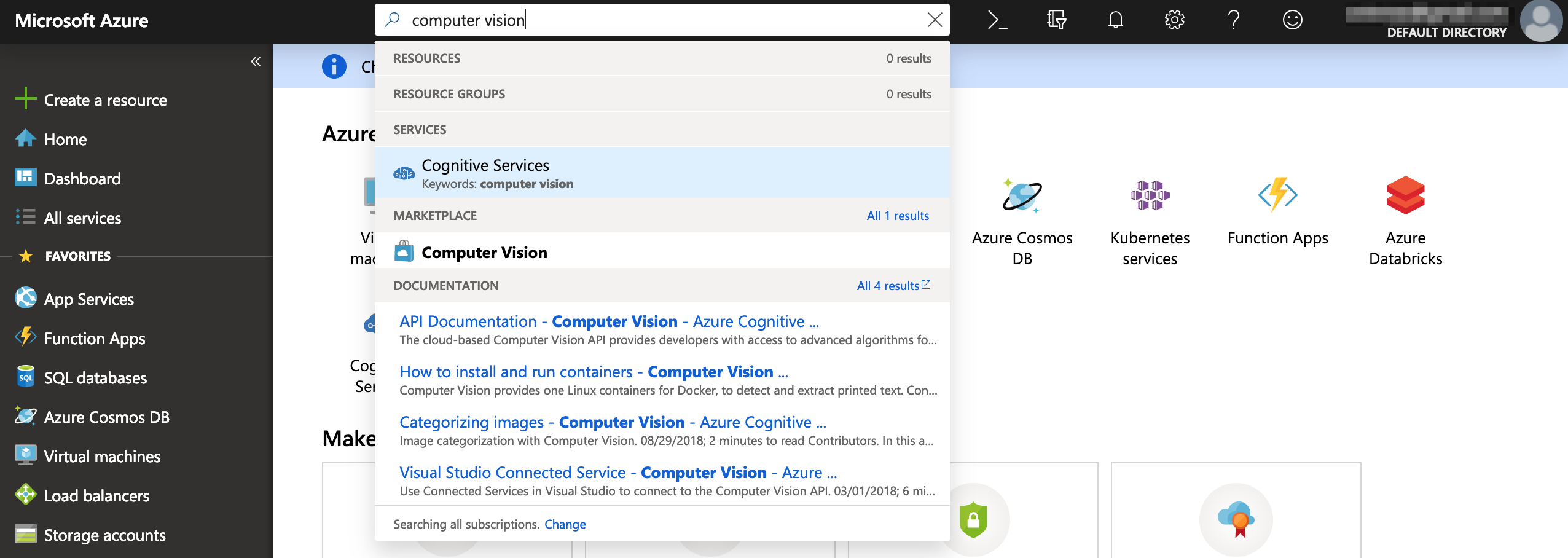
Once you’re on the dashboard, search and select Computer Vision and fill in the necessary details.

Starting out

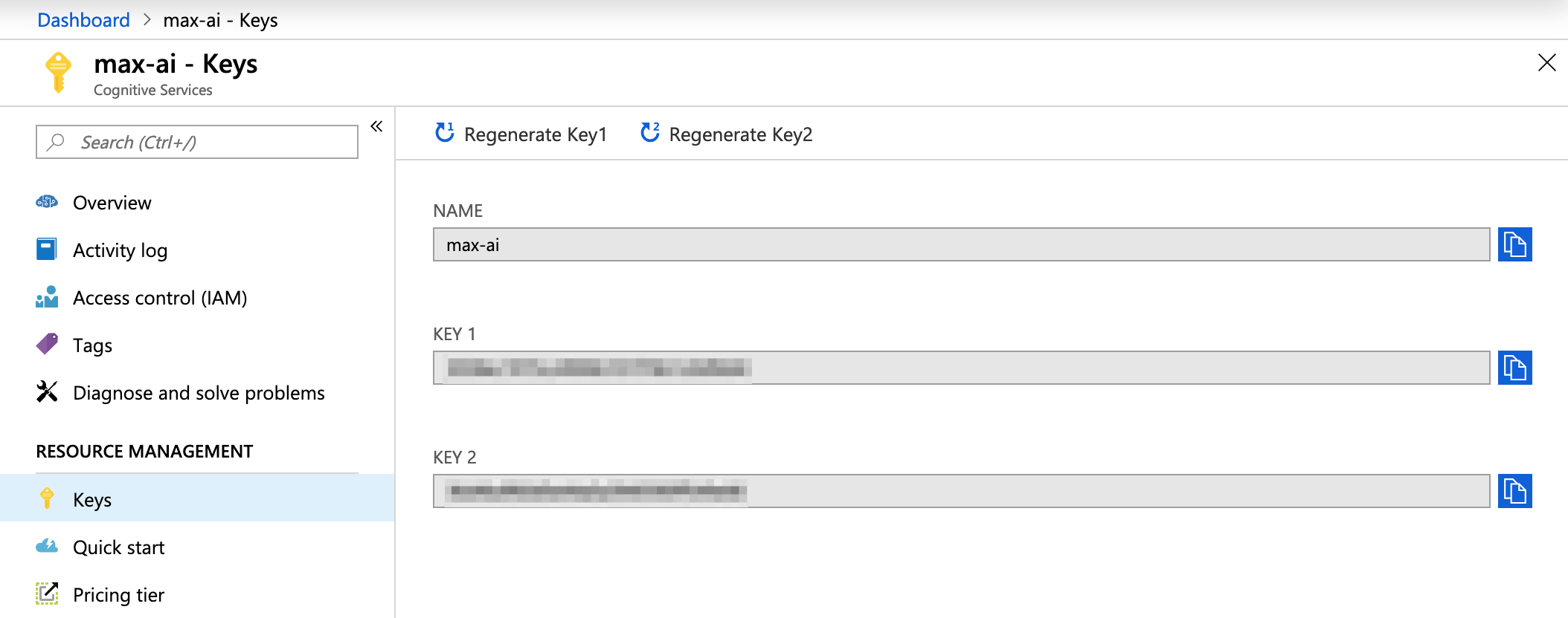
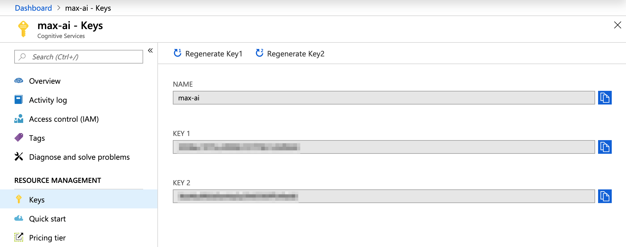
Wait for the platform to finish spinning up an instance of your computer vision. The API keys for development will be available once it’s done.

​​Keys: Also known as the Subscription Key in the official documentation

Let the interesting and tricky parts begin! I will be using vanilla JavaScript for the sake of demonstration. For other languages, you can check out the documentation. Below is a straight-up copy and paste of the code and you can use to replace the placeholders.

​​var request = new XMLHttpRequest();
request.open('POST', 'https://[LOCATION]/vision/v1.0/describe?maxCandidates=1&language=en', true);
request.setRequestHeader('Content-Type', 'application/json');
request.setRequestHeader('Ocp-Apim-Subscription-Key', '[SUBSCRIPTION_KEY]');
request.send(JSON.stringify({ "url": "[IMAGE_URL]" }));
request.onload = function () {
    var resp = request.responseText;
    if (request.status >= 200 && request.status < 400) {
        // Success!
        console.log('Success!');
    } else {
        // We reached our target server, but it returned an error
        console.error('Error!');
    }

    console.log(JSON.parse(resp));
};

request.onerror = function (e) {
    console.log(e);
};

Alright, let’s run through some key terminology of the AI service.

  • Location: This is the subscription location of the service that was selected prior to getting the subscription keys. If you can’t remember the location for some reason, you can go to the Overview screen and find it under Endpoint.
  • ​​

Overview > Endpoint : To get the location value
  • ​​Subscription Key: This is the key that unlocks the service for our plugin use and can be obtained under Keys. There’s two of them, but it doesn’t really matter which one is used.
  • ​​Image URL: This is the path for the image that’s getting the alt​ text. Take note that the images that are sent to the API must meet specific requirements:
    • File type must be JPEG, PNG, GIF, BMP
    • ​File size must be less than 4MB
    • ​​Dimensions should be greater than 50px by 50px

Easy peasy

​​Thanks to big companies opening their services and API to developers, it’s now relatively easy for anyone to utilize computer vision. As a simple demonstration, I uploaded the image below to Microsoft Azure’s Computer Vision API.

Possible alt​ text: a hand holding a cellphone

​​The service returned the following details:

​​{
    "description": {
        "tags": [
            "person",
            "holding",
            "cellphone",
            "phone",
            "hand",
            "screen",
            "looking",
            "camera",
            "small",
            "held",
            "someone",
            "man",
            "using",
            "orange",
            "display",
            "blue"
        ],
        "captions": [
            {
                "text": "a hand holding a cellphone",
                "confidence": 0.9583763512737793
            }
        ]
    },
    "requestId": "31084ce4-94fe-4776-bb31-448d9b83c730",
    "metadata": {
        "width": 920,
        "height": 613,
        "format": "Jpeg"
    }
}

​​From there, you could pick out the alt​ text that could be potentially used for an image. How you build upon this capability is your business:

  • ​​You could create a CMS plugin and add it to the content workflow, where the alt​ text is generated when an image is uploaded and saved in the CMS.
  • ​​You could write a JavaScript plugin that adds alt​ text on-the-fly, after an image has been loaded with notably missing alt​ text.
  • ​​You could author a browser extension that adds alt​ text to images on any website when it finds images with it missing.
  • ​​You could write code that scours your existing database or repo of content for any missing alt​ text and updates them or opens pull requests for suggested changes.

​​Take note that these services are not 100% accurate. They do sometimes return a low confidence rating and a description that is not at all aligned with the subject matter. But, these platforms are constantly learning and improving. After all, Rome wasn’t built in a day.

The post Using Artificial Intelligence to Generate Alt Text on Images appeared first on CSS-Tricks.
Using React and XState to Build a Sign In Form

Post pobrano z: Using React and XState to Build a Sign In Form

To make a sign in form with good UX requires UI state management, meaning we’d like to minimize the cognitive load to complete it and reduce the number of required user actions while making an intuitive experience. Think about it: even a relatively simple email and password sign in form needs to handle a number of different states, like empty fields, errors, password requirements, loading and success.

Thankfully, state management is what React was made for and I was able to create a sign in form with it using an approach that features XState, a JavaScript state management library using finite machines.

State management? Finite machines? We’re going to walk through these concepts together while putting together a solid sign in form.

Jumping ahead, here’s what we’re going to build together:

First, let’s set up

We’ll need a few tools before getting started. Here’s what to grab:

Once those are in hand, we can make sure our project folder is set up for development. Here’s an outline of how the files should be structured:

public/
  |--src/
    |--Loader/
    |--SignIn/
      |--contactAuthService.js
      |--index.jsx
      |--isPasswordShort.js
      |--machineConfig.js
      |--styles.js
    |--globalStyles.js
    |--index.jsx
package.json

A little background on XState

We already mentioned that XState is a state management JavaScript library. Its approach uses finite state machines which makes it ideal for this sort of project. For example:

  • It is a thoroughly tried and tested approach to state management. Finite state machines have been around for 30+ years.
  • It is built accordance to specification.
  • It allows logic to be completely separated from implementation, making it easily testable and modular.
  • It has a visual interpreter which gives great feedback of what’s been coded and makes communicating the system to another person that much easier.

For more information on finite-state machines check out David Khourshid’s article.

Machine Config

The machine config is the core of XState. It is a statechart and it will define the logic of our form. I have broken it down into the following parts, which we’ll go over one by one.

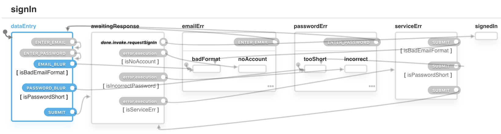
1. The States

We need a way to control what to show, hide, enable and disable. We will control this using named-states, which include:

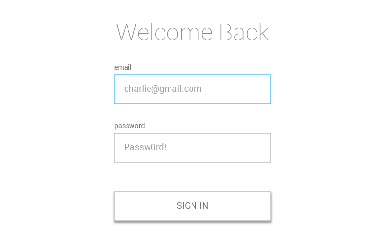
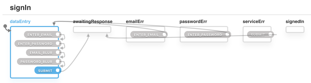
dataEntry: This is the state when the user can enter an email and password into the provided fields. We can consider this the default state. The current field will be highlighted in blue.

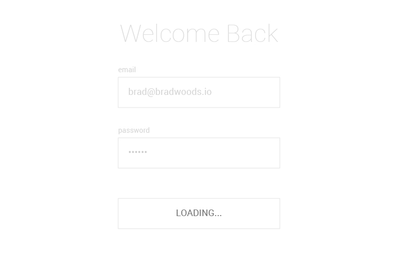
awaitingResponse: This is after the browser makes a request to the authentication service and we are waiting for the response. We’ll disable the form and replace the button with a loading indicator when the form is in this state.

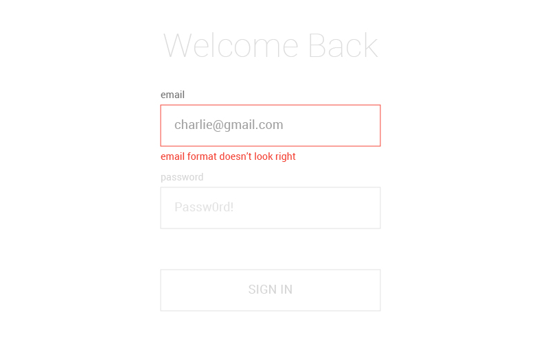
emailErr: Whoops! This state is thrown when there is a problem with the email address the user has entered. We’ll highlight that field, display the error, and disable the other field and button.

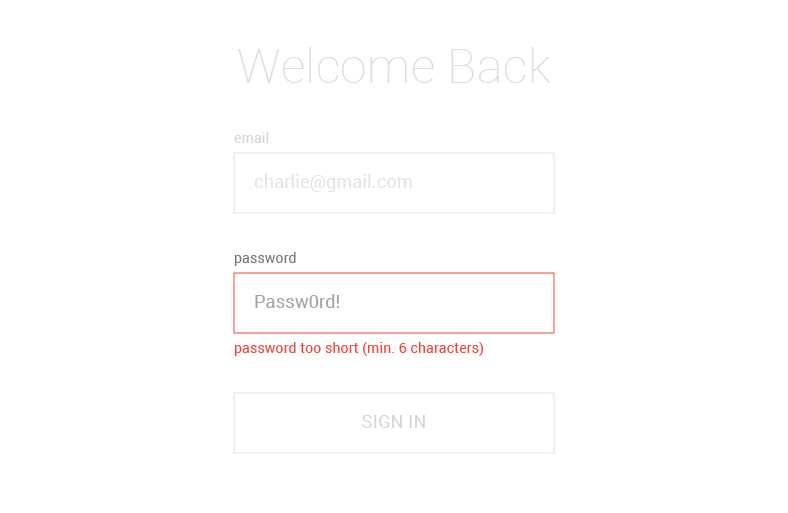
passwordErr: This is another error state, this time when there is a problem with the password the user has entered. Like the previous error, we’ll highlight the field, display the error, and disable the rest of the form.

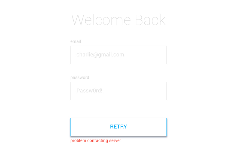
serviceErr: We reach this state when we are unable contact the authentication service, preventing the submitted data to be checked. We’ll display an error along with a „Retry” button to re-attempt a service connection.

signedIn: Success! This is when the user has successfully authenticated and proceeds past the sign in form. Normally, this would take the user to some view, but we’ll simply confirm authentication since we’re focusing solely on the form.

See the machinConfig.js file in the SignIn directory? Crack that open so we can define our states. We list them as properties of a states object. We also need to define an initial state, which mentioned earlier, will be the dataEntry state, allowing the user to enter data into the form fields.

const machineConfig = {
  id: 'signIn',
  initial: 'dataEntry',
  states: {
    dataEntry: {},
    awaitingResponse: {},
    emailErr: {},
    passwordErr: {},
    serviceErr: {},
    signedIn: {},
  }
}

export default machineConfig

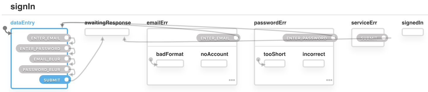
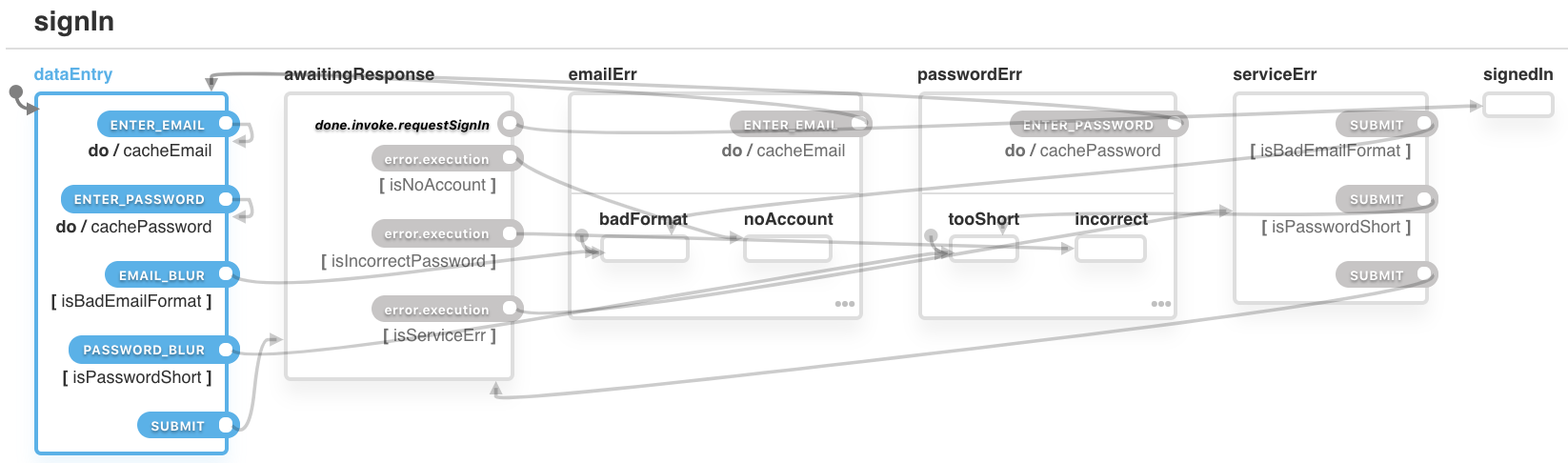
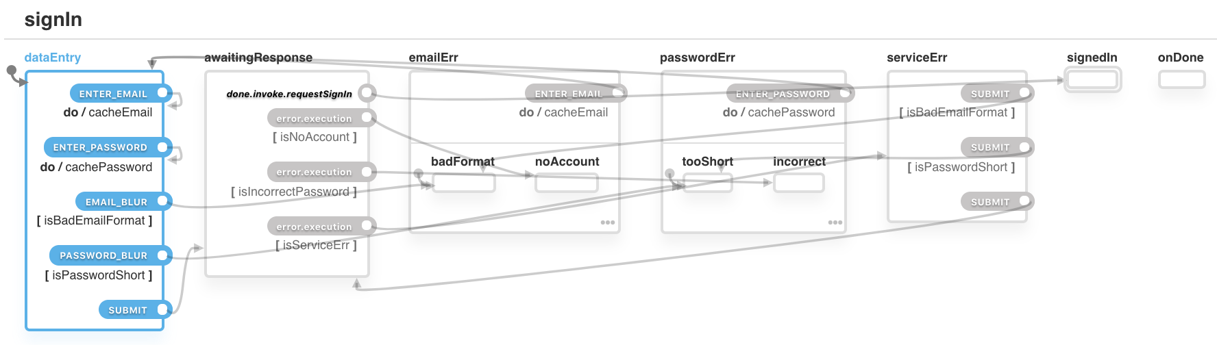
Each part of this article will show the code of machineConfig.js along with a diagram produced from the code using XState’s visualizer.

2. The Transitions

Now that we have defined our states, we need to define how to change from one state to another and, in XState, we do that with a type of event called a transition. We define transitions within each state. For example, If the ENTER_EMAIL transition is triggered when we’re in the emailErr state, then the system will move to state dataEntry.

emailErr: {
  on: {
    ENTER_EMAIL: {
      target: 'dataEntry'
    }
  }
}

Note that nothing would happen if a different type of transition was triggered (such as ENTER_PASSWORD) while in the emailErr state. Only transitions that are defined within the state are valid.

When a transition has no target, it is an external (by default) self-transition. When triggered, the state will exit and re-enter itself. As an example, the machine will change from dataEntry back to dataEntry when the ENTER_EMAIL transition is triggered.

Here’s how that is defined:

dataEntry: {
  on: {
    ENTER_EMAIL: {}
  }
}

Sounds weird, I know, but we’ll explain it a little later. Here’s the machineConfig.js file so far.

const machineConfig = {
  id: 'signIn',
  initial: 'dataEntry',
  states: {
    dataEntry: {
      on: {
        ENTER_EMAIL: {},
        ENTER_PASSWORD: {},
        EMAIL_BLUR: {},
        PASSWORD_BLUR: {},
        SUBMIT: {
          target: 'awaitingResponse',
        },
      },
    },
    awaitingResponse: {},
    emailErr: {
      on: {
        ENTER_EMAIL: {
          target: 'dataEntry',
        },
      },
    },
    passwordErr: {
      on: {
        ENTER_PASSWORD: {
          target: 'dataEntry',
        },
      },
    },
    serviceErr: {
      on: {
        SUBMIT: {
          target: 'awaitingResponse',
        },
      },
    },
    signedIn: {},
  },
};

export default machineConfig;

3. Context

We need a way to save what the user enters into the input fields. We can do that in XState with context, which is an object within the machine that enables us to store data. So, we’ll need to define that in our file as well.

Email and password are both empty strings by default. When the user enters their email or password, this is where we’ll store it.

const machineConfig = {
  id: 'signIn',
  context: {
    email: '',
    password: '',
  },
  ...

4. Hierarchical States

We will need a way to be more specific about our errors. Instead of simply telling the user there is an email error, we need to tell them what kind of error happened. Perhaps it’s email with the wrong format or there is no account linked to the entered email — we should let the user know so there’s no guessing. This is where we can use hierarchical states which are essentially state machines within state machines. So, instead of having a emailErr state, we can add sub-states, such as emailErr.badFormat or emailErr.noAccount.

For the emailErr state, we have defined two sub-states: badFormat and noAccount. This means the machine can no longer only be in the emailErr state; it would be either in the emailErr.badFormat state or the emailErr.noAccount state and having them parsed out allows us to provide more context to the user in the form of unique messaging in each sub-state.

const machineConfig = {
  ...
  states: {
    ...
    emailErr: {
      on: {
        ENTER_EMAIL: {
          target: 'dataEntry',
        },
      },
      initial: 'badFormat',
      states: {
        badFormat: {},
        noAccount: {},
      },
    },
    passwordErr: {
      on: {
        ENTER_PASSWORD: {
          target: 'dataEntry',
        },
      },
      initial: 'tooShort',
      states: {
        tooShort: {},
        incorrect: {},
      },
    },
    ...

5. Guards

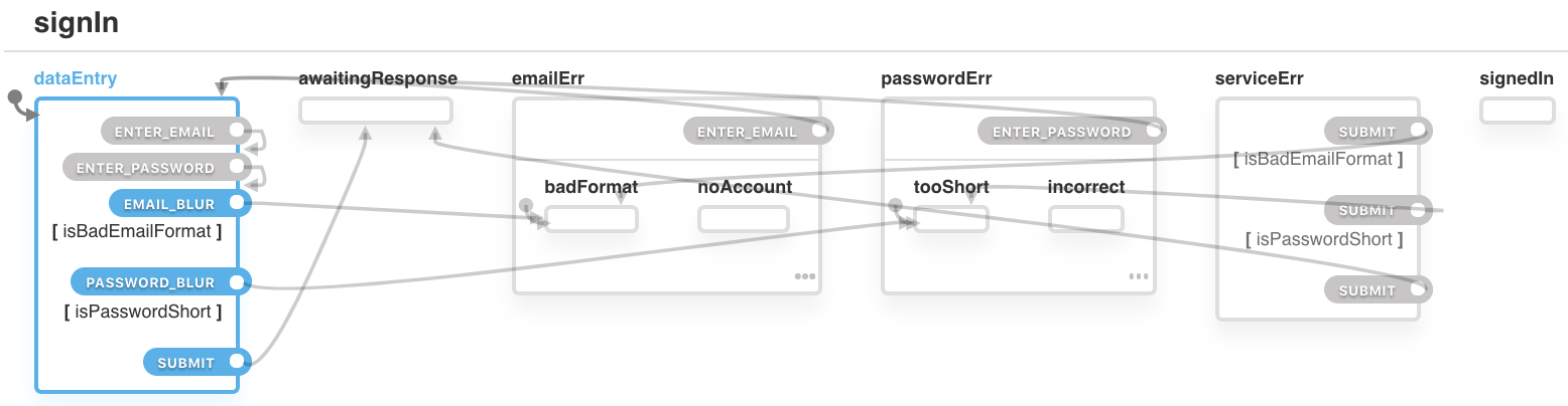
When the user blurs an input or clicks submit, we need to check if the email and/or password are valid. If even one of those values is in a bad format, we need to prompt the user to change it. Guards allows us to transition to a state depending on those types of conditions.

Here, we’re using the EMAIL_BLUR transition to change the state to emailErr.badFormat only if the condition isBadEmailFormat returns true. We are doing a similar thing to PASSWORD_BLUR.

We’re also changing the SUBMIT transition’s value to an array of objects with a target and condition property. When the SUBMIT transition is triggered, the machine will go through each of the conditions, from first to last, and change the state of the first condition that returns true. For example, if isBadEmailFormat returns true, the machine will change to state emailErr.badFormat. However, if isBadEmailFormat returns false, the machine will move to the next condition statement and check if it returns true.

const machineConfig = {
  ...
  states: {
    ...
    dataEntry: {
      ...
      on: {
        EMAIL_BLUR: {
          cond: 'isBadEmailFormat',
          target: 'emailErr.badFormat'
        },
        PASSWORD_BLUR: {
          cond: 'isPasswordShort',
          target: 'passwordErr.tooShort'
        },
        SUBMIT: [
          {
            cond: 'isBadEmailFormat',
            target: 'emailErr.badFormat'
          },
          {
            cond: 'isPasswordShort',
            target: 'passwordErr.tooShort'
          },
          {
            target: 'awaitingResponse'
          }
        ],
      ...

6. Invoke

All of the work we’ve done so far would be for nought if we didn’t make a request to an authentication service. The result of what’s entered and submitted to the form will inform many of the states we defined. So, invoking that request should result in one of two states:

  • Transition to the signedIn state if it returns successfully, or
  • transition to one of our error states if it fails.

The invoke method allows us to declare a promise and transition to different states, depending on what that promise returns. The src property takes a function that has two parameters: context and event (but we’re only using context here). We return a promise (our authentication request) with the values of email and password from the context. If the promise returns successfully, we will transition to the state defined in the onDone property. If an error is returned, we will transition to the state defined in the onError property.

const machineConfig = {
  ...
  states: {
    ...
    // We’re in a state of waiting for a response
    awaitingResponse: {
      // Make a call to the authentication service      
      invoke: {
        src: 'requestSignIn',
        // If successful, move to the signedIn state
        onDone: {
          target: 'signedIn'
        },
        // If email input is unsuccessful, move to the emailErr.noAccount sub-state
        onError: [
          {
            cond: 'isNoAccount',
            target: 'emailErr.noAccount'
          },
          {
            // If password input is unsuccessful, move to the passwordErr.incorrect sub-state
            cond: 'isIncorrectPassword',
            target: 'passwordErr.incorrect'
          },
          {
            // If the service itself cannot be reached, move to the serviceErr state
            cond: 'isServiceErr',
            target: 'serviceErr'
          }
        ]
      },
    },
    ...

7. Actions

We need a way to save what the user enters into the email and password fields. Actions enable side effects to be triggered when a transition occurs. Below, we have defined an action (cacheEmail) within the ENTER_EMAIL transition of the dataEntry state. This means if the machine is in dataEntry and the transition ENTER_EMAIL is triggered, the action cacheEmail will also be triggered.

const machineConfig = {
  ...
  states: {
    ...
    // On submit, target the two fields
    dataEntry: {
      on: {
        ENTER_EMAIL: {
          actions: 'cacheEmail'
        },
        ENTER_PASSWORD: {
          actions: 'cachePassword'
        },
      },
      ...
    },
    // If there’s an email error on that field, trigger email cache action
    emailErr: {
      on: {
        ENTER_EMAIL: {
          actions: 'cacheEmail',
          ...
        }
      }
    },
    // If there’s a password error on that field, trigger password cache action
    passwordErr: {
      on: {
        ENTER_PASSWORD: {
          actions: 'cachePassword',
          ...        
        }
      }
    },
    ...

8. Final State

We need to way to indicate if the user has successfully authenticated and, depending on the result, trigger the next stage of the user journey. Two things are required for this:

  • We declare that one of the states is the final state, and
  • define an onDone property that can trigger actions when that final state is reached.

Within the signedIn state, we add type: final. We also add an onDone property with action onAuthentication. Now, when the state signedIn is reached, the action onAuthentication will be triggered and the machine will be done (no longer executable).

const machineConfig = {
  ...
  states: {
    ...
    signedIn: {
      type: 'final'
    },
    onDone: {
      actions: 'onAuthentication'
    },
    ...

9. Test

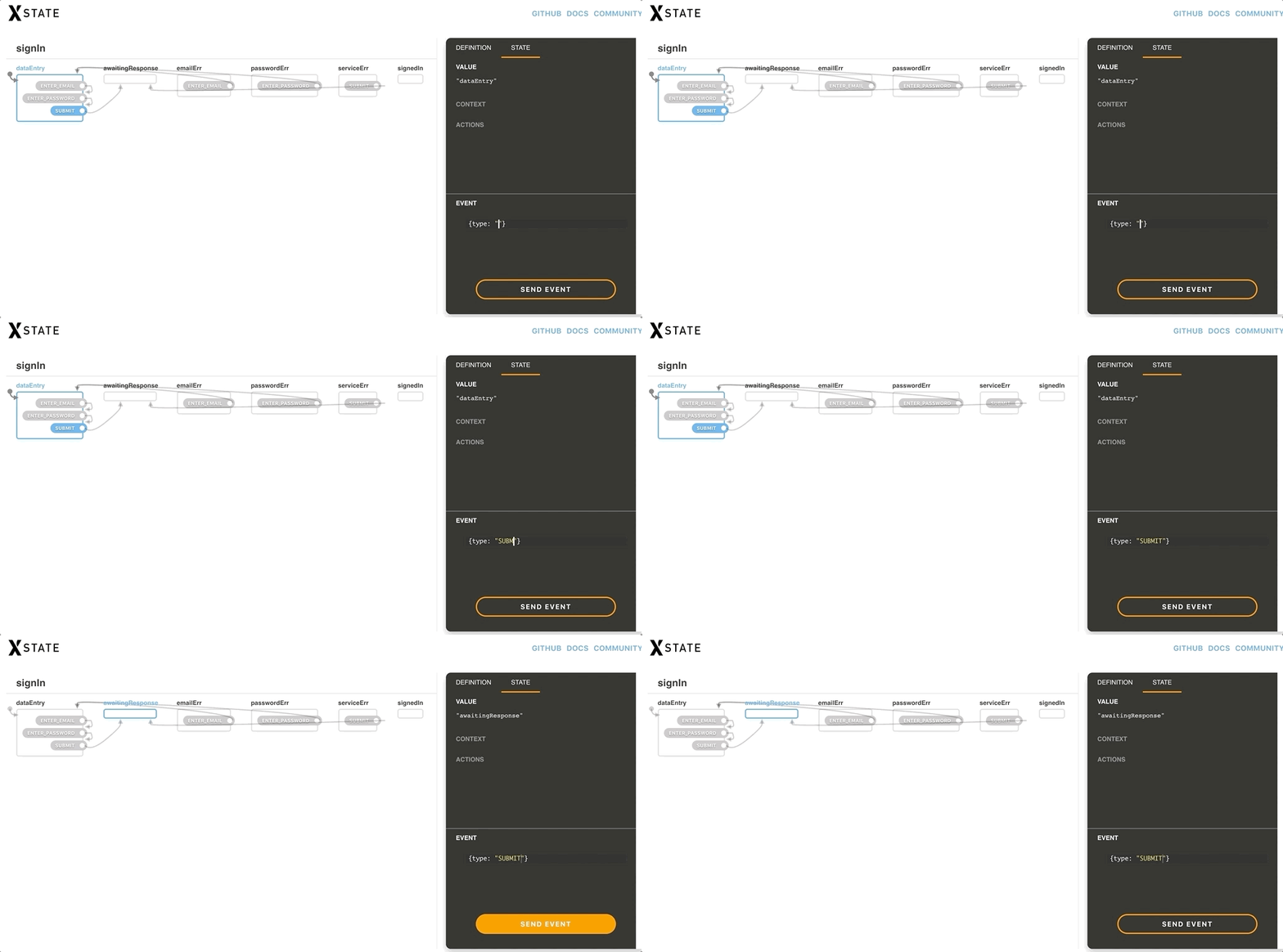
A great feature of XState is that the machine configuration is completely independent of the actual implementation. This means we can test it now and get confidence with what we’ve made before connecting it to the UI and backend service. We can copy and paste the machine config file into XState’s visualizer and get a auto-generated statechart diagram that not only outlines all the defined states with arrows that illustrate how they’re all connected, but allows us to interact with the chart as well. This is built-in testing!

Connecting the machine to a React component

Now that we’ve written our statechart, it’s time to connect it to our UI and backend service. An XState machine options object allows us to map strings we declared in the config to functions.

We’ll begin by defining a React class component with three refs:

// SignIn/index.jsx

import React, { Component, createRef } from 'react'

class SignIn extends Component {
  emailInputRef = createRef()
  passwordInputRef = createRef()
  submitBtnRef = createRef()
  
  render() {
    return null
  }
}

export default SignIn

Map out the actions

We declared the following actions in our machine config:

  • focusEmailInput
  • focusPasswordInput
  • focusSubmitBtn
  • cacheEmail
  • cachePassword
  • onAuthentication

Actions are mapped in the machine config’s actions property. Each function takes two arguments: context (ctx) and event (evt).

focusEmailInput and focusPasswordInput are pretty straightforward, however, there is a bug. These elements are being focused when coming from a disabled state. The function to focus these elements is firing right before the elements are re-enabled. The delay function gets around that.

cacheEmail and cachePassword need to update the context. To do this, we use the assign function (provided by XState). Whatever is returned by the assign function is added to our context. In our case, it is reading the input’s value from the event object and then adding that value to the context’s email or password. From there property.assign is added to the context. Again, in our case, it is reading the input’s value from the event object and adding that value to the context’s email or password property.

// SignIn/index.jsx

import { actions } from 'xstate'
const { assign } = actions  

const delay = func => setTimeout(() => func())

class SignIn extends Component {
  ...
  machineOptions = {
    actions: {
      focusEmailInput: () => {
        delay(this.emailInputRef.current.focus())
      },
      focusPasswordInput: () => {
        delay(this.passwordInputRef.current.focus())
      },
      focusSubmitBtn: () => {
        delay(this.submitBtnRef.current.focus())
      },
      cacheEmail: assign((ctx, evt) => ({
        email: evt.value
      })),
      cachePassword: assign((ctx, evt) => ({
        password: evt.value
      })),
      // We’ll log a note in the console to confirm authentication
      onAuthentication: () => {
        console.log('user authenticated')
      }
    },
  }
}

Put up our guards

We declared the following guards in our machine config:

  • isBadEmailFormat
  • isPasswordShort
  • isNoAccount
  • isIncorrectPassword
  • isServiceErr

Guards are mapped in the machine configuration’s guards property. The isBadEmailFormat and isPasswordShort guards make use of the context to read the email and password entered by the user then pass them on to the appropriate functions. isNowAccount, isIncorrectPassword and isServiceErr make use of the event object to read what kind of error was returned from the call to the authentication service.

// isPasswordShort.js

const isPasswordShort = password => password.length < 6

export default isPasswordShort
// SignIn/index.jsx

import { isEmail } from 'validator'
import isPasswordShort from './isPasswordShort'

class SignIn extends Component {
  ...
  machineOptions = {
    ...
    guards: {
      isBadEmailFormat: ctx => !isEmail(ctx.email),
      isPasswordShort: ctx => isPasswordShort(ctx.password),
      isNoAccount: (ctx, evt) => evt.data.code === 1,
      isIncorrectPassword: (ctx, evt) => evt.data.code === 2,
      isServiceErr: (ctx, evt) => evt.data.code === 3
    },  
  },
  ...
}

Hook up the services

We declared the following service in our machine configuration (within our invoke definition): requestSignIn.

Services are mapped in the machine configuration’s services property. In this case, the function is a promise and is passed to the email password from the context.

// contactAuthService.js
// error code 1 - no account
// error code 2 - wrong password
// error code 3 - no response

const isSuccess = () => Math.random() >= 0.8
const generateErrCode = () => Math.floor(Math.random() * 3) + 1

const contactAuthService = (email, password) =>
  new Promise((resolve, reject) => {
    console.log(`email: ${email}`)
    console.log(`password: ${password}`)
    setTimeout(() => {
      if (isSuccess()) resolve()
      reject({ code: generateErrCode() })
    }, 1500)
})

export default contactAuthService
// SignIn/index.jsx
...
import contactAuthService from './contactAuthService.js'

class SignIn extends Component {
  ...
  machineOptions = {
    ...
    services: {
      requestSignIn: ctx => contactAuthService(ctx.email, ctx.password)
    }
  },
  ...
}

react-xstate-js connects React and XState

Now that we have our machine config and options at the ready, we can create the actual machine! In order to use XState in a real world scenario, that requires an interpreter. react-xstate-js is an interpreter that connects React with XState using the render props approach. (Full disclosure, I developed this library.) It takes two props — config and options — and returns an XState service and state object.

// SignIn/index.jsx
...
import { Machine } from 'react-xstate-js'
import machineConfig from './machineConfig'

class SignIn extends Component {
  ...
  render() {
    <Machine config={machineConfig} options={this.machineOptions}>
      {({ service, state }) => null}
    </Machine>
  }
}

Let’s make the UI!

OK, we have a functional machine but the user needs to see the form in order to use it. That means it’s time to create the markup for the UI component. There are two things we need to do to communicate with our machine:

1. Read the state

To determine what state we are in, we can use the state’s matches method and return a boolean. For example: state.matches('dataEntry').

2. Fire a transition

To fire a transition, we use the service’s send method. It takes an object with the transitions type we want to trigger as well as any other key and value pairs we want in the evt object. For example: service.send({ type: 'SUBMIT' }).

// SignIn/index.jsx

...
import {
  Form,
  H1,
  Label,
  Recede,
  Input,
  ErrMsg,
  Button,
  Authenticated,
  MetaWrapper,
  Pre
} from './styles'

class SignIn extends Component {
  ...
  render() {
    <Machine config={machineConfig} options={this.machineOptions}>
      {({ service, state }) => {
        const disableEmail =
          state.matches('passwordErr') ||
          state.matches('awaitingResponse') ||
          state.matches('serviceErr')
          
        const disablePassword =
          state.matches('emailErr') ||
          state.matches('awaitingResponse') ||
          state.matches('serviceErr')
        
        const disableSubmit =
          state.matches('emailErr') ||
          state.matches('passwordErr') ||
          state.matches('awaitingResponse')
        
        const fadeHeading =
          state.matches('emailErr') ||
          state.matches('passwordErr') ||
          state.matches('awaitingResponse') ||
          state.matches('serviceErr')

        return (
          <Form
            onSubmit={e => {
              e.preventDefault()
              service.send({ type: 'SUBMIT' })
            }}
            noValidate
          >
            <H1 fade={fadeHeading}>Welcome Back</H1>

            <Label htmlFor="email" disabled={disableEmail}>
              email
            </Label>
            <Input
              id="email"
              type="email"
              placeholder="charlie@gmail.com"
              onBlur={() => {
                service.send({ type: 'EMAIL_BLUR' })
              }}
              value={state.context.email}
              err={state.matches('emailErr')}
              disabled={disableEmail}
              onChange={e => {
                service.send({
                  type: 'ENTER_EMAIL',
                  value: e.target.value
                })
              }}
              ref={this.emailInputRef}
              autoFocus
            />
            <ErrMsg>
              {state.matches({ emailErr: 'badFormat' }) &&
                "email format doesn't look right"}
              {state.matches({ emailErr: 'noAccount' }) &&
                'no account linked with this email'}
            </ErrMsg>
            
            <Label htmlFor="password" disabled={disablePassword}>
              password <Recede>(min. 6 characters)</Recede>
            </Label>
            <Input
              id="password"
              type="password"
              placeholder="Passw0rd!"
              value={state.context.password}
              err={state.matches('passwordErr')}
              disabled={disablePassword}
              onBlur={() => {
                service.send({ type: 'PASSWORD_BLUR' })
              }}
              onChange={e => {
                service.send({
                  type: 'ENTER_PASSWORD',
                  value: e.target.value
                })
              }}
              ref={this.passwordInputRef}
            />
            <ErrMsg>
              {state.matches({ passwordErr: 'tooShort' }) &&
                'password too short (min. 6 characters)'}
              {state.matches({ passwordErr: 'incorrect' }) &&
                'incorrect password'}
            </ErrMsg>
            
            <Button
              type="submit"
              disabled={disableSubmit}
              loading={state.matches('awaitingResponse')}
              ref={this.submitBtnRef}
            >
              {state.matches('awaitingResponse') && (
                <>
                  loading
                  <Loader />
                </>
              )}
              {state.matches('serviceErr') && 'retry'}
              {!state.matches('awaitingResponse') &&
                !state.matches('serviceErr') &&
                'sign in'
              }
            </Button>
            <ErrMsg>
              {state.matches('serviceErr') && 'problem contacting server'}
            </ErrMsg>

            {state.matches('signedIn') && (
              <Authenticated>
                <H1>authenticated</H1>
              </Authenticated>
            )}
          </Form>
        )
      }}
    </Machine>
  }
}

We have a form!

And there you have it. A sign in form that has a great user experience controlled by XState. Not only were we able to create a form a user can interact with, we also put a lot of thought into the many states and types of interactions that’s need to be considered, which is a good exercise for any piece of functionality that would go into a component.

Hit up the comments form if there’s something that doesn’t make sense or if there’s something else you think might need to be considered in the form. Would love to hear your thoughts!

More resources

The post Using React and XState to Build a Sign In Form appeared first on CSS-Tricks.

Need to Test API Endpoints? Two Quick Ways to Do It.

Post pobrano z: Need to Test API Endpoints? Two Quick Ways to Do It.

Here’s a possibility! Perhaps you are testing your JavaScript with a framework like Jasmine. That’s nice because you can write lots of tests to cover your application, get a nice little UI to see the output, and even integrate it with build and deploy tools to make your ongoing development work safer.

Now, perhaps there is this zany developer on your team who keeps changing API endpoints on you — quite literally breaking things in the process. You decide to write a test that hits those endpoints and makes sure you’re getting back from it what you expect. Straightforward enough. The only slightly tricky part is that API requests are async. To really test it, the test needs to have some way to wait for the results before testing the expectations.

That can be handled in Jasmine through a beforeEach(), which can wait to complete until you call a done() function. Here’s the whole thing:

See the Pen
Test Endpoint with Jasmine
by Chris Coyier (@chriscoyier)
on CodePen.

Here’s largely the same thing but with Mocha/Chai:

See the Pen
Test Endpoint with Mocha/Chai
by Chris Coyier (@chriscoyier)
on CodePen.

The post Need to Test API Endpoints? Two Quick Ways to Do It. appeared first on CSS-Tricks.