If the current cell has a colspan attribute, then parse that attribute’s value, and let colspan be the result. If parsing that value failed, or returned zero, or if the attribute is absent, then let colspan be 1, instead. If colspan is greater than 1000, let it be 1000 instead.
If the current cell has a rowspan attribute, then parse that attribute’s value, and let rowspan be the result. If parsing that value failed or if the attribute is absent, then let rowspan be 1, instead. If rowspan is greater than 65534, let it be 65534 instead.
I saw the answers in advance and know I’d have flubbed rowspan. Apparently, 1000 table columns are plenty of columns to span at once, while 65534 is the magic number for clamping how many rows we can span at a time. Why is the sweet spot for rowspan 6,4543 spans greater than colspan? There are usually good reasons for these things.
What that reason is, darned if I know, but now I have a little nugget for cocktail chatter in my back pocket.
I can’t say I would have ever expected to see Jeremy Keith performing the Yeah Yeah Yeahs song “Maps”, but then again, I don’t know what I expected to happen at Frostapalooza.
The Event
Brad Frost, web designer, author of Atomic Design, and an absolute maniac on the bass, celebrated his birthday by putting together a one-night-only benefit concert featuring musical performances by himself and his talented family and friends.
Frostapalooza, held at Mr. Smalls Theatre in Pittsburgh, PA, was an all-ages event where 100% of the proceeds are headed towards two great causes:
NextStep Pittsburgh: Helping provide accessible rehabilitation for folks with spinal cord injuries and paralysis in Pittsburgh.
Project Healthy Minds: Providing research and resources to help tackle mental health.
Performances
The variation of musical performances sprawled across the night, covering tracks by Fleetwood Mac, Radiohead, David Bowie and so much more, check out this setlist of all 31 tracks on Spotify.
I loved the performance of Pink Floyd’s classic song, “Money.” As a Floyd fan who will never get to see them live, this was easily the best rendition I could ask for, which included the full lineup of instrumental sections.
Brad was joined on stage by none other than CSS-Tricks founder, Chris Coyier. Chris picked banjo on a few songs, such as Johnny Cash’s “Folsom Prison Blues” and The Band’s “The Weight,” both fantastic.
The stage background prominently displayed visuals out of CodePen demos made by CodePen community members during the set. Check out the Frostapalooza tag on CodePen to see everything that was projected.
Another favorite moment was Brad’s version of “Wake Up” by Arcade Fire, which felt like a perfectly matched song for the evening.
Musicians
If you haven’t caught on yet, many of the folks lending their musical talents to Frostapalooza also happen to be web designers and developers Brad has met and worked with during his career. At times it felt like the Wu-Tang Clan of CSS on stage.
Brad’s family and musicians from his other bands pitched in, such as Elby Brass. Ridiculously impressive! I had never seen a tuba-playing lead vocalist until this night.
You can see the full lineup on the event’s website. But I’ll drop a screenshot in here just for posterity.
Photos! Videos!
Mike Aparicio captured a great video of a group jam on Queen’s “Bohemian Rhapsody” that you’ve got to watch on YouTube. Brian Kardell nabbed this gem of Chris pickin’ on “The Weight”:
Every programming language has loops. Loops perform an operation (i.e., a chunk of work) a number of times, usually once for every item in an array or list, or to simply repeat an operation until a certain condition is met.
JavaScript in particular has quite a few different types of loops. I haven’t even used all of them, so for my own curiosity, I thought I’d do a high-level overview of them. And as it turns out, there are pretty good reasons I haven’t used at least a couple of the different types.
So, for now let’s spend a while exploring the different types of loops, what we can do with each of one, and why you might use one over another. (You’ll think that little play on words is absolutely hilarious by the end.)
The while and do...while loops
First up is the while loop. It’s the most basic type of loop and has the potential to be the easiest to read and the fastest in many cases. It’s usually used for doing something until a certain condition is met. It’s also the easiest way to make an infinite loop or a loop that never stops. There is also the do...while statement. Really, the only difference is that the condition is checked at the end versus the beginning of each iteration.
// remove the first item from an array and log it until the array is empty
let queue1 = ["a", "b", "c"];

while (queue1.length) {
  let item = queue1.shift();

  console.log(item);
}

// same as above but also log when the array is empty
let queue2 = [];

do {
  let item = queue2.shift() ?? "empty";

  console.log(item);
} while (queue2.length);
The for loop
Next is the for loop. It should be the go to way to do something a certain number of times. If you need to repeat an operation, say, 10 times, then use a for loop instead. This particular loop may be intimidating to those new to programming, but rewriting the same loop in the while-style loop can help illustrate the syntax make it easier to stick in your mind.
// log the numbers 1 to 5
for (let i = 1; i <= 5; i++) {
  console.log(i);
}

// same thing but as a while loop
let i = 1; // the first part of a for loop

// the second
while (i <= 5) {
  console.log(i);

  i++; // the third
}

("end");
The for...of and for await...of loops
A for...of loop is the easiest way to loop through an array.
let myList = ["a", "b", "c"];

for (let item of myList) {
  console.log(item);
}
They aren’t limited to arrays though. Technically they can iterate through anything that implements what is called an iterable protocol. There are a few built-in types that implement the protocol: arrays, maps, set, and string, to mention the most common ones, but you can implement the protocol in your own code. What you’d do is add a [Symbol.iterator] method to any object and that method should return an iterator. It’s a bit confusing, but the gist is that iterables are things with a special method that returns iterators; a factory method for iterators if you will. A special type of function called a generator is a function that returns both a iterable and iterator.
let myList = {
  *[Symbol.iterator]() {
    yield "a";
    yield "b";
    yield "c";
  },
};

for (let item of myList) {
  console.log(item);
}
There is the async version of all the things I just mentioned: async iterables, async iterators, and async generators. You’d use an async iterable with for await...of.
async function delay(ms) {
  return new Promise((resolve) => {
    setTimeout(resolve, ms);
  });
}

// this time we're not making an iterable, but a generator
async function* aNumberAMinute() {
  let i = 0;

  while (true) {
    // an infinite loop
    yield i++;

    // pause a minute
    await delay(60_000);
  }
}

// it's a generator, so we need to call it ourselves
for await (let i of aNumberAMinute()) {
  console.log(i);

  // stop after one hour
  if (i >= 59) {
    break;
  }
}
One unobvious thing about for await...of statement is that you can use it with non-async iterables and it will work just fine. The reverse, however, is not true; you can’t use async iterables with the for...of statement.
The forEach and map loops
While these are not technically loops per se, you can use them to iterate over a list.
Here is the thing about the forEach method. Historically it was much slower than using a for loop. I think in some cases that may not be true anymore, but if performance is a concern, then I would avoid using it. And now that we have for...of I’m not sure there is much reason to use it. I guess the only reason that it still may come up is if you have a function ready to use as the callback, but you could easily just call that same function from inside the body of for...of.
forEach also receives the index for each item though, so that may be a thing you need too. Ultimately, the decision to use it will probably come down to whether any other code you’re working with uses it, but I personally would avoid using it if I’m writing something new.
let myList = ["a", "b", "c"];

for (let item of myList) {
	console.log(item);
}

// but maybe if I need the index use forEach
["a", "b", "c"].forEach((item, index) => {
  console.log(`${index}: ${item}`);
});
Meanwhile, map essentially converts one array into another. It still has the same performance impact that forEach has, but it is a bit nicer to read than the alternative. It’s certainly subjective though, and just like with forEach you’ll want to do what the rest of your other code is doing. You see it a ton in React and React-inspired libraries as the primary way to loop through an array and output a list of items within JSX.
This list of loops in JavaScript wouldn’t be complete without mentioning the for...in statement because it can loop through the fields of an object. It visits fields that are inherited through the object’s prototype chain too, though, and I’ve honestly always avoided it for that reason.
That said, if you have an object literal, then for...in might be a viable way to iterate through the keys of that object. Also it’s worth noting that if you’ve been programming JavaScript for a long time, you may remember that the order of keys use to be inconsistent between browsers, but now the order is consistent. Any key that could be an array index (i.e., positive integers) will be first in ascending order, and then everything else in the order as authored.
let myObject = {
  a: 1,
  b: 2,
  c: 3,
};

for (let k in myObject) {
  console.log(myObject[k]);
}
Wrapping up
Loops are something that many programmers use every day, though we may take them for granted and not think about them too much.
But when you step back and look at all of the ways we have to loop through things in JavaScript, it turns out there are several ways to do it. Not only that, but there are significant — if not nuanced — differences between them that can and will influence your approach to scripts.
Container queries are often considered a modern approach to responsive web design where traditional media queries have long been the gold standard — the reason being that we can create layouts made with elements that respond to, say, the width of their containers rather than the width of the viewport.
.parent {
  container-name: hero-banner;
  container-type: inline-size;

  /* or container: hero-banner / inline-size; */
}

}

.child {
  display: flex;
  flex-direction: column;
}

/* When the container is greater than 60 characters... */
@container hero-banner (width > 60ch) {
  /* Change the flex direction of the .child element. */
  .child {
    flex-direction: row;
  }
}
Why care about CSS Container Queries?
When using a container query, we give elements the ability to change based on their container’s size, not the viewport.
They allow us to define all of the styles for a particular element in a more predictable way.
They are more reusable than media queries in that they behave the same no matter where they are used. So, if you were to create a component that includes a container query, you could easily drop it into another project and it will still behave in the same predictable fashion.
They introduce new types of CSS length units that can be used to size elements by their container’s size.
This example registers a new container named card-grid that can be queried by its inline-size, which is a fancy way of saying its “width” when we’re working in a horizontal writing mode. It’s a logical property. Otherwise, “inline” would refer to the container’s “height” in a vertical writing mode.
The container-name property is used to register an element as a container that applies styles to other elements based on the container’s size and styles.
The container-type property is used to register an element as a container that can apply styles to other elements when it meets certain conditions.
The container property is a shorthand that combines the container-name and container-type properties into a single declaration.
Some Possible Gotchas
The container-name property is optional. An unnamed container will match any container query that does not target a specific container, meaning it could match multiple conditions.
The container-type property is required if we want to query a container by its size or inline-size. The size refers to the container’s inline or block direction, whichever is larger. The inline-size refers to the container’s width in the default horizontal writing mode.
The container-type property’s default value is normal. And by “normal” that means all elements are containers by default, only they are called Style Containers and can only be queried by their applied styles. For example, we can query a container’s background-color value and apply styles to other elements when the value is a certain color value.
A container cannot change its own styles. Rather, they change the styles of their contents instead. In other words, we cannot change the container’s background-color when it is a certain size — but we can change the background-color of any element inside the container. “You cannot style what you query” is a way to think about it.
A container cannot be sized by what’s in it. Normally, an element’s contents influence its size — as in, the more content in it, the larger it will be, and vice versa. But a container must be sized explicitly as part of a flex or grid layout.
The @container at-rule property informs the browser that we are working with a container query rather than, say, a media query (i.e., @media).
The my-container part in there refers to the container’s name, as declared in the container’s container-name property.
The article element represents an item in the container, whether it’s a direct child of the container or a further ancestor. Either way, the element must be in the container and it will get styles applied to it when the queried condition is matched.
Some Possible Gotchas
The container’s name is optional. If we leave it out, then any registered container would match when the conditions are met.
A container’s width can be queried with when the container-type property is set to eithersize or inline-size. That’s because size can query the element’s width or height; meanwhile, inline-size can only refer to the width.
You can query any length. So, in addition to width (i.e., inline-size), there’s an element’s aspect-ratio, block-size (i.e., height), and orientation (e.g. portrait and landscape).
Queries support the range syntax. Most of the examples so far have shown “greater than” (>) and “less than” (<), but there is also “equals” (=) and combinations of the three, such as “more than or equal to” (>=) and “less than or equal to” (<=).
Queries can be chained. That means we can write queries that meet multiple conditions with logical keywords, like and, or, and not.
Container Queries Properties & Values
Container Queries Properties & Values
container-name
container-name: none | <custom-ident>+;
Value Descriptions
none: The element does not have a container name. This is true by default, so you will likely never use this value, as its purpose is purely to set the property’s default behavior.
<custom-ident>: This is the name of the container, which can be anything, except for words that are reserved for other functions, including default, none, at, no, and or. Note that the names are not wrapped in quotes.
Computed value:none or an ordered list of identifiers
Canonical order: Per grammar
Animation: Not animatable
container-type
container-type: normal | size | inline-size;
Value Descriptions
normal: This indicates that the element is a container that can be queried by its styles rather than size. All elements are technically containers by default, so we don’t even need to explicitly assign a container-type to define a style container.
size: This is if we want to query a container by its size, whether we’re talking about the inline or block direction.
inline-size: This allows us to query a container by its inline size, which is equivalent to width in a standard horizontal writing mode. This is perhaps the most commonly used value, as we can establish responsive designs based on element size rather than the size of the viewport as we would normally do with media queries.
If <'container-type'> is omitted, it is reset to its initial value of normalwhich defines a style container instead of a size container. In other words, all elements are style containers by default, unless we explicitly set the container-type property value to either size or inline-size which allows us to query a container’s size dimensions.
1% of the queried container’s inline size, which is its width in a horizontal writing mode.
cqb
Container query block size
1% of the queried container’s inline size, which is its height in a horizontal writing mode.
Container Minimum & Maximum Lengths
Unit
Name
Equivalent to…
cqmin
Container query minimum size
The value of cqi or cqb, whichever is smaller.
cqmax
Container query maximum size
The value of cqi or cqb, whichever is larger.
Container Style Queries
Container Style Queries is another piece of the CSS Container Queries puzzle. Instead of querying a container by its size or inline-size, we can query a container’s CSS styles. And when the container’s styles meet the queried condition, we can apply styles to other elements. This is the sort of “conditional” styling we’ve wanted on the web for a long time: If these styles match over here, then apply these other styles over there.
CSS Container Style Queries are only available as an experimental feature in modern web browsers at the time of this writing, and even then, style queries are only capable of evaluating CSS custom properties (i.e., variables).
Browser Support
The feature is still considered experimental at the time of this writing and is not supported by any browser, unless enabled through feature flags.
This browser support data is from Caniuse, which has more detail. A number indicates that browser supports the feature at that version and up.
Desktop
Chrome
Firefox
IE
Edge
Safari
129
No
No
125
TP
Mobile / Tablet
Android Chrome
Android Firefox
Android
iOS Safari
125
No
125
18.0
Registering a Style Container
article {
  container-name: card;
}
That’s really it! Actually, we don’t even need the container-name property unless we need to target it specifically. Otherwise, we can skip registering a container altogether.
And if you’re wondering why there’s no container-type declaration, that’s because all elements are already considered containers. It’s a lot like how all elements are position: relative by default; there’s no need to declare it. The only reason we would declare a container-type is if we want a CSS Container Size Query instead of a CSS Container Style Query.
So, really, there is no need to register a container style query because all elements are already style containers right out of the box! The only reason we’d declare container-name, then, is simply to help select a specific container by name when writing a style query.
Using a Style Container Query
@container style(--bg-color: #000) {
  p { color: #fff; }
}
In this example, we’re querying any matching container (because all elements are style containers by default).
Notice how the syntax it’s a lot like a traditional media query? The biggest difference is that we are writing @container instead of @media. The other difference is that we’re calling a style() function that holds the matching style condition. This way, a style query is differentiated from a size query, although there is no corresponding size() function.
In this instance, we’re checking if a certain custom property named --bg-color is set to black (#000). If the variable’s value matches that condition, then we’re setting paragraph (p) text color to white (#fff).
Browser support for CSS Container Size Queries is great. It’s just style queries that are lacking support at the time of this writing.
Chrome 105 shipped on August 30, 2022, with support.
Safari 16 shipped on September 12, 2022, with support.
Firefox 110 shipped on February 14, 2023, with support.
This browser support data is from Caniuse, which has more detail. A number indicates that browser supports the feature at that version and up.
Desktop
Chrome
Firefox
IE
Edge
Safari
106
110
No
106
16.0
Mobile / Tablet
Android Chrome
Android Firefox
Android
iOS Safari
125
126
125
16.0
Demos!
Many, many examples on the web demonstrate how container queries work. The following examples are not unique in that regard in that they illustrate the general concept of applying styles when a container element meets a certain condition.
You will find plenty more examples listed in the References at the end of this guide, but check out Ahmad Shadeed’s Container Queries Lab for the most complete set of examples because it also serves as a collection of clever container query use cases.
Card Component
In this example, a “card” component changes its layout based on the amount of available space in its container.
CodePen Embed Fallback
Call to Action Panel
This example is a lot like those little panels for signing up for an email newsletter. Notice how the layout changes three times according to how much available space is in the container. This is what makes CSS Container Queries so powerful: you can quite literally drop this panel into any project and the layout will respond as it should, as it’s based on the space it is in rather than the size of the browser’s viewport.
CodePen Embed Fallback
Stepper Component
This component displays a series of “steps” much like a timeline. In wider containers, the stepper displays steps horizontally. But if the container becomes small enough, the stepper shifts things around so that the steps are vertically stacked.
CodePen Embed Fallback
Icon Button
Sometimes we like to decorate buttons with an icon to accentuate the button’s label with a little more meaning and context. And sometimes we don’t know just how wide that button will be in any given context, which makes it tough to know when exactly to hide the icon or re-arrange the button’s styles when space becomes limited. In this example, an icon is displayed to the right edge of the button as long as there’s room to fit it beside the button label. If room runs out, the button becomes a square tile that stacks the icons above the label. Notice how the border-radius is set in container query units, 4cqi, which is equal to 4% of the container’s inline-size (i.e. width) and results in rounder edges as the button grows in size.
CodePen Embed Fallback
Pagination
Pagination is a great example of a component that benefits from CSS Container Queries because, depending on the amount of space we have, we can choose to display links to individual pages, or hide them in favor of only two buttons, one to paginate to older content and one to paginate to newer content.
Many CSS properties accept numbers as values. Sometimes those are whole numbers. Sometimes they’re decimals and fractions. Other times, they’re percentages. Whatever they are, the unit that follows a number determines the number’s computed length. And by “length” we mean any sort of distance that can be described as a number, such as the physical dimensions of an element, a measure of time, geometric angles… all kinds of things!
You’re going to see a lot numbers in CSS. Here are a few examples?
/* Integers */
1

/* Pixels */
14px

/* em */
1.5em

/* rem */
3rem

/* Percentage */
50%

/* Characters */
650ch

/* Viewport units */
100vw
80vh
50dvh

/* Container units */
100cqi
50cqb
While these all mean different things, they essentially do the same thing: define an element’s dimensions in CSS. We need units in CSS because they determine how to size elements on a page, whether it’s the height of a box, the width of an image, the font-size of a heading, the margin between two elements, how long an animation runs, etc. Without them, the browser would have no way of knowing how to apply numbers to an element.
So, what the heck ispx? What’s up with this thing called rem? How are these different than other length units? The unit defines what type of number we’re dealing with, and each one does something different, giving us lots of ways to size things in CSS.
Types of numbers
You may think a number is just a number, and you’re not wrong. Numbers are numbers! But we can distinguish between a few different types of numbers, which is helpful context for discussing the different types of units we attach them to since “number” can mean, well, a number of different things.
Integers (literally a unit-less number, e.g. 3)
Numbers (same as an integer, only measured in decimals, e.g. 3.2)
Dimensions (either a number or integer with a unit, e.g. 3.2rem)
Ratios (the quotient between two divided numbers, e.g. 3/2)
Percentages (e.g. 3%)
Got that? They’re all numbers but with nuances that make them ever-so-slightly different.
From here, we can think of numbers in CSS as falling into two specific types of units: absolute and relative. Let’s start things off our deep dive on CSS length units by breaking those down.
Absolute units
An absolute unit is like Bill Murray in the movie Groundhog Day: it’s always the same. In other words, whatever the number is, that’s exactly how it computes in the browser regardless of how other elements are sized.
The most common absolute value you’ll see is the pixel value. It’s sort of hard to define, but a pixel is the smallest building block of a graphical display, like a computer screen. And it’s based on the resolution of the screen. So, if you’re on a super high-resolution screen, a pixel will be smaller than it would be on a low-resolution screen, as the resolution can pack more pixels into a smaller amount of space for higher clarity. But look at the example below. All of the boxes are sized with pixels, so you can get a sense of how large 50px is compared to 250px.
CodePen Embed Fallback
Absolute values are nice in that they are predictable. That could, however, change in some situations, particularly when it comes to zooming. If, say, a user zooms into a page using browser settings, then anything defined with an absolute value is going to increase its absolute size accordingly. So, if the font-size of a paragraph is set to 20px, the paragraph is going to be larger as the user zooms closer into the page. And because zooming is often used to make content more readable, using absolute values that retain their sizing could be a good approach for making pages more accessible by allowing users to zoom things up to a spot that more comfortable to read.
But then again, see Josh Collinsworth’s click-baity, but fantastic, post titled “Why you should never use px to set font-size in CSS” for an exhaustive explanation of how pixels behave when used to set the font-size of an element. It’s a great read to better understand the behavior and limitations of pixel units.
And, hey: pixels are only one of many types of absolute lengths that are available in CSS. In fact, we can group them by the types of things they measure:
Length units
Length units are a little funny because they can technically be either an absolute unit or a relative unit. But we’re discussing them in absolute terms at the moment and will revisit them when we get further along to relative length units.
A length is essentially a dimension, which is any integer proceeded by a unit, according to the list of types of numbers we looked at earlier. And when we talk about dimensions, we’re really talking about the physical size of an element.
Unit
Name
cm
Centimeters
mm
Millimeters
Q
Quarter-millimeters
in
Inches
pc
Picas
pt
Points
px
Pixels
What we’re looking at here are the types of units you might use see on a tape measure (e.g., cm and in) or in print design (e.g. pc and pt). They are what they are and what you see is what you get.
Angle units
Angle units are purely geometric. They’re good for setting shape dimensions — like a circle’s radius, setting the direction of a linear-gradient(), or setting the how much we want to rotate()something.
Unit
Name
Description
Example
deg
Degrees
A full circle is equal to 360deg.
rotate(180deg)
grad
Gradiens
A full circle is equal to 400grad.
rotate(200grad)
rad
Radiens
A full circle is equal to 2π (i.e., 2 × 3.14), or about 6.2832rad.
rotate(3.14rad)
turn
Turns
A full circle is 1turn, like a bicycle wheel making one full rotation.
rotate(.5turn)
Time units
Time units are what you’d expect to find on a clock or watch, but only measure in seconds and milliseconds. Apparently the web cannot be measured in minutes, hours, days, weeks, months, or years. Perhaps we’ll get a new category of “calendar units” at some point, or maybe there’s no good use case for that sort of thing. 🤷♂️
Unit
Name
Description
Example
s
Seconds
One full minute of time is equal to 60s.
animation-duration: 2s
ms
Milliseconds
One full second of time os equal to 1000ms.
animation-duration: 2000ms
Frequency units
You won’t see frequency units used very often and for good reason: they’re not supported by any browser at the time of this writing. But they’re specced to change sound frequency, such as a sound’s pitch. The best I can make of it as it currently stands is that frequencies can be used to manipulate an audio file with a higher or lower pitch measured in hertz and kilohertz.
If you’re wondering what constitutes a “low” pitch from a “high” one, the spec explains it like this:
[W]hen representing sound pitches, 200Hz (or 200hz) is a bass sound, and 6kHz (or 6khz) is a treble sound.
Resolution units
Resolution is how many little dots are packed into a screen — such as the screen you’re looking at right now — where more dots per inch of space improves the clarity and quality of the display. The fewer dots there are, the more pixelated and blurry the display.
Why would you need something like this? Well, it’s great for targeting styles to specific screens that support certain resolutions in a media query.
The number of dots packed into one centimeter of space.
@media
(min-resolution: 960dpcm) {}
dppx (or x)
Dots per pixel
The number of dots packed into one pixel of space.
@media
(min-resolution: 1dppx) {}
Interestingly, the specification makes mention of an infinite value that is supported by resolution media queries for targeting screens without resolution constraints. It’s not so much of a “catch-all” value for targeting any sort of screen, but for cases when we’re using the media query range syntax to evaluate whether a certain value is greater than, less than, or equal to it:
For output mediums that have no physical constraints on resolution (such as outputting to vector graphics), this feature must match the infinite value. For the purpose of evaluating this media feature in the range context, infinite must be treated as larger than any possible <resolution>. (That is, a query like (resolution > 1000dpi)will be true for an infinite media.)
A relative unit is extremely well-named because whatever value we use for a relative unit depends on the size of something else. Say we have an HTML element, a <div>, and we give it an absolute height value (not a relative one) of 200px.
<div class="box">
  I am 200 pixels tall
</div>
.box {
  height: 200px;
}
That height will never change. The .box element will be 200px tall no matter what. But let’s say we give the element a relative width (not an absolute one) of 50%.
<div class="box">
  I am 200 pixels tall and 50% wide
</div>
.box {
  height: 200px;
  width: 50%;
}
What happens to our box? It takes up 50%, or half, of the available space on the screen.
CodePen Embed Fallback
See that? Go ahead and open that demo in a new window and change the width of the screen. And notice, too, how the height never changes because it’s an absolute length unit in pixels. The width, meanwhile, is fluidly resized as “50% of the available space” changes with the width of the screen.
That’s what we mean when talking about computed values with relative numbers. A relative number acts sort of like a multiplier that calculates the value used to set a length based on what type of unit it is relative to. So, a value of 3rem is going to wind up becoming a different value when it is computed.
Percentages, like 50%, are only one kind of relative unit. We have many, many others. Once again, it’s helpful to break things out into separate groups to understand the differences just as we did earlier with absolute units.
Percentages
We’ve already discussed percentages in pretty good detail. What makes a percentage relative is that it computes to a number value based on the length of another element. So, an element that is given width: 25% in a container that is set to width: 1000px computes to width: 250px.
Unit
Name
Relative to…
%
Percent
The size of the element’s parent container.
Font relative units
The em and rem units we looked at earlier are prime examples of relative units that you will see all over the place. They’re incredibly handy, as we saw, because changing the font-size value of an element’s parent or the <html> element, respectively, causes the element’s own font-size value to update in accordance with the updated value.
In other words, we do not need to directly change an element’s font-size when updating the font-size of other elements — it’s relative and scales with the change.
Unit
Name
Relative to…
em
Element
The font-size value of the element’s parent container.
rem
Root element
The font-size value of the <html> element.
ch
Character
The width of one character of content relative to the parent element’s font. The computed width may update when replacing one font with another, except for monospace fonts that are consistently sized.
rch
Root character
The same thing as a ch unit except it is relative to the font of the root element, i.e. <html>.
lh
Line height
The line-height value of the element’s parent container.
rlh
Root element line height
The line-height value of the <html> element.
cap
Capital letter
The height of a capital letter for a particular font relative to the parent element.
rcap
Root capital letter
The same measure as cap but relative to the root element, i.e. <html>.
ic
International character
The width of a CJK character, or foreign glyph, e.g. from a Chinese font, relative to an element’s parent container.
ric
Root international character
The same measure as ic but relative to the root element, i.e. <html>.
ex
X-height
The height of the letter x of a particular font, or an equivalent for fonts that do not contain an x character, relative to the parent element.
rex
Root x-height
The same measure as ex but relative to the root element, i.e. <html>.
Some of those terms will make more sense to typography nerds than others. The following diagram highlights the lines that correspond to relative font units.
So, at the expense of beating this concept into the ground, if width: 10ch computes to a certain number of pixels when using one font, it’s likely that the computed value will change if the font is swapped out with another one with either larger or smaller characters.
Viewport relative units
Unit
Name
Relative to…
vh / vw
Viewport Height / Viewport Width
The height and width of the viewport (i.e., visible part of the screen), respectively.
vmin / vmax
Viewport Minimum / Viewport Maximum
The lesser and greater of vh and vw, respectively.
lvh / lvw
Large Viewport Height / Large Viewport Width
The height and width of the viewport when the device’s virtual keyboard or browser UI is out of view, leaving a larger amount of available space.
lvb / lvi
Large Viewport Block / Large Viewport Inline
These are the logical equivalents of lvh and lvw, indicating the block and inline directions.
svh / svw
Small Viewport Height / Small Viewport Width
The height and width of the viewport when the device’s virtual keyboard or browser UI is in view, making the amount of available space smaller.
svb / svi
Small Viewport Block / Small Viewport Inline
These are the logical equivalents of svh and svw, indicating the block and inline directions.
dvh / dvw
Dynamic Viewport Height / Dynamic Viewport Width
The height and width of the viewport accounting for the available space changing if, say, the device’s virtual keyboard or browser UI is in view.
dvb / dvi
Dynamic Viewport Block / Dynamic Viewport Inline
These are the logical equivalents of dvh and dvw, indicating the block and inline directions.
dvmin / dvmax
Dynamic Viewport Minimum / Dynamic Viewport Maximum
The lesser and greater of dvh/dvb and dvw/dvi, respectively.
Ah, viewport units! When we say that something should be 100% wide, that means it takes up the full width of the contain it is in. That’s because a percentage unit is always relative to its nearest parent element. But a viewport unit is always relative to the size of the viewport, or browser window. If an element has a viewport height of 100vh and a viewport width of 100vw, then it will be as tall and wide as the full browser window.
CodePen Embed Fallback
This can be a neat way to create something like a hero banner at the top of your website. For example, we can make a banner that is always one half (50vh) the height of the viewport making it prominent no matter how tall someone’s browser is. Change the CSS in the top-left corner of the following demo from height: 50vh to something else, like 75vh to see how the banner’s height responds.
CodePen Embed Fallback
There’s something else that’s very important to know when working with viewport units. You know how mobile phones, like iPhone or an Android device, have virtual keyboards where you type directly on the screen? That keyboard changes the size of the viewport. That means that whenever the keyboard opens, 100vh is no longer the full height of the screen but whatever space is leftover while the keyboard is open, and the layout could get super squished as a result.
That’s why we have the svh, lvh, and dvh units in addition to vh:
svh is equal to the “small” viewport height, which occurs when the keyboard is open.
lvh is equal to the “large” viewport height, which is when the keyboard is disabled and out of view.
dvh is a happy medium between svh and lvh in that it is “dynamic” and updates its value accordingly when the keyboard is displayed or not.
dvmin / dvmax is the greater ore lesser of dvh, respectively.
It’s a bit of a tightrope walk in some cases and a good reason why container queries and their units (which we’ll get to next) are becoming more popular. Check out Ahmed Shader’s article “New Viewport Units” for a comprehensive explanation about viewport units with detailed examples of the issues you may run into. You may also be interested in Sime Vidas’s “New CSS Viewport Units Do Not Solve The Classic Scrollbar Problem” for a better understanding of how viewport units compute values.
Container relative units
Unit
Name
Equivalent to…
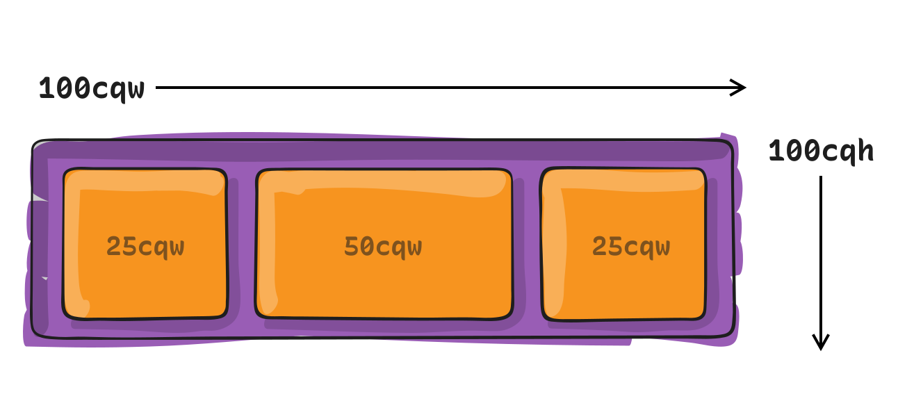
cqw
Container query width
1% of the queried container’s width
cqh
Container query height
1% of the queried container’s height
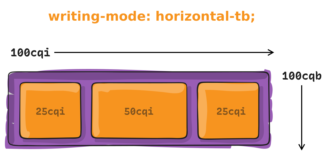
cqi
Container query inline size
1% of the queried container’s inline size, which is its width in a horizontal writing mode.
cqb
Container query block size
1% of the queried container’s inline size, which is its height in a horizontal writing mode.
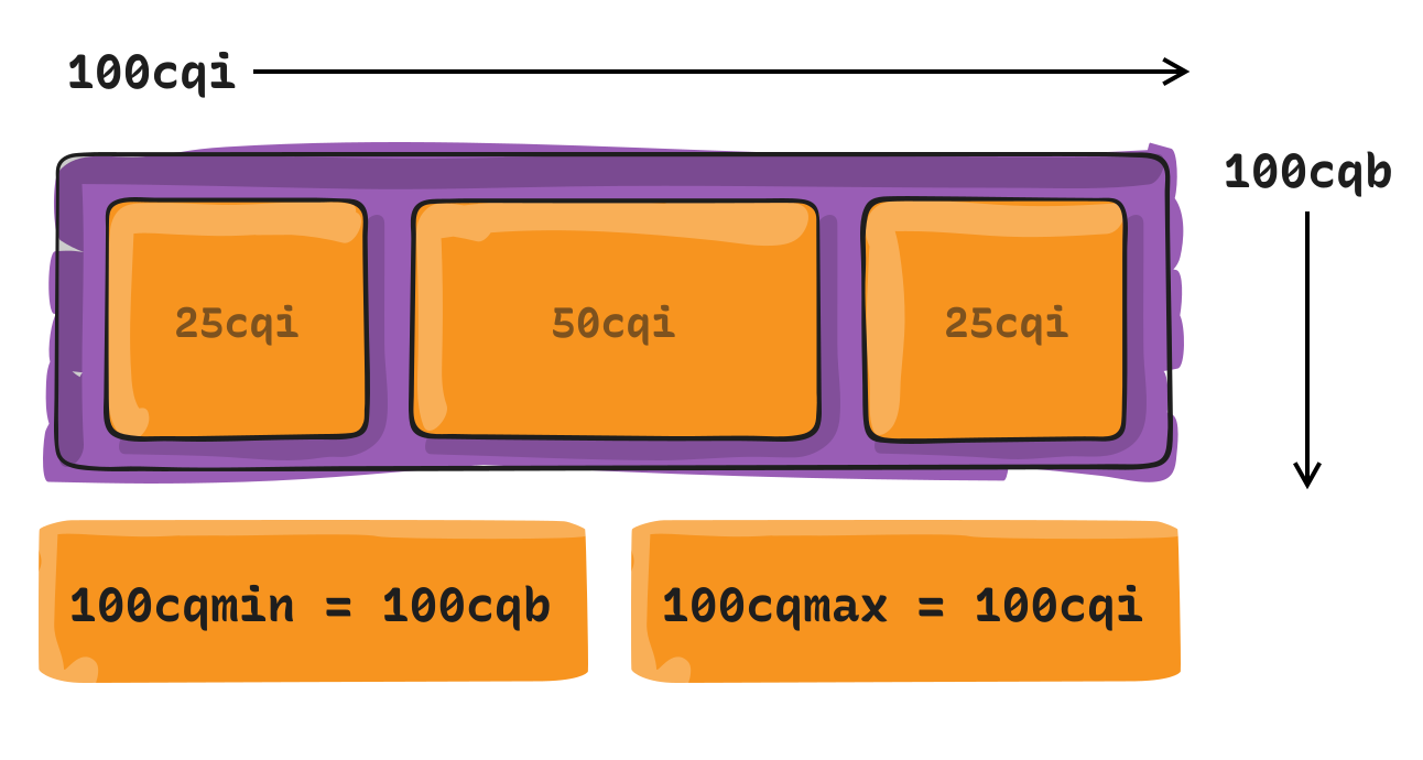
cqmin
Container query minimum size
The value of cqi or cqb, whichever is smaller.
cqmax
Container query maximum size
The value of cqi or cqb, whichever is larger.
Container units are designed to be used with container queries. Just as we are able to target a specific screen size with a media query, we can target the specific size of a particular element and apply styles using a container query.
We won’t do a big ol’ deep dive into container queries here. The relevant bit is that we have CSS length units that are relative to a container’s size. For example, if we were to define a container:
…then we’re watching that element’s inline-size — which is equivalent to width in a horizontal writing mode — and can apply styles to other elements when it reaches certain sizes.
Try resizing the following demo. When the parent container is greater than 30ch, the child element will change backgrounds and shrink to one-half the parent container’s width, or 50cqi.
CodePen Embed Fallback
What about unit-less numbers?
Oh yeah, there are times when you’re going to see numbers in CSS that don’t have any unit at all — just a single integer or number without anything appended to it.
aspect-ratio: 2 / 1; /* Ratio */
column-count: 3; /* Specifies a number of columns */
flex-grow: 1; /* Allows the element to stretch in a flex layout */
grid-column-start: 4; /* Places the element on a specific grid line */
order: 2; /* Sets the order of elemnents in a flex or grid layout */
scale: 2; /* The elementis scaled up or down by a factor */
z-index: 100; /* Element is placed in a numbered layer for stacking */
zoom: 0.2;  /* The element zooms in or out by a factor */
This isn’t a comprehensive list of all the CSS properties that accept unit-less numeric values, but it is a solid picture of when you would use them. You’ll see that in most cases a unit-less number is an explicit detail, such as a specific column to position an element, a specific layer in a stacking context, a boolean that enables or disables a feature, or the order of elements. But note that anytime we declare “zero” as a number, we can write it with or without a prepended unit, as zero always evaluates to zero no matter what unit we’re dealing with.
border: 0; /* No border */
box-shadow: 0 0 5px #333; /* No shadow offset */
margin: 0; /* No margin */
padding: 0; /* No padding */
We can create our own custom units!
In some cases, we may want to work with a numeric value, but CSS doesn’t exactly recognize it as one. In these cases, the number is recognized as a “string” value instead, regardless of whether or not it contains alphabetical characters. That’s where we can use @property to create what’s called a “custom property” that evaluates a numeric value in a certain way.
Here’s a good example. There was a time when it was virtually impossible to animate a gradient that changes colors over time because to do so would require (1) a color function that allows us to change a color value’s hue (which we have with hsl()) and (2) being able to interpolate that hue value around the color spectrum, between a range of 0deg and 360deg.
Sounds simple enough, right? Define a variable that starts at 0 and then cycles through 360 degrees at the end of an animation. But this doesn’t work:
That’s because CSS reads the variable as a string instead of a number. We have to register that variable as a custom property so that CSS aptly reads it as a numeric value.
This is super tricky because CSS is extremely flexible and there are no definitive or hard-and-fast rules for when to use a specific type of CSS length unit over another. In some cases, you absolutely have to use a specific unit because that’s how a certain CSS feature is specced, like using angle units to set the direction of a linear gradient:
The same goes for the values we use in certain color functions, like using percentages to set the saturation and lightness levels in the hsl() function:
.element {
  background: hsl(0 100% 10%);
}
Speaking of color functions, we define alpha transparency with either an integer or number:
All that being said, many cases are going to be some degree of “it depends” but there are some instances where it makes sense to use a specific unit in your work.
Generally set font sizes in rem and em units
This way, you can set things up in a way where changing the font-size value of the <html> or a parent element updates the font sizes of their descendants.
html {
  font-size: 18px; /* Inherited by all other elements */
}

.parent {
  font-size: 1rem; /* Updates when the `html` size changes */
}

.child {
  font-size: 1em; /* Updates when the parent size changes */
}
Declare “zero” without units if you’d like
It’s not a big deal or anything, but leaving off the units shortens the code a smidge, and anytime we’re able to write shorter code it’s an opportunity for faster page performance. The impact may be negligible, but we’re able to do it since 0 always computes to 0, no matter what unit we’re working with.
Use container units for responsive design, where possible
Container queries in general are so gosh-darn great for responsive layouts because they look at the size of the container and let us apply styles to its descendants when the container is a certain size.
.parent {
  container: my-container / inline-size; /* Looks at width */
}

.child {
  display: flex;
  flex-direction: column;
  max-width: 100vh; /* 100% of the viewport */
}

/* When the container is greater than 600px wide */
@container my-container (width >= 600px) {
  .child {
    flex-direction: row;
    max-width: 50%; /* 50% of the parent elenent */
  }
}
So, if we going to size the .child element — or any of its children — it’s worth specifying sizes in relation to the container’s size with container units than, say, the viewport’s size with viewport units.
.parent {
  container: my-container / inline-size; /* Looks at width */
}

.child {
  display: flex;
  flex-direction: column;
  max-width: 100cqi; /* 100% of the container */
}

/* When the container is greater than 600px wide */
@container my-container (width >= 600px) {
  .child {
    flex-direction: row;
    max-width: 50cqi; /* 50% of the container */
  }
}
Use percentages when you’re unsure of the context
Yes, use container units for responsive design, but that only does you good if you know you are in the context of a container. It’s possible, though, that you use the same component in different places, and one of those places might not be a registered container.
In that case, go with a percentage value because percentages are relative to whatever parent element you’re in, regardless of whether or not it’s a container. This way, you can declare an element’s size as 100% to take up the full space of whatever parent element contains it.
The only word of caution is to note that we’re only basing the size on the parent. Meanwhile, container units can style any descendant in the container, no matter where it is located.
Viewport units are great for laying out containers
You may be thinking that viewport units are a bad thing since we’ve been advising against them in so many cases, like font sizing, but they are still incredibly useful, particularly when it comes to establishing a full-page layout.
I say “full-page” layout because container queries are the gold standard for sizing elements according to the space they have in their container. But if we’re working with a full page of containers, this is where viewport units can be used to establish a responsive layout at a higher level.
If the elements of individual containers look at their container for sizing information, then the sizing and placement of individual containers themselves probably ought to look at the viewport since it directly influences the amount of space on the page.
Examples
Element (em) and Relative element (rem) units
Let’s talk specifically about these two little buggers. We saw how a percentage unit calculates its size by the size of something else. em and rem units are sort of the same, but they are calculated based on the relative font size of specific elements.
Let’s start with em units and say we have an HTML element, a <div> with a .box class, and we set its font size to 20px. That means any text inside of that element is 20px.
CodePen Embed Fallback
Great, now what if we decide we need additional text in the box, and give it a relative font size of 1.5em?
CodePen Embed Fallback
See how a font size of 1.5em is larger than the 20px text? That’s because the larger text is based on the box’s font size. Behind the scenes, this is what the browser is calculating:
20px * 1.5 = 30px
So, the relative font size is multiplied by the pixel font size, which winds up being 30px.
And guess what? rem units do the exact same thing. But instead of multiplying itself by the pixel font size of the parent container, it looks at the pixel font size of the actual <html> element. By default, that is 16px.
/* This is the browser's default font size */
html {
  font-size: 16px;
}

.box {
  font-size: 1.5rem; /* 16px * 1.5 = 24px */
}
And if we change the HTML element’s font size to something else?
html {
  font-size: 18px;
}

.box {
  font-size: 1.5rem; /* 18px * 1.5 = 27px */
}
Character unit (ch)
The character unit (ch) is another is another unit relative to font size and, while it isn’t used all that often, it is amazingly great at sizing things based on the amount of content displayed in an element, because one character unit equals the width of one character of content. Here’s how I wrap my own head around it. If we have this in our HTML:
<p>The big brown dog lazily jumped over the fence.</p>
…and this CSS:
p {
  width: 10ch;
}
What we get is a paragraph that is 10 characters wide. That means the text will break after the tenth character, including spaces.
CodePen Embed Fallback
But note that the words themselves do not break. If the content is supposed to break after 10 characters, the browser will start the next line after a complete word instead of breaking the word into multiple lines, keeping everything easy to read.
The line-height unit (lh) looks at the line-height property value of the element’s containing (i.e., parent) element and uses that value to size things up.
When would you use this? Personally, I find lh useful for setting an exact height on something based on the number of lines needed for the text. You can see this clearly demonstrated in Temani Afif’s “CSS Ribbon” effect that uses lh to establish dimensions for each row of text that makes for consistently-sized lines that adapt to whatever the parent element’s font-size value happens to be,
This is the 3rd post in a small series we are doing on form accessibility. If you missed the 2nd post, check out Managing User Focus with :focus-visible. In this post we are going to look at using a screen reader when navigating a form, and also some best practices.
What is a Screen Reader?
You may have heard the term “screen reader” as you have been moving around the web. You might even be using a screen reader at this moment to run manual accessibility tests on the experiences you are building. A screen reader is a type of AT or assistive technology.
A screen reader converts digital text into synthesized speech or Braille output, commonly seen with a Braille reader.
In this example, I will be using Mac VO. Mac VO (VoiceOver) is built-in to all Mac devices; iOS, iPadOS, and macOS systems. Depending on the type of device you are running macOS on, opening VO could differ. The Macbook Pro that is running VO I am writing this on doesn’t have the touch bar, so I will be using the shortcut keys according to the hardware.
Spinning Up VO on macOS
If you are using an updated Macbook Pro, the keyboard on your machine will look something like the image below.
You will start by holding down the cmd key and then pressing the Touch ID three times quickly.
If you are on a MBP (MacBook Pro) with a TouchBar, you will use the shortcut cmd+fn+f5 to turn on VO. If you are using a traditional keyboard with your desktop or laptop, the keys should be the same or you will have to toggle VO on in the Accessibility settings.. Once VO is turned on, you will be greeted with this dialog along with a vocalized introduction to VO.
If you click the “Use VoiceOver” button you are well on your way to using VO to test your websites and apps. One thing to keep in mind is that VO is optimized for use with Safari. That being said, make sure when you are running your screen reader test that Safari is the browser you are using. That goes for the iPhone and iPad as well.
There are two main ways you can use VO from the start. The way I personally use it is by navigating to a website and using a combination of the tab, control, option, shift and arrow keys, I can navigate through the experience efficiently with these keys alone.
Another common way to navigate the experience is by using the VoiceOver Rotor. The Rotor is a feature designed to navigate directly to where you want to be in the experience. By using the Rotor, you eliminate having to traverse through the whole site, think of it as a “Choose Your Own Adventure”.
Modifier Keys
Modifier keys are the way you use the different features in VO. The default modifier key or VO is control + option but you can change it to caps lock or choose both options to use interchangeably.
Using the Rotor
In order to use the Rotor you have to use a combination of your modifier key(s) and the letter “U”. For me, my modifier key is caps lock. I press caps lock + U and the Rotor spins up for me. Once the Rotor comes up I can navigate to any part of the experience that I want using the left and right arrows.
Using the Rotor in VoiceOver
Navigating By Heading Level
Another neat way to navigate the experience is by heading level. If you use the combination of your modifier keys + cmd + H you can traverse the document structure based on heading levels. You can also move back up the document by pressing shift in the sequence like so, modifier keys + shift + cmd + H.
Using the Heading Level Shortcut with VoiceOver
History & Best Practices
Forms are one of the most powerful native elements we have in HTML. Whether you are searching for something on a page, submitting a form to purchase something or submit a survey. Forms are a cornerstone of the web, and were a catalyst that introduced interactivity to our experiences.
The following are 5 best practices to follow when building an accessible form for the web.
Make sure that you are using a form element. Forms are accessible by default and should be used over div’s at all times.
<form>
  <!-- Form controls are nested here. -->
</form>
Be sure to use the for and id attributes on label’s and input’s so that they are linked. This way, if you click/tap the label, focus will shift to the input and you can start typing.
A button is used to invoke an action, like submitting a form. Use it! Don’t create buttons using div’s. A div by definition is a divider. It has no inherent accessibility properties.
Below is a list of various types of screen reader software you can use on your given operating system. If a Mac is not your machine of choice, there are options out there for Windows and Linux, as well as for Android devices.
If you understood the reference above, you are in good company. According to the JAWS website, this is what it is in a nutshell:
“JAWS, Job Access With Speech, is the world’s most popular screen reader, developed for computer users whose vision loss prevents them from seeing screen content or navigating with a mouse. JAWS provides speech and Braille output for the most popular computer applications on your PC. You will be able to navigate the Internet, write a document, read an email and create presentations from your office, remote desktop, or from home.”
Narrator is a built-in screen reader solution that ships with WIndows 11. If you choose to use this as your screen reader of choice, the link below is for support documentation on its usage.
Orca is a screen reader that can be used on different Linux distributions running GNOME.
“Orca is a free, open source, flexible, and extensible screen reader that provides access to the graphical desktop via speech and refreshable braille.
Orca works with applications and toolkits that support the Assistive Technology Service Provider Interface (AT-SPI), which is the primary assistive technology infrastructure for Linux and Solaris. Applications and toolkits supporting the AT-SPI include the GNOME Gtk+ toolkit, the Java platform’s Swing toolkit, LibreOffice, Gecko, and WebKitGtk. AT-SPI support for the KDE Qt toolkit is being pursued.”
If you are looking for actual browser support for HTML elements and ARIA (Accessible Rich Internet Application) attributes, I suggest caniuse.com for HTML and Accessibility Support for ARIA to get the latest 4-1-1 on browser support. Remember, if the browser doesn’t support the tech, chances are the screen reader won’t either.