This is going to be the 2nd post in a small series we are doing on form accessibility. If you missed the first post, check out Accessible Forms with Pseudo Classes. In this post we are going to look at :focus-visible and how to use it in your web sites!
Focus Touchpoint
Before we move forward with :focus-visible, let’s revisit how :focus works in your CSS. Focus is the visual indicator that an element is being interacted with via keyboard, mouse, trackpad, or assistive technology. Certain elements are naturally interactive, like links, buttons, and form elements. We want to make sure that our users know where they are and the interactions they are making.
When you remove focus, you remove it for EVERYONE! We want to make sure that we are preserving the focus.
If for any reason you do need to remove the focus, make sure there is also fallback :focus styles for your users. That fallback can match your branding colors, but make sure those colors are also accessible. If marketing, design, or branding doesn’t like the default focus ring styles, then it is time to start having conversations and collaborate with them on the best way of adding it back in.
What is focus-visible?
The pseudo class, :focus-visible, is just like our default :focus pseudo class. It gives the user an indicator that something is being focused on the page. The way you write :focus-visible is cut and dry:
:focus-visible {
  /* ... */
}
When using :focus-visible with a specific element, the syntax looks something like this:
.your-element:focus-visible {
  /*...*/
}
The great thing about using :focus-visible is you can make your element stand out, bright and bold! No need to worry about it showing if the element is clicked/tapped. If you choose not to implement the class, the default will be the user agent focus ring which to some is undesirable.
Backstory of focus-visible
Before we had the :focus-visible, the user agent styling would apply :focus to most elements on the page; buttons, links, etc. It would apply an outline or “focus ring” to the focusable element. This was deemed to be ugly, most didn’t like the default focus ring the browser provided. As a result of the focus ring being unfavorable to look at, most authors removed it… without a fallback. Remember, when you remove :focus, it decreases usability and makes the experience inaccessible for keyboard users.
What this means is that the browser can detect whether or not the user is interacting with the experience from a keyboard, mouse, or trackpad and based on that input type, it adds or removes the focus ring. The example in this post highlights the input interaction.
In the early days of :focus-visible we were using a polyfill to handle the focus ring created by Alice Boxhall and Brian Kardell, Mozilla also came out with their own pseudo class, :moz-focusring, before the official specification. If you want to learn more about the early days of the focus-ring, check out A11y Casts with Rob Dodson.
Focus Importance
There are plenty of reasons why focus is important in your application. For one, like I stated above, we as ambassadors of the web have to make sure we are providing the best, accessible experience we can. We don’t want any of our users guessing where they are while they are navigation through the experience.
One example that always comes to mind is the Two Blind Brothers website. If you go to the website and click/tap (this works on mobile), the closed eye in the bottom left corner, you will see the eye open and a simulation begins. Both the brothers, Bradford and Bryan Manning, were diagnosed at a young age with Stargardt’s Disease. Stargardt’s disease is a form of macular degeneration of the eye. Over time both brothers will be completely blind. Visit the site and click the eye to see how they see.
If you were in their shoes and you had to navigate through a page, you would want to make sure you knew exactly where you were throughout the whole experience. A focus ring gives you that power.
Demo
The demo below shows how :focus-visible works when added to your CSS. The first part of the video shows the experience when navigating through with a mouse the second shows navigating through with just my keyboard. I recorded myself as well to show that I did switch from using my mouse, to my keyboard.
Video showing how the heuristics of the browser works based on input and triggering the focus visible pseudo class.
The browser is predicting what to do with the focus ring based on my input (keyboard/mouse), and then adding a focus ring to those elements. In this case, when I am navigating through this example with the keyboard, everything receives focus. When using the mouse, only the input gets focus and the buttons don’t. If you remove :focus-visible, the browser will apply the default focus ring.
The code below is applying :focus-visible to the focusable elements.
If the browser does not support :focus-visible you can have a fall back in place to handle the interaction. The code below is from the MDN Playground. You can use the @supports at-rule or “feature query” to check support. One thing to keep in mind, the rule should be placed at the top of the code or nested inside another group at-rule.
<button class="button with-fallback" type="button">Button with fallback</button>
<button class="button without-fallback" type="button">Button without fallback</button>
.button {
  margin: 10px;
  border: 2px solid darkgray;
  border-radius: 4px;
}

.button:focus-visible {
  /* Draw the focus when :focus-visible is supported */
  outline: 3px solid deepskyblue;
  outline-offset: 3px;
}

@supports not selector(:focus-visible) {
  .button.with-fallback:focus {
    /* Fallback for browsers without :focus-visible support */
    outline: 3px solid deepskyblue;
    outline-offset: 3px;
  }
}
Further Accessibility Concerns
Accessibility concerns to keep in mind when building out your experience:
Make sure the colors you choose for your focus indicator, if at all, are still accessible according to the information documented in the WCAG 2.2 Non-text Contrast (Level AA)
Cognitive overload can cause a user distress. Make sure to keep styles on varying interactive elements consistent
Browser Support
This browser support data is from Caniuse, which has more detail. A number indicates that browser supports the feature at that version and up.
Hey all you wonderful developers out there! In this post we are going to explore the use of :has() in your next web project. :has() is relatively newish but has gained popularity in the front end community by delivering control over various elements in your UI. Let’s take a look at what the pseudo class is and how we can utilize it.
Syntax
The :has() CSS pseudo-class helps style an element if any of the things we’re searching for inside it are found and accounted for. It’s like saying, “If there’s something specific inside this box, then style the box this way AND only this way.”
:has(<direct-selector>) {
  /* ... */
}
“The functional :has() CSS pseudo-class represents an element if any of the relative selectors that are passed as an argument match at least one element when anchored against this element. This pseudo-class presents a way of selecting a parent element or a previous sibling element with respect to a reference element by taking a relative selector list as an argument.”
For a more robust explanation, MDN does it perfectly
The Styling Problem
In years past we had no way of styling a parent element based on a direct child of that parent with CSS or an element based on another element. In the chance we had to do that, we would need to use some JavaScript and toggle classes on/off based on the structure of the HTML. :has() solved that problem.
Let’s say that you have a heading level 1 element (h1) that is the title of a post or something of that nature on a blog list page, and then you have a heading level 2 (h2) that directly follows it. This h2 could be a sub-heading for the post. If that h2 is present, important, and directly after the h1, you might want to make that h1 stand out. Before you would have had to write a JS function.
This JS function is looking for all the h1’s that have a h2 proceeding it, and applying a class of highlight-content to make the h1 stand out as an important article.
New and improved with modern day CSS coming in hot! The capabilities of what we can do in the browser have come a long way. We now can take advantage of CSS to do things that we traditionally would have to do with JavaScript, not everything, but some things.
New School Way – CSS
h1:has(+ h2) {
    color: blue;
}
Throw Some :has() On It!
Now you can use :has() to achieve the same thing that the JS function did. This CSS is checking for any h1 and using the sibling combinator checking for an h2 that immediately follows it, and adds the color of blue to the text. Below are a couple use cases of when :has() can come in handy.
:has Selector Example 1
HTML
<h1>Lorem, ipsum dolor.</h1>
<h2>Lorem ipsum dolor sit amet.</h2>
<p>Lorem, ipsum dolor sit amet consectetur adipisicing elit. Eius, odio voluptatibus est vero iste ad?</p>

<!-- WITHOUT HAS BELOW -->

<h1>This is a test</h1>
<p>Lorem, ipsum dolor sit amet consectetur adipisicing elit. Eius, odio voluptatibus est vero iste ad?</p>
CSS
h1:has(+ h2) {
    color: blue;
}
:has Selector Example 2
A lot of times we as workers on the web are manipulating or working with images. We could be using tools that Cloudinary provides to make use of various transformations on our images, but usually we want to add drop shadows, border-radii, and captions (not to be confused with alternative text in an alt attribute).
The example below is using :has() to see if a figure or image has a figcaption element and if it does, it applies some background and a border radius to make the image stand out.
HTML
<section>
  <figure>
    <img src="https://placedog.net/500/280" alt="My aunt sally's dog is a golden retreiver." />
    <figcaption>My Aunt Sally's Doggo</figcaption>
  </figure>
</section>
Lol the last time I used it I was building keyboard functionality into a tree view, so I needed to detect states and classes of sibling elements, but it wasn’t in Firefox yet so I had to find another solution. 🫠
It is great to see how community members are using modern CSS to solve real world problems, and also a shout out to Abbey using it for accessibility reasons!
Things to Keep in Mind
There are a few key points to keep in mind when using :has() Bullet points referenced from MDN.
The pseudo-class takes on specificity of the most specific selector in its argument
If the :has() pseudo-class itself is not supported in a browser, the entire selector block will fail unless :has() is in a forgiving selector list, such as in :is() and :where()
The :has() pseudo-class cannot be nested within another :has()
Pseudo-elements are also not valid selectors within :has() and pseudo-elements are not valid anchors for :has()
Conclusion
Harnessing the power of CSS, including advanced features like the :has() pseudo-class, empowers us to craft exceptional web experiences. CSS’s strengths lie in its cascade and specificity…the best part, allowing us to leverage its full potential. By embracing the capabilities of CSS, we can drive web design and development forward, unlocking new possibilities and creating groundbreaking user interfaces.
Hey all you wonderful developers out there! In this post, I am going to take you through creating a simple contact form using semantic HTML and an awesome CSS pseudo class known as :focus-within. The :focus-within class allows for great control over focus and letting your user know this is exactly where they are in the experience. Before we jump in, let’s get to the core of what web accessibility is.
Form Accessibility?
You have most likely heard the term “accessibility” everywhere or the numeronym, a11y. What does it mean? That is a great question with so many answers. When we look at the physical world, accessibility means things like having sharps containers in your bathrooms at your business, making sure there are ramps for wheel assisted people, and having peripherals like large print keyboards on hand for anyone that needs it.
The gamut of accessibility doesn’t stop there, we have digital accessibility that we need to be cognizant of as well, not just for external users, but internal colleagues as well. Color contrast is a low hanging fruit that we should be able to nip in the bud. At our workplaces, making sure that if any employee needs assistive tech like a screen reader, we have that installed and available. There are a lot of things that need to be kept into consideration. This article will focus on web accessibility by keeping the WCAG (web content accessibility guidelines) in mind.
The :focus-within CSS pseudo-class matches an element if the element or any of its descendants are focused. In other words, it represents an element that is itself matched by the :focus pseudo-class or has a descendant that is matched by :focus. (This includes descendants in shadow trees.)
This pseudo class is really great when you want to emphasize that the user is in fact interacting with the element. You can change the background color of the whole form, for example. Or, if focus is moved into an input, you can make the label bold and larger of an input element when focus is moved into that input. What is happening below in the code snippets and examples is what is making the form accessible. :focus-within is just one way we can use CSS to our advantage.
How To Focus
Focus, in regards to accessibility and the web experience, is the visual indicator that something is being interacted with on the page, in the UI, or within a component. CSS can tell when an interactive element is focused.
“The :focus CSS pseudo-class represents an element (such as a form input) that has received focus. It is generally triggered when the user clicks or taps on an element or selects it with the keyboard’s Tab key.”
Always make sure that the focus indicator or the ring around focusable elements maintains the proper color contrast through the experience.
Focus is written like this and can be styled to match your branding if you choose to style it.
:focus {
  * / INSERT STYLES HERE /*
}
Whatever you do, never set your outline to 0 or none. Doing so will remove a visible focus indicator for everyone across the whole experience. If you need to remove focus, you can, but make sure to add that back in later. When you remove focus from your CSS or set the outline to 0 or none, it removes the focus ring for all your users. This is seen a lot when using a CSS reset. A CSS reset will reset the styles to a blank canvas. This way you are in charge of the empty canvas to style as you wish. If you wish to use a CSS reset, check out Josh Comeau’s reset.
*DO NOT DO what is below!
:focus {
  outline: 0;
}

:focus {
  outline: none;
}
Look Within!
One of the coolest ways to style focus using CSS is what this article is all about. If you haven’t checked out the :focus-within pseudo class, definitely give that a look! There are a lot of hidden gems when it comes to using semantic markup and CSS, and this is one of them. A lot of things that are overlooked are accessible by default, for instance, semantic markup is by default accessible and should be used over div’s at all times.
<header>
  <h1>Semantic Markup</h1>
  <nav>
    <ul>
      <li><a href="/">Home</a></li>
      <li><a href="/about">About</a></li>
    </ul>
  </nav>
</header>

<section><!-- Code goes here --></section>

<section><!-- Code goes here --></section>

<aside><!-- Code goes here --></aside>

<footer><!-- Code goes here --></footer>
The header, nav, main, section, aside, and footer are all semantic elements. The h1 and ul are also semantic and accessible.
Unless there is a custom component that needs to be created, then a div is fine to use, paired with ARIA (Accessible Rich Internet Applications). We can do a deep dive into ARIA in a later post. For now let’s focus…see what I did there…on this CSS pseudo class.
The :focus-within pseudo class allows you to select an element when any descendent element it contains has focus.
The example code above will add a background color of orange, add some padding, and change the color of the labels to black.
The final product looks something like below. Of course the possibilities are endless to change up the styling, but this should get you on a good track to make the web more accessible for everyone!
Another use case for using :focus-within would be turning the labels bold, a different color, or enlarging them for users with low vision. The example code for that would look something like below.
:focus-within also has great browser support across the board according to Can I use.
Conclusion
Creating amazing, accessible user experience should always be a top priority when shipping software, not just externally but internally as well. We as developers, all the way up to senior leadership need to be cognizant of the challenges others face and how we can be ambassadors for the web platform to make it a better place.
Using technology like semantic markup and CSS to create inclusive spaces is a crucial part in making the web a better place, let’s continue moving forward and changing lives.
Geeky OS security enhancements don’t exactly make big headlines in the front-end community, but it stands to reason that passkeys are going to be a “thing”. And considering how passwords and password apps affect the user experience of things like authentication and form processing, we might want to at least wrap our minds around them, so we know what’s coming.
That’s the point of this article. I’ve been studying and experimenting with passkeys — and the WebAuthn API they are built on top of — for some time now. Let me share what I’ve learned.
Here’s the obligatory section of the terminology you’re going to want to know as we dig in. Like most tech, passkeys are wrought with esoteric verbiage and acronyms that are often roadblocks to understanding. I’ll try to de-mystify several for you here.
Relying Party: the server you will be authenticating against. We’ll use “server” to imply the Relying Party in this article.
Client: in our case, the web browser or operating system.
Authenticator: Software and/or hardware devices that allow generation and storage for public key pairs.
FIDO: An open standards body that also creates specifications around FIDO credentials.
WebAuthn: The underlying protocol for passkeys, Also known as a FIDO2 credential or single-device FIDO credentials.
Passkeys: WebAuthn, but with cloud syncing (also called multi-device FIDO credentials, discoverable credentials, or resident credentials).
Public Key Cryptography: A generated key pair that includes a private and public key. Depending on the algorithm, it should either be used for signing and verification or encrypting and decrypting. This is also known as asymmetric cryptography.
RSA: An acronym of the creators’ names, Rivest Shamir and Adel. RSA is an older, but still useful, family of public key cryptography based on factoring primes.
ES256: An elliptic curve public key that uses an ECDSA signing algorithm (PDF) with SHA256 for hashing.
RS256: Like ES256, but it uses RSA with RSASSA-PKCS1-v1.5 and SHA256.
What are passkeys?
Before we can talk specifically about passkeys, we need to talk about another protocol called WebAuthn (also known as FIDO2). Passkeys are a specification that is built on top of WebAuthn. WebAuthn allows for public key cryptography to replace passwords. We use some sort of security device, such as a hardware key or Trusted Platform Module (TPM), to create private and public keys.
The public key is for anyone to use. The private key, however, cannot be removed from the device that generated it. This was one of the issues with WebAuthn; if you lose the device, you lose access.
Passkeys solves this by providing a cloud sync of your credentials. In other words, what you generate on your computer can now also be used on your phone (though confusingly, there are single-device credentials too).
Currently, at the time of writing, only iOS, macOS, and Android provide full support for cloud-synced passkeys, and even then, they are limited by the browser being used. Google and Apple provide an interface for syncing via their Google Password Manager and Apple iCloud Keychain services, respectively.
How do passkeys replace passwords?
In public key cryptography, you can perform what is known as signing. Signing takes a piece of data and then runs it through a signing algorithm with the private key, where it can then be verified with the public key.
Anyone can generate a public key pair, and it’s not attributable to any person since any person could have generated it in the first place. What makes it useful is that only data signed with the private key can be verified with the public key. That’s the portion that replaces a password — a server stores the public key, and we sign in by verifying that we have the other half (e.g. private key), by signing a random challenge.
As an added benefit, since we’re storing the user’s public keys within a database, there is no longer concern with password breaches affecting millions of users. This reduces phishing, breaches, and a slew of other security issues that our password-dependent world currently faces. If a database is breached, all that’s stored in the user’s public keys, making it virtually useless to an attacker.
No more forgotten emails and their associated passwords, either! The browser will remember which credentials you used for which website — all you need to do is make a couple of clicks, and you’re logged in. You can provide a secondary means of verification to use the passkey, such as biometrics or a pin, but those are still much faster than the passwords of yesteryear.
More about cryptography
Public key cryptography involves having a private and a public key (known as a key pair). The keys are generated together and have separate uses. For example, the private key is intended to be kept secret, and the public key is intended for whomever you want to exchange messages with.
When it comes to encrypting and decrypting a message, the recipient’s public key is used to encrypt a message so that only the recipient’s private key can decrypt the message. In security parlance, this is known as “providing confidentiality”. However, this doesn’t provide proof that the sender is who they say they are, as anyone can potentially use a public key to send someone an encrypted message.
There are cases where we need to verify that a message did indeed come from its sender. In these cases, we use signing and signature verification to ensure that the sender is who they say they are (also known as authenticity). In public key (also called asymmetric) cryptography, this is generally done by signing the hash of a message, so that only the public key can correctly verify it. The hash and the sender’s private key produce a signature after running it through an algorithm, and then anyone can verify the message came from the sender with the sender’s public key.
How do we access passkeys?
To access passkeys, we first need to generate and store them somewhere. Some of this functionality can be provided with an authenticator. An authenticator is any hardware or software-backed device that provides the ability for cryptographic key generation. Think of those one-time passwords you get from Google Authenticator, 1Password, or LastPass, among others.
For example, a software authenticator can use the Trusted Platform Module (TPM) or secure enclave of a device to create credentials. The credentials can be then stored remotely and synced across devices e.g. passkeys. A hardware authenticator would be something like a YubiKey, which can generate and store keys on the device itself.
To access the authenticator, the browser needs to have access to hardware, and for that, we need an interface. The interface we use here is the Client to Authenticator Protocol (CTAP). It allows access to different authenticators over different mechanisms. For example, we can access an authenticator over NFC, USB, and Bluetooth by utilizing CTAP.
One of the more interesting ways to use passkeys is by connecting your phone over Bluetooth to another device that might not support passkeys. When the devices are paired over Bluetooth, I can log into the browser on my computer using my phone as an intermediary!
The difference between passkeys and WebAuthn
Passkeys and WebAuthn keys differ in several ways. First, passkeys are considered multi-device credentials and can be synced across devices. By contrast, WebAuthn keys are single-device credentials — a fancy way of saying you’re bound to one device for verification.
Second, to authenticate to a server, WebAuthn keys need to provide the user handle for login, after which an allowCredentials list is returned to the client from the server, which informs what credentials can be used to log in. Passkeys skip this step and use the server’s domain name to show which keys are already bound to that site. You’re able to select the passkey that is associated with that server, as it’s already known by your system.
Otherwise, the keys are cryptographically the same; they only differ in how they’re stored and what information they use to start the login process.
The process… in a nutshell
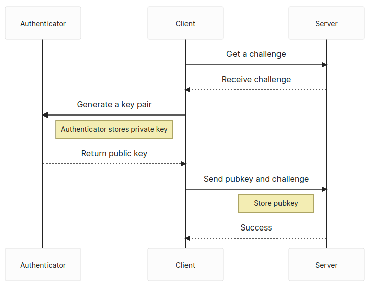
The process for generating a WebAuthn or a passkey is very similar: get a challenge from the server and then use the navigator.credentials.create web API to generate a public key pair. Then, send the challenge and the public key back to the server to be stored.
Upon receiving the public key and challenge, the server validates the challenge and the session from which it was created. If that checks out, the public key is stored, as well as any other relevant information like the user identifier or attestation data, in the database.
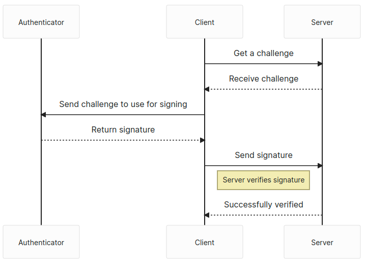
The user has one more step — retrieve another challenge from the server and use the navigator.credentials.get API to sign the challenge. We send back the signed challenge to the server, and the server verifies the challenge, then logs us in if the signature passes.
There is, of course, quite a bit more to each step. But that is generally how we’d log into a website using WebAuthn or passkeys.
The meat and potatoes
Passkeys are used in two distinct phases: the attestation and assertion phases.
The attestation phase can also be thought of as the registration phase. You’d sign up with an email and password for a new website, however, in this case, we’d be using our passkey.
The assertion phase is similar to how you’d log in to a website after signing up.
The navigator.credentials.create API is the focus of our attestation phase. We’re registered as a new user in the system and need to generate a new public key pair. However, we need to specify what kind of key pair we want to generate. That means we need to provide options to navigator.credentials.create.
// The `challenge` is random and has to come from the server
const publicKey: PublicKeyCredentialCreationOptions = {
  challenge: safeEncode(challenge),
  rp: {
    id: window.location.host,
    name: document.title,
  },
  user: {
    id: new TextEncoder().encode(crypto.randomUUID()), // Why not make it random?
    name: 'Your username',
    displayName: 'Display name in browser',
  },
  pubKeyCredParams: [
    {
      type: 'public-key',
      alg: -7, // ES256
    },
    {
      type: 'public-key',
      alg: -256, // RS256
    },
  ],
  authenticatorSelection: {
    userVerification: 'preferred', // Do you want to use biometrics or a pin?
    residentKey: 'required', // Create a resident key e.g. passkey
  },
  attestation: 'indirect', // indirect, direct, or none
  timeout: 60_000,
};
const pubKeyCredential: PublicKeyCredential = await navigator.credentials.create({
  publicKey
});
const {
  id // the key id a.k.a. kid
} = pubKeyCredential;
const pubKey = pubKeyCredential.response.getPublicKey();
const { clientDataJSON, attestationObject } = pubKeyCredential.response;
const { type, challenge, origin } = JSON.parse(new TextDecoder().decode(clientDataJSON));
// Send data off to the server for registration
The response provides a couple of bits of useful information. First, we have our public key in this response, and we need to send that to the server to be stored. Second, we also get back the clientDataJSON property which we can decode, and from there, get back the type, challenge, and origin of the passkey.
For attestation, we want to validate the type, challenge, and origin on the server, as well as store the public key with its identifier, e.g. kid. We can also optionally store the attestationObject if we wish. Another useful property to store is the COSE algorithm, which is defined above in our PublicKeyCredentialCreationOptions with alg: -7 or alg: -256, in order to easily verify any signed challenges in the assertion phase.
The navigator.credentials.get API will be the focus of the assertion phase. Conceptually, this would be where the user logs in to the web application after signing up.
// The `challenge` is random and has to come from the server
const publicKey: PublicKeyCredentialRequestOptions = {
  challenge: new TextEncoder().encode(challenge),
  rpId: window.location.host,
  timeout: 60_000,
};
const publicKeyCredential: PublicKeyCredential = await navigator.credentials.get({
  publicKey,
  mediation: 'optional',
});
const {
  id // the key id, aka kid
} = pubKeyCredential;
const { clientDataJSON, attestationObject, signature, userHandle } = pubKeyCredential.response;
const { type, challenge, origin } = JSON.parse(new TextDecoder().decode(clientDataJSON));
// Send data off to the server for verification
We also get the type, challenge, and origin from the clientDataJSON again. The signature is now included in the response, as well as the authenticatorData. We’ll need those and the clientDataJSON to verify that this was signed with the private key.
The authenticatorData includes some properties that are worth tracking First is the SHA256 hash of the origin you’re using, located within the first 32 bytes, which is useful for verifying that request comes from the same origin server. Second is the signCount, which is from byte 33 to 37. This is generated from the authenticator and should be compared to its previous value to ensure that nothing fishy is going on with the key. The value should always 0 when it’s a multi-device passkey and should be randomly larger than the previous signCount when it’s a single-device passkey.
Once you’ve asserted your login, you should be logged in — congratulations! Passkeys is a pretty great protocol, but it does come with some caveats.
Some downsides
There’s a lot of upside to Passkeys, however, there are some issues with it at the time of this writing. For one thing, passkeys is somewhat still early support-wise, with only single-device credentials allowed on Windows and very little support for Linux systems. Passkeys.dev provides a nice table that’s sort of like the Caniuse of this protocol.
Also, Google’s and Apple’s passkeys platforms do not communicate with each other. If you want to get your credentials from your Android phone over to your iPhone… well, you’re out of luck for now. That’s not to say there is no interoperability! You can log in to your computer by using your phone as an authenticator. But it would be much cleaner just to have it built into the operating system and synced without it being locked at the vendor level.
Where are things going?
What does the passkeys protocol of the future look like? It looks pretty good! Once it gains support from more operating systems, there should be an uptake in usage, and you’ll start seeing it used more and more in the wild. Some password managers are even going to support them first-hand.
Passkeys are by no means only supported on the web. Android and iOS will both support native passkeys as first-class citizens. We’re still in the early days of all this, but expect to see it mentioned more and more.
After all, we eliminate the need for passwords, and by doing so, make the world safer for it!
Resources
Here are some more resources if you want to learn more about Passkeys. There’s also a repository and demo I put together for this article.
Live Demo (no actual information is collected by the form)
I spend a lot of time in DevTools, and I’m sure you do too. Sometimes I even bounce between them, especially when I’m debugging cross-browser issues. DevTools is a lot like browsers themselves — not all of the features in one browser’s DevTools will be the same or supported in another browser’s DevTools.
But there are quite a few DevTools features that are interoperable, even some lesser-known ones that I’m about to share with you.
For the sake of brevity, I use “Chromium” to refer to all Chromium-based browsers, like Chrome, Edge, and Opera, in the article. Many of the DevTools in them offer the exact same features and capabilities as one another, so this is just my shorthand for referring to all of them at once.
Search nodes in the DOM tree
Sometimes the DOM tree is full of nodes nested in nodes that are nested in other nodes, and so on. That makes it pretty tough to find the exact one you’re looking for, but you can quickly search the DOM tree using Cmd + F (macOS) or Ctrl + F (Windows).
Additionally, you can also search using a valid CSS selector, like .red, or using an XPath, like //div/h1.
Searching text in Chrome DevTools (left), selectors in Firefox DevTools (center), and XPath in Safari DevTools (right)
In Chromium browsers, the focus automatically jumps to the node that matches the search criteria as you type, which could be annoying if you are working with longer search queries or a large DOM tree. Fortunately, you can disable this behavior by heading to Settings (F1) → Preferences → Global → Search as you type → Disable.
After you have located the node in the DOM tree, you can scroll the page to bring the node within the viewport by right-clicking on the nod, and selecting “Scroll into view”.
Access nodes from the console
DevTools provides many different ways to access a DOM node directly from the console.
For example, you can use $0 to access the currently selected node in the DOM tree. Chromium browsers take this one step further by allowing you to access nodes selected in the reverse chronological order of historic selection using, $1, $2, $3, etc.
Another thing that Chromium browsers allow you to do is copy the node path as a JavaScript expression in the form of document.querySelector by right-clicking on the node, and selecting Copy → Copy JS path, which can then be used to access the node in the console.
Here’s another way to access a DOM node directly from the console: as a temporary variable. This option is available by right-clicking on the node and selecting an option. That option is labeled differently in each browser’s DevTools:
Chromium: Right click → “Store as global variable”
Firefox: Right click → “Use in Console”
Safari: Right click → “Log Element”
Access a node as a temporary variable in the console, as shown in Chrome (left), Firefox (center), and Safari (right)
Visualize elements with badges
DevTools can help visualize elements that match certain properties by displaying a badge next to the node. Badges are clickable, and different browsers offer a variety of different badges.
In Safari, there is a badge button in the Elements panel toolbar which can be used to toggle the visibility of specific badges. For example, if a node has a display: grid or display: inline-grid CSS declaration applied to it, a grid badge is displayed next to it. Clicking on the badge will highlight grid areas, track sizes, line numbers, and more, on the page.
Grid overlay with badges in Safari DevTools
The badges that are currently supported in Firefox’s DevTools are listed in the Firefox source docs. For example, a scroll badge indicates a scrollable element. Clicking on the badge highlights the element causing the overflow with an overflow badge next to it.
In Chromium browsers, you can right-click on any node and select “Badge settings…” to open a container that lists all of the available badges. For example, elements with scroll-snap-type will have a scroll-snap badge next to it, which on click, will toggle the scroll-snap overlay on that element.
Taking screenshots
We’ve been able to take screenshots from some DevTools for a while now, but it’s now available in all of them and includes new ways to take full-page shots.
The process starts by right-clicking on the DOM node you want to capture. Then select the option to capture the node, which is labeled differently depending on which DevTools you’re using.
Chrome (left), Safari (middle), and Firefox (right)
Repeat the same steps on the html node to take a full-page screenshot. When you do, though, it’s worth noting that Safari retains the transparency of the element’s background color — Chromium and Firefox will capture it as a white background.
Comparing screenshots in Safari (left) and Chromium (right)
There’s another option! You can take a “responsive” screenshot of the page, which allows you to capture the page at a specific viewport width. As you might expect, each browser has different ways to get there.
Chromium: Cmd + Shift + M (macOS) or Ctrl + Shift + M (Windows). Or click the “Devices” icon next to the “Inspect” icon.
Launching responsive design mode in Safari (left), Firefox (right), and Chromium (bottom)
Chrome tip: Inspect the top layer
Chrome lets you visualize and inspect top-layer elements, like a dialog, alert, or modal. When an element is added to the #top-layer, it gets a top-layer badge next to it, which on click, jumps you to the top-layer container located just after the </html> tag.
The order of the elements in the top-layer container follows the stacking order, which means the last one is on the top. Click the reveal badge to jump back to the node.
Firefox tip: Jump to ID
Firefox links the element referencing the ID attribute to its target element in the same DOM and highlights it with an underline. Use CMD + Click (macOS) or CTRL + Click (Windows) )to jump to the target element with the identifier.
Wrapping up
Quite a few things, right? It’s awesome that there are some incredibly useful DevTools features that are supported in Chromium, Firefox, and Safari alike. Are there any other lesser-known features supported by all three that you like?
There are a few resources I keep close by to stay on top of what’s new. I thought I’d share them with here:
DevTools Tips (Patrick Brosset): A curated collection of helpful cross-browser DevTools tips and tricks.
Dev Tips (Umar Hansa): DevTools tips sent to your inbox!
There are many considerations when building a calendar component — far more than what is covered in the articles I linked up. If you think about it, calendars are fraught with nuance, from handling timezones and date formats to localization and even making sure dates flow from one month to the next… and that’s before we even get into accessibility and additional layout considerations depending on where the calendar is displayed and whatnot.
Many developers fear the Date() object and stick with older libraries like moment.js. But while there are many “gotchas” when it comes to dates and formatting, JavaScript has a lot of cool APIs and stuff to help out!
I don’t want to re-create the wheel here, but I will show you how we can get a dang good calendar with vanilla JavaScript. We’ll look into accessibility, using semantic markup and screenreader-friendly <time> -tags — as well as internationalization and formatting, using the Intl.Locale, Intl.DateTimeFormat and Intl.NumberFormat-APIs.
In other words, we’re making a calendar… only without the extra dependencies you might typically see used in a tutorial like this, and with some of the nuances you might not typically see. And, in the process, I hope you’ll gain a new appreciation for newer things that JavaScript can do while getting an idea of the sorts of things that cross my mind when I’m putting something like this together.
First off, naming
What should we call our calendar component? In my native language, it would be called “kalender element”, so let’s use that and shorten that to “Kal-El” — also known as Superman’s name on the planet Krypton.
Let’s create a function to get things going:
function kalEl(settings = {}) { ... }
This method will render a single month. Later we’ll call this method from [...Array(12).keys()] to render an entire year.
Initial data and internationalization
One of the common things a typical online calendar does is highlight the current date. So let’s create a reference for that:
const today = new Date();
Next, we’ll create a “configuration object” that we’ll merge with the optional settings object of the primary method:
We check, if the root element (<html>) contains a lang-attribute with locale info; otherwise, we’ll fallback to using en-US. This is the first step toward internationalizing the calendar.
We also need to determine which month to initially display when the calendar is rendered. That’s why we extended the config object with the primary date. This way, if no date is provided in the settings object, we’ll use the today reference instead:
const date = config.date ? new Date(config.date) : today;
We need a little more info to properly format the calendar based on locale. For example, we might not know whether the first day of the week is Sunday or Monday, depending on the locale. If we have the info, great! But if not, we’ll update it using the Intl.Locale API. The API has a weekInfo object that returns a firstDay property that gives us exactly what we’re looking for without any hassle. We can also get which days of the week are assigned to the weekend:
if (!config.info) config.info = new Intl.Locale(config.locale).weekInfo || {
  firstDay: 7,
  weekend: [6, 7]
};
Again, we create fallbacks. The “first day” of the week for en-US is Sunday, so it defaults to a value of 7. This is a little confusing, as the getDay method in JavaScript returns the days as [0-6], where 0 is Sunday… don’t ask me why. The weekends are Saturday and Sunday, hence [6, 7].
Before we had the Intl.Locale API and its weekInfo method, it was pretty hard to create an international calendar without many **objects and arrays with information about each locale or region. Nowadays, it’s easy-peasy. If we pass in en-GB, the method returns:
The last one is a Boolean that checks whether today exists in the month we’re about to render.
Semantic markup
We’re going to get deeper in rendering in just a moment. But first, I want to make sure that the details we set up have semantic HTML tags associated with them. Setting that up right out of the box gives us accessibility benefits from the start.
Calendar wrapper
First, we have the non-semantic wrapper: <kal-el>. That’s fine because there isn’t a semantic <calendar> tag or anything like that. If we weren’t making a custom element, <article> might be the most appropriate element since the calendar could stand on its own page.
Month names
The <time> element is going to be a big one for us because it helps translate dates into a format that screenreaders and search engines can parse more accurately and consistently. For example, here’s how we can convey “January 2023” in our markup:
The row above the calendar’s dates containing the names of the days of the week can be tricky. It’s ideal if we can write out the full names for each day — e.g. Sunday, Monday, Tuesday, etc. — but that can take up a lot of space. So, let’s abbreviate the names for now inside of an <ol> where each day is a <li>:
<ol>
  <li><abbr title="Sunday">Sun</abbr></li>
  <li><abbr title="Monday">Mon</abbr></li>
  <!-- etc. -->
</ol>
We could get tricky with CSS to get the best of both worlds. For example, if we modified the markup a bit like this:
…we get the full names by default. We can then “hide” the full name when space runs out and display the title attribute instead:
@media all and (max-width: 800px) {
  li abbr::after {
    content: attr(title);
  }
}
But, we’re not going that way because the Intl.DateTimeFormat API can help here as well. We’ll get to that in the next section when we cover rendering.
Day numbers
Each date in the calendar grid gets a number. Each number is a list item (<li>) in an ordered list (<ol>), and the inline <time> tag wraps the actual number.
<li>
  <time datetime="2023-01-01">1</time>
</li>
And while I’m not planning to do any styling just yet, I know I will want some way to style the date numbers. That’s possible as-is, but I also want to be able to style weekday numbers differently than weekend numbers if I need to. So, I’m going to include data-* attributes specifically for that: data-weekend and data-today.
Week numbers
There are 52 weeks in a year, sometimes 53. While it’s not super common, it can be nice to display the number for a given week in the calendar for additional context. I like having it now, even if I don’t wind up not using it. But we’ll totally use it in this tutorial.
We’ll use a data-weeknumber attribute as a styling hook and include it in the markup for each date that is the week’s first date.
Let’s get the calendar on a page! We already know that <kal-el> is the name of our custom element. First thing we need to configure it is to set the firstDay property on it, so the calendar knows whether Sunday or some other day is the first day of the week.
We’ll be using template literals to render the markup. To format the dates for an international audience, we’ll use the Intl.DateTimeFormat API, again using the locale we specified earlier.
The month and year
When we call the month, we can set whether we want to use the long name (e.g. February) or the short name (e.g. Feb.). Let’s use the long name since it’s the title above the calendar:
For weekdays displayed above the grid of dates, we need both the long (e.g. “Sunday”) and short (abbreviated, ie. “Sun”) names. This way, we can use the “short” name when the calendar is short on space:
And finally, the days, wrapped in an <ol> element:
${[...Array(numOfDays).keys()].map(i => {
  const cur = new Date(year, month, i + 1);
  let day = cur.getDay(); if (day === 0) day = 7;
  const today = renderToday && (config.today.day === i + 1) ? ' data-today':'';
  return `
    <li data-day="${day}"${today}${i === 0 || day === config.info.firstDay ? ` data-weeknumber="${new Intl.NumberFormat(locale).format(getWeek(cur))}"`:''}${config.info.weekend.includes(day) ? ` data-weekend`:''}>
      <time datetime="${year}-${(pad(month))}-${pad(i)}" tabindex="0">
        ${new Intl.NumberFormat(locale).format(i + 1)}
      </time>
    </li>`
}).join('')}
Let’s break that down:
We create a “dummy” array, based on the “number of days” variable, which we’ll use to iterate.
We create a day variable for the current day in the iteration.
We fix the discrepancy between the Intl.Locale API and getDay().
If the day is equal to today, we add a data-* attribute.
Finally, we return the <li> element as a string with merged data.
tabindex="0" makes the element focusable, when using keyboard navigation, after any positive tabindex values (Note: you should never add positive tabindex-values)
To “pad” the numbers in the datetime attribute, we use a little helper method:
const pad = (val) => (val + 1).toString().padStart(2, '0');
Week number
Again, the “week number” is where a week falls in a 52-week calendar. We use a little helper method for that as well:
I didn’t write this getWeek-method. It’s a cleaned up version of this script.
And that’s it! Thanks to the Intl.Locale, Intl.DateTimeFormat and Intl.NumberFormat APIs, we can now simply change the lang-attribute of the <html> element to change the context of the calendar based on the current region:
de-DE
fa-IR
zh-Hans-CN-u-nu-hanidec
Styling the calendar
You might recall how all the days are just one <ol> with list items. To style these into a readable calendar, we dive into the wonderful world of CSS Grid. In fact, we can repurpose the same grid from a starter calendar template right here on CSS-Tricks, but updated a smidge with the :is() relational pseudo to optimize the code.
Notice that I’m defining configurable CSS variables along the way (and prefixing them with ---kalel- to avoid conflicts).
The seven-column grid works fine when the first day of the month is also the first day of the week for the selected locale). But that’s the exception rather than the rule. Most times, we’ll need to shift the first day of the month to a different weekday.
Remember all the extra data-* attributes we defined when writing our markup? We can hook into those to update which grid column (--kalel-li-gc) the first date number of the month is placed on:
In this case, we’re spanning from the first grid column to the fourth grid column — which will automatically “push” the next item (Day 2) to the fifth grid column, and so forth.
Let’s add a little style to the “current” date, so it stands out. These are just my styles. You can totally do what you’d like here.
I like the idea of styling the date numbers for weekends differently than weekdays. I’m going to use a reddish color to style those. Note that we can reach for the :not() pseudo-class to select them while leaving the current date alone:
Oh, and let’s not forget the week numbers that go before the first date number of each week. We used a data-weeknumber attribute in the markup for that, but the numbers won’t actually display unless we reveal them with CSS, which we can do on the ::before pseudo-element:
We’re technically done at this point! We can render a calendar grid that shows the dates for the current month, complete with considerations for localizing the data by locale, and ensuring that the calendar uses proper semantics. And all we used was vanilla JavaScript and CSS!
But let’s take this one more step…
Rendering an entire year
Maybe you need to display a full year of dates! So, rather than render the current month, you might want to display all of the month grids for the current year.
Well, the nice thing about the approach we’re using is that we can call the render method as many times as we want and merely change the integer that identifies the month on each instance. Let’s call it 12 times based on the current year.
as simple as calling the render-method 12 times, and just change the integer for month — i:
[...Array(12).keys()].map(i =>
  render(
    new Date(date.getFullYear(),
    i,
    date.getDate()),
    config.locale,
    date.getMonth()
  )
).join('')
It’s probably a good idea to create a new parent wrapper for the rendered year. Each calendar grid is a <kal-el> element. Let’s call the new parent wrapper <jor-el>, where Jor-El is the name of Kal-El’s father.
<jor-el id="app" data-year="true">
  <kal-el data-firstday="7">
    <!-- etc. -->
  </kal-el>

  <!-- other months -->
</jor-el>
We can use <jor-el> to create a grid for our grids. So meta!
I figured we could do something similar without changing anything in the HTML or JavaScript. I’ve taken the liberty to include full names for months, and numbers instead of day names, to make it more readable. Enjoy!
You know what it’s like to pick up a new language or framework. Sometimes there’s great documentation to help you find your way through it. But even the best documentation doesn’t cover absolutely everything. And when you work with something that’s new, you’re bound to find a problem that doesn’t have a written solution.
That’s how it was for me the first time I created a React project — and React is one of those frameworks with remarkable documentation, especially now with the beta docs. But I still struggled my way through. It’s been quite a while since that project, but the lessons I gained from it are still fresh in my mind. And even though there are a lot of React “how-to” tutorials in out there, I thought I’d share what I wish I knew when I first used it.
So, that’s what this article is — a list of the early mistakes I made. I hope they help make learning React a lot smoother for you.
Using create-react-app to start a project
TL;DR Use Vite or Parcel.
Create React App (CRA) is a tool that helps you set up a new React project. It creates a development environment with the best configuration options for most React projects. This means you don’t have to spend time configuring anything yourself.
As a beginner, this seemed like a great way to start my work! No configuration! Just start coding!
CRA uses two popular packages to achieve this, webpack and Babel. webpack is a web bundler that optimizes all of the assets in your project, such as JavaScript, CSS, and images. Babel is a tool that allows you to use newer JavaScript features, even if some browsers don’t support them.
Both are good, but there are newer tools that can do the job better, specifically Vite and Speedy Web Compiler (SWC).
These new and improved alternatives are faster and easier to configure than webpack and Babel. This makes it easier to adjust the configuration which is difficult to do in create-react-app without ejecting.
To use them both when setting up a new React project you have to make sure you have Node version 12 or higher installed, then run the following command.
npm create vite
You’ll be asked to pick a name for your project. Once you do that, select React from the list of frameworks. After that, you can select either Javascript + SWC or Typescript + SWC
Then you’ll have to change directory cd into your project and run the following command;
npm i && npm run dev
This should run a development server for your site with the URL localhost:5173
Data can be passed to React components through something called props. These are added to a component just like attributes in an HTML element and can be used in a component’s definition by taking the relevant values from the prop object passed in as an argument.
With modern JavaScript, it is possible to destructure the props object and assign a default value to it all in the function argument.
// Card.jsx
function Card({title = "Default title", description= "Desc"}) {
  return (
    <div>
      <h1>5 Mistakes I Made When Starting My First React Project</h1>
      <p>{description}</p>
    </div>
  )
}

export default Card;
This is more favorable as the code that can be read by modern browsers without the need for extra transformation.
Unfortunately, defaultProps do require some transformation to be read by the browser since JSX (JavaScript XML) isn’t supported out of the box. This could potentially affect the performance of an application that is using a lot of defaultProps.
In React, the propTypes property can be used to check if a component is being passed the correct data type for its props. They allow you to specify the type of data that should be used for each prop such as a string, number, object, etc. They also allow you to specify if a prop is required or not.
This way, if a component is passed the wrong data type or if a required prop is not being provided, then React will throw an error.
TypeScript provides a level of type safety in data that’s being passed to components. So, sure, propTypes were a good idea back when I was starting. However, now that TypeScript has become the go-to solution for type safety, I would highly recommend using it over anything else.
TypeScript is a programming language that builds on top of JavaScript by adding static type-checking. TypeScript provides a more powerful type system, that can catch more potential bugs and improves the development experience.
Class components in React are created using JavaScript classes. They have a more object-oriented structure and as well as a few additional features, like the ability to use the this keyword and lifecycle methods.
I prefer writing components with classes over functions, but JavaScript classes are more difficult for beginners to understand and this can get very confusing. Instead, I’d recommend writing components as functions:
Function components are simply JavaScript functions that return JSX. They are much easier to read, and do not have additional features like the this keyword and lifecycle methods which make them more performant than class components.
Function components also have the advantage of using hooks. React Hooks allow you to use state and other React features without writing a class component, making your code more readable, maintainable and reusable.
TL;DR: There’s no need to do it, unless you need hooks.
Since React 17 was released in 2020, it’s now unnecessary to import React at the top of your file whenever you create a component.
import React from 'react'; // Not needed!
export default function Card() {}
But we had to do that before React 17 because the JSX transformer (the thing that converts JSX into regular JavaScript) used a method called React.createElement that would only work when importing React. Since then, a new transformer has been release which can transform JSX without the createElement method.
You will still need to import React to use hooks, fragments, and any other functions or components you might need from the library:
import { useState } from 'react';

export default function Card() {
  const [count, setCount] = useState(0);
  // ...
}
Those were my early mistakes!
Maybe “mistake” is too harsh a word since some of the better practices came about later. Still, I see plenty of instances where the “old” way of doing something is still being actively used in projects and other tutorials.
To be honest, I probably made way more than five mistakes when getting started. Anytime you reach for a new tool it is going to be more like a learning journey to use it effectively, rather than flipping a switch. But these are the things I still carry with me years later!
If you’ve been using React for a while, what are some of the things you wish you knew before you started? It would be great to get a collection going to help others avoid the same struggles.
I used to have this boss who loved, loved, loved, loved to emphasize words. This was way back before we used a WYSIWYG editors and I’d have to handcode that crap.
<p>
  I used to have this boss who <em>loved</em>, <strong>loved</strong>,
  <strong><em>loved</em></strong>, <strong><em><u>loved</u></em></strong>
  to emphasize words.
</p>
(Let’s not go into the colors he used for even MOAR emphasis.)
Writing all that markup never felt great. The effort it took, sure, whatever. But is it even a good idea to add overload content with double — or more! — emphases?
Different tags convey different emphasis
For starters, the <strong> and <em> tags are designed for different uses. We got them back in HTML5, where:
So, <strong> gives the content more weight in the sense it suggests that the content in it is important or urgent. Think of a warning:
Warning: The following content has been flagged for being awesome.
It might be tempting to reach for <em> to do the same thing. Italicized text can be attention-grabbing after all. But it’s really meant as a hint to use more emphasis when readingt the content in it. For example, here are two versions of the same sentence with the emphasis in different locations:
<p>I ate the <em>entire</em> plate of burritos.</p>
<p>I ate the entire <em>plate</em> of burritos.</p>
Both examples stress emphasis, but on different words. And they would sound different if you were to read them out loud. That makes <em> a great way to express tone in your writing. It changes the meaning of the sentence in a way that <strong> does not.
Visual emphasis vs. semantic emphasis
Those are two things you gotta weigh when emphasizing content. Like, there are plenty of instances where you may need to italicize content without affecting the meaning of the sentence. But those can be handled with other tags that render italics:
<i>: This is the classic one! Before HTML5, this was used to stress emphasis with italics all over the place. Now, it’s purely used to italicize content visually without changing the semantic meaning.
<cite>: Indicating the source of a fact or figure. (“Source: CSS-Tricks“)
<address>: Used to mark up contact information, not only physical addresses, but things like email addresses and phone numbers too. (
howdy@example.com
)
It’s going to he the same thing with <strong>. Rather than using it for styling text you want to look heavier, it’s a better idea to use the classic <b> tag for boldfacing to avoid giving extra signficance to content that doesn’t need it. And remember, some elements like headings are already rendered in bold, thanks to the browser’s default styles. There’s no need to add even more strong emphasis.
Using italics in emphasized content (and vice versa)
There are legitimate cases where you may need to italicize part of a line that’s already emphasized. Or maybe add emphasis to a bit of text that’s already italicized.
A blockquote might be a good example. I’ve seen plenty of times where they are italicized for style, even though default browser styles don’t do it:
blockquote {
  font-style: italic;
}
What if we need to mention a movie title in that blockquote? That should be italicized. There’s no stress emphasis needed, so an <i> tag will do. But it’s still weird to italicize something when it’s already rendered that way:
<blockquote>
  This movie’s opening weekend performance offers some insight in
  to its box office momentum as it fights to justify its enormous
  budget. In its first weekend, <i>Avatar: The Way of Water</i> made
  $134 million in North America alone and $435 million globally.
</blockquote>
In a situation where we’re italicizing something within italicized content like this, we’re supposed to remove the italics from the nested element… <i> in this case.
This little snippet evaluates the blockquote to see if it’s font-style is set to italic. If it is, then it’ll make sure the <em>, <i>, <cite>, and <address> elements are rendered as normal text, while retaining the semantic meaning if there is one.
But back to emphasis within emphasis
I wouldn’t nest <strong> inside <em> like this:
<p>I ate the <em><strong>entire</strong></em> plate of burritos.</p>
…or nest <em> inside <strong> instead:
<p>I ate the <em><strong>entire</strong></em> plate of burritos.</p>
The rendering is fine! And it doesn’t matter what order they’re in… at least in modern browsers. Jennifer Kyrnin mentions that some browsers only render the tag nearest to the text, but I didn’t bump into that anywhere in my limited tests. But something to watch for!
The reason I wouldn’t nest one form of emphasis in another is because it simply isn’t needed. There is no grammar rule that calls for it. Like exclamation points, one form of emphasis is enough, and you ought to use the one that matches what you’re after whether it’s visual, weight, or announced emphasis.
And even though some screen readers are capable of announcing emphasized content, they won’t read the markup with any additional importance or emphasis. So, no additional accessibility perks either, as far as I can tell.
But I really want all the emphasis!
If you’re in the position where your boss is like mine and wants ALL the emphasis, I’d reach for the right HTML tag for the type of emphasis, then apply the rest of the styles with a mix of tags that don’t affect semantics with CSS to help account for anything browser styles won’t handle.
<style>
  /* If `em` contains `b` or `u` tags */
  em:has(b, u) {
    color: #f8a100;
  }
</style>

<p>
  I used to have this boss who <em>loved</em>, <strong>loved</strong>,
  <strong><em>loved</em></strong>, <strong><em><u>loved</u></em></strong>
  to emphasize words.
</p>
I might even do it with the <strong> tag too as a defensive measure:
/* If `em` contains `b` or `u` tags */
em:has(b, u),
/* If `strong` contains `em` or `u` tags */
strong:has(i, u) {
  color: #f8a100;
}
As long as we’re playing defense, we can identify errors where emphases are nested within emphases by highlighting them in red or something:
Then I’d probably use that snippet from the last section that removes the default italic styling from an element when it is nested in another italiczed element.
Anything else?
Mayyyyybe:
Make sure your webfont includes bold and italic variations — otherwise, you’ll be relying on the browser to try to bold or italicize text for you. But limit your font files to just the weights and styles you need for better performance.
Check your analytics for the browsers your visitors use and test accordingly. Even though I didn’t run into a browser that balked at <strong> in <em> or the other way around, there may be a browser or several that will.
Do you know that kind of effect where someone’s head is poking through a circle or hole? The famous Porky Pig animation where he waves goodbye while popping out of a series of red rings is the perfect example, and Kilian Valkhof actually re-created that here on CSS-Tricks a while back.
I have a similar idea but tackled a different way and with a sprinkle of animation. I think it’s pretty practical and makes for a neat hover effect you can use on something like your own avatar.
CodePen Embed Fallback
See that? We’re going to make a scaling animation where the avatar seems to pop right out of the circle it’s in. Cool, right? Don’t look at the code and let’s build this animation together step-by-step.
The HTML: Just one element
If you haven’t checked the code of the demo and you are wondering how many divs this’ll take, then stop right there, because our markup is nothing but a single image element:
<img src="" alt="">
Yes, a single element! The challenging part of this exercise is using the smallest amount of code possible. If you have been following me for a while, you should be used to this. I try hard to find CSS solutions that can be achieved with the smallest, most maintainable code possible.
I wrote a series of articles here on CSS-Tricks where I explore different hover effects using the same HTML markup containing a single element. I go into detail on gradients, masking, clipping, outlines, and even layout techniques. I highly recommend checking those out because I will re-use many of the tricks in this post.
An image file that’s square with a transparent background will work best for what we’re doing. Here’s the one I’m using if you want start with that.
I’m hoping to see lots of examples of this as possible using real images — so please share your final result in the comments when you’re done so we can build a collection!
Before jumping into CSS, let’s first dissect the effect. The image gets bigger on hover, so we’ll for sure use transform: scale() in there. There’s a circle behind the avatar, and a radial gradient should do the trick. Finally, we need a way to create a border at the bottom of the circle that creates the appearance of the avatar behind the circle.
We said that the background would be a radial gradient. That’s perfect because we can create hard stops between the colors of a radial gradient, which make it look like we’re drawing a circle with solid lines.
Note the CSS variable, --b, I’m using there. It represents the thickness of the “border” which is really just being used to define the hard color stops for the red part of the radial gradient.
CodePen Embed Fallback
The next step is to play with the gradient size on hover. The circle needs to keep its size as the image grows. Since we are applying a scale() transformation, we actually need to decrease the size of the circle because it otherwise scales up with the avatar. So, while the image scales up, we need the gradient to scale down.
Let’s start by defining a CSS variable, --f, that defines the “scale factor”, and use it to set the size of the circle. I’m using 1 as the default value, as in that’s the initial scale for the image and the circle that we transform from.
Here is a demo to illustrate the trick. Hover to see what is happening behind the scenes:
CodePen Embed Fallback
I added a third color to the radial-gradient to better identify the area of the gradient on hover:
Now we have to position our background at the center of the circle and make sure it takes up the full height. I like to declare everything directly on the background shorthand property, so we can add our background positioning and make sure it doesn’t repeat by tacking on those values right after the radial-gradient():
The background is placed at the center (50%), has a width equal to calc(100%/var(--f)), and has a height equal to 100%.
Nothing scales when --f is equal to 1 — again, our initial scale. Meanwhile, the gradient takes up the full width of the container. When we increase --f, the element’s size grows — thanks to the scale() transform — and the gradient’s size decreases.
Here’s what we get when we apply all of this to our demo:
CodePen Embed Fallback
We’re getting closer! We have the overflow effect at the top, but we still need to hide the bottom part of the image, so it looks like it is popping out of the circle rather than sitting in front of it. That’s the tricky part of this whole thing and is what we’re going to do next.
The bottom border
I first tried tackling this with the border-bottom property, but I was unable to find a way to match the size of the border to the size to the circle. Here’s the best I could get and you can immediately see it’s wrong:
CodePen Embed Fallback
The actual solution is to use the outline property. Yes, outline, not border. In a previous article, I show how outline is powerful and allows us to create cool hover effects. Combined with outline-offset, we have exactly what we need for our effect.
The idea is to set an outline on the image and adjust its offset to create the bottom border. The offset will depend on the scaling factor the same way the gradient size did.
CodePen Embed Fallback
Now we have our bottom “border” (actually an outline) combined with the “border” created by the gradient to create a full circle. We still need to hide portions of the outline (from the top and the sides), which we’ll get to in a moment.
Here’s our code so far, including a couple more CSS variables you can use to configure the image size (--s) and the “border” color (--c):
Since we need a circular bottom border, we added a border-radius on the bottom side, allowing the outline to match the curvature of the gradient.
The calculation used on outline-offset is a lot more straightforward than it looks. By default, outline is drawn outside of the element’s box. And in our case, we need it to overlap the element. More precisely, we need it to follow the circle created by the gradient.
When we scale the element, we see the space between the circle and the edge. Let’s not forget that the idea is to keep the circle at the same size after the scale transformation runs, which leaves us with the space we will use to define the outline’s offset as illustrated in the above figure.
Let’s not forget that the second element is scaled, so our result is also scaled… which means we need to divide the result by f to get the real offset value:
Offset = ((f - 1) * S/2) / f = (1 - 1/f) * S/2
We add a negative sign since we need the outline to go from the outside to the inside:
Offset = (1/f - 1) * S/2
Here’s a quick demo that shows how the outline follows the gradient:
CodePen Embed Fallback
You may already see it, but we still need the bottom outline to overlap the circle rather than letting it bleed through it. We can do that by removing the border’s size from the offset:
There is no particular logic to that top padding. The idea is to ensure the outline doesn’t touch the avatar’s head. I used the element’s size to define that space to always have the same proportion.
Note that I have added the content-box value to the background:
We need this because we added padding and we only want the background set to the content box, so we must explicitly tell the background to stop there.
Adding CSS mask to the mix
We reached the last part! All we need to do is to hide some pieces, and we are done. For this, we will rely on the mask property and, of course, gradients.
Here is a figure to illustrate what we need to hide or what we need to show to be more accurate
The left image is what we currently have, and the right is what we want. The green part illustrates the mask we must apply to the original image to get the final result.
We can identify two parts of our mask:
A circular part at the bottom that has the same dimension and curvature as the radial gradient we used to create the circle behind the avatar
A rectangle at the top that covers the area inside the outline. Notice how the outline is outside the green area at the top — that’s the most important part, as it allows the outline to be cut so that only the bottom part is visible.
Let’s break down that mask property. For starters, notice that a similar radial-gradient() from the background property is in there. I created a new variable, --_g, for the common parts to make things less cluttered.
This creates the rectangle part of the mask. Its width is equal to the radial gradient’s width minus twice the border thickness:
calc(100% / var(--f) - 2 * var(--b))
The rectangle’s height is equal to half, 50%, of the element’s size.
We also need the linear gradient placed at the horizontal center (50%) and offset from the top by the same value as the outline’s offset. I created another CSS variable, --_o, for the offset we previously defined:
One of the confusing things here is that we need a negative offset for the outline (to move it from outside to inside) but a positive offset for the gradient (to move from top to bottom). So, if you’re wondering why we multiply the offset, --_o, by -1, well, now you know!
Here is a demo to illustrate the mask’s gradient configuration:
CodePen Embed Fallback
Hover the above and see how everything move together. The middle box illustrates the mask layer composed of two gradients. Imagine it as the visible part of the left image, and you get the final result on the right!
Wrapping up
Oof, we’re done! And not only did we wind up with a slick hover animation, but we did it all with a single HTML <img> element. Just that and less than 20 lines of CSS trickery!
Sure, we relied on some little tricks and math formulas to reach such a complex effect. But we knew exactly what to do since we identified the pieces we needed up-front.
Could we have simplified the CSS if we allowed ourselves more HTML? Absolutely. But we’re here to learn new CSS tricks! This was a good exercise to explore CSS gradients, masking, the outline property’s behavior, transformations, and a whole bunch more. If you felt lost at any point, then definitely check out my series that uses the same general concepts. It sometimes helps to see more examples and use cases to drive a point home.
I will leave you with one last demo that uses photos of popular CSS developers. Don’t forget to show me a demo with your own image so I can add it to the collection!
My previous post was a broad overview of SvelteKit where we saw what a great tool it is for web development. This post will fork off what we did there and dive into every developer’s favorite topic: caching. So, be sure to give my last post a read if you haven’t already. The code for this post is available on GitHub, as well as a live demo.
This post is all about data handling. We’ll add some rudimentary search functionality that will modify the page’s query string (using built-in SvelteKit features), and re-trigger the page’s loader. But, rather than just re-query our (imaginary) database, we’ll add some caching so re-searching prior searches (or using the back button) will show previously retrieved data, quickly, from cache. We’ll look at how to control the length of time the cached data stays valid and, more importantly, how to manually invalidate all cached values. As icing on the cake, we’ll look at how we can manually update the data on the current screen, client-side, after a mutation, while still purging the cache.
This will be a longer, more difficult post than most of what I usually write since we’re covering harder topics. This post will essentially show you how to implement common features of popular data utilities like react-query; but instead of pulling in an external library, we’ll only be using the web platform and SvelteKit features.
Unfortunately, the web platform’s features are a bit lower level, so we’ll be doing a bit more work than you might be used to. The upside is we won’t need any external libraries, which will help keep bundle sizes nice and small. Please don’t use the approaches I’m going to show you unless you have a good reason to. Caching is easy to get wrong, and as you’ll see, there’s a bit of complexity that’ll result in your application code. Hopefully your data store is fast, and your UI is fine allowing SvelteKit to just always request the data it needs for any given page. If it is, leave it alone. Enjoy the simplicity. But this post will show you some tricks for when that stops being the case.
Speaking of react-query, it was just released for Svelte! So if you find yourself leaning on manual caching techniques a lot, be sure to check that project out, and see if it might help.
Setting up
Before we start, let’s make a few small changes to the code we had before. This will give us an excuse to see some other SvelteKit features and, more importantly, set us up for success.
First, let’s move our data loading from our loader in +page.server.js to an API route. We’ll create a +server.js file in routes/api/todos, and then add a GET function. This means we’ll now be able to fetch (using the default GET verb) to the /api/todos path. We’ll add the same data loading code as before.
import { json } from "@sveltejs/kit";
import { getTodos } from "$lib/data/todoData";

export async function GET({ url, setHeaders, request }) {
  const search = url.searchParams.get("search") || "";

  const todos = await getTodos(search);

  return json(todos);
}
Next, let’s take the page loader we had, and simply rename the file from +page.server.js to +page.js (or .ts if you’ve scaffolded your project to use TypeScript). This changes our loader to be a “universal” loader rather than a server loader. The SvelteKit docs explain the difference, but a universal loader runs on both the server and also the client. One advantage for us is that the fetch call into our new endpoint will run right from our browser (after the initial load), using the browser’s native fetch function. We’ll add standard HTTP caching in a bit, but for now, all we’ll do is call the endpoint.
Yep, forms can target directly to our normal page loaders. Now we can add a search term in the search box, hit Enter, and a “search” term will be appended to the URL’s query string, which will re-run our loader and search our to-do items.
Let’s also increase the delay in our todoData.js file in /lib/data. This will make it easy to see when data are and are not cached as we work through this post.
We’ll look at manual invalidation shortly, but all this function says is to cache these API calls for 60 seconds. Set this to whatever you want, and depending on your use case, stale-while-revalidate might also be worth looking into.
And just like that, our queries are caching.
Note make sure you un-check the checkbox that disables caching in dev tools.
Remember, if your initial navigation on the app is the list page, those search results will be cached internally to SvelteKit, so don’t expect to see anything in DevTools when returning to that search.
What is cached, and where
Our very first, server-rendered load of our app (assuming we start at the /list page) will be fetched on the server. SvelteKit will serialize and send this data down to our client. What’s more, it will observe the Cache-Control header on the response, and will know to use this cached data for that endpoint call within the cache window (which we set to 60 seconds in put example).
After that initial load, when you start searching on the page, you should see network requests from your browser to the /api/todos list. As you search for things you’ve already searched for (within the last 60 seconds), the responses should load immediately since they’re cached.
What’s especially cool with this approach is that, since this is caching via the browser’s native caching, these calls could (depending on how you manage the cache busting we’ll be looking at) continue to cache even if you reload the page (unlike the initial server-side load, which always calls the endpoint fresh, even if it did it within the last 60 seconds).
Obviously data can change anytime, so we need a way to purge this cache manually, which we’ll look at next.
Cache invalidation
Right now, data will be cached for 60 seconds. No matter what, after a minute, fresh data will be pulled from our datastore. You might want a shorter or longer time period, but what happens if you mutate some data and want to clear your cache immediately so your next query will be up to date? We’ll solve this by adding a query-busting value to the URL we send to our new /todos endpoint.
Let’s store this cache busting value in a cookie. That value can be set on the server but still read on the client. Let’s look at some sample code.
We can create a +layout.server.js file at the very root of our routes folder. This will run on application startup, and is a perfect place to set an initial cookie value.
You may have noticed the isDataRequest value. Remember, layouts will re-run anytime client code calls invalidate(), or anytime we run a server action (assuming we don’t turn off default behavior). isDataRequest indicates those re-runs, and so we only set the cookie if that’s false; otherwise, we send along what’s already there.
The httpOnly: false flag is also significant. This allows our client code to read these cookie values in document.cookie. This would normally be a security concern, but in our case these are meaningless numbers that allow us to cache or cache bust.
Reading cache values
Our universal loader is what calls our /todos endpoint. This runs on the server or the client, and we need to read that cache value we just set up no matter where we are. It’s relatively easy if we’re on the server: we can call await parent() to get the data from parent layouts. But on the client, we’ll need to use some gross code to parse document.cookie:
export function getCookieLookup() {
  if (typeof document !== "object") {
    return {};
  }

  return document.cookie.split("; ").reduce((lookup, v) => {
    const parts = v.split("=");
    lookup[parts[0]] = parts[1];

    return lookup;
  }, {});
}

const getCurrentCookieValue = name => {
  const cookies = getCookieLookup();
  return cookies[name] ?? "";
};
Fortunately, we only need it once.
Sending out the cache value
But now we need to send this value to our /todos endpoint.
getCurrentCookieValue('todos-cache') has a check in it to see if we’re on the client (by checking the type of document), and returns nothing if we are, at which point we know we’re on the server. Then it uses the value from our layout.
Busting the cache
But how do we actually update that cache busting value when we need to? Since it’s stored in a cookie, we can call it like this from any server action:
It’s all downhill from here; we’ve done the hard work. We’ve covered the various web platform primitives we need, as well as where they go. Now let’s have some fun and write application code to tie it all together.
For reasons that’ll become clear in a bit, let’s start by adding an editing functionality to our /list page. We’ll add this second table row for each todo:
And, of course, we’ll need to add a form action for our /list page. Actions can only go in .server pages, so we’ll add a +page.server.js in our /list folder. (Yes, a +page.server.js file can co-exist next to a +page.js file.)
We’re grabbing the form data, forcing a delay, updating our todo, and then, most importantly, clearing our cache bust cookie.
Let’s give this a shot. Reload your page, then edit one of the to-do items. You should see the table value update after a moment. If you look in the Network tab in DevToold, you’ll see a fetch to the /todos endpoint, which returns your new data. Simple, and works by default.
Immediate updates
What if we want to avoid that fetch that happens after we update our to-do item, and instead, update the modified item right on the screen?
This isn’t just a matter of performance. If you search for “post” and then remove the word “post” from any of the to-do items in the list, they’ll vanish from the list after the edit since they’re no longer in that page’s search results. You could make the UX better with some tasteful animation for the exiting to-do, but let’s say we wanted to not re-run that page’s load function but still clear the cache and update the modified to-do so the user can see the edit. SvelteKit makes that possible — let’s see how!
First, let’s make one little change to our loader. Instead of returning our to-do items, let’s return a writeable store containing our to-dos.
return {
  todos: writable(todos),
};
Before, we were accessing our to-dos on the data prop, which we do not own and cannot update. But Svelte lets us return our data in their own store (assuming we’re using a universal loader, which we are). We just need to make one more tweak to our /list page.
Instead of this:
{#each todos as t}
…we need to do this since todos is itself now a store.:
{#each $todos as t}
Now our data loads as before. But since todos is a writeable store, we can update it.
First, let’s provide a function to our use:enhance attribute:
This will run before a submit. Let’s write that next:
function executeSave({ data }) {
  const id = data.get("id");
  const title = data.get("title");

  return async () => {
    todos.update(list =>
      list.map(todo => {
        if (todo.id == id) {
          return Object.assign({}, todo, { title });
        } else {
          return todo;
        }
      })
    );
  };
}
This function provides a data object with our form data. We return an async function that will run after our edit is done. The docs explain all of this, but by doing this, we shut off SvelteKit’s default form handling that would have re-run our loader. This is exactly what we want! (We could easily get that default behavior back, as the docs explain.)
We now call update on our todos array since it’s a store. And that’s that. After editing a to-do item, our changes show up immediately and our cache is cleared (as before, since we set a new cookie value in our editTodo form action). So, if we search and then navigate back to this page, we’ll get fresh data from our loader, which will correctly exclude any updated to-do items that were updated.
We can set cookies in any server load function (or server action), not just the root layout. So, if some data are only used underneath a single layout, or even a single page, you could set that cookie value there. Moreoever, if you’re not doing the trick I just showed manually updating on-screen data, and instead want your loader to re-run after a mutation, then you could always set a new cookie value right in that load function without any check against isDataRequest. It’ll set initially, and then anytime you run a server action that page layout will automatically invalidate and re-call your loader, re-setting the cache bust string before your universal loader is called.
Writing a reload function
Let’s wrap-up by building one last feature: a reload button. Let’s give users a button that will clear cache and then reload the current query.
In a real project you probably wouldn’t copy/paste the same code to set the same cookie in the same way in multiple places, but for this post we’ll optimize for simplicity and readability.
We could call this done and move on, but let’s improve this solution a bit. Specifically, let’s provide feedback on the page to tell the user the reload is happening. Also, by default, SvelteKit actions invalidate everything. Every layout, page, etc. in the current page’s hierarchy would reload. There might be some data that’s loaded once in the root layout that we don’t need to invalidate or re-load.
So, let’s focus things a bit, and only reload our to-dos when we call this function.
We’re setting a new reloading variable to true at the start of this action. And then, in order to override the default behavior of invalidating everything, we return an async function. This function will run when our server action is finished (which just sets a new cookie).
Without this async function returned, SvelteKit would invalidate everything. Since we’re providing this function, it will invalidate nothing, so it’s up to us to tell it what to reload. We do this with the invalidate function. We call it with a value of reload:todos. This function returns a promise, which resolves when the invalidation is complete, at which point we set reloading back to false.
Lastly, we need to sync our loader up with this new reload:todos invalidation value. We do that in our loader with the depends function:
export async function load({ fetch, url, setHeaders, depends }) {
    depends('reload:todos');

  // rest is the same
And that’s that. depends and invalidate are incredibly useful functions. What’s cool is that invalidate doesn’t just take arbitrary values we provide like we did. We can also provide a URL, which SvelteKit will track, and invalidate any loaders that depend on that URL. To that end, if you’re wondering whether we could skip the call to depends and invalidate our /api/todos endpoint altogether, you can, but you have to provide the exact URL, including the search term (and our cache value). So, you could either put together the URL for the current search, or match on the path name, like this:
invalidate(url => url.pathname == "/api/todos");
Personally, I find the solution that uses depends more explicit and simple. But see the docs for more info, of course, and decide for yourself.
If you’d like to see the reload button in action, the code for it is in this branch of the repo.
Parting thoughts
This was a long post, but hopefully not overwhelming. We dove into various ways we can cache data when using SvelteKit. Much of this was just a matter of using web platform primitives to add the correct cache, and cookie values, knowledge of which will serve you in web development in general, beyond just SvelteKit.
Moreover, this is something you absolutely do not need all the time. Arguably, you should only reach for these sort of advanced features when you actually need them. If your datastore is serving up data quickly and efficiently, and you’re not dealing with any kind of scaling problems, there’s no sense in bloating your application code with needless complexity doing the things we talked about here.
As always, write clear, clean, simple code, and optimize when necessary. The purpose of this post was to provide you those optimization tools for when you truly need them. I hope you enjoyed it!