As an Internet user, you are probably using a web browser most of your day, whether it’s for work or for personal use. Just as for other software, we quickly adopt some habits when it comes to using a browser. On top of that, we also install extensions that make switching browser even more bothering.
While most of us may use several web browser for different uses, we tend to stick to one browser as our main browser. According to W3Counter stats, in March 2020, the most used web browser was Google Chrome with 59.3% of all Internet users using it.
I was one of these Google Chrome users for a while, after being a faithful Firefox user for years. Main reason for switching at the time? Speed, and some other reasons like the browser plugins. Last week, I switched to the Brave browser, partly for the same reasons, but let’s take a look at the main reasons.
1. It’s Super-Fast! (Faster Than Google Chrome)
While it may not be the fastest browser of all, Brave is really much faster than its most popular counterparts (looking at you, Chrome!). On top of that, Brave doesn’t eat up all your CPU as Google Chrome does. So if speed is a concern for you, Brave should be just right for you.
2. It Cares About Your Privacy
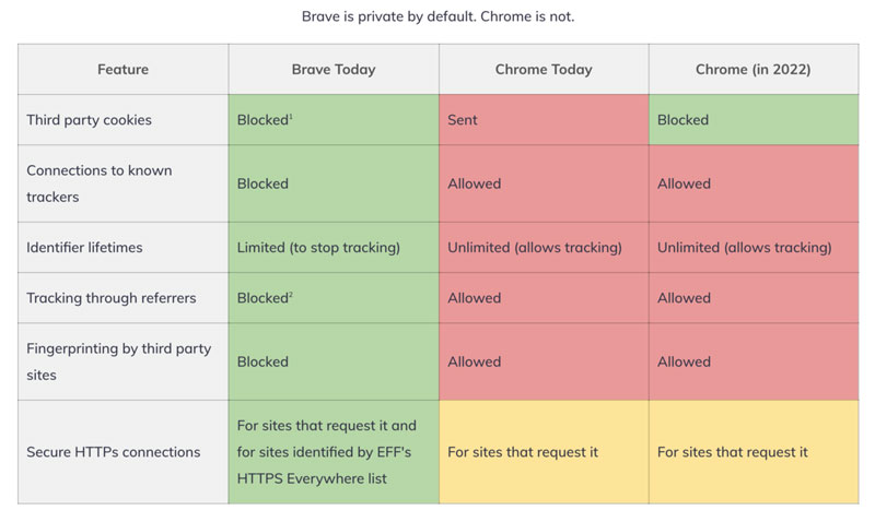
This may be the most convincing point for anyone who cares about not being tracked online. Most other browsers require you to install an ad blocker to start blocking ads, but Brave takes it much further by not only blocking ads, but also making sure that other means of tracking can’t be used either. See the following chart that compares it to Google Chrome and the future, more private, Google Chrome of 2022.
3. It Uses Innovative Advertising
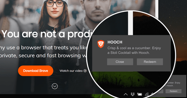
Out of the box, Brave blocks all ads on every website. You can turn ads on specific websites if you want to support them, but the browser encourages using its ground-breaking advertising system. Brave comes with a cryptocurrency (BAT) that is used to pay the browser’s users for accepting being served native ads. The BAT earned this way can be used to reward content creators by tipping them once or regularly.
4. It Is Crypto-friendly
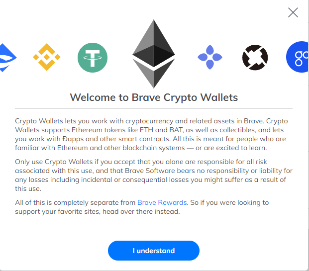
For those of you interested in crypto-currencies, or in blockchain projects at large, you will enjoy the Brave browser. On top of using BAT coins to reward users and content creators, it also comes with a crypto-wallet out of the box, so you can store your Bitcoin and other crypto-currencies on it. If you want to use your earned BAT for trading, you can do so by using the integrated Binance widget.
5. Browser extensions
Last for this article, but not least, Brave comes with tons of browser extensions. In fact, you can use any Google Chrome extension in Brave, so if you are a Chrome user, you will not lose any of your current extensions.
Multipurpose themes are among the best selling WordPress themes out there. They allow users to build virtually any type of website. They are great for web designers who have a large and diverse clientele to satisfy, and almost all of the top-of-the-line themes are easy to work with.
They save time since their users don’t have to search for a suitable theme for every new project
They save money for those who serve a large and diverse clientele
They help users avoid stress by providing the tools they need to build the websites they want, the way they want.
There will probably always be a need for specialty themes. Although top-tier multipurpose themes like those listed below are constantly expanding their range and versatility.
Any one of these 8 multipurpose themes can help you take your design capabilities and business to the next level. Save you time and money, and help you avoid unnecessary stress.
A summary listing of how BeTheme could make life easier for you is a long one. It would take at least 40 paragraphs to cover all of BeTheme’s core features.
Click on the banner to learn more about the powerful tools and design options that Be places at your disposal; and at the same time, get a better sense as to how easy this multipurpose theme is to work with.
Highlights include –
BeTheme’s 500+ pre-built websites help users get projects off to a fast start and also serve as sources of inspiration
They cover 30+ industry sectors, a wide range of business niches, and all the popular website types
They are expertly crafted, extremely attractive, fully customizable, and responsive
Appropriate UX features are embedded in each pre-built website
Other key tools and design aids include
The Muffin Builder, Options Panel, and shortcodes that allow users to build any layout without coding.
Design options for headers, footers, portfolio, blog, and shop page layouts and colors and special effects.
Although Total offers its users a multiplicity of useful features, they are presented in a manner that makes this multipurpose theme a joy to work with. Users don’t have to contend with a variety of the “bells and whistles” that tend to make using a theme more of a challenge than a pleasure.
Users can perform frontend and backend editing using Total’s built-in theme customizer and the popular Visual Composer page builder/editor.
The design process is simplified thanks to the selection of building blocks including blocks supporting WooCommerce, Revolution Slider, and other plugins.
80+ Builder modules, 40+ pre-made demos, and 500+ styling options ensure maximum design flexibility
Total is 100% developer friendly thanks to its selections of custom hooks, filters, and snippets
Total is 100% responsive and optimized for SEO
Click on the banner to learn more about this user-friendly theme.
Much of TheGem’s popularity is undoubtedly due to the fact, that this theme is one of the most customizable and performant WordPress themes on market. It is a perfect choice for professionals and beginners
Online shops, corporate entities, agencies and all creative types will especially benefit from this creative multipurpose theme’s offerings
It comes with beautiful 400+ pre-designed websites and uniqu feature TheGem Blocks with over 300 pre-made page sections to speed up creative workflow
TheGem includes rich collection of WooCommerce templates for any shops
Click on the banner to learn what it takes to make 45,000 users happy.
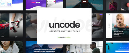
Uncode is one of the ThemeForest top-sellers, it is an ideal choice for agencies, freelancers, bloggers and other creative types. One of its main selling points is the terrific attention to detail that went into its design, making it a truly pixel-perfect theme.
Uncode’s 70 inspirational pixel-perfect concepts will help you get your project started and 400+ wireframe templates will help complete the task
Uncode’s frontend editor lets you design in real time
Uncode’s user-designed website showcase is a must-see
Whether you are a beginner or a more advanced WordPress user doesn’t really matter since Kalium is delightfully easy to use and is also easy to maintain.
All the popular WordPress plugins are supported, while Slider Revolution, WPBakery page builder, WooCommerce, and other plugins are included at no cost to the user
Kalium is 100% responsive, making it an ideal choice for creating portfolio and eCommerce sites
34,000 clients love Kalium’s excellent customer support
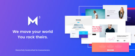
Movedo is an absolute blast to work with. Of particular interest is how it enables web designers to use both real and apparent movement to engage site visitors and hold their attention through an astute use of –
Ultra-dynamic parallax effects
Dynamic scrolling
Unique animations
This theme really rocks and with a little effort on your part your websites will as well.
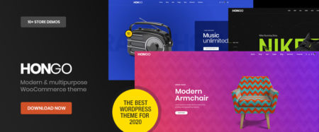
Hongo will be a great choice if you have company websites, WooCommerce stores, or bloggings sites in mind. This multipurpose theme’s one click importable store demos, page styles, and creative content pages are stylish and in line with the latest design trends.
The WPBakery page builder and Revolution Slider plugins are included
Hongo’s selections include premium eCommerce features like product search filtering, product quick view, and product videos to name several
Hongo is very fast in page loading and SEO friendly as well
Hondo is a modern, well-designed, and highly attractive website-building theme.
Click to learn more.
*****
The best reason for choosing a multipurpose theme is that it should serve you well for any type of website building project you might have in mind.
Not every multipurpose theme on the market will do that for you however, which is why you want to take the time to find a theme that definitely delivers. That is why we’ve assembled this list of premier, best in their class multipurpose WordPress theme
Multipurpose themes are among the best selling WordPress themes out there. They allow users to build virtually any type of website. They are great for web designers who have a large and diverse clientele to satisfy, and almost all of the top-of-the-line themes are easy to work with.
They save time since their users don’t have to search for a suitable theme for every new project
They save money for those who serve a large and diverse clientele
They help users avoid stress by providing the tools they need to build the websites they want, the way they want.
There will probably always be a need for specialty themes. Although top-tier multipurpose themes like those listed below are constantly expanding their range and versatility.
Any one of these 8 multipurpose themes can help you take your design capabilities and business to the next level. Save you time and money, and help you avoid unnecessary stress.
A summary listing of how BeTheme could make life easier for you is a long one. It would take at least 40 paragraphs to cover all of BeTheme’s core features.
Click on the banner to learn more about the powerful tools and design options that Be places at your disposal; and at the same time, get a better sense as to how easy this multipurpose theme is to work with.
Highlights include –
BeTheme’s 500+ pre-built websites help users get projects off to a fast start and also serve as sources of inspiration
They cover 30+ industry sectors, a wide range of business niches, and all the popular website types
They are expertly crafted, extremely attractive, fully customizable, and responsive
Appropriate UX features are embedded in each pre-built website
Other key tools and design aids include
The Muffin Builder, Options Panel, and shortcodes that allow users to build any layout without coding.
Design options for headers, footers, portfolio, blog, and shop page layouts and colors and special effects.
Although Total offers its users a multiplicity of useful features, they are presented in a manner that makes this multipurpose theme a joy to work with. Users don’t have to contend with a variety of the “bells and whistles” that tend to make using a theme more of a challenge than a pleasure.
Users can perform frontend and backend editing using Total’s built-in theme customizer and the popular Visual Composer page builder/editor.
The design process is simplified thanks to the selection of building blocks including blocks supporting WooCommerce, Revolution Slider, and other plugins.
80+ Builder modules, 40+ pre-made demos, and 500+ styling options ensure maximum design flexibility
Total is 100% developer friendly thanks to its selections of custom hooks, filters, and snippets
Total is 100% responsive and optimized for SEO
Click on the banner to learn more about this user-friendly theme.
Much of TheGem’s popularity is undoubtedly due to the fact, that this theme is one of the most customizable and performant WordPress themes on market. It is a perfect choice for professionals and beginners
Online shops, corporate entities, agencies and all creative types will especially benefit from this creative multipurpose theme’s offerings
It comes with beautiful 400+ pre-designed websites and uniqu feature TheGem Blocks with over 300 pre-made page sections to speed up creative workflow
TheGem includes rich collection of WooCommerce templates for any shops
Click on the banner to learn what it takes to make 45,000 users happy.
Uncode is one of the ThemeForest top-sellers, it is an ideal choice for agencies, freelancers, bloggers and other creative types. One of its main selling points is the terrific attention to detail that went into its design, making it a truly pixel-perfect theme.
Uncode’s 70 inspirational pixel-perfect concepts will help you get your project started and 400+ wireframe templates will help complete the task
Uncode’s frontend editor lets you design in real time
Uncode’s user-designed website showcase is a must-see
Whether you are a beginner or a more advanced WordPress user doesn’t really matter since Kalium is delightfully easy to use and is also easy to maintain.
All the popular WordPress plugins are supported, while Slider Revolution, WPBakery page builder, WooCommerce, and other plugins are included at no cost to the user
Kalium is 100% responsive, making it an ideal choice for creating portfolio and eCommerce sites
34,000 clients love Kalium’s excellent customer support
Movedo is an absolute blast to work with. Of particular interest is how it enables web designers to use both real and apparent movement to engage site visitors and hold their attention through an astute use of –
Ultra-dynamic parallax effects
Dynamic scrolling
Unique animations
This theme really rocks and with a little effort on your part your websites will as well.
Hongo will be a great choice if you have company websites, WooCommerce stores, or bloggings sites in mind. This multipurpose theme’s one click importable store demos, page styles, and creative content pages are stylish and in line with the latest design trends.
The WPBakery page builder and Revolution Slider plugins are included
Hongo’s selections include premium eCommerce features like product search filtering, product quick view, and product videos to name several
Hongo is very fast in page loading and SEO friendly as well
Hondo is a modern, well-designed, and highly attractive website-building theme.
Click to learn more.
*****
The best reason for choosing a multipurpose theme is that it should serve you well for any type of website building project you might have in mind.
Not every multipurpose theme on the market will do that for you however, which is why you want to take the time to find a theme that definitely delivers. That is why we’ve assembled this list of premier, best in their class multipurpose WordPress theme
Nowadays, businesses have become more competitive than ever before in terms of promoting products and services. The use of websites has been increased tremendously, and the organizations are investing larger funds than ever before in designing websites.
There has been a significant advancement in the field of technology that made several business organizations improve the capability of using a perfect website to promote products & services. As a result, designing a website that can perform better than those of others has become very challenging.
A website can establish reliability amongst the customers and can attract future clients as the most crucial part of the modern business. Visitors can get a great browsing experience from visiting a lucrative website that can turn the single time visitors into frequent ones. Finally, a good website represents the business’s mission, vision, and values and its message towards the society and customers.
A lucrative and properly designed website can attract viewers for a boring business; if the visitors find it special and different from others. In this article, we will discuss how a good performing website can be developed for boring businesses or for miscellaneous themes, like campaign websites.
Techniques for Designing a Unique website
Make it Unique & Special:
There are numerous web templates available on the net; if your design is similar to a boring style of template that people see every day, the visitors will surely run away from your website by the first impression. Tempting or driving away from the visitors largely depends on what impression the site makes on the viewers in the first view. The homepage of a corporate website must be designed in such a way that it represents the whole site, which will make it unique & special and attract the visitors to grab the deal.
Select an Attractive Domain Name:
A domain name must be selected so that it gives a message to the visitors of what the business stands for. It should also be kept in mind that the domain name should very effective for Search Engine Optimization (SEO) so that the target viewers can easily find what they are looking for.
Create Space around Content:
It’s essential to make the contents easy to focus on the visitors so that they can feel comfortable when hovering over the contents. The surrounding area is equally important as the contents to make the site comfortably readable.
Well Organized:
An ambiguous design with loads of unnecessary information can make the visitors feel uncomfortable, so a perfect website should be designed in a simple yet useful form. A well-organized website reflects business professionalism that makes the visitors reliable to the business.
Use Formatting:
In the current online world, users are very cautious about their time, and none is ready to hovering over your site for a more extended period. Using formatting can be a great way to emphasize the heading and key points of the contents, but it must be simplified so that users can save their time. Nothing extravagant, a simple, bold, italic, or color formatting can catch the eye of the reader.
Professional Branding:
Promote your brand in the most professional manner that reflects the values of your business. Promote it like you are doing business, some serious business, and you mean it. You can use graphical presentation in the contents to highlight your core ideas and statistics.
Think out of the Box:
Sometimes, you may need to think out of the box to make your business website a little different from the competitors. You may adopt a different approach than that of the existing. It can be something crazy, something pleasant, or something totally freaky, or anything that doesn’t go with the flow.
Ensure Smooth Navigation:
The website should be designed in such a way that it enables a user to navigate it smoothly. Since the business is boring, you have to be very careful about arranging a wide range of products & services that might be a hindrance to the smooth navigation for users. So, plan your strategy tactfully and avoid unnecessary content from the site to ensure comfy navigation for viewers.
Use of Animated Graphics:
Using animated graphics could be a great option to attract visitors to your site that will make it unique from the existing competitors. Adding videos to the site will give an extra lucrative look to the site that will lead to an increasing number of visitors and potential customers.
Enhancing Site Performance:
It is very important to use the appropriate hardware and high-speed internet connection for the server to support the website to ensure a great performance. The site cab crash while the users are loading it if the server cannot support it. Especially if any graphical presentations or videos are used in the contents, the site may become slow if the server configuration and the bandwidth are not adequate enough. Site performance can also be increased by choosing a better host.
Well-organized Presentation of Products & Services:
Think profoundly and carefully how well you can organize the products and services on the site, since the customers won’t spend a long time to find the desired outcomes.
Also, you need to ensure there is enough information about the products, i.e., pictures, production descriptions, prices, etc. so that customers can easily be influenced to buy the product.
If you cannot manage a proper display of the product range, you will lose potential customers. Chances are that you won’t be able to create a website like Amazon, but you have to aim for it. Make it similar in functionality, not in style. This means not using their font, color palette, or a similar logo.
Keep a Place for Customer Query:
Customers or users may have various queries about products or services, technical issues of site, or availability of your products in a particular area, or maybe anything. Keep a query box on the site while designing it so that clients can make their queries, and you can answer them anytime. Arranging a real-time chatting box for the visitors will improve customer experience in your site primarily, and it will turn the potential customers into regular ones.
Paying Attention to Details:
While designing the website, you must pay close attention to details so that it doesn’t go far from the ultimate goal. The ultimate purpose of a website to increase the business turnover, and for achieving it, you must not add any redundant materials into the site that results in losing the appeal of the main contents. The details must need to convey a message of professionalism to potential clients.
Monitor Technical Issues like404s:
You must monitor the website regularly to check if any technical issues might annoy the visitors/customers. A problem like the 404 error annoys the visitors seriously when they don’t find the required link while browsing the site. As a result, you may lose a regular customer, including a potential one. Even too much 404 errors reduce the performance of the site and make it slow, which ultimately results in a sales loss.
Suggestions for Good Content
Using Catchy Headlines:
There is numerous information available all around the web, and so does for your site. The visitors don’t have the luxury of spending much time at your site if they don’t find anything attractive. So, to make the contents attractive to the viewers you should use some catchy headlines in your content. A catchy headline attracts the visitors easily and makes them read the full content attentively. To make better headlines, you must review the materials over and over again.
Avoiding Lengthy Paragraphs:
A lengthy paragraph makes the contents wordy and repetitive and thus loses its attraction to the visitors. So, you must prevent such bigger sections, rather you can divide an enormous paragraph into small parts so that it doesn’t look wordy in the eye of the visitors.
Highlighting the Hyperlink:
Hyperlinks are added to the contents to provide additional information to the viewers. Highlighting helps the visitors to trace the hyperlink easily. There is various way of highlighting a hyperlink text such as using a different color or underlining.
Adding Something Funny:
Sometimes, using something funny in the contents make people interested in going through the entire contents, which will eventually make people know about your products and services and thus generates sales.
Nowadays, businesses have become more competitive than ever before in terms of promoting products and services. The use of websites has been increased tremendously, and the organizations are investing larger funds than ever before in designing websites.
There has been a significant advancement in the field of technology that made several business organizations improve the capability of using a perfect website to promote products & services. As a result, designing a website that can perform better than those of others has become very challenging.
A website can establish reliability amongst the customers and can attract future clients as the most crucial part of the modern business. Visitors can get a great browsing experience from visiting a lucrative website that can turn the single time visitors into frequent ones. Finally, a good website represents the business’s mission, vision, and values and its message towards the society and customers.
A lucrative and properly designed website can attract viewers for a boring business; if the visitors find it special and different from others. In this article, we will discuss how a good performing website can be developed for boring businesses or for miscellaneous themes, like campaign websites.
Techniques for Designing a Unique website
Make it Unique & Special:
There are numerous web templates available on the net; if your design is similar to a boring style of template that people see every day, the visitors will surely run away from your website by the first impression. Tempting or driving away from the visitors largely depends on what impression the site makes on the viewers in the first view. The homepage of a corporate website must be designed in such a way that it represents the whole site, which will make it unique & special and attract the visitors to grab the deal.
Select an Attractive Domain Name:
A domain name must be selected so that it gives a message to the visitors of what the business stands for. It should also be kept in mind that the domain name should very effective for Search Engine Optimization (SEO) so that the target viewers can easily find what they are looking for.
Create Space around Content:
It’s essential to make the contents easy to focus on the visitors so that they can feel comfortable when hovering over the contents. The surrounding area is equally important as the contents to make the site comfortably readable.
Well Organized:
An ambiguous design with loads of unnecessary information can make the visitors feel uncomfortable, so a perfect website should be designed in a simple yet useful form. A well-organized website reflects business professionalism that makes the visitors reliable to the business.
Use Formatting:
In the current online world, users are very cautious about their time, and none is ready to hovering over your site for a more extended period. Using formatting can be a great way to emphasize the heading and key points of the contents, but it must be simplified so that users can save their time. Nothing extravagant, a simple, bold, italic, or color formatting can catch the eye of the reader.
Professional Branding:
Promote your brand in the most professional manner that reflects the values of your business. Promote it like you are doing business, some serious business, and you mean it. You can use graphical presentation in the contents to highlight your core ideas and statistics.
Think out of the Box:
Sometimes, you may need to think out of the box to make your business website a little different from the competitors. You may adopt a different approach than that of the existing. It can be something crazy, something pleasant, or something totally freaky, or anything that doesn’t go with the flow.
Ensure Smooth Navigation:
The website should be designed in such a way that it enables a user to navigate it smoothly. Since the business is boring, you have to be very careful about arranging a wide range of products & services that might be a hindrance to the smooth navigation for users. So, plan your strategy tactfully and avoid unnecessary content from the site to ensure comfy navigation for viewers.
Use of Animated Graphics:
Using animated graphics could be a great option to attract visitors to your site that will make it unique from the existing competitors. Adding videos to the site will give an extra lucrative look to the site that will lead to an increasing number of visitors and potential customers.
Enhancing Site Performance:
It is very important to use the appropriate hardware and high-speed internet connection for the server to support the website to ensure a great performance. The site cab crash while the users are loading it if the server cannot support it. Especially if any graphical presentations or videos are used in the contents, the site may become slow if the server configuration and the bandwidth are not adequate enough. Site performance can also be increased by choosing a better host.
Well-organized Presentation of Products & Services:
Think profoundly and carefully how well you can organize the products and services on the site, since the customers won’t spend a long time to find the desired outcomes.
Also, you need to ensure there is enough information about the products, i.e., pictures, production descriptions, prices, etc. so that customers can easily be influenced to buy the product.
If you cannot manage a proper display of the product range, you will lose potential customers. Chances are that you won’t be able to create a website like Amazon, but you have to aim for it. Make it similar in functionality, not in style. This means not using their font, color palette, or a similar logo.
Keep a Place for Customer Query:
Customers or users may have various queries about products or services, technical issues of site, or availability of your products in a particular area, or maybe anything. Keep a query box on the site while designing it so that clients can make their queries, and you can answer them anytime. Arranging a real-time chatting box for the visitors will improve customer experience in your site primarily, and it will turn the potential customers into regular ones.
Paying Attention to Details:
While designing the website, you must pay close attention to details so that it doesn’t go far from the ultimate goal. The ultimate purpose of a website to increase the business turnover, and for achieving it, you must not add any redundant materials into the site that results in losing the appeal of the main contents. The details must need to convey a message of professionalism to potential clients.
Monitor Technical Issues like404s:
You must monitor the website regularly to check if any technical issues might annoy the visitors/customers. A problem like the 404 error annoys the visitors seriously when they don’t find the required link while browsing the site. As a result, you may lose a regular customer, including a potential one. Even too much 404 errors reduce the performance of the site and make it slow, which ultimately results in a sales loss.
Suggestions for Good Content
Using Catchy Headlines:
There is numerous information available all around the web, and so does for your site. The visitors don’t have the luxury of spending much time at your site if they don’t find anything attractive. So, to make the contents attractive to the viewers you should use some catchy headlines in your content. A catchy headline attracts the visitors easily and makes them read the full content attentively. To make better headlines, you must review the materials over and over again.
Avoiding Lengthy Paragraphs:
A lengthy paragraph makes the contents wordy and repetitive and thus loses its attraction to the visitors. So, you must prevent such bigger sections, rather you can divide an enormous paragraph into small parts so that it doesn’t look wordy in the eye of the visitors.
Highlighting the Hyperlink:
Hyperlinks are added to the contents to provide additional information to the viewers. Highlighting helps the visitors to trace the hyperlink easily. There is various way of highlighting a hyperlink text such as using a different color or underlining.
Adding Something Funny:
Sometimes, using something funny in the contents make people interested in going through the entire contents, which will eventually make people know about your products and services and thus generates sales.
Nowadays, businesses have become more competitive than ever before in terms of promoting products and services. The use of websites has been increased tremendously, and the organizations are investing larger funds than ever before in designing websites.
There has been a significant advancement in the field of technology that made several business organizations improve the capability of using a perfect website to promote products & services. As a result, designing a website that can perform better than those of others has become very challenging.
A website can establish reliability amongst the customers and can attract future clients as the most crucial part of the modern business. Visitors can get a great browsing experience from visiting a lucrative website that can turn the single time visitors into frequent ones. Finally, a good website represents the business’s mission, vision, and values and its message towards the society and customers.
A lucrative and properly designed website can attract viewers for a boring business; if the visitors find it special and different from others. In this article, we will discuss how a good performing website can be developed for boring businesses or for miscellaneous themes, like campaign websites.
Techniques for Designing a Unique website
Make it Unique & Special:
There are numerous web templates available on the net; if your design is similar to a boring style of template that people see every day, the visitors will surely run away from your website by the first impression. Tempting or driving away from the visitors largely depends on what impression the site makes on the viewers in the first view. The homepage of a corporate website must be designed in such a way that it represents the whole site, which will make it unique & special and attract the visitors to grab the deal.
Select an Attractive Domain Name:
A domain name must be selected so that it gives a message to the visitors of what the business stands for. It should also be kept in mind that the domain name should very effective for Search Engine Optimization (SEO) so that the target viewers can easily find what they are looking for.
Create Space around Content:
It’s essential to make the contents easy to focus on the visitors so that they can feel comfortable when hovering over the contents. The surrounding area is equally important as the contents to make the site comfortably readable.
Well Organized:
An ambiguous design with loads of unnecessary information can make the visitors feel uncomfortable, so a perfect website should be designed in a simple yet useful form. A well-organized website reflects business professionalism that makes the visitors reliable to the business.
Use Formatting:
In the current online world, users are very cautious about their time, and none is ready to hovering over your site for a more extended period. Using formatting can be a great way to emphasize the heading and key points of the contents, but it must be simplified so that users can save their time. Nothing extravagant, a simple, bold, italic, or color formatting can catch the eye of the reader.
Professional Branding:
Promote your brand in the most professional manner that reflects the values of your business. Promote it like you are doing business, some serious business, and you mean it. You can use graphical presentation in the contents to highlight your core ideas and statistics.
Think out of the Box:
Sometimes, you may need to think out of the box to make your business website a little different from the competitors. You may adopt a different approach than that of the existing. It can be something crazy, something pleasant, or something totally freaky, or anything that doesn’t go with the flow.
Ensure Smooth Navigation:
The website should be designed in such a way that it enables a user to navigate it smoothly. Since the business is boring, you have to be very careful about arranging a wide range of products & services that might be a hindrance to the smooth navigation for users. So, plan your strategy tactfully and avoid unnecessary content from the site to ensure comfy navigation for viewers.
Use of Animated Graphics:
Using animated graphics could be a great option to attract visitors to your site that will make it unique from the existing competitors. Adding videos to the site will give an extra lucrative look to the site that will lead to an increasing number of visitors and potential customers.
Enhancing Site Performance:
It is very important to use the appropriate hardware and high-speed internet connection for the server to support the website to ensure a great performance. The site cab crash while the users are loading it if the server cannot support it. Especially if any graphical presentations or videos are used in the contents, the site may become slow if the server configuration and the bandwidth are not adequate enough. Site performance can also be increased by choosing a better host.
Well-organized Presentation of Products & Services:
Think profoundly and carefully how well you can organize the products and services on the site, since the customers won’t spend a long time to find the desired outcomes.
Also, you need to ensure there is enough information about the products, i.e., pictures, production descriptions, prices, etc. so that customers can easily be influenced to buy the product.
If you cannot manage a proper display of the product range, you will lose potential customers. Chances are that you won’t be able to create a website like Amazon, but you have to aim for it. Make it similar in functionality, not in style. This means not using their font, color palette, or a similar logo.
Keep a Place for Customer Query:
Customers or users may have various queries about products or services, technical issues of site, or availability of your products in a particular area, or maybe anything. Keep a query box on the site while designing it so that clients can make their queries, and you can answer them anytime. Arranging a real-time chatting box for the visitors will improve customer experience in your site primarily, and it will turn the potential customers into regular ones.
Paying Attention to Details:
While designing the website, you must pay close attention to details so that it doesn’t go far from the ultimate goal. The ultimate purpose of a website to increase the business turnover, and for achieving it, you must not add any redundant materials into the site that results in losing the appeal of the main contents. The details must need to convey a message of professionalism to potential clients.
Monitor Technical Issues like404s:
You must monitor the website regularly to check if any technical issues might annoy the visitors/customers. A problem like the 404 error annoys the visitors seriously when they don’t find the required link while browsing the site. As a result, you may lose a regular customer, including a potential one. Even too much 404 errors reduce the performance of the site and make it slow, which ultimately results in a sales loss.
Suggestions for Good Content
Using Catchy Headlines:
There is numerous information available all around the web, and so does for your site. The visitors don’t have the luxury of spending much time at your site if they don’t find anything attractive. So, to make the contents attractive to the viewers you should use some catchy headlines in your content. A catchy headline attracts the visitors easily and makes them read the full content attentively. To make better headlines, you must review the materials over and over again.
Avoiding Lengthy Paragraphs:
A lengthy paragraph makes the contents wordy and repetitive and thus loses its attraction to the visitors. So, you must prevent such bigger sections, rather you can divide an enormous paragraph into small parts so that it doesn’t look wordy in the eye of the visitors.
Highlighting the Hyperlink:
Hyperlinks are added to the contents to provide additional information to the viewers. Highlighting helps the visitors to trace the hyperlink easily. There is various way of highlighting a hyperlink text such as using a different color or underlining.
Adding Something Funny:
Sometimes, using something funny in the contents make people interested in going through the entire contents, which will eventually make people know about your products and services and thus generates sales.
Mobile user experience somehow ‘imposed itself’ with all the development and improvement of mobile communication devices.
In fact, it is the quality of user experience that divides outstanding apps from their less outstanding counterparts.
The same factor enables startups to learn from big brands and to improve their products.
User experience for mobile applications – the key to success
UX seems to fit perfectly the development of mobile interaction. Customers cannot deny the fact that digital disruption is knocking out their loyalty, and mobile brands are gaining success. Instead, they are looking for a customized and stable experience that can always be upgraded.
Only a small part of them agree that channel interactions offered by companies are seamless. Established brands are working hard on triggering loyalty and improving their UX experiences to the level of impeccability.
Image source: Cassius Kiani
It is a challenging task-they need to ensure their sites comply with traditional standards and that they load faster with no need for zooming or pinching.
The success of a website, however, depends on continuous streaming, and customers are becoming more and more frustrated that companies struggle to do business via mobile communication.
Tips for ‘mobilizing’ and personalizing the user experience
We cannot talk about a universal UX simply because we are all different form each other.
Great apps should really consider their users’ personalities. They should research and gather data and they should customize the experience according to their users’ needs.
Take travel apps as an example – they ought to present attractive information even before we adjust searching settings because they know who we are, where we are, and how empowering our budget is.
Menus should have search options
Searching is a core element of good user experience. Therefore, such an option should be available everywhere. Your users need to be able to switch pages, to add or deduct content from the current page. Designers should pay attention to this because their main purpose is to make interaction easy and comfortable, which necessarily involves proper content division. From now on, it counts also for mobile systems.
Additionally, make sure the search field is visible. Put it in the menu or in a very striking position on the pages.
Remember – introducing search is not enough. It is just the beginning. You have to make sure it actually provides results. The results, on the other hand, should be logically ordered and accessible from desktops and mobile phones.
Finally, make sure your results are easily distinguished. One more thing about mobile UX related to search: having the option is just step one. Make sure your internal search result pages look great and are functional as well.
Most generally, 80% of your app’s users are about to use only 20% of its functionality. If not sure this is a valid rule, launch the service online, and observe how customers interact with it (in the case of mobile analytics difficulties, pay special attention to your mobile users). You will conclude which functionality is mostly applied so that you can cut the rest out and get as close to intuitive design as possible.
The same as with your desktop sites, mobile replications should not aspire for too much conversation, especially when we’re talking about forms. You need an app that summarizes information, buys or sells products or makes subscriptions through simple contact forms.
Think about it – what will your mobile UX look like if you introduce an 8-page long questionnaire? It will be ruined! “I’ll do that tomorrow on coffee time” – that’s exactly what users will say. And they won’t do it.
An optimal user experience takes care of size. Therefore, remove everything you wanted to know, but it wasn’t really necessary. Do they want a newsletter? Ask only for their electronic mails. Do they want to shop? Ask for the delivery and input address (and give them the chance to copy-paste the same information).
Excellent apps start from the basics. The designer finds out what customers want and he adjusts the work to their requirements. Improvement comes second, whenever there is an affordable chance for improving your digital existence. Then, if it is a mobile idea, let it be a mobile idea! There is nothing that can make ideas so unique.
An app without content will simply not work
Additionally, too much content will be just as dysfunctional.
And we are not talking about not having content at all. We are talking about content that has not been exposed in a clear way. You may not have a searching tool or it may not work properly. You have to consider every option and to put content as close to your users’ view as possible. Again – filtering that provides low-quality results is equally bad as not having a filter at all.
Therefore, the same efforts apply to the search option-incredibly customized apps need incredibly customized searching features.
Consider interruption
One of the biggest drawbacks when designing for mobile systems is the unavoidable possibility for users to be distracted. They are almost all the time on their phones and there is naturally no chance that something will not interrupt their experience (either from the outside or within the phone itself).
You have to consider this option-maintain the app straightforward and the interface simple because it is the only way to keep users focused and engaged. Make sure that if they leave, they will come back and pick up from where they stopped. Therefore, divide content in small chunks and break larger tasks in no-time operations.
Appear friendly and really grateful for the fact that new customers visited you.
Assuming you’ve gotten to know your target users, the next thing to do is to let them know you. Charm them at first sight and convince them that it is a good decision to start using your site. You have to create a positive impression from the very first moment, instead of waiting for them to start searching. In fact, most clients base their entire experience on the first run they had on the site.
Presenting poor and empty screens to potential users is like signing a death sentence. Their first impression will be terrible and it will likely stay like that forever.
Speed is among most important factors for creating excellent user experience. Speed is what users mostly complain about, so every website is trying to improve it. The improvement goes mostly in two directions: optimization of images (even if everybody tries to hide instant images); and reduction of size.
However, remember that the loading speed on your website/app doesn’t depend only on your efforts. It is highly dependent on mobile connections too. We don’t always have WiFi or 4G and we have to be patient.
Most users adjust their browsing habits to the speed of their internet connection-if traveling on the subway, it’s not really recommendable to try and stream a three-hour movie. Instead, you can read a Wikipedia article or your daily horoscope. This is how it works-users decide!
Even if you made it to the top of all lists and your users seem to adore you, there is a big chance you’ll discover flaws you weren’t really aware of. In fact, it is very probable those will be things you missed when developing the app or results of failing to adjust it to real-time needs.
There are also certain options that make sense when you don’t have a great budget for the app and no revenue, like using free fonts instead of premium ones.
However, it is not a justification for throwing out ideas that seem technically unfeasible at the moment – write them down and work out whether there is an alternative that can replace them, or save them for better days. The mobile world is constantly innovating, so the same way as inundated settings fail to work, futuristic ones may become real. The key is to adjust to the time being.
Remember – your app is a developing entity. It will draw analytical data, users’ feedback, and it will follow trends and breakthroughs. You have to make sure it is ready to provide better and better experience. Don’t think that you will only work hard on it around the launching date when you have all your checklists and plan with what needs to be done.
Try and create excellent mobile user interface which can respond to every need and it can act informatively in every phase of the purchase cycle. Don’t rely on trends which impose the ‘must go mobile’ mindset and think how your users want you to enhance their journey. This is the right approach for keeping customers on board, encouraging purchases, and breaking records.
The quality of your app depends on the quality of its UX design – it will either make it or break it. We think you know what you should do.
Mobile user experience somehow ‘imposed itself’ with all the development and improvement of mobile communication devices.
In fact, it is the quality of user experience that divides outstanding apps from their less outstanding counterparts.
The same factor enables startups to learn from big brands and to improve their products.
User experience for mobile applications – the key to success
UX seems to fit perfectly the development of mobile interaction. Customers cannot deny the fact that digital disruption is knocking out their loyalty, and mobile brands are gaining success. Instead, they are looking for a customized and stable experience that can always be upgraded.
Only a small part of them agree that channel interactions offered by companies are seamless. Established brands are working hard on triggering loyalty and improving their UX experiences to the level of impeccability.
Image source: Cassius Kiani
It is a challenging task-they need to ensure their sites comply with traditional standards and that they load faster with no need for zooming or pinching.
The success of a website, however, depends on continuous streaming, and customers are becoming more and more frustrated that companies struggle to do business via mobile communication.
Tips for ‘mobilizing’ and personalizing the user experience
We cannot talk about a universal UX simply because we are all different form each other.
Great apps should really consider their users’ personalities. They should research and gather data and they should customize the experience according to their users’ needs.
Take travel apps as an example – they ought to present attractive information even before we adjust searching settings because they know who we are, where we are, and how empowering our budget is.
Menus should have search options
Searching is a core element of good user experience. Therefore, such an option should be available everywhere. Your users need to be able to switch pages, to add or deduct content from the current page. Designers should pay attention to this because their main purpose is to make interaction easy and comfortable, which necessarily involves proper content division. From now on, it counts also for mobile systems.
Additionally, make sure the search field is visible. Put it in the menu or in a very striking position on the pages.
Remember – introducing search is not enough. It is just the beginning. You have to make sure it actually provides results. The results, on the other hand, should be logically ordered and accessible from desktops and mobile phones.
Finally, make sure your results are easily distinguished. One more thing about mobile UX related to search: having the option is just step one. Make sure your internal search result pages look great and are functional as well.
Most generally, 80% of your app’s users are about to use only 20% of its functionality. If not sure this is a valid rule, launch the service online, and observe how customers interact with it (in the case of mobile analytics difficulties, pay special attention to your mobile users). You will conclude which functionality is mostly applied so that you can cut the rest out and get as close to intuitive design as possible.
The same as with your desktop sites, mobile replications should not aspire for too much conversation, especially when we’re talking about forms. You need an app that summarizes information, buys or sells products or makes subscriptions through simple contact forms.
Think about it – what will your mobile UX look like if you introduce an 8-page long questionnaire? It will be ruined! “I’ll do that tomorrow on coffee time” – that’s exactly what users will say. And they won’t do it.
An optimal user experience takes care of size. Therefore, remove everything you wanted to know, but it wasn’t really necessary. Do they want a newsletter? Ask only for their electronic mails. Do they want to shop? Ask for the delivery and input address (and give them the chance to copy-paste the same information).
Excellent apps start from the basics. The designer finds out what customers want and he adjusts the work to their requirements. Improvement comes second, whenever there is an affordable chance for improving your digital existence. Then, if it is a mobile idea, let it be a mobile idea! There is nothing that can make ideas so unique.
An app without content will simply not work
Additionally, too much content will be just as dysfunctional.
And we are not talking about not having content at all. We are talking about content that has not been exposed in a clear way. You may not have a searching tool or it may not work properly. You have to consider every option and to put content as close to your users’ view as possible. Again – filtering that provides low-quality results is equally bad as not having a filter at all.
Therefore, the same efforts apply to the search option-incredibly customized apps need incredibly customized searching features.
Consider interruption
One of the biggest drawbacks when designing for mobile systems is the unavoidable possibility for users to be distracted. They are almost all the time on their phones and there is naturally no chance that something will not interrupt their experience (either from the outside or within the phone itself).
You have to consider this option-maintain the app straightforward and the interface simple because it is the only way to keep users focused and engaged. Make sure that if they leave, they will come back and pick up from where they stopped. Therefore, divide content in small chunks and break larger tasks in no-time operations.
Appear friendly and really grateful for the fact that new customers visited you.
Assuming you’ve gotten to know your target users, the next thing to do is to let them know you. Charm them at first sight and convince them that it is a good decision to start using your site. You have to create a positive impression from the very first moment, instead of waiting for them to start searching. In fact, most clients base their entire experience on the first run they had on the site.
Presenting poor and empty screens to potential users is like signing a death sentence. Their first impression will be terrible and it will likely stay like that forever.
Speed is among most important factors for creating excellent user experience. Speed is what users mostly complain about, so every website is trying to improve it. The improvement goes mostly in two directions: optimization of images (even if everybody tries to hide instant images); and reduction of size.
However, remember that the loading speed on your website/app doesn’t depend only on your efforts. It is highly dependent on mobile connections too. We don’t always have WiFi or 4G and we have to be patient.
Most users adjust their browsing habits to the speed of their internet connection-if traveling on the subway, it’s not really recommendable to try and stream a three-hour movie. Instead, you can read a Wikipedia article or your daily horoscope. This is how it works-users decide!
Even if you made it to the top of all lists and your users seem to adore you, there is a big chance you’ll discover flaws you weren’t really aware of. In fact, it is very probable those will be things you missed when developing the app or results of failing to adjust it to real-time needs.
There are also certain options that make sense when you don’t have a great budget for the app and no revenue, like using free fonts instead of premium ones.
However, it is not a justification for throwing out ideas that seem technically unfeasible at the moment – write them down and work out whether there is an alternative that can replace them, or save them for better days. The mobile world is constantly innovating, so the same way as inundated settings fail to work, futuristic ones may become real. The key is to adjust to the time being.
Remember – your app is a developing entity. It will draw analytical data, users’ feedback, and it will follow trends and breakthroughs. You have to make sure it is ready to provide better and better experience. Don’t think that you will only work hard on it around the launching date when you have all your checklists and plan with what needs to be done.
Try and create excellent mobile user interface which can respond to every need and it can act informatively in every phase of the purchase cycle. Don’t rely on trends which impose the ‘must go mobile’ mindset and think how your users want you to enhance their journey. This is the right approach for keeping customers on board, encouraging purchases, and breaking records.
The quality of your app depends on the quality of its UX design – it will either make it or break it. We think you know what you should do.
No one can deny that UX (user experience) is the foundation of any website. This is the main reason why many website owners always look for ways to improve it. Some even spend a lot of money on design because of it.
UX design is the process of improving user satisfaction through various aspects of a website. These enhancements usually deal with usability, efficiency, and accessibility of a website.
On the other hand, the user interface consists of the elements that a user interacts with when using a digital website or service. Of course, the user interface is a part of the user experience.
Conversion rates are directly proportional to the UX design of a website. After all, according to the latest sales stats, as much as 83% of customers would give a recommendation after a positive experience with a brand.
In other words, a good UX design means much more than an intuitive user flow and stunning layout.
However, what’s even more important is that a great UX will instantly boost the experience visitors are having while on your website. And that can significantly help with conversions in your sales funnel.
If you are interested in learning how to improve user experience with some great design tips, keep reading.
Create a straightforward call-to-action button
Call-to-action (CTA) buttons are used to attract users towards conversion on a website.
The way people implement these buttons can vary. However, some of the most common ones include:
Starting a trial.
Signing up for updates.
Downloading the app.
Booking a consultation.
The CTA on your website needs to be placed on every page of the website. It has been recorded that websites that have a clear CTA have higher conversion rates.
Furthermore, if your website is designed in folds, it is essential to keep your CTA above the fold so that it is easy for users to see.
Bear in mind the following:
Be careful when picking the color for your CTA. Use colors that make the CTA stand out and make them big enough to be easily spotted.
When writing your CTA text, make sure that it is action-oriented. Do not use passive verbs in the text. The text needs to be subtle but still active enough to prompt the user to take action.
Be careful not to include more than five words when writing your CTA.
All in all, a clear and visible CTA is important if you want to improve UX.
All your website pages have to be consistent
When it comes to user experience, consistency means making everything on your website match.
This includes:
Heading sizes
Font choices
Coloring
Button styles
Spacing
Design elements
Illustration styles
Photo choices
All of the elements need to be themed to make the overall design coherent between pages and on the same page.
For users to have a nice experience as they navigate your website, it is important that they are aware of the fact that they are still on your website. Hence, drastic design changes from one page to the other can make visitors feel lost and confused.
If you need to rearrange elements or add new ones to your website, consider utilizing the power of the drag and drop WordPress page builders.
WordPress is the most widely used website-building platform and the drag and drop feature makes it really easy for non-experts to make design changes.
Although search engines don’t punish you harshly for soft 404 errors (page not found), a user will.
When a website visitor clicks on an image or link, they expect it to take them to the next place they want to go. It will annoy them if they find a 404 error page.
Also, it will definitely make them think about whether spending time on your website was a good decision. After all, they can always go to another website for a faster solution.
Error pages are very frustrating and they completely disrupt the user’s journey throughout your website. Next to slow page load time, they are at the top of the list of unwanted aspects of a website.
If you want to check for 404s, you can set up Google Webmaster tools on your website and check crawl errors.
Additionally, you can also ensure that when a visitor lands on a 404, the page provides them with the option to get back on track.
Speed up page loading time
It is easy to get frustrated when a web page is loading slowly. This can lead to visitors abandoning your website and moving on to another website where they can enjoy faster loading times.
In general, if a page takes more than 2 seconds to load, the users are most likely to leave the website. Depending on the loading time of your website, users decide if they would like to further visit your website or move to another site.
Remember, improving the website load speed for desktop is not enough. You need to optimize for mobile users too. Since the mobile-first approach is promoted by Google, it is crucial to optimize and design your webpage for mobile users and show you care about them.
Thanks to Google and its tool called PageSpeed Insights,if you enter the URL of the site you want to check, Google will highlight the areas where your page speed is weak.
On top of that, the tool provides suggestions on how you can improve the loading time.
Authentic images are better than stock photos
Images play a significant role in making a website look more professional and pleasing. However, you need to pay attention here too since your photos have to fit the overall design of your pages.
Avoid stock photos for a couple of very simple reasons. Yes, they are cheap (and often free), they are easy to use, but they may do more harm than good.
Stock images look professional. However, your website visitors will figure out these are stock images and thus lose interest before too long. Also, stock images are overused and don’t appeal to the users.
On the other hand, original photos draw more website visitors. The reason for this is that they have a personal approach and the user can easily connect.
Another thing to bear in mind is that using stock photos shows that you have not invested too much effort in designing the website. Therefore, it won’t look unique, as the visitors might have already seen it on another website.
Therefore, try to use authentic images, no matter how basic and simple they might look.
Finally, just because outreach campaigns aren’t necessarily something directly related to the website design, it doesn’t mean that the messages you send out should look different and feel different from the content of your website.
In other words, after you learn how to create a newsletter, you should think about conversions and efficient converting email design.
Therefore, you also need to follow some email design practices that can help with UX.
White space
In order for your email design to be appealing, you need an adequate amount of white space around your CTA button.
This use of white space is meant to signal the importance of a given CTA button. Not only will your email look nice this way, but it will also guide a reader’s eyes towards the button.
Directional cues
If you want an effective and simple way to guide your readers to the crucial part of your email, you need to use directional cues.
These cues will help a person to move in the direction of your CTA, which is, generally speaking, the whole point of the email. Consequently, this enables the user to easily follow the action process, which results in a higher click-through rate for your business.
Therefore, it shouldn’t be emphasized how important it is to use the directional cues in your emails and thus integrate them into your larger campaign and journey for the user.
No one can deny that UX (user experience) is the foundation of any website. This is the main reason why many website owners always look for ways to improve it. Some even spend a lot of money on design because of it.
UX design is the process of improving user satisfaction through various aspects of a website. These enhancements usually deal with usability, efficiency, and accessibility of a website.
On the other hand, the user interface consists of the elements that a user interacts with when using a digital website or service. Of course, the user interface is a part of the user experience.
Conversion rates are directly proportional to the UX design of a website. After all, according to the latest sales stats, as much as 83% of customers would give a recommendation after a positive experience with a brand.
In other words, a good UX design means much more than an intuitive user flow and stunning layout.
However, what’s even more important is that a great UX will instantly boost the experience visitors are having while on your website. And that can significantly help with conversions in your sales funnel.
If you are interested in learning how to improve user experience with some great design tips, keep reading.
Create a straightforward call-to-action button
Call-to-action (CTA) buttons are used to attract users towards conversion on a website.
The way people implement these buttons can vary. However, some of the most common ones include:
Starting a trial.
Signing up for updates.
Downloading the app.
Booking a consultation.
The CTA on your website needs to be placed on every page of the website. It has been recorded that websites that have a clear CTA have higher conversion rates.
Furthermore, if your website is designed in folds, it is essential to keep your CTA above the fold so that it is easy for users to see.
Bear in mind the following:
Be careful when picking the color for your CTA. Use colors that make the CTA stand out and make them big enough to be easily spotted.
When writing your CTA text, make sure that it is action-oriented. Do not use passive verbs in the text. The text needs to be subtle but still active enough to prompt the user to take action.
Be careful not to include more than five words when writing your CTA.
All in all, a clear and visible CTA is important if you want to improve UX.
All your website pages have to be consistent
When it comes to user experience, consistency means making everything on your website match.
This includes:
Heading sizes
Font choices
Coloring
Button styles
Spacing
Design elements
Illustration styles
Photo choices
All of the elements need to be themed to make the overall design coherent between pages and on the same page.
For users to have a nice experience as they navigate your website, it is important that they are aware of the fact that they are still on your website. Hence, drastic design changes from one page to the other can make visitors feel lost and confused.
If you need to rearrange elements or add new ones to your website, consider utilizing the power of the drag and drop WordPress page builders.
WordPress is the most widely used website-building platform and the drag and drop feature makes it really easy for non-experts to make design changes.
Although search engines don’t punish you harshly for soft 404 errors (page not found), a user will.
When a website visitor clicks on an image or link, they expect it to take them to the next place they want to go. It will annoy them if they find a 404 error page.
Also, it will definitely make them think about whether spending time on your website was a good decision. After all, they can always go to another website for a faster solution.
Error pages are very frustrating and they completely disrupt the user’s journey throughout your website. Next to slow page load time, they are at the top of the list of unwanted aspects of a website.
If you want to check for 404s, you can set up Google Webmaster tools on your website and check crawl errors.
Additionally, you can also ensure that when a visitor lands on a 404, the page provides them with the option to get back on track.
Speed up page loading time
It is easy to get frustrated when a web page is loading slowly. This can lead to visitors abandoning your website and moving on to another website where they can enjoy faster loading times.
In general, if a page takes more than 2 seconds to load, the users are most likely to leave the website. Depending on the loading time of your website, users decide if they would like to further visit your website or move to another site.
Remember, improving the website load speed for desktop is not enough. You need to optimize for mobile users too. Since the mobile-first approach is promoted by Google, it is crucial to optimize and design your webpage for mobile users and show you care about them.
Thanks to Google and its tool called PageSpeed Insights,if you enter the URL of the site you want to check, Google will highlight the areas where your page speed is weak.
On top of that, the tool provides suggestions on how you can improve the loading time.
Authentic images are better than stock photos
Images play a significant role in making a website look more professional and pleasing. However, you need to pay attention here too since your photos have to fit the overall design of your pages.
Avoid stock photos for a couple of very simple reasons. Yes, they are cheap (and often free), they are easy to use, but they may do more harm than good.
Stock images look professional. However, your website visitors will figure out these are stock images and thus lose interest before too long. Also, stock images are overused and don’t appeal to the users.
On the other hand, original photos draw more website visitors. The reason for this is that they have a personal approach and the user can easily connect.
Another thing to bear in mind is that using stock photos shows that you have not invested too much effort in designing the website. Therefore, it won’t look unique, as the visitors might have already seen it on another website.
Therefore, try to use authentic images, no matter how basic and simple they might look.
Finally, just because outreach campaigns aren’t necessarily something directly related to the website design, it doesn’t mean that the messages you send out should look different and feel different from the content of your website.
In other words, after you learn how to create a newsletter, you should think about conversions and efficient converting email design.
Therefore, you also need to follow some email design practices that can help with UX.
White space
In order for your email design to be appealing, you need an adequate amount of white space around your CTA button.
This use of white space is meant to signal the importance of a given CTA button. Not only will your email look nice this way, but it will also guide a reader’s eyes towards the button.
Directional cues
If you want an effective and simple way to guide your readers to the crucial part of your email, you need to use directional cues.
These cues will help a person to move in the direction of your CTA, which is, generally speaking, the whole point of the email. Consequently, this enables the user to easily follow the action process, which results in a higher click-through rate for your business.
Therefore, it shouldn’t be emphasized how important it is to use the directional cues in your emails and thus integrate them into your larger campaign and journey for the user.
Agregator najlepszych postów o designie, webdesignie, cssie i Internecie