Archiwum kategorii: Design

How to personalize the mobile experience for app users

Post pobrano z: How to personalize the mobile experience for app users

Mobile user experience somehow ‘imposed itself’ with all the development and improvement of mobile communication devices.

In fact, it is the quality of user experience that divides outstanding apps from their less outstanding counterparts.

The same factor enables startups to learn from big brands and to improve their products.

User experience for mobile applications – the key to success

UX seems to fit perfectly the development of mobile interaction. Customers cannot deny the fact that digital disruption is knocking out their loyalty, and mobile brands are gaining success. Instead, they are looking for a customized and stable experience that can always be upgraded.

Only a small part of them agree that channel interactions offered by companies are seamless. Established brands are working hard on triggering loyalty and improving their UX experiences to the level of impeccability.
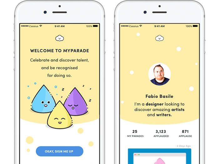
Image source: Cassius Kiani

It is a challenging task-they need to ensure their sites comply with traditional standards and that they load faster with no need for zooming or pinching.

The success of a website, however, depends on continuous streaming, and customers are becoming more and more frustrated that companies struggle to do business via mobile communication.

Tips for ‘mobilizing’ and personalizing the user experience

The focus is always on the user
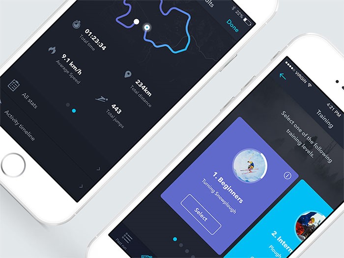
Image source: Filippo Chiumiento

We cannot talk about a universal UX simply because we are all different form each other.

Great apps should really consider their users’ personalities. They should research and gather data and they should customize the experience according to their users’ needs.

Take travel apps as an example – they ought to present attractive information even before we adjust searching settings because they know who we are, where we are, and how empowering our budget is.

Menus should have search options

Searching is a core element of good user experience. Therefore, such an option should be available everywhere. Your users need to be able to switch pages, to add or deduct content from the current page. Designers should pay attention to this because their main purpose is to make interaction easy and comfortable, which necessarily involves proper content division. From now on, it counts also for mobile systems.

Additionally, make sure the search field is visible. Put it in the menu or in a very striking position on the pages.

Remember – introducing search is not enough. It is just the beginning. You have to make sure it actually provides results. The results, on the other hand, should be logically ordered and accessible from desktops and mobile phones.

Finally, make sure your results are easily distinguished. One more thing about mobile UX related to search: having the option is just step one. Make sure your internal search result pages look great and are functional as well.

Apply the 80/20 rule
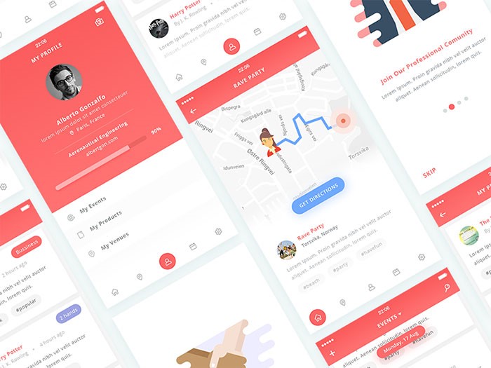
Image source: Rifai Muhamad

Most generally, 80% of your app’s users are about to use only 20% of its functionality. If not sure this is a valid rule, launch the service online, and observe how customers interact with it (in the case of mobile analytics difficulties, pay special attention to your mobile users). You will conclude which functionality is mostly applied so that you can cut the rest out and get as close to intuitive design as possible.

Keep forms short and simple
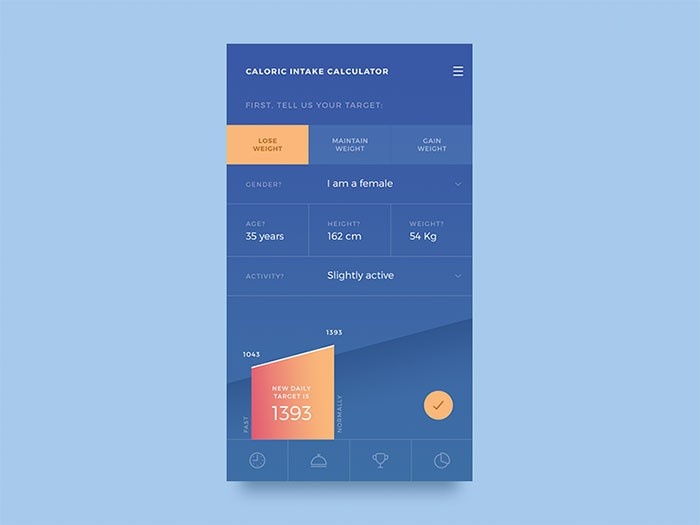
Image source: Alex Cristache

The same as with your desktop sites, mobile replications should not aspire for too much conversation, especially when we’re talking about forms. You need an app that summarizes information, buys or sells products or makes subscriptions through simple contact forms.

Think about it – what will your mobile UX look like if you introduce an 8-page long questionnaire? It will be ruined! “I’ll do that tomorrow on coffee time” – that’s exactly what users will say. And they won’t do it.

An optimal user experience takes care of size. Therefore, remove everything you wanted to know, but it wasn’t really necessary. Do they want a newsletter? Ask only for their electronic mails. Do they want to shop? Ask for the delivery and input address (and give them the chance to copy-paste the same information).

Start from scratch
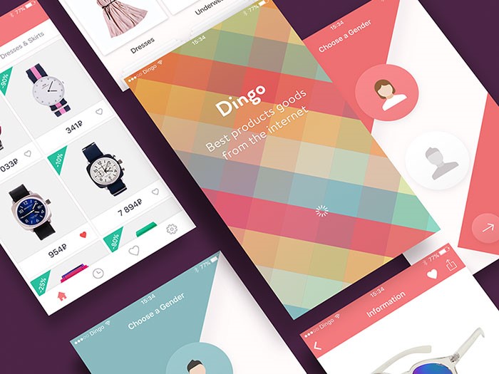
Image source: Alexander Zaytsev

Excellent apps start from the basics. The designer finds out what customers want and he adjusts the work to their requirements. Improvement comes second, whenever there is an affordable chance for improving your digital existence. Then, if it is a mobile idea, let it be a mobile idea! There is nothing that can make ideas so unique.

An app without content will simply not work

Additionally, too much content will be just as dysfunctional.

And we are not talking about not having content at all. We are talking about content that has not been exposed in a clear way. You may not have a searching tool or it may not work properly. You have to consider every option and to put content as close to your users’ view as possible. Again – filtering that provides low-quality results is equally bad as not having a filter at all.

Therefore, the same efforts apply to the search option-incredibly customized apps need incredibly customized searching features.

Consider interruption

One of the biggest drawbacks when designing for mobile systems is the unavoidable possibility for users to be distracted. They are almost all the time on their phones and there is naturally no chance that something will not interrupt their experience (either from the outside or within the phone itself).

You have to consider this option-maintain the app straightforward and the interface simple because it is the only way to keep users focused and engaged. Make sure that if they leave, they will come back and pick up from where they stopped. Therefore, divide content in small chunks and break larger tasks in no-time operations.

Introduce yourself properly
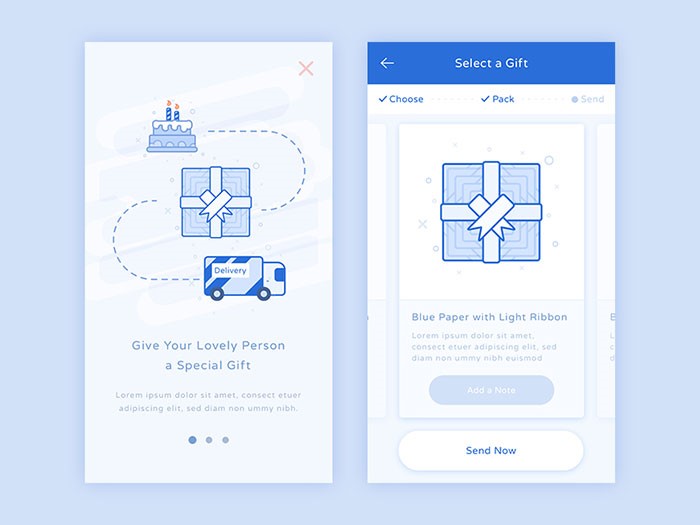
Image source: Ibnu Mas’ud

Appear friendly and really grateful for the fact that new customers visited you.

Assuming you’ve gotten to know your target users, the next thing to do is to let them know you. Charm them at first sight and convince them that it is a good decision to start using your site. You have to create a positive impression from the very first moment, instead of waiting for them to start searching. In fact, most clients base their entire experience on the first run they had on the site.

Presenting poor and empty screens to potential users is like signing a death sentence. Their first impression will be terrible and it will likely stay like that forever.

Don’t stop working on speed

Image source: Mike Voropaev

Speed is among most important factors for creating excellent user experience. Speed is what users mostly complain about, so every website is trying to improve it. The improvement goes mostly in two directions: optimization of images (even if everybody tries to hide instant images); and reduction of size.

However, remember that the loading speed on your website/app doesn’t depend only on your efforts. It is highly dependent on mobile connections too. We don’t always have WiFi or 4G and we have to be patient.

Most users adjust their browsing habits to the speed of their internet connection-if traveling on the subway, it’s not really recommendable to try and stream a three-hour movie. Instead, you can read a Wikipedia article or your daily horoscope. This is how it works-users decide!

Design will never be perfect enough
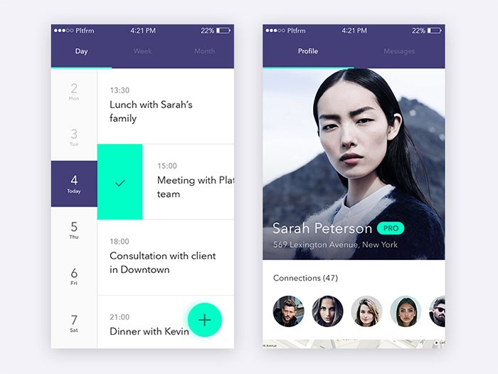
Image source: Jakub Reis

Even if you made it to the top of all lists and your users seem to adore you, there is a big chance you’ll discover flaws you weren’t really aware of. In fact, it is very probable those will be things you missed when developing the app or results of failing to adjust it to real-time needs.

There are also certain options that make sense when you don’t have a great budget for the app and no revenue, like using free fonts instead of premium ones.

However, it is not a justification for throwing out ideas that seem technically unfeasible at the moment – write them down and work out whether there is an alternative that can replace them, or save them for better days. The mobile world is constantly innovating, so the same way as inundated settings fail to work, futuristic ones may become real. The key is to adjust to the time being.

Remember – your app is a developing entity. It will draw analytical data, users’ feedback, and it will follow trends and breakthroughs. You have to make sure it is ready to provide better and better experience. Don’t think that you will only work hard on it around the launching date when you have all your checklists and plan with what needs to be done. 

Conclusion
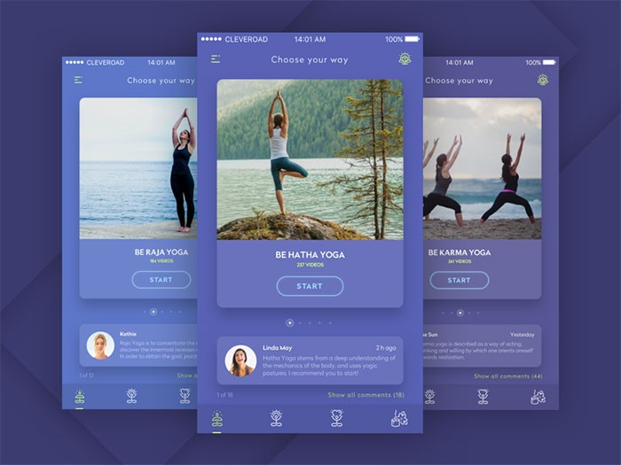
Image source: Veronika Bass

Try and create excellent mobile user interface which can respond to every need and it can act informatively in every phase of the purchase cycle. Don’t rely on trends which impose the ‘must go mobile’ mindset and think how your users want you to enhance their journey. This is the right approach for keeping customers on board, encouraging purchases, and breaking records.

The quality of your app depends on the quality of its UX design – it will either make it or break it. We think you know what you should do.


How to personalize the mobile experience for app users

Post pobrano z: How to personalize the mobile experience for app users

Mobile user experience somehow ‘imposed itself’ with all the development and improvement of mobile communication devices.

In fact, it is the quality of user experience that divides outstanding apps from their less outstanding counterparts.

The same factor enables startups to learn from big brands and to improve their products.

User experience for mobile applications – the key to success

UX seems to fit perfectly the development of mobile interaction. Customers cannot deny the fact that digital disruption is knocking out their loyalty, and mobile brands are gaining success. Instead, they are looking for a customized and stable experience that can always be upgraded.

Only a small part of them agree that channel interactions offered by companies are seamless. Established brands are working hard on triggering loyalty and improving their UX experiences to the level of impeccability.

Image source: Cassius Kiani

It is a challenging task-they need to ensure their sites comply with traditional standards and that they load faster with no need for zooming or pinching.

The success of a website, however, depends on continuous streaming, and customers are becoming more and more frustrated that companies struggle to do business via mobile communication.

Tips for ‘mobilizing’ and personalizing the user experience

The focus is always on the user

Image source: Filippo Chiumiento

We cannot talk about a universal UX simply because we are all different form each other.

Great apps should really consider their users’ personalities. They should research and gather data and they should customize the experience according to their users’ needs.

Take travel apps as an example – they ought to present attractive information even before we adjust searching settings because they know who we are, where we are, and how empowering our budget is.

Menus should have search options

Searching is a core element of good user experience. Therefore, such an option should be available everywhere. Your users need to be able to switch pages, to add or deduct content from the current page. Designers should pay attention to this because their main purpose is to make interaction easy and comfortable, which necessarily involves proper content division. From now on, it counts also for mobile systems.

Additionally, make sure the search field is visible. Put it in the menu or in a very striking position on the pages.

Remember – introducing search is not enough. It is just the beginning. You have to make sure it actually provides results. The results, on the other hand, should be logically ordered and accessible from desktops and mobile phones.

Finally, make sure your results are easily distinguished. One more thing about mobile UX related to search: having the option is just step one. Make sure your internal search result pages look great and are functional as well.

Apply the 80/20 rule

Image source: Rifai Muhamad

Most generally, 80% of your app’s users are about to use only 20% of its functionality. If not sure this is a valid rule, launch the service online, and observe how customers interact with it (in the case of mobile analytics difficulties, pay special attention to your mobile users). You will conclude which functionality is mostly applied so that you can cut the rest out and get as close to intuitive design as possible.

Keep forms short and simple

Image source: Alex Cristache

The same as with your desktop sites, mobile replications should not aspire for too much conversation, especially when we’re talking about forms. You need an app that summarizes information, buys or sells products or makes subscriptions through simple contact forms.

Think about it – what will your mobile UX look like if you introduce an 8-page long questionnaire? It will be ruined! “I’ll do that tomorrow on coffee time” – that’s exactly what users will say. And they won’t do it.

An optimal user experience takes care of size. Therefore, remove everything you wanted to know, but it wasn’t really necessary. Do they want a newsletter? Ask only for their electronic mails. Do they want to shop? Ask for the delivery and input address (and give them the chance to copy-paste the same information).

Start from scratch

Image source: Alexander Zaytsev

Excellent apps start from the basics. The designer finds out what customers want and he adjusts the work to their requirements. Improvement comes second, whenever there is an affordable chance for improving your digital existence. Then, if it is a mobile idea, let it be a mobile idea! There is nothing that can make ideas so unique.

An app without content will simply not work

Additionally, too much content will be just as dysfunctional.

And we are not talking about not having content at all. We are talking about content that has not been exposed in a clear way. You may not have a searching tool or it may not work properly. You have to consider every option and to put content as close to your users’ view as possible. Again – filtering that provides low-quality results is equally bad as not having a filter at all.

Therefore, the same efforts apply to the search option-incredibly customized apps need incredibly customized searching features.

Consider interruption

One of the biggest drawbacks when designing for mobile systems is the unavoidable possibility for users to be distracted. They are almost all the time on their phones and there is naturally no chance that something will not interrupt their experience (either from the outside or within the phone itself).

You have to consider this option-maintain the app straightforward and the interface simple because it is the only way to keep users focused and engaged. Make sure that if they leave, they will come back and pick up from where they stopped. Therefore, divide content in small chunks and break larger tasks in no-time operations.

Introduce yourself properly

Image source: Ibnu Mas’ud

Appear friendly and really grateful for the fact that new customers visited you.

Assuming you’ve gotten to know your target users, the next thing to do is to let them know you. Charm them at first sight and convince them that it is a good decision to start using your site. You have to create a positive impression from the very first moment, instead of waiting for them to start searching. In fact, most clients base their entire experience on the first run they had on the site.

Presenting poor and empty screens to potential users is like signing a death sentence. Their first impression will be terrible and it will likely stay like that forever.

Don’t stop working on speed

Image source: Mike Voropaev

Speed is among most important factors for creating excellent user experience. Speed is what users mostly complain about, so every website is trying to improve it. The improvement goes mostly in two directions: optimization of images (even if everybody tries to hide instant images); and reduction of size.

However, remember that the loading speed on your website/app doesn’t depend only on your efforts. It is highly dependent on mobile connections too. We don’t always have WiFi or 4G and we have to be patient.

Most users adjust their browsing habits to the speed of their internet connection-if traveling on the subway, it’s not really recommendable to try and stream a three-hour movie. Instead, you can read a Wikipedia article or your daily horoscope. This is how it works-users decide!

Design will never be perfect enough

Image source: Jakub Reis

Even if you made it to the top of all lists and your users seem to adore you, there is a big chance you’ll discover flaws you weren’t really aware of. In fact, it is very probable those will be things you missed when developing the app or results of failing to adjust it to real-time needs.

There are also certain options that make sense when you don’t have a great budget for the app and no revenue, like using free fonts instead of premium ones.

However, it is not a justification for throwing out ideas that seem technically unfeasible at the moment – write them down and work out whether there is an alternative that can replace them, or save them for better days. The mobile world is constantly innovating, so the same way as inundated settings fail to work, futuristic ones may become real. The key is to adjust to the time being.

Remember – your app is a developing entity. It will draw analytical data, users’ feedback, and it will follow trends and breakthroughs. You have to make sure it is ready to provide better and better experience. Don’t think that you will only work hard on it around the launching date when you have all your checklists and plan with what needs to be done. 

Conclusion

Image source: Veronika Bass

Try and create excellent mobile user interface which can respond to every need and it can act informatively in every phase of the purchase cycle. Don’t rely on trends which impose the ‘must go mobile’ mindset and think how your users want you to enhance their journey. This is the right approach for keeping customers on board, encouraging purchases, and breaking records.

The quality of your app depends on the quality of its UX design – it will either make it or break it. We think you know what you should do.

How to Improve User Experience Design: Tips to Increase Conversion Rates

Post pobrano z: How to Improve User Experience Design: Tips to Increase Conversion Rates

Image by David Schwarzenberg from Pixabay

No one can deny that UX (user experience) is the foundation of any website. This is the main reason why many website owners always look for ways to improve it. Some even spend a lot of money on design because of it.

So, what is UX design exactly? And what is the difference between user interface vs user experience?

UX design is the process of improving user satisfaction through various aspects of a website. These enhancements usually deal with usability, efficiency, and accessibility of a website.

On the other hand, the user interface consists of the elements that a user interacts with when using a digital website or service. Of course, the user interface is a part of the user experience.

Conversion rates are directly proportional to the UX design of a website. After all, according to the latest sales stats, as much as 83% of customers would give a recommendation after a positive experience with a brand.

In other words, a good UX design means much more than an intuitive user flow and stunning layout. 

However, what’s even more important is that a great UX will instantly boost the experience visitors are having while on your website. And that can significantly help with conversions in your sales funnel.

If you are interested in learning how to improve user experience with some great design tips, keep reading.

Create a straightforward call-to-action button

Call-to-action (CTA) buttons are used to attract users towards conversion on a website.

The way people implement these buttons can vary. However, some of the most common ones include:

  • Starting a trial.
  • Signing up for updates.
  • Downloading the app.
  • Booking a consultation.

The CTA on your website needs to be placed on every page of the website. It has been recorded that websites that have a clear CTA have higher conversion rates.

Furthermore, if your website is designed in folds, it is essential to keep your CTA above the fold so that it is easy for users to see.

Bear in mind the following:

  • Be careful when picking the color for your CTA. Use colors that make the CTA stand out and make them big enough to be easily spotted.
  • When writing your CTA text, make sure that it is action-oriented. Do not use passive verbs in the text. The text needs to be subtle but still active enough to prompt the user to take action.
  • Be careful not to include more than five words when writing your CTA.

All in all, a clear and visible CTA is important if you want to improve UX.

All your website pages have to be consistent

When it comes to user experience, consistency means making everything on your website match. 

This includes:

  1. Heading sizes
  2. Font choices
  3. Coloring
  4. Button styles
  5. Spacing
  6. Design elements
  7. Illustration styles
  8. Photo choices

All of the elements need to be themed to make the overall design coherent between pages and on the same page.

For users to have a nice experience as they navigate your website, it is important that they are aware of the fact that they are still on your website. Hence, drastic design changes from one page to the other can make visitors feel lost and confused.

If you need to rearrange elements or add new ones to your website, consider utilizing the power of the drag and drop WordPress page builders.

WordPress is the most widely used website-building platform and the drag and drop feature makes it really easy for non-experts to make design changes.

Fix all 404s

Image by Mocho from Pixabay

Although search engines don’t punish you harshly for soft 404 errors (page not found), a user will.

When a website visitor clicks on an image or link, they expect it to take them to the next place they want to go. It will annoy them if they find a 404 error page. 

Also, it will definitely make them think about whether spending time on your website was a good decision. After all, they can always go to another website for a faster solution. 

Error pages are very frustrating and they completely disrupt the user’s journey throughout your website. Next to slow page load time, they are at the top of the list of unwanted aspects of a website.

If you want to check for 404s, you can set up Google Webmaster tools on your website and check crawl errors. 

Additionally, you can also ensure that when a visitor lands on a 404, the page provides them with the option to get back on track.

Speed up page loading time

It is easy to get frustrated when a web page is loading slowly. This can lead to visitors abandoning your website and moving on to another website where they can enjoy faster loading times.

In general, if a page takes more than 2 seconds to load, the users are most likely to leave the website. Depending on the loading time of your website, users decide if they would like to further visit your website or move to another site.

Remember, improving the website load speed for desktop is not enough. You need to optimize for mobile users too. Since the mobile-first approach is promoted by Google, it is crucial to optimize and design your webpage for mobile users and show you care about them.

Thanks to Google and its tool called PageSpeed Insights, if you enter the URL of the site you want to check, Google will highlight the areas where your page speed is weak.

On top of that, the tool provides suggestions on how you can improve the loading time.

Authentic images are better than stock photos

Images play a significant role in making a website look more professional and pleasing. However, you need to pay attention here too since your photos have to fit the overall design of your pages.

Avoid stock photos for a couple of very simple reasons. Yes, they are cheap (and often free), they are easy to use, but they may do more harm than good.

Stock images look professional. However, your website visitors will figure out these are stock images and thus lose interest before too long. Also, stock images are overused and don’t appeal to the users.

On the other hand, original photos draw more website visitors. The reason for this is that they have a personal approach and the user can easily connect. 

Another thing to bear in mind is that using stock photos shows that you have not invested too much effort in designing the website. Therefore, it won’t look unique, as the visitors might have already seen it on another website.

Therefore, try to use authentic images, no matter how basic and simple they might look.

Be consistent even with your outreach efforts

Image by Andrian Valeanu from Pixabay

Finally, just because outreach campaigns aren’t necessarily something directly related to the website design, it doesn’t mean that the messages you send out should look different and feel different from the content of your website.

In other words, after you learn how to create a newsletter, you should think about conversions and efficient converting email design.

Therefore, you also need to follow some email design practices that can help with UX.

White space

In order for your email design to be appealing, you need an adequate amount of white space around your CTA button.

This use of white space is meant to signal the importance of a given CTA button. Not only will your email look nice this way, but it will also guide a reader’s eyes towards the button.

Directional cues

If you want an effective and simple way to guide your readers to the crucial part of your email, you need to use directional cues. 

These cues will help a person to move in the direction of your CTA, which is, generally speaking, the whole point of the email. Consequently, this enables the user to easily follow the action process, which results in a higher click-through rate for your business.

Therefore, it shouldn’t be emphasized how important it is to use the directional cues in your emails and thus integrate them into your larger campaign and journey for the user.

How to Improve User Experience Design: Tips to Increase Conversion Rates

Post pobrano z: How to Improve User Experience Design: Tips to Increase Conversion Rates

Image by David Schwarzenberg from Pixabay

No one can deny that UX (user experience) is the foundation of any website. This is the main reason why many website owners always look for ways to improve it. Some even spend a lot of money on design because of it.

So, what is UX design exactly? And what is the difference between user interface vs user experience?

UX design is the process of improving user satisfaction through various aspects of a website. These enhancements usually deal with usability, efficiency, and accessibility of a website.

On the other hand, the user interface consists of the elements that a user interacts with when using a digital website or service. Of course, the user interface is a part of the user experience.

Conversion rates are directly proportional to the UX design of a website. After all, according to the latest sales stats, as much as 83% of customers would give a recommendation after a positive experience with a brand.

In other words, a good UX design means much more than an intuitive user flow and stunning layout. 

However, what’s even more important is that a great UX will instantly boost the experience visitors are having while on your website. And that can significantly help with conversions in your sales funnel.

If you are interested in learning how to improve user experience with some great design tips, keep reading.

Create a straightforward call-to-action button

Call-to-action (CTA) buttons are used to attract users towards conversion on a website.

The way people implement these buttons can vary. However, some of the most common ones include:

  • Starting a trial.
  • Signing up for updates.
  • Downloading the app.
  • Booking a consultation.

The CTA on your website needs to be placed on every page of the website. It has been recorded that websites that have a clear CTA have higher conversion rates.

Furthermore, if your website is designed in folds, it is essential to keep your CTA above the fold so that it is easy for users to see.

Bear in mind the following:

  • Be careful when picking the color for your CTA. Use colors that make the CTA stand out and make them big enough to be easily spotted.
  • When writing your CTA text, make sure that it is action-oriented. Do not use passive verbs in the text. The text needs to be subtle but still active enough to prompt the user to take action.
  • Be careful not to include more than five words when writing your CTA.

All in all, a clear and visible CTA is important if you want to improve UX.

All your website pages have to be consistent

When it comes to user experience, consistency means making everything on your website match. 

This includes:

  1. Heading sizes
  2. Font choices
  3. Coloring
  4. Button styles
  5. Spacing
  6. Design elements
  7. Illustration styles
  8. Photo choices

All of the elements need to be themed to make the overall design coherent between pages and on the same page.

For users to have a nice experience as they navigate your website, it is important that they are aware of the fact that they are still on your website. Hence, drastic design changes from one page to the other can make visitors feel lost and confused.

If you need to rearrange elements or add new ones to your website, consider utilizing the power of the drag and drop WordPress page builders.

WordPress is the most widely used website-building platform and the drag and drop feature makes it really easy for non-experts to make design changes.

Fix all 404s

Image by Mocho from Pixabay

Although search engines don’t punish you harshly for soft 404 errors (page not found), a user will.

When a website visitor clicks on an image or link, they expect it to take them to the next place they want to go. It will annoy them if they find a 404 error page. 

Also, it will definitely make them think about whether spending time on your website was a good decision. After all, they can always go to another website for a faster solution. 

Error pages are very frustrating and they completely disrupt the user’s journey throughout your website. Next to slow page load time, they are at the top of the list of unwanted aspects of a website.

If you want to check for 404s, you can set up Google Webmaster tools on your website and check crawl errors. 

Additionally, you can also ensure that when a visitor lands on a 404, the page provides them with the option to get back on track.

Speed up page loading time

It is easy to get frustrated when a web page is loading slowly. This can lead to visitors abandoning your website and moving on to another website where they can enjoy faster loading times.

In general, if a page takes more than 2 seconds to load, the users are most likely to leave the website. Depending on the loading time of your website, users decide if they would like to further visit your website or move to another site.

Remember, improving the website load speed for desktop is not enough. You need to optimize for mobile users too. Since the mobile-first approach is promoted by Google, it is crucial to optimize and design your webpage for mobile users and show you care about them.

Thanks to Google and its tool called PageSpeed Insights, if you enter the URL of the site you want to check, Google will highlight the areas where your page speed is weak.

On top of that, the tool provides suggestions on how you can improve the loading time.

Authentic images are better than stock photos

Images play a significant role in making a website look more professional and pleasing. However, you need to pay attention here too since your photos have to fit the overall design of your pages.

Avoid stock photos for a couple of very simple reasons. Yes, they are cheap (and often free), they are easy to use, but they may do more harm than good.

Stock images look professional. However, your website visitors will figure out these are stock images and thus lose interest before too long. Also, stock images are overused and don’t appeal to the users.

On the other hand, original photos draw more website visitors. The reason for this is that they have a personal approach and the user can easily connect. 

Another thing to bear in mind is that using stock photos shows that you have not invested too much effort in designing the website. Therefore, it won’t look unique, as the visitors might have already seen it on another website.

Therefore, try to use authentic images, no matter how basic and simple they might look.

Be consistent even with your outreach efforts

Image by Andrian Valeanu from Pixabay

Finally, just because outreach campaigns aren’t necessarily something directly related to the website design, it doesn’t mean that the messages you send out should look different and feel different from the content of your website.

In other words, after you learn how to create a newsletter, you should think about conversions and efficient converting email design.

Therefore, you also need to follow some email design practices that can help with UX.

White space

In order for your email design to be appealing, you need an adequate amount of white space around your CTA button.

This use of white space is meant to signal the importance of a given CTA button. Not only will your email look nice this way, but it will also guide a reader’s eyes towards the button.

Directional cues

If you want an effective and simple way to guide your readers to the crucial part of your email, you need to use directional cues. 

These cues will help a person to move in the direction of your CTA, which is, generally speaking, the whole point of the email. Consequently, this enables the user to easily follow the action process, which results in a higher click-through rate for your business.

Therefore, it shouldn’t be emphasized how important it is to use the directional cues in your emails and thus integrate them into your larger campaign and journey for the user.

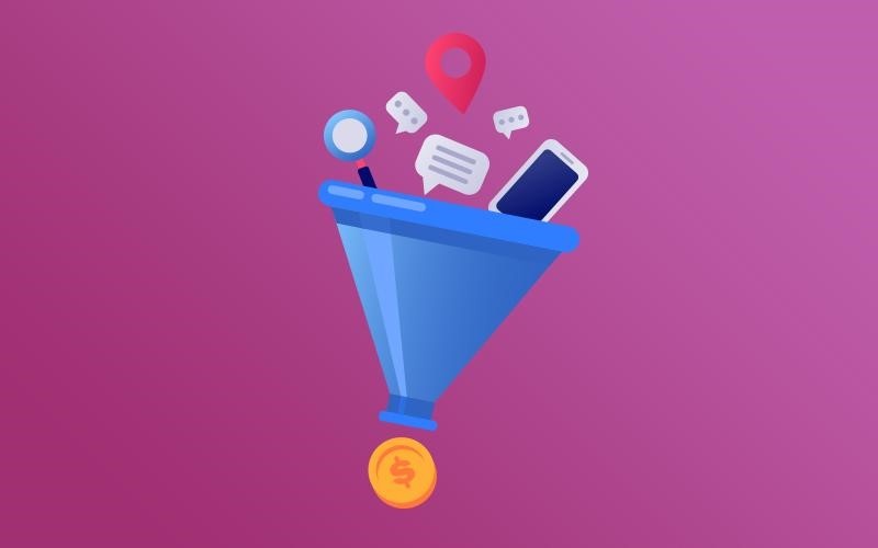
How to Design Sales Funnels That Convert

Post pobrano z: How to Design Sales Funnels That Convert

According to Pardot, 79% of marketing campaigns never lead to purchases. Only 4% of website visitors make up their mind to make a purchase.

So you ask yourself, where does the other 96% go? Well, they never buy, but there is something you can do.

What they need is encouragement and nurturing. Whilst this is what sales funnels essentially try to do, it’s not as easy as you may think.

It is one thing to build a sales funnel but entirely another thing to design a funnel pathway that converts as many visitors to buyers as possible.

Here are some tips to show you what I mean.

1. Repositioning your Call-to-Action Button

The call-to-action is a vital feature that shifts visitors from one end of the funnel to the other. It is what moves your subscribers to buyers. How you approach the CTA will determine your conversion rate in a great deal.

For too long, content marketers have been making a mistake of using just one CTA at the end of the funnel. As readers’ attention spans are continuously changing, this is not enough. Most of them only reach to the middle of the process before something else piques their attention.

It’s advisable to also place the CTA at the top and bottom of the funnel. The one placed on the top of the funnel does the primary task of calling a subscriber to join a mailing list. The one at the bottom encourages the visitors to sign up for a service or buy a product.

In addition, the CTA should make it easy for the visitors to perform the action you want them to.  Create an easy-to-use form and distribute it over the page.

2. Working on Your Landing Page

Landing pages are excellent ways to promote every stage of your funnel. Since sales funnels are divided into three parts, you should have a landing page for each level.

This gives you room to increase the number of people you can capture. One landing page that works for the whole website will not yield the same results.

In all the steps, the sales funnel should follow this procedure;

  1. Attract customers
  2. Engage the customer
  3. Make the customers buy

The result you get here will help you analyze your business and the areas you need to improve.

3. Using the Right Navigation Layout

Many visitors use their phones to access websites. According to Smashing magazine, it’s because of this reason that website content should be kept minimum.

But because we are talking about designing a converting sales funnel, you must include all the details that will make or break their purchasing decision.

4. Eliminating Distractions

You might have a perfectly curated sales funnel, but if it has a lot of distractions, you automatically interfere with the design flow.

People make decisions quickly on whether they should stay on a website longer or not. If your page has a lot of distracting features like sidebars, top navigations, or too many images, visitors are likely to bounce off your site.

Every section within the funnel should answer whether it is the final stop or leads to another page. If there is anything else that will distract your visitors or direct them to click away, delete them.

Conclusion

You will agree that coming up with an effective sales funnel is an uphill battle. However, they still remain an essential weapon in content marketing strategies. If you need some inspiration have a look at these sales funnel templates from Performance Funnels. To convert the most visitors, it advisable that you take into account even the smallest things. It’s such alterations that will help you maximise sales at the end of the day.

5 Important Tips When Building Your First Mobile App

Post pobrano z: 5 Important Tips When Building Your First Mobile App

Building a mobile application is a complex process, and mistake can be costly in time and money. To make sure that your mobile app projects are a success, here are a few tips that will be helpful.

1. Plan Ahead

When building anything complex, you should never start without a plan. Building a mobile app is no exception. To plan ahead for an app, you’ll have to do extensive thinking to make sure you are not forgetting any important functionalities. Some of the steps you should follow include:

  1. Brainstorming: get together with your team and go wild while looking for ideas. Once you feel like you went through all important ideas, organize the results of your brainstorming sessions by structuring the features you keep and eliminating useless ones.
  2. Do your research: chances are that you are not the first one to have had the idea for the app you are about to create. Search for apps that serve a similar purpose, or at least that target similar audiences if your idea is truly unique. Try to understand what makes the app successful (or not) and look at the way they are doing business (promotion, pricing,…).
  3. Create a comprehensive final list of functional and technical specifications: a crucial step to ensure you will not have too many surprises along the way while developing the app.
  4. Create an app flowchart: maybe the most important step of all. The app flowchart will give you the opportunity to identify the most important “nodes” in your app, as well as the relationship between various functionalities.
  5. List your technical challenges: if you practice the “Getting Things Done” methodology by David Allen, you already know that listing your technical challenges will actually help you solve it by already putting it in your mind, as well as eliminating the surprise effect.

2. Build a Wireframe

As counter-intuitive as it may sound on a design blog, a design-free environment will allow you to create better designed apps. In fact, working on a wireframe will force you to focus on the functional parts of your app design, and prevent you from “prettifying” things to hide your apps flaws.

To make your wireframes more efficient, start by sketching it on paper to get your ideas flowing and work quicker. Try to go for as many ideas as possible.

Use a grid in your wireframes already, grids will make your layout work easier and more stable. Also, try to insert the real content early-on in the process. Dummy content actually doesn’t add any value to the app creation process.

If possible, I would also suggest to try to go colorless. It may be harder, but this type of constrain forces you to be even more sure of the way you lay out the functionalities. When working with a team, you should also annotate your wireframes to better communicate with others.

3. Go for a Quick MVP

Once your mobile app’s preliminary work has been done thoroughly, you should try to go for a quick MVP for your mobile app.

There are several reasons for trying to release quickly and often. First, it can give you a competitive edge on other mobile apps similar to yours. It also gives you the opportunity to quickly understand what your users like or not by observing their behavior and collecting their feedback. At last but not least, it will help you avoid heavy development costs on features that you would have abandoned anyway.

Obviously, this advice doesn’t mean that you should release unfinished work. Releasing with less features should never equate with buggy software.

4. Test, Test, Test, and Test Some More

It is important to understand that there is a major difference between what you think that your users are going to do, and how they effectively behave.

For that reason, testing is a crucial part of app development. Organize user testing sessions where you ask them to perform some tasks and observe their behavior. All data and feedbacks should be collected for analysis and later use.

5. Revise and Maintain

Of course, testing is not useful if it’s not followed by revisions on the app. You need to take your user testing into account and make changes accordingly.

On the longer term, it is important to keep your mobile app updated and regularly fix bugs and add new features. Through the download platforms, you will get regular feeback and comments from your users, you should show them that you care and use their experience to make your software better.

How to secure a website and be foolproof against surprises

Post pobrano z: How to secure a website and be foolproof against surprises

The internet is an excellent resource for all
kinds of information. However, with all of its advantages, there are also some
things that you need to pay attention too. Knowing how to secure a website is a
must, and anyone with an online identity needs to pay attention to this.

As the internet can also be a dangerous place
for websites knowing how to protect them is an investment in the long run. As
an owner, knowing that somebody can wipe out your entire page feels quite bad.

What is needed is to add protection that keeps
out hackers, bugs, or any harmful things. If this doesn’t happen, the entire
data can be at risk, the site can crash, and you could lose money.

Why should you know how to secure a website?

Even if you have a small website that you
consider not relevant for a hacker, websites are still compromised all the
time.

Most of the problems that appear are not
related to data or to mess up the layout of a website. The main reason is to
use your server as an email relay for spam or to add files of an illegal
nature. Other things hackers do is to compromise machines, a well-known one
being to mine for Bitcoins using your hardware.

How can you secure your site?

One of the best ways to do this is by going
for simple choices. You know that you should keep the website safe from
surprises, but when you go down in the rabbit hole of a website, You can
discover difficult concepts.

No worries, there are still some basic steps
that you can take together with decisions so let’s see them.

Password and protection

First of all, start by having more complex
passwords than in general. Avoid using the same old one for your accounts and
especially your website’s administrator login. Never use easy to remember
passwords because they can be even guessed sometimes by hackers.

Do not use words that relate to your family or
your name. Passwords that contain your birthday are so easy to hack that you
can’t even complain that you did not expect that to happen.

Also, when you access your website, use a
secure complex password that you can’t guess. A single user’s weak password can
make your entire website be at risk, together with all of its registered users.

Keep everything up-to-date

This can seem quite obvious, but sometimes
people just don’t do it. Make sure that all of the software that you are using
related to your website is on its latest version.

A lot of them are open-source, so this means
that hackers can check the source code and find vulnerabilities. This is how
they usually manage to get inside of your website and take advantage of it. So,
whenever you think it’s
a good idea to downgrade WordPress
, don’t. New versions usually fix
vulnerabilities.

Choose a reputable hosting provider

Today, there are many hosting providers that
you can choose from. Even if most of them are safe and have many protections,
they can still get hacked. This is probably one of the current disadvantages;
you can’t control how secure your hosting server is. The only thing you can
control is who you choose as your host provider.

It’s probably in your interest to go for
reputable, world-class hosting providers that invest big amounts in providing
the best services.

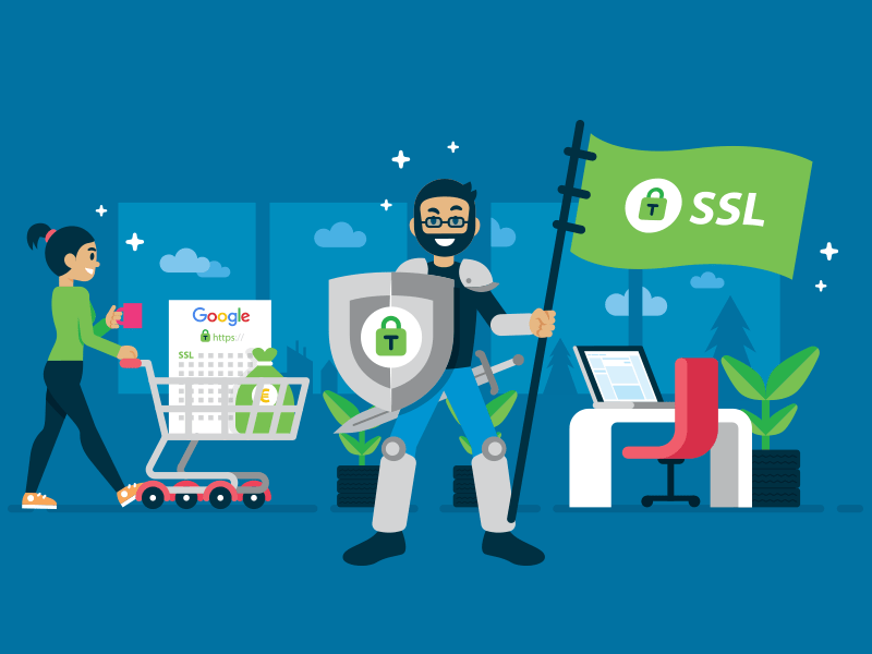
Go for HTTPS and SSL

If you don’t know what HTTP and SSL are, you
need to find out, especially if you are a site owner. People that are running
online shops and have transactions made need to pay even more attention to
their protection.

SSL certificates are obtained from reputable
providers and offer great protection. Understanding how to secure a website
should always include an SSL certificate.

Install security plugins

If you built your website with a content
management system (CMS), you could add security plugins that prevent your
website from getting hacked. Each of the main CMS options has security plugins
available, and a lot of them are free.

Security plugins for WordPress:

Security options for Magento:

Security extensions for Joomla:

These options are focused on the security
vulnerabilities that each of the platforms has.

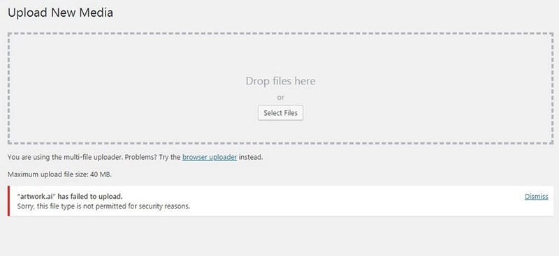
Prevent users from uploading files

What this means is that people don’t get forms
through which they can upload files. Limiting forms of how users can upload
files to just photo extensions can be a solution. Sure, they’ll receive more of
those „this
file is not permitted
” errors. But you’ll be safer.

Another one is to add an email address to your
contact page where users can email their files rather than sending them
directly through the website.

Beware of error messages

Be careful about how much information you are
giving in the error messages that your website has. Only give minimal errors to
the users. Sometimes errors can send sensitive information like API keys or
database passwords.

If you don’t change them, you risk getting
certain attacks on your website. This information is good to know, and if you
could do a check to it for sure, it is going to be only in your interest.

Watch out when opening emails

Many attacks from hackers take place by using
emails. They send all kinds of viruses, and they can target you or your
employees, for example.

So the entire team needs
to double-check when they open an email
because you don’t want to
compromise the security of your website due to a virus that is ready to mess up
your online presence.

Secure data using VPN

Even if there are many options for safeguards,
the best one to secure your data transmission is using VPN. It is a great
service that is designed to make sure that all of your data gets routed only
through secure channels and that they are highly encrypted.

Create backups regularly

If you don’t do it, now is the time to start.
A backup can help you recover fully if any of your website content gets
damaged. There are lots
of options out there
to try.

What is cool now is that you can set the
frequency of how often they are getting done. So for sure, this is another
useful tip on how to secure a website, especially if this is the first time
that you are doing it.

Conclusion

In conclusion, understanding how to secure a
website is all about having good practices. Simple solutions are, most of the
time, the efficient ones. This is why the ones that you can see in this article
are easy to use. So the best way to start your own check is by seeing if you
are applying all of them.

Make a list of what your website is doing now
from a protection point of view. It’s better to invest some time and energy now
when you can and not after you’ve been targeted by hackers.

How to secure a website and be foolproof against surprises

Post pobrano z: How to secure a website and be foolproof against surprises

The internet is an excellent resource for all
kinds of information. However, with all of its advantages, there are also some
things that you need to pay attention too. Knowing how to secure a website is a
must, and anyone with an online identity needs to pay attention to this.

As the internet can also be a dangerous place
for websites knowing how to protect them is an investment in the long run. As
an owner, knowing that somebody can wipe out your entire page feels quite bad.

What is needed is to add protection that keeps
out hackers, bugs, or any harmful things. If this doesn’t happen, the entire
data can be at risk, the site can crash, and you could lose money.

Why should you know how to secure a website?

Even if you have a small website that you
consider not relevant for a hacker, websites are still compromised all the
time.

Most of the problems that appear are not
related to data or to mess up the layout of a website. The main reason is to
use your server as an email relay for spam or to add files of an illegal
nature. Other things hackers do is to compromise machines, a well-known one
being to mine for Bitcoins using your hardware.

How can you secure your site?

One of the best ways to do this is by going
for simple choices. You know that you should keep the website safe from
surprises, but when you go down in the rabbit hole of a website, You can
discover difficult concepts.

No worries, there are still some basic steps
that you can take together with decisions so let’s see them.

Password and protection

First of all, start by having more complex
passwords than in general. Avoid using the same old one for your accounts and
especially your website’s administrator login. Never use easy to remember
passwords because they can be even guessed sometimes by hackers.

Do not use words that relate to your family or
your name. Passwords that contain your birthday are so easy to hack that you
can’t even complain that you did not expect that to happen.

Also, when you access your website, use a
secure complex password that you can’t guess. A single user’s weak password can
make your entire website be at risk, together with all of its registered users.

Keep everything up-to-date

This can seem quite obvious, but sometimes
people just don’t do it. Make sure that all of the software that you are using
related to your website is on its latest version.

A lot of them are open-source, so this means
that hackers can check the source code and find vulnerabilities. This is how
they usually manage to get inside of your website and take advantage of it. So,
whenever you think it’s
a good idea to downgrade WordPress
, don’t. New versions usually fix
vulnerabilities.

Choose a reputable hosting provider

Today, there are many hosting providers that
you can choose from. Even if most of them are safe and have many protections,
they can still get hacked. This is probably one of the current disadvantages;
you can’t control how secure your hosting server is. The only thing you can
control is who you choose as your host provider.

It’s probably in your interest to go for
reputable, world-class hosting providers that invest big amounts in providing
the best services.

Go for HTTPS and SSL

If you don’t know what HTTP and SSL are, you
need to find out, especially if you are a site owner. People that are running
online shops and have transactions made need to pay even more attention to
their protection.

SSL certificates are obtained from reputable
providers and offer great protection. Understanding how to secure a website
should always include an SSL certificate.

Install security plugins

If you built your website with a content
management system (CMS), you could add security plugins that prevent your
website from getting hacked. Each of the main CMS options has security plugins
available, and a lot of them are free.

Security plugins for WordPress:

Security options for Magento:

Security extensions for Joomla:

These options are focused on the security
vulnerabilities that each of the platforms has.

Prevent users from uploading files

What this means is that people don’t get forms
through which they can upload files. Limiting forms of how users can upload
files to just photo extensions can be a solution. Sure, they’ll receive more of
those „this
file is not permitted
” errors. But you’ll be safer.

Another one is to add an email address to your
contact page where users can email their files rather than sending them
directly through the website.

Beware of error messages

Be careful about how much information you are
giving in the error messages that your website has. Only give minimal errors to
the users. Sometimes errors can send sensitive information like API keys or
database passwords.

If you don’t change them, you risk getting
certain attacks on your website. This information is good to know, and if you
could do a check to it for sure, it is going to be only in your interest.

Watch out when opening emails

Many attacks from hackers take place by using
emails. They send all kinds of viruses, and they can target you or your
employees, for example.

So the entire team needs
to double-check when they open an email
because you don’t want to
compromise the security of your website due to a virus that is ready to mess up
your online presence.

Secure data using VPN

Even if there are many options for safeguards,
the best one to secure your data transmission is using VPN. It is a great
service that is designed to make sure that all of your data gets routed only
through secure channels and that they are highly encrypted.

Create backups regularly

If you don’t do it, now is the time to start.
A backup can help you recover fully if any of your website content gets
damaged. There are lots
of options out there
to try.

What is cool now is that you can set the
frequency of how often they are getting done. So for sure, this is another
useful tip on how to secure a website, especially if this is the first time
that you are doing it.

Conclusion

In conclusion, understanding how to secure a
website is all about having good practices. Simple solutions are, most of the
time, the efficient ones. This is why the ones that you can see in this article
are easy to use. So the best way to start your own check is by seeing if you
are applying all of them.

Make a list of what your website is doing now
from a protection point of view. It’s better to invest some time and energy now
when you can and not after you’ve been targeted by hackers.

The 2020 WordPress Plugin Hacking Debacle

Post pobrano z: The 2020 WordPress Plugin Hacking Debacle

By now, anyone who has the internet has heard about how hackers targeted WordPress plugins during January and February 2020. Quite understandably, this hack job left many WordPress users wary about the damage done. For one of the most prevalent website template providers on the planet, this was an eye-opener.

This hack job was also
a heads-up for WordPress customers to keep their plugins updated. To avoid future security risks, customers should take the plunge and invest in free or
paid security plugins. For some business owners, these hack jobs may be a
simple annoyance, but for others, this type of security breach can be costly.

Which plugins were besieged by hackers?

Nefarious hackers had a field day of targeting the most vulnerable plugins they could identify on WordPress. They made a point of honing in on susceptible plugins which contained pre-identified security defects. These plugins had been newly patched to eliminate bugs. Either that or the hackers were able to unearth ‘zero-day exploits’ in a range of these add-ons.

These ‘zero-day exploits’ relate to weak areas in plugins that the developer has overlooked or is unaware of. A lack of knowledge of vulnerability also means that the developer does not have a patch for that particular plugin.

Some of the plugins worst hit were:

  • Duplicator – the worst hit with over 1 million installations compromised
  • ThemeGrill Demo Importer – attracted 200k hits
  • Async JavaScript – over 100k hits
  • WP Database Reset – 80k hits
  • Profile Builder Plugin – approximately 65k hits
  • Modern Events Calendar Lite – 40k hits
  • Flexible Checkout Fields for WooCommerce – 20k hits
  • 10Web Map Builder for Google Maps – 20k hits

Several other plugins
were also impacted, including ThemeREX Addons, CP Contact Form with PayPal and Simple Fields.

WordPress hacker plugin fallout

Reports initially suggested
that up to 2,000 customer websites were breached by hackers. Other than the plugins affected as indicated above, traffic
was also rerouted to scam sites. On unwittingly selecting installed reroutes, visitors found themselves
being presented with unexpected results. These included bogus survey requests,
free gifts, false downloads of Adobe Flash Player and unsolicited subscriptions
for announcements.

Malicious
JavaScript was used to infect vulnerable add-ons to redirect traffic, insert
other malware to impact theme files, and gain unauthorized access to customer
files. Hackers increased the damage implemented by creating plugin directories
that were fake. As a result, WordPress encouraged website owners to disallow
primary folder modification to minimize further potential risk.

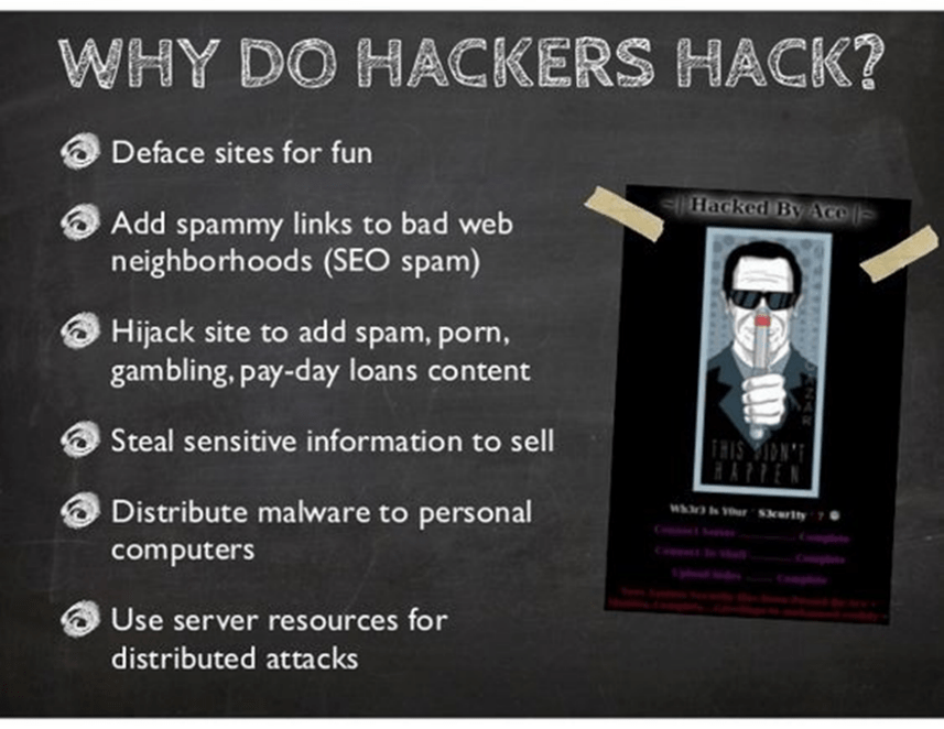
Why do hackers hack?

Some do it for
fun, because they can, because they are malicious, can gather personal details
for gain, or because they want to claim some sort of ransom from their victims.

To place
hacking in perspective, a study by Juniper Research forecast that hacking would cost up to $2 trillion
during 2019.

A large 43 percent of cybercrimes are aimed at small businesses.

A study conducted at Maryland university indicated that a cyber-attack occurs every 39 seconds.

More than 230,000 pieces of malware are generated daily.

While there is
no need to panic in the face of these figures, necessary precautions are needed
to protect your website and your personal information.

Discovered unwanted intrusions on your website?

It is scary to find
that your website has been hacked. If you have web development skills and are
technically skilled, you’ll probably know what the best course of action is.

For the web
development novices, the best advice is also to – stay calm, and look for these
clues that your website has been compromised:

  • the most obvious clue – you cannot log into your own site
  • the site is unusually sluggish
  • you suddenly decide it might be a good idea to look at the dashboard for user accounts and see that you have attracted some foreign interest – unwelcome users
  • you receive messages of site re-directions from visitors, Google hacking notification, site suspension
  • your site is blacklisted on search engines because it definitely has been hacked, or is ranked as promoting the sale of illegal pharmaceuticals
  • antivirus and malware warnings from your installed software or warnings from site visitors

You will be in a good position to get your website operational if you take a deep breath. Place your site in maintenance mode, roll up your sleeves and get ready for business again.

Fix the mess made by the hackers

You can clean up your
site by following some basic steps. Backup, scan, do a deep clean – then take
prevention measures related to what originally instigated site susceptibility.

Site backup. Do this after you have placed your site in maintenance mode, and after you have been able to log in. This is a precaution so that you don’t lose data unnecessarily with a cleanup plugin.

Pick a security add-on. You can look through this list and pick a malware plugin to deliver a  deep scan. MalCare is recommended for an automatic site cleanup to ward off further attacks. This plugin prompts a backup through BlogVault, prior to cleanup.

Download MalCare, install
and scan
. After selecting
MalCare, follow the steps to create your account prior to being allowed to
install this add-on. After installation, you can open this program and follow
the prompts to begin a scan.

Select autoclean. The plugin will indicate the number of
vulnerabilities detected. Simply pick autoclean to remove hacked files and
malicious scripts. Choose the ‘public_html’ option, using your host or server
name, FTP type, user name, and password. Follow these steps to retrieve
this information if it is not readily available. Select ‘Apply Fix’.

Remove vulnerabilities
and install security.
Follow this link to remove vulnerabilities, and make safe updates to your
website.

A thorough cleanup. Do another scan. Make another backup once your site has been cleaned. Activate the add-ons that you want and remove those that you are not using. Create complex passwords (write these down in a safe place offline). Installing an audit plugin will help keep tabs on-site activity, alerting you to unwanted changes.

Run updates for other
add-ons. Send a request to Google to whitelist your site if needed. Check if
your host has suspended your site. Contact them if it has been so that you can
get back to business.

Moving forward

Where customers
realize that their websites have been impacted, or are using any of the plugins
listed, they should be updated promptly. A full 98 percent of WordPress hackings take place because users fail to update their
plugins.

It is further advised
that customers continue to implement updates as and when these become
available. Updates are generated for the purpose of minimizing security risks,
and to remain compatible with related functions. Being attentive to upgrades
will help to ward off threats.

The 2020 WordPress Plugin Hacking Debacle

Post pobrano z: The 2020 WordPress Plugin Hacking Debacle

By now, anyone who has the internet has heard about how hackers targeted WordPress plugins during January and February 2020. Quite understandably, this hack job left many WordPress users wary about the damage done. For one of the most prevalent website template providers on the planet, this was an eye-opener.

This hack job was also
a heads-up for WordPress customers to keep their plugins updated. To avoid future security risks, customers should take the plunge and invest in free or
paid security plugins. For some business owners, these hack jobs may be a
simple annoyance, but for others, this type of security breach can be costly.

Which plugins were besieged by hackers?

Nefarious hackers had a field day of targeting the most vulnerable plugins they could identify on WordPress. They made a point of honing in on susceptible plugins which contained pre-identified security defects. These plugins had been newly patched to eliminate bugs. Either that or the hackers were able to unearth ‘zero-day exploits’ in a range of these add-ons.

These ‘zero-day exploits’ relate to weak areas in plugins that the developer has overlooked or is unaware of. A lack of knowledge of vulnerability also means that the developer does not have a patch for that particular plugin.

Some of the plugins worst hit were:

  • Duplicator – the worst hit with over 1 million installations compromised
  • ThemeGrill Demo Importer – attracted 200k hits
  • Async JavaScript – over 100k hits
  • WP Database Reset – 80k hits
  • Profile Builder Plugin – approximately 65k hits
  • Modern Events Calendar Lite – 40k hits
  • Flexible Checkout Fields for WooCommerce – 20k hits
  • 10Web Map Builder for Google Maps – 20k hits

Several other plugins
were also impacted, including ThemeREX Addons, CP Contact Form with PayPal and Simple Fields.

WordPress hacker plugin fallout

Reports initially suggested
that up to 2,000 customer websites were breached by hackers. Other than the plugins affected as indicated above, traffic
was also rerouted to scam sites. On unwittingly selecting installed reroutes, visitors found themselves
being presented with unexpected results. These included bogus survey requests,
free gifts, false downloads of Adobe Flash Player and unsolicited subscriptions
for announcements.

Malicious
JavaScript was used to infect vulnerable add-ons to redirect traffic, insert
other malware to impact theme files, and gain unauthorized access to customer
files. Hackers increased the damage implemented by creating plugin directories
that were fake. As a result, WordPress encouraged website owners to disallow
primary folder modification to minimize further potential risk.

Why do hackers hack?

Some do it for
fun, because they can, because they are malicious, can gather personal details
for gain, or because they want to claim some sort of ransom from their victims.

To place
hacking in perspective, a study by Juniper Research forecast that hacking would cost up to $2 trillion
during 2019.

A large 43 percent of cybercrimes are aimed at small businesses.

A study conducted at Maryland university indicated that a cyber-attack occurs every 39 seconds.

More than 230,000 pieces of malware are generated daily.

While there is
no need to panic in the face of these figures, necessary precautions are needed
to protect your website and your personal information.

Discovered unwanted intrusions on your website?

It is scary to find
that your website has been hacked. If you have web development skills and are
technically skilled, you’ll probably know what the best course of action is.

For the web
development novices, the best advice is also to – stay calm, and look for these
clues that your website has been compromised:

  • the most obvious clue – you cannot log into your own site
  • the site is unusually sluggish
  • you suddenly decide it might be a good idea to look at the dashboard for user accounts and see that you have attracted some foreign interest – unwelcome users
  • you receive messages of site re-directions from visitors, Google hacking notification, site suspension
  • your site is blacklisted on search engines because it definitely has been hacked, or is ranked as promoting the sale of illegal pharmaceuticals
  • antivirus and malware warnings from your installed software or warnings from site visitors

You will be in a good position to get your website operational if you take a deep breath. Place your site in maintenance mode, roll up your sleeves and get ready for business again.

Fix the mess made by the hackers

You can clean up your
site by following some basic steps. Backup, scan, do a deep clean – then take
prevention measures related to what originally instigated site susceptibility.

Site backup. Do this after you have placed your site in maintenance mode, and after you have been able to log in. This is a precaution so that you don’t lose data unnecessarily with a cleanup plugin.

Pick a security add-on. You can look through this list and pick a malware plugin to deliver a  deep scan. MalCare is recommended for an automatic site cleanup to ward off further attacks. This plugin prompts a backup through BlogVault, prior to cleanup.

Download MalCare, install
and scan
. After selecting
MalCare, follow the steps to create your account prior to being allowed to
install this add-on. After installation, you can open this program and follow
the prompts to begin a scan.

Select autoclean. The plugin will indicate the number of
vulnerabilities detected. Simply pick autoclean to remove hacked files and
malicious scripts. Choose the ‘public_html’ option, using your host or server
name, FTP type, user name, and password. Follow these steps to retrieve
this information if it is not readily available. Select ‘Apply Fix’.

Remove vulnerabilities
and install security.
Follow this link to remove vulnerabilities, and make safe updates to your
website.

A thorough cleanup. Do another scan. Make another backup once your site has been cleaned. Activate the add-ons that you want and remove those that you are not using. Create complex passwords (write these down in a safe place offline). Installing an audit plugin will help keep tabs on-site activity, alerting you to unwanted changes.

Run updates for other
add-ons. Send a request to Google to whitelist your site if needed. Check if
your host has suspended your site. Contact them if it has been so that you can
get back to business.

Moving forward

Where customers
realize that their websites have been impacted, or are using any of the plugins
listed, they should be updated promptly. A full 98 percent of WordPress hackings take place because users fail to update their
plugins.

It is further advised
that customers continue to implement updates as and when these become
available. Updates are generated for the purpose of minimizing security risks,
and to remain compatible with related functions. Being attentive to upgrades
will help to ward off threats.