Archiwum kategorii: Design

The 2020 WordPress Plugin Hacking Debacle

Post pobrano z: The 2020 WordPress Plugin Hacking Debacle

By now, anyone who has the internet has heard about how hackers targeted WordPress plugins during January and February 2020. Quite understandably, this hack job left many WordPress users wary about the damage done. For one of the most prevalent website template providers on the planet, this was an eye-opener.

This hack job was also
a heads-up for WordPress customers to keep their plugins updated. To avoid future security risks, customers should take the plunge and invest in free or
paid security plugins. For some business owners, these hack jobs may be a
simple annoyance, but for others, this type of security breach can be costly.

Which plugins were besieged by hackers?

Nefarious hackers had a field day of targeting the most vulnerable plugins they could identify on WordPress. They made a point of honing in on susceptible plugins which contained pre-identified security defects. These plugins had been newly patched to eliminate bugs. Either that or the hackers were able to unearth ‘zero-day exploits’ in a range of these add-ons.

These ‘zero-day exploits’ relate to weak areas in plugins that the developer has overlooked or is unaware of. A lack of knowledge of vulnerability also means that the developer does not have a patch for that particular plugin.

Some of the plugins worst hit were:

  • Duplicator – the worst hit with over 1 million installations compromised
  • ThemeGrill Demo Importer – attracted 200k hits
  • Async JavaScript – over 100k hits
  • WP Database Reset – 80k hits
  • Profile Builder Plugin – approximately 65k hits
  • Modern Events Calendar Lite – 40k hits
  • Flexible Checkout Fields for WooCommerce – 20k hits
  • 10Web Map Builder for Google Maps – 20k hits

Several other plugins
were also impacted, including ThemeREX Addons, CP Contact Form with PayPal and Simple Fields.

WordPress hacker plugin fallout

Reports initially suggested
that up to 2,000 customer websites were breached by hackers. Other than the plugins affected as indicated above, traffic
was also rerouted to scam sites. On unwittingly selecting installed reroutes, visitors found themselves
being presented with unexpected results. These included bogus survey requests,
free gifts, false downloads of Adobe Flash Player and unsolicited subscriptions
for announcements.

Malicious
JavaScript was used to infect vulnerable add-ons to redirect traffic, insert
other malware to impact theme files, and gain unauthorized access to customer
files. Hackers increased the damage implemented by creating plugin directories
that were fake. As a result, WordPress encouraged website owners to disallow
primary folder modification to minimize further potential risk.

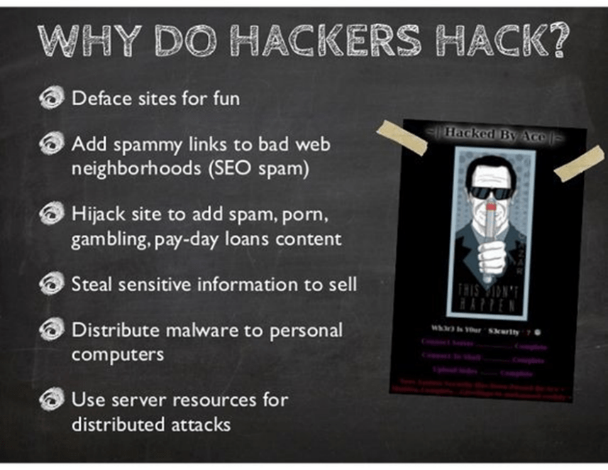
Why do hackers hack?

Some do it for
fun, because they can, because they are malicious, can gather personal details
for gain, or because they want to claim some sort of ransom from their victims.

To place
hacking in perspective, a study by Juniper Research forecast that hacking would cost up to $2 trillion
during 2019.

A large 43 percent of cybercrimes are aimed at small businesses.

A study conducted at Maryland university indicated that a cyber-attack occurs every 39 seconds.

More than 230,000 pieces of malware are generated daily.
While there is
no need to panic in the face of these figures, necessary precautions are needed
to protect your website and your personal information.

Discovered unwanted intrusions on your website?

It is scary to find
that your website has been hacked. If you have web development skills and are
technically skilled, you’ll probably know what the best course of action is.

For the web
development novices, the best advice is also to – stay calm, and look for these
clues that your website has been compromised:

  • the most obvious clue – you cannot log into your own site
  • the site is unusually sluggish
  • you suddenly decide it might be a good idea to look at the dashboard for user accounts and see that you have attracted some foreign interest – unwelcome users
  • you receive messages of site re-directions from visitors, Google hacking notification, site suspension
  • your site is blacklisted on search engines because it definitely has been hacked, or is ranked as promoting the sale of illegal pharmaceuticals
  • antivirus and malware warnings from your installed software or warnings from site visitors

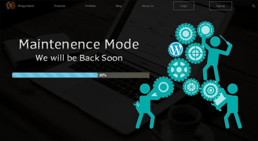
You will be in a good position to get your website operational if you take a deep breath. Place your site in maintenance mode, roll up your sleeves and get ready for business again.
Fix the mess made by the hackers

You can clean up your
site by following some basic steps. Backup, scan, do a deep clean – then take
prevention measures related to what originally instigated site susceptibility.

Site backup. Do this after you have placed your site in maintenance mode, and after you have been able to log in. This is a precaution so that you don’t lose data unnecessarily with a cleanup plugin.

Pick a security add-on. You can look through this list and pick a malware plugin to deliver a  deep scan. MalCare is recommended for an automatic site cleanup to ward off further attacks. This plugin prompts a backup through BlogVault, prior to cleanup.

Download MalCare, install
and scan
. After selecting
MalCare, follow the steps to create your account prior to being allowed to
install this add-on. After installation, you can open this program and follow
the prompts to begin a scan.

Select autoclean. The plugin will indicate the number of
vulnerabilities detected. Simply pick autoclean to remove hacked files and
malicious scripts. Choose the ‘public_html’ option, using your host or server
name, FTP type, user name, and password. Follow these steps to retrieve
this information if it is not readily available. Select ‘Apply Fix’.

Remove vulnerabilities
and install security.
Follow this link to remove vulnerabilities, and make safe updates to your
website.

A thorough cleanup. Do another scan. Make another backup once your site has been cleaned. Activate the add-ons that you want and remove those that you are not using. Create complex passwords (write these down in a safe place offline). Installing an audit plugin will help keep tabs on-site activity, alerting you to unwanted changes.

Run updates for other
add-ons. Send a request to Google to whitelist your site if needed. Check if
your host has suspended your site. Contact them if it has been so that you can
get back to business.

Moving forward

Where customers
realize that their websites have been impacted, or are using any of the plugins
listed, they should be updated promptly. A full 98 percent of WordPress hackings take place because users fail to update their
plugins.

It is further advised
that customers continue to implement updates as and when these become
available. Updates are generated for the purpose of minimizing security risks,
and to remain compatible with related functions. Being attentive to upgrades
will help to ward off threats.
Benefits of Approval Studio Proofing Tool for Designers and Creative Teams

Post pobrano z: Benefits of Approval Studio Proofing Tool for Designers and Creative Teams

Among all of the design agencies’ headaches, artwork proofing is probably one of the most acute ones. Forwarding countless numbers of requests, following up your approvers with reminders that they have a file to check, searching for their feedback in the endless pile of emails or messages… Quite daunting, to say the least, and quite expensive too – the amounts of time and, as a result, money spent on this back-and-forth game are quite significant. However, there is a solution that would allow you to cut your turnaround time by up to 35% – a specialized proofing software.

One of such programs is Approval Studio. It is a proofing tool developed specifically to help designers and creative teams spend less time on boring and repetitive processes and make the whole workflow more organized and efficient. There are quite a few features with which Approval Studio helps you to streamline proofing of visual assets, so let’s create a project, upload some file, and see what we can do with it.

№1: Sharing files

After the upload, users can start sharing their artwork with other reviewers. There are two types of reviewers: internal – they can access your dashboard or even get tasks assigned to them in Approval’s Pro version – and external ones. Let’s concentrate on the latter.

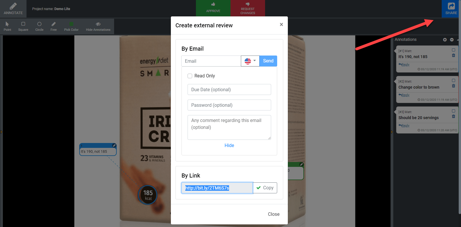
A big blue “Share” button in the upper right corner is the starting point of your cooperation with the clients. You can send the invitation to Approval Studio to their email or share a short link via your messenger chat – with a password or making the file read-only if you like. Your reviewer will be able to see the same thing you see and add annotations. 

№2: Online review tool

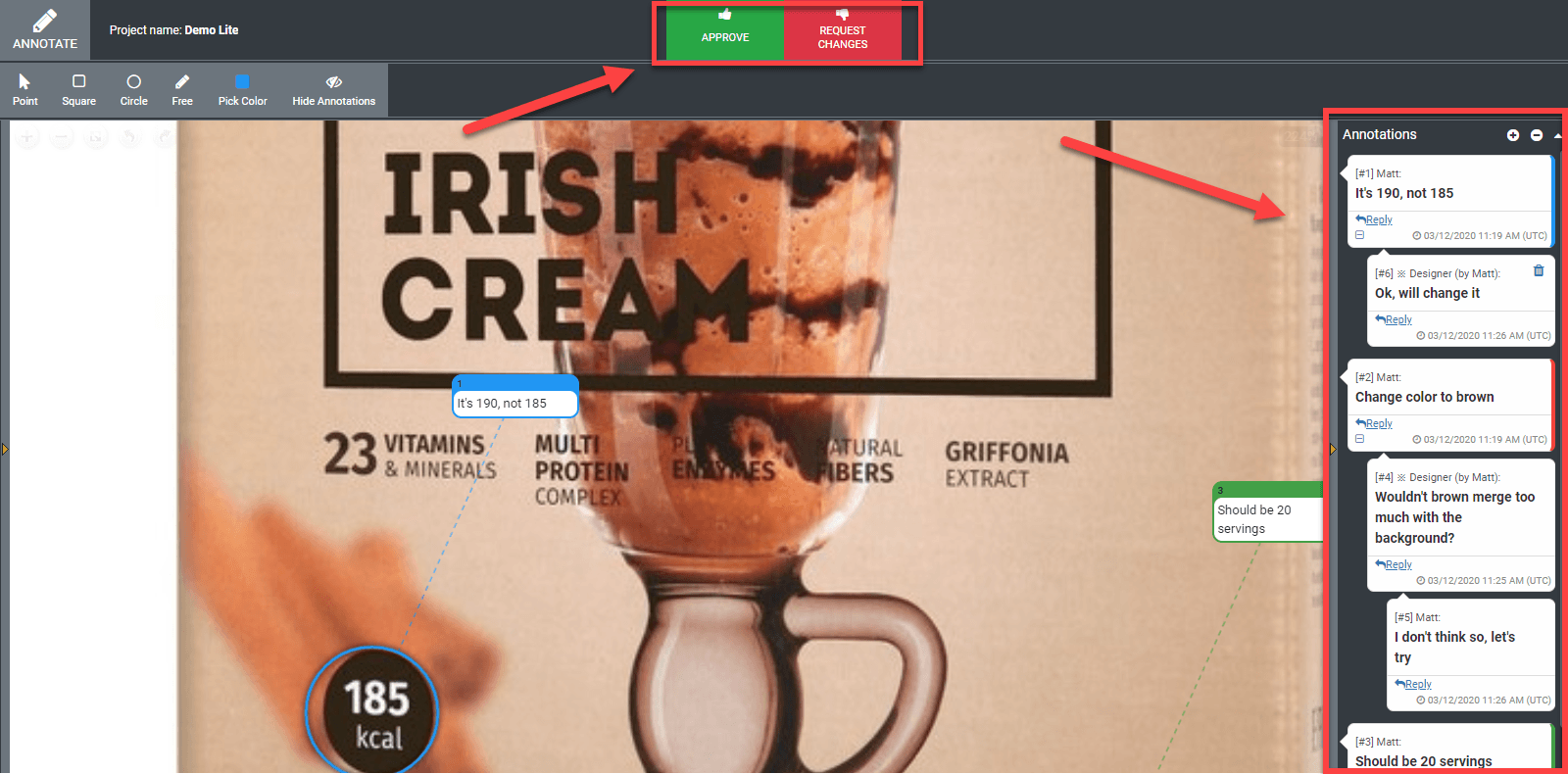
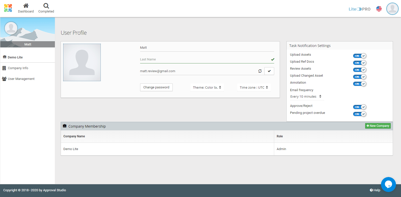
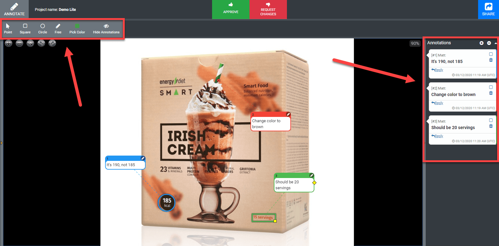
Approval Studio offers advanced annotation possibilities that include a set of different shapes, namely a point, a circle, a square, and a free-form (if you need to draw something by hand). Users can pick a color for each annotation, which is helpful when there are several reviewers. Also, there is a possibility to bind one annotation to several places in the artwork if there is the same repeated mistake or if you need to apply similar changes, let’s say, to the fonts or colors. Annotations will appear on the mockup itself and on the comments panel to the right.

If you need to check the artwork from another angle or annotate a much smaller detail, it is not a problem at all. Approval Studio allows rotating the image as much as you like and zooms it without descaling or quality loss so that you can read even the tiniest text.

The main thing is that the system is totally live – whenever they add a comment, you will see it instantly on your screen with no need to refresh the page. It works like a built-in messenger to make your review sessions more convenient.

After the discussion is over, the last thing that’s left is approving or rejecting the file. At this stage, it’s important to be careful, because you will not be able to add any new annotations to this version after you confirm your verdict.

№3: Versioning and 4 unique compare modes

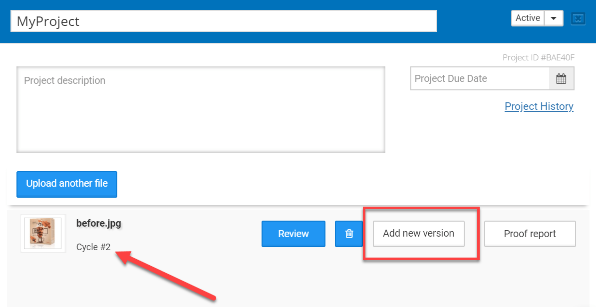
The annotations were added, the artwork was discussed, and now it’s high time for a designer to upload a new version of the artwork. When it is done, the cycle on a dashboard will switch to №2, and the review process will repeat, although there will be one small difference. Starting with the second cycle, you will be able to compare the versions of the file to find out if all issues were fixed.

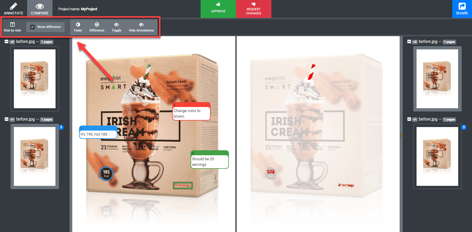
Approval Studio helps you with it significantly with 4 AI-driven compare modes. First, let’s choose the version that we want to compare – the ones that were annotated will be marked by the number of comments added to them. By the way, you can turn on annotations in the compare mode if you need them.

Side-by-side shows you two images next to each other with the ability to highlight differences if you tick the necessary checkbox. Fader will let you manually switch from one version to another moving the slider with edits highlighted in the center. Difference will just cut out the things that were changed and show them to you. Toggle, which is by far my favorite one, will switch from one version to the other dynamically.

№4: Comprehensive reporting

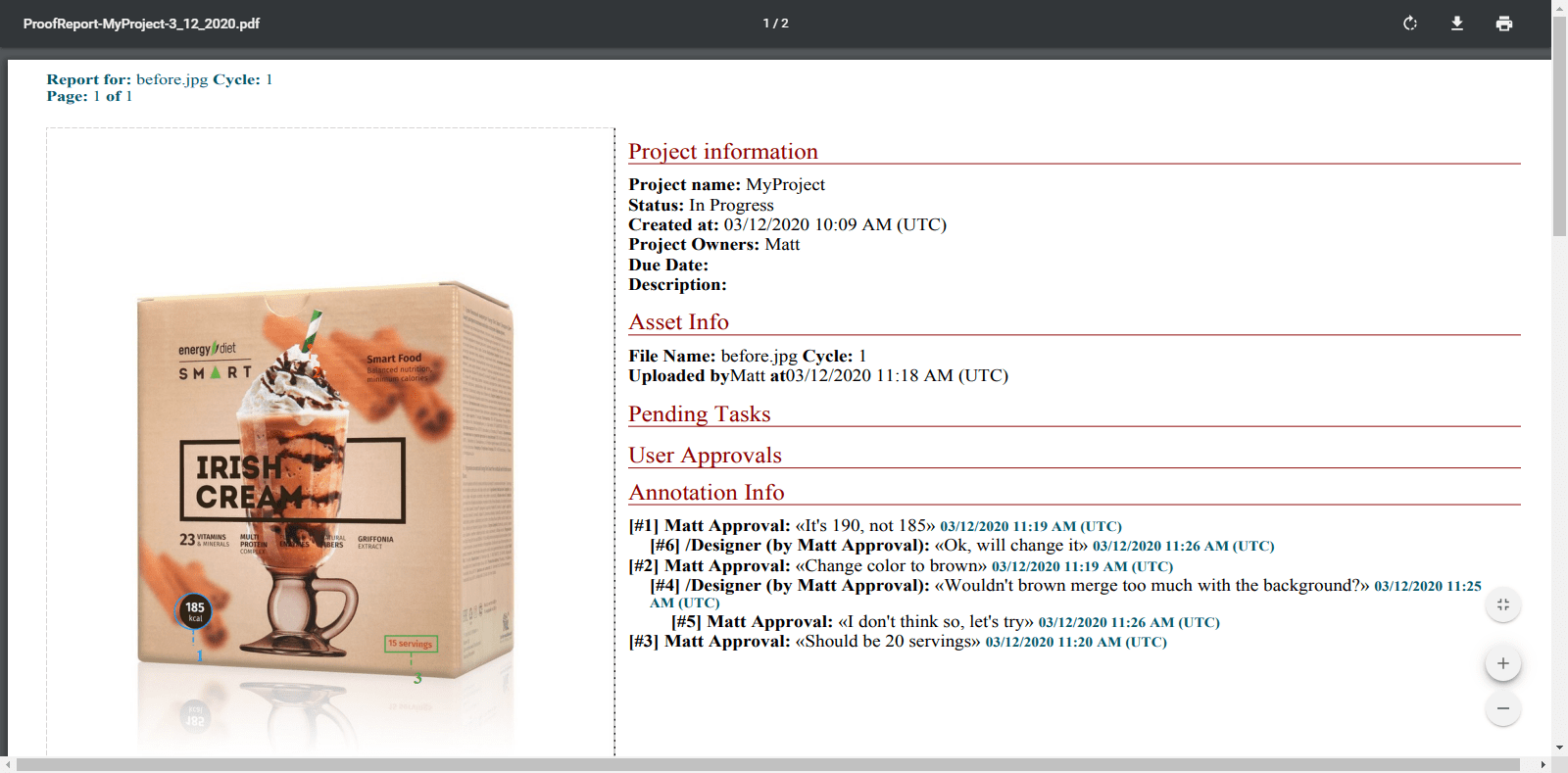
After the project is ready, many agencies need to deal with the accountancy thing. Clients often forget which requests they made, how long it all was supposed to take, and why these or those changes were applied at all. To avoid such confusion, Approval Studio provides full PDF reports on the whole project or each asset separately with the exhausting amount of information. The data provided range from time and date of each action completed by each user or reviewer and ending with thumbnails of each version with all annotations.

Also, users can check project history created for internal use to see the chronology actions committed within the project.

№5: Highly customizable user settings

Every company has their own approaches and workflows. Approval Studio is a very flexible proofing tool that lets their users adjust the settings as much as possible. To begin with, it concerns the language choice – among a solid pack of 8 localizations, each user and even external reviewer can choose their own, which is especially beneficial when you are working with an international team.

Also, there are many different notification types, the ability to change the time zone, and add companies if you work on multiple projects with different clients.

Company info provides a range of important customizable features like a personalizable review invitation where you can replace the standard text with your own or custom approval confirmation that lets you make sure your reviewers follow your company’s policies.

Conclusion

Approval Studio is one of those tools that are a must for each design agency. All these features make the process of artwork approval significantly simpler and can save a lot of resources and nerve cells. The tool has much more cool tricks up their sleeve, so sign up if you want to check Approval Studio out! Also, there are brief and simple tutorials on their YouTube channel which you can check to see everything we’ve discussed here in motion!

Benefits of Approval Studio Proofing Tool for Designers and Creative Teams

Post pobrano z: Benefits of Approval Studio Proofing Tool for Designers and Creative Teams

Among all of the design agencies’ headaches, artwork proofing is probably one of the most acute ones. Forwarding countless numbers of requests, following up your approvers with reminders that they have a file to check, searching for their feedback in the endless pile of emails or messages… Quite daunting, to say the least, and quite expensive too – the amounts of time and, as a result, money spent on this back-and-forth game are quite significant. However, there is a solution that would allow you to cut your turnaround time by up to 35% – a specialized proofing software.

One of such programs is Approval Studio. It is a proofing tool developed specifically to help designers and creative teams spend less time on boring and repetitive processes and make the whole workflow more organized and efficient. There are quite a few features with which Approval Studio helps you to streamline proofing of visual assets, so let’s create a project, upload some file, and see what we can do with it.

№1: Sharing files

After the upload, users can start sharing their artwork with other reviewers. There are two types of reviewers: internal – they can access your dashboard or even get tasks assigned to them in Approval’s Pro version – and external ones. Let’s concentrate on the latter.

A big blue “Share” button in the upper right corner is the starting point of your cooperation with the clients. You can send the invitation to Approval Studio to their email or share a short link via your messenger chat – with a password or making the file read-only if you like. Your reviewer will be able to see the same thing you see and add annotations. 

№2: Online review tool

Approval Studio offers advanced annotation possibilities that include a set of different shapes, namely a point, a circle, a square, and a free-form (if you need to draw something by hand). Users can pick a color for each annotation, which is helpful when there are several reviewers. Also, there is a possibility to bind one annotation to several places in the artwork if there is the same repeated mistake or if you need to apply similar changes, let’s say, to the fonts or colors. Annotations will appear on the mockup itself and on the comments panel to the right.

If you need to check the artwork from another angle or annotate a much smaller detail, it is not a problem at all. Approval Studio allows rotating the image as much as you like and zooms it without descaling or quality loss so that you can read even the tiniest text.

The main thing is that the system is totally live – whenever they add a comment, you will see it instantly on your screen with no need to refresh the page. It works like a built-in messenger to make your review sessions more convenient.

After the discussion is over, the last thing that’s left is approving or rejecting the file. At this stage, it’s important to be careful, because you will not be able to add any new annotations to this version after you confirm your verdict.

№3: Versioning and 4 unique compare modes

The annotations were added, the artwork was discussed, and now it’s high time for a designer to upload a new version of the artwork. When it is done, the cycle on a dashboard will switch to №2, and the review process will repeat, although there will be one small difference. Starting with the second cycle, you will be able to compare the versions of the file to find out if all issues were fixed.

Approval Studio helps you with it significantly with 4 AI-driven compare modes. First, let’s choose the version that we want to compare – the ones that were annotated will be marked by the number of comments added to them. By the way, you can turn on annotations in the compare mode if you need them.

Side-by-side shows you two images next to each other with the ability to highlight differences if you tick the necessary checkbox. Fader will let you manually switch from one version to another moving the slider with edits highlighted in the center. Difference will just cut out the things that were changed and show them to you. Toggle, which is by far my favorite one, will switch from one version to the other dynamically.

№4: Comprehensive reporting

After the project is ready, many agencies need to deal with the accountancy thing. Clients often forget which requests they made, how long it all was supposed to take, and why these or those changes were applied at all. To avoid such confusion, Approval Studio provides full PDF reports on the whole project or each asset separately with the exhausting amount of information. The data provided range from time and date of each action completed by each user or reviewer and ending with thumbnails of each version with all annotations.

Also, users can check project history created for internal use to see the chronology actions committed within the project.

№5: Highly customizable user settings

Every company has their own approaches and workflows. Approval Studio is a very flexible proofing tool that lets their users adjust the settings as much as possible. To begin with, it concerns the language choice – among a solid pack of 8 localizations, each user and even external reviewer can choose their own, which is especially beneficial when you are working with an international team.

Also, there are many different notification types, the ability to change the time zone, and add companies if you work on multiple projects with different clients.

Company info provides a range of important customizable features like a personalizable review invitation where you can replace the standard text with your own or custom approval confirmation that lets you make sure your reviewers follow your company’s policies.

Conclusion

Approval Studio is one of those tools that are a must for each design agency. All these features make the process of artwork approval significantly simpler and can save a lot of resources and nerve cells. The tool has much more cool tricks up their sleeve, so sign up if you want to check Approval Studio out! Also, there are brief and simple tutorials on their YouTube channel which you can check to see everything we’ve discussed here in motion!

How to make sure your call to action buttons convert the way you want

Post pobrano z: How to make sure your call to action buttons convert the way you want

You are probably already familiar
with the concept of call to action, but if somehow you are new to web
design, call to action refers to elements in a page that request an action from
its visitors.

If you are indeed new to web design,
there are high chances that you will neglect this important part of a website,
but the real problem is that experienced designers do it as well.

A lot of web designers struggle to
understand their true function, beyond looking attractive. Yet, call to action
buttons are too valuable to be placed carelessly on a website, without any real
regard for their purpose.

It is essential for designers and
developers to have a good understanding of the various ways in which color,
size, text, and other features can affect the value of a call to action button.

Making Call To Action Buttons More Efficient
Image source

The techniques employed to create
better call to action buttons are not overly intricate, but they do need a
reasonable amount of planning and care if they are going to successfully
encourage visitors to exhibit desired behaviors.

For call to action buttons that
perform successfully, it is first necessary to work out how they should gel
with the rest of the website design. This is referred to as ‘establishing the
ground architecture’ and it will help you to further understand how call to
action buttons work within the web interface.

The primary goal of all business
websites is to turn a profit. As better call to action buttons actively
contribute to the achievement of this objective, it makes sense to spend a
reasonable amount of time thinking about their design, even if they do only
take up a tiny amount of space. In many ways, they are the true stars of a web
page.

How to make them better

Use size and color properly

It is a good idea to think carefully
about the size of your call to action buttons. A button that is too big is
likely to distract visitors in a negative way, but a button that is too small
will get lost in all of the other features which are competing for attention.

The best call to action buttons are big enough to draw in the eye
but dainty enough to gel with the overall design.

Use size and color properly
Image source

In fact, color is a great way to
further balance out the scale of the call to action buttons. For bigger
buttons, opt for a shade that is used infrequently within the overall website
design.

It should still be a color that is
bright enough to stand out. The opposite is true for shades that are used
frequently; in this case, a bold tone will really make the button stand out.

So, if you’re using a WordPress plugin to insert the buttons on the page, make sure not to use
the default ones. Customize them to your design and for your users. Use a
legible font, and make sure not to use one that you fancy from other sites.
This means that you should say no to using the font that Instagram uses just because you like it. Your
audience might not.

Use directional cues

It is common for businesses to
surround call to action buttons with images associated with clicking or looking
at them. This is to further encourage visitors to want to go where they promise
to lead.

If you use the right images, this
kind of technique can be very effective – why not try a series of arrows or
even a picture of a person looking directly at the button?

For human beings, directional
prompts can be very powerful. You only have to think about what happens when we
spot an individual looking intensely in a specific direction – in most cases,
everybody else would look there too, in order to find out what was causing such
interest. This is why directional cuing can be a successful technique.

Use a good copy

Use a good copy
Image source

The
copy featured in your call to action buttons
needs to be simple and easy to understand. A good call to
action button is one that tells a visitor what it offers in a fraction of a
second. This means that they do not have to pause to find out, and are much
more likely to follow it.

It is perfectly okay, necessary in
fact, to use direct language within call to action buttons. For example, words
like Click Here, Call, Visit, Buy, Register, and Subscribe are common and
effective. Look at German startups and how they are doing things. They’re known for being
direct. Their call to action buttons have a simple and efficient copy.

However, if you want to have a unique website not just in terms of design, but
also copy, you can use more creative copy variations.

It is just as important to think
about the size of your copy. It should be significantly bigger than the rest of
the text on your website so that it stands out. It should also be boldly
colored, and contrast enough so that it is easy to read quickly.

Tell visitors what they get after clicking

Tell visitors what they get after clicking
Image source

If necessary, you can use a call to
action button to tell visitors what to expect. However, this is most effective
when it comes to the use of ‘trial’ and ‘download’ functions. The information
provided usually pertains to the size of a download, or the length of a free
trial.

For call to action buttons that
feature extra data, it is still vital that their key goal is prioritized above
all else.

In other words, do not forget the
action which you are trying to promote. This can be achieved by making sure
that the ‘action’ words are more prominent than everything else.

The button’s placement

The button’s placement
Image source

For most webpages, the best place to
position a call to action button is just above the fold. In fact, if a button
can only be reached with scrolling, many visitors will simply ignore it, or not
see it at all. This is what some people say, at least. The truth, however, is
that it depends.

You can get around this by placing
two of the same call to action buttons on a page, with one at the top and one
at the bottom. This way, if they can only be reached via scrolling, you have
doubled the chance that the prompt will be effective.

It is equally important to think
about proximity to other items. For instance, it can be valuable to position
call to action buttons close to reviews, testimonials, about us pages, and
anything else which clearly states what your company does, and what it promises
to offer visitors.

Use whitespace

Use whitespace

It is a mistake to assume that the
placement of a call to action button is all that matters. The area surrounding
it can be just as vital because the more empty space there is around a call to
action button, the more chance there is of the eye being drawn there. If there
is too much ‘noise,’ they may get lost.

Create urgency (if applicable)

Create urgency (if applicable)
Image source

The main aim is to prompt visitors
to exhibit the behaviors which you want to see with as little effort as
possible.

Whilst deception is not the aim, it
is important to make sure that they do not get too many opportunities to pause
and think about whether or not to click through. The internet is a place that
moves extremely fast, and you have to work fast if you want to secure
conversions.

This is why it is important for call
to action buttons to convey a sense of urgency. They should make it seem like
the only opportunity is right now as if the only chance to take advantage is to
follow the directions quickly.

In the case of high-cost purchases,
this might not be successful, but for low ticket items, it can lead to a hike
in sales. For example, if your
site sells tickets to events
, you might want to create a sense of urgency to sell them
faster.

Ending thoughts

In many different ways, call to
action buttons are essential to the success of online businesses. For all
website developers, the primary aim is to secure either more attention or
increased sales, and this feature is a big part of achieving that.

It could be purchases,
registrations, membership enrollment, or anything else which needs
participation – whatever the aim, use call to action buttons to make it so.
They may take up a tiny amount of space, but these little buttons can have a
big impact on business.

How to make sure your call to action buttons convert the way you want

Post pobrano z: How to make sure your call to action buttons convert the way you want

You are probably already familiar
with the concept of call to action, but if somehow you are new to web
design, call to action refers to elements in a page that request an action from
its visitors.

If you are indeed new to web design,
there are high chances that you will neglect this important part of a website,
but the real problem is that experienced designers do it as well.

A lot of web designers struggle to
understand their true function, beyond looking attractive. Yet, call to action
buttons are too valuable to be placed carelessly on a website, without any real
regard for their purpose.

It is essential for designers and
developers to have a good understanding of the various ways in which color,
size, text, and other features can affect the value of a call to action button.

Making Call To Action Buttons More Efficient
Image source

The techniques employed to create
better call to action buttons are not overly intricate, but they do need a
reasonable amount of planning and care if they are going to successfully
encourage visitors to exhibit desired behaviors.

For call to action buttons that
perform successfully, it is first necessary to work out how they should gel
with the rest of the website design. This is referred to as ‘establishing the
ground architecture’ and it will help you to further understand how call to
action buttons work within the web interface.

The primary goal of all business
websites is to turn a profit. As better call to action buttons actively
contribute to the achievement of this objective, it makes sense to spend a
reasonable amount of time thinking about their design, even if they do only
take up a tiny amount of space. In many ways, they are the true stars of a web
page.

How to make them better

Use size and color properly

It is a good idea to think carefully
about the size of your call to action buttons. A button that is too big is
likely to distract visitors in a negative way, but a button that is too small
will get lost in all of the other features which are competing for attention.

The best call to action buttons are big enough to draw in the eye
but dainty enough to gel with the overall design.

Use size and color properly
Image source

In fact, color is a great way to
further balance out the scale of the call to action buttons. For bigger
buttons, opt for a shade that is used infrequently within the overall website
design.

It should still be a color that is
bright enough to stand out. The opposite is true for shades that are used
frequently; in this case, a bold tone will really make the button stand out.

So, if you’re using a WordPress plugin to insert the buttons on the page, make sure not to use
the default ones. Customize them to your design and for your users. Use a
legible font, and make sure not to use one that you fancy from other sites.
This means that you should say no to using the font that Instagram uses just because you like it. Your
audience might not.

Use directional cues

It is common for businesses to
surround call to action buttons with images associated with clicking or looking
at them. This is to further encourage visitors to want to go where they promise
to lead.

If you use the right images, this
kind of technique can be very effective – why not try a series of arrows or
even a picture of a person looking directly at the button?

For human beings, directional
prompts can be very powerful. You only have to think about what happens when we
spot an individual looking intensely in a specific direction – in most cases,
everybody else would look there too, in order to find out what was causing such
interest. This is why directional cuing can be a successful technique.

Use a good copy

Use a good copy
Image source

The
copy featured in your call to action buttons
needs to be simple and easy to understand. A good call to
action button is one that tells a visitor what it offers in a fraction of a
second. This means that they do not have to pause to find out, and are much
more likely to follow it.

It is perfectly okay, necessary in
fact, to use direct language within call to action buttons. For example, words
like Click Here, Call, Visit, Buy, Register, and Subscribe are common and
effective. Look at German startups and how they are doing things. They’re known for being
direct. Their call to action buttons have a simple and efficient copy.

However, if you want to have a unique website not just in terms of design, but
also copy, you can use more creative copy variations.

It is just as important to think
about the size of your copy. It should be significantly bigger than the rest of
the text on your website so that it stands out. It should also be boldly
colored, and contrast enough so that it is easy to read quickly.

Tell visitors what they get after clicking

Tell visitors what they get after clicking
Image source

If necessary, you can use a call to
action button to tell visitors what to expect. However, this is most effective
when it comes to the use of ‘trial’ and ‘download’ functions. The information
provided usually pertains to the size of a download, or the length of a free
trial.

For call to action buttons that
feature extra data, it is still vital that their key goal is prioritized above
all else.

In other words, do not forget the
action which you are trying to promote. This can be achieved by making sure
that the ‘action’ words are more prominent than everything else.

The button’s placement

The button’s placement
Image source

For most webpages, the best place to
position a call to action button is just above the fold. In fact, if a button
can only be reached with scrolling, many visitors will simply ignore it, or not
see it at all. This is what some people say, at least. The truth, however, is
that it depends.

You can get around this by placing
two of the same call to action buttons on a page, with one at the top and one
at the bottom. This way, if they can only be reached via scrolling, you have
doubled the chance that the prompt will be effective.

It is equally important to think
about proximity to other items. For instance, it can be valuable to position
call to action buttons close to reviews, testimonials, about us pages, and
anything else which clearly states what your company does, and what it promises
to offer visitors.

Use whitespace

Use whitespace

It is a mistake to assume that the
placement of a call to action button is all that matters. The area surrounding
it can be just as vital because the more empty space there is around a call to
action button, the more chance there is of the eye being drawn there. If there
is too much ‘noise,’ they may get lost.

Create urgency (if applicable)

Create urgency (if applicable)
Image source

The main aim is to prompt visitors
to exhibit the behaviors which you want to see with as little effort as
possible.

Whilst deception is not the aim, it
is important to make sure that they do not get too many opportunities to pause
and think about whether or not to click through. The internet is a place that
moves extremely fast, and you have to work fast if you want to secure
conversions.

This is why it is important for call
to action buttons to convey a sense of urgency. They should make it seem like
the only opportunity is right now as if the only chance to take advantage is to
follow the directions quickly.

In the case of high-cost purchases,
this might not be successful, but for low ticket items, it can lead to a hike
in sales. For example, if your
site sells tickets to events
, you might want to create a sense of urgency to sell them
faster.

Ending thoughts

In many different ways, call to
action buttons are essential to the success of online businesses. For all
website developers, the primary aim is to secure either more attention or
increased sales, and this feature is a big part of achieving that.

It could be purchases,
registrations, membership enrollment, or anything else which needs
participation – whatever the aim, use call to action buttons to make it so.
They may take up a tiny amount of space, but these little buttons can have a
big impact on business.

How Email Verification Works and How to Find the Right Service

Post pobrano z: How Email Verification Works and How to Find the Right Service

Is your bounce
rate higher than 2%? Then you may be in need of an email verification service
to help you get your list back in shape.

Everywhere you look there’s another company asking for your
email address or running another promotion to get you to subscribe to its
emails. There’s a good reason for this. We are living in the age of email! If
you are like most people, you check your email several times a day. Email lists
are one of the most cost-effective and efficient methods to stay in direct
communication with your customers.

What is email verification?

Your list of email addresses is indispensable – one of the
most valuable assets you have. Within your list is the potential to gain
loyalty, promote your brand and stay in regular contact with your audience.

Like most other things of value, even your email list needs
regular maintenance. You change the oil of your car regularly and hopefully go
to the dentist from time to time. A minimum of once every quarter, you should
use email verification. The process
ensures you communicate only with real human beings, who want to hear from you
and will eventually buy from you.

Bad email addresses you should remove from your list

All email lists will have varying amounts of bad emails. Removing
them improves your list hygiene and allows you to connect with your audience –
by landing in the inbox.

Here are some bad email addresses email verification services
help to remove:

  • complainer emails, known as “abuse emails,” who
    regularly mark newsletters they subscribe to as spam.
  • misspelled – thus invalid – addresses, entered in
    with a letter or number off.
  • catch-all emails, which are somewhat of a
    lottery: some will be perfectly valid, others will bounce. Start by isolating
    them from the others, then consider scoring them.
  • disposable emails, created to last for a short
    period of time. They self-destruct and end up bouncing.
  • abandoned emails – nobody monitors them anymore,
    so they’re only taking up space in your list.

Keeping these bad emails on your list will negatively affect
your sender reputation. So, before you send out another newsletter or campaign,
consider using an email verification system to remove them from your database.

A clean list will greatly increase the likelihood that the
newsletters and promotions you so carefully planned and crafted actually end up
being received by your intended audience.

How do you find the right email verification service?

As stated, we’re living in the age of email. Because of the
prominence of email marketing, more and more senders are realizing the
importance of verifying email addresses. Fortunately, this has resulted in a
lot of companies to fill this need.

However, not all technology is created equal. There are some email
verification services or email checkers that have sought to fill the demand
without offering the quality level you would expect. It’s important to keep
some things in mind when looking for an email verification service.

  • Accuracy. This is the number one
    thing. You want to find a service that is at least 98% accurate.
  • Speed. How long is this going
    to take?  For a list of up to 100,000 addresses, you shouldn’t have to
    wait more than an hour. Of course, if you have millions of email addresses, you
    can expect to wait a few hours.
  • Customer support. If you are new to email
    verification, you may find yourself in need of help. Find an email checker that
    offers 24/7 support.
  • Security. An email verification
    service is a data processor. You want to be sure they are GDPR compliant, which
    means it will keep the data safe during the verification process.
  • Price. Check different
    services and see the one that offers the best value for the investment.

What are the benefits of using email verification?

Some people receive hundreds of emails a day. If your email never lands in the inbox, then it’s as if you never even sent it.

Having a healthy email list increases the score that Internet
Service Providers give all email senders. A bad score can put your sender
reputation in peril and have your email relegated to the spam folder.

It’s also something that pays for itself. Most email
distribution services charge based on the number of emails on your list. That
goes for the invalid email addresses too. Getting the bad or inaccurate emails
off of your list saves you money in the long run. An email list that has been
properly verified will result in a higher return of investment (ROI).

As you can see, email verification is a part of your routine that you simply can’t afford to overlook. Verify your list frequently and be sure to use a reputable email verification service. 

How to use social proof for gaining credibility and boosting conversions

Post pobrano z: How to use social proof for gaining credibility and boosting conversions

The internet has given many web
companies the chance to rise and meet new audiences. The challenge for these
companies is the competition to grow the customer base and build the companies’
credibility. One of the ways to do that is to use social proof as a marketing
tool.

Many people make decisions regarding
a product or service based on what they see others do or say. People’s initial
judgment on a website can be influenced by what others perceive based on their
experiences. This can make or break a company especially if it is new in the
market.

What is Social Proof?

Image source

Social proof is the concept that
people have a tendency to conform to the action of others with the assumption
that other people are more knowledgeable in that particular situation and
therefore they reflect correct behavior.

For example, when people pass a
crowded restaurant that they have never set foot into, they will assume that
the food must be good and they will be more inclined to try it. On the other
hand, an empty restaurant will, unfortunately, send a warning signal that there
is something unfavorable about it and people will be more reluctant to make it
their choice of restaurant.

In this era of technology, social
proof has become a powerful marketing tool. When people encounter an unfamiliar
website, like a fintech app website (considering how new the term is for some), and they are
unsure whether the products or services offered are good, they will look for
third-party validation such as customers’ testimonials and product reviews to
decide on their course of action.

The right use of social proof can
positively impact your consumers’ behavior and boost your conversion rate.

Testimonials

Testimonials
Image source

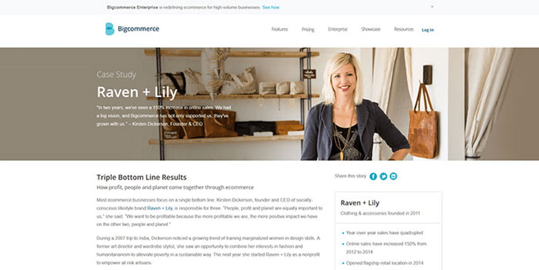
Many companies invite customers to
write their positive experiences with their products or services and post them
on their website. Companies may promise to deliver excellent service but until
someone actually shares their positive experience, people will look at that
promise as just another selling line used by countless websites.

Testimonials will give the
third-party validation that your site visitors need to look further into your
offer. People value the opinions of others, especially opinions from people
that they can relate to.

For example, a mom’s testimonial
about a cleaning product will be more influential than a testimonial from a
fashion celebrity. Also, make sure how you wrap those testimonials on the page.

A lot of designers are tempted to
stuff a lot of testimonials on the page. Don’t do that. Use transitions for the
testimonials or a parallax effect to not bore the visitor.

Getting Testimonials Right

Image source

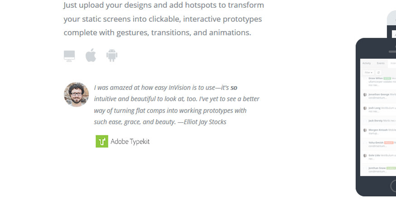
Testimonials can be tricky to get
right. Ideally, testimonials should be specific, relatable and are aligned with
the overall feel of your website and brand. A generic comment such as ‘this is
a great product’ will not persuade your visitors to become buyers, as compared
to a specific comment like ‘I have been using this product for 5 years and have
not had any maintenance issue’.

Creating a separate page for
testimonials will most likely create a dead-end because people very rarely
visit a webpage to read the testimonial page. Place the testimonials in
multiple locations and alongside the relevant products or services to maximize
their effectiveness.

Used correctly, testimonials can be
a powerful form of social proof to build your website’s credibility and
increase your conversion rate.

An interesting way of using
testimonials to boost credibility is to show them through a popup to visitors
who are bouncing the site. If you’re on WordPress, use a WordPress popup plugin for that. If you are on a different CMS, use Leadpages or
something similar.

Use pictures

Use pictures on testimonials
Image source

The best way to maximize the
effectiveness of a testimonial is to put a face to the words.

People can relate better to the
testimonials when they can see the pictures of the persons writing it. They
will be more inclined to believe that the testimonials are not made up and come
from real customers.

Use high-quality photos and make
sure the participants look inviting and friendly. Placed strategically
alongside a call-to-action button such as ‘Call now’ or ‘Visit our store
today’, the testimonials can be a very persuasive tool.

Having Testimonials from Influential People

Approval from an expert or a
celebrity can have a positive influence on consumer behavior. The psychological
explanation is in the tendency for people to have a biased opinion on a certain
product or service based on their overall judgment of the people endorsing it,
also known as the halo effect.

It is no wonder that companies will
seek a well-known expert or celebrity with an established reputation to sponsor
their products. If you have a designer website, for instance, it will speak
volumes when a famous fashion blogger makes a reference to your website.

A word of caution on the use of
celebrity to endorse a website or a product. If the celebrity is a match to the
website, it will have a positive impact and people will look favorably on the
company. If the celebrity is a mismatch, it may make the company appear
desperate or confused about its own identity. This can make the company lose
its trustworthiness.

Using Logos of Customers or Sites That Reviewed Your Product

Image source

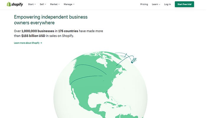
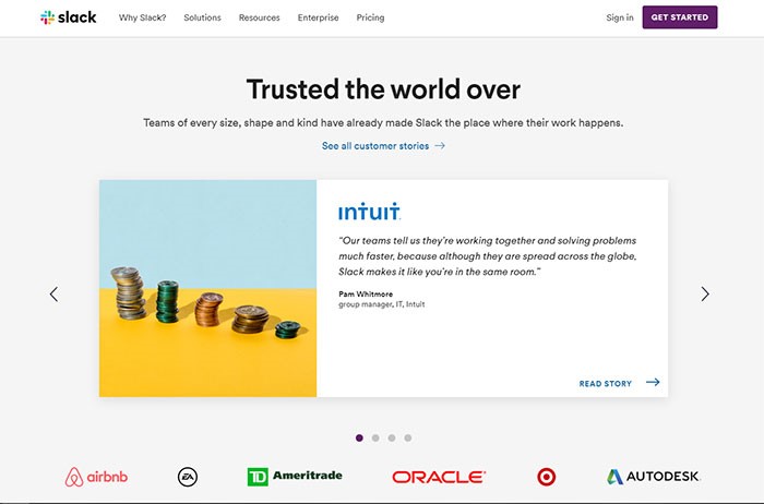
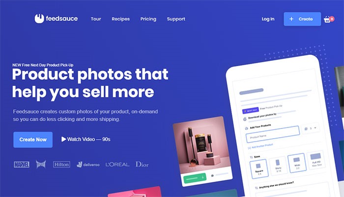
One of the ways to increase the conversion
rate is to display your customers’ logos, especially ones that are well-known.
This social proof will improve your credibility and impress your site visitors.

If your products are covered in the
news or other websites, this will be a chance to incorporate their logos into
your home page and boost your website’s credibility.

Other sources of logos that you
might want to include in your website are logos of your official partners, your
suppliers, awards and accreditation that you have and quality standards that
you have met.

If you’d have a big partner like
Coca-Cola, for example, it would immediately boost your trust. That Coca-Cola logo is one of the most recognized symbols on the planet and if
that huge company decided to work with you, there’s surely something good about
you.

The logos should be placed where
they are easily visible by visitors such as the side of the header/footer of
your website home page. Two big companies known in the B2B community, Calendly and Doodle are doing this differently. One is showing the logos in the
hero section, the other in the footer.

Newsletter Subscriber Count

Newsletter Subscriber Count
Image source

This form of social proof is an
example of the ‘wisdom of the crowds’ social proof. Basically, the more people
that have signed up to your newsletter, the higher the probability of new
visitors signing up too. If you have not built a large customer base yet, a
relevant testimonial highlighting the positive aspect of your newsletter might
persuade visitors to sign up.

People will be more inclined to sign
up for the newsletter if they believe the website is trustworthy and that their
information will be protected. Privacy policy regarding the use and collection
of their information should be included in the sign-up process.

Using Social Media Widgets

Using Social Media Widgets
Image source

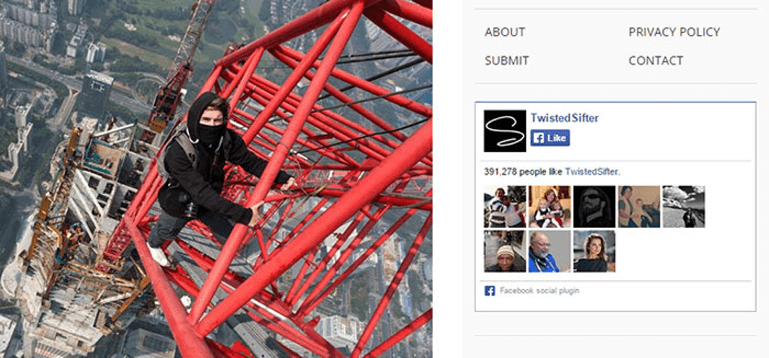
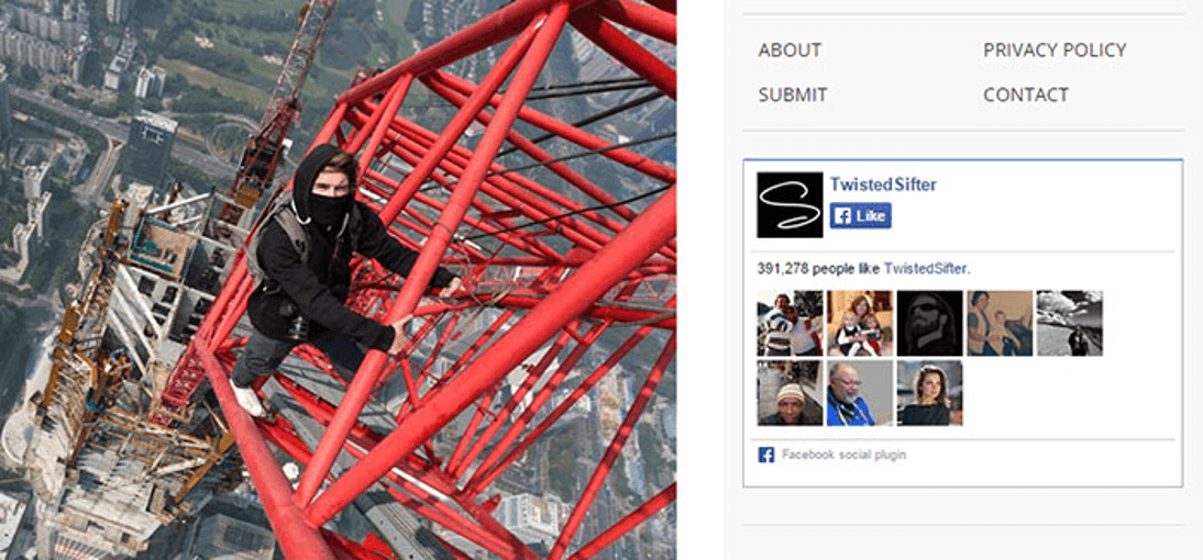
Social media is a great source of
social proof. You can track the mention of your website or products on Twitter
and gain insight into your customers’ perception of them. You can track the
size of your website followers on Twitter and Facebook.

Many companies now include social
media icons on their website where customers can readily access their social
media and share the website’s link and post comments about the companies. Many
companies invite their customers to ‘like’ them on Facebook.

A positive comment on your website
or brand on social media can have a ripple effect that will bring new visitors
to your website. People feel more secure to engage in your website when their
friends have recommended it through social media.

Showcasing the Number of Users or Downloads

This display of user statistics
works in the same way as when McDonalds’ fast-food restaurants display signs
“Billions and Billions Served”.

This social proof will work if you
have an impressive statistic to make visitors believe that your website is
trustworthy. If your customer base is not up to par yet, this is a chance to
utilize other forms of social proof to increase the number of your site
visitors and increase your conversion rate.

Using Trust Badges

Image source

The display of trust badges is most
commonly found in the checkout section of a landing page. With online fraud
becoming common, customers are more cautious in filling out forms and sharing
sensitive information such as their credit card numbers to an online company.

Trust badges give customers the
assurance that the information they give to the company will be secure. People
have been reported to cancel their online purchase in the absence of a trust
seal and they are more likely to have a second thought about purchasing a
product. Trust badges may or may not bring in new visitors but they do prevent
potential customers to doubt the security of their purchase.

Ending Thoughts

There are many forms of social proof
available to promote your website. When used effectively, they can be a great
asset to continuously bring visitors to your website and increase your conversion rate.
On the other hand, misuse of social proof can also backfire and have the
reverse effect on your website.

The use of social
proof
requires
practice and experience. If you are looking to promote your great new products
or services on the web, social proof can be your best marketing tool and the
cheapest form of marketing available yet.

The
use of social proof

also promotes interactions with customers and this can have a long-lasting
effect. New customers will be enticed with existing testimonials about the
positive experiences other people have and existing customers will be reminded
of their own positive experience.

As with any marketing tool, it will
only be effective if you have a great product or service to start with and you
maintain your integrity in delivering what you promise. Continue to review your
products and gain feedback from close associates. As said earlier, social media
can be a great place to gain feedback about your products and keep track of
your number of followers.

The combination of the right
products and the right use of different forms of social proof will ensure your
company’s visibility in the market place and create a building platform for
your company’s sustainability.