Archiwum kategorii: Design

How to use social proof for gaining credibility and boosting conversions

Post pobrano z: How to use social proof for gaining credibility and boosting conversions

The internet has given many web
companies the chance to rise and meet new audiences. The challenge for these
companies is the competition to grow the customer base and build the companies’
credibility. One of the ways to do that is to use social proof as a marketing
tool.

Many people make decisions regarding
a product or service based on what they see others do or say. People’s initial
judgment on a website can be influenced by what others perceive based on their
experiences. This can make or break a company especially if it is new in the
market.

What is Social Proof?
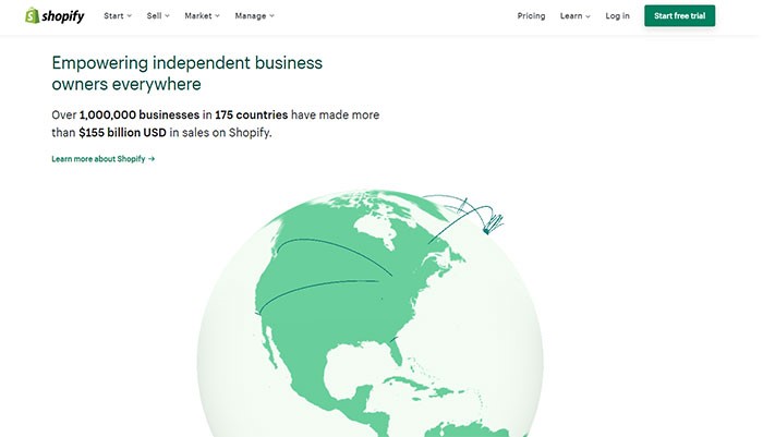
Image source

Social proof is the concept that
people have a tendency to conform to the action of others with the assumption
that other people are more knowledgeable in that particular situation and
therefore they reflect correct behavior.

For example, when people pass a
crowded restaurant that they have never set foot into, they will assume that
the food must be good and they will be more inclined to try it. On the other
hand, an empty restaurant will, unfortunately, send a warning signal that there
is something unfavorable about it and people will be more reluctant to make it
their choice of restaurant.

In this era of technology, social
proof has become a powerful marketing tool. When people encounter an unfamiliar
website, like a fintech app website (considering how new the term is for some), and they are
unsure whether the products or services offered are good, they will look for
third-party validation such as customers’ testimonials and product reviews to
decide on their course of action.

The right use of social proof can
positively impact your consumers’ behavior and boost your conversion rate.

Testimonials
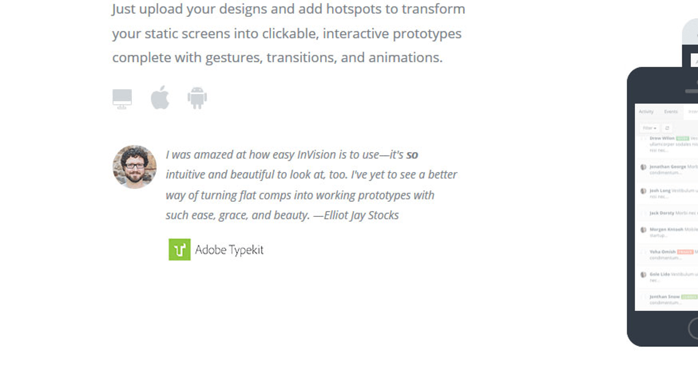
Testimonials
Image source

Many companies invite customers to
write their positive experiences with their products or services and post them
on their website. Companies may promise to deliver excellent service but until
someone actually shares their positive experience, people will look at that
promise as just another selling line used by countless websites.

Testimonials will give the
third-party validation that your site visitors need to look further into your
offer. People value the opinions of others, especially opinions from people
that they can relate to.

For example, a mom’s testimonial
about a cleaning product will be more influential than a testimonial from a
fashion celebrity. Also, make sure how you wrap those testimonials on the page.

A lot of designers are tempted to
stuff a lot of testimonials on the page. Don’t do that. Use transitions for the
testimonials or a parallax effect to not bore the visitor.

Getting Testimonials Right
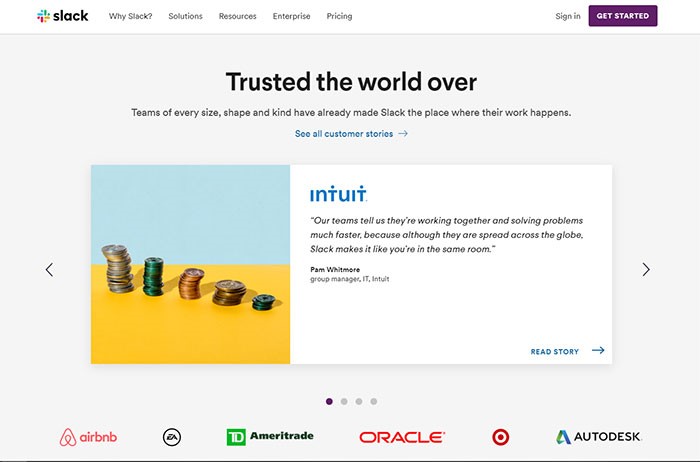
Image source

Testimonials can be tricky to get
right. Ideally, testimonials should be specific, relatable and are aligned with
the overall feel of your website and brand. A generic comment such as ‘this is
a great product’ will not persuade your visitors to become buyers, as compared
to a specific comment like ‘I have been using this product for 5 years and have
not had any maintenance issue’.

Creating a separate page for
testimonials will most likely create a dead-end because people very rarely
visit a webpage to read the testimonial page. Place the testimonials in
multiple locations and alongside the relevant products or services to maximize
their effectiveness.

Used correctly, testimonials can be
a powerful form of social proof to build your website’s credibility and
increase your conversion rate.

An interesting way of using
testimonials to boost credibility is to show them through a popup to visitors
who are bouncing the site. If you’re on WordPress, use a WordPress popup plugin for that. If you are on a different CMS, use Leadpages or
something similar.

Use pictures
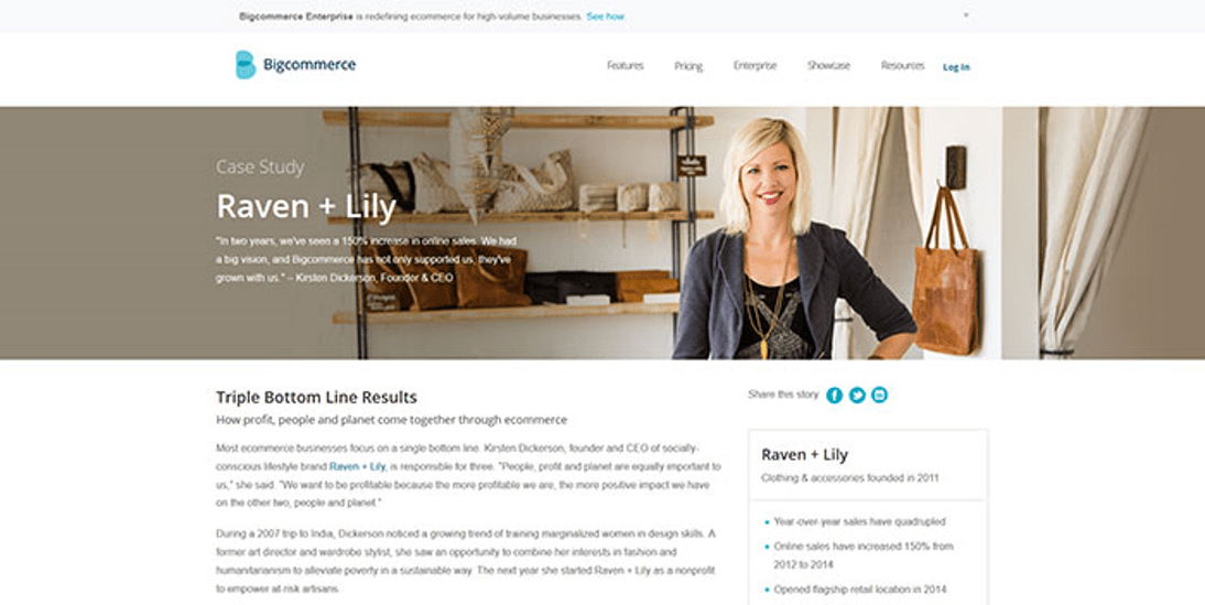
Use pictures on testimonials
Image source

The best way to maximize the
effectiveness of a testimonial is to put a face to the words.

People can relate better to the
testimonials when they can see the pictures of the persons writing it. They
will be more inclined to believe that the testimonials are not made up and come
from real customers.

Use high-quality photos and make
sure the participants look inviting and friendly. Placed strategically
alongside a call-to-action button such as ‘Call now’ or ‘Visit our store
today’, the testimonials can be a very persuasive tool.

Having Testimonials from Influential People

Approval from an expert or a
celebrity can have a positive influence on consumer behavior. The psychological
explanation is in the tendency for people to have a biased opinion on a certain
product or service based on their overall judgment of the people endorsing it,
also known as the halo effect.

It is no wonder that companies will
seek a well-known expert or celebrity with an established reputation to sponsor
their products. If you have a designer website, for instance, it will speak
volumes when a famous fashion blogger makes a reference to your website.

A word of caution on the use of
celebrity to endorse a website or a product. If the celebrity is a match to the
website, it will have a positive impact and people will look favorably on the
company. If the celebrity is a mismatch, it may make the company appear
desperate or confused about its own identity. This can make the company lose
its trustworthiness.

Using Logos of Customers or Sites That Reviewed Your Product
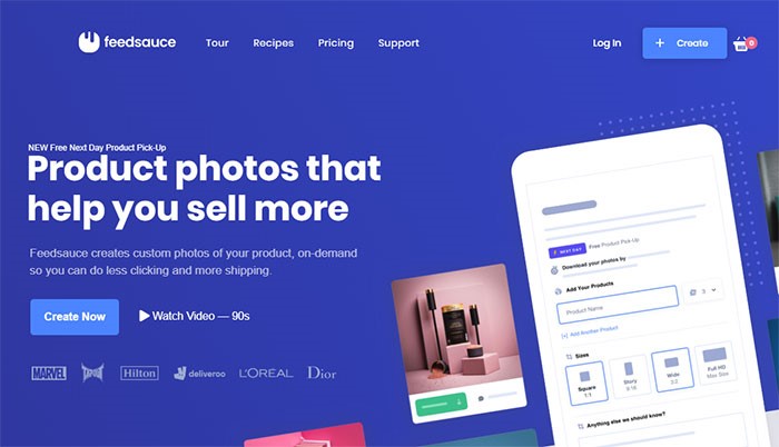
Image source

One of the ways to increase the conversion
rate is to display your customers’ logos, especially ones that are well-known.
This social proof will improve your credibility and impress your site visitors.

If your products are covered in the
news or other websites, this will be a chance to incorporate their logos into
your home page and boost your website’s credibility.

Other sources of logos that you
might want to include in your website are logos of your official partners, your
suppliers, awards and accreditation that you have and quality standards that
you have met.

If you’d have a big partner like
Coca-Cola, for example, it would immediately boost your trust. That Coca-Cola logo is one of the most recognized symbols on the planet and if
that huge company decided to work with you, there’s surely something good about
you.

The logos should be placed where
they are easily visible by visitors such as the side of the header/footer of
your website home page. Two big companies known in the B2B community, Calendly and Doodle are doing this differently. One is showing the logos in the
hero section, the other in the footer.

Newsletter Subscriber Count
Newsletter Subscriber Count
Image source

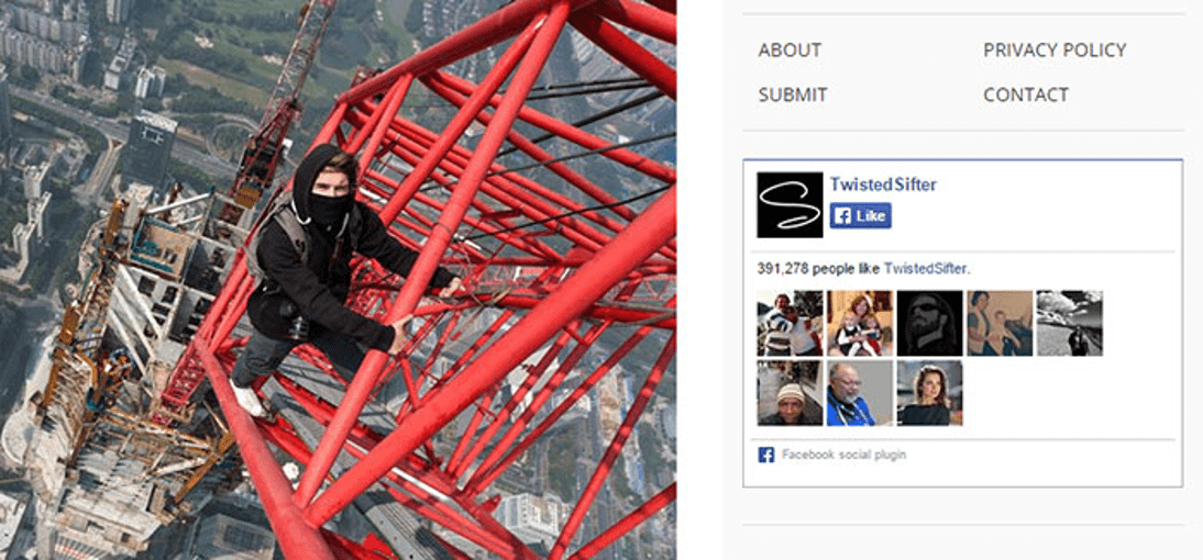
This form of social proof is an
example of the ‘wisdom of the crowds’ social proof. Basically, the more people
that have signed up to your newsletter, the higher the probability of new
visitors signing up too. If you have not built a large customer base yet, a
relevant testimonial highlighting the positive aspect of your newsletter might
persuade visitors to sign up.

People will be more inclined to sign
up for the newsletter if they believe the website is trustworthy and that their
information will be protected. Privacy policy regarding the use and collection
of their information should be included in the sign-up process.

Using Social Media Widgets
Using Social Media Widgets
Image source

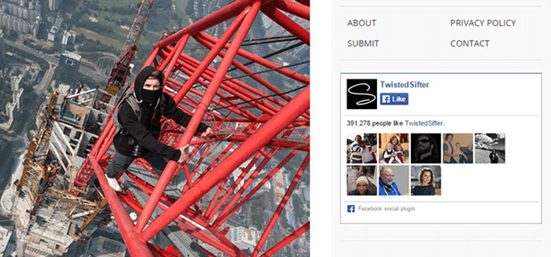
Social media is a great source of
social proof. You can track the mention of your website or products on Twitter
and gain insight into your customers’ perception of them. You can track the
size of your website followers on Twitter and Facebook.

Many companies now include social
media icons on their website where customers can readily access their social
media and share the website’s link and post comments about the companies. Many
companies invite their customers to ‘like’ them on Facebook.

A positive comment on your website
or brand on social media can have a ripple effect that will bring new visitors
to your website. People feel more secure to engage in your website when their
friends have recommended it through social media.

Showcasing the Number of Users or Downloads

This display of user statistics
works in the same way as when McDonalds’ fast-food restaurants display signs
“Billions and Billions Served”.

This social proof will work if you
have an impressive statistic to make visitors believe that your website is
trustworthy. If your customer base is not up to par yet, this is a chance to
utilize other forms of social proof to increase the number of your site
visitors and increase your conversion rate.

Using Trust Badges
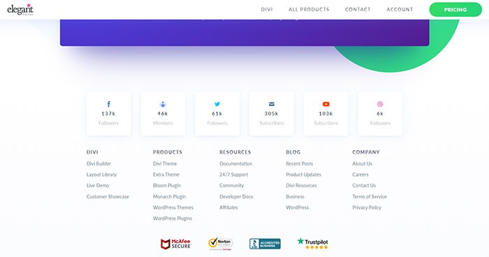
Image source

The display of trust badges is most
commonly found in the checkout section of a landing page. With online fraud
becoming common, customers are more cautious in filling out forms and sharing
sensitive information such as their credit card numbers to an online company.

Trust badges give customers the
assurance that the information they give to the company will be secure. People
have been reported to cancel their online purchase in the absence of a trust
seal and they are more likely to have a second thought about purchasing a
product. Trust badges may or may not bring in new visitors but they do prevent
potential customers to doubt the security of their purchase.

Ending Thoughts

There are many forms of social proof
available to promote your website. When used effectively, they can be a great
asset to continuously bring visitors to your website and increase your conversion rate.
On the other hand, misuse of social proof can also backfire and have the
reverse effect on your website.

The use of social
proof
requires
practice and experience. If you are looking to promote your great new products
or services on the web, social proof can be your best marketing tool and the
cheapest form of marketing available yet.

The
use of social proof

also promotes interactions with customers and this can have a long-lasting
effect. New customers will be enticed with existing testimonials about the
positive experiences other people have and existing customers will be reminded
of their own positive experience.

As with any marketing tool, it will
only be effective if you have a great product or service to start with and you
maintain your integrity in delivering what you promise. Continue to review your
products and gain feedback from close associates. As said earlier, social media
can be a great place to gain feedback about your products and keep track of
your number of followers.

The combination of the right
products and the right use of different forms of social proof will ensure your
company’s visibility in the market place and create a building platform for
your company’s sustainability.
How to use social proof for gaining credibility and boosting conversions

Post pobrano z: How to use social proof for gaining credibility and boosting conversions

The internet has given many web
companies the chance to rise and meet new audiences. The challenge for these
companies is the competition to grow the customer base and build the companies’
credibility. One of the ways to do that is to use social proof as a marketing
tool.

Many people make decisions regarding
a product or service based on what they see others do or say. People’s initial
judgment on a website can be influenced by what others perceive based on their
experiences. This can make or break a company especially if it is new in the
market.

What is Social Proof?

Image source

Social proof is the concept that
people have a tendency to conform to the action of others with the assumption
that other people are more knowledgeable in that particular situation and
therefore they reflect correct behavior.

For example, when people pass a
crowded restaurant that they have never set foot into, they will assume that
the food must be good and they will be more inclined to try it. On the other
hand, an empty restaurant will, unfortunately, send a warning signal that there
is something unfavorable about it and people will be more reluctant to make it
their choice of restaurant.

In this era of technology, social
proof has become a powerful marketing tool. When people encounter an unfamiliar
website, like a fintech app website (considering how new the term is for some), and they are
unsure whether the products or services offered are good, they will look for
third-party validation such as customers’ testimonials and product reviews to
decide on their course of action.

The right use of social proof can
positively impact your consumers’ behavior and boost your conversion rate.

Testimonials

Testimonials
Image source

Many companies invite customers to
write their positive experiences with their products or services and post them
on their website. Companies may promise to deliver excellent service but until
someone actually shares their positive experience, people will look at that
promise as just another selling line used by countless websites.

Testimonials will give the
third-party validation that your site visitors need to look further into your
offer. People value the opinions of others, especially opinions from people
that they can relate to.

For example, a mom’s testimonial
about a cleaning product will be more influential than a testimonial from a
fashion celebrity. Also, make sure how you wrap those testimonials on the page.

A lot of designers are tempted to
stuff a lot of testimonials on the page. Don’t do that. Use transitions for the
testimonials or a parallax effect to not bore the visitor.

Getting Testimonials Right

Image source

Testimonials can be tricky to get
right. Ideally, testimonials should be specific, relatable and are aligned with
the overall feel of your website and brand. A generic comment such as ‘this is
a great product’ will not persuade your visitors to become buyers, as compared
to a specific comment like ‘I have been using this product for 5 years and have
not had any maintenance issue’.

Creating a separate page for
testimonials will most likely create a dead-end because people very rarely
visit a webpage to read the testimonial page. Place the testimonials in
multiple locations and alongside the relevant products or services to maximize
their effectiveness.

Used correctly, testimonials can be
a powerful form of social proof to build your website’s credibility and
increase your conversion rate.

An interesting way of using
testimonials to boost credibility is to show them through a popup to visitors
who are bouncing the site. If you’re on WordPress, use a WordPress popup plugin for that. If you are on a different CMS, use Leadpages or
something similar.

Use pictures

Use pictures on testimonials
Image source

The best way to maximize the
effectiveness of a testimonial is to put a face to the words.

People can relate better to the
testimonials when they can see the pictures of the persons writing it. They
will be more inclined to believe that the testimonials are not made up and come
from real customers.

Use high-quality photos and make
sure the participants look inviting and friendly. Placed strategically
alongside a call-to-action button such as ‘Call now’ or ‘Visit our store
today’, the testimonials can be a very persuasive tool.

Having Testimonials from Influential People

Approval from an expert or a
celebrity can have a positive influence on consumer behavior. The psychological
explanation is in the tendency for people to have a biased opinion on a certain
product or service based on their overall judgment of the people endorsing it,
also known as the halo effect.

It is no wonder that companies will
seek a well-known expert or celebrity with an established reputation to sponsor
their products. If you have a designer website, for instance, it will speak
volumes when a famous fashion blogger makes a reference to your website.

A word of caution on the use of
celebrity to endorse a website or a product. If the celebrity is a match to the
website, it will have a positive impact and people will look favorably on the
company. If the celebrity is a mismatch, it may make the company appear
desperate or confused about its own identity. This can make the company lose
its trustworthiness.

Using Logos of Customers or Sites That Reviewed Your Product

Image source

One of the ways to increase the conversion
rate is to display your customers’ logos, especially ones that are well-known.
This social proof will improve your credibility and impress your site visitors.

If your products are covered in the
news or other websites, this will be a chance to incorporate their logos into
your home page and boost your website’s credibility.

Other sources of logos that you
might want to include in your website are logos of your official partners, your
suppliers, awards and accreditation that you have and quality standards that
you have met.

If you’d have a big partner like
Coca-Cola, for example, it would immediately boost your trust. That Coca-Cola logo is one of the most recognized symbols on the planet and if
that huge company decided to work with you, there’s surely something good about
you.

The logos should be placed where
they are easily visible by visitors such as the side of the header/footer of
your website home page. Two big companies known in the B2B community, Calendly and Doodle are doing this differently. One is showing the logos in the
hero section, the other in the footer.

Newsletter Subscriber Count

Newsletter Subscriber Count
Image source

This form of social proof is an
example of the ‘wisdom of the crowds’ social proof. Basically, the more people
that have signed up to your newsletter, the higher the probability of new
visitors signing up too. If you have not built a large customer base yet, a
relevant testimonial highlighting the positive aspect of your newsletter might
persuade visitors to sign up.

People will be more inclined to sign
up for the newsletter if they believe the website is trustworthy and that their
information will be protected. Privacy policy regarding the use and collection
of their information should be included in the sign-up process.

Using Social Media Widgets

Using Social Media Widgets
Image source

Social media is a great source of
social proof. You can track the mention of your website or products on Twitter
and gain insight into your customers’ perception of them. You can track the
size of your website followers on Twitter and Facebook.

Many companies now include social
media icons on their website where customers can readily access their social
media and share the website’s link and post comments about the companies. Many
companies invite their customers to ‘like’ them on Facebook.

A positive comment on your website
or brand on social media can have a ripple effect that will bring new visitors
to your website. People feel more secure to engage in your website when their
friends have recommended it through social media.

Showcasing the Number of Users or Downloads

This display of user statistics
works in the same way as when McDonalds’ fast-food restaurants display signs
“Billions and Billions Served”.

This social proof will work if you
have an impressive statistic to make visitors believe that your website is
trustworthy. If your customer base is not up to par yet, this is a chance to
utilize other forms of social proof to increase the number of your site
visitors and increase your conversion rate.

Using Trust Badges

Image source

The display of trust badges is most
commonly found in the checkout section of a landing page. With online fraud
becoming common, customers are more cautious in filling out forms and sharing
sensitive information such as their credit card numbers to an online company.

Trust badges give customers the
assurance that the information they give to the company will be secure. People
have been reported to cancel their online purchase in the absence of a trust
seal and they are more likely to have a second thought about purchasing a
product. Trust badges may or may not bring in new visitors but they do prevent
potential customers to doubt the security of their purchase.

Ending Thoughts

There are many forms of social proof
available to promote your website. When used effectively, they can be a great
asset to continuously bring visitors to your website and increase your conversion rate.
On the other hand, misuse of social proof can also backfire and have the
reverse effect on your website.

The use of social
proof
requires
practice and experience. If you are looking to promote your great new products
or services on the web, social proof can be your best marketing tool and the
cheapest form of marketing available yet.

The
use of social proof

also promotes interactions with customers and this can have a long-lasting
effect. New customers will be enticed with existing testimonials about the
positive experiences other people have and existing customers will be reminded
of their own positive experience.

As with any marketing tool, it will
only be effective if you have a great product or service to start with and you
maintain your integrity in delivering what you promise. Continue to review your
products and gain feedback from close associates. As said earlier, social media
can be a great place to gain feedback about your products and keep track of
your number of followers.

The combination of the right
products and the right use of different forms of social proof will ensure your
company’s visibility in the market place and create a building platform for
your company’s sustainability.
Print Peppermint: the Online Printer that Goes for Quality over Quantity

Post pobrano z: Print Peppermint: the Online Printer that Goes for Quality over Quantity

If you are a graphic designer who regularly needs to print his work, you know how frustrating it can be to work with some online printers. Most just have the price as their top-selling point.

Print Peppermint made other choices. At the core of their values: quality is the most important aspect when it comes to printing, pretty much on the same level of importance as innovation and offering new products to their customers.

With this mindset and commitment, Print Peppermint brings you the best of both worlds: the convenience and availability of an online shop combined with the quality of a true craftsman of printing.

Printing Products & Services

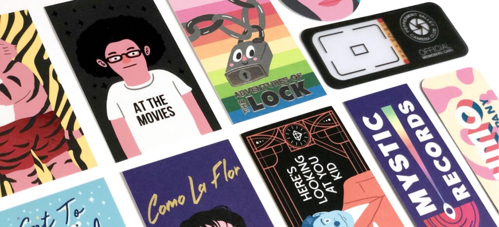
Print Peppermint offers plenty of printing products, but their high-end business cards are what really gave them the solid reputation they have in the industry.

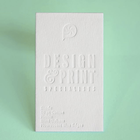
Their cards include a meticulously curated family of thick and premium papers including 100% Cotton, Soft-Touch, Triplex Layered, Clear-Frosted Plastic, Onyx Black Suede, Recycled Kraft, and many more.

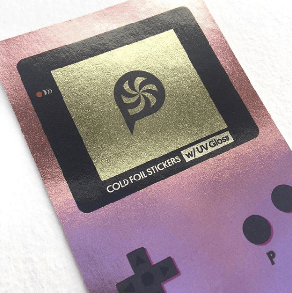
The special finishes are also worth a look. For example, you can go for foil stamping, die-cutting, embossing, letterpress, edge painting, or more.

Services That Make You Want to Come Back

Companies such as Google, Vice, Grammarly, Wendy’s, or Vice, work with Print Peppermint for a good reason. They know that they will not have to worry about the end results and that any special request will be addressed.

In an effort to bring the best possible service, Print Peppermint hand-proofs every single order, no matter how large or small. If you have no in-house designer or agency for your company, they have a cool business card design maker that lets you start from a blank canvas. Even better, if you need more creative designs made by professionals, Print Peppermint has a great in-house design team that can handle graphic design services like logo and business card design.

On top of all that, they support their products with a 100% money-back quality guarantee, a feature that only a company with a high level of confidence in its work can ensure.

Some Printing Inspiration

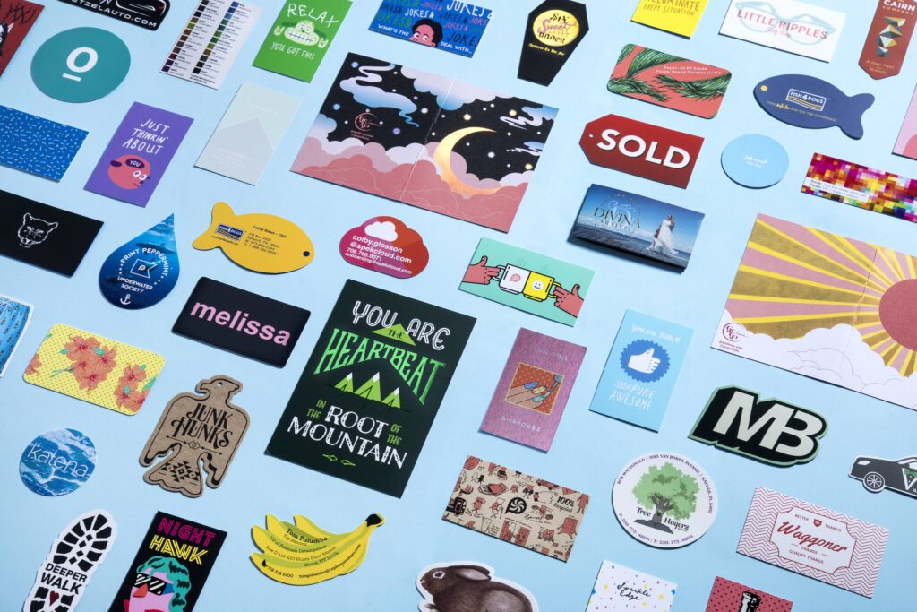
As you know, an image is worth a thousand words. Here are a few examples of the amazing results you can achieve with a good design, smart choice of paper and great printing.

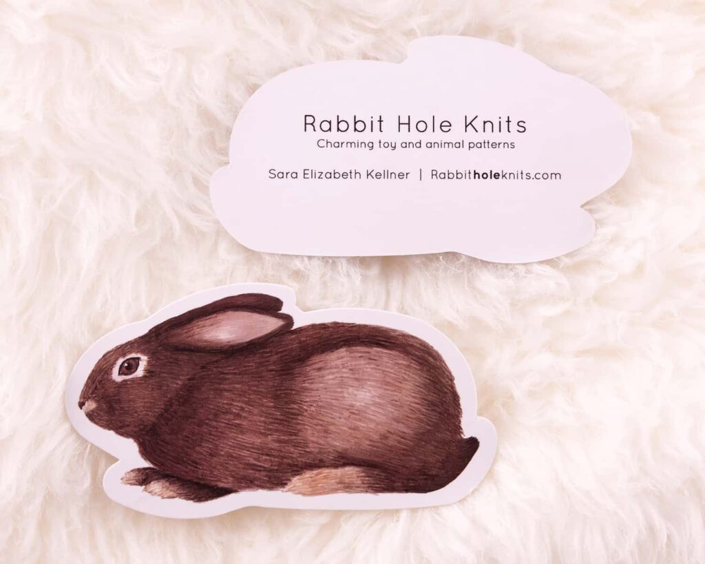
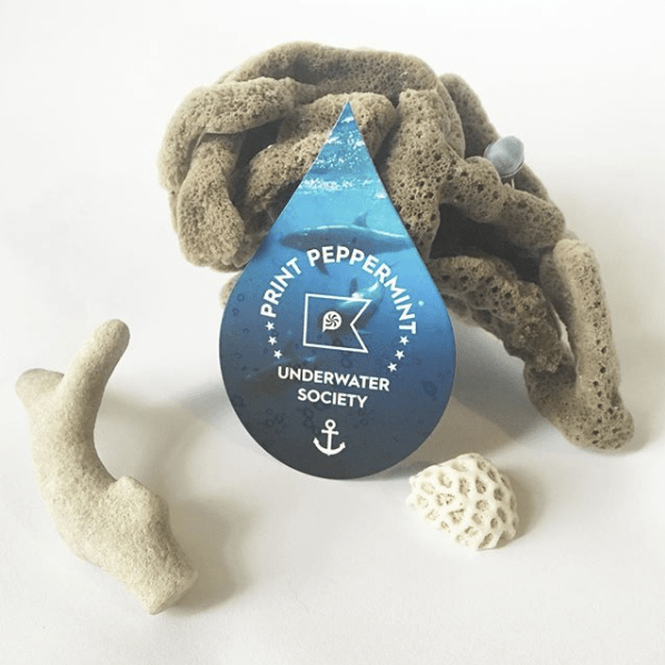
Below, you can find a couple examples of cute and beautiful die-cut business cards.

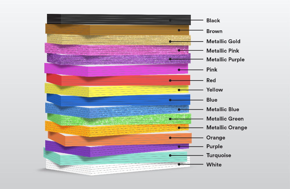
Below: the available colors for business cards with custom painted edges, pretty slick!

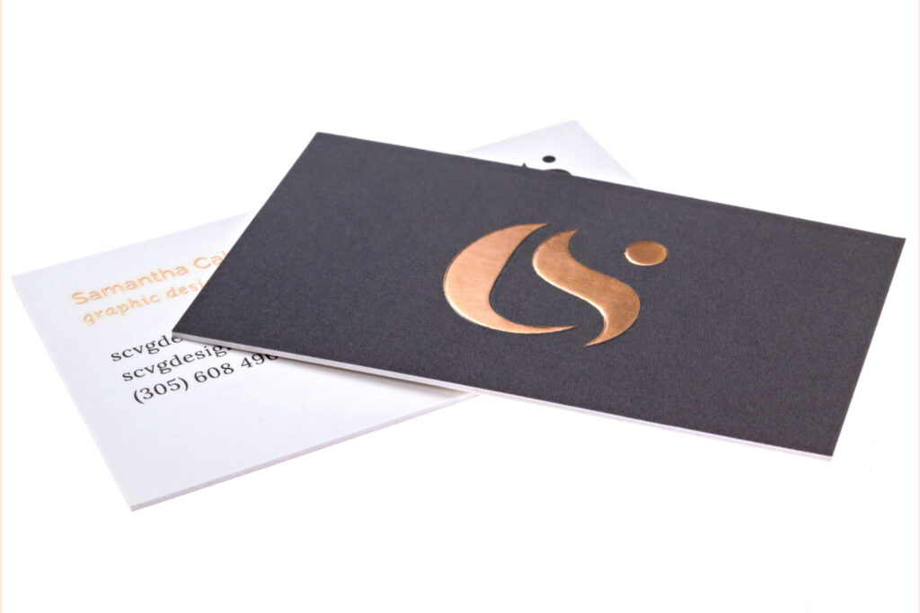
Below: a copper metallic business card that puts a real shine on your branding.

If you are interested in Print Peppermint’s approach to the world of design and printing, make sure to check out their design blog.

Print Peppermint: the Online Printer that Goes for Quality over Quantity

Post pobrano z: Print Peppermint: the Online Printer that Goes for Quality over Quantity

If you are a graphic designer who regularly needs to print his work, you know how frustrating it can be to work with some online printers. Most just have the price as their top-selling point.

Print Peppermint made other choices. At the core of their values: quality is the most important aspect when it comes to printing, pretty much on the same level of importance as innovation and offering new products to their customers.

With this mindset and commitment, Print Peppermint brings you the best of both worlds: the convenience and availability of an online shop combined with the quality of a true craftsman of printing.

Printing Products & Services

Print Peppermint offers plenty of printing products, but their high-end business cards are what really gave them the solid reputation they have in the industry.

Their cards include a meticulously curated family of thick and premium papers including 100% Cotton, Soft-Touch, Triplex Layered, Clear-Frosted Plastic, Onyx Black Suede, Recycled Kraft, and many more.

The special finishes are also worth a look. For example, you can go for foil stamping, die-cutting, embossing, letterpress, edge painting, or more.

Services That Make You Want to Come Back

Companies such as Google, Vice, Grammarly, Wendy’s, or Vice, work with Print Peppermint for a good reason. They know that they will not have to worry about the end results and that any special request will be addressed.

In an effort to bring the best possible service, Print Peppermint hand-proofs every single order, no matter how large or small. If you have no in-house designer or agency for your company, they have a cool business card design maker that lets you start from a blank canvas. Even better, if you need more creative designs made by professionals, Print Peppermint has a great in-house design team that can handle graphic design services like logo and business card design.

On top of all that, they support their products with a 100% money-back quality guarantee, a feature that only a company with a high level of confidence in its work can ensure.

Some Printing Inspiration

As you know, an image is worth a thousand words. Here are a few examples of the amazing results you can achieve with a good design, smart choice of paper and great printing.

Below, you can find a couple examples of cute and beautiful die-cut business cards.

Below: the available colors for business cards with custom painted edges, pretty slick!

Below: a copper metallic business card that puts a real shine on your branding.

If you are interested in Print Peppermint’s approach to the world of design and printing, make sure to check out their design blog.

Braille Lego Bricks Designed to Help Blind Children Learn

Post pobrano z: Braille Lego Bricks Designed to Help Blind Children Learn

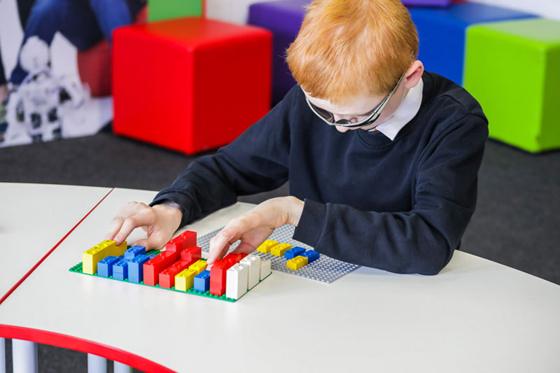
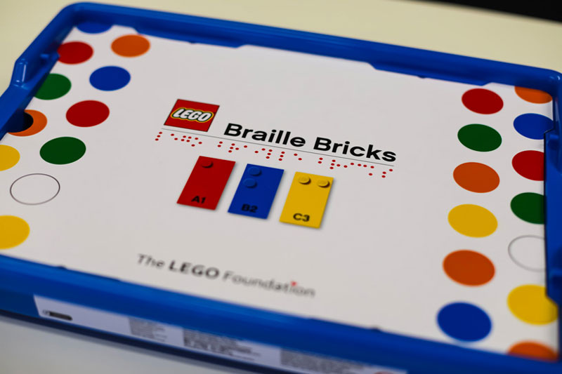
LEGO recently launched a new product with the purpose of helping blind and visually impaired children to learn Braille. The LEGO Foundation is testing the program, which is composed of “Braille bricks”, with each LEGO piece representing a different letter or number.

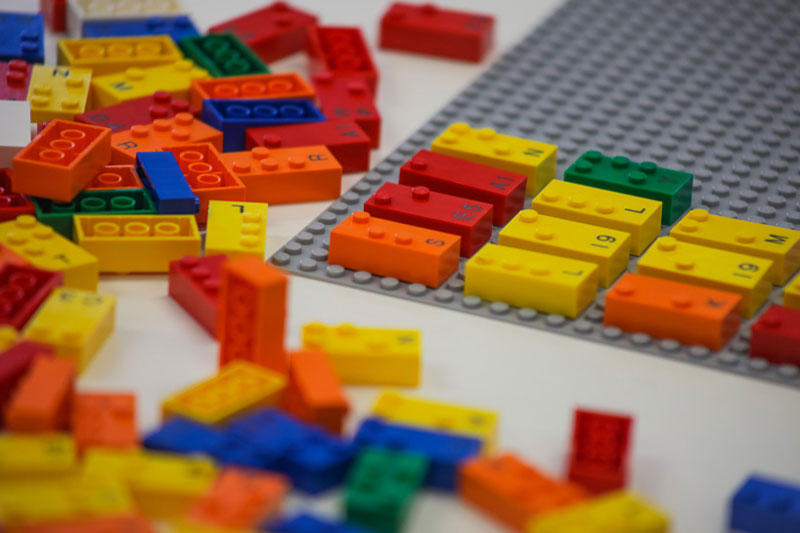
These specific bricks will be molded with both Braille letter and numbers, while still compatible with the good old usual LEGO bricks. In addition, they will include printed characters to allow sighted people to help the children by reading it out loud and use the bricks together with the blind and visually impaired children.

The set will include around 250 different pieces, with the full Braille alphabet, numbers, and mathematical symbols. It is destined to be an inspiration for teaching and interactive games.

The concept of this new product was first suggested to the LEGO Foundation in 2011 by the Danish association for visually impaired, then again by the Brasilian Foundation Dorina Nowill.

Since then, the project took form in a close collaboration with the associations for the visually impaired of the following countries: Denmark, Brasil, UK, and Norway. The first prototypes are now available in the same countries to further evaluate the concept.

If everything goes well, the final product should be launched and distributed freely to some institutions in 2020.

5 Web Design Trends for 2020 that aren’t Going Away any Time Soon

Post pobrano z: 5 Web Design Trends for 2020 that aren’t Going Away any Time Soon

Every time the new year rolls around, we find
ourselves eager to improve the way we live and work. We do it by leaving our
comfort zones long enough to try new things – like the latest design fads.

Good intentions – problematic results.

Chasing after design fads is short-term
thinking. It can be easy and exciting, but the results tend to be short lived.  

Think long term instead.

We’re talking about design trends with staying
power
, a quality you want in your websites as well.

What’s behind staying power? Simply put, it’s a
matter of fashioning your work around strong, tried-and-true design principles.
There’s nothing wrong with “tried-and-true”.

It’s also about engaging users while not taking
them out of their comfort zones.

Remember – every visitor to your website asks
the same question: “What’s in it for me?”

It’s not about you.

Browse the BeTheme
library of 500+ pre-built websites and you’ll see what we’re talking about.
These professionally crafted design aids all have something in common – staying
power.

Ready to put that staying power to work for
you? Take advantage of these tried and tested web design trends.

Trend #1: Skip the tendency to overkill and stick to a
super minimal navigation approach

A wonderful thing happened as we found
ourselves moving toward achieving a mobile-first experience. Websites, when viewed
on desktops, gradually became less complicated and easier to navigate.

When you need to shrink a design element to make
it fit, something has to give. With menus, its available space and the allowable
number of links. Designers have addressed that on mobile sites by limiting the
number of key pages in the primary menu. Secondary links are relegated to
footers or sidebars and call-to-action buttons are likewise distributed. The
result is much cleaner design.

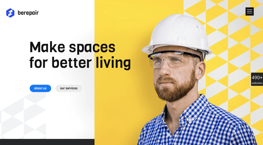
BeRepair
is an attractive example of this. This pre-built website has tucked its
navigation menu neatly under the hamburger menu icon.

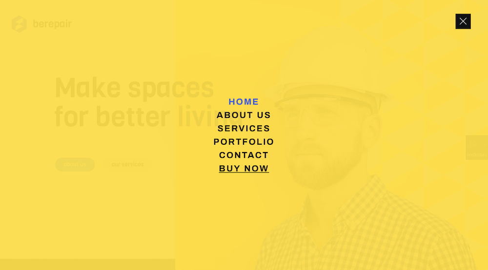
Upon opening the pop-out menu you’ll notice it
follows the less-is-more design trend – short, easy-to-navigate links in a sea
of white space.

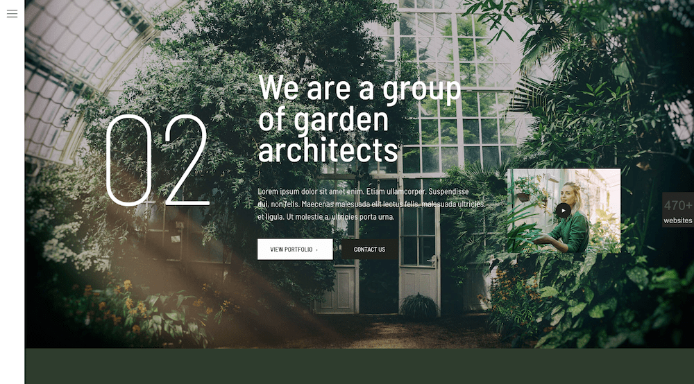
BeGarden,
with its non-traditional navigation benefits from a minimalist approach. It is demonstrated
in its left-aligned menu.

Trend #2: Add greater emphasis to your message with white
space

It’s all about doing more with less. This
design trend can be lots of fun to work with.

Users like it too. A crisp, concise, to-the-point
message in a wide open space can help your conversion rate – a lot.

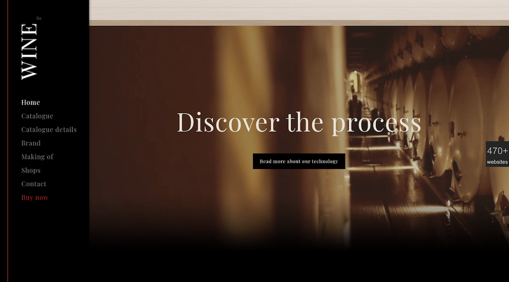
This applies to videos as well. Brevity rules –
as illustrated at the bottom of BeWine.

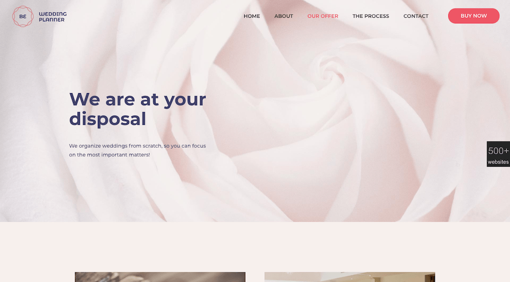
The BeWeddingPlanner
site shows how powerful simple imagery can be in telling your brand’s story.

Some text is usually necessary, but in this
case not very much.

Trend #3: Give visitors a human face to connect to

It’s not about you.  That’s worth repeating. Blog readers, business
customers, and online shoppers have something in common. They seek out brands
they feel they can be loyal to.

The way you present your website to them can strongly
influence how they will initially evaluate your brand. And the best way to do
that is to “talk” to them. Make them feel like there are real people behind
what they are seeing on the screen; people that have their best interests at
heart.

Adding warmth to your site can be extremely
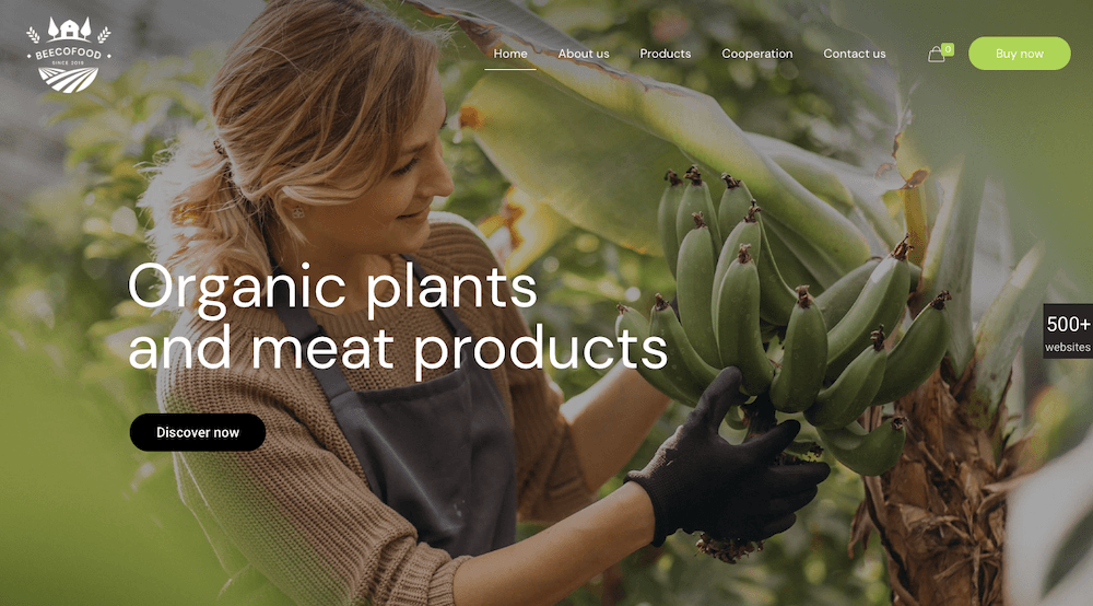
effective. BeEcoFood
does this with a lively header.

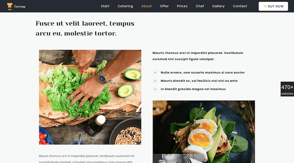
BeCatering
does so by adding a human touch. It’s like the food is being prepared just for
you.

Trend #4: Create a harmonious experience with
universally-accepted typography

The importance of typography to good web design
should be obvious, but you need to do your font homework. Not all font styles
are 100% browser and device friendly, so you need to do a little research.
Sans-serif fonts like Arial, Roboto, and Tahoma are safe choices; as is Times
New Roman for a serif font.

There are many more of course. Just take the time
to verify they work across all devices and browsers.

Pick a font you know to be web safe so you can
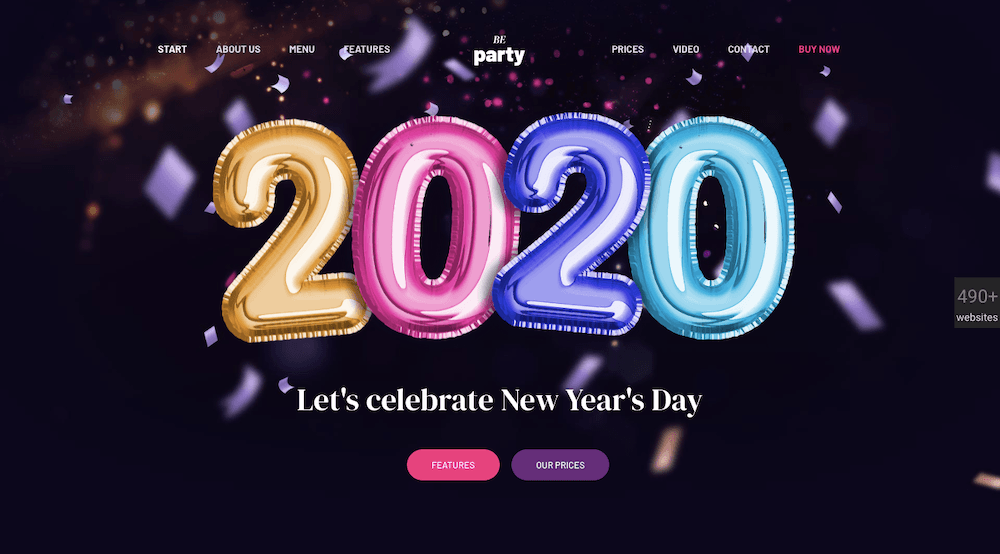
devote your creative energies to other tasks. BeParty’s
animation is an example.

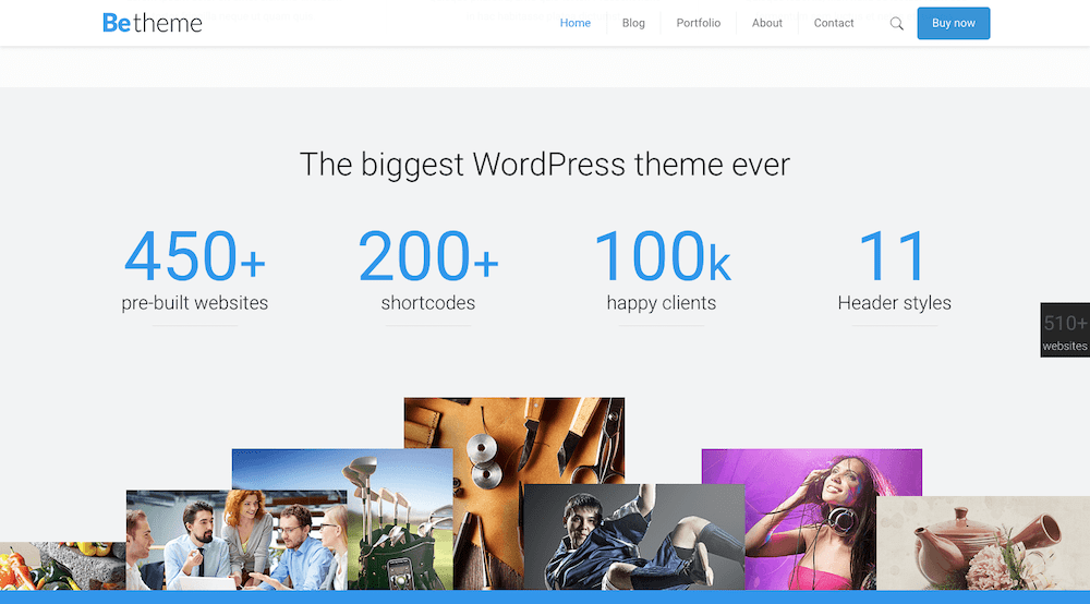
Or, an eye catching design like this BeTheme’s
website page, with its minimal text, plenty of white space, and engaging and
informative imagery.

Trend #5: Dark mode is here to stay – Embrace it

Dark mode is a popular, relatively new design
trend. Look at all the ways its being used and you can see it definitely has
staying power.

Users love Dark mode because it’s friendly on
the eyes. That’s important since those on mobile show no signs of spending less
time looking at their screens. Quite the opposite in fact.

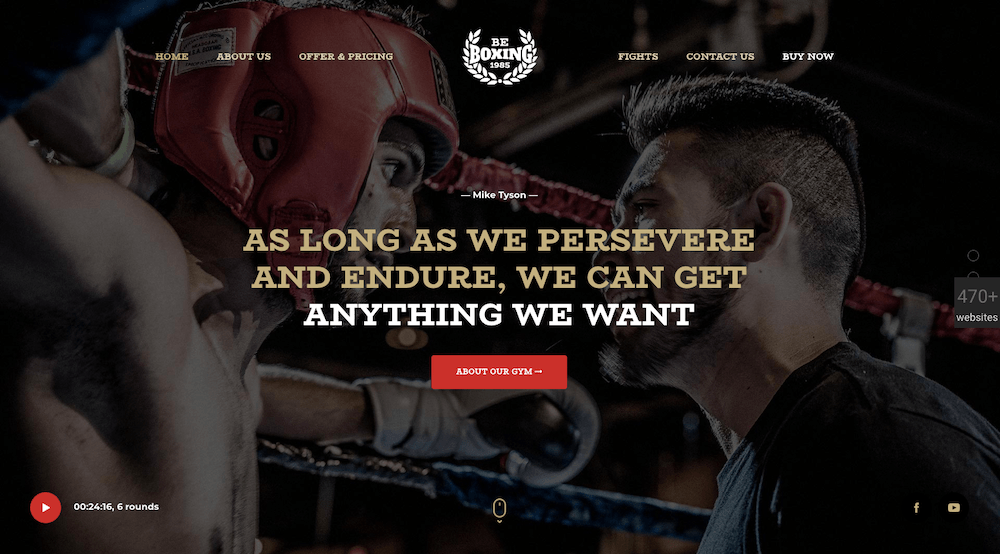
Although websites may tend to grow darker, good
design dictates they do so in the proper contexts – as is the case with BeBoxing’s
powerful hero image.

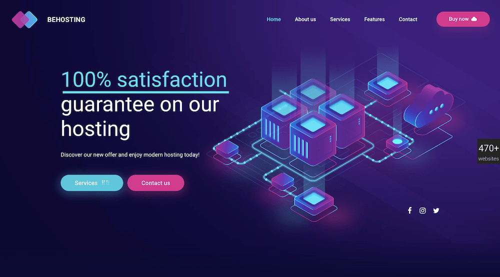
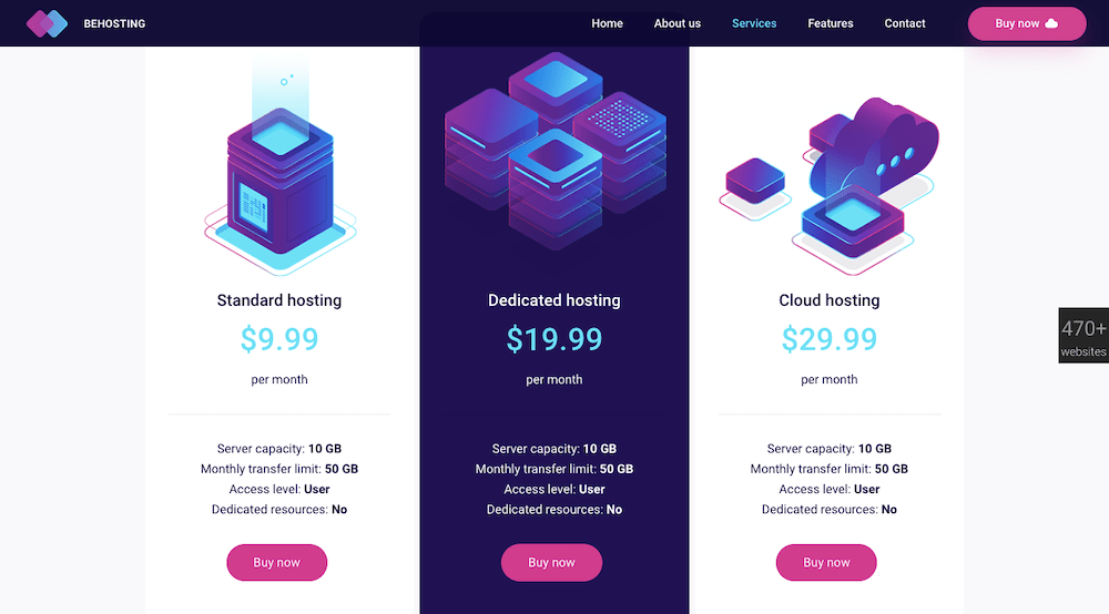
BeHosting
uses the dark mode trend to make its key messages stand out in a dramatic,
delightfully pleasing way.

Which web design trends will you adopt this year?

You don’t what to invest your time and energy
in a web design trend that might be a passing fad. But if you can find a good
application for it, feel free to use it. You still need to think long term and
make choices that will ensure your websites’ longevity.

Any time a design trend you’ve implemented
stops working for you, it’s time to swap it out for something else.

For the most part, you should be focusing on those
design trends that aren’t going away any time soon. That will always be the
case when you choose to select any of BeTheme’s
500+ pre-built websites
as the foundation for
your web design.

5 Web Design Trends for 2020 that aren’t Going Away any Time Soon

Post pobrano z: 5 Web Design Trends for 2020 that aren’t Going Away any Time Soon

Every time the new year rolls around, we find
ourselves eager to improve the way we live and work. We do it by leaving our
comfort zones long enough to try new things – like the latest design fads.

Good intentions – problematic results.

Chasing after design fads is short-term
thinking. It can be easy and exciting, but the results tend to be short lived.  

Think long term instead.

We’re talking about design trends with staying
power
, a quality you want in your websites as well.

What’s behind staying power? Simply put, it’s a
matter of fashioning your work around strong, tried-and-true design principles.
There’s nothing wrong with “tried-and-true”.

It’s also about engaging users while not taking
them out of their comfort zones.

Remember – every visitor to your website asks
the same question: “What’s in it for me?”

It’s not about you.

Browse the BeTheme
library of 500+ pre-built websites and you’ll see what we’re talking about.
These professionally crafted design aids all have something in common – staying
power.

Ready to put that staying power to work for
you? Take advantage of these tried and tested web design trends.

Trend #1: Skip the tendency to overkill and stick to a
super minimal navigation approach

A wonderful thing happened as we found
ourselves moving toward achieving a mobile-first experience. Websites, when viewed
on desktops, gradually became less complicated and easier to navigate.

When you need to shrink a design element to make
it fit, something has to give. With menus, its available space and the allowable
number of links. Designers have addressed that on mobile sites by limiting the
number of key pages in the primary menu. Secondary links are relegated to
footers or sidebars and call-to-action buttons are likewise distributed. The
result is much cleaner design.

BeRepair
is an attractive example of this. This pre-built website has tucked its
navigation menu neatly under the hamburger menu icon.

Upon opening the pop-out menu you’ll notice it
follows the less-is-more design trend – short, easy-to-navigate links in a sea
of white space.

BeGarden,
with its non-traditional navigation benefits from a minimalist approach. It is demonstrated
in its left-aligned menu.

Trend #2: Add greater emphasis to your message with white
space

It’s all about doing more with less. This
design trend can be lots of fun to work with.

Users like it too. A crisp, concise, to-the-point
message in a wide open space can help your conversion rate – a lot.

This applies to videos as well. Brevity rules –
as illustrated at the bottom of BeWine.

The BeWeddingPlanner
site shows how powerful simple imagery can be in telling your brand’s story.

Some text is usually necessary, but in this
case not very much.

Trend #3: Give visitors a human face to connect to

It’s not about you.  That’s worth repeating. Blog readers, business
customers, and online shoppers have something in common. They seek out brands
they feel they can be loyal to.

The way you present your website to them can strongly
influence how they will initially evaluate your brand. And the best way to do
that is to “talk” to them. Make them feel like there are real people behind
what they are seeing on the screen; people that have their best interests at
heart.

Adding warmth to your site can be extremely
effective. BeEcoFood
does this with a lively header.

BeCatering
does so by adding a human touch. It’s like the food is being prepared just for
you.

Trend #4: Create a harmonious experience with
universally-accepted typography

The importance of typography to good web design
should be obvious, but you need to do your font homework. Not all font styles
are 100% browser and device friendly, so you need to do a little research.
Sans-serif fonts like Arial, Roboto, and Tahoma are safe choices; as is Times
New Roman for a serif font.

There are many more of course. Just take the time
to verify they work across all devices and browsers.

Pick a font you know to be web safe so you can
devote your creative energies to other tasks. BeParty’s
animation is an example.

Or, an eye catching design like this BeTheme’s
website page, with its minimal text, plenty of white space, and engaging and
informative imagery.

Trend #5: Dark mode is here to stay – Embrace it

Dark mode is a popular, relatively new design
trend. Look at all the ways its being used and you can see it definitely has
staying power.

Users love Dark mode because it’s friendly on
the eyes. That’s important since those on mobile show no signs of spending less
time looking at their screens. Quite the opposite in fact.

Although websites may tend to grow darker, good
design dictates they do so in the proper contexts – as is the case with BeBoxing’s
powerful hero image.

BeHosting
uses the dark mode trend to make its key messages stand out in a dramatic,
delightfully pleasing way.

Which web design trends will you adopt this year?

You don’t what to invest your time and energy
in a web design trend that might be a passing fad. But if you can find a good
application for it, feel free to use it. You still need to think long term and
make choices that will ensure your websites’ longevity.

Any time a design trend you’ve implemented
stops working for you, it’s time to swap it out for something else.

For the most part, you should be focusing on those
design trends that aren’t going away any time soon. That will always be the
case when you choose to select any of BeTheme’s
500+ pre-built websites
as the foundation for
your web design.