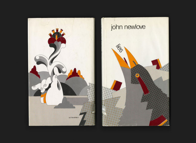
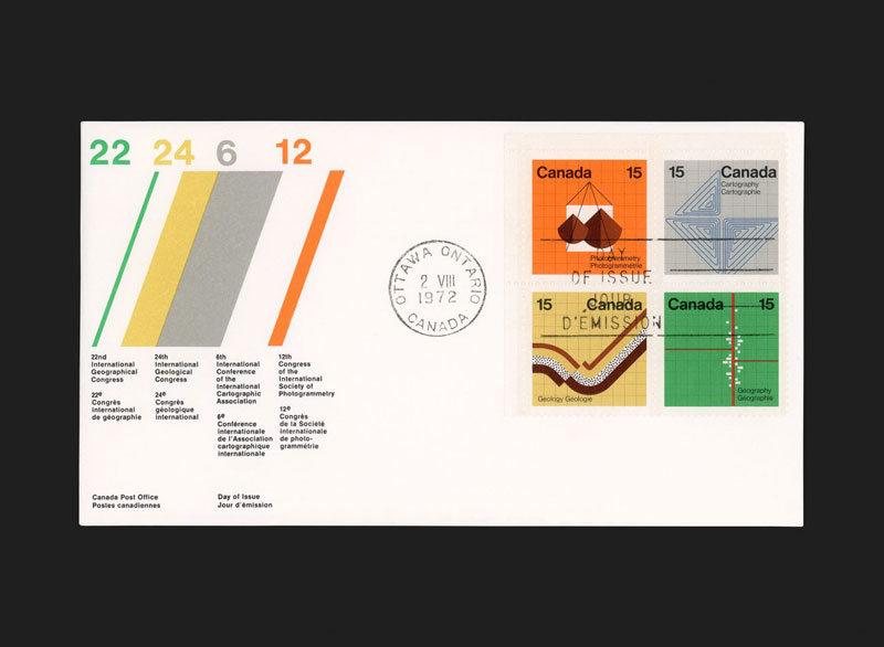
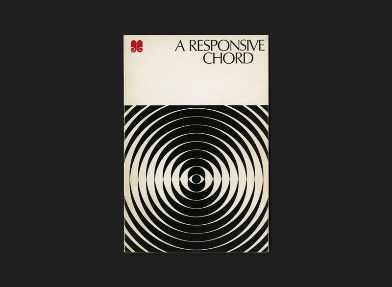
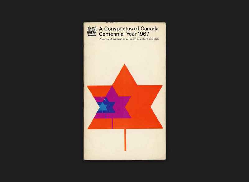
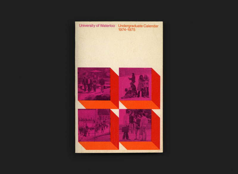
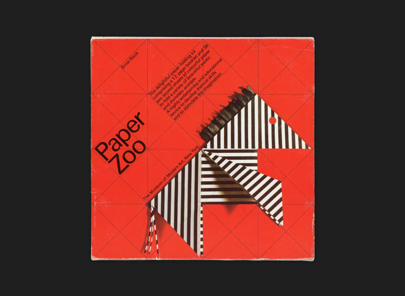
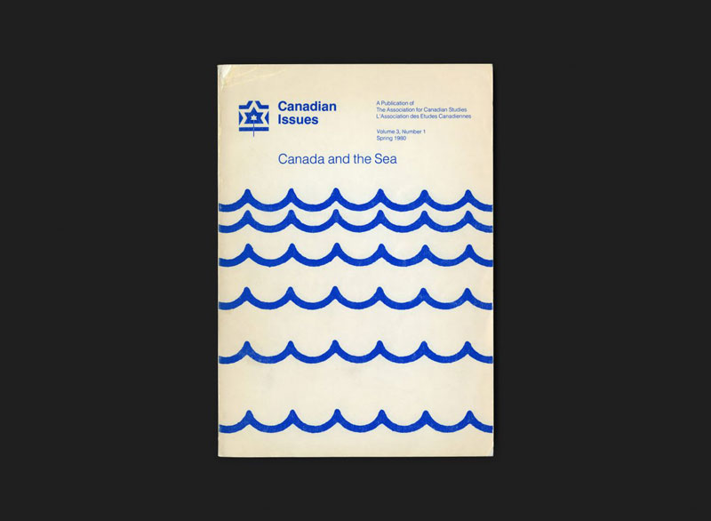
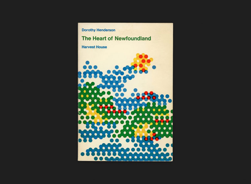
Canada Modern is a physical and digital archive of Canadian graphic design, with modernism central to its glowing heart. It’s a great display of what has been achieved by Canadian designers and a good way to promote the country’s image overseas.
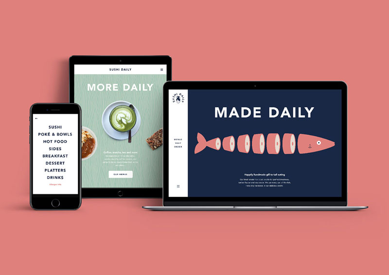
When choosing Without for its branding, Sushi Daily made an excellent decision. The London-based design studio did a great job with the branding, using simple illustrations and typography to create a friendly logo that can easily be declined in many variations.
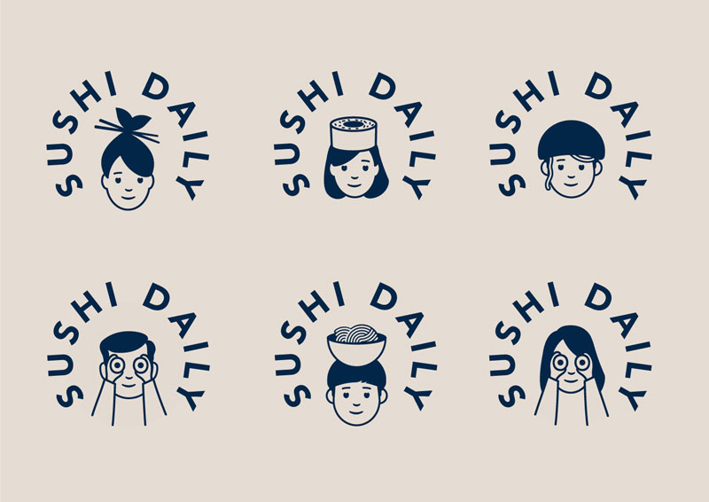
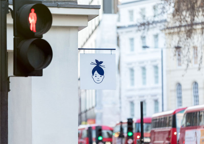
The basic logo is very subtle, the hair of the woman illustrated look like a fish with its mouth wide open, while the sticks in the hair look just like chopsticks. The brand being European, it was important to give it a Japanese touch while still making it attractive for European customers, which is the case in my opinion.
The “core” logo
Below: some illustrations that go along with the logo, the playful style of drawing and topics make it very attractive.
When choosing Without for its branding, Sushi Daily made an excellent decision. The London-based design studio did a great job with the branding, using simple illustrations and typography to create a friendly logo that can easily be declined in many variations.
The basic logo is very subtle, the hair of the woman illustrated look like a fish with its mouth wide open, while the sticks in the hair look just like chopsticks. The brand being European, it was important to give it a Japanese touch while still making it attractive for European customers, which is the case in my opinion.
The “core” logo
Below: some illustrations that go along with the logo, the playful style of drawing and topics make it very attractive.
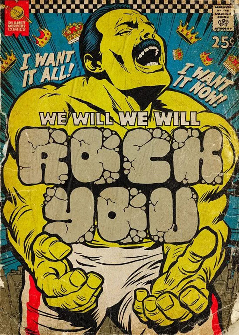
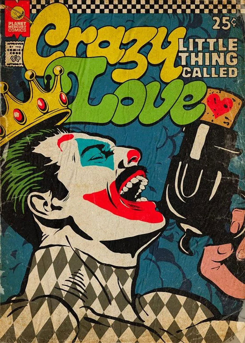
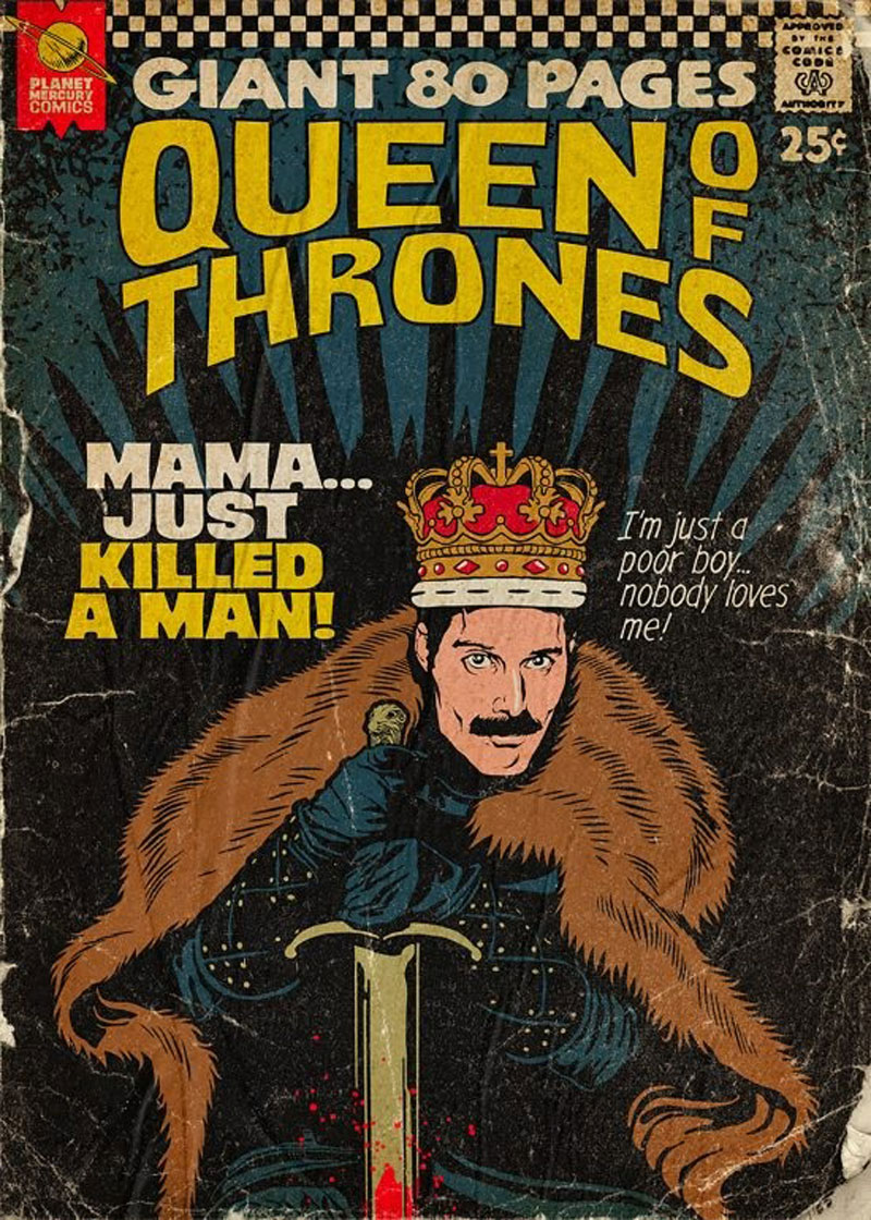
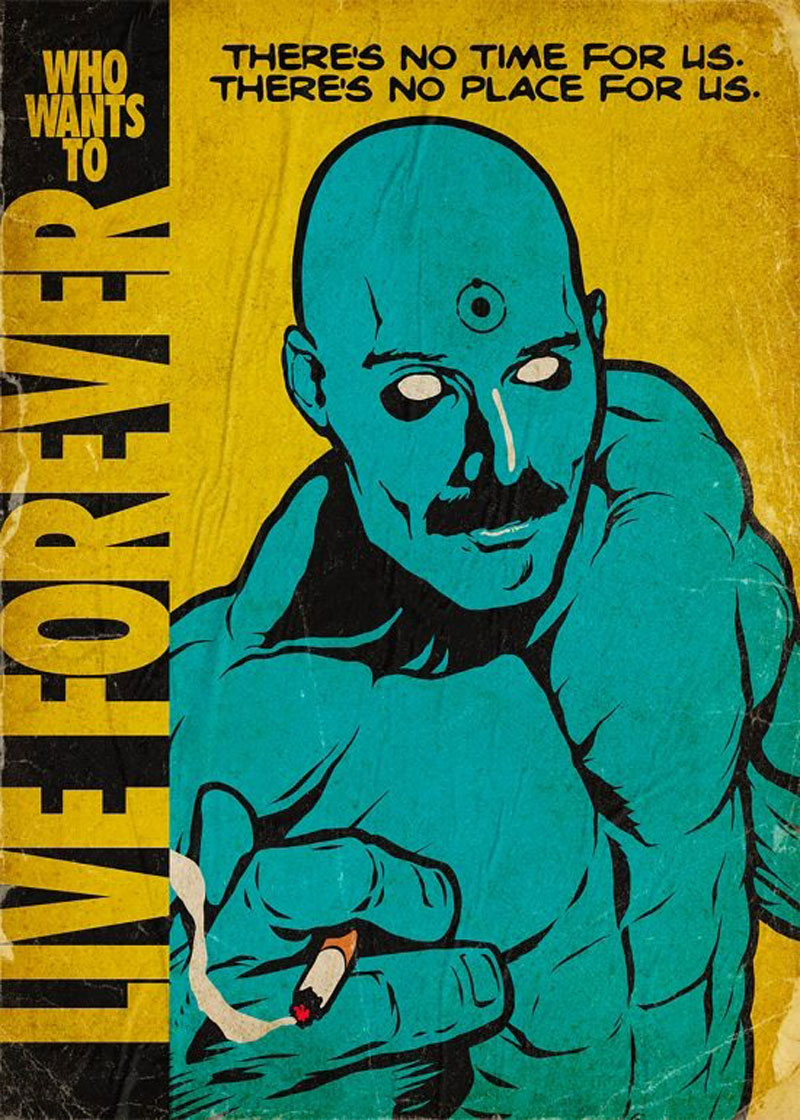
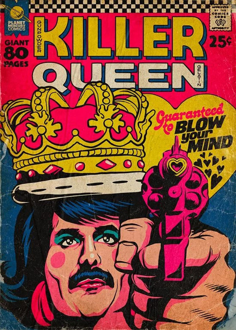
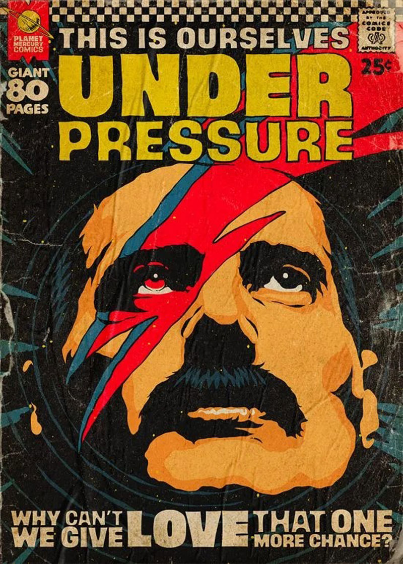
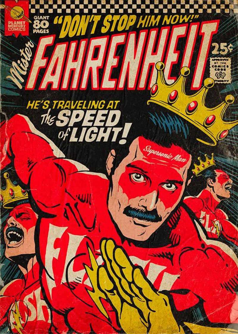
Butcher Billy is an illustrator based in Curitiba, Brazil. He creates powerful illustrations in a comic book style and has a real talent for creating a vintage look-and-feel in his art.
One of his most popular illustration series is this Planet Mercury work. In it, the artist integrated rockstar Freddy Mercury into comics covers and turned him into all kinds of heroes. This work can be purchased as prints on the illustrator’s Redbubble shop.
Butcher Billy is an illustrator based in Curitiba, Brazil. He creates powerful illustrations in a comic book style and has a real talent for creating a vintage look-and-feel in his art.
One of his most popular illustration series is this Planet Mercury work. In it, the artist integrated rockstar Freddy Mercury into comics covers and turned him into all kinds of heroes. This work can be purchased as prints on the illustrator’s Redbubble shop.
Butcher Billy is an illustrator based in Curitiba, Brazil. He creates powerful illustrations in a comic book style and has a real talent for creating a vintage look-and-feel in his art.
One of his most popular illustration series is this Planet Mercury work. In it, the artist integrated rockstar Freddy Mercury into comics covers and turned him into all kinds of heroes. This work can be purchased as prints on the illustrator’s Redbubble shop.
Butcher Billy is an illustrator based in Curitiba, Brazil. He creates powerful illustrations in a comic book style and has a real talent for creating a vintage look-and-feel in his art.
One of his most popular illustration series is this Planet Mercury work. In it, the artist integrated rockstar Freddy Mercury into comics covers and turned him into all kinds of heroes. This work can be purchased as prints on the illustrator’s Redbubble shop.
Mr. Marcel is an online school that teaches design and related topics. As such, they have to produce great visuals for their promotional material. To do this, they worked with Tata&Friends, a Spanish design agency.
The designers went for bichromic visuals, with handmade designs and great photography. The color scheme is very subtle, with gorgeous use of white space and well-aligned typography.