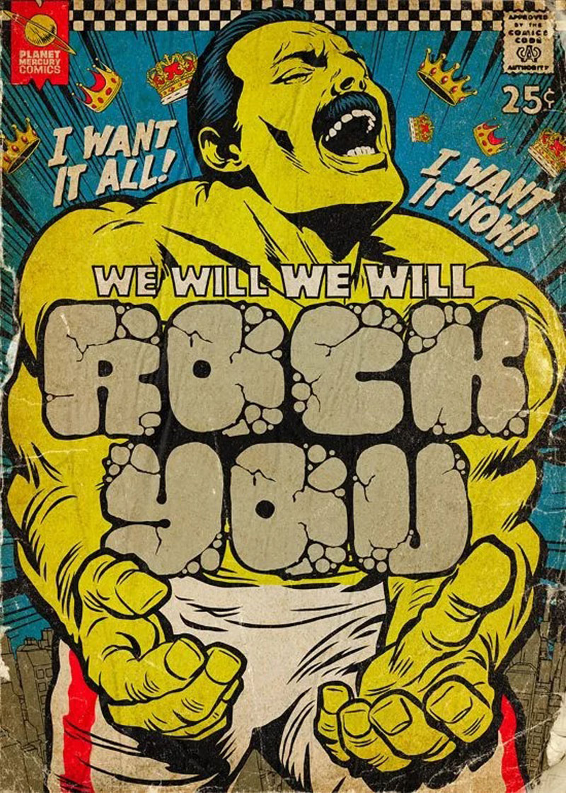
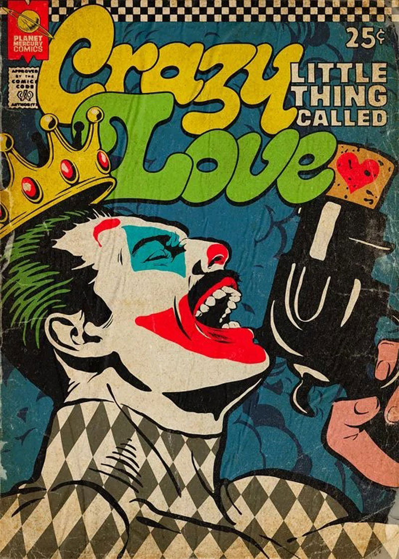
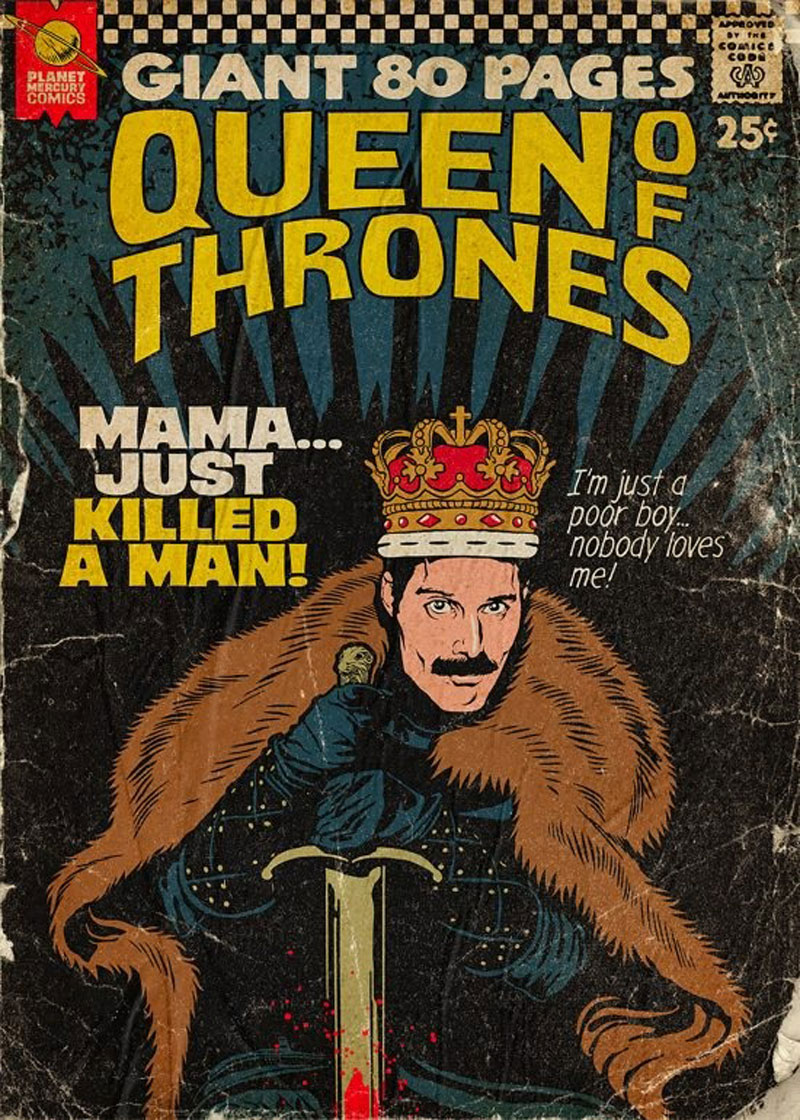
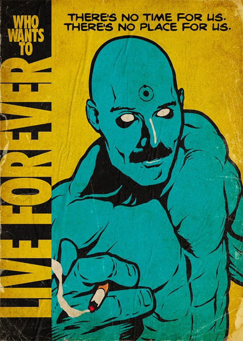
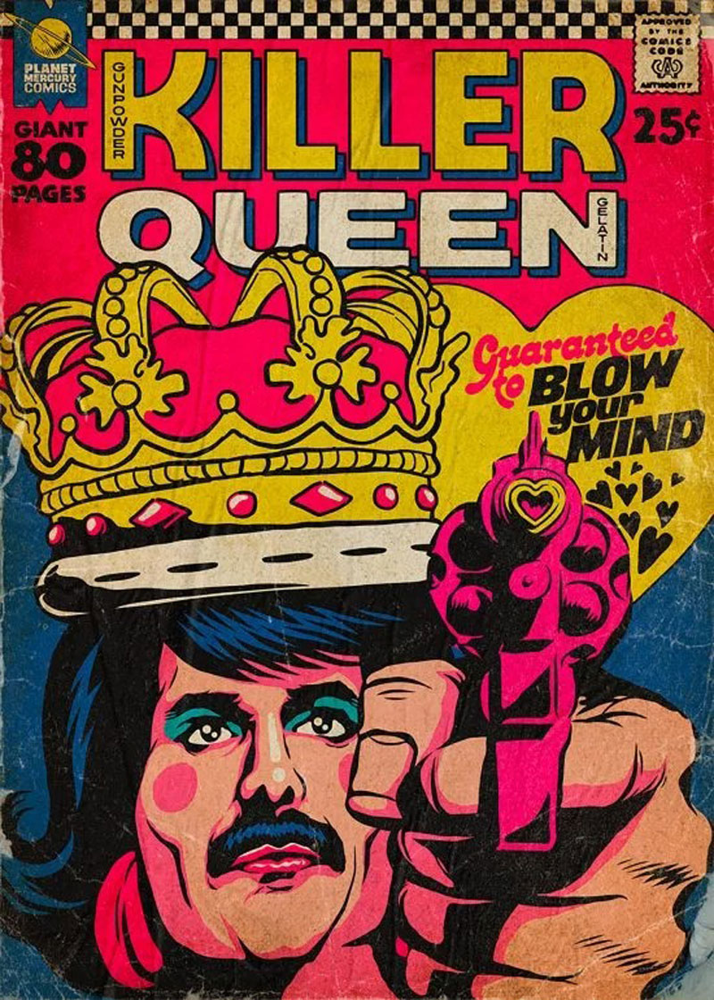
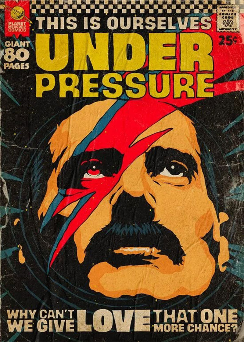
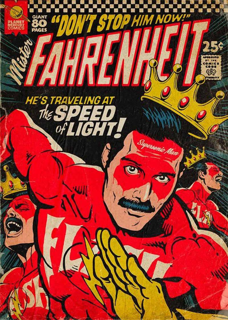
Butcher Billy is an illustrator based in Curitiba, Brazil. He creates powerful illustrations in a comic book style and has a real talent for creating a vintage look-and-feel in his art.
One of his most popular illustration series is this Planet Mercury work. In it, the artist integrated rockstar Freddy Mercury into comics covers and turned him into all kinds of heroes. This work can be purchased as prints on the illustrator’s Redbubble shop.
Butcher Billy is an illustrator based in Curitiba, Brazil. He creates powerful illustrations in a comic book style and has a real talent for creating a vintage look-and-feel in his art.
One of his most popular illustration series is this Planet Mercury work. In it, the artist integrated rockstar Freddy Mercury into comics covers and turned him into all kinds of heroes. This work can be purchased as prints on the illustrator’s Redbubble shop.
Butcher Billy is an illustrator based in Curitiba, Brazil. He creates powerful illustrations in a comic book style and has a real talent for creating a vintage look-and-feel in his art.
One of his most popular illustration series is this Planet Mercury work. In it, the artist integrated rockstar Freddy Mercury into comics covers and turned him into all kinds of heroes. This work can be purchased as prints on the illustrator’s Redbubble shop.
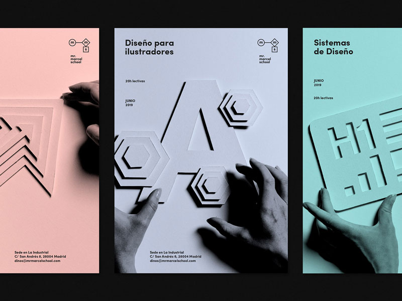
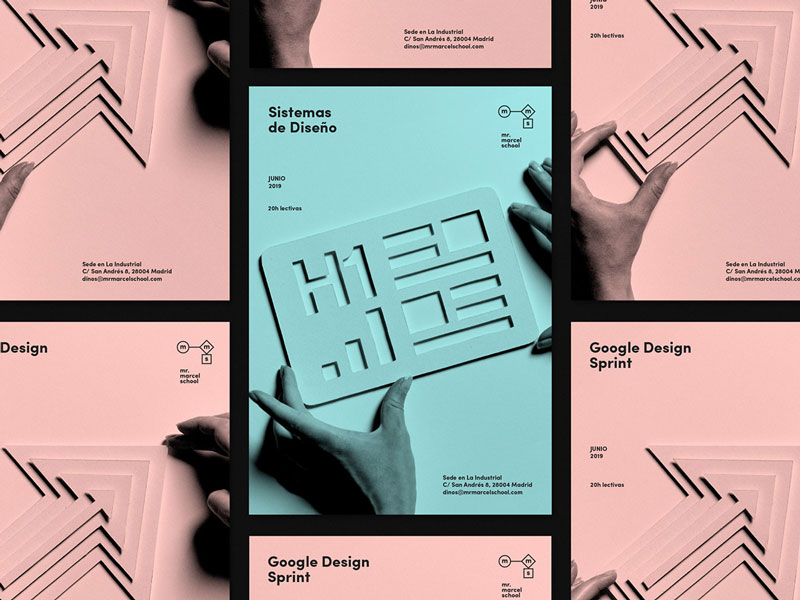
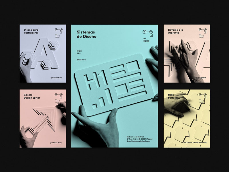
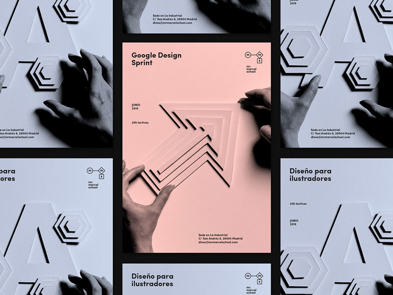
Mr. Marcel is an online school that teaches design and related topics. As such, they have to produce great visuals for their promotional material. To do this, they worked with Tata&Friends, a Spanish design agency.
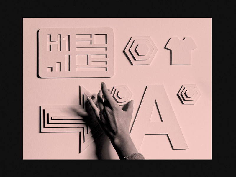
The designers went for bichromic visuals, with handmade designs and great photography. The color scheme is very subtle, with gorgeous use of white space and well-aligned typography.
Mr. Marcel is an online school that teaches design and related topics. As such, they have to produce great visuals for their promotional material. To do this, they worked with Tata&Friends, a Spanish design agency.
The designers went for bichromic visuals, with handmade designs and great photography. The color scheme is very subtle, with gorgeous use of white space and well-aligned typography.
Mr. Marcel is an online school that teaches design and related topics. As such, they have to produce great visuals for their promotional material. To do this, they worked with Tata&Friends, a Spanish design agency.
The designers went for bichromic visuals, with handmade designs and great photography. The color scheme is very subtle, with gorgeous use of white space and well-aligned typography.
Are you a social media influencer? If so, to generate the maximum amount of income from your efforts, your branding across all channels should match.
Making your website and YouTube backdrop match doesn’t mean they have to be twins. For instance, if you film against the backdrop of a bookshelf, your website design doesn’t need to look like a bookshelf. However, aligning your website design with your bookshelf backdrop will strengthen your brand image across both platforms.
Match the style, not the pattern
The idea of making your YouTube backdrops match your website is based on the same fundamentals that cause people to create branded stationery and matching address labels: it creates and reinforces the perception of your brand.
What kind of image are you trying to portray to your visitors and fans? Dark? Happy? Cryptic? Intellectual? Figure out what image you want first, and then research what that looks like by looking at what other people are doing.
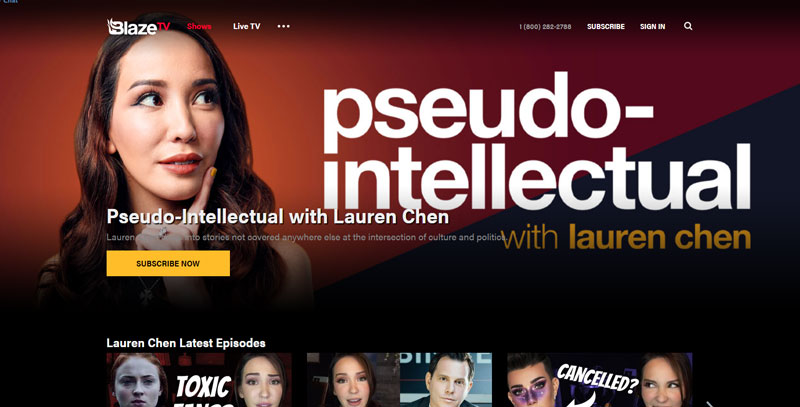
If you’re going for the intellectual look, a good example is Lauren Chen’s Pseudo-Intellectual show on Blaze TV. Chen’s videos generally have two different backdrops. There’s always a bookshelf, but the background features either a glowing electric fireplace or a sign depicting the name of her show. Both backgrounds match the color scheme on Chen’s Blaze TV homepage, and the banners used in her videos use the show’s official color scheme.
For many YouTubers, the electric fireplace has become a staple background, adding a touch of elegance to what might otherwise be a plain wall. The problem is, when a person’s blog or website doesn’t maintain the same style of elegance or sophistication, that person’s brand image is slightly diminished.
If you’re using an electric fireplace for a YouTube background, make sure your website design matches in style. For instance, if your fireplace is mahogany, try redesigning your website’s theme using mahogany, black, and perhaps a dark gray. If you’re unable to change your existing website theme, consider hiring someone to create a new one for you. When you’re serious about being an influencer, a redesign is worth every penny.
Matching designs tell people they’re in the right place
The first thing a visitor wants to know when they land on a webpage or video is, “am I in the right place?” It’s not necessarily a question asked consciously, but if anything hints to the visitor that they might be in the wrong place, they’re likely to leave.
By creating matching designs that match at least on some level, you’re immediately making visitors feel comfortable, and like they’re in the right place. This is especially important when you cross-reference platforms. For example, if you tell people to visit your blog from your YouTube videos, your visitors should feel like they haven’t left your realm of content.
Matching designs gives you an image
The reason major corporations spend millions of dollars exposing consumers to a logo is because people will eventually associate those logos with their corporations.
You don’t have to pay for ad space on television to get your logo and image in front of consumers. All you need to do is make sure your visitors and fans see it wherever they find your content. They’ll get used to seeing it, and eventually they’ll recognize it no matter where they see it – even without the presence of your name.
In the marketing world, this is called brand recognition. Investopedia defines brand recognition as “the extent to which the general public (or an organization’s target market) is able to identify a brand by its attributes.” They also state brand recognition is most successful “when people can state a brand without being explicitly exposed to the company’s name, but rather through visual or auditory signifiers like logos, slogans, packaging, colors, or jingles.”
In this regard, your YouTube introduction music, your backdrop, and your visual introduction are equally important. Once you train people to recognize you on one platform, using the same imagery on other platforms will only strengthen brand recognition among your fans.
Create a unifying image
Developing strong brand recognition throughout your internet presence means unifying the image people see. When a person sees multiple styles while interacting with your content, it’s not likely to be remembered or associated with you. For example, if your website theme is a basic template you filled in with stock photos, it’s not going to stick in anyone’s mind.
Creating brand recognition begins with creating a unique and consistent brand image across all online platforms. Make your image match, at least in style.
Are you a social media influencer? If so, to generate the maximum amount of income from your efforts, your branding across all channels should match.
Making your website and YouTube backdrop match doesn’t mean they have to be twins. For instance, if you film against the backdrop of a bookshelf, your website design doesn’t need to look like a bookshelf. However, aligning your website design with your bookshelf backdrop will strengthen your brand image across both platforms.
Match the style, not the pattern
The idea of making your YouTube backdrops match your website is based on the same fundamentals that cause people to create branded stationery and matching address labels: it creates and reinforces the perception of your brand.
What kind of image are you trying to portray to your visitors and fans? Dark? Happy? Cryptic? Intellectual? Figure out what image you want first, and then research what that looks like by looking at what other people are doing.
If you’re going for the intellectual look, a good example is Lauren Chen’s Pseudo-Intellectual show on Blaze TV. Chen’s videos generally have two different backdrops. There’s always a bookshelf, but the background features either a glowing electric fireplace or a sign depicting the name of her show. Both backgrounds match the color scheme on Chen’s Blaze TV homepage, and the banners used in her videos use the show’s official color scheme.
For many YouTubers, the electric fireplace has become a staple background, adding a touch of elegance to what might otherwise be a plain wall. The problem is, when a person’s blog or website doesn’t maintain the same style of elegance or sophistication, that person’s brand image is slightly diminished.
If you’re using an electric fireplace for a YouTube background, make sure your website design matches in style. For instance, if your fireplace is mahogany, try redesigning your website’s theme using mahogany, black, and perhaps a dark gray. If you’re unable to change your existing website theme, consider hiring someone to create a new one for you. When you’re serious about being an influencer, a redesign is worth every penny.
Matching designs tell people they’re in the right place
The first thing a visitor wants to know when they land on a webpage or video is, “am I in the right place?” It’s not necessarily a question asked consciously, but if anything hints to the visitor that they might be in the wrong place, they’re likely to leave.
By creating matching designs that match at least on some level, you’re immediately making visitors feel comfortable, and like they’re in the right place. This is especially important when you cross-reference platforms. For example, if you tell people to visit your blog from your YouTube videos, your visitors should feel like they haven’t left your realm of content.
Matching designs gives you an image
The reason major corporations spend millions of dollars exposing consumers to a logo is because people will eventually associate those logos with their corporations.
You don’t have to pay for ad space on television to get your logo and image in front of consumers. All you need to do is make sure your visitors and fans see it wherever they find your content. They’ll get used to seeing it, and eventually they’ll recognize it no matter where they see it – even without the presence of your name.
In the marketing world, this is called brand recognition. Investopedia defines brand recognition as “the extent to which the general public (or an organization’s target market) is able to identify a brand by its attributes.” They also state brand recognition is most successful “when people can state a brand without being explicitly exposed to the company’s name, but rather through visual or auditory signifiers like logos, slogans, packaging, colors, or jingles.”
In this regard, your YouTube introduction music, your backdrop, and your visual introduction are equally important. Once you train people to recognize you on one platform, using the same imagery on other platforms will only strengthen brand recognition among your fans.
Create a unifying image
Developing strong brand recognition throughout your internet presence means unifying the image people see. When a person sees multiple styles while interacting with your content, it’s not likely to be remembered or associated with you. For example, if your website theme is a basic template you filled in with stock photos, it’s not going to stick in anyone’s mind.
Creating brand recognition begins with creating a unique and consistent brand image across all online platforms. Make your image match, at least in style.
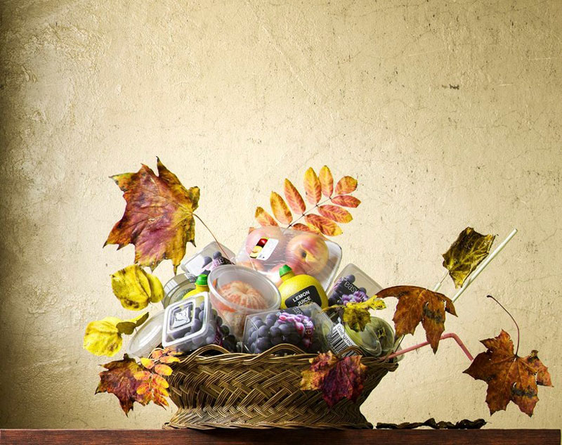
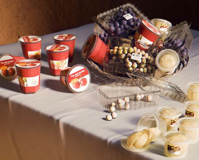
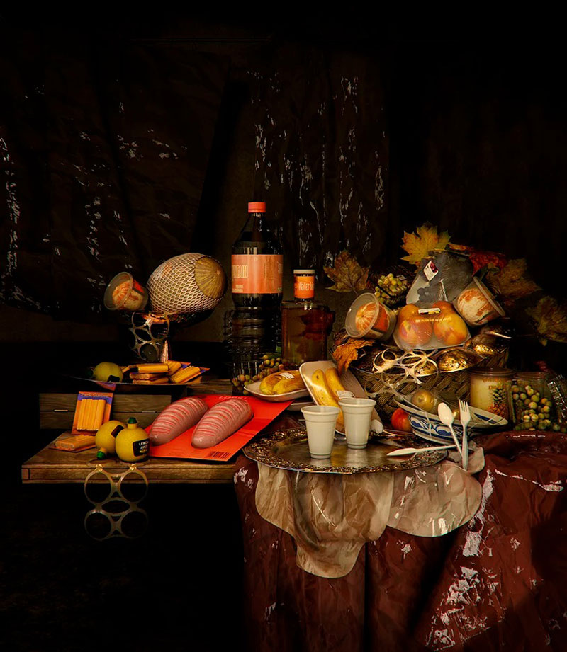
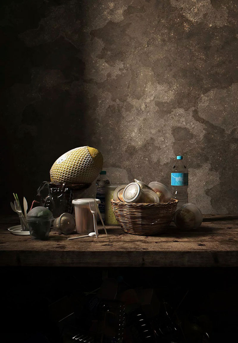
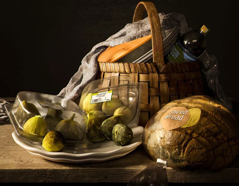
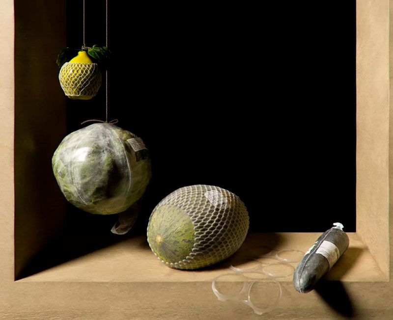
“Not Longer Life” is a series of reinterpretation of famous still life paintings. Obviously, there is a twist to these new looks at these artworks. In these dead still life paintings, the fruits and other items are packed with plastic, thus highlighting the absurdity of modern packaging.
The absurdity of the packages is the most evident on the fruits when the natural shell has been removed and replaced by a less efficient plastic wrap or box. It also points to our lazyness as consumer, buying lemon juice already pressed and filled in a plastic bottle, just so we don’t have to do a little effort to get some juice.
This project was imagined and conceived by Quatre Caps, an architecture studio based in Valencia, Spain. The original paintings were the work of famous classic painters, such as Monet or Caravaggio, among others.
“Not Longer Life” is a series of reinterpretation of famous still life paintings. Obviously, there is a twist to these new looks at these artworks. In these dead still life paintings, the fruits and other items are packed with plastic, thus highlighting the absurdity of modern packaging.
The absurdity of the packages is the most evident on the fruits when the natural shell has been removed and replaced by a less efficient plastic wrap or box. It also points to our lazyness as consumer, buying lemon juice already pressed and filled in a plastic bottle, just so we don’t have to do a little effort to get some juice.
This project was imagined and conceived by Quatre Caps, an architecture studio based in Valencia, Spain. The original paintings were the work of famous classic painters, such as Monet or Caravaggio, among others.