Archiwum kategorii: Design

How to create a user friendly mobile app

Post pobrano z: How to create a user friendly mobile app

The usage of mobile technology and the number of users is constantly increasing. With the always-growing list of mobile activities, the focus is to upgrade individual features that combine into a modern mobile using experience.

The experience of a mobile user consists of the user’s approach and impressions prior to his mobile interaction; during his mobile interaction; and afterwards. It encompasses web browsing and applications on all types of mobile devices (low-featured smart phones to high definition tablets).

The ultimate result of technology improvement is that businesses have adjusted the quality of their mobile services to the same level of customer experience they offer in their stores.

Few ideas on how to build an excellent User-Friendly Mobile App Experience
Image source: Matteo Pasuto

The Customer sets the Rules

Due to the large choice and the severe competition, customers have more and more power to choose the appropriate device and to ensure that their mobile journey will be diverse and will include various channels.

They use several devices and as technology modernizes, they upgrade their smartphones, tablets or laptops. The key to keep them satisfied is to provide a persistent, excellent-quality interface and to guide their experience through few simple steps:

Recognizing Your Users’ Context
Image source: daRwin

Mobile experiences encompass large number of factors, some of them related to the app, while others with the personality of the user operating with it and the context of the operation.

For instance, checking your phone usually happens while you’re busy with a different activity. Most often, you’re trying to ‘kill time’ while traveling, having a coffee in the morning or waiting to reach the desk in a bank.

Clear Presentation

As we mentioned, people use their phones mostly when they are engaged in another, less divertive activity. Therefore, we must always approach their activities as something that is done rapidly, with no time to lose.
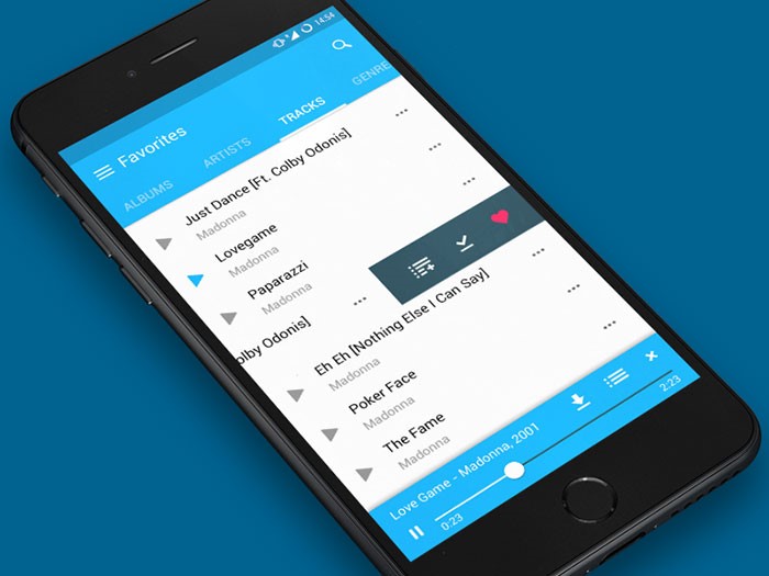
Image source: Fireart Studio

A user friendly app needs to use all of the real estate that can be found on the screen in a balanced manner. Your designs and layouts may appear perfect, but the secret lies in the fact they need to be equally applicable in every condition. For instance, it is very likely that your customer will have to use them with outside, rushing or facing a terrible connection, so you have to make sure they will remain applicable.

Remaining committed to Security

Your customer’s interactions and transactions need to be secured in every moment. It is the customers’ right and your obligation to employ secure user friendly mobile design and to cooperate only with vendors and other parties that share the same security commitment.

Marvelous Design
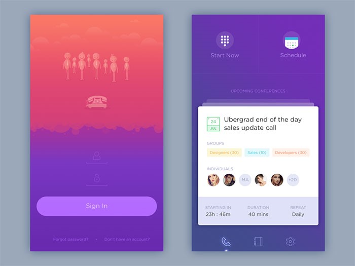
Image source: Zulal Ahmad

To start with, there is no general definition of good design. It simply depends on the taste and preferences of your customers. Design is a plan for arranging elements in such a way as best to accomplish a particular purpose.

If you’re looking for a more straightforward definition, good design is obvious. Great design is transparent. How to make a decision? Test it and check what your users think about it.

Gradual and Sustainable Improvement
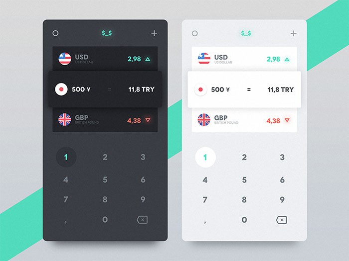
Image source: Emre Durmus

The main rationale behind technological development is to empower people and to simplify their way of living. If you wish to remain on the scene, you have to follow every development and to remain innovative.

This is a ‘full-store’ chain-you have to develop your software, the partners you’re integrating, as well as the service you’re providing to your customers. It is only your creativity that can ensure optimal customer experience and bring you maximal results.

Avoiding design mistakes in the User-Friendly Mobile App Experience

It isn’t all about color
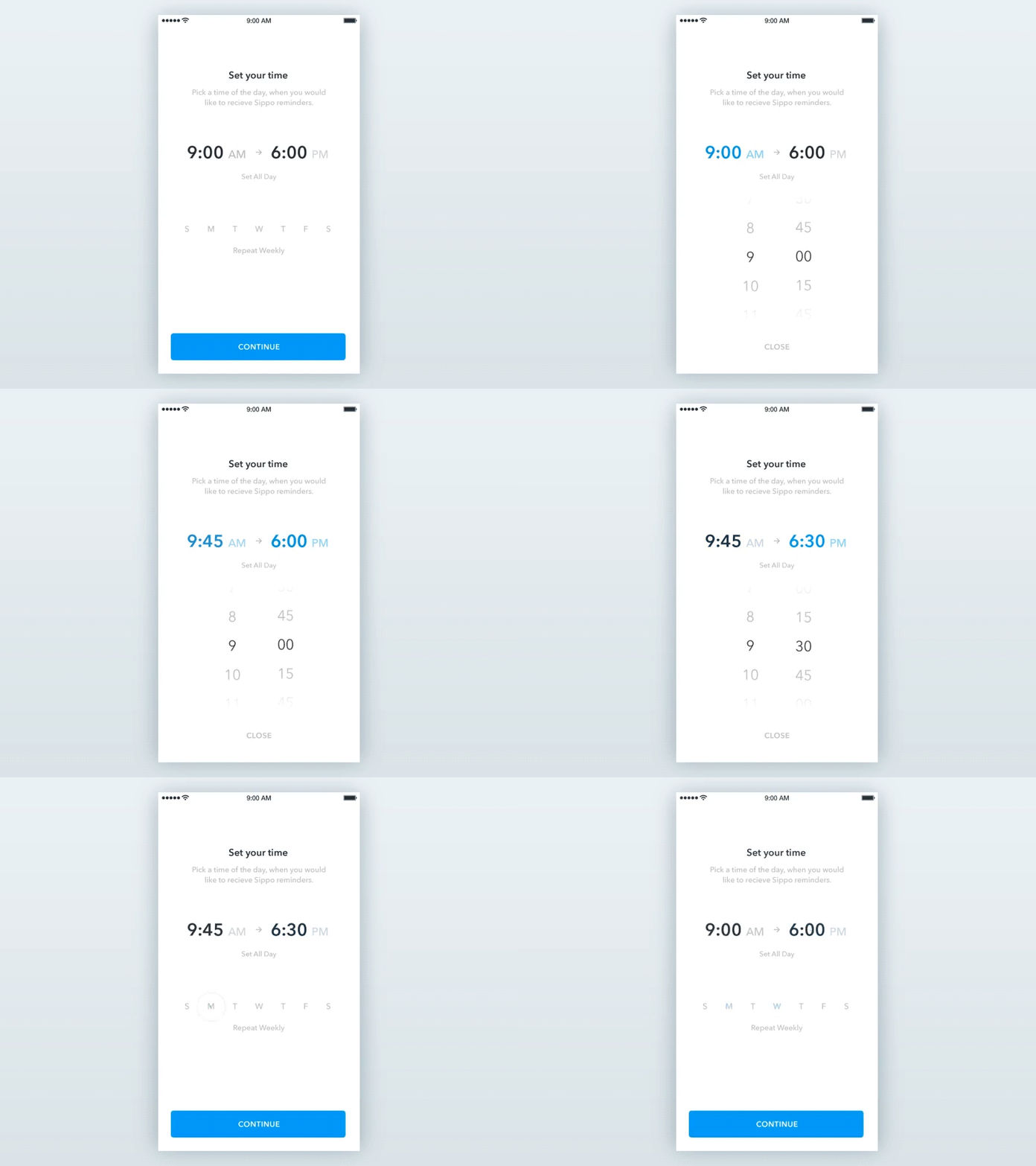
Image source: Dejan Markovic

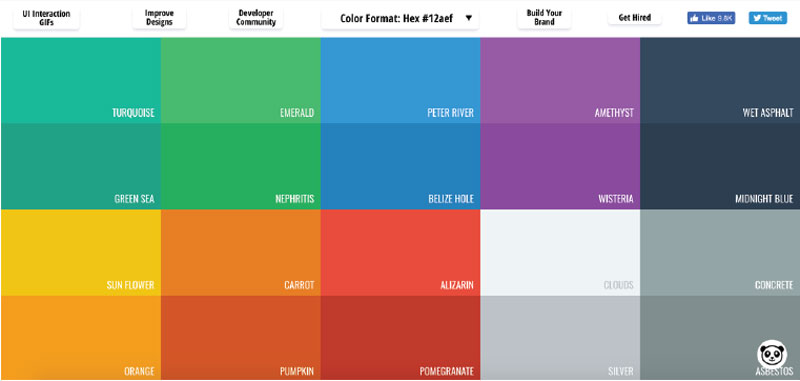
A user-friendly app experience will be significantly bettered with interface decluttering. The best way to achieve this in your design is to employ a restricted palette of colors.

Learn from successful apps and try using the traditional black and white combination, but they apply sharper tones for headlines or other areas that need to be highlighted. They try to attract user’s attention with vivid red or orange. With no color diversity to distract them, users are free to navigate their interface without fearing to click on the wrong spot.

Icons are not random decoration tools
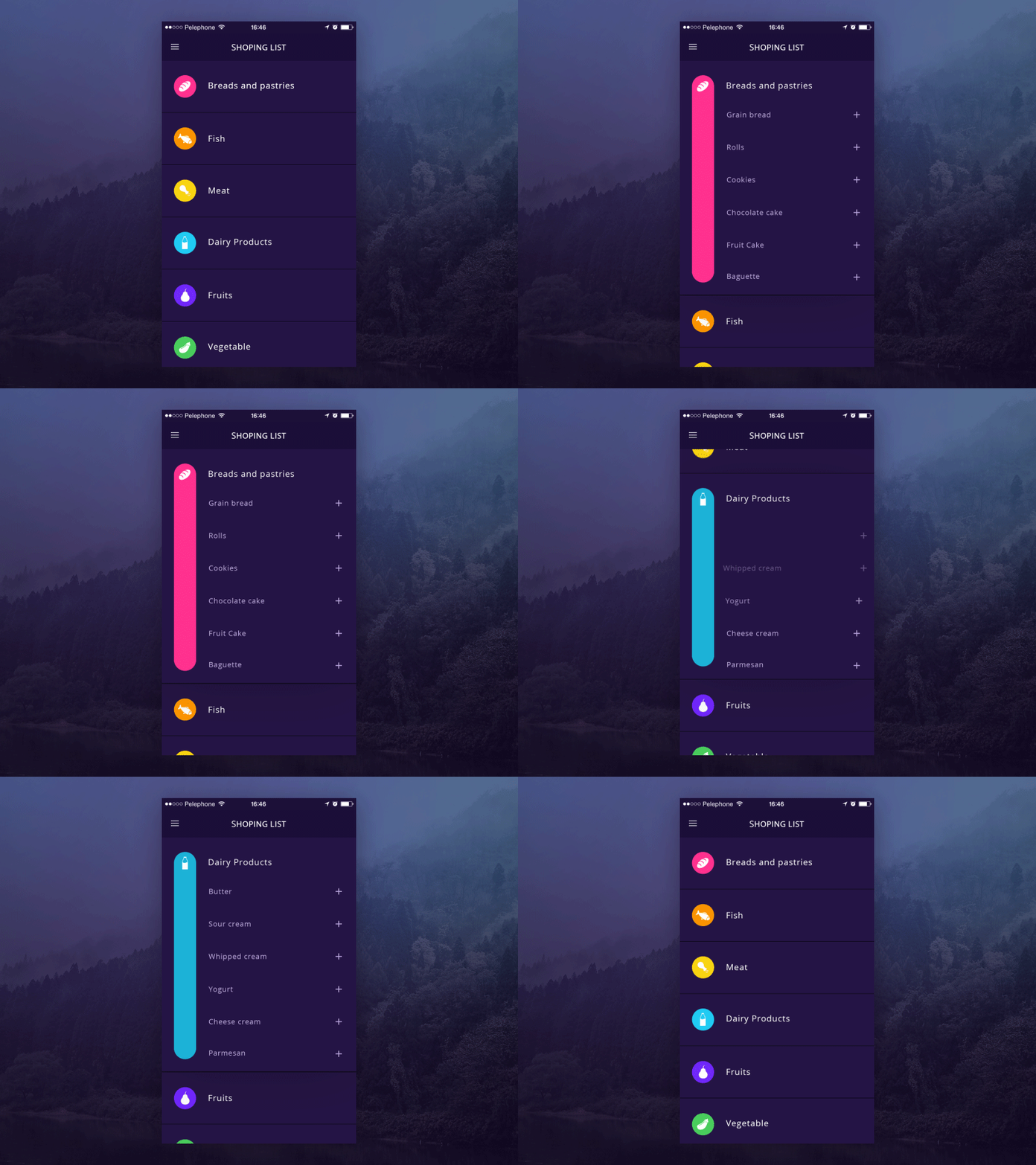
Image source: Hila Peleg

Their purpose is to ensure interaction, both in user friendly apps or websites. They save the designer some space, but offer enormous help to users who can perform their activities with a single click.

If created precisely, icons ensure an instinctive workflow without any need to rely on copy. On the other hand, messing things up would lead your customers out of the right path and it could ruin the image of your product.

Make sure the devices are compatible

The rule is one and only-in order to be user friendly, your app needs to be compatible with whatever device the user might be working on. That will inquire you to make constant compatibility tests with recent software releases.

There are numerous of excellent applications which failed just because the designer didn’t adjust them to popular software upgrades. Therefore, even if you consider your design to be perfect, you have to be aware there is a risk it will not run on an updated operative system.

Here are some tips that will keep your application usable: networking and constant communication with acknowledged designers in the branch, launching through a single “store”, and becoming unavoidably present on social media. All of this will help you to follow the trends and to adjust your design to them; to observe your own progress through customer feedback and to respond adequately.

Guidelines for creating people’s favorite user friendly app
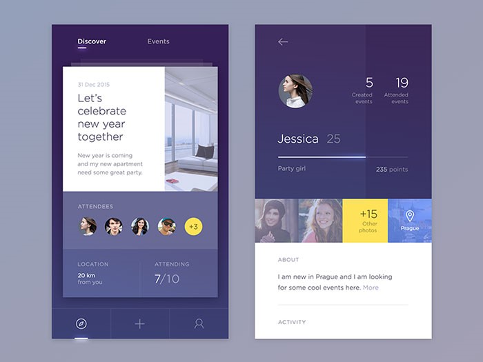
Image source: Jakub Antalík

Get to know your users

What your users want is essential in user friendly mobile app design. You need to discover their motivation and to place triggers accordingly. Working on user experience will never be solid unless you are thinking the way your users do and unless you understand why they need the app you’re designing at the first place. Failing to do so will lead your conversion attempts to failure and will put an end to your growth tactic experiments.

Think seriously about the Offline experience

Many of the most popular apps base their usability on offline application. There should be no difference in the quality of their operation when connected to a signal or not. Designers should really take the importance of offline experience into account and think about how their application would look if applied without internet connection.

Employ Grids

Grids can help you to keep the consistency of your application when the users are switching from one page to the other. This famous design concept enables entrepreneurs to preserve their consistency, to establish excellent visual connections and to secure their design is unified throughout the entire app.

Cover all the Platforms that you can

It is no longer enough to think about all the devices your user could be in possession of. You should also consider the platforms he is using to access your application (Web browsers, Desktop) and to ensure that the app will be available, compatible and worth of their attention.

Replicate the Real World

The secret of designing a ‘blockbuster’ app is to provide fantastic experience resembling real life and responding to real needs. This task employs a serious dose of creativity, depending on the area, category or subject the app may represent.

Here is an example: If you are creating a productivity app, do some research on people’s behavior when using those particular products in real terms. That will enhance the user friendly mobile experience.

Essential to Remember
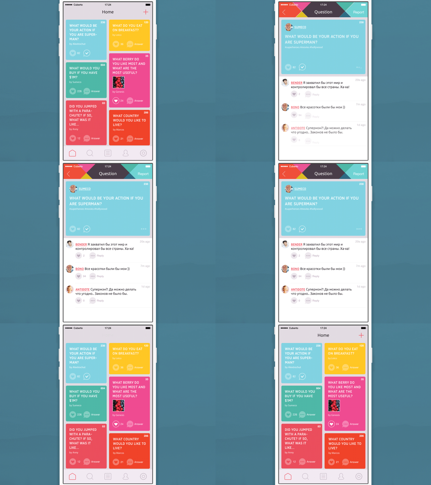
Image source: Cuberto

Designers do have the tendency to take mobile user experience for granted. They don’t employ too much creativity to delight their users and they seem to underestimate the complexity of mobile design.

It is a step-by-step procedure which consists of various mobile-characteristic considerations, tightly connected to smaller screens, varying device specifications, connection limitations, usage restrains, and the hardly identifiable modification-prone mobile context.

User friendly app design (both mobile or not) cannot be done in a rush. You need time to estimate precisely the behavior of your user, since he could always change paths statuses or interactions.

Skimping on foundation building is not an affordable luxury for a proper designer. He needs to understand the purpose: What is the aim of the app? Is it addressing a new need or improving an already existing one? Whatever you’re doing, focus on functionality. Your users will appreciate it!
 

How to use consistency in website design

Post pobrano z: How to use consistency in website design

Whenever designers take the time to sit down and design something new, there’s a lot more involved than just constructing a layout that looks appealing to viewers. It’s also important to establish a set of rules pertaining to exactly how an interface is able to handle various forms of information that it receives.

Later on down the road, if we decide to create something newer that essentially subverts the patterns and standards that we had previously established, we must have a rational explanation that is able to easily support this decision.

The main reason for this is because people will always learn to use all of our products thanks to all of the patterns and standards that we have established, regardless of whether or not good UX principles have been utilized.

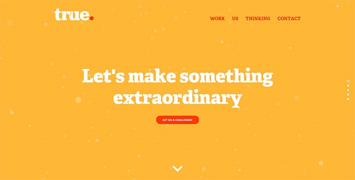
Image source: truedigital.co.uk

Consistency in web design is something that will essentially help designers create systems that are effective. Design consistency is extremely important, even though the mere thought of it may sound completely uninteresting.

Structure and Interactions

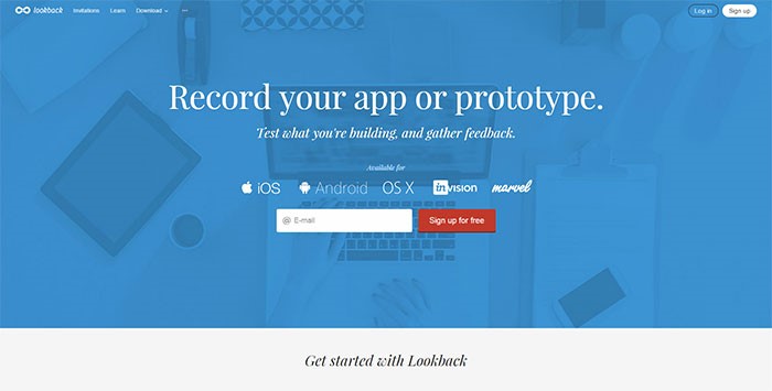
Image source: lookback.io

Both of these are absolutely key to create a consistent page design and user interface. We often to forget about how both interaction and structure will affect user experience whenever we begin developing something. Creating a user interface that is usable and consistent is just as important as creating plans and blueprints for an entire home, for example.

Think about the following things before you begin making any attempts to write code: Consider how to place different elements consistently throughout your application and/or website. Contemplate what particular user interface patterns you will actually be using and think about what kind of input elements you will need the most.

You should also determine what icons you will actually need before selecting a good icon set that covers all of them

User interface patterns

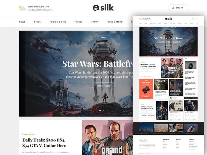
Image source: Silk UI Kit

Start to think about what particular user interface patterns you will actually need to use the most, such as modals, accordions, and galleries. When you plan these things out ahead of time, not only will you be able to develop and design your application much more quickly, but you will also be able to figure out all of your content ahead of time as well. In the end, you stand to save a great deal of time, as you will have many of your pressing questions answered.

Consistency’s importance

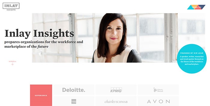
Image source: inlayinsights.com

No one should ever have to wonder if the same things actually mean different things, or if different things actually mean the same things. Typically, if things look the same, then individuals will assume that they mean the same thing.

In the end, we are solely responsible for everything that we create. This means that it is entirely up to us to own that very responsibility and make sure that we do our best to put out nothing short of the best work possible, including making sure that everything is always consistent.

Designers are never truly able to change the outcomes of meetings, and any short-term decisions that are made can have effects that can end up being potentially problematic.

Making your designs consistent

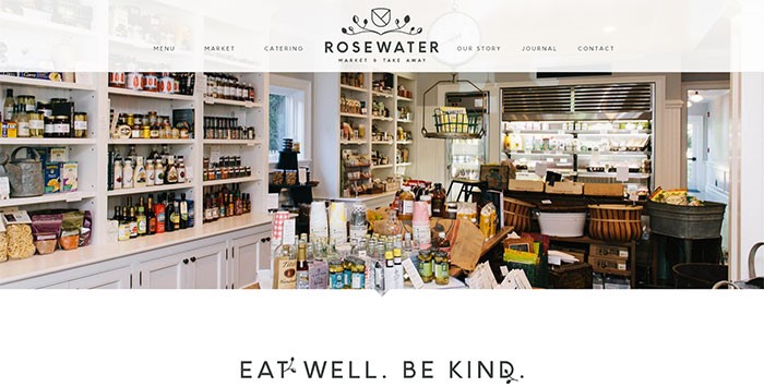
Image source: rosewatermv.com

Consistency can’t be ensured by simple tasks such as creating style guides and defining user interface rules before emailing them around. Once those rules have actually been defined, it’s important to make sure that those rules are actually being observed properly.

The best way to do this is to define the user interface styles using various frameworks. These are able to assist the development teams stay consistent without actually having to do too much of the work themselves. Another useful tip is to engage in usability testing, gathering qualitative information, and addressing all issues that may arise.

Typography is also important, if you’re using serif fonts on a page, don’t switch to sans serif ones on a different page. It will confuse your users.

Elements

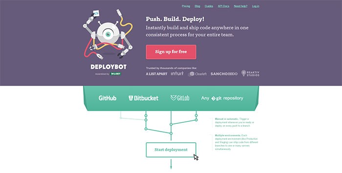
Image source: deploybot.com

Websites that use approximately three or four different kinds of border elements can come across as being really confusing at times. All of your borders should be kept on the following: Buttons, selects, inputs, galleries, images, other kinds of user interface elements.

Internal consistency

Image source: rudys.paris

External consistency can certainly enhance your overall user interface design due to meeting various kinds of user expectations. However, internal consistency is often viewed as more of a requirement that can actually cause harm to a user experience if it is not properly met.

When you deal with internal consistency, it’s important for you to try to cover all of the following: Color, Typography, Language, General visuals, Layout/location, Interactions.

Making a website consistent

Image source: Victor Erixon

If you want to make a website consistent, you should use the same colors throughout the entire thing. Also, there should be a consistent amount of horizontal and vertical spacing between all elements.

Navigation, which is very important, should be in the same location and text links always the same color. Make sure all the icons belong to the same family or have the same style.

Making sure your website is always consistent

One way to make sure that your website stays consistent is to use some kind of CSS framework, which will allow you to maintain a consistent layout at all times. If you have used a service such as WordPress to construct your website, you will easily be able to implement a service such as Bootstrap into your pages in order to help make this happen.

Ending thoughts

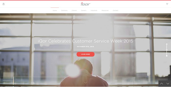
Image source: iqor.com

At times, you may feel that designing something merely for consistency is rather boring. You may feel, instead, that you want to include something as a surprise for your users, which is completely acceptable.

Nothing is wrong with keeping your users on their toes and wondering what may be coming next, so long as you don’t include so many things that will cause them to become so confused that they end up just wanting to go somewhere else.

Things you hate to hear as a designer

Post pobrano z: Things you hate to hear as a designer

So, it all starts with your dream of being a designer. You learn the craft, you create a personal logo, a portfolio for yourself, some demo work, and you are off to your designer career. But, there’s still something that you didn’t prepare for: clients.

As a designer, you’re always open to feedback, and you want to develop open and flexible relationships with your clients.  However, there are those dreaded statements you hear which make your hair stand on end.

These are statements that make you feel devalued or ask for a great deal without the promise of reciprocation.

This article looks at some real-world comments and how you can handle them with grace.

I don’t like what you have done

This comment is limiting because it doesn’t offer up constructive feedback.  If your client simply shares that s/he doesn’t like what you have done, you have no way of knowing how to change it.

In order to determine how to rework your project, you will have to find out more information.  Ask your client what feels wrong about the project.  Are the colours to bold/not bold enough/out of sync with the mood the client would like?  How about the typeface?  Would the client like to use a different imagery?  Does the site feel chaotic or too empty?

By focusing on specifics, you may be able to get the client to acknowledge what is right or wrong with the design.

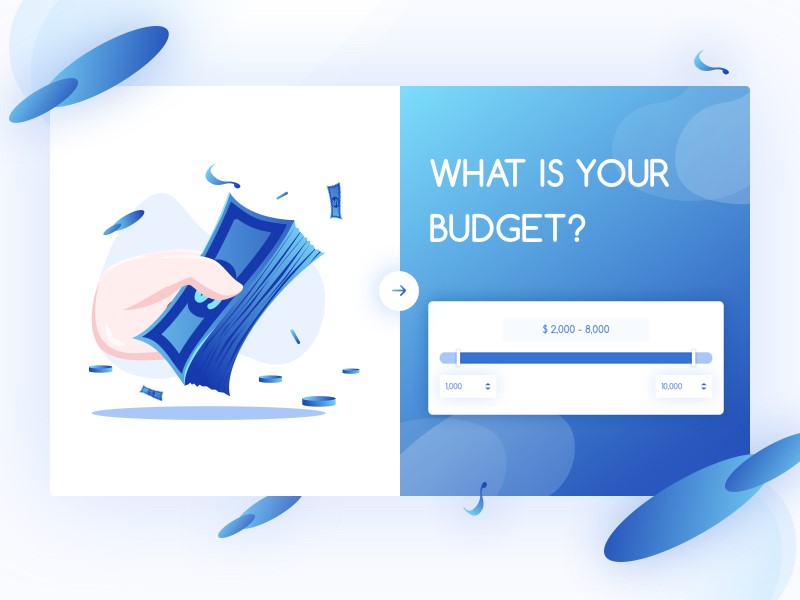
I don’t have a budget

If your client doesn’t have the income to pay for your designs, think carefully about accepting their job.  While you may be willing to offer up free time for a charity or pro bono project you believe in, many people are more appreciative of work they actually pay for.  A client who is looking for a design will only truly be worth working for if s/he understands the value of that design and acknowledges that it is worth paying for.

If your client is trying to offer you either experience or free publicity in place of payment, try to share with them how much a great design actually costs to create.  You will need to use your knowledge or expertise to create the design.  You will also need to use software that has to be paid for.  If your client doesn’t understand or value what you have to offer, it is usually worth declining the job.

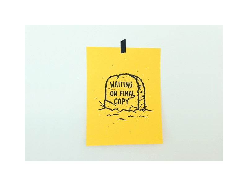
We haven’t finished writing the copy but can you design the site?

When it comes to website design, content is often king.  When you have the content needed for a site, you will understand how to present it to its full effect.  This means spacing the content so that it is clear and easy to read.  It also means designing a page around headings, subheadings and chunks of information that are easy to digest.

When a site is designed around content it can offer a simplicity and legibility that leaves that content clear and easy to read.  However, when a site has been designed and content is forced to fit in with this design, it may appear squashed or chaotic.

Going back to recreate a design based on newly acquired content can cost time and money.  It is far more effective to provide a designer with the final draft of content before starting to work on a site.

Can you do something quick for me?

Designers are always happy to make changes, particularly if this will increase your levels of contentment with their work.  However, not all adjustments are quick or easy to fix.  If you are asking for changes, however small they may appear, let your designer share how much time they will take (and invoice you accordingly).  This way any changes you make will meet both your needs

Can you create a format that can be edited?

Why would you want to edit a project that has been carefully and precisely crafted to meet your individual needs?  As a designer, each and every step of the process has been carefully planned and developed to achieve an aesthetic yet effective result.  Without this knowledge, you risk making changes which may not be in your best interests.

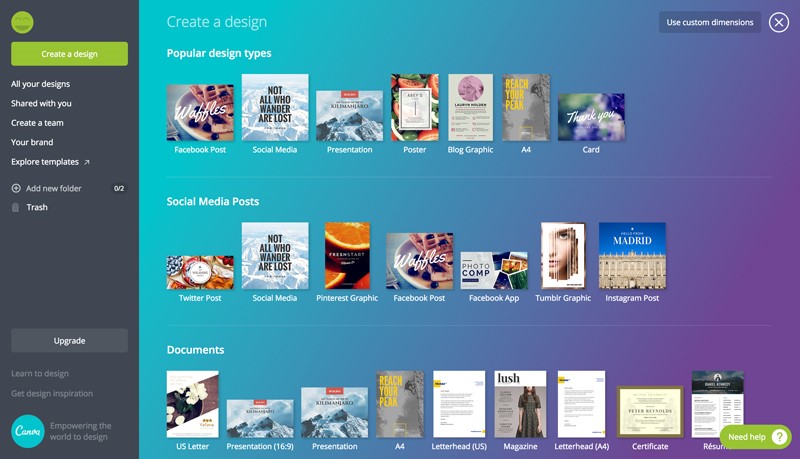
If you have a blog or site which will need regular edits, you can use a DIY program such as Canya, where you can use designer templates.  You will be able to tweak or make changes to your site any time you need to without sacrificing the design.

Can you create many different versions of my design?  That way I can choose my favourite

Although it seems as if many different choices would help you to make a suitable selection, design often works best when it is carefully planned or brainstormed.  This means assessing your target market, your goals and what you would like to communicate via your design.

By carefully planning and constructing your site together while working towards a specific goal, we will have more of a chance of creating a suitable final product.  Although a wide range of options may seem more appropriate, they will not be as specific or goal-directed as a carefully planned design would be.

Can you Photoshop it?

What would you like to achieve by using Photoshop?  Image manipulation can be very effective if you are looking to create a superimposed image or dual impact photograph.  However, simply adjusting or tampering with an image can reduce its natural appeal.  We’ve all seen sites where the imagery has been Photoshopped to such an extent that it looks awkward.  A person’s arm may appear may look crooked, or their limbs no longer look proportionate.

While some images will improve by being Photoshopped and it is worth the time and effort it will create to create an impact, others will not.

As a designer, offer up your professional opinion to your clients.  Share the advantages and disadvantages (from an aesthetic, time and cost perspective) of manipulating an image.

Can I make one last change?

Designers are always happy to tweak a site to meet a client’s needs.  However, if you have made a number of changes in the past, it will be unlikely that this is your last one.  Let’s openly acknowledge that changes take time, and that time is money when it comes to design. Instead of making continual tweaks, create a list of changes you’d like to your final design.

By sharing the changes you’d like to make and offering up any extra payment needed to make these changes, your designer would be happy to help you.  After all, a satisfied customer is a designer’s end goal.

I have a huge opportunity and I know you will love it

Many clients have big dreams.  Without dreams, we wouldn’t be able to bring our goals into reality.  However, not all of these dreams pan out.  A client who is sure they are onto the next big thing may believe they will be soon offering you the chance for great publicity.

However, your client’s dreams may never come to fruition and you cannot pay your bills on a future promise.  Share the practicalities of running a design business and leave it at that.

Can I get my friends’/family’s/partner’s opinion?

You can, but as a designer, I am an expert in my field and I have a proven history of knowing how to translate a goal into a design or visual message.  Your friends do not have this experience.  You can ask your 12-year-old nephew what he thinks of any design which excludes Batman, but you shouldn’t bet your business on his answer!

This is easy, why does it cost so much money?

Every skilled designer will make a job look easy.  This is because the process of creating an excellent design will be both smooth and efficient.  Hiring a professional costs money because you pay for the experience.  It is this knowledge that will result in a great design tailored specifically towards your needs.

Cheaper designers are available but the process of creating a design which has been tailored to your specific needs will not be as easy or smooth.  When it comes down to it, knowledge, experience and reputation are worth paying for.

Create a mockup or concept drawing for me, and if I like your design I’ll pick you.

A great design is not that simple to create.  Each tailor-made design will take time, planning, effort and a lot of brainstorming.  Although in the digital realm you can find designers who will compete based on a basic concept which is pulled together quickly, these designs won’t be unique or tailor-made specifically for your business.

Designers who pull a concept together very quickly are offering you generic concepts which might be attractive, but might not be well thought through in order to meet the precise needs of your site.

If you are looking for a great concept which will stand out from the crowd, it is often well worth hiring a professional designer.  The cost will be once off, and the results will be well worth it.

Summary

As a professional designer, we put a great deal of thought, effort and time into our work.  We aim to meet the needs of our clients and will often make adjustments to ensure our projects are both effective and visually appealing.

Our clients often understand the value of our work (which is why they have approached a professional for assistance).  However, they often don’t understand the time, thought and skill which goes into creating an effective design.  Sharing how to work effectively in the field of design often helps to communicate and build relationships with our clients.

Design deals for the week

Post pobrano z: Design deals for the week

Every week, we’ll give you an overview of the best deals for designers, make sure you don’t miss any by subscribing to our deals feed. You can also follow the recently launched website Type Deals if you are looking for free fonts or font deals.

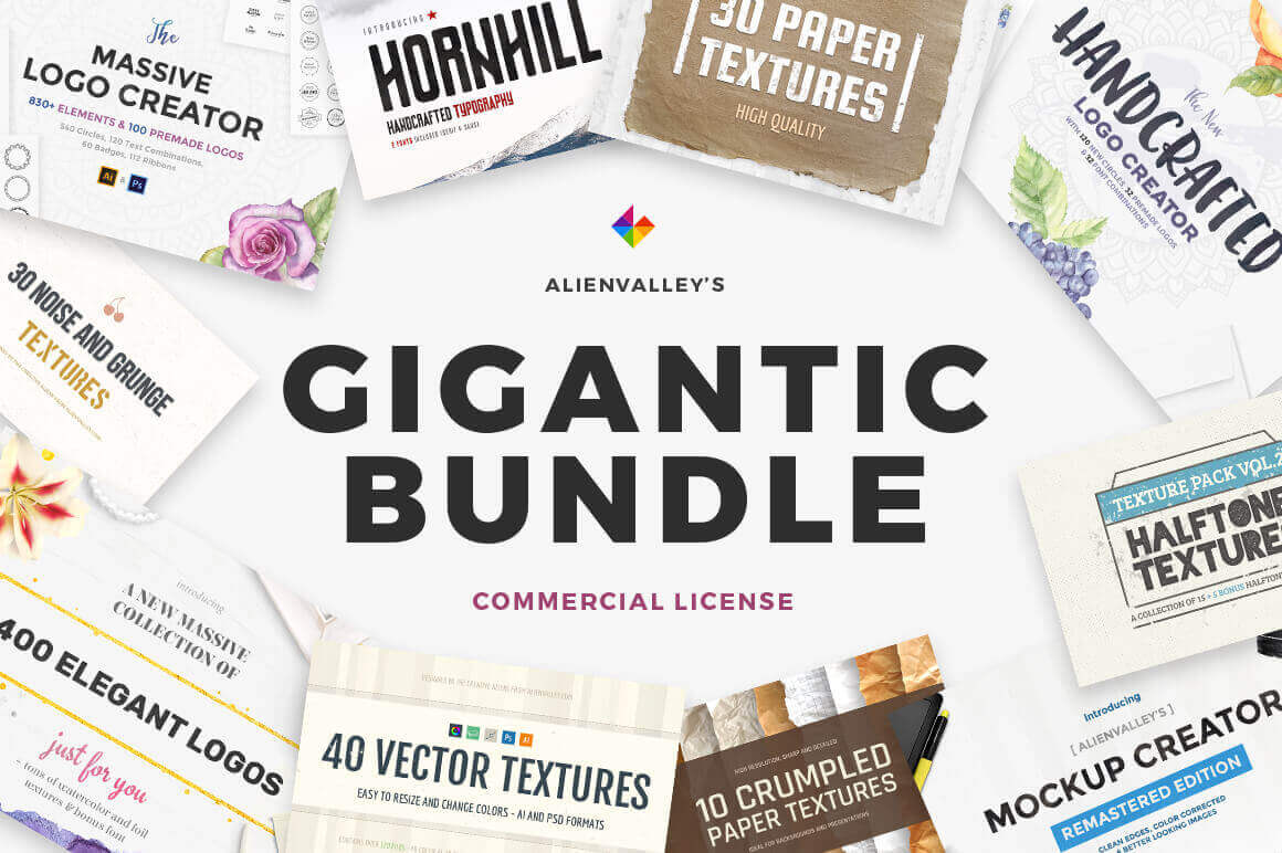
Gigantic Bundle of 1000+ Logos, Elements, Mockups, Textures

When a Mighty Deal is called a Gigantic Bundle, you just know it’s going to be big. And that’s exactly what this Alienvalley deal is: Chock full of 1000s of design graphics. You’ll get 400 premade elegant logos, 200+ textures, multiple typefaces and both a nifty Logo Creator and Mockup Creator to quickly and easily whip up hundreds (or is that thousands?) of creative results.

$19 instead of $110 – Get it now!

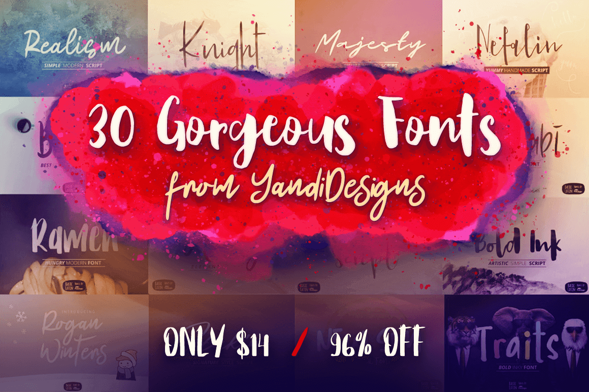
30 Gorgeous Fonts from YandiDesigns

If your projects are desperately in need of a fresh look, then cast your eyes on this collection of 30 gorgeous fonts created by YandiDesigns. Mix and match styles with these beautiful brush stroke typefaces that are the perfect answer to any project from logo design to wedding invitations.

$14 instead of $362 – Get it now!

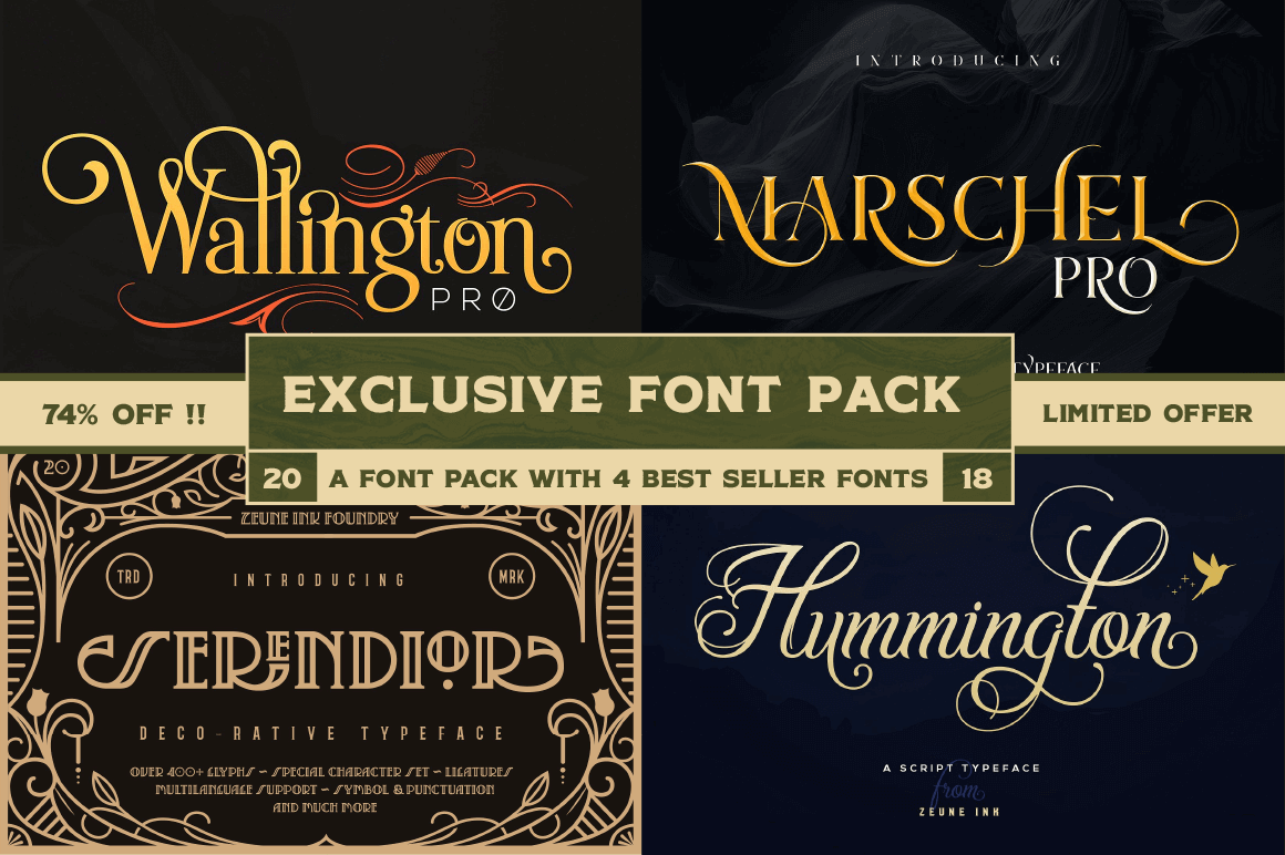
Exclusive! 4 High-Quality Fonts from Zeune Ink Foundry

Another Mighty Deals exclusive coming your way! Zeune Ink Foundry is offering up a fantastic font collection of 4 High-Quality Classy Typefaces at one incredibly discounted price. Designed to create elegant typographic works, this collection is overflowing with OpenType features and characters so you certainly don’t want to miss it. Especially considering they all come with an extended license of use!

$9 instead of $94 – Get it now!

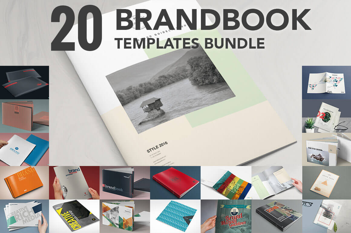
Bundle of 20 Brand Book Templates from ZippyPixels

Showing off a logo or stationery design is standard fare for most graphic designers. But if you really want to blow your clients away, you’ll offer them up a slew of brand designs in a full-fledged brand book! Get higher value for your work without spending days putting it all together. Instead, use these gorgeous Brand Book templates from ZippyPixels to present your designs in a truly stunning manner. And it only takes a few hours! With this incredible Mighty Deal, you’ll get 20 High-Quality Brand Book Templates that are print ready and simple to customize with your info and designs.

$17 instead of $39 – Get it now!

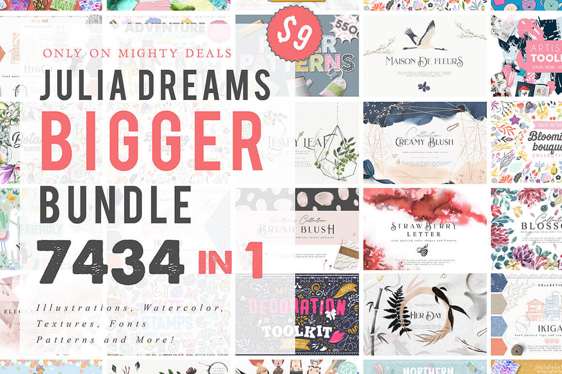
Julia Dreams Bigger Bundle of 7400+ Elements

Exclusive! You won’t find this amazing deal anywhere else on the Interweb! So stop looking. Instead, feast your eyes on the Julia Dreams Bigger Bundle, which is just bursting with more than 7400 professional design elements. We’re talking illustrations, textures, fonts, toolkits, watercolors and more. From adorable to colorful to realistically detailed, this set has you covered literally from head to toe. And at only $9, you’ll be kicking yourselves tomorrow if you pass this one up today.

$9 instead of $1800 – Get it now!

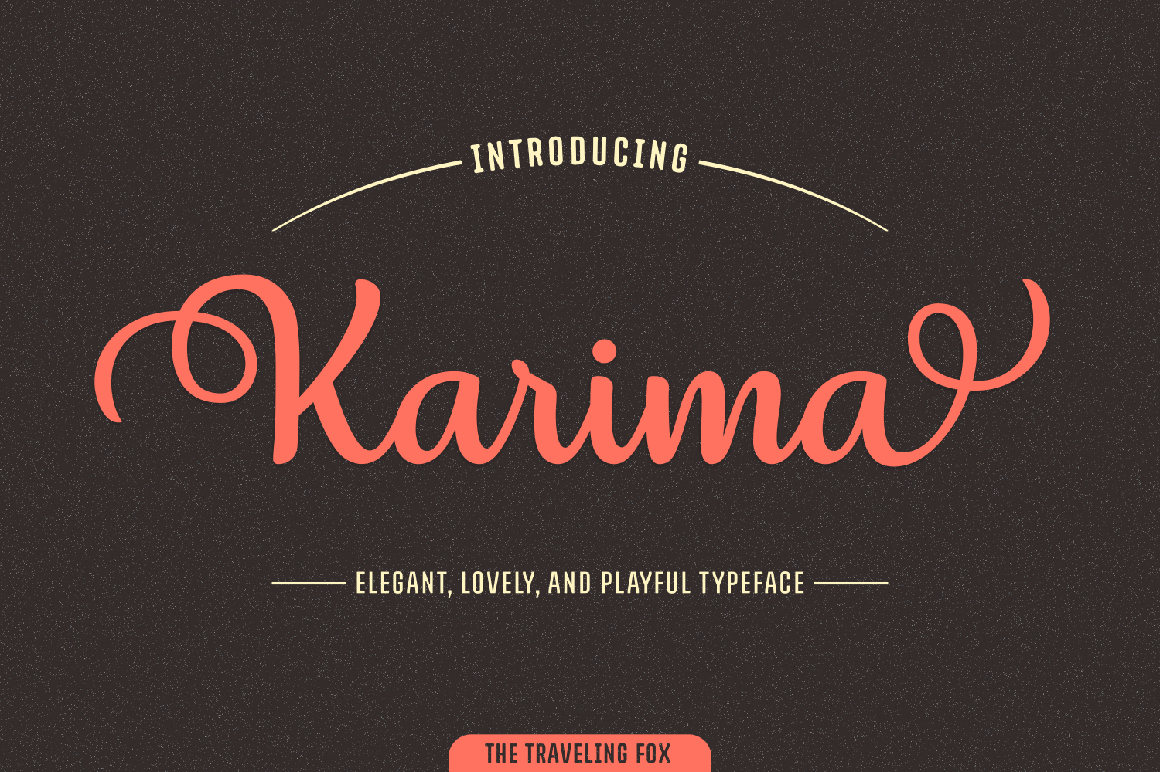
1000+ Unique Characters in Stunning Karima Script Font

If you want to impress your typeface toolbox (and your clients, of course!), grab hold of this discounted deal today! The stunning Karima Script is as elegant as it is curvy. Flowing with smooth, legible letters, Karmia features a regular and italics version, alternates, swashes and ligatures and more, all adding up to more than 1,000 unique glyphs. That’s some serious flexibility in a font.

$7 instead of $20 – Get it now!

What to follow when designing a one-page website

Post pobrano z: What to follow when designing a one-page website

Are one-page websites effective?  Due to their lack of complexity, one-page websites are often dismissed by designers.  However, they can often provide an effective solution to many.

This article aims to explore when a single paged website would be helpful, and how to go about constructing one…

When would a single page website be helpful?

If you’re wondering whether to build a single page site, have a look at your content.  Is your content limited to a single topic?  Do you have only a few chunks of information which can be placed on a single page?

Diluting your content simply so that it will fit on a single page is not always a great solution.  If you have a great deal of content, in different topics, and if this content could span multiple pages, then a single page website may not be for you.

If your content is short and to the point, a single page site would be helpful.  Single page sites are also very useful if content flows into a single narrative or story which would suit a single page.

If you’re starting out small and only wish to share a small amount of information, a single page site would suit you.  You can always build or add onto your site later on.

Single sites are also a great opportunity for people who need a website to be online while a fuller site is being developed.

A single page site is a great addition to social media profiles such as a Facebook page or Instagram account, and these accounts are providing great traffic to your site.

You are not using content or SEO to attract visitors or new clients.

What about SEO strategies?

SEO uses content to attract visitors to your site.  Search engines rank sites with particular keywords as more valuable.  As a result, many websites use SEO techniques such as keywords or questions in order to achieve a higher ranking with Google.

A single page site doesn’t have a high amount of content.  This means there is not a great deal of information to offer search engines and the site might not rank as highly.  However, using a single page site doesn’t mean you won’t be able to use some SEO principles.

You can still ask questions which apply to your services or product and use keywords in your copy.  These basic SEO principles and techniques will still assist you while setting up your site.

What about parallax scrolling?

Parallax scrolling is a website technique which shows the foreground of the site moving more rapidly than the background, as a user scrolls down the site.  This technique helps to create a 3D effect.

Many designers prefer not to use parallax scrolling in site design, believing that although attractive, it does not improve the user experience.

Sometimes the arguments about whether to create a one-page site and whether to use parallax scrolling have combined, and designers speak out about one-page sites because they dislike parallax scrolling.

Parallax scrolling does not have to be a part of a one-page website though.

When should you consider creating a one-page site?

If your site has information that could be condensed into a single page, with contact details placed at the top or bottom of the site, a single page might be ideal.  This may give coherence to your content while keeping your site fresh and modern.

When content is sparse, a single page site can make your content seem more complete.

If your site would be very simple and efficient to use as a single page, it is worth making use of this design.  This will keep your site easy to use for viewers while presenting everything you need to share.

Add navigation links to your site

Your viewers may be able to access all of your content by simply scrolling, but it wouldn’t harm your site to add extra navigation links.  If you have a long page, adding navigation links to the various sections or elements of your site will keep it easy to read.

Try to add these on the top of your page, near your logo design. Your users need to find these links easily.

Use headings and subheadings to divide up your content

Large masses of content can feel difficult for your reader.  Internet users prefer to take in information at a glance.  By using headings and subheadings, your reader will be able to grasp the contents of your site quickly.

Subheadings allow your reader to choose what to read and the sections which appear most interesting.

Make use of imagery

A single site will often have a large amount of white space.  If you’re only using a single page for your website, emotionally resonant and relevant imagery will add interest to your page.

They will also assist you to divide up your content.  Effective imagery will, therefore, assist you to add appeal to your site.

Create a hierarchy

Internet users like their information to be concise and easy to read.  When creating a site, your headings will help your reader to understand your content.  You will also want to structure your site so that your reader is most likely to read important content first.

When constructing your site, keep your most important information at the top of your page.  Interested readers can scroll down and read more if they want to.

Use multimedia to add impact

Although many site holders will tell you that content is king, we also know that pictures speak a thousand words.  Over 65% of people are visual learners.  This is why illustrations, photographs or images are a very effective way to share a message.

Images produce an emotional resonance in viewers, and they will break up your text, helping you to hold your viewer’s interest.  Images are able to give a message clearly without demanding an awful lot of your viewers.

You can use photos, videos or slideshows on your site.

Images:  create visual impact.  If you are creating a one-page website, adding images which resonate with your viewer will enhance your site.  Keep your images relevant, high quality and eye-catching.

An emotionally resonant image will assist your viewer to identify with your brand and keep viewers on your site.  If you take high quality, professional looking photos, you can use these to communicate with your viewers.  Alternatively, there is a range of royalty-free stock images available for use.

Look for stock images which are uncommon in order to make the greatest impact on viewers.

Slideshows:  Photos or illustrations can be combined in the form of a slideshow, which can be used to tell a visual story.  Slideshows can often share complex messages with ease.

Videos:  site viewers deeply appreciate videos.  These videos can be used to share messages which keep viewers engaged.  Videos make a great feature, keeping viewers engaged.

In fact, research shows that viewers spend 100% more time on websites which offer videos as a part of their content.

Keep your calls to action clear and visible

Your call to action is a clear message to guide your viewer into taking action.  Without a clear call to action, your visitors will not know where to go or what to do next.  This is as true with single page sites as it is with complex and intricate ones.

In order for your call to action to be effective, it needs to be persuasive.  This may mean receiving a free offer or coupon when you subscribe to a site or knowing exactly how to place a purchase in your shopping cart.

Keep your call to action clearly visible, use colour to help it to stand out from the rest of your site, and make sure that it is not surrounded by too much information.

When you half close your eyes, your call to action should be the first thing you can see on your site.

Summary

Although websites are often appreciated for their intricacy and ability to convey information, a single page site can be equally effective.  Although single page sites may hold less content, they make an excellent choice for many businesses.

Weigh up the value of creating a single page site for your business.  It may just be the option you need to get your message across.

3 Mistakes You Should Avoid in Your Freelance Web Designer Career

Post pobrano z: 3 Mistakes You Should Avoid in Your Freelance Web Designer Career

On the good days, becoming a freelance web designer might look like the best decision you’ve made in your life. You don’t have a boss, you can set your own hours, you have a lot of flexibility, and you’re a part of a growing movement that’s transforming the way work is being done across the world.

On the bad days, however, things look completely different. It’s not easy to be a successful freelancer. You can easily end up working more hours than you would with a traditional job. You can get into deep financial problems. You can have very little control over your business and personal life.

It’s not always easy to be a freelancer. But if you know what mistakes you need to avoid, you can have a fighting chance to develop a decent career as a freelance web designer.

Leaving the Wrong First Impression

You probably already have a sense of the importance of first impressions. It even seeps into your line of work — people who visit the websites you design will form an opinion on them in seconds. If the opinion isn’t good, they won’t stick around. Your interactions with clients follow the same pattern.

It’s tricky to manage first impressions, especially if you’re only communicating with your clients through online channels. But you shouldn’t leave things up to pure chance and your current mood. It would be much better if you learned at least the basics of business communication and work them into your routine.

For example, you shouldn’t take more than one business day to answer an email. But it’s also not a good idea to answer emails right away. That’s why you schedule exact times when you read and reply to emails. You won’t seem unprofessional or undisciplined, but you also won’t seem too eager and desperate.

Failing to Demonstrate Additional Value

Freelance workers spend a significant amount of time managing client relationships. You have to attract clients. You need to make the good clients stay. You need to make the bad clients leave. You need to figure out ways to get more money from your clients.

If you’re not using all that communication to demonstrate value beyond what’s asked of you, you’re making a big mistake. You don’t have to perform work for free, but you should never skip an opportunity to give advice to the clients that matter the most to you.

For example, you are contracted to create a website, but you notice that the hosting package your client uses isn’t what they need. You can say nothing. But you can also speak up, explain to them the different hosting options they have, and let them decide. Even sending them a link to a good article could help them. And you get their loyalty in return.

Getting Too Comfortable

When you get the hang of the whole freelancing thing, you’ll probably reach a point where your career is very okay. You’re not doing challenging work and earning tons of money, so it’s not great. But you’re not having problems with paying the bills, and you got used to the people you’re working with.

That’s the point where you need to shake things up, a lot. Complacency is a luxury you cannot afford as a freelancer. If you’re not striving for something, you’re missing out on opportunities. It’s a hungry mentality, sure, but it will serve you well until you reach a point where you can safely rest on your laurels. Until then, you must stay hungry.

If you find yourself with a couple of steady clients that allow you to make a decent living, don’t sit back and relax. Find another client that will need you to do more challenging work. Or do some work pro bono, especially if it’s for a cause you’re passionate about, or if it will look good in your portfolio. Get yourself in a position that will open new opportunities.

Being a freelance web designer means that everything is up to you. You have to find your own clients. You have to figure out how much to charge them. You have to find ways to pay for health and social insurance. You have to create your own pension plan. To some people, that kind of a deal sounds appealing. To others, it can be their worst nightmare. If you want to succeed as a freelance web designer, better be sure that you’re one of the former. And then work on your skills, self-discipline, and understanding of the business.

5 Tips for iOS App Designers

Post pobrano z: 5 Tips for iOS App Designers

Due to the increase in new phone users, app developers need to understand that everything is obvious. App users evolve, meaning some might assume any minor changes while others eagerly wait for them. With two main operating systems in the phone market, it’s definite that iOS developers need to keep up with the changes.

Since the platform has lots of users, like term paper writers, coders, among others. The developers should factor in all of their needs and ensure they’re met. Below is a guide which iOS developers should use when creating their apps.

1.    UI Design

As a developer, your primary goal should be pleasing to the user. Therefore, with an improved, unique app design, you’ve accomplished the first step towards user satisfaction. With the UI design, you entice the user into wanting to use more of your app. Meaning that they get to spend more time on the app. Something which will be ideal for collecting feedback on any bugs which might be available.

Nonetheless, you have to ensure that address all the security compliance issues. Addressing this ensures that you give the user enough cybersecurity. Thus ensuring that their information cannot be hacked through your application. Besides, the information which you collect will be used only towards making the entire app experience better.

2.    Color Schemes

Follow the latest trends when developing any new app. Currently, you’ll find that as for the color schemes, most users prefer monotone. Therefore, take advantage of this, use a single color and either a black or white font. The fun with this is that you can choose any bold color to make your app unique. However, don’t go overboard when choosing the colors. Ensure that it’ll entice both you and your users.

If you’re not sure as per the best color scheme for your app, give your users the ability to customize the colors. It’s something which most of the Android users have on their platform. Copying such a strategy will submerge an iOS user more into your app, thus increasing the overall traffic.

3.    Navigation

Even if we might be moving towards the gesture future, ensure the user can easily navigate the application. In the app, add more cues which the user can find when going back, home, minimizing, next, amongst others. Make it easy for the user to navigate through the app and you’ll get no complaints.

4.    Animation

App animation has been there for ages. Implementing it wisely is something which most haven’t been able to do. Therefore, ensure that there’s not too much animation or even loo less. It should be something which the user will notice and like. With too much notification, you end up making the device lag. Something which you have to avoid by all means.

5.    Micro-Interactions

Some users might never detect these, but they’ll affect the smoothness of the app. For example, when in your app and the user finds an interesting link, ensure that they can directly visit the link with no hassle. That is if a student were to come across a Myhomeworkdone link on your app, ensure they get to access the website.

Conclusion

Through this, you’re confident that you’ve developed an application which your users will love. Therefore, take time to look into any of the minor details. Look also into any of the upcoming trends and adjust accordingly. You get to evolve with time and ensure that the app users are delighted in every step.

Nonetheless, it’ll be a fun process for you. You get to learn more about your users and always get to work on any bugs you encounter. Besides, the more the app traffic grows, the more feedback you attain, thus making your app development easier.

4 Benefits Of Solar LED Lights For Parking Lots

Post pobrano z: 4 Benefits Of Solar LED Lights For Parking Lots


The future is solar LED lights. You will see them in the parking lots and other large areas around a city. They are cheap and save a good deal of money on electricity bills. Nowadays, the majority of parking lots feature the conventional lights that get their power from the grid. These products are not efficient and add to the environmental pollution. Let’s take a look at some of the prominent benefits of solar LED lights.

1. Energy Efficiency

Solar LED lights are a bit more expensive than the traditional lights but they offer a lot higher return on investment. According to statistics, they are 500% more efficient and stand the test of time. Since they get their power from the sun, they are a lot more efficient.

If you want to figure out the cost of power consumption, all you need to do is multiply the power of all the units of light with the number of hours the light will operate for. Usually, the cost lies between 10 and 20 dollars for each unit on a monthly basis.

2. Smart Technology

With smart technology, solar operators can configure lighting schedules from a remote area. Moreover, they feature smart gadgets as well. They can serve as powerful anti-theft devices and data collectors for the internet of things or large data banks.

3. Luminosity

Why do we get lights? It’s simple. We need lights for the purpose of luminosity. Although watts is the measure of power something consumes, luminosity measures the brightness of light that a bulb produces.

Traditionally, watts represent the brightness of a source of light. On the other hand, solar LED lights have a different convection. As far as efficiency is concerned, they are 400% more efficient. With the help of smart technology, it’s possible to get a better control over the lighting systems that is installed outdoors.

Apart from this, you can increase or decrease the amount of brightness easily. It’s possible to provide the right amount of light in the right area.

4. Environmental Advantages

There are a lot of environmental advantages of the solar LED lights. As a matter of fact, traditional ones get their power from the grid. In the grid, power is produced through fossil fuels, which emits a good deal of pollution in the air. And we don’t need to explain how pollution can cause a lot of health issues.

Since solar energy is 100% clean with zero side effects, it is the future. Moreover, fossil fuel will become scarcer over the passage of time. Research in the world of solar power may bring the prices down in the future.

The installation process for solar LED lights is quite simple. The cost is lower and efficiency is higher.

So, these are a few main benefits of installing solar LED lights in the parking lots. The cost of energy is rising. To help solve this problem, we should turn to the renewable sources of power and solar power is one of them.

Source

Psychology hacks to use when designing a website

Post pobrano z: Psychology hacks to use when designing a website

As we go about our lives, there are a number of different things which motivate us to make the choices we do.  We are often unconscious of these various elements.  A colour can make us feel vibrant.  A new scent can remind us of a childhood spent in a meadow.  These various factors influence what we will do or how we will rate our experiences.

As web designers, then, we know that psychology plays a massive role in user experience.  It can determine the conversion rates of a site, and whether our users have a positive experience or not.  Understanding basic elements of psychology can help us to create sites which appeal to our users.

It isn’t enough to design a website nowadays, you also have to play the role of a UX researcher a bit, or work with one to create a good experience for the site’s users.

These following tips are here to assist!
Understand how the brain works

In order to work both creatively and effectively as a web designer, it helps to understand how the brain functions.  This doesn’t mean you need to be a neurologist.  Instead, some basic tips will help us to interpret a webpage from a viewer’s perspective.

The field of neurodesign was introduced in 2012, and this shows us the impacts our designs will have on user experience. That’s right, aesthetics really does make a massive impact.

Interestingly enough, one of the most important aspects of web design in order.  Our brains battle with chaos.  When we look at a situation or space, our brains automatically create categories or ‘schemata’ in order to make sense of what we see.  This helps us to come up with solutions to problems or to grasp the meanings that are presented to us.  These ‘heuristics’ or broad rules help the word feel predictable.  We are able to make sense of what is happening around us.  This creates the feeling of comfort or safety.

One example of how our brain makes sense of scattered information involves pattern formation.  Our brains recognize patterns, and will even create imagery out of scattered information.  Early astrologers, for example, produced patterns from scattered stars.  We often fill in information when we see gaps in sentences or even letters that are missing or misplaced in words.  We see the whole as greater than the sum of the parts.

You may be wondering how this relates to web design?  Here are a few helpful tips:

Make use of hierarchy:  When your users are able to grasp a pattern or order to what is presented to them, it helps them to make sense of the information presented.  This helps your users to understand what your site is about and where to access what they are looking for.

Create categories:  Your users like to see information collected into groups.  This could be groups of products, services or even people.  Categories help to simplify what is on offer.  An E-commerce site which offers up ladies clothing and then divides it into tops, then t-shirts, jackets and shirts, will make it easier for clients to find what they are looking for.  Information is no longer presented in scattered mass.  Instead, it has been given a sense of order.

Use recognition:  If you’ve ever been trying to explain a concept to a friend and couldn’t find the term you’re looking for, you know how frustrating retrieval failure can be.  This is something to avoid on your website.  Instead, ensure your viewers are familiar with your interface and are able to navigate it effectively.  By using recognition you are able to do much of the work for your viewers.

You may be wondering how recognition works in online design?

Think of the way that Google draws on a browser’s history in order to auto-fill information a user could be searching for.

E-Commerce sites such as Amazon will often show shoppers what they have recently browsed.  They might also show shoppers purchases that have been combined by past shoppers in order to make product recommendations.

By presenting and organizing information in this way, website experiences often become more friendly for viewers.

Here are some further methods you can use to organize your webpage in a viewer-friendly manner:

Grab your user’s attention

By organizing your website into sections which grab your user’s attention, you stop your user’s mind from wandering across the site.  This helps to give your information structure as well as keep your viewer’s attention focused on specific aspects of your site.

Use colour and contrast

Your viewer will receive an emotional message from colour.  By using colour carefully, you will, therefore, be communicating with your viewer.  The contrast will help you to draw attention to aspects of your site, enabling them to stand out.  A call to action button, for example, should be clearly visible so that your viewer knows how to proceed.  This will increase the conversion rate on your site.

The messages communicated by colour

When it comes to using colour, each choice will have a psychological impact on your viewers.  This will determine how they will respond to your site.  Colour can be very complex, and some colours may represent different emotions.  Red, for example, may represent both passion and danger.  Context, therefore, plays an important role when it comes to colour usage.

Here are some broad rules when it comes to colour usage:

Black is often associated with luxury, value or professionalism.  Colours mixed with black often give a professional or corporate feel.

Green is often associated with environmental awareness as well as with humanitarian organizations such as NGO’s.

Blue provokes feelings of calmness or serenity.  This colour is often used to show trust.

Yellow is linked to warmth but can also be used to indicate a warning.

Orange shows warmth and vibrancy but is also used to represent impulse.

All of the above colours can be used to communicate a message to a viewer.  However, it is not only the colour in the foreground that sends a message but the use of white or background space as well.

Effective use of white space

When white space is used effectively, this creates a clean, clear effect, reducing cognitive load.  White space keeps your site looking clean and fresh.  If you use colour to attract attention to your site, your white space will create a breathing space for your viewer.

Create a consistent site

In order to work towards maximum viewer comfort (and therefore conversion rates), it is important to keep your site as predictable as possible.  This will keep your viewer feeling at ease.  Ensure that each page of your site uses the same typography, colours and page headers.

Keep your navigation system consistent across your different web pages.  Icons such as search buttons or shopping baskets should be in the same position on each page.  This way your site will seem predictable (and therefore easy to navigate) for your viewers. By doing this, you will increase your conversion rates.

Create emotional resonance by using imagery

A picture says a thousand words!  If you would like your viewers to resonate with your site, use imagery to build a connection.
Effective (and relevant) use of imagery creates emotional resonance within your viewers.  This is particularly helpful on a landing page in order to assist your viewers to identify with your brand.  A great image will boost your conversion rates.

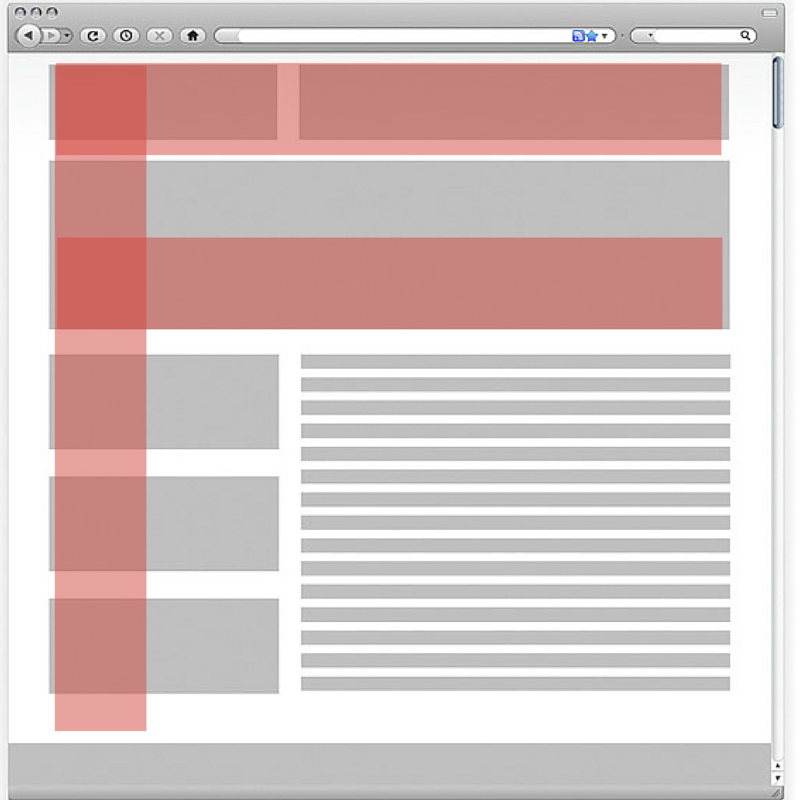
Use the F page layout

Research into web design has shown that the most common way to read a webpage is by using the F pattern.  Eye tracking studies show that this is true.  Viewers will look at the top of a webpage or in the header.  They will then look at the left side of the screen.  However, viewers will only glance at the right side of the page every now and then.

By designing web pages which fit in with the viewer’s gaze patterns, you will be able to produce an effective site.  Concentrate your important messages or key information on the left side of the page for maximum impact.

When viewers are ready to leave a site, research reveals that they often look to the right.  By placing an effective image or enticing information on the right-hand side of your site, you may be able to distract your viewer, keeping him on the site for longer.

Think through your use of typography

Typography sends out a message to your user.  It is not only the typeface you select but how it is laid out that will make your user feel comfortable.  A comfortable, easy to read font which is well laid out will ensure easy reading.

Keep your font selection simple and easy to read in order to keep your viewer engaged.  When a font is hard to read, your information will seem more complex to your viewer.  Content which is simple to read and easy to digest will keep your user engaged.

Fonts can often tell the viewer if they are in the right space.  A font choice which is suitable for your brand or company will create a sense of trustworthiness in a viewer.  A modern, clean-lined font will often suit a technology company, where a typeface style font might suit a writer.

The layout will make a big difference as well.  When your site is clean-lined and easy to read, your viewer will be more likely to engage with your content.

Keep your calls to action clear

Your call to action buttons guide your viewer, assisting him with what he should do next.  They are therefore a very important element to any webpage.  It is important that they stand out against the background of your site.  You can use contrast to ensure that your calls to action attract a great deal of attention.  In web page design, the call to action should generate the most attention on your page.

If you are unsure if your call to action button is vivid enough, stare at your computer screen with your eyes unfocused.  If you can still see your call to action button, your design is effective.

When it comes to vivid contrasts or attractive colours, our brains are wired to take notice.  By drawing attention to the Call to Action button and compelling the brain to focus on it, you will guide your viewer towards responding.  This will increase your conversion rate.

Attract your viewers with new information

Viewers enjoy novelty and as a result, are attracted to new information.  When setting up your site, ensure that you create a section where new products can be seen or explored.  Even if your site has minor updates, ensure that these stand out to your viewers.

Let your viewers know that you have the latest products available.  By placing this information on your landing page, you will encourage your viewers to delve further into your site.  Try to whet your viewers’ appetite and leave them wanting to find out more.

If you have regular readers, making subtle changes to your site will hold your viewers’ attention.  You could add some new imagery, load some quotes, or change your font sizing to create a sense of variety.

Conclusion

There are no single solutions to designing a great website.  However, by understanding what will appeal to your viewers and attract their attention, you will be able to ensure an effective website design.  This will help you to work towards dynamic creations which result in high viewer conversion rates.

How to improve your web design workflow

Post pobrano z: How to improve your web design workflow

As a freelancer in the field of web design or development, you are well aware that time is money.  When you are able to get a great deal of work done in a set amount of time, your profits will increase, and you will be able to meet your goals and deadlines.

Working efficiently is, therefore, a crucial skill for freelancers to develop.  Time management will provide a significant boost to your career.  However, as a freelancer, you may wonder where you should best invest your time?  What will pave a smooth path towards an efficient work schedule and what would result in mere procrastination?

Here are some helpful tips to improve your workflow

Plan your projects

When you give your web designs a sense of direction from the very start, you will save time in the long term.  Although planning takes time and reveals the complexities or intricacies or a design, it will help you save time.  This is because a clearly thought out design will give you a clear sense of direction.

When you plan your project well, you will save time from making repairs at work.  You can both receive information from your client and share your feedback.  This will ensure that the end result meets your client’s need.  There will be no surprises along the way if your client agrees to your initial plan.

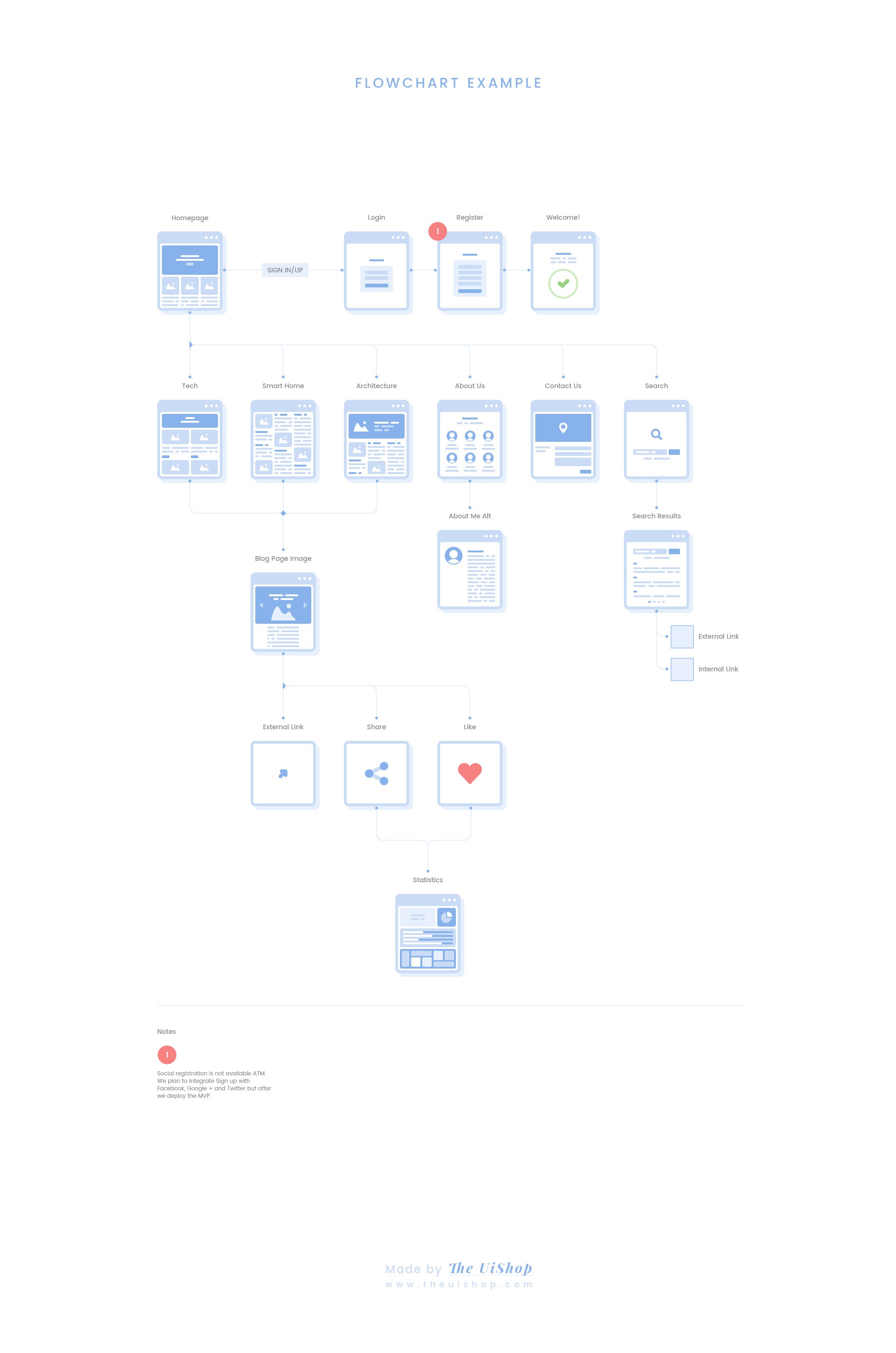
When planning your project, take into account the goals and functionalities of your site, the content you will include, the design or aesthetic, your sitemap, budget and call to actions.  Once you have a clear vision for your site you will be able to work with a clear set of goals in mind. You can then use Photoshop or wireframe.cc to begin your layouts.

What should you include in your project plan?

Every project you work on will include a different plan, as well as a different level of complexity.  While some designs are relatively simple and your client has a clear idea of how to proceed, others will take a lot of thought.

When it comes to planning your project, the amount of time you give to each different stage will be different.  However, planning should evolve through 6 different steps or stages:

  1. Define what you would like from your site.
  2. Assess the content and how you will design around this.
  3. Define the features of your site.
  4. Take your audience into account.
  5. Research how to create an intuitive, aesthetic site which will suit a company’s identity.
  6. Plan how you will organize your site, create a hierarchy and your wireframe.

Which questions should be taken into account when planning the site?

You’ve made the decision to plan your site before you begin designing.  Now you might be searching for some questions to ask which will assist you with the planning process.  Here are some guidelines you can follow while planning your site:

Who will be visiting this site, and what would they like to achieve?  Is your site informative, does it aim to sell a product or service?

Why does your client want to construct this site?  Is it to gain new leads, sell a product or reach out to the community?

What do you need to achieve in order for the site to be a success?  Do you need to encourage your viewers to subscribe, buy a product or participate in an online forum?

What materials do you need for designing the site? Think of what you need to use based on your audience. Do you have a tech site to create? Would a carbon fiber texture fit in there?

Taking these questions into account will guide your design process.  When you design with your end result in mind, you will be able to create clear goals which will inform your design process.

Designing with the big picture in mind will assist you to create a successful site.  It will also save you time in the long run as you will not need to make numerous changes later on.

Your graphic design workflow

Once you are ready to start designing, you may wish to use Photoshop or Illustrator to design your site.

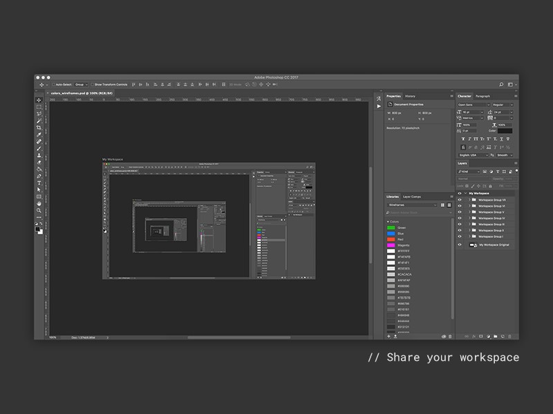
Photoshop gives you the opportunity to customize your workspaces.  If you make this choice, you will save yourself a lot of time.  This is because you will have palettes or panels which appeal specifically to you.  You will also find that you often create your own frequent choices.  Setting up these features in the order which suits you will enable you to work more quickly.

Although Photoshop offers predefined features such as painting, photography, or design, you can create some of your own features too.

Optimize your images to increase speed

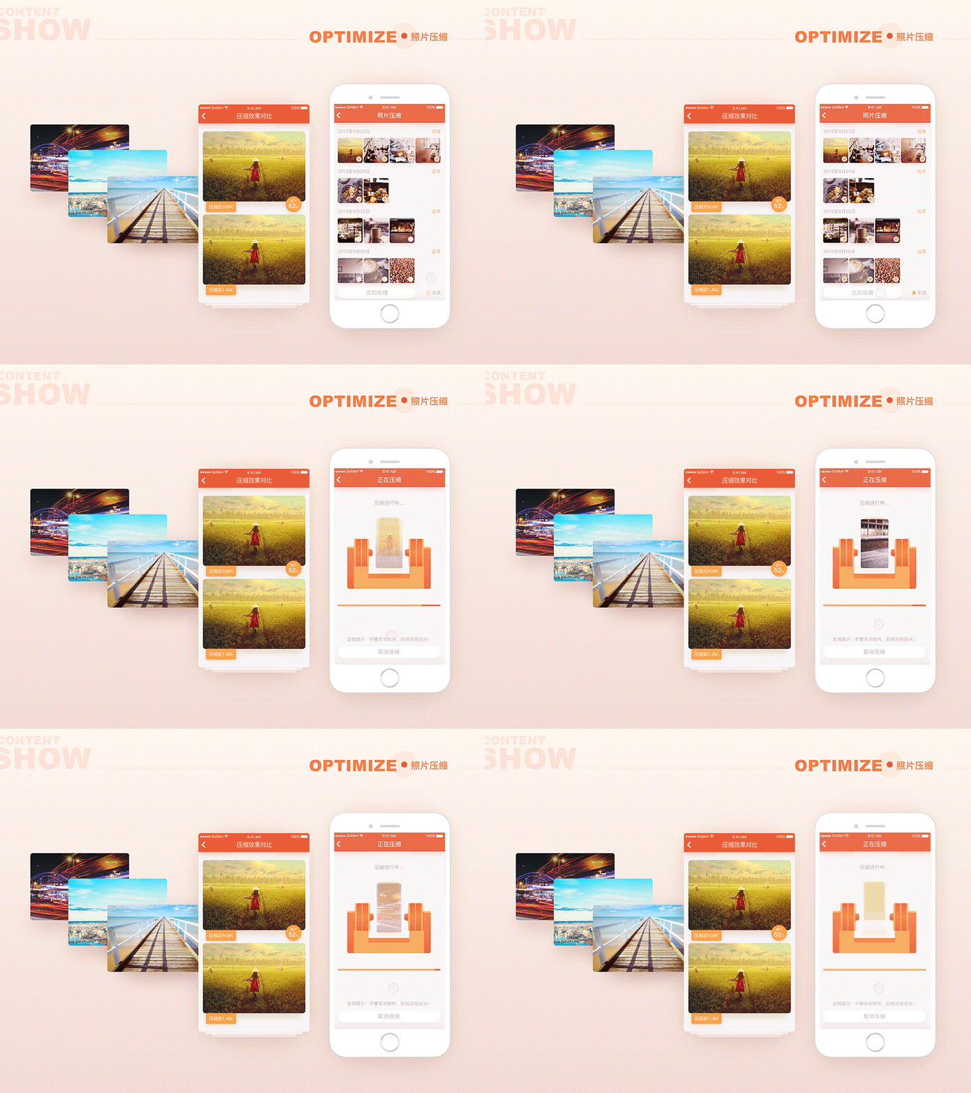
When you are working on your designs, slow downloading speeds will both delay and frustrate you and eventual viewers of a site.  One of the biggest contributors to slow page loading times is image size.  If you customize your images you’ll be able to increase both your working and eventual site download time.

While you work on optimizing your images, you could also ensure that they will be responsive to a range of different devices.  You can do this by adjusting the image size to the screen it will be displayed upon.

Take your different font weights into consideration.  When you work to increase your downloading speed, remove all unnecessary font selections or weights from your designs.  Each new element will add a different weight to your site and therefore delay your speed.  By keeping your site as clean and clear as possible, you’ll ensure that it loads more quickly.

Learn a new skill

By increasing your skills, you will expand your design repertoire and the number of projects you will be able to work on.  You will initially feel as though you are working more slowly.  This is because you will be leaving the comfortable territory where each stage of your project is familiar to you.  However, once you’ve developed new skills, you will be able to expand your practice or speed up your current designs.

If you are unsure of new areas to expand into, you could even explore your current weaknesses and how you could strengthen them.  If you battle with project management, planning or typography, this may be an area to work upon.  Alternatively, if you are limiting your software use because you prefer a familiar program, then working on new programs may be the option for you.

Organize your workplace to suit your needs

Every designer needs a structured or organized workspace.  This will help you to find the tools you need for your tasks as well as incorporate them quickly and efficiently into your new job.

Keep your office space well organized, your computer files easy to access and your software programs customized to meet your individual needs.  This might take a little time at first but will enable you to work on your projects quickly and efficiently.

Learn your software shortcuts

Most programs, such as Illustrator, have a range of shortcuts that you can use to increase your speed while working.

Although the number of shortcuts may feel daunting at first, by learning those you use most frequently, they will eventually become second nature.

You can keep expanding as you go along.  Once you have learned to use the keyboard shortcuts, your programs will begin to feel more intuitive and second nature to you.  You will also be able to work more quickly with your programs.

Make use of a CSS preprocessor

When we create style sheets, we know that they can become both repetitive and terribly dull.  Although we often repeat some elements on our style sheets a CSS preprocessor such as Sass or LESS allows us to organize or CSS effectively.

In addition, it allows for some elements on our style sheets to be tweaked or changed while others remain the same.  You can also reuse chunks of information should you wish to.

You could also improve your CSS workflow by creating an awesome development team who will be able to rework your CSS codes, continually creating new variables for you.

Summary

While there are many ways to work efficiently and increase your productivity as a freelancer, these basic building blocks will assist you to save time while you set up your freelance practice.  This will help you to work more efficiently and increase your profitability.  Although many time-saving techniques may seem basic, they are worth implementing.  The overall results help you to work efficiently, improving your design process.