Archiwum kategorii: Design

Visualizing archetypes: an infographic about heroes archetypes

Post pobrano z: Visualizing archetypes: an infographic about heroes archetypes

As designers, we work mostly with form, color, and typography to express meanings and communicate ideas, messages, or concepts. Writers also have some core tools that they use for storytelling. Archetypes are one of these tools.

First described by Swiss psychologist Carl Jung, archetypes are symbolic images recognized in the collective unconscious of all people. Using archetype characters in storytelling is a more subtle way for writers to use symbols and expressing ideas without explicitly writing those ideas.

The infographic

Published on Point Park University, a detailed infographic has been making the rounds on the Internet. It takes the most common characters a hero usually meets in an adventure and details it in a short text and a great illustration.

The Illustrations

In the detailed presentation of the infographic, you can discover the illustrations one-by-one by hovering each archetype image. In a clever twist, each archetype is presented as a tarot character, making each illustration a tarot card. The cards are simple vector illustrations that use the world surrounding each character to represent each archetype. Each card’s color scheme was carefully studied to match the universe we could imagine for each archetype. The use of tarot card was very clever, as it is one of the best examples of archetype use in design.

The archetypes

The archetypes presented are the following: the Hero, the Herald, the Mentor, the Threshold Guardian, the Shapeshifter, the Ally, the Trickster, and the Shadow. Discover each archetype’s description in the infographic below or in this detailed article.

Is Interactive Email the Future of Inboxes?

Post pobrano z: Is Interactive Email the Future of Inboxes?

The interaction between your brand and its customer is the lifeblood of any business. Without setting up proper channels to bridge the gap between you and your audience, you may as well kiss your business goodbye.

Keeping an open line of communication is vital to the success of your online business. This reason is precisely why email marketing is one of the best channels for this purpose. Not only can you build better relationships with your current subscribers but you can also convert them into loyal customers!

However, you need to keep up with the different email marketing trends so you can make the most out of your strategy. One of the more recent and interesting trends in this discipline is interactive email. It doubles down on the concept of what makes email great, thus helping you increase your engagement levels and conversion rate!

In this post, learn the value that interactive email brings to your business and concrete examples of interactive email at work to help you come up with ideas of your own for your business.

Why the need for interactive email

Email marketing is a very dynamic practice. With lots of innovation going around in this space, you need to be sharp, vigilant, and on your toes should you want to make the most out of your email campaigns.

The fact of the matter is that what works now in email marketing may not be as effective sooner than you think. Every company and brand is observing the latest practices on how to get more subscribers and increase their CTRs from their campaigns.

Therefore, the latest tactics and technology lose their novelty faster than you’d think because people are quick to adapt to them. If you’re not susceptible to change, then you might as well count yourself out from the game – email will always evolve to provide people with better ways to interact with your content.

Speaking of interaction, interactive email is somewhat of a game-changer in the strictest sense. This type of email has been around for years but not a lot of brands have implemented it as extensively. If there’s an innovation in email marketing that you need to capitalize on, then it’s got to be interactive email.

The key is “interaction”

If you’re not familiar with interactive email, then think of the usual emails that you receive from brands. There are good reasons why you subscribe and remain subscribed to their email lists such as persuasive copy, clear message, and others. However, wouldn’t it be nice if the email looks just as great as its content?

There’s nothing wrong with how brands design their emails, but there’s only so much you can do with it. What if there’s an image carousel or animated images like a GIF in the email? With a host of other potential elements you can add, you can create more
compelling emails that you can test and benchmark to help you engage and interact with your subscribers even more!

With interactive email, you don’t have to imagine. You can design your emails like you would a website. You can add menu hamburger menus, videos, and even payment gateways in your emails. And those are just some of the possible elements you can add!

Interactive email examples

Instead of telling you how to use interactive email for your business, it’s better to just show you! Below are examples of how companies used interactive email to great effect:
  • Allen Edmonds – The brand used geo-targeting to provide subscribers with weather forecast through email. It also recommended products that users need to purchase according to the weather that day.
  • The New York Times – To drive more subscribers to their publication, the brand created an email that makes use of an animated GIF as its heading. The headline reads, “Give the Truth. Give the Facts. Give the Times.”
  • Pret – To promote its Smoothie and Frappe campaign, Pret launched an email campaign using animation as well. However, instead of GIF, the brand used CSS animated sprites to create the visuals of pouring a smoothie or frappe on a plastic cup every time the user clicks on the available flavors.
  • TrendyMinds – The brand sent out an email promoting their latest content by way of a game. To unlock the content, subscribers must click on the colors in correct order.

Email marketing is always on the cusp of the future and interactive email is proof of that claim. With the technological advancements from companies like Campaign Monitor, the ability to create engaging and interactive messages is now upon us. There’s no need to send static, text-based email message now that you have a more compelling way to display your content to people via email.

It’s up to you to adapt with the times and include interactive emails in your strategy before it’s too late. Hopefully, the tips and examples above should have convinced you to take this route now.

12 UX Design Tips For Your Website

Post pobrano z: 12 UX Design Tips For Your Website

Imagine you get a piece of white paper on one hand and on the other you get all the rainbow colors in a pallet. Now you can start playing… This is how I feel when I am designing a website from scratch, when I can play with layouts and colors in the website builder to create my website masterpiece.

But, at the same time, I remind myself that the creative part of the process needs to include my customers. The way it should be done is by thinking about their experiences in the buying process of a product or service, or just when reading my blog.

In this blog post, I will help you understand what matters the most in UX (User Experience). And at the end, the answer to all the following questions will be yes!

  • Anyone who comes to my website understands what my business is about (especially if it’s their first time)?
  • Is it easy to navigate?
  • My customers find everything they need?

Let’s start:

  1. Design for the users – Know your target audience
    • Why are you making this site? Skip the temptation to dive into the website builder tools without first thinking about your main objective for the website. Remember why you are making it and what must be included.
    • Who is your audience? This is the second natural question that comes into play and one of the most important. Define your audience (age range, locations, preferences, etc.) and adjust all your website content to satisfy them.
    • What do you want visitors to do / take away when they land on your site? Is it an impression? Is it a feeling? Is it something more tangible such as e-book? You should consider passing something onto them as a way to establish a relationship and turn them into recurring visitors.
    • Are you creating the site for a client? If so, what are the client’s goals? If the website on the table is for a client, put yourself on their shoes and make it just as you would make yours. Think and plan all the little aspects and ask them any questions in order to take into consideration all their goals.

  1. Say more with less – simple design elements. How many seconds users have to pay attention? Make sure they do not have to stay 100% focused to be able to understand your website. If it’s too messy or too hard to get the message, they will just leave. With all the entertaining messages we constantly get through ads, signs, sounds, emails, and so on, we tend to have shorter attention span. Do not fall into the fallacy of building a messy website and you will have better chances of succeeding.
  2. Consistency – very important. Start with a nice introduction but remember to follow-up with content that matches the initial message. Build up on the tone smoothly and you will be able to present everything you want in the right time and with the right words. Stick to this strategy even if you like to be aggressive with content. It is better to go one step at a time not to sounds confusing or messy. It is human nature to avoid messy things, places and guess what? Websites too. We will avoid incomprehensive, inconsistent websites. Period.
  3. Color scheme – we have all visited websites that looked like a carnival of colors. There are web designers (or con artists) out there that are really masters at throwing around all sorts of red, yellow, blue and green. Do they really think it’s cool? I guess so…Let’s admit: at least they exist to make us laugh. Those kinds of websites are so funny! However, getting back to business, it’s hard to really see companies with funky websites as reliable. I have certainly never seen reliable companies with funky color schemes on their websites.
  4. Fonts – same thing applies here. There are thousands of fonts out there nowadays, we know. There are some that are very impressive, cool, fancy, elaborate… We know that too. It’s very tempting to browse through all the varieties of fonts you can find. And it’s even more tempting to try them out. But save yourself some time to play with them later. A website is not a place for that. Avoid using many types of fonts. Think about your logo, general appearance of your website and try to maintain your fonts consistent with your color schemes, brand identity and content.
  5. Images and videos – this part can really make it or break it. To make it, use high quality images and videos only. There are countless smartphones out there that shoot very good pictures and videos. You certainly have one you can use. If you have a camera, even better. Make sure all the visual content you put into your website is good in terms of brightness, focus and angle. The visuals will play a major role in reinforcing your messages throughout the website. Ultimately, they will prevail with the impression you are passing onto your visitors. I have a golden rule that I use to determine if the files are ok to upload to my websites: if I would see it on YouTube or on the TV and think it’s bad quality, beyond acceptable, I don’t use it.
  6. White space – a good musician knows a pause is just like any other musical note and should be used wisely within the harmony of a song. However, a musician usually is not silent for a long period of time, otherwise that’s not actually playing music. It is basically the same thing when it comes to websites. Avoid leaving blank spaces around your website but know when to use it to give users a break and to make the website better, aesthetically speaking.
  7. Navigation bar – where do you click when you want to go to the “beginning” of a website? The homepage button. Where is it? On the navigation bar. Where do look when you want to find a contact page? On the navigation bar. You get the point… The go-to place when looking for pages on any given website is the navigation bar. So keep it simple and organized. This ensures users will find everything they are looking for. The better the navigation bar, the better experience, the better impression, the better revenues…
  8. Cover the basics – mobile usability, site speed, security, reliability. Everything has a start. And these four key elements are the solid basis for a good user experience. Starting from mobile, users want to be able to see the full content of a website when navigating on their phones and tablets. They want to be able to click on every link, image and video with the tip of their fingers. Secondly, people want pages to open at the very moment they click a link, so site speed is very important for their experience. Last but not least, security and reliability are indispensible. You can pass on a trustworthy image by following the branding aspects discussed above. Needless to say, the easiest way to have all the above accomplished without moving a finger is by making your websites here on SITE123.
  9. Call to Action or short CTA – and before they leave your website, get them to take some kind of action. Yes, take advantage of them already being on your website and get them to do something that establishes or strengthens the connection between you and them. That can be by asking them to share something, to download something, or even by selling them something. There are many possibilities and you can use your imagination and knowledge of your visitors to choose what the best for your website is.

How to keep improving?

  1. Collect data about your users. Science has been doing it forever and all the other areas of life have been mimicking it since the beginning of the modern age. The use of data is simply amazing to better understand your users and to foresee how you can improve your website/business in order to enhance user experience. There are plenty of tools you can use to collect and analyze data about your users. On our plugin manager and app market you can find tools that allow you to see all sorts of data. Everything from how many visitors you get to what kinds of things they search for on the internet. Enjoy!
  2. Respond to live chat or to your customers’ emails – this will give you first-hand experience when customers are confused. It is like a direct source of feedback in this sense. If visitors get confused with something on your website, they can instantly reach you to ask a question. Now you understand more about their experience and also have the chance of developing the conversation with them.

Conclusion

When you start by thinking about your main objective for the website, you are on the right path. Then, it’s just a matter of putting your customers in the center of everything and build the website around them. In the end, they are the ones giving you the money, visibility or whatever you are getting from your website/business.

The key to succeeding is in considering all the key aspects. Think about your logo, general appearance and try to maintain your fonts consistent with your color schemes. Step by step you can build and represent your brand identity. With the attention to use blank spaces wisely, and providing a solid navigation bar and contact channel, it will be easy to excel in user experience.

Now that you master the magic of user experience, it’s time to create a website!

9 Top Invoicing and Time Management Apps You Need

Post pobrano z: 9 Top Invoicing and Time Management Apps You Need

Physicists can’t explain what time is. No one else can either. All we know is that there are situations in which we can’t get enough of it. When it isn’t used wisely, bad things can happen.

Still, we can take time, make time, pass the time, and track time; and whatever time may be made of, it can be used wisely.

We can schedule our time using a calendar app, and track it using a time-tracking app. There are numerous invoicing apps, expense tracking apps and project management apps. There are also other tools that make it easier for us to use time wisely.

The invoicing/time tracking app market can be bewildering. There are so many choices, that it can be difficult and time-consuming to find the best of the best. The good news is, we’ve done that for you with the following selections.

1. FreshBooks

FreshBooks is an accounting app that is so simple to use that it’s commonly referred to as ridiculously easy. There’s virtually no learning curve to FreshBooks, so creating and sending your first invoice only takes a few seconds. Tracking time, managing expenses, adding clients and viewing financial reports are just as easy. FreshBooks allows you to make the best use of your business hours, so you can grow your business instead of just taking care of time-consuming tasks.

FreshBooks is the perfect solution for service-based businesses, but users range from freelancers to start-ups to small enterprises. The reason behind such broad use is the breadth of useful features that make users so much more productive.

You can use the proposal feature to create a project outline, scope, and timeline in an estimate/proposal format that can then be sent directly to a client.

Expense tracking is one of the most popular features in Freshbooks. You can literally take photos of receipts with your phone and add them directly to clients and invoices within the Freshbooks mobile app. Then, once you’re ready, you can create and send invoices bearing your logo and brand colors. And since FreshBooks takes care of your time-tracking needs, you can easily illustrate what you did and when you did it, right on the invoice.

Try FreshBooks free for 30 days.

2. Jibble.io

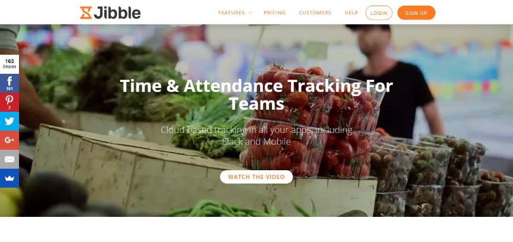
Jibble.io is a cloud-based, team time and attendance tracking app featuring a basic plan that is free for an unlimited number of users. The free plan offers up to 2 months of access to timesheets stored in the cloud, unlimited access to its many features, priority support, and unlimited usage of its activity tracking and collaboration powerups.

With Jibble, it’s always a simple task to drill down to see what activities have been worked on. Time sheets can then be generated, exported, and downloaded in spreadsheet formats to support accounting activities. Jibble also enables team leaders to generate personal timesheets for staff member use and input.

The statistics and alert feature calculates average daily and weekly hours worked by teams and by team members, including clock in and out times for the latter. Alerts are issued when anomalies are detected in the recorded stats.

3. Invoice Plane

The thinking behind Invoice Plane was to create a self-hosting billing cycle management app that targeted the self-employed workforce, small to mid-size businesses, and freelancers. The result was a reliable, easy to use invoicing and client management system that to date can claim more than 100,000 downloads in more than 190 countries.

Invoice Plane is an open source software tool, and it’s free. This app enables you to manage quotes, invoices, payments, and client relationships. It can be customized to fit your billing process needs and workflow, and it provides access to PayPal, Stripe, Bitcoin, and 22 other payment gateways.

Although you can download Invoice Plane today for free, the authors suggest you view their demo first. You can then try it out on your server or use one of the hosting solutions that are offered.

4. TimeCamp

TimeCamp tracks both task time and attendance. It is free to use for busy freelancers, and you can access TimeCamp with a browser extension or on any device by using a mobile app.

TimeCamp integrates with Slack, Evernote, Trello, Basecamp and more. It will keep your billing cycle up to date, create invoices, and integrates seamlessly with multiple project management software systems.

5. AND CO from Fiverr

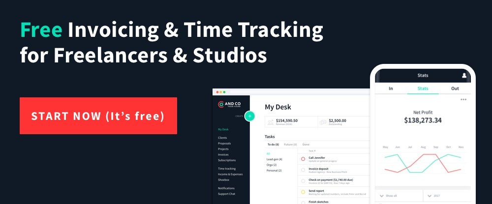
AND CO is a simple-to-use app featuring a beautiful UI that was designed with studios and freelancers in mind. ADD CO is completely free. No trial is necessary, and you can keep your credit card in your purse or wallet.

AND CO is accessible on the web, Android, and iOS. You can run your entire business with this invoicing, payments, time tracking, expense tracking, and project management app. It’s used by more than 100,000 businesses around the globe.

6. Scoro

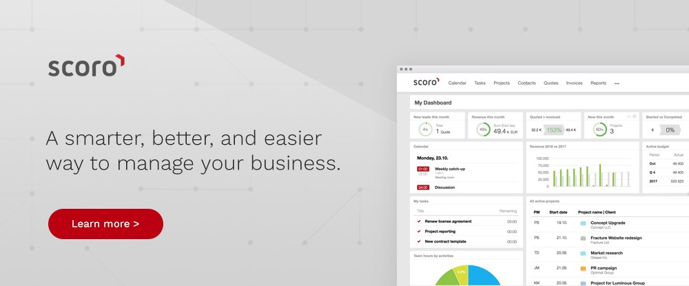
Scoro provides a comprehensive solution to your business management needs. Track your business’s or team’s performance in real time on Scoro’s modern, attractive dashboard.

You can use this app to track both actual and billable hours, transfer hours to an invoice, keep up to date with everyone’s schedule on the shared team calendar, and get a one-page overview of any project on demand. You can also track time spent on meetings, planning sessions, etc.

7. Minterapp

Minterapp is a time tracking tool for small business and startups. It monitors how much time a user spends on a task and converts that tracked time into an invoice with a single click. Invoices can be customized to fit a user’s brand, and a client can return payment via Stripe or PayPal.

Minterapp maintains a record of all invoices, whether they are still in draft, are pending, or have been paid.

8. Hiveage

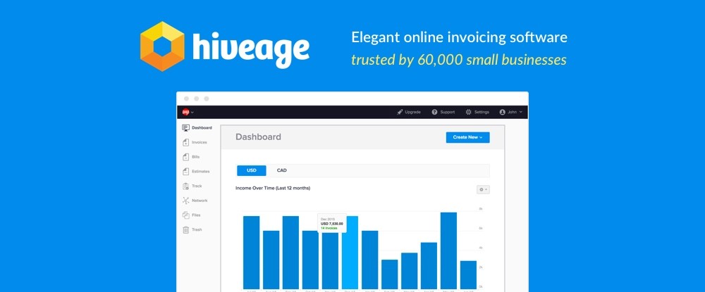
This small business invoicing, billing, and reporting app seamlessly integrates with over a dozen payment gateways. As such, a Hiveage user can serve a worldwide clientele. Hiveage also assists in preparing detailed quotations for clients and manages recurring payments and subscriptions.

Different levels of staff access can be granted, and Hiveage can also be used to effectively manage multiple teams, projects, or businesses from a single login.

9. Invoice Ninja

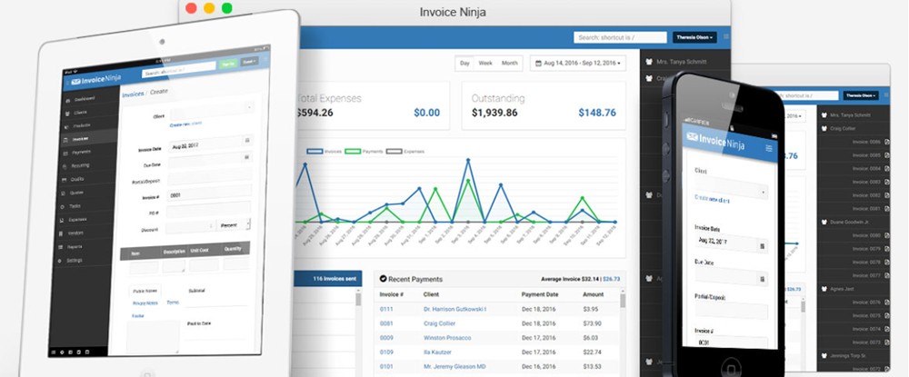
Invoice Ninja is a suite of apps freelancers can use for their project estimating, quoting, and invoicing activities. The suite also contains time tracking web and desk apps, Kanban boards, and a proposal template and proposal creation tool.  Clients will benefit from having access to over 40 payment gateways.

This Invoice Ninja suite of apps is completely free.

Conclusion

Having reviewed this list of time tracking and invoicing apps, you’ve found one or two that can serve you well. Each of these can enable you to use your valuable time to the best advantage.

You will save time as well. The minutes you save every day from time tracking results are valuable. They can add up to many days saved during a year.

Any of these apps is a good investment, and the ROI on several will be immediate.

Design deals for the week

Post pobrano z: Design deals for the week

Every week, we’ll give you an overview of the best deals for designers, make sure you don’t miss any by subscribing to our deals feed. You can also follow the recently launched website Type Deals if you are looking for free fonts or font deals.

Front End Developer eLearning Bundle, 20 Course/120+ Hours

Your lifetime access gives you so much learning spread out over 20 courses and 120+ teaching hours. This collection is great for you beginners looking to really digest all you can about the world of JavaScript.

$22 instead of $199 – Get it now!

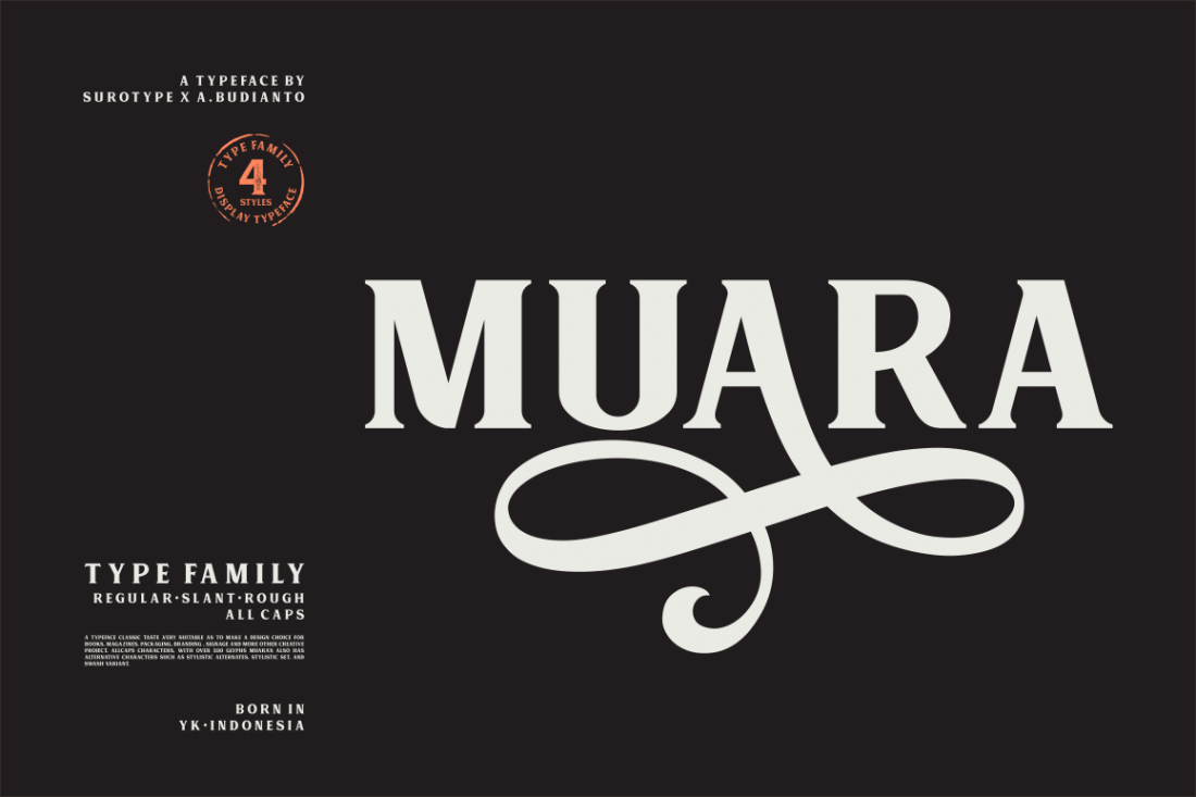
Classic, All-Caps Muara Font Family

This classic font family is loaded with style. An All-Caps typeface, this collection comes in Regular and Rough styles, as well as regular or slanted fonts. With 300+ glyphs and plenty of extras, your design problems are solved with this family that’s a great choice for everything from book covers to packaging.

$9 instead of $60 – Get it now!

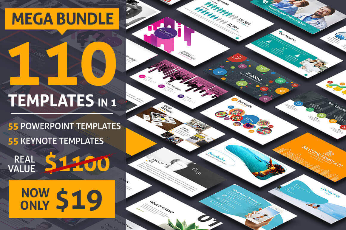
55 PowerPoint + 55 Keynote Templates

This bundle contains various styles/themes suitable for every business. Insanely well-designed, fully customizable, and available in multiple different visual styles, this templates can help turn your audiences into loyal clients. What’s more, if you act now, you can save 92% off the regular price!

$19 instead of $1100 – Get it now!

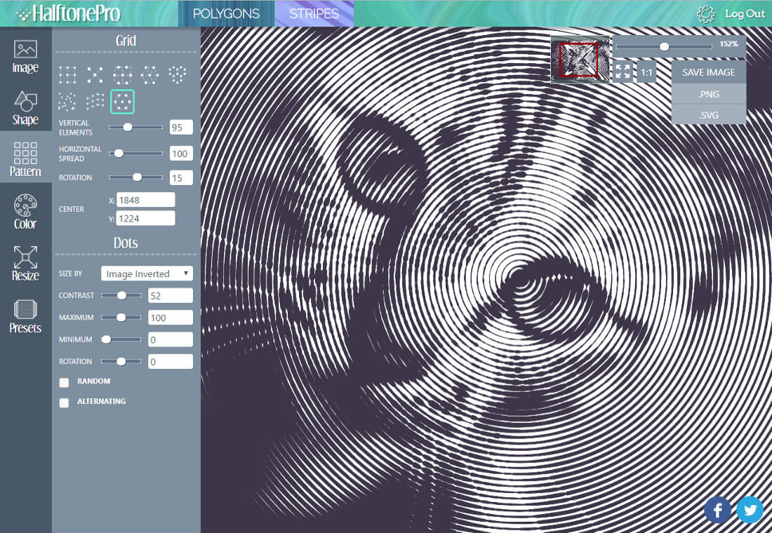
HalftonePro Vector Pattern Toolkit

HalftonePro is a powerful and easy-to-use tool for creating vector halftone, low poly, or stripe patterns. You can use an existing image as the source or create your own gradient. Play around to customize a pattern as you see fit and then export it for use in programs like Adobe Illustrator, GIMP or Inkscape.

$9 instead of $15 – Get it now!

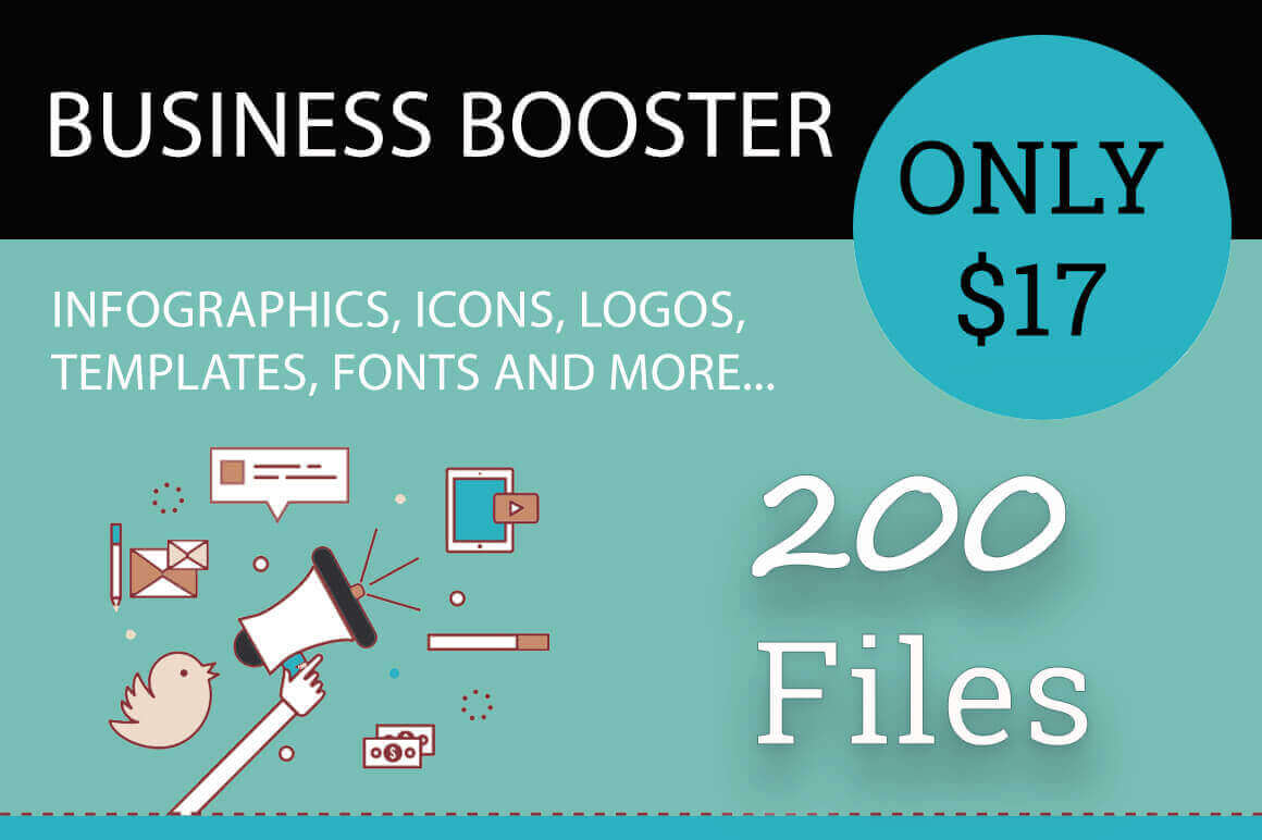
Business Booster Bundle of 200+ Professional Vectors

Whether you’re rebranding your business or just looking for a fresh marketing take, the Business Booster Bundle is your answer! Loaded with more than 200 professional vectors, you’ll get everything you need to market your business via all sorts of resources from infographics to presentations. It’s time for a fresh new look!

$17 instead of $199 – Get it now!

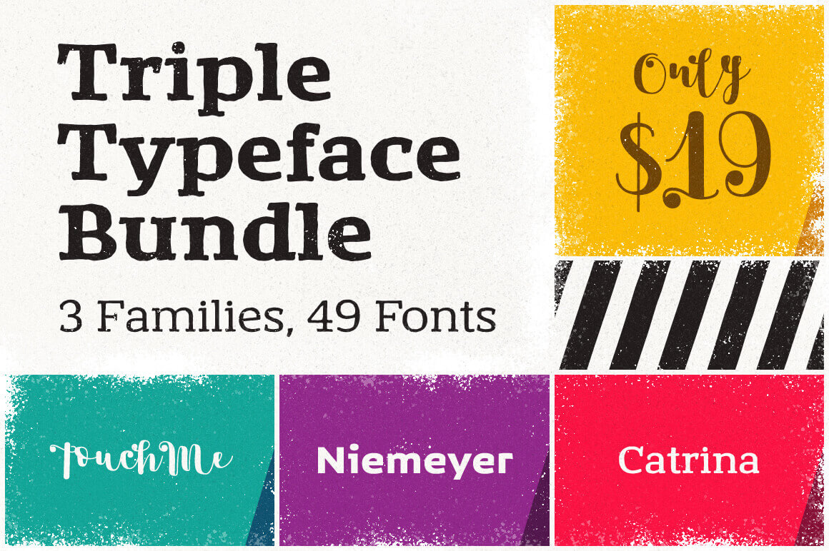
Triple Typeface Bundle: 3 Families, 49 Fonts

Your family of fonts is about to expand big time. With this magnificent Mighty Deal you’ll get a whopping 49 unique typefaces, made up from 3 fabulous font families. Multiple weights and loads of OpenType Features make for an easy choice when it comes to everything from branding to magazine covers.

$19 instead of $514 – Get it now!

Da Vetro: a limited edition glass collection of vases inspired by human gestures

Post pobrano z: Da Vetro: a limited edition glass collection of vases inspired by human gestures

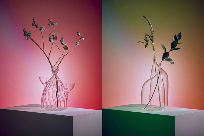
Da Vetro is the name of a series of vases, carafes, and containers designed with glass by a group of young designers from Fabrica, the research center based in Italy. The work was commissioned by Do Not Enter, a luxury retail and exhibition space in Los Angeles. The eight designs of the collection were hand-blown in Italy by glass blower Massimo Lunardon. Only a limited edition of 30 pieces are made for each design.

Design fail: this is what happens when you don’t proofread

Post pobrano z: Design fail: this is what happens when you don’t proofread

Sometimes, when focusing on designing things, we forget the obvious and let horrible mistake slip through. In this post, you can find examples of what happens when you forget to proofread and go to print carelessly.

Welcome to Kansas City

What was meant to be a welcoming statement becomes a warning for most.

Not Lorem Ipsum

But not much better, looks like somebody slammed the keyboard.

Pedestrian hunters

The lack of punctuation and spacing turns this message in a different one.

Orignal

Making typos may be a way to be original, but it will not make you look more professional.

Hell

Sometimes replacing a letter with a picture can be a good idea, sometimes not.

For a special aunt

Some fonts are more readable than others.

Flicks

Some mistakes are not typos, but bad kerning can change the meaning of words as well.

Shitake

Bad kerning again, with too much space this time.

Porn & Beans

This looks like something autocorrect would do, but I doubt the designer was working with his phone.

School too easy for graphic designers

In this graphic designer’s defense, working for TV as a designer must be quite stressful as you need to always be producing new work quickly.

A Better America

This campaign slogan for Mitt Romney had a typo in the word America, which is a shame.

Adobe announces that it will acquire Magento for 1.68 billion

Post pobrano z: Adobe announces that it will acquire Magento for 1.68 billion

After last week’s announcement of a freemium business model for its UX tool Adobe XD, the design software giant makes another big move towards the web design industry. In fact, Adobe will acquire Magento Commerce, a key player in the eCommerce field.

With this acquisition, Adobe is aiming to add another essential tool to its Experience Cloud ecosystem. While the amount announced seems very high, it’s worth noting that Magento is a leader in its industry with over 250’000 platforms developed with its cloud solution, which generate an average of 155 billion dollars in annual sales.

On the practical side, Magento’s current CEO, Mark Lavelle, will stay in charge of operations in the new branch at Adobe. He shared his excitement of working with Adobe in a recent blog post. The Magento community, which represents 300’000 developers who will probably be happy about the news.

Design deals for the week

Post pobrano z: Design deals for the week

Every week, we’ll give you an overview of the best deals for designers, make sure you don’t miss any by subscribing to our deals feed. You can also follow the recently launched website Type Deals if you are looking for free fonts or font deals.

10 Full Font Families and Bonus Design Extras

Give your voice a new look thanks to this epic typeface deal full of 10 full font families! You’ll get multiple styles, resulting in 18 unique fonts, along with OpenType Features including Stylistic and Contextual Alternates. Not to mention multilingual support, additional glyphs and all sorts of fabulous design extras from Vectors to doodles.

$9 instead of $147 – Get it now!

The Wonderful Graphics Bundle

This amazing bundle includes 40 of the most popular graphic packs from the Design Bundles marketplace, all bundled together in this one-time offer.

$15 instead of $148 – Get it now!

Create Gorgeous Scenes with Floral and Stationery Mockup Sets

Add some real zip to your latest designs by creating some gorgeous and realistic scenes. This Mighty Deal features 200 high-quality items through a pair of Floral and Stationery Mockups. Easy to customize and sort using smart objects and organized layers, you can arrange a variety of flowers, leaves and stems or paper, envelopes and office supplies to build the perfect scene to show off your designs.

$19 instead of $49 – Get it now!

The Amazing Craft Bundle

Including 16 fonts and dingbats, monograms, hundreds of SVG’s and more! It’s a Crafters Dream Bundle!

$24 instead of $285 – Get it now!

Celestial Typeface Offers Antique, Victorian Style

Step back into the early 19th century with the beautiful, hand lettered font, Celestial. A gorgeous mix of modern and classic styles, you can give your latest project a true Victorian tone. Packed with 300+ glyphs, tons of OpenType features, and a trio of bonus items, the past never looked so good.

$9 instead of $18 – Get it now!

120 Stylish and Elegant Flyer Templates

Grab this stylish and clean Print Templates Bundle to showcase your business, products or services. Fully customizable, these hi-res files are ready to print and start sharing with the public. You can use the bundle for several activities: business, corporate, travel, mobile app, photography, menu, real estate, interior design, rent cars, etc.

$19 instead of $350 – Get it now!

Illustrator CC 2018 MasterClass Taught By One of the World’s Top Instructors

Always wanted to figure out how to use Adobe Illustrator? Now’s your chance! With Illustrator CC 2018 MasterClass, you’ll quickly learn everything there is to know about mastering Adobe Illustrator. From designing logos to using various brushes, these online tutorials feature hands-on exercises and quizzes to test your knowledge.

$17 instead of $97 – Get it now!


Yose-gi Stool by TAMEN

Post pobrano z: Yose-gi Stool by TAMEN

You may already have seen one of these videos showing how traditional houses are built without the need for nails. If you didn’t, I suggest you take a look at this article on the Interesting Engineering blog. The pieces used to build those houses without nails have their ending looking like puzzle pieces, they are assembled together and hold very good.

For his Yose-gi stool, Brooklyn-based Japanese product designer Yoshiaki Ito found his inspiration in these traditional elements. The founder of TAMEN, his design studio, made stools that can be assembled together in order to save space when the stools are not in use.