Archiwum kategorii: Design

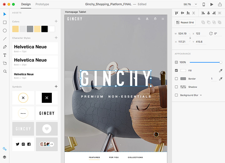
Adobe makes its prototyping tool XD CC free to download

Post pobrano z: Adobe makes its prototyping tool XD CC free to download

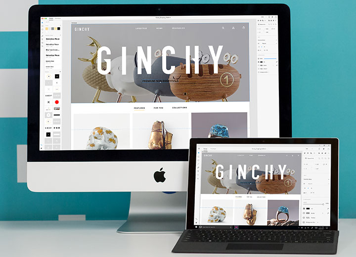
Dominant in the graphic design industry with tools like Photoshop, Illustrator, or InDesign, Adobe is not as successful with its web designing tools. Apps like Sketch or InVision are very popular among people who design for the web, which is not what Adobe wants. The company decided that its XD CC software wasn’t getting enough attention, so they changed their model to make it more accessible. It’s worth noting that you will still need to pay to get the full experience, as only the starter edition is free.

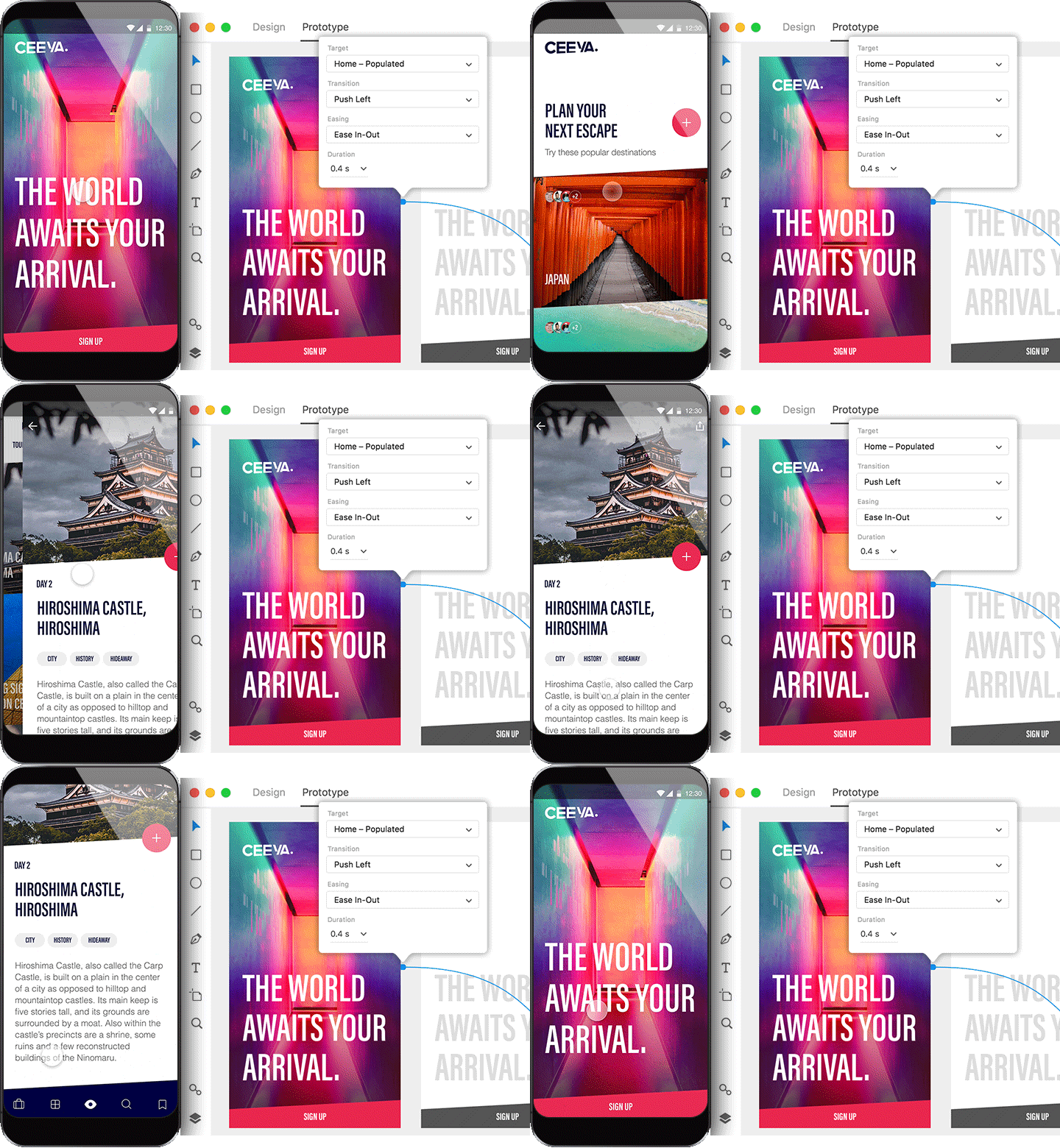
Adobe XD is a comprehensive solution for going to concept to a working prototype very quickly, the type of tool that all UX/UI designers need to be more productive. With the free version, you even get access to great icon sets you can use in your designs. Once ready, your designs can be previewed with Android or iOS transitions, then easily shared.

Are you a developer? Create plugins for XD. Adobe has even created a $10 million fund to invest in new features proposed by developers. This great announcement and the whole excitement around XD shows that Adobe is looking to make their UX/UI tool one of their flagship product. Scott Belsky, who is no less than the Chief Product Officer & Executive Vice President at Adobe, was quoted saying that XD may even become bigger than Photoshop.

Stunning 3D graffiti by Peter Preffington

Post pobrano z: Stunning 3D graffiti by Peter Preffington

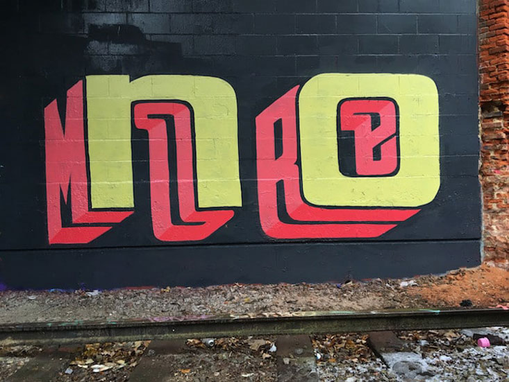
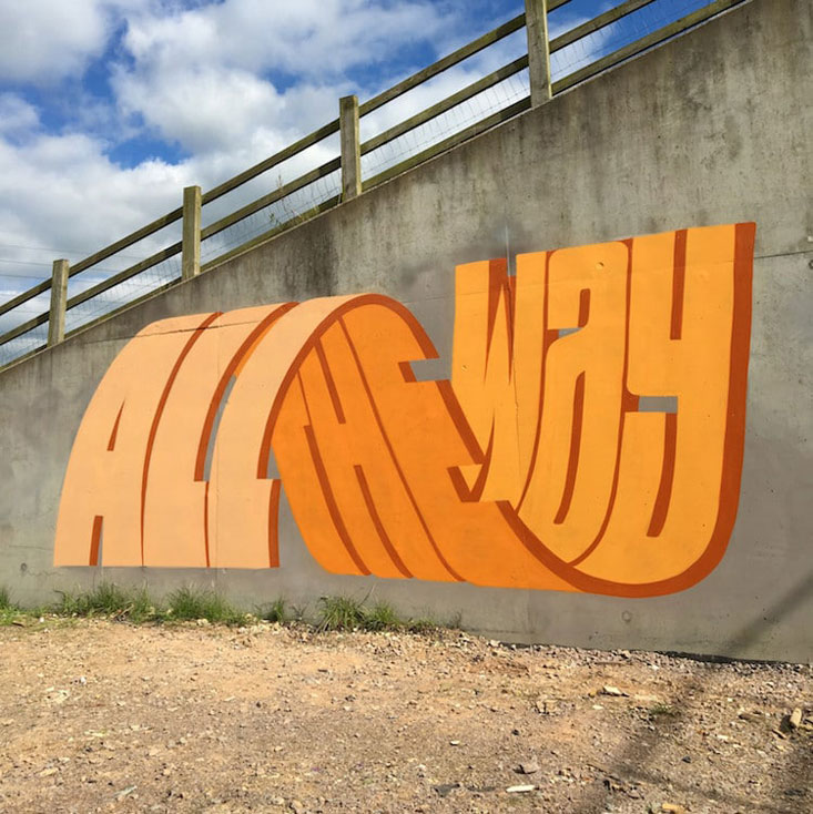
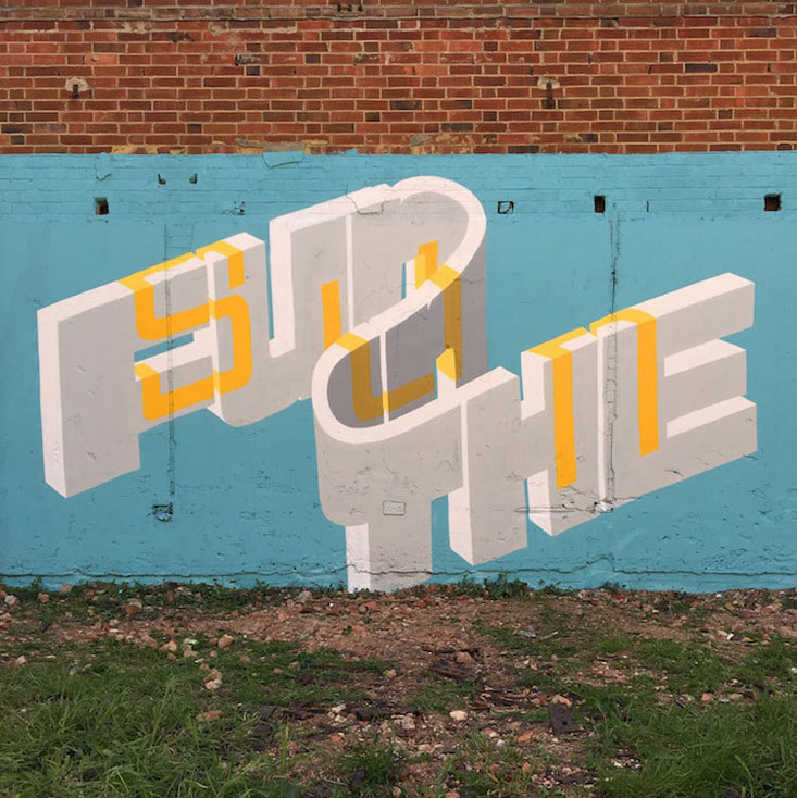
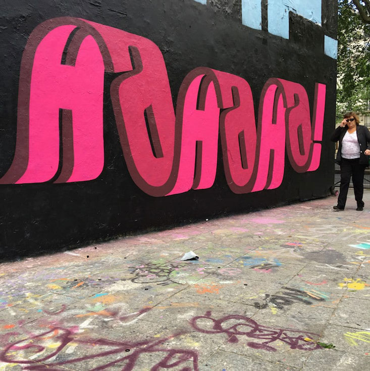
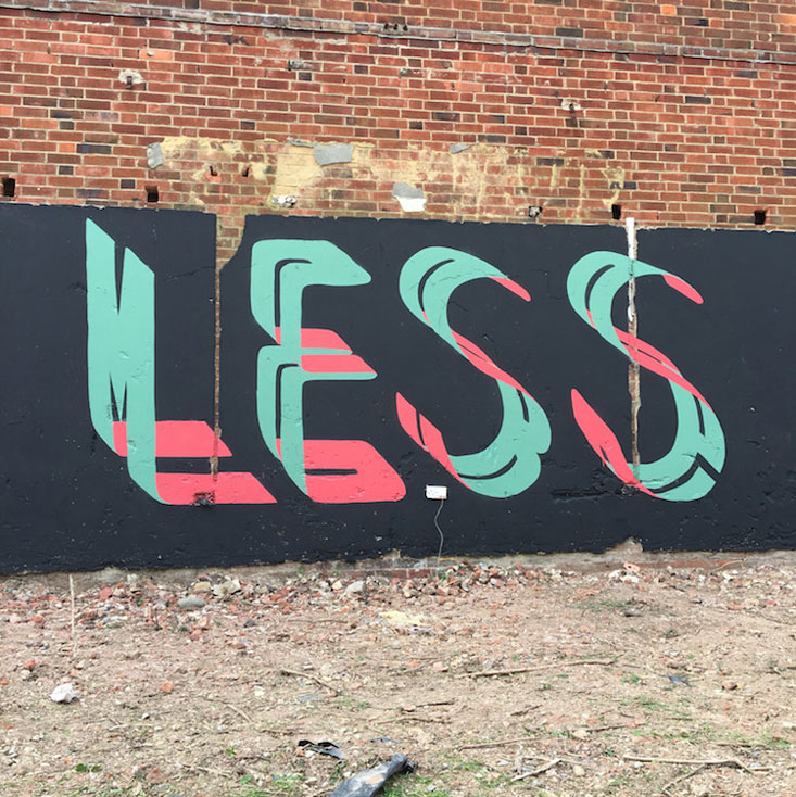
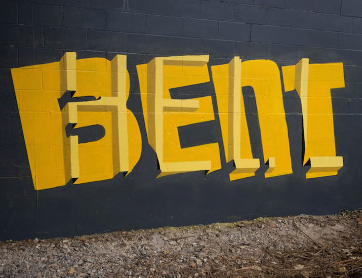
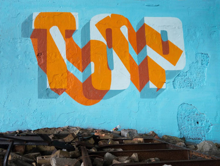
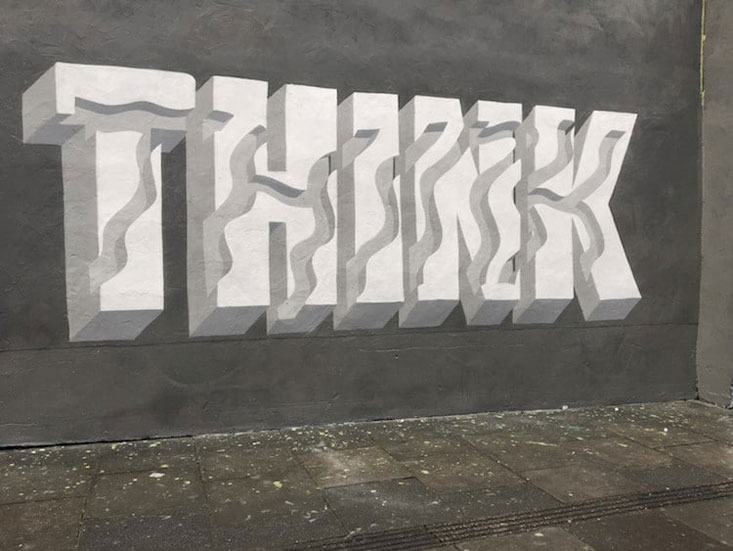
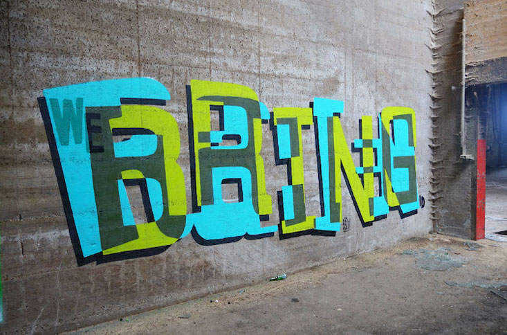
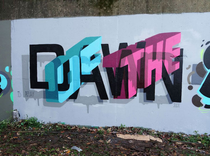
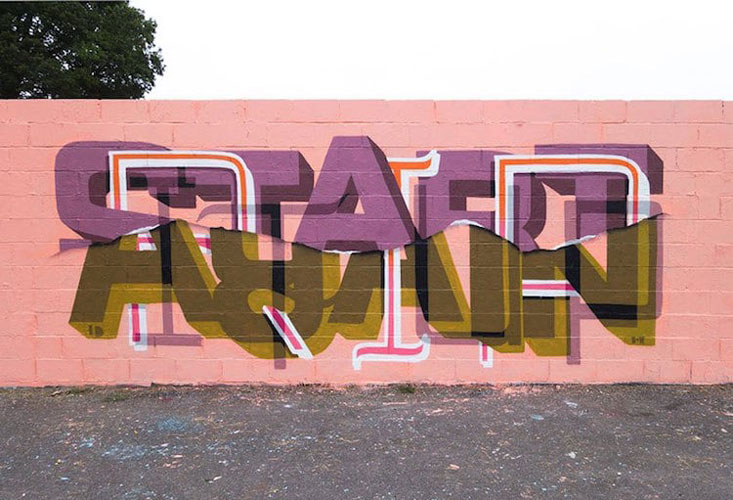
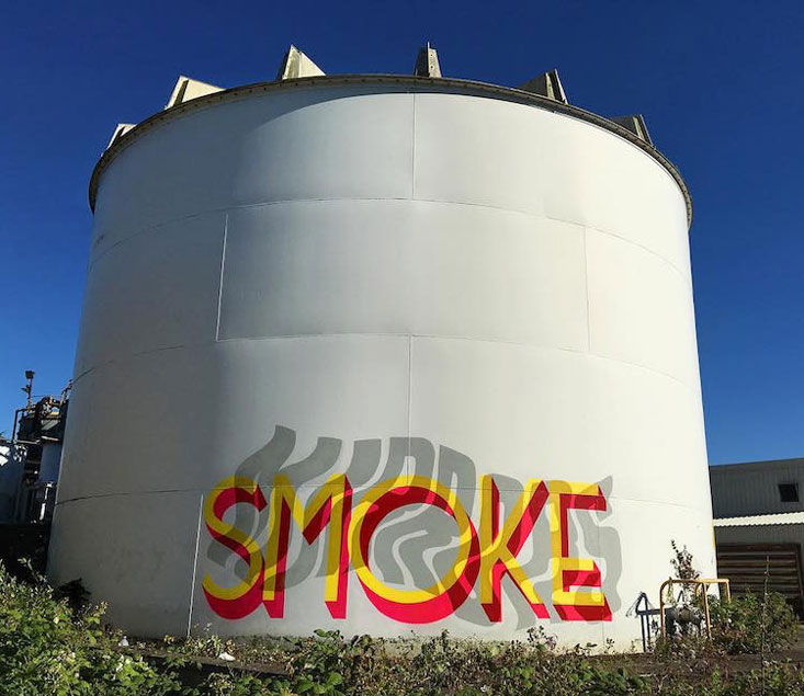
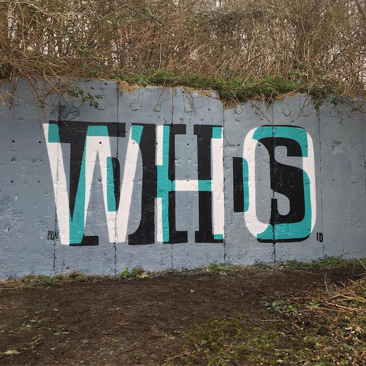
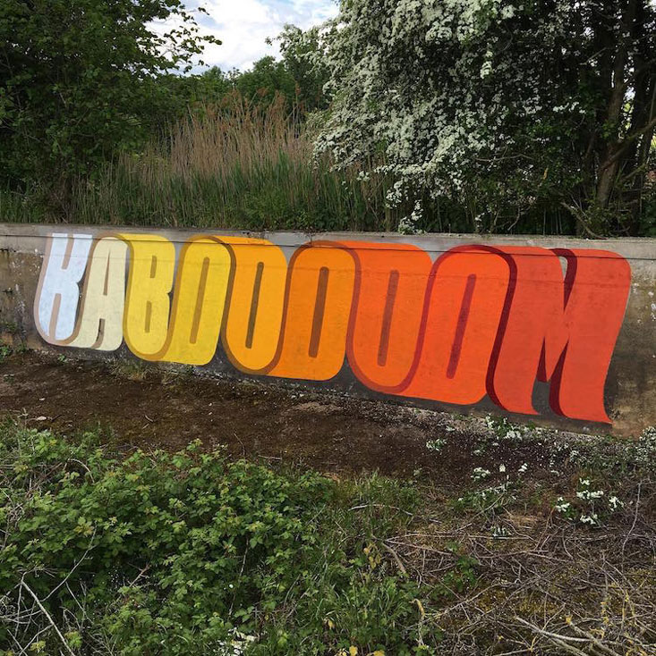
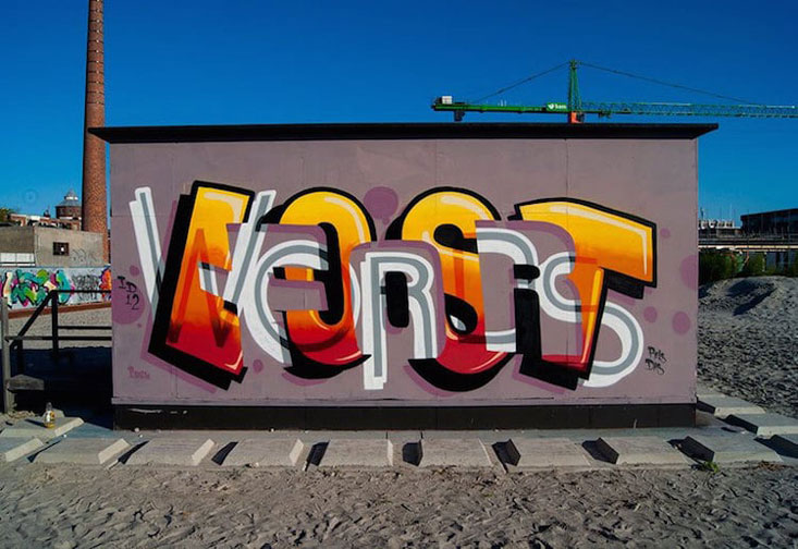
For the past twenty years, Peter Preffington (aka Pref) has been creating art that he published in his homeland, Great-Britain, or abroad. On top of the prints he exhibits in art galleries or online, the British artist also creates stunning street art that plays with type.

Playing with letter and dimensions, the street artist designs words that can be read in two ways. His multi-layered typography is not only fun and clever, it also looks great. You can obviously not purchase the designs that lay on walls, but you can buy some of his artworks as prints on his online shop.

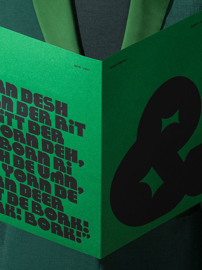
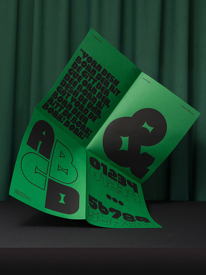
Kernit: a typeface developed for The Jim Henson Exhibition at The Museum of Moving Image

Post pobrano z: Kernit: a typeface developed for The Jim Henson Exhibition at The Museum of Moving Image

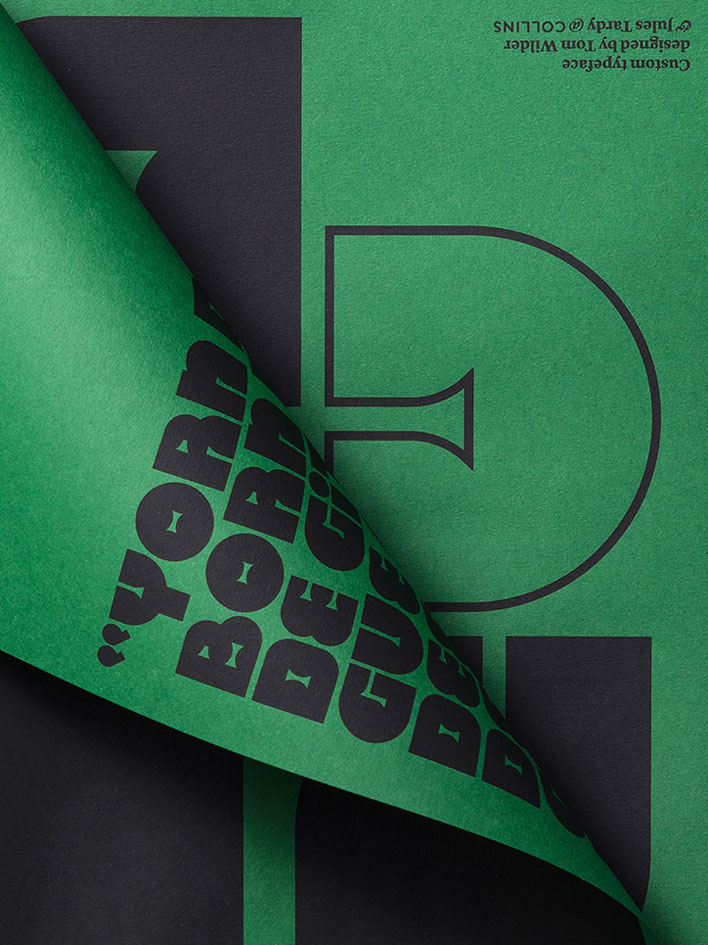
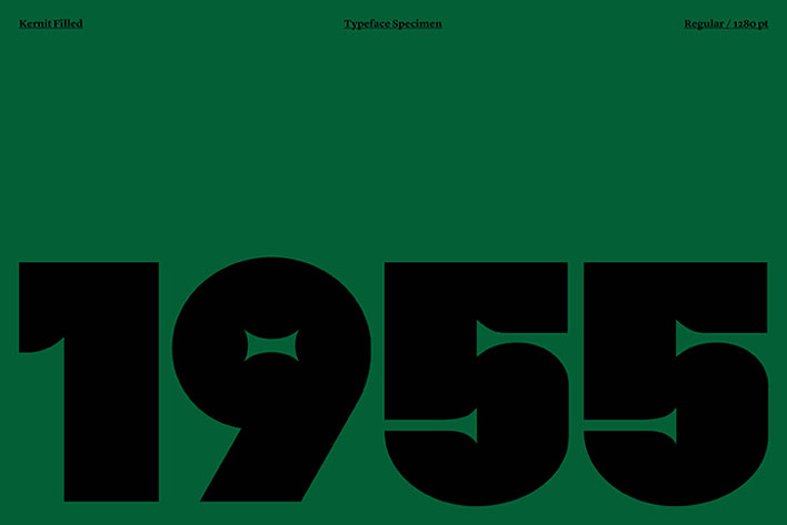
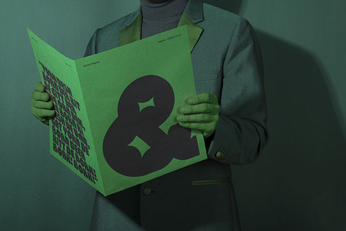
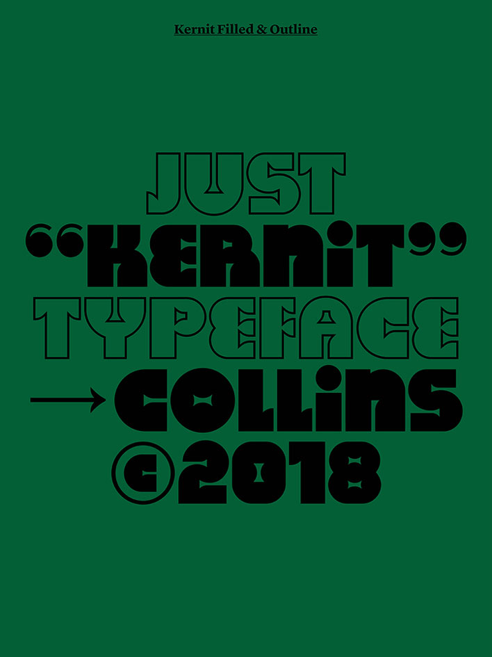
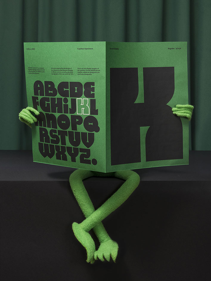
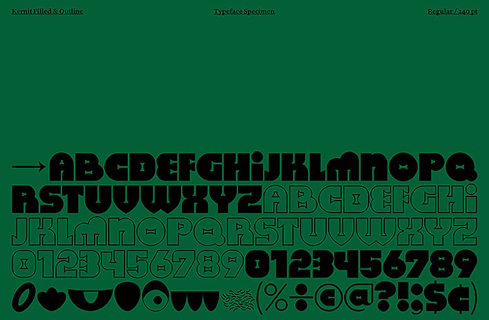
When Collins & MCKL designed a new font for an exhibition about Jim Henson, the creator of the Muppet Show, the naturally named it Kernit, a word referencing to both Kermit the frog and kerning, a typographic term.

The font, intended for the Jim Henson Exhibition at the Museum of the Moving Image, features bold characters inpired by the show. You can download it in bold and outline on this website.

Spectacular Link Building Techniques For Your Website

Post pobrano z: Spectacular Link Building Techniques For Your Website

There are numerous techniques you could use to build links, some of them white hat while others black hat. Google is very keen on sites that use black hat techniques and will place penalties on such sites, so while building links through ghost marketing, you should be careful to avoid falling in the hands of Google algorithms because this will literally take you back to zero. With that said, you still have white hat methods that are natural and safe that you could utilize.

Here are some guidelines you may use to generate high-quality links.

Content marketing

The first step you should take in building links is content marketing, which is basically producing high quality content that is sharable. By far, this is the most legitimate link building solution because you will naturally get links from different sources. Choose a relevant topic and conduct in-depth research to come up with an original article. Curate comprehensive advice and publish on your website and newsletter. You could also share on social media platforms like Twitter and Facebook. If your content is good, your target audience will share it and this will give you natural backlinks.

Broken link building

Broken link building includes identifying broken links on blogs and sites and giving the site owners an alternative resource. You need an SEO tool like Ahrefs to identify sites in your niche that have broken links for articles. Export data about the sites and reach out to as many as possible because most of them will definitely not agree to the offer. How this works is that after approval you create an article on the topic highlighted on the broken link, then ask the site to use your link instead of that which is not available.

Guest posting for SEO link building

Guest blogging is an effective technique and this works because you give valuable input to sites then they give you a link in return. Choose your targets wisely and build a diverse link profile including authoritative inbound link profile. Reach out to the sites you have identified and show them a sample of the article you intend to publish. After they have approved your request create a high-quality article and include one link to your site in a natural flow.

Link building with social shares

One of the options for getting links is encouraging social sharing. Although this does not impact ranking directly, social shares could impact the number of people who see the content and eventually link to it. This explains the reason posts that have many social shares usually rank high on search results.

Build links with reviews

Another way to build links is through reviews. There are many review platforms that you can join that will link back to your site. You could also talk to an online influencer to get them to review your content and this could get you some links. Sites like Trustpilot give you an opportunity to link back to your site and reviewers could also help to spread the good news about your business if your services or goods are perfect.

Link building is a diverse specialty and you can use different methods to earn links for your site. The rule of the thumb to good link building is to always avoid strategies that would be classified as spamming or black-hat because this will bring down the reputation of your site in the eyes of Google. Try the ideas mentioned here coupled with other white-hat methods and you will see results.

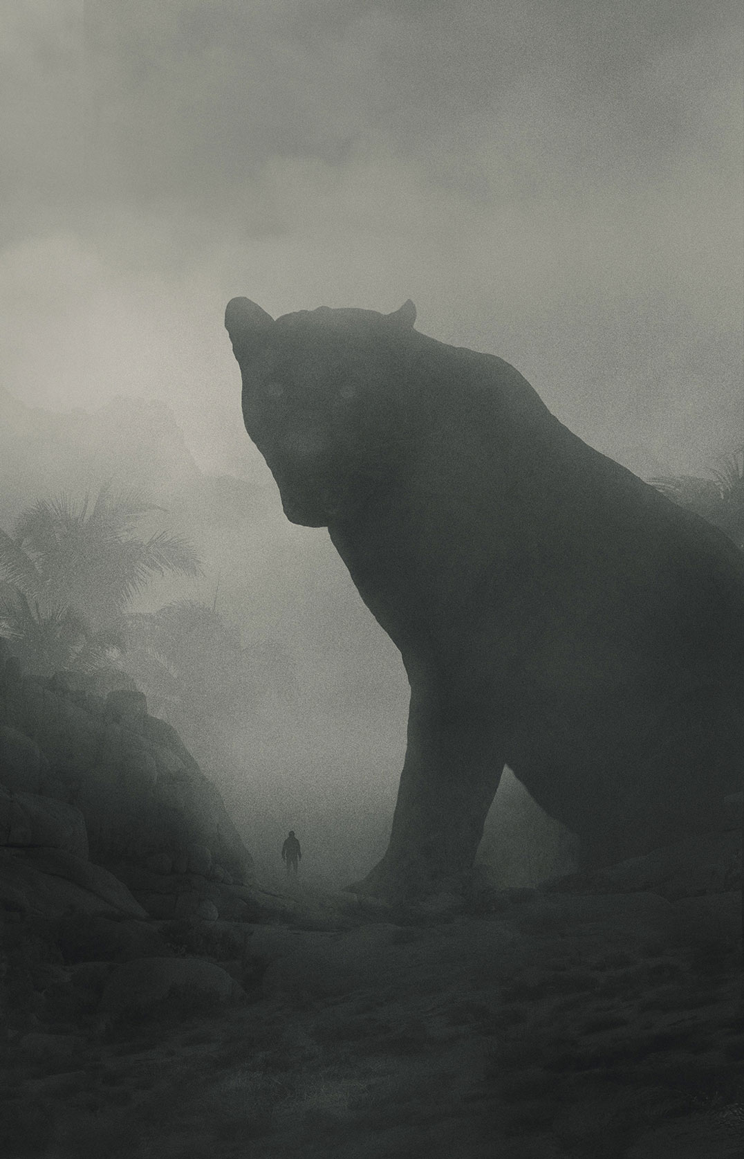
Mini People in the Jungle: beautiful grayscale illustrations by Dawid Planeta

Post pobrano z: Mini People in the Jungle: beautiful grayscale illustrations by Dawid Planeta

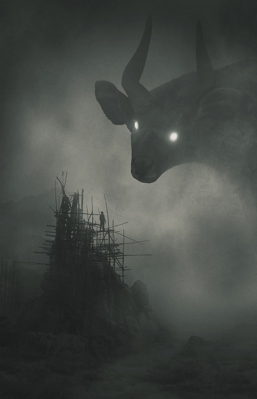
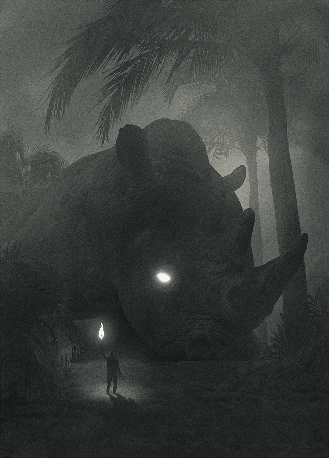
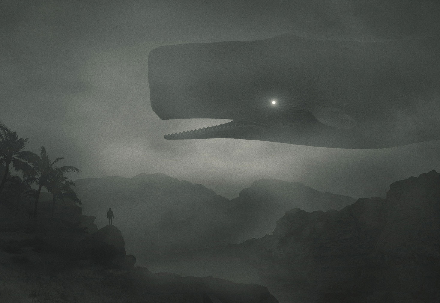
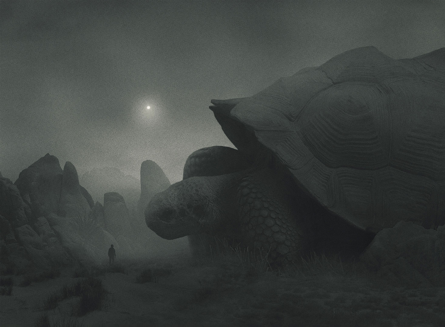
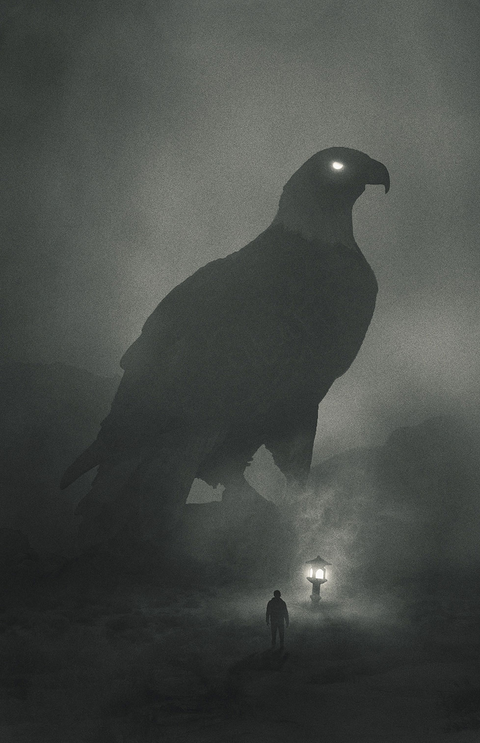
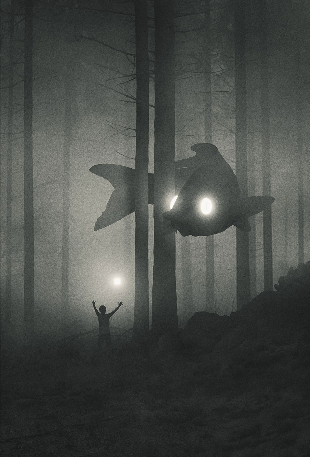
Dawid Planeta is a graphic design, illustrator, and artist from Poland. One of his most prominent work recently is his series of illustration titled “Mini People in the Jungle“. It features dark, colorless scenes with gigantic animals with glowing eyes. As one could have guessed, the artist’s inspiration comes from the dark side, from his own personal struggle with depression. The result is stunning and can be followed with recent artworks regularly added on his Tumblr.

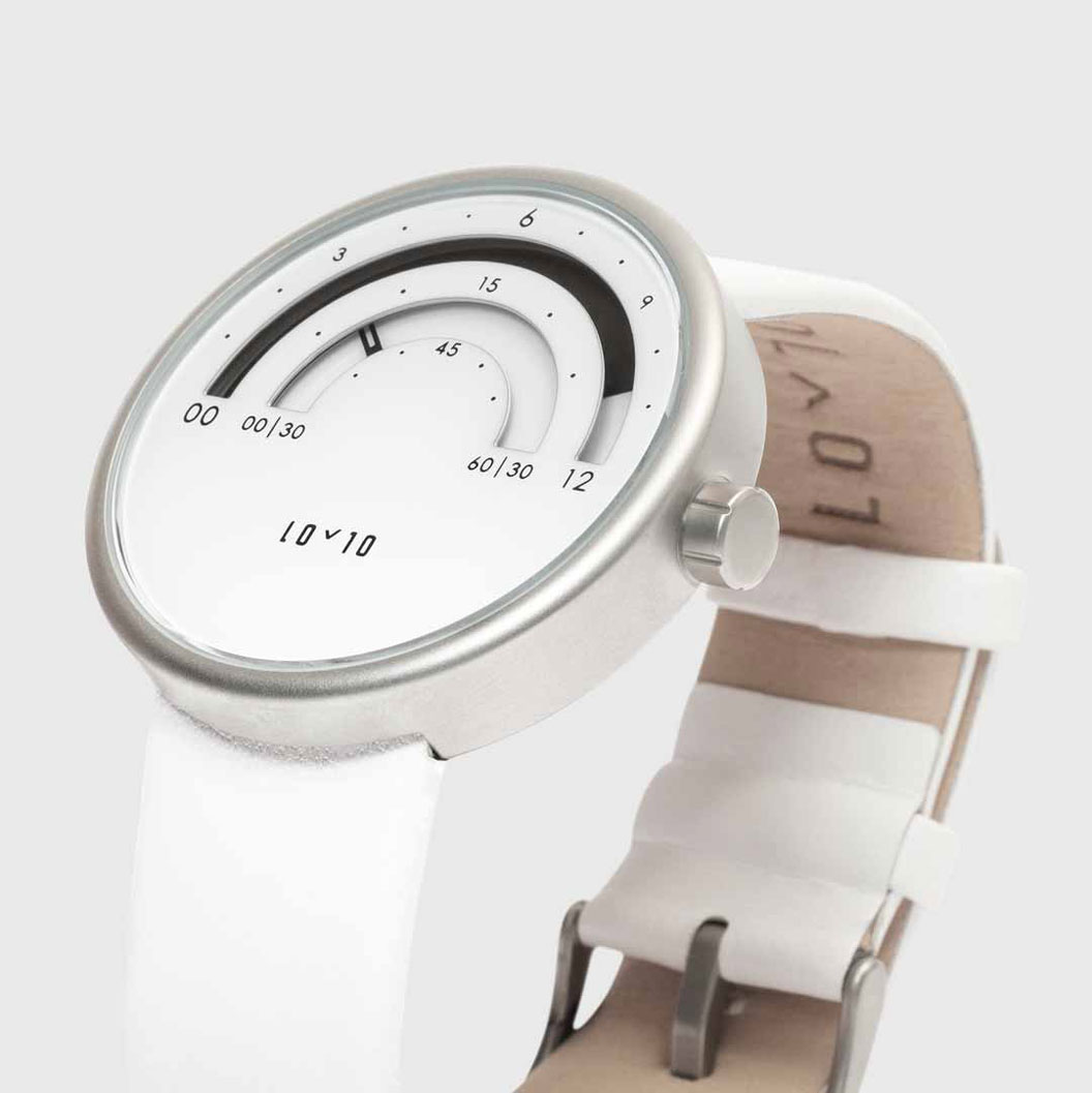
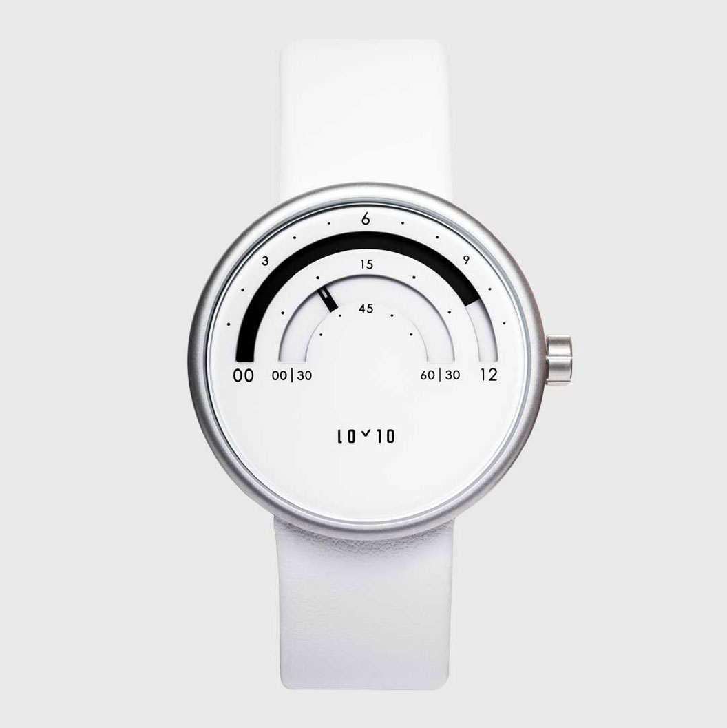
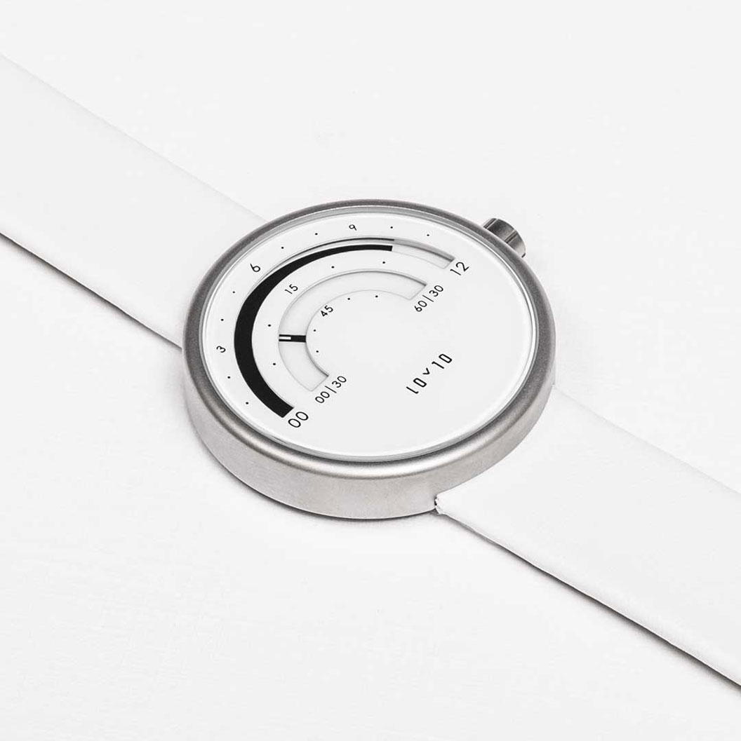
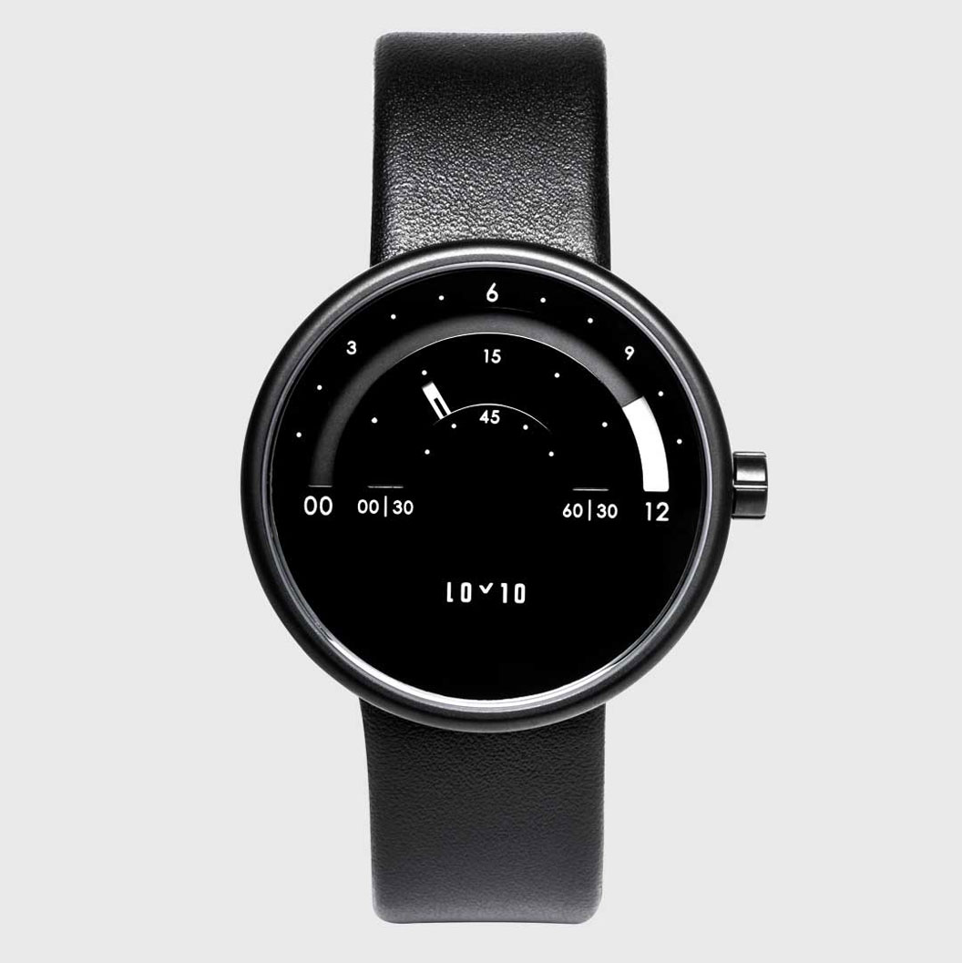
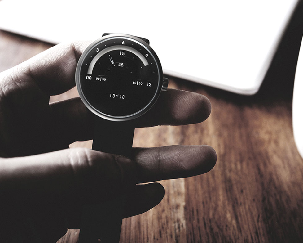
Loyto L1: a modern take on the traditional analogue watch

Post pobrano z: Loyto L1: a modern take on the traditional analogue watch

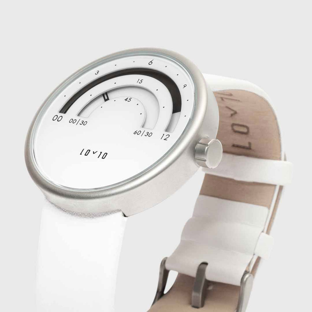
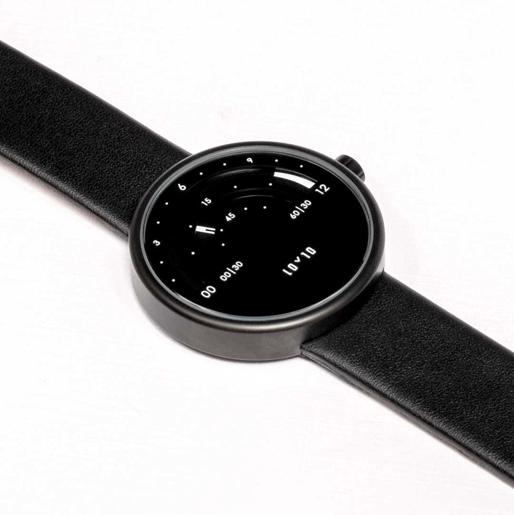
Many designers choose to design for smartwatches because the digital screens allow them to create modern interfaces and innovate. Innovating with a technology that has been around for hundreds of years is harder, especially when the technology behind is more restrictive.

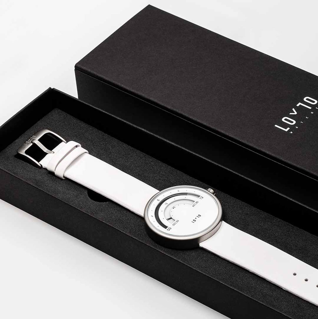
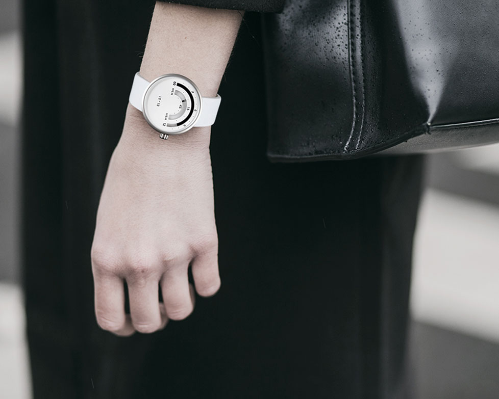
With the Loyto L1, the designers found a way to give a new, modern graphic representation of “reading time”. You can find this beautiful watch on Loyto Watches.

Design deals for the week

Post pobrano z: Design deals for the week

Every week, we’ll give you an overview of the best deals for designers, make sure you don’t miss any by subscribing to our deals feed. You can also follow the recently launched website Type Deals if you are looking for free fonts or font deals.

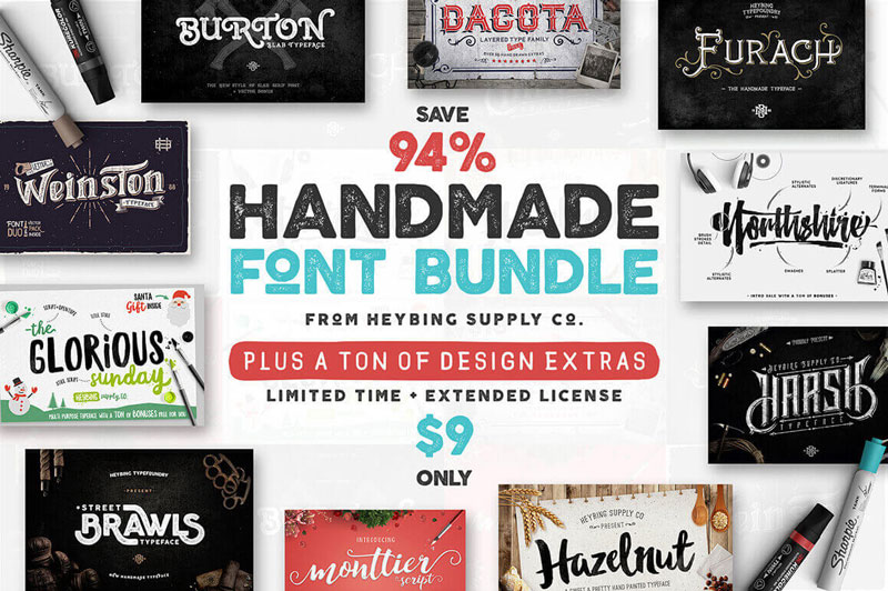
10 Full Font Families and Bonus Design Extras

Give your voice a new look thanks to this epic typeface deal full of 10 full font families! You’ll get multiple styles, resulting in 18 unique fonts, along with OpenType Features including Stylistic and Contextual Alternates. Not to mention multilingual support, additional glyphs and all sorts of fabulous design extras from Vectors to doodles.

$9 instead of $147 – Get it now!
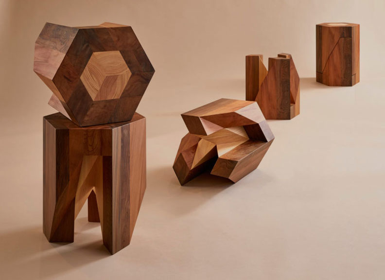
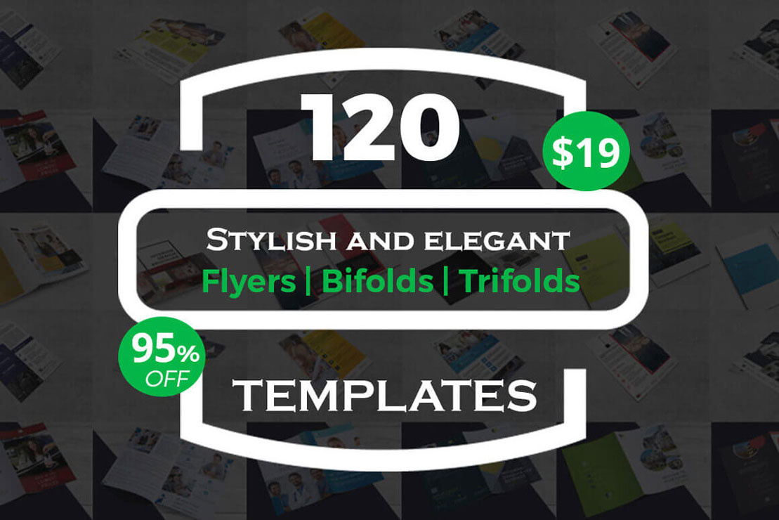
Massive Bundle: 120 Premium Business Card Templates

Even in this day and age where texting and email are as natural as breathing, something as simple as a business card is still crucial. Putting a physical card in your wallet or even on your desk, makes it easy to remember to contact someone. More importantly, having a business card to hand out adds serious credibility to you and your business.

$19 instead of $620 – Get it now!
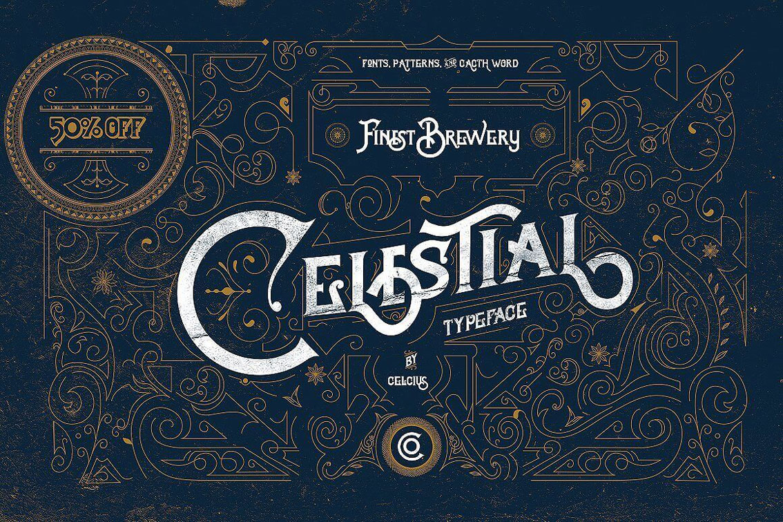
Akwe Pro Font Family of 150+ Modern Typefaces

Professional. Versatile. Those are just two words to describe Akwe Pro. This professional, ultra versatile sans serif typeface sports a modern design with perfect legibility. Created for use in both short and long blocks of text, as well as headlines and user interfaces, this font family features more than 150 unique fonts that are just perfect for your latest branding challenge.

$24 instead of $299 – Get it now!
123 Best-Selling Fonts & 552 Premium Graphics and Logos

A Mighty Deals Exclusive!!! You won’t find this designer’s dream of a deal anywhere else on the Web. Packed with pure professional pop, this Mighty Bundle is overflowing with more than 120 fabulous fonts and over 550 graphics and logo templates. From badges to ornaments to illustrations, and everything from modern script to watercolor brush style fonts, this collection is all you’ll need to whip up your latest projects.

$15 instead of $1850 – Get it now!
Graphic Design Trends You Shouldn’t Miss

Post pobrano z: Graphic Design Trends You Shouldn’t Miss

In a digital era, trends constantly shift and change.  This is true in the field of graphic art.  What was trendy or modern a few years ago might look outdated in 2018.  Some trends have staying power, while others disappear quickly.

Latest graphic design trends

2018 is the year that imagination has been given freedom to roam.  Trends are wider, more experimental and far freer.  Some trends in the field are new while others have been evolving over time.

Graphic design is a field which is never boring.  New ideas constantly emerge and the boundaries of the industry shift and change all of the time.  Nike does that with its magazine advertisements once a few years.

This article will introduce you to some of the current trends in graphic design.

The glitch effect

One of the more popular movements in the graphic art field is ‘the glitch effect’’ which gives the appearance of a corrupted image.

Signs of imperfection which would (until recently) have been discarded or seen to be problematic are now being embraced and turned into a trend.

The film industry has used the glitch effect for a while, presenting broken images and imperfect shoots as a way to create tension.

However, 2018 is the year that faulted images are starting to take over the design world too.

Destroyed design

In recent times, graphic artists have been preoccupied with destroying their designs or imagery.

This might mean spray painting over them, tearing them or crumpling them.  Rumpled, worn in or destroyed designs are leading the way in 2018.

Color channels

Playing with color is a new trend in 2018.  Designers are using color to distort images, producing a psychedelic or hallucinogenic effect.

These images have a psychological impact on viewers, keeping them engaged.  As a result, ‘color channels’ are emerging as a popular trend in 2018.

Holography is slowing down

The hologram effect has been hugely popular for a while, with designers using holograms in branding, logo design, brochures and even stock photos.

Holograms added an interesting detail to the minimalist design.  Recently, however, the trend has begun to slow down.  While the holographic design will still hold some power, we’ll be seeing it less frequently in 2018.

Double exposure duotones

Double exposure duotones offer a radically new element to the graphic designer.  In 2018 this trend uses vivid colors.

Different overlapping images are used to create an interesting visual effect.  This combination is used to create a modern design which is taking over the industry.

Muted or moody color tones

As the retro themes of the 80s and 90s are starting to reemerge, moodier colors are beginning to dominate the design field.

These colors reflect the themes of times gone by when cameras and screens were not able to capture saturated colors.

Popular trends include muted colors (or low-intensity colors with a greyed out effect).  These colors are removed from their primary base and have a low Chroma.

Moody colors have been used to create texture, fabrics, screens, paper and retro website designs.  This trend is emerging strongly in the design field and will gain popularity in 2018.

Ultra Violet

Ultraviolet is a deep purple-blue color reminiscent of the mobile disco era.  It is often used to give a futuristic feel to design.

This color has recently become trendy, drawing on the space theme to provoke an atmosphere of exploration or discovery.

Futuristic themes are beginning to emerge in web design, graphic design, fashion and interior design.  This is definitely a graphic design trend for 2018.

Mid Century design

Mid Century design draws inspiration from themes which existed between the 1930’s and mid 1960’s.

This trend has been growing within the interior design industry for the past while with a focus on mid-century Scandinavian furniture design.  This theme gives the feeling of timeless quality and attention to detail.

During 2018, this theme will start to emerge far more strongly in the world of digital and graphic design, adding a retro feel to work that is produced.

Colored fonts

As nostalgia takes over, designers are often choosing to use colored and highlighted fonts to draw attention to their content.

This is replacing the old trend of using illustration or imagery to put a message across.

New software which allows for developing your own handmade color fonts has recently been released (Photoshop CC 2017/2018).

This enables graphic artists to create an attention-grabbing but unique element to their work. This trend is going to increase rapidly as 2018 unfolds.

Cinemagraphs

Cinemagraphs are living photographs where a person takes small continuous motions.  They have become increasingly popular on social media sites.

This trend, which combines the photograph and the video is bound to become more popular in 2018, adding a new element to the design field.

Responsive logos

Recently, responsive design has emerged as a crucial element of web design.  Many people use mobile phones and tablets to browse the web, and the market is even making a move towards wearable online devices.

As a result, designers are adjusting their designs so they will suit a wide range of screens.

More recently, companies have started to focus on making their logos responsive.  This means ensuring that the logo is simple enough to work well on a small screen.

Many companies are also modernizing their logos in order to adjust to the current market.

Responsive logos are therefore an emerging trend which is rapidly emerging during 2018.

Greater depth

Flat design has been a recent trend in web design.  This meant taking away shadows or 3D elements in website design and replacing them with simple, flat colors.  However, this trend is starting to change.

Extreme minimalism is giving way to the realization that detail adds an interesting element to design, helping designers to create a hierarchy.  Viewers strongly engage with the detail on a site and this helps them to engage.

As a result, sites are changing from flat to semi – flat designs. Shadows are often added to call to action buttons, long shadows, soft and subtle color variations and a larger degree of nuance.

Shadows added in this 2018 trend do not have harsh qualities as their predecessors once did.  Instead, the trend is to add subtly to the site, creating interest without the contrast.

Debonair duotones

Old comic strips often show pixilated images or halftones which are printed in overlapping format.

Contrasting colors such as red and green were often used to create a visual effect.  The result was an attractive two-toned image which created a sense of vibrancy.

This old printing technique has been given new life by digital media. New tools and techniques make it possible to overlay a range of different colors, from duotones to quadtones.

There is even the possibility for designers to create fake duotones using software such as Photoshop or InDesign.

Fake duotones don’t have the same contrast as the traditional duotoned image, but they are still effective and easy to create.

Retro designs – inspired by the 80s and 90s

We’ve already discussed the moody colors which are making a comeback in 2018 but the influence of the 80’s and 90’s goes further still.

Both electric and pastel colors are starting to make a comeback as designers move away from the vivid colors made popular by flat design.

Patters from this era are also starting to influence design.  Instead of the minimalist imagery of recent times, geometric patterns and abstract designs are becoming more and more popular.

Our current brand leaders and target audiences are made up largely of the millennial generation (or children of the 80s and 90s).

This is reflective of the nostalgic designs which are starting to arise.  Adding a touch of nostalgia is bound to be a hit.

Focus on authenticity

This year is seeing a trend towards photographic images.  Both custom photography and stock photo images can evoke emotion in your viewers.

Imagery assists designers to send out a clear and concise message.  They also give voice to a brand.

In the 80s and 90s, the grittiness of authentic photography had a wide appeal.  This trend changed towards staged images or photos which have become generic.

Thankfully, the trend is changing back to interesting photographs which are full of life.

Authentic images increased in popularity during 2017 and will continue to do so in 2018.  Brands are seeking to connect with users rather than present them with overused and tired images.

Talented photographers are assisting by offering up excellent photos to stock image sites, often without restriction.

Summary

Graphic design is going through a rapid shift, pushing the boundaries into new arenas while simultaneously embracing the past.

We are seeing old trends fade away as new opportunities emerge within the field.  The field of design is embracing a more authentic image which speaks to their audiences.

As a designer, it is now a time to take risks, breaking old patterns.  2018 is the year to allow the imagination free reign and embrace the waves of change.

Ultimate Design Bundle: Great Prey for a Design Hunter

Post pobrano z: Ultimate Design Bundle: Great Prey for a Design Hunter

Every designer is a skilled internet hunter. After just a little time you learn where to find your prey, how to understand if it is worth getting and when will be the perfect time to hunt it down. Of course, I am talking about icons, fonts, and other design elements.

Even inexperienced beginners know that drawing the design from a scratch is a really complicated and long-time task. Even the simplest landing page design needs at least a dozen icons and don’t even start talking about fonts, background and the rest of graphics. It will take several days or maybe weeks to draw a design using ready elements, because you have to tune them up and polish the whole picture to perfection, but without pre-made stuff, it will be months. Come on, the payment is not that big to put so many efforts in work (there are exceptions, yes, but let’s be sincere, they are VERY rare).

As every good hunter, you sure have a really big hoard of graphic elements. Like mountains of gold, silver, and gemstones in a dragon cave, they lay silent and beautiful on your computer’s hard drive. However, what dragon will refuse to get some more precious treasures into his collection? That’s very pity you are not a dragon and can’t afford having everything you want, huh? I feel your pain, bro, every designer has the same problem with paid content. And that’s why you learn not only “where” to get those goodies, but also “when” to hunt for them. Every company does sales time to time and you can be lucky to grab the stuff you adore for a sufficiently lower price.

If you were waiting for a perfect time to hunt down some TemplateMonster product, stop waiting and go check Ultimate Design Bundle. We created it keeping in mind designers, their desires, and needs, so it is definitely worth your attention.

We put inside that bundle an unbelievably huge bunch of products:

Why the perfect time to get that bundle is now? Because until April 30 it costs only $29! Twenty-nine bucks, Carl! On the other time that set of graphic elements would be worth $1123 and we sell it with a 97% discount. Even a Black Friday is not so profitable!
There’s not much time has left, so hurry up! This great pray waits for you, digital hunter!

How to design a creative website

Post pobrano z: How to design a creative website

As the digital world grows and evolves, many businesses are starting to work online.  However, in order to appeal to new clients, businesses need a website.  This website provides an interactive space between a business and its clients.

An excellent website designer is able to offer a business a custom-made website.  This website will be both creative and adaptive to business needs.

What to consider when designing a website

When you begin designing a business website, take your audience into account.    There are many different types of website templates available.  However, each appeal to different members of an audience.

When designing a website, you might want to use an existing template which will suit a specific viewer.

Alternately, you might select a custom template.  This choice largely depends on what you will be using a website for.

A good website should be able to adapt and adjust as the business expands.  This will enable a business to grow with ease.

When creating a business website, it’s helpful to note that there are a lot of free resources which can be accessed.

These resources offer ready-made templates which can be adjusted to the needs of a site or its clients.

This enables you to save time and money on designing a site.  Your site can also be up and running in a very short period of time.

Free website templates are also often very easy to manage, with drag and drop features which enable a site manager to change and adjust the content or images on a site with relative ease.

How to search for inspiration

When you’re working on a site, seek for inspiration everywhere you go.  You could look at a collection of old art, view color combinations in nature or look at the dynamic movement of waves rolling off the sea.

Even the evolving colors of a city street might inspire you.  Once you have the inspiration you need, begin by creating a mood board.  This will assist you to bring your ideas together.

Learn about colors

Color sends out a message, creating atmosphere or mood.  Some colors (those next to each other on the color wheel) are complementary and can be used to create attractive but subtle designs.

Others are contrasting (such as red and green or blue and orange).  When placed together, these colors offset one another and bring a interest to a page.

Your local paint company should have a color wheel for you to explore.  Interior and graphic designs both rely on color insights.

If it seems complicated, create a website with a dark background. There are lots of black textures online for you to use. And then, every color will be easily put into a contrasting scheme.

Learn about typography

When creating a website or blog, your knowledge of typography will enhance your viewing experience.

This is because, like color, typography sends out a clear message.  Typography can be used to create a mood or tell a story about a site.

The layout of a webpage, the typeface was chosen, and the way this font is spaced will all make a difference to the legibility of a site.

Clean-lined, well-organized text will create a pleasant experience for the reader.  This will encourage the reader to engage more deeply with a site.

Look at background  images

Only a few years ago placing a great deal of imagery on a site meant that the site would take a long time to download.

Now, however, bandwidth is much faster and it is easier to add attractive background images to a site.

These images can reflect the goals of a company (for example blueprint drawings might represent an architectural firm).

Remember to keep your images responsive though.  This means they will give the same impact when downloaded on a mobile device.

Learn Photoshop

Once you’ve mastered Photoshop, you’ll be able to give your clients just about any image they need.

If you’re unfamiliar with the program, have a look for online tutorials.  They’ll guide you on how to use the program in step by step fashion.  Once you’ve mastered Photoshop, you’ll have far more to offer your clients.

Start drawing

Although websites use a variety of different codes to create the desired effect, begin by planning your website design on paper.

This will prevent any blocks between you and your ideas.  Creative people often feel very comfortable planning on paper.

Search for internet inspiration

Once you’ve started planning your website, search the internet for a range of inspiring sites you can draw from.

Good quality web designs will offer you a multitude of different ideas to add to your site.  It might also be helpful to explore ideas which don’t appeal to you.

This will show you what to avoid.  You could even Google ‘worst sites’.  Looking at badly designed sites might be educational for you.

Simplify your home page

When you are working with website design, your goal will be to keep your homepage simple and free of clutter.

When a viewer lands on your homepage, they’re looking for evidence that they’ve come to the right place.  Brand identity needs to be clear and content minimal.

When your viewers land on your page, they will scan your page for information.  The less they have to see and remember, the more likely they assess what they want from your site.

This means they will navigate more deeply into your site, or even respond to a call to action button.

If you do use content on your home page, break it up into small chunks.  If you can, use an image or icon to portray a similar message.  Your viewer can always search for any information they need later on.

Use hierarchy to direct your viewer

As a designer, it’s your goal to focus your viewer’s attention on important aspects of your site.

As a designer, you’ll be arranging the site and its context in a manner which is clear and easy to understand.

You’ll only have a short while to show your viewer what your site is about.  If your information is clearly arranged, with headings and subheadings, your viewer will know what to expect.

You can also use contrast, color, size and spacing to show your viewer important information.  Displaying your information in strips will make it easily comprehensible to viewers.

Keep your content easy to read

Legibility is always key when creating a website.  No matter how attractive or profound the information you share might be, it won’t matter if viewers cannot read it.  You want your viewer to be able to read and absorb your content easily.

Use contrast:  if your information stands out against the background of your site, it will be easy to read.  Think black letters on a white page or white lettering against a deep grey background.

This is much easier to read than the vague differences between green and turquoise, which make it hard for viewers to see.

Font size:  when we read online, the screen is usually at least 24 inches from our faces.  This makes small lettering very hard to read.  Most online sites use a font size of at least 16pts.  However, this may vary depending on the type of font used.

Use clean lined fonts:  Clean-lined fonts are often referred to as ‘sans serifs’ and are often the most frequently used online font option.

Fonts with serifs are often used in books or offline publishing.  Clean, easy looking text is best used for online site design.

Hand drawn text is very attractive and gives a unique feel to a website, but keep it limited to headings.  It can be very difficult to read in large quantities.

Limit your fonts:  When constructing your website, limit your fonts to two or three choices.  This will help you to create an orderly site.  Too many fonts can clutter up your site while a limited number will keep it harmonious.

Summary

As a website designer, you will never stop learning.  Whether you focus on typography, digital skills or finding inspiration, there are always new steps to take.

As you grow and evolve as a designer, you will have more to offer your clients.  Keep learning and you’ll watch your designs change as you do.