Archiwum kategorii: Design

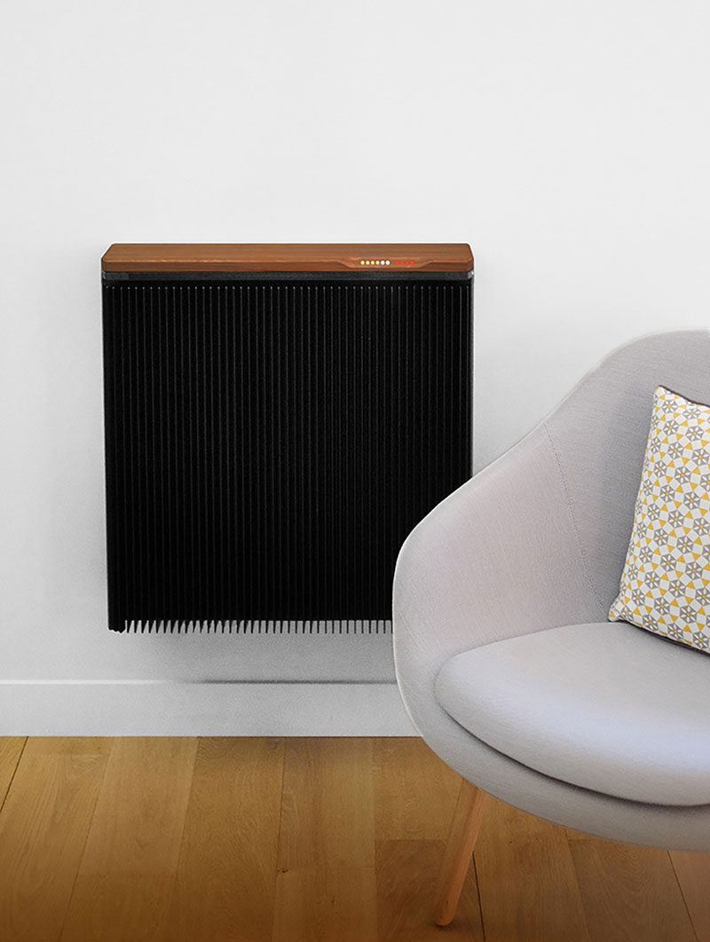
A heater that mines cryptocurrencies while keeping you warm

Post pobrano z: A heater that mines cryptocurrencies while keeping you warm

Cryptocurrencies have been a very hot topic since 2017, it’s been in the news daily and keeps on staying at the center of attention. Apart from the volatility of the Bitcoin, one big concern for all the specialists has been the sustainability of the blockchain as a technology, can it really scale and become a mainstream technology?

The example that first comes to mind when talking about this is the insane amount electricity needed to mine a Bitcoin now that it’s expensive. Can you even believe there is a Bitcoin Energy Consumption Index?

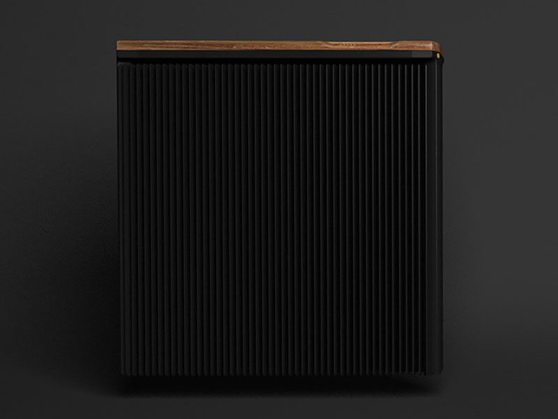
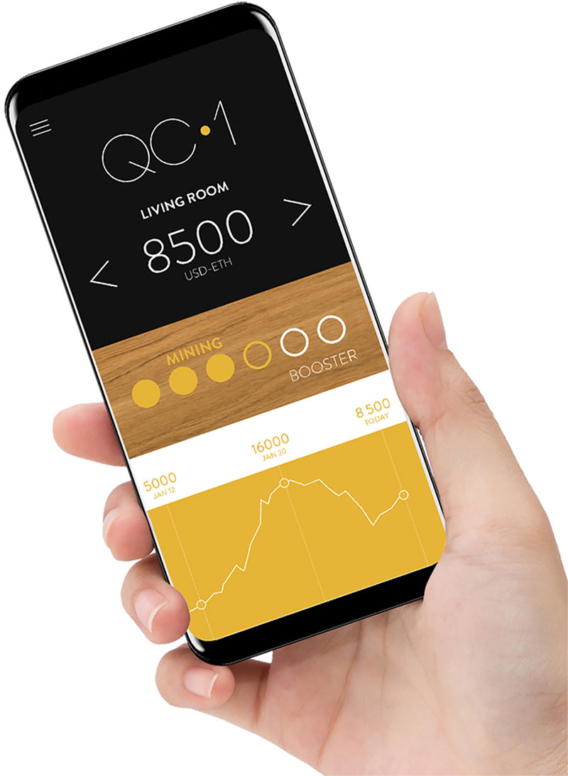
French company Qarnot found its own clever solution to this issue, they have released a heater that passively mines cryptocurrencies (Ether by default, but you can change) while warming up the room. They even claim that the cryptocurrencies mined this way will pay for your electrical bill.

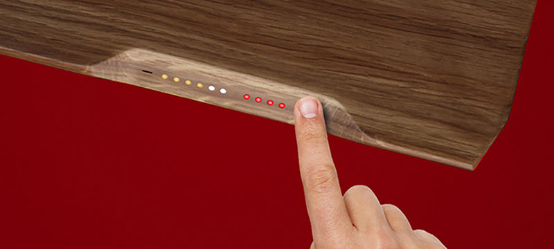
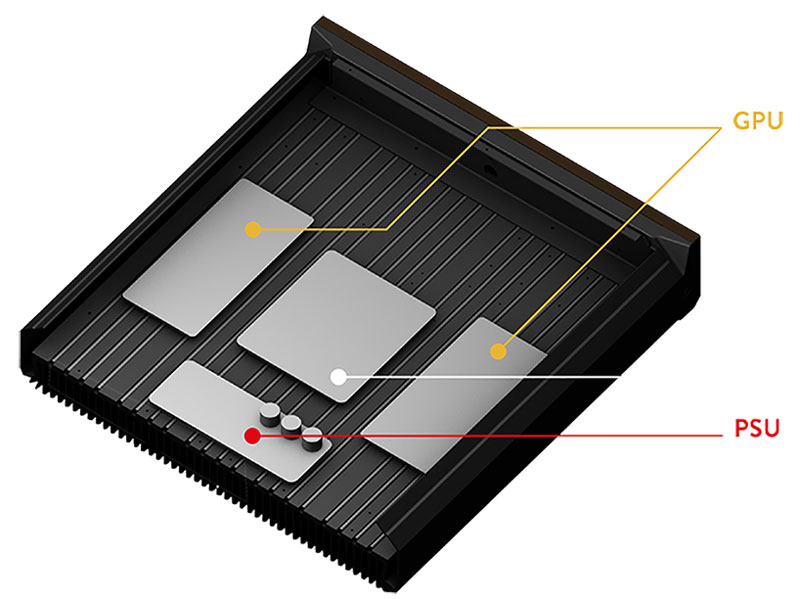
The elegantly designed heating device comes at the price of $3,500 and can very easily be set up to start mining as soon as you use it. Normally, the energy used for mining cryptocurrencies will generate some heat that will be cooled down using fans. This makes is use even more electricity. The QC1 by Qarnot turns this heat into a passive feature, which is really clever if it works as well as they claim.

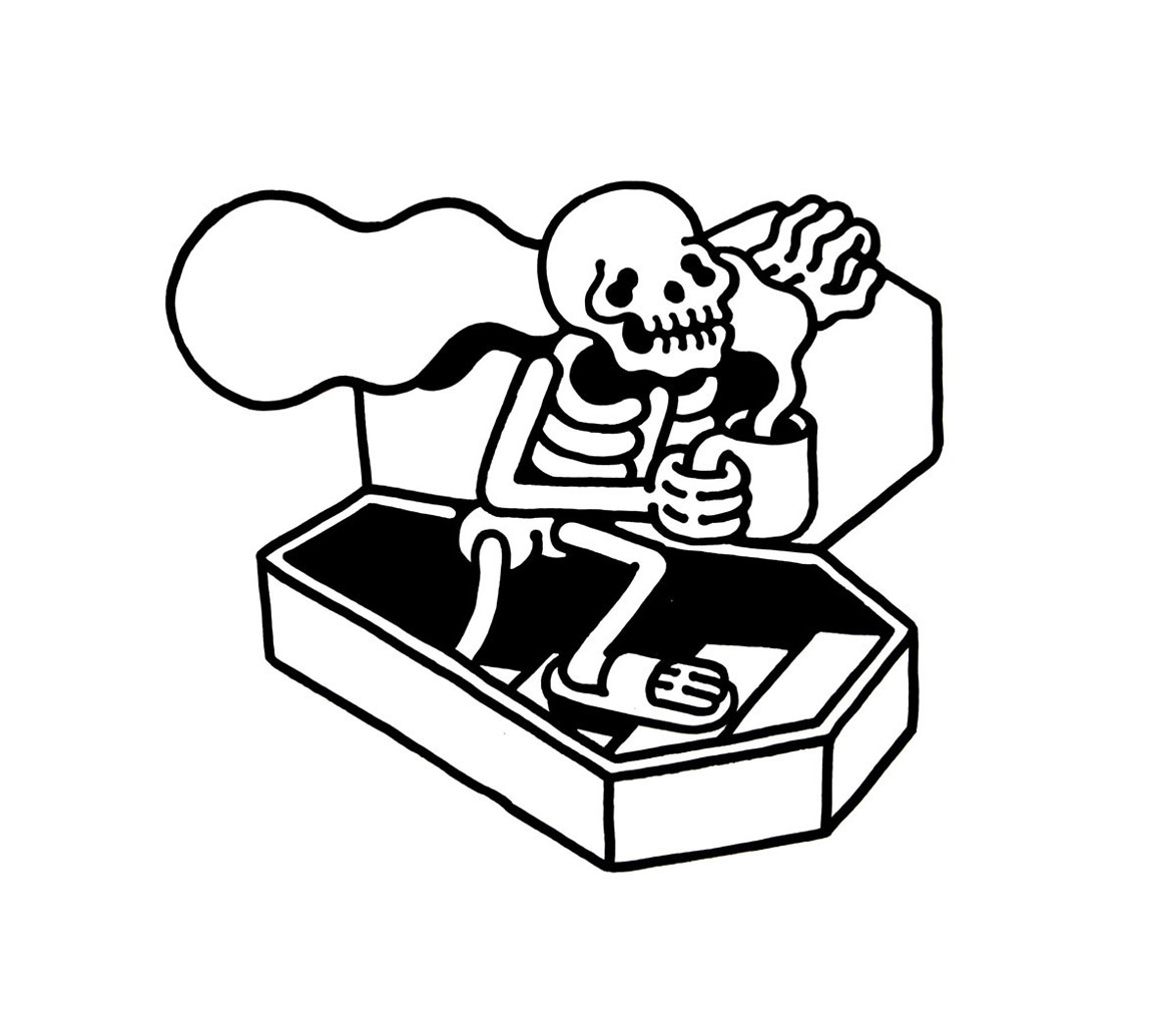
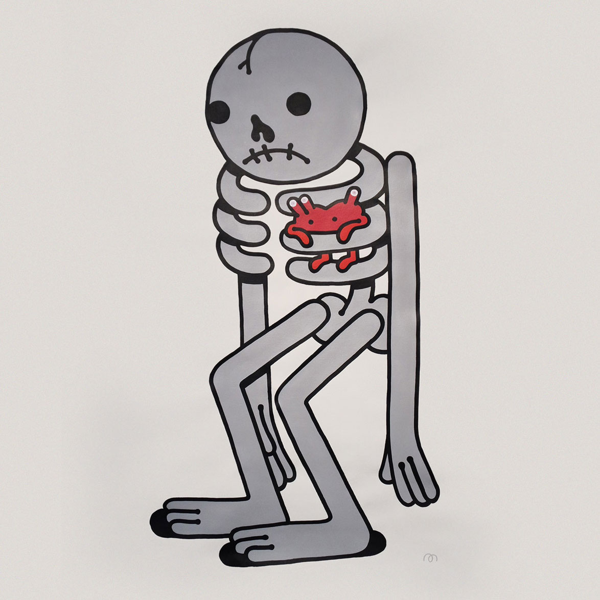
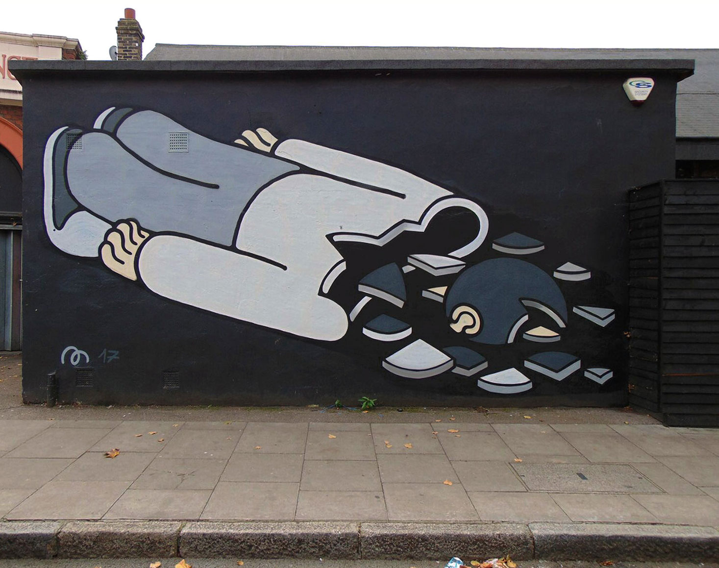
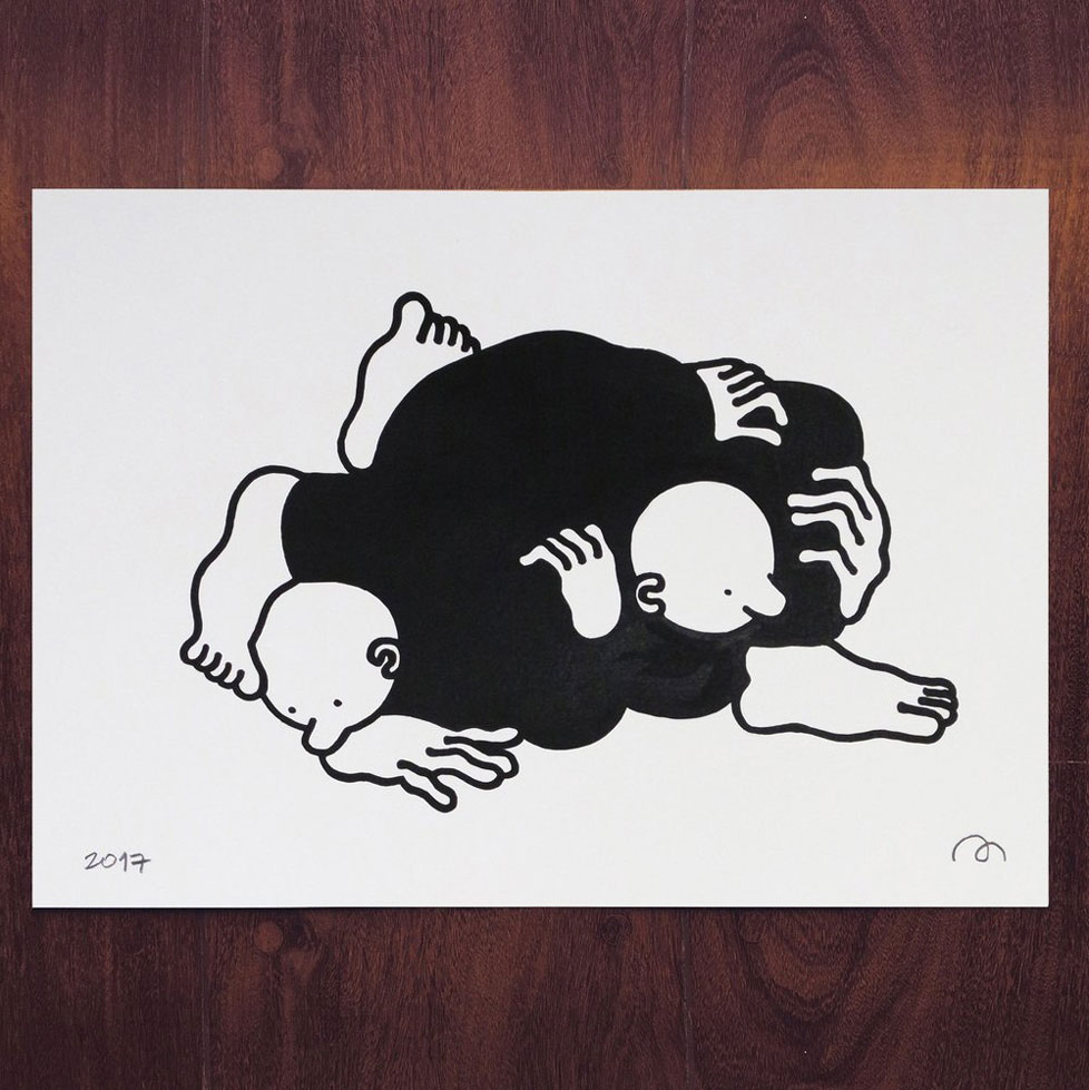
Sad skeletons and surrealist scenes: the art of Muretz

Post pobrano z: Sad skeletons and surrealist scenes: the art of Muretz

Brazilian artist Muretz is most famous for his street art in large format. In his work, you can meet a lot of skeletons, mostly sad ones. With a large exposure of his work in the streets and on social media, Muretz also made himself a name beyond the streets and his work was on display in art galleries around the world. You can also purchase his art in small format on his website.

Typography trends to look out for this year

Post pobrano z: Typography trends to look out for this year

The internet is constantly changing and evolving. As a result, it is important to stay dynamic.  As a graphic designer, you’ll know that trends change and what works well and converts for your clients one month will be different the next.  We need to be aware of the trends that are emerging, and those that are fading out.  This is especially true with typography because it often forms the basis of our projects.

It’s helpful to know that typography trends don’t simply emerge out of nowhere.  Instead, they slowly grow, flowing through the different design niches.  Eventually, as they become more and more popular, these trends reach the mainstream.  This is why in order to predict the big trends of 2018, it is helpful to look at the growing influences which shaped 2017.

Some of these trends are exciting and will bring changes into the design industry.  As we’ve become familiar with the trends of the past few years, something new can only bring vitality.

Let’s take a look at the trends emerging for this year!

The return of the serif

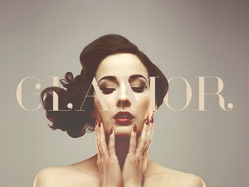
After the cleanly lined minimalism of the past couple of years, it’s time for serifs!  Serifs are warm and retro, bringing up images of the 1970s.  This offers up an alternative to the commonly used Helvetica, which has dominated the digital design market.

Chaotic and creative

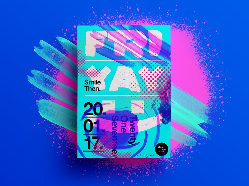
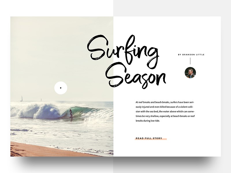
Minimalism has dominated the design field over the last couple of years.  However, the trend is moving to chaotic designs which offer broken elements and juxtapositions.  Although this may seem confusing or even overwhelming, it actually engages the viewer.

Using typography in this way offers a sense of creativity, creating interest for the viewer. Viewers often spend a great deal of time exploring these unconventional sites, which results in a higher conversion rate.

Overlays and cutouts

Overlays and cutouts are beginning to emerge as a new trend which hasn’t taken over 2018 yet.  These trends are bright and vibrant, offering a unique approach to web design.

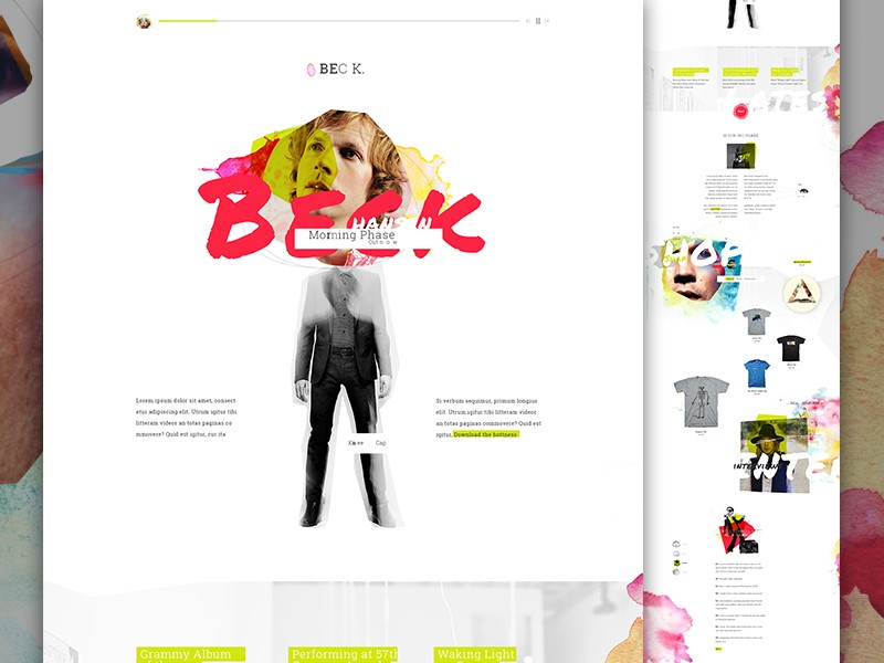
Designers are using animation, striking photography or parallax backgrounds.  Sometimes these vivid images overlay the text.  Other times they are used in the background.  After the flat design trend of recent years, this new method of working brings the site alive.

Highlights

This new trend is reminiscent of the schoolroom.  Designers are using colored fonts or underlying specific words in order to draw attention to a message.  This technique is currently being used in both headlines and body text. Many sites are starting to use typography to catch viewer’s attention.

In the past, designers have often used striking illustrations to call attention to a message.  The new trend is to use different typographic techniques.  This new trick draws on a sense of nostalgia and is rapidly emerging as a popular choice.

Variable fonts

In the past, designers had a couple of choices when it came to fonts.  We could make our fonts bold or italic or keep them light.

Now though, there is a range of different options which enable us to add weight to a page.  Fonts can now be given different weights and axes.  This allows us to customize our pages, bringing a unique and creative edge to our designs.

Hand drawn lettering

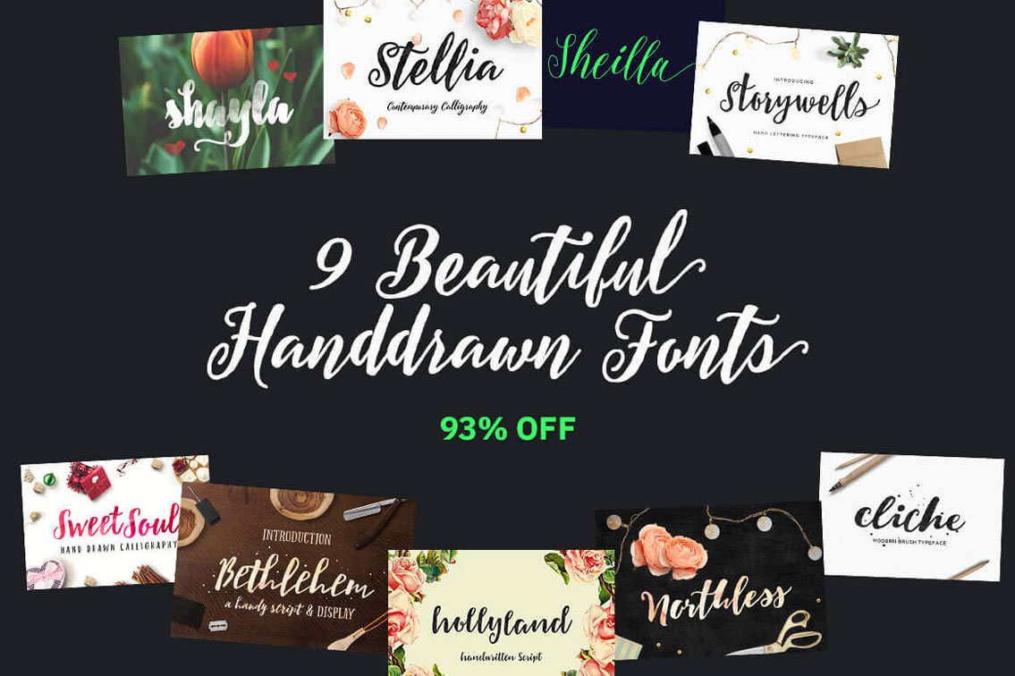
The creative touch of hand-drawn lettering returns again and again to our web designs.  This unique approach to design is expanding from simple handwriting into hand-drawn letters.  Hand drawn fonts are being offered as a unique option for headers and logos.

When thinking of the popularity of Disney, Coca-Cola or the New York Times, it’s easy to see how a well-designed font can bring identity to a brand.  This one of a kind creation is shaping a new trend in typography.

This is especially relevant with all the Arabic fonts that you see in the media lately and their hand drawn style.

Gradients

Gradients have been an emerging web trend in recent years.  This movement was made popular by Instagram, which incorporated a gradient into their logo background.  The design community cheered, and gradients became a new trend.

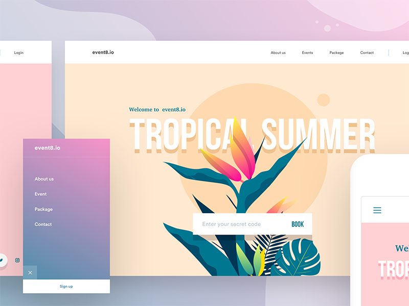
However, this trend is no longer limited to backgrounds.  Designers are beginning to use gradients within the lettering itself.  This is a new trend which is emerging for 2018.  Using gradient in lettering depends on the size of the font you use.  It can be used to create a 3D effect, or more simply add a sense of style or flair to typography.

Background gradients are changing too and moving towards color transitions rather than simple shading.  Combining gradients in background and typography will keep you on top of the trend for 2018.

Maximalism

This trend is all about creating a bold and attention-grabbing font which is large and shouts out to viewers.  This trend offers something new when compared to the subtle use of the font in recent years.

However, it still doesn’t turn its back on the minimalist trend.  The style is still clean-lined and the page remains uncluttered.  This trend is the new maximalist – minimalist step for webpage design.

Hiding content

This new trend can be very effective when done well.  It sounds counter-intuitive, but designers are now starting to hide some of their content, while still keeping the page legible and easy to read.  This trend is all about cutting out letters (or parts of letters) while ensuring your viewer can still read or scan the content.

This trend can be hard to master.  If used badly, it can prevent your viewer from reading your content.  It can also make your site look neglected and very unattractive.  However, when used well, it is a creative way to add interest to your site.  And it just works.

Off-kilter kerning

Kerning creates spaces between lettering that makes your page easy to read.  Traditionally, kerning makes the spacing between letters uniform and adds symmetry to your page.  However, new trends are shaking this up.  More space is being added between letters to create a clean and open feeling on the page.

This new technique widens the distance between letters in order to create an easy, relaxed feeling to your site.  As a result, viewers often remain engaged and spend a leisurely amount of time on your site.

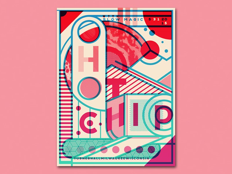
Clean-lined and geometric typography

This is a new, modern typeface which is starting to emerge across the web.  Totally clean-lined and without serifs, geometric fonts are useful for sites which focus on science, technology, and engineering.  This font uses single lines and rounded circles to create a futuristic feel.

This font style adds sophistication to a website.  Legible and easy to digest, this is a popular choice for logos and headers.  It can also be used for business cards.  2018 presents the opportunity for geometric fonts to move into mainstream design.

Handwritten fonts

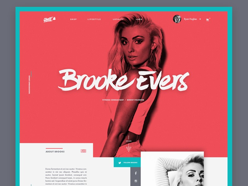
Handwritten fonts give a personal touch to a site.  These fonts are taking on new elements in 2018 however.  Instead of simply representing a handwritten script, they are now incorporating the appearance of brush strokes.  Although still personal and unique, these fonts evoke memories of sign writing.

Handwritten scripts range from offering feminine flourish to masculine scrawl.  We can see this trend feature strongly in 2018.  Movie posters, invitations, business cards and logo design will all incorporate this unique look

Watercolor

Watercolor has been emerging as a recent web trend.  Recently, however, it has been incorporated into the new movement towards handwritten fonts.  Typography now gives the appearance of being written using watercolor paint.

Although this font doesn’t bring an edge to your site, it does have feminine flourish.  Watercolor offers a unique and personal touch which brings sophistication to your designs.

Summary

The world of fonts is changing at such a rapid rate.  As designers, there is a wider range of fonts to choose from and multiple ways to bring them to life on a site.

By pushing the boundaries, designers are able to create new and interesting works of art which shape future choices.  As new trends emerge there are many new opportunities to explore and develop the typography we use and the way we incorporate it into our designs.

Freebie: inDesign template of a 10 pages corporate brochure

Post pobrano z: Freebie: inDesign template of a 10 pages corporate brochure

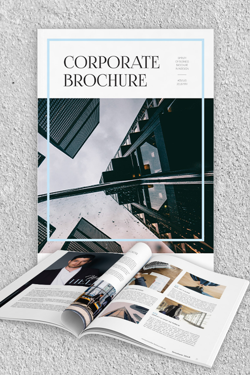
Thanks to the excellent work of the graphic designers at Elegantflyer.com, we are able to share with our readers a gorgeous inDesign template for a 10 pages corporate brochure. You can preview it on the above and below pictures, and download it on the button at the end of this article.

On top of being free, this InDesign brochure template has great features:

  • It’s very easy to customize texts and images (but images are not included).
  • It comes in both A4 and US letter formats.
  • It’s based on master pages.
  • It’s print-ready!

Make sure to get your copy by clicking on the button below!

Download InDesign brochure template

The most entertaining nutcracker you’ll ever see

Post pobrano z: The most entertaining nutcracker you’ll ever see

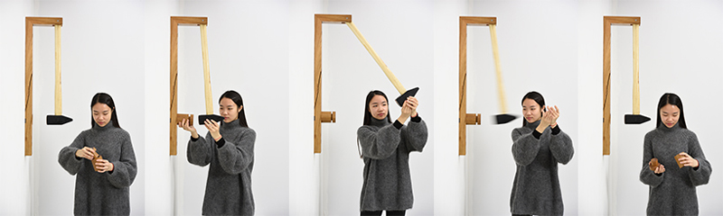
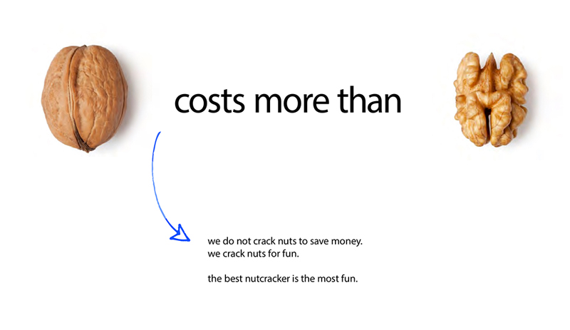
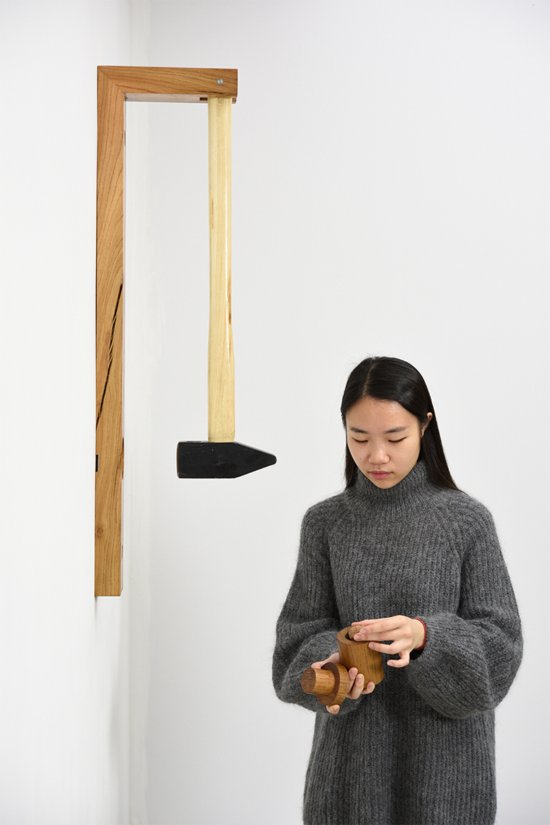
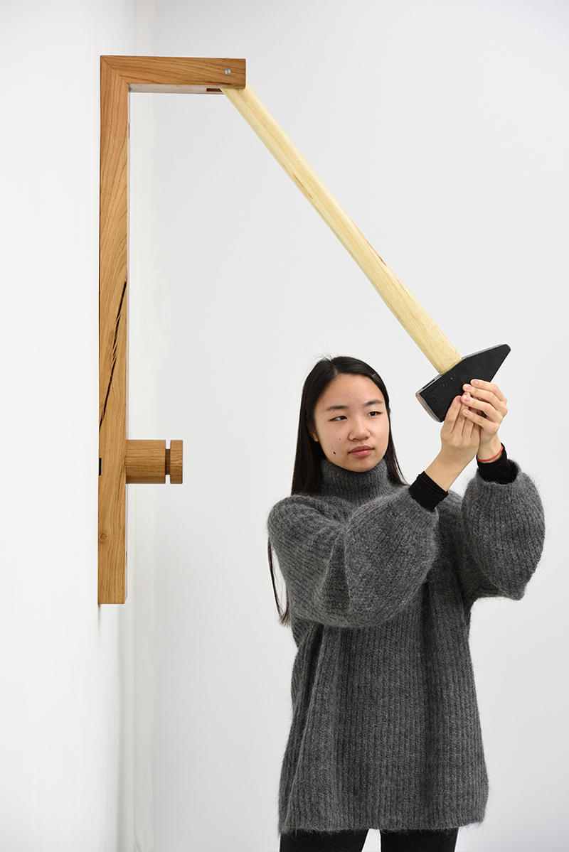
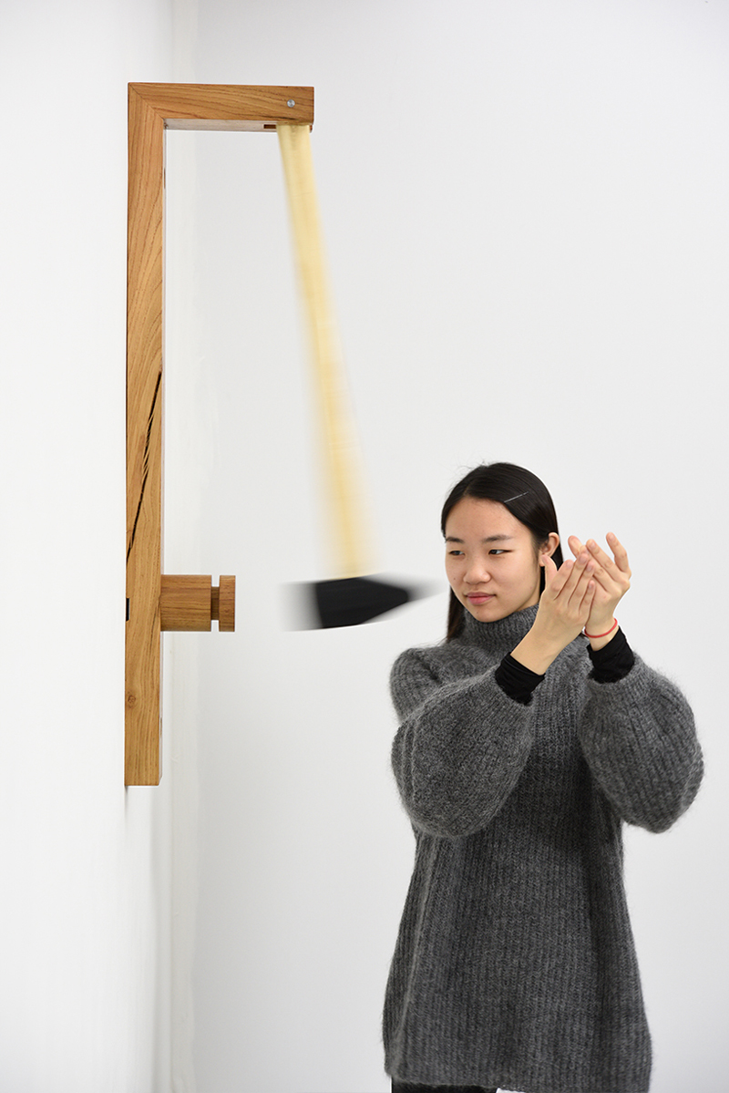
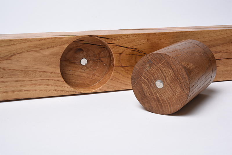
Looking at this Nutcracker, most designers would probably tell you that it’s oversized, not convenient or functional. In short, they may find it entertaining, but not well designed.

However, a design isn’t only about form and function, it’s also about fun. Thought and designed by Georg Kloeck, a designer based in Eindhoven, this Nutcracker is also an entertainment device that brings back the fun in a mostly tedious task.

Designing with retro colors: showcase and tips

Post pobrano z: Designing with retro colors: showcase and tips

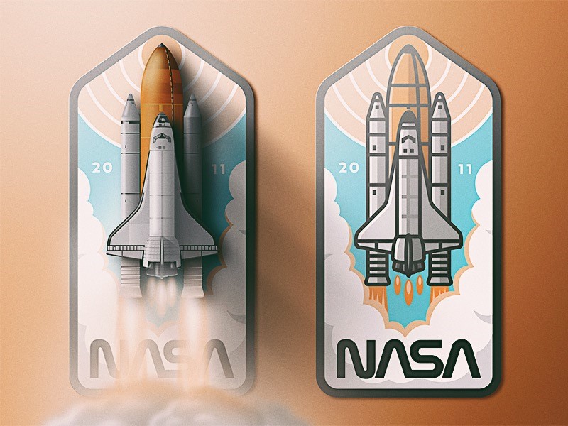
Trends often emerge from a collective feeling or mood, which is captured by designers in different fields.  Retro color pallets, made popular through the emergence of photo filters, is an example of how old-world charm is being reborn into web design.

Designers have always kept an eye on the past, and every twenty or so years, trends return in updated form.

If you’re thinking of retro, imagine a mood board filled with a faded photo from your childhood, an image from a television program which takes you back in time, a vintage dress, architecture, an old album cover, and multiple other images from the last century.

Retro colors


Retro colors come in a variety of hues but tend to be more muted.  They don’t draw from primary colors, but range from neutrals such as creams, and yellowed browns, to blues, sage green, teal, and art deco style pastels such as peach or pale pink.

Color influences range from the 1920s to the 1980s.  As time passed, colors became brighter.  However, the large time range gives designers a huge variety of influences to draw from.

Retro templates are becoming increasingly popular in website design.  These templates are characterized by iconic imagery from a particular time period, vivid graphics, and muted colors.  This popular trend is emerging, not only in website design but in paintings, adverts and in fashion, home decor and color pallet choices.

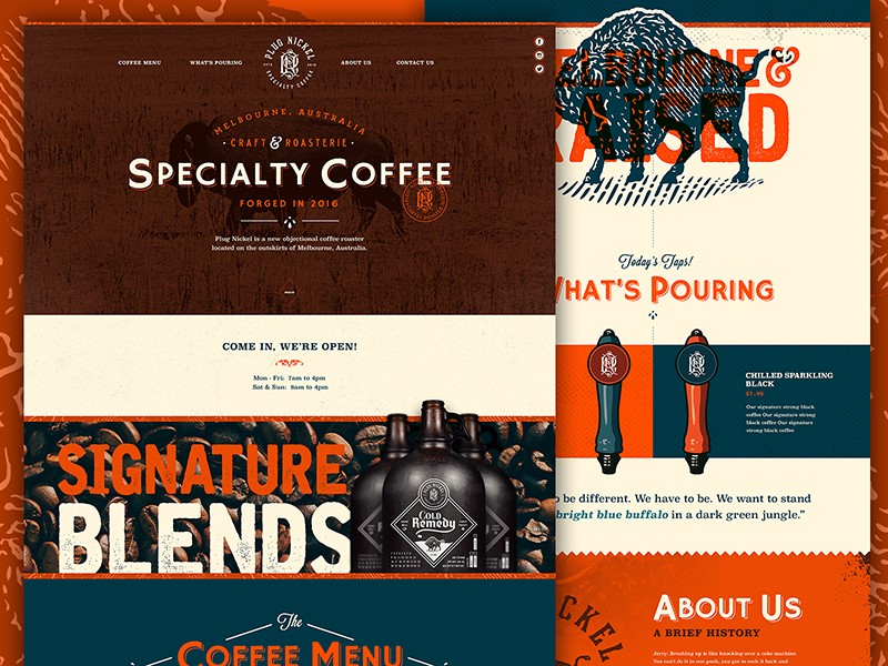
Retro is about giving space to the past, whether by using funky seventies psychedelics, the oversized light fixtures popular in the sixties, or mid-century style chairs, retro is back in a big way.  Texture is often used to provide a gritty feel, mimicking popular printing techniques of the time.

You can even see it in sites that use a style similar to the soviet propaganda, with the Russian fonts included, of course.

Why is Retro so popular?

A retro style creates unity, transcending age, taste, and culture.  A retro style website will be accepted by people from different countries.

This is because it focuses on iconic images or elements of pop culture that has loyal followers throughout the world.  Retro is an indication of globalization, and it presents in a playful way, with color schemes that are muted but never dull.

Retro tunes into nostalgia, and the belief that in times gone by, products were better quality.  Trying to extract the best out of the past, while leaving behind bad memories offers up a new appreciation of old style design.

Retro design is an attempt to bring this sense of nostalgia to life.  Creating the perception of value helps to bring visitors, while modern design elements create interest, encouraging customers to return.  In this way, retro design offers the best of both worlds, an old feel style with modern imagination.

Mixing old styles with new techniques

Retro style design encourages both the imagery and feelings associated with a world gone by.  Using color is a great easy way to make a design stand out.  It is often helpful to pick an era.  The muted colors of vintage design are often juxtaposed with a strong hue in order to add contrast and interest to your design.

Retro design is associated with the nostalgia of the past, a time when life was simple, hedges were green, wild spaces flourished and streets were safe.  The design aims to recreate these memories.

There are several different approaches or themes used to do this.  Some designers use images of old cars, well known or iconic products, or old photographs.  Early versions of electronic devices may also create a retro look.

Some might focus on the optimism of the 50’s, while others look at a celebration of 60s space travel, and the feeling of extended boundaries and new possibilities.

Elements used to create a retro design

Retro color schemes can be complicated to create as they use a lot of vintage or cream colors, which can be tricky to use in print.

On a website, however, they do stand out.  These colors are contrasted with brighter hues.  Background colors are normally desaturated.

Hues are muted, but often look as though they have been mixed with a touch of black, or grey when compared to the brightness of pastels.

Use shapes and illustrations

In times gone by, artists or designers often used simple shapes in order to create a big impact.  Retro design often focuses on these simple shapes.

Varying sizes of circles are often used.  Sometimes designers may also add floral patterns.  Bright colors are often used to draw attention to these images.

A worn-in look – using texture effectively

Texture is often used in vintage design to draw back to old printing techniques of a time gone by.  Textures often seem rigid, gritty, grainy or tough.  Imagine images of rough cardboard, gritty paper or a chalkboard.

Imagery might include faded areas, as though depicting a comfortable, worn-in item of clothing.  There may also be ‘rough’ patches, or an asymmetrical area within the texture, as though a background or figure has been handmade.  These effects often appear to be random, and ‘worn in’ rather than carefully designed.

While creating texture, consider color as well.  Many designers using background texture use a bold color so that contrasts are clear and noticeable rather than simply background noise.

When creating texture, the goal is to be subtle, so that the effect appears natural or genuine.  The goal is to create depth, without too much repetition, so that the background has the appearance of natural wear.

Using fonts for funky effects

Typography has always played a crucial role in creating a retro design.  It is not just choice of a font that will make a difference, but how this font is used.  Designers wishing to create a retro look might reposition a font, duplicating pixel strokes for added texture and a unique element to their designs.

Typography is just as important as color in creating a retro design.  Adding the correct font will create a coherent feel to your designs.  Retro color palettes look great with fonts which have an old-style feel, such as period lettering.

Alternatively, you could use a curvy font.  Choose a font which fits in with the era you are recreating.  This way, you can add a feel of age and even texture to your design. Think of the handmade poster style designs of the 80’s, or the lettering used in old movie posters.  Art Deco style fonts, or cursive inspired brush stroke lettering, or even laser styled neon writing.

Adding borders

Borders add an interesting touch to a vintage design and can be used for framing photos or images, highlighting content or may create focal areas.

They may be created out of ornamental designs or have matching colors. From art deco style borders to a border which takes the shape of worn paper, there are many options to choose from.

Vintage Touches

If you would like to create a vintage feel to your design without the full-blown effect of a retro template, this is possible too.

Add small elements of vintage style such as an iconic image, banners, fonts or borders.  Alternatively, you could focus on a font, taking the viewer back to a particular era.  You could also grab attention by focusing on using a vintage color palette for imagery or lettering.

Conclusion

Creating retro web designs is an attempt to bring back the nostalgia for a time gone by.  The designer uses tools or techniques from an era gone by and blends this with new services or modern touches in order to create a retro effect.

Retro designs, borders, textures, and colors add interest and fun to a project.  Experiment with a variety of color pallets, choosing those which are muted and less saturated, in order to create an authentic look.  Remember that typefaces should connect to the era that you are representing.  This will help you to achieve your overall look.

Retro design is a fun trend which adds interest, atmosphere, and emotion to projects.  While some of the styles may seem as though they would be a lot of work, the end result is a style which grabs your attention and brings an atmospheric element to a design.

When working on a retro design, remember to combine color, texture, and type, so that you end up with a project which takes you back in time.

Top 10 graphic design resources for designers in 2018

Post pobrano z: Top 10 graphic design resources for designers in 2018

2018 is finally here and design is hotter and more complex than ever. To make it through the ever-changing jungle of pixels, vectors, stock images and what not, we handpicked the top graphic design resources that you’ll need this year to save time, optimize your work and improve your design quality. Whether you’re just starting out or a veteran pixel champion, all these resources are a must-have in your design toolbox for this year and forever.

1. Vectors: Vexels

The hottest site dedicated to vector graphics has got it all: well over 20,000 PNG & SVG items, free vectors for the casual user, premium content for seasoned designers, and if you’re in a hurry or lacking inspiration, you can take up their online editor and choose among hundreds of ready-to-edit designs. Still can’t find what you need? Ask them to make a custom design specially for you! They’re big on skylines, silhouettes and cartoons, and have a wide range of exclusive trendy designs you won’t find anywhere else. While their content is affordable and cost-efficient, they also offer free download options depending on the use you’ll give the design.

2. Best free stock photos: Pexels

Whatever your project is, Pexels is a must when it comes to high quality free stock photography. Self-proclaimed as the website that gathers “the best free stock photos in one place”, they add five photos per day, all of them are creative common 0 (can be used without attribution) and ready for commercial use.

3. Inspiration: Niice

Niice is a design inspiration hub meant for teams. What started as a carefully curated inspiration site is now a team-focused platform for creative discussion where team members can gather up, share and discuss creative ideas. They make it really easy to share visual boards and get all members on the same page. If you’re a lone wolf, you can find awesome inspiration for yourself.

4. Browser extensions: Piktab

If you are a Chrome user and haven’t heard about Piktab, you’re in for a treat. A handy extension, Piktab allows you to discover free graphic resources every time you open a new tab. Finding awesome free content can’t get any easier than this. It gathers content from the top design sites out there, and you can customize your experience any way you want.

5. Icons: Noun Project

With a modern interface, high quality icons, and affordable prices, Noun Project is a globally-powered icon factory that hosts over a million designs from artists and designers from all over the world. If budget is too restrictive, you can pay with attribution. You are guaranteed to find anything here.

6. Design news: DesignTAXI

Keeping up with the latest design trends and news can be mind-numbing, as there are plenty of options to pick from, but we found DesignTAXI as a daily hub of informative and engaging design-related content where you can find pretty much anything, from film, art and graphic design news all the way to fashion and product design.

7. Mockups: Pixeden

When it comes to finding top quality free editable graphics, look no further than Pixeden. Armed with free web graphics, background graphics, textures, PSD mockups and tons of more features, they make any graphic designer’s life easier when it’s time to present a project or show your client how awesome your design looks on various formats

8. Fonts: FontSquirrel

Arguably the ruler of all font sites, FontSquirrel is everything we look for: free and 100% ready for commercial use. If by “free” you think “low quality”, think again. The hottest and trendiest fonts are there for the taking. Did we mention all their fonts are handpicked? That means you’ll surely get a great font regardless of your choice.

9. Design Tutorials: Skillshare

Skillshare is a heaven-sent for anyone who’s eager to either learn new skills or improve their craft from the best in the biz. With over 18,000 design classes available (and counting), this is by and large one of the most resourceful sites you’ll ever come across with.

10. Color palette inspiration: Adobe Color CC

When color matters, it’s time for Adobe Color CC, a super-useful tool which allows you to create your own color palette from scratch or draw inspiration from a massive library of palettes, all of which are human-made. Originally as a stand-alone Adobe product, it’s now embedded into Illustrator for a seamless design experience. The best thing about it: it’s totally free.
You’re now officially set for your design journey, so get those creative juices flowing and your design skills going. Did you find these useful? Do you have a pick of your own? Let us know!

In April, Minsk will become the creative capital of Europe

Post pobrano z: In April, Minsk will become the creative capital of Europe

On April 19-21 Minsk will host one of the brightest  creative festivals in Eastern Europe – International Advertising and Marketing Festival WHITE SQUARE.

Historically being a mediator of avant-garde ideas, Belarus is proud to be a motherland of the world famous Malevich and Chagall, and is recently getting more and more recognized thanks to innovative projects in IT sphere World of Tanks, Viber and MSQRD, and in communications industry – to WHITE SQUARE Festival that will celebrate its tenth anniversary this spring.

CALL FOR ENTRIES IS NOW OPEN ON OFFICIAL WEBSITE ADFEST.BY. DEADLINE – MARCH 30!

Entries are being accepted into 6 CONTESTS, 17 nominations that will be judged by 5 categories of international JURY consisting of the leading creatives from all around Europe, holding numerous prestigious industrial trophies including over 200 Lions and having a rich experience of judging at world famous ad festivals including Cannes.

High level of organization of judging process, jury team, entries and awards has been many times recognized by the leading representatives of professional community of different countries, including global creativity ranking The Gunn Report.

Promoting creative solutions worldwide WHITE SQUARE has been included into new global creativity ranking AdForum Business Creative Report that will help the players of ad market all around the world to track top agencies and best projects in sector of services.

Next to the contests WHITE SQUARE has various educational and evening programs consisting of over 80 different activities: master-classes from the leading experts of communications industry from all around the world, awards shows, theme parties and many more.

Detailed information about participation in WHITE SQUARE is provided on adfest.by or directly at the Directorate of the Festival – Association of Communications and Marketing Agencies of Belarus ACMA, EACA member, via konkurs@adfest.by.

Who Is Your Ideal Customer?

Post pobrano z: Who Is Your Ideal Customer?

 If you have yet to answer this question, you’re also probably wondering why your business is underperforming. Satisfied customers are the foundation of any company. However, to satisfy someone, you have to know their needs. With the vast number of people in the world, it’s impossible to satisfy everyone. You have to focus your efforts to maximize your results. When you make a conscious decision to do this, it becomes much easier to figure out who is your ideal customer.

What Is An Ideal Customer?

The short answer to this question is someone who stands to benefit from your product or your service. However, within that, you also want to cater to people who can help your business go where you want it to be. Let’s say you sell electronics. If you’re dealing in high-end home theater equipment, you’re going to want to invest your marketing and sales resources in people with the means to afford it. However, within that, you’ll also need to narrow your focus to those who appreciate state of the art equipment. They will see the value in what you have to offer and they have the means to help your business be successful offering it.
Know Your Product First

However, before you can know your customer, you have to know your product. Take a look at it from a buyer’s point of view. What does your product do for them? What problems does it solve? How will using it improve their lives? How will buying from you be of benefit to them—as opposed to buying from someone else? Assessing your situation in this fashion will make it easier to design your site to sell electronics online to a specific group of people. It will also make it easier to craft effective marketing messages and activities.

Then Get To Know Your Customer

With answers to the questions above, you can begin to identify the traits of your ideal customer. Where do they live? Where do they work? What do they do for a living? Where do they shop for what you’re offering? Are their purchases usually tied to a life event?  At what time of the year do they most often tend to buy? Have they bought products similar to yours in the past? Where do they conduct their research before shopping? How do they shop, and most importantly—how do they conduct their purchase transactions?

Create a Persona

Using that data, you can create an entity to which you can speak. Find a picture of this type of person somewhere and assign a profile to them. You might say, “The ideal customer for my electronics business is a college student, looking to have the latest electronics for their dorm or apartment. Their budget is tight, but they like cool tech. They are pretty savvy about electronic devices and they spend a lot of time in online forums and on social media.” These perceptions will help you craft organic content and product messaging in the style of language to which they can relate. It will also give you the insights you need to place these assets in the places they tend to frequent.

When you’re working this way, you’ll get a lot more mileage out of your marketing and advertising budgets. What’s more, you can use this to inform the tone and tenor of your ecommerce site to help this group of people feel at home shopping it. Get the factors related to determining your ideal customer right and you’ll find yourself with a cadre of satisfied, enthusiastic and loyal customers.

Title: 13 Must-Do Checks Before Launching Your WordPress Website

Post pobrano z: Title: 13 Must-Do Checks Before Launching Your WordPress Website

You worked hard on your WordPress website and now you are about to launch it. The big day is right around the corner!

But there are a lot of things that can go wrong. Are you aware of all of them? You probably aren’t if this is your first ever launch.

That is why I decided to outline 13 things that you need to check before you launch your website…

1. Domain considerations

Okay, so it’s something I shouldn’t even have to say, but I still see a lot of people making this mistake – get your own domain name (don’t use .wordpress.com)!

Domain names are extremely affordable so you don’t have any reason not to get one. For example, at Hostinger you can get a cheap domain for $8.99/year. Please do yourself and your business a favor and get a proper domain name!

2. Make sure you have a backup

You know how life is. Things are going well… Until they aren’t. You never know what might happen, which is why it’s important to have a recent backup of your website at all times. BackupBuddy is a great plugin for backing up your site, restoring it, or moving it to a different hosting provider.

3. Build good looking website

People like to say that content is king. But think about it. When you land on a website that has a terrible design, how often do you stick around long enough to check out their content? If you are like most people, your answer is “Never”. So don’t ruin all the hard work you put into creating great content by underestimating the importance of design. Make sure that your website looks great!

4. Check Images, Videos, Sliders

Okay, so you made sure that your website looks good, but before you launch it, I suggest you go through everything one more time just to make sure that all the images and videos are working properly. Also, add a WordPress slider to your homepage, it will really liven it up!

5. Setup Email for Your WordPress Site

Many people use their personal emails for their blogs, but I don’t recommend it, because as you get more popular your inbox will be flooded with inquiries from your readers. Create a separate email account that is dedicated to the blog.

6. Make sure the contact form is working

Having a contact form is important because it provides your readers with a way to reach you. Use CaptainForm plugin to create a simple contact form and add it to your site. Just don’t forget to test it before the launch!

7. E-commerce Websites

Are you creating an ecommerce website using WordPress? Then you’ll need an easy way to process payments. Stripe works great for that. Simply install a payment plugin and add “Buy Now” buttons. You are ready to sell!

8. Build a knowledge base

Your customers will have questions… a lot of them! If you don’t want to spend all your waking hours on customer support, you should create a knowledge database. Install the KnowAll Theme and add the most frequently asked questions to it. It will save you tons of time in the long run!

9. Setup social media accounts

When it comes to social media, you want to hit the ground running, which is why it’s important to setup your social media accounts prior to the launch. I recommend you to start with Facebook and Twitter. Once you have grown these a bit, you can branch out to other social networks, such as Instagram and Pinterest.

10. Use social media schedule tool

Things are going to get busy once you launch your website. It’s very easy to neglect your social media profiles when there are so many other pressing matters that need your attention. That’s why you should use Viraltag to schedule and recycle your posts on various social networks. Put it on autopilot and watch your profiles grow!

11. Want to earn from affiliates?

Are you aware that you don’t actually need to have your own product to start earning money from day one? You can become an affiliate, sell other people’s products, and earn a commission. It can be a very lucrative business model. For example, you could become an iGaming affiliate and use VegasHero.co – WordPress Affiliate themes & plugins – to add monetized games to your website. There are plenty of opportunities like that, you just need to look!

12. Make sure you take care of analytics

Data is extremely important because that is what allows you to make good decisions in your business. That’s why you need to set up Google Analytics before the launch. That way you’ll have all the metrics you need from day one.

13. Make sure Yoast is running

Do you want people to be able to find you on Google? Well, then you better make sure that each of your posts is optimized for search engines, not just for the readers. Yoast SEO plugin can be incredibly helpful in that regard. Do you already have it running? Make sure that you do!

Conclusion

I know that you are already busy. There are many things that you need to do before the launch. However, please do yourself a favor, and run the checks that I recommended. It will make the launch day go much smoother!