Archiwum kategorii: Design

Top 10 graphic design resources for designers in 2018

Post pobrano z: Top 10 graphic design resources for designers in 2018

2018 is finally here and design is hotter and more complex than ever. To make it through the ever-changing jungle of pixels, vectors, stock images and what not, we handpicked the top graphic design resources that you’ll need this year to save time, optimize your work and improve your design quality. Whether you’re just starting out or a veteran pixel champion, all these resources are a must-have in your design toolbox for this year and forever.

1. Vectors: Vexels

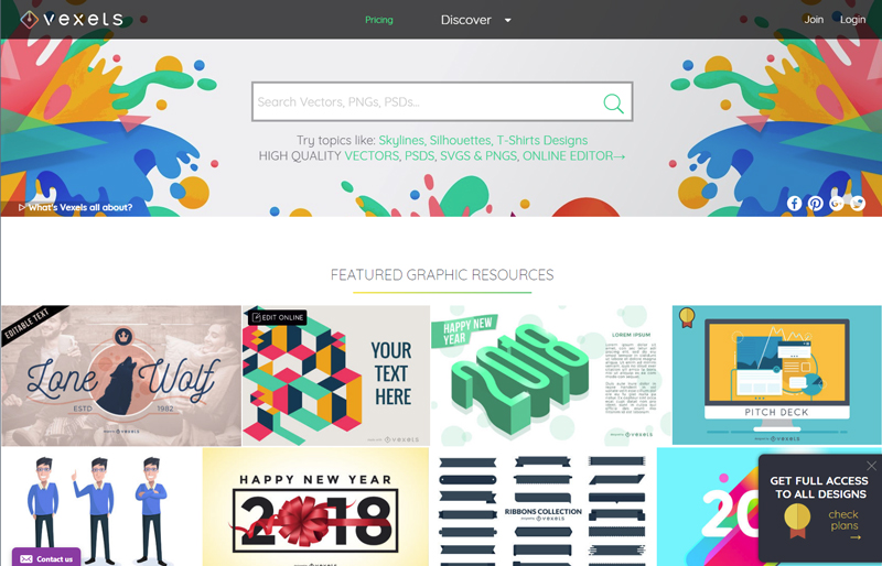
The hottest site dedicated to vector graphics has got it all: well over 20,000 PNG & SVG items, free vectors for the casual user, premium content for seasoned designers, and if you’re in a hurry or lacking inspiration, you can take up their online editor and choose among hundreds of ready-to-edit designs. Still can’t find what you need? Ask them to make a custom design specially for you! They’re big on skylines, silhouettes and cartoons, and have a wide range of exclusive trendy designs you won’t find anywhere else. While their content is affordable and cost-efficient, they also offer free download options depending on the use you’ll give the design.
2. Best free stock photos: Pexels

Whatever your project is, Pexels is a must when it comes to high quality free stock photography. Self-proclaimed as the website that gathers “the best free stock photos in one place”, they add five photos per day, all of them are creative common 0 (can be used without attribution) and ready for commercial use.

3. Inspiration: Niice

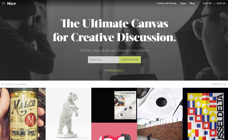
Niice is a design inspiration hub meant for teams. What started as a carefully curated inspiration site is now a team-focused platform for creative discussion where team members can gather up, share and discuss creative ideas. They make it really easy to share visual boards and get all members on the same page. If you’re a lone wolf, you can find awesome inspiration for yourself.
4. Browser extensions: Piktab

If you are a Chrome user and haven’t heard about Piktab, you’re in for a treat. A handy extension, Piktab allows you to discover free graphic resources every time you open a new tab. Finding awesome free content can’t get any easier than this. It gathers content from the top design sites out there, and you can customize your experience any way you want.

5. Icons: Noun Project

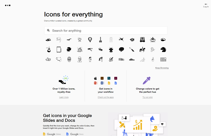
With a modern interface, high quality icons, and affordable prices, Noun Project is a globally-powered icon factory that hosts over a million designs from artists and designers from all over the world. If budget is too restrictive, you can pay with attribution. You are guaranteed to find anything here.
6. Design news: DesignTAXI

Keeping up with the latest design trends and news can be mind-numbing, as there are plenty of options to pick from, but we found DesignTAXI as a daily hub of informative and engaging design-related content where you can find pretty much anything, from film, art and graphic design news all the way to fashion and product design.

7. Mockups: Pixeden

When it comes to finding top quality free editable graphics, look no further than Pixeden. Armed with free web graphics, background graphics, textures, PSD mockups and tons of more features, they make any graphic designer’s life easier when it’s time to present a project or show your client how awesome your design looks on various formats

8. Fonts: FontSquirrel

Arguably the ruler of all font sites, FontSquirrel is everything we look for: free and 100% ready for commercial use. If by “free” you think “low quality”, think again. The hottest and trendiest fonts are there for the taking. Did we mention all their fonts are handpicked? That means you’ll surely get a great font regardless of your choice.

9. Design Tutorials: Skillshare

Skillshare is a heaven-sent for anyone who’s eager to either learn new skills or improve their craft from the best in the biz. With over 18,000 design classes available (and counting), this is by and large one of the most resourceful sites you’ll ever come across with.

10. Color palette inspiration: Adobe Color CC

When color matters, it’s time for Adobe Color CC, a super-useful tool which allows you to create your own color palette from scratch or draw inspiration from a massive library of palettes, all of which are human-made. Originally as a stand-alone Adobe product, it’s now embedded into Illustrator for a seamless design experience. The best thing about it: it’s totally free.

You’re now officially set for your design journey, so get those creative juices flowing and your design skills going. Did you find these useful? Do you have a pick of your own? Let us know!

In April, Minsk will become the creative capital of Europe

Post pobrano z: In April, Minsk will become the creative capital of Europe

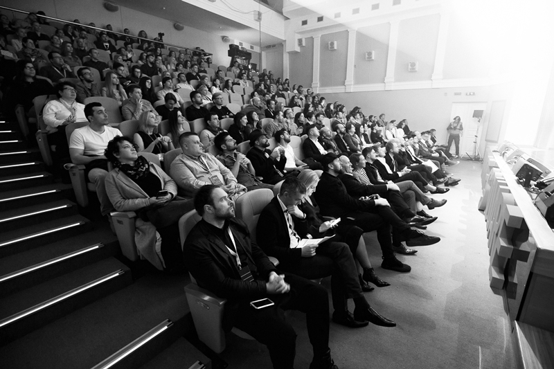
On April 19-21 Minsk will host one of the brightest  creative festivals in Eastern Europe – International Advertising and Marketing Festival WHITE SQUARE.

Historically being a mediator of avant-garde ideas, Belarus is proud to be a motherland of the world famous Malevich and Chagall, and is recently getting more and more recognized thanks to innovative projects in IT sphere World of Tanks, Viber and MSQRD, and in communications industry – to WHITE SQUARE Festival that will celebrate its tenth anniversary this spring.

CALL FOR ENTRIES IS NOW OPEN ON OFFICIAL WEBSITE ADFEST.BY. DEADLINE – MARCH 30!

Entries are being accepted into 6 CONTESTS, 17 nominations that will be judged by 5 categories of international JURY consisting of the leading creatives from all around Europe, holding numerous prestigious industrial trophies including over 200 Lions and having a rich experience of judging at world famous ad festivals including Cannes.

High level of organization of judging process, jury team, entries and awards has been many times recognized by the leading representatives of professional community of different countries, including global creativity ranking The Gunn Report.

Promoting creative solutions worldwide WHITE SQUARE has been included into new global creativity ranking AdForum Business Creative Report that will help the players of ad market all around the world to track top agencies and best projects in sector of services.

Next to the contests WHITE SQUARE has various educational and evening programs consisting of over 80 different activities: master-classes from the leading experts of communications industry from all around the world, awards shows, theme parties and many more.

Detailed information about participation in WHITE SQUARE is provided on adfest.by or directly at the Directorate of the Festival – Association of Communications and Marketing Agencies of Belarus ACMA, EACA member, via konkurs@adfest.by.

Who Is Your Ideal Customer?

Post pobrano z: Who Is Your Ideal Customer?

 If you have yet to answer this question, you’re also probably wondering why your business is underperforming. Satisfied customers are the foundation of any company. However, to satisfy someone, you have to know their needs. With the vast number of people in the world, it’s impossible to satisfy everyone. You have to focus your efforts to maximize your results. When you make a conscious decision to do this, it becomes much easier to figure out who is your ideal customer.

What Is An Ideal Customer?

The short answer to this question is someone who stands to benefit from your product or your service. However, within that, you also want to cater to people who can help your business go where you want it to be. Let’s say you sell electronics. If you’re dealing in high-end home theater equipment, you’re going to want to invest your marketing and sales resources in people with the means to afford it. However, within that, you’ll also need to narrow your focus to those who appreciate state of the art equipment. They will see the value in what you have to offer and they have the means to help your business be successful offering it.

Know Your Product First

However, before you can know your customer, you have to know your product. Take a look at it from a buyer’s point of view. What does your product do for them? What problems does it solve? How will using it improve their lives? How will buying from you be of benefit to them—as opposed to buying from someone else? Assessing your situation in this fashion will make it easier to design your site to sell electronics online to a specific group of people. It will also make it easier to craft effective marketing messages and activities.

Then Get To Know Your Customer

With answers to the questions above, you can begin to identify the traits of your ideal customer. Where do they live? Where do they work? What do they do for a living? Where do they shop for what you’re offering? Are their purchases usually tied to a life event?  At what time of the year do they most often tend to buy? Have they bought products similar to yours in the past? Where do they conduct their research before shopping? How do they shop, and most importantly—how do they conduct their purchase transactions?

Create a Persona

Using that data, you can create an entity to which you can speak. Find a picture of this type of person somewhere and assign a profile to them. You might say, “The ideal customer for my electronics business is a college student, looking to have the latest electronics for their dorm or apartment. Their budget is tight, but they like cool tech. They are pretty savvy about electronic devices and they spend a lot of time in online forums and on social media.” These perceptions will help you craft organic content and product messaging in the style of language to which they can relate. It will also give you the insights you need to place these assets in the places they tend to frequent.

When you’re working this way, you’ll get a lot more mileage out of your marketing and advertising budgets. What’s more, you can use this to inform the tone and tenor of your ecommerce site to help this group of people feel at home shopping it. Get the factors related to determining your ideal customer right and you’ll find yourself with a cadre of satisfied, enthusiastic and loyal customers.

Title: 13 Must-Do Checks Before Launching Your WordPress Website

Post pobrano z: Title: 13 Must-Do Checks Before Launching Your WordPress Website

You worked hard on your WordPress website and now you are about to launch it. The big day is right around the corner!

But there are a lot of things that can go wrong. Are you aware of all of them? You probably aren’t if this is your first ever launch.

That is why I decided to outline 13 things that you need to check before you launch your website…

1. Domain considerations

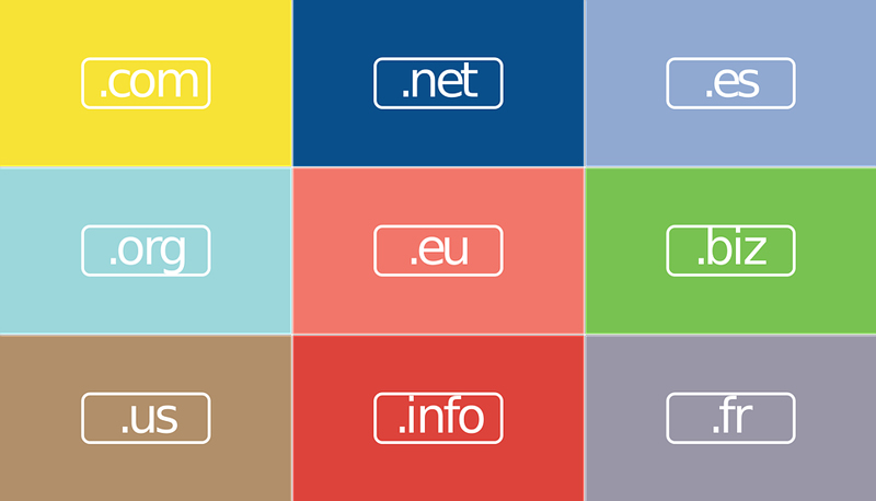
Okay, so it’s something I shouldn’t even have to say, but I still see a lot of people making this mistake – get your own domain name (don’t use .wordpress.com)!

Domain names are extremely affordable so you don’t have any reason not to get one. For example, at Hostinger you can get a cheap domain for $8.99/year. Please do yourself and your business a favor and get a proper domain name!

2. Make sure you have a backup

You know how life is. Things are going well… Until they aren’t. You never know what might happen, which is why it’s important to have a recent backup of your website at all times. BackupBuddy is a great plugin for backing up your site, restoring it, or moving it to a different hosting provider.

3. Build good looking website

People like to say that content is king. But think about it. When you land on a website that has a terrible design, how often do you stick around long enough to check out their content? If you are like most people, your answer is “Never”. So don’t ruin all the hard work you put into creating great content by underestimating the importance of design. Make sure that your website looks great!

4. Check Images, Videos, Sliders

Okay, so you made sure that your website looks good, but before you launch it, I suggest you go through everything one more time just to make sure that all the images and videos are working properly. Also, add a WordPress slider to your homepage, it will really liven it up!

5. Setup Email for Your WordPress Site

Many people use their personal emails for their blogs, but I don’t recommend it, because as you get more popular your inbox will be flooded with inquiries from your readers. Create a separate email account that is dedicated to the blog.

6. Make sure the contact form is working

Having a contact form is important because it provides your readers with a way to reach you. Use CaptainForm plugin to create a simple contact form and add it to your site. Just don’t forget to test it before the launch!

7. E-commerce Websites

Are you creating an ecommerce website using WordPress? Then you’ll need an easy way to process payments. Stripe works great for that. Simply install a payment plugin and add “Buy Now” buttons. You are ready to sell!

8. Build a knowledge base

Your customers will have questions… a lot of them! If you don’t want to spend all your waking hours on customer support, you should create a knowledge database. Install the KnowAll Theme and add the most frequently asked questions to it. It will save you tons of time in the long run!

9. Setup social media accounts

When it comes to social media, you want to hit the ground running, which is why it’s important to setup your social media accounts prior to the launch. I recommend you to start with Facebook and Twitter. Once you have grown these a bit, you can branch out to other social networks, such as Instagram and Pinterest.

10. Use social media schedule tool

Things are going to get busy once you launch your website. It’s very easy to neglect your social media profiles when there are so many other pressing matters that need your attention. That’s why you should use Viraltag to schedule and recycle your posts on various social networks. Put it on autopilot and watch your profiles grow!

11. Want to earn from affiliates?

Are you aware that you don’t actually need to have your own product to start earning money from day one? You can become an affiliate, sell other people’s products, and earn a commission. It can be a very lucrative business model. For example, you could become an iGaming affiliate and use VegasHero.co – WordPress Affiliate themes & plugins – to add monetized games to your website. There are plenty of opportunities like that, you just need to look!

12. Make sure you take care of analytics

Data is extremely important because that is what allows you to make good decisions in your business. That’s why you need to set up Google Analytics before the launch. That way you’ll have all the metrics you need from day one.

13. Make sure Yoast is running

Do you want people to be able to find you on Google? Well, then you better make sure that each of your posts is optimized for search engines, not just for the readers. Yoast SEO plugin can be incredibly helpful in that regard. Do you already have it running? Make sure that you do!

Conclusion

I know that you are already busy. There are many things that you need to do before the launch. However, please do yourself a favor, and run the checks that I recommended. It will make the launch day go much smoother!

Designing a mobile app? These tips will help you

Post pobrano z: Designing a mobile app? These tips will help you

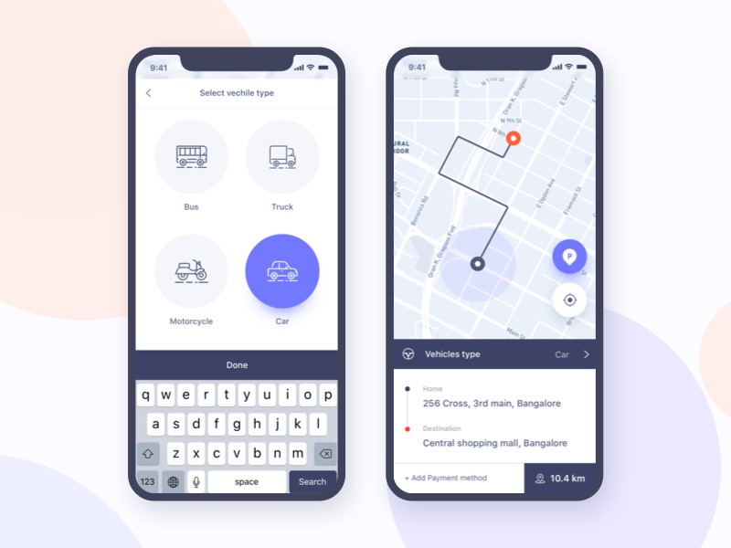
Mobile navigation is one of the essential aspects of mobile application design.  In a time when many of us use mobile phone applications to carry out online tasks, the ability to use an application quickly and efficiently makes all the difference.  A mobile application should work intuitively in a way that provides you with what you need when you need it.

However, designing an effective mobile navigation system for a mobile application can be complex.  Hardware and software are continually changing and evolving. Phones come in different strengths and sizes.

And unlike a desktop or laptop, mobile screens are small, and therefore each area or aspect of a screen becomes increasingly more important.  For this reason, navigation systems should be minimal.

When a user opens up an application, they need to be able to understand where to go, and how to get there.  If they cannot do this, you will lose them.

This means that designing an effective navigation system for a mobile application is crucial.

Get to know your audience

Without understanding who will be using your design, it can often be difficult to gain insight into how to begin designing.

Audience research assists with making better choices when working towards a design.  It will also assist with gaining consensus on how these designs should be implemented.

If you are unsure where to start, get some UI design inspiration by looking at the competition.

Without an effective navigation system, the website or application will suffer.  However, creating an interface which will be effective across different interfaces or screen sizes may not always be easy.

You, as a designer, have to balance business goals with technical constraints, stakeholder strategy, content needs and user behavior.

The Principles of Mobile Navigation

Mobile is different

Although desktop computers are seen to be more powerful than a small screened computer like a mobile phone, smartphones are more powerful than desktops in that they work quickly, are highly personal, and are carried with us.

A smartphone has sensors which can detect location, movement, acceleration, orientation, proximity, traffic conditions and much more.

A mobile phone is very different to a desktop computer.  So, when designing for a mobile phone, take the following points into consideration:

  • Go Zen: edit your features carefully, only including those which will assist the app to work intuitively, and with efficiency.
  • Be unique: With so many applications to choose from, add a special interface, which will motivate a user to pick yours.
  • Be effective: Mobile phones are very personal.  We use and interact with them constantly.  Apps that are fun, efficient, reliable and delightful to use bring pleasure.  People will become attached to the experience.

Mobile devices have their own contexts

It’s important for designers to understand when and why we use mobile phones.  This enables an enjoyable application experience.

Mobile phones are often used to carry out micro-tasks such as banking, checking a location, searching for recipes or booking tickets.  Understanding when people use phones adds to creating a valuable experience.  Most people use phones when they are bored, busy and lost.

Bored

Waiting at an airport, traveling by train or passing time often provide opportunities for phone use.  People may often play games or search for information.  A mobile app can provide a fun or playful experience which a person might become immersed in.  In this context, applications can be geared towards longer time sessions.

Busy

Carrying out tasks while in a rush or during a quick break means they need to be efficient and often might be carried out with only one hand in a busy environment. Bold design is important.

Lost

People in unfamiliar surroundings or who are searching for somewhere new in a familiar surrounding might be considered to use a phone while lost.  Create an application which wouldn’t use too much battery power, and which can be extended to offline support.

Guidelines for creating a Mobile Application

If the interaction between the user and the app is not instant, then the app will not have an audience.  If a user uses the app, there needs to be an instant response, even while the app may process this input.

Style:  An app which is both attractive and intuitive will be extremely valuable.  Place a lot of attention into the finer details of how the app is styled to give it a gorgeous interface.

Thumbs:  Ensure your user will be able to use thumbs to get your app to work.  Even in a two-handed grip, your user will likely use thumbs to get the app to work.

Scrolling:  Try to avoid a scrolling screen, which can be frustrating and unreliable when in a hurry.

Targets:  Thumbs present large areas when working on a small screen.  Consider what this means for the various features or targets of your app.

What size would you need numbers or letters to be?  Where do you space your features?  Planning carefully helps.  It wouldn’t be helpful to place a return and send button close together on an SMS application, for example.

Navigation models

There are many navigation models for mobile apps.  Choose one which will be most effective for your application.

None:  Most helpful for isolated screen utility apps.

Tab Bar:  Three to six content areas.

Drill Down:  Content placed in a hierarchy.

Design interactions to be tappable

With a mobile interface, the user won’t be clicking on options or instructions.  Instead, the user taps a screen.

Therefore, improving the quality of this interaction will improve the user experience.  Ensure that your app doesn’t respond to accidental tapping or touch, as this will frustrate the user.

Create buttons which are large enough, and spaced widely enough to create a usable interface, but not too far apart that they become unreachable.

User-friendly keyboards

Assist your user with typing keyboards which are easy to use, and which is most useful for the information being submitted.

If your application requires a lot of typing, ensure that it can be used in landscape position to enable a larger keyboard.

Gestures

If your app enables the use of gestures, such as a screen swipe to turn a page, you might have to decide how to reveal their availability to the user.

Two-handed gestures are often difficult for a user, and not an essential part of your app.  Most apps use controls which can be used with a single finger.

The benefits of designing for mobile

Apart from not being left behind as people use smaller screens to carry out everyday tasks, there are other benefits to embracing a mobile-first approach:

  • Mobile users needs are met.
  • This allows designers to focus on content, structure and navigation details.
  • Web pages become easier to navigate, which improves the overall experience. This assists visitors with wanting to visit a site.
  • A mobile first approach produces fresh concepts and clean designs.

Conclusion

In order to create an effective design for a mobile application, a different perspective is needed.  Mobile applications need to be simple, responsive and intuitive.  This is important when designing for clients.

Designing for the small screen can be challenging.  Not all design concepts can be implemented on smaller screens.  Different sizes or technical capabilities of phones means that designs are often complicated.

There is no single solution to designing for mobile apps.  Instead, focusing on what your audience needs, and providing effective and well thought out designs to enable pleasurable user experiences is crucial.

By conducting research and exploring how a mobile app interacts with users, a designer can provide a quality product which offers value and efficiency.

Designing for Smartphones? Here’s What you Need to Know

Post pobrano z: Designing for Smartphones? Here’s What you Need to Know

If you are making anything that will be consumed by end users in some way, then you have to be designing for smartphones. Everyone has a smartphone. The government gives out smartphones to welfare recipients. So even people who can’t afford to buy and maintain a data plan for smartphones have a smartphone. Practically everyone you want to read with your product or service will be doing so on a smartphone.

That means that designing for smartphones has to be the priority for whatever you are making. That includes hardware. If you want to build a great sounding speaker for music playback, you have to recognize that most of that music will be coming from a smartphone or streaming service triggered by a smartphone. No one wants to physically tether their phone to a speaker. So you have to consider various wireless standards that are smartphone friendly.

If you are making clothes, you have to consider the smartphone. Do you have a pocket that can comfortably hold the large smartphones that are popular today? Do you have a place that makes routing the wire convenient? Is there a pocket that can hold a charger?

So if you are designing anything, you are designing for smartphones. Here is what you need to know that will pay dividends for the final product:

Design to Minimize Smartphone Weaknesses

As great as smartphones are, they have some built-in weaknesses that are going to present problems to the user. You can be a hero to the end user by designing around those weaknesses and making them less pronounced. One example is the camera bump so prevalent on modern smartphones. While smartphones are getting thinner, cameras are not. They still need physical space to be any good.

The best iPhone X cases are a testimony to this principle. iPhones are among the most egregious examples of camera bumps. But a good case completely eliminates the bump.

That is not the only thing a good case does. Phones are getting more fragile as they are being made with glass on both the front and the back. A good case offers more protection from scratches and impact. Design with smartphone weaknesses in mind. And you will make the world a better place for smartphone users.

Design for Unique Smartphone Distinctives

Although it might look like it from a distance, not all smartphones are the same. The iPhone X is an example of a smartphone with a design distinctive that makes it materially different from other smartphones. The Essential Phone is the same way. They both have notches at the top of the phone instead of traditional bezels.

Immediately following the launch of the iPhone X, the most popular apps were those that were redesigned to fit the new, curved contours of the screen, and used the notch for all it was worth. If some manufacturer completely loses their mind and designs a rounded smartphone, you need to be prepared to design round apps so that you find yourself at the top of the sales charts for the people with that device.

Even people without that device will note that you are a developer that stays on top of the latest trends. They are more likely to trust you over other developers that never update their apps to reflect the newest smartphones.

Design for Humans

Even the biggest smartphone screens are tiny compared to laptops and desktops. So you have to be sure your apps and websites have fonts that are readable on small screens. You also have to account for information density. Humans need a certain amount of information at one time without being overwhelmed. You can’t cram the same amount of information on a smartphone screen as you can on a desktop or laptop screen. You have to design for humans using small screens.

If you are making a case, you have to design for the human hand. The case needs to be right-sized and somewhat grippy, as humans tend to drop phones. If you are making a charging dock, it has to be easy for humans to install the phone and not have to waste time fumbling around.

When designing for smartphones, you have to design for weaknesses of the product. Design for unique distinctions. And design for the people who will be using them.

How to Design Your Own Website?

Post pobrano z: How to Design Your Own Website?

You want to create your own website? Good for you! This article will give you a complete guideline on how you should go about the process, step by step using the latest information. Even if you a beginner, worry not because the information will not be technical, but as easy as A, B, C!

The Steps of Designing a Website

Have a Domain Name

A domain name is the name you will choose to name your website. For example, ‘thepagewizard.com’ . You must pay a fee every year to a registrar to acquire the rights of your name.

Select a Web Host and Sign Up for an Account

A web host is an organization that has several computers that are connected to the internet. After you select a web host, your web page is placed on any of the company’s computers and this allows everybody to view your website worldwide. Signing up an account with a web host, allows your website to have a home. You have to consider several factors when choosing a web host such as cost, experience and if the host is licensed. Immediately after signing up for a web host, you should then place your domain name on the account of your web host.

Design the Website Pages

You could choose to design your website on your own or hire a web design company in Las Vegas like Platinum Web Marketing, but if you are designing the website page on your own, the following is the procedure you should follow.

  1. Find something out on the web.
  2. You can use a ‘what you see is what you get’ web editor, because the editor enables you to design your site without dealing with the technical part.
  3. These editors are similar to a word processor.
  4. There are also commercial editors, for example, Microsoft Expression WEB.
  5. This editor is best if you are using windows.
  6. It is recommended you design your website to be a mobile friendly site, meaning it can work on desktops, laptops and also mobile phones.

Test The Website

After designing the site, test it on some of the huge browsers such as Chrome, Firefox, Internet Explorer. You can get these browsers for free. You can also try the website using your phone.However, testing it directly is the best way since it is the only way you can make sure that the site is working the exact way you want it to, on someone else’s device.

Get The Credit Card Information

In case you are selling products or services, you have to acquire the credit card information. There are several advertisers and integrated programs that can be found in online affiliate programs and sponsors. The companies search for new publishers to showcase their advertisements.

Have Your Site Noticed

After you are done with the above procedures, submit your site to the search engines such as Google, Yahoo and Bling. You can also use other ways to promote your site. For example, you can advise your website on newspapers, use press releases using the help of internet companies such as PRWeb. Your website can then be noticed by blogs and news sites.

In cessation, if you follow the procedure above, you will be able to create your own website easily. After creating the website, do not stop there, you should keep on improving it every now and then.

Send bulk email the right way with SendPulse

Post pobrano z: Send bulk email the right way with SendPulse

At one point, a few years ago, some Internet marketers predicted that blogs and emails would die. Neither did die, blogs are a well-established communication tool for companies, there are more professional bloggers than ever, it even became a normal job, and email marketing has never been as important as it is now.

It has become so important to communicate by email that everybody is doing it now, which means that it’s getting harder to make your way into your subscriber’s inbox. Sending mass emails from your inbox is a thing of the past, and using an open-source tool to send the emails is also on its way out. In fact, if you are sending many emails from the same server, you are likely to be marked as suspicious.

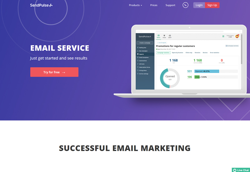
SendPulse is one of the most professional solutions available nowadays for marketers, bloggers, and online shop owners. The bulk email service gives you easy-to-use tools for efficient online marketing that lands in your subscribers’ inbox.

More than email marketing

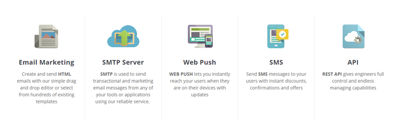
Although SendPulse better-known feature is email marketing, this powerful tool goes way beyond it. The technology uses SMTP to allow you to send emails from any application, you can even take more control over the tool by using the Rest API. Going with the Internet users’ habits, SendPulse is also targetting mobile users by giving you web push tools and the possibility to send SMS messages.

On top of all this, this online service also makes you more successful by using artificial intelligence technology that increase the opening rate of emails by up to 50%. These impressive results are achieved by a combination of optimal personalization of the message, an optimization of the delivery time of messages according to the user’s habits, and subject optimization that help you create more catchy messages.

Drag-and-drop template editor

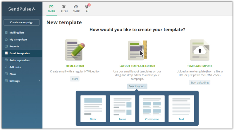
If you are not a web developer, designing HTML emails can be tough. It requires skills that would take too long to learn, and you are primarily interested in marketing anyway. SendPulse makes email design very easy, thanks to its drag-and-drop editor that gives you full control over what you are doing.

You start by choosing a template as basis for your email, then you customize it with the elements available. Probably the simplest tool for email design out there.

And much more features

Unless I missed something, SendPulse has all the necessary features for a professional marketer. They have made everything responsive and mobile-friendly, so you don’t have to worry about that part. It comes with useful marketing automation tools, schedulers, in-depth analytics, and is easy to integrate, so what are you waiting to try it out?

Design deals for the week

Post pobrano z: Design deals for the week

Every week, we’ll give you an overview of the best deals for designers, make sure you don’t miss any by subscribing to our deals feed. You can also follow the recently launched website Type Deals if you are looking for free fonts or font deals.

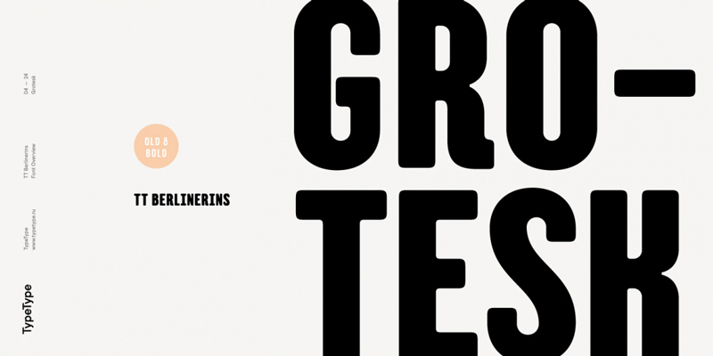
TT Berliners

Old meets new in this fabulous font deal that includes both Modern Script and Old Grotesk typefaces. TT Berlinerins combines the best of both worlds with an elegant script exemplifying the modern feel of Berlin, mixed with an old Grotesk font reminiscent of wood-type posters from the early 20th century. Loads of OpenType features, swashes and glyphs offer real flexibility with this pair.

$9 instead of $29 – Get it now!
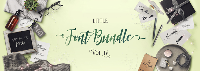
The Little Font Bundle Vol IV

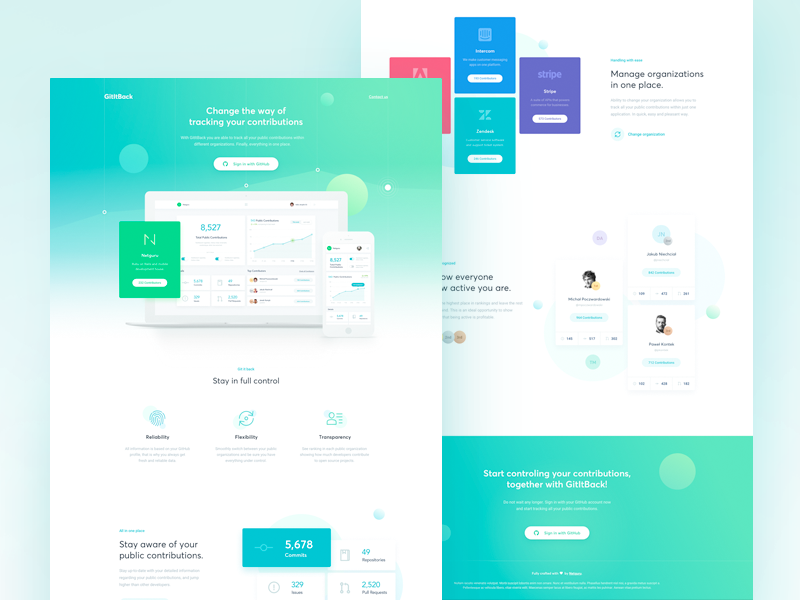
The Little Font Bundle Volume IV is here and it’s Pay What You Want!

Pay what you want instead of $143 – Get it now!
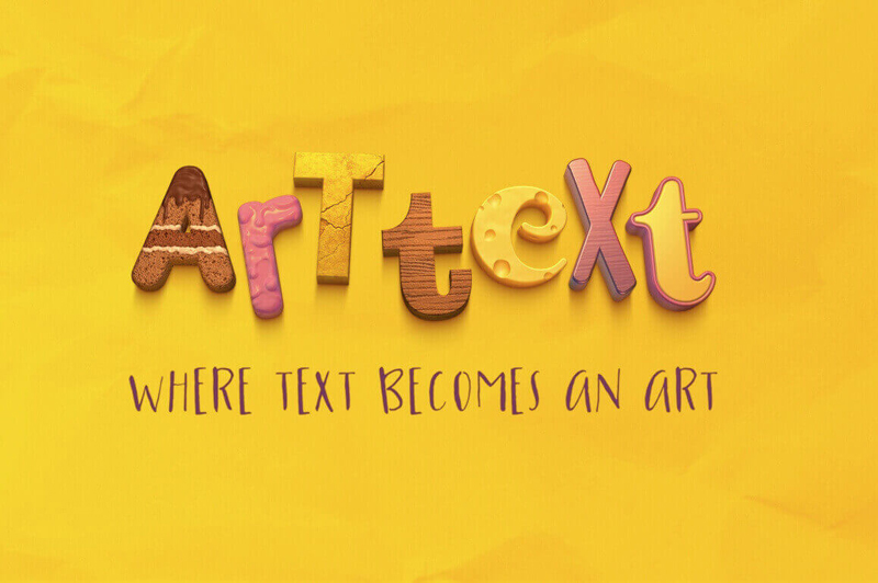
Art Text App for Mac Turns Text into a Masterpiece

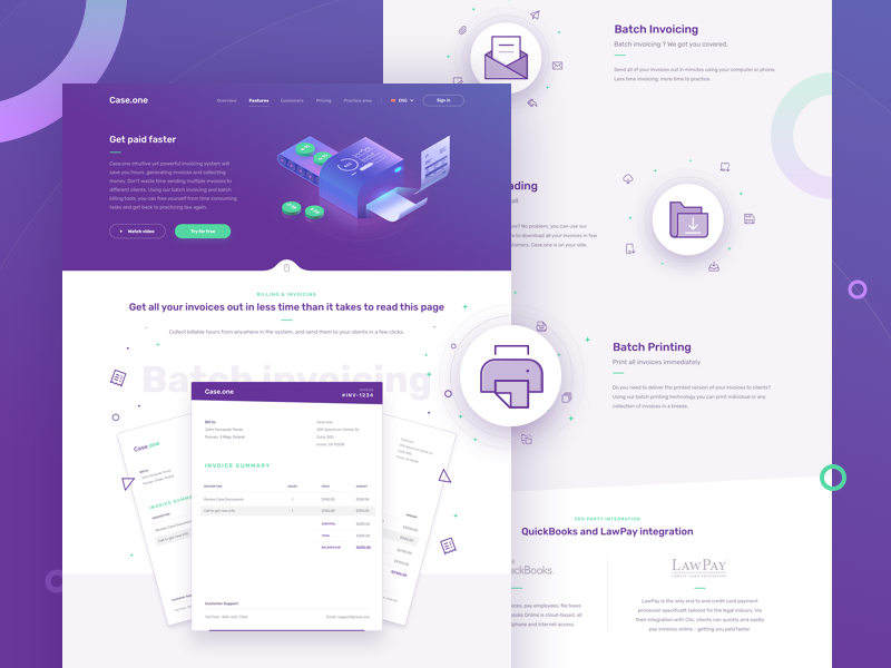
Words can be a beautiful thing, especially when the very letters themselves are in fact artwork. With the Art Text app for mac, that’s exactly what you get. Put together magnificent sophisticated title art for everything from presentations to logos to buttons. With thousands of templates, fill tools, graphic content and more, your words will never look better.

$17 instead of $30 – Get it now!

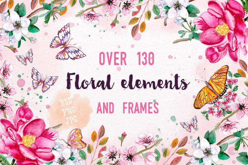
130+ Clip-art Floral Elements and Frames

Now you can easily change up your website (or your clients’) with this beautiful collection from NexThemes. You’ll get 27 premium WordPress themes and 16 HTML website templates covering a huge array of categories from fashion to fitness to photography. Fully responsive, these beautiful themes are real flexible too, letting you change up colors, fonts and more.

$8 instead of $650 – Get it now!

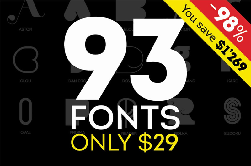
Fontfabric Font Bundle of 90+ Fonts

If you’re looking for a great set of fonts, this Fontfabric Font Bundle is sure to put a big fat smile on your face! That’s because with just 1 deal, you’ll get yourself more than 90 different fonts! You’ll get yourself some of the greatest Sans and Art fonts around. These 18 unique font families are delivered to you all in an .OTF file format. What’s even more amazing is that thanks to this Mighty Deal, you can save more than 95% off the regular price!

$29 instead of $1298 – Get it now!

Use color to make your website look good

Post pobrano z: Use color to make your website look good

When we first look at a design or artwork, we often don’t think about what we see.  Instead, we focus on aspects of the work that grab our attention.

This is called pre-attentive vision.  It begins when a design grabs our attention, but we haven’t yet thought about it.  We scan information, which is recognized by the unconscious.

A designer often aims to attract the eye to the most important aspect of a poster, website or image by organizing information and showing a viewer where to look.  Using line, color, hierarchy, framing, depth, shape, and motion helps aspects of a design to POP out at a viewer.

Color and Semiotics

Capturing user attention with color means recognizing that color sends out messages.

When looking at color, people first respond to light, and levels of color saturation.  They then respond to the emotional message a color brings.

Peirce’s Trichotomy of Signs explains that color has:

  • Iconicity: This is the emotional message of color.  Dark colors are often seen to be heavy, while light, fresh colors can be cheerful.  We might also look at what colors resemble, such as the green of grass, or the warmth and passion of fire.
  • Indexicality: The link between color and context. A grey sky is seen to represent rain, while a blue one represents a sunny day.
  • Symbolicity: This is the abstract meaning behind color and is often more emotional than logical.  This is the language behind color, which connects red to passion or love, blue to spirituality or peace, and yellow to happiness.  This language can be complex and isn’t always easy to understand.

How to design using color:

Use balance and contrast

Picking three colors, and using the dominant color 60% of the time, the secondary color 30% of the time, and the accent color 10% of the time provides balance within a design or color scheme.

As the eye often notices saturated color first, the most saturated color should be used for important content, that which seeks to bring a message.

Using the brightest color as an accent color means that this color will draw our attention not only because it is saturated, but also because it is sparse, and contrasts with the space behind it.  This shows the viewer that the message is important.

Link color to shapes

We do not only form messages in connection with color but also associate color with a shape.  Color, and shape, when combined together, often give off new meaning.

Green and blue may be associated with sky, spirituality, peace or even nature, but place these colors together along with the easily recognizable shape of the globe, and they take on an easily recognizable meaning.  Likewise, a red rose gives a different message to a jagged red line.

When working with color, it is important to determine how this color interacts with shape, and the meanings the combinations evoke.

Use texture

When a texture is contrasted with a simple background, it can be used as a means of attracting attention, causing a message to pop out.  Texture adds depth to a message, and brings it to life, sometimes becoming more prominent than shape or line.

However, when using texture to construct a message, the background cannot compete for attention, otherwise, the textured message will simply add to the noise on the page.

Make use of the Gestalt Principles

Gestalt shares that the whole is more than the sum of its parts.  The human brain looks at the overall design and how this interconnects and takes a message from this, rather than breaking down the individual parts.  The following Gestalt principles are therefore helpful in creating an effective design:

Proximity:  the more closely objects are placed next to one another, the more likely the mind will see them as interconnected.  These objects don’t have to share colors or characteristics to be seen as related.

Similarity:  Objects which share characteristics will be seen to be more similar than those which do not share similarities.  Objects may be seen to be related because of color, shape, size or texture.

Symmetry:  Symmetry helps to create order, and people seek order.  As a result, they often see objects to be symmetrical.  Symmetry does not only rely on shape but may also use color or texture.

Boundary:  Boundary is used to frame or enclose like elements, separating them from others.

Connectedness:  Connectedness is used to show the how different objects relate.

How to grab the attention of site visitors

Site visitors are always potential customers.  Holding their attention long enough to show what is on offer is therefore crucial.  The following factors assist with grabbing a visitor’s attention:

Our brains can be quite selective when it comes to focus.  This is because without filtering out a great deal of irrelevant information, we would often feel overwhelmed.  Therefore, designing a website which grabs attention would need to take into account how the brain focuses.

We know that the brain will pay attention to physical needs when we are hungry, recognize the names of those close to us, pays attention to areas we have chosen to focus on and can be captured by emotion.  Our brains also pay attention to novelty and contrast.

Use novelty

When designing it is helpful to be different, bringing in something which is weird or unusual in order to attract attention.

This is because our brain screens out everyday background noise, or that which is overly familiar.  People will, however, pay attention to contrast or difference.  Be quirky when designing a site.  Use CSS text effects, illustrations, and clever animations for that.

Inspire emotion

Use color effectively, be visual, aim for warmth and friendliness in your copy, and your visitors will feel welcome.

They will also feel an emotional connection, meaning that they will pay more attention to your site.

The language of color

Color can be very effective in creating emotion in visitors.  This is because colors have a language, and visitors relate to them on an emotional level.  Used effectively, a color will create the effects you need.  Here are common messages perceived behind 10 popular colors:

Red

Red is the color of passion, power, and warmth.  It is attention-grabbing but should be used in small doses.

Blue

Blue is seen to be calm, cool and trustworthy.  It is often very effective when mixed with orange.

Pink

This is the color loved by girls.  Fun, romantic and feminine, this is the color aimed at a young female audience.

Yellow

Yellow is a strong, bright and sunny color which can be used to capture your audience’s attention.  It lets them know you are confident.

Green

Green is warm and inviting, and links to goodwill, environmental awareness, and health.  It is also the color of money and may represent wealth.

Gold

Gold is another elegant, prestigious color, symbolizing wealth and pedigree or achievement.

Orange

Orange represents warmth or energy.  This is a powerful and attention-grabbing color which feels cutting edge.

Purple

Purple is the color of luxury and has been associated with royalty.  It will add a sense of prestige and even decadence to your designs.

Brown

Brown is warm, earthy and homely, and brings a feeling of ease.

Black

Black is extremely versatile and can be used in many different contexts.

It can be modern or traditional, exciting or relaxing, and it is up to the designer to choose how best to use it.  Black can add drama or depth to a design.