Archiwum kategorii: Design

Career Tips for Graphic Designers

Post pobrano z: Career Tips for Graphic Designers

Junior graphic designers provide a visual representation of a client’s brief.  This means using typeface, images, animation, color and composition to communicate ideas.  Designers create advertisements, websites, multimedia products and illustrations.

If you are starting out in the field of graphic design as a recent graduate (or even if you’re a design student) the following tips may help you.

Common Responsibilities of Junior Graphic Designers

You might wonder what the job of a junior or entry-level graphic designer entails.

Junior graphic designers often use Illustrator to create and edit illustrations.

They work with typefaces to create a clear message about a product or brand.

They develop guidelines for companies to communicate their brand messages or images.

They create digital interfaces which convey atmosphere and are in alignment with a company’s brand identity.

Join design networks

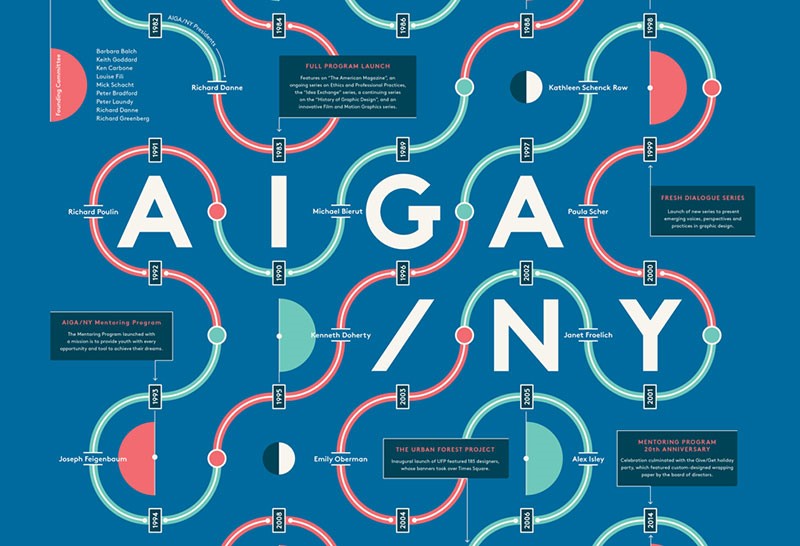
As a student designer, it is helpful to join organizations such as AIGA.  This way you can network with professionals in the industry.  This will help you to gain insight into industry players.  You will also get the chance to speak to people who will inspire you.

Within a networking organization, you can gain insight into the industry.  You will also be able to obtain knowledge or advice on how to work as a graphic designer.  As a student, you may also gain the attention of key industry players.

Volunteer

If you would like to build up your portfolio while working for a worthy cause, you could volunteer with charity organizations.

This will give you the opportunity to gain experience following a client’s brief.  If you believe in the cause, you’ll put in your best and acquire a stellar portfolio piece.

Working with charities could lead to further work for you (some of this may be paid work).  You could approach animal shelters, children’s homes or even local galleries.  Choose work that is close to your heart to keep you motivated.

Seek out internships
If you’re looking to gain valuable experience with a good design studio, you could look for an internship.  An internship will teach you skills that you can use throughout your career.  You’ll learn how organizations are run, understand how to work with client briefs and how design teams work.

If you work hard and put in every effort, you may be able to make a real contribution.  Make the most of your talents and show your commitment to the company.  By doing so, you may be able to turn your internship into a full-time job.  At the very least, you’ll be able to develop new skills and develop a professional network.

Nurture your networks

Instead of seeing your design peers as competition, develop networks.  Peers become supporters and collaborators for future projects.  It pays to develop professional networks.

Projects are often assigned based on word of mouth.   A busy peer may have the perfect project for you.  Another might know of a job opportunity, which you would love to take up.  Those small jobs an experienced designer will pass over could be a great opportunity for you to build your portfolio.

Become a fan

We all enjoy it when someone shares their appreciation of our work.  Let your heroes know how you feel.

If you send short emails to people in the industry that you admire, this might lead to opportunities.  You may be able to fill a gap in a large project.  You might also be able to do contract work on a project that suits your skills set.

Don’t be discouraged if your heroes don’t always respond.  You could send a follow-up mail and an example of some of your newest work.  By doing this, you could keep recipients interested, as well as remind them that you are available.

Create an online presence

When you apply for job opportunities or set yourself up as a freelance designer, your prospective employers will search for you on the internet.  Creating an online presence will give you a head start.

When you create an online presence, showcase your talents to the best of your ability.  You could set up a blog or website to showcase your best work.

Show all of your skills
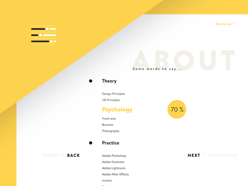
If you are a skilled illustrator or an excellent photographer, draw attention to these skills and include them in your design portfolio.  This could catch the attention of talented art directors.

Pull together your best work in either a PDF or print format, and send it to agencies or companies you would love to work for.

Also, make sure you set up a great looking resume. You can use a resume template, if you want, however it’s best to create one yourself, if you have the skills for it.

Submit your work for award
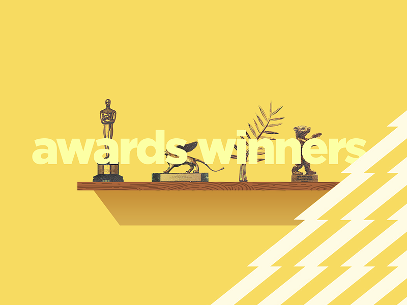
Awards can help you build your reputation in the art industry.  They also gain the attention of significant art directors.

If you have awards linked to your name, it will help you to become a designer of choice for creative directors making a choice between talented applicants.

Use your people skills

In the design industry, emotional connectedness guides a designer’s intuition and builds a reputation.  By being respectful, friendly and genuinely interested in a client’s project you will be able to win contracts, work with a team or attract repeat clients.

Effective communication and respectful relationships lie at the heart of developing an effective design practice.  By using your people skills to the best of your ability, you will be able to develop an excellent reputation as a graphic designer.

Initiate your own projects
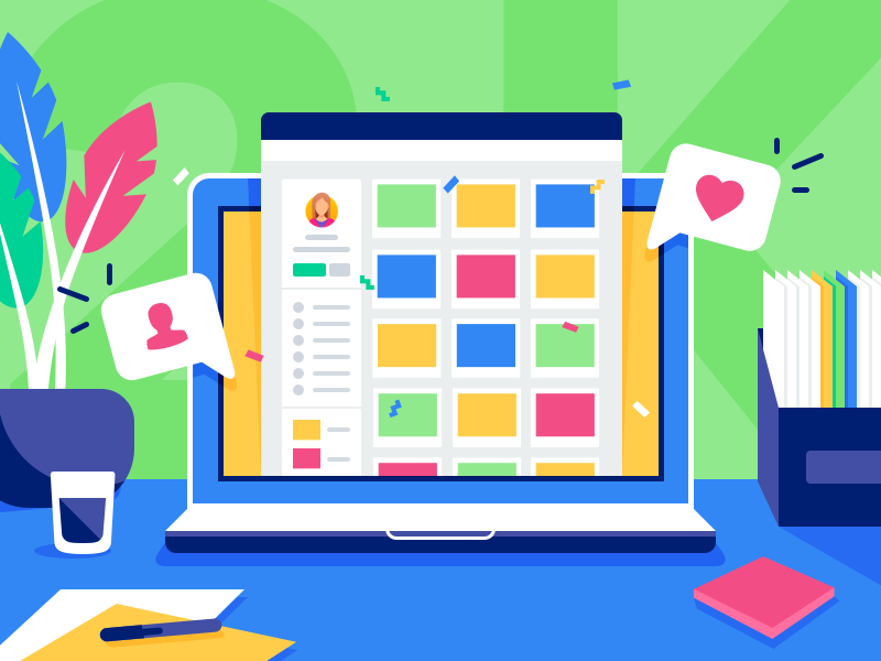
As a creative person, you have the option of starting your own projects.  This will help you build a portfolio and generate opportunity.

If you prefer to work in an art studio or with a design team, you could search for work for one part of your day while working on your own projects at the same time.  These projects could include ebooks, postcards, t-shirt designs, websites, logos or invitations for family and friends or even illustration projects that you could sell online.

Your own projects allow you to give your creativity free reign.  You could also connect with like-minded people to develop your projects, expand your ideas and build on the work of others.

As internet culture grows and expands there are a great many more opportunities for designers to sell or promote products and services.  You could search for ways that this could work best for you.

Assess your goals, talents, and interests

Always ask yourself what you can do to make yourself useful to the design industry.  How can you offer the most to your employer, clients or the people you care for.

What would you like to do to expand your talents or work towards your dreams?  Asking what you might do to work towards growth will get you past momentary frustrations or personal blocks.

If you feel stuck in a situation, ask yourself what you would like a year from now?  If this means leaving a difficult situation, you will gain perspective towards the bigger picture.

Focus on your unique talents.  This will make you stand out as a memorable designer.  Too many designers try to shape themselves into a mold.  By focusing on what makes you unique, you’ll create a portfolio which is unique to you.
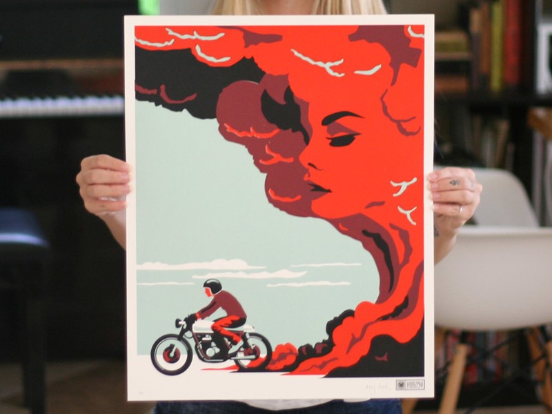
Share your passions, even if these are outside of traditional graphic design.  Illustration, photography, painting, and sculpture are all aspects of visual design.  It takes talent and dedication to learn each new skill.  The more you share, the greater your uniqueness as a designer.

Develop your interests beyond graphic design.  Passionate designers are inspiring but let your interests roam.  By going beyond your own field you’ll expand your ability to relate to new areas of the world.  Remain curious.  Read widely.  Understand the human body, ancient mythology or even astronomy.  The wider your knowledge, the more you have to bring into the field.

When working freelance, always make your terms clear
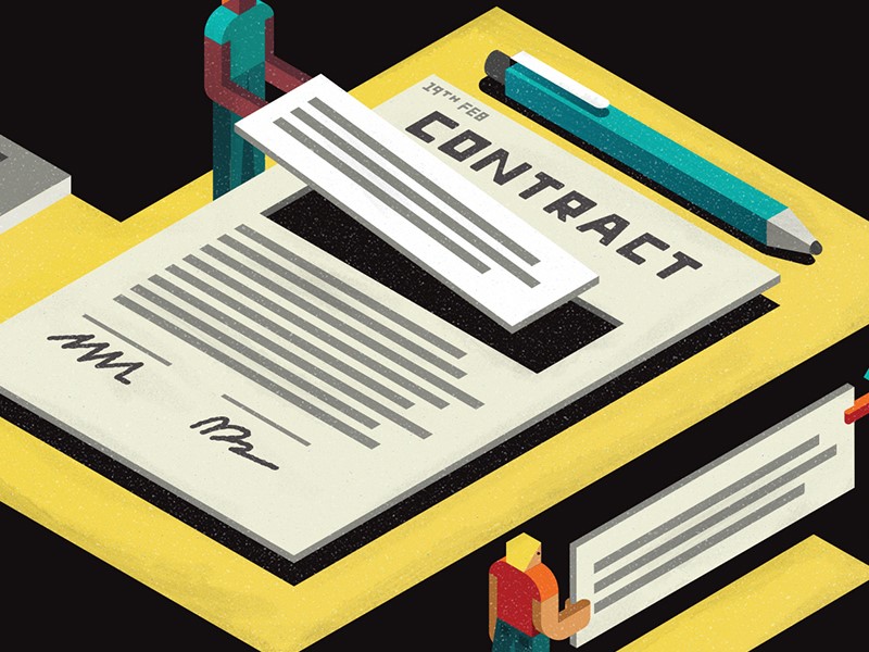
As a designer, you want to be clear about the terms and conditions of your employment.  There’s nothing wrong with working on a project at a low rate.

You can even volunteer, but ensure that you know how you will be working and how much you will get for this.  Ask for a deposit.  Don’t let vague terms or employment conditions rob you of your time.

Summary

By following these tips, you can develop your budding graphic design career into the direction you choose.

This will help you get started by putting your best foot forward.  Keep working, stay positive and seize the opportunity to develop your portfolio.

Design deals for the week

Post pobrano z: Design deals for the week

Every week, we’ll give you an overview of the best deals for designers, make sure you don’t miss any by subscribing to our deals feed. You can also follow the recently launched website Type Deals if you are looking for free fonts or font deals.

ANAPTÁR—WHERE ART MEETS SCIENCE

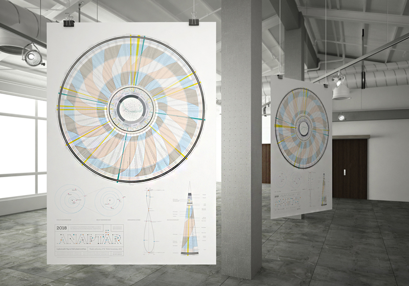
Anaptár is a unique, informative poster calendar, which is not only a work of beauty but also a source of fascinating new discoveries. Anaptár is much more than a traditional calendar. It provides lots of information beside enumerating days: visualizing data on the Sun and the Moon in a new way the calendar shows the movement of these heavenly bodies in the sky, and because of the radial arrangement this huge amount of data is incorporated in a spectacular, complex and yet easily comprehensible system.

Anaptár is the result of exceptionally meticulous work: all the versions made for various cities are different because the represented data are specific to the given city only. For 2018 Anaptár has versions adapted for the geographic locations of Budapest, Chicago, London, Los Angeles, New York and Sydney.

Get 10% discount by using this coupon code: dd10dis18 on Anaptar by Anagraphic

Mega Bundle of Illustrator Brushes

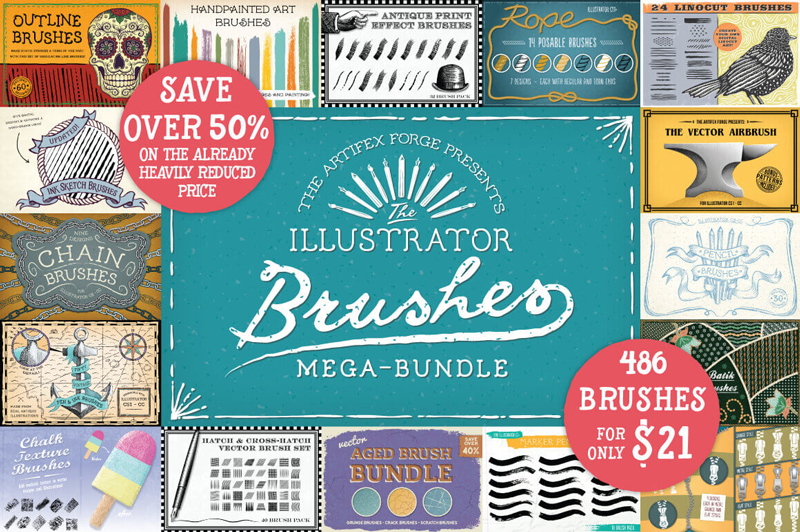
Illustrator brushes can add a real dose of realism to any project. Well, things are about to get real thanks to this Mighty Deal from The Artifex Forge. You’ll get 18 different Illustrator Brush sets for a combined total of 486 unique brushes! Easily customizable in stroke size and color, you’ll be impressing your clients in no time flat with these bundles covering everything from pencil to chalk brushes and rope to zipper brushes.

$21 instead of $43 – Get it now!

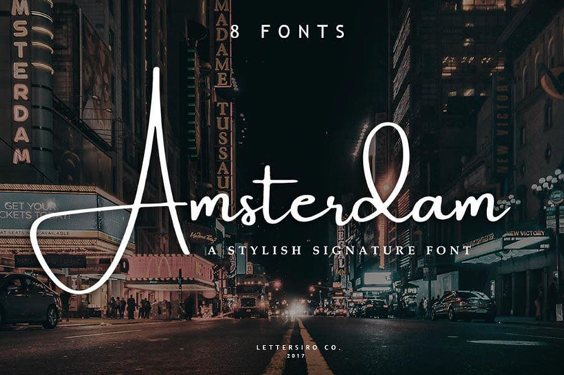
Elegant Amsterdam Font Collection

Add some serious style to your typeface toolbox with the Amsterdam Font Family! This elegant signature font features four fabulous typefaces, each offered in a regular and slanted variety, meaning you’re getting 8 different fonts! From business cards to photo watermarks, this family is here to elevate your work to the highest level.

$9 instead of $18 – Get it now!

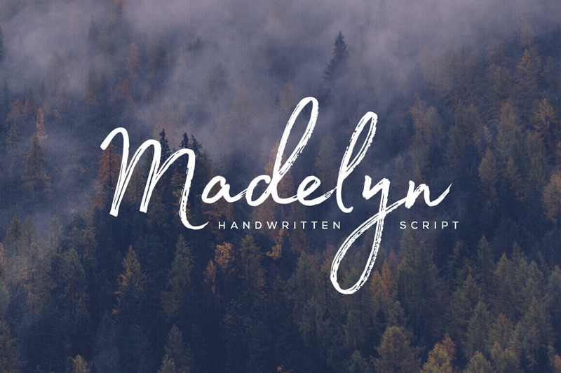
Beautiful Handwritten Madelyn Script Family

Time to extend your family! With the Madelyn Handwritten Script Font Family, you’ll be bringing home two unique font styles: Madelyn Script and Madelyn Black. These handwritten script fonts is a masterful blend of calligraphy pen and casual dry strokes. Packed with 500+ letters, over 100 ligatures and 70+ ornaments, Madelyn can bring your latest designs to a whole new level.

$17 instead of $37 – Get it now!

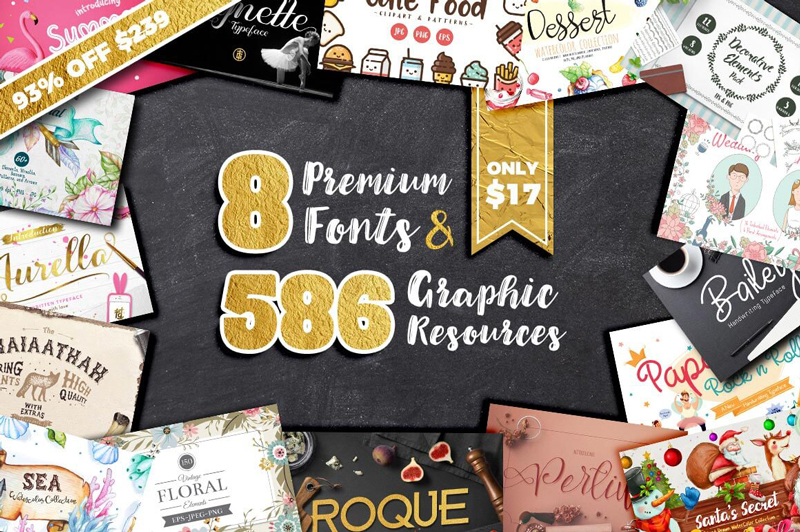
Designer’s Dream: 8 Premium Fonts & 575+ Fabulous Graphic Resources

Whether you’re starting from scratch or looking to bolster your artistic toolbox, this Mighty Deal is just magnificent! A Designer’s Dream, you’ll start with 8 premium fonts ranging from the curvaceously glamorous to the quirky and cool. But you’ll also get 8 graphic resource packs full to the brim with more than 575 professional floral elements, frames, arrows, wreaths, patterns, clipart, icons and so much more.

$17 instead of $239 – Get it now!

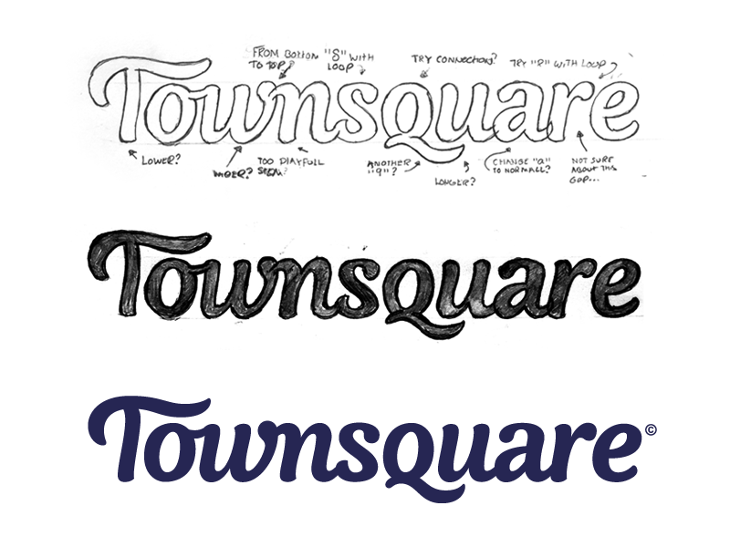
Tips for Creating Hand-Drawn Typography

Post pobrano z: Tips for Creating Hand-Drawn Typography

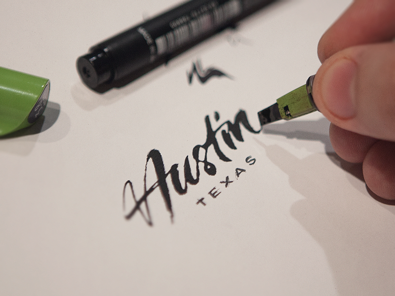
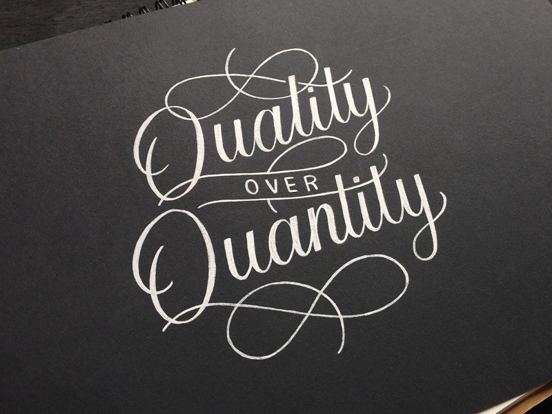
Hand drawn typography has grown into a field of its own.  Illustrators, designers and letter artists are working with multimedia to make their own contributions to this growing trend.

From traditional sign making long used by local communities, to illustration used in publishing, hand-drawn typography creates a sense of creativity, uniqueness, and playfulness in illustration and design.

Creating your own lettering, even if it’s just simply by doodling, can be a creative form of expression.  However, with all of the potential opportunities in this field, creating your own lettering is a means of developing your own skills.

There are many different techniques that experienced typographers use in their graphic design projects.  This is because typography is an art and a science, with rules or formulas which create effective pages which are intuitive to readers.

When creating your own hand-drawn letters or fonts, follow these basic rules to help your page look both unique and effective.

You can always download free handwriting fonts from an article or another, but it delivers a bigger satisfaction to actually create one.

Inspire yourself from the best work out there

When you create your own lettering, it is different than handwriting.  Instead, you are drawing or illustrating your font.

To do this, it is helpful to create a folder of inspirational ideas.  You can explore the work of other lettering artists too.
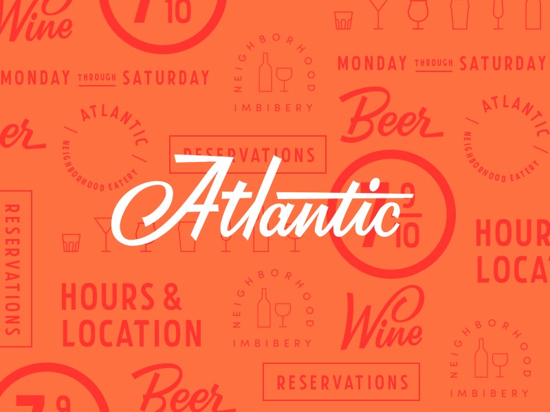
Many publish their work online, so you could always browse Pinterest or YouTube to find inspiration.
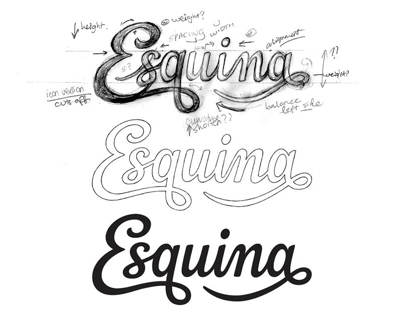
Create a formula for your lettering

When you create and design your own lettering, begin by measuring the height and width of the letters you will use on your page.

This will depend on the design of our letters and how you would like to lay them out.  Some fonts are small and wide, while others are narrow.

Many designers use a ruler to layout the type on their page, making lines around the letters they are inspired by to show the width or height.

These measurements are then transferred to a page where the designer begins to experiment with his/her own font designs.

Use shapes to map out your page

When creating the space for a font, designers often map their page using empty shapes.  Thus, a large rectangle may be used to represent the space where a headline will eventually go.  Speech bubbles create spaces to be filled by text.

These shapes give an indication of the length or height you’d use for your fonts.  However, hand-drawn letters do not have to be constructed in straight lines and can vary in height or curve in wave format, depending on the design.

Use different sizes to create hierarchy

When you design your letters or fonts, you can use different sized fonts for different words, depending on importance.

This is an easy way to create hierarchy, or evaluate the importance of a message.  You can shrink unimportant words such as ‘and’ but then increase the size of important words in order to grab your reader’s attention.

Once you have placed your words on the page, you can adjust or resize them as you go along.  If you’re drawing by hand, this requires a pencil and eraser.  Gradually, a sleek, clean-lined page will begin to emerge.

Focus on consistency

When you are working on a larger project, it’s helpful to make sure the different aspects of your design are consistent.  If you create a brand logo, for example, it has to be exactly the same in all areas of the project.

In order to create identical lettering, you can create a stencil.  If work has been done already, make careful reference, as even slight deviations can make a project look messy.  Top level designers work with a consistency which creates a fluid flow across the page.

Do your research

If you’re creating typography by hand, this often creates a historic or vintage element.  Do some research before you get started.

Many contemporary logos use vintage style (exploring what is already out there enables you to set yourself apart).

However, you could also draw on historic images or references in order to create an interesting font.  You could also look at how people used fonts or lettering in years gone by in order to create the mood of the era.

Once you know what you would like to achieve, go out and sketch!  Create more than one design, exploring what works best and refining it until you are happy with the result.

Pay attention to the message your typeface is communicating.  Explore how many different fonts you would like to use in your design, and how to pair them with each other.

Look at your layout, and how you would like to place your different fonts and how this fits in with the mood or historical element you are portraying.

Transform with Photoshop

Once you’ve created your font, import your design into Photoshop.  Your next step would be to change your design from a colored photograph to a high contrast black and white image.  Using Photoshop using greyscale mode.

Choose image > mode > Grayscale

Alternatively, click Layer > Adjustment Layer > Black and White

Within the same menu you can select from:

Levels:  Use the highlighted eye drops on the left of the menu.  You can use the white dropper to define the pure white parts of your image, and the black dropper will define pure black aspects.

Brightness and Contrast:  This can help you to contrast various aspects of your image in a manual way.  You can adjust these two factors until you achieve a high contrast between light and dark.

Selective Color:  Use this to define the texture of your image.  Play with the amount of black you would like within the image in order to achieve a high level of contrast.

Polish your image using Illustrator

Once you’ve created your rastor image, you will need to turn it into a vector using Illustrator.

You will need to import the high contrast image into Illustrator.  Make sure it is selected and then use Image Trace.  You will be able to create a vector sketch from your design.  You can then tweak your image to be as sleek or messy as you would like.

Once you have created your vector, you can make some final changes to the style.  You can expand the object and Ungroup it in order to access the anchor points of your vector.  Using the toolbar, you can add, delete or move these anchor points.

If you’d like your work to be very sleek in order to use it as a logo, you can tighten it up in order to create smoother lines.

Summary

These helpful tips will assist you to create hand-lettered fonts which can be used with consistency, giving a touch of creativity and uniqueness to your graphic design pages.

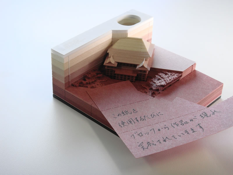
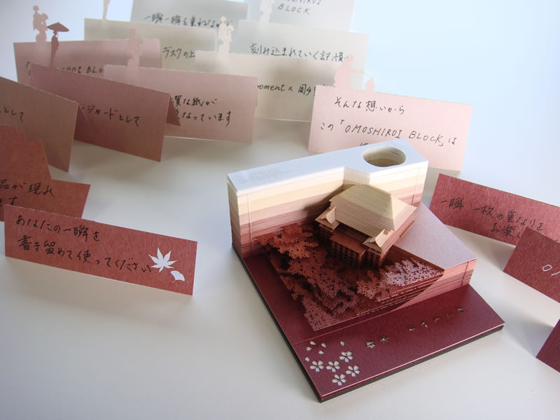
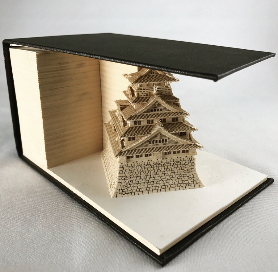
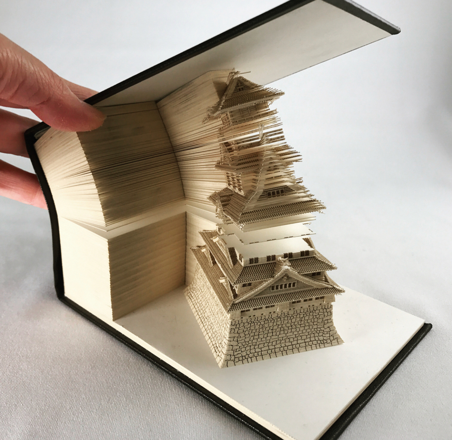
These Japanese memo pads will excavate objects as they get used

Post pobrano z: These Japanese memo pads will excavate objects as they get used

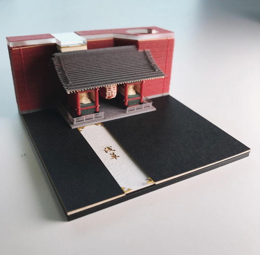
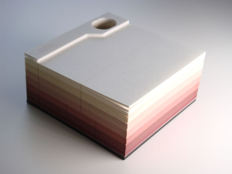
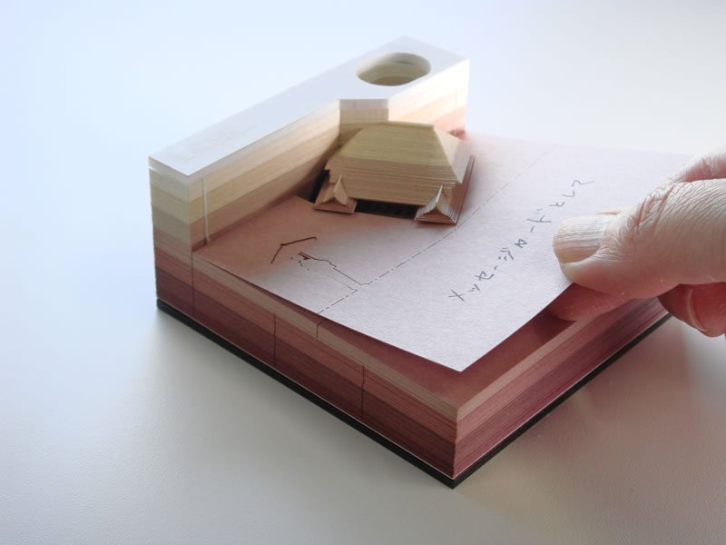
If you thought that paper notes blocks could not become a form of art, the Japanese will prove you wrong with the Omoshiro Block. These average looking paper note cards reveal stunning tiny paper sculptures as you remove the paper. These innovative stationary designs are created using laser-cutting technology, they reveal various architectural beauties, such as Kyoto’s Kiyomizudera Temple, Tokyo’s Asakusa Temple and Tokyo Tower.

Design deals for the week

Post pobrano z: Design deals for the week

Every week, we’ll give you an overview of the best deals for designers, make sure you don’t miss any by subscribing to our deals feed. You can also follow the recently launched website Type Deals if you are looking for free fonts or font deals.

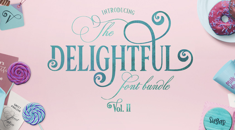
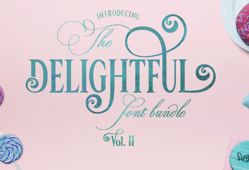
The Delightful Bundle Vol II

Jam-packed with 25 fonts from 20 different font families, this amazing font bundle comes in at JUST $0.80 per font.

$19 instead of $299 – Get it now!

Beautiful Handwritten Madelyn Script Family

Time to extend your family! With the Madelyn Handwritten Script Font Family, you’ll be bringing home two unique font styles: Madelyn Script and Madelyn Black. These handwritten script fonts is a masterful blend of calligraphy pen and casual dry strokes. Packed with 500+ letters, over 100 ligatures and 70+ ornaments, Madelyn can bring your latest designs to a whole new level.

$17 instead of $37 – Get it now!

Designer’s Dream: 8 Premium Fonts & 575+ Fabulous Graphic Resources

Whether you’re starting from scratch or looking to bolster your artistic toolbox, this Mighty Deal is just magnificent! A Designer’s Dream, you’ll start with 8 premium fonts ranging from the curvaceously glamorous to the quirky and cool. But you’ll also get 8 graphic resource packs full to the brim with more than 575 professional floral elements, frames, arrows, wreaths, patterns, clipart, icons and so much more.

$17 instead of $239 – Get it now!

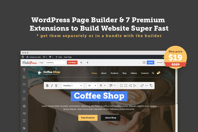
MOTOPRESS: WordPress Page Builder with Premium Extensions

Thousands of customers already use WordPress the MotoPress way. MotoPress is a powerful WordPress Page Builder plugin, which makes it possible to create and customize websites for diverse niches, with no coding skills. Assemble a full-blown WordPress website with just one Page Builder plugin – MotoPress Content Editor and its highly-functional addons. No need to compare and choose extra plugins for different purposes for you or your client, no need to wait for updates from dozens of providers, no need to fuss with compatibility issues.

$19 instead of $119 – Get it now!

6 Tips for Getting Web Design Right

Post pobrano z: 6 Tips for Getting Web Design Right

Source: Pixabay

Whether you’ve been a web designer for a decade or just a couple of months, the early days of getting started on a web development and design project can be nerve-wracking. There are numerous moving parts and clients, no matter their size or budget, expect high quality of work.

The design lifecycle incorporates requirement specification, scope definition, wireframe and sitemap creation, content development, interface design and testing (including penetration testing as provided by firms such as CBI). So much could go wrong. Yet, it doesn’t have to as long as there’s robust planning and preparation.

The following design tips will help you stay the course and deliver to the customer’s satisfaction.

1.   Define Expectations

You cannot really meet the client’s expectations unless you know what those expectations are. If you are working with a client who has commissioned one or more websites before, defining targets and outcomes will be a fairly straightforward process. However, if your client has no previous experience, they may find it difficult to articulate exactly what they need.

When it comes to web design, few things are more depressing than a client realizing halfway that what you are building is not what they wanted. That’s why setting expectations and goals is the single most important phase of the entire project. Develop a simple questionnaire that you’ll use to extract the requisite information from the client.

Questions should seek to establish the purpose of the website, who its target audience is, what it aims to achieve and how its success will be measured. With these answers, prepare a document outlining your understanding of the client’s expectations and share it with them for final verification. Going through this process will drastically reduce the likelihood of surprises later on.

2.   Prioritize Content

One of the biggest mistakes web designers make is to take the word ‘design’ as a license to concentrate on aesthetics. Content is still king. No amount of beautiful design can replace great content. Good content stimulates engagement while engagement triggers action.

Find out what content the client would like to share on the site and then design with the intention of making the content stand out and appeal to the target audience. For instance, if you are creating an e-commerce store, focus on highlighting the products as opposed to blending them in with everything else on the page.

3.   Adhere to Web Standards

Being unconventional is fun, but when it comes to web standards, that’s not something you can afford to do. Your client’s audience has already gotten used to existing standards and you do not want to make things difficult for them. Successful websites are intuitive and following convention is one way to achieve that.

There’s no reason for users to have to learn a new design model in order to navigate the site. For example, nearly every e-commerce store places the shopping cart in the top right corner of the page. It’s not because that’s the most attractive place to put it. Rather, visitors have grown accustomed to finding the shopping cart there.

Other examples of web design convention include placing the logo in the top left corner, contact in the top right, the search box in the header and consistent branding throughout the website.

4.   Make it Easy to Navigate

If visitors cannot quickly move from one section to another, they’re likely to lose enthusiasm and this means the website will have failed to achieve its goals. Navigation design must minimize the amount of information and steps required for users to move between sections and pages.

You have to put yourself in the shoes of the audience and lay out the most logical steps a typical visitor would follow in their journey across the site. Help them do what they want to do as opposed to forcing them along a path they aren’t interested in. Familiarize yourself with navigation best practices, including the most common patterns of mobile navigation.

5.   Prioritize Mobile

The way the average person accesses the internet has changed radically over the last decade. Desktop PCs have lost their dominance. The exponential growth of smartphones and tablets means the majority of the world’s population today accesses the web primarily through a mobile device.

From watching videos, posting on social media, shopping and just general searches, mobile is where it’s all happening now. Optimizing a website for the mobile experience used to be an afterthought. Nowadays, it’s a critical requirement. The site must be fully operational on mobile which means text, images, calls to action and shopping carts must work as flawlessly on mobile as they do on a desktop browser.

6.   Integrate Social Media

Just like mobile, social media has moved from the early days of MySpace when it was on the fringes of internet conversations to a colossus that has its tentacles in every nook and cranny of the world wide web. Facebook, the behemoth in this space, has more than 2 billion active users.

Social media is where the bulk of internet users spend the most time on the internet. The website must leverage that to its advantage. By integrating the site with social media, you increase the likelihood of visitors sharing the product and contents with their network thus increasing visitor traffic.

The above tips are useful in getting you moving in the right direction, but do not cover everything you need to build a successful website. Web design is an art and there’s only so much you can learn from books or on the web. In reality, you’ll make some mistakes and experiment with different options before you eventually perfect your craft.

Stephen is an influencer marketing pro with brownboxbranding.com who is passionate about building authentic relationships and helping businesses connect with their ideal online audience. She keeps her finger on the pulse of the ever-evolving digital marketing world by writing on the latest marketing advancements and focuses on developing customized blogger outreach plans based on industry and competition.

The surreal conceptual illustrations of Andrea Ucini

Post pobrano z: The surreal conceptual illustrations of Andrea Ucini

If you are a reader of notorious magazines such as Wired, Entrepreneur Magazine, LeMonde, Die Zeit and New Scientist, you may have already stumbled upon Andrea Ucini’s work. If you are like me, you were probably charmed by the surreal scenes depicted by the artist, as well as the considerable amount of poetry Ucini puts in his work.

Andrea Ucini was born in Italy and started his artistic career with music. He has a classical piano and composition degree from the prestigious Music Academy of Florence. Now the Italian illustrator has become an illustrator specialized in editorial work and he lives in Denmark. You can see more of his work on his website, but also follow him on Instagram or Behance.

How to Be Better at Designing Vectors

Post pobrano z: How to Be Better at Designing Vectors

Vectors are an effective way of creating online illustrations which can be blown up to large sizes without losing quality.  If you’ve ever looked at an image and believed it would look great as a vector, but wondered where to start, these helpful tips are for you.

When working with a vector program, your first job is to get to know your drawing program.  After this, taking a design down to its foundations will enable you to create an effective illustration.

Seek out the basic structure of your drawing


Seek out the core areas of your design.  Based on the flat shapes in front of you, you’ll get an idea of the composition of the page.

Next, seek out the essential elements.  How can you create focus by reducing the elements on the page?  This will give your drawing focus.

As you develop base shapes for the elements of your page, such as the laptop, table, coffee cup and glass, you’ll see your rendering begin to take form.  These shapes might feel flat, but you’ll begin to get a sense of your layout.

Add texture and patterns

Now that you have your layout, start to look at where you can add texture or pattern.  You could look at the surface of the table and add just enough texture to show that it is made of wood.

Adding some grain will achieve this effect.  Focus carefully on where you’d like to add texture so that you don’t complicate your page.

Repeat Elements

If you have repeat shapes such as window frames or coffee cups, you can repeat these images, adding some new details such as different blind lengths or patterns in order to create a unique image.

Take creative shortcuts

If you’d like to add interesting details to your drawing, such as shadows of trees framed against a night sky, you can use Image Trace.

This way you do not have to draw every detail, but you’ll still be able to add texture or background to your illustration.

Start with simple shapes

When you’re starting your drawing, begin with basic geometric shapes such as rectangles, triangles, squares or trapeziums.

From here, you can use the warp function to alter your shape.  When you’re working from stock images, sketches or even your own imagination, begin by breaking the image down into basic shapes and work from there.

Consult your client

When you are about to hand over the final image to your client, find out the format they require.  This way you can supply them with the file they want most.

If the client wants an Illustrator file, and you have a great many layers that you don’t want to move over one by one, simply draw a rectangle over your image, control, and right click, and ‘create clipping mask’.

This will give you the shape of your artwork that you are now able to present to your client.

Use Bezier Curves

When you are drawing with a Wacom pad and pen, you could use Bezier Tools to create smooth curves.

Bezier curves might take time to learn but they will give you the smooth lines or shapes you want.  Learning keyboard shortcuts will help you to work quickly and efficiently with this tool.

Consider your medium

Your medium will determine your approach to your design.  If you are designing for a magazine or a billboard, the end result will be different than a design you would like to spray onto a wall.  Choice of shapes, color, texture, and complexity will all depend on the end goal.

If you are designing a T-Shirt artwork, for example, you should look first at how others are creating them. Also, frame your design in a blank T-shirt template, so that you will present it better to your client.

Experiment

Feel free to play and experiment when working on your design.  Create simple shapes, lines or curves, move them about, erase some of the details and then add new elements.

Allowing yourself to play with your design gives you space for spontaneity, and to allow the process to evolve.  Even though you might plan your design carefully, allowing experimentation creates space for new ideas to flow.

Develop your own style

When working with vectors, try to find your own unique style.  This is possible with Adobe Illustrator, which offers unlimited ways of working.  After experimenting with the program, allow your own style to emerge.  Below are some opportunities for experimentation:

When working with a pen, use the least number of anchor points and draw on curves so that your design looks clean and smooth.

Calligraphic brushes used alongside your tablet will give your illustration a hand-drawn feel.

In Illustrator, close off all the shapes you don’t need, and experiment with using the pencil tool.  You can draw basic shapes, expand on them and use color to add life to your work.

If you are using line art, play with the lightness or thickness of your strokes.  This will add texture and depth to your work.

Using layer folders

When you are creating complex artworks, it is often helpful to work in layers, an option provided by Illustrator.  Layers are like clear folders which manage all the different elements of your artwork.

You can place them together, change their stacking order or delete aspects of your work that you no longer like.  Shifting and playing with layers gives you the opportunity to experiment with your design without losing the original concept.

Color opacity and transparent gradients

The gradient palate is a very effective feature on Illustrator.  Transparent gradients give you the opportunity to fade out a color in different areas of your page, providing different levels of opacity.  Using transparent gradients will also give you a watercolor effect.

Store your work

Once you have created shapes or drawing, you can store them, giving you a collection of drawings or ideas to play with while working on a new project.

These shapes will be able to provide you with foundations for new projects which will feel easy and natural to use.

Use your imagination

When using Adobe Photoshop, creating new forms or shapes means imagining how they will look in 3D.

Working with multiple layers which add color, light, and shadow will create a three-dimensional effect.  You can adjust these shapes or layers later on to suit your needs.

Which software is most helpful when drawing vector icons?

When Drawing Shapes

When creating icons, you can achieve incredible results simply by combining basic shapes and sizes.  All drawing apps have tools for basic shapes, but when you’re choosing which product you’d like to work with, it’s worth thinking about how easy each program is to use, and the flexibility offered.

Photoshop is not so easy to use because it isn’t made for vector drawing, and so isn’t as smooth or intuitive as Illustrator or Sketch when it comes to drawing.  You may also struggle with editing shapes such as polygons or stars, and this might limit your flexibility.

Illustrator is great for creating basic shapes, and it has a Live Corners feature which can smooth out corners.  However, Illustrator (like Photoshop) can limit you when it comes to polygons or stars, which can’t be adjusted.  Sketch allows you to edit all shapes, including polygons and stars and will let you round all corners, which gives you a greater degree of flexibility.

When using Pathfinder or Boolean Operations

You can use the Pathfinder panel to create new shape combinations.  This allows you to add complexity to your vector illustrations.  The panel gives you 4 options to create new shapes:

  • Unite/Add: combines and merges selected shapes
  • Minus/Subtract: Uses a cookie cutter to subtract top shapes from bottom ones.
  • Intersect deletes shapes that do not overlap.
  • Exclude: deletes everything that does overlap

Photoshop has non-destructive operations on Pathfinder (and so they won’t make permanent changes to your shapes), and these can be flattened if you need this.  However, you will need to merge layers together as Photoshop can only perform pathfinders on single layer vectors.

Illustrator has a far wider range of Pathfinder options.  These extra options increase the flexibility of your vector drawings.  However, they are destructive, so they will make permanent changes to your shapes.

Sketch has non-destructive Pathfinder operations which can be modified within the various layers.  You can also flatten your combined shapes to create permanent changes.  Sketch is a very helpful program when it comes to Pathfinder options.

When exporting to SVG

SVG creates scalable vector graphics and is a standard format used by the World Wide Web Consortium.  SVG is the best way to share vector illustrations as it is supported by browsers, drawing applications, and image viewers.

Photoshop enables you to export multiple SVG files by either using individual artboards or creating a .svg suffix for layers or group files.  There is, therefore, no need to create an artboard for each icon.  This sets Photoshop apart.  It can be helpful when you are working with large numbers of icons or layers.  You can also overlap layers in Photoshop using the same artboard.

Illustrator has a range of SVG export options which enables you to create font preferences, CSS properties, and image embedding.  You can export multiple SVG files simultaneously.  However, there is a limit of 100 artboards per Illustrator document.

Sketch allows you to export SVG files using Slices.  However, this process can be buggier than Photoshop and Illustrator and can be a drawback when using Sketch.

Ending thoughts

Little tips can be effective to turn your work around, or allow your thoughts or ideas to ‘click’.  Going through the foundations, although this may seem like common knowledge, might give you a simple solution to any problem you might be having.  Good luck with your vector drawings.

Some Advice on Using Illustrations When Designing Websites

Post pobrano z: Some Advice on Using Illustrations When Designing Websites

An illustration is a versatile means of expressing a message.  Used in web design, illustration helps to provide a visual representation or example of what is being shared, making it a message clear.  It also offers an attractive or aesthetic element to a website.

If you’re using illustration to add to your website, using it to its full potential means creating an attractive or decorative message.  This will help you get the most out of illustration.  Let’s explore what it means to use illustration in website design, and what can be done to use illustration to its full potential.

Branding

Branding is used to create an emotional message which transcends the product and gives it a meaning.  When you create a website, you want the design to give visual representation to a business.  A website needs to give a visual feel to a client’s brand.

This means creating a visual impact.  When viewers land on a site, it should be memorable.

Illustration helps to create a memorable site because it gives a site uniqueness.  Whether you use eye-catching graphics or vector designs, your site will stand out from the competition.

Visual Appeal

When a site uses illustration, it will have an instant visual appeal.  Many companies use stock photos to add a graphic element to their sites.  However, stock photos are not unique, and not created in accordance with your brand.  As a result, your site may fade into the background.  Illustration fits in with your brand, adding an element which instantly identifies your company and makes it stand out.

An example of a site which uses fun illustrations to create a unique and exciting brand story is Luhse Tea.  This tea stands out from the competition and identifies itself as a unique but delicious and memorable brand.

Illustrations tell a story

In addition to creating an interesting and unique appeal, illustration helps to tell a story.  Some sites use illustration storyboards or slideshows to put across a message in a way which is appealing to clients or viewers.

When illustration tells a story, it can share how a brand is able to add to people’s lives, offer service or meet a need.  An original and very human story helps to connect with viewers.

An example of this is the WWF Website, which uses colorful images in the form of a slide show.   Instead of using words and statistics, WWF gives customers a clear message using an illustration.

Illustrations add interest

Long and involved messages can be hard to understand, and numbers and charts are often confusing.  Very often, viewers may feel overwhelmed or even bored by stats.

However, you can add zest to your message by using an illustration.  If you don’t have an illustrator to add unique images to your site, you can learn Adobe Illustrator by following a few simple tutorials.

Use different styles

Websites rely on hierarchy in order to communicate important messages.  Using different styles of illustration can enable you to draw attention to navigation buttons or calls to action.  These are the elements of your site that you would like to stand out.

Creating contrast often helps a design element to stand out.  If your illustrations are heavy and rough, you could create a user interface which uses sharp edges.  If illustrations are monochromatic, use design to create brightly colored navigation buttons or calls to action.

Illustrations can be used to create themes

Illustrations can be used to create a theme for a website.  This might mean using images of mountains and lakes for a nature-based company or using architectural blueprints for a building and design company.

An illustration may also be used to identify a company’s location.  In other words, a company can use illustration to identify a company.  Illustration becomes the most prominent feature on a site, and this helps to create a unique image for a company.

Mascots

Mascots provide a friendly and approachable character for a brand.  The Kellogg’s Rice Krispie characters Snap, Crackle, and Pop provide images of friendly mascots who help to define a brand.

Mascots help to identify and give personality to a site.  Using a character provides a face for the company which is able to talk to your customers.  This gives your brand a ‘human’ element and helps to make it memorable.

Illustrative Decoration

This means that illustration is used to decorate a site, offering an underlying framework or style.

However, the goal is not to represent a person, product or place, but simply to offer a sense of style or structure.  This style helps the site to connect with an audience.  Very often simple drawings and well-chosen colors add an aesthetic appeal to the site.

Illustrated Text

Creating text out of hand renderings is an opportunity to create a unique design or style for a site.  This is a great way to put your art school experience to work in order to create a distinctly individual element to your site.

Hand rendered type can be used to demonstrate a purpose.  A creative website can use illustrated text to demonstrate talent in the arts, careful craftsmanship or the uniqueness of a product.

Keep it simple

Simple illustrations help create an attractive image which informs your readers but doesn’t overwhelm them.

Keep illustrations informative

Aesthetic illustrations keep your site looking good, and this is important.  However, using illustration can help your site to share a message with your viewer.

Illustration can be used purposefully.  When designing your site, ask yourself why you would need to add to add illustrations, and how they will contribute to the goals of your site.  This will help with conceptualizing your illustrations.

Plan your designs before incorporating them into the website.  You can use pen and paper or a whiteboard to map out your designs.  This will help you to create an abundance of ideas before venturing into the digital realm.

You can then draw on similar ideas and find inspirational images.  Explore graphic design galleries and take notes on how the designers have brought their designs to fruition.  How are they similar or different to what you would like to achieve?  How would you like to use color?  How does illustration relate to content?

Ending thoughts

Illustrations add uniqueness to your site, adding personality and a sense of warmth.  Your goal as a web designer is to ensure it is used with purpose, communicating a message to your audience.

This means ensuring that there is a clear distinction between elements which share a message and those which encourage your audience to interact.  This will enable your viewers to navigate your site clearly, and take actions such as signing up for a newsletter.

It also means assisting viewers with understanding a product or service, ensuring that the site is not only beautiful but meaningful for viewers.