Archiwum kategorii: Design

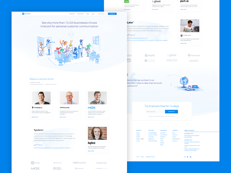
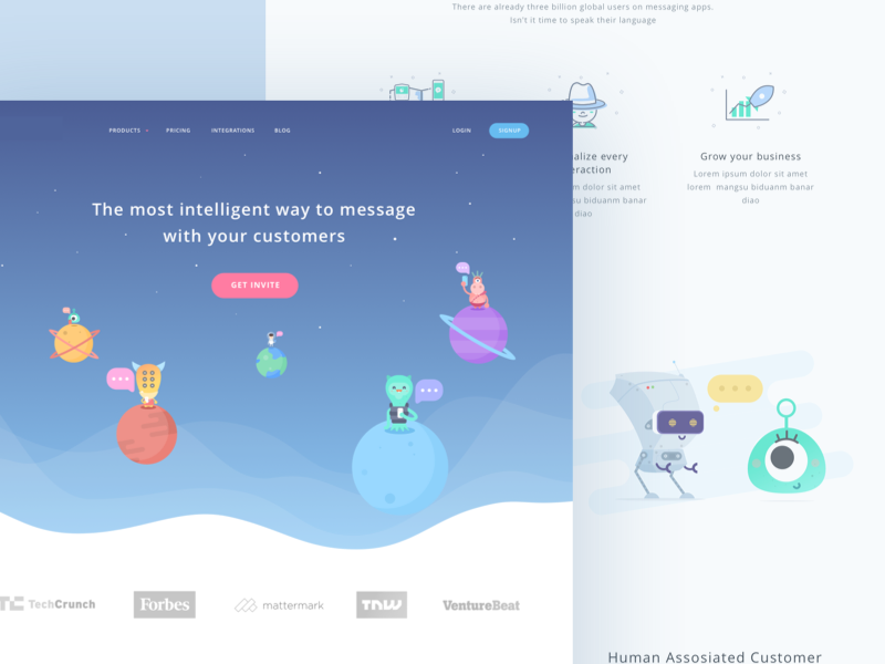
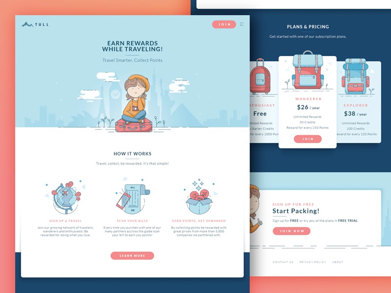
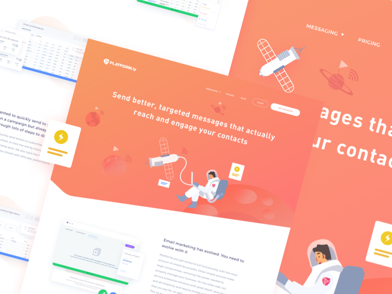
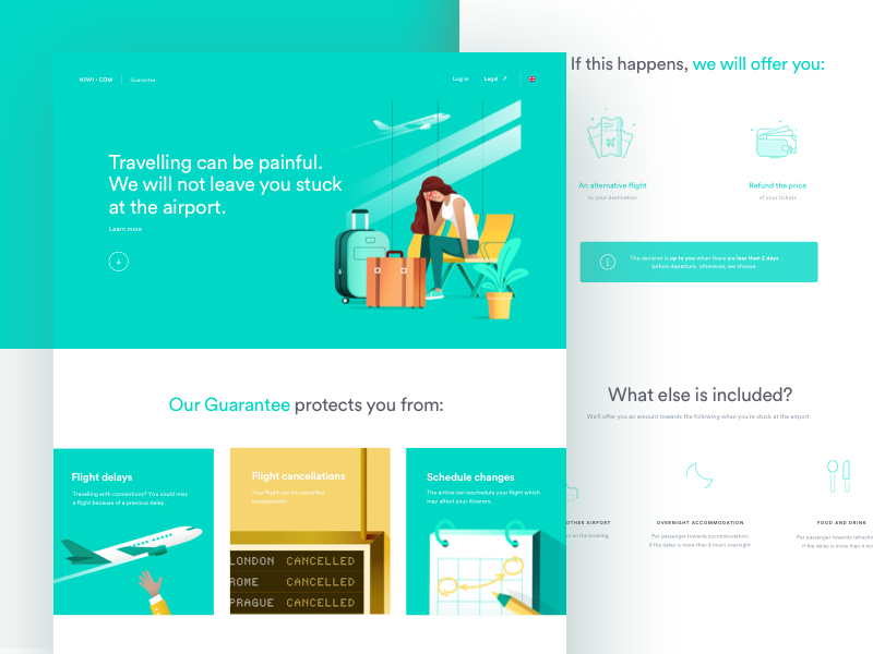
How to Make Your Website Stand Out From The Crowd

Post pobrano z: How to Make Your Website Stand Out From The Crowd

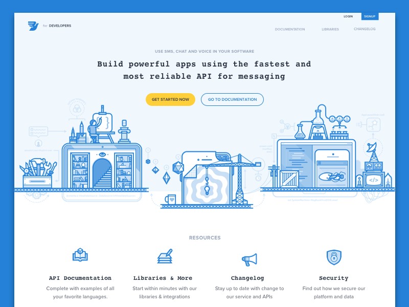
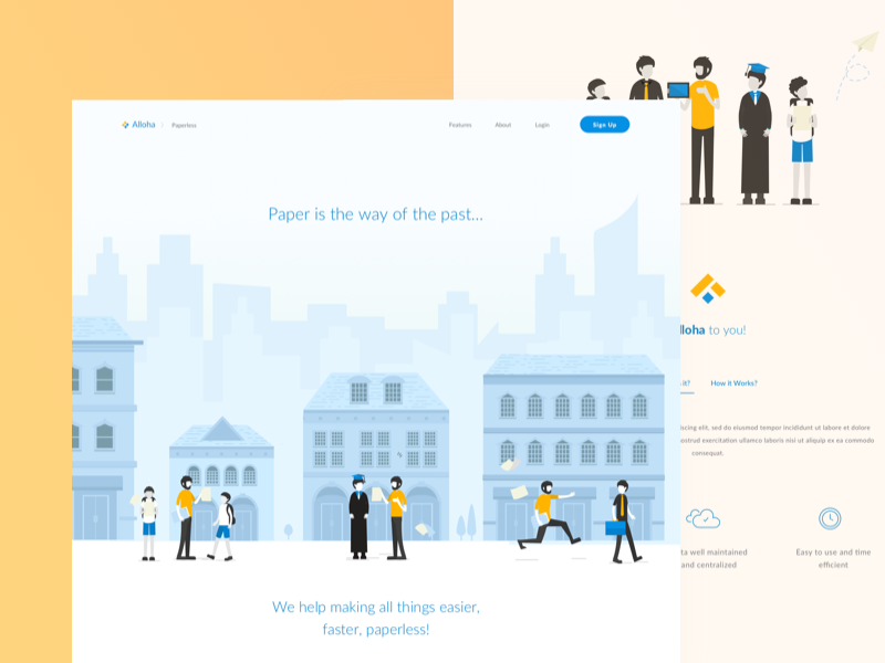
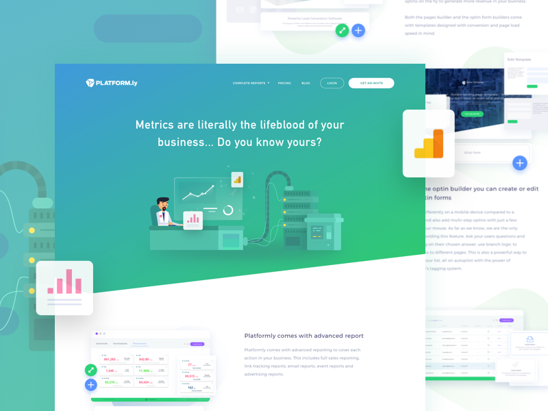
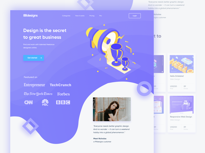
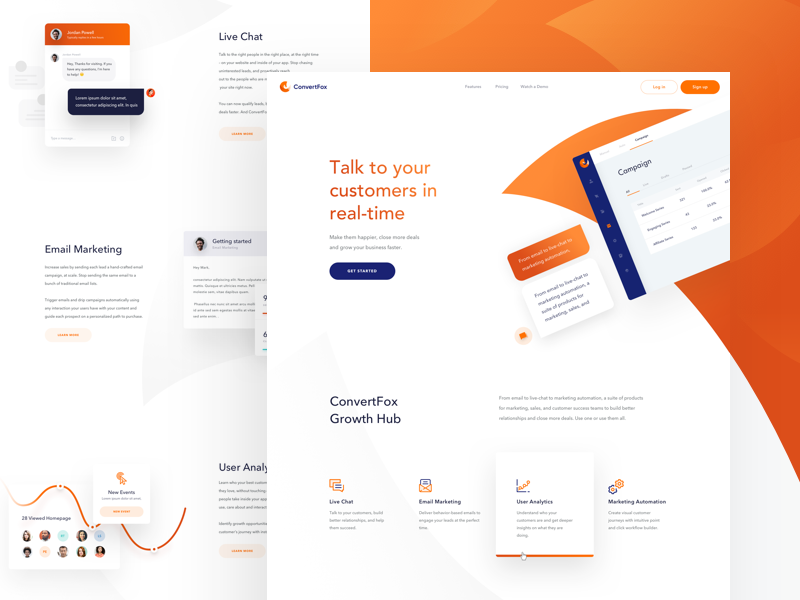
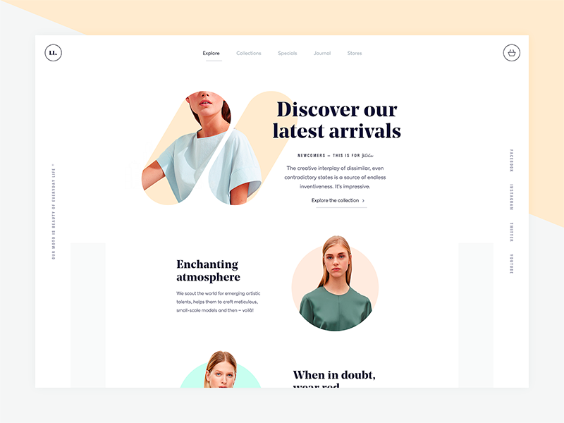
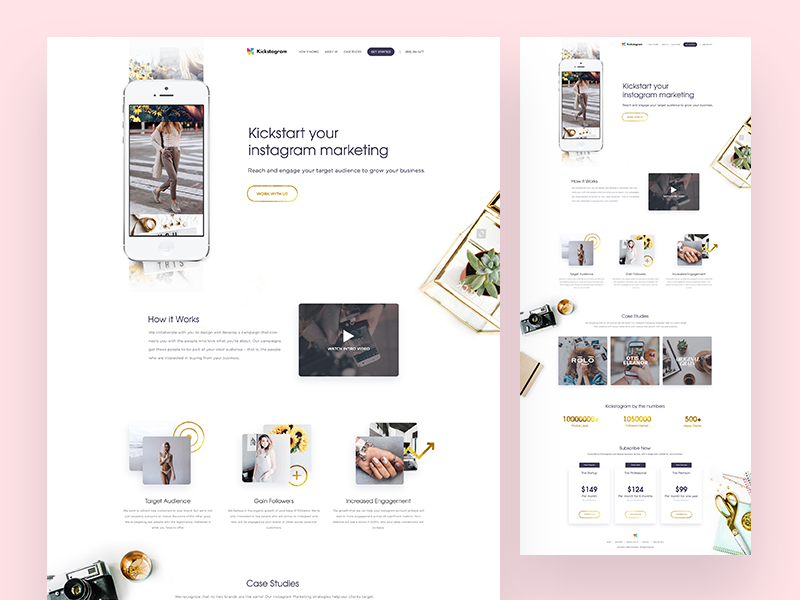
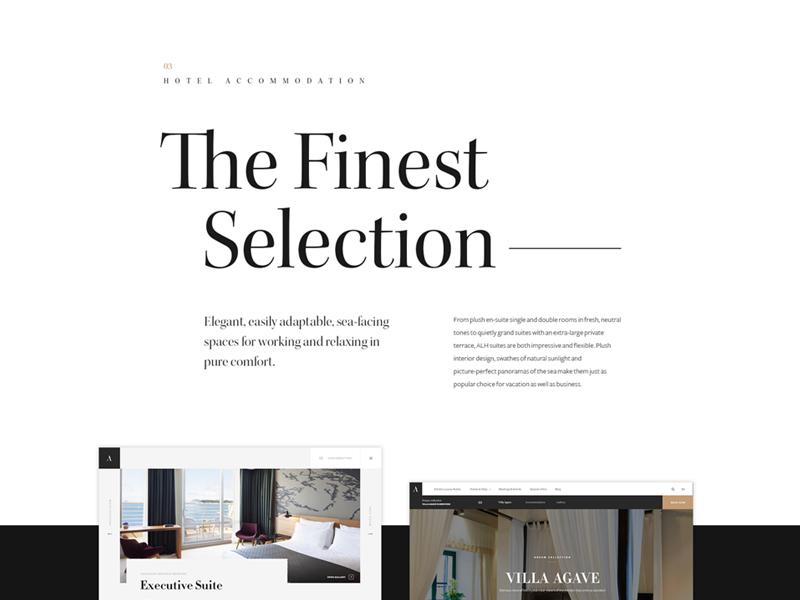
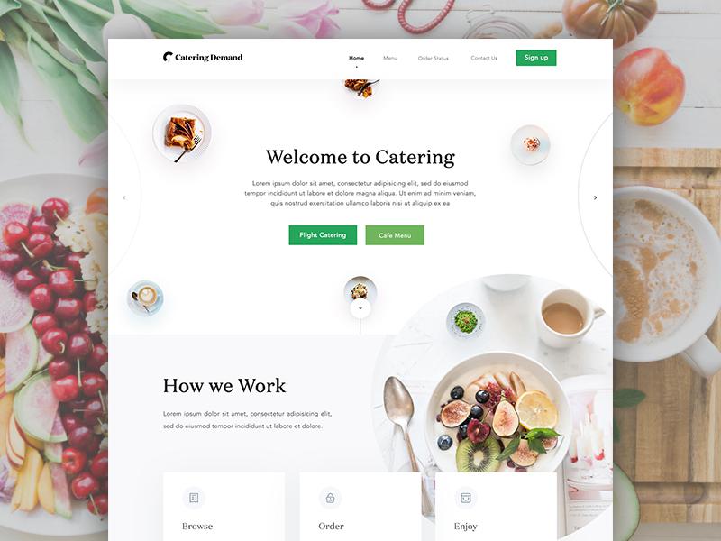
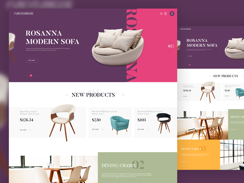
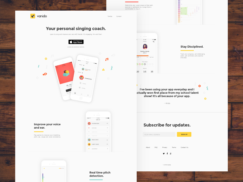
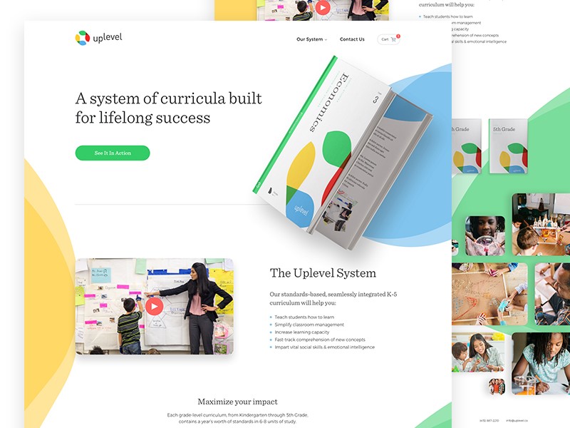
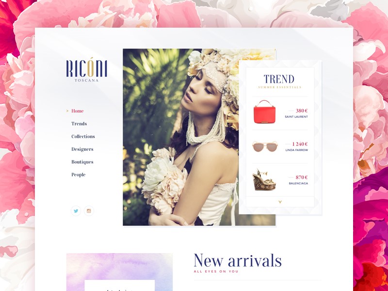
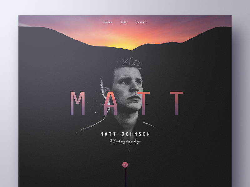
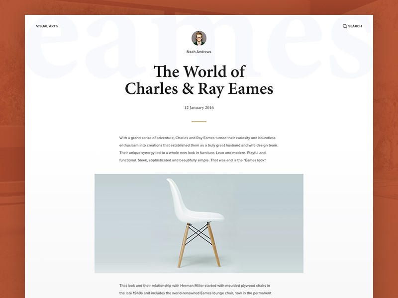
When you are creating a website, it’s no secret that you want it to stand out. An outstanding site gains points over the competition and is impressive to potential customers.

A unique and attractive website gives designers a competitive edge. Developers add original and successful websites to their portfolios in order to attract new clients.

The following tips will assist you to make your website stand out:

Layout and structure

A unique site structure or impressive layout will make your site memorable. However, this is no easy feat. Creating a unique website provides a visual challenge and the opportunity to stretch your developmental skills.

Remember to keep information well organized and accessible while working on a unique site. When offering a unique site, development time may be increased as you encounter new problems.

When designing a new site, use programs which are easily accessible to users. Many complex sites rely heavily on JavaScript, but this is not always accessible to users.

Branding

If your client has an excellent brand, this will assist your site to stand out. Branding aims to transcend a product, creating an emotional resonance with the user. Stick with your client’s branding guidelines, embrace them, and use the client’s logo on your site.

If your client does not have original branding or logos and only has a choice of font, this makes it harder. Work with the message, color and font you would like your client to create.

Use text effectively

Using text to set your site apart is both complex and very effective. The content of a site reflects the client’s personality or corporate culture. Use text, video, subheadings and easy reading or legibility to set the site apart.

Ask your client for copy that is well written and effective, showing a sense of warmth which connects with the reader. You want any copy which reaches your site to go beyond the obvious sell tactics and to engage the reader. This can sometimes be tricky.

Work with your audience

When you construct your website around user needs, you create a site which is both engaging and easy to navigate.

Many designers don’t do this. Take time to research who your users are, what interests them, and how you can incorporate their needs to create a niche site which is easy to navigate.

Keep it simple

Although branding and logo set the stage, assuring users they have come to the right place, it is the site’s design which will keep the reader engaged. A well laid out site is clear and easy to read, has plenty of white space, and uses color effectively. Navigation is simple and easy to use. Keep content arranged according to hierarchy.

When creating your site, keep it simple. Arrange content so that you don’t overwhelm your audience, but they are easily able to find the information they need.

Use white space effectively

Background space keeps your design clear and simple. Website organization is an important aspect of your design.

Design each area of your page so that it is aesthetic and adds value. Use white space to keep your design looking clean and fresh.

Typography

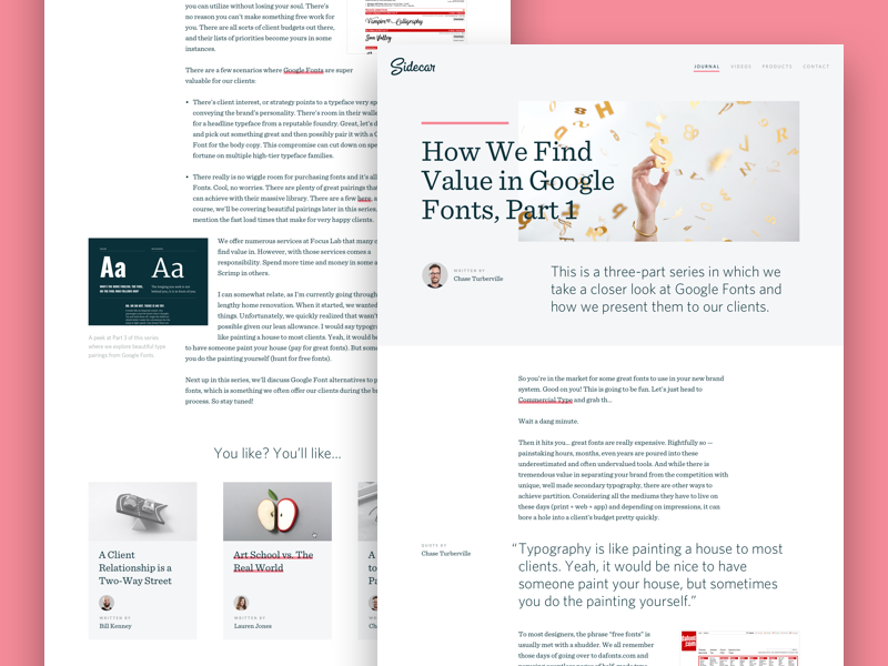
When you browse the web and come across some of your favourite brands or designs, how often do you recognize the font or typeface immediately? A brand is often immediately recognizable by the font chosen. Using a clearly defined font will link viewers to your brand.

When creating a header font, use a font which will stand out, and tie your viewers back to your brand. Google Fonts has plenty of options which are free to use.

Play with text

Great websites use large font sizes to keep text legible. This helps to create an easy flow. It also assists the designer with narrowing down language so that it is clear and precise. A large text has no space to become superfluous, confusing readers.

Clear, legible text which is easy to read will make your message easier for viewers. Along with headings and subheadings, large fonts will also enable you to scan articles or web pages to find the information they need.

Dramatic Headlines

Headlines make a statement, showing users what your site is about. They are often the most important aspect of a site and grab user attention because of their information content.

As a result, large, attractive headlines are used amongst many modern designers.

Color

The goal of a website is not just to create site visitors, but to encourage those visitors to buy a product, commit to a service or access new knowledge. In other words, the success of a website is determined by its ability to convert viewers into clients or customers.

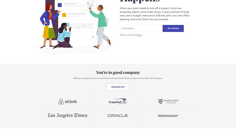
In order for a website to have a high conversion rate, there is a need to make it accessible, efficient, and to use prompts which encourage users to take action. Color is often used as a means of highlighting aspects such as ‘sign up’ or ‘get started’ buttons.

Instead of looking at which single color is most effective, focus on how color stands out against the background of your website. This way, you can use color to create a hierarchy, drawing user attention to the most important buttons on a site.

Use contrast

Web designers rely on color to give an emotional or intuitive message to viewers. This helps to portray the atmosphere or culture of a company.

Color does not only create a mood, however. By contrasting colors, a designer is able to highlight different areas of a page. This assists viewers with establishing a hierarchy.

Be willing to experiment

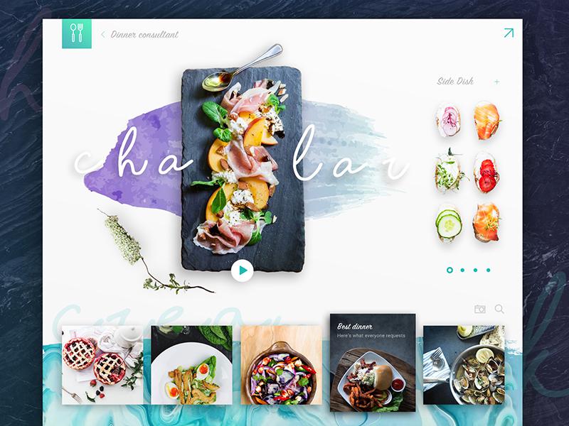
Have you ever thought about designing using a watercolor theme? There are many approaches to watercolor.

It was a popular trend not too long ago, and it’s making a comeback. You can use various watercolor elements in your header, sidebar or footer, depending on the site you’re designing.

Even if you don’t already have watercolor illustrations, you can create them yourself with watercolor brushes for Photoshop.

Whatever you do when using watercolor, have fun!

Using a grid

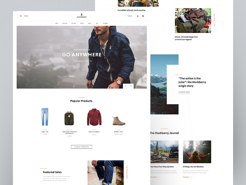
Using a grid is a popular website design method for modern websites. This effective way of designing enables you to add effective imagery to your site while presenting options to site visitors.

When using a grid, keep it simple. Too many options can be overwhelming for visitors. Keep your imagery simple and your navigation panel concise and easy to use.

Minimalism

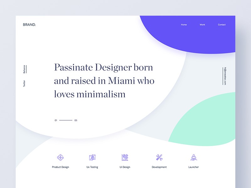
Minimalism sounds simple, with its use of white space, attractive imagery, and sleek typography, and believes that less is more. However, there is a lot going on beneath the clean surface.

In minimalism, negative space is used to draw attention to specific elements, so that the viewer does not get overwhelmed by too much information. The focus is on content, and the bare background is a means of achieving this goal.

When creating minimalist designs, focus on large images which give a sense of drama to your page, providing an emotional connection for viewers. Image quality is vital, as it will provide the emotional or atmospheric element to your page.

Social proof

When you have an expert review a product, make a statement on a service or carry out research, you create a sense of trust or reliability for your readers. Likewise, customer reviews or testimonials show how clients have experienced a product or service.

When using reviews, do so after you’ve made an argument for how your product will fit, providing a similar service or content. This will enable the review to offer a persuasive element to your site.

Go fast

Users are quick to abandon slow websites. Therefore, if you want to ensure that viewers turn into clients, it is important that your site downloads quickly.

Online viewers are impatient, and if your site takes more than a few seconds to download, they will often abandon the page.

Search engines give a higher ranking to pages which load quickly. In order to ensure rapid download, use only essential elements in your design, and go for premium hosting to ensure your downloading speed gives you what you need.

Summary

Developing a stellar website is all about embracing customer need, thinking through your design so that it works intuitively while being aesthetically appealing.

If you are able to work with client needs, your site will set you apart from the competition. Follow these tips and get started, and remember, never settle for second best!

Design Deals for the Week

Post pobrano z: Design Deals for the Week

Every week, we’ll give you an overview of the best deals for designers, make sure you don’t miss any by subscribing to our deals feed. You can also follow the recently launched website Type Deals if you are looking for free fonts or font deals.

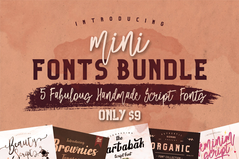
5 Fabulous Handmade Script Fonts

Fonts make all the difference in your designs. Sure, what you say is important, but how you say it is just as powerful! Be sure to hurry and grab this Mini-Font collection sporting 5 fantastic handmade script fonts! Whether you’re working on invitations or mugs, these professional typefaces can be molded to suit your style thanks to the many OpenType Features they include.

$9 instead of $75 – Get it now!

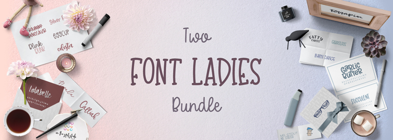
The Two Font Ladies Bundle

Missy Meyer and On The Spot Studio have teamed up for a brand new font bundle with 93% off!

$15 instead of $203 – Get it now!

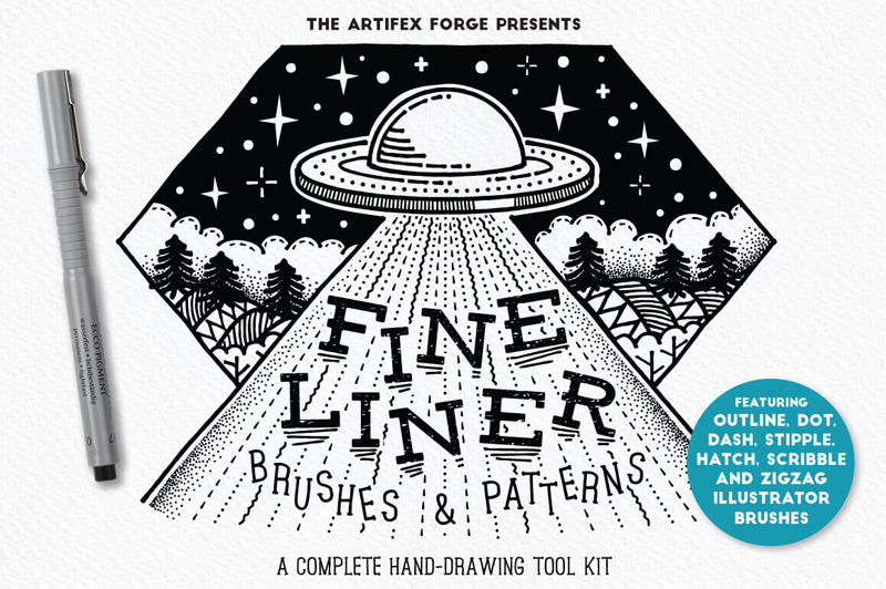
20+ Fineliner Brushes & Patterns

Looking for a quick and easy way to draw up some basic doodles on your computer? Then this Mighty Deal from The Artifex Forge shapes up perfectly for you. You’ll get a real authentic hand-drawn feel on your projects with this collection of Fineliner Brushes and Patterns. You’ll get 17 anti-stretch brushes in a variety of styles from dots to hatches to dashes, as well as a set of patterns to fill up large areas in one fell swoop.

$8 instead of $16 – Get it now!

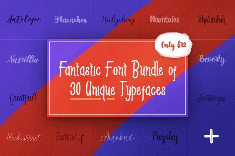
Fantastic Font Bundle of 30 Unique Typefaces

It’s time for another font-astic deal! This one from the mighty Polem, you’ll get yourself a collection of 30 unique hand-drawn, script and serif fonts. Gorgeous, elegant and flowing, these fonts are packed with oodles of OpenType features, and are just the thing you’re looking for in terms of your next project whether it’s greeting cards, invitations or even T-shirts.

$12 instead of $312 – Get it now!

How fitness wear designs are incorporating style and functionality

Post pobrano z: How fitness wear designs are incorporating style and functionality

Many folks who tell you they want to get fit also say they don’t like going to the gym. Often you’ll hear the opinion that it’s because they can’t stand to be around all those Lycra-clad people who appear to be in fabulous shape and have no need to work out at all.

Well, times have moved on and designs for fitness wear nowadays go well beyond the basic elastane fabric, also known as Lycra or Spandex, which originated in the 1950s. Fashion designers have taken fitness wear to their hearts, while manufacturers have worked hard to develop new synthetic products; so much so that the range and variety of clothing and shoes as well as support garments is more extensive and more stylish than ever before. Here are a few of the ideas that are trending among the connoisseurs of fitness fashion.

Style or functionality?

You will already know that architects often debate whether, when designing a building, form follows function or the other way round. So it is that designers have just the same argument about the importance of style versus functionality. In truth, it has to be said that the best garment designs are those that combine both, and as a result create clothing that performs well for the people, including athletes, who wear it for utility as well as looking great in the process.

The rise of athleisure

The designs that are gaining most attention and applause have been categorized as ‘athleisure’ – a hybrid style deriving from business casual clothing and sportswear. Deirdre Clemente, professor of history at the University of Nevada in Las Vegas, believes this new form of styling is attractive to consumers because business casual clothing is very versatile, and sportswear is very durable.

She has examined trends in fashion over more than a century and feels the introduction of synthetic fibers to sportswear has resulted in these comfortable clothes edging towards the mainstream of the casual clothing market. An increased interest in health and fitness has helped swing opinion on the acceptability of sportswear-led designs in business and casual settings, all of which adds up to increased sales in the athleisure sector.

More than a trend?

Athleisure may be a fashion buzzword, however, designers and retailers currently are obsessed with clothes that fit this broad category of being appropriate for leisure pursuits, sports activities or both.

Think designer leggings, yoga pants, cashmere sweats and layers of various pricey and fancy gym clothes. Underneath the hype, however, there are some seriously good products emerging from the top designers. The interesting thing is that just as many of these quality items are hidden beneath outer clothes as are showing off their designer labels.

Functionality that’s stylish

If you like support garments to wear next to your skin, you really need these to perform for you, particularly if you’re recovering from injury or aiming to prevent pain, for example, from repetitive strain injury (RSI).

An advanced fabric using copper technology is used in the manufacture of copper socks, which provide additional support and relief to your legs and feet. This innovative material allows your skin to stay cool and dry while eliminating odors, and is just as comfortable in an overheated office building as it is on the sports field.

Other attractive options include lightweight undershirts and boxer briefs, both ideal for a long-haul business flight as well as a hockey game or a session at the gym. Women’s wear includes elegant compression tops with great wicking qualities and stylish designs. These can be worn under other clothing or alone.

Ethical footwear

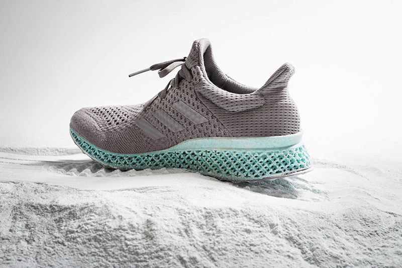
Besides clothing, sports and casual footwear is undergoing something of a revolution. We are hearing more and more about plastic waste choking the oceans of the world, and scientists have been actively seeking solutions for decades. It’s only a couple of years since manufacturers adidas announced a partnership with Parley to create trainers printed in 3D from waste plastic. Parley for the Oceans is continuing its innovative work and the shoes are now a powerful symbol of the exciting collaborative relationship between the eminent sports shoe manufacturer and the environmentalists working to rebalance the eco-system.

The first product collaboration with adidas Originals introduced the EQT Support ADV sneaker, made using materials created from upcycled plastic waste, and more have followed. The shoes are available in at least two color ways and are becoming increasingly popular, especially with young people, among worldwide concerns about the damage being caused by climate change.

How to impress by creating a website with great typography

Post pobrano z: How to impress by creating a website with great typography

When you are working on a website, you’re aware that great typography helps to create a message, keeps viewers engaged and adds to your design.

There are so many fonts available, that you might wonder how you create the perfect choice for your site.  Here are some tips to help you:

Go back to the basics

Working with website design means looking at the foundations of a font.

Explore the divide:  almost every font choice is based on the decision of serif or sans serif.

Use space:  kerning means working on the space between letters, tracking means pulling blocks of text together by eliminating excessive space, and leading refers to the amount of space between text lines.

Legibility:  ensure that your text is easy to read.  Play with font size to ensure that your viewers will be able to read easily without impacting how sentences run across a page.

Remove hyphens and justification:  this helps to keep your work looking organized and eliminates unnecessary spaces.

Limit choice:  try to use only two or three fonts on a screen.  This keeps your page from becoming chaotic or overwhelming.

Remember to contrast: when you want to make a message pop out onto your screen, remember to use contrast.

Contrast is created by combining light and dark colors, but can also be used by contrasting color intensities such as vivid and muted colors.

Use browser friendly fonts

When you are shifting between browsers, make sure your texts are compatible.  Text should also be compatible with different devices, such as mobile phones and laptop computers.

To do this, you could explore browser friendly fonts from Google Fonts, and ensure that you can read or use them on a smartphone or tablet.

How to create atmosphere or emotion using text

Words or sentences carry a message, but your viewer will take a first glance at your site and absorb meaning from your design, text, background, and color.

Your audience will not be able to relate to your site or text if the following four elements are not present:

  • Type
  • Color
  • Texture
  • Image

Adding these to your typography will enable you to create atmosphere, and to pass on a message to your viewers.

Working with color

When working with color, limit your choices.  Many designers use a primary color, secondary color and accent color.

By using too many colours in your design, your website will be chaotic.  If you’d like to create points of emphasis, use contrast instead of additional colour.

Be creative with your graphics

Surely, you want your site to be different than other websites in your niche. You can design a great header, footer or simply create a creative background.

That would be easy for a graphic designer, but if you’re a web designer that usually tackles simple graphics and code, it might be quite the challenge.

My advice is to start reading a few typography tutorials for Photoshop or Illustrator. Then, the sky is the limit when it comes to designing beautiful typography designs.

Working with content

When working with content, add hierarchy by working with paragraphs, headings, and subheadings.

While books are divided into chapters, sections, and paragraphs, websites use individual pages.  The navigation bar represents a table of contents.

Websites have a clear distinction between titles, main paragraphs, and subsections of content.  Subparagraphs often come with subheadings, so that users can take in information quickly.

Web users often want to be able to take in information quickly and get the general idea of a page.  Page design is about making the reading process as quick and efficient as possible.

It is for the designer to lay out content according to importance.  This means getting to know the content of your client’s pages so that you can organize it effectively.

Create mockups

If you’re working with small amounts of content, arrange the text according to headings, subheadings, and short paragraphs or bullet points.

However, if you are working with a great deal of text design a mock-up first.  This will help you to work with chunks of text in a way which is both attractive and easy to read.

This way you can experiment with different combinations or page settings.  Once you are happy with the mockups, you can incorporate other elements of your design.
Align your text

Alignment means placing text so that it can be read from left to right.

Aligning text from left to right prevents creating a chaotic feel to the website and makes it look professional.  Only center large headlines on a website.

Preview the website

Once you have inserted your text into your page, take a look at how it fits within the page.

Look for text errors such as excess spacing, or sentences which fall out of balance.  Examine the white space above and below your text.  Without changing the content, make sure that the text gives an attractive and legible appearance to the page.

Create hierarchy

In the current society, website users are exposed to so much information on a daily basis that, were this not arranged effectively, it would feel chaotic.

As a designer, it is your role to structure this information so that it is easily digestible, arranged into a hierarchy of importance, and attractive to look at.

This relies on typography.  From a design perspective, creating hierarchy is absolutely crucial in order to ensure users engage with a site.

Acknowledge the tone and message


When selecting a font, consider the tone and message of your content or site.  Pick a typeface which matches the project you are working on.

A typeface for a thrash metal band would be different to that of a vintage furniture and clothing shop.  Corporate projects would be different to casual ones.

Ask whether your typeface should be formal or casual, sleek or elegant, large or small, bold or light, and how it will pair with the colors you will be using on the site.  How will the mood of the letters match with the words being read?  A focus on zen design, for example, would clash with a very elaborate font.

Ending thoughts

Website designers use text to tell a story using words, but to provoke emotion and atmosphere through design.

When the writer and designer are able to work together to produce quality content which can be effectively and legibly displayed, this creates an attractive and easily absorbable end result.

9 Easy Ways to Keep Your Website Visitors Longer

Post pobrano z: 9 Easy Ways to Keep Your Website Visitors Longer

Your website’s bounce rate, or the rate at which people leave shortly after arriving, is used by search engines as a measure of the fit of the site with the user’s query. If people leave the site quickly, search engines use that as a vote of no confidence in the content and downrank your site. Conversely, “sticky” sites that keep visitors longer are given higher rankings – and they’re more likely to convert visitors to customers. Here are 9 easy ways to keep your website visitors for longer.

Don’t Drive Them Away by Design

If your website takes too long to load, people will bounce away from it. And the patience of the average viewer is falling. You used to lose 10% of your potential visitors every second. You’ll now lose a fair percentage if the page isn’t starting to show results in three seconds.

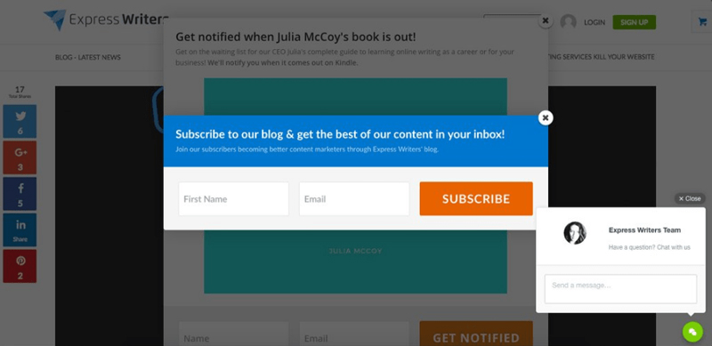
One way you drive away visitors as soon as they arrive is with pop-ups and interstitials. Think about landing on a webpage, and instead of the content you expect, there’s a pop-up ad. That drives visitors away. Another mistake is putting an interstitial or partial block on the page, whether asking them to sign up for your newsletter or promoting your newest product. Remove all obstacles between your visitors and your content and you’ll retain more of them.

Don’t Accidentally Tease Them

If your website is still using Adobe Flash, your site could play a few seconds of rich multimedia before erroring out. You’ve just guaranteed they’ll leave your site and never return. Don’t show up in search results for informational queries and then take them to a spammy landing page with too many ads. They’ll abandon the site again and avoid it forever.

Be an Open Book

Ensure that your text is readable on every screen size without visitors having to resize the text. Don’t forget to check the readability and usability of buttons and menus. And don’t use weird fonts that visitors have to download.

Adjust Your Search Engine Optimization

One common cause of bounces is the fact that your content isn’t a fit for the search. The solution here is to study the customer segment arriving on the site versus the focus of the content. One solution is to leave your page’s SEO as it is but tailor the content to better answer the question visitors are asking. Another is to alter the key terms on the page so that it ranks higher in the searches that your content answers.

Improve Your Answer

One reason people bounce away from websites is that the page isn’t answering the question. This is where a long introduction before answering the user’s question causes them to quit the page. The solution is to answer at least a partial answer like a yes or no before going into detail further down on the page. This at least keeps the reader on the page and reading a while longer.

Use Smart Formatting

Smart formatting makes it easy to read your content. This takes the form of bulleted lists, FAQ formats, suitable images, short paragraphs and frequent subheadings. The benefit of smart formatting is that it makes it easy for someone to skim the content to find what they want.
Lead Them On to Other Content

Another way to keep visitors on your pages is to embed links to related content on your website. For example, you’re showing the pros and cons of the Model A product. Provide a link on the same page to take them to the specifications for Model A or a comparison of Model A to its main rival. If people follow internal links to other content, search engines see this as an endorsement for your content. If someone is seeking advice on how to fix a problem with your product, give them your link to the repair kit you recommend instead of letting them look for it elsewhere.

Use Intuitive Navigation

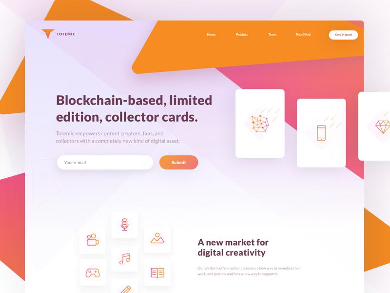
Intuitive navigation is a navigation structure that users understand immediately. If you have an ecommerce page, design the product structure so that someone looking at a blue short sleeved sweater by brand B can tell how to see other sweaters by brand B or your other short sleeved sweaters. This keeps them on the site as they browse instead of abandoning your site for someone else’s. A web design company can help you implement this if it isn’t already set up on your website.
Be Mindful of Their Needs

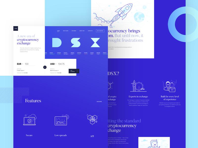
One variation of this is creating targeted pages that are optimized to answer questions the users are asking, so they don’t have to hunt for answers. Another variation is using a few, high quality images that are directly relevant to the query but minimizing bandwidth demands, whether you use content delivery networks or have a lazy load of third party content.

Conclusion

Keeping your visitors on page is all about understanding their needs and improving their user experience. You also have to design your site for maximum readability and make the navigation as seamless as possible.

Multi-Lingual Web Design – 7 Essential SEO Elements to Keep in Mind

Post pobrano z: Multi-Lingual Web Design – 7 Essential SEO Elements to Keep in Mind

In an increasingly international business climate, it is becoming more important to make your website accessible to all of your customers, regardless of the language they speak. Here are 7 essential SEO elements to keep in mind for multi-lingual web design. We’ll give specific tips instead of platitudes while making the advice as generally applicable as possible.

Have an International Web Marketing Strategy

It is amazing how many people look at the international market and assume that having a website with content in that language is enough. They ignore the fact that Google isn’t the dominant search engine in every other part of the world. For example, Baidu dominates Asia while Yandex is strong in Russia. So, work with the search engines and social media sites that your international customers will be using in order to reach them.

Create Well Crafted Content for Each Audience

One solution is having separate web domains for each of your customers’ languages. This adds to the number of sites you have to maintain and do SEO for, and dilutes your company’s homepage in search engine results, but it gives each linguistic group a website designed for their language and culture. You can thus have buttons, content and support information in their native tongue instead of hoping they can run it through a translation website. If you’re creating separate company websites to target each country’s customers, use the country code in the top level domain to garner trust and rank higher in searches in those countries.

Another option is having content in several languages on each website. Create a separate page for each language, for example yourwebsite.com/ru and submit each of these pages in Google webmaster tools just like you submit every other site you might have.  Tip: Use hreflang code which specifies the language for each of your pages. This will help search engines better understand your website and get better rankings in specific countries.  Call to action buttons help with conversion. It is recommended that the CTA buttons are also translated in the specific languages you are targeting.

In any of these cases, it is wise to hire an SEO agency that understands truly universal web design and can create quality content in every language you want your customers to read.

Design with the International Customer in Mind

Ecommerce sites found that shopping cart abandonment rates are lower if the prices are presented in someone’s own currency instead of an intermediate currency. You should design your website to show someone the currency based on where they are connecting to the site. Make your international shipping policies clear with information on delivery time and product tracking if you’re not shipping products from a hub within their country.

Use the Key Search Terms They Are Using

It is amazing how many businesses build key search terms into their content and on-page SEO in English even when translating the content to Spanish, French or Arabic. Integrate the key search terms searchers in those languages are using into each page, whether building them into the title, tags or content.

Consider Customer Support in Their Language

One issue that trips up many international businesses is the lack of support for customers in their own language. Perhaps they find they are unable to order the product; you’ll lose their business forever if they cannot reach someone to help them complete the order that can actually answer their questions. Make sure the Q and As are in their language so they rank properly. Contact an SEO agency to not only create this content but apply the right SEO in the customer’s language so that your Spanish language tech support page comes up for Spanish speaking searchers, for instance.

Select Hosting Strategies that Suit Your Users

You should not assume that your customers are best served by a server in their own country, though there are times this is the best option. Consider whether or not you want mirrored servers in their country or you want to rely on local content delivery networks instead.

Generalize All of the Design as Much as Possible

Your website design should be based on logos and branded colour schemes that don’t rely on language to communicate whose site it is. Where possible, use universally accepted images of your product in use. Ikea, for example, created assembly instructions with gender neutral figures assembling its furniture so that no one was offended by an uncovered woman assembling furniture. Many websites focus on someone’s hands holding or assembling the product instead of images of the whole person; this may have the side benefit of reducing the size of the image and its load time, as well.

Conclusion

Multi Lingual can seem intimidating at first, but it doesn’t have to be. You need to have an international marketing strategy if you’re going to reach your ideal foreign customers. And, make sure that you design your website to provide answers and content geared towards an international audience.

World Design Rankings, the Olympic Games of Design

Post pobrano z: World Design Rankings, the Olympic Games of Design

Ever discussed with your designer friends about which countries have the best designers? This kind of argument will always be heated as pretty much any point of view will be biased. Now, thanks to the World Design Rankings, we have a statistic base to discuss upon.

The World Design Rankings provide a listing with the ranking of all countries based on the number of designers that have been granted with the A’ Design Award, so it’s basically what Olympics are to Sports. Like in the Olympics, where athletes are rewarded for their performances and ranked by categories, designers get to be ranked in the Designers Rankings website.

It comes as no surprise that the countries with the biggest economies came first, as there is usually more money there to finance bigger projects. Here is the top three design countries according to these rankings. Enjoy a sample of work!

1. The USA

The most awarded design studio from the USA is the design department of a company that you know pretty well for making your kids and yourself fat: Pepsi Co. Working as a designer for them seems quite fun, as the designers get room for experimenting and producing great designs.

Bottles designed by the multi-awarded PepsiCo design department.

Pip Tompkin Design is the second most awarded agency from North America, with a lot of awards to their credit. Among other things, they designed this cool Polycom conference phone.

Cangshan is ranked third among the design studios in the USA, they designed these amazing cooking knives.

2. China

In China, the country that comes second in the Design Olympics, Kris Lin is the most awarded designer with his spectacular architectural work, you can see an example of it here with the Origami Real Estate Agency.

Johnson Li of Lenove Ltd. in China is another great producer of high-quality designs, like this Ideapad.

If you like good architecture, you will enjoy the work of the next Chinese designer: Raynon Chiu.

3. Japan

Japan is a country known for its amazing aesthetics, so it may come as a surprise that this country doesn’t finish at the first place. They are represented by a large number of top-notch designers, such as Katsumi Tamura and his flower calendar.


Yasumichi Morita is another example of a great Japanese designer and artist, his Life is a Flower porcelain artwork is just stunning.

With a different spectrum of work, Shunmyo Masuno creates memorable landscape designs like the one he did for the Hofu City Crematorium.

How to create a landing page that converts

Post pobrano z: How to create a landing page that converts

When you’ve got your website up and running, you’ve taken out the search engine and Facebook adverts you need, and you are getting lots of traffic, and people are landing on your page, what do you do when your viewers go no further?  In other words, they do not convert into clients or customers?

A good landing page is an essential aspect of web design.  This means that when viewers land on your site, they will take action.

A good landing page makes it easy.  But how do you create a landing page which converts?

You want your landing page to give an excellent first impression.  This impression is created in the blink of an eye.

Internet users are impatient, and won’t stay long on your site if it does not appeal.  You want your audience to linger long enough to convert from visitor to customer.

Decide on your specialty

What makes your site unique (your unique selling point or USP), or sets you apart from your competition?  Declare what you offer that your competition doesn’t have on your landing page.  Do so obviously, so that viewers are in no doubt.

In order to declare your USP you could use your headline, a subheader or a value proposition.  Make sure it POPS out at your reader.  If your viewers bounce off your page (go no further than a simple landing), rethink how your USP is being communicated.

Also, use a website layout that leads the user to your unique selling point and to the call to action.

Five ways to get your message across:

  1. Keep your language simple and concise. This will mean that your viewers understand exactly what you offer without confusing terms of difficult jargon.
  2. Use the word ‘free’ as a reward to encourage users to engage. This could mean a free trial or sign up period.  There could also be a ‘buy one, get one free’ deal, or a discount code or coupon to be used within a specified time period.
  3. Create a comparison to a well-known brand. Show how you stand up to your competition (make sure you can back it up).
  4. Share how your viewer will receive a return on investment. Will landscaping their garden improve the curb appeal of a home?  Share this so that your user understands the purpose or benefit of investing their money into a product.
  5. Show long-term or immediate benefits. This means showing your users how your product or service will assist them.  Will they be eligible for promotion by taking an online course?  Point this out.  Give references from past customers to back up your point.

Use a call to action

Your call to action is one of the most important aspects of your landing page because it asks users to engage further.  It should be a focus of your page.

Making your call to action seem appealing is crucial if you want to convert viewers into subscribers or clients.

The following prompts invite a call to action:

  • Sign up
  • Learn more
  • Free Download
  • Start your Free Trial
  • Create an Account

Evoke user imagination

By representing the brand visually, you aim to show your viewers what your product or service looks like, and how it will be of benefit.

A sportsman, crossing the finish line, arms raised in delight will show the benefit of a good pair of running shoes.

Your goal is to get your user to imagine himself in this situation.  You can use photos or videos to showcase your product, showing how it will bring benefit to your user’s everyday life.

Share the benefits

Your user won’t want to buy a product unless it offers benefit.  Speak directly to your customer, sharing what your product offers.  Go into detail.

Your headline and images may attract user attention, but by engaging further, you encourage your user to delve deeper.

Try to answer any questions which may arise.  Use bullet points for easy understanding.  Make your wording clear and concise so that your user understands what you are saying.

Offer Proof

Share research, customer testimonials and articles on your product.

Offer up proof from scientific studies.  Show reviews from people who have purchased the download and have found it helpful.

Explain clearly how your product provides an example of these services, and why users would benefit from making a purchase.

Tips for keeping it simple

Your landing page is there to invite a call to action.  Keep it simple.  You can add a link to a home page to share additional information later on.

Keep your product page separate.  Your goal is to keep your viewer from getting distracted or feeling lost.  You want your viewer to focus on the call to action.

Limit extra navigation, which could distract your viewer from the Call To Action.  You don’t want your viewer to move from the landing page too quickly.

Keep your objective clear and simple.  Don’t add too much information beyond sharing your brand, purpose and value.  Only add what is necessary to carry out this goal.  The call to action should be clear and visible.

Make sure the content is consistent with what your visitor has previously seen or heard about your brand.  Any feeling of disconnect will make your visitors feel lost or as though they are in the wrong place.

Your landing page must add something of value to your customer.  Your visitor has to be shown the benefits of engaging further.

Be flexible and engaging with your landing page.  Find out what appeals to your customers and offer it up.  Change your landing page when you offer new products.  This will give you the opportunity to convert internet traffic into new clients or customers.

Summary

Your landing page is the place where you showcase your brand or design, inviting visitors to become loyal customers.

A powerful landing page will bring business goals to fruition.  Showcase a brand, sharing the benefits and offering the opportunity to sign up.  Then stay flexible, improving and developing your page as needs arise.

10 Useful Graphic Software for Beginners

Post pobrano z: 10 Useful Graphic Software for Beginners

“A picture is worth a thousand words.” This statement is justifiable through the graphic design technologies that are effective for both beginner and experienced graphic web designers. Through free and payable graphic design software, one can improve their graphics content to appeal to the market through high-quality visuals and materials.

Listed below are 10 effective graphic design software that every beginner should consider in coming up with attractive models, images, and texts for their websites.

1. Photoshop

With its flexibility in the application of Windows and Mac devices, Photoshop is an effective photo-editing tool for beginners. It enables one to convert a simple photo to an intriguing masterpiece work of art. Photoshop is quite popular with the millennial as most viral photos on the internet are courtesy of its simple sharing platform that covers popular social media platforms like Facebook, twitter, and Instagram. The user is able to remove/crop out or add images and combine several images together. It has numerous filters with auto fix mode on elements such as color & enables photo rotation.

2. FILMORA

FILMORA possesses simple video editing tools enabling the user to crop, rotate, flip, merge videos among others. It provides over three hundred effects great for converting video into other file formats and readily applicable motion elements. It enables the creation of animated beautiful texts and titles for attractive headings, easy selection of music from the music library and sound effect to enhance specific scenes, and effective overlays and filters.

3. CANVA

A free online web design software with simple features for dragging and dropping. Its fonts and layouts selection is wide with numerous shapes, photos, and icons for achieving attractive images applicable in both social platforms and presentations.

4. VECTR

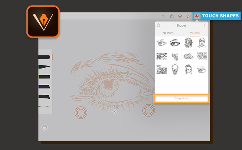
It is easily accessible through downloading on the desktop or website as an app with no charges. VECTR best suits beginners in vector graphics offering easily usable graphic design tools and editing options including filters and easily accessible platforms for sharing one’s work enhancing collaboration.

5. Adobe Premiere Pro

Through Adobe’s customer’s satisfaction aim, the software is equipped with effective video editing tools depending on the user’s specification that vary from movies to short commercial clips and even music videos.

6. Director Suite

It’s a flexible professional video editing software that focuses on photos, audio, color, and video enhancing one’s creativity. Its cost is reasonable compared to the vast array of services and specialization it possesses.

7. INKSCAPE

It enables flexibility in the application in Mac devices, Windows, Linux among others. Its free services are effective for web designers specializing in logo creation and branding services. INKSCAPE scalable vectors and drawings are flexible. It possesses a unique alphabet transparency feature.

8. PAINT.NET

It is available through windows enhancing the simple application of photo and image editing tools for effective designs. It enables adjustment of graphics layers acting as a substitute for Microsoft Photo editor among other software.

9. Adobe Indesign

Its application favors both mobile phone and desktop accessories. Its specialization is focused on the creation of layout designs. Adobe Indesign is effective for web designers specialized in the printing press for books and digital magazines. One can easily transfer and share work from both desktop and Smartphone enabling application of available phone and desktop apps for an effective outcome.

10. Xara Xtreme

An effective photo editing software specifically helpful to photographers in editing different features ranging from photo texture to color. One can easily resize an image by following the easily explained rules concerning its available image editing tools. A good example is its ability to correct errors caused by the lens.

In conclusion, there is various graphics software that can serve both beginner and advanced web designers. One should consider the cost value as some are free while others tend to have a fee payment requirement. Some of the useful graphic design software includes Photoshop, Filmora, CANVA, VECTR, Adobe Premiere Pro, \Director Suite, INKSCAPE, PAINT.NET, and Xara Xtreme. Listed above are ten efficient graphic designs that will improve one’s images, videos, and texts to high-quality, eye-catching graphic design products.