Archiwum kategorii: Design

10 Best Graphic Design Tools For 2018

Post pobrano z: 10 Best Graphic Design Tools For 2018

The right kind of graphic design tools can easily modernize your workflow, assisting you to execute in a smart way and more proficiently. You are actually investing your time and energy in crafting wonderful, eye-catchy designs for your clients’ satisfaction and to the delight of your regular users. So the graphic designers though being busy; need to stay updated with the new design tools of 2018 that will help them become more fruitful and creative in the coming year, thus saving their time. Mentioned here are 10 brand new graphic design tools that can bring out the best in your projects!

1. Photoshop CC’s Curvature Pen Tool

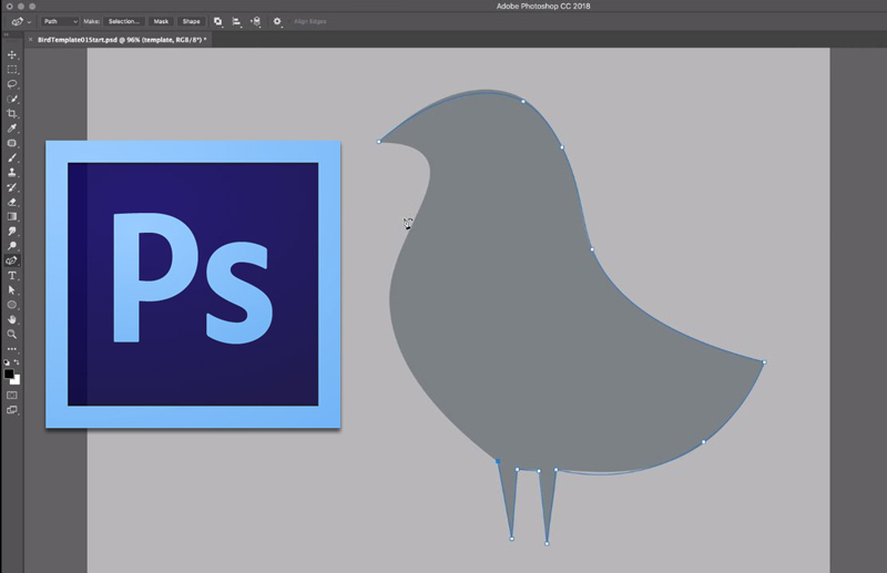
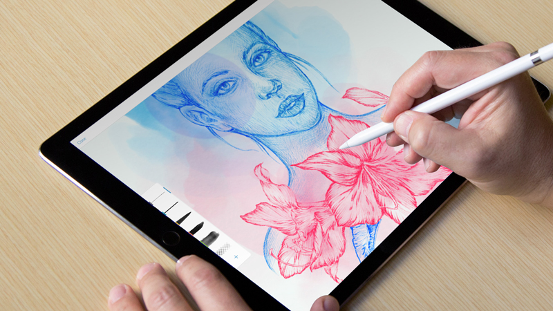
If you are having a Creative Cloud subscription, then a cool new pen tool is accessible in the Tools panel to create curved lines in Photoshop CC much simpler. With the help of this Curvature Pen tool, you can click to add points which will directly make drawing curves between them. The push and pull the segments of the curve purely to modify it for better.

2. Lightwell

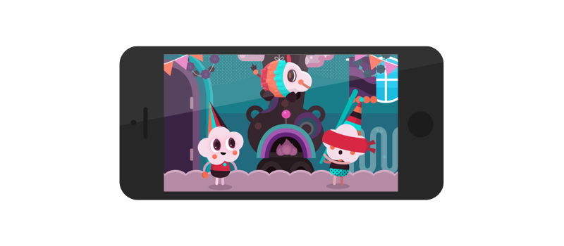
Available for iPad, iPhone, and OS X, the Lightwell tool allows you to upload your 2D designs superbly and spin them into interactive storytelling apps. Currently free on Apple Store and reaching Google Play Store in 2018, this tool offers a prospective easy and quick method to bring all the stories and media to life.

3. Sketch

Sketch is a Bohemian Coding’s vector UI design tool that has small size documents and provides hundreds of plugins to makes the workflow smoother and simpler for a designer. The Sketch features a great built-in grid system and user-friendly and creates interface design much simpler.

4. Adobe XD

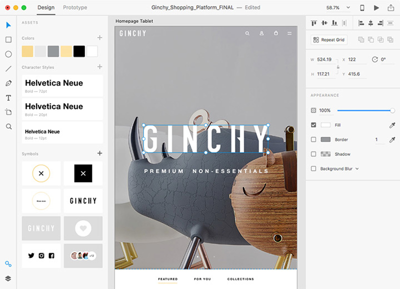
Adobe XD covers drawing tools that enable the designer to choose a device-precise art-board size to start a project and can also import a trendy UI kit like Google’s Material Design. XD is also a light interface along with multiple photos loaded in it, and good for mood-boards.

5. Canva

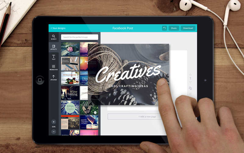
Canva is the most popular and free tool used for creating amazing designs, brochures, and logos. The graphic designers can easily utilize this browser-based tool to craft graphics for print as well as the web. Canva is just perfect for carving superb images for your website and social media. One can apply the drag-and-drop feature of Canva and specialized layouts to design striking graphics always.

6. Type Nugget

Type Nugget deals with CSS typography. This is known to be an online typesetting tool which offers you good control of typestyles. Type Nugget exhibits a wide range of text samples on the page that can be easily live-tweaked in a panel on the right side. Thus the panel allows the graphic designer to choose the font size, style, weight, letter spacing, text decoration, and much more for individual features of the page, like headings, global styles, links, paragraphs, and HTML lists.

7. Parallax SVG Animation Tools

SVG Animation Tools is available in the form of a Python script which is crafted by Gareth Battensby of Parallax. This tool helps in creating long or complex sequence SVG animations in a very easy way. The Parallax SVG Animation tools are ideal for the front-end developers who do the animation of SVG graphics along with GSAP or related animation libraries.

8. Figma

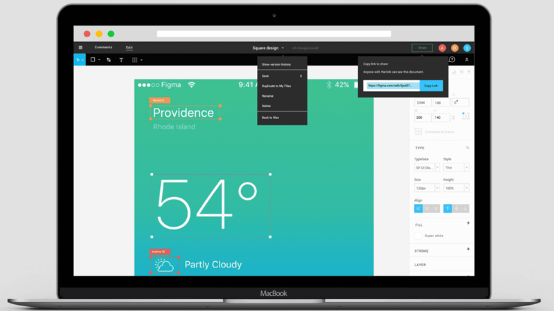
Accessible in the browser, or on Mac, Linux, or Windows, the Figma has free and paid versions which depend on what you apply it for. It is an interface design tool which allows numerous designers to team up in real-time.  One can get discount & coupons at Couponobox.com for premium tools. You can use Figma to craft a couple of icons for articles that you want to publish on your website as its workflow is exceptional.

9. Affinity Designer

Serif’s Affinity Designer has been amazingly well-designed and is a unique graphic design tool. You can enjoy using its features that include nondestructive, adjustable layers where you can easily adjust vectors or images sans smashing them.

10. Pattern Lab

Pattern Lab is a stunning pattern-driven design tool that is based on Atomic Design concept. It is a language-and-tool-agnostic and also a static site generator which sews up UI components together. Pattern Lab allows the designer to layer the UI patterns inside each other and even design along with dynamic data.   

Hence, save your budget, energy and time in your future webs design projects with these above new graphic design tools.

Design deals for the week

Post pobrano z: Design deals for the week

Every week, we’ll give you an overview of the best deals for designers, make sure you don’t miss any by subscribing to our deals feed. You can also follow the recently launched website Type Deals if you are looking for free fonts or font deals.

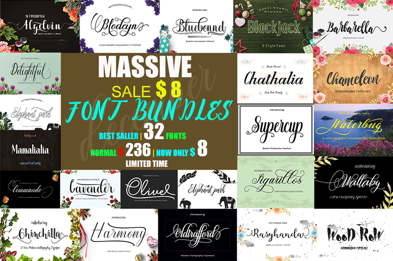
December massive font bundle

This package contains 32 Font Scripts,brush & font regular. Includes some best-selling fonts. Harmony Script, Lavender Script, Barbarella Script, Bluebonnet Script, Chameleon Script, Commando Dll Script & regular, with hundreds of glyphs, including alternates, ligatures, swashes, contextual alternatives and international language support. It can be accessed by using OpenType smart programs like Adobe Illustrator, Adobe InDesign, CorelDraw X6-X7, Microsoft Word.

$4 instead of $236 – Get it now!

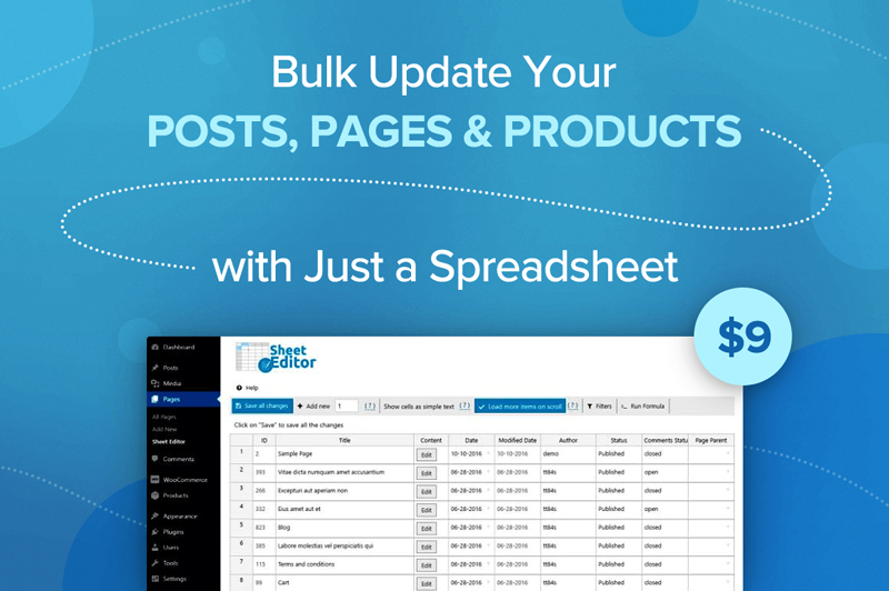
Bulk Update Your Posts, Pages and Products with Just a Spreadsheet

Whether you run a WooCommerce website or have tons of posts on a WordPress platform, you know how frustratingly slow it can be to update information. What if prices change by 10%? What if you want to add the same text or photo to every single post? Well now you can do it all in a snap thanks to Sheet Editor! Easily create, customize and edit your posts, pages and product in bulk all through a simple spreadsheet.

$9 instead of $19.99 – Get it now!

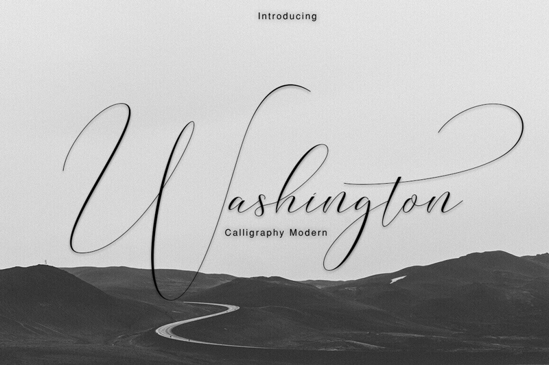
Professional Washington Calligraphy Modern with 450+ Glyphs

You don’t need to be a Founding Father to use this elegant and professional typeface. But you’ll certainly feel like one! The Washington Calligraphy Modern Typeface is an incredibly elegant font that practically flows off the end of a calligraphy pen. Packed with more than 450 glyphs, multi-lingual support and extras from swashes to ligatures, you can practically feel the power flowing out of this font.

$9 instead of $22 – Get it now!

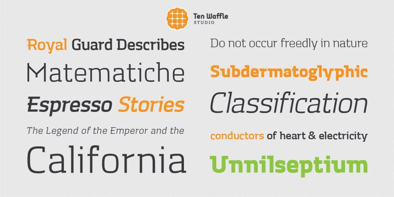
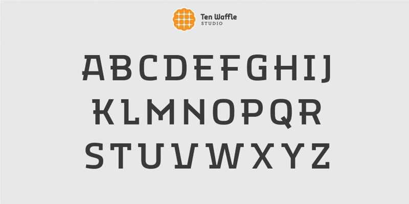
TWS Mora: A Modern Font Family

If you’re in need of a modern, display slab font family, you’ve come to the right place. The TWS Mora font family is as flexible as it is multifaceted, mixing up geometric shapes with humanistic strokes. It’s the perfect choice to use for projects centered around classical literature, music and other creativity.

$9 instead of $54.99 – Get it now!

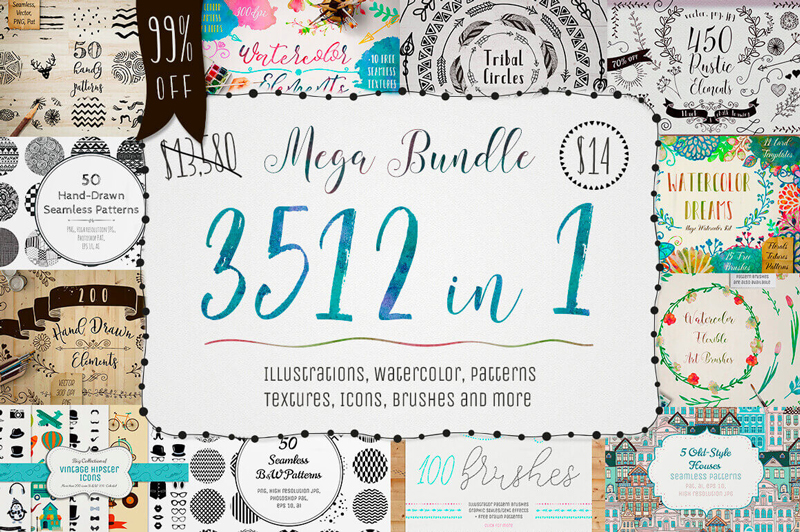
3500+ Textures, Brushes, Icons, Watercolors & More Graphic Elements

Designers are always looking for more. More graphics. More textures. More brushes. Well, with this Mega Bundle of a Mighty Deal, you’ll get all that and more! Packed with more than 3,500 professional graphic elements, you’ll get everything from patterns to textures to brushes to icons. No matter your latest project, you’re sure to find some new design elements in this bundle that fit the bill perfectly for you.

$14 instead of $13,580 – Get it now!

Design deals for the week

Post pobrano z: Design deals for the week

Every week, we’ll give you an overview of the best deals for designers, make sure you don’t miss any by subscribing to our deals feed. You can also follow the recently launched website Type Deals if you are looking for free fonts or font deals.

Poster and Flyer Design Templates Bundle

Too busy to design on your own? Use our templates bundle to choose a perfect design for poster or flyer. It contains 190 visual concepts, each with 2 poster and 4 flyer formats ‒ 1140 templates total.

$30.6 instead of $3040 until December 24 – Get it now on Etsy!

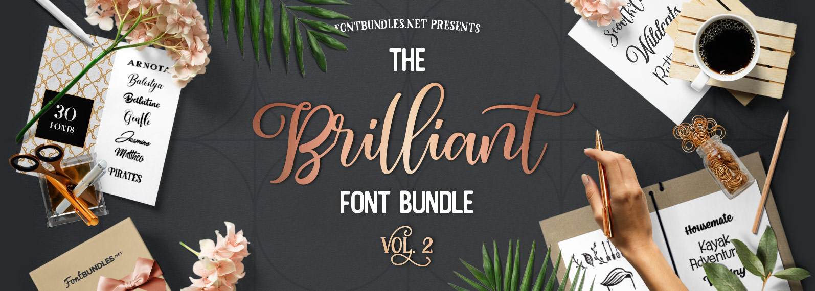
The Brilliant Font Bundle Volume II

The Brilliant Font Bundle Volume II has arrived. Jam-packed with 46 fonts from 30 different font families for only $21. Saving you 95% off the RRP!

$21 instead of $429 – Get it now!

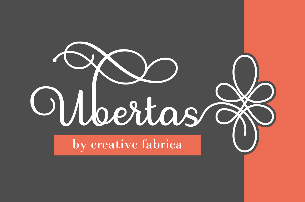
800+ Unique Characters in Stunning Ubertas Script Font

Let the fonts flow with this beautiful Mighty Deal featuring the stunning Ubertas Script font. With curves in all the right places, this terrific typeface includes more than 800 characters, plenty of alternates and offers a regular and italics version.

$7 instead of $22 – Get it now!

StockPop’s Mega Stock Bundle of 20,000+ Stock Photos, Videos, Audio & More

Cast aside your licensing fears! With this Mega Stock Bundle from StockPop, you’ll instantly have yourself a royalty and copyright free library packed with over 20,000 premium stock photos, videos, background audio and more. From food to flowers you’ll have a ridiculous amount of categories to search through in order to beef up your latest project.

$39 instead of $149 – Get it now!

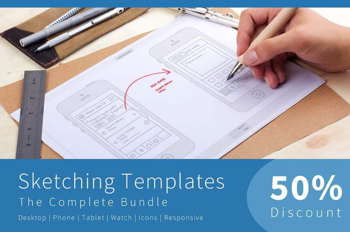
Sketching Templates Bundle of 8 Unique Design Contexts

Sometimes you just need to sketch out your ideas. Now with this professional Sketching Templates Bundle, you can easily dive right in to start generating ideas for your newest app or website. Featuring multiple guide types, you can choose from 8 different designs that range from phones to tablets to watches, as you jot down your ideas. Stop wasting time drawing and redrawing the same device over and over again. Instead, just hit the ground running with your ideas!

$19 instead of $39 – Get it now!

Understanding human behavior to deliver a better UX

Post pobrano z: Understanding human behavior to deliver a better UX

Design can reach the peak of its efficiency when combined with excellent knowledge of psychology. Designers often rely on people’s reaction to different visual incentives in order to take the most of their designs.

As you can notice, the psychology applied is very basic and it doesn’t require you to be an expert in order to use its techniques. In fact, there are few basic guidelines and psychology principles which every designer should use to improve the effectiveness of his design.

Human reaction to visual stimuli is significantly more connected to the subconscious thoughts than it is to the conscious ones. Interestingly enough, it is very predictable. Designers should understand people’s perception and to anticipate the reactions they might have.
Still, don’t worry if you don’t have the appropriate psychology or human factors training. With practice and experience, you will soon be able to distinguish which is the best design and to become a professional interface designer.

We suggest some outstanding examples for improving user experience, applicable for both software and hardware.

Contemplative Listening

Contemplative listening may as well be the most applied psychological principle in UX. It is a straightforward but gradual process of reflective attention, where designers focus on the needs of their customers and they reflect them back to prove they’ve understood them.

Observed from a psychological aspect, the procedure builds empathy, where the listener is focused on clarifying what has been said, while the orator starts feeling validated and free from any judgmental interruption.

With the improvement of their interaction, parties invest more and more trust into each other and they develop meaningful conclusions, which could not be reached otherwise.

Human Reaction
Reactions are emotional products which are created in the central nervous system. They originate subconsciously, and they influence our actions in a manner which can hardly be controlled.

As self-aware and concentrated as you may think you are, you are still a human being. It is also time to let go of that cognition prejudice that there is a ‘higher force’ that can control and plan all of our actions and reactions.

According to modern psychology, a large part of our behavior is dominated by the so-called ‘old brain’, namely our survival instincts. This part of our mind is faster than any logical or conscious thinking and it takes the lead in every basic need we might have (food, reproduction, danger). In such situations, the brain triggers our ‘visceral reactions’ and we react in a fast and unexpected manner.

An overview of costs and benefits

We might be far ahead than our nomadic ancestors in many aspects, but we reflect a large part of their behavior. Even when our mind is dealing with a completely normal task, we are subconsciously calculating the energy we would need to perform it, the time or the worthiness of its results.

In the online world, this means that energy-inefficient or low-reward tasks are quite unlikely to be performed. Take the example of form and its meaning: large forms take time and energy, while short ones are easy to fulfill.
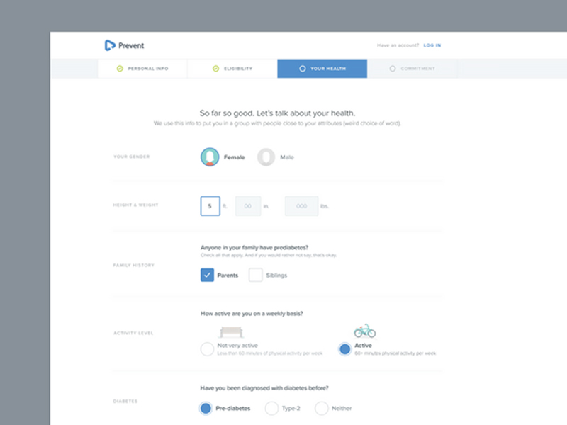
In order to fulfill the long form and to do it properly, users would expect a valuable reward. Even if the reward is the actual information they were looking for, users may not find it valuable enough and they may turn to another site where the procedure is simpler.

The role of Hick’s law in design for human behavior

Hick’s Law must be applied when talking about costs and benefits. Firstly, if you give your users larger lists of possibilities to choose from (pages, images, texts, etc), you are automatically wasting more of their energy.

That energy waste grows and grows to a point where a user cannot really estimate the benefit of complying with your requirements.

Psychology can solve this problem too-you can apply simple psychology principles and you will estimate how people will react to every aspect of your design.

Device inertia

As we already explained, the reason for users’ apathy towards an item/service is that their cost will be higher than their benefit.

Switching devices is a very good example which can explain this-replacing your current screen with a bigger one may seem a good idea at first (larger pictures, better comparisons), but at the same time you would have to approach a different device, do a navigation to the desired site, and do the same search all over again.
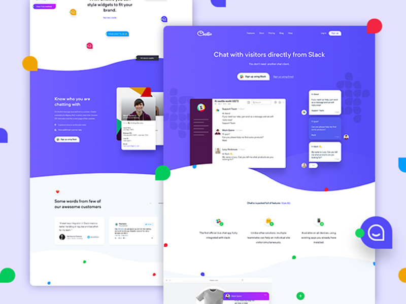
Yes, it sounds like a waste of time. This is exactly when users start experiencing device inertia.

Assuming that the user did a detailed calculation between energy and time expenditure, and the ones he would have saved, and the result would be standing in favor of the optimal device with better quality, he would move and he would use it for a longer time.

However, the calculation would most probably stand in support of the current device, and he would stay had there been only one more interaction.

The reason is that people are prone to short-term planning. Their tendency is to go step by step, avoiding the risk of taking more than a single step ahead.

Behavior and the feeling of power

Let me use a personal example to explain this connection – I have a friend who is very intelligent and never lazy. Still, she holds tight to suboptimal online methods that she had established herself, and she is not willing to change them. Here is why:

  • She was the one to discover the methods first.
  • It hasn’t crossed her mind that there is software which can make the accomplishment of her tasks easier and simpler.
  • She is satisfied with her methods and she thinks they are good enough.

Psychology calls this state momentum behavior. It usually occurs when people decide to stick to a familiar option, instead of looking for something new that could actually help them. Down that road, they become used and loyal to those methods and they deny any other interface element.

‘Picky’ attention
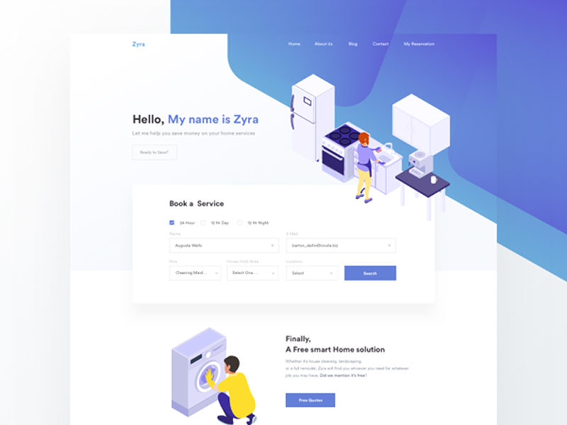
Face it – not every element you put on the screen will be noticed. In fact, due to the design type, the particular situation or the user’s preferences, most of the elements will be ignored.

But is this good or bad for your user? Firstly, picky attention is a result of our cost/benefit calculations and it is directly dictated by our nature and the process of evolution. When people are overwhelmed with incentives, they are mentally unable to pay equal attention to all of them.

Take a Manhattan street as an example – if you could pay the same attention to stylish people’s outfits, or the unpleasant smell of garbage containers as you pay to traffic, you’d probably end up under the wheels of some rushing car.

People are ‘programmed’ in a way to pay attention to the most important incentives and to ignore those which are less interesting or menacing to their wellbeing.

Design for human behavior: Solutions
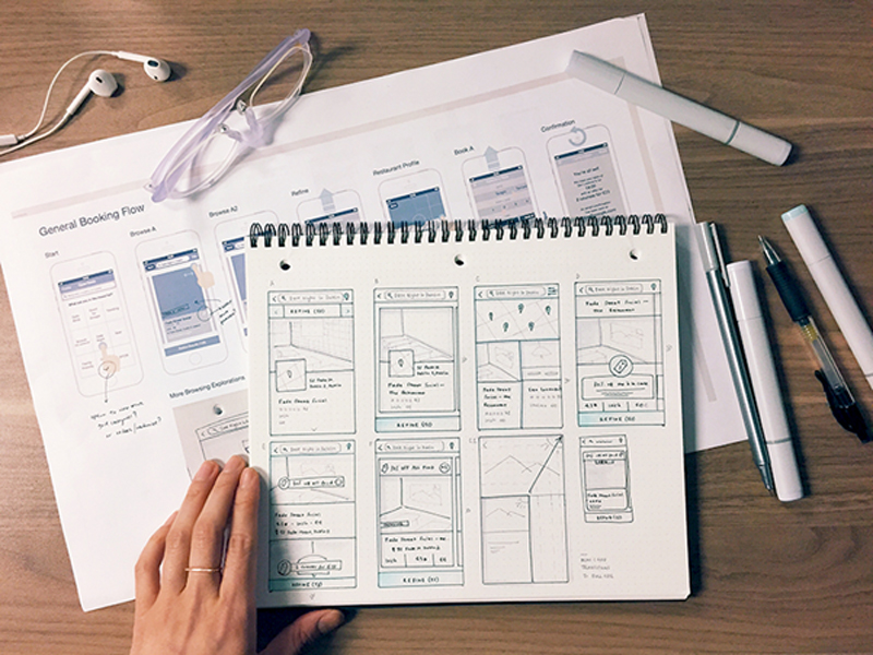
It is a designer’s obligation to help his users to stay focused and to derogate from device inertia, momentum behavior or picky attention. These are the strategies that could help:

  • Choose the important tasks and the important devices and focus on them. If you don’t know which ones, search for the most commonly used.
  • Don’t expect your users to switch devices in order to perform a specific task.
  • Make sure that your users have no problems when syncing information throughout various platforms. Make it really easy for them to resume or restore the work done on a particular device when they start using another one.
  • Take behavioral research seriously. Analyze the way in which people perform tasks and make sure to implement the most reliable/usable one.
  • Refrain from you think is an important UI element. You might be considering including advertisements or similar content, but you need to make sure it is not exactly the thing your users would ignore.

Most of all, avoid blaming your ‘lazy’ users for the failure of your design solutions. If they are not applying it, it may not be as good as you thought.

The way people think nowadays is a product of long evolution, and users are not very likely to change their mental resources just because your app requires them to act differently. Learn the basics of designing apps and start from there.

The effect of expectations
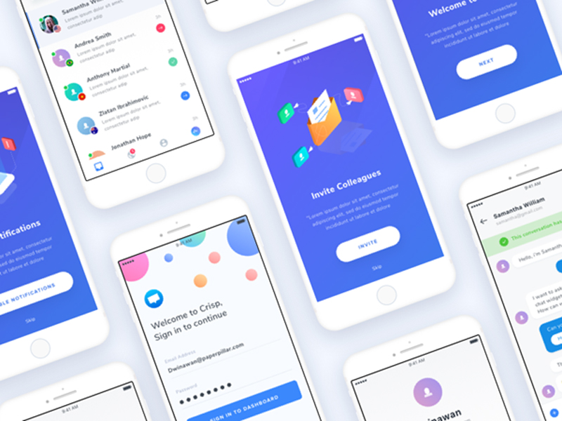
 

The moment when you are introducing a new product to a particular target group is the moment when people will be most susceptible in terms of being convinced to go for it. Therefore, you have to ‘touch’ their needs and emotions with clear illustrations and credibility statements.

Looking at the iPad and its first releases, the producers were faced with extreme levels of expectations and they still managed to communicate properly and to release products which were clearly synchronized with those expectations.

You may be really convinced of the quality of your product, but checking their videos and rethinking your persuasion methods may still help you.

The mental model
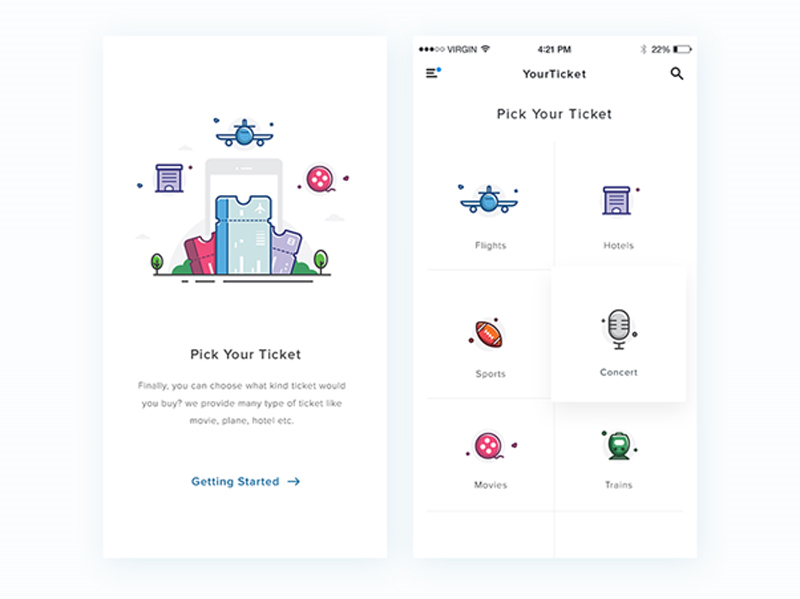
 

Interface design and improving user experience consist of two separate models: Systematic models (explaining the system’s operation) and interaction models (explaining the way in which people interact with that system).

United, these models create the so-called mental model which ought to be ‘absorbed’ by the users. The user can either approve or refuse the model, using his previous experience with digital products. What you need to ensure is that your model will comply with their interpretation of your design.

Long story short, the model needs to be an effective combination of system and interaction, which looks like something efficient, which could satisfy the needs of users.

Preference or performance?
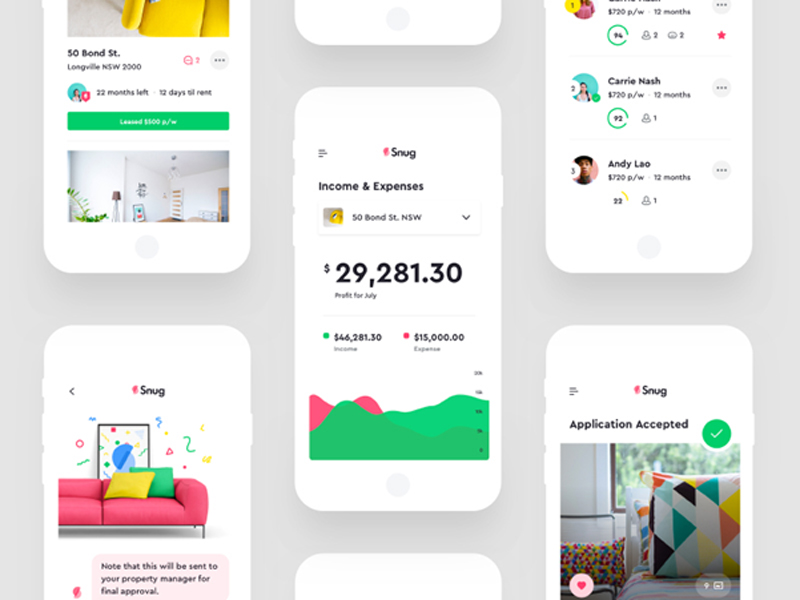
The most common mistake of designers and businessmen is that they believe that users’ affection to a certain product automatically means that the product is efficient and ensures excellent performance.

People are not really able to distinguish between the product they want to purchase and the product that could really improve their abilities by using it. Unfortunately, they often make poor choices of products that are not really helpful. The main problem is that they remain unable to compare and to understand their mistake.

The most appropriate tactic to determine whether a user is really satisfied with a product is to observe the way he is using it. Obviously, you are not supposed to make surveys and interviews, but to remain on the side and to monitor the interaction.

You should pay attention to their results, rather than their approach, and to decide how your product could benefit from it. As simple as it sounds, this is a tactic employed by the best products and outstanding producers-they made a solid, well-informed decision.

Final thoughts

What could be more useful for a successful design than a proper understanding of its potential users?

Each psychology principle shouldn’t be implemented in web design, but the proper understanding of a set of important concepts could be the shortcut to outstanding results.

Therefore, keep users’ mind in your mind. Make sure there is a balance between your product and their mindset and learn everything about it.

 

New Solar Plant In Chile To Power 13,000 Homes Per Year

Post pobrano z: New Solar Plant In Chile To Power 13,000 Homes Per Year


Chile is building a brand new solar power plant that has some exciting outcome on the future. The plant is expected to provide energy on day and night as well as throughout inclement weather, to power up to 13,000 homes annually. This project will make Chile one of the top solar energy spots in the world.

It is a clear sign that energy storage on large scale projects is developing further with a range of large batteries networks being developed this year within California and Australia. Clean energy expects truly value the energy storage industry and expect it to become even more significant as further renewable energy sites are constructed worldwide.


Important principles to follow when designing an eCommerce site

Post pobrano z: Important principles to follow when designing an eCommerce site

Do you remember the last time you had to contact support to help you check out? Odds are good you can’t, as a site that led you to a deal will also likely make the process smooth.

The high card abandonment rates that go beyond 50% are mostly recorded before initiating checkout, as it is at that point that customers decide whether they trust you or not.

While we can’t speak of universal customer retention rules in eCommerce, we can still share a couple of tips and fundamentals that can help designers build successful sites. Some of them are pretty self-explanatory, but with so many sites burning out in their attempt to attract attention, they shouldn’t be taken for granted.

Functional and simple navigation

It’s not exactly rocket science, isn’t it? Begin with your own examples: Would you purchase a piece you can get in 2 minutes, or scroll through tenths of options until you find what you need?

Conversions and complexity simply don’t go together. Shoppers find unrelenting categorization and excess menus and clicks fairly annoying, and they prefer an intuitive, no-brainer navigation.

Speaking of which, we’re not insinuating that you should create an overly simple website. A menu, for instance, is an absolute must, and so are the basic headers and subtitles that help understand the hierarchy of the website.

Quantity is not the only thing you should worry about – what matters is also whether the options are clear, for the sake of which you should use one- to two-word headers. The tone should be transparent and direct, ideally combined with fun and engaging wording that is still on point.

For instance, it may sound like a great idea to label the categories of apparel eCommerce websites as ‘Kicks’ or ‘Threads’, but not everyone in its audience would be able to understand them. Plain and straightforward titles have 9x bigger chances to retain more clients.

Familiarity is another thing people appreciate while shopping online. An arrow pointing to the left is expected to lead to the previous page, the same way a pointing finger should enable them to click on a link.

To make your clients’ shopping experience even friendlier, stick to symbols they can understand.

Before the site goes online, check whether all your navigation options are functional. The last thing you want is that your client will navigate for ages through your intricate and confusing sections, only to discover a 404 error or another inconvenient problem.

Also, I know you want to create cool websites, but remember that those that are popular are also cool because they’re functional at the same time. Don’t sacrifice usefulness for the sake of creating something that only you like.

The influence of color and type

Colors and typography can make or break an eCommerce website, which makes them your leading tools.

Using the right font and palette, retail sites manage to attract and convince thousands of users to check their promotions and to buy their products. Here is how they do it:

Is it readable?


Typography leaves enough room for many engaging experiments, and designers adore it. They shape, twist, and contour letters, and transform words into skillful and beautiful works of art.
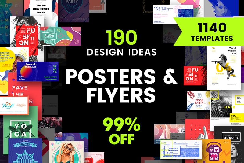
Yet, you must keep in mind that not all visitors come with a refined taste in art, and they may not understand what you’re trying to sell them. Your message should always be readable, up front, and at point, so that it will bring you the answer you expect.
Fun copy is an alternative you should definitely consider.

Consistent types

Make sure that the headers on your site are consistent with the sub-headers and body copies.

This, however, is only a small portion of coming up with a well-defined style for your website, a mission that requires you to be very patient, and one that will never be entirely accomplished. You should think of your website’s style as a living document, and work on it each time your brand undergoes a change.

Customers do recognize uniqueness as they see it, and it is your task to make that happen. To do so, you can always learn from best performing styles in your industry, and try to incorporate their practices on your own website.

Depending on how complex your offer is, you can divide this document into two distinct parts: a guide on creativity and style, and a guide on copy style, and build up the perfect website step by step.

Familiarizing with your brand and your audience

Will 10 seconds be enough for you to describe what your eCommerce website is selling? Could your customers or employees describe it in the same way? If the answer is no, you should take some time to analyze your brand and its current position on the market.

Once you have all details, it will be much easier to take the right steps to position it among competitors, and build up the right style to attract more customers.

Those working with a popular and established brand have a huge advantage, and they should keep up the good work and make customers even happier.

Another important task is to analyze your audience. What can be done to target even more buyers and to boost your revenue? In most cases, designers lack the proper identification of targeted demographics, and end up creating a site that doesn’t feel too comfortable to its visitors.

In cases like these, websites are risking losing the trust factor. Given that there is no salesperson to lead customers to checkout, you must make sure they understand the sales funnel and that they trust your brand.

Balance between form and function

eCommerce websites are not only supposed to be functional, but eye-catchy as well. This is the reason they are entrusted to creative people who know exactly how to attract traffic.

Yet, the quality of your design should not overcome the quality of your products, but rather answer the common questions of customers, and address their needs.

To ensure your customers are motivated to purchase your product, promote it using the services of a professional and experienced web designer.

Automated search

A search feature is compulsory for any eCommerce website, and there are no exceptions to this rule. It would be overly ambitious to believe that all customers browse randomly to discover a piece they like – in fact, most of them arrive with defined expectations, and want to locate the product in few seconds.

To improve their experience, you can take the search feature to a whole new level, and enhance it with an auto-complete functionality.

This means that users will receive automated suggestions before they’ve typed in the entire word, which aims to help foremost horizontal sellers targeting a well-defined audience.

Ending thoughts

Commerce businesses of today rely heavily on quality websites to close more deals. As a matter of fact, for certain retailers, websites are the only interaction portals for their customers, and they do their best to provide them a great shopping experience.

With competition being as harsh as it is, surfers are becoming intolerant to poorly designed websites, meaning that it takes a masterpiece to attract their attention, and to maximize your chances of success.


Five questions to ask when choosing a WordPress theme for your blog

Post pobrano z: Five questions to ask when choosing a WordPress theme for your blog

At the last count there were something in the order of 10,000 WordPress themes available, so it is understandable that if you are building a site or blog, particularly for the first time, you can feel a little overawed.

Of course, you want a theme that is in keeping with the subject matter on your site, and that conveys the right image, but there is more to it than just choosing something that looks nice.

To help you along, here are five questions you need to ask yourself when narrowing down a shortlist of possible themes.

1. Is it mobile friendly?

In 2015, Google confirmed that mobile had overtaken desktop as the browsing platform of choice for searches, so anyone who tells you that mobile internet is the future is living in the past. A mobile friendly theme is not a “nice to have” anymore, it is an absolute prerequisite. If you buy the best WordPress blog themes, you can be sure they will be mobile responsive, but be cautious about free themes, as there is no telling what you might get.

2. Does it work across different browsers?

As well as being mobile friendly, the theme needs to work across the range of browsers that people use these days, such as Chrome, Explorer, Firefox, Safari and so on. Again, if you are sourcing your theme from a reputable provider, this should be explicitly stated, but if in doubt, you can always check it for yourself.

3. Is it multilingual / ¿es multilingüe?

The world wide web is so called for a reason. It is a big old world out there, and online, every corner of it is right on your doorstep. If you hadn’t thought about creating a multilingual WordPress site, maybe now is the time to give it some consideration. At the very least, it makes sense to ensure your theme is translation ready and able to support multilingual plugins, so you will be ready for anything.

4. Is it SEO friendly?

Optimising a theme for SEO is not a simple matter. It goes beyond looking good and depends to a large extent on the html coding that lies at its heart. For the layman this can be enough to send your head into a spin. There are tools like WC3 that will check it for you, but you need to understand what you are looking at, as this will flag all sorts of warnings that are perfectly normal, but will send the uninitiated into a blind panic. This is another reason to buy a premium theme, where you will get explicit confirmation from the developers that it is SEO optimised.

5. What do other people think?

Finally, check out the reviews. These days, everyone is an expert and an influencer, so it makes sense to canvass opinions. If you are taken with a theme that has a heap of 1-star ratings, by all means dig around to find out why, but ultimately, it is probably best to walk away.

Design deals for the week

Post pobrano z: Design deals for the week

Every week, we’ll give you an overview of the best deals for designers, make sure you don’t miss any by subscribing to our deals feed. You can also follow the recently launched website Type Deals if you are looking for free fonts or font deals.

3D Lettering Mega Bundle of Grunge, Ice, Cubes & more

Want to have some real fun with your fonts? Try adding some real 3D texture to your words! Thanks to this 3D Lettering Mega Bundle from MIIM Design, you can do just that. You’ll get 6 super creative 3D lettering sets that range from grunge painted wood to realistic ice. It’s high time you really let your letters speak for you.

$12 instead of $148 – Get it now!

The Brilliant Font Bundle

The Brilliant Font Bundle Volume II has arrived. Jam-packed with 46 fonts from 30 different font families for only $21. Saving you 95% off the RRP!

$21 instead of $429 – Get it now!

Didonesque Font Family with 16 Beautiful & Elegant Fonts

Give your typeface toolbox a luxurious makeover with the Didonesque Font Family! You’ll get 16 beautiful, elegant typefaces that were all inspired by the classic Didone fonts. With a variety of OpenType features and multilingual support, Didonesque is a great choice for your next branded project.

$19 instead of $160 – Get it now!

The Crafters Delight Bundle

The Crafters Delight Bundle Volume II is here! The 2nd Instalment of our Crafters Delight Series includes over 900 design elements perfect for crafters.

Packed with SVG’s, Fonts, Monograms, Wreaths, Arrows Silhouettes, Flourishes, Decorative Items, Cut Files and more!

$24 instead of $365 – Get it now!

Lifetime Access to 145+ Tech Courses at Stone River eLearning

When it comes to getting an education in technology, there’s an awful lot to learn. Good thing you’ve got a lifetime ahead of you! With this Mighty Deal from Stone River eLearning, you can get a lifetime access to more than 145 amazing courses built to help you master everything from graphic design to iPhone app development! That’s more than 500 hours of online learning!

$111 instead of $11236 – Get it now!

Taking advantage of negative space in web design

Post pobrano z: Taking advantage of negative space in web design

Negative space is an often misunderstood and underused idea. It breaks down very simply. Positive space represents the elements of your site—navigation, content, ads, images, and so forth. Negative space is where those things are not.

It’s the empty space between those elements, the space around and between them. Negative space helps structure and define your website design.

It’s a necessity that you rarely think about. Understanding how it plays a part in web design more thoroughly will help your designs achieve results better.

https://dribbble.com/shots/3765288-Rockefeller-Partners-Architects

There are two kinds of negative space: micro negative space and macro negative space.

Micro negative space is the small spaces between the small elements of your web design, like the space between lines of type, the space between paragraphs, even the spaces between words and letters.

Macro negative space, on the other hand, is the space between larger elements like your header and footer. Both micro and macro negative space are vitally important to the overall effectiveness of your design.

Why is Negative Space So Important?

https://dribbble.com/shots/1482948-Lesley-Anne-Scorgie-Personal-Website

Negative space makes a huge impact on the usability of a site. It makes sure that the users find it easy to read the text and easy to navigate between different pages or elements.

A cluttered, visually busy site makes it incredibly hard to find what you want to be found.

Negative space is especially useful in the header design, where the first impression of your site is created.

It’s all too easy to think that you need to fill up every last bit of screen space with info to catch a potential customer’s attention, but the truth is that this overabundance of information makes it harder for that potential customer to focus on what they need and want to know.

https://dribbble.com/shots/1988063-Reclaimed-Lighting-Homepage

It’s very important for a web designer to understand the vital importance of negative space. You’ll probably find clients that want an incredibly cluttered site design. You need to calmly convince them of how that is more of a hindrance than a help to their business or organization.

A site with negative space is not a waste of money or screen space. It’s an important element of creating a useful, clean, navigable, and professional looking website that will help them stand out.

How do you explain this to a client?

Getting Clients to Understand Negative Space

The first thing you need to do is demonstrate to your client that you can, in fact, fit everything necessary (and a lot of desired elements) onto a cleaner looking website that makes use of negative space.

https://dribbble.com/shots/3956119-Koralis-Software-Agency-homepage

It’s okay if potential customers need to scroll through the site, and is in fact expected. Content should still be chosen widely, especially the content that will be featured on the front page and “above the fold”. Offering too many options on the front page can make the site unnavigable to a user, who will quickly move on.

A well-designed site’s negative space will not even be obvious to a user. They will instead focus on what matters. They’ll pay attention to the details of a product or service, or find it easier to find the articles that interest them. For most website design, the best approach is “less is more”.

Think of Negative Space as an Active Element of Web Design

https://dribbble.com/shots/1804403-It-s-real

A lot of fancier elements of web design do not actually make a very big impact on a user’s experience, like flat design or parallax scrolling, but they are still treated as active elements of design.

You really think about them. Start to think of negative space in the same way, because it definitely makes an impact on the user experience of the website.

Now that you’re going to start thinking about negative space as a design element unto itself, what are ways that you use negative space? There are a lot of them we see and use in web designs that we don’t even think about.

Page breaks

https://dribbble.com/shots/3206666-Disability-page-animation

Negative space is used to offer visual relief and separation between messages and items on the webpage. This allows the viewer to between understand what’s going on.

If they better understand what’s going on, they can better get to the goal that you and/or your client want them to achieve.

Highlighting a central message

Negative space will draw a user’s eyes to the main items on the page.

It helps make sure the page is focused on the message and emotions it wants to communicate. It makes the page more readable without having to anything elaborate.

Directing the flow of a page

https://dribbble.com/shots/3633666-Blog-Single-Post-Negative-Space

Negative space dictates the way a user moves through the page and the entire site.

Placing it in certain ways can direct people to scroll down for more info, view page elements in a particular pattern, or prompt them to go to a different landing page. Negative space creates visual relationships between elements and provides direction.

How to Successfully Apply Negative Space

Practice different arrangements of negative space. Every website will need to use negative space in a different way. Some might need to use it less, while others may need more.

Make sure the pages are easy to read and comprehend

https://www.mapbox.com/

Before you even begin to work on the design proper, create a list of required interface elements. Doing this will help you to estimate how much content the page will need.

From there, you can create a rough wireframe to see how much space you require to include all this content in a way that can be easily read and understood.

Keep the design fresh and modern

Proportionate font sizes and asymmetrical uses of negative space create an overall very stylish look that is both uncluttered and interesting.

Use negative space practically

https://hitask.com/

This will assist in the overall readability. Separate blocks of content out to make it easier for visitors to access. Include margins between different elements. Use padding to create space inside an element and prevent overcrowding.

Experiment with the proximity and containment of the elements

https://asana.com/

Proximity is how close or far objects are from each other, while containment is used to group objects together.

Understanding how negative space focuses and organizes a page will help you get the elements right.

Conclusion

Negative space can make all the difference in the functionality of a web page. You should create your web designs while thinking of negative space as a major element.

The branding work of Ivan Chermayeff

Post pobrano z: The branding work of Ivan Chermayeff

You may never have heard his name, but Ivan Chermayeff was one of the most influential designers of the 20th century. Unfortunately, I must write “was”, because the logo design expert died last week at the age of eighty-five. In his over 60 years career, Chermayeff designed some of the most memorable logos, many of which became iconic, such as the NBC, PanAm, Chase Bank, or National Geographic logos. In this post you can find a tiny sample of his work, you’ll see more on his professional website.