Archiwum kategorii: Design

Five questions to ask when choosing a WordPress theme for your blog

Post pobrano z: Five questions to ask when choosing a WordPress theme for your blog

At the last count there were something in the order of 10,000 WordPress themes available, so it is understandable that if you are building a site or blog, particularly for the first time, you can feel a little overawed.

Of course, you want a theme that is in keeping with the subject matter on your site, and that conveys the right image, but there is more to it than just choosing something that looks nice.

To help you along, here are five questions you need to ask yourself when narrowing down a shortlist of possible themes.

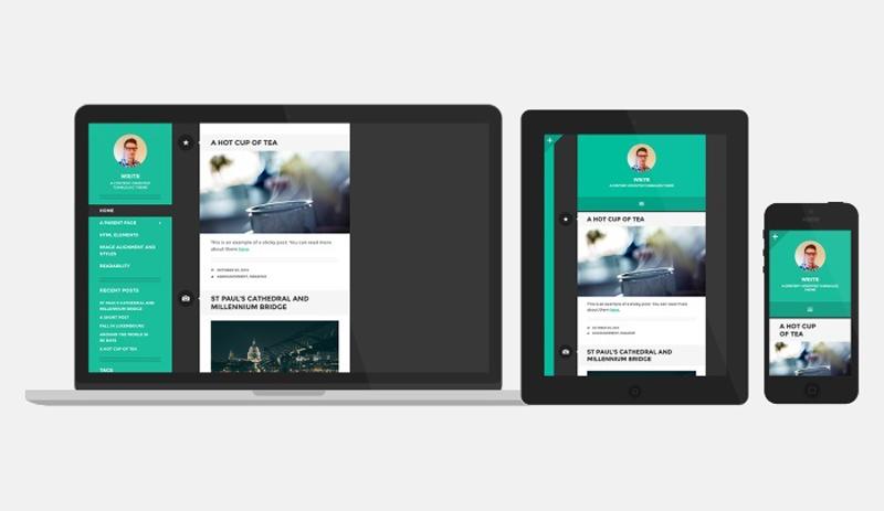
1. Is it mobile friendly?

In 2015, Google confirmed that mobile had overtaken desktop as the browsing platform of choice for searches, so anyone who tells you that mobile internet is the future is living in the past. A mobile friendly theme is not a “nice to have” anymore, it is an absolute prerequisite. If you buy the best WordPress blog themes, you can be sure they will be mobile responsive, but be cautious about free themes, as there is no telling what you might get.

2. Does it work across different browsers?

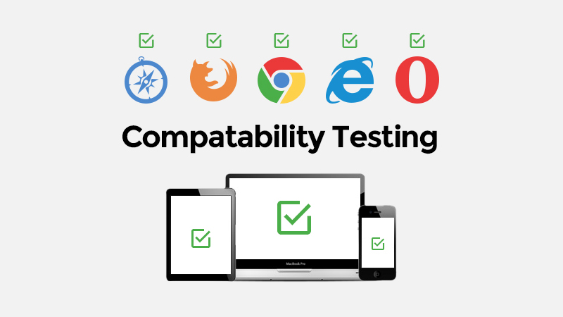
As well as being mobile friendly, the theme needs to work across the range of browsers that people use these days, such as Chrome, Explorer, Firefox, Safari and so on. Again, if you are sourcing your theme from a reputable provider, this should be explicitly stated, but if in doubt, you can always check it for yourself.

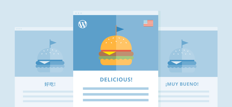
3. Is it multilingual / ¿es multilingüe?

The world wide web is so called for a reason. It is a big old world out there, and online, every corner of it is right on your doorstep. If you hadn’t thought about creating a multilingual WordPress site, maybe now is the time to give it some consideration. At the very least, it makes sense to ensure your theme is translation ready and able to support multilingual plugins, so you will be ready for anything.

4. Is it SEO friendly?

Optimising a theme for SEO is not a simple matter. It goes beyond looking good and depends to a large extent on the html coding that lies at its heart. For the layman this can be enough to send your head into a spin. There are tools like WC3 that will check it for you, but you need to understand what you are looking at, as this will flag all sorts of warnings that are perfectly normal, but will send the uninitiated into a blind panic. This is another reason to buy a premium theme, where you will get explicit confirmation from the developers that it is SEO optimised.

5. What do other people think?

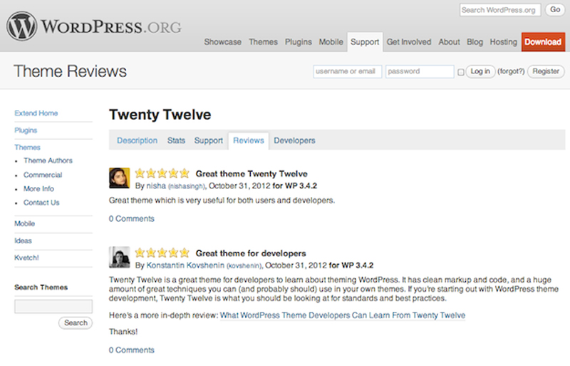
Finally, check out the reviews. These days, everyone is an expert and an influencer, so it makes sense to canvass opinions. If you are taken with a theme that has a heap of 1-star ratings, by all means dig around to find out why, but ultimately, it is probably best to walk away.

Design deals for the week

Post pobrano z: Design deals for the week

Every week, we’ll give you an overview of the best deals for designers, make sure you don’t miss any by subscribing to our deals feed. You can also follow the recently launched website Type Deals if you are looking for free fonts or font deals.

3D Lettering Mega Bundle of Grunge, Ice, Cubes & more

Want to have some real fun with your fonts? Try adding some real 3D texture to your words! Thanks to this 3D Lettering Mega Bundle from MIIM Design, you can do just that. You’ll get 6 super creative 3D lettering sets that range from grunge painted wood to realistic ice. It’s high time you really let your letters speak for you.

$12 instead of $148 – Get it now!

The Brilliant Font Bundle

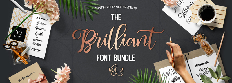
The Brilliant Font Bundle Volume II has arrived. Jam-packed with 46 fonts from 30 different font families for only $21. Saving you 95% off the RRP!

$21 instead of $429 – Get it now!

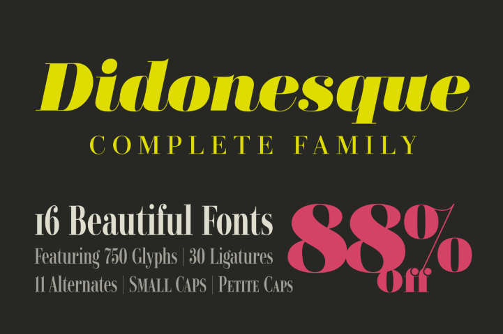
Didonesque Font Family with 16 Beautiful & Elegant Fonts

Give your typeface toolbox a luxurious makeover with the Didonesque Font Family! You’ll get 16 beautiful, elegant typefaces that were all inspired by the classic Didone fonts. With a variety of OpenType features and multilingual support, Didonesque is a great choice for your next branded project.

$19 instead of $160 – Get it now!

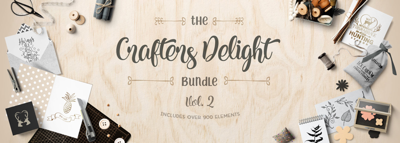
The Crafters Delight Bundle

The Crafters Delight Bundle Volume II is here! The 2nd Instalment of our Crafters Delight Series includes over 900 design elements perfect for crafters.

Packed with SVG’s, Fonts, Monograms, Wreaths, Arrows Silhouettes, Flourishes, Decorative Items, Cut Files and more!

$24 instead of $365 – Get it now!

Lifetime Access to 145+ Tech Courses at Stone River eLearning

When it comes to getting an education in technology, there’s an awful lot to learn. Good thing you’ve got a lifetime ahead of you! With this Mighty Deal from Stone River eLearning, you can get a lifetime access to more than 145 amazing courses built to help you master everything from graphic design to iPhone app development! That’s more than 500 hours of online learning!

$111 instead of $11236 – Get it now!

Taking advantage of negative space in web design

Post pobrano z: Taking advantage of negative space in web design

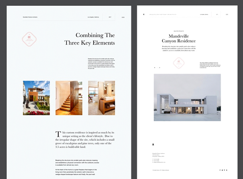
Negative space is an often misunderstood and underused idea. It breaks down very simply. Positive space represents the elements of your site—navigation, content, ads, images, and so forth. Negative space is where those things are not.

It’s the empty space between those elements, the space around and between them. Negative space helps structure and define your website design.

It’s a necessity that you rarely think about. Understanding how it plays a part in web design more thoroughly will help your designs achieve results better.

https://dribbble.com/shots/3765288-Rockefeller-Partners-Architects

There are two kinds of negative space: micro negative space and macro negative space.

Micro negative space is the small spaces between the small elements of your web design, like the space between lines of type, the space between paragraphs, even the spaces between words and letters.

Macro negative space, on the other hand, is the space between larger elements like your header and footer. Both micro and macro negative space are vitally important to the overall effectiveness of your design.

Why is Negative Space So Important?

https://dribbble.com/shots/1482948-Lesley-Anne-Scorgie-Personal-Website

Negative space makes a huge impact on the usability of a site. It makes sure that the users find it easy to read the text and easy to navigate between different pages or elements.

A cluttered, visually busy site makes it incredibly hard to find what you want to be found.

Negative space is especially useful in the header design, where the first impression of your site is created.

It’s all too easy to think that you need to fill up every last bit of screen space with info to catch a potential customer’s attention, but the truth is that this overabundance of information makes it harder for that potential customer to focus on what they need and want to know.

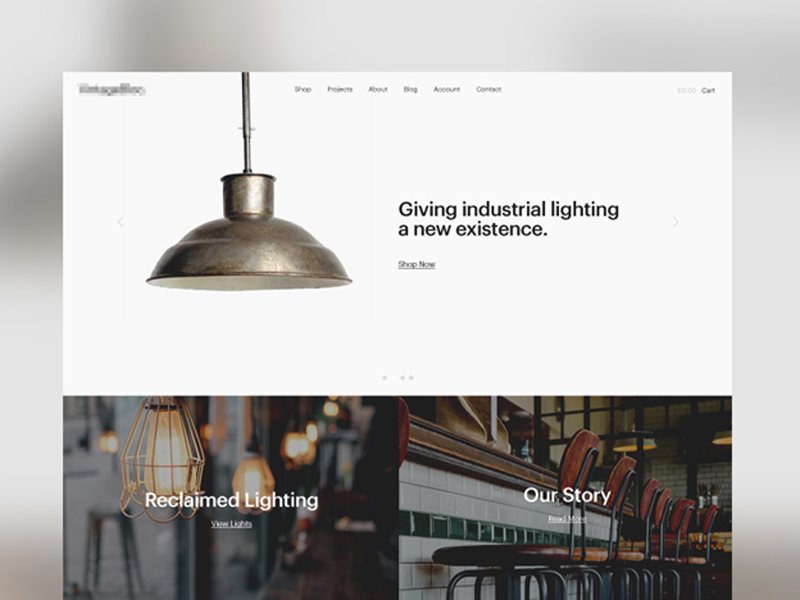
https://dribbble.com/shots/1988063-Reclaimed-Lighting-Homepage

It’s very important for a web designer to understand the vital importance of negative space. You’ll probably find clients that want an incredibly cluttered site design. You need to calmly convince them of how that is more of a hindrance than a help to their business or organization.

A site with negative space is not a waste of money or screen space. It’s an important element of creating a useful, clean, navigable, and professional looking website that will help them stand out.

How do you explain this to a client?

Getting Clients to Understand Negative Space

The first thing you need to do is demonstrate to your client that you can, in fact, fit everything necessary (and a lot of desired elements) onto a cleaner looking website that makes use of negative space.

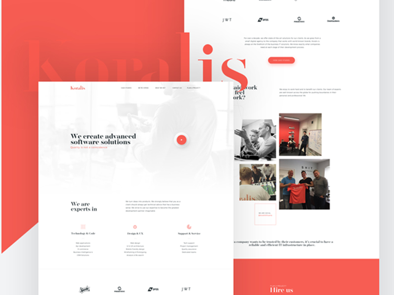
https://dribbble.com/shots/3956119-Koralis-Software-Agency-homepage

It’s okay if potential customers need to scroll through the site, and is in fact expected. Content should still be chosen widely, especially the content that will be featured on the front page and “above the fold”. Offering too many options on the front page can make the site unnavigable to a user, who will quickly move on.

A well-designed site’s negative space will not even be obvious to a user. They will instead focus on what matters. They’ll pay attention to the details of a product or service, or find it easier to find the articles that interest them. For most website design, the best approach is “less is more”.

Think of Negative Space as an Active Element of Web Design

https://dribbble.com/shots/1804403-It-s-real

A lot of fancier elements of web design do not actually make a very big impact on a user’s experience, like flat design or parallax scrolling, but they are still treated as active elements of design.

You really think about them. Start to think of negative space in the same way, because it definitely makes an impact on the user experience of the website.

Now that you’re going to start thinking about negative space as a design element unto itself, what are ways that you use negative space? There are a lot of them we see and use in web designs that we don’t even think about.

Page breaks

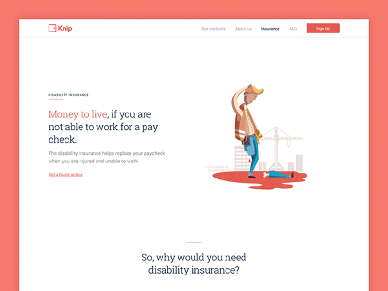
https://dribbble.com/shots/3206666-Disability-page-animation

Negative space is used to offer visual relief and separation between messages and items on the webpage. This allows the viewer to between understand what’s going on.

If they better understand what’s going on, they can better get to the goal that you and/or your client want them to achieve.

Highlighting a central message

Negative space will draw a user’s eyes to the main items on the page.

It helps make sure the page is focused on the message and emotions it wants to communicate. It makes the page more readable without having to anything elaborate.

Directing the flow of a page

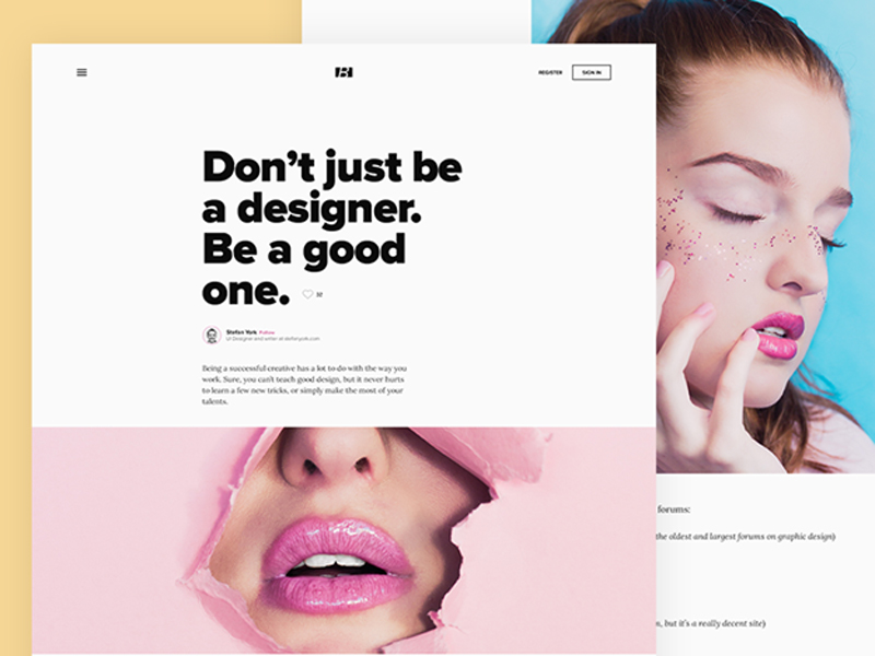
https://dribbble.com/shots/3633666-Blog-Single-Post-Negative-Space

Negative space dictates the way a user moves through the page and the entire site.

Placing it in certain ways can direct people to scroll down for more info, view page elements in a particular pattern, or prompt them to go to a different landing page. Negative space creates visual relationships between elements and provides direction.

How to Successfully Apply Negative Space

Practice different arrangements of negative space. Every website will need to use negative space in a different way. Some might need to use it less, while others may need more.

Make sure the pages are easy to read and comprehend

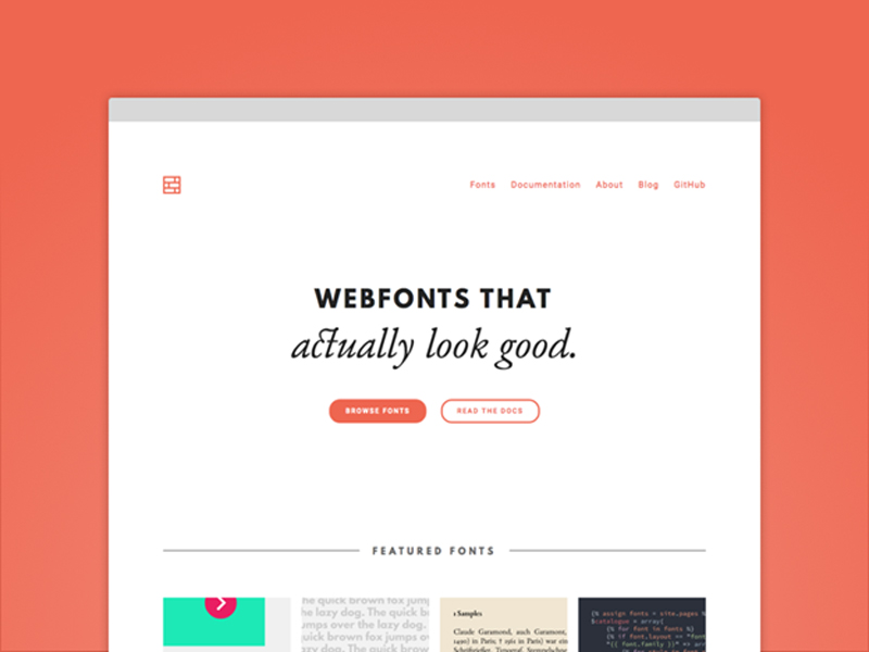
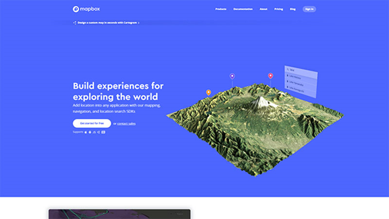
https://www.mapbox.com/

Before you even begin to work on the design proper, create a list of required interface elements. Doing this will help you to estimate how much content the page will need.

From there, you can create a rough wireframe to see how much space you require to include all this content in a way that can be easily read and understood.

Keep the design fresh and modern

Proportionate font sizes and asymmetrical uses of negative space create an overall very stylish look that is both uncluttered and interesting.

Use negative space practically

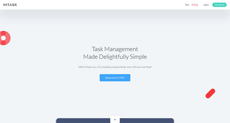
https://hitask.com/

This will assist in the overall readability. Separate blocks of content out to make it easier for visitors to access. Include margins between different elements. Use padding to create space inside an element and prevent overcrowding.

Experiment with the proximity and containment of the elements

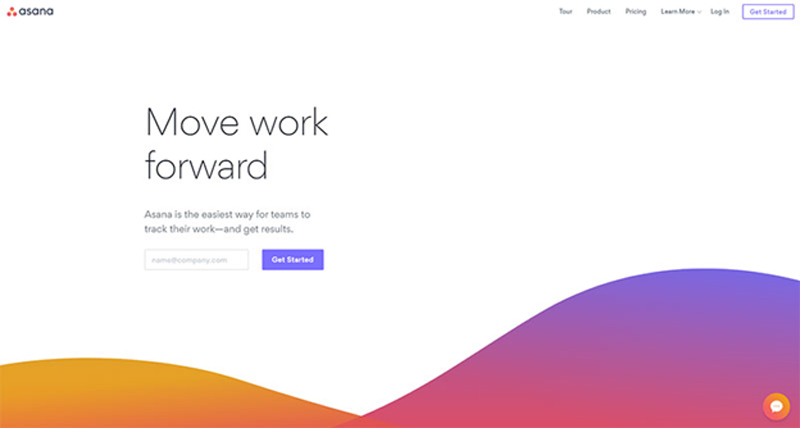
https://asana.com/

Proximity is how close or far objects are from each other, while containment is used to group objects together.

Understanding how negative space focuses and organizes a page will help you get the elements right.

Conclusion

Negative space can make all the difference in the functionality of a web page. You should create your web designs while thinking of negative space as a major element.

The branding work of Ivan Chermayeff

Post pobrano z: The branding work of Ivan Chermayeff

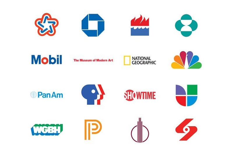
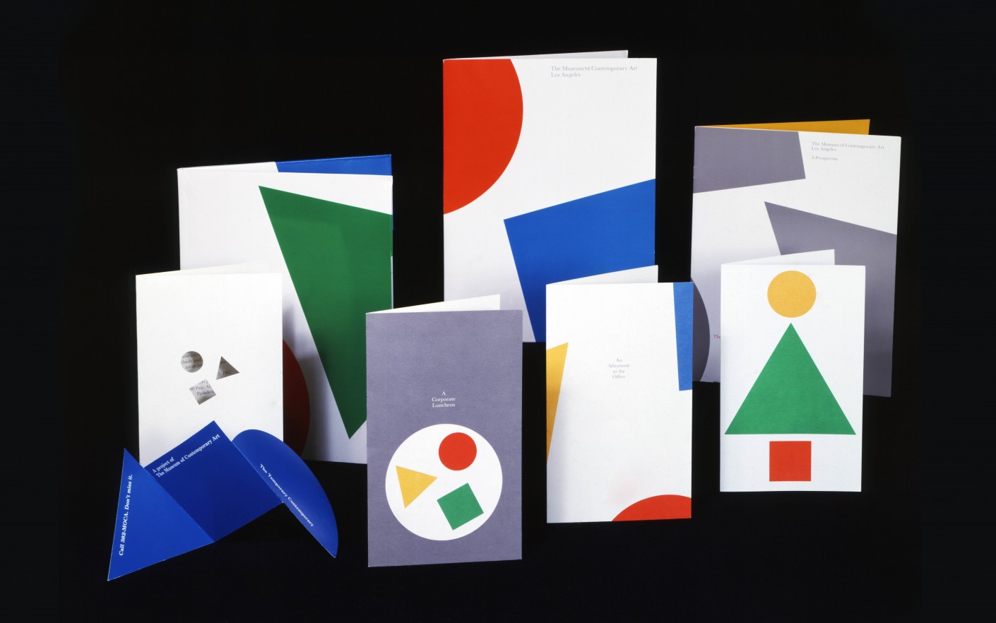
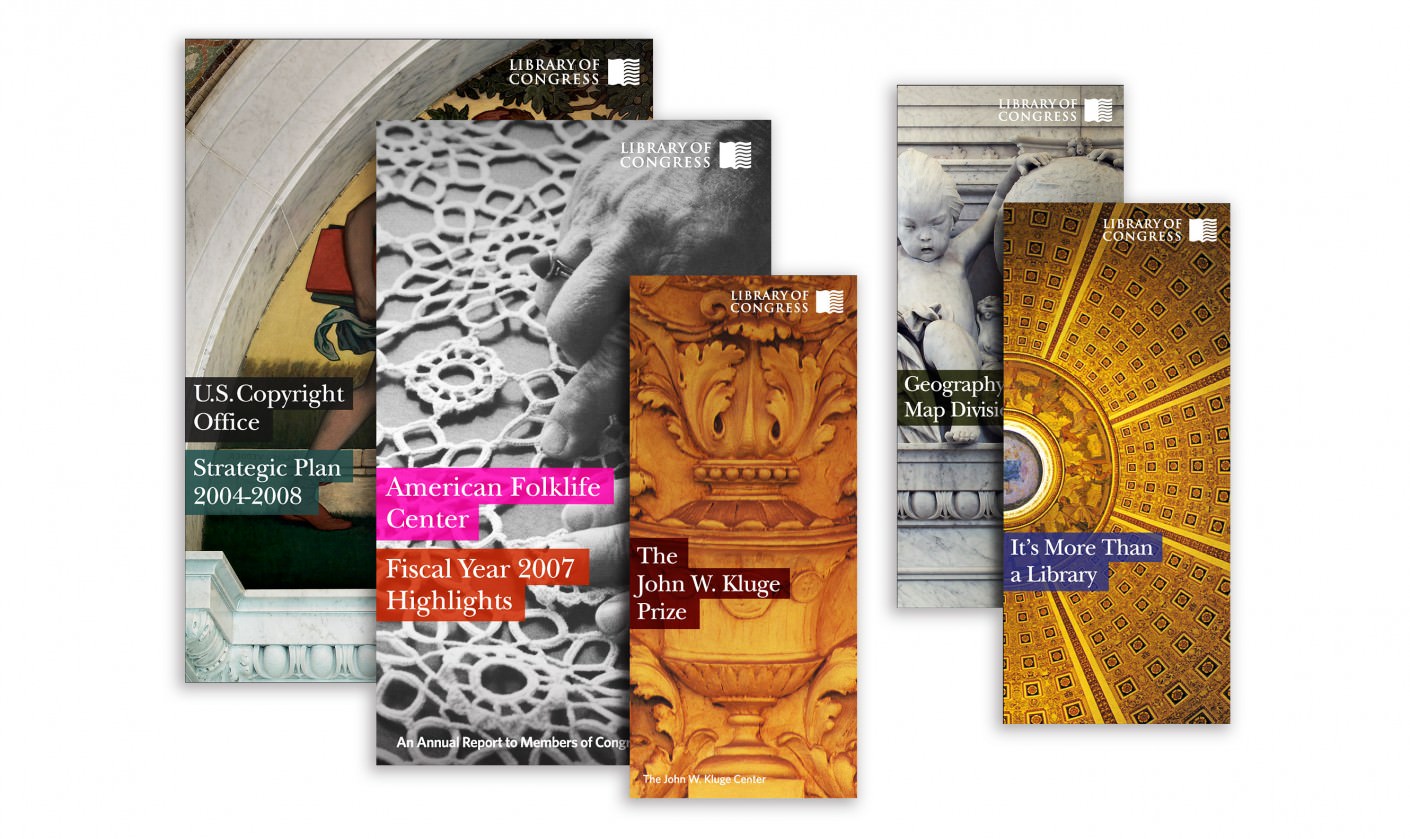
You may never have heard his name, but Ivan Chermayeff was one of the most influential designers of the 20th century. Unfortunately, I must write “was”, because the logo design expert died last week at the age of eighty-five. In his over 60 years career, Chermayeff designed some of the most memorable logos, many of which became iconic, such as the NBC, PanAm, Chase Bank, or National Geographic logos. In this post you can find a tiny sample of his work, you’ll see more on his professional website.

The Best Tools for designing a Mobile App

Post pobrano z: The Best Tools for designing a Mobile App

Mobile App development industry is expanding by the day, transforming the way businesses operate worldwide. The ever-increasing number of smartphone users in the global market has resulted in this tremendous popularity of the mobile applications. Could this be the reason why every enterprise is investing in a mobile app? Certainly, Yes.

Designing mobile apps have become more streamlined and simple these days – credits to the various easy-to-use design tools. Once you are clear with your mobile app idea, you need to select an appropriate design tool that will help you design user-friendly apps for your end users. If you are a mobile app designer and want to refine your design toolkit then we have got you covered.

This blog post shares 5 best tools for designing a mobile app. I am sure, you will find the right tool as per the type and functionality of your app.

1. PhoneGap

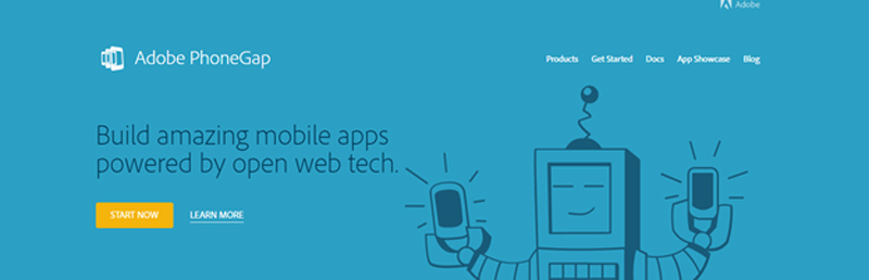
PhoneGap is an open source platform great for building cross-platform mobile apps, this tool is easier to use and is widely used by professional designers. The interesting thing is, this tool is best suited for mobile apps that do not completely rely on phone’s built-in features for performance.

This free tool is a product of Adobe and is in great demand among developers due to the features, functionality, and overall support it offers. Again, it is a versatile platform that allows designers to design app for all the popular platforms such as Android, iPhone, Windows, and Blackberry.

The only limitation with this tool is, if you are thinking of designing a graphic-intensive app then this may not be a good option as performance issues may occur.

2. Xamarin

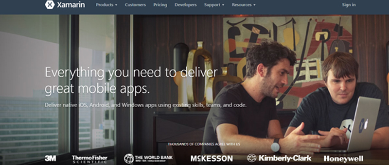
Xamarin is a versatile tool that shines at creating native apps for multiple platforms. Surprisingly, with this tool designers can create an app from start to finish using only c# code base. It allows develops to design great apps quickly using the same Apis, language, and IDE. Another major benefit of using  Xamarin is, it allows developers to share 75% of created code across all major mobile platforms. And this dramatically reduces the cost of app development and the app can be created in relatively less time.

If you want to design an app exclusively using C# then this tool is your best bet. This platform is quite popular and has been used by many big brands as well like Foursquare, Microsoft and IBM to name a few.
3. Axure

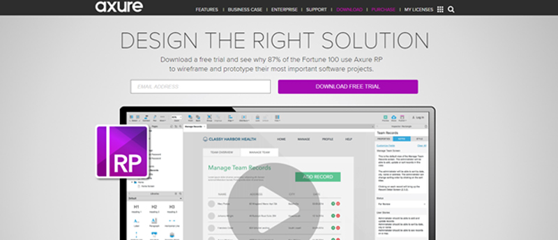
If you want to create fully interactive mobile apps and looking for an easy to use the tool then let your search rest here. Axure allows designers to create mobile applications and wireframing websites without any need for coding. The tool also consists of all the documentation tools that are required to make the design choices and record the layouts.

It is an elaborative application that has been devised for advance level prototyping solutions.It offers great functionality and gives the option to add interactions, ready-to-use components, patterns, make master pages and more. It surely helps designers to create more impressive  mobile app designs. And, if you are a code freak then the good news is, it gives you an option to code as well.

For Axure, you have the option to either go for the Standard edition or the Pro edition with advanced features.

4. Monocross

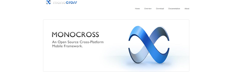
Monocross is an open source mobile framework that allows designers to create mobile applications for all popular platforms. This tool supports C#, mono framework, Microsoft, and .net. The interesting thing about this tool is, while still coding in C# designers can enjoy full access to the native device APIs.

Moreover, this tool reduces development time to a great extent as developers are not required to struggle with the minor intricacies of every platform. However, there is one downside of this tool especially for beginners or first-time users as there is only very limited material or support material is available online.

5. Kony App Plattform

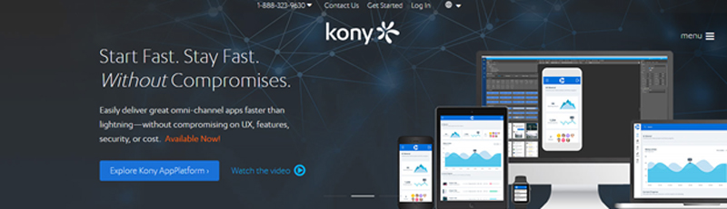
Kony is the first choice of enterprises who are in search of a tool that can help them meet with their growing demand of mobile applications. It is an integrated, cross-platform mobile app development tool that is widely used by developers with the sound knowledge of javascript.

Kony is loaded with many impressive features such as API connection, app preview facility, automatic coding, drag-and-drop functionality, and more. Another impressive thing about this tool is, it comes with pre-built apps that provide enough support material to educate beginners and it accelerates the development process.

Despite being packed with such amazing features there is not enough material available for first time-users or novice developers that have made learning curve steep.

Wrapping up

These tools pave the way for designing high-performance apps but you need to take right design decisions. Each tool mentioned here has its own strengths and limitations, pick the one that matches your design needs seamlessly and give life to your mobile app idea. Happy Designing!

Illustrations of microbes as a form of art, a look at Ernst Haeckel’s work

Post pobrano z: Illustrations of microbes as a form of art, a look at Ernst Haeckel’s work
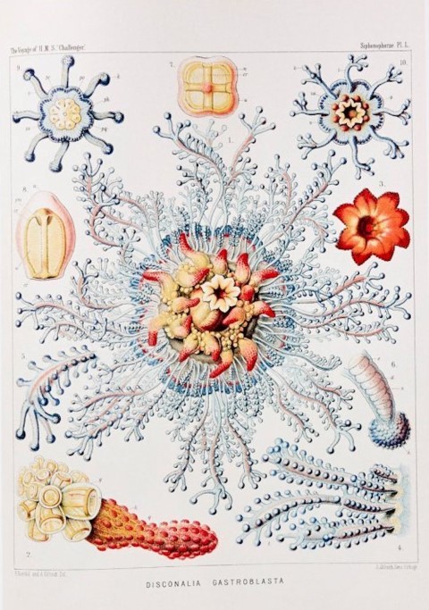
first image of the post

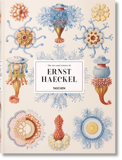
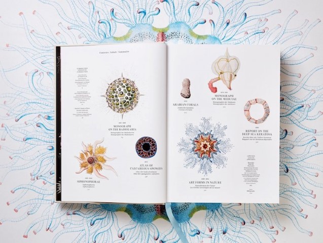
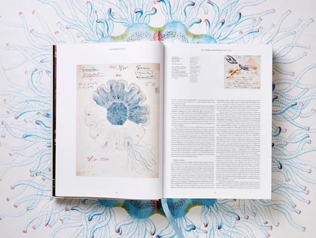
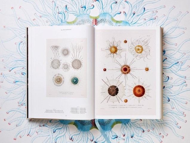
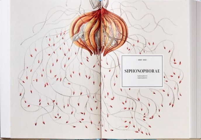
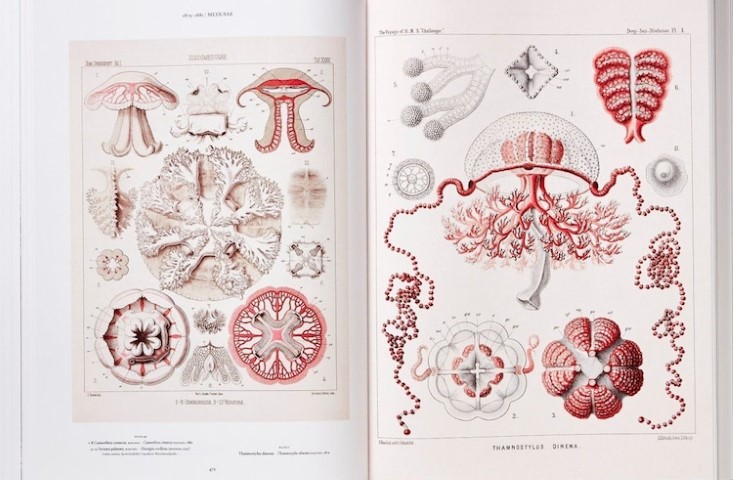
When Ernst Haeckel drew the illustrations of microbes, he was doing it for science, to help to introduce the world to micro-organisms. Little did he know that his illustrations would be compiled in a book by one of the largest art publishers in the world: Taschen.

However, once you take a look at pages from the book and discover the beautiful illustrations of Haeckel, you quickly understand that scientific illustration can be a real art form. The work of the scientist is combined in a fascinating book of 450 plates with his drawings.

Could you draw these famous logos from memory?

Post pobrano z: Could you draw these famous logos from memory?
first image of the post

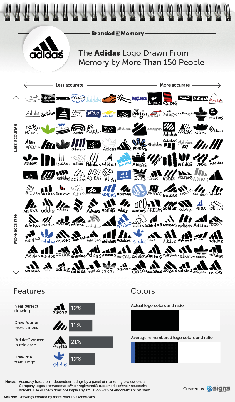
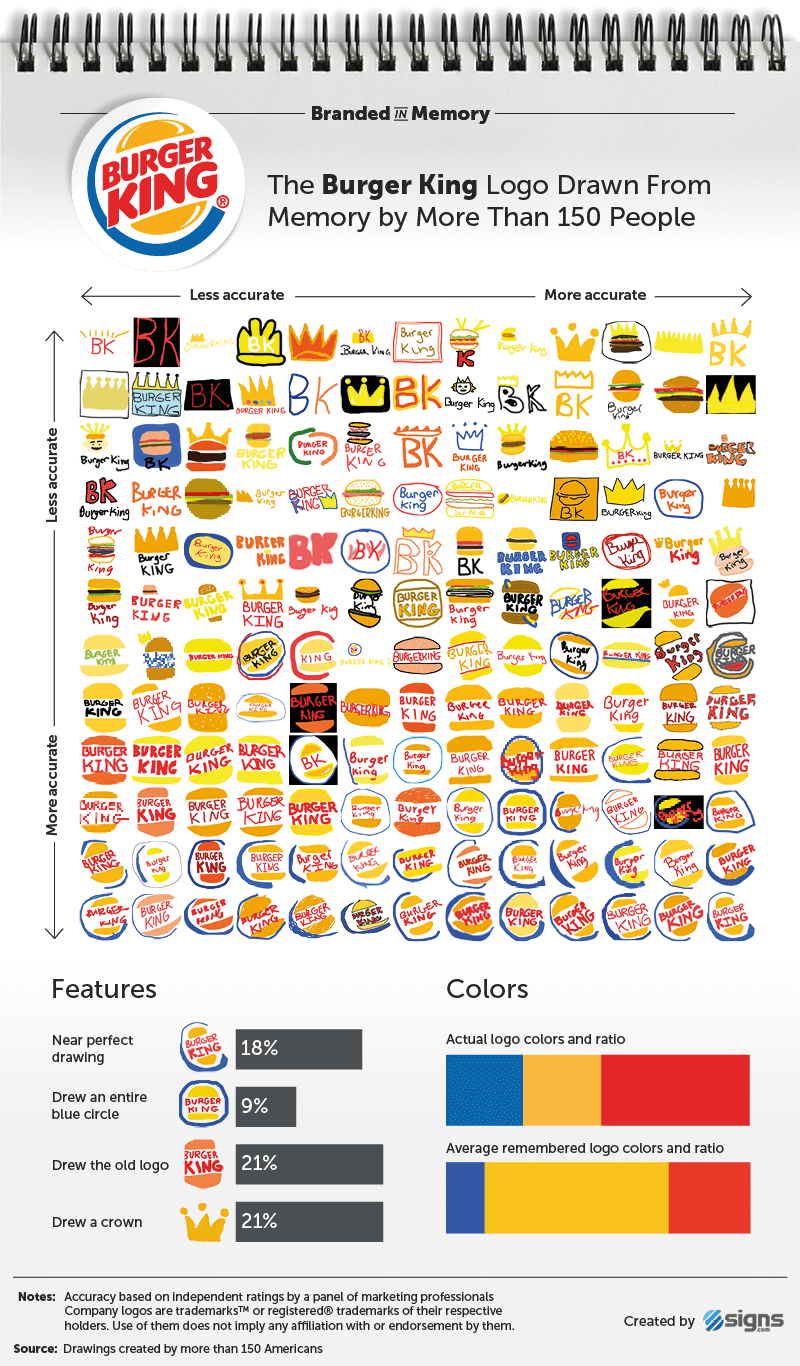
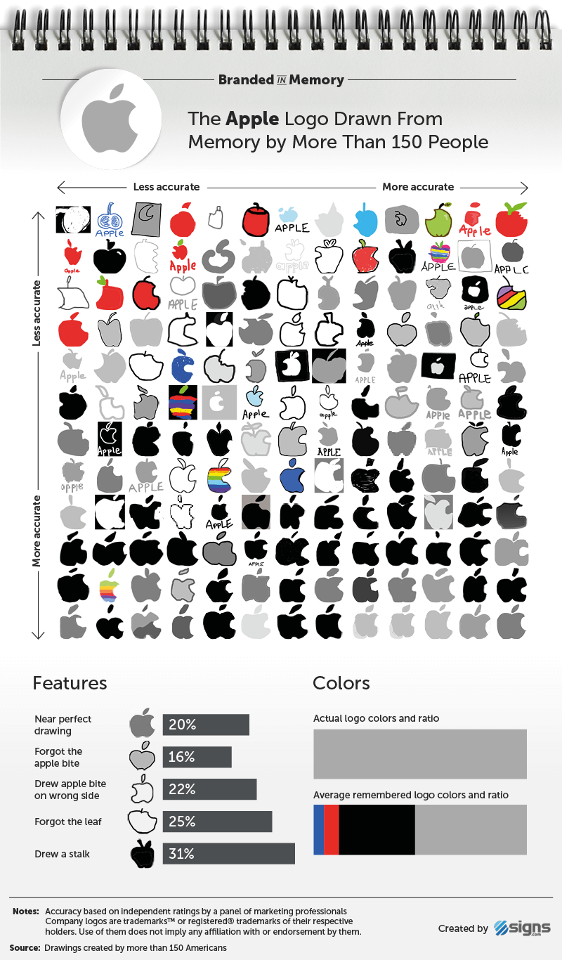
For testing brand recognition, asking people to draw the logo from memory is probably the best test you could imagine. That’s what the Branded in Memory project did. They took 10 famous logos and asked 156 Americans to draw them from memory and studied the results. Here are a few examples, check the other on the project’s website.

The Adidas logo

The Burger King logo

The Apple logo

Could you draw these famous logos from memory?

Post pobrano z: Could you draw these famous logos from memory?
first image of the post

For testing brand recognition, asking people to draw the logo from memory is probably the best test you could imagine. That’s what the Branded in Memory project did. They took 10 famous logos and asked 156 Americans to draw them from memory and studied the results. Here are a few examples, check the other on the project’s website.

The Adidas logo

The Burger King logo

The Apple logo