In the following steps, you will learn how to create a Spanish 3D text effect in Adobe Illustrator.
For starters, you will learn how to create a simple background for your text and how to add basic text. Using only your piece of text and the Appearance panel, you will learn how to create the final text effect. You’ll only need four fills, a stroke, several Transform and 3D Rotate effects, a Gaussian Blur, and some basic blending techniques.
For more inspiration on how to adjust or improve your final text effect, you can find plenty of resources at GraphicRiver.
What You Will Need
You will need the following resource in order to complete this project:
1. How to Create a New Document and the Background
Step 1
Hit Control-N to create a new document. Select Pixels from the Units drop-down menu, enter 850 in the width box and 600 in the height box, and then click that More Settings button. Select RGB for the Color Mode, set the Raster Effects to Screen (72 ppi), and then click Create Document.
Open the Info panel (Window > Info) for a live preview with the size and position of your shapes. Don’t forget to set the unit of measurement to pixels from Edit > Preferences > Units.
Step 2
Pick the Rectangle Tool (M) and focus on your Toolbar. Remove the color from the stroke and then select the fill and set its color to R=137 G=147 B=150.
Simply click on your artboard to open the Rectangle window. Set the Width to 870 px and the Height to 620 px, and then click OK. Make sure that your new shape covers the entire artboard as shown in the following image.
2. How to Create the Text
Step 1
Pick the Type Tool (T) and open the Character panel (Window > Type > Character). Select the Etna font, and set the size to 100 px and the tracking to 100.
Click on the artboard and add your piece of text about as shown below. The text I’m using means „Always look on the bright side of life” in Spanish. Make it black, for now.
Step 2
Select your text, focus on the Swatches panel (Window > Swatches), and click that [None] swatch to remove the black text color.
Move to the Appearance panel (Window > Appearance) and add a new fill using the Add New Fill button. Select that new fill and set the color to R=249 G=62 B=73.
3. How to Create the Spanish 3D Text Effect
Step 1
Make sure that your text stays selected and focus on the Appearance panel. Select the fill and go to Effect > 3D > Rotate. Enter the attributes shown below and click OK.
Step 2
Make sure that your text stays selected and keep focusing on the Appearance panel.
Add a second fill and select it. Drag it below that other fill, set its color to R=206 G=17 B=38, and go to Effect > 3D > Rotate. Enter the attributes shown below, click OK, and go to Effect > Distort & Transform > Transform. Drag the Move-Vertical slider to 0.25 px, enter 20 in the Copies box, and then click OK.
Step 3
Make sure that your text stays selected and keep focusing on the Appearance panel.
Add a third fill and select it. Drag it below the other fills and set its color to black (R=0 G=0 B=0). Lower its Opacity to 50% and change the Blending Mode to Soft Light, and then go to Effect > 3D > Rotate. Enter the attributes shown below, click OK, and go to Effect > Distort & Transform > Transform. Enter the settings shown in the following image, click OK, and go to Effect > Blur > Gaussian Blur. Set the Radius to 8 px and click OK.
Step 4
Make sure that your text stays selected and keep focusing on the Appearance panel.
Select the black fill and duplicate it using the Duplicate Selected Item button. Select the newly added fill, lower its Opacity to 5%, and remove that Gaussian Blur effect.
Step 5
Make sure that your text stays selected and keep focusing on the Appearance panel.
Select the stroke and set its color to white (R=255 G=255 B=255). Increase the stroke Weight to 4 px and then go to Effect > Path > Offset Path. Enter a -2 px Offset, click OK, and go to Effect > 3D > Rotate. Enter the attributes shown below, click OK, and go to Effect > Distort & Transform > Transform. Drag the Move-Vertical slider to -20 px and click OK.
Congratulations! You’re Done!
Here is how your Spanish 3D text effect should look. I hope you’ve enjoyed this tutorial and can apply these techniques in your future projects. Don’t hesitate to share your final result in the comments section.
Feel free to adjust the final design and make it your own. You can find some great sources of inspiration at GraphicRiver, with interesting solutions to improve your design.
Looking for more tutorials? I recommend the following:
In the following steps, you will learn how to create a Spanish 3D text effect in Adobe Illustrator.
For starters, you will learn how to create a simple background for your text and how to add basic text. Using only your piece of text and the Appearance panel, you will learn how to create the final text effect. You’ll only need four fills, a stroke, several Transform and 3D Rotate effects, a Gaussian Blur, and some basic blending techniques.
For more inspiration on how to adjust or improve your final text effect, you can find plenty of resources at GraphicRiver.
What You Will Need
You will need the following resource in order to complete this project:
1. How to Create a New Document and the Background
Step 1
Hit Control-N to create a new document. Select Pixels from the Units drop-down menu, enter 850 in the width box and 600 in the height box, and then click that More Settings button. Select RGB for the Color Mode, set the Raster Effects to Screen (72 ppi), and then click Create Document.
Open the Info panel (Window > Info) for a live preview with the size and position of your shapes. Don’t forget to set the unit of measurement to pixels from Edit > Preferences > Units.
Step 2
Pick the Rectangle Tool (M) and focus on your Toolbar. Remove the color from the stroke and then select the fill and set its color to R=137 G=147 B=150.
Simply click on your artboard to open the Rectangle window. Set the Width to 870 px and the Height to 620 px, and then click OK. Make sure that your new shape covers the entire artboard as shown in the following image.
2. How to Create the Text
Step 1
Pick the Type Tool (T) and open the Character panel (Window > Type > Character). Select the Etna font, and set the size to 100 px and the tracking to 100.
Click on the artboard and add your piece of text about as shown below. The text I’m using means „Always look on the bright side of life” in Spanish. Make it black, for now.
Step 2
Select your text, focus on the Swatches panel (Window > Swatches), and click that [None] swatch to remove the black text color.
Move to the Appearance panel (Window > Appearance) and add a new fill using the Add New Fill button. Select that new fill and set the color to R=249 G=62 B=73.
3. How to Create the Spanish 3D Text Effect
Step 1
Make sure that your text stays selected and focus on the Appearance panel. Select the fill and go to Effect > 3D > Rotate. Enter the attributes shown below and click OK.
Step 2
Make sure that your text stays selected and keep focusing on the Appearance panel.
Add a second fill and select it. Drag it below that other fill, set its color to R=206 G=17 B=38, and go to Effect > 3D > Rotate. Enter the attributes shown below, click OK, and go to Effect > Distort & Transform > Transform. Drag the Move-Vertical slider to 0.25 px, enter 20 in the Copies box, and then click OK.
Step 3
Make sure that your text stays selected and keep focusing on the Appearance panel.
Add a third fill and select it. Drag it below the other fills and set its color to black (R=0 G=0 B=0). Lower its Opacity to 50% and change the Blending Mode to Soft Light, and then go to Effect > 3D > Rotate. Enter the attributes shown below, click OK, and go to Effect > Distort & Transform > Transform. Enter the settings shown in the following image, click OK, and go to Effect > Blur > Gaussian Blur. Set the Radius to 8 px and click OK.
Step 4
Make sure that your text stays selected and keep focusing on the Appearance panel.
Select the black fill and duplicate it using the Duplicate Selected Item button. Select the newly added fill, lower its Opacity to 5%, and remove that Gaussian Blur effect.
Step 5
Make sure that your text stays selected and keep focusing on the Appearance panel.
Select the stroke and set its color to white (R=255 G=255 B=255). Increase the stroke Weight to 4 px and then go to Effect > Path > Offset Path. Enter a -2 px Offset, click OK, and go to Effect > 3D > Rotate. Enter the attributes shown below, click OK, and go to Effect > Distort & Transform > Transform. Drag the Move-Vertical slider to -20 px and click OK.
Congratulations! You’re Done!
Here is how your Spanish 3D text effect should look. I hope you’ve enjoyed this tutorial and can apply these techniques in your future projects. Don’t hesitate to share your final result in the comments section.
Feel free to adjust the final design and make it your own. You can find some great sources of inspiration at GraphicRiver, with interesting solutions to improve your design.
Looking for more tutorials? I recommend the following:
In the following steps, you will learn how to create a Spanish 3D text effect in Adobe Illustrator.
For starters, you will learn how to create a simple background for your text and how to add basic text. Using only your piece of text and the Appearance panel, you will learn how to create the final text effect. You’ll only need four fills, a stroke, several Transform and 3D Rotate effects, a Gaussian Blur, and some basic blending techniques.
For more inspiration on how to adjust or improve your final text effect, you can find plenty of resources at GraphicRiver.
What You Will Need
You will need the following resource in order to complete this project:
1. How to Create a New Document and the Background
Step 1
Hit Control-N to create a new document. Select Pixels from the Units drop-down menu, enter 850 in the width box and 600 in the height box, and then click that More Settings button. Select RGB for the Color Mode, set the Raster Effects to Screen (72 ppi), and then click Create Document.
Open the Info panel (Window > Info) for a live preview with the size and position of your shapes. Don’t forget to set the unit of measurement to pixels from Edit > Preferences > Units.
Step 2
Pick the Rectangle Tool (M) and focus on your Toolbar. Remove the color from the stroke and then select the fill and set its color to R=137 G=147 B=150.
Simply click on your artboard to open the Rectangle window. Set the Width to 870 px and the Height to 620 px, and then click OK. Make sure that your new shape covers the entire artboard as shown in the following image.
2. How to Create the Text
Step 1
Pick the Type Tool (T) and open the Character panel (Window > Type > Character). Select the Etna font, and set the size to 100 px and the tracking to 100.
Click on the artboard and add your piece of text about as shown below. The text I’m using means „Always look on the bright side of life” in Spanish. Make it black, for now.
Step 2
Select your text, focus on the Swatches panel (Window > Swatches), and click that [None] swatch to remove the black text color.
Move to the Appearance panel (Window > Appearance) and add a new fill using the Add New Fill button. Select that new fill and set the color to R=249 G=62 B=73.
3. How to Create the Spanish 3D Text Effect
Step 1
Make sure that your text stays selected and focus on the Appearance panel. Select the fill and go to Effect > 3D > Rotate. Enter the attributes shown below and click OK.
Step 2
Make sure that your text stays selected and keep focusing on the Appearance panel.
Add a second fill and select it. Drag it below that other fill, set its color to R=206 G=17 B=38, and go to Effect > 3D > Rotate. Enter the attributes shown below, click OK, and go to Effect > Distort & Transform > Transform. Drag the Move-Vertical slider to 0.25 px, enter 20 in the Copies box, and then click OK.
Step 3
Make sure that your text stays selected and keep focusing on the Appearance panel.
Add a third fill and select it. Drag it below the other fills and set its color to black (R=0 G=0 B=0). Lower its Opacity to 50% and change the Blending Mode to Soft Light, and then go to Effect > 3D > Rotate. Enter the attributes shown below, click OK, and go to Effect > Distort & Transform > Transform. Enter the settings shown in the following image, click OK, and go to Effect > Blur > Gaussian Blur. Set the Radius to 8 px and click OK.
Step 4
Make sure that your text stays selected and keep focusing on the Appearance panel.
Select the black fill and duplicate it using the Duplicate Selected Item button. Select the newly added fill, lower its Opacity to 5%, and remove that Gaussian Blur effect.
Step 5
Make sure that your text stays selected and keep focusing on the Appearance panel.
Select the stroke and set its color to white (R=255 G=255 B=255). Increase the stroke Weight to 4 px and then go to Effect > Path > Offset Path. Enter a -2 px Offset, click OK, and go to Effect > 3D > Rotate. Enter the attributes shown below, click OK, and go to Effect > Distort & Transform > Transform. Drag the Move-Vertical slider to -20 px and click OK.
Congratulations! You’re Done!
Here is how your Spanish 3D text effect should look. I hope you’ve enjoyed this tutorial and can apply these techniques in your future projects. Don’t hesitate to share your final result in the comments section.
Feel free to adjust the final design and make it your own. You can find some great sources of inspiration at GraphicRiver, with interesting solutions to improve your design.
Looking for more tutorials? I recommend the following:
In the following steps, you will learn how to create a Spanish 3D text effect in Adobe Illustrator.
For starters, you will learn how to create a simple background for your text and how to add basic text. Using only your piece of text and the Appearance panel, you will learn how to create the final text effect. You’ll only need four fills, a stroke, several Transform and 3D Rotate effects, a Gaussian Blur, and some basic blending techniques.
For more inspiration on how to adjust or improve your final text effect, you can find plenty of resources at GraphicRiver.
What You Will Need
You will need the following resource in order to complete this project:
1. How to Create a New Document and the Background
Step 1
Hit Control-N to create a new document. Select Pixels from the Units drop-down menu, enter 850 in the width box and 600 in the height box, and then click that More Settings button. Select RGB for the Color Mode, set the Raster Effects to Screen (72 ppi), and then click Create Document.
Open the Info panel (Window > Info) for a live preview with the size and position of your shapes. Don’t forget to set the unit of measurement to pixels from Edit > Preferences > Units.
Step 2
Pick the Rectangle Tool (M) and focus on your Toolbar. Remove the color from the stroke and then select the fill and set its color to R=137 G=147 B=150.
Simply click on your artboard to open the Rectangle window. Set the Width to 870 px and the Height to 620 px, and then click OK. Make sure that your new shape covers the entire artboard as shown in the following image.
2. How to Create the Text
Step 1
Pick the Type Tool (T) and open the Character panel (Window > Type > Character). Select the Etna font, and set the size to 100 px and the tracking to 100.
Click on the artboard and add your piece of text about as shown below. The text I’m using means „Always look on the bright side of life” in Spanish. Make it black, for now.
Step 2
Select your text, focus on the Swatches panel (Window > Swatches), and click that [None] swatch to remove the black text color.
Move to the Appearance panel (Window > Appearance) and add a new fill using the Add New Fill button. Select that new fill and set the color to R=249 G=62 B=73.
3. How to Create the Spanish 3D Text Effect
Step 1
Make sure that your text stays selected and focus on the Appearance panel. Select the fill and go to Effect > 3D > Rotate. Enter the attributes shown below and click OK.
Step 2
Make sure that your text stays selected and keep focusing on the Appearance panel.
Add a second fill and select it. Drag it below that other fill, set its color to R=206 G=17 B=38, and go to Effect > 3D > Rotate. Enter the attributes shown below, click OK, and go to Effect > Distort & Transform > Transform. Drag the Move-Vertical slider to 0.25 px, enter 20 in the Copies box, and then click OK.
Step 3
Make sure that your text stays selected and keep focusing on the Appearance panel.
Add a third fill and select it. Drag it below the other fills and set its color to black (R=0 G=0 B=0). Lower its Opacity to 50% and change the Blending Mode to Soft Light, and then go to Effect > 3D > Rotate. Enter the attributes shown below, click OK, and go to Effect > Distort & Transform > Transform. Enter the settings shown in the following image, click OK, and go to Effect > Blur > Gaussian Blur. Set the Radius to 8 px and click OK.
Step 4
Make sure that your text stays selected and keep focusing on the Appearance panel.
Select the black fill and duplicate it using the Duplicate Selected Item button. Select the newly added fill, lower its Opacity to 5%, and remove that Gaussian Blur effect.
Step 5
Make sure that your text stays selected and keep focusing on the Appearance panel.
Select the stroke and set its color to white (R=255 G=255 B=255). Increase the stroke Weight to 4 px and then go to Effect > Path > Offset Path. Enter a -2 px Offset, click OK, and go to Effect > 3D > Rotate. Enter the attributes shown below, click OK, and go to Effect > Distort & Transform > Transform. Drag the Move-Vertical slider to -20 px and click OK.
Congratulations! You’re Done!
Here is how your Spanish 3D text effect should look. I hope you’ve enjoyed this tutorial and can apply these techniques in your future projects. Don’t hesitate to share your final result in the comments section.
Feel free to adjust the final design and make it your own. You can find some great sources of inspiration at GraphicRiver, with interesting solutions to improve your design.
Looking for more tutorials? I recommend the following:
In the following steps, you will learn how to create a Spanish 3D text effect in Adobe Illustrator.
For starters, you will learn how to create a simple background for your text and how to add basic text. Using only your piece of text and the Appearance panel, you will learn how to create the final text effect. You’ll only need four fills, a stroke, several Transform and 3D Rotate effects, a Gaussian Blur, and some basic blending techniques.
For more inspiration on how to adjust or improve your final text effect, you can find plenty of resources at GraphicRiver.
What You Will Need
You will need the following resource in order to complete this project:
1. How to Create a New Document and the Background
Step 1
Hit Control-N to create a new document. Select Pixels from the Units drop-down menu, enter 850 in the width box and 600 in the height box, and then click that More Settings button. Select RGB for the Color Mode, set the Raster Effects to Screen (72 ppi), and then click Create Document.
Open the Info panel (Window > Info) for a live preview with the size and position of your shapes. Don’t forget to set the unit of measurement to pixels from Edit > Preferences > Units.
Step 2
Pick the Rectangle Tool (M) and focus on your Toolbar. Remove the color from the stroke and then select the fill and set its color to R=137 G=147 B=150.
Simply click on your artboard to open the Rectangle window. Set the Width to 870 px and the Height to 620 px, and then click OK. Make sure that your new shape covers the entire artboard as shown in the following image.
2. How to Create the Text
Step 1
Pick the Type Tool (T) and open the Character panel (Window > Type > Character). Select the Etna font, and set the size to 100 px and the tracking to 100.
Click on the artboard and add your piece of text about as shown below. The text I’m using means „Always look on the bright side of life” in Spanish. Make it black, for now.
Step 2
Select your text, focus on the Swatches panel (Window > Swatches), and click that [None] swatch to remove the black text color.
Move to the Appearance panel (Window > Appearance) and add a new fill using the Add New Fill button. Select that new fill and set the color to R=249 G=62 B=73.
3. How to Create the Spanish 3D Text Effect
Step 1
Make sure that your text stays selected and focus on the Appearance panel. Select the fill and go to Effect > 3D > Rotate. Enter the attributes shown below and click OK.
Step 2
Make sure that your text stays selected and keep focusing on the Appearance panel.
Add a second fill and select it. Drag it below that other fill, set its color to R=206 G=17 B=38, and go to Effect > 3D > Rotate. Enter the attributes shown below, click OK, and go to Effect > Distort & Transform > Transform. Drag the Move-Vertical slider to 0.25 px, enter 20 in the Copies box, and then click OK.
Step 3
Make sure that your text stays selected and keep focusing on the Appearance panel.
Add a third fill and select it. Drag it below the other fills and set its color to black (R=0 G=0 B=0). Lower its Opacity to 50% and change the Blending Mode to Soft Light, and then go to Effect > 3D > Rotate. Enter the attributes shown below, click OK, and go to Effect > Distort & Transform > Transform. Enter the settings shown in the following image, click OK, and go to Effect > Blur > Gaussian Blur. Set the Radius to 8 px and click OK.
Step 4
Make sure that your text stays selected and keep focusing on the Appearance panel.
Select the black fill and duplicate it using the Duplicate Selected Item button. Select the newly added fill, lower its Opacity to 5%, and remove that Gaussian Blur effect.
Step 5
Make sure that your text stays selected and keep focusing on the Appearance panel.
Select the stroke and set its color to white (R=255 G=255 B=255). Increase the stroke Weight to 4 px and then go to Effect > Path > Offset Path. Enter a -2 px Offset, click OK, and go to Effect > 3D > Rotate. Enter the attributes shown below, click OK, and go to Effect > Distort & Transform > Transform. Drag the Move-Vertical slider to -20 px and click OK.
Congratulations! You’re Done!
Here is how your Spanish 3D text effect should look. I hope you’ve enjoyed this tutorial and can apply these techniques in your future projects. Don’t hesitate to share your final result in the comments section.
Feel free to adjust the final design and make it your own. You can find some great sources of inspiration at GraphicRiver, with interesting solutions to improve your design.
Looking for more tutorials? I recommend the following:
Vijayadashami, also known as Dasara, Dusshera, or Dussehra, is a major Hindu festival celebrated at the end of Navratri every year, which typically falls in the Gregorian months of September and October.
This colorful infographic is a tribute to the Dasara festival, during which processions and celebrations take place across many parts of the Indian subcontinent.
This is a great introduction to infographic design for beginners, and you can also share the completed design on social media. You can download the high-quality version of the infographic here.
We’ll put together the infographic artwork in Adobe InDesign, but you’ll also need to have access to vector software like Adobe Illustrator to edit the temple graphics and icons.
You’ll also need to download the following images and fonts from Envato Elements:
Install the fonts on your computer, and you’re ready to get started.
1. Create the Infographic Document in InDesign
Step 1
Open InDesign and go to File > New > Document.
Click on Web at the top of the window to set the intent of the document. Then set the Width of the page to 870 px and Height to 2600 px.
Uncheck Facing Pages. Add Margins of 44 px, and then click Create.
Step 2
Expand the Layers panel (Window > Layers) and double-click on Layer 1, renaming it Background.
Create two more new layers—first Graphics, and then Type at the top.
Lock both the Graphics and Type layers, and click on the Background layer to activate it.
Step 3
Expand the Swatches panel (Window > Color > Swatches) and choose New Color Swatch from the panel’s main menu (at top-right).
Set the levels to C=0 M=92 Y=15 K=0*. Click Add and Done.
Create three more new swatches with the following values:
C=20 M=14 Y=97 K=2
C=4 M=80 Y=89 K=0
C=6 M=32 Y=91 K=0
* If you’re creating your infographic for print, you can set your swatches to CMYK. But even if you’re exporting your infographic to share online, you can still use CMYK swatches and simply export to an RGB color mode later on.
Step 4
Working on the Background layer, select the Rectangle Tool (M) from the Tools panel, and drag across the top of the page to create a small rectangle about 267 px in Height (visible from the top Controls panel).
From the Swatches panel, set the Stroke Color of the shape to [None] and Fill Color to your new yellow swatch, C=6 M=32 Y=91 K=0.
Step 5
Create a second shape 557 px in Height, positioning it below the first. Set the Fill to orange, C=4 M=80 Y=89 K=0.
Edit > Copy and Edit > Paste this shape, and position below, creating a sequence of shapes. Switch the Fill to green, C=20 M=14 Y=97 K=2.
Paste two more shapes below, setting the first to a pink Fill of C=0 M=92 Y=15 K=0, and the second to yellow, C=6 M=32 Y=91 K=0.
2. How to Add a Bold Header to Your Infographic
Step 1
Lock the Background layer and unlock the top layer, Type.
With the Rectangle Tool still selected, draw a shape inside the top yellow rectangle to create a border effect. From the Stroke panel (Window > Stroke), set the Weight of the shape’s stroke to 17 pt.
Switch the Stroke Color of the shape to green, C=20 M=14 Y=97 K=2.
Step 2
Take the Type Tool (T) and drag across the top of the page, inside the border you’ve just created.
Type in ‘DASARA’ and from either the top Controls panel or the Character panel (Window > Type & Tables > Character) set the Font to Garlic Salt Bold, Size 115 pt, and the Tracking to 60.
Set the Font Color to pink, C=0 M=92 Y=15 K=0.
You can also thicken the appearance of the text by adding the same swatch color to the Stroke Color of the text—simply click on the other ‘T’ symbol at the top of the Swatches panel.
Step 3
Create a second text frame above, writing in introductory text like ‘THE HINDU FESTIVAL OF’, and setting the Font to CornerOne Bold, Size 29 pt, Tracking 50, and the Font Color to [Paper].
3. How to Add Temple Graphics to Your Design
Step 1
Minimize your InDesign window; we’ll come back to it in a moment.
Open up the Surat skyline EPS file in Adobe Illustrator, or another vector program.
Right-Click > Ungroup the illustration.
Then select the temple in the center of the design, and Edit > Copy it.
Step 2
Head back over to your InDesign document and lock the Type layer. Unlock the Graphics layer below.
Edit > Paste the temple directly onto the page, and resize, holding Shift, positioning it on the right side of the orange section of the infographic, towards the top.
Step 3
Open the Patna skyline in Illustrator and repeat, by ungrouping the illustration and then selecting and copying the temple graphic in the center.
Paste it onto the InDesign layout, positioning it on the left side of the next colored section down.
Use the Visakhapatnam skyline to copy and paste over two temple illustrations, using them to fill the two final colored sections of the infographic.
4. How to Format Typography on Your Infographic
Step 1
Lock the Graphics layer and unlock the top layer, Type.
Use the Type Tool (T) to create a text frame to the left of the temple at the top of your layout.
Type in the first fact for your infographic, and set the Font to CornerOne Bold, Size 18 pt. Set the Font Color to [Paper] and pull out key items of text in a contrasting green swatch.
Step 2
Create a text frame to the right of the temple on the next section down. For statistics, you can pull out numbers in a larger font size. Try setting them in CornerOne Bold, Size 139 pt.
Group other text frames around the number, setting the Font to CornerOne Bold, Size 28 pt.
Use the body text frame from the section above as a template for populating the infographic with more text frames; simply Copy and Paste.
Step 3
Keep working your way down the infographic, populating each section with text. Set key sentences in a slightly larger 20 pt Font Size and All Caps.
Team these key sentences with the other pasted body text frames.
Step 4
You can add icons to your infographic to indicate the theme of each section. Open up the Diwali icons set in Illustrator, and isolate one icon before copying it.
Edit > Paste it onto the Graphics layer in InDesign, and position it alongside a piece of text.
5. How to Export Your Infographic for Sharing Online
Step 1
Your infographic’s finished—great job! All that’s left to do is to export your artwork, ready for sharing online on social media.
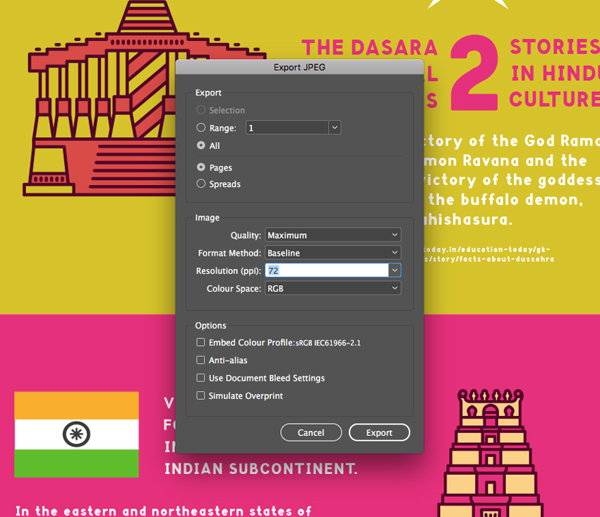
Go to File > Export. Choose JPEG from the Format drop-down menu, and hit Save.
Step 2
In the window that opens, set the Resolution to 72 ppi, and the Color Space to RGB.
Then click Export.
Conclusion: Your Finished Infographic
Your Dasara infographic is finished, and it’s looking awesome!
Make sure to share the infographic on Pinterest and Facebook to raise awareness about Dasara and celebrate the festival in style.
This infographic looks at how organisations worldwide are battling to improve education for girls. Here we’ll learn how to put together the infographic in…
It’s Science Week here at Envato Tuts+, and this fun infographic is a great way to celebrate! With a focus on the future of space travel, you’ll be able to…
Vijayadashami, also known as Dasara, Dusshera, or Dussehra, is a major Hindu festival celebrated at the end of Navratri every year, which typically falls in the Gregorian months of September and October.
This colorful infographic is a tribute to the Dasara festival, during which processions and celebrations take place across many parts of the Indian subcontinent.
This is a great introduction to infographic design for beginners, and you can also share the completed design on social media. You can download the high-quality version of the infographic here.
We’ll put together the infographic artwork in Adobe InDesign, but you’ll also need to have access to vector software like Adobe Illustrator to edit the temple graphics and icons.
You’ll also need to download the following images and fonts from Envato Elements:
Install the fonts on your computer, and you’re ready to get started.
1. Create the Infographic Document in InDesign
Step 1
Open InDesign and go to File > New > Document.
Click on Web at the top of the window to set the intent of the document. Then set the Width of the page to 870 px and Height to 2600 px.
Uncheck Facing Pages. Add Margins of 44 px, and then click Create.
Step 2
Expand the Layers panel (Window > Layers) and double-click on Layer 1, renaming it Background.
Create two more new layers—first Graphics, and then Type at the top.
Lock both the Graphics and Type layers, and click on the Background layer to activate it.
Step 3
Expand the Swatches panel (Window > Color > Swatches) and choose New Color Swatch from the panel’s main menu (at top-right).
Set the levels to C=0 M=92 Y=15 K=0*. Click Add and Done.
Create three more new swatches with the following values:
C=20 M=14 Y=97 K=2
C=4 M=80 Y=89 K=0
C=6 M=32 Y=91 K=0
* If you’re creating your infographic for print, you can set your swatches to CMYK. But even if you’re exporting your infographic to share online, you can still use CMYK swatches and simply export to an RGB color mode later on.
Step 4
Working on the Background layer, select the Rectangle Tool (M) from the Tools panel, and drag across the top of the page to create a small rectangle about 267 px in Height (visible from the top Controls panel).
From the Swatches panel, set the Stroke Color of the shape to [None] and Fill Color to your new yellow swatch, C=6 M=32 Y=91 K=0.
Step 5
Create a second shape 557 px in Height, positioning it below the first. Set the Fill to orange, C=4 M=80 Y=89 K=0.
Edit > Copy and Edit > Paste this shape, and position below, creating a sequence of shapes. Switch the Fill to green, C=20 M=14 Y=97 K=2.
Paste two more shapes below, setting the first to a pink Fill of C=0 M=92 Y=15 K=0, and the second to yellow, C=6 M=32 Y=91 K=0.
2. How to Add a Bold Header to Your Infographic
Step 1
Lock the Background layer and unlock the top layer, Type.
With the Rectangle Tool still selected, draw a shape inside the top yellow rectangle to create a border effect. From the Stroke panel (Window > Stroke), set the Weight of the shape’s stroke to 17 pt.
Switch the Stroke Color of the shape to green, C=20 M=14 Y=97 K=2.
Step 2
Take the Type Tool (T) and drag across the top of the page, inside the border you’ve just created.
Type in ‘DASARA’ and from either the top Controls panel or the Character panel (Window > Type & Tables > Character) set the Font to Garlic Salt Bold, Size 115 pt, and the Tracking to 60.
Set the Font Color to pink, C=0 M=92 Y=15 K=0.
You can also thicken the appearance of the text by adding the same swatch color to the Stroke Color of the text—simply click on the other ‘T’ symbol at the top of the Swatches panel.
Step 3
Create a second text frame above, writing in introductory text like ‘THE HINDU FESTIVAL OF’, and setting the Font to CornerOne Bold, Size 29 pt, Tracking 50, and the Font Color to [Paper].
3. How to Add Temple Graphics to Your Design
Step 1
Minimize your InDesign window; we’ll come back to it in a moment.
Open up the Surat skyline EPS file in Adobe Illustrator, or another vector program.
Right-Click > Ungroup the illustration.
Then select the temple in the center of the design, and Edit > Copy it.
Step 2
Head back over to your InDesign document and lock the Type layer. Unlock the Graphics layer below.
Edit > Paste the temple directly onto the page, and resize, holding Shift, positioning it on the right side of the orange section of the infographic, towards the top.
Step 3
Open the Patna skyline in Illustrator and repeat, by ungrouping the illustration and then selecting and copying the temple graphic in the center.
Paste it onto the InDesign layout, positioning it on the left side of the next colored section down.
Use the Visakhapatnam skyline to copy and paste over two temple illustrations, using them to fill the two final colored sections of the infographic.
4. How to Format Typography on Your Infographic
Step 1
Lock the Graphics layer and unlock the top layer, Type.
Use the Type Tool (T) to create a text frame to the left of the temple at the top of your layout.
Type in the first fact for your infographic, and set the Font to CornerOne Bold, Size 18 pt. Set the Font Color to [Paper] and pull out key items of text in a contrasting green swatch.
Step 2
Create a text frame to the right of the temple on the next section down. For statistics, you can pull out numbers in a larger font size. Try setting them in CornerOne Bold, Size 139 pt.
Group other text frames around the number, setting the Font to CornerOne Bold, Size 28 pt.
Use the body text frame from the section above as a template for populating the infographic with more text frames; simply Copy and Paste.
Step 3
Keep working your way down the infographic, populating each section with text. Set key sentences in a slightly larger 20 pt Font Size and All Caps.
Team these key sentences with the other pasted body text frames.
Step 4
You can add icons to your infographic to indicate the theme of each section. Open up the Diwali icons set in Illustrator, and isolate one icon before copying it.
Edit > Paste it onto the Graphics layer in InDesign, and position it alongside a piece of text.
5. How to Export Your Infographic for Sharing Online
Step 1
Your infographic’s finished—great job! All that’s left to do is to export your artwork, ready for sharing online on social media.
Go to File > Export. Choose JPEG from the Format drop-down menu, and hit Save.
Step 2
In the window that opens, set the Resolution to 72 ppi, and the Color Space to RGB.
Then click Export.
Conclusion: Your Finished Infographic
Your Dasara infographic is finished, and it’s looking awesome!
Make sure to share the infographic on Pinterest and Facebook to raise awareness about Dasara and celebrate the festival in style.
This infographic looks at how organisations worldwide are battling to improve education for girls. Here we’ll learn how to put together the infographic in…
It’s Science Week here at Envato Tuts+, and this fun infographic is a great way to celebrate! With a focus on the future of space travel, you’ll be able to…
Vijayadashami, also known as Dasara, Dusshera, or Dussehra, is a major Hindu festival celebrated at the end of Navratri every year, which typically falls in the Gregorian months of September and October.
This colorful infographic is a tribute to the Dasara festival, during which processions and celebrations take place across many parts of the Indian subcontinent.
This is a great introduction to infographic design for beginners, and you can also share the completed design on social media. You can download the high-quality version of the infographic here.
We’ll put together the infographic artwork in Adobe InDesign, but you’ll also need to have access to vector software like Adobe Illustrator to edit the temple graphics and icons.
You’ll also need to download the following images and fonts from Envato Elements:
Install the fonts on your computer, and you’re ready to get started.
1. Create the Infographic Document in InDesign
Step 1
Open InDesign and go to File > New > Document.
Click on Web at the top of the window to set the intent of the document. Then set the Width of the page to 870 px and Height to 2600 px.
Uncheck Facing Pages. Add Margins of 44 px, and then click Create.
Step 2
Expand the Layers panel (Window > Layers) and double-click on Layer 1, renaming it Background.
Create two more new layers—first Graphics, and then Type at the top.
Lock both the Graphics and Type layers, and click on the Background layer to activate it.
Step 3
Expand the Swatches panel (Window > Color > Swatches) and choose New Color Swatch from the panel’s main menu (at top-right).
Set the levels to C=0 M=92 Y=15 K=0*. Click Add and Done.
Create three more new swatches with the following values:
C=20 M=14 Y=97 K=2
C=4 M=80 Y=89 K=0
C=6 M=32 Y=91 K=0
* If you’re creating your infographic for print, you can set your swatches to CMYK. But even if you’re exporting your infographic to share online, you can still use CMYK swatches and simply export to an RGB color mode later on.
Step 4
Working on the Background layer, select the Rectangle Tool (M) from the Tools panel, and drag across the top of the page to create a small rectangle about 267 px in Height (visible from the top Controls panel).
From the Swatches panel, set the Stroke Color of the shape to [None] and Fill Color to your new yellow swatch, C=6 M=32 Y=91 K=0.
Step 5
Create a second shape 557 px in Height, positioning it below the first. Set the Fill to orange, C=4 M=80 Y=89 K=0.
Edit > Copy and Edit > Paste this shape, and position below, creating a sequence of shapes. Switch the Fill to green, C=20 M=14 Y=97 K=2.
Paste two more shapes below, setting the first to a pink Fill of C=0 M=92 Y=15 K=0, and the second to yellow, C=6 M=32 Y=91 K=0.
2. How to Add a Bold Header to Your Infographic
Step 1
Lock the Background layer and unlock the top layer, Type.
With the Rectangle Tool still selected, draw a shape inside the top yellow rectangle to create a border effect. From the Stroke panel (Window > Stroke), set the Weight of the shape’s stroke to 17 pt.
Switch the Stroke Color of the shape to green, C=20 M=14 Y=97 K=2.
Step 2
Take the Type Tool (T) and drag across the top of the page, inside the border you’ve just created.
Type in ‘DASARA’ and from either the top Controls panel or the Character panel (Window > Type & Tables > Character) set the Font to Garlic Salt Bold, Size 115 pt, and the Tracking to 60.
Set the Font Color to pink, C=0 M=92 Y=15 K=0.
You can also thicken the appearance of the text by adding the same swatch color to the Stroke Color of the text—simply click on the other ‘T’ symbol at the top of the Swatches panel.
Step 3
Create a second text frame above, writing in introductory text like ‘THE HINDU FESTIVAL OF’, and setting the Font to CornerOne Bold, Size 29 pt, Tracking 50, and the Font Color to [Paper].
3. How to Add Temple Graphics to Your Design
Step 1
Minimize your InDesign window; we’ll come back to it in a moment.
Open up the Surat skyline EPS file in Adobe Illustrator, or another vector program.
Right-Click > Ungroup the illustration.
Then select the temple in the center of the design, and Edit > Copy it.
Step 2
Head back over to your InDesign document and lock the Type layer. Unlock the Graphics layer below.
Edit > Paste the temple directly onto the page, and resize, holding Shift, positioning it on the right side of the orange section of the infographic, towards the top.
Step 3
Open the Patna skyline in Illustrator and repeat, by ungrouping the illustration and then selecting and copying the temple graphic in the center.
Paste it onto the InDesign layout, positioning it on the left side of the next colored section down.
Use the Visakhapatnam skyline to copy and paste over two temple illustrations, using them to fill the two final colored sections of the infographic.
4. How to Format Typography on Your Infographic
Step 1
Lock the Graphics layer and unlock the top layer, Type.
Use the Type Tool (T) to create a text frame to the left of the temple at the top of your layout.
Type in the first fact for your infographic, and set the Font to CornerOne Bold, Size 18 pt. Set the Font Color to [Paper] and pull out key items of text in a contrasting green swatch.
Step 2
Create a text frame to the right of the temple on the next section down. For statistics, you can pull out numbers in a larger font size. Try setting them in CornerOne Bold, Size 139 pt.
Group other text frames around the number, setting the Font to CornerOne Bold, Size 28 pt.
Use the body text frame from the section above as a template for populating the infographic with more text frames; simply Copy and Paste.
Step 3
Keep working your way down the infographic, populating each section with text. Set key sentences in a slightly larger 20 pt Font Size and All Caps.
Team these key sentences with the other pasted body text frames.
Step 4
You can add icons to your infographic to indicate the theme of each section. Open up the Diwali icons set in Illustrator, and isolate one icon before copying it.
Edit > Paste it onto the Graphics layer in InDesign, and position it alongside a piece of text.
5. How to Export Your Infographic for Sharing Online
Step 1
Your infographic’s finished—great job! All that’s left to do is to export your artwork, ready for sharing online on social media.
Go to File > Export. Choose JPEG from the Format drop-down menu, and hit Save.
Step 2
In the window that opens, set the Resolution to 72 ppi, and the Color Space to RGB.
Then click Export.
Conclusion: Your Finished Infographic
Your Dasara infographic is finished, and it’s looking awesome!
Make sure to share the infographic on Pinterest and Facebook to raise awareness about Dasara and celebrate the festival in style.
This infographic looks at how organisations worldwide are battling to improve education for girls. Here we’ll learn how to put together the infographic in…
It’s Science Week here at Envato Tuts+, and this fun infographic is a great way to celebrate! With a focus on the future of space travel, you’ll be able to…
Vijayadashami, also known as Dasara, Dusshera, or Dussehra, is a major Hindu festival celebrated at the end of Navratri every year, which typically falls in the Gregorian months of September and October.
This colorful infographic is a tribute to the Dasara festival, during which processions and celebrations take place across many parts of the Indian subcontinent.
This is a great introduction to infographic design for beginners, and you can also share the completed design on social media. You can download the high-quality version of the infographic here.
We’ll put together the infographic artwork in Adobe InDesign, but you’ll also need to have access to vector software like Adobe Illustrator to edit the temple graphics and icons.
You’ll also need to download the following images and fonts from Envato Elements:
Install the fonts on your computer, and you’re ready to get started.
1. Create the Infographic Document in InDesign
Step 1
Open InDesign and go to File > New > Document.
Click on Web at the top of the window to set the intent of the document. Then set the Width of the page to 870 px and Height to 2600 px.
Uncheck Facing Pages. Add Margins of 44 px, and then click Create.
Step 2
Expand the Layers panel (Window > Layers) and double-click on Layer 1, renaming it Background.
Create two more new layers—first Graphics, and then Type at the top.
Lock both the Graphics and Type layers, and click on the Background layer to activate it.
Step 3
Expand the Swatches panel (Window > Color > Swatches) and choose New Color Swatch from the panel’s main menu (at top-right).
Set the levels to C=0 M=92 Y=15 K=0*. Click Add and Done.
Create three more new swatches with the following values:
C=20 M=14 Y=97 K=2
C=4 M=80 Y=89 K=0
C=6 M=32 Y=91 K=0
* If you’re creating your infographic for print, you can set your swatches to CMYK. But even if you’re exporting your infographic to share online, you can still use CMYK swatches and simply export to an RGB color mode later on.
Step 4
Working on the Background layer, select the Rectangle Tool (M) from the Tools panel, and drag across the top of the page to create a small rectangle about 267 px in Height (visible from the top Controls panel).
From the Swatches panel, set the Stroke Color of the shape to [None] and Fill Color to your new yellow swatch, C=6 M=32 Y=91 K=0.
Step 5
Create a second shape 557 px in Height, positioning it below the first. Set the Fill to orange, C=4 M=80 Y=89 K=0.
Edit > Copy and Edit > Paste this shape, and position below, creating a sequence of shapes. Switch the Fill to green, C=20 M=14 Y=97 K=2.
Paste two more shapes below, setting the first to a pink Fill of C=0 M=92 Y=15 K=0, and the second to yellow, C=6 M=32 Y=91 K=0.
2. How to Add a Bold Header to Your Infographic
Step 1
Lock the Background layer and unlock the top layer, Type.
With the Rectangle Tool still selected, draw a shape inside the top yellow rectangle to create a border effect. From the Stroke panel (Window > Stroke), set the Weight of the shape’s stroke to 17 pt.
Switch the Stroke Color of the shape to green, C=20 M=14 Y=97 K=2.
Step 2
Take the Type Tool (T) and drag across the top of the page, inside the border you’ve just created.
Type in ‘DASARA’ and from either the top Controls panel or the Character panel (Window > Type & Tables > Character) set the Font to Garlic Salt Bold, Size 115 pt, and the Tracking to 60.
Set the Font Color to pink, C=0 M=92 Y=15 K=0.
You can also thicken the appearance of the text by adding the same swatch color to the Stroke Color of the text—simply click on the other ‘T’ symbol at the top of the Swatches panel.
Step 3
Create a second text frame above, writing in introductory text like ‘THE HINDU FESTIVAL OF’, and setting the Font to CornerOne Bold, Size 29 pt, Tracking 50, and the Font Color to [Paper].
3. How to Add Temple Graphics to Your Design
Step 1
Minimize your InDesign window; we’ll come back to it in a moment.
Open up the Surat skyline EPS file in Adobe Illustrator, or another vector program.
Right-Click > Ungroup the illustration.
Then select the temple in the center of the design, and Edit > Copy it.
Step 2
Head back over to your InDesign document and lock the Type layer. Unlock the Graphics layer below.
Edit > Paste the temple directly onto the page, and resize, holding Shift, positioning it on the right side of the orange section of the infographic, towards the top.
Step 3
Open the Patna skyline in Illustrator and repeat, by ungrouping the illustration and then selecting and copying the temple graphic in the center.
Paste it onto the InDesign layout, positioning it on the left side of the next colored section down.
Use the Visakhapatnam skyline to copy and paste over two temple illustrations, using them to fill the two final colored sections of the infographic.
4. How to Format Typography on Your Infographic
Step 1
Lock the Graphics layer and unlock the top layer, Type.
Use the Type Tool (T) to create a text frame to the left of the temple at the top of your layout.
Type in the first fact for your infographic, and set the Font to CornerOne Bold, Size 18 pt. Set the Font Color to [Paper] and pull out key items of text in a contrasting green swatch.
Step 2
Create a text frame to the right of the temple on the next section down. For statistics, you can pull out numbers in a larger font size. Try setting them in CornerOne Bold, Size 139 pt.
Group other text frames around the number, setting the Font to CornerOne Bold, Size 28 pt.
Use the body text frame from the section above as a template for populating the infographic with more text frames; simply Copy and Paste.
Step 3
Keep working your way down the infographic, populating each section with text. Set key sentences in a slightly larger 20 pt Font Size and All Caps.
Team these key sentences with the other pasted body text frames.
Step 4
You can add icons to your infographic to indicate the theme of each section. Open up the Diwali icons set in Illustrator, and isolate one icon before copying it.
Edit > Paste it onto the Graphics layer in InDesign, and position it alongside a piece of text.
5. How to Export Your Infographic for Sharing Online
Step 1
Your infographic’s finished—great job! All that’s left to do is to export your artwork, ready for sharing online on social media.
Go to File > Export. Choose JPEG from the Format drop-down menu, and hit Save.
Step 2
In the window that opens, set the Resolution to 72 ppi, and the Color Space to RGB.
Then click Export.
Conclusion: Your Finished Infographic
Your Dasara infographic is finished, and it’s looking awesome!
Make sure to share the infographic on Pinterest and Facebook to raise awareness about Dasara and celebrate the festival in style.
This infographic looks at how organisations worldwide are battling to improve education for girls. Here we’ll learn how to put together the infographic in…
It’s Science Week here at Envato Tuts+, and this fun infographic is a great way to celebrate! With a focus on the future of space travel, you’ll be able to…
Welcome to how to create an abstract icon set in Adobe Illustrator! The theme we’re working on will be chess. In this tutorial we will learn the step by step process of how to create an abstract set of icons using basic shapes and tools.
For more examples of abstract icon sets, check out GraphicRiver where you can find a wide variety of different abstract icons.
1. How to Set Up a New Project File
Step 1
Let’s get started by setting up a New Document in Adobe Illustrator (File > New or Control-N). For this tutorial, we will use the settings below:
Number of Artboards: 1
Width: 850 px
Height: 850 px
Units: Pixels
In the Advanced tab, use the following settings:
Colour Mode: RGB
Raster Effects: Screen (72ppi)
Preview Mode: Default
Step 2
Go to Edit > Preferences > General and set the Keyboard Increment to 1 px.
Step 3
Go to Units and use the settings shown below.
General: Pixel
Stroke: Points
Type: Points
2. How to Set Up the Layers
Step 1
Next, you will need to structure the project by creating layers. Select the Layers panel and create two layers. Name them as follows:
Layer 1: Background
Layer 2: Icons
Step 2
Make sure that you select the background layer to begin creating the background.
3. How to Create the Background Color
Step 1
With the background layer selected, click on the Rectangle Tool (M) and create a 850 x 850 rectangular area to place your icons in. This should fit the entire area of the Artboard.
Step 2
Make sure that the rectangle is still selected, and click on the Gradient Tool. In the angle section, select 45 Degrees from the drop-down menu.
Step 3
Select two colors for the gradient. For this tutorial, we will use the following:
R: 70
G: 82
B: 162
Step 4
For the second color, we will use the following:
R: 138
G: 105
B: 173
Step 5
The final background should look like the image below. Lock the background layer by clicking on the lock icon, and click on the icon layer to start creating the icons.
4. How to Create a Pawn Icon
Step 1
Choose the Pen Tool (P) and adjust the settings of stroke to the following:
Stroke Weight: 6
Cap: Round Cap
Corner: Miter Join
Align Stroke: Align Stroke to Center
Step 2
Start by selecting the Ellipse Tool (L) and creating a small circle. To create a perfect circle, press and hold the Shift keyon the keyboard whilst clicking and dragging with the mouse.
Step 3
Select the Pen Tool (P) and create two lines underneath the circle.
Step 4
Select the Rounded Rectangle Tool (M) and create a shape underneath the two lines. You can adjust the curvature of the corners by pressing the Up Arrow or the Down Arrow on your keyboard whilst creating the shape (clicking and dragging with the mouse).
With the shape still selected, change it to a fill shape.
Step 5
Duplicate the shape by copying it (Control-C) and then paste it into place (Control-Shift-V).
Add a stroke to the second shape with a width of 20 pt. For the best results, align the stroke to the outside.
Step 6
With the second shape still selected, go to the top menu and select Object > Expand to open the Expand window. Make sure both Fill and Stroke are selected, and then click OK.
Step 7
This will create a shape from the stroke. Make sure that the shape is still selected and, using the Pathfinder, click on Unite. This will merge the shape.
Step 8
Change the shape to a stroke by using the Eyedropper Tool (I) and align the stroke to the outside.
Step 9
Use the Ellipse Tool (L) to create a small circle at the bottom to complete the pawn icon.
5. How to Create a Rook Icon
Step 1
To start creating the rook icon, use the Rectangle Tool (M) to create a small rectangle shape.
Step 2
Create a slightly larger rectangle shape and set it to Stroke by using the Eyedropper Tool and selecting one of the strokes we used previously on the pawn icon.
Step 3
Use the Rectangle Tool (M) to create a small rectangle shape at the top.Then use the Ellipse Tool (L) to create a small circle at the bottom (holding the Shift keyon the keyboard to create a perfect circle).
Step 4
Use the Rectangle Tool (M) and follow the steps below to create the top of the rook icon.
Step 5
Select all the shapes in Step 4 and click on Pathfinder > Unite.
Step 6
This will merge all the shapes together.
Step 7
With the new shape selected, change it into a stroke by using the Eyedropper Tool (I) to ensure that the weight of the stroke is the same.
Step 8
To create the semicircles, you need to start by creating a circle using the Ellipse Tool (L). Place a rectangle over the circle using the Rectangle Tool (M).
Step 9
Select both the shapes (making sure that the rectangle is arranged on top of the circle) and then select Pathfinder > Minus Front.
Step 10
This will remove the rectangle shape and the part of the circle which is overlapping.
Step 11
Duplicate the semicircle by copying it (Control-C) and then pasting it (Control-V).
Step 12
Select the duplicate semicircle and then Right-Click on it. From the menu, select Transform > Select. Choose Vertical axis at 90 Degrees and then click OK.
Step 13
Make sure that both semicircles are aligned horizontally opposite each other.
Step 14
Place the semicircles on either side of the shapes to complete the rook icon.
6. How to Create a Knight Icon
Step 1
To start creating the knight icon, create a duplicate of the rook icon. With the duplicate icon, use the Selection Tool (V) or the Direct Selection Tool (A) to remove the middle shapes of the icon.
Step 2
Use the Polygon Tool to create a triangle. Whilst using the Polygon Tool, press the Up Arrow keyor Down Arrow keyon the keyboard to increase or decrease the number of sides.
To create an equilateral triangle,press and hold the Shift keyon the keyboard whilst creating the shape.
Create a smaller equilateral triangleand place it in the middle.
Step 3
Rotate the semicircles on either side of the triangle so that the strokes align diagonally (Right Click > Transform > Rotate).
Step 4
To create the head of knight icon, use the Rounded Rectangle Tool and the Ellipse Tool (L) to create the shapes below.
Step 5
Use the Rectangle Tool (M) and place two rectangles above the shapes as shown below.
Step 6
Use the Minus Front Tool on the overlapping shapes.
Step 7
This will create a straight edge where the shapes used to overlap. Move the two shapes together so that they resemble the image below.
Step 8
Use the Minus Front Tool again to remove the left side of the shape and change them both into a stroke.
Step 9
Select both shapes and use Pathfinder > Unite to combine them into a single shape.
Step 10
Select the Add Anchor Point Tool (+) and add a point near the left corner of the shape. Then use the Direct Selection Tool (A) to drag the top left corner to the left to create the ear.
Step 11
Use the Direct Selection Tool (A) and remove the point shown in the image below.
Step 12
Use the Pen Tool (P) and draw out three extra points on the right side of the shape.
Step 13
Select the curve points and drag them to the middle using the mouse to create the neck of the horse. Hold the Shift key on the keyboard to select multiple points.
Step 14
Once you are happy with the way the horse head looks, use the Ellipse Tool (L) to create the eye (remember to press and hold the Shift keyon the keyboard to create a perfect circle).
Step 15
Add a line underneath the head and position it underneath the previous shapes to create the final knight icon.
7. How to Create a Bishop Icon
Step 1
To start creating the bishop icon, create a duplicate of the knight icon. With the duplicate icon, use the Selection Tool (V) or the Direct Selection Tool (A) to remove the top shapes (the horse head) of the icon.
Step 2
Use the Ellipse Tool (L) and hold the Shift keyon the keyboard to create a perfect circle on top of the icon.
Step 3
Use the Direct Selection Tool (A) to move the top point of the circle slightly upwards. This will create an egg-like shape.
Step 4
Select the handlebars with the Direct Selection Tool (A) and move them to the middle point to create a teardrop shape.
Step 5
Use the Ellipse Tool (L) to create a circle and place it on top of the teardrop shape. Then use the Pen Tool (P) to create a cross, and place it inside the teardrop shape to create the final bishop icon.
8. How to Create a Queen Icon
Step 1
To start creating the queen icon, create a duplicate of the bishop icon. With the duplicate icon use the Selection Tool (V) or the Direct Selection Tool (A) to remove the top and middle shapes of the icon.
This will leave just the two circles at the bottom and the semicircles on the sides.
Step 2
Rotate the semicircles slightly. To do this, Right-Click on the shapes, and then go to Transform > Rotate,following the image below.
Step 3
Use the Ellipse Tool (L) to create two circles, with the outer circle using a stroke and the inner circle using a fill. Remember to hold the Shift keyon the keyboard to create a perfect circle.
Step 4
Use the Ellipse Tool (L) to create two overlapping circles side by side on top of the other shapes.
Step 5
Use the Ellipse Tool (L) to create a small circle on top.
Step 6
To create the base of the crown, use the Pen Tool (P) or the Rectangle Tool (M) to draw the shape as seen in the image below. When using the Pen Tool, you can hold the Shift key on the keyboard in order the draw a straight line vertically or horizontally. This will make it easier to align.
From there, use the Direct Selection Tool (A) to select the curve points (hold Shift to select multiple points) and move the points towards the centre with the mouse to transform the corners into curves.
Step 7
Complete the queen icon by placing the crown on top of the shapes, as shown in the image below.
9. How to Create a King Icon
Step 1
To create the king icon, duplicate the queen icon. With the duplicate icon, use the Direct Selection Tool (A) to delete the middle circle shapes.
Step 2
Use the Direct Selection Tool (A) to delete the small circle shape at the top of the crown.
Step 3
Use the Rectangular Shape Tool (M) to create two squares (one larger outline and one smaller fill shape). Place the smaller square inside and in the middle of the larger square.
From there, select both squares and rotate them both by 45 degrees (Right Click > Transform > Rotate) and place both squares in the centre space of the icon.
Step 4
Use the Pen Tool (P) to create a small cross on top of the crown.
Awesome! You’re Finished!
Congratulations! You have successfully completed this tutorial. Feel free to share your own creations below! I hope you found this tutorial helpful and that you’ve learned many new tips and tricks that you can use for your future illustrations. See you next time!
Learn More Icon Skills!
If you liked this and are looking to learn some new icon skills, check out these tutorials below! Expand your expertise by going through these in-depth guides. Happy designing!
Today, I’m going to share with you ten tips on icon design that I’ve managed to isolate and put down in digital ink after doing some research from both my…
This little quick tip is dedicated to a subject that is close to my heart but at the same time gave me some strong headaches in the early days of my design…
In our new course, Designing Game UI Assets in Adobe Illustrator, you’ll learn how to design beautiful user interface (UI) elements for your video-game…
Lately I’ve been getting a lot more technical and started exploring solutions to the different challenges that you might encounter along your creative…
Agregator najlepszych postów o designie, webdesignie, cssie i Internecie


 Text EffectsHow to Create a German Flag-Inspired Text Effect in Adobe IllustratorAndrei Marius
 Text EffectsHow to Create a Spain-Inspired Text Effect in Adobe IllustratorAndrei Marius
 Text EffectsHow to Create a Colorful 3D Text Effect in Adobe IllustratorAndrei Marius
 VectorCreate a Propeller Pinwheel Illustration in Adobe IllustratorAndrei Marius