Archiwum kategorii: Web Tools

How to Create an Abstract Icon Set in Adobe Illustrator

Post pobrano z: How to Create an Abstract Icon Set in Adobe Illustrator

Final product image
What You’ll Be Creating

Welcome to how to create an abstract icon set in Adobe Illustrator! The theme we’re working on will be chess. In this tutorial we will learn the step by step process of how to create an abstract set of icons using basic shapes and tools.

For more examples of abstract icon sets, check out GraphicRiver where you can find a wide variety of different abstract icons.

1. How to Set Up a New Project File

Step 1

Let’s get started by setting up a New Document in Adobe Illustrator (File > New or Control-N). For this tutorial, we will use the settings below:

  • Number of Artboards: 1
  • Width: 850 px
  • Height: 850 px
  • Units: Pixels

In the Advanced tab, use the following settings:

  • Colour Mode: RGB
  • Raster Effects: Screen (72ppi)
  • Preview Mode: Default
Create a new project settings

Step 2

Go to Edit > Preferences > General and set the Keyboard Increment to 1 px

Edit project preferences

Step 3

Go to Units and use the settings shown below. 

  • General: Pixel
  • Stroke: Points
  • Type: Points
Edit units in project preferences

2. How to Set Up the Layers

Step 1

Next, you will need to structure the project by creating layers. Select the Layers panel and create two layers. Name them as follows:

  • Layer 1: Background
  • Layer 2: Icons
Set up the project layers in Adobe Illustrator

Step 2

Make sure that you select the background layer to begin creating the background.

Select the Background layer

3. How to Create the Background Color

Step 1

With the background layer selected, click on the Rectangle Tool (M) and create a 850 x 850 rectangular area to place your icons in. This should fit the entire area of the Artboard.

Use the Rectangle Tool to create a 850 x 850 box

Step 2

Make sure that the rectangle is still selected, and click on the Gradient Tool. In the angle section, select 45 Degrees from the drop-down menu.

Edit the gradient angle to 45 degrees

Step 3

Select two colors for the gradient. For this tutorial, we will use the following:

  • R: 70
  • G: 82
  • B: 162
Adjust the left gradient color

Step 4

For the second color, we will use the following:

  • R: 138
  • G: 105
  • B: 173
Adjust the right gradient color

Step 5

The final background should look like the image below. Lock the background layer by clicking on the lock icon, and click on the icon layer to start creating the icons. 

The final gradient background

4. How to Create a Pawn Icon

Step 1

Choose the Pen Tool (P) and adjust the settings of stroke to the following:

  • Stroke Weight: 6
  • Cap: Round Cap
  • Corner: Miter Join
  • Align Stroke: Align Stroke to Center
Edit the Stroke Settings

Step 2

Start by selecting the Ellipse Tool (L) and creating a small circle. To create a perfect circle, press and hold the Shift key on the keyboard whilst clicking and dragging with the mouse.

Use the Ellipse Tool to create a small circle

Step 3

Select the Pen Tool (P) and create two lines underneath the circle.

Use the Pen Tool to create two lines

Step 4

Select the Rounded Rectangle Tool (M) and create a shape underneath the two lines. You can adjust the curvature of the corners by pressing the Up Arrow or the Down Arrow on your keyboard whilst creating the shape (clicking and dragging with the mouse).

With the shape still selected, change it to a fill shape.

Use the Rounded Rectangle Tool to create a shape

Step 5

Duplicate the shape by copying it (Control-C) and then paste it into place (Control-Shift-V)

Add a stroke to the second shape with a width of 20 pt. For the best results, align the stroke to the outside. 

Duplicate the round rectangle shape and add a stroke to it

Step 6

With the second shape still selected, go to the top menu and select Object > Expand to open the Expand window. Make sure both Fill and Stroke are selected, and then click OK.

Expand the stroke and the shape

Step 7

This will create a shape from the stroke. Make sure that the shape is still selected and, using the Pathfinder, click on Unite. This will merge the shape.

Combine the shapes using the unite button in pathfinder

Step 8

Change the shape to a stroke by using the Eyedropper Tool (I) and align the stroke to the outside.

Create a new stroke using the eyedropper tool

Step 9

Use the Ellipse Tool (L) to create a small circle at the bottom to complete the pawn icon.

Use the Ellipse Tool to create a small circle

5. How to Create a Rook Icon

Step 1

To start creating the rook icon, use the Rectangle Tool (M) to create a small rectangle shape.

Use the Rectangle Tool to create a small shape

Step 2

Create a slightly larger rectangle shape and set it to Stroke by using the Eyedropper Tool and selecting one of the strokes we used previously on the pawn icon. 

Create a larger rectangle and set it to stroke

Step 3

Use the Rectangle Tool (M) to create a small rectangle shape at the top. Then use the Ellipse Tool (L) to create a small circle at the bottom (holding the Shift key on the keyboard to create a perfect circle). 

Add a rectangle and a circle shape

Step 4

Use the Rectangle Tool (M) and follow the steps below to create the top of the rook icon.

Use the Rectangle Tool to create the Rook Icon

Step 5

Select all the shapes in Step 4 and click on Pathfinder > Unite.

Click on the Unite button in Pathfinder

Step 6

This will merge all the shapes together.

The Unite button will merge the shapes together

Step 7

With the new shape selected, change it into a stroke by using the Eyedropper Tool (I) to ensure that the weight of the stroke is the same.

Use the Eyedropper Tool to change copy the stroke settings

Step 8

To create the semicircles, you need to start by creating a circle using the Ellipse Tool (L). Place a rectangle over the circle using the Rectangle Tool (M).

Create a rectangle on top of a circle

Step 9

Select both the shapes (making sure that the rectangle is arranged on top of the circle) and then select Pathfinder > Minus Front.

Click on the Minus Front button

Step 10

This will remove the rectangle shape and the part of the circle which is overlapping.

Minus front removes any overlapping shapes

Step 11

Duplicate the semicircle by copying it (Control-C) and then pasting it (Control-V).

Duplicate the new semi circle

Step 12

Select the duplicate semicircle and then Right-Click on it. From the menu, select Transform > Select. Choose Vertical axis at 90 Degrees and then click OK.

Reflect the duplicate semi circle vertically

Step 13

Make sure that both semicircles are aligned horizontally opposite each other.

Make sure both shapes are opposite each other

Step 14

Place the semicircles on either side of the shapes to complete the rook icon.

Combine the shapes to create the Rook Icon

6. How to Create a Knight Icon

Step 1

To start creating the knight icon, create a duplicate of the rook icon. With the duplicate icon, use the Selection Tool (V) or the Direct Selection Tool (A) to remove the middle shapes of the icon.

Duplicate Rook icon and remove some shapes

Step 2

Use the Polygon Tool to create a triangle. Whilst using the Polygon Tool, press the Up Arrow key or Down Arrow key on the keyboard to increase or decrease the number of sides. 

To create an equilateral triangle, press and hold the Shift key on the keyboard whilst creating the shape.

Create a smaller equilateral triangle and place it in the middle.

Create two triangles using the Polygon Tool

Step 3

Rotate the semicircles on either side of the triangle so that the strokes align diagonally (Right Click > Transform > Rotate).

Rotate the semi circles to align with the triangle

Step 4

To create the head of knight icon, use the Rounded Rectangle Tool and the Ellipse Tool (L) to create the shapes below.

Use the Rounded Rectangle Tool and Ellipse Tool

Step 5

Use the Rectangle Tool (M) and place two rectangles above the shapes as shown below.

Place two rectangles above the new shapes

Step 6

Use the Minus Front Tool on the overlapping shapes. 

Click on the Minus Front button

Step 7

This will create a straight edge where the shapes used to overlap. Move the two shapes together so that they resemble the image below.

Move the semi circle inside the larger shape

Step 8

Use the Minus Front Tool again to remove the left side of the shape and change them both into a stroke.

Delete half the shape and change it to a stroke

Step 9

Select both shapes and use Pathfinder > Unite to combine them into a single shape.

Combine the strokes using the Unite button

Step 10

Select the Add Anchor Point Tool (+) and add a point near the left corner of the shape. Then use the Direct Selection Tool (A) to drag the top left corner to the left to create the ear.

Add an anchor point and edit it

Step 11

Use the Direct Selection Tool (A) and remove the point shown in the image below.

Delete an anchor point

Step 12

Use the Pen Tool (P) and draw out three extra points on the right side of the shape.

Use the Pen Tool to draw the neck of the horse

Step 13

Select the curve points and drag them to the middle using the mouse to create the neck of the horse. Hold the Shift key on the keyboard to select multiple points.

Use the curve points to round out the corners

Step 14

Once you are happy with the way the horse head looks, use the Ellipse Tool (L) to create the eye (remember to press and hold the Shift key on the keyboard to create a perfect circle).

Use the Ellipse Tool to create the eye

Step 15

Add a line underneath the head and position it underneath the previous shapes to create the final knight icon.

Add the horse head to create the final Knight Icon

7. How to Create a Bishop Icon

Step 1

To start creating the bishop icon, create a duplicate of the knight icon. With the duplicate icon, use the Selection Tool (V) or the Direct Selection Tool (A) to remove the top shapes (the horse head) of the icon.

Delete the horse head from the duplicate icon

Step 2

Use the Ellipse Tool (L) and hold the Shift key on the keyboard to create a perfect circle on top of the icon.

Add a circle using the Ellipse Tool

Step 3

Use the Direct Selection Tool (A) to move the top point of the circle slightly upwards. This will create an egg-like shape.

Use the Direct Selection Tool to edit the anchor points

Step 4

Select the handlebars with the Direct Selection Tool (A) and move them to the middle point to create a teardrop shape.

Edit the handle bars to create a tear drop shape

Step 5

Use the Ellipse Tool (L) to create a circle and place it on top of the teardrop shape. Then use the Pen Tool (P) to create a cross, and place it inside the teardrop shape to create the final bishop icon.

Add a cross and circle to complete the final Bishop Icon

8. How to Create a Queen Icon

Step 1

To start creating the queen icon, create a duplicate of the bishop icon. With the duplicate icon use the Selection Tool (V) or the Direct Selection Tool (A) to remove the top and middle shapes of the icon.

This will leave just the two circles at the bottom and the semicircles on the sides.

Duplicate the Bishop icon and delete the middle shapes

Step 2

Rotate the semicircles slightly. To do this, Right-Click on the shapes, and then go to Transform > Rotate, following the image below.

Rotate the semi circles

Step 3

Use the Ellipse Tool (L) to create two circles, with the outer circle using a stroke and the inner circle using a fill. Remember to hold the Shift key on the keyboard to create a perfect circle.

Create two circles using the Ellipse Tool

Step 4

Use the Ellipse Tool (L) to create two overlapping circles side by side on top of the other shapes.

Create two overlapping circles using the Ellipse Tool

Step 5

Use the Ellipse Tool (L) to create a small circle on top.

Create a small circle using the Ellipse Tool

Step 6

To create the base of the crown, use the Pen Tool (P) or the Rectangle Tool (M) to draw the shape as seen in the image below. When using the Pen Tool, you can hold the Shift key on the keyboard in order the draw a straight line vertically or horizontally. This will make it easier to align.

From there, use the Direct Selection Tool (A) to select the curve points (hold Shift to select multiple points) and move the points towards the centre with the mouse to transform the corners into curves.

Use the Pen Tool and edit the curve points to create the crown

Step 7

Complete the queen icon by placing the crown on top of the shapes, as shown in the image below.

Combine all the shapes to create the final Queen Icon

9. How to Create a King Icon

Step 1

To create the king icon, duplicate the queen icon. With the duplicate icon, use the Direct Selection Tool (A) to delete the middle circle shapes.

Duplicate the Queen Icon and delete the middle shapes

Step 2

Use the Direct Selection Tool (A) to delete the small circle shape at the top of the crown.

Delete the top circle

Step 3

Use the Rectangular Shape Tool (M) to create two squares (one larger outline and one smaller fill shape). Place the smaller square inside and in the middle of the larger square.

From there, select both squares and rotate them both by 45 degrees (Right Click > Transform > Rotate) and place both squares in the centre space of the icon.

Add two squares in the middle and rotate by 45 degrees

Step 4

Use the Pen Tool (P) to create a small cross on top of the crown.

Add a cross shape using the Pen Tool

Awesome! You’re Finished!

Congratulations! You have successfully completed this tutorial. Feel free to share your own creations below! I hope you found this tutorial helpful and that you’ve learned many new tips and tricks that you can use for your future illustrations. See you next time!

The final Chess Icons Set in Adobe Illustrator

Learn More Icon Skills!

If you liked this and are looking to learn some new icon skills, check out these tutorials below! Expand your expertise by going through these in-depth guides. Happy designing!

Check out my video course on Animating Icons in Adobe Illustrator and After Effects:


Or why not check out these tutorials:

How to Create an Abstract Icon Set in Adobe Illustrator

Post pobrano z: How to Create an Abstract Icon Set in Adobe Illustrator

Final product image
What You’ll Be Creating

Welcome to how to create an abstract icon set in Adobe Illustrator! The theme we’re working on will be chess. In this tutorial we will learn the step by step process of how to create an abstract set of icons using basic shapes and tools.

For more examples of abstract icon sets, check out GraphicRiver where you can find a wide variety of different abstract icons.

1. How to Set Up a New Project File

Step 1

Let’s get started by setting up a New Document in Adobe Illustrator (File > New or Control-N). For this tutorial, we will use the settings below:

  • Number of Artboards: 1
  • Width: 850 px
  • Height: 850 px
  • Units: Pixels

In the Advanced tab, use the following settings:

  • Colour Mode: RGB
  • Raster Effects: Screen (72ppi)
  • Preview Mode: Default
Create a new project settings

Step 2

Go to Edit > Preferences > General and set the Keyboard Increment to 1 px

Edit project preferences

Step 3

Go to Units and use the settings shown below. 

  • General: Pixel
  • Stroke: Points
  • Type: Points
Edit units in project preferences

2. How to Set Up the Layers

Step 1

Next, you will need to structure the project by creating layers. Select the Layers panel and create two layers. Name them as follows:

  • Layer 1: Background
  • Layer 2: Icons
Set up the project layers in Adobe Illustrator

Step 2

Make sure that you select the background layer to begin creating the background.

Select the Background layer

3. How to Create the Background Color

Step 1

With the background layer selected, click on the Rectangle Tool (M) and create a 850 x 850 rectangular area to place your icons in. This should fit the entire area of the Artboard.

Use the Rectangle Tool to create a 850 x 850 box

Step 2

Make sure that the rectangle is still selected, and click on the Gradient Tool. In the angle section, select 45 Degrees from the drop-down menu.

Edit the gradient angle to 45 degrees

Step 3

Select two colors for the gradient. For this tutorial, we will use the following:

  • R: 70
  • G: 82
  • B: 162
Adjust the left gradient color

Step 4

For the second color, we will use the following:

  • R: 138
  • G: 105
  • B: 173
Adjust the right gradient color

Step 5

The final background should look like the image below. Lock the background layer by clicking on the lock icon, and click on the icon layer to start creating the icons. 

The final gradient background

4. How to Create a Pawn Icon

Step 1

Choose the Pen Tool (P) and adjust the settings of stroke to the following:

  • Stroke Weight: 6
  • Cap: Round Cap
  • Corner: Miter Join
  • Align Stroke: Align Stroke to Center
Edit the Stroke Settings

Step 2

Start by selecting the Ellipse Tool (L) and creating a small circle. To create a perfect circle, press and hold the Shift key on the keyboard whilst clicking and dragging with the mouse.

Use the Ellipse Tool to create a small circle

Step 3

Select the Pen Tool (P) and create two lines underneath the circle.

Use the Pen Tool to create two lines

Step 4

Select the Rounded Rectangle Tool (M) and create a shape underneath the two lines. You can adjust the curvature of the corners by pressing the Up Arrow or the Down Arrow on your keyboard whilst creating the shape (clicking and dragging with the mouse).

With the shape still selected, change it to a fill shape.

Use the Rounded Rectangle Tool to create a shape

Step 5

Duplicate the shape by copying it (Control-C) and then paste it into place (Control-Shift-V)

Add a stroke to the second shape with a width of 20 pt. For the best results, align the stroke to the outside. 

Duplicate the round rectangle shape and add a stroke to it

Step 6

With the second shape still selected, go to the top menu and select Object > Expand to open the Expand window. Make sure both Fill and Stroke are selected, and then click OK.

Expand the stroke and the shape

Step 7

This will create a shape from the stroke. Make sure that the shape is still selected and, using the Pathfinder, click on Unite. This will merge the shape.

Combine the shapes using the unite button in pathfinder

Step 8

Change the shape to a stroke by using the Eyedropper Tool (I) and align the stroke to the outside.

Create a new stroke using the eyedropper tool

Step 9

Use the Ellipse Tool (L) to create a small circle at the bottom to complete the pawn icon.

Use the Ellipse Tool to create a small circle

5. How to Create a Rook Icon

Step 1

To start creating the rook icon, use the Rectangle Tool (M) to create a small rectangle shape.

Use the Rectangle Tool to create a small shape

Step 2

Create a slightly larger rectangle shape and set it to Stroke by using the Eyedropper Tool and selecting one of the strokes we used previously on the pawn icon. 

Create a larger rectangle and set it to stroke

Step 3

Use the Rectangle Tool (M) to create a small rectangle shape at the top. Then use the Ellipse Tool (L) to create a small circle at the bottom (holding the Shift key on the keyboard to create a perfect circle). 

Add a rectangle and a circle shape

Step 4

Use the Rectangle Tool (M) and follow the steps below to create the top of the rook icon.

Use the Rectangle Tool to create the Rook Icon

Step 5

Select all the shapes in Step 4 and click on Pathfinder > Unite.

Click on the Unite button in Pathfinder

Step 6

This will merge all the shapes together.

The Unite button will merge the shapes together

Step 7

With the new shape selected, change it into a stroke by using the Eyedropper Tool (I) to ensure that the weight of the stroke is the same.

Use the Eyedropper Tool to change copy the stroke settings

Step 8

To create the semicircles, you need to start by creating a circle using the Ellipse Tool (L). Place a rectangle over the circle using the Rectangle Tool (M).

Create a rectangle on top of a circle

Step 9

Select both the shapes (making sure that the rectangle is arranged on top of the circle) and then select Pathfinder > Minus Front.

Click on the Minus Front button

Step 10

This will remove the rectangle shape and the part of the circle which is overlapping.

Minus front removes any overlapping shapes

Step 11

Duplicate the semicircle by copying it (Control-C) and then pasting it (Control-V).

Duplicate the new semi circle

Step 12

Select the duplicate semicircle and then Right-Click on it. From the menu, select Transform > Select. Choose Vertical axis at 90 Degrees and then click OK.

Reflect the duplicate semi circle vertically

Step 13

Make sure that both semicircles are aligned horizontally opposite each other.

Make sure both shapes are opposite each other

Step 14

Place the semicircles on either side of the shapes to complete the rook icon.

Combine the shapes to create the Rook Icon

6. How to Create a Knight Icon

Step 1

To start creating the knight icon, create a duplicate of the rook icon. With the duplicate icon, use the Selection Tool (V) or the Direct Selection Tool (A) to remove the middle shapes of the icon.

Duplicate Rook icon and remove some shapes

Step 2

Use the Polygon Tool to create a triangle. Whilst using the Polygon Tool, press the Up Arrow key or Down Arrow key on the keyboard to increase or decrease the number of sides. 

To create an equilateral triangle, press and hold the Shift key on the keyboard whilst creating the shape.

Create a smaller equilateral triangle and place it in the middle.

Create two triangles using the Polygon Tool

Step 3

Rotate the semicircles on either side of the triangle so that the strokes align diagonally (Right Click > Transform > Rotate).

Rotate the semi circles to align with the triangle

Step 4

To create the head of knight icon, use the Rounded Rectangle Tool and the Ellipse Tool (L) to create the shapes below.

Use the Rounded Rectangle Tool and Ellipse Tool

Step 5

Use the Rectangle Tool (M) and place two rectangles above the shapes as shown below.

Place two rectangles above the new shapes

Step 6

Use the Minus Front Tool on the overlapping shapes. 

Click on the Minus Front button

Step 7

This will create a straight edge where the shapes used to overlap. Move the two shapes together so that they resemble the image below.

Move the semi circle inside the larger shape

Step 8

Use the Minus Front Tool again to remove the left side of the shape and change them both into a stroke.

Delete half the shape and change it to a stroke

Step 9

Select both shapes and use Pathfinder > Unite to combine them into a single shape.

Combine the strokes using the Unite button

Step 10

Select the Add Anchor Point Tool (+) and add a point near the left corner of the shape. Then use the Direct Selection Tool (A) to drag the top left corner to the left to create the ear.

Add an anchor point and edit it

Step 11

Use the Direct Selection Tool (A) and remove the point shown in the image below.

Delete an anchor point

Step 12

Use the Pen Tool (P) and draw out three extra points on the right side of the shape.

Use the Pen Tool to draw the neck of the horse

Step 13

Select the curve points and drag them to the middle using the mouse to create the neck of the horse. Hold the Shift key on the keyboard to select multiple points.

Use the curve points to round out the corners

Step 14

Once you are happy with the way the horse head looks, use the Ellipse Tool (L) to create the eye (remember to press and hold the Shift key on the keyboard to create a perfect circle).

Use the Ellipse Tool to create the eye

Step 15

Add a line underneath the head and position it underneath the previous shapes to create the final knight icon.

Add the horse head to create the final Knight Icon

7. How to Create a Bishop Icon

Step 1

To start creating the bishop icon, create a duplicate of the knight icon. With the duplicate icon, use the Selection Tool (V) or the Direct Selection Tool (A) to remove the top shapes (the horse head) of the icon.

Delete the horse head from the duplicate icon

Step 2

Use the Ellipse Tool (L) and hold the Shift key on the keyboard to create a perfect circle on top of the icon.

Add a circle using the Ellipse Tool

Step 3

Use the Direct Selection Tool (A) to move the top point of the circle slightly upwards. This will create an egg-like shape.

Use the Direct Selection Tool to edit the anchor points

Step 4

Select the handlebars with the Direct Selection Tool (A) and move them to the middle point to create a teardrop shape.

Edit the handle bars to create a tear drop shape

Step 5

Use the Ellipse Tool (L) to create a circle and place it on top of the teardrop shape. Then use the Pen Tool (P) to create a cross, and place it inside the teardrop shape to create the final bishop icon.

Add a cross and circle to complete the final Bishop Icon

8. How to Create a Queen Icon

Step 1

To start creating the queen icon, create a duplicate of the bishop icon. With the duplicate icon use the Selection Tool (V) or the Direct Selection Tool (A) to remove the top and middle shapes of the icon.

This will leave just the two circles at the bottom and the semicircles on the sides.

Duplicate the Bishop icon and delete the middle shapes

Step 2

Rotate the semicircles slightly. To do this, Right-Click on the shapes, and then go to Transform > Rotate, following the image below.

Rotate the semi circles

Step 3

Use the Ellipse Tool (L) to create two circles, with the outer circle using a stroke and the inner circle using a fill. Remember to hold the Shift key on the keyboard to create a perfect circle.

Create two circles using the Ellipse Tool

Step 4

Use the Ellipse Tool (L) to create two overlapping circles side by side on top of the other shapes.

Create two overlapping circles using the Ellipse Tool

Step 5

Use the Ellipse Tool (L) to create a small circle on top.

Create a small circle using the Ellipse Tool

Step 6

To create the base of the crown, use the Pen Tool (P) or the Rectangle Tool (M) to draw the shape as seen in the image below. When using the Pen Tool, you can hold the Shift key on the keyboard in order the draw a straight line vertically or horizontally. This will make it easier to align.

From there, use the Direct Selection Tool (A) to select the curve points (hold Shift to select multiple points) and move the points towards the centre with the mouse to transform the corners into curves.

Use the Pen Tool and edit the curve points to create the crown

Step 7

Complete the queen icon by placing the crown on top of the shapes, as shown in the image below.

Combine all the shapes to create the final Queen Icon

9. How to Create a King Icon

Step 1

To create the king icon, duplicate the queen icon. With the duplicate icon, use the Direct Selection Tool (A) to delete the middle circle shapes.

Duplicate the Queen Icon and delete the middle shapes

Step 2

Use the Direct Selection Tool (A) to delete the small circle shape at the top of the crown.

Delete the top circle

Step 3

Use the Rectangular Shape Tool (M) to create two squares (one larger outline and one smaller fill shape). Place the smaller square inside and in the middle of the larger square.

From there, select both squares and rotate them both by 45 degrees (Right Click > Transform > Rotate) and place both squares in the centre space of the icon.

Add two squares in the middle and rotate by 45 degrees

Step 4

Use the Pen Tool (P) to create a small cross on top of the crown.

Add a cross shape using the Pen Tool

Awesome! You’re Finished!

Congratulations! You have successfully completed this tutorial. Feel free to share your own creations below! I hope you found this tutorial helpful and that you’ve learned many new tips and tricks that you can use for your future illustrations. See you next time!

The final Chess Icons Set in Adobe Illustrator

Learn More Icon Skills!

If you liked this and are looking to learn some new icon skills, check out these tutorials below! Expand your expertise by going through these in-depth guides. Happy designing!

Check out my video course on Animating Icons in Adobe Illustrator and After Effects:


Or why not check out these tutorials:

How to Create an Abstract Icon Set in Adobe Illustrator

Post pobrano z: How to Create an Abstract Icon Set in Adobe Illustrator

Final product image
What You’ll Be Creating

Welcome to how to create an abstract icon set in Adobe Illustrator! The theme we’re working on will be chess. In this tutorial we will learn the step by step process of how to create an abstract set of icons using basic shapes and tools.

For more examples of abstract icon sets, check out GraphicRiver where you can find a wide variety of different abstract icons.

1. How to Set Up a New Project File

Step 1

Let’s get started by setting up a New Document in Adobe Illustrator (File > New or Control-N). For this tutorial, we will use the settings below:

  • Number of Artboards: 1
  • Width: 850 px
  • Height: 850 px
  • Units: Pixels

In the Advanced tab, use the following settings:

  • Colour Mode: RGB
  • Raster Effects: Screen (72ppi)
  • Preview Mode: Default
Create a new project settings

Step 2

Go to Edit > Preferences > General and set the Keyboard Increment to 1 px

Edit project preferences

Step 3

Go to Units and use the settings shown below. 

  • General: Pixel
  • Stroke: Points
  • Type: Points
Edit units in project preferences

2. How to Set Up the Layers

Step 1

Next, you will need to structure the project by creating layers. Select the Layers panel and create two layers. Name them as follows:

  • Layer 1: Background
  • Layer 2: Icons
Set up the project layers in Adobe Illustrator

Step 2

Make sure that you select the background layer to begin creating the background.

Select the Background layer

3. How to Create the Background Color

Step 1

With the background layer selected, click on the Rectangle Tool (M) and create a 850 x 850 rectangular area to place your icons in. This should fit the entire area of the Artboard.

Use the Rectangle Tool to create a 850 x 850 box

Step 2

Make sure that the rectangle is still selected, and click on the Gradient Tool. In the angle section, select 45 Degrees from the drop-down menu.

Edit the gradient angle to 45 degrees

Step 3

Select two colors for the gradient. For this tutorial, we will use the following:

  • R: 70
  • G: 82
  • B: 162
Adjust the left gradient color

Step 4

For the second color, we will use the following:

  • R: 138
  • G: 105
  • B: 173
Adjust the right gradient color

Step 5

The final background should look like the image below. Lock the background layer by clicking on the lock icon, and click on the icon layer to start creating the icons. 

The final gradient background

4. How to Create a Pawn Icon

Step 1

Choose the Pen Tool (P) and adjust the settings of stroke to the following:

  • Stroke Weight: 6
  • Cap: Round Cap
  • Corner: Miter Join
  • Align Stroke: Align Stroke to Center
Edit the Stroke Settings

Step 2

Start by selecting the Ellipse Tool (L) and creating a small circle. To create a perfect circle, press and hold the Shift key on the keyboard whilst clicking and dragging with the mouse.

Use the Ellipse Tool to create a small circle

Step 3

Select the Pen Tool (P) and create two lines underneath the circle.

Use the Pen Tool to create two lines

Step 4

Select the Rounded Rectangle Tool (M) and create a shape underneath the two lines. You can adjust the curvature of the corners by pressing the Up Arrow or the Down Arrow on your keyboard whilst creating the shape (clicking and dragging with the mouse).

With the shape still selected, change it to a fill shape.

Use the Rounded Rectangle Tool to create a shape

Step 5

Duplicate the shape by copying it (Control-C) and then paste it into place (Control-Shift-V)

Add a stroke to the second shape with a width of 20 pt. For the best results, align the stroke to the outside. 

Duplicate the round rectangle shape and add a stroke to it

Step 6

With the second shape still selected, go to the top menu and select Object > Expand to open the Expand window. Make sure both Fill and Stroke are selected, and then click OK.

Expand the stroke and the shape

Step 7

This will create a shape from the stroke. Make sure that the shape is still selected and, using the Pathfinder, click on Unite. This will merge the shape.

Combine the shapes using the unite button in pathfinder

Step 8

Change the shape to a stroke by using the Eyedropper Tool (I) and align the stroke to the outside.

Create a new stroke using the eyedropper tool

Step 9

Use the Ellipse Tool (L) to create a small circle at the bottom to complete the pawn icon.

Use the Ellipse Tool to create a small circle

5. How to Create a Rook Icon

Step 1

To start creating the rook icon, use the Rectangle Tool (M) to create a small rectangle shape.

Use the Rectangle Tool to create a small shape

Step 2

Create a slightly larger rectangle shape and set it to Stroke by using the Eyedropper Tool and selecting one of the strokes we used previously on the pawn icon. 

Create a larger rectangle and set it to stroke

Step 3

Use the Rectangle Tool (M) to create a small rectangle shape at the top. Then use the Ellipse Tool (L) to create a small circle at the bottom (holding the Shift key on the keyboard to create a perfect circle). 

Add a rectangle and a circle shape

Step 4

Use the Rectangle Tool (M) and follow the steps below to create the top of the rook icon.

Use the Rectangle Tool to create the Rook Icon

Step 5

Select all the shapes in Step 4 and click on Pathfinder > Unite.

Click on the Unite button in Pathfinder

Step 6

This will merge all the shapes together.

The Unite button will merge the shapes together

Step 7

With the new shape selected, change it into a stroke by using the Eyedropper Tool (I) to ensure that the weight of the stroke is the same.

Use the Eyedropper Tool to change copy the stroke settings

Step 8

To create the semicircles, you need to start by creating a circle using the Ellipse Tool (L). Place a rectangle over the circle using the Rectangle Tool (M).

Create a rectangle on top of a circle

Step 9

Select both the shapes (making sure that the rectangle is arranged on top of the circle) and then select Pathfinder > Minus Front.

Click on the Minus Front button

Step 10

This will remove the rectangle shape and the part of the circle which is overlapping.

Minus front removes any overlapping shapes

Step 11

Duplicate the semicircle by copying it (Control-C) and then pasting it (Control-V).

Duplicate the new semi circle

Step 12

Select the duplicate semicircle and then Right-Click on it. From the menu, select Transform > Select. Choose Vertical axis at 90 Degrees and then click OK.

Reflect the duplicate semi circle vertically

Step 13

Make sure that both semicircles are aligned horizontally opposite each other.

Make sure both shapes are opposite each other

Step 14

Place the semicircles on either side of the shapes to complete the rook icon.

Combine the shapes to create the Rook Icon

6. How to Create a Knight Icon

Step 1

To start creating the knight icon, create a duplicate of the rook icon. With the duplicate icon, use the Selection Tool (V) or the Direct Selection Tool (A) to remove the middle shapes of the icon.

Duplicate Rook icon and remove some shapes

Step 2

Use the Polygon Tool to create a triangle. Whilst using the Polygon Tool, press the Up Arrow key or Down Arrow key on the keyboard to increase or decrease the number of sides. 

To create an equilateral triangle, press and hold the Shift key on the keyboard whilst creating the shape.

Create a smaller equilateral triangle and place it in the middle.

Create two triangles using the Polygon Tool

Step 3

Rotate the semicircles on either side of the triangle so that the strokes align diagonally (Right Click > Transform > Rotate).

Rotate the semi circles to align with the triangle

Step 4

To create the head of knight icon, use the Rounded Rectangle Tool and the Ellipse Tool (L) to create the shapes below.

Use the Rounded Rectangle Tool and Ellipse Tool

Step 5

Use the Rectangle Tool (M) and place two rectangles above the shapes as shown below.

Place two rectangles above the new shapes

Step 6

Use the Minus Front Tool on the overlapping shapes. 

Click on the Minus Front button

Step 7

This will create a straight edge where the shapes used to overlap. Move the two shapes together so that they resemble the image below.

Move the semi circle inside the larger shape

Step 8

Use the Minus Front Tool again to remove the left side of the shape and change them both into a stroke.

Delete half the shape and change it to a stroke

Step 9

Select both shapes and use Pathfinder > Unite to combine them into a single shape.

Combine the strokes using the Unite button

Step 10

Select the Add Anchor Point Tool (+) and add a point near the left corner of the shape. Then use the Direct Selection Tool (A) to drag the top left corner to the left to create the ear.

Add an anchor point and edit it

Step 11

Use the Direct Selection Tool (A) and remove the point shown in the image below.

Delete an anchor point

Step 12

Use the Pen Tool (P) and draw out three extra points on the right side of the shape.

Use the Pen Tool to draw the neck of the horse

Step 13

Select the curve points and drag them to the middle using the mouse to create the neck of the horse. Hold the Shift key on the keyboard to select multiple points.

Use the curve points to round out the corners

Step 14

Once you are happy with the way the horse head looks, use the Ellipse Tool (L) to create the eye (remember to press and hold the Shift key on the keyboard to create a perfect circle).

Use the Ellipse Tool to create the eye

Step 15

Add a line underneath the head and position it underneath the previous shapes to create the final knight icon.

Add the horse head to create the final Knight Icon

7. How to Create a Bishop Icon

Step 1

To start creating the bishop icon, create a duplicate of the knight icon. With the duplicate icon, use the Selection Tool (V) or the Direct Selection Tool (A) to remove the top shapes (the horse head) of the icon.

Delete the horse head from the duplicate icon

Step 2

Use the Ellipse Tool (L) and hold the Shift key on the keyboard to create a perfect circle on top of the icon.

Add a circle using the Ellipse Tool

Step 3

Use the Direct Selection Tool (A) to move the top point of the circle slightly upwards. This will create an egg-like shape.

Use the Direct Selection Tool to edit the anchor points

Step 4

Select the handlebars with the Direct Selection Tool (A) and move them to the middle point to create a teardrop shape.

Edit the handle bars to create a tear drop shape

Step 5

Use the Ellipse Tool (L) to create a circle and place it on top of the teardrop shape. Then use the Pen Tool (P) to create a cross, and place it inside the teardrop shape to create the final bishop icon.

Add a cross and circle to complete the final Bishop Icon

8. How to Create a Queen Icon

Step 1

To start creating the queen icon, create a duplicate of the bishop icon. With the duplicate icon use the Selection Tool (V) or the Direct Selection Tool (A) to remove the top and middle shapes of the icon.

This will leave just the two circles at the bottom and the semicircles on the sides.

Duplicate the Bishop icon and delete the middle shapes

Step 2

Rotate the semicircles slightly. To do this, Right-Click on the shapes, and then go to Transform > Rotate, following the image below.

Rotate the semi circles

Step 3

Use the Ellipse Tool (L) to create two circles, with the outer circle using a stroke and the inner circle using a fill. Remember to hold the Shift key on the keyboard to create a perfect circle.

Create two circles using the Ellipse Tool

Step 4

Use the Ellipse Tool (L) to create two overlapping circles side by side on top of the other shapes.

Create two overlapping circles using the Ellipse Tool

Step 5

Use the Ellipse Tool (L) to create a small circle on top.

Create a small circle using the Ellipse Tool

Step 6

To create the base of the crown, use the Pen Tool (P) or the Rectangle Tool (M) to draw the shape as seen in the image below. When using the Pen Tool, you can hold the Shift key on the keyboard in order the draw a straight line vertically or horizontally. This will make it easier to align.

From there, use the Direct Selection Tool (A) to select the curve points (hold Shift to select multiple points) and move the points towards the centre with the mouse to transform the corners into curves.

Use the Pen Tool and edit the curve points to create the crown

Step 7

Complete the queen icon by placing the crown on top of the shapes, as shown in the image below.

Combine all the shapes to create the final Queen Icon

9. How to Create a King Icon

Step 1

To create the king icon, duplicate the queen icon. With the duplicate icon, use the Direct Selection Tool (A) to delete the middle circle shapes.

Duplicate the Queen Icon and delete the middle shapes

Step 2

Use the Direct Selection Tool (A) to delete the small circle shape at the top of the crown.

Delete the top circle

Step 3

Use the Rectangular Shape Tool (M) to create two squares (one larger outline and one smaller fill shape). Place the smaller square inside and in the middle of the larger square.

From there, select both squares and rotate them both by 45 degrees (Right Click > Transform > Rotate) and place both squares in the centre space of the icon.

Add two squares in the middle and rotate by 45 degrees

Step 4

Use the Pen Tool (P) to create a small cross on top of the crown.

Add a cross shape using the Pen Tool

Awesome! You’re Finished!

Congratulations! You have successfully completed this tutorial. Feel free to share your own creations below! I hope you found this tutorial helpful and that you’ve learned many new tips and tricks that you can use for your future illustrations. See you next time!

The final Chess Icons Set in Adobe Illustrator

Learn More Icon Skills!

If you liked this and are looking to learn some new icon skills, check out these tutorials below! Expand your expertise by going through these in-depth guides. Happy designing!

Check out my video course on Animating Icons in Adobe Illustrator and After Effects:


Or why not check out these tutorials:

How to Create an Abstract Icon Set in Adobe Illustrator

Post pobrano z: How to Create an Abstract Icon Set in Adobe Illustrator

Final product image
What You’ll Be Creating

Welcome to how to create an abstract icon set in Adobe Illustrator! The theme we’re working on will be chess. In this tutorial we will learn the step by step process of how to create an abstract set of icons using basic shapes and tools.

For more examples of abstract icon sets, check out GraphicRiver where you can find a wide variety of different abstract icons.

1. How to Set Up a New Project File

Step 1

Let’s get started by setting up a New Document in Adobe Illustrator (File > New or Control-N). For this tutorial, we will use the settings below:

  • Number of Artboards: 1
  • Width: 850 px
  • Height: 850 px
  • Units: Pixels

In the Advanced tab, use the following settings:

  • Colour Mode: RGB
  • Raster Effects: Screen (72ppi)
  • Preview Mode: Default
Create a new project settings

Step 2

Go to Edit > Preferences > General and set the Keyboard Increment to 1 px

Edit project preferences

Step 3

Go to Units and use the settings shown below. 

  • General: Pixel
  • Stroke: Points
  • Type: Points
Edit units in project preferences

2. How to Set Up the Layers

Step 1

Next, you will need to structure the project by creating layers. Select the Layers panel and create two layers. Name them as follows:

  • Layer 1: Background
  • Layer 2: Icons
Set up the project layers in Adobe Illustrator

Step 2

Make sure that you select the background layer to begin creating the background.

Select the Background layer

3. How to Create the Background Color

Step 1

With the background layer selected, click on the Rectangle Tool (M) and create a 850 x 850 rectangular area to place your icons in. This should fit the entire area of the Artboard.

Use the Rectangle Tool to create a 850 x 850 box

Step 2

Make sure that the rectangle is still selected, and click on the Gradient Tool. In the angle section, select 45 Degrees from the drop-down menu.

Edit the gradient angle to 45 degrees

Step 3

Select two colors for the gradient. For this tutorial, we will use the following:

  • R: 70
  • G: 82
  • B: 162
Adjust the left gradient color

Step 4

For the second color, we will use the following:

  • R: 138
  • G: 105
  • B: 173
Adjust the right gradient color

Step 5

The final background should look like the image below. Lock the background layer by clicking on the lock icon, and click on the icon layer to start creating the icons. 

The final gradient background

4. How to Create a Pawn Icon

Step 1

Choose the Pen Tool (P) and adjust the settings of stroke to the following:

  • Stroke Weight: 6
  • Cap: Round Cap
  • Corner: Miter Join
  • Align Stroke: Align Stroke to Center
Edit the Stroke Settings

Step 2

Start by selecting the Ellipse Tool (L) and creating a small circle. To create a perfect circle, press and hold the Shift key on the keyboard whilst clicking and dragging with the mouse.

Use the Ellipse Tool to create a small circle

Step 3

Select the Pen Tool (P) and create two lines underneath the circle.

Use the Pen Tool to create two lines

Step 4

Select the Rounded Rectangle Tool (M) and create a shape underneath the two lines. You can adjust the curvature of the corners by pressing the Up Arrow or the Down Arrow on your keyboard whilst creating the shape (clicking and dragging with the mouse).

With the shape still selected, change it to a fill shape.

Use the Rounded Rectangle Tool to create a shape

Step 5

Duplicate the shape by copying it (Control-C) and then paste it into place (Control-Shift-V)

Add a stroke to the second shape with a width of 20 pt. For the best results, align the stroke to the outside. 

Duplicate the round rectangle shape and add a stroke to it

Step 6

With the second shape still selected, go to the top menu and select Object > Expand to open the Expand window. Make sure both Fill and Stroke are selected, and then click OK.

Expand the stroke and the shape

Step 7

This will create a shape from the stroke. Make sure that the shape is still selected and, using the Pathfinder, click on Unite. This will merge the shape.

Combine the shapes using the unite button in pathfinder

Step 8

Change the shape to a stroke by using the Eyedropper Tool (I) and align the stroke to the outside.

Create a new stroke using the eyedropper tool

Step 9

Use the Ellipse Tool (L) to create a small circle at the bottom to complete the pawn icon.

Use the Ellipse Tool to create a small circle

5. How to Create a Rook Icon

Step 1

To start creating the rook icon, use the Rectangle Tool (M) to create a small rectangle shape.

Use the Rectangle Tool to create a small shape

Step 2

Create a slightly larger rectangle shape and set it to Stroke by using the Eyedropper Tool and selecting one of the strokes we used previously on the pawn icon. 

Create a larger rectangle and set it to stroke

Step 3

Use the Rectangle Tool (M) to create a small rectangle shape at the top. Then use the Ellipse Tool (L) to create a small circle at the bottom (holding the Shift key on the keyboard to create a perfect circle). 

Add a rectangle and a circle shape

Step 4

Use the Rectangle Tool (M) and follow the steps below to create the top of the rook icon.

Use the Rectangle Tool to create the Rook Icon

Step 5

Select all the shapes in Step 4 and click on Pathfinder > Unite.

Click on the Unite button in Pathfinder

Step 6

This will merge all the shapes together.

The Unite button will merge the shapes together

Step 7

With the new shape selected, change it into a stroke by using the Eyedropper Tool (I) to ensure that the weight of the stroke is the same.

Use the Eyedropper Tool to change copy the stroke settings

Step 8

To create the semicircles, you need to start by creating a circle using the Ellipse Tool (L). Place a rectangle over the circle using the Rectangle Tool (M).

Create a rectangle on top of a circle

Step 9

Select both the shapes (making sure that the rectangle is arranged on top of the circle) and then select Pathfinder > Minus Front.

Click on the Minus Front button

Step 10

This will remove the rectangle shape and the part of the circle which is overlapping.

Minus front removes any overlapping shapes

Step 11

Duplicate the semicircle by copying it (Control-C) and then pasting it (Control-V).

Duplicate the new semi circle

Step 12

Select the duplicate semicircle and then Right-Click on it. From the menu, select Transform > Select. Choose Vertical axis at 90 Degrees and then click OK.

Reflect the duplicate semi circle vertically

Step 13

Make sure that both semicircles are aligned horizontally opposite each other.

Make sure both shapes are opposite each other

Step 14

Place the semicircles on either side of the shapes to complete the rook icon.

Combine the shapes to create the Rook Icon

6. How to Create a Knight Icon

Step 1

To start creating the knight icon, create a duplicate of the rook icon. With the duplicate icon, use the Selection Tool (V) or the Direct Selection Tool (A) to remove the middle shapes of the icon.

Duplicate Rook icon and remove some shapes

Step 2

Use the Polygon Tool to create a triangle. Whilst using the Polygon Tool, press the Up Arrow key or Down Arrow key on the keyboard to increase or decrease the number of sides. 

To create an equilateral triangle, press and hold the Shift key on the keyboard whilst creating the shape.

Create a smaller equilateral triangle and place it in the middle.

Create two triangles using the Polygon Tool

Step 3

Rotate the semicircles on either side of the triangle so that the strokes align diagonally (Right Click > Transform > Rotate).

Rotate the semi circles to align with the triangle

Step 4

To create the head of knight icon, use the Rounded Rectangle Tool and the Ellipse Tool (L) to create the shapes below.

Use the Rounded Rectangle Tool and Ellipse Tool

Step 5

Use the Rectangle Tool (M) and place two rectangles above the shapes as shown below.

Place two rectangles above the new shapes

Step 6

Use the Minus Front Tool on the overlapping shapes. 

Click on the Minus Front button

Step 7

This will create a straight edge where the shapes used to overlap. Move the two shapes together so that they resemble the image below.

Move the semi circle inside the larger shape

Step 8

Use the Minus Front Tool again to remove the left side of the shape and change them both into a stroke.

Delete half the shape and change it to a stroke

Step 9

Select both shapes and use Pathfinder > Unite to combine them into a single shape.

Combine the strokes using the Unite button

Step 10

Select the Add Anchor Point Tool (+) and add a point near the left corner of the shape. Then use the Direct Selection Tool (A) to drag the top left corner to the left to create the ear.

Add an anchor point and edit it

Step 11

Use the Direct Selection Tool (A) and remove the point shown in the image below.

Delete an anchor point

Step 12

Use the Pen Tool (P) and draw out three extra points on the right side of the shape.

Use the Pen Tool to draw the neck of the horse

Step 13

Select the curve points and drag them to the middle using the mouse to create the neck of the horse. Hold the Shift key on the keyboard to select multiple points.

Use the curve points to round out the corners

Step 14

Once you are happy with the way the horse head looks, use the Ellipse Tool (L) to create the eye (remember to press and hold the Shift key on the keyboard to create a perfect circle).

Use the Ellipse Tool to create the eye

Step 15

Add a line underneath the head and position it underneath the previous shapes to create the final knight icon.

Add the horse head to create the final Knight Icon

7. How to Create a Bishop Icon

Step 1

To start creating the bishop icon, create a duplicate of the knight icon. With the duplicate icon, use the Selection Tool (V) or the Direct Selection Tool (A) to remove the top shapes (the horse head) of the icon.

Delete the horse head from the duplicate icon

Step 2

Use the Ellipse Tool (L) and hold the Shift key on the keyboard to create a perfect circle on top of the icon.

Add a circle using the Ellipse Tool

Step 3

Use the Direct Selection Tool (A) to move the top point of the circle slightly upwards. This will create an egg-like shape.

Use the Direct Selection Tool to edit the anchor points

Step 4

Select the handlebars with the Direct Selection Tool (A) and move them to the middle point to create a teardrop shape.

Edit the handle bars to create a tear drop shape

Step 5

Use the Ellipse Tool (L) to create a circle and place it on top of the teardrop shape. Then use the Pen Tool (P) to create a cross, and place it inside the teardrop shape to create the final bishop icon.

Add a cross and circle to complete the final Bishop Icon

8. How to Create a Queen Icon

Step 1

To start creating the queen icon, create a duplicate of the bishop icon. With the duplicate icon use the Selection Tool (V) or the Direct Selection Tool (A) to remove the top and middle shapes of the icon.

This will leave just the two circles at the bottom and the semicircles on the sides.

Duplicate the Bishop icon and delete the middle shapes

Step 2

Rotate the semicircles slightly. To do this, Right-Click on the shapes, and then go to Transform > Rotate, following the image below.

Rotate the semi circles

Step 3

Use the Ellipse Tool (L) to create two circles, with the outer circle using a stroke and the inner circle using a fill. Remember to hold the Shift key on the keyboard to create a perfect circle.

Create two circles using the Ellipse Tool

Step 4

Use the Ellipse Tool (L) to create two overlapping circles side by side on top of the other shapes.

Create two overlapping circles using the Ellipse Tool

Step 5

Use the Ellipse Tool (L) to create a small circle on top.

Create a small circle using the Ellipse Tool

Step 6

To create the base of the crown, use the Pen Tool (P) or the Rectangle Tool (M) to draw the shape as seen in the image below. When using the Pen Tool, you can hold the Shift key on the keyboard in order the draw a straight line vertically or horizontally. This will make it easier to align.

From there, use the Direct Selection Tool (A) to select the curve points (hold Shift to select multiple points) and move the points towards the centre with the mouse to transform the corners into curves.

Use the Pen Tool and edit the curve points to create the crown

Step 7

Complete the queen icon by placing the crown on top of the shapes, as shown in the image below.

Combine all the shapes to create the final Queen Icon

9. How to Create a King Icon

Step 1

To create the king icon, duplicate the queen icon. With the duplicate icon, use the Direct Selection Tool (A) to delete the middle circle shapes.

Duplicate the Queen Icon and delete the middle shapes

Step 2

Use the Direct Selection Tool (A) to delete the small circle shape at the top of the crown.

Delete the top circle

Step 3

Use the Rectangular Shape Tool (M) to create two squares (one larger outline and one smaller fill shape). Place the smaller square inside and in the middle of the larger square.

From there, select both squares and rotate them both by 45 degrees (Right Click > Transform > Rotate) and place both squares in the centre space of the icon.

Add two squares in the middle and rotate by 45 degrees

Step 4

Use the Pen Tool (P) to create a small cross on top of the crown.

Add a cross shape using the Pen Tool

Awesome! You’re Finished!

Congratulations! You have successfully completed this tutorial. Feel free to share your own creations below! I hope you found this tutorial helpful and that you’ve learned many new tips and tricks that you can use for your future illustrations. See you next time!

The final Chess Icons Set in Adobe Illustrator

Learn More Icon Skills!

If you liked this and are looking to learn some new icon skills, check out these tutorials below! Expand your expertise by going through these in-depth guides. Happy designing!

Check out my video course on Animating Icons in Adobe Illustrator and After Effects:


Or why not check out these tutorials:

How to Create a Wood Engraved Logo Mockup in Adobe Photoshop

Post pobrano z: How to Create a Wood Engraved Logo Mockup in Adobe Photoshop

Final product image
What You’ll Be Creating

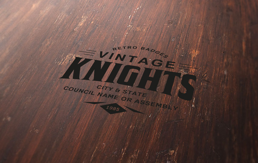
Learn how to take advantage of Photoshop’s Smart Objects to mock up your logo with photorealistic results. Thanks to the use of multiple layer styles, we’ll carve your logo into wood!

But first, do you need to design a logo? Check out this simple, easy to use online logo maker. Over 745 SMART logo templates to design your custom logo all in one place, Placeit. No Photoshop skills required.

If you’re looking to get a logo mockup, head on over to Envato Elements or GraphicRiver where you can find many to suit your needs, including this striking laser wood cut mockup.

Tutorial Assets

The following assets were used during the production of this tutorial:

1. How to Create a Smart Object With the Right Perspective

Step 1

Download the Wood Texture and open it with Photoshop.

Wood Texture

Step 2

Download the Perspective Image and open it with Photoshop.

Perspective image

Step 3

In the top menu, choose Select > All and then Edit > Copy to copy the selection to the clipboard.

Go back to the background document and choose, in the top menu, Edit > Paste to paste the perspective image over the background.

Rename the layer by double-clicking directly on the layer’s name in the Layers panel and changing it to „Perspective„.

Layers panel

Step 4

Set the foreground color to yellow (any color different from black is good).

Then choose the Rectangle Tool, move the cursor over the canvas, and click. You’ll open a small dialog box that allows you to enter precise dimensions for your new shape. Type 1267 x 814 px and then click the OK button.

Rename the layer by double-clicking directly on the layer’s name in the Layers panel and changing it to „Smart Object„.

With the „Smart Object” layer selected, choose, in the top menu, Layer > Smart Object > Convert to Smart Object.

Smart object

Step 5

Choose Edit > Transform > Distort and move the top right corner point to align it with the top right corner of the black rectangle

Distort smart object

Step 6

Keep dragging the corner points until you align all the corners of the yellow rectangle with the black perspective image and cover the whole area:

Distort smart object

Step 7

Now you can remove the „Perspective” layer by selecting it in the Layers panel and choosing Layer > Delete > Layer

Smart object over the wood texture

2. How to Prepare the Badge With Illustrator

Step 1

We need a logo or badge to complete the scene. This badge will be a prominent element that later will be engraved in the wood texture.

Fortunately, Envato Elements offers a wide range of high-quality badges and vector elements ready for use. Subscribe to unlock unlimited badges, templates, photos and more for one monthly fee!

In this tutorial we’ll use a badge that comes from Badges and Logos Vol.01. Download it and open with Illustrator.

Badge from Badges and Logos Vol01

Step 2

Open the vector .ai file with Adobe Illustrator. While you open the file, a window may pop up alerting you that the document uses fonts that are currently not available on your computer. No worries about that—all the fonts are free for use, and you can find a text file inside the folder with all the references and links to download each font.

Missing font dialog

For the purpose of this tutorial, I used the following free fonts for the badge:

Step 3

Once you’re done with fonts, choose the Selection Tool (V). Now select the „Vintage Knights” badge (or whatever badge you like).

Copy the badge by going to Edit > Copy or pressing Command-C.

Create a new 350 x 350 px document in Adobe Illustrator.

Finally, paste the badge just copied by choosing Edit > Paste or pressing Command-V.

Badge from Badges and Logos Vol01

Step 4

With the Selection Tool (V), move the badge over the grey area, out of the white canvas.

Badge from Badges and Logos Vol01

Step 5

Before importing the badge into our scene in Photoshop, we need to expand the appearance, convert all the text to vector shapes, and remove the white area revealed now that we’ve moved the badge to the grey area.

If the badge is not selected, select it by clicking on it with the Selection Tool (V).

In the top menu, choose Object > Expand Appearance.

Again, choose Object > Expand. A dialog window will appear; select Object and Fill and press OK:

Expand dialog

Step 6

Locate the Pathfinder panel. If you can’t see the panel, open it by choosing Window > Pathfinder.

Choose Trim.

Pathfinder panel

Step 7

Now that the badge is 100% vector shapes, we can remove the white area. Choose the Magic Wand Tool, and move the cursor over a white area and click to select all the white areas of the badge. If you need, magnify the canvas by using the Zoom Tool (Z). When all the white areas of the badge are selected, remove them by choosing, in the top menu, Edit > Cut.

Badge from Badges and Logos Vol01

3. How to Include the Badge in the Scene

Step 1

We’re still in the Adobe Illustrator workspace. If the badge is not selected, select it by clicking on it with the Selection Tool (V). Copy the badge by going to Edit > Copy or pressing Command-C.

Badge from Badges and Logos Vol01

Step 2

Go back to Photoshop, and double-click on the Smart Objects thumbnail. This will open the content of the smart object in a new window of Photoshop. Here you can make any changes you like and, once you’re satisfied, all you need to do is save the file and the Photoshop Smart Object will be updated when you return to it.

In the Layers panel, deactivate the visibility for the yellow rectangle layer, and paste the badge just copied by choosing Edit > Paste or pressing Command-V.

From the dialog box, choose Smart Object and press OK:

Paste smart object dialog

Step 3

Locate the top options bar and set the badge’s position to 633.50 x 406.50 px and its dimension to 666% for both Width and Height fields. When you’re done, press ENTER on your keyboard:

Top options bar

Step 4

Save the document by choosing File > Save or using the keyboard shortcut Command-S.

Go back to the main document and you’ll notice that the smart object is now updated with the last changes. The badge, in fact, has taken the perspective of the smart object.

Wood Engraved Logo MockUp

4. How to Engrave the Badge Into the Wood

Step 1

Set the Fill for the „Smart Object” layer to 0%:

Layers panel

Step 2

Duplicate the „Smart Object” layer five times by going to Layer > New > Layer Via Copy.

Now rename and group the layers as shown in the image below.

From now on, when you need to replace the badge in your smart object, you can use the „Smart Object” layer, by clicking on it and editing the content.

Layers panel

Step 3

Let’s start adding some layer styles to the „Effect 5” layer. Open the Layer Style panel and add a new Bevel & Embossed effect. Set the color for the Highlight Mode to #ffffff, the color for the Shadow Mode to #000000, and set the rest as follows:

Layer style dialog

Step 4

Add a new Inner Shadow effect, set the color for the Blend Mode to #000000, and set the rest as follows:

Layer style dialog

Step 5

Add a new Satin effect, set the color for the Blend Mode to #3b2b25, and set the rest as follows:

Layer style dialog

Step 6

Add a new Drop Shadow effect, set the color for the Blend Mode to #ffffff, and set the rest as follows:

Layer style dialog

Step 7

Now let’s add some layer styles to the „Effect 4” layer. 

Open the Layer Style panel and add a new Inner Shadow effect, set the Blend Mode color to #000000, and set the rest as follows:

Layer style dialog

Step 8

Add a new Pattern Overlay effect and set the options as shown in the image below:

Layer style dialog

Click on the pattern thumbnail, and then click on the small gear to open the cascade menu. Choose Grayscale Paper and then click on the first pattern named Black Weaved.

Layer style dialog

Step 9

Add a new Drop Shadow effect, set the Blend Mode color to #b07555, and set the rest as follows:

Layer style dialog

Step 10

Let’s add a layer style to the „Effect 3” layer. 

Open the Layer Style panel and add a new Inner Shadow effect, set the Blend Mode color to #000000, and set the rest as follows:

Layer style dialog

Step 11

Let’s add a layer style to the „Effect 2” layer. 

Open the Layer Style panel and add a new Inner Shadow effect, set the Blend Mode color to #000000, and set the rest as follows:

Layer style dialog

Step 12

Let’s add a layer style to the „Effect 1” layer. 

Open the Layer Style panel and add a new Inner Shadow effect, set the Blend Mode color to #000000, and set the rest as follows:

Layer style dialog

Step 13

Add a new Gradient Overlay effect and set the options as follows:

Layer style dialog

Click on the small gradient window to edit the gradient color.

  • Set the first color stop to Color #696969 and Location 0%.
  • Set the second color stop to Color #d9d9d9  and Location 100%.
Gradient editor dialog

Congratulations, You’re Done!

In this tutorial we learned how to create an engraved wood logo mockup with Adobe Photoshop!

I hope that you’ve enjoyed my tutorial and learned something new. Please feel free to leave your comments, suggestions, and outcomes below.

Enjoy Photoshopping!

Final image

How to Create a Wood Engraved Logo Mockup in Adobe Photoshop

Post pobrano z: How to Create a Wood Engraved Logo Mockup in Adobe Photoshop

Final product image
What You’ll Be Creating

Learn how to take advantage of Photoshop’s Smart Objects to mock up your logo with photorealistic results. Thanks to the use of multiple layer styles, we’ll carve your logo into wood!

But first, do you need to design a logo? Check out this simple, easy to use online logo maker. Over 745 SMART logo templates to design your custom logo all in one place, Placeit. No Photoshop skills required.

If you’re looking to get a logo mockup, head on over to Envato Elements or GraphicRiver where you can find many to suit your needs, including this striking laser wood cut mockup.

Tutorial Assets

The following assets were used during the production of this tutorial:

1. How to Create a Smart Object With the Right Perspective

Step 1

Download the Wood Texture and open it with Photoshop.

Wood Texture

Step 2

Download the Perspective Image and open it with Photoshop.

Perspective image

Step 3

In the top menu, choose Select > All and then Edit > Copy to copy the selection to the clipboard.

Go back to the background document and choose, in the top menu, Edit > Paste to paste the perspective image over the background.

Rename the layer by double-clicking directly on the layer’s name in the Layers panel and changing it to „Perspective„.

Layers panel

Step 4

Set the foreground color to yellow (any color different from black is good).

Then choose the Rectangle Tool, move the cursor over the canvas, and click. You’ll open a small dialog box that allows you to enter precise dimensions for your new shape. Type 1267 x 814 px and then click the OK button.

Rename the layer by double-clicking directly on the layer’s name in the Layers panel and changing it to „Smart Object„.

With the „Smart Object” layer selected, choose, in the top menu, Layer > Smart Object > Convert to Smart Object.

Smart object

Step 5

Choose Edit > Transform > Distort and move the top right corner point to align it with the top right corner of the black rectangle

Distort smart object

Step 6

Keep dragging the corner points until you align all the corners of the yellow rectangle with the black perspective image and cover the whole area:

Distort smart object

Step 7

Now you can remove the „Perspective” layer by selecting it in the Layers panel and choosing Layer > Delete > Layer

Smart object over the wood texture

2. How to Prepare the Badge With Illustrator

Step 1

We need a logo or badge to complete the scene. This badge will be a prominent element that later will be engraved in the wood texture.

Fortunately, Envato Elements offers a wide range of high-quality badges and vector elements ready for use. Subscribe to unlock unlimited badges, templates, photos and more for one monthly fee!

In this tutorial we’ll use a badge that comes from Badges and Logos Vol.01. Download it and open with Illustrator.

Badge from Badges and Logos Vol01

Step 2

Open the vector .ai file with Adobe Illustrator. While you open the file, a window may pop up alerting you that the document uses fonts that are currently not available on your computer. No worries about that—all the fonts are free for use, and you can find a text file inside the folder with all the references and links to download each font.

Missing font dialog

For the purpose of this tutorial, I used the following free fonts for the badge:

Step 3

Once you’re done with fonts, choose the Selection Tool (V). Now select the „Vintage Knights” badge (or whatever badge you like).

Copy the badge by going to Edit > Copy or pressing Command-C.

Create a new 350 x 350 px document in Adobe Illustrator.

Finally, paste the badge just copied by choosing Edit > Paste or pressing Command-V.

Badge from Badges and Logos Vol01

Step 4

With the Selection Tool (V), move the badge over the grey area, out of the white canvas.

Badge from Badges and Logos Vol01

Step 5

Before importing the badge into our scene in Photoshop, we need to expand the appearance, convert all the text to vector shapes, and remove the white area revealed now that we’ve moved the badge to the grey area.

If the badge is not selected, select it by clicking on it with the Selection Tool (V).

In the top menu, choose Object > Expand Appearance.

Again, choose Object > Expand. A dialog window will appear; select Object and Fill and press OK:

Expand dialog

Step 6

Locate the Pathfinder panel. If you can’t see the panel, open it by choosing Window > Pathfinder.

Choose Trim.

Pathfinder panel

Step 7

Now that the badge is 100% vector shapes, we can remove the white area. Choose the Magic Wand Tool, and move the cursor over a white area and click to select all the white areas of the badge. If you need, magnify the canvas by using the Zoom Tool (Z). When all the white areas of the badge are selected, remove them by choosing, in the top menu, Edit > Cut.

Badge from Badges and Logos Vol01

3. How to Include the Badge in the Scene

Step 1

We’re still in the Adobe Illustrator workspace. If the badge is not selected, select it by clicking on it with the Selection Tool (V). Copy the badge by going to Edit > Copy or pressing Command-C.

Badge from Badges and Logos Vol01

Step 2

Go back to Photoshop, and double-click on the Smart Objects thumbnail. This will open the content of the smart object in a new window of Photoshop. Here you can make any changes you like and, once you’re satisfied, all you need to do is save the file and the Photoshop Smart Object will be updated when you return to it.

In the Layers panel, deactivate the visibility for the yellow rectangle layer, and paste the badge just copied by choosing Edit > Paste or pressing Command-V.

From the dialog box, choose Smart Object and press OK:

Paste smart object dialog

Step 3

Locate the top options bar and set the badge’s position to 633.50 x 406.50 px and its dimension to 666% for both Width and Height fields. When you’re done, press ENTER on your keyboard:

Top options bar

Step 4

Save the document by choosing File > Save or using the keyboard shortcut Command-S.

Go back to the main document and you’ll notice that the smart object is now updated with the last changes. The badge, in fact, has taken the perspective of the smart object.

Wood Engraved Logo MockUp

4. How to Engrave the Badge Into the Wood

Step 1

Set the Fill for the „Smart Object” layer to 0%:

Layers panel

Step 2

Duplicate the „Smart Object” layer five times by going to Layer > New > Layer Via Copy.

Now rename and group the layers as shown in the image below.

From now on, when you need to replace the badge in your smart object, you can use the „Smart Object” layer, by clicking on it and editing the content.

Layers panel

Step 3

Let’s start adding some layer styles to the „Effect 5” layer. Open the Layer Style panel and add a new Bevel & Embossed effect. Set the color for the Highlight Mode to #ffffff, the color for the Shadow Mode to #000000, and set the rest as follows:

Layer style dialog

Step 4

Add a new Inner Shadow effect, set the color for the Blend Mode to #000000, and set the rest as follows:

Layer style dialog

Step 5

Add a new Satin effect, set the color for the Blend Mode to #3b2b25, and set the rest as follows:

Layer style dialog

Step 6

Add a new Drop Shadow effect, set the color for the Blend Mode to #ffffff, and set the rest as follows:

Layer style dialog

Step 7

Now let’s add some layer styles to the „Effect 4” layer. 

Open the Layer Style panel and add a new Inner Shadow effect, set the Blend Mode color to #000000, and set the rest as follows:

Layer style dialog

Step 8

Add a new Pattern Overlay effect and set the options as shown in the image below:

Layer style dialog

Click on the pattern thumbnail, and then click on the small gear to open the cascade menu. Choose Grayscale Paper and then click on the first pattern named Black Weaved.

Layer style dialog

Step 9

Add a new Drop Shadow effect, set the Blend Mode color to #b07555, and set the rest as follows:

Layer style dialog

Step 10

Let’s add a layer style to the „Effect 3” layer. 

Open the Layer Style panel and add a new Inner Shadow effect, set the Blend Mode color to #000000, and set the rest as follows:

Layer style dialog

Step 11

Let’s add a layer style to the „Effect 2” layer. 

Open the Layer Style panel and add a new Inner Shadow effect, set the Blend Mode color to #000000, and set the rest as follows:

Layer style dialog

Step 12

Let’s add a layer style to the „Effect 1” layer. 

Open the Layer Style panel and add a new Inner Shadow effect, set the Blend Mode color to #000000, and set the rest as follows:

Layer style dialog

Step 13

Add a new Gradient Overlay effect and set the options as follows:

Layer style dialog

Click on the small gradient window to edit the gradient color.

  • Set the first color stop to Color #696969 and Location 0%.
  • Set the second color stop to Color #d9d9d9  and Location 100%.
Gradient editor dialog

Congratulations, You’re Done!

In this tutorial we learned how to create an engraved wood logo mockup with Adobe Photoshop!

I hope that you’ve enjoyed my tutorial and learned something new. Please feel free to leave your comments, suggestions, and outcomes below.

Enjoy Photoshopping!

Final image

How to Create a Wood Engraved Logo Mockup in Adobe Photoshop

Post pobrano z: How to Create a Wood Engraved Logo Mockup in Adobe Photoshop

Final product image
What You’ll Be Creating

Learn how to take advantage of Photoshop’s Smart Objects to mock up your logo with photorealistic results. Thanks to the use of multiple layer styles, we’ll carve your logo into wood!

But first, do you need to design a logo? Check out this simple, easy to use online logo maker. Over 745 SMART logo templates to design your custom logo all in one place, Placeit. No Photoshop skills required.

If you’re looking to get a logo mockup, head on over to Envato Elements or GraphicRiver where you can find many to suit your needs, including this striking laser wood cut mockup.

Tutorial Assets

The following assets were used during the production of this tutorial:

1. How to Create a Smart Object With the Right Perspective

Step 1

Download the Wood Texture and open it with Photoshop.

Wood Texture

Step 2

Download the Perspective Image and open it with Photoshop.

Perspective image

Step 3

In the top menu, choose Select > All and then Edit > Copy to copy the selection to the clipboard.

Go back to the background document and choose, in the top menu, Edit > Paste to paste the perspective image over the background.

Rename the layer by double-clicking directly on the layer’s name in the Layers panel and changing it to „Perspective„.

Layers panel

Step 4

Set the foreground color to yellow (any color different from black is good).

Then choose the Rectangle Tool, move the cursor over the canvas, and click. You’ll open a small dialog box that allows you to enter precise dimensions for your new shape. Type 1267 x 814 px and then click the OK button.

Rename the layer by double-clicking directly on the layer’s name in the Layers panel and changing it to „Smart Object„.

With the „Smart Object” layer selected, choose, in the top menu, Layer > Smart Object > Convert to Smart Object.

Smart object

Step 5

Choose Edit > Transform > Distort and move the top right corner point to align it with the top right corner of the black rectangle

Distort smart object

Step 6

Keep dragging the corner points until you align all the corners of the yellow rectangle with the black perspective image and cover the whole area:

Distort smart object

Step 7

Now you can remove the „Perspective” layer by selecting it in the Layers panel and choosing Layer > Delete > Layer

Smart object over the wood texture

2. How to Prepare the Badge With Illustrator

Step 1

We need a logo or badge to complete the scene. This badge will be a prominent element that later will be engraved in the wood texture.

Fortunately, Envato Elements offers a wide range of high-quality badges and vector elements ready for use. Subscribe to unlock unlimited badges, templates, photos and more for one monthly fee!

In this tutorial we’ll use a badge that comes from Badges and Logos Vol.01. Download it and open with Illustrator.

Badge from Badges and Logos Vol01

Step 2

Open the vector .ai file with Adobe Illustrator. While you open the file, a window may pop up alerting you that the document uses fonts that are currently not available on your computer. No worries about that—all the fonts are free for use, and you can find a text file inside the folder with all the references and links to download each font.

Missing font dialog

For the purpose of this tutorial, I used the following free fonts for the badge:

Step 3

Once you’re done with fonts, choose the Selection Tool (V). Now select the „Vintage Knights” badge (or whatever badge you like).

Copy the badge by going to Edit > Copy or pressing Command-C.

Create a new 350 x 350 px document in Adobe Illustrator.

Finally, paste the badge just copied by choosing Edit > Paste or pressing Command-V.

Badge from Badges and Logos Vol01

Step 4

With the Selection Tool (V), move the badge over the grey area, out of the white canvas.

Badge from Badges and Logos Vol01

Step 5

Before importing the badge into our scene in Photoshop, we need to expand the appearance, convert all the text to vector shapes, and remove the white area revealed now that we’ve moved the badge to the grey area.

If the badge is not selected, select it by clicking on it with the Selection Tool (V).

In the top menu, choose Object > Expand Appearance.

Again, choose Object > Expand. A dialog window will appear; select Object and Fill and press OK:

Expand dialog

Step 6

Locate the Pathfinder panel. If you can’t see the panel, open it by choosing Window > Pathfinder.

Choose Trim.

Pathfinder panel

Step 7

Now that the badge is 100% vector shapes, we can remove the white area. Choose the Magic Wand Tool, and move the cursor over a white area and click to select all the white areas of the badge. If you need, magnify the canvas by using the Zoom Tool (Z). When all the white areas of the badge are selected, remove them by choosing, in the top menu, Edit > Cut.

Badge from Badges and Logos Vol01

3. How to Include the Badge in the Scene

Step 1

We’re still in the Adobe Illustrator workspace. If the badge is not selected, select it by clicking on it with the Selection Tool (V). Copy the badge by going to Edit > Copy or pressing Command-C.

Badge from Badges and Logos Vol01

Step 2

Go back to Photoshop, and double-click on the Smart Objects thumbnail. This will open the content of the smart object in a new window of Photoshop. Here you can make any changes you like and, once you’re satisfied, all you need to do is save the file and the Photoshop Smart Object will be updated when you return to it.

In the Layers panel, deactivate the visibility for the yellow rectangle layer, and paste the badge just copied by choosing Edit > Paste or pressing Command-V.

From the dialog box, choose Smart Object and press OK:

Paste smart object dialog

Step 3

Locate the top options bar and set the badge’s position to 633.50 x 406.50 px and its dimension to 666% for both Width and Height fields. When you’re done, press ENTER on your keyboard:

Top options bar

Step 4

Save the document by choosing File > Save or using the keyboard shortcut Command-S.

Go back to the main document and you’ll notice that the smart object is now updated with the last changes. The badge, in fact, has taken the perspective of the smart object.

Wood Engraved Logo MockUp

4. How to Engrave the Badge Into the Wood

Step 1

Set the Fill for the „Smart Object” layer to 0%:

Layers panel

Step 2

Duplicate the „Smart Object” layer five times by going to Layer > New > Layer Via Copy.

Now rename and group the layers as shown in the image below.

From now on, when you need to replace the badge in your smart object, you can use the „Smart Object” layer, by clicking on it and editing the content.

Layers panel

Step 3

Let’s start adding some layer styles to the „Effect 5” layer. Open the Layer Style panel and add a new Bevel & Embossed effect. Set the color for the Highlight Mode to #ffffff, the color for the Shadow Mode to #000000, and set the rest as follows:

Layer style dialog

Step 4

Add a new Inner Shadow effect, set the color for the Blend Mode to #000000, and set the rest as follows:

Layer style dialog

Step 5

Add a new Satin effect, set the color for the Blend Mode to #3b2b25, and set the rest as follows:

Layer style dialog

Step 6

Add a new Drop Shadow effect, set the color for the Blend Mode to #ffffff, and set the rest as follows:

Layer style dialog

Step 7

Now let’s add some layer styles to the „Effect 4” layer. 

Open the Layer Style panel and add a new Inner Shadow effect, set the Blend Mode color to #000000, and set the rest as follows:

Layer style dialog

Step 8

Add a new Pattern Overlay effect and set the options as shown in the image below:

Layer style dialog

Click on the pattern thumbnail, and then click on the small gear to open the cascade menu. Choose Grayscale Paper and then click on the first pattern named Black Weaved.

Layer style dialog

Step 9

Add a new Drop Shadow effect, set the Blend Mode color to #b07555, and set the rest as follows:

Layer style dialog

Step 10

Let’s add a layer style to the „Effect 3” layer. 

Open the Layer Style panel and add a new Inner Shadow effect, set the Blend Mode color to #000000, and set the rest as follows:

Layer style dialog

Step 11

Let’s add a layer style to the „Effect 2” layer. 

Open the Layer Style panel and add a new Inner Shadow effect, set the Blend Mode color to #000000, and set the rest as follows:

Layer style dialog

Step 12

Let’s add a layer style to the „Effect 1” layer. 

Open the Layer Style panel and add a new Inner Shadow effect, set the Blend Mode color to #000000, and set the rest as follows:

Layer style dialog

Step 13

Add a new Gradient Overlay effect and set the options as follows:

Layer style dialog

Click on the small gradient window to edit the gradient color.

  • Set the first color stop to Color #696969 and Location 0%.
  • Set the second color stop to Color #d9d9d9  and Location 100%.
Gradient editor dialog

Congratulations, You’re Done!

In this tutorial we learned how to create an engraved wood logo mockup with Adobe Photoshop!

I hope that you’ve enjoyed my tutorial and learned something new. Please feel free to leave your comments, suggestions, and outcomes below.

Enjoy Photoshopping!

Final image

How to Create a Wood Engraved Logo Mockup in Adobe Photoshop

Post pobrano z: How to Create a Wood Engraved Logo Mockup in Adobe Photoshop

Final product image
What You’ll Be Creating

Learn how to take advantage of Photoshop’s Smart Objects to mock up your logo with photorealistic results. Thanks to the use of multiple layer styles, we’ll carve your logo into wood!

But first, do you need to design a logo? Check out this simple, easy to use online logo maker. Over 745 SMART logo templates to design your custom logo all in one place, Placeit. No Photoshop skills required.

If you’re looking to get a logo mockup, head on over to Envato Elements or GraphicRiver where you can find many to suit your needs, including this striking laser wood cut mockup.

Tutorial Assets

The following assets were used during the production of this tutorial:

1. How to Create a Smart Object With the Right Perspective

Step 1

Download the Wood Texture and open it with Photoshop.

Wood Texture

Step 2

Download the Perspective Image and open it with Photoshop.

Perspective image

Step 3

In the top menu, choose Select > All and then Edit > Copy to copy the selection to the clipboard.

Go back to the background document and choose, in the top menu, Edit > Paste to paste the perspective image over the background.

Rename the layer by double-clicking directly on the layer’s name in the Layers panel and changing it to „Perspective„.

Layers panel

Step 4

Set the foreground color to yellow (any color different from black is good).

Then choose the Rectangle Tool, move the cursor over the canvas, and click. You’ll open a small dialog box that allows you to enter precise dimensions for your new shape. Type 1267 x 814 px and then click the OK button.

Rename the layer by double-clicking directly on the layer’s name in the Layers panel and changing it to „Smart Object„.

With the „Smart Object” layer selected, choose, in the top menu, Layer > Smart Object > Convert to Smart Object.

Smart object

Step 5

Choose Edit > Transform > Distort and move the top right corner point to align it with the top right corner of the black rectangle

Distort smart object

Step 6

Keep dragging the corner points until you align all the corners of the yellow rectangle with the black perspective image and cover the whole area:

Distort smart object

Step 7

Now you can remove the „Perspective” layer by selecting it in the Layers panel and choosing Layer > Delete > Layer

Smart object over the wood texture

2. How to Prepare the Badge With Illustrator

Step 1

We need a logo or badge to complete the scene. This badge will be a prominent element that later will be engraved in the wood texture.

Fortunately, Envato Elements offers a wide range of high-quality badges and vector elements ready for use. Subscribe to unlock unlimited badges, templates, photos and more for one monthly fee!

In this tutorial we’ll use a badge that comes from Badges and Logos Vol.01. Download it and open with Illustrator.

Badge from Badges and Logos Vol01

Step 2

Open the vector .ai file with Adobe Illustrator. While you open the file, a window may pop up alerting you that the document uses fonts that are currently not available on your computer. No worries about that—all the fonts are free for use, and you can find a text file inside the folder with all the references and links to download each font.

Missing font dialog

For the purpose of this tutorial, I used the following free fonts for the badge:

Step 3

Once you’re done with fonts, choose the Selection Tool (V). Now select the „Vintage Knights” badge (or whatever badge you like).

Copy the badge by going to Edit > Copy or pressing Command-C.

Create a new 350 x 350 px document in Adobe Illustrator.

Finally, paste the badge just copied by choosing Edit > Paste or pressing Command-V.

Badge from Badges and Logos Vol01

Step 4

With the Selection Tool (V), move the badge over the grey area, out of the white canvas.

Badge from Badges and Logos Vol01

Step 5

Before importing the badge into our scene in Photoshop, we need to expand the appearance, convert all the text to vector shapes, and remove the white area revealed now that we’ve moved the badge to the grey area.

If the badge is not selected, select it by clicking on it with the Selection Tool (V).

In the top menu, choose Object > Expand Appearance.

Again, choose Object > Expand. A dialog window will appear; select Object and Fill and press OK:

Expand dialog

Step 6

Locate the Pathfinder panel. If you can’t see the panel, open it by choosing Window > Pathfinder.

Choose Trim.

Pathfinder panel

Step 7

Now that the badge is 100% vector shapes, we can remove the white area. Choose the Magic Wand Tool, and move the cursor over a white area and click to select all the white areas of the badge. If you need, magnify the canvas by using the Zoom Tool (Z). When all the white areas of the badge are selected, remove them by choosing, in the top menu, Edit > Cut.

Badge from Badges and Logos Vol01

3. How to Include the Badge in the Scene

Step 1

We’re still in the Adobe Illustrator workspace. If the badge is not selected, select it by clicking on it with the Selection Tool (V). Copy the badge by going to Edit > Copy or pressing Command-C.

Badge from Badges and Logos Vol01

Step 2

Go back to Photoshop, and double-click on the Smart Objects thumbnail. This will open the content of the smart object in a new window of Photoshop. Here you can make any changes you like and, once you’re satisfied, all you need to do is save the file and the Photoshop Smart Object will be updated when you return to it.

In the Layers panel, deactivate the visibility for the yellow rectangle layer, and paste the badge just copied by choosing Edit > Paste or pressing Command-V.

From the dialog box, choose Smart Object and press OK:

Paste smart object dialog

Step 3

Locate the top options bar and set the badge’s position to 633.50 x 406.50 px and its dimension to 666% for both Width and Height fields. When you’re done, press ENTER on your keyboard:

Top options bar

Step 4

Save the document by choosing File > Save or using the keyboard shortcut Command-S.

Go back to the main document and you’ll notice that the smart object is now updated with the last changes. The badge, in fact, has taken the perspective of the smart object.

Wood Engraved Logo MockUp

4. How to Engrave the Badge Into the Wood

Step 1

Set the Fill for the „Smart Object” layer to 0%:

Layers panel

Step 2

Duplicate the „Smart Object” layer five times by going to Layer > New > Layer Via Copy.

Now rename and group the layers as shown in the image below.

From now on, when you need to replace the badge in your smart object, you can use the „Smart Object” layer, by clicking on it and editing the content.

Layers panel

Step 3

Let’s start adding some layer styles to the „Effect 5” layer. Open the Layer Style panel and add a new Bevel & Embossed effect. Set the color for the Highlight Mode to #ffffff, the color for the Shadow Mode to #000000, and set the rest as follows:

Layer style dialog

Step 4

Add a new Inner Shadow effect, set the color for the Blend Mode to #000000, and set the rest as follows:

Layer style dialog

Step 5

Add a new Satin effect, set the color for the Blend Mode to #3b2b25, and set the rest as follows:

Layer style dialog

Step 6

Add a new Drop Shadow effect, set the color for the Blend Mode to #ffffff, and set the rest as follows:

Layer style dialog

Step 7

Now let’s add some layer styles to the „Effect 4” layer. 

Open the Layer Style panel and add a new Inner Shadow effect, set the Blend Mode color to #000000, and set the rest as follows:

Layer style dialog

Step 8

Add a new Pattern Overlay effect and set the options as shown in the image below:

Layer style dialog

Click on the pattern thumbnail, and then click on the small gear to open the cascade menu. Choose Grayscale Paper and then click on the first pattern named Black Weaved.

Layer style dialog

Step 9

Add a new Drop Shadow effect, set the Blend Mode color to #b07555, and set the rest as follows:

Layer style dialog

Step 10

Let’s add a layer style to the „Effect 3” layer. 

Open the Layer Style panel and add a new Inner Shadow effect, set the Blend Mode color to #000000, and set the rest as follows:

Layer style dialog

Step 11

Let’s add a layer style to the „Effect 2” layer. 

Open the Layer Style panel and add a new Inner Shadow effect, set the Blend Mode color to #000000, and set the rest as follows:

Layer style dialog

Step 12

Let’s add a layer style to the „Effect 1” layer. 

Open the Layer Style panel and add a new Inner Shadow effect, set the Blend Mode color to #000000, and set the rest as follows:

Layer style dialog

Step 13

Add a new Gradient Overlay effect and set the options as follows:

Layer style dialog

Click on the small gradient window to edit the gradient color.

  • Set the first color stop to Color #696969 and Location 0%.
  • Set the second color stop to Color #d9d9d9  and Location 100%.
Gradient editor dialog

Congratulations, You’re Done!

In this tutorial we learned how to create an engraved wood logo mockup with Adobe Photoshop!

I hope that you’ve enjoyed my tutorial and learned something new. Please feel free to leave your comments, suggestions, and outcomes below.

Enjoy Photoshopping!

Final image

Quick Tip: Create Dynamic Poses Using Gesture Drawing

Post pobrano z: Quick Tip: Create Dynamic Poses Using Gesture Drawing

Final product image
What You’ll Be Creating

Characters looking stiff? Illustrations repeating the same old poses? Animation looking boring? Fret not, I have a cure! Dynamic gesture drawing is a great way to really loosen up and make your work interesting and more importantly fun!

Following along with this video over on our Envato Tuts+ YouTube channel.

What You Will Need

  • Reference images such as PhotoDune: group of teenagers jumping.
  • Films or TV shows with action.
  • Your favourite drawing program or traditional media—I recommend inexpensive felt pens and copier paper.
  • A stopwatch.

Optional:

  • Life Drawing Classes (check the local press or art colleges).
  • A friend being silly.

What Is Gesture Drawing and Why Is It Important? 

According to Wikipedia

„A gesture drawing is work of art defined by rapid execution. Typical situations involve an artist drawing a series of poses taken by a model in a short amount of time…”

It’s an important skill to develop because you learn to capture motion very quickly, which is helpful for creating interesting and dynamic artwork. Gesture drawing can really help you capture a subtle motion, a look someone gives a loved one, or a fabulous action pose you see in a wrestling match that would work great in your superhero comic! 

Gesture drawing does not always have to involve exciting, explosive poses like this image from PhotoDune.

Group of Teenagers Jumping - Photodune

Gesture drawing captures the rhythm, the motion and the flow of an action. Even stationary poses can look dynamic. Remember these are not stick figures, these are action poses. 

The Line of Action

The line of action is very important and is not necessarily the spine of the person or creature. It’s the shape the form takes. This is where my gesture drawings begin. Really look at your subject and redraw the line of action several times if need be. Here’s an example of the line of motion in these five teenagers.

Line of Action

Moving on from these lines of action you can rough in limbs, torso and head. Keep the lines fluid. Even jagged lines such as the legs in the central character are fluid. Remember, though, that smooth lines can show calm and flexibility, whereas jagged lines show tension.

Simple Forms

How I Work

I start with a line of motion, and then plot out the legs. Working quickly helps me capture the motion. When working in a life drawing class I was trained to draw poses in 30 seconds to two minutes. As much info needs to be put down as possible. 

My Sketches

Practice

You won’t always get it right first time, but that’s cool. These are not meant to be finished pieces. 

Red Cardigan Girl Sketches

Be scribbly, be quick! Remember to look at your work afterwards and see what you need to improve and what you’re doing right. 

Scribbly Jump Sketches

If you do find a dynamic pose that works well, then try working it up with some basic anatomy. This can be a great confidence booster.

Another use for these quick gesture drawings is working out a complex, long pose in a life drawing class. Not sure where some anatomy should go? Do a few rough gesture poses first. Not happy with how the model looks from your spot? Try walking round the model and other students (quietly, of course!) and rough out poses to find the best one. I am a big believer in planning out my artwork before I start—it might seem like a waste of time, but it will save you time later on in the piece. 

Refined Jump Sketch

Keep It Simple! 

Start with a line of motion and use whatever shapes help. Sometimes I use bean shapes for the body, other times I use rectangles and triangles.

To show head direction, draw an oval with a horizontal contour line of where the eye line is and a vertical one for the nose.

Quick Pose Sketches

How to Improve

It’s nothing more than Practice, Practice, Practice! 

An option is going to life drawing classes. This isn’t always possible, but there is nothing like drawing from a model. At art college I loved life drawing classes—we had them every Friday. These ranged from long poses studying anatomy to 30‑second poses to study movement. In these the model would change pose, often with a prop such as a stick or perhaps a cloth. You never knew what you would get next! By the end of a morning session of a few hours I would have pages and pages of sketches. It helped my capturing of movement and gesture improve very quickly! 

A fun way to practice is to watch films and pause scenes with some cool action and try to capture the pose. Try timing yourself.

Do you have a commute or some time on a lunch break with no access to life drawing classes? Try some observational drawing! Look out of the bus window and try to capture poses—this is good as you can’t sit and analyse the pose, go back and redraw. 

Find a medium that works for you. When not working digitally I like to use brush pens. They do not have to be expensive—just plain children’s colouring pens are great. An advantage of having different colours is that you can have your line of motion in one colour and the pose in another.

Quick poses do not have to be humans either. Got a pet? Live near a farm? Apply the same principles to Tabby the cat or Daisy the cow. 

Most importantly: keep it simple

Remember these do not have to be anatomically perfect—it’s just a case of finding motion and fluidity. 

Conclusion

I hope you have a lot of fun creating these sketches. Do not be precious about these. Use the cheapest media you can, like copier paper or news print, felt pens or charcoal. Make this a regular exercise, and even use it to warm up before a long day of drawing! 

Quick Tip: Create Dynamic Poses Using Gesture Drawing

Post pobrano z: Quick Tip: Create Dynamic Poses Using Gesture Drawing

Final product image
What You’ll Be Creating

Characters looking stiff? Illustrations repeating the same old poses? Animation looking boring? Fret not, I have a cure! Dynamic gesture drawing is a great way to really loosen up and make your work interesting and more importantly fun!

Following along with this video over on our Envato Tuts+ YouTube channel.

What You Will Need

  • Reference images such as PhotoDune: group of teenagers jumping.
  • Films or TV shows with action.
  • Your favourite drawing program or traditional media—I recommend inexpensive felt pens and copier paper.
  • A stopwatch.

Optional:

  • Life Drawing Classes (check the local press or art colleges).
  • A friend being silly.

What Is Gesture Drawing and Why Is It Important? 

According to Wikipedia

„A gesture drawing is work of art defined by rapid execution. Typical situations involve an artist drawing a series of poses taken by a model in a short amount of time…”

It’s an important skill to develop because you learn to capture motion very quickly, which is helpful for creating interesting and dynamic artwork. Gesture drawing can really help you capture a subtle motion, a look someone gives a loved one, or a fabulous action pose you see in a wrestling match that would work great in your superhero comic! 

Gesture drawing does not always have to involve exciting, explosive poses like this image from PhotoDune.

Group of Teenagers Jumping - Photodune

Gesture drawing captures the rhythm, the motion and the flow of an action. Even stationary poses can look dynamic. Remember these are not stick figures, these are action poses. 

The Line of Action

The line of action is very important and is not necessarily the spine of the person or creature. It’s the shape the form takes. This is where my gesture drawings begin. Really look at your subject and redraw the line of action several times if need be. Here’s an example of the line of motion in these five teenagers.

Line of Action

Moving on from these lines of action you can rough in limbs, torso and head. Keep the lines fluid. Even jagged lines such as the legs in the central character are fluid. Remember, though, that smooth lines can show calm and flexibility, whereas jagged lines show tension.

Simple Forms

How I Work

I start with a line of motion, and then plot out the legs. Working quickly helps me capture the motion. When working in a life drawing class I was trained to draw poses in 30 seconds to two minutes. As much info needs to be put down as possible. 

My Sketches

Practice

You won’t always get it right first time, but that’s cool. These are not meant to be finished pieces. 

Red Cardigan Girl Sketches

Be scribbly, be quick! Remember to look at your work afterwards and see what you need to improve and what you’re doing right. 

Scribbly Jump Sketches

If you do find a dynamic pose that works well, then try working it up with some basic anatomy. This can be a great confidence booster.

Another use for these quick gesture drawings is working out a complex, long pose in a life drawing class. Not sure where some anatomy should go? Do a few rough gesture poses first. Not happy with how the model looks from your spot? Try walking round the model and other students (quietly, of course!) and rough out poses to find the best one. I am a big believer in planning out my artwork before I start—it might seem like a waste of time, but it will save you time later on in the piece. 

Refined Jump Sketch

Keep It Simple! 

Start with a line of motion and use whatever shapes help. Sometimes I use bean shapes for the body, other times I use rectangles and triangles.

To show head direction, draw an oval with a horizontal contour line of where the eye line is and a vertical one for the nose.

Quick Pose Sketches

How to Improve

It’s nothing more than Practice, Practice, Practice! 

An option is going to life drawing classes. This isn’t always possible, but there is nothing like drawing from a model. At art college I loved life drawing classes—we had them every Friday. These ranged from long poses studying anatomy to 30‑second poses to study movement. In these the model would change pose, often with a prop such as a stick or perhaps a cloth. You never knew what you would get next! By the end of a morning session of a few hours I would have pages and pages of sketches. It helped my capturing of movement and gesture improve very quickly! 

A fun way to practice is to watch films and pause scenes with some cool action and try to capture the pose. Try timing yourself.

Do you have a commute or some time on a lunch break with no access to life drawing classes? Try some observational drawing! Look out of the bus window and try to capture poses—this is good as you can’t sit and analyse the pose, go back and redraw. 

Find a medium that works for you. When not working digitally I like to use brush pens. They do not have to be expensive—just plain children’s colouring pens are great. An advantage of having different colours is that you can have your line of motion in one colour and the pose in another.

Quick poses do not have to be humans either. Got a pet? Live near a farm? Apply the same principles to Tabby the cat or Daisy the cow. 

Most importantly: keep it simple

Remember these do not have to be anatomically perfect—it’s just a case of finding motion and fluidity. 

Conclusion

I hope you have a lot of fun creating these sketches. Do not be precious about these. Use the cheapest media you can, like copier paper or news print, felt pens or charcoal. Make this a regular exercise, and even use it to warm up before a long day of drawing!