Archiwum kategorii: Web Tools

The History of Emoticons and Emojis

Post pobrano z: The History of Emoticons and Emojis

Final product image
What You’ll Be Creating

Have you ever wondered what emoticons and emojis have in common, or how they even came to be? Well, since we love empowering our readers with knowledge, we took the time and put together this in-depth article which should break down these two modern ways of communication that have changed our lives so greatly.

From the early days of humanity, our ability
to communicate has played a key factor in completely shaping the way we as members
of the same species interact with each other, allowing us to elevate not only
our minds but also the world that we live in.

This all began when our
early ancestors figured out ways of exchanging pieces of information between
different members of a group, through a common system of symbols, signs, and eventually
words. These slowly but surely formed the tools that we now refer to as language,
which the Britannica Encyclopedia defines as:

„Language, a system of
conventional spoken or written symbols by means of which human beings, as
members of a social group and participants in its culture, express themselves.
The functions of language include communication, the expression of identity,
play, imaginative expression, and emotional release.”

As the human population started growing and covering different
geographical areas, the number of languages grew exponentially. SIL
International (originally known as the Summer Institute of Linguistics)
reported that in 2018 it identified and cataloged roughly 7,097 spoken
languages
: 2,300 in Asia alone, 2,143 in Africa, 1,306 in the Pacific, 1,060 in the
Americas, and 288 in Europe.

spoken languages around the world

Just imagine, 7,097 languages and your average person speaks roughly two or three out of all of them. So what happens when two foreigners try to engage in
the act of communication?

In 1948, Claude Elwood Shannon and Warren
Weaver
developed the Shannon-Weaver Model of Communication in which they
postulated that for a successful exchange of information to occur, a sender (the source) needs to encode a message (the information) that will then be
passed down a channel (the medium) to
the receiver which will then decode it.

shannon-weaver model of communication

Even though the model was introduced as a way of improving technical communication for telephone lines, it was later applied to all kinds of communications since it helped develop effective communication.

This all sounds pretty straightforward, but
what happens when the receiver can’t
decode the message due to the fact that
it was encoded using a different set of words, or more precisely a different language?

Well, nothing much
really, since the information simply
won’t be able to make its way across, creating what is commonly known as a language barrier, which can be a great
source of frustration.

Imagine going to your local food market
and trying to buy a few apples. Easy, right? Now let’s say that there’s only one
farmer that sells apples, and this particular person speaks another language, a
foreign one that you don’t know at all.

At first, without knowing it, you’ll open
the conversation and send your message across by telling him the number of
apples that you’d like to buy, but after a few moments you’ll notice that he
doesn’t seem to understand you.

At this point, you
could easily fix the problem by changing the encoding of your message from spoken
words to visual signs, and indicating the product and quantity using your
fingers.

Now let’s take a slightly different example, where the entire conversation takes
place outside of a face-to-face scenario, where the message is encoded using
written text, such as an instant messaging app.

We’ve all been in that situation when we’ve had a huge crush on a person, but we’ve never had the courage to let her/him know how we truly feel. We would start writing long sentences, and then quickly delete them one word at a time, since we couldn’t find the exact words, or we would be frightened of the other person’s reaction.

As with the previous example, a quick and easy solution would be to change the encoding from letters to emoticons or emojis which have a powerful impact on their own. Not only will this engage the other person into partaking in the conversation, but it will also force you to take a shot and express your feelings.

While these might not be the best examples that I could have come up with, the idea is that sometimes words, whether spoken or written, are not the best solution to a communication problem created by language
barriers or social inhibitions. Sometimes, we need to
adapt our message to the situation, and try and make it as clear and succinct as possible
using the easiest way of getting our thoughts across without losing
too much information.

Whether to express love or to communicate things like the weather or your current state of mind (sadness, happiness, etc.), symbols have become powerful means of expression that we intertwine more and more with our other ways of communication.

This is where emoticons and emojis come in play, since they allow you to adapt to almost any conversation, giving you the ability to communicate your inner emotions more quickly and easily using visual symbols that the other person can relate to.

1. Definition and Point of Origin

Most of the time, when people start thinking of emoticons or emojis, for some reason they end up portraying the same visual entity, since both of them are used with the purpose of enhancing an ongoing conversation.

While the latter is true, the two are quite distinct forms of visual representations, as we will get to see in the following moments.

1. Emoticon

The term emoticon (i-ˈmō-ti-ˌkän / plural emoticons) was created by blending together the words emotion and icon, and is commonly defined as a typographic representation composed of
punctuation marks, numbers and letters meant to illustrate a facial expression
capable of conveying emotions in a text-only medium.

example of basic emoticons

The first documented use of the modern concept
dates back to the year 1982, in a message published by computer scientist
Scott Elliott Fahlman within the bulletin boards of the Carnegie Mellon
University.

Back in the day, faculty staff and
students alike constantly created posts in which they discussed different
topics of the day.

As one would expect, many of these posts
were intended to be serious, while others were meant to be humorous. The
problem was that often the reader would fail to catch sarcastic remarks due to the nature of written language, which lacks tone
and body language.

Such was the case with
a specific post, in which during a physics riddle, one Neil Swartz mentioned a
mercury leak within one of the faculty’s elevators.

“16-Sep-82
12:09    Neil Swartz at CMU-750R     
Pigeon type question

This question does
not involve pigeons, but is similar:

There is a lit
candle in an elevator mounted on a bracket attached to  the middle of one wall (say, 2″ from the
wall).  A drop of mercury is on the floor.  The cable snaps and the
elevator falls.

What happens to the candle and the mercury?”

What happened was that other users that
read the post either hadn’t followed the entire conversation or they didn’t
catch his subtlety, so they ended up assuming that there was indeed a mercury
spill, causing a wave of terror among the other students.

Of course, Neil quickly
pointed out that people had gotten it wrong, and was the first to propose that
they use a convention where all subjects that were to be taken as jokes were
marked using a star (*).

“17-Sep-82 10:58    Neil
Swartz at CMU-750R      Elevator posts

Apparently there has been some confusion
about elevators and such.  After talking to Rudy, I have discovered that
there is no mercury spill in any of the Wean hall elevators.  Many people
seem to have taken the notice about the physics department seriously.

Maybe we should adopt
a convention of putting a star (*) in the subject field of any notice which is
to be taken as a joke.”

This started a whole debate on what symbol should be used, to which Professor Fahlman found an elegant solution by suggesting that people should
explicitly mark the posts that were not to be taken serious using the 🙂
character sequence, while using 🙁 for those that were.

“19-Sep-82
11:44    Scott E 
Fahlman 🙂

From: Scott
E  Fahlman <Fahlman at Cmu-20c>

I propose that the
following character sequence for joke markers:

🙂

Read it
sideways.  Actually, it is probably more economical to mark things that
are NOT jokes, given current trends.  For this, use

:-(“

As we now know, this convention quickly became a norm spreading out to
other universities, giving birth to what we now call emoticons.

2. Emoji

The etymology of the term emoji (ē-ˈmō-jē / plural emoji, emojis) comes from within the Japanese
language, where e stands for picture/illustration and moji for
character. An emoji is defined as a pictographic depiction of any small image,
symbol or icon used within a digital text conversation in order to express the
emotional state of the writer, enabling the writer to succinctly convey information in
a playful manner.

simple emoji example

The concept was invented back in the year 1999 by Shigetaka Kurita while working on i-mode, the early mobile internet platform of the Japanese Carrier NTT DoCoMo, which encompassed a wide variety of internet standards including web access and email.

While the system allowed the use of emails, they were limited to 250 characters, which he strongly believed could impair the users’ ability to express themselves,
since they were forced to use words in such a small message.

Kurita sought to ease the communication by conveying information in a simple, succinct manner using pictograms instead of typographic characters. Taking inspiration from marks used in weather forecasts, manga, and other sources, he designed a total of 176 icons, created on a 12 x 12 px grid that incorporated not just facial expressions, but other symbols (hearts, fist bumps, peace signs, etc.) capable of adding emotional subtext to a message.

example of original emoji icons

While the model was instantly replicated by other Japanese telecom companies, it took almost 11 years (1999–2010) for the symbols to be standardized and incorporated into Unicode, which is a computing industry standard for the consistent encoding, representation and handling of text expressed in most of the world’s writing systems.

In 2011, Apple started officially supporting emojis within iOS by adding a dedicated set of icons within its own keyboard, and it was followed by Google two years after.

With the official adoption of Unicode and the support of these two tech giants, emoji was finally going to become its own universal language.

2. Similar but Different: A Quick Comparison

Now that we have a better understanding of the two notions, let’s take a couple of moments and see what they have in common and what sets them apart.

2.1. Form

As we already pointed out, emoticons are typographical representations, meaning they are usually built using keyboard characters (punctuation marks, letters and/or numbers) that are positioned in such a way that they end up depicting a sideways facial expression or in some cases a simple real-world object.

example of building an emoticon icon

The complexity of the design is directly influenced by the person creating them and how they choose to use its different composing characters, which means that the person doesn’t necessarily have to be a designer.

complex emoticons example

Emojis, on the other hand, are characters in themselves, which means that instead of having to create them from scratch, you can simply open up your keyboard and find one that suits your needs, or copy them from another source if you’re using an application that doesn’t already have them built in.

Compared to emoticons, emojis are usually created by an experienced designer within a dedicated vector software program, using basic geometric shapes and paths that are then exported and encoded in order to be used with Unicode.

example of modern emoji

Even though many people tend to think that emojis are usually round, today we have a huge variation in terms of form, which allows designers to paint different images of the same concept.

flo emoji icon pack by graphicriver
Flo Emojis Icon Pack by GraphicRiver

Some go to such an extent that they end up anthropomorphizing simple objects or even symbols with human emotion, sometimes managing to bring a bigger emphasis to the message.

pink heart emoji icon pack
Pink Heart Emoji Icon Pack by GraphicRiver

On the other hand, if you need to create a library of emojis, but you’re not a fully fledged designer yourself, you can always head over to Envato Elements, where you can find a great selection of editable vector packs such as these that might help you out.

emoji icon pack example
Emoji Icon Pack by Envato Elements
flat design emoji set
Flat Design Emoji Set by Envato Elements

Another key difference between the two has to do with the use of colors within their different composing elements. In this regard, emoticons suffer a huge disadvantage, since they only come as flat monochromatic symbols, which is understandable if we take a look at their typographic nature.

example of use of colors with emoticons

Emojis usually come with a larger set of colors, due to their more complex nature, yellow usually being the base color used for the character’s skin tone.

While we’re not absolutely sure why, many including myself tend to believe that the design decision was inspired from Harvey Ball, who back in 1963 invented the smiley or smiley face, using out of all the possible colors yellow as the main one to represent the human face.

recreation of harvey balls original smiley face

That being said, a few slimmed-down versions called smileys were popular on older phones that used monochromatic displays. 

Now, while some might jump in and say that these were in fact emoticons, I tend to look at them as being a more primitive version of emojis that were created by converting typographic symbols into pictographic images, so kind of a bridge between the two.

example of smiley icons
Smiley Line Icons by Envato Elements

2.2. Content

As we saw at the beginning, the ability to correctly send a message across can make or break a conversation, which is why the content that’s being depicted needs to be easily understandable.

When using a specific emoticon, the sender needs to be certain that the receiver will be able to decipher its intended meaning, which can sometimes be hard to accomplish since not everybody has the same level of imagination.

This implies that both the sender and receiver need to get good at using them, which is usually done by adding the symbols to their personal lingo through the process of memorization.

example of hard to understand emoticons

Emojis, on the other hand, are designed in such a way that their idea is clearly portrayed at a first glance, which is one of the primary reasons why they’ve been adopted so rapidly.

2.4. Function

When it comes to function, both emoticons and emojis fulfill the same role of enabling users to express themselves in a manner that is more humane than regular plain text, by creating a deeper impact in the reader’s mind when it comes to understanding the intensity and direction of an emotion or attitude. 

As we’ve seen, this is accomplished through the use of lesser or more complex imagery which helps convey not only emotions, but ideas and actual intents from one user to another. By adding these type of symbols within a conversation, the user is able to increase or decrease its tone, thus influencing the other person’s mood and state of mind.

Let’s take a quick and easy example, in which we want to communicate our feelings of love for another person.

If we were to send out a simple text message saying „I love you”, the intensity of the feeling may not be perceived as intended due to the lack of other stimulants.

„I love you”

Of course, we could finish the sentence by adding an exclamation mark, which should give the words more depth and move the love meter a few lines.

„I love you!”

Now, watch what happens if we add a simple heart at the end.

„I love you❤️”

By adding a visual symbol that we are all too familiar with, our brain gets stimulated in a way that allows us to visualize the face of our loved one and experience different feelings that text alone can’t produce.

Let’s take another example in which two people are talking about their current mood and one of them responds by simply saying:

„I’m OK”

Now, if the entire scenario were taking place within a face-to-face environment, one could observe the facial expression and conclude if indeed that person is feeling okay.

If we take the same context and put it within a text-based communication environment, words alone would make it far harder to grasp the true state of the sender.

But what happens if we add a simple sad face at the end of the same sentence?

„I’m OK :(„

If the receiver is familiar with the symbol (which shouldn’t be a problem in this case), it should be easy to understand that the sender is in fact sad and engage in a series of questions aimed towards understanding the root of the problem, which should then be followed by a period of comforting.

Compared to written text, emojis are easier to decipher because their representations are less abstract, which takes away the tinkering process and produces an immediate understanding of the signified intent and language itself.

Due to this fact, emojis will always create a more profound effect than emoticons, allowing the human brain to be stimulated more profoundly.

At the end of the day, it doesn’t really matter what form you end up using, since when introduced to a conversation, both will end up enhancing it by adding substance to what would otherwise be a plain piece of text.

3. Evolution and Cultural Impact

Whether we see it or not, technology is
constantly interfering with our day-to-day lives, slowly shaping who we are and
what we choose to become, giving us new tools to overcome what was once thought
impossible.

From rocket-driven spaceships to instant messaging, the human race is on a course of re-inventing
itself in ways that our grandparents never dared to dream of, and it’s all happening
right now, right here under our very own eyes.

The way we communicate and interact with one another is in a constant state of transformation, as new vehicles of communication are introduced through technology.

That being said, I strongly believe that emoticons can and
should be perceived as the first modern digital form of expression, an attempt at a universal language in its one right, that was
created out of a need for carrying one’s emotions beyond the barrier of any language,
which is exactly what it allowed us to do.

While they haven’t changed at all over the years (which is a statement in itself of their efficiency), these little
typographic creations have enabled us to bring deeper meaning to our otherwise
tone-deaf conversations, making it easier for us to capture the true intent of the message.

Today, emoticons have seen a decrease in use, mainly due to the smaller range of feelings and real-life objects that they can convey, allowing emojis to take the helm of this digital communication revolution. 

Compared to their smaller brothers, emojis have come a long way in terms of both form and function, which can be directly attributed to the ongoing technological advancements (particularly smartphones) and the world population’s increasing access to this technology.

If, in the beginning, they only covered a specific portion of the different known cultures, today we have more and more variations added each year, from different skin tone colors to international cuisine and holidays, which results in an ever-growing glossary of symbols that can be used to create comprehensive sentences on their own.

Just imagine the number of things you can express using just a sequence of visual symbols, from I’m sad (😢) to peace (✌️) or even funny things like 📺🤣🤣🤣 without having to send out a specific set of instructions on how to read them.

Common expressions such as lolI love youI like it that were over-saturated with use have quickly been replaced with mind-pleasing symbols such as 😂, ❤️, 👍, creating a culturally understood link between the image and the concept that is being conveyed.

Now, whether or not we realize it, these forms of expression have become an intrinsic part of our ways of communication, as professor Vyvyan Evans pointed out, surpassing the reach of most common languages and demonstrating their global accessibility and function.

The simple fact that we can send a 😍 to any person on the planet, and they immediately understand it for what it is, demonstrates the impact that this visual form of representation has on culture, by creating bridges where previously language barriers did not permit them.

Going beyond that, emojis have become intermediaries for both one’s self-identity and a broader, cultural identity due to the fact that they depict real-life objects, traits and values that people can identify with, which are reflected within their use.

For example, people who are extremely friendly and socially confident might be inclined to overuse positive, outgoing emojis such as kisses (😚), hugs (🤗), fist bumps (👊), etc.

On the other hand, people who are tend to shy away from social interaction might tend to use more reserved symbols such as 🙄,  😀, 👍.

By simply observing people’s patterns, you can start forming an idea of their personalities, which is something that regular text can’t facilitate to the same extent.

On the other hand, emojis can also provide a digital mask, an ego pumper where a person can become something entirely different, thus enabling both positive and negative behaviors.

At this point, I could go on listing new notions and observations, but I won’t since I’m pretty confident I’ve proved my point. Whether we like it or not, emojis are going to continue shaping our ways of communication, transforming both our interactions with one another and our identities.

4. The Future

When it comes to the future, these days it’s kind of hard to make an accurate prediction, since things are changing at an alarming rate due to different factors from technological breakthroughs to cultural awareness, trends, and fads.

Considering their current state, I tend to believe that emojis are here to stay, but their form and ability to convey information will probably change a lot during the upcoming years, which is clearly suggested by the appearance of Apple’s animoji.

If you don’t know what animojis are, well they’re a new breed of emojis that are capable of imitating a person’s facial expression through the use of powerful face tracking technology.

While I personally haven’t used the feature, I’m amazed at the level of craftsmanship that has been put into it, and I’m looking forward to seeing how people will go about adopting it in the near future.

Emoticons, on the other hand, will probably end up being faded out and completely replaced by emoji in a similar way that older phones took the typographic characters entered by the user and automatically converted them to smileys. You’ll either won’t use them at all, or the app/tool will immediately convert them to similar thought-provoking emojis when used.

Conclusion

While this article started out as a simple guide to what emoticons and emoji are, it slowly but surely ended up becoming a scientific exploration that tries (and for the bigger part of it succeeds) to bring substance to these two visual forms of expression.

That being said, I hope that after reading the piece you’ve managed to expand your knowledge on the subject and most importantly had fun while doing so.

Want to Learn More?!

So, we’ve talked about emojis, but how about taking a stab at creating one? Well, in hopes that we’ve piqued your interest, we’ve set out and hand-picked a collection of in-depth tutorials that will help you create your own sets:

How to Create a Summer Club Flyer in Adobe InDesign

Post pobrano z: How to Create a Summer Club Flyer in Adobe InDesign

Final product image
What You’ll Be Creating

This stylish flyer is the perfect way to promote club nights, music gigs or festivals this summer. Quick and easy to create using InDesign and Photoshop, it’s also simple to adapt the text to your own content too.

Looking for more easy-to-edit club flyers? These flyer templates on GraphicRiver and Envato Elements come in a huge range of customisable styles.

Ready to party? Awesome! Let’s dive in…

What You’ll Need to Create Your Flyer

You’ll need Adobe InDesign to create the main layout of the flyer, and Adobe Photoshop to edit the paint splash graphic. 

You’ll also need to download the following fonts and images:

Install the font on your computer, and you’re ready to start designing. 

1. How to Set Up the Flyer in InDesign

Step 1

Open up InDesign and go to File > New > Document. Set the Width of the page to 8.5 in and Height to 11 in. Uncheck Facing Pages. 

Add a 0.5 in Margin and a 0.25 in Bleed, before clicking Create

new document

Step 2

Expand the Layers panel (Window > Layers) and double-click on Layer 1. Rename it Background and click OK

Create three more new layers in this order—Palm trees, Paint stroke, and finally Type at the top of the pile.

layer options

Then lock all layers except Background, which we’ll work on first. 

background layer

Step 3

Expand the Swatches panel (Window > Color > Swatches) and choose New Color Swatch from the panel’s main menu. 

Set the levels to C=23 M=16 Y=20 K=1, and click Add and Done

Repeat the process to create two more new CMYK swatches:

  • C=10 M=6 Y=10 K=0
  • C=88 M=46 Y=26 K=10
swatch options

Step 4

Choose New Gradient Swatch from the Swatches panel’s menu.

new gradient swatch

Name the swatch Background Gradient and set the Type to Radial

Click on the left-hand stop on the Gradient Ramp and choose C=23 M=16 Y=20 K=1 from the Swatches menu. Choose the slightly paler swatch, C=10 M=6 Y=10 K=0, for the right-hand stop.

Then click Add and Done.

new gradient swatch

2. How to Build Up Images on Your Flyer

Step 1

Working on the Background layer, use the Rectangle Frame Tool (F) to create an image frame across the whole page, extending it up to the edge of the bleed. 

File > Place, navigate to the aerial view photo, and Open, allowing it to fill the frame. (Note that the original image I used is no longer available, but you should be able to create a very similar effect with the alternative I’ve linked to.)

Double-click inside the frame to select the image directly. Then position and rotate the image so that the woman on the pink ring is in the position shown below. 

place image

Step 2

Use the Rectangle Tool (M) to create a shape over the top, across the whole page, and set the Fill Color of this to Background Gradient. 

background gradient

With the shape selected, go to Object > Effects > Transparency. Set the Mode to Screen and reduce the Opacity to 90%. Click OK

screen mode

Step 3

Open up the acrylic brush strokes image in Photoshop

opened image

Identify the ‘7’ folder in the Layers panel, and select and delete all the other folders except this. 

folders deleted

Step 4

Select the Crop Tool (C) and crop the canvas until it fits around the paint stroke sitting inside the ‘7’ folder.

crop tool

Go to Image > Rotate Canvas > 90 Degrees CW. 

Expand the ‘7’ folder and switch off the visibility of the CHANGE COLOUR layer.

rotate image

Step 5

File > Place the aerial view photo, scaling it and rotating it into the position shown below. 

place image

From the Layers panel, set the photo layer to Multiply

multiply

Then drag the photo layer down to sit above the ‘7’ layer, using Alt-Click to attach it to this layer. 

Then head up to File > Save, and save the image as a Photoshop (PSD) image, ready for using in your InDesign flyer. 

photoshop file

Step 6

Head back to your InDesign document, and lock the Background layer. Unlock the Paint stroke layer.

Use the Rectangle Frame Tool (F) to create a tall rectangular frame over the page. File > Place, choose your edited Photoshop image, and Place, allowing it to fill the frame. 

Rotate the image frame slightly to the left to mimic the angle shown below. 

place image

3. How to Format Type on Your Flyer

Step 1

Use the Type Tool (T) to create a small text frame to the left of the image of the woman. 

Type in ‘P’ and from either the top Controls panel or the Character panel (Window > Type & Tables > Character), set the Font to Breymont Bold. Try to size the font so that it matches the height of the pink ring in the photo. 

Set the Font Color to [Paper] from the Swatches panel.

breymont bold

Copy and Paste the text frame, moving it over to the right of the woman. Adjust the text to read ‘OL’.

pool text

Step 2

Create another text frame below ‘POOL’, typing in ‘PARTY’ and setting the Font to Breymont Bold, Size 60 pt. 

Increase the Tracking (letter-spacing) to 920

party text

Add a second text frame below this, typing in the location of the event and setting the Font to Breymont Light, Size 20 pt, Tracking 400

text frame

Highlight any letters which cross over the paint stroke image, and adjust the Font Color of these to [Paper], to help the text stand out. 

paper color

Step 3

Add more text frames below this, detailing the acts playing at the event or other details, setting the Font to Breymont Bold.

breymont font

As before, pull out any crossover text in a [Paper] Font Color. 

paper color

Add a text frame across the bottom margin line, adding details about tickets or a website. 

character panel

Step 4

Choose the Polygon Tool from the Tools panel (you’ll find this inside the Rectangle Tool’s drop-down menu), and click once anywhere onto the page. 

In the Polygon window that opens, set the Number of Sides to 3, and click OK

polygon tool

Move the triangle you’ve created over to the top-right corner of the layout. From the Stroke panel (Window > Stroke) set the Weight to 6 pt, and adjust the Stroke Color to [Paper] from the Swatches panel. 

triangle

Step 5

Add a text frame over the top of the triangle, typing in the date and setting the Font to Breymont Bold.

Add a second text frame below, and type in the month, setting the Font to Breymont Light.

Set the Font Color of both frames to C=88 M=46 Y=26 K=10. 

august text

4. How to Add a Tropical Touch to Your Flyer

Step 1

Lock the Type layer and unlock the Palm trees layer below. 

Create an image frame using the Rectangle Frame Tool (F) behind the top-right side of the paint stroke image. File > Place, and navigate to the ‘36_Tropical_leaves_vector.eps’ image, scaling it so that just one leaf is visible in the frame.

Allow the leaf to peek out from behind the paint stroke. 

palm trees

Step 2

Copy and Paste the image frame, and move it over to the middle left side of the paint stroke, rotating the image slightly so that it fans out from behind the paint stroke. 

palm trees

Paste a couple more image frames and position them over on the right side again, creating a built-up fan effect. 

palm trees

5. How to Export Your Flyer for Print

Step 1 

Your flyer artwork is finished, and ready for exporting to a print-ready format. 

To do this, go to File > Export. Name the file ‘Pool Party Flyer’, and choose Adobe PDF (Print) from the Format drop-down menu. Click Save

adobe pdf export

Step 2

In the Export Adobe PDF window that opens choose Press Quality from the Adobe PDF Preset menu at the top. 

press quality

Click on Marks and Bleeds in the panel’s left-hand menu. Check both All Printer’s Marks and Use Document Bleed Settings. 

Then click Export

marks and bleeds

InDesign will generate a press-ready PDF you can send straight off to be professionally printed. Great job!

Conclusion: Your Finished Flyer

Your flyer is finished and printed, and ready for distributing, awesome work!

In this tutorial, you’ve picked up some handy skills for applying to InDesign and other print projects in the future. You now know how to:

  • Create flyer layouts in Adobe InDesign.
  • Edit images in Photoshop to add cool graphics to your layouts.
  • Format typography to a high standard.
  • Export your artwork for professional printing.

Looking for more club flyer designs? These easy-to-edit templates on GraphicRiver and Envato Elements come in a huge range of styles and customisable designs.

final flyer

Transitioning From Adobe Photoshop to Affinity Photo

Post pobrano z: Transitioning From Adobe Photoshop to Affinity Photo

Final product image
What You’ll Be Creating

Affinity Photo isn’t the first photo-editing program to claim it can stand toe to toe with Adobe’s Photoshop for a fraction of the price, but it may be the first to actually back up that claim with pure, uncompromising photo-editing power!

And with a one-time fee of $50 USD, it can be much more financially appealing than Photoshop’s $10 USD monthly subscription.      

Today, I will be comparing and contrasting the basic functions of each program, focusing on the fundamental tools that you would use day to day.

So come take a look at Affinity Photo from the perspective of a long-time advanced Photoshop user!

1. User Interface and Modules

The first thing you may notice is that Photoshop’s and Affinity Photo’s interfaces are very similar. That’s great for anyone looking to possibly make a switch from one to the other, like me!

1.1 Customizing Your Workspace   

Just like in Photoshop, Affinity Photo allows you to arrange your different modules however you want, with one exception: you can’t move your Tools module in Affinity Photo.  

Affinity Photo makes up for it in a big way, however, by letting you customize and arrange the individual tools themselves! Something Photoshop has never allowed you to do, this is a big win for Affinity Photo in my book. 

Go to View > Customize Tools to mix and match your own Tools panel. You can even choose how many columns you’d prefer!

Customize tools

This also means you can almost exactly replicate the Photoshop Tool setup in Affinity Photo. I personally have my Photoshop workspace set up in a very specific way, and after 10 years of using Photoshop I am very used to its tool setup, but I was able to mimic my workspace almost exactly in Affinity Photo! That makes the transition much smoother. 

Replicating my Photoshop

My personal Photoshop

I’d like to note that I usually have the top Toolbar in Affinity Photo hidden, which you can do by going to and unchecking View > Show Toolbar. However, I turned it back on for the sake of this article.

Do note that you can also customize the toolbar, which is very handy!

1.2 Creating a New Document 

Creating a new document is very similar and equally straightforward in both programs. Both programs open with a New Document prompt, but will also allow you to create a new document by going to File > New. 

create new file

2. Navigation and Interactions

2.1 Transforming Images

One of my favorite features of Affinity Photo is how it keeps an image’s original aspect ratio by default when enlarging or shrinking an image using the Move Tool. 

When transforming an image in Photoshop, you would select the Move Tool, click on one of the image’s anchor points, hold down Shift, and then drag to either enlarge or shrink the image.

If you don’t hold down Shift then the original ratio of the image will not be preserved, leaving the image stretched or squished, which I find you usually don’t want to happen. 

In Affinity Photo, it’s exactly the same, except you hold Shift when you don’t want to preserve the image’s original aspect ratio. It’s a very small but very smart change! 

move tool

2.2 Personas 

Affinity Photo has these things called „personas”. You can access them by going to File > Personas and then choosing a persona, or alternatively you can change the persona by clicking the different persona buttons in the top-left corner of the Toolbar. 

Affinity Photos personas

Each persona serves a different function, almost like some of the more in-depth filters in Photoshop. While there are five personas in total, including the default Photo persona, I am going to be focusing on the Liquify persona as Photoshop also has a liquify function that I use very often.  

In Photoshop, to access the Liquify feature, you would go to Filter > Liquify to open the Liquify panel, which opens in a new window. 

Liquefy in Photoshop

In Affinity Photo, you go to File > Personas > Liquify, or click the second button in the top toolbar, which will enter Affinity Photo’s liquify user interface. You have a lot of the same options and functions as you do in Photoshop. 

Liquefy in Affinity Photo

All of Affinity Photo’s personas activate a new user interface, almost like opening a different program altogether. This makes things a bit more organized and user-friendly; however, Affinity Photo is noticeably slower while in the Liquify persona. 

In fact, I do want to note that Affinity Photo is all around slower than Photoshop. 

3. Layers and Smart Objects

3.1 Layers

Affinity Photo’s and Photoshop’s Layers panels are almost identical. You have your Opacity and Layer Modes on top and the various layer effects, masks, and a Create New Layer button, or Add New Pixel Layer in Affinity Photo, in the bottom-right of the Layers panel. 

You can hide layers in Affinity Photo by hitting the checkmark on the right, similar to hitting the eye icon to the left of layers in Photoshop, and you can arrange the layers by dragging and dropping, just like Photoshop. 

hide layers

You can clip a layer into another layer in Affinity Photo, but it’s a bit trickier than Photoshop. You have to drag and drop a layer into another layer—there’s no button or a key like holding Alt in Photoshop, and it can be very finicky.    

You can collapse clipped images for a cleaner-looking Layers panel, though. This means creating fewer groups, which is a nice feature.  

clip layers in affinity photo

One more disadvantage is that when you double-click on layers in Affinity Photo, no Layer Style panel opens like in Photoshop, leading me to believe there is no Blend If function in Affinity Photo, which is something I use often.  

3.2 Smart Objects

One thing Affinity Photo does a bit differently is that every new image brought into a document is automatically a Smart ObjectWhile Photoshop does this if you drag and drop a new image into a document, in Affinity Photo all images are smart objects by default. 

Just like in Photoshop, you can Right Click > Rasterize any smart object to rasterize the layer.

Do note that in Affinity Photo, smart object layers and regular rasterized layers look the same. When you rasterize a layer in Affinity Photo, it will crop any part of the image that is not inside the canvas, something Photoshop doesn’t do. 

3.3 Layer Masks 

Affinity Photo’s and Photoshop’s layer mask features are virtually the same. You can add a layer mask to any layer by hitting the Add Layer Mask (called Mask Layer in Affinity Photo) button at the bottom of the Layers panel. 

layer masks

4. Sections and Layer Masks

4.1 Freehand Selections 

Affinity Photo has an exact equivalent to Photoshop’s Lasso Tool called the Free Hand Selection Tool, as well as the various „shape” marquee tools that go by the same names in both programs: Elliptical Marquee Tool, Rectangular Marquee Tool, etc. 

shape selections

4.2 Quick and Auto Selection Tools 

From what I can tell, Affinity Photo does not have an exact replica of the Magnetic Lasso Tool. And while it doesn’t technically have the Polygonal Lasso Tool, instead what you do is hold Shift while using the Free Hand Selection Tool to get the same polygonal effect. 

polygonal selections

4.3 Refine Edge 

While both programs have a Refine Edge, and they are somewhat similar, this is where Affinity Photo differs from Photoshop and lacks a bit for me. 

To use the refine edge feature in Photoshop, you’d make your selection and click Select and Mask to open up Photoshop’s Refine Edge interface. The options are very straightforward and include Edge Detection with a Smart Radius option, which I find to be a key feature in extracting hair, fur, and cloth. 

refine edge in Photoshop

In Affinity Photo, the process is similar. You make your selection and click Refine in the selection tool’s toolbar. The refine options are a bit less clear in what they do, and the tool seems to lack any kind of edge detection options. It does, however, have both the Smooth and Feather options, which are two of the main settings you would use.  

refine edge in affinity photo

5. The Pen Tool

I was very happy to learn that the Pen Tool in Affinity Photo is almost identical to the Pen Tool in Photoshop! It functions exactly the same, which also means you could use a Photoshop Pen Tool tutorial to learn how to use the tool in either program.

the pen tool

6. The Paintbrush Tool 

6.1 Brush Settings

Affinity Photo offers all the same bells and whistles as Photoshop does when it comes to its brushes—including a well-sorted array of default brushes. 

Affinity Photo has Opacity, Flow, and Hardness settings, as well as a very impressive Stabilizer option, leading me to believe that digital painters would get along very well in Affinity Photo. 

brush settings in affinity photo

6.2 Importing Custom Brushes

While it comes with a high variety of default brushes, Affinity Photo also lets you import brushes just like Photoshop. One of the main questions I’m sure a lot of people have is: „But can I import my current Photoshop brushes? Do I have to find all new brushes?”

I am happy to say yes, you can use Photoshop brushes in Affinity Photo! That’s a big plus for someone considering transitioning. 

import brushes

6.3 Pen Pressure  

I personally use a graphics tablet, and so do many of you out there, so I was curious how well it would play with Affinity Photo. This is where Affinity Photo really surprised me as I found the Brush Tool to be not only smoother but with a higher level of pressure sensitivity! 

Hit the Force Pressure button in the Brush Tool’s toolbar to turn on pen pressure. 

pen pressure

7. Layer Filters 

Affinity Photo has a total of 11 filter types available, located under the Filter menu just like in Photoshop. While this is fewer than Photoshop’s 18 total filter groups, Affinity Photo makes sure to give you the filters you really need. 

Affinity Photo Filter Groups 

  1. Blur 
  2. Sharpen 
  3. Distort 
  4. Noise 
  5. Detect 
  6. Colors 
  7. Frequency Separation
  8. Apply Image 
  9. Lighting 
  10. Shadow/Highlights
  11. Haze Removal

8. Adjustment Layers 

Affinity Photo offers an impressive array of adjustment layers—a few more than Photoshop offers, in fact. Affinity Photo has all the favorites such as Curves, Gradient Map, and Color Balance, and it also brings some new adjustments to the table, with my favorite being the Split Toning adjustment! 

split toning adjustment layer

9. Exporting and Saving Images

9.1 Exporting Files  

One of the personas mentioned before is the Exporting Persona, which is a whole interface dedicated to exporting your images. However, I prefer to just go to File > Export, just as you would in Photoshop. 

exporting files in affinity photo

9.2 Exporting to or From Photoshop 

You can export an image to Photoshop from Affinity Photo by exporting the Affinity Photo file as a PSD.

All layers will be preserved, with the exception of adjustment layers. Adjustment layers will be exported, but I find they almost never convert well, even if Photoshop has a similar adjustment layer option. 

It’s the same with opening a Photoshop file in Affinity Photo, which you can do by dragging and dropping a PSD into Affinity Photo—everything but the adjustment layers will work completely normally. 

Conclusion

Affinity Photo proves itself to be just as capable a piece of photo-editing software as Adobe Photoshop, in my opinion! And while Photoshop still beats it in some areas, there are things I believe Affinity Photo actually does better.

Affinity Photo

Pros:

  • Single payment of $50 USD makes it more affordable.
  • Very user-friendly controls and interface.
  • Highly customizable user interface.
  • Similar to Photoshop in enough ways to make for a smooth transition.
  • Almost all Photoshop resources are compatible, including .PSD files.     

Cons:

  • All around slower processing speed.
  • Lacking Blend If function.
  • I have a hard time getting layers to clip into each other.
  • Lackluster Refine Edge function. 

Photoshop

Pros: 

  • Still the most powerful photo-editing software on the market.
  • It’s been around for 20 years, so many of us are familiar with it and know it well.
  • More educational resources are available. 

Cons: 

  • $10 USD monthly subscription fee.
  • Unintuitive user interface.
  • Less interface customization. 

Ultimately, I recommend Affinity Photo to beginner and upper intermediate Photoshop users who may be looking to save money but don’t want to sacrifice power or who are simply frustrated or overwhelmed with Photoshop’s unintuitive user interface. 

I would also recommend Affinity Photo to anyone new to photo editing who has yet to dig their teeth into any single photo-editing software. 

I’m personally excited to get to know Affinity Photo even more and continue to discover all it has to offer! You can join me by checking out some of our other Affinity Photo tutorials!

What Are Variable Fonts?

Post pobrano z: What Are Variable Fonts?

Formatting typography to fit your exact purposes can be a time-consuming process. So imagine instead being able to make a font subtly bolder or more italicised just by adjusting a slider in Illustrator. 

variable font

Variable font technology now allows you to do just that. These individual font files actually behave like multiple fonts, allowing you to adjust the weight, width and slant of type as you work. 

But are variable fonts actually useful for designers, or a fun but pointless gimmick? Here we take a look at how you can use variable fonts in Illustrator CC and how you can best apply them in your design work.

On the hunt for more cool fonts? Check out the huge range of display styles, serifs and sans serifs over on Envato Elements and GraphicRiver.

What Are Variable Fonts?

A variable font is an OpenType font format that includes new technology called OpenType Font Variations

Jointly developed by four of the most influential technology companies—Google, Apple, Microsoft, and Adobe—these font files contain a huge amount of extra data, compared to your average OpenType font. 

A variable font can contain a font’s entire glyph set, or individual glyphs with up to 64,000 axes of variation, including weight, width, slant, and, in some cases, specific styles, such as Condensed, Bold, etc.

OK, But… Why?

Alongside Color Font technology, variable fonts can seem to the uninitiated a little, well, pointless. Many typographers would argue that the process of manually formatting fonts is the most professional and satisfactory way to go about things. 

However, variable fonts are a natural progression for the field of typography, which is increasingly reflective of developments in responsive web design. Designers are demanding more convenience and interactivity from their design tools, and fonts which you can adjust with the roll of a slider are meeting this demand.

Variable fonts offer flexibility and immediate results, which makes them a welcome novelty for the time-strapped typographer. 

They’re also great for adjusting typography ‘live’. So if, for example, you’re showing a client a design on a screen, you can adjust the formatting of a header before their eyes instantly.

How Do I Find Variable Fonts?

You can use a limited range of pre-installed variable fonts in Adobe Illustrator CC and Adobe Photoshop CC, including:

  • Acumin Variable Concept
  • Minion Variable Concept
  • Myriad Variable Concept
  • Source Sans Variable
  • Source Serif Variable
  • Source Code Variable

Independent typeface designers are also starting to release their own variable fonts, though many of these are still only available as prototypes. Check out Gingham, a minimal sans serif by Christoph Koeberlin, or Jabin, a variable take on Gothic type styles by Frida Medrano.

You can also find a beta website, v-fonts.com, which features an ever-growing list of new variable fonts. 

variable fonts site

How Do I Use Variable Fonts?

Here, we’ll look at how to use variable fonts in Illustrator CC. 

The process is really easy. Simply select the Type Tool (T) and drag to create a text frame on the page. Place your cursor into the frame and type in your text. 

With either the frame selected or the type highlighted, choose a variable font from the normal font menu in the Character panel (Window > Type > Character)

Click on the small double-T symbol to the right of the font weight menu. When you hover over the symbol, you’ll see ‘Variable Font’ appear next to your cursor. 

character panel

Clicking on this opens a pop-out window with sliders to adjust three options, which are detailed below.

Weight

Adjusting this slider makes the type appear thinner or bolder. Depending on the variable font, this can range from ultra-thin to a very heavy or fat weight. 

This is a great option for playing with the visual impact of headers or sub-headings, allowing you to define just the right amount of boldness for your text.

Note that increasing the weight of the font can also expand the overall width of the text, purely due to the increased size of each character. 

Width

To give your type a condensed (or squashed) look, or stretch it to give it a broader appearance, adjust the Width slider.  

While this has an aesthetic effect on your text, it’s also a really nifty method for banishing any stray orphans or widows in your typography if you don’t want to spend a long time adjusting tracking or kerning manually.

Slant

Although applying false italicisation to text is often considered a big no-go in typographic circles, the Slant slider actually replicates a large variety of authentic italic weights. 

This gives you the professional look of actual italics, but the wide variety of options you can often only achieve by applying false italics. 

Where Should I Use Variable Fonts?

Variable fonts have been designed with web design in mind, and they are supported by Safari, Chrome, Edge, and Firefox. The web is the natural home for variable fonts because they are uniquely tuned to responsive sites and apps. You can play around with different variable fonts to see how they would appear online on the Axis-Praxis site.

axis praxis

By storing information about multiple font families within just one font file, variable fonts also offer a space-saving solution for web designers. 

However, variable fonts also present an exciting new way of formatting typography for print designers. Because adjusting the fonts is so quick and convenient, they make a brilliant timesaver for print designers as they work on drafts. 

Conclusion: Are Variable Fonts a Gimmick or Here to Stay?

For web designers, variable fonts represent another exciting development in responsive typography. Along with color fonts, variable fonts allow web designers to be more flexible and creative in their designs, making typography the focal point of websites rather than a mere necessity. 

For print designers, the jury is still out as to whether variable fonts are useful enough to replace manual typography formatting. Until a very wide range of variable fonts are made available in Adobe software, it seems unlikely that they will replace the standard method of formatting type for most designers. 

Looking for more great fonts? Check out the selection of typefaces on Envato Elements and GraphicRiver, or read our edited lists of some of the best fonts out there:

If you want to learn more, why not try our new course, Up and Running with Variable Fonts.


The Best Alternatives to the 10 Most Popular Fonts

Post pobrano z: The Best Alternatives to the 10 Most Popular Fonts

We see them on a daily basis—these popular fonts are everywhere! Check out this article to find hand-picked alternatives to some popular fonts.

Alternatives to the 10 Most Popular Fonts

If you are into fonts, you’ll know that the most popular can become ubiquitous. 

Thankfully, Envato Elements and Graphic River have some great alternatives. We looked at the characteristics of these popular fonts and found their match. These alternatives are beautifully designed, high-quality fonts with, in some cases, many weights to choose from! 

Try updating your design look with these alternatives for a unique style, and you might just start a new trend! 

1. Fonts Similar to Helvetica

Helvetica has been a widely used typeface ever since its release in the 1960s. Here are some typefaces that share the same characteristics and aren’t as overused.

BW Nista Grotesk

Bw Nista is a clean, modernist sans serif font family that provides a neutral tone of voice. It comes in three different sets, each with subtle features portraying different personalities. This typeface is just as functional as the famous Swiss style, thanks to its strict, rational shapes.

The set includes seven weights with matching obliques. It supports European Latin languages, ligatures, old style and tabular figures.

Nista Grotesk
Bw Nista Grotesk

RNS Sisma

RNS Sisma is a workhorse sans serif typeface comprised of nine weights and some alternates. It is neutral yet bold, perfect for getting a message across. 

RNS Sisma
RNS Sisma

2. Fonts Similar to Futura

Futura is an intense, geometric typeface and one of the most recognisable. It was introduced to promote the modern age to the masses in the 1920s.

Noir Pro

Noir Pro is a sans serif font influenced by the early 20th century geometric typefaces. The set ranges from light to heavy weights. This typeface is suited for any job! 

Noir has a rich arsenal of Open Type features for highly professional use and extended Latin, Cyrillic and Greek language support.

Noir Pro
Noir Pro

Lorin

Lorin is inspired by classic geometric fonts with extra personality. It focuses on aesthetic quality typography. It is suited for any type of application.

The font comes in four weights, with formats compatible for web.

Lorin
Lorin

Electro Sans

Electro Sans is a minimalist typeface with a modern take inspired by geometric forms from the 1920s. It’s perfect for headlines and portfolios.

Web fonts are included in the set.

Electro Sans
Electro Sans

3. Fonts Similar to Gotham

Gotham was inspired by architectural signs popular in the mid-twentieth century throughout New York. It is mostly known from Barack Obama’s 2008 presidential campaign. Below we share some typefaces that have the same characteristics with a new spin. 

Catesque

Catesque is designed with a large x-height, making it highly legible at any size. The typeface is fresh and versatile, perfect for any application. 

The typeface comes in five weights and matching italics.

Catesque
Catesque

Bw Modelica

Modelica is a beautifully designed typeface based on geometric shapes. It is minimal and strong, suited for any purpose.

It’s available in four widths, each containing eight weights with matching oblique italics (that’s 64 styles in total!).

Bw Modelica
Bw Modelica

4. Fonts Similar to Times New Roman

Times New Roman, used by The Times, is one of the most influential typefaces in history. Its large x-height and short ascendants and descendants make it highly legible on body text. 

Zimra Serif

Zimra shares the same features as Times New Roman. It has a large x-height and short ascendants and descendants. If you are looking for a timeless typeface, this is a beautifully designed option.

The set features five weights and includes web format.

Zimra Serif
Zimra Serif

Cammron Serif

Cammron is a modern serif font family. This is a great alternative to Times New Roman because of its legibility. The large x-height makes it look very spacious and light. 

The set features four weights, including a web font kit.

Cammron Serif
Cammron Serif

5. Fonts Similar to Avenir

Avenir is an organic interpretation of the geometric style fonts from the 1920s. This font is on the pricey side, so here are some smartly designed options. 

BERLIN

BERLIN is a minimal typeface designed to perfection. This typeface has won a spot on the Envato Elements list of best fonts of the year in 2017. BERLIN is suited for creating headlines—just add some tracking and you will be in love! 

The set comes with three weights, with all formats including web fonts.

Berlin
BERLIN

Bergen Text

Bergen Text has been carefully crafted to improve readability and legibility at small sizes. The typeface is geometric, but it has a very palpable, adorable personality. 

Bergen Text is a family of six fonts. While being a small font family, it has plenty of OpenType features for highly professional use. It includes Extended Latin, Cyrillic (with a Bulgarian character set) and Greek language support.

Bergen Text
Bergen Text

6. Fonts Similar to Proxima Nova

Proxima Nova is a mix of classic geometric proportions and a contemporary feel. Here we have a few options from Envato Elements. 

SIGNIA Pro

SIGNIA Pro is a modern Sans Serif typeface inspired by European city street lettering styles. On a page, this typeface looks fresh and modern.

SIGNIA Pro features two weights, regular and bold. The set also includes Web Fonts.

SIGNIA Pro
SIGNIA Pro

Morton

Is a unique condensed typeface. It is in a grotesque style that lends impact to your design.

The Morton Type Family is available in nine weights.

Morton
Morton

7. Fonts Similar to Century Gothic

Century Gothic is a sans serif typeface in the geometric style. It has a high x-height and the characters are wide, giving it a signature spacious look.

Silver Thread

Silver Thread is a hairline thin geometric sans serif font. It has Art Deco and 1970s elements to it. It’s perfect for any project that needs a typeface which evokes elegance and sophistication. 

The font contains alternate versions for added variety.

Silver Thread
Silver Thread

Gesture

Gesture Sans is a modern sans serif typeface. Its thick strokes make it highly legible in large formats. 

The pack includes OTF, TTF and Web Fonts.

Gesture
Gesture

Liber v2

This typeface is built on the mathematical purity of geometric circles and squares. While its roots are traditional text fonts, it is redesigned for modern use. This linear sans is highly legible and harmonious, making it suitable for headlines or body text. 

The set features ten weights.

Liber v2
Liber v2

8. Fonts Similar to Impact

Impact is a hard-to-miss font. It was originally designed to, like its name, have an impact. Below we have some options from Envato Elements that share the similar characteristics.

Schmalfette

Schmalfette is a digital revival inspired by the typeface Schmalfette Grotesk from the 1950s. Its tall height, heaviness and condensed characteristics make it a great alternative to Impact. Whenever you need to make a bold statement, Schmalfette will be here to do the job. 

Schmalfette offers support for all Latin based and most Eastern European languages.

Schmalfette
Schmalfette

Bw Stretch

Bw Stretch is great for both display and body text purposes. The compressed style is inspired by wood-block designs. The best part of this typeface is the disruptive titling alternates that expand the width dramatically. It’s perfect for when you need an extra kick in your headlines!

The package includes eight weights from Thin to Heavy, covering all European Latin languages. The set is completed by small/petite caps, fractions, case-sensitive forms, discretionary ligatures, and disruptive titling alternates.

Bw Stretch
Bw Stretch

9. Fonts Similar to Trajan

Trajan is a classic typeface inspired by Roman Square Capitals. It is well known for being used in many movie posters. 

Praetoria

Praetoria is meant to be used at a larger point size. It was inspired by the Roman square capitals used in ancient Rome. Some of the lowercase letters are fictitious variations of their uppercase counterparts. A few others are borrowed from the Russian and Greek alphabets.

Praetoria
Praetoria

Antiqua

Antiqua is inspired by first-century Roman inscriptions. It can be used to set body texts and works well in titles and headlines. Antiqua has 175 characters.

Antiqua
Antiqua

10. Fonts Similar to Didot

Didot is a group of typefaces developed in the 1800s by a famous French printing family of the same name.

It features a strong contrast between thick and thin strokes, resulting in an elegant font. It has been used on Vogue’s cover since the 1950s due to its classic, timeless feel.

Domani

Domani, by Jason Walcott, is a digital revival of an old typeface called Didi. It has some unique design details that set it apart from other Didone style typefaces. It has thinner strokes compared to the classic Didot and heavier terminals.

Walcott has created a professional-quality digital version that is faithful to the original design while expanding the character set to make use of OpenType features.

The set supports Latin-based and most Eastern European languages.

Domani
Domani

Giaza

Giaza is a multilingual Didone style typeface. It features smooth curves and subtle indentations, perfect for fashion applications.

The set contains 650 characters, 190 character swashes, Everted & Inverted Alternates, Discretionary Ligatures, Ornaments, Oldstyle Numeral Alternates, and Standard Alternates.

Giaza
Giaza

Gokú

Gokú is a multilingual typeface, initially designed as a stencil font. A very stylish font with heavy strokes and terminals. 

The set includes an array of ligatures, glyphs, and alternates. Bold lines, subtle curves and improved legibility make it perfect for any application.

Gok
Gokú

Conclusion

Looking for more alternatives to a specific font? Let us know in the comments below!

This list of typefaces aims to show that there are many high-quality alternatives to popular fonts. These are excellent resources for any designer’s toolbox.

For more high-quality fonts, be sure to check out Envato Market and Envato Elements. Let us know your favourite typeface in the comments! 

If you liked this article, you might like these:

How to Create a Dark Double Exposure Effect in Affinity Photo

Post pobrano z: How to Create a Dark Double Exposure Effect in Affinity Photo

Final product image
What You’ll Be Creating

Today we will be creating a dark forest themed double exposure effect using Affinity Photo! As with all things, there is more than one way to create a double exposure effect, and we will be looking at one of those variations today that involves some beginner level painting. 

We will also be creating some dramatic dual-tone color grading using Affinity Photo’s impressive Split Toning adjustment layer. 

Today’s focus is on taking a slow, close look at Affinity Photo, with the goal of ultimately understanding the basics of this affordable yet powerful program! 

What You’ll Need

You will need the following resources in order to complete this project:

1. How to Create and Prepare a New Document

To start things off, we’ll be learning how to create a fresh new document and how to bring in images to edit!

Step 1 

First, open up Affinity Photo.

Once it’s open, you will be able to create a new document in one of two ways. You can click the New Document button on the bottom right-hand corner of the Affinity Photo splash screen. 

Create New document

Alternatively, you can go to File > New in the upper left-hand corner of Affinity Photo.

Create new document

Step 2

Next, in our New Document panel, we will be setting up our document to make sure it’s print-ready. 

Type: Print

Affinity Photo has suggested settings depending on what you intend to do with your image. In this case, I want my image to be print-ready, so I choose Print.

Page Preset: Custom 

Today our canvas won’t be a standard size, so I choose Custom. A good default size to chose in a lot of circumstances is A4 as that is your standard medium-sized poster or print. 

Document Units: Millimeters 

This is personal preference—in fact, usually I work in inches or pixels, but today it’ll be Millimeters. You can change this at any time, and Affinity Photo will simply convert one unit to another.

Color Format: RGB/8

Here we are choosing how many bits we want our image to be. When printing, we always want RGB/8. You can always convert from RGB/16 later; however, you will notice a slight change in your image’s colors and tones. 

Color Profile: Adobe RGB

A lot of people start off with a different Color Profile, such as Adobe RGB, and then convert to sRGB when saving something for the internet. I am one of those people. However, if you don’t need to worry about printing, and your images are internet only, feel free to always set this to sRGB!

Also be sure to check Transparent Background.

Width x Height: 276 mm x 414 mm 

This one is self-explanatory, luckily! 

DPI: 300

DPI stands for „Dots Per Inch” meaning „For every inch, there will be this many printed dots.” When preparing a file that you intend to print, you want your DPI to be no lower than 230, and ideally you want it to be right at 300. 

If you aren’t printing then the default is usually 72 as DPI has absolutely no effect on web-based images. 

Document settings

After all that, we get to finally press OK!

Step 3

Now we will be dropping the first image onto our canvas. 

I find the easiest way to import an image into Affinity Photo is to drag and drop it into the document. 

Two Things to Note!

  • Images are smart objects by default. This means that you can shrink, stretch and pull them without losing any pixel quality permanently. This is most helpful for when you shrink an image too much and need to enlarge it. 
  • Affinity Photo automatically keeps the image ratio of your image by default. This means that, when adjusting the size of an image, you need to hold down Shift if you want to resize it without the ratio being locked. In Photoshop, it’s the opposite! 

With that information, we can now properly place and size our Dark Forest Background to fill out the canvas.

Place wooded background

2. How to Quickly Remove Objects From an Image 

Next, we will be preparing our Sensuous Woman stock image, which includes removing her earrings. 

Step 1

Drag and drop in the Sensuous Woman image and size her similar to what you see below, placing her above the dark forest background layer. 

Place model

I will rename and refer to this layer as the „Model” layer from here on out. 

Step 2

There are several ways to remove an object from an image. In this case, our model is on a flat black background, which simplifies our job significantly. Today we will be using the Clone Brush Tool.

With the Clone Brush Tool selected, change the Brush Hardness to 70%. Start off with a medium brush size and change the brush size as needed while painting.

Hold Alt and click on a section of the black background to select it as a source.  

With short horizontal strokes, paint black over the earrings until they are no longer visible. I recommend using a smaller brush the closer you get to the face.

Use Command-Z to undo a stroke if needed.

Remove earrings

Step 3

Let’s move on by setting our model layer to Screen.

To change a layer’s Layer Mode, look towards the top-right of the Layers panel, to the right of Opacity. It will always be set to Normal by default. 

Set layer to screen

3. How to Create a Double Exposure Effect 

Finally, on to the fun stuff: painting! I will be using a Wacom graphics tablet to paint, but you can use any tablet, a mouse, or even premade tree brushes/shapes!

Step 1

Create a New Layer below the model by hitting the Add Pixel button on the bottom-right corner of the Layers panel.

Create new layer

You can move and reorder a layer by hitting left-click and dragging it above or below another layer. 

Step 2

Select the Paint Brush Tool, and then in the top toolbar change the Hardness to 89% and the Color to black #000000.  

If you are using a tablet, you will want to turn on the Force Pressure option, located to the right of Hardness and More in the top toolbar. 

activate pressure

The brush size will change as needed to paint our branches. 

Step 3 

Next, let’s start painting some trees! This may sound intimidating if you aren’t a painter; however, we are trying to recreate the same shapes of trees that are in the background. We basically are just tracing, and once you get the feeling and movement of painting trees down then you can start free-handing them! 

You’ll notice that wherever you paint black, you will see more of the model, so we want to focus color on the eyes and mouth.  

Below I turned off my „Model” layer so you can more clearly see what I painted. However, you should paint with your model layer on. 

Paint tree branches

Step 4

You may have noticed above that I painted some soft black towards the bottom of the canvas. That was to bring back the model’s shoulders. 

Change the brush’s Hardness to 0% and paint to achieve the same soft-brush effect. 

Let’s do the same thing to the left and right sides of the model’s face and around her eyes to bring out her features more. 

This time, bring the brush’s Flow down to 5% and the Hardness to 0%.

Flow is located to the left of Hardness in the upper brush toolbar.

Flow settings

The flow amount tells the brush how much to paint at one time. Notice how when you paint with a low flow percentage, you can slowly build up color, creating a very soft and subtle edge. 

Paint in face

Step 5

To finish off my trees, I free-handed some more branches around the model’s nose and eyes, as I really want these features to stand out. 

Paint in more branches

When I turn my „Model” layer back on, this is what we have!

Final face

Remember, I recommend you keep your model layer on while painting. I only turned it off so you could better see my exact lines.

You can turn a layer on and off by clicking the checkmark to the right of the layer’s name. 

4. How to Apply a Wood Grain Texture 

Next up, we will be adding a wood grain texture from the Wood Grain Texture Pack to our model.

Step 1

Drag and drop a wood grain texture onto the canvas, above our „Model” layer. I used „06” from the pack.

Set the texture’s layer to Overlay. 

Place wood grain texture

Step 2

Add a Layer Mask to the texture layer by clicking the Mask Layer button, which is the first button located to the middle-right of the Layers panel. 

Mask button

Layer masks work like this: Anywhere you paint white will show, and anywhere you paint black will become hidden. Layer masks are a great way of „erasing” things without actually erasing them as you can always bring something back by painting white!

All layer masks start off as white by default, but we want ours black. So let’s click on the layer mask and hit Command-I to invert the layer mask, which will turn it black, which in turn will hide our texture. 

Step 3

So we hid our texture with a black layer mask, and now we are going to paint some of the texture back in using a white #ffffff brush!

Select the Paint Brush Tool, and set the color to white, the Hardness to 0%, and the Flow to 100%. 

Paint the wood grain texture back onto the model’s face and chest. 

Mask wood grain texture

5. How to Create a Dual-Tone Color Grading Effect 

To finish our image off, we are going to be doing some pretty intense color grading.

We will be color grading using a whopping six different adjustment layers that will be placed above all other layers.

You can find adjustment layers by clicking the Adjustments button in the middle of the Layers panel. 

Adjustment button

Be sure to pay attention to the order—how you order the layers will affect the overall outcome! We will be creating the layers starting bottom to top, meaning the last layer we create will be at the very top of our Layers panel. 

Step 1

Create a Curves adjustment layer, dragging the three white dots to match what you see below: 

First curves settings

Step 2

Create a Black & White adjustment layer. Settings: Red 86%, Yellow 0%, Green 131%, Cyan 148%, and Blue 300%.

Step 3

Create another Curves adjustment layer.

To change what color curve you are controlling, change Master to Red, Green, or Blue.

Each color has a slight adjustment, so I’ve shown each curve individually below, circling where I moved each curve point.  

Second curves settings

Halfway point

Step 4

Create a Color Balance adjustment layer. Red 14%, Green -18%, and Blue -51%.

Step 5

Create a Lens Filter adjustment layer. Settings: Filter Color R:255 G:59 B:0 and Optical Density 79%.

Step 6

Create a Split Toning adjustment layer. Settings below: 

Split toning settings

Final layers

We’ve Done It!

Creating a double exposure effect will always impress! And, even better, we have learned that we don’t have to be confined by just images and that sometimes painting in your own background to create the structure of the double exposure effect can give you a much stronger sense of control. 

We also took a look at how some quick color grading can create an intense mood and atmosphere, especially when working with dual-tone colors. The difference between before and after color grading is staggering!

As always, keep experimenting with different techniques, and don’t forget to post your version below, along with any questions, comments, or critiques!

Apparel Designer Must-Haves: T-Shirt Design Templates, Photoshop Actions, and More

Post pobrano z: Apparel Designer Must-Haves: T-Shirt Design Templates, Photoshop Actions, and More

Whether you’re looking for content to add to your designs, inspire your designs, or show off your designs, this jam-packed list of clothing design templates for Photoshop from Envato Market is for you! Apparel designers of all sorts will find numerous brushes, styles, actions, and more to give a boost to their work, making it ready for the next step!

Mock-Ups

When your designs are ready for catalogs, marketing materials, or your online shop, you’ll need to show them off as much as possible. Mock-ups are a great way to showcase print-on-demand content, work up samples, or showcase designs in your portfolio.

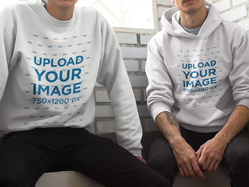
Crewneck Sweatshirt and a Pullover Hoodie Mockup

Your hoodies and crewnecks deserve to be promoted with the best assets too, and this hoodie mockup by Placeit will be your next favorite mockup. Why? Easy. You’ll be able to upload a different design to each hoodie and even choose a different garment color, and all straight from your browser—no Photoshop whatsoever. Go ahead and check out Placeit’s other available hoodie mockups.

Hoodie mockup from Placeit

Tee Mock-Up

Perfect for all of your t-shirt design needs, this set of t-shirt mock-ups places the focus on the product itself rather than the model.

Tee Mockup - Your clothing

All Baby Apparel Mock-Up

These baby apparel mock-ups are perfect for designing an entire line of baby clothes or simply showing off textile prints in a new format.

All Baby Apparel Mock-up

Square – Pillow Mock-up

Pillows may not be apparel, but expanding your designs to include other textile-based products is a great and easy way to expand your line of designs!

Square - Pillow Mockup

Long Sleeve Presentation Mock-Up

For those fall and winter months, show off your t-shirt designs on a long-sleeved mock-up!

Long Sleeve Presentation Mockup

Leggings Mock-Ups – Women Clothing

With athleisure at an all-time high, busting out some legging designs to fit with your shirts and other apparel is a no-brainer. Have fun with a larger canvas or an all-over print!

Leggings Mock-ups - Women Clothing

Cycling Socks 3 Types Mockup

It’s not all about t-shirts in here: socks are fantastic for printed design work and patterns! Present a full look from head to toe with these cycling sock mock-ups or a similar product.

Cycling Socks 3 Types Mockup

Skate Shoes Mock-Up

Printed shoe designs are forever cool for skaters, teens, and more. Present a variety of work styles in a way you may not have considered when designing apparel with this skate shoe mock-up!

Skate Shoes Mock-up

Urban T-Shirt Mockups

Make your mockups stand out against awesome urban backgrounds. Capture the hustle of your empire with this set of urban mockups. Enjoy 14 templates with organized layers for easy customization.

Urban T-Shirt Mockups

Shop Themes

Give your finished and printed products a space to shine and be sold with one of these fantastic e-commerce themes!

Flatsome | Responsive WooCommerce Theme

Flatsome is a fantastic, responsive theme for WordPress and WooCommerce. I love its focus on large images and a simple, boxy design.

Flatsome  Responsive WooCommerce Theme

Shopkeeper – eCommerce WP Theme for WooCommerce

I’m especially fond of how professional and catalog-focused you can make this WooCommerce theme. Have fun showcasing your content with or without all of the bells and whistles with Shopkeeper.

Shopkeeper - eCommerce WP Theme for WooCommerce

Neighborhood – Responsive Multi-Purpose Shop Theme

Neighborhood is a responsive theme with a very sleek design sensibility. The customization of this theme really makes it shine, allowing you to create something wonderfully unique without compromising on design.

Neighborhood - Responsive Multi-Purpose Shop Theme

Ultimo – Fluid Responsive Magento Theme

Ultimo is a fantastic shop theme for Magneto, giving users the ability to customize a fun, responsive theme that’s perfect for apparel and accessory shops.

Ultimo - Fluid Responsive Magento Theme

Shopper – Magento Theme, Responsive & Retina Ready

Shopper is a fantastic theme with an instant-film feel and responsive, customizable design that can take you from image-heavy to simple in no time! 

Shopper - Magento Theme Responsive  Retina Ready

Shoppica – Premium OpenCart Theme

Shoppica is an OpenCart theme that’s perfect for showcasing large catalogs or apparel with multiple design options. With over 40 custom widgets ready for your shop, you’ll have something unique in no time!

Shoppica  Premium OpenCart Theme

Ella – Responsive Shopify Template

Ella is an elegant shop template with a fully responsive design that showcases apparel designs wonderfully. Integrate your brand’s social media accounts into the template to keep well in touch with your customer base and grow a community around your apparel and products.

Ella - Responsive Shopify Template

Actions: Text Effects

Actions are fantastic for speeding up your workflow and allowing you to perform intricate tasks in the click of a button (and some loading time). Text Effects make for quick marketing content or fun effects for editorial on a t-shirt. Check out some of the selections below!

Fabric Style Vol.1

You’ll find assets in this theme quite a bit in this list. Fabric, apparel, and more are great themes for marketing or designed content for apparel. When you can’t actually embellish textiles, digital assets are your next best bet. 

Fabric Style Vol1

Denim Material Generator

I love how realistic this denim material generator is. Whether you’re working on a denim line or in need of some quick graphics for a t-shirt, actions like these are sure to speed up your design or prototype process.

Denim Material Generator

Stitched Leather Generator

Whether you’re working up leather details within a design or want to add a realistically rendered touch to your apparel work, this stitched leather generator does the job in a snap.

Stitched Leather Generator

Stitched Stripe Actions

Add stitched details to your catalog, sell sheets, or designs themselves with this stitching actions set.

Stitched Stripe Actions

Vintage Text Effects

Speed up your design process with some vintage text effects. Whether you’re adding it to your printed apparel or playing off the theme for marketing materials, this set of effects is a great addition to your toolbox!

Vintage Text Effects

Painted Photoshop Text Effects

Turn your text into an awesome painted effect with this selection of three Photoshop actions. Choose from ten handmade and digitized styles for stencil effects and more. Also included is an easy-to-follow tutorial. 

Painted Photoshop Text Effects

Actions: Utilities

Speed up your design and creation process with utility actions. Those listed below are great for creating apparel-themed effects or can serve as a time saver for creating complex imagery.

Realistic Embroidery – Photoshop Actions

I love this action for creating embroidered mock-ups for samples, sell sheets, and manufacturers. When designing apparel, you don’t always have time to create a real embroidered sample. This action set gives you the next best thing to embroidering content yourself!

Realistic Embroidery - Photoshop Actions

Cross Stitch and Needlepoint Action

This action set serves double duty for creating cross-stitch style designs for apparel prints or creating mock-ups for manufacturers or crafters!

Cross Stitch and Needlepoint Action

Fur and Knitted Fabric Photoshop Actions

Get cozy with this knit and fur style action. Perfect for designing knitwear samples and sketches or for adding a fun, digital knit touch to printed apparel designs!

Fur and Knitted Fabric Photoshop Actions

Smart Pattern – Clean Edge Dot, Line, Grid Action

This interesting action set is fantastic for quickly differentiating between material types within manufacturer mock-ups or showing a variety of stitch types if you’re designing for embroidered materials.

Smart Pattern - Clean Edge Dot Line Grid Action

Vector Creator Photoshop Action

Turn your work into instant vector creations! This Photoshop action transforms your designs for amazing t-shirt illustrations. Follow the simple instructions to get started right away!

Vector Creator Photoshop Action

Actions: Photo Effects

Whether you’re a designer for a larger label or company or simply an indie designer, you may have to show off completed apparel in the best light possible via catalog or lookbook. Using photo effects helps put your brand’s best foot forward and create a unified look for a season’s designs!

Vintage Photoshop Action Pack

For a trendy vintage look to your product and model shots, check out this fantastic pack of vintage photo effects.

Vintage Photoshop Action Pack

Marshmallow – Photoshop Action

For a soft and dreamy touch to all of your product shots, this set of „marshmallow” styled photo effects is perfect. Consider running through different themes for different lines or brands. It can really unify a catalog or lookbook!

Marshmallow - Photoshop Action

Portrait Actions VI

I find it best to focus on portrait photo effects for model shots. A set like this one is great for playing with different looks for content from a single photo shoot or even unifying shots from multiple photo shoots.

Portrait Actions VI

Professional Retouching Actions Kit

Give model shots a quick, professional retouch with this retouching kit.

Professional Retouching Actions Kit

Skin – 25 Retouching Actions

Go the distance with this huge pack of skin retouching actions. With 25 retouching actions included, your catalog will be polished in no time!

Skin - 25 Retouching Actions

Instagram Filter – Photoshop Action

Make your marketing photos stand out with this
wicked suite of Photoshop actions. With this pack you can easily apply
45 different photo filters to your photos. Update banners, social media
profiles and more with this wonderful suite.

Instagram Filter - Photoshop Action

Styles

Styles are a fantastic way to utilize a document’s layers in a non-destructive way. Check out some of the fantastic styles below that are sure to be an asset to your design work!

New Fabric Styles

With one click, these fabric styles will surely be a great asset to your design work or marketing materials for your apparel line!

New Fabric Styles

Cartoon and Comic Book Styles

Get a little cartoony with these fantastic cartoon and comic book styles! I love these for creating fun, geeky apparel print designs or eye-catching copy for advertisements.

Cartoon and Comic Book Styles

New 3D Retro Creator

Go old school with this gorgeous set of retro styles. Whether you’re creating printed apparel or marketing materials for a retro-inspired apparel line, this set will be a great addition to your designer toolbox.

New 3D Retro Creator

Vintage Styles

Looking for a more „worn” vintage look for your designs? Check out this style set to give your content a weathered appearance.

Vintage Styles

Vintage Retro Text Effects Col 8

Keep on rocking the retro cool with these vintage text effect styles. From printed to weathered, these styles feature a variety of looks for your apparel designs at the click of a button.

Vintage Retro Text Effects Col 8

Graffiti Styles

Instantly transform text into graffiti designs at the click of a button with this style set!

Graffiti Styles

Cotton Pressed Styles

I love this style set for hang tags and marketing materials. Instantly transform design work or logos into a cotton pressed style at the click of a button.

Cotton Pressed Styles

Cartoon Text Effects

This set of ten cartoon-inspired text effects offers a fantastic way to quickly create apparel design or marketing content without losing time. These work wonderfully as a point of inspiration for unique designs too.

Cartoon Text Effects

Patterns

Patterns are wonderful for adding quick bits of color to shapes, as inspiration for all-over print designs, and more!

10 Seamless Valentine Patterns

Choose a holiday theme, like Valentine’s Day, and use a set of seamless patterns like the set below to add a festive touch to shapes or prints within your apparel design work.

10 Seamless Valentine Patterns

32 Tileable Baroque Backgrounds Textures & Pattern

For something a bit more elegant, this Baroque themed pattern set is positively perfect, whether as your printed design or a source of inspiration!

32 Tileables Baroque Backgrounds Textures  Pattern

10 Seamless Fabric Patterns

Get on theme with fabric texture patterns. These are great for showing different fabric types in a catalog or to be used within the planning stages of your design work!

10 Seamless Fabric Patterns

Argyle-tartan-plaid-fabrics-patterns

Classic textile pattern styles, like argyle and plaid, are a must for your pattern collection. This set is the perfect inspiration point for patterned areas in your apparel design work.

Argyle-tartan-plaid-fabrics-patterns

Japanese Patterns

Japanese-inspired patterns are a fantastic way to fill in some areas of larger designs or serve as a starting point for intricately doodled design work.

Japanese Patterns

Vintage Cupcake Pattern

Sometimes you just need to narrow down your pattern choices and go for something sweet, like this vintage cupcake pattern!

Vintage Cupcake Pattern

Seamless Patterns Generator I

Transform your design tile into a multitude of seamless patterns with this pattern generator!

Seamless Patterns Generator I

Instapatterns: Turns Any Images Into Patterns

Create a variety of patterns from your design work, whether it’s an entirely new design or it’s a variation on something from within your apparel line, with this pattern generator!

Instapatterns Turns Any Images Into Patterns

Indigo Blue Watercolor Patterns

Create impressive designs with these gorgeous indigo patterns. This package includes 11 different watercolor patterns you can use for fabric textures and more. Deliver professional-looking designs in less time!

Indigo Blue Watercolor Patterns

Brushes: Artistic

Artistic brushes are fantastic to have in your toolkit for designing real-media styled digital work for apparel. Whether you’re creating digital watercolors for t-shirt prints or digital ink drawings for your apparel line, these brushes will get the job done and more!

Brush Pack Professional Volume 4 – Classic Art

This set of ink pen and pencil brushes is absolutely top notch and a must-have for designers of all kinds!

Brush Pack Professional volume 4 - Classic Art

55 Splatters, Smudges & Splashes Photoshop Brushes

Add a touch of ink or paint splatter to your design work with this mega pack of splatter brushes!

55 Splatters Smudges  Splashes Photoshop Brushes

Watercolor Art

Transform your design work with this fantastic set of watercolor brushes and splatters. 

Watercolor Art

56 Watercolor & Paint Photoshop Brushes

This set of watercolor styled brushes is fantastic for creating dry-brush-inspired illustrative work for apparel or marketing materials.

56 Watercolor  Paint Photoshop Brushes

Japan Brushes Pack

Add a touch of Japanese design work to your own apparel designs with this fantastic brush set!

Japan Brushes Pack

Art Brush Bundle

Unleash your creativity with this fun art brush bundle. This bundle includes 27 high-quality art brushes to help you make beautiful artwork.

Art Brush Bundle

Brushes: Flourishes

Flourishes are great for when you need quick additions to your apparel designs or patterns in brush form.

75 Photoshop Brushes Watercolor Collection

This elegant set of watercolor flourishes is a fantastic addition to your brush set, especially for those with watercolor brushes.

75 Photoshop Brushes Watercolor Collection

Filigree Brushes 01

This set of filigree brushes lends a quick and elegant touch to your design work or can be combined to create new patterns and motifs.

Filigree Brushes 01

Tribal Tattoo Brush Set 2

For tattoo-inspired work, tribal tattoo flourishes are a perfect touch for printed or embroidered design pieces.

Tribal Tattoo Brush Set 2

Native Flourishes Brushes

This gorgeous set of flourishes takes inspiration from Russian folk art, and is a wonderful addition to your apparel design work as well as a great source of inspiration.

Native Flourishes Brushes

Collection of Flames

This set of flourishes is fantastic for when you need a variety of themed prints or apparel designs.

Collection Of Flames

20 Hand Drawn Arrows

Add some direction to your illustrations with this set of arrow flourishes. This download includes one Photoshop file with all the vector shapes you need for cool hand-drawn arrows.

20 Hand Drawn Arrows

Brushes: Texture

These brushes are fantastic for adding texture to your designs for a grunge, distressed, or worn look.

Ink Scratches Photoshop Brush Set

Ink scratches like those found in this set of brushes are fantastic for mimicking vintage photos and designs.

Ink Scratches Photoshop Brush Set

8 Photoshop Cracked Ink Distress Brushes

This set of brushes is perfect for creating a distressed look over your latest vintage-inspired design.

8 Photoshop Cracked Ink Distress Brushes

Embroidery. 100+ Sewing Stitches with Fabrics

These textured embroidered brushes are fantastic for meticulously creating your own digital embroidery designs or adding a touch of stitching to your apparel work.

Embroidery 100 Sewing Stitches with Fabrics

8 Fabulous Hi-Res Brushes (.ABR) from Hell!

Ink explosions are fantastic textures for ink or watercolor-style additions to your design work. I especially like content like this for modifying figurative illustrations or photographic elements.

8 Fabulous Hi-Res Brushes ABR from Hell

50 Photoshop Crack Grunge Distress Brushes

This set of 50 brushes is great for showing torn, distressed, and partially destroyed effects within your design content.

50 Photoshop Crack Grunge Distress Brushes

Shapes

Shapes are fantastic for adding a variety of elements to your work in an easily editable or repeatable way. Choose from a variety of abstract sets or specific object sets to add something special to your work!

44 Wings Custom Shape

Whether you’re creating a line of fantasy-inspired or tattoo-inspired designs, this set of wing shapes is a perfect fit for a variety of uses.

44 Wings Custom Shape

Floral Swirl Shapes

This set of floral swirls is a great way to start an abstract design or even a fun source of inspiration for creating flourishes and shapes of your own.

Floral Swirl Shapes

Fantasy Creatures Photoshop Shapes

Whether designing t-shirts for your fantasy house of choice or creating something new, these fantasy creatures are a great addition to most any designer’s toolkit.

Fantasy Creatures Photoshop Shapes

Flowers Custom Shapes

Floral patterns and design are a classic touch to an apparel or textile design. This set of 80 flower shapes should have exactly what you need to design to your heart’s content.

Flowers Custom Shapes

Hipster Elements Custom Shape

For all those times that your design would have truly been completed with a mustache, beard, or swanky pair of glasses, this set of hipster-inspired shapes is here for you!

Hipster Elements Custom Shape

Grunge Paint Splash Shapes

Instantly add some grunge details to your work with this grunge paint splash set. This pack includes customizable vector shapes that imitate realistic textures. Enjoy high-quality shapes you can use for print or web.

Grunge Paint Brushes

Laurel Wreath Shapes

Laurel wreaths are a symbol of victory and honor. Show off your honor with this set of vector laurel wreaths. Download six amazing designs available in gold and black.

Laurel Wreaths

Custom T-Shirt Graphics

Whether you need a starting point or simply some inspiration, these ready-made t-shirt templates are a great addition to even an established apparel designer’s toolbox.

T-Shirt Design Templates

Need t-shirt designs? Look no further! Placeit has a bunch of t-shirt design templates to help you grow your t-shirt business without breaking the bank. The t-shirt design maker over at Placeit is super easy to use—just type your text and choose your graphics, fonts and colors straight from the browser. No need to open up Photoshop or Illustrator at all. It really is as easy as it gets. 

T-Shirt Design Templates

Couple T-Shirt Collection

Double up on your t-shirt designs with couple sets! Expand upon these designs with custom text or other design elements.

Couple T-Shirt Collection

Classics Denim T-Shirt

Go for a classic look with this set of customizable branded t-shirt designs.

Classics Denim T-Shirt

City Marathon Event Premium T-Shirt Template

Sometimes you just need something for an event or are called upon to design something on a short deadline. That’s where event t-shirt designs like the one below come in handy!

City Marathon Event Premium T-Shirt Template

Vintage Style Anniversary Tees Bundle

Celebrate an event in vintage style with these t-shirt templates. These designs can be a fantastic start to new designs or a great way to save time when designing for smaller budgets.

Vintage Style Anniversary Tees Bundle

Zip Up Hoodie Tee Collection Mockup

A five-star product on Envato Market, this awesome hoodie mockup will give you everything you need for apparel marketing. Enjoy nine brilliant templates with changeable hoodies and more to save valuable time.

Zip Up Hoodie Tee Collection Mockup

Conclusion

This list of fantastic resources aims to highlight useful and must-have content for apparel designers that use Adobe Photoshop. Chances are we’ve missed some Envato Market items that you think would be an excellent asset to any designer’s toolbox. Share those links in the comment section below, and let this list be a jumping-off point for building your ultimate digital asset kit!

How to Create a Tropical Stationery Set in Adobe InDesign

Post pobrano z: How to Create a Tropical Stationery Set in Adobe InDesign

Final product image
What You’ll Be Creating

Tropical and botanical patterns are a big trend in brand design right now. Channel the nature-inspired look with this letterhead and business card set—perfect for making great first impressions with new clients.

In this tutorial suitable for beginners to Adobe InDesign, we’ll look at how to lay out the card and letterhead and prepare them for printing.

Looking for a quick stationery fix? You can download and adapt lots of easy-to-edit stationery templates from Envato Elements and GraphicRiver.

What You’ll Need to Create Your Stationery Set

You’ll need access to Adobe InDesign, and to download the following patterns and font files:

1. How to Set Up the Stationery Document in InDesign

Step 1

Open InDesign and go to File > New > Document. 

Set the Width of the page to 2 in and Height to 3.5 in. Increase the Number of Pages to 4, and uncheck Facing Pages. 

Add Margins of 0.1875 in and a Bleed of 0.125 in, before clicking Create.

new document

Step 2

Expand the Layers panel (Window > Layers) and double-click on the Layer 1 name, renaming it Pattern

Create a second new layer, and name this Type

new layer

Lock the Type layer, and click on Pattern to activate it. 

pattern layer

2. How to Create Your Business Card

Step 1

Select the Rectangle Frame Tool (F) and drag across the whole of Page 1, extending the edges up to the edge of the bleed. 

rectangle frame

Go to File > Place, navigate to the ‘patt2.jpg’ file in the Tropical Accent pattern folder, and click Open. Allow it to fill up the whole image frame. 

pattern image

Step 2

Lock the Pattern layer and unlock the layer above, Type

Use the Rectangle Tool (M) to create a shape across the page, extending its edges up to the margin line. From the Swatches panel, set the Fill of the shape to [Paper].

rectangle shape

Step 3

Switch to the Type Tool (T) and create a text frame centrally on the card, about a third of the way down. 

Type in the name of the person or business, and from either the top Controls panel or the Character and Paragraph panels (Window > Type & Tables > Character / Paragraph), set the Font to Abside Smooth, Size 11 pt, Leading 17 pt, Tracking 60, All Caps, and set the text to Align Center.

name text

Step 4

Create a second text frame below the first and type in the occupation of the person. 

Set the Font to Abside Round 1, Size 9 pt, Tracking 60, and Align Center. 

occupation text

Step 5

Add a final text frame below this, listing the website, email and phone number of the business, setting the Font to Abside Smooth, Size 7 pt, Leading 13 pt, Tracking 60, and Align Center. 

contact details

Step 6

Unlock the Pattern layer and select the image frame containing the pattern. Edit > Copy it.

Scroll down to Page 2 of your document and Edit > Paste in Place.

pattern

The artwork for your business card is finished—great job! Now we can work on creating a letterhead with a matching style within the same InDesign document.

business card

3. How to Create Your Letterhead

Step 1

Scroll down to Page 3 of your document.

Select the Page Tool (Shift-P) and click onto the page to select it. 

page tool

In the top Controls panel, adjust the Width (W) of the page to 8.5 in and Height (H) to 11 in, to expand the page to a US Letter size. 

page tool controls

Step 2

With the page still selected using the Page Tool, go to Layout > Margins and Columns. 

Increase the Margins to 0.3125 in, and click OK

margins

Scroll down to Page 4, and repeat the process to expand this to a Letter size as well, with a 0.3125 in Margin.

margins and columns

Step 3

Head back up to Page 3 and Edit > Paste to drop a pattern image frame onto the page. 

Expand the edges of the frame to fit the larger page size, and allow the image to scale up, so that it fills the frame completely. 

pattern background

Step 4

Remaining on Page 3, unlock the Type layer and use the Rectangle Tool (M) to create a shape across the page, extending it up to the margin edge. 

Set the Fill of the shape to [Paper].

paper rectangle

Step 5

Copy the name and occupation text frames from Page 1, and Paste them onto Page 3. 

Move the text frame towards the top of the white shape, and increase the Font Size a little, to make it more proportional for the letter page size.

type layer

Step 6

Create a header text frame below, set in Abside Smooth. 

Then create another text frame below this for a sub-heading, setting the Font to Domani, Size 12 pt. 

domani font

Use the Line Tool (\) to create small bounding lines above and below the header and sub-heading frames. From the Stroke panel (Window > Stroke), set the Weight to 2 pt, and adjust the Cap to a Round Cap.

stroke panel

Step 7

Create a large text frame across the main body of the page. Set your Type Tool cursor in the frame and set the Font to Domani, Size 9 pt, Leading 16 pt, Tracking 60. 

You can type in your body text here, or go to Type > Fill with Placeholder Text, to place filler text in the frame for now. 

body text

Step 8

Add a trio of text frames along the bottom of the letter, setting contact details in each. 

Set the Font to Abside Smooth, Size 9 pt. 

abside font

Use the Line Tool (\) to add two small vertical dividers between each item of text, setting the Weight to 1 pt and adding a Round Cap.

stroke panel

Step 9

To create the reverse side of your letterhead, unlock the Pattern layer and Edit > Copy the pattern image frame sitting on Page 3. 

Scroll down to Page 4 and Edit > Paste in Place. Pull back the edges of the image frame, until they hit the margin line, leaving a blank margin around the edge of the page. 

pattern image

Unlock the Type layer, scroll up to Page 3, and Copy the name and occupation text frames from the top of the page. Head back down to Page 4 and Edit > Paste them onto the page. 

Move them onto the center of the page, adjust the Font Color to [Paper], and increase the Font Size until the text looks more proportional. 

text paper

Great work! Your letterhead artwork is finished and ready for exporting.

letterhead

4. How to Export Your Stationery Set for Printing

Step 1

Go to File > Export. In the Export window, name the file something like ‘Letterhead and business card for print’ and choose Adobe PDF (Print) from the Format menu at the bottom of the window. Then click Save

In the Export Adobe PDF window that opens, choose [Press Quality] from the Preset menu at the top, and make sure that Pages is set to export All. 

press quality

Step 2

Click on Marks and Bleeds in the window’s left-hand menu. 

Check both All Printer’s Marks and Use Document Bleed Settings, before clicking Export

marks and bleeds

Conclusion: Your Finished Stationery Set

Your tropical stationery set is ready for sending straight off to print—awesome work!

final set

We’ve covered a wide range of print design skills over the course of this tutorial. You now know how to create stationery documents in InDesign, import graphic patterns to add style and flair, and format typography to a high standard, as well as using the Page Tool to adjust page sizes as you work.

On the hunt for more great stationery styles? You can find lots of easy-to-edit stationery templates over on Envato Elements and GraphicRiver.

Or why not try out another stationery design tutorial?

How to Create a Beach Guard Tower Illustration in Adobe Illustrator

Post pobrano z: How to Create a Beach Guard Tower Illustration in Adobe Illustrator

Final product image
What You’ll Be Creating

In today’s tutorial we are going to get into summer vibes while creating a lonely beach guard tower on a seashore in Adobe Illustrator. We will use simple tools and techniques.

As usual, you can purchase the result as a part of my Summer Seaside collection on GraphicRiver.

Summer Seaside Collection on Graphicriver

1. How to Create a New Document

First, set up a New Document (File > New or Control/Command-N) with these settings:

  • Number of Artboards: 1
  • Width: 1200
  • Height: 1200
  • Units: pixels

From the Advanced tab:

  • Color Mode: RGB
  • Raster Effects: Screen
  • Preview Mode: Default
  • Uncheck Align New Objects to Pixel Grid
Creating a New Document

2. How to Create the Top Section of the Tower

Step1

Let’s start simple by creating a 127 x 127 px rectangle and filling it with #98D2BE.

Take the Direct Selection Tool (A) and select both top anchors of the rectangle. Press Enter to open the Move window. Set the Horizontal value to -32 px and the Vertical value to 0 px and press OK, moving our anchors to the left.

This angled rectangle will act as a main front wall.

Building a Rectangle

Step 2

Select the shape and Copy it, using Control-C. Click Control-F twice to get two copies on the top of the rectangle, and move the top copy to the right by about 60 px.

Add the second copy to the selection and use the Minus Front option of the Pathfinder panel.

Copying the Rectangle and Using the Minus Front Option

Step 3

Select the resulting shape with the Selection Tool (V) and reduce its size by Shift-dragging one of the top corners of the Bounding Box blue area to the center.

Set the color of the shape to #48A987 and position the shape in the middle part of the wall. It will act as a doorway.

Forming a Doorway

Step 4

Copy (Control-C) the doorway and paste two copies in the front by pressing Control-F twice.

Move the top shape slightly to the right, add a second copy to the selection, and press the Intersect button on the Pathfinder panel. Change the color of the new shape to #225443, forming the inner shadow part of the entrance.

Forming a Shadow Part for the Doorway

Step 5

Now we are going to add a shadow to the entrance wall. Make two copies (Control-C) and paste them in front of the shape (Control-F twice), and move the top copy to the left and down.

Add a second shape to the selection using the Minus Front option of Pathfinder, getting an angled shape.

Since it will act as a shadow, change its Blending Mode to Multiply while lowering the Opacity to 40% in the Transparency panel.

Building a Shadow

Step 6

Let’s add a highlight on the right part of the wall.

Create two front copies of the wall again and move the top copy to the right. Add another copy to the selection while using the Minus Front option of Pathfinder, making sure to change the resulting shape’s color to white (#FFFFFF).

Building a Highlight

Step 7

Time to add outlines to the shapes.

Select the main rectangle and copy it. Then click once on the shadow doorway part and press Control-F, getting a copy of the wall in front of the entrance.

Set the Fill of the copy to None, the Stroke color to #3d342d, and the Weight to 6 px.

Give 6 px thick outlines (#3d342d) to the doorway parts.

Adding Outlines

Step 8

Build a 152 x 127 px rectangle (#6ebea2) for the side wall, placing its top-left anchor behind the top-right anchor of the front wall and hiding it behind the previous section.

As we did with the previous wall, give the current one a shadow part by making two front copies, moving the top copy to the left and bottom and using the Minus Front option of the Pathfinder for the two shapes, making sure to change the Blending Mode of the resulting shape to Multiply while lowering the Opacity to 40%. 

Building a Side Wall

Step 9

Working the same way, add one more side shadow on the wall.

Let’s add an outline to the side wall. Copy (Control-C) the side wall, click on the upper shadow, and paste the shape in front of it with Control-F. Remove the Fill while setting the Stroke color to #3d342d and the Weight to 6 px.

Adding Shadows for the Side Wall

Step 10

Add a 210 x 16.5 px rectangle (#6ebea2) on the top of the side wall and align it to the center of the shape.

As we did for the previous sections, give the current rectangle two shadows and a 6 px thick outline (#3d342d).

Building a Rectangle Over the Side Wall

Step 11

Form a 129 x 16.5 px rectangle (#98d2be) on the outer left side of the previously created shape.

Using the same methods, build a highlight on the left part and a shadow on the right side of the stripe, followed by a 6 px wide outline (#3d342d).

Group (Control-G) all the parts together.

Forming an Upper Rectangle

3. How to Create the Bottom Section of the Tower

Step 1

Let’s start working on the bottom section of our tower by forming a 290 x 16.5 px rectangle (#48a987) below the upper section, aligning it to the right edge of the roof.

Make one more 230.5 x 16.5 px stripe of the same color under the first one.

Rotate the rectangle by 30 degrees by Alt-clicking on the bottom-left anchor with the Rotate tool (R), setting the Angle to 30 degrees.

Attached the angled shape to the left side of the horizontal one, positioning its top anchor on the top-left anchor of the horizontal rectangle.

Building to Rectangles on the Bottom

Step 2

Select the angled rectangle and press Enter to open the Move option window. Set the Horizontal value to -100 px and the Vertical value to 0 px and press Copy, getting a duplicate on the left side.

Take the Direct Selection Tool (A) and drag the bottom-right anchor of the duplicate onto the top point of the original angled shape.

Then select the bottom-left anchor of the left angled shape and position it on the top-left anchor of the original rectangle.

Set the color of the resulting shape to #98d2be.

Forming an Angled Shape

Step 3

Take the Rectangle Tool (M) and add a small rectangle (#48a987) under the bottom side of the large angled shape, making sure to place its lower edge on the same level as the bottom anchor of the right angled stripe.

Select the lower edge of the created figure with the Direct Selection Tool (A) and drag it to the right, positioning its right side on the left edge of the neighboring angled stripe.

Building Side Parts for the Angled Shape

Step 4

Now let’s work on the highlights.

Make a larger copy of the side angled rectangle. Select it together with the original shape and the horizontal rectangle and cut off the outstanding part by Alt-clicking on it with the Shape Builder Tool (Shift-M). Change the color of the resulting shape to white (#ffffff).

Using the Pathfinder method, as we did before, add a second highlight to the slope.

Adding Highlights

Step 5

Give shadows to the horizontal side stripe and the slope.

Select the angled rectangle and horizontal stripe and unite the two into a single larger shape using Pathfinder’s Unite Shape Mode.

Add 6 px thick outlines (#3d342d)  with a Round Join to all the bottom pieces.

Adding Shadows on the Bottom Parts

Step 6

Start working on the fence by creating an 11.5 x 29 px rectangle (#6ebea2) for the post, giving it a shadow followed by a 4 px thick outline (#3d342d). Group (Control-G) all the parts together and place one copy of the post on the top of the slope. 

Building a Small Rectangle

Step 7

Select the original post, open the Move option window (Enter), and set the horizontal value to 65 px. Click on the Copy, getting a duplicate of the post on the right side. Keeping the duplicate selected, press Control-D two more times, getting two more copies.

Group (Control-G) all four posts together and rotate the group by 30 degrees using the Rotate tool (R).

Attach the post group to the left edge of the slope.

Working over Fence Racks

Step 8

Now we need a rail sitting over the posts.

Copy the slope’s black outline and drag it onto the side row of posts, making its left edge sit on their top as shown in the image below.

Delete the right and bottom edges of the outline.

Drag its end points with the Direct Selection Tool (A), placing one of them on the left edge of the cabin and another on the top-left anchor of the left post. Set Round Cap for the rail.

Forming a Crossbar

Step 9

Doing the same manipulations, copying and dragging the posts and the rail, create another fence on the right side of the tower.

Finishing the Fence

Step 10

Let’s create bearing piles supporting our cabin.

Build a 14 x 113 px rectangle (#48a987) on the right side below the cabin. Give it a shadow followed by a 6 px thick outline (#3d342d).

Group (Control-G) all the parts together and make a duplicate on the left.

Making Supporting Piles

Step 11

Draw two 6 px thick horizontal lines (#3d342d) going from one pile to another, making the left endpoints slightly overlap the left post.

Group (Control-G) the bearing piles construction and create a copy, moving it to the left and hiding it behind the tower, as well as making the color darker.

Building Bearing Piles Group

4. How to Make a Windsock and Add Details

Step 1

Let’s add a flowing windsock on the roof of our beach tower.

Form a 62 x 24 px rectangle (#d65428) for the main windsock shape.

Then add one anchor point on the middle of the right edge with the Add Anchor Point Tool (+). Delete the top and bottom anchors, getting a triangle, and make its right corner rounded by pulling the Live Corner indicator to the center with the Direct Selection Tool (A).

Add a 15.5 x 24 px ellipse (#a8411f) on the left part of the triangle.

Creating a Red Cone

Step 2

Select the ellipse and go to Object > Path > Offset Path. Enter 10 px into the Offset value field and press OK, getting an outline.

Keeping the outer ellipse selected, use the Offset Path again, setting the Offset value to 5 px.

Select both outer shapes and go to Object > Path > Offset Path again. Set the Offset to 20 px, getting two more outer shapes.

Select the cone shape, get one copy in the front, and select the copy together with the four outer ellipses using the Divide option of the Pathfinder panel.

Delete all divided pieces except the two stripes, changing their color to #fbf8f1.

Building Stripes on the Cone

Step 3

Give the shape that we’ve just created a highlight followed by a 4 px thick outline (#3d342d) with a Round Join. Add the same outline to the ellipse.

Create two ropes attaching our windsock to the pole. Use two 4 px thick lines for the ropes and a 6 px thick line for the pole.

Group (Control-G) all the sock parts together and position it on the roof of the tower.

Finishing Off the Red Windsock

Step 4

We are nearly done with the beach guard tower.

Give our tower a more interesting and stylish look by opening some of the outlines. To do it, just use the Add Anchor Point Tool (+) to add additional anchors on the outlines and then Delete paths between these anchors, making sure to set the Cap of the remaining outlines to Round from within the Stroke panel.

Take your time, and once you’re done, add some additional 4 px thick lines near the edges of our illustration.

Finish the tower by adding a few lines below for the ground level.

Opening the Outlines

5. How to Create a Tropical Beach Background

Let’s place our beach guard tower on a tropical paradise by creating a seaside landscape on the background.

Step 1

Form a 1200 x 1200 px rectangle (#fb9f31) behind our building for the background.

Add a few 6 px thick lines of #f8cc6b color below the tower to imitate the surface of water. Make them more interesting and lively by adding some dashes and varying their sizes.

Forming a Background and Surf

Step 2 

Add a 300 x 300 px circle (#f37f10) for the setting sun and two outer circles for the sun’s glow. Use white color and Screen Blending mode with 30% Opacity for the glow.

Delete the outstanding lower part of the outer circle by selecting it and Alt-dragging over the outstanding part with the Eraser Tool (Shift-E).

Creating a Sun

Step 3

We need a few additional elements to finish the composition.

Create a simple palm made from a few leaves and a rectangular trunk. We can get a leaf by using the Intersect option of the Pathfinder panel for two overlapping ellipses. Then attach a rectangle for the trunk and form a crown by copying and moving the leaves. Use #f37f10 for the color.

Then make a cloud consisting of overlapping circles and a rounded rectangle. Just remove any unwanted pieces with the help of the Shape Builder Tool (Shift-M), merge all shapes into one with the Unite option of Pathfinder, and set the color to #fbe2aa.

Spread the palms and clouds over the scene, creating a balanced composition.

Adding Smaller Details

That’s It! Our Beach Guard Tower Illustration Is Ready

Congratulations! Our flat-style Baywatch house scene is finished.

I decided to add two seagull silhouettes on the background to enhance the atmosphere of the seaside sunset. Can you now feel the summer breeze and the sea surf splashing on a tropical coast? Our lesson is ending here, and new adventures are beginning.

I hope you enjoyed the process and discovered something new and helpful along the way.

This beach guard tower illustration is only a part of my Summer Seaside collection, and there are far more travel and adventure illustrations in my portfolio on GraphicRiver.

Sea Side Collection on Graphicriver

How to Create an Editable Line Chart in Adobe Illustrator

Post pobrano z: How to Create an Editable Line Chart in Adobe Illustrator

Final product image
What You’ll Be Creating

In the following steps, you will learn how to create a fully editable line chart in Adobe Illustrator and how to easily adjust its style.

First, you will learn how to create the starting line chart using the Line Graph Tool. Using the Group Selection Tool and the Graphic Styles panel along with some basic colors and effects, you will learn how to stylize the main components of your chart. Taking full advantage of the Appearance panel, you will learn how to add a frame to your chart and how to apply subtle shading and highlights. Finally, you will learn how to easily adjust the data on your chart.

For more inspiration on how to adjust or improve your final chart, you can find plenty of resources at GraphicRiver.

What You Will Need

You will need the following in order to complete this project:

1. How to Create a New Document and Set Up the Starting Chart

Step 1

Hit Control-N to create a new document. Select Pixels from the Units drop-down menu, enter 850 in the width box and 665 in the height box, and then click that More Settings button. Select RGB for the Color Mode, set the Raster Effects to Screen (72 ppi), and then click Create Document.

Don’t forget to set the unit of measurement to pixels from Edit > Preferences > Units. All these options will significantly increase your work speed.

new document

Step 2

Focus on your toolbar and double click the Line Graph Tool to open the Graph Type window. Enter the attributes shown in the following image and then click OK.

graph type

Step 3

Make sure that the Line Graph Tool is selected and simply click on your artboard to open the Graph window. Set both Width and Height to 350 pt, and then click OK.

Enter the data shown below and then click that Check button. Your graph should look roughly as shown in the following image.

line graph tool

2. How to Adjust the Text on the Chart

Step 1

Pick the Group Selection Tool and focus on the column of text from your chart design. Click once on one of those pieces of text to select it, and then click a second time on the same text to select all the text from that column. You can use the Group Selection Tool to easily select multiple elements with similar attributes from your graph.

Make sure that these pieces of text remain selected and open the Character panel (Window > Type > Character). Select the Krona One font, set the size to 15 px, and change the text color to R=81 G=90 B=95.

adjust text

Step 2

Using that same Group Selection Tool, select the numbers from your chart. Focus on the Character panel, change the font to Krona One font, and set the size to 12 px and the text color to R=81 G=90 B=95.

group selection tool

3. How to Adjust the Line Separators on the Chart

Step 1

Focus on the bottom side of your graph and pick the Group Selection Tool. Select all horizontal and vertical paths (highlighted in the first image), go to the Appearance panel, and simply remove the existing stroke color. This should basically make your selected paths invisible.

invisible stroke

Step 2

Focus on the left side of your graph, select that long, vertical path, and remove its stroke color.

horizontal path

Step 3

Using the Group Selection Tool, select the tiny horizontal paths from your chart (highlighted in the first image). Focus on the Appearance panel, set the stroke color to R=81 G=90 B=95, and then open the Stroke fly-out panel. Make sure that the Weight is set to 1 px and check the Round Cap button.

Keep focusing on the Appearance panel and add a second stroke using the Add New Stroke button. Select the bottom stroke from the panel, lower its Opacity to 20%, and then go to Effect > Distort & Transform > Transform. Enter the settings shown below and click OK.

add new stroke

Step 4

Make sure that your tiny horizontal paths are still selected and keep focusing on the Appearance panel. Add a new stroke, drag it below the other two strokes, and select it.

Change the color to black (R=0 G=0 B=0), lower its Opacity to 20%, and go to Effect > Distort & Transform > Transform. Enter the settings shown below (in the left window), click OK, and go again to Effect > Distort & Transform > Transform. Enter the settings shown below (in the right window) and click OK.

transform effect

Step 5

Select only the bottom tiny path and focus on the Appearance panel. Remove the top and bottom strokes, select the remaining stroke, and increase the Opacity to 100%.

delete stroke

4. How to Add a Frame to Your Chart

Step 1

Pick the Move Tool (V) and select your entire graph. Focus on the Appearance panel and use the Add New Fill button to add a new fill.

Make sure that the fill lies below the Contents section and select it. Set the color to R=30 G=38 B=41 and go to Effects > Convert to Shape > Rectangle. Enter the settings shown below, click OK, and go to Effect > Stylize > Rounded Corners. Set the Radius to 20 px, click OK, and go to Effect > Distort & Transform > Transform. Enter the attributes shown in the following image, click OK, and go to Effect > Stylize > Drop Shadow. Enter the settings shown below and click OK.

frame

Step 2

Make sure that your entire graph is still selected and keep focusing on the Appearance panel. Add a second fill and drag it below the existing one.

Select this new fill, lower its Opacity to 70%, change the color to black, and go to Effect > Convert to Shape > Rectangle. Enter the settings shown below, click OK, and go to Effect > Stylize > Rounded Corners. Set the Radius to 20 px, click OK, and go to Effect > Distort & Transform > Transform. Enter the attributes shown in the following image, click OK, and go to Effect > Blur > Gaussian Blur. Set the Radius to 15 px and click OK.

gaussian blur

5. How to Stylize the First Line on the Chart

Step 1

Pick the Group Selection Tool and select the five segments that make up the top line of your line chart. Focus on the Appearance panel and select the stroke. Change the color to R=246 G=178 B=33 and make sure that the Weight is set to 2 px.

yellow line

Step 2

Focus on your yellow line and select one of the black squares that indicate the end point of a line segment. Focus on the Appearance panel, remove the stroke color, and change the fill color to R=246 G=178 B=33.

yellow square

Step 3

Make sure that your yellow square stays selected and keep focusing on the Appearance panel. Select the entire path (simply click that Path section from the Appearance panel) and go to Effect > Path > Offset Path. Enter a 2 px Offset, click OK, and go to Effect > Stylize > Rounded Corners. Enter a 5 px Radius and click OK.

rounded corners

Step 4

Make sure that your yellow square is still selected and keep focusing on the Appearance panel.

Add a second fill and select it. Change its blending mode to Soft Light and apply the linear gradient shown below.

linear gradient

Step 5

Make sure that your yellow square is still selected and keep focusing on the Appearance panel.

Add a third fill and select it. Set the color to R=30 G=38 B=41 and go to Effects > Path > Offset Path. Enter a -3 px Offset, click OK, and go to Effect > Stylize > Drop Shadow. Enter the attributes shown below and click OK.

offset path

Step 6

Make sure that your yellow square is still selected and keep focusing on the Appearance panel.

Drag the stroke below the existing fills and select it. Set the color to R=30 G=38 B=41 and open the Stoke fly-out panel. Change the Weight to 2 px and check the Align Stroke to Outside button.

align stroke

Step 7

Make sure that your yellow square is still selected and keep focusing on the Appearance panel. Select the yellow fill and apply the two Drop Shadow effects shown below, starting with the left one.

drop shadow

Step 8

Make sure that your yellow square is still selected, open the Graphic Styles panel, and click the New Graphic Style button.

graphic style

Step 9

Pick the Group Selection Tool and select the other black squares that go along your yellow line. Once selected, simply apply your style from the Graphic Styles panel.

apply graphic style

Step 10

Focus on the bottom row of your legend and select that horizontal path. Change the stroke color to R=246 G=178 B=33, increase the Weight to 2 px, and don’t forget to check the Round Cap button from the Stroke fly-out panel.

Move to the black square, select it, and simply apply your graphic style from the Graphic Styles panel.

legend

6. How to Stylize the Other Lines on the Chart

Step 1

Move down to the next line from your line chart. Use the Group Selection Tool to select all segments of this line and change the stroke color to R=255 G=118 B=4.

Select the black squares that go along the orange line and apply your graphic style. Make sure that all these shapes remain selected and focus on the Appearance panel. Select the yellow fill and replace that color with R=255 G=188 B=4.

orange line

Step 2

Move down to the next line from your line chart. Use the Group Selection Tool to select all segments of this line and change the stroke color to R=190 G=74 B=124.

Select the black squares that go along the purple line and apply your graphic style. Make sure that all these shapes remain selected and focus on the Appearance panel. Select the yellow fill and replace that color with R=190 G=74 B=124.

purple line

Step 3

Move down to the next line from your line chart. Use the Group Selection Tool to select all segments of this line and change the stroke color to R=40 G=118 B=221.

Select the black squares that go along the blue line and apply your graphic style. Make sure that all these shapes remain selected and focus on the Appearance panel. Select the yellow fill and replace that color with R=30 G=118 B=221.

blue line

Step 4

Move down to the next line from your line chart. Use the Group Selection Tool to select all segments of this line and change the stroke color to R=0 G=165 B=0.

Select the black squares that go along the green line and apply your graphic style. Make sure that all these shapes remain selected and focus on the Appearance panel. Select the yellow fill and replace that color with R=0 G=165 B=0.

green line

7. How to Add a Background and Edit the Chart

Step 1

Pick the Rectangle Tool (M) and create an 870 x 685 px shape. Fill this rectangle with R=81 G=90 B=95, send it to back (Shift-Control-[) and make sure that it covers your entire canvas.

background

Step 2

Finally, remember that you can always edit the data from your chart, and your design will not change.

Here’s how you can easily do it: Make sure that your chart is selected, right click anywhere on your artboard, and go to Data. Adjust your data and then click that check button.

edit chart

Congratulations! You’re Done!

Here is how it should look. I hope you’ve enjoyed this tutorial and can apply these techniques in your future projects. Don’t hesitate to share your final result in the comments section.

Feel free to adjust the final design and make it your own. You can find some great sources of inspiration at GraphicRiver, with interesting solutions to improve your design.

final product