Archiwum kategorii: Web Tools

International Artist Feature: Denmark

Post pobrano z: International Artist Feature: Denmark

Welcome back to our International Artist Series.

Today
we’re catching up with five incredible artists from Denmark, a Scandinavian country with a love of design. I
asked each artist how
their country and culture inspired their work, and they delivered great
responses.

Mani Zamani

Mani is a digital artist and product designer living in Vejle, Denmark. Drawing from his diverse inspirations, he creates futuristic handmade and digital crafts that are creative and intriguing.

See more in his portfolio and follow him on Instagram.

The PhoneMaster

I love the open
minded mentality in Denmark and the appreciation of art and design even on a daily
basis. There’s such simplicity and very quick access to almost everything.

The PhoneMaster
The PhoneMaster

Extraterrestrial Aristocrats

My works are a mix of what I daydream, or see and experience. I’ve lived in four different countries and although I never directly
pinpoint the culture of where I live in my work, I do use some visual
nodes from that specific area. Denmark has a rich design heritage and I
do appreciate the pure minimalism and pastel colors with accents
they use in their everyday objects.

Extraterrestrial Aristocrats

The Zoo Series: Whale

The Zoo Series Whale
The Zoo Series: Whale

Calm Kayak

I live in Vejle although I spend the majority of the day designing toys
for a toy company in Billund. I participate and organize workshops with a friend of mine in a cultural center here, and the community is very open to any new ideas that celebrate
creativity.

Calm Kayak
Calm Kayak

Melany Vilchynska

Melany is an illustrator and graphic designer currently living in Copenhagen, Denmark. Featuring bold colors and unique concepts, her illustrations are clever and inspiring.

See more in her portfolio.

Cosmo I

I am from Ukraine but currently live in Denmark. I
enjoy this country a lot, it is small but there are so many places you
can go and just catch pure inspiration. People are also an important
part of living „Danishly.”

They are cheerful, they always smile to you
if you exchange glances, and they are always ready to help. I think their
secret is just that they have a positive approach to life.

Cosmo I
Cosmo I

Illustrations for Polish Magazine

I recently became more courageous in my artwork and have tried more techniques to find new ways to make my illustrations more rich and interesting.

Denmark is the country where people like to express
themselves and are not afraid of being judged. It helps a lot since we
are always thinking that something in our drawings may not be accepted or
warmly welcomed by society.

Illustrations for Polish magazine
Illustrations for Polish Magazine

Psychologia dla Rodziców

Psychologia dla Rodzicw
Psychologia dla Rodziców

Illustrations for Polish Magazine

Here, design is a key. Folks love to pay attention to every detail and
create comfortable and well-designed spaces around them. It influences every
aspect of life.

Copenhagen is full of art museums and galleries which
are all separate worlds, presenting a variety of époques and artists.
But the first thing you learn is how to save money so you can buy only that
lamp which you saw in a small shop and have already started dreaming about.

Illustrations for Polish Magazine

Rune Elias

Rune is a visual artist and designer living in Copenhagen, Denmark. His work is subtle yet unique, and often communicates strong themes in various styles.

See more in his portfolio.

CPH:DOX Poster

I love the summer here which is the only reason I’m staying, the other 8 months are straight up hell!

CPHDOX Poster
CPH:DOX Poster

Movie Poster: Where Have All The Good Men Gone?

I’m living in Copenhagen, hanging around with good and weird people,
which inspires me the most! The culture of hanging out at different
brown Bodegas definitely gives my work some edge. And it’s how people understand what they are seeing in
the easiest way.

Movie Poster Where Have All The Good Men Gone
Movie Poster: Where Have All The Good Men Gone?

No Title

No Title
No Title

Formaldehyde

The art community is always fun here. I mostly only mingle with the „art community” when there is free beer!

Formaldehyde
Formaldehyde

Michelle Carlslund

Michelle is an illustrator and poster maker living in Copenhagen, Denmark. Featuring flat illustrations with lots of patterns and textures, Michelle’s work is beautifully hand crafted.

See more in her portfolio and follow her on Instagram.

The Golden Collection

Even though I am not very fond of winter I really love seeing the
seasons change in Denmark. The sense of euphoria that happens when we have the
first day of spring is the best. It is like everyone is in love with the
world all at once!

I also love the Scandinavian design tradition; the
minimal, clean and functional designs using a lot of natural materials
like wood, metals and stone. My own work is a bit more colorful but it
looks really nice when you combine all the colors with the neutral and
calm surroundings.

The Golden Collection

Michelle Carlslund x Södahl

I think that the color palette I use is quite typical for Danish and
Scandinavian design. I adapted some of their clean
lines and simplicity and added it to my illustration style.

Denmark is a really nice place to live as an illustrator because
we have a lot of dark winter months here. They’re perfect for
staying inside, coming up with ideas and drawing all through the
winter!

Michelle Carlslund x Sdahl
Michelle Carlslund x Södahl

Forest Poster

Forest Poster
Forest Poster

Peacock

We have a lot of creatives and entrepreneurs in Denmark in many
different fields. I think the creative scene is quite innovative and I
see so many great things happening and ideas coming to life.

Peacock
Peacock

Johanna Wurm

Johanna is a creative designer living in Aarhus, Denmark. With a specialty in brand design and illustration, her work features heartwarming creations you’ll love.

See more in her portfolio and follow her on Instagram.

Spring Chinchilla Illustration

Denmark is a place of high standards in all aspects of life, which makes
my work both challenging and a great deal of fun. I am very lucky to have some great influences around me.

Spring Chinchilla Illustration

Cute Bunny Textile

People appreciate and
value design in Denmark and they are willing to pay for it. This gives me the
opportunity to constantly push myself to be better at my craft.

Cute Bunny Textile
Cute Bunny Textile

Branding for Aalborg Zoo

Branding for Aalborg Zoo

Kernehuset Branding

The art
community is very vibrant here. In my
experience, to fit into the Danish design culture you need to elevate the
quality, push your boundaries and do it with passion. People are open and passionate about their
work and it is common to work as a team.

Kernehuset Branding
Kernehuset Branding

Many thanks to the artists who took time to answer my
questions and share a bit about themselves and how their country and/or culture
has affected their work. You can check out more of their work in the links
below:

How to Create an Abstract Poster Using the Puppet Warp Tool in Adobe Photoshop

Post pobrano z: How to Create an Abstract Poster Using the Puppet Warp Tool in Adobe Photoshop

Final product image
What You’ll Be Creating

Creating posters is difficult when images are not of optimal size. Here is a trick to create an abstract poster when you either don’t have a good enough image or you want to create something outside the box!

What You Will Need

You will need the following resources in order to complete this project:

1. How to Create a Photoshop Document

Step 1

In Photoshop, go to File > New. Name the document Abstract Poster. Set the Width to 1270 px and Height to 1600 px. Set the Resolution to 72 Pixels/Inch. Click OK.

Create a new Photoshop file

Step 2

Let’s start by adding a black background. On the Layers panel, click on Create a New Fill or Adjustment Layer > Solid Color and choose black as the background.

Add a solid black color background

Step 3

Drag the Building Exterior Wall from Envato Elements by Liufuyu into the Photoshop window. Double click to unselect.

Place the building image into the file

2. How to Use the Puppet Warp Tool

Step 1

For this tutorial, we will be using the Puppet Warp tool to create an interesting abstract image. Head over to Edit > Puppet Warp. This action will apply many triangle shapes to the image. These shapes are the density in which you will be able to edit. You can change this by going to the Options bar and clicking on Density. For this tutorial, we will be using Normal, so set the Mode to Normal and Expansion to 0 px.

Use the Puppet Warp tool on the building image

Step 2

When you hover over the image, you will notice a pin with a plus sign. This will allow us to add points to the image to hold them to a specific place. Click on the top left quadrant—anywhere is fine. 

At this point, nothing will happen. In order for this to work, we need to move these pins around, so we need to place several of them. Click in the opposite direction and move the pin around. 

Create more than two points with the Puppet Warp tool to edit the image

Step 3

Now that we know how the Puppet Warp tool works, add pins on the image and move them around.

Something to remember here is that there is no right or wrong—this is an abstract poster, and pretty much anything goes! 

Create multiple points with the Puppet Warp tool and move them around

Step 4

You can edit the points after you’ve moved them around. Simply head over to the Layers panel and click on the dropdown arrow on the building layer. Double-click on the Puppet Warp layer settings and edit away!

I ended up with the image below. Press Enter when you are done to set the image.

You can edit after youve set on your image on the layers panel

3. How to Use Clipping Masks

Step 1

On the Layers panel, click Create New Fill or Adjustment Layer > Black & White. We want this layer to be applied only to the one below, so while selecting the Black and White layer, Right click > Clipping Mask. To see if this is working, check that the layer has an arrow on the left side pointing down, meaning it will only affect the layer below it.

Add a new black and white adjustment layer and create a clipping mask

Step 2

Add a new layer on the Layers panel. We want to add color blotches on the building. On the toolbar, select the Brush tool. Right click on the page, and set the Size to 300px and Hardness to 0%.

Use the following color codes to create strokes over the layer.

  • Pink: #e21efc 
  • Cyan: #11fdfb
  • Blue: #0018ff
  • Green: #11fdc3
Add a new layer and use the brush to apply different color strokes

Step 3

Set the Blending Mode of the layer with the strokes to Multiply on the Layers panel. Again, we want this layer to be applied only to the two layers below it, and we can do this with Right click > Create Clipping Mask. To see if this is working, check that the layer has an arrow on the left side pointing down, meaning it will only affect the layers below it.

Let’s group these three layers by selecting them and dragging them to the folder on the bottom of the Layers panel.

Set the new layer to multiply and create a clipping mask

Step 4

We want to create a glitchy poster, so let’s move the Group 1 folder to the right side of the page. We want it to go over the margin. Duplicate the folder by pressing Command-J and rename it to Group 2. Then place it in the opposite direction. I am placing them at different heights to add movement.

Create a folder with the layers we created and duplicate it to place on the left side of the poster

Step 5

Let’s create a line between the objects to make it appear like a glitched image. On the toolbar, select the Line Tool (U) and draw a line vertically, holding Shift to draw a straight line. Head over to the Options bar, select white for the Stroke, and set the Shape Stroke Width to 3 pt and the Width to 6 px.

Yo create a misplaced glitchy poster draw a line in between the two objects

Step 6

On the Layers panel, add a new layer and, as before, use the Brush Tool (B) and add strokes of different colors to be applied to the line.

  • Pink: #e21efc 
  • Cyan: #11fdfb
  • Blue: #0018ff
  • Green: #11fdc3

When you are done, while selecting the layer, Right click > Create Clipping Mask.

Add different color brush strokes on a new layer and create a clipping mask over the new line we created

Step 7

Let’s add some more details. Add a new layer on the layers panel; the goal for this will be to add strokes with the same colors as above, but this time they will be applied to the whole poster.

Using the Brush Tool (B), create strokes on the poster. We will edit them in the next step.

  • Pink: #e21efc 
  • Cyan: #11fdfb
  • Blue: #0018ff
  • Green: #11fdc3
Create colored strokes on a new layer again

Step 8

While selecting the layer, choose Filter > Blur > Motion Blur.

Use the Motion Blur effect on the layer we created

Step 9

Move the layer below all the grouped layers. Using the Rectangular Marquee Tool (M), select the areas you’d like to delete. I am deleting things after/before the line we created as this poster is intended to look glitchy and displaced.

Move the layer below all the grouped layers and using the Marquee Tool delete some spots

Step 10

Add a Layer Mask to the strokes layer and use the Brush Tool (B) in black to erase and soften a few spots. Set the Opacity to 80%.

Set the opacity to 80 Add a layer mask and use a black brush to soften some spots

4. How to Add Text Details

Step 1

Let’s go back to the top of the layers. Use the Text Tool (T) to add text. I used Chinese characters to add more interesting shapes to the poster: 步步高升. I used Kozuka Gothic Pr6N in 47pt size, but feel free to use any font in any language! 

I am placing this initial text on the lower right side of the stroke.

Add text details

Step 2

Let’s duplicate these letters and place them on the background. I am placing two on either side of the stroke and changing the Opacity to 15%.

Multiply the text details and resize for prominence Move them to bottom of the layers

Step 3

As before, let’s add a new layer and add color strokes to it, and we’ll also create a Clipping Mask for both of these text layers. Start by applying the strokes on one layer, duplicate it, and then move them to apply a Clipping Mask as in the steps before.

Also feel free to use black on this layer to create a “barely there” look. 

Add a new layer with color strokes and create clipping masks to the text layers

Step 4

Let’s add more text, this time with words related to metamorphosis. I added this twice: “1. denoting a change of position or condition. Metamorphosis.” I set it in RNS Sanz from Envato Elements in 25 pt. 

Duplicate the text layer above by pressing Command-J, and while selecting the duplicated layer, Right click > Rasterize Type.

Add a few more text details and duplicate Rasterize one of the text layers

Step 5

Head over to Filter > Liquify. The Liquify option window will open. Use the Forward Warp Tool and set the Tools options: Brush Size to 300, Brush Density to 10 and Brush Pressure to 60. Click OK. 

Lower both the text layer and the rasterized layer to 40% Opacity.

Liquify the rasterized text layer

Step 6

Add one more text layer with the word “meta” to the left side of the poster to add balance. Rotate the layer vertically by pressing Command-T, and hold Shift for an even rotation.

I added one more word Meta to the top left side of the poster to add balance

Step 7

Let’s add some texture to the poster. Select all of the layers on the Layers panel and duplicate them by dragging them to the Create New Layer button. This action will duplicate all the layers and will keep them selected. While they’re selected, Right click > Merge Layer. 

Let’s add some noise by going to Filter > Noise > Add Noise.

Multiply all the layers and merge them to add texture add noise to the poster

5. How to Save a File

Head over to File > Save and save the file as you would normally. 

To save a JPEG file, head over to File > Save for Web or Shift-Options-Command-S. Select the file type you want to save the document in; I am choosing JPEG and setting 100 for Quality. Under Image size, you can change the pixel size of the image if you have any size constraints. 

On the bottom left-hand side, you can see a preview of the size of the file. This is useful when there are size constraints on a website and you need to lower the quality or the size of the image. 

Click on Save… to choose the location in the new window, and then click on Save again.

Save the poster

Congratulations! You’ve Finished This Tutorial!

In this tutorial, we’ve learned how we can make an image work for an abstract poster. Today we’ve learned:

  • how to use the Puppet Warp Tool
  • how to use Clipping Masks and how to apply them to specific layers
  • how to use layer styles
  • how to use the Liquify effect to add dimension to text

If you liked this tutorial, you might like these:

How to Create an Editable Pie Chart in Adobe Illustrator

Post pobrano z: How to Create an Editable Pie Chart in Adobe Illustrator

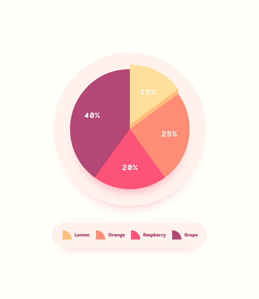
Final product image
What You’ll Be Creating

In the following steps, you will learn how to create an editable pie chart in Adobe Illustrator and how to easily stylize it.

First, you will learn how to create the starting pie chart using the Pie Graph Tool. Using the Direct Selection Tool and the Appearance panel along with some basic colors and effects, you will learn how to stylize the main components of your chart. Finally, you will learn how to create a simple legend and flat background.

For more inspiration on how to adjust or improve your final chart, you can find plenty of resources at GraphicRiver.

1. How to Create a New Document and Create the Starting Chart

Step 1

Hit Control-N to create a new document. Select Pixels from the Units drop-down menu, enter 850 in the width box and 980 in the height box, and then click that More Settings button. Select RGB for the Color Mode, set the Raster Effects to Screen (72 ppi), and then click Create Document.

Enable the Grid (View > Show Grid) and Snap to Grid (View > Snap to Grid). You will need a grid every 10 px, so simply go to Edit > Preferences > Guides & Grid, and enter 10 in the Gridline every box and 1 in the Subdivisions box. Try not to get discouraged by all that grid—it will make your work easier, and keep in mind that you can easily enable or disable it using the Control-„ keyboard shortcut.

You can learn more about Illustrator’s grid system in this short tutorial from Andrei Stefan: Understanding Adobe Illustrator’s Grid System.

You should also open the Info panel (Window > Info) for a live preview with the size and position of your shapes. Don’t forget to set the unit of measurement to pixels from Edit > Preferences > Units. All these options will significantly increase your work speed.

set up grid

Step 2

Focus on your toolbar and double click the Pie Graph Tool to open the Graph Type window. Enter the attributes shown in the following image and then click OK.

pie graph tool

Step 3

Make sure that the Pie Graph Tool is selected and simply click on your artboard to open the Graph window. Set both Width and Height to 450 pt, and then click OK.

Enter the data shown below and then click the Check button. Place your new graph roughly as shown in the following image.

graph

2. How to Edit the Pie Chart Components

Step 1

Pick the Direct Selection Tool (A), select only the shape highlighted in the following image, and focus on the Appearance panel (Window > Appearance).

Remove the existing stroke color and then select the fill. Set its color to R=255 G=190 B=123 and go to Effect > Distort & Transform > Transform. Drag the Move-Vertical slider to -1 px and enter 15 in the Copies box, and then click OK. Return to the Appearance panel and add a second fill using the Add New Fill button. Select it, set the color to R=255 G=223 B=153, and go to Effect > Distort & Transform > Transform. Drag the Move-Vertical slider to -15 px and click OK.

direct selection tool

Step 2

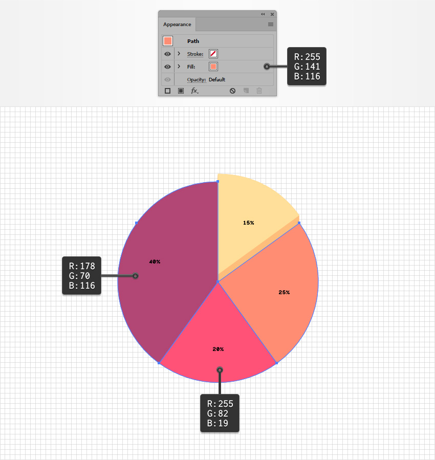
Using the Direct Selection Tool (A), select the other pie chart slices one by one. Remove the stroke color and replace the existing fill colors with the ones shown below.

change color

Step 3

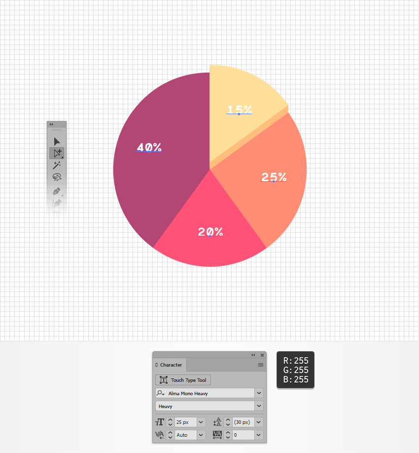
Pick the Group Selection Tool and select one of the text pieces from your pie chart. Click a second time on the same piece of text to easily select all the text.

Open the Character panel (Window > Type > Character) and select the Alma Mono Heavy font. Set the Size to 25 px and change the color to white (R=255 G=255 B=255).

edit text

3. How to Stylize Your Pie Chart

Step 1

Pick the Move Tool (V), select your entire pie chart, and focus on the Appearance panel.

Add a new fill, select it, and make sure that it lies below the „Contents” section. Set the color to R=255 G=242 B=236 and go to Effect > Convert to Shape > Ellipse. Check the Absolute box, set both Width and Height to 500 px, click OK, and then go to Effect > Distort & Transform > Transform. Drag the Move-Vertical slider to 7 px, click OK, and go to Effect > Stylize > Drop Shadow. Enter the attributes shown below and click OK.

add new fill

Step 2

Make sure that your entire pie chart is still selected and keep focusing on the Appearance panel. Add a second fill, drag it below the existing fill, and select it.

Set the color to R=255 G=82 B=119, lower its Opacity to 30%, and go to Effect > Convert to Shape > Ellipse. Check the Absolute box, set both Width and Height to 440 px, click OK, and then go to Effect > Distort & Transform > Transform. Drag the Move-Vertical slider to 45 px, click OK, and go to Effect > Blur > Gaussian Blur. Enter a 15 px Radius and click OK.

gaussian blur

Step 3

Make sure that your entire pie chart is still selected and keep focusing on the Appearance panel. Add a third fill, drag it above the other two fills, and select it.

Set the color to R=255 G=82 B=119, lower its Opacity to 50%, and go to Effect > Convert to Shape > Ellipse. Check the Absolute box, set both Width and Height to 350 px, click OK, and then go to Effect > Distort & Transform > Transform. Drag the Move-Vertical slider to 35 px, click OK, and go to Effect > Blur > Gaussian Blur. Enter a 15 px Radius and click OK.

chart shadow

4. How to Create a Simple Legend

Step 1

Using the Rectangle Tool (M), create a 510 x 80 px shape, and place it as shown in the following image. Make sure that this rectangle stays selected and focus on the Appearance panel.

Select the fill, set its color to R=255 G=242 B=236, and go to Effect > Stylize > Rounded Corners. Enter a 40 px Radius, click OK, and go to Effect > Stylize > Drop Shadow. Enter the attributes shown below and click OK.

rounded rectangle

Step 2

Make sure that your rectangle stays selected and keep focusing on the Appearance panel. Add a second fill and drag it below the other one.

Set the color to R=255 G=82 B=119, lower its Opacity to 30%, and go to Effect > Stylize > Rounded Corners. Enter a 10 px Radius, click OK, and go to Effect > Distort & Transform > Transform. Enter the attributes shown below, click OK, and go to Effect > Blur > Gaussian Blur. Set the Radius to 15 px and click OK.

legend shadow

Step 3

For this step, you will need a grid every 5 px. Simply go to Edit > Preferences > Guides & Grid and enter 5 in the Gridline every box.

Pick the Ellipse Tool (L) and create a 60 px circle, and then select the Rectangle Tool (M) and create a 30 px square. Place your square as shown in the second image and fill it with R=255 G=190 B=123. Select both shapes made in this step and click the Intersect button from the Pathfinder panel (Window > Pathfinder).

pathfinder panel

Step 4

Select your quarter circle and place it as shown in the following image.

quarter circle

Step 5

Make three copies of your quarter circle. Place them as shown below and replace the yellow with the colors shown below.

change color

Step 6

Go to your Toolbar and set the fill color to R=178 G=70 B=116. Focus on the Character panel, select the Auro font, and set the size to 16 px.

Pick the Type Tool (T), click on your artboard, add the „Lemon” piece of text, and then place it as shown below. Type the other three pieces of text and place them as shown below.

type tool

Step 7

Select all four pieces of text and go to Effect > Stylize > Drop Shadow. Enter the attributes shown below and click OK.

drop shadow

5. How to Create a Simple Background

Pick the Rectangle Tool (M) and create an 870 x 1000 px shape. Fill this new rectangle with R=255 G=255 B=250, make sure that it covers your entire artboard, and send it to back (Shift-Control-[).

background

Congratulations! You’re Done!

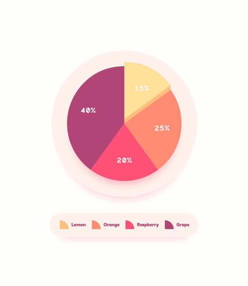
Here is how it should look. I hope you’ve enjoyed this tutorial and can apply these techniques in your future projects. Don’t hesitate to share your final result in the comments section.

Feel free to adjust the final design and make it your own. You can find some great sources of inspiration at GraphicRiver, with interesting solutions to improve your design.

final product

How to Draw a Flamingo

Post pobrano z: How to Draw a Flamingo

Final product image
What You’ll Be Creating

Flamingos are familiar even to those who have never seen one in real life. These large birds have long, stick-like legs with backward-bending knees and long, curvy necks.

Flamingos embody the saying „You are what you eat.” The pink and reddish colors of their feathers come from eating pigments found in algae and invertebrates. Zoo flamingos will turn white if their diet doesn’t contain shrimp or other food providing carotenoid pigments.

Let’s explore this bird and learn some interesting facts about it together! In this tutorial, we’ll draw a flamingo from scratch, using graphite pencils.

What You Will Need

You’ll need the following supplies to create this project:

  • an HB graphite pencil
  • a 3B graphite pencil
  • an eraser
  • drawing paper
The art supplies for this project

How to Draw a Flamingo

Step 1

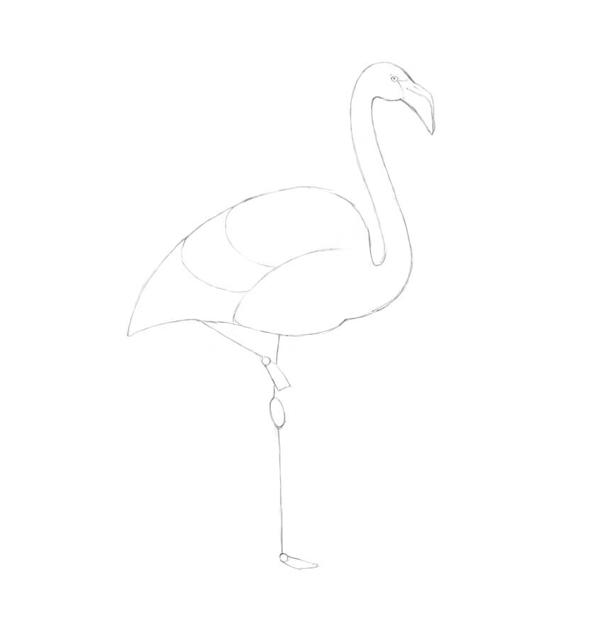
I outline a rough shape of the flamingo’s head, using the HB graphite pencil.

Drawing the shape of the head

I add a shape of the bird’s beak; it is massive and slightly bent downwards.

Adding the shape of the beak

Step 2

I add the long line of the neck—it has an “S” shape. 

This position may vary, and sometimes the line of the neck becomes much straighter or, on the contrary, demonstrates even more curves.

Adding the core line of the neck

Step 3

I draw a rough shape of the flamingo’s body; it is similar to a stylized drop that is lying on its side.

Adding the shape of the body

Step 4

I add a framework of the first leg, marking the ankle with an oval. Let’s keep the outline as simple as possible for now.

Drawing the core line of the leg

I’m going to depict a common position in which the other leg is tucked beneath the bird’s body.

It’s difficult to say why flamingos tend to stand on one foot, but it’s supposed that keeping one of their feet out of the cold water helps birds to conserve body heat. However, this behavior also takes place in warm water and in birds that do not typically stand in water.

It also seems to be a comfortable resting position for flamingos; the one-legged pose can be held without any muscle activity.

Adding the framework of another leg

Actually, the positions of the flamingo’s neck and legs can be quite versatile. Don’t feel limited to just one of them!

The variants of poses

Step 5

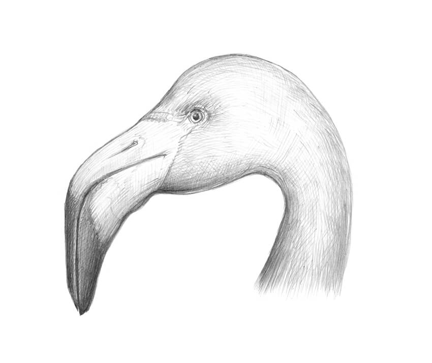
It’s time to refine the head of the bird in our drawing. It is relatively small, compared to the massive black-tipped beak with a distinctive downward bent. The lower part of the beak is much larger and stronger than the upper one.

A flamingo’s beak has a filter-like structure to remove food from the water before the liquid is expelled.

You can find a stylized illustration of a flamingo’s head in the image below.

An illustration of the head

I add a small eye, and then refine the contours of the upper and lower bills.

Refining the head and adding some details

Step 6

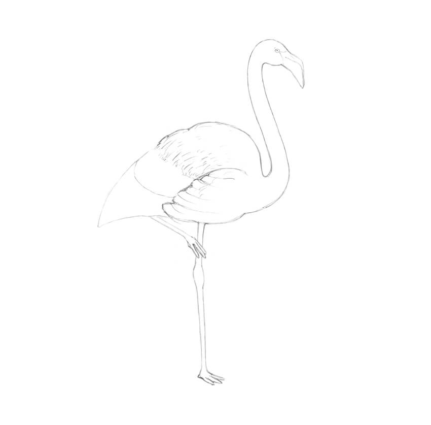
I outline the contours of the bird’s wing.

Adding the wing

A flamingo has a massive covering of feathers; some of them, especially in the bottom part of the body, are longer, with clear-cut contours.

The feathers in the upper part of the body create a softer, smother impression—often, we can’t differentiate separate feathers there.

I divide the bird’s body into parts (or layers) to make the process of drawing the feathers easier.

Creating the layers for the feathers

Step 7

I draw the contours of the flamingo’s neck, joining the head and the body.

Refining the neck

Step 8

I refine the leg, based on the framework.

The three main toes are webbed to help spread the bird’s weight as it stands on soft mud, and also to act as paddles when the flamingo swims.

Drawing the first leg adding details

I add the contours of the visible part of the tucked leg.

Refining another leg

Step 9

I refine the outer contour of the wing, marking the feathers, and then create an illusion of soft feathers in the top part of the body. The direction of the pencil lines accentuates the contours of the flamingo’s body.

Adding the texture of feathers

I add the longer feathers. They can be more fluffed up in slightly different directions or just come together at the tip of the tail. 

I decided to make this flamingo more artistic and stylized, so I draw a decorative tail with attention to the long feathers.

Adding the longer feathers

Step 10

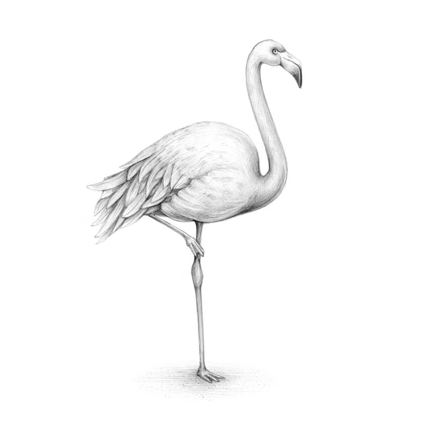
With the HB pencil, I apply some graphite hatching to give the drawing more volume. 

I accent the bottom part of the bird’s body and the areas between the long feathers. There should be shadows on the bird’s neck and legs.

And, as a nice addition, a drop shadow makes the bird’s figure steadier.

Creating a layer of hatching

Step 11

With the 3B pencil, I increase the contrast in my drawing. Flamingos have black flight feathers under their wings, so I create a hint at them.

I also darken the tip of the beak and the area around the eye to make the artwork more expressive. It’s a great trick to use a sharp tip of the eraser to add small highlights on the feathers and create a soft transition between the areas of shorter and longer feathers.

As a finishing touch, I add some graphite dots to the drop shadow under the flamingo to create an illusion of grainy sand texture.

Completing the drawing

Your Drawing Is Complete

Congratulations—we’ve created a beautiful graphite pencil drawing! I hope you were inspired by the theme of this tutorial: wonderful flamingos.

Let your creative journey be fruitful and full of joy!

The result of our work

Join the Design & Illustration Instructor Team!

Post pobrano z: Join the Design & Illustration Instructor Team!

It’s that time of year again! We’re looking for some new designers to join our always developing team of awesome instructors. 

What We’re Looking For

Envato Tuts+ has many areas of content, and while we love a variety of avenues, we’re specifically looking for instructors to create written content. The topics we’re specifically looking for are:

  • Photo manipulation
  • Product mockups
  • Logo design 
  • Adobe Photoshop
  • Procreate
  • Affinity Photo
  • Sketchbook

Vector Software Gurus: 

  • Affinity Designer
  • Sketch
  • Inkscape

Your area of expertise not listed? We never turn a good application down!

You must also be comfortable with the English language. We can proof your content, but we can’t rewrite everything for you. 

We’re looking for content from quick tips to in-depth tutorials. Most of all, we want instructors who can explain themselves clearly and accurately and produce quality end results. Whether you’re an expert in Adobe Illustrator, Adobe InDesign, Inkscape, Adobe Photoshop, Sketch or any other design package, we want to hear from you!

We are passionate about diversity and inclusion, and this includes design and trends from all corners of the globe. If you want to contribute to our ever-expanding Global Influences content, please send us a pitch.

If you want to know more, please check out this insightful comment on our previous call for new instructors.

What Do You Get Out of It?

There are many benefits to becoming an Envato Tuts+ Instructor:

  • Getting paid for a subject you’re passionate about is always rewarding. Depending on the content type and subject, you could be billing thousands per month! We pay $250 USD for a standard length tutorial (around 25-30 steps/images).
  • We have in-depth guides to help you put together your posts, from formatting to tone to screenshot presentation. So if you’re new to tutorial writing, this is a great place to start!
  • Get your name out into the community. This is especially good if you’re just starting your freelance career.
  • If you create assets for Envato Market or Envato Elements, then use this opportunity to help promote your items!

Pitch a Tutorial!

While I can tell you which areas we’re specifically looking into, it all comes down to which areas are your strongest and what you feel most confident in teaching. If you are interested in becoming an Envato Tuts+ instructor, why don’t you pitch us an idea? We’re looking forward to hearing from you.

The Beginner’s Quick-Start Guide to InDesign (Tutorials, Tips & Resources)

Post pobrano z: The Beginner’s Quick-Start Guide to InDesign (Tutorials, Tips & Resources)

How to Get Started With Adobe InDesign

If you’re putting together a magazine, brochure or book, it’s likely that you’ll encounter Adobe InDesign during your design process. This publishing program is the print designer’s everyday tool of choice, but you can also use it to do more unusual tasks, such as creating EPUBs (eBooks), formatting cool typography effects, and designing Pinterest-worthy posters. 

club flyer tutorial

If you’re a beginner to InDesign, it can be intimidating knowing how to get started and what tasks the software is suitable for. Here, you’ll find a quick-start guide to InDesign to help you get started on the right foot.

What Is InDesign?

InDesign is a publishing program, which means it’s designed for creating 2D layouts which combine type and images. 

Some items you might commonly create in InDesign might include multi-page print publications like magazines and books, stationery items such as business cards and letterheads, promotional media like flyers, booklets, and brochures, and other single-page print layouts like posters and banners. 

The more recent CC version of InDesign also has more features that allow designers to create layouts for digital and online, such as eBooks, digital magazines, and social media images.

indesign cc

Manufactured by Adobe, InDesign is part of a core trio of Creative Suite applications, which also includes Photoshop and Illustrator. While Photoshop is designed for editing raster (photographic) images and Illustrator is tailored to creating vector (scaleable) graphics, InDesign is programmed to allow designers to incorporate their edited images as part of a broader layout.

If you’re still not sure whether InDesign is going to be the best software choice for your project, ask yourself whether the design is based around a layout across one page or multiple pages. If so, InDesign is going to be a great pick. If your design is going to be focussed on a single image, such as a photo that requires a lot of editing or a design for a logo, opt for Photoshop or Illustrator instead. 

Templates Are a Great Way to Get Started With Learning InDesign

As well as picking up some basic InDesign skills from Envato’s range of beginner tutorials (see below), you can actually learn a huge amount about InDesign by downloading a template.

Opening a template and exploring what’s already been set up for you, such as layers, color swatches, and type, is a fun and easy way to start getting familiar with the InDesign interface. 

Here is a selection of some of our favorite templates, which make a great foundation for creating your own unique design:

Minimal Magazine Template

magazine template

This minimal magazine template has a simple layout which is intuitive and easy to edit, making it a great template choice for beginners to magazine design. 

Professional Magazine Template

magazine template

This magazine template uses more experimental color and transparencies to add visual interest to layouts. It’s deceptively simple in its setup, so again it makes for a perfect magazine template for InDesign beginners. 

You can also find out how to adapt this template creatively in this tutorial: 

Stylish Brochure Template

brochure template

This newsletter and brochure template is a more stylish take on the corporate brochure format. This design is particularly strong on the typography front, so make sure to explore the different styles being used across the template (Window > Styles > Paragraph Styles) to pick up some tips.  

Simple Brochure Template

brochure

A multipurpose brochure is always handy, but this ultra-simple style is particularly versatile. It’s a great example of how strong color and type is a tried-and-tested combination that packs a punch. 

Lookbook Template

lookbook

Catalogs and lookbooks are another type of print media for which InDesign is the perfect software choice. Lookbooks tend to be very simple in format—pairing images and type together to create a heavily visual result—so they make an ideal template for InDesign beginners to explore.

Juniper Stationery Set 

stationery set

Stationery sets are really simple to put together in InDesign, but it’s always handy to dip a toe into creating your own by adapting an existing template. This contemporary stationery set is easy to adapt by swapping in a different image for the background and border, or by swapping the sans serif font for a more classic serif. 

You can find more of our top InDesign template picks here:

How to Develop Your InDesign Learning Further With Tutorials

Working your way through a tutorial, either with the goal of picking up a new skill or creating a particular design, is an immersive and effective way to start learning InDesign. 

Luckily, you’ll find a huge range of free InDesign tutorials here on Envato Tuts+. If you’re a complete beginner, work your way through the following tutorials, which will help to build your confidence with using InDesign and develop your print design skills along the way. 

How to Create Documents in InDesign 

create documents

This tutorial gives readers with no or limited InDesign experience the basic knowledge on how to set up a document for print.

How to Thread Text in InDesign

thread text

Threading text within InDesign can hugely improve the experience of editing and amending copy while working on layouts. The process of threading text is linking two or more text frames, allowing text to flow from one separate frame to another.

How to Import Graphics Into InDesign Documents

import images

In this Quick Tip tutorial, you will learn about the various ways you can import image files into an InDesign document and how to replace and rescale them.

How to Prepare Your InDesign Documents for Printing

prep for print

Learn how to properly set up the technical specs for your InDesign documents, before you send off your hard work to the printers.

When you have a few basic skills under your belt, you can start to pick up more skills by learning how to create layouts for magazines, posters, or flyers.

How to Design a Book Cover in InDesign

moby dick

Learn how to design a book cover in InDesign the fun way, with this modern twist on the classic novel Moby Dick.

How to Create a Magazine Template in InDesign

magazine template

This tutorial leads you through the steps of creating a magazine template in InDesign, complete with page numbers, masters, and running headers. It makes a great foundation for creating your own unique magazine designs. 

How to Design a Stylish Real Estate Flyer in InDesign

real estate flyer

Flyers might be small, but these single-page layouts need to pack a punch if they’re going to attract the eye. Here, you’ll learn how to put together a stylish real estate flyer.

How to Create a Business Card in InDesign

business card

Business cards are easy to create in InDesign, and they’re really fun to do. This tutorial shows you how to create one in ten easy steps. 

How to Create a Wedding Invitation in InDesign

wedding invite

Want to know more about specialist print finishes, like foiling and die-cutting? Invitation tutorials are fantastic ways of picking up some cool print skills. Check out this fall-themed wedding invite tutorial. 

Take Your Skills to the Next Level With Courses and Intermediate Tutorials

When you’ve created your first magazine layout or business card in InDesign, you’re ready to deepen your InDesign knowledge and tackle some more niche projects. Learn how to create EPUBs or advanced typography effects through an intermediate tutorial, or become a print design expert with an in-depth course.

How to Create an eBook (EPUB) in InDesign

epub

Ever wanted to convert your InDesign layouts to eBooks? With the right know-how, it’s super-simple to do. In this tutorial, you’ll learn about three different ways you can quickly turn your designs into interactive PDFs or EPUBs, ready for sharing or selling online. 

How to Create Advanced Text Effects in InDesign

These four quick tutorials show you how you can create immersive, advanced typography effects in InDesign in minutes.

Course: Pro Print Design Workflow


In this course, instructor Nicki Hart leads you through the process of creating any print document professionally, all the way through from the initial client brief to revisions and final delivery.

Course: Designing Booklets


Learn how to create a multi-page booklet in this course, as well as picking up skills applicable to creating catalogs, brochures, and other print publications. You’ll also learn how to use InDesign’s „Print Booklet” feature so you can send your new booklet to print. 

Course: The Art of Typography


This course gives a broad overview of typography and how to apply it to print designs. You’ll learn how to apply fundamental typographic techniques to your own layouts, and you’ll tackle a broad range of project tasks, including typesetting a book and designing a vintage-inspired typographic poster.

Conclusion

InDesign might seem a little intimidating for first-time users, but it’s actually really intuitive to use once you know a few basics. 

Downloading InDesign templates is a good way of familiarising yourself with the workspace, before moving on to beginner tutorials to build your knowledge base. You can deepen your understanding of creating more specific print and digital work by following intermediate tutorials and video courses. 

Discover more InDesign tutorials and courses here.

indesign cc

20 Best Photo Frame Effects for Photoshop to Make Your Pictures Pop

Post pobrano z: 20 Best Photo Frame Effects for Photoshop to Make Your Pictures Pop

Create a simple and easy picture frame effect with Photoshop! Check out these amazing resources below.

20 Best Photo Frame Effects

Need a quick frame for your photo? Try a simple Photoshop mockup. These clever resources help you create realistic scenes with picture frames and more.

Display your art in a vintage frame for an old-world effect, or use a levitating frame for a modern twist! Today we bring you 20 incredible assets to simplify your work.

Hand-picked from the latest premium sections of Envato Elements and Envato Market, these picture frame resources are easy to use for any creative professional or hobbyist.

Want to see these resources in action? Check out our examples below.

Make Amazing Vintage Effects Fast: See Our Examples!

To give you an idea of how easy it is to use these resources, here are two fun examples we’ve tried out!

Picture Frame Mockup

Display
your favorite posters and more in this simple retro setup. Featuring
several versatile sizes to display your art, this pack lets you mix and
match frames for the perfect wall. Add it to your website for an
impressive professional look.

Picture Frame Mockup

In this case, I used this mockup pack on a few free stocks from Pixabay. For a quick turnaround, I went with the setup featuring three black frames in a row. Check out my result below! Pretty sweet!

Picture frame example 1

Picture Frame Mockup v3

Typography
is stunning all on its own. Now you can display your favorite handwritten
quotes and more with this wondrous mockup set. Inside you’ll get a look at five
Photoshop files with well-organized layers for easy customization.

Picture Frame Mockup v3

I tried out this mockup set on this Yellow Bee and Hydrangeas Stock from Pixabay. My favorite room featured a beautiful bicycle, so I used that to complement these photos for a cool look. Experiment with different setups to refresh your designs.

Picture frame example 2

Want to see more options? Check out the rest of these amazing resources below.

Just Frames – Prints Mockups

There’s no need to print out your work when you can create that same framed look in seconds! Check out this Just Frames print mockup series, featuring 20 smart locations to choose from. Explore amazing brick backgrounds and incredible wood finishes with this high-quality set.

Just Frames - Prints Mockups

20 Gravity Photo Frame Mockups

Design a magical room for your photos with this anti-gravity mockup set. These fully customizable Photoshop files make it easy to insert your photos for a cool, anti-gravity effect. Try out different looks featuring white and old oak wood patterns.

20 Gravity Photo Frame Mockups

9 Picture Frame Mockups

A simple frame can do a lot for a photo. Make your work shine with this professional pack of picture frame mockups. Designed for high-resolution photos of portraits, landscapes, and more, this pack is fun and easy to use. Just double-click the smart objects to insert your own pictures.

9 Picture Frame Mockups

Poster Frame Mockups – Letter

Need a simple frame against a white background? Try out this clean poster frame mockup. This mockup set features various letter-sized frames in an array of basic and bold colors. You’ll get two Photoshop files to view these frames in landscape or portrait mode and a convenient help file.

Poster Frame Mockups - Letter

A4 Frame Mock Up

Make your poster scene even better with a cute office plant! This A4 frame mockup features a standard professional design against a modern stone background. The background is completely included too, so you won’t have to worry about switching it out. Give it a try!

A4 Frame Mock Up

Picture Art Mockup Vol 11

Want a contemporary space for your art? Try out this epic picture art mockup set dedicated to giving you that sleek vibe. Including several inspiring scenes made from real photos, this set features tall windows and cool furniture. Present your designs in a beautiful manner with this amazing pack.

Picture Art Mockup Vol 11

Poster Frame Mockup

Poster mockups are a great way to display your art to clients and other professionals. Check out this impeccable set, featuring 10 realistic-looking templates with interchangeable backgrounds. Inside, you’ll find well-organized layers that are easy to customize for efficient editing.

Poster Frame Mockup

Frame Art Photoshop Action

Split your pictures up into rectangular frames with this awesome action. Install the action to enjoy an instant effect you can apply to Facebook headers and more. Included in this download is one Photoshop action file along with simple text instructions to help you achieve this look!

Frame Art

Frame Picture Mockup

Create a clean 3D display with interesting details. This creative picture frame mockup features editable smart objects, well-organized layers, and a helpful instructional guide. Learn how to change the impact of your work with a striking picture frame effect.

Frame Picture Mockup

Gif Animated Frames Photoshop Action

Design an impressive animated frame effect with this cool Photoshop action. Take your portraiture to the next level with unlimited variants to switch up your animation. Get ready to explore 20 color effects that will mesmerize and dazzle. Just watch the animation included.

Gif Animated Frames Photoshop Action

20 Studio Frame Mockups

Transform your backgrounds into simple studios with this easy mockup. Use Adobe Photoshop to present your photographs and illustrations with finesse and style. Check out the 20 high-resolution Photoshop files to try out different color effects.

20 Studio Frame Mockups

Stack of Vintage Frames

Quickly emulate the look of vintage photo frames with this useful pack! Download stunning vintage designs that work well with cityscape and landscape photography. Also included are bonus features like 10 stain brushes and more for added distressing.

Stack of Vintage Frames

Film Strip Mockup

How would your story look? Easily insert your memories into this simple film strip for an exciting look! Check out this film strip mockup featuring fully editable smart objects for pictures and graphics. Replace the blue backgrounds with your images for a fun and exciting effect!

Film Strip Mockup

Picture Art Mockup Vol 12

Can you see your art displayed in a modern interior design? Style your designs with incredible, realistic scenes using this epic picture art frame mockup. Using scenes from real photos, this mockup set is great for beginners to Photoshop. Give it a try!

Picture Art Mockup Vol 12

Simple Homes Mockup Vol. 4

Minimalism is simple yet purposeful. Now you can create simple, stunning layouts with this Simple Homes Mockup. Enjoy six Photoshop files packed with professionally lit photography. Display these images for your Etsy, Facebook, or Behance projects for an impressive result.

Simple Homes Mockup Vol 4

New Photo Frames

Instantly transform your images with creative, geometric splits. This new photo frame action gives you four amazing styles perfect for the avid photographer. Bring out the best of your work with creative geometric frames that are fully editable and resizable. Download it now!

New Photo Frames

Video Feedback Photo Effect Photoshop Tool

Make an epic video feedback effect with this effective Photoshop tool. Great for picture frame posters or shots with rectangular edges, this tool allows you to warp your photos instantly for a wicked illusion. Test it out with any image, including text and other graphics.

Video Feedback Photo Effect Photoshop Tool

Framework Scene Creator

Design the scene you need with this awesome Framework scene creator. Creatives will enjoy the beautiful selection of high-quality frames and objects to beautify any scene. Showcase your work in its best light with this striking set!

Framework Scene Creator

Show Us Your Picture Frame Designs!

Tried any of these assets? Let us know! Tell us your favorite picture frame assets in the comments below.

Want to create these effects yourself? Try out these tutorials:

This has been a collection of premium resources perfect for the avid designer. For more Photoshop photo frame effects, check out Envato Market and Envato Elements, or enlist the help of our talented professionals at Envato Studio. Happy designing!

How to Create a Vintage Photo Filter With Photoshop in 60 Seconds

Post pobrano z: How to Create a Vintage Photo Filter With Photoshop in 60 Seconds

Final product image
What You’ll Be Creating

In this quick video,I will show you how to create your own Photoshop Action for a cool vintage photo effect.

Photoshop in 60 Seconds: Vintage Filter Effect

Vintage photos take us back in time to a whole different world. And you can give your photos the beautiful look of old photography with a custom Photoshop action. In this video below, watch me create an easy Photoshop action for a vintage photo effect that incorporates both fade and texture.

And feel free to download the Old Paper Stock image used in this video. 


How to Create a Vintage Filter Action in Photoshop

Open your photo into Photoshop. Here I’ll be using this Man Stock.

Pixabay Asian Man Stock
Man Stock

Go to Window > Actions, to open the Actions palette. Then hit the Folder and Paper icons to create a New Action Set and Action. Name your new action.

Create a New Action in Photoshop

Next, go to Layer > New Adjustment Layer > Levels. Adjust the Shadow Output Level to 56 and increase the Shadow Input Level to 23.

Adjust the Levels

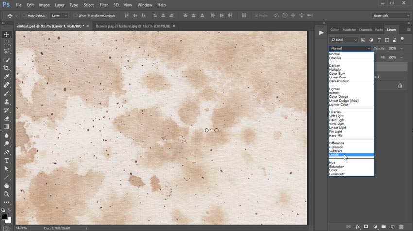
Copy and Paste your Old Paper Reference onto the canvas, setting the Layer Blend Mode to Divide.

Paste the Old Paper Reference

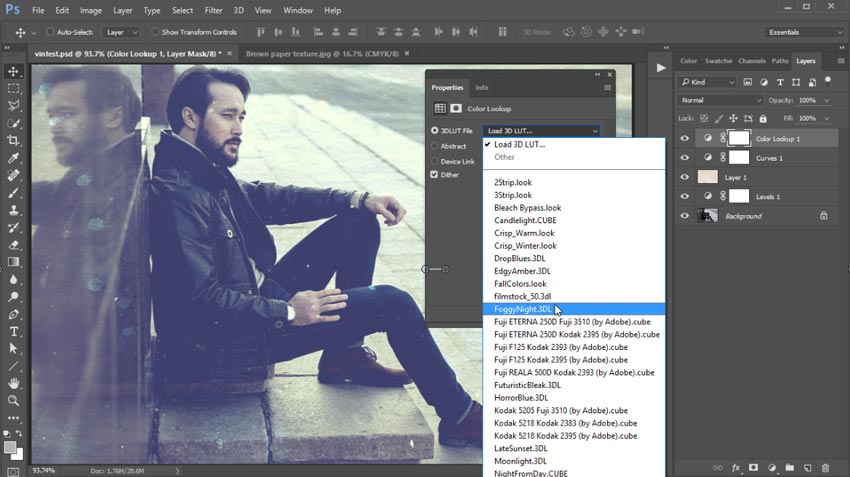
Add two new Adjustment Layers: one for Curves, and the other for Color Lookup. Adjust the curve for the Blue Channel to add a yellow and blue tint to the photo. Then set the Color Lookup layer to FoggyNight.

Hit the Stop button on the Actions palette when you’re finished, and feel free to Save this action for later photos.

Color Lookup Adjustment Layer

Here is the final result.

Vintage Photo Effect Photoshop Action Tutorial

Want to see this in action? Check out the video above to see this lesson at work!

5 Vintage Photoshop Actions

Love the look of retro photos? Browse the amazing selection of Photoshop Actions available through GraphicRiver and Envato Elements to create instant vintage effects! And check out a few of our favorites below.

Vintage Photoshop Action

How would your photo look if it were taken during the early 1900s? Find out with this incredible vintage action. This action is created using old charcoal and watercolor scans that result in an amazing effect. Download this action to get access to 16 different color variations.

Vintage Photoshop Action

Vintage Sketch Photoshop Action

Merge your love of old photos with a quick sketch effect with this awesome action. Tested on multiple versions of Photoshop for your convenience, this action includes 10 total color effects. Simply run the action after you open your photo to save hours of work!

Vintage Sketch Photoshop Action

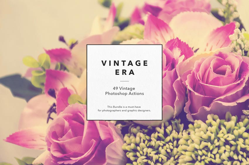
49 Vintage Photoshop Actions

Get an amazing pack of retro Photoshop actions all for one low price! This set includes 49 vintage-inspired actions to give your photos that dreamy, timeless look. With fast rendering and non-destructive editing, this set gives you awesome filters for your photos with just one click!

49 Vintage Photoshop Actions

Premium Vintage – Photoshop Actions

Create luxury photo effects with this incredible collection of Photoshop actions. This pack features five professional actions located in one organized file. Download today to get access to an additional help file for more instructions.

Premium Vintage - Photoshop Actions

Vintage Film Photoshop Actions

Are you a fan of retro films? Then showcase your love of this vintage art form with these incredible Photoshop actions. Inspired by vintage film like Fujifilm and more, this pack comes complete with 10 total actions. Create non-destructive photo effects easily with this essential action pack.

Vintage Film Photoshop Actions

60 Seconds?!

This is part of a series of quick video tutorials on
Envato Tuts+ in which we introduce a range of subjects, all in 60
seconds—just enough to whet your appetite. Let us know in the comments
what you thought of this video and what else you’d like to see explained
in 60 seconds!

How to Draw a Giraffe and a Giraffe Pattern

Post pobrano z: How to Draw a Giraffe and a Giraffe Pattern

Final product image
What You’ll Be Creating

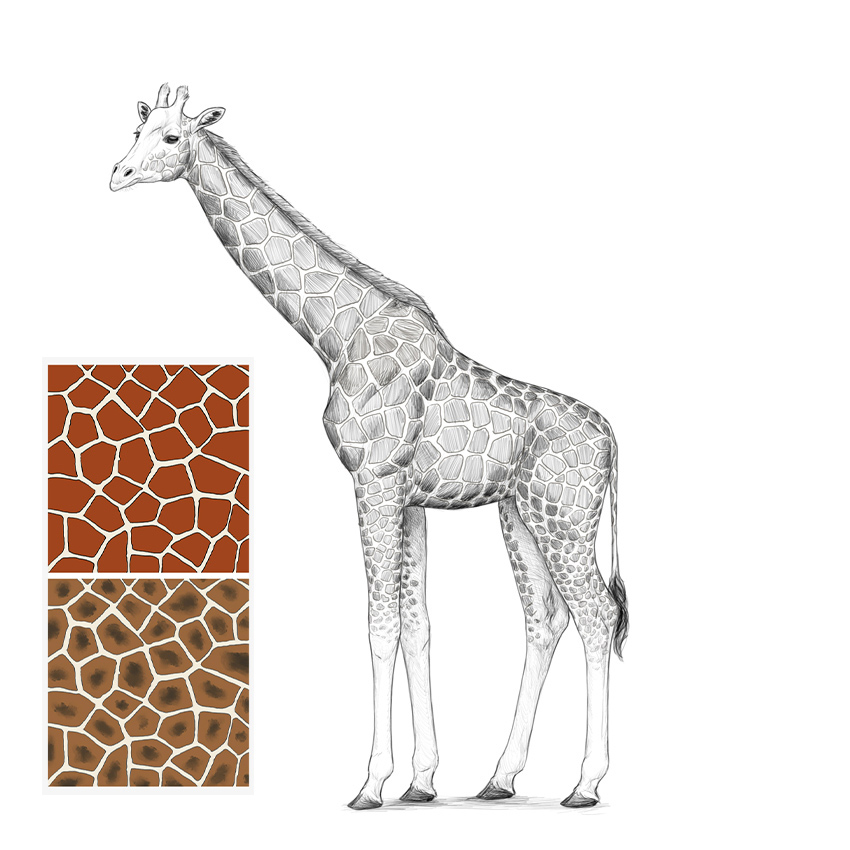
If you want to learn how to draw a giraffe, you’ve come to the right place! In this tutorial I will show you how to draw these amazing animals from scratch: first by establishing the guidelines of the skeleton, then by adding simplified muscle masses, and then by adding all the necessary details. 

Even if you’re a beginner at drawing, you can draw a realistic giraffe with me! And if you want something simpler, I will also show you how to draw the characteristic giraffe pattern.

This is a simple step-by-step tutorial on how to draw a giraffe in a single pose. If you want to learn more about drawing giraffes, especially about their anatomy, try this tutorial instead:

1. How to Draw a Giraffe’s Body

Step 1

The main body of a giraffe has a characteristic shape—the shoulders are much higher than the hips, and the whole torso is quite short. Sketch this shape to create a basic outline of the body.

simple giraffe body

Step 2

Divide this shape into thirds.

divide torso into thirds

Step 3

Draw a circle in the first two thirds. This will help us see the ribcage.

rib cage simplified

Step 4

Add two circles in the front for the shoulder, and a tilted oval in the back for the hips.

draw simplified shoulders

Step 5

We’ll need more details to use these pieces of anatomy. Add the front of the shoulder, the front of the ribcage, and tips of the hips—all drawn as simple circles.

add bony landmarks

Step 6

Draw the sacrum right over the hips.

draw sacrum

Step 7

Add the tail.

draw simple tail

Step 8

Outline the silhouette of the body as the guidelines suggest.

outline the body

2. How to Draw a Giraffe’s Legs

Step 1

Giraffes have very long legs—but how long, exactly? It’s all about proportions. Measure the torso in the middle, and then add twice this length below, plus some extra space for the hooves.

measure the distance to the ground

Step 2

Sketch basic curves for the front and hind legs.

sketch one pair of legs

Step 3

Legs can only be legs if they have joints in the correct places. Here’s how you can find them:

add joints to the legs

Step 4

Let’s add some depth to the drawing by adding another pair of legs slightly in the background. Draw the line of the ground above the previous one…

add another ground level

… and draw another pair of legs here.

add another pair of legs

Step 5

Mark their joints, too.

add another pair of leg joints

Step 6

The joints have a special shape that is very visible on these skinny legs. First, draw circles to create the joints over the hooves.

draw hoof joints

Step 7

Now, add semicircles for the „wrists” and „ankles”.

add bony joints

Step 8

Finish these joints by adding more shapes.

finish joint hsapes

Step 9

Finally, the arm and the knee.

add arm and knee bones

Step 10

Draw the top of the hooves by „cutting” the line right over them.

sketch hooves

Step 11

Outline the hooves. They should be quite flat.

outline hooves

Step 12

Add some muscle masses.

add thigh
add muscle masses

Step 13

Outline the whole legs.

outline giraffe legs

3. How to Draw a Giraffe’s Neck and Head

Step 1

To find the proper length for the giraffe’s neck, use the length of the front limbs (without the hooves). You don’t have to use a ruler—these lengths just need to be visually similar.

establish length of giraffe neck

Step 2

To give this neck the proper volume, draw three ovals across it.

add volume to neck

Step 3

Outline the neck, merging it gently with the torso.

outline the neck

Step 4

Add an oval for the head. It should be quite small.

add head oval

Step 5

The simplest way to quickly set the proportions of the head is to draw a cross made of the eye line and a line going along the whole head. This cross must be adjusted to the perspective.

add head cross

Step 6

Add the muzzle in the front.

add muzzle oval

Step 7

Add the cheeks.

add oval cheeks

Step 8

Add the „eye sockets”. If you draw them bigger than the intended eyes, you get a better visual idea of where they should be placed.

add eye sockets

Step 9

Draw the top of the muzzle.

add top of muzzle

Step 10

Add the long nostrils.

add giraffe nostrils

Step 11

Add the ears.

add giraffe ears

Step 12

Some giraffes have a bump on their forehead—this is where males store additional calcium.

giraffe head bump

Step 13

Sketch the two little horns.

sketch giraffe horns

Step 14

Draw the oval lines.

draw oval eyes

Step 15

Draw the bump over the eyes.

draw detail of eyes

Step 16

Draw the long upper lip of the giraffe.

draw giraffe upper lip

Step 17

Finish the shape of the head by connecting some of the guidelines.

finish head guide lines

4. How to Finish the Drawing of a Giraffe

Step 1

The guidelines are all done, so it’s time to draw the final lines over them. You can use a darker tool now, erase the sketch to an extent, or put a new sheet of paper over it—it’s up to you.

Outline the body as the guidelines suggest.

outline whole body

Step 2

Outline the head and all its details.

outline head

Step 3

Add some details to the body.

add details to body

Step 4

Some elements should be darker—the eyes, the nostrils, the mane, the tail, and the hooves.

add value to drawing

Step 5

To better show the 3D form of the body, shade it in a simple way.

add simple shading
finish the shading

5. How to Draw a Giraffe Pattern

Step 1

Let’s practice it on the side first. The pattern is pretty chaotic, but it has a special rhythm we have to follow. You can simulate it by drawing a lot of ovals/circles of similar size.

draw a pattern of ovals

Step 2

Now you need to create borders between these ovals. First with long curves…

create borders between ovals

… then with simple lines, wherever necessary. Your goal is to keep all the ovals separate.

separate the ovals

Step 3

Clean up these borders to create a regular mesh of polygons.

clean up the borders

Step 4

Finally, draw patches inside the polygons, creating some distance between them. Make the lines a little wobbly to create a more natural shape.

finish the pattern

Step 5

Various species of giraffe have slightly different patterns and colors, so don’t forget to check out some references to finish your pattern correctly!

how to draw a giraffe pattern skin

Step 6

Back to our drawing. Let’s use the same process: fill the whole body with ovals. Remember to adjust them to the 3D form of the giraffe’s body!

fill body with ovals

Step 7

Now the sketch of the borders…

sketch the borders
finish the borders

Step 8

And the clean plan of the borders:

clean up the borders

Step 9

Finally, draw the patches.

draw giraffe pattern

Step 10

Darken the patches to create a proper contrast between them and the rest of the skin.

color giraffe pattern

Step 11

Finally, shade the patches to fit the rest of the lighting, and add some final touches.

finish the shading with pattern

Beautiful Job!

Now you know how to draw a giraffe and a giraffe pattern! Are you interested in other giraffe-related tutorials? Check these out:

And if you want to keep drawing, here are some other animal drawing tutorials. You’ll like the cow, especially—it’s very similar to a giraffe!

how to draw a giraffe step by step

What Is the Memphis Style?

Post pobrano z: What Is the Memphis Style?

If you love unashamedly brash and bold colors and patterns, you’ll be very happy to hear that the Memphis Style, the design style pioneered by the 1980s Memphis Group, is very much back in vogue. 

90s dj flyer
Club flyer template with Memphis Style references

Here we’ll take a look at the background of the Memphis Group and look at how you can emulate the Memphis Style in your own design work. 

What Was the Memphis Group?

In 1981, Italian designer Ettore Sottsass founded a group of artists and designers called Memphis. Bob Dylan’s song ’Stuck Inside of Mobile with the Memphis Blues Again’ was playing on repeat during the group’s first meeting, which led to the group being named 'Memphis’.

After the inaugural meeting, the group decided that they would meet again in February 1981. The members brought over 100 drawings with them, picturing a variety of bold, colorful designs with multiple stylistic influences. 

The Memphis Group went on to create furniture, fabrics, patterns, ceramics and other products in a distinctly Postmodern style that blended stylistic traits of 1950s kitsch, Art Deco, and Pop Art. 

memphis style
A room containing furniture and other items designed in the Memphis Style, as part of a Memphis-Milano design collection. CC Wikipedia.

Initial critical reaction to the designs produced by the Memphis Group was not positive. The group’s use of conventionally ‘bad-taste’ plastic laminate and clashing colors didn’t resonate with the more widely accepted design standards of the time. 

However, we can now reflect on the designs created by the Memphis Group and recognise that they were groundbreaking. They marked a complete separation from the dark, overly tasteful and serious design styles of the 1970s. 

Memphis’s fresh approach to design, which was characterised by creativity and humor, came to be a lasting stylistic hallmark of the 1980s. 

dj flyer
Club flyer template

After six years of creative productivity, in 1987 the Memphis Group disbanded. Despite being described as a fad at the time, the group’s trademark style is now experiencing a revival. 

One of the members of the Memphis Group, Nathalie Du Pasquier, recently collaborated with Danish design company HAY to create Memphis-inspired products. The world of fashion has been one of the quickest design fields to revitalise the style, with houses such as Dior and Missoni creating collections and show sets that take inspiration from the Memphis Group.

What Is the Memphis Style?

The Memphis Style is one of the most instantly recognisable design styles. It’s known for its use of bright neon, primary and pastel colors, geometric shapes, and bold, repetitive patterns. The style is experiencing a resurgence in graphic design and illustration, as the trend for reviving all things eighties and maximalist continues to feel fresh and relevant.  

As the Memphis Style is a mish-mash of various design styles that were popular during the 1980s, it can look a little confused at best, and downright bonkers at worst! It’s a real Marmite design style—individuals tend to either completely love it or loathe it. 

Whether you think the outlandish designs of the Memphis Style are awesome or simply bad taste, you can’t deny the influence of the Memphis Group on graphic design and interior design today. 

casablanca cabinet
‘Casablanca Cabinet’, designed by Ettore Sottsass in 1982. CC Wikipedia.

Graphic design has allowed the Memphis Style to be recreated for a contemporary audience, with designers creating patterns, textures, color fonts and posters using its trademark geometric shapes and bold colors.

How Can I Emulate the Memphis Style in My Own Work?

While the out-there furniture style of the Memphis Group might not be everyone’s cup of tea, luckily the revival of the style in graphic design and illustration is a little more pared back. 

A good starting point is to create a vector pattern using repeated shapes, such as triangles, circles, and wavy lines, to give any background a Memphis flavor. 

memphis patterns
Memphis seamless patterns

Try softening the color palette of your pattern to more muted tones to keep the style looking fresh, not throwback. 

abstract memphis patterns
Abstract Memphis Style backgrounds

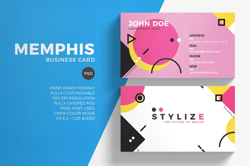
You can apply your background to print media, such as business cards or invitations. Team it with simple, minimal sans serif typography in black to anchor the style and stop it all looking a bit too zany.

business card
Memphis business card template
wedding invite set
Wedding invite set with geometric border

You don’t need to be a Memphis purist to extract the best elements of the style. Blending Memphis influences with other retro design traits can make patterns look nicely off-beat and relevant for now. These retro-style patterns borrow influences from 1970s design and the Memphis Style, as well as mixing in pastel neons for a contemporary twist.

pattern
Seamless retro patterns

Ultimately, the Memphis Style is all about taking a bold and brash approach to design. So get experimental! Try pairing pastels and neons together, rotate shapes into jaunty positions, and keep everything you create looking playful. 

Try to add a contemporary twist to your designs that keeps the style looking on-trend. In this tutorial, the Memphis Style is given a 3D update and a fresh pastel palette. 

In this text effect tutorial, Memphis Style influences are stripped down to the basics, with minimal lines, a rich color palette, and a flat design. 

Conclusion

Even though the Memphis Group’s ethos was considered to be in poor taste by the critics of the day, the style they pioneered has proven to have lasting relevance for designers, who look to its off-beat, humorous approach to give freshness and life to their designs.

What makes the Memphis Style so fun is the lack of rules and regulations associated with it. It really is a style that embraces eclectic and truly creative design. It’s also an inherently optimistic design style, which perhaps is why designers and illustrators are discovering a fresh relevance to the style today. 

Although the Memphis Style had its heyday during the 1980s, its influence filtered down into 90s-era design too. Check out these retro-themed tutorials to embrace the optimistic, brightly colored design style of the 1990s: