Archiwum kategorii: Web Tools

How to Create a Lace-Up Text Effect in Adobe Photoshop

Post pobrano z: How to Create a Lace-Up Text Effect in Adobe Photoshop

Final product image
What You’ll Be Creating

This tutorial will show you how to use Photoshop’s layer styles, filters, and adjustments to create a stylish lace-up text effect. Let’s get started!

This text effect was inspired by the many Layer Styles available on GraphicRiver.

Tutorial Assets

The following assets were used during the production of this tutorial:

1. How to Define Patterns

Step 1

Open the 71.jpg image from the Realistic Textile Backgrounds 5 pack. Go to Image > Image Size, change the Width value to 1170, and click OK.

Image Size

Step 2

Go to Edit > Define Pattern, and click OK.

Do that for the rest of the pattern images to add them to the Patterns preset.

Define Pattern

2. How to Create the Background and Text Shape Layers

Step 1

Create a new 1000 x 1000 px document. Click the Create new fill or adjustment layer icon at the bottom of the Layers panel, choose Solid Color, and use the Color #d6dbdb.

Solid Color

Step 2

Create the text using the font The Next Font. Set the Size to 550 pt and the Tracking to 50.

Create the Text

Step 3

Duplicate the text layer and hide it, and right-click the copy to choose Convert to Shape.

Rename the shape layer to Text Shape.

Convert to Shape

Step 4

Duplicate the Text Shape layer 3 times and hide it.

Rename the copy layers from top to bottom to Fill, Outer Stroke, and Stroke.

Keep in mind that you can turn these layers’ visibility on and off during the tutorial to better see what you’re doing with each one of them.

Duplicate the Shape Layer

Step 5

For both the Stroke and Outer Stroke layers, select each of them, and pick the Direct Selection Tool (A) to adjust their shape attributes in the Options bar.

Change the Fill to None, the Stroke Color to any bright color, and the Size to 35. Then click the Set shape stroke type icon to change the Align to Center and the Corners to Round.

Shape Attributes

3. How to Style the Stroke Layer

Double-click the Stroke layer to apply the following layer style:

Step 1

Add a Bevel and Emboss with these settings:

  • Size: 0
  • Uncheck the Use Global Light box
  • Angle: 40
  • Altitude: 48
  • Check the Anti-aliased box
  • Highlight Mode: Overlay
    • Opacity: 60%
  • Shadow Mode: Linear Burn
    • Opacity: 35%
Bevel and Emboss

Step 2

Add a Texture with these settings:

  • Pattern: Rough Cloth
  • Scale: 100%
  • Depth: 1000%
  • Check the Invert box
Texture

Step 3

Add a Pattern Overlay with these settings:

  • Pattern: 71.jpg
Pattern Overlay

Step 4

Change the Stroke layer’s Fill value to 0.

Fill Value

4. How to Style the Outer Stroke Layer

Double-click the Outer Stroke layer to apply the following layer style:

Step 1

Add a Bevel and Emboss with these settings:

  • Style: Stroke Emboss
  • Size: 29
  • Check the Anti-aliased box
  • Highlight Mode: Soft Light
    • Opacity: 35%
  • Shadow Mode: Linear Burn
    • Opacity: 35%
Bevel and Emboss

Step 2

Add a Contour with these settings:

  • Contour: Cove – Deep
  • Check the Anti-aliased box.
Contour

Step 3

Add a Texture with these settings:

  • Pattern: Project Papper
  • Check the Invert box
Texture

Step 4

Add a Stroke with these settings:

  • Size: 3
  • Position: Outside
  • Fill Type: Pattern
  • Pattern: 71.jpg
Stroke

Step 5

Change the Outer Stroke layer’s Fill value to 0.

Fill Value

5. How to Style the Text Shape Layer

Make the Text Shape layer visible, and double-click it to apply the following layer style:

Step 1

Add a Pattern Overlay with these settings:

  • Pattern: Human Skin
  • Scale: 50%
Pattern Overlay

Step 2

Add a Color Overlay with these settings:

  • Color: #edece9
  • Blend Mode: Multiply

You can use any other color you like depending on the result you want.

Color Overlay

This will style the Text Shape layer.

Text Shape

6. How to Create and Style Eyelets

Step 1

Pick the Ellipse Tool and create a 30 x 30 px circle where you want to place the first eyelet.

Then, press-hold the Option key, and create a smaller 17 x 17 px circle inside the one you already have to subtract it and get the main eyelet shape.

You can use the Path Selection Tool to separately select and move the smaller circle inside the bigger one if needed.

Right-click the shape layer and choose Convert to Smart Object.

Create the Eyelet Shape

Double-click the eyelet shape layer to apply the following layer style:

Step 2

Add a Bevel and Emboss with these settings:

  • Size: 7
  • Uncheck the Use Global Light box
  • Angle: 40
  • Altitude: 48
  • Check the Anti-aliased box
  • Highlight Mode: Linear light
    • Opacity: 60%
  • Shadow Mode: Linear Burn
    • Opacity: 35%
Bevel and Emboss

Step 3

Add a Contour with these settings:

  • Contour: Cone
  • Check the Anti-aliased box.
Contour

Step 4

Add a Color Overlay with these settings:

  • Color: #969c9d
Color Overlay

Step 5

Add a Drop Shadow with these settings:

  • Opacity: 100%
  • Distance: 2
  • Size: 3
Drop Shadow

Step 6

Add another Drop Shadow effect instance with these settings:

  • Opacity: 60%
  • Distance: 3
  • Size: 7
Drop Shadow

Step 7

Press-hold the Option key and click-drag the styled eyelet shape to duplicate it. You can press-hold the Shift key while doing so to constrain the movement.

Duplicate the Eyelet Shape

7. How to Modify a Ribbon Image

Step 1

Open the Ribbons image, and use the Quick Selection Tool to select the black ribbon.

Select the Ribbon

Step 2

Press Command-J to duplicate the selected ribbon into a new layer, and use the Rectangular Marquee Tool to select a portion you like of the duplicated ribbon.

Press Command-J again to duplicate that portion in a new layer, and hide the other layers you have.

Duplicate the Ribbon

Step 3

Use the Rectangular Marquee Tool to select the right half of the ribbon, pick the Move Tool, and press the Left Arrow key a couple of times to move the selected part inwards, making the ribbon thinner without losing texture or details.

You might need to repeat the process a couple of times to get the result you like.

Once you do, duplicate the layer to the original text document.

Reduce the Ribbon Size

8. How to Add a Ribbon to an Eyelet

Step 1

The ribbon should be thin enough to fit inside the eyelet shape you have. If it’s not, keep selecting one half of it and moving it inwards until you get the right size.

Duplicate the Ribbon

Step 2

Double-click the ribbon layer to apply an Inner Shadow effect with these settings:

  • Color: #020302
  • Opacity: 100%
  • Distance: 0
  • Size: 5
Inner Shadow

Step 3

Convert the ribbon layer to a Smart Object.

Convert to a Smart Object

Step 4

Press Command-T to enter Free Transform Mode, rotate the ribbon to an angle you like based on the distance you want to create between the eyelet rows, and place one of its ends inside the first eyelet.

You can also resize the ribbon slightly if needed.

Free Transform Mode

Step 5

Press the Warp icon in the Options bar to enter Warp Mode, and click-drag the ribbon’s tip to create a small arc and give the illusion of it being folded into the eyelet.

Press the Return key to commit the changes.

Warp Mode

9. How to Build a Laced-Up Effect

Step 1

Duplicate both eyelet shape layers and drag them downwards. Adjust their position as well as the ribbon’s end so that they meet where you’d like them to.

Place the Ribbon

Step 2

Duplicate the ribbon layer, and go to Edit > Transform > Flip Horizontal.

Place the flipped ribbon’s tip inside the empty top eyelet.

Flip Horizontal

Step 3

With the ribbon layer selected, click the Add layer mask icon at the bottom of the Layers panel, and select the mask’s thumbnail.

Pick the Brush Tool, set the Foreground Color to Black, choose a hard round brush tip with the same Size as the eyelet, and click on the bottom eyelet to erase the ribbon covering it.

Then, erase the extra parts of the ribbon, and repeat that for the other one.

Remove the Extra Parts

Step 4

Double-click the ribbon’s Smart Object thumbnail to open it, add a Hue/Saturation adjustment layer, and change both the Hue and Saturation values to -60.

Save and close the file.

HueSaturation

Step 5

To continue building the laced-up effect, select both the ribbon layers and the bottom eyelet layers, duplicate them, and drag them downwards.

Duplicate the Lace Units

Step 6

Keep doing that for the straight parts of the letters. Once you reach a curved area, duplicate one of the ribbon layers, rotate it so that it’s horizontal again, and place it on top of the last pair of eyelets you have.

You might need to delete the layer mask in order to transform the ribbon, so do that, and add in a new mask to get rid of any extra parts.

End the Lace-Up

Step 7

Take the time to build up the effect, and play around with the placement of the elements to fit each letter’s shape.

Build the Lace-Up Effect

Step 8

Once you’re done, put all the eyelet and ribbon layers in a group and name it Lace.

Lace Group

10. How to Cover Empty Text Areas

Step 1

Select the Fill layer and change its Fill value to 0.

Fill Value

Step 2

Pick the Rectangle Tool, press-hold the Option key, and create rectangles that cover the laced-up parts of the letters you have to remove them.

Remove the Lace-Up Parts

Step 3

Change the Fill layer’s Fill value back to 100%, and click the Path operations icon in the Options bar to choose Merge Shape Components.

Merge Shape Components

Step 4

Pick the Add Anchor Point Tool, and click where you want to extend the shape to cover any more areas.

Add Anchor Point Tool

Step 5

Pick the Convert Point Tool and click any anchor points you added to convert them to corner points.

Convert Point Tool

Step 6

Use the Direct Selection Tool to select and drag the anchor points to create a final shape you like.

Drag the Points

Step 7

Duplicate the Fill shape layer and rename the copy to Stitches.

Stitches Layer

Step 8

In the Options bar, change the Fill to None, the Stroke Size to 2, click the Set shape stroke type icon, and choose the dashed preset.

Stroke Properties

11. How to Style Stitches

Step 1

Right-click the Stroke layer, choose Copy Layer Style, right-click the Fill layer, and choose Paste Layer Style.

Copy and Paste the Layer style

Double-click the Stitches layer to apply the following layer style:

Step 2

Add a Bevel and Emboss with these settings:

  • Size: 1
  • Check the Anti-aliased box
  • Highlight Mode: Linear Light
    • Opacity: 82%
  • Shadow Mode: Linear Burn
    • Opacity: 35%
Bevel and Emboss

Step 3

Add a Contour with these settings:

  • Contour: Gaussian
  • Check the Anti-aliased box.
Contour

Step 4

Add a Color Overlay with these settings:

  • Color: #b5b4b2
Color Overlay

Step 5

Add a Drop Shadow with these settings:

  • Opacity: 100%
  • Distance: 2
  • Spread: 5
  • Size: 5
Drop Shadow

This will style the stitches.

Styled Stitches

12. How to Add Edges

Step 1

Duplicate the Outer Stroke Layer and change its Fill value to 100%.

Fill Value

Step 2

Convert the copy layer to a Smart Object and Command-click its thumbnail to load a selection.

Load a Selection

Step 3

Open the Paths panel, Option-click the Make work path from selection icon at the bottom of the panel, set the Radius to 0.8, and click OK.

Make Work Path

Step 4

Hide the Outer Stroke copy layer, and create a new layer on top of it with the name Edges.

Edges Layer

13. How to Create an Edges Brush

Step 1

Pick the Brush Tool and open the Brush Settings panel.

Choose the Dune Grass tip and adjust its settings as below:

Brush Tip Shape

Brush Tip Shape

Shape Dynamics

Shape Dynamics

Scattering

Scattering

Color Dynamics

Color Dynamics

Step 2

Set the Foreground Color to #212121 and the Background Color to #3f3f3f, and hit the Return key a couple of times until you like the stroke.

Stroke the Work Path

Step 3

Place all the layers you have, except for the Background and Solid Color layers, in a group and name it Text.

Text Group

14. How to Add Drop Shadow and Noise

Step 1

Double-click the Text group to apply Drop Shadow effects with these settings:

  • Opacity: 50%
  • Distance: 2
  • Spread: 5
  • Size: 5
Drop Shadow

Step 2

  • Opacity: 30%
  • Distance: 30
  • Size: 50
Drop Shadow

This will add the final shadows.

Added Shadows

Step 3

Place the 1.jpg image from the Abstract Spotlight Backgrounds pack on top of the Solid Color layer, and resize it to fit within the document so that its bottom part isn’t showing.

Rename the layer to BG Texture and change its Blend Mode to Soft Light.

BG Texture

Step 4

Create a new layer, name it BG Noise, and go to Edit > Fill.

Change the Contents to 50% Gray and click OK.

Gray Fill

Step 5

Convert the BG Noise layer to a Smart Object, and change its Blend Mode to Soft Light.

Convert to a Smart Object

Step 6

Go to Filter > Noise > Add Noise, change the Amount to 10 and the Distribution to Uniform, and check the Monochromatic box.

Add Noise Filter

15. How to Make the Final Changes

Step 1

Add a Levels adjustment layer on top of the Text group, change its Blend Mode to Luminosity, and change the Shadows value to 5 and the Highlights to 237.

Levels

Step 2

Add another Levels adjustment layer on top of all layers, choose the Blue channel, and change the Output Shadows value to 7.

Blue Channel Levels

Step 3

Create a new layer on top of all layers, name it High Pass, and press Command-Option-Shift-E to create a stamp.

Convert the layer to a Smart Object and change its Blend Mode to Soft Light.

High Pass Layer

Step 4

Go to Filter > Other > High Pass, and change the Radius value to 1.

High Pass Filter

Step 5

Duplicate the BG Noise layer, place the copy on top of all layers, expand the Smart Filters list, and double-click the Noise tab to change the Amount to 7.

Add Noise Filter

Congratulations, You’re Done!

In this tutorial, we created a couple of shape layers and adjusted their shape attributes to create the different text parts.

Then, we styled the layers, created the eyelets, and added the ribbon.

After that, we worked with the different elements to build the laced-up effect, and created a brush tip to add some fuzzy edges.

Finally, we made some final adjustments to finish off the effect.

Please feel free to leave your comments, suggestions, and outcomes below.

Final Result

Envato Tuts+ Community Challenge: Created by You, June 2018 Edition

Post pobrano z: Envato Tuts+ Community Challenge: Created by You, June 2018 Edition

Welcome to our monthly feature of fantastic tutorial results created by
you, the Envato Tuts+ community! 

Every day, visitors like you take the
time not only to read our tutorials but also to try them out. This is an
assortment of those comment submissions found throughout the Design
& Illustration section. Check out this set of results and join in
for the next roundup, published next month!

Vector Tutorial Results

Taken from the
comments section of your favorite tutorials, these first pieces are an
assortment of results created with vector drawing programs. Check out
these amazing results!

Create a Summer Portrait From a Stock Image in Adobe Illustrator

After studying this Summer Portrait tutorial from , Aaron created this beautiful, colorful design. See his work below!

Create a Summer Portrait From a Stock Image in Adobe Illustrator

Create Two Colorful Children’s Book Illustrations in Illustrator

Narcisa Didoaca took on this adorable Colorful Children’s Book Illustration from Mary Winkler, creating a lovely result of her own. Check it out!

Create Two Colorful Childrens Book Illustrations in Illustrator

How to Create a Cartoon Polar Bear Portrait in Adobe Illustrator

Monique Carrati cuddled up to this charming Cartoon Polar Bear Portrait, inspired by a tutorial from . See how she changed the colors below!

How to Create a Cartoon Polar Bear Portrait in Adobe Illustrator

How to Create a „BBQ Time” Concept Illustration in Adobe Illustrator

Caroll Boubou is all prepped for summer after taking on this BBQ Concept Illustration from . See her work below!

How to Create a BBQ Time Concept Illustration in Adobe Illustrator

How to Create a Tropical Pattern in Adobe Illustrator

Very pretty! Cheryl Ferrell couldn’t have created a more perfect version of this Tropical Pattern tutorial from instructor . Let’s take a look!

How to Create a Tropical Pattern in Adobe Illustrator

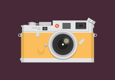
How to Create a Vintage Camera in Adobe Illustrator

Brenda Santoli did a wonderful job recreating this Vintage Camera Illustration from . See how she switched up the colors below!

How to Create a Vintage Camera in Adobe Illustrator

How to Create a Cherry Pie Text Effect in Adobe Illustrator

So cool! Medore Ruiz transformed this Cherry Pie Text Effect tutorial from into a delicious looking plate of pie. Check out her work!

How to Create a Cherry Pie Text Effect in Adobe Illustrator

How to Create a Canyon Illustration in Adobe Illustrator

Clever! Cindi Bane Gilmour added an extra funny element to this Canyon Illustration by instructor . Can you tell what it is?

How to Create a Canyon Illustration in Adobe Illustrator

How to Create a Spain-Inspired Text Effect in Adobe Illustrator

Alicia Hermelibus celebrated a good siesta with this Spain-Inspired Text Effect from . Check out her version below!

How to Create a Spain-Inspired Text Effect in Adobe Illustrator

How to Draw a Festive Theatre Stage in Adobe Illustrator

Reader Tanu Bedi achieved a stunning Theatre Stage Design by using this awesome Illustrator tutorial by . Try it yourself!

How to Draw a Festive Theatre Stage in Adobe Illustrator

Adobe Photoshop Tutorial Results

Let’s
take a look at this next set of results inspired by Adobe Photoshop
tutorials published here on Envato Tuts+. Contributions range from photo
manipulations to text effects and more! Check out these wicked results
below!

How to Create a Surreal Giraffe Photo Manipulation With Adobe Photoshop

Super impressive! Susana González Gutierrez aced this Surreal Giraffe Photo Manipulation from instructor . Check it out!

How to Create a Surreal Giraffe Photo Manipulation With Adobe Photoshop

How to Create a Sketch vs. Camera Effect in Adobe Photoshop

Very cool! Debayani Das nailed this Sketch vs. Camera Effect created by instructor . Check out her result below!

How to Create a Sketch vs Camera Effect in Adobe Photoshop

How to Create a Quick Mirrored Landscape Text Effect in Adobe Photoshop

Nice! Ano used this incredible Mirrored Landscape Text Effect from to illustrate his name creatively. See his version below!

How to Create a Quick Mirrored Landscape Text Effect in Adobe Photoshop

How to Create a 90s Graphical Photo Effect in Adobe Photoshop

Kat Silent did an amazing job with this 90s Graphical Photo Effect from . See her fantastic result below.

How to Create a 90s Graphical Photo Effect in Adobe Photoshop

Quick Tip: Create a Sports-Themed Text Effect in Photoshop Using Layer Styles

Khaldoon Megdadi tackled this Sports-Themed Text Effect from , adding his own unique take on the colors and textures. Check it out!

Quick Tip Create a Sports-Themed Text Effect in Photoshop Using Layer Styles

How to Create a Dragon Landscape Photo Manipulation With Adobe Photoshop

Hecton Eciro made an incredible version of this Dragon Landscape Photo Manipulation from instructor . Check out his design below!

How to Create a Dragon Landscape Photo Manipulation With Adobe Photoshop

How to Create an Enchanted Photoshop Action

User aio350 made this sweet bird sparkle by using this Enchanted Photoshop Action tutorial from . Check out their work below!

How to Create an Enchanted Photoshop Action

Design Tutorial Results

These final
pieces are inspired by an assorted of design tutorials that don’t quite
fit the previous categories. They include everything from print design
to drawing and more! Enjoy these beautiful pieces created by the
community below!

How to Create a 3D Paper Cut-Out Text Effect in Adobe InDesign

So quick and easy! Arjen van der Velde perfected this 3D Paper Cut-Out Text Effect from . You should try it out too!

How to Create a 3D Paper Cut-Out Text Effect in Adobe InDesign

Cartoon Fundamentals: The Secrets in Drawing Animals

Congrats, you did great! Ashley Miller did a wonderful job drawing different sides of this cat from this Cartoon Fundamentals lesson by Check it out!

Cartoon Fundamentals The Secrets in Drawing Animals

How to Create a Vintage Music Festival Flyer in Adobe InDesign

Inspired by this summery Vintage Music Festival Flyer by , Jael mastered her own result. Check it out below!

How to Create a Vintage Music Festival Flyer in Adobe InDesign

How to Be Involved in the Next Showcase

Have
you created a piece based on one of our tutorials here in the Design
& Illustration section of Envato Tuts+? We’re keen for you to share
your results with us! Check out the general guidelines below to join in
with our community:

  • Your artwork should be similar in some
    way to the tutorial that you followed or that inspired it. The aim of
    these showcases is to share what readers have created after following
    the tutorial.
  • Comment on the tutorial you used, attaching an
    image of your result. We’re keen on all levels of ability: from beginner
    to advanced!
  • Include a comment about your result, yourself, or your process. We like knowing about you and what you’re sharing.
  • Share
    the tutorial when you share that artwork elsewhere on the web. If
    you’ve posted your piece on sites like Facebook, Tumblr or Behance, link
    back to the tutorial so that other users know your source and can join
    in on the fun.

Thanks to everyone who was highlighted above for sharing your results with the Envato Tuts+ community. We look forward
to checking out your brilliant versions of our tutorials in the near
future, and welcome users new and old to participate in upcoming
showcases.

20 Best Photo to Pencil Drawing Effect Actions for Photoshop

Post pobrano z: 20 Best Photo to Pencil Drawing Effect Actions for Photoshop

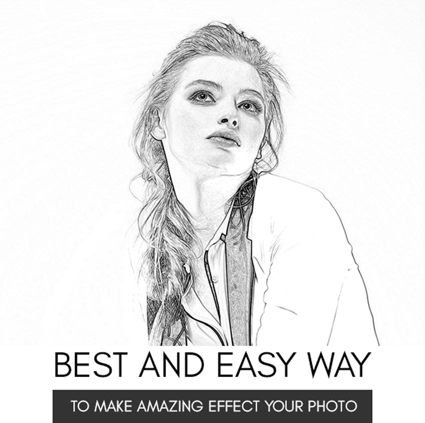
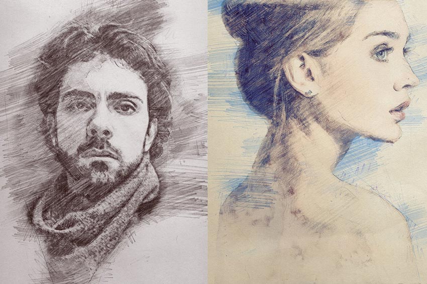
Learn how to make photo drawing effects using Photoshop actions! Check out this awesome resource list below.

20 Best Photo to Sketch & Art Photoshop Actions

How do you draw a person? A city? Or sky? These simple questions open the floodgates to different design and art theories, but often people get intimidated by them.

That’s why you should always take advantage of different mediums to explore your creative thoughts. Photoshop actions can deliver promising, expert-level results by transforming any photo into a realistic pencil drawing.

Explore varying textures and more, with exciting actions perfect for any art enthusiast. Enjoy this selection of amazing handpicked assets from Envato Market and Envato Elements.

Want to see these resources in action? Check out our examples below.

Make Amazing Photo Effects Fast: See Our Examples!

To give you an idea of how easy it is to use these resources, here are two fun examples we’ve tried out!

Pencil Sketch Photoshop Action

First, I tried out this pencil sketch action. It quickly changes your photos to pencil drawings and works with all the latest versions of Adobe Photoshop. For the best results, use it with high-resolution photos between 1,500 and 6,000 pixels in size.

Pencil Sketch Photoshop Action

Here I tried this action on this Student Stock from Pixabay. All I needed to do was open the photo and press play. Pretty simple setup! Check out the result below.

Pencil example 1

Sketch Art Photoshop Action

For a little more texture, I went with this pretty Sketch Art action for Adobe Photoshop. Easily make your photos into gifts, packages, or souvenirs with this quick and effective action.

Sketch Art Potoshop Action

Here I used this action on this Man Stock from Pixabay. Initially, I
created a simple color fill around the man’s entire body before pressing
play. It’s a pretty big file, so give it some time to load. Check out my result below.

Pencil Example 2

Want to see more options? Check out the rest of these amazing resources below.

Mixed Ink Sketch Photoshop Action

Use Photoshop actions to help update your space! This mixed ink sketch action combines ink and pencil textures for an abstract, modern painting. It’s been tested on dozens of photos with quality results and creates stunning images you’ll want to hang up. Try it out!

Mixed Ink Sketch Photoshop Action

Sketch Photoshop Action

Dedicate a special portrait to your furry friend with this amazing action. This download features one Photoshop action with accompanying brush textures to complete the look! It’s been tested on Photoshop CS3 and above, so make sure to try it out with recent versions!

Sketch Photoshop Action

Pencil Sketch Photoshop Action

Discover the beauty of hatching and crosshatching pencil marks with this sketch Photoshop action. Convert any photo into a masterpiece with the two-step process. First, create a new layer dedicated to the pencil details, and then brush over your image. Press the action and presto! You’ve got one stunning traditional result.

Pencil Sketch Photoshop Action

Scribble Pen Sketch Photoshop Action

Some artists are so talented that they can create epic drawings with pens! Now you can too with this incredible Photoshop action. Dedicate a new layer to the areas where you want the most details, and then play the action. Within a matter of moments, you’ll get a cool drawing like the one below.

Scribble Pen Sketch Photoshop Action

Graphitum – Charcoal Sketch Photoshop Action

Charcoal is another great medium many artists enjoy. Now you can explore these dramatic tones with this fun Graphitum Photoshop action. Included in this pack is one main Photoshop action with access to 10 colorful presets for more options. Check it out!

Graphitum - Charcoal Sketch Photoshop Action

Pencil Sketch vs Camera Photo Effect Photoshop Action

Easily change your cityscapes into dramatic pencil sketches with this Photoshop action. This action simulates a person holding a torn drawing over a real-life scene. Inspired by the photo artist Ben Heine, this action creates a high-quality image we’re sure you’ll love.

 Pencil Sketch vs Camera Photo Effect Photoshop Action

Tech Sketch Photoshop Action

Design the tech you’ve always wanted with this brilliant Photoshop action. Try it out on amazing car concepts and more for fantastic tech-inspired drawings. Save countless hours with this simple action packed with well-organized layers.

Tech Sketch Photoshop Action

Pencilogy – Pencil Sketch Photoshop Action

Prefer a colored sketch instead? Then try out this clever Pencilogy Photoshop action. Get fast results with easy-to-use folders you can turn off and on to adjust your drawings. Enjoy the classic black-and-white effect or switch it up with full-blown color.

Pencilogy - Pencil Sketch Photoshop Action

Pencil Sketch Photoshop Action

No matter your subject, Photoshop actions create jaw-dropping images that will wow your audience. And this pencil sketch action is no different. Create realistic pencil sketches that you can easily apply color effects to. Keep it monochromatic for a traditional look or just add color.

Pencil Sketch Photoshop Action

Art Pen Photoshop Action

Make your photography even more beautiful with this art pen Photoshop action. Designed to combine two traditional textures into one, this action is highly effective. Play around with different looks by jumping into the folders section and experimenting with texture. Check it out!

Art Pen Photoshop Action

Pencil Print Photoshop Action

Design epic prints with traditional pencil textures. This new Photoshop action brings you phenomenal results with simple instructions. As with most actions, you’ll need to follow the initial steps of preparing your photo before playing the action. Pair this design with posters, prints, and more.

Pencil Print Photoshop Action

Architectum – Sketch Draft Photoshop Action

Need a new way to display your product photos? Try this wicked sketch Photoshop action. Featuring a fantastic, realistic look, this action creates drawings that look as if they just left your drafting table. Simply pick the photo you want, and then play the action for great effects!

Architectum - Sketch Draft Photoshop Action

Architectum 2 – Sketch Tools Photoshop Action

A sequel to the original Architectum action, this action is one you don’t want to miss! Add varying straight and diagonal lines for more dynamic energy in your work. Apply this action to objects, places, or transportation like the image below. Check it out!

Architectum 2 - Sketch Tools Photoshop Action

Construct Photoshop Action

Construct a clean and dynamic composition with this helpful Photoshop action. Specifically made for design images and architecture-friendly content, this action is super simple to master. Try out the colored pencil effect by itself or add more color to match your brand.

Construct Photoshop Action

Archi Sketch Photoshop Action

Architects are known for bringing their work to life with traditional pencil sketches. Now you can get the same look with your favorite architectural imagery. Perfect for exteriors, interiors, and other types of building design, this action is highly effective and easy to use.

Archi Sketch Photoshop Action

Pen Sketch Photoshop Action

Get clean crosshatching lines with this incredible pen sketch action. Optimized specifically for Photoshop CS3 and above, this action helps you enjoy a phenomenal pen sketch look without all the fuss. Use it on posters, collages, and more for different effects.

Pen Sketch Photoshop Action

ModernArt Photoshop Action

Highlight your family photos with this charming and modern Photoshop action. This ModernArt action comes with one Photoshop action to quickly convert your work. Save the original background or upload your own textures for more variety. Try it out!

ModernArt Photoshop Action

Vintage Sketch 2 Photoshop Action

Mix and match vintage styles and textures with beautiful color presets. This amazing Photoshop action is inspired by vintage drawings and even places your photo on weathered paper. Customize your result by playing with different brushes to make your work unique.

Vintage Sketch 2 Photoshop Action

Show Us Your Sketch Effects!

Tried any of these assets? Let us know! Tell us your favorite Photoshop sketch effects in the comments below.

Or make your own! Create amazing photo to sketch effects using the following tutorials:

This has been a collection of premium resources perfect for the avid designer and photographer. For more cool Photoshop sketch actions, check out Envato Market and Envato Elements, or enlist the help of our talented professionals at Envato Studio. Happy designing!

How to Create a Set of Glitches in Adobe Photoshop

Post pobrano z: How to Create a Set of Glitches in Adobe Photoshop

Final product image
What You’ll Be Creating

Experimental glitches are not only used to depict the 80s—nowadays they’re also used to convey a robotic, trendy feel. Here is a quick and easy way to create this trend in Adobe Photoshop! 

Looking for amazing fonts and Photoshop addons? Head on over to GraphicRiver.

What You’ll Need to Create Your Poster

You will need the following resource in order to complete this tutorial:

1. How to Create the Base of the Glitch

Step 1

In Photoshop, go to File > New. Name the document Glitch_Set. Set the Width to 1270 px and Height to 1600 px. Set the Resolution to 72 Pixels/Inch. Click OK.

Create a new Photoshop file

Step 2

Using the Rectangle Tool (U), create a stripe at the top of the page. Head over to the Options bar and change the fill color to #ff0000. On the Layers panel, duplicate the Rectangle 1 layer by pressing Command-J. Change the color again, but this time to #00ff00. Place the rectangle under the first red rectangle. Duplicate the rectangle once more and set the color to #0000ff.

With the Rectangle Tool create horizontal lines in green blue and red colors

Step 3

Now we need to fill the page with the rectangles we created. Select the rectangle layers and, on the page, click on the elements and press Option-Shift and drag to duplicate. Do this until you’ve covered the whole page. 

Select all the Rectangle layers and Right-click > Rasterize Layers. Now we can merge the layers—while selecting all the layers, Right-click > Merge Layers. Let’s rename the layer as Main. Now we have the basis to create our set of glitches.

Fill the all of the page with the lines

2. Glitch A

Step 1

On the Layers panel, duplicate the Main layer by selecting the layer and pressing Command-J. Hide the original Main layer. While selecting the newly duplicated layer, head over to Filter > Distort > Wave. The Wave options window will pop up, and now we can experiment! 

Let’s start by setting the Type: of wave to Sine. We will be able to see how the artwork changes through the small view window. I am setting the Number of Generators to 999, Wavelength to Min. 1 and Max. 21, Amplitude to Min. 1 and Max. 2, and Scale to 100%.

Rasterize the horizontal lines and apply the Wave filter

Step 2

Head over to Filter > Distort > Shear. To make the glitch look like a disrupted VHS tape, we need to create waves. Under Undefined Areas, select Wrap Around and add points on the grip—this is to create waves on the composition. I added various points, and I find it works better when the points are random and have sharp turns. 

On the same layer use the Shear filter

Step 3

We can leave this as is or change the color by adding a solid color or a Gradient layer over it. We can also create a black and white look by going to Adjustment Layer > Black & White on the Layers panel and tweaking the color separately. I will do the latter as it will come in handy to create Glitch C. 

Let’s organize the first glitch by dragging the duplicated layer and the black and white layer into a folder at the bottom of the Layers panel. Let’s hide the visibility and move on to Glitch B. 

Add a black and white adjustment layer

3. Glitch B

Step 1

Duplicate the Main layer with the stripe by pressing Command-J when selecting it. Move the layer to the very top of the layers. 

Duplicate the stripes

Step 2

Head over to Filter > Pixelate > Color Halftone. I am using the following settings: Max. Radius: 20, Channel 1: 108, Channel 2: 162, Channel 3: 90, and Channel 4: 45. Click OK. The reason we are doing this step is so that when we apply the Wave effect, the divisions will look rougher compared to Glitch A. 

Apply a color halftone filter

Step 3

Go to Filter > Distort > Wave. Let’s set the Type: of wave to Square. We will be able to see how the artwork changes through the small view window. I am setting the Number of Generators to 720, Wavelength to Min. 270 and Max. 365, Amplitude to Min. 1 and Max. 2, and Scale to 100%. Click OK. 

Now we have our second glitch. As with Glitch A, go ahead and organize it in a folder.

Apply the wave filter

4. Glitch C

Step 1

Duplicate the Main layer twice with the stripe by pressing Command-J when selecting it. Move the layer to the very top of the layers.

Duplicate the horizontal lines

Step 2

Select one of them and go to Create a New Fill or Adjustment Layer  > Black & White. Right click on the new layer and select Create Clipping Mask. This is to apply this new Adjustment layer only to the one after it.

Create a black and white clipping mask over the horizontal lines

Step 3

Select the layer after it and go to Filter > Distort > Wave. The Wave options window will pop up. Set the Type: of wave to Sine, and under Undefined Areas select Wrap Around. We will be able to see how the artwork changes through the small view window. I am setting the Number of Generators to 999, Wavelength to Min. 1 and Max. 999, Amplitude to Min. 999 and Max. 999, and Scale to 100%. Click OK. Apply this effect twice to get an even finer scratchy look.

Apply the wave effect twice to create a scratchy look

Step 4

Click on the Black & White Adjustment layer and tweak the colors on the Properties panel. If you don’t have the panel, double click on the layer thumbnail. I changed the color Red to 300 and lowered the Green to -120.

You can adjust the settings of the black and white clipping mask to add contrast to the layer

Step 5

Let’s do the same with the second layer we duplicated in Step 1. We can repeat Step 3, but this time in color, without the Black & White Adjustment Layer.

On the toolbar, select the Rectangular Marquee Tool (M). With this tool, we can select the parts that we want to delete to reveal the black and white layer behind it. Don’t be afraid to duplicate layers and experiment. You can get the best result by just playing with the layers and settings to create something that is yours! 

Using the Rectangular Marquee Tool you can delete certain parts of the layer to reveal the back

Step 6

Don’t forget that this effect also works with text. Using the Text Tool (T), add any kind of text. I added the word TEST in Bw Nista International Black and color #0000ff. Try to fill the whole page. On the Layers panel, select the text layer and Right click > Rasterize Type. Once you have the text set, repeat the Wave effect by going to Filter > Distort > Wave. Feel free to play with the settings! 

You can also apply the Wave effect on text

Awesome Work—You’re Done!

Congratulations! In this tutorial, you’ve learned to:

  • Use the Wave effect to create a unique glitch set from scratch.
  • Use the Color Halftone effect to your advantage. 
  • Experiment! Scratchy and techno designs can be difficult to create because of the randomness, and experimenting with colors and various methods is the only way to achieve it!  

If you liked this tutorial, you might like these:

Illustrator in 60 Seconds: The Asset Export Panel

Post pobrano z: Illustrator in 60 Seconds: The Asset Export Panel

Final product image
What You’ll Be Creating

Welcome to our Illustrator in 60 Seconds series, in which you can learn an Illustrator skill, feature, or technique in just a minute!

Illustrator in 60 Seconds: The Asset Export Panel

The process of exporting multiple assets from Illustrator at the same time used to be a tedious task, but luckily for us Adobe has added a new tool that changes everything for the better.

If you want to learn more then you should definitely check out this short video, which comes with a couple of steps to help you.

The Asset Export Panel

Back in
the day, the process of exporting multiple assets at the same time used to be
really clunky, but luckily for us Adobe has introduced a new tool that allows you to
save as many items as you want, using just a couple of clicks.

By default, the tool is hidden, but you can find it underneath the Window menu, or within the Layers
and Artboards group if you’re using the
Essentials Classic workspace.

asset export panel location

You start by selecting and then dragging the desired items within the
panel, which treats each group as its own asset.

adding the assets to the export panel

Moving on, you have your Export Settings, which allow you to generate not one but multiple
scales to which you can assign a custom suffix, and then choose from eight different file formats that can be individually set for each and every one of
them.

export settings preview

If you’re designing for iOS or Android you have a
set of dedicated buttons that will create all the required size variations, to
which you can add new ones or even remove those that are unnecessary.

example of using the android preset

Once you’re ready, all you have to do is press
the Export button, which will ask you
for a location to save the generated files.

example of exporting the selected assets

Learn More With Our Awesome Tutorials!

Looking to expand your bag of Adobe Illustrator skills? Start right now by checking out these in-depth tutorials that will help you bring your art to the next level!

Need Awesome Resources? We’ve Got You Covered!

Whether you’re looking for brushestextures or any other creative resource, we’ve put together an amazing library that’s forever increasing, which you can check out by heading over to Envato Elements.

That being said, I’ll see you in the next one!

How to Create an Ice-Cream Script Poster in Adobe InDesign

Post pobrano z: How to Create an Ice-Cream Script Poster in Adobe InDesign

Final product image
What You’ll Be Creating

Looking for a summer fix? This pastel poster evokes long, hot days eating ice cream in the park. It’s also super simple to create in Adobe InDesign and is a great way of picking up some new techniques for creating print layouts.

Ready to bring the sunshine in? Let’s get started!

What You’ll Need to Create Your Poster

You’ll need access to Adobe InDesign to create the main layout of your poster. We’ll also dip into Adobe Illustrator to briefly edit some vector graphics. You can use alternative vector software, such as Inkscape or CorelDRAW, for this step.

You’ll also need to download the following image and font files from Elements:

Install the fonts on your computer, and you’re ready to start putting your poster together.

1. How to Create a Pastel Color Palette for Your Poster

Step 1

Open InDesign and go to File > New > Document. 

Choose Print for the Intent from the top of the window, and select A3 for the Page Size. Add a Bleed of 5 mm to all edges of the document. Then click Create

new document

Step 2

Expand the Layers panel (Window > Layers), and double-click on the Layer 1 name. Rename it as Background and click OK

Choose New Layer from the panel’s drop-down menu, at top-right, and name it Type

Create two more new layers: Sparks and then Texture at the top of the sequence.

layer options

Then lock all layers except Background, which we’ll work on first. 

background layer

Step 3

Expand the Swatches panel (Window > Color > Swatches), and choose New Color Swatch from the panel’s menu. 

With the Color Type set to Process and Mode to CMYK, set the levels below to C=2 M=5 Y=29 K=0. Click Add and then OK.

Repeat the process to create a further six new CMYK swatches, with the following values:

  • C=29 M=49 Y=65 K=7
  • C=23 M=0 Y=25 K=0
  • C=0 M=40 Y=9 K=0
  • C=6 M=21 Y=14 K=0
  • C=7 M=0 Y=43 K=0
  • C=2 M=0 Y=3 K=0
new color swatch

2. How to Build Up Typography on Your Poster

Step 1

Take the Rectangle Tool (M) and drag across the whole page, extending it up to the edge of the bleed on all sides. 

From the Swatches panel, set the Fill Color of the shape to your new pink swatch, C=0 M=40 Y=9 K=0.

pink background

Step 2

Lock the Background layer and unlock the Type layer above it. 

Switch to the Line Tool (\), and drag to create a shallow diagonal line across the top-right section of the page, as shown below. 

line tool

Step 3

Select the Type on a Path Tool (Shift-T), and click once onto the left side of the line, to transform it into a text path. 

line tool

Type in ‘Ice’. From either the top Controls panel or the Character panel (Window > Type & Tables > Character), set the Font to Author Type and the Font Size to around 260 pt. 

author type

Switch to the Selection Tool (V, Escape) to select the line, not the text sitting on it. From the Swatches panel, adjust the Stroke Color of the line to [None] to make it invisible. 

ice text

Step 4

Select the line and Edit > Copy, Edit > Paste it, moving it below the first text line. 

Edit the text to read ‘Cream’, and reduce the Font Size to around 210 pt. Maneuver the text line into a snug position below ‘Ice’.

cream text

Edit > Paste the text line again, adjusting the text to read ‘always’. Change the Font Size to 220 pt, and maneuver the line into position below ‘Cream’.

always text

Paste in three more text lines, setting the first to read ‘good’, the second to ‘idea’, and the final one to an exclamation mark. Move them into roughly the same position as shown below.

exclamation mark

Step 5

Paste another text line, moving it over to the left side of ‘always’. Type in ‘IS’ and set the Font to Burtons, 80 pt. 

Copy and Paste this text line, moving the second to the left of ‘good’ and editing the text to ‘A’.

text lines

Step 6

Select the top text line, ‘Ice’, and click on the ‘T’ icon at the top-left corner of the Swatches panel, to be able to edit the Font Color. 

Switch the Font Color to your brown swatch, C=29 M=49 Y=65 K=7.

swatches ice

Set ‘Cream’ in C=2 M=5 Y=29 K=0.

swatches cream

Apply C=23 M=0 Y=25 K=0 to ‘always’.

swatches

Set ‘good’ in C=2 M=5 Y=29 K=0, ‘idea’ in C=29 M=49 Y=65 K=7, and the exclamation mark in C=23 M=0 Y=25 K=0. Finally set ‘IS’ and ‘A’ in the palest new swatch, C=2 M=0 Y=3 K=0. 

swatches

Step 7

Select all the text lines except the small ‘IS’ and ‘A’, and go to Object on the top main menu. Go to Effects > Drop Shadow

Click on the colored square to the right of the Mode menu to open the Effect Color window. Choose the pink swatch, C=0 M=40 Y=9 K=0, and click OK

Back in the Effects window, increase the Opacity of the shadow to 100%, Distance to 5 mm, Angle to around 140, Size to 1 mm, Spread to 100%, and Noise to about 30%

Click OK to exit the window. 

effect color

Step 8

Select the two small text lines containing ‘IS’ and ‘A’, and go to Effects > Drop Shadow, as before. 

Repeat the same settings as before (Opacity 100%, Distance 5 mm, Angle 140, Size 1 mm, Spread 100% and Noise 30%), but this time choose your yellow swatch, C=7 M=0 Y=43 K=0, for the Effect Color. 

effect color

3. How to Add Framing Elements and Texture to Your Poster

Step 1

Open up the ribbon and design elements vector in Illustrator, or your vector software of choice. 

Select the circular sparks illustration pictured below, and Edit > Copy it. 

Minimize the Illustrator window and head back to your InDesign document.

ribbon and design elements

Step 2

Lock the Type layer and unlock the Sparks layer. 

sparks layer

Edit > Paste the sparks vector directly onto the layer. Then Right-Click > Ungroup the vector.

ungroup

Step 3

Delete about two-thirds of the vector shape, and move the remaining third into position to the right of the ‘e’ in ‘Ice’.

sparks vector

Copy and Paste this shape, and move the second over the top of ‘C’.

sparks

Paste two more shapes, moving one next to the ‘i’ in ‘idea’ and the second to the bottom-right of the exclamation mark.

sparks layer

Step 4

Adjust the Fill Color of the top shape to C=29 M=49 Y=65 K=7, to match the brown color of ‘Ice’.

fill color

Then adjust the colors of the other shapes to match the letters they are nearest to. 

swatches

Step 5

Lock the Sparks layer and unlock the top layer, Texture

texture layer

Use the Rectangle Frame Tool (F) to create an image frame across the whole page. Go to File > Place, and navigate to the vintage grit textures images you downloaded earlier.

Go into the PNG folder and choose the second texture, ‘Grit02-byGhostlyPixels.png’, before clicking Open, and allowing it to fill the image frame. 

texture

Step 6

With the image frame selected, go to Object > Effects > Transparency. Choose Screen for the Mode, and bring the Opacity down to 70%.

screen

Click OK to exit the window.

texture layer

4. How to Export Your Poster

Your poster is finished—great job! If you want to share your poster online, you can simply go to File > Export and choose JPEG or PNG from the Format menu.

If you want to get your poster printed professionally, read on to find out how to make a press-ready file.

Step 1

Go to File > Export. Choose Adobe PDF (Print) from the Format menu, name the file and click Save

In the Export Adobe PDF window that opens, choose [Press Quality] from the Adobe PDF Preset menu at the top. 

press quality

Step 2

Click on Marks and Bleeds in the window’s left-hand menu. Check both All Printer’s Marks and Use Document Bleed Settings, before clicking Export.

export adobe pdf

And there we have it! Your poster is exported, and this PDF file is ready for sending straight off to be printed. 

Conclusion: Your Finished Ice-Cream Poster

Your poster is finished—great job!

In this tutorial, we’ve covered several techniques for creating print designs in InDesign, including how to set up a flyer layout and format typography. We’ve also looked at how to use fonts, textures, and colors to bring a vintage, mid-century vibe to your design. 

If you’re looking for more help with poster design, these easy-to-edit poster templates on GraphicRiver and Envato Elements will suit a wide range of occasions and look fantastic too!

final poster

How to Create an Animated Photo Reveal for Instagram in Adobe Photoshop

Post pobrano z: How to Create an Animated Photo Reveal for Instagram in Adobe Photoshop

What You’ll Be Creating

In this tutorial, we will use Adobe Photoshop to create an animated photo reveal effect for Instagram, which can be used with any image.

You can also check my Animated Geometric Color Reveal Action with different animated textures and effects, created the same way for my GraphicRiver portfolio.

httpsgraphicrivernetitemgeometric-color-reveal-action20608465

Tutorial Assets

  • Any photo you want to use for this manipulation. You can find some free photos on Unsplash and Pixabay or buy high-quality photos on PhotoDune. I chose this photo from Unsplash.

1. How to Prepare the Document

Step 1

Use Control-N to create a new document and use the following settings: 1080 x 1080 px; 300 dpi.

Creating a new docoment

Step 2

Go to File > Place and put your image inside the document.

Placing the image

Step 3

Now we need to convert our image to a smart object. Right Click on the layer, and then select Convert to Smart Object.

Creating smart object

Step 4

After that, let’s create a duplicate of the smart object: Right Click > Duplicate layer.

Creating the duplicate of smart object

Step 5

Create four more duplicates of the smart object as we did before. After that, you can easily change the image in all the smart objects just by replacing the photo in the first smart object.

Creating more duplicates of the smart object

Step 6

Now let’s create the shapes for our template. Hit U to create a Rectangle Shape and use the following settings: Width: 432; Height: 432.

Creating first shape

Step 7

After that, create the second shape with the following settings: Width: 594; Height: 594; No Fill; Stroke: 81 px.

Creating second shape

Step 8

Create the third shape with the following settings: Width: 756; Height: 756; No Fill; Stroke: 81 px.

Creating third shape

Step 9

Create the fourth shape with the following settings: Width: 918; Height: 918; No Fill; Stroke: 81 px.

Creating fourth shape

Step 10

For the last shape, let’s use these settings: Width: 1080; Height: 1080; No Fill; Stroke: 81 px.

Creating the last shape

Step 11

Hit V and select all the shape layers, and then click Align Horizontal Center and Align Vertical Center.

Centring the shapes

Step 12

Now we need to move each shape below each smart object.

Moving shape layers

Step 13

Make the main smart object and the background layer invisible.

Making layer invisible

Step 14

Now select the first smart object and Right Click > Create Clipping Mask.

Creating the clipping mask

Step 15

Create a clipping mask for each smart object using the same method as before.

Creating clipping mask for other smart objects

Step 16

To make it easier for us to work with our layers, we need to create groups of layers. Select each smart object and shape and then hit the Make a Group icon.

Creating the groups of layers

2. How to Create Color Effects

Step 1

To create a black and white filter, we will use a gradient map. Select the first smart object and go to Layer > New Adjustment Layer > Gradient Map.

Creating black and white filter

Step 2

After that, Right Click > Create Clipping Mask.

Creating clipping mask

Step 3

Now create another gradient map above, but use the following colors: #21382e; #3d3b6d; #fd605b.

Creating gradient map

Step 4

Select the gradient map layer and create another clipping mask.

Creating clipping mask

Step 5

Create another gradient map with the clipping mask in the second group with the following colors: #31444b; #843332.

Creating gradient map

Step 6

Now let’s create another gradient map with a clipping mask as we did before, but for the third group of the layers. For this one, let’s use the following colors: #16172b; #df7136.

Creating gradient map

Step 7

For the next group of layers, use a gradient map with the following colors: #dd0a00; #fe7f32.

Creating gradient map

Step 8

For the last group of layers, use a gradient map with the following colors: #5b673f; #a23c2d.

Creating last gradient map

Step 9

Now we need to make our image look a bit faded. Go to Layer > New Adjustment Layer > Exposure and use the following settings: Offset: +0.0200.

Creating adjustment layer

3. How to Create an Animation From a Static Image

Step 1

To start creating the animation, go to Window > Timeline and then hit Create Video Timeline.

Creating video timeline

Step 2

Select the smart object in the first group of the layers, press Control-T, and rotate the image -180° while holding Shift.

Rotating the smart object

Step 3

Select the smart object in the second group of the layers, and then press Control-T and rotate the image -90° while holding Shift.

Rotating the smart object

Step 4

Select next smart object in and then press Control-T and rotate the image -180° while holding Shift.

Rotating the smart object

Step 5

Select the smart object in the fourth group of the layers, and then press Control-T and rotate the image 90° while holding Shift.

Rotating the smart object

Step 6

Select the last smart object, and then press Control-T and rotate the image -180° while holding Shift.

Rotating the smart object

Step 7

Open the first smart object in the Timeline panel and move the Time Indicator to 0:00:00:00. After that, click on the Timer icon near the Transform to create the first Keyframe.

Creating the first keyframe

Step 8

Move the Time Indicator to 0:00:02:00, and then rotate the smart object 180° while holding Shift.

Creating the 2nd keyframe

Step 9

Open the second smart object in the Timeline panel and create the first Keyframe at 0:00:00:00. Move the Time Indicator to 0:00:02:00 and rotate the smart object 90° while holding Shift.

Creating the animation for the second smart object

Step 10

Open the next smart object in the Timeline panel and create the first Keyframe at 0:00:00:00. Move the Time Indicator to 0:00:02:00 and rotate the smart object 180° while holding Shift.

Creating the animation for the third smart object

Step 11

Open the fourth smart object in the Timeline panel and create the first Keyframe at 0:00:00:00. Move the Time Indicator to 0:00:02:00 and rotate the smart object -90° while holding Shift.

Creating the animation for the fourth smart object

Step 12

Open the last smart object in the Timeline panel and create the first Keyframe at 0:00:00:00. Move the Time Indicator to 0:00:02:00 and rotate the smart object 180° while holding Shift.

This is how the animation should look after the manipulations listed above.

Step 13

Now we need to create an animation for the color effects. Open the black&white filter in the Timeline panel and move the Time Indicator to 0:00:00:00. After that, click on the Timer icon near the Opacity to create the first Keyframe

Creating keyframes for blackwhite filter

Step 14

Move the Time Indicator to 0:00:04:00 and change the Opacity of the layer to 0% in the Layers panel.

Creating the animation for black and white filter

Step 15

Duplicate this layer four times using Right Click > Duplicate and place each duplicate of the filter above each smart object. The animation of this layer is copied along with the layer.

Creating the duplicates of the layer

Step 16

Select the gradient map in the first group of layers and then move the Time Indicator to 0:00:00:00. After that, click on the Timer icon near the Opacity to create the first Keyframe

Creating animation for gradient map

Step 17

Move the Time Indicator to 0:00:02:00 and change the Opacity of the layer to 0% in the Layers panel.

Creating the animation for gradient map

Step 18

Now we need to copy the keyframes. Select two Keyframes while holding Control, and then hit Copy.

Copying the keyframes

Step 19

Open the gradient map in the next group of layers. After that, click the Timer icon near the Opacity in the Timeline panel, and Right Click > Paste.

Pasting the keyframes

Step 20

Now let’s create copies of the keyframes for all gradient maps, as we did before.

Creating copies of the keyframes

4. How to Render the Animation for Instagram

Step 1

To save your animation for Instagram, you need to click on the icon in the upper right corner and select Render Video.

Opening render panel

Step 2

Set the following settings in the Render Video panel: Format: H.264; Size: Document Size; Range: All Frames.

Saving the animation as a video

5. How to Replace the Image Used in the Template

Step 1

If you want to change the image used for your animation, Right Click > Edit Contents on the smart object which we created first.

Replacing the main image

Step 2

Place your new image above the old one, press Alt-F4 to close the placeholder, and then select Save.

Saving new image

Awesome Work, You’re Now Done!

In this way, we can create an animated template in Adobe Photoshop using smart objects.

I hope you’ve enjoyed this tutorial, and feel free to contact me for any help with the tutorial. You can also check my Animated Geometric Color Reveal Action in my portfolio on GraphicRiver.

httpsgraphicrivernetitemgeometric-color-reveal-action20608465

How to Draw a Sheep

Post pobrano z: How to Draw a Sheep

Final product image
What You’ll Be Creating

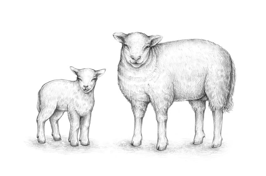
In this tutorial, you’ll learn to draw an adult sheep and a lamb, find out if all sheep have horns, and explore the distinctive appearance features that are typical for these animals. You don’t need any special knowledge of animal anatomy to complete the drawings!

Did you know that a sheep can not only recognize up to 50 other sheep faces and remember them for two years, but it also recognizes human faces? That’s truly incredible!

The sheep is a key animal in the history of farming; we can’t imagine our culture without this wonderful animal.

You may also be interested in these drawing tutorials:

What You Will Need

You will need the following equipment to complete this project:

  • An HB graphite pencil
  • A 3B graphite pencil
  • An eraser
  • Drawing paper
The art supplies for this project

1. How to Draw an Adult Sheep

Step 1

Let’s start with the general shape of the head; I outline it, using the HB pencil. Please be sure to leave enough space for the rest of the sheep’s body on the sheet of paper.

Drawing the rough shape of the head

Step 2

I add an oblong shape for the sheep’s body. Don’t overthink the process at this stage of drawing; we’ll make the refinements later.

Adding the shape of the body

Actually, it’s useful to see the shapes that we are drawing as something three-dimensional in their core essence. For example, the body can be presented as a shape that has a rounded foundation and a top plane.

You don’t have to draw these ovals as I did—this is just an illustration.

A visual exercise

Step 3

I add the framework of the limbs—this is a simple stylized version that captures just the main anatomical features. I use the small circles to mark the elbows, knees, and ankles of the forelimbs. 

The structure of the hind legs is slightly different—the upper bones create a peculiar angle. One of the hind legs isn’t fully visible because of the foreshortening, so I’ll leave it without the upper round mark.

The feet have circles at the base to create an illusion that the animal is actually standing on the ground.

Drawing the stylized framework of the feet

Step 4

I add rough shapes to add some thickness to the legs, creating the bulk. We’ll refine the contours later.

Adding the bulk shapes of the limbs

Step 5

I add the shapes of the ears to the head; their tips are slightly rounded.

Adding the ears

Step 6

I draw the neck. Imagine that this shape is three-dimensional; adding the subsidiary circles may help.

I also erase the lines of the limbs’ framework; they can be distracting, and we don’t need them anymore.

Creating the neck

Step 7

I draw the eyes. They are relatively small, located at a distance from each other, and have horizontal pupils.

I also add the inner openings of the ears.

Drawing the eyes

Let’s add the details to the bottom part of the face. 

I draw the nose and the mouth; sheep have divided upper lips, which makes them different from goats. Also, they don’t have a beard (and goats do).

Drawing the nose and the mouth

Depending on the breed, domestic sheep may have no horns at all, or horns in both sexes, or in males only. The horns usually are quite large and often form a lateral spiral.

Let’s assume that the sheep we are drawing is hornless, but if you are interested in drawing a sheep with horns (or a ram, which is a male sheep), we have an in-depth tutorial on drawing the horns. Just add the shapes of the horns to the top of the animal’s head!

A sheep with horns

Step 8

I refine the contours of the limbs, accenting the elbows and knees of the forelegs and the hocks of the hind legs. Sheep have cloven hooves and dew claws, so I add these features of the limbs’ bottom parts, too.

Refining the contours of the limbs

The foreshortening of this sheep doesn’t allow us to see its hocks fully; we can add just a hint at them. In the illustration below you can observe a sheep in a side view.

I recommend paying attention to the tail of the sheep; these animals have tails that hang down. Some breeds demonstrate short tails that don’t require docking (this is the name of the process when a tail is shortened); in other cases, the tail of a domestic sheep may be cut. 

In the corner of the image, you’ll find a sample of the line that I used for drawing the wool. Such scrawl-like lines work perfectly and can also save you much time.

An illustration of a sheep in a side view

Step 9

Let’s add the outer covering of the sheep’s body and refine it. I extend the contours; a sheep’s body usually creates a solid impression, partially because of a thick layer of wool, so feel free to make it really bulky.

I also add some folds in the neck area to emphasize the wool covering. Then I draw just a couple of other anatomical details: an udder and a tail.

Refining the contours of the body

Step 10

Now we have a line sketch that actually resembles a sheep, but we can make it more realistic and interesting. With the 3B pencil, I add some graphite shading to the head of the sheep, accentuating its sides, and darken the folds of wool in the neck area.

It’s important to make the main facial features contrasting, so I emphasize the eyes, the nose, and the mouth.

Adding graphite hatching to the head and neck of the sheep

Step 11

I use the HB pencil to add hatches to the upper part of the sheep’s body.

If we stylize the shape of the body, the back will demonstrate a top plane—it is spotlit and should be slightly lighter than the sides of the body.

Applying hatches to the back and the sides of the body

Step 12

I work on the bottom part of the sheep’s body, including the limbs and tail. I darken the belly and the sides of the legs and body, using the 3B pencil.

As a finishing touch, I add soft graphite strokes to create a blurry drop shadow under the animal.

Completing the sketch

2. How to Draw a Lamb

Step 1

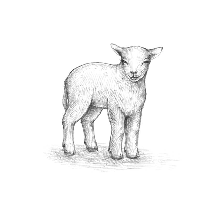
In this part of the tutorial, we’ll sketch a lamb—a younger sheep. We’ll also explore its distinctive features. 

With the HB pencil, I draw the shape of the head; it is wider in the upper part.

Drawing the shape of the head

I add the shapes of the ears, making them slightly asymmetrical on purpose.

Adding the ears

Step 2

I add the rough shape of the lamb’s body. It is quite small in relation to the head; this feature is common for baby animals.

Drawing the rough shape of the body

Step 3

I join the head and the body, drawing the cylindrical form of the neck between them.

Adding the shape of the neck

Step 4

I draw the framework of the limbs, using small circles and lines. Regarding the direction of the bones, a lamb is similar to an adult sheep, but its limbs are shorter and more slender.

Drawing the framework of the limbs

Step 5

I add the rough shapes of the legs’ parts. The simpler your drawing is at this stage, the better.

Adding the general shapes of the legs

Step 6

I draw the eyes of the lamb. The eyes of a baby animal are bigger than the eyes of an adult sheep; you can make them even bigger to add cuteness to your sketch.

I draw the nose and an open mouth; let’s imagine that this lamb is happy and wants to tell us something!

Drawing the open mouth and the nose

Step 7

I refine the forelimbs of the lamb. They have more smoothed contour lines than the legs of an adult sheep, but the dew claws and knees should be observable.

It’s also a nice idea to add a covering of short wool in the breast area.

Refining the front legs of the lamb

I refine the contours of the hind legs, accentuating the dew claws and the hocks.

Refinig the contours of the hind legs

Step 8

I extend the contours of the lamb’s body just a little bit, using a wavy line that is imitating the wool covering. I also add the tail and the marks that split the hooves.

Refining the contours of the body and adding the tail

Step 9

Let’s add some graphite shading. I mark the darker areas of the drawing (the sides of the head, body, and the limbs), using the HB pencil.

Adding the graphite hatching

Step 10

I increase the contrast by adding the darker 3B pencil hatches. I make sure that the facial features of the lamb attract the viewer’s attention, and the belly and the hooves are dark enough.

A soft drop shadow is a nice addition; if you are in the mood, you can draw some grass blades or another texture.

Completing the sketch of the lamb

Your Drawings Are Complete

Congratulations! You’ve created two beautiful drawings of wonderful happy sheep. I hope you’ve enjoyed the process, and no animal seems too difficult to draw now!

The project is complete

How to Create a Summer Vacation Illustration in Adobe Illustrator

Post pobrano z: How to Create a Summer Vacation Illustration in Adobe Illustrator

Final product image
What You’ll Be Creating

In this tutorial, you will learn how to create a summer vacation illustration in Adobe Illustrator. To be more exact, we will create an image of a woman sitting on a bunch of suitcases. We will use basic shapes, warp effects, and the Scissors Tool to create our illustration. This tutorial is broken down into clear, simple steps, making it suitable for beginners.

If you love vacation and travel and want to find tons of amazing images online, then go to GraphicRiver. They have an amazing selection of images there, including some vacation ones.

So, let’s get started!

1. How to Create the Woman’s Head and Hat

Step 1

After opening your Adobe Illustrator, let’s start to create the woman, beginning with her head. Take the Ellipse Tool (L) and draw an ellipse that is almost a circle. Delete the stroke color if you have one, and set the fill color shown below.

Then we want to give her a smiley mouth, so draw an ellipse again and set a white fill color. Add a new ellipse overlapping this one—it should cover just the top part of the previous ellipse. In the image below, you can see how the shapes need to overlap each other. They’re marked with a black stroke, which you don’t actually need in your illustration.

Select the two white ellipses, go to the Pathfinder panel (Window > Pathfinder), and click on the Minus Front button. You’ll end up with a crescent shape, which is the smiley mouth!

how to create the head and mouth

Step 2

Sunglasses are a mandatory attribute of summer vacations, and we will start to create them by using the Rounded Rectangle Tool. Set a dark grey fill color and no stroke.

While keeping it selected, go to Effect > Warp > Bulge. A new dialogue window will pop up, where you want to enter the options presented below. Then press OK. The first lens of the sunglasses is ready.

Now we want to create another lens for the sunglasses. Select the first one and, while holding the Shift and Alt keys on your keyboard, move this shape to the right. Holding these two keys will help you to create a copy (Alt), which will be perfectly aligned horizontally (by the Shift button).

Now we want to create the bridge of the sunglasses. Press the Swap Fill and Stroke button on the Tools panel (Shift-X), and the fill color you had will transform into the stroke color. That’s exactly what we need. Hit the Arc Tool and draw a curve between the two glasses. Now the sunglasses are ready!

how to create the glasses

Give them to the woman, who looks more like an alien now!

how to place the glasses

Step 3

We will create the woman’s hair from a few parts. First, draw an ellipse using the Ellipse Tool (L). Be sure you delete the stroke color and set the necessary fill color.

While keeping it selected, go to Effect > Warp > Arc and in the new dialogue window enter the options shown below. Then, press OK.

Finally, expand this shape (Object > Expand Appearance). As we will rotate this shape later on, we must expand it first in order not to deform it.

how to create the front hair

Step 4

After this, place this shape on the woman’s head. Notice that it has to stay behind the glasses. After you’ve placed the left part of the hair on the woman’s face, select the glasses, cut (Control-X), and place them over the hair (Control-F).

So now we have the left part of the hair, and we want to create the right part. Select the left part and hit the Reflect Tool (O). Then, while keeping the Alt key pressed, click on the woman’s forehead. A new dialogue window will pop up, where you need to enter Axis Vertical, Angle 90 degrees, and then press Copy. You’ve just created a vertical copy of the left part to get the right part.

Finally, we want to create the hair at the back. Draw a darker ellipse behind the head using the Ellipse Tool (L). Remember, to place something behind everything, you need to cut it (Control-X), and then place it behind (Control-B).

The last effect we must apply to the back hair is the Inflate effect. While keeping the back hair selected, go to Effect > Warp > Inflate, and then enter the options shown in the image below.

how to create the front and back hair

Step 5

After that, we are going to create the hat. Using the Ellipse Tool (L), draw a red ellipse on the woman’s forehead. Warp it (Effect > Warp > Arc), and enter the options shown below.

Finally, add a big red ellipse behind everything. The hat is done!

how to create the hat

2. How to Create the Woman’s Body

Step 1

Let’s start to create the body from a circle. It doesn’t have to be an even circle. While keeping it selected, go to Effect > Warp > Inflate, and enter the necessary options. You don’t need to expand this shape, but you can if you want to (Object > Expand Appearance). If you do not want to expand, it means you can edit the options later in the Appearance panel (Window > Appearance).

Finally, add the neck using the Rectangle Tool (M), by creating a small rectangle under the head. You don’t actually need the stroke that is shown below.

how to create the body and neck

Step 2

To create the dress, we need a white fill color and the Rectangle Tool (M). The black stroke you see below is presented just for better visibility, and you don’t actually need it in your final illustration. So draw a rectangle and then apply the Bulge effect to this shape (Effect > Warp > Bulge).

how to create the dress

Step 3

Place the upper part of the dress on the woman’s body.

To add the first strap, draw a small rectangle using the Rectangle Tool (M) with white fill color and no stroke. Place the strap on the left shoulder and rotate it a little bit to the left.

Select the left strap and hit the Reflect Tool (O). Then, while keeping the Alt key pressed, click just under the woman’s neck. A new dialogue window will pop up, where you need to enter Axis Vertical, Angle 90 degrees, and then press Copy. Remember that the stroke is there only for better visibility. Now she has two dress straps.

how to create the straps

Step 4

Add a tiny ellipse where the hand should be. Then take the Direct Selection Tool (A), and select the top and bottom anchor points on the ellipse. Pressing the Up Arrow on your keyboard, move these anchor points up just a little. Remember, you don’t need the black stroke.

Now we want to create another hand. Hold down the Shift and Alt buttons together and move the hand to the right using the Selection Tool (V). You just created the hands!

how to create the hands

Step 5

After that, we are going to create the bottom part of the woman. Draw an ellipse which should overlap the upper part of the dress.

Using the Direct Selection Tool (A), select its left and right anchor points and move them down using the Down Arrow on your keyboard.

Select all of the dress parts (the two straps, as well as the upper and bottom parts) together (you should hold the Shift button to select two or more objects). Go to the Pathfinder panel (Window > Pathfinder) and press the Unite button. Now you should have one shape instead of four.

how to create the dress

Step 6

Let’s create the left leg. Draw an ellipse, place it where the leg starts, and then rotate it to the right.

Add a rectangle as shown in the image below. While keeping this rectangle selected, go to Effect > Warp > Arc Upper and enter the options shown below.

To finish off the leg, add four tiny ellipses as toes. And as before, make sure that you do not have the black stroke.

how to create the leg

Step 7

Select the whole leg and group it (right-click > Group) so you can move it later on.

Then create a vertical copy of the left leg to get the right one. By using the Reflect Tool (O), you can do this. Now the woman is ready!

how to create the another leg

3. How to Create the Suitcases

Step 1

Let’s create the first suitcase. First, draw a light blue rectangle.

Create a copy of it in front and shrink it down from the top and bottom until you get a very thin rectangle. Set the fill color shown for the new thin rectangle.

Hit the Rounded Rectangle Tool and draw a tiny yellow rounded rectangle on the left side of the thin rectangle. Add one more rounded rectangle over it, which should be darker.

Select the two yellow rounded rectangles and, while holding the Shift and Alt buttons, move the rounded rectangles to the right.

Then, add two blue circles as shown in the image below. If you want to have an even circle, hold down the Shift key while creating it.

how to create the first suitcase

Step 2

Now we are going to create the handle of the suitcase. Delete the fill color and set the stroke color shown below. Draw a rounded rectangle.

Grab the Scissors Tool (C) and click on the marked places. You just cut off the upper part of the rounded rectangle. Delete the upper part because you don’t need it. This will be the handle.

how to create the handle

Place the handle on the suitcase. Feel free to adjust the size of the handle.

how to place the handle on the suitcase

Step 3

Place the woman on the first suitcase.

how to place the woman on the suitcase

Step 4

Create another blue rectangle for the second suitcase. It has to be bigger than the first one.

Now you need to switch on the Smart Guides (View > Smart Guides). Set the yellow fill color shown below and hit the Ellipse Tool (L). After that, while holding down the Alt key, start to create a circle exactly on the corner of the rectangle. The Alt key will help you to draw it from the center of this circle, and the Smart Guides will help you to draw the circle exactly on the corner of the rectangle.

After you’ve created one circle, using the Selection Tool (L) and while holding down the Shift and Alt keys, move this circle to the right, on the right corner of the rectangle. Then, move them to the two bottom corners of the rectangle.

Now we will use the rectangle to cut off the unnecessary parts, which are the ones not touching the rectangle. So create a new copy of the rectangle in front (Control-C, Control-F). You now have two rectangles in front of each other, but we want the second rectangle to be in front of the circles. While keeping the second rectangle selected, cut it (Control-X), and place it in front of everything (Control-F). Select it with all four circles. While keeping the five shapes (rectangle and four circles) selected, press the Intersect button on the Pathfinder panel (Window > Pathfinder).

how to create the second suitcase

Step 5

Using the same technique as for the handle of the first suitcase, create another handle for the second one using the Scissors Tool (C). Note the color and shape difference.

how to create the another handle

Step 6

Make a thin, dark rectangle in front of the second suitcase as you did for the first one. Add two small yellow circles as shown below. 

Delete the fill color and set a white stroke color. Take the Line Segment Tool (/) and draw two lines as shown in the image below.

Finally, place the handle you created for the second suitcase on it.

how to create the second suitcase

Add the second suitcase to the image.

how to place the second suitcase

Step 7

Before we start to create the third suitcase, let’s create one little detail: a keyhole. Start with a yellow rectangle. You can use the Eyedropper Tool (I) to take the yellow color you used before in this tutorial.

Add another rectangle at the bottom of the first one. Select the two of them and press the Unite button on the Pathfinder panel. You’ve got one shape from two.

After that, take the Delete Anchor Point Tool (-) and delete the anchor points marked in the image below. You’ve got a trapeze shape.

Add a circle on top of the previous shape. And the keyhole is done!

how to create the keyhole

Step 8

Let’s start to create the third suitcase. Create two rectangles: one dark blue, and a second thin one in an even darker blue shade.

Add a rounded rectangle.

Add the keyhole on the rounded rectangle.

While holding down the Shift and Alt buttons, move the rounded rectangle and the keyhole to the right. Add two tiny circles for even more detail. 

Create a copy of the previous handle and place it on the third suitcase. You do not need to change the color of this one. It’s done!

how to create the third suitcase

Place the third suitcase under the second one.

how to place the third suitcase

4. How to Create the Anchors and Background

Step 1

We are going to create the anchor. Delete the fill color and set the stroke color shown below. Draw a circle.

Add a vertical line using the Line Segment Tool (/). Add a small horizontal line to give your anchor more detail.

Make a copy of one of the previous suitcase handles and change its stroke color. Place it as shown below.

how to create the anchor

Step 2

Draw a square. Just as you used the Shift button to create an even circle, you need to use it while creating a square too.

Rotate it 45 degrees. While the square is selected, hit the Selection Tool (V) and, while holding down the Shift button, start to rotate. The Shift helps you to rotate it exactly 45 degrees.

Using the Scissors Tool (C), cut off the upper part of the square to get a v-shape.

how to create the detail for the anchor

Step 3

Place the v-shape on the bottom of the previously created shapes to get the anchor.

Make one more copy of the v-shape and place it as shown. Create another copy of the v-shape and place it on the other end, forming the anchor.

how to finish creating the anchor

Step 4

Create a copy of the anchor and change its color to red.

how to create another anchor

Place the anchors on the suitcases.

how to place the anchors

Step 5

For the background, create a blue square with 850 px Width and Height, by using the Rectangle Tool (M). First, take the tool, and then click on your artboard and enter the necessary options.

how to create the background

Place the background behind (Control-X, Control-B) everything you created before, creating a summer-themed image.

how to place the background behind everything

Step 6

To make this image even more appealing and summery, you can add some tropical leaves, which you can learn how to create in one of my previous tutorials

how to place the palm leaves

Awesome Work, You’re Done!

Congratulations on finishing this tutorial and creating an image. And again, for more inspiration, art, ideas, and much more, check out GraphicRiver. They really have a river of images! I’m sure yours is ready to be presented to all the people! 

Hopefully you enjoyed this tutorial and learned something new. As you can see, it is very easy to create images in Adobe Illustrator.

See you next time!

final

New Course: Adobe Photoshop for Beginners

Post pobrano z: New Course: Adobe Photoshop for Beginners

Want a comprehensive beginner’s guide to Photoshop? Then try our new course, From the Top: Adobe Photoshop for Beginners

In this hands-on course, Adobe guru Daniel Walter Scott will take you through examples of typical creative challenges you will encounter as you learn to master Adobe Photoshop. You’ll learn about adjusting colors, masking, retouching, and manipulating images. Whether you are a photographer, marketer, or designer, this is the perfect course to gain core Adobe Photoshop skills.

From the Top Adobe Photoshop for Beginners

You can take our new course straight away with a subscription to Envato Elements. For a single low monthly fee, you get access not only to this course, but also to our growing library of over 1,000 video courses and industry-leading eBooks on Envato Tuts+. 

Plus you now get unlimited downloads from the huge Envato Elements library of 550,000+ creative assets. Create with unique fonts, photos, graphics and templates, and deliver better projects faster.