Archiwum kategorii: Web Tools

How to Make Colorful Sparkle Photo Lighting With Photoshop Actions

Post pobrano z: How to Make Colorful Sparkle Photo Lighting With Photoshop Actions

Final product image
What You’ll Be Creating

In this tutorial, you will learn how to create a sparkle photo effect. I will explain everything in so much detail that everyone can create it, even those who have just opened Photoshop for the first time. 

The effect shown above is the one I will show you how to create in this tutorial. If you would like to create the even more advanced magic dust effects below, using just a single click and in only a few minutes, then check out my Magic Dust 2 Photoshop Action.

Action final result

What You’ll Need

To recreate the design above, you will need the following resources:

1. Let’s Get Started

First, open the photo that you want to work with. To open your photo, go to File > Open, choose your photo, and click Open. Now, before we get started, just check a couple of things:

  1. Your photo should be in RGB Color mode, 8 Bits/Channel. To check this, go to Image > Mode.
  2. For best results, your photo size should be 2000–3000 px wide/high. To check this, go to Image > Image Size.
  3. Your photo should be the Background layer. If it is not, go to Layer > New > Background from Layer.
Checking image size and mode

2. How to Create the Sparkles Brush

Step 1

In this section, we are going to create the brush that we will need for this effect. Choose the Brush Tool (B) and pick a soft brush. Then, go to Window > Brush and in the Brush window use the settings below:

Adjusting brush settings

Step 2

Now to define this brush with new settings as a new brush, click on the top right icon in the bottom right corner of the Brush panel, and name it Sparkles.

Defining new brush

3. How to Create the Sparkles

Step 1

In this section we are going to create the sparkles. Go to Layer > New > Layer to create a new layer and name it Sparkles_Small_1.

Creating new layer

Step 2

Now choose the Brush Tool (B), select the Sparkles brush, and set the Diameter of the brush to around 10 px. Then, set the foreground color to #ffffff and brush as shown below (decrease the Diameter of the brush as you brush from the edges of the photo towards the center):

Brushing into layer

Step 3

Go to Layer > New > Layer to create a new layer and name it Sparkles_Small_2. Then, drag this layer just below the Sparkles_Small_1 layer in the Layers panel.

Creating new layer

Step 4

Now choose the Brush Tool (B), select the Sparkles brush, and set the Diameter of the brush to around 10 px. Then, set the foreground color to #ffffff and brush as shown below (decrease the Diameter of the brush as you brush from the edges of the photo towards the center):

Brushing into layer

Step 5

Go to Layer > New > Layer to create a new layer and name it Sparkles_Medium_1. Then, drag this layer just below the Sparkles_Small_2 layer in the Layers panel.

Creating new layer

Step 6

Now choose the Brush Tool (B), select the Sparkles brush, and set the Diameter of the brush to around 35 px. Then, set the foreground color to #ffffff and brush as shown below (decrease the Diameter of the brush as you brush from the edges of the photo towards the center):

Brushing into layer

Step 7

Go to Layer > New > Layer to create a new layer and name it Sparkles_Medium_2. Then, drag this layer just below the Sparkles_Medium_1 layer in the Layers panel.

Creating new layer

Step 8

Now choose the Brush Tool (B), select the Sparkles brush, and set the Diameter of the brush to around 35 px. Then, set the foreground color to #ffffff and brush as shown below (decrease the Diameter of the brush as you brush from the edges of the photo towards the center):

Brushing into layer

Step 9

Go to Layer > New > Layer to create a new layer and name it Sparkles_Large_1. Then, drag this layer just below the Sparkles_Medium_2 layer in the Layers panel.

Creating new layer

Step 10

Now choose the Brush Tool (B), select the Sparkles brush, and set the Diameter of the brush to around 50 px. Then, set the foreground color to #ffffff and brush as shown below (decrease the Diameter of the brush as you brush from the edges of the photo towards the center):

Brushing into layer

Step 11

Go to Layer > New > Layer to create a new layer and name it Sparkles_Large_1. Then, drag this layer just below the Sparkles_Large_1 layer in the Layers panel.

Creating new layer

Step 12

Now choose the Brush Tool (B), select the Sparkles brush, and set the Diameter of the brush to around 75 px. Then, set the foreground color to #ffffff and brush as shown below (decrease the Diameter of the brush as you brush from the edges of the photo towards the center):

Brushing into layer

Step 13

Select the Sparkles_Small_1 layer, go to Layer > New Fill Layer > Solid Color to create a new solid color fill layer, name it SS_1_Color, and choose the color #eea815 as shown below:

Creating new solid color fill layer

Step 14

Now press Control-Alt-G on your keyboard to create a clipping mask. Then, select the Sparkles_Small_1 layer and change the Blending Mode of this layer to Linear Dodge (Add).

Creating clipping mask

Step 15

Select the SS_1_Color layer and press Control-J on your keyboard to duplicate it. Then, drag this layer just above the Sparkles_Medium_1 layer in the Layers panel. After that, press Control-Alt-G on your keyboard to create a clipping mask.

Duplicating layer

Step 16

Now name this layer SM_1_Color. Then, select the Sparkles_Medium_1 layer and change the Blending Mode of this layer to Linear Dodge (Add).

Changing blending mode

Step 17

Select the SM_1_Color layer and press Control-J on your keyboard to duplicate it. Then, drag this layer just above the Sparkles_Large_1 layer in the Layers panel. After that, press Control-Alt-G on your keyboard to create a clipping mask.

Duplicating layer

Step 18

Now name this layer SL_1_Color. Then, select the Sparkles_Large_1 layer
and change the Blending Mode of this layer to Linear Dodge (Add).

Changing blending mode

Step 19

Select the SS_1_Color layer and Shift-click on the Sparkles_Large_2 layer to select all layers between. Then, go to Layer > New > Group from Layers to create a new group from the selected layers and name it Sparkles.

Creating new group from layers

4. How to Create the Focus

Step 1

In this section, we are going to create the focus. Select the Background layer, go to Layer > New Adjustment Layer > Levels to create a new levels adjustment layer, and name it Focus_1.

Creating new levels adjustment layer

Step 2

Now Double-click on this layer thumbnail and, in the Properties panel, use the settings below:

Adjusting levels

Step 3

Choose the Brush Tool (B), pick a soft brush, set the foreground color to #000000, and brush as shown below:

Brushing into layer mask

Step 4

Now select the Background layer and press Control-J on your keyboard to duplicate it. Then, go to Filter > Blur > Gaussian Blur and set the Radius to 10 px.

Adding gaussian blur filter

Step 5

Go to Layer > Layer Mask > Reveal All to add a layer mask that reveals the whole layer.

Adding layer mask

Step 6

Choose the Brush Tool (B), pick a soft brush, set the foreground color to #000000, and brush as shown below:

Brushing into layer mask

Step 7

Now name this layer Focus_2.

Renaming layer

5. How to Make the Final Adjustments

Step 1

In this section, we are going to make final adjustments to the design. Select the Sparkles folder, go to Layer > New Adjustment Layer > Curves to create a new curves adjustment layer, and name it Color Look.

Creating new curves adjustment layer

Step 2

Now Double-click on this layer thumbnail and in the Properties panel enter the settings below:

Adjusting curves

Step 3

Press D on your keyboard to reset the swatches. Then, go to Layer > New Adjustment Layer > Gradient Map to create a new gradient map adjustment layer and name it Overall Contrast.

Creating new gradient map adjustment layer

Step 4

Now change the Blending Mode of this layer to Overlay and set the Opacity to 10%.

Changing blending mode and opacity

Step 5

Go to Layer > New Adjustment Layer > Vibrance to create a new vibrance adjustment layer and name it Overall Vibrance/Saturation.

Creating new vibrance adjustment layer

Step 6

Now Double-click on this layer thumbnail and in the Properties panel, set the Vibrance to +10 and the Saturation to +5.

Adjusting vibrance and saturation

Step 7

Go to Layer > New Adjustment Layer > Levels to create a new levels adjustment layer and name it Overall Brightness.

Creating new levels adjustment layer

Step 8

Now Double-click on this layer thumbnail and in the Properties panel enter the settings below:

Adjusting levels

Step 9

Press Control-Alt-Shift-E on your keyboard to make a screenshot, and then press Control-Shift-U to desaturate this layer. Then, go to Filter > Other > High Pass and set the Radius to 2 px.

Adding high pass filter

Step 10

Change the Blending Mode of this layer to Vivid Light and set the Opacity to 50%. Then, name this layer Overall Sharpening.

Changing blending mode and opacity

You Made It!

Congratulations, you have succeeded! Here is our final result:

Final result

If you would like to create the even more advanced magic dust effects
below, using just a single click and in only a few minutes, then check
out my Magic Dust 2 Photoshop Action.

The
action works so you simply draw a path over your photo where you want the effect to appear and just
play the action. It’s really that simple! The sparkles remain fully layered, and you have full control over them to customize them—you can move, scale, or rotate them, remove them, or
duplicate them to create even more sparkles! The action
will also create 15 preset color looks that you can choose from.

The action comes with a detailed video tutorial that demonstrates how to use the action and customize the results to get the most out of the effect.

Action final result

You may also like:

How to Create 5 Awesome Gradient Effects in Adobe InDesign

Post pobrano z: How to Create 5 Awesome Gradient Effects in Adobe InDesign

Final product image
What You’ll Be Creating

Gradient effects are super easy to achieve in InDesign, and they’re an instant way of bringing your layouts bang up-to-date. 

Read on to discover five high-impact gradient effects, from duotone to neon-pastel, that would look fantastic on posters, flyers, stationery, or magazine designs.

If you want to make your gradient effects truly unique, you can easily add cool typography over the top of your design. Head over to GraphicRiver or Envato Elements to source great fonts for your next project.

What You’ll Need to Create Your Gradient Effects

All you need is access to Adobe InDesign to create the majority of these effects. 

To create the ‘Retro’ text effect, you’ll need to download Charlevoix Pro ExtraBold.

1. Simple Duotone Gradient Effect

This is the simplest gradient effect to achieve, and it looks amazing set as a background or as a fill color for shapes or text. 

final duotone effect

Step 1

Open InDesign and go to File > New > Document. You can set the page to any size you prefer.

If you’re creating your gradient effects for print (as I am here), make sure the Intent is set to Print. For online-friendly images, set the Intent to Web

With your document created, expand the Swatches panel (Window > Color > Swatches)

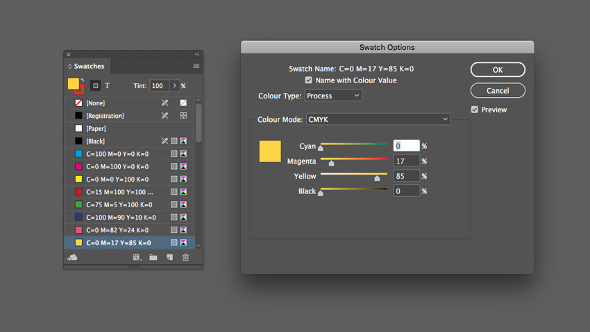
Choose New Color Swatch from the panel’s drop-down menu (at top-right). Set the Color Mode to CMYK for print or RGB for web, and set the levels to C=0 M=82 Y=24 K=0 or R=234 G=76 B=125.

Click Add and OK.

Create a second new swatch, C=0 M=17 Y=85 K=0 or R=255 G=211 B=50.

yellow swatch

Step 2

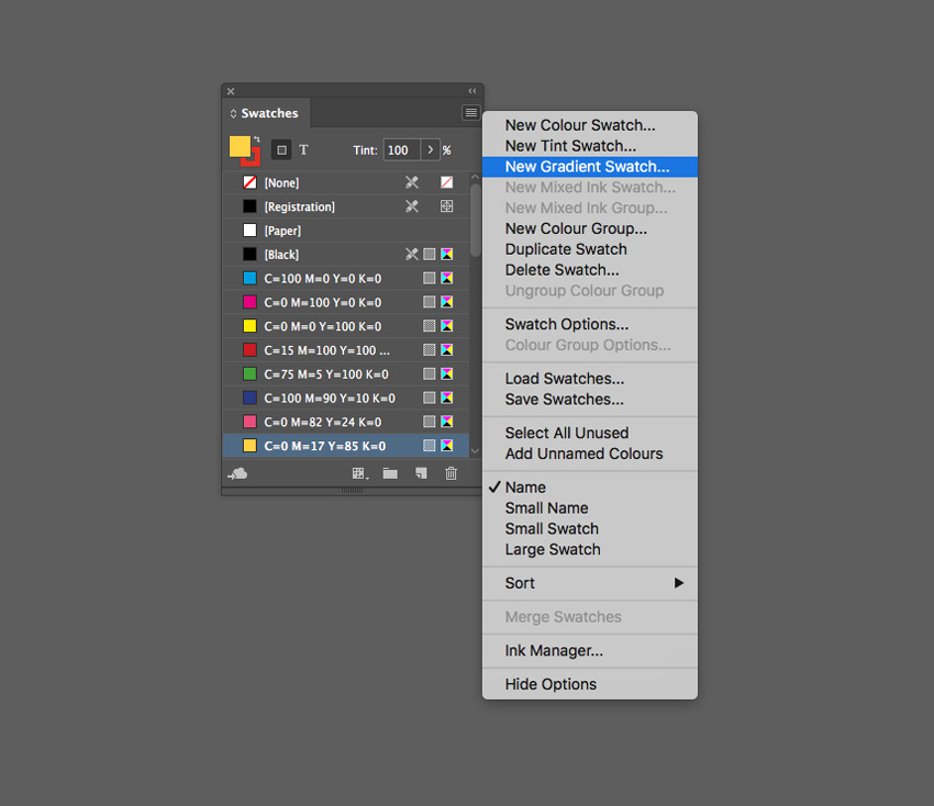
Choose New Gradient Swatch from the Swatches panel’s menu. 

new gradient swatch

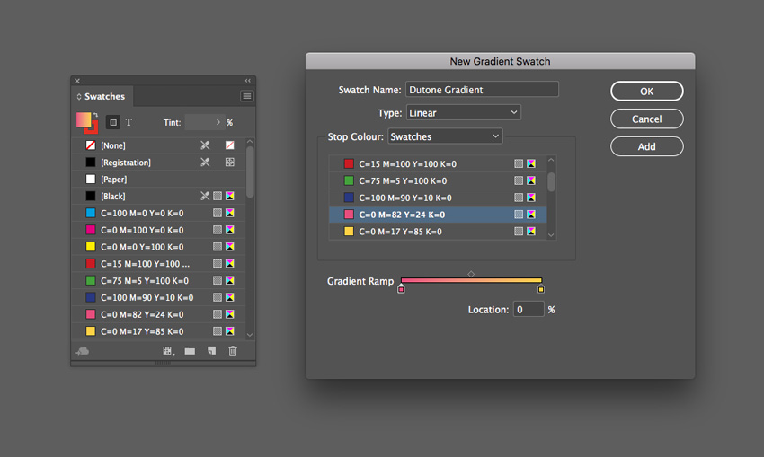
Name the swatch Duotone Gradient, set the Type to Linear, and choose Swatches from the Stop Color menu. 

Click on the left-hand stop on the Gradient Ramp and set this to your first pink swatch, C=0 M=82 Y=24 K=0. Set the right-hand stop to the yellow swatch, C=0 M=17 Y=85 K=0.

Click Add and OK.

new gradient swatch

Step 3

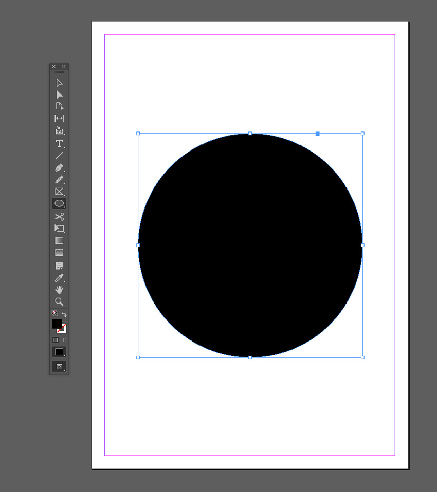
Create a shape on the page you’d like to apply the gradient to. Use the Rectangle Tool (M) to create a background shape. Here I’ve used the Ellipse Tool (L) to create a circle (holding Shift to keep the proportions).

ellipse tool

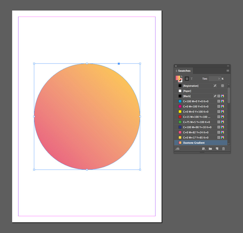
Apply the Duotone Gradient swatch to the Fill Color of the shape from the Swatches panel.

duotone swatch

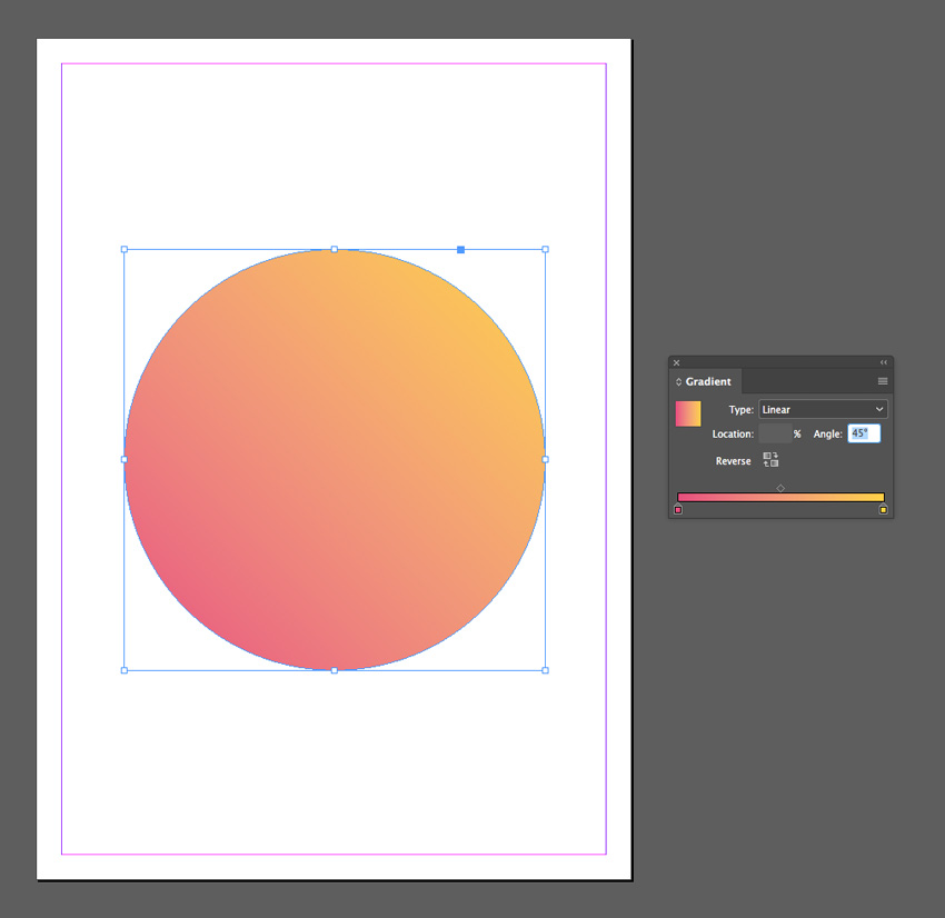
You can use the Gradient panel (Window > Color > Gradient) to adjust the Angle of the gradient.

angle of gradient
duotone effect

2. Blackout Gradient Effect

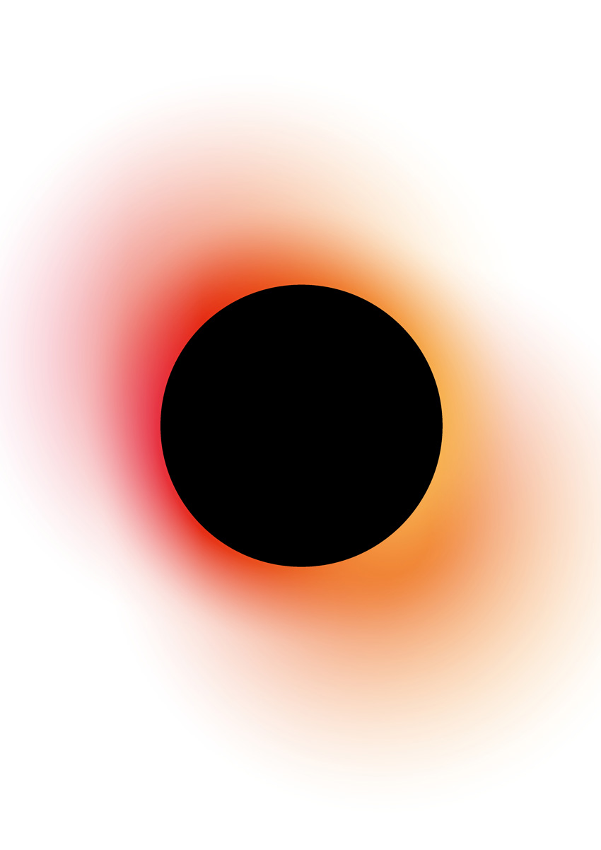
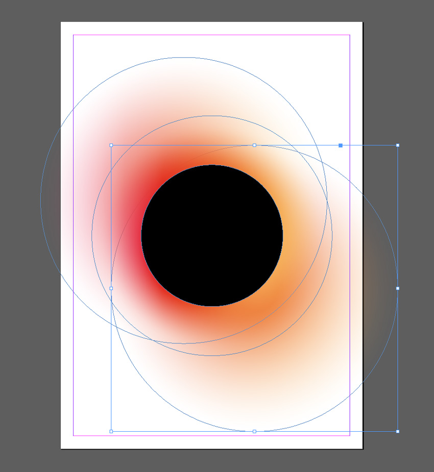
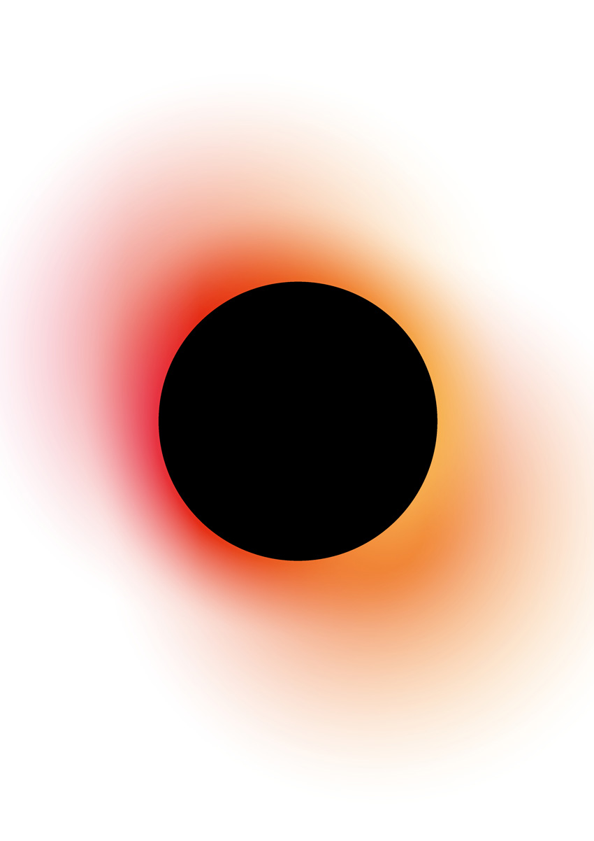
This is a high-impact gradient effect that gives an eclipse effect. This works best as a standalone effect using a circle design. Why not try placing text or an image inside the inner circle for extra impact?

Step 1

From the Swatches panel (Window > Color > Swatches), choose Create New Swatch. Create a hot pink swatch, C=0 M=87 Y=2 K=0 or R=232 G=59 B=140.

Create two more new swatches:

  • C=1 M=14 Y=63 K=0 or R=254 G=219 B=117 
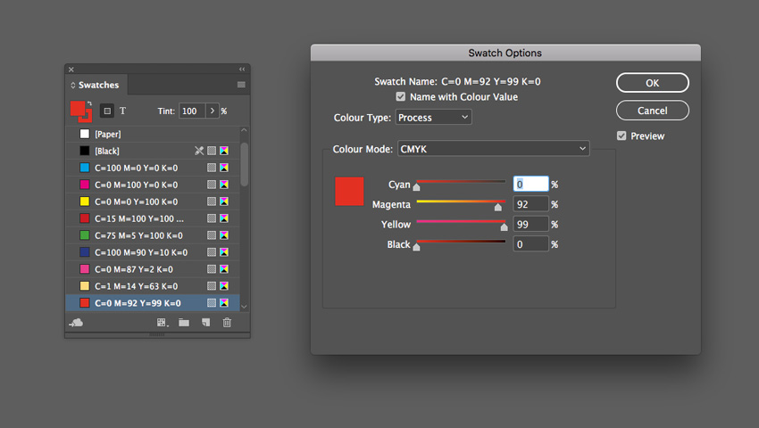
  • C=0 M=92 Y=99 K=0 or R=229 G=45 B=20 
swatch options

Step 2

Choose New Gradient Swatch from the Swatches panel’s menu. 

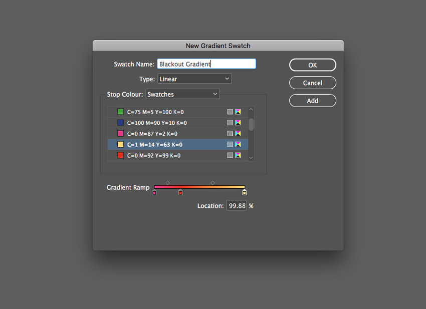
Name the swatch Blackout Gradient, set the Type to Linear and choose Swatches from the Stop Color menu. 

Click on the left-hand stop on the Gradient Ramp and set this to your hot pink swatch, C=0 M=87 Y=2 K=0. Set the right-hand stop to the pale yellow swatch, C=0 M=92 Y=99 K=0.

Click on the ramp about a third across from the left to add a third stop, setting this to your red swatch, C=0 M=92 Y=99 K=0.

blackout gradient

Step 3

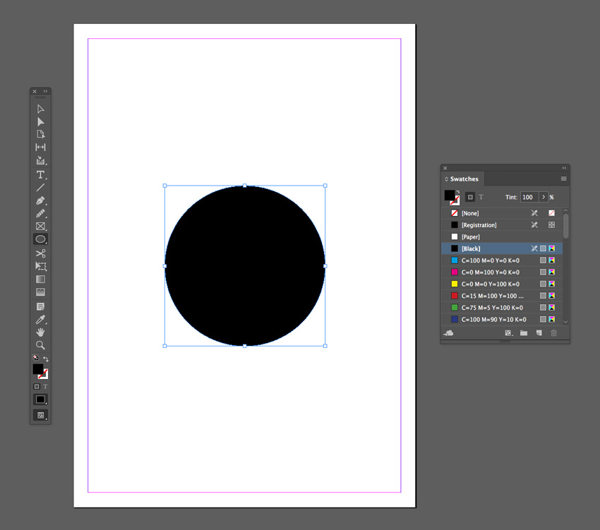
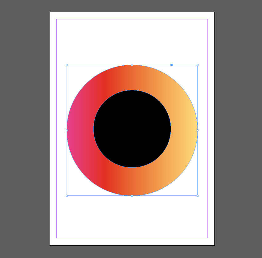
Take the Ellipse Tool (L) and drag onto the page to create a small circle. Set the Fill Color to [Black].

small circle

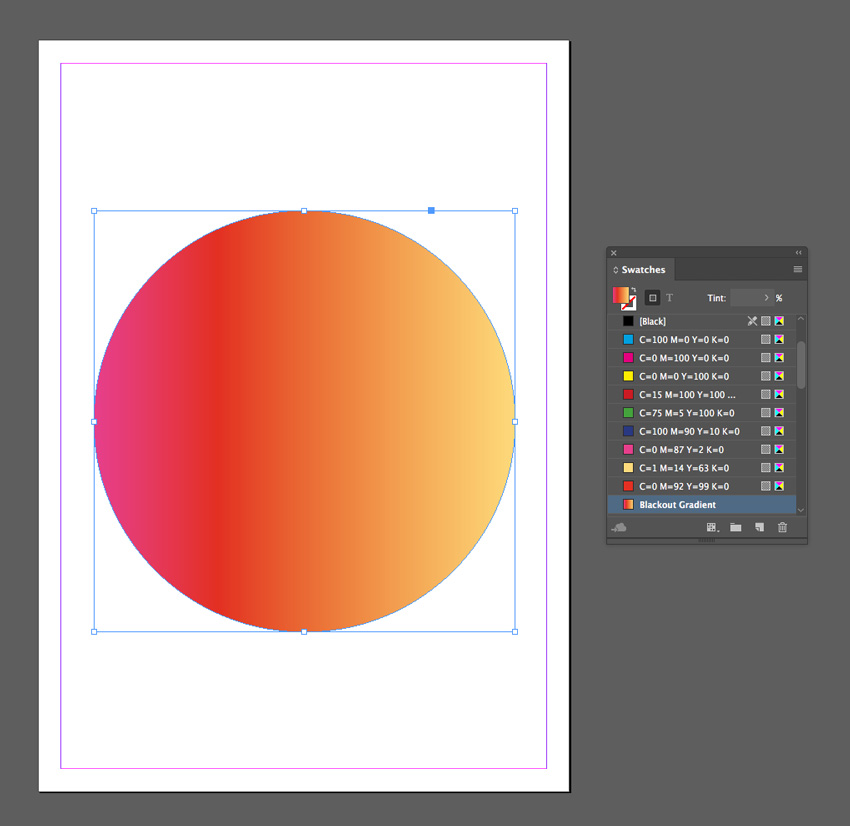
Then create a second larger circle over the top, setting the Fill to Blackout Gradient. 

large circle

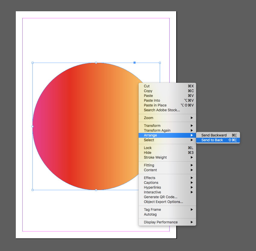
Right-Click on this larger circle and choose Arrange > Send to Back. 

send to back
circle behind

Step 4

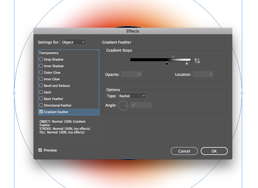
With the Blackout Gradient circle selected, go to Object on the top main menu and choose Effects > Gradient Feather.

Set the Type to Radial, and move the dark stop on the ramp about two-thirds of the way along. 

gradient feather

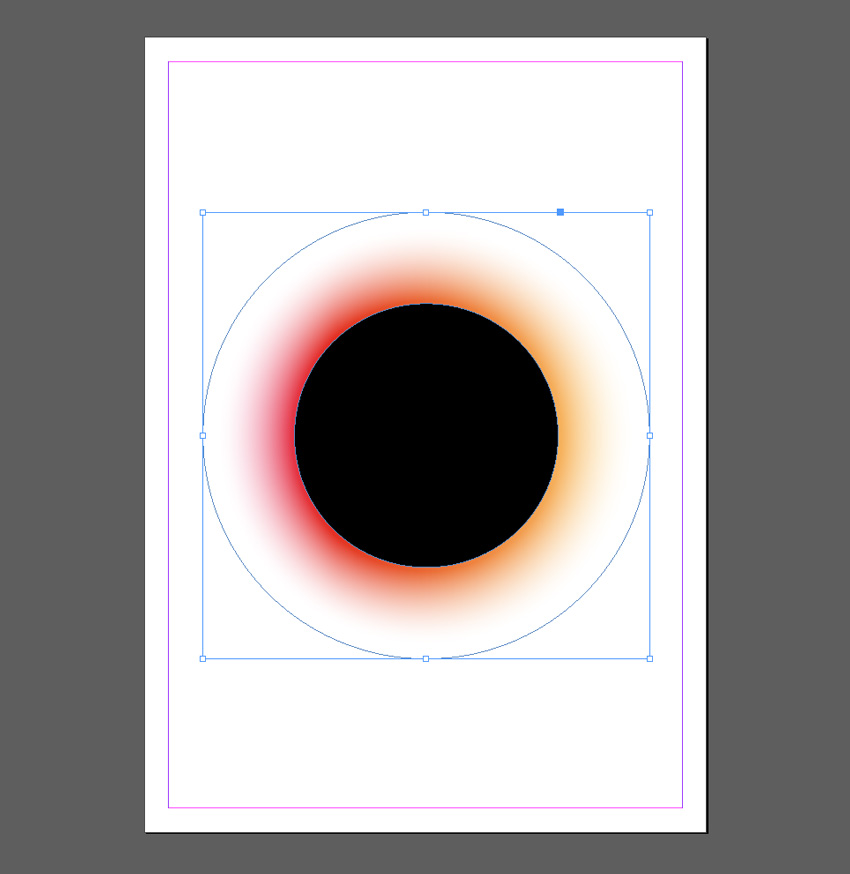
Click OK to exit the window. 

gradient applied

Step 5

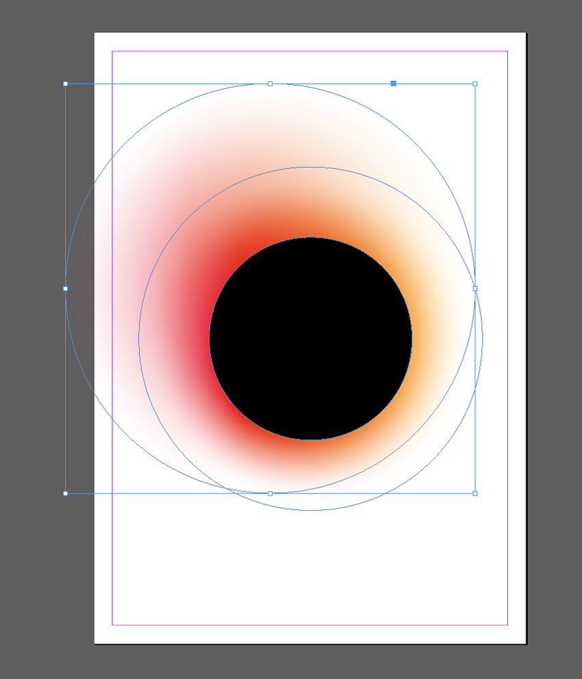
Edit > Copy and Edit > Paste the gradient circle, sending it to the back as before. Scale it up to a slightly larger size and position it towards the top-left of the design.

pasted circle

Edit > Paste again, moving this circle to the bottom-right of the design. 

circle pasted
blackout effect

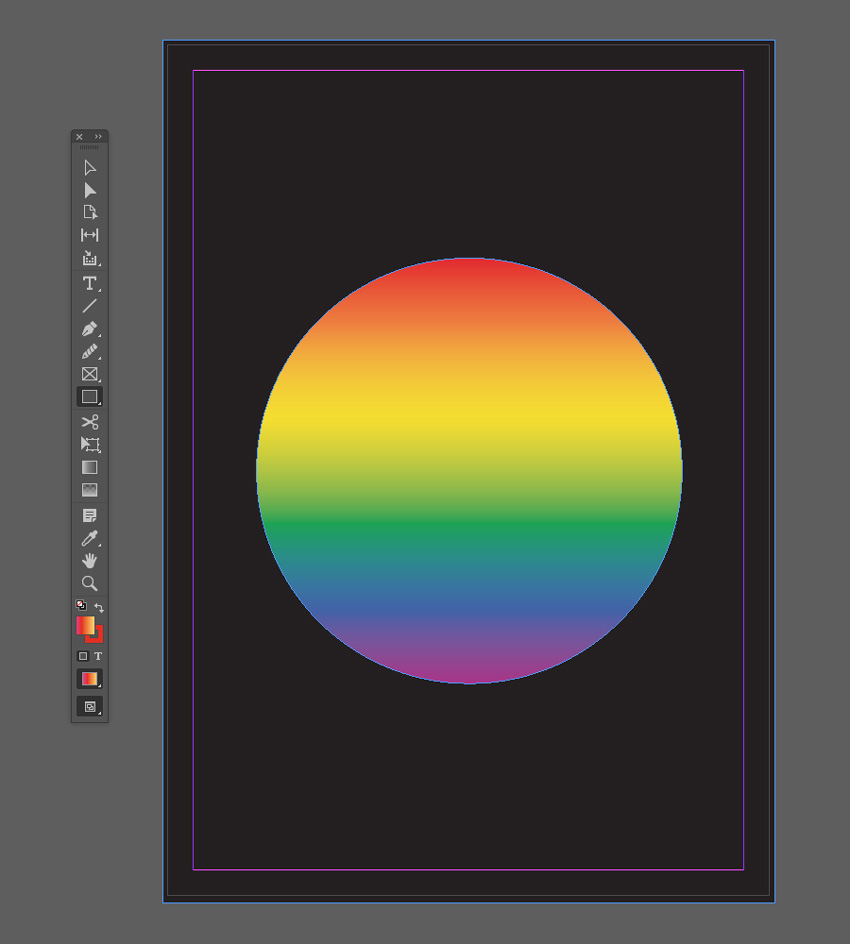
3. Pride Gradient Effect

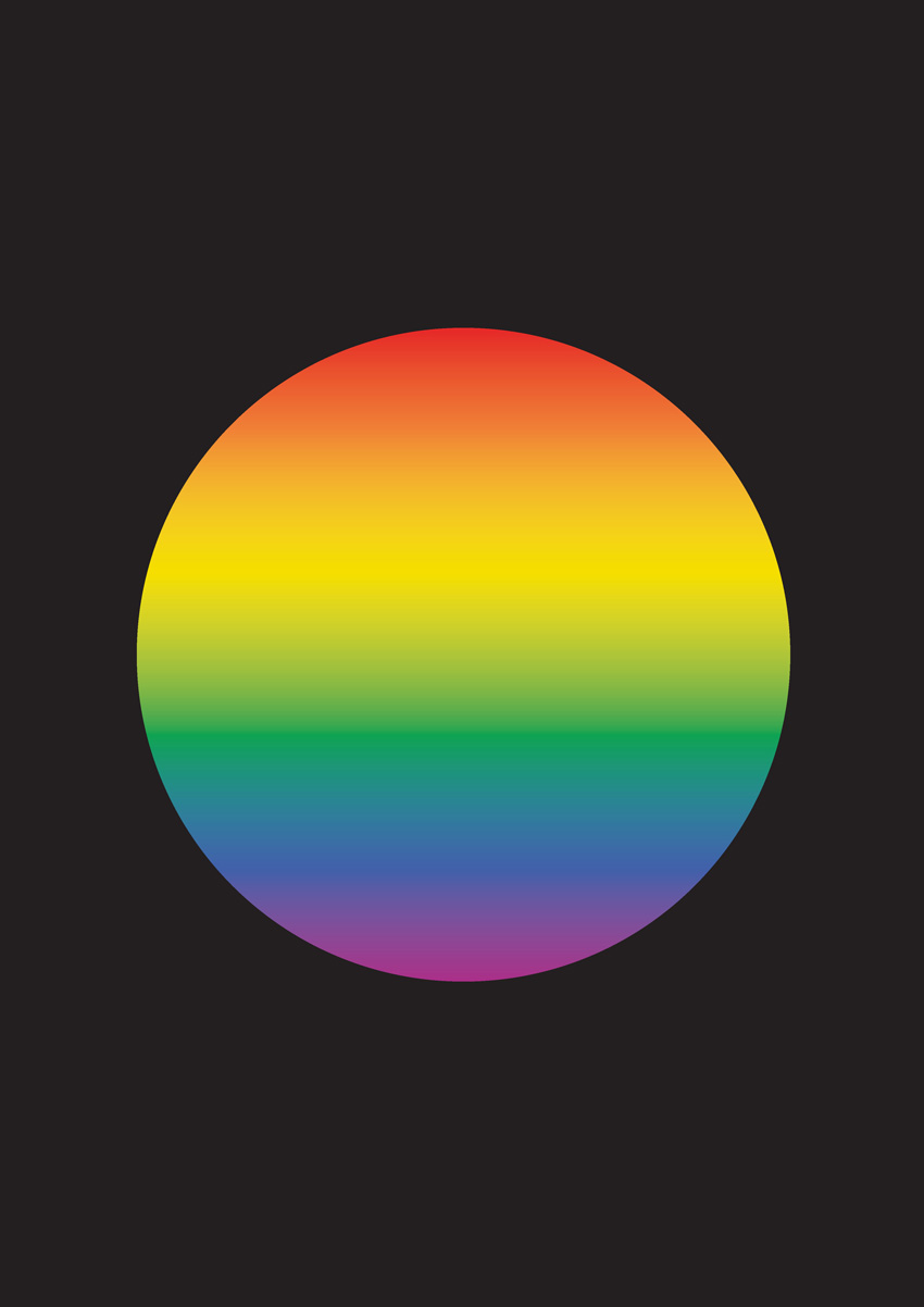
Show your support of Pride this summer (LGBT Pride Month takes place in June) with this gradient set in the colors of the Pride flag.

final pride effect

Step 1

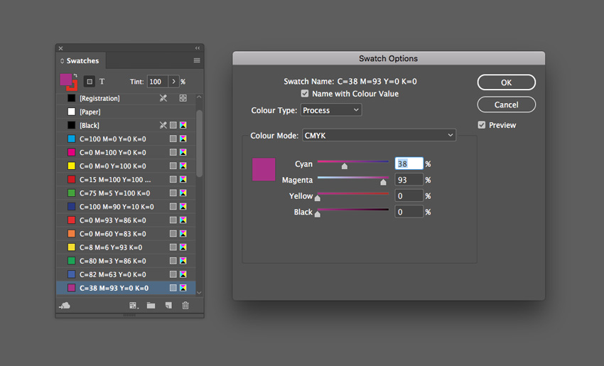
From the Swatches panel (Window > Color > Swatches), choose Create New Swatch. Create a red swatch, C=0 M=93 Y=86 K=0 or R=230 G=42 B=40.

Create five more new swatches:

  • C=0 M=60 Y=83 K=0 or R=240 G=127 B=54 
  • C=8 M=6 Y=93 K=0 or R=245 G=222 B=0
  • C=80 M=3 Y=86 K=0 or R=12 G=164 B=81
  • C=82 M=63 Y=0 K=0 or R=66 G=96 B=169
  • C=38 M=93 Y=0 K=0 or R=171 G=45 B=136 
swatch options

Step 2

Choose New Gradient Swatch from the Swatches panel’s menu. 

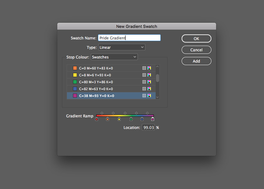
Name the swatch Pride Gradient, set the Type to Linear, and choose Swatches from the Stop Color menu. 

Click on the left-hand stop on the Gradient Ramp and set this to your new red swatch, C=0 M=93 Y=86 K=0. Set the right-hand stop to the violet swatch, C=38 M=93 Y=0 K=0.

Click on the ramp to add four more stops, setting them to (from left to right) orange, yellow, green, and blue from your palette of new swatches. 

Then click Add and OK

pride gradient

Step 3

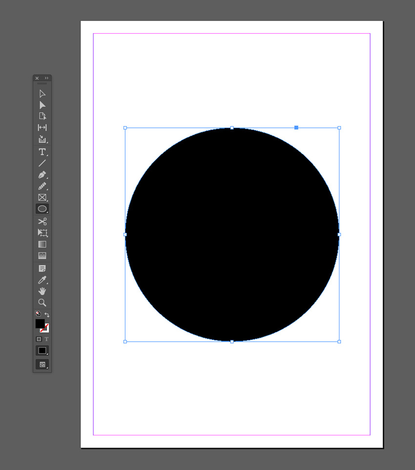
Create a shape on the page you’d like to apply the gradient to. Here I’ve used the Ellipse Tool (L) to create a circle (holding Shift to keep the proportions).

ellipse tool

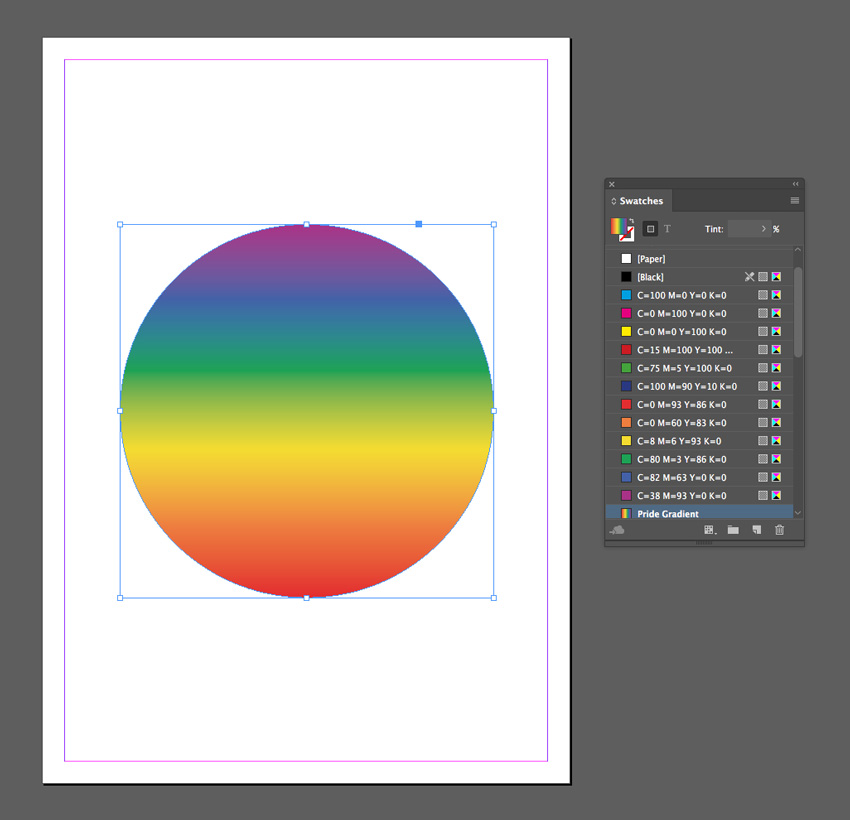
Apply the Pride Gradient swatch to the Fill Color of the shape from the Swatches panel.

fill color

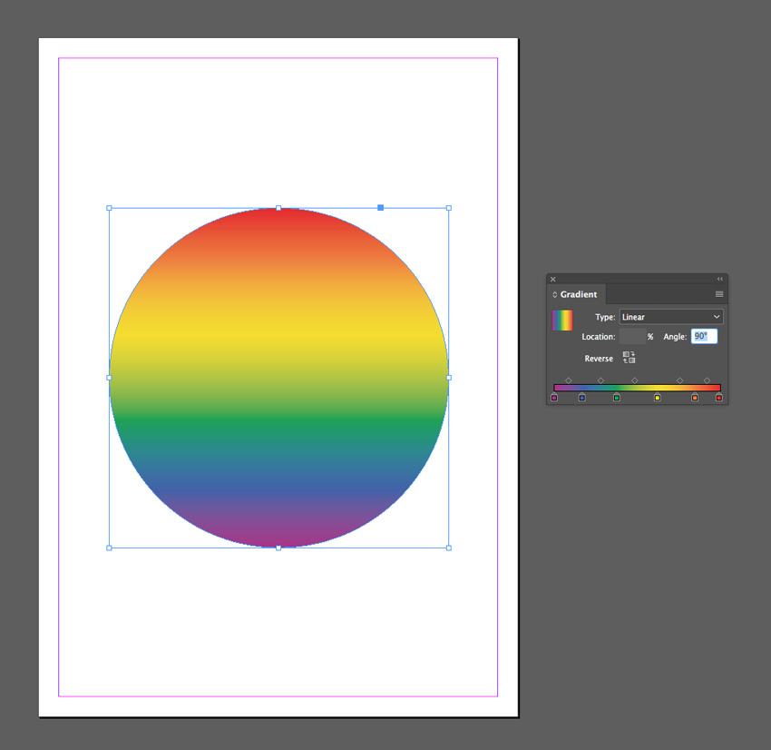
You can use the Gradient panel (Window > Color > Gradient) to adjust the Angle of the gradient.

angle of gradient

Step 4

You can set the shape against a dark background for impact.

Use the Rectangle Tool (M) to create a frame across the whole page and set the Fill Color to [Black]. Right-Click on the shape and choose Arrange > Send to Back. 

black background
rainbow pride effect

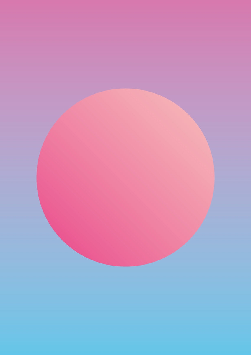
4. Pastel and Neon Double Gradient Effect

This is a popular take on the gradient trend that looks incredible on posters and magazine covers. It’s simple to create, and you can switch up colors to create an almost endless range of results.

final pastel effect

Step 1

From the Swatches panel (Window > Color > Swatches), choose Create New Swatch. Create a lavender swatch, C=14 M=65 Y=0 K=0 or R=215 G=119 B=174.

Create three more new swatches:

  • C=59 M=0 Y=6 K=0 or R=98 G=198 B=233 
  • C=0 M=33 Y=22 K=0 or R=248 G=192 B=186
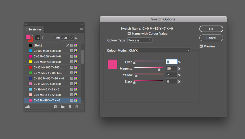
  • C=0 M=86 Y=7 K=0 or R=233 G=62 B=136
swatch options

Step 2

Choose New Gradient Swatch from the Swatches panel’s menu. 

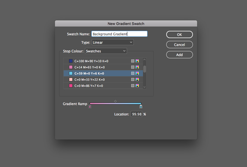
Name the swatch Background Gradient, set the Type to Linear and choose Swatches from the Stop Color menu. 

Click on the left-hand stop on the Gradient Ramp and set this to your new lavender swatch, C=14 M=65 Y=0 K=0. Set the right-hand stop to the blue swatch, C=59 M=0 Y=6 K=0.

Then click Add and OK

background gradient

Step 3

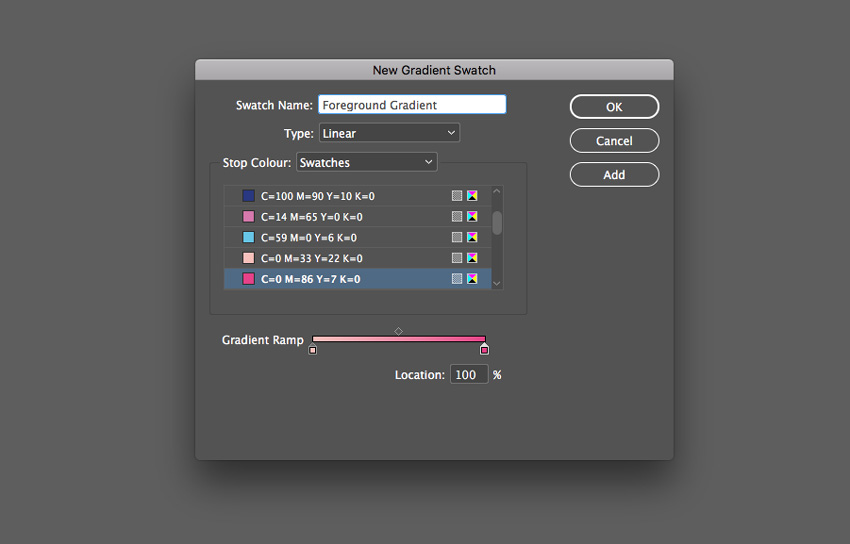
Create a second New Gradient Swatch. Name this swatch Foreground Gradient, set the Type to Linear, and choose Swatches from the Stop Color menu. 

Click on the left-hand stop on the Gradient Ramp and set this to your pale pink swatch, C=0 M=33 Y=22 K=0. Set the right-hand stop to the bright pink swatch, C=0 M=86 Y=7 K=0. Click Add and OK

new gradient swatch

Step 4

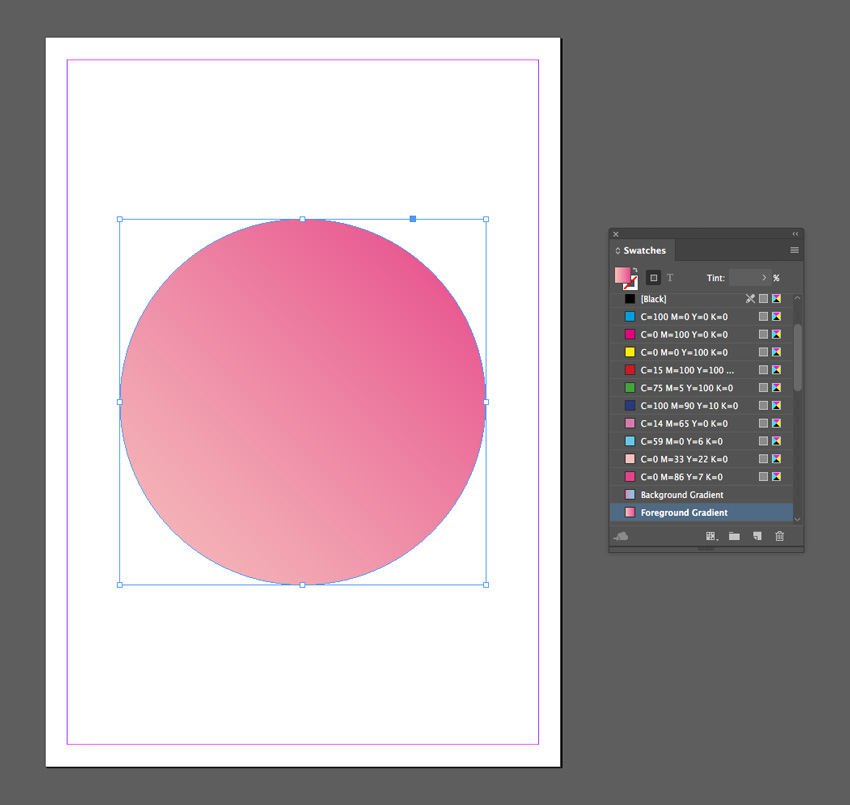
Create a shape on the page you’d like to apply the gradient to. Here I’ve used the Ellipse Tool (L) to create a circle.

Apply the Foreground Gradient swatch to the Fill Color of the shape from the Swatches panel.

circle gradient

Step 5

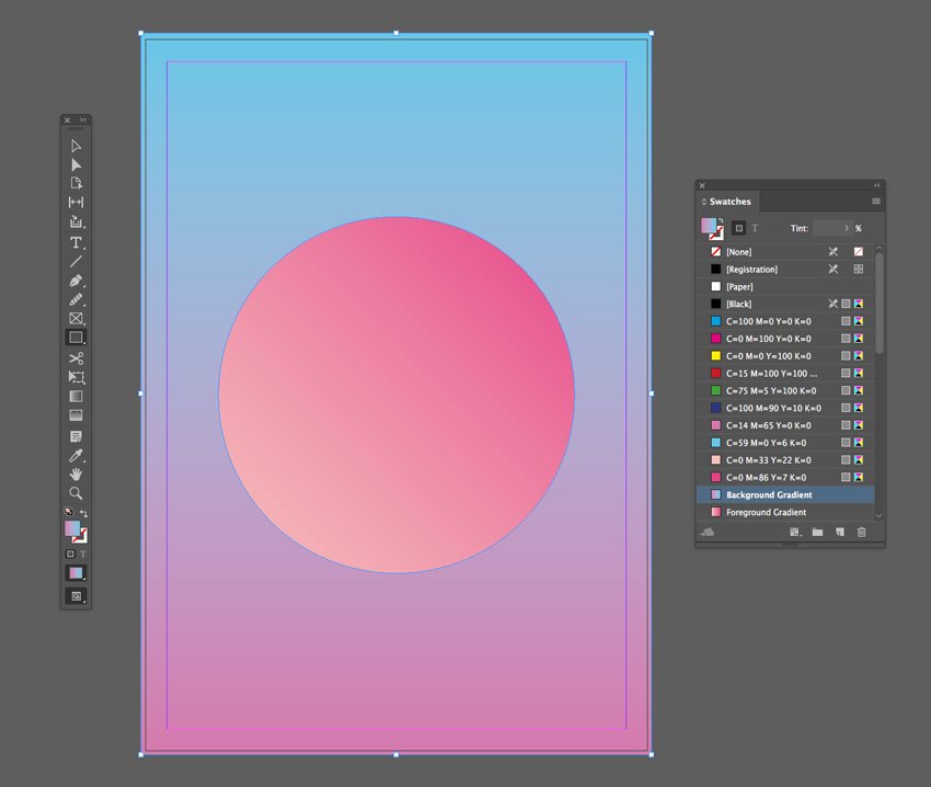
Create a shape across the whole page using the Rectangle Tool (M) and Right-Click > Arrange > Send to Back.

Apply the Background Gradient swatch to the Fill Color of the shape.

background gradient

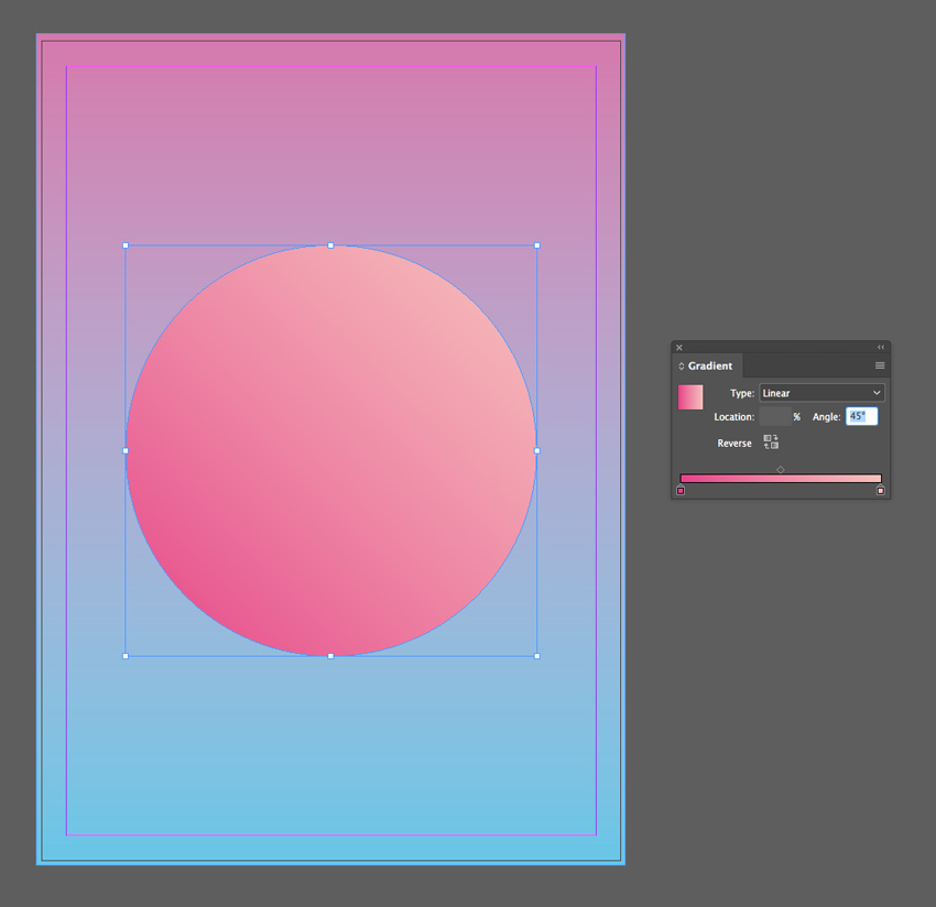
You can adjust the Angle of the gradient and strength of each of the colors from the Gradient panel (Window > Color > Gradient).

gradient angle
final double gradient

5. Retro Gradient Effect

This funky effect takes inspiration from 1960s and 70s graphic design. It’s a more chunky, dissected take on the gradient trend, and it’s great for giving typography a retro flavor. 

For this effect, you’ll need to download Charlevoix Pro ExtraBold.

final retro effect

Step 1

From the Swatches panel (Window > Color > Swatches), choose Create New Swatch from the panel’s main menu. 

Create a yellow swatch, C=3 M=6 Y=91 K=0 or R=255 G=226 B=9.

Create ten more new swatches, to create a full rainbow palette plus one pale swatch and one dark swatch:

  • C=0 M=44 Y=93 K=0 or R=246 G=159 B=25 
  • C=0 M=59 Y=94 K=0 or R=240 G=128 B=26
  • C=0 M=92 Y=92 K=0 or R=230 G=45 B=32
  • C=0 M=93 Y=0 K=0 or R=231 G=36 B=134
  • C=77 M=100 Y=0 K=0 or R=98 G=36 B=131
  • C=100 M=90 Y=22 K=5 or R=39 G=52 B=117
  • C=73 M=9 Y=4 K=0 or R=6 G=173 B=224
  • C=77 M=4 Y=47 K=0 or R=0 G=170 B=155
  • C=7 M=3 Y=17 K=0 or R=242 G=241 B=222
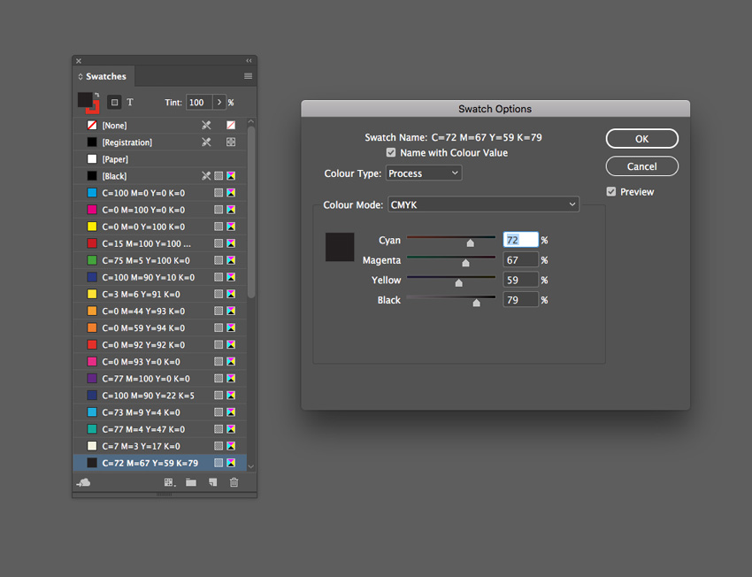
  • C=72 M=67 Y=59 K=79 or R=35 G=31 B=32
swatch options

Step 2

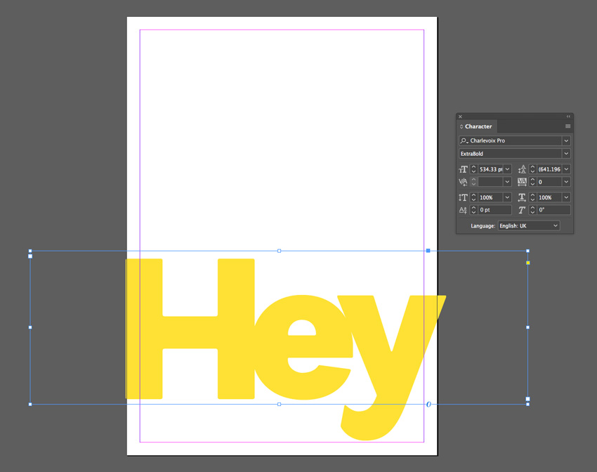
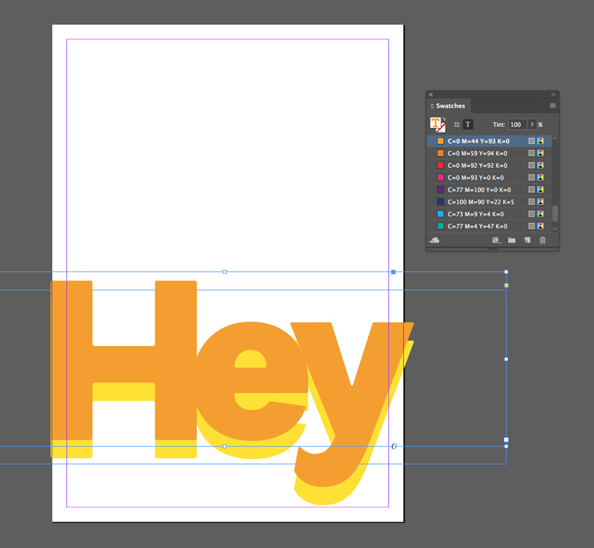
Use the Type Tool (T) to create a large text frame across the bottom of the page. 

Type in a single word, such as ‘Hey’, and from either the top Controls panel or the Character panel (Window > Type & Tables > Character), set the Font to Charlevoix Pro ExtraBold. Blow up the Font Size so that the text extends across the whole page, crossing the trim edge on both sides.

Set your Type Tool cursor between each of the letters and reduce the Kerning (letter-spacing) from the Character panel, so that the letters are pushed closer together. 

Set the Font Color, from the Swatches panel, to your new yellow swatch, C=3 M=6 Y=91 K=0.

yellow swatch

Step 3

Select the text frame and Edit > Copy, Edit > Paste in Place, using the arrow keys to move this second frame upwards slightly. 

Adjust the Font Color to your orange swatch, C=0 M=44 Y=93 K=0.

orange swatch

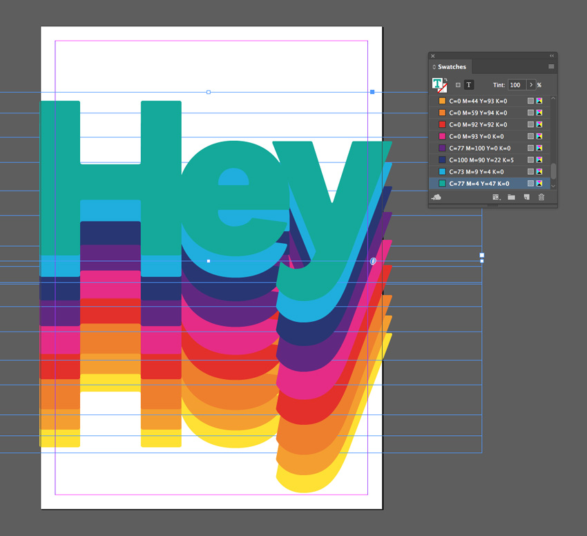
Step 4

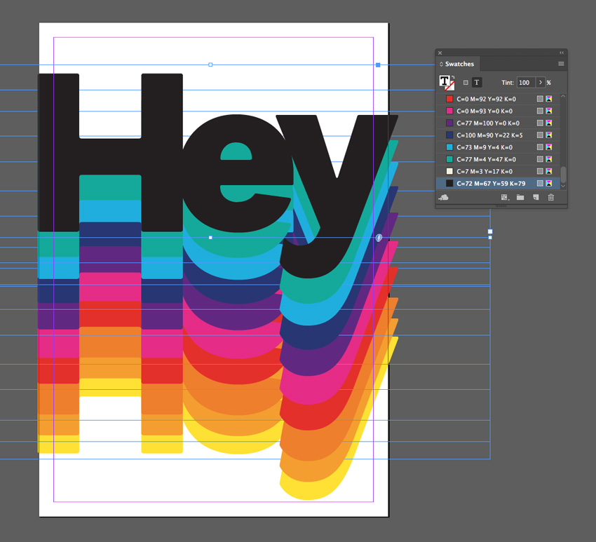
Continue to Edit > Paste in Place more text frames, shifting them upwards and adjusting the Font Color until you have created a gradual rainbow effect, as shown below. 

colored frames

For your final text frame, set the Font Color to your off-black swatch, C=72 M=67 Y=59 K=79.

pasted frames

Step 5

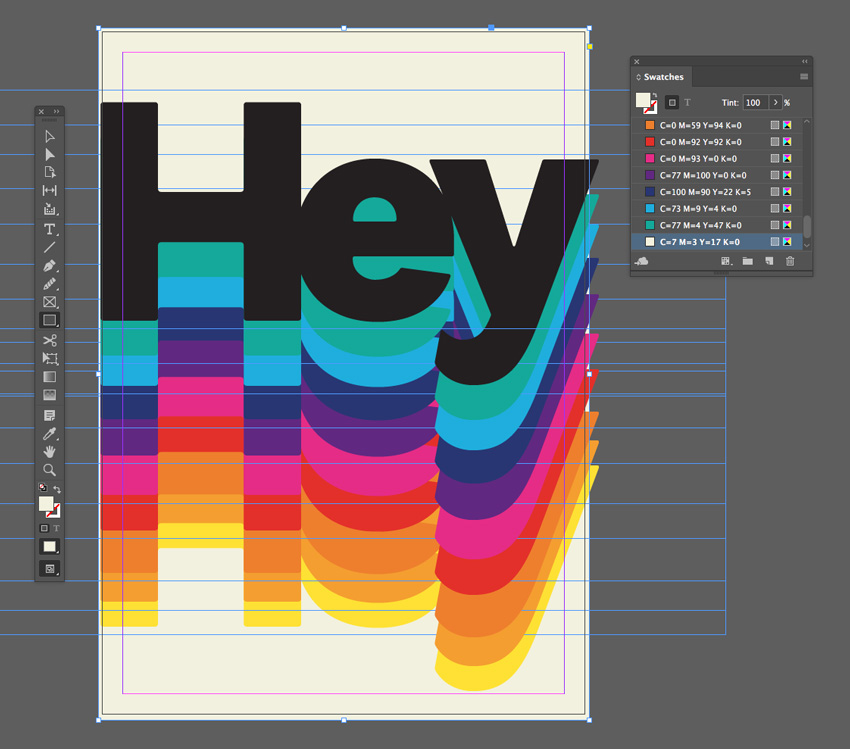
To add a final retro vibe to your effect, create a shape across the whole page using the Rectangle Tool (M) and Right-Click on it and Arrange > Send to Back.

Set the Fill Color to the beige swatch, C=7 M=3 Y=17 K=0.

black text
final effect

Hey! Awesome Work!

And there we have it! Five quick and effective gradient effects that can transform any lacklustre layout.

Why not add cool typography to your gradient designs to transform them into posters or flyers? Head over to GraphicRiver or Envato Elements to source great fonts for your next project.

Looking for more InDesign text effect tutorials? Don’t miss these:

Envato Elements Now Offers Video!

Post pobrano z: Envato Elements Now Offers Video!

Welcome to video on Envato Elements!

If you work with video, your life just got a little easier. Instead of having to create everything from scratch or chase around the web looking for stock footage, motion graphics and After Effects templates, you can now access more than 60,000 top-quality video items, all in one place.

Read all about it on the Envato Blog, check out our related articles and courses, or go and check out the stock video and video templates for yourself!

Related Content

How to Create Vintage Photos With Faded Effect Photoshop Actions

Post pobrano z: How to Create Vintage Photos With Faded Effect Photoshop Actions

Final product image
What You’ll Be Creating

In this tutorial, you will learn how to create a vintage photo effect using brushes and adjustment layers in Adobe Photoshop.

I created a Vintage Photo Press with different vintage effects using the same method for my GraphicRiver portfolio.

Tutorial Assets

You will need the following in order to complete this tutorial: 

  • Any photo you want to use for this manipulation. You can find some free photos on Unsplash and Pixabay or buy high-quality photos on PhotoDune. I chose this photo from Unsplash.
  • A free brush created by me specifically for this tutorial.

1. How to Prepare the Document

Step 1

Go to File > New and create a new file to work with. Use the following settings: Width: 2000 px; Height: 1500 px; 300 dpi.

Creating new document

Step 2

Go to File > Place and put your image inside the document.

Placing the image to the document

Step 3

Right-Click on the layer, and then click Convert to Smart Object.

Creating smart object

Step 4

Select your background layer and then go to Layer > New Fill Layer > Solid Color and chose #ebebeb color.

Creating background fill layer

Step 5

Now we need to delete the background layer by clicking on the Delete Layer icon.

Deleting background layer

Step 6

Create a new layer above the image using the Shift-Control-N shortcut.

Creating texture layer

Step 7

Select the image and the texture layers while holding Shift, and then click on the Create a New Group icon.

Creating a group of layers

2. How to Create the Texture

Step 1

Select the smart object and then go to Filter > Noise > Add Noise. Use the following settings: Amount: 5%; Distribution: Uniform; Monochromatic: On.

Adding noise to the smart object

Step 2

Now let’s create a texture with our free brush. Select the texture layer and then click B to activate the Brush Tool and draw the texture you want to use for this manipulation.

Creating a texture

Step 3

Change the Fill of the texture to 0%.

Changing the fill of the layer

Step 4

Double Click on the texture layer and use the following settings: Knockout: Shallow.

Changing knockout settings

Now the color of the texture depends on the first fill layer. If you change the color of the fill layer, your texture will also change color.

Step 5

Change the Opacity of the texture to 35%.

Changing the opacity of the layer

3. How to Create a Vintage Color Correction

Step 1

Now let’s create color correction layers. Go to Layer > New Adjustment Layer > Gradient Map and create a black and white gradient.

Creating adjustment layer

Step 2

Change the Blending Mode of the gradient map to Soft Light and the Opacity of the layer to 25%.

Changing the blending mode and the opacity

Step 3

Go to Layer > New Adjustment Layer > Brightness/Contrast and create a new layer with the following settings: Brightness: -5; Contrast: -15.

Creating adjustment layer

Step 4

Create another gradient map as we did before, and use the following colors: #564e63 and #8c96a2.

Creating gradient map layer

Step 5

Change the Blending Mode of the layer to Hard Light.

Changing the blending mode

Step 6

Go to Layer > New Adjustment Layer > Exposure and create a new layer with the following settings: Offset: +0,0500.

Creating exposure adjustments layer

Step 7

Now let’s go to Layer > New Adjustment Layer > Hue/Saturation and create a new layer with the following settings: Saturation: -25.

Creating huesaturation adjustments

Step 8

After that, we need to create the last adjustment layer. Go to Layer > New Adjustment Layer > Photo Filter and use the following settings: Color: #e49d16.

Adding photo-filter to the document

Step 9

Change the Blending Mode of the layer to Color and the Opacity to 70%.

Changing the opacity and the blending mode

Step 10

Now we can add a vignette using the gradient fill layer. Go to Layer > New Fill Layer > Gradient and create a black and white gradient with the following settings: Style: Radial; Scale: 100%; Reverse: On.

Creating gradient fill layer

Step 11

Change the Blending Mode of the layer to Soft Light and the Opacity to 20%.

Changing the blending mode and the opacity of the layer

Awesome Work, You’re Now Done!

In this way, we can create a vintage photo manipulation with a fade effect and a texture overlay using Adobe Photoshop.

Final result

If you would like to create similar effects in a few simple clicks, then check out my Vintage Photo Press item in my GraphicRiver portfolio.

httpsgraphicrivernetitemvintage-photo-press-vol-0111321649

International Artist Feature: Hong Kong

Post pobrano z: International Artist Feature: Hong Kong

Welcome back to our International Artist Series.

Today
we’re catching up with six incredible artists from Hong Kong, home of incredible history, a bustling skyline, and the talented people of East Asia. I
asked each artist how
their country and culture inspired their work, and they delivered great
responses.

Panyeung Chan

Panyeung is a designer and illustrator from Hong Kong. Full of culture and dynamic scenes, his work reflects his real-life experience as an artist living in this energetic city.

See more in his portfolio and follow him on Instagram!

Leaving Hong Kong

Living in Hong Kong, the most fascinating thing is definitely its multi-cultural environment. When you walk down the street, you can
easily find everything in your surroundings, from architecture, to food and language—all hugely influenced by different cultures.

Leaving Hong Kong
Leaving Hong Kong

The 14th Guangdong Dance Festival

Hong Kong is such a small place that people are living here in a crowded
condition so most buildings along the main avenue
combine their list of functions. Inside one building alone you could find
that there is a wet market, a library, a gym room, or a gallery separated on a different floor.
Those crowded and detailed images stay deep in my
mind and I’ve always wanted to reflect this kind of impression in my work.

The 14th Guangdong Dance Festival

The 12th Guangdong Dance Festival

The 12th Guangdong Dance Festival

Aging Population in Hong Kong

Many internationally well-known galleries create their branches here in Hong
Kong. That is really good news for any art lover! Although art is not a mainstream industry in Hong Kong, people interested in art can really
enjoy living or visiting this city.

Aging Population in Hong Kong

Claire O’Brien

Claire is a creative illustrator currently living in Hong Kong. Her joyous illustrations are not only sweet and beautiful but full of color and life.

See more in her portfolio and follow her on Instagram!

Little Bear Blu

Even though I’ve been here for only five
years, to me it’s still very exotic and I find it incredibly
interesting. I love the way the traditional culture spills out into the street in Hong Kong. It’s not uncommon to see
offerings of oranges and incense sticks nestled in and around the feet
of skyscrapers.

In the village near my studio, there are mini street
temples with little green tiled roofs, and I really
love watching the older generation going about their daily lives with woven wicker hats, sampan and even hanging
fish out to dry.

Little Bear Blu
Little Bear Blu

Hmong Woman and Child

I’m passionate about folk-art and ethno-cultural art forms. Hong
Kong has really beautiful folk arts and crafts, and my favorite
time of year is the Mid-Autumn festival. The colors are so inviting and
cheerful—it’s really magical to me.

I also came across embroidered bags
woven by the Miao and Hmong tribes in Northern China, Laos and Thailand
being sold in the markets here. That introduced me to a whole other world of
amazing inspiration and I really fell in love with the motifs and
traditional dress. Hong Kong is such a great place that just sets you off on a new journey of inspiration.

Hmong Woman and Child

Year of the Rooster

Year of the Rooster
Year of the Rooster

Neon Koi

The art community here is small but vibrant. In the studio where I work, there are textile artists, ceramic
artists, graphic artists, and oil painters. We
all sort of influence one another back and forth, and I’ve also met some
lovely illustrators on Instagram. It’s quite hard to socialize or find other like-minded creatives in such
a business-oriented place. But yet we thrive!

Neon Koi
Neon Koi

Dixon Chan

Dixon is a talented graphic designer based in Hong Kong. His work features fantastic graphic design work with stunning visuals of design packages and more.

See more in his portfolio!

Paradox – Mid-Autumn Moon Festival

I love that it is always convenient to get around here and that nothing is ever too far away.
I get so spoiled sometimes that I once felt a 20 minute walk to a live house was too much when I was touring with other bands in Taipei.

Paradox - Mid-Autumn Moon Festival
Paradox – Mid-Autumn Moon Festival

LAVA

Like a lot of Hong Kong kids, I was taught it’s
better to be as multi-talented as possible. So I like trying out different
styles, tricks or gimmicks here and there in my design work.

In the area, there are mostly busy colors, overloaded
neon signs, too many adverts everywhere, and color themed subway stations. So I guess it’s in my subconscious to
use vibrant colors.

LAVA
LAVA

The Joker – Tuxedo

The Joker - Tuxedo
The Joker – Tuxedo

Avengers: Age of Ultron

The art community is pretty small here, I think, but closely knit. There are lots of
indie or small scale collaborations between people of different fields
and disciplines. It’s a nice little self-sufficient scene.

Avengers Age of Ultron
Avengers: Age of Ultron

April Y. – Leafbear Studio

April is an artist who creates whimsical illustrations in Hong Kong. With a specialty in watercolor paintings, her work is delightfully unique with many pieces dedicated to fairy tales and yummy cuisine.

See more in her portfolio and follow her on Instagram.

Watercolor – Into the Maze

I love the convenience of living in HK. Everything is so accessible
as the transport system is very efficient. Also the food in HK is simply
amazing. You can find all sorts of different types of cuisine here.

Watercolor - Into the Maze
Watercolor – Into the Maze

Watercolor Doodles – Once Upon A Time

I draw my inspiration from what I see and experience daily. Hong Kong is
a very lively city where the Eastern and Western cultures truly blend.
There are always new discoveries to be made when you walk on its streets
and experience the energy and colorful life of the city.
It also
has a very unique cityscape filled up with skyscrapers. So both the culture
and the urban street scenes serve as a source of inspiration for me.

Watercolor Doodles - Once Upon A Time
Watercolor Doodles – Once Upon A Time

The Towers Series

The Towers Series
The Towers Series

Watercolor Doodles – Once Upon A Time

Apart from the
increasing number of international art shows and exhibitions being held
in Hong Kong, there are regular open studios, events, and weekend art markets for
independent artists to showcase their work and to connect with other
independent artists.

Watercolor Doodles - Once Upon A Time
Watercolor Doodles – Once Upon A Time

Kitty Wong

Our next amazing feature is Kitty, a traditional artist living in Hong Kong. With a fondness for the beauty and skill of pen and ink illustrations, her work spills into elaborate swirls of unique compositions.

See more in her portfolio!

Face

Hong Kong has such a strong mix of Chinese and Western culture that it
shows in everyday living and provides open minded thinking. We may not
have the best environment for creativity and opportunity, but it
certainly has room for those who strive to be persistent as creatives.

Face
Face

Chinese Zen Flower Doodle

In the past 20 years, I’ve worked with many talented creative
people and launched fantastic projects in top international advertising agencies. Hong Kong’s mix of culture provides constant stimulation and
collaboration. So having new ideas is everyday practice. I only started creating four years ago and I’ve already had tremendous opportunities while having a full time
marketing job in a new cultural destination.

Chinese Zen Flower Doodle

Morning Charm

Morning Charm
Morning Charm

Face

In Hong Kong, like-minded artists become close and form collaborative projects, and art is very subjective in a way. But it’s a global market and
platform for many galleries, auction houses, and exhibitors. So international art events have been stimulating public interest in
the recent years.

Face
Face

Ophelia Pang

Our last artist is Ophelia, an imaginative illustrator living in Hong Kong. Her simplistic use of color and texture is absolutely intriguing, as she creates charming illustrations of the world around her.

See more in her portfolio!

A Cloudy Day

I love that Hong Kong is such a compact place where doing anything is very convenient.

We have food and cuisine from around the world and all types of services are just fast and efficient.
People work hard and play hard. It is a city that never sleeps.

A Cloudy Day
A Cloudy Day

The Place That I Used to Know

I admire Matisse, Egon Schiele, Van Gogh, as well as Chinese artists such as
Qi Baishi and Wu Guanzhong. I myself learnt
Chinese sumi painting when I was small and then Western watercolor and oil painting
when I grew older. My artistic styles are influenced by all of them.

The Place That I Used to Know

The Place That I Used to Know 2

The Place That I Used to Know 2

Paris

We have all sorts of design communities here, many of them are
active groups on Facebook where artists and designers share their work
and advice.

Paris
Paris

Many thanks to the artists who took time to answer my
questions and share a bit about themselves and how their country and/or culture
has affected their work. You can check out more of their work in the links
below:

How to Create a Sci-Fi, Robot Photo Manipulation in Adobe Photoshop

Post pobrano z: How to Create a Sci-Fi, Robot Photo Manipulation in Adobe Photoshop

Final product image
What You’ll Be Creating

Test out your skills and build a sci-fi scene from scratch!

In this tutorial, I’ll show you how to make a cool 80s-inspired photo manipulation using free stocks and 3D assets in Adobe Photoshop.

Get inspired! Find more stocks for your manipulations on Envato Market.

Tutorial Assets

The following assets were used in the production of this tutorial:

Finding Sci-Fi Inspiration

I’ve been wanting to make a sci-fi manipulation for a while now. So I was super happy when I stumbled across this Robot stock, modeled after the ED-209 machine in the movie, RoboCop.

So with this in mind, I’ll be going for a total 80s sci-fi look, complete with body armor, an 80s droid, and a night-time city scene. Though it’s not based on the movie, this photo art can still be made by finding inspiration about the series online.

Just check out the background characters and story for more ideas.

Let’s take a look at the before and after, featuring some of the stocks used:

Before and After manipulation

Pretty cool! We’ll learn how to build the entire scene from scratch, using a couple of free stocks and 3D assets from Envato Elements.

Let’s get started!

1. How to Build the Sci-Fi Scene

Step 1

Start by creating the general composition.

Open a New Document in Photoshop at 2000 x 1500 pixels and 300 dpi.

Copy and Paste the Robot Stock onto a New Layer. Resize it with the Free Transform Tool (Control-T) and position it to hug the right side, as shown below.

Feel free to delete the original white background layer.

Add the robot

Step 2

In order to make the most out of this image, we need to cut it up.

We’re still going to use the dark gradient background and flat ground, so we just have to separate the robot onto a New Layer.

Use the Polygonal Lasso Tool (L) to make a selection around the robot. It’s okay if the selection is imperfect. Once it’s selected, hold Control-J once to create a new Duplicate onto a New Layer.

cut out the robot

Step 3

Now add the city.

Copy and Paste the City Stock onto a New Layer above the original Robot layer. Free Transform (Control-T) to resize the city picture and fill up the background.

But make sure the bottom floor from the robot stock is still visible!

Add the city stock

Step 4

Let’s add the model next!

Copy and Paste the Model Stock onto a New Layer above the robot copy (Layer 2).

Add the model
  1. Resize the picture (Control-T) to fill the document as shown.
  2. Then add a Layer Mask to the model and use a Hard Round Brush (100% Hardness, 100% Opacity) to paint black onto the mask until the entire background is removed.
  3. Right-click the Layer Mask to Apply Mask when you’re through. Then rename the layer „Model.”

Step 5

For more style, let’s add the glasses and armor.

Download this angle of the Sunglasses 3D Stock. (Feel free to use your own stock, or just omit the glasses entirely.)

Copy and Paste the glasses onto a New Layer above the Model layer. Resize (Control-T) the glasses so that they fit the model’s face better.

Add the glasses

Now add the armor.

Use the Polygonal Lasso Tool (L) to select these highlighted areas one at a time from the Armor Stock.

Add the armor

Step 6

Copy and Paste each piece onto a New Layer and position them to fit onto the model. Use the Eraser Tool (E) to erase any areas you don’t want showing. Once they’re positioned, Merge all the armor layers together.

For a little extra length in her hair, add some extensions to the ponytail!

Lengthen the hair

Simply select the ponytail with the Polygonal Lasso Tool (L). Copy and Paste it onto a New Layer, and then use the Free Transform Tool (Control-T) to make the hair longer.

Erase any areas you don’t need before Merging the layer with the original Model layer.

Step 7

The next thing we’ll add is the Earth patch.

We’re going to apply this to her outfit to add to the visual story. Creating a quick embroidered patch will help cover the red flower shown on the model’s chest, which is currently a little distracting.

Open the Earth Stock in Photoshop.

Create the earth patch

Then go to Filter > Filter Gallery.

Select Rough Pastels and add the following values:

  • Stroke Length: 6
  • Stroke Detail: 6
  • Scaling: 100%
  • Relief: 20

When you’re finished, Copy and Paste the Earth patch onto a New Layer above the model. Use the Free Transform Tool (Control-T) to change the perspective so that it’s resting on her chest.

Add the patch and stroke

Then Right-click the patch layer and go to Blending Options. Add a quick blue #031030 Stroke with the options shown above.

Here’s the result so far.

Step 8

The last piece of this puzzle is the moon.

Copy and Paste a selection of the Moon Stock onto a New Layer above the others.

Add the moon

Add a Layer Mask to the layer and use a Soft Round Brush (0% Hardness, 100% Opacity) to mask away the harsh edges of the picture.

Here is the composition so far.

Composition result

2. How to Create Depth of Field

Now that we have all the elements in place, we can move on to creating depth of field.

Depth of field will give us that realistic look by making sure that the objects look more blurred as they move farther away in the distance.

Step 1

Start with the robot.

Select the robot copy (Layer 2) and hold Control-J to create another Duplicate. Temporarily hide the copy, and then go to Filter > Blur > Gaussian Blur. Add a Radius of 5 pixels and hit OK.

Blur the robot

This second copy of the robot will help bring some of the details back.

Unhide the robot copy (Layer 2 copy) and Right-click to set it as a Clipping Mask to Layer 2. Now lower the Opacity to 50%. Now that the robot shows much clearer, Erase any areas you prefer to stay blurred with the Eraser Tool (E).

Mask the robot

You can also take this time to refine the original robot. Add a Layer Mask to mask away any remaining parts that are showing above the city.

Step 2

Move on to the City layer.

Select the layer and go to Filter > Blur > Gaussian Blur. Add a Radius of 6 pixels and hit OK.

Blur the city

Step 3

Lastly, we’ll blur the moon.

Select the layer and change the Layer Blend Mode to Screen. Then go to Filter > Blur > Gaussian Blur. Add a Radius of 4 pixels and hit OK.

Blur the moon

3. How to Adjust the Lighting

To make this scene more realistic, we’ll need to adjust the lighting extensively for a beautiful night scene.

Try not to get too distracted by the color changes; we’re just focusing on the shading values for now.

Step 1

Let’s start with the background.

Create a New Layer below the robot copy (Layer 2) and fill it with blue #111146 using the Paint Bucket Tool (G).

Set the Layer Blend Mode to Difference.

Add a difference layer

Step 2

Create another New Layer, this time below the blue layer.

Use a Soft Round Brush (0% Hardness, 70-80% Opacity) to paint greenish-black #020811 along the bottom of the ground. Allow a single bit of light to appear below the robot’s right foot.

Set the Layer Blend Mode to Multiply.

Make the ground darker

Step 3

Let’s adjust the robot.

Create another New Layer, set as a Clipping Mask to the robot copy (Layer 2).

Set the Layer Blend Mode to Multiply and use a Soft Round Brush to paint dark blue #151b31 all over the left side of the robot and brown #38150c towards the top.

Make sure to get into those crevices too!

Our light source is coming from the right, so make sure the robot is mostly shaded behind the model.

Shade the robot

To make the robot even darker, add an Adjustment Layer.

Set a New Color Lookup Adjustment Layer as a Clipping Mask to the robot copy (Layer 2).

Set the 3D LUT File to NightFromDay.Cube. Then set the Layer Blend Mode to Darken and the Opacity to 65%.

Darken the robot more

Step 4

Let’s continue to darken the background.

Create a New Layer above the robot copy. This one shouldn’t be clipped.

Use the Gradient Tool (G) to create a blue #131a33 to transparent Linear Gradient moving upwards from the ground. Set the Layer Blend Mode to Difference and the Opacity to 78%.

Darken the background

Step 5

Light up the city!

Create a New Layer underneath the Dark Green and Blue layers.

Use a Soft Round Brush (0% Hardness, 70% Opacity) to paint yellow #e0e0ad onto the city lights. Set the Layer Blend Mode to Overlay and the Opacity to 61%.

Light the city

Step 6

Now let’s shade the model.

Create a New Layer and set it as a Clipping Mask to the model. Set the Layer Blend Mode to Multiply and use a dark blue #0e1328 to paint soft shadow onto the model with a Soft Round Brush.

Paint shadow on the model

We’ll need to color/darken the glasses separately.

Create a New Layer above the Glasses layer and set it as a Clipping Mask to the glasses. Use a Hard Round Brush to paint blue #0a206c all over the glasses, and then set the Layer Blend Mode to Darken.

Color the glasses

Step 7

Take this moment to clean up any areas or add extra details with a Hard Round Brush.

Here I added an earpiece (with highlights) for the glasses, a rectangular bar on her shirt, and painted away the original earpiece that covers her eye. Just use the Eyedropper Tool (I) to sample colors from these areas to add these details on a New Layer.

Add more details

4. How to Finish the Manipulation

Great job so far!

Here is what the composition currently looks like.

current composition

For the final stages of this manipulation, all we need to do is add a little more lighting and tweak the final colors with Adjustment Layers.

Let’s do it!

Step 1

Temporarily Hide the detail layers.

Create a New Adjustment Layer of Curves above the Model layer. Set the curves like the ones shown below for the RGB and Blue Channels. This will make the whole scene a little darker.

Add a curves adjustment

Step 2

Now light up the armor and robot!

Create a New Layer above the rest. Use a pale green #b6d6be to paint light on the armor and robot with a Soft Round Brush (0% Hardness, 50% Opacity).

Then set the Layer Blend Mode to Vivid Light.

Make sure that some of the light is reflected onto the model’s skin, hair, and outfit.

Add light to the girl and robot

Step 3

For more style, add a dramatic lip color.

Unhide the detail layers. Create a New Layer set to Multiply. Paint blue #283d89 onto the model’s lips for an intense, stylish look!

Add a blue lipstick

Step 4

Continue to tweak the lighting. Add a quick vignette!

Create a New Layer set to Soft Light. Use the Gradient Tool (G) to create a blue #010228 to transparent Radial Gradient, making sure the Reverse option is checked.

Lower the Layer Opacity to 50%.

Add a vignette

Step 5

Almost there!

Now adjust the color scheme with a New Adjustment Layer of Levels above the rest. Set the values for the RGB, Red, and Blue Channels to the following:

Add a levels adjustment

Here’s the result.

Result after levels

Step 6

Now let’s make this composition black and white!

Because the colors in each stock are so different, this ends up being a much better option than leaving it in color. But feel free to experiment!

Create a New Adjustment Layer of Gradient Map above the rest. Add a black to white Linear Gradient, and then set the Layer Blend Mode to Color.

Add a gradient map adjustment

Step 7

For a slightly blue hue, fill a New Layer with blue #00183b above the rest, using the Paint Bucket Tool (G).

Then set the Layer Blend Mode to Lighten and the Opacity to 15%.

Add a blue hue

Step 8

Time for the highlights!

For this last step, all we need to do is use a tapered Hard Round Brush to paint crisp white highlights around the scene. Do this on one last New Layer.

Make sure the highlights reflect both the moon and city as potential light sources.

Add highlights

That’s it! Check out the final result below!

All Done! Great Job!

Have fun making your very own sci-fi manipulations by using free stocks and 3D assets. In this tutorial, not only were we able to create an entire scene from scratch, but we also made it look as if it came straight from a movie!

I hope you’ve enjoyed this tutorial! How’d you do? Share your comments and results below.

For more photo manipulation tutorials like this one, check out these links:

Sci Fi Photo Manipulation Photoshop Tutorial by Melody Nieves

How to Create a Quick 3D Botanical Letter Effect in Adobe InDesign

Post pobrano z: How to Create a Quick 3D Botanical Letter Effect in Adobe InDesign

Final product image
What You’ll Be Creating

Often seen across advertising and poster artwork, this eye-catching effect gives an immersive, natural look to any letter. As well as being a quick tutorial, this is also a great introduction to some more advanced techniques in Adobe InDesign. 

If you’re on the hunt for more great fonts to use in your text effects, head on over to Envato Elements to browse a huge range of display typefaces.

Ready to get started? Awesome, let’s go!

What You’ll Need to Create Your Text Effect

For this tutorial, you’ll need access to both Adobe InDesign and Adobe Photoshop. You’ll also need to download the following images and font files:

1. How to Map Out Your Text Effect

Step 1

Open up Adobe InDesign and go to File > New > Document. You can set up your page to any size, but here I’ve set it up as Portrait A3. When you’re ready, click Create

Expand the Layers panel (Window > Layers) and double-click on Layer 1 to rename it as Background.

Create four new layers above this, in this order: Type, Leaves Inside, Shadow, and finally Elements in Front at the top. 

Then lock all layers except Background.

background layer

Step 2

Use the Rectangle Frame Tool (F) to create an image frame across the whole page. 

File > Place, navigate to the pink paper background image, and click Open, allowing it to fill the frame completely (without the gift box in the corner visible).

paper background

Step 3

Lock the Background layer and unlock the layer above, Type.

Create a large text frame on the page using the Type Tool (T), and type in a single letter*. From the Controls panel at the top of the workspace, set the Font to Nista International Bold, and make the Font Size nice and generous.

* Note that this effect works much better with completely angular letters, like ‘F’, ‘L’, and ‘T’, but is much trickier to achieve with letters with rounded elements like ‘O’ or ‘P’.

type tool

2. How to Edit and Add Leaves to Your Letter

Step 1

Minimize the InDesign window briefly and open up the green leaves image in Photoshop.

Duplicate the Background layer to preserve a copy of the original image, and switch off the visibility of the original layer. 

background copy

Go to Select > Color Range and click anywhere onto the white background of the image. In the Color Range window that opens, increase the Fuzziness slider until most of the white is selected. Then click OK.

color range

Click on the Refine Edge button on the top Controls panel, and check Smart Radius. Increase the Radius and Shift Edge sliders until you’re happy with the accuracy of the selection. 

refine edge

Then click OK and hit Delete on your keyboard to delete the white area.

delete area

Step 2

Use the Lasso Tool (L) to isolate one of the leaves on the image, and then Edit > Copy the selection.

lasso tool

Create a new Photoshop document, and Edit > Paste the leaf onto this new canvas. 

Switch off the visibility of the Background layer and then File > Save As the document as a Photoshop (PSD) file. Name it ‘Leaf1.psd’.

isolated leaf

Repeat the process for each leaf, looping it off, copying and pasting it onto a new document, switching off the Background layer, and saving it as an individual Photoshop file. Name each leaf image in a sequence, e.g. ‘Leaf2.psd’, ‘Leaf3.psd’, etc.

looped off leaf
isolated leaf

Step 3

When you’ve saved all the leaves as Photoshop files, head back over to your InDesign document. 

Lock the Type layer and unlock the Leaves Inside layer above.

Use the Rectangle Frame Tool (F) to create a small frame somewhere over the top of your letter. Go to File > Place, choose one of your leaf images, and Open.

leaf psd image

With the image frame selected, go to Object > Effects > Drop Shadow. Switch the Effect Color to a pink swatch (here, I’ve added a new CMYK swatch from the Swatches panel, C=13 M=60 Y=48 K=2, beforehand, to make a good match to the pink paper background), and adjust the options in the Effects window until you have created a subtle shadow for the leaf. 

effect color

Step 4

Select the leaf’s image frame and Edit > Copy, Edit > Paste, moving it over to cover another section of the letter. 

place image

With the copy selected, go to File > Place and choose a different leaf PSD image.

placed leaf image

By adding the leaves this way, you can preserve the drop shadow settings for the image frame.

drop shadow leaf

Continue to Paste new image frames onto the page, and File > Place to replace each frame with a different leaf image. Build the leaves up across the stem and arms of the letter.

leaves inside

Step 5

Once you’ve built up a dense range of leaves across the letter, unlock the top Elements in Front layer.

Then expand the Leaves Inside layer to view all the leaf PSD images sitting on that layer. Highlight the top four or five leaves.

leaves moved in layer

Then drag these up, dropping them onto the Elements in Front layer. 

expanded layer

Step 6

Lock the Leaves Inside layer, and switch off its visibility. Keep the Elements in Front layer unlocked and active. 

elements in front

Now we want to create blocks of pink texture on this top layer, to overlap some of the edges of the leaves and create the desired peekaboo effect. 

Use the Pen Tool (P) to mark off a section of the background, running the edges along the letter’s edge. Here, I want to disguise the top edge of the leaf pictured here, so that’s my focus for this block.

pen tool

Then unlock the Background layer and double-click inside the large image frame sitting on this layer, to directly select the pink paper image. Then Edit > Copy the image. 

copy image

Lock the Background layer and go back to the shape you created on the Elements in Front layer. From the Swatches panel (Window > Color > Swatches), make sure the Fill and Stroke Color of the shape is set to [None]. 

Then select the shape and Right-Click > Paste Into, dropping the pink paper image into the shape at the same scale as the background image.

paste into
pasted paper

Step 7

Repeat the process for another section of background. 

Use the Pen Tool (P) to loop off another area on the Elements in Front layer, before Right-Clicking > Paste Into the paper texture image into the shape, and then setting the Fill and Stroke of the shape to [None].

elements in front
paste into

Keep building up shapes around the perimeter of the letter, and pasting in copies of the paper image. Do each bit in small sections, until the whole page is covered around the edge of the letter. 

elements in front

Step 8

Now you can start to experiment with moving some paper-filled shapes in front of or behind the leaf shapes sitting on this layer. 

Expand the Elements in Front layer and try setting the group of leaves in the middle of two sections of paper shapes, allowing some of the tips of the leaves to poke out. 

layer expanded

This will take a bit of experimenting, so keep checking the result as you work. 

Eventually, you’ll end up with a 3D effect like this:

effect so far

3. How to Add Depth to Your Text Effect

Step 1

Lock the Elements in Front layer and unlock the Shadow layer. 

Use the Rectangle Tool (M) to create a rectangle shape over one edge of the letter, setting the Fill Color to [Black].

shadow layer

Step 2

With the black rectangle selected, go to Object > Effects > Transparency. Set the Mode to Multiply and bring the Opacity down to 75%.

transparency

Click on Gradient Feather at the bottom of the window’s left-hand menu. Keep the settings as they are, only reversing the gradient if needed, to allow the shadow to move from more opaque closer to the edge of the letter and more transparent towards the center of the letter.

gradient feather

Step 3

Select the rectangle shape and Edit > Copy, Edit > Paste it. You might need to Right-Click > Rotate it and resize it to position it along another edge of the letter.

transform rotate
rotate shadow

Continue to paste more rectangles along the edges of your letter, rotating and resizing each to fit. 

shadow rotated

Eventually, you’ll have a shadow running along each edge of the letter, adding depth and drama to the whole effect.

shadow shape

Your Finished Text Effect

And your text effect is finished! Awesome job!

final effect

You can now incorporate your text effect into other InDesign work, or go to File > Export to create a JPG, PNG, or PDF version of your effect. 

On the lookout for more great fonts to use in your text effects? Head on over to Envato Elements to browse a huge range of awesome display typefaces.

Looking for more quick InDesign text effects? Make sure to check these out:

How to Create a Quick Burnt Wood Text Effect in Adobe InDesign

Post pobrano z: How to Create a Quick Burnt Wood Text Effect in Adobe InDesign

Final product image
What You’ll Be Creating

This effect adds rustic charm to any typography, is quick and easy to create, and is a great way of mocking up logos or signage. We’ll use Adobe InDesign’s Effects window to develop depth, highlighting and shadowing.

Have 15 minutes? What are you waiting for!

If you’re on the hunt for more great fonts to use in your text effects, head on over to Envato Elements to browse a huge range of display typefaces.

What You’ll Need to Create Your Text Effect

As well as access to Adobe InDesign, you’ll also need to download the following image and font files:

1. How to Set Up the Wooden Backdrop for Your Effect

Step 1

Open up InDesign and go to File > New > Document. You can set up your page to any size, but here I’ve set it up as Landscape A3. When you’re ready, click Create

Expand the Layers panel (Window > Layers) and double-click on Layer 1 to rename it as Background.

Create three new layers above this, in this order—Smudge, Type, and finally Highlight at the top. 

Then lock all layers except Background.

background layer

Step 2

Working on Background, use the Rectangle Frame Tool (F) to create an image frame across the whole page.

File > Place, navigate to the wood texture image you downloaded earlier, and Open, allowing it to fill the whole frame. 

wood texture

Step 3

Lock the Background layer and unlock the Type layer. 

Expand the Swatches panel (Window > Color > Swatches), and choose New Color Swatch from the panel’s drop-down menu. 

Set the CMYK levels to C=71 M=79 Y=66 K=92, and click Add and then OK

Repeat to create three more CMYK swatches:

  • C=26 M=75 Y=89 K=21
  • C=8 M=46 Y=42 K=1
  • C=43 M=65 Y=48 K=48
swatch options

Step 4

Choose New Gradient Swatch from the Swatches panel’s menu. 

new gradient swatch

Name the swatch Burn Gradient and set the Type to Radial

Click on the left-hand stop on the Gradient Ramp, and choose your new dark swatch, C=71 M=79 Y=66 K=92, for this. 

Set the right-hand stop to your pale swatch, C=8 M=46 Y=42 K=1. Then click on the ramp to add a central, third stop, setting this to C=26 M=75 Y=89 K=21.

new gradient swatch

2. How to Create Your Burn Effect

Step 1

Still working on the Type layer, use the Type Tool (T) to create a text frame centrally on the page. Type in some text and set the Font to Douglas-Calgury Block.

font douglas calgury

Here, I’ve also added text frames above and below this central text frame.

text frames

I also add a framing circle around the typography using the Ellipse Tool (L), and increase the Weight of the circle’s stroke to 23 pt from the Stroke panel (Window > Stroke). 

stroke weight

Step 2

When you’ve finished formatting your typography, Right-Click > Group all of the elements together. 

group elements

Edit > Copy and Edit > Paste the group, moving the copy over onto the pasteboard. 

pasted group

Step 3

To format your effect you may find it easier to Right-Click > Ungroup the original type elements sitting on the page. 

Select each text frame individually and apply the Burn Gradient swatch as the Font Color of each. 

font color burn gradient

Also apply the Burn Gradient to any other elements, like the circle shape here.

burn gradient applied

You can use the Gradient panel (Window > Color > Gradient) to adjust the gradient on each text frame individually. Try shifting the Angle, reversing the gradient or moving the gradient stops on the ramp at the bottom, to create a deep, dark gradient effect on each text frame. 

radial gradient

Step 4

Select all the text frames and shapes and go to Object > Effects > Transparency. Set the Mode to Multiply and bring the Opacity down to 90%. 

multiply mode

Step 5

Click on Inner Shadow in the Effects window’s left-hand menu. 

Click on the colored square next to the Mode menu, and from here change the Effect Color to C=71 M=79 Y=66 K=92, and click OK.

Back in the Inner Shadow menu, set the Distance to 1 mm, Size to 3 mm, Choke to 25%, and Noise to around 15%. 

inner shadow

Step 6

Click on Outer Glow in the Effects window’s menu. Adjust the Mode to Normal and Opacity to about 90%. 

Change the Effect Color to C=26 M=75 Y=89 K=21.

With the Technique set to Softer, increase the Size to 5 mm, Noise to 25%, and Spread to around 45%

outer glow

Step 7

Finally, click on Inner Glow in the left-hand menu. Switch the Mode to Normal, Opacity to about 85%, and switch the Effect Color to C=8 M=46 Y=42 K=1.

Set the Technique to Softer, Source to Edge, Size to 2 mm, and Noise to around 25%. 

inner glow

Then click OK to exit the Effects window.

effects window exit

Step 8

Select the grouped elements which you moved over to the pasteboard earlier. Move this over on top of the elements sitting on the wooden background, placed slightly to the right, as shown below. 

In the Layers panel, expand the Type layer by clicking on the arrow to the left of the Type name. Drag the <group> element down onto the Create New Layer button at the bottom of the panel, to duplicate it.

Then unlock the Smudge layer, and drag one of the two <group> elements down, dropping it onto the Smudge layer. Then you can lock the Type layer.

Working on the <group> now sat on the Smudge layer, apply the Burn Gradient swatch to each element of this copy of the typography. Use the Gradient panel (Window > Color > Gradient), as before, to adjust the angle and position of the gradient on each section of the type. 

gradient swatch

With the <group> selected, go to Object > Effects > Transparency. Set the Mode to Soft Light and click OK.

soft light
effect so far

Step 9

Expand the Smudge layer and drag the <group> element down onto the Create New Layer button, to duplicate the <group>.

copied group

Unlock the top layer, Highlight, and drag one of the <group> elements up onto this layer. 

group in layer

Lock the Smudge layer, working on Highlight.

Select the group of type elements on this page and shift its position slightly to the left. Then go to Object > Effects > Transparency. Set the Mode to Screen and click OK

screen mode

Your Finished Text Effect

Your burnt wood text effect is finished—awesome job!

final wood effect

You can now incorporate your text effect into other InDesign work, or go to File > Export to create a JPG, PNG, or PDF version of your effect. 

A great way to give a twist on a text effect is to use a different typeface style. You can find a huge range of awesome fonts to use in your text effects over on Envato Elements.

Looking for more quick InDesign text effects? Make sure to check these out:

How to Create a Sliced Mountain Effect Using Adobe Photoshop

Post pobrano z: How to Create a Sliced Mountain Effect Using Adobe Photoshop

Final product image
What You’ll Be Creating

In this tutorial, you will learn how to create a sliced effect in Photoshop by mimicking a 3D shape on a 2D image to give an object the illusion of being cut in pieces.

What You’ll Need

In order to complete this project, you will also need the following image:

1. How to Prepare the Image

Step 1

Open the Faraglioni rocks image in Photoshop. We want to remove the background before using the rocks in the poster. To do this, in the Layers panel, Duplicate the Background layer by pressing Command-J, and Hide the visibility of the original Background layer. 

Open the rocks image and duplicate the background layer

Step 2

While selecting the new Layer 1 on the Layers panel, click on the Vector Mask button to add a Layer Mask to the Background copy.

Hide the background layer and add a layer mask to the new duplicated layer

Step 3

We will use the rock on the right side as it is solid compared to the one on the left. Let’s crop the image using the Crop Tool (C). I am maintaining the height and only closing in horizontally, as shown in the image below. Hit Enter to apply the crop.

Crop the image

Step 4

Select the Magic Wand Tool (W) and head over to the Options bar to make sure the Contiguous option is unchecked. For this specific tutorial we need to delete the sky, so click on a white part of the sky, which will select parts of the sky. In order to add to the selection, hold down Shift and click on the blue parts of the sky.

Using the Magic Wand Tool select the sky

Step 5

Once all of the sky is selected, head over to the Layers panel. Select the Layer Mask we created for the new layer and hit Backspace on the keyboard to delete the parts we selected. You should have something like the image below. To deselect the parts we selected with the Magic Wand Tool (W), press Command-D.

Delete the selected sections on the Layer Mask

Step 6

Now we need to remove the water. Using the Brush Tool (B) and black as the Foreground Colour on the Tools panel, you can hide parts of the image. If you use white as the foreground colour, you will instead reveal parts of the image. Make sure you have the Layer Mask selected on the Layers panel.

Right click to set the brush to a Size of 150 px and Hardness of 100% and start brushing parts away from the image. I like to do the big parts first, before zooming in and concentrating on the details later. 

A great tool that helps here is using the backslash key (\) to get a red tint behind the image and see what parts need to be perfected.

Remove the water under the rock using the Brush Tool

Step 7

To soften the edges of the image, we can use the Refine Mask option. Using the Zoom Tool (Z), zoom in on the image. Head over to the Layers panel and right click on the Layer Mask > Refine Mask, and a new window will pop up. Under the Adjust Edge option, set the Feather to 2 px and Shift Edge to -30%. Click OK.

Refine the edges on the Layer Mask through the Refine Mask option

2. How to Create a New Document and Guides

Step 1

In Photoshop, go to File > New. Name the document Sliced-v1, and set the Width to 1275 px and Height to 1650 px, with Background Contents white. I am keeping the poster digital, so I will work with 72 dpi. Click OK to create the document.

Create a new document

Step 2

Let’s create guides in our document to make sure things are aligned. My ruler measures in inches; you can change this in Photoshop > Preferences > Units and Rulers. Head over to View > New Guide, where a new window will pop up. We want to make all of our Guides 1 inch from each edge. Select Horizontal and under Position type 1 in. Click OK

We will do the same for the Vertical option. To add a guide to the bottom and the right side of the page, subtract 1 inch from the overall dimensions of the page. To hide and show the guides, hit Command-;.

Add a 1 inch margin around the document

3. How to Duplicate Layers and Add a Gradient Background

Step 1

Let’s duplicate the Layer 1 from the rocks file into our new Sliced-v1 file. To do so, Right Click > Duplicate Layers. Under As:, rename the layer to Rock, and under Destination select Document > Sliced-v1. Click OK to continue.

Duplicate the rocks to the newly created file

Step 2

In the Sliced-v1 file, resize the Rock layer by hitting Command-T to activate the Transform Tool. Resize the image to fit within the margin. Alternatively, you can head to the Options bar and set the Width and Height to 58%, making sure to activate the Maintain Aspect Ratio button. Hit Enter to proceed. 

Resize the rock image to fit within the margin

Step 3

Head over to the bottom of the Layers panel, and click on Create a New Fill or Adjustment Layer > Gradient. A new Gradient Fill window will pop up; click on the Gradient color space.

Add a gradient layer and move under the rock layer

Step 4

Go to Gradient Editor > Gradient Type, double-click on the left color swatch, and use the following color code: #c5c5c5. Click OK. Double-click on the right color swatch and set the following color code: #f1f1f1. Click OK in all three windows to go back to the page. Let’s move the Gradient Fill layer under the Rock layer.

Choose gradient colors from medium grey to light grey

4. How to Convert a Single Layer to Black and White

Step 1

Before we start to create the effect, let’s turn the Rock layer into black and white. Select the Rock layer on the Layers panel and head over to Image > Adjustments > Black and White. An option window will pop up; click on Auto and then OK. 

Convert the rocks into a Black and White layer

Step 2

The photo looks dull, so let’s add some contrast. Go to Image > Adjustments > Brightness/Contrast and set the Brightness to 35 and Contrast to 65. Click OK.

Edit the Brightness and Contrast of the rock layers

5. How to Create a Sliced Effect

Step 1

We need to cut our image into five pieces. We will be using the Pen Tool (P) to draw through the rock to create a mask. Try to follow the surface of the rock to make the effect credible.

Select the Pen Tool (P). Head over to the Options bar and make sure that Fill has no color selected. We can choose white as the Stroke at 1 pt. This is so we can see where we are slicing. Now we are all set! 

Start by making the first point on the left side of the rock, and try to follow the form of the rock. You will notice I did about eight points, the last point being on the edge of the right side of the rock. Close the shape by going around the rock either around the top or bottom—I chose the top. Close the shape by clicking on the first point again. This new shape will be a new layer.

Using the Pen Tool draw around the top of the rock

Step 2

Let’s go ahead and do the same step three more times, but lower on the rock. You can do as many points as you like with the Pen Tool (P). We should have four layers, each containing a shape like the image below. 

Repeat the same step as above with the rest of the rock Divide into 5 sections

Step 3

On the Layers panel, right click on the Rock Layer Mask thumbnail and select Apply Layer Mask to delete all of the background we had on the rock layer.

On the rocks layer apply the layer mask on the original image

Step 4

We will use the shapes we created as masks to duplicate the different parts of the rock and convert them into separate layers. On the Layers panel, press Command and click on the Shape 1 thumbnail, which will select only the shape. Click on the Rock layer and press Command-X to cut, followed by Shift-Command-V to paste in place. This will create a new layer with the first shape we created. Below, I’ve deactivated the layer so you can see which part I’ve cut from the original image.

Use the sections divided previously to cut and copy in place the rock

Step 5

Repeat the same step with the other shapes. Select all the Shape layers and drag them towards the folder icon on the Layers panel to group them. Deactivate them so we don’t get confused. Below I have moved the layers to show you how they should be separated and how the Layers panel should be looking.

Repeat the same step above resulting in a total of 5 layers containing pieces of the rock

Step 6

Now that we have the rock as puzzle pieces, we will create the 3D effect. I am moving the Rock layer off the bottom margin to give space for the other rocks. We will work our way up. Select Layer 4 or the second layer from the bottom. Using the Pen Tool (P), we will draw on the bottom of the rock to form a 3D look. Click on the very edge of the left side, giving shape to the rock all the way to the edge of the right side (image on the left). To close the shape, this time go through the rock (right image)

If you want to change the shape, simply select the Direct Selection Tool (A) and click on the shape to bring up the points and edit. There is no right or wrong, so you can edit as much or as little as you want! 

Draw the 3D part effect for each division using the Pen Tool

Step 7

Drag the shape under Layer 4. Head over to the Options bar and select Fill > Gradient and Stroke > None. We will worry about the color of the gradient later. Group these two layers to avoid confusion.

Fill the shape with a gradient

Step 8

Do the same step as above for the other rocks. I will organize the layers by grouping the shapes layers with their correspondent rock layers to avoid confusion and naming them numerically. You should have something like the image below.

Organize the layers by grouping them in folders

Step 9

We want to create the illusion that the slices are falling on top of each other. In this specific image, our eyesight is at a low angle as we are looking up at the rock. The 3D parts we created need to be behind each other from bottom to top. 

Let’s switch the order of the layers. Instead of going from 1 to 5, we will have 1 to 5 starting from the top. In other words, the gradient shapes we created need to be behind the rock. Below is an image of the order of the layers and how the file should be looking.

Organize the layers so the bottom of the rock is forward and the top is at the very back

Step 10

Now that we have the layers in the right order, let’s give them a spontaneous look. Select different sections and use the Transform Tool (Command-T) to rotate them slightly. There is no right or wrong—you can move them as much as you like and resize as you wish! 

Using the Transform Tool rotate the shapes to add movement

Step 11

On the Layers panel, expand one of the folders. I will be expanding Rock 5, so double-click on the Shape 5 layer to bring up the Gradient Fill window. Here we need to change the Angle of the gradient; mine is at -100. The darker color we will choose later on needs to go on the side closest to the bottom rock, and the brighter side on the side that is farthest from the rock. On this specific layer, the closest point is on the left side, while the farthest is on the right. This will be different on all the layers. Feel free to use this as a reference.

Double-click on the Gradient color swatch. In the new Gradient Type window, double click on the left color swatch. I am using an orange color with the following code: #ef8d00. Click OK.

Double click on the right color swatch and choose a darker color than the one above; I am using #412701. Click OK on all the windows. 

Color each of the shapes we created for each rock piece using the Gradient Tool

Step 12

Now let’s do the same for the other shapes! I am using the following codes for bright and dark shades respectively:

  • Purple: #5700e6 and #1a0145
  • Pink: #e600e6 and #49014a
  • Green: #0ebb98 and #004134

The image should be looking like the one below.

The gradient should be a lighter shade on one side and a darker shade on the side closes to the bottom rock

Congratulations! You’ve Done It!

In this tutorial, you learned to:

  • Create the illusion of a 3D object on a flat image.
  • Use the Pen Tool to create shapes that can be used as Masks on an image.
  • Use the Gradient Tool to create the illusion of light and shadow.
End Result

How to Create a Sci-Fi Scan-Line Text Effect in Adobe Photoshop

Post pobrano z: How to Create a Sci-Fi Scan-Line Text Effect in Adobe Photoshop

Final product image
What You’ll Be Creating

This tutorial will show you how to use layer styles to create a super quick and easy sci-fi scan-line inspired text effect. Let’s get started!

This text effect was inspired by the many Layer Styles available on GraphicRiver.

Tutorial Assets

The following assets were used during the production of this tutorial:

1. How to Create a Simple Gradient Pattern

Step 1

Create a new 500 x 104 px document, and double-click the Background layer to unlock it.

Unlock the Background Layer

Step 2

Double-click the Layer 1 layer to apply a Gradient Overlay effect with these settings:

  • Check the Dither box.
  • Use the faucet 150 gradient fill.
Gradient Overlay

Step 3

Pick the Single Column Marquee Tool and click once anywhere to select a single vertical line.

Then, go to Edit > Define Pattern, and set the Name to Lines.

Define Pattern

2. How to Create a Background Texture

Step 1

Create a new 850 x 588 px document with the Resolution value set to 300, place the Black grunge wall texture image on top of the Background layer, and resize it as needed.

Add the Background Texture

Step 2

Go to Image > Adjustments > Levels, and change the Gamma value to 1.10.

Levels

Step 3

Double-click the texture layer to apply a Color Overlay effect with these settings:

  • Color: #3b7aab
  • Blend Mode: Overlay
Color Overlay

This will add a blue color to the texture.

Colored Texture

3. How to Create and Style Text Layers

Step 1

Create the text using the font Kenney Future, and set the Size to 50 pt.

Duplicate the text layer and change the copy’s Fill value to 0%.

Create the Text Layers

Double-click the original text layer to apply the following layer style:

Step 2

Add a Bevel and Emboss with these settings:

  • Style: Stroke Emboss
  • Technique: Chisel Hard
  • Depth: 550
  • Size: 6
  • Uncheck the Use Global Light box
  • Angle: -169
  • Altitude: 37
  • Gloss Contour: Ring
  • Check the Anti-aliased box
  • Highlight Mode: Color Dodge
    • Opacity: 75%
  • Shadow Mode: Linear Burn
    • Opacity: 40%
Bevel and Emboss

Step 3

Add a Contour with these settings:

  • Contour: Cone – Inverted
  • Check the Anti-aliased box.
  • Range: 100%
Contour

Step 4

Add a Stroke with these settings:

  • Size: 3
  • Position: Outside
  • Fill Type: Gradient
  • Angle: 90
  • Click the Gradient box to create the gradient
Stroke

Create the Gradient by adding alternating Color Stops of the Colors #1b5ad3 and #6db7fd.

Gradient Fill

Step 5

Add an Inner Shadow with these settings:

  • Blend Mode: Color Burn
  • Color: #0886f1
  • Opacity: 60%
  • Uncheck the Use Global Light box
  • Angle: 90
  • Distance: 0
  • Choke: 25
  • Size: 9
Inner Shadow

Step 6

Add an Inner Glow with these settings:

  • Blend Mode: Vivid Light
  • Opacity: 70%
  • Color: #7ffffd
  • Choke: 30
  • Size: 16
  • Check the Anti-aliased box
  • Range: 100
Inner Glow

Step 7

Add a Gradient Overlay with these settings:

  • Check the Dither box
  • Blend Mode: Linear Burn
  • Opacity: 75%
  • Scale: 109%
  • Create the Gradient using the Colors #145190 to the left and #9517ff to the right.
Gradient Overlay

Step 8

Add a Pattern Overlay with these settings:

  • Pattern: Lines
  • Scale: 7%
Pattern Overlay

Step 9

Add an Outer Glow with these settings:

  • Blend Mode: Overlay
  • Opacity: 75%
  • Color: #dd69ff
  • Spread: 10
  • Size: 30
  • Check the Anti-aliased box
Outer Glow

Step 10

Add a Drop Shadow with these settings:

  • Opacity: 100%
  • Uncheck the Use Global Light box
  • Angle: 90
  • Distance: 10
  • Spread: 30
  • Size: 15
Drop Shadow

Step 11

Add another instance of the Drop Shadow effect with these settings:

  • Opacity: 70%
  • Uncheck the Use Global Light box
  • Angle: 90
  • Distance: 20
  • Size: 35
Drop Shadow

This will create the main effect.

Main Effect

4. How to Add More Layer Effects

Double-click the copy text layer to apply the following layer style:

Step 1

Add a Bevel and Emboss with these settings:

  • Size: 49
  • Uncheck the Use Global Light box
  • Angle: 58
  • Altitude: 21
  • Gloss Contour: Cone – Inverted
  • Check the Anti-aliased box
  • Highlight Mode: Vivid Light
    • Opacity: 77%
  • Shadow Mode:
    • Opacity: 0%
Bevel and Emboss

Step 2

Add a Contour with these settings:

  • Contour: Rolling Slope – Descending
  • Check the Anti-aliased box.
  • Range: 100%
Contour

Step 3

Add an Inner Shadow with these settings:

  • Blend Mode: Soft Light
  • Color: #ab2eec
  • Opacity: 100%
  • Uncheck the Use Global Light box
  • Angle: 90
  • Distance: 0
  • Size: 21
Inner Shadow

Step 4

Add an Inner Glow with these settings:

  • Blend Mode: Vivid Light
  • Opacity: 25%
  • Gradient: Use the Colors #3b5e7e to the left, #588b8a in the middle, and #c5c396 to the right
  • Source: Center
  • Size: 51
  • Check the Anti-aliased box
  • Range: 100%
Inner Glow

Step 5

Add a Gradient Overlay with these settings:

  • Check the Dither box
  • Blend Mode: Linear Light
  • Opacity: 50%
  • Scale: 109%
  • Create the Gradient using the Colors #98addc to the left and #9e727f to the right.
Gradient Overlay

Step 6

Add a Pattern Overlay with these settings:

  • Blend Mode: Multiply
  • Pattern: Paper 2
Pattern Overlay

Step 7

Add an Outer Glow with these settings:

  • Blend Mode: Color Dodge
  • Opacity: 75%
  • Color: #88621f
  • Spread: 10
  • Size: 20
Outer Glow

This will finish off the text effect.

Finished Text Effect

5. How to Add Finishing Touches

Step 1

If you want to add more than one line of text, just duplicate both styled text layers, and change their contents.

Add More Text

Step 2

Click the Create new fill or adjustment layer icon at the bottom of the Layers panel and choose Color Lookup.

Choose the Fuji REALA 500D Kodak 2392 (by Adobe).cube table from the 3DLUT File menu, and change the layer’s Opacity to 35%.

Color Lookup

Congratulations, You’re Done!

In this tutorial, we used textures, patterns, and layer styles to create a quick and easy tech-inspired scan-lines text effect.

Please feel free to leave your comments, suggestions, and outcomes below.

Final Result