Let’s learn how to use the Mesh Tool while creating a photo-realistic T-shirt!
Begin by drawing the shape of half of a shirt with the Pen Tool (P). Fill it in with #F3F3F3.
Create a copy of the shape! Put it aside—we will need it later.
Let’s start using a Mesh! Take the Mesh Tool (U)
and start creating a Mesh grid on the object by placing nodes.
Afterwards, select the nodes on the left edge of the shirt and
change their color to #B7B7B7.
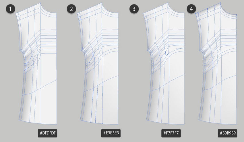
Add some more nodes, as indicated in the screenshot below, and color the selected nodes with #F4F4F4, adding wrinkles to the shirt.
Step 2
Continue coloring the nodes as indicated below. Use these colors:
#DFDFDF
#E3E3E3
#F7F7F7
#B9B9B9
Step 3
Take the second copy of the shirt, reflect it, and continue coloring.
#F3F3F3
#B7B7B7
#D9D9D9
#EEEEEE
Step 4
Finish the second half.
#CFCFCF
#C4C4C4
#B9B9B9
#E3E3E3
Step 5
Draw a sleeve.
#EAEAEA
#BDBDBD
#B6B6B6
#CFCFCF
#DADADA
#BDBDBD
Step 6
#E9E9E9
#C0C0C0
#F4F4F4
Step 7
Bend the Mesh into a collar with Effect > Warp > Arc, using -85% Bend.
Object > Expand Appearance of the result.
Step 8
Draw the second part of the collar.
#6A6A6A
#979797
Step 9
Combine the collar parts.
Step 10
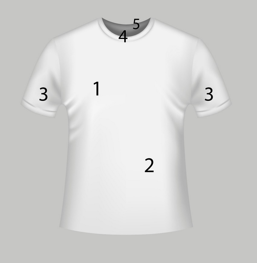
Assemble the T-shirt mockup!
2. How to Recolor the T-Shirt Mockup Template
Step 1
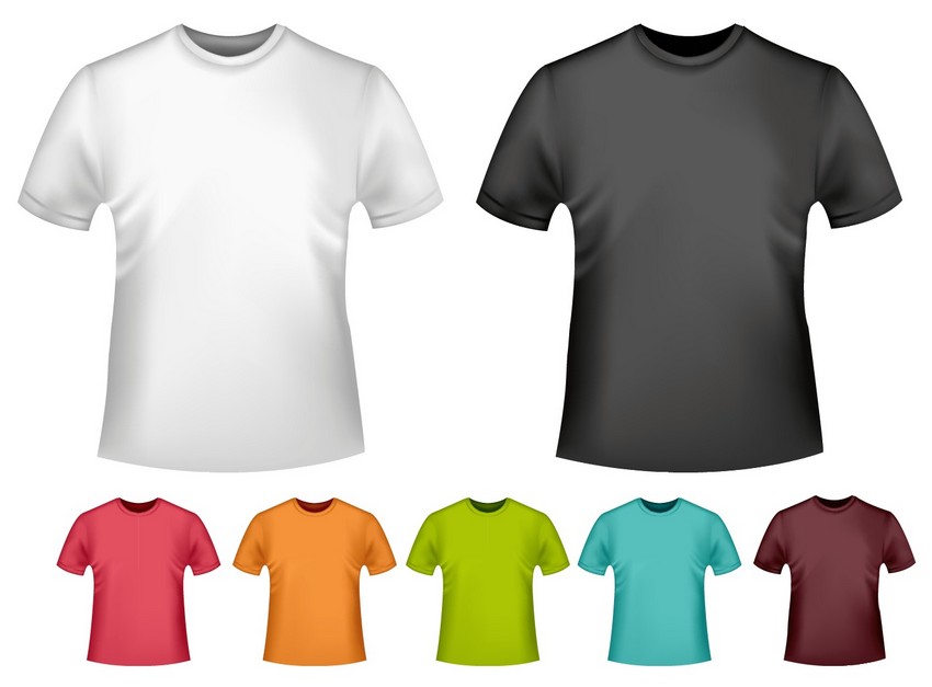
To get all the colors you can see in the thumbnail, create three more copies of the white shirt we just made.
Grab a copy and proceed to Edit > Edit Colors > Adjust Colors. Change the tab to Greyscale and apply 32% Black. Don’t forget to tick the Convert box.
Step 2
Create two more copies of the grey shirt mockup we just made. Grab the original and recolor it with Edit > Edit Colors > Adjust Colors.
This time, change the tab to RGB and apply 18% Red, -30% Green, and -26% Blue. Don’t forget to tick the Convert box.
Step 3
Take another copy and essentially repeat the last step by going to Edit > Edit Colors > Adjust Colors, changing the tab to RGB and applying 6% Red, 13% Green, and -60% Blue.
Step 4
Take the final copy and convert it to orange with 27% Red, -5% Green, and -41% Blue.
Step 5
Grab one of the original white T-Shirts and convert it to Grayscale with 40% Black.
Step 6
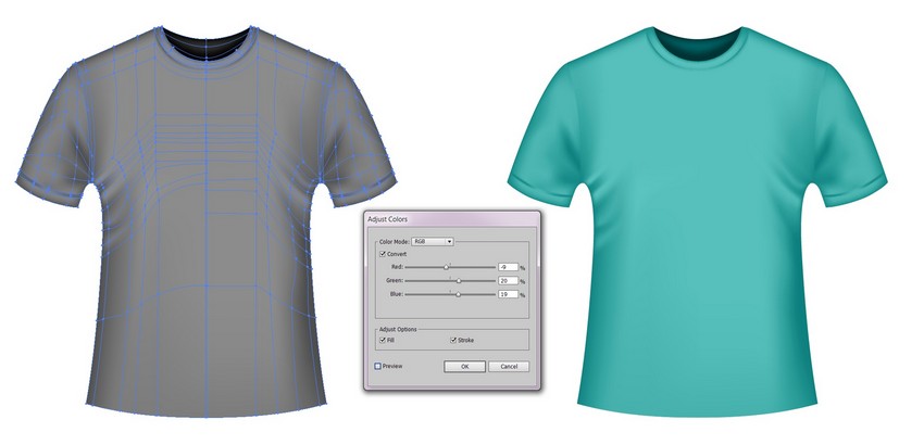
Recolor the grey template to cyan with -9% Red, 20% Green, and 16% Blue.
Step 7
Take the last white copy and turn it black with 63% Black.
Step 8
Create a copy of the black T-Shirt mockup and recolor it to dark red with 9% Red, -9% Green, and -7% Blue.
Step 9
Congratulations! Your colorful set of T-Shirt mockup templates is done!
Photo manipulations are a fun way to test out fantasy compositions and dramatic self-portraits. And you can place yourself into one easily by using a few simple tools in Photoshop!
So in this tutorial, I’ll show you how to create a magical self-portrait using stocks and 3D assets in Adobe Photoshop.
Get inspired! Find more stocks for your photo art on Envato Market.
Tutorial Assets
The following assets were used in the production of this tutorial
This year I’ve embarked on a personal project to place myself into more of my art. Not only has this been a great experience for learning about Photoshop, but it has also helped improve my overall confidence.
And if you want to make cool and creative self-portraits, you should definitely just go for it! You can see more of these self-portraits on my Instagram.
Forest Theme
For this portrait, I wanted to place myself into something more magical—a cool forest manipulation with a bit of fantasy and allure. To facilitate this, I recently bought an LED light from Home Depot ($20) and immediately got to experimenting with new pictures.
Let’s take a before and after look at the manipulation with the stocks we’ll be using:
Feel free to use your own self-portraits for this tutorial. Even smartphone pictures will do—just make sure you have enough light and clarity.
To save time on this extensive manipulation, I’ll be giving you a pre-edited version of my self-portrait made with frequency separation techniques and the background already removed.
But if you’re looking to get inspired by the photo shoot perspective, feel free to check out my previous tutorial:
Start by opening a New Document in Photoshop at 1500 x 2217 pixels and 72 dpi.
Feel free to increase the resolution if you plan on printing your portrait.
Copy and Paste the Forest Stock (with an image size of 1920 x 1848 pixels) onto a New Layer above the white background, resizing it to make it much bigger with the Free Transform Tool (Control-T).
This will be our new background. So go ahead and Delete the white layer below it.
Position the image so that it favors the left side. This will create an interesting perspective to place the portrait and other details.
Step 2
Now open the Self-Portrait Stock. Double-click the background layer to make it normal.
Use the Magic Wand Tool (W) to select the white background, and then hit Delete on your keyboard to remove it. If the selection spills over into the picture, just remove those areas by using the Lasso Tool (L).
Hold Control-A to select the entire image, and then Copy and Paste it onto a New Layer above the forest. Place the picture within the center of the composition.
When I originally took these pictures, I had no clue how I was going to use them. So you’ll notice that my picture is cut off on the left side since I was leaning up against a wall.
Because of this, I have built the entire composition keeping this in mind, so we’ll need to cover up any awkwardly cut areas next.
Step 3
To cover up those missing areas, we’ll use some simple leaves. Open the Leaves Stock in Photoshop. Follow the same steps as before.
Remove the dark background by selecting and deleting it with the Magic Wand Tool (W).
Then Copy and Paste the Leaves Stock onto a New Layer above the portrait.
Resize it for a much smaller fit as shown above, using the Free Transform Tool (Control-T).
Step 4
For more balance, let’s create more copies of the leaves layer.
Duplicate (Control-J) the leaves layer twice, and then flip both copies. Select each layer, and go to Edit > Transform > Flip Horizontal to flip it.
Now fill in both sides of the portrait with leaves.
Place the layer for the first copy above the original leaves layer. Then position the actual leaves underneath the first set to fill in the area beneath them.
Select the second leaves copy and position the layer underneath the portrait layer.Resize it for a much smaller fit (and more depth of field) with the Free Transform Tool (Control-T).
Now that we have the leaves all set, we can move on to adding butterflies.
2. How to Use 3D Assets From Envato Elements
A crucial part of this manipulation is the monarch butterflies. So I’ll be using amazing 3D assets from Envato Elements to help achieve this effect.
By using 3D assets, I’ll be able to position the butterflies at the exact angles I need for this composition. This means I can achieve a more believable and realistic effect for an incredible result.
Step 1
Start by locating each butterfly. Here are the three stocks I’ll be using:
Now View the 3D Render for each stock. Once it loads, position the butterfly at the angle you need. Move it up, down, or sideways to see different views.
Then download that angle.
For this particular set of butterflies, here are all five angles I’ll be downloading.
You’ll receive each butterfly as a transparent PNG (with accompany shadows), which you can easily place into the manipulation.
Step 2
Let’s add the butterflies!
Copy and Paste each butterfly angle onto New Layers above the rest.Resize each butterfly using the Transform Tool (Control-T).
Then add as many butterflies as you’d like. Since insects are usually drawn to light, I’ve made sure to face the butterflies towards the light. You can also rotate or even flip the images for more variation.
Continue resizing them in different areas for more depth of field. The first butterfly, for instance, is the largest because it’s closest to the viewer.
Try to tell a story with the butterflies. Rest a few on the leaves or even place one on my fingertips as shown above.
When you’re through, Merge the butterfly layers together.
Step 3
The setup for our manipulation is almost complete!
Our last step before we blur, relight and color the composition is to add more hair. For this portrait, I’ve already airbrushed any imperfections and even removed my right arm for a better composition.
Now I’ll use the Polygonal Lasso Tool (L) to make a selection of the curls on the right. Hold Control-J to Paste a copy onto a New Layer, and then resize the hair using the Free Transform Tool (Control-T).
Do the same for the left side to cover my shoulder.
Then Merge the hair layers with the portrait layer. You may need to reposition the leaves layer above the portrait/hair layers to allow this effect.
Now we have glorious extensions!
3. How to Create Depth of Field
Let’s move on!
With all of our elements in place, we can start to relight the composition and add depth of field. This will help create more realism and make it look as though the photo was actually taken within a forest setting.
Step 1
Start with the background.
Select the forest layer and go to Filter > Blur > Gaussian Blur.
Add a Radius of 3 pixels and hit OK.
Step 2
Now the leaves. Let’s slightly blur the original Leaves and Leaves copy layers next. Select each layer and go to Filter > Blur > Gaussian Blur. Then add a Radius of 2 pixels and hit OK.
Step 3
Let’s make the leaves in the background appear farther away.
Select the Leaves copy 2 layer and go to Filter > Blur Gaussian Blur. Set the Radius to 4.8 pixels and hit OK.
Step 4
Last, we’ll blur the front butterfly.
We’ve already made several butterflies fly out of the shot to create a lively and active scene. Now we can blur the front butterfly for even more depth.
Use the Lasso Tool (L) to make a quick selection around the front butterfly. Then go to Filter > Blur > Gaussian Blur, adding a Radius of 5 pixels.
Here’s a look at our composition so far!
Great! Let’s move on to lighting.
4. How to Adjust the Lighting
Now that everything is in place, it’s important to get the lighting as perfect as we can. Keep in mind that every photo manipulation requires extensive relighting for a more believable look.
If you’re using your own stocks in this case, just follow the same methods, but tweak the settings to your personal desires.
Step 1
Let’s start by darkening the background.
Select the Leaves copy 2 layer. Then go to Layer > New Adjustment Layer > Curves. Adjust the curve as shown below for more darkness and contrast.
Step 2
Adjust the color of the background leaves even further.
Select the Leaves copy 2 layer and go to Layer > New Adjustment Layer > Curves. Right-click the adjustment to set the curves as a Clipping Mask to the Leaves copy 2 layer.
Adjust the curves for the Green and RGB Channels as follows for a greenish effect.
This play on the contrast also creates an interesting color effect! Pretty cool!
Step 3
Now adjust the lighting for the middle ground leaves.
Follow the same steps as before by setting new Curves Adjustment Layers as Clipping Masks to the remaining leaves layers.
Start with the original leaves. Make them reflect the bright lighting seen from my light bar. Adjust the curves for the RGB, Green, and Blue Channels as shown below.
Step 4
Move on to the bottom leaves (Leaves copy).
Set a New Adjustment Layer of Curves as a Clipping Mask to the layer.
Adjust the curves for the RGB, Blue, and Green Channels as shown below. This time we don’t need as much light because the LED light is above this specific section of leaves.
Step 5
Time for some shadow! To keep this part from being too confusing, let’s break it down into simple sections, just as we did with the lighting steps.
Start with the butterflies.
Set a New Layer as a Clipping Mask to the butterflies layer. Change the Layer Blend Mode to Multiply. Then use a Soft Round Brush (0% Hardness, 30-60% Opacity) to paint black shadow onto the butterflies.
Concentrate the shadow on the wings and body. Then lower the Layer Opacity to 58%.
Add another Clipped layer above it set to Multiply.
Now use a deep earthy red #271416 to paint more shadow onto the butterflies, setting the Layer Opacity to 76% when you’re done.
Keep this shadow layer softer, making sure the shadows are placed in the opposite direction to the light source.
Step 6
We’ll add shadow to the leaves by following the same method.
Create New Layers set as Clipping Masks to the Leaves and Leaves copy layers.
Set the Layer Blend Modes to Multiply, and then use a Soft Round Brush to paint black onto the leaves. Make sure the shadow covers the bottom leaves completely. Then cover the top row. This will create more dimension.
Frame the light source as best as you can. Then adjust the Layer Opacities as needed (50-75%)
Step 7
Next, we’ll shade the hair and body.
Just like before, add a New Layer set as a Clipping Mask to the portrait. Set the Layer Blend Mode to Multiply and use a Soft Round Brush to paint brown #864a3b and dark red #271416 colors onto the hair, face, and body.
Chisel out the shadows for a more dramatic look. Adjust the Opacity as needed.
Here’s what we have so far.
5. How to Blend the Colors and Lighting
Great job so far! Keep going!
Step 1
Now that we have the base shadows down, it’s time to fine-tune our composition for a more seamless blend.
In these next steps, I’ll be using a mixture of digital painting techniques and Adjustment Layers to achieve the desired effect.
Fill a New Layer above all the others with orange #9c6b00 using the Paint Bucket Tool (G), and lower the Opacity to 36%.
Set the LayerBlend Mode to Vivid Light.
Add a New Color Lookup Adjustment Layer. Set the 3DLUT File to Crisp_winter.look and lower the Opacity to 39%.
Step 2
Intensify the shadows even more.
Create a New Layer set to Multiply above the rest. Use dark reddish browns like #1a070e and #140b01 to paint shadow (Soft Round Brush – 0% Hardness, 100% Opacity) all around the subject, leaving out the top leaves and LED light. Lower the Opacity to 21%.
Then fill a New Layer with blue above the previous. Set the Blend Mode to Pin Light, Opacity to 65%, and use a Layer Mask to remove the middle and leaf areas.
Step 3
One of the coolest lighting effects you can achieve is by playing with glitch images.
Here I’ll be using #38 from this Glitch Effect Overlays pack for a cool rainbow reflection. Copy and Paste the image above the blue layer and set it to Overlay.
Lower the Opacity to 40% and use a Layer Mask to remove any unwanted areas around the face.
Step 4
Almost there!
Before we move on to the final edits of this manipulation, let’s quickly edit the colors, brightness, and contrast.
Create a New Adjustment Layer of Color Balance with the following settings:
Then follow up with a New Adjustment Layer of Levels. Set the following values for the Red, Green, and Blue Channels.
Here’s the result so far.
6. How to Finish the Manipulation
The last steps for this manipulation will pump up the lighting, refine the details, and use more Adjustment Layers to bring everything together.
Ready? Let’s do this!
Step 1
Here is when I’ll start to use digital painting techniques to transform this selfie into a magical portrait.
Start by creating a New Layer above the rest. Use the Brush Tool (B) to paint directly onto my face and hair. First, I’ll use a Soft Round Brush to paint more brown shadow underneath my hair, while adding some brown around my forehead too.
Then I’ll switch over to a Hard Round Brush (B) to adjust my makeup (eyebrows/eyeliner) and paint more sharp details for my hair. I’ll also take this opportunity to clean up any areas around the leaves where the light should be reflected. Feel free to use the Eyedropper Tool (E) to sample colors from these areas as you refine more details.
Step 2
Let’s add more light!
Create a New Layer set to Overlay. Use a mixture of Soft and Hard Round Brushes (40-70% Opacity) to paint white onto the composition for more light.
Create rays of light coming from my hand and bounce the light around the forest. Push this effect as far as you want for a powerful glow.
Step 3
In between adding more light, remember to continue refining these details. Use a Hard Round Brush to draw sharp edges around the butterflies, leaves, and hair. I’ve even drawn simple details like loose curls and sparkly dots around the composition.
Add highlights to the hair by painting white lines onto a few flowing strands, and then use the Eraser Tool (E) to softly diminish the edges of each highlight. Feel free to add another New Layer set to Overlay for even more white light.
Make certain areas pop out from the shine of the LED light. Paint white light onto the butterflies, jewelry and LED for more intensity. Later on, I’ll also paint a few blue highlights on the hair, leaves, and butterflies for a cool effect.
Step 4
As we start to finish up, we’ll use Adjustment Layers again to tweak the colors. I have quite a few layers to go, so let’s run through them quickly.
Add a New Adjustment Layer of Channel Mixer. Adjust the settings for the Red, Green, and Blue Channels.
Then add a New Adjustment Layer of Gradient Map. Create a blue #0a00b2 to turquoise #01fffcLinear Gradient and set it to Lighter Color. Lower the Opacity to 8%.
Duplicate (Control-J) this adjustment. Set the copy to Saturation and the Opacity to 10%.
Step 5
Now create a New Adjustment Layer of Curves. Adjust the curves for the RGB, Blue, and Red Channels as shown below.
Step 6
Now for the last two Adjustment Layers.
Create a New Adjustment Layer of Color Balance. Set the settings to the following values below:
Now bring out all the rich colors. Add a New Adjustment Layer of Saturation.
Then set the Saturation to 15.
Step 7
One more step to go!
For a subtle fade, create a New Layer above the rest. Select the Gradient Tool (G) and use it to create two passes of Linear Gradients that go from color to transparent.
Start with a rich blue color #181f40 that moves from the bottom upwards, and then select black and create a black to transparent Linear Gradient moving downwards.
Then set the Layer Blend Mode to Difference and the Opacity to 18%.
Feel free to keep this composition as is, or crop it if you’d like. For a tighter perspective, I’ll use the Crop Tool (C), and make sure I adjust it so that my eyes are almost aligned with the middle.
All Done! Great Job!
Congratulations on creating this forest-inspired photo manipulation. I hope you are inspired to tackle your own self-portraits for one-of-a-kind selfies you’ll always remember.
If you enjoyed this tutorial, let us know! Share your comments and results below.
For more photo manipulation tutorials like this one, check out these links:
You can draw, you know it. You can hold a pencil, you can lead lines, but somehow they don’t want to listen to you. As long as you draw something that doesn’t require precision, something chaotic, it works all right. But any time you try to draw from a reference, the proportions are so off that it’s scary.
Why does it happen? Is something wrong with you? Your eyes are OK, your hand is OK… why can’t you just draw what you see? It looks so easy!
A lot of things that we do in life seem easy only because they’re automatic to us. But if you tried to explain them to someone who’d never done them, you’d understand how complex they are. Just try to focus on your steps when walking!
Automation is great—it lets you do certain things effortlessly and almost magically. However, in order to reach this state, you need to put an effort into it first. When first learning how to drive, there’s so much to focus on that it’s totally overwhelming. But after some practice you’re able to talk and listen to the radio when driving, and you still have enough attention to see that pedestrian.
Professional artists make drawing look easy, but it’s only because it was hard for them earlier in their lives. When you force yourself to draw complicated things over and over again, and they don’t turn out as intended, it’s because you ignore this simple fact—you must learn how to do it in order to do it.
This is the second part of the drawing basics series. In the first part we were learning how to control the tool so that it didn’t disturb your future exercises. If you still have problems with it, don’t start this part before finishing the previous one! It’s very important to do it at your own pace. Come back here when you’re really ready, otherwise you’ll make it harder than it needs to be.
Also, if you’re new to this series and you’re sure you don’t need to practice pure manual skills, read that first part anyway. You’ll find there a very important introduction and general tips about learning.
What There Is to Learn
There are things that you learn consciously, things that are fully explainable. Precise drawing isn’t one of them. It’s one of the „mind skills”, meaning it’s learned by your mind rather than consciously by you. For example, as a child you learned how perspective worked. That’s why now you’re not scared of the world constantly moving and changing size as you move. But do you, consciously, know the rules of perspective?
These „mind skills” are very easy to learn—and very hard at the same time. They’re hard, because you can’t learn them consciously. You can’t read a book about them, and you can’t listen to a lecture, come back home and just know them. You can’t learn them—it’s only your mind that can do it.
And the mind learns best through repetition. That’s the simplicity of this. You just need to practice, and practice a lot, until it starts being automatic. That will be the sign that your mind is grasping it! Easy, isn’t it?
Well, if it were that easy, you would already be a master of copying references. Haven’t you practiced it many times? Your manual skills certainly developed, but your problem with proportions hasn’t been solved. It’s because you were practicing many kinds of exercises at the same time. Even if you progressed at one of them, it wasn’t noticeable because of other mistakes.
This is what this stage is about. I’ll show you simple exercises, each focusing on a slightly different part of the problem. This way you’ll clearly see your progress, and even though these drawings won’t be anything worth admiration, you’ll be able to transfer the skill gained here to your „real” works—not only for copying references, but for everything!
What you need to keep in mind when practicing:
Never forget that you’re doing it because you want to. Nobody’s forcing you, and you don’t have an obligation to draw well.
It’s perfectly normal when it turns out bad. You’re learning! If you were expecting your drawings to turn out great every time, why would you learn? There’s nothing wrong with the outcome, but with your expectations about it.
Each exercise is based on skills gained in the previous one. Therefore, the last ones may be impossible to do before you practice some more. Don’t push yourself—take it easy. Being too ambitious may slow down your progress!
It will take time. It doesn’t require much time every day (see the previous part for more info), but it needs to be a constant, regular practice.
There may be moments when you feel uncomfortable. This feeling of „mental stretching” is a clear sign that you’re working on a long unused „mind-muscle”. It may be painful, in a weird way, but this is a direct signal that you’re learning something new! Learn to embrace this feeling, and don’t use it as an excuse to do something more pleasant.
Take a break from drawing serious things for some time. This way you’ll prevent yourself from being disappointed (if you expect to be much better after one session of exercises), and you’ll have a pleasant surprise when you’re ready.
Always start a session with a warm-up, also described in the previous part.
Use continuous lines only for small shapes. For drawing in a larger scale, use the „soft lines” described in the previous part.
1. Measure the Distance Between Dots
Let’s start slowly. Draw two dots with a random distance in between. Then draw another dot, trying to use the same distance. Repeat it many times in various directions, and feel free to use diagonal lines, too. Try a different distance every time you do this exercise. The longer the distance, the more challenging the exercise.
This exercise:
„warms up” your mind for working with proportions
is focused on seeing distance, a base of proportions
is extremely simple in construction—there’s only one type of mistake you can make here!
2. Copy the Length of Lines
Draw a line of random length. Then try to draw it once again under the original. After finishing a column, repeat them on the sides. The lines don’t need to be perfect (mine certainly aren’t!), but if drawing them seems too hard, it’s a sign you haven’t finished the first stage.
This exercise:
is not only about seeing distance, but also about replicating it
engages your hand, eyes, and mind all together
extends the exercises from the first stage about line control
3. Measure the Distance Between Equal Length Lines
Draw a line of random length, and then draw it once again. Repeat the process, using the same distance that appeared between the first two. The longer the lines and distances, the harder the exercise.
This exercise:
is another level of the two previous ones
stretches your mind-muscles very intensively, because you’re processing two distances at a time. Don’t let it discourage you!
4. Draw Crosses: Squares
We’re picking up speed now, so don’t worry if you start losing your breath. The beginning must be hard!
Draw a line of random length, and then cross it in the middle with another line of the same length. „Close” the cross with more lines. The more like a square it looks, the better. Do the same with rotated crosses (45 degrees).
This exercise:
contains a clear indicator of your progress (how squarish the squares are)
extends your manual skill by drawing squares
introduces you to seeing angles
5. Draw Stars: Circles
Draw a line of random length. Cross it with a line of the same length, but on a 45 degree angle. Add another one, rotating by another 45 degrees. Do it until you have four lines crossing each other. Close the star with a circle—the more lines touch it, the better.
This exercise:
contains a clear indicator of your progress (if all the lines touch the circle)
is very complex: combines seeing distance, copying distance, seeing angle, and copying angle
extends your manual skill by drawing circles
6. Copy Squares and Circles
Draw a circle, then a square of similar size below. Copy the circle and square, trying to achieve the same size every time. Remember: if it’s too hard, draw the shapes „softly”, with repeating-overlapping lines.
This exercise:
extends your manual skill by drawing circles and squares
introduces you to a concept of „general size” (various lengths combined to create a shape)
trains your „complex precision”—it’s the first step to copying more complicated shapes
7. Scale Squares and Circles
Draw a circle, and then draw smaller copies of it. Do the same with squares.
This exercise:
extends your manual skill by drawing circles and squares
is the first step to scaling the reference
8. Copy Combined Figures
Time to combine all the skills you are learning into one complex exercise, a simulation of what you’re going to do when drawing from a reference.
Draw a combination of shapes: squares, circles, rectangles, lines. Then copy the figure as accurately as possible.
This exercise:
combines all the previously practiced skills
is a simulation of 1:1 reference copying
9. Copy and Scale Combined Figures
Again, draw a combination of various shapes. This time don’t copy it directly; instead, scale all the components at the same degree.
This exercise:
combines all the previously practiced skills
is a simulation of scaled copying—the case when it’s the easiest to lose proportions
10. Copy and Rotate Combined Figures
Draw a combination of shapes. Copy all the components, this time rotating them all by the same degree. Be very, very careful!
This exercise:
combines all the previously practiced skills
trains you for seeing proportions even in a disturbed reference
11. Copy, Scale, and Rotate Combined Figures
Draw a combination of shapes. Copy the components, transforming them all in two ways: scaling and rotating. Paradoxically, you may find it easier than the previous exercise!
This exercise:
greatly engages all kinds of mind-muscles
12. Copy, Scale, and Rotate Smooth Shapes
Let’s finish this session with a very strong accent. Draw a simple, smooth shape. Transform it in all the ways: copy 1:1, scale, rotate, and combine the transformation.
This exercise:
is extremely hard!
greatly engages all kinds of mind-muscles
is a good final exercise—when all the previous ones become boring, this one will stay challenging
Good Job!
That was the second stage. Make sure to stay here for longer—these aren’t easy exercises, and the harder they are for you, the more important it is to work through them. Give yourself as much time as needed, and even more than this!
How can you tell when to stop? When these exercises become boring, but not in an unenjoyable-boring way—rather I-can-do-it-with-my-eyes-closed boring.
The next step after mastering them is to draw from a reference. However, keep in mind it won’t become completely trivial. It depends on how much work you’ve put into these exercises, and what you’ve learned from them.
So, this was about drawing from a reference. Next time we’re going to look into drawing from imagination!
You can print this image for a quick reminder of all the exercises
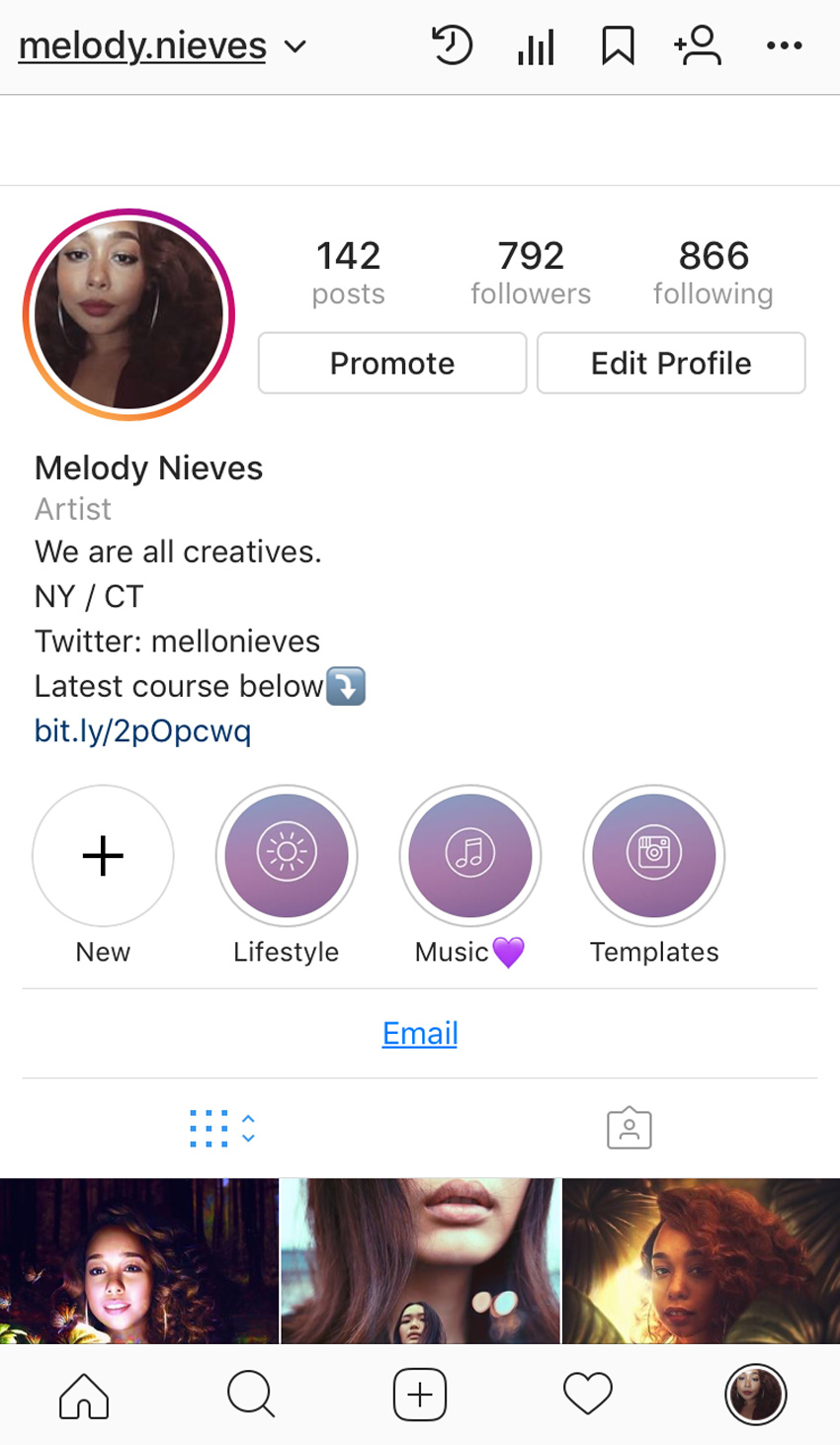
Organize your Instagram stories with beautiful covers! Check out this video below!
Photoshop in 60 Seconds: Instagram Story Cover
Making a creative Instagram profile is a really easy way to get more followers. Now you can organize your favorite stories with clever covers on your profile. This video will show you
how to create three easy covers using awesome gradient backgrounds and fine-line icons.
Watch the steps unfold and get all the details you need in the process below. Check out more amazing backgrounds and resources on Envato Elements.
How to Create an Instagram Story Cover
First set up your document. Open a New Document at 1080 x 1920 pixels, the perfect size for Instagram.
Now decide which color or graphic you want to use for the cover’s background. For an easy result, simply Fill a New Layer with any color using the Paint Bucket Tool (G).
But for a more creative route, I’ll use one of these beautiful Gradient Backgrounds from Envato Elements. Copy and Paste the background onto a New Layer and position it in place using the Move Tool (V).
Now add the categories. Download a Fineline Icon Pack and use the icons to define each category. Here I’ll add the Instagram logo for Instagram templates, a music icon for my favorite music, and the sun icon for lifestyle posts.
Position each icon in the center of the graphic and upload the result to Instagram. Then go to your profile and create new covers for your Instagram stories.
Here is the final result.
Learn More With Our Tutorials!
Inspired to learn more cool tips for Instagram? Start with one of our Photoshop
tutorials! Create fun and inspiring graphics to post on all your social media profiles.
Get Amazing Design Resources
Want to create videos like this? Download the resources used in this video:
Welcome to our Illustrator in 60 Seconds series, in which you can learn an Illustrator skill, feature, or technique in just a minute!
Illustrator in 60 Seconds: How to Create Custom Guides in AI
Always wanted to create custom guides from more intricate shapes but never knew exactly how? Well, if that’s the case, you should watch this quick video, which will show you how easy the process is!
By default, Illustrator
comes with a basic Ruler system that you can turn on using the Control-R keyboard shortcut. You can use it to add both horizontal and vertical guidelines, to which your shapes can
snap, by simply clicking and dragging them out.
But what about those
situations when you need to build a set of custom guides based on more
intricate shapes? You’ll be happy to hear that the software allows you to do just that using any shape, as long as it’s a vector.
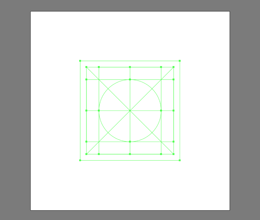
In my case, I’ve set up a simple
grid system that I’ll be using for some custom icons that I’ve built using a
couple of basic geometric shapes and strokes.
To convert my shapes into guides, I first have to
select them and then go to View >
Guides > Make Guides or use the faster right click > Make Guides option. This will turn them into a
custom reference grid that I can lock and use to build my assets on.
Creating shapes in Illustrator can sometimes become an unintuitive process, especially if you’re doing it using Pathfinder’s Shape Modes. Luckily for us,…
In this article, we’re going to talk about the top ten most useful tools in Adobe Illustrator. Whether you’re into icon design, illustrations or any other…
This little quick tip is dedicated to a subject that is close to my heart but at the same time gave me some strong headaches in the early days of my design…
60 Seconds?!
This is part of a series of quick video tutorials on Envato Tuts+ in which we introduce a range of subjects, all in 60 seconds—just enough to whet your appetite. Let us know in the comments what you thought of this video and what else you’d like to see explained in 60 seconds!
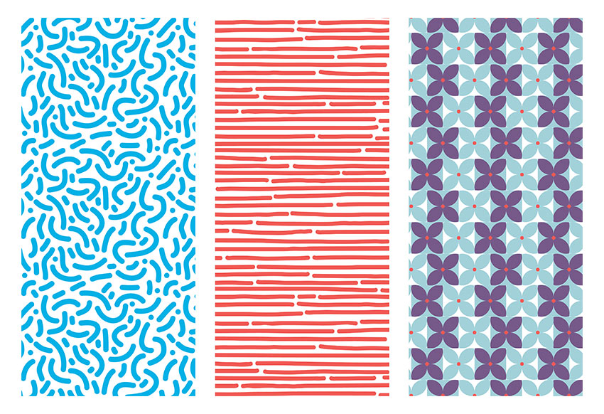
Have you always wondered how to make seamless patterns in Illustrator? Patterns that look effortless and are pleasant to the eye? In this tutorial, you will learn how to use the Pattern Option tool in Illustrator to create a set of fun patterns.
1. How to Create a New Document in Adobe Illustrator
Step 1
Open Adobe Illustrator and head to File > New. Let’s name our file Patterns-v1, and let’s create a single square Artboard. Set the Width and Height to 1080 x 1080 px. Under Advanced, choose RGB for our Color Mode and 72 ppi for Raster Effects. If you are planning on printing it, use 300. Click OK.
Step 2
Let’s bring up our Pattern Options panel by going to Windows > Pattern Options. Let’s open the Swatches panel as well by going to Windows > Swatches. The new patterns we create will be added to the Swatches panel.
2. How to Set Brush Options
Step 1
Let’s start by setting the brush for our first organic pattern. Select the Paintbrush Tool (B) from the Tools panel. For the Fill and Stroke color, double-click the stroke color and select a blue color with the following code: #00B0E6. Click on the fill color and select None (/).
Step 2
Head over to the Control bar. Click on Brush Definition and double-click on the round brush to open the Calligraphic Brush Options. On the new window, change the Size brush to 40 pt and change the Name to 40 pt. Round.Click OK.
Step 3
Go to the Tools panel and double-click on the Paintbrush Tool (B) to open the Paintbrush Tool Options panel. I am using the settings in the image below. This is to create a soft shape with curves and no hard edges, which will result in fewer points to edit.
3. How to Create an Organic Pattern
Step 1
Using the Paintbrush Tool (B), create soft C shapes. I created the bigger shapes first and later filled them in with smaller dots and strokes. You can create anything—there’s no right or wrong in this!
Try to focus on staying inside the page and making the shapes evenly spaced. We will fix the edges later on.
Step 2
Add smaller details within the frame, like dots and short strokes. Remember not to worry too much about the edges as they will be fixed later on.Use the Direct Selection Tool (A) to select single points of the shapes and edit.
4. How to Use the Pattern Tool
Step 1
Select the composition you just created, head over to the Pattern Options panel, and click on the dropdown menu on the top right side. Select Make Pattern, which will open up a window letting you know that the new pattern will be added to the Swatches panel. A second window will let you know that the strokes will now be extended into shapes. Click OK in both cases.
At this point you will enter Pattern Editing Mode, where you can edit the composition you just created as a whole pattern. You will notice you are in this mode when there is a bar over the document with a red stroke under it. Please note that the compositions around the main pattern are not clickable objects.
Step 2
Let’s start by setting up the basics to edit the pattern. Head over to the Pattern Options and name the pattern. I will name mine New Pattern 1. Set the Tile Type to Grid and the Width and Height to the same size as the artboard we created, 1080 x 1080 px.
Under Copies I have 3×3 selected, which is the number of sets that appear around the main pattern. Make sure that Show Tile Edge is checked, which will add a blue margin to see the edge of the composition that we want to work on now.
Step 3
Let’s edit the pattern. Use the Zoom Tool (Z) to get closer into the composition. Remember that only the composition within the blue stroke is editable.
Use the Paintbrush Tool (B) to add elements. The new elements will be automatically drawn in the other compositions. This is a great tool for creating seamless patterns. Command-Z will be your friend for this stage as you will need to go back and forth to find the right balance.
Step 4
Let’s work on the edges. Continue using the Paintbrush Tool (B) and draw a line over the blue margin. The exceeding part will be drawn on the opposite side of the main composition; this is a great way to know how the elements are being connected.
A seamless pattern works better when there’s no visible margin on the main composition. You can Zoom(Z) in and out to see what the pattern looks like and fix elements that seem too obvious to the eye.
Step 5
To save the pattern, simply head over to the top of the document, above the red line, and click on Save a Copy. This will save a copy of the pattern. You can save as many copies as you like throughout the process so you can go back and forth.
Another way of saving the pattern is by pressing Command-S to save the original pattern with its original name. This won’t create a whole new pattern, but will save the one you have been editing. A window will open letting you know that the strokes will be expanded. Click OK.
5. How to Use and Edit the Pattern
Our pattern has been added to the Swatches panel, so now it’s time to use it! Click on the Rectangle Tool (M), draw a square, and select our newly created pattern in the Swatches panel as the Fill color.
If the pattern seems too big or small, you can resize it in the Pattern Options panel and lower the Width and Height to change the margin. Once you have resized the margin, proceed to resize the composition by selecting all of it, as if you were working normally outside Pattern Editing Mode.
Now you are ready to use the pattern anywhere!
6. How to Create a Hand-Drawn Pattern
Step 1
Let’s duplicate the artboard we created by hitting Shift-O, and you will get an outline around the artboard.Press Option-Shift and drag the artboard to duplicate and maintain the same XY level.
Step 2
Using the Paintbrush Tool (B) from the Tools bar, create horizontal lines across the artboard. For this pattern, feel free to go outside the board and to change the point size of the brush. I am using a brush size of 40 pt, but remember we can change the size of our pattern later on. I am also using red color: #F05A54.
Step 3
Open the Pattern Options panel by going to Window > Pattern Options. Select the shapes and, in the Pattern Options panel, click on the dropdown menu in the top right corner. Select Make Pattern. The pattern will be added to the Swatches panel.
Step 4
Pattern Editing Mode will be activated. Let’s experiment with the options in the Pattern Options panel. Change the Tile Type to Hex by Column, which will make the pattern change from a square grid to a hexagonal grid margin in which the composition will overlap.Change the Height and Width to have a smaller size; I am activating the Maintain Width and Height Proportion option andchanging the Width to 400 px. Resize the pattern to fit the margin.
Step 5
Feel free to edit the pattern. When you are good with it,click Done on the top of the document, above the red stroke. This will take us out of Pattern Editing Mode, and our pattern will be edited in the Swatches panel. Our second pattern is ready to use!
7. How to Create a Geometric Pattern
Step 1
Let’s create one last pattern inspired by the 70s. Using the Ellipse Tool (M), create two circles and make them overlap to create a leaf. Using the Pathfinder panel, Intersect the two shapes.
Step 2
Duplicate the leaf by pressing Command-Shift and clicking and dragging. We need four leaves to create a flower. Using the RotateTool (R), rotate each leaf while pressing Shift for an even rotation. Let’s add a red circle in the centre. I am using the following codes: blue #A3D1DA and red #F05956.
Step 3
Duplicate the flower shape, and change the leaves’ color to purple with the color code #775988, and add a square as a background. Duplicate the two tiles by pressing Command-Shift and clicking and dragging horizontally. Do the same vertically until it looks like the image below:
Step 4
Open the Pattern Options panel by going to Window > Pattern Options. Select the shapes and, in the Pattern Options panel, click on the dropdown menu in the top right corner. Select Make Pattern. The pattern will be added to the Swatches panel. For this pattern, let’s choose a Height and Width of 400 px and resize the composition so that the pattern is smaller.
Step 5
I am choosing to select alternate horizontal lines of flowers and shifting them slightly to the left to add visual interest. As you can see, anything that appears outside of the left margin will reappear on the right side.
Step 6
Click on Done at the top of the document, above the red line.
Step 7
Duplicate the square we created previously and apply the pattern. Now you have three patterns that you can use for anything!
Awesome Work, You’re Done!
Congratulations! In this tutorial we’ve learned to:
Use the Pattern Option tool in Illustrator.
Set and change options for brushes.
Work in different grid settings to give a different look to our patterns.
Welcome back to another Illustrator
tutorial, in which we’re going to take a close look at the process of
creating a scary scene. You’ll see how easy it is to put it together using nothing
more than a few geometric shapes and tools.
So assuming you already
grabbed a fresh mug of coffee, let’s get started!
Also, don’t forget you can always add new elements to the illustration by heading over to GraphicRiver, where you’ll find a great selection of scary vector assets.
1. How to Set Up a New Project File
Assuming you already have Illustrator up
and running in the background, bring it up and let’s set up a New Document (File > New or Control-N)
which we will adjust as follows:
Number
of Artboards: 1
Width: 800
px
Height: 600
px
Units: Pixels
And from the Advanced tab:
Color
Mode: RGB
Raster
Effects: Screen (72ppi)
Preview Mode: Default
2. How to Set Up the Layers
Once we’ve finished setting up our project
file, it would be a good idea to structure our document using a couple of
layers, since this way we can maintain a steady workflow by focusing on one
section of the illustration at a time.
That being said, bring up the Layers panel, and create a total of two
layers, which we will rename as follows:
layer
1: background
layer 2: foreground
Quick tip: I’ve colored all of
my layers using the same green value, since it’s the easiest one to view when
used to highlight your selected shapes (whether they’re closed or open paths).
3. How to Create the Main Background Shape
Now that we’ve finished layering our
document, we can start working on the actual project, and we will do so by
gradually building the background. That being said, make sure you’ve positioned
yourself on the first layer, and let’s jump straight into it!
Using the Rectangle Tool (M), create an 800 x 600 px rectangle, which we will
color using #2A323D and then position in the center of the underlying Artboard
using the Align panel’s Horizontal and Vertical Align Center options.
4. How to Create the Brick Wall
With the main background shape in place,
we can shift our focus over to the center of the Artboard, where we will create
the visible section of the brick wall.
Step 1
Start by creating a 480 x 396 px rectangle, which we will
color using #F76C5E and then center align to the underlying Artboard, positioning it at a distance of 78 px from
its top edge.
Step 2
Adjust the upper
section of the shape by individually selecting its two anchor points using the Direct Selection Tool (A), and then
pushing them to the inside by 200 px using the Move tool
(right click > Transform > Move
> Horizontal > +/- 200 px depending on which side you start with).
Step 3
Start adding the
first row of bricks using sixteen 32 x
16 px rectangles with a 4 px thick Stroke (#DD4C45), which we will
group using the Control-G keyboard
shortcut and then center align to the bottom of the wall, making sure that
their bottom outline falls outside of its surface.
Step 4
Create a copy (Control-C > Control-F) of the row
that we’ve just grouped, and then position it above, making sure to push it to
the right by 16 px
using either the directional arrow keys or the Move tool (right click >
Transform > Move > Horizontal > 16 px).
Step 5
Add the remaining
bricks by selecting the two rows that we currently have and then dragging them
to the top while holding down the Alt
and Shift keys, making sure their
outlines overlap as seen in the reference image.
As soon as you have the first duplicates,
add the remaining ones by pressing the Control-D
keyboard shortcut until you’ve filled in the wall. Once you’re done, remove the
extra top row and then select and group (Control-G)
all the remaining ones together before moving on to the next step.
Step 6
Next, we’re going to mask the
rows that we’ve just grouped using a copy (Control-C)
of the underlying wall, which we will paste in front (Control-F) and then, with both of them selected, simply right click > Make Clipping Mask.
Step 7
Take a couple of
moments and enhance some of the bricks by double clicking on them to isolate
them, and then opening up either their top or bottom paths as seen in the
reference image. Once you’re done, press the Escape key to exit Isolation
Mode, and then select both the bricks and the wall and group them together
using the Control-G keyboard
shortcut.
5. How to Create the Sidewalk
Now that we’ve finished working on the
brick wall, we can move towards the bottom of the Artboard, where we will
quickly build the sidewalk.
Step 1
Create the main shape
for the projected light using a 560 x 48
px ellipse, which we will color using #F76C5E and then position below the wall
as seen in the reference image.
Step 2
Add the visible
section of the sidewalk using a 560 x 24
px rectangle (#2A323D), which we will position on the upper half of the
ellipse, making sure to select and group the two together afterwards using the Control-G keyboard shortcut.
6. How to Create the Suspended Street
Light
With the wall and sidewalk in place, we
can now focus on the last piece of the background, which we will create one
shape at a time.
Step 1
Create the vertical
body of the post using an 8 x 48 px rounded
rectangle (#2A323D) with a 4 px Corner
Radius, which we will center align to the wall’s top edge as seen in the
reference image.
Step 2
Add the horizontal segment
holding the post to the wall using a 16
x 12 px rectangle (#2A323D), which we will position 8 px from the previous shape’s bottom
edge.
Step 3
Create the little
side details using two 2 x 4 px rectangles, which we will color using #2A323D and then position as seen in the reference
image. Once you’re done, select and group the four shapes together using the Control-G keyboard shortcut.
Step 4
Add the light bulb
using a 28 x 16 px ellipse, which we
will color using #FFE7C5 and then position on the upper section of the stand
so that its upper half goes outside of the wall’s surface.
Step 5
Adjust the shape that
we’ve just created by removing its upper half. You can do that by selecting its top anchor point
using the Direct Selection Tool (A)
and then pressing Delete, making sure
to close the resulting path using the Control-J
keyboard shortcut. Once you’re done, select and group (Control-G) all of the light’s composing shapes together, doing the
same for the entire background before locking the current layer and moving on
to the next section of the illustration.
7. How to Create the Door Entrance
Now that we have our background in place,
we can shift our focus over to the foreground, where we will continue working
on our scene. So assuming you’ve positioned yourself on the second layer,
let’s start working on the little door frame.
Step 1
Create the inner
section of the room using a 120 x 278 px rectangle, which we will color using #2A323D and then center align to the
upper edge of the sidewalk.
Step 2
Start working on the
right section of the door frame by creating an 18 x 278 px rectangle (#FFE7C5), which we will position on the
left side of the previous shape.
Step 3
Add the bottom
decorative insertion using a 10 x 96 px rectangle
(#2A323D), on top of which we will add a smaller 2 x 88 px one (#FFE7C5), which we will group (Control-G) and then position 4 px from the previous shape’s bottom edge.
Step 4
Create the upper
insertion using a copy (Control-C >
Control-F) of the one that we’ve just grouped, which we will then position
on the opposite side of the frame, making sure to maintain the same 4 px gap.
Step 5
Add the vertical
detail lines using three 2 x 70 px rectangles
(#2A323D) which we will horizontally stack 2 px from one another, grouping (Control-G) and then positioning them between the two decorative
insertions.
Step 6
Finish off the
current section of the frame by adding the hard shadow using an 18 x 8 px rectangle, which we will color
using #2A323D and then align to the upper edge of the frame. Once you’re done,
select and group (Control-G) all of its composing shapes together before moving on to the
next step.
Step 7
Create the left section of the frame using a copy (Control-C
> Control-F) of the one that we’ve just finished working on, which we
will position on the opposite side of the entrance.
Step 8
Start working on the
upper section of the frame by creating a 172
x 18 px rectangle (#FFE7C5), which we will position on top of the entrance, as seen in the reference image.
Step 9
Add the round decorative
elements using two 14 x 14 px circles
(#FFE7C5), which we will position on the upper section of the frame, making
sure to center align them to the frame’s side sections.
Step 10
Create the decorative
insertion using a 164 x 10 px rectangle
(#2A323D), on top of which we will add a smaller 156 x 2 px one (#FFE7C5), grouping (Control-G) and then positioning the two in the center of the
frame’s top section.
Step 11
Add the main shape
for the raised portion using a 108 x 12
px rectangle, which we will color using #FFE7C5 and then position as seen
in the reference image.
Step 12
Create the side
curvatures using two 6 x 6 px circles
(#FFE7C5), which we will position on the sides of the previous shape and then
adjust by selecting their top and outer anchor points using the Direct Selection Tool (A) and then
removing them by pressing Delete.
Close the resulting paths using the Pen
Tool (P), and once you’re done, move on to the next step.
Step 13
Add the vertical
insertion lines using thirteen 4 x 8 px rectangles
(#2A323D) horizontally stacked 4 px from
one another, grouping (Control-G)
and then center aligning them to the bottom edge of the raised section. Take
your time, and once you’re done, make sure you select and group (Control-G) all of the current section’s
composing shapes together, doing the same for the entire door afterwards.
8. How to Create the Doorbell
Once we’ve finished working on the
entrance, we can move over to its right side and quickly create the little
doorbell.
Step 1
Create the base of
the bell using an 8 x 12 px rectangle, which we will color using #FFE7C5 and then position 14 px from the door frame’s right
section and 16 px from its three
vertical insertion lines.
Step 2
Add the smaller side
sections using two 2 x 8 px rectangles, which we will color using #FFE7C5 and then position as seen in the reference
image.
Step 3
Create the round
endpoints using two 4 x 4 px circles
(#FFE7C5), which we will position onto the doorbell’s center shape so that
their inner halves overlap it.
Step 4
Finish off the
doorbell by adding the little button using a 4 x 4 px circle, which we will color using #2A323D and then center
align to the larger body. Once you’re done, select and group (Control-G) all of its composing shapes, before moving on to the next section of the illustration.
9. How to Create the Scary Monster
As soon as we’ve finished working on the
doorbell, we can shift our focus back to the entrance, where we will change the
mood of the scene by adding the dark yet friendly presence.
Step 1
Start working on the
mouth by creating a 56 x 8 px ellipse, which we will color using #F76C5E and then center align to the entrance,
positioning it 84 px from
its top edge.
Step 2
Adjust the shape that we’ve just created by
first selecting it and then pinching its left and right anchor points using the Anchor Point Tool (Shift-C).
Step 3
Select the resulting
shape’s top anchor point using the Direct
Selection Tool (A) and then push it to the bottom by 16 px using the Move tool (right click >
Transform > Move > Vertical > 16 px).
Step 4
With the fill color
set to #2A323D, draw the crooked teeth with the help of the Pen Tool (P), using the reference image
as your main guide. Once you’re done, select the resulting
shape and the mouth and group the two together using the Control-G keyboard shortcut.
Step 5
Create the main shape
for the right eye using a 10 x 10 px circle
(#F76C5E), which we will adjust by selecting and pushing its top and bottom
anchor points to the right side by 1 px and its left and right ones to the bottom by another 1 px. Once you’re done, position the
resulting shape above the mouth as seen in the reference image.
Step 6
Add the iris using a 2 x 6 px ellipse (#2A323D), which we
will center align to the resulting eye, making sure to position it 3 px from its right
edge. Once you have the shape in place, select and group the two together using
the Control-G keyboard shortcut.
Step 7
Create the left eye
using a copy (Control-C > Control-F)
of the one that we’ve just finished working on, which we will vertically reflect
(right click > Transform > Reflect
> Vertical) and then position on the opposite side of the mouth. Once
you’re done, select and group (Control-G)
all of the monster’s composing shapes, before moving on to the next section.
10. How to Create the Ball
We are now down to the last section of our
little composition, which will help us achieve that level of scariness that we
want our illustration to portray. So, assuming you’ve finished working on the
monster, shift your focus over to the bottom section of the entrance, and let’s
wrap things up!
Step 1
Create the main shape
of the ball using a 28 x 28 px circle, which we will color using #F76C5E and then align to the entrance’s bottom edge.
Step 2
Add the little rings
using four 32 x 16 px ellipses with
a 2 px thick Stroke (#2A323D), which we will adjust by selecting and removing
their top anchor points, vertically stacking the resulting shapes 4 px from one another. Once you’re
done, select and group (Control-G)
all the rings together, doing the same for the entire ball afterwards.
Step 3
Create the main shape
for the dripping blood using a 4 x 8 px rectangle
(#F76C5E), which we will adjust by setting the Radius of its bottom corners to 2 px from within the Transform panel’s Rectangle Properties,
positioning the resulting shape on the sidewalk as seen in the reference
image.
Step 4
Add the side sections
using two 4 x 4 px circles (#F76C5E), which we will adjust by removing their bottom and outer anchor points, closing
and positioning the resulting paths on the sides of the previous shapes as seen
in the reference image. Make sure to select and group (Control-G) all three of them afterwards.
Step 5
Finish off the current section, and with it the project itself, by adding the projected shadow, which we will
create using a 24 x 20 px ellipse (#2A323D). Position it on the lower section of the sidewalk, at a distance of 10 px from the projected light’s
bottom edge. Once you’re done, select and group all of the foreground’s
composing shapes using the Control-G
keyboard shortcut, before hitting that save button.
Great Job!
As always, I hope you had fun working on
the project and most importantly managed to learn something new and useful
along the way.
If you have any questions, feel free to post them within the comments section, and
I’ll get back to you as soon as I can!
Learn how to create Photoshop text effects in this beginner’s tutorial. You’ll be shown how to create a Photoshop action for your text effect and more.
This text effect that we are going to create is part of Super Bundle Styles. This is a collection of 146 unique styles and is the first bundle of the series.
Image inside the zip file attached to this tutorial (optional)
1. How to Create the Text Effect
Step 1
Create a new 850 x 500 px 72 dpi document and name it Glass Text Effect. Then place an image that you’d like to use as the background.
I’m going to use an abstract image that I created. This image is attached to this tutorial.
Step 2
Go to Window > Character to open the Character panel. Then change the font to Soviet Program, the text size to 130 pt, and the color to white #ffffff, and turn Faux Bold On.
After that, pick the Horizontal Type Tool (T) and write GLASS.
Step 3
Select the text layer and change the Fill Opacity to 0%. Then go to Layer > Layer Style > Blending Options to open the Layer Style panel.
Step 4
To create this text effect, we need two layers. So let’s first create a border with a simple shadow.
Add a Drop Shadow with these settings:
Blend Mode: Normal
Color:#000000
Opacity: 100%
Use Global Light: Off
Angle: 120°
Distance: 5 px
Spread: 21%
Size: 9 px
Contour: Linear
Anti-aliased: Off
Noise: 0%
Layer Knocks Out Drop Shadow: On
Step 5
Add a Stroke with these settings:
Size: 4 px
Position: Outside
Blend Mode: Normal
Opacity: 78%
Overprint: Off
Fill Type: Gradient
Reverse: Off
Align with Layer: On
Style: Linear
Angle: 75°
Dither: Off
Scale: 100%
Click on the gradient bar to create a new gradient.
Note that we have to add stops above (Opacity) and below (Colors) the gradient bar.
Let’s first add stops for opacity:
Stop 1: Location: 0% Opacity: 0%
Stop 2: Location: 4% Opacity: 100%
Stop 3: Location: 26% Opacity: 0%
Stop 4: Location: 43% Opacity: 100%
Stop 5: Location: 64% Opacity: 0%
Stop 6: Location: 85% Opacity: 100%
Stop 7: Location: 100% Opacity: 0%
Then add stops for the colors below the gradient bar with these settings:
Stop 1: Location: 0% Color: #ffffff
Stop 2: Location: 6% Color:#ffffff
Stop 3: Location: 7% Color:#194962
Stop 4: Location: 41% Color:#ffffff
Stop 5: Location: 42% Color:#194962
Stop 6: Location: 84% Color:#e0e0e0
Stop 7: Location: 85% Color:#194962
Then name it Glass Gradient and click on New to add this gradient to the presets, we are going to use it later.
Step 6
Now add a Bevel & Emboss with these settings:
Style: Stroke Emboss
Technique: Smooth
Depth: 1000%
Direction: Down
Size: 1 px
Soften: 0 px
Use Global Light: Off
Angle: 86°
Altitude: 21°
Gloss Contour: Cove – Shallow
Highlight Mode: Screen
Highlight Color:#ffffff
Highlight Opacity: 75%
Shadow Mode: Multiply
Shadow Color:#000000
Shadow Opacity: 29%
Then activate the Contour option of Bevel & Emboss with these settings:
Contour: Linear
Anti-aliased: Off
Range: 50%
Step 7
Now add an Inner Glow with these settings:
Blend Mode: Normal
Opacity: 75%
Noise: 0%
Color:#fdfdfd
Technique: Softer
Source: Edge
Choke: 0%
Size: 2 px
Contour: Linear
Anti-aliased: Off
Range: 50%
Jitter: 0%
Step 8
Add an Outer Glow with these settings:
Blend Mode: Normal
Opacity: 72%
Noise: 0%
Color:#b0f1ff
Technique: Softer
Spread: 91%
Size: 4 px
Contour: Linear
Anti-aliased: On
Range: 100%
Jitter: 0%
After that, click OK.
Step 9
Press Control-J to duplicate the text layer, and then rename this copy Glass 2. After that, Double-Click the layer Glass 2 to open the Layer Style panel.
Add a Gradient Overlay with these settings:
Blend Mode: Normal
Dither: Off
Opacity: 100%
Reverse: Off
Style: Linear
Align with Layer: On
Angle: 90°
Scale: 100%
Click on the gradient bar and create a new gradient with these settings:
Stop 1: Location: 0% Color:#40006e
Stop 2: Location: 51% Color:#b900ce
Stop 3: Location: 100% Color:#40006e
Step 10
Now add a Color Overlay with these settings:
Blend Mode: Color
Color:#ff003c
Opacity: 100%
The Color Overlay will make it easier for you to change the color of the text effect later.
Step 11
Now let’s make the text effect look glossy.
Add a Bevel & Emboss with these settings:
Style: Inner Bevel
Technique: Smooth
Depth: 317 %
Direction: Up
Size: 43 px
Soften: 0 px
Use Global Light: Off
Angle: 90°
Altitude: 37°
Gloss Contour: Rolling Slope – Descending
Highlight Mode: Screen
Highlight Color:#ffffff
Highlight Opacity: 16%
Shadow Mode: Multiply
Shadow Color:#000000
Shadow Opacity: 4%
Step 12
Add an Inner Shadow with these settings:
Blend Mode: Vivid Light
Color: #baf3ff
Opacity: 100%
Use Global Light: Off
Angle: 120°
Distance: 0 px
Choke: 0%
Size: 18 px
Contour: Linear
Anti-aliased: Off
Noise: 0%
Step 13
Add a Stroke with these settings:
Size: 3 px
Position: Center
Blend Mode: Normal
Opacity: 78%
Overprint: Off
Fill Type: Gradient
Gradient: Glass Gradient (the one we created)
Reverse: Off
Style: Linear
Align with Layer: On
Angle: 78°
Dither: Off
Scale: 150%
Step 14
Add an Inner Glow with these settings:
Blend Mode: Normal
Opacity: 100%
Noise: 0%
Color:#000000
Technique: Softer
Source: Edge
Choke: 59%
Size: 3 px
Contour: Linear
Anti-aliased: On
Range: 100%
Jitter: 0%
Step 15
Add a Drop Shadow with these settings:
Blend Mode: Multiply
Color: #0076a2
Opacity: 71%
Use Global Light: Off
Angle: 120°
Distance: 3 px
Spread: 7 %
Size: 2 px
Contour: Linear
Anti-aliased: Off
Noise: 0%
Layer Knocks Out Drop Shadow: On
After that, click OK.
2. How to Create the Action
Now that we have the styles complete, we are going to create an action to make it easier to apply the effect to anything we want.
Step 1
Select the first text layer (glass) on the Layers panel, and then go to Window > Styles to open the Styles panel.
After that, click on the little Create New Style icon on the Styles panel, name it Glass – A, and click OK.
Do the same for the second text layer (glass 2), naming it Glass – B.
Step 2
Go to Window > Actions to open the Actions panel. Then click on Create new set, name it Glass Text Effect, and click OK.
Step 3
Before we start recording the new action, go to the Layers panel and click to select the first text layer.
Then go back to the Actions panel, and click on the Create New Action icon. Name it Red Glass Text Effect, and click on Record.
Step 4
Go to the Styles panel and click on the Glass – A style.
Step 5
Now press Control-J to duplicate the layer, and rename it glass TOP.
After that, go to the Styles panel again and click on the Glass – B style. And finally, go to the Actions panel and click on the Stop Recording icon.
And We’re Done!
To apply the effect to some text, you have to select the Red Glass Text Effect action in the Actions panel and then click on Play.
The action will automatically duplicate the layer and apply both styles correctly.
In this tutorial, you learned how to create a glass effect using a simple gradient. You also learned how to use two layers to create a single text effect. Then you learned how to create an action to apply the effect to anything you want with a single click.
Afros are beautiful—and so is space! Let’s put them together in this galaxy-inspired portrait tutorial for Adobe Photoshop.
In this tutorial, we’re going to draw in Adobe Photoshop, from start to finish. You should have a basic understanding of Photoshop—for example, creating new documents, selecting content, and creating new layers should be familiar to you.
First, start by creating a New Document. For this illustration, I’m going to work at 8 inches by 10 inches, at 300 dpi.
Step 2
When sketching, I always draw on a New Layer—separate from the Background. This helps keep these two aspects independent.
Start with basic shapes to help establish your subject. I like to use Photoshop’s basic Hard Round Brush when drawing my initial sketches.
Note the variable transparency in my lines—this is because my Opacity Jitter and Flow Jitter are set to Pen Pressure. You can find these settings in your Brush panel(located under Windows > Brush), and we will discuss them further, after creating a Custom Brush, in this tutorial.
Step 3
I often like to draw on top of my initial sketch, using it as a guide—on a New Layer.
When drawing afro textured hair, I like to focus on soft, round shapes. No two afros are exactly the same, so looking at reference is a strong idea! In this case, I wanted the hair to have some weight, as well as thickness.
2. How to Create a Custom Brush
Step 1
Before we get too far into this illustration, let’s take a look at our Brushes.
I often use Photoshop’s default Brushes when I draw and paint, but for this illustration, I’d like to use a Custom Brush. I could probably get away with using a Soft Round Brush for the afro, but I know I’m going to want a little extra texture in there. So let’s create a basic textured brush together.
Please keep in mind that creating Custom Brushes is potentially a tutorial all its own. There is a lot that can be done and customized!
First, we’ll need to create a second New Document. I chose to work at 100 pixels wide by 100 pixels high.
Then, create a black circle on a New Layer. I used the Ellipse Tool to do so (hold down the Shift keywhile using the Ellipse Tool to create a perfect circle).
Then I chose Rasterize Layer so it would no longer be a vector-based Layer. To do this, Right Click and select Rasterize Layer.
Step 2
Now, we need to add some texture to our circle. First, make sure to Lock Transparent Pixels in your Layers panel, so the Filters we apply stay within the circle. I applied both the Sponge and Film Grain Filters via the Filters Gallery to add some texture (you can find these via Filter > Filter Gallery).
Step 3
Next, I adjusted the Exposure (found via Image > Adjustments > Exposure) and hand drew some imperfections, both inside and around the circumference of the circle (remember to turn off Lock Transparent Pixels to do so, because we no longer want to stay inside the boundaries of our circle).
My goal was to lighten the circle and make the primary contours look more organic (instead of a clean, perfect circle).
Step 4
Keep in mind that yours won’t look exactly like mine—and that’s fine! The goal is to create a brush with some texture and variation.
Finally, apply a Gaussian Blur to the circle (I chose around 2.5%) and clean up any stray markings that you don’t want included in your Brush. You can find Gaussian Blur under Filters > Blur > Gaussian Blur.
Step 5
To turn this circle into a Brush Preset, go to Edit > Define Brush Preset. You will then be prompted to give your Brush a name—any name will do! I normally choose a name that will help me remember what I created and/or what purpose I intended.
3. How to Add Initial Color and Values
Step 1
Now that we’ve created our Custom Brush, let’s go ahead and start working with color.
Personally, I like to apply base colors on top of my lines, in a New Layer with the Blending Mode set to Multiply.
I chose a brown color, a little darker in value than the skin tone, as my base. For the eyes, accessories, and clothing, I decided to start with a purple color.
Step 2
If you haven’t already, make sure to Save your work! I regularly Flatten my Layers when I’m painting; it’s a personal preference, but it’s also why I tend to save regularly and save multiple versions of my work.
In this case, once I’m happy with my initial color choices, I Flatten my artwork Layers, keeping the Background independent.
I also chose a new Background Color via the Color Picker in the Tools panel. In this case, I know I want to go with something dark and space-like, so I chose a dark, cool gray.
Step 3
I’m happy with my color choices, but I decided I might like to give everything a purple hue, since the character is going to be set in space.
I created a New Layer and set the Blending Mode to Hue. Setting the Opacity to 32% gives it a slight hue, rather than an entirely purple hue. I used the same purple that I used in other parts of the illustration.
Step 4
Now, let’s experiment with our light source.
Create a New Layer on top of your artwork Layers and set it to Clipping Mask (Right Click on the Layer and choose Clipping Mask from the available options). This way, when we apply color, it will be confined to the area the artwork occupies (we’ll automatically „stay in the lines”).
I experimented with a light purple here, with the Layer’s Blending Mode set to Multiply.
Step 5
With my initial colors and values selected, it’s time to start blending and refining the artwork.
When painting the face, I tend to stick to a Soft Round Brush, especially in the rounder parts of the face. When there’s a harsher shadow, I will often start with a Hard Round Brush and then blend using a Soft Round Brush.
Some artists may prefer painting on top of their work on a New Layer—and this may be what you prefer, especially if you’re leery about making mistakes.
Step 6
In my opinion, it is very important to keep an eye on your Brush Settings. If you’re not getting the results you want with your Brush Strokes, adjusting these settings would likely be a step in the right direction.
For example, I almost always draw with the Opacity Jitter and Flow Jitter set to Pen Pressure. Opacity is generally the amount of transparency, and Flow can be considered how much color „comes out”.
You can find these settings in your Brush panel(located under Windows > Brush).
Step 7
You can also experiment with the Opacity and Flow in your Options panel when you have the Paint Brush selected.
So, for example, when I want a smooth transition on the face area, I might lower my Opacity and Flow considerably—versus when I’m drawing hard lines and I know I want a bold, hard contour.
Here is an example of overlapping Brush Strokes with varied Opacity and Flow, to further illustrate this concept in an isolated example.
Step 8
Personally, I like to add highlights and additional shadows later in my process, following the same techniques described. For example, for the eye area, I used a New Layer with a Blending Mode set to Multiply.
Step 9
Now let’s take what we’ve learned and apply this to our Custom Brush. We’re going to use it for my favorite part—the afro!
I would recommend keeping the Brush Spacing between 5% to 10% for this Brush and the purpose of this tutorial. Again, you can open the Brush panelby going to Window > Brush.
Brush Spacing is the space between your Defined Brush. Remember the circle we created as the basis of our Custom Brush? Turn the Brush Spacing up high, and it’ll start to resemble the circle we originally created.
However, we don’t want to draw a line of fuzzy circles—we want a relatively fluid stroke that has some texture to it. Here is an example of the texture we can create with this Custom Brush versus a standard Hard Round Brush.
Personally, when I’m painting afro textured hair, I like to apply color in a circular motion. I often think about clouds in terms of shape, as my guide.
4. How to Create Your Galaxy Background
Step 1
However, we’re not going for clouds in this tutorial—we’re going to work with galaxy colors! Now that I have the basics of my portrait figured out, I’m going to skip to the background. I want the background to feature similar, galaxy-inspired patterns and colors.
You may want to Hide your artwork Layer(s) so you can focus on the Background, for now. You can do this by toggling visibility on and off.
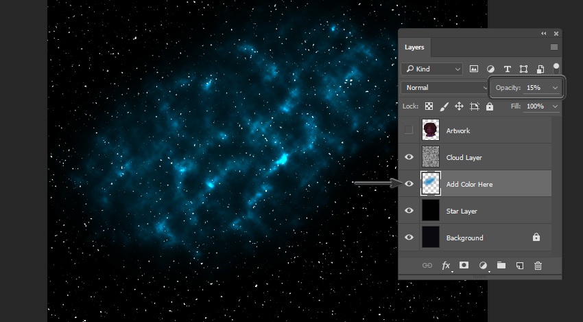
First, create a New Layer above the Background Layer and Fill it with black. This is going to be the start of our starry sky.
Step 2
We’re going to apply a Filter to this New Layer. There are many ways you could approach this—the goal is simply to create a background full of stars. For this tutorial, we’re going to use the Sponge Filter in the Filter Gallery (found via Filters > Filter Gallery)
Step 3
Next, apply a Gaussian Blur (found via Filter > Blur > Gaussian Blur). I chose to apply a radius of 3.5 pixels.
Step 4
Then, we need to adjust the Curves. Go to Image > Adjustments > Curves, to open this panel.
Our goal is to manipulate the Input points so they are close together.
Step 5
Next, let’s Create a New Layer, on top of the one we were just working on. We’re going to apply a Cloud Filter to this layer, using the colors black and white.
Set this Cloud Layer’s Blending Mode to Color Dodge.
Step 6
Now, for the fun part! We need to create a New Layer between the Cloud Layer (set to Color Dodge) and the Star Layer (the one right above the Background Layer). Set this New Layer’s Opacity to 15%.
Once you’ve created this Layer, take a Soft Round Brush and choose any color you’d like. I chose to start with a light blue color, because I know this is one I’d like in my galaxy.
As you paint, you’ll notice it starts to look like clouds of color in the stars!
Step 7
You can add additional Layers of color here, if desired. Try adding different colors, using a Soft Round Brush. In this case, I stuck to blue, purple, and violet hues until I had pretty splashes of color.
It’s also a good idea to turn your Artwork layer back on, so you can get an idea of how your galaxy visually relates to the artwork.
5. How to Paint Galaxy Colors in the Hair
Step 1
We’re going to apply these galaxy colors we’ve created to the hair, using a Clipping Mask and Blending Modes.
First, create a New Layer above your artwork and set it as a Clipping Mask (as described earlier in this tutorial). I like to use a Hard Round Brush to fill in the area I want to work with—in this case, the hair area.
Step 2
Once you’re happy with the area you’ve defined, set the Layer’s Blending Mode to Color. Make sure to toggle Lock Transparent Pixels on, so we are confined to the area we’ve just established when we’re drawing.
Now, using a Soft Round Brush, start applying colors inspired by the galaxy in the background. You’ll notice that it changes the color of the hair.
Step 3
At this point, I like to draw on top of my work and add small refinements. For example, using the same Custom Brush from earlier, I added some lighter blues and variations in the hair.
6. How to Add Finishing Touches
Step 1
I also wanted to put sparkles in the hair, to push the galaxy aesthetic further. I started by drawing simple shapes—little dots and crosses—where I wanted to see stars.
Step 2
Then, I Duplicated this Layer and added a Gaussian Blur to it, to give them a glow.
Lower the Opacity of the original Layer to 20%, and then create a New Layer on top of both of the Layers of sparkles. I drew small dots in the center of each sparkle, on this Layer, to push them further.
Step 3
Finally, it’s time for some finishing touches. For the eyes and earrings, I used a Hard Round Brush to add some extra details and shine. My light source is coming from the viewer’s left, so I made sure to keep that in mind.
I also added a cute star shape to her cheek! Notice how it looks soft against the skin—this can be achieved by lowering the Opacity of the layeryou’re drawing on.
I also thought a touch of galaxy-inspired eye shadow would help push things further! I did so using the same technique we used earlier, when adding colors to the hair. Create a New Layer, set the Blending Mode to Color, and add color using a Soft Round Brush. If the color seems too intense, try lowing the Opacity.
Step 4
One last thing and we’re done! Using a Soft Round Eraser, I removed some of the base of the artwork, so the character blends into the starry background.
Awesome Work!
We’ve drawn a lovely, galaxy-themed portrait. As a woman of color with afro textured hair myself, I’d love to rock this look—but until I can get in touch with my inner space princess, painting this out-of-this-world style will have to do!
Good luck experimenting with your own galaxy-themed portraits!
Welcome to our monthly feature of fantastic tutorial results created by
you, the Envato Tuts+ community!
Every day, visitors like you take the
time not only to read our tutorials but also to try them out. This is an
assortment of those comment submissions found throughout the Design
& Illustration section. Check out this set of results and join in
for the next roundup, published next month!
Vector Tutorial Results
Taken from the
comments section of your favorite tutorials, these first pieces are an
assortment of results created with vector drawing programs. Check out
these amazing results!
How to Create a Subtle Summer Sunset Textured Illustration in Adobe Illustrator
Daniel Johnson used this Instagram Gradient Icon tutorial from Mary Winkler to work out his own design for a special project. Check out his result below.
Adobe Photoshop Tutorial Results
Let’s
take a look at this next set of results inspired by Adobe Photoshop
tutorials published here on Envato Tuts+. Contributions range from photo
manipulations to text effects and more! Check out these wicked results
below!
How to Create a Sketch vs. Camera Effect in Adobe Photoshop
Photoshop newbie H. Pronk smashed this Cartoon Text Effect tutorial from Jan Stverak. Make sure to check out their wicked result below!
Design Tutorial Results
These final
pieces are inspired by an assorted of design tutorials that don’t quite
fit the previous categories. They include everything from print design
to drawing and more! Enjoy these beautiful pieces created by the
community below!
How to Create a Fall-Themed Wedding Invite in Adobe InDesign
Have
you created a piece based on one of our tutorials here in the Design
& Illustration section of Envato Tuts+? We’re keen for you to share
your results with us! Check out the general guidelines below to join in
with our community:
Your artwork should be similar in some
way to the tutorial that you followed or that inspired it. The aim of
these showcases is to share what readers have created after following
the tutorial.
Comment on the tutorial you used, attaching an
image of your result. We’re keen on all levels of ability: from beginner
to advanced!
Include a comment about your result, yourself, or your process. We like knowing about you and what you’re sharing.
Share
the tutorial when you share that artwork elsewhere on the web. If
you’ve posted your piece on sites like Facebook, Tumblr or Behance, link
back to the tutorial so that other users know your source and can join
in on the fun.
Thanks to everyone who was highlighted above for sharing your results with the Envato Tuts+ community. We look forward
to checking out your brilliant versions of our tutorials in the near
future, and welcome users new and old to participate in upcoming
showcases.
Agregator najlepszych postów o designie, webdesignie, cssie i Internecie