Up and Running With Cinema 4D is a brand new course for artists and designers who are just getting started with 3D and are ready to learn the foundational skills that Cinema 4D provides. In this post, you’ll learn more about the course and watch some free preview videos to whet your appetite and pick up some useful Cinema 4D skills!
What You’ll Learn
In this course, you’ll learn how to create and manipulate basic shapes, use colour, work with lighting and rendering, and more. Jonathan Lam will walk you through the step-by-step process of how to use these skills to create a simple pair of headphones!
By the end of the course, you’ll have a better understanding of how these tools work together and how to come up with your own modelling solutions.
Here are some free lessons from this course, as a preview of what you can expect:
Introduction to Basic Shapes in Cinema 4D
In this video you’ll learn about different ways to create and manipulate basic shapes in Cinema 4D. This will act as the foundation of our modelling techniques.
Introduction to Deformers
In this video you’ll learn how to use the “deformers”, which will provide further options for manipulating shapes into what we want for modelling.
How to Edit Basic Shapes in Cinema 4D
In this video you will learn how to make basic shapes editable. You’ll learn the options that become available to you and discuss how this can affect your modelling. You will then use the half sphere object to create part of the headphones model.
Take the Course
You can take our new course straight away with a subscription to Envato Elements. For a single low monthly fee, you get access not only to this course, but also to our growing library of over 1,000 video courses and industry-leading eBooks on Envato Tuts+.
Plus you now get unlimited downloads from the huge Envato Elements library of 580,000+ creative assets. Create with unique fonts, photos, graphics and templates, and deliver better projects faster.
In this tutorial I’ll show you how to use Adobe Photoshop to create an abstract piece featuring a broken woman portrait.
First, we’ll build the base background using several landscape and abstract texture images. After that, we’ll retouch the model, add a mountain to the model’s head, and import the abstract texture and crack effect. Later, we’ll add rocks with lava effects and draw some lines. We’ll work with an abstract texture again, using the Dodge and Burn Tool and several adjustment layers to complete the final effect.
Tutorial Assets
The following assets were used during the production of this tutorial:
Create a new 3000 x 1790 px document with the given settings:
Step 2
Open the landscape 1 image. Drag this image into the white canvas using the Move Tool (V).
Click the
second icon at the bottom of the Layers panel to add a mask to this
layer. Select a soft round brush with black color (soft black brush) to
remove the hard edges and blend the landscape to make it fade out into
the white background.
Step 3
Go to Layer > New Adjustment Layer > Hue/Saturation and set it as Clipping Mask. Bring the Saturation value down to -100.
Step 4
Place the
landscape 2 image onto the existing canvas and add a mask to this layer.
Use a soft black brush to remove the bottom of this landscape and leave
the mountains visible softly and subtly in the middle of the canvas.
Step 5
Make a Hue/Saturation adjustment layer (set as Clipping Mask) to desaturate the landscape 2.
Step 6
Open the
abstract texture pack. Browse the folder of the colorful power backgrounds
and select the first group. Take the image you like and place it onto
the existing canvas.
Use a layer mask to erase most of this texture image, leaving some details visible subtly on top of both sides.
Step 7
Add a Gradient Map adjustment layer and pick the default colors (black and white) to desaturate the texture.
Step 8
Create a Curves adjustment layer and increase the lightness to make the effect more subtle.
Step 9
Open the
abstract texture pack again. Browse the grunge folder and select one
image from the fourth group to add to the main canvas. Use a layer mask
to erase the bottom and make the effect visible mostly on the upper section.
Step 10
Create a Hue/Saturation adjustment layer and reduce the Saturation value to the minimum.
Step 11
Use an Invert adjustment layer to make the effect more subtle.
2. How to Retouch the Model
Step 1
Open the model image. Cut out the model on the left and place her in the middle of the main canvas.
Step 2
Add a mask
to the model layer and select a brush from the watercolor brush set.
I’ve used the one numbered 2494 and pressed F5 to change the settings of
this brush.
Use this brush to trim the hair and some details on her shoulders.
Step 3
Make a Gradient Map adjustment layer with black and white to desaturate the model.
Step 4
Create a Curves adjustment layer to bring more light to the model, especially the
side of the model towards the background. Paint on the shadow and face
of the model so they won’t be affected or will be less affected by this adjustment
layer.
Step 5
Make a new layer and use a soft brush with Opacity and Flow about 50% to reduce the shadow on the model’s shoulder.
Step 6
Create a new layer, and use a soft brush with the color #808080 to decrease the light on the model’s lips and teeth.
Step 7
Add a new layer, change the mode to Overlay 100%, and fill with 50% gray.
Activate
the Dodge and Burn Tool (O) to refine the light and shadow on the model.
You can see how I did it with Normal mode and the result with Overlay
mode.
3. How to Add the Mountain
Step 1
Open the
mountain image. Select the big mountain on the right to add to the
model’s head. Use the Free Transform Tool (Control-T) with Warp mode
to distort the mountain to fit the size of the head.
Step 2
Add a mask to this layer and use a hard black brush to cut the contour of the mountain to fit the head completely.
Step 3
Create a Hue/Saturation adjustment layer to desaturate this mountain.
Step 4
Make a Curves adjustment layer to increase the contrast of the mountain.
Step 5
Use another Curves adjustment layer to brighten the mountain. On this layer mask,
use a soft black brush with a lowered opacity (about 20-50%) to reduce
the light to keep the mountain’s contrast but still show some texture.
4. How to Import the Abstract Textures
Step 1
Open the
abstract texture pack again. Browse the grunge folder and select one
from the fifth group to add to the lower part of the canvas. Use a layer mask
with a watercolor brush to remove the top and leave some jagged,
crumbly effects on the model’s body and both bottom corners of the canvas.
Lower the brush’s opacity if needed to get a better, more natural
effect.
Step 2
Create a Hue/Saturation adjustment layer to desaturate the effect.
Step 3
Make a Curves adjustment layer to strengthen the effect. On the layer mask,
use a watercolor brush to reduce the dark effect in the bottom right corner.
Step 4
Duplicate
this texture image and drag it above the top of the layers. Move it up
and use a layer mask with a watercolor brush to remove most of the
image, leaving some subtle abstract effects visible around the model’s head
and the bottom of the mountain to give it some details and texture.
Step 5
Add a Hue/Saturation adjustment layer to turn the color of the effect to black and white.
Step 6
Use a Curves adjustment layer to make the effect on the mountain more visible and on the background less visible.
5. How to Make the Crack Effect
Step 1
Move the crack image into the main document and change this layer mode to Multiply 100%.
Add a mask to this layer and use a watercolor brush to remove the areas outside the model.
Step 2
Use the
Lasso Tool (L) to select a part of the crack image and place it onto the
model’s face. Activate Control-T to make it much smaller, and then use a
layer mask to erase the parts outside the face.
Step 3
Select the
crack layers and hit Control-G to create a group for them. Change this
group’s mode to Multiply 100% and add a Curves adjustment layer within
this group. Decrease the lightness to increase the broken effect’s visibility.
On the layer mask, use a soft black brush to reduce the effect on the
areas which are too dark after this step.
Step 4
Use another Curves adjustment layer to brighten the effect, especially the contour
around the face and body. Paint on the shadow areas so they won’t be
affected by this adjustment layer.
6. How to Add the Rocks and Lava Effect
Step 1
Open the
rock images pack. Select the meteor_11 folder and take one rock from
this. Place it above the mountain’s area and use Control-T to rotate it
as shown below.
Use a layer mask to blend this rock with the existing surface.
Step 2
Add more lava effect to the head and model’s body using different rocks.
Step 3
For the lava effects on the model’s cheek and shoulder, use a Curves adjustment layer to brighten them as they’re too dark now.
Step 4
Add one
rock from the meteor_11 folder to our working document, and then go
to Filter > Liquify. Select the Twirl Clockwise Tool (C) to tweak the
rock so it looks different from the original form. Don’t overdo it as
it would look too strange and unnatural.
Use Control-T to scale it down and place it below the mountain area.
Step 5
Use the same method to tweak different rocks into different forms and add them around the ear area and above the forehead.
Use a layer
mask to blend the upper part of the rocks with the forehead and break their tops to get the form of a headpiece (the rocks above the forehead include two
rock parts; the smaller one is upper and the bigger is lower).
Step 6
Make a Curves adjustment layer to bring more light for the rocks on the
forehead. On their layer mask, paint on the shadow area so they won’t be
brightened by this adjustment layer.
Step 7
Use
the Liquify Tool to make some small twisted parts to decorate the eyes
and forehead. Use a Curves adjustment layer if you feel any
details are too dark or want to increase their visibility.
Step 8
Turn one
rock into a similar result below and place it onto one of the model’s
shoulders. Duplicate this layer and flip it horizontally and move it to the other shoulder.
Add another
rock to one of the shoulders to make the two sides appear different. On
each of these three layers, use a layer mask to blend them with the
shoulders.
Step 9
Create a
Curves adjustment layer for each of these indicated layers to match
their lightness with the background. Paint on the back side of the rocks
if you feel this part is too bright.
Step 10
Use the
same method to add more rocks on the background, and use Control-T with Warp mode to turn them into different sizes and forms. Place them
vertically on both sides of the model.
Step 11
Group all
the rock layers and use a Curves adjustment layer to brighten them a
bit. The selected areas show where to paint on the layer mask.
7. How to Draw the Lines
Step 1
Create a
new layer on top of the layer and activate the Line Tool (U). Draw five
lines with black color and 1 px stroke along the rocks on the background. Hold the Shift key to make them go straight.
Step 2
Use a layer mask to remove some line parts on the rocks.
8. How to Do the Final Adjustments
Step 1
Add the
texture used in section 4 to the top of the layers and use a layer mask
to erase most of this texture image, leaving the grunge effect covering
only the lower part of the model’s body, especially the rocks on the
shoulders, to make them integrated better with the background.
Step 2
Create a Hue/Saturation adjustment layer to desaturate the texture’s effect.
Step 3
Make a Curves adjustment layer to match the effect’s lightness with the rest of the body and background.
Step 4
I want to desaturate and reduce some lava details to make them appear
more subtle. Use the Lasso Tool to select one area on the neck (or any
areas you want) and go to Layer > New Adjustment Layer >
Hue/Saturation. Decrease the Reds and Yellows values.
On this layer mask, use a lowered soft black brush to recover some yellow details.
Step 5
Create a
new layer, change the mode to Overlay 100%, and fill with 50% gray. Use
the Burn Tool to paint more shadow below the strokes of the crack effect
on the model’s face to increase their visibility, and use the Dodge Tool
to brighten the model’s contour.
Step 6
Add a Curves adjustment layer to increase the whole canvas contrast. Paint on
the edges and the shadow areas of the model so they won’t be affected by
this adjustment layer.
Step 7
Make
another Curves adjustment layer to bring more light to the middle of the
canvas. The selected areas on the edges and shadows show where to paint on the layer mask.
Step 8
Use another Curves adjustment to darken the edges more, to give the whole scene a better contrast.
Congratulations, You’re Done!
I hope that you’ve enjoyed the tutorial and learned something new for
your own projects. Feel free to share your results or leave comments in
the box below. Enjoy Photoshopping!
Install the font on your system and you are ready to get started!
1. How to Create a New Document and Set Rulers in Photoshop
Step 1
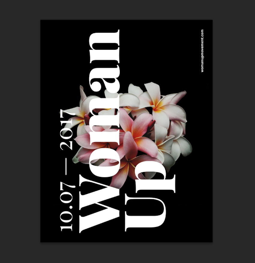
In Photoshop, go to File > New. Name the document Girl Power. Set the Width to 1275 px and Height to 1650 px. I will change the measurements of Width and Height to Inches. Set the Resolution to 72 Pixels/Inch. To start, we will set the Color Mode to Grayscale and change it later on. Click OK. Later on, we will need to change the mode to Duotone, and the only way to do this is by starting with a Grayscale mode file.
Step 2
Press Command-R to activate the rulers on the document. As I mentioned in the step above, I am using inches for this project. If you wish to change to other units, go to Photoshop > Preferences > Units & Rulers. A Preferences window will pop up,and you will be able to change to the desired system.
Step 3
Click on the Rulers and drag onto the page to create a guide. Hold Shift to drag to an even number. In this case, let’s create a 1 inch margin all around our document. Hide or display the guides by pressing Command-;.
2. How to Use the Color Halftone Filter
Step 1
In order to be able to create a screen or halftone effect, we need to start with a grayscale file and turn it into Monotone. A halftone effect only works on gradients if you are using CMYK or RGB. We are looking for an even pattern, and this can only be achieved by converting our file mode from Grayscale to Monotone. Head over to Image > Mode > Duotone.
Step 2
The Duotone Options window will pop up. Under Type, select Monotone. For Ink 1, click on the second square and use the color black or the code #000000. Click OK.
Step 3
Using the Paint Bucket Tool (G), color the page with the following color code: #a2a2a2.
Step 4
Head over to Filter > Pixelate > Color Halftone.
Step 5
The Color Halftone window will pop up. Use the settings from the image below and click OK.
Step 6
We want to create a denser look and have the dots be white. On the Layers panel, duplicate the Background layer by pressing Command-J. Let’s invert the pattern by pressing Command-I. The layer should change from left to right like the image below.
Step 7
In order to be able to work in color, we have to change the mode again to RGB. Go to Image > Mode > RGB Color.
Step 8
Create a new layer by pressing Shift-Command-N, and name it Blue background. Using the Paint Bucket Tool (G), select a blue foreground color (#0000ff), and paint over the new layer.
Step 9
To be able to see the halftone texture we created on Layer 1, we need to set the Blending Mode of the blue background layer to Screen on the Layers panel.
Step 10
We can alter the size of Layer 1to create a more prominent texture. I am resizing mine by pressing Command-T. Head over to the Options bar and check that the Maintain Aspect Ratio button is activated. Set the Width and Height to 130%.
3. How to Add and Adjust Text
Step 1
Set the foreground color to black on the Tools panel. Press T to activate the Type Tool and type Girl Power on three lines like the image below. We want to the text to cover the poster horizontally. I used separate layers for each word and activated right align text on the Options bar for the word Power. To edit the style, bring up the Character panel by going to Type > Panels > Character Panel. I am using the font Prompt Black Italic and set the Size to 360 pt. For the word Power, set the Leading to 280 pt.
Step 2
On the Layers panel, select both layers by pressing Shift and clicking on each layer. We want to add movement to the poster, so we will rotate these two text layers. Press Command-T to rotate and hold Shift for an even rotation to 15 degrees. Alternatively, you can head over to the Options bar and type -15.00 in the Rotate option. Hit Enter to set the text. Place the text just within the top margin.
On this specific poster, we want the type to bleed over to create a strong aesthetic, so we will leave the sides to bleed over.
Step 3
To add more texture to the text, we need to duplicate the two layers we created. Do this by selecting both layers on the Layers panel and pressing Command-J. Using the Move Tool (V), drag both of the new layers under the main text and move them to the right. To create contrast, let’s set the font style to Thin Italic on the Characters panel.
4. How to Add a Halftone Texture to the Text
Step 1
We want to add movement and a Lichtenstein effect to the poster. Let’s duplicate the text layers and set them in two other colors. First, we need to create folders containing all these layers to keep things organized. On the Layers panel, select the four text layers we created and drag them towards the folder at the bottom.
Step 2
Duplicate the folder to create three more folders by pressing Command-J on the folder. Name each folder with the following color names: black, white, yellow, red.
Step 3
Using the Characters panel, change the color of each folder’s text layer. Use plain black and white for the first two. For yellow, use the code #ffd200 and for red, the code #ff3d00. In order to see all the layers, we need to slightly move them around—there is no right or wrong for this part! I used the keyboard as it gives us more control compared to the mouse.
Step 4
The red text is taking over our poster, so I would like to add some texture and contrast to that text layer. Let’s duplicate (Command-J)Layer 1 with the halftone and drag it into the Red folder. Open the Red folder by clicking on the arrow. We will now be working within this folder.
Step 5
Select the four text layers, and Right Click > Rasterize Type. Keep the four layers selected and Right Click > Merge Layers.
Step 6
Remember we are still working on the Red folder. Press Command and click on the newly merged layer thumbnail. This will outline and select the objects in this layer, i.e. our text.
Step 7
Deactivate the visibility of the Power copy text layer and, while still selecting the objects, click on Layer 1 copy. Remember this is the halftone layer we duplicated. Press Shift-Command-I and use the Erase Tool (E) to brush over the poster. This will erase everything in the layer but the words we selected.
Step 8
We still want to maintain the red color to make our poster stand out. On the Layers panel, activate the visibility of the Power Copy text layer and set the Blending Mode to Screen. We want this layer to be transparent, so let’s merge the two layers left under the Red folder and set the Blending Mode to Multiply.
Step 9
If desired, on the Layers panel we can duplicate the black folder layer and set the blending mode to Color Burn and the Opacity to 55% to add more shadowing to the poster.
5. How to Save the Poster for Web
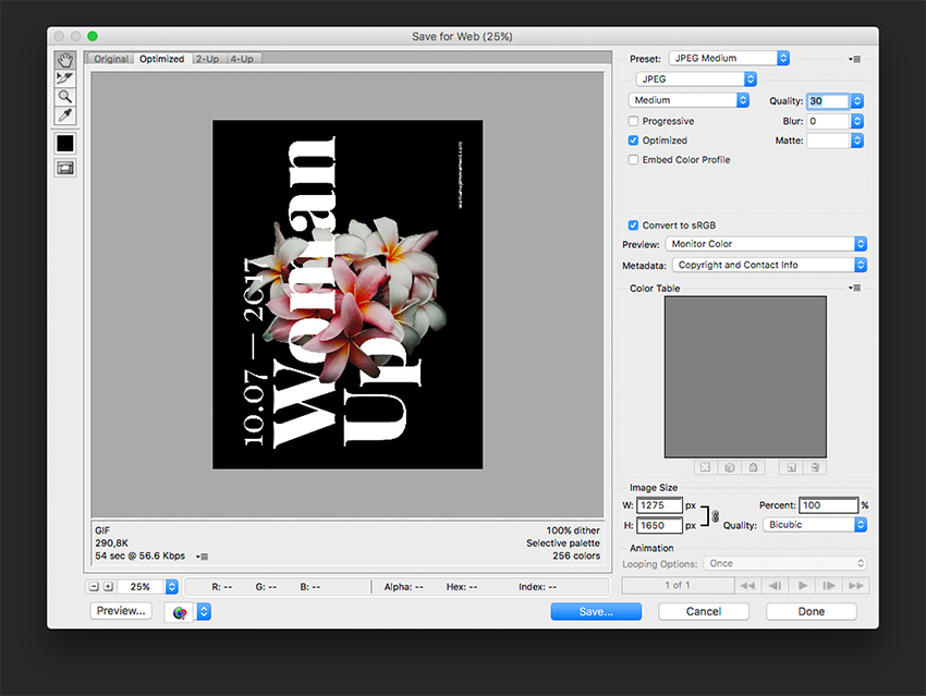
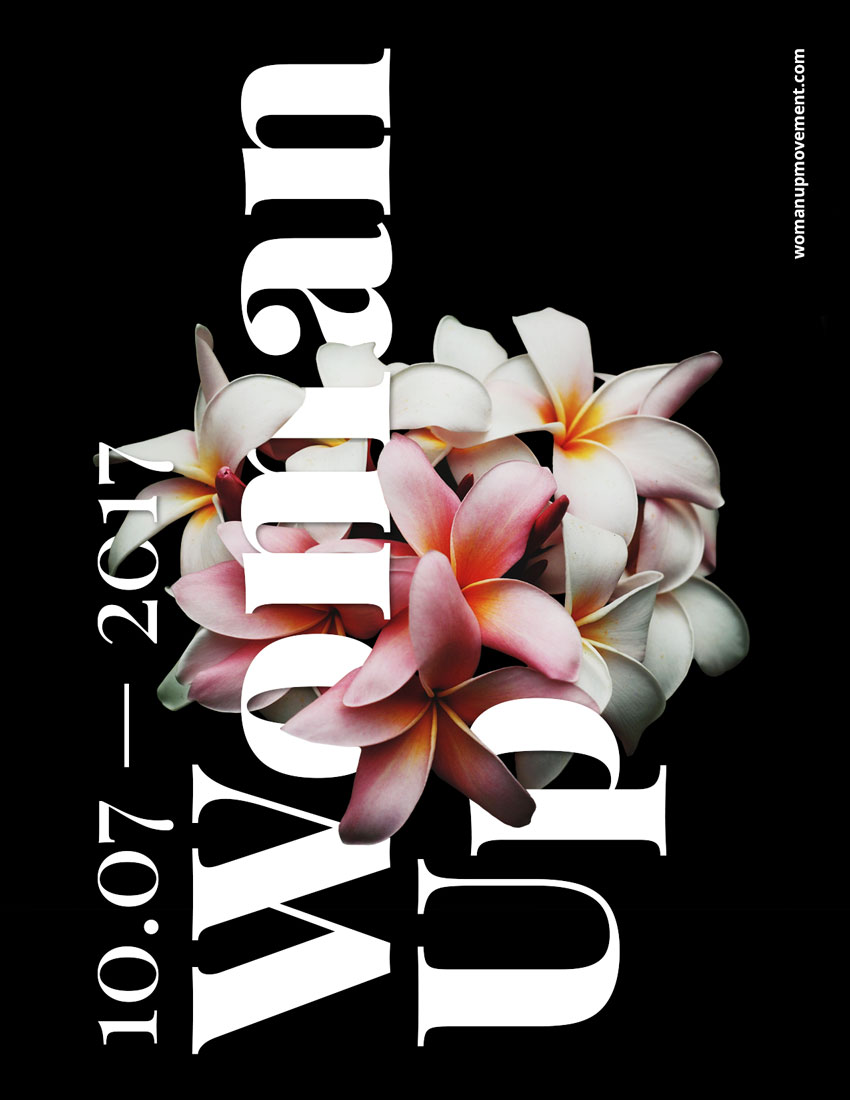
Head over to File > Save for Web (Shift-Option-Command-S). Set the quality to Maximum, or lower the quality if there are any size constraints. Under Image Size, set the width and height to the size you need. Click on Save…, add a name, and click on Save.
Great Job! You’ve Finished This Tutorial!
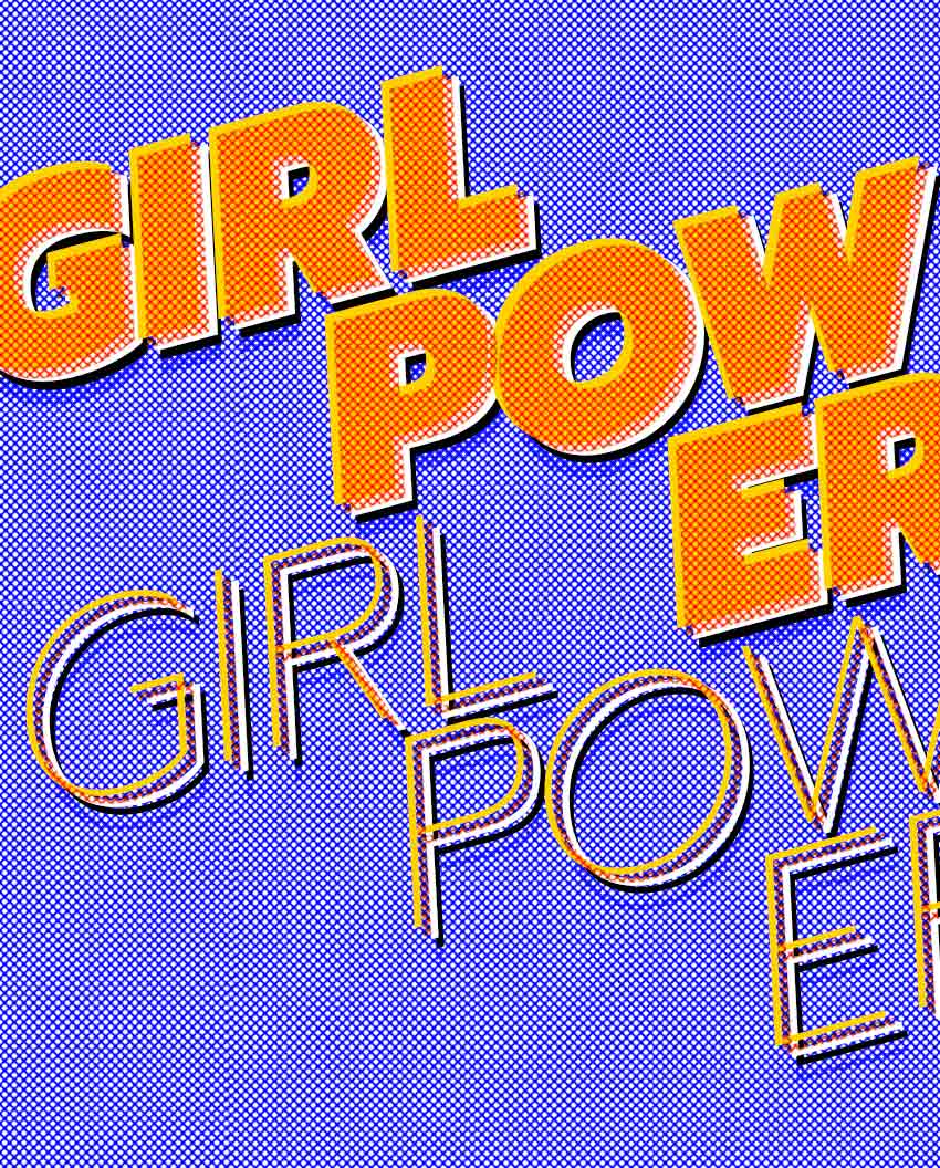
In this tutorial, we’ve created a poster using the famous Roy Lichtenstein style. Today we’ve learned how to:
Create a typography-based poster and add interesting touches by multiplying layers.
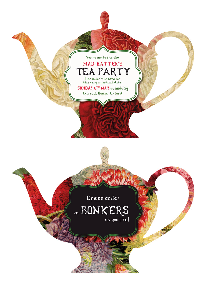
Anyone for tea? This cute and quirky two-part invite won’t fail to make your friends smile!
Inspired by the Mad Hatter’s infamous tea party ritual, this invite would work really well for vintage- or Alice-themed events.
In this tutorial suitable for beginner to intermediate InDesign users, we’ll create the layout in InDesign and dip into Illustrator briefly to edit vector graphics for the design.
Make sure to save your images to a safe folder and install the fonts on your computer.
1. How to Create a Teapot Backdrop for Your Invite
Step 1
Open InDesign and go to File > New > Document.
Set the Width of the page to 7.895 in and Height to 5.5 in. Uncheck Facing Pages.
Add a Bleed of 0.25 in to all edges of the page and click Create.
Step 2
Expand the Layers panel (Window > Layers) and double-click on Layer 1. Rename it Background and click OK.
Create three more new layers in this order: Teapot, Frame, and finally Type at the top of the sequence.
Lock all the layers except Teapot, which we’ll work on first.
Step 3
Expand the Swatches panel (Window > Color > Swatches) and click on New Color Swatch in the panel’s main drop-down menu (at top-right).
Name the swatch Soft White, and set the Type to Process and Mode to CMYK. Set the levels below to C=1 M=1 Y=2 K=0, and then click Add and OK.
Repeat the process to create three more CMYK swatches with the following names and values:
Green: C=81 M=31 Y=100 K=21
Bright Red: C=8 M=100 Y=78 K=0
Off-Black: C=77 M=74 Y=58 K=83
Step 4
Briefly minimize, but don’t close, the InDesign window.
Open the teapot vector set in Adobe Illustrator, and isolate the teapot at the far left of the second row. Delete the floral pattern on the teapot, so you have only the silhouette remaining.
Select both the main teapot and the teapot’s lid with your mouse, and open the Pathfinder panel (Window > Pathfinder). Click Unite.
With the shape united, select it and head up to Edit > Copy. Then minimize the Illustrator window.
Step 5
Head back to your InDesign document and Edit > Paste to drop the vector directly onto the Teapot layer.
Scale the teapot so that it fills the page neatly, taking it up to the trim edge of the page on all sides.
From the Swatches panel (Window > Color > Swatches) ensure the Stroke and FillColor of the vector is set to [None].
Then, with the teapot selected, go to File > Place. Navigate to the image of yellow and red flowers and click Open, allowing it to fill the teapot completely.
Extend the image up to the bleed edge (indicated by the bounding box highlighted).
Step 6
Set your cursor inside the teapot to select the flower image directly (a circular symbol will appear in the middle of the image), and Edit > Copy.
Click anywhere else on the page to deselect the teapot, and Edit > Paste in Place.
When you expand the Teapot layer, you’ll now see two copies of the image, with the larger version at the top.
Unlock the Background layer, and drag the top flower image down, dropping it into this layer. This creates a seamless backdrop for the design and allows for any trimming errors to be minimised.
2. How to Create a Cute Frame for the Type on Your Invite
Step 1
Lock and switch off the visibility of the Background layer, and unlock the Frame layer.
Open the vector frames set in Illustrator. Identify the frame on the second row down, second left along.
Select it and Edit > Copy.
Head back to InDesign and Edit > Paste, dropping it onto the Frame layer. From the Swatches panel, adjust the Fill to Soft White and position the frame centrally on the teapot.
When you’re happy with the position and size of the frame, Edit > Copy it. We’ll use this later.
Step 2
With the frame selected, head up to Object > Effects > Drop Shadow.
Bring the Opacity down to around 70% and add about 5% Noise, before clicking OK.
Edit > Paste a second frame on top of the first, scale it down slightly, and position it inside the edge of the original as shown below. Set the Fill to [None] and Stroke Color to Green.
From the Stroke panel (Window > Stroke), increase the Weight of the frame’s stroke to 5 pt, and choose Thick-Thick from the Type menu in the panel.
3. How to Format Quirky Typography on Your Invite
Step 1
Lock the Frame layer and unlock the layer above, Type.
Take the Type Tool (T) and drag across the frame, centering it towards the top.
Type in ‘You’re invited to the’ and from either the top Controls panel or the Character panel (Window > Type & Tables > Character), set the Font to Herbert Lemuel Sans, Size 10 pt, and text to Align Center.
Set the Font Color to Green from the Swatches panel.
Step 2
Create a second text frame below, typing in ‘MAD HATTER’S’ and setting the Font to Herbert Lemuel Dots, Size 15 pt, and Font Color to Bright Red.
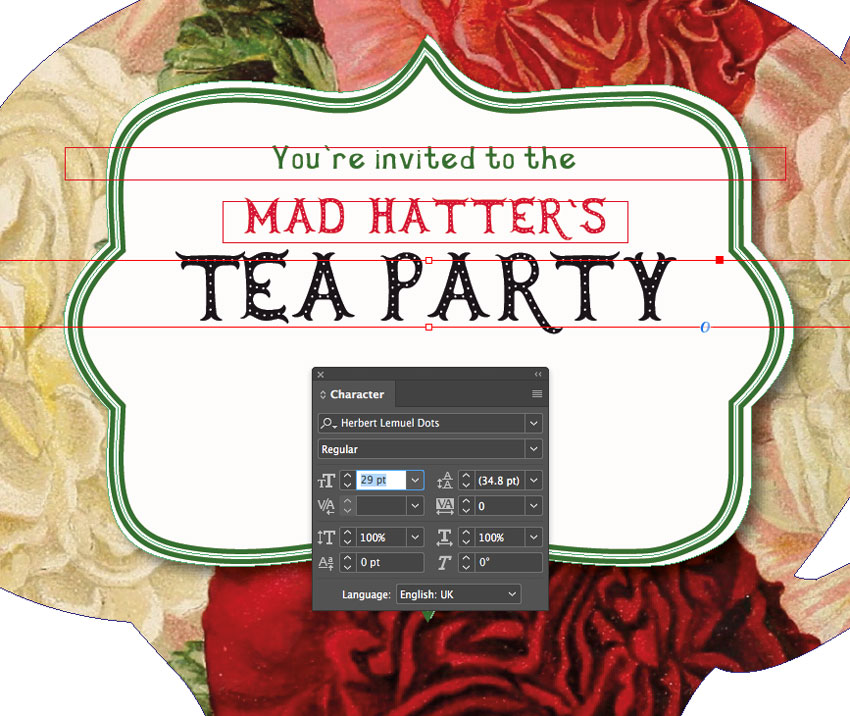
Copy and Paste the text frame below, adjusting the text to read ‘TEA PARTY’, increasing the Font Size to 29 pt and adjusting the Font Color to Off-Black.
Add more text frames below this, typing in:
‘Please don’t be late for this very important date:’
‘[Date] at [time]’
‘[Location]’
Set the Font to a mix of Herbert Lemuel Regular, Sans, and Dots, and use Green and Bright Red for the Font Colors.
4. How to Create the Other Part of Your Invite
Note: If you’re printing your invite from a home printer, you may find it easier to create two separate parts to your invite (as I’ve done here), as lining up home or office printers for two-sided printing can be tricky. Even if you’re going to print the invite professionally, you may want to provide it as two pieces. To do this, you can follow the steps below as they are.
However, if you’re going to print your invite professionally and want to create a double-sided invite, you will need to observe the following steps, but make sure to FLIP the teapot for the reverse side horizontally. I’ll flag up when you should do this below.
Step 1
With the first part of your invite finished, you can either keep this as it is and skip forward to Step 5.1, or create another part or side of your invite if you like.
To do this, expand the Pages panel (Window > Pages) and drag the Page 1 icon down onto the Create New Page button at the bottom of the panel, to duplicate it.
Step 2
Switch off the visibility of all layers except Teapot. File > Place the vintage flowers image into the teapot, extending the edge of the image up to the bleed, as we did earlier.
Select the flower image inside the teapot directly and Edit > Copy it. Click outside of the teapot and Edit > Paste in Place.
Then move this pasted flower image onto the Background layer below*.
* If you want to create a double-sided invite (rather than two separate invites), here you should unlock both the Teapot and Background layers. Select all elements on these layers (on Page 2) and Right-Click > Transform > Flip Horizontal. Move them back into a central position on the page.
Step 3
Lock the Background and Teapot layers, and unlock the Frame layer.
Adjust the Fill of the frame at the back to Off-Black.
Step 4
Unlock the Type layer at the top, and adjust the text here to read more details about the event, such as dress code, directions to the venue, or RSVP details.
Set the Font Color to Soft White for contrast.
5. How to Set Up Your Invite for Laser Cutting
To achieve that lovely teapot shape in your final invite, you’ll have to set up your artwork with a die line. This is not too tricky to do!
Step 1
Scrolling up to Page 1, unlock the Teapot layer and select the teapot shape. Edit > Copy it.
Edit > Paste in Place the teapot, and expand the Teapot layer to identify this pasted copy.
Create a new layer in the Layers panel at the top of the layers sequence, calling it DIE-LINE.
Drag the top teapot shape into this layer, and lock the Teapot layer afterwards.
Step 2
Remove the image from the teapot shape, leaving a blank vector shape behind.
From the Swatches panel, choose New Color Swatch from the panel’s drop-down menu.
Name the swatch DIE LINE MAGENTA, and set the Color Type to Spot. Set the levels to 100% Magenta, and click Add and then OK.
Apply this new swatch to the Stroke of the teapot shape.
Step 3
With the teapot shape selected, go to Window > Output > Attributes.
Check the Overprint Stroke and, if available, the Nonprinting box.
Step 4
Select the teapot, and Edit > Copy it.
Scroll down to Page 2 (if you have created a second part to the invite) and Edit > Paste in Place*.
* For a double-sided invite, you will also have to flip the die line, by Right-Clicking > Transform > Flip Horizontal, and moving into the correct position.
6. How to Export Your Invite
Step 1
Make sure all the layers in your InDesign document are visible*.
Then head up to File > Export. Choose Adobe PDF (Print) from the Format menu at the bottom, and click Save.
Set the Adobe PDF Preset at the top to PDF/X-1A:2001, which is the best preset for exporting die lines.
* Some printers will prefer to work with a separate die line document, so make sure to check their preferences before you export your file.
Step 2
Click on Marks and Bleeds in the window’s left-hand menu.
Check All Printer’s Marks and Use Document Bleed Settings.
Then you’re ready to click Export, and create your ready-to-print file! Great job!
Conclusion: Your Finished Invite
Your Alice-themed invitation is finished and ready for printing. Awesome work!
In this tutorial we’ve covered tons of useful skills for applying to print design and invite design.
This beginner’s tutorial is a great introduction to preparing print items for special post-print effects, like die-cutting and embossing. You’ll use Adobe…
Looking to create your own packaging for sharing your business cards in style or for wedding favours? These handheld pillow boxes are simple to create and…
If you’ve ever wanted to DIY your wedding invitations, this tutorial is for you! Here, we’ll be creating a two-sided wedding invitation with a rustic, floral…
In this tutorial you’ll learn how to create a cool pop-up card, perfect for showcasing retail offers or adapting for events. We’ll break down into simple…
In this tutorial I’ll show you how to use Adobe Photoshop to create a photo manipulation scene based on „Alice in Wonderland”.
First, we’ll build the base scene using several stock images. After that, we’ll add flowers and plants, create a tree, import mushrooms, and blend them together using adjustment layers, masking, and brushes. Later, we’ll add a rabbit and eyes for the trees, and we’ll paint some mist to increase the dreamy feeling in the scene. We’ll use several adjustment layers to complete the final effect.
Tutorial Assets
The following assets were used during the production of this tutorial:
Create a new 2000 x 1333 px document in Photoshop with the given settings:
Step 2
Open the forest image. Drag this image into the white canvas using the Move Tool (V).
Step 3
Go to Layer > New Adjustment Layer > Color Balance and set it as Clipping Mask. Alter the Midtones values to make the forest more yellow.
Step 4
Make a Curves adjustment layer to darken the forest. On this layer mask,
activate the Brush Tool (B) and select a soft round one with black
color. Use this brush to erase the far middle of the background as we’re
aiming to add the main light source there.
Step 5
Create another Curves adjustment layer to increase the haze of the
forest, especially the left. Use a soft black brush to paint on the
rest so it won’t be affected by this adjustment layer.
Step 6
Add another Curves adjustment layer to make the forest darker. Paint on the middle so it won’t be darkened.
Step 7
Open the path 1 image and move it into the main canvas. Use the Free
Transform Tool (Control-T) to distort the perspective of the path a bit.
Flip the path horizontally by choosing Edit > Transform > Flip Horizontal.
Step 8
Click the second icon at the bottom of the Layers panel to add a mask to
this layer. Use a soft black brush to remove the fence and both sides
of the path so only the middle part is visible on the existing midground.
Step 9
Use the Lasso Tool to select the sunny area on top of the path and set the feather for it to 10:
Go to Layer > New Adjustment Layer > Hue Saturation and set it as Clipping Mask. Change the Master settings to desaturate this selected area.
Step 10
Use a Color Balance adjustment layer to match the path’s color with the background.
Step 11
Create a Curves adjustment layer to darken the path. On this layer mask,
use a soft black brush to erase the middle and top of the path as it’s
nearer the background light.
Step 12
Make another Curves adjustment layer with the same purpose. The selected area shows where to paint on the layer mask.
Step 13
Add another Curves adjustment layer to make the top of the path hazier.
Paint on the rest so it won’t be affected by this adjustment layer.
2. How to Import the Flowers and Plants
Step 1
Open the path 2 image. Use the Lasso Tool to select the left of the path
with flowers to place it on the left of the main canvas.
Add a mask to this layer and use a soft black brush to remove the hard edges and blend the bottom with the existing ground.
Step 2
Add the right of the flowery path from the original image to the right of the canvas.
Step 3
Select the flowers layers and hit Control-G to make a group for them.
Change this group’s mode to Normal 100% and create a Color Balance
adjustment layer to alter the flowers’ color a little.
Step 4
Make a Curves adjustment layer to darken the flowers. On the layer mask,
use a soft black brush to lighten the effect on the shadow areas.
Step 5
Open the plants 2 image and use the Lasso Tool to select the plants area to add to the right corner of the ground.
Use a layer mask to remove the unwanted red details of the bottom of the plants.
Step 6
Create a Hue Saturation adjustment layer and alter the Midtones values.
Step 7
Add a Curves adjustment layer to bring more light to the plants. Paint
on the right where it’s more hidden from the light than the left.
Step 8
Create another Curves adjustment layer to increase the shadow a bit. The selected area shows where to work on the layer mask.
Step 9
Make a new layer below the plants layer and use a soft brush with the
color #100303 and Opacity about 40% to paint shadows below them.
Step 10
Drag the plants 1 image into our working document and place it on the
right side of the path. Set this layer below the flowery path layers.
Use a layer mask to remove the part covering the midground of the path.
Step 11
Make a Color Balance adjustment layer to alter the Midtones settings, making the plants redder and yellower.
Step 12
Create a Curves adjustment layer to darken the plants.
Step 13
Open the flower 1 image. Cut out the flower using the Magic Wand Tool (W) and place it on the right edge of the main canvas.
Step 14
Go to Filter > Blur > Gaussian Blur and set the Radius to 6 px. This step is to increase the depth of the scene.
Step 15
Make a Hue Saturation adjustment layer to alter the flower’s color.
Step 16
Create a Color Balance adjustment layer to give the flower more orange.
Step 17
Add a Curves adjustment layer to darken the flower. Paint on the front
of the flower where it gets more light from the background.
Step 18
Isolate the
flower 2 and place it on the lower left edge. Apply a Gaussian
Blur of 6 px to this layer to give it some softness and depth.
Step 19
Use a Hue/Saturation adjustment layer to desaturate the flower.
Step 20
Make a Curves adjustment layer to darken the flower. Use a soft black
brush to paint on the front of this flower so it won’t be affected by
this dark effect.
3. How to Composite the Tree
Step 1
Cut out the tree from the tree 1 image and add it to the left side of
the canvas. Use a layer mask to remove the part covering the path.
Step 2
Make a Curves adjustment layer to darken the tree. We’ve aimed to use
the hidden area (shadow one) of this tree only, so use a soft black brush
to erase there.
Step 3
Open the tree 2 image and use the Polygonal Lasso Tool to select the
tree part only. Place it above the tree 1 image and use a layer mask to
blend it with the existing tree.
Step 4
Use a Hue Saturation adjustment layer to match the tree 2 color with the tree 1 color.
Step 5
Create a Curves adjustment layer to darken the tree. Paint on the front details of the tree to keep its lightness.
Step 6
Use another Curves adjustment layer to increase the haze of the root
part beside the top of the path to fit the softness of this place. The
selected area shows where to paint on the layer mask.
Step 7
Make a new layer, change the mode to Overlay 100% and fill with 50% gray.
Activate the Dodge Tool (O) to paint more light for the contour of the
tree. You can see how I did it with Normal mode and the result with Overlay mode.
Step 8
Cut out tree 3 from the background and add it to the upper part of the
existing tree. Use Control-T with the Warp mode to change the form of
the tree a little.
Go to Edit > Puppet Warp to bend the tree a bit. After that, use a layer mask to blend this part with the existing tree.
Step 9
Make a Curves adjustment layer to make this tree part darker. On this
layer mask, use a soft black brush to reduce the adjustment layer effect
on the areas which you feel are dark enough.
Step 10
Use another Curves adjustment layer to give this tree part, especially the front, a hazy effect.
Step 11
Create a new layer, change the mode to Overlay 100% and fill with 50%
gray. Use the Dodge Tool to bring more light to the contour of this
part.
4. How to Add the Mushrooms
Step 1
Isolate the mushroom 1 from the background and add it to the right side
of the path. Use a layer mask to blend the bottom of the mushroom with
the ground.
Step 2
Make a Color Balance adjustment layer to alter the mushroom’s color a little.
Step 3
Create a Curves adjustment layer to brighten the mushroom. Paint on the
hidden/shadow area of the mushroom so it won’t be affected by this
adjustment layer.
Step 4
Use another Curves adjustment layer to strengthen the shadow area of the
mushroom. Paint on the front of the mushroom to keep its lightness.
Step 5
Create a new layer, change the mode to Overlay 100%, and fill with 50%
gray. Use the Dodge and Burn Tool to refine the light and shadow of the
mushroom.
Step 6
To make a shadow for this mushroom, create a new layer below the mushroom
layer. Hold Control and click the thumbnail of the mushroom layer to
load its selection.
Fill this selection with the color #100303 and flip it vertically. Use Control-T to transform the shadow to fit the direction of the light
source.
Lower the Opacity of this layer to 50% and apply a Gaussian Blur of 8 px to this layer.
Use a layer mask to reduce the opacity of the shadow, especially the part near the foreground.
Step 7
Open the mushrooms 2 image. Cut out the mushrooms on the left and middle and place them beside the existing mushroom.
Use a layer mask to blend their bottom with the ground.
Step 8
Create a group for these mushroom layers and add a Hue Saturation
adjustment layer within the group to desaturate the mushrooms. Change
the Master values.
Step 9
Make a Color Balance adjustment layer to alter the mushrooms’ color more.
Step 10
Create a Curves adjustment layer to darken the mushrooms, especially the
shadow areas. On the layer mask, paint on the front of the mushrooms
where it’s illuminated by the light.
Step 11
Isolate the mushroom 3 and place it near the top of the path. Use a
layer mask to blend its bottom with the ground as we did with other
objects.
Step 12
Make a shadow for this mushroom as we did with the big mushroom, following the light’s direction.
Step 13
Create a Hue Saturation adjustment layer and alter the Master settings.
Step 14
Make a new layer, change the mode to Overlay 100% and fill with 50% gray. Use the Burn Tool to darken the right of the mushroom.
Step 15
Add a Curves adjustment layer to increase the shadow of the mushroom.
Paint on the left of the mushroom so it won’t be darkened by this
adjustment layer.
Step 16
Make a Curves adjustment layer to improve the haze on the mushroom as
it’s near the background light. On the layer mask, paint on the right
side so it’s less affected by this Curves adjustment layer.
Step 17
Import the mushroom 4 to our working document and make its shadow as we did with other mushrooms.
Step 18
Use a Hue/Saturation adjustment layer to desaturate the mushroom.
Step 19
Make a Curves adjustment layer to darken the mushroom. Paint on its front to reveal the lightness there.
Step 20
Create a new layer, change the mode to Overlay 100%, and fill with 50%
gray. Use the Burn Tool to strengthen the shadow of the mushroom.
Step 21
Continue adding mushroom 5 using a similar method. You can see the screenshots to know
the steps as I won’t bother you by repeating the description.
Step 22
Import mushrooms 6 as we did with the other mushrooms.
Step 23
Add mushrooms 7 using the same method.
5. How to Retouch the Rabbit
Step 1
Open the rabbit image. As it has a transparent background, just use the Move Tool to drag the rabbit onto the tree.
Create a new layer below the rabbit one. Use a soft brush with the color #100303 to paint shadow below his feet.
Step 2
Make his long shadow as we did with the other objects.
Step 3
You can see the light and shadow on the rabbit do not fit the light
from the background. To fix it, use the Dodge Tool to paint highlights on
the contour and front of the rabbit and the Burn Tool to paint shadow
for his other sides.
6. How to Add the Tree’s Eyes
Step 1
Open the owl eyes image. Use the Lasso Tool to select one eye and move
it onto the tree. Use Control-T to distort the eye a bit.
Use a layer mask to blend the eye with the tree trunk.
Step 2
Add another eye to the other side of the tree using the same method.
7. How to Make the Final Adjustments
Step 1
Make a new layer on top of the layers and use a soft brush with the
color #e2e0de and Opacity about 30% and 80-90% to paint some light on
top of the path and around the tree. Use a layer mask to reduce the
opacity of the mist/haze and increase the dreamy, fantasy feeling a bit.
Step 2
Create a Gradient Map adjustment layer on top of the layers and pick the
colors #e10019 and #00601b. Lower the Opacity of this layer to 20%.
Step 3
Make a Color Fill layer and pick the color #1b0505. Change this layer mode to Exclusion 100%.
Step 4
Add a Color Balance adjustment layer and alter the Midtones and Highlights settings.
Step 5
Create a Selective Color adjustment layer to alter the color of the flowers/plants.
Step 6
Make a Photo Filter adjustment layer and pick the color #0048ec.
Create another Photo Filter adjustment layer and change the color to #00ec1c. On this layer mask, paint on both the sides and the ground so
the effect only works on the middle.
Step 7
Add a Curves adjustment layer to bring more light to the middle. Paint
on the rest so it won’t be affected by this adjustment layer.
Step 8
Use another Curves adjustment layer to increase the shadow of both the sides and the foreground.
Step 9
Create a Vibrance adjustment layer to enhance the final effect.
Congratulations, You’re Done!
I hope that you’ve enjoyed the tutorial and learned something new for
your own projects. Feel free to share your results or leave comments in
the box below. Enjoy Photoshopping!
This tutorial will show you how to use Photoshop’s work paths, brush settings, and layer styles to create a quick Alice in Wonderland shisha smoke text effect. Let’s get started!
Create a new 850 x 850px document. Click the Create new fill or adjustment layer icon at the bottom of the Layers panel, choose Solid Color, and use the Color#0f0e11.
Step 2
Create the text, each letter in a separate layer, using the font Multicolore, and change the Size to 200 pt.
Step 3
Place each letter’s text layer in a group with the letter’s name.
2. How to Create and Save Work Paths
Step 1
Pick the Pen Tool and choose the Path option in the Options bar, and create a work path inside each of the letters you have.
Click once to add corner points, click-drag to add smooth curve points, and Command-click outside the path once you finish it.
You can use the Direct Selection Tool (A) to select and adjust any anchor point as well as its direction points and handles if needed.
Step 2
In order to save a work path and reuse it, open the Paths panel, and double-click the Work Path tab to enter a name for the path you want to save.
Name the path Center and hit OK.
Step 3
Click the Create new path icon at the bottom of the Paths panel to add a new path tab.
Use the Ellipse Tool with the Path option to create a couple of ring shapes around the letters you have, and save the new path tab with the name Rings.
3. How to Modify and Save a Brush Tip
Step 1
Pick the Brush Tool and open the Brush Settings panel.
Choose the Soft Round tip, check the Build-up and Smoothing boxes, and use these settings:
Brush Tip Shape
Shape Dynamics
Scattering
Texture (Use the Clouds pattern).
Transfer
Step 2
Click the Create new brush icon in the bottom right corner of the panel to save the modified brush tip, and name it Smoke.
4. How to Stroke a Work Path
Step 1
Select the Center tab in the Paths panel, pick the Path Selection Tool, and click on the first letter’s work path to select it.
Hide the text layer, and create a new layer on top of it with the letter’s name.
Step 2
Set the Foreground Color to any color you’d like to stroke the path with. The color used here is #d57187.
It is important to save the colors you use as you’ll need them later on.
Pick the Brush Tool (B), and hit the Return key to stroke the selected work path.
5. How to Create a Simple Smoke Style
Double-click the stroked path layer’s group to apply the following layer style:
Step 1
Add an Inner Shadow with these settings:
Opacity: 35%
Distance: 0
Size: 7
Step 2
Add an Inner Glow with these settings:
Opacity: 75%
Color: #c2bdbd
Source: Center
Size: 16
Step 3
Add a Satin effect with these settings:
Blend Mode: Multiply
Color: #c3c3c3
Opacity: 50%
Angle: 20
Distance: 194
Size: 183
Contour: Rounded Steps
Check the Invert box
Step 4
Add an Outer Glow with these settings:
Opacity: 53%
Color: #e34065
Size: 25
Range: 100%
The Color here should correspond to the one you chose for the original brush tip color, so you should choose a different one if you are using other brush tip colors.
Step 5
Right-click the styled group, and choose Copy Layer Style. Then select the rest of the groups you have, right-click any of them, and choose Paste Layer Style.
Step 6
Repeat the same steps to stroke the rest of the work paths you have.
After that, for each group, double-click it to adjust the Outer Glow effect’s Color to one that matches the brush tip color used for the letter in the group.
The other brush colors used here are #054ae3, #41a614, and #f1a327.
6. How to Warp Objects
Step 1
Select the stroked letter’s layer, press Command-T to enter Free Transform Mode, and click the Warp icon in the Options bar.
Step 2
Click-drag the small sections to warp the letter and get a more dynamic effect, and hit the Return key to commit the changes.
Step 3
Repeat that for the rest of the letters.
7. How to Add Smoke
Step 1
Next, use the Real Smoke and Smoke Out Brush Set tips to add smoke to the letters you created.
Add the smoke on as many new layers as needed, and use the same color as the letter you’re adding the smoke to.
Use different brush tips with very small tip sizes to get the best results.
Step 2
If you feel the brushes are too sharp, you can go to Filter > Blur > Gaussian Blur, and use a Radius value you like to soften the tips a little bit.
Step 3
Create a new layer on top of the Solid Color layer, name it BG Smoke, and use some large smoke brushes to add colored smoke around the text.
Right-click the BG Smoke layer and choose Convert to Smart Object.
Step 4
Blur the smoke quite a lot, and reduce its layer’s Opacity to around 30%.
8. How to Make Final Adjustments
Step 1
Add the Noisy Black Texture 4 image on top of the BG Smoke layer, resize it as needed, and change its layer’s Blend Mode to Color Dodge and its Opacity to 50%.
Step 2
Add the Snow Texture VI 5184 x 3456 Pixels image on top of all layers, resize it as needed, and change its layer’s Blend Mode to Screen and its Opacity to 10%.
Step 3
Go to Filter > Pixelate > Mezzotint, and change the Type to Long Strokes.
Step 4
Add a Vibrance adjustment layer on top of all layers, and change the Vibrance value to -5.
Step 5
Add a Color Lookup adjustment layer on top of all layers, choose the 3Strip.look table from the 3DLUT File menu, and change the layer’s Opacity to 35%.
Congratulations, You’re Done!
In this tutorial, we created a simple background and a couple of grouped text layers for the text letters we have.
Then, we created work paths for the letters, modified a simple brush tip, and stroked the work paths to create the main smoke effect.
After that, we styled the letters to enhance the smoke effect, warped them to get a more dynamic result, and added more smoke brushes for a more detailed outcome.
Finally, we added some textures and global adjustment layers to finish off the effect.
Please feel free to leave your comments, suggestions, and outcomes below.
Follow
this tutorial and learn how to create a Cheshire Cat inspired text
effect in Adobe Illustrator. You will learn a new way to create the
appearance of fur and also use a Pattern brush to add extra fur for a
more detailed look. And this tutorial would not be complete without a
cheesy cat grin. Let’s start!
Launch Illustrator and
open a blank document. Type a name for your file, set the
dimensions, and then set Pixels as Units and RGB as Color
Mode.
Next,
go to Edit
> Preferences > General and
set the Keyboard
Increment to 1
px and
while there, go to Units to
make sure they are set as in the following image. I usually work with
these settings, and they will help you throughout the drawing process.
2. How
to Create and Distort the Text
Step
1
Grab
the Type Tool (T) and write “MEOW” on your artboard using the Jungle Fever Font, size of 160 pt. Choose Expand Appearance from the Object menu to get the individual letters and Ungroup
(Shift-Control-G) if necessary.
Step
2
Focus
on the letter “M”. Use the Delete Anchor Point Tool (-) to delete
some of the points at the top to obtain a straight edge (1). Now,
take the Pen Tool (P) and draw a shape like the one below to simulate the Cheshire Cat’s tufts of fur (2). Continue with the shape of the ears
and send them to the back (3).
Step
3
Focus
on the letter “W”. Use the Add Anchor Point Tool (+) to add an
extra point at the top of the left leg and distort the shape to
simulate another tuft of fur (1).
Switch
to the Pen Tool (P) and draw the shape of the tail (2). After that,
select the letter along with the tail and press Unite in the Pathfinder panel to merge them into a single shape (3).
Step
4
Rotate
and move the letter “E” closer to the letter “M” (1). Next,
delete the existing letter “O” and draw an egg-like shape instead
(2). Scale up the letter “W” a little, rotate it, and move it over
the letter “O” (3). At this point, the text is ready.
3. How
to Create the Stripes on the Text
Step
1
Use
the Pen Tool (P) to draw a few paths over the letter “M” and drag
some of them over the letter “E” as well to create a continuous
look (the green paths). Use Width Profile 1 to stroke these paths
and choose different Stroke Weights of 14 pt, 12 pt, and even 10 pt.
Step
2
Focus
on the letter “E”. First, make copies of the three green paths
that go over both letters because you will need the duplicates later.
After that, draw more paths to cover the free areas (the blue paths).
Use Width Profile 1 again and choose different Stroke Weights of 12 pt and 18 pt.
Step
3
Now,
focus on the letter “O” and draw four paths with a 10, 12, and 14 pt Stroke (1). Next, draw a long path that goes over the letter
“W” as well, and leave some free space in the bottom left corner for
the cheesy Cheshire Cat grin (2).
Continue
to draw more wavy paths over the letter “W”, and don’t forget to
duplicate the green one for later (3).
Step
4
Let’s
go back to the letter “M”. Select all the paths and choose Expand
Appearance from the Object menu to turn them from strokes into fills.
Do not release and go to Object > Compound Path > Make
(Control-8) (1). Make a copy in front of the resulting compound path
for later use.
Copy and Paste
in Front (Control-F)
the letter “M”; then select this copy along with the striped
compound path and press Minus Front in the Pathfinder panel (2). If
you get a group of shapes as a result, also go to Object >
Compound Path > Make (Control-8). Fill the newly obtained compound
path with gray for the moment (3).
Step
5
Select
the original pink letter and then Copy and Paste
in Front (Control-F)
again. While this copy stays selected, also select the copy of the
striped compound path made in the previous step and press Intersect in the Pathfinder panel (1). If you get a group of shapes as the
result, go to Object > Compound Path > Make (Control-8). You
will obtain a new striped compound path (2).
Step
6
Focus
on the letter “E” and select all the paths that go over it (1).
Choose Expand Appearance from the Object menu to turn them into fills
and then go to Object > Compound Path > Make (Control-8). Make
a copy in front of the resulting striped compound path.
Select
the pink letter and then Copy and Paste
in Front (Control-F).
Keep this copy selected along with the striped compound path and
press Minus Front on the Pathfinder panel. Also go to Object >
Compound Path > Make (Control-8) and fill the resulting shape with
gray (2).
Make
another copy in front of the pink letter. While this copy stays
selected, also select the copy of the striped compound path made
earlier and press Intersect on the Pathfinder panel. If you get a
group of shapes as the result, go to Object > Compound Path >
Make (Control-8). You will obtain a new striped compound path (3).
Step
7
Follow
the technique explained above and apply it for the letters “O”
and “W” as well to get the compound paths that you need.
4. How
to Create the Furry Look
Step
1
Focus
on the letter “O”. Select the gray compound path obtained earlier
and change the fill color to a darker shade. Next, go to Effect >
Sketch > Reticulation and apply the settings shown (1). Choose Expand Appearance from the Object menu to expand the effect, and then
go to Object > Image Trace > Make. Do not release, and choose High Fidelity Photo as the Preset and Expand from the Control panel.
Use the Direct Selection Tool (A) to select only the white square
around the letter and delete it (2). As a result, you will have a
complex group of tiny gray shapes (3).
Step
2
Fill
the group of tiny shapes with the linear gradient shown at a -60
degrees Angle (1). Next, go to Effect > Distort & Transform >
Pucker & Bloat and apply a -140% Pucker effect to get the furry
look. Drag the Pucker & Bloat effect applied under Contents in
the Appearance panel for a better result (2).
While
the group of shapes is still selected, go to the Appearance panel and
double click on Contents to see the attributes. Select the existing Fill attribute and then go to Effect > Stylize > Drop Shadow.
Apply the settings shown and hit OK (3). This will add more depth to
the fur.
Step
3
Now,
select the striped compound path and replace the fill color (1).
Make
a copy in front of this shape, fill it with gray, and apply the Reticulation effect using the same settings (2).
Choose Expand Appearance from the Object menu to expand the effect and then
go to Object > Image Trace > Make. Select High Fidelity Photo
as the Preset and Expand from the Control panel just like before, and
then delete the white square. You will get a new group of tiny random
gray shapes (3).
Step
4
Fill
the newly obtained group of tiny shapes with the linear gradient
shown at a -45 degrees Angle (1). Apply a -140% Pucker effect again, and after that, drag the effect under Contents in the Appearance panel
(2).
While
the group is still selected, open the Contents to see the attributes
and apply a Drop Shadow effect using the same settings in order to
add more depth (3).
Step
5
If
you take a closer look, you will be able to see the shapes that are
behind the fur, and they are too sharp. Let’s fix that.
Select
the pink letter that was in the back all along and, while the existing
Fill attribute stays selected in the Appearance panel, go to Effect >
Path > Offset Path and apply an Offset of -1 px to make the shape
slightly smaller. Next, go to Effect > Stylize > Inner Glow and
apply the settings shown; then go to Effect > Blur > Gaussian
Blur and apply a Radius of 2 px (1).
Now,
select the purple striped compound path behind the purple fur and
apply the same effects to obtain smooth, blurry edges (2). You can see
the end result in the image below (3).
Step
6
Now,
focus on the letter “E” and apply the same technique. First,
create the pink fur, starting from the gray compound path and the Reticulation effect (1). Next, replace the blue fill color of the
striped compound path with purple and make a copy in front (2). To
this copy, apply the Reticulation effect and then create the purple
fur as explained earlier (3). At the end, don’t forget to create the
smooth, blurry edges for the original pink letter and the purple
stripes that are in the back (4).
Repeat
the same things for the letter “W”.
Step
7
For
the letter “M”, after you create the fur on the actual letter (1), let’s work on the shapes above. Select the fur tufts shape and apply
the Offset Path, Inner Glow and Gaussian Blur effects using the same
settings as for the purple striped compound paths earlier in the
tutorial (2). Make a copy in front of this shape, remove all existing
appearances, and apply the Reticulation effect followed by Image Trace and the Pucker & Bloat effect to create the
fur (3).
Step
8
Repeat
the same technique and create the pink fur on the ears.
Step
9
At
this point, the Cheshire Cat inspired text effect should look like the following image.
5. How
to Add Extra Fur Around the Text
Step
1
Select
the original pink letter “M” and then Copy and Paste in Back
(Control-B) to make a copy of it. Remove all existing appearances
(1). Go to File > Scripts > Round Any Corner and apply a Radius of 10 in order to get the rounded corners. This script works better
than the Round Corners effect. You
can find more information about the Round Any Corner Script and how to
install and use it in the 20
Free and Useful Adobe Illustrator Scripts tutorial.
Give
it a 1 pt light pink Stroke and use the Grass Pattern Brush that you
can find in the Brush Libraries Menu > Borders >
Borders_Novelty. Open the Stroke Options window from the Appearance panel, drag the Scale slider to 20%, and set the Colorization Method
to Tints and Shades. This will make the grass smaller, like fur, and it will take the color of the stroke, which in this case is pink. If the tips
of the brush don’t go outwards, also check the Flip Across option
(2).
Step
2
While
this copy of the letter is still selected, add a New Stroke at the
top of the Appearance panel and use the Grass Pattern Brush again.
This time, set the color to a darker pink (1). Open the Stroke Options
window, drag the Scale slider to 40%, and set the Colorization Method
to Tints and Shades. You can see the result in the image below (2).
Step
3
Now,
select the fur tufts shape and make a copy in back. Remove the
existing appearances and then apply the Round Any Corner Script. To
this shape, apply the two Stroke attributes using the Grass Pattern
Brush and the same settings (1).
Repeat
the same thing for the ear shapes (2).
You
can even save this “Edge Fur Graphic Style” in the Graphic Styles
panel and apply it more easily to the other letters.
Step
4
Apply
the same technique for the letters “E”, “O”, and “W”, and
add extra fur around the letters.
6. How
to Add Shadow to the Furry Text
Step
1
Let’s
create a complex compound path. Focus on the letter “O”, select
the original pink shape, and then Copy and Paste in Place
(Shift-Control-V). Remove all existing appearances and give it any
fill color (1). Hide this shape for the moment.
Select
the purple fur group and Copy and Paste in Place (Shift-Control-V) to
make a copy of it. Double click on Contents in the Appearance panel
to see the attributes and delete the Drop Shadow effect. Now, go to Object > Expand Appearance in order to expand the Pucker &
Bloat effect. Do not release the group and press Unite in the Pathfinder panel (2); then go to Object > Compound Path > Make
(Control-8). Fill the resulting striped fur compound path with blue
for the moment (3).
Step
2
Next,
select the pink fur group and Copy and Paste in Place
(Shift-Control-V) to make a copy of it. Delete the Drop Shadow effect
in the Appearance panel and then go to Object > Expand Appearance
to expand the Pucker & Bloat effect (1). Press Unite in the Pathfinder panel followed by Object > Compound Path > Make
(Control-8) and you will obtain the green complex compound path (2).
Hide it for now.
Step
3
Next,
select the copy of the letter “O” stroked with the Grass Pattern
Brush and then Copy and Paste in Place (Shift-Control-V) to make a
copy of it (1). Go to Object > Expand Appearance to expand the
brushes (2); then press Unite in the Pathfinder panel followed by Object > Compound Path > Make (Control-8). Fill the resulting
compound path with gray for the moment (3).
Step
4
Unhide
the pink, blue, green, and gray compound paths that you have obtained
in the previous three steps (1) and keep them selected. Press Unite in the Pathfinder panel, and then go to Object > Compound Path >
Make (Control-8). We’ll use this newly obtained shape to create the
shadow (2).
Step
5
Follow
the steps explained above and create the other shapes that you need
(1). Move all four shapes into a New Layer under the text effect and
fill them with purple. Go to Effect > Stylize > Drop Shadow and
apply the settings shown (2).
Step
6
Select
the four shapes from the previous step, and then Copy and Paste in
Back (Control-B) to make copies of them. While they are still
selected, go to Object > Compound Path > Make (Control-8) to
merge them into a single compound path (1). Remove the Drop Shadow
effect and replace it with the Outer Glow effect (2).
Step
7
Take
the Pen Tool (P) and draw a path where the letter “M” touches “E” and where “O” touches “W”. Send the first path
behind the letter “M” but in front of the letter “E”; and
send the second path behind the letter “W” but in front of “O”
(1).
Give
them both a 3 pt black Stroke and use Width Profile 1 in the Stroke panel. Next, apply a 3 px Gaussian Blur and reduce the Opacity to 50% (2).
7. How
to Create the Cheesy Cheshire Cat Grin
Step
1
Use
the Pen Tool (P) to draw the shape of the smile on the letter “O”.
Give it a white fill and then go to Effect > Stylize > Outer
Glow and apply the settings shown. Also, add a 2 pt Outside Stroke
and use the linear gradient shown.
Step
2
With
the smile shape still selected, add a New Fill at the bottom of the Appearance panel and use black as the color. While this Fill
attribute stays selected, go to Effect > Distort & Transform >
Transform and apply a -3 px Vertical Move. Set the Blending Mode to Overlay and you will get a thin shadow at the top of the smile (1).
With
the smile shape still selected, add another black Fill attribute at
the bottom of the Appearance panel and then apply a 3 px Vertical
Move. Set the Blending Mode to Overlay and you will get a thin shadow
at the bottom of the smile (2).
Step
3
Use
the Pen Tool (P) of the Line Segment Tool (\) to draw a bunch of
short paths to define the teeth (1). Give all of them a 2 pt light
gray Stroke and use the Tapered Blend Art Brush. Add a New Stroke at
the top of the Appearance panel and use the same brush, but choose a
darker shade of gray and reduce the Stroke Weight at 0.2 pt (2). I’ve
shown how to create and save this useful blend brush in the How to Create a Candy Monster Charactertutorial
(section 10).
Select
the smile shape and then Copy and Paste in Place (Shift-Control-V) to
make a copy of it. Set it to stroke-none and fill-none. While this
copy stays selected, also select the lines and go to Object >
Clipping Mask > Make (Control-7) (3).
Step
4
Use
the Pen Tool (P) to draw a few short paths following the edge around
the mouth and apply the two Stroke attributes using the Grass Pattern
Brush and the same settings as for the extra fur around the edges of
the letters earlier in the tutorial (1).
While
all the paths stay selected, go to Object > Expand Appearance in
order to expand the brushes, and then Group (Control-G) them and apply
the Drop Shadow effect (2).
Step
5
Select
the smile shape, go to Object > Path > Offset Path, and apply an
Offset of 2 px. Now, select the bigger shape that you have obtained
and bring it in front of everything by going to Object > Arrange >
Bring to Front (Shift-Control-]). Set this shape to stroke-none and
fill-none (1).
Now,
select the small groups of fur around the mouth along with the copy
of the smile and go to Object > Clipping Mask > Make (Control-7) (2). At this point, the cheesy grin is ready.
Congratulations!
You’re Done
Here
is the final image of the Cheshire Cat inspired text effect. This was
challenging and fun to create. I hope you enjoyed it and that you
learned new techniques. Don’t forget to share an image with us if you
decide to recreate it.
Drawing something from a reference is one thing, but if you want to draw from memory/imagination, you must really understand the topic beforehand. In this tutorial I will tell you everything you need to know about a human nose: how its anatomy can be simplified to forms and lines, and how to draw it in every view and style without a reference.
1. The Anatomy of a Human Nose
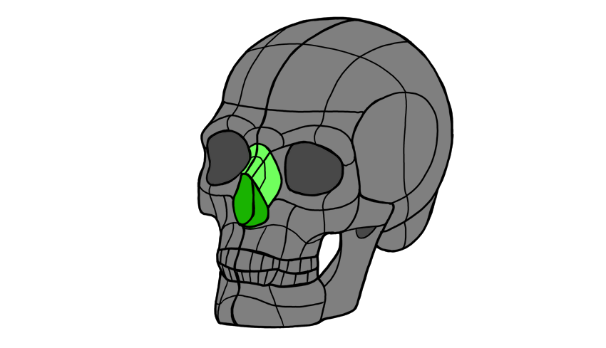
The nose consists of three parts: bone, cartilage, and connective tissue. Its upper half is all made of bone, an integral part of the skull:
The lower half is more complex and consists of:
Alar cartilage (the ball of the nose)
Lateral and septal cartilage
The ala (the wings of the nose made of connective tissue)
The nostrils (notice they’re made of two parts: the hole in the ball and in the wings)
The philtrum (the groove connecting the nose with the lips)
All these elements can be turned into a 3D form:
Once you understand what this form looks like, you can rotate it and reshape it to create a nose from imagination.
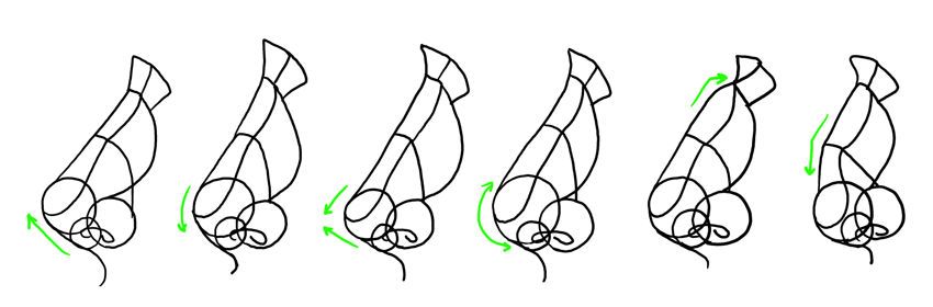
But it’s still not easy to remember! Let’s simplify it to something easier to draw:
The ball of the nose can be drawn as a sphere.
The wings can be drawn as two smaller spheres.
The septum can be drawn as a small sphere below the ball, behind it, and between the nostrils.
The bridge can be drawn in two parts, to symbolically separate the bone from the cartilage.
The tip of the nose is the upper part of the ball. You don’t always need to draw it, but it should be accentuated with shading. A great place to put some shine on!
The sides of the nose should blend with the rest of the face, but the shading should gently reveal their shape.
The root can be drawn as a „bent fan”.
2. Nose Shapes
This was a general „recipe” for a nose. But noses vary a lot among people! For example, we can talk about a „masculine” and a „feminine” nose. Traditionally, males are drawn with big, wide, roughly chiseled noses, and females with small, smooth, gentle ones.
However, this difference is mostly an artistic exaggeration (based on beauty standards and used to differentiate the „beautiful, feminine” characters from the „rough, masculine” ones) —both males and females can have various nose shapes that have nothing to do with their sex. It’s not unusual for a woman to have her father’s nose!
If you look at a nose in profile, there are lots of ways you can arrange the elements to create a nose. It can be pointing up or down, round or pointed, straight or humpy. There is not one perfect shape, „default” to all humans!
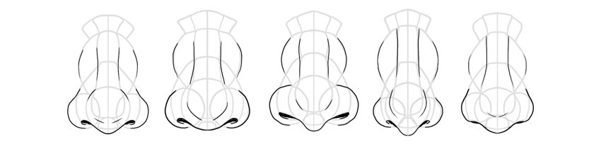
Noses can also differ in front view. Both the ball and the nostrils can have various sizes and proportions. Also, the nostrils can appear wide or tiny. Because the shape of a nose is mainly genetic, various ethnicities can have their own characteristic shape. Experimenting with the nose shape will therefore help you create unique characters, with a story hidden in their faces (you can make certain characters look related, or show their affiliation to a clan or tribe).
3. How to Draw a Nose in the Side View
Step 1
First, sketch the general shape of the nose as you imagine it. This will help you get an idea about the proportions of the elements you’ll need to draw later.
Step 2
Draw the ball in the front according to the shape you want to achieve.
Step 3
Draw the circle for the wing. Adjust its size to your vision.
Step 4
Draw the tiny circle for the septum. It should be placed slightly below the ball, at the back.
Step 5
Draw the nostril. Remember the two parts of it!
Step 6
Outline the bottom of the nose all the way down to the philtrum. „Cut” the upper part of the nose to create the root, and divide the rest roughly into halves.
Step 7
Outline the bridge and the tip.
Step 8
Draw the sides of the nose.
Step 9
Add the details.
Step 10
Draw the final lines and shade it, if you want to.
4. How to Draw a Nose in the Front View
Step 1
Sketch the general shape, adjusting the length and width of your imagined nose.
Step 2
Add the ball at the bottom.
Step 3
Sketch the circular wings.
Step 4
Add the small circle for the septum.
Step 5
Outline the nostrils. Remember that they’re 3D—they bend towards the front.
Step 6
„Cut off” the upper part of the nose to define the root. Mark the border between the two halves of the nose, too.
Step 7
Outline the bridge.
Step 8
Outline the sides.
Step 9
Add the details.
Step 10
Finish the drawing.
5. How to Draw a Nose in Perspective
Although drawing in perspective is considered difficult, there’s actually one rule you need to remember here: rotation from side to front creates an intermediate state between them. So you need to draw all the elements as a transition between one state and the other.
Step 1
Sketch the general shape of the nose. It should be an intermediate shape between the side and the front, depending on the angle of rotation.
Step 2
Draw the ball. Notice it’s almost on the side, but not really.
Step 3
Draw the circular wings. In the side view, they would cover each other. In the front view, there would be a distance between them. Here we have a compromise between these two states.
Step 4
Add the septum. It still needs to be under the ball, behind it, and between the wings.
Step 5
Sketch the outline of the nostrils. Remember the 3D shape!
Step 6
Draw a line along the nose, accentuating its 3D form. „Cut off” the top to create the root, and mark the middle of the bridge.
Step 7
Draw the bridge.
Step 8
Draw the sides.
Step 9
Add the details.
Step 10
Finish the nose.
6. Nose Styles
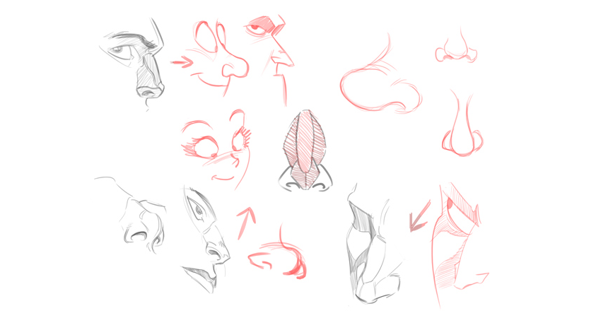
Drawing the nose in styles different than realism is pretty straightforward—you simply need to replace shading with lines. You can also ignore almost everything besides the ball, the wings, and the outline of the bridge. The simpler your style, the more elements you can safely ignore.
In cartoon styles, you can exaggerate visible elements of the nose. If the nose is pointed, you can make it almost sharp, if it’s small, you can make it tiny, and so on. This will let you accentuate the difference between the characters and will make drawing them easier.
In manga style, noses are almost non-existent, symbolic, which directly follows the simplification of other facial features (a detailed nose would bring attention to them being unrealistic). The simpler the variation of manga, the simpler the nose, with chibi being the extreme—no need to draw a nose at all!
Now you know how to draw a nose in any view and style you need! Do you want to learn more about drawing human characters? You may be interested in these tutorials, then:
We need to remove the background before using the flowers on the poster. To do this, on the Layers panel, Duplicate the Background layer by pressing Command-J and Hide the visibility of the original Background layer.
Step 3
While selecting the new layer on the Layers panel, click on the Vector Mask button to add a Layer Mask to Background copy.
Step 4
While selecting the new Layer Mask, use the Brush Tool (B). Reset the foreground/background colours by pressing D and X to switch between them. Use black as the foreground colorand paint over the image to erase the background.
Step 5
Once we have painted over with the Brush Tool, we can zoom in and work on the details. Tap the backslash key (\) to display a red overlay on the layer mask. This is useful to see if we are erasing the right parts on an image.
We should have something like this:
2. How to Set Up a New Document and Create Guides
Step 1
In Photoshop, go to File > New. Name the document Woman Up and set the Width to 1275 px and Height to 1650 px. I am using this composition as an online pamphlet, so I will be using 72 dpi. Click OK to create the document.
Step 2
Select the Background Layer and paint the layer using the Paint Bucket Tool (G) and black as the foreground colour.
Step 3
Activate the rulers by pressing Command-R. I am using inches—you can change this by going to Photoshop > Preferences > Units and Rulers.
Step 4
Click on the rulers and drag towards the page to create guidelines. I’ve set mine to 1 inch on each side. Hold Shift to drag the guideline to an even number.
3. How to Duplicate Layers
Step 1
We will duplicate the cleaned-up flower layer into the new file. To do so, select the layer Right Click > Duplicate Layer, under As: change the name to Flowers,and select Document > Woman Up. Click OK to continue.
Step 2
The flowers will appear larger than we need, so let’s resize by pressing Command-T while selecting the flowers layer. Head over to the options bar,on the Reference Point Location select the top left corner, and also select the Maintain Aspect Ratio icon. Change the Width to 30% and press Enter.
Step 3
Let’s centre the image on the poster by selecting the Background layer, pressing Shift, and clicking on the flowers layer. Head over to the options barand click on Align Vertical Centre. Then visually align the flowers layer to the poster.
4. How to Add Text Layers
Step 1
Bring up the Characters panelby going to Window > Character. Press T to add a new text layer. One the first layer, add a date, and on the second layer, add Woman Up.
Step 2
Select the text layers by holding Command and clicking on both. Let’s rotate these two layers vertically by pressing Command-T, head over to one of the corners until the rotation symbol appears, and hold down Shift to make an even rotation.
Step 3
We want to fill up the whole poster to create something with impact. Bring up the guides by pressing Command-;. Resize both text layers by pressing Command-T to fill the poster, vertically, from guide to guide. The goal is to have the title and date interact with the flower.
Step 4
Let’s add a website to balance the poster. I used Open Sans, at 25 pt, white in colour, and placed it in the top right corner, leaving about an inch margin. I used something different because Playfair Display is used, as its name suggests, for display settings and doesn’t read well in small sizes.
5. How to Add Mask Layers
Step 1
We want to create an illusion that the text is interwoven with the flowers. Let’s duplicate the flower layer by pressing Command-J and place it at the very top of our Layers panel.
Step 2
We want to work on the new flower layer and more specifically on the layer mask. Start by setting the Brush Tool (B) followed by Right-Click to a size of 30 px and Hardness of 100%.
You can interchange between black and white colours to hide or reveal parts of the image. Pressing X will interchange between these two colours, making it easier to work on the details.
We also want to pay attention to the petals that are in the foreground and background for these to make sense in terms of what is covering the text and what is behind the text. The final file and layers should be looking like the image below:
Step 3
Do the same with the date on the very left.
6. How to Add Effects to a Text Layer
Step 1
To create a depth of field, we will add a Drop Shadow layer style to the main text. Select the Woman Up text layer on the Layers panel. Click on Effects > Drop Shadow.
Step 2
A Layer Style window will pop up, and you will notice that on our poster, the text will have a shadow. We want a softer look, so let’s change to the values in the image below and click OK.
Step 3
Our text layer now will have an “fx” symbol next to it. We want to copy the drop shadow effect onto the date text layer. Select the Woman Up text layer and Right click > Copy Layer Style. On the date text layer, Right click > Paste Layer Style. The layers and the image should be looking like the image below:
7. How to Add Adjustment Layers
Step 1
At the bottom of the Layers panel, click on Add Adjustment Layer > Brightness/Contrast.
Step 2
The Properties panel for this new layer will open. We want to add more contrast and some brightness to the image to make it stand out. I added the following values; Brightness:+15 and Contrast:+20.
8. How to Save the Poster as .PSD and for Web
Step 1
Click File > Save As to save the file as a .PSD to edit it later.
Step 2
For a lower-resolution web jpeg and smaller file size, click File > Save for web (Shift-Option-Command-S). Here you can alter the quality of the image and the image size. Click on Save … and save the file.
Congratulations on Finishing This Tutorial!
We have covered an interesting skill for putting together typography poster that interacts with an image. Today we’ve learned to:
Use Layer Masks to hide and reveal parts of an image.
Use Adjustment Layers to add Brightness/Contrast to an image.
Format typography and use it in different directions to interact with the image.
Use the image’s levels of focus to our advantage to create a poster with depth.
Use Effects layers to add drop shadows to a text layer to create depth of field.
Want to warp some text? In this video from my course, 10 Essential Design Tips in Adobe Illustrator, you’ll learn all the ins and outs of distorting and warping text in Adobe Illustrator.
How to Warp Text in Adobe Illustrator
Prepare the Text for Warping
So we’re going to learn how to warp stuff. Let’s grab our Type Tool, left click anywhere on the artboard, and type some text. Let’s type „WARPED”. And we can go to the Character panel at the top, and we can pick a font—let’s go for Gotham Bold.
Then I’m going to go to the alignment options and select Align Center so that it’s in the middle. Now let’s create a couple of copies by holding Alt-Shift and dragging. So your screen should look like this:
Create a Bulge Effect
We’ll select the first piece of text, and go to Object > Envelope Distort > Make with Warp. We’ve got the Preview option checked, and we can choose the Style as well. There are lots of presets to choose from, so let’s go for Bulge, and see how that looks.
So at the moment, we are bulging this text horizontally, and we can adjust that Bend slider. So, of course, we can go up a few percent and you’ll see it starts to bulge outwards. Or we can go ever so slightly into the negatives and it will go inwards.
You could also bulge this vertically, so it’ll behave slightly differently. It really does depend what you’re going for.
Add Distortion
We could also distort this both horizontally and vertically, using the slider. So you could make one side appear larger by dragging the Horizontal Distortion slider to -100.
But let’s go for something more subtle. Choose the following values:
Horizontal Bend: -2%
Horizontal Distortion: -54%
Vertical Distortion: 25%
Then click OK, you can see that we’ve warped the text.
And if we click on it, we still have all of these options along the top, where you can change the preset and other values.
Adjust the Bulge Effect
Now, at the moment, if I press Command-Y to go into outline mode, you can see that it’s still got a box and lines around it, and I can’t change the fill color or anything.
So what I recommend is once you’ve done your warp, and you’re happy with your text, go to Object > Expand. Leave Object and Fill selected, click OK, and then we can switch into outline mode again, and you’ll be able to see your text.
Now remember, when you expand anything in Illustrator, essentially what you see becomes the paths of the shape. So this is now made up of lots of different anchor points, and we can go in and adjust these if we want to fine tune that warp.
But also, when we select it, it now has a fill color, and we can easily change it if we want to.
Create an Arc Effect
So let’s go and warp something else.
Click on the second piece of text and, as before, go to Object > Envelope Distort > Make with Warp. This time, for the Style, let’s choose Arc. So we’ll set the Distortion back to 0, and then we can bend this up or down, and of course, you can adjust the Bend to Vertical as well.
Let’s try these settings:
Vertical Bend: -72%
Horizontal Distortion: -100%
Vertical Distortion: 0%
And it should look like this:
Adjust the Arc Effect
Once you’re happy with your warp, and you’d like to start adding color to it, or possibly getting creative and adding some strokes or brushes, you can go to Object > Expand. Leave Object and Fill selected, click OK, and now we can get creative with this.
Let’s add some brushes. We’ll start by swapping the fill and the stroke, so we now have an outline. And from the Brushes panel, let’s choose a pencil brush with an orange color.
So those are a few ways to warp text in Illustrator, and now I’ll leave you to go and have a lot of fun experimenting with them.
Watch the Full Course
In the full course, 10 Essential Design Tips in Adobe Illustrator, you’ll learn about ten essential design tips to help you bring your creative ideas to life in Adobe Illustrator. You’ll master a variety of different techniques, helping you to boost your creativity and transfer your ideas to a digital canvas.
You can take this course straight away with a subscription to Envato Elements. For a single low monthly fee, you get access not only to this course, but also to our growing library of over 1,000 video courses and industry-leading eBooks on Envato Tuts+.
Plus you now get unlimited downloads from the huge Envato Elements library of 490,000+ creative assets. Create with unique fonts, photos, graphics and templates, and deliver better projects faster.
Agregator najlepszych postów o designie, webdesignie, cssie i Internecie