In this tutorial I’ll show you how to use Adobe Photoshop to create a colorful 3D floral collage featuring a beautiful woman.
First, we’ll isolate the model from the background. After that, we’ll add our background. Then we will cut out the model to create a 3D effect. Later, we will add the flowers and crystals. Next, we will import the waves, the jewelry, and the crow on the model. Then, we will the tribal marks and geometrical shapes to keep the collage balanced. Finally, we will adjust the contrast, vibration, and saturation using Adobe Lightroom. Let’s get started!
Tutorial Assets
The following assets were used during the production of this tutorial:
1. How to Isolate the Model and Prepare the Base Background
Step 1
Create a new 2160 by 1440px document in Photoshop with the given settings:
Step 2
Open the model image. Cut out the image using the Pen Tool (P). Find a spot on the main image to start drawing the outline. As we’re drawing, we want to zoom in closer to the subject. Press Control-(+) or Control-(–) to zoom in and out.
Step 3
Now that we have drawn the outline, we want to soften the edges of the hair before removing the background. Right-click, Make Selection, and then select the Marquee Tool (M). Once the option bar pops up, choose Select Inverse and click on Select and Mask. This will open the Select and Mask Workspace.
Step 4
Then, activate the Refine Edge Brush Tool (R). Brush over any detailed hair areas that are missing from your selection with this tool (we can change the brush size and hardness from the brush drop-down in the top left). This will select the detailed hair areas and remove the contrasting background. When you are done,click OK.
Step 5
Now we want to remove the background. Select the Marquee Tool (M). Right-click and Select Inverse. Then hit Delete.
2. How to Bring the Image Into the Main Canvas
Drag the image into the main canvas using the Move Tool (V).Then, resize by pressing Control-T. This will bring up the transformation tools you want. We do not want the image to deform or stretch, so press Shift while resizing. Then press Enter.
3. How to Create a Colorful Background
Step 1
Press Control-Shift-N to make a new layer. Name the layer “Background”. Set this layer under the model’s one.
Step 2
Activate the Rectangle Tool (U) fill it with the blue color #1caeb3 and drag the rectangle over the whole background.
4. How to Create the 3D Cuts on the Model
Step 1
We want to cut out the model’s top head and a little bit of the forehead. Activate the Pen Tool (P), andthen outline the top part as shown below.
Step 2
After drawing the outline, Right-click and select Make Selection. Make sure the model’s layer is selected. Then press Delete on the keyboard.
Step 3
Next, we want to cut out the bottom part of the model. Activate the Pen Tool (P), and then outline the bottom part, following the body shape as shown below.
Step 4
After drawing the outline, Right-click and select Make Selection. Make sure the model’s layer is selected, and then press Delete on the keyboard.
Step 5
Now we want to create the 3D effect. Activate the circle Ellipse Tool (U), fill it with black #000000, and then draw a circle on top of the model’s head and place the layer under the model’s layer. Next, name the layer head ellipse.
Step 6
Next, we want to do the same for the bottom part. Activate the Ellipse Tool (U), fill it with black #000000, and then draw a circle on the bottom part and place the layer under the model’s layer. Next, name the layer body ellipse.
5. How to Add the Flowers and Crystals
Step 1
Drag the flower onto the main canvas. Then, Press Control-T to resize the image. We do not want the image to deform or stretch, so press Shift while resizing, and then press Enter. Use the Move Tool (V) to center the image. Next, place the flower’s layer under the model’s layer.
Step 2
Now, press Control-J to duplicate the flower. Activate the Move Tool (V) to bring the flower onto the bottom part.
Step 3
Then, we want to make the flower slightly bigger. Press Control-T to resize the image, holding Shift while resizing. Right-click and select Flip Horizontal, and then press Enter. Use the Move Tool (V) to center the image. Then, place the flower’s layer under the model’s layer.
Next, we want to change the flower’s hue.
Step 4
Now we want to change the flower’s hue. Select both layers, Right-click, and Merge Layers. Then, Press Control-U tobring out the Hue/saturation adjustment layer. Then change the Hue to -61 and the Saturation to +31.
Step 5
Now we want to add the crystals. Drag the crystal onto the main canvas. Then, press Control-T to resize the image, holding Shift while resizing, and then press Enter. Use the Move Tool (V) to place the crystals on the right.
Step 6
Now, we want to add another small crystal in the head. Press Control-J to duplicate the crystal and press Control-T to resize the image, holding Shift while resizing. Use the Move Tool (V) to place the duplicated crystal as shown below.
6. How to Add the Waves, the Jewelry, and the Crow
Step 1
Import the waves onto the main canvas. Place the layer above the model’s layer, and then press Alt and click on the adjustment layer to place the image on the model only.
Step 2
Open the mirror picture in Photoshop. Use the Pen Tool (P) to cut the crown and remove the background. Drag the jewelry into the main file on top of the model’s neck. Press Control-T, holding Shift while resizing the image.
Step 3
Drag the crow image into the main file. Resize the image. Press Control-T, holding the Shift key while resizing. Use the Move Tool (V) and bring the crow onto the model’s left shoulder.
7. How to Make the Model Black and White and Add the Circle and Tribal Marks
Step 1
Now we want to turn the model black and white. Select the Model layer in the Layers panel and turn it to black and white. Click on Image > Adjustments > Black and white, and then click OK or Alt-Shift-Control-B.
Step 2
Now that we’ve turned the model black and white, we want to add a colorful circle behind to make her pop. Activate the Ellipse Tool (U), make the fill color of the circle sky blue (#00fcff), and place the layer right above the background layer.
Step 3
Now we want to add some tribal marks. Use the Ellipse Tool (U), make sure the fill color is white, draw a circle, and use the Move Tool (V) to place it on the model’s forehead. Then press Control-J to duplicate the circle and use the Move Tool (V) to place the duplicated circle on the chin.
Step 4
We want to add the remaining marks on the model’s chest. Use the Ellipse Tool (U), make sure the fill color is white, draw a small circle, and duplicate the layer four times by pressing Control-J. Select all four layers, Right-click, and Merge Layers. Then duplicate the merged layers three times and use the Move Tool (V) to place them as shown below.
8. How to Add Lines, More Flowers, and Additional Elements
Step 1
Activate the Rectangle Tool (U). Fill it in sky blue (#00fcff) and drag a thin rectangle on top of the model. Then, press Control-J to duplicate the rectangle three times. Place one rectangle under the model’s layer and use the Move Tool (V) to place it under the shoulder. Now we want to make this line thicker. Press Control-T and drag the rectangle vertically to make it thicker.
Step 2
Next, we want to add two circles at the end of the thin lines to balance it. Activate the Ellipse Tool (U), fill it in sky blue (#00fcff) and draw a small circle on the left side, on top of the rectangles. Then, press Control-J to duplicate the circle and use the Move Tool (V) to place the duplicated circle on the right side as shown below.
Step 3
Now that we’ve added the lines, we want to add more flowers. Select the flowers layer and press Control-J to duplicate it. Then activate the Move Tool (V) to slightly move it to the right side as shown below.
Step 4
Now we want to add a colorful line on the model’s hair to make it pop more. Activate the Rectangle Tool (U), fill the color in purple (#ff00d2) and draw a thin, medium rectangle. Then press Control-T to rotate the rectangle. Then, use the Move Tool (V) to place it on the right edge as shown below.
9. How to Do the Final Retouching in Adobe Lightroom
Step 1
Now we want to make the entire image pop out more. Export the photo as a JPEG from Photoshop. Import the picture in Lightroom. Then click develop. Boost the Temperature to +5, Clarity to+33, Vibrance to +14, and Saturation to +7.
Step 2
We want to play more with the hue and saturation. Go to the hue palette. Bring the Purple hue to +100 andthe Magenta hue to +100. Then click on the Saturation panel. Set the Red hue to -9, the Orange hue to +24, the Aqua hue to +100, the Blue hue to +2, and the Purple and Magenta hue to +100.
10. How to Export the Final Artwork From Adobe Lightroom
Now that we are finished, we want to export our artwork as a JPEG. Click File, and then Export. Select in which folder we want to save our image. Then click Export.
Awesome Work, You’re Done!
I hope that you’ve enjoyed the tutorial and learned something new for your own projects. Feel free to share your results or leave comments in the box below. Keep creating!
Drawing a star may seem simple and overwhelming at the same time. For example, how to construct a five- or a seven-pointed star and make your drawing technically correct? If this theme is something you’re interested in, let’s dive into the fascinating world of stars and geometry.
In this tutorial, I’ll show you the way to design different kinds of stars, from a three-pointed to an eight-pointed one. We’ll use ordinary tools like a ruler, a graphite pencil, compasses, and a protractor.
As a fun bonus, we’ll also explore a way to draw a five-pointed star in a casual way, without any serious measurements.
I recommend following this tutorial from start to finish; every part demonstrates the common basic features, but an understanding of the simpler examples will help you to master more complex methods.
If you’re interested in this type of tutorial, we have a whole series of Geometric Drawing tutorials which you may also enjoy.
What You Will Need
You will need the following equipment to complete this project:
a graphite pencil (I recommend using an HB or H type, and please make sure it’s sharp)
a pair of compasses
a protractor
a ruler
an eraser
an ink pen (an optional tool)
drawing paper
1. How to Draw a Three-Pointed Star
Step 1
I mark the central point with a graphite pencil, and then draw a small circle of an arbitrary radius, using the compass. It’s important to leave enough space around this circle.
Keep your pencil marks light, just in case you decide to erase the subsidiary lines later on.
Step 2
I draw a bigger circle, using the central point as a reference.
Step 3
I draw a straight line that is going upwards from the center of the circumference. If you need perfectly even lines, make sure you use a ruler.
Step 4
A circle has 360 degrees. To draw a three-pointed star, we should create three equal sectors; 360 divided by 3 is 120.
With a protractor, I construct a sector that has an angle of 120°. The central point and the vertical line are our references for the measurements.
Step 5
I create another sector of the circle with the angle of 120°. Now we have three lines; the points where they meet the bigger circumference are the apexes of our star.
Step 6
It’s time to divide each sector in two. With the protractor, I find the angles of 60° and mark the segments with dashed lines.
I also mark the points of intersection where these lines cross the small circle.
Step 7
I connect the points with the apexes. Now we have a beautiful three-pointed star!
Step 8
I outline the contours of the star, using an ink pen.
This step isn’t obligatory; it’s just useful to emphasize the main lines of the figure. You can erase all subsidiary pencil lines or leave them—it’s completely up to you.
2. How to Draw a Four-Pointed Star
Step 1
I draw a small circle of an arbitrary radius, using a pencil and a compass.
Step 2
I add a bigger circle that is encircling the existing one.
Step 3
I add a straight vertical line going from the center of the circle.
Step 4
With the protractor, I find a 90° angle and create the first sector.
I add two more lines, based on the same method; now we have four sectors, each with an angle of 90°. The points where the lines cross the bigger circumference are the apexes of our star.
Step 5
Let’s divide each sector in half. To do that, I find the angle of 45° within each sector and mark the new segments with dashed lines.
I also mark the points of intersection, where these lines cross the small circle.
Step 6
I connect the points with the apexes, using straight lines. The four-pointed star is complete!
Step 7
I outline the contours of the star, using the ink pen.
3. How to Draw a Five-Pointed Star
Step 1
I mark the central point with a pencil, and then draw a relatively big circle of an arbitrary radius, using the compass.
Step 2
I add a vertical line that is going from the central point of the circle.
Step 3
Let’s find the first sector with a protractor; its angle should be 72°.
Using the same principle, I add more lines. Now we have five sectors; the points where the lines cross the circumference will be the apexes of our star.
I also name these points with letters, just to simplify the process and make it visually clear.
Step 4
I connect the points A and B with a straight line.
Step 5
I connect the points A and C with a line.
Step 6
In the same manner, I join the point B and the point D.
Step 7
I connect the point E with the points D and C. The shape is complete!
Step 8
With an ink pen, I outline the contours of the star, and then erase the unnecessary captions.
4. How to Draw a Six-Pointed Star
Step 1
I mark the central point and draw a relatively big circle of an arbitrary radius, using the compass.
Step 2
I add a straight vertical line from the center of the circle.
Step 3
To draw a six-pointed star, we need to create six equal sectors, each with an angle of 60°.
I create the first sector, using the protractor.
I add the sectors, using the same principle, and name the points of intersection with letters.
Step 4
I connect the points A and B.
Step 5
Now I connect the points B and C.
Step 6
I connect another pair of points, this time A and C. Now we have a triangle.
Step 7
I connect the points D and E with a straight line.
Step 8
I join the points E and F.
Step 9
I connect the points D and F; now we have another triangle, and the shape of the hexagram is complete.
Step 10
I outline the contours of the star with black ink pen lines.
Step 11
By the way, there is another method of drawing a six-pointed star, this time without a protractor. Let’s try this option!
I draw a circumference of an arbitrary radius, using the compass.
Step 12
I add the lines (a vertical and a horizontal one) that are going right through the central point of the circle. Let’s agree that the upper point of intersection is the point A.
Step 13
Put the needle point of your compass right into the point A, and measure the distance between this point and the center of the circle.
Then, without removing the needle point, measure the same distance on the circumference. You’ll get the point C on the right side and the point B on the left side.
Repeat this action several times, shifting the needle point of the compass, and name the points you get with letters.
Step 14
I connect the points A and D, A and E, and D and E with straight lines. Now we have the first triangle.
Step 15
I connect the points B and C, C and F, and F and B with straight lines. We get the second triangle, and the star is complete!
5. How to Draw a Seven-Pointed Star
Step 1
I draw a circumference of an arbitrary radius, using the compass.
Step 2
I draw a straight vertical line that is going downwards from the central point of the circle.
Step 3
When 360 is divided by 7, we get a fractional number, so we have to pick the closest value (51°). I create a set of sectors that have angles of 51°, using the vertical line as a reference.
I also name the points of intersection with letters.
Step 4
I connect the point A with the points B and C.
Step 5
I join the points B and D.
Step 6
I connect the points D and E.
Step 7
I join the points E and F.
Step 8
I connect the points F and G.
Step 9
I connect the points G and C. The shape is complete!
Step 10
I outline the contours of the heptagram, using the ink pen.
6. How to Draw an Eight-Pointed Star
Step 1
I draw a circumference of an arbitrary radius, using the compass.
Step 2
I add a straight vertical line that is going upwards from the center of the circle.
Step 3
360 divided by 8 is 45, so we have to construct the sectors that have angles of 45° each. I create the first sector, using the existing vertical line as a reference.
I complete the set of sectors and name the points of intersection.
Step 4
I connect the points A and D with a straight line.
Step 5
I connect the points D and G.
Step 6
I join the points G and B.
Step 7
I connect the points B and E.
Step 8
I connect the points E and H. Do you foresee where the next line will be?
Step 9
I join the points H and C.
Step 10
I connect the points C and F.
Step 11
I connect the points F and A. The octagram is complete!
Step 12
I outline the contours of the star with ink lines.
7. How to Draw a Five-Pointed Star in a Casual Way
Step 1
Are you tired of making calculations and measuring everything? The serious part is over, so let’s relax and draw a pentagram in a casual way.
I draw a straight inclined line, using a pencil and a ruler. You can use a ruler, too, or draw the lines just by hand.
Step 2
I draw another inclined line, starting from the top point of the existing one. Now we have a contour resembling an upturned “v” letter.
Step 3
I add another line going to the left-hand side.
Step 4
I add a straight horizontal line.
Step 5
I complete the shape of the star, connecting the points with a finishing line.
By the way, it’s possible to draw a star following the same method, by marking all five points beforehand and then connecting them with lines.
Your Drawings Are Complete
Congratulations—you did it! Now you can draw different kinds of stars. I hope the compass and protractor became your best friends, and together you’ll create many more geometrical objects.
Creating technically perfect figures requires skill and patience, so if your stars came out slightly uneven at the first attempt, don’t give up—just try again. Sometimes the tools we use allow imperfections, like the inaccuracy of the protractor’s grid.
At the same time, remember to have fun and enjoy the process!
In this tutorial, I will teach you how to create an African celebratory pattern in Adobe Illustrator. To bring this pattern to life, we’ll create different elements that represent African culture such as sacred African symbols, shapes, and silhouettes, and then we’ll combine all the elements to create a seamless pattern. Excited? Let’s get started then!
1. How to Set Up the Canvas
Create a new 600 px by 600 px document in Illustrator with the given settings:
2. How to Create the Triangles
Step 1
We’ll start by forming the first element of our pattern: triangles. First, select the Polygon Tool, and thenclick once on the canvas and change the radius to 50 px and the Sides to 3.
Step 2
Next, change the fill color to teal #14aaa3.
Step 3
Now that we have changed the color of the first triangle, we want to duplicate the triangle and rotate it. Activate the Selection Tool (V), and then select the shape and hold down Alt on the keyboard, and drag the shape while pressing Shift. Next, press Control-D seven times to create more triangles.
Step 4
Now that we have our triangles, we want to group them and change the rotation. Activate the Selection Tool (V), select all the triangles, and press Control-G to group them.Next, select the grouped elements, Right-click, select Transform, and then Rotate. Change the angle to 180.
Step 5
Now, we want to center the shapes. Select the elements, and then press Shift-F7 to bring out the Align panel and click on Horizontal Align Center. Make sure to select Align to Artboard in the Align adjustment panel.
Step 6
Next, we want to add another layer of triangles on top. Activate the Selection Tool (V), and thenselect the triangles, hold down Alt, and drag the shape slightly on top while pressing Shift. Fill it in yellow #edb71e.
3. How to Create the Circles and the African Symbol
Step 1
Create a new layer and name it medium circles. Then, activate the Ellipse Tool (L), fill it with red #e22227, and click on the canvas. Change the Width and Height to 20 px.
Step 2
Next, place the circle between the first two triangles. Activate the Selection Tool (V), select the circle, hold down Alt, and drag the shape down while pressing Shift as shown below.
Step 3
Now, we want to duplicate the circles between each triangle. Activate the Selection Tool (V), select the circles, and press Control-G to group them. Then, hold down Alt and drag the shapes into the spaces while pressing Shift as shown below.
Step 4
Before creating the African love symbol, we want to separate each part with thin rectangles. Activate the Rectangle Tool (M), fill it in red #e22227, and then click on the canvas and change the Width to 600 px and Height to 5.3333 px as shown below.
Step 5
Next, activate the Selection Tool (V) and place the shape under the triangles. Then duplicate the shape by pressing Alt on the keyboard, and drag the shape as shown below.
Step 6
Now we want to create the African love symbol. Create a new layer and name it Love symbol. Then, activate the Pen Tool (P) and start by drawing half of the shape as shown below.
Step 7
Then duplicate the shape by pressing Alt on the keyboard, and drag the shape as shown below.
Step 8
Now, we want to reflect the shape. Select the duplicated shape, Right-Click, and select Transform>Reflect.
Step 9
Now that we have reflected the shape, we want to finish the symbol. Activate the Pen Tool (P), click on the bottom right anchor point, and draw the shape as shown below.
Step 10
Next, select the Pen Tool (P), and click on the top left anchor point to finish the left wing as shown below.
Step 11
Now that we have finished drawing the symbol, we want to change the color. Fill it in a light yellow #fcde62. Next, activate the Selection Tool (V) and make the shape smaller, pressing Shift while resizing. Then, select the symbol and place it as shown below.
Next, we want to duplicate the shape. Select the symbol and hold down Alt on the keyboard, and drag the shape while pressing Shift. Next, press Control-D until the space is filled.
4. How to Create the Woman Silhouette
Step 1
Create a new layer and name it woman. Then, activate the Ellipse Tool (L) and fill it in cream #f4eabc, and click on the canvas. Change the Width and Height to 15 px.
Step 2
Then, select the Pen Tool (P) and start drawing the body as shown below. Start from the circle to the left arm and keep moving.
Step 3
Now that we have finished drawing the silhouette, activate the Selection Tool (V) and place the shape under the rectangle shape. Next, we want to duplicate the shape. Select the silhouette, hold down Alt on the keyboard, and drag the shape while pressing Shift.
Step 4
Next, we want to fill the space with more silhouettes. Press Control-D until the space is filled as shown below.
5. How to Create the Man Silhouette
Step 1
Before drawing the man silhouette, we want to break the designs with more lines and circles in between. First, drag one of the previous red rectangles, hold down Alt on the keyboard, and drag the shape while pressing Shift. Duplicate the shape twice, as shown below.
Step 2
Next, we want to fill the space between the two lines with small circles. Activate the Ellipse Tool (L), fill it in yellow #ecb71e, and click on the canvas. Change the Width and Height to 9 px.
Step 3
Now, use the Selection Tool (V) to place the circle between the two shapes, and duplicate the circle once. Press Alt on the keyboard and drag the shape while pressing Shift.Duplicate the circle as shown below.
Step 4
Next, we want to fill the space with more circles. Press Control-D until the space is filled as shown below.
Step 5
Now that we have broken down our pattern a little bit, we want to draw the man silhouette. Activate the Pen Tool (P) and draw the silhouette as shown below.
Step 6
Next, we want to draw another shape between the arms and the trumpet. Activate the Pen Tool (P) and draw the shape as shown below.
Step 7
Now that we’ve finished drawing the silhouette, we want to change the color and duplicate the silhouette to fill the space. Select the silhouette and fill it in cream #f4eabc. Then, select the shape between the arms and fill it in green #10755b. Next, select both shapes and press Control-G to group them. Then, press Alt on the keyboard, drag the shape while pressing Shift, and pressControl-D until the space is filled as shown below.
6. How to Create the Waves, Triangles, and Background
Step 1
First, we want to break down the pattern a little bit. Activate the Rectangle Tool (M), fill it with cream #f4eabc, and draw a thin rectangle under the silhouette as shown below.
Step 2
Now, we want to draw the waves. Choose the Pen Tool (P), fill it with blue #17aaa3, and then place each wave between the silhouettes as shown below.
Step 3
Next, we want to duplicate the triangles and circles from the top to the bottom. Select the triangles and circles and press Control-G to group them. Then, press Alt on the keyboard and drag the shapes under the rectangle as shown below. Hold Shift while duplicating. Next, select the duplicated elements, Right-Click, Transform>Rotate.
Step 4
Now that we have finished drawing all objects, we want to add our background. Create a new layer and name it background. Place this layer under all layers. Then, activate the Rectangle Tool (M) and fill it in green #10755b. Next, drag the rectangle all over the canvas as shown below.
7. How to Make the Pattern Seamless
Step 1
Now, we want to readjust the design to be able to make it seamless. All elements except the lines have to be inside the artboard. Activate the Selection Tool (V), select all the objects that are hanging on the sides, and resize them as shown below.
Step 2
Now that we have adjusted everything, we want to make a clipping mask to remove any objects hanging around the artboard. Activate the Rectangle Tool (M), fill it with white #ffffff, and click on the canvas. Change the Width and Height to 600 px. Then, select all elements, including the background, and Right-click > Make Clipping Mask.
Step 3
Here is the fun part! We can now make it seamless. Select the artwork, and then go to Object> Pattern > Make. Change the Width and Height to 600 px.
Congratulations! Our African Celebratory Pattern Is Done!
Great job! We’ve finished creating our African celebratory pattern. I hope this tutorial brought you a joyful mood and helped you to discover some new tips and tricks which will be useful for your future artworks! Keep creating.
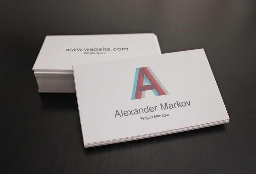
In this tutorial we’ll create an editable business card mockup using very simple photography and Photoshop techniques. You’ll be able to transform your photo into a customizable template, to showcase your design with elegance.
A mockup is an editable template that you can use to showcase a replica/model of your final product: in the graphic design field, it’s used to offer your clients a very detailed preview of what they ordered—in this case, a photo of their printed business cards.
The Workflow
These are the steps we’re going through for this tutorial:
How to Design Your Card/Flyer. Use any software you prefer; Illustrator and InDesign are recommended when designing printable graphics.
How to Photograph the Business Cards. Place blank cards or any stationery element on a surface and take photos of them.
How to Choose and Edit the Photos in Photoshop. Choose the best photos and retouch the composition.
How to Add Smart Objects to the Photographs. The card design will be added using these smart templates that automatically apply transformations and filters to a given image.
You can apply the techniques used in this tutorial when creating any type of stationery or branding mockup, so that you can show your customers a photo of the final printed result, without having to actually print it.
Not everyone has access to professional photo shooting tools, but I will show you how to achieve a professional looking mockup nonetheless. For this tutorial, you need Adobe Photoshop CS5 (or superior) and the best camera that you can access (even a good smartphone camera is surprisingly efficient).
1. How to Design Your Business Card
Step 1
When you have to design a standard business card, consider the country to which you will have to deliver it and establish with your client the dimensions before starting your work. Each country has its own most used dimensions; you can refer to this guide for more information.
You most likely want to set up your document in Illustrator or InDesign, because they’re specifically created for the printing process. However, Photoshop can prepare a print document as well.
If you like to work in Photoshop when it comes to printable graphics, you can use these useful Photoshop Actions: they automatically create documents in CMYK mode, 300DPI, with most of the standard international print sizes, including bleeds (necessary for the printing process).
Step 2
When creating a mockup, you don’t need to consider the bleeds and cut size because you can just place your design in the correct position. However, you should always design a business card in vector format, with print-ready colors, and consider the necessary bleed amount. Check out more detailed guides on how to design a business card if you want more information.
For this tutorial, we’ll use this simple design that I prepared.
2. How to Prepare the Scene and Take Photos of Blank Business Cards
When it comes to photography, there’s a great abundance of guides and books dedicated to the photo shooting process: the lighting setup, the camera setup, etc. I’m not going to pretend to give you a complete explanation of these vast topics in these few lines, but I will tell you the simple key steps that will make your photo decent, even if the setup and the lights are not ideal.
Step 1
A darker photo is always better than a brighter one. To deal with an underexposed photo is easier than an overexposed one.To retouch a darker photo is better than a darker one because in Photoshop you can restore information from darker shadow areas and reveal some of the lost details a lot more easily than you can from areas that are too bright, where sometimes all the pixels are just plain white.
Step 2
Always have one or more dominant light sources. Try to have a clear light direction in order to create an attractive defined contrast between lights and shadows that will make your design a lot more distinguishable.
If you have no distinctive light in your scene, the subject will be very dull and bland in the final photo. You can use as many lights as you want. If you think the natural available light is too strong and will burn your shot, tune down the exposure in your camera: the correct exposure is always between 0 and -1.
Step 3
Be generous with the subject’s background.Maybe this is personal, but from experience I think it’s always better that you take a photo which includes more background than you will actually need: you can crop the photos in Photoshop carefully and focus on the exposure and scene while taking the photos.
Many times it will happen that you want more „air” on your subject, and you’ll have to create parts of the background because we took the photo too close to the subject.
For this tutorial we’ll be working on this sample above: as you can see, I included more background than I would need, so that in Photoshop we have an easier time cropping the subject and a lot of space to work with. Below,you can see the actual final area used.
Step 4
Prepare the scene, being consistent with your task. Take your time positioning your elements on the surface and use your taste trying to create a composition that makes sense. Showing two sides of the card is the most obvious choice, but not mandatory.
For example, it’s not a fixed rule that the cards have to be placed with geometry (as I do in most my mockups because they look more institutional/corporate): in fact, they could be scattered on the table, or even aligned as a card castle as long as you think it’s attractive for you or your client.
Experiment, and don’t stop trying other positions, moving the elements on the surface. Take many photos from many angles, change the light direction and intensity, etc. Always guarantee yourself plenty of selections at the end of the shooting section.
3. How to Do the Photo Selection and Retouching
Step 1
Once we have finished the photography phase, transfer the photos from the camera to the computer and open Photoshop. If you prefer Lightroomto adjust lighting and contrast, that is also a very valid alternative, but you will need Photoshop to create the Smart Objects for the business card design.
Let’s continue with our sample: we’ve reached the point where we’ve decided how to crop our photo to enhance the subject. Use the Cropping Tool (C) or make a Selection with the Rectangular Marquee Tool (M) and then go to Image > Crop.
Step 2
Now let’s move on to adjusting the lighting, color, and contrast, and removing eventual spots and unwanted details. Before doing anything, we want to remove dust and spots that sometimes will be visible on the surface that we used, especially if it’s dark.
Step 3
Select the Clone Stamp Tool (S), Alt-click on a clean spot to refer to that portion of image, and then click on the spot that you want to cover. Also, the Healing Brush Tool (J) can be used efficiently. Below is the clean photo.
Step 4
To reduce the reddish tone of the photo, I applied these „Black & White” adjustment settings. To create a new Adjustment Layer, go to Layer > New Adjustment Layer > Black & White…
Step 5
I added also a soft light in the center to brighten the scene a bit. To create that soft light effect, pick a large Brush (B) with hardness set to 0%, and paint a white circle on a New Layer. Change the Blending Mode of this layer to Soft Light, and our document should look like the image below.
Step 6
Now it’s time to add the Smart Objects that will contain our card designs. First of all, we need a template the same size as the card, so we create a selection using the Rectangular Marquee Tool (M) in Fixed Ratio mode, and enter the proportions of our card, which are in this case 3.5 x 2 since the card itself is 3.5 in x 2 in.
It’s not important that this selection matches the actual size of the card design; however, it is mandatory that we use the same proportions. In this step, you have to create a selection which is as close as possible to the business card below. It depends on the photograph’s dimensions.
Step 7
Fill the selection with any color on a New Layer and name this layer Front Card. The layer in blue named Front Card will become our front card design.
Step 8
Right Click on it in the Layers panel and Convert to Smart Object.
Step 9
Set the Front Card Layer to Multiply Blending Mode so we can see what happens, and transform the layer using the Free Transform Tool (Control-T). At the corners of your layer there are anchor points indicated by small squares; while holding Control, clickon each of them to position this layer and match the card’s perspective.
Step 10
Sometimes you will also need to use the Warp Tool while transforming, because the cards bend slightly. (The Warp Tool on Smart Objects is available only from Photoshop CS5 and higher.)
Step 11
Do the same process with the card back, creating a New Smart Object (we’re using a red color this time). The fastest way to do this is to create a duplicate of that Front Card Smart Object.
So Right-Click on the Front Card Layer and choose the option New Smart Object Via Copy, which will create a new editable copy of that Smart Object.
Step 12
Enter in the newly created Smart Object (Right Click > Edit Contents) and fill this one with another color (I used red) so we can distinguish them better. Finally, name this red layer Back Card. Apply the same transformations as we did with the blue layer, trying to match the corners as precisely as possible. The document should look like this.
Step 13
In this case, for the red Back Card layer, we will also have to apply a Layer Mask because the card at the back is partially covered by the ones in front. To do so, hold Control and clickon the Front Card layer in the Layers panel; this will create the selection that we need.
Step 14
Then clickon the Back Card layer and then on the Layer Mask icon.
Step 15
We just need to Invert the Layer Mask for our task, so click Control-I on the Layer Mask.
Step 16
Make manual adjustments if needed; below you can see how it was necessary to cover a bit of the card space that didn’t match the starting selection. Using the Lasso Tool (L), we select the small parts that still need masking.
Step 17
Now we need to blend the cards smoothly into the photo. The Multiply Blending Mode and the Layer Mask already do a great job, giving the illusion that the tops of the cards are now blue and red, but there’s a detail that makes the composition still not realistic, and that is the depth of field.
To give the illusion of depth of field in certain areas, we just need to blur the edges of the Smart Objects so that they match the amount of blur in the photo below. Select the Back Card Layer (and not the Mask), go to Filter > Blur > Gaussian Blur, and choose an amount that matches the photograph below—for our photo, a value of 2/3 pixels.
Step 18
Below you can see the edges before and after the blur. Remember to work on the Smart Object so that it will register the Blur Filter as a Smart Filter and it will not modify the starting image inside of it. That’s why it’s called non-destructive, because it doesn’t actually modify the content of the Smart Object, but it works on its appearance.
As you can see on the right where the Blur has been applied, the corners and edges blend together with the photo, resulting in a more realistic effect. But not only the edges—once you apply the design on the card, it will look out of place if it’s really focused and sharp, while the area surrounding it is all blurred.
The blur amount must be consistent throughout the picture in order for the design to really blend in the photo.
Step 19
Select Back Card, Right Click on the layer, and then Edit Contents: doing so will open a new document (the Smart Object) where you can see our red layer.
Step 20
The content of the Smart Object should look like this.
Step 21
At this point, we just need to place our design into this document. Go to File > Place and select your image.
Step 22
Close the Smart Object now and Photoshop will ask you to Save. Click Yes and the Smart Object will automatically update the image, maintaining transformations and adjustments, so instead of the red color we have our design now.
Step 23
Do the same process with the Card Front Layer, and you have your beautiful, ready-to-use, customizable mockup.
Awesome! Our Mockup Is Ready to Be Used
Test this mockup with other designs: the Smart Object will do all the work for us, and we can utilize this template to preview as many as we want. They can be also used to showcase flyers and posters because the photo doesn’t give any reference to the real size of the paper sheets. So they could be any size you need, as long as the proportions of the card and your design are more or less maintained.
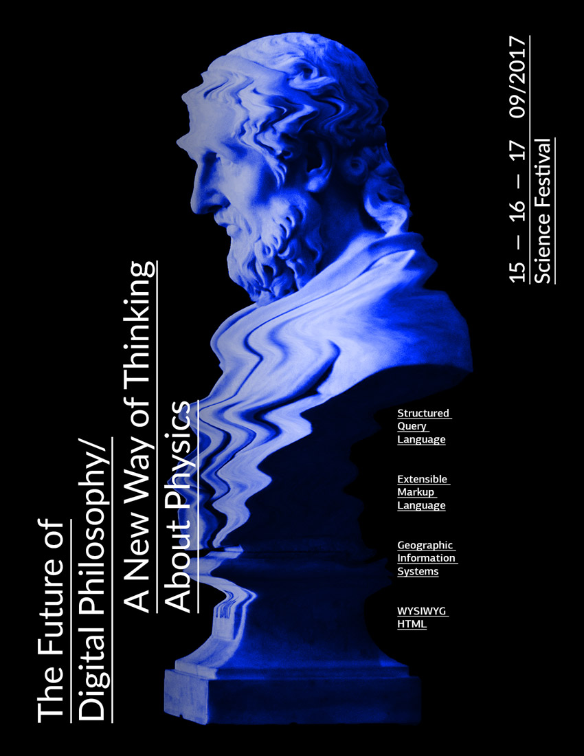
Before using it on the poster, we will remove the background and use the bust that is in focus. To do this, in the Layers panel, Duplicate the Background layer by pressing Command-J. Click on the eye icon to Hide the visibility of the original Background layer.
Step 3
While selecting the new layer in the Layers panel, click on the Vector Mask button to add a Layer Mask to Layer 1.
Step 4
While selecting the new Layer Mask, select the Brush Tool (B). Use black as the foreground colorand paint over the image to erase the background.
Step 5
Once we have painted over most of the image with the Brush Tool (B), we can Zoom in (Z) and work on the details.
Step 6
If needed, tap the backslash key (\) to display a red overlay on the layer mask. This is useful to check if we have erased the right parts of the image.
Step 7
Let’s go ahead and crop the image using the Crop Tool (C) and crop the bust to a manageable size.
2. How to Set Up a New Document, Create Rulers, and Duplicate Layers
Step 1
In Photoshop, go to File > New. Name the document The Future of Philosophy, and set the Width to 1275 px and Height to 1650 px. I am using this composition as an online pamphlet, so I will be using 72 dpi with Background ContentsWhite. Click OK to create the document.
Step 2
Activate the rulers by pressing Command-R. I am using inches—you can change this by going to Photoshop > Preferences > Units and Rulers.
Step 3
Click on the rulers and drag towards the page to create guidelines. I’ve set mine to 1 inch on each side. Hold Shift to drag the guideline to an even number.
Step 4
Let’s duplicate the bust layer with the layer mask onto our Future of Philosophy file. To do so, select the layer and Right Click > Duplicate Layer. Under As, change the name to Bust and select Document > The Future of Philosophy. Click OK to continue.
Step 5
Let’s make the image smaller by using the Transform Tool (Command-T). I am leaving about 1 inch on the top and the bottom as margins. You can hide the guides by pressing Command-;.
Step 6
Select the background layer and paint the layer using the Paint Bucket Tool (G) and black as the foreground colour.
3. How to Use Adjustment Layers
Step 1
The image is looking yellow in tone, so let’s manipulate it to give it a futuristic feeling. On the Layers panel,select the Bust Layer and click on Create New Fill or Adjustment Panel > Black & White. This will add a layer on top of our image without committing to turning the image itself Black and White.
Step 2
The Properties panel will open up, and we can adjust the colours that are turning black and white. The highlights are looking too burned and we are losing some definition, so let’s look for the blue colour and move the slider to the left. That looks better!
Step 3
To make it even more futuristic, let’s add a blue overlay. On the Layers panel, click on create a New Layer. Using the Bucket Tool (G), select a foreground colour of blue with the following code: #0030ff. Paint over the layer and set the Blending Mode to Overlay.
4. How to Use the Liquify Tool
Step 1
Select the Bust Layer and duplicate it by pressing Command-J. Hide the visibility of the original layer by clicking on the eye icon, and go back to the copy.
We need to keep the masked image only. If we go ahead and use the Liquify Tool, we will only see the results on the spaces the mask is revealing. While selecting the bust layer, hold Command and select the Layer Mask. This will select the spaces we didn’t hide at the beginning.
Step 2
Make sure that the bust layer is selected and not the layer mask. We want to delete the opposite of this, so let’s inverse it by pressing Shift-Command-I and Delete.
Step 3
Deselect by pressing Command-D. Delete the Layer Mask by clicking on the layer mask, Right Click > Delete Layer Mask.
Step 4
Go to Filter > Liquify (Shift-Command-X), and a new window will pop up showing the selected bust later. For this specific image, we want to create a digital glitch look.
Step 5
Let’s use the Forward Warp Tool (W). On the right side of the window, we can tweak the Tool Options. Since we want to make small glitches, we can start with a Brush Size of 150, Brush Density of 100, and Brush Pressure of 50. We can now brush over the image. Feel free to experiment with other settings! Once you are done, click OK.
Step 6
We have our image almost ready. To give a more digital look to this traditional bust, we can reinforce the brightness and contrast. At the bottom of the Layers panel,click on Create a New Fill or Adjustment Layer > Brightness/Contrast. The Properties window will pop up, and we can adjust the settings to Brightness:-15 and Contrast:70.
5. How to Add Text
Step 1
In order to create a contrast with the horizontal lines we created on the bust, we will use vertical text. Press T to add a new text layer and add other details. Set the font to Lato Regular, at 75 pt in white, and select Underline on the Character panel to add prominence to the title. I also used two text boxes for the title of the poster. In the first, type „The Future of Digital Philosophy” and in the second, „A New Way of Thinking About Physics”.
Step 2
Select both of these text boxes by clicking on one, holding Shift, and clicking on the other. Rotate by pressing Command-R and hold Shift for an even rotation. Let’s place them on the bottom left corner margin.
Step 3
You will notice that the white text is slightly conflicting with the image. Let’s add a gradient to darken the bust. On the Layers panel,select the blue layer and add a new layer.
Step 4
On the toolbar,select the Gradient Tool (G). Set your background and foreground colours as black and white. Drag from the left side of the poster to the centre to create a partial gradient. Let’s set the Blending Mode for this layer to Multiply.
Step 5
Now let’s add more details to our poster! Using the same Text Tool as before, we can add more components to bring it to life. I added dates and the kind of event at 46 pt in size, and to create balance on the poster I placed this text on the opposite side to the title. I also added bits of information parallel to the bust to reinforce the theme of the event and add another layer of detail with the same character style, but this time at 18 pt in size.
6. Saving the Poster for Web
Click File > Save As to save the file as a .PSD to later edit it. For a lower-resolution web jpeg, click File > Save for web (Shift-Option-Command-S) to save the file as a .JPEG. Here you can alter the quality of the image and the image size. Click on Save… and save the file.
Congratulations on Finishing This Tutorial!
We have covered some interesting skills for putting together a promotional piece for social media. Today, you’ve learned to:
Clean up an image using Layer Masks.
Use Adjustment Layers to tweak images endlessly.
Use the Liquify Tool to change a traditional object into a digital one.
Format typography and use it in different directions to interact with the image.
In today’s quick tutorial you will learn how to create a pussy willow and chick illustration. We will basically create one branch and then turn it into many. We will then make three compositions using these branches. At the end, we will cheer up our illustration by creating a little chick.
This is a quick and easy illustration that is perfect for beginners. To create this image, we will be using basic shapes in Adobe Illustrator and deforming them to create a cute illustration.
After opening Adobe Illustrator, create a new document with 850 x 850 px Width and Height.
Let’s start with the catkin of the willow. Set the fill color as you see in the image below. Now take the Ellipse Tool (L) and create a grey ellipse. Then we will transform this ellipse by going to Effect > Distort and Transform > Roughen. You can play with the options for the rough effect (Size and Detail) to get a result close to the one shown below or whatever you like. Expand this shape (Object > Expand Appearance).
Now create a copy of the rough ellipse in the front (Control-C, Control-F) and shift it to the upper left side. In the image below, the black stroke color of these ellipses is used only for better visibility.
Next, create another copy of the first ellipse in front (Control-C, Control-F) and, while keeping this copy and the shifted one selected, press the Minus Front button on the Pathfinder panel (Window > Pathfinder). This action leaves us with a new crescent shape. Change the color of the crescent shape to a darker grey.
After this, add a light colored ellipse on the top left side to show the volume of the catkin. To finish the catkin, add small yellowish circles of different sizes all over it. It is better to group the whole catkin now, as it will be easier to move it later (right-click > Group).
Step 2
Using the Rounded Rectangle Tool, create a thin, vertical rounded rectangle for the stem. Place the catkins on both sides of the stem. Rotate and change the size of some catkins to get a result similar to the image shown below. Do not place each catkin evenly, but place them more randomly.
Step 3
To make the stem look more realistic and not so perfectly straight, we will roughen its surface by using the Warp Tool. Double-click on the Warp Tool (Shift-R) and enter Width and Height dimensions for the brush of around 20-30 px, Intensity 100% and hit OK. Place the rounded rectangle in front the catkins (Control-C, Control-F), and select it before you use the Warp Tool (Shift-R), otherwise you will affect the other objects surrounding it.
Move your mouse over the stem (as shown in the image) to create the part where the catkin sits on a branch.
In a similar way, create another stem, which should be smaller and should have a different number of catkins. Group each stem (right-click > Group). Later in this tutorial we will combine them in different ways, so it’s important to have at least two different stems.
Step 4
In this step we will create a set of stems, which will be used for the three different compositions. Therefore make a few copies of the large and small stems and combine them.
First, we will select one stem and warp it. Go to Effect > Warp > Arc. For your convenience, select Preview while adjusting the options to get a result you like. In the new dialogue window, select Vertical, Bend -20%, Distortion Horizontal 0%, Vertical 0%, and hit OK. Do the same warping process for each branch, just by varying the Bend percentage.
Expand each branch (Object > Expand Appearance).
2.How to Create the Compositions of Pussy Willow
Step 1
First, let’s create our first composition. Draw a blue circle (use the Ellipse Tool (L) while holding down the Shift key for an even circle).
Add a set of willow branches on the left side of the circle. Now select all of the stems, right-click the mouse, and select Transform > Reflect. This will bring up the Reflect dialogue window, where you should enter Axis Vertical, Angle 90 degrees, and press Copy. Move the copy of the newly created stems to the right. You’ll end up with a composition similar to the one shown below.
Step 2
Now we will create our second composition.
Make another copy of the blue circle created in the previous step, and place a set of pussy willows on the circle as shown in the image below. Notice that the willow is overlapping the sides of the circle.
Next, select the circle and make a copy of it in front of the willows (Control-C, Control-F), cut it off (Control-X), and place it in front of everything (Control-F). To be able to see the willows under the circle, we will remove its fill color and add a black stroke color.
Now, as we want to make the top part of the willows visible, we have to distort the top circle so as to be able to cover the willow on top. Move the handles of the anchor points of this circle by using the Direct Selection Tool (A) to achieve the result you need. You want to place the black stroke color inside the top part of the willow.
After that, select the willow and the front shape, and then go to Object > Clipping Mask > Make (Control-7). This action will cut the part of the willow beyond the blue circle.
Step 3
For the third composition, create a copy of the blue circle again. Place the willow branches around the circle to have a wreath look as shown below.
Step 4
Place all three compositions together.
3.How to Create the Chick
Step 1
We will start by drawing the head of the chick. Using the Ellipse Tool (L), draw an oval. In the image below, you can see which fill color you need. Then go to Effect > Warp > Inflate to shape the head. Enter the options you see below.
For the eyes, create a brown ellipse and add a tiny white circle to brighten up the eye. Place this eye on the left side of the head. While keeping the eye selected, take the Reflect Tool (O). Hold down the Alt key and click in the middle of the head. In the new dialogue window, select Vertical, Angle 90 degrees, and press Copy. You should now have two eyes.
Step 2
Let’s add the chick’s beak. In the middle of the head, add a pink oval and modify it with a warp effect: go to Effect > Warp > Inflate. Select the required options and expand the shape.
Next, select the pink shape, and create a copy behind it (Control-C, Control-B). Using the Direct Selection Tool (A), select the bottom anchor point of the upper copy. Then move this anchor point a little bit upward.
Change the fill color of the bottom copy to a darker color. The beak of our chick is ready!
Step 3
For the chick’s body, add an ellipse below the head and distort it with the warp effect: Effect > Warp > Inflate. After adjusting the options as shown, expand the resulting shape.
Step 4
In this step, we will create the chick’s wing. Start with an ellipse and modify it with the Arc effect (Effect > Warp > Arc). Enter the options shown below. Expand the shape.
Next, add four ellipses that should be slightly rotated to the right, and place them over the deformed ellipse. For better visibility, I added a black stroke color which should not be present in the final image. In the end, group the whole wing (right-click > Group).
Step 5
Put the wing on the left side of the chick’s body. Then make a vertically reflected copy of this wing to get another one. To do so, while keeping the wing selected, right-click your mouse and select Transform > Reflect. Once you get the dialogue box, select Axis Vertical, Angle 90 degrees, and press Copy. Move the new wing to the right.
Step 6
To create the chick’s leg, start with a pink ellipse. Next, use the Direct Selection Tool (A) to select the left and right anchor points and move them up.
Then, create a copy of the shape, place it on the left side, and rotate it to the left. Make another copy and rotate it to the right to get the three toes of the chick’s leg.
Finally, add a fourth copy of the shape, make it smaller, and place it as the fourth toe.
Step 7
Below the chick’s body, add two circles to start creating the legs. Place the foot (which should be grouped together) below the chicken, and slightly rotate it to the left as shown below.
Next, we will add chick’s leg. First, we will delete the fill color and set the stroke color. To do so, hit the double arrow Swap Fill and Stroke (Shift X) in the Tools panel. You should now have the same pink fill color as you had for the toes. Increase the stroke Weight and check Round Cap on the Stroke panel (Window > Stroke). Now, create an arc which will connect the two legs (you should rotate the arc) and place it behind the chick’s body. Move the handles of the arc by using the Direct Selection Tool (A) until you get the necessary result.
Make a vertical copy of the chick’s toes and attach them to the right leg.
Step 8
Place the chick in the middle of the two compositions, as shown below.
4. How to Create the Background
Step 1
Create a blue square with Width and Height of 850 px, send it to the back (Control-X, Control-B), and center it to the artboard. For the alignment, select this square and on the Align panel (Window > Align) from the pop-up menu, choose Align to: Align to Artboard, and hit the Horizontal Align Center and Vertical Align Center buttons.
Step 2
Arrange the created compositions on the background to get the complete image.
Conclusion
Good job! I hope you had fun creating these cute compositions. To make them brighter, you can add some bows. If you want to know how to create such a bow, you can follow the instructions from one of my previous tutorials. You can also add other details if you wish. Just be creative and enjoy the process! See you again in my next tutorial!
In this tutorial I will show you how to create an ornate gold text effect in Adobe Photoshop CC. And as a bonus, you will learn how to create seamless textures.
I know that many readers of Envato Tuts+ are from Indonesia, so I decided to create this tutorial using an Indonesian word. „Mulia” means „noble” in Indonesian, and I think that it works very well with the text effect that we are going to create.
This text effect is part of Epic Metallic Styles 3. The complete pack
has 15 different text effects and works with shapes and text.
pattern and gradient inside the zip file attached to this tutorial (optional)
1. How to Create the Ornamental Pattern
Step 1
Create a new 2000 x 2000 px 300 dpi document and name it Ornamental Pattern.
Step 2
Press Shift-Backspace to open the Fill panel. Choose Color… and set the color to #1a1515.
Step 3
Pick the Brush Tool (B) with these settings:
Brush: Hard Round
Size: 35
Hardness: 100%
Mode: Normal
Opacity: 100%
Flow: 100%
Smoothing: 100% (only available in Adobe Photoshop CC)
Step 4
Press Control-Shift-N to create a new layer. Name it Brush and click on OK. Then go to Window > Brush Settings and use these settings:
Brush: Hard Round
Size: 35 px
Roundness: 100%
Hardness: 100%
Spacing: 1%
Step 5
Now starts the relaxing part (at least for me). With the Brush Tool selected, choose a color that you like and start drawing some abstract curves.
The secret here is to maintain a constant speed with the mouse, and try to maintain the same space between the lines. But it’s OK if you make some lines closer or farther than others; sometimes it looks better this way.
Please do not touch the borders of the document while drawing; we will deal with that later. Don’t worry if you have shaky hands, because the 100% of smoothness on the Brush Tool will help you with that.
Step 6
Continue drawing the lines. If you don´t like the result, press Control-Z and try again. Take your time!
Sometimes you will have to draw some branches. Remember to start the branch precisely from the middle of the previous line, so that your drawing will look smooth and natural.
Step 7
This is what I came up with. You can try to copy, but I don’t recommend that you do that. It’s important that you create your own pattern if you want to learn how to do it.
Step 8
Now we’re going to make this pattern seamless using the Offset filter. This filter can move the corners of the document to the center, making it a lot easier for you to complete the texture in a seamless way.
Go to Filter > Other > Offset… and use these settings:
Horizontal: +956
Vertical: +949
Wrap Around: Checked
Step 9
With the same brush settings that we used before, continue drawing more lines and filling the empty spaces. Remember to not touch the border of the document.
In the next image, you can see how I did it. I changed the color to red, so you can see the new lines.
Step 10
Now turn off the visibility of the background layer, and then go to Edit > Define Pattern and click OK.
Step 11
Now activate the visibility of the background layer again. After that, press Control-R to activate the rulers in Photoshop. Then click on the rulers and drag four margins to the borders of the document.
Step 12
Go to Image > Canvas Size and use the following settings:
Width: 2665 px
Height: 2665 px
Relative: Unchecked
Anchor: Center
Canvas extension color: Other
Color: #1a1515
Step 13
Select the Brush layer and press Shift-Backspace to open the Fill panel. Then choose the following settings:
Contents: Color…
Color: #262626 (any color will do)
Mode: Normal
Opacity: 100%
Preserve Transparency: Unchecked
Step 14
With the Brush layer still selected, set its Fill to 0%. After that, go to Layer > Layer Style > Blending Options and add a Pattern Overlay with these settings:
Blend Mode: Normal
Opacity: 100%
Pattern: Ornamental Pattern.psd (The one we just saved)
Scale: 100%
Link with Layer: Checked
… and click OK.
Note that we have a seamless texture inside the margins, so no matter where you move the pattern overlay, it will always be seamless.
Step 15
Now right-click the Brush layer and choose Rasterize layer. Then go to Layer > Layer Style > Blending Options and add a Color Overlay with these settings:
Blend Mode: Normal
Color: #ff8400
Opacity: 100%
Step 16
Add a Bevel & Emboss with these settings:
Style: Inner Bevel
Technique: Smooth
Depth: 1000%
Direction: Up
Size: 16 px
Soften:0 px
Shading Angle: 20°
Shading Altitude: 26°
Use Global Light: Off
Anti-aliased:On
Highlight Mode: Lighter Color
Highlight Mode Color: #ffd179
Highlight Mode Opacity: 66%
Shadow Mode: Darken
Shadow Mode Color: #1c1505
Shadow Mode Opacity: 100%
Click on the thumbnail of the Gloss Contour to edit it with the following settings:
Point 1: Input: 0% Output: 100% Corner: Off
Point 2: Input: 13% Output: 29% Corner: Off
Point 3:Input: 38% Output: 45% Corner: Off
Point 4: Input: 44% Output: 76% Corner: Off
Point 5:Input: 76% Output: 100% Corner: Off
Point 6: Input: 87% Output: 1% Corner: Off
Point 7: Input: 100% Output: 0% Corner: Off
After that, click OK.
Step 17
Activate the Contour option of Bevel & Emboss with these settings:
Contour: Rolling Slope – Descending
Anti-aliased: On
Range: 74%
Step 18
Add an Outer Glow with these settings:
Blend Mode: Darken
Opacity: 74%
Noise: 0%
Color: #000000
Technique: Softer
Spread: 0%
Size: 59%
Contour: Linear
Anti-aliased: On
Range: 48%
Jitter: 0%
After that, click OK to close the Layer Style panel.
Step 19
Now hold down the Control key and click on both layers (Brush and Background) to select them. Then right-click on any layer and select Convert to Smart Object.
Step 20
Go to Filter > Filter Gallery and add a Plastic Wrap effect with these settings:
Highlight Strength: 4
Detail: 1
Smoothness: 9
Step 21
Now pick the Rectangular Marquee Tool (M) and select a small square.
Step 22
Right-Click on that selected square and select Transform Selection. Then scale up the selection to match the margins that we previously created. It has to be perfectly aligned with the margins.
Step 23
Now pick the Crop Tool (C) and press Enter twice to crop the image. Then go to Edit > Define Pattern and name it Ornamental Pattern Final.
You can close the document after doing that.
Note that we first expanded the document size, and then we contracted it again. That was necessary because we don’t want the layer style being cut by the borders of the document.
2. How to Create the Secondary Pattern (Optional)
You can install the optional pattern (it is inside the zip file) and skip to „3. How to Create the Text Effect” if you don’t want to learn how to create the secondary pattern. The secondary pattern is a radial metallic texture that goes on the top of the ornamental pattern. This texture is optional on the final text effect too.
Step 1
Create a new 980 x 1696 px 300 dpi document with a red background #d11212 and name it Radial Pattern. Then pick the Ellipse Tool (U) and set it to Shape mode.
Step 2
With the Ellipse Tool selected, click on the middle of the document and create a 980 x 980 px ellipse.
Step 3
Press Control-A to select the entire document, and then pick the Move Tool (V) and click on Align Horizontal and Vertical Centers. This will place the ellipse exactly in the center of the document.
Step 4
Turn off the visibility of the Ellipse layer and create a new layer called Noise. After that, press Control-Backspace and fill this layer with the color #797979. This color will help us when we start moving the radial shapes. We don’t want to see any red in the final texture.
Step 5
Go to Filter > Noise > Add Noise and use these settings:
Amount: 400 %
Distribution: Gaussian
Monochromatic: On
Step 6
Go to Filter > Blur > Radial Blur and use these settings:
Amount: 100
Blur Method: Spin
Quality: Best
Step 7
Press Alt-Control-F to apply the same radial blur again. Then Control-Click on the thumbnail of the Ellipse layer to create a selection. After that, press Control-C and Control-V to create a new layer, name this layer Radial, and convert it to a Smart Object. After that, you can delete the noise layer.
Step 8
Control-Click on the thumbnail of the Radial layer to create another selection, and then click on the Add vector mask icon.
Step 9
With the Radial layer selected, go to Layer > Layer Style > Blending Options to open the Layer Style panel. Then add a Color Overlay with these settings:
Step 10
Now add a Gradient Overlay with these settings.
Blend Mode: Color Dodge
Dither: Off
Opacity: 87%
Gradient: Radial gradient (inside the zip file attached to this tutorial)
Reverse: Off
Style: Angle
Align with Layer: On
Angle: -90°
Scale: 100%
To install the gradient file, click on the drop-down menu of the Gradient option, and then click on the little gear icon in the top-right corner and choose Load Gradients…
Step 11
Add a Bevel & Emboss with these settings:
Style: Inner Bevel
Technique: Smooth
Depth: 834%
Direction: Up
Size: 250 px
Soften: 16 px
Use Global Light: Off
Angle: 73°
Altitude: 37°
Anti-aliased: On
Highlight Mode: Color Dodge
Highlight Opacity: 25%
Highlight Color: #ffffff
Shadow Mode: Multiply
Shadow Opacity: 34%
Shadow Color: #000000
Click on the thumbnail of the Gloss Contour to edit it with the following settings:
Point 1: Input: 0% Output: 0% Corner: Off
Point 2: Input: 15% Output: 89% Corner: Off
Point 3: Input: 22% Output: 24% Corner: Off
Point 4: Input: 33% Output: 99% Corner: Off
Point 5: Input: 58% Output: 37% Corner: Off
Point 6: Input: 100% Output: 53% Corner: Off
Step 12
Activate the Contour option of the Bevel & Emboss and use these settings:
Contour: Rolling Slope – Descending
Anti-Aliased: On
Range: 56%
Then click OK to close the Layer Style panel.
Step 13
Go to Image > Adjustments > Curves to add a curve filter with these settings:
Show Amount of: Light (0-255)
Channel: RGB
Point 1: Input: 0% Output: 0%
Point 2: Input: 56% Output: 43%
Point 3: Input: 181% Output: 167%
Point 4: Input: 255% Output: 183%
Step 14
Go to Filter > Sharpen > Sharpen to add a sharpen filter. Then Right-click on the Radial layer and transform it into a Smart Object again.
Step 15
Create four copies of the Radial layer and place one copy in each corner of the document, aligning the center of the ellipses with the corners of the document.
Step 16
Select the first Radial layer and create four more copies, and then move these copies to the back of the original Radial layer. You can change the colors of the layer and group them to make it easier for you to identify the layers.
Step 17
Click on the rulers and drag two margins to the center of the document. Place one copy of the Radial layer on each edge of the document, aligning the center of the ellipses with the margins and the edges of the document. (The small circles in the next image represent the center of the ellipses).
Step 18
Go to Edit > Define Pattern and name it Radial Pattern. After that, you can save and close the document.
3. How to Create the Text Effect
Step 1
Create a new 2160 x 1025 px 300 dpi document with a dark blue background #132125. I’m going to name it Mulia, but you can choose any name you want.
Step 2
Double-click on the Background layer to unlock it. Then pick the Brush Tool (B) with the Soft Round brush and set its size to 2173 px and color to #365861.
Step 3
With the Brush Tool selected, click on the center of the document. Then go to Filter > Noise > Add Noise to apply a noise effect with these settings:
Amount: 1%
Distribution: Gaussian
Monochromatic: On
Step 4
Go to Layer > Layer Style > Blending Options and add a Pattern overlay with these settings:
Blend Mode: Luminosity
Opacity: 5%
Pattern: Ornamental Pattern Final
Scale: 10%
Link with Layer: On
Step 5
Convert the layer to Smart Object, and then go to Filter > Sharpen > Sharpen. After that, go to Window > Adjustments and add a new Gradient Map layer.
Step 6
Double-click on the thumbnail of the Gradient Map layer to open the Properties panel. Then click on the gradient bar to open the Gradient Editor.
Step 7
You can use any color that you like here, but I’m going to make a red background. These squares with small triangles pointing to the gradient bar are called Stops. You can create new Stops by clicking just below the gradient bar. Create a new gradient with these settings:
Stop 1:Location: 0% Color: #020007
Stop 2:Location: 66% Color: #c61717
Stop 3:Location: 100% Color: #ffdbdb
Step 8
Pick the Horizontal Type Tool (T) and set the size of the text to 160 pt. Then choose the font Titania and write your text.
Step 9
Double-click on the text layer to open the Layer Style panel (don’t click on the name or thumbnail of the layer). Add a Pattern Overlay with these settings:
Blend Mode: Normal
Opacity: 100%
Pattern: Ornamental Pattern Final
Scale: 50%
Link with Layer: On
Tip: If you have the Pattern Overlay selected on the Layers panel, you can click on the text and drag to move the texture to a better position.
Step 10
Add a Bevel & Emboss with these settings:
Style: Stroke Emboss
Technique: Smooth
Depth: 100%
Direction: Up
Size: 24 px
Soften: 0 px
Use Global Light: On
Shading Angle: 90°
Altitude: 30°
Anti-Aliased: Off
Highlight Mode: Screen
Highlight Mode Color: #ffffff
Highlight Mode Opacity: 50%
Shadow Mode: Multiply
Shadow Mode Color: #000000
Shadow Mode Opacity: 50%
Click on the Gloss Contour and create a new contour with these settings:
Point 1: Input: 0% Output: 0% Corner: On
Point 2: Input: 46% Output: 69% Corner: On
Point 3: Input: 50% Output: 0% Corner: On
Point 4: Input: 94% Output: 73% Corner: On
Point 5: Input: 100% Output: 0% Corner: On
Step 11
Add a Stroke with these settings:
Size: 28 px
Position: Center
Blend Mode: Normal
Opacity: 100%
Overprint: Off
Fill Type: Pattern
Pattern: Ornamental Pattern Final
Scale: 25%
Link with Layer: On
Step 12
Add an Inner Shadow with these settings:
Blend Mode: Color Dodge
Color: #ffffff
Opacity: 96%
Use Global Light: Off
Angle: 0°
Distance: 18 px
Choke: 28 %
Size: 6 px
Contour: Choose Linear, then move the second point to Input 100% and output 71 %
Anti-Aliased: Off
Noise: 0%
Step 13
Add an Inner Glow with these settings:
Blend Mode: Darken
Opacity: 69%
Noise: 0%
Color: #000000
Technique: Precise
Source: Edge
Choke: 66%
Size: 21 px
Contour: Linear
Anti-aliased: On
Range: 55%
Jitter: 0%
Step 14
Add a Drop Shadow with these settings:
Blend Mode: Normal
Color: #000000
Opacity: 57%
Use Global Light: Off
Angle: 0°
Distance: 27 px
Spread: 33%
Size: 16 px
Contour: Linear
Anti-aliased: Off
Noise: 0%
Layer Knocks Out Drop Shadow: On
After that, click OK.
Step 15
Create a copy of the text layer and name it Mulia TOP, and then right-click on it and choose Clear Layer Style.
Step 16 (Optional)
This step adds a very subtle effect to the text, and sometimes the text looks better without it.
Double click on the Mulia TOP layer to open the Layer Style panel. Then add a Pattern Overlay with these settings:
Blend Mode: Overlay
Opacity: 100%
Pattern: Radial Pattern (you can move this texture just like the first one)
Scale: 25%
Link with Layer: On
Step 17
Add a Bevel & Emboss with these settings:
Style: Inner Bevel
Technique: Smooth
Depth: 240 %
Direction: Up
Size: 68 px
Soften: 0 px
Use Global Light: Off
Shading Angle: 90°
Altitude: 37°
Anti-aliased: On
Highlight Mode: Lighter Color
Highlight Color: #ffdb95
Highlight Opacity: 7%
Shadow Mode: Darken
Shadow Color: #000000
Shadow Opacity: 26%
Click on the Gloss Contour and edit the contour with these settings:
Point 1: Input: 0% Output: 9% Corner: Off
Point 2: Input: 35% Output: 25% Corner: Off
Point 3: Input: 52% Output: 23% Corner: Off
Point 4: Input: 60% Output: 97% Corner: Off
Point 5: Input: 100% Output: 0% Corner: Off
Step 18
Add a Stroke with these settings:
Size: 24 px
Position: Center
Blend Mode: Normal
Opacity: 0%
Overprint: Off
Fill Type: Any type
Color: Any color
This Stroke effect is here just to show the Stroke from the first layer; that’s why the Fill type and Color don’t matter. Note that the Opacity is set to 0%.
Step 19
Add an Outer Glow with these settings:
Blend Mode: Normal
Opacity: 100%
Noise: 0%
Color:#1a1a1d
Technique: Softer
Spread: 90%
Size: 14 px
Contour: Linear
Anti-aliased: On
Range: 100%
Jitter: 0%
Step 20
Add a Drop Shadow with these settings:
Blend Mode: Normal
Color: #0c0b0c
Opacity: 100%
Use Global Light: Off
Angle: 0°
Distance: 8 px
Spread: 100%
Size: 14 px
Contour: Linear
Anti-aliased: Off
Noise: 0%
Layer Knocks Out Drop Shadow: On
After that, click on OK.
Step 21
We’re almost done; it just needs a few tweaks. Select both text layers and convert them to one Smart Object. Then press Control-T and resize it to 55%.
Step 22
Go to Filter > Sharpen > Sharpen. Then Double-click on the text layer to open the Layer Style panel. Add a Drop Shadow with these settings:
Blend Mode: Normal
Color:#000000
Opacity: 23%
Use Global Light: Off
Angle: -1%
Distance: 21%
Spread: 8 %
Size: 6 px
Contour: Linear
Anti-aliased: Off
Noise: 0%
Layer Knocks Out Drop Shadow: On
Step 23
Create a new layer and set its mode to Screen. Then pick the Brush Tool (B) and select the Soft Round brush with a size of 473 px.
Select the color #120202 and start clicking on the text to add some lights to it. The small circles in the next image represent where I clicked.
Step 24
Create another layer and leave the layer mode as normal. Then change the brush size to 213 px and color to #170c00.
Start clicking on the text to add more lights (it will look ugly, but don’t worry).
Step 25
Change the Fill of the second light layer to 0%. Then Double-Click on the layer to open the Layer Style panel and add a Color Overlay with these settings:
Blend Mode: Screen
Color: #390300
Opacity: 41%
After that, click on OK.
You just learned two ways to add a simple light effect to the image. The first option is faster, and the second one gives you more control over the effect.
Step 26
Now we need to add a shadow to the bottom of the text. Create a new layer and name it Simple Shadow, and then move this layer on the layer panel and place it below the text.
After that, pick the Ellipse Tool (U) and set the color to black #000000. Then click below the start of the first letter and drag the mouse to the end of the last letter, drawing a very elongated oval shape below the text.
Step 27
Convert the Simple Shadow layer to a Smart Object. Then go to Filter > Blur > Gaussian Blur and add a blur with 6.4 px. After that, change the layer Opacity to 55%.
And We’re Done!
In this tutorial, you learned how to create seamless textures using the Offset filter.
You also learned that increasing the size of the document can help you when you want to add continuity to the layer
style effect, avoiding layer styles being „ended” by the borders. You also learned how to use textures with layer styles and complement that with another layer.
If
you completed the second part of this tutorial, you may have noticed
how good smart objects are for performance. You can try to repeat those steps using groups instead of smart objects, and you’ll see that your
computer will soon become slow.
Remember that this text effect is completely editable.
This one uses the Radial pattern as the stroke:
To change the text color, I recommend opening the text smart object and adding some Color Overlays or Gradient Map layers with Layer Masks.
I hope that you’ve learned something useful with this tutorial!
Everyone needs a bit of optimism in their lives, and this neon sign poster is the perfect pick-me-up. Pop it on the office noticeboard, set it as your phone background, or share it on social media to spread the good vibes.
We’ll create the poster layout in Adobe InDesign and prepare the design for either printing or online circulation. This is a great all-round introduction to graphic poster design for beginners.
1.How to Prepare Your InDesign Document for Designing
Step 1
Open InDesign and go to File > New > Document.
With the Intent set to Print, deselect Facing Pages.
Set the Width of the page to 24 in and Height to 36 in. Keep the Margins to their default width, and add a Bleed of 0.25 in to all edges of the page. Then click OK.
Step 2
Expand the Layers panel (Window > Layers). Double-click on Layer 1 to rename the layer Brick, and click OK.
Choose New Layer from the panel’s top-right menu. Name this second layer Wires and click OK. Create a further two new layers: Backs and then Neon.
Lock all layers except the bottom layer, Brick.
Step 3
Expand the Swatches panel (Window > Color > Swatches). Choose New Color Swatch from the panel’s top-right menu.
Name the swatch Deep Pink, and set the Color Type to Process and Color Mode to CMYK. Set the levels below to C=10 M=100 Y=0 K=16. Click Add, and then OK.
Repeat the process to create five more new CMYK swatches, with the following names and values:
Hot Pink: C=10 M=100 Y=0 K=0
Pale Pink: C=5 M=12 Y=0 K=0
Shadow: C=88 M=95 Y=50 K=74
Dark Pink: C=10 M=100 Y=0 K=38
Maroon: C=39 M=97 Y=40 K=55
2. How to Create a Brick Backdrop for Your Poster
Step 1
Working on the Brick layer, use the Rectangle Frame Tool (F) to create an image frame over the top half of the page, extending the edge up to the bleed.
Go to File > Place, navigate to the brick wall image you downloaded earlier, and Open.
Allow the brick texture to fill the frame completely.
Select the image frame and Edit > Copy, Edit > Paste. On the copy, Right-Click > Transform > Flip Vertical.
Move the copy below, covering the bottom half of the page and creating a solid brick texture across the whole page.
Step 2
In the Swatches panel, click on New Gradient Swatch in the panel’s drop-down menu.
Name the swatch Background Pink Gradient, set the Type to Radial, and choose Swatches from the Stop Color menu.
On the Gradient Ramp, set the left-hand stop to Deep Pink and the right-hand stop to Shadow. Click on the ramp to add a third stop in the center, setting this to Maroon.
Step 3
Use the Rectangle Tool (M) to create a shape across the whole page, setting the Fill (from the Swatches panel) to Background Pink Gradient.
With the rectangle selected, head up to Object on the main menu, and Effects > Transparency. Set the Mode to Multiply and reduce the Opacity to 90%, before clicking OK.
3. How to Create Neon Type on Your Layout
Step 1
Lock the Brick layer and unlock the top layer, Neon.
Use the Line Tool (\) to draw a slightly diagonal line across the top half of the page, as shown below.
Step 2
Select the Type on a Path Tool (Shift-T) and click once on the left side of the line, to transform it into a text path.
Type in ‘Everything’. Highlight the text and, from either the top Controls panel or the Character panel (Window > Type & Tables > Character), set the Font to Balham to Brooklyn and Font Size to 450 pt.
Step 3
Switch to the Selection Tool (V, Escape) and select the line. From the Swatches panel, set the Stroke Color to [None].
Switch back to the Type Tool (T), highlight the text, and set the Font Color to Hot Pink.
Step 4
With the line selected, head up to Object > Effects > Outer Glow.
Click on the colored square next to the Mode menu, and choose Hot Pink for the Effect Color.
Set the Opacity of the glow to 80% and Spread to around 40%, before clicking OK.
Step 5
Select the line and Edit > Copy, Edit > Paste, moving the copy below. Adjust the text to read ‘will’ and reduce the Font Size a little.
Edit > Paste the line again, editing this text to read ‘be’ and moving it over to the bottom-right of ‘will’, as shown below.
Paste again, moving this copy to the bottom of the group, and adjusting the text to read ‘alright’. Increase the Font Size a little.
Step 6
Select all four text lines and Right-Click > Group.
With the group selected, Edit > Copy and Edit > Paste in Place.
Adjust the Font Color of this pasted group to Pale Pink.
Step 7
With the pasted Pale Pink group selected, go to Object > Effects > Transparency. Set the Mode to Screen and Opacity to 70%.
Click on Drop Shadow in the menu’s left-hand menu. Set the Effect Color to Hot Pink and pull down the Opacity to around 40%.
Click on Outer Glow in the left-hand menu. Set the Effect Color to Pale Pink and bring the Opacity down to around 65%.
Finally, click on Gradient Feather at the bottom of the menu. Set the Type to Radial, and click OK to exit the window.
Step 8
Edit > Paste in Place to drop another group of text lines onto the page. We’ll use this copy as a highlight, to give the text effect some extra glow.
Set the Mode to Screen and bring the Opacity down to 50%.
Click on Outer Glow in the panel’s menu, and set the Effect Color to Pale Pink. Set the Opacity to around 55%, add about 10% Noise, and set the Spread to 40%.
Click OK to exit.
4. How to Add Wires and Backs to Your Neon Sign
To make your sign look more realistic, we can add trailing wires and ‘backs’ behind the words.
Step 1
Lock the Neon layer and unlock the Wires layer.
Use the Pencil Tool (N) to draw an imperfect line from the edge of the ‘a’ of ‘alright’ down past the bottom edge of the page.
Use the Smooth Tool to stroke over the line, smoothing out any jaunty edges to the line.
From the Stroke panel (Window > Stroke), set the Weight of the line to 12 pt.
Then adjust the Stroke Color of the line to Maroon.
Step 2
Use the Pencil Tool (N) to draw more lines leading from the outlying edges of each word, trailing down to the bottom of the page. Repeat the same Stroke Weight and Color as described in the step above.
Add a few looped lines between the words in the center of the layout, setting the Stroke Color to Dark Pink, to indicate the increased amount of light at the center of the poster.
Select all the pencil-drawn ‘wires’ on the poster, and go to Object > Effects > Drop Shadow.
Set the Effect Color to Hot Pink, bring the Opacity down to around 65%, and add about 20% Noise.
Click on Inner Glow, and set the Opacity to around 40%. Then click OK.
Step 3
Lock the Wires layer and unlock the Backs layer above.
Use the Line Tool (\) to create a line under the baseline of the top word, ‘Everything’. Set the Stroke Color of the line to Shadow and set the Weight (from the Stroke panel) to 11 pt.
Edit > Copy, Edit > Paste the line, shortening it to fit under ‘will’. Repeat two more times, placing copies of the line under ‘be’ and ‘alright’.
Step 4
Select all four lines sitting under the words, and go to Object > Effects > Drop Shadow.
Set the Effect Color to Dark Pink, Opacity to 75%, Spread to 27% and Noise to 15%.
Click OK to exit the window. Then step back and admire your hard work!
With your artwork now finished, you can export your poster to a print- or online-friendly format. Go to File > Export, and choose Adobe PDF (Print) from the Format menu for a press-ready file. To share your poster online, choose PNG, JPEG or Adobe PDF (Interactive) from the Format options.
Conclusion
Your neon sign poster is finished—great job!
In this tutorial we’ve covered a wide range of skills for creating poster work and special typographic effects. You now know how to:
Create a moody gradient backdrop for your posters.
Format advanced neon text effects by building up layers of type.
Create a ‘lit-up’ effect by adjusting glows, gradients, transparencies, and shadows.
Add extra photorealistic details, like wires and backs, using InDesign’s drawing tools.
If you’re on the hunt for more poster designs, a poster template is a quick and easy-to-edit alternative. You can find tons of fantastic event, infographic and motivational posters over on GraphicRiver and Envato Elements.
Looking for more poster tutorials? Make sure to check these out:
2018 marks a hundred years since women won the right to vote in Britain, due to the remarkable efforts of the suffragist movement. This poster design takes…
Tackle a fun photo manipulation inspired by old Western wanted posters. In this tutorial, I’ll show you how to create the poster design itself before nailing…
Whether you’re planning to host your own festival event or looking for inspiration to help with a design project, these top design tips will help you create…
In this course, Melody Nieves will show you how to create three separate double exposure effects using Adobe Photoshop. You’ll start off by learning essential tips for creating effective end results, before moving on to each project.
By the end, you’ll have three high-quality results featuring cityscape, duotone, and surreal-inspired concepts.
Watch the Introduction
Take the Course
You can take our new course straight away with a subscription to Envato Elements. For a single low monthly fee, you get access not only to this course, but also to our growing library of over 1,000 video courses and industry-leading eBooks on Envato Tuts+.
Plus you now get unlimited downloads from the huge Envato Elements library of 490,000+ creative assets. Create with unique fonts, photos, graphics and templates, and deliver better projects faster.
The majority of people in Ukraine, the country where I grew up, are Christian. Therefore, Ukrainian culture has a big influence from Christianity, and one of the biggest celebrations in Ukraine is Easter.
In today’s tutorial I would like to show you how to use basic shapes to create a wonderful image in Adobe Illustrator. You will also learn how to create some decorated Easter eggs and a little chick. As always, we will apply different warp effects to some basic shapes to achieve the beautiful result we want. I think that this image is really festive looking and perfect for the Easter occasion.
Did you have a chance to check what GraphicRiver has for Easter? If not, make sure to check its wonderful collection. If yes, let’s get started!
1. How to Create the Paska (an Easter Bread)
Step 1
Create a new document (File > New) with 850 px Width and 850 px Height. Let’s start with the special baked Easter bread, which in Ukraine is called paska. Take the Ellipse Tool (L) and create a brown ellipse. Next, we will apply the warp effect to this ellipse. Go to Effect > Warp > Arc Lower and enter the presented options. Expand the shape once you like how it looks (Object > Expand Appearance).
Step 2
Using the Rounded Rectangle Tool, create a lighter rounded rectangle. Place it behind (Control-X, Control-B) the top part.
Now by using the warp effect, we will slightly deform this rounded rectangle to show that it’s round. Select the rounded rectangle and go to Effect > Warp > Arc Lower. In the new window, adjust the presented options. Expand this shape (Object > Expand Appearance). Starting from this step, remember to always expand all transformed objects on which we use the warp effect.
Step 3
To add frosting on top of the paska, create a light oval on the top part. Now we will add some dimensions to the frosting by making it look as if it is dripping. Double-click on the Warp Tool (Shift-R), and in the pop-up window, select Brush Dimensions: Width and Height around 30 px, Angle 0 degree, Intensity 100 %; Warp options: Detail 2, Simplify 50. These options are approximate, so they can be slightly different in your case.
Select the ellipse that we just placed as the frosting, and start to spread it over the paska as shown by the arrows. A very important point: select the object before you use the Warp Tool (Shift-R), otherwise you will spread other objects surrounding it.
Step 4
Let’s add some sprinkles on top. Add some tiny baby blue and pastel pink rounded rectangles over it (use the Rounded Rectangle Tool). Feel free to change the colors of the sprinkles for a more personal touch.
Step 5
To finish our paska, we will add a candle on top. First create a green, thin, horizontal rounded rectangle. Then add a tiny orange oval on top and apply the warp effect: Effect > Warp > Inflate (enter the options shown below).
2. How to Create the Easter Eggs
Step 1
Let’s start with a blue ellipse for an egg. Select the bottom and top anchor points by using the Direct Selection Tool (A), and move them up by pressing the Up Arrow key on the keyboard.
Step 2
Next, we will work on the decorative pattern of the egg. First, delete the fill color and set the stroke color. Draw a few dark blue and white lines of different thicknesses using the Line Segment Tool (\). To have a straight line, hold the Shift key while drawing the line. The line thickness can be changed on the Stroke panel (Window > Stroke) by changing the stroke Weight.
Also add a line of white and blue circles. To do so, create a small circle (use the Ellipse Tool (L) while holding down the Shift key). Make a copy of the circle: while holding the Shift and Alt keys, drag the circle to the right. This way, you’ll create a second copy of the circle, which will be horizontally aligned. While the newly created circle is selected, press Control-D a few more times to repeat the previous step and create a group of circles exactly the same distance from each other. Group them for your convenience (right-click > Group).
To add a zig-zag line, first create a straight line. Then modify it: go to Effect > Distort & Transform > Zig Zag… In the Zig Zag options window, adjust the Size and Ridges per segment to achieve a similar zig-zag effect as in the image below. Don’t forget to select Points: Corner. For your convenience, select Preview while adjusting these options. At the end, click OK.
Place the entire decorative pattern in front of the egg’s base shape, but don’t group all these lines and zig-zags. Next, while keeping it selected, go to Effect > Warp > Arc. In the new window, adjust the options you can see in the image below.
Be sure your transformed decoration is wider than the egg’s base shape. Then expand this decoration (Object > Expand Appearance). Now it is very important to expand it one more time, but this time go to Object > Expand, and then hit OK.
Step 3
Now we need to cut off the unnecessary parts of the decoration. Make a copy of the egg’s base shape in front (Control-C, Control-F), cut it off (Control-X), and place it in front of everything (Control-F). Here’s a little help: when you create a copy in front of the egg’s basic shape, this copy will appear just in front of the egg’s base shape, not in front of the decoration which we created.
Then we need to cut off the copy and place it in front of everything, but this time in front of the egg’s base shape and ornamental decoration.
While keeping this copy in front and the ornament selected, press the Crop button in the Pathfinder panel (Window > Pathfinder). You will end up with the egg’s base shape with a resized piece of decoration on it.
Step 4
Let’s create a dotted Easter egg. Make a copy of the blue egg shape from the previous step. Add a white circle in front of the egg’s base. Make more copies of the circle (move the original circle into different directions while holding the Alt key) and place them all over the egg as you wish.
Once all the dots are placed, we need to cut off the unnecessary parts of the circles which are outside of the egg’s boundaries. Similarly to the previous step, make a copy of the egg’s base in front (Control-C, Control-F), cut it off (Control-X), and place it in front of everything (Control-F).
While keeping this front copy of the egg’s base selected, select all circles. To select all of the circles at once, grab the Magic Wand Tool (Y) and hit on one of the circles which are visible outside of the egg. By pressing on one of the circles, this tool will select all similar objects, which in this case, are all of the circles.
Once you’ve selected all the circles along with the top copy of the egg, press the Crop button in the Pathfinder panel. Our dotted Easter egg is now ready!
Step 5
Make two more copies of the dotted Easter egg, and change the color of the dots and the egg’s base.
Step 6
We can also add a flower pattern to our Easter eggs. To create the flower, we will start with a white circle and a white vertical oval above it. Keep in mind that the black stroke is there only for better visibility, so you don’t actually need it.
Next, select the oval, hit the Rotate Tool (R) and, while keeping Alt button pressed, click in the middle of the circle. Enter 45 degrees in the new dialogue window and press Copy. To finish the flower, press Control-D six more times.
Step 7
Now create two more copies of the white flower and place them in front of the egg’s base (this time, make it orange).
Next, as in the previous steps, make a copy of the egg’s base in front (Control-C, Control-F), cut it off (Control-X), and place it in front of everything (Control-F). While keeping this front copy of the egg’s base selected, select all the flowers. (You can use the Magic Wand Tool (Y) as in the previous step).
Once you have selected all the flowers and the top copy of the egg, press the Crop button in the Pathfinder panel. The Easter egg decorated with flowers is ready!
Step 8
Make another copy of the flower-decorated egg and change its color to pink.
Now we have six nicely decorated Easter eggs.
3. How to Create the Easter Basket
Step 1
Create a light brown rectangle and deform it: go to Effect > Warp > Bulge. Enter the options presented below and press OK.
After that, apply another warp effect (Effect > Warp > Arch) and apply the options shown below.
Step 2
For the handle of the basket, create an oval with no fill color and light brown stroke color. On the Stroke panel, adjust the stroke Weight to get a result similar to the one shown below.
Now add a set of darker lines. Create a straight line using the Line Segment Tool (\) while holding the Shift key. The line thickness can be controlled on the Stroke panel (Window > Stroke) by changing the stroke Weight. To multiply the created line, make a copy of it (holding the Shift and Alt keys and drag the line up) and, while the newly created line is selected, press Control-D a couple of times. Group them for your convenience (right-click > Group) and expand (Object > Expand).
Now apply the Arch effect shown below. Make a copy of the basket base in front (Control-C, Control-F), cut it off (Control-X), and place it in front of everything (Control-F). While keeping this front copy of the basket base selected, select all the lines and press the Crop button in the Pathfinder panel. The basket is ready!
Step 3
Now place all of the objects to create a nice composition. Be sure that the base of the basket is placed in front of the Easter eggs and paska, which are inside the basket.
Finally, create a darker oval and place it behind everything.
4. How to Create the Chick
Step 1
To create the tiny chick, we will start with a yellow oval, which will be deformed by the Arc effect and the options shown below. This is the body of the chick.
Step 2
Next, create an ellipse which is almost a circle and apply another warp effect. This will be the head of the chick.
Step 3
Place the head of the chick on its body, as shown in the image below. Note how the body is slightly tilted. Add a small brown oval and a tiny white circle for the eye.
Step 4
For the beak, create an orange oval and apply the Arc effect with the options presented below.
Step 5
Let’s put the beak on the chick. Be sure that the beak is placed behind the head (Control-X, Control-B).
Next, we will add the wing. Create a copy of the body shape, change it to a darker color, make it smaller, and place it on the body. Finally, make another copy of the body shape in front, and shift it up.
Step 6
To add the tail, create a small yellow oval and modify it with the Arc effect shown.
Step 7
Make three more copies of the shape, and make two of them slightly thinner. Place two bigger ones as the tail, and two smaller ones as forelocks on the head.
Step 8
For the chick’s leg, create an oval and place it on the bottom part of the body. Then, create a thin rectangle, slightly rotate it to the left, and attach it behind the oval.
Step 9
Create a new copy of one of the forelocks, change its color to orange, and place it on the bottom of the leg, as a toe. Create two more copies to give it two more toes.
After that, create a vertical copy of one toe to have the fourth toe. You can also add a few feathers on the leg using the forelock.
Group the whole leg, and make a new copy of it. Make the new leg smaller and place it close to the first one. And our cute chick is ready!
Place all the objects together.
5. How to Create the Background
Step 1
For the background, create a square with no stroke color and with 850 px Width and Height. To make the square, select the Rectangle Tool (M), click on your artboard, and then enter the options needed.
Step 2
To finalize the image, add a darker ellipse below as a shadow.
Step 3
Place the background and shadow behind the Easter basket and chick: select the background, cut it off (Control-X), and put it behind (Control-B).
Conclusion
What a wonderful illustration we have created! I hope you like your final outcome and the process. If you want, you can also add some crocuses to your Easter basket—here is the tutorial where I show you how to create these flowers.
Feel free to customize the image to your liking. So now that you have followed this tutorial, I hope that you can create more amazing images in Adobe Illustrator.
See you next time!
Agregator najlepszych postów o designie, webdesignie, cssie i Internecie


.jpg)


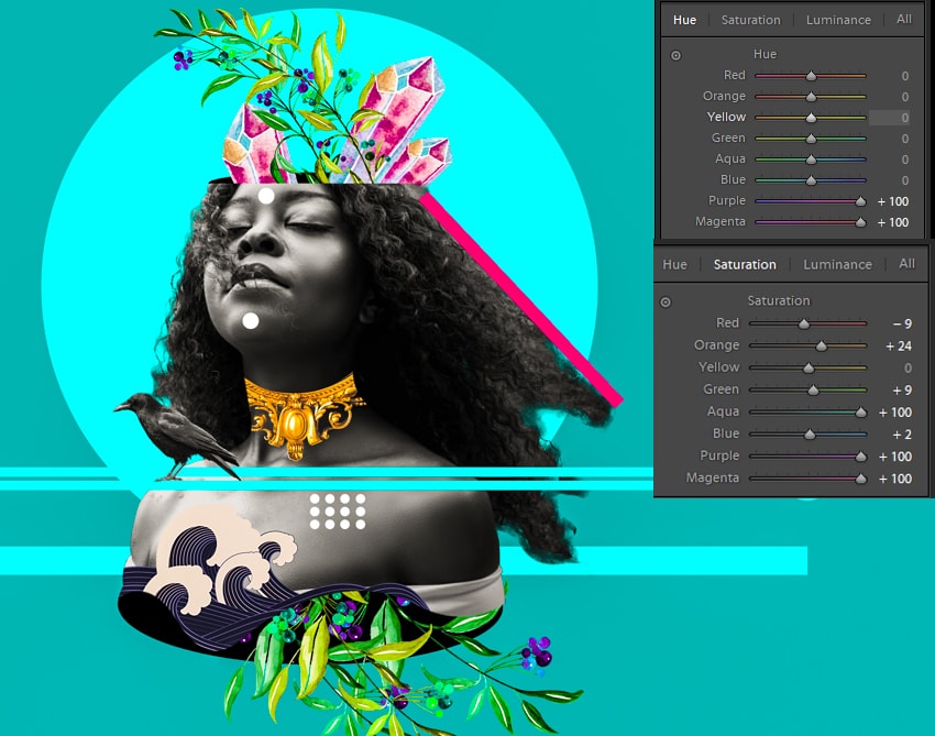


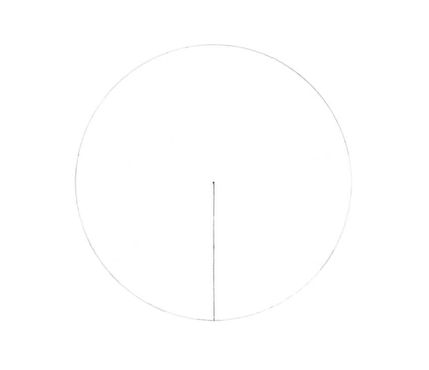


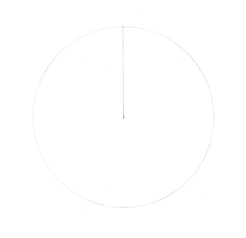


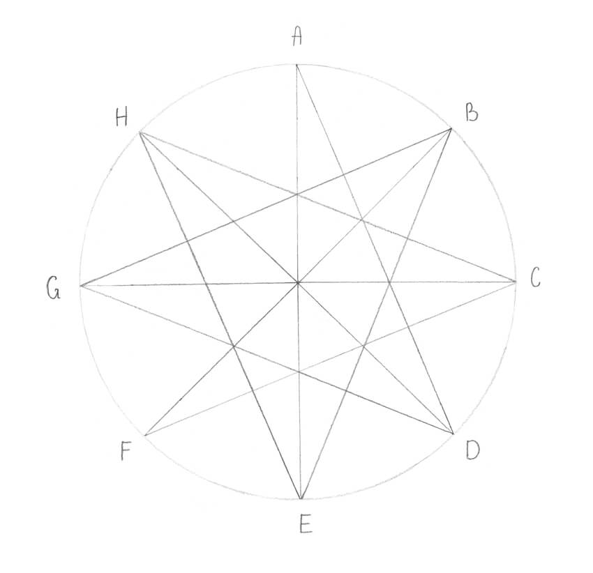


.jpg)