Archiwum kategorii: Web Tools

How to Draw a Tree

Post pobrano z: How to Draw a Tree
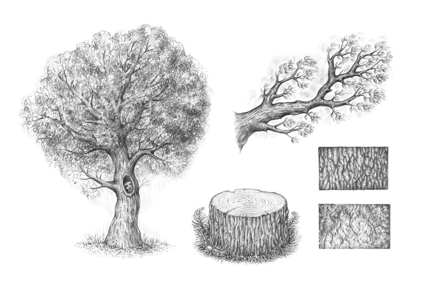
Final product image
What You’ll Be Creating

Trees are beautiful embodiments of nature’s abundance and variety. They can live for many years; the oldest tree ever discovered is approximately 5,000 years old. No wonder that artists of all skill levels are attracted to trees, trying to convey their charm and diversity. 

In this tutorial, I’ll show you how to draw a typical tree, using graphite pencils. But first, we need to observe some basic things, like constructing a branch with twigs, creating an illusion of foliage, and drawing the bark.

Let’s dive into the world of nature and have fun!

You may also be interested in these tutorials on drawing trees and leaves:

What You Will Need

You will need the following supplies to create this project:

  • an HB graphite pencil
  • a 3B graphite pencil
  • an eraser
  • drawing paper
The art supplies for this project

1. How to Draw Bark

Step 1

What is commonly called bark includes a number of different tissues that overlay the wood and serve as a protective barrier. For example, cork is an external tissue that is impermeable to water and gases.

Why do we start with this part of the tree? Bark is a concluding element that covers the shape of the trunk and branches. Knowing how to draw bark will speed up our process later on, when we gain an understanding of designing a tree from scratch.

Let’s draw just a sample of the tree bark in close-up; we’ll focus on its pattern and details. With an HB pencil, I draw a small rectangle and fill it with lines that imitate the bark’s pattern.

Don’t overthink this pattern in the early stages; just draw something resembling irregular rhombs.

Drawing the main contours of the pattern

Step 2

I add more details to the drawing, using the HB pencil. The groups of parallel hatches help to create the illusion of a three-dimensional surface.

Adding the details to the pattern

Step 3

With the 3B pencil, I darken the borders between the sections of bark. You can also use dots to make the texture more interesting.

Adding depth to the pattern

Step 4

With the 3B pencil, I decrease the contrast, covering the sample with a layer of soft, smooth hatching. Then I accentuate the shadows once again. This sample is complete!

Completing the sample

Step 5

Let’s create another sample of the bark texture; this time I draw larger shapes, using the HB pencil. I also add areas of moss and cover them with a layer of hatching.

Creating the pattern of lines

Step 6

With the HB pencil, I add some shadows to the moss and the bark.

Creating the shadows

Step 7

With the 3B pencil, I increase the contrast in the drawing, accentuating the borders between the sections and under the moss.

Increasing the contrast

Step 8

I add more details with dots and short hatches, using the 3B pencil. I also darken the perimeter of the sample to create an illusion of depth.

Completing the second sample

2. How to Draw a Branch

Step 1

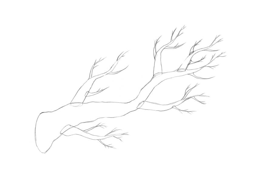
A branch is a woody element that is connected to the central trunk of a tree. Large branches are known as boughs, and small branches are known as twigs or sprigs.

Branches and twigs may be found in many different shapes and sizes; while branches can be nearly horizontal, vertical, or diagonal, the majority of trees have upwardly diagonal branches.

Let’s draw a standard branch; I mark its core line with the HB pencil. It’s also useful to mark the place where the branch connects to the trunk.

Drawing the core line of the branch

Step 2

I draw the form of the branch. Remember that it is a three-dimensional shape with a round foundation.

Adding the shape of the branch

Step 3

I erase the subsidiary lines and refine the contour of the branch.

Creating a new contour with an organic line

Step 4

I add the smaller branches. Feel free to add as many of them as you wish, and make them diverse.

Adding the smaller branches

Step 5

I add tiny twigs.

Adding the twigs

Step 6

I draw the leaves; they capture light energy and convert it into sugars by photosynthesis, providing the food for the tree’s growth and development.

Make sure that the leaves in your drawing have different sizes and directions. Usually, we don’t see each leaf as an individual element, but for the sake of our study let’s allow a hint of stylization.

Drawing the leaves

Step 7

I add the long lines and the groups of hatching, imitating the bark texture. It’s so great that we already know how to draw bark, isn’t it?

Creating the rough pattern of the bark

Step 8

With the 3B pencil, I darken the sides of the branch to make it three-dimensional. I also fill the space around the leaves with groups of hatches to create an illusion of depth.

Increasing the contrast and completing the drawing

3. How to Draw a Tree

Step 1

Now we are ready to draw the whole tree. I mark the foundation of the tree and add the core line.

Drawing the core line of the tree and its basis

Step 2

A tree usually has a wide foundation and a thin top. I construct the shape of the tree, creating the segments of the shape and joining them together with a pencil contour.

Drawing the shape of the tree

Step 3

I add the shapes of the branches; they differ in size and direction.

Adding the branches

Step 4

I erase the subsidiary lines and refine the contour. When it comes to the natural objects, small imperfections are charming!
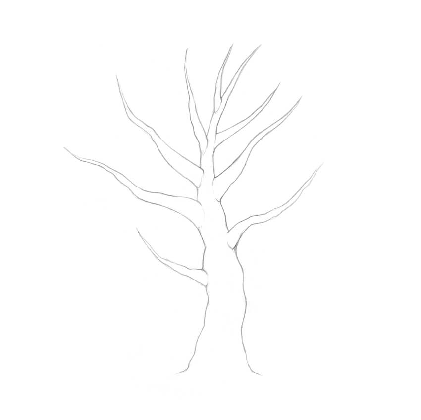
Refining the contour lines

Step 5

I add the smaller branches and twigs, based on the principles that we observed in the previous part of the tutorial.

Drawing the branches and twigs

Step 6

Since we are drawing a whole tree, there is no point in representing every single leaf. I add rough shapes of the leaves just to the lower branches and the bounds of the crown.

It’s important to keep the shapes sketchy; too many details will make your drawing look weird and unnatural.

Adding the shapes of the individual leaves

Step 7

Let’s create an illusion of foliage. An easy way to draw masses of leaves is to fill the crown with scribble lines. You can find an example of this technique in the lower corner of the illustration below.

With the HB pencil, I cover the area of the crown with scribble-like lines, leaving some areas lighter and darkening the underside of the crown.

Creating an illusion of foliage

Step 8

It’s time to work on the trunk; it usually is darker than the foliage, so having the right contrast is vital.

With the HB pencil, I draw the rough pattern of the bark and mark the core shadows. Please note that we see this pattern from a distance, so having much detail here won’t be a help.

I also decided to bring in a cute addition: a hollow with an owl that is looking out. 
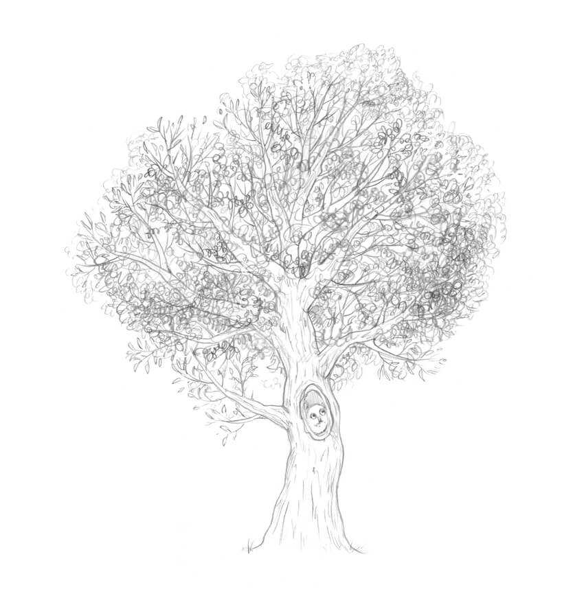
Working on the trunk

Step 9

With the 3B pencil, I increase the contrast in the drawing. Feel free to make the sides of the tree and the visible parts of the branches really dark.
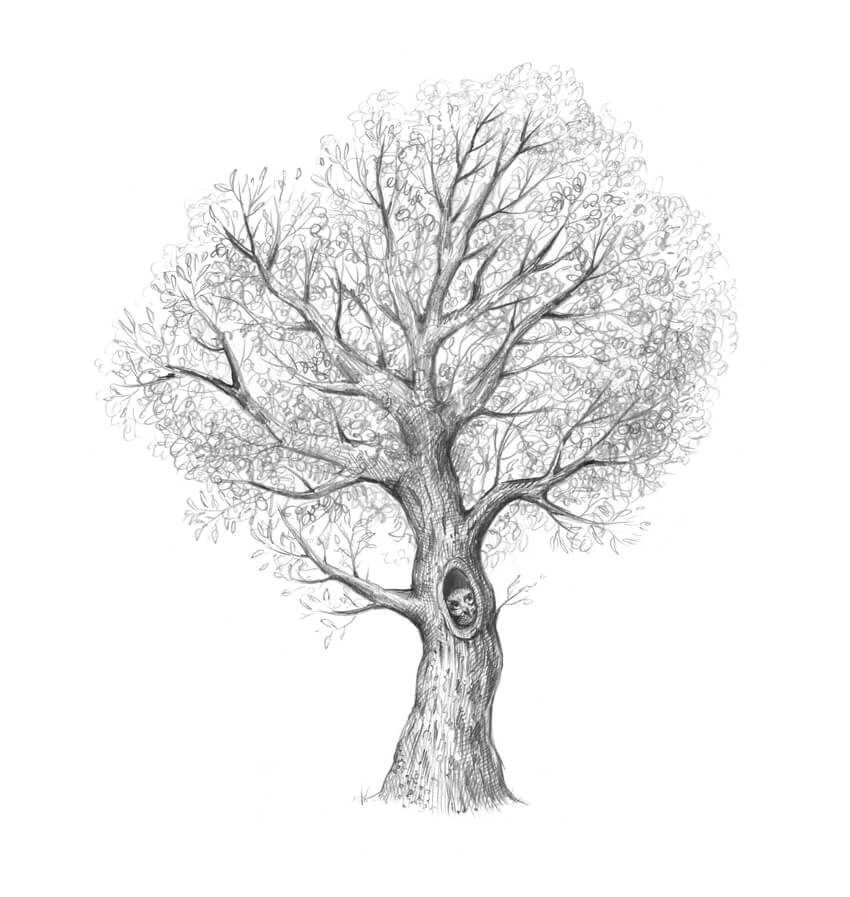
Darkening the trunk with a soft pencil

Step 10

With the 3B pencil, I darken the foliage, accentuating the lower part of the crown. The goal here is to achieve a contrasting yet harmonious look.

I complete the drawing by adding some grass near the base of the trunk.

Adding the details and completing the drawing

4. How to Draw a Tree Stump

Step 1

With the HB pencil, I draw the core line and the foundation of the stump.

Drawing the foundation and core line of the stump

Step 2

I add the top section of the stump. The core line may be a useful reference tool, but you don’t have to make this shape perfectly even.

Completing the shape of the stump

Step 3

I mark the texture of the bark, using the HB pencil.

Adding the texture of the bark

Step 4

A transverse section through a tree trunk may show concentric circles of lighter and darker wood—the tree rings (also known as the annual growth rings). These circles usually have a regular shape, but sometimes, due to abnormal growth conditions, they turn into wavy joint lines.

I mark the center of the inner part of the trunk, and then draw circular shapes going from the section’s center to the periphery. I also add small cracks to make the drawing more credible.

Working on the top part of the stump

Step 5

With the HB pencil, I create the texture of the bark. I also add horizontal hatches to the top section of the stump to accentuate its flat plane.

Working on the texture

Step 6

I darken the sides of the stump, using the 3B pencil. It’s time to add details to the bark, like small islets of moss, and to vary the pattern of the growth rings.

The top plane of the stump may demonstrate interesting transitions from a darker core to a lighter periphery (which proceeds to a slightly darker area near the bark).
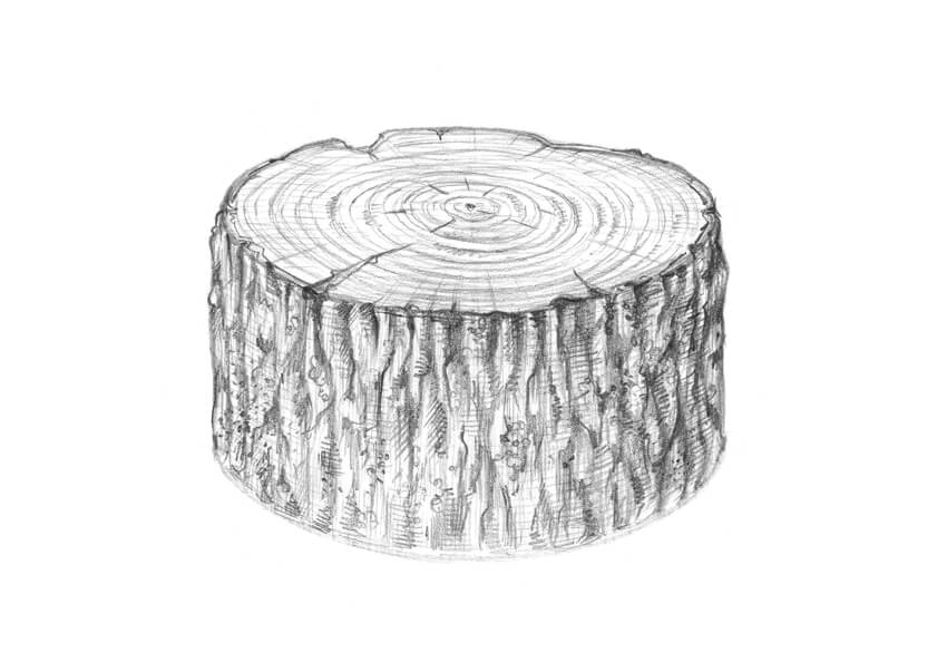
Making the shape three-dimensional

Step 7

The drawing of the stump itself is complete, but it doesn’t look believable. I add some grass and fern leaves to create a nice natural environment.

Completing the drawing

Your Drawings Are Complete

Congratulations—we’ve created four beautiful graphite pencil sketches! I hope you were inspired by the trees and enjoyed the process of drawing.

Let your creative journey be fruitful and full of joy!

The result of work

How to Create an Architecture Sketch Effect in Adobe Photoshop

Post pobrano z: How to Create an Architecture Sketch Effect in Adobe Photoshop

Final product image
What You’ll Be Creating

In this tutorial you will learn how to create an amazing architecture sketch effect. I will explain everything in so much detail that everyone can create it, even those who have just opened Photoshop for the first time. 

The effect shown above is the one I will show you how to create in this tutorial. If you would like to create the even more advanced sketch with watercolor effects shown below, using just a single click and in only a few minutes, then check out my TechnicalArt 2 Photoshop Action.

Action final results

What You’ll Need

To recreate the design above, you will need the following resources:

1. Let’s Get Started

First, open the photo that you want to work with. To open your photo, go to File > Open, choose your photo, and click Open. Now, before we get started, just check a couple of things:

  1. Your photo should be in RGB Color mode, 8 Bits/Channel. To check this, go to Image > Mode.
  2. For best results, your photo size should be 2000–4000 px wide/high. To check this, go to Image > Image Size.
  3. Your photo should be the Background layer. If it is not, go to Layer > New > Background from Layer.
Checking image size and mode

2. How to Create the Background

Step 1

In this section, we are going to create the background. Go to Layer > New Fill Layer > Solid Color to create a new solid color fill layer, name it Background color, and choose the color #f0f0f0 as shown below:

Creating new solid color fill layer

Step 2

Now Right-click on this layer, choose Blending Options, check Gradient Overlay, and use the settings below:

Adding layer style

3. How to Create the Main Sketch

Step 1

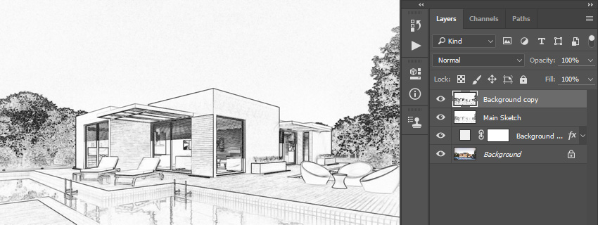
In this section we are going to create the main sketch. Select the Background layer and press Control-J on your keyboard to duplicate this layer. Then, drag this layer to the top of the Layers panel.

Duplicating layer

Step 2

Now press Control-Shift-U on your keyboard to desaturate this layer. Then, go to Image > Adjustments > Levels and enter the settings below:

Adjusting levels

Step 3

Name this layer Temp and press Control-J on your keyboard to duplicate this layer.

Duplicating layer

Step 4

Now press Control-I on your keyboard to invert this layer and change the Blending Mode of this layer to Color Dodge. Then, go to Filter > Other > Minimum, and set the Radius to 2 px and Preserve to Squareness as shown below:

Adding minimum filter

Step 5

Control-click on the Temp layer to get both layers selected at the same time. Then, press Control-E on your keyboard to merge these two layers into one layer.

Merging layers

Step 6

Change the Blending Mode of this layer to Multiply and name it Main Sketch.

Changing blending mode

4. How to Create the Perspective Sketch

Step 1

In this section, we are going to create the perspective sketch. Select the Background layer and press Control-J on your keyboard to duplicate it. Then, drag this layer to the top of the Layers panel.

Duplicating layer

Step 2

Now go to Filter > Stylize > Find Edges and then press Control-Shift-U on your keyboard to desaturate this layer.

Adding stylize filter

Step 3

Go to Filter > Blur > Motion Blur, and set the Angle to 90° and Distance to 1200 px as shown below:

Adding motion blur filter

Step 4

Now go to Filter > Sharpen > Smart Sharpen and enter the settings below:

Adding smart sharpen filter

Step 5

Go to Filter > Filter Gallery > Sketch > Photocopy, and set the Detail to 2 and Darkness to 5.

Adding photocopy filter

Step 6

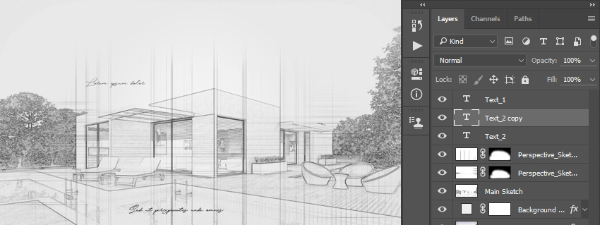
Change the Blending Mode of this layer to Multiply and change the Opacity to 40%. Then, name this layer Perspective_Sketch_1.

Changing blending mode and opacity

Step 7

Now go to Layer > Layer Mask > Hide All to add a layer mask that hides the whole layer.

Adding layer mask

Step 8

Set the foreground color to #ffffff, choose the Brush Tool (B), pick a soft brush, and brush where you want to reveal the vertical perspective lines.

Brushing into layer mask

Step 9

Now select the Background layer and press Control-J on your keyboard to duplicate this layer. Then, drag this layer just below the Perspective_Sketch_1 layer in the Layers panel.

Duplicating layer

Step 10

Go to Filter > Stylize > Find Edges and then press Control-Shift-U on your keyboard to desaturate this layer.

Adding stylize filter

Step 11

Go to Filter > Blur > Motion Blur, and set the Angle to 0° and Distance to 1200 px as shown below:

Adding motion blur filter

Step 12

Now go to Filter > Sharpen > Smart Sharpen and enter the settings below:

Adding smart sharpen filter

Step 13

Go to Filter > Filter Gallery > Sketch > Photocopy, and set the Detail to 2 and Darkness to 5.

Adding photocopy filter

Step 14

Change the Blending Mode of this layer to Multiply and change the Opacity to 55%. Then, name this layer Perspective_Sketch_2.

Changing blending mode and opacity

Step 15

Now go to Layer > Layer Mask > Hide All to add a layer mask that hides the whole layer.

Adding layer mask

Step 16

Set the foreground color to #ffffff, choose the Brush Tool (B), pick a soft brush, and brush where you want to reveal the vertical perspective lines.

Brushing into layer mask

5. How to Create the Text

Step 1

In this section, we are going to create the text. Choose the Horizontal Type Tool (T) and set the font to Hijrnotes, font size to 80 px, alignment to Left, and color to #000000. Then, click anywhere inside the canvas and go to Type > Paste Lorem Ipsum to paste some random text. Feel free to use your own text and font settings.

Creating text

Step 2

Double-click on this layer thumbnail to make the text editable and delete some of the text. Then, choose the Move Tool (V) and click and drag anywhere inside the canvas to position the text as shown below:

Editing text

Step 3

Now name this layer Text_1. Then, press Control-J on your keyboard to duplicate this layer.

Duplicating layer

Step 4

Double-click on this layer thumbnail to make the text editable, press Control-A to select all text, and go to Type > Paste Lorem Ipsum to paste random text. Then, delete some of the text, choose the Move Tool (V), and click and drag anywhere inside the canvas to position the text as shown below:

Editing text

Step 5

Name this layer Text_2 and drag it just below the Text_1 layer in the Layers panel. Then, press Control-J on your keyboard to duplicate this layer.

Duplicating layer

Step 6

Now Double-click on this layer thumbnail to make the text editable, press Control-A to select all text, and go to Type > Paste Lorem Ipsum to paste random text. Then, delete some of the text, choose the Move Tool (V), and click and drag anywhere inside the canvas to position the text as shown below:

Editing text

Step 7

Press Control-T on your keyboard to transform this layer and set the Rotate to 15°.

Transforming layer

Step 8

Now name this layer Text_3 and drag it just below the Text_2 layer in the Layers panel.

Arranging layers

6. How to Make the Final Adjustments

Step 1

In this section, we are going to make final adjustments to the design. Press D on your keyboard to reset the swatches and select the Text_1 layer. Then, go to Layer > New Adjustment Layer > Gradient Map to create a new gradient map adjustment layer and name it Overall Contrast.

Creating new gradient map adjustment layer

Step 2

Now change the Blending Mode of this layer to Soft Light and set the Opacity to 35%.

Changing blending mode and opacity

Step 3

Go to Layer > New Adjustment Layer > Levels to create a new levels adjustment layer and name it Overall Brightness.

Creating new levels adjustment layer

Step 4

Now Double-click on this layer thumbnail and, in the Properties panel, use the settings below:

Adjusting levels

Step 5

Press Control-Alt-Shift-E on your keyboard to make a screenshot. Then, go to Filter > Other > High Pass and set the Radius to 2 px as shown below:

Adding high pass filter

Step 6

Change the Blending Mode of this layer to Hard Light and name it Overall Sharpening.

Changing blending mode

You Made It!

Congratulations, you have succeeded! Here is our final result:

Final result

If you would like to create the even more advanced sketch with watercolor effects shown below, using just a single click and in
only a few minutes, then check out my TechnicalArt 2 Photoshop Action.

The
action works so you simply brush over your photo with a color and just
play the action. The action will do everything for you,
giving you fully
layered and customizable results. There are also over 60 high-quality watercolor brushes included with the
action that you can use to build the designs even further. The action
will also create four textures (watercolor, canvas, paper, and halftone)
and 25 preset color looks that you can choose from.

The action comes with a detailed video tutorial that demonstrates how to use the action and customize the results to get the most out of the effect.

Action final results

You can also get this item in a bundle and save 50%—check out my Artistic 4in1 Photoshop Actions Bundle.

New Course: 5 Ways to Brand Your Small Business With Envato Elements

Post pobrano z: New Course: 5 Ways to Brand Your Small Business With Envato Elements

Our new Coffee Break Course is ideal for the small business owner who is looking for a convenient and quick way to establish or revamp their professional presence through effective branding. 

Try 5 Ways to Brand Your Small Business With Envato Elements to get a jump start on creating a cohesive brand identity for your business.

Stationery available on Envato Elements

In this quick, ten-minute course, Chamira Young will show you how to strategically select a logo, a font, a stationery set, a website template, and a presentation template. The goal is to represent your business as professionally as possible without spending a ton of time doing it, and to use assets that work well together.

Watch the introduction below to find out more.


You can take our new Coffee Break Course straight away with a subscription to Envato Elements. For a single low monthly fee, you get access not only to this course, but also to our growing library of over 1,000 video courses and industry-leading eBooks on Envato Tuts+. 

Plus you now get unlimited downloads from the huge Envato Elements library of 460,000+ creative assets. Create with unique fonts, photos, graphics and templates, and deliver better projects faster.

49 Amazing Isometric Vectors and Icons

Post pobrano z: 49 Amazing Isometric Vectors and Icons

Try out the best isometric vectors around! Check out this list of premium resources below!

49 Isometric Vectors & Icons

Isometric design allows designers to see the true scale of their 2D work. It involves a thorough process of projecting a 2D design onto parallel planes for an axonometric result.

Short on time? To help you create your own isometric designs, today we bring you a massive list of premium vector goodies. Enjoy this selection of handpicked isometric vectors and icons exclusively picked from Envato Market and Envato Elements.

Start with a icon generator to turn your favorite designs into 3D axonometric projections. Or build a complete city using an assortment of quality kits.

Check out this list of isometric icons, vectors, and assorted graphics below. For custom design, enlist the help of the talented folks at Envato Studio.

SmartIcon Generator 2

Create 3D icons in seconds with this smart icon generator. Featuring three isometric variations and various editable shapes, this generator takes the headache out of 3D design. Adjust the depth and lighting for a truly phenomenal result. Try it out!

SmartIcon Generator 2

Wireless City in Isometric View

The world is becoming more wireless. And you can show this fabulous transition with a beautiful vector graphic like this one below. Featuring giant devices like computers, tablets and phones, this graphic looks great on any poster or flyer. Pair it with your presentation for an impressive look.

Wireless City in Isometric View

Isometric Flat World Collection v.1

Build an entire isometric scene with this incredible flat world collection. From buildings to roads and transportation, this collection has everything you need to build an isometric landscape. Get access to 425 highly detailed objects, perfect for any project!

Isometric Flat World Collection v1

3D Flat App Mockup

Need a 3D smartphone mockup for your app or presentation? Give this one a try! Included in this download are six files with 12 different views to choose from. Try out amazing orthographic and perspective variations to highlight your points and ideas.

3D Flat App Mockup

Businessman Handshake

Isometric graphics also come in the form of business-themed artwork like this vector below. It features a corporate-friendly color scheme of two businessmen shaking hands and exchanging ideas. Use it for your presentations, websites, and more.

Businessman Handshake

Isometry 3D Actions

This one-click action creates a clean and unique isometric look you can apply in seconds! Included are four different directions to face your objects along with five separate depth amounts to choose from. Try it on shapes, text, or any vector object.

Isometry 3D Actions

Isometric Characters Constructor Kit

Build the perfect isometric character from scratch! Ideal for creatives who want a more customized look, this construction kit features everything you need to build a character. Style them with different clothes, hair and accessories to match your website or blog.

Isometric Characters Constructor Kit

Isometric Peoples

Find your occupation in this cute isometric people set! Inspired by various jobs, this set has amazing icons suitable for many industries. Use them on their own or pair them together for an even better result. Download it today to get bonus vectors and file formats.

Isometric Peoples

Infographics Design Elements

Infographics help you create compelling content with colorful graphics and icons. And this set of design elements is just what you need for fast infographic design. Featuring fully editable vector files, this download includes helpful graphs, charts, and more. Enjoy!

Infographics Design Elements

Vector Isometric House

Buildings are some of the hardest objects to transfer to 3D. But this isometric house set makes it fast and simple. Just download this complete pack of colorful vector houses made with only linear and radial gradients. You’ll love the different choices!

Vector Isometric House

Isometric Infographic Set

Need to create compelling online content? Build the ultimate infographic with this isometric elements set. Featuring 100% vector elements, this set is fully scalable and customizable. Change the colors and text easily to match your brand today!

Isometric Infographic Set

Isometric People African Descent

Representation matters. So make sure to add this set of African isometric people to your collection. Great for websites, apps, or infographics, this set includes a bundle of isometric people of color. Try it out now and let us know what you think!

Isometric People African Descent

Medical Equipment Isometric Flat

Many professional industries require their own set of icons too! This flat isometric set includes various medical instruments and equipment, ideal for educational programs and general training. Learn more about this industry by downloading this set!

Medical Equipment Isometric Flat

Vector Trains Isometric Flat

Add some vector trains to your isometric city with this essential train set. Featuring various types of trains in two file formats, these trains are easy to use and adjust. Enjoy the sleek flat style which already matches many popular trends in the design industry.

Vector Trains Isometric Flat

Isometric City Objects

Grab a quick stoplight for your vector street with this isometric set. Included in this pack are 20 various city-themed isometric objects in a simple minimalist style. They’re all fully editable and resizable, making them the perfect addition to any print or web project.

Isometric City Objects

Cryptocurrency Blockchain Isometric Icons

Will you win big with cryptocurrency? Test out the latest graphics surrounding bitcoin and more with this crytocurrency icon set. Created in the popular isometric style, this set includes 16 icons with a bold, blue and yellow color scheme. Download them now!

Cryptocurrency Blockchain Isometric Icons

Marketing Isometric Concept

Marketing will always be a thorough process. From tracking statistics to trying out new campaigns, there are many levels to this science. So bring the allure of marketing into your presentation with this professional isometric graphic. Use it on brochures, posters, or online presentations.

Marketing Isometric Concept

Isometric Flat 3d Rectangles Backgrounds

Create a fantastic desktop wallpaper with this pack of 3D backgrounds. Featuring 10 isometric backgrounds created with minimal 3D elements, these designs are eye-catching and stylish. Make your backgrounds pop with an alternative twist by trying isometric design!

Isometric Flat 3d Rectangles Backgrounds

Modern Isometric City Template

Launch a new game with this isometric city template. Build incredible flat cities using roads, buildings, plants, and more. All the shapes are organized on a layered file to make the customization process so much easier. Test it out for phenomenal results!

Modern Isometric City Template

Isometric Gamer Objects

Are you a gamer? Then you’ll love this isometric gamer set! Packed with fan favorites like game controllers, monitors, and consoles, this set is 100% vector. Create a bold pattern for your desktop wallpaper or mix and match objects for your exclusive game-themed projects.

Isometric Gamer Objects

Isometric Wallet Icons

Buying things online gets easier every day. And new emerging technology makes the process faster than ever before. This isometric wallet shows us just how far we’ve come with a complete set of money-related graphics. Get access to 30 isometric icons created in a simple minimalist style.

Isometric Wallet Icons

Mobile Communication Design Concept

We are always attached to our phones. So naturally, we tend to pay attention to smartphone-related artwork. This design concept is great for any professional communicating more about mobile and app design. Use it in your presentations for a stylish perspective.

Mobile Communication Design Concept

Business Stair Success Infographics

Climb your way to the top with this success-based infographic set. This design is inspired by popular design concepts which always relate stairs to success and business. So make a mark in your project with a colorful step-by-step process.

Business Stair Success Infographics

Isometric Map Icons Bundle

This massive icon bundle set includes 160 high-quality icons of city objects and more. Each icon has a minimum of one object and shadow layer that can be easily adjusted for more intensity. Create realistic cityscapes and more with this fantastic pack!

Isometric Map Icons Bundle

3D City and Map Generator

It’s no wonder why this map generator ranks top on Envato Market with its five-star rating! Featuring over 200 elements for a professional outcome, this generator makes it easy to build a 3D city without any prior experience. Explore a variety of quality assets to build magical, real-world environments!

3D City and Map Generator

Map Icons and Elements – River and Road Kit

Add beautiful rivers to your cities with this river and road icon kit. Ideal for beginners, this kit makes it easy to create realistic rivers and roads for your city designs. Build a toy race track and more with this sweet download. 20 bonus elements are also included!

Map Icons and Elements - River and Road Kit

Furniture Isometric Flat Set

How should your 3D interior space look? Find out with this phenomenal isometric furniture set. Featuring a modern minimalist style of clean 3D projections, this set includes 64 total elements for your creative projects. Style your designs with amazing modern furniture!

Furniture Isometric Flat Set

Flatt 3D Isometric Icon Set

This pack of 15 isometric icons is not as big as the rest, but still packs a punch. It features many popular themes like technology, games, and even modern furniture. Download this essential set to add that extra special element to your work today!

Flatt 3D Isometric Icon Set

Isometric Kitchen Objects

What’s cooking? Chef up your favorite meals or show off your delicious recipes with this kitchen object set. This pack features 20 layered objects that are all available in Adobe Illustrator. They’re easy to edit and a smart resource for foodies and restaurateurs.

Isometric Kitchen Objects

Isometric Birthday Party

Celebrate your birthday with this fun isometric design! Great for posters, postcards and invites, this concept features a bold color scheme with joyful party-themed elements. Serve it alongside your favorite baked goods for a sweet bit of decor. Enjoy this design!

Isometric Birthday Party

Flat 3D Isometric Shopping Mall

Let’s go shopping in this fun isometric mall! A multistory mall featuring various stores and people, this graphic is great for posters or presentations. Enjoy the bold, colorful design with fully editable elements. Customize it fast using Adobe Illustrator!

Flat 3D Isometric Shopping Mall

Van Food Vehicle Isometric

Food trucks are yummy meals on wheels. And this isometric set features so many possibilities for delicious food truck options. Enjoy a full selection of diverse cuisines suitable for any blogger or food lover. Give it a try!

Van Food Vehicle Isometric

Map of City Hall Set

Create a map of your local city hall with this isometric set. Featuring detailed vectors with a flat, minimalist finish, this set includes buildings, churches, and even mosques! Celebrate all the best parts of your local community with this multipurpose pack!

Map of City Hall Set

Christmas Isometric Icons

Get ready for the holiday season with this isometric icon pack. From festive Santa Claus elements to colorful wreaths and trees, this set is the best solution for any creative or designer. Add it to your apps and devices for a festive holiday alternative.

Christmas Isometric Icons

Amusement Park Isometric

Amusement parks can bring out the best of our childhood memories. Relive them today with this awesome pack of amusement park-themed icons. Included in this pack are fun-filled designs like Ferris-wheel icons, ice-cream carts, and more.

Amusement Park Isometric

Internet Concept Isometric

The internet has the ability to connect us all. And you can showcase this powerful idea to your peers or clientele with this professional internet-based concept. An isometric design featuring people and objects, this concept is centered around a globe. Try it out to make an impact in your presentation today!

Internet Concept Isometric

Home Planning Isometric Vector Kit

Plan for the perfect home with this vector isometric kit. Design your own house, room, apartment or office with fully scalable objects. Mix and match windows, doors, and other interior elements for the best possible design. Experimentation is key!

Home Planning Isometric Vector Ki

Isometric Stationery Mockup Generator

Organize your stationery with this isometric generator. This high-quality mockup features a clean black and white style with 100% vector elements for easier customization. Just open it up in Adobe Illustrator to get started right away.

Isometric Stationery Mockup Generator

Payment Icons Isometric

What’s your favorite way to pay? Cash, debit, or credit? Feature your favorite payment methods in your designs with this isometric icon set. This download features an editable EPS format that has also been rendered in JPEG for an easy transition. You’ll want this set!

Payment Icons Isometric

Isometric Car Parking

Where did you park your car? Find your special spot with this car parking lot. A unique isometric design featuring various automobiles, this set includes vector graphics ideal for CMYK printing. Enjoy simple gradients and bright colors for use in your creative projects.

Isometric Car Parking

Isometric Game Assets

Have an idea for the next best game? Try it out with a clever game asset pack. This set includes various isometric designs for characters, platforms, and backgrounds. We know you’ll love the awesome cube style inspired by many popular mobile games.

Isometric Game Assets

Isometric Game Assets

Continue to build the ultimate game with this phenomenal pack of game assets. Build your own world using eight game characters and many colorful accessories. It’s also great for barn animal lovers or any future developer.

Isometric Game Assets

Isometric Pixel Font

Write inspiring quotes with this isometric pixel font. Included in this download are 100% vector graphics with over 100 isometric elements. Although it’s not an official font, you’ll still be able to get access to a complete set of letters, numbers, and symbols.

Isometric Pixel Font

Public Wi-Fi Zone Wireless

How’s your wifi? Test out different theories with this wireless isometric concept. A stylish design featuring various people in different interiors, this concept is fun and unique. Pair it with your presentations or posters for impressive results.

Public Wi-Fi Zone Wireless

Smart Home

As technology advances, so does our homes. Showcase the innovation of the future with this smart home graphic. A beautiful isometric design with lovely colors, this graphic is fully customizable. Just change the color or size of each element using Adobe Illustrator.

Smart Home

Rainbow Family People Isometric

Nothing is more important than family. And no matter your background, family is important to us all. This LGBT-friendly graphic is a stunning example of diversity and love. Hang it up on your wall or add it to any print design for an inspiring message.

Rainbow Family People Isometric

University Isometric Concept

Universities help us tackle our dreams, and you can inspire your viewers to do the same with this interesting concept. From books to laptops and more, this isometric concept features many school-themed elements. Let us know how you would rock this message!

University Isometric Concept

Isometric Office Equipment

Stunning and chic, this office equipment set should definitely go into your collection. Featuring 28 layered objects with amazing details, this pack is 100% vector and easy to edit. Change the colors fast or even add more realistic textures using Adobe Illustrator.

Isometric Office Equipment

Video Tutorial Isometric

Teach the world with your online videos! This isometric graphic is perfect for any YouTuber or content creator. Featuring a gorgeous modern design, this graphic is stylish and straight to the point. Add it to your video thumbnails or profiles for even more engagement!

Video Tutorial Isometric

Conclusion

This list is jam-packed with exciting resources for the avid designer
familiar with Adobe Illustrator. If you need additional
help with isometric designs, enlist the skills of a talented
professional by choosing one of the amazing designers from Envato Studio.

And with tons of gorgeous isometric vectors available, chances are we’ve missed a few to add to your personal collection. Be sure to browse Envato Market and Envato Elements for more resources, and let us know your favorites in the comments below!

How to Create a Vintage Movie Text Effect in Adobe InDesign

Post pobrano z: How to Create a Vintage Movie Text Effect in Adobe InDesign

Final product image
What You’ll Be Creating

Have 15 minutes to spare? This super-quick and high-impact effect gives any text an instant dose of vintage movie magic. 

We’ll create the effect in InDesign, and the text remains editable, so it’s easy to tweak the type formatting afterwards.

If you want to make your design really unique, you can easily switch up the font to create a very different look. Head over to GraphicRiver or Envato Elements to source perfect fonts for your next project.

Let’s go!

What You’ll Need to Create Your Effect

As well as access to Adobe InDesign, you’ll also need:

1. How to Create a Cinematic Backdrop for Your Text Effect

Step 1

Open up InDesign and go to File > New > Document. Create a document at any size. Here, I’ve set the page to A3 Landscape. Then click OK

Expand the Layers panel (Window > Layers) and rename Layer 1 as Background. Create three new layers in this order: Type, Highlight, and Overlay.

layer options

Then lock all layers except Background, which we’ll work on first. 

Step 2

Expand the Swatches panel (Window > Color > Swatches) and create three new CMYK swatches:

  • Pale Grey: C=13 M=9 Y=10 K=0
  • Slate: C=68 M=58 Y=55 K=63
  • Rich Black: C=87 M=76 Y=62 K=95
rich black

Step 3

Take the Rectangle Tool (M) and drag across the whole page, setting the Fill to your new Rich Black swatch.

black shape

With the shape selected, head up to Object > Effects > Gradient Feather. Apply a Linear gradient, with an approximate -130 Degree angle, allowing for a diagonal gradient effect. Click OK

gradient feather

Step 4

Edit > Copy and Edit > Paste in Place the rectangle. Adjust the Fill of this second shape to Slate

Head up to Object > Effects > Gradient Feather, as before, and adjust the Type of the gradient to Radial, allowing the color to lighten towards the center of the page. Click OK.

gradient feather

2. How to Create Your Movie Typography

Step 1

Lock the Background layer and unlock the layer above, Type

Create a text frame across the center of the page, and type in your text. From the Character panel (Window > Type & Tables > Character) or the top Controls panel, set the Font to Day Poster Black, or your font of choice. 

From the Swatches panel, set the Font Color to Pale Grey. Edit > Copy the text frame. We’ll need to paste in another copy of this a little later.

layers

Step 2

With the text frame selected, go to Object > Effects > Drop Shadow. Switch the Effect Color to Rich Black for a deep, inky shadow.

Set the Opacity to 100% and add 15% Noise. Tweak the other options slightly until you are happy with the shadow.

drop shadow

Click on Inner Shadow in the window’s left-hand menu. Bring the Opacity down to around 40%, set the Choke to about 30%, and add around 7% Noise. Ensure the inner shadow falls in the same direction as your drop shadow.

inner shadow

Finally, click on Inner Glow in the left-hand menu. With the Opacity set to about 10%, bring up the Choke to 60% and the Noise to 50%, and set the Source to Center

Then click OK to exit the window. 

inner glow

Step 3

Edit > Paste in Place the text frame you copied earlier (see Step 1). 

Unlock the Highlight layer.

Expand the Type layer, select this new text frame, and drag it up to sit inside the Highlight layer. Then lock the Type layer. 

text frame

From the Swatches panel, set the Stroke Color of the text (you can switch to this by clicking on the ‘T’ symbol sitting behind at the top-left corner of the panel) to [Paper].

From the Stroke panel (Window > Stroke), increase the Weight of the text’s white stroke to 3 pt. 

stroke weight

Step 4

With the text frame selected, go to Object > Effects > Drop Shadow, and apply a 45% Opacity shadow, setting the Effect Color to Rich Black. Add about 15% Noise. 

drop shadow

Click on Bevel and Emboss in the window’s left-hand menu. Set the Style to Inner Bevel and Technique to Chisel Hard, and bring the Depth and Opacity of both the Highlight and Shadow to 100%. 

inner bevel

Click OK to exit the window, and view your text effect so far.

text effect

3. How to Apply an Authentic Vintage Texture to Your Effect

Step 1

Lock the Highlight layer and unlock the top layer, Overlay

Create an image frame across the whole page using the Rectangle Frame Tool (F). Go to File > Place and navigate to one of the image textures from the texture pack you downloaded earlier. 

Click Open, allowing it to fill the whole frame. 

overlay

Step 2

Go to Object > Effects > Transparency, and set the Mode to Soft Light. Click OK.

soft light

Conclusion

Your text effect is finished—awesome work! This is a really characterful effect, which is great for adding vintage flair to posters or flyers. 

You can find more fantastic fonts for creating type effects over on GraphicRiver and Envato Elements.

final

How to Create a High-Contrast Skateboard Flyer in Adobe Photoshop

Post pobrano z: How to Create a High-Contrast Skateboard Flyer in Adobe Photoshop

Final product image
What You’ll Be Creating

For this tutorial we will design a poster using Layer Masks, clipping masks and the Liquify Tool to create a poster that is literally outside of the box! 

If you’re looking for more unique flyer designs, head on over to GraphicRiver for more.

What You’ll Need

You’ll need access to Photoshop. If you don’t have the software, you can download a trial from the Adobe website.

You will also need to download and install the following font file and image: 

Install the font on your system and you are ready to get started! 

1. How to Use Layer Masks and Prepare the Image

Step 1

Open the skateboarder image in Photoshop. We want to remove the clouds before using the skateboarder image on the poster. To do this, in the Layers panel, Duplicate the Background layer by pressing Command-J and Hide the visibility of the original Background layer. 

Preparing and cleaning up image

Step 2

While selecting the new Background copy layer on the Layers panel, click on the Vector Mask button to add a Layer Mask to Background copy. 

Using Layer Masks to clean background

Step 3

I recommend using the Brush Tool (B). Using the Brush Tool (B) and black as Foreground Colour on the Tools panel, you can hide parts of the image. If you use white as a foreground colour, you will instead reveal parts of the image. I prefer this method instead of the Erase Tool as this gives me the option to go back and forth in revealing the image and fixing mistakes. 

Right click to set the brush to a Size of 200 px and Hardness of 100% and start brushing parts away from the image. I like to do the big parts first to later zoom in and concentrate on the details around the body. 

Using the Layer Masks and Brush Tool

Step 4

Let’s Zoom In to work on the details. For this I go back and forth with the brush sizes as sometimes I need to get into corners, but I started with a Size of 30 px and Hardness of 100%. A great tool that helps here is using the backslash key (\) to get a red tint behind the image and know what parts need to be perfected.

Using the Brush Tool to clean up details of the image

2. How to Set Up a New Document and Guides

Step 1

In Photoshop, go to File > New. Name the document Skateboard Culture, and set the Width to 1275 px and Height to 1650 px, with Background Contents white. I am keeping the poster digital, so I will work with 72 dpi or 150 dpi. Click OK to create the document.

Creating a new document

Step 2

Let’s create guides on our document to make sure things are aligned the way we want them to be. My ruler measures in Inches; you can change this in Photoshop > Preferences > Units and Rulers. We can head over to View > New Guide, where a new window will pop up. We want to make all of our Guides 0.75 inches from each edge. Select Horizontal and under Position type 0.75 in. Click OK

We will do the same for the Vertical option. To add a guide to the bottom and right side of the page, we simply need to subtract 0.75 inches to the final measurement of your page. To hide and show the guides, hit Command-;.

Adding guides to our poster

3. How to Duplicate Layers and Add Colour to the Background

Step 1

Let’s duplicate the skateboarder Background copy layer into our new Skateboard Culture file. To do so, Right Click > Duplicate Layers. Under As:, rename the layer to Skateboarder, and under Destination select Document > Skateboard Culture. Click OK to continue.

Duplicating layers to another file

Step 2

Let’s jump to our Skateboard Culture document. To make the poster jump out a bit more, let’s make the background black. Using the Paint Bucket Tool (G), select the background layer and click on the page to paint the poster.

Using the Paint Bucket Tool to colour background

4. How to Use the Liquify Tool

Step 1

Selecting the background layer, let’s create a new layer in order to add coloured shapes. Press Shift-Command-N, and let’s name our new layer by the colours we will be using—in this instance, Pink. Make sure that under Color, None is selected.

Creating new layers

Step 2

Let’s select a colour by clicking on Set Foreground Colour, and then set the colour code to #ff0cf0. Using the Brush Tool (B), set the Size to 125 px and Hardness to 100%. We can just create random brush strokes as below.

Preparing brush strokes behind skateboarder to liquify

Step 3

Filter > Liquify or Shift-Command-X, and a new window will pop up displaying the selected layer. In the left panel, use the Clock Twirl Clockwise Tool (C), and choose the following settings in the right panel: Brush Size: 300, Brush Density: 100, and Brush Pressure: 100. Use the brush over the strokes in this new window. The goal here is to create wobbly figures that can act as a background on the poster. There’s no wrong or right way to do it, so feel free to do it your own way! 

Feel free to also use the Forward Warp Tool (W), Pluck Tool (S), and Bloat Tool (B). Don’t worry about making it too perfect as we can use the Layer Mask later on to hide things we don’t want.

Once you are done, click OK.

Using the Liquify Tool to create different shapes

Step 4

Do the same with new layers for a green and a yellow colour with the following colour codes. Green: #0cffd1Yellow: #0fffe10.

We can edit some of the shapes out by using the Layer Mask, the same method we used to clean out the initial image of the skateboarder layer. You can create Layer Masks on each coloured layer and use the Brush Tool (B) to hide or show certain parts of the layer.

All three different colours after using the Liquify Tool

Step 5

Let’s hide the coloured layers and create a New Layer. This new layer will contain strokes of each colour to be placed behind the skateboarder. We are doing this so we can Liquify all three colours at the same time. I am using a Brush Size of 250 px and Sharpness of 100%

Creating a new Layer with all three colours to be blended with the Liquify Tool

Step 6

We will proceed in the same way as for the coloured layers before with the Liquify Tool, playing around with it until you find something you like. You can play with the brush size in the new Liquify window. Again, there is no right or wrong! 

Once we have all these components, we can go back and edit with the aforementioned Layer Mask to balance these colours out. 

Using Layer Masks to clean up the coloured shapes that are not necessary

5. Using the Rectangle Tool and Adding Text 

Step 1

Using the Guides we created at the beginning of this tutorial, we will add some rigid lines to this funky poster. Let’s select our Mixed Colours layer and activate our guides again by pressing Command-;.

In the Tools panel, click on the Rectangle Tool (U). Head over to the Options Bar. Set Fill to no colour, Stroke to white, and Shape Stroke Width to 5 pt. 

Options Bar setting before using the Rectangle Tool

Create the rectangle based on the margin. We will come back to this shortly, but for now we will adjust and add a few things. Let’s hide our guides again by pressing Command-;.

Poster without margins to make sure the Rectangle Tool is working

Step 2

Using the Type Tool (T), type SKATE-BOARD CULTURE on three lines; this is to occupy more space at the bottom of the poster. On the Character panel, set the Font to Universe 93 Black Extended, Size 75 pt and Leading 60 pt. If you are using one of the alternative fonts, this will look a bit different, but anything works! Centre the text box in the rectangle we created. 

Adding text to our poster

6. How to Use Black and White Layer Masks

We want to create the illusion that the skateboarder is coming out of the page, and we also want to make him stand out from the busy background. 

Step 1

We will clip a Black and White Layer Mask to the Skateboarder layer. Let’s start by selecting the Skateboarder layer. Go to the bottom of the Layers panel. Click Create new fill or adjustment layer and while pressing Alt, click on Black & White. A New Layer window will pop up. Name this new Layer Skateboarder BW, check Use Previous Layer to Create Clipping Mask, and click OK. This will create a layer that will change the colour of only the Skateboarder layer to Black and White.

Using Black and White Layer Mask to clip onto only one layer

Step 2

Now we want to adjust the contrast. Select the initial Skateboarder layer, and head over to Image > Adjustments > Brightness and Contrast. I chose to go with Brightness: 36 and Contrast: 68 to make the photo pop. Click OK.

Correcting Brightness and Contrast on our new Black and White layer

Step 3

Now we want to resize the skateboarder slightly. While selecting the same layer, hit Command-T and, while holding Shift to keep the same proportions, click and drag from any of the corners to about 120% and reposition the image. We want the image of the skateboarder to appear as if it is coming out of the rectangle we created previously. 

Resizing the Skateboarder Layer

7. Adding Final Details

Let’s add a date and location for this poster. Select the Rectangle 1 Layer and create a new rectangle using the Rectangle Tool (U), this one vertically on the right side of the poster. We can adjust our Skateboard Culture layer by pressing Command-T, holding Shift and resizing to keep the original proportions. 

Let’s add some made-up text to this rectangle with the Type Tool. Let’s add a date, time, and website. Once the information is in, hold Command, and the text box is going to turn into an object that we will be able to turn. Hold Command, head over to one of the text box’s corners, and click and rotate. Alternatively, you can hold Shift and turn the text box 90 degrees with precision.

Adding details to the right side of our poster

Let’s add a third rectangle over the title of the poster to match the right side. Your layers should be looking like the image below.

A view of all our layers

8. How to Save the Poster

Click File > Save to save the file as a .PSD to later edit it and as JPEG if you will be using it for social media.

Saving the poster as a PSD or JPEG file

You Did It!

Congratulations on finishing this tutorial! We have covered an interesting skill for putting together a promotional piece for social media. Today we’ve learned to:

  • Clean up an image using Layer Masks.
  • Format typography and allow it to interact with the image.
  • Use the image in a different way to create an outside-of-the-box poster. 
  • Use Layer Masks and Clipping Masks to edit colours on only one layer.
  • Use the Liquify Tool.
Final Poster

New Course: Animate a Rubber Hose Character in Cinema 4D

Post pobrano z: New Course: Animate a Rubber Hose Character in Cinema 4D

If you’re looking to get started in animation, try our new course, Animate a Rubber Hose Character in Cinema 4D.

In this post, you’ll find out more about the course and be able to watch some free lessons from it to learn more about animating in Cinema 4D.

Animating a walking character in Cinema 4D

What You’ll Learn

In a recent course, we showed you how to Rig a Rubber Hose Character for Animation. In this new course, you’ll learn about the next step: animating this character and making it walk. 

Designer and concept artist Jonathan Lam will take you through the step-by-step process of animating a “rubber hose” style character in Cinema 4D. 

You’ll learn how to animate a walk cycle for the character using a simple rig that you can use for your own animations, graphics, or video-game projects. This workflow is perfect for those looking to get into basic 3D character animation. 

Here are some free lessons from this course, as a preview of what you can expect:

The Walk Cycle Explained

In this video, you will learn how a walk cycle is created by going through the key frames and key poses of the character.


How to Animate Basic Movement

It’s time now to create some basic movement for your character using keyframes. You’ll then learn how to manually edit and adjust them.


Animate the Legs

In this video, you will learn how to animate the legs of the character. You will use the rig you’ve built to move the legs in order to make the character walk.


Take the Course

You can take our new course straight away with a subscription to Envato Elements. For a single low monthly fee, you get access not only to this course, but also to our growing library of over 1,000 video courses and industry-leading eBooks on Envato Tuts+. 

Plus you now get unlimited downloads from the huge Envato Elements library of 460,000+ creative assets. Create with unique fonts, photos, graphics and templates, and deliver better projects faster.

How to Create a Dark-Themed Fashion Image in Adobe Photoshop

Post pobrano z: How to Create a Dark-Themed Fashion Image in Adobe Photoshop

Final product image
What You’ll Be Creating

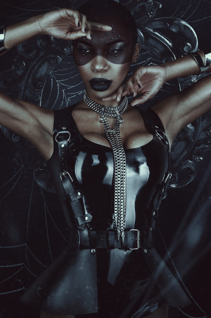
Today we will be exploring the darker side of fashion by creating a latex-clad spider woman! We will create our own spider-web brush using simple shapes, create our own bead detailing from scratch, and use textures to add both depth and detail. 

Hopefully, you aren’t afraid of spiders because here we go!   

Tutorial Assets

Here are the resources we will be using: 

Find more high-quality resources on Envato Elements!

1. How to Create a Dusty Background 

To start, we will be creating a background for our subject. A dark and dusty environment sounds fitting for a spider, don’t you think? 

Step 1

Let’s create a New 2287 x 3440 px Canvas.

Create a Color Fill Layer and fill it with a very dark blue #000308.

Place texture „07” from the Dust and Hair Particles texture pack so that it is flipped vertically and the exact size of our canvas. 

To increase the contrast, go to Image > Adjustments > Brightness/Contrast. Settings: Contrast: 63

Set the texture to Screen with a 73% Opacity. 

Add texture

Step 2

Create a New Layer and set it to Overlay. 

Using a very large, soft round Brush, paint black on both the bottom and the left side of the canvas.

Create another New Layer and, with the same brush as before, paint white on the middle and top portion of the canvas. 

Add lighting

Step 3

To finish up the background, we are going to add some simplified spider webs. These aren’t our main spider webs, just some extra background detail, so don’t overthink them!

Create a New Layer.

Using a hard 1-2 px Brush, paint white strings coming from all four corners of the canvas, painting in a large „swooping” motion.  

Group all of the background layers together, naming it „Background.”

Current layers

2. How to Add Our Subject to the Background

Next up, we are going to place our subject in its newly created environment! 

Step 1 

First, we are going to extract our subject, which is our Woman in Black Latex.

As the subject has no difficult cloth, clothing or hair to extract, feel free to use whichever method you prefer! I personally favor the Pen Tool. 

Resize and place the subject so that she is roughly in the same position as you see below, directly in the middle of our canvas.

Place model

Step 2

Add an Inner Shadow Layer Style to the subject. Settings:

Inner shadow settings

Step 3

Now, we will be changing our subject’s lipstick to a dark black color. 

Create and clip a Black to White Gradient Map Layer into our subject. Click on the Layer Mask and hit Control-I to invert it, turning it black. 

Using a medium, hard round Brush, paint white over the top of the lips to mask back in the black and white gradient map. 

Blacken lips

Step 4 

Create and clip a Brightness/Contrast Layer into the subject. Settings: Brightness -83 and Contrast 23.

Copy the gradient map’s layer mask onto the Brightness/Contrast Layer to darken the lips. 

Darken lips

Step 5

Now, let’s extract our Round Wood Mirror Frame. Again, use your preferred method! I used the Magic Wand Tool since the image is on a nice, crisp, white background.

Place the frame directly behind the subject.

Place wood frame

Step 6

Create and clip a Gradient Map into the wooden frame. Settings:  

Gradient map settings
  1. #000000
  2. #1b1b1b
  3. #2f2f2f
  4. #a7a7a7
  5. #ffffff

Step 7

Add an Inner Shadow Layer Style to the now black frame. Settings: 

Inner shadow settings

Step 8

Group all of the main subject and frame layers together, naming it „Model”. We will be using this group to help make our shadows. 

Duplicate the „Model” group and Right-Click > Merge Group. 

Go to Image > Adjustments > Hue/Saturation. Settings: Lightness -100.

Add some blur to the shadow by going to Filter > Blur > Gaussian Blur. Settings: 50 px. 

Move and morph the shadow up and to the left using the Warp Mode in the Free Transform Tool.

Current layers

3. How to Create a Moody, Dark Color Grading

Now on to the mood lighting! Usually, I would save this for the end, but the color change is so drastic in this image that I think it’s worth doing it sooner. 

Do note that this group of layers will always be above all other layers. All layers from here on out will be located under these five adjustment layers. 

1. Color Lookup Layer: (3dLUT) FoggyNight at 60% Opacity

2. Color Lookup Layer: (3dLUT) Moonlight at 47% Opacity. Blend If: Hold Alt to separate and move toggles.

Blend if settings
First set of adjustment layers

3. Color Lookup Layer: (3dLUT) Kodak 5205 at 70%

4. Selective Color: (Reds) Cyan -100, Magenta +56 and Yellow +63 

Second set of adjustment layers

5. Curves Layer:

Curves settings

Group all of the adjustment layers together and name the group „CC” or „Color Correction.”

Current layers

4. How to Create a Spider-Web Brush in Photoshop 

Now, there are plenty of premade spider-web brushes and textures; however, they are so fun to paint by hand! So we are going to create our very own brush from scratch. 

Step 1

For the base of our brush, we will be creating a water droplet shape. Create a New 300 x 300 px Document. Make sure the background is white. 

Using the Ellipse Tool, create a black 45 x 45 px circle with an 80% Opacity and a 40% Fill.

create a circle

Step 2

Add a black Inner Glow Layer Style. Settings:

Inner glow settings

Next, add a black Inner Shadow. Settings: 

Inner shadow settings
Brush base

Step 3

Create a New Layer above the circle. Using a small, soft round Brush, paint a crescent moon shape on the upper-left part of the circle. 

Merge the layers together and give the merged layer a very slight Filter > Blur > Gaussian Blur. Settings: Amount 1 px.

That was just so our brush isn’t too sharp. Very few things in the world have a hard, crisp edge, so don’t be afraid to blur things a bit!

Crop the canvas down so that it is the exact size of our droplet. 

Crop brush

Go to Edit > Define Brush Preset, naming the brush „droplet.”

Step 4

Now that we have our brush made, we need to set up its settings. Open up the Brush panel and select our new brush. 

Open up the Brush Settings panel. Settings:

  • Brush Tip Shape Spacing: 116%
  • Shape Dynamics Size Jitter: 25% Transfer: Checked
Brush settings

Hit the Create New Brush button in the lower right-hand corner of the Brush Settings panel in order to save a new brush with these settings.

If we didn’t do this, we would have to redo the brush settings every time we selected this brush. 

Step 5

Finally, we get to use our brush! Create a New Layer below our „Model” group.

Select our new brush and set the Size to 15 px. However, keep in mind we will be changing the size as we paint our webs. 

Paint strands of white web in a swooping motion. If your lines are shaky, try increasing the brush’s Smoothing to 30–50%. This will help keep your lines steady. Just paint slowly if you are using a mouse.

Make some strands slightly thicker than others, and use a large, soft round Brush to erase some of the edges of the strands to create a tapering effect. 

Paint spider webs

Step 6

Create a New Layer and paint smaller webs towards the bottom of the subject and top of the frame. Make these strands less prominent than the ones around the head of the subject. 

Paint lower spider webs

Duplicate the web layers to increase their brightness. Just erase any part of the webs you don’t want to be brightened.  

Group all of the web layers together, naming the group „Webs.”

Current layers

5. How to Design a Set of Abstract Spider Eyes

Next, we will be designing an abstract version of spider eyes with the use of self-made beads and a nifty face-painting technique that can be used in multiple different ways in any color you may need! 

Step 1

First, we will be adding a layer of face paint to our subject’s face. Create a New Group and add a Layer Mask to it. Name the group „Face Paint.”

Hit Control-I to Invert the mask.

Create a selection around the subject’s face similar to what you see below. I used the Pen Tool, but you can use whichever way you feel most comfortable with!

create selection

Step 2

Fill in the selection with white. Create a Black to White Gradient Map and place it into the group. The group’s mask will act as a layer mask for all adjustment layers that are placed within it. 

black and white gradient map

Step 3

Create a Brightness/Contrast Layer, also placing it into the group, above the gradient map. Settings: Brightness -116 and Contrast 65.

Create a Color Balance Layer, placing it above both the B/C and gradient map layers. Settings: Red +46, Green -25, Blue -34.

Using a soft round Brush, mask out the eyes, using the group mask. 

add two adjustment layers

Step 4

Now, we will be creating our „spider eye” beads. Create a black circle using the Ellipse Tool. 

create black circle

Step 5

Create a New Layer and clip it into the black circle. 

Using a small, soft round Brush with a 5% Flow, paint a white crescent moon shape onto the right side of the bead. 

Build up the white slowly and concentrate the white in the middle of the curve of the moon shape. 

Add a small white radial gradient shape, using a slightly bigger brush size, over the moon shape as well. 

create highlight

Step 6

Duplicate the black circle and smush it down horizontally, bringing it to the bottom of our bead. 

Bring the Opacity down to 30% to create the bead’s shadow. 

add shadow

Step 7

Group all three bead layers together into a group and name it „Bead.”

Duplicate the group and Right Click > Merge Group. 

Place the beads all over the upper face. You can do it similarly to how I have done it, or create your own pattern! 

create multiple beads

Step 8

Place beads behind our subject, onto the spider webs, as well. 

Group all of the copied bead layers, of which there will be quite a few, naming the group „Beads Copies.”

Create some highlights using either an Overlay Layer or a Curves Adjustment Layer. 

Final layers

6. Adding the Final Touches

We are in the final stretch! We just have a couple more dust and web details to add, bringing her dark and dusty environment to life. 

Step 1 

Place another copy of the „07” texture from the dust texture pack right below our „CC” group, again flipping it vertically.

Set the texture to Screen.

Step 2

Go to Filter > Blur > Shape Blur and set the settings to what you see below: 

Shape blur settings

Enlarge the texture so that the dust particles look closer and out of focus. 

Step 3

Using the Line Tool, create a few diagonal lines coming from the bottom-right corner of the canvas.

Make them slightly random, not perfectly side by side. 

Create white lines

Step 4

Add a Filter > Blur > Motion Blur. Settings: -72 Angle and 85 Distance. 

This will give the lines a nice out-of-focus effect. Experiment with different blur filters! I tend to prefer a shape or motion blur to make objects look out of focus rather than a Gaussian blur, for instance.  

Group these two new layers together, naming the group „Details.”

We’ve Done It! 

Sometimes making our own resources seems daunting, but it can be as easy as combining some simple shapes and stringing them together! Learning how to use basic tools, instead of solely relying on premade resources, gives you the ability to create without restriction. 

It’s not about how many resources you have, but instead how well you know your base set of tools with which you can create those resources yourself. 

And as always, share your art down below, along with any comments or questions! 

Finished result

How to Create a Minecraft Character in Affinity Designer

Post pobrano z: How to Create a Minecraft Character in Affinity Designer

Final product image
What You’ll Be Creating

In today’s
tutorial, we’re going to embark on a creative journey into the land of
Minecraft and learn how to create a cute little character using Affinity
Designer’s handy Isometric Grid.

So assuming you’re a fan of the game, quickly get a coffee refill and
let’s jump straight into it!

Also, don’t forget you can always expand the
project by heading over to GraphicRiver where you’ll find a great selection of
vector pixel art.

1. How to Set Up a
New Project File

Assuming you
already have Affinity up and running, let’s set up a New Document by going to File
> New
(or by using the Control-N
keyboard shortcut) which we will adjust as follows:

  • Type:
    Web
  • Document Units: Pixels
  • Create artboard:
    checked
  • Page Width:
    800 px
  • Page Height:
    600 px
  • DPI: 72
setting up a new document

2. How to Set Up
an Isometric Grid

As soon as we’ve
created our document, we’ll want to set up a custom isometric grid, which will
provide visual guidance when it comes to drawing the shapes of our character.

Step 1

To do this, simply
go to View > Grids and Axis Manager,
where we will first enable the Show grid
option, and then uncheck the Use
automatic grid
one so that we can set up a custom one as follows:

  • Grid type: Isometric
  • Spacing:
    16 px
  • Divisions: 4 px
setting up a custom grid

Step 2

Once the grid is all set up, we need to make sure that our shapes are
actually snapping to it, so go to View
> Snapping Manager
(or use the little Magnet icon) where we will make sure it’s enabled, and then uncheck
all the options except the Snap to grid
one.

Normally, we would have the Force pixel alignment option enabled, but due to the angles of the
grid’s lines, our shapes will end up having comma-delimited values, which as
you know can’t snap to the Pixel Grid.

adjusting the snapping options

Step 3

As you can see, the resulting grid is made out of multiple 16 px tall rhombi, which have 4 subdivisions along each of their
sides (16 in total), which become
clearly visible once you zoom in on them. We are going to rely on them in the
process of defining the size of each and every shape, using the outer edges of
the rhombus as a Width measuring
unit, and its inner vertical height as a Height
measuring one.

To keep things simple, I’m going to use some
simple annotation where R= one edge/height of the larger rhombus,
and a small r= one edge/height of the
smaller division
.

measuring units example

3. How to Create the Character’s Lower Body

As soon as we’ve created our custom isometric grid, we can start working on
the actual character, and we will do so by creating a blank version of its
entire body one section at a time.

Step 1

Using the Pen
Tool (P)
, draw the front section of the legs using a 6 x 4 R shape, which we will color using #596C7B and then position
as seen in the reference image.

creating and positioning the front section of the legs

Step 2

Add the side section of the legs using a 2 x 6 R shape, which we will color using #384C57 and then position
onto the right side of the previous one.

creating the side section of the legs

4. How to Create the Character’s Upper Body

Now that we have the main shapes of the legs, we can move up and start
working on the upper body, which we will create one shape at a time.

Step 1

Start by creating the torso using a copy (Control-C > Control-V) of the legs’ front section, which we will position above, making sure
to change its color to #E47145.

creating the front section of the torso

Step 2

With the torso in place, we can now start working on the character’s arms
and shoulders.

Create the main shape for the left arm using a 2 x 6 R rectangle, which we will color using #96693B and then position
next to the torso as seen in the reference image.

creating the front section of the left arm

Step 3

Add the front section of the right hand using a
copy (Control-C > Control-V) of
the one that we’ve just finished working on, which we will position on the
opposite side of the torso.

creating the front section of the right arm

Step 4

Create the side section using a copy (Control-C > Control-V) of the shape
that we’ve just created, which we will horizontally reflect (right click > Transform > Flip Horizontal),
and then position on its right side.

creating the side section of the right arm

Step 5

Add the shoulders and upper section of the torso
using a single shape, which we will color using #E58047 and then position as
seen in the reference image. Once you’re done, make sure you select and group (Control-G) all of the upper body’s
composing shapes together before moving on to the next section.

creating the shoulders and upper section of the torso

5. How to Create
the Character’s Head

Since at this
point we pretty much have all the sections of the character’s body, we can move
up and focus on creating the main shapes for its head.

Step 1

Start by drawing the front section using a 4 x 4 R shape, which we will color using #96693B and then position
on the body as seen in the reference image.

creating the front section of the head

Step 2

Add the side section using a copy (Control-C
> Control-V
) of the shape that we’ve just created, which we will color
using #3E2815 and then position on the right side, making sure to
horizontally reflect it (right click
> Transform > Flip Horizontal
).

creating the side section of the head

Step 3

Finish off the head by drawing a 4
x 4 R
shape which we will color using #6D4A2D and then position on top of
the two rectangles, as seen in the reference image. Once you’re done, select and
group all three shapes together using the Control-G
keyboard shortcut.

creating the upper section of the head

Quick tip: at this point, it would be a good idea to start
organizing our project by opening up the Layers
panel and naming the different sections that we’ve grouped, so that we can
more easily target and navigate the body parts of our character.

example of grouping and structuring the project

6. Adding Details
to the Character’s Head

Now that we have
the blank version of our character, we can begin adding details to it, and we
will do so from the head down.

Step 1

Draw the mouth using a 4 x 2 r shape,
which we will color using #BD9169 and then position towards the lower edge of
the head’s front section, as seen in the reference image.

creating the mouth

Step 2

Create the left eye using two 2 x
4 r
shapes (one colored using #FFFFFF and one using #3E2815), which we will
group (Control-G) and then position
on the upper-left section of the mouth, at a distance of just 1 r from its top edge.

creating the left eye

Step 3

Add the right eye using a copy of the one that we’ve just grouped, which
we will position on the
opposite side of the mouth, making sure to flip their colors.

creating the right eye

Step 4

With both eyes in place, we can quickly draw the hair segment (#4C341E)
using the reference image as our main guide. Take your time, and once you’re
done, move on to the next step.

adding the front hair segment to the head

Step 5

Finish detailing the current section by adding the little golden
earring using a 1 x 2 r shape, which
we will color using #E19B4F and then position on the side section of the
head, aligning it to the lower eye line. Once you’re done, select and group all
of the head’s details together (Control-G)
before moving on to the next section.

adding the side earring

7. Adding Details
to the Character’s Upper Body

Now that we’ve
finished working on the head, we can shift our focus over to the character’s
body, where we will gradually start adding details to it.

Step 1

Create the front section of the left sleeve using a copy (Control-C > Control-V) of the arm’s
main shape, which we will then adjust by first changing its color to #E47145 and then cutting its height in half.

creating the front section of the left sleeve

Step 2

Add the front section of the right sleeve using a copy (Control-C > Control-V) of the one
that we’ve just finished working on, which we will position on the opposite
side of the torso.

creating the front section of the right sleeve

Step 3

Draw the lower section of the sleeve using the reference image as your
main guide, making sure to select and group (Control-G) the two shapes together once you’re done.

adding the lower detail to the left sleeve

Step 4

Create the lower section of the right sleeve using the same
process used for the left one, making sure to select and group the resulting
shape and the front section together using the Control-G keyboard shortcut.

adding the lower detail to the right sleeve

Step 5

Create the right sleeve’s side section using a copy (Control-C > Control-V) of the arm,
which we will adjust by first setting its color to #C0512A and then shortening
its height from 6 R to 4 R.

adding the side section to the right sleeve

Step 6

Add the neck cutout using the reference image as your main guide, making
sure to color the resulting shape using #96693B.

adding the neck cutout to the shirt

Step 7

Separate the front section of the head from the neck using an 8 x 2 r block, which we will color using #784A27
and position onto the cutout.

adding the shadow to the neck cutout

Step 8

With the Fill color set to #4C341E,
draw the front hair segments using the reference image as your main guide. Take
your time, and once you’re done, move on to the next step.

adding the front hair segments to the shirt

Step 9

Add the shoulder hair segments using #4C341E for the front section and
#3E2815 for the top one, making sure to select and group the two together
afterwards using the Control-G
keyboard shortcut.

adding the side hair segment to the right shoulder

Step 10

Draw the belt using a 16 x 2 r shape,
which we color using #343E4C and then position at a distance of 2 r from the bottom edge of the shirt’s
front section.

adding the belt to the front of the shirt

Step 11

Add the shirt’s bottom front details using a copy (Control-C > Control-V) of the ones that we’ve just created for
the sleeves, which we will position as seen in the reference image.

adding the bottom details to the front of the shirt

Step 12

Finish the detailing process of the current part of the
illustration by adding the side section of the shirt’s bottom, which we will
color using #C0512A. Once you’re done, create individual groups (Control-G) of the different sections,
positioning them within the main shapes with the help of the Layers panel.

adding the side section of the shirt

8. Adding Details to the Character’s Lower Body

Now that we’ve finished adding the different details to the upper body,
we can shift our focus towards the legs and gradually add details to those as
well.

Step 1

Start by creating the side section of the boot,
using a copy (Control-C > Control-V)
of the underlying leg, which we will adjust by first setting its color to #152028 and then shortening its Height to
just 14 r.

adding the side section of the right boot

Step 2

With the color set to #343E4C, draw the main
shape for the front section of the right foot’s boot using the reference image
as your main guide.

adding the front section of the right boot

Step 3

Finish detailing the legs, and with them the illustration itself, by
adding the left boot using a copy (Control-C
> Control-V
) of the one that we’ve just finished working on, which we
will position on the left side of the legs. Once you’re done, select and
group all of the details together using the Control-G keyboard shortcut, before hitting that save button.

finishing off the illustration

9. A Little
Touching Up

At this point, you may have noticed that some of our
character’s neighboring shapes ended up having little white gaps between
them, which has to do with the way the software handles aliasing, which is a
problem that the people at Serif are aware of.

finished project preview with space gaps

The official method of fixing this annoying
issue is to add duplicates of the shapes where this happens, which I’ve tested
out and seems to work. It’s not a perfect method, but it’s all we have
until we get a software update.

example of fixing the resulting space gaps

Great Job!

There you have it, fellow Minecraft lovers, a cute little character created using Affinity’s
powerful isometric grid.

As always, I hope
you’ve managed to follow each and every step and most importantly learned
something new and useful along the way.

That being said, if you have any questions, feel free to post them
in the comments section and I’ll get back to you as soon as I can!

finished project preview

How to Create an Energy Effect Action in Adobe Photoshop

Post pobrano z: How to Create an Energy Effect Action in Adobe Photoshop

Final product image
What You’ll Be Creating

In this tutorial, you will learn how to create an amazing energy
effect. I will explain everything in so much detail that everyone can
create it, even those who have just opened Photoshop for the first time. 

The effect shown above is the one I will show you how to create
in this tutorial. If you would like to create the even more advanced
energy effects shown below, using just a single click and in only a few
minutes, then check out my Energy Photoshop Action.

Action final results

What You’ll Need

To recreate the design above, you will need the following resources:

1. Let’s Get Started

First, open the photo that you want to work with. To open your photo, go to File > Open, choose your photo, and click Open. Now, before we get started, just check a couple of things:

  1. Your photo should be in RGB Color mode, 8 Bits/Channel. To check this, go to Image > Mode.
  2. For best results, your photo size should be 2000–4000 px wide/high. To check this, go to Image > Image Size.
  3. Your photo should be the Background layer. If it is not, go to Layer > New > Background from Layer.
Checking image size and mode

2. How to Select the Subject

Step 1

In this section, we are going to make a selection of our subject and then copy the subject to a separate layer. Choose the Quick Selection Tool (W) and select the background of the photo. Use the Shift-Alt buttons on your keyboard to add or subtract areas from the selection. After you’ve made a perfect selection, press Control-Shift-I on your keyboard to invert the selection.

Making selection

Step 2

Now go to Select > Modify > Smooth and set the Sample Radius to 5 px. Then, go to Select > Modify > Contract and set Contract By to 2 px. After that, go to Select > Modify > Feather and set the Feather Radius to 2 px as shown below:

Modifying selection

Step 3

Press Control-J on your keyboard to create a new layer using the selection, and name this layer Subject.

Creating new layer using selection

3. How to Create the Background

Step 1

In this section we are going to create the background. Select the Background layer, go to Layer > New Fill Layer > Solid Color to create a new solid color fill layer, name it Background Color, and choose the color #000000 as shown below:

Creating new solid color fill layer

Step 2

Now go to Layer > New > Layer to create a new layer and name it Temp.

Creating new layer

Step 3

Press D on your keyboard to reset the swatches and go to Filter > Render > Clouds.

Adding clouds filter

Step 4

Now press Control-J on your keyboard to duplicate this layer. Then, go to Filter > Distort > Twirl and set the Angle to 50° as shown below:

Adding twirl filter

Step 5

Change the Blending Mode of this layer to Darken and press Control-J on your keyboard to duplicate this layer. Then, go to Edit > Transform > Flip Horizontal and then to Edit > Transform Flip Vertical to flip this layer both horizontally and vertically.

Duplicating layer

Step 6

Now Shift-click on the Temp layer to select all layers between and press Control-E on your keyboard to merge them into one layer. Then, press Control-J to duplicate this layer.

Duplicating layer

Step 7

Press Control-I on your keyboard to invert this layer. Then, press D to reset the swatches and go to Filter > Render > Difference Clouds.

Adding difference clouds

Step 8

Now press Control-I on your keyboard to invert this layer. Then, go to Filter > Distort > Twirl and set the Angle to 50° as shown below:

Adding twirl filter

Step 9

Change the Blending Mode of this layer to Multiply. Then, Control-click on the Temp copy 2 layer to select both layers at the same time and press Control-E on your keyboard to merge them into one layer.

Merging layers

Step 10

Now press Control-T on your keyboard to transform this layer and set the Width and Height to 200% as shown below:

Transforming layer

Step 11

Now go to Layer > Layer Mask > Hide All to add a layer mask that hides the whole layer. Then, set the foreground color to #ffffff, choose the Brush Tool (B), pick a soft brush, and brush where you want texture to appear. Feel free to change the Hardness of the brush.

Brushing into layer mask

Step 12

Name this layer Background_Texture_1. Then, select the Background Color layer, go to Layer > New > Layer to create a new layer, and name it Background_Texture_2.

Creating new layer

Step 13

Press D on your keyboard to reset the swatches, and go to Filter > Render > Clouds.

Adding clouds filter

Step 14

Now press Control-T on your keyboard to transform this layer and set the Width and Height to 200% as shown below:

Transforming layer

Step 15

Now go to Filter > Distort > Twirl and set the Angle to 50° as shown below:

Adding twirl filter

Step 16

Go to Image > Adjustments > Levels and enter the settings below:

Adjusting levels

Step 17

Now change the Opacity of this layer to 10%.

Changing opacity

Step 18

Select the Background_Texture_1 layer, go to Layer > New > Layer to create a new layer, and name it Temp.

Creating new layer

Step 19

Press D on your keyboard to reset the swatches and go to Filter > Render > Clouds.

Adding clouds filter

Step 20

Now press Control-T on your keyboard to transform this layer and set the Width and Height to 150% as shown below:

Transforming layer

Step 21

Press Control-J on your keyboard to duplicate this layer. Then, go to Filter > Distort > Twirl and set the Angle to 50°.

Adding twirl filter

Step 22

Now change the Blending Mode of this layer to Screen. Then, Control-click on the Temp copy 2 layer to select both layers at the same time and press Control-E on your keyboard to merge them into one layer.

Merging layers

Step 23

Now go to Layer > Layer Mask > Hide All to add a layer mask that hides the whole layer. Then, set the foreground color to #ffffff, choose the Brush Tool (B), pick a soft brush, and brush where you want texture to appear. Feel free to change the Hardness of the brush.

Brushing into layer mask

Step 24

Change the Blending Mode of this layer to Screen and set the Opacity to 50%. Then, name this layer Background Glow.

Changing blending mode and opacity

4. How to Blend the Subject

Step 1

In this section we are going to blend the subject more with the background. Select the Subject layer and Control-click on this layer thumbnail to make a selection of this layer. Then, go to Select > Modify > Contract and set the Contact By to 25 px. After that, go to Select > Modify > Feather and set the Feather Radius to 50 px as shown below:

Modifying selection

Step 2

Now go to Layer > Layer Mask > Reveal Selection to add a layer mask that reveals the selected area of the layer. Then, in the Properties panel, set the Density of the layer mask to 55% as shown below:

Adding layer mask

Step 3

Press Control-J on your keyboard to duplicate this layer. Then, press Control-Shift-U to desaturate this layer, go to Filter > Other > High Pass, and set the Radius to 30 px.

Adding high pass filter

Step 4

Now go to Image > Auto tone and then to Image > Auto Contrast to make auto-corrections of this layer tone and contrast. Then, go to Edit > Adjustments > Levels and enter the settings below:

Adjusting levels

Step 5

Change the Blending Mode of this layer to Overlay and set the Opacity to 50%. Then, name this layer Subject Details.

Changing blending mode and opacity

Step 6

Control-click on the Subject layer to select both layers at the same time. Then, go to Layer > New > Group from Layers to create a new group from the selected layers and name it Main Subject.

Creating new group from layers

Step 7

Now go to Layer > Layer Mask > Reveal All to add a layer mask that reveals the whole layer group. Then, set the foreground color to #000000, choose the Brush Tool (B), pick a soft brush, and brush over the areas that are left from the background.

Brushing into layer mask

5. How to Create the Subject Glow

Step 1

In this section we are going to create the subject glow. Control-click on the Subject layer thumbnail to make a selection of this layer. Then, Control-Alt-Shift-click on the layer mask of the Main Subject layer group to intersect the selection. After that, go to Select > Modify > Contract and set Contract By to 10 px.

Modifying selection

Step 2

Now press Control-Shift-I on your keyboard to invert the selection. Then, Control-Alt-Shift-click on the Subject layer thumbnail to intersect the selection. After that, Control-Alt-Shift-click on the layer mask of the Main Subject layer group to intersect the selection again.

Modifying selection

Step 3

Select the Background layer and press Control-J on your keyboard to create a new layer using the selection. Then, drag this layer to the top of the layers in the Layers panel.

Creating new layer using selection

Step 4

Now go to Filter > Blur > Gaussian Blur and set the Radius to 10 px as shown below:

Adding gaussian blur filter

Step 5

Change the Blending Mode of this layer to Linear Dodge (Add) and set the Opacity to 70%. Then, name this layer Subject_Glow_1.

Changing blending mode and opacity

Step 6

Now Control-click on the Subject layer thumbnail to make a selection of this layer. Then, Control-Alt-Shift-click on the layer mask of the Main Subject layer to intersect the selection. After that, go to Layer > New > Layer to create a new layer and name it Temp.

Creating new layer

Step 7

Set foreground color to #ffffff. Then, go to Edit > Fill and set Contents to Foreground Color, Mode to Normal, and Opacity to 100%.

Filling selection with foreground color

Step 8

Now press Control-D on your keyboard to deselect. Then, press Control-J to duplicate this layer. After that, go to Filter > Blur > Gaussian Blur and set the Radius to 100 px.

Adding gaussian blur filter

Step 9

Name this layer Subject_Glow_2 and drag it just below the Main Subject layers group in the Layers panel.

Arranging layers

Step 10

Now select the Temp layer, go to Filter > Blur > Gaussian Blur, and set the Radius to 100 px.

Adding gaussian blur filter

Step 11

Name this layer Subject_Glow_3 and drag it just below the Subject_Glow_2 layer in the Layers panel.

Arranging layers

6. How to Make the Final Adjustments

Step 1

In this section we are going to make final adjustments to the design. Select the Subject_Glow_1 layer, go to Layer > New Adjustment Layer > Color Balance to create a new color balance adjustment layer and name it Color_1.

Creating new color balance adjustment layer

Step 2

Now Double-click on this layer thumbnail and in the Properties panel enter the settings below:

Adjusting color balance

Step 3

Go to Layer > New Adjustment Layer > Curves to create a new curves adjustment layer and name it Color_2. Then, drag this layer just below the Color_1 layer in the Layers panel.

Creating new curves adjustment layer

Step 4

Now Double-click on this layer thumbnail and in the Properties panel enter the settings below:

Adjusting curves

Step 5

Press D on your keyboard to reset the swatches. Then, go to Layer > New Adjustment Layer > Gradient Map to create a new gradient map adjustment layer and name it Overall Contrast. After that, drag this layer to the top of the Layers panel.

Creating new gradient map adjustment layer

Step 6

Now change the Blending Mode of this layer to Soft Light and set the Opacity to 10%.

Changing blending mode and opacity

Step 7

Go to Layer > New Adjustment Layer > Hue/Saturation to create a new hue/saturation adjustment layer and name it Overall Saturation.

Creating new hue and saturation adjustment layer

Step 8

Now Double-click on this layer thumbnail and in the Properties panel set the Saturation to +7 as shown below:

Adjusting saturation

Step 9

Go to Layer > New Adjustment Layer > Levels to create a new levels adjustment layer and name it Overall Brightness.

Creating new levels adjustment layer

Step 10

Now Double-click on this layer thumbnail and in the Properties panel enter the settings below:

Adjusting levels-3

Step 11

Select the Subject layer, go to Layer > New Adjustment Layer > Hue/Saturation to create a new hue/saturation adjustment layer and name it Subject_Color_Correction.

Creating new hue and saturation adjustment layer

Step 12

Now press Control-Alt-G on your keyboard to create a clipping mask. Then, Double-click on this layer thumbnail and in the Properties panel, choose the Cyans preset color range, and set Hue to +55 and Saturation to -80 as shown below:

Adjusting hue and saturation

Step 13

Select the Overall Brightness layer, press Control-Alt-Shift-E on your keyboard to make a screenshot, and then press Control-Shift-U to desaturate this layer. Then, go to Filter > Other > High Pass and set the Radius to 2 px.

Adding high pass filter

Step 14

Name this layer Overall Sharpening and change the Blending Mode of this layer to Vivid Light.

Changing blending mode

You Made It!

Congratulations, you have succeeded! Here is our final result:

Final result

If you would like to create the even more advanced
energy effects shown below, using just a single click and in only a few
minutes, then check out my Energy Photoshop Action.

The action works so you simply fill in your subject with a color and
just play the action. The action will do everything for you,
giving you fully
layered and customizable results. The action will also create 30 preset color looks that you can choose
from, and there are 65 high-quality fractal brushes included with the
action that you can use to build the designs even further.

The action comes with a detailed video tutorial that demonstrates how to use the action and customize the results to get the most out of the effect.

Action final results