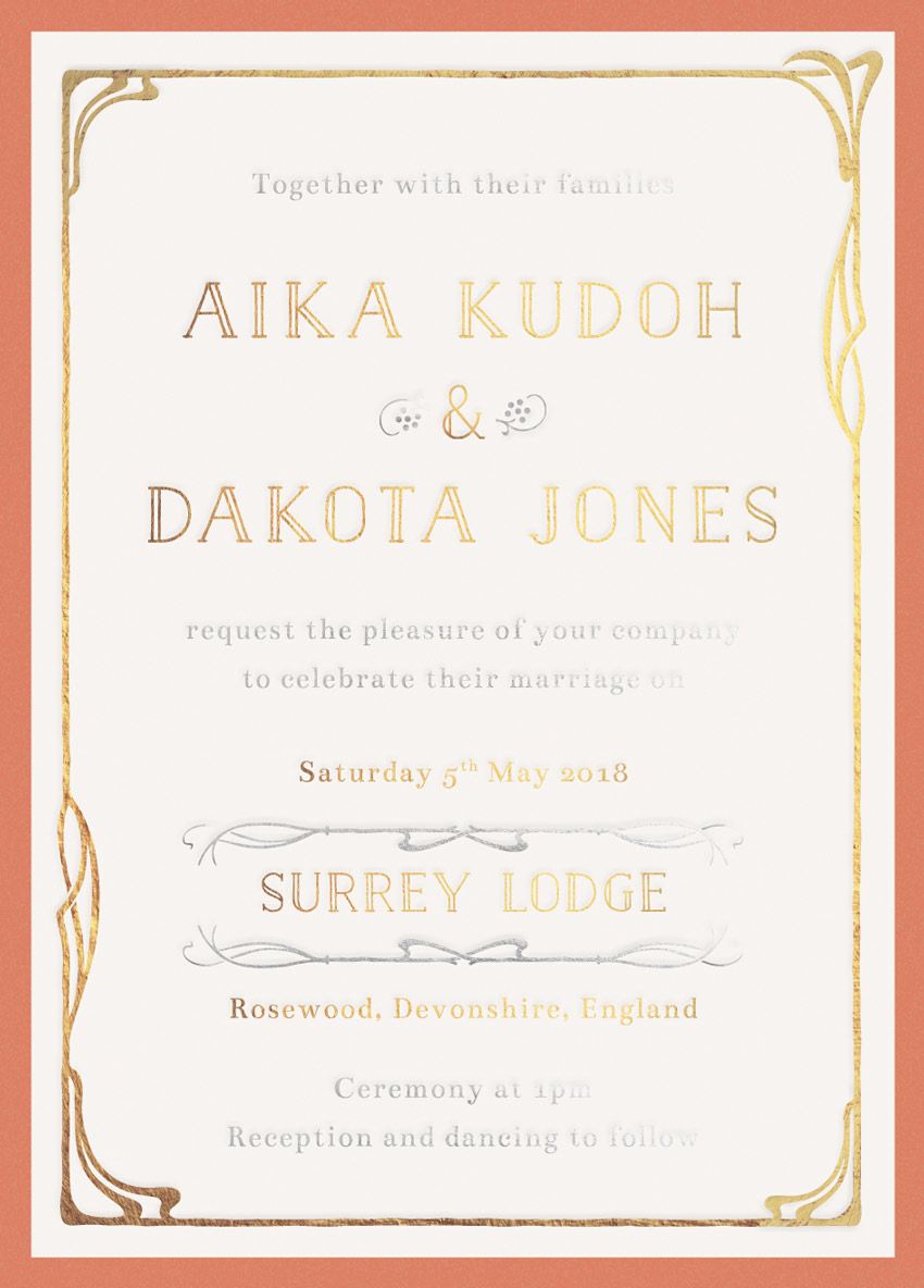
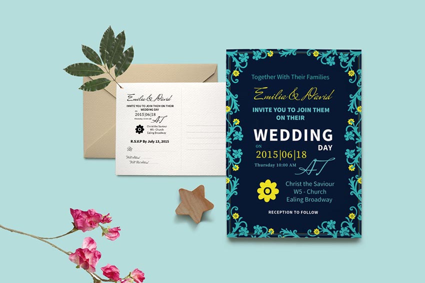
Art Nouveau is a romantic, decorative design style that works beautifully for wedding stationery. Here, we’ll give a modern update to this ornate style with this easy-to-create wedding invitation.
In this tutorial suitable for relative beginners, we’ll create the layout in Adobe InDesign and use Adobe Illustrator to edit some Belle Époque-style graphics.
The design we’re going to create here is made up of three separations: a full-color background, a gold metallic foil layer, and a silver metallic foil layer. We’ll look at how to set up the layout and export the separations ready for printing.
Let’s get started!
What You’ll Need to Create Your Invite
As well as access to InDesign and Illustrator, you’ll also need to download the following vector illustrations and font files:
Once you’ve installed the fonts onto your computer, you’re ready to start creating your invitation.
1. How to Create an Elegant Backdrop for Your Invite
Step 1
Open up Adobe InDesign, and go to File > New > Document.
With the Intent set to Print and Number of Pages to 1, uncheck the Facing Pages box. Set the Width of the invite to 4.5 in and Height to 6.25 in, to create a standard-size card. Add Margins of 0.1575 in, and a Bleed of 0.25 in, before clicking OK.
Step 2
Expand the Layers panel (Window > Layers) and double-click on Layer 1 to rename it Background.
Click on the Create New Layer button at the bottom of the panel and rename this layer Gold Foil. Then create a third layer, and rename this Silver Foil.
Lock all layers except the bottom Background layer.
Step 3
Expand the Swatches panel (Window > Color > Swatches) and create a New Color Swatch.
Set the Type to Process, Mode to CMYK and levels to C=13 M=52 Y=56 K=2. Click Add and OK.
Create a second new CMYK swatch, setting the levels to C=9 M=71 Y=66 K=1. Click Add and OK, as before.
Create a final new swatch, C=5 M=4 Y=6 K=0.
Step 4
Take the Rectangle Tool (M) and drag across the whole page, extending the shape up to the edge of the bleed.
From the Swatches panel, set the Fill of the rectangle to C=13 M=52 Y=56 K=2.
With the rectangle selected, head up to Object on the main menu, and Effects > Inner Glow.
Set the Mode to Overlay, and set the Effect Color to your new red swatch, C=9 M=71 Y=66 K=1. Bring the Opacity down to around 35%.
Set the Source to Center and increase the Noise to around 100%. This will add a bit of grainy, vintage-style texture to the color. Then click OK.
Step 5
Create a new rectangle in the center of the invite using the Rectangle Tool (M) and rest the edges of this against the margin line.
Set the Fill of this shape to your new pale swatch, C=5 M=4 Y=6 K=0.
2. How to Add Gold Foil Elements to Your Invite
The invite as it is presented here is made up of three colorways: a full-color background, a gold metallic foil layer, and a silver metallic foil layer.
Here we’ll start to build up the gold separation layer.
Step 1
Minimize the InDesign window for a moment, and open up the ‘Vitis Combined Elements.eps’ file from your Art Nouveau ornaments pack in Illustrator. Right-Click > Ungroup the elements.
Select the border design at the top-left corner of the artboard and Edit > Copy.
Step 2
Head back to your InDesign document.
Return to the Layers panel and lock the Background layer. Unlock the layer above, Gold Foil.
Edit > Paste the vector border directly into your InDesign document. Position it centrally, nestled inside the border of the pale central rectangle, as shown below.
I’ve switched the Fill of the border to a gold swatch, purely to demonstrate the color difference. But in your own work you should keep this set to [Black](C=0 M=0 Y=0 K=100).
Step 3
Back in Illustrator momentarily again, open up the other vector file in your ornaments pack, ‘Vitis Combination Ornaments Main Set.eps’. Right-Click > Ungroup the elements.
Select one of the corner decorations, as highlighted in the image below, and Edit > Copy.
Step 4
Back in InDesign, Edit > Paste the vector onto the page, and move up to the top-left corner of the border, resizing it to fit snugly onto the design.
Select the corner element, and Edit > Copy, Edit > Paste. Right-Click on the pasted vector and Transform > Rotate 180 Degrees.
Position it over on the bottom-right corner of the border.
Step 5
Take the Type Tool (T) and drag to create a long text frame over the top third of the invite.
Type in the first name of the couple, and from either the top Controls panel or the Character panel (Window > Type & Tables > Character) set the Font to Naive Inline, Size 26 pt, and Tracking to 100.
From the Paragraph panel or the Controls panel, set the text to Align Center.
Edit > Copy, Edit > Paste the text frame twice, moving these below the first. Edit the central frame to have an ampersand (&), and the lower frame to read the second name.
Step 6
Create three more text frames across the lower half of the page, with the date first, set in Bentham, Size 11 pt.
Then set the venue in Naive Inline, Size 18 pt. Finally, set the location of the wedding in Bentham, Size 11 pt.
3. How to Add a Touch of Silver to Your Invite
With the gold elements finished, we can now start to build up the silver foil elements on our design.
Step 1
Lock the Gold Foil layer and unlock the layer above, Silver Foil.
Create a text frame at the top of the invite, reading ‘Together with their families’, set in Bentham, Size 11 pt.
Copy and Paste the text frame, moving it between the second name and the date text frame, editing the text to read ‘request the pleasure of your company to celebrate their marriage on’.
Paste a final text frame at the bottom of the invite, reading ‘Ceremony at (time) / Reception and dancing to follow’.
Step 2
Head back to the ‘Vitis Combination Ornaments Main Set.eps’ file in Illustrator. Select the small berries icon (highlighted below), and Edit > Copy.
Edit > Paste the illustration straight into your InDesign document, positioning it on the left side of the ampersand.
Copy and Paste the icon, and then Right-Click > Transform > Rotate 180 Degrees.
Position it on the right side of the ampersand.
Step 3
Head back to the ‘Vitis Combination Ornaments Main Set.eps’ Illustrator document, and select one of the long horizontal sections of a border, like the one highlighted below. Then Edit > Copy it.
Back in InDesign, Edit > Paste the element in, positioning it below the venue name.
Copy and Paste the border and Right-Click > Transform > Flip Vertical.
Position this above the venue name, to frame it.
4. How to Prepare Your Invite as Separations
If you’re going to ask your printer to apply metallic foiling to your invite, you’ll need to create ‘separations’ of your file, splitting the document into separate PDFs. Here we’ll look at how to create three separations: a full-color CMYK layer, a gold foil layer, and a silver foil layer.
Step 1
Make sure you’re happy with the final design of your invite, and check that the details of the event and spelling are correct.
Then switch off the visibility of the top two Foil layers, and make sure Background is visible.
Go to File > Export. Name this file ‘Invite_Background Full-Color’, and choose Adobe PDF (Print) from the Format menu below. Then click Save.
Step 2
In the Export Adobe PDF window that opens, set the Adobe PDF Preset to Press Quality (at the top).
Click on Marks and Bleeds in the window’s left-hand menu, and check both All Printer’s Marks and Use Document Bleed Settings.
Then click Export to create your first separation PDF.
Step 3
Back in your InDesign document, switch off the visibility of the Background layer and switch on Gold Foil.
Make sure all the elements on this layer are set in [Black].
Then head up to File > Export. Choose Adobe PDF (Print) for the Format as before, and name the file ‘Invite_GOLD FOIL SEPARATION’, before clicking Save.
In the window that opens, set the Preset to Press Quality, as before, but this time only check Crop Marks and Use Document Bleed Settings under the Marks and Bleeds options.
Then click Export.
Step 4
To create your final separation, make sure only the top layer, Silver Foil, is visible. Ensure that all the elements sitting on this layer are set to [Black].
Go to File > Export, this time naming the Adobe PDF (Print) file ‘Invite_SILVER FOIL SEPARATION’.
In the Export window, check Crop Marks and Use Document Bleed Settings as before, and then hit Export.
You’ll need to send all three separation PDFs to the printer, with clear instructions for which layers should be rendered in foil (although your naming convention should make this obvious, it’s always wise to get a proof).
Conclusion
Your invitation artwork is finished and ready to send straight off to the printers—great job!
This invite would make a great pairing with other vintage-inspired, Art Nouveau stationery. Why not send your invites in marbled envelopes, or have baroque-style place settings at the event?
In today’s tutorial, we’re going to tackle another icon project, in which we’re going to gradually learn how to create
a set of text editor elements, using some of the basic shapes and tools found
within good old Illustrator.
So, if that sounds
like something right up your alley, make sure you grab a fresh cup of that
magic bean juice and let’s get started!
And don’t forget, you can always expand the pack by heading over to GraphicRiver where you’ll find a huge selection of UI icons.
1. How to Set Up a New Project File
Assuming you already have Illustrator up
and running in the background, bring it up and let’s set up a New Document (File > New or Control-N)
using the following settings:
Number
of Artboards: 24
Spacing:
20 px
Columns: 4
Width: 32
px
Height: 32
px
Units: Pixels
And from the Advanced tab:
Color
Mode: RGB
Raster
Effects: Screen (72ppi)
Preview Mode: Default
2. How to Set Up a Custom Grid
Since we’re going to be creating the icons
using a pixel-perfect workflow, we’ll want to set up a nice little Grid so that we can have full control
over our shapes.
Step 1
Go to the Edit > Preferences > Guides & Grid submenu, and adjust
the following settings:
Once we’ve set up our custom grid, all we
need to do in order to make sure our shapes look crisp is enable the Snap to Grid and Snap to Pixel options found under the View menu, which will transform into Snap to Pixel each time you enter the Pixel Preview mode (if you’re using an older version of the software).
Now, if you’re new to
the whole “pixel-perfect workflow”, I strongly recommend you go through my How
to Create Pixel-Perfect Artwork tutorial, which will help you widen your
technical skills in no time.
3. How to Set Up the Layers
With the New Document created, it would be
a good idea to structure our project using a couple of layers in order to
separate the reference grids from the actual icons. If you’re familiar with my
previous tutorials, you’ll notice that with this one we’re taking a slightly
different approach, since we’re basing the project on Artboards instead of
Layers due to the high icon count.
That being said, bring up the Layers panel, and create a total of two
layers, which we will rename as follows:
layer
1: reference grids
layer 2: icons
4. How to Create the Reference Grids
The reference grids (or base grids)
are a set of precisely delimited reference surfaces, which allow us to build
our icons by focusing on size and consistency.
Usually, the size of the grids determines
the size of the actual icons, and they should always be the first decision you
make once you start a new project, since you’ll always want to start from the
smallest possible size and build on that.
Now, in our case, we’re going to be
creating the icon pack using just one size, more exactly 32 x 32 px, which is on the smaller side of the scale.
Step 1
Make sure you’re on
the right layer (that would be the first one), and then grab the Rectangle Tool (M) and create a 32 x 32 px orange (#F15A24) square
which we will center align to the first Artboard and use to define the overall
size of our icons.
Step 2
Add a smaller 28 x 28 px one (#FFFFFF) which we will
position on top of the previous shape, since it will act as our active drawing
area, thus giving us an all-around 2 px padding
to work with.
Step 3
Select and group the
two squares together using the Control-G keyboard shortcut, and then create the remaining grids using 23 copies
(Control-C > Control-F) which we
will position onto each of the empty Artboards. Take your time, and once you’re
done, make sure you lock the current layer before moving on to the next section.
5. How to Create
the Justify Icon
Assuming you’ve
successfully managed to create and position the little reference grids, move on
to the next layer (that would be the second one), and let’s kick off the
project by creating the first icon of the set.
Step 1
Start by creating the bottom horizontal line using a 2 px thick Stroke, which we will color using #252A2D and then position at a
distance of 2 px from the center of
the active drawing area’s bottom edge.
Step 2
Finish off the icon by adding the remaining
lines using two copies (Control-C >
Control-F twice) of the one that we’ve just created, which we will
vertically stack at a distance of 4 px from
the original. Once you’re done, select and group all three of them together
using the Control-G keyboard
shortcut before moving on to the next reference grid.
6. How to Create
the Align Left Icon
As soon as we’ve
finished working on the second icon, we can move on to the next active drawing
area, where we will quickly put together our next one.
Step 1
Since some of the upcoming icons are based on the one that we’ve just
finished working on, we will make a copy (Control-C)
of it which we will then paste (Control-F)
onto the current reference grid, making sure to click on the underlying
Artboard first to make it active.
Step 2
Isolate the middle stroke by double
clicking on it, and then shorten its length from 24 px to 16 px—you can do this by
selecting its right anchor point using the Direct
Selection Tool (A) and then pushing it to the left by 8 px using the Move tool (right click >
Transform > Move > Horizontal > – 8 px).
Once you’re done, press the Escape key to exit Isolation Mode, and then make a copy (Control-C) of the resulting icon before
moving on to the next grid.
7. How to Create
the Right Align Icon
Next, we’re going
to quickly create the right align icon, so make sure you’re on the right Artboard (that would be the third one) and let’s get started.
Step 1
Paste a copy of the icon that we’ve just finished working on onto the
empty active drawing area using the Control-F
keyboard shortcut.
Step 2
Adjust the copy that we’ve just created by vertically reflecting it
using the Reflect tool (right click > Transform > Reflect
> Vertical). Once you’re done, don’t forget to make a copy (Control-C) of the resulting icon,
before moving on to the next one.
8. How to Create
the Center Align Icon
Since no text
editor is complete without a center align option, we’re going to quickly add
one in the following moments.
Step 1
Paste a copy of the previous icon onto the fourth Artboard using the Control-F keyboard shortcut so that it
places it in exactly the same position.
Step 2
Isolate the middle Stroke of
the copy that we’ve just created by double clicking on it, and then center
align it to the underlying Artboard using the Align panel’s Horizontal
Align Center option. Once you’re done, quickly exit IsolationMode by
pressing the Escape key.
9. How to Create
the Increase Indent Icon
Move on down to the second row, and then zoom in on the first artboard where we will start working
on our next icon.
Step 1
Create the icon’s main shapes using a copy (Control-C) of the justify one, which we will paste (Control-F) onto the current active
drawing area and then adjust by isolating and shortening the length of its
middle and bottom Strokes from 24 px to 12 px using the Move tool
(left anchor points selected > right
click > Transform > Move > Horizontal > 12 px).
Step 2
Add the main shape for the right-facing arrow
using an 8 x 12 px rectangle, which
we will color using #252A2D and then position on the left side of the active
drawing area, as seen in the reference image.
Step 3
Finish off the icon by turning the shape that
we’ve just created into an arrow by first adding a new anchor point to the
center of its right edge using the Add
Anchor Point Tool (+), and then removing its top and bottom ones using the Delete Anchor Point Tool (-). Once
you’re done, exit Isolation mode,
and then make a copy (Control-C) of
the entire icon before moving on to the next Artboard.
10. How to Create the Decrease Indent Icon
Assuming you’ve finished working on the previous icon, position yourself
on the neighboring Artboard, where we will create its alternate version.
Step 1
Use the Control-F
keyboard shortcut to paste a copy of the increase indent icon onto the
current active drawing area.
Step 2
Double click on the little arrow to isolate it, and
then quickly adjust it by vertically reflecting it using the Reflect tool (right click > Transform > Reflect > Vertical). Once you’re
done, don’t forget to exit Isolation
Mode using the Escape key before
moving on to the next icon.
11. How to Create the Add Space Before Paragraph Icon
As soon as you’ve finished working on the decrease indent icon, we can move
on to the next active drawing area, where we will create our next item.
Step 1
Create the main shapes of the icon using a copy
(Control-C) of the justify one,
which we will paste (Control-F) onto
the current Artboard, making sure to center align it to the active drawing
area’s bottom edge.
Step 2
Ungroup the copy that we’ve just pasted (right click > Ungroup or Shift-Control-G), and then adjust it by
removing its top Stroke line by
selecting it and then pressing Delete.
Step 3
Finish off the current icon by adding the down-facing arrow. We will create it using a 12
x 8 px rectangle (#252A2D), which we will adjust by adding a new anchor
point to the center of its bottom edge using the Add Anchor Point Tool (+), and then removing its bottom ones using
the Delete Anchor Point Tool (-).
Once you’re done, select and group (Control-G)
all three shapes together before moving on to the next one.
12. How to Create the Add Space After Paragraph Icon
Next, we’re going to quickly create an alternate version of the icon that
we’ve just finished working on.
Step 1
Create a copy (Control-C) of the previous icon, which we will paste (Control-F) onto the empty active
drawing area, as seen in the reference image.
Step 2
Ungroup the copy that we’ve just created (right click > Ungroup or Shift-Control-G), and then adjust the
icon by flipping the position of its Strokes
with its arrow as seen in the reference image, making sure to select and group
(Control-G) them before moving on to
the next one.
13. How to Create the Type Tool Icon
Assuming you’ve already moved down to the third row, let’s start working on
the next category, which has to do with text formatting.
Step 1
Create the upper section of the icon using a 20 x 6 px rectangle with a 4 px thick Stroke, which we will color using #252A2D and then center align to
the active drawing area’s top edge.
Step 2
Open up the path of the shape that we’ve just
created by adding a new anchor point to the center of its bottom edge using the Add Anchor Point Tool (+) and then
immediately selecting and removing it by pressing Delete.
Step 3
Add the center section using a 20 px tall 8 px thick vertical Stroke
line (#252A2D), which we will center align to the previous shape, as seen in the
reference image.
Step 4
Finish off the icon by creating the bottom
section using a 16 px wide 4 px thick Stroke line (#252A2D), which we will center align to the active
drawing area’s bottom edge. Take your time, and once you’re done, select and
group (Control-G) all three shapes
together before moving on to the next one.
14. How to Create the Bold Icon
Next, we’re going to quickly create one the most used icons in all text
editor history, so make sure you’ve positioned yourself on the next Artboard, and let’s jump straight into it.
Step 1
Create the lower section of the icon using a 12 x 12 px square with a 4 px thick Stroke, which we will color using #252A2D and then center align to
the active drawing area’s bottom edge.
Step 2
Quickly adjust the shape that we’ve just created
by setting the Radius of its right
corners to 6 px from within the Transform panel’s Rectangle Properties.
Step 3
Finish off the current icon by adding the upper
section using an 8 x 8 px square
with a 4 px thick Stroke (#252A2D), which we will adjust
by setting the Radius of its right
corners to 4 px from within the Transform panel’s Rectangle Properties. Once
you’re done, position the resulting shape as seen in the reference image, making
sure to select and group them together afterwards using the Control-G keyboard shortcut.
15. How to Create
the Underline Icon
As usual, make
your way to the next Artboard, where we will see how to put together the
underline icon.
Step 1
Start by creating the lower section using a 24 px wide 4 px thick Stroke line, which we will color using #252A2D and then center align to the active drawing area’s bottom edge.
Step 2
Create the main shape for the “U” letter using a 12 x 14 px rectangle with a 4
px thick Stroke (#252A2D), which
we will center align to the active drawing area’s top edge so that its path
overlaps it.
Step 3
Start adjusting the shape by setting the Radius of its bottom corners to 6 px from within the Transform
panel’s Rectangle Properties.
Step 4
Finish off the icon by opening up the path of the shape that we’ve
previous adjusted, by adding a new anchor point to the center of its top edge
using the Add Anchor Point Tool (+),
and then immediately selecting and removing it by pressing Delete. Once you’re done, don’t forget to select and group the two
shapes together using the Control-G
keyboard shortcut.
16. How to Create
the Italic Icon
We are now down to
the last icon of the current row, so assuming you’ve already positioned
yourself onto the Artboard, let’s create the next item.
Step 1
Create the bottom and upper sections of the “I” shaped letter using two 16 px wide 4 px thick Stroke lines
(#252A2D), which we will position as seen in the reference image.
Step 2
Finish off the current icon by adding the diagonal line connecting the
two horizontal sections using a 4 px thick Stroke (#252A2D). As always, once
you’re done, select and group (Control-G)
all three shapes together before moving on to the next one.
17. How to Create
the Bring to Front Icon
Assuming you’ve
moved down another row, zoom in on its first Artboard and let’s create our next
icon.
Step 1
Start by creating the front shape using a 12 x 12 px square with a 4
px thick Stroke, which we will
color using #252A2D and then align to the active drawing area’s top-left
corner.
Step 2
Create the back shape using another 12
x 12 px square with a 4 px thick Stroke (#252A2D), which we will align
to the active drawing area’s bottom-right corner.
Step 3
Adjust the shape of the square that we’ve just created by adding a set
of new anchor point where its paths intersect those of the first one using the Add Anchor Point Tool (A), making sure
to reposition its corner one as seen in the reference image.
Step 4
Finish off the icon by adding a fill to the resulting shape, which we
will create using a copy (Control-C)
which we will paste in place (Control-F)
and then adjust by flipping its Stroke
with its Fill (Shift-X). Once you’re done, select and group (Control-G) the two shapes together, doing the same for the entire
icon afterwards.
18. How to Create
the Send to Back Icon
By now, you already
know the drill, so jump on the next Artboard and let’s carry on working on our next item.
Step 1
Create the back shape using a 12
x 12 px square with a 4 px thick Stroke (#252A2D), which we will
align to the active drawing area’s top-left corner.
Step 2
Finish off the current icon by adding the front shape using another 12 x 12 px square with a 4 px thick Stroke (#252A2D) and a 12 x
12 px fill shape (#252A2D), which we will group (Control-G) and then align to the active drawing area’s bottom-right
corner. Once you’re done, select and group (Control-G) all of the shapes together before moving on to the next
one.
19. How to Create
the Insert Header Icon
Make sure you’ve
positioned yourself onto the empty neighboring Artboard, and then let’s get
started working on our next icon.
Step 1
Create the upper section using a 20
x 6 px rectangle with a 4 px thick Stroke, which we will color using #252A2D and then center align to the active drawing area’s top edge.
Step 2
Add the main shape for the lower section using a 20 x 8 px rectangle with a 4
px thick Stroke (#252A2D), which
we will position so that its bottom path overlaps the edge of the active
drawing area, as seen in the reference image.
Step 3
Open up the path of the shape that we’ve just created by adding a new
anchor point to the center of its bottom edge using the Add Anchor Point Tool (+) and then immediately selecting and
removing it by pressing Delete.
Step 4
Finish off the icon by adding the little fill segment using a 12 x 4 px rectangle (#252A2D), which we
will center align to the active drawing area’s bottom edge. Once you’re done,
select and group all of the composing shapes together using the Control-G keyboard shortcut.
20. How to Create
the Insert Footer Icon
Next, we’re going
to quickly create another version of the header icon, so make sure you position
yourself onto the next active drawing area, and let’s get started.
Step 1
Create a copy (Control-C) of
the previous icon, which we will then paste onto the current Artboard using the Control-F keyboard shortcut.
Step 2
Finish off the current icon by horizontally reflecting the copy that
we’ve just created (right click >
Transform > Reflect > Horizontal), making sure to center it again afterwards.
21. How to Create
the List Icon
Our next item is a
must have for any good text editors, so hop on down to the next row and let’s
jump straight into it.
Step 1
Create the upper bullet using a 4
x 4 px square, which we will color using #252A2D and then align to the
active drawing area’s left edge, positioning it at a distance of 2 px from its top one.
Step 2
Add the list item using a 16 px wide 4 px thick Stroke line (#252A2D), which we will
position next to the bullet as seen in the reference image, making sure to
select and group (Control-G) the two
together before moving on to the next step.
Step 3
Finish off the icon by creating two copies (Control-C > Control-F twice) of the
shapes that we’ve just grouped, which we will vertically stack
below at a distance of 4 px from the
original. Once you have your shapes in place, don’t forget to select and group
all of them together using the Control-G
keyboard shortcut.
22. How to Create
the Sublist Icon
We now have a list
icon, but how about we move on to the next Artboard and create a sub-level one.
Step 1
Start by creating a copy (Control-C)
of the previous icon, which we will paste onto the current active drawing area
using the Control-F keyboard
shortcut.
Step 2
Finish off the current icon by isolating the middle and bottom list
items, and then adjusting their length so that their bullets align to the top
one as seen in the reference image. Take your time, and once you’re done, exit Isolation Mode by pressing the Escape key.
23. How to Create
the Insert Page Break Icon
Number 19 off our items’ list is the page break icon, which we will create in a blink of
an eye.
Step 1
Start by creating the center line using a 24 px wide 4 px thick Stroke, which we will color using #252A2D and then center align to the underlying Artboard.
Step 2
Add the main shapes for the pages using two 12 x 6 px rectangles with a 4
px thick Stroke (#252A2D), which
we will position onto the top and bottom edges of the active drawing area as seen
in the reference image.
Step 3
Finish off the icon by opening up the paths of the shapes that we’ve
just created by adding a new anchor point to the center of their outer edges
and then immediately selecting and removing them using the Delete key. Once you’re done, select and group all three shapes
together using the Control-G
keyboard shortcut.
24. How to Create
the Resize Icon
Next off, we have
another simple yet useful tool that most of the time goes overlooked, but not
today.
Step 1
Create the icon’s main body using a 20
x 20 px square with a 4 px thick Stroke (#252A2D), which we will
center align to the underlying Artboard.
Step 2
Finish off the current icon by creating a smaller 12 x 12 px square with a 4 px thick Stroke (#252A2D), which we will align to the active drawing area’s
bottom-right corner. Once you’re done, don’t forget to select and group (Control-G) the two together before
moving on to the next one.
25. How to Create
the Shapes Icon
We are now down to
our sixth and last row of icons, so assuming you’ve already positioned yourself
onto the first of its Artboards, let’s create our next item.
Step 1
Start by creating a 16 x 16 px
circle with a 4 px thick Stroke, which we will color using #252A2D and then
align to the active drawing area’s top-left corner.
Step 2
Add a smaller 12 x 12 px square with a 4
px thick Stroke (#252A2D), which
we will position on the circle as seen in the reference image.
Step 3
Finish off the current icon by adding a set of new anchor points to the
edges of the square where the two paths overlap using the Add Anchor Point Tool (+), and then selecting and removing its
corner one using the Delete key. As
always, don’t forget to select and group (Control-G)
the two shapes together once you’re done.
26. How to Create
the Chart Icon
If you love
charts, you’ll be happy to know that we’re going to be building one of our own
in the following moments.
Step 1
Create the lower section of the icon using a 24 px wide 4 px thick Stroke line (#252A2D), which we will
center align to the active drawing area’s bottom edge.
Step 2
Add the vertical chart segments using three 16 px tall 4 px thick Strokes (#252A2D), which we will
position 4 px from
one another horizontally, and then center align them to the active drawing area’s top edge.
Step 3
Finish off the chart, by adjusting the length of its outer vertical
segments as seen in the reference image. Take your time, and once you’re done, make sure you select and group (Control-G)
all of the icon’s composing shapes before moving on to the next one.
27. How to Create the Table Icon
The next item off our list is one that you probably use quite a lot, so make sure you position yourself onto the next
Artboard, and let’s quickly learn how to create it.
Step 1
Start working on the upper section by creating an 8 x 8 px square with a 4 px
thick Stroke (#252A2D), which we
will align to the active drawing area’s top-left corner.
Step 2
Add a wider 12 x 8 px one
with the same 4 px thick Stroke (#252A2D), which we will
position onto the square’s right side so that their outlines overlap.
Step 3
Create the left shape for the icon’s lower section using an 8 x 12 px rectangle with a 4 px thick Stroke (#252A2D), which we will align to the active drawing area’s
bottom-left corner.
Step 4
Finish off the current icon by adding a 12 x 12 px square with a 4
px thick Stroke (#252A2D) in the
lower-right corner of the active drawing area, making sure to select and group
all four shapes together afterwards using the Control-G keyboard shortcut.
28. How to Create
the Ruler Icon
We are now down to
our last icon, so make your way to the remaining Artboard, and let’s wrap
things up!
Step 1
Create the upper section of the ruler using a 20 x 6 px rectangle with a 4
px thick Stroke (#252A2D), which
we will center align to the active drawing area’s top edge.
Step 2
Finish off the icon, and with it the project itself, by adding a 6 x 20 px rectangle with a 4 px thick Stroke (#252A2D), which we will center align to the active drawing
area’s left edge. As always, once you’re done, don’t forget to select and group
(Control-G) the two shapes together
before hitting that save button.
Great Job!
It might have been
a longer one than usual, but if you made it to the end, you should now have a
nice little practical icon set that you can put to use in any future project.
As always, I hope
you’ve managed to keep up with each and every step and learned something new
and useful along the way.
That being said, if you have any questions, feel free to post them within
the comments section and I’ll get back to you as soon as I can!
Before you start creating the Spiderman text effect, download and install the font and patterns into your Photoshop.
1. Create the Background
I’ll show you how to make the background for the final image, but if you want to use your own background, then skip this whole part.
Step 1
Start by creating a new 850 x 500 px document with the Resolution of 72 Pixels/Inch and the Background Contents to White.
Step 2
Double click the Background layer in the Layers panel to unlock it. Now right click this unlocked layer and choose Blending Options from the menu. Another way to open these options is to select the layer and go to Layer > Layer Style > Blending Options.
Then add a Gradient Overlay with these settings:
Blend Mode: Linear Burn
Opacity: 20%
Click the Gradient box to create the gradient fill using the colors White on the left and Black on the right.
Style: Radial
Angle: 0°
Check the Dither box.
Step 3
Add a Pattern Overlay with these settings:
Click on the Pattern box and choose the Dark Wall pattern.
Opacity: 100%
Scale: 100%
This will create a dark textured background with a vignette.
2. Create the Spiderman Text Effect
This text effect is made of one layer, so you can save it as a new style in your Styles palette for future use.
Step 1
Pick the Type Tool and select the Aero Matics font. Set the Font Style to Bold Italic and Font Size around 200 pt. Write „SPIDER” with capital letters.
Step 2
Select your text layer in the Layers panel, right click on the layer and choose Blending Options from the menu.
Add Pattern Overlay with these settings:
Click on the Pattern box and choose the Spidy pattern.
Scale: 25%
This will add the main red Spiderman pattern.
Step 3
Add Gradient Overlay with these settings:
Blend Mode: Multiply
Opacity: 14%
Click the Gradient box to create the gradient fill using the colors Black on the left and White on the right.
Style: Linear
Angle: -90°
Check the Dither box.
Step 4
Add Color Overlay with these settings:
Blend Mode: Multiply
Click on the Color box and choose the color #e10505.
Opacity: 100%
Both color and gradient overlay will slightly darken the main texture.
Step 5
Add Satin with these settings:
Blend Mode: Linear Dodge (Add) with Color#ffeb0d
Opacity: 100%
Angle: 0°
Distance: 4 px
Size: 16 px
Uncheck the Invert box, if checked.
Satin adds a yellow and orange glow inside the Spiderman texture.
Step 6
Add an Outer Glow with these settings:
Blend Mode: Normal
Opacity: 100%
Technique: Precise
Spread: 0%
Size: 8 px
Range: 55%
Jitter: 0 %
Select the radio button next to the gradient and then edit the gradient Stops:
First gradient stop Color#111111 and Location at 21%.
Second gradient stop Color#177ece and Location at 48%.
Third gradient stop Color#9adaff and Location at 73%.
This will add a blue gradient around the text with dark blue center.
Step 7
Add Inner Shadow with these settings:
Blend Mode: Linear Burn with Color#010101
Opacity: 30%
Uncheck the Use Global Light before setting Angle: -90°.
Distance: 6 px
Choke: 0%
Size: 0 px
Inner shadow adds a 3D feel to the style.
Step 8
Add Inner Glow with these settings:
Blend Mode: Screen
Opacity: 71%
Choose Color#ffeb0d
Technique: Softer
Source: Edge
Choke: 0%
Size: 5 px
Inner glow adds a thin yellow stroke around the texture.
Step 9
Add Stroke with these settings:
Size: 2 px
Position: Outside
Blend Mode: Normal
Opacity: 100%
Fill Type: Gradient
Style: Linear
Angle: 90°
Check the Dither box.
Set the Gradient with these 5 stops:
First gradient stop Color#003669 and Location at 12%.
Second gradient stop Color#bcebff and Location at 22%.
Third gradient stop Color#003669 and Location at 52%.
Fourth gradient stop Color#bcebff and Location at 83%.
Fifth gradient stop Color#003669 and Location at 96%.
The stroke will add small, blue, shiny lines around the text.
Step 10
Add Bevel & Emboss with these settings:
Style: Inner Bevel
Technique: Smooth
Depth: 100%
Direction: Up
Size: 18 px
Uncheck the Use Global Light box before setting Angle: 110° and Altitude: 30°
Highlight Mode: Linear Dodge (Add) with Color#ffc000 and Opacity: 26%
Shadow Mode: Linear Burn with Color#0a2a40 and Opacity: 20%
Step 11
Add a Texture with these settings:
Click on the Pattern box and choose the Spidy pattern.
Scale: 25%
Depth: +120%
Inner bevel with texture adds more depth into the red Spiderman pattern.
Step 12
As a final step, add a Drop Shadow with these settings:
Blend Mode: Normal with Color#001e2d
Opacity: 100%
Uncheck the Use Global Light before setting Angle: 120°
Distance: 3 px
Spread: 100%
Size: 11 px
Congratulations! You’re Done!
In this tutorial, you learned how to create a Spiderman text effect in Photoshop.
We started out by creating the dark background with a seamless pattern. Then we created a text layer and added many different effects in order to create a Spiderman-style text effect.
I hope you’ve enjoyed this tutorial, and if you like the final effect, don’t forget to save this style to your Layer Styles palette for future projects.
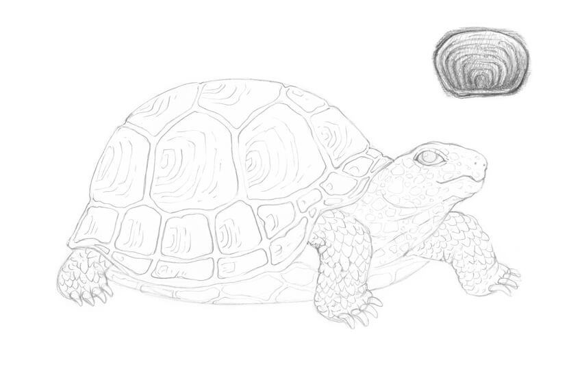
Did you know that turtles belong to one of the oldest reptile groups in the world—beating snakes, crocodiles, and alligators? The first proto-turtles are believed to have existed about 220 million years ago!
Drawing a turtle is a great experience for artists of any skill level. Using the example of this animal, we can observe a variety of textures and natural patterns.
We’ll sketch a turtle from scratch, both in a side and aerial view, using just a couple of graphite pencils. Let’s have fun!
What You Will Need
an HB graphite pencil
a 3B graphite pencil
an eraser
drawing paper
1. How to Draw a Turtle in a Side View
Step 1
Let’s start with a rough sketch of the turtle’s figure.
I draw a rounded shape of the shell. Most land-based turtles have a large, heavy, dome-shaped shell that protects the animal’s body from predators.
The shell is actually a part of the skeleton; it consists of over 50 bones. And, contrary to a popular belief, a turtle cannot come out of its shell.
Then I add the shape of the head…
… and mark the feet—or, more precisely, the places where the limbs meet the ground. We don’t add the fourth shape because it is not visible in this foreshortening.
Step 2
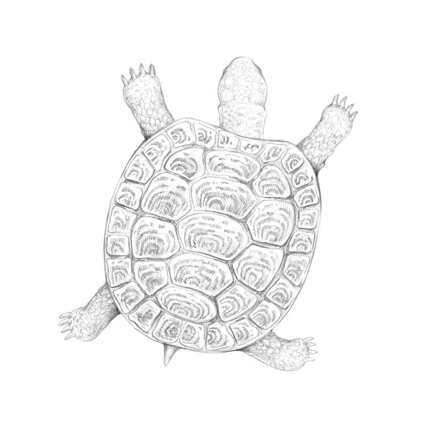
I refine the initial shape, outlining the upper shell of the turtle (it is called the carapace).
A shell is a three-dimensional object, so I round the contour line in the bottom part of the shape.
Then I add the plastron—the lower shell that encases the belly.
Step 3
I outline the shape of the head.
Step 4
I draw the eye. Most terrestrial turtles have their eyes looking down at objects in front of them, so my intention is to convey this feature by lowering the eye’s inner corner.
Step 5
I draw the line of the mouth. Turtles have rigid beaks that help them to bite off pieces of food.
I also add the nostrils.
Step 6
Using simple shapes, I construct the short, sturdy feet of the turtle.
Step 7
I refine the feet, erasing all the unnecessary lines.
Step 8
Turtles usually have long claws, so I add four claws to each limb. The feet look much more credible now!
I also refine the shape of the carapace.
Step 9
I draw the prominent polygonal plates (they are called the scutes) in the upper part of the carapace.
I add the next row of scutes just underneath the first one.
Step 10
I add two more rows; the scutes here are smaller.
I also mark the relief elements of the plastron with light lines; we don’t need too many details here.
Step 11
Let’s add some details to the turtle’s skin. The pattern may vary; you can see a couple of examples in the image below.
I add the elements, starting from the head. I also draw the folds of skin in the neck area.
Step 12
I complete the pattern in the head and neck area.
Then I add the pattern of the turtle’s limbs; it resembles a set of close-fitting jags of slightly different size.
Step 13
I draw the pattern of the scutes. You can see an example scheme in the image below.
By the way, counting the rings formed by the stack of smaller, older scutes on top of the larger, newer ones can help to estimate the approximate age of a turtle.
Step 14
With the HB pencil, I add some shading to the darkest areas of my drawing, including the drop shadow.
Step 15
I also add a layer of light hatching to the sides of the shell and the head of the turtle.
Step 16
With the 3B pencil, I emphasize the pattern of the scutes.
Step 17
With the 3B pencil, I increase the contrast in the drawing by darkening the skin texture.
Step 18
With the 3B pencil, I cover the shell with a layer of hatching, accentuating the sides and the gaps between the scutes.
Step 19
To make this drawing harmonious, I apply more 3B graphite strokes to the limbs and head.
This illustration is complete!
2. How to Draw a Turtle in an Aerial View
Step 1
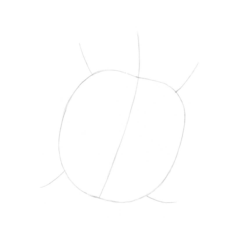
I draw a light line with the HB pencil; let’s assume that this line is going through the center of the turtle’s head and shell.
I add the shape of the shell and the framework of the limbs.
This reference is not a strict guideline, it’s rather a general outline that helps us to convey the direction of the body.
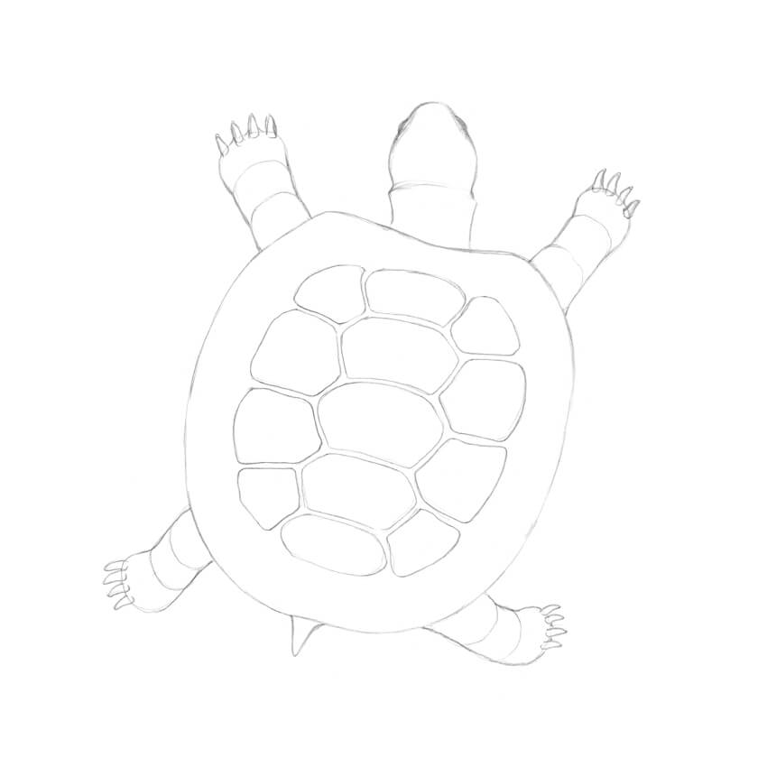
Step 2
I draw the shape of the head with the neck, and then add the feet.
Step 3
I refine the shape of the neck. Turtles often have a traverse skinfold that is visible in this foreshortening.
I narrow the shape of the head and add the eyes—they are barely visible.
Step 4
I construct the limbs.
Step 5
To complete the feet, I add the claws.
Step 6
I draw a short tail; most species of turtles have it.
Step 7
I draw a new rounded shape inside the shell outline, and then divide it into three parts.
Step 8
I draw the scutes in the central part of the shell. Allow the elements to be slightly uneven—this makes the drawing more natural.
I add the circular row of smaller scutes.
Step 9
I create a pattern of scutes. Don’t strive for perfection; let the pattern be slightly irregular and spontaneous.
Step 10
I add the jagged pattern of the limbs.
Step 11
With the HB pencil, I accentuate the darkest areas of the drawing.
Step 12
With the 3B pencil, I increase the contrast, darkening the pattern of the scutes and the gaps between the plates.
Step 13
I apply a layer of hatching to the shell, using the 3B pencil. I also work on the textures of the turtle’s limbs, head, and tail.
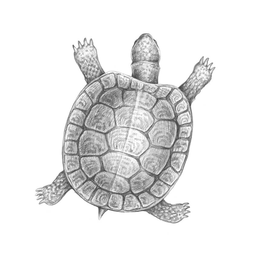
Step 14
With the 3B pencil, I darken the shell, leaving its center relatively light to create an illusion of convexity. I also accentuate the shadows on the limbs and neck.
Your Artworks Are Complete
Congratulations—we’ve created two beautiful graphite pencil drawings! I hope you were inspired by the fascinating textures and the world of nature.
Let your creative journey be fruitful and full of joy!
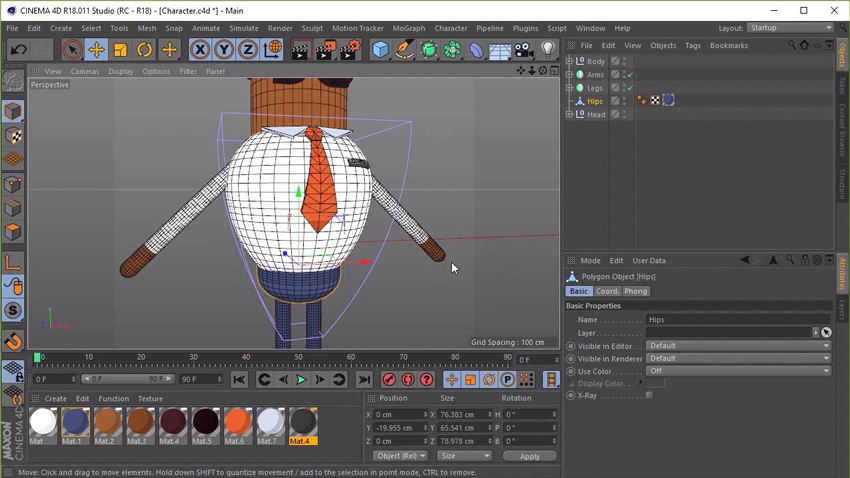
Do you want to learn animation quickly and easily? Our new course, Rig a Rubber Hose Character for Animation, will take you through the step-by-step process of rigging a simple “rubber hose style” character in Cinema 4D.
Instructor Jonathan Lam will teach you how to prepare a character for your own animations, graphics, or video-game projects. This workflow is perfect for those looking to get into rigging and basic 3D animation.
You can take our new course straight away with a subscription to Envato Elements. For a single low monthly fee, you get access not only to this course, but also to our growing library of over 1,000 video courses and industry-leading eBooks on Envato Tuts+.
Plus you now get unlimited downloads from the huge Envato Elements library of 460,000+ creative assets. Create with unique fonts, photos, graphics and templates, and deliver better projects faster.
This is part two in our four-part series on How to Design Flat Icons in Affinity Designer.
If you haven’t already, make sure to check out Part One to this series, where you’ll get the introduction to this course as well as the first lesson for creating a flat shopping bag icon.
In this lesson, Yulia Sokolova will show you how to create a quick discount badge icon. Learn how to make the second icon in this set, using basic shape tools, operations, and the Artistic Text Tool.
Create a yellow shape using the Rounded Rectangle Tool (M). Adjust the shape with the Vector Crop Tool to shrink in the right side.
Then create a yellow triangle and attach it to the first shape, adjusting the size with the Transform panel. Align the shapes together.
Now combine the shapes so that there’s no gap. Then modify the triangle to look more like a badge.
Complete the design of the badge using the Rectangle Tool (M) to create the tag and the Ellipse Tool (L), along with operations, to create the badge’s hole.
Finish the badge with some text. Here we’ll use the Bowlby One Free Font to create the percentage sign to represent the discount.
Then use the same methods as before to create a trendy long shadow effect and the circular base for the icon. Here’s the finished result.
How to Create a Hanger Icon
Time for the third icon. In this next lesson, we’ll learn how to create a simple hanger icon using basic shapes and operations.
Use the Triangle Tool to create the initial base shape for the orange hanger. Duplicate this shape and make it smaller, and then create a circle for the top of the hanger with the Ellipse Tool(L).
Combine the larger triangle and circle shapes together, and then modify the new shape with the smaller triangle. This will result in a cutout effect for a stylized hanger design.
Finish the hanger with a curved metal rod. Use the Artistic Text Tool to create the metal shape from a simple question mark symbol. Then apply the gray shape to the hanger.
Create the final hanger icon with the usual steps from before. Make a long shadow effect first, and then apply it to the purple circular base. Here’s the result.
Want More?
All done! Let’s continue with the fourth and fifth icons in the next lesson. There we’ll learn how to create a
colorful shopping basket and dress icons.
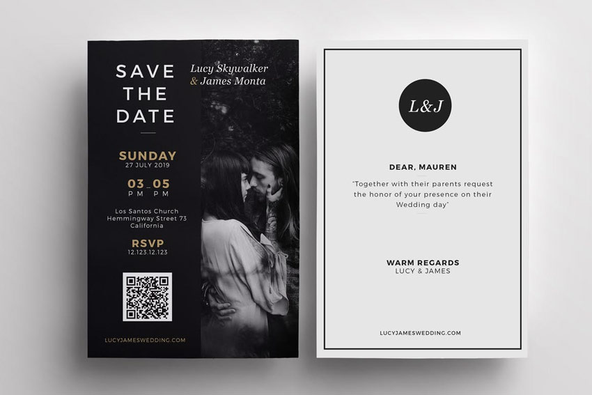
Love is in the air! And in this collection of premium design assets, we present you with 50 stunning wedding invitation templates.
Loaded with incredible designs from GraphicRiver and Envato Elements, this collection features a plethora of gorgeous invitations we’re sure you’ll love.
Download these templates today to embark on your romantic journey or enlist the help of a design professional from Envato Studio for custom invitation design.
50 Fabulous Wedding Invitation Templates
Start the first day of the rest of your life in style. Download one of these premium wedding invitation templates to celebrate your love with the world. They’re crafted with exquisite designs and luxurious elements, so say „I do” to these fabulous wedding templates today. Enjoy!
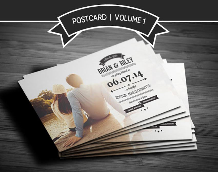
To kick off this collection, we’ll start with this lovely wedding invitation set. This set includes several unique templates for your wedding invitations, RSVP cards, and so much more. Celebrate your special day in style with this minimal design featuring unique cursive lettering.
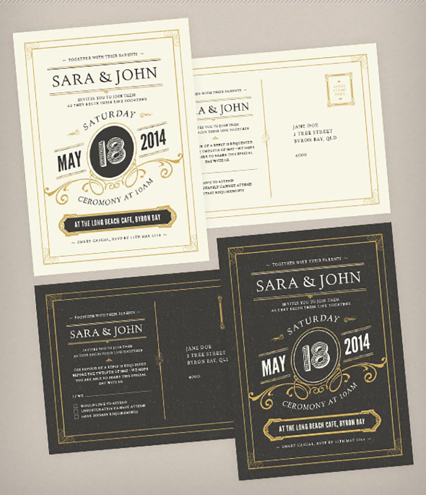
Dazzle your guests with this stunning wedding invitation design. This template features an elegant black and white color scheme with gold elements to complement your overall palette. Print ready and easy to use, this design can be downloaded today!
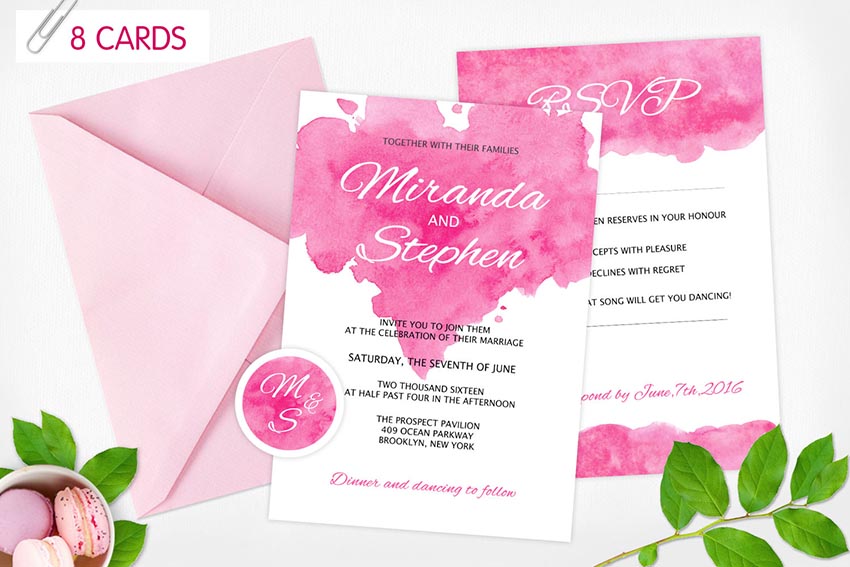
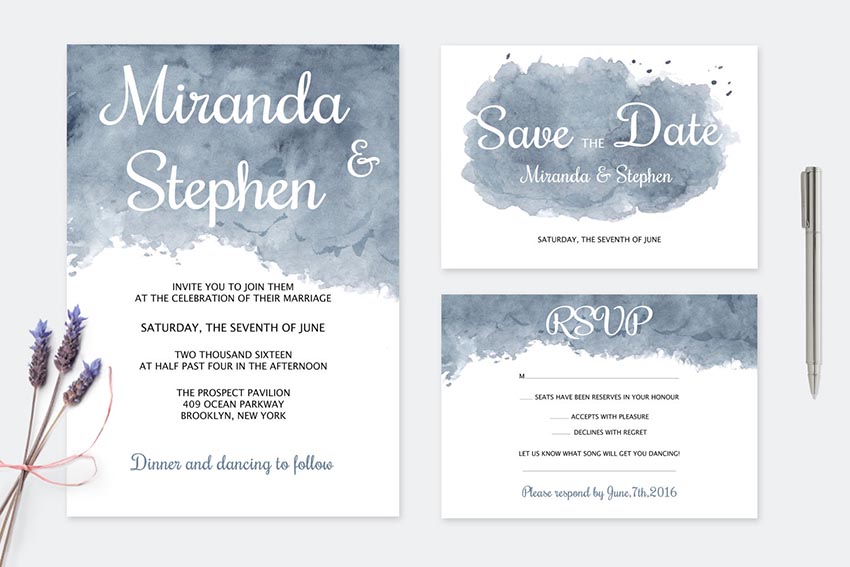
This beautiful invitation package features a handmade watercolor wash that is sure to impress your guests! Also included in this package are eight Photoshop files with multiple card designs and so much more!
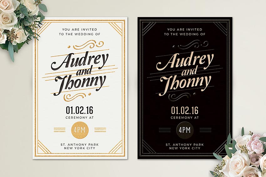
Match your invitation design to the bride’s dress details with this elegant invitation. This template features a lovely dark and light version with a professional clean design that is sure to make your invitations memorable.
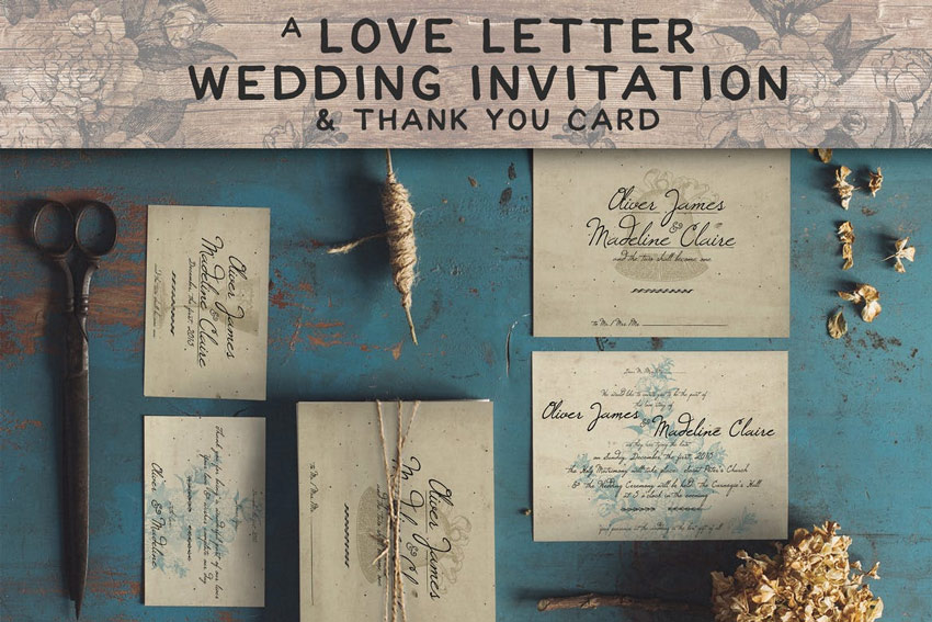
Send a love letter to all your party guests with this stunning invitation package. This download includes several print-ready designs with lovely script details. Easily adjust and customize the designs for more creative options.
Customize your invitations to match your wedding’s style. Perfect for that elegant look, this suite includes one invitation and matching RSVP card. Complement your wedding details by featuring this beautiful gold wreath set.
Kick off your wonderful wedding experience with this floral invitation suite. Apart from the initial documentation file, you’ll also receive four separate Photoshop files with double-sided invitations and additional wedding cards.
Need an invitation with a unique vintage theme? Then look no further! Here we have a gorgeous template that features a pristine vintage design with rustic elements and both front and back layout options.
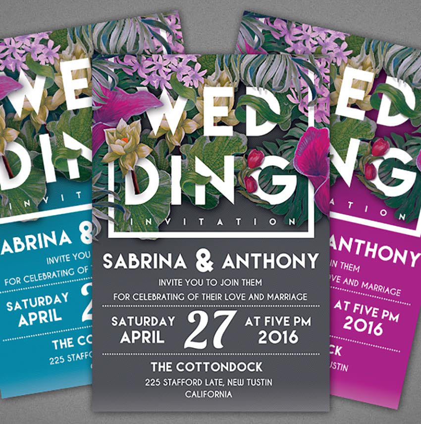
One unique way to make your invitations shine is to match them to your current floral arrangement. Use this template to feature your favorite flowers with a modern typographic design. Included in this set are two Photoshop files that are well organized with color-coded groups.
Stamp your face on a cute invitation design and let your loved ones know you’re ready to take the leap! This lovely template features a professional clean design that is print ready and super easy to use. Simply drag and drop your photos into the allotted Smart Objects to customize this design easily.
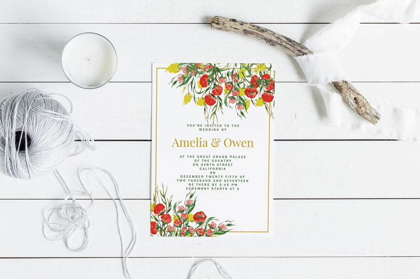
Are you having a wedding in the summer? Then perhaps you’ll love this gorgeous floral wedding invitation card. Designed with vintage floral elements and elegant text, this pack includes two high resolution invitation cards. Share the love today!
Enjoy this rustic invitation design for your special day. This elegant template features a minimalist design with vintage rustic elements to highlight your wedding arrangements. Download this file to get three unique color combinations and links to free fonts.
You can achieve the look of custom chalkboard lettering against a dusty blackboard with this unique design. This template features two additional color alternatives with a front and back design for a nice vintage look.
Many invitation templates on GraphicRiver come with elegant color alternatives. Check out this vintage wedding invitation, for instance. This template features three unique color combinations along with a clean front and back design perfect for your romantic celebration.
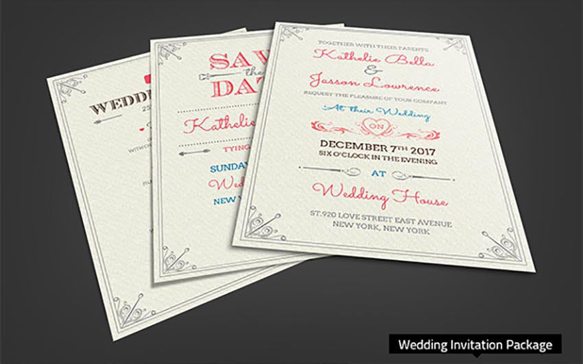
Want a wedding invitation with bold, vibrant colors? Then check out this lovely minimalist design. This template features four unique color combinations that we’re sure you’ll love. Download free fonts included with this package to take advantage of this stunning design.
There’s no need for a fussy design when you can celebrate your love with an elegant wedding invitation. This template features four fully layered Photoshop files, with two color options, and so much more!
Or how about a nice watercolor design for your wedding invitation? This template features a special design with handmade watercolor textures that are sure to complement your special day. Download this template to get access to four color combinations and so much more!
If you love the look of sparkly bokeh photography, then we’re sure you’ll enjoy this stunning wedding invitation. This template features a gorgeous sparkly design with elegant text and a simplistic layout.
Put your love on display with this beautiful wedding invitation template. This design features a print-ready layout that is super easy to use. Simply place your photos into the appropriate Smart Objects to enjoy this design quickly and easily.
Love geometric shapes and warm, vibrant colors? Then this template might be the one for you! Included in this package are all the materials you need to kick off your wedding in style. Enjoy a complete collection featuring modern designs for wedding invitations, RSVP cards, and more!
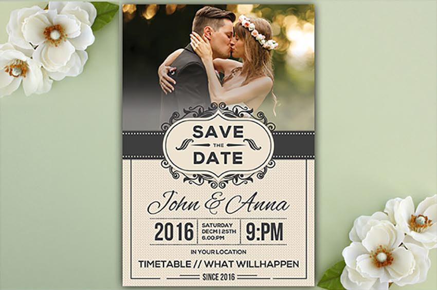
Many lovely couples utilize talented photographers for stunning engagement photos. So take advantage of your special photo shoot by showcasing your photos on your save the date cards. Created in Photoshop with well organized layers, this template is ready to download and enjoy today!
Save the date with a remarkable design that is classic and effortless. This wedding invitation features a sublime design with exquisite watercolor foliage. Adjust the text elements with the names of you and your love to enjoy this invitation now!
Get royal with this stunning wedding invitation package. Included in this package are ten premium Photoshop files with templates for the invitations, RSVP cards, and so much more. Download this set to create a nice, cohesive look for all your wedding materials.
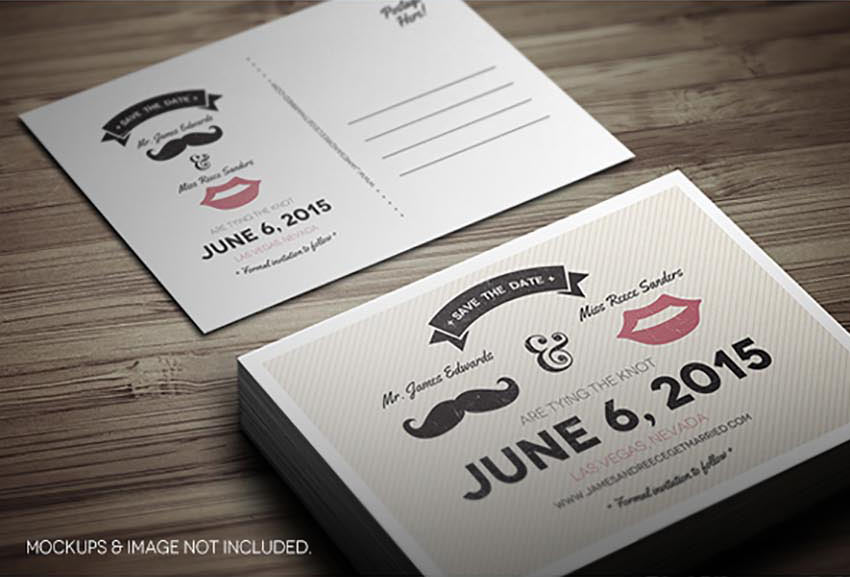
This super cute wedding invitation is perfect for an adorable retro couple. Show off his manly stache and her favorite lip shade with this cute design. This template features two layered Photoshop files, front and back designs, and plenty of room for guest information.
Save the date in style with this customized wedding invitation. This template features two layered PSD files that are super easy to edit. Simply drag and drop your favorite photo into the template and change the details for a personalized design.
Show how much you love each other with this adorable wedding invitation package. This package includes 11 Photoshop files with templates for your save the date invites, RSVP forms, and thank you cards. Download this set today to get 11 great designs in one professional package!
Take advantage of cool typographic design with this unique wedding invitation template. This design features a grungy mix of letters for all your pertinent information. Download this package to get an easy-to-use file with fully editable layers and more.
Wedding planning is already stressful, so do yourself a favor and go with a simple and elegant invitation design. This template features five gorgeous color variations with simplistic details and well-organized layers. Download it today to plug in your wedding details in no time at all!
Match your invites to your garden surroundings. We hope you’re inspired to take a calming stroll amongst the flowers after using this lovely invitation set. Included in this download are several Photoshop files with front and back wedding card designs for fast printing!
With a mix of fresh flowers and vintage design, this template features two unique light and dark versions to match your overall theme. Download this package today to get access to fully editable files and print-ready templates.
Are you a bird lover at heart? Incorporate your passion into your wedding with this unique wedding invitation set. This template features a simplistic, elegant design with double-sided cards in a print-ready format. Download it today to make the most of this lovely design.
For a classic wedding invite design, check out this gorgeous collection below. This package features easily editable Photoshop files for invites, info cards, and so much more. Customize it easily with your wedding details to get started today!
Stand out from the crowd and download a template today that won’t be expected. This creative design features a unique black and white style with charming design details. You’ll receive a documentation file with nine additional files to cover your wedding arrangements.
White typography against a solid black background always makes for stunning design. And you can utilize this design for print-ready invitations that are super easy to use. Purchase this package today to get access to several black and white designs featuring that classic vintage look.
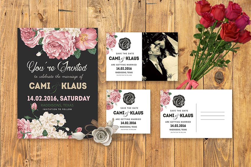
Do it yourself with this fabulous wedding invitation set! This package includes an elegant design with incredible peony flowers and room for photos. Customize your cards easily with dreamy engagement photography and all your wedding details.
Save the date with this divine wedding invitation package. Featuring a gorgeous wash of watercolor as the base, this design also includes eight Photoshop files that are easy to use. Download the free fonts included with these templates to take full advantage of these designs.
The beauty of DIY design is that you can still create beautiful invitations that won’t break the bank. And this vintage template is certainly no different. Included in this package are several files for your invites and cards in a print-ready format you can also print at home.
Match your vintage wedding theme with this authentic invitation design. Included in this package are four Photoshop and Illustrator files with 100% vector elements. Show off your style and your incredible taste with this overall charming invitation set.
Those special little details really set a normal invitation apart from an extraordinary one. And this watercolor invite set features lovely floral details with files available in Adobe Photoshop. Get it printed on a special card stock with raised ink for an awesome experience.
Minimalist design can be just as fabulous as ornate ones. And with this adorable invitation set, you’ll be able to enjoy a simple design with a loving couple on the back cover. This package also includes elegant font types with vintage design elements for added style.
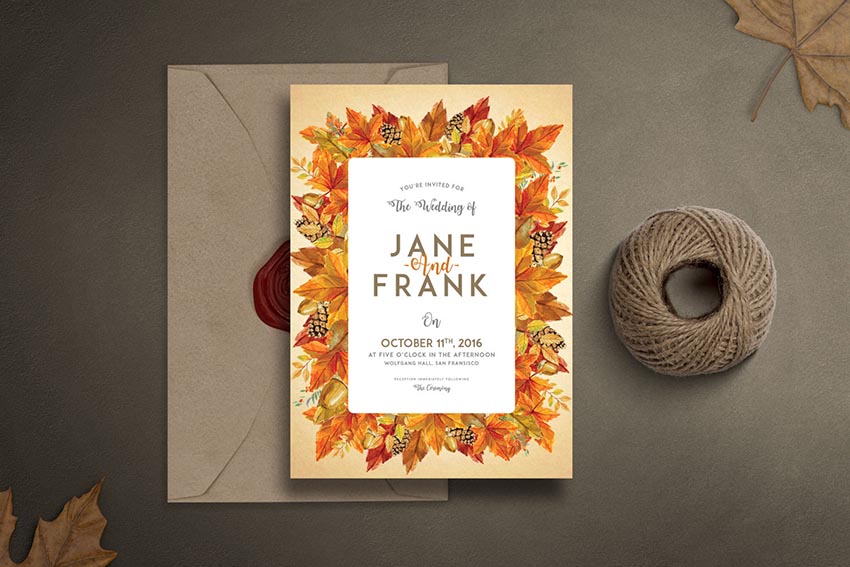
As the colors on the leaves start to change, autumn becomes a beautiful time of the year to have a wedding. And with this invitation set, you get access to a nice fall design with several invitation cards that are easily editable. Celebrate your favorite season with the wedding of a lifetime!
Go for a traditional aesthetic with this sweet embroidery invitation package. This download includes several important items like invites, RSVP cards, and more to complete your special day. Get access to front and back designs with bleed lines and more.
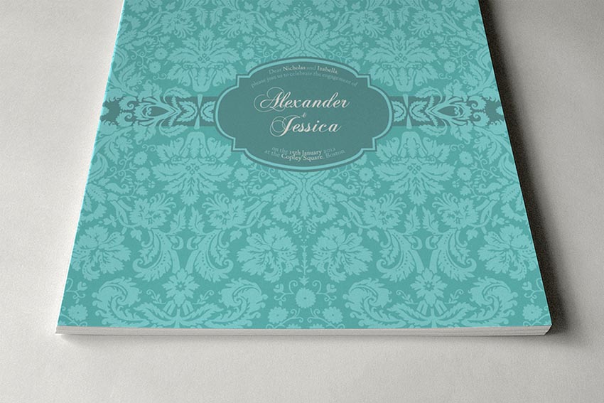
It’s always good to have options in your life. And with this wedding invitation package, you get access to 24 vintage invitations featuring a fabulous brocade design. With print-ready files and six color variations, these mature wedding designs will make your plans complete.
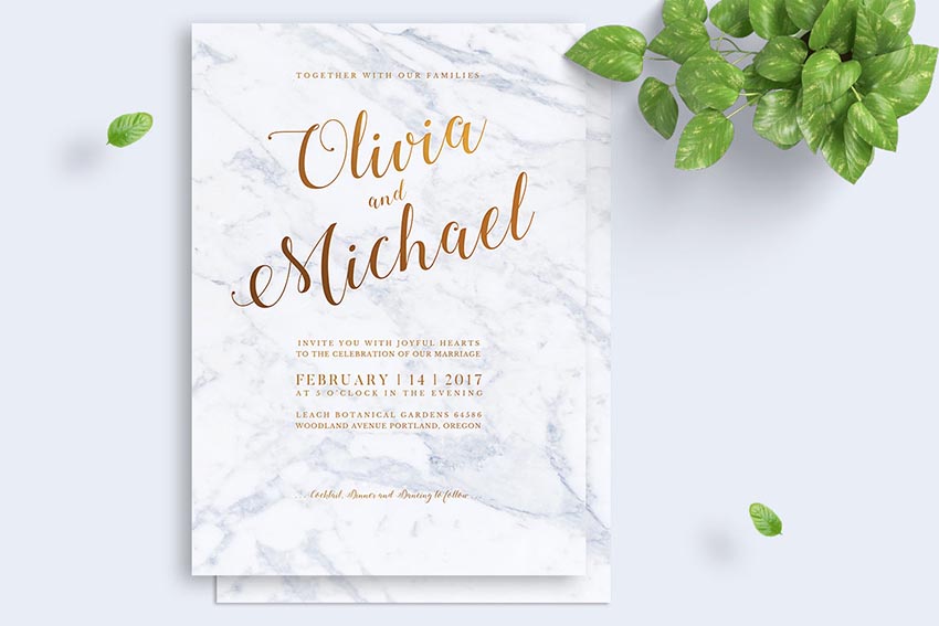
Marble floors exude class and sophistication. And you can incorporate that expensive look into your designs with these marble wedding invitations. Complete with print-ready files that are also fully editable, this template lets you enjoy that marvelously chic look without breaking the bank.
Unite your love of flowers and vibrant watercolors with this stunning invitation set. Included in this package are several save the date designs with a bonus set of eight watercolor elements. Choose a premium card stock to truly highlight your awesome designs.
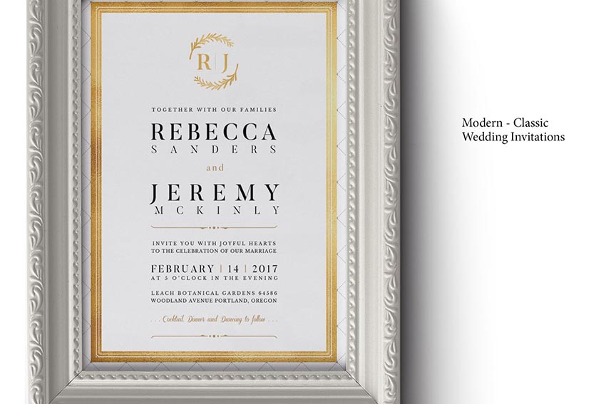
Showcase your classic wedding theme with this gorgeous modern design. This template features print-ready, fully editable files, with only free fonts used. Download this package today for a smart and simple wedding solution.
This fun floral invitation is made with 100% vector elements. This means you can easily customize the flowers and leaves by scaling them to the size you desire. Make additional changes to the text or colors for a nice personalized touch.
Or surprise your guests with these extraordinary invites featuring beautiful script text. This template includes a classy watercolor wreath design that your guests are sure to love. Choose from two color palettes, green and gold, to make your wedding unique and memorable.
If your wedding is during that special time of the year when the flowers are at full bloom, then you’ll definitely want this spring invitation set to match your theme. Included in this package is a lovely watercolor design with flirty elements and gorgeous cursive fonts.
To finish this awesome collection, we’ll feature this amazing typographic design. Included in this package are six separate Photoshop files with a multitude of color variations to fit any theme. Download today to customize this design quickly and easily.
Conclusion
This list is jam-packed with exciting resources for the avid designer
familiar with Adobe Photoshop and Illustrator. If you need additional
help modifying these templates, enlist the skills of a talented
professional by choosing one of the amazing designers from Envato Studio.
And with hundreds of gorgeous wedding invitation templates available, chances are we’ve missed a few to add to your personal collection. Be sure to browse Envato Market and Envato Elements for more resources, and let us know your favorites in the comments below!
Procreate is my favorite drawing app available for the iPad.
In this tutorial we’ll be creating a colorful portrait of a beautiful woman, using different painting techniques. We’ll take some inspiration from the retro and glamour styles, and we’ll use vibrant neon colors to make it stylish.
Let’s start!
1. How to Make a Sketch
Step 1
In this tutorial, I’m using an iPad pro with the Apple
Pencil and the Procreate 4 app.
First, open the application. Tap the (+) icon in the top-right corner to
create a New Canvas. There you can
select one of the canvases from the list or create a new one.
Tap to Create
Custom Size and create a 3500 x 4000
px canvas, RGB, 300 DPI.
Step 2
Before creating a sketch, let’s find a proper brush
for it.
First, open the Brushes
tab, tap the Sketching set, and
select the 6B Pencil.
Let’s modify this brush a little bit. Tap the 6B Pencil icon, and the Settings of the tool will appear. Choose
the General settings and change the Size Limits to ~30% Max. It will allow us to have more flexibility in the
sketching process.
Step 3
Let’s begin by drawing a sketch.
We already have two layers by default: one layer with the background color and one empty layer. Open the Layers panel, tap „Layer 2”, and rename it to „sketch”.
Step 4
Now we can start sketching. Usually I make a
combination of basic shapes first, where I’m trying to search for the silhouette of
the character and her features. Then I refine the sketch, adding a couple
more details to give them a bit more character.
I do a lot of rotating of the canvas in the process. You
can do it too if you like—just use two fingers and rotate your image or size
it.
Also, you can change the Size and Opacity of any Brush tool by moving up
and down the sliders on the left
side of the screen.
2. How to Create the Main Shapes
Step 1
First, let’s
create the Palette of the basic
colors.
We have the Colors menu in the top right corner, where we can select the color.
For the Create
a New Palette option, click on the (+) icon, and a new area with empty boxes for our new palette will appear. Rename
it to „neon”.
Now pick the color and tap on any of the empty boxes, and
it saves it (tap on the boxes to create the colors for your palette, and tap on
them to delete any of them).
This way we’ll create our own Palette. Basically, we’ll choose bright colors for the hair and
clothes (place them on the first row), and cold brown colors and nuances of lilac,
purple and lavender for the skin (on the second and third rows).
Step 2
Now open the Layers
menu, tap N on the
„sketch” layer, lower the Opacity
to 50%, and change the Blending Mode to Multiply.
Step 3
Let’s set a background color by tapping the
„Background color” layer, which we already have by default. Select a
dark purple color on the Color Wheel.
Step 4
It’s time to
begin painting.
Create a New
Layer for the skin and drag it under the „sketch” layer.
First, go to Brushes >
Airbrushing > Hard Airbrush andpick
a brown color from our Palette.
Draw the
outlines of the body, using our sketch as a reference. Now we can fill it with
a solid color. Just drag it from the Colors in the top right using your
finger, and drop it onto your outline shape. Make sure that your lines are
completely closed. Then refine the edges using the Eraser Tool. Choose the Hard Airbrush tool as an eraser.
Step 5
Using this method, draw the hair and clothes on separate layers. Organize them as shown below.
Step 6
Open the „makeup” layer, and draw eyelashes,
eyebrows, nostrils, and the middle line of the lips using the 6B Pencil and a dark brown color.
Create a New
Layer for the eyes and lips on top of the „skin” layer. Fill them
with colors using the same brush.
Step 7
Set the Opacity of the „sketch” layer to 30%,
making it more transparent. It’s still useful to us in the painting process,
but should not be so conspicuous at the same time.
3. How to Add Shadows and Highlights to the Body
Step 1
Let’s start by adding some volume to the body. Tap on
the „skin” layer and select Alpha
Lock from
the drop-down list.
It will help us to paint inside the body shape without crossing this area.
Now select a dark brown color from our Palette and choose the Nikko Rull brush from the Painting set.
Start creating soft shadows by making strokes on the
shadowy area. Change the stroke Size
and Opacity in the process until you get the desired shapes. Turn off the „sketch” layer to see the
result.
Step 2
This way, add some deeper shadows using the same brush.
Check the result, making the „sketch”
layer invisible.
Step 3
Let’s change the color of the strokes on the
„makeup” layer.
First select the layer, and then tap the Adjustments icon and choose the Hue, Saturation, and Brightness from the drop-down
list.
Change the color, making it darker. Move the sliders until you get the desired
result.
Step 4
Now let’s add some blush to the skin.
Create a New
Layer on top of the „skin” layer first. Then tap on the
„skin” layer and choose Select
from the drop-down list. It will allow us to draw on the „blush”
layer just inside the body shape.
Choose the Soft
Brush from the Airbrushing set,
and draw some blush shapes on the cheeks, nose, and neck. Reduce the Opacity of the layer to 40%.
Step 5
It’s time to add some highlights to the lightened
area.
Create a New
Layer on top of the „blush” layer, and rename it to
„highlights”. Pick a beige color from our Palette, and paint some highlights strokes, using the same Nikko Rull brush. Reduce the Opacity to 40%.
Step 6
Now create a New Layer again on top of the „highlights”. Draw more evident strokes, using the same color and brush. Reduce the Opacity to 40% as well.
Step 7
Once we’re happy with the highlights, we can merge
these layers. Tap on the top layer with highlights and choose Merge Down from the drop-down list. Or
you can take the two layers (one finger on one, and one finger on the other)
and squeeze them together.
Step 8
Create a New
Layer on top of the „highlights”. We’ll add some bright highlights to make the look more expressive. Use the same brush and lilac tint
from our Palette. In the end, lower
the Opacity to 60%.
Now create a New
Layer again and draw some highlights on the cheekbone, on the corner of the
eyes and lips, on the tip of the nose, under her eyebrows, and on the forehead.
Use the same color and brush with 100%
Opacity. Once you’re happy with the result, merge all these layers with
highlights, blush and skin into one „skin” layer.
Step 9
Let’s refine the skin a little bit, correcting the roughness of
the skin
and improving the shape of her face and body. Use the Color Picker Button to select the color you need. You can find this
button between the Size and Opacity sliders.
Step 10
Now let’s add some volume to the eyes.
Start with the white of the eye, adding some brown
shadows under the eyelashes. Choose a dark brown color for the top of the iris and
a light brown color for the underside. Also add some bright green strokes to
the iris.
Next, draw a strip on the edge of the eyelid, adding some
shadows and highlights to it.
In the end, add some gloss and twinkles to the white of
the eye, the iris, and the pupil.
Step 11
Now we’ll get to work on the lips.
Add the shadows first, using dark shades of cherry
color. Then add some bright pink strokes and a white gloss to the upper part of
the lips. In the end, draw some dark brown shadows on the left part of the upper
lip and under the bottom lip, as shown below.
Here’s how the face of our woman looks at this stage.
Step 12
Let’s refine the face a little bit, adding some deeper
shadows to the area above and under the eyes and neck. Also, draw some bright gloss
using the lavender color from our Palette.
Step 13
Once we’re happy with the volume of the face and body,
let’s add a texture to make the skin more natural.
Create a New
Layer on top of the „skin”, and rename it „skin
texture”. Choose the Splatter
brush from the Spraypaints set and pick
a brown color.
Apply Select to
the „skin” layer. Using the max
size of the brush, draw some strokes, spraying tiny spots on the skin area.
Reduce the Opacity to 20%.
Now create a New
Layer again on top of the „skin texture”. Draw some freckles and
moles, using the same brown color and the Nikko
Rull brush. Add them randomly to the nose, cheeks, forehead, and shoulders.
Reduce the Opacity of the layer to 50%.
Step 14
In the end, let’s draw some falling shadows from the
hairstyle. Create a New Layer for
themon top of the „skin”.
Add some dark shadows to the forehead under the fringe first. Lower the Opacity to 65%. Then, on a New Layer, draw some deep pink reflections using the Soft
Brush. Reduce the Opacity to 35%.
4. How to Create a Neon Hairstyle
Step 1
Let’s start forming the hairstyle.
First, make the „sketch” layer visible. Also
reduce the Opacity of the „hair
2” layer to 50%.
Now lock in the „hair 1” and „hair
2” layers by activating Alpha Lock.
Use the Soft Brush to draw some blue
strokes at the edges of the main hairstyle shape. Also add some pink to the
edges of the hair on the „hair 2” layer.
Step 2
Create a New
Layer on top of the hair layers. Use the 6B
Pencil and blue color to draw the lines of the strands
of hair, styling separate locks. In the end, turn off the „sketch”
layer.
Step 3
Use the textured brush Nikko Rull and cyan color from our Palette to add some bright spots to the inner part of the
hairstyle. Then pick a pink color and draw some gentle textured strokes of the
highlights.
This way, add a lilac touch to the locks.
Step 4
Apply Select
to the „hair 2” layer, and create a New Layer on top of it. Pick a cyan color and draw some short, bright strokes, imitating shaved hair. Also use a blue color to draw the
shadows from the upper hair and the area behind the ear.
Step 5
Lock in the „hair lines” layer by activating Alpha Lock. Use the same brush with pink
and blue colors to shade the hair lines, according to the principle „pink to pink,
blue to blue.”
Then turn off Alpha
Lock, choose the 6B Pencil, and
draw separate thin blue hairs. In the end, add some gloss to these hairs using cyan.
5. How to Add Volume and Texture to the Clothes
Step 1
Let’s start with the earrings.
First, choose the Soft
Brush from the Airbrushing set and a green color. Apply Alpha Lock to the layers with earrings and draw some green shadows.
Now turn off Alpha Lock. Select the new Lightpen brush from the Luminance set, choose a lime green color from
our Palette, and draw some shining strokes on the edges of the earrings.
Step 2
Now let’s move to the
dress. Make the „sketch” layer visible first. Then lock in the „dress” layer by activating Alpha Lock.
Using the Nikko Rull brush, draw two lime color strokes to decorate the edges of the dress. Also
use a pink color for the
underside of the dress. Then, using the Soft Brush, add some lilac tints to the
cloth.
Turn off the
„sketch” layer. Pick the Nikko
Rull brush again and draw some cyan highlights and purple shadows, forming the creases of the dress.
Step 3
Now let’s add some
texture to the fabric.
Create a New Layer on top of the „dress” layer.
Select the Newsprint brush from the Retro set, and draw some pink strokes
on the creases and on the area of the shoulders.
Create a New Layer again and draw some green
strokes on the highlights area. Then, using the EraserTool, make some vertical stripes on top of them.
In the end, on a New Layer, draw some lime green and yellow dots on the green
texture.
Step 4
Take the Selection Tool, and select the area of the dress we want to make a little darker. Then go to Adjustments > Curves, and pull the right slider down a little.
Do the same for the
creases, as shown in the screenshot below.
In the end, using the Nikko Rull brush and a dark violet color, draw some vertical stripes deep in the folds.
6. It’s Time for the Final Touches
Step 1
Let’s add some necessary
details.
First, create a New Layer for reflections on top of the
„eyes/ lips”. Apply Alpha
Lock and Select to the „skin” layer.
Now pick the lilac color
and draw some shapes of reflections mostly along the left side of the body. Use
the Nikko Rull brush with 60% Opacity for it. Draw more saturated strokes on the edges of the body shape.
Step 2
Create a New Layer for the rim light on top of the
„makeup”, and deselect the „skin” layer.
Pick the cyan color and the 6B Pencil brush to draw vivid strokes on the left side of the face. Add some gloss to the eyebrows, eyelashes, and the tip of the nose as well.
Step 3
In the end, we have to add some reflections from the earrings.
Create a New Layer for the green reflections
under the „reflections” layer. Pick the Nikko Rull brush again and draw some green and yellow shapes on the
cheeks and chin.
7. How to Create an Abstract Background
Step 1
We already have the
basic dark purple color on our default background layer. Let’s add some texture and a pattern
to make our image more stylish.
Create a New Layer on top of „Background
color”. Pick a new brush, Nebula, from the Luminance set and a blue color to add some mistiness to the background. Reduce the Opacity of the layer to 60%.
Create a New Layer on top of the blue nebula and add
some pink splashes as well, reducing the Opacity
of the layer to 60% too.
In the end, pick a dark main color from the background and add a splash to the bottom right corner of
our canvas. Pick the Eraser Tool with the Soft
Pastel brush and make some holes in the blue and pink shapes, diffusing their density.
Step 2
Let’s create a simple
pattern for the decoration of our background.
First, turn off the
„background” and all nebula layers. Create a New Layer
on top of them. Pick the Hard Brush
from the Airbrushing set and tap on the canvas, making perfect dots. using a grid on the canvas will help you to place them at
equal distances from each other.
Now let’s duplicate this
row of dots. Tap Transform in
the top panel, swipe down with three fingers, and the menu will appear. Choose Copy+Paste and we’ll get these dots on the new layer. Move them down and to the right. As a result, we’ll get them in staggered order. Merge these layers into
one.
Duplicate this layer
using the same principle.
Now let’s flip our four
rows horizontally. Just tap Transform
in the top panel and choose the first icon in the bottom panel. Move them to the
right side.
Step 3
Let’s add some texture
to the dots. Apply Select to the layer with the dots. Create a New
Layer on top of it and choose a new brush, Burnt Tree, from the Charcoals
set.
Pick the pink color from
our Palette and use the max size of the brush to cover our dots with texture. Turn off the first layer with blue dots. Now we have clean, textured pink dots. Reduce the Opacity of the layer to 55%.
Great Work! We’re Finished!
I hope you’ve enjoyed the process and the final result meets your expectation!
Good luck, and don’t be afraid to use your imagination and create something beautiful!
Today, we will be learning how to create a golden stitched effect using just a handful of images and default brushes. We will utilize color palettes, adjustment layers, and textures to their fullest extent to create a striking piece of black, white, and gold art portraiture.
What You’ll Need
Here are the resources we will be using, all found on Envato Elements!
First, we are going to be creating a fairly basic background using a few textures.
Step 1
Create a New Document in a size of 2834 x 3803 px.
Create a Color Fill Layer and set it to a very dark grey #090909.
Using a very large soft Brush, with a 50% Flow, paint giant white blobs all over your canvas.
Step 2
Place texture „21” from the Artistic Backgrounds texture pack, or any other watercolor texture, in the middle of your canvas and set it to Soft Light.
Remember, color doesn’t matter in this instance as it all will be black and white in the end!
Place texture „6” over texture „21” and also set it to Soft Light.
Add a Layer Mask to „6” and using a very large soft Brush mask out the bottom-left portion of the texture.
Step 3
Create a black to white Gradient Map adjustment layer. Set the Opacity to 78%.
Duplicate the Gradient Map and set the duplicate’s Opacity back to 100%. This is to add extra contrast to the background.
Step 4
Next, let’s place our gold leaf detail from the Gold Streak Backgrounds texture pack. I used texture „8” set to Hard Light.
Clip a New Layer into the gold texture and set it to Soft Light.
Using a medium soft round Brush paint black and white streaks going diagonally from top-left to bottom-right to give the gold more shine.
Lastly, clip a Color Balance layer into the gold texture. Settings: Red -35, Green +7, and Blue -30.
Group all your background layers together and name the group „Background.”
2. How to Do Color Correcting
Normally, I would save this step for last, but in this case, it helps to do some overall color correcting early on. This is largely due to the atmosphere of the image relying so heavily on this handful of adjustment layers.
Take note that almost all other layers after this step will be located under this group of layers.
Step 1
All layers are numbered as the order is important.
Color Lookup Layer: (3DLUT) FoggyNight. Opacity 42%.
Color Balance Layer: Red -8 and Blue +15
Step 2
Now, for the second batch.
Color Lookup Layer: (3DLUT) Kodak 5218 Kodak 2395
Curves:
Make sure to group all your layers together and name the group „CC”.
3. How to Prepare and Process Our Model
Next, we will be placing and preparing our model. Remember all layers from now on will be placed under the „CC” group.
Step 1
Place our Beautiful African Woman image in the middle of the canvas, keeping the crop fairly tight with her shoulders and upper chest touching the edges of the canvas.
Extract her using your preferred method. As she has no complicated clothing or hair, any method will do! I personally use the Pen Tool.
Step 2
Create and clip a Brightness/Contrast layer into the model. Settings: Contrast -50.
Create and clip a New Layer into our model and set it to Overlay.
Using a soft round Brush, bring back in some of the contrast by painting black on the shadows and white on the highlights of our model. Make sure to bring a lot of brightness into her left eye and darken the top of her head wrap.
Step 3
Create and clip a black to white Gradient Map into our model.
Step 4
Next, we will be adding some gold detail to our model’s body to help connect her with her surroundings.
Go back into the Gold Streak Backgrounds texture pack and place texture „6” over the model. Set the layer to Hard Light.
Step 5
Add a Layer Mask to the gold texture and mask out the left side of the texture on the chest, necklace and face using a hard round Brush.
Double-Click on the gold texture to open up its Layer Style panel. Hold down Alt to separate and move the Blend If toggles around. The settings are below:
I went ahead and gave the same treatment to the white stones on her necklace, only I didn’t use Blend If. I just masked some of the gold texture „1”, from the texture pack, into the stones to add a little extra detail.
Step 6
To finish up the model, we are going to create and clip a Curves layer into her. The settings:
Press Control-I to invert the Curves layer mask. Using a large round Brush, paint white to mask back in some of the darkness around the model’s head and shoulders.
Group all your model layers together and name the group „Model.”
4. How to Create a Hollow Face
Next, we will be creating the face „panel” that will later be stitched back on!
Step 1
Go back to the „Model” group and create and clip a Brightness/Contrast layer into the top of the „Model” layer, above all other clipped layers. Settings: Brightness -100 and Contrast 100.
Using the Pen Tool, create a path around the eye and part of the cheek of our model. At this point, we are creating the shape of the hole and panel, so feel free to choose whatever shape you’d like.
Right-Click > Make Selection to turn the path into a selection.
Step 2
With the Brightness/Contrast layer active, Right-Click > Fill with black.
Control-I to invert the layer mask. Now, only the eye and cheek should be dark.
Step 3
Control-Click the Brightness/Contrast Layer Mask to make a selection in the same shape as the mask.
Duplicate the „Model Group” and turn off the Brightness/Contrast layer. Merge the duplicated group together and then Edit > Copy and Edit > Paste.
Delete the merged „Model” duplicate. This will leave you with just a face panel in the same shape as the layer mask on the Brightness/Contrast layer.
Step 4
Tilt and position the face panel so that it is slightly pointing upward.
Step 5
To make the edge of our face section, duplicate the face panel and bring it down 5 px and to the left 5 px.
Add a Color Overlay layer style in a medium gray color #717171.
Right-Click > Rasterize Layer Style.
Step 6
Add some noise by creating and clipping a New Layer into the face edge, filling it with black.
Go to Filter > Noise > Add Noise. Settings: Amount 7, Gaussian and Monochromatic. It should be fairly subtle.
Step 7
Create and clip a New Layer into the face’s edge. Set it to Overlay.
Using a 2-5 px hard round Brush, paint lines on the face’s edge in both black and white. They don’t have to be perfect. This is to give it a wood grain effect.
Set the layer’s Opacity to 70%.
Step 8
Create and clip yet another New Layer into the „Face Edge” layer and set it to Soft Light.
Using a large soft Brush with a low Flow Rate, paint in some shadows and highlights.
Step 9
To add some final detail, we are going to add wrinkles to the model’s skin. Add a Layer Mask to the „Face Panel” layer.
Using a hard, round Brush, mask out parts of the face nearest the edge in „half-oval” shapes.
Create and clip a New layer into your face edge layer.
Using a semi-hard round Brush, paint black under where you masked out the face. This will create a shadow effect. Set the layer Opacity to 50%.
Step 10
We will finish off the wrinkles by adding some shading to them. Create and clip a New Layer into your face panel. Set it to Soft Light.
Using a medium soft round Brush with a low Flow Rate, paint black on the left and right side of each wrinkle and white in the middle. This will give it a „folding” effect.
Step 11
Group all your face layers together, except the one in the „Model” group of course, and name the group „Face.”
Add a layer mask to the „Face” group and, using a hard round Brush, mask out the eye.
5. Creating Thread Holes
Next, we are going to be focusing on how to create the holes that our thread will loop through. The process is very similar to how we did the edge of the model’s face.
Step 1
Using the Ellipse Tool create medium gray #818181 circles along the side of the face panel and original model’s face. They should be in pairs and side by side but at a slight angle.
Step 2
Select all your hole layers and Right-Click > Merge Shapes so that they are all one shape and thus one layer.
Duplicate the newly merged holes and clip them into the original holes. Change their color from gray to black.
Move the black holes 3 px down and 7 px to the left.
Step 3
Create and clip a New Layer into the grey holes, below your black holes. Set the layer to Soft Light.
Now, just as we did before with the face’s edge, add a wood grain texture to the holes with a 1 px hard round Brush by painting black and white lines in the holes in a „C” shape. Set the layer’s Opacity to 70%.
Step 4
Create and clip a New Layer into your gray holes, above your wood grain but below your black holes, and set it to Overlay.
Using a small, soft, round Brush, paint white in the middle and black on both sides of the grey holes. This will give them more dimension and make them appear more curved.
Step 5
To finish up the holes, we are going to add some shading to the hole itself, similar to what we did with the wrinkles in step 4. Create a New Layer below your gray holes. Set it to Soft Light.
Using a small, soft, round Brush, paint white on the left side of the holes and black on the right side.
Create another New Layer and, with a slightly bigger Brush, paint more black around the holes, focusing on the left side. Keep this layer set to Normal.
Group all the hole layers together and name the group „Holes.”
6. How to Create Golden Thread
Finally, we have reached the main event: creating our golden thread! This is a long one, so get ready.
Step 1
We will be creating the base for our thread using the Pen Tool. First, however, go to your Brush Tool and set it to 100% Hard, a Size of 15 px, and a dark gold/brown color #87461c
Create a New Layer.
Now, go to your Pen Tool and create paths arching from one hole to the hole directly across from it.
Step 2
Right-Click > Stoke Path. Make sure that Tool is set to Brush and Simulate Pressure is Unchecked. Press OK.
Right-Click > Delete Paths if you are satisfied with how your lines look. You can re-do them as many times as you need.
You can also use the Eraser Tool with a hard round Brush to fix the ends of the thread, and use a combination of the Lasso Tool and Move Tool to adjust the threads even further.
Step 3
Create and clip a New Layer into your thread. Fill it with black and set it to Screen.
Go to Filter > Noise > Add Noise. Settings: Amount 13 px, Gaussian, and Monochromatic.
Duplicate the noise layer to increase its intensity.
Step 4
Before we move on to painting our gold, we have to do a bit of prep work.
First, below is the color palette we will be using. I suggest making some Photoshop Color Swatches of them, or just copy and paste the image below above all your current layers so you can easily color pick from it using the Eyedropper Tool! Whichever is easiest.
Second, we will need to figure out what brushes to use. You could absolutely use a semi-hard round Brush if you want to. However, I suggest something with more texture. Brushes that are meant to give a charcoal, pastel or brush stroke effect work great. As do „natural edge” brushes. The example below is a „natural” brush.
One stroke of the brush.
Two strokes of the brush.
Three strokes of the brush.
All versions of Photoshop come with similar brushes by default!
Step 5
Now that we have our colors and brushes settled, we can move on to the painting. Create a New Layer and clip it into your thread layer, above your noise layers.
Using your preferred brush, paint the second color in our palette, which is #ad6d16, onto the thread in a „C” motion. This color is only slightly lighter than the thread’s base color.
Step 6
Next, do the same thing with the third color in the palette, #ca9d40, only make it slightly shorter than the previous stroke of color.
And with the fourth color in the palette, #e7d63e, again making it slightly shorter than the previous swipe.
Step 7
And the same with the fifth (#fffbcb) and sixth (#ffffff) colors. Use the Smudge Tool to smooth out any areas that seem too choppy.
Repaint them as many times as you deem necessary. I didn’t nail this my first, second or third time either! Think of it as just painting a gold gradient, as that’s what we are doing!
Do this to all the remaining stitches. Again, take your time! Gold can be very tricky to paint.
Step 8
Next, we are going to paint some thread details. This part is also a bit tricky, but we can do it! Create and clip a New Layer into your thread layer, above the gold you just painted.
Using the same brush you used to paint the gold, but this time set toa 2 px Size, paint lines of the darkest color in our palette, #87461c, across the first thread. Paint it in a slight twisting motion.
Step 9
Do the same with the other five colors, using the light colors to make highlights on the thread.
If your lines seem too strong, you can lower the opacity of the layer a small amount, or you can lower the Flow Rate of your brush to 50%. We want the lines to be very dainty and thin.
We also want them to be sharp. Do this by going to Filter > Sharpen > Smart Sharpen. Settings: Amount 72% and Radius 1.9 px.
Do this to the remaining threads. Unfortunately, there is no quick trick to this—we are just painting lines! Dark lines first, and then light lines on top.
Step 10
Create and clip a New Layer into your thread, above the lines you just created. Set it to Multiply.
Using a small, soft, round Brush, paint shadows in a dark brown color (#5f2d0d) at each corner of the threads.
Step 11
Create and clip yet another layer into your thread, above your shadows layer, and set it to Screen.
Using the same brush we used for the shadows, only this time in a medium orange color (#c98614), paint some light on the left side of the thread.
Step 12
There is a very important part missing thus far: shadows! Create a New Layer below your thread.
Using a semi-hard round Brush with a 10% Flow Rate, paint shadows underneath the thread.
Remember, shadows will be darker and less soft the closer they are to the object they are being cast by. Use the Smudge Tool to smudge out the ends of shadows to disperse them a bit. Setting your brush to a low flow rate will allow you to build up the shadows slowly.
Group all your thread layers together and name the group „Stitch.”
7. How to Add the Finishing Touches
To finish everything off, we will be adding some small details such as the stitches running underneath the face panel and some lens flares.
Step 1
Go into your „Model” group and Control-Click on the Brightness/Contrast layer that we created the face panel shape from.
Leave the group and create a New Layer below your „Face” group.
With the Brush Tool set to 100% Hard, a Size of 15 px and a dark gold/brown color (#87461c), use the Pen Tool to create paths similar to step 6. This time, however, we are creating the thread that runs underneath the face panel.
Right Click > Stroke Path.
Step 2
Add a Bevel & Emboss layer style to the new thread layer. Settings below:
Shadow Mode Color: #281200
Step 3
Create and clip a New Layer into your threads. Set it to Overlay.
Using a medium soft round Brush, paint black on the outer edges of the thread and white on the middle section of the thread to add contrast and lighting.
Group all your under thread layers up and name the group „Under Stitch”.
Step 4
Finally, create a New Layer above all your other layers, including the „CC” group! Set the layer to Screen.
With a soft round medium Brush, paint pale yellow (#fffbcb) lens flares on a few of the stitches. I like to paint six-point stars. Bring the layer Opacity down to 60% if the shine is too strong.
Step 5
Create one more New Layer above all previous layers. Set it to Screen.
Using a very large soft Brush with a Flow Rate of 5%, paint that same pale yellow color on the left side of the face. Again, bring down the layer Opacity if needed. We want this to be a very subtle final pop of light and color.
You’ve Done It!
Be proud! Painting gold is no small task. Remember that keeping to a specific color palette can help a lot, and you don’t need fancy brushes to create stunning effects. Sometimes a simple round brush is the best answer!
As always, keep experimenting with different techniques, and don’t forget to post your version below, along with any questions, comments, or critiques!
With cloud computing on the rise, a simple „cloud” icon will always come in handy. Learn how to create one in this video from my course, Icon Design With Adobe XD.
How to Create a Cloud Icon in Adobe XD
Create the Basic Shapes for the Cloud
To start, set up a 60 x 60 px artboard, and then select it and turn on the Grid in the toolbar on the right. The grid is set to 1, so every one pixel there will be a horizontal and vertical guideline.
Select the Ellipse Tool and just left-click and hold Shift to draw a fairly small circle. Then go to Edit > Duplicate, move the copy up and to the right, and hold Shift and scale it up.
Drag over both of them and deselect the fill. And then select the smaller circle, and go to Edit > Duplicate again. Hold Shift and left-click and drag it to the right so it stays perfectly in line.
Then go to Edit > Duplicate again. Make this new circle a little bit bigger by holding Shift, left-clicking, and scaling from one of the corners.
Now select the Rectangle Tool and draw a horizontal rectangle. Then drag over everything and go to Object > Align to Pixel Grid. That just helps everything snap in place and line up at the bottom in particular.
Drag this rectangle out a little, and then double-click the shape and select the top two corners and drag them in if they’re extending outside of the cloud icon.
Create a Single Cloud Shape and Adjust It
Now, this does look like a mess of different shapes at the moment. However, in Adobe XD we can combine multiple shapes into a single shape.
Simply drag over everything, and from the options at the top of the Property Inspector, select Add, and it will combine all of the shapes together into one shape.
You can see that at the bottom, we’ve got a little bit of an anomaly. But that’s fine—just zoom in, double-click, and try to adjust that path a little bit. Just moving that circle a little bit will help smooth out the curve.
Then drag over everything and give it a Border of 2. And from the color picker, select the color #4A4A4A, and deselect the fill. Scale it up a little, holding Alt-Shift and scaling from the center.
Again, go to Object > Align to Pixel Grid if you need to. You can see it shuffles it a little bit, so you may need to adjust some of the shapes again, as we did before.
Add the Final Detail
The last thing that we’re going to do is add a little curve, just to give the cloud a bit more detail.
Select the Pen Tool and just left-click, left-click again to create a curve, and press Escape to complete it. Then select that same #4A4A4A swatch from the color picker. And the last thing that we can do is drag over everything and go to Object > Group so that we can move it around as one object.
You’ll see that our cloud is ever so slightly off the pixel grid. So you can just drag over everything, and go to Object > Group to group it all together. And then go over to the toolbar and adjust the y value so that instead of being 15.5, it’s rounded down to 15. And you’ll see it now aligns to the pixel grid nicely.
Watch the Full Course
In the full course, Icon Design With Adobe XD, you’ll learn how to use the tools available in Adobe XD to design a variety of different icons. As well as the cloud, you’ll learn to create a phone, browser, pencil icon and more, picking up some useful Adobe XD skills along the way.
You can take this course straight away with a subscription to Envato Elements. For a single low monthly fee, you get access not only to this course, but also to our growing library of over 1,000 video courses and industry-leading eBooks on Envato Tuts+.
Plus you now get unlimited downloads from the huge Envato Elements library of 440,000+ creative assets. Create with unique fonts, photos, graphics and templates, and deliver better projects faster.
Agregator najlepszych postów o designie, webdesignie, cssie i Internecie