In this tutorial you will learn how to create an amazing logo typography effect. I will explain everything in so much detail that everyone can create it, even those who have just opened Photoshop for the first time.
The effect shown above is the one I will show you how to create in this tutorial. If you would like to create the even more advanced logo typography effect shown below, using just a single click, then check out my Logo Typo Photoshop Action.
What You’ll Need
To recreate the design above, you will need the following resources:
First, go to File > New to create a new file to work with, name it Logo Typography, and use the settings below:
2. How to Create a Background
Step 1
In this section, we are going to create a background. Go to Layer > New Fill Layer > Solid Color to create a new solid color fill layer, name it Background Color, and choose the color #262626 as shown below:
Step 2
Now choose the Horizontal Type Tool (T) and set the font to Arial, font style to Bold, font size to 30 px, alignment to Left, and color to #000000. In the Character panel, check All Caps and set the Leading to 18 px as shown below. Then, click anywhere inside the canvas and go to Type > Paste Lorem Ipsum to paste some random text. Feel free to use your own text and font settings.
Step 3
Right-click on this layer in the Layers panel and choose Convert to Paragraph Text. Then, Double-click on this layer thumbnail and transform the Text Box as shown below:
Step 4
Now go to Type > Paste Lorem Ipsum and repeat this step until you cover the whole canvas with text. Again, you can use your own text—just make sure it covers the whole canvas.
Step 5
Press Control-A on your keyboard to make a selection of the canvas and click on Align Vertical Center and then on Align Horizontal Center to align the text both vertically and horizontally. Then, press Control-D to deselect and name this layer Text.
3. How to Add a Logo
Step 1
In this section, we are going to add a logo. Go to File > Open, select the Learnimo Logo.eps file, choose Open, and enter the settings below:
Step 2
Now choose the Eraser Tool (E), pick a hard brush, and remove Your Slogan Here text of the logo as shown below:
Step 3
Choose the Rectangular Marquee Tool (M) and make a selection around the Learnimo text of the logo as shown below:
Step 4
Now go to Layer > New > Layer Via Cut to cut the selected area of the logo to a new layer. Then, Right-click on this new layer and choose Blending Options. Select the Color Overlay option, and set the Blend Mode to Normal, Color to #ffffff and Opacity to 100% as shown below:
Step 5
Control-click on Layer 1 to select both layers at the same time, Right-click on any of the layers, and choose Convert to Smart Object. Then, name this new layer Logo.
Step 6
Now, using the Move Tool (V), drag this layer to the Logo Typography file. Then, press Control-A on your keyboard to make a selection of the canvas and click on Align Vertical Center and then on Align Horizontal Center to align the logo both vertically and horizontally.
Step 7
Press Control-T on your keyboard and set Width and Height to 200% as shown below:
Step 8
Now press Control-Alt-G on your keyboard to create a clipping mask.
4. How to Add a Focus
Step 1
In this section, we are going to add a focus. Go to Layer > New > Layer to create a new layer and name it Focus.
Step 2
Now press D on your keyboard to reset the swatches. Go to Edit > Fill and set Contents to Foreground Color, Blending to Normal, and Opacity to 100% as shown below:
Step 3
Press Control-A to make a selection of the canvas and go to Layer > Layer Mask > Hide Selection to hide the selected area of the layer.
Step 4
Now click on the link icon between the layer thumbnail and layer mask to unlink them. Then, press Control-T on your keyboard and set Width and Height to 85% as shown below:
Step 5
Go to Filter > Blur > Gaussian Blur and set the Radius to 150 px as shown below:
Step 6
Now change the Opacity of this layer to 50%.
You Made It!
Congratulations, you have succeeded! Here is our final result:
If you would like to create the even more advanced logo typography effect
shown below, using just a single click, then
check out my Logo Typo Photoshop Action.
The
action works so you simply open the logo file and just
play the action. The action will do everything for you,
giving you fully
layered and customizable results. You can also add perspective (you can choose from five different perspectives), focus and lighting.
The action comes with a detailed video tutorial that demonstrates how to use the action and customize the results to get the most out of the effect.
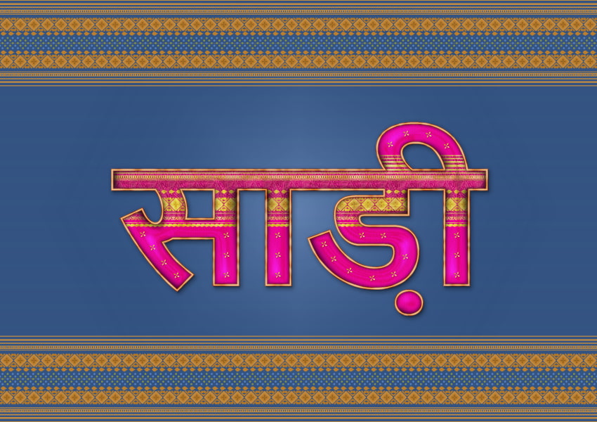
In
this tutorial you will learn how to draw a text effect inspired by
the stunning sari/saree clothing. The color theme here is bright pink
and gold. There are plenty of details and plenty of Illustrator
brushes and effects that we’ll use to create the beautiful
decorations and silky texture, so follow along and learn some new techniques.
If
you are hungry for more text effects, make sure to check out GraphicRiver and you’ll surely find what you are looking for there.
1. How
to Open a New Document
Launch Illustrator and
go to File
> New to
open a blank document. Type a name for your file, set up the
dimensions, and then select Pixels as Units and RGB as Color
Mode.
Make sure that Align
New Objects to Pixel Grid is not checked.
Next,
go to Edit
> Preferences > General and
set the Keyboard
Increment to 1
px and
while there, go to Units to
make sure they are set as in the following image. I usually work with
these settings, and they will help you throughout the drawing process.
2. How
to Create the Sari Text
Step
1
Copy
the text “साड़ी“, which is the Hindi word for sari, and Paste it on your artboard using the Type Tool (T). You most likely
will see squares instead of the text, but change the font to “Nirmala
UI”, Bold, size of 220 pt. This is a Microsoft font that comes with the Windows OS, and
this is the only font in my collection that allows me to see the
Hindi characters. You can download it from here or here.
Another option is to simply use the word Sari or Saree.
Use
the Selection Tool (V) to select the text and drag it a little to the
right to make it wider.
Step
2
While
the text is still selected, choose Expand from the Object menu and
then Ungroup (Shift-Control-G). You will get the individual pieces of
text. Throughout this tutorial, I will refer to the pink character as
“piece 1” of text, to the orange character as “piece 2” of
text, and the green, blue and red ones as “piece
3”, “piece 4” and “piece 5” respectively.
As
you can see, the pieces of text are overlapping at the top, especially
the orange and green pieces. You need to fix that. Grab the Direct
Selection Tool (A) and use it to select only the top left anchor
points of the orange piece and move them towards the inside, up to the pink edge. Continue
with the top right points and move them up to the green edge. Repeat
the same thing between the green and blue pieces.
Fill
the newly obtained text with bright pink.
3. How
to Create the Golden Border Around the Sari Text
Step
1
Copy
and Paste in Back (Control-B) all five pieces of text and remove the
fill color. Select a 1.5 pt beige Stroke and press the Align Stroke
to Outside icon in the Stroke panel. While this Stroke attribute
stays selected in the Appearance panel, go to Effect > Path >
Offset Path and apply an Offset of 1 px.
Add
a New Stroke at the bottom of the Appearance panel and select a 1 pt
light brown Outside Stroke. Apply an Offset of 2.5 px this time.
Add
a New Stroke at the top of the Appearance panel and select a 1
pt Outside Stroke.
Step
2
Let’s
create a mask shape now. Copy and Paste in Place (Shift-Control-V)
the five pieces of text, remove the fill color, and select a 3.5 pt
Outside Stroke which is the exact thickness of the golden border.
Choose Expand Appearance from the Object menu in order to turn the
strokes into fills. While the resulting blue borders stay selected,
go to Object > Compound Path > Make (Control-8) to merge them
into a single compound shape (1).
Grab
the Rectangle Tool (M) and draw a rectangle between the inside points
of the blue border as shown (2). Now, select the blue compound path
along with this rectangle and press Minus Front in the Pathfinder panel. As a result, you will get rid of the small segments of blue
border that were on the inside (3).
Step
3
Take
the Pencil Tool (N) and draw a random wavy path following the golden
border of the first piece of text (1). Do the same thing for the
other pieces of text (2).
Stroke
these wavy paths with the Watercolor -Blend Art Brush that you can
find in the Brush Libraries Menu > Artistic >
Artistic_Watercolor. Keep the Stroke Weight at 1 pt and then go to Effect > Blur > Gaussian Blur and apply a Radius of 2 px. Set
the Blending Mode to Color Burn (3).
Step
4
Now,
select the mask shape from earlier (which must be in front of
everything and set to stroke-none, fill-none (1)) along with all the
wavy paths, and go to Object > Clipping Mask > Make (Control-7).
As a result, the shading details will be visible only on the golden
border (2). You can see a before and after in the close-ups.
4. How
to Create the Golden Decorative Stripe on the Sari Text
Step
1
First,
let’s define where the decorations will go. Use the Rectangle Tool
(M) to draw a rectangle with a size of about 575 x 88 px over the
text (1).
Fill
the rectangle with the color indicated and then add a New Fill above.
Use the Leaves Tropical Color Pattern that you can find in the Swatch
Libraries menu > Patterns > Nature > Nature_Foliage. Set the Blending Mode to Hard Light and reduce the Opacity to 45% (2).
With
the rectangle still selected, go to Object > Transform > Scale,
type 50% in the Scale field, and make sure to check only the Patterns
option. Hit OK and the pattern will be smaller (3).
Step
2
Select
the five pieces of text and then Copy and Paste in Place
(Shift-Control-V) to make copies of them in front of everything. Go
to Object > Compound Path > Make (Control-8) to merge them into
a single shape and set it to stroke-none and fill-none (1).
Now,
select the pattern rectangle along with the newly obtained compound
path and go to Object > Clipping Mask > Make (Control-7) (2).
Step
3
Use
the Pen Tool (P) or the Line Segment Tool (\) to draw a straight path
over the text. Give it a 2 pt warm brown Stroke and select the Gold
Leaf Pattern Brush from the Brush Libraries menu > Borders >
Borders_Decorative. Open the Stroke Options window and set the Colorization Method to Tints and Shades so the brush becomes warm
brown as well. Move this path under the mask that you created in
the previous step (1).
While
this Stroke attribute stays selected in the Appearance panel, go to Effect > Distort & Transform > Transform and type -45 px in
the Move Vertical field. This will move the brush stroke upwards and
should go exactly up to the edge of the pattern rectangle (2).
Step
4
Add
a New Stroke under the first in the Appearance panel and use the Floral 1 Pattern Brush from the Brush Libraries menu > Borders >
Borders_Decorative. Set the Stroke Weight to 0.75 pt and then set the Colorization Method to Tints and Shades in the Stroke Options window
again to change the color of the brush.
While
this Stroke attribute stays selected in the Appearance panel, apply
the Transform effect again, and this time type -15 px in the Move
Vertical field.
Step
5
Add
a New Stroke at the bottom of the Appearance panel and use the Leaf
Pattern Pattern Brush from the Brush Libraries menu > Decorative >
Elegant Curl & Floral Brush Set. Set the Stroke Weight to 0.5 pt.
The Colorization Method is set to Tints by default, so you don’t have
to change it this time.
While
this Stroke attribute stays selected in the Appearance panel, apply
the Transform effect and type -33 px in the Move Vertical field. This
will move the brush right under the long stripe at the top of the text.
Step
6
Add
a New Stroke at the bottom of the Appearance panel and use the Rococo
Pattern Brush from the Brush Libraries menu > Borders >
Borders_Decorative. Keep the Stroke Weight at 1 pt. Open the Stroke
Options window, set the Colorization Method to Tints and Shades, and
use the color indicated. Apply the Transform effect and type 5 px in
the Move Vertical field.
Step
7
Add
a New Stroke and the last one at the bottom of the Appearance panel
and use the Scallopped Pattern Pattern Brush from the Brush
Libraries menu > Decorative > Elegant Curl & Floral Brush
Set. Reduce the Stroke Weight to 0.75 pt. Apply the Transform effect
and type 15 px in the Move Vertical field.
At
this point, the decorative stripe is ready.
5. How
to Create Shading & Highlights on the Sari Text
Step
1
Select
all five pieces of text and then Copy and Paste in Place
(Shift-Control-V) to make copies of them in front of everything. Fill
the copies with a linear gradient called Tin from the Swatch
Libraries menu > Gradients > Metals. Next, go to Effect >
Sketch > Chrome and apply the settings shown. Set the Blending
Mode to Overlay and reduce the Opacity to 55%. As a result, you will
get the appearance of shading and highlights on the text.
Step
2
Take
the Pen Tool (P) and draw the four paths on the first piece of text.
Give them a 5 pt black Stroke and use the Tapered Blend Art Brush
that I’ve shown how to create and save in step 10 of the Candy Monster Character
tutorial.
Next, go to Effect > Blur > Gaussian Blur
and apply a Radius of 3 px. Set the Blending Mode to Multiply and
reduce the Opacity to 75%. The green path is set to 55%.
Step
3
Select
the first piece of text and then Copy and Paste in Place (Shift-Control-V)
to make a copy of it in front of everything. Set this copy to
stroke-none and fill-none.
Now,
select this copy along with the piece of text with the Chrome effect
applied to it and the four paths from the previous step and go to Object > Clipping Mask > Make (Control-7).
Step
4
Use
the technique explained in the previous two steps and create some
shading for the other pieces of text.
6. How
to Create Shading & Highlights on the Golden Decorative Stripe
Step
1
Let’s
create the mask shape first. Select the path with all the decorative
strokes applied to it and then Copy and Paste in Place
(Shift-Control-V) to make a copy of it in front of everything. From
the Object menu, choose Expand Appearance and then Compound Path >
Make (Control-8) (1).
Select
the four pieces of text and Copy and Paste in Place (Shift-Control-V)
to make copies of them in front. Go to Object > Compound Path >
Make (Control-8) to merge them into a single shape (2).
Now,
select these two new compound paths and press Intersect in the Pathfinder panel. You can see the resulting shape in the image below
(3).
Step
2
Use
the Pencil Tool (N) to draw a random wavy path over the decorative
stripe. Give it a 1 pt black Stroke and use the Watercolor – Blend
Art Brush from the Brush Libraries menu > Artistic >
Artistic_Watercolor. Apply a 5 px Gaussian Blur; then set the Blending Mode to Color Burn and the Opacity to 75%.
Step
3
Copy and Paste
in Front (Control-F)
the wavy path from the previous step and choose Flip Vertical from
the fly-out menu of the Transform panel. Change the stroke color to
white and the Blending Mode to Overlay at 100% Opacity.
Step
4
Now,
select the two wavy paths along with the mask shape made earlier,
which should be in front and set to stroke-none, fill-none and go to Object > Clipping Mask > Make (Control-7). You will get a
notification saying that the mask shape is very complex, but do it
anyway.
Step 5
Here
is a before and after GIF so you can see the difference better.
7. How
to Create the Inner Shadow on the Sari Text
Select
all five pieces of text and then Copy and Paste in Place
(Shift-Control-V) to make copies of them in front of everything.
After that, go to Object > Compound Path > Make (Control-8)
(1).
Fill
the newly obtained shape with white; then go to Effect > Stylize >
Inner Glow and apply the settings shown. Set the Blending Mode to Multiply but only for the Fill attribute because this way the white
will become transparent but you will still be able to see the inner
shadow (2).
8. How
to Add Shine on the Sari Text
Use
the Pen Tool (P) to draw the following paths on the text.
Give them a 3 pt Stroke and use the Tapered Blend Art Brush again.
Apply a 3 px Gaussian Blur and then set the Blending Mode to Color
Dodge.
9. How
to Create the Fabric Texture on the Sari Text
Copy and Paste in Place (Shift-Control-V) the five pieces of text and
replace the fill color with light gray. Next, go to Effect >
Texture > Texturizer and apply the settings shown. Set the Blending Mode to Multiply and reduce the Opacity to about 10%. It
should be only slightly visible.
10. How
to Create Extra Decorations on the Sari Text
Step
1
Draw
a straight path with the Pen Tool (P) or the Line Segment Tool (\)
and use the Floral 1 Pattern Brush from the Brush Libraries menu >
Borders > Borders_Decorative. Keep the Stroke Weight at 1 pt (1).
While
the path stays selected, choose Expand Appearance from the Object menu and then select only the small shape in the center (2).
Make
a copy of this shape, Rotate it -30 degrees, and replace the existing
fill color with the linear gradient shown. Next, go to Effect >
Stylize > Drop Shadow and apply this effect twice using the
settings shown below (3).
Step
2
Multiply
the small golden decoration and align a few of the copies on each piece of
text.
11. How
to Create the Shadow for the Sari Text
Copy and Paste in Place (Shift-Control-V) the five pieces of text to make
copies of them and then go to Object > Compound Path > Make
(Control-8). Move the new compound path to a New Layer behind the
text effect (1).
Remove
the existing fill color and select a 3 pt Outside Stroke. Next, go to Effect > Stylize > Drop Shadow and apply this effect four times
to create a shadow under the text (2).
Here
are the settings for the Drop Shadow effects in order.
Congratulations!
You’re Done!
The
sari-inspired text effect is ready now. I hope you learned new
techniques today that you’ll be able to apply to other text effects
and future projects.
If
you decide to recreate this effect, don’t forget to share an image because it will surely make my day.
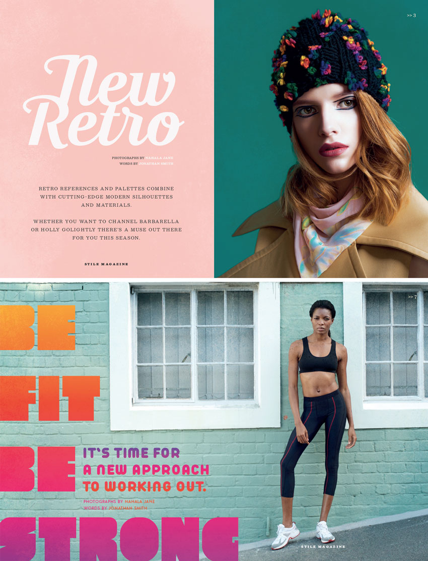
Our love affair for all things vintage isn’t waning anytime soon, but you can bring your designs bang up-to-date by balancing retro and contemporary elements in your layouts.
Here, we’ll put together a few spreads for a fashion and lifestyle magazine with a retro flavor. This is a great introduction to creating magazines in Adobe InDesign, as well as picking up tips on how to keep your layouts looking fresh and on-trend.
If you’re a relative beginner to InDesign, this will introduce you to essential print design techniques, as well as broadening your skillset.
We’ll use Adobe InDesign to create the magazine layout. To create the design pictured here, you’ll also need to download the following images and font files:
Once you’ve saved the images to a safe place and installed the fonts onto your computer, you’re ready to get started.
1. How to Set Up Your Magazine Document in InDesign
Step 1
Open up InDesign and go to File > New > Document.
Keep the Intent set to Print, and set the Number of Pages to 10*.
Set the Width of the page to 213 mm and Height to 276.5 mm, which is equivalent to a standard US magazine page size. If you want to adapt your layouts to a different page size, go ahead.
Set the Top and Outside Margins to 13 mm, Inside to 14 mm, and Bottom to 15 mm.
Add a Bleed of 5 mm, before clicking OK.
*Note: You can easily add more pages to your magazine later by clicking on the New Page button in the Pages panel (Window > Pages).
Step 2
Well-organised layers are key to keeping your sanity intact while you work on complex magazine spreads.
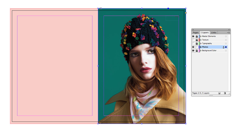
Expand the Layers panel (Window > Layers) and double-click on the Layer 1 name. Rename the layer Background Color and click OK.
Choose New Layer from the panel’s drop-down menu (at top-right). Name the layer Photos and click OK.
Create three more layers in this order: Typography, Texture and finally Master Elements.
Lock all layers except Master Elements, which we’ll work on first.
Step 3
Expand the Pages panel (Window > Pages) and click onto the A-Master page icons to bring up the master on screen.
Zoom into the top-right corner of the page and use the Type Tool (T) to create a small text frame against the margin line. Here will be your page number, and you can begin it with a ‘/’ or ‘>>’ as I’ve done here, if you like.
Use the main Controls panel or Character panel (Window > Type & Tables > Character) to set the frame’s Font to Besley.
With your type cursor sitting in the text frame, head up to Type > Insert Special Character > Markers > Current Page Number.
Step 4
Right-Click on the A-Master and click on Master Options.
Add ‘Light Background’ to the name of the master, and click OK.
Step 5
On the A-Master, Right-Click > Duplicate Master Spread, to create a copy below.
Rename this B-Master ‘Dark Background’.
From the Swatches panel, switch the Font Color of the page number text to [Paper]. When you set this over a darker colored background, this will ensure the page number will be visible.
2. How to Build Up Color and Photography on Your Magazine Spreads
Step 1
Return to the Layers panel and lock the Master Elements layer. Unlock the bottom layer, Background Color.
Click on New Color Swatch in the Swatches panel’s menu, and create a new CMYK swatch, C=0 M=27 Y=18 K=0. Click Add and then OK.
Head down to Page 2 and 3 of your InDesign document.
Use the Rectangle Tool (M) to create a shape across the whole of Page 2, extending it up to the bleed edge. Set the Fill to your new pink swatch.
Step 2
Lock the Background Color layer and unlock the layer above, Photos.
Use the Rectangle Frame Tool (F) to create an image frame across Page 3. File > Place, navigate to one of the model portrait images you downloaded earlier (or a photo of your choice) and Open, allowing it to fill the whole frame.
Because this photo has a dark background, I drag down the B-Master – Dark Background right-page icon onto the Page 3 icon, to apply it to this page.
3. How to Format Retro Typography for Your Magazine
Step 1
Lock the Photos layer and unlock Typography above it.
Take the Type Tool (T) and create a large text frame for a title over on Page 2 of your spread. Type in the first part of the article title, and set the Font to Moonface Script, around Size 180 pt.
Edit > Copy, Edit > Paste the text frame and type up the second part of your title. Move the text frame up to allow the words to join up.
Step 2
Add body text below your titling set in Bosley, and Uppercase.
You can stick to this one-font-for-title, another-for-body-text rule as you work on your magazine spreads.
4. How to Add Texture to Your Designs
Texture is an easy and effective way of injecting vintage style into your magazine designs.
Step 1
Lock the Typography layer and unlock the Texture layer above.
Use the Rectangle Frame Tool (F) to create an image frame across Page 2 of the spread, and File > Place.
Choose one of the texture PNG images inside the handmade vintage textures folder. Here, I’ve gone for Texture 14.
Copy and Paste the texture image frame, moving the copy over on top of Page 3.
Step 2
Select both texture image frames and go to Object > Effects > Transparency. Set the Mode to Color Dodge and bring the Opacity down to around 35%.
Want a moodier look? Set the Mode to Multiply.
5. And Repeat…
By layering background color, photo, type and texture, you can create a beautiful retro style for your magazine layouts. It’s easy to follow this same process with other layouts, like here, for the next spread of the magazine.
Here, I’ve set two different model portraits on Pages 4 and 5 of the document.
I Copy and Paste the texture image frames I used on the previous spread and increase the Opacity of the Color Dodge transparency, to bring through a little more texture onto this spread.
I’m also going to create another couple of spreads in the magazine, using the same layering process. Read on to see how I use the same technique to create a 1980s-inspired design.
Step 1
Move down to Pages 6 and 7 of your document, and set a large image, such as this one, on the Photos layer, spanning the whole spread.
Step 2
Use the Type Tool (T) to create a very large text frame across the left-hand page, and type in the article title. Set the Font to Cred Regular.
Step 3
Gradient swatches are great for adding a retro feel to typography on your magazine designs. First, it’s a good idea to create a range of swatches to use in your gradient.
Choose New Color Swatch from the Swatches panel’s main menu. Set the Type to Process and Mode to CMYK. Then adjust the CMYK values below. To create a sunset-style range of swatches, as used here, add the following swatches to the panel:
C=0 M=30 Y=93 K=0
C=0 M=84 Y=91 K=0
C=0 M=95 Y=18 K=0
C=65 M=85 Y=0 K=0
Step 4
Choose New Gradient Swatch from the panel’s main menu.
Name the swatch Sunset, set the Type to Linear and choose Swatches from the Stop Color menu.
Click on the left-hand stop on the Gradient Ramp at the bottom and set this to the yellow swatch.
Click on the right-hand stop and set this to the dark purple swatch.
Click onto the ramp twice to add two more stops, and set these to the orange and pink swatch, to create a gradual sunset effect. Then click OK.
Step 5
Select the title text frame and apply the Sunset gradient swatch to the text using the Swatches panel.
You can also create a subtitle set in Arista Pro Fat, and apply the Sunset swatch to this as well.
Step 6
Unlock the Texture layer, Copy and Edit > Paste in Place texture image frames down from the previous spread.
Go to Object > Effects > Transparency to play around with the transparency settings a little.
Step 7
For the final spread of this article, I’m going to add a color gradient across the whole image, to give it a retro look.
Place a photo on the Photos layer. If you want to introduce a larger section of body text to this spread, only allow the photo to cover some of the spread.
Use the Rectangle Frame Tool (F) to create a shape over the top of the image frame, and set the Fill of the shape to Sunset.
With the shape selected go to Object > Effects > Transparency and set the Mode to Multiply. Bring the Opacity down to around 80% and click OK.
Step 8
Scatter text frames set in Cred Regular across the layout, using some of the swatches you created earlier to add a contrasting pop of color.
You can set a text frame on the emptier section of your spread, setting body text in Acre.
You can increase the Drop Cap Number of Lines in the Paragraph panel to pull out the first letter of your article in a drop cap. Try setting it in a contrasting font, like Cred, and in the Sunset gradient swatch.
And this layout’s finished—awesome!
Once you’ve finished each spread of your magazine, make sure to head up to File > Save to keep an intact copy of all your hard work.
You can keep adding pages to your magazine using the Pages panel. Follow the sequence of layering—background color, photos, typography, and texture—to build up a consistent vintage-inspired look for your magazine.
Conclusion
In this tutorial, we’ve looked at how you can add vintage touches to your magazine layouts with color, typography, and texture. This modern-retro mix is a hot trend in print design for 2018, so start experimenting with vintage touches in your projects to keep your designs looking fresh and on-trend.
2018 is the year of purple! Let’s find out why in this article below!
Trend Watch: Ultra Violet Design
Take on a new adventure with an ultra violet color at your side. A magical symbol of royalty and innovation, ultra violet design is the rising trend to watch this year.
Artists have always loved this color. Its vibrancy is hard to miss, and it pushes us towards the future by reminding us of our connection to the galaxy. Pantone declared it the color of 2018, and we can certainly understand why.
Today, we’ll take a look at one of the most popular trends to hit the industry: ultra violet design. Let’s take a look at its key features and a few of our favorite resources!
Designers everywhere love purple! Here are a few key features of this trend:
Beautiful shades of purple. Light purple, dark purple, and every one in between. Every shade of this ultra violet trend is inspiring and unique. Collect a few swatches of your favorites for a fun monochromatic color scheme!
Futuristic Themes. We often equate purple to the cosmos. So naturally, designers find inspiration in this vibrant color for amazing futuristic creations. What unique projects can you think of?
Energetic and dazzling. Prince loved purple, as did Jimi Hendrix and even David Bowie. Creatives are drawn to this color simply because it’s bold and daring. So take a risk and design with ultra violet today!
Fun Ultra Violet Lessons
Love this color too? Check out these tutorials for more
inspiration. Learn how to incorporate shades of purple into your designs and art.
We all stare up at the stars to find our purpose. Discover yours with this beautiful pack of space backgrounds. It features 10 hand-made realistic backgrounds—you’ll be surprised these were are all created from scratch! Choose from different colors and textures for your print and web projects!
Marble has been a favorite texture for many designers recently. Combine it with this year’s color for a brilliant result! This lovely pack includes 10 abstract backgrounds featuring a unique, liquid marble texture. Use them for your website, app, or creative wallpapers.
Throw the best party ever with this epic party flyer! Designed with a phenomenal glittery finish, this ultra violet design is stunning and unique. All the text is fully editable, including the 3D bubble text! Print it out for your next event.
Create innovative products with this set of ultra violet backgrounds. They’re great for showcasing your products and presentations and can be used in many design scenarios. Download this pack today to get access to six different layouts.
Or integrate this powerful color into a professional set of business cards! This corporate pack includes standard business card sizes along with convenient bleeds and marks. Easily update them using Adobe Illustrator and get access to several free fonts!
The color purple goes perfectly with any space-inspired design. And this brilliant pack of nebula space backgrounds will certainly make your work shine. Included are 10 total backgrounds created as high-resolution jpeg files. Try it out!
We can’t forget to cover science when thinking about this futuristic trend. And you can integrate ultra violet icons into your app designs using this minimalist science pack. Included are 20 total icons of various scientific elements.
Create an awesome mockup for your brand using this professional suite. Featuring a stunning polygon and purple theme, this mockup includes 12 Photoshop files that are fully editable. Try out different layout variations for a super creative setup!
Is purple one of your official wedding colors? Then you’ll love this luxurious wedding pack! Dive into this collection of premium wedding invites featuring stunning violet flowers and plants. Get access to glorious seamless patterns and ready-to-print designs!
Celebrate your love for „old school” design with this epic pack of colored lines backgrounds. Full of nostalgic charm, this pack features 10 total backgrounds with this old school theme. Try it out for wallpapers, print designs, and so much more!
One of the most popular types of ultra violet design we’ll see is a fantastic party flyer. This sound waves flyer features an abstract design inspired by music. You can use it for any occasion and even have access to more colors for a greater variety.
If you’re a DJ in need of a bumping background, then try out this high-energy pack! This download includes 10 colorful backgrounds along with several ultra violet versions. Combine it with your favorite text effects for a hot flyer design!
These days it’s important to cover your fan bases from every angle, and this glow-in-the-dark flyer pack is great for both print and web. It’s designed with extra banner elements for Facebook and Instagram, so you’ll be able to dazzle all your party goers.
This retro text effect takes your typographic creations to new heights! Enjoy the beautiful ultra violet design with fully editable layers. Just open Photoshop to get access to incredible alterations for more color variety. You’ll love this effect!
Seamless textures are great for print work and more. Try out these wonderful pack of purple watercolor textures all created from scratch! First they were drawn by hand, then later scanned and cleared for seamless repeating. Let us know your favorites!
Combine two industry trends for a high fashion look! This Photoshop action creates a beautiful double exposure effect you can customize fast. Select from several color presets, including this beautiful purple and green version. Instantly transform your portraits!
This silky collection of violet glossy background is luxurious and dreamy! It includes six high-resolution backgrounds perfect for web and app projects. Try out different styles or mix and match the backgrounds for an impressive effect!
Need an awesome tech background for your sci-fi
projects? Then check out this wicked set of editable graphics. Included
are five total color variations, including this beautiful ultra violet
version. But remember, you can also use Adjustment Layers in Photoshop
for more amazing options.
Even just a hint of purple goes a long way! This vibrant pack of Lightroom presets includes 17 ready-to-use filters for your Instagram and social media posts. Try out different color combinations for a professional result.
Let’s end this collection with this inspiring ultra-violet-themed poster. Featuring an abstract design that mixes futuristic elements with geometric shapes, this template is fun and easy to use. Customize it with your content for parties or corporate events.
Show Us Your Ultra Violet Designs!
If you’re as fond of the ultra violet trend as we are, show us your
work! Post a result showing us how you work with purple and let us know your favorite styles in the comments below.
This has been a collection of tutorials and premium resources perfect for the avid designer. For more trendy ultra violet assets, check out Envato Market and Envato Elements. Happy Designing!
Roses
are very popular flowers, commonly seen as a symbol of love. They’re
very difficult to draw, though—they’re made of many layers of petals. You need to add them carefully one by one, and then shade the whole construction. In this quick tutorial I will show you how to do it if you want to build your own rose from scratch, without relying on a reference. But if you want, feel free to check any of these Envato Market references to help yourself:
Start by drawing a teardrop/egg shape with a hard pencil. Use very light lines. This will be the inner bud of the rose.
Step 2
Draw the „opening” of this shape.
Step 3
Draw little petals inside.
Step 4
Close those petals into a heart shape—this will be the outline of other petals.
Step 5
Connect the outline with the rest of the bud, creating a petal shape.
Step 6
One more heart…
… attached to the bud.
Step 7
One more time draw the heart shape, but this time make it less regular and more open.
The lines connecting it with the bud will create an effect of depth if you lead them correctly.
Step 8
We need one more petal on this level. It will have a more complicated perspective, so look carefully:
Step 9
We need to place the bud inside a „cup” of petals. First make it out of small petals…
… then use larger ones.
Step 10
The rest of the petals should bend more and more down.
Step 11
When you’re done, press harder over the lines you want to see better to bring out the final shape.
Step 12
Take a softer pencil and shade the inner parts of the rose. First draw lightly…
… then press harder to achieve a darker shade.
Step 13
Use the same pencil to slightly stress some edges of the petals. Don’t draw all over them!
Step 14
Go back to a hard pencil and use it to add a subtle texture to the
illuminated parts. The darker your rose, the darker you can go here.
Step 15
Take the softest pencil and finish shading with it, putting it in the darkest crevices.
Beautiful!
You have drawn a beautiful rose! If you would like to publish it on the Internet, make sure you prepare the scan/photo properly first. These tutorials will help you with it:
Everybody probably knows the story about princess frog, because many countries have similar stories. How do you imagine the frog princess? I imagine her as an adorable little frog princess like the one we’ll create today. This short tutorial is very easy to follow, and great for beginners.
For more amazing images of the frog princess, check out GraphicRiver. It’s interesting to see how other artists imagine this creature.
Once you are ready, let’s start!
1. How to Create a Vector Frog
Step 1
Open Adobe Illustrator and create a new document with 850 x 850 px Width and Height. We will start by drawing the head of the frog. Using the Ellipse Tool (L), draw an oval. In the image below, you can see which fill and stroke colors you need. On the Stroke panel, make the stroke Weight very thick, about 5 px. The stroke will give our final image a cartoonish look.
Next, we will apply the Inflate effect to this ellipse. Go to Effect > Warp > Inflate. Enter the options you see below, and press OK.
Expand this shape: go to Object > Expand Appearance. After expanding the shape and ungrouping it (right-click > Ungroup), you will notice that now you have two pieces instead of one: the stroke itself and the fill color by itself. To make it into one shape again, simply delete the stroke and make a new stroke color directly on the Tools panel, which is on your left (see the second image).
Step 2
Create an ellipse using the Ellipse Tool (L) using the same fill and stroke colors as before. Rotate it slightly to the left.
While keeping this small ellipse selected, take the Reflect Tool (O) and, while holding down the Alt key, click on the forehead. In the new dialogue window, select Vertical, Angle 90 degrees and press Copy. You should now have these two ellipses on the frog’s head.
Next, select all three of the shapes and, using the Unite button on the Pathfinder panel (Window > Pathfinder), unite them. Now, instead of three ellipses, we have one shape.
Finally, add two dark grey ellipses for the eyes.
Step 3
For the highlights on the frog’s eyes, let’s add some heart shapes. Because she is in love, remember? Start by creating a rounded rectangle by using the Rounded Rectangle Tool. But let me show you how to make it with the Corner Widget, which is available in the latest version of Adobe Illustrator. It will be easier to adjust the roundness of the corners by using this tool.
So create a regular rectangle by using the Rectangle Tool (M). Be sure to check View > Show Corner Widget. Now, near each corner of the rectangle, you have a tiny circle. Move these circles to the middle of the shape, and the corners of the rectangle will gradually become round. (Just for practice, try moving the circles out, and the corners of the rectangle will be sharp again.)
Rotate the rounded rectangle by 45 degrees. Next, while keeping it selected, press the Reflect Tool (O) and then the Enter key. In the pop-up window, enter Axis Vertical. and hit Copy. Arrange these two shapes as shown below. The orange shaded area on the image is the area that we want to keep. So we will need to delete the rest. For that, take the Shape Builder Tool (Shift-M), select the two rounded rectangles and swipe on the orange marked areas, thus forming a heart shape. Using the same tool and holding the Alt key, click on the unmarked areas to delete them. Now you should see the basic heart, which we will use inside the eyes later on.
For older versions of Adobe Illustrator: select both rounded rectangles and press Divide on the Pathfinder panel. After that, right-click your mouse and hit Ungroup. Select those three parts of the rectangles marked orange in the image below, and press the Unite button in Pathfinder. Now simply delete the excess to get your heart shape. And your heart is ready!
Finally, place the two white hearts on the eyes. Remember that you don’t need the stroke (outline) anymore.
Step 4
Now we will create the mouth. We start by creating an ellipse. Remember to use the same stroke color and no fill color. Then take the Scissors Tool (C) and click on the marked anchor points to cut off the upper part of the ellipse. Delete this part, as you don’t need it.
Step 5
To create the body, place an ellipse behind the head. Place another small ellipse on the left side of the body—this will be the leg.
Hold the Shift and Alt keys together and move the left leg to the right. Now, you have the right leg, perfectly aligned.
Step 6
Now we will create the arm. Start with an ellipse. Now, hit the Direct Selection Tool (A) and move the handles of the anchor points to achieve the result you see below.
After that, take the Scissors Tool (C) and click on the path segment marked in the image below. This will be one arm, and we still need another. Place this arm on the left side of the frog’s body, under the head. While keeping it selected, hit the the Reflect Tool (O) and press the Enter key. Be sure that in the new dialogue Reflect window Vertical is checked, and press Copy. Using the Right Arrow key on your keyboard, move the newly created arm to the right.
2. How to Create the Arrow and Crown
Step 1
Make a new copy of one of the hearts that you placed on the frog’s eye. Change its fill color and set the same stroke color as before. On the Stroke panel (Window > Stroke), check Corner: Round Join.
Then delete the fill color, so that you only have the stroke color. Now, using the Line Segment Tool (\), draw a line.
Click on the heart to have in the AI memory the same fill and stroke
color as you have for the heart. Draw a rectangle using the Rectangle
Tool (M) on the other end of the line. Using the Direct Selection Tool
(A), select the two upper anchor points of this rectangle. Move them to
the right.
While keeping this rectangle selected, take the Reflect Tool (O) and press the Enter key. In the new dialogue window, check Horizontal and press Copy. Move the new copy down. The arrow is
done!
For your convenience, select the whole arrow and group it (right-click > Group).
Place the arrow in the frog’s mouth. Be sure the arrow stays in the mouth, not over it. To achieve this, select the mouth, cut it off (Control-X) and place it in front (Control-F).
Step 2
Now we will create the crown. Leave the same stroke color, and change its fill color to yellow.
Then we need to make a cutter to cut off one part of the crown. For this, we need to draw a triangle: take the Polygon Tool and click on your artboard. In the new dialogue window, type 3 Sides with any Radius. Then click OK. Finally, turn it upside down, and place it as shown below. While holding the Shift and Alt keys, move this triangle to the left. You’ll get the second upside-down triangle. Select them and unite them: press the Unite button on the Pathfinder panel (Window > Pathfinder).
Keep this shape selected and select the yellow rectangle. Press the Minus Front button on the Pathfinder panel.
To finalize our crown, go to Effect > Warp > Bulge. Enter the options presented below and press OK. The crown is ready!
Place the crown on the frog’s head. Isn’t she cute?
3. How to Create the Lotus Leaf and the Reed
Step 1
Let’s create the lotus leaf where our frog will sit. Keep the same stroke color and change the fill color to blue, and then draw an ellipse.
Create a cutter again: this will be a triangle which you’ll make using
the Polygon Tool. Place the triangle (the cutter) on the ellipse as
shown below. Hit Minus Front on Pathfinder.
Now we want to make the edges of the leaf smoother. First, check Show
Corner Widget (View > Show Corner Widget). After that, using the Direct Selection Tool (A), drag the outer corners inside and the inner
corner outside to make them smooth.
Step 2
A reed will be a nice addition to the lotus leaf. Start with an ellipse. To create a leaf shape of the reed, you’ll need to create sharp corners using the Convert Anchor Point Tool (Shift-C). Simply click on the top and bottom anchor points of the ellipse. And, yes, it’s the same fill color as the lotus leaf.
Delete the fill color and leave the stroke color as it is. Take the Arc Tool and draw a curve.
Set the fill color you see below and draw a rounded rectangle using the Rounded Rectangle Tool. The reed is ready!
Step 3
Place your froggy on the lotus leaf. Add the reed and, if you want, add a few more reeds by making copies.
4. How to Create the Background
Step 1
For the background, create a light blue square with no stroke color and with 850 px Width and Height. To make the square, select the Rectangle Tool (M), click on your artboard, and then enter the options needed.
Step 2
Place the background behind the frog: select the light blue square, cut it off (Control-X), and put it behind (Control-B).
Step 3
Add a few water ripples: create a few ellipses with no fill color and with the stroke color presented below. They should stay over the background and under the frog.
Step 4
Make a new copy of the heart, set the fill color presented below, and delete the stroke color. Distribute the hearts around your froggy.
Conclusion
And we are done! I hope you enjoyed this tutorial and learned
something new about using Adobe Illustrator. This image is perfect for
Valentine’s Day, and also perfect for anyone you love. Print it out, give
it as a card, or simply keep it where it is.
Can you imagine traveling the wilderness on the back of your faithful animal companion, going on a fantasy adventure together?
If you find such an image inspiring, I have something cool for you. In this tutorial I will show you how to place a rider on top of a huge animal with the power of Photoshop. You’ll learn all the basics of photo manipulation while working towards a beautiful end result.
1. How to Separate the Fluffy Dog From the Background
Step 1
Open the running husky image in Photoshop. It has a perfect pose, but the collar doesn’t really fit the concept. Let’s remove it!
Take the Patch Tool (J) and outline a part of the collar.
Step 2
Drag the selection towards the area that would fit nicely inside the selection.
Step 3
This method, though very powerful, is not flawless. Keep selecting smaller areas around until you achieve a convincing effect.
Step 4
Use this method to remove the whole collar.
Step 5
Use your favorite method to select the whole body of the husky. It doesn’t need to be a perfect selection with all the hairs outlined—we’ll take care of them in the next steps. You can learn about various methods of selection in our course Selections and Masking in Adobe Photoshop.
Step 6
Go to Select > Refine Edge. Change the View Mode to a black background to see the fur better, and then select Smart Radius and play with the Radius to make the edge of the selection smoother.
Step 7
Use the Refine Radius Tool to „paint” the fluff around the edges. It should do quite a good job at separating the hairs from the background.
Step 8
Finally, change the Output to New Layer and hit OK.
Step 9
A new layer with the isolated husky should appear—hide it. Go back to the original layer, duplicate it (Control-J), and hide it as well. Select the husky with the Rectangular Marquee Tool (M). We’re going to remove it from the background!
Step 10
Go to Edit > Fill and select Content-Aware. Press OK.
Step 11
Like all the automatic functions of Photoshop, the Content-Aware fill is not perfect. Use the Patch Tool to remove any „seams”.
Step 12
This trick has removed the shadow under the dog’s legs, but we need it to keep the scene consistent. Show the copied background and add a Layer Mask to it. Fill it with black to make the content transparent, and then use a soft brush and paint with white to reveal just the shadow.
If this instruction sounds confusing, you can learn about using Layer Masks here:
Open the wolf head image in Photoshop and separate it from the background the same way as you did with the dog.
Step 2
Copy and paste it into the file with the dog (you can flip the whole image of the dog, or just the head). Lower its Opacity to see the dog’s head beneath, and then use the Free Transform Tool (Control-T) to resize it properly.
Step 3
Switch the Opacity to 100% again and use a Layer Mask to blend the wolf’s head with the neck. Then use the Lasso Tool (L) to remove the dog’s head.
Step 4
Obviously, our husky is colored in a different way than the wolf. Let’s fix it! Select the layer with the head, go to Window > Adjustments, and select Curves.
Step 5
Drag the curve to make the head brighter. Don’t forget to clip the adjustment to affect the head only!
Step 6
Select the body now and add the Color Balance adjustment.
Step 7
Play with the sliders to make the whole body colder in its shade—more like the head. Clip the adjustment, too!
Step 8
Add the Hue/Saturation adjustment.
Step 9
Clip the adjustment and lower the Saturation to remove the warmer parts.
Step 10
When you’re ready, select the body’s and head’s layers along with their adjustments and merge them (Control-E). Fix any obvious seams by copying parts of the fur, blending it with a Layer Mask, and merging it with the rest.
Step 11
Curiously, the faces of big animals have slightly different proportions. To make our wolf look huge, make its eyes and ears smaller, and the muzzle shorter and thicker. Go to Filter > Liquify to add these changes.
Step 12
Dogs like to keep their tails high up, but for a wolf this is not a normal position. Let’s put it lower! Select the tail, for example with the Lasso Tool (L). Cut it and place it under the body layer.
Step 13
Use the Free Transform Tool (Control-T) to rotate the tail properly…
… and use the Warp Mode to reshape the tail. Merge the parts when you’re done.
Step 14
To make the wolf look even bigger, let’s modify its body even further. Use the Liquify filter to make the paws and torso thicker. You can also play with the facial features a little to give the wolf a more serious look.
Step 15
For me the whole wolf looks still a little bit too colorful, so let’s lower its Vibrance.
3. How to Put a Rider on the Wolf’s Back
Step 1
Our image with the wolf is not very big, so let’s resize it to have better access to details. Go to Image > Image Size and change the Width to 6000 pixels.
Step 2
Use the Crop Tool (C) to make more space.
Step 3
Open the image with the girl rider in Photoshop and cut it from its background as before. Include the saddle, too!
Step 4
Paste the girl into the main file and use the Free Transform Tool to adjust her size and position her on the back of our wolf.
Step 5
Crop the image for a better composition.
Step 6
The background is now bigger than the original one, so let’s use the Content-Aware Fill to fill the empty areas with snow.
Step 7
The girl on a horse had a different perspective, so let’s fix it subtly. Select the farther arm, cut it, and place it behind the body. Rotate it to better fit the perspective of the wolf.
Step 8
Use the Liquify filter to fix the torso, too. Merge the parts when you’re done.
Step 9
The Liquify filter will also help you adjust the saddle to the body of the wolf. Just make sure you use the backdrop with the wolf’s layer only.
Step 10
The girl has come from a differently lighted environment, so now we need to fix it. Add the Color Balance adjustment to make the girl colder in her hue…
… and the Hue/Saturation adjustment to make the colors less striking. When you’re done, merge the body layer with its adjustment layers.
Step 11
In the girl’s photo there was much more direct light, and our wolf is illuminated in a more ambient way. Brighten the dark shadows on the girl’s body with the Dodge Tool (O) in Shadows mode.
Step 12
The image with the girl had a high resolution, but the one with the husky didn’t—and we had to resize it. Because of that, the girl looks much sharper than the wolf, which breaks the illusion we want to achieve. Go to Filter > Blur > Gaussian Blur to fix it.
Step 13
To make the whole scene more interesting, let’s add a new background—a winter forest. Place the image behind the girl and the wolf, and resize it properly.
Step 14
Apply Gaussian Blur to the background to give an impression of depth.
4. How to Add the Accessories of a Fantasy Rider
Step 1
We have a girl riding a wolf, but it doesn’t look very convincing. Let’s give them both special fantasy outfits to make the whole illustration more interesting.
Open the chainmail image and place it inside the main file. Cut the part you need.
Step 2
Lower the Opacity of the chainmail to see the saddle beneath, and then adjust it to the shape of the blanket.
Step 3
Use a Layer Mask to reveal the saddle and the girl, keeping the chainmail over the blanket only.
Step 4
Open the image with the armor and cut its breast element the same way as before.
Step 5
Put this armor part over the neck of the wolf.
Step 6
Cut the parts that don’t fit the perspective.
Step 7
The lower part of the armor will be useful, too! Copy it…
… and put it over the back of the wolf.
Step 8
Copy it, put the copy beneath, and transform it to give more segments to this element.
Step 9
Open the image with the leather armor now. The armor looks nice, but there’s so much hair in front of it! Use the Patch Tool (J) to „clean” it.
Step 10
Cut the armor from its background the same way as before. Then copy the fur part as well, refining its edge carefully.
Step 11
Place the fur over the shoulder of the girl.
Step 12
Place the rest of the armor under the fur, transforming it to fit the girl’s torso.
Step 13
Use the Liquify filter to modify the armor even further. Pay attention to the perspective!
Step 14
Open the image with the sword and copy it to place it on the side of the girl.
Step 15
Our wolf needs a bridle, too! Open the image with the horse and copy parts of its head gear step by step, always refining the edge of selection first to make it softer. Place it in the main file and adjust the shape to the wolf’s head, trying to keep it all functional.
Here you may need to copy a part of the band to make it longer:
Step 16
The reins will be a bit tricky. Copy them as before…
… paste them and resize in the main file. To reshape them in a controlled way, use Edit > Puppet Warp. Uncheck Show Mesh to make the image clearer, and then place pins all along the length of the reins.
Step 17
Drag the pins to reshape the reins. Press Enter when you’re done.
Step 18
You can use the same method to decorate the reins with sapphires.
5. How to Make the Photo Manipulation Consistent
Step 1
All the elements are in place, but it doesn’t take a detective to tell that it doesn’t look realistic. We need to spend some time tweaking all the parts carefully using the same methods as before.
First, adjust the torso of the girl. Make sure the leather has a proper shape and that the sweater is beneath it.
Step 2
Adjust the color of the armor to make it as cool as the background and less contrasting.
Step 3
Add some Gaussian Blur to hide the sharp edges.
Step 4
Add another Hue/Saturation adjustment and brighten it strongly. Then fill the mask of the adjustment layer with black to hide the effect.
Step 5
Use a soft brush and paint with white on the mask to reveal the brightness around the sides of the armor—this will give it a proper ambient lighting.
Step 6
Add another Hue/Saturation adjustment to color the whole girl brown. Check Colorize for a better result.
Step 7
Fill the mask with black, and then paint on it with white to reveal the parts you want to color brown. This will give a more traditional look to the outfit.
Step 8
Use the same method (an adjustment layer with black mask, painting with white) to paint the shadows on the chainmail.
Step 9
Darken the saddle the same way, too.
Step 10
Use this method to give a more fitting shading to the armor. You can use the Hue/Saturation and Levels adjustments to create both shadow and light.
Step 11
Desaturate the whole bridle to fit its color to the whole scheme.
Step 12
Use the Levels adjustment to give more contrast to the bridle.
Step 13
Shade the bridle with the Hue/Saturation adjustment.
Step 14
There’s one more thing we need to add for more realism: the straps. Copy them from the image with the medieval armor.
Step 15
Use Puppet Warp to adjust the shape of the strap to the wolf’s neck.
Step 16
Remove the rest of the strap with a Layer Mask.
Step 17
Use the same method to attach the sword with a strap.
Step 18
I’ve also noticed that the girl has been copied with a soft edge from her previous background. If you have the same effect, remove it carefully with a Layer Mask.
Step 19
The bridle should sink a bit into the thick fur on our wolf’s face. To achieve this effect, copy a part of the fur from the wolf’s layer and place it over the bridle.
Step 20
Right click the fur layer and select Blending Options. Drag the upper black marker to remove the dark parts of the layer. Hold Alt to split it for a smoother effect. You can learn more about this great tool from the tutorial below:
Use the same technique to add covering fur wherever necessary.
Step 21
Time to add some shadows between the gear and the wolf’s body. Do it carefully and sparingly to avoid an airbrushing effect.
6. Final Tweaks and Adjustments
Step 1
Our photo manipulation is almost complete now, so let’s take a closer look at it as a whole to find any inconsistencies.
First, metal, even when it’s old, is reflective. That means it reflects both the brightness and colors of the objects around to a certain extent. To simulate this effect, create a New Layer over the metal parts, use the Eyedropper Tool (I) to pick the color of the surroundings, and carefully paint over a part of the metal. Clip the layer (Control-Alt-G) to keep the effect to the boundaries of the layer below.
Step 2
Use the Blending Options to remove the color from the dark crevices by dragging the lower slider.
Use this trick for all the metal parts.
Step 3
Take a good look at all the elements. Does everything cast a shadow as it’s supposed to? Make sure there are no missing shadows in your scene.
Step 4
To make the scene more dynamic, we can add some blur. Go into Quick Mask Mode (Q) and paint a part of the hair with a soft brush. Then go out of the mode (Q), Select > Inverse, and hide the selection (Control-H).
Step 5
Now you can use Filter > Blur > Motion Blur on the selection.
Step 6
Use the same trick in other places you want blurred. Just remember not to select too many at once, or they’ll seem flat.
Step 7
We’re going to add snow to the scene, so let’s give a snow-mist to the background by increasing the Lightness in the Hue/Saturation adjustment.
Step 8
If you are sure you don’t want to fix any more details separately, select all the layers and merge them (Control-E). Duplicate this merged layer (Control-J) and apply Filter > Blur > Motion Blur to the copy.
Step 9
Add a Layer Mask to the copy and reveal the most important parts of the scene. The ones you leave will stay blurred, giving the whole silhouette a sense of motion.
Step 10
Time for the snow! It will not only add a special atmosphere to the scene, but it will also unify all the elements. You can learn how to create realistic snow from the tutorial below. Just remember to add more blur than normally (especially motion blur), because our characters are moving fast.
One more look: is anything missing? At this point, you can add special details like snowflakes on the hair or reddened cheeks. It’s up to you how you decide to finish it!
Step 12
To unify the scene for the last time, change the Color Balance of the whole image to something cold.
Step 13
After you merge the layers again, you can add Filter > Noise > Add Noise to unify the level of noise across the picture.
Good Job!
This was a long tutorial, but I hope you enjoyed it and learned something about creating a fantasy photo manipulation in Photoshop today. If you want to learn more, you may be interested in these tutorials as well:
Welcome back to our Diversity in Design series on Envato Tuts+. Discover four talented artists with inspiring styles you’ll love.
4 Artists You Should Know: Diversity in Design
Celebrate
the work of these extraordinary artists. Each with their own unique
background, they draw inspiration from their culture and surroundings to
create phenomenal designs.
Johnny Cardoso
Grab a jet pack and soar into the epic artwork of Johnny Cardoso. Featuring exciting poster designs with mind-blowing illustrations, his work mixes nostalgic design with incredible details.
Fliperama Party Poster 1
I’m an illustrator from Brazil currently living in Buenos Aires,
Argentina. I started working at ad agencies around 2011 when I decided to pursue a career in illustration.
I’ve always drawn since I was a
kid. I used to copy a lot from comics and things I saw in magazines about
anime. I really love music and big concerts, so I contribute with my
illustrations—making these gig posters.
I’m very inspired
by Japanese animation like Akira, Paprika and Ghost in The Shell. I
love the work of artists like Otomo Katsuhiro, Bicicleta Sem Freio,
Moebius, James Jean and Dave McKean.
Thandiwe is a creative digital artist from Cape Town, South Africa. Her style is uniquely geometric, and features a collection of stunning illustrations of celebrities and more.
I am a graphic designer and illustrator based in Cape Town, South Africa.
I am eccentric, weird, confident, a dreamer,
and basically an interesting mix of crazy cool.
I consider myself to be a story-teller. The subject and
inspiration behind my artwork is always changing. I have expressed my
love for black people, struggles of being poor, racism and sexism
through my illustrations. I also enjoy illustrating portraits; it makes
me happy.
I love Sebastien Thibault’s work, he’s my favorite conceptual illustrator. Sindiso Nyoni is also my fave, he’s a Zimbabwean graphic
artist. In terms of style, I look up to Gabriel Silveira, Magoz and Brian
Miller.
The future is here. Saad Syed is a 3D artist with exceptional 3D illustrations with futuristic themes. Enjoy his unique take on epic hovercrafts, advanced weaponry, and more.
I have worked as an independent filmmaker,
animator, and 3D artist for 7 years. I grew up in Brooklyn and currently
reside in Durham, North Carolina. My passion is hard surface design and
3D concept art.
My family are mostly doctors and engineers and they all married
doctors and engineers. I am the sole dedicated professional creative in
the whole family. I taught myself animation and 3D design, becoming
proficient in Cinema4D, Maya, Modo, Moi3D, and Fusion360.
Anjali is a fine artist from Ontario, Canada. Her work features beautiful abstract paintings you can absolutely get lost in. Enjoy her lovely collection below.
I am an ardent artist by soul. Since childhood, art has been an
important aspect of my life. Art defines my subtlety, my patience, and
sometimes it is a medium to represent my inner conscience.
Painting has healed me psychologically and has helped me to
overcome depression. I wish to continue pursuing my passion for art
and to develop a delightful source of happiness through this mode.
The sole inspiration for my work is my father. After his death, I fell into depression and that is when someone
insisted that I do what I love, to pursue what I
left behind in order to fill the emptiness within. I wanted to make my
dad proud.
Celebrate Diversity! Send Us Your Favorite Artists!
Help us find more incredible artists from different backgrounds to share with our audience! Tweet me your recommendations at MelloNieves or use the hashtags #artforall and #tutsplusdesign on Twitter and Instagram. You never know, we may just feature you in our next article!
I’d
like to extend a warm thank you to all the artists who participated in
this feature. Feel free to see more of their work in the links below:
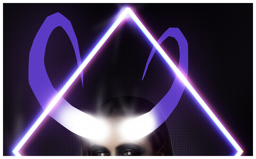
Today, we will be creating an 80s-inspired poster featuring a pair of glowing neon devil horns! We will not only create brilliant vivid lights by combining different Layer Modes and Adjustment Layers, but we will also use those same techniques to develop shadows to show how versatile they really are.
Tutorial Assets
Here is what you will need to complete this tutorial.
To start things off, we will be creating a very simple „scan line” background.
Step 1
First, create a New Document at 2277 x 3155 px.
Create a Color Fill adjustment layer and fill it with a dark muted blue #09080d.
Step 2
Next, open a New Document at 17 x 5 px.
Zoom in very, very close since our canvas is very small.
Using a hard Brush at a Size of 2-4 px, paint four lines from right to left, leaving a transparent line on the far left, in the colors below:
Muted Purple #482f4a
Muted Red #6d3742
Muted Blue #353661
Muted Purple #482f4a
The above image is zoomed 3200%.
Step 3
Go to Edit > Define Pattern, name it „Vertical Scan Lines”, and then press OK.
Go to Image > Image Rotation > 90° Counter-Clockwise.
Once again, go to Edit > Define Pattern, name it „Horizontal Scan Lines”, and then press OK.
So, we have created two new patterns!
Step 4
Go back to our original canvas and create a Pattern Fill layer and use your newly created „Horizontal Lines” pattern.
Create another Pattern Fill layer and do the same with the „Vertical Lines” pattern.
Set both pattern layers to 19% Opacity.
Step 5
To finish up the background, create a New Layer.
Use the Gradient Tool to create a dark blue #09080d to transparent gradient starting at the bottom of the canvas to the middle of the canvas.
Group all the background layers into a new group and name it „Background”.
2. How to Create Neon Lights
Next, we will be moving on to one of the main features of this image: the neon lights!
Step 1
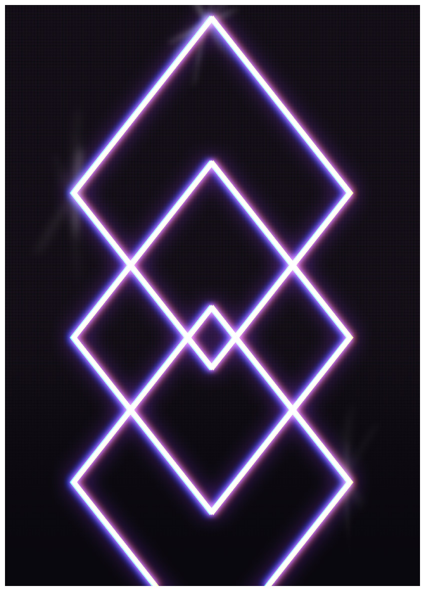
First, using the Custom Shape Tool, create a large diamond shape with a Transparent Fill and a white Stroke of 17 px. The Size should be 1500 x 1900 px.
Duplicate the diamond and bring it halfway down to the middle of the original diamond.
Repeat the last step again to make three diamonds total.
Step 2
Next, add an Outer Glow layer style to the first diamond. See the settings below:
Blend Mode: Screen
Opacity: 100
Color: Bright Purple #9230ff
Size: 136
Now, Right-Click > Copy Layer Style and Right-Click > Paste Layer Style on the other two diamonds to give them the same glow as well.
Step 3
Duplicate the three diamonds, bring the duplicates above the original diamonds, and Right-Click > Clear Layer Style to all three duplicate diamonds. Then merge the duplicates together, leaving us with a plain white three-diamond design.
Go into the Outer Glow layer style and change the Size to 29. This is to intensify the glow even further.
Step 4
To create a chromatic effect, duplicate the previously duplicated and merged diamonds.
Go into its Glow layer style and change the Size from 29 to 50.
Duplicate the new duplicate, and merge the two layers together. This will combine the two glows and make them even more intense!
Bring the new duplicated diamonds above all current layers and set the layer mode to Screen.
Double-Click on the newly merged diamond layer to open up the Layer Style panel.
Go to Channels anduncheck „B”.
Move the layer 3 px to the right and rename it „Chromatic Yellow.”
Step 5
Duplicate the „Chromatic Yellow” layer and rename it „Chromatic Blue.”
Double click the „Chromatic Blue” layer to open up the Layer Style panel. Check „B” and uncheck „R”.
Move the „Chromatic Blue” layer to the left by 6 px.
Step 6
Create a New Layer.
Add some light reflections to the corners of the diamonds using a soft, medium round Brush with a 1% Flow. Paint in a few six-pointed stars at the corners of the diamonds.
Step 7
Create a New Layer and set it to Soft Light.
Using a very large, soft round Brush, paint a white blob of white in the lower-middle portion of the canvas.
Step 8
Create a New Layer and set it to Overlay.
Using the same large white Brush, paint more light in the middle of the canvas as well as smaller blobs of light on the three-diamond design.
Step 9
Create a New Layer and set it to Overlay.
Using the same Brush, paint black in the upper portion of the canvas including the corners.
Group all the neon light images together and name the group „Diamonds.”
3. How to Create a Smokey Eye Makeup Effect
Now, we will be moving on to processing our main subject, focusing on her eye makeup!
Step 1
First, let’s cut and extract our model using your preferred method. As we don’t have to worry about any fur, cloth or hair extractions, absolutely any method will work!
Place the model in the middle of the canvas, showing her body from the waist up.
Step 2
Create and clip the following three adjustment layers into the model’s layer:
Black to White Gradient Map layer at 55% Opacity
Brightness/Contrast layer: Brightness -27 and Contrast 100
Curves layer:
Step 3
Next, we will create a dark makeup effect using nothing but adjustment layers!
Create a Black to WhiteGradient Map and clip it to the model, above all the previous adjustment layers.
Click the gradient map’s layer mask and hit Control-I to invert it to black.
Using a soft, round Brush set to white mask in some of the black and white around the eyes, below her eyes and all the way up to her eyebrows.
Step 4
Create and clip a Brightness/Contrast layer into the model above all the other layers. Set the settings to Brightness -104 and Contrast -50.
Press Control-I to invert the layer mask to black.
Once again, with a soft white Brush, mask back in some of the dark around her eyes up to her eyebrows and down to the top of the cheeks. Bring the dark a bit further down than the black and white. Also, add a bit to the bottom of her nose.
Step 5
Create and clip a Curves adjustment layer to the model; bring it above all other clipped layers. Settings:
Press Control-I to invert the layer mask to black.
Again, take a soft white Brush and mask back in some of the black in the same general area of the black and white. We want a „smokey eye” effect.
Step 6
Create and clip another Brightness/Contrast layer into the model. Settings: Brightness -104.
Press Control-I to invert the layer mask to black.
Using the same white Brush, but now with a Flow of 1%, paint in some subtle darkness around her outer eyes, cheeks, and nose. We don’t want this to be as dark as her eyes.
Step 7
Create and clip a Curves adjustment layer to our model. Settings:
Press Control-I to invert the layer mask to black.
Using a soft round Brush, set to white, mask in some red-purple under the eyes and nose.
Step 8
Create and clip a New Layer to the model.
Using a large, soft round Brush, paint the top and upper sides of the model’s hair solid black.
Create and clip one last layer to the model.
Now, using a hard, very small round Brush, paint solid white highlights in the model’s hair and on her shoulders. You can add some soft lines as well, but for the most part, we want harsh white lines to almost make her look illustrated.
Group all our model layers together and name the group „Model.”
4. How to Create a Starry Eyed Effect
Next, we will be giving our model a pair of starry demon eyes!
Step 1
Create a New Layer.
Using a hard, round Brush set to black, fill in the eyes.
Set the layer Opacity to 50%.
Step 2
Using the Custom Shape Tool, place a white star shape in the middle of the model’s pupil. Set the star’s Opacity to 36%.
Add a Layer Mask to the star and invert it by hitting Control-I.
Using a small, soft round Brush, mask back in the middle and some of the edges of the star. If you are having trouble, you can set the Brush Flow to 5% to help control how much you are masking back in.
Step 3
Duplicate the star shape and delete its layer mask.
Set the layer mode to Soft Light with an Opacity of 83%.
Add a new Layer Mask and then, using a semi-hard round Brush, mask out the top point of the star as it would be hidden by her eyelid shadow.
Repeat the same steps for the right eye!
Step 4
To finish up the eyes, we are going to add a bit more light so that they really stand out. Create a New Layer and set it to Overlay.
With a large, soft round Brush, paint white over each of the eyes. Set the layer Opacity to 47%.
Finally, paint some highlights in the eyes, similar to the hair highlights, with a very small, hard round Brush. Paint lines across the eyelids and in the eyelashes to really make them pop.
Group all the eye layers together and rename the group „Eyes.”
5. How to Create Neon Typography
Next, we are moving on to the typography!
Step 1
Using the font face „Brandine”, type out the words „Satanic” and „Panic” separately. We want them on separate layers. Align them similarly to how you see below.
Step 2
Apply an Outer Glow layer style to both texts. Settings below:
Blend Mode: Screen
Opacity: 100
Color: Bright Purple #9230ff
Size: 70
Step 3
Next, we are going to add some chromatic aberration to the text in almost the same way as we did with the diamonds.
Duplicate both „Satanic” and „Panic” and bring the duplicates above the original text.
Right-Click > Rasterize Type, Right-Click > Rasterize Layer Style and then Right-Click > Merge Layers.
Set the layer style to Screen and rename it „Chromatic Blue Text.”
Double-Click „Chromatic Blue Text” to open up the Layer Style panel and uncheck „R”.
Move the „Chromatic Blue Text” layer 2 px to the right and 2 px down.
Add a blur by going to Filter > Blur > Gaussian Blur. Set the Radius to 5 px.
Step 4
Now, we are going to add some yellow chromatic aberration by duplicating the „Chromatic Blue Text” layer.
Rename the layer „Chromatic Yellow Text”.
Double-Click „Chromatic Yellow Text” to open up the Layer Style panel. Check „R” and uncheck „B”.
Move the „Chromatic Yellow Text” layer 10 px up and 5 px to the right.
Group all the text layers together and name the group „Text.”
6. How to Paint Neon Horns
Next, we are going to focus on the main feature of the poster: the neon horns!
Step 1
You could just paint the horns using a hard round Brush set to a violet purple #5132c0, but for those of you who are not painterly, a neat trick is using the Polygonal Marquee Tool!
Create a New Layer and, using the Polygonal Marquee Tool, create a selection in the shape of a crooked, sharp „C” or any other horn shape!
Use the Lasso Tool to round out the part of the horn that connects to the forehead. Don’t worry about it being perfectly round; you won’t see the bottom of the horns in the final piece, anyway.
Grab any brush, and paint in the selection with some violet purple #5132c0.
Create a second horn, or alternatively duplicate, flip and shrink the existing horn layer and move it to the opposite side of the forehead.
Step 2
Add an outer glow to both of the horns using the settings below:
Blend Mode: Screen
Opacity: 26%
Color: Violet Purple #5132c0
Size: 250 px
Clip a New Layer to both horns, and paint the bottom half of the horns pure white.
Set both horn layers to Screen.
Step 3
Create a New Layer above the horn layers.
Using a large, soft round Brush, paint white at the point where the horns meet the forehead. This is so that the horns blend into the forehead; we want that whole area solid white.
Create a New Layer, and using a medium, soft round Brush with a flow of 1% paint a six-point star coming from the newly painted white light.
Group all the current horn layers, including the white light, into a group and name it „Horns.”
Step 4
Next, we are going to add some detail to the horns.
Create a New Layer and set it to Overlay.
Go back into our horns folder and create a selection in the shape of the left horn by holding Control and then Right-Clicking the left horn layer.
Now, add a Layer Mask to the new layer. This will create a layer mask in the shape of the left horn.
Using a small, hard, white round Brush, sketch in some details/lines/ridges onto the left horn. The layer mask will help keep the lines sharp and contained in the horn shape.
Create a New Layer and add some shadows using the same technique. I set the shadow layer to 33% Opacity.
Repeat the above steps to add detail to the right horn, as well.
Step 5
Next, we are going to create the light beam effect coming from the horns, which is done by using a custom brush created from our horn shape!
Create a New Document in a large enough size to fit our left horn—we will crop it down to its exact size in a moment, so the size really doesn’t matter. Just make it big enough.
Drag and drop the left horn layer into the new document, make sure the layer mode is set to Normal, and crop it down to the exact size.
Remove any layer styles and turn the horn pure black.
Step 6
Go to Edit > Define Brush and press OK.
Go back to the main file, create a New Layer, and set the layer to Screen.
Select the Brush Tool, choose our newly created brush and go to Window > Brush Settings to open the Brush Settings panel.
Set the Spacing to 1% and the Flow to 1% as well. Set the color to a muted pink #b3838d.
Align the brush with the horn and paint down in a swooping motion.
Step 7
Check Flip X in the Brush Settings panel to flip the brush, reduce the size until it’s roughly the same size as the right horn, and then paint the same swooshing motion.
You don’t have to bring it straight down, nor does the brush have to line up exactly with the horn. This is a perfect spot to experiment and do what you think looks best!
Bring the Opacity of the layer down to 85%.
Step 8
Create a New Layer and set it to Screen.
Using a very large, soft round Brush, paint a light blue #b3838d on the top of the horns.
Bring the layer Opacity to 70%.
Step 9
Go back to the layers we painted the beams of light on (with the brush we created) and duplicate it.
Bring the duplicate above the blue glow, and then set the layer to Overlay.
Add a Layer Mask to the light beam duplicate, and then using a large, soft round Brush, mask out the bottom half of the beams.
Duplicate that layer, and then mask even more out so that the glow is strongest on top of the horns.
Step 10
To finish up the horns, create a Curves adjustment layer. Settings:
Press Control-I to invert the curve’s layer mask and make it black.
Using a large, soft round Brush, paint white in the middle of the horns, dragging in a downward motion.
Group all the horn layers together, including the „Horns” group, into a new group and also name it „Horns.”
7. How to Achieve an 80s Vintage Color Effect
We are in the final stretch! Now, all we have to do is tie everything together with a vintage finish.
We will do this by using several different adjustment layers—seven, to be precise. They are ordered from last to first, meaning each new layer will go on top of the last.
They are already grouped in the group „CC”, colored and numbered so you won’t get lost!
Step 1
Color Lookup layer: (Abstract) Pastel Hues at 36% Opacity.
Color Lookup layer: (Device Link) RedBlueYellow at 35% Opacity.
Color Lookup layer: (3DLUT File) FoggyNight at 33% Opacity. Double-Click the color lookup layer to open its Layer Style panel. Set the Underlying Layer to what you see below.
Tip: Hold Alt and thenclick and drag to separate the toggles.
Step 2
Now, for the second batch of adjustment layers!
Channel Mixer layer: Red +129, Green -45 and Blue -5.
Curves layer:
Using a large, soft round Brush, mask out the middle of the canvas to create a vignette.
Step 3
And finally, the last set of adjustment layers!
Color Lookup layer: (Abstract) Turquoise-Sepia at 61% Opacity.
Color Lookup layer: (3DLUT File) FallColors at 50% Opacity.
We’ve Done It!
As we’ve learned here, adjustment layers are incredibly versatile and can be used for anything from dark, grungy makeup to vivid neon lights. Always take the time to experiment with different colors, settings, and shapes—this effect has no „wrong way!”
And as always, share your art down below, along with any comments or questions!
Become the next hottest spot to grab a bite! Check out these amazing menu templates below!
18 New Restaurant and Cafe Menus for 2018
The restaurant of your dreams is missing just one special element: the perfect menu. So entice your customers with mouth-watering items and tasty aesthetics.
Today we bring you another amazing set of premium templates from Envato Market and Envato Elements. Featuring incredible designs from professional designers, these templates will give you high-quality results in less time!
Not sure where to begin? Try a minimalist vibe with clean colors and simplistic elements. Or for the more traditional route, download trendy menu designs any customer is sure to love!
Get more help! For custom professional designs, ask our experts at Envato Studio.
Learn More About Menu Design
New to menu design? Follow along with our instructors with these helpful lessons:
Many restaurants incorporate certain colors into their menus that are as vibrant as their meals. Take this spectacular design, for example. With clean, professional elements and plenty of room for your menu items, this design is highly effective. Use it today for a noticeable difference!
Modern cafe menus effortlessly blend a mixture of elegance and style. So does that sound like your restaurant? Celebrate your delectable treats with a lovely design like this one. It features a standard A4 sized template that is completely customizable, so you’ll be able to update this design in minutes! Enjoy!
Your menu is the biggest selling point for every customer. Make sure you win them over with stunning modern visuals like fresh, premium ingredients. This gorgeous template features a seafood-inspired design with plenty of premium extras for drink menus and more.
Invite your customers to enjoy a delicious healthy meal with this vegan food menu. Inspired by a classic chalkboard style, this template features an A4 sized design that has been pieced together with bold, editable details. The best part? Only free fonts were used!
Could this be the template for your next
award-winning meals? We hope so! Created with stylish rustic elements in
mind, this menu template is a beauty! Enjoy six Photoshop files with
alternative styles for the main menu and drinks page.
Large menus are overwhelming. So keep it simple with an elegant cafe menu like this casual style below. It offers two unique color schemes with beautiful arrangements, so you’ll love the way your items appear on this menu! All the images you see are included, and you’ll get access to free fonts!
Refresh your coffee shop menu with a contemporary flyer template! Although the sample graphics are not included in this one, you can easily drag and drop your favorite photos into the editable placeholders for more customization. Try it out for a fresh new look!
The best meals in town should have the best menu too! This mouth-watering design features a classic flip out style with room for food items and pictures. Just switch out the images for some of your own or utilize your subscription to download these great finds!
Got a burger joint with the best fresh patties around?
Check out this delicious-looking Fakous menu with incredible colors and
details. This design features a clean and modern layout with adjustable
smart objects. And it’s ready to print for a super quick turnaround!
Or
highlight your exquisite palette with this clean and simple menu
template. A ready-to-print design created in standard A4 size, this
template is ideal for any cafe or restaurant looking to stay away from
busy visuals. Enjoy a minimalist style with text elements you can easily
update today!
Create
a happy atmosphere in your establishment with this delightful tropical
menu. Inspired by the vibrant colors seen in many exotic locations, this
menu can be customized to any tropical cuisine. Perfect for beginners,
this template requires at least Photoshop CS3 to access the files.
Show off your love for nostalgic diner design with this vibrant food menu. Inspired by the retro aesthetics of 1950s drive-in diners, this menu comes in Photoshop and Illustrator formats. Included are well-organized layers with vector elements you can modify.
A stunning design with golden geometric details, this menu is an elegant choice for any restaurateur. Included in this package is a duo restaurant and beverage menu set with ten total files available. Simply edit them with the help of Adobe Photoshop for easy customization.
Chalkboard menus are currently popular for their clean designs and retro charm. Check out this sketch trifold menu, for instance. It comes with A4 and US letter sizes perfect for an easy transition to a new menu. You’ll love the realistic chalkboard design!
Brew heartwarming cups of delicious coffee accompanied by this delightful menu! An affordable design for any cafe owner on a budget, this trifold makes it easy to update the pictures and coffee names fast. Experience no quality loss with fully editable smart objects!
Make your cafe stand out with delectable items presented on this vintage-inspired chalkboard menu. It’s created with realistic chalkboard details like handmade typography and more, so you’ll be able to update it quickly and easily. Just drag and drop your specials into the super convenient placeholders. Get started today!
Everyone loves happy hour! So make sure your best weekly deals shine with a fun cocktail drinks menu. This design features a cool, modern style with realistic bar elements for the perfect mixer! Get access to one fully editable Photoshop file with built-in bleed lines and more!
Sometimes, less is more. Succeed with a professional menu template that is easy to read and manage. Easily update this ready-to-use template with new items when they’re available! Included are four Photoshop files with clear instructions.
Conclusion
This list features exciting
resources for the avid designer
familiar with Adobe Photoshop, Illustrator, and InDesign. For
additional help with your menu needs, enlist the skills of a talented
professional by choosing one of the amazing designers from Envato Studio.
And
with loads of menu templates available at your fingertips, chances are we’ve
missed a few to add to your personal collection. Be sure to browse Envato Market and Envato Elements for more resources, and let us know your favorites in the comments below!
Agregator najlepszych postów o designie, webdesignie, cssie i Internecie