Archiwum kategorii: Web Tools

Art Therapy: Draw by Numbers for Adults

Post pobrano z: Art Therapy: Draw by Numbers for Adults

Final product image
What You’ll Be Creating

Do you remember those color-by-numbers pages you used to play with as a child? You were provided with the outlines, and your job was to fill them with colors as they showed, to create an artwork the author had planned for you. It was fun without any stress! 

Today, I’d like you to try something similar, but more interesting for an adult: draw-by-numbers with a complex end result. If you follow my instructions, you’ll create a beautiful, intricate artwork—safely, without any stress or fear of failure.

This tutorial is part of the Art Therapy series. It teaches you how to
use art for relaxation and fun, without putting too much pressure on
yourself.

What You Will Need

Look to the right: there’s an attachment you need to download to start. In it, you’ll find three versions of the template. Pick one and print it.

  • template-numbers: the template with faded numbers (easy)
  • template-no-numbers: the template with the lines only, if you want to keep it clean (medium)
  • template-clear: faded template with no numbers; use it to draw all the lines on your own (hard)

You will also need a tool. It must be something black, thick, and precise at the same time. It can be any marker/ink liner (at least 0.5), even the cheapest one. You can also have a thicker one, for filling big areas and for drawing the final lines (make sure both tools have the same shade of black).

Although the whole piece can be finished very quickly, it will have a higher therapeutic value if you do it slowly. Draw the lines carefully, trying to stay within the outline. Pay attention to every little line, drawing each one in a measured way. There’s no hurry—the artwork will be finished either way, but if you do it slowly, you’ll enjoy the process more. It’s all about the journey, not the destination!

1. Fill Area A

Area A will be filled with vertical lines:

fill area with vertical lines

Step 1

Fill A1. Keep it symmetrical and radial.

lines between the brow

Step 2

Fill A2. If you start with a „V” in the middle, you’ll achieve an interesting effect.

nose width

Step 3

Fill A3.

nose triangle

Step 4

Fill A4. This direction will accentuate the 3D form of the muzzle.

muzzle nose sides

Step 5

Fill A5. Tightly placed lines will make the nose look dark without filling it completely.

simple shading nose

Step 6

Fill A6, the whisker area.

whiskers shading

Step 7

Fill A7A10, changing the direction gradually to accentuate the 3D form of the cheek-bone.

muzzle width
between eye sockets and muzzle
under the cheekbones
upper cheekbone

Step 8

Fill A11.

behind the cheeks

Step 9

Fill A12.

forehead roundness

Step 10

Fill A13.

forehead sides

Step 11

Fill A14 to finish the shape of the forehead.

top of the forehead

Step 12

Fill A15, the fluff in front of the ears.

ears fur

Step 13

Fill A16.

simple tiger pattern

Step 14

Fill A17.

top of the head

Step 15

Fill A18 to darken the inside of the ears.

inside of the ears

2. Fill Area B

Area B will be filled completely with black. You can use a thicker tool for this task.

fill area with black

Step 1

Fill B1 to create dark nose-holes.

dark noseholes

Step 2

Fill B2 to create the dark „tear path” under the eye.

dark corner of the eye

Step 3

Fill B3, the dark outline of the eye.

dark outline of cat eye

Step 4

Fill B4 to make the eyes stand out more.

cat eyeliner

Step 5

Fill B5.

line under the eye

Step 6

Fill B6.

tiger pattern simple

Step 7

Fill B7.

tiger pattern on face

Step 8

Fill B8.

patter between eyes

Step 9

Fill B9B13 to create a pattern on the forehead.

little stripes forehead
more stripes on forehead
tiger eyebrows
tiger pattern between eyebrows
tiger pattern above eyebrows

Step 10

Fill B14 to give some depth to the ears.

dark ears

Step 11

Fill B15 to darken the backs of the ears.

dark back of the ears

Step 12

Finally, fill B16—the pupils.

dark pupils

3. Fill Area C

This area should be filled with circles and ovals:

fill area with circles

Step 1

Fill C1.

tiger nose pattern

Step 2

Fill C2.

tiger nose decor

Step 3

Fill C3. Darkening this area this way will make the eyes stand out even more.

lines around the eyes

Step 4

Fill C4.

area around the eyes

Step 5

Fill C5 to finish the cheek-bone area.

cheekbone finished

Step 6

Fill C6 to finish the forehead.

forehead finished

4. Fill Area D

This area will be filled with arcs:

fill area with arcs

Step 1

Fill D1. This is where the „mane” starts, and as it’s usually brighter, the pattern should look „brighter” too.

tiger mane pattern

Step 2

Fill D2.

pattern under the cheeks

Step 3

Fill D3.

high mane pattern

Step 4

Fill D4.

forehead stripe

Step 5

Fill D5.

cheekbones complete

5. Fill Area E

This area will be filled with a leaf-like pattern:

fill area with leaf pattern

Step 1

Draw a line across E1, adjusting it to its shape.

line across the fur strand

Step 2

Draw lines coming from the middle line towards the outer edges.

draw leaf pattern

Step 3

Fill E2 with the same pattern.

tiger fur simple
tiger fur leaf pattern

Step 4

Fill E3.

furry cheeks
full fury cheeks

Step 5

Fill E4.

tiger fur sides
tiger fur sides complete

Step 6

Fill E5.

tiger face fur
tiger face fur complete

Step 7

Fill E6. We’re halfway there!

tiger cheek mane
tiger chek mane fur

Step 8

Fill E7.

tiger fur strands
tiger fur strands complete

Step 9

Fill E8.

fur behind ears
fur behind ears complete

Step 10

Fill E9.

ear tufts
ear tufts complete

Step 11

Fill E10.

full ears
full ears complete

Step 12

To simulate shading, add more lines where the „leaves” seem to cover each other.

simulated geometric shading

6. Finish the Artwork

The patterns are all filled in, but the whole thing may look quite confusing to the eyes of the viewer. Let’s accentuate some lines to make the tiger’s head clearer. You can use the thicker tool for this. If you only have a thin tool, first draw the outline of a thick line and then fill it.

Step 1

Outline the roundness of the muzzle.

outline the muzzle

Step 2

Outline the furry chin.

outline the chin

Step 3

Outline the cheek-bones.

outline the cheekbones

Step 4

Outline the forehead and the eyelids.

outline the forehead

Step 5

Outline all of the cheeks and the whole forehead.

outline cheeks and forehead

Step 6

Outline the pattern on the cheeks.

outline cheek pattern

Step 7

Outline the nose.

outline the nose

Step 8

Outline the ears.

outline the ears

Step 9

Outline the fur in front of the ears.

outline ear fur

Step 10

Accentuate the outline of the whole piece.

outline the artwork

Good Job!

Your beautiful artwork is finished! You can now treat it as a coloring page and fill it with fantastic colors, or leave it as it is and hang it up on your wall—even looking at it will give you a therapeutic effect, as the intricate patterns keep your brain busy. You can also print the template once again and fill it with any patterns you like, now that you know the rules!

If you enjoyed this tutorial, you may also like the others from the Art Therapy series:

And if you simply want to keep drawing, you may like these simple step-by-step tutorials:
how to draw gemoetric tiger head simple

10 Responsive Slider jQuery Plugins

Post pobrano z: 10 Responsive Slider jQuery Plugins

We’ve all heard about why we should be using responsive design (beyond the fact that it’s current design trend). But the decision to go responsive raises a number of development questions. One of the biggest issues is handling media. And one of the most common features on a media-heavy website is a featured content carousel (or image slider, image rotator, etc). This post will help you find a solution for your responsive slider needs. We’ve gathered a number of the best  jQuery responsive image sliders to compare and share.

10 Responsive jQuery Image Sliders

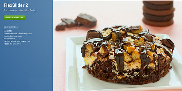
Flexslider 2 – Free

flexlslider responsive slider

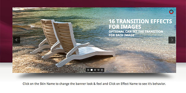
I use Flexslider more than any other image slider (responsive or not) so it’s a great place to start. Flexslider offers a fullly skin-able and customizable slider that works great across all screen sizes. I  use it with both images and images with text/calls to action. It also offers both horizontal and vertical sliding as well as multiple slider support so you can have multiple image sliders on a single page. Definitely gets my vote!

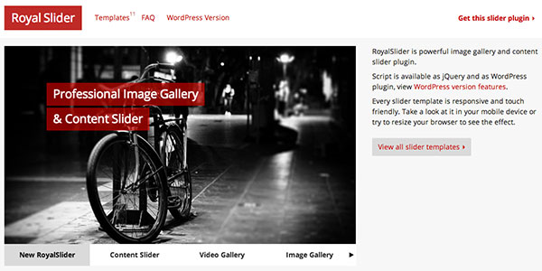
Royal Slider – Premium

Royal Slider responsive jQuery plugin

Another great slider that I have personal experience with. Royal Slider has a myriad of configuration options (my favorites being the “Gallery with Visible Nearby Images” or the “Video Slider”). The only thing keeping this plugin from the top spot is that it isn’t free (Flexslider is).  However, a very affordable and super-powerful plugin awaits. There’s also a great wordpress version.

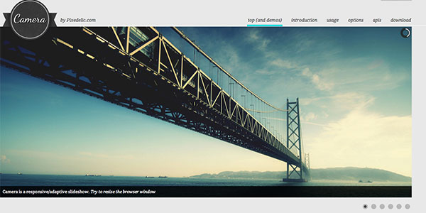
Camera – Free

Camera - a free responsive slider

Camera slideshow is an open source project, based on Diapo slideshow and offers a variety of skin and customizable options. I’ve never personally used Camera but the documentation looks thorough and the sampel they provide in the demo looks really nice and clean.

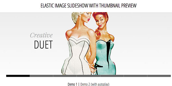
Elastic – Free

Elastic responsive slider

Elastic is presented in a tutorial fashion and includes the downloadable code to get you started using it on your site. This plugin has a much more specific look than some of the other plugins mentioned but there are some cool javascript animations being used.

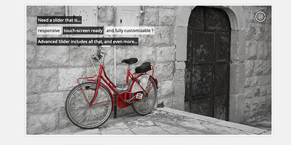
Advanced Slider – Premium

Advanced Slider - customizable jQuery slider

Another premium slider, Advanced Slider is fully responsive, mobile-ready, and can be used with either HTML markup or XML. The plugin also provides an easy to use API to customize it to your specific site. It comes with various pre-built styles that look nice out of the box.

All in One Responsive Slider – Premium

All in One responsive slider

All In One is an Advanced Jquery Slider which comes in 5 flavors: Banner Rotator, Thumbnails Banner, Banner with Playlist, Content Slider, Carousel. It allows you to easily create powerful sliders with animated text using HTML standard tags, making the slider very easy to setup and maintain.

Responsive Image Gallery – Free

responsive image gallery plugin

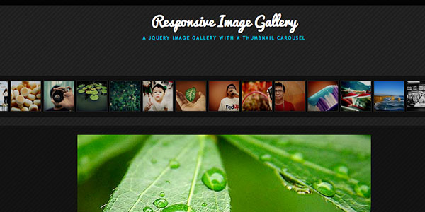
Another tutorial by Codrops on how to create a responsive image gallery with a thumbnail carousel using Elastislide. This slider is inspired by Twitter’s “user gallery” and is more useful for image galleries than a featured content carousel. But a free and great plugin nonetheless.

UnoSlider – Premium

Unoslider - responsive slider for jQuery

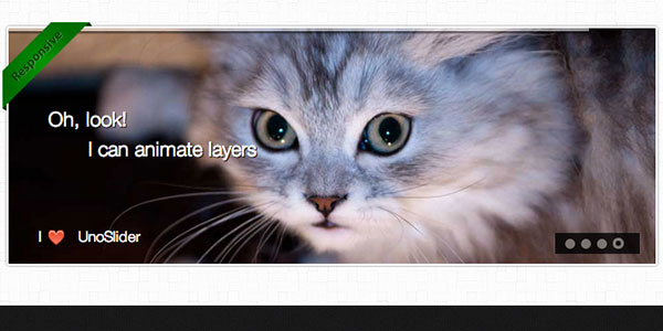
UnoSlider is a premium jQuery content slider plugin that’s core feature is the number of transition animations offered (the plugin developer claims “unlimited transition animations”). It’s also touch enabled, and offers a variety of other features similar to what’s been mentioned before.

Fluid CSS3 Slideshow with Parallax Effect – Free

parallax and responsive slider

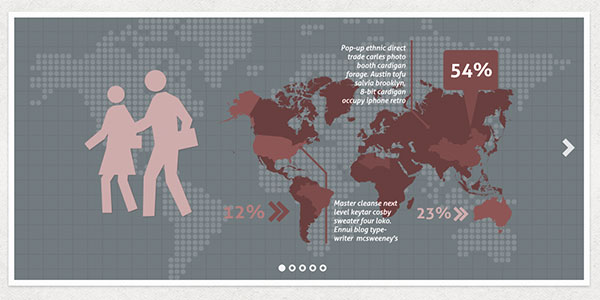
Another great freebie by Codrops (sensing a trend here?). This responsive slider mixes in a little parallax effect (another popular trend). A parallax and responsive site? This plugin is for the ambitious designers out there.

Layer Slider – Premium

parallax and responsive image slider

We’ll end with another parallax/responsive combo (this time a premium plugin). Layer Slider offers something really cool and unique: the ability to control an unlimited number of layers with individual animations. Combing this cool functionality with the responsive aspect and you have yourself a pretty powerful and extensible tool. I’ve had quite a bit of fun playing around with this on a few websites.

What other plugins do you use?

I’m sure I’ve left off some really great plugins and tutorials. But that’s where you come in. Let me know what I’ve missed and what plugins are your favorites. Feel free to post links to examples of these plugins in action. We’d love to see your great work!

The post 10 Responsive Slider jQuery Plugins appeared first on Visual Swirl Design Resources.

13 Beautiful 2013 Desktop Wallpapers for New Years

Post pobrano z: 13 Beautiful 2013 Desktop Wallpapers for New Years

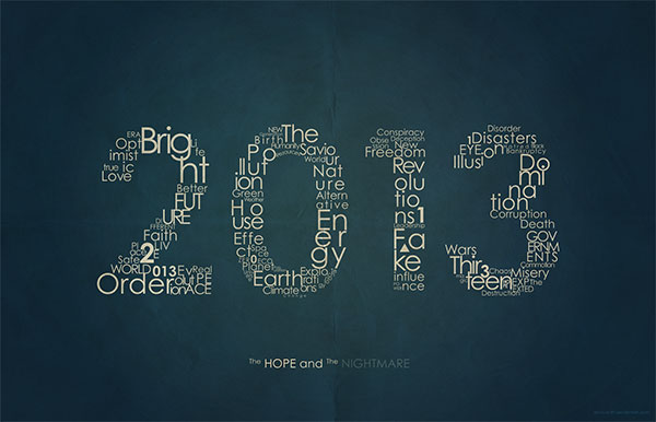
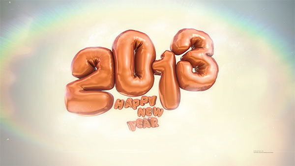
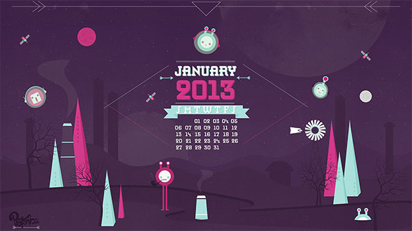
Welcome to 2013! To kick off another great  year I’ve rounded up 13 of the best 2013 wallpapers. Start off the new year by making a plan to clean up your desktop. Once it’s clean, you’ll want to decorate with one of these great wallpaper designs. And if you’re looking for monthly calendars for January, head over to Smashing Magazine to see some really great January 2013 calendars. So find the wallpaper that fits your resolutions (pun intended) and here’s to a happy and productive New Years!

2013 Wallpapers for a Happy New Years

Wallpaper by Upwallpapers.net

2013 Sparks New Years Wallpaper

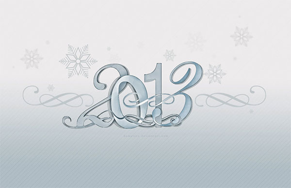
Wallpaper by demeters

Snowflakes 2013 desktop wallpaper

Wallpaper by paha13

crazy colorful 2013 desktop wallpaper

Wallpaper by GuilleBot

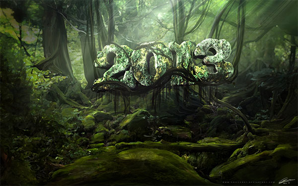
Jungle Wallpaper for 2013 desktop

Wallpaper by paha13

Purple desktop wallpaper for 2013

Wallpaper by PSDRoman

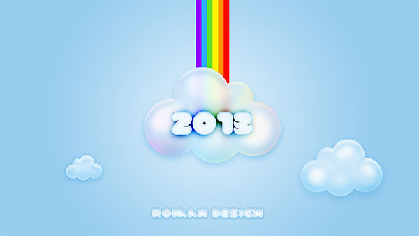
cloud rainbow 2013 desktop wallpaper

Wallpaper by Jenova89

hope and darkness 2013 wallpaper desktop

Wallpaper by Zakzak008

2013 wallpapers balloon new year

Wallpaper by tajio

purple bokeh new years 2013 wallpaper

Wallpaper by Concrete Love

Bright wrapping paper 2013 desktop wallpaper

Wallpaper by danishprakash

2013 New Years Wallpaper

Wallpaper by photonica

January 2013 Desktop Wallaper calendar

Wallpaper by ravirajcoomar

Futuristic 2013 wallpaper

The post 13 Beautiful 2013 Desktop Wallpapers for New Years appeared first on Visual Swirl Design Resources.

Desktop Wallpaper Calendars for August 2012

Post pobrano z: Desktop Wallpaper Calendars for August 2012

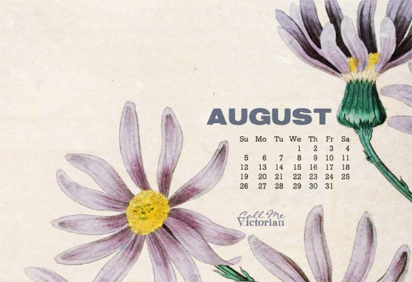
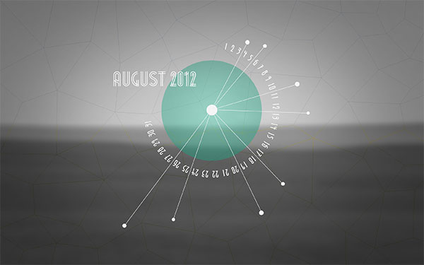
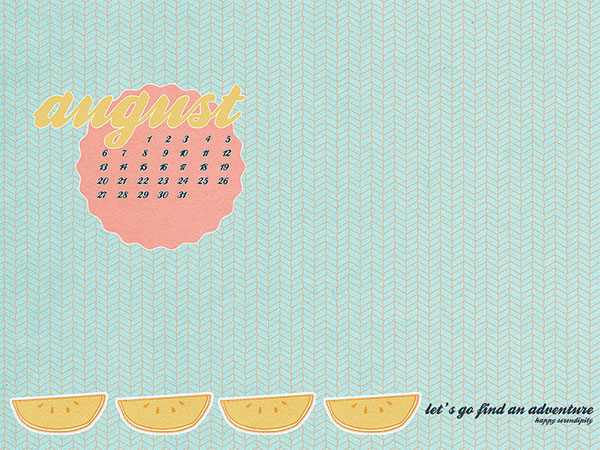
August desktop calendars just a couple days late. This collection of desktop calendar wallpapers will help keep your desktops fresh as we roll through the rest of the summer. As always, I’ve hand-picked wallpapers from talented artists and designers  around the web. Feel free to share your favorites and check back next month for some great new desktop calendars. As always, if you’d like to include your own design in future roundups, let me know.

7 Beautiful Desktop Wallpapers for August 2012

Wallpaper by Call Me Victorian

August Flower Calendar Wallpaper

Wallpaper by Paper Leaf

August Desktop Calendar

Wallpaper by Oana Befort

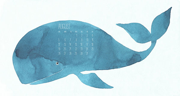
August Blue Whale Wallpaper

Wallpaper by Kriegs

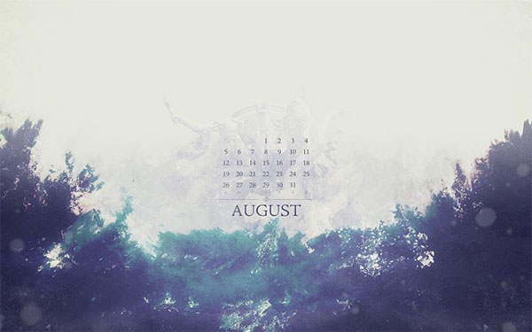
Vintage August Wallpaper

Wallpaper by Kinnon Elliott

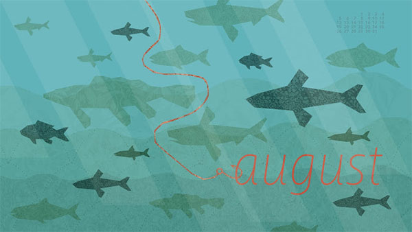
Wallpaper by Sarah Hearts

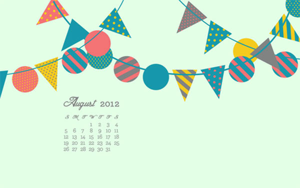
Wallpaper by Happy Serendipity


The post Desktop Wallpaper Calendars for August 2012 appeared first on Visual Swirl Design Resources.

Desktop Wallpaper Calendars for July 2012

Post pobrano z: Desktop Wallpaper Calendars for July 2012

July desktop calendars are hot off the press. 2012 is halfway gone but these fun and inspiring calendar wallpapers will surely help you get through the dog-days of summer. These fine wallpapers have been hand-picked from talented artists and designers from around the web. Feel free to share your favorites and check back next month for some great new desktop calendars. As always, if you’d like to include your own design in future roundups, let me know.

5 Desktop Wallpaper Calendars for July

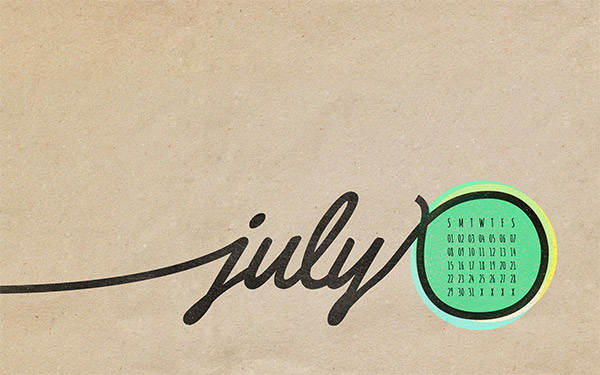
Wallpaper by Paper Leaf

Sandy backgrounds and a retro color scheme comprise this beautiful wallpaper. The script font matches nicely with this “made for the beach” design.

July 2012 Desktop Calendar

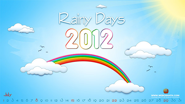
Wallpaper by Webgranth

Rainy days may be a title better served for the spring (depending on your location) but regardless, this illustrated desktop calendar provides some optimism for what is typically a scorchingly hot time of year.

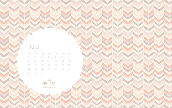
Wallpaper by Studio of Mae

Studio of Mae  has another nice  patterned wallpaper ready for July. As always the fonts and minimal calendar go nicely with the lovely background. Enjoy!

Decorative July Desktop Wallpaper

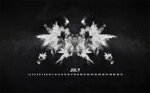
Wallpaper by Kriegs

This darker, grunge based design has some nice inkblot/rorschach digital art working for it. Do you see anything in the ink blots?

July Desktop Wallpaper Calendar

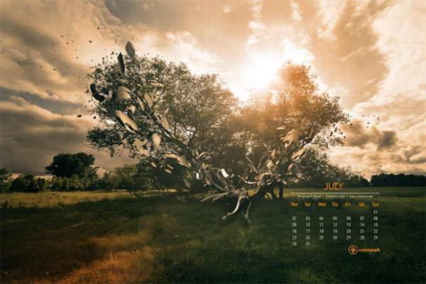
Wallpaper by Cromoart

Abstract shapes bursting from an evening view of the shade tree on a farm. I absolutely love the color scheme. There’s also iPad and iPhone versions available.

Abstract July 2012 Desktop Calendar

That’s the roundup. Please let us know which calendar is your favorite by leaving a comment below.

The post Desktop Wallpaper Calendars for July 2012 appeared first on Visual Swirl Design Resources.

How to Create a Styled Mixer Brush Text Effect in Adobe Photoshop

Post pobrano z: How to Create a Styled Mixer Brush Text Effect in Adobe Photoshop

Final product image
What You’ll Be Creating

This tutorial will show you how to create and style a mixer brush tip, and adjust its settings to stroke a work path and create a simple 3D text effect. Let’s get started!

This text effect was inspired by the many Layer Styles available on GraphicRiver.

Tutorial Assets

The following assets were used during the production of this tutorial:

1. How to Create Background and Text Layers

Step 1

Create a new 1250 x 2000 px document, click the Create new fill or adjustment layer icon at the bottom of the Layers panel, choose Solid Color, and set the Color Fill to #040214.

Solid Color

Step 2

Add the Blue circle background image on top of the Solid Color layer, rename its layer to BG Texture, change its Opacity to 35%, and resize it as needed.

BG Texture

Step 3

Create a reference text using any script font you like. The font used here is Nickainley, and the Size is set to 350 pt.

If you have more than one line of text, make sure to change the Leading value to one you like. Here, it is set to 550 pt.

Create the Text

2. How to Create and Style a Mixer Brush Tip

Step 1

Pick the Ellipse Tool, make sure that the Shape option in the Options bar is active, and click anywhere inside the document to get the Create Ellipse box.

Set the Width and Height values to 50 px, and click OK.

Create and Ellipse

Double-click the Ellipse layer to apply the following layer style:

Step 2

Add a Gradient Overlay with these settings:

  • Check the Dither box
  • Style: Radial
  • Angle: 0
  • Scale: 150%
  • Check the Reverse box if needed.
  • Click the Gradient box to create the gradient using the Colors #35378e to the left, #b62789 in the center, and #f15332 to the left.

You can use any other colors you like for the gradient to get different outcomes.

Gradient Overlay

Step 3

We need to move the gradient to the top of the ellipse. To do so, click-drag the gradient fill inside the ellipse.

Move the Gradient

Step 4

Add a Bevel and Emboss with these settings:

  • Size: 25
  • Uncheck the Use Global Light box
  • Angle: 158
  • Altitude: 32
  • Gloss Contour: Cove – Deep
  • Check the Anti-aliased box
  • Highlight Mode: Vivid Light
    • Opacity: 65%
  • Shadow Mode: Color Burn
    • Color: #7a7a7a
    • Opacity: 25%
Bevel and Emboss

Step 5

Add a Contour with these settings:

  • Contour: Cone – Inverted
  • Check the Anti-aliased box.
  • Range: 100%
Contour

This will create the styled tip that we will use for the Mixer Brush Tool later.

Styled Tip

Step 6

Since the styled shape needs to be rasterized to be used for the Mixer Brush, you can duplicate its layer first to keep a copy, hide it, and right-click the copy to choose Rasterize Layer Style.

Rasterize Layer Style

3. How to Create a Text Work Path

Step 1

Pick the Pen Tool and choose the Path option in the Options bar.

Click to add anchor points, and click-drag to create curves.

Pen Tool

Step 2

While you’re creating the path, you can press-hold the Command key to temporarily select and adjust the anchor points and their direction lines and points.

Another way to do that would be by using the Direct Selection Tool (A) instead.

When you finish creating a letter’s work path, Command-click anywhere outside it.

Adjust the Points

Step 3

In the Paths panel, double-click the Work Path tab and enter a name for your path to save it.

Save the Work Path

Step 4

It is better to separate the paths where needed, so that you can edit them easily after stroking them.

Make sure to align the paths so that they fall nicely on top of each other where they are supposed to overlap.

Overlapping Paths

4. How to Adjust the Mixer Brush Tool’s Settings

Step 1

Pick the Mixer Brush Tool (click and hold the standard Brush Tool to reveal it), and use these settings in the Options bar:

  • Click the Load the brush after each stroke icon.
  • Click the Clean the brush after each stroke icon.
  • Choose the Dry, Heavy Load preset from the Useful mixer brush combinations list.
  • Wet: 0%
  • Load: 100%
  • Flow: 100%
  • Stroke Smoothing: 100%
  • Uncheck the Sample All Layers box.

Once you adjust the settings, change the tip’s Size to 10 px more than the styled ellipse’s Size, so here the brush tip’s Size is set to 60 px.

Mixer Brush Tool Settings

Step 2

Select the styled ellipse’s layer, place the cursor in the center of the styled ellipse, press-hold the Option key, and click to load the ellipse into the brush tip.

Load the Brush Tip

5. How to Stroke a Work Path Using the Mixer Brush Tool

Step 1

Hide the original text layer and create a new layer on top of it.

Create a New Layer

Step 2

Pick the Path Selection Tool, click outside all paths to make sure none of them are selected, and then click the first letter’s path you want to stroke.

Path Selection Tool

Step 3

Hit the Return key to stroke the path, create a new layer, select the next path, and stroke it on the new layer.

Stroke the Path

Step 4

Continue selecting the paths and stroking them on separate layers until you’re done with the first word.

Place all the word’s layers in a group to keep things organized.

Group the Letter Layers

Step 5

Finish stroking all the words you have to start adjusting the final effect.

Stroke All the Text Paths

6. How to Get Rid of Unwanted Path Ends

Step 1

For some letters, the path ends might not be necessary, such as the O letters.

To fix that, you need to change the path’s starting and end points, either by recreating the path or by flipping it.

To flip a path, use the Path Selection Tool to select it, and press Command-T to enter the Free Transform Mode.

Right-click the bounding box and choose Flip Horizontal, and right-click it again to choose Flip Vertical.

Hit the Return key to commit the changes.

Flip the Work Paths

Step 2

Create a new layer on top of the original stroked path layer, and stroke the transformed path.

Stroke the Path

Step 3

Then, pick the Eraser Tool, and erase the end of the new stroked path.

You can temporarily hide any layers on top of the one you’re working on to see things clearly.

If the flipping method doesn’t create a result you like, you can recreate the original path but with different starting and end points.

Eraser Tool

Step 4

Repeat the steps to fix any other path ends you don’t like.

Fix Path Ends

7. How to Reverse a Path’s Direction

Step 1

If you want to completely reverse an open path, pick the Pen Tool, and click the starting point of the path.

Select Start Point

Step 2

Then, click the end point of the path to close it.

Close the Path

Step 3

Pick the Direct Selection Tool, click outside the path to unselect it, and click the segment that you created to close the original path (the one between the starting and end points).

Hit Delete to get rid of the selected segment. This will reverse the path’s direction.

Revers Path Direction

Step 4

Now use the Path Selection Tool to select the inverted path, and stroke it on a new layer.

Stroke the Path

8. How to Smooth the Final Outcome

Step 1

Select all the text groups you have, duplicate them, press Command-E to merge the copies, and hide the original ones.

Merge the Layers

Step 2

Go to Filter > Stylize > Diffuse, and set the Mode to Anisotropic to get a smoother result.

Diffuse Filter

Step 3

Add any extra dots or accents manually where needed, and make sure to do so on new layers so that you can transform them if you like, and then apply the Diffuse filter separately to them.

Add Any Remaining Parts

Congratulations! You’re Done

In this tutorial, we created a simple background and a reference text layer. Then, we created an ellipse and styled it to create a mixer brush’s tip. After that, we created a text work path and stroked the letters to create the text effect. Finally, we used a filter to smooth the final outcome.

Please feel free to leave your comments, suggestions, and outcomes below.

Final Result

A Brief History of Type

Post pobrano z: A Brief History of Type

mesopotamia tablet

Text is never simply text—typography, or the way type is arranged on a layout, has a huge influence over the visual impact of a message, setting the tone and mood for the reader. Type design has a long and fascinating history, and the digital fonts we use today often have incredible origin stories. 

Here we’ll explore a brief history of type and typography, starting with the early serifs engraved on the monuments of Ancient Rome, learning a little about the printing press revolution of the Middle Ages, and looking at the huge impact of 20th Century Modernism and the digital age on typography as we know it today. 

Looking for the perfect font to use in your typography project? You’re sure to find something to fit the bill from the huge range on GraphicRiver or Envato Elements

Typography Before ‘Typography’

Typography is the term used to describe how type is arranged on a layout. For most designers now, this refers to how type is formatted for displaying on a page, product (e.g. packaging), signage, or website. 

Typography as we know it only really came into being with the invention of the printing press (see below), but it actually has deeper origins. Many of the fonts you will see used widely today evolved from much earlier type designs. 

In second century BC Mesopotamia, punches and dies were used to stamp letterforms or glyphs onto seals, which makes it a very early form of printing. There is also evidence that similar ‘printing’ techniques were used in Babylon, Crete, and Ancient Greece. 

mesopotamia early writing
Mesopotamia provides some of the earliest evidence of ‘movable type’, with punches and dies being used to inscribe seals, currency and tablets.

Many of the serif fonts we use now can also trace their roots back to Ancient Roman capital lettering, which was used to inscribe monuments and municipal buildings. Trajan Pro and Times New Roman are two examples of typefaces which owe much of their design heritage to these early Roman type styles.

Gutenberg’s Blackletter Revolution

By the 12th century in Europe, hand-lettering had developed into an incredibly beautiful art form, practiced by monks who created illuminated manuscripts covered in ornate lettering designs. The style of type which was perfected by the monks is now known as blackletter—a Gothic calligraphy script.   

The downside of this hand-lettering technique was that it was also time-consuming and costly, which made it accessible only to a limited group of people. 

For many type enthusiasts, typography only really came into being with the invention of the printing press. In Germany, a blacksmith named Johannes Gutenberg created a machine that could process movable type, allowing a large number of sheets to be printed using ink and dies. Mimicking the blackletter type style used in hand-lettered manuscripts, Gutenberg developed the first ever typeface: Blackletter

helmswald post
Helmswald Post is a contemporary font inspired by the Blackletter typefaces developed by Gutenberg.

For the first time ever, typography had the potential to be accessible to the masses. Pamphlets and flyers could be reproduced quickly and inexpensively, though it would still take many centuries for books to become a commodity that ordinary people could afford. 

“Flippin’ eck, this Blackletter’s hard to read!”

The sheer blackness of Blackletter never made it the easiest typeface to read, so it was a breath of fresh air when Roman type styles became popularised in the 15th and 16th centuries. 

In 1470 in Venice, Nicolas Jenson designed a highly legible typeface inspired by Ancient Roman type styles. Jenson is one of the earliest Old Style typefaces, which are defined by low contrast between thick and thin strokes. 

jenson
Adobe Jenson is a contemporary refinement of the typeface designed by Nicolas Jenson in the 15th century.

Old Style Roman typefaces are readable and aesthetically pleasing, which led to them becoming the defining typeface style used throughout this period. 

While this renewed legibility was welcome, typesetters were also starting to explore ways of saving space on layouts. Books and other print materials were still not very cheap to produce, so designers focussed on compressing tracking (space between characters) and leading (space between lines). This need for space-saving also led to the development of italic weights. 

While typographers mostly use italics today to create hierarchy and difference in their typesetting, Renaissance-era typographers used slanted type styles to make the most of the limited space they had available.

You Old Romantic: 18th Century Serifs

Roman typefaces remained enduringly popular for a few centuries, and it wasn’t until the 18th Century that some of the most influential type designers quietly revolutionised the serif as we now know it today. 

This was the era of the humanist serifs. It all began with William Caslon, a London-based type designer, who created a more refined version of the Old Style serifs first developed by Jenson some centuries before. Caslon is a romantic and undeniably beautiful typeface, which makes all printed documents of this period appear exceptionally elegant. 

A couple of decades later, in the 1750s, another English type designer, John Baskerville, created what is now known as the first Transitional typeface. Compared to Old Style Caslon, Baskerville is recognised for its thinner serifs and moderately higher contrast between thick and thin strokes. It has a more formal, sombre appearance than Caslon, and remains one of the most popular typefaces for typesetting books today. 

The tide of typographic change was coming thick and fast during the 18th Century, during the Age of Enlightenment. In France, the Didot family designed one of the first Modern serifs, which are defined by very thin serifs and a very high contrast between thick and thin strokes. 

didot

In a similar vein, the Italian typographer Giambattista Bodoni developed typefaces that can also be classified as some of the earliest Modern typefaces. 

Didot and Bodoni are commonly used in luxury advertising and magazine design today, as they are considered to be exceptionally beautiful and chic type styles. 

A Typographic ‘Blip’: The Industrial Revolution 

After all the sophisticated developments in typography during the 18th century, the 19th century was bound to be a little disappointing. This was the era of the Industrial Revolution, and while incredible progress was made in mechanical and industrial fields, typography suffered from a cluttered approach during this time. 

Type was condensed or stretched to fit onto advertising materials like posters and newspapers. An eclectic mix of styles was used to fit every available space, which resulted in an eccentric look that ranged from circus-inspired styling to the letterpress-influenced ‘vintage’ styles popular with hip coffee bars today. 

lawless
Many modern 'vintage’ fonts, like Lawless, take inspiration from the Industrial Revolution period.

The upside of all this typographic freedom during the 19th century was the development of slab serif, or Egyptian, typefaces. These were punchier, bolder incarnations of existing serif styles, and they still give a lovely antiquated feel to titles in contemporary design. 

Thank Goodness, the Modernists Are Here

After all the clutter of the Industrial period, typography was badly in need of a refresh. Luckily, there were some very forward-thinking chaps who did just that. 

William Caslon (of Caslon fame, see above) had a great-grandson, William Caslon IV, who controversially removed the serifs from one of his traditional typefaces in the early 19th century. The style was too ahead of its time and didn’t take off, and it would be another century before the world was ready for the palette-cleansing simplicity of the sans serif.

The best-known early sans serif is Futura, which was created by German typographer Paul Renner in 1927. Renner was inspired by simple geometric shapes, which gives Futura and its relations their group name—the Geometric Sans typefaces. 

miles sans
Geometric Sans typefaces have an enduring appeal. Miles Sans is a more rounded, friendly interpretation of the style.

At the same time over in England, Eric Gill was approaching the new Modernist mood from a different perspective. He created Gill Sans, which introduced more natural curves and organic forms to the sans serif template. This and other related typefaces are now known as Humanist Sans typefaces. 

gill sans

A few decades later, in the late1950s in Switzerland, another sans serif evolutionary step was made. The Swiss Style, as practiced by a group of designers in the country, was characterised by functional and ultra-legible type design. Helvetica was the star product of this modernist experiment, and it soon came to be used across signage and print design the world over. 

The Influence of the Digital Age

Modernist sans serifs really broke tradition with all the typographic developments that had come before. But there was one final development that would extend the reach of both serifs and sans serifs, as well as typographic formatting, to an as yet unimaginably large audience. 

With the invention of computers in the 20th century, fonts—digital versions of typefaces—became the new currency in typography. Despite the exciting possibilities the digital revolution could hold for type, typography as a discipline seemed for a short while a little out of place. With the limitations of screen technology, many fonts were rendered as primitive Pixel Type, and pixel-inspired styles became the trend-leading typefaces for print design too. 

old computer

As computer technology evolved, the field of typography gradually opened up, making more sophisticated fonts available to all computer users. The downside of this was the overuse of ‘bad’ fonts (*cough*, Comic Sans) by every Tom, Dick and Harry. 

The upside was actually the most revolutionary development in typography, ever—that typeface development could no longer only be accomplished by specialists; but instead anybody with access to vector design software had the potential to design their own fonts. 

Conclusion: From Mesopotamia to Microsoft… and Everything In-Between

Humans have always sought out new and creative ways to communicate with others, and typography is the most visually arresting way that this has been done. 

As we’ve explored here, typography didn’t simply begin with the invention of the printing press, but has a much deeper history, much of which archaeologists and historians are still only just bringing to light. 

Typography’s evolution also won’t stall with the digital age, but in fact has more potential than ever to develop and win over new legions of type enthusiasts.

If this brief history of type has whetted your appetite for more typography-related content, you’re in luck! Check out the tutorials below, which will focus on honing your type skills. 

You can also find the perfect font for your next project over on GraphicRiver or Envato Elements

How to Create a Dream Catcher in Affinity Designer

Post pobrano z: How to Create a Dream Catcher in Affinity Designer

Final product image
What You’ll Be Creating

In today’s
tutorial, we’re going to embark on a mystical journey and learn how to create
our very own dream catcher in Affinity Designer. Using a step-by-step workflow,
we’re going to see how we can achieve a detailed illustration with the help of
a few basic geometric shapes in combination with some stroke lines here
and there.

If that sounds interesting, quickly grab a fresh cup of coffee and let’s
get started!

Also, don’t forget you can always expand the project by heading over to GraphicRiver, where you can find a great selection of Native American inspired vector art.

The Origin and Meaning of Dream Catchers

Before we jump
straight into the tutorial, I want to take a couple of moments and talk about
the history and deep meaning that this sacred hoop carries within it.

From an ethnographic perspective, the dream catcher is thought to have
originated from within the Ojibwe people
(also known as the Chippewa, or as
they called themselves the Anishinaabe)
which were an Algonquian speaking
North American tribe, who in 1500 occupied what is now Ontario and Manitoba (in
Canada) and Minnesota and North Dakota (in the U.S.).

According to the Eagle Spirit Ministry, the existence of this mystical talisman derives
from the legend of the Asibikaashi
(the Spider Woman), in which an old grandmother who served as the spiritual
protector of the people could no longer watch over all the babies due to the growth and expansion of the tribe to all four corners of the
land.

To overcome this, she crafted what we now call a dream catcher, by taking a willow hoop and spinning a web around its center, which would then be placed above the sleeping place, where the sunlight could hit it.

Since the Native Americans believed that the night air was filled with dreams, both good and bad, the sacred hoop would attract and catch all the bad ones, which would be burnt by the light of day. The good ones would pass through its center and gently slide down the feathers onto the sleeper.

From a metaphorical perspective, the shape of the dream catcher is deeply tied to the natural world, where the hoop represents the circle of life as well as the passing of the sun and moon across the sky. The feathers act as a smooth ladder meant to carefully carry the dreams onto the person underneath, while the beads are thought to symbolize the spider that wove the web. The web itself is connected to the hoop with the help of eight nodes, which are thought to represent the legs of the spider.

I believe that knowing the history of an object is always important when deciding to use it as a symbol, since by opening the doors of knowledge you can decipher its true meaning and therefore portray it as close as possible to its true nature.

For me, the dream catcher is a powerful symbol of the Native Americans’ culture, which should not only be respected but honored since it managed to withstand the passing of time and prove that our connection to nature is more powerful than we can imagine.

Even though in its original version, the design had a spider-like web, over the centuries multiple iterations were created, gradually adding beauty to function. So I decided to take the circle of life metaphor and apply it to the web in order to make it feel more geometric.

I hope that by sharing this piece of information with you, I’ve managed to deepen your interest in this beautiful culture. Now let’s move on and start working on our little project.

1. How to Set Up a
New Project File

Assuming you
already have Affinity up and running, let’s set up a New Document by going to File
> New
(or by using the Control-N
keyboard shortcut) which we will adjust as follows:

  • Type:
    Web
  • Document Units: Pixels
  • Create artboard:
    checked
  • Page Width:
    640 px
  • Page Height:
    640 px
  • DPI: 72
setting up a new document

2. How to Create the Hoop Frame

Now that we’ve finished setting up our
document, we can start working on the actual illustration, and we will do so by
creating the outer frame.

Step 1

Using the Ellipse Tool (M twice), draw a 252 x 252
px
circle, which we will color using #6D96D1 and then horizontally center
align to the underlying Artboard, positioning it at a distance of 262 px from its bottom edge.

creating and positioning the main shape for the frame

Step 2

Create a smaller 240 x 240 px circle
(highlighted with red), which we will position in the center of the previous
one and then cut out using the Subtract
function.

cutting out the smaller circle from the frame

Step 3

Give the resulting shape an outline using the Stroke method, by creating a copy of it (Control-C) which we will paste in front (Control-V) and then adjust by changing its color to #433363, making sure to flip its Fill with
its Stroke (Shift-X). Set the Stroke’s
Width to 4 pt, and then select and group the two together using the Control-G keyboard shortcut.

adding the outline to the outer frame

Quick tip: from this point on, I strongly recommend you
organize the different sections of the illustration using groups, which you can
rename within the Layers panel,
making it easier to identify and edit them if you need to later on.

example of organizing the different shapes

3. How to Create
the Woven Web 

Once we’ve created
our outer frame, we can gradually add the geometric web one shape at a time, as
we will see in the following moments.

Step 1

Create four 120 x 120 px circles
with a 4 pt Stroke (#433363), which we will position in the inner section of
the frame’s outline as seen in the reference image, making sure their strokes overlap. Take your time, and
once you’re done, move on to the next step.

adding the main circles to the woven web

Step 2

Add the remaining web segments using four more 120 x 120 px circles with a 4
pt Stroke
(#433363), which we will diagonally position on the frame as
seen in the reference image. Once you’re done, select and group all the circles
together using the Control-G
keyboard shortcut.

adding the secondary circles to the woven web

Step 3

Next, we need to add the little center cutout to the web, which we will
create using a clipping object. First, create a 240 x 240 px circle (highlighted with red), from the center of which
we will cut out a smaller 24 x 24 px one.

creating the clipping object

Step 4

Once you have the clipping object, all you need to do is go to the Layers panel and drag and position the
grouped circles within the larger shape.

masking the woven web

Step 5

As soon as you’ve masked the circles, you can select the clipping object
and remove its Fill color so that
you can have a clear view of the background.

removing the fill color from the clipping object

Step 6

Give the center hole an outline using a 24 x 24 px circle with a 4
pt Stroke
, which we will color using #433363.

adding the small outline to the center of the woven web

Step 7

Add the little
binding nodes using eight 12 x 12 px circles
(#433363), which we will position at the following intersections.

adding the nodes to the woven web

Step 8

Select the Pen Tool (P) and, using a 4 pt thick Stroke (#433363) with a Round Cap, draw the little string segments holding the web to the
frame. Use three 10 px tall
segments for each group.

adding the support string segments to the frame

Step 9

Add the main shape for the hanging string segment using a 16 x 16 px circle with a 4 pt thick Stroke (#433363), which we will position above the frame at a
distance of just 8 px from its
outline’s top edge.

creating and positioning the main shape for the hanging string

Step 10

Since we want to adjust the lower section of the circle, we’ll first
have to select it and then use the Convert
to Curves
function in order to get access to its nodes.

converting the hanging string to curves

Step 11

Once you’ve converted the shape, you can use the Node Tool (A) to select its bottom node, which we will push to the
bottom by 12 px using
the down-facing arrow key so that it ends up overlapping the outline of the
frame.

adjusting the shape of the hanging string

Step 12

Before we move on to the next part, make sure you select and group all
of the shapes together using the Control-G
keyboard shortcut, giving each section a descriptive name from within the Layers panel.

example of organizing the main shapes of the frame

4. How to Create
the Feathers

Next, we’re going
to focus on the lower section of the dream catcher and create the three
feathers which help all the good dreams slide down onto the person that it’s
protecting.

Step 1

Start working on the central feather by creating a 24 x 28 px triangle (#6D96D1) using the Triangle Tool, which we will center align to the underlying Artboard and then position at a
distance of 72 px from the frame’s
bottom binding strings.

creating the upper shape of the middle feather

Step 2

Add the lower section of the feather using a 24 x 60 px rectangle, which we will color using #6D96D1 and then
position below the smaller triangle.

adding the lower section of the middle feather

Step 3

Adjust the bottom corners of the shape that we’ve just created by
selecting them using the Corner Tool (C),
and then setting their Radius to 12 px.

adjusting the corner radius of the lower section of the middle feather

Step 4

Select the two shapes and unite them into a single larger one using the Add function.

uniting the two sections of the middle feather

Step 5

Give the resulting shape a 4 pt thick
outline (#433363), making sure to select and group the two shapes together
afterwards using the Control-G
keyboard shortcut.

adding the outline to the middle feather

Step 6

Create the first color segment using a 12 x 16 px rectangle (#FFFAE9), which we will adjust by pushing its
right nodes to the bottom by 12
px
. Give the resulting shape a 4 pt thick
outline (#433363), grouping (Control-G)
and then positioning the two on the right side of the feather as seen in the
reference image.

adding the top-right detail to the middle feather

Step 7

Make a copy (Control-C >
Control-V
) of the outline that we’ve just created, and position it below so
that the strokes overlap.

adding the bottom-right detail to the middle feather

Step
8

Add the left-sided details using a copy (Control-C > Control-V) of the ones that we’ve just finished
working on, which we will vertically reflect (right click > Transform > Flip Vertical). Position the copies
on the opposite side of the feather as seen in the reference image, making
sure to switch the position of the filled detail with the outlined one.

adding the left details to the middle feather

Step
9

Create the shaft and the string segment connecting the feather to the
lower section of the frame using a 160
px
tall 4 pt thick Stroke line (#433363), which we will
position at a distance of 8 px from
the feather’s outline.

adding the string section to the middle feather

Step 10

Add the bottom blue bead using an 8
x 8 px
circle (#6D96D1) with a 4 pt thick
outline (#433363), which we will group and then position on the string, at a
distance of 54 px from the frame’s bottom
section.

adding the lower bead to the middle feather

Step
11

Create the red bead using a 16 x
12 px
rounded rectangle (#F76A4D) with a 4 px corner Radius and 4 pt thick outline (#433363), which we
will group (Control-G) and then
position above the previous one, making sure their strokes overlap.

adding the red bead to the middle feather

Step
12

Add the top bead using a copy (Control-C
> Control-V
) of the blue one, which we will reposition so that its outline
now overlaps that of the red bead.

adding the top bead to the middle feather

Step
13

Add the little node holding the beads in place using an 8 x 8 px circle, which we will color
using #433363 and then position onto the top bead’s outline as seen in the
reference image. Once you’re done, select and group all of the current
feather’s composing shapes together using the Control-G keyboard shortcut.

adding the node to the middle feather

Step
14

Create the left feather, using a copy (Control-C > Control-V) of the one that we’ve just finished
working on, which we will position on the left side of the frame.

creating and positioning the left feather

Step
15

Adjust the copy that we’ve just created by increasing the length of the
feather’s string from 160 px to 208 px.

adjusting the string length of the left feather

Step
16

Finish off the dream catcher, and with it the project itself, by adding
the right feather using a copy (Control-C
> Control-V
) of the one that we’ve just adjusted, which we will position
on the opposite side. Once you’re done, select and group (Control-G) all of the shapes together
before hitting that save button.

finishing off the dream catcher

Great
Job!

As
always, I hope that you’ve managed to follow each and every step, and most
importantly learned something new and useful.

Also, if you have any questions feel free to post them within the
comments section and I’ll get back to you as soon as I can!

finished project preview

How to Create a Colorful, Wavy, Tribal Photo Manipulation in Adobe Photoshop & Lightroom

Post pobrano z: How to Create a Colorful, Wavy, Tribal Photo Manipulation in Adobe Photoshop & Lightroom

Final product image
What You’ll Be Creating

I have always been a fan of Japanese art, so I decided to merge two styles together: Afrofuturistic and Japanese. I hope you will enjoy this. 

In this tutorial, I’ll show you how to use Adobe Photoshop to create a colorful, wavy, tribal collage featuring a beautiful woman. I will also teach you how to retouch the artwork in Adobe Lightroom.

First, we’ll isolate the model from the background. After that, we’ll add our background, patterns, and waves. Later, we will cut out the model’s eyes, create some faux sunglasses, and add some stars to create that dreamy, futuristic mood. Then, we will additional elements such as the crow, the UFO, the face accessories, and some tribal marks. Finally, we will retouch the artwork in Adobe Lightroom. Let’s get started!

Tutorial Assets

The following assets were used during the production of this tutorial:

1. How to Isolate the Model and Prepare the Base Background

Step 1

Create a new 20″ by 30” document in Photoshop with the given settings:

Setting up the canvas

Step 2

Open the model image. Cut out the image using the Pen Tool (P). Find a spot on the main image to start drawing the outline. As we’re drawing, we want to zoom in closer to the subject. Press Control-(+) or Control-(–) to zoom in and out.

Showing the image we are going to work on
Outlining the model to be able to remove background

Step 3

We need to isolate the model to be able to work easily in the future. Click on the Marquee Tool (M), choose Make Selection, and then press Delete.

Deleting the background after outlining

2. How to Bring the Image Into Your Main Canvas

Drag the image onto the main canvas using the Move Tool (V). Then, press Control-T to resize the image. Hold Shift while resizing. Next, use the Move Tool (V) to center the image.

Dragging the image into the main canvas

3. How to Create an Accordion Effect on the Model

Step 1

Use the Rectangle Marquee Tool (M) and draw a vertical rectangle on the left side of the model.

Cutting out the edge of the image

Step 2

Then, Right-Click and select Layer via cut to separate the selected slice. Then, duplicate the layer nine times and align them as shown below. Use the Move Tool (V) to move each slice.

Creating the accordion effect

Step 3

Next, select all layers, Right-Click and merge layers, and rename the layer „Main image”. Then, activate the Move Tool (V) and move the image to the left of the canvas.

End result of the accordion effect

4. How Create the Colorful Background

Step 1

Hit Control-Shift-N to make a new layer. Name the layer “Background”. Set this layer under the model’s one.

Step 2

Activate the Brush Tool (B) and select #009e7d and paint over the background.

Adding the colorful background

5. How to Turn the Model Black and White

Select the Model layer in the Layers panel and turn it black and white. Click on Image > Adjustments > Black and white, and then click OK or Alt-Shift-Control-B.

Turning the model into black and white

6. How to Add the UFO and the Crow

Step 1

Drag the UFO picture into Photoshop. We need to remove the background. Cut out the image using the Pen Tool (P). Find a spot on the main image, and click on a point to start drawing the outline. To finish, we have to click from the last point to the first one we did. Press Control-(+) to zoom in and Control-(-) to zoom out during the process.

Outlining the UFO to delete the background
Deleting the background

Step 2

Now we want to import the UFO into the main file. Select the UFO layer, use the Move Tool (V), and drag the image into the main canvas. Then resize it to make it fit on the model’s head. To resize, press Control-T, holding the Shift key while resizing the UFO image. 

Bringing the UFO on the models head

Step 3

Now we need to add the crow. Drag the image into Photoshop, and use the Pen Tool (P) to draw the crow’s outline. Then, click on the Marquee Tool (M), Right-click, and Select inverse if the background is not selected. Otherwise, Right-click, Make Selection, and then press Delete.

outlining the crow

Step 4

Drag the crow image into the main file. Resize the image. Press Control-T, holding the Shift key while resizing. Use the Move Tool (V) and bring the crow onto the model’s left shoulder. Then we want to adjust the contrast and brightness.

Step 5

Next, we want to adjust the brightness of the UFO. Select Brightness / Contrast in the adjustment palette, and then bring down the Brightness to -110. Next, to apply the adjustment on the UFO only, press Alt on the adjustment layer and click on the layer thumbnail (the white square on the layer) to apply the settings.

Adding the crow and adjusting the exposure of the UFO

Step 6

Now, we want to adjust the contrast and brightness on the model as well as on the other elements. First, group all layers except the background together. Then, select Brightness/Contrast and boost the Contrast to +81. Place the adjustment layer above the group layer, and then press Alt on the adjustment layer and click to apply the settings to the model only, not the background.

Adjusting the exposure of the Model and each element

7. How to Add the Waves

Drag the wave picture into the main canvas. Place the layer under the model’s layer. Then, duplicate the waves layer by pressing Control-J and place that layer above the model’s layer. Use the Move Tool (V) to place the images as shown below.

Adding the waves

8. How to Add the Yellow Circle and the Patterns

Step 1

Select the Ellipse Tool (U), change the fill color to #ffff01, and draw a medium circle. Then place the layer under the model’s layer. Use the Move Tool (V) to center the image.

Adding the yellow circle

Step 2

Drag the pattern image into the main canvas and bring the layer under the model’s and the wave layer.

Adding tribal patterns in the background

Step 3

Then, lower the Opacity to 16%. Resize the patterns by pressing Control-T. Hold Shift while resizing.

9. How to Add Tribal Marks, Faux Sunglasses, and Stars

Step 1

We want to add some tribal marks. Activate your Ellipse Tool (U). Make sure the fill color is white, draw a small circle, and duplicate the layer four times by pressing Control-J. Redistribute the circles on the cheeks, forehead, and chin. 

Then activate your Ellipse Tool (U) again, and duplicate the layer four times by pressing Control-J. Use the Move Tool (V) to align the circles vertically and group the layers. Now duplicate the group layer twice and redistribute them on the two corners and on the model’s chest as shown. 

Adding tribal marks

Step 2

Now we want to create our faux sunglasses. Use the Pen Tool (P) and draw the sunglasses outline as shown below.

Drawing the sunglasses outline

Step 3

Next, we want to remove the part we outlined. Right-Click, select Make Selection, and then hit Delete.

Removing the outlined part

Step 4

Bring the stars picture into the main canvas. Place the layer under the Main Image layer. Activate the Pen Tool (P) and draw around the sunglasses shape, and then Right-Click, select Make SelectionSelect Inverse, and hit Delete.

Adding the stars on the faux sunglasses
Removing the extra parts

10. How to Retouch in Adobe Lightroom

Step 1

We want to add more contrast to our artwork. Bring the Exposure to +0.24, the Clarity to +21, and the Vibrance to +62. Then go to the Hue palette and boost the Orange Hue to +100. 

Adjusting the exposure and hue in Lightroom

Step 2

Next, boost the Grain level to +54 and the Dehaze amount to +10.

Adding a vignette grain and dehaze

11. How to Export the Final Artwork From Adobe Lightroom

Now that we are finished, we want to export our artwork as a JPEG. Click File, then Export. Select in which folder we want to save the image. Then click Export.

Before and after

Awesome Work, You’re Done!

I hope that you’ve enjoyed the tutorial and learned something new for your own projects. Feel free to share your results or leave comments in the box below. Keep creating!

Final result

Trend Watch: Retro 90s Design

Post pobrano z: Trend Watch: Retro 90s Design

The 90s are making a comeback all over design! Let’s find out why in this article below!

Trend Watch: Retro 90s Design

Jean vests, baggy overalls, and funky flannels were just a few of the highlights of the 90s. And whether you love it or hate it, nostalgic retro design is making a comeback now more than ever.

Nostalgia has a way of inviting happy memories of times long forgotten. So designers are paying homage to their favorite TV shows and fashionable styles with the popular retro 90s trend.

90s Dj Flyer
90s DJ Flyer

What We Love About This Trend

Who doesn’t love the 90s!? Here are just a few key features from this era:

  • Bold colors. Pink, yellow, blue—you name it, we wore it. Integrate these vibrant colors with funky patterns and black outlines for a classic 90s aesthetic.
  • Fun fashion statements. The 90s were all about expression. From grunge fashion to popular flannel patterns, you can incorporate your favorite fashionable styles by looking at their patterns and textures.
  • Abstract Shapes. Geometry was huge in the 90s! Polka-dot patterns and bold abstract shapes were a standard among 90s-themed graphics. Mix and match shapes with bold colors for a clever effect!
  • Inspiring Musical Themes. From grunge songs to your favorite hip-hop jams and more, the 90s were a special time in music. Integrate retro boomboxes into your work for an epic twist!

Nostalgic 90s-Inspired Lessons

Relive your favorite shows and more with these 90s tutorials. Learn how to create professional party flyers, patterns, and even photo effects from our experts!

20 Epic 90s-Themed Design Assets

Can’t get enough of the 90s? Download these premium resources from Envato Market and Envato Elements to aid in your retro designs.

Explore this collection of high-quality assets, from cool party posters to business cards and more!

90’s Music Flyer

There’s
no party like a 90s themed party! So get all your friends together and
put on your best retro fashion for a fun night out. Download this clean
flyer template complete with free fonts and vector graphics. Celebrate your favorite 90s moments!

90s Music Flyer

90’s DJ Flyer

This trendy DJ flyer is one of the classic ways we’re starting to see this theme play out. It features bold pastel colors and simple triangular shapes. Add a photo with the same theme to really help this flyer pop! Enjoy this template!

90s DJ Flyer

Memphis Business Card Template

Your business cards should feature a design you’re happy to pass out! This Memphis business card template is not only stylish but also super cool! The print-ready file is fully customizable with high-resolution elements. Let us know how you like it!

Memphis Business Card Template

Pop Punk Music Flyer

Whether you love pop or punk music, you’ll definitely love this creative music flyer. This pack features six Illustrator and Photoshop files that are 100% vector. Update it with your event details to use it right away!

Pop Punk Music Flyer

Hip-hop 90s Illustrations Pack

The music of the 90s was like no other. And you can show off your stylish fashionable side with this awesome hip-hop illustration pack. A vector EPS file with 14 total illustrations, these graphics can be used for icons and more!

Hip-hop 90s Illustrations Pack

Retro Funky 3D Text Effects

Create
a bold title like your favorite retro TV shows with this funky 3D text
effect. Included are 10 well-organized Photoshop files with editable elements you can customize fast. Choose from several bold color
schemes and even unique textures!

Retro Funky 3D Text Effects

90s Revival Flyer Template

This epic design duo features not only a 90s revival flyer but also a GIF Photoshop action. Turn your flyers into an exciting animation ready for any social media profile or website. Download it today to get access to fully editable elements.

90s Revival Flyer Template

Vintage 90s Style Elements Set

Another great set you should definitely download is this vintage 90s element pack. With around 20 party-themed elements, you’ll be able to incorporate these vector pieces into any nostalgic design. Mash them up for the ultimate 90s graphic!

Vintage 90s Style Elements Set

90’s Music Festival Flyer

Keeping along with the theme is this 90s music festival flyer. A great option for beginners to design, this pack includes several Photoshop files and easily editable layers. You’ll adore the classic 90s vibe for your next musical event!

90s Music Festival Flyer

Flyer 90’s Night Party

From cassette tapes to retro boomboxes and more, this party flyer is completely packed with 90s nostalgia! Some of the fonts featured include accessible options like Bebas Neue, along with print-ready files for your convenience. Try it out!

Flyer 90s Night Party

Classic Pop Disco Flyer

Become the star of your next event with this pop disco flyer template. A new spin on a classic design, this template features abstract shapes and a bold pink color scheme. Just swap out the model’s photo for one of your best glam shots!

Classic Pop Disco Flyer

90’s is Back Flyer

Welcome back the 90s in style! Created with both horizontal and vertical versions, this retro flyer template is both bold and striking! Show all your friends a night of fun with incredible music and good company. You’ll love this design!

90s is Back Flyer

Vintage Storage Icons

The modern world has left behind these vintage storage items, but we can still remember them in spirit! Make your retro graphics complete with this vintage set of storage icons made with Adobe Illustrator. Get 10 total icons available in several formats.

Vintage Storage Icons

6 Retro Text Mock-ups

Add a grunge text effect to your party flyer or typography poster in only minutes! This awesome mockup set includes six vintage-inspired text mockups with classic styles you’ll love. Easily change the colors and backgrounds to customize it fast!

6 Retro Text Mock-ups

Vintage Flyer Template

Open up any party with your favorite 90s tunes and this vintage party flyer! Featuring a mixture of grunge design and bold colors for that old-school vibe, this template is simple and easy to use. The model images aren’t included, though, so just replace them with your own!

Vintage Flyer Template

Emboss Grunge Photoshop Action

One
way to show off your love of 90s grunge is with an epic Photoshop
action. And this action can transform your photos with just a few simple
clicks! Follow along with the attached video tutorial for more tips to achieve the perfect effect!

Emboss Grunge Photoshop Action

Grunge Core Rock Concert Flyer

Or rock out with this wicked grunge core concert flyer. It’s designed with incredibly realistic grunge texture and chunky letters, and you’ll be able to swap out the main photo for one of your own. Also included are 10 different color schemes to try out!

Grunge Core Rock Concert Flyer

12 Retro Photoshop Text Effects

This awesome pack of retro text effects includes cool 90s-themed options you’ll definitely want! Get access to so many styles that can be used in a variety of design scenarios. A convenient help file is also included for more information.

12 Retro Photoshop Text Effects

Thunderstorm Font

Thunderstorm has a familiar Saved By the Bell vibe that is hard to miss. This font is a handmade typeface inspired by several classic periods like the 80s, the 90s, and beyond. Use it for amazing quotes, apparel, or even logos.

Thunderstorm Font

House Party Flyer

Make sure to invite your favorite Photoshop instructor to a fun 90s-themed house party. This cool template features a creative typographic design with plenty of room for your party details. Enjoy the print-ready design complete with editable fonts and text.

House Party Flyer

Show Us Your 90s Designs!

If you’re as fond of this retro trend as we are, then show us your
work! Post a result showing how you work with the vintage 90s theme and let us know your favorite styles in the comments below.

This has been a collection of tutorials and premium resources perfect for the avid designer. For more trendy retro 90s designs, check out Envato Market and Envato Elements. Happy designing!