In this tutorial I’ll show you how to use Adobe Photoshop to create a vintage collage featuring a beautiful woman. I will also teach you how to retouch the artwork in Adobe Lightroom.
First, we’ll isolate the model from the background. After that, we’ll add our background. Later, we will cut out the model’s eyes and create some faux sunglasses with a desert picture. Then, we will add additional elements such as the crow, the UFO, the jewelry, and some tribal marks. Finally, we will adjust the contrast, vibration, and saturation using Adobe Lightroom. Let’s get started.
Tutorial Assets
The following assets were used during the production of this tutorial:
1. How to Isolate the Model and Prepare the Base Background
Step 1
Create a new 2500 by 2000 pixels document in Photoshop with the given settings:
Step 2
Open the model image in Photoshop. Cut out the image using the Pen Tool (P). Find a spot on the main image to start drawing the outline. As we’re drawing, we want to zoom in closer to the subject. This is accomplished using the Zoom Tool by pressing Control and the + or – keys.
Step 3
Now that we have drawn the outline, we want to soften the edges of the hair before removing the background. Right-click, make selection, and then select the Marquee Tool (M). Once the option bar pops up, select Select Inverse and click on Select and Mask. This will open the Select and Mask Workspace.
Step 4
Then, activate the Refine Edge Brush Tool (R). Brush over any detailed hair areas that are missing from your selection with this tool (we can change the brush size and hardness from the brush drop-down in the top left). This will select the detailed hair areas and remove the contrasting background. When you are done,click OK.
Step 5
Now we want to remove the background. Select the Marquee Tool (M). Right-click and Select Inverse. Then hit Delete.
2. How to Bring the Image Into the Main Canvas
Drag the image into the main canvas using the Move Tool (V).Then, resize by pressing Control-T. This will bring up the transformation tools you want. We do not want the image to deform or stretch, so press Shift while resizing. Then press Enter.
3. How to Create the Background
Step 1
Bring the background image into the canvas, and then place the layer under the model’s layer. We want the image to fill the canvas. Press Control-T, and drag the corners to make it bigger. Press Shift while resizing. Then press Enter.
Now that we have resized the background image, we want to center the circle. Select the Move Tool (V) and move the image to the right side to center the circle.
Step 2
Next, we want to make the background more colorful. Press Shift-Control-A to open the camera raw filter workspace, and then bring the Clarity up to +83 and the Vibrance up to +68. Click OK.
4. How to Import the UFO and the Crow
Step 1
Drag the UFO picture into Photoshop. We need to remove the background. Cut out the image using the Pen Tool (P). Find a spot on the main image, and click on a point to start drawing the outline. To finish, we have to click from the last point to the first one we did. Press Control-(+) to zoom in and Control-(-) to zoom out during the process.
Step 2
Now we want to import the UFO into the main file. Select the UFO layer, use your Move Tool (V), and drag the image into the main canvas, and then resize it to make it fit on the model’s head. To resize, press Control-T,holding the Shift key while resizing the UFO image. Next, we want to delete the extra hair around the UFO. Select the Model’s layer, activate the Eraser Tool (E), and remove the hair on the edges.
Step 3
Now we need to add the crow. Drag the image into Photoshop, and use the Pen Tool (P) to draw the crow’s outline. Click on the Marquee Tool (M), and then Right-click and Select Inverse. Click Select Selection, and then press Delete.
Step 4
Drag the crow image on the main file. Resize the image. Press Control-T, holding Shift while resizing. Use the Move Tool (V) and bring the crow onto the model’s left shoulder.
5. How to Add the Jewelry and Tribal Marks
Step 1
Open the mirror picture in Photoshop. Use the Pen Tool (P) to cut the crown and remove the background. Drag the jewelry into the main file on top of the model’s neck. Press Control-T, holding Shift while resizing the image. We want the image under the UFO. Bring the layer under the UFO’s layer.
Step 2
Press Control-J to duplicate the jewelry’s layer and place it on the model’s neck. Lower the Opacity to 50%, and activate the Pen Tool (P) to remove the extra part on the edges. Follow the body shape, and then bring back the Opacity to 100%.
Step 3
Now we want to add some tribal marks. Use the Ellipse Tool (U) to draw a small circle, making sure the fill color is white. Duplicate the layer nine times by pressing Control-J, and then use the Move Tool (V) to redistribute the circles on the cheeks and arms.
6. How to Create Desert Sunglasses
Step 1
Open the desert picture in Photoshop, and then activate the Rectangle Marquee Tool (M) and draw a rectangle on the image.
Step 2
Then use the Move Tool (V) and drag the rectangle into the main canvas. Place the rectangle on the model’s eyes.
Step 3
Next, lower the image’s Opacity to 50%, and then use the Pen Tool (P) to draw a round shape in the middle of the nose area. Cut out the sides like the following shape.
7. How to Create a Vintage Retouch to the Artwork in Adobe Lightroom
Step 1
Export the photo as a Jpeg from Photoshop. Import the picture into Lightroom. Then click Develop. Bring the Temperature to +14, Highlights to -100, Shadows to +100, Blacks to -57, Clarity +100, and Vibrance to +24.
Step 2
Next, we want to add some vignette to create more of a vintage mood. Scroll down the toolbar to Post-Crop Vignetting and bring down the Amount to -29. Then add some Grain. Bring up the Amount to +75, size 24, roughness 50.
Step 3
Now, scroll down to camera calibration and bring the Green primary to -38
8. How to Export the Final Artwork From Adobe Lightroom
Now that we are finished, we want to export our artwork as a JPEG. Click File, then Export. Select in which folder we want to save our image. Then click Export.
Congratulations, You Made It!
I hope that you’ve enjoyed the tutorial and learned something new for your own projects. Feel free to share your results or leave comments in the box below. Keep creating!
In today’s tutorial, we’re going to explore
the process of creating an instant snapshot of a busy city, using nothing more
than the basic shapes and tools that we work with on a daily basis.
You can always expand your project by heading over to GraphicRiver, where you’ll find a great selection of vector assets to choose from.
That being said, quickly grab a fresh cup of coffee to keep you energized, and let’s jump
straight into it!
1. How to Set Up a New Project File
Assuming you already have Illustrator up
and running in the background, bring it up and let’s set up a New Document (File > New or Control-N)
for our project using the following settings:
Number
of Artboards: 1
Width: 800
px
Height: 600
px
Units: Pixels
And from the Advanced tab:
Color
Mode: RGB
Raster
Effects: Screen (72ppi)
Preview Mode: Default
2. How to Set Up a Custom Grid
Even though today’s project is not an icon-based one, we’ll still want to create the illustration using a pixel-perfect
workflow, so let’s set up a nice little grid so that we can have full control
over our shapes.
Step 1
Go to the Edit > Preferences > Guides & Grid submenu, and adjust
the following settings:
Once we’ve set up our custom grid, all we
need to do in order to make sure our shapes look crisp is enable the Snap to Grid option found under the View menu (that’s if you’re using an
older version of Illustrator).
Now, if you’re new to
the whole “pixel-perfect workflow”, I strongly recommend you go through my How
to Create Pixel-Perfect Artwork tutorial, which will help you widen your
technical skills in no time.
3. How to Set Up the Layers
Once we’ve finished setting up our project
file, it would be a good idea to structure our document using a couple of
layers, since this way we can maintain a steady workflow by focusing on one
section of the illustration at a time.
That being said, bring up the Layers panel and create a total of three
layers, which we will rename as follows:
layer
1: background
layer
2: photo stack
layer 3: city illustration
Quick tip: I’ve colored all of my layers using the same
green value, since it’s the easiest one to view when used to highlight your
selected shapes (whether they’re closed or open paths).
4. How to Create
the Background
As soon as we’ve
layered our document, we can start working on the project by creating the light
background, so make sure you position yourself on the first layer, and let’s
jump straight into it.
Step 1
Create an 800 x 600 px rectangle,
which we will color using #FFF8F0 and then center align to the underlying
Artboard using the Align panel’s Horizontal
and Vertical Align Center options.
Step 2
Apply a subtle
texture to the shape that we’ve just created by making a copy (Control-C > Control-F) of it, which
we will adjust by setting its color to #808080. Then, simply go to Effect > Photoshop Effects > Texture
> Grain and set the Intensity to 40, the Contrast to 50, and the Grain Type to Stippled.
Step 3
Adjust the resulting
texture by setting its Blending Mode to Soft Light, selecting and grouping
the two rectangles together afterwards using the Control-G keyboard shortcut.
Step 4
Lock the current layer using the Layers panel, and then move on up to the next one (that would be the second one)
where we’ll gradually build our composition.
5. How to Create the Polaroid Instant Film
Stack
Assuming you’ve positioned yourself on the next layer (that would be the second one), let’s start working on the next
section of our illustration, which will house the city itself.
Step 1
Create the main shape
for the bottom polaroid using a 360 x
460 px rectangle, which we will color using #E8D4BF and then position in the center of the Artboard.
Step 2
Adjust the shape that
we’ve just created by rotating it clockwise by an angle of 8º using the Rotate tool
(right click > Transform > Rotate
> -8 px).
Step 3
Give the resulting
shape a subtle, grainy texture following the same process and values used
for the background, only this time color the copy using #666666, lowering its Opacity to 40%.
Step 4
Add a secondary
texture that will act as a shadow cast by the top polaroid, using a 380 x 480 px rectangle (#333333) which
we will position in the center of the Artboard, setting its Blending Mode to Soft Light and its Opacity
to 64%.
Step 5
Select and group (Control-G) both textures together,
masking them afterwards by creating a copy (Control-C) of the underlying shape (highlighted with red), which we
will paste in front (Control-F) and
then simply right click > Make
Clipping Mask.
Step 6
Add the front
polaroid using a 360 x 460 px rectangle,
which we will color using #FFEED9 and then center align to the underlying
Artboard. Once you’re done, select and group all of the current layer’s shapes
together using the Control-G
keyboard shortcut, making sure to lock it before moving on to the next section
of the illustration.
6. How to Create the Buildings on the Right Side
As soon as we’ve finished working on the
polaroid film stack, we can move on to the third and last layer, where we will gradually
build our little city.
Step 1
Start by creating the
background using a 280 x 340 px rectangle, onto which we will apply a linear gradient using #F9C958 for the left color
stop and #F97E58 for the right one. Set the Angle to 90º, positioning
the resulting shape as seen in the reference image.
Step 2
Zoom in on the
gradient that we’ve just created and add the sun using a 112 x 112 px circle, which we will color using #FFD18D and then
position at a distance of 16 px from
the center of the larger shape’s bottom edge.
Step 3
Start working on the buildings by creating the main shape for the bottom one using a 108 x 112 px rectangle, which we will
color using #E87D60 and then align to the gradient’s bottom-right corner.
Step 4
Add the windows using
seven rows of five 12 x 8 px rectangles
(#BA473C), spacing them 8 px from one another horizontally and vertically. Then group them (Control-G) and position them on the building as seen in
the reference image.
Step 5
Create the roof using
a 112 x 12 px rectangle (#FFEDD7) on
top of which we will add two 112 x 2 px horizontal
detail lines (#BA473C) vertically stacked 2 px from one another and from the larger shape’s top edge. Select and
group (Control-G) all three shapes
together, positioning them on top of the current building.
Step 6
Get creative and add the
antenna/roof assembly using a couple of #BA473C colored rectangles, which we
will group (Control-G) and then
position on top of the previously created shapes. Take your time, and once you’re done, select and
group (Control-G) all of the
building’s composing shapes before moving on to the next one.
Step 7
Start working on the
next building by creating its main body using a 68 x 104 px rectangle, which we will color using #FFE5C0 and then
position on top of the one from the previous step.
Step 8
Add the windows using
twelve 68 x 4 px rectangles (#BA473C),
which we will vertically stack 4 px from
one another, grouping (Control-G)
and then aligning them to the bottom of the larger rectangle.
Step 9
Once you have the shapes
in place, select and group (Control-G)
them and the building’s larger body together, making sure to position them underneath the
bottom one’s antenna (right click >
Arrange > Send Backward), before moving on to the next step.
Step 10
Start working on the
smaller side building using a 20 x 52 px rectangle, which we will color using #CCCCCC and then position as seen in
the reference image.
Step 11
Add the hard shadow
cast by the right building using an 8
x 52 px rectangle, which we will color using #BA473C and then position onto
the current one’s right edge.
Step 12
Create the windows
using six 12 x 4 px rectangles (#BA473C),
which we will vertically stack 4 px from
one another, grouping (Control-G)
and then aligning them to the bottom edge of the building.
Step 13
Finish off the
current building by adding the antenna assembly using two #BA473C colored
rectangles, which we will position as seen in the reference image. Once you’re
done, select and group (Control-G) all of its composing shapes before moving on to the next
one.
Step 14
Create the main shape
for the top building using a 52 x 56 px rectangle,
which we will color using #DDD4C8 and then position on top of the taller one.
Step 15
Give the building a
hard shadow using a 12 x 56 px rectangle
(#BA473C), which we will align to the center of its right edge.
Step 16
Add the windows using
four 4 x 56 px rectangles (#BA473C),
which we will horizontally space 4
px from one another, grouping (Control-G)
and then positioning them at a distance of 4
px from the shadow that we’ve just created.
Step 17
Add the antenna
assembly using a couple of #BA473C colored rectangles. Take your time, and once
you’re done, select and group (Control-G)
all of its composing shapes together, doing the same for the entire building
afterwards.
Step 18
Finish off the
current section of the city by quickly creating the crane using a few #BA473C
colored rectangles. Once you’re done, select and group (Control-G) all of its composing shapes together, doing the same for
all of the buildings afterwards.
7. How to Create the Buildings on the Left Side
Once we’ve finished working on the right
side of the city, we can shift our focus over to the left one and start adding
the buildings one step at a time.
Step 1
Create the main shape
for the bottom building using a 172 x 36
px rectangle, which we will color using #FFE5C0 and then position as seen
in the reference image.
Step 2
Add the hard-shadow
using a 12 x 36 px rectangle, which
we will color using #BA473C and then center align to the larger shape’s right
edge.
Step 3
Create the windows using
four 160 x 4 px rectangles (#BA473C),
which we will vertically stack 4 px from
one another, grouping (Control-G)
and then positioning them onto the bottom-left corner of the building. Once you’re done, select and
group all of the shapes together using the Control-G
keyboard shortcut.
Step 4
Add the upper section
of the building by creating a 96 x 16 px rectangle (#FFEDD7), on top of which we will add three 96 x 2 px rectangles (#BA473C) vertically stacked 2 px from one another. Group (Control-G) and position the shapes on
top of the lower body, doing the same for the entire building afterwards.
Step 5
Start working on the
center building by creating a 76 x 140
px rectangle, which we will color using #CADDCF and then position on top of
the one that we’ve just finished.
Step 6
Add the windows using
16 rows of six 8 x 4 px rectangles
(#BA473C), horizontally and vertically spaced 4 px from one another, which we will group (Control-G) and then position as seen in the reference image.
Step 7
Finish off the
current building by adding the horizontal detail lines using two 76 x 2 px rectangles (#BA473C)
vertically stacked 2 px from one
another, which we will group (Control-G)
and then position at a distance of 2 px from
its top edge. Take your time, and once you’re done, select and group (Control-G) all of its composing shapes, making
sure to position it underneath the bottom one (right click > Transform > Arrange > Send Backward).
Step 8
Create the main shape
for the smaller side building using a 32
x 88 px rectangle, which we will color using #CCCCCC and then position as
seen in the reference image.
Step 9
Add the hard-shadow
using a 10 x 88 px rectangle, which
we will color using #BA473C and then center align to the building’s left edge.
Step 10
Create the windows
using three 4 x 88 px rectangles (#BA473C),
horizontally spaced 2 px from
one another, which we will group (Control-G)
and then position at a distance of 2 px from
the shadow.
Step 11
Add the antenna
assembly using a couple of #BA473C colored rectangles, selecting and grouping
all of them together using the Control-G
keyboard shortcut. Take your time, and once you’re done, do the same for the
entire building.
Step 12
Start working on the
taller building by creating its lower body using a 56 x 100 px rectangle (#E87D60), which we will adjust by selecting
and pushing its top-right corner to the bottom by 10 px (right click > Transform > Move > Vertical > 10 px).
Step 13
Add the windows using
ten 56 x 4 px rectangles (#BA473C)
vertically stacked 4 px from one
another, which we will group (Control-G)
and then position at a distance of 4 px from
the previous shape’s bottom edge.
Step 14
Create the building’s
upper body using a 48 x 20 px rectangle
(#BA473C), which we will position as seen in the reference image, making sure
to arrange it behind the larger one (right
click > Arrange > Send Backward).
Step 15
Add the antenna
assembly using a couple of #BA473C colored rectangles. Take your time, and once
you’re done, select and group (Control-G)
all of the resulting shapes together, doing the same for the entire building
afterwards.
Step 16
Finish off the
current section of the city by quickly creating the water tower using a couple
of #BA473C colored shapes. Once you’re done, make sure to select and group (Control-G) all of its composing shapes
together, doing the same for the entire section afterwards.
8. How to Create the Bridge
Once we’ve finished working on the buildings,
we can shift our focus to the center of our illustration, where we will create
the bridge.
Step 1
Start by creating the
support towers using two 4 x 24 px rectangles
(#BA473C), which we will horizontally space 18 px from one another, grouping (Control-G) and then positioning them in the center of the city as
seen in the reference image.
Step 2
Add the deck using a 64 x 4 px rectangle (#BA473C), which we
will position on top of the shapes that we’ve just created.
Step 3
Create the horizontal
support section using a smaller 64 x 2
px rectangle (#BA473C), which we will position below the deck, at a
distance of just 2 px.
Step 4
Add the suspension
cables using two 64 x 48 px ellipses
with a 4 px thick Stroke (#BA473C), which we will
position as seen in the reference image and then adjust by selecting and
removing their top and outer anchor points, uniting their center ones using the Control-J keyboard shortcut.
Step 5
Create the center pylon
using a 4 x 34 px rectangle (#BA473C),
which we will center align to the top edge of the cables.
Step 6
Add the suspenders using
six 2 px wide rectangles (#BA473C), spaced 8
px from one another, positioning them as seen in the reference image. Once
you’re done, select and
group all of the bridge’s composing shapes using the Control-G keyboard shortcut.
Step 7
Create the little cars
using a couple of 4 x 1 px rectangles
(#BA473C), which we will position onto the deck as seen in the reference image.
Take your time, and once you’re done, select and group (Control-G) all of the current section’s composing shapes before
moving on to the next one.
9. How to Create
the Clouds
Since we’re
pretty much done working on the city, we can shift our focus to the upper
section of the horizon and start filling it up using a couple of clouds.
Step 1
Using the Rounded Rectangle Tool, create a couple
of 4 px tall shapes (#FFFFFF) with a 2 px Corner Radius, which we will
position as seen in the reference image, making sure to group (Control-G) and arrange them beneath the
buildings (right click > Arrange >
Send Backward).
Step 2
Add the little airplane
using a couple of #BA473C rectangles which we will adjust and position as seen
in the reference image. Once you’re done, select and group (Control-G) all of its composing shapes
together, doing the same for the entire city afterwards.
10. How to Add the Finishing Touches
Once we’ve added the clouds and the
airplane, our illustration is almost done. All we need to do now is add the
grainy texture.
Step 1
Create a 360 x 460 px rectangle (#666666), which
we will turn into a texture following the same process and values used
for the previous ones, positioning it in the center of the underlying Artboard
afterwards.
Step 2
Adjust the resulting shape
by setting its Blending Mode to Soft Light and its Opacity to 30%. Once you’re
done, select and group (Control-G)
all of the current layer’s composing shapes together before finally hitting that Save button.
Great Job!
So we started out laying some simple
shapes but ended up creating a beautiful instance of a living, breathing city by
following an in-depth, step-by-step process.
I truly hope you’ve
managed to learn something new and useful that you can apply to some if not all
of your future projects.
As always, if you
have any questions, post them within the comments area and I’ll get back to you
as soon as I can!
Join us for a free live stream, where experienced Envato Tuts+ instructor Dan White will share 15 time-saving tips and shortcuts to help you in your next Adobe XD project. From working with text on paths and understanding layout grids, to learning about publishing options and masking; we’ll cover all these shortcuts and more. So download the starter files, join in the live chat, and enjoy the livestream!
The course will be free for everyone who joins live, so don’t miss out on your chance to follow along and ask questions. Envato Elements subscribers will be able to access the recorded version of the course on Tuts+ once it is published.
Get professional designs in less time! Check out these incredible flyer templates.
18 New Event Flyers for 2018
Make 2018 a year to remember! Kick off your festive celebrations with modern event flyers that are stunning and surreal.
Today we bring you another wonderful collection of design assets from Envato Market and Envato Elements. This selection includes awesome flyer designs featuring the latest trends in graphic design.
With choices ranging from awesome vintage-inspired templates to beautiful minimalist designs, you’ll be happy you went with these flyers. Take your events to the next level with these easy-to-use templates!
Need more help? Get custom flyer designs from our experts at Envato Studio.
Learn More About Flyer Design
New to design? Follow along with our experts with these helpful lessons:
Multipurpose designs give you room to take your flyers to the next level. This colorful event flyer and social media package is a surefire way to kick-start your online campaigns. Enjoy high-quality A4 and letter format designs, with additional templates for Facebook and Instagram.
Need
something fast yet simple? This brilliant minimalist flyer has just the
right balance of design and color. Use it for any jazz, club, or party
event and easily update the text with editable layers. Download it now
to try out the 100% vector design.
Everyone needs a fun night out every once in a while. Celebrate great music and even greater company with this music event flyer. Used to promote your music event, this flyer comes with a print-ready file that is easy to edit. It’s available in both Photoshop and Illustrator formats.
Stand out from all the other DJs in town. This fun flyer package features A3 sized posters with four color variations. Replace the main image with one of your own and match the colors to your brand. Give it a try!
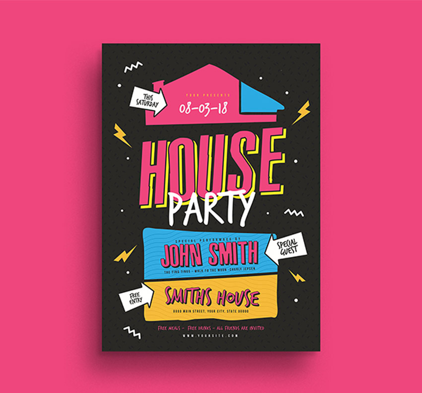
Did someone say house party? Invite your friends, family, and favorite Photoshop instructor to the party of the century with this awesome 80s-inspired design. Made to look like a blast from the past, this trendy design is nostalgic and fun. You’ll love this template!
Get an entire promotional kit with this great deal! Packed with loads of awesome resources, this kit includes two print-ready Photoshop flyers, a Facebook cover, and optional Instagram banner. Easily arrange your content with editable layers and text. Try it out!
Indie rock fans unite! We’ve got a wicked flyer ready for your next musical event. This modern design features minimalist text and elements centered around the main microphone. Update this file with your information using Adobe Photoshop or Illustrator.
For the vintage music enthusiast, you’ll definitely love this Sky Zeppelin flyer. It works perfectly as an event flyer or as a cool decoration for your home or office. And since it’s created in traditional CMYK format, you won’t have to worry about loss of color or quality.
Get ready to lace up your ice skates for a magical time! This party flyer features a sleek and minimalist design with ample room for your event details. It’s designed with Adobe Photoshop, and you’ll get one other color variation with helpful bleed lines. Download it today!
Or blow away your party-goers with an epic abstract design. This party flyer is best suited for high-energy techno music and more. The full package includes not only a professional A3 Photoshop poster, but also a web banner template. You’ll want this design!
Make a child’s day today! Get your friends and community together for a special cause with this flyer template. Designed with friendly stuffed animals and more, this flyer is one that both kids and parents will love! Download A4 sized templates supported by Photoshop and Illustrator.
If a clean and professional design is what you need then feast your eyes on this stunning example! This lovely event flyer features a relaxing color scheme with a gorgeous minimalist guitar. The multipurpose design is well organized and even includes free fonts and icons!
The world could use a little more peace. Spread love with this spiritual-themed event flyer. Designed with a peaceful landscape and sublime color scheme, this flyer is 6×8 inches with all the standard industry specifications. Use it for conferences, events, or prayer services.
If you’re having trouble deciding on a design, then try a professional flyer template bundle. This stunning design features a winter theme with beautiful abstract elements. Easily switch out the text for your own and choose from the three lovely color variations included.
Tell your buddies to tag along for a fun motor club event! This awesome bundle includes Photoshop and Illustrator supported files that are 100% vector. Also included are free fonts and helpful bleed lines for your convenience.
Your birthday is a special event, so celebrate it with all your loved ones! This modern design features two well-organized flyers with easily editable layers. Just swap out one of the images for one of your own to get started right away!
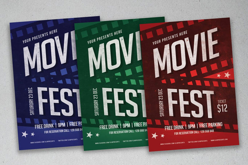
Movie nights are the best nights! This Photoshop template is perfect for beginners to flyer design. Choose from the red, green, and blue colors included or update it with your own in minutes! Not sure where to begin? Just access helpful documentation to help you get started.
Or promote your local specials with this vintage flyer. Designed using Adobe Photoshop, this flyer is print-ready, with bleed lines and more. Easily change the colors or edit the text to your liking. Try it out today!
Conclusion
This list features exciting
resources for the avid designer
familiar with Adobe Photoshop, Illustrator, and InDesign. For
additional help with your flyer needs, enlist the skills of a talented
professional by choosing one of the amazing designers from Envato Studio.
And
with loads of event flyers available at your fingertips, chances are we’ve
missed a few to add to your personal collection. Be sure to browse Envato Market and Envato Elements for more resources, and let us know your favorites in the comments below!
We’re celebrating all things celebratory this week! And what sort of celebration could be more fun than a night out clubbing?
This flyer is an easy way of tapping into the pastel-neon gradient trend. In this tutorial suitable for beginners to InDesign, we’ll look at how to create gradient swatches and apply them to a simple layout that can be adapted for print or online.
Once you’ve installed the font files onto your computer, you’re ready to get started.
1. How to Set Up a Flyer Layout in InDesign
Step 1
Open InDesign and go to File > New > Document.
Set the Width of the page to 4 in and Height to 6 in, to create a standard size flyer.
Set the Margins to 0.4 in and add a Bleed of 0.25 in.
Then go ahead and click OK.
Step 2
Expand the Layers panel (Window > Layers) and double-click on the Layer 1 name. Rename it Background and click OK.
Choose New Layer from the panel’s drop-down menu (at top-right), and name this layer Pattern, before clicking OK.
Then add a further three new layers in this order: Type Behind, Circle and, at the top, Type in Front.
Lock all the layers except the bottom one, Background.
2. How to Create Gradient Swatches in InDesign
You can create the equivalent of Photoshop’s ‘gradient maps’ in InDesign by tweaking the settings of gradient swatches. First, you’ll need to create a base group of standard swatches, to use as building blocks for your gradient swatches.
Step 1
Expand the Swatches panel (Window > Color > Swatches) and choose New Color Swatch from the panel’s drop-down menu.
Name this first swatch Neon Mint, and set the Type to Process. You can choose either RGB (for online) or CMYK (for print) depending on your intention to share the flyer in hard or soft copy. Here I’m going for RGB, as I’m planning to share the flyer on social media.
Set the values to R=140 G=249 B=208, and click Add and then OK.
Step 2
Repeat the process described in the previous step, to create a palette of nine more swatches, with the following names and values:
Blue: R=61 G=177 B=252
Pastel Pink: R=250 G=200 B=253
Rose: R=244 G=136 B=170
Neon Lime: R=145 G=255 B=142
Purple: R=110 G=89 B=190
Neon Pink: R=255 G=84 B=232
Pastel Lime: R=234 G=247 B=201
Neon Yellow: R=248 G=255 B=81
Deep Rose: R=240 G=88 B=171
Step 3
Now it’s time to create your first gradient swatch. Click on New Gradient Swatch in the Swatch panel’s menu.
Name the swatch Gradient Map 1, set the Type to Linear, and choose Swatches from the Stop Color menu.
Click on the left-hand stop on the Gradient Ramp below, and select Neon Lime from the swatch menu above.
Click on the right-hand stop, and choose Purple.
You can add more colors to your gradient by clicking anywhere on the Gradient Ramp and adding a new stop. From the left side, add a stop set in Neon Pink. Then one in Pastel Lime. And a third one in Neon Yellow.
Make sure the stops are spaced relatively evenly across the ramp, before clicking Add and then OK.
Step 4
Working on the Background layer, select the Rectangle Tool (M) from the Tools panel (docked to the left side of the workspace) and drag across the whole page, extending it up to the bleed on all sides.
Set the Fill of the shape to Purple from the Swatches panel.
Step 5
With the shape selected, go to Object on the main menu, and Effects > Transparency.
Pull the Opacity down to 10%.
Click on Inner Glow in the window’s left-hand menu. Increase the Choke to around 4% and Noise to 8%, to add texture across the whole shape. Then click OK.
Step 6
Create another shape using the Rectangle Tool (M) over the top of this first rectangle. From the Swatches panel, set the Fill to Gradient Map 1.
Go to Window > Color > Gradient and adjust the Angle of the gradient to 110, so that it extends diagonally from the bottom-right to the top-left corner of the page. You can also adjust the position of the stops to soften the gradient if you need to.
3. How to Build Up Shapes and Typography on Your Flyer
Step 1
Return to the Layers panel and choose New Gradient Swatch from the drop-down menu.
Call this swatch Gradient Map 2, and choose Blue and Neon Mint from the swatches list to create a two-color gradient. Click Add, and then OK.
Step 2
Lock the Background layer and unlock the Circle layer.
Select the Ellipse Tool (L), and, holding Shift, drag to create a perfect circle across the center of the page. Set the Fill to Gradient Map 2 and Stroke to [None].
Step 3
With the circle shape selected, go to Object > Effects > Drop Shadow.
Click on the colored square to the right of the Mode menu at the top, and change the Effect Color to Pastel Pink. Click OK, and add about 13% Noise to the shadow. Then click OK to exit the window.
Step 4
Lock the Circle layer and unlock the layer below, Type Behind.
Take the Type Tool (T) and drag to create a square text frame at the top-right corner of the circle shape.
Type in ‘C’ and, from either the top Controls panel or the Character panel (Window > Type & Tables > Character), set the Font to Charlevoix Pro ExtraBold, Size 130 pt.
Adjust the Font Color to [Paper] from the Swatches panel.
Step 5
Select the text frame and Edit > Copy, Edit > Paste. Move this second frame to the bottom-right corner of the circle, as shown below.
Select both the ‘C’ and ‘B’ text frames and head up to Object > Effects > Drop Shadow.
Switch the Effect Color to Neon Mint, pull the Opacity down to about 60%, and add 25% Noise. Then click OK.
Step 6
Take the Type Tool (T) again and create a smaller, longer text frame next to the ‘B’ frame.
Type in ‘NIGHT’ and set the Font to Charlevoix Pro Medium, Size 22 pt and increase the Tracking (letter-spacing) to 90. Change the Font Color to Pastel Lime.
Then Right-Click on the text frame and choose Transform > Rotate 90 Degrees CW.
Move the text frame to sit snugly against the left side of the ‘B’ letter.
Step 7
Use the Type Tool (T) to create another small text frame up in the right-hand corner of the page. Here you can add an introductory sentence such as ‘RIOT BLVD presents its opening’.
Set the Font to Charlevoix Pro, setting titles in Bold and other text in Medium. You can set most text in [Paper], but pull out key info in a contrasting color like Deep Rose.
Step 8
Add more text frames to the bottom-left corner of the page, setting text in Charlevoix Pro Bold, Medium and Regular to create hierarchy, and the Font Color to [Paper].
Step 9
Head back to the Layers panel and expand the Type Behind layer by clicking on the small arrow symbol to the left of the layer’s name.
Select the <B> element with your mouse and drag it down onto the Create New Layer button at the bottom of the panel to duplicate it.
Unlock the Type in Front layer at the top, before dragging the <B> copy upwards to sit on this layer. Then you can lock the Type Behind layer, and work on the Type in Front layer.
Step 10
Edit the ‘B’ letter on the Type in Front layer to read ‘L’ instead and move it to sit above the ‘B’.
Select the ‘L’ text frame and Edit > Copy, Edit > Paste, adjusting the letter of the copy to read ‘U’. Move so that it sits below the ‘C’, as shown below.
4. How to Add a Retro Pattern to Your Flyer
Step 1
Lock the Type in Front layer and unlock the Pattern layer.
Switch to the Pen Tool (P) and click onto the page or pasteboard three times to create a triangle shape, before uniting the shape at its first anchor point. Use the Direct Selection Tool (A) to select anchor points individually and move them to create a symmetrical triangle shape.
Step 2
Set the Fill of the triangle shape to Rose and Stroke Color to [None].
Move the triangle over to the top-left corner of the page, and scale it down and rotate it a little.
With the shape selected, go to Object > Effects > Drop Shadow. Switch the Effect Color to Neon Lime and add about 10% Noise, before clicking OK.
Step 3
Copy and Paste the triangle repeatedly, scattering shapes around the page and rotating them to different angles to create a jaunty, jumpy effect.
Your flyer’s finished! Awesome work!
All that’s left to do now is File > Save your hard work, and then File > Export to export it as either a print-ready PDF file (choose Adobe PDF [Print] from the Format menu) or online image file (choose JPEG or PNG).
Conclusion: Your Finished Flyer
Pastel-neon gradients are a big trend for this year, and this colorful flyer is a great way to tap into the style. It works perfectly for club or party flyers—but why not try using gradient swatches on different designs too?
In this tutorial, you’ve picked up some handy skills for applying to InDesign and other layout projects in the future. You now know how to:
Create gradient swatches (or ‘gradient maps’) in Adobe InDesign.
Layer color, shapes, patterns and type for a 3D look in your designs.
Format typography to a high standard.
Apply sophisticated effects to graphics, like glows, shadows, and transparencies.
This tutorial will show you how to use Photoshop’s 3D Tools, adjustment layers, and a couple of textures to create a dazzling, glittery, festive text effect. Let’s get started!
Then, create the text using the font HWT Artz. Set the Size to 600 pt and the Tracking to 150 pt.
Step 2
Rename the text layer to Text, and then right-click it and choose Convert to Shape.
2. How to Create Stroke Layers
Step 1
Duplicate the Text layer and rename the copy to Stroke 1.
Step 2
Pick the Direct Selection Tool (A) to get the shape options in the Options bar.
Change the Fill to None, the Stroke Color to Black, and its Size to 25, and then click the Set shape stroke type icon, and change the Align to Outside.
Step 3
Duplicate the Stroke 1 layer, rename the copy to Stroke 2, and change the Stroke Size to 35.
Step 4
Duplicate the Stroke 2 layer, rename the copy to Stroke 3, and change the Stroke Size to 50.
3. How to Create 3D Layers
Step 1
For each shape layer you have, select it, and then go to 3D > New 3D Extrusion from Selected Path.
Step 2
Select all 3D layers you have, and go to 3D > Merge 3D Layers.
4. How to Work With a 3D Scene
Step 1
To access the 3D mesh settings and properties, you’ll need to open two panels: the 3D panel and the Properties panel (both found under the Window menu).
The 3D panel has all the components of the 3D scene, and when you click the name of any of those, you’ll be able to access its settings in the Properties panel. So make sure to always select the tab of the element you want to modify in the 3D panel before you change its settings in the Properties panel.
Step 2
If you select the Move Tool, you’ll find a set of 3D Modes for it to the right of the Options bar.
When you choose one of those, you can then click and drag to perform changes (on the selected element in the 3D panel).
Use those modes to change the Current View into an angle you like.
5. How to Modify 3D Mesh Settings
Step 1
Select the Text mesh tab in the 3D panel, and then, in the Properties panel, change the Extrusion Depth to 200.
Step 2
Select all the Stroke mesh tabs, and change their Extrusion Depth to 35.
6. How to Modify 3D Cap Settings
Step 1
Select the Text tab again. Then click the Cap icon at the top of the Properties panel.
Set the Sides to Front and Back, and change the Bevel Width to 5%, the Contour to Half Round, and the Inflate Strength to 10%.
Step 2
Select the Stroke tabs, set the Sides to Front and Back, and then change the Bevel Width to 20% and the Contour to Ring.
7. How to Reposition 3D Meshes
Step 1
Select all the mesh tabs in the 3D panel, and then click the 3D panel menu icon, and choose Move Object to Ground Plane.
Step 2
Pick the Move Tool, and use the 3D Axis to move the Stroke meshes apart from each other, and spread them over the 3D text you have.
The arrows at the ends of the axis move the mesh, the part below them is used for rotation, and the cubes are used for scaling. The cube in the center is used to scale the object uniformly. All you need to do is click and drag the part you want.
You can also open the 3D Secondary View window (View > Show > 3D Secondary View), and then click the little arrow to the left and choose the Top view, to better see what you are doing.
Step 3
Make sure that the biggest stroke is at the back and the smallest is in the front.
8. How to Create a 3D Text Front Inflation Material
Step 1
Select the Text Front Inflation Material tab in the 3D panel, and then, in the Properties panel, click the Diffuse texture icon, and choose Edit Texture.
Step 2
Place the Silver Glitter Texture Stock image on top of the Text shape layer, and resize it to the text’s width.
Step 3
Press Command-U to get the Hue/Saturation window, check the Colorize box, and change the Hue value to 37.
Go to File > Save, and then File > Close to go back to the 3D Scene.
9. How to Adjust 3D Text Inflation and Bevel Material Settings
Step 1
Select the Text Front and Bevel Material tabs, and then use these material settings:
Specular: (221, 161, 32)
Shine: 50
Reflection: 20
Bump: 3
Refraction: 1.3
Step 2
Select the Text Front Inflation Material tab, click the Bump folder icon, click Load Texture, and then load the Metallic_Silver image.
Step 3
Click the Bump texture icon, and choose Edit UV Properties.
Step 4
Set both Tile values to 1.
Step 5
Select the rest of the Text Inflation and Bevel Material tabs, click the Bump folder icon, and choose the Metallic_Silver texture name from the list.
10. How to Create a 3D Text Extrusion Material
Step 1
Select the Text Extrusion Material tab, click the Diffuse texture icon, and choose Remove Texture.
Step 2
Change the rest of the values as below:
Diffuse: (232, 226, 211)
Specular: (153, 151, 137)
Shine: 20
Reflection: 20
Roughness: 31
Refraction: 1.2
11. How to Create 3D Stroke Materials
Step 1
Select all the Stroke Inflation and Bevel Material tabs, remove their Diffuse texture, and change the rest of the settings as below:
Diffuse: (92, 90, 83)
Specular: (170, 168, 152)
Shine: 50
Reflection: 20
Refraction: 1.2
Step 2
Select all the Stroke Extrusion Material tabs, remove their Diffuse texture, and change the rest of the settings as below:
Diffuse: (228, 183, 63)
Specular: (51, 51, 51)
Shine: 20
Reflection: 20
Refraction: 1.2
12. How to Adjust a 3D Scene’s Lighting
Step 1
Select the Infinite Light tab, and change the Intensity to 50% and the Shadow Softness to 30%.
Step 2
You can then use the Move Tool to move the light, or click the Coordinates icon at the top of the Properties panel to enter numerical values.
Step 3
Select the Environment tab, click the IBL texture icon, choose Replace Texture, and then load the Room image.
Step 4
Click the IBL texture icon again, choose Edit Texture, then press Command-U, and change the Saturation value to -65.
Save and close the file.
Step 5
Change the IBL light’s Intensity to 50%.
Step 6
You can use the Move Tool to move the texture until you get a result you like.
13. How to Modify a Rendered 3D Layer
Step 1
Once you’re done modifying the 3D scene, go to 3D > Render to render it. The rendering might take a while, but you can stop it any time by pressing the Esc key.
Step 2
Once the rendering is finished, right-click the 3D layer, and choose Convert to Smart Object.
Step 3
Go to Image > Image Size, and set the Width to 1500 px.
14. How to Use Adjustment Layers
Step 1
Click the Create new fill or adjustment layer icon at the bottom of the Layers panel, and choose Selective Color.
Step 2
Clip the Selective Color layer to the 3D layer, and then modify these channels as below:
Yellows:
Cyan: 9
Magenta: 6
Yellow: 13
Black: 3
Greens:
Black: -80
Cyans:
Black: -50
Whites:
Cyan: -15
Magenta: 10
Yellow: 20
Black: -90
Neutrals:
Cyan: -2
Yellow: 5
Blacks:
Cyan: -5
Magenta: 5
Yellow: –20
Black: 5
This will enhance the coloring of the text.
Step 3
Add a Levels adjustment layer, clip it to the 3D layer, and then change the Highlights to 27, the Gamma to 1.03, and the Shadows to 231.
This will enhance the contrast.
15. How to Create a Background
Step 1
Add a Gradient Fill layer on top of the Background layer, and create the Gradient using the colors #8f8e8e to the right, #ebeaea in the center, and #8f8e8e to the left.
Change the Angle to 105, and the Scale to 250. You can then click-drag the gradient fill inside the document to position it behind the text.
Step 2
Place the Glitter Bokeh texture on top of the Gradient Fill layer, resize it as needed, rename its layer to Glitter BG, and change its Blend Mode to Soft Light.
Step 3
Add a Hue/Saturation adjustment layer, clip it to the Glitter BG layer, check the Colorize box, and change the Hue to 40.
Step 4
Place the hybrid3 image from the Salomdi hybrid c4d pack on top of the Glitter BG layer, and rename its layer to BG Texture 01.
Change the BG Texture 01 layer’s Blend Mode to Screen, and resize it as needed.
Step 5
Add a Hue/Saturation adjustment layer, clip it to the BG Texture 01 layer, check the Colorize box, and change the Hue to 38.
Step 6
Place the Platinafx4 image from the C4d Pack 12 By Platina set on top of the BG Texture 01 layer, and rename its layer to BG Texture 02.
Change the BG Texture 02 layer’s Blend Mode to Screen, and resize it as needed.
Step 7
Add a Hue/Saturation adjustment layer, clip it to the BG Texture 02 layer, check the Colorize box, and change the Hue to 35.
16. How to Add Sparkles
Step 1
Pick the Brush Tool, and open the Brush panel (Window > Brush).
Choose a brush tip you like from the Stars and Flares Brush Set, and then, under the Shape Dynamics tab, change the Size Jitter to 50%, and the Angle Jitter to 100%.
Step 2
Set the Foreground Color to #d6d6d6, create a new layer on top of all layers, call it Sparkles, and change its Blend Mode to Overlay.
Decrease the brush tip Size to a value that you think looks good for the text, and start clicking over some bright areas of the text to add the sparkles.
17. How to Modify a Gradient Map
Step 1
Add a Gradient Map adjustment layer, and change its Blend Mode to Soft Light and its Opacity to 15%.
Check the Dither box, and then create the Gradient fill using the colors #5a5871 to the left, #b79787 in the center, and #fdcd90 to the right.
Step 2
You can try different colors and Opacity values to get different results if you like.
Congratulations! You’re Done
In this tutorial, we created a text layer, converted it into a shape layer, and created the stroke layers.
Then, we converted the shape layers into 3D layers, and modified their settings. After that, we created the 3D materials, worked on the lighting of the scene, and rendered it.
Finally, we worked on the coloring and the background, using adjustment layers and textures, as well as adding some sparkles to finish off the effect.
Please feel free to leave your comments, suggestions, and outcomes below.
There are so many things that people
celebrate when feeling happy about their achievements. In this tutorial we’ll
be drawing a cheerful character celebrating a victory in a sports event. We’ll
be using various functions of Adobe Illustrator and modifying geometric shapes
in order to make the process easy and fun. Join the marathon, and let’s run
through this tutorial together!
If you want to take a look at the source
file or get this illustration in various color options for your own project, be
sure to check the Sporty Character Flat Set at Envato Elements! There
you will find everything you need, including various file formats.
Let’s get started!
1. How to Draw a Head
Step 1
Create a 600 x 800 px size document and let’s make a rectangle for the
background of the same size using the Rectangle
Tool (M).
Step 2
Let’s start making the head from a 65 x 95 px rectangle. Select it with
the Direct Selection Tool (A) and
pull the circle marker of the Live
Corners to make the corners fully rounded. We can also do this by entering
the exact value in the Corners field
in the control panel on top.
Step 3
Take the Ellipse Tool (L) and let’s draw the eyes. Make a 17 x 17 px circle with dark-blue Stroke. Open the Stroke panel (Window >
Stroke) and set the Weight to 3 pt, Cap to Round Cap.
Select the bottom anchor point with the Direct Selection tool (A) and hit the Delete key (Backspace on Mac) to delete it, creating an arc.
Hold Alt-Shift
and drag the arc to the right, creating a second eye.
Step 4
Now let’s make a nose using the Rectangle Tool (M). Create a 10 x 18 px shape of a slightly darker
color than the face. Use the Direct
Selection Tool (A) to make the corners of the shape rounded.
Let’s make sure that the nose is perfectly
aligned to the head. Select both the nose and the head and click the head one
more time to make it a Key Object.
Open the Align panel (Window > Align) and click Horizontal Align Center. There we have
it!
Use the nose shape to create the ears. Hold Alt-Shift and drag the nose copy to the edge of the head. Place the ears beneath
the head shape by Sending to Back
(Shift-Control-[).
Tip: We can also align groups of elements to the Key Object. For example, we can Group (Control-G) the eyes and the ears and align them to the head
as well.
Step 5
Let’s make a mouth from a rectangle. Make
a 30 x 12 px dark-red shape and
selects its bottom left and right anchor points with the Direct Selection Tool (A). Make the bottom corners fully rounded.
Step 6
Now let’s add the inner elements. Make a white
stripe for the teeth and draw a squashed pink ellipse for the tongue.
Select all three shapes—teeth, tongue, and
mouth—and grab the Shape Builder Tool
(Shift-M). Hold down Alt and
click the pieces outside the mouth shape to delete them.
Step 7
Let’s move on to the hair. Select the head
shape and go to Object > Path >
Offset Path. Set the Offset
value to 5 px and click OK.
Fill the created shape with dark-blue
color.
Step 8
Keeping the new shape selected, take the Eraser Tool (Shift-E), hold down Alt and make a selection over the
bottom part of the shape to make a haircut.
Step 9
Now we’ll add a fringe. Copy (Control-C) the hair shape, Paste in Front (Control-F) and Bring to Front (Shift-Control-]).
Use the
Eraser Tool (Shift-E) while holding down Alt to shorten the fringe.
Step 10
Now we have a bob haircut and a nice
straight fringe!
Make the bottom hair shape slightly darker
to add contrast.
Step 11
Select the bottom hair shape and go to Effect > Warp > Shell Lower. Set
the Bend value to 8% and click OK.
Go to Object
> Expand Appearance to apply the effect. Now the hair looks more
interesting!
Step 12
Let’s finish off the head by adding a
neck. Use the Rectangle Tool (M) to
create a 17 x 40 px shape of a
slightly darker color. We can use the Eyedropper
Tool (I) to pick the desired color from the ears or nose.
2. How to Draw the Character’s Body
Step 1
Let’s start making the body from a 54 x 108 px pink rectangle. Center it
to the neck horizontally using the Align
panel.
Copy
(Control-C) the shape and Paste in Back (Control-B). Extend the bottom shape down and fill
it with the same dark-blue color as the hair.
Step 2
Now let’s make the legs. Grab the Pen Tool (P) or the Line Segment Tool (\) and draw a
diagonal line. Make its Stroke color dark-blue and set its Weight to 15 pt and Cap to Round Cap in the Stroke panel.
Take the Curvature Tool (Shift-`) and bend the leg down, making a smooth
arc.
Step 3
Add a second leg and go to Object > Expand to turn the strokes
into curves.
Step 4
Let’s add some details here. Copy (Control-C) the legs and Paste in Back (Control-B). Fill the
bottom copies with the same skin-tone color as we have for the face.
Select the top dark-blue copies, grab the Eraser Tool (Shift-E) and erase the
bottom half of the legs, depicting sports pants.
Repeat the same for the bottom parts of the
legs, adding short white socks.
Step 5
Now let’s draw the sneakers. Create a 40 x 20 px dark-blue rectangle. Use the Direct Selection Tool (A) to select
three corners and pull them to make the corners rounded.
Duplicate
(Control-C > Control-F) the shape and use the Eraser Tool (Shift-E) to make the sole
of the shoe.
Step 6
Rotate the created shoes and attach them to
the legs. Send to Back (Shift-Control-[),
placing the shoes under the legs.
Step 7
Create the arms, using the same techniques
as we used for the legs. Object >
Expand the created strokes and fill them with skin-tone color.
Step 8
Duplicate the arms and fill the top copy with the same pink color as we have
for the t-shirt. Use the Eraser Tool
(Shift-E) to create short sleeves by deleting the rest of the arm shape.
3. How to Draw the Medal and Trophy
Step 1
Let’s start making a medal from a 20 x 20 px yellow circle. Place it in
the center of the character’s chest.
Step 2
Keeping the circle selected, go to Object > Path > Offset Path and
set the Offset value to 5 px. Make the new shape slightly
darker.
Step 3
Make a 6
x 35 px white rectangle, rotate it 45
degrees, and place it across the medal to make a reflection.
Select the larger circle and the rectangle
and delete the unneeded white pieces using the Shape Builder Tool (Shift-M) while holding down Alt.
Make the white shape less opaque by
lowering the Opacity to 20% in the Transparency panel.
Step 4
Now let’s make a red ribbon for the medal.
Create a 10 x 52 px rectangle and
place it as shown in the image below.
Select its bottom corners with the Direct Selection Tool (A), hold Shift and drag them to the left, making
the shape skewed. Place the ribbon beneath the medal by pressing Control-[ a few times.
Step 5
Keeping the ribbon selected, double-click
the Reflect Tool (O). Set the Axis to Vertical and press Copy
to create the second half of the ribbon, flipped to the other side. Move it to
the opposite shoulder.
Step 6
Now let’s make a golden trophy cup. Start by
creating a 42 x 54 px yellow
rectangle. Use the Direct Selection Tool
(A) to make its bottom corners fully rounded.
Create two more rectangles for the bottom
part of the cup, making them slightly darker.
Step 7
Create a 24 x 27 px rectangle for the handle. Selects its top and bottom
left anchor points with the Direct
Selection Tool (A) and make the corners fully rounded. Send the shape to Back
(Shift-Control-[), beneath the cup.
Apply Offset
Path with -5 px Offset value to
create a smaller shape inside of it.
Select both shapes and apply Minus Front function of the Pathfinder panel to cut the top shape
out.
Step 8
Use the Reflect Tool (O) to flip the handle over the Vertical Axis, creating a mirrored copy for the opposite side.
Use the Star Tool to add a large star to the cup. You can find this tool in
the same drop-down menu as the Rectangle
Tool (M).
Step 9
Place the cup in the girl’s hand. Add two 28 x 28 px circles to the tips of the
arms, depicting stylized fists.
Great! Looks like our character is ready.
Let’s make some background details.
4. How to Design a Festive Background
Step 1
Let’s start by drawing a balloon from an 80 x 80 px circle.
Go to Effect
> Warp > Arc Lower and set the Bend
value to 60%.
Click OK
and Object > Expand Appearance to
apply the effect.
Step 2
Add a tiny 10 x 8 px rectangle to the bottom of the balloon and apply Effect > Warp > Shell Lower with 20% Bend value.
Object
> Expand Appearance to apply the effect.
Step 3
Let’s use the Pen Tool (P) to draw a vertical line for the string. Go to Effect > Distort & Transform >
Zig Zag.
Set the:
Size value to 5 px
Ridges per segment to 3
Points to Smooth
Click OK
and go to Object > Expand Appearance
to apply the effect.
Step 4
Use the Pen Tool (P) and the Curvature
Tool (Shift-`) to add a stroke for the highlight on top of the balloon.
We can make the balloons colorful if we
want to make the whole image more festive. Or we can fill the silhouette with a
slightly darker color than the background in order to emphasize the character,
so that no other elements distract the viewer’s attention.
Step 5
Let’s copy the balloon a few times and
arrange the elements around the character. Vary the size and brightness of the
balloons to create a feeling of perspective.
Add some strokes in the bottom of the
composition to place our character on the ground.
Yay! Our Celebration Sporty Character
Illustration Is Finished!
Congratulations! And thank you
for running this marathon up to the end together with me. Let’s add a final
touch to our illustration and speckle some colorful confetti. Now you’ve got
the first prize!
I hope you’ve enjoyed following this simple
tutorial and learned some new tips and trips that will help you design flat
characters.
Tropical and botanical design is one of the most popular trends in the industry right now. Let’s find out why below!
Trend Watch: Floral, Tropical, & Botanical Design
There is nothing more cathartic than nature. It has a serene, calming effect that is both enjoyable and soothing.
For creatives, nature is one of our biggest inspirations. Not only do we tend to capture the beauty of the natural world around us, but we can also bring the same calm feeling we experience to the observer.
Today we’ll take a look at one of the most popular trends to hit the industry: floral, botanical, and tropical design. Let’s take a look at its key features and a few of our favorite resources!
Designers everywhere love this trend! Here are just a few of its key features:
Vibrant colors. Green is the color of vitality, wealth, and nature. And this natural trend instantly freshens up any design with a joyful, vibrant look. Try out bold, vibrant colors for an instant happy design.
Stunning leaves and flowers. Areca Palms, Split-Leaf Philodendrons, and Banana Leaves are a few of the most popular plants seen in tropical designs, while floral designs usually stick with blooming roses and daises. Integrate both into your work for a fresh, minimalist-friendly alternative.
Inspiring seasonal themes. You can couple your designs with a fun seasonal theme. Try out a summer sunset idea for a beautiful color palette!
Fun Floral & Tropical-Themed Lessons
Do you love this trend too? Check out these tutorials for more inspiration. Learn how to incorporate beautiful botanical leaves and flowers into your work.
Let’s start with this stunning tropical background. You can drape it around you as a lovely fabric design or incorporate it into a website header. And since it’s a vector file, you’ll be able to enjoy the natural watercolor appearance with a completely lossless design!
Spell out your favorite quotes with this awesome floral alphabet. This amazing collage of letters includes gray and pink flowers made into a decorative font. Download it today to create inspiring messages and more.
Summer-themed flyers are one of the hottest ways to show off your love for the tropics. This design incorporates a mixture of botanical leaves with a vibrant green color palette that your party-goers will definitely love. Enjoy high-quality graphics on a pristine 4×6 inch template.
Need a few floral elements to complete your work? Then try out this pretty pack of abstract floral patterns. Inspired by a warm summer theme, this pack contains four total patterns available in several standard formats.
This classy invite set is simply divine! It’s inspired by traditional tropical leaves and incorporates a few into the design. Included in this set is a massive pack of dazzling invites, RSVP cards, and so much more!
Or celebrate your love for the tropics with an inspiring, chic logo. A perfect companion to any luxury brand, this logo template is simple and easy to use. It’s available in 100% vector format and can be easily adapted to any business with the help of Adobe Illustrator.
Sometimes a toolkit of the essentials is just what you need to kick-start a new project. Try out this watercolor and elements toolkit for a fun alternative to design burnout. Enjoy 75 custom shapes, 90 watercolor brushes, and 12 unique styles of patterns.
If this is the year you’ve ignited your passion for writing, then consider a calming botanical-themed magazine template. Designed with a crisp, clean appearance, this template offers two industry sizes all wrapped up in a 40-page InDesign document.
A stunning business card always leaves a great first impression! This stylish package offers an attractive wild flower theme with plenty of room for your contact details. Download it today for a fun, professional alternative.
Weddings are a time for love and fresh, lively flowers! So check out this vintage floral invitation set, perfect for the next bride to be. Aside from a phenomenal collection of colorful invites, you’ll also get access to this stylish black set! Make your invites pop with super pretty flowers!
There’s no better way to stand out than with a creative resume. This professional suite includes not only an elegant resume, but an accompanying letterhead template as well. You’ll love the fresh botanical accents like palm leaves and a cute office plant!
Every designer should have at least one pack of flower assets. This amazing pack of floral clipart includes 20 PNG files of individual flowers and six flower combinations. They’re ideal for wedding invites, handmade crafts, and scrapbooking projects.
If minimalism is your forte, consider a delightful foliage pattern. This tropical leaf design features hand-drawn patterns that are organic-looking and simple. Use it for a package design or to help your interior spaces shine!
This cool effect is achieved in just a few moments with the help of a Photoshop action. Floral Faces lets you transform your face into a beautiful tropical garden by working with premade colors and layout orientations. You’ll love this effect!
Invite your friends to a fun luau with this striking summer flyer. Featuring a creative guitar design covered in tropical flowers, this flyer comes available in two standard sizes. Switch out the details for your own, and even get access to free fonts!
Green isn’t the only color you’re stuck with for the tropical/botanical trend. This floral breeze Photoshop action applies colorful flowers to your photos with just a few steps. Choose from four different flower types to freshen up your portraits.
Photoshop brushes take the work out of creating certain shapes and textures by hand. This massive pack contains 75 high-resolution watercolor brushes with wonderful styles to choose from. Enjoy 60 impressive flowers with helpful extras like wreaths and garlands.
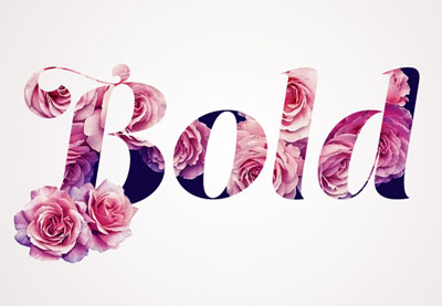
You can, of course, go full on glam with this rose and flowers text effect. A Photoshop action that does all the work for you, this action transforms your text with just one click. It’s super easy to use, so beginners to Photoshop will love the simple process!
Still
working on your Illustrator skills? Then complete your designs with a
vibrant island illustration like the one below. Featuring two palm
trees, an energetic ocean, and a beaming sun in the background, this 100% vector illustration is perfect for brochures and more.
Lastly, we have this delightful spring flyer great for any tropical-themed party. Featuring jungle leaves and an exotic flowers pattern, this template also offers a creative double exposure effect. Enjoy a neat twist on the botanical theme and download it today!
Show Us Your Designs!
If you’re as fond of the tropical and floral trend as we are, show us your work! Post a result showing us how you work with the tropical/botanical theme, and let us know your favorite styles in the comments below.
Celebrate the Easter weekend with this cheerful flyer design. Inspired by mid-century style, this would make a lovely promotional flyer for an Easter egg hunt or other spring-themed event.
We’ll put together the flyer layout in Adobe InDesign, and dip into Illustrator to create our egg graphics. This is a simple design that would be a great introduction to print design for beginners.
Save the texture file to a folder you can easily come back to, and install the font files on your system. Then you’re ready to start designing your flyer.
1. How to Create a Color Palette for Your Flyer
Step 1
Open up InDesign and go to File > New > Document.
Make sure the Intent is set to Print and uncheck the Facing Pages box. Set the Width of the page to 8.5 in and Height to 11 in.
Keep the Margins to their default value, and add a Bleed of 0.25 in to all edges of the page. Then click OK.
Step 2
Expand the Layers panel (Window > Layers) and double-click on the Layer 1 name to open the Options window. Rename the layer Background and click OK.
Choose New Layer from the panel’s drop-down menu (accessible at the top-right corner), and rename this second layer Shadows. Click OK.
Create a further three new layers in this order: Eggs, Typography, and finally Texture at the top of the sequence.
Then lock all layers except Background at the bottom.
Step 3
Expand the Swatches panel (Window > Color > Swatches), and select New Color Swatch from the panel’s drop-down menu.
Name this new swatch Sky Blue, and set the Type to Process and the Mode to CMYK. Then adjust the percentage levels below to C=62 M=4 Y=13 K=0.
Step 4
Repeat the process, building up a palette of 17 CMYK swatches in total:
Mink: C=33 M=33 Y=44 K=14
Orange: C=0 M=68 Y=75 K=0
Lime: C=19 M=10 Y=81 K=1
Pink: C=0 M=51 Y=20 K=0
Mustard: C=3 M=13 Y=93 K=0
Blush: C=3 M=27 Y=25 K=0
Chocolate: C=33 M=70 Y=92 K=40
Yolk Yellow: C=3 M=36 Y=92 K=0
Tomato: C=0 M=93 Y=83 K=0
Pea Green: C=68 M=0 Y=88 K=0
Burnt Red: C=0 M=85 Y=94 K=0
Sage: C=58 M=17 Y=50 K=2
Green: C=58 M=17 Y=85 K=2
Pink White: C=0 M=5 Y=0 K=0
Slate: C=65 M=50 Y=44 K=36
Brown Black: C=52 M=53 Y=56 K=52
Step 5
With the Background layer still unlocked, take the Rectangle Tool (M) and drag across the whole page, extending the shape up to the edge of the bleed on all sides.
From the Swatches panel, set the Fill Color to Slate.
2. How to Create Colorful Easter Eggs for Your Flyer
Step 1
For this stage, we’ll need to move over to Illustrator for a moment. Minimize but don’t close your InDesign window, and open up Illustrator.
Go to File > New, and create a new document at any size.
Take the Arc Tool (from the Line Segment Tool pop-out menu), and draw a rough ‘C’-shaped curve onto the page. Try to make the lower part of the curve more generous than the top, to mimic the shape of a half-egg.
Step 2
Right-Click > Copy the curved line and Edit > Paste it. Right-Click on the copy and Transform > Reflect.
In the Reflect window, check Vertical to flip the curve and click OK to exit.
Then position the curve perfectly against the original, to create a whole egg shape. Select both curves and Right-Click > Join to unite the lines into a single vector shape.
Then Copy the egg shape, and minimize Illustrator.
Step 3
Head back to your InDesign document and lock the Background layer. Unlock the layer above, Eggs.
Edit > Paste to drop the egg vector directly onto the page. Holding Shift while you resize it, scale it to a width of around 1.77 in (visible in the Controls panel running along the top of your workspace), and position it in the top-left corner of the page.
From the Swatches panel, change the Fill Color of the egg to Sky Blue.
Step 4
Expand the Stroke panel (Window > Stroke). With the egg selected, set the Width of the stroke to 0.75 pt and choose Dashed from the Type drop-down menu. This will add a little bit of texture to the edge of the shape, softening it.
From the Stroke panel, set the Stroke Color of the egg to Sky Blue to match the fill.
Step 5
Edit > Copy, Edit > Paste the egg shape, moving the copy over to the right of the original. Adjust the Fill and Stroke Color to Mink.
Paste two more eggs, moving them over to the right, creating a row of four eggs in total. Tweak the spacing and position to ensure they are evenly spaced.
Set the Fill and Stroke Color of the third egg to Orange, and the fourth to Yolk Yellow.
Step 6
Select all four eggs, and Right-Click > Copy, and Paste.
Position the four copies in a row below the first, adjusting the color of each, from left to right, to Lime, Pink, Mustard, and Sky Blue.
Repeat, creating a third row, set in Blush, Chocolate, Yolk Yellow, and Tomato.
Paste in a final row, setting the colors to Pea Green, Burnt Red, Sage, and Green.
3. How to Format Retro-Inspired Typography on Your Flyer
Step 1
Lock the Eggs layer and unlock the layer above, Typography.
Take the Type Tool (T), and drag to create a text frame over the top of the egg shape in the top-left corner of the page.
Type in ‘e’, and from the Character panel (Window > Type & Tables > Character), set the Font to Compass Rose CPC Bold, Size 140 pt.
From the Swatches panel, set the Font Color to Pink White.
Step 2
Select the text frame and Right-Click > Copy, and Paste.
Edit the text to read ‘a’, and position it over the top of the second egg along.
Paste another copy of the text frame, adjusting the text to ‘s’, and placing it over the top of the third egg in the row.
Step 3
Select all three text frames and Copy and Paste.
Move over the second row of eggs, adjusting the letters to read ‘t’, ‘e’, and ‘r’.
Then Paste another row of text frames onto the third row, shifting them to the right, with the pale pink egg blank. Edit the text to read ‘e’, ‘g’, and ‘g’.
And Paste another sequence of frames over the top of the final row, adding an extra text frame, and changing the text to read ‘h’, ‘u’, ‘n’, and ‘t’.
Step 4
Use the Type Tool (T) to create another text frame over the top of the egg in the top-right of the flyer.
Type in the day, date, and time of the event, and set the Font to Compass Rose CPC Bold, Size 23 pt.
Set the text to Align Center from the Controls panel at the top, and adjust the Font Color to Brown Black.
You can separate lines of text, such as the time shown here, by highlighting a line and increasing the Leading (line-spacing) in the Character panel.
Click on the Superscript button in the Controls panel to make the ‘st’ or ‘nd’ of a date smaller, as shown below.
Step 5
Copy and Paste the date text frame, moving it over the blank blue egg below. Adjust the text to read the location of your event, and tweak the Font Size so that the text is large and legible.
You can also add another text frame, perhaps listing the price of the event, over the top of the pale pink egg on the third row.
4. How to Add Collage Effects and Vintage Texture to Your Flyer
Step 1
Lock the Typography layer and unlock the Shadows layer. Zoom in on the top-left corner of the flyer, and switch to the Pen Tool (P).
We’re going to create a collage-style vintage effect behind each egg, which will give the shapes a rough cut-out pale shadow. Trace very roughly around the perimeter of the blue egg…
… taking it around the whole shape and meeting at the beginning.
Step 2
Set the Stroke Color of the shadow to [None] and the Fill to Pink White.
Repeat the process for the next egg, looping a rough shadow around the shape and setting the Fill to Pink White.
Do the same for the third egg along, too, and the fourth as well.
Step 3
Copy and Paste the shadows, moving them behind each egg. Vary the scale and position of them slightly to add variation.
Step 4
Lock the Shadows layer and unlock the top layer, Texture.
Take the Rectangle Frame Tool (F) and drag over the top of the whole flyer. Go to File > Place, and choose the PNG version of ‘Texture-8’ in the vintage textures pack you downloaded earlier. Click Open, and allow the texture to fill the whole image frame.
Step 5
Click on the texture image frame and head up to Object > Effects > Transparency. Set the Mode to Screen and click OK.
Select the image frame and Edit > Copy, Edit > Paste in Place.
With the copy of the frame selected, head back to Object > Effects > Transparency, and pull down the Opacity to 45%, before clicking OK.
Your flyer artwork is finished—great job! All that’s left to do now is export it as a PDF ready for printing.
5. How to Export Your Flyer for Print
Step 1
First, make sure to File > Save all of your hard work. Then go to File > Export. Name your file, and choose Adobe PDF (Print) from the Format drop-down menu. Then click Save.
In the Export Adobe PDF window that opens, choose [Press Quality] from the Preset menu at the top.
Step 2
Click on Marks and Bleeds in the window’s left-hand menu.
Check All Printer’s Marks and Use Document Bleed Settings.
Then click Export to create your PDF.
Conclusion: Your Finished Flyer
Your PDF file is ready to send off for professional printing—great job! All you need to do now is post it up on noticeboards and spread the word about your fun Easter event.
In this tutorial, we’ve covered several techniques for creating print designs in InDesign, including how to set up a flyer layout and format typography. We’ve also looked at how to use fonts, textures, and colors to bring a vintage, mid-century vibe to your design.
Color blindness is a vision deficiency that affects a large number of people around the world. Whether we know it or not, we as designers have a great impact on their daily lives through the work that we create and put out all around us. That being the case, I believe that we should take a few moments and explore some simple yet effective solutions that could help improve their situation and thus the quality of their lives.
1. What Is Color? A Brief Definition
Before we can
completely understand what color blindness is, we should first take a couple of
moments and talk about color, what it is, and how it behaves.
According to Google, the noun color is defined as:
“the property possessed by an object
of producing different sensations on the eye as a result of the way it reflects
or emits light”.
Now, light itself
is made out of multiple colors that have different wavelengths, where red is
the longest one that humans can see, while violet is the shortest.
We know this since in 1666 Sir Isaac Newton put together a little experiment in which he
took a beam of white sunlight and passed it through a glass prism. What he
observed must have been incredible at that moment since the prism split the
beam into a band of seven composing colors which he called the “spectrum”. The
order of these colors from the lower end of the spectrum is violet (V), indigo (I), blue (B), green (G), yellow (Y), orange (O),
and red (R)—which we now call ROYGBIV.
Quick tip: you can see Newton’s prism experiment in action by
heading over to MITK12Videos’ YouTube channel where they give you an in-depth explanation of the cause of the light dispersion phenomenon.
2. How Do Our Eyes „See” Color?
Depending on its physical
properties (light absorption, emission spectra, etc.), an object can
individually reflect or absorb these seven colors more or less, giving it the
property that we call color.
So when we say we
see a specific color, we actually see the amount of color reflected by the
surface of an object when it’s being hit by a light source. When an object
reflects all the wavelengths, we see it as being white; when it absorbs them
all, it is black.
We’re able to visualize these properties due to the millions of
light-sensitive cells found within our retinas, which process the light into
nerve impulses and then pass them to the cortex of the brain via the optic
nerve.
These cells come
in two different shapes: rods and cones. The rods are highly concentrated around the edge of the retina
(somewhere around 90 million cells for humans), and transmit mostly black and
white information due to the fact that they contain a single photopigment,
being the ones that help us adjust to a darker environment.
The cones, on the other hand, are
concentrated in the middle of the retina (4.5–6 million cells), and are able
to capture three different wavelengths: S (short), M (medium), and L (long).
Short cones are
usually referred to as “blue” due to the fact that they provide color
information for that specific wavelength of light. Medium cones are referred to
as “green”, while long ones are known as “red”.
Normal color
vision uses all three types of light cones (red, green, and blue), and is known as trichromacy.
In fact, the RGB color
space that we work and interact with on a daily basis is created around our trichromatic vision determined by
these three types of cones, where each and every image is built using a combination of just three colors.
3. What Is Color Blindness?
We now have a
basic idea of what color is, but what is color blindness?
Well, many people think that being color blind means you see the world in black and white, but that’s not actually true.
As the online version of the Medical Dictionary points out, color blindness is:
“an abnormal
condition characterized by the inability to clearly distinguish different
colors of the spectrum”.
A person that is color blind is usually born with this condition, which is
determined by a faulty gene found within the X chromosome. According to the American Academy of Ophthalmology, „color blindness can occur when one or more of the color cone cells are absent, non functioning, or detect a different color than normal”.
Colour Blind Awarenessstates that the condition affects approximately 1 in every 12 men (8%) and 1 in every 200 women around the world.
4. What Are the
Different Types of Color Blindness?
As we learned a few moments ago, our eyes have three types of cone cells. Depending on which
of them is affected, a person can suffer from one of three conditions:
4.1. Red-Green Color Blindness
According to the National Eye Institute (NEI), the most common type of color blindness is due to „the loss or limited function of the red cone (known as protan) or green cone (deutran) photopigments” that depending on their severity can lead to:
Protanomaly: when the person’s red cone photopigment is abnormal, causing red, orange, and yellow colors to appear greener.
Protanopia: when there are no working red cone cells, causing red to appear as black, and certain shades of orange, yellow, and green to appear as yellow.
Deuteranomaly: when the person’s green
cone photopigment is abnormal, causing yellow and green to appear redder, making
it difficult to tell violet apart from blue.
Deuteranopia: when there are no working green cone cells, causing reds to appear as brownish-yellow
and greens as beige.
4.2. Blue-Yellow Color Blindness
Compared to red-green color blindness, blue-yellow color blindness is rarer, and it appears when the blue cone photopigments are either missing or have limited function.
Depending on the case, we can have:
Tritanomaly:
when the person’s blue cone cells have limited function, causing blue to appear
greener and making it difficult to tell yellow and red apart from pink.
Tritanopia: when the person’s blue cone cells are missing, causing blue to appear
green and yellow violet or light grey.
4.3. Complete Color Blindness
For those who don’t experience any color at all, they suffer from what is called monochromacy,which is when they see the world in shades of grey ranging from black to white.
5. How Do You Know If You’re Color Blind?
If you want to make sure that your eyes are functioning correctly, you should always go visit an optometrist, who will apply a simple color perception test called the „Ishihara Color Test”. The name comes from its creator Dr. Shinobu Ishihara, who in 1917 published a simple yet ingenious method of determining if a person is color blind or not using colored plates (ishihara plates). Each plate contains multiple dots that vary in color and size and are displayed within a circular pattern, forming a number at the center.
If you can distinguish the number correctly then it means you have normal color vision. If you’re having problems seeing the shape of the numbers, then you might be suffering from one of the color blindness types that we talked about a few moments ago.
If you don’t really want to go to an eye doctor just yet, you can take the test online using any of the following sites:
6. How Can You See What a Color Blind Person Sees?
As a designer and visual creative, you must understand that your work will need to be visible not only to people with normal vision but also to those that suffer from one type of color blindness.
The first step to finding a solution to the problem is understanding how it manifests itself, by trying to see what a color blind person would see.
Luckily, there are a couple of solutions out there that allow you to take a normal image and apply filters to it in order to get an idea of what a certain vision deficiency would look like.
6.1 Online Color Blindness Simulators
If you’re dealing with regular images, these color blindness simulators can quickly generate a picture of what a person suffering from a specific condition would see:
Coblis by Colorblindness.com is probably the most exhaustive solution out there since it generates images for all types of color blindness.
Vischeck is a simpler generator that gives you the ability to preview a side-by-side picture of both the original and the simulated color vision deficiency.
If you’re a web designer and want to see what your project would look like for a person suffering from color blindness, Toptal has put together a smart little Color Blind Filter that takes any website and converts it using one of the four available filters.
6.2. Local Color Blindness Simulators
Since uploading your project to the web and then comparing the images back and forward can be a little time-consuming, there are a couple of software solutions out there that can help you achieve the same result faster.
Adobe Illustrator: if you didn’t know, Illustrator actually comes with two color proofs (Protanopia and Deuteranopia) within its View menu (View > Proof Setup), that help you quickly see what your project would look like when viewed by a color blind person.
Adobe Photoshop: the same color proofs are included within Photoshop (View > Proof Setup), helping you identify and correct the final result.
Stark is a free plugin created for Sketch that helps you select from eight color profiles and preview your design as a color blind person.
Color Oracle is another free color blindness simulator developed by Bernie Jenny that can be installed and used on Windows, Mac, and Linux and was created to work independent of the creative software that you’re using.
7. How Does Color Blindness Affect the Quality of One’s Life?
Even though for color blind people the world around them seems „normal”, since most of the time that’s the only way they’ve experienced it, the reality is that they usually face difficulties in what we think of as being simple, everyday tasks. From cooking food to driving a car or choosing what clothes to wear, what they see does affect their reactions and behavior, directly influencing their life.
Imagine that you would like to drive a car, but can never tell if the traffic lights are green or red without knowing the position of each of the three states. Or maybe you would like to cook a nice piece of meat that you bought from the local market, but you can’t tell if it’s rare or well done.
Also, think of all the creative jobs out there that you would love to do but could never apply for since you can’t really see what everybody else is seeing.
These are just a couple of the situations that a color blind person has to deal with on a daily basis, so why not try and learn how we can help them even just a little bit by following some of the simple solutions presented below.
8. How Can You Adjust Your Designs and Illustrations for the Color Blind?
So at this point, we know what color blindness is and have a basic idea what it can look like, which means that we can now talk about finding and implementing solutions meant to adjust our projects for people affected by these vision deficiencies.
8.1. What Colors Work Best?
The first thing that we need to ask ourselves when working on a project (whether it’s an existing or new one) is what color combinations work best. And the answer is that we really don’t have a generalized list, since it all depends on the Saturation and Brightness levels used for each and every color.
What we do know is that there is a set of color combinations that should be avoided, since it might be hard for a color blind person to tell them apart:
red and green
red and brown
red and orange
red and violet
red and black
green and brown
green and orange
light green and yellow
blue and green
blue and purple
blue and yellow
The problem usually arises when a design is based on colors that have close hue, saturation, or brightness levels, making them seem like shades of the same color.
So our goal is not to create a color scheme that is clearly identifiable by a person suffering from color blindness, but to make it possible for them to distinguish one color from another, even though they might not be sure what that color is.
8.2. How Can You Fix Bad Color Combinations?
The first step to fixing a bad color combination is noticing it. This is where the color simulation tools come in handy, since you can quickly observe if you have indistinguishable overlapping sections or elements that are either identical or simply not visible, by going through the different available filters.
Depending on the type of creative project that you’re working on, whether it’s an illustration, a mobile app, or a type of graphical data representation (bar chart, line chart, or pie chart), you can use the following suggestions to adjust the final result for those suffering from this condition.
Use a Different Hue
If you take a look at this illustration of a classic Game Boy, you might notice that when using a Deuteranopia filter, the upper section of the device looks as if it has a cutout since the hue of the background and that of the screen are really close in terms of saturation (57.83% for the red hue and 42.96% for the green one).
We could adjust the saturation of the screen section in order to increase the hue’s intensity, but as you can see, in this particular situation that won’t help as much as we’d like.
What we want to do is adjust the hue of the background from red to purple, which as you can see will create a clear separation between the two sections.
Aim for High Contrast
We’ve fixed the background problem, but as you can see, some sections of the console (such as the front and the side) are really hard to distinguish, since they use the same hue value (0%), and similar brightness levels (92.94% for the front and 86.67% for the side). The same thing can be said about the d-pad button, where the cross-section uses a 45.88%brightness level while the center dot uses a similar 40.78% value.
When this happens, you can quickly address the situation by selecting the respective shapes and adjusting their saturation and/or brightnesslevels until they start standing out.
The general rule would be to use as few tints and shades as possible, and have the artwork stand out, using high contrast whenever you can.
Since in real life the console’s shell is made out of white plastic, it seems fair to use a few tints and shades if we want to represent it more accurately, but if the project allows, you can always achieve higher contrast by using different hues.
Separate Your Shapes Using Outlines
If you tried some of the previous solutions but couldn’t get the desired result, you can sometimes isolate the different sections of a badly colored composition using thick, dark outlines. In the case of our Game Boy, we could turn some of its shapes into outlines and add new ones to those that support them, thus giving us a more defined result.
Add or Remove Colors
Adding or removing colors can make or break a design, especially one viewed by a person that can’t distinguish all of them. If we take a look at the outlined version of our console, you might have noticed that the circular buttons are now blending in with their outlines.
We can easily fix this by introducing two new hues (a light yellow and blue) as long as we know what colors can be seen by a person suffering from a specific vision deficiency (in our case, Deuteranopia).
In other situations, you might find that removing colors will improve the overall design since sometimes simpler is better.
Adhere to a Monochromatic Color Scheme
Sometimes colors might prove to be your biggest enemy, especially when dealing with a vision deficiency such as Deuteranopia, so it might be a good idea to reduce your palette to a monochromatic color scheme.
Often, people confuse a monochromaticcolor scheme with a grayscale one consisting of only blacks, grays, and whites, but they’re actually two completely different things.
According to Wikipedia, a monochromaticcolor scheme is derived from „a single base hue and extended using its shades, tones, and tints”.
As you can see below, by adhering to a monochromatic scheme, you can eliminate the whole rigorous color matching process, and focus on just one hue from which you can create shades and tints using different saturation and brightness levels.
Go Grayscale
Another solution to avoiding color completely is to go fully grayscale. By doing so, you eliminate almost all of the above steps, which means you can focus on the artwork itself.
Add Texture
One last method of making sure your design is clearly understandable by those suffering from vision deficiency is that of adding texture. Whether it’s grain, horizontal lines, or any other type, texture can easily separate and highlight a specific section of an image, helping you break any color boundary.
Conclusion
Whether we realize it or not, color blindness is a condition that affects a large number of people out there, making their daily lives harder by limiting the things they can see and understand through the filter of color.
Luckily, as we’ve seen, there are several things that we as designers can do in order to improve the quality of their life, thus making things a little easier one step at a time.
I really hope that this article has opened your eyes to an area of design that is often overlooked, and managed to teach you a few key notions that you can implement in future projects.
That being said, you can further expand your knowledge on color by checking out these awesome articles:
Color blindness is a mild disability through which the affected experience a decreased ability to distinguish colors from others. This can be a real drawback…
Tints, tones and shades are terms you’ll hear used when discussing color. A “tint” is the result of mixing a color with white. A “shade” is the resultant…
Artists seek to stand out in a variety of ways. One way that you can accomplish this is by using a recognizable color palette throughout your work. In this…
Agregator najlepszych postów o designie, webdesignie, cssie i Internecie
 (1).jpg)


.jpg)
.jpg)
.jpg)