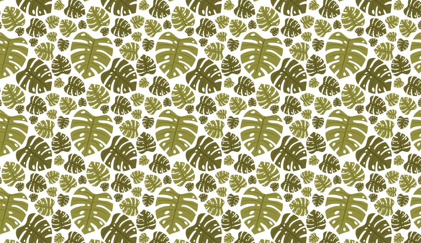
This tutorial is very easy and quick. However, despite its brevity and simplicity, you will still be able to add a few important skills to your designer’s arsenal. We will use the option Object > Pattern > Make, which will automatically create a pattern for you.
If you are in a mood to create more patterns, then check out GraphicRiver. There you can find many images that you can use to create your new patterns.
So grab a cup of coffee, and let’s start!
1. How to Create the Monstera Leaf
Step 1
Create a New Document (File > New) with 850 px Width and 850 px Height.
We will start by creating the main image of the pattern, which will be the leaf. For that, take the Ellipse Tool (L) and create a green ellipse. Rotate the ellipse slightly to the left. Now select it, right-click the mouse, and select Transform > Reflect. This will bring up the Reflect dialogue window, where you should enter Axis Vertical, Angle 90 degrees, and press Copy. Move the copy of the oval to the right, as shown in the image below.
After that, while keeping the two shapes selected, go to the Pathfinder panel (Window > Pathfinder) and press the Unite button, and you will get one shape from these two ovals. You will now get a heart-like shape, which will be the base of our leaf.
As you can see, the bottom of this shape is round, and we don’t want that. So, to get a sharp bottom point, hit the Direct Selection Tool (A) and select the bottom anchor point. Then look up, right over your artboard, and a bit on the left side. There you can find the AnchorPoint options, where you want to select “Convert selected anchor points to corner”. After that, select the top anchor point using the same Direct Selection Tool (A), and select “Convert selected anchor points to smooth”.
Step 2
Now, we will add the holes for the monstera leaf. For that, we will use the Eraser Tool (Shift-E). To set theoptions, double-click on the Eraser Tool and enter Angle 0 degrees, Roundness 100%, Size around 10 pt (depends on how big your leaf is), and then hit OK. Now you can start to drag the Eraser Tool from the inside to the outside. Don’t do it straight from the center, but rather more from the sides. Remember to do this on both sides of the oval. The erased lines don’t have to be exactly symmetrical, as that will give us a more realistic look.
We will add a few holes to the leaf, which are also typical for a monstera’s leaves. Remember, you don’t have to worry if something you have done does not satisfy you, because you can always hit Control-Z to Undo.
Now we have the base of our leaf. As you go through the tutorial, you’ll see how we will modify this leaf, so it will become even more realistic.
Step 3
In this step, we will create the veins. Using the Ellipse Tool (L), create a dark green, thin, horizontally aligned ellipse. Then select the Direct Selection Tool (A) and slide the top and bottom anchor points up. This will be one of the veins that we will use for our leaf later on. As it is not needed right now, set it aside.
Step 4
In this step, we will continue to create veins. Using the Ellipse Tool (L), draw a dark green, thin, vertical ellipse and place it in the middle of the leaf. This is the primary vein of the leaf.
Now, take the vein created in the previous step, and place it on the left side of the primary vein. Make a few copies of the vein (Control-C, Control-V) and place them on the left side of the leaf. If necessary, you can make some of them slightly smaller or bigger, to make the size more appropriate for the base of the leaf.
After that, select all the veins on the left side, and again right-click your mouse, select Transform > Reflect, select Axis Vertical, Angle 90 degrees, and press Copy. Move the vein copies to the right.
Step 5
Make a copy of the leaf and make it a little darker. Did you know that you can change the position of the holes in the new leaf? As you remember, these holes are not separate shapes that we added, but erased parts of the leaf shape. To change their positions, we need to use a special mode of the image.
So double-click on the main shape of the leaf. Your image will be in isolated mode. Being in this mode, you can move the holes of the leaf. Be sure you select the side of the hole to be able to move it, do not click in the middle of the hole. When you finish the modifications, double-click on the artboard to exit the isolated mode.
Now group the leaf (the light and dark one should be grouped separately), (right-click > Group), make a few copies of them, rotate them in different directions, and resize them as you want.
2. How to Create the Pattern
Step 1
Place the leaves in a similar way to the image below. This will be the base of our pattern. If you have large gaps between the larger leaves, you can fill them up with small ones. To do that, create some more copies of the leaves, and rotate them in different directions.
Step 2
Select the set of leaves you’ve created. Now, go to Object > Pattern > Make. Your illustration will appear in a special isolated mode, which will give you a preview of your final pattern. A new dialogue window will appear, which is called Pattern Options. Play around with the options to get a result which satisfies you.
Here you can choose the Tile Type (Grid, Brick by Row, etc.). The Width and Height will be given to you automatically, so don’t change anything here. Be sure to check Move Tile with Art. You can also play around with the Overlap and Copies here. Make sure you have checked Dim Copies to: 50% (it allows you to see the boundaries), and Show Tile Edge.
In this mode, you can also freely modify the pattern by moving the leaves, deleting or resizing them, and changing the color or making other copies of the leaves. When you like the pattern, hit the Done button on the top left side of the window. Now the pattern is saved in the buffer of your AI. To make sure the pattern is saved, take a look at the Swatches panel (Window > Swatches). As soon as your pattern is saved, you can delete all of the leaves from your artboard.
Select the pattern and in the Swatches panel for the fill color, grab the Rectangle Tool (M) and click on the artboard. Enter Height and Width 850 px, and press OK. As a result, you will get your seamless pattern to be in a square shape.
Step 3
As our created pattern has a transparent background, or it doesn’t have a background at all, you can add any background color you want without changing the pattern. Using the Rectangle Tool (M), create a beige square with Height and Width of 850 px. As I said before, you can add any background color you want, but here I chose a pretty beige color.
Step 4
Place the background behind the pattern (Control-X, Control-B).
Finally, we need to align the background and pattern to the artboard. To
do this, open the Align panel (Window > Align). Set Align To:
Align to Artboard (open the fly-out menu and go to Show Options if you
don’t see the Align To:), make sure that your pattern and background are selected, and
click the Horizontal Align Center and Vertical Align Center buttons. And
we are done!
Conclusion
You did a great job! I hope it was clear and easy for you. Now you are ready to create any seamless patterns you want. You can use other objects also, and by repeating the second part of the tutorial, you can create amazing seamless patterns.
I really like the look of all the monstera leaves, which give our final image a beautiful look. I think it looks a little bit like a tablecloth, a scrapbooking background, or even a piece of clothing! As you can see, a seamless pattern can be used for many things, which will hopefully put you in a mood to create more!
Welcome back to our Diversity in Design series on Envato Tuts+. Discover four talented artists with inspiring styles you’ll love.
4 Artists You Should Know: Diversity in Design
Celebrate
the work of these extraordinary artists. Each with their own unique
background, they draw inspiration from their culture and surroundings to
create phenomenal designs.
Antonio Reinhard
The hidden stories of Indonesia come alive in the beautiful illustrations of artist Antonio Reinhard’s work. Check out his alluring style
below.
Limas Palembang: The Traditional House of The Palembang
My
work is mostly about Indonesian culture,
in this case the culture of Palembang during the Indonesian colonial era. I focus on its
current architectures, clothing and hierarchy.
For these
illustrations, the artists that influence me the most are Norman Rockwell,
and the airy paintings of Degas and Mikhail Zichy. I always look for a
style that is somehow timeless, so I took inspirations from mostly
the Romanticism era.
I look up to a new artist almost every week but I would definitely
say my biggest inspiration growing up as a young artist would be Audrey
Kawasaki. The way she draws girls in such a sensual and elegant way
is something I always strive for in my own paintings.
As for style, I take great interest in graphic
design and abstract art as well.
Illustrator and graphic designer extraordinaire Mario McMeans mixes his unique point of view with his clean graphic style. Check out his super dope vector work below.
My name is Mario McMeans, otherwise known as 'Supahmariostyle.’ I’m a
Graphic Designer, horror junkie, and all around connoisseur of
paternal witticisms.
Every project has a story
tell. It’s up to you as the designer to be receptive to that
message, whatever it is. That’s kind of the approach I’ve been taking
lately with all my projects.
Currently, I’m teamed up with other amazing talents of this collective
we call 'The Design Room’ where the talent owns the rights to their
work and not the company.
There are so many artists that have given me inspiration
for many different reasons. I have to start things off with Tasso Art because if it wasn’t for his illustrations I would’ve never touched Illustrator at all. Next, Chris Do, founder of 'Blind’, really
helped me to understand the business side of design.
There’s my friend
Jarmon Maxie aka King Maxie Animation, and lastly, this free-spirited artist that’s always keeping me
on my toes, the world knows her as Melody Nieves.
Black greatness and epic celestial goodness are a just a few of the words I’d use to describe the work of designer and artist Kaylan Michael. Check out her brilliant manipulations below.
I’m a self-taught visual artist and graphic designer based in Montreal Canada. Highly passionate and all about art and design, I enjoy everything from
fashion, interior and graphic design, extending to photography and video
editing.
My work explores themes of spirituality and femininity with
an African touch.
The inspiration behind my work is basically my life. I share a
little bit of my pain, scars, growth and visions through each of my pieces and hope that it inspires people.
Being originally from Africa, I look up to African art and afro
futuristic art styles. I love patterns, colors and designs that represent
my roots.
I love the fact that
each person can see different things in one piece of art and relate to
it. Some artists I look up to are: Jean-Michel Basquiat, Frida Kahlo,
Gustav Klimt, and a New York based artist Kehinde Wiley. I love the energy behind their work, it truly inspires me.
Celebrate Diversity! Send Us Your Favorite Artists!
Help us find more incredible artists from different backgrounds to share with our audience! Tweet me your recommendations at MelloNieves or use the hashtags #artforall and #tutsplusdesign on Twitter and Instagram. You never know, we may just feature you in our next article!
I’d
like to extend a warm thank you to all the artists who participated in
this feature. Feel free to see more of their work in the links below:
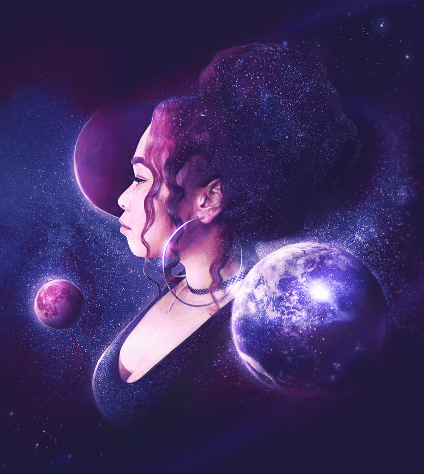
I’ve always wanted to do a photo manipulation with one of my own pictures. And after ten years of working with Photoshop, I finally did it!
My general love for space inspired this piece. I once created this painting with a similar vibe, so I decided to use it as inspiration to help guide me towards a fun result.
Plan out your photo shoot ahead of time with what you would like to wear and which way you’ll be facing. I never really liked pictures of myself in profile, so I wanted to see how I could make it happen.
For this shoot, I used my Samsung NX3000 mirrorless camera. It has a super helpful LCD screen that allows me to see myself in the shot. Feel free to use your phone to take selfies or ask a friend for help. Just make sure there’s enough lighting!
Take several photos to get the best shot possible. I usually stick to my safe place for selfies, but if you learn your angles for picture taking and try to take risks, it can actually empower you and lead to awesome results!
We’ll be using photo #2 for this manipulation
Need more help with photography? Check out these articles:
You can really build a photo manipulation from scratch just using a general concept and a few free stocks! Keep in mind this was initially made out of fun, so feel free to add more details to your own self-portraits.
Let’s get started!
2. How to Manipulate Your Own Photo
I’m giving you free rein to do as you please with my photo. I promise I won’t take anything personally, so take advantage of using it like any other stock.
This photo has already been edited to boost up the clarity and hair (and to save my precious ego). But I’ll show you how I made the hair more voluminous for more style.
I knew I wanted to create a massive, stylish bun, but I didn’t have enough hair to fill it out naturally. Instead, I’ll take advantage of the Liquify Tool for amazing, glamorous results!
If you’re working on your own photo, skip this step or add the edits you prefer.
Use a combination of the Bloat Tool (B) and the Forward Warp Tool (W) to stretch the hair. Increase the Brush Size to make sure it’s wide enough to stretch out the structure of the bun.
Continue playing with the bun size until it’s about the size of my head.
Hair stylists often pull the underside of the hair out for a fluffier look.
So let’s do the same!
Use the Forward Warp Tool (W) again to pull the bottom side of the hair to the right. Balance the shape out for a full, natural appearance, or go crazy for a fabulous result!
Here’s the before and after.
Now on to the manipulation!
3. How to Add the Other Stocks
Step 1
Create a New Document in Photoshop. My final document comes in at 1262 x 1410 pixels.
Square-like compositions are usually great for Instagram and more!
Fill the background layer with black using the Paint Bucket Tool (B). Then Copy and Paste the edited stock onto the canvas. Position it towards the center.
Step 2
Let’s remove the background from my photo!
Add a Layer Mask to the stock. Select it then paint black onto the mask to remove the background using a Hard Round Brush (set to 100% Hardness for a crisp, clean line).
Step 3
Use the Free Transform Tool (Control-T) to decrease the size of the photo. Position it so that it’s floating in the center of the black space.
Continue modifying the shape of the mask.
Remove the majority of the lower outfit and clean up all the edges around the hair and body.
Remember the reference from before? I’m going for the same „bust portrait” vibe. An abstract shape like this will help us float the portrait in space more effectively.
Right-click the Layer Mask and select Apply Mask.
Step 4
Now let’s add the rest of our stocks, starting with the planets.
Extract Mars, Earth, and the Moon from their photos. Using the tool of your choice (here I used the Elliptical Marquee Tool (M)), select the planet and then Copy and Paste each one onto New Layers.
Arrange the layers as shown below. Make sure that Mars is on a layer beneath the main stock so that it’s situated behind me. This will create a sense of depth of field.
4. How to Create the Galaxy Look
Step 1
Now for some stars!
Copy and Paste the Milky Way stock onto a New Layer above the black background.
Add a Layer Mask, and then use a Soft Round Brush to mask away the edges with black.
Step 2
Let’s add more depth to the space background.
Create a New Layer and Right-click to set it as a Clipping Mask to the Milky Way layer. Use a Soft Round Brush (0% Hardness, 60-100% Opacity) to paint dark blue #081a40 and black onto the clipped layer. Create shading similar to the result above.
Set the Layer Blend Mode to Multiply, and then lower the Opacity to 70%.
Here’s the result so far.
Step 3
Clip another New Layer to the same Milky Way stock.
Add some subtle lighting to the scene.
Use a Soft Round Brush (0% Hardness, 10-30% Opacity) to paint light blue #a8b7e3 onto the left side of the canvas.
Set the Layer Blend Mode to Hard Light and lower the Opacity to 30%.
Step 4
Let’s work on the main stock again.
Feel free to retouch your photo as far as you need to for this step.
Here I added a little more light to my face, neck, and body, by using a Hard Round Brush (80-100% Hardness, 10-25% Opacity) and a light tan #efd2b7 color. Adjust the Layer Opacity as needed.
Step 5
We can recolor the main stock with a few Adjustment Layers.
Start with Levels.
Go to Layer > New Adjustment Layer > Levels. Add the following values for the RGB, Red, and Blue Channels. Then Right-click to set it as a Clipping Mask to my picture.
RGB: 0, 0.90, 196; Output: 17, 210
Red: 0, 0.92, 255; Output: 0, 191
Blue: 0, 1, 179; Output: 35, 192
Here is the result, along with the layer setup.
Step 6
Apply more contrast and warmth to the photo.
Above the previous levels layer, Clip a NewAdjustment Layer of Curves to the stock.
Adjust the curves for the RGB, Red, Green, and Blue Channels like the ones below.
Step 7
You’re doing great, keep going!
Let’s add some stars to the subject.
Copy and Paste the original Milky Way stock on a New Layer above the last one. Set it as a Clipping Mask to the main stock and use the Free Transform Tool (Control-T) to rotate the image counter-clockwise.
Position the stars so that they cover me completely.
Then set the Layer Blend Mode to Difference, adjusting the Opacity to 70%. Follow up with a Layer Mask to mask away the stars on the face and body with a Soft Round Brush.
We’ll clip one last New Layer to the main stock. This layer will be used for more shadow.
Use a Soft Round Brush (50-70% Opacity) to paint an orange color #f3a279
on the right side of the hair and body. I’m following the light source
from the original photo, so all our shading will coincide with it.
Then set the Layer Blend Mode to Subtract and lower the Opacity to 50%. Refine the shadow even more with a quick Layer Mask.
Step 8
We still need to adjust the shading and coloring of the planets.
Let’s begin with planet Earth.
As before, set a New Layer as a Clipping Mask to the planet layer. Use a Soft Round Brush (0% Hardness, 60-80% Opacity) to paint dark blue #080e1b onto the right side of the planet.
Set this layer to Color Burn.
Follow up with another Clipped New Layer above it. This time, use a deep red color #120500 to paint more shadow.
Step 9
Now shade Mars.
Clip two New Layers to the Mars planet. Use a Soft Round Brush to paint deep red #1a010d shadow on the first layer, and purple #14051b on the second.
Step 10
Before we move on to shading the moon, let’s tweak the colors of the scene first.
Add two New Adjustment Layers above the Earth layer. Do not clip these.
Here’s the setup below for clarification.
Start with a New Adjustment Layer of Color Lookup.
Set the 3DLUT File to:
Fuji F125 Kodak 2395
Then set the Layer Blend Mode to Hue.
Boost the colors with a New Adjustment Layer of Levels.
Adjust the values for the RGB Channel to the following:
Input: 0, 1, 211
Output: 0, 255
Step 11
Now for the moon!
Clip a New Layer to the moon. Use a Soft Round Brush (0% Hardness, 50% Opacity) to paint soft black color for some shadow. Follow the upward direction of the arrow shown below.
5. How to Finish the Manipulation
Almost there!
Here is how the manipulation looks so far:
Next, we’ll need to figure out the last few elements of this piece.
If you’re working on your own photo, feel free to follow your own natural inclinations for lighting, colors, and detailing.
Step 1
Pump up the lighting for more intensity!
Create a New Layer above all the rest. Set it to Overlay.
Use a Soft Round Brush (0% Hardness, 60-90% Opacity) to paint white all over the scene for more light. Add a Layer Mask to refine it if needed.
Step 2
Orbital rings aren’t actually real, but they’ll add another cool element to this manipulation.
Use the Ellipse Tool (U) to create two 2 pixel white orbital rings. Rasterize the shape layers and Merge them together.
With the merged layer selected („Rings”), go to Filter > Blur > Gaussian Blur, setting the Radius to 15 pixels. Lower the Layer Opacity to 60% and remove any unwanted areas with a Layer Mask.
Step 3
Let’s add our last stock.
Make several extractions from the brighter sections of this Galaxy stock. I used the Rectangular Marquee Tool (M) to grab different sections of stars and stardust. Copy and Paste them onto New Layers positioned around the composition.
Set the first two (Earth and hair sections) to Hard Light and the second two (star sections) to Pin Light. Adjust the Opacity as desired and use Layer Masks to remove unwanted areas with a Soft Round Brush.
Step 4
This next step will require a bunch of Adjustment Layers.
I know, you’re ready to finish, right? Let’s try to run through them as quickly as possible.
Add a New Adjustment Layer of Color Lookup.
Set the 3DLUT File to
FuturisticBleak.3DL
Next, add a New Adjustment Layer of Levels.
Add the following values to the RGB, Red, and Blue Channels.
RGB: 27, 0.94, 240; Output: 20, 255
Red: 0, 1.11, 204; Output: 0, 255
Blue: 29, 1.38, 226; Output: 51, 224
Step 5
Fill a New Layer with neon green #76ff39. Lower the Opacity to 10% and set the BlendMode to Divide.
Step 6
Keep going! You’re doing so well!
Add a New Adjustment Layer of Color Balance. Adjust the values for the Shadows, Midtones, and Highlights to the following ones shown for a much bluer tone. Then set the Blend Mode to Hue.
Next, add a New Adjustment Layer of Gradient Map.
Select the Red, Blue, and Yellow preset, and lower the Opacity to 10%.
The last New Adjustment Layer we’ll use is Photo Filter.
Set the Filter to Violet and the Density to 52%.
Step 7
Now that we have the colors all set, we just need to do some light maintenance on the composition itself.
Take this opportunity to clean up any harsh edges or blend them with more shadows using a Soft Round Brush. Use the Brush Tool (B) to paint these areas, and hold the Alt key to select the colors you need from the composition.
On a New Layer set to Overlay, use a combination of violet #c6a2d0 and white to paint highlights onto the hair and planets. Keep the bright spots in line with our current lighting setup.
Step 8
Clean highlights are also an important part of this composition. On a New Layer, paint white highlights around the planets, body, and face. Make sure each planet gets a highlight on the upper left side.
Continue painting any areas you would like to sharpen for more appeal, and don’t forget to add more white dots for stars wherever you’d like!
You might notice a slight blur to the final piece. I achieved this with a quick Tilt-Shift Filter, but you can opt to leave it out instead.
Now
that you’ve finished your work of art, hang it on the wall! Check
out how your self-portrait would look using this awesome Frame Mockup from Envato Elements.
Check out the final result below!
All Done! Great Job!
You can create amazing photo manipulations using your very own photos. Take your time and have fun conjuring up fantasy compositions from scratch!
I hope you enjoyed this tutorial. How’d you do? Share your comments and results below.
For more photo manipulation tutorials like this one, check out these links:
In
this tutorial, you will learn how to draw a candy monster cartoon
character in Adobe Illustrator.
There are plenty of techniques used
throughout the entire tutorial, from textures to small details, a new
Blend Art Brush, masking techniques, reverse spine blending options, and even a 3D effect. Not to mention the colorful candy and jelly
worms that are fun to draw.
By the end of the tutorial, you will have
the skills to draw other cartoon characters in future projects. Let’s
start!
Launch Illustrator and
go to File
> New to
open a blank document. Type a name for your file, set up the
dimensions, and then select Pixels as the Units and RGB as the Color
Mode.
Make sure that Align
New Objects to Pixel Grid is
not checked.
Next,
go to Edit
> Preferences > General and
set the Keyboard
Increment to 1
px and
while there, go to Units to
make sure they are set as in the following image. I usually work with
these settings, and they will help you throughout the drawing process.
2. How
to Create the Body of the Monster
Step
1
Take
the Ellipse Tool (L) and draw a 192 x 339 px ellipse on your artboard
(1). Switch to the Direct Selection Tool (A) and use it to select
only the right and left points; then move them outwards to make the
ellipse rounder (2). Now, select only the bottom point and drag the
handles to make them longer (3).
Step
2
Make
a few extra adjustments to get the shape from the image below and
fill it with light blue. This will be the “body shape”.
3. How
to Create the Eyes of the Monster
Step
1
Draw
two shapes like the ones in the following image as the eyes and give them a 1
pt light blue Stroke. They don’t have to be perfectly rounded.
Select
only the left eye and go to Effect > 3D > Extrude & Bevel.
Change the settings as indicated and hit OK. As a result, you will get
the outer contour of the eye.
Step
2
Select
the right eye and go to Effect
> 3D > Extrude & Bevel again. The settings are the same except for the rotation coordinates
and the light, which you have to move from the upper right side
(default) to the upper left side.
Step
3
Zoom in on the eyes and draw the eyeballs inside the 3D contours, making sure
not to cover the shading and highlights created by the 3D effect (1).
Fill the eyeball shapes with the radial gradient shown (2), and you
can see the result in the image below (3).
Step
4
Use
the Ellipse Tool (L) to draw a small 18 x 19 px ellipse as the iris
for the right eye. Select light brown as the fill color; then go to Effect > Stylize > Inner Glow and apply the settings shown (1).
Next,
grab the Pencil Tool (N) and draw a random star-like path over the
iris (2). Use the Ink Spatter 1 Scatter Brush from the Brush
Libraries Menu > Artistic > Artistic_Ink and reduce the Stroke
Weight to 0.1 pt. Set the Blending Mode to Multiply (3).
Select
the iris shape and Copy and Paste in Place (Shift-Control-V) in order
to make a copy of it in front of everything. Remove all existing
appearances. Now, select the stroked path along with the copy of the
iris and go to Object > Clipping Mask > Make (Control-7) (4).
Step
5
Draw
a 7 x 7 px black circle in the center of the iris as the pupil (1).
To
add a sparkle, draw a small circle in the upper right side filled
with a basic white to black radial gradient (2), and then set the Blending Mode to Screen (3).
Step
6
Select
the iris, the stroked path, the pupil, and the sparkle, and make copies
of them for the left eye.
Group
(Control-G) all the shapes that make up each eye to keep things
organized in the Layers panel.
Step
7
Select
the left eye contour, go to Effect > Stylize > Drop Shadow, and
apply this effect twice using the settings shown.
Step
8
Now,
select the right eye contour and apply the two Drop Shadow effects.
The settings are the same as above, except for the X Offset, which is
negative this time.
4. How
to Create the Mouth of the Monster
Step
1
Take
the Pen Tool (P) and draw a big mouth shape for all that candy, and fill it with a dark burgundy red (1). While this shape stays
selected, go to Effect > Stylize > Drop Shadow and apply the
settings shown (2) to obtain the blue bottom lip. Apply the Drop
Shadow effect again, using the other settings shown (3) to obtain the
upper lip.
Step
2
With
the mouth shape still selected, apply the third Drop Shadow effect to
obtain a thin highlight line above the upper lip (1).
Apply
the Drop Shadow effect for the last time to obtain the highlight line
under the bottom lip (2).
Step
3
Select
the mouth and Copy and Paste
in Front (Control-F)
to make a copy of it. Remove the four Drop Shadow effects and just
keep the dark red fill color (1). Draw a similar but smaller shape at
the top of the mouth and fill it with a lighter shade (2).
Now,
select both shapes and go to Object > Blend > Blend Options.
Choose 20 Specified Steps, hit OK, and then go back to Object >
Blend > Make (Alt-Control-B) (3).
Step
4
Next,
take the Pen Tool (P) and draw four paths on the lips (1). Give them
a 1 pt white Stroke and use the Black Blend Art Brush 100×3 (info
below). Set the Blending Mode to Overlay for all four (2).
I
have an entire tutorial dedicated to Blend
Art Brushes and
how useful they are. I use them in my drawings all the time. You can
find out how to create and save the Black
Blend Art Brush 100×3 that
we are using today in How
to Create a Set of Multi-Use Blend Brushes in Adobe Illustrator.
Since
the Colorization of the brush is set to Tints, when you select white
as the stroke color, the brush becomes white as well, despite its
name. The same thing happens with any other color.
5. How
to Create the Tongue of the Monster
Step
1
Use
the Pen Tool (P) to draw a shape like the one in the following image as the
back piece of the tongue (1). Continue with the front piece and fill
it with red (2).
Step
2
Draw
a path through the middle of the back piece and move it behind the
front piece of the tongue (1). Give it a 1 pt Stroke using the color
indicated and select Width Profile 2 in the Stroke panel.
With
the path still selected, go to Effect > Stylize > Outer Glow
and apply the settings shown. Reduce the Opacity to 75%, but only for
the Stroke attribute, and you can see the result below (2).
Step
3
Next,
draw a path through the middle of the front piece of the tongue (1). Give
it a 1 pt Stroke using the color indicated and select Width
Profile 2 again. Set this Stroke attribute to 75% Opacity.
With
the path still selected, go to Effect > Stylize > Outer Glow and apply the settings shown (2).
6. How
to Create the Teeth of the Monster
Step
1
Grab
the Pen Tool (P) and draw the shapes of the four top teeth filled
with beige (1). Next, draw a similar but smaller shape above each
tooth filled with cream (2) and finally, four smaller shapes filled
with white (3).
Now,
select the three shapes that make up the first tooth and go to Object
> Blend > Blend Options. Choose 10 Specified Steps and hit OK, and then go back to Object > Blend > Make (Alt-Control-B).
Repeat the same thing for the other three teeth (4).
Step
2
Follow
the technique explained above and create the four bottom teeth.
Step
3
Group
(Control-G) the four top teeth and apply the Drop Shadow effect to
create a shadow. Do the same thing for the bottom teeth.
Step
4
Select
the two pieces of the tongue and apply the Drop Shadow effect using
the settings shown.
Step
5
It’s
finally time for a mask. Select the mouth shape and then Copy and Paste in Place (Shift-Control-V) to make a copy of it in front of
everything. Remove all existing appearances (1).
Now,
select this copy of the mouth along with the top teeth, the bottom
teeth, and the tongue, and go to Object > Clipping Mask > Make
(Control-7). You can see the result in the image below (2).
7. How
to Add Texture on the Monster’s Body
Step
1
Grab
the Pencil Tool (N) and draw a random path on the body of the monster, and then send it behind the eyes and the mouth (1). Give it a 1 pt white Stroke using the Ink Drop Scatter Brush from the Brush Libraries Menu
> Artistic > Artistic_Ink (2).
While
the Stroke attribute stays selected in the Appearance panel, go to Effect > Blur > Gaussian Blur and apply a Radius of 2.5 px. Set
the Blending Mode to Overlay and reduce the Opacity to 20% (3).
Step
2
With
the path still selected, add a New Stroke in the Appearance panel
above the first. Use the Ink Drop Scatter Brush again, but open the Stroke Options window and switch the Scatter settings. This will make
the dark spots not overlap with the white spots from the previous
step (1).
Apply
a 2.5 px Gaussian Blur again; then set the Blending Mode to Overlay
and reduce the Opacity to 50% (2).
If
your spots go over the edge of the body, simply use the Direct
Selection Tool (A) to modify the path or create a mask.
8. How
to Add Shading on the Monster’s Body
Step
1
Use
the Pen Tool (P) to draw a curved path at the top of the head. Give
it a 10 pt blue Stroke and choose Width Profile 6 from the Stroke
panel (1).
Next,
draw a curved path at the bottom of the body. Give it a 15 pt blue Stroke and use Width Profile 6 again (2). Apply a 12 px Gaussian
Blur for both of them (3).
Step
2
Select
the body shape and then Copy and Paste in Place (Shift-Control-V) to
make a copy of it in front of everything. Remove all existing
appearances. Now, select the two curved paths along with the copy of
the body and go to Object > Clipping Mask > Make (Control-7).
9. How
to Create the Arms of the Monster
Step
1
Use
the Pen Tool (P) to draw the shapes of the arms as shown in the following
image (1). Next, draw two smaller shapes on the inside filled with a
darker shade of blue (2).
Select
the two shapes that make up one of the arms and Blend them using 20
Specified Steps. Do the same thing for the other arm (3).
Step
2
Draw
two curved paths on the arms and apply the two strokes using the Ink
Drop Scatter Brush as you did earlier for the body. Position the
paths so the spots fall on the arms (1).
Make
a copy in front for each arm shape and use them to mask the stroked
paths (2).
10. How
to Create a Tapered Blend Art Brush
Step
1
Earlier in the tutorial, you used the Black Blend Art Brush 100×3 from How
to Create a Set of Multi-Use Blend Brushes.
Now, let’s create a new Blend Art Brush that is not featured in that
tutorial but definitely should be.
Grab
the Line Segment Tool (\), click on your artboard, and choose 100 px
as the Length and 0 degrees as the Angle. This will generate the
green horizontal line. Use the Line Segment Tool (\) again, and this
time choose 5 px in Length and 90 degrees as the Angle to generate
the small blue vertical line. While both lines stay selected, press Vertical Align Center and Horizontal Align Right in the Align panel
(1).
Use
the two lines as guides and draw a sharp triangle (2). While this
triangle stays selected, go to Object > Path > Offset Path and
apply an Offset of -2 px to obtain a smaller one inside (3).
Fill
both triangles with black, but set the Opacity of the bigger one to 0%
(4). Blend them using 15 Specified Steps, and the brush is ready to be
saved (5).
Step
2
Drag
the blend group obtained in the previous step into the Brushes panel
and choose New Art Brush. Type Tapered Blend Art Brush 100×5 as the
name and choose Tints as the Colorization Method. Hit OK, and you’ll
find the new brush right next to the Black Blend Art Brush 100×3 in
the Brushes panel.
11. How
to Create the Feet of the Monster
Step
1
Draw
the shape of the right foot with the Pen Tool (P) and fill it with
blue (1). Continue with a smaller shape above, filled with a lighter
shade of blue (2), and with the smallest shape at the top filled with
a darker shade of blue (3).
Blend
these three shapes using 15 Specified Steps, and you can see the
result below (4).
Step
2
Use
the Pen Tool (P) to draw a path at the bottom of the foot, and give it
a 5 pt Stroke using black and Width Profile 6. Apply a 5 px
Gaussian Blur and set the Blending Mode to Overlay.
Step
3
Draw
two short paths at the top of the foot and give them a 1 pt azure
blue Stroke using the Tapered Blend Art Brush 100×5 that you saved earlier (1).
Make
a copy of the foot shape in front and set it to stroke-none and
fill-none. Use this copy to mask the last three stroked paths (2).
You can see the result below (3).
12. How
to Create the Claws of the Monster
Step
1
Draw
three triangle-like shapes as the claws and fill them with dark
orange (1). Next, draw a similar but smaller shape on each claw, filled with a pale shade of orange (2).
Select
the two shapes that make up one of the claws and Blend them using 10
Specified Steps. Repeat the same thing for the other two claws (3).
Step
2
Follow
the top edge of the claws and draw three paths with the Pen Tool (P).
Give them a 2 pt Stroke and use Width Profile 6. Send these paths
behind the claws in the Layers panel.
Step
3
Use
the Direct Selection Tool (A) to select only the bigger claw shapes
from the blend groups and then Copy and Paste in Place
(Shift-Control-V) to make copies of them. Move the copies behind the
claws in the Layers panel. Keep the same fill color and just apply
the Drop Shadow effect to create the shadows (1).
Copy and Paste in Place (Shift-Control-V) the bigger foot shape, and set
the copy to stroke-none and fill-none. Use it to mask the three
copies of the claws with the shadow applied to them (2). As a result, the shadow that falls outside the foot area will not be visible (3).
Step
4
Use
the Pen Tool (P) to draw a path on each claw and give them a 0.5 pt white Stroke using the Tapered Blend Art Brush. Also apply a 1 px Gaussian
Blur.
The
base (thicker part) of the brush should be at the top of the claws, and the tip of the brush should be at the bottom. If not, open the Stroke Options window and check the Flip Along option.
Step
5
At
this point, the right foot is ready, and you can Group (Control-G) all
the shapes that compose it to keep things organized in the Layers panel.
While
the right foot stays selected, go to Object > Transform >
Reflect. Check Vertical and hit Copy to obtain the left foot. All you
have to do is to move it into place and make small adjustments if needed.
Step
6
Focus
on the right arm of the monster and use the same technique to create
the claws (1-3).
Select
only the bigger claw shapes from the blend groups, and then Copy and Paste in Place (Shift-Control-V) to make copies of them. Move these
copies behind the claws in the Layers panel, and choose brown as the
fill color. Use the Direct Selection Tool (A) to select only the top
anchor points of these shapes (without the tip) and move them inwards
a little with the help of the arrow keys on your keyboard (4). You
can see the result below (5).
Step
7
The
right arm’s claws are ready now, and you can Group (Control-G) all the
shapes. Reflect this group to obtain the claws for the left arm.
13. How
to Create the Horns of the Monster
Step
1
Use
the technique explained earlier for the arm claws to create the horn
on the right side of the head (1-4).
To
add some shine, use the Pen Tool (P) to draw a path on the horn (5).
Give it a 1 pt white Stroke and use the Tapered Blend Art Brush. Also
apply a 2 px Gaussian Blur (6).
Step
2
Follow
the previous step again, and create a smaller version of the horn next
to the first one (1). Now, take the Pen Tool (P) and draw a shape
like the one in the next image at the base of the horns (2).
To
add some details, draw a few short paths on the blue shape. First,
select a 2 pt blue Stroke and use the Tapered Blend Art Brush. Add a New Stroke above, select a 0.25 pt gray Stroke, and use the Tapered
Blend Art Brush again (3). You can see the result below (4).
Step
3
At
this point, the right horns are ready, and you can Group (Control-G)
all the shapes. Reflect this group to obtain the horns on the left
side and move them into place.
14. How
to Add Extra Details on the Monster’s Body
Step
1
Take
the Pen Tool (P) and draw a few triangle-like shapes at the bottom of
the body filled with the linear gradient shown at a 90 degrees Angle
(1). Continue with the pieces of fur at the top of the head, and use
the same gradient but change the Angle to -90 degrees (2).
Step
2
Next,
draw two fur pieces on the sides of the head and a few smaller ones
on the arms. Use the gradient shown to fill all of them. The darker
shade of the gradient should be at the tip of these fur shapes, so adjust the angle accordingly.
Step
3
Use
the Ellipse Tool (L) to draw a bunch of ellipses of different sizes
on the body. Fill all of them with blue. Add a New Fill above and use
the same color; then apply a 4 px Gaussian Blur.
Step
4
Use
the Pen Tool (P) or the Ellipse Tool (L) to draw a few tiny shapes
under the eyes as the freckles. They don’t have to be perfectly
round.
Step
5
Select
the body, the arms, and the feet, and then Copy and Paste in
Place (Shift-Control-V) to make copies of them. Remove all existing
appearances (1) and then press Unite in the Pathfinder panel to merge
them into a single shape (2).
Step
6
Select
the body shape; then go to Effect > Stylize > Drop Shadow and
apply the settings shown (1).
Select
the shape that you obtained in the previous step, set it to
stroke-none and fill-none, and move it right in front of the body in
the Layers panel. Now, select the body along with this shape and go
to Object > Clipping Mask > Make (Control-7) (2). As a result,
the shadow around the monster that falls on the white background will
not be visible (3).
15. How
to Create the Colorful Candy
Step
1
Grab
the Ellipse Tool (L) and draw a 35 x 35 px circle filled with the
radial gradient shown (1). Switch to the Pen Tool (P) and draw four
shapes as shown in the image below. All four shapes have a white fill
color, but set the Opacity for the bigger ones to 0% (2).
Select
the pair of shapes on the upper left side and Blend them using 15
Specified Steps. Set the resulting blend group to Blending Mode Soft
Light.
Blend
the other two shapes on the bottom right side; then set the Blending
Mode to Soft Light and reduce the Opacity to 75% (3).
Step
2
The
orange candy is ready, and you can Group (Control-G) all the shapes.
Make a copy of the group; then select only the circle and replace the
orange gradient with the green radial gradient shown.
Do
the same thing to obtain the pink candy, the chocolate candy, and the
caramel candy.
Step
3
It’s
time to arrange the candy inside the monster’s mouth. First, arrange
the orange candy in the desired place; then select only the orange
circle and apply the Drop Shadow effect.
Arrange
the pink candy on the right side and apply the Drop Shadow effect
again to the pink circle. Continue to arrange the rest of the candy or as many as
you want. You can also scale them up or down, and don’t forget to add
the shadow.
After
you are done, select all the pieces of candy and move them behind the
teeth but in front of the tongue in the Layers panel under the
existing mask.
16. How
to Create the Jelly Worms
Step
1
Use
the Pen Tool (P) to draw a wavy path between the colorful candy and
one on the right side of the mouth. Give them a 10 pt Stroke using
the color of your choice.
Step
2
Draw
a small 10 x 10 px circle on your artboard. Go to Object >
Transform > Move, type 170 px in the Horizontal field, and hit Copy to obtain the second circle. The fill colors are not important at this moment—just make sure they are different.
While
the two circles stay selected, go to Object > Blend > Blend
Options and choose 18 Specified Steps. Hit OK and then go back to Object > Blend > Make (Alt-Control-B).
Step
3
First,
make a copy of the blend group from the previous step because you
have worms to create. Now, select the blue path along with one of
the blend groups and go to Object > Blend > Replace Spine (1).
Use the other blend group for the green path and do the same thing.
You can see the result below (2).
Step
4
Zoom in on the mouth and use the Direct Selection Tool (A) to select each
circle at the end of the blended worms and replace the fill colors
(1). You can choose other colors as well.
Use
the Pen Tool (P) or the Pencil Tool (N) to draw slightly curved paths
on the yellow/green worm. Give them a 0.5 pt black Stroke and select
the Width Profile 1 in the Stroke panel. Set the Blending Mode to Overlay and reduce the Opacity to 75%; then Group (Control-G) all of
them (2).
Repeat
the same thing for the pink/blue worm.
Step
5
To
add shine, draw a path on the yellow/green jelly worm following its
shape (1). Give it a 1 pt white Stroke and use the Tapered Blend Art
Brush (2). With this path still selected, duplicate the existing
Stroke attribute in the Appearance panel, but open the Stroke Options
window and check the Flip Along option (3). Set the Blending Mode to Overlay (4).
Draw
a similar path on the pink/blue jelly worm and apply the same
settings to make it glossy as well.
Step
6
Select
only the blended yellow/green worm (without the lines and the
highlight), and then Copy and Paste in Back (Control-B) to make a copy of
it and expand it (Object > Expand). Apply
the Drop Shadow effect to the resulting group using the settings shown (1). Repeat the same
thing for the other jelly worm.
It’s
time to mask the yellow/green jelly worm, and for that, you need a
copy of the mouth shape. Bring the copy in front of everything by
going to Object > Arrange > Bring to Front (Shift-Control-])
and set it to stroke-none and fill-none.
Now, select all the shapes
that make up the yellow/green worm, along with the copy of the mouth, and go to Object > Clipping Mask > Make (Control-7) (2). The
result is not quite what we want, so you need to distort the mask
shape a little to reveal the front end of the worm (3).
17. How
to Add the Final Elements
Step
1
Let’s
create a stick for the orange candy. Draw a rectangle-like shape, slightly rounded at the ends and filled with a very light gray (1). Continue
with a similar but smaller shape on the stick filled with white (2)
and finally, draw a small ellipse at the end filled with gray as the
hole (3).
To
add the shadow, draw another rectangle-like shape under the stick
filled with a linear white to black gradient. Set the Opacity to 0%
for the white slider to make it transparent, and after that, apply a 1.5 px Gaussian Blur (4).
Step
2
You
can also add smaller versions of the chocolate and caramel candy on
the tongue and then apply the Drop Shadow effect to the circles.
Step
3
The
last thing is the saliva, and it’s easy to make. Use the Pen Tool (P) to draw a shape between the top teeth, as shown in the next image. Select
light blue as the fill color; then set the Blending Mode to Screen
and reduce the Opacity to 30% (1).
Draw
a small, droplet-like shape at the bottom, filled with pale blue; then
set the Blending Mode to Screen and reduce the Opacity to 40% (2). Group (Control-G) these two shapes and apply the Drop Shadow effect
using the settings shown (3).
You
can add more saliva using the same technique, but draw different shapes to
make it more realistic.
Step
4
This
big guy is done now.
Congratulations!
You’re Done!
Here
is the final image of the candy monster. He is quite cute, right?
I
had a lot of fun creating this cartoon character, and I hope the
tutorial was fun for you as well. If you decide to recreate it,
please share an image because I would love to see it.
Now
you have the knowledge to create other cute characters, so be creative
and keep drawing!
In the following steps, you will learn how to create a promotion vector badge in Adobe Illustrator.
For starters, you will learn how to set up a simple grid. Next, using basic tools and some aligning techniques, you will learn how to create a set of concentric circles. Moving on, you will learn how to create a stylized ribbon and how to easily bend it using some Warp effects. Finally, you will learn how to add some text on a path and a subtle texture for the entire design.
For more inspiration on how to adjust or improve your final badge, you can find plenty of resources at GraphicRiver.
1. How to Create a New Document and Set Up Grid
Hit Control-N to create a new document. Select Pixels from the Units drop-down menu, enter 850 in the width and height boxes, and then click that More Settings button. Select RGB for the Color Mode, set the Raster Effects to Screen (72 ppi), and then click Create Document.
Enable the Grid (View > Show Grid) and the Snap to Grid (View > Snap to Grid). You will need a grid every 5 px, so simply go to Edit > Preferences > Guides & Grid, and enter 5 in the Gridline every box and 1 in the Subdivisions box. Try not to get discouraged by all that grid—it will make your work easier, and keep in mind that you can easily enable or disable it using the Control-„ keyboard shortcut.
You should also open the Info panel (Window > Info) for a live preview with the size and position of your shapes. Don’t forget to set the unit of measurement to pixels from Edit > Preferences > Units. All these options will significantly increase your work speed.
2. How to Create a Set of Concentric Circles
Step 1
Pick the Ellipse Tool (L) and focus on your Toolbar. Remove the color from the stroke and then select the fill and set its color to R=73 G=35 B=84. Move to your artboard and create a 300 px grid—the grid and the Snap to Grid should make it easier.
Make sure that your shape stays selected and open the Align panel (Window > Align). Simply click the Horizontal Align Center and Vertical Align Center buttons to bring your selection to the center of the artboard.
Step 2
Make sure that your shape is still selected and go to Effect > Distort & Transform > Zig Zag. Enter the attributes shown below and click OK.
Step 3
Using the Ellipse Tool (L), create a 260 px circle. Fill this new shape with R=228 G=242 B=255 and center it.
Step 4
Using the Ellipse Tool (L), create a 240 px circle. Fill this new shape with R=73 G=35 B=84 and center it.
Step 5
Using the Ellipse Tool (L), create a 220 px circle. Fill this new shape with R=228 G=242 B=255 and center it.
Step 6
Using the Ellipse Tool (L), create a 150 px circle. Fill this new shape with R=73 G=35 B=84 and center it.
Step 7
Using the Ellipse Tool (L), create a 130 px circle. Fill this new shape with R=228 G=242 B=255 and center it.
Step 8
Using the Ellipse Tool (L), create a 110 px circle. Fill this new shape with R=73 G=35 B=84 and center it.
3. How to Create the Ribbon
Step 1
Using the Rectangle Tool (M), create a 310 x 70 px shape and fill it with R=228 G=242 B=255. Center this new shape, make sure that it stays selected, and focus on the Appearance panel (Window > Appearance).
Select the stroke and set its color to R=73 G=35 B=84, and then open that Stroke fly-out panel. Set the Weight to 10 px and don’t forget to check that Round Join button.
Step 2
Using the Rectangle Tool (M), create an 80 x 70 px shape and fill it with R=198 G=212 B=255. Place this new shape as shown in the first image, make sure that it stays selected, and focus on the Appearance panel. Select the stroke and set its color to R=73 G=35 B=84, and then open that Stroke fly-out panel. Set the Weight to 10 px and don’t forget to check that Round Join button.
Make sure that this rectangle stays selected and pick the Add Anchor Point Tool (+). Use a simple click to add a new anchor point as shown in the second image.
Step 3
Make sure that the rectangle made in the previous step is still selected and pick the Direct Selection Tool (A). First, select the top-right anchor point and drag it 30 px to the left, and then select the middle-left anchor point and drag it 30 px to the right. In the end, your shape should look like in the second image.
Step 4
Pick the Pen Tool (P) and create a simple shape as shown in the following image. Fill it with R=73 G=35 B=84 and add a 10 px stroke of a similar color. Don’t forget to check the Round Join button for the stroke, and then lower the Opacity of your entire selection to 30%.
Step 5
Using the Pen Tool (P), create a simple triangle as shown in the following image. Fill it with R=73 G=35 B=84 and add a 10 px stroke of a similar color. Don’t forget to check the Round Join button for this stroke.
Step 6
Select the three shapes highlighted in the first image and Group them (Control-G). Make sure that your group is selected and go to Effect > Distort & Transform > Transform. Enter the attributes shown in the following image and then click OK.
Step 7
Using the Pen Tool (P), create the two triangle shapes shown in the following images. Fill both shapes with a random yellow, for now.
Step 8
Select the bottom yellow shape and focus on the Appearance panel. Replace the fill color with R=73 G=35 B=84 and add a 10 px stroke with a similar color. Remember to check the Round Join button for this stroke and then select the entire path (simply click that „Path” piece of text from the Appearance panel). First, lower the Opacity to 30% and then go to Effect > Warp > Arc Lower. Enter the attributes shown below and click OK.
Move to the top yellow shape and apply the same Appearance attributes, but replace the Arc Lower effect with the Arc Upper effect shown in the second image.
Step 9
Select your 310 x 70 px rectangle and bring it to front using the Shift-Control-] keyboard shortcut.
Pick the Pen Tool (P) and create the tiny horizontal paths shown in the second image. Add a 10 px stroke for these new paths, set its color to R=73 G=35 B=84, and don’t forget to check that Round Join button.
4. How to Add Some Text
Step 1
Pick the Type Tool (T) and open the Character panel (Window > Type > Character). Select the Insaniburger font, set the size to 30 px, and increase the tracking to 22.
Simply click on your artboard and add the „PROMOTION” piece of text. Place it as shown in the following image and set the color to R=73 G=35 B=84.
Step 2
Select all the shapes highlighted in the first image, Group them (Control-G), and then go to Effect > Warp > Flag. Enter the attributes shown below and click OK.
Step 3
Pick the Ellipse Tool (L) and create a 200 px circle. Fill this new shape with a random yellow and center it.
Make sure that this new shape stays selected, pick the Type on a Path Tool, and simply click on the edge of your selected shape. This will allow you to add text along your path.
Add the „BEST DEALS” piece of text, set the color to R=73 G=35 B=84 and focus on the Character panel. Select the Insaniburger font, and set the size to 22 px and the tracking to 0. Next, you need to adjust the position of your text. Switch to the Direct Selection Tool (A) and simply drag that middle bracket from the outside to the inside of your circle. This should move your text inside the circle. Use that same bracket to move your text along the path as shown in the following image.
Step 4
Pick the Ellipse Tool (L) and create a 170 px circle. Fill this new shape with a random yellow and center it.
Make sure that your yellow circle stays selected, pick the Type on a Path Tool, and simply click on the edge of your selection.
Add the „SPECIAL OFFER” piece of text, set the color to R=73 G=35 B=84, and focus on the Character panel. Apply the attributes shown in the following image and use that bracket to move your text along the path as shown below.
5. How to Create the Background and Add a Subtle Texture
Step 1
Pick the Rectangle Tool (M) and create an 860 px square. Fill this new shape with R=228 G=242 B=255, send it to back using the Shift-Control-[ keyboard shortcut, and don’t forget to center it.
Resize it a little, make sure that it covers your entire artboard, and then change its Blending Mode to Soft Light.
Congratulations! You’re Done!
Here is how it should look. I hope you’ve enjoyed this tutorial and can apply these techniques in your future projects. Don’t hesitate to share your final result in the comments section.
Feel free to adjust the final design and make it your own. You can find some great sources of inspiration at GraphicRiver, with interesting solutions to improve your design.
As a kid, I used to spend my nights
watching The X-Files and wondering if there truly is something else in the universe, something that might change the way we think but most importantly
help us see our place within it.
Whether it’s little green men or grey ones,
our imagination has always run wild creating stories that might or might not be
true, so today we’re going to try and gather some evidence by creating our very
own alien abduction illustration. Of course, we’re going to do all of that
using our creative imagination and a few shapes and tools found in Adobe Illustrator.
That being said, go pour some magic bean
juice in that special agent mug, and let’s get started!
Oh, and don’t forget
you can always expand your project by heading over to GraphicRiver where you’ll
find a great selection of alien-themed vector assets.
1. How to Set Up a New Project File
Assuming you already have Illustrator up
and running in the background, bring it up and let’s set up a New Document (File > New or Control-N)
for our project using the following settings:
Number
of Artboards: 1
Width: 920
px
Height: 680
px
Units: Pixels
And from the Advanced tab:
Color
Mode: RGB
Raster
Effects: Screen (72ppi)
Preview Mode: Default
2. How to Set Up a Custom Grid
Even though today’s project is not an icon-based one, we’ll still want to create the illustration using a pixel-perfect
workflow, so let’s set up a nice little grid so that we can have full control
over our shapes.
Step 1
Go to the Edit > Preferences > Guides & Grid submenu, and adjust
the following settings:
Once we’ve set up our custom grid, all we
need to do in order to make sure our shapes look crisp is enable the Snap to Grid option found under the View menu (that’s if you’re using an
older version of Illustrator).
Now, if you’re new to
the whole “pixel-perfect workflow”, I strongly recommend you go through my How
to Create Pixel-Perfect Artwork tutorial, which will help you widen your
technical skills in no time.
3. How to Set Up the Layers
Once we’ve finished setting up our project
file, it would be a good idea to structure our document using a couple of
layers, since this way we can maintain a steady workflow by focusing on one
section of the illustration at a time.
That being said, bring up the Layers panel, and create a total of four
layers, which we will rename as follows:
layer
1: background
layer
2: main composition
layer
3: texture
layer 4: hud overlay
Quick tip: I’ve colored all of my layers using the same
green value, since it’s the easiest one to view when used to highlight your
selected shapes (whether they’re closed or open paths).
4. How to Create
the Background
As soon as we’ve
layered our document, we can start working on the project by creating the dark
background, so make sure you position yourself on the first layer, and let’s
jump straight into it.
Step 1
Create a 920 x 680 px rectangle,
which we will color using #2C2D2D and then center align to the underlying Artboard
using the Align panel’s Horizontal and Vertical Align Center options.
Step 2
Lock the current layer using the Layers panel, and then move on up to the next one (that would be the second one)
where we’ll gradually build our composition.
5. How to Create
the Cellar Entrance
With the
background in place, we can start working on our surreal composition, and we
will do so by creating the cellar entrance where the person behind the camera
lens is documenting the close encounter.
Step 1
Create a 280 x 536 px rectangle
(#656868), which we will center align to the underlying Artboard and then turn
into a subtle light curtain by applying a Linear gradient to it. Use the same #656868 hex value for both color stops, making
sure to set the left one’s Opacity
to 0%.
Step 2
Add the cellar’s entrance using a 280
x 396 px rectangle (#868989) which we will position on top of the one that
we’ve just created, center aligning it to the underlying one’s top edge.
Step 3
Adjust the smaller rectangle, by individually
selecting its bottom anchor points using the Direct Selection Tool (A), and then pushing them to the inside by 20 px using the Move tool (right click > Transform > Move > Horizontal > +/- 20 px depending on which side you start with).
Step 4
Zoom in on the document, and then start working
on the entrance’s sill by creating a 240
x 16 px rectangle (#6A6D6D), which we will position below the previously
adjusted shape.
Step 5
Add another shorter 248 x 4 px rectangle which we will color using #515454, and then
position as seen in the reference image.
Step 6
Select the Pen
Tool (P), and using #2C2D2D as your Fill
color draw the little wood cracks using the reference image as your main guide.
Take your time, and once you’re done, select and group them all together using
the Control-G keyboard shortcut,
doing the same for all of the current section’s composing shapes.
Step 7
Create the stairs using a 240 x 28 px rectangle for the top one, followed by a 256 x 28 px one for the center one and
an even larger 272 x 28 px one for
the bottom one. Color all three shapes using #515454, making sure to vertically
stack them 8 px from
one another.
Step 8
Give each stair a subtle highlight using three 2 px tall rectangles, which we will
color using #6A6D6D and then center align to their top edges.
Step 9
Add the hard shadows using three curved
segments, which we will color using #2C2D2D and then position onto the larger
rectangles’ bottom edges as seen in the reference image.
Step 10
As we did with the sill, take a couple of moments and draw a few cracks on each stair, using #2C2D2D as your Fill color. Take your time, and once you’re done, select and
individually group (Control-G) each
stair with its corresponding details, doing the same for the entire set afterwards.
6. How to Create
the Stars
As soon as we’ve
finished working on the stairs, we can focus on adding details to the
background framed by our cellar’s entrance, and we will do so by creating little stars.
Using a couple of 4 x 4 px circles
(#B1B5B5), gradually populate the night sky, making sure to select and group all
of them together afterwards using the Control-G
keyboard shortcut.
7. How to Create
the Windmill
With the stars in
place, we can start developing our composition by building some of the farm
utilities, the first one on our list being the windmill.
Step 1
Create the main shape for the windmill using a 72 x 248 px rectangle with a 4
px thick Stroke (#2C2D2D) with a Round Join, which we will position
on the lower side of the entrance, as seen in the reference image.
Step 2
Adjust the shape that we’ve just created, by adding a new anchor point to the center of its top
edge using the Add Anchor Point Tool (+) and then removing its corner ones using the Delete Anchor Point Tool (-).
Step 3
Add the drop pipe assembly using a 248
px tall 4 px thick Stroke line (#2C2D2D), which we will
center align to the windmill’s body.
Step 4
Add the horizontal structure beams using two 4 px thick Stroke lines
(#2C2D2D), which we will position onto the mill’s larger body as seen in the
reference image.
Step 5
Draw the diagonal beams using a couple of slightly thinner 2 px Stroke lines (#2C2D2D), which we
will position between the horizontal ones that we’ve just created. Take your
time, and once you’re done, select and group all of the body’s composing shapes
together using the Control-G
keyboard shortcut.
Step 6
Start working on the windmill’s head by creating a 16 x 16 px circle with a 1 px thick Stroke (#2C2D2D), which we will center
align to the larger body’s tip.
Step 7
Create a 24 x 24 px circle
with a 2 px thick Stroke (#2C2D2D), followed by a slightly larger 48 x 48 px one (#2C2D2D), both of which we will center align to the previously created shape.
Step 8
Add the vertical and horizontal detail lines using two 2 px thick Strokes (#2C2D2D), which we will center align to the head’s smaller
circle.
Step 9
Create the vertical pair of blades using two 8 x 28 px rectangles (#2C2D2D), which we will adjust by
individually selecting and pushing their inner-facing anchor points to the
inside by 2 px using
the Move tool (right click > Transform > Move > Horizontal > +/- 2 px depending
on which side you start with). Once you’re done, group (Control-G) and position the resulting shapes on the head’s
smaller circle.
Step 10
Add the remaining blades using three copies (Control-C > Control-F) of the ones that we’ve just grouped,
which we will adjust using the Rotate tool
(right click > Transform > Rotate
> 90º for the horizontal ones and 45º
for the diagonal ones). Once you’re done, select and group (Control-G) all of the head’s composing
shapes, doing the same for the entire windmill afterwards.
8. How to Create
the Phone Pole
As soon as you’ve
finished building the windmill, we can move a few pixels to the right and start
working on the phone pole.
Step 1
Create the pole’s main body using a 4 x 108 px rectangle, which we will
color using #2C2D2D and then position onto the right side of the cellar’s sill
as seen in the reference image.
Step 2
Using a couple of #2C2D2D colored rectangles, gradually add the remaining
sections to the pole, making sure to select and group them all together
afterwards using the Control-G
keyboard shortcut.
Step 3
Add the phone line using a 48 x
12 px ellipse with a 2 px thick Stroke (#2C2D2D), which we will adjust
by removing its top half by selecting its top anchor point using the Direct Selection Tool (A) and then
removing it by pressing Delete. Once
you’re done, position the resulting shape onto the pole’s horizontal section,
making sure to select and group (Control-G)
all of its composing shapes before moving on to the next section.
9. How to Create
the Flying Saucer
With the phone
pole in place, we can finally start working on the scarier section of our
composition, where we will get to create the imposing flying saucer.
Step 1
We’re going to start by quickly drawing the floating cow that’s being
abducted using #2C2D2D as our Fill color,
positioning the resulting shape as seen in the reference image.
Step 2
Create the main shape for the saucer’s upper section using an 80 x 40 px ellipse, which we will color
using #515454 and then position 42 px from the upper edge of the cellar’s entrance.
Step 3
Add the hard shadow using a 200 x 64 px ellipse (#2C2D2D), which we will position 8 px from the upper edge of the
shape that we’ve just created. Mask the larger shape using a copy (Control-C) of the one from underneath
(highlighted with red) which we will paste in front (Control-F) and then right
click > Make Clipping Mask, making sure to select and group (Control-G) the two together afterwards.
Step 4
Start working on the saucer’s lower body by creating a 200 x
64 px rectangle, which we will color using #6A6D6D and then position at a
distance of 12 px from the top edge
of the previous section.
Step 5
Add the bottom section using a darker 200 x 56 px ellipse (#2C2D2D), which we will center align to the lower
edge of the shape that we’ve just created.
Step 6
Create the circular insertion using a 12 x 8 px ellipse (#2C2D2D), which we will position as seen in the
reference image. Once you have the shape in place, select and group (Control-G) all of the lower body’s
composing shapes before moving on to the next step.
Step 7
Create the main shape for the tractor beam using an 80 x 12 px ellipse, which we will color using #6A6D6D and then
position as seen in the reference image.
Step 8
Add an 80 x 8 px rectangle (#6A6D6D) to
the lower half of the ellipse that we’ve just created, making sure to adjust
the new shape by individually selecting and pushing its bottom anchor points to
the inside by 8 px using
the Move tool (right click > Transform > Move > Horizontal > +/- 8 px depending
on which side you start with).
Step 9
Create the tractor beam’s lower section using a 64 x 12 px ellipse (#515454), on top of which we will add a smaller 48 x 6 px one (#2C2D2D), positioning
the two on the bottom edge of the shape that we’ve just created. Once you
have the ellipses in place, select and group (Control-G) all of the current section’s composing shapes, doing the
same for the entire saucer afterwards.
Step 10
Create the actual beam pulling the cow from the ground using a 32 x 296 px rectangle (#B1B5B5), which
we will position onto the lower half of the darker ellipse and then adjust by
selecting and pushing its bottom-left anchor point to the outside by 36 px (right click > Transform > Move > Horizontal > -36 px).
Step 11
Create the upper section of the beam using a 64 x 2 px ellipse (#B1B5B5), which we will adjust by removing its
right half, positioning the resulting shape onto the taller shape. Then, select
the two and combine them into a single larger shape using Pathfinder’s Make Compound
Shape option.
Step 12
Turn the beam into a gradient using #B1B5B5 for both of its color stops, making sure to set the left one’s Opacity to 0%. Once you’re done, select and group both the flying saucer and
the beam using the Control-G
keyboard shortcut.
Step 13
Add the smaller saucers using two 48 x 2 px rectangles (#B1B5B5) with a 1 px right corner Radius, which we will turn into gradients following the same
process used for the beam, making sure to leave the Angle set to 0º.
Position the resulting shapes as seen in the reference image, making sure to
group (Control-G) them together
before moving on to the next step.
10. How to Create the Fence
As you can see, our composition is gradually taking shape, so let’s continue working on it by creating the two fence
sections.
Step 1
Create the left section of the fence using a
couple of #2C2D2D coloredrectangles,
which we will position and adjust as seen in the reference image. Take your
time, and once you’re done, select and group (Control-G) all of the shapes together before moving on to the next
step.
Step 2
Create the right section using a copy (Control-C > Control-F) of the one that we’ve just finished
working on, which we will vertically reflect (right click > Transform > Reflect > Vertical) and then
position on the opposite side of the cellar’s entrance.
Step 3
Once you’re done working on
the fence, we can select and group (Control-G)
all of the composition’s shapes framed by the cellar’s entrance, masking them
afterwards using a copy (Control-C > Control-F)
of the underlying shape by right
clicking > Make Clipping Mask.
11. How to Create
the Alien
Since at this
point our composition is pretty much done, we can add the central piece of our
illustration, the little grey man.
Step 1
Create the alien’s main body using a 28 x 12 px rectangle (#2C2D2D), which we will adjust by setting the Radius of its top corners to 8 px, positioning the resulting shape
in the center of the entrance’s sill.
Step 2
Add the neck section using two 8 x 16 px ellipses (highlighted with
red), which we will horizontally distribute 4 px from one another, adjusting them by selecting and removing
their top and outer anchor points. Unite the resulting paths into a single
larger shape by pressing Control-J
twice, setting its color to #2C2D2D.
Step 3
Create the head using a 40 x 40 px circle (#2C2D2D), which we will adjust by selecting and
pushing its bottom anchor point to the outside by 8 px using the Move tool (right click > Transform > Move > Vertical > 8 px).
Step 4
Give the resulting shape a subtle highlight, which we will color using #515454.
Step 5
Separate the arms from his body using two 2 x 2 px squares (#868989) with a 1 px top corner Radius,
which we will position at a distance of 4
px from the torso’s sides. Once you’re done, select and group (Control-G) all of its composing shapes
together, before moving on to the next section.
Step 6
Add the shadows cast by the little grey man’s head onto the stairs
using a 56 x 158 px ellipse (#2C2D2D)
with a 64% Opacity as your base
shape, gradually adding 8 px to each new copy (Control-C > Control-F) and masking them using a copy of the corresponding
stair’s fill shape. Once you’re done, select and group (Control-G) all of the current layer’s
composing shapes before moving on to the next one.
12. How to Create
the Textures
As soon as we’ve
finished working on our composition, we can start adding some visual effects to
it. So, assuming you’ve positioned yourself on the next layer (that would be
the third one), let’s do just that by applying some subtle textures.
Step 1
Make the illustration look as if it was shot on film, by adding a
couple of 920 x 2 px rectangles (#FFFFFF),
which we will vertically stack 2 px from
one another. Once you’re done, group (Control-G)
and then center align the shapes to the underlying Artboard, making sure to
lower their Opacity to 6%.
Step 2
Give the illustration some noise by creating a 920 x 680 px rectangle (#2C2D2D), which
we will turn into a texture by going over to Effect > Photoshop Effects > Texture > Grain, where we
will set the Intensity to 40, the Contrast to 50, and the Grain Type to Stippled.
Step 3
Set the resulting texture’s Opacity to 12%, changing
its Blending Mode from Normal to Lighten.
13. How to Create the HUD
Once we’ve finished adding the textures, all we need to do in order to
finish our illustration is create the little camera HUD. That being said, move
on up to the fourth and last layer, and let’s wrap things up!
Step 1
Start by creating the framing guides using four 76 x 52 px rectangles with a 4 px thick Stroke (#868989), which we will position at a distance of 28 px from the Artboard’s corners and
then adjust by individually selecting and removing their inner-facing anchor
point.
Step 2
Zoom in on the Artboard’s bottom-left corner, and create the battery
level indicator using a 30 x 16 px rectangle
with a 4 px thick Stroke (#D8D8D8) for its main body. Add
the levels using three 4 x 8 px rectangles
(#D8D8D8) horizontally spaced 2 px from one another, followed by the nose using a 6 x 8 px rectangle (#D8D8D8). Once you’re done, select and group (Control-G) all its composing shapes
together, positioning them as seen in the reference image.
Step 3
Add the recording state using a 16
x 16 px circle (#F26A46), which we will position at a distance of 12 px from the top-right framing guide. Add the “REC” text (#F26A46) in front of it using a font of your choice.
Step 4
Finish off the HUD, and with it the project itself, by adding the elapsed
time indicator to the bottom framing guide, making sure to select and group (Control-G) all of its composing shapes
together before hitting that save button.
Great Job!
There you have it, fellow conspiracy theory lovers, an in-depth step-by-step tutorial on how to
create an alien abduction illustration.
I hope you’ve
managed to keep up with each and every step, and most importantly learned
something new and useful along the way.
That being said, I’m looking forward to seeing your final result, and if
you have any questions, feel free to post them in the comments section and I’ll
get back to you as soon as I can!
Get the best new fonts of 2018! Create inspiring designs with beautiful typography.
The Best New Fonts for 2018
Each font carries its own magic. Some are sturdy and professional, while others may be dainty or relaxed. Find the right font for your work with this quick selection below!
Featuring the latest font types to hit Envato Market and Envato Elements, we bring you 18 amazing typefaces for all your creative projects.
Enjoy effortless script types with elegant swoops and futuristic letters. Create awesome designs with these incredible fonts!
Need more help? Get quality advice from our experts at Envato Studio.
Learn More About Fonts
New to fonts and typefaces? Check out these great lessons to learn more:
Designed for optimal legibility, the Kiona font features crisp lines and clean edges. Take advantage of its four different font weights, developed after very different personalities. Are you feeling strong or edgy? Try out this font!
Show off your feisty side with the Selfish script font. Introducing a brand new handwritten font with incredible charm, the Selfish font is clean and fluid. It’s perfect for branding, home ware, and more—you’ll love this stylish font!
Design a luxury brand with the Sustans Typeface. Featuring stylish, handwritten letters, this typeface is sophisticated and multipurpose. Create compelling designs that are sure to arouse interest in your work! Give it a try!
You are unique. So find a font that matches your individual style. Ornacle is a font for innovators and risk takers. Enjoy its futuristic style designed with clever geometric elements to help you stand out. Shine with this creative typeface!
Hey darlings! Add a little sweetness to your work with this joyful typeface. Handwritten with brilliant brush details, this font also includes darling swashes and ligatures to match! Download it today to get access to unique OpenType stylistic alternates.
Fiesta Color is a gorgeous decorative typeface created with Fontself Maker. It features a trendy, geometric style with wonderful abstract elements exploding with color. Use it on postcards, invitations, or fashionable tote bags.
You can achieve the same beautiful swoops of traditional calligraphic handwriting with modern typefaces. And the stunning Flitte script is a perfect example! Use it for wedding invitations, t-shirts, and so much more!
Celebrate your favorite memories with the festive Tehika font. A hand-drawn script font with well-spaced letters, this font is simply magical. Attach it to the company’s Christmas card or apply a beautiful signature to any bare stationery. Try it out!
Create
that authentic handcrafted feel with the lovely Contaur typeface.
Designed for stationery, logos, and so much more, this font is a mixture
of tall and short elegant letters. It’s the perfect companion to any
beauty-related project!
Quirky and futuristic, the Auro font is a sleek, decorative typeface. Use it for headers and posters as a unique way to highlight your brand. Included in this download are a complete set of letters, numbers, and punctuation for you to enjoy.
Step into the future with the Teratur typeface. A modern font family with clean, minimal details, this typeface is inspired by classic sci-fi font types. Just toggle the caps lock to enjoy alternate letters. You’ll love this font!
Need something simple and multipurpose? Then try the Mellifret semi-bold script font. A great addition to any book cover or logo, this font is simple yet sporty. Included along with this three font pack deal are amazing swashes to help decorate your designs.
Utilizing the newest OpenType technology, the Heady Rough typeface is wild and energetic. Experiment with this versatile hand brushed style for impeccable designs that are hard to miss. Included are three fonts compatible with Photoshop CC 2017.1.1 or later.
A little grunge never hurt anyone! So begin your next adventure with this rustic, hand-painted brush font. By utilizing high-resolution brush stroke images, this font achieves hyper-realistic details with an authentic grunge finish. Download it now!
The Sacred Bridge Family is old-fashioned and dignified. Create that instant elegant feel with beautiful decorative letters designed after traditional letterpress styles. So what will you get? An awesome collection of 10 retro fonts with alternate glyphs, and multilingual support. Try it out!
Zembood features all the characteristics of an amazing vintage font. Add it to your modern apparel line for an edgy look in only a matter of seconds. With bold letters and fine grunge details, this font features a versatile style you’ll definitely want.
Bring
a smile to someone’s face with this set of pretty Bambi fonts. Great
for inspirational quotes, posters, and more, this calm brush font is
smooth and tranquil. Enjoy the bouncy baseline and curvy letters today!
Need a steampunk font for epic retro designs? Then try out the Starship typeface! Brilliantly charismatic, this font features a strong serif typeface with bold vintage letters. Download eight font files complete with regular, grunge, and inline styles.
Conclusion
This list features exciting
resources for the avid designer
familiar with type design. For
additional help with your font needs, enlist the skills of a talented
professional by choosing one of the amazing designers from Envato Studio.
And
with loads of fonts available at your fingertips, chances are we’ve
missed a few to add to your personal collection. Be sure to browse Envato Market and Envato Elements for more resources, and let us know your favorites in the comments below!
With more music events launching each year, the festival market is booming… and fiercely competitive. Thoughtfully designed posters and flyers will make a huge difference to ticket sales, and will help set the mood for the event.
So whether you’re planning to host your own festival event or looking for inspiration to help with a design project, these top design tips will help you create posters that are memorable and beautiful.
If time is of the essence, you can always adapt an existing poster template to create a unique design. On GraphicRiver and Envato Elements, you’ll find plenty of festival templates to get you started.
Read on to get inspired and start creating something special…
1. Consider Prioritising Typography on Your Poster Layout
It can be difficult to know where to get started with creating a poster design. For festivals, it’s likely that the publicity would be displayed in places where people are quickly viewing them as they pass by, such as metro stations, at bus stops, or on street walls.
For this reason, it’s best to prioritise one main element on the layout. Whether that’s an image (see Tip 2, below) or text really depends on the type of festival being advertised and which design approach you’d like to take.
If your festival has an established history, it may be best to make typography the key focus of your design. Blow up the name of the festival to large scale, and choose a typeface to really make the type stand out. Look for display fonts or slab serifs (you can find a wide range of display fonts here), and set the type in uppercase letters and a contrasting font color.
This indie flyer template could be easily adapted to any style of festival, and would make the most of a well-known festival name.
If your festival is lucky enough to have bagged a few well-known artists, make the most of it. Set the names of the best-known bands towards the top of the design, creating a hierarchy that catches the attention of existing fans.
2. Illustration or Photo?
Festival posters tend to fall into three main camps of design—with a typographic (see above), illustrative, or photographic focus.
Certain music genres and styles of event tend to suit either an illustrated or photographic approach. While photos work best for pop or rock events, illustrations and abstract designs make a perfect match for jazz festivals, food festivals, or alternative music events.
Illustrator Indrė Vaiciukaitė references 1920s illustration styles in this poster for international jazz dance and music festival „HARLEM”, based in Lithuania. Image via Behance.
If your festival falls into the more alternative side of the festival spectrum, an illustrated approach, like in these designs for the Jazz in June music festival by Brock Wynn, will inject a dose of creativity and uniqueness into your poster.
Poster designs for the Jazz in June music festival by Brock Wynn. Image via Behance.
If you’re short on time, look out for vector elements you can adapt for your poster design, like these jazz-themed logo illustrations.
Although most designers begin conceptualising their poster designs in terms of typography or graphics, color is actually the single most transformative element you can apply to your layout.
More so than perhaps any other poster subject, a festival poster has to entice potential attendees by communicating a vivid sense of atmosphere. Festival-goers attend these events to share a particular vibe and experience an ambience which is unique to that festival. It’s your job as the poster designer to convey what it would feel like to attend the event as evocatively as possible.
Switching up your color palette is the quickest way to evoke a sense of time and place. Using a sunset-inspired palette of oranges and yellows would make a great fit for summertime, hot-weather events.
These neon illustrations, when placed against a dark background, evoke a sense of night-time glamor.
As well as using color, you can increase the immersive potential of your poster design by playing with layering, creating a 3D effect that helps the viewer to become completely absorbed in the design.
As well as building a flat, grid-based hierarchy on your layout, think about which elements will sit in the background and foreground of your design.
This flyer design is an example of how simple layering can create an absorbing design that helps you to feel you are actually at the event.
Placing the singer in the background of the image, and allowing the atmospheric smoke to mingle with the headline in the foreground, creates a sense of depth and makes the image feel as if it expands beyond the edges of the page.
Graphics, type, and color might be the building blocks of your poster design, but it’s the extra details that will really make it look incredible.
Texture overlays are a quick and easy way of adding grungy, vintage-inspired textures to your designs. They have the ability to de-formalise any layout, which makes them perfect for rock or indie festivals. You can track down some grunge overlay textures here.
Adding light effects to your artwork also adds an extra dimension to the poster and fits beautifully with festival-themed designs. Try creating a lit-up effect for typography (look at how to add glow effects or screen filters in your design software), or frame a design with a border of flashbulbs to create a starry, stage-like effect.
Everybody seems to have a relative who attended the very first Glastonbury festival, and yep, they all say how festivals now just aren’t the same.
You can channel the authentic, carefree vibes of the original music festivals in your own designs by looking to vintage styles for inspiration.
Choose retro-style typefaces and muted color palettes, and build papery textures into the background of your design. Look to retro styling ideas, like the exaggerated drop-shadow used in this flyer template, to make a stylish nod to the past.
If you’re designing a poster for an electronic music event or a dance festival, digital-inspired designs always look slick and ultra-contemporary.
These designs blend club-night style with pared-back layouts, creating designs which are really atmospheric.
Try using Photoshop to create abstract effects in neon shades, like in this flyer template. Set your designs against a dark background for a night-time effect.
Even the most minimal of designs can create a strong sense of atmosphere. This ultra-simple design by Luca Izzo contrasts a deep black circle with a clean, white background, creating an intriguing, abstract design.
Once you’ve designed your poster, it might be tempting to sit back and relax. But take a tip from some of the most successful festivals, and expand your design into a series.
Why make the effort? A series of related designs transforms a single poster into an advertising campaign, allowing you to place different designs in different locations, making them more memorable and intriguing for passing viewers.
Try keeping some of the core elements of your design consistent across the posters, to build a brand look for your series. This music flyer template keeps all elements except color consistent across the series.
Beyond creating a series of related posters, you can take a leaf out of the book of established festivals and work on creating a complete brand identity for your festival posters. This will really impress clients who are looking for something special, and is really fun to do.
For the Helsinki-based Spotlight Festival, design agency Manitou developed a versatile logo design, which could be used across their posters. The logo and colors can be split and used in different ways, creating a complete brand look for the event using just a few simple design elements.
Logo and poster designs for Spotlight Festival by Manitou. Images via Behance.
When some festivals become established, they often come back to a particular brand look for their posters each year, to help reinforce the event as a brand and attract previous attendees.
These poster designs for Printemps de Pérouges (« Spring of Pérouges »), a music festival in France, come back to the same formula year after year, as it works so well for the event. The consistent typography, punchy colors, and 3D-style graphics make the designs instantly recognisable.
10. Go a Step Further and Create a Complete Brand Identity for the Festival
Festivals are no longer the casual affairs they were in eras past. Now, festival organisers can reach huge audiences over social media and TV, and the financial potential of these events has skyrocketed.
As a result, many festivals are looking to go a step further with their branding, and are looking to develop complete brand identities which go beyond the posters.
Once you’ve created core elements for your posters, such as a logo-like headline, graphics, and a color palette, you can lift some of these and adapt them to use across other festival media, like merchandise, social media images and animations, tickets, signage, and stationery.
This complete brand identity for Move Phnom Penh, a music festival in Cambodia, by Sonich Touch, shows how you can adapt simple design elements for a wide range of media.
Music festivals are really fun events to design posters for. Most festival organisers will be looking for something exceptionally creative and unique, so dive in and start creating something fantastic!
If you’re short on time, it can be easier and quicker to adapt an existing poster or flyer template, tweaking fonts and colors to create a unique design. You can find a huge range of easy-to-edit templates over on GraphicRiver and Envato Elements.
In this tutorial I’ll show you how to create a dark and magical scene using a range of photo manipulation techniques in Adobe Photoshop.
First, we’ll build the base scene using three stock images. After that, we’ll import the chest and blend it with the existing ground. Later, we’ll use several adjustment layers to change the light and color of the whole scene. We’ll add the crow, paint the light, and create light rays and magical dots to complete the final result.
If you’re looking for resources, including stock images, textures, and 3D models for your manipulation projects, you can find them all over on Envato Elements or GraphicRiver.
Tutorial Assets
The following assets were used during the production of this tutorial:
Create a new 2200 x 1500 px document in Photoshop with the given settings:
Step 2
Open the landscape image. Drag this image into the white canvas using
the Move Tool (V). Use the Free Transform Tool (Control-T) to rotate it a
bit.
Step 3
We need to reduce the light on the background and particles in the sky.
To do it, go to Layer > New Fill Layer > Solid Color and pick a
similar color to the sky. Remember to set this layer under the landscape
image. I’ve turned off the landscape image to show the result.
Step 4
Turn on the landscape image and click the second icon at the bottom of
the Layers panel to add a mask to this layer. Activate the Brush Tool
(B) and choose a soft round one with black color (soft black brush) with
a lowered opacity (about 70-80%) to paint over the sky and the top of the sun.
Step 5
Create a new layer and
select the Clone Tool (S). Use this tool to remove the sign and line on the right edge.
Step 6
Open the mountain 1 image and place it over the canvas and rotate it to
fit the existing background angle. After that, add a mask to this layer
and use a soft black brush to erase its ground and the right mountain, make
the left one fade into the existing sky.
Step 7
Use the same method to make the right misty mountain with the mountain 2
image. Flip it horizontally (Edit > Transform > Flip Horizontal)
before applying the mask.
2. How to Import the Chest
Step 1
Open the chest image. As it has a transparent background, you just
need to use the Move Tool to drag it into our working document. Place it
near the foreground and use Control-T to transform it a bit as shown
below:
Add a mask to this layer and use a medium-soft black brush to paint over
its bottom so that this part looks as if it’s buried in the ground.
Step 2
We’re aiming to add a light coming directly from inside the chest, so
it will create a shadow dispersed around the chest’s bottom. Make a new
layer below the chest one and use the Polygonal Lasso Tool (L) to make
a slanted rectangle on the ground and fill it with the color #010101.
Lower the opacity of this layer to 30% and go to Filter > Blur > Gaussian Blur and set the Radius to 10 px.
The shadow needs to be a bit softer, so use a layer mask to reduce the opacity around its edges.
Step 3
To create a shadow for the top of the chest, create a new layer and use
the Polygonal Lasso Tool to select it and fill it with the color
#010101.
Lower the opacity of this shadow layer to 30% and use Control-T to transform the shadow, making it narrower and thinner to fit the perspective of the ground.
Step 4
Apply a Gaussian Blur of 10 px to this shadow layer and reduce the top’s visibility using a layer mask.
Step 5
Create a Hue/Saturation adjustment layer above the chest one and set it as Clipping Mask. Reduce the Saturation value to -72:
Step 6
Add a Curves adjustment layer and decrease the lightness. On the layer
mask, use a layer mask to remove the dark effect on the sides of the
chest as well as the curvy details inside the top.
Step 7
Continue darkening the chest using another Curves adjustment layer. The selected areas show where to paint on the layer mask.
Step 8
Make a new layer, change the mode to Overlay 100%, and fill with 50% gray.
Activate the Dodge and Burn Tool (O) with Midtones Range, Exposure about 15-40% to refine the light and shadow of the chest. You can see how I
did it with Normal mode and the result with Overlay mode.
3. How to Do the Basic Adjustments
Step 1
Create a Gradient Map adjustment layer on top of the layers and pick the colors #0d0501 and #0a437b.
Step 2
Make a Curves adjustment layer and increase the lightness. On this layer
mask, use a soft black brush to erase around the edges and sides of the
scene and make the light visible subtly in the middle.
Step 3
Create another Gradient Map adjustment layer and pick the colors #750909
and #00601b. Lower the opacity of this layer to 20% and paint around
the chest’s area so it won’t be affected by this adjustment layer.
Step 4
Add a Color Lookup adjustment layer and choose Bleach Bypass.look. Lower the opacity of this layer to 70%.
4. How to Add the Crow
Step 1
Cut out the crow and add him to the higher position of the right side of
the chest. Place this layer below
the basic adjustment layers.
Step 2
Make a Curves adjustment layer to brighten the crow. On the layer mask,
paint on the shadow areas so they won’t be affected by this adjustment
layer.
Step 3
Create a new layer and use a small medium-soft brush with the color
#1a1a19 to remove the unwanted bright details on the crow’s wings.
Step 4
Make a new layer, change the mode to Overlay 100%, and fill with 50%
gray. Use the Dodge Tool to paint highlights on the crow’s wings and the Burn Tool to strengthen the shadow’s details.
5. How to Paint the Light
Step 1
In this step, we’ll add light to the chest. Create a new layer and use a
soft brush with the color #152c3c to paint inside the chest. Change
this layer mode to Linear Dodge 100%.
Step 2
On a new layer, change the brush’s color to #85aacb to paint inside the chest and alter the layer’s mode to Overlay 100%.
Step 3
Make a new layer with Overlay mode and continue painting inside this box using a lighter color (#b4d4f1).
Step 4
Use another color (#c6d7e6) to paint inside the box again, but alter its mode to Soft Light 100%.
Step 5
Add a new layer and paint more highlight for the contour of the crow and his eye. Change this layer mode to Overlay 100%.
6. How to Make the Light Rays and Magical Dots
Step 1
Open the smoke image and add it to our main canvas. Change this layer mode to Linear Dodge 100%.
Go to Filter > Blur > Motion Blur and fill in the following settings:
Step 2
Use Control-T to change the light’s perspective, making it look as if it’s coming from inside the chest:
Step 3
Duplicate this layer several times and move them to the middle and the other side of the box. Use a layer mask if needed to remove any
unwanted light details outside the box.
Step 4
Select all the light ray layers and group them into a new folder using Control-G. Alter this group’s mode to Linear Dodge 100% and create a Hue/Saturation adjustment layer to desaturate the blue light a bit.
Step 5
Use a Levels adjustment layer to increase the highlight of the effect.
Step 6
Make a new layer and change the foreground to #b6d4df. Press F5 to change the settings of this brush:
Use this brush to paint tiny dots flying from inside the chest, following the direction of the light rays.
Step 7
Hit Control-G to make a group of this layer and change the group’s mode to Color Dodge 100%. Now the effect looks a lot better!
Congratulations, You’re Done!
I hope that you’ve enjoyed the tutorial and learned something new for
your own projects. Feel free to share your results or leave comments in
the box below. Enjoy Photoshopping!
A beautifully designed resume can spell the difference between securing that interview or being tossed onto a pile of overlooked applications. While a jazzy design might be appropriate for some creative roles, most employers will be looking for a CV that’s pleasant to look at and easy to read.
Here we’ll create a timeless resume design with a minimal, pared-back style in Adobe InDesign. Once you’ve created the layout, you can also easily customise the color scheme and fonts to adapt the resume to any job application.
Less is more when it comes to resumes. All you will need is two legible, professional fonts—one sans serif to use for subheadings, and one serif to use for your name and the body text.
To recreate the design pictured here, you’ll need to download and install the following fonts:
Before you start designing your resume, it’s really important to establish a grid for the page, to help you guide the placement of text. Here, we’ll use guides to create a two-column grid.
Step 1
Open up Adobe InDesign and go to File > New > Document.
With the Intent set to Print, uncheck the Facing Pages box, to create a single sheet document.
From the Page Size menu, choose Letter*.
Add a Bleed of 0.25 in and click OK to create your new document.
* This is the standard US resume size. For Europe, Australia, and elsewhere, A4 tends to be the standard size. You can adapt the page size and position of the grid lines, described below, accordingly.
Step 2
Structuring your layout around a grid will be key to making this classic resume look really professional.
First up, make sure the rulers are visible (View > Show Rulers).
Then drag out a vertical guide from the left-hand ruler. In the Controls panel at the top of the workspace, you’ll be able to see the X position of the guide as you drag it across. Bring this first guide along to X:1.08 in.
Step 3
Drag out two more vertical guides to X:2.89 in and X:3.29 in.
Then drag another out to X:7.5 in.
Step 4
From the horizontal ruler running along the top, drag down three guides to Y:1.5 in, Y:2.01 in, and Y:3.16 in.
Drag down one more guide to Y:9.52 in.
Step 5
Expand the Layers panel (Window > Layers), and double-click on the Layer 1 name. In the Options window that opens, rename the layer Main Grid and click OK.
Choose New Layer from the panel’s drop-down menu (accessible at the top-right corner). Name this layer Type and click OK.
Lock the Main Grid layer so as not to disturb the position of your grid while you work.
2. How to Format Typography on Your CV
Paying attention to the details of your text formatting will ensure that your resume will really shine.
Step 1
Zoom into the top of your resume. Take the Type Tool (T) and drag onto the page to create a text frame. Type in your name and allow the baseline of the text to sit on the top horizontal guide.
From the Character panel (Window > Type & Tables > Character), set the Font to Cormorant SemiBold, Size 45 pt. Increase the Tracking (letter-spacing) to 90.
From the Paragraph panel (Window > Type & Tables > Paragraph), adjust the text to Align Center.
Step 2
Take the Type Tool (T) again and create a text frame below the first, resting the baseline on the next guide down.
Type in your role (e.g. ‘Illustrator and Designer’) and set the Font to Charlevoix Pro Regular, Size 13 pt, Tracking 100 and flush the text to Align Center. From the Character panel’s main menu (at top-right), choose All Caps.
Step 3
Now it’s time to start building up sub-headings and sections on your resume. Create a text frame that fits snugly underneath the next horizontal guide down, and against the third vertical guide, as shown below.
Type in ‘BIO’ and set the Font to Charlevoix Pro Bold, Size to 12 pt, and Tracking to 140.
Create a larger text frame below the first, with a little spacing between the two. Type in your bio text, setting the Font to Cormorant Regular, Size to 11 pt, and Leading (line-spacing) to 15 pt.
Step 4
Return to the Layers panel and create a New Layer above Type, naming it Line Spacing Grid. On this layer you can place extra guides to help you space out the sections of text evenly.
Step 5
Lock the Type layer to avoid disturbing the text frames.
Drag three guides down from the top ruler to mark out the baseline of the ‘BIO’ sub-heading and the top and bottom of the body text frame.
Select all three guides and Edit > Copy, Edit > Paste, before dragging them down to sit below the text frames.
Then unlock the Type layer and Copy and Paste the two bio text frames, moving them to fit onto the guides you’ve just created.
Step 6
You can edit the sub-heading of this copy to read ‘EXPERIENCE’. To create another sub-heading for the job title, delete the body text frame, and create a text frame with the job title set in Charlevoix Pro SemiBold, Size 10 pt, Tracking 140.
From the Swatches panel (Window > Color > Swatches), you can adjust the Tint of the default [Black] color of the text, bringing it down to around 65%.
Copy and Paste the body text frame under ‘BIO’, above, and move below this tinted sub-heading.
Step 7
Bring down two more guides to mark out the baseline of the tinted sub-heading and the top of the body text frame beneath it.
Select and Copy all the guides marking out the ‘EXPERIENCE’ section…
… and move them below, resting the top guide in the group over the baseline of the body text frame.
Copy and Paste the tinted sub-heading and body text frame, moving this below, using the guides to position it accurately.
Step 8
Use two guides to mark out the spacing between the ‘BIO’ and ‘EXPERIENCE’ sections.
Then select all the guides which mark out the spacing, as well as the position of all the sub-sections under ‘EXPERIENCE’, and Copy them.
Move them below, sitting the top guide of the group on the baseline of the last line of body text.
Then Copy and Paste all the text frames from the Experience section, moving them below.
Adjust the pasted sub-heading to read ‘EDUCATION’, and edit the tinted sub-headings and body text to list your qualifications and details about them.
Step 9
With the text frames in the large column now formatted, you can start working on the sections in the left-hand, narrow column. This is a great place to put smaller items of info that need to be found by the interviewer quickly and easily, like contact details and references.
Copy and Paste the ‘BIO’ sub-heading and body text frame below, moving them over to the top of the left-hand column, and reducing the length to fit inside it, as marked out by the two vertical guides.
Edit the text to read ‘CONTACT’, and in the text frame below, type in your email address, phone number, etc. Increase the Leading (line-spacing) of the text to around 20 pt, to visually separate each line.
Step 10
Reduce the width of the body text frame so that there’s a little space available to the left side of the frame. Here you can place some optional icons to make the contact section more memorable and easy to read at a glance.
Switch to the Rectangle Frame Tool (F) and drag onto the page, creating a small frame to the left of the top line.
Go to File > Place and choose one of the vector icons from the icons bundle you downloaded earlier. Click Open, and allow it to fill the frame.
If the icons are set to a black color, you can pare down the boldness of them by selecting the image frame and going to Object > Effects > Transparency. Bring the Opacity down to around 40%.
Place more icons down along the length of the ‘CONTACT’ section.
Step 11
Select the two guides marking out the spacing between the ‘BIO’ and ‘EXPERIENCE’ sections, and Copy them.
Paste them, moving them down to mark out the same spacing between the ‘CONTACT’ section we’ve just created and the next section down, which is going to be ‘SKILLS’.
Edit the ‘SKILLS’ text to read a list of skills, like software you can use, for example.
Step 12
Highlight the list of skills you’ve typed up, and click on the Bulleted List icon in the top Controls panel to add bullet points to the list.
You can edit the look of the bullets by going to the menu at the top-right corner of the workspace (under the search bar) and clicking Bullets and Numbering.
In the window that opens, choose New Character Style from the Character Style drop-down menu.
From here, you can format the style of your bullets.
To create a very simple tinted bullet style, click on Character Color in the window’s left-hand menu. Bring the Tint of the [Black] swatch down to 60%, and click OK. Then click OK again to exit the window.
Step 13
Copy the two guides marking out the spacing between the ‘CONTACT’ and ‘SKILLS’ sections, and Paste them, moving them to sit below the ‘SKILLS’ section.
Copy and Paste the ‘SKILLS’ section, and move it below, editing the text to read ‘INTERESTS’.
Step 14
You can also add a ‘REFERENCES’ section below interests.
Try setting the name of the reference in Cormorant Bold Italic to create a bit of hierarchy.
3. How to Add a Touch of Color to Your CV
Step 1
Create a new layer sandwiched between Main Grid and Type. Name it Color, and lock all other layers.
Step 2
Take the Rectangle Tool (M) and drag across the top of the page, extending the shape up to the top, left and right edges of the bleed, and halfway down the name text below.
Step 3
Expand the Swatches panel (Window > Color > Swatches) and choose New Color Swatch from the panel’s drop-down menu (at top right).
Name the swatch Baby Blue, and set the Color Type to Process and Mode to CMYK. Adjust the percentage levels below to C=33 M=9 Y=9 K=0. Click Add and then OK.
Apply the Baby Blue swatch to the Fill Color of the rectangle shape.
Step 4
With the rectangle selected, head up to Object > Effects > Transparency. Bring the Opacity down to 80% to create more of a watermark effect.
Step 5
Copy and Paste the rectangle, moving it down to the bottom of the page.
Reduce the height of the rectangle so that only a small margin of color can be visible along the bottom edge.
Your CV design is finished—great work!
All that’s left for you to do is export it ready for printing. Read on to find out how…
4. How to Export Your CV for Printing
Note: These steps show you how to export your resume for professional printing. This is recommended if you want to print your CV to a high standard. If you’d rather print from a home printer, you can go straight to File > Print in InDesign.
Step 1
Go to File > Export.
In the window that opens, choose Adobe PDF (Print) from the Format drop-down menu, and hit Save.
In the Export Adobe PDF window, select [Press Quality] from the Adobe PDF Preset menu at the top.
Step 2
Click on Marks and Bleeds in the window’s left-hand menu.
Check All Printer’s Marks and Use Document Bleed Settings, before clicking Export at the bottom.
Ta-dah! Your CV is now ready for sending straight off for printing.
Conclusion: Your Finished CV
Awesome job—your resume’s ready to be sent off in the post. Fingers crossed you’ll get that interview!
In this tutorial you’ve picked up a range of handy print design skills you can apply to other print projects. You now know how to work with advanced grids and section spacing, and how to format type to a high standard.