Archiwum kategorii: Web Tools

How to Create an Elderly Man Illustration in Adobe Illustrator

Post pobrano z: How to Create an Elderly Man Illustration in Adobe Illustrator

Final product image
What You’ll Be Creating

Today we will create an illustration of an elderly man. We’re going to do this by using some basic geometric shapes combined with the power of some simple tools in Adobe Illustrator.

And to keep our love for grandparents, remember that grandparents’ day is in September, and this tutorial could result in a beautiful card for them.

If you are looking for more to draw, feel free go to GraphicRiver to browse a bunch of great vector characters.

And now, let’s get started!

1. How to Create the Head 

Step 1

After opening your Adobe Illustrator and creating a new document with 850 x 850 px Width and Height, we will start to create the man’s head. Using the Rounded Rectangle Tool, create a beige rounded rectangle. In the image below, you can see which fill color you need.

To get a rounded rectangle with very rounded corners, create a small rounded rectangle first, and then stretch it while holding down the Shift key. Or you can go to View > Show Corner Widget and modify the corners by dragging them inside.

Now, we can draw the hair. Start by creating a grey rounded rectangle. To place it behind, hit Control-X, Control-B. Now add two smaller rounded rectangles to the sides of the head.

how to create the head and hair

Step 2

In this step, we will create the ears and neck. 

First, add another thin vertical rounded rectangle and attach it to the left side of the head behind the small grey rounded rectangle and in front of the large grey rounded rectangle.

Now, while holding the Shift and Alt keys, move this ear to the right. You will get another copy of the ear to complete the ears.

Using the Ellipse Tool (L), create an oval with the same beige color and place it under the face to create the neck.

how to create the ears and neck

Step 3

Let’s add the eyebrows. Using the Ellipse Tool (L), create a thin, horizontally aligned, light grey oval. Then take the Direct Selection Tool (A), select by dragging the top and bottom anchor points of the oval, and slide them up. This will be the eyebrow. Place the left eyebrow over on the left side. While keeping the left eyebrow selected, hold the Alt and Shift buttons, and move it to the right. Now you have two eyebrows.

how to create the eyebrows

Step 4

Let’s make the nose. Place a new vertical light brown ellipse. Using the Direct Selection Tool (A), select the left and right anchor points and then move them down. Create a new copy of this shape in front (Control-C, Control-F), and change its fill color to beige using the Eye Dropper Tool (I). To take the color you want, select the necessary object (the one you want to change color), take the Eyedropper Tool (I), and click on the necessary object.

Make the new beige copy a bit thinner, so you can see just the sides of the previous light brown shape. The nose is done! Group it for your convenience: right-click > Group.

Next, we will add eyes. Using the Ellipse Tool (L), draw a dark brown circle for the left eye. To make an even circle, draw an oval using the Ellipse Tool (L) while holding down the Shift key. Select the left eye and, while holding the Shift and Alt keys, move it to the right to get another copy of it. Now you have two eyes.

how to create the nose and eyes

Step 5

Next, we will create the mouth and mustache. 

First, create a light grey rounded rectangle and place it under the man’s nose. To have this rectangle under the nose, just select the nose and place it over the rounded rectangle: Control-X, Control-F.

Now, we will cut the bottom half of the rounded rectangle: using the Rectangle Tool (M), create a rectangle and cover the bottom part of the rounded rectangle. The rectangle will be used as a cutter; therefore its color is not important. Select both shapes and press the Minus Front button on the Pathfinder panel (Window > Pathfinder). This action leaves us with half of the rounded rectangle, which looks like a mustache. (Just something interesting: do you have some ideas how else you can create mustaches in any other shape?)

Next, create a light brown ellipse and place it behind the mustache. Then create a copy of this ellipse in front (Control-C, Control-F), make it a bit smaller, and change the fill color to the same as the color of the face.

how to create the mustaches and mouth

Step 6

To make the glasses, create an even circle. It needs to have an almost black stroke color and a light fill color, as shown in the image below. Place this circle in front of the left eye. Hold the Shift and the Alt keys together, and move this circle to the right to duplicate it.

Now we need to add a transparency to the fill color and keep the stroke color unchanged. For this, we will lower the opacity of the fill color: on the Appearance panel (Window > Appearance), you have to click on the word “Fill” then “Opacity” and in the pop-up menu, decrease its Opacity to 50%. Remember: you need to change the Opacity just for the Fill, not for the Stroke. That’s why we use the Appearance panel and not the Transparency panel, which will change the Opacity of the whole circle, fill and stroke.

Then, using the Arc Tool, add an arc between the two glasses as a bridge. Make sure you delete the fill color and leave just the stroke color. 

With the help of the Arc Tool again, draw the left and right temples of the glasses. Be sure to check Round Cap on the Stroke panel.

how to create the glasses

2. How to Create the Body and Legs 

Step 1

Let’s make the body. Delete the stroke color and set the fill color presented below. Using the Rounded Rectangle Tool, create a red rounded rectangle and attach it to the head. Place it behind the head. 

Now, using the Bulge effect, we will slightly deform this rounded rectangle. Select the rounded rectangle and go to Effect > Warp > Bulge. In the new window, adjust the presented options. Expand this shape (Object > Expand Appearance).

how to create the body

Step 2

To create the arms, we will start with an arc. First, delete the fill color and set the stroke color the same as the body color, or just press Shift-X. Check Round Cap on the Stroke panel and make the Weight of this stroke very thick (around 30-40 px). 

Now, using the Arc Tool, draw the man’s left arm. Move the handles of the anchor points using the Direct Selection Tool (A) to achieve the result you need. To make a copy of the arm, select it, right-click your mouse, and select Transform > Reflect. Once you get a dialogue box, select Axis Vertical, Angle 90 degrees, and press Copy. Move the newly created arm to the right.

how to create the arms

Step 3

For the left hand, create an oval and attach it to the left arm. Keep the same fill color as for the face. Take the Direct Selection Tool (A), select the bottom anchor point, and move it up to get a result similar to the image below. Make a copy of this shape and attach it to the right arm.

how to create the hands

Step 4

Create a dark grey rounded rectangle and attach it below the body. Hide a part of this rounded rectangle behind (use Control-X, Control-B).

Using the Rectangle Tool (M), draw a rectangle for the left leg. Then take the Direct Selection Tool (A) and move the lower right anchor point to the left.

Make a copy of the leg: select it, right-click your mouse, and select Transform > Reflect. In the dialogue box, select Axis Vertical, Angle 90 degrees, and press Copy. Move the created copy to the right.

how to create the pants

Step 5

For the shoes, make a copy of the shape of the mustache, which we created before. Add a thin, horizontally aligned, rounded rectangle for the shoe sole. Set the necessary fill color for the shoe. While holding the Alt and Shift keys, move the whole shoe to the right leg.

how to create the shoes

3. How to Create the Walker

Step 1

Create a rounded rectangle using the Rounded Rectangle Tool with no fill color and a greyish-blue stroke color. Select the Scissors Tool (C) and click on the left and right parts of the rounded rectangle, marked in the image below. Delete the bottom part of the rounded rectangle by pressing the Delete button on your keyboard.

how to create the walker

Step 2

Place the shape below the left hand (use Control-X, Control-B). And place a copy of it below the right hand (to have them horizontally aligned, move the left copy to the right while keeping the Shift and Alt keys pressed). 

Finally, join the two sides of the walker with a horizontal line (match the thickness of the line to the thickness of the vertical lines) using the Line Segment Tool (\).

continuce creating of the walker

Step 3

Using the Rectangle Tool (M), draw a dark grey rectangle. Then, using the Direct Selection Tool (A), move the upper anchor points to the center. Attach four copies of this shape to the bottom of the walker to create the tips.

how to create the walkers tips

4. How to Create the Background

Step 1

Create a light green square with 850 px Width and Height, by using the Rectangle Tool (M). First select this tool, and then click on your artboard and enter the necessary width and height in the new dialogue window, and press OK.

how to create the background

Step 2

Place the image of the man with the walker in front of the background.

placing the elderly man on the background

Step 3

To finalize the image, add a few dark green rounded rectangles below as shadows.

how to create the shadow

Conclusion

And we are finished! Well done! I hope you enjoyed learning some of the processes and shortcuts during the creation of this image in Adobe Illustrator.

Always respect your elders—they made it through school without Google or Wikipedia!

final image

How to Draw a Goat Step by Step

Post pobrano z: How to Draw a Goat Step by Step

Final product image
What You’ll Be Creating

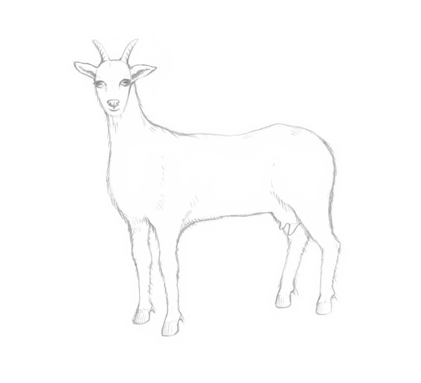
In this tutorial, I’ll show you a simplified way to draw goats: an adult one and a baby. 

You don’t need any special knowledge of animal anatomy or advanced drawing skills to complete this project!

What You Will Need

You will need the following equipment (or similar) in order to complete this tutorial:

  • drawing paper
  • an HB graphite pencil
  • a 3B graphite pencil
  • an eraser
The art supplies Ill be using

You’ll also find our How to Draw Fur tutorial useful in this project.

1. How to Draw an Adult Goat

Step 1

I draw an oval shape for the goat’s head, using the HB graphite pencil.

Drawing the head of the goat

Step 2

I add the shapes of the ears and pointed horns. Keep the elements simple and stylized; we’ll refine them later.

Drawing the shapes of the ears and horns

Step 3

I draw the neck of the goat; it is basically a simple elongated shape. 

Adding the neck shape

Step 4

I add the rough shapes of the chest and the rump; they are the building blocks of the goat’s body.

Constructing the body

Step 5

I join the shapes of the body, outlining the back of the goat. It has a prominence that marks the hip bone.

Outlining the back of the goat

Step 6

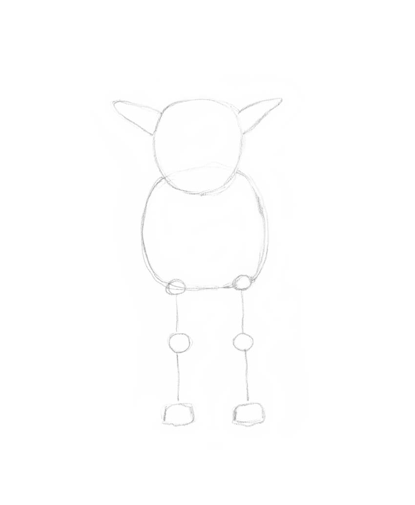
I draw the framework of the goat’s limbs, marking the joints with big circles.

At this stage, we can already mark the bottom line of the goat’s body. 

Drawing the framework of the limbs

Step 7

I refine the shape of the goat’s forelimbs; they are thicker in the knee area and end with a hoof.

Goats also have dewclaws on the back side of the limbs, which are rudimentary hooves.

Drawing the fore limbs of the goat

Step 8

I draw the contours of the hind legs. They have hocks—the joints between the knee and the fetlock that point backwards.

Drawing the hind legs of the goat

Step 9

It’s time to draw the goat’s face. I sketch a vertical core line, and then add three horizontal lines for the eyes, nose, and mouth.

Drawing the reference lines for the eyes nose and mouth

Step 10

I draw the eyes with horizontal pupils. The eyes of a real goat are relatively small, but I want my drawing to look cute, so I make them slightly bigger.

Then I add the nose and the mouth with a hint of a smile.

Adding the eyes nose and smiling mouth

Step 11

I refine the shape of the ears, adding a deep shadow.

Refining the ears

Step 12

I add several contour lines to each horn and draw the beard. Both male and female goats have beards.

Drawing the beard and refining the horns

Step 13

The body of a goat is covered with hair; its coloring can vary from white to grey or black.

I draw the hair along the contours of the goat’s body, using long hatches.

Drawing the hair on the body

Step 14

I add the rounded udder with two prominent teats.

Drawing the udder

Step 15

I draw a short tail and create an illusion of its texture, using long graphite lines.

Adding the tail

Step 16

Let’s give some completeness to our sketch by adding values. With the HB pencil, I draw relatively long hatches that imitate hair.

Adding long graphite hatches that imitate hair

With the 3B pencil, I darken the sides of the goat’s head to make the drawing more realistic.

Increasing the contrast

Step 17

I continue to add long hatches to the front part of the goat’s body, using the HB pencil.

It’s the right time to accent small details like the cloven hooves or the longer strands of hair.

Step 18

I complete creating the illusion of hairy texture, working in the same technique.

I also strengthen the core shadows, applying an additional layer of hatching with the 3B pencil.

Completing the goat figure

As a finishing touch, I add light hatches that imitate grass at the goat’s feet, using the HB pencil.

This drawing is complete

2. How to Draw a Baby Goat

Step 1

I draw the rounded shape of the head, and then add the ears. The head of a baby goat is relatively big in comparison to the body; it is also shorter than the head of an adult goat.

Baby goats don’t have horns as adult goats do, but they have so-called 'horn buds.’ These are small bumps on the top of the head, between the ears and above the eyes. Our goat is too young, so we don’t need to overload the drawing with information.

Drawing the shape of the baby goats head with ears

Step 2

I add the rough shape of the chest. The neck of a baby goat is shorter than this part of the body of an adult animal.

Adding the chest shape

Step 3

I draw the framework of the front legs.

Adding the framework of the limbs

Step 4

I add the contours of the limbs, accentuating the knees.

Drawing the fore legs

Step 5

It’s time to draw the reference lines of the animal’s face. I sketch the vertical core line, and then add lines for the eyes, nose, and mouth. Leaving enough space for the forehead is important.

I also refine the shape of the ears.

Adding the reference lines

Step 6

I draw the eyes with horizontal pupils. Then I add the nose and a smiling mouth.

Drawing the eyes

Step 7

I add the back and the hind legs of the baby goat. The foreshortening doesn’t allow us to see much of the animal’s back, but we should mark it to make the drawing look realistic.

Completing the body shape

Step 8

With the HB pencil, I add long hatches that imitate hair.

Adding the hair

As a cute addition, I draw a floral diadem on the head of the baby goat. There is no need to draw all the tiny petals or other details; just create something that looks like small flowers.

Drawing the floral crown

Step 9

I create an illusion of hair, using the HB pencil, just as we did with the adult goat. 

Adding long graphite strokes

I darken the eyes, the neck, and the back limbs to increase the contrast and make the drawing more credible.

Completing the drawing

Your Artworks Are Complete

Congratulations! You’ve created two beautiful drawings of charming goats. I hope you’ve enjoyed the process, and no animal seems too difficult to draw now!

The project is complete

How to Create Vexel Art in Adobe Photoshop With an Action

Post pobrano z: How to Create Vexel Art in Adobe Photoshop With an Action

Final product image
What You’ll Be Creating

In this tutorial you will learn how to create an amazing vexel art effect. I will explain everything in so much detail that everyone can create it, even those who have just opened Photoshop for the first time.

The effect shown above is the one I will show you how to create in this tutorial. If you would like to create the even more advanced vexel art effect
shown below, using just a single click and in only a few minutes, then
check out my Vexel Photoshop Action.

Action final result

What You’ll Need

To recreate the design above, you will need the following photo:

1. Let’s Get Started

First, open the photo that you want to work with. To open your photo, go to File > Open, choose your photo, and click Open. Now, before we get started, just check a couple of things:

  1. Your photo should be in RGB Color mode, 8 Bits/Channel. To check this, go to Image > Mode.
  2. For best results, your photo size should be 1500–3500 px wide/high. To check this, go to Image > Image Size.
  3. Your photo should be the Background layer. If it is not, go to Layer > New > Background from Layer.
Checking image size and mode

2. How to Create the Vexel Art Style

Step 1

In this section, we are going to create the vexel art style. Press Control-J on your keyboard to duplicate the Background layer, go to Image > Adjustments > Shadows/Highlights, and enter the settings below:

Adjusting shadows and highlights

Step 2

Now go to Image > Adjustments > Shadows/Highlights again and enter the settings below:

Adjusting shadows and highlights

Step 3

Go to Image > Adjustments > Brightness/Contrast and set the Brightness to -20 as shown below:

Adjusting brightness

Step 4

Now go to Filter > Sharpen > Unsharp Mask, and set the Amount to 500%, Radius to 5.0 px, and Threshold to 0 levels as shown below:

Adding unsharp mask filter

Step 5

Go to Filter > Stylize > Diffuse and set the Mode to Anisotropic as shown below:

Adding diffuse filter

Step 6

Now go to Filter > Noise > Reduce Noise and use the settings below:

Adding reduce noise filter

Step 7

Go to Filter > Blur > Smart Blur, and set the Radius to 5.0, Threshold to 25, Quality to Low, and Mode to Normal.

Adding smart blur filter

Step 8

Now go to Filter > Sharpen > Unsharp Mask, and set the Amount to 500%, Radius to 1.0 px, and Threshold to 0 levels.

Adding unsharp mask filter

Step 9

Go to Filter > Stylize > Diffuse and set the Mode to Anisotropic.

Adding diffuse filter

Step 10

Now go to Filter > Stylize > Oil Paint, set the Stylization to 5.0 and Cleanliness to 2.0, and uncheck the Lighting.

Adding oil paint filter

Step 11

Go to Filter > Stylize > Oil Paint again, set the Stylization to 10.0 and Cleanliness to 10.0, and uncheck the Lighting.

Adding oil paint filter

Step 12

Now go to Filter > Blur > Surface Blur, and set the Radius to 5 px and Threshold to 15 levels as shown below:

Adding surface blur filter

Step 13

Go to Filter > Filter Gallery > Artistic > Cutout, and set the Number of Levels to 8, Edge Simplicity to 5 and Edge Fidelity to 3 as shown below:

Adding cutout filter

Step 14

Now go to Image > Auto Tone and then Image > Auto Contrast to make some auto-corrections to the photo’s tone and contrast.

Making auto corrections

Step 15

Go to Image > Adjustments > Brightness/Contrast and set the Contrast to 100 as shown below:

Adjusting contrast

Step 16

Now go to Filter > Sharpen > Unsharp Mask, and set the Amount to 50%, Radius to 5.0 px, and Threshold to 0 levels as shown below:

Adding unsharp mask filter

Step 17

Now name this layer Vexel Art.

Renaming the layer

3. How to Make the Final Adjustments

Step 1

In this section, we are going to make some final adjustments to the design. Press D on your keyboard to reset the swatches. Then, go to Image > Adjustments > Gradient Map to create a new gradient map adjustment layer and name it Overall Contrast.

Creating new gradient map adjustment layer

Step 2

Now change the Blending Mode of this layer to Luminosity and set the Opacity to 56%.

Changing blending mode and opacity

Step 3

Go to Layer > New Adjustment Layer > Levels to create a new levels adjustment layer and name it Overall Brightness.

Creating new levels adjustment layer

Step 4

Now Double-click on this layer thumbnail and in the Properties panel enter the settings below:

Adjusting levels

Step 5

Go to Layer > New > Gradient Map to create a new gradient map adjustment layer and name it Color Look.

Creating new gradient map adjustment layer

Step 6

Now Double-click on this layer thumbnail, and then in the Properties panel, click on the gradient to open up the Gradient Editor panel and enter the settings below:

Adjusting gradient map
The left color stop has color e000e0, and the right color stop has color 005161.

Step 7

Change the Blending Mode of this layer to Color.

Changing the blending mode

Step 8

Now go to Layer > New Adjustment Layer > Vibrance to create a new vibrance adjustment layer and name it Overall Vibrance/Saturation.

Creating new vibrance adjustment layer

Step 9

Double-click on this layer thumbnail and in the Properties panel set the Vibrance to +43 and Saturation to +22 as shown below:

Adjusting vibrance and saturation

Step 10

Now press Control-Alt-Shift-E on your keyboard to make a screenshot, and then press Control-Shift-U to desaturate this layer. Then, go to Filter > Other > High Pass and set the Radius to 2 px.

Adding high pass filter

Step 11

Name this layer Overall Sharpening and change the Blending Mode of this layer to Overlay.

Changing the blending mode

You Made It!

Congratulations, you have succeeded! Here is our final result:

Final result

If you would like to create the even more advanced vexel art effect shown below, using just a single click and in only a few minutes, then check out my Vexel Photoshop Action.

The action works so you simply fill in your subject with a color and just play the action. The action will do everything for you,
giving you fully
layered and customizable results. The action also creates 20 preset color looks that you can choose from.

The action comes with a detailed video tutorial that demonstrates how to use the action and customize the results to get the most out of the effect.

Action final result

How to Create a Mountain Rescue Unit Badge in Adobe Illustrator

Post pobrano z: How to Create a Mountain Rescue Unit Badge in Adobe Illustrator

Final product image
What You’ll Be Creating

In the following steps you will learn how to create a mountain rescue unit vector badge in Adobe Illustrator. For starters you will learn how to set up a simple grid and how to create the main badge shape. Using basis vector shape building techniques and some warp effects, you will learn how to create the rest of the shapes. Moving on, you will learn how to add some subtle shading and a flat background. Finally, you will learn how to add text and how to easily bend it.

For more inspiration on how to adjust or improve your final badge, you can find plenty of resources at GraphicRiver.

1. How to Create a New Document and Set Up Grid

Hit Control-N to create a new document. Select Pixels from the Units drop-down menu, enter 850 in the width and height boxes, and then click that More Settings button. Select RGB for the Color Mode, set the Raster Effects to Screen (72 ppi), and then Create Document.

Enable the Grid (View > Show Grid) and the Snap to Grid (View > Snap to Grid). You will need a grid every 5 px, so simply go to Edit > Preferences > Guides & Grid, and enter 5 in the Gridline every box and 1 in the Subdivisions box. Try not to get discouraged by all that grid—it will make your work easier, and keep in mind that you can easily enable or disable it using the Control-„ keyboard shortcut.

You can learn more about Illustrator’s grid system in this short tutorial from Andrei Stefan: Understanding Adobe Illustrator’s Grid System.

You should also open the Info panel (Window > Info) for a live preview with the size and position of your shapes. Don’t forget to set the unit of measurement to pixels from Edit > Preferences > Units. All these options will significantly increase your work speed.

set up grid

2. How to Create the Main Shape

Step 1

Pick the Ellipse Tool (L) and focus on your Toolbar. Remove the color from the stroke and then select the fill and set its color to R=87 G=158 B=214.

Move to your artboard and simply create a 310 x 70 px shape—the grid and the Snap to Grid should make it easier.

ellipse tool

Step 2

Pick the Rectangle Tool (M), create a 310 x 255 px shape, and place it as shown in the first image. Make sure that it stays selected and go to Object > Path > Add Anchor Points.

Switch to the Direct Selection Tool (A), select the anchor point highlighted in the first image, and drag it 115 px down as shown in the second image.

add anchor point

Step 3

Select both shapes made so far, open the Pathfinder panel (Window > Pathfinder), and click the Unite button.

pathfinder

Step 4

Make sure that your shape is still selected and go to Effect > Stylize > Rounded Corners. Enter a 25 px Radius, click OK, and then go to Object > Expand Appearance.

rounded corners

3. How to Create the Smaller Shapes

Step 1

Make sure that your blue shape is still selected and go to Object > Path > Offset Path. Enter a 25 px Offset and click OK. Fill the resulting shape with red and don’t forget to send it to back with Shift-Control-[.

Reselect your blue shape and go again to Object > Path > Offset Path. This time, enter a -15 px Offset and click OK. Fill the resulting shape with yellow.

expand appearance

Step 2

Select your red and yellow shapes and click the Minus Front button from the Pathfinder panel.

offset path

Step 3

Using the Rectangle Tool (M), create a 200 x 100 px shape and place it as shown in the first image. Select this rectangle along with the red shape and click the Intersect button from the Pathfinder panel. Fill the resulting shape with R=246 G=40 B=17.

intersect

Step 4

Select your blue shape and go to Object > Path > Offset Path. Enter a -15 px Offset, click OK, and fill the resulting shape with R=32 G=43 B=63.

offset path

Step 5

Using the Rectangle Tool (M), create a 320 x 155 px shape and place it as shown in the first image. Select this new rectangle along with the darker blue shape and click the Intersect button from the Pathfinder panel. Make sure that the resulting shape is filled with R=32 G=43 B=63.

intersect

Step 6

Pick the Rectangle Tool (M) and create a 360 x 85 px shape. Fill it with R=246 G=40 B=17 and place it as shown in the following image.

red rectangle

4. How to Create the Mountains

Step 1

Using the Pen Tool (P), create a sharp mountain outline roughly as shown in the following image. Once you’re done, fill this shape with R=248 G=232 B=217.

mountain shape

Step 2

Pick the Ellipse Tool (L), create a 50 px circle and place it as shown in the first image. Select your mountain shape and go to Object > Path > Offset Path. Enter a 5 px Offset, click OK, and bring the resulting shape to front (Shift-Control-]).

Select both shapes made in this step and click the Minus Front button from the Pathfinder panel. Fill the resulting shape with R=248 G=232 B=217.

sun

Step 3

Using the Pen Tool (P), create several sharp shapes as shown in the first image. Fill them all with R=153 G=196 B=230.

pen tool

5. How to Create the Bent Shapes

Step 1

Select your red rectangle and go to Effect > Warp > Arch. Enter the attributes shown below, click OK, and then go to Object > Expand Appearance.

warp arch

Step 2

Pick the Rectangle Tool (M) and create a 360 x 85 px shape. Fill it with R=32 G=43 B=63, place it as shown in the first image, and then go to Effect > Warp > Arch. Enter the attributes shown below and click OK. Expand your selection (Object > Expand Appearance) and then send it to back (Shift-Control-[) .

warp arch

6. How to Add Strokes, Shading, and a Background

Step 1

Select your blue shape and focus on the Appearance panel (Window > Appearance). Select the stroke, set the color to R=248 G=232 B=217, and then open the Stroke fly-out panel. Increase the Weight to 15 px and check the Align Stroke to Inside button.

stroke

Step 2

Make sure that your blue shape is still selected and keep focusing on the Appearance panel. Add a second stroke using the Add New Stroke button and select it. Set the color to R=32 G=43 B=63 and the Weight to 10 px.

add new stroke

Step 3

Select all the shapes made so far and add copies in front (Control-C > Control-F). Make sure that only these copies are selected and click the Unite button from the Pathfinder panel.

Send the resulting shape to back (Shift-Control-[) and focus on the Appearance panel. Select the fill, set the color to R=32 G=43 B=63 and lower its Opacity to 15%, and then go to Effect > Path > Offset Path. Enter a -30 px Offset, click OK, and then go to Effect > Distort & Transform > Transform. Enter the attributes shown below, click OK, and then go to Effect > Blur > Gaussian Blur. Enter a 20 px Radius and click OK.

gaussian blur

Step 4

Pick the Rectangle Tool (M) and create an 860 px square. Fill it with R=248 G=232 B=217, make sure that it covers your entire artboard, and don’t forget to send it to back (Shift-Control-[).

background

7. How to Add Text

Step 1

Pick the Type Tool (T) and open the Character panel (Window > Type > Character). Select the Balatype font and set the size to 70 px.

Simply click on your artboard and add the „HIMALAYA” piece of text. Place it as shown in the following image and set the color to R=248 G=232 B=217.

character panel

Step 2

Make sure that your piece of text is still selected and go to Effect > Warp > Arch. Enter the attributes shown below and then click OK.

type tool

Step 3

Pick the Type Tool (T) and focus on the Character panel. Use the same font and set the size to 35 px.

Add the „RESCUE UNIT” text and set its color to R=248 G=232 B=217. Place this new piece of text as shown in the following image and go to Effect > Warp > Arch. Enter the attributes shown below and then click OK.

warp arch

Step 4

Pick the Type Tool (T), add the „EVEREST” piece of text, and set its color to R=248 G=232 B=217. Place this new piece of text as shown in the following image and go to Effect > Warp > Arch. Enter the attributes shown below and then click OK.

warp arch

Step 5

Pick the Type Tool (T) and focus on the Character panel. Use the same font and set the size to 100 px. Add a little „+„, set the color to R=248 G=232 B=217, and place it as shown in the first image.

Return to the Character panel and set the size to 30 px. Add the „19” and the „69” pieces of text and place them as shown in the last two images.

cross

8. How to Add Some Fir Trees

Finally, download the attachment from this tutorial: How to Create a Wintry, Snow Background in Adobe Illustrator. Open that christmas tree.ai document and copy the shape inside your badge document.

Change the fill color to R=32 G=43 B=63 and then create about seven copies. Spread these copies roughly as shown in the first image and then send them behind that red shape.

christmas tree

Congratulations! You’re Done!

Here is how it should look. I hope you’ve enjoyed this tutorial and can apply these techniques in your future projects. Don’t hesitate to share your final result in the comments section.

Feel free to adjust the final design and make it your own. You can find some great sources of inspiration at GraphicRiver, with interesting solutions to improve your design.

final product

How to Create a Power Scene Photo Manipulation With Adobe Photoshop

Post pobrano z: How to Create a Power Scene Photo Manipulation With Adobe Photoshop

Final product image
What You’ll Be Creating

In this tutorial I’ll show you how to use Adobe Photoshop to create a power scene using a variety of photo manipulation techniques. 

First, we’ll build the base environment using images of the sky and buildings. After that, we’ll add the flying rocks and lightning and blend them together using adjustment layers, masking, and brushes. Later, we’ll paint the light and particles. We’ll use several adjustment layers to complete the final effect.

Tutorial Assets

The following assets were used during the production of this tutorial:

1. How to Make the Base Environment

Step 1

Create a new 2000 x 1333 px document with the given settings:

new file

Step 2

Open the sky image. Use the Rectangular Marquee Tool (M) to select the
sky only and add it to the white canvas using the Move Tool (V).

add sky

Step 3

Go to Layer > New Adjustment Layer > Hue/Saturation and bring the Saturation value down to -100:

sky hue saturation

Step 4

Create a Curves adjustment layer to bring more light, especially the
top left of the sky where the main light will be located. On the layer
mask, activate the Brush Tool (B) to paint over the lower section to reduce the effect there.

sky curves

Step 5

Cut out the buildings and add them to the main document.

add buildings

Step 6

Use the Lasso Tool (L) to select the building on the top right and then
hit Control-J to paste the selected one into a new layer. Flip it
horizontally by choosing Edit > Transform > Flip Horizontal. Move
it to the top left to fill in this corner and resize it to be a bit
smaller.

select right towers
add to the left

Step 7

Copy the building in the lower right of the canvas and add it to the
top left corner where we’ve added a small building in the previous step.

add more tower

Step 8

The buildings look a bit darker than the sky. On each of the building
layers, create a new layer (set as Clipping Mask), change the mode to
Overlay 100%, and fill with 50% gray.

DB new file

Use
the Dodge Tool (O) with Highlight Range and Exposure about 50-60% and the
Burn Tool with Midtones Range to bring more light and details to the
buildings. You can see how I did it with Normal mode and the result with
Overlay mode.

DB normal mode
DB overlay mode

Step 9

Select all the building layers and Dodge/Burn ones and press Control-G
to create a group for them. Change this group’s mode to Normal 100% and
add a Hue/Saturation adjustment layer within the group. Bring the Cyans
value down to -51:

buildings hue saturation

Step 10

Create a Curves adjustment layer to brighten the buildings more. On
this layer mask, use a soft black brush to erase some corners of the
buildings as they shouldn’t get much light on there.

buildings curves 1

Step 11

Make a Levels adjustment layer to decrease the dark contrast in the
corners of the buildings. Paint on the rest of the buildings so that they won’t
be affected by this adjustment layer.

buildings levels

Step 12

Create a new layer and use a soft white brush to paint on the top of
the building to brighten these areas more. Change this layer mode to
Soft Light 100%.

building light
building light result

2. How to Add the Rocks

Step 1

Open the rock images pack. Browse the meteor10 folder and grab the one
you like and place it in the middle of the space between the buildings.
Use the Free Transform Tool (Control-T) to move the top of the rock towards the sky to fit the
angle of the buildings.

add big rock

Duplicate
this layer and move the bright side of the rock towards the light. Use
Control-T
with the Warp mode to bend it until you get a result like
the one below:

big rock duplicated

Step 2

Use a layer mask to blend this rock with the existing one.

rocks blending

Step 3

Add several rocks to both sides of the scene by duplicating this
layer or selecting others from the folders. Use the Warp Tool to tweak and
bend the rocks so they appear different.

add more rocks

Step 4

Add more rocks around the buildings and make them in different sizes using
Control-T with the Warp mode. Place some bigger ones on the edges of the
canvas. On each of these layers, go to Filter > Motion Blur and
apply similar settings to the ones below. Depending on the size, angle and
distance of the rock, you can change the settings to get
your desired result.

more rocks with motion blur settings 1
rocks with motion blur settings 2
rocks with motion blur settings 3

Step 5

Create a group for all the rock layers and add a Hue/Saturation adjustment
layer within the group. Bring the Saturation value down to the minimum.

rocks hue saturation

Step 6

Use a Curves adjustment layer to brighten the rocks. On the layer mask,
use a soft black brush to erase the shadow side of the rocks so they
won’t be affected by this adjustment layer.

rocks curves
rocks curves masking

3. How to Add the Lightning

Step 1

Open the lightning 1 image. Isolate the lightning using the Magic Wand
Tool (W)
and add it to the bottom of the biggest rock (middle one) so it
looks as if it’s coming down from the rock. Use Control-T to change its
perspective and make the top much smaller and the bottom much bigger.

add  lightning 1

Step 2

Select two details of the original image and add them to the big fork of lightning.

select two details from lightning 1
add more details to lightning 1

Step 3

Create a group for the lightning layers and use a Hue/Saturation adjustment layer to desaturate the effect’s color.

lightning 1 hue saturation

Step 4

Open the lightning 2 image. Use the Lasso Tool (L) to select the big fork and add it to the bottom of the middle rock. Use Control-T to make it connected to one of the falling rocks on
the right.

select lightning 2
add lightning 2

Change this layer mode to Screen 100% and use a layer mask to remove the edges around the fork.

lightning 2 screen mode

Step 5

Add other forks of lightning from the original image and connect them to three rocks on the left and the top sides.

add more rays from lightning 2

Step 6

Make a group for these layers and alter the group’s mode to Screen
100%
. Add a Hue/Saturation adjustment layer and reduce the Saturation
value to -100:

lightning 2 hue saturation

Step 7

Create a Levels adjustment layer to remove the white edges completely.

lightning 2 levels

4. How to Paint the Light and Particles

Step 1

Create a new layer on top of the layers and use a soft white brush to
spot on the area between the rock and the big fork of lightning to make a light hole.

paint light hole

Step 2

Make a new layer and change the mode to Overlay 100%. Use a soft white
brush with a lowered opacity (about 50%) to paint glow around the light hole and on the two forks below.

paint more light glow

Step 3

Make a new layer and turn the foreground to black. Press F5 to change the setting of this brush. After that, use this brush to paint tiny particles around the rocks area.

particles brush settings 1
particles brush settings 2
particles brush settings 3
particles brush settings 4
particles result

5. How to Make the Final Adjustments

Step 1

Create a Curves adjustment layer on top of the layers and decrease the
lightness. On this layer mask, use a soft black brush to paint on the
middle of the space between the buildings and the top of them to keep
their brightness.

whole scene curves 1
whole scene curves 1 masking
whole scene curves 1 masking result

Step 2

Make another Curves adjustment layer to bring more light to the space
between the buildings. Paint on the rest of the scene so it won’t be affected by this
adjustment layer.

whole scene curves 2

Step 3

Use a Color Balance adjustment layer to complete the final effect.

whole scene color balance

Congratulations, You’re Done!

I hope that you’ve enjoyed the tutorial and learned something new for
your own projects. Feel free to share your results or leave comments in
the box below. Enjoy Photoshopping!

final result

How to Create an 80s-Inspired Double Exposure Manipulation in Adobe Photoshop

Post pobrano z: How to Create an 80s-Inspired Double Exposure Manipulation in Adobe Photoshop

Final product image
What You’ll Be Creating

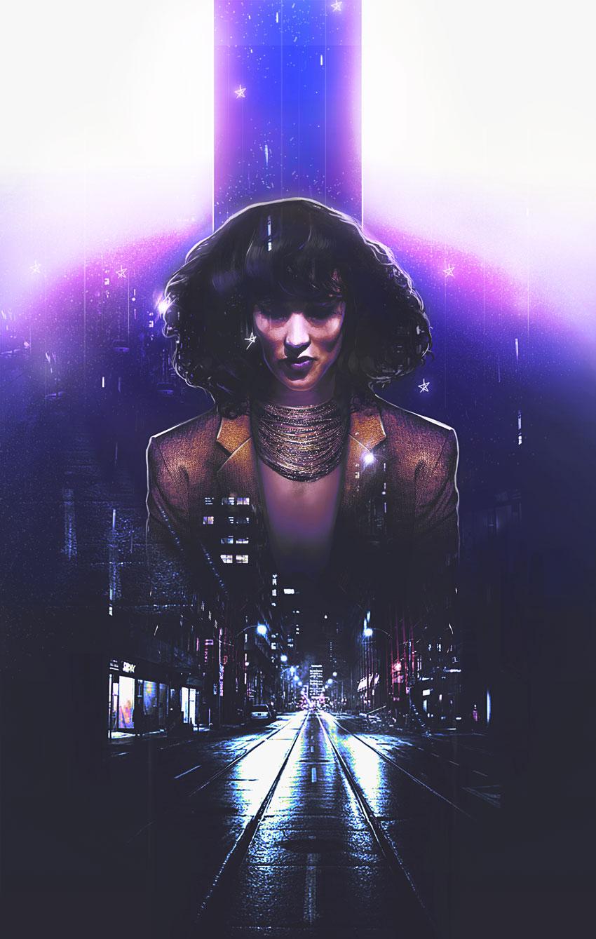
Here’s an ode to 80s power suits and supreme boss chicks. Learn how to create an epic 80s-inspired photo manipulation in Adobe Photoshop.

Today, I’ll cover how to style a person from scratch before adding cityscape images for an awesome double exposure effect.

Get inspired! Find more 80s-inspired effects on Envato Market.

Tutorial Assets

The following assets were used in the production of this tutorial:

Finding Retro Inspiration

Let’s take a look at the before and after. I love this part.

This manipulation combines a few of my favorite trends from the past
year. It mixes a double exposure effect with a 1980s vibe for a cool
movie-poster-like effect.

References and Inspiration

Pictures always shape the result! So make sure you pick photos that fit the vibe you’re trying to achieve. I was inspired by this simple Business Woman stock because she reminds of Jennifer Beals in the movie Flashdance.

And I just know we can do magic with that hair!

With that in mind, I’ve also gathered cityscape images to fit the retro 80s vibe because of their bright lights and neon colors. Always bookmark extra stocks for more variations.

Now for the tutorial! Let’s begin.

1. How to Style and Manipulate Your Subject

Step 1

Our subject seems a little distracted, so we’ll have to restyle the photo a bit for a fierce look. First, create a New Document at 1780 x 2800 pixels and 100 dpi.

Note: these dimensions are not traditional poster dimensions by any means (though it resembles a poster), so make sure you alter the numbers accordingly. 

Use the Magnetic Lasso Tool (L) to extract the subject from the photo. Copy and Paste it into your document, Free Transforming (Control-T) her body slightly to make it straighter.

Extract the subject

Step 2

For this next part, we want to create powerful, boss chick body language. Let’s make her shoulders more forward!

Fix her shoulders
  1. Use the Polygonal Lasso Tool (L) to create a selection around the right side of her suit. Since this side is the straighter of the two, we’ll use it to create stronger body language.
  2. Copy and Paste the right side of the suit onto its own New Layer. Then Control-J to Duplicate it. Flip the copy by going to Edit > Transform > Flip Horizontal.

Here is the result so far with the new shoulders in position.

Shoulder Result

Step 3

Continue to modify her suit and style.

Paint the skin
  1. Use the Rectangular Marquee Tool (M) to cut the top half of her body off, specifically the area right above her collar. We’ll need to insert a necklace here soon.
  2. Her
    blouse makes her look super corporate, so let’s add another realm of
    fierceness with some Grace Jones vibes! Create a New Layer below the suit layers and use a Hard Round Brush to paint tan #be9b84 below her neck. Use the Eraser Tool (E) at a low Opacity (10-20%) to erase the color for a subtle skin-like gradient.

Step 4

Let’s add that necklace!

Copy and Paste a selection of this Beaded Necklace onto the canvas.

Position it onto a New Layer above the skin before adding a Layer Mask. Mask away any remnants from the previous photo until there’s only the necklace left.

Don’t worry—we’ll fill any gaps left over later!

Mask the necklace

Step 5

Time for her curls!

Have fun with this step—it’ll add a lot of personality to the manipulation.

Make a selection of her hair using the Polygonal Lasso Tool (L). Copy and Paste this selection onto a New Layer. Resize her hair using the Free Transform Tool (Control-T).

Pull her hair wider and taller for voluminous 80s hair!

Resize the hair

For even more volume, consider using Liquify. Select the hair layer and go to Filter > Liquify. Use the Forward Warp Tool (W) to push her hair, stretching the curls out until it looks full and teased.

Liquify the hair

Here is the result when we’re through. Epic 80s hair!

Feel free to use a Layer Mask to feather out the edges.

Hair after liquify

Step 6

This next step is optional. So let me first say, there is nothing wrong with her face. I just want it to look more symmetrical.

To do this, we’ll first Copy and Paste a selection of the left side of her face onto a New Layer. Then Flip this side to mirror the other by going to Edit > Transform > Flip Horizontal. Use the Eraser Tool (E) to blend any harsh edges.

Flip the models face

2. How to Adjust the Skin

Step 1

Before we move on to the double exposure effect, let’s adjust the colors.

Create a New Layer and set it to Saturation. Use the Brush Tool (B) to paint a golden yellow color #b37f1a over the subject’s skin. This will make her appear more tanned. Lower the Opacity to 38%.

Tan the subject

Step 2

On another New Layer above the model, smooth out her skin with a Soft Round Brush.

Paint a light tan color #dd9364 over her skin to minimize the uneven light hitting her face.

Keep the brush Opacity low (15-30%) as well as the Hardness (0%) for the best result.

Smooth Her Skin Tone

3. How to Set Up the Graphic Elements

Step 1

Let’s start piecing together the rest of this scene!

Create a New Layer underneath the model.

Use the Rectangular Marquee Tool (M) to make a selection in the shape of a skinny rectangle above her head. Fill this section in with a light #959aa1 to medium gray #8b909a gradient using the Paint Bucket Tool (G).

This top bar will draw the focus to our subject for more drama.

Add the top bar

Step 2

Do the same for the bottom, this time creating a medium gray #383938 to dark gray #1c1e1d gradient.

Add the bottom bar

4. How to Create the Double Exposure Effect

Step 1

The magic of this manipulation is behind the double exposure look. We’ll be creating this by blending our two city photos together.

Let’s start with the first photo.

Add the first city
  1. Copy and Paste the City #1 stock onto a New Layer above all the others. 
  2. Set the Layer Blend Mode to Lighten. Add a Layer Mask to mask out the top portions with a Soft Round Brush.

Step 2

Control-J this layer to create a Duplicate. Set the Layer Blend Mode to Lighten.

Now turn it upside down. Go to Edit > Transform > Flip Vertical.

Position this copy layer (named „flip” below) higher than the other. Try to make some of the lights from the buildings blend into her hair. Adjust the Layer Mask accordingly.

Add the flipped city

Step 3

Now add the second city.

All we really need from this photo is a subtle hint of those bright red buildings.

So Copy and Paste the City #2 stock onto a New Layer above the others. Position it to align with the first city photo.

Set the Layer Blend Mode to Color Dodge, and then add a Layer Mask to mask out everything else besides the red buildings.

Add the second city photo

Continue experimenting with this method, add more bits of glittery city lights to her face as well as the top gray bar.

5. How to Blend All the Colors Together

I’ve tried to set up this tutorial in the order that would work best for this effect.

Some parts might look a little trippy at first, but these next steps will help bring all the colors of the manipulation together.

It’s a lot. But you’ll love it, I promise!

Step 1

Let’s start with the background.

Add the background colors
  1. Create a New Layer above the white background layer. Use the Gradient Tool (G) to create an upward-moving, gray #484847 to transparent Linear Gradient.
  2. Create another New Layer above the gradient. Use a Soft Round Brush to paint a blue #5674ae circle behind the model.

Step 2

Adjustment Layers are the best way to get cool results!

Add a New Adjustment Layer of Color Lookup above all the other layers in the panel.

Set the 3DLUT File to:

  • FoggyNight.3DL
Add a color lookup adjustment

Step 3

Create two New Layers above the Color Lookup layer.

Set the first one to Overlay. Create a white to transparent downward-moving Linear Gradient (30-50% Opacity).

On the layer above it, Fill it with purple #362f58 using the Paint Bucket Tool (G). Adjust the Opacity to 74% and set the Blend Mode to Lighten.

Adjust the colors with blend modes

Step 4

Time for more adjustments!

Add a New Adjustment Layer of Curves. Adjust the curves for the RGB, Blue, and Green Channels for a cool color effect. 

Curves adjustment layer

Step 5

Add a second Curves adjustment. This time, adjust the curves for the Blue and RGB Channels like the following ones below.

second curves adjustment

Follow up with a New Adjustment Layer for Levels.

Add the following values for the RGB and Blue Channels.

Blue Channel:

  • 0, 0.76, 162
  • 0, 255

RGB Channel:

  • 26, 0.84, 204
  • 21, 255
Levels adjustment

Here’s the result.

levels result

6. How to Add the Final Touches

Step 1

Ready to finish? Me too!

Create a New Layer above all the others. Set the Blend Mode to Hue and paint purple #1c083b across the top to recolor the yellow parts. 

This layer will also add some shadow to the bar, so play with the softness for more depth.

Paint purple for the top

Step 2

Add some color to the suit too! We’ll use Layer Styles.

Remember to keep some of your layers separated. Right-click the right suit layer and go to Blending Options. Add a yellow #ffbb35 Color Overlay and black Satin Effect with the following settings.

Add layer styles ot the suit

Recreate this easily on the left side! Simply Right-click the right suit layer and go to Copy Layer Style. Then Paste this style onto the left layer.

Here’s the result below.

Color the suit yellow

Step 3

Take some time to add crisp white highlights to the edges of the model and top bar.

Use a tapered Hard Round Brush to create the backlight, and then add some vertical lines in varying Opacities for a surreal look.

Add white highlights

Step 4

Continue the highlights onto her hair and suit.

I love adding texture! Use this Star Brush from our essential Photoshop Brush pack to create tiny areas of grainy white texture which blend into the rest of the composition.

Get creative! Draw some fun stars by hand for a cool graphic effect!

Draw stars and texture

Step 5

Almost there!

Add some beautiful glow to the manipulation.

Create a New Layer and set it to Overlay. Use a Soft Round Brush to paint soft yellow #e6d98f onto the model’s hair and suit. Paint some yellow onto the white background for a beautiful effect too!

Add glow to the composition

Finish with a New Adjustment Layer for Gradient Map.

Use the Gold-Copper preset, and then set the Layer Blend Mode to Luminosity and the Opacity to 40%.

Add a gold copper gradient map

Check out the final result below!

7. How to Add a Quick 80s Text Effect

Turn this look into an epic 80s movie poster with a quick text effect! Just download one of the many amazing premade text effects from Envato Elements.

Here, I used the third file from this 80s Text Effect Volume 1 package.

Extract the text effect

Merge only the text layers together before extracting and inserting your title into the manipulation.

Check out this alternate version below!

Alternate with text effect

All Done, Great Job!

Photo manipulations help us learn how to use Photoshop in new ways. Continue creating beautiful effects inspired by your favorite retro styles!

I hope you’ve enjoyed this tutorial! Feel free to add your comments and share your results with us below.

For more fun photo manipulations, check out these great tutorials:

80s Double Exposure Photoshop Manipulation by Melody Nieves

Photoshop in 60 Seconds: Brush Panel—A Look at the New 2018 Update

Post pobrano z: Photoshop in 60 Seconds: Brush Panel—A Look at the New 2018 Update

Get updated on the latest features to Adobe Photoshop. Check out the quick video below.

If you’re looking for amazing premium Photoshop brushes, head on over to GraphicRiver.

Photoshop in 60 Seconds: Brush Panel

Adobe recently unveiled a suite of new additions to Creative Cloud for 2018. Today, we’ll go over a few of the latest updates dedicated to Photoshop’s Brush panel.

Check out this quick video below to see a few of the new features explained, like folders for custom brushes and so much more!

Photoshop’s Brush Panel Features for 2018

Here are a few of the new features now available for the Brush panel in Adobe Photoshop.

Brush Management and Setup

You can now drag and drop any brush preset to a new location. Easily toggle different views to understand which brush you’re using and see additional settings like the Brush Tip, Stroke, and Name for a better workflow.

Brush Management

Importing Brushes

Photoshop has also made it easier to download and install brushes! Choose the Get More Brushes option from the flyout menu to use awesome brushes from Adobe’s acquisition of illustrator Kyle Webster’s brush packs. Once you’ve downloaded a pack, just click on the ABR file while Photoshop is still running to use it right away.

Importing Brushes in Photoshop CC

Stroke Smoothing

Photoshop now has advanced Stroke Smoothing to help artists and designers avoid jittery strokes. Enable different modes by clicking the gear icon, and experiment with the Smoothing value for the best results.

Stroke Smoothing

Learn More With Our Tutorials!

Inspired to learn more about Photoshop brushes? Start with one of our
tutorials! Continue to grow your skills over time with easy to follow lessons.

Check out these tutorials to learn more from our experts:

How to Draw a Deer Step by Step

Post pobrano z: How to Draw a Deer Step by Step

Final product image
What You’ll Be Creating

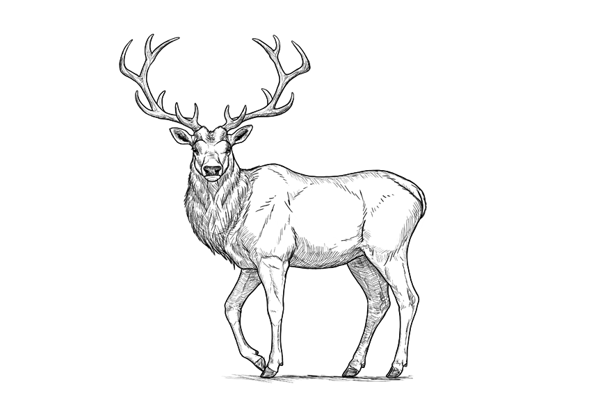
For me, a deer is the symbol of autumn—the time when the males of this timid species turn into the real kings of the forest, with a crown of antlers on their heads. Of all the deer species, my favorite is the red deer—not as big as a moose, but more regal looking. 

In this tutorial, I will show you how to draw such a deer step by step: from the sketch, torso, legs, and details of the head to a pair of beautiful antlers.

This is a simple tutorial about how to draw a deer. If you want to learn more about deer anatomy and various species, you’ll be interested in the tutorial below:

1. How to Sketch a Deer

The biggest problem with drawing real things is that it’s very easy to lose proportions. To avoid such a mistake, we need to plan the body before adding any details. Such a plan should be sketched lightly, so that you can fix anything after you finish it.

Step 1

Draw a rectangle. This will be the torso of our deer.

base body rectangle

Step 2

Measure the distance to the ground. It should be slightly longer than the width of the torso.

distance between bpdy and ground

Step 3

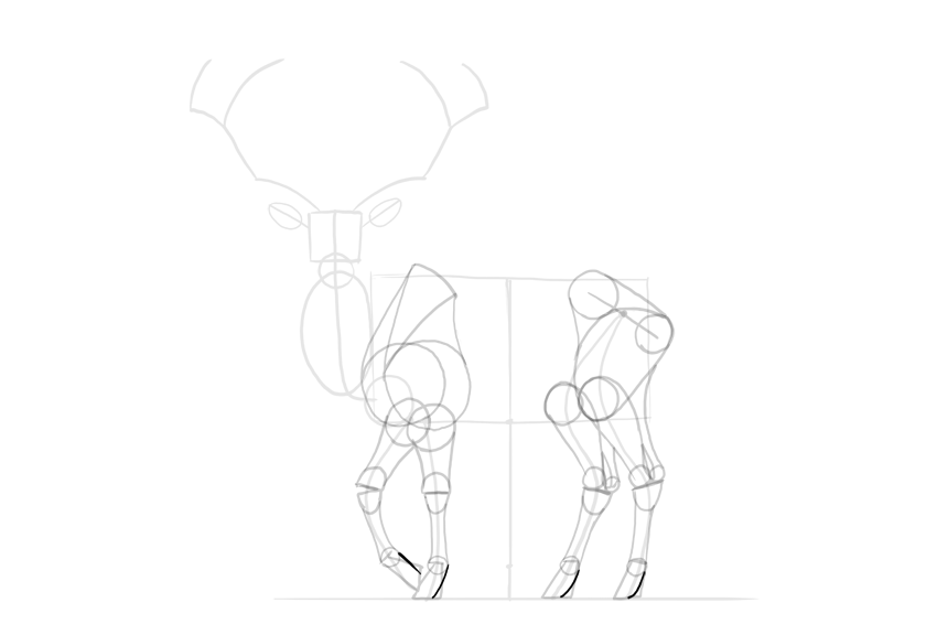
Find the points where the limbs start.

limbs slots in body

Step 4

Sketch the limbs.

simplified deer legs

Step 5

To add a realistic form of the chest, add a circle to the lower left corner of the rectangle.

simplified deer sternum

Step 6

Add an oval to the front of the rectangle. This is the simplified form of the rotated neck.

simplified deer neck rotated

Step 7

Sketch the neck.

deer neck length

Step 8

Add the head on top of the neck.

deer head simplified shape

Step 9

Add the muzzle to the head.

deer muzzle simplified shape

Step 10

Add the direction of the ears…

deer ears length and direction

… and their general shape.

deer ears simplified shape

Step 11

Sketch the antlers step by step:

deer antlers how to start
deer antlers basic shape
elk antlers how to draw
simplified deer antlers

2. How to Draw the Legs of a Deer

Once you have the sketch, take a good look at it and see if you got the proportions correct. If not, this is the last moment to fix them!

Step 1

The forequarters of many animals can be drawn with a „6” shape, which includes both the shoulder area and the shoulder blade. Draw it for both front legs.

deer forequarters
deer shoulders drawing

Step 2

Sketch the top of the shoulder blade.

deer shoulder blade

Step 3

Close the whole shoulder area.

deer shoulder area

Step 4

Sketch the hips.

deer simplified hips

Step 5

Add a circle in the knee area.

deer simplified knees

Step 6

The main muscle mass of the thigh can be created by outlining the knee, the hip joint, and the back of the hip.

deer thigh shape

Step 7

Add the rest of the thigh by connecting the big muscle mass to the other end of the hip.

deer complete thigh shape

Step 8

Mark the wrist/ankle area at around 60% of the limb’s length.

deer legs proportions

Step 9

Mark the hoof at about one-third of the length below the wrist/ankle.

deer hooves proportions

Step 10

Draw the circle in the joint right above each hoof. It should be quite small.

deer hooves base

Step 11

Sketch a general shape of the hoof. This trick can be useful for drawing horses as well.

deer simplified hooves

Step 12

Draw the simplified shapes of the joints. The lower legs of hoofed animals are not very muscular, so the form of the bones should be accentuated instead.

deer leg joints simplified

Step 13

Add muscle forms to the forearms and calves.

deer simplified muscle masses
deer simplified calves

Step 14

Draw the characteristic space under the Achilles tendon.

deer achilles tendon

Step 15

Outline the whole legs. Keep the parts below the wrist/ankle thinner than the ones above.

deer simplified leg outline

Step 16

Finish the shape of the hooves.

deer hooves detailed shape
deer hooves shape complete

Step 17

Deer are even-toed ungulates, and they have four toes—two make the actual hoof, and two are hanging in the back.

deer hooves four toes
deer back toes

3. How to Draw the Head and Antlers of a Deer

Step 1

Divide the head into thirds.

deer face proportions

Step 2

Attach two ovals to the sides, within the middle third.

deer eye sockets

Step 3

Draw a smaller oval inside, close to the outer edge of the bigger one.

deer eyes proportions

Step 4

Draw a line at about a third of the mouth.

deer mouth proportion

Step 5

Outline the chin and the nose.

deer chin
deer nose shape

Step 6

Add the nose holes.

deer nose holes

Step 7

Outline the whole head.

deer muzzle shape
deer jaw shape

Step 8

Draw two circles to create a base for the ears.

deer ear base

Step 9

Connect the ears to the head by outlining their base.

deer detailed ear shape

Step 10

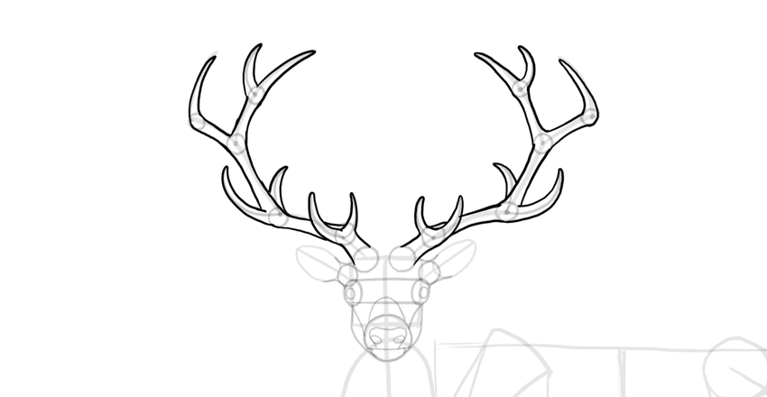
Add circles for the base of the antlers.

deer antlers base

Step 11

Mark all the points where you want the antlers to branch out.

deer antlers branching

Step 12

Sketch the „branches”.

deer antlers sketch

Step 13

Add a circle at every branching. This will help you achieve the right thickness of the antlers.

deer antlers thickness

Step 14

Outline the antlers.

deer antlers outline

4. How to Draw the Torso of a Deer

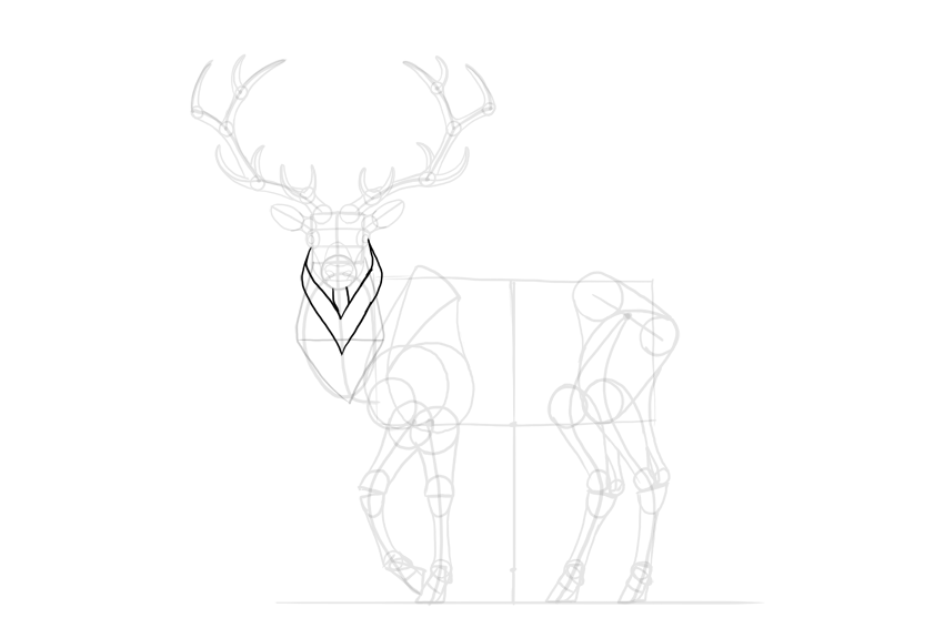
Step 1

Cross the neck with a line to find its width.

deer neck width

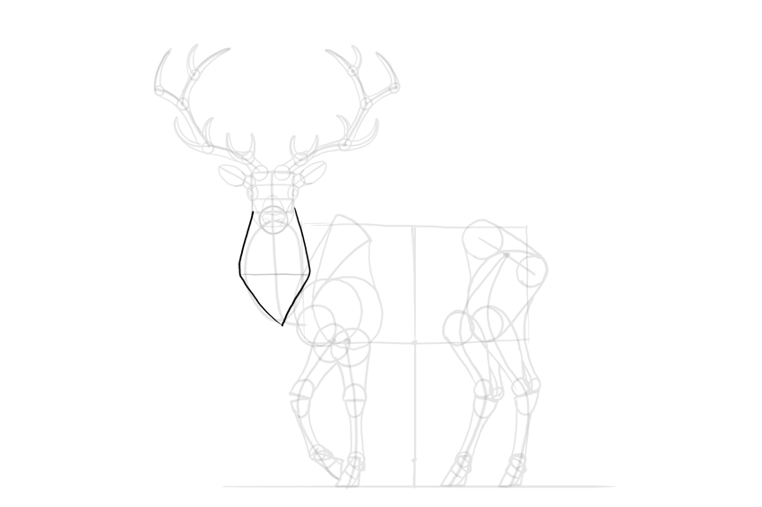
Step 2

Outline the neck, creating a diamond shape for the mane.

deer neck mane

Step 3

Add more layers to the mane.

deer detailed mane

Step 4

The spine of the deer reaches higher than the shoulder blade. Sketch the characteristic „hump” made by it.

deer back hump

Step 5

Finish the neck.

deer detailed neck
deer detailed torso

Step 6

Outline the whole torso.

deer torso shape

Step 7

Add the details.

deer tail

5. How to Finish a Drawing of a Deer

The sketch is finished, so now we can add the final lines. If you’re drawing traditionally, it’s good to use a darker tool now (for example, an ink liner will nicely cover the pencil strokes), or to place a new sheet of paper on the sketch and draw the final lines on it.

Step 1

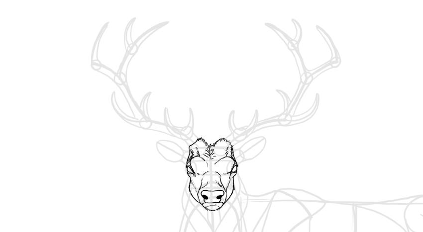
Sketch the bulging „eyebrows” of the deer.

deer grumpy face

Step 2

Draw the eyes with all the details.

how to draw deer eyes

Step 3

Draw the nose.

how to draw deer nose

Step 4

Outline the whole head. Not all lines should be outlined continuously—sketch them with short lines to simulate hair.

how to draw deer head

Step 5

Outline the ears. The darkness inside will make them look fluffy.

how to draw deer ears

Step 6

Outline the antlers and add some texture to them.

how to draw deer antlers

Step 7

Outline the mane.

how to draw deer mane

Step 8

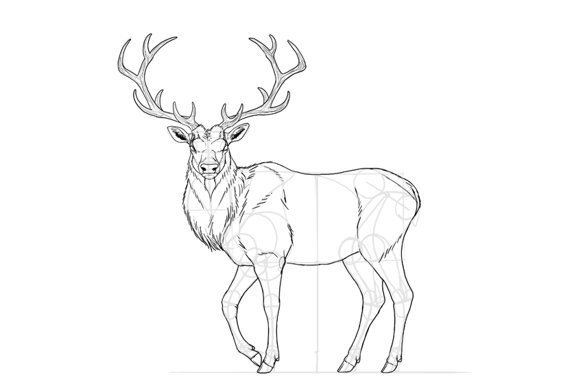
Outline the whole body.

how to draw deer silhouette

Step 9

You can add some details to accentuate the anatomy of the deer.

how to draw deer body details

Step 10

Darken the eyes, nose, and hooves.

how to draw a detailed deer

Step 11

Finally, you can outline the whole animal with a darker stroke, and shade it in a simple way using hatching.

how to shade deer

Good Job!

Did you like this tutorial? You may also enjoy other animal-themed tutorials of ours:

Or you may want to check out other deer-related tutorials:

How to Create a Low Poly Tree in Cinema 4D

Post pobrano z: How to Create a Low Poly Tree in Cinema 4D

Final product image
What You’ll Be Creating

Follow this tutorial step-by-step to create a low poly tree model that you can use in video games, graphic design and illustration projects whilst learning Cinema 4D quickly.

Some of the skills you’ll learn in this tutorial include creating basic 3D shapes, extrusion techniques, basic rendering techniques and how to colour 3D objects.

1. How to Create a Cube

Step 1

Open Cinema 4D and take a look at the top menu bar of the screen. You’ll find almost all the tools that you will need to create the floating island. 

Select a new project in Cinema 4D and enter Perspective Mode by selecting it with the mouse.

Four different views in Cinema 4D

Step 2

Navigate the mouse to the top of the screen and click on the Add Cube Object button in the top menu bar.

Primary-Click and Hold on the blue Add Cube Object button. This reveals a sub menu where you can click to create more objects. This will come in handy later on in the project. Create the Cube tool by clicking on it.

Clicking the Add Cube Object button

Step 3

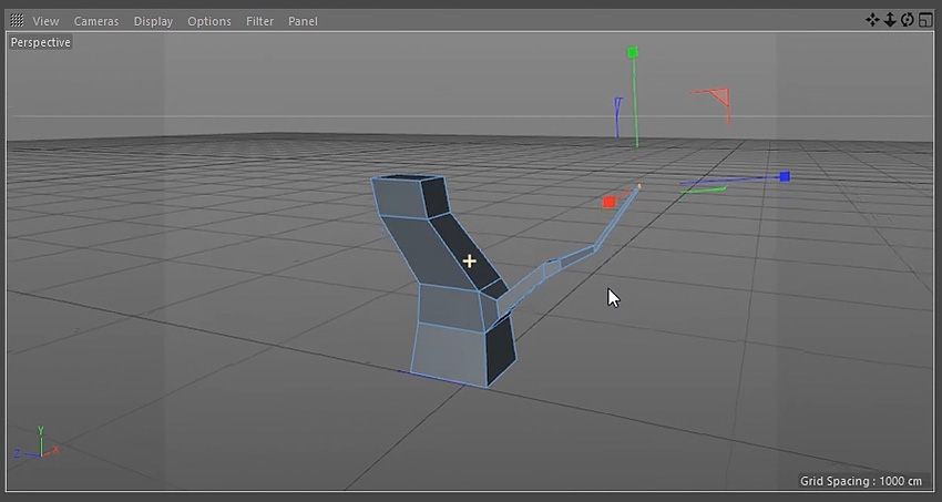
Make sure that the cube is selected and then click on the Make Editable button in the menu bar on the left of the screen.

Clicking the Make Editable button

2. How to Extrude Polygons from a Cube

Step 1

Select the Polygons button on the left side of the screen. This allows you to select the polygons on the cube.

Clicking the Polygons button

Step 2

Click the polygon that you would like to extrude. The polygon will appear highlighted in yellow. Hold the Control Button on the keyboard and use the mouse to hover over the direction you want to move the polygons to. For this example we will use the y axis (green arrow). 

The mouse cursor should change shape, indicating that you can move the polygons. Whilst holding the Control Button, click and drag the arrow to extrude the polygons.

Extruding the polygons from the cube object

Step 3

Choose from any of the polygons sides in order to extrude the object to the shape that you want.

Extruding polygons in different directions

3. How to create the Tree Trunk

Step 1

Use the Scale Tool to create a tapered look to the tree trunk. Make sure to select the top polygon first using the Polygons button.

Selecting the Scale Tool button

Step 2

Click and drag the axis using the scale tool to taper the top of the cube.

Scaling down the top polygon

Step 3

Extrude the polygons and use the Move Tool to change the direction of the tree trunk to give it an interesting shape.

Extruding polygons from the base

Step 4

Remember to taper the top polygon by using the Scale Tool.

Scaling down the top polygon

Step 5

Repeat the previous steps a few more times, using the Scale Tool and the Move Tool, until you are happy with the shape of the tree trunk.

Modelling the tree trunk

4. How to create Tree Branches

Step 1

To create the branches select the polygon for it’s point of origin using the Polygons button.

Once you have a polygon selected, secondary-click the mouse to bring up a menu and select Bevel from the list of options.

Selecting the bevel tool

Step 2

Click and drag on the selected polygon until you are happy with the shape of the bevel.

Using the bevel tool

Step 3

Use the Move Tool to extrude the branch out. Hold the Control Button on the keyboard whilst using the mouse to click and drag the selected polygon.

Extruding polygons for the branch

Step 4

Taper the branch using the same techniques used to taper the tree trunk. Play around using the Move Tool and the Scale Tool to get the best results.

Using the scale tool to taper the branch

Step 5

Keep extruding and tapering the branch out until you are happy with the overall shape. Remember to use the Move Tool to send the branch out into different directions.

Modelling and shaping the branch

Step 6

Choose another polygon on the branch and extrude another shape out.

Extruding and shaping the branch

Step 7

Repeat the steps above to create a second and third branch. Make sure to view the tree from different angles in the viewport. This will give you the most interesting shapes for the tree.

Creating a second branch
Creating a third branch

5. How to create Low Poly Leaves

Step 1

Navigate to the top menu and click and hold on the Cube Button. This reveals a menu with options to create more shapes. Select the Sphere. This will spawn a sphere in the scene.

Selecting the Sphere button

Step 2

Navigate to the top menu and click and hold the Bend Button. This will reveal another set of options. Select Polygon Reduction.

Selecting the Polygon Reduction button

Step 3

Drag the Polygon Reduction into the Sphere. This will reduce the amount of polygons in the sphere.

Dragging the Polygon Reduction into the Sphere

Step 4

Make sure Polygon Reduction is still selected. In the bottom window change the Reduction Strength until you are satisfied with the results.

Adjusting the Polygon Reduction strength setting

Step 5

Navigate to the top menu and click and hold the Bend Button again. This reveals another set of options. This time select Displacer.

Selecting the Displacer button

Step 6

Drag the Displacer into the Sphere. This changes the shape of the sphere and add more options.

Dragging the Displacer into the Sphere

Step 7

With the Displacer still selected, navigate to the bottom of the screen where the Displacer options are located. Select the Shading tab and click the arrow button next to Shader. Select Noise from the drop down menu.

Adjusting the Displacer settings

Step 8

Select the Object tab and adjust the Height until you are happy with the way the sphere looks.

Adjusting the Displacer settings

Step 9

Select the Sphere then select the Scale Tool. Make sure that the Model button is selected and use the Scale Tool to adjust the shape of the sphere until you are happy with it’s shape.

Scaling the sphere object

Step 10

Use the Move Tool to position the sphere correctly on the tree. Using all four views in the viewport can help with this. To do this, click on the middle button on the mouse.

Using the Move Tool to position the sphere

Step 11

Duplicate the Sphere by holding the Control Button and clicking and dragging the Sphere Object.

Duplicate the sphere object

Step 12

Move the new sphere to another position on the tree using the Move Tool. Adjust the look of the new sphere by selecting the Displacer and using the options as outlined in the previous steps.

Duplicating more spheres

Step 13

Continue to duplicate and position new spheres to create a look that you are happy with.

Creating the look of low poly tree leaves

Step 14

Repeat the steps to create leaves for the other branches of the tree.

Creating more low poly tree leaves

6. How to Group Objects

Step 1

Select all the Sphere Objects that belong to a group of leaves. Group objects by holding the Shift Key on the keyboard and selecting objects with the mouse.

Selecting a group of sphere objects

Step 2

With the objects selected press Alt-N to create a new group.

Grouping sphere objects together

Step 3

Use the mouse to select the Null Group and rename the group with a suitable name.

Renaming the group object

Step 4

Repeat the steps for each sphere group.

Renaming all the group objects

7. How to Colour Objects

Step 1

At the bottom of the screen click on the Create Button and select New Material.

Selecting the New Material button

Step 2

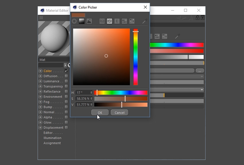
Double click on the Material and a new window will appear. Untick Reflectance.

Untick Reflectance in the Material Editor

Step 3

Select Colour and double click on the box at the top of the window.

Selecting the colour box

Step 4

Select a suitable colour for the tree trunk and then click the OK button.

Using the colour picker

Step 5

Apply the material to the tree trunk by clicking and dragging it to the object using the mouse.

Dragging the new material into the tree trunk

Step 6

Repeat the steps to create several different coloured materials for the leaves. 

Selecting new colours for more materials

Step 7

Apply the materials to the grouped objects.

Adding the new materials to the tree leaves

8. How to add Light to the Scene

Step 1

Choose a suitable angle in the viewport by navigating around the scene. Click on the Camera button at the top to create a camera.

Selecting the Camera button

Step 2

To set up the basic lighting, you’ll want to go to the Floor button located in the top menu bar. Left Click-Hold and then select Physical Sky from the menu.

Selecting the Physical Sky button

Step 3

Ensuring that Physical Sky is selected in the menu on the right, a new menu will appear on the bottom right of the screen. Select the Time and Location tab and choose a time using the left and right arrow keys. This will change the lighting of the scene. Choose a suitable time to light up the scene.

Adjusting the Time and Location

Step 4

To add additional lighting to the scene, select the Add Light button in the top menu bar at the top of the screen.

Selecting the Add Light button

Step 5

This will create a Light Object which you can move around the scene. Move the light object using the Move Tool to a suitable position.

Using the Move Tool to position the Light Object

Step 6

To customise the lighting further, experiment with the light object options in the bottom right of the screen. Here you can adjust the Intensity, Light Type and even Colour.

Adjusting the light settings

9. How to Render the Scene

Step 1

Click on the Render Settings button on the top menu bar.

Selecting the Render Settings button

Step 2

Choose the resolution, height and width of the image. This tutorial uses the settings 1920×1200 72dpi.

Adjusting the render settings for output

Step 3

Choose where you’d like to save the file and the file name. You may wish to tick Alpha Channel on, if you want to continue editing the image in another program such as Adobe Photoshop.

Adjusting the render settings for save

Step 4

Go to the Effect button at the bottom left and select both Ambient Occlusion and Global Illumination from the drop down menu. This will add these options to the render.

Selecting Ambient Occlusion and Global Illumination

Step 5

Click the Render button and wait for the render to finish.

Selecting the Render button

Conclusion

And with that, the 3D Low Poly Tree is complete. Feel free to share the own creations below. Explore different camera angles, lighting set ups and colours to find out what works best for the illustration.

You can also export the image to Adobe Photoshop to enhance it further or to use it as part of a larger scene or illustration. 

The final render of the low poly tree

How to Create a Glazed Cookie Text Effect in Adobe Photoshop

Post pobrano z: How to Create a Glazed Cookie Text Effect in Adobe Photoshop

Final product image
What You’ll Be Creating

This tutorial will show you how to use Photoshop’s brush settings, layer styles, and adjustment layers to create a fun, bright glazed cookies text effect. Let’s get started!

This text effect was inspired by the many Layer Styles available on GraphicRiver.

Tutorial Assets

The following assets were used during the production of this tutorial:

1. How to Create a Gradient Background and Text Layers

Step 1

Create a new 1000 x 800px document, and click the Create new fill or adjustment layer icon at the bottom of the Layers panel to add a Gradient layer.

Create the gradient fill using the Colors #e8d2d6 to the left and #ddbcc0 to the right, and change the Angle to 107.

Gradient Layer

Step 2

Create the text in All Caps using the font Sniglet, and set the Size to 250 pt.

You can create the whole word at once, or, if you want a more dynamic result, create each letter on a separate layer.

If you are creating the letters separately, make sure to place each one’s layer in a group with the letter’s name.

Create the Text Layers

2. How to Create and Save a Stroke Brush Tip

Step 1

Pick the Brush Tool and open the Brush panel. Choose a hard round tip and use these settings:

Brush Tip Shape

Brush Tip Shape

Shape Dynamics

Shape Dynamics

Step 2

Click the Create new brush icon in the bottom right corner of the panel, change the Name to Cookie Stroke, and click OK.

Cookie Stroke Brush Tip

3. How to Create and Stroke a Work Path

Step 1

Right-click the text layer and choose Create Work Path.

Create Work Path

Step 2

Create a new layer on top of the text layer, name it Stroke, make sure that the Brush Tool is still active, and hit the Return key to stroke the path.

Pick the Direct Selection Tool (A), and hit the Return key again to get rid of the work path.

Stroke the Work Path

Step 3

Put both the text and Stroke layers in a group and name it Text and Stroke.

Text and Stroke Group

4. How to Style a Layer Group

Double-click the Text and Stroke group to apply the following layer style:

Step 1

Add a Bevel and Emboss with these settings:

  • Size: 7
  • Check the Anti-aliased box
  • Highlight Mode:
    • Color: #b08965
  • Shadow Mode:
    • Color: #d3a35e
    • Opacity: 35%
Bevel and Emboss

Step 2

Add a Contour with these settings:

  • Contour: Half Round
  • Check the Anti-aliased box.
Contour

Step 3

Add a Drop Shadow with these settings:

  • Color: #762b3d
  • Opacity: 38%
  • Distance: 3
  • Size: 5
Drop Shadow

Step 4

Add another Drop Shadow effect instance with these settings:

  • Color: #7d3848
  • Opacity: 50%
  • Distance: 15
  • Size: 25
Drop Shadow

This will style the main cookie shape.

Styled Cookie Shape

5. How to Add a Texture Image

Step 1

Open the Biscuits image, and pick the Elliptical Marquee Tool to select one of the cookies in the image. You can select only the part you want to use as well.

Go to Edit > Copy to copy the selected part.

Select and Copy the Texture

Step 2

Go back to the original document and go to Edit > Paste to paste the copied biscuit texture.

Place the pasted layer inside the letter’s group on top of the Text and Stroke group. Then, right-click the biscuit texture layer, and choose Create Clipping Mask.

Press Command-T to enter Free Transform Mode, and resize and rotate the texture until you like how it looks.

Hit Return to commit the changes.

Add the Cookie Texture

6. How to Contract a Selection

Step 1

Command-click the text layer’s thumbnail to create a selection.

Create a Selection

Step 2

Go to Select > Modify > Contract, and change the Contract By value to 5.

Contract Selection

Step 3

Create a new layer at the top of the letter’s group and name it Glaze 01.

Fill the selection with White, and press Command-D to deselect.

Fill Selection

Step 4

Duplicate the Glaze 01 layer and name the copy Glaze 02, and change the copy’s Fill value to 0.

Duplicate the Layer

Step 5

Place both glaze layers in a group and name it Glaze.

Glaze Group

7. How to Create a Smooth Glaze Style

Double-click the Glaze 01 layer to apply the following layer style:

Step 1

Add a Bevel and Emboss with these settings:

  • Size: 9
  • Soften: 9
  • Check the Anti-aliased box
  • Highlight Mode: Soft Light
    • Color: #b08965
  • Shadow Mode:
    • Color: #b69c5e
    • Opacity: 35%
Bevel and Emboss

Step 2

Add a Contour with these settings:

  • Contour: Half Round
  • Check the Anti-aliased box.
Contour

Step 3

Add a Texture with these settings:

  • Pattern: Clouds
  • Depth: 25%
Texture

Step 4

Add an Inner Shadow with these settings:

  • Color: #d3d1c8
  • Opacity: 35%
  • Distance: 3
  • Size: 7
Inner Shadow

Step 5

Add a Color Overlay with these settings:

  • Color: #f1efde
Color Overlay

Step 6

Add a Drop Shadow with these settings:

  • Blend Mode: Linear Burn
  • Color: #2c1c0b
  • Opacity: 15%
  • Distance: 3
  • Size: 3
Drop Shadow

This will create a soft glaze style.

Styled Glaze

8. How to Create a Textured Glaze Style

Double-click the Glaze 02 layer to apply the following layer style:

Step 1

Add a Bevel and Emboss with these settings:

  • Size: 7
  • Soften: 7
  • Uncheck the Use Global Light box
  • Angle: 85
  • Altitude: 26
  • Check the Anti-aliased box
  • Highlight Mode: Vivid Light
    • Color: #ffffff
  • Shadow Mode: Linear Burn
    • Color: #b1997c
    • Opacity: 28%
Bevel and Emboss

Step 2

Add a Contour with these settings:

  • Contour: Half Round
  • Check the Anti-aliased box.
Contour

Step 3

Add a Texture with these settings:

  • Pattern: Satin
  • Depth: 26%
Texture

This will create a more textured glaze.

Styled Glaze

9. How to Create More Letters

Repeat the same steps to create any more letters you need.

Use the Free Transform Mode to rotate the letters and place them however you like.

You don’t need to re-apply all the layer styles for each layer. Instead, you can right-click the styled layer, choose Copy Layer Style, right-click the new layer you want to apply the same layer style to, and choose Paste Layer Style.

Once you’re done, place all the letter groups in another group and name it Text.

Text Group

10. How to Create a Sprinkles Brush Tip

Pick the Brush Tool and open the Brush panel.

Choose a hard round tip and use these settings:

Brush Tip Shape

Brush Tip Shape

Shape Dynamics

Shape Dynamics

Scattering

Scattering

11. How to Create a Sprinkles Style

Step 1

Create a new layer on top of the Text group, and place it in a group with the name Sprinkles.

Sprinkles Group

Double-click the new layer to apply the following layer style:

Step 2

Add a Bevel and Emboss with these settings:

  • Size: 6
  • Uncheck the Use Global Light box
  • Angle: 98
  • Altitude: 53
  • Check the Anti-aliased box
  • Highlight Mode: Vivid Light
    • Opacity: 5%
  • Shadow Mode: Color Burn
Bevel and Emboss

Step 3

Add a Contour with these settings:

  • Contour: Rounded Steps
  • Check the Anti-aliased box.
  • Range: 59%
Contour

Step 4

Add a Color Overlay with these settings:

  • Color: #f88dc7

This is where you can choose the color of the sprinkles on the styled layer, so you can choose any color you like.

Color Overlay

Step 5

Add a Drop Shadow with these settings:

  • Color: #2a2826
  • Opacity: 20%
  • Distance: 2
  • Size: 3
Drop Shadow

12. How to Add Sprinkles

Step 1

Rename the styled layer to the color you chose for the Color Overlay effect, and copy its layer style.

Click-drag slightly over the letters to add the sprinkles. You can change the brush tip’s Spacing and Scattering values as needed to create an effect you like.

Add the Sprinkles

Step 2

Create new layers, name each one with the color you want its sprinkles to be, and paste the layer style to it.

All you need to do to change the sprinkles’ color is double-click the sprinkles layer, and choose a new Color value for the Color Overlay effect.

Color Overlay

Step 3

You can add as many sprinkle layers and colors as you like to fill the text with.

Add More Sprinkles

13. How to Add Global Adjustments

Step 1

Once you’re done adding the sprinkles, put the Text and Sprinkles groups in another new group and name it Cookies.

Cookies Group

Step 2

Add a Levels adjustments layer and clip it to the Cookies group.

Then, change the Highlights value to 6, the Gamma to 0.90, and the Shadows to 248.

Levels

Step 3

Add a Vibrance adjustments layer and clip it to the Cookies group, and change the Vibrance value to 20.

Vibrance

Step 4

Add a Brightness/Contrast adjustments layer and clip it to the Cookies group, and change the Contrast value to 15.

BrightnessContrast

Step 5

Place the Cement texture image on top of the Gradient fill layer, resize it to fit within the document, and rename its layer to Texture Overlay.

Change the Texture Overlay layer’s Blend Mode to Linear Burn and its Opacity to 50%.

Texture Overlay

Congratulations! You’re Done!

In this tutorial, we created a gradient background and text layers.

Then, we created a simple brush tip, used it to stroke the text, and styled the text and stroke layers to create the main cookie shape.

After that, we created and styled glaze layers, and created a sprinkles brush tip that we added on top of the glazed cookies and styled with different colors.

Finally, we used a couple of adjustment layers to add global adjustments to the effect.

Please feel free to leave your comments, suggestions, and outcomes below.

Final Result