Archiwum kategorii: Web Tools

How to Create a Reindeer Cartoon Character in Adobe Illustrator

Post pobrano z: How to Create a Reindeer Cartoon Character in Adobe Illustrator

Final product image
What You’ll Be Creating

Learn how to create a cute reindeer character that will put you into the winter holiday spirit, using Adobe Illustrator.

For
the reindeer’s head, body, and legs, you’ll use effects to add texture
and brushes to add details. After that, you’ll create a cute face
for this little guy along with the classic red nose, draw the horns, and decorate them with a bauble and ribbon curls. By the end of this
tutorial, you will be able to apply these techniques to create other
cartoon characters in the future. Let’s start the fun!

If
you are hungry for more cartoon characters
decorations,
winter holidays or Christmas inspiration, be sure to check out GraphicRiver where you’ll
find more resources than you’ll ever need. 

What You’ll Need

To
complete the tutorial you will need the following assets:

1. How
to Open a New Document 

Launch
Illustrator
and
go to
File
> New
to
open a blank document. Type a name for your file, set up the
dimensions, and then select
Pixels
as
Units
and
RGB
as
Color
Mode
.
Make sure that
Align
New Objects to Pixel Grid
is
not checked.

Next,
go to
Edit
> Preferences > General
and
set the
Keyboard
Increment
to
1
px
and
while there, go to
Units
to
make sure they are set as in the following image. I usually work with
these settings, and they will help you throughout the drawing process.

how to open a new illustrator document

2. How
to Create the Head of the Reindeer

Step
1

First,
take the Ellipse Tool (L) and draw a 90 x 219 px ellipse on your
artboard (1). Use the Add Anchor Point Tool (+) to add extra points
on the path, and now distort the ellipse by moving these points and
also adjust their handles to get the shape of the head (2). Rotate
the head about 30 degrees and give it a light brown fill (3).

how to create the reindeer head shape

Step
2

While
the head shape stays selected, go to Effect > Stylize > Inner
Glow
and apply the settings shown (1); then go back and apply this
effect again using different settings (2).

how to apply Inner Glow effects to reindeer head shape

Step
3

Let’s
add some texture. With the head shape still selected, add a New Fill
above the first and use the same color; then go to Effect > Sketch
> Note Paper
and apply the settings shown (1). Set the Blending
Mode
to Multiply and reduce the Opacity to 12% (2).

how to apply texture to reindeer head shape

Step
4

Use
the Pen Tool (P) to draw three paths on the sides and at the bottom
of the head. Give them a 2 pt black Stroke and use the Dry Brush 6
Art Brush
from the Brush Libraries Menu > Artistic >
Artistic_Paintbrush
(1). 

Next, go to Effect > Blur > Gaussian
Blur
and apply a Radius of 6 px (2), and then set them to Blending
Mode Overlay
and 35% Opacity (3).

how to add details to reindeer head shape

Step
5

Select
the head shape and then Copy and Paste in Place (Shift-Control-V) in
order to make a copy of it in front of everything. Remove all
existing appearances for this copy. Now, select all the shapes on
your artboard and go to Object > Clipping Mask > Make
(Control-7)
. You can see the result in the image below, and at this
point the head is ready (2).

how to mask the reindeer head

3. How
to Create the Ears of the Reindeer

Step
1

Use
the Pen Tool (P) to draw the two ear shapes and give them a light
brown color (1). Next, apply the Inner Glow effect twice, as you did
for the head, but use the settings shown below (2).

how to draw the ears of the reindeer

Step
2

Draw
a similar but smaller shape on top, filled with light pink (2), and
then draw the second shape even smaller, filled with the same pink
(2). The third shape is the smallest; use the linear gradient
shown to fill it (3).

Now,
select only the second pink shape along with the smallest purple
shape and go to Object > Blend > Blend Options. Choose 20
Specified Steps
, hit OK, and then go back to Object > Blend >
Make (Alt-Control-B)
(4).

how to create the inner part of the reindeers ear

Step
3

Using
the Pen Tool (P), draw a curved path at the top of the pink ear shape
(1). Give it a 2 pt brown Stroke and use the Black Blend Brush 100×3
(info below). Group (Control-G) all the shapes that make up the left
ear to keep things organized in the Layers panel (2).

Follow
the same techniques to draw the other ear of the reindeer, or to make
things easier, you could just reflect vertically the first one (Object
> Transform > Reflect
) (3).

I
have an entire tutorial dedicated to
Blend
Art Brushes
and
how useful they are. I use them in my drawings all the time. You can
find more information on the
Black
Blend Art Brush 100×3
that
we are using today in 
How
to Create a Set of Multi-Use Blend Brushes in Adobe Illustrator
.

how to add detail on the reindeers ear

4. How
to Create the Body of the Reindeer

Step
1

Take
the Pen Tool (P) and draw a shape like in the next image as the body
(1). Use the same color, effects, and settings as for the head of the
reindeer earlier in the tutorial (2).

how to draw the body of the reindeer

Step
2

Select
the body shape and then Copy and Paste in Place (Shift-Control-V) in
order to make a copy of it in front of everything. Remove all
existing appearances for this copy (1).

Now,
select the body shape along with the copy and go to Object >
Clipping Mask > Make (Control-7)
. As a result, you will get smooth, clean edges (2).

how to mask the body of the reindeer

Step
3

To
create the belly, draw an ellipse on the body (1) and fill it with
the radial gradient shown. After that, go to Effect > Stylize >
Feather
and apply a Radius of 5 px to make the edges a bit smoother
(2).

how to draw the belly of the reindeer

5. How
to Create the Legs and Hooves of the Reindeer 

Step
1

Draw
with the Pen Tool (P) the shape of the leg (1) and use the same
color, effects, and settings as for the head and the body of the
reindeer. For the Inner Glow effects, use a smaller Radius value
because the shape of the leg is much smaller. You can see the result
in the image below (2).

You
can create a mask using a copy of the leg shape to get clean edges, just as you did earlier in the tutorial for the body.

how to draw the leg shape of the reindeer

Step
2

The
hoof is made of two shapes as shown in the following image (1), so draw
the two halves with the Pen Tool (P) and fill them with dark brown
(2). Next, draw two similar but smaller shapes in the middle filled
with a medium brown (3).

Now,
select the dark brown shape on the left side along with the smaller
shape on top of it and blend them using 20 Specified Steps. Do the
same thing for the right side of the hoof (4).

how to create the hoof of the reindeer

Step
3

Draw
with the Pen Tool (P) two paths on the hoof (1); give them a 1 pt
light brown Stroke and also use the Black Blend Art Brush. As a
result, you will get two highlights on the hoof (2).

Group
(Control-G)
all the shapes that make up the hoof to keep things
organized in the Layers panel.

how to highlight the hoof of the reindeer

Step
4

Make
a copy of the first leg and the hoof and arrange them on the left
side of the body as the “arm”. Move these two behind the body in
the Layers panel (1).

Make two other copies and arrange them as the right leg and the right
“arm”. These two should be in front of the body. Take the Pen
Tool (P)
and draw a slightly curved path at the base of the leg and
the “arm” (2); give them a 1.5 pt Stroke and use the Black Blend
Art Brush
again. This will create a small shadow at the base (3).

how to arrange the legs of the reindeer

6. How
to Create the Collar of the Reindeer

Step
1

Draw
a rectangle-like shape on the neck of the reindeer and use the linear
gradient shown to fill it (1). Copy and Paste in Back (Control-B)
this shape and move it 1-2 px downward by pressing the Down Arrow key
on your keyboard. Change the fill color to dark red (2).

how to draw the collar of the reindeer

Step
2

Go
to the Symbols panel, open the Symbol Libraries menu > Web Buttons
and Bars
and find the Bullet 6-Orange symbol. Drag it into your
artboard and go to Object > Expand (1). Select the bigger circle
and delete it.

Now,
select the outer circle and set the Angle of the gradient to -90
degrees
so the white is at the top and the gray at the bottom. Also
set the Blending Mode to Multiply (2). 

Select the new button (3), go
to Object > Transform > Scale, and type 22% in the Scale field.
Move the tiny button (4) on the collar and make two or three more copies.

how to add button details on the reindeers collar

7. How
to Create the Eyes of the Reindeer

Step
1

Use
the Ellipse Tool (L) to draw two ellipses as the eyes (1). Fill them
with a very light gray and then apply the Inner Glow effect using the
settings shown (2).

how to draw the eye shapes of the reindeer

Step
2

Draw
a smaller ellipse on each eye as the iris (1). Fill them with a dark
yellow and apply the Inner Glow effect (2).

how to draw the iris shapes of the reindeer

Step
3

Draw
two even smaller ellipses filled with black as the pupils (1). To add
some sparkles, draw two new ellipses on the pupils as shown in the image
below (2). Fill all of them with a basic black to white radial
gradient and set the Blending Mode to Screen (3).

how to draw the pupils and sparkles on reindeers eyes

Step
4

Use
the Pen Tool (P) to draw two curved paths above the eyes as the
eyebrows and two paths following the bottom edge of the eyes for the
shadows (1). Give all of them a 2 pt brown Stroke and use the Black
Blend Art Brush
(2).

how to create the eyebrows and shadows for reindeers eyes

Step
5

Draw
other two paths under the eyes, as shown in the next image (1). Give them
a 2 pt brown Stroke and use the Black Blend Art Brush again (2).

how to create the under eyes of the reindeer

8. How
to Create the Mouth of the Reindeer

Step
1

Grab
the Pen Tool (P) and draw a big mouth shape like in the following
image (1). Use the same color and effects as for the ears

of
the reindeer (2). 

Now, Copy and Paste in Back (Control-B) the mouth
shape, remove all existing appearances, and select just a brown fill
color. Move this copy 2 px downwards by pressing the Down Arrow key
on your keyboard twice (3).

how to draw the mouth shape of the reindeer

Step
2

While
the mouth shape stays selected, go to Object > Path > Offset
Path
and apply an Offset of -5 px (1). Fill the smaller shape
obtained with red and apply the Inner Glow effect (2).

how to create the gums of the reindeer

Step
3

Draw
the shapes of the teeth, four on each side. They don’t have to be
identical or perfectly round (1). Fill the teeth with pale
yellow and after that, draw a similar but smaller shape filled with
white on each tooth (2).

Select
only one tooth along with the smaller white shape on top of it and
Blend them using 12 Specified Steps. Repeat the same thing for the
rest of the teeth (2).

how to draw the teeth of the reindeer

Step
4

Zoom
on the teeth and draw with the Pen Tool (P) two paths right between
them (1). Give them a 0.5 pt Stroke using gray and the Black Blend
Art Brush
(2).

how to add shadow between the teeth of the reindeer

Step
5

Let’s
add a small highlight on the gums. Use the Pen Tool (P) or the Pencil
Tool (N)
to draw a short path on the left side of the teeth (1). Give
it a 1.5 pt Stroke using white and also the Black Blend Art Brush.
Since the Colorization is set to Tints, the brush becomes white as
well regardless of its name. Reduce the Opacity to 50% (2).

how to highlight the gums of the reindeer

9. How
to Create the Nose of the Reindeer

Step
1

Use
the Ellipse Tool (L) to draw two ellipses like in the next image
filled with red and dark red (1). While both shapes stay selected,
Blend them using 12 Specified Steps (2). Now, select the resulting
blend group, go to Effect > Stylize > Drop Shadow and apply the
settings shown below (3).

how to draw the red nose of the reindeer

Step
2

Draw
a new ellipse on the nose filled with a basic black to white radial
gradient (1). Apply a 2 px Gaussian Blur; then set it to Blending
Mode Screen
and 75% Opacity (2).

how to add shine on reindeers nose

Step
3

Use
the Pen Tool (P) to draw a path on the lower left side of the nose
(1). Give it a 2 pt Stroke using white and the Black Blend Art Brush.
Set the Blending Mode to Overlay and the Opacity to 75% (2).

Use
the Direct Selection Tool (A) to select only the bigger ellipse of
the nose and then Copy and Paste in Place (Shift-Control-V) to make a
copy of it in front of everything. Set this copy to stroke-none and
fill-none. Now, select the stroked path along with the nose copy (3)
and go to Object > Clipping Mask > Make (Control-7). You can
see the result in the image below (4).

how to highlight the reindeers nose

Step
4

At
this point the red nose is ready and you can Group (Control-G) all
the shapes that compose it to keep things organized in the Layers
panel. 

This cute reindeer is just missing his horns now.

reindeer cartoon character without horns

10. How
to Create the Horns of the Reindeer

Step
1

Grab
the Pen Tool (P) or the Pencil Tool (N) and draw four paths to define
the shape of the horns. Give them an 11 pt Stroke and press the Round
Cap
option in the Stroke panel (1). While the paths stay selected, go
to Object > Expand and then press Unite in the Pathfinder panel.
As a result, you will get the shape of the left horn (2).

Now,
you can make extra adjustments like making the top ends wider and
rounder or fix other areas that don’t look smooth enough (3).

how to draw the horns shape of the reindeer

Step
2

Repeat
the previous step and create the right horn (1) or you could just
reflect vertically the first one (Object > Transform >
Reflect
). Fill both horns with brown; then go to Effect > Stylize
> Inner Glow
and apply the settings shown (2).

how to color the reindeers horns

Step
3

Use
the Pen Tool (P) or the Pencil Tool (N) to draw a few short paths on
the horns where you want the highlights to be (1). For the green
paths select a 2 pt Stroke, for the orange paths select a 1 pt Stroke, and also use the Black Blend Art Brush.

With
all the paths still selected, go to Effect > Blur > Gaussian
Blur
and apply a Radius of 2 px (2).

how to highlight the reindeers horns

11. How
to Create the Bauble and Ribbons

Step
1

Take
the Ellipse Tool (L) and draw a 53 x 53 px circle filled with a golden
radial gradient (1). Draw a new circle on the upper right side of
the bauble filled with a basic black to white radial gradient and
after that, apply a 2 px Gaussian Blur. Set the Blending Mode to
Screen and the Opacity to 75% (2).

Continue
with another ellipse on the lower left side of the bauble filled with
a basic white to black radial gradient and apply a 2 px Gaussian Blur
again. Set the Blending Mode to Multiply and the Opacity to 15% this
time (3).

Let’s
create a mask now. Select the bauble shape and then Copy and Paste in
Place (Shift-Control-V)
to make a copy of it in front of everything.
Remove the existing appearances for this copy. Now, drag a selection
over the bauble to select all the shapes and go to Object >
Clipping Mask > Make (Control-7)
(4).

how to create the golden bauble

Step
2

To
create the hanging piece, first draw a rectangle-like shape at the
top of the bauble filled with the linear gradient shown (1). Next,
draw a circle having a 0.75 pt Stroke and after that, go to Object >
Expand
(2). Fill the resulting ring shape with the same golden
gradient (3).

how to create the hanging piece of the bauble

Step
3

To
add a shadow under the hanging piece, draw a path following the top
edge of the bauble (1). Give it a 0.5 pt brown Stroke and use the
Black Blend Art Brush (2). At this point, the bauble is ready, and you
can Group (Control-G) all the shapes (3).

how to add shadow under hanging piece of the bauble

Step
4

From
the bauble up to the horns, draw a thin rectangle slightly rounded at
the ends as the hanging ribbon (1). 

To create the ribbon curls, follow the sequence of
images and draw one segment at a time (2). There are no shortcuts
here.

how to hang the bauble and add ribbon curls in reindeers horns

Step
5

You
can add a second ribbon curl or as many as you want. 

To create the
small bow above the bauble, follow the sequence of images and draw it
with the Pen Tool (P).

how to add more ribbon curls and bow in reindeers horns

Step
6

The
golden curls are just a much thinner version of the red ribbon curls.
You can decorate the horns with as many as you want.

I’ve
used these ribbons in another tutorial of mine a while back, 
Create
a Set of Realistic Christmas Baubles
. Have a look and learn more about how to create vector baubles in Illustrator.

how to add more golden curls in reindeers horns

Step
7

This
cute guy is ready for Christmas now.

reindeer cartoon character with decorated horns

Congratulations!
You’re Done!

I
hope this tutorial was fun for you and put you into the winter
holiday spirit. Cartoon characters are my favorite to draw because
they put my imagination to the test, so if you decide to recreate this
cute reindeer, please share an image. I would love to see your work.

final image of reindeer cartoon character

How to Create a Shiny Tinsel Text Effect in Adobe Photoshop

Post pobrano z: How to Create a Shiny Tinsel Text Effect in Adobe Photoshop

Final product image
What You’ll Be Creating

This tutorial will show you how to use brush settings, layer styles, healing tools, adjustment layers, and some tips and tricks to create a shiny, bright, fun tinsel text effect. Let’s get started!

This text effect was inspired by the many Layer Styles available on GraphicRiver.

Tutorial Assets

The following assets were used during the production of this tutorial:

1. How to Create Background and Text Layers

Step 1

Create a new 1613 x 1075 px document, and go to File > Place Linked to open the Background Image.

Resize the Background Image to fit within the document and hit the Return key to commit the changes.

Background Image

Step 2

Create the text in All Caps using the font Quicksand Bold. Change the Size to 300 pt, the Kerning to Optical, and the Leading value to 325 pt if you have multiple lines of text.

Place the text however you like, and don’t worry about the background as we’ll fix it at the end of the tutorial.

Create the Text

2. How to Create Inner Work Paths

Next, we are going to create work paths inside the letters we have.

You can do that using the Pen Tool, but in this tutorial, we are going to use Photoshop’s new Curvature Pen Tool.

Step 1

Pick the Curvature Pen Tool, make sure to choose the Path option in the Options bar, and click once in the center of the first letter where you want to start creating the work path.

The Curvature Pen Tool is different from the Pen Tool. So to create corner points, you need to double-click when you add the point, and to create a curve, you can either click once or create a straight line instead, and then click on that line to add a point and drag it to create the curve.

When you finish creating the path, Command-click anywhere outside it.

Curvature Pen Tool

Step 2

You can also use any other shape tools to help you easily create the work path for some of the letters. For example, you can use the Ellipse Tool, with the Path option active, to create the work path for the letter O.

Ellipse Tool

Step 3

Make sure to create all the work paths needed to fill all the letters you have.

Create the Inner Work Paths

Step 4

It is very important to save the paths created. To do so, open the Paths panel, double-click the Work Path tab, and type Center in the Name field.

Save Work Path

This will save the work paths so that you can go back to them and use them any time.

Saved Work Path

Step 5

Right-click the text layer and choose Create Work Path to create the outer stroke path.

The dots on top of the letter E are a bit too big and will overlap with the letter when stroked with the tinsel brushes, so we’ll create smaller ones.

To do so, pick the Direct Selection Tool, select the dots, and hit the Delete key to delete them.

Create Work Path

Step 6

Then, use the Ellipse Tool to create smaller circular paths.

Once you’re done, double-click the new Work Path tab and name it Stroke.

Ellipse Tool

3. How to Create a Tinsel Brush Tip

Step 1

Pick the Rectangle Tool, choose the Shape option in the Options bar, and create a small 3 x 30 px Black rectangle.

Ellipse Tool

Step 2

Pick the Add Anchor Point Tool, and click once in the middle of each of the rectangle’s vertical sides to add two anchor points.

Add Anchor Points

Step 3

Use the Direct Selection Tool to select both added points, and click the Left Arrow key three times to nudge the points 3 px to the left.

Nudge the Anchor Points

Step 4

Command-click the Rectangle shape layer’s thumbnail to load the selection.

Load Selection

Step 5

Go to Edit > Define Brush Preset, and type Tinsel Brush in the Name field.

Define Brush Preset

4. How to Modify and Save Brush Tip Settings

Step 1

Pick the Brush Tool, choose the Tinsel Brush tip, and open the Brush panel to modify the settings:

Brush Tip Shape

Brush Tip Shape

Shape Dynamics

Shape Dynamics

Scattering

Scattering

Color Dynamics

Color Dynamics

Step 2

Click the Create new brush icon in the bottom right corner of the Brush panel, and change the Name to Brush 01.

Create New Brush

Step 3

Modify the same tip’s settings to create another variation:

Brush Tip Shape

Brush Tip Shape

Shape Dynamics

Shape Dynamics

Scattering

Scattering

Color Dynamics

Color Dynamics

Step 4

Click the Create new brush icon, and change the Name to Brush 02.

Create New Brush

Step 5

This is optional, but it’s a cool new feature in Photoshop that will help keep things a bit more organized.

Click the Brush Preset Picker icon in the Options bar, Command-click the icons of the three brush tips you’ve created for this tutorial (Tinsel Brush, Brush 01, and Brush 02), click the flyout menu icon, and choose New Brush Group.

Name the group Tinsel Brushes, and click OK.

New Brush Group

5. How to Stroke Work Paths

Step 1

We will create six new layers that will be used to create the main tinsel effect, and we will name them according to what they will contain. So it is important to name the layers as mentioned below to follow the tutorial easily.

The names from bottom to top are:

  • Stroke – Brush 01
  • Center – Brush 01
  • Center – Brush 02
  • Stroke – Brush 01 – White FG
  • Center – Brush 02 – White FG
  • Center – Brush 01 – Desaturated
Create New Layers

Step 2

Put all the new layers in a group and call it Tinsel, and set the Foreground Color to #d9001f and the Background Color to #300600.

New Group

Step 3

Open the Paths panel, and for each layer, select the path in the layer’s name, and stroke it with the brush tip mentioned along with it.

So if you select the Stroke – Brush 01 layer, you’ll need to click the Stroke work path in the Paths panel, pick the Brush Tool and choose the Brush 01 tip, and hit the Return key to stroke the path.

Stroke the Work Path

Step 4

To quickly switch between the brush tips, you can right-click anywhere to get the preset and choose the tip you need.

Switch Brush Tips

Step 5

Make sure to set the Foreground Color to White before you stroke the two layers that have White FG in their name.

White Foreground Color

Step 6

Change the Foreground Color back to #d9001f before creating the Center – Brush 01 – Desaturated layer’s stroke.

Stroke the Work Path

6. How to Add Glow and Shadow Effects

Double-click the Stroke – Brush 01 layer to apply the following layer style:

Step 1

Add an Inner Glow with these settings:

  • Blend Mode: Linear Light
  • Opacity: 50%
  • Color: #a7a7a7
  • Size: 10
Inner Glow

Step 2

Add a Drop Shadow with these settings:

  • Opacity: 36%
  • Distance: 10
  • Size: 5
Drop Shadow

This will style the first layer.

Styled Layer

Step 3

Double-click the Center – Brush 01 layer to apply an Inner Glow effect with these settings:

  • Blend Mode: Linear Light
  • Opacity: 74%
  • Color: #a7a7a7
  • Size: 10
Inner Glow

This will help build the glow effect to add more dimension to the tinsel.

You can hide the top layers to see the effects you apply, and then show them again.

Hide and Show Layers

Double-click the Center – Brush 02 layer to apply the following layer style:

Step 4

Add an Inner Glow with these settings:

  • Blend Mode: Linear Light
  • Opacity: 74%
  • Color: #a7a7a7
  • Size: 10
Inner Glow

Step 5

Add a Drop Shadow with these settings:

  • Opacity: 50%
  • Distance: 0
  • Size: 5
Drop Shadow

Step 6

Change the Center – Brush 02 layer’s Blend Mode to Overlay.

Blend Mode

7. How to Style Layers

Step 1

Change the Stroke – Brush 01 – White FG layer’s Blend Mode to Linear Light and its Opacity to 60%.

Layer Settings

Double-click the Center – Brush 02 – White FG layer to apply the following layer style:

Step 2

Add a Pattern Overlay with these settings:

  • Blend Mode: Vivid Light
  • Opacity: 70%
  • Pattern: FDR Glitter Pattern 02
Pattern Overlay

Step 3

Add a Drop Shadow with these settings:

  • Blend Mode: Linear Burn
  • Color: #8e8e8e
  • Opacity: 35%
  • Distance: 0
  • Size: 5
Drop Shadow

Step 4

Change the Center – Brush 02 – White FG layer’s Blend Mode to Linear Light.

Blend Mode

Step 5

Select the Center – Brush 01 – Desaturated layer, and go to Image > Adjustments > Desaturate.

Desaturate

Step 6

Double-click the Center – Brush 01 – Desaturated layer to apply an Inner Glow effect with these settings:

  • Blend Mode: Linear Light
  • Opacity: 60%
  • Color: #a7a7a7
  • Source: Center
  • Size: 7
Inner Glow

Step 7

Change the Center – Brush 01 – Desaturated layer’s Blend Mode to Soft Light.

Blend Mode

8. How to Colorize a Layer Group

Double-click the Tinsel group to apply the following layer style:

Step 1

Add a Color Overlay with these settings:

  • Color: #c29816
  • Blend Mode: Hue
Color Overlay

Step 2

Add another Color Overlay effect instance with these settings:

  • Color: #cecece
  • Blend Mode: Divide
Color Overlay

Step 3

Add a Drop Shadow with these settings:

  • Blend Mode: Linear Burn
  • Color: #1e0700
  • Opacity: 10%
  • Distance: 30
  • Size: 5
Drop Shadow

This will create the final tinsel effect.

Tinsel Effect

9. How to Create a Texture Overlay Using Filters

Step 1

Create a new layer on top of all layers, name it Texture Overlay, fill it with White, and right-click it to choose Convert to Smart Object.

Set the Foreground and Background Colors to Black and White.

Texture Overlay

Step 2

Go to Filter > Render > Fibers, and change the Variance to 30 and the Strength to 3.

Fibers Filter

Step 3

Go to Filter > Filter Gallery > Sketch > Bas Relief, and use these settings:

  • Detail: 13
  • Smoothness: 3
  • Light: Bottom
Bas Relief Filter

Step 4

Click the New effect layer icon in the bottom right corner, go to Texture > Grain, and use these settings:

  • Intensity: 40
  • Contrast: 50
  • Grain Type: Regular
Grain Filter

Step 5

Clip the Texture Overlay layer to the Tinsel group, and change its Blend Mode to Soft Light and its Opacity to 50%.

Layer Settings

10. How to Add Global Adjustments

Step 1

Add a Selective Color adjustment layer with these settings:

Yellows

  • Cyan: -10
  • Magenta: -2
  • Black: -5
Selective Color

Step 2

Add a Color Lookup adjustment layer, choose the Fuji ETERNA 250D Kodak 2395 (by Adobe).cube table from the 3DLUT File menu, and change its Opacity to 15%.

Color Lookup

Step 3

Add a Solid Color fill layer with the Color #150806 and change its Blend Mode to Soft Light and its Opacity to 20%.

Solid Color

Step 4

Use the Elliptical Marquee Tool to create an elliptical selection around the text, select the Solid Color layer mask’s thumbnail, and fill the selection with Black.

Layer Mask

Step 5

With the mask’s thumbnail still selected, open the Properties panel, and change the Feather value to 52% to create a quick simple vignette effect.

Vignette Effect

11. How to Add Glitter Using Brush Settings

Step 1

Create a new layer on top of the Background Image layer, and name it Background Glitter.

Background Glitter

Double-click the Background Glitter layer to apply the following layer styles:

Step 2

Add a Pattern Overlay with these settings:

  • Pattern: FDR Glitter Pattern 16
Pattern Overlay

Step 3

Add a Drop Shadow with these settings:

  • Blend Mode: Linear Burn
  • Color: #0a1119
  • Opacity: 15%
  • Distance: 1
  • Size: 2
Drop Shadow

Step 4

Pick the Brush Tool, choose the Airbrush Hard Low Density Grainy tip, and open the Brush panel to change the Scattering settings as needed.

The important thing for this to work is to use a big, 300px brush tip Size.

Scattering

Step 5

Click-drag slightly to add the glitter behind the text. You can change the brush settings to get a result you like.

Add the Glitter

12. How to Modify a Background Image

Step 1

Double-click the Background Image Smart Object’s thumbnail to open its file.

Pick the Content-Aware Move Tool, and set the Mode to Move in the Options bar.

Select the object you want to move and place somewhere else, and make sure to include some empty space around it within the selection.

You can check the Transform on Drop box if you want to transform the object after moving it.

Content-Aware Move Tool

Step 2

Move the selected object to its new position, transform it if needed, and then hit Return.

Move the Selected Element

Step 3

After that, you can use any of the other Healing Tools to better blend the object’s edges with the new background.

You can also use the Dodge, Burn, and Sponge Tools wherever needed.

Blend with the New Background

Step 4

If there are any parts you want to remove completely, select them using any selection tool, and go to Edit > Fill and choose Content-Aware from the Content menu.

Content-Aware Fill

Step 5

Again, use the Healing Tools to make any further adjustment to the area after removing the object.

Healing Tools

Step 6

Make any other adjustment needed to the background using the same tools.

Adjust the Background

Step 7

You can save the file and go back to the original document to see the changes there and make any necessary adjustments.

Make Further Adjustments

13. How to Add Finishing Touches

Step 1

Add a Hue/Saturation adjustment layer and clip it to the Background Image layer.

Choose the Yellows channel, and change the Saturation value to -25.

HueSaturation

Step 2

We need the Hue/Saturation layer to affect only the bells in the image.

So fill the Hue/Saturation layer mask with Black, set the Foreground Color to White, and use a soft round brush tip to brush over the bells.

Adjust the Layer Mask

Step 3

Select the Background Glitter layer and click the Add layer mask icon at the bottom of the Layers panel.

Set the Foreground Color to Black, and paint over the areas you want to remove the glitter from, like the bells and the trees, since the glitter is supposed to be under them.

Modify the Background Glitter

Congratulations! You’re Done

In this tutorial, we created a simple brush tip and adjusted its settings to create the main tinsel effect.

Then, we styled the many layers used in creating the effect to achieve the final result. After that, we added glitter, modified the background image, and added global adjustments to the effect.

Finally, we used some more adjustment layers and layer masks to add final touches.

Please feel free to leave your comments, suggestions, and outcomes below.

Final Result

How to Create the USS Enterprise From Star Trek in Adobe Illustrator

Post pobrano z: How to Create the USS Enterprise From Star Trek in Adobe Illustrator

Final product image
What You’ll Be Creating

If you’re a true Star Trek fan, then you’re going to love this tutorial
since we’re going to be recreating the iconic NCC-1701 starship, using a step-by-step
process based on some basic geometric shapes and tools.

You can always expand your collection by
heading over to GraphicRiver, where you’ll find a great selection of vector illustrated starships.

That being said, grab a hot cup of the energizing space juice, and let’s get started! 

1. How to Set Up a New Project File

Since I’m hoping you already have
Illustrator up and running in the background, bring it up and let’s set up a New Document (File > New or Control-N)
for our project using the following settings:

  • Number
    of Artboards:
    1
  • Width:
    800
    px
  • Height:
    600
    px
  • Units:
    Pixels

And from the Advanced tab:

  • Color
    Mode:
    RGB
  • Raster
    Effects:
    Screen (72ppi)
  • Preview Mode: Default
setting up a new document

2. How to Set Up a Custom Grid

Even though today we’re not working on
icons, we’ll still want to create the illustration using a pixel-perfect
workflow, so let’s set up a nice little Grid so that we can have full control
over our shapes.

Step 1

Go to the Edit > Preferences > Guides & Grid submenu, and adjust
the following settings:

  • Gridline
    every:
    1 px
  • Subdivisions: 1
setting up a custom grid

Quick
tip:
you can learn more about grids by reading this
in-depth piece on How Illustrator’s Grid System Works.

Step 2

Once we’ve set up our custom grid, all we
need to do in order to make sure our shapes look crisp is enable the Snap to Grid option found under the View menu (that’s if you’re using an
older version of Illustrator).

Now, if you’re new to
the whole “pixel-perfect workflow”, I strongly recommend you go through my How
to Create Pixel-Perfect Artwork
tutorial, which will help you widen your
technical skills in no time.

3. How to Set Up the Layers

Once we’ve finished setting up our project
file, it would be a good idea to structure our document using a few layers, since this way we can maintain a steady workflow by focusing on one
section of the illustration at a time.

That being said, bring up the Layers panel and create a total of four
layers, which we will rename as follows:

  • layer
    1:
    background
  • layer
    2:
    starship
  • layer
    3:
    warp lines
  • layer 4: texture
setting up the layers

Quick tip: I’ve colored all of my layers using the same
green value, since it’s the easiest one to view when used to highlight your
selected shapes (whether they’re closed or open paths).

4. How to Create
the Background

We’re going to kick off the
project by quickly creating the interstellar background, so make sure you’re on
the right layer (that would be the first one), and then lock all the other ones
so that we can get started.

Step 1

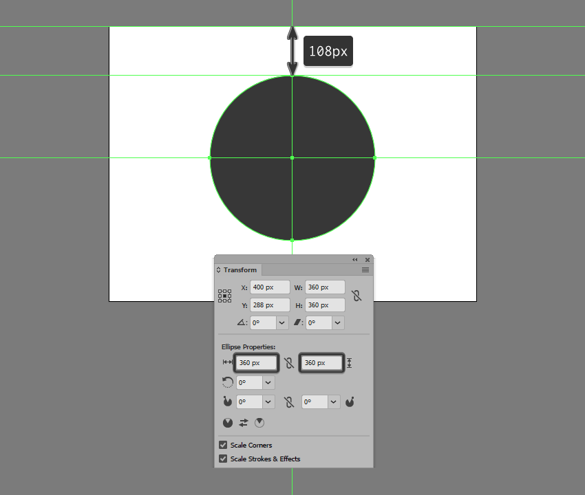
Create a 360 x 360 px circle,
which we will color using #343434 and then center align to the underlying
Artboard, positioning it 108
px
from its top edge.

creating and positioning the background

Step 2

Take a couple of moments and add the static stars using a couple of 4 x 4 px circles, which we will color
using a lighter orange (#EFC36C) and a slightly darker one (#EF986C) and
position on the background as seen in the reference image. Once you’re done,
select and group all of them together using the Control-G keyboard shortcut.

adding the static stars

Step 3

Start working on the first of the moving objects by creating its tail
using a 4 x 16 px rectangle, to
which we will apply a 90º Linear Gradient using #6FCDE2 for both
color stops. Set the right color’s Opacity
to 0%, positioning the resulting
shape next to one of the static stars.

creating the tail for the moving object

Step 4

Add the head section using a 4 x 4 px circle, which we will color
using #6FCDE2 and then position onto the tail as seen in the reference image.
Once you have the shape in place, select and group (Control-G) the two together before moving on to the next step.

adding the head to the moving object

Step 5

Add a few more moving objects using copies (Control-C > Control-F) of the one that we’ve just finished
working on, which we will position on the sides of the background as seen in
the reference image. Once you’re done, don’t forget to select and group (Control-G) all of them together.

adding the moving objects to the background

Step 6

As soon as you’ve finished working on the background, you can select and
group (Control-G) all its composing
shapes together, locking its layer before moving on to the next one.

locking the background layer

5. How to Create
the Starship

Assuming you’ve
finished working on the background, make your way to the next layer (that would
be the second one) and let’s start building the iconic USS Enterprise NCC-1701
starship!

Step 1

Create the main shape for the ship’s secondary hull using a 28 x 64 px rectangle, which we will
color using #AAAAAA and then center align to the underlying background,
positioning it 140 px from its top edge.

creating the upper section of the secondary hull

Step 2

Add the hull’s center section
using a 28 x 80 px rectangle (#AAAAAA),
which we will adjust by individually selecting its bottom anchor points using
the Direct Selection Tool (A), and
then pushing them to the inside by 4 px using the Move tool
(right click > Transform > Move
> Horizontal > +/- 4 px
depending on which side you start with).
Once you’re done, position the resulting shape as seen in the reference image.

creating the center section of the secondary hull

Step 3

Position another smaller 20 x 4
px
rectangle (#AAAAAA) beneath the one that we’ve just adjusted, and then
select and unite all three shapes into a single larger one using Pathfinder’s Unite Shape Mode.

creating the lower section of the secondary hull

Step 4

Create the hangar’s entry section using a 12 x 4 px rectangle (#7F7F7F), which we
will adjust by setting the Radius of
its bottom corners to 4 px from
within the Transform panel’s Rectangle Properties. Position the
resulting shape beneath the larger hull, making sure to leave a 4 px gap between them, which will act
as a hard shadow.

adding the hangar section to the secondary hull

Step 5

Start adding details to the current section of the ship by creating an 8 x 8 px circle (#7F7F7F), on top of
which we’ll add a smaller 4 x 4 px one
(#F2A16B), which we will group (Control-G)
and then position at a distance of 2 px from
its bottom edge.

adding the circular detail to the secondary hull

Step 6

Add the vertical detail line using a 2 x 56 px rounded rectangle (#7F7F7F)
with a 1 px Corner Radius, which we
will center align to the hull, positioning it at a distance of 2 px from its circular detail.

adding the vertical detail line to the secondary hull

Step 7

Create a slightly bigger 8 x 24
px
rounded rectangle (#7F7F7F) with a 4
px Corner Radius
, which we will position on the vertical detail line so
that it overlaps its bottom section by 4 px.

adding the rounded rectangle to the secondary hull

Step 8

Next, take a couple of moments and add the
little rectangular details using fourteen 2
x 4 px
rectangles (#7F7F7F), which we will position onto the sides of the
hull as seen in the reference image. Once you’re done, make sure
you select and group all of them together using the Control-G keyboard shortcut.

adding the rectangular details to the secondary hull

Step 9

Add the shadow cast by the ship’s main hull
using a 152 x 152 px circle, which
we will color using #343434 and then center align to the current section’s top
edge.

adding the projected shadow to the secondary hull

Step 10

Mask the shadow that we’ve just created using a
copy (Control-C) of the ship’s
secondary hull (highlighted with red), which we will paste in front (Control-F), and then with both shapes
selected, right click > Make Clipping
Mask
. Once you’re done, select and group (Control-G) all of the current section’s composing shapes together,
before moving on to the next step.

masking the circular shadow

Step 11

Star working on the ship’s main hull by creating
a 136 x 136 px circle, which we will
color using #D8D8D8 and then center align to the previous section’s top edge.

creating the main hull

Step 12

Add a subtle highlight by creating two copies
(Control-C > Control-F twice) of
the circle that we’ve just positioned, and then pushing the top
one to the bottom by 4 px,
cutting it out from the one from underneath afterwards using Pathfinder’s Minus Front Shape Mode. Color the resulting shape using white
(#FFFFFF), before moving on to the next step.

adding the highlight to the main hull

Step 13

Add the ring
sections using five 2 px thick
circles (#AAAAAA), with the following Width
and Height values:

  • first circle: 126 x 126 px
  • second circle: 106 x 106 px
  • third circle: 86 x 86 px
  • fourth circle: 66 x 66 px
  • fifth circle: 46 x 46 px

Position the shapes as seen in the reference image, making sure to select
and group all of them together afterwards using the Control-G keyboard shortcut.

adding the ring sections to the main hull

Step 14

Start working on the detail lines by creating the vertical one using a 140 px tall 2 px thick Stroke (#AAAAAA),
which we will center align to the ship’s main hull.

adding the vertical detail line to the main hull

Step 15

Create the second line using the Rotate
tool, by selecting the one that we’ve already have and then right click > Transform > Rotate >
Angle >
360 / 16 (which gives
you a 22.5º angle), making sure to
use the Copy function. The first
value is the actual circumference of the circle, while the second one is the
number of segments that we want to delimit after adding all the line details.

adding the second detail line to the main hull

Step 16

Gradually add the remaining strokes using
Illustrator’s repeat function, by pressing Control-D six times, until you have the same result as in the reference image.

adding the remaining detail lines to the main hull

Step 17

Make sure that all of the lines’ anchor points
are snapped to the underlying pixel grid, by turning on Pixel Preview mode (Alt-Control-Y) and then manually
selecting and repositioning them with the help of the Direct Selection Tool (A). Take your time, and once you’re done, select and group all of the adjusted strokes together using the Control-G keyboard shortcut.

example of anchor snapping

Step 18

Create an 8
x 6 px
rectangle, which we will color using #7F7F7F and then center align
to the circle’s bottom edge.

adding the bottom rectangular detail to the main hull

Step 19

Add a 4 x
24 px
rectangle (#7F7F7F) above the shape that we’ve just created,
adjusting it afterwards by setting the Radius
of its top corners to 2 px from
within the Transform panel’s Rectangle Properties.

adding the taller detail shape to the main hull

Step 20

Select and group all of the main hull’s details, masking them afterwards using a copy (Control-C > Control-F) of the larger underlying circle (right click > Make Clipping Mask).

masking the details of the main hull

Step 21

Start working on the bridge section by creating
a 28 x 28 px circle, which we will
color using #EDEDED and then center align to the larger underlying circle.

creating the main shape for the bridge section

Step 22

Adjust the shape that we’ve just created by selecting its bottom anchor point using the Direct Selection Tool (A), and then
pushing it to the bottom by 12 px using the Move tool (right click > Transform > Move > Vertical > 12 px).

adjusting the shape of the bridge section

Step 23

As we did with the ship’s main hull, give the bridge section a 2 px tall highlight which we
will color using #FFFFFF.

adding the highlight to the bridge section

Step 24

Add the hard shadow using a copy (Control-C
> Control-B
) of the shape that we adjusted a few steps ago, which we
will color using #343434 and then push to the bottom by 4 px using either the keyboard’s
directional arrows or the Move tool (right click > Transform > Move >
Vertical > 4 px
).

adding the shadow to the bridge section

Step 25

Create the center section of the bridge using a 12 x 12 px circle (#7F7F7F), on top of which we will add a smaller 4 x 4 px one (#EDEDED), which we will
group (Control-G) and then center
align to the larger underlying shape.

adding the center section to the bridge

Step 26

Add some of the bridge’s details using a few rectangles (#7F7F7F)
and a circle (#7F7F7F), which we will position as seen in the reference image.
Take your time, and once you’re done, select and group (Control-G) all of the current
section’s composing shapes before moving on to the next step.

adding the little details to the bridge section

Step 27

Create the rectangular details sitting on top of the hull’s second ring
section, using four 8 x 4 px rectangles
(#AAAAAA), which we will rotate using a 45º
angle (right click > Transform >
Rotate > 45º
), making sure to snap their anchors back to the Pixel Grid.

adding the detail rectangles to the main hull

Step 28

Finish off the hull by adding the two circular details using an 8 x 8 px circle (#7F7F7F), on top of
which we will add a smaller 4 x 4 px one
(#F2A16B), which we will group (Control-G), duplicate (Control-C > Control-F), and then position onto the sides of the ship as seen in the reference image.
Once you’re done, select and group (Control-G)
all of the current section’s composing shapes, before moving on to the next
step.

adding the circular details to the main hull

Step 29

Start working on the left propulsion unit’s wing by creating a 24 x 12 px rectangle (#D8D8D8), which we
will position at a distance of 22 px from
the secondary hull’s bottom edge and 6
px
from its vertical detail line.

creating the main shape for the left wing

Step 30

Give the shape that we’ve just created a subtle highlight using a 24 x 2 px rectangle, which we will
color using #FFFFFF and then center align to its top edge.

adding the highlight to the left wing

Step 31

Add three 4 x 4 px detail
squares (#7F7F7F) positioned 2 px from
one another, which we will group (Control-G)
and then position 2 px from
the wing’s left edge and its top highlight. Once you have them in place, select
and group (Control-G) all of the
current section’s composing shapes before moving on to the next step.

adding the detail squares to the left wing

Step 32

Create the main shape for the ship’s left warp engine using a 16 x
128 px
rectangle, which we will color using #EDEDED, and then position at a
distance of 4 px from the smaller
wing and 28 px from the ship’s main
hull.

creating and positioning the main shape for the left warp drive

Step 33

Add the tip using a 12 x 12 px circle
(#F2A16B), which we will center align to the taller rectangle, positioning it
at a distance of 8 px from its top
edge.

adding the tip to the left warp drive

Step 34

Create a 16 x 8 px rectangle
(#EDEDED), which we will adjust as seen in the reference image, positioning the
resulting shape on the lower half of the tip.

adding the upper rectangular detail to the left warp drive

Step 35

Fill in the gap between the warp engine’s main body and its tip by
positioning a 16 x 2 px rectangle, which we will color using #EDEDED.

adding the smaller detail rectangle to the left warp drive

Step 36

Add some of the current section’s highlights (#FFFFFF) using the reference image as your main guide.
Take your time, and once you’re done, move on to the next step.

adding the highlights to the left warp drive

Step 37

Create the left wing segment using a 4 x 32 px rectangle (#AAAAAA), which we will adjust by setting the Radius of its left corners to 2 px from within the Transform panel’s Rectangle Properties. Center align a 2 x 12 px rectangle (#7F7F7F) to the resulting shape’s right edge,
grouping (Control-G) and then
positioning the two at a distance of 2
px
from the current section’s bottom edge.

adding the left wing to the left warp drive

Step 38

Add the right wing using a copy (Control-C
> Control-F
) of the one that we’ve just created, which we will
vertically reflect (right click >
Transform > Reflect > Vertical
) and then position on the opposite
side of the warp engine.

adding the right wing to the left warp drive

Step 39

Create a 16 x 4 px rectangle,
which we will color using #636363 and then position below the warp engine’s
main body.

adding the bottom rectangle to the left warp drive

Step 40

Add the rear end of the engine using a 16 x 16 px square (#7F7F7F), which we will adjust by setting the Radius of its bottom corners to 6 px.

adding the rear end to the left warp drive

Step 41

Give the shape that we’ve just created a set of four 2 x 16 px rectangles (#636363)
positioned 2 px from one another,
which we will group (Control-G) and
then mask. Once you’re done, select and group (Control-G) all of the left warp engine’s composing shapes together,
before moving on to the next step.

adding the vertical lines to the rear end of the left warp drive

Step 42

Finish up the ship by creating the right warp engine using a copy of
the one that we’ve just finished working on, which we will vertically reflect (right click > Transform > Reflect
> Vertical
), and then position on the opposite side. Once you’re done,
select and group all of its composing sections using the Control-G keyboard shortcut.

adding the right warp drive

6. How to Create
the Warp Lines

Assuming you’ve locked
the previous layer and already moved on to the next one (that would be the
third one), let’s take a couple of moments and add the little warp lines that help
create the illusion of movement.

Step 1

Create the left-sided warp lines using five 2 px wide rounded rectangles (#FFFFFF)
with a 1 px Corner Radius and
varying heights, which we will position as seen in the reference image, making
sure to select and group (Control-G)
them together afterwards.

creating the left warp lines

Step 2

Add the right-sided warp line using a copy (Control-C > Control-F) of the ones
that we’ve just finished working on, which we will vertically reflect (right click > Transform > Reflect
> Vertical
) and then position on the opposite side of the ship.

adding the right warp lines

Step 3

Finish off the current section by adding the
bottom warp lines (#FFFFFF), making sure to select and group all of them
together afterwards using the Control-G keyboard
shortcut.

adding the bottom warp lines

7. How to Create the Texture

Since we’re pretty much done working on our starship, we can now move on to
the fourth and last layer, where we will create the subtle texture covering the
entire illustration.

Step 1

Unlock the first two layers and then quickly grab
a copy (Control-C) of the background
and the ship’s sections that go outside of its surface, which we will paste (Control-F) back onto the texture layer,
making sure to color them using black (#000000) afterwards.

creating the main shapes for the texture

Step 2

Select all of the shapes that we’ve just pasted, and make them behave
like a single larger one by using Pathfinder’s
Make Compound Shape advanced option.

turning the texture shapes into a compound shape

Step 3

Select the resulting compound shape and turn it into a texture by going
to Effect > Photoshop Effects >
Texture > Grain
 and setting the Intensity
to 58, making sure to set the Grain Type to Sprinkles.

texture settings

Step 4

Finally, set the resulting texture’s Blending Mode to Soft Light,
lowering its Opacity all the way
down to 20%.

adjusting the blending mode

Live Long and
Prosper!

It might have taken us a while to get here, but I truly believe the end
result makes it all worth it. That being said, I hope you’ve managed to follow
each and every step, and if you have any questions, feel free to post them
within the comments area and I’ll get back to you as soon as I can!

final result preview

How to Create Unique Paint Effects With Watercolour and Gouache

Post pobrano z: How to Create Unique Paint Effects With Watercolour and Gouache

Final product image
What You’ll Be Creating

I love the unpredictability of watercolour and gouache, and in this tutorial I will introduce you to the materials I use while painting and the effect they have on the paints I use.

Why Use Paint Effects?

Painting
is fun. Part of that fun is experimenting, and part of that experimentation
is not knowing what is going to happen with a painting as you work on it. I find
all of this very exciting.

Texture adds a great deal of interest to a painting,
and watching someone walk up close to one of my pieces because they want to see what I have done more
clearly is thrilling.

What You Will Need

Your
imagination. Anything goes—you just need your usual paper and paint and patience to see if your ideas work. 

Here are just some of the things I’ve been known to use in my paintings:

  • silicone
  • alcohol
  • salt
  • bleach
  • thread
  • clingfilm
  • gesso

An example of some of the items I use in my paintings

Water-Based Effects

Like every artist, I use plain water with my watercolour and gouache, but you don’t have to do that all the time. I like to add a few things to it, resulting in different appearances. Below is a mix of watercolour and gouache with just plain tap water.

Plain water

All the examples below are of a water mix put down
on clean paper and then adding the paint in after.

1. Water Plus Salt

If I sprinkle a good helping of salt in my water, swirling it until it has dissolved, the paint spreads more and becomes granular.

Water plus salt

2. Water Plus Bleach

I love this effect. The colours are so soft, and they feather at the edges. Experiment with how much bleach you mix into your water—it’s up to you, of course.

Water plus bleach

3. Water Plus Alcohol

I use either vodka (I’m a non-drinker, so I don’t have any qualms about using it to paint with) or rubbing alcohol (bought online) for this. The alcohol puts a stop to the spreading of my paint. 

Water plus alcohol

Clingfilm

Depending on where you are from, you may call this stuff something different—cellophane, cling wrap, or saran wrap are all different names
for what I know as clingfilm. But it all does the same thing with watercolour
and gouache.

Lay down your paint first, and while it is wet,
place a strip of clingfilm on top. I move it around to get the patterns and
shapes I want, and to get the direction I want them to be moving in.

Clingfilm

When the paint is dry, lift the clingfilm and you will be left with this…

Clingfilm - the result

Occasionally,
I leave the dried paint and clingfilm and feed a new, more watery colour down inside
while moving my paper at different angles, forcing the paint to spread about as
it desires. I then wait until this is dry before lifting the clingfilm.

Gesso

Gesso is wonderful. It can be watered down to any consistency you prefer. I like painting it onto my paper and leaving the brush strokes in it. When it’s dry, it is easy to paint over and scrape into (using a knife, nail, or pin), and it dries quickly.

Gesso

You can also build it up into shapes you want (below), and if you make a huge mistake with something you are working on, you can use gesso to paint over it and start again.

Gesso snodrops

Salt

A lot of watercolour artists swear by this, but I have to admit I find it a bit hit or miss (it just means I get to do more experimenting). The effects can be spectacular, but I find that although I do get a 2D texture, it isn’t enough for me. I thought I should include it, though, because you may have more luck. I may have to look at the type of paper I use—I prefer to use rough, but smooth may work better. However, I have found that the type of salt does make a difference. I sprinkle the salt onto wet watercolour, and it does its magic as it dries.

This is what dried paint looks like without salt…

Paint without salt

1. Table Salt

This tends to be the least successful as I find the grains are too fine.

Wait until the paint is dry before brushing off the salt. Some is likely to remain stuck to your paper, though.

Table salt

You will end up with a slightly granulated effect and an uneven spread of colour, but that’s what I tend to be looking for when I use salt.

Table salt dried

2. Flaked Salt

Flaked salt

This works better than table salt, and is easier to remove when it dries.

Flaked salt dried

3. Rock Salt

My favourite. It soaks up the colour, leaving little star effects in the dried paint, and it’s easily removed.

Rock salt

Just be patient when letting it dry as shaking it off your painting too early could leave you with wet paint trails where the salt has moved.

Rock salt dried

Bleach

I use this as pure bleach or watered down. I sprinkle it or paint it into my work. I use it on wet paint or dry. Something always happens, and the higher the concentration of the bleach, the more colour you lose. It’s smelly but exciting stuff. Just be careful not to splash it on your clothes.

Below is bleach dropped onto dry paint. I have used pure bleach here, without watering it down. 

Bleach dropped onto dry paint

Below is bleach dropped onto wet paint—there is more of a spread into the colour.

Bleach dropped onto wet paint

Blowing

It’s not all about what you can add to your paint. Sometimes, just blowing and manipulating the directions you blow your paint in makes all the difference. You can also change the angle of your board, tilting it as you work to move the paint around your paper.

Blowing your paint around your paper works too

Crackle Glaze

I rather like this one. It dries clear, so it can be painted on top of what you have already done and can also be painted over.

Crackle glaze painted over

Or you can rub into it, leaving a different colour in the cracks (below), and wiping off the excess on top, which allows the colour underneath to shine through.

Crackle glaze with paint rubbed into the cracks

PVA Glue

You can use this in a couple of ways. There’s the obvious use as, well, glue, sticking papers and whatever else you wish to your work. I tend to thin it a bit with water when I do this as I use tissue or handmade paper that I can manipulate into the shapes that I want, like trees. It is then easy to paint on top of.

Tissue paper trees

And then there is the option of mixing the glue directly into the paint. It gives it a soft sheen when it’s dry…

PVA mixed with watercolour

… but it is not easy to paint on top of. I like the effect, though.

Painting on top of PVA

You can also mix sand into the glue for added texture—I’ve circled the effect below. In this example, I then did a thin coat of gesso on top, which allowed me to add paint without any problems. You could add sand to the gesso too.

PVA mixed with sand

Thread

You can either just drop the thread directly onto your paper or lay down a layer of paint first. The thread can be dipped in paint before placing it on paper or dabbed with paint after putting it on your paper. Or both.

Thread

Wait until the paint is dry and then lift the thread off. You can also use straw or hair for this.

Thread effect

Splashing

There are so many ways you can do this. Use a small brush, a large one, or a toothbrush. Splash onto dry paint, splash onto wet paint, or onto just water (or water with bleach, salt, or alcohol in it). Bang on the side of your brush’s handle, or flick the loaded brush bristles themselves. Hold your brush high or very low, near to the paper. Whatever you do, the result always looks good.

Splashing

Silicone

I’ve only just started to experiment with this, so who knows what I’ll discover over the next while. Just make sure you wash your brush thoroughly with soap and water after use.

Here, the image above is split into two. I put down a layer of silicone, and on the left, I painted into it while it was still wet. The right was painted when the silicone dried.

Granulation Medium

I use granulation medium straight from the bottle instead of water. I mix it into my watercolour (it doesn’t work with gouache) as I paint and angle my board, moving the paint around my paper. It breaks the pigment into tiny granules, giving added texture. It’s wonderful layered on top of contrasting colours.

Granulation medium

Conclusion

As I write this, I am coming up with all sorts of ideas I haven’t yet tried or noting down ideas for future experimentation. What if I watered down silicone and used that as a water mix? Or what if I try mixing colour directly into the silicone? I need to try painting with pure alcohol and not mixing it with any water.

Your ideas may not always work, but the ones that do will be a wonderful surprise and make experimenting more than worthwhile. You are only limited by your own imagination.

How to Create an Animated Character with Photoshop and CrazyTalk Animator 3

Post pobrano z: How to Create an Animated Character with Photoshop and CrazyTalk Animator 3

What You’ll Be Creating

As a graphic designer, you may be very familiar with working in Adobe Photoshop. But Photoshop, though very powerful, isn’t good for everything—just try to animate something more advanced than a bouncing ball! Luckily, there are other programs you can use to animate a character created directly in Photoshop, so that you can design in the software meant for designing, and animate in the software meant for animating.

In this tutorial I will show you how to use such a program, CrazyTalk Animator 3, to animate a character created in Photoshop. I’ll teach you how to prepare the character for editing, how to add the bones, how to import it to CrazyTalk Animator, and then how to animate its body and facial features—with both simple and advanced techniques.

1. How to Create a Character for Animation

This part is optional. You don’t need to follow me directly; you can
create any other character or use one you’ve created before. Just make sure it’s layered like mine.

A character is the easiest to animate if it’s made of simple shapes. In Photoshop they can be created as Shapes with the Pen Tool. It’s not hard to use this tool, but if you want to learn about it, try our super short course How to Use the Pen Tool and Paths in Adobe Photoshop. We also have an older tutorial with a great exercise that will help you grasp the tool in no time:

If you have Photoshop CC, you can also use the more intuitive Curvature Pen Tool.

Make sure you use the Pen Tool in Shape mode. This will color the paths automatically, and you’ll be able to change the colors anytime by double clicking the thumbnail.

how to draw shapes in photoshop

Step 1

Start with a torso. It shouldn’t be completely oval; try to make the front slightly smaller. Use #acb6b8 to color it. You don’t need to copy my shape perfectly—just make sure it’s smooth and round.

simple oval torso

Step 2

Create the front leg and the paw separately (on different layers). Use the same color to blend the leg nicely with the torso. This will help us hide any potential inconsistencies in the movement.

simple cat paw

Step 3

Copy the leg with the paw, and place them behind the other layers. Change their color to #919a9c.

cat two front legs drawing

Step 4

Create two other legs the same way.

simple cat hind leg
simple cat legs drawing

Step 5

Create the tail with a simple oval. Color it with #919a9c.

simple cat tail

Step 6

Add the head. Color it with #c1cdcf.

simple cat head

Step 7

Add two ellipses for the patches around the eyes. Use the color of the torso for them.

simple cat eye patches

Step 8

Add the eyes: a black circle, a white oval for the shine, and a dark gray shape in the bottom for the reflection. Keep the eyes on separate layers.

simple cat eye vector
how to draw simple cat eyes in vector

Step 9

Create the mouth out of three circles: two of them colored like the torso, and one colored like the legs in the background.

simple cat mouth

Step 10

Add a simple ellipse for the nose. Color it with #ff7dd1.

simple cat nose

Step 11

Add the ears. Color them like the torso.

simple cat ears

Step 12

We’ve created all the body parts, but the face is just as important as the legs or tail. You can add some variations of the eyes and mouth to achieve various facial expressions you can use later in the animation. Keep them all in the same place, so you can change the expression just by showing/hiding the layers.

various facial experessions for cat

Step 13

These are all my layers. The basic ones are:

  • Front right leg
  • Front right paw
  • Back right leg
  • Back right paw
  • Tail
  • Torso
  • Front left leg
  • Front left paw
  • Back left leg
  • Back left paw
  • Head

If you want to animate the body only, merge the eyes and mouth with the head (you can merge the ears as well). If you’d like to animate the face as well, you’ll need more layers:

  • Left eye normal
  • Right eye normal
  • Left eye closed
  • Right eye closed
  • Left eye smile
  • Right eye smile
  • Left eye scared
  • Right eye scared
  • Mouth normal
  • Mouth open
  • Mouth surprised
  • Mouth smile
  • Mouth teeth
  • Right ear
  • Left ear
photoshop layered for animation

2. How to Add Bones to a Character in Photoshop

To animate our character, we need to assign a „bone” to each body part. All the bones will create a „skeleton” together, allowing you to create a fluid, realistic animation. You can easily add the bones directly in Photoshop by using a special template for quadruped motion.

Step 1

Download the templates pack and go to 01_Templates > Quadruped Template to open the template in Photoshop.

quadruped motion template

Step 2

We need to bring the template into the file with our character. To do this, make both windows visible, select all layers in the template, and drag them over the character window.

how to bring layers from a file to another file in photoshop

Step 3

With the layers still selected, use the Free Transform Tool (Control-T) to resize the skeleton to fit the character roughly.

how to resize in photoshop

Step 4

The template file contains four types of elements:

  • Images: the parts of animation that we can see.
  • Bones: the parts of animation that direct the movement of the images, though they are not visible during the animation.
  • Labels: they help us assign the bones to the correct images.
  • Pivot: it defines the ground level.

First, we need to replace the template images with our own, part by part. Open the RL_Image group, and then open a folder inside it, and delete its content.

find the folder

Replace it with a body part of your character.

replace the image inside a folder

Do this with all the folders expect the Neck (which we don’t have), and, if you want to create facial animations later, also the Head. The ears can be animated as a part of the body, but in the case of a forward-facing cat we don’t want them to move too much, so exclude them as well.

layer order ready for animation
Remember that „left” and „right” mean the directions on the body, not how you see them. So the Right Eye is the right eye of the cat.

Step 5

The images for facial expressions should be prepared the same way, except they have their own folders inside the RL_TalkingHead > HeadImage group. Place the „normal” eyes in the Iris group, and the others in the EyeWhite group.

facial expression layers eyes
facial expression layers head
facial expression layers mouth

Step 6

The images are ready, so we can add the bones now. Bones will be created automatically in CrazyTalk Animator; you just need to tell the program where the joints are. You can use the template as a reference to see where the dog has its joints and how they apply to your character.

character in photoshop how to add bones

Open the RL_Bone_Quadruped group. Each body part has its own folder containing the joints’ marks. To place the marks correctly, you can hide the other images while working on one. Start with the tail: place the marks along it, staying away from the borders of the shape. These marks will be the points of bending.

how to prepare tail for animation

Step 7

Show one of the hind paws now and find its corresponding folder with joints. Place the Foot_Nub mark almost at the tip of the foot, and the Foot mark in the middle.

how to prepare foot for animation

Step 8

Show the rest of the leg, and add the other joints: Shank for the heel, Thigh for the knee, and UpThigh for the hip.

how to prepare leg for animation

Step 9

Add joints to the other leg of the pair as well.

how to prepare cat hind legs for animation

Step 10

Come to the legs in the front now. Here, Shank is the wrist, Thigh is the elbow, and UpThigh is the shoulder (the names come from the template for a human character; that’s why they’re a little confusing when you’re creating a cat!).

cat front leg ready for animation

Step 11

Finish the other leg the same way.

how to add bones to cat front leg

Step 12

Open the Torso folder to assign the joints for the hip and the spine.

cat hip spine how to animate

Step 13

My character doesn’t really have a visible neck, but we still need to show where it is.

add neck for animation

Step 14

If you want the ears to move as a part of the body, add bones to them as well.

how to add bones to ears for animation

Step 15

If you want to animate the facial features, go to RL_TalkingHead and open the HeadBone folder. Place the marks on the corresponding facial features.

how to prepare facial features for animation

Step 16

Finally, place the ObjectPivot directly under the paws of your character (you’ll find it in the RL_Bone_Quadruped group) and take a final look at the whole skeleton. You can see it as a complete structure now, so it should be easier to see if something’s not placed right. If you spot any mistake, just go to the group and shift the mark to the correct place.

how to add bones to photoshop character

3. How to Import a Character Into CrazyTalk Animator

Step 1

Once the character is done and saved, open CrazyTalk Animator and click Create G3 Free Bone Actor.

create g3 free bone actor

Your character will be transferred into the program and shown automatically in Composer Mode. You can see how the bones have been created between the joints you’ve assigned in Photoshop. The ears don’t have real bones because I’ve made them a part of the head to stop them from moving (if you want them to move, just place them in their folder in the RL_Image group).

photoshop character imported to crazytalk

Step 2

In Composer Mode, you can play a bit with the character to see if it’s ready for animation. For example, you can click Preview to test the joints.

Click preview
test joints in crazytalk animator

Step 3

If you click Edit Pose, you’ll be able to adjust the character.

edit pose crazytalk animator

For example, you can move the whole body part along with its bones, if you’ve discovered a mistake…

how to adjust character pose crazytal kanimator

… or you can open the Bones Editor to move the bones separately.

how to move bones in crazytalk animator
move the bone crazytalk animator

Step 4

If these options are not enough for you, and you want to change something more comfortably in Photoshop, just click Launch to External PSD Editor. Or you can simply open your file again, modify it, and import one more time.

launch to external psd editor crazytalk animator

Step 5

You can notice that some of the layers have been messed up in the process of assigning the bones. We can fix it now. Just go to the Layer Manager

layer manager crazytalk animator

… and drag the layers where you want them to be. I’ve placed the ears over the face, and the front right leg and paw above the head.

how to change the layers crazytalk animator

Step 6

When you’re ready to start animating, just exit Composer Mode by clicking Back stage.

leave composer mode crazytalk animator

4. How to Add a Simple Animation to Your Character

Step 1

Once you have the character done, it’s very easy to animate it! First, open the Window > Timeline editor.

how to open timeline editor crazytalk animator

Step 2

Click Motion to see a typical timeline under your character.

where to find timeline in crazytalk animator

Step 3

CrazyTalk Animator has a set of sample animations that you can use right off the bat. Just go to Content Manager

content manager crazytalk animator

… open the Animation tab…

animation tab crazytalk animator

… go to Motion

motion templates crazytalk animator

… and go through the folders: G3 Animals

g3 animals templates crazytalk animator

Cats

cats motion templates crazytalk animator

Move

motion templates crazytalk animator

… until you get to the list of the available motions. There are many types of motions. Here, for example, you have a starting motion (1S), a loop motion (2L), and an ending motion (3E). You can use all of them to create a fluid movement.

To add the animation, simply select your character and double click the motion. For a simple walking animation, add one Walk(1S), two Walk(2L), and one Walk(3E).

how to make character walk crazytalk animator

Step 4

To play the animation, you can use the simple controls right over the timeline. To establish the start and the end of the animation, drag the red markers.

animation controls crazytalk animator

It’s walking!

If you want more ready-made motions like this, you can find them in the G3-Animals: Cats pack.

g3 animals cat motions crazytalk animator

5. How to Create a Custom Animation

The ready-made motions are universal, designed for the bones but not for the images, so sometimes they may not fit your character completely. For example, the Sit and Lick motion wasn’t designed for a forward-facing character like mine. But it’s not a problem—we can create such an animation (and many, many more) by ourselves!

sit and lick animation crazytalk animator

Step 1

Open the 2D Motion Key Editor.

2d motion key editor crazytalk animator

Step 2

Move the marker over the frame where you want your motion to happen.

how to start animation crazytalk animator

Step 3

Apply your changes. Move and rotate the bones to position your character.

bend the spine crazytalk animator
rotate the hips crazytalk animator
bend the knees crazytalk animator
put down the tail crazytalk animator

If you play the animation now, you’ll see the character change its position gradually from the first frame.

Step 4

So our kitten sits down. Now we want it to move its paw up and lick it. As you’ve just noticed, the animation happens between the keyframes—the ones where something was changed (as indicated by a dot on the timeline). If you want your character to stay in the pose for a while before getting animated towards another change, just add a keyframe manually by pressing V.

add a keyframe manually crazytalk animator

Step 5

Move the marker to the frame where you want another motion to stop.

move the marker on timeline

Step 6

Position the bones again as you like.

bring the paw up crazytalk animator
tilt the head crazytalk animator

Step 7

Play the animation to see the results! Remember: if something happens too fast or too slow, you can always drag the keyframes to change the intervals between them.

6. How to Animate Facial Expressions

Now you know how to animate the body, but what about the face? It’s not so difficult either!

Step 1

Add a keyframe where you want your motion to start.

select the time crazytalk animator

Step 2

Open the Face Puppet editor.

face puppet editor crazytalk animator

Step 3

Select the cat as the Face Animation Profile.

cat face animation profile crazytalk animator

Step 4

Click Preview and move your cursor to the center of your character’s face. Press Space and move the cursor around to see the kitten look at it!

make the character look around crazytalk animator

Step 5

There are various default facial expressions available, and their effect will depend on the assets you’ve used. I’ve discovered that the „angry” expression is actually pretty good for licking, if I move the cursor to the left, and quickly up and down!

angry animation licking crazytalk animator

You can make the character blink by clicking the left mouse button during the preview. This is going to be useful!

make character blink crazytalk animator

Step 6

Practice for a while with the preview until you are sure you know how to move the head to achieve the effect you want. Then click Record and press Space or Enter to record the motion. Press Space again to finish.

how to record facial animation crazytalk animator

Looking good!

Step 7

After the animation of licking stops, I’d like the kitten to move its paw to the ground again. To do this, place a keyframe after the animation.

add a new keyframe

Step 8

Place the marker some distance from this keyframe…

add distance between keyframes crazytalk animator

… and position the character again.

position the bones of character crazytalk animator

Step 9

After the animation is complete, I’d like the kitten to tilt its head and smile. The first part can be done with the 2D Motion Key Editor

kitten tilt head animation crazytalk animator

… and the other with the Sprite Editor.

sprote editor crazytalk animator

Step 10

With the marker in the proper frame, select the element of the face you want to change and then select the image you want to replace it with.

sprite editor change eyes to smile crazytalk animator
smiling eyes crazytalk animator

It’s smiling!

Step 11

To finish the animation, you can add another keyframe later, with the facial features back to normal.

niormal facial features crazytalk animator

7. How to Finish the Animation

But what if you want to add some animation at the start, where there are too few frames to add anything? No problem! Let’s just add more frames.

Step 1

Make sure you have the Project on your list.

how to make project visible crazytalk animator

Step 2

Click Collect Clip.

collect clip crazytalk animator

Step 3

Click Insert Frame.

how to insert frames crazytalk animator

Step 4

Type the number of frames you want to add. Don’t be afraid to add too many; it’s easy to remove the empty ones.

how to add more frames crazytalk animator

Step 5

The frames have been added! I’ve decided to fill them with a walking animation.

add walking animation on the beginning crazytalk animator

Step 6

Make sure your two animations both have enough space on the timeline, and that they meet at the correct moment.

how to connect two animations crazytalk animator

Step 7

The kitten is walking in place for now, but it can be fixed. Just go to the first frame and move the character outside of the scene.

move the character outside of the scene crazytalk animator

The motion speed will be adjusted to the distance automatically.

Step 8

I’ve added more frames between the walking and licking animations to make it all slower. My kitten will now blink cutely and move its tail as well.

cat blinking crazytalk animator

Step 9

When your animation is finished and ready to be shown to the world, go to Render > Render Video.

render video crazytalk animator

Step 10

Adjust the options to your liking. Make sure the Range of frames is correct!

render video options crazytalk animator

Good Job!

My kitten is walking, smiling, and licking its paw! And how about your character? I’d love to see your result, so don’t be afraid to share it in the comments!


Master Adobe XD With These 4 Courses

Post pobrano z: Master Adobe XD With These 4 Courses

Adobe XD is the perfect graphic tool for anyone who designs for the web. It allows for designing, prototyping, and collaborating with others, all from within one application. 

But as it’s still quite a new app, there’s only limited information available out there on how to get the most out of it. So you’ll want to check out these four Adobe XD courses, in which instructor Dan White takes you through the software in detail. 

If you take all four courses, you’ll end up with a comprehensive understanding of how to use the essential tools in Adobe XD, as well as a grasp of more specialised topics like icon design, prototyping, and landing page design. 

Icon design in Adobe XD
Designing a search icon in Adobe XD

1. This Is Adobe XD

Adobe XD (also known as “Experience Design”) is fast becoming the web designer’s graphic tool of choice. In this course, you’ll learn about all of the essential tools you’ll need to start designing and prototyping with Adobe XD.


2. Icon Design With Adobe XD

This short course focuses on learning how to use the tools available in Adobe XD to design a variety of different icons. You’ll start by creating a grid to work on, before learning how to use the various tools in Adobe XD to create and customise stylish icons.


3. Prototyping an App With Adobe XD

In this course, you’ll learn how to wireframe, prototype, and design an app with Adobe XD. Originally recorded as a livestream, the course takes you through the steps involved in creating several screens for a fictional social platform. It includes detailed discussion of the process from start to finish, including questions from the participants.


4. Landing Page Design With Adobe XD

Learn how to wireframe and design a landing page from start to finish, all within Adobe XD. You’ll get detailed instruction on each of the steps involved, as well as looking at some useful tricks and tips that can be used to create this complete landing page design for a fictional company.


Watch Any Course Now

You can take any of our courses straight away with a subscription to Envato Elements. For a single low monthly fee, you get access not only to these courses, but also to our growing library of over 1,000 video courses and industry-leading eBooks on Envato Tuts+. 

Plus you now get unlimited downloads from the huge Envato Elements library of 400,000+ creative assets. Create with unique fonts, photos, graphics and templates, and deliver better projects faster.

Best Resources of 2017: Awesome Fonts You Must Have!

Post pobrano z: Best Resources of 2017: Awesome Fonts You Must Have!

Get the best fonts of 2017. Check out this list below.

21 of the Best Fonts of 2017

The end of the year is almost here, and you know what that means! We’ve got another great list of premium resources for you.

Today, we bring you 21 of the best fonts from Envato Market and Envato Elements. These fonts feature everything from retro-inspired styles to playful typefaces with bouncy baselines.

Cool fonts are just what you need to create clever and unique designs. Enjoy beautiful script fonts and sans serif styles that are sure to impress.

Download professionally made typefaces that are easy to use! Or get quality help from our experts at Envato Studio.

Learn More About Fonts

New to typefaces? Learn how to use fonts with the help of these lessons:

Astronout Signature Typeface

Push the limits with this stunning Astronout typeface. This sleek font features a distinct signature style with realistic finishes. Use it as your official signature on personal documents, brand stationery, and more.

Astronout Signature Typeface

Fusioner Typeface

Or check out this awesome Fusioner typeface with cool graffiti elements. This epic typeface merges street style details with futuristic design. Get access to a full set of letters, numbers, and punctuation in this download.

Fusioner Typeface

Parlour Typeface

Reflect that vintage era you’re going for with this retro Parlour typeface. The old-fashioned design features all capital letters along with punctuation and special glyphs. Add a bit of grunge to your work with a subtle typeface.

Parlour Typeface

Burelom Brush Script

Brush scripts give you the best aspects of handwritten design without all the fuss. This Burelom typeface features a natural brush style with a mix of smooth and rough edges. It captures the essence of rugged design while maintaining a nice rhythm. Try it out!

Burelom Brush Script

Honeycomb Font

Lure all your customers with this gorgeous Honeycomb font. This modern design features a lovely calligraphic style with fat to thin brush strokes for more appeal. Download this font pack to get full letters and punctuation, as well as international support.

Honeycomb Font

Crazy Marker Graffiti Font

Marker stains are permanent. Avoid the mess that comes with traditional art tools by downloading a graphic graffiti font like Crazy Marker. This handwritten font features 376 glyphs including letters, numbers, and stylistic alternates.

Crazy Marker Graffiti Font

The Douglas Collections

There’s nothing better than a great font bundle. This Douglas collection features 12 of the finest handmade fonts you’ll want to include in your arsenal. Equip yourself with the ultimate font and vector shape combo to transform your workflow.

The Douglas Collections

Bananito Font Duo

Created by our very own instructor, Yulia Sokolova, the playful Bananito font features beautiful curves and quirky details. The design combines common cheery elements with a sleek minimalist style to make your work look fresh and creative. You’ll love this font!

Bananito Font Duo

Letter Craft Font

Designers are keeping traditional calligraphy styles alive with digital font types. Check out this Letter Craft font, for example. The design features a modern, trendy look that is suitable for many projects.

Letter Craft Font

Masto Typeface

Launch your dream with a compelling logo. The incredible Masto font features a unique calligraphic design with fluid brush strokes. Get that authentic, hand-crafted feel with a brilliant typeface that looks as if it was just written.

Masto Typeface

Arion Signature Typeface

It’s always good to keep a few signature fonts on deck. Try this Arion signature, for instance. Test out your name using the easy-to-use text preview to see how it looks. A great deal for designers, this pack gives you two amazing fonts for one price.

Arion Signature Typeface

Metropolis Font-Family

Some of your favorite fonts have incredible back stories to them. This Metropolis font family was originally inspired by a 1927 Fritz Lang movie and influenced by its classic style. It revives the classic elegance of traditional serif typefaces while maintaining some modernity. Give it a try!

Metropolis Font-Family

Cebo Font

Futuristic fonts are always sleek and minimal. And this Cebo font doesn’t disappoint. This font package features five professional typefaces with several styles to choose from. Use it for headers and logos, or even on a t-shirt design.

Cebo Font

Billy Ohio Typeface

Billy Ohio is a dry brush style typeface that is hard to miss. You’ll love the mix of elegant swooping letters with rough brush accents for any creative endeavor. Download it today to get a full set of numbers, letters, and stylistic alternates.

Billy Ohio Typeface

Maxwell Sans Bold Typeface

Clean and condensed, this Maxwell Sans Bold Typeface is inspired by similar font styles from the 1950s. Incorporate a bit of vintage nostalgic into your work, with a font that is sure to enhance your designs. Test it out!

Maxwell Sans Bold

Zalora Typeface

Display fonts are best suited for fabulous design. And you’ll want to dive into the next incredible adventure with this Zalora typeface. Featuring eight unique display fonts, this pack includes both grunge and inline versions.

Zalora Typeface

Amsterdam Font Collection

Create the perfect postcard of your memories. Download a font like Amsterdam to satisfy the travel lover within you. This collection features four stylish signature fonts with lowercase and capital letters. Enjoy!

Amsterdam Font Collection

Zenzero Grotesk Typeface

There’s nothing grotesque about this Zenzero Grotesk typeface. Featuring a mixture of sans serif and slab font styles, this typeface will set your work apart from the rest. Download it today to use it in endless design projects.

Zenzero Grotesk Typeface

Selfish Font

Selfish is a cheeky, flirty font that will make you feel a little guilty. Enjoy the stylish design with simplistic letters that are absolutely charming. The best part? You’ll be able to use this font in multiple languages, making it an essential asset for everyone!

Selfish Font

Brightshine Typeface

Cursive scripts are elegant and romantic. This Brightshine typeface features 313 glyphs with tons of alternate characters. Add it to a Valentine’s Day design or incorporate it into a lovely greeting card to make someone’s day!

Brightshine Typeface

The Risk – Handmade Font

Without risk, there’s no reward. The Risk is a tough, handmade typeface featuring a compelling, casual design. Start your next journey with a trendy aesthetic that is both modern and textural.

The Risk - Handmade font

Conclusion

This list features exciting
resources for the avid designer
familiar with type design. For
additional help with your font needs, enlist the skills of a talented
professional by choosing one of the amazing designers from Envato Studio.

And
with loads of fonts available at your fingertips, chances are we’ve
missed a few to add to your personal collection. Be sure to browse Envato Market and Envato Elements for more resources, and let us know your favorites in the comments below!

How to Create a Cozy Winter Character in Adobe Illustrator

Post pobrano z: How to Create a Cozy Winter Character in Adobe Illustrator

Final product image
What You’ll Be Creating

Funny warm beanies, pretty mittens, warm chocolate beverages, and a Christmas mood—it’s all about December.

Today we’re going to create a cozy character design illustration using simple shapes and various tools of Illustrator. For example, we’ll work with the Shape Builder Tool, the Pathfinder panel, Zig Zag effect, and more.

So make yourself a cup of hot cocoa, throw a bunch of marshmallows into it, and let’s start. 

If you’re looking for winter inspiration, pop on over to GraphicRiver where you can find thousands of winter-themed vectors.

1. How to Prepare a Document and Make a Background

Step 1

First, set up a New Document (File > New) following these settings:

  • Number of Artboards: 1
  • Width: 800 px
  • Height: 600 px
  • Units: Pixels
  • Color Mode: RGB

With the help of the Rectangle Tool (M), make an 800 x 600 px rectangle and color it in light beige (#e8dcc5).

Also, turn Smart Guides on (View > Smart Guides).

Setting up the document in Illustrator

Step 2

Create a navy blue (#134854) circle by using the Ellipse Tool (L) and align it to the Artboard with the help of the upper Align panel.

Our background is done! Now let’s make a cute character. 

Creating and aligning of a circle shape

2. How to Make a Girl’s Face

Step 1

Create a yellow (#f9ba48) 100 x 115 px rectangle by using the Rectangle Tool (M) and round both bottom corners to the maximum.

Make two orange (#f68b1e) 30 x 30 px circles and place them on the face as cheeks. 

Making of the face

Step 2

Then, a nose and a mouth.

Make a small 20 x 15 px oval of the same color as the cheeks (pick the color with the Eye Dropper Tool (I)). Add two smaller dark brown (#2f2920) ovals under it as nostrils.

Place the nose on the face.

With the help of the Pen Tool (P) or the Line Segment Tool (\), make a 30 px width burgundy (#d3370d) line. Set 4 pt Stroke and Round Cap in the Stroke panel (Window > Stroke). Drag the middle of the line a bit down with the help of the Anchor Point Tool (Shift-C).

Make a 30 x 30 px red (#f15a2a) circle and place it beneath the line. Select both the line and the circle, choose the Shape Builder Tool (Shift-M), and click on the unnecessary bottom part of the circle while holding Alt. Place the mouth on the face.

Adding of cheeks and nostrils on the face

Step 3

And now we’re going to make ears. 

Create a 35 x 35 px orange (#f68b1e) circle and place a small burgundy (#d3370d) circle with no Fill and 1 pt Stroke on it.

Group them (Command-G) for your convenience. Paste one ear from one side of the head and one from the other.

Making of ears

3. How to Create a Beanie Hat

Step 1

To make a beanie, create a blue (#80b5c5) 45 x 45 px rectangle with corners rounded to 5 px.

Create a 70 x 55 px beige rectangle (pick the color from the background) and round its upper corners to the maximum. 

Place the blue one on the beige (on its lower side) to form a hat.

Creating of a hat

Step 2

Let’s add a pompom.

Start with an 80 x 80 px blue circle (pick the color from the hat). Make a smaller 15 x 15 px one and place it on the top of the big circle. 

Select the small circle, choose the Rotation Tool (R), and click on the middle of the big circle while holding Alt

In the pop-up Rotate panel, set Angle: 360/20 (where 20 is the desired amount of small circles) and click Copy.

Then, Command-D as many times as needed to repeat your last action.

Making of a pompone by using the Rotation Tool

Step 3

Select all the small circles and merge them using the Unite option in the Pathfinder panel.

Copy the resulting shape, delete its inner part (by clicking on any anchor point and pressing the Delete key on your keyboard), and set a 1 pt light blue (#b0cdcc) stroke. Make this element smaller and place it on the pompom. Place two more smaller copies on the pompom.

Add our newly made pompom at the top of our hat base.

Adding of an ornament to the pompone

Step 4

Add a small light blue vertical line on the blue stripe on the hat. Go to Effect > Distort & Transform > Zig Zag. In the Zig Zag menu, set 4% size, Relative, 4 Ridges per segment, Smooth points, and click OK.

Copy this curved line and paste the copied one on the other side of the blue shape. 

Select the Blend Tool (W) and click on both lines. Then, click twice on the Blend Tool thumbnail and set Specified Steps: 10.

Well then, now that we have a pretty knitted ornament on the beanie, let’s put it on our character’s head. We all know that it’s better to cover your ears in winter, but her ears are too awesome for it, aren’t they?

Creating of an ornament by using Zig Zag effect

4. How to Make a Scarf and a Coat

Step 1

Start with a 260 x 90 px blue rectangle (the same color as the hat) and round its corners to 15 px. Turn the shape a bit, copy it, and paste the copied one in the same place (Command-Shift-V). 

Move the copied rectangle beneath the original (you can press Command-[), color it in a darker blue shade, and Reflect it Vertical. Delete the unnecessary parts of the bottom shape by using the Shape Builder Tool (Shift-M).

Add two more vertical copies of the first rectangle, color them in darker shades of blue, and place them as scarf edges. 

Making of a scarf

Step 2

And now we’re going to quickly apply a basic dots pattern.

Just Copy the upper part of the scarf and paste in the same place. Then, go to the Swatches panel and click twice on the Swatch Libraries menu > Patterns > Basic Graphics > Basic Graphic Dots. Choose the 6 dpi 10% pattern. Once you click on its thumbnail, the pattern will fill the shape.

Adding of a pattern to the scarf

Step 3

Let’s make the pattern a bit bigger. Go to Object > Transform > Scale. Choose Uniform: 150% and click OK. Also set up Overlay blending mode and 15% Opacity in the Transparency panel.

Now you just need to create a copied layer for other parts of the scarf and copy this pattern fill by using the Eye Dropper Tool (I).

Scaling of the pattern

Step 4

Create a 190 x 200 px red (#f15a2a) rectangle—it’ll be the body. Add a forearm by using a 60 x 170 px red rectangle. Select its bottom right anchor, choose the Free Transform Tool (E), and drag the anchor a bit to the left while holding Command-Alt-Shift. As you can see, it’s an easy way to move two anchors symmetrically.

Rotate the forearm a bit and place it next to the body.

Creating of the body and a forearm

Step 5

Let’s continue with the arm.

Make another, thinner rectangle and color it in light red (#fc6e47). Round its upper corners to the maximum and connect it with the first part of the arm.

Adding of the arm

Step 6

And mittens!

Start with a 25 x 45 px blue rectangle with corners rounded to 5 px. Also make a 70 x 55 px rectangle colored in beige and round its corners to 10 px. Place them next to each other. 

Make a 35 px height burgundy line with 4 pt stroke. Form a snowflake by using four copies of this line. Place the snowflake on the mittens. 

Making of the mittens

Step 7

Add the mittens to the arm and copy all their parts. Group them (Command-G), Reflect Vertically, and place on the other side of the body. 

Adding of the mittens to the character

5. How to Make Hair and a Cup of Cocoa

Step 1

Well then, our girl is waiting for a cup of hot cocoa (she’s also waiting for hair, but let’s make the cup first).

Make a 90 x 90 px light grey (#f2f2f2) rectangle, and round its bottom corners to 20 px. Then make an 80 x 50 px oval with 10 px light grey Stroke and light blue Fill. Place this oval on the rectangle base to form a cup. Go to Object > Expand to expand the oval.

Making of a cups base

Step 2

Create a 1 pt light brown (#493d38) line and place it between the Stroke and the Fill of the oval. Go to Effect > Distort & Transform > Zig Zag. Set 4% size, Relative, 4 Ridges per segment, and Smooth. Make two more copies of the line and place them under the first.

A small piece of the last line goes over the edge of the oval’s stroke, so delete it by using the Shape Builder Tool (Shift-M) as we did before with the scarf.

Making of cacao in the cup

Step 3

Copy the blue oval, paste in the same place, and recolor it in dark brown (#2f2920). Select the upper line and the dark brown oval and then delete the unnecessary upper part of the oval by using the Shape Builder Tool (Shift-M).

Make the handle of the mug from a 45 x 45 px light grey circle with 10 pt Stroke and no Fill.

Place the mug into the hands of the girl.

Adding of the cup to the character

Step 4

And hair!

Make bangs from three 45 x 45 px dark brown circles. Then, form hair from a bunch of 55 x 55 px dark brown circles on the left side. Use Alt-Drag to make copies of circles quickly. 

Make a shape inside the circles to fill the hole. Unite all the parts by using the Pathfinder panel.

Creating of the hair

Step 5

Copy the hair shape, make the copied one smaller, and set 1 pt light brown Stroke and make no Fill. You may quickly copy these stroke settings from the cup’s light brown lines by using the Eyedropper Tool (I). Place two of these shapes on the hair to give it a more interesting and ornate look. 

Copy the hair and Reflect it Vertically.

Reflecting of the hair shape

6. How to Insert the Character on the Background

Step 1

Select all the parts of our character and place them on the big navy blue circle.

Then, select only the body of the girl and the big circle. Delete the unnecessary part of the body by using the Shape Builder Tool (Shift-M).

Placing of the character to the background

Step 2

Make a simple shiny star from a 10 x 10 px yellow circle and a 30 x 30 px bright yellow (#ffde1a) circle with 10% Opacity. Group (Command-G) them and spread them around the girl. All the stars should be on one layer.

Making of shiny stars

Step 3

Finally, we’re going to make a Clipping Mask

Create a copy of the big navy blue circle and paste it in the same place. Select the layer with the stars and the copied circle. Right-click and choose Make Clipping Mask.

We’re done!

Hiding of the stars under a clipping mask

What a Warm, Cozy Mood!

We all did a good job. So I hope that it was as funny and joyful a process for you as it was for me.

Share your results in the comments. I’m always happy to see them. And feel free to experiment with colors and details.

Flat Winter Girl Character finall result

How to Create a Flat Winter Scene in Adobe Illustrator

Post pobrano z: How to Create a Flat Winter Scene in Adobe Illustrator

Final product image
What You’ll Be Creating

In this tutorial we’ll be creating a cozy
winter forest scene in a trendy flat style. We’ll be using various basic shapes
and Pathfinder operations of Adobe Illustrator, building a lovely scene that
can be used as a header for your blog or website, as a greeting card or an
illustration for print. The process is very easy and comprehensive.

Flat vector scenery has become a very popular design
element that is widespread in advertisement banners, website layouts and brochure
templates. You can find plenty of it on Envato Market and combine several
different concepts into a series. In this tutorial we will make one piece of such a set of scenes: a flat winter forest. 

If you’re interested, you can purchase the end result and the different variants of this flat style forest vector illustration, you can buy it on GraphicRiver.

Flat Style Forest Vector Illustration

1. How to Make a Flat Fir Tree

Step 1

Let’s start by making a trunk for our first
tree. Take the Rectangle Tool (M) and
make a thin stripe of 7 x 90 px size. 

Fill
it with brown color. Use the Live
Corners
feature to make the corners of the stripe fully rounded by pulling
the circle markers to the center. If you’re using an earlier version of Adobe
Illustrator, feel free to use Effect
> Stylize > Round Corners.

Add another thin shape with rounded corners
of 7 x 60 px for the fir branch, and
fill it with light-blue color.

make a tree trunk with rectangle tool

Step 2

Hold Alt-Shift
and drag the created blue shape to the right to make a copy. Press Control-D a few times to make more copies. And let’s add some
diversity to the branches. Copy the
first one and Paste it in Front
(Control-C > Control-F).
Squash the shape, making it shorter, but
preserving the initial width of 7 px.

make a fir branch with rectangle tool

Step 3

Make each stripe a bit longer then the
other by selecting their bottom anchor points with the Direct Selection Tool (A) and dragging them down. Leave the width
the same for all the shapes. Add shorter copies on top of each stripe.
Recolor the stripes, gradually darkening the lower shapes, as shown in the
screenshot below.

make a fir branch with rectangle tool 2

Step 4

Group
(Control-G)
the pieces of each stripe to form the branches, and place our
stripes vertically. And now let’s select the upper branch and double-click the Rotate Tool (R) to open the Options menu. Set the Angle value to 30 degrees and repeat the same action for every stripe, rotating it
at the same angle.

rotate the branches

Step 5

Place the rotated branches on the left side
of the tree, Group (Control-G) them
and double-click the Reflect Tool (O)
to open the Options menu. Select the
Vertical Axis and click Copy to flip the mirrored group to the
other side of the trunk.

reflect the branches

Step 6

Finally, let’s make the trunk a bit more
detailed. Copy the trunk shape and Paste it in Front (Control-C>Control-F). Make the copy a bit lighter. Take the Scissors Tool (C) and click the top and bottom anchor points to split
the shape into two halves. Delete the left half of the copy.

Wonderful! Our first tree—the winter fir—is ready! Let’s move on to the next one!

use the scissors tool for the trunk

2. How to Render the Second Tree

Step 1

Let’s make the second tree taller. Start by
forming a two-colored trunk. You can make a new shape, changing its length and width to your liking, or
just copy the trunk from our first tree and make it taller.

Take the Rounded Rectangle Tool and make two small light-blue shapes on top
of the trunk, forming a stylized crown of the tree.

Select the blue shapes together with the
trunk, and use the Align panel to
align the shapes, selecting Align to Key
Object
and clicking Horizontal Align
Center.

make a rounded rectangle tree crown

Step 2

Duplicate both blue shapes (Control-C > Control-F) and make their color a bit darker.
Then use the Scissors Tool (C) to
split the upper copies apart by clicking their side anchor points and deleting
the unneeded halves.

Here is how the second tree should look in comparison with our first tree. We make it taller in order to make the whole composition more diverse. 

use scissors tool on the rounded rectangle shapes

Step 3

And let’s add a couple of branches to this
tree as well. First of all, duplicate one of the rounded pieces from the crown
and place it at the right side of the trunk. Then take the Pen Tool (P) or the Line Segment
Tool (\)
and make a squared shape.

Set the Stroke color to brown in the Color
panel, and head to the Stroke panel.
From here, set the Cap and Corner to the middle positions, making
the corner and the ends of the line a bit rounded. And set the Stroke Weight to 3 pt.

use strokes lines to make branches

You can make the corner even more rounded
using the Live Corners feature.

make the corners rounded with live corners feature

Step 4

Let’s add some more branches here.
Duplicate the one that we’ve made and vary the sizes and positions of the
copies. We may need to make the tree even taller to have more space for the additional branches.

copy and add more branches

Step 5

Let’s add a small, rounded bush, consisting
of two circles made with the Ellipse
Tool (L).
 Attach a dark-brown trunk. This little fellow will help us to fill in some blank spaces of our illustration.

make a circle tree

3. How to Make a Bushy Oak

Step 1

We’ll start by making the crown of our oak.
Form a 90 x 45 px rectangle of a
light-blue color and make its corners fully rounded. Make two more rounded
rectangles of a smaller size and form a pyramid, placing one on top of the
other.

form the oak crown from rectangles

Step 2

Group
(Control-G)
the shapes and duplicate them (Control-C > Control-F), making the
top copy a bit darker. Keeping the top group of shapes selected, take the Eraser Tool (Shift-E), hold down Alt, and stretch the selection over the
right half of the tree-crown to delete it.

add a shadow with the eraser tool

Step 3

Add a dark-brown tree-trunk in front. Take the Polygon Tool and set the Sides value to 3 to make a tiny triangle. Copy the created triangle and spread
the copies over the left side of the crown and over the trunk, making the tree
textured.

add a trunk and triangle details

4. How to Make a Fancy Pine

Step 1

Let’s use the very first tree that we made in this tutorial—the fir—to form a tall, detailed pine. First of all, make its
trunk much taller, dragging its bottom anchor points down with the Direct Selection Tool (A). 

Then select all the branches,
except the top ones, and press Enter
to open the Move window. Set the Horizontal value to 0 px and the Vertical value to 10 px
in order to move the selected group of branches 10 px down.

Deselect the upper branches from the group
that we’ve just moved and repeat the same action, moving the rest of the branches 10 px down.

move the branches down

Step 2

Now recolor the branches, applying a brown tint to make them fit the trunk. And let’s start forming the pine
needles. Use the Rounded Rectangle Tool to
place a tiny vertical shape at the left side of the upper branch.

add pine needles with rounded rectangle tool

Step 3

Move the created needle beneath the branch (Shift-Control-[). Hold Alt-Shift and
drag it to the right and up a bit, making a copy. Press Control-D
several more times, filling the upper branch with stylized needles. Vary the
shades of blue, making the branch more diverse.

add pine needles with rounded rectangle tool 2

Step 4

Group
(Control-G)
the needles that we’ve made for the
upper branch, copy the group and paste it multiple times to fill all the empty branches. Make
the bottom needles a bit longer by selecting their bottom anchor points with the Lasso Tool (Q) and moving them down with the Down Arrow key.

You can make the left side of the pine a
bit darker to make it look more detailed. And let’s move to our last tree!

add details to the pine

5. How to Make a Stylized Fir

Step 1

Finally, let’s make another needle-leaved
tree, but this time it will be very simple and stylized. To start with, make
three triangles, using the Polygon Tool.
Vary the size and the color of the triangles, making the top one small and
light blue and the bottom one large and dark blue.

Combine the triangles, placing them one
beneath the other, forming a pyramid.

make a fir tree from triangles

Step 2

Add a trunk and Send it to Back
(Shift-Control-[).
Finally, make a set of tiny dark-blue triangles and
speckle them above the blue shapes of the fir-tree, adding a textured touch.

add texture to the fir tree with triangles

6. How to Make a Winter Forest Scene

Step 1

Let’s place our trees in a row, duplicating
some of them and varying the sizes to form a well-balanced composition. Add a long horizontal stripe with the Rounded Rectangle Tool at the bottom of the forest, forming the ground.

You can
rearrange the trees, placing one object above the other by using the Control-[ and Control-] key combinations.

Select all the trees and head to the Align panel. From here, select Align to Key Object and click Vertical
Align Bottom
.

align the trees to key object

Now all the trees are aligned evenly to the ground! 

make a balanced composition

Step 2

Let’s add a light-beige rectangle for the
background beneath the trees so that we’ll be able to make some white, snowy
details. Recolor the horizontal ground to white and add a small white
circle at the left side of the ground shape. Press Alt-Shift and drag the white circle to the right, making a copy.
Press Control-D several times to
create more copies, covering all the ground shape with circles.

add white circles for the ground

Step 3

Keeping the circles selected, Unite them in Pathfinder. Take the Eraser
Tool (Shift-E)
, hold Alt and drag the selection rectangle over the bottom half
of the circled shape in order to delete it.

unite the circles in pathfinder

If you combine the circles with the ground
stripe, it should look like this.

flat forest scene composition

Step 4

And now let’s add a few finishing details
to the sky to fill the empty space of our composition. Use the Rounded Rectangle Tool to form a 50 x 15 px shape. Place a smaller shape on top, moving it to the left
and thus forming a stylized cloud.

Make more clouds and distribute them at the
top part of our illustration. Now it looks complete!

add clouds with rounded rectangle tool

Congratulations! Our Winter Forest Flat
Illustration Is Finished!

Great job, everyone! Our flat-style winter
forest scene is ready! We’ve added a tiny finishing touch here: snowflakes
falling from the clouds to make the illustration look more detailed. I hope you’ve discovered some new tips and tricks that you can use in your future work.

flat forest scene composition

You can get the source file for this flat winter forest vector illustration to check out how it was made and see what other color schemes you can apply to it in order to make the image more diverse and to expand its field of use. Following this example, you can try recoloring the image, depicting various seasons of the year or different lighting, or showing day and night scenes.

Flat Style Forest

How to Create an Illustration Inspired by International Day of Persons With Disabilities

Post pobrano z: How to Create an Illustration Inspired by International Day of Persons With Disabilities

Final product image
What You’ll Be Creating

In the following steps, you will learn how to create a simple illustration inspired by the International Day of Persons With Disabilities

For starters, you will learn how to set up a simple grid and how to easily add or remove anchor points from a path. Moving on, you will learn how to add text on a path, how to stylize it, and how to easily mask it. Using basic stroke techniques and the Rounded Corners effect, you will learn how to create most of that wheelchair logo. Finally, you will learn how to add a simple background, some subtle shading, and a smaller piece of text on a path.

For more inspiration on how to adjust or improve your final text effect, you can find plenty of resources at GraphicRiver.

1. How to Create a New Document and Set Up a Grid

Hit Control-N to create a new document. Select Pixels from the Units drop-down menu, enter 850 in the width box and 860 in the height box, and then click that More Settings button. Select RGB for the Color Mode, set the Raster Effects to Screen (72 ppi), and then click Create Document.

Enable the Grid (View > Show Grid) and the Snap to Grid (View > Snap to Grid). You will need a grid every 10 px, so simply go to Edit > Preferences > Guides & Grid, and enter 10 in the Gridline every box and 1 in the Subdivisions box. Try not to get discouraged by all that grid—it will make your work easier, and keep in mind that you can easily enable or disable it using the Control-„ keyboard shortcut.

You can learn more about Illustrator’s grid system in this short tutorial from Andrei Stefan: Understanding Adobe Illustrator’s Grid System.

You should also open the Info panel (Window > Info) for a live preview with the size and position of your shapes. Don’t forget to set the unit of measurement to pixels from Edit > Preferences > Units. All these options will significantly increase your work speed.

set up grid

2. How to Create the Wheelchair Wheel

Step 1

Pick the Rectangle Tool (M) and focus on your Toolbar. Remove the color from the fill and then select the stroke and set its color to R=37 G=170 B=227. Move to your artboard and simply create a 300 px circle—the grid and the Snap to Grid should make it easier.

Make sure that your shape stays selected, focus on the Appearance panel (Window > Appearance), and set the stroke weight to 60 px.

ellipse tool

Step 2

With your shape still selected, go to Object > Path > Add Anchor Points twice. Pick the Direct Selection Tool (A), select the seven anchor points highlighted in the first image, and remove them using the Delete button on your keyboard.

Make sure that the resulting path remains selected and return to the Appearance panel. Click that „Stroke” piece of text to open the Stroke fly-out panel, and then check the Round Cap and Round Join buttons.

add anchor point

3. How to Add Text on a Path and Stylize It

Step 1

Pick the Ellipse Tool (L), create a 330 px circle, and place it exactly as shown in the following image. The color attributes are not very important.

circle

Step 2

Make sure that your 330 px circle is still selected, pick the Type on a Path Tool, and simply click on the edge of your selected shape. This will allow you to add text along your path.

Add the „INCLUSION MATTERS” piece of text, make it white, and open the Character panel (Window > Type > Character). Select the Insaniburger font, and set the Size to 45 px and the Tracking to 75

Next, you need to adjust the position of your text. Switch to the Direct Selection Tool (A) and simply drag that middle bracket from the outside to the inside of your circle. This should move your text inside the circle. Use that same bracket to move your text along the path as shown in the following image.

text on path

Step 3

Make sure that your text is still selected, focus on the Appearance panel, and add a new fill using the Add New Fill button. Select it and set the color to R=27 G=34 B=88.

add new fill

Step 4

Make sure that your text is still selected and keep focusing on the Appearance panel. Add a second fill, drag it below the existing one, and select it.

Set the color to R=27 G=34 B=88, lower its Opacity to 30%, and go to Effect > Distort & Transform > Transform. Drag both Scale sliders to 101% and set the Move-Vertical slider to 0.2 px, enter 1 in that Copies box, and then click OK.

opacity

Step 5

Make sure that your text is still selected and keep focusing on the Appearance panel. Add a third fill, drag it below the existing ones, and select it.

Set the color to R=27 G=34 B=88, lower its Opacity to 30%, and go to Effect > Distort & Transform > Transform. Enter the attributes shown in the following image, click OK, and then go to Effect > Blur > Gaussian Blur. Enter a 3 px Radius and click OK.

gaussian blur

Step 6

Make sure that your text is still selected and keep focusing on the Appearance panel. Add a fourth fill, drag it below the existing ones, and select it.

Set the color to R=27 G=34 B=88, lower its Opacity to 15%, and go to Effect > Distort & Transform > Transform. Enter the attributes shown in the following image and then click OK.

transform

Step 7

Make sure that your text is still selected and keep focusing on the Appearance panel. Add a fifth fill, drag it below the existing ones, and select it.

Set the color to R=27 G=34 B=88, lower its Opacity to 20%, and go to Effect > Distort & Transform > Transform. Enter the attributes shown in the following image and then click OK.

transform

Step 8

Select your blue path, make a copy in front (Control-C > Control-F), and bring it to front (Shift-Control-]). With this copy still selected, go to the Appearance panel and set the stroke color to white.

Select this white path along your text on a path, open the Transparency panel (Window > Transparency), and click the Make Mask button. In the end, things should look like in the third image.

make mask

4. How to Create the Background

Step 1

Pick the Rectangle Tool (M) and create an 870 x 880 px shape. Fill it with R=27 G=34 B=88, send it to back (Shift-Control-[), and make sure that it covers your entire artboard.

background

Step 2

Reselect your blue path and replace the blue with white.

white stroke

5. How to Create a Human Silhouette

Step 1

Pick the Pen Tool (P) and create a simple path about as shown in the following image. Once again, the grid and the Snap to Grid will help. Add a 60 px stroke for this new path, make it white, and don’t forget to check the Round Cap and Round Join buttons.

pen tool

Step 2

Make sure that the path created in the previous step is still selected and go to Effect > Stylize > Rounded Corners. Enter a 30 px Radius and then click OK.

rounded corners

Step 3

Using the Pen Tool (P) or the Line Segment Tool (\), create a 120 px horizontal path, and place it as shown in the following image. Add a 60 px stroke for this new path, make it white, and don’t forget to check the Round Cap button.

line tool

Step 4

Pick the Ellipse Tool (L) and create a 100 px circle. Fill it with white and place it as shown below.

white circle

6. How to Add Subtle Shading and a Second Text on a Path

Step 1

Reselect your white circle along with the three white paths and Group them (Control-G).

group

Step 2

With your group still selected, apply the three Drop Shadow effects (Effect > Stylize > Drop Shadow) shown in the following image.

drop shadow

Step 3

Pick the Ellipse Tool (L), create a 220 px circle, and place it exactly as shown in the following image.

circle

Step 4

Make sure that your 220 px circle is still selected, pick the Type on a Path Tool, and add the „DECEMBER 3RD” piece of text along your selection. Make it white, use the text attributes shown below, and use the Direct Selection Tool (A) to adjust the text location as shown below.

type on path

Congratulations! You’re Done!

Here is how it should look. I hope you’ve enjoyed this tutorial and can apply these techniques in your future projects. Don’t hesitate to share your final result in the comments section.

Feel free to adjust the final design and make it your own. You can find some great sources of inspiration at GraphicRiver, with interesting solutions to improve your design.

final product