At Envato this year, Cyber Monday lasts a whole week. You can get 50% off selected items on Envato Market, or save a whopping $120 on an annual Envato Elements subscription, any time between now and next Wednesday, 29 November.
So if you’re looking for Photoshop actions, WordPress themes, stock photos, video footage, music or a wide array of other creative digital products, you can snag some impressive savings. Just visit the Cyber Monday Sale page to get the full details and start saving.
50% Off 500 Envato Market Items
For the Cyber Monday sale on Envato Market, 500 popular items have been marked with special 50% reductions.
So you can build a new site with top themes, add functionality with code, design with stunning add-ons and templates, or bring your projects to life with audio and video files. All at half the normal price.
You can browse all the discounted items on the sale page.
Save $120 on an Envato Elements Annual Subscription
If you just want one or two specific items, the Envato Market sale above is the one for you. But if you regularly use fonts, graphic templates, WordPress themes and other creative assets, an Envato Elements subscription is the best deal in town.
For $228 (the equivalent of $19 a month), you get a whole year of unlimited downloads from the huge library of 400,000+ stock photos, WordPress themes and plugins, icons, fonts, presentation templates, and much more.
And on top of that, you also get free access to unlimited Tuts+ courses and eBooks. So it’s the perfect way to improve your skills while having access to all the digital assets you’ll need for your creative projects throughout the year. It’s an investment that will pay off many times over.
Don’t Miss Out!
Remember, all of these deals end on 29 November, at 2 pm AEDT (Australian Eastern Daylight Time). Yes, that’s Australian time, so if you’re in Europe, America or other points east, you should make sure you’ve done all your shopping by Tuesday, 28 November at the latest. After that, the prices go back to normal.
You can find more details on all of these deals and links to the discounted items on the Envato Cyber Monday Sale page. So head over there to stock up on all the digital assets you’ll need for the coming year, at unbeatable prices.
In the following steps you will learn how to create a simple bones text effect in Adobe Illustrator.
For starters, you will learn how to set up a simple grid and how to create several pixel-perfect shapes. Using the Rounded Corners effect and some basic vector shape-building techniques, you will learn how to create the main bone shape. Moving on, you will learn how to save and use an art brush. For the final touches, you will learn how to add Drop Shadow effects and a simple background.
For more inspiration on how to adjust or improve your final text effect, you can find plenty of resources at GraphicRiver.
1. How to Create a New Document and Set Up a Grid
Hit Control-N to create a new document. Select Pixels from the Units drop-down menu, enter 850 in the width box and 600 in the height box, and then click that More Settings button. Select RGB for the Color Mode, set the Raster Effects to Screen (72 ppi), and then click Create Document.
Enable the Grid (View > Show Grid) and the Snap to Grid (View > Snap to Grid). You will need a grid every 5 px, so simply go to Edit > Preferences > Guides & Grid, and enter 5 in the Gridline every box and 1 in the Subdivisions box. Try not to get discouraged by all that grid—it will make your work easier, and keep in mind that you can easily enable or disable it using the Control-„ keyboard shortcut.
You should also open the Info panel (Window > Info) for a live preview with the size and position of your shapes. Don’t forget to set the unit of measurement to pixels from Edit > Preferences > Units. All these options will significantly increase your work speed.
2. How to Create the Bone Shape and Pattern Brush
Step 1
Pick the Rectangle Tool (M) and focus on your Toolbar. Remove the color from the stroke and then select the fill and set its color to R=253 G=241 B=193. Move to your artboard and simply create a 25 x 105 px rectangle—the grid and the Snap to Grid feature should help.
Focus on the bottom side of this rectangle and switch to the Direct Selection Tool (A). Select the right anchor point and drag it 5 px to the left, and then select the left anchor point and drag it 5 px up and 5 px to the right.
Step 2
Keep focusing on the bottom side of your existing shape. Using the Rectangle Tool (M), create a 30 x 35 px shape and place it as shown in the first image. Focus on the left side of this new rectangle and pick the Add Anchor Point Tool (+). Simply click in the point highlighted with blue to add a new anchor point for your shape.
Switch to the Direct Selection Tool (A), select the newly added anchor point and drag it 15 px to the left. Move to the right side of this shape and make sure that the Direct Selection Tool (A) remains active. Select the top anchor point and drag it 10 px down, and then select the bottom anchor point and drag it 10 px up and 5 px to the left.
Step 3
Using the Rectangle Tool (M), create a 25 px square and place it as shown in the first image. Focus on the bottom side of this new shape, pick the Add Anchor Point Tool (+) and add a new anchor point as shown below.
Keep focusing on your square and switch to the Direct Selection Tool (A). First, select the bottom-left anchor point and drag it 10 px up and 5 px to the left. Move to the bottom-right anchor point and drag it 5 px up, and then select the top-right anchor point and drag it 5 px up and 10 px to the left.
Step 4
Using the Rectangle Tool (M), create a 40 x 30 px shape and place it as shown in the first image. Pick the Add Anchor Point Tool (+) and add the two anchor points shown below.
Keep focusing on this new rectangle and switch to the Direct Selection Tool (A). First, select the bottom-left anchor point and drag it 5 px up. Move to the top-right anchor point and drag it 10 px to the left, and then select the top-left anchor point and drag it 5 px to the right.
Step 5
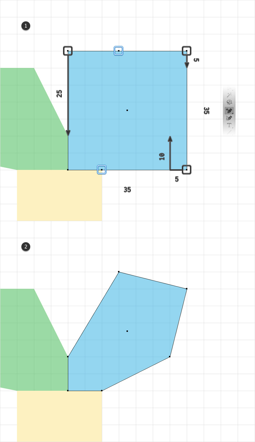
Using the Rectangle Tool (M), create a 35 px square and place it as shown in the first image. Pick the Add Anchor Point Tool (+) and add the two anchor points shown below.
Keep focusing on your square and switch to the Direct Selection Tool (A). First, select the bottom-right anchor point and drag it 10 px up and 5 px to the left. Move to the top-right anchor point and drag it 5 px down, and then select the top-left anchor point and drag it 25 px down.
Step 6
Select all the shapes made so far, open the Pathfinder panel (Window > Pathfinder), and click the Unite button. Make sure that the resulting shape is filled with R=253 G=241 B=193 and move to the next step.
Step 7
Make sure that your shape is still selected and go to Effect > Stylize > Rounded Corners. Enter a 5 px Radius, click OK, and then go to Object > Expand Appearance.
Step 8
Pick the Pen Tool (P) and create three simple triangles as shown in the first image. Select all the shapes made so far and click the Minus Front button from the Pathfinder panel.
Step 9
Make sure that your shape is selected, open the Brushes panel (Window > Brushes) and click that New Brush button. Select the Art Brush box and then click OK. Pick a name for your brush, drag that Width slider to 50%, enter the rest of the attributes shown in the following image, and then click the OK button.
3. How to Create the Text Effect
Step 1
Pick the Type Tool (T) and open the Character panel (Window > Type > Character). Select the Bonez font and then set the size to 150 px and the tracking to 100. Simply click on your artboard and add some text. Make it black (R=0 G=0 B=0) and lower its Opacity to about 30%.
Step 2
Disable the Grid (Control-„) and the Snap to Grid (Shift-Control-„).
Pick the Brush Tool (B) and select your art brush from the Brushes panel. Use that black text as a rough reference and start drawing paths to create the first letter.
Step 3
Move to the next letters and use the same art brush. Once you’re done, delete that piece of text.
Step 4
Select all the paths made so far and go to Effect > Stylize > Drop Shadow. Enter the attributes shown in the following image and then click OK.
Step 5
Make sure that all your paths are still selected, Group them (Control-G) and then go to Effect > Stylize > Drop Shadow. Enter the attributes shown below and then click OK.
4. How to Create the Background
Step 1
Pick the Ellipse Tool (L) and simply click on your artboard to open the Ellipse window. Set the Width to 600 px and the Height to 360 px and then click OK. Fill the resulting shape with R=235 G=107 B=38 and send it to back (Shift-Control-[).
Make sure that this orange shape stays selected and open the Align panel (Window > Align). Set the aligning to Artboard (open the fly out menu and go to Show Options if you can’t see the Align To section as shown in the following image) and then click the Horizontal Align Center and Vertical Align Center buttons. This will basically bring your selected shape to the center of the artboard.
Step 2
Make sure that your orange ellipse is still selected and go to Effect > Distort & Transform > Zig Zag. Enter the attributes shown in the following image and then click OK.
Step 3
Pick the Rectangle Tool (M) and simply click on your artboard to open the Rectangle window. Set the Width to 860 px and the Height to 610 px and then click OK. Fill the resulting shape with R=39 G=9 B=62, send it to back (Shift-Control-[), and don’t forget to center it.
Congratulations! You’re Done!
Here is how it should look. I hope you’ve enjoyed this tutorial and can apply these techniques in your future projects. Don’t hesitate to share your final result in the comments section.
Feel free to adjust the final design and make it your own. You can find some great sources of inspiration at GraphicRiver, with interesting solutions to improve your design.
Many businesses use the festive season as an opportunity to entice bargain-hunting customers into their stores. This flyer is a sweet and simple way of marketing winter season promotions, with a collage-inspired design and hand-drawn font style.
We’ll set up the flyer in Adobe InDesign, create a snowy scene directly in the software, and show you how to export your design for printing or circulating online.
Even if you’re a beginner to using InDesign, this single-page design is a great introduction to creating simple layouts and drawing graphics.
Looking for more promotional flyer designs? You can find a broad range of flyer templates over on Envato Elements, which are quick and simple to customize with your own text content.
What You’ll Need
You’ll need the following resource to complete this project:
A quick note on sizing: We’ll be setting up the flyer pictured here to a standard US flyer size, 8.5 by 11 inches. If you want to create your flyer to a different size, that’s no problem. You’ll simply have to adapt the scale of graphics and fonts to match your required page size.
Step 1
Open InDesign and go to File > New > Document. Uncheck Facing Pages and keep the Number of Pages set to 1.
Set the Width of the page to 8.5 in and Height to 11 in. Keep the margins to their default value, and add a Bleed of 0.5 in.
Click OK to create your document.
Step 2
We’re going to build up the design across a series of layers, which will help give the design a 3D collage-like effect.
To do this, expand the Layers panel (Window > Layers) and double-click on the default Layer 1 name in the panel. Rename the layer Background and click OK.
Click on the Create New Layer button at the bottom of the panel, and double-click on this to rename the layer as Type.
Then create a further five new layers using the same process, in this order: Mountains, Trees Background, Trees Foreground, Snow, and finally Snowfall.
Then click to the left of each layer’s name to lock all the layers except Background.
Step 3
We’ll also set up a color palette, which we can use throughout the design.
Expand the Swatches panel (Window > Color > Swatches) and choose New Color Swatch from the panel’s top-right drop-down menu.
Name the swatch Dusky Pink and set the percentage levels below to C=6 M=12 Y=16 K=5. Click Add and then OK.
Repeat the process to create a palette of CMYK swatches in lovely subdued tones of blues, pinks, and corals:
Teal: C=76 M=33 Y=23 K=6
Green Blue: C=68 M=38 Y=39 K=21
Pale Grey: C=11 M=6 Y=6 K=0
Pale Pink: C=3 M=12 Y=12 K=0
Pale Blue: C=28 M=6 Y=3 K=12
Coral: C=0 M=66 Y=52 K=0
Step 4
Take the Rectangle Tool (M) and drag across the whole page, extending it up to the edge of the bleed on all sides. From the Swatches panel, set the Fill to Dusky Pink.
Step 5
Create a second rectangle, allowing it to cover most of the page, with just a sliver at the bottom uncovered, as shown below.
Set the Fill to Pale Blue.
With this rectangle selected, go to Object > Effects > Gradient Feather. Adjust the Angle to 90 Degrees, and move the Gradient Stops until you’ve created a subtle gradated effect from blue to pink.
2. How to Create a Forest Scene for Your Flyer
Step 1
Head back to the Layers panel and lock the Background layer. Unlock Trees Foreground.
Take the Pen Tool (P) and create a small, tall triangle, by clicking four times onto the page, linking the lines into a shape. From the Swatches panel, set the Fill to Dusky Pink and Stroke Color to [None].
Step 2
Switch to the Line Tool (\) and drag from the bottom of the tree to the top, creating a trunk. Set the Stroke Color to Green Blue.
Create more lines stemming off the central trunk, reaching out to the edge of the tree, creating a series of branches.
Expand the Stroke panel (Window > Stroke) and select all the branches and the trunk (but not the pink triangle shape).
Set the Weight of the stroke to 2 pt and choose Straight Hash from the Type menu.
Step 3
Select the pink triangle and go to Object > Effects > Drop Shadow. Set the Effect Color to Green Blue, Opacity to 50%, and Noise to about 15%. You can tweak the other options until you’ve created a subtle, grainy drop shadow.
Click OK when you’re happy with the result.
Step 4
Select all the elements of the tree shape, including the triangle, trunk, and branches, and Right-Click > Group.
Use Shift to scale the whole illustration, positioning it at the bottom of the page, as shown below.
Edit > Copy, Edit > Paste the tree, creating multiple copies. Arrange them in a sequence along the bottom of the page and double-click on the triangle shape of each graphic to be able to adjust the color. Here, I’ve set one tree in Pale Grey and another in Pale Blue.
Continue to build up the row of trees, with one tree positioned in the center of the sequence and the page.
Step 5
Double-click on one of the triangle shapes to select this alone, and Edit > Copy.
Lock the Trees Foreground layer and unlock the layer below, Trees Background. From the Layers panel’s drop-down menu, make sure Paste Remembers Layers is not active, and then Edit > Paste, dropping the triangle onto this layer.
Adjust the Fill to Green Blue, and position it behind the row of trees, allowing it to peek through one of the gaps.
Copy and Paste this tree shape repeatedly, building up a background row of trees, creating a forest effect.
Step 6
Lock the Trees Background layer and unlock the Mountains layer below.
Edit > Paste another triangle shape onto this page, and drag to make it much larger. Change the Fill to Teal.
Go to Object > Effects > Inner Glow. From here, we can add a grainy texture to the shape. Set the Mode to Normal, Effect Color to Green Blue, and Opacity to about 50%. Increase the Size to 1.25 in, Choke to about 35%, and Noise to about 60%, before clicking OK.
Step 7
To create a snow cap for your mountain, take the Pen Tool (P) and click around the top of the triangle shape, creating more jagged edges along the bottom edge. Unite into a shape and set the Fill to Pale Grey.
With the cap selected, go to Object > Effects > Inner Glow. With the Mode set to Normal, adjust the Effect Color to Pale Blue. Increase the Choke to around 20% and Noise to about 40%, before clicking OK.
Step 8
Select both the blue triangle and snow cap and Right-Click > Group.
Copy and Paste the mountain, moving a copy over to the right side of the layout.
Create more copies of the mountain, stretching them and reducing their height, and fitting them in the central section of the layout, as shown below, creating a mountain range.
Step 9
Take the Ellipse Tool (L) and, holding Shift, drag onto the top-right of the page, creating a small moon. Set the Fill to Pale Grey.
With the circle selected, go to Object > Effects > Transparency. Choose Overlay from the Mode menu.
Click on Outer Glow in the window’s left-hand menu. Tweak the options to create a soft glow effect, to give the impression the moon is shining.
Click OK to exit the window.
Step 10
Lock the Mountains layer and unlock the Snow layer. Select the Pen Tool (P) and click around the bottom of the page, to create a long rectangle-like shape, which just overlaps the bottom edge of the trees. Set the Fill to [Paper].
3. How to Format Typography on Your Flyer
Step 1
Lock the Snow layer and unlock the Type layer.
Select the Type Tool (T) and drag onto the page to create a text frame across the center of the layout, above the mountain range. Type in ‘WINTER’.
From either the Controls panel at the top of the workspace or the Character and Paragraph panels (Window > Type & Tables > Character), set the Font to Naive Inline, Size 85 pt, Tracking 70 and set the text to Align Center. From the Swatches panel, set the Font Color to [Paper].
Step 2
Edit > Copy, Edit > Paste the text frame to create a second text frame below the first. Type in ‘SALE’ and increase the Font Size until the edges of the word meet the edges of ‘WINTER’ above.
Switch the Font Color to Coral for contrast.
Step 3
Build up more text frames around the main headline if you wish. You can add more details about the savings on offer…
… and where customers can benefit from the discounts.
Vary the Font Color between [Paper] and Teal, so that the coral ‘SALE’ text remains the most visible piece of type on the page.
4. How to Add a Snowy Finishing Touch
Step 1
It’s not a wintry scene without a generous sprinkling of snow!
Lock the Typography layer and unlock the top layer, Snowfall. Select the Pen Tool (P) and roughly draw a small circle onto the top of the page. Set the Fill to [Paper].
With the shape selected, go to Object > Effects > Transparency. Set the Mode to Overlay and bring the Opacity down to 70%.
Click on Drop Shadow in the window’s left-hand menu. Set the Effect Color to Teal, and add 30% Noise to create a subtle shadow. Click OK.
Step 2
Copy and Paste the circle repeatedly, creating a scattered group of snowdrops.
Then select the group and Copy and Paste, eventually building up a whole snowfall design across the top of the flyer. Avoid the circles spilling over any of the text, but allowing a few to fall over the top of the mountains helps the whole illustration to pull together.
5. How to Export Your Flyer
Your flyer’s finished—great job! Now all you have to do is export it, ready for circulating online or sending off for printing.
Step 1
First up, make sure to File > Save your hard work. Then go back to File and choose Export.
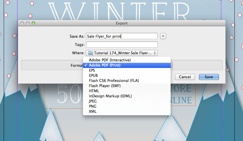
In the Export window that opens, choose PNG or JPEG from the Format menu if you want to create a web-ready image.
If you’re looking to print your flyer professionally, choose Adobe PDF (Print) from the Format menu. Then click Save.
Step 2
If you’ve chosen PDF, the Export to PDF window will open. Select [Press Quality] from the Preset menu at the top.
Then click on Marks and Bleeds in the left-hand menu. Check All Printer’s Marks and Use Document Bleed Settings, before clicking Export to create your print-ready file.
Conclusion: Your Finished Flyer
Your winter sale flyer is finished and ready for distributing—awesome work!
In this tutorial, we’ve looked at how you can create gorgeous flyers with a craft-inspired look in InDesign. It’s also easy to adapt your flyer design to a different purpose—why not use it to promote a festive event?
Looking for more promotional flyer designs? You can find a broad range of flyer templates over on Envato Elements, which are super easy to customize with your own text content. Make sure to take a look!
When in doubt, create your own patterns! Learn how to make a tie-dye effect in under a minute!
Photoshop in 60 Seconds: Tie-Dye Pattern
Decorate your work with custom patterns! They’re an essential resource for designers and are super easy to make!
In this quick video, I’ll show you how to use Photoshop’s different filter tools to create a custom tie-dye pattern. Experiment with colors and more, and show us your results!
How to Create a Tie-Dye Pattern in Photoshop
Create a New Document at 850 x 850 pixels, and then add a New Layer.
Use the Rectangular Marquee Tool (M) to create a vertical selection and Fill it with color using the Paint Bucket Tool (G).
Repeat this process until the entire document is filled with any alternating colors that you like.
Here are the colors I’ve used:
#791a93
#18106e
#2c73d2
#71cae1
#31a457
#f1ea88
#f07c4f
#f03d0f
Now blend the colors together. Go to Filter > Blur > Gaussian Blur and add a Radius of 25 pixels.
Next, go to Filter > Distort > Polar Coordinates and choose Rectangular to Polar.
For the tie-dye effect, go to Filter > Liquify and select the Twirl Clockwise Tool (C).
Increase the size of your brush before clicking and holding the center to twirl the colors. Use the Forward Warp Tool (W) to drag lines out from the center and distort the pattern. (You can also blur any harsh lines with the Blur Tool (O).)
Experiment with different directions for a better look.
Add more texture by setting a Watercolor Stock to Overlay and lowering the Opacity to 82%. Then, Merge all the layers together. To create the final pattern, select the Rectangular Marquee Tool (M), and go to Edit > Define Pattern.
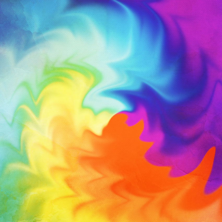
Here is the tie-dye result below.
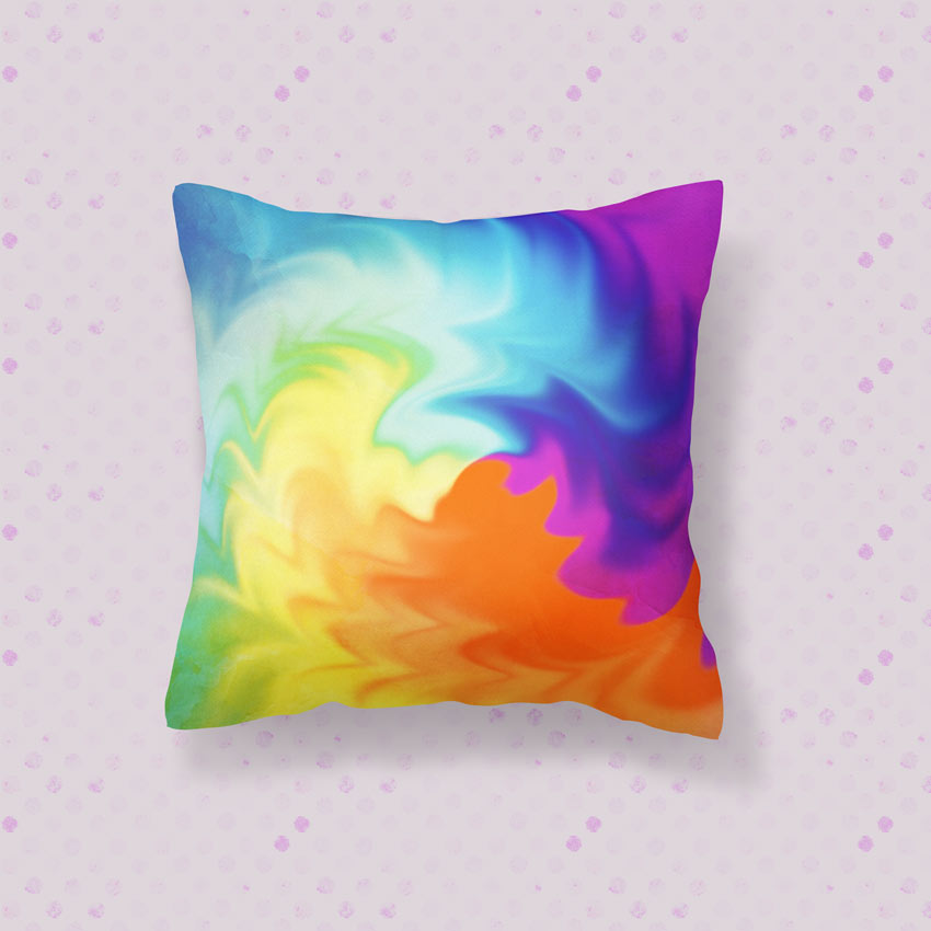
Apply it to different scenes like this Pillow Mockup for more fun variations.
Learn More With Our Tutorials!
Inspired to create custom patterns? Start with one of our
tutorials! Continue to grow your skills over time while growing your collection of resources.
Get Amazing Design Resources
Want to create videos like this? Download the items used in this video:
This is part of a series of quick video tutorials on
Envato Tuts+ in which we introduce a range of subjects, all in 60
seconds—just enough to whet your appetite. Let us know in the comments
what you thought of this video and what else you’d like to see explained
in 60 seconds!
Whether you’re a photographer, a painter, or a web designer, one thing remains a constant: You need a portfolio. After all, portfolios are the time-tested, best way to give potential clients a look into your work history and methodology.
I’ll give you an example. A photographer needs a portfolio to display his best work with categories for featuring different types of photos like black and white or nature-themed. Likewise, a web designer needs a creative portfolio that can be used to show off her latest client projects and even provide space to write about the development process.
Portfolios can take on many shapes and many styles. But the important commonality here is that they are, in fact, important. If you want to ensure your work resonates with its target audience, and pick up a few new clients or customers, you can use WordPress portfolio themes to build a stunning representation for your work on the web.
Useful WordPress Portfolio Theme Features
While the best portfolio themes can vary widely in presentation style, they often include a similar feature set. Getting familiar with what is offered aids in the decision-making process. It let’s you know what to expect in a solid portfolio theme purchase and allows you to quickly compare creative options. A few popular features include:
Dedicated portfolio page layouts. These give you the ability to customize the look of your portfolio without having to dig into code.
Masonry, grid, and list options. Because varied presentation options are the spice of life and can help maintain visitor interest.
Portfolio item descriptions. This lets you describe each project and give visitors insight into how you work.
Slideshows. Adding an interactive element can pique visitor interest.
Parallax sliders and backgrounds. More smooth moving parts create visual interest and support for your work.
Video backgrounds. Inclusion of video backgrounds can help engage visitors if you’re taking a storytelling approach to displaying your portfolio pieces.
Galleries. Act as a nice supplement to portfolios and let you display more than one image or video per portfolio piece.
These are just a sampling of what many creative WordPress portfolio themes include. Your mileage may vary. But now you have a better appreciation of what to expect as you begin browsing through the many WordPress portfolio themes currently available on ThemeForest and Envato Elements.
The WordPress themes included here are some of the very best options for creating a portfolio out there right now. And best of all, these are the top sellers, the themes that many people have already tried and loved.
Envato Elements
Envato Elements allows you to download unlimited WordPress themes for beautiful creative websites, all for a single monthly fee ($19 per month, with an annual subscription). If you create a lot of sites, this option is perfect for you.
Let’s look at a couple before we roundup our ThemeForest examples.
Firstly, check out the beautiful Adios template below. It’s really striking, fully responsive and retina ready, and it comes with these features, among many others:
Solid typography
Visual Composer page builder
26 custom shortcodes
Advanced portfolio layouts, including masonry and classic options
Osmos is a wonderfully minimalist portfolio theme, getting out of the way and letting your work do the talking. Whitespace and typography play a big part in what’s behind Osmos, and as it hooks directly into your Adobe Typekit account you can enjoy full control over its typographic features. It also comes packaged with several plugins which you’d otherwise have to pay for:
Freelo has a neat, gentle aesthetic–perfect for anyone who needs an organised and friendly portfolio to show off their work (be that design, illustration, photography, videography, whatever). It comes with all manner of layout options, depending on the portfolio you’re looking for, and a lovely full-screen search input when the little magnifying glass is clicked–joy!
Sprint is another pleasantly minimalistic theme (something common amongst portfolios, because heavy styling is frankly out of place). Its header and masonry grid are a solid choice, though there are other portfolio layouts to try.
And the footer has just the right balance of style and function:
Now, if a subscription is not for you, and you’re looking for individual creative WordPress themes, read on for the full selection of the best examples from Envato Market.
Best Portfolio WordPress Themes, to Display Your Creative Work Online
With a good understanding of what makes up the very best portfolio WordPress themes available for creatives of all types, we can move on to the theme showcase. Here you’ll find 15 of the very best (and the best-selling) portfolio themes money can buy:
I love a good niche theme, and this one is perfect if your niche is illustration. Tailored to the needs of illustrators, artists, photographers, animators and so on, this theme showcases portfolio collections and individual pieces equally well.
The screenshot below shows the masonry layout, but there are fourteen other homepage arrangements to choose from, as well as a wide range of page templates to make the most of your work.
With clean lines and demo’d with cool, calming photography, Argenta is a new theme (February 2017) for creatives in search of that stylish solution. It comes wrapped up with Visual Composer, Revolution Slider, and ACF (advanced custom fields) Pro, a range of portfolio settings, and a host of navigation layout options.
If you need to display your creative work online with a robust canvas of options, Ronneby is a great choice! It’s dubbed a high-performance WordPress theme and for good reason. It can be used to create just about any kind of site you want, and is certainly up for the task of making a stunning portfolio.
It comes with a versatile set of display options, with over 40 layouts, plenty of portfolio options, numerous demo layouts, and several plugins like Slider Revolution, Visual Composer, and Ultimate Addons for Visual Composer.
This responsive and retina-ready theme includes one-click installation, 8 pre-made headers, Mega Menu options, modern typography, portfolio hover variants, 23 portfolio page types, 48 styled widgets, over 1,700 font icons, and it’s WooCommerce-ready. Support and updates are included as well.
The Kalium theme was designed with creative people in mind, offering a host of features for creative professionals that help them get their work in front of prospective clients. It comes with many pre-made demos that can be installed with a single click, saving you a considerable amount of time.
It’s packed with numerous plugins that make designing custom layouts a breeze including Visual Composer, Revolution Slider, and LayerSlider. Plus it comes with shortcodes, can be translated, and supports unique portfolio options including hover styles, Dribbble Portfolio integration, and over 30 portfolio types. Other features include over 700 Google Fonts, unlimited skins, over 800 icons, multiple footer styles, and the whole thing is responsive and retina-ready.
This theme packs the features you need to create a stunning portfolio to showcase your creative work!
TheFox is a multipurpose WordPress theme that offers plenty of options for creating a stylish portfolio that suits the needs of creatives from all walks. This theme is responsive and super flexible, allowing for numerous customizations to build the perfect site to suit your needs.
It comes with loads of demos, plenty of documentation, support, and a video tutorial for quick setup. Also included are 30 homepage designs, over 250 design details, a robust theme options panel, Visual Composer, Premium Slider, and a shortcode generator. You also get a one-click demo importer, Mega Menu, WooCommerce compatibility, CSS3 animations, unlimited colors, header options, and so much more. A flexible and robust WordPress folio theme to display your best creative work.
Unicon was made with designers in mind, offering plenty of customization options without bogging down users. It comes with a Drag & Drop Page Builder, a responsive and retina-ready design, 50 Page Builder elements, and one page layouts. It also features multiple headers, sticky headers, Revolution Slider, Mega Menus, one-click setup, over 650 Ultrasharp icons, and over 50 premade layouts. It packs high-quality code, numerous features, free updates, as well as the display options you need to make a rockstar online portfolio!
Another best-selling WordPress portfolio theme worth checking out is Uncode. This theme is multi-use, so it can be configured to suit just about any purpose. However, it comes packed with loads of portfolio features sure to please creatives of all types: designers, illustrators, photographers, and more. It also includes several high-quality plugins like Visual Composer, Layer Slider, Revolution Slider, and iLightbox.
It’s WooCommerce compatible and WPML ready. It comes with 20 homepage layouts, a full admin options panel, grid layouts, over 6 menu styles, and dedicated portfolio and blog templates for total control over your design.
While the primary focus of the Atelier theme is e-commerce, it’s also perfect for portfolios and comes with the features to back up that claim. It comes with 12 demos that can be installed with one click, a minimal design, speed and SEO optimization, and a responsive design.
It also packs in 10 different header types, animated headers, 5 cart animations, multiple product display types, and drag-and-drop page builder. It features Visual Composer compatibility, numerous page types including portfolio and blog. You can make quick use of its shortcodes, RTL support, Mega Menus, and more.
Scalia is another best-selling WordPress theme that offers multi-concept solutions for businesses, shops, and creatives. This theme’s numerous portfolio layouts and gallery options make it a great choice for displaying your creative work. It features five different designs to suit varying tastes and includes 100 unique page templates.
There are 8 blog styles, multiple shop pages, quick finders, and more. It also comes with Visual Composer, Mega Menus, and a responsive design. It’s robust and ready to be extended with WPML, sliders, and WooCommerce compatibility.
Borderland is a creative WP theme that can be used for a variety of purposes, but we’re focusing on its portfolio features today.
It comes with 12 beautiful demos that can be imported with a single click, WooCommerce shop compatibility, Ajax page transitions, Fullscreen Elated Slider, a clients carousel, and a testimonials shortcode.
It features numerous layout options, such as portfolio single templates, portfolio list layouts, hover animation effects, multiple blog layouts, sliders, and custom post formats. You can also put parallax backgrounds, video backgrounds, and a number of additional features to work. Grab this WP theme today to create a stylish portfolio and to standout on the web!
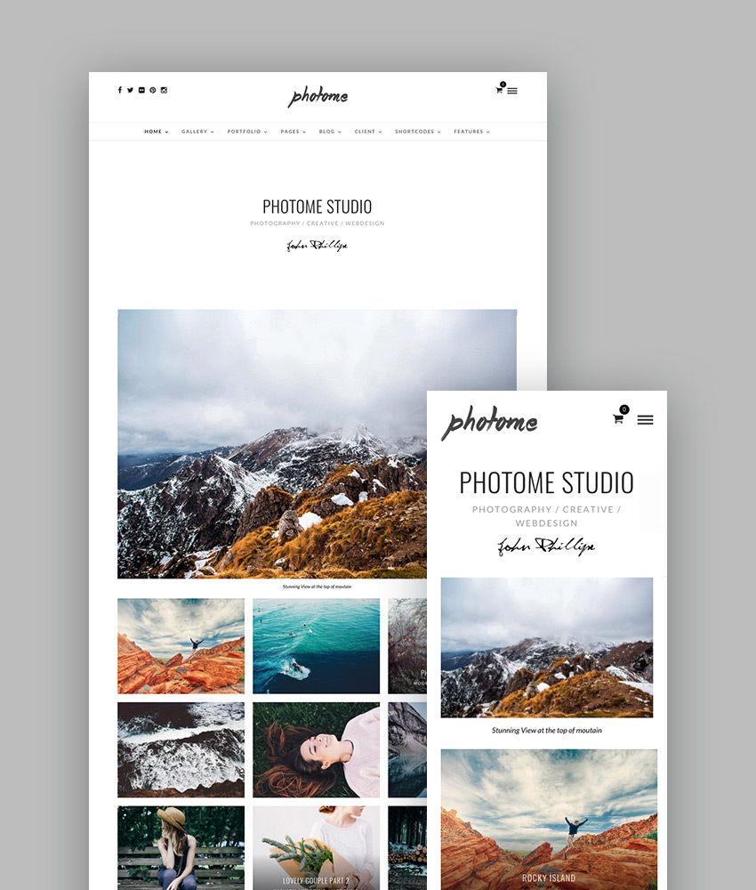
If photography is your outlet of choice, you’ll love the PhotoMe theme. It comes jam-packed with over 50 gallery and portfolio layouts, one of which is certain to fit your next project.
It also comes with 8 demos, all of which can be imported with a single click and supports a multitude of options and portfolio templates for customizing your site to best display your work.
This theme supports the Live Customizer, features a responsive layout, comes with a Content Builder, blog templates, and a one page layout. It also packs in Revolution Slider, WooCommerce support, and includes support and documentation. PhotoMe is a feature-rich theme you can use to set up your photography portfolio online!
This is a WP theme that’s ideal for photographers and is aptly named Photography theme. This responsive theme comes with 24 demos that can be installed with just one click, dark and light style options, as well as over 70 gallery and portfolio templates—to display your best work.
It also features, infinite scroll, a photo proofing section with password protection, Live Customizer support, a Content Builder, 8 menu layouts. It comes with support, documentation, and professional files to get your photography portfolio started right.
Kinetika is a fullscreen photography theme that includes numerous gallery and portfolio features that allowa for the creative display of your latest and best works. If you’re a photographer or need to display your work at full-screen, then this is a great WordPress portfolio theme to start with.
It includes a promotion box, a portfolio and blog carousel, fullscreen slideshows and videos, and a proofing gallery. You’ll also get slideshow text, multiple headers, video page backgrounds, and a fullscreen menu. And it packs in Revolution Slider, WooCommerce compatibility, WPML compatibility, as well as optimization for speed and SEO.
Foundry is another multipurpose theme that can be used to create a knockout portfolio to impress your clients. The design here is flat, responsive and totally professional, all while being super easy to customize thanks to the inclusion of Visual Composer, and numerous page builder elements.
It also comes with great display options, such as: fullwidth and boxed layouts, ready-to-use demo pages, over 20 homepage designs, coming soon pages, Mega Menus, and multiple menu styles. It has easy to customize components like one-click color changes. It includes features like, page notifications, Google Fonts, WooCommerce compatibility, and well as documentation and video tutorials.
You can have your portfolio online quickly, but also all the WordPress theme features you need to work with as you grow your reputation and expand your folio of professional work.
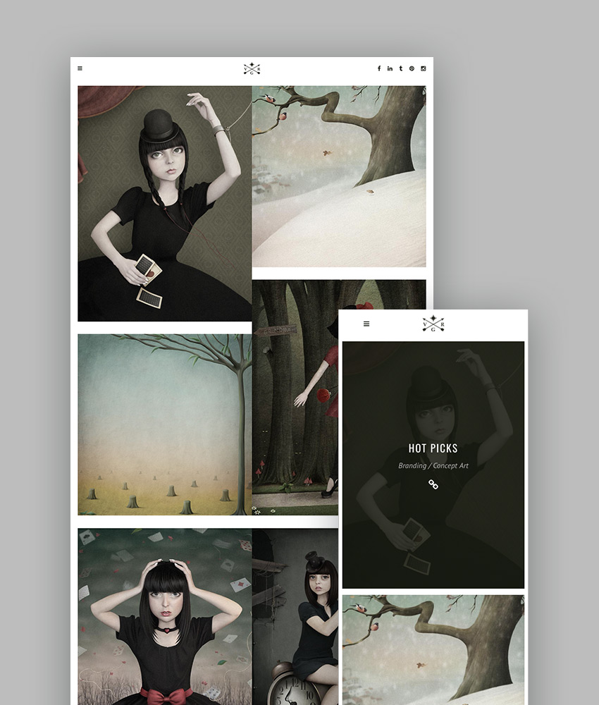
The last theme to make our cut of the best-selling portfolio WordPress themes is Vigor. This theme is easy to customize and ideal for creating a compelling portfolio that truly captures attention. If you want your portfolio to stand out online, this is the theme to grab!
It comes with a powerful admin interface, multiple header layouts, Edge Slider, parallax, animations, a masonry gallery, fullscreen menus, Mega Menu, and video backgrounds. As well as great visual display options, like LayerSlider, Visual Composer, portfolio lists, single items, and sliders, a client carousel, and pretty much everything you’d ever need to display your work in-style online.
How to Make a Portfolio Using Creative WordPress Themes
1. Carefully Install Your Theme
After picking the right theme for your situation, make sure you install it correctly. This means following the theme’s included documentation as well as following general theme installation best practices.
It’s a good idea to create a child theme for the portfolio WordPress theme you select as well, since this will ensure that the customizations you make won’t be deleted when a theme update is released.
2. Use The Theme’s Customization Settings
Speaking of customization, it’s a fantastic idea to get familiar with how you can customize your chosen theme. Most good themes come with thorough documentation, so be sure to read that to find out all of the little things you can modify or adapt to suit your needs.
Whether it makes use of the theme options panel, Live Customizer, or includes a custom settings screen, familiarize yourself with what’s included and make use of it to the greatest extent possible.
3. Optimize Your Portfolio Items
While you’re perusing your theme’s documentation, you’ll likely come across some specifications about how to approach your portfolio items. That is, you should pay attention to the sizing specifications, formats accepted, and your layout options. Then, you can go through all of the items you’d like to feature in your portfolio and optimize them accordingly.
A great portfolio layout won’t help you if your items don’t fit the format correctly. Everything will look „off.” To avoid this, take the appropriate time to resize and format your images. A pristine end result will be worth it.
4. Keep Your Portfolio Up-to-Date
Once your site is up and running with your new WordPress portfolio theme, be certain to keep your portfolio up to date. Set aside some time each month to review your work and see if something new should be included in the lineup. Doing this keeps your site fresh and ensures you’re always putting your best face forward.
Pick the Right Portfolio WordPress Theme Now!
Trying to cobble together a portfolio site can feel maddening when starting from scratch. But with a fantastic selection of creative portfolio WordPress themes to choose from, you can’t go wrong. With a little research, you’re certain to find the perfect theme to suit your personality and to act as your representation on the web. We have a whole lot of choices on ThemeForest, brought to you by the largest global community of creatives.
If you work with WordPress, you’re in luck—WordPress themes and plugins are now included in an annual Envato Elements subscription. And what’s more, you can lock in a special introductory rate for a limited time. Read on for more details.
What’s Included
Envato Elements already gives you unlimited downloads from a massive library of 400,000+ photos, graphics, templates, and other creative assets. Plus it gives you free access to more than 1,000 courses and 240 eBooks here on Envato Tuts+.
From today, you’ll still get all of that plus a curated collection of beautiful, premium WordPress themes and plugins.
As with everything else on Envato Elements, this is an „all you can eat” deal. You can download as many themes and plugins as you want, with no limits or credits to keep track of. And there’s a simple licensing system so that you know you’re covered for all of your projects.
Right now, there are over 190 top themes and 130 plugins available to choose from, and you can expect that number to grow as more authors join the platform and existing authors upload more items.
WordPress Themes
There’s a wide range of premium themes on offer, whether you’re looking for a multipurpose theme suitable for a corporate audience or something more creative that would work for a blog or portfolio site. There are even niche themes for real estate sites, wedding sites and more—and of course, you can find e-commerce themes to help you make sales from your site.
WordPress Plugins
A well-designed theme is a great start, of course, but if you’re working with WordPress you’ll also need access to premium plugins to add the features and functionality you want.
Envato Elements has you covered here too, with a selection of powerful plugins to help you create booking and scheduling systems, contact forms, responsive menus, social media feeds, and more.
What It Costs
It’s important to understand that WordPress themes and plugins are only available with an annual subscription, not a monthly one. Usually, an Envato Elements subscription costs $29 a month, so the annual subscription will be $348 a year ($29 x 12).
However, for a limited time, you can save $120 on your subscription and sign up for just $228 (the equivalent of $19 a month). Remember, for that price you get not only the WordPress themes and plugins but also thousands of photos, fonts, graphics, templates and more. It’s a pretty special deal.
So head over to Envato Elements to see what’s on offer, and if you like what you see, sign up for an annual subscription to start making unlimited downloads. Don’t spend too long thinking about it, though, because this introductory deal won’t last forever!
This is a romantic, rustic invitation which would be a perfect fit for winter weddings. In this tutorial suitable for beginners to Adobe InDesign, we’ll look at how to put together the invitation card and how to export your design ready for printing.
We’ll be dipping into vector software to edit the tree graphics in the design, so you will need access to Illustrator too.
Ready to get swept up in the romance of the colder months? Let’s go!
Note on sizing:We’ll be setting up the cards to a standard 4.5 in by 6.25 in size, which will fit inside standard sized envelopes that you can easily find online or in a stationery store. Try pairing your cards with a brown paper envelope for rustic charm.
1. How to Create a Rustic Backdrop for Your Invite
Step 1
Open up Adobe InDesign and go to File > New > Document.
With the Intent set to Print, uncheck the Facing Pages box. Set the Width of the page to 4.5 in and the Height to 6.25 in.
Add Margins of 0.5 in and a Bleed of 0.25 in. Then head up and click OK.
Step 2
Expand the Layers panel and double-click on the Layer 1 name. Rename the layer Background and click OK.
Take the Rectangle Frame Tool (F) and drag across the whole page, extending the image frame up to the edges of the bleed on all sides. Go to File > Place, choose the brown paper texture image you downloaded earlier, and click Open. Allow the image to fill up the whole frame.
Step 3
Expand the Swatches panel (Window > Color > Swatches) and choose New Color Swatch from the panel’s drop-down menu (at top-right).
Set the Type to Process and Mode to CMYK, and adjust the levels below to C=16 M=31 Y=36 K=4. Click Add and then OK.
Take the Rectangle Tool (M) and drag across the whole page, before setting the Fill of the shape to your new brown swatch from the Swatches panel.
With the shape selected, go to Object > Effects > Transparency. Bring the Opacity down to 35% and click OK.
2. How to Format Elegant Typography on Your Invite
Step 1
Lock the Background layer and click on the Create New Layer button at the bottom of the panel. Rename this new layer Typography.
With the rulers visible (go to View > Show Rulers if not), drag out a guide from the left-hand ruler, dropping it in the center of the page. This will help you judge how centered the typography elements on your page are.
Use the Type Tool (T) to create a text frame across the central guide, about a third of the way down the page. Type in ‘Name 1’.
From either the top Controls panel or the Character and Paragraph panels (Window > Type > Character and Paragraph), set the Font to Love Hewits, Size 80 pt. From the Swatches panel, adjust the Font Color to [Paper].
Step 2
Edit > Copy, Edit > Paste the text frame and position it below and a little to the right of the original. Edit the text to read ‘Name 2’.
You can create a smaller text frame to the left of the second name, type in an ampersand (‘&’), and set the Font to Miama.
Step 3
Once you’re happy with the formatting of the names, you may want to vectorise the text to make it a little easier to scale the names up and down as a group. Select all three text frames with your mouse and go to Type > Create Outlines.
Right-click on the vectors and choose Group. Then you can scale the names together, while holding down Shift, and adjust the position until you are happy with the result.
Step 4
In the Swatches panel, choose New Color Swatch from the panel’s menu. Name the swatch Charcoal and set the levels to C=62 M=52 Y=50 K=47.
Create a new text frame above the names, centering it on the page. Type in introductory text, such as ‘Please join us to celebrate the wedding of’, and set the Font to Aleo Bold, Size 8 pt, Align Center and increase the Tracking (space between all letters) to 200.
From the Swatches panel, switch the Font Color to Charcoal.
Step 5
Build up more text frames below the names by copying and pasting the top text frame repeatedly. Adjust the text to read the date and time of the event, then the place, and finally a ‘PTO for more details’ note if you want to place extra info like directions or contact details on the reverse of the card.
3. How to Add Snowy Forest Details to Your Invite
Step 1
Open up the winter tree vector in Illustrator. Isolate the tree silhouette alone, and head up to Edit > Copy.
Back in InDesign, lock the Typography layer and create a new layer above called Trees. Edit > Paste the tree vector directly onto the page. Position it at the bottom center of the page, and set the Fill to Charcoal.
Step 2
With the tree selected, go to Object > Effects > Transparency. Choose Multiply from the Mode menu, and pull the Opacity down to 80%. Click OK.
Copy and Paste the tree and scale it down a little, before placing it to the left of the original tree, allowing some of the branches to overlap. Edit > Copy, Edit > Paste this second tree and move it over to the right side, creating a fan effect.
Step 3
We can add extra details, like berries and snow, to the card to make it extra special.
Create a new swatch called Berry Red, C=15 M=87 Y=57 K=4. Then lock the Trees layer and create a new layer above, called Berries.
Take the Pencil Tool (N) and draw a rough berry shape over the top of one of the tree branches, setting the Fill to Berry Red.
Select the red shape and copy and paste repeatedly, spreading the berries across the tops of all the branches.
Step 4
Open the paint drops vector in Illustrator and adjust the color of the drops from black to White. Make sure to remove the background too, before saving as an Illustrator EPS (.eps) file.
Back in InDesign, create a new layer called Snow, and drag this down to sit above the Background layer and below the Typography layer.
Zoom into the top-right corner of the page and use the Pencil Tool (N) to draw a rough cloud-like shape onto the page.
Make sure the Fill and Stroke of the shape are set to [None] before going to File > Place. Choose the paint drops vector in white you edited earlier, and allow it to fill the shape.
Step 5
Copy and Paste the shape a few times, rotating each one slightly differently, and creating a cluster of shapes around the top-right corner of the layout, using them to create a frame around the edges of the page.
Select all the shapes and Right-Click > Group.
Copy and Paste the group repeatedly, positioning each group around the perimeter of the page, building up a snowy border around the whole invite.
Step 6
Create a new layer at the top of the sequence, naming it Snow Cap.
As we did with the border detailing, take the Pencil Tool (N) and doodle a small snow cap shape over the top of part of the central tree’s branches, as shown below.
With the Stroke and Fill of the shape set to [None], go to File > Place and choose the white paint drops image as before, allowing it to fill the shape.
Repeat the process of creating and filling snow cap shapes across the curved top of the central tree.
When you’ve finished, Right-Click > Group the snow caps.
Copy and Paste the group, scaling it down and repositioning to fit over the top of the left-hand tree. Repeat for the tree on the right side too.
4. How to Export Your Design for Printing
Step 1
Make sure to first File > Save your work, and then go to File > Export.
Choose Adobe PDF (Print) from the Format menu at the bottom of the Export window, name your file appropriately (something like ‘Wedding invite_final for print.pdf’), and hit Save.
In the window that opens, choose Press Quality from the Adobe PDF Preset dropdown menu at the top.
Step 2
Then click on Marks and Bleeds in the window’s left-hand menu. Check All Printer’s Marks and Use Document Bleed Settings, before clicking Export.
This will create a ready-to-print PDF file which you can send straight off to the printer’s—great job!
Conclusion
Your winter wedding invitation is finished. Awesome work! All you have to do now is send them off in the post, and get ready for the big day.
In this tutorial, we’ve covered a number of key skills relating to print and stationery design. You should now feel more confident with tackling projects like this and using your newfound skills to create more spectacular invitations.
In this tutorial you will learn how to use the Mesh Tool in Adobe Illustrator to create a vector Christmas background with a pile of gift boxes!
If you want to skip the tutorial and just use these presents along with some other awesome elements in your work, you can purchase Christmas Gift Boxes in Snow from GraphicRiver!
For our very first step, grab a red (#B33029) rectangle.
Proceed to Effects > Warp > Arc and apply the effect with the following settings:
Bend -28%
Horizontal 0%
Vertical 0%
Step 2
Go to Object > Expand Appearance, and modify the shape by bringing its edges up a bit.
Let’s begin using Mesh! Grab the Mesh Tool (U) and create a Mesh Grid like the one in the screenshot below by clicking where the nodes are supposed to be.
Once your Mesh Grid is done, begin coloring it by selecting the indicated column of nodes with the Mesh Tool (U) and changing their color to #F9E5D5.
Continue by coloring the nodes selected in the screenshot below with #D04640.
Finally, color the six nodes on the left edge of the shape with #941F17.
Step 3
Draw the lid of the box using the same technique and these colors:
#D24741
#D45458
#FFE0D0
Step 4
Create the bottom side of the gift box using the Mesh Tool and the following colors:
–
#B12E27
#FFEFDE
#DD544E
#941F17
#EF8A7E
Step 5
Assemble the box out of the three parts we made!
Step 6
Let’s move on to creating the bow!
Create the first element with Mesh and these colors:
#AE2C26
–
#871910
#3E0600
Step 7
Create the second element.
#8F1D15
#FAB7A8
#721107
#150100
Step 8
Put both elements together to create the first piece of the bow.
Step 9
Create another bottom part of the bow with Mesh.
#AB2C25
#7A150B
#120100
Step 10
Create the accompanying top part.
#A0241E
#D74F48
#FADCCC
#80170D
#190200
Step 11
Again, put the last two parts together.
Step 12
Draw the first half of piece number 3.
#B9352E
–
#FFF7E6
Step 13
Draw another part.
#C13C36
–
#480700
Step 14
Put together the third piece.
Step 15
Draw another part of the bow.
#C7413B
–
#691108
Step 16
Draw this part out of two shapes, both colored with #C7413B.
#C7413B
#FFF7E6
#4F0800
Step 17
Join our final two parts together!
Step 18
Now put together the left half of the bow, as indicated by the numbers.
Step 19
Go to Object > Transform > Reflect, choose the Vertical option, and press Copy to complete the bow.
Step 20
Draw a #100000 filled ellipse to serve as a shadow for the base of the bow.
Step 21
Place it onto the base.
Step 22
Add the bow on top of the gift box we drew earlier.
Step 23
Draw an ellipse filled with a Radial Gradient (#58342D to white) to create another shadow. Use the Multiply transparency mode.
Step 24
Add shadows on the base of the bow and under the box.
Step 25
Let’s create a new color variant of this box!
Proceed to Edit > Edit Colors > Convert to Greyscale.
Step 26
Go to Edit > Edit Colors > Adjust Colors and tweak the Black in the box by -14%.
Step 27
Finally, return to Edit > Edit Colors > Adjust Colors, only now choosing the RGB mode.
Tick Convert on the top of the window, and set the following parameters:
Red: -33%
Green: -9%
Blue: -9%
2. How to Draw the Second Present
Step 1
Draw the left side of the second gift box’s lid with Mesh.
#D3CFB4
#ABA485
#817756
#F7F5DF
Step 2
Draw the right part of the lid.
#E8E5CD
#C5BFA4
#F7F5DF
Step 3
Draw the left side of the box.
#9E9676
#695F3E
#796F4D
#E8E3CD
Step 4
Draw the right side of the box.
#CDC8AC
#695F3E
#796F4D
#E8E3CD
Step 5
Draw the lid.
#F2F1DB
#CFCAB0
#E9E6CF
Step 6
Put together the second box.
Step 7
Recolor a copy of the box with Edit > Edit Colors > Adjust Colors and these settings:
Red: -60%
Green: -37%
Blue: -12%
Step 8
Create another green box out of a copy with Edit > Edit Colors > Adjust Colors:
Red: -45%
Green: -36%
Blue: -34%
Step 9
Begin drawing the cyan bow.
#3B7F92
#9DD9CA
#113C33
#236072
Step 10
Draw the second element.
#3B7F92
#A0DBCD
#0E3533
#489397
#285F64
Step 11
Draw the next part.
#1A4F63
#05210B
Step 12
Create the next element.
#1E556C
#89CDC4
#27678B
#154549
#53A1AD
Step 13
#1D5268
#7FC4BE
#28698C
#112F3F
Step 14
Draw the final part of the bow.
#28667A
#5299A7
#0D3A3F
#66B9C4
Step 15
Create a shadow for the bow by filling an ellipse with a #0B3330 to white Radial Gradient and Multiply transparency.
Step 16
Add all the parts together.
Step 17
Let’s begin drawing the ribbon for the bow!
#286372
#79C5CD
#61A9B6
#0F2A30
Step 18
Draw the top part of the ribbon.
#3C8395
#153538
#59A3B0
Step 19
Join these two together!
Step 20
Create another element.
#2C6779
#144349
#5EAABA
#93D8DB
Step 21
Draw the last section of the ribbon.
#5EAABA
#16454C
Step 22
Draw a pattern for the box.
Use two circles with a #408696Stroke, which you would then Expand. Create a couple of different versions.
Step 23
Create a rectangular pattern out of the circles.
Step 24
Create two copies of the pattern.
Go to Effect > Distort & Transform > Free Distort and create a pattern for the side of the box.
Step 25
Grab the second copy and through Effect > Distort & Transform > Free Distort, create a pattern for the lid.
Step 26
Apply the pattern and the bow with the ribbon to the box.
Step 27
Grab a copy of the pattern, and set it to Multiply and 60% Opacity before applying it to the blue box.
Step 28
Take another pattern, this time with Screen and 60% Opacity, for the green box.
Step 29
Recolor the bow and the pattern with Edit > Edit Colors > Adjust Colors:
Red: 45%
Green: -47%
Blue: -41%
Step 30
Arrange the boxes we made into a pile.
3. How to Draw the Third Present
Step 1
Begin drawing the third box.
#778C80
#B6CCBC
#363E2A
#353C28
#5B6B5B
Step 2
Draw the lid.
#B2CDBF
#FEF9E7
#95B0A7
Step 3
Draw the side of the lid.
#8EA59B
#EDEFDE
#708477
#A1BCB3
#515F4F
Step 4
Assemble the gift box.
Step 5
Begin drawing a bow.
#90A29A
#102114
#C8D8C2
#637568
Step 6
Draw the second part.
#55675F
#DBEAD4
#798E87
#D4352C
Step 7
Draw another element with mesh.
#95A79F
#ECFCDF
#091B0F
Step 8
#8FA299
#516156
#CDDECD
Step 9
#A7BAB3
#E9FCDD
#75867C
#112216
Step 10
#112317
#53655C
Step 11
#7C9884
#E5EDE3
#224029
Step 12
Draw the eighth element:
#223B29
#46614F
and the final part.
#37513E
#0E2312
#893398
Step 13
Assemble the bow!
Step 14
Place the bow onto the box.
Step 15
Recolor a copy of the present into blue by using Edit > Edit Colors > Adjust Colors:
Red: -18%
Green: -7%
Blue: 15%
Step 16
Apply Edit > Edit Colors > Saturate with -35% Intensity to get a light blue box.
Step 17
Add these boxes and the boxes made in the first section to the group.
4. How to Draw the Background
Step 1
Draw the background with Mesh:
#6C9F99
#C4D7CA
#99C0B8
#D7E2D2
#3F7D79
Step 2
Add a drawing of snow.
#EFF4E4
#D1E0D5
Step 3
Combine the two.
Step 4
Place the group of presents on the snow.
Next, draw a rectangle and put it on top of the image. The rectangle should „frame” everything you want to keep in the picture.
Select all the elements, right-click, and choose Make Clipping Mask.
What now? You can try any of my other tutorials from my profile, or check out my portfolio on GraphicRiver, as well as the original vector we recreated in this tutorial.
I hope you enjoyed the tutorial, and I would be super happy to see any results in the comments below!
Autumn is all about the beautiful reds and golds and what’s in between. This tutorial will show you how to use Photoshop’s layer styles, filters, and adjustment layers, along with a couple of stock images, to create a glittering, gold, autumn-inspired text effect. Let’s get started!
Create a new 1500 x 950 px document, and go to File > Place Linked to place the Wood Background image as a Smart Object on top of the Background layer.
Resize the Wood Background image as needed and hit the Return key to commit the changes.
Step 2
Go to Image > Adjustments > Vibrance, and change the Vibrance value to -20.
Step 3
Double-click the Wood Background layer to apply a Color Overlay effect with these settings:
Color: #d2d0cb
Blend Mode: Multiply
This will adjust the coloring.
2. How to Create Text Layers
Step 1
Create the text in All Caps using the font Big Bottom Cartoon. Change the Size to 300 pt and the Tracking to 75.
Step 2
Duplicate the text layer to create a copy.
3. How to Create a Drop Shadow Effect
Double-click the original text layer to apply the following layer style:
Step 1
Add a Drop Shadow with these settings:
Opacity: 32%
Distance: 11
Size: 9
Step 2
Add another Drop Shadow effect instance with these settings:
Color: #121212
Opacity: 50%
Distance: 36
Size: 50
Step 3
Right-click the original text layer, choose Copy Layer Style, click the copy text layer, and choose Paste Layer Style.
Change the original text layer’s Fill value to 0.
4. How to Create a Glittering Effect
Double-click the copy text layer to add the following layer style:
Step 1
Add a Bevel and Emboss with these settings:
Size: 3
Check the Anti-aliased box
Highlight Mode: Linear Light
Shadow Mode: Color Burn
Opacity: 15%
Step 2
Add a Contour with these settings:
Contour: Half Round
Check the Anti-aliased box.
Step 3
Add an Inner Shadow with these settings:
Blend Mode: Linear Burn
Opacity: 13%
Distance: 0
Size: 10
Step 4
Add a Pattern Overlay with these settings:
Pattern: FDR Glitter Pattern 02
Scale: 50%
Step 5
Place both text layers in a group and name it Text Layers.
Step 6
Add a Vibrance adjustment layer on top of the Text Layers group, clip it to the group, and change the Vibrance value to -70%.
5. How to Apply Color to an Image
Step 1
Open the Leaves0020 – Image 3 image, right-click the layer, choose Convert to Smart Object, and duplicate it.
Hide the copy layer and make sure that the original is selected.
Step 2
Go to Filter > Noise > Median, and change the Radius to 3.
Step 3
Double-click the layer to apply a Color Overlay effect with these settings:
Add a Color Overlay with these settings:
Color: #9c752a
Blend Mode: Color
This will color the original leaf.
Step 4
Show the copy layer, and expand the original’s Filters list.
Press-hold the Option key and click-drag the original leaf layer’s Smart Filters tab to the copy layer.
6. How to Create a Gold Effect Using Filters
Step 1
Select the copy leaf layer, press Command-U, and change the Saturation value to -100.
Step 2
Go to Filter > Filter Gallery > Artistic > Plastic Wrap, and use these settings:
Highlight Strength: 20
Detail: 10
Smoothness: 7
Step 3
Change the copy leaf layer’s Blend Mode to Linear Light.
Step 4
Double-click the copy leaf layer to adjust its Blending Options.
We are going to adjust the Underlying Layer sliders under the Blend If section.
Press-hold the Option key, and click-drag the right slider to split it. As you move the slider’s ends, you’ll notice how the copy leaf will not affect the lighter areas below it.
Press-hold the Option key, and click-drag the left slider to exclude some of the darker areas as well.
Step 5
This will create a golden leaf. Because we’re going to significantly downsize this when we use it, the effect will look even more refined and realistic. So don’t worry about the details for now.
Save this file and keep it open as we’ll get back to it again.
7. How to Use Highlights and Shadows to Increase Contrast
Step 1
Open the Leaves0153 – Image 1 image, convert the layer to a Smart Object, and duplicate it.
Step 2
Go to Select > Color Range, and choose Highlights from the Select drop-down menu. Adjust the Fuzziness and Range sliders to select the highlights.
Step 3
Create a new layer on top of all layers and name it Highlights.
Step 4
Fill the layer with White and press Command-D to deselect.
Step 5
Hide the Highlights layer so that it doesn’t affect the Shadows selection we’re going to create next.
Step 6
Go to Select > Color Range, and this time choose Shadows from the Select menu. Adjust the Fuzziness and Range sliders to select the shadows.
Step 7
Create a new layer on top of all layers, name it Shadows, fill it with Black and deselect, and show the Highlights layer.
Step 8
Change both the Highlights and Shadows layers’ Blend Mode to Soft Light, and their Opacity value to 50%.
This will help create more contrast.
8. How to Duplicate and Adjust Effects and Filters
Step 1
What you need to do next is repeat the same steps to turn the leaves gold.
You can duplicate the original leaf layers into this document to copy and paste the layer styles and duplicate the filters, but remember to delete the duplicated layers when you’re done.
Step 2
Double-click the originalLeaves0153 – Image 1 layer to adjust its Color Overlay effect by changing the Color to #a27412.
Step 3
Double-click the copy Leaves0153 – Image 1 layer to adjust its Blending Options if needed.
You can adjust any settings needed to get a result you like.
9. How to Create Final Smart Objects for the Leaf Layers
Step 1
Go back to the first leaf layer document, duplicate the layers you have, hide the original ones, merge the copy layers, and rename the merged layer to Leaf 01.
Step 2
Add a Vibrance adjustment layer, clip it to the Leaf 01 layer, and change the Vibrance value to -35.
Step 3
Select both the Leaf 01 and the Vibrance layers and convert them to a Smart Object.
Placing the adjustment layer inside the Smart Object will help make it easily editable if you want to change its values anytime later on.
Step 4
Go back to the second leaf image document, group the layers, duplicate the group and hide it, and merge the copy.
Step 5
Pick the Lasso Tool and select one of the leaves.
Step 6
Press Shift-Command-J to cut and paste the selected leaf into a new layer
Select and cut and paste the second leaf into a new layer, and delete the original empty layer. Rename the first leaf layer to Leaf 02 and the second to Leaf 03.
Step 7
Add a clipped Vibrance layer using the same -35Vibrance value to each of the leaf layers.
Step 8
Convert each leaf layer and its Vibrance layer to Smart Objects.
10. How to Add the Leaves to the Text
Step 1
Duplicate the Leaf 01 layer to the original document that has the text layers. Place the leaf on top of the first letter and scale it down as you like.
Step 2
Double-click the Leaf 01 layer to apply a Drop Shadow effect with these settings:
Opacity: 32%
Distance: 11
Size: 9
This will add a subtle drop shadow effect.
Step 3
Press-hold the Option key, and click-drag to duplicate the Leaf 01 layer. Then, you can transform the copy to build a dynamic effect.
Step 4
Follow the same steps to add more Leaf 01 copies, as well as adding and duplicating the Leaf 02 and Leaf 03 layers, over a part of the first letter.
Place all the leaf layers in a group with the letter’s name.
Step 5
Keep duplicating and transforming the leaf layers to place them over all the remaining letters.
11. How to Add More Leaves
Step 1
Open the autumn leaves image, and use the Lasso Tool to select any of the leaves you want to add to your text, and copy them to the original text document.
Step 2
Rename the copied leaf layer to Red Leaf 01, convert it to a Smart Object, and place it anywhere you like.
Double-click the Red Leaf 01 layer to apply the following layer style:
Step 3
Add a Pattern Overlay with these settings:
Blend Mode: Linear Dodge (Add)
Opacity: 35
Pattern: FDR Glitter Pattern 02
Scale: 25%
Step 4
Add a Drop Shadow with these settings:
Blend Mode: Darker Color
Opacity: 50%
Uncheck the Use Global Light box
Angle: 99
Distance: 6
Size: 9
Step 5
Add another Drop Shadow effect instance with these settings:
Blend Mode: Multiply
Opacity: 50%
Distance: 36
Size: 50
Step 6
This will style the leaf layer. Make sure to copy and paste this layer style to any red leaf layers you add next.
Step 7
Continue adding different red leaves until you get a result you like.
12. How to Add Pins
Step 1
Open the Mirror ball png image, and go to Image > Trim. Set Based On to Transparent Pixels, and check all the Trim Away boxes.
Step 2
Double-click the layer to apply a Color Overlay with these settings:
Color: #998051
Blend Mode: Color
Step 3
Convert the mirror ball layer to a Smart Object.
Step 4
Duplicate the mirror ball’s smart object into the original document, rename its layer to Pin, place it on top of all layers, and resize it to fit inside the center of some of the leaves you have.
Double-click the Pin layer to apply the following layer style:
Step 5
Add a Pattern Overlay with these settings:
Blend Mode: Lighten
Pattern: FDR Glitter Pattern 02
Scale: 50%
Step 6
Add an Outer Glow with these settings:
Blend Mode: Soft Light
Opacity: 35%
Color: #ffffff
Size: 50
Step 7
Add a Drop Shadow effect with these settings:
Opacity: 32%
Distance: 11
Size: 9
This will style the pin.
Step 8
Duplicate the pin to add it over more parts of the text, and place all the pin layers in a group with the name Pins.
13. How to Apply Global Adjustments
Step 1
Add a Color Lookup adjustment layer and choose the 3Strip.look table from the 3DLUT File menu, and change the layer’s Opacity to 50%.
Step 2
Press the Shift-Option-Command-E keys to create a stamp layer on top of all layers. Rename the stamp layer to Lighting Effects and convert it to a Smart Object.
Step 3
Go to Filter > Render > Lighting Effects. Choose Spot Light and adjust the rest of the settings as below:
Step 4
Create another stamp layer on top of all layers, name it High Pass, convert it to a Smart Object, and change its Blend Mode to Soft Light.
Step 5
Go to Filter > Other > High Pass, and set the Radius to 1.
Step 6
Change the Lighting Effects layer’s Opacity to 50%.
14. How to Add a Vignette
Step 1
Save the final result as an image, and open it.
Step 2
Go to Image > Image Size, and change the Width to 1000 px.
Step 3
Use the Elliptical Marquee Tool to create an elliptical selection around the text.
Step 4
Add a new Solid Color fill layer and set the Color to Black. The selection will be applied to the mask.
Step 5
Select the mask’s thumbnail and press Command-I to invert it.
Step 6
Change the Solid Color layer’s Blend Mode to Soft Light and its Opacity to 35%.
Step 7
Select the mask’s thumbnail again and open the Properties panel to increase the Feather value until you get a smooth vignette effect.
Congratulations! You’re Done!
In this tutorial, we used layer styles to create some glittering text. Then, we used layer styles and filters to create gold leaves, and added them along with more red leaves over the text to create the main effect.
Finally, we added some pins, and applied a bunch of adjustment layers and filters to blend everything together.
Please feel free to leave your comments, suggestions, and outcomes below.
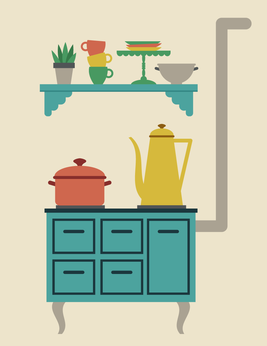
I really love retro style, and it so happens that it’s become very popular. So I decided to draw a retro kitchen. And of course, I will show you how it’s done!
Don’t worry, you do not have to be a professional to do this. We will be using simple shapes and some effects that will make this tutorial a breeze. You will be surprised by just how many things we can create using mostly rectangles and ellipses.
For more inspiration for retro illustrations, check GraphicRiver. They have a great selection of different images.
So, let’s get into a retro mood, and begin!
1. How to Create a Retro Stove
Step 1
Start by creating a new document (File > New) with 850 px Width and 1100 px Height. First, we will create a retro stove with some drawers, where the coffee and the soup will be made.
Take the Rectangle Tool (M) and create a blue rectangle with no stroke color. To get the same color, type in the numbers shown below in the Color panel (Window > Color). Be sure that you have checked RGB on the options of the panel.
Next, create a second, darker rectangle, which should be much thinner. Now, place the darker rectangle on top of the lighter one. When doing this, make sure you are using the selection tool. Other tools can deform the shape, which is not needed in this case.
Step 2
Let’s give our retro stove a few drawers. Draw a dark blue rectangle using the Rectangle Tool (M). The stroke color of this rectangle should be the same as the top of our stove, and the fill color should be left as it is. On the Stroke panel, make the stroke Weight around 3 pt for this rectangle. After you draw the drawer, add a handle. Just create a dark blue rounded rectangle. This is the first drawer.
Select all parts of the drawer and group them (right-click > Group). Holding the Shift and Alt keys, move the drawer down to get another copy of it. Now select two drawers and, while holding the Shift and Alt keys, move both drawers to the right side to get two more drawers.
Finally, to get a large drawer, make a copy of the small drawer, drag the bottom part down, and align its position and size with all the other drawers to get a result similar to the one presented below.
Step 3
Let’s create the legs for the stove. First, using the Rectangle Tool (M), create a grey vertical rectangle. Next, we will apply the Flag effect to this rectangle. Go to Effect > Warp > Flag and use the options shown. Don’t forget to expand the final shape: while keeping it selected, go to Object > Expand Appearance.
Step 4
Now let’s attach the leg behind our stove. Make a vertical copy of this leg: select it and go to Transform > Reflect, enter Axis Vertical, Angle 90 degrees, and press Copy. Move the copy of the leg to the right.
Finally, in this step, add two thin grey rectangles on top of the stove.
Step 5
Using the Rounded Rectangle Tool, create a grey rounded rectangle, horizontally aligned, and place it behind the right side of the stove as shown in the image below.
To get a rounded rectangle with very rounded corners, create a small rounded rectangle first, and then stretch it. Or you can go to View > Show Corner Widget and modify the corners by dragging them inside.
Next, attach a long vertical rounded rectangle and finally a shorter horizontal one. Our retro stove is ready!
2. How to Create the Soup Pot
Step 1
Using the Rounded Rectangle Tool, create a red rounded rectangle. Be sure you have checked View > Show Corner Widget. Take the Direct Selection Tool (A) and select the two upper anchor points of the rectangle. Drag them outside. You will notice that those corners become sharp.
Next, add a thin, dark red rounded rectangle on top. After that, create another dark red rounded rectangle, slightly rotate it to the right, and place it behind the pot. This is the left handle.
To make the right handle, make a reflected copy of the left one. For this, select the left handle, right-click your mouse, and select Transform > Reflect. In the dialogue box, select Axis Vertical, Angle 90 degrees, and press Copy. Move the newly created handle to the right.
Step 2
To make the pot lid, take the Ellipse Tool (L), and draw a light brown ellipse and place it behind the pot. To finish the lid, add a dark red circle. To create an even circle, use the Ellipse Tool (L) while holding down the Shift key. Now let’s modify this. We’ll use the Fish effect: select the circle, go to Effect > Warp > Fish and enter the options below. Expand this shape: select it and go to Object > Expand Appearance. Our soup pot is ready!
3. How to Create the Coffee Pot
Step 1
To create the coffee pot, we will start with a copy of the lid of the soup pot. Now, decrease its size and change its color as shown in the image below. Add a vertical rectangle for the body of our coffee pot. After this, apply the Arc effect to this rectangle: go to Effect > Warp > Arc and enter the presented options. Expand the shape (Object > Expand Appearance).
Finally, in this step, we will add the coffee pot handle. For this, we need to draw a triangle: take the Polygon Tool and click on your artboard. In the new dialogue window, type 3 Sides with any Radius. Then click OK. Set the necessary stroke color and remove the fill color (Shift-X). Finally, resize this triangle, turn it upside down, and place it behind the coffee pot body.
Step 2
To create the spout of our coffee pot, we will start with a yellow rectangle. Next, we will apply the Flag effect: go to Effect > Warp > Flag and use the shown options. Expand the final shape. And finally, place it to the left of the coffee pot’s body.
Step 3
Place the created pots on the stove.
4. How to Create the Shelf
To create the shelf, we will start with a blue rectangle. Make a copy of it behind: Control-C, Control-B. Then move this back rectangle down a bit and change its color so it is darker.
Behind these rectangles on the left side, create a set of different sized rounded rectangles as shown below. Of course, you can place them however you want. Just remember that the black stroke color is not needed; it is only there for better visibility.
After that, while keeping all the rounded rectangles selected, unite them by pressing the Unite button on the Pathfinder panel (Window > Pathfinder). You will end up with a single shape. To add another piece on the right, select this shape and create a vertical reflection of it (Transform > Reflect, Copy). Move the vertical copy to the right.
5. How to Create the House Plant
Step 1
Now, we will create the plant pot. First, create a grey rectangle. To deform the shape, go to Effect > Warp > Arc. In the new dialogue window, adjust the options as you see in the image below. Create a new dark grey rectangle on top of the previous one.
Step 2
Let’s create the leaves for our plant.
Draw a green ellipse. Select this ellipse and, using the Convert Anchor Point Tool (Shift-C), make the top and bottom anchor points sharp by clicking on them. Make a few more copies of the created leaf, and slightly rotate them in different directions and place them behind the flower pot. To add a three-dimensional effect, change the color of half of them to the dark green as shown below.
6. How to Create the Cups
Step 1
Using the Rectangle Tool (M), make a green rectangle and go to Effect > Warp > Bulge. In the new window, enter the options shown. Expand the object: Object > Expand Appearance. For the handle, create a circle with green stroke color and no fill color (press Shift-X). Place this circle on the right of the modified rectangle.
Step 2
Create two more copies of the cup and change their colors. You can use the Eyedropper Tool (I) to take the colors from the coffee and soup pots. Place them on top of each other. Be sure that the image of each cup on top is placed behind the bottom one.
7. How to Create the Plates
For the plate, we will use a green rectangle. Now, go to Effect > Warp > Bulge. In the new window, enter the options shown in the image below. Don’t forget to expand this shape.
Create another two copies of the plate, change their colors, and place them on top of each other, in a similar way to the cups in the previous step.
8. How to Create the Cake Stand
Step 1
Let’s start with the scallops. Using the Ellipse Tool (L), create a green ellipse. Now, we will cut the top half of the ellipse: using the Rectangle Tool (M), create a rectangle and cover the top part of the ellipse. The rectangle will be used as a cutter; therefore its color is not important.
Select both shapes and press the Minus Front button on the Pathfinder panel. This action leaves us with half of the ellipse.
Step 2
While holding down the Shift and Alt buttons, move the half ellipse to the right. Make sure the copies are attached to each other. Then, by pressing Control-D a few more times, create some scallops.
Finally, add a long rectangle on top of the scallops to get the top part of the cake stand.
Step 3
For the cake stand’s leg, create a vertical ellipse and attach it to the cake stand’s top. Next, add four horizontal ellipses, followed by another vertical ellipse and a circle. On the bottom, attach one of the scallops, which should be stretched out. Our cake stand is ready!
Finally, place all the plates on this cake stand.
9. How to Create the Bowl
To start, make a copy of a scallop and change the color to grey. This will be the body of the bowl. On top of this bowl body, add a rounded rectangle for the rim.
For the handle, create a dark grey rounded rectangle, rotate it slightly to the right, and place it as shown below—on the left side of the bowl behind the body (Control-X, Control-B). To make the right handle, create a vertical reflection of the left one and move it to the right.
Add a rectangle on the bottom. The bowl is ready!
10. How to Place All the Objects Together
Step 1
Place the kitchenware and plant on the shelf.
Step 2
Hang the shelf with all the elements above the stove.
11. How to Create the Background
Add a light tan rectangle behind the objects. Hit the Rectangle Tool (M) and click on your artboard. Enter the Width as 850 px and Height as 1100 px. Place the background behind everything. Your entire scene is ready!
Conclusion
Awesome work, you’re done! I can even smell the coffee from the coffee pot. This kitchen will warm up those cold November days. I hope you’ve enjoyed following this tutorial. Have fun creating your own illustrations, and please share your creations in the comments below. See you again in my next tutorial!
Agregator najlepszych postów o designie, webdesignie, cssie i Internecie