Want to know more about Sketch? In this video from my course, Up and Running With Sketch, I’ll give you an introduction to this useful design app. You’ll learn who it’s for, why you should consider using it, and what you can do with it.
What Is Sketch?
Why Use Sketch?
Sketch is a digital design app from Mac. You can use it for UI, mobile, web and even icon design.
If you’ve been using Photoshop for these things, then you should know that Sketch is a very capable replacement. If you want more detail on switching from Photoshop to Sketch, see my Coffee Break Course:
Here are the top three reasons that I use Sketch from a web designer’s perspective.
1. The Licensing System
Basically, you pay for the app once, and you can use it for as long as you want. Now, while it’s true that you only buy the app once, that license that you buy lasts for one year, and in that year, you have all the updates included.
After your license expires, you can still use the app, but you won’t get any new updates. You will have to purchase a new license for that.
Fortunately, renewing a license is a bit cheaper. While a new license costs $99, renewing one is $69 a year, which is not that much.
2. Sketch Is a Vector-Based App
Being vector-based means that every shape you draw can be resized to any dimension without losing sharpness. So your designs will look great, even on a retina or very high DPI screen.
3. Ease of Use
Sketch is just so much easier to use than an app like Photoshop. I cannot tell you just how much time it has saved me.
And speaking from a web designer’s point of view, one thing that I also love about Sketch is the quality of the render, which means the designs that you can create are very, very close to a finished HTML/CSS result or web page. And because of that, you can really perfect a design, even on the coded version. It’s just great.
Who Is Sketch For?
Now, who is this app for? Well, first of all it’s a Mac app. So, if you don’t have a Mac, unfortunately you are not be going to be able to use it.
There is a Windows app that can interpret Sketch files. So you can open Sketch files in that app, but you cannot edit them—you can only work in Sketch on a Mac.
Now Sketch is actually very lightweight, so you don’t need a monster PC to run it. For example, I’m running it on a four-year-old MacBook Pro. It’s top spec, 16GB of RAM, i7, all that stuff, but I bet this app would work just fine even on the cheapest Mac available, which right now is, I believe, a $500 Mac Mini.
Really anyone with a design background can use Sketch. As I said earlier, you can use it for web design, UI design, mobile, icon design, and pretty much anything you want—except maybe things like heavy 3D renders.
You can even use Sketch for wireframing, or with the help of some plugins you can use it for prototyping, which is very, very cool.
Watch the Full Course
In the full course, Up and Running With Sketch, you’ll learn everything you need to get started with Sketch. From a tour of the user interface to more advanced features like shared styles and symbols, it’s all there for you. By the end, you’ll be confident in using Sketch for all your design projects.
You can take this course straight away with a subscription to Envato Elements. For a single low monthly fee, you get access not only to this course, but also to our growing library of over 1,000 video courses and industry-leading eBooks on Envato Tuts+.
Plus you now get unlimited downloads from the huge Envato Elements library of 300,000+ creative assets. Create with unique fonts, photos, graphics and templates, and deliver better projects faster.
In this short tutorial you’ll learn how to create an icy effect which you can apply to any text. Guaranteed to give your designs an instant wintry vibe, this is also a quick introduction to InDesign effects for beginners.
If you want to add a unique touch to your text effect, you can easily switch up the font to create a very different look. Head over to GraphicRiver or Envato Elements to source fab fonts for your next project.
Ready to create our icy effect? Let’s get started!
What You’ll Need to Create Your Frozen Effect
As well as having access to Adobe InDesign, you’ll also need to download the following images and font files to create your effect:
* If you’d like to use a different font for your text effect, go ahead!
1. How to Create a Frozen Backdrop for Your Text Effect
Step 1
Open up InDesign and go to File > New > Document. You can create the type effect at any size you wish, but here I’m going to set up an A3 landscape page with the Intent set to Print.
Once you’ve set up the specs for your document, go ahead and click OK.
Expand the Layers panel (Window > Layers) and double-click on the Layer 1 name. In the Options window, change the name to Background and click OK.
Click on the Create New Layer button at the bottom of the panel and rename the new layer Typography. Finally, create a third layer and name it Texture.
Lock both the Texture and Typography layers, clicking on the Background layer to activate it.
Step 2
Take the Rectangle Frame Tool (F) and drag across the whole page. Go to File > Place and choose the ice background image you downloaded earlier. Click Open and allow it to fill up the whole frame.
Step 3
Expand the Swatches panel (Window > Color > Swatches) and choose New Color Swatch from the panel’s top-right drop-down menu.
Name the swatch Blue and set the levels to C=60 M=26 Y=9 K=0. Click Add and then OK.
Use the Rectangle Tool (M) to create a rectangle shape that extends across the whole page and past the left and right edges, as shown below. Set the Fill to Blue.
With the rectangle selected, go to Object > Effects > Transparency. Set the Mode to Multiply and reduce the Opacity to 25%.
Click on Gradient Feather at the bottom of the panel’s left-hand menu. Set the Type to Radial, and allow the gradient to move from a paler center to darker outer edges, before clicking OK to exit.
2. How to Create Your Icy Text Effect
Step 1
Lock the Background layer and unlock the layer above, Typography.
Take the Type Tool (T) and drag onto the center of the page, before typing in the text you want to apply the effect to.
From the Character panel (Window > Type & Tables > Character) or the Controls panel at the top of the workspace, set the Font to Charlevoix Pro (or a font of your choice) and make the Font Size big and generous.
Step 2
Make sure you are completely happy with the formatting of your text, because we’ll be vectorising the design before we apply the effects to it. You don’t have to do this, but it can be easier to move the text around and play with the scale of the design once it’s vectorised.
To vectorise the text, go to Type > Create Outlines.
Edit > Copy the vectorised text, and Edit > Paste a copy onto the pasteboard. We’ll come back to this later, in Step 6.
From the Swatches panel, set the Fill of the vectorised text to [None], and then go to File > Place. Navigate to the same ice background image you used earlier, and Open, allowing it to fill up the text shape.
Step 3
Now you’re ready to start building up effects on your text, such as shadowing and 3D elements.
With the text shape selected, go to Object > Effects > Outer Glow. With the Mode set to Normal, bring the Opacity down to about 40%. Set the Technique to Precise, Size to about 0.7 in, Noise to about 15%, and Spread to about 40%.
Tweak the levels of each setting individually until you have a nice diffuse glow around the edge of the text.
Step 4
Click on Bevel and Emboss in the Effect window’s left-hand menu. Set the Style to Inner Bevel and Size to about 0.4 in. Set the Technique to Smooth and Soften to about 0.2 in. Increase the Depth to 100%.
Adjust the Shading options to create a subtle shadow. For the Shadow color, click on the colored square and choose your Blue swatch.
Click OK to exit the Effects window.
Step 5
Create a new CMYK swatch, C=94 M=69 Y=27 K=11, and name it Dark Blue.
Lock the Typography layer and unlock the layer above, Texture.
Step 6
Select the copy of the vectorised text which you placed earlier onto the pasteboard (see Step 2, above), and Edit > Copy, Edit > Paste it, moving the new copy on top of the text sitting on the page.
Go to File > Place and choose the ice texture image you downloaded earlier. Click Open and allow the texture to fill up the vector.
Step 7
With the vector selected, go to Object > Effects > Transparency. Set the Mode to Overlay and Opacity to 80%.
Click on Inner Shadow in the window’s menu, and set the Mode to Darken and Effect Color to Dark Blue (click on the colored square to edit this). Increase the Opacity to 100%.
From the Options section at the bottom, increase the Size to about 0.2 in and Choke to about 30%.
Click OK to exit.
Step 8
We can deepen the engraved shadow effect of the text by bringing over the vector copy still sitting on the pasteboard and laying it over the top of the other text vectors. Set the Fill to Dark Blue.
Go to Object > Effects > Transparency and set the Mode to Overlay.
Then click on Gradient Feather and add a Linear 90 degree gradient, going from darker at the top to lighter towards the bottom of the text.
Click OK to exit the window.
Conclusion: Your Finished Ice Text Effect
Your type effect’s looking awesome—great job! You can now incorporate it into another layout or simply enjoy it as it is.
In this tutorial, you will learn how to turn your photos into frozen
winter images inspired by white walkers from the Game of Thrones TV series. I
will try to explain everything in so much detail that everyone can do
it, even those who have just opened Photoshop for the first time.
The
effect shown above is the one I will show you how to create here in
this tutorial. If you would like to create the effect shown below, a
more advanced effect with animated snow and mist, and just using a
single click, then check out my Snow Walker Photoshop Action.
What You’ll Need
To recreate the design above, you will need the following photo:
First, open the photo that you want to work with. To open your photo, go to File > Open, choose your photo, and click Open. Now, before we get started, just check a couple of things:
Your photo should be in RGB Color mode, 8 Bits/Channel. To check this, go to Image > Mode.
For best results, your photo size should be 2000–4000 px wide/high. To check this, go to Image > Image Size.
Your photo should be the Background layer. If it is not, go to Layer > New > Background from Layer.
2. How to Select the Subject
Step 1
In this section we are going to make a selection of our subject and copy the subject to a separate layer. Select the Magic Wand Tool (W), set the Tolerance to 32, and click once on the white background to make a selection of it. Then press Control-Shift-I on your keyboard to invert the selection and get a selection around the subject.
Step 2
Now go to Select > Modify > Smooth and set the Sample Radius to 5 px. Next, go to Select > Modify > Contract and set Contract By to 3 px. Finally, go to Select > Modify > Feather and set Feather Radius to 2 px.
Step 3
Press Control-J on your keyboard to create a new layer using a selection, and name this new layer Subject.
3. How to Make the Eyes Glow
Step 1
In this section, we are going to change the eye color and make the eyes glow. Go to Layer > New > Layer to create a new layer and name it Temp.
Step 2
Now choose the Brush Tool (B), pick a soft brush, and brush over the iris of both eyes. The color doesn’t matter.
Step 3
Control-click on this layer thumbnail to make a selection of it, and then select the Subject layer and press Control-J on your keyboard to create a new layer using the selection. After that, Right-click on the Temp layer and choose Delete Layer to delete it.
Step 4
Now go to Image > Adjustment > Hue/Saturation, check the Colorize option, and set Hue to 206, Saturation to 82 and Lightness to 21 as shown below:
Step 5
Change the Blending Mode of this layer to Linear Dodge, set the Opacity to 59%, and name it Eyes_Glow_1.
Step 6
Now go to Layer > Layer Mask > Reveal All to create a blank layer mask. Then set the foreground color to #000000, choose the Brush Tool (B), pick a soft brush, and brush over the pupils of both eyes.
Step 7
Select the Subject layer, go to Layer > New > Layer to create a new layer, and name it Eyes_Glow_2.
Step 8
Set the foreground color to #808080, choose the Brush Tool (B), pick a soft brush, and brush over both eyes of your subject.
Step 9
Now go to Image > Adjustment > Hue/Saturation, check the Colorize option, and set Hue to 206, Saturation to 82 and Lightness to 21 as shown below:
Step 10
Change the Blending Mode of this layer to Color.
Step 11
Now press Control-J on your keyboard to duplicate the current layer, name this new layer Eyes_Glow_3, and drag it just above the Subject layer.
Step 12
Choose the Lasso Tool (L) and make a selection around the left eye of the subject. Right-click anywhere inside the canvas, choose Free Transform, and set the Width of the layer to 200% and the Height to 400%, as shown below:
Step 13
Now press Control-D on your keyboard to deselect. Then choose the Lasso Tool (L), make a selection around the right eye of the subject, Right-click anywhere inside the canvas, choose Free Transform, and set the Width of the layer to 200% and the Height to 400%, as shown below:
Step 14
Press Control-D on your keyboard to deselect, and then go to Filter > Blur > Gaussian Blur and set the Radius to 50 px as shown below:
Step 15
Now set the Opacity of this layer to 84% and then Shift-click on the Eyes_Glow_1 layer to select all glow layers at once. After that, go to Layer > New > Group from Layers to create a new group from the selected layers and name it Eyes Glow.
4. How to Create the Background and Texture
Step 1
In this section, we are going to create the background and also add some texture. Select the Background layer and go to Layer > New Fill Layer > Solid Color to create a new solid color fill layer, name it Background Color, and set the color to #000000 as shown below:
Step 2
Now we are going to add a small light source behind the subject. Press Control-J on your keyboard to duplicate the current layer, and name this new layer Middle Light.
Step 3
Right-click on this layer, choose Blending Options, check Gradient Overlay, and use the settings below:
Step 4
Now set the Opacity of this layer to 20%.
Step 5
Go to Layer > New > Layer to create a new layer and name it Background Texture.
Step 6
Now press D on your keyboard to reset the swatches and go to Filter > Render > Clouds.
Step 7
Press Control-T on your keyboard and set the Width and Height of the layer to 200% as shown below:
Step 8
Now go to Image > Adjustments > Levels and enter the settings below:
Step 9
Set the Opacity of this layer to 25%.
5. How to Blend the Subject
Step 1
In this section, we are going to blend our subject more with the background. Select the Subject layer and go to Layer > Layer Mask > Reveal All to add a blank layer mask.
Step 2
Now set the foreground color to #000000, choose the Brush Tool (B), pick a small soft brush, and brush over the white areas that are left from the background.
Step 3
Pick a large soft brush and brush over the bottom area of the subject to fade it.
6. How to Create Snow and Mist
Step 1
In this section, we are going to create snow and mist. Go to Layer > New > Layer to create a new layer, name it Snow_1, and drag it to the top of the layers in the Layers panel.
Step 2
Now set the foreground color to #000000, go to Edit > Fill, and set Contents to Foreground Color, Mode to Normal, and Opacity to 100%.
Step 3
Go to Filter > Noise > Add Noise, and set the Amount to 100% and Distribution to Uniform. Check the Monochromatic option, and then go to Filter > Blur > Gaussian Blur and set the Radius to 2 px as shown below:
Step 4
Now go to Image > Adjustments > Curves and use the settings below:
Step 5
Press Control-T on your keyboard and set the Width and Height of the layer to 200% as shown below:
Step 6
Now go to Filter > Blur > Motion Blur, and set Angle to 45 and Distance to 10 as shown below:
Step 7
Set the Blending Mode of this layer to Screen.
Step 8
Now go to Layer > New > Layer to create a new layer, name it Snow_2, and drag it just below the Snow_1 layer in the Layers panel.
Step 9
Set the foreground color to #000000, go to Edit > Fill, and set Contents to Foreground Color, Mode to Normal and Opacity to 100% as shown below:
Step 10
Go to Filter > Noise > Add Noise, and set the Amount to 100% and Distribution to Uniform. Check the Monochromatic option, and then go to Filter > Blur > Gaussian Blur and set the Radius to 2 px as shown below:
Step 11
Now go to Image > Adjustments > Curves and use the settings below:
Step 12
Press Control-T on your keyboard and set the Width and Height of the layer to 200% as shown below:
Step 13
Now press Control-A on your keyboard to make a selection of the canvas and go to Layer > Layer Mask > Reveal Selection to add a layer mask that reveals the selected area of the layer.
Step 14
Right-click on the layer mask and choose Apply Layer Mask. Then press Control-T on your keyboard and set the Width and Height of the layer to 500% as shown below:
Step 15
Now go to Filter > Blur > Motion Blur, and the set Angle to 60 and Distance to 50 as shown below:
Step 16
Change the Blending Mode of this layer to Screen. Then go to Layer > Layer Mask > Reveal All to add a blank layer mask. After that, press D on your keyboard to reset the swatches and X to exchange them, and then go to Filter > Render > Clouds.
Step 17
Now go to Image > Auto Tone, and then go to Image > Adjustments > Levels and enter the settings below:
Step 18
Inside the Properties panel, set the Density of the layer mask to 60%.
Step 19
Now we are going to do the same for the other snow layer. Select the Snow_1 layer, go to Layer > Layer Mask > Reveal All to add a blank layer mask, and then go to Filter > Render > Clouds.
Step 20
Now go to Image > Auto Tone, and then go to Image > Adjustments > Levels and enter the settings below:
Step 21
Inside the Properties panel, set the Density of the layer mask to 60%.
Step 22
Now we are going to create some mist. Go to Layer > New > Layer to create a new layer, name it Snow Mist, and drag it just below the Snow_2 layer in the Layers panel.
Step 23
Press D on your keyboard to reset the swatches and go to Filter > Render > Clouds.
Step 24
Now press Control-T on your keyboard and set the Width and Height of the layer to 200% as shown below:
Step 25
Change the Blending Mode of this layer to Screen and set the Opacity to 45%.
Step 26
Now go to Layer > Layer Mask > Reveal All to add a blank layer mask. Then set the foreground color to #000000, choose the Brush Tool (B), pick a soft brush, and brush over the face of your subject to remove the mist from this area.
Step 27
Inside the Properties panel, set the Density of the layer mask to 80%.
7. How to Make the Final Adjustments
Step 1
In this section, we are going to make the final adjustments to the design. Select the Snow_1 layer and go to Layer > New Adjustment Layer > Color Balance to create a new color balance adjustment layer, and name it Color Look.
Step 2
Now Double-click on this layer thumbnail and in the Properties panel, enter the settings below:
Step 3
Go to Layer > New Adjustment Layer > Vibrance/Saturation to create a new vibrance/saturation adjustment layer and name it Overall Vibrance/Saturation.
Step 4
Now Double-click on this layer thumbnail and in the Properties panel, enter the settings below:
Step 5
Control-click on the Eyes_Glow_2 layer thumbnail to make a selection of that layer, set the foreground color to #000000, go to Edit > Fill, and set Contents to Foreground Color, Blending to Normal, and Opacity to 100% as shown below:
Step 6
Now press D on your keyboard to reset the swatches and X to exchange them. Then go to Layer > New Adjustment Layer > Gradient Map to create a new gradient map adjustment layer and name it Overall Contrast.
Step 7
Change the Blending Mode of this layer to Soft Light and set the Opacity to 40%.
Step 8
Now press Control-Alt-Shift-E on your keyboard to make a screenshot, and then Control-Shift-U to desaturate this layer. After that, go to Filter > Other > High Pass and set the Radius to 2 px as shown below:
Step 9
Change the Blending Mode of this layer to Hard Light and name it Overall Sharpening.
You Made It!
Congratulations, you have succeeded! Here is our final result:
If you would like to create the effect shown below, a
more advanced effect with animated snow and mist, and just using a
single click, then check out my Snow Walker Photoshop Action.
The action works so that you just fill in your subject with a color and play the
action, and the action will do everything for you, giving you fully
layered and customizable results.
The action comes with a detailed video tutorialthat demonstrates how to use and customize the results to get the most out of the effect.
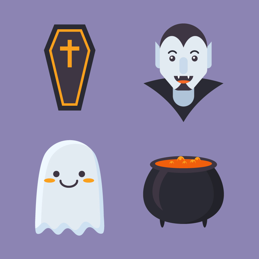
In this tutorial we’ll go through a fun and simple process to create a set of flat Halloween icons, using simple geometric shapes, the Shape Builder Tool, and various Warp effects to modify and transform the elements.
If you want to check out the source file and see how the icons are made, you can always get the full set of Flat Halloween Icons at Envato Elements. As a bonus, you’ll get additional icons in this expanded collection for your personal or commercial use!
1. How to Make a Magic Cauldron Icon
Step 1
Start by making a 120 x 30 px dark-purple oval using the Ellipse Tool (L). Create a smaller 100 x 17 px oval on top of it and fill it with orange.
Step 2
Now let’s make the body of the cauldron. Make a 140 x 140 px dark-purple circle. Select its side anchor points with the Direct Selection Tool (A) and drag them down a bit to make the bottom of the cauldron flatter.
Take the Eraser Tool (Shift-E), hold down Alt, and erase the top part of the circle, making it hidden beneath the top ellipses.
Step 3
Let’s add some details. Copy (Control-C) the body of the cauldron and Paste in Front (Control-F). Move the top copy to the left a bit and make the bottom copy darker.
Select both copies and take the Shape Builder Tool (Shift-M). Hold down Alt and click the unwanted piece on the left to delete it.
Great! Now we have only a crescent shape left.
Step 4
Create another crescent shape using the same technique and make it smaller. Fill it with lighter purple to make a highlight on the surface of the cauldron.
Step 5
Let’s create a pair of legs. Use the Ellipse Tool (L) to make a 9 x 20 px dark-purple oval. Take the Direct Selection Tool (A) and move its side anchor points up to make the shape more pointed.
Step 6
Duplicate the leg to the opposite side of the cauldron.
Step 7
Now we’ll make a simple bubble. Create an orange circle, Copy it, and Paste in Front (Control-C > Control-F). Move the top copy down a bit and fill the circle behind it with lighter orange color.
Finally, use the Shape Builder Tool (Shift-M) while holding Alt to delete the unwanted piece at the bottom.
Finish off the bubble by adding a small light-orange circle for the highlight.
Step 8
Now we can Group (Control-G) all the pieces of the bubble and speckle the bubbles on top of the orange liquid in the cauldron. Change their size and position to make it look more natural.
Step 9
And that’s it for our magic cauldron! Let’s move on to the next icon.
2. How to Design a Cartoon Coffin Icon
Step 1
Take the Rectangle Tool (M) and start with a 55 x 155 px dark-purple rectangle. Go to Object > Path > Add Anchor Points to add a point in the middle of each side. We will need only the left and the right one.
Step 2
Select the left anchor point with the Direct Selection Tool (A) and hit the Enter key to open the Move options window.
Set the Horizontal Position value to -15 px and Vertical to 0 px.
Click OK to move the point 15 px to the left.
Step 3
Now let’s move the other point in the opposite direction. This time set the Horizontal value to 15 px,Vertical value to 0 px.
Step 4
Let’s make the bottom edge of the coffin narrower. Select its bottom left anchor point with the Direct Selection Tool (A) and open the Move window. Set the Horizontal value to 10 px, Vertical to 0 px.
Do the same for the opposite side, but set the Horizontal value to -10 px.
Step 5
Keeping the shape selected, go to Object > Path > Offset Path and set the Offset value to -7 px.
Make the color of the top shape lighter.
Step 6
Duplicate (Control-C > Control-F) the top shape and set its Fill color to None.
Apply a bright orange Stroke and open the Stroke panel (Window > Stroke). Set the Weight of the line to 4 pt and Align Stroke to Inside.
Step 7
Take the Rectangle Tool (M) and make a 7 x 50 px orange shape. Add a 33 x 7 px rectangle on top of it to make a cross.
And there we have it! Our coffin icon is finished. Let’s move on!
3. How to Draw a Cute Ghost Icon
Step 1
Start by creating the body of our ghost from a 90 x 165 px light-blue rectangle.
Select its bottom left anchor point and use the Move function to move it 20 px to the left. The do the same for the bottom right anchor point and move it in the opposite direction, making the bottom edge wider.
Step 2
Now select both top anchor points and make the top of the body rounded with the Live Corners feature by dragging the circle markers down. You can also adjust the radius manually by setting the Corners value to 50 px in the control panel on top.
Step 3
Let’s make the bottom part wavy. Grab the Scissors Tool (C) and click the bottom left and right anchor points to split the shape. Now the horizontal bottom line is separated from the rest of the body.
Step 4
Keeping the line selected, go to Effect > Distort & Transform > Zig Zag.
Set the following Options:
Size to 6 px
Absolute
Ridges per Segment to 5
Points to Smooth
And click OK.
Go to Object > Expand Appearance to apply the effect.
Step 5
Use the Lasso Tool (Q) to select the bottom left anchor point of the body together with the left side of the wave. Click the right mouse button and Join the points. Repeat the same for the opposite bottom points to unite the shape.
Step 6
Now we can Convert selected anchor points to smooth, using the Convert function in the control panel on top.
Use the Direct Selection Tool (A) to move some anchor handles, making the shape more balanced and smooth.
Step 7
Let’s add details. Duplicate the shape and move the top copy down and to the right. Use the Shape Builder Tool (Shift-M) while holding down the Alt key to delete the unwanted piece. Use the remaining piece to make a highlight.
Create a subtle shadow at the bottom of the ghost, using the same technique.
Step 8
Now let’s add some facial features to our ghostly fellow. Use the Ellipse Tool (L) to make a pair of 11 x 11 px dark-purple circles for the eyes.
Step 9
Add a larger ellipse for the mouth right in the center of the face. Take the Scissors Tool (C) and click both side anchor points to split the ellipse.
Delete its top half, leaving only the bottom arc to form a smile. Set the Weight to 3 pt and Cap to Round Cap in the Stroke panel.
Step 10
Finish the ghost by adding two orange ovals on the cheeks.
There we have it! Let’s make our last icon!
4. How to Create a Flat Vampire Icon
Step 1
Let’s use a character from another tutorial as a base for our scary Dracula. I choose a construction worker flat avatar to make this transformation. You can either create it following Part 1, Step 1 and onwards of this descriptive tutorial:
In this tutorial we’ll be making a set of flat-style portraits, depicting people of different professions and occupations. Basic shapes and tools of Adobe…
Let’s right click on the icon, Release Clipping Mask, and delete the circle base and the shadow.
Step 2
Delete the clothes and some unneeded facial features. Select the bottom part of the neck using the Direct Selection Tool (A) and make it rounded with the help of the Live Corners function:
Step 3
Now let’s recolor the skin of our character to give him a pale vampiric look. Fill the elements of the head with pale-blue tints and make his eyes and eyebrows dark.
Step 4
Already looks scary enough! Let’s add a mouth. Make a 35 x 23 px circle and split it using the Scissors Tool (C).
Step 5
Take the Ellipse Tool (L) and make two 5 x 10 px white ovals for the fangs. Select the bottom points and Convert selected anchor points to corner from the control panel on top to make the fangs sharp.
Step 6
Add an orange oval for the tongue. Select all the elements of the mouth and take the Shape Builder Tool (Shift-M). Hold down Alt and click the unneeded pieces to delete them.
Step 7
Let’s add a hairdo and a small stylish beard.
Duplicate the face shape. Take the Ellipse Tool (L) and place two large ellipses so that they cover the face, making the ellipses overlap. The uncovered parts of the face will form the hair. Now we can delete the unwanted pieces using the Shape Builder Tool (Shift-M) and fill the hair parts with dark color.
Step 8
We also need to change the shape of the ears. First of all, make the top of the ear squared either by dragging the markers of the Live Corners up or by setting the Corners value to 0 px in the control panel on top.
Then select the top left corner with the Direct Selection Tool (A) and drag it up, making the ear pointed.
Step 9
Let’s add a final touch to our vampire: a high collar. Take the Polygon Tool and single-click anywhere on the Artboard to open the options window. Set the Sides value to 3 and create a dark-purple triangle, rotating it upside down.
Keeping the shape selected, go to Effect > Warp > Arc and set the Horizontal Bend value to 20%. Click OK and Object > Expand Appearance to apply the effect.
Step 10
And there we have it! Our vampire icon is ready!
Boo! Have A Spooky Halloween!
Great work! Now we’re ready for Halloween with our set of creepily cute flat icons! I hope you’ve enjoyed following this tutorial and got inspired by its simple and fun techniques.
Take your expertise to the next level with these advanced Photoshop tutorials.
99 of the Best Advanced Photoshop Tutorials
Photoshop is the tool of choice for many artists. Whether you’re a photographer, a designer, or any kind of creative, there is so much you can do with one program.
So in order to show you how endless the possibilities are, we present you with 99 of the best advanced Photoshop tutorials from around the web. Learn more about photo effects and manipulations, or try out a fun digital painting like those of your favorite artists.
Need a quick challenge? Try our Photoshop in 60 Seconds series to learn quick tips in under a minute!
Enjoy this collection of tutorials curated from Envato Tuts+ and friends.
Photo Effects
Live your life with beautiful filters better than Instagram. Adjust
the brightness and color scheme or just explore more fun tricks for
easier control.
Put your best face forward with these advanced photo effects to transform your images.
How to Make Your Photos Look Better Fast! Photoshop Tutorial
Enhance your photos with these quick tips! YouTuber Peter McKinnon walks you through his process for editing photos. Learn about Adjustment Layers and more in this helpful video.
How To Create an Infrared Photo Effect in Adobe Photoshop
Master your photography skills with this Photoshop tutorial. Learn how
to enhance your eye for breathtaking photos while tackling extraordinary
infrared effects. Enjoy this breakdown from Chris Spooner.
How to Make Optical Illusion Art in Adobe Photoshop
Grabbed from Adobe Creative Cloud’s
YouTube Channel, this video shows you how to make a dope optical
illusion using Photoshop. Twist your photos with mind-blowing patterns.
How to Create a Colored Pencil Sketch Effect Action in Adobe Photoshop
Create a handmade pencil sketch effect using Photoshop actions. Check out this deconstruction process from Marko Kožokar, involving amazing brushes and more.
How to Create a 90s Graphical Photo Effect in Adobe Photoshop
Follow along with Melody Nieves as she shows you how to create this colorful and graphic photo effect. Use bold colors and abstract shapes to make your photos stand out.
How to Create a Color Dust Action in Adobe Photoshop
Learn how to build a Color Dust Action with this Photoshop tutorial. Indranil Saha gives you his process for creating an epic photo effect. Great for posters too!
How to Create an Awesome Dispersion Action in Adobe Photoshop
You can create photo effects that are simply out of this world in Photoshop. In this tutorial, Marko Kožokar uses simple shapes and patterns to create a dispersion effect.
How to Create a Graffiti Effect in Adobe Photoshop
Test out a cool graffiti look with this Photoshop tutorial. In this tutorial, John Negoita shows you how to use filters and adjustments to blend your portraits with graffiti art.
Make a Trendy Double Exposure Effect in Adobe Photoshop
Recreate one of the biggest trends around with this fun double exposure tutorial. Instructor Yulia Sokolova walks you through the process from start to finish.
Manipulate a Portrait Photo to Create a Splatter Paint Effect
Put your manipulation skills to the test with this paint splatter tutorial. Instructor Brandon Spahn shows you how to recreate traditional paint textures you can apply to any photo.
How to Create a Dark Futuristic City in Adobe Photoshop
Step into the future and build a remarkably lit city. This Photoshop tutorial from Marie Gardiner shows you how to create a Blade Runner effect we’re sure you’ll love.
Think of a photo manipulation like a jigsaw puzzle. Once you find the right images, all you have to do is put the pieces together.
And we have jigsaw puzzles of all types for you to enjoy! Build any fantasy scene or magical composition using these helpful tutorials.
How to Create an Intense Composite of a Stone Tiger With Blue Flames
Master a stunning fiery scene with this photo manipulation tutorial.
Create the initial composite with fire and nature stocks before adding
amazing effects.
Create an enchanting composition with fairies and jungle elements. This
tutorial shows you how to build the landscape from scratch before painting it with earthy colors.
Watch this video by YouTuber Rafy A
to learn how to create this beautiful bear manipulation. Start with the
sky and cloud shapes before adding the main subjects. Enjoy this
incredible treat!
Build a dark rainy scene in under 15 minutes! In this video, YouTuber Arunz Creation shows you how to make a rainy photo manipulation using Layer Masks.
Advanced Photo Manipulation Techniques: Filters and Adjustments
In this free course, learn how to use advanced photo manipulation techniques to create a fiery landscape. Lewis Moorhead shows you how to build the 3D object and landscape first before adding smoke and fire.
How to Create a Frankenstein’s Monster Photo Manipulation in Adobe Photoshop
Master this spooky Frankenstein Monster manipulation from Melody Nieves. Learn how to create the menacing expression along with extra tips for working with color.
How to Create a Pumpkin Coach Photo Manipulation in Adobe Photoshop
Create an enchanting scene with this Cinderella-inspired tutorial from Melody Nieves. Recreate this manipulation using 3D objects and layer blend modes.
How to Create a Dragon Landscape Photo Manipulation With Adobe Photoshop
Jenny Le will guide you into a beautiful dragon landscape with this Photoshop tutorial. Learn how to create the mountainous landscape and adjust it with dark colors.
How to Create a Magical Butterfly Photo Manipulation With Adobe Photoshop
You can illustrate many beautiful scenes in Photoshop. Take this magical butterfly manipulation, for example. Learn how to master adjustment layers and more with this tutorial from Jenny Le.
How to Create a Glamorous Calavera Portrait in Adobe Photoshop
Celebrate the Day of the Dead with this glamorous Calavera portrait tutorial. Melody Nieves walks you through the steps to applying Calavera makeup to a photo.
Need a new website? Design it first in Photoshop! This next selection of tutorials features great designs for marketing, stationery, and promotional work.
Design a professional resume or your first blockbuster movie poster. Enjoy this next collection of design tutorials.
How to Create a Photoshop Website Design
Every creative should have a website. Get started with this amazing design. Created by YouTuber Mir Rom, this design features a modern look with sleek office accents.
Design a winning resume in Photoshop. In this video, YouTuber Digital Roni shows you how to build a nice modern design under an hour. Follow along for great design tips.
How to Make a Movie Poster With Texture Background In Photoshop
You
can rock any design you want, like this legendary movie poster.
YouTuber Mir Rom shows you how with his step-by-step process using
simple textures. Enjoy!
Sometimes designers like to work out their logos in Photoshop before
transferring to Illustrator. Learn how to build a logo yourself using
this video tutorial.
How to Design a Vintage Travel Poster in Adobe Illustrator and Photoshop
Show off your love of travel with a fun poster project. This tutorial from Janie Kliever shows you how to create a vintage-inspired design using Illustrator and Photoshop.
How to Create a Hand-Lettered Housewarming Poster in Adobe Photoshop
Spread the love with this heartwarming poster tutorial. Instructor Yulia Sokolova shows you how to create a delightful hand-lettered design with beautiful colors.
Design a Floral Pattern for Fabric in Adobe Photoshop
Bring out your passion for pattern design with this tutorial. Lidija Paradinovic Nagulov walks you through the steps of creating a handmade floral pattern.
How to Create Flat Pirate Icons in Adobe Photoshop
This last design tutorial shows you how to make trendy flat icons in Adobe Photoshop. Yulia Sokolova helps you design the pirate theme complete with a treasure-chest icon.
Text effect tutorials are one of the best ways to get started in Photoshop. But they’re even better for helping you master it. So clear out the cobwebs in your inspiration department and try a realistic text effect!
Step up your game with Layer Styles and design epic typography.
How to Create a Splashing Water Text Effect
Photoshop’s 3D tools are still new to many designers. Try out this splashing water text effect from fellow instructor Rose. Spend the afternoon tinkering away at this lovely design.
Everyone’s lovin’ the 80s again and so are we! Join along with this text
effect tutorial. A thoroughly broken down lesson, this tutorial will
introduce you to incredible 3D typography and metallic effects.
Video tutorials are a great way to watch the design process unfold right
before you. Check out this great video from Arunz Creation. Featuring
3D tools and more, this Photoshop tutorial is one you’ll want to see.
Create awesome rock typography with this quick process video. Ismail El haddad shows you how to build the initial rock letters before finalizing it with vibrant plants. Enjoy!
How to Create a 3D Chipped, Painted Wood Text Effect in Adobe Photoshop
Rose breaks down her method for this 3D chipped wood effect in this tutorial. Get better acquainted with Photoshop’s 3D features in this detailed lesson.
How to Create a Tasty 3D Typographic Illustration in Photoshop
We’ve got a mouth-watering treat for you with this typographic illustration. Mark Mayers shows you how to complete this tasty, sweet typography using stocks and filters in Photoshop.
How to Create a Trendy Marble and Rose Gold Text Effect in Adobe Photoshop
Make an impact with a marble and rose gold text effect. This trendy style features a popular minimalist design that takes time to perfect. Try it out today!
Digital art doesn’t have to be so hard. Just search around for tutorials that fit your learning style. These digital painting tutorials offer simple breakdowns for essential techniques.
Even great artists need more practice. Test out your knowledge with these awesome lessons.
How to Create a Fantasy Sword in Photoshop
Explore
amazing game design techniques with instructor Javier Salas. Follow
along as he breaks down the process of designing medieval-style swords
based on animal references. Then give this lesson a try!
How to Digitally Paint a Beautiful Animal-Headed Portrait
Many find animals easier to paint, particularly cats. Do
you? Their furry faces challenge artists to push themselves and better
their hone drawing skills. And you can learn how with this painting
tutorial.
How to Create an 80’s-Inspired Portrait in Photoshop
Paint
a gorgeous portrait inspired by 80s design with this fun lesson.
KittoZutto walks you through her personal steps to delivering a stunning
digital painting.
Illustrate a gorgeous swan using shadow and texture. This tutorial shows
you how, along with several extra tips for developing more depth. Enjoy
this lesson from instructor Andrew Lyons.
How to Create a Sign Language Digital Painting in Adobe Photoshop
Spread love with a sign language painting and celebrate others. Learn how to use premium Photoshop brushes to achieve mood and realism with this tutorial by Melody Nieves.
How to Use Color to Set the Mood in Adobe Photoshop
There are a few simple ways to change the mood of your digital paintings. Learn how to use Photoshop’s essential tools to add beautiful filters to your work.
How to Digitally Paint Faces With Incredible Likeness
Likeness is how much you’re able to capture the person you’re painting. Are the features the same? Do they line up? And how can you improve? Find out in this lesson by Melody Nieves.
Sculpt Your Idea: How to Quickly Paint a Snow Griffin in Adobe Photoshop
Follow along with Monika Zagrobelna to paint a beautiful snow griffin in Photoshop. Learn how to sculpt a character using a simple texture brush and a few steps.
An Introduction to Painting Realistic Hair in Adobe Photoshop
Paint beautiful, springy hair with this Photoshop tutorial. Melody Nieves breaks down what it’s like to paint four different hair styles and textures. Enjoy!
7 Exercises to Improve Your Digital Painting Skills
Learn seven essential tips to bring the best out of your work. Monika Zagrobelna breaks down a few common things we all go through while trying to master our technique.
How to Create Dramatic Lighting in Your Digital Painting Portraits
Stop stressing yourself out about lighting! You know more than you realize. Learn how to use Photoshop’s awesome tools to create dramatic lighting now.
How to Shade Black and White Realistically in Digital Painting
Enhance your photos with these quick tips! YouTuber Peter McKinnon walks you through his process for editing photos. Learn about Adjustment Layers and more in this helpful video.
Love animation? Get started on your first cartoon in Photoshop. Take on these new challenges to bring your animations to life.
How to Illustrate Animals With 13 Circles
In this drawing challenge by Dorota Pankowska, she set out to draw several
familiar animal designs using just 13 circles. Learn how to create one
of these amazing animals yourself.
How to Make Your Pictures Come to Life using a Cinemagraph
Nike said it best, Just do it. And in this awesome video,
you’ll see Peter McKinnon create a cool cinemagraph effect in Adobe
Photoshop. If you love photos and animation, you’ll definitely like this
tutorial.
Learn how to draw dynamic movement frame by frame. Now is the time to make your animations come alive! Join YouTuber Finchwing for this Photoshop animation lesson.
How to Create a Selective Animated Glitch Photo Effect in Adobe Photoshop
Create an incredible animation glitch effect with this tutorial by Mohammad Jeprie. Learn how to use the automated Content Aware Fill feature and more great tools.
How to Create an Animated Pixel Art Sprite in Adobe Photoshop
Dive into this animated pixel art tutorial by Gleb Polikanin. Follow closely as you learn how to build and animate your pixel art. Try something new today.
How to Create a Glitch Animated Gif Action in Adobe Photoshop
Glitch effects can be used on all types of photos for a unique-looking post. Try this tutorial by Ivan Gromov to learn how to animate this amazing effect from start to finish.
How to Create a Walking Kitten Animation In Adobe Photoshop
For cat lovers and friends, animate your favorite furry pals with this tutorial. Monika Zagrobelna breaks down the steps for a wonderful introduction to animation.
How to Create Animated Vector Icons in Adobe Illustrator and Photoshop
Tackle this super awesome vector icon animation created by Mary Winkler. Watch as you take simple icons and turn them into magical animations in Photoshop.
Design your own animation assets using this Photoshop tutorial. Instructor Rowena Aitken guides you step by step through the storyboard and illustration process.
Want to learn more? Get quality, step-by-step videos from our experts. Envato Tuts+ courses offer creatives access to thorough video lessons on your favorite subjects. Conquer Photoshop on your time.
Filter Forge is an impressive Photoshop plugin made with quality custom-made textures. In this course, instructor Kirk Nelson explores the incredible preset and shows you how to master its settings.
Some believe that mastering realism takes a lifetime, but you can get pretty close with a few Photoshop tricks. Follow along with my Photoshop course to achieve better likeness and realism in your digital portraits.
Learn the best techniques around for fiery photo manipulations! Build a volcanic scene with instructor Lewis Moorhead. In this course, you’ll use patterns and custom textures to create a powerful manipulation.
Follow up with this advanced photo manipulation course for aspiring advertisers. Get the industry information you need to know to design amazing ads. Try out the refreshing design yourself, using pro techniques from Gavin Campbell.
If you need a simple beginner’s introduction to working with gradients, watch this quick video from my course on Mastering Logo Design in Adobe Illustrator. I’ll show you how to create different types of gradients and change various options such as the colours, position, and opacity.
By the end, you’ll be clear about how to create various different types of gradients and edit them to get the exact look you want.
How to Create and Edit Gradients in Adobe Illustrator
How to Create a Simple Gradient
Start by using the Rectangle Tool to create a simple rectangle to work on. Then you can open the Gradient panel by clicking the icon in the toolbar or by going to Window > Gradient.
Clicking anywhere on the gradient slider will create a default black-to-white gradient. And the Reverse Gradient icon just above it lets you reverse the direction, going from left to right or right to left. Or you can manually adjust the angle of the gradient by typing a value in the box.
There are also lots of presets, so you can go from top to bottom or left to right, and you can apply the gradient either to the fill or the stroke. And if you change the Type from Linear to Radial, it will emanate from the center towards the edges (and, of course, that can also be reversed).
How to Change the Colours of the Gradient
You can adjust the starting point for each colour as well. So if you want more black, you can drag the arrow below the slider over to the right. And, if I bring the white in from the right hand side, you can see it creates a very, very harsh divide.
So for a softer gradient, it’s always better to move these colour swatches apart.
Now, for any gradient, you’ve got to have a minimum of two colours, because you have to have one colour that graduates into another. However, when you hover over the slider, a plus icon appears, and you can add more swatches. You can then double-click a swatch and pick a colour.
So go ahead and add some more colours there. If you use global swatches, you can go into the Swatches panel and change the global swatch, and it will update it in every instance, including gradients.
How to Change the Location and Opacity of a Gradient
To delete a swatch, just click and drag it off—you can do that with the black one on the left.
Then you can extend the other colours out by dragging the swatches, or you can also be more precise and type in a Location value. For the orange one, you can type 50% to get it right in the middle.
Of course, you can adjust the Opacity of any swatch by selecting it and choosing a value from the dropdown menu or typing a value in.
Between each individual swatch, you can adjust the position using the little diamond icon on the top of the slider. It’s very similar to moving the swatch itself—you can introduce a bit more of one colour and a bit less of another just by adjusting the break point within the gradient.
And they also have Location percentages, so you can enter precise values if you prefer.
Watch the Full Course
In the full course, Mastering Logo Design in Adobe Illustrator, you’ll learn the essential tools you need to create a logo in Adobe Illustrator. As I did in this video with gradients, I’ll go through some important tools and techniques in Illustrator, and then at the end, we’ll apply everything we’ve learned in a practical project to create a complete logo design.
You can take this course straight away with a subscription to Envato Elements. For a single low monthly fee, you get access not only to this course, but also to our growing library of over 1,000 video courses and industry-leading eBooks on Envato Tuts+.
Plus you now get unlimited downloads from the huge Envato Elements library of 300,000+ creative assets. Create with unique fonts, photos, graphics and templates, and deliver better projects faster.
Before you start, download and install these assets. It will help you to get the same result.
Introduction
If you are a beginner and are not good at painting, you can download and install the pattern, and skip the next part of the tutorial. To do that, go to Edit > Presets > Preset Manager. Change Preset Type to Patterns.
After that, click on the Load button, find our pattern file on your device, and press Load. That’s all—now the patterns have been added. Also, you can drag and drop the pattern file to Photoshop.
1. How to Create the Brain Pattern
First of all we need to create the brain pattern. It will be the base of our text effect.
Step 1
Open Photoshop (I use Photoshop CS6), go to File > New, and create a new 314 x 374 px document.
Step 2
Rename the layer as Background. Fill this one using #d88364 color.
Step 3
Create a New Layer (Layer > New > Layer) with the name Lines. Move it above the Background.
Step 4
Pick the Brush Tool (B), select a Hard Round brush, and go to Window > Brush to change some settings:
Size: 8 px
Spacing: 7%
If you are working with a graphics tablet, also check the Transfer and make sure that Opacity Jitter and Flow Jitter are controlled by Pen Pressure.
Step 5
Set the Foreground Color to #7f2b16. Make sure you are on the Lines layer. Let’s start drawing the lines of the convolutions. You can use Eraser Tool (E) to clean or delete part of the image. My result:
Step 6
Duplicate the Lines layer. Change the layer name to Shadow. This layer should be between Background and Lines.
Step 7
Right-click the Lines layer and choose Blending Options to create the Layer Style.
Add an Outer Glow:
Blend Mode: Normal
Opacity: 34%
Noise: 0%
Color:#7f2b16
Technique: Softer
Spread: 0%
Size: 4 px
Contour: Linear
Uncheck Anti-aliased
Range: 50%
Jitter: 0%
Step 8
Right-click the Shadow layer and choose Blending Options to create the Layer Style.
Add an Outer Glow:
Blend Mode: Normal
Opacity: 100%
Noise: 0%
Color:#c05648
Technique: Softer
Spread: 34%
Size: 16 px
Contour: Linear
Uncheck Anti-aliased
Range: 100%
Jitter: 0%
Step 9
Create a New Layer (Layer > New > Layer) with the name Highlight. Move it between the Lines and Shadow layers. Set the Blending Mode for the layer to Vivid Light. Pick the Brush Tool (B) and draw the highlights using #e9a186 color. If your result doesn’t look smooth, go to Filter > Blur > Gaussian Blur and set the Radius to 3 px.
Step 10
Now we need to make sure that our image works as a pattern. To do that, stay on the Lines layer, go to Select > All (Control-A) to select the picture, go to Edit > Copy Merged to copy all layers as one, and go to Edit > Paste (Control-V) to paste this layer as a new one. Rename it Pattern. Now select this layer, and go to Layer > Smart Objects > Convert to Smart Object (or right-click on the layer and choose Convert to Smart Object).
Step 11
Pick this Smart Object, go to Filter > Other > Offset, and set these values:
Step 12
As you can see, our future pattern has some issues. To fix it, create a New Layer (Layer > New > Layer), pick the Brush Tool (B), change the Hardness to 30%, and paint over it using the Eyedropper Tool (I) to pick the colors. Result:
Step 13
Create a new Hue/Saturation adjustment layer and decrease the Saturation to -20.
Step 14
Our image is ready, and all you need to do is to create a pattern. Go to Edit > Define Pattern. Type Brain Pattern in the Name field.
2. How to Create the Text Smart Object
The main goal of this part is the creation of a Smart Object with a text layer inside. It will help you to make fast changes in the future.
Step 1
Set the Foreground Color to #454545. After that, pick Switch Foreground and Background Colors (X).
Create a new 4000 x 1420 px document with resolution of 300 pixels/inch. Set Background Content as Background Color.
Step 2
Pick the Type Tool (T) and select the Rounds Black font. Set the Font Size around 250 pt and Font Color#ffa81f. Write „BRAIN” in capital letters.
Step 3
Select the Brain layer, press Control-A, pick the Move Tool, and press Align vertical center and Align horizontal center to move the layer to the center of the document.
Step 4
Go to Layer > Smart Objects > Convert to Smart Object to convert the text layer to a Smart Object(or right-click on the layer and choose Convert to Smart Object).
Step 5
Double-click with your mouse on the layer icon to open the Smart Object.
Go to Edit > Transform Free Path (Control-T) and change some settings of the text layer:
X: 2012 px
Y: 483 px
W: 93%
H: 111%
Step 6
Create the stain effect of the text using the Pen Tool (P). As you can see, I have filled the background with gray color to differentiate better. This layer is temporary and will be deleted before closing. My result:
Now you need to save it. Go to File > Save (or press Control-S) to do it and File > Close to close this file. After that, you will get an updated Smart Object with a new word.
Step 7
Pick this Smart Object and duplicate it four times. As a result, there will be five copies of the Smart Object. I suggest renaming each layer from the top to the bottom using the following names:
Volume
Pattern
Stroke
Shadow
Outer Stroke
It will help you to navigate the document during the following steps.
3. How to Create the Volume Layer Style
Step 1
Change the Fill of the layer to 0. Double-click with your mouse on the Volume layer to apply the following layer styles. Add a Bevel & Emboss using the following values:
Style: Inner Bevel
Technique: Smooth
Depth: 103%
Direction: Up
Size: 103 px
Soften: 16 px
Uncheck the Use Global Light box before setting an Angle: 120°
Altitude: 60°
Gloss Contour: Linear
Uncheck the Anti-aliased
Highlight Mode: Color Dodge
Highlight Color:#ffffff
Opacity: 65%
Shadow Mode: Color Dodge
Shadow Color:#ffffff
Opacity: 87%
Step 2
Add a Contour:
Contour: Half Round
Uncheck Anti-aliased
Range: 73%
Step 3
Add an Inner Shadow with these settings:
Blend Mode: Difference
Color:#7adafa
Uncheck the Use Global Light box before setting an Angle: -60°
Distance: 29 px
Choke: 20%
Size: 125 px
Contour: Linear
Uncheck the Anti-aliased
Noise: 2%
Step 4
Now add an Inner Glow:
Blend Mode: Overlay
Opacity: 72%
Noise: 0%
Color: #ffffff
Technique: Softer
Source: Edge
Choke: 4%
Size: 33 px
Uncheck the Anti-aliased
Range: 55%
Jitter: 0%
Step 5
Add a Satin style using these settings:
Blend Mode: Multiply
Color:#000000
Opacity: 36%
Angle: 0°
Distance: 25 px
Size: 66 px
Contour: Linear
Uncheck the Anti-aliased and Invert
Step 6
Add an Outer Glow:
Blend Mode: Multiply
Opacity: 57%
Noise: 0%
Color:#000000
Technique: Softer
Spread: 0%
Size: 25 px
Contour: Linear
Uncheck Anti-aliased
Range: 100%
Jitter: 0%
Step 7
Don’t forget about a Drop Shadow:
Blending Mode: Multiply
Color:#000000
Opacity: 41%
Uncheck the Use Global Light box before setting an Angle: 120°
Distance: 25 px
Spread: 0%
Size: 25 px
As a result, you will have the following image:
4. How to Create the Pattern Layer Style
Step 1
Double-click on the Pattern layer to apply the Layer Styles. Add a Stroke:
Size: 2 px
Position: Outside
Blend Mode: Normal
Opacity: 100%
Fill Type: Color
Color:#a8262d
Step 2
Now add an Inner Glow:
Blend Mode: Normal
Opacity: 100%
Noise: 0%
Color: #f15d62
Technique: Softer
Source: Edge
Choke: 100%
Size: 10 px
Uncheck the Anti-aliased
Range: 100%
Jitter: 0%
Step 3
Also add a Color Overlay with these settings:
Blend Mode: Soft Light
Color: #f59088
Opacity: 100%
Step 4
Add a Pattern Overlay:
Blend Mode: Normal
Opacity: 80%
Click on Pattern and select the pattern that we created earlier
Scale: 240%
As a result, you will have the following image:
5. How to Create the Stroke Layer Style
This is a simple step. All you need to do is to add a Stroke with these settings:
Size: 20 px
Position: Outside
Blend Mode: Normal
Opacity: 100%
Fill Type: Color
Color:#fb705c
As a result, you have the following image:
6. How to Create the Shadow Layer Style
Step 1
Double-click on Shadow layer to apply the following layer styles. Add a Bevel & Emboss using the following values:
Style: Outer Bevel
Technique: Smooth
Depth: 1000%
Direction: Up
Size: 21 px
Soften: 0 px
Uncheck the Use Global Light box before setting an Angle: 90°
Altitude: 30°
Gloss Contour: Linear
Uncheck the Anti-aliased
Highlight Mode: Normal
Highlight Color:#ffffff
Opacity: 0%
Shadow Mode: Multiply
Shadow Color:#000000
Opacity: 50%
Step 2
Add a Stroke with these settings:
Size: 20 px
Position: Outside
Blend Mode: Normal
Opacity: 100%
Fill Type: Gradient
Gradient: from #c88206 to #753104
Style: Linear
Angle: -90°
Scale: 100%
Uncheck Reverse and Dither
Check Align with Layer
Step 3
Add a Drop Shadow:
Blending Mode: Normal
Color:#000000
Opacity: 75%
Uncheck the Use Global Light box before setting an Angle: 90°
Distance: 11 px
Spread: 47%
Size: 38 px
As a result, you will have the following image:
7. How to Create the Outer Stroke Layer Style
Add a Stroke with these settings:
Size: 30 px
Position: Outside
Blend Mode: Normal
Opacity: 100%
Fill Type: Gradient
Gradient: from #bc1526 to #c72435
Style: Linear
Angle: 90°
Scale: 100%
Uncheck Reverse and Dither
Check Align with Layer
As a result, you will have the following image:
Congratulations, You’re Done!
The brain text effect is ready. Here is the final image. I hope you enjoyed the tutorial.
Don’t forget to share your result with us.
By the way, if you want to change the text, double-click on the Smart Object icon, and Photoshop will open a new PSB file. Change the text, go to File > Save to save changes and File > Close to close this file. After that, you will get an updated file with a new word.
Arachnophobia is probably the most popular phobia: the fear of spiders. In a sense, it’s not an irrational fear. After all, many spiders are venomous! However, most of them are not harmful to humans, and they do not actively seek contact with us. A spider sitting on its web poses no danger to you, and if know it but you still feel uneasy about it, desensitization therapy may be good for you. Drawing a spider can be a part of it!
1. How to Draw a Spider
Step 1
Draw a circle. This will be the torso.
Step 2
Attach a slightly tapered oval to the torso. This will be the abdomen.
Step 3
Attach the head to the torso.
Step 4
Draw the mandibles in the front.
Step 5
Time for the legs. There are eight of them, so prepare space for four of them on each side of the torso.
Step 6
Draw the base of each leg.
Step 7
Draw the three main segments of the legs and the palps in the front. First, a short section…
… then a slightly longer one…
… and a short one again.
Step 8
The legs have more sections; they are not as visible though.
Step 9
Let’s add some thickness to the legs now, segment by segment. First, define the width of the segment with lines…
… then outline it.
Step 10
Draw the other segments the same way, making each thinner and thinner.
Step 11
Add some details to the body of the spider: eight eyes, spinnerets, torso details, and a pattern on the abdomen.
Step 12
Finally, outline the whole body and add some hair here and there.
Good Job!
You did it! If you want to learn more about spiders, their anatomy and species, check out the tutorial below:
Darkness is probably one of our oldest fears, since it has haunted our imagination starting with the dawn of time, bending and twisting reality in such ways that it has been permanently inserted in our genetic memory as a phobia known as nyctophobia.
Today, we’re going to do a little reality distortion ourselves and create a spooky illustration using some of the most basic geometric shapes and tools that one can find within Adobe Illustrator.
That being said, make sure you have plenty of light sources surrounding you so that we can jump straight into action!
1. How to Set Up a New Project File
Since I’m hoping you already have
Illustrator up and running in the background, bring it up and let’s set up a New Document (File > New or Control-N)
for our project using the following settings:
Number
of Artboards: 1
Width: 720
px
Height: 1080
px
Units: Pixels
And from the Advanced tab:
Color
Mode: RGB
Raster
Effects: Screen (72ppi)
Preview Mode: Default
2. How to Set Up a Custom Grid
Even though today we’re not working on
icons, we’ll still want to create the illustration using a pixel-perfect
workflow, by setting up a nice little grid so that we can have full control
over our shapes.
Step 1
Go to the Edit > Preferences > Guides & Grid submenu, and adjust
the following settings:
Once we’ve set up our custom grid, all we
need to do in order to make sure our shapes look crisp is enable the Snap to Grid option found under the View menu (that’s if you’re using an
older version of Illustrator).
Now, if you’re new to
the whole “pixel-perfect workflow”, I strongly recommend you go through my How
to Create Pixel-Perfect Artwork tutorial, which will help you widen your
technical skills in no time.
3. How to Set Up the Layers
Once we’ve finished setting up our project
file, it would be a good idea to structure our document using a few layers, since this way we can maintain a steady workflow by focusing on one
section of the illustration at a time.
That being said, bring up the Layers panel, and create a total of three
layers, which we will rename as follows:
layer 1: background
layer 2: window
layer 3: window
projection
Quick tip: I’ve colored all of my layers using the same
green value, since it’s the easiest one to view when used to highlight your
selected shapes (whether they’re closed or open paths).
4. How to Create
the Background
We’re going to kick off the
project by quickly creating the background, so make sure you’re on the
right layer (that would be the first one), and then lock all the other ones so
that we can get started.
Step 1
Create a 720 x 1080 px rectangle,
which we will color using #3F3330 and then center align to the underlying
Artboard using the Align panel.
Step 2
Lock the current layer, and then move on up to the next one (that would be the second one) where
we’ll start working on our next composing section.
5. How to Create
the Window Section
Once we’ve
finished working on the background, we can shift our focus over to the window,
which we will create in the following moments.
Step 1
Start working on the frame, by creating a 184 x 292 px rectangle, which we will color using #70463E, and then
center align to the underlying Artboard, positioning it at a distance of 214 px from its top edge.
Step 2
Create the window section using a smaller 160 x 280 px rectangle, which we will
color using #FF8D60 and then center align to the previous shape’s bottom edge. Once you have the two shapes in place, select and then
group them together using the Control-G keyboard
shortcut.
Step 3
Create the moon using an 80 x 80
px circle (#FFFFFF), which we will position
onto the window section, at a distance of 14
px from its left edge and 40 px from
its top one.
Step 4
Give the moon a spooky atmosphere by adding a couple of 4 px tall rectangles (#FF8D60), which
we will adjust pushing their bottom inner facing anchor points to the top by 3 px (right click > Transform > Move
> Vertical > -3 px). Position the resulting shapes as seen in the reference
image, selecting and grouping them and the moon together afterwards using the Control-G keyboard shortcut.
Step 5
Start working on the frame’s inner section by creating the vertical grid using a 4 x 280 px rectangle (#3F3330), which
we will center align to the smaller window section.
Step 6
Add the upper horizontal grid using a 160 x 4 px rectangle (#3F3330), which we will center align to the
underlying window section, positioning it at a distance of 96 px from its top edge.
Step 7
Start working on the horizontal grid’s outer rounded segments by
creating two sets of two 16 x 16 px circles
(#3F3330), which we will position as seen in the reference image.
Step 8
Adjust each pair of circles by selecting and
removing their inner facing two anchor points, uniting the resulting paths into
a single larger shape using the Control-J
keyboard shortcut twice.
Step 9
Create the inner rounded segments using two sets
of two 8 x 8 px circles (#3F3330),
which we will position as seen in the reference image.
Step 10
Open up each of the four circles by removing their outer facing anchor
points, uniting the resulting paths into a single larger shape by pressing Control-J four times. Once you’re done,
select and group (Control-G) all of
the horizontal grid’s composing shapes together, before moving on to the next
step.
Step 11
Create the bottom horizontal grid using a copy (Control-C > Control-F) of the one that
we’ve just finished working on, which we will position below at a distance of 64 px. Once you’re done, select and
group all of the window’s composing sections using the Control-G keyboard shortcut.
Step 12
Start working on the window’s sill by creating the subtle highlight using a 216 x 2 px rectangle,
which we will color using #FF8D60 and then position underneath the shapes that
we’ve just grouped.
Step 13
Create the current section’s main body using a 216 x 14 px rectangle (#70463E), which we will position below the
previously created shape.
Step 14
Following almost the same process used for
the moon’s atmospheric lines, add a couple of side insertions to the sill’s
main body. Take your time, and once you’re done select and group (Control-G) all of the current section’s
composing shapes together.
Step 15
Start working on the window’s lintel by creating
its bottom section using a 232 x 4 px rectangle (#70463E), which we will position above the frame’s top
edge, at a distance of 8 px.
Step 16
Create the upper section of the lintel using a 240 x 8 px rectangle (#70463E), which
we will position above the previously created shape, at a distance of just 4 px.
Step 17
Finish off the current section by adding the two
side insertions (#3F3330). Take your time and once you’re done select and group (Control-G) all of the lintel’s composing shapes together, doing the same for the entire window
afterwards.
Step 18
Start working on the left cover door by creating its hinges using two 4 x 10 px rectangles (#3F3330) which we
will align to the frame’s left edge, positioning them at a distance of 24 px from its top and bottom ones.
Step 19
With the hinges in place, start working on the actual cover by creating
a 4 x 292 px rectangle (#70463E),
followed by seven smaller 4 x 276
ones (#70463E). Horizontally distance the shapes at 4 px from one another, grouping (Control-G) and then positioning them at a distance of 4 px from the window frame’s left side.
Step 20
Create the handle using a 4 x 28
px rectangle (#70463E) to the right side of which we will add two 8 x 4 px rectangles (#70463E). Group (Control-G) all three shapes together
and then position them at a distance of 4
px from the left cover as seen in the reference image. Once you’re done, select and group (Control-G) all of the cover door’s
composing shapes together before moving on to the next step.
Step 21
Create the right cover door, using a copy (Control-C > Control-F) of the one that we’ve just finished
working on, which we will vertically reflect (right click > Transform > Reflect > Vertical) and then
position onto the opposite side of the window frame.
Step 22
For this next step, I’m going to let you get a little creative, since you’ll have to draw the two spooky tree
branches with the help of the Pen Tool
(P) using #3F3330 as your main Fill color.
Take your time, and use the reference images as your main guide, selecting and
grouping (Control-G) all your
resulting shapes before moving on to the next step.
Step 23
Start working on the little teddy bear, by creating its main body using
a 36 x 36 px circle, which we will
color using #3F3330 and then position onto the sill, at a distance of 36 px from the window’s left edge.
Step 24
Adjust the shape that we’ve just created by selecting its top anchor point using the Direct Selection Tool (A) and then
pushing it to the outside by 4
px using the Move tool (right click > Transform > Move >
Vertical > -4 px).
Step 25
Start working on the toy’s left leg, by creating a 16 x 20 px ellipse (#3F3330) on top of which we will add a smaller 8 x 12 px one (#70463E). Group (Control-G) the shapes together, and
then rotate them at a 45º angle (right click > Transform > Rotate >
45º), positioning them onto the larger body’s left side as seen in the
reference image.
Step 26
Create the right leg using a copy (Control-C > Control-F) of the one
that we’ve just finished working on, which we will
vertically reflect (right click >
Transform > Reflect > Vertical) and then position on the opposite side of the bear’s larger body.
Step 27
Start working on the left paw by creating its bottom section using an 8 x 8 px circle (#3F3330), which we
will position onto the leg, at a distance of 32 px from the window’s left edge.
Step 28
Add the paw’s upper section using a 10
x 10 px square (#3F3330) which we will adjust by setting the Radius of its top-left corner to 10 px from within the Transform panel’s Rectangle Properties. Once you’re done, position the resulting
shape onto the circle’s upper half, selecting and grouping both of them
together using the Control-G
keyboard shortcut.
Step 29
Add the right paw using a copy (Control-C
> Control-F) of the one that we’ve just finished working on, which we
will vertically reflect (right click
> Transform > Reflect > Vertical) and then position on the
opposite side of the bear’s body.
Step 30
Create the toy’s head using a 28
x 24 px ellipse, which we will color using #3F3330 and then position onto
the larger body, at a distance of 34 px from
its bottom edge.
Step 31
Finish off the bear by adding its ears using two 12 x 12 px circles (#3F3330), which
we will position 8 px from
one another horizontally, grouping (Control-G)
and then positioning them as seen in the reference image. Once you’re
done, select and group (Control-G)
all of the toy’s composing shapes before moving on to the next step.
Step 32
Add the first segments of the projected legs using two 4 x 14 px rectangles (#3F3330), which
we will position 16 px from
one another, grouping (Control-G) and
then positioning them on the window’s sill.
Step 33
Create the lower visible section of the wall
using a 160 x 48 px rectangle, which
we will color using #70463E and then position below the sill, at a distance of
just 24 px.
Step 34
Finish off the current section of the illustration by adding the second
segments of the projected legs using two 6
x 48 px rectangles (#3F3330). Adjust the segments by individually
selecting and pushing their top outer anchor points to the inside by 2 px (right click > Transform > Move > + / – 2 px depending on
which side you start with). Horizontally space the resulting shapes 16 px from one another, grouping (Control-G) and then positioning them
onto the visible section of the wall.
6. How to Create
the Window Projection Section
Assuming you’ve
locked the previous layer, move on up to the third and last one, where we’re
going to work on the lower half of the illustration, where all the dark magic
happens.
Step 1
Create the projected window using a 232
x 280 px rectangle, which we will color using #EA764E and then position
below the visible wall section, at a distance of 16 px from its bottom edge.
Step 2
Adjust the shape that we’ve just created, by individually selecting and
pushing its top anchor points to the inside by a distance of 36 px using the Move tool (right click >
Transform > Move > Horizontal > + / – 36 px depending on which
side you start with).
Step 3
Create the vertical grid using a 4 x 280 px rectangle, which we will
color using #3F3330, and then center align to the shape that we’ve just
adjusted.
Step 4
Add the horizontal grids using a copy (Control-C) of the ones from the
previous section, which we will paste onto the current layer (Control-F). Position the copies onto the
projected window, making sure to adjust their length as seen in the reference
image.
Step 5
Create the projected tree branches using a copy
(Control-C) of the ones that we’ve
previously made, which we will paste onto the current layer (Control-F) and then adjust by
horizontally reflecting them (right
click > Transform > Reflect > Horizontal). Position the resulting
shapes onto the right side of the projected window, as seen in the reference
image.
Step 6
Finish off the current section and with it the
illustration itself, by drawing the scary shadow monster using #3F3330 as your Fill color. Take your time, and once
you’re done, select and group (Control-G)
all of the projected window’s composing shapes together before saving the
project.
All Lights On!
Phew, now that was a scary one! I hope you’ve managed to keep up with each and every step, and maybe, just maybe, to break free of your fears for a little while during the process.
The moon has always attracted people, not only from a scientific point of view as an astronomical object, but also because it is believed to have some magical aspects which influence our lives. It can even be frightening and sometimes creepy!
If you’ve ever heard of selenophobia, you probably know what I mean. Selenophobia (from the Greek word seleno, meaning „moon”), also known as lunaphobia (from the Latin word luna, meaning „moon”) is the fear of the moon. Like many other phobias, selenophobia originates from painful experiences during childhood.
You may believe it or not, but as for now, let’s get some inspiration from this side of the moon’s nature and draw a mysterious illustration in Procreate. We’ll start with a very rough sketch, discovering all the basic features of this drawing application, and gradually moving to building shapes, colouring them, and adding textures up to the end result. Interested?
Oh, and by the way, you can get the Mystic Moon source file together with other file formats on Envato Elements. This file will allow you to see how everything was made and organised by going through the layers. You will also get a layered Adobe Photoshop file which is convenient to use for your personal or commercial work.
Let’s begin!
1. How to Draw a Moon in Procreate
Step 1
I’m using an iPad Pro and an Apple Pencil to create illustrations in Procreate. However, Procreate also supports other models of iPads (with iOS 10.0 and newer) which work with other styluses listed in Actions > Devices. The Apple Pencil itself is not on the list, though all its functions are fully supported by the app as well. While choosing your device or stylus, please keep in mind that Apple Pencil works only with iPad Pro, so always check the full information and compatibility of devices and apps before purchasing.
Step 2
Open the application, and let’s create a New Canvas by clicking the Create (+) icon in the top right corner. From there we can either select one of the canvases from the list or create a custom one. The number of layers in our file depends on its size. The higher the dimensions, the fewer layers you’ll be able to create.
Let’s make a 3500 x 3500 px canvas that will allow us to make up to 12 layers, which is more than enough for this project.
Step 3
I usually start my illustration with a rough sketch. Let’s open the Brushes tab and select an HB Pencil brush from the Sketching set.
We already have one empty layer by default, so I just pick the brush and start doodling. I can control the Size and Opacity of my brush by moving the two vertical sliders on the left side of the screen.
Step 4
Once I’m happy with the overall idea of my future illustration, I open the Layers panel and tap the layer to reveal a menu. Tap Rename and change the layer name to “Sketch”.
Step 5
Here is what I ended up with. It is pretty simple yet detailed, which will help me to focus on shapes and colours.
Step 6
As you may have noticed, we already have a “Background colour” layer in the Layers panel by default. It allows us to change the colour of the canvas by tapping and selecting the desired colour on the colour wheel. Let’s pick a nice tint of dark blue for the night sky.
Step 7
Now let’s tap the “+” icon in the top right corner of the Layers panel to make a New Layer. Then open the Brushes panel and pick the Ink Bleed brush in the Inking set.
Step 8
If we swipe to the left through all the brush sets, we can tap the “+” icon and create a New Set. Then we can drag and drop any existing brushes in this set for quick access.
Apart from that, we can edit the settings of any brush by tapping it. Let’s tap the Ink Bleed brush and edit the Stroke > Streamline parameter by setting it to 5%. This function allows us to smooth the line while drawing, which gives higher control over the strokes.
Then go to General > Size Limits and make sure that the Max slider is set to maximum.
Step 9
Now we can pick the pale yellow colour on the colour wheel (top right corner) and draw the outline of the moon, using our sketch as a reference. We can also pinch the canvas with two fingers, zoom it, and rotate for our convenience.
I also move the Size and Opacity sliders all the way up to make the line thick and solid.
Step 10
Once we’ve created a closed path, we can either scribble inside to fill it with colour or we can tap and hold the colour circle in the top right corner and drag and drop it right onto our shape.
Step 11
Let’s open the Layers panel and tap the N letter on the Sketch layer. From here, we can switch between the Blending Modes and change the Opacity of the layer. Set the Opacity to 45%, making the sketch semi-transparent.
Step 12
When using a textured brush, you may notice some empty spots or strokes after filling the shape. Use the Ink Bleed brush to paint inside the shape, eliminating the blank spaces.
Step 13
Now let’s Alpha Lock our moon layer by swiping to the right with two fingers. You will see the layer thumbnail background become checkered. Once you’ve Alpha Locked the layer, you’ll be painting inside the shape, without crossing its edges, which is very convenient for adding shadows, highlights, and textures.
Step 14
Now let’s add some texture to our moon. First of all, let’s select a darker colour. If you already have another colour selected, tap the square that’s located between the Size and Opacity sliders, and move the magnifying circle on top of the moon to pick its pale yellow colour.
Open the colour wheel and select a darker colour.
If you want to change the options of the colour picker, you can go to Actions > Advanced gesture control and switch between the settings of the Eyedropper.
Step 15
Let’s go to Brushes > Sketching and pick the Bonobo Chalk brush. Lower the Opacity and start painting over the moon, adding texture.
Step 16
Now lower the Size and draw along the edges of the moon to make it more three-dimensional.
Step 17
Now let’s create a New Layer, pick an orange colour, and choose the HB Pencil brush. Start scribbling over the darker areas, adding a realistic pencil texture. Make short parallel hatches, the same way as you do it on paper.
Step 18
Continue adding pencil strokes along the edges. Then pick a light-yellow colour and fill the center of the crescent as well.
Here you can see the layers that we’re using in this step.
Step 19
Let’s make a New Layer and take the Ink Bleed brush. Use a dark-orange colour to add short strokes for a cartoon effect.
Lower the Opacity of the layer to 60%, making the strokes semi-transparent.
Step 20
Now that our moon is finished, let’s Group all of its layers together. Select the top layer and swipe to the right all the layers beneath it with one finger. You will see a light-blue selection and a three-strokes icon appear in the top right corner of the Layers panel. Tap the icon to create a Layer Group. Now we can rename it and fold by tapping the arrow icon.
2. How to Draw a Star
Step 1
Let’s unlock the alpha on the Moon layer by swiping it to the right again with two fingers. You will see a solid background on the layer thumbnail, meaning that now you can paint anywhere on this layer.
Let’s use the Ink Bleed brush again to draw a star that we have on our sketch layer.
Step 2
I want to move the star a bit as I don’t like its current position. It looked fine on the sketch, but now the composition is quite unbalanced, so let’s see how we can center its top point with the top tip of the crescent.
Let’s tap the Freehand Selection in the top panel and make sure that Freehand option is selected in the bottom panel. Now we can draw a circle around our star, creating a selected area.
Step 3
After the selection is created, tap Transform and select Freeform in the panel below. Now that our selection around the star has changed to a square, we can move it around without affecting any other elements on the same layer.
Step 4
Use the Bonobo Chalk brush and switch to lighter and darker yellow colours, adding that texture touch to the star and making it more three-dimensional.
Step 5
Both main elements of our composition are ready, so let’s make them pop out of the background a bit more.
Create a New Layer right above the Background colour layer. You can reorder the layers by simply tapping and holding a layer and then dragging and dropping it to the desired position in the Layers panel.
Use the Bonobo Chalk brush and a dark blue colour (slightly lighter than the background) to create a subtle mist around the moon.
3. How to Draw Floral Elements and Herbs
Step 1
Now let’s unleash our imagination and draw out all those herbs and flowers from our sketch by adding more details and life to them.
Create a New Layer, take the Ink Bleed brush, and start drawing out the first branch growing from the bottom tip of the crescent. I’m using a dark-blue colour for this one, starting with a thin, arched stem and then adding rounded leaves along the stem.
Step 2
Continue using the same colour to add more elements around the moon. First of all, add a few floating leaves next to the first branch. Then draw a second branch growing from the bottom of the crescent. Place it right above the yellow surface, thus adding contrast.
Move on by adding other branches and leaves. I’m also using the Erase tool with the same Ink Bleed brush, cleaning some spots where I don’t want the leaves to overlap with the yellow shape of the moon.
Step 3
Once you’re happy with the dark blue plants (by the way, you’re always able to return to them later and add whatever details you want), create a New Layer and use a greyish-blue colour to add those leaves and flowing stems. Make the new grey plants partially overlap the dark-blue ones from the previous layer.
Try to maintain the balance in your composition by adding branches of more or less equal length on both sides of the moon. Don’t forget about the floating leaves—speckle them around the branches as well.
Step 4
Now it’s time to create the next New Layer. Pick a light-yellow colour and start adding bright strokes to our image in the spots where they are really needed.
Step 5
I have some plants here that consist of a grey stem and light-yellow flower bud. In order to add those buds, I simply create a New Layer and place it beneath all the other floral layers so that my additional yellow elements will always be partially hidden beneath the top layers of herbs.
Step 6
Once I’m happy with all the flowers and plants, I make sure that everything looks balanced enough and there are no empty spots or, on the contrary, areas overloaded with elements.
I’m using one of the yellow layers to speckle some stars around the moon by drawing dots of various sizes with the Ink Bleed brush.
Step 7
Now it is time to add a textured touch to all the floral elements! Don’t worry, you won’t have to draw a shadow on each leaf and flower manually.
First of all, let’s Alpha Lock each of the floral layers by swiping to the right with two fingers. If you do everything right, you will see a checkered background on the thumbnails.
Now take the Bonobo Chalk brush, and let’s start with the dark blue layer. Select a darker colour and go over the layer with wide strokes, adding grainy texture to all the dark-blue pieces. Then decrease the Size of the brush and go over the areas that need some more intense shadows, like the places where the leaves overlap or the spots where leaves grow from the stem, making the stem darker. This way we’ll visually separate the layers from each other, bringing more dimension to our image.
Step 8
Now let’s blend in some highlights. Pick a lighter yellow colour and draw over the tips of the leaves, adding a subtle silver glow to them.
Step 9
Work over all the dark blue layer and don’t forget to zoom out in order to check how the overall image looks at this stage.
Step 10
Now let’s switch to the grey layer and do the same for the greyish-blue plants. Start by adding those shadows and go on to the highlights, making all the tips slightly lighter.
Step 11
And finally, the yellow layers (both top and bottom ones)! This time, try to achieve a golden look by using orange for the shadows and light yellow (almost white) for the highlights.
Step 12
Once you’re happy with the floral elements, make a New Layer on top of all the floral layers, and let’s add some more mystic glow. Go to Brushes and select Airbrushing > Soft Airbrush. Pick a light-yellow colour.
Step 13
Decrease the Opacity and draw very light round spots around all the yellow-gold elements, making them really stand out and glow.
Step 14
We can add some more volume to our image if we create a New Layer in the Moon group of layers (Shadow layer) and use the Bonobo Chalk brush to make subtle shadows in the areas where leaves are placed on top of the moon. We can play with the layer options by setting it to Multiply mode and decreasing the Opacity to 80%, making it more subtle.
To the Moon & Back! Our Mystic Moon Image Is Finished!
Great work! Now our mystic moon illustration looks balanced and complete! I hope you’ve enjoyed following this tutorial and discovered new opportunities of using your iPad as a fully featured working device while creating beautiful pieces of art in Procreate.
By the way, once you’ve finished with your image, you can always share it and export in multiple formats, including the original Procreate file and a layered PSD file for Adobe Photoshop, which gives you even more flexibility and a wider range of opportunities!
You can get the Mystic Moon file in various formats on Envato Elements, to see how it was made and how the layers are organised. Apart from that, you’ll get a layered PSD file which is easy to use for your personal or commercial designs.
Agregator najlepszych postów o designie, webdesignie, cssie i Internecie