If you want to master Adobe Illustrator, these nine courses will give you a solid foundation to work from. Whether you’re a beginner who wants an introduction to the essential features or a more advanced user who wants to learn new techniques, there’s something here for you.
So browse through the list, watch the quick introduction videos, and decide what you want to learn: logo design, typography, product mockups, animated icons? Or perhaps you want to master the Pen Tool or create some cool vector silhouettes. Or are you looking for a comprehensive course that takes you through the tools, panels and other features of Illustrator from start to finish? You can find all of that and more here.
This first course may be primarily about logo design, but it’s also a great introduction to the most important tools, panels and features of Illustrator. Instructor Daniel White takes you on a guided tour through Illustrator, showing you how everything works, before putting it all into practice by creating a complete logo design.
Let’s move from a general course to a very specific one. In this quick, ten-minute Coffee Break Course, illustrator Simona Pfreundner shows you how to use the Touch Type Tool in Adobe Illustrator CC. The Touch Type Tool can manipulate the individual characters in type as if they were separate objects. This makes this tool extremely useful as you don’t have to worry about making stylistic changes to your type that make it hard to change later on.
This is really two courses in one. It will teach you how to create beautiful typography and custom lettering in Illustrator and Photoshop, but instructor Matt Withers also focuses heavily on the creative process, helping you hone your creativity as you design a piece of concept-driven, typographic artwork. If you are looking to get the most out of your creativity, and you have a keen eye for typography, this is the course for you.
Product mockups are a great way of helping your clients visualize how your designs will look in the real world. In this course, Grace Fussell will show you how to create your own 3D product mockups, using Adobe Illustrator to create 3D shapes and Adobe Photoshop to edit and enhance your designs. This is an immersive, easy-to-follow introduction to some of the tricks and techniques used by professional designers to create photorealistic mockups of their packaging designs.
If you’re looking for a solid introduction to Illustrator, or a refresher on some of its main features, this course is ideal for you. Simona Pfreundner walks you through the fundamentals of the program, so that by the end, you will be comfortable with how to use it and hopefully inspired to learn more about it.
Animated icons can liven up the user experience for anything from an app or website to a video game. Join concept artist Jonathan Lam to discover the step-by-step process of creating icons in Adobe Illustrator and exporting them to After Effects to animate them.
This course is perfect for designers, illustrators and game artists who are interested in animation and motion graphics.
The Pen Tool is without doubt one of the trickiest tools to use in Adobe Illustrator. But once mastered, it can also be the most useful tool. In this Coffee Break Course, instructor Simona Pfreundner will show you how to get to grips with using this tool, so you can become more confident and hopefully more productive in your design work.
If you’re relatively new to Illustrator and haven’t mastered the Pen Tool yet, try this course to discover how you can create great end results by following some simple steps. Tuts+ Design & Illustration Editor Sharon Milne walks you through the process of creating two fun silhouette-based projects, helping you learn some great new tools and processes along the way.
When you’re learning new design skills, it can be easy to overlook something simple and fundamental like color. Although you learned the fundamentals of colors as a child, there’s a lot more to discover. The right colors can set a mood, change a mood, and communicate all sorts of things.
In this course, Simona Pfreundner will show you how to color your artwork in Adobe Illustrator, how to be really efficient with it, and how to use color to spark your creativity.
Watch Any Course Now
You can take any of our Illustrator courses straight away with a subscription to Envato Elements. For a single low monthly fee, you get access not only to these courses, but also to our growing library of over 1,000 video courses and industry-leading eBooks on Envato Tuts+.
Plus you now get unlimited downloads from the huge Envato Elements library of 300,000+ creative assets. Create with unique fonts, photos, graphics and templates, and deliver better projects faster.
Your business needs a brochure, but which should you choose? Check out these premium templates from Envato Market.
31 Premium Brochure Templates
Think of a brochure as an extension of your sales team. It lets customers know more about your product or service without any extra fuss.
So make the right impression with a professional brochure. Today, we bring you 31 designs from Envato Market to inspire the budding entrepreneur within you.
Need more help? Let us know! Check out the design professionals at Envato Studio for all your brochure needs!
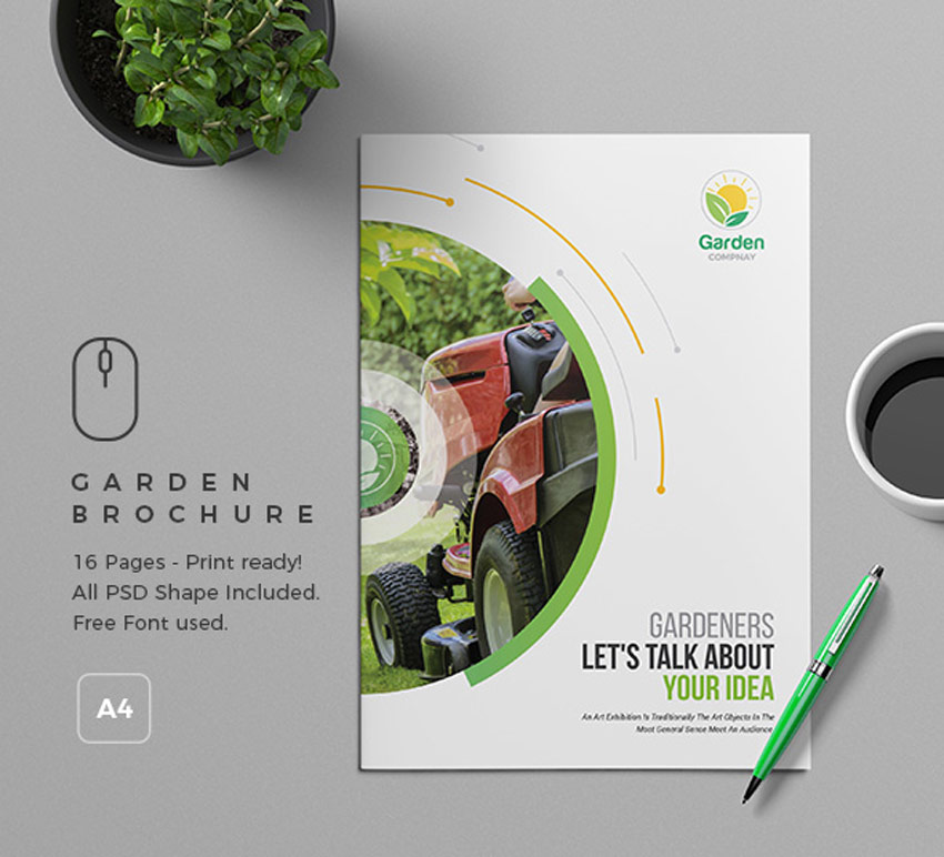
Do you have a green thumb? Then showcase your
gardening business with style. This brochure template includes easy-to-use smart objects to replace photos and logos fast. Download this
package now to get eight Photoshop files with 16 total pages and links
to free fonts.
Set your coffee shop apart from the others in
town. Use this clean and minimal template featuring a high-quality
design and luxurious coffee beans. Switch out the images using the editable smart objects and change the style to fit your needs.
Become
the next best thing in your neck of the woods with this high-quality
brochure. This package features a modern multipurpose template that is
certainly impressive. Suitable for beginners to design, this download
also includes detailed instructions.
Get
ahead with this modern brochure. Recently updated, this brochure
features eight unique pages and editable logos. Just change the colors
to match your brand in no time at all!
Create an elegant brochure for your photography business. This template contains 16 total pages with impressive layouts. It’s suitable for InDesign CS4 and above, so you’ll be able to customize it easily! Try it out today.
Highlight your work with a photography portfolio. Whether you’re a seasoned photographer or just starting out, this brochure presents your work in a classy and sophisticated manner. Download it today to get access to this template in several industry formats.
Tackle
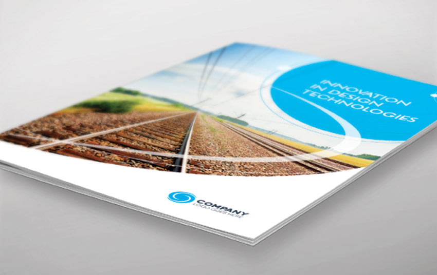
a new and exciting business with this clean brochure template. This
professional package includes several InDesign files at the standard A4
size. Enjoy creative angular layouts and access to free fonts.
Modern and stylish, this trifold brochure features a sleek, corporate style with colorful elements. It’s a fully editable template with easy-to-use placeholders for the text and images. Just open Photoshop to edit it.
Seek out a stylish alternative with this modern brochure.
Featuring a flexible design, this template can be used for a variety of
businesses. You can add as many pages as you’d like for even more
flexibility.
Know when to go minimal. A photography portfolio should let
your work shine. This template, for instance, features a horizontal A4
format with custom styles and master pages. It only uses free fonts, so
you won’t have to pay extra!
Portray your company’s true message with this brochure template. This InDesign template features eight unique pages with a colorful corporate theme. It even includes awesome extras like vector elements and icons.
Created in InDesign, this trifold brochure is perfect for medical professionals. Simply update it with your information of choice, using the simple-to-use text holders. Try it out!
When creating a brochure, it’s important that the
template is easy to navigate. Here’s a design that makes the process
simple. Just download the file and open it in Photoshop to update the
text, images, and logos.
Adjust the colors of this brochure to make your brand stand out. This template includes a 48-page layout with customizable backgrounds and vector assets. A handy help file is also included for further instruction.
This brochure template breaks the traditional mold of trifold designs. Featuring a creative layout with many photo options, this template is fully editable and print ready. Try it out for a unique presentation.
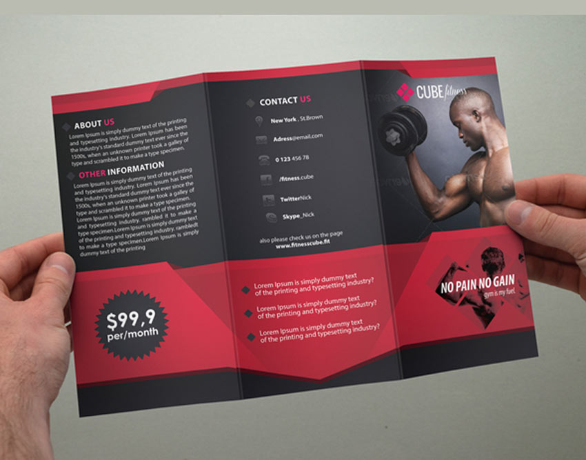
Is your business out of shape? Kick things into gear with this fitness trifold brochure. With three amazing color styles, this template comes print ready with bleed lines. Edit it fast using Adobe Photoshop.
What will be your first impression? This corporate
trifold is sleek and sophisticated. You can keep the original color
scheme or change it to the colors of your choice. Enjoy access to free
fonts and more, for an amazing deal.
Get started with your new business brochure. This corporate design features a high-resolution, fully layered template. Feel free to use the fonts included, or update it with your own favorites.
This business brochure features a stylish design that is sure to pique interest. There are 16 professional pages and multiple color options for your convenience. It’ll suit everyone from corporate agencies to small studios, so we’re sure you’ll love this template!
The standard brochure style we often see today is very minimal. This template, for instance, works well for energy businesses and more. Choose clear, high-quality stocks related to your industry to bring this template to the next level!
Or step out of the box with this fun design! This brochure template features a trendy geometric design with low polygonal elements. Perfect for creatives and all techies alike, this brochure is colorful and energetic.
What’s your mission? Make it clear with this trifold brochure. This download contains a 300-dpi, print-ready file with editable elements and colors. Choose from four color variations or create your own. Enjoy!
With 24 total pages, this modern brochure features a lovely dark theme with bold accents. Easily edit the paragraph and character styles, and take advantage of the auto page-numbering option. Grab this amazing asset today!
Showcase your luxury apartments with this exquisite brochure design. This download features fully editable files with four color variations. And it’s a great way to maintain quality while saving valuable time.
Communicate your SEO knowledge with a clear design.
This print template features six total pages with free fonts and bleed
lines. It’s a smart aesthetic for any creative professional or business
looking for customers. Download it today!
Brand your business with a powerful brochure. This
template features a bold yellow color scheme with smart black accents.
It’s clean and professional and definitely handy to have around.
Beautiful design will set you apart from others. So show off your impeccable taste with this brochure template. Featuring 28 pages and a clean, modern design, this template will definitely do your projects justice. We hope you enjoy it!
Inspired by the phenomenal scenery in Africa, this trifold brochure highlights amazing nature and wildlife shots. It features an attractive modern design with plenty of space for your best photos. We hope you enjoy it!
Dominate your local market with a brilliant real estate brochure. This trifold design features bold, colorful sections with four color variations to choose from. Get more help with your work by reading the helpful guide also included.
Track the facts and figures of your business with this
annual report template. This brochure is easy to edit with changeable
colors, paragraph styles, and more. Print it out for a presentation or
save it for your official documents.
Live out your dreams with this landscape brochure.
This design features a relaxed, approachable aesthetic with charming
fonts and colors. There are also links to the free fonts used to help
you save money!
Conclusion
This list features exciting
resources for the avid designer
familiar with Adobe Photoshop, Illustrator, or InDesign. For
additional help with all your brochure needs, enlist the skills of a talented
professional by choosing one of the amazing designers from Envato Studio.
And with loads of brochures available at your fingertips, chances are we’ve missed a few to add to your personal collection. Be sure to browse Envato Market for more resources, and let us know your favorites in the comments below!
In the following steps you will learn how to create a simple set of sexuality icons in Adobe Illustrator.
For starters, you will learn how to set up a simple grid and how to create the male and female symbols using basic tools and vector shape building techniques along with the Rounded Corners effect. Using these two icons and the Rotate Tool, you will learn how to create the remaining ten icons. Finally, you will learn how to add some subtle shading and highlights.
For more inspiration on how to adjust or improve your final icons, you can find plenty of resources at GraphicRiver.
1. How to Create a New Document and Set Up a Grid
Hit Control-N to create a new document. Select Pixels from the Units drop-down menu, enter 850 in the width box and 1730 in the height box, and then click that More Settings button. Select RGB for the Color Mode, set the Raster Effects to Screen (72 ppi), and then click that Create Document button.
Enable the Grid (View > Show Grid) and the Snap to Grid (View > Snap to Grid). You will need a grid every 1 px, so simply go to Edit > Preferences > Guides & Grid, and enter 1 in the Gridline every box and 1 in the Subdivisions box. Try not to get discouraged by all that grid—it will make your work easier, and keep in mind that you can easily enable or disable it using the Control-„ keyboard shortcut.
You should also open the Info panel (Window > Info) for a live preview with the size and position of your shapes. Don’t forget to set the unit of measurement to pixels from Edit > Preferences > Units. All these options will significantly increase your work speed.
2. How to Create the Male and Female Symbol Icons
Step 1
Pick the Ellipse Tool (L) and focus on your Toolbar. Remove the color from the fill and then select the stroke and set its color to R=255 G=0 B=0. Move to your artboard and simply create a 76 px circle—the grid and the Snap to Grid should make this easier. Make sure that this new shape stays selected and open the Appearance panel (Window > Appearance).
First, click that Opacity piece of text to open the Transparency fly-out panel and lower the Opacity to about 50%. Keep focusing on the Appearance panel and this time click that Stroke piece of text to open the Stroke fly-out panel. Increase the Weight to 16 px and then check the Align Stroke to Inside button.
Step 2
Pick the Rectangle Tool (M) and hit Shift-X to invert the existing fill and stroke attributes. Create a 16 x 50 px shape and place it as shown in the following image. Lower its Opacity to about 50% and then go to Effect > Stylize > Rounded Corners. Enter an 8 px Radius and then click that OK button.
Step 3
Using the same tool and color attributes, create a 48 x 16 px shape and place it as shown in the following image. Make sure that it’s selected and go to Effect > Stylize > Rounded Corners. Enter an 8 px Radius and then click that OK button.
Step 4
Reselect your circle and simply duplicate it (Control-C > Control-V). Select this copy and replace the existing stroke color with R=41 G=171 B=226.
Step 5
Pick the Line Segment Tool (\), create a 36 px horizontal line, and place it exactly as shown in the first image. Add a blue stroke (R=41 G=171 B=226) for this path, lower its Opacity to about 50%, and then open that Stroke fly-out panel. Set the Weight to 16 px and don’t forget to check that Round Cap button.
Switch to the Direct Selection Tool (A), select the right anchor point, and simply drag it 36 px up.
Step 6
Pick the Rectangle Tool (M), create a 20 px square and place it as shown in the first image. Add the same blue stroke, lower its Opacity to 50% and then open that Stroke fly-out panel. Set the Weight to 16 px and then check those Round Cap and Round Join buttons.
Switch to the Direct Selection Tool (A), select the bottom left anchor point, and simply hit the Delete key on your keyboard to remove it. In the end, things should look like in the second image.
Step 7
Select all your red shapes and go to Object > Expand Appearance. Make sure that the resulting shapes are selected, open the Pathfinder panel (Window > Pathfinder), and click the Unite button. This will be your icon for the female symbol.
Repeat the same techniques with your blue shapes. This will be your icon for the male symbol.
3. How to Create the Other Ten Icons
Step 1
Duplicate your male and female icons and then place the copies as shown in the following image. This will be your icon for the hetero symbol.
Step 2
Make two copies of your male icon and place them as shown in the first image. Leave a 4 px spacing between those edges, as you did in the previous step.
Once you’re done, select the bottom copy and pick the Rotate Tool (R). Use a simple click to place the center point right in the center of that inner circle (as shown in the first image) and then rotate it manually 135 degrees. In the end, things should look like in the third image. This will be your icon for one of the gay symbols.
Step 3
Make two copies of your female icon and place them as shown in the first image. Once again, leave a 4 px spacing between those edges.
Once you’re done, select the top copy and pick the Rotate Tool (R). Be sure that you place the center point right in the center of that inner circle (as shown in the first image) and then rotate it manually 135 degrees. In the end, things should look like in the third image. This will be your icon for one of the lesbian symbols.
Step 4
Create some new copies of your male and female icons and use them to create the four icons shown in the following images. You have the second icons for the gay and lesbian symbols and two icons for the bisexual symbols.
Step 5
Duplicate your male and female icons and then place the copies on top of each other as shown in the first image. Select these copies and click the Unite button from the Pathfinder panel. This will be your icon for one of the transgender symbols.
Step 6
Duplicate your male and female icons and then place the copies on top of each other as you did in the previous step. Select only that male icon and go to Object > Transform > Reflect. Check the Vertical box and then click that Copy button. Select your flipped copy, drag it to the left and place it as shown in the first image.
Pick the Rectangle Tool (M) and create a 44 x 16 px shape. Place it exactly as shown in the second image and then go to Effect > Stylize > Rounded Corners. Enter an 8 px Radius and then click that OK button.
Step 7
Select your newly made rounded rectangle and pick the Rotate Tool (R). Place the center point right in the center of that inner circle and then rotate your shape 45 degrees. You can use the Ellipse Tool (L) to add a tiny circle in that center point which will make it easier for you to spot the center of that inner circle. Once you’re done, make sure that your rectangle is still selected and go to Object > Expand Appearance.
Step 8
Select all the shapes highlighted in the following image and click the Unite button from the Pathfinder panel. This will be your icon for the second transgender symbol.
Step 9
Pick the Ellipse Tool (L) and create a new, 76 px circle. Lower its Opacity to 50%, add a 16 px stroke and align it to inside, and then go to Object > Path > Outline Stroke. This will be your icon for the asexual symbols.
Step 10
Make sure that you have all 12 icons and spread them about as shown in the following image.
4. How to Add Color, Some Subtle Shading, and Highlights
Step 1
Using the Rectangle Tool (M), create a shape the size of your artboard, fill it with R=143 G=94 B=226, and send it to back (Shift-Control-[). Select all your icons and simply hit the D key on your keyboard to replace the existing Appearance attributes with the default ones (white fill and black stroke). Remove the black stroke and only keep that white fill.
Step 2
Focus on your heterosexual symbol. Using the Ellipse Tool (L), create a 44 px circle and place it exactly as shown in the first image. Make sure that there’s no color set for the fill and then select the stroke. Set the Weight to 4 px, align it to inside, and then go to Object > Path > Outline Stroke.
Switch to the Rectangle Tool (M), create a 30 px square, and place it as shown in the second image. Just make sure that this shape covers the surface of your grey shape that overlaps with the male symbol icon. Select both shapes made in this step and click the Intersect button from the Pathfinder panel.
Step 3
Select that male symbol shape and make a copy in front (Control-C > Control-F). Select it along with that red shape and click the Intersect button from the Pathfinder panel. Fill the resulting shape with R=190 G=200 B=200.
Step 4
Keep focusing on your heterosexual symbol. Using the Ellipse Tool (L), create a 76 px circle and place it exactly as shown in the first image. Make sure that there’s no color set for the fill and then select the stroke. Set the Weight to 4 px, align it to outside, and then go to Object > Path > Outline Stroke.
Switch to the Rectangle Tool (M), create a 40 px square, and place it as shown in the second image. Again, make sure that this shape covers the surface of your grey shape that overlaps with the female symbol icon. Select both shapes made in this step and click the Intersect button from the Pathfinder panel.
Step 5
Select that female symbol shape and make a copy in front (Control-C > Control-F). Select it along with that red shape and click the Intersect button from the Pathfinder panel. Fill the resulting shape with R=190 G=200 B=200.
Step 6
Keep focusing on your heterosexual symbol. Select the two white icons along with those tiny grey shapes and Group them (Control-G).
Step 7
Move to the other six symbols that have overlapping icons and add some subtle shading, as shown in the following images. Once you’re done with the shading, don’t forget to Group your shapes.
Step 8
Finally, select your groups and go to Effect > Stylize > Drop Shadow. Enter the attributes shown in the following image and then click that OK button.
Congratulations! You’re Done!
Here is how it should look. I hope you’ve enjoyed this tutorial and can apply these techniques in your future projects. Don’t hesitate to share your final result in the comments section.
Feel free to adjust the final design and make it your own. You can find some great sources of inspiration at GraphicRiver, with interesting solutions to improve your design.
In this tutorial I’ll show you how to create a dark, sci-fi landscape photo manipulation in Adobe Photoshop.
First, we’ll build the base scene using two stock images. After that, we’ll import the stars and add planets. Later, we’ll add the misty mountains and a big rock to the middle of the background. We’ll use several adjustment layers to change the color and contrast of the whole scene. Finally, we’ll create the lighting effect.
If you’re looking for photo manipulation resources, including brushes, texture, 3D models and photos, you can find them all over on Envato Elements and Envato Market.
Tutorial Assets
The following assets were used during the production of this tutorial:
Create a new 1920 x 1080 px document and fill it with white:
Step 2
Open the landscape image and use the Magic Wand Tool (W) to isolate the
landscape only. Move it into the white canvas and place it at the bottom
using the Move Tool (V). Convert this layer to a Smart Object.
Step 3
There
are some unwanted details on the ground. To correct them, create a new
layer and set it as Clipping Mask. Use the Clone Tool (S) to remove the
indicated details.
Step 4
Go to Layer > New Adjustment Layer > Color Balance and change the Midtones settings:
Step 5
Use a Hue/Saturation adjustment layer and bring the Saturation value to -82:
Step 6
Make a Curves adjustment layer and decrease the lightness a lot. On this
layer mask, select a soft round brush with black color (soft black
brush) with a lowered opacity (about 10-15%) to reveal some visibility on
the middle of the ground.
Step 7
Create a new layer, change the mode to Overlay 100%, and fill with 50% gray:
Activate the Burn Tool (O) with Midtones Range, Exposure about 25% to
darken the left edge of the landscape. You can see how I did it with Normal mode and the result with Overlay mode.
Step 8
Open the sky image. Use the Rectangular Marquee Tool (M) to select the sky only and place it in the upper half of the main canvas. Set this
layer below the landscape group and reduce its opacity to 50%.
Step 9
Make a
Curves adjustment layer and decrease the lightness. On this layer mask,
use a soft black brush to erase the middle of the sky as we’re aiming to make
the light source there.
Step 10
Add another Curves adjustment layer to darken the left more as it’s a bit brighter than the right. Paint on the right and the middle to show some light.
Step 11
To make the left darker, create a new layer and use a soft brush with
the color #8f939d to paint on there. Change this layer mode to Multiply
100%.
Step 12
Use a Color Balance adjustment layer and alter the Midtones settings to make the sky more purple:
2. How to Add the Stars
Step 1
Place the star image over the main document and change its mode to Linear Dodge 100%.
Step 2
Add a Hue/Saturation adjustment layer to desaturate the effect.
Step 3
Use a Levels adjustment layer to decrease the effect’s brightness.
Step 4
Click the second icon at the bottom of the Layers panel to add a mask to
this layer. Use a soft black brush to clear the stars on the ground and
reduce the effect’s visibility in the sky’s area.
3. How to Import the Planets
Step 1
Open the planet texture. Check out this tutorial to know how to make a
planet. Drag the planet into the main canvas and place it onto the top
middle. Duplicate this layer twice and scale them down, and then arrange them on both sides of the big one.
Step 2
Add a mask to the two small planet layers and make them fade out into the sky.
Step 3
Double click the big planet layer, choose Inner Shadow and Outer Glow.
Set the color of shadow to #f4f5f6 and color of glow to white.
Step 4
Select these planet layers and hit Control-G to make a group for them.
Set this group’s mode to Normal 100% and use a Hue/Saturation adjustment
layer within the group to desaturate the planets.
Step 5
Make a Color Balance adjustment layer to change the planets’ color. On
the layer mask, use a soft black brush to reduce the magenta effect on
the small planets.
Step 6
Add a Curves adjustment layer to darken the planets. Paint on the lower parts of
the planets towards the middle light of the background.
Step 7
Use another Curves adjustment layer to bring more light to the lower of
the planets. Paint on the higher areas of the planets so they won’t be
affected by this adjustment layer.
Step 8
Create another Curves adjustment layer to make the planets, especially the big one, hazier and blended more into the sky.
4. How to Create the Background Mountains
Step 1
Isolate the mountains from the sky and add them to the left of the landscape. Lower the opacity of this layer to 70%.
Step 2
Duplicate this layer and flip it horizontally (Edit > Transform >
Flip Horizontal). Move it to the right side and change its opacity to 90%.
Step 3
Add a mask to each of these layers and use a soft black brush to remove
the areas on the ground and decrease the mountains’ opacity on the
background.
Step 4
Make a group for the mountain layers and use a Curves adjustment layer to change their lightness to match the landscape’s one.
5. How to Add the Rock
Step 1
Cut out the rock from the background and place it in the middle of the
background. Use a layer mask with a medium-soft black brush to erase the
bottom and blend the rock with the existing ground.
Step 2
Use a Hue/Saturation adjustment layer and reduce the Saturation value to -66.
Step 3
The rock looks too bright compared to the background, so add a Curves adjustment layer to darken it.
Step 4
Make a Color Balance adjustment layer and change the Midtones values:
Step 5
Create a new layer, change the mode to Overlay 100%, and fill with 50%
gray. Use the Dodge and Burn Tool to paint bright edges for the contour of the
rock where it should be illuminated by the background light, and also paint
more details for the rock.
Step 6
Use
another Curves adjustment layer to make the contour of the rock softer
and hazier. Paint on the rest to keep its contrast and shadow.
6. How to Do the Basic Adjustments
Step 1
Make a Gradient Map adjustment layer on top of the layers and pick the
colors #a58869 and #94ece5. Change this layer mode to Soft Light 90%.
Step 2
Add a Curves adjustment layer to make the edges of the landscape darker. Paint on the middle to make it brighter than the edges.
Step 3
Create a Photo Filter adjustment layer and pick the color #1200ec:
Step 4
Make a Color Balance adjustment layer and alter the Midtones and Highlights settings:
Step 5
Add another Curves adjustment layer to bring more light to the middle.
Paint on the edges so they won’t be affected by this adjustment layer.
Step 6
Make another Curves adjustment layer to increase the contrast for the
whole scene. The selected areas show where to paint on the layer mask.
7. How to Make the Light Effect
Step 1
First, create a new layer and use a soft brush with the color #b1c0d9 to
make a spot on the canvas. After that, change the brush color to #cddbf3 to make a smaller spot on the middle of the previous one.
Convert this layer to a Smart Object and use the Free Transform Tool
(Control-T) to make it longer and much thinner.
Add a mask to this layer to make the line fade into the rock and look like a gap.
Step 2
Make a new layer and use a soft brush with the color #f5f7fb to make a
light spot on the existing one. Use Control-T and a layer mask to make
the light spot appear like a subtle ray.
Step 3
On a new layer, use a soft brush with the color #cddbf3 to paint a
highlight in the middle. Change this layer mode to Overlay 100%.
Duplicate this layer to make the light stronger.
Step 4
To make a light flare, take the Rectangular Marquee Tool to grab a
square and set the Feather Radius to 2. Use a large soft brush with the
color #cddbf3 to spot on the right side.
Hit Control-D to deselect and use Control-T to make it much thinner (convert this layer to a Smart Object before transforming). Move it to the light gap area.
Use a layer mask to remove the top and bottom, making it mostly visible on the left of the light gap.
Step 5
Use a small brush with the color #ff89aa to paint along the light line. Set this layer mode to Hard Light 100%.
Step 6
Use the same brush to paint around the light gap. Change this layer mode
to Soft Light 100% and mask it off so the red effect appears very
subtle.
Step 7
Make a Vibrance adjustment layer on top of the layers to complete the final effect.
Congratulations, You’re Done!
I hope that you’ve enjoyed the tutorial and learned something new for
your own projects. Feel free to share your results or leave comments in
the box below. Enjoy Photoshopping!
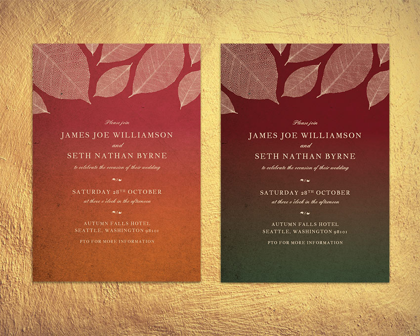
Fall is such a romantic and atmospheric time of year to get married. These autumnal invitations pay tribute to the earthy colors and falling leaves that lend the season its cosy mood.
The invites are quick and simple to create, and we’ll set up the cards in InDesign. Perfect for beginners to the software, this is a great all-round introduction to print design. You can also add optional metallic foiling to the cards, to give an extra touch of luxury to the design.
We’ll be using Adobe InDesign to set up the main layout, and dipping into Illustrator for editing the leaf graphics, so make sure you have access to both of these programs. You’ll also need to download a few fonts and graphics to give you a foundation for creating your invitation:
Save the images to a folder you can easily find, and install the fonts onto your computer.
One thing that many people forget about when they are trying to design their own wedding invitations is the envelope! Envelopes come in a variety of standard sizes, whereas invites can vary widely in size, so it’s always a good idea to pin down your envelope size first, before you size your invitation.
We’ll be setting up the invitation card at a standard size of 109 mm by 154 mm. To accommodate this, you’ll need to buy envelopes which are 4.75 in by 6.5 in when folded and closed. These are sometimes known as ‘6 Baronial’ envelopes.
1. How to Set Up the Invite in InDesign
Step 1
Open up InDesign and go to File > New > Document.
Keep the Intent set to Print and Number of Pages to 1. Uncheck the Facing Pages box.
Set the Width of the page to 109 mm and Height to 154 mm. Add Margins of 7 mm and a Bleed of 5 mm. Then head up and click OK.
Step 2
Expand the Layers panel (Window > Layers) and double-click on Layer 1 to open the Layer Options window. Rename the layer Background and click OK.
Choose New Layer from the panel’s drop-down menu (at top-right). Name this second layer Paper, and click OK.
Create a further two new layers, firstly Typography and finally Leaves at the top of the sequence.
Lock all the layers except Background, and click on this layer to activate it.
2. How to Create an Autumnal Backdrop for Your Invite
Step 1
You can create the gradient backdrop for your invite using any pairing of colors you wish. To create the colors as used in the invite example here, expand the Swatches panel (Window > Swatches) and choose New Color Swatch from the panel’s drop-down menu.
Name the swatch Cream and set the Type to Process and Mode to CMYK. Set the percentage levels to C=9 M=16 Y=30 K=0. Then click Add, and OK.
Create a further two new CMYK swatches:
Forest Green: C=75 M=45 Y=68 K=33
Burgundy: C=31 M=100 Y=76 K=46
Step 2
With the Background layer still active, take the Rectangle Tool (M) and drag across the whole page, extending the shape up to the edge of the bleed on all sides.
From the Swatches panel, set the Fill of the rectangle to Forest Green.
With the shape selected, head up to Object > Effects > Gradient Feather. Set the Angle to -90, and move the dark gradient stop about halfway along the slider.
Step 3
Select the shape and Edit > Copy, Edit > Paste. Then Right-click on the copy and choose Transform > Flip Vertical.
Position the flipped copy over the top of the original and switch its Fill to Burgundy.
Step 4
Lock the Background layer and unlock the next layer up, Paper.
Use the Rectangle Frame Tool (F) to drag across the whole page, and go to File > Place. Choose the paper background image you downloaded earlier, and click Open. Allow it to fill the whole frame.
Step 5
With the image frame selected, go to Object > Effects > Transparency. Set the Mode to Multiply and reduce the Opacity to 90%.
3. How to Format Elegant Typography for Your Invite
Step 1
With the rulers visible (View > Show Rulers), drag a guideline down from the top ruler to 52 mm.
Take the Type Tool (T) and drag to create a text frame that extends from the left-hand margin to the right-hand margin. Type in ‘Please Join’, and allow the baseline of the text to sit on the guideline.
From either the top Controls panel or the Character panel (Window > Type & Tables > Character), set the Font to England Hand, Size 11 pt and set the text to Align Center. Set the Font Color to Cream from the Swatches panel.
Step 2
Create a second text frame below the first, typing in ‘Name 1’ in uppercase letters, and setting the Font to Jacques Francois, Size 13 pt and increasing the Tracking (space between all characters) to 110. Set the Font Color to Cream, as before.
Copy and Paste this name text frame, moving it below with a gap in between and adjusting the text to read ‘Name 2’.
Set a text frame between the names reading ‘and’, setting the Font to England Hand.
Set another text frame below ‘Name 2’, reading ‘to celebrate the occasion of their wedding’ and set in England Hand, as before.
Step 3
Create a text frame below the previous. Place your type cursor in the frame and set the Font to IM FELL FLOWERS 2.
Then go to Window > Type & Tables > Glyphs, and select a decorative glyph from the panel, like the leaf style pictured. Double-click to insert it. You can insert two opposite-facing glyphs to create a balanced divider.
Step 4
Build up the second section of text, which will include the date (set in Jacques Francois) and the time (set in England Hand).
Then Copy and Paste the decorative divider text frame below.
Step 5
You can add a third section of text with details of the event location towards the bottom of the page, set in Jacques Francois.
Include a ‘PTO’ note at the bottom if you would want to include any more details on the reverse of the invite.
4. How to Add Autumnal Leaves to Your Invite
Step 1
Lock the Typography layer and unlock the top layer, Leaves.File > Save your InDesign document and minimize the window for a minute.
Open up the autumn leaves vector in Illustrator. Isolate one of the leaves in the illustration and set the Fill to a solid black swatch. Then Edit > Copy the leaf.
Return to InDesign and Edit > Paste the leaf vector directly onto the page. Rotate and scale it into roughly the position shown at the top-left of the page.
Adjust the Fill color of the leaf to Cream*.
*If you want to set up your cards for applying metallic foiling instead, skip forward to Step 3 below.
Step 2
Copy and Paste the cream leaf, rotating it and making it smaller. Position it to the bottom-right of the first leaf.
Build up other pasted leaf vectors in a sort of criss-cross pattern across the top of the invite…
…until the top of the card is filled with falling leaves.
Your invitation design is finished—great job! You can skip ahead to Section 5 below to find out how to export your design. However, if you want to add an extra touch of luxury to your cards, you may want to consider setting the leaves, text or both in metallic foil once printed. Here’s how…
Step 3
To do this, first identify which layer or layers you want to apply the foil design too. Let’s say you want to apply the foil to the leaves in the design, for example.
Unlock the layer, and then create a new swatch from the Swatches panel. Name the swatch FOIL SPOT, and set the Type to Spot. Set the levels below to 100% Magenta.
Apply this FOIL SPOT swatch to the elements you want to be pulled out in foil.
Then select all the foil elements and go to Window > Output > Attributes. Check the Overprint Fill box and/or Overprint Stroke.
And you’re done!
5. How to Export Your Invitation for Printing
Head up to File > Export, and choose Adobe PDF (Print) from the Format drop-down menu at the bottom of the Export window. Click Save.
In the window that opens, choose Press Quality from the Preset menu at the top.
Then click on Marks and Bleeds in the window’s left-hand menu. Check All Printer’s Marks and Use Document Bleed Settings, before clicking Export.
You can send your exported PDF straight off to the printers—awesome work!
Conclusion: Your Finished Invitation
You’ve created an elegant, autumnal-themed invitation that will be perfect for fall weddings. In this tutorial we’ve covered a broad range of print design skills, including:
How to set up an invitation template in InDesign, complete with a bleed and organized layers.
How to create a colorful, atmospheric backdrop for the layout.
How to format typography to an advanced level in InDesign.
How to bring in vector graphics to your work and edit them to create a unique design.
How to set up your design for optional foiling, and how to export your work for professional printing.
Today we’re going to put our superhero capes on and hop into our secret
cave, where we’re going to observe and analyze each and every detail in order
to bring five of the most iconic crime fighters to life in a vector format. We’re
going to do all of this by relying on some basic geometric shapes combined with
the power of some simple-to-use tools in Adobe Illustrator.
Before we start, don’t forget that you can expand your project by heading over to GraphicRiver where you’ll find a great selection of superhero-themed vectors.
That being said, grab a cup of that crime-fighting juice and let’s get
started!
1. How to Set Up a New Project File
Assuming you already have Illustrator up
and running in the background, bring it up and let’s set up a New Document (File > New or Control-N)
using the following settings:
Number
of Artboards: 1
Width: 1000
px
Height: 600
px
Units: Pixels
And from the Advanced tab:
Color
Mode: RGB
Raster
Effects: Screen (72ppi)
Preview Mode: Default
2. How to Set Up a Custom Grid
Since we’re going to be creating the icons
using a pixel-perfect workflow, we’ll want to set up a nice little Grid so that we can have full control
over our shapes.
Step 1
Go to the Edit > Preferences > Guides & Grid submenu, and adjust
the following settings:
Once we’ve set up our custom grid, all we
need to do in order to make sure our shapes look crisp is enable the Snap to Grid and Snap to Pixel option found under the View menu, which will transform into Snap to Pixel each time you enter the Pixel Preview mode (if you’re using an older version of the
software).
Now, if you’re new to
the whole “pixel-perfect workflow”, I strongly recommend you go through my How
to Create Pixel-Perfect Artwork tutorial, which will help you widen your
technical skills in no time.
3. How to Set Up the Layers
Once we’ve set up our document, it would
be a good idea to structure our project using a few layers, since this
way we can maintain a steady workflow by focusing on one icon at a time.
That being said, bring up the Layers panel, and create a total of six
layers, which we will rename as follows:
layer
1: reference grids
layer
2: batman
layer
3: jubilee
layer
4: baby groot
layer
5: wonder woman
layer 6: luke cage
4. How to Create the Reference Grids
The reference grids (or base grids)
are a set of precisely delimited reference surfaces, which allow us to build
our icons by focusing on size and consistency.
Usually, the size of the grids determines
the size of the actual icons, and they should always be the first decision you
make once you start a new project, since you’ll always want to start from the
smallest possible size and build on that.
Now, in our case, we’re going to be creating
the icon pack using just one size, more exactly 128 x 128 px, which is a fairly large one.
Step 1
Start by locking all
but the “reference grids” layer, and then grab the Rectangle Tool (M) and create a 128 x 128 px orange (#F15A24) square, which will help define the
overall size of our icons.
Step 2
Add a smaller 120 x 120 px one (#FFFFFF) which we
will position on top of the previous shape, since it will act as our active
drawing area, thus giving us an all-around 4
px padding to work with.
Step 3
Select and group the
two squares together using the Control-G keyboard shortcut, center aligning them to the underlying Artboard
afterwards. Create the remaining grids using four copies (Control-C > Control-F) at a horizontal distance of 40 px from each other, locking
the current layer before moving on to the next section.
5. How to Create the Batman Emoji
Assuming you’ve successfully managed to
create the little reference grids, move on to the next layer (that would be the
second one), and let’s kick off the project by creating the dark knight.
Step 1
Start by creating the
character’s head using a 120 x 120 px circle,
which we will color using #FFDA66, and then center align to the first active
drawing area.
Step 2
Create a copy (Control-C > Control-F) of the
circle, which we will adjust by first changing its color to #2B3249, and then
cutting out a smaller 104 x 104 px one
(highlighted with red) from its center using Pathfinder’s Minus Front
Shape Mode.
Step 3
Start working on the
mask’s upper section by creating a 120 x
64 px rectangle (#2B3249), which we will center align to the active drawing
area’s top edge as seen in the reference image.
Step 4
Adjust the shape that
we’ve just created by first turning on Pixel
Preview mode (Alt-Control-Y) and
then adding two new anchor points at a distance of 14 px from the center of the rectangle’s bottom edge using the Add Anchor Point Tool (+).
Step 5
Select the two anchor
points that we’ve just created using the Direct
Selection Tool (A), and then push them to the bottom by a distance of 12 px using the Move Tool (right click >
Transform > Move > Vertical > 12 px).
Step 6
Add a second pair of
anchor points at a distance of just 2 px from the resulting shape’s bottom edge, selecting and pushing them to the
bottom by a distance of 8 px (right click > Transform > Move >
Vertical > 8 px). Once you’re done, turn off Pixel Preview mode (Alt-Control-Y)
and then move on to the next step.
Step 7
Create the subtle
shadow cast by the mask, using two copies (Control-C > Control-F twice) of the shape that we’ve just
finished adjusting, making sure to push the one from underneath to the bottom
by a distance of 8 px (right click > Transform > Move >
Vertical > 8 px). Use Pathfinder’s Minus Front Shape Mode to cut out the
upper copy from the bottom one, as seen in the reference image.
Step 8
Color the resulting
shape using #E89A54, and then make sure you position it behind the mask’s
circular cutout by right clicking >
Arrange > Send to Back. Once you’re done, select and group all three
shapes together using the Control-G
keyboard shortcut.
Step 9
Mask the shapes that
we’ve just grouped using a copy (Control-C)
of the underlying yellow circle, which we will paste in front (Control-F) and then use as a Clipping Mask (right click > Make Clipping Mask).
Step 10
Start working on Batman’s
left pointed ear, by creating a 40 x 120
px ellipse (#2B3249), which we will adjust by selecting its bottom anchor
points using the Direct Selection Tool
(A) and then removing it by pressing Delete.
Then, remove the shape’s right half, positioning the resulting ear onto the
active drawing area’s top-left corner, as seen in the reference image.
Step 11
Create the right ear
using a copy (Control-C > Control-F)
of the one we’ve just finished working on, which we will horizontally reflect (right click > Transform > Reflect
> Horizontal) and then position onto the opposite side of the active
drawing area.
Step 12
Take a couple of moments
and draw the eyes with the help of the Pen
Tool (P), using white (#FFFFFF) as your main Fill color. Position the resulting shapes as seen in the reference
image, selecting and grouping (Control-G)
them together before moving on to the next step.
Step 13
Create the mouth
using a 12 x 8 px rounded rectangle
(#2B3249) with a 4 px Corner Radius,
which we will position at a distance of 40
px from the active drawing area’s right edge and 26 px from its bottom one.
Step 14
Finish off the emoji
by adding the rough beard using a couple of 2 x 2 px circles (#2B3249) spaced both horizontally and
vertically 2 px from one another.
Take your time, and once you’re done, select and group (Control-G) each side of the beard, doing the same for the entire
icon afterwards.
6. How to Create the Jubilee Emoji
Assuming you’ve
finished working on the first superhero, lock its layer and then move on up to
the next one (that would be the third one), where we’ll start working on the pyrotechnic energy-blasting superhero.
Step 1
Create the character’s
head using a 120 x 120 px circle,
which we will color using #FFDA66 and then center align to our second active
drawing area.
Step 2
Create the upper section
of the hair using a 120 x 48 px rectangle
(#2B3249), which we will center align to the active drawing area’s top edge.
Step 3
Adjust the shape that
we’ve just created by adding three new anchor points 2 px from one another, which we
will position 24 px from
the larger shape’s right edge.
Step 4
Select the center
anchor point that we’ve just added, and the push it to the top by 8 px using the Move tool (right click >
Transform > Move > Vertical > -8 px).
Step 5
Add the subtle shadow
following the same process used for the first character, coloring the
resulting shape using #E89A54.
Step 6
Create the hair’s
side sections using two 8 x 72 px rectangles,
which we will color using #2B3249 and then bottom align to the active drawing
area’s side edges.
Step 7
Select and group (Control-G)all of the hair’s composing shapes, masking (right click > Make Clipping Mask) them afterwards using a copy (Control-C > Control-F) of the
underlying circle.
Step 8
Create the back
section of Jubilee’s hair, using a 96 x
12 px rectangle (#2B3249), which we will position 16 px from the active drawing area’s
bottom edge, making sure to send it to the back of all the other shapes (right click > Arrange > Send to Back).
Step 9
Start working on the
hair’s front-side
section, by creating an 8 x 44 px rectangle
(#2B3249), which we will position as seen in the reference image.
Step 10
Add another 8 x 16 px rectangle (#2B3249), which we
will adjust by selecting and removing its top-right anchor point. Position the
resulting shape onto the right side of the previous shape, at a distance of 16 px from its bottom edge, making sure
to group (Control-G) the two together
afterwards.
Step 11
Create the right section
of the character’s front hair using a copy (Control-C
> Control-F) of the shapes that we’ve just grouped, which we will
vertically reflect (right click >
Transform > Reflect > Vertical) and then position onto the opposite
side of the active drawing area.
Step 12
Start working on the
left eye by creating a 20 x 12 px rectangle
(#FFFFFF), which we will position underneath the shadow, at a distance of 22 px from the left hair section.
Step 13
Adjust the shape that
we’ve just created by setting the Radius
of its top-left corner to 4 px, its
top-right one to 12 px and its
bottom-left one to 8 px from within
the Transform panel’s Rectangle Properties.
Step 14
Add an 8 x 8 px circle (#2B3249) to the center
of the resulting shape, followed by a smaller 4 x 4 px one (#FFFFFF) which we will align to its top-right corner.
Once you’re done, select and group all three shapes together using the Control-G keyboard shortcut.
Step 15
Create the right eye
using a copy (Control-C > Control-F)
of the one that we’ve just finished working on, which we will vertically
reflect (right click > Transform >
Reflect > Vertical) and then position onto the opposite side of the
head. Once you’re done, select and group (Control-G)
both eyes together before moving on to the next step.
Step 16
Start working on the
mouth by creating the character’s lips using a 20 x 12 px ellipse (#F97F55) which we will adjust by pinching its
side anchor points using the Anchor
Point Tool (Shift-C). Once you’re done, center align the resulting shape to
the larger underlying circle, positioning it at a distance of 12 px from the eyes.
Step 17
Add the mouth using an 8 x 4 px ellipse (#2B3249), which we
will center align to the shape from the previous step.
Step 18
Add the visible section
of the teeth, using an 8 x 2 px rectangle
(#FFFFFF), which we will center align to the mouth’s top edge, masking (right click > Make Clipping Mask) it
afterwards using a copy (Control-C >
Control-F) of the underlying shape. Once you’re done, select and group (Control-G) all of the mouth’s composing
sections, before moving on to the next step.
Step 19
Create the blush spots
using two 16 x 12 px ellipses
(#FFB266), which we will position at a distance of 4 px from the character’s eyes and 12 px from its hair’s side sections. Once you’re done, select and
group (Control-G) all of the shapes
that we’ve created so far, before moving on to the next step.
Step 20
Start working on the
glasses by creating the upper section of the frame using a 104 x 8 px rectangle (#BDC9E5), which we will adjust by setting the Radius of its top corners to 4 px. Center align the resulting shape
to the underlying active drawing area, positioning it at a distance of 4 px from its top edge.
Step 21
Create the lens section
using a 104 x 28 px rectangle
(#F97F55), which we will adjust by setting the Radius of its bottom corners to 8 px, positioning the resulting shape below the frame.
Step 22
Adjust the shape by
adding a pair of new anchor points at a distance of 4 px from its center, followed by another one at a distance of 12 px. Once you have the anchors in
place, select the middle pair and push it to the top by 12 px (right click > Transform > Move > Vertical > -12 px).
Step 23
Start working on the
highlight by creating the first pair using a 4 x 20 px rectangle (#FFFFFF) followed by a narrower 2 x 20 px one (#FFFFFF) positioned just 2 px from the wider one. Adjust
the shapes by selecting and pushing their bottom anchor points to the left by 8 px (right click Transform > Move > Horizontal > -8 px), grouping (Control-G) and positioning the
resulting shapes as seen in the reference image.
Step 24
Finish off the glasses, and with them the emoji itself, by adding the second pair of highlights using a
copy (Control-C > Control-F) of
the ones that we’ve just finished working on, which we will position onto the opposite
side. Once you’re done, select and group (Control-G)
all of the glasses’ composing shapes, doing the same for all of the character’s
composing sections before moving on to the next one.
7. How to Create the Baby Groot Emoji
Assuming you’ve
finished working on the second emoji, lock its layer and then move on up to the
next one (that would be the fourth one), where we’ll create cute little Baby Groot.
Step 1
Start working on the
character’s head by creating its lower section using a 120 x 92 px rectangle (#B5725B), which we will adjust by setting
the Radius of its bottom corners to 60 px. Once you’re done, center align
the resulting shape to the active drawing area’s bottom edge.
Step 2
Create the head’s
upper section using a couple of varying width and height rectangles (#B5725B),
which we will adjust by setting the Radius
of some of their upper corners to 4 px.
Once you’re done, select and group (Control-G)
all of the head’s composing shapes, before moving on to the next step.
Step 3
Take a couple of
moments and add the grass sections, using #B6D65F as your main Fill color, moving on to the next step once
you’re done.
Step 4
Give the character some
texture, by adding a couple of rounded rectangles (#82453B) with a 1 px Corner Radius, which we will
position as seen in the reference image. Once you’re done, make sure you select
and group (Control-G) all of them
together, doing the same for all the head’s composing sections as well.
Step 5
Start working on Groot’s
eyes, by creating the main shape for its left one using a 16 x 16 px circle (#2B3249), which we will position at a distance
of 32 px from the active drawing
area’s left edge and 40 px from its
bottom one.
Step 6
Create a slightly wider 24 x 12 px ellipse (#B5725B), which
we will position onto the lower section of the previously created, making sure
to mask it afterwards using a copy (Control-C
> Control-F) of the smaller circle (right
click > Make Clipping Mask).
Step 7
Add the little highlight
using a 4 x 4 px circle (#FFFFFF),
which we will position at a distance of 4
px from the eye’s top and right edges. Once you’re done, select and group (Control-G) all three shapes together
before moving on to the next step.
Step 8
Create the right eye
using a copy (Control-C > Control-F)
of the one that we’ve just finished working on, which we will position onto the
opposite side of the head, making sure to select and group (Control-G) the two together once you’re
done.
Step 9
Add the character’s
mouth using an 8 x 8 px circle,
which we will color using #2B3249 and then position at a distance of 40 px from the active drawing area’s
right edge and 28 px from its bottom
one.
Step 10
Move a few pixels down
and add the blush spots using two 16 x
12 px ellipses (#A0604E), which we will position at a distance of 32 px from the active drawing area’s
bottom edge and 16 px from its side
ones.
Step 11
Create the left eyebrow,
using two 4 x 4 px circles (#82453B),
horizontally spaced 12 px from
one another. Push the right circle to the top by a distance of just 2 px (right click > Transform > Move > Vertical > -2 px), and
then connect the two using a diagonal rectangle, making sure to group (Control-G) and position the shapes as
seen in the reference image.
Step 12
Finish off Groot, by
adding the right eyebrow using a copy of the one that we’ve just created,
which we will vertically reflect (right
click > Transform > Reflect > Vertical) and then position onto
the opposite side of the head. Once you’re done, group (Control-G) the two together, doing the same for all of the emoji’s
composing sections, before moving on to the next one.
8. How to Create the Wonder Woman Emoji
Make sure you’ve
locked the previous layer, and then move on up to the next one (that would be
the fifth one) where we will start working on the Amazonian goddess.
Step 1
As we did with all the
other ones, start by creating the character’s head using a 120 x 120 px circle, which we will color using #FFDA66 and then center
align to our second active drawing area.
Step 2
Start working on the
hair by creating a 120 x 120 px square
(#2B3249), from the bottom of which we will cut out a smaller 88 x 72 px rectangle (highlighted with
red) using Pathfinder’s Minus Front Shape Mode.
Step 3
Mask the resulting shape
using a copy (Control-C) of the
underlying circle, which we will paste in front (Control-F) and then use as a Clipping
Mask (right click > Make Clipping
Mask).
Step 4
Start working on the
hair’s side sections by creating the main shape for its left one using a 16 x 40 px rectangle (#2B3249), which
we will align to the active drawing area’s left edge, positioning it at a
distance of 20 px from its bottom
edge.
Step 5
Next, we’re going to
go a little off the grid, by creating the curled section using a 32 x 32 px circle (#2B3249), which we
will adjust by cutting out another 32 x
32 px one (highlighted with red) from its top-left section. Once you’re
done, position the resulting shape as seen in the reference image, selecting
and grouping (Control-G) it and the
previously created rectangle together.
Step 6
Create the right hair
section using a copy (Control-C >
Control-F) of the one that we’ve just finished working on, which we will
vertically reflect (right click >
Transform > Reflect > Vertical) and then position onto the opposite
side of the head.
Step 7
Next, grab the Pen Tool (P) and draw the iconic crown,
using #FFB266 as your main Fill
color. Use the reference image as your main guide, moving on to the next step
once you’re done.
Step 8
Give the resulting shape
a pair of vertical highlights using a 4
x 36 px rectangle (#FFFFFF) positioned 2 px away horizontally from a narrower 2
x 36 px one (#FFFFFF), which we will group (Control-G) and then position at a distance of 20 px from the crown’s right edge. Once you’re done, mask the
highlights and then move on to the next step.
Step 9
Quickly draw the star
using #F97F55 as your main Fill color,
selecting and grouping all of the crown’s composing shapes afterwards using the Control-G keyboard shortcut.
Step 10
As we did with all the
other characters, add the subtle shadow (#E89A54), making sure to position it
behind the hair’s side sections (right click
> Arrange > Send Backward). Once you’re done, select and group all of
the current shapes together using the Control-G
keyboard shortcut.
Step 11
Start working on the
eyes, by creating the main shape for the left one using a 20 x 12 px ellipse (#FFFFFF), which we will adjust by pinching its
side anchor points using the Anchor
Point Tool (Shift-C). Position the resulting shape underneath the crown’s shadow,
at a distance of 14 px from the left
hair section.
Step 12
Continue adjusting
the eye, by selecting its top anchor point using the Direct Selection Tool (A), and then pushing it to the left by 2 px (right click > Transform > Move >
Horizontal > -2 px).
Step 13
Add the eye’s
remaining details using an 8 x 8 px circle
(#2B3249) which we will position in the center of the resulting shape, followed
by a smaller 4 x 4 px one (#FFFFFF)
in its top-right corner. Once you’re done, select and group (Control-G) all three shapes together,
before moving on to the next step.
Step 14
Create the right eye
using a copy (Control-C > Control-F)
of the one that we’ve just finished working on, which we will vertically
reflect (right click > Transform >
Reflect > Vertical) and then position onto the opposite side of the
head. Once you have the copy in place, select both it and the original and
group them together using the Control-G
keyboard shortcut.
Step 15
Start working on the
mouth by creating a 20 x 16 px ellipse
(#2B3249), which we will center align to the larger underlying circle,
positioning it at a distance of 8 px from
the character’s eyes.
Step 16
Add the teeth using a 20 x 6 px rectangle (#FFFFFF), and
the tongue using a 20 x 12 px ellipse
(#F97F55), which we will position as seen in the reference image, making sure
to group (Control-G) and mask them
afterwards. Once you’re done, select and group (Control-G) all of the mouth’s composing shapes before moving on to
the next step.
Step 17
Finish off the emoji,
by adding the blush spots using two 16 x
12 px ellipses (#FFB266), which we will position as seen in the reference
image. Take your time, and once you’re done, select and group (Control-G) the two together, doing the
same for the entire character afterwards.
9. How to Create
the Luke Cage Emoji
We are now down
to our fifth and last superhero, which is one of my all-time favorite Marvel characters.
That being said, take a quick sip of that second coffee, and let’s
jump into it!
Step 1
Start by creating the
character’s head using a 120 x 120 px circle,
which we will color using #B5725B and then center align to the last active
drawing area.
Step 2
Add the hair section
using a 96 x 24 px rectangle (#2B3249),
which we will center align to the circle’s top edge and then adjust by setting
the Radius of its top corners to 8 px.
Step 3
Grab the Pen Tool (P) and draw Luke’s headband
using #BDC9E5 as your Fill color.
Step 4
As we did with Wonder
Woman, give the band a set of vertical highlights (#FFFFFF) followed by the
subtle shadow (#8E5042), making sure to group (Control-G) and mask the shapes afterwards. Once you’re done, select
and group (Control-G) all of the
other composing sections as well.
Step 5
Start working on the
eyes by creating the main shape for the left one using a 16 x 16 px circle (#FFFFFF), which we will position at a distance
of 32 px from the active drawing
area’s left edge and 4 px from the
band’s shadow.
Step 6
Create the pupil using
an 8 x 8 px circle (#2B3249), onto
the top-right corner of which we will add a 4 x 4 px circular highlight (#FFFFFF).
Step 7
Create the eyelid
using a 24 x 12 px ellipse (#B5725B),
which we will position on the upper section of the eye so that its bottom
half overlaps it. Mask the shape (right
click > Make Clipping Mask) using a copy (Control-C > Control-F) of the underlying circle, selecting and
grouping all of the eye’s composing shapes together before moving on to the
next step.
Step 8
Create the right eye using
a copy (Control-C > Control-F) of
the one that we’ve just finished working on, which we will position on the
opposite side of the head. Once you have the copy in place, select both it and
the original and group them together using the Control-G keyboard shortcut.
Step 9
Create the beard using a 36 x 40 px rectangle (#2B3249),
which we will adjust by setting the Radius of its top corners to 12 px and
its bottom ones to 18 px. Once you’re done, center
align the resulting shape to the underlying head, positioning it at a distance
of 6 px from its bottom edge.
Step 10
Add the mouth cutout
using a 28 x 16 px rounded rectangle
(#B5725B) with an 8 px Corner Radius,
which we will center align to the beard, positioning it at a distance of 8 px from its top edge.
Step 11
Create the actual mouth
using a 12 x 8 px rounded rectangle
(#2B3249) with a 4 px Corner Radius,
which we will center align to the cutout, positioning it at a distance of 4 px from its right edge.
Step 12
Give the beard a small
inner facing segment using a 12 x 2 px rectangle
(#2B3249) which we will adjust by individually selecting and pushing its top
anchor points to the inside by a distance of 2 px (right click > Transform > Move > Horizontal > +
/ – 2 px depending on which side you start with). Position the resulting shape to
the center of the cutout’s bottom edge, selecting and grouping (Control-G) all of the mouth’s composing
shapes before moving on to the next step.
Step 13
Finish off the
character and with it the project itself, by adding the rough beard using a
couple of 2 x 2 px circles (#2B3249)
distanced both horizontally and vertically at 2 px from one another. Take your time, and once you’re done, select
and group (Control-G) each side of
the beard, doing the same for the entire icon afterwards.
Avengers
Assemble!
Great job! As always, I
hope you’ve managed to keep up with each and every step, and maybe learned a
trick or two along the way.
This quick tutorial will show you how to create a letterpress-style effect to apply to any text. It’s a lovely vintage-inspired style that will give any layout a more hand-crafted look, but without the expense of letterpress printing!
We’ll be creating the effect in Adobe InDesign using the program’s Effects panel, and it only takes ten minutes to put together.
1. How to Create a Papery Background for Your Effect
Step 1
Open up InDesign and go to File > New > Document. You can create the type effect at any size you wish, but here I’m going to set up an A3 landscape page with the Intent set to Print.
Once you’ve set up the specs for your document, go ahead and click OK.
Expand the Layers panel (Window > Layers) and double-click on the Layer 1 name. In the Options window, change the name to Background and click OK.
Step 2
Select the Rectangle Frame Tool (F) and drag across the whole page. Go to File > Place, choose a paper texture image (here I’ve used this art paper photo), and click Open. Allow the paper to fill the whole frame.
Step 3
Expand the Swatches panel (Window > Color > Swatches) and create a new CMYK swatch. Name it Cream and set the levels to C=12 M=10 Y=18 K=0.
Take the Rectangle Tool (M) and create a shape that again extends across the whole page. From the Swatches panel, set the Fill to Cream.
With the rectangle still selected, head up to Object > Effects > Transparency. Set the Mode to Overlay and bring the Opacity down to 90%.
Click on Gradient Feather at the bottom of the panel’s left-hand menu. Choose Radial from the Type menu, and ensure the gradient extends outwards, getting more opaque towards the outer edges of the page.
Click OK to exit the window.
2. How to Build Up Your Letterpress Effect
Step 1
Lock the Background layer and create a new layer above, Typography.
Use the Type Tool (T) to create a text frame in the center of the page. Type in the word or words you would like to apply the effect to, and format this as you wish using either the top Controls panel or the Character panel (Window > Type & Tables > Character). Here I’ve set the text in Arvo Bold, increased the Font Size to 220 pt, and upped the Tracking to 20.
Once you’re completely happy with your text, first Edit > Copy, Edit > Paste a copy and set it aside on the pasteboard. This is because we’re going to outline the text to make formatting a little easier, but this will mean you will be unable to change details like font and tracking. So it’s always a good idea to have a spare copy to hand if you change your mind!
With the text frame selected, head up to Type > Create Outlines.
Step 2
Create three new CMYK swatches with the names and values listed below:
Off-Black: C=85 M=76 Y=61 K=93
Blue: C=0 M=95 Y=92 K=0
Red: C=70 M=15 Y=22 K=1
Apply the Off-Black swatch to the Stroke of your outlined text, setting the Fill to [None].
Step 3
Go to Object > Effects > Transparency and set the Mode to Multiply and Opacity to 35%.
Click on Outer Glow in the left-hand menu and set the Mode to Multiply, Effect Color to Cream and Opacity to about 40%. Increase the Spread to around 40%.
Finally, click on Bevel and Emboss. Choose Outer Bevel for the Style, and adjust the Size and Shadow Opacities until the text has a slightly lifted effect. When you’re happy, go ahead and click OK.
Step 4
Select the text and Edit > Copy, Edit > Paste, shuffling the copy down and to the right a little. Go to Object > Effects and remove any effects.
Then set the Fill of the copy to Red and the Stroke to [None].
Head back to the Effects window and adjust the Transparency to Multiply, 90% Opacity.
Click on Inner Glow. Choose Cream for the Effect Color, set the Opacity to 75%, and increase both the Choke and Noise to 100%. Click OK to exit the window.
Step 5
Select the red, grainy version of the text and Copy and Paste, moving it slightly further down and to the right. Adjust the Fill to Blue.
Step 6
Select the blue text and Copy and Paste, before getting rid of any effects applied to it. Move it upwards and to the left a little, as shown below. Adjust the Fill to Red.
Go to Object > Effects > Inner Glow. Set the Mode to Screen and Opacity to about 65%, and add about 50% Noise.
Click on Bevel and Emboss and add a Pillow Emboss effect, setting the Shadow to Multiply and the shadow’s color to Red. Play about with the percentage levels of the glow settings until you’ve given a nice flat, letterpress-style look to the text.
Step 7
Go to the Layers panel (Window > Layers) and click on the arrow symbol next to the Typography layer’s name to expand the layer. Identify the version of the text which has the Off-Black outline and no color fill, and click on the small square to the right of that element’s name to select it.
Drag the element up to the top of the layer sequence, setting it above all the other text items.
Conclusion: Your Finished Letterpress Effect
Your type effect’s looking fantastic—great job! You can now incorporate it into another layout, or simply enjoy it on its own.
You can’t miss this Games of Thrones-style type effect. Perfect for posters and social media, this effect is quick and easy to create in Adobe InDesign.
Ben Heine is a Belgian visual artist and music producer born in 1983 in Abidjan, Ivory Coast, currently living and working in Brussels, Belgium.
He is best known for his original series „Pencil Vs Camera”, „Digital Circlism” and „Flesh and Acrylic”. He is a self-taught person in drawing, photography, and music.
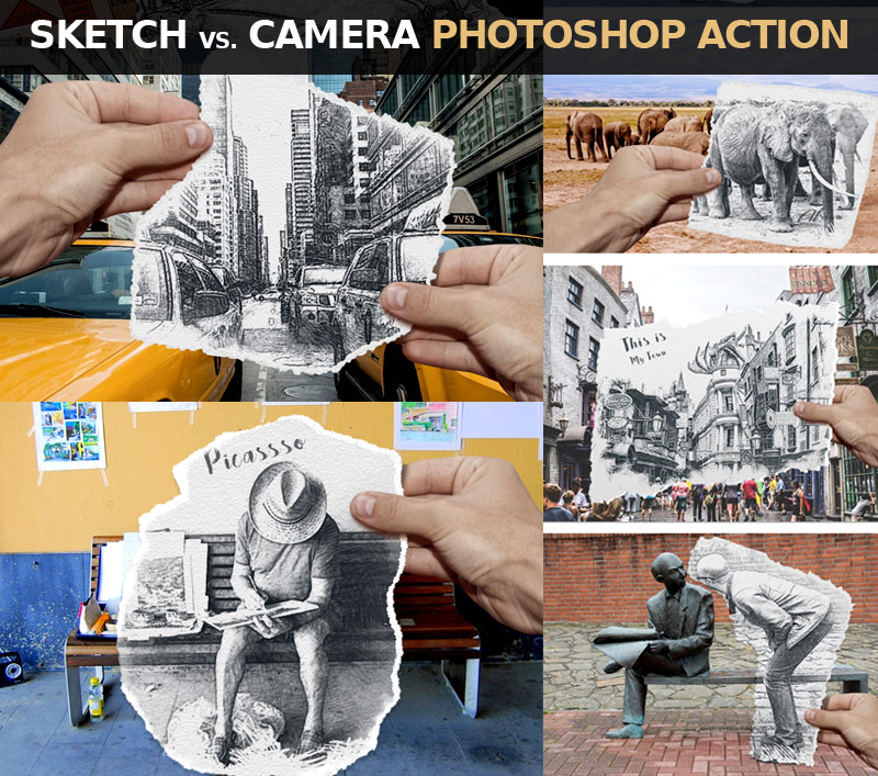
Pencil Vs Camera is an original visual concept invented and popularized by Ben Heine since April 2010. The images in this series usually show a surreal hand-drawn sketch held by the artist and placed over a real photograph to symbolize the connection between reality and imagination/creativity.
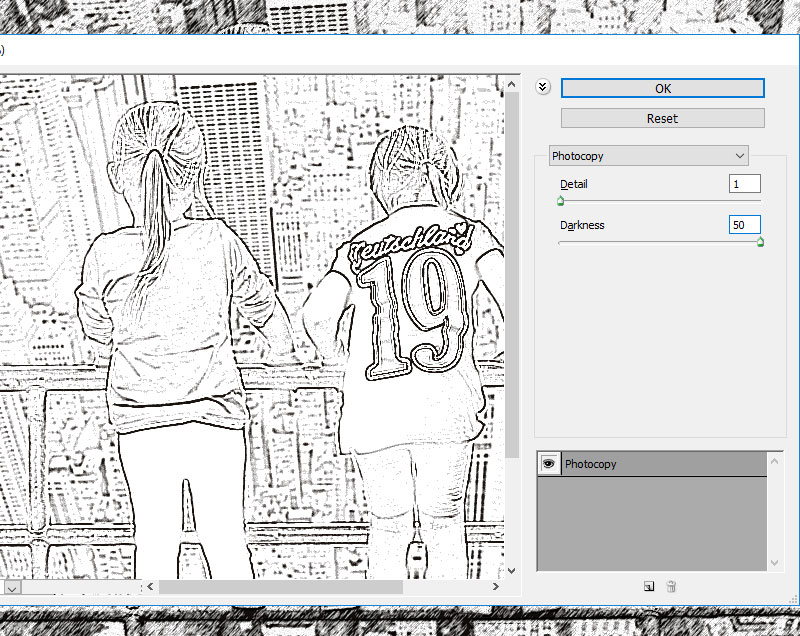
Create an 850 x 636 pxNew Document. You can, of course, use another size for your PSD file,but you have to proportionally adjust all the sizes used in this tutorial. Add the Girls stock image.
2. Add the Torn Paper
Step 1
I have attached a Torn Paper PNG image that you can use. But, if you want to create your own texture of a torn paper, it’s very easy to do. You can find a piece of thick paper or cardboard and tear it roughly in the shape that you want. Then place it on a flat surface, preferably of a contrasting color (e.g. black if the paper is white).
Take a photo using a camera or a mobile phone. Make sure that you take the picture from directly above the piece of paper so that the perspective matches what we need.
Step 2
Upload the photo to your computer and open it in Photoshop. Using the Magic Wand Tool, make a selection and remove the background.
Step 3
Download the Torn PaperPNG image and add it in a new layer.
Step 4
Press Control-T to rotate the Torn Paper and position it over the area that you want to turn into a sketch.
Step 5
Press Control-J twice, to make two copies of the Torn Paper layer, and call them Torn Paper 1 layer and Torn Paper 2 layer.
Step 6
Add a Drop Shadow layer style to the Torn Paper layer, using the color #000000.
3. Make Four Copies for the Girls Layer
Step 1
Press Control-J four times, to make four copies of the Girls layer, and call them Girls 1 layer, Girls 2 layer, Girls 3 layer, and Girls 4 layer.
Step 2
Keep the Control key pressed and select Girls 1 layer, Girls 2 layer, Girls 3 layer, and Girls 4 layer. Move them above the Torn paper layer.
4. Use the Graphic Pen and Motion Blur Filters in Photoshop
Step 1
Hide all the copy layers except the Girls 1 layer.
Set the Foreground Color to #000000 and the Background Color to #ffffff.
Step 2
For the Girls 1 layer, go to Filter > Sketch > Graphic Pen. For another image, you might have to adjust these settings.
Step 3
Go to Filter > Blur > Motion Blur.
5. Use the Graphic Pen and Noise Filters in Photoshop
Step 1
Make the Girls 2 layer visible and set the blend mode to Multiply, opacity 30%.
Step 2
Go to Filter > Sketch > Graphic Pen. For another image, you might have to adjust these settings.
Step 3
Go to Filter > Noise > Add Noise.
6. Use the Photocopy Filter in Photoshop
Step 1
Make the Girls 3 layer visible and set the blend mode to Multiply, opacity 100%.
Step 2
Go to Filter > Sketch > Photocopy.
7. Use the Watercolor Filter in Photoshop
Step 1
Make the Girls 4 layer visible and set the blend mode to Color, opacity 100%.
Step 2
Go to Filter > Artistic > Watercolor. You can hide the Girls 4 layer for now.
8. Create the Sketch Paper Piece With a Clipping Mask
Keep the Control key pressed and select the Girls 1 layer, Girls 2 layer, Girls 3 layer, and Girls 4 layer. Right click on the selected layers and choose Create Clipping Mask.
9. Create the Torn Paper Border
Step 1
Make the Torn Paper 1 layer visible and set the blend mode to Multiply, opacity 57%.
Step 2
Make the Torn Paper 2 layer visible. Click on the Add Layer Mask button from the Layers tab to add a mask for the Torn Paper 2 layer.
Step 3
Create a new layer just below the Torn Paper 2 layer and fill it with color #ffffff.
Step 4
Click on the Torn Paper 2 layer mask thumbnail. Go to Image > Apply Image.
Step 5
Go to Image > Adjustments > Levels and enter these settings.
You can use the Brush Tool and paint with color #ffffff inside the Torn Paper 2 layer if you want to add a more ripped edge effect.
Step 6
Delete the White Background layer to see the effect.
Step 7
Keep the Control key pressed and select the Torn Paper 1 layer and the Torn Paper 2 layer. Right click on the selected layers and choose Create Clipping Mask.
10. Move the Sketch Effect Very Easily
If you want another part of your image to be turned into a sketch, simply keep the Control key pressed and select the Torn Paper 1 layer, the Torn Paper 2 layer, and the Torn Paper layer.
Use the Move Tool to change the position of the torn paper piece.
Congratulations! You’re Done!
In this tutorial, you’ve learned how to create a Sketch vs. Camera effect in Photoshop using your photos, in just a few steps.
In this tutorial I will show you how to draw a realistic African elephant step by step from scratch. This tutorial is ideal for beginners. You’ll learn how to plan the pose, how to achieve the correct proportions, and how to add all the body parts and their details. It’s not as difficult as it seems!
1. How to Sketch an Elephant’s Pose
Step 1
Sketch an oval. It doesn’t need to be perfect.
Step 2
Attach a vertical oval to it, slightly higher.
Step 3
Place two slanting lines on the shoulders and the hips.
Step 4
Draw the ground. It should be about the „shoulder” length long.
Step 5
Sketch the position of the legs without paying too much attention to their anatomy.
Step 6
Add the general shape of the head.
2. How to Draw a Simplified Skeleton of an Elephant
Step 1
Draw the width of the feet on the ground.
Step 2
Sketch the actual anatomy of the legs; the joints and the direction of the bones. Elephants have very straight legs, and they walk on their fingertips.
Step 3
Draw flat cushions under the feet.
Step 4
Draw a cross on the face, keeping in mind that it’s seen in perspective.
Step 5
Draw the eye sockets.
Step 6
Draw the forehead.
Step 7
Draw the cheekbone and the base of the ear.
Step 8
Draw the tusks.
Step 9
Draw the direction and length of the trunk.
Step 10
Draw the direction and length of the tail.
3. How to Draw an Elephant’s Body
Step 1
We have the basic skeleton, so now it’s time to add some body to it. Draw circles above the feet, in the place of wrists and ankles.
Step 2
Draw „cups” under them.
Step 3
Draw big muscle masses in the forearms and thighs.
Step 4
Sketch the position of the hips.
Step 5
Draw two mirrored '9’s for the ears. They can cover the shoulder.
Step 6
Close the shape of the ears.
Step 7
Draw ovals inside ovals to create the basic sketch of the eye.
Step 8
Sketch the brow.
Step 9
Draw the width of the trunk all along its length, and then outline it.
Step 10
Do the same with the tusks.
Step 11
Add more detailing shapes to the face.
Step 12
Sketch and outline the tail.
Step 13
Outline the legs, going around the defining shapes.
Step 14
Outline the whole body.
Step 15
Add the elbow.
4. How to Finish the Drawing of an Elephant
We’re going to draw the final lines now. If you’re drawing traditionally, use a darker tool for them, or put a new sheet of paper on top.
Step 1
Draw the little dark eye and the wrinkles around it.
Step 2
Outline the head and ears.
Step 3
Outline the tusks.
Step 4
Add details to the trunk.
Step 5
Add details to the face.
Step 6
Add the toenails. African elephants have four nails on the front feet and three on their back feet, but they’re not all seen in this view.
Step 7
Outline the body, drawing big wrinkles here and there to show how thick the skin is.
Step 8
Add more wrinkles all over the body to create a texture of the skin.
Step 9
If you want, you can shade the elephant with simple cross-hatching.
Good Job!
You did it! If you want to learn more about elephants, for example how to draw the Asian elephant, check out my detailed tutorial below:
The theme of this tutorial is drawing an octopus; we’ll base it on the anatomy of this mollusc but also bring some stylization into our artwork.
I’ll show you an easy way to create a pencil sketch from scratch, and then we’ll explore the step-by-step process of drawing with ink liners. We’ll also learn to use dots and mix artistic techniques to our advantage!
What You Will Need
A sheet of drawing paper
A graphite pencil (I recommend using an HB type)
An eraser
An ink liner number 0.2
An ink liner number 0.1
An ink liner number 0.05
1. How to Draw an Octopus With a Graphite Pencil
Step 1
I draw a slightly curved core line; it will help us to mark the positioning of the figure.
Step 2
I outline the rough shape of the head. Then I add an oblong shape where the eyes are located.
According to this foreshortening, one side of the octopus is more visible to the viewer than another.
Step 3
I add the framework of the limbs. An octopus has eight arms that can be divided into four pairs.
Now I mark only the arms that are visible in the foreground, just to keep the process as simple as possible. We’ll add the hidden arms later.
Step 4
I draw the eyes. They are large, enclosed in a capsule, and have a slit-shaped pupil.
Step 5
I draw the fold of the aperture at the side of the head.
Step 6
I add the siphon; it resembles a funnel. An octopus uses a siphon for respiration and locomotion.
Now we are ready to proceed to drawing the tentacles, or the arms. This topic needs additional explanations, so I’ll see you in the next section!
2. How to Draw Tentacles
Step 1
It’s worth mentioning that, according to Wikipedia, the correct name for the limbs of an octopus is „arms”, not „tentacles”. But since it is a common appellation, I’ll be using „tentacles” now and then throughout the tutorial.
I draw the first pair of arms, keeping the lines smooth and soft.
Step 2
To draw the inner parts of the tentacles correctly, we need to keep in mind the principles of perspective.
The foreshortening defines how much of the interior surface we see; the image below illustrates this concept.
We’ll dwell upon drawing the suckers (the round elements that cover the interior surfaces of the arms) just in the next step.
I add the inner parts of the first pair of arms.
Step 3
The stylized form of a sucker resembles a bowl with a hollow central cavity.
The principles of perspective are applicable here, too: the point of view defines how we see the object. For example, if we have an overhead view of a sucker, we’ll see only the top plane with the cavity and no sides.
Each arm has two rows of suckers. Depending on the species, the suckers can be placed in a parallel or a staggered order.
I add the suckers to the first pair of the arms. The suckers get smaller towards the end of the limb, so just mark the smallest ones without adding many details.
Step 4
I draw the second pair of arms and then add the inner sides.
Step 5
I add the suckers to the second pair of arms.
Step 6
I draw the remaining tentacle of the third pair. Then I add the inner surface and the suckers, just as we did in the previous examples.
Step 7
I draw the second arm from the third pair; it is hidden behind one of the arms in the foreground.
Step 8
I add the fourth arm pair. Use your imagination and artistic flair to find the best direction for these arms; it’s important to keep the balance of the figure.
I applied light pencil hatching to the inner parts of the limbs just for your reference.
Step 9
As a final addition to this pencil sketch, I draw the suckers.
I clean my drawing with the eraser. It’s important to make sure that all unnecessary pencil lines are removed before proceeding to any additional artistic tool.
The sketch is ready for inking!
3. How to Draw With Ink Liners
Step 1
Before we begin inking our octopus drawing, let’s try some warm-up exercises and practice making dots on the paper.
Dotwork (also known as stippling) is a great artistic technique; it’s a perfect choice for creating beautiful textures.
Draw a sample of dotwork that consists of two parts. Use the 0.2 ink liner for the left one and the 0.1 liner for the right one.
Step 2
Create a line, using only dots. The speed of drawing influences the accuracy of the individual dots within the line.
The 0.2 ink liner is a great tool for this exercise.
Step 3
The goal of the next exercise is to make a gradation of value. With the 0.2 ink liner, create a sample with an increasing density of ink dots.
4. How to Draw an Octopus With Ink Liners
Step 1
With the 0.2 ink liner, I create the main contours.
To make the drawing more interesting, I use a dotted line in addition to a traditional continuous outline.
Step 2
I add dots to the sides of the octopus, using the 0.2 ink liner. I also darken the pupils and mark the darker places of the figure.
Step 3
With the 0.1 ink liner, I add a layer of dots to the drawing.
Step 4
I add dots to the back arms of the octopus, using the 0.1 ink liner. To create the core shadows of the arms, you can place dots closer to each other.
Step 5
I outline the suckers, using the 0.05 liner, and also add dots to the eyes to make them more three-dimensional.
Step 6
With the 0.2 liner, I add another layer of dots to the sides of the octopus, giving the drawing more contrast and making it more three-dimensional.
I create a pattern of the skin, applying the groups of dots to the head and arms. Approximately five dots per group is the way to go.
Step 7
I make the contours of the drawing a bit thicker, using the 0.2 ink liner.
Step 8
The ink drawing is complete!
As a finishing touch, I apply pencil hatches to the sides of the octopus, creating soft transitions from shadow to light. This combination of artistic techniques makes the drawing more unique and interesting.
Your Drawing Is Complete
Congratulations! You’ve created a beautiful artwork; I hope you enjoyed both the process and the result.
I wish you much success in drawing with pencils and ink. Have fun capturing the unique charm of the wonderful world of animals and nature!
Agregator najlepszych postów o designie, webdesignie, cssie i Internecie