Archiwum kategorii: Web Tools

How to Create a Retro Interior Illustration in Adobe Illustrator

Post pobrano z: How to Create a Retro Interior Illustration in Adobe Illustrator

Final product image
What You’ll Be Creating

All of us have a nostalgia sometimes for the past: for the people we knew, some places, or things. Living in a high-tech digital age, we can miss something like an old-fashioned grandma’s pitcher or an old toy you owned as a child. Because you still remember how it was broken and you still want to cry. Just don’t cry now—I still need you to pass this tutorial!

Wipe off your tears and think about… something like… like a retro TV standing on a cabinet. I will show you how to create such an illustration using basic shapes, some warp effects, and the Offset Path.

By the way, GraphicRiver has a good collection of retro items, so feel free to check its collection.

1. How to Create the Retro TV

Step 1

Open Adobe Illustrator and create a new document (File > New) with 850 x 850 px Width and Height. We will start to create a TV shape. Using the Rounded Rectangle Tool, create a light grey rounded rectangle. Set the fill color as shown in the image below. You do not need the stroke color for your rectangle—it’s only there for better visibility.

Next, we will apply the Inflate effect to this rounded rectangle. Go to Effect > Warp > Inflate. Enter the options you see below. Expand this shape (Object > Expand Appearance).

creating the TV shape

Step 2

Now we will make a smaller copy of the transformed rounded rectangle placed exactly in the middle of the original one. While keeping the shape selected, go to Object > Path > Offset Path, enter the negative number -9, and press OK. You will get a smaller copy of the shape in front of the original one. Change the color of this copy as shown in the image.

Next create a smaller copy of this shape. Select the second copy and again, go to Object > Path > Offset Path, and enter the negative number -4. Change the color of the smaller copy to dark grey.

And finally, using the same method, make the smallest copy of the shape, which will have the Offset Path -2. You should have four shapes in total.

creating the TV shape 2

Step 3

Now let’s create the screen for the TV. Create a copy of any grey shape and place it in front. Make it smaller, and change the color to a darker shade. Next create a smaller copy of this shape: select the shape, go to Object > Path > Offset Path, and enter the negative number -2. Change the color of the created copy to a bluish grey.

creating the screen

Step 4

Let’s give our TV screen more volume. Create an ellipse by using the Ellipse Tool (L), which overlaps the bluish shape. The color of this ellipse does not matter, as it is used as a cutter. 

Now make a copy of the bluish shape in front (Control-C, Control-F) and, while keeping it selected with the overlapped ellipse, press the Minus Front button on the Pathfinder panel. This action leaves us with the part of the ellipse in front of the bluish screen. Finally change the color of the upper part of the screen to a lighter color.

creating the screen 2

Step 5

Let’s add a speaker to our TV. Create a small dark grey circle (for an even circle, use the Ellipse Tool (L) while holding down the Shift key). Select this circle and while holding the Shift and Alt keys, drag it to the right. This way, you’ll create a second copy of the circle, which will be horizontally aligned. 

While the newly created circle is selected, press the Control-D buttons three more times to repeat the previous step and create a group of circles exactly the same distance from each other. 

Now select the line of circles and while holding the Shift and Alt keys, drag them down. And again, press the Control-D buttons to repeat the previous step. Do this as much as you need to get a result close to the one presented below.

creating the speaker

Step 6

In order to move the objects with more precision, we need to enable the Smart Guides. So, let’s go to View > Smart Guides (Control-U). Draw a circle with grey fill color and no stroke color. To make an even circle, use the Ellipse Tool (L) while holding down the Shift key. Create a copy of this circle in front (Control-C, Control-F), make it smaller, and be sure it stays exactly in the middle of the original one. For the smaller circle, change the fill color to the light grey.

Next, using the Rectangle Tool (M), create a grey rectangle and place it exactly in the middle of the circle. Create a copy of this rectangle in front (Control-C, Control-F), decrease its width (using the Selection Tool (V)), place it exactly in the middle of the original one, and change its color to the light grey.

creating the manual switch

Step 7

Now place the manual switch on the right side of the TV. You can slightly rotate it to the side, to have the rectangle not precisely in the vertical position. To highlight this manual switch, we will create a dark grey circle behind it. After that, create a copy of the manual switch together with the highlighting and place it below, as shown in the image. The second copy of the manual switch can be slightly rotated in a different direction.

placing the manual switch and creating another one

Step 8

Now we will create the antenna. Let’s start by drawing a thin, vertically oriented, light grey ellipse. Using the Direct Selection Tool (A), move its left and right anchor points down. Create a small circle and attach it to the sharper end of the ellipse as shown in the image below. Make a copy of it to have an another antenna (Control-C, Control-V). Add an oval on the bottom.

And again, you do not need the stroke color because it is only there for better visibility.

creating the antenna

Step 9

Place our antenna on top and behind the TV (Control-X, Control-B). As the outer shape of our TV does not have any stroke color, we need to emphasize that the antenna is behind and is separated from the TV. Therefore, create a very thin horizontal oval and place it on the line of intersection between the antenna and the body of the TV.

placing the antenna

Step 10

Now let’s create the TV legs. First create a grey rectangle, and then take the Direct Selection Tool (A) and move the two lower anchor points to the left. The lower anchor points should be closer to each other than the upper anchor points are.

creating the TV legs

Step 11

Place the TV leg in its place. To make another leg, select the left leg, right-click > Transform > Reflect, and then choose Vertical, Angle 90 degrees, and press Copy. Move the copy of the leg to the right. Our retro TV image is ready!

placing the leg and creating another one

2. How to Create the Cabinet

Step 1

Of course, in past times, TVs were heavy and quite large. They were not hung on a wall, but placed on cabinets or tables. Therefore, today we will place our TV on a cabinet. 

Let’s start with a brown rectangle (Rectangle Tool (M)). To make a darker rectangle inside the brown one, again we will use the Offset Path: while keeping the brown rectangle selected, go to Object > Path > Offset Path and enter Offset -10 px. Change the color of the created rectangle to dark brown. 

Again, select the dark brown rectangle and go to Object > Path > Offset Path and enter Offset -3 px. Now, change its color to another shade of brown.

creating the cabinet

Step 2

Let’s add a texture to the doors of our cabinet. Create a very thin, light brown ellipse, which should fit into the smallest rectangle. The Smart Guide, which you activated in one of the previous steps, will be really useful here. Place the oval inside the smallest rectangle on the left side. 

Make a copy of this ellipse horizontally aligned (drag it to the right while holding the Shift and Alt keys). Now use the Control-D buttons to repeat the action as many times as necessary to fill the rectangle.

adding the texture to the cabinet

Step 3

To make two doors for our cabinet, create a thin darker brown rectangle and place it in the middle of the cabinet, as shown in the image below.

continue creating the cabinet

Step 4

To make the handle, create a brown even circle. Create a copy of this circle in front (Control-C, Control-F), and make it smaller. Be sure it stays exactly in the middle (use the Smart Guides). Now, change the color of the newly created circle to a lighter brown. Make a third copy of the circle, but this time just a little smaller than the light brown one (Control-C, Control-F). The color of the third smallest circle will be slightly darker than the second one.

For your convenience, group all the circles together (right-click > Group). These three circles will be our handle. Place the handle on the left door. When shrinking it down, make sure to hold the Shift button. Make a copy of the handle for the right door: hold the Shift and Alt keys and move the handle to the right.

creating the handles

Step 5

The legs of our cabinet will be made in a similar way as for the TV. For that, create a brown rectangle, and then while using the Direct Selection Tool (A), move the two lower anchor points to the left. The lower anchor points should be closer to each other than the upper points are. Place the leg on the left side of the cabinet. 

Finally, make another leg: select the left leg, right-click > Transform > Reflect, choose Vertical, Angle 90 degrees, and press Copy. Move the copy of the leg to the right. Our cabinet is ready!

creating the legs

3. How to Create the Background

Step 1

Create a blue square 850 px Width and Height, by using the Rectangle Tool (M). First, take the tool, and then click on your artboard and enter the necessary options.

creating the background

Step 2

To add some dimensions to the scene, create a darker ellipse in the bottom part of the square.

adding the shadow

Step 3

Finally, place the created TV and the cabinet in front of the background. However, it will be easier to put the background behind all the objects (Control-X, Control-B).

placing all objects

4. How to Create the Jar of Flowers

Step 1

Now we will add a pretty bouquet of flowers in a mason jar! To make the jar, we will start with a grey rounded rectangle. Remember that the stroke here is for better visibility. 

Add a small rectangle on the upper part of the rounded rectangle and another small horizontally aligned rounded rectangle on top as the neck of the jar. Unite these shapes using the Unite button on the Pathfinder panel.

creating the jar

Step 2

To add some water in the jar, create another copy of the shape of the vase by using the Offset Path (enter the value as -6). You will get two copies inside one another.

Now lower the opacity of these two copies: on the Appearance panel (Window > Appearance), you have to click on the word “Opacity” and in the pop-up menu, decrease its Opacity to 50%.

Now we will cut away a part of the inner shape. For the cutter, create a rectangle with any fill color you want. Make sure that the rectangle overlaps the top part of the inner shape. While keeping these two shapes selected, press the Minus Front button on the Pathfinder panel. We will end up with the bottom part of the shape, which will represent water in the jar.

creating the water in the jar

Step 3

Place the jar on our cabinet near the TV.

placing the jar on the cabinet

Step 4

Finally, add some flowers into our jar. You can find out how to create these flowers in one of my previous tutorial. Place your flowers behind the jar. You’re done!

adding flowers in the jar

Conclusion

And we are finished! Well done! I hope you enjoyed learning some of the processes and shortcuts during the creation of this image in Adobe Illustrator. As always, feel free to share your project and ask questions in the comments section below. Happy designing!

final image

Art History: Harlem Renaissance

Post pobrano z: Art History: Harlem Renaissance

„Sometimes I feel discriminated against, but it does not make me angry.
It merely astonishes me. How can anyone deny themselves the pleasure of
my company? It’s beyond me.” — Zora Neale Hurston

Getting Religion by Archibald Motley

We are artists. Illustrators. Graphic designers.

Art unites us all, with an array of styles as diverse and unique as our heritage.

In this next part of our Art History series, we turn to the Harlem Renaissance, a 20th-century cultural and creative movement giving African Americans the platform to voice their stories through several artistic mediums.

The Harlem Renaissance

What if you were free?

Art is a humbling reminder of history. Though they were considered free, African Americans waited for a new life outside the borders of southern racist ideologies after the American Civil War. 

In turn, a new wave of dreamers migrated to the west, midwest, and northeastern US states in hopes of economic stability.

Migration Series Panel by Jacob Lawrence

As the years progressed, the families of these great migrators gave way to the stunning artists and intellectuals of the 1920s. Today we honor a few of their legacies by taking a look at their incredible styles.

Sculptors

Her sculpture of President Franklin D. Roosevelt inspired the dime. Selma Burke was an extraordinary American sculptor whose sculptures influenced many during the Harlem Renaissance. Her style consisted of remarkable busts and wooden sculptures of maternal subjects. 

Roosevelt Plaque by Selma Burke

Similarly to Selma, artist Augusta Savage created small clay sculptures of animals as a child. Even early on, her work was impressive. She later went on to create realistic busts of several notable figures during the Harlem Renaissance like W.E.B. Du Bois and more.

Sculpture by Augusta Savage

Painters

Laura Wheeler Waring was an African-American artist and educator for more than 30 years. She specialized in textural oil paintings of unknown African Americans and notable Harlem Renaissance figures.

This portrait of civil rights activist W.E.B. Du Bois landed her major recognition within the movement. In turn, she went on to create many more portraits of important leaders and activists.

WEB Du Bois by Laura Wheeler Waring
W.E.B. Du Bois by Laura Wheeler Waring

Initially, her life as an educator slowed down her personal work, but she later used her love of travel to discover new artistic interests.  

For artists, the Harlem Renaissance gave way to new expressions of African-American life.

Anne Washington Derry by Laura Wheeler Waring

In the Migration Series (at the top of this post), artist Jacob Lawrence depicted colorful portrayals of the Great Migration. He used flat visuals and bright colors to abstract the material as a result of his influence of Mexican muralism.

Jacob Lawrence
Jacob Lawrence

Illustrators & Muralists

While the Harlem Renaissance is believed to have disappeared during the late 1930s, its influence would affect generations of black and brown artists to come.

These artists explored minimalist and abstract elements in their work, influenced by Pablo Picasso and others. Many even attributed Cubism to their early inspiration for working in design.

Early on in her career, graphic artist Elizabeth Catlett crafted wooden sculptures depicting the female experience. Her work revolved around Afrocentric themes which explored the human condition.

Sharecropper by Elizabeth Catlett

But if you were a designer during the 1930s then perhaps Aaron Douglas would have inspired you.

His work showcased a unique abstract style. Painting silhouettes of
African American men and women, he communicated scenes of social life and
struggle.

Aspiration by Aaron Douglas

For our last artist, we’ll take a look at the extraordinary work of Charles Alston. An illustrator, painter, and sculptor, Charles contributed greatly to the rise of the modernist art styles in African-American work during this time.

His illustrations were usually of presidents, musicians, and prominent activists, but he also explored many other mediums in an effort to improve his skills.

Carter Woodson by Charles Alston

Conclusion

Though the movement came and went as a result of the Great Depression, the Harlem Renaissance continues to be an inspiration for artists even today. Its wide range of culture and influence is a
true testament to
the evolution of art. And I hope you continue to learn more about these
amazing timelines on your own.

For more stories from the Harlem Renaissance, dive into the links below for further reading. And
join me next month when we discuss Cubism.

The following sources were also included in this article:

How to Create a Metallic 3D Spiky Text Effect in Adobe Photoshop

Post pobrano z: How to Create a Metallic 3D Spiky Text Effect in Adobe Photoshop

Final product image
What You’ll Be Creating

This tutorial will show you how to use Photoshop’s 3D tools and settings to create a spiky text effect with text and preset meshes, as well as a few textures, adjustment layers, and filters. Let’s get started!

This text effect was inspired by the many Layer Styles available on GraphicRiver.

Tutorial Assets

The following assets were used during the production of this tutorial:

1. How to Create 3D Text

Step 1

Create a new 1000 x 850 px document with a white background.

Create the text in All Caps using the font Squada One. Change the Size to 250 pt and the Tracking to 150.

Create the Text

Step 2

Go to 3D > New 3D Extrusion from Selected Layer.

New 3D Extrusion from Selected Layer

2. How to Work With the 3D Scene

Step 1

To access the 3D mesh settings and properties, you’ll need to open two panels: the 3D panel and the Properties panel (both found under the Window menu).

The 3D panel has all the components of the 3D scene, and when you click the name of any of those, you’ll be able to access its settings in the Properties panel. So make sure to always select the tab of the element you want to modify in the 3D panel before you change its settings in the Properties panel.

3D and Properties Panels

Step 2

If you select the Move Tool, you’ll find a set of 3D Modes for it to the right of the Options bar.

When you choose one of those, you can then click and drag to perform changes (on the selected element in the 3D panel).

Use those modes to change the Current View into an angle you like.

Move Tool 3D Modes

3. How to Adjust 3D Mesh and Cap Settings

Step 1

Select the text mesh tab in the 3D panel, and change the Extrusion Depth in the Properties panel to 55 px.

Extrusion Depth

Step 2

Click the Cap icon at the top of the Properties panel. Change the Sides to Front and Back, the Bevel Width to 5%, and the Contour to Half Round.

Cap Settings

4. How to Create a 3D Cone Mesh

Step 1

Create a new layer on top of the 3D layer, fill it with White, and name it Cone.

Create the Cone Layer

Step 2

Go to 3D > New Mesh from Layer > Mesh Preset > Cone.

Create the Cone 3D Mesh

Step 3

Select the Current View tab in the 3D panel, and choose the 3D text layer’s name from the View menu in the Properties panel.

Change the Current View

Step 4

Select both 3D layers, and go to 3D > Merge 3D Layers.

Merge 3D Layers

5. How to Scale 3D Meshes

Step 1

Select the Cone mesh tab, pick the Move Tool, and use the 3D Axis to scale the cone into a size you like.

The arrows at the ends of the axis move the mesh, the part below them is used for rotation, and the cubes are used for scaling. The cube in the center is used to scale the object uniformly. All you need to do is click and drag the part you want to use.

3D Axis

Step 2

You can also click the Coordinates icon at the top of the Properties panel to use numerical values.

Click the Scale icon and uncheck the Uniform Scaling option if you don’t want to scale the cone uniformly.

Scale the 3D Mesh

Step 3

We need to achieve a long thin cone, so the Y Scale value needs to be larger than the other two.

The final overall size is up to you to decide, based on how many cones you plan on adding and the size you’d like them to be.

Change the Y Scale

6. How to Use Different Camera Views

Step 1

After creating the cone you want to use, it’s time to duplicate and place it all over the text.

To help you to place the cones more precisely, you can use the different camera view options.

Select the Current View tab in the 3D panel, and choose Front from the View dropdown menu in the Properties panel.

Front Camera View

Step 2

After you choose a camera view, you can zoom in or out, or move the scene around using the Move Tool’s 3D Modes.

Once you get a clear view of the part of the text you want to work on, select the cone mesh tab and place it wherever needed.

You can initially use the 3D Axis, and then you can use the Coordinates values to get a more precise result.

Move the Cone

Step 3

Another helpful camera view is the Top view. It will help you place the cones along the extruded part.

Top Camera View

7. How to Instance Objects

Step 1

Right-click the Cone mesh tab, and choose Instance Objects.

This will create a linked copy that reflects the changes made to the original mesh, like the material settings, for example.

Instance Objects

Step 2

Move the copy along the Z Axis to push it behind the original cone.

Move Along the Z Axis

Step 3

Instance as many objects as needed to cover the extrusion behind the original cone.

If the cone needs resizing to fit within the extrusion area, use the Coordinates values to scale it, and apply the same values to the copies.

Make sure to end up with an evenly spaced line of cones along the extrusion of the text.

Adjust the Extrusion Cones

8. How to Create a Spiky Effect

Step 1

Select all the Cone mesh tabs created, right-click any of them, and choose Instance Objects. This will duplicate all of them together, and you can transform them as a unit as well.

Use the camera views, 3D Axis, and Coordinates values to move and rotate the copies next to the original meshes.

Rotate the Copy Meshes

Step 2

Instance and move as many cone meshes as needed to place spikes all over the text.

Add More Spikes

Step 3

Once you’re done, you can select a random cone mesh and change its Y Scale value to make it longer.

Change the Y Scale

Step 4

Use the different camera views to adjust its position after scaling it.

Adjust the Position

Step 5

Repeat that to scale up a couple of other random cones.

Scale More Cones

9. How to Create a Metallic Cone Material

Step 1

Select the Cone_Material tab in the 3D panel, click its Diffuse texture icon in the Properties panel to choose Replace Texture, and open the 9.jpg image from the Metal seamless textures pack.

Replace Texture

Step 2

Click the Diffuse texture again, and choose Edit Texture.

Edit Texture

Step 3

This will open the texture file. Add a Solid Color fill layer, use the Color #ffae21, and change the layer’s Blend Mode to Linear Burn.

Save and close the file.

Color the Texture

Step 4

Use these settings for the rest of the values (the color values used are in RGB):

  • Specular: 191, 191, 191
  • Shine: 80%
  • Reflection: 50%
  • Roughness: 3%
Material Settings

10. How to Save 3D Materials

Step 1

Click the Material Picker box, click the pop-up menu icon, and choose New Material.

New Material

Step 2

Type Cone_Material in the Name field, and click OK. This will add the material to the picker so that you’ll be able to reapply it later on.

Save the Material

11. How to Create a Front Inflation Material

Step 1

Select the text’s Front Inflation Material tab, click its Diffuse texture icon, and choose Load Texture to open the 15.jpg image from the Metal seamless textures pack 5 pack.

Load Texture

Step 2

Click the Diffuse texture icon again, and choose Edit UV Properties.

Edit UV Properties

Step 3

Use any Tile values that you like and click OK.

Change the Tile Values

Step 4

Use these values for the rest of the settings:

  • Specular: 100, 100, 100
  • Shine: 50%
  • Reflection: 5%
Material Settings

12. How to Add a Bump Effect

Step 1

Click the Bump folder icon and choose Load Texture to open the 10.jpg image from the Metal seamless textures pack 5 pack.

Load Texture

Step 2

Change the Bump value to 25, and edit its texture’s UV Properties to match the Diffuse’s.

Save the material once you’re done.

Bump Settings

Step 3

Select the text’s Extrusion Material tab, open the Material Picker, scroll down to the Front Inflation Material’s icon, and click it to apply it to the Extrusion Material.

Extrusion Material

13. How to Adjust More Material Settings

Step 1

Select the text mesh tab, and change its Texture Mapping to Tile.

Texture Mapping

Step 2

Select the Extrusion Material tab again, and edit its Diffuse and Bump textures’ UV Properties as needed.

Edit UV Properties

Step 3

Select both Bevel Material tabs, and apply the Cone_Material to them. Also, apply the Front Inflation Material to the Back Inflation Material.

Apply Materials

14. How to Adjust a 3D Scene’s Lighting and Render It

Step 1

Select the Infinite Light 1 tab, and change its Intensity to 60% and its Shadow Softness to 30%.

Infinite Light Settings

Step 2

Use the Move Tool or the Coordinates values to move the Infinite Light until you get a result you like.

Move the Infinite Light

Step 3

Select the Environment tab, click the IBL texture icon, choose Replace Texture, and open the Living Room image.

Environment Light

Step 4

Change the Intensity to 50%, and move the image around to get a result you like.

You can go back and forth between the Infinite and Environment lights, and change their settings or move them around, until you achieve the result you want.

Environment Light Settings

Step 5

Place the Modern wood texture background design image below the 3D layer, rename its layer to Background Texture, resize it to fit within the document, and adjust the 3D scene’s camera angle accordingly to choose a final camera view.

Don’t worry about any empty areas that appear as we will crop them later on.

Add the Background Texture

Step 6

Once you like the final result, go to 3D > Render 3D Layer. The rendering might take a while, but you can stop it any time by pressing the Esc key.

After the rendering is done, right-click the 3D layer and choose Convert to Smart Object to avoid making any accidental changes.

Render the 3D Layer

15. How to Apply a Texture Overlay

Step 1

Place the Concrete rough texture image on top of the 3D layer, rename its layer to Texture Overlay, change its Blend Mode to Color Burn, resize it as needed, and right-click it to choose Create Clipping Mask.

Texture Overlay

Step 2

Double-click the Texture Overlay layer to get the Layer Style box.

We are going to adjust the Underlying Layer sliders under the Blend If section. Press-hold the Option key, and click-drag the left slider to split it. As you move the slider’s ends, you’ll notice how the texture starts to blend better with the text. What this slider does is protect the darker areas of the text from being affected by the texture.

Blend If

16. How to Adjust a Background Texture

Step 1

Select the Crop Tool, uncheck the Delete Cropped Pixels box in the Options bar, and drag the sides of the bounding box to get rid of any empty areas outside the background texture image.

Hit the Return key to apply the crop.

Crop the Image

Step 2

Select the Background Texture layer, and go to Image > Adjustments > Levels. Change the Output LevelsHighlights value to 147.

Levels

Step 3

Go to Image > Adjustments > Hue/Saturation. Change the Hue to -13, the Saturation to -31, and the Lightness to -40.

HueSaturation

Step 4

Double-click the Background Texture layer to apply a Color Overlay effect with these settings:

  • Color: #655d52
  • Blend Mode: Overlay
Color Overlay

17. How to Add a Vignette

Step 1

Create a new layer on top of the Background Texture layer and name it Vignette.

Select the Brush Tool, and set the Foreground Color to #b7b7b7.

Create the Vignette Layer

Step 2

Change the Vignette layer’s Blend Mode to Linear Burn and its Opacity to 70%.

Pick a big soft round brush tip, and change its Opacity value in the Options bar to 10%. Paint around the document to add the vignette. You can change the Opacity values if you want a more subtle outcome.

Add the Vignette

18. How to Add a Quick Dodge and Burn

Step 1

Add a new Curves adjustment layer on top of all layers, and select its mask’s thumbnail.

Add a Curves Layer

Step 2

Go to Image > Apply Image. Set the Layer to Merged, the Channel to RGB, and the Blending to Linear Burn.

Apply Image

Step 3

Change the Curves layer’s Blend Mode to Luminosity, and drag the curve’s center slightly upwards to brighten the lighter areas a little bit.

Brighten the Image

Step 4

Duplicate the Curves layer, and drag the curve’s center slightly downwards to darken the darker areas.

In order to affect the darker areas, you need to invert the mask. So click the mask’s thumbnail, and press Command-I.

Darken the Image

19. How to Apply High Pass and Noise Filters

Step 1

Create a new layer on top of all layers and name it High Pass.

Press the Shift-Option-Command-E keys to create a stamp, and change its Blend Mode to Soft Light.

High Pass Layer

Step 2

Go to Filter > Other > High Pass, and change the Radius to 1.

High Pass Filte

Step 3

Create another new layer on top of all layers and name it Noise.

Go to Edit > Fill, change the Contents to 50% Gray, and click OK.

Fill with Gray

Step 4

Convert the Noise layer to a Smart Object, and change its Blend Mode to Soft Light.

Noise Layer

Step 5

Go to Filter > Noise > Add Noise, change the Amount to 3 and the Distribution to Uniform, and check the Monochromatic box.

Add Noise Filter

Step 6

Duplicate the Texture Overlay layer, drag the copy on top of all layers, and change its Opacity to 50%.

Duplicate the Texture Overlay

Congratulations! You’re Done

In this tutorial, we created 3D text and cone meshes, adjusted their settings, and created their materials.

Then, we adjusted the lighting, added a background, and rendered the 3D scene. After that, we used textures, adjustment layers, and layer styles to adjust the coloring and contrast of the effect.

Finally, we used high pass and noise filters to finish off the effect.

Please feel free to leave your comments, suggestions, and outcomes below.

Final Result

Envato Tuts+ Community Challenge: Created by You, September 2017 Edition

Post pobrano z: Envato Tuts+ Community Challenge: Created by You, September 2017 Edition

Welcome to our monthly feature of fantastic tutorial results created by
you, the Envato Tuts+ community! 

Every day, visitors like you take the
time not only to read our tutorials but also to try them out. This is an
assortment of those comment submissions found throughout the Design
& Illustration section. Check out this set of results and join in
for the next roundup, published next month!

Vector Tutorial Results

Taken from the
comments section of your favorite tutorials, these first pieces are an
assortment of results created with vector drawing programs. Check out
these amazing results!

How to Create a Futuristic Racing Illustration in Sketch

Nicholas Persa achieved this amazing Futuristic Racing Illustration with a tutorial from . He commented:

Your tutorials are amazing! Very clear, and easy to follow. Great for
understanding both the utility of Sketch and the principles of design.

Create a Futuristic Racing Illustration in Sketch

How to Create a Modern Kitchen In Adobe Illustrator

Irshad Meer created this perfect Modern Kitchen Illustration from a tutorial by Andrei Stefan. He commented:

Thanks for such a great tutorial. Please see mine, it’s almost pixel perfect!

Modern Kitchen Illustrator Tutorial

How to Create a Post Box Illustration in Adobe Illustrator

Inspired by this Post Box Illustration tutorial from , Dawn Laurel Gunn created their own stunning version. They commented:

Thank you. I really enjoyed this!

Create a Post Box Illustration in Adobe Illustrator

Create a Detailed Envelope Illustration in Adobe Illustrator

Follow up the tutorial above with this Fun Envelope Illustration by , just like community regular Butu. He commented:

Hello Andrei, thanks for the tutorial. Here is my try!

Create a Detailed Envelope Illustration in Adobe Illustrator

How to Create a Tropical Pattern in Adobe Illustrator

Cheryl Ferrell created a lovely pattern using this Tropical Pattern tutorial from . She commented:

Great tutorial! Here’s mine.

Create a Tropical Pattern in Adobe Illustrator

How to Create a Boston Terrier Illustration in Adobe Illustrator

Lirio M. Religioso achieved a charming result with this Boston Terrier Illustration from . She commented:

Great tutorial! Mine didn’t come out as good as yours, but I tried.
Thank you. I’ll try making the girl in the cafe next!

Create a Boston Terrier Illustration in Adobe Illustrator

Create a UAE National Day Poster Design in Adobe Illustrator

Laura Spiteri was inspired by this UAE Poster Design from instructor Miss ChatZ. She commented:

I did this today because I went to Dubai last week for seven days and absolutely loved the place!

Create a UAE National Day Poster Design in Adobe Illustrator

How to Create a Vintage Camera in Adobe Illustrator

Garry Chevalier rocked this Vintage Camera Illustration by . Check out his awesome result below!

Create a Vintage Camera in Adobe Illustrator

Create a Bonfire With Blends in Adobe Illustrator

Gosia created this blazing Bonfire Illustration using a tutorial from . She commented simply:

Thank you!

Create a Bonfire With Blends in Adobe Illustrator

How to Create a Maneki Neko Lucky Charm in Adobe Illustrator

User Sphuxis achieved a fabulous result with the help of this Maneki Neko Charm Illustration from , commenting:

Beautiful tutorial! Thank you for sharing it, I had a blast following it. I
just had a little trouble regulating the size of the pattern, but oh
well!

Create a Maneki Neko Lucky Charm in Adobe Illustrator

Adobe Photoshop Tutorial Results

Let’s
take a look at this next set of results inspired by Adobe Photoshop
tutorials published here on Envato Tuts+. Contributions range from photo
manipulations to text effects and more! Check out these wicked results
below!

How to Create a Double Exposure Action in Adobe Photoshop

Misaki created this gorgeous Double Exposure Effect with help from a lesson by instructor . She commented:

Thank you for the tutorial!

Create a Double Exposure Action in Adobe Photoshop

How to Create an Easy Ice Text Effect in Adobe Photoshop

HIBA wowed us with this brilliant take on this Ice Text Effect from instructor Rose. They commented:

Thank you so much! This is my result

Create an Easy Ice Text Effect in Adobe Photoshop

How to Create a Mysterious Forest Scene With Adobe Photoshop

Liya Rybakova mastered this Mysterious Forest Scene from instructor . Check out her fantastic result below!

Create a Mysterious Forest Scene With Adobe Photoshop

How to Create a Graffiti Effect in Adobe Photoshop

Yohan Pramuditha pushed for an epic result with this Graffiti Wall Effect from John Negoita. She said:

Thanks. I made this after my second attempt!

Create a Graffiti Effect in Adobe Photoshop

How to Create an Isometric Pixel Art Room in Adobe Photoshop

David Tencza nailed this Isometric Pixel Art Room tutorial from . He commented simply:

Great tutorial! Thank you.

Create an Isometric Pixel Art Room in Adobe Photoshop

How to Create a Glossy, Puffy Text Effect in Adobe Photoshop

Jonas Stark walked away with many new tips from this Glossy Text Effect tutorial by . He commented:

I really liked the tutorial! Short and easy, but the outcome is amazing. And I get to learn the English-German Photoshop translation more and more. Thanks Rose!

Create a Glossy Puffy Text Effect in Adobe Photoshop

Create a Photo Manipulation of the Emerald City of Oz With Adobe Photoshop

Step into a fairy tale with this Emerald City Manipulation from . Reader Koko tried it and created this insane manipulation. She commented:

I enjoyed it! Very cool. Thanks for the tutorial.

Create a Photo Manipulation of the Emerald City of Oz With Adobe Photoshop

Design Tutorial Results

These final
pieces are inspired by an assorted of design tutorials that don’t quite
fit the previous categories. They include everything from print design
to drawing and more! Enjoy these beautiful pieces created by the
community below!

How to Create a Vintage Music Festival Flyer in Adobe InDesign

Community regular Jael recreated this Vintage Music Festival Flyer from a tutorial by . Jael commented:

Thanks Grace, wonderful tutorial, such fun!

Create a Vintage Music Festival Flyer in Adobe InDesign

How to Create a 3D Low Poly Mini Planet in Cinema 4D

Anas tackled this 3D Low Poly Planet tutorial from and created an awesome design. She commented:

This is my first time doing anything in C4D. It was fun, thank you.

Create a 3D Low Poly Mini Planet in Cinema 4D

Cartoon Fundamentals: The Secret to Drawing Animals

Barbara Valentini unlocked the secrets to Drawing Animals with this series by . She commented:

Awesome tutorial! Here are my Sunday sketches! Thank you Carlos!

Cartoon Fundamentals The Secrets to Drawing Animals

How to Be Involved in the Next Showcase

Have
you created a piece based on one of our tutorials here in the Design
& Illustration section of Envato Tuts+? We’re keen for you to share
your results with us! Check out the general guidelines below to join in
with our community:

  • Your artwork should be similar in some
    way to the tutorial that you followed or that inspired it. The aim of
    these showcases is to share what readers have created after following
    the tutorial.
  • Comment on the tutorial you used, attaching an
    image of your result. We’re keen on all levels of ability: from beginner
    to advanced!
  • Include a comment about your result, yourself, or your process. We like knowing about you and what you’re sharing.
  • Share
    the tutorial when you share that artwork elsewhere on the web. If
    you’ve posted your piece on sites like Facebook, Tumblr or Behance, link
    back to the tutorial so that other users know your source and can join
    in on the fun.

Thanks to everyone who was highlighted above for sharing your results with the Envato Tuts+ community. We look forward
to checking out your brilliant versions of our tutorials in the near
future, and welcome users new and old to participate in upcoming
showcases.

Win $250 in Envato Market Credits!

Jump over to the Envato community forums to show off your creation from one of the many Tuts+ tutorials. Read more about it over here.

How to Turn Day Into Night in Adobe Photoshop

Post pobrano z: How to Turn Day Into Night in Adobe Photoshop

Final product image
What You’ll Be Creating

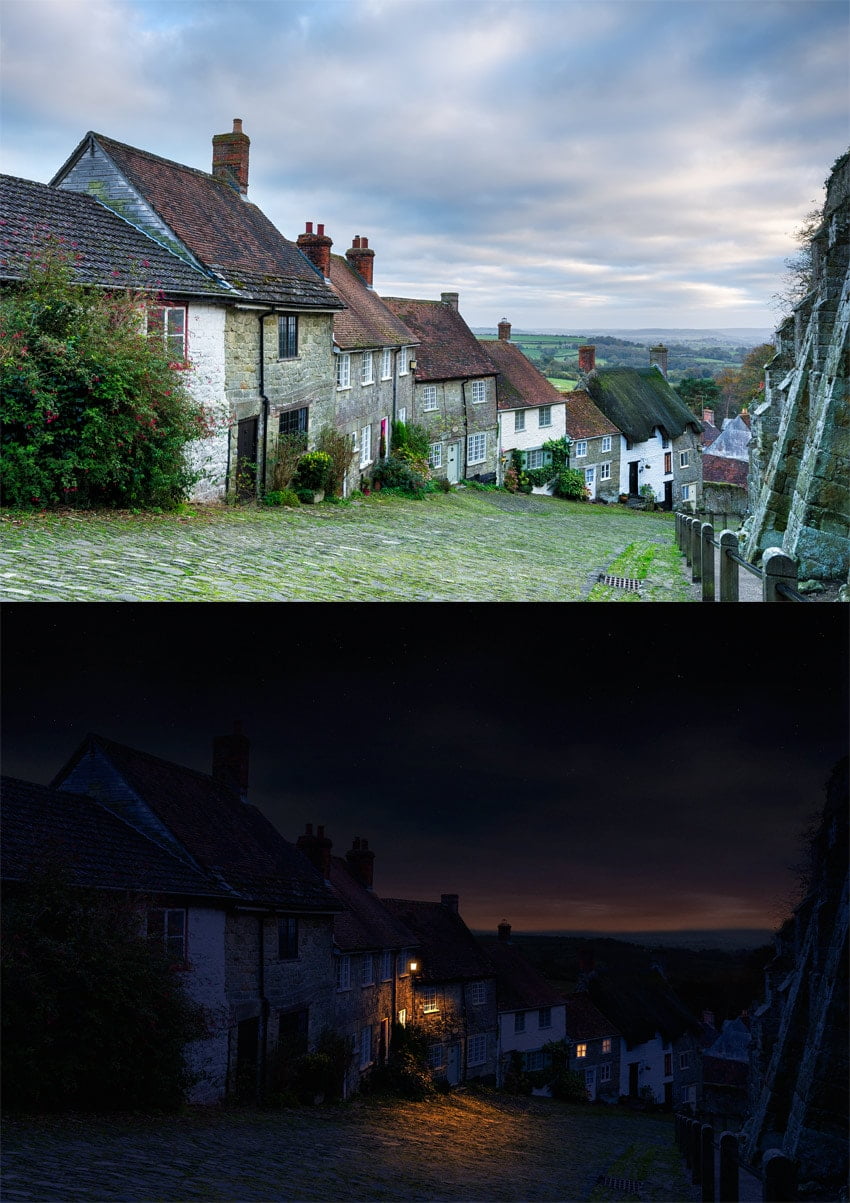
It’s not so easy to find a perfect photo for a photo manipulation we have in mind. Sometimes, for example, we want to create a night scene, but the available photos are either too dark or already heavily edited. What do to in such a case? 

Well, you can always turn a day scene into a night scene with the power of Photoshop! In this tutorial I will show you how to play with the brightness of the scene, how to add stars to the sky, and how to add new light sources with convincing effects.

What You Will Need

You can use any photo you need for this exercise. If you want to follow my steps directly, you can find the same photo I use here:

1. How to Select the Sky

Step 1

Open your photo in Photoshop. Take the Magic Wand Tool (W) and change its Tolerance to 100. Caution: such a high tolerance works best with a good contrast between the sky and the buildings.

magic wand photoshop tolerance

Step 2

Use the Magic Wand on the sky.

magic wand tool sky selection

Step 3

Go into Quick Mask Mode (Q) to see the selection better. Pick any brush to paint the areas that aren’t part of the sky (paint with black to select them as red).

quick mask mode selection
The mountains in the background are affected by the color of the sky, so let’s make them a part if it.

Step 4

Exit Quick Mask Mode (Q) and go to Select > Refine Edge to make sure the selection is perfect. Select a view that lets you see the effects the best.

refine edge selection photoshop
refine edge on white view

Step 5

Now check Smart Radius and increase its value. You can also play with other sliders to get a perfect result. When you’re done, click OK.

refine edge smart radius
how to select with refine edge

2. How to Darken the Sky

Step 1

Go to Window > Adjustments. Select Hue/Saturation from the panel.

hue saturation adjustment layer

Step 2

Clip the Adjustment Layer to the layer below (the sky). Then change the Lightness to make the sky very dark, but not black.

darken the sky saturation
dark sky adjustment photoshop

Step 3

Every Adjustment Layer has a Layer Mask. You can learn how it works from this quick tutorial:

In short, when you paint on a mask, you define the transparency of the layer: black makes the layer transparent, white makes it opaque, and the shades of gray become the states in between.

Click the mask to make it active.

how layer mask work

Step 4

Take the Gradient Tool (G) and click the gradient in the upper panel.

gradient tool change gradient

Change the gradient to very bright gray-white.

bright gradient

Step 5

Apply the gradient to the mask from top to bottom. This will make the upper part „white” (opaque), and the lower part „bright gray” (slightly transparent).

bright gradient on layer mask
how to use gradient on layer mask

Step 6

Click the background layer now. We need to darken it too! In the Adjustments panel, find Photo Filter.

photo filter adjustment layer

Step 7

Change the color to dark, desaturated blue.

how to change color of photo filter
dark blue photo filter

Step 8

Uncheck Preserve Luminosity

preserve luminosity photo filter

… and make the effect very intense.

density photo filter
photo filter night effect

Step 9

The sky could use some blue tint as well! Add the Photo Filter adjustment to it, too, this time using a brighter, more saturated shade.

bright blue photo filter
sublte photo filter
Don’t forget to clip the adjustment to affect the sky only!
night photo filter

Step 10

Normally, the night sky is brighter than non-illuminated buildings below, so let’s darken that lower layer some more. Duplicate (Control-J) the Photo Filter adjustment and lower its Opacity to adjust the intensity.

duplicate adjustment layer
intense darkening photo filter

3. How to Create the Stars

Step 1

Create a New Layer on top. Use the Paint Bucket Tool (G) to fill it with black. Then go to Filter > Noise > Add Noise. Add a maximum amount of black-and-white noise.

filter add noise

Step 2

Now go to Filter > Filter Gallery and select Sketch > Stamp. Play with the settings to create an optimal effect. The sky is not perfectly clear, so we don’t want too many stars.

how to make stars in photoshop

Step 3

Use the Move Tool (V) to move the stars up, over the sky.

move sky up

Step 4

Right click the stars layer and select Blending Options. Drag the upper black marker to the middle, to make the dark part of the layer transparent.

how to use blend if

Step 5

Add a Layer Mask to this layer. Use a black-and-white gradient to make the lower part transparent, gradually turning opaque towards the top.

how to add layer mask
gradual change in opacity
layer effect added

4. How to Illuminate the Windows

Step 1

Let’s pick some windows in the background—the farther they are, the harder it will be to notice the little imperfections. Use the Polygonal Lasso Tool (L) to select the panes. Hold Shift to keep selecting after closing one selection.

how to select with polygonal lasso

Step 2

Click the background layer and duplicate the selection (Control-J). Move the duplicated part to the top.

drag layers

Step 3

Right click the layer and select Blending Options. Check Color Overlay and change the color to bright orange.

blending options color overlay
bright orange color overlay

Step 4

Click the Blend Mode and scroll through it until you find the effect you like. I’ve decided to use Hue, as it adds the color without concealing the details.

hue blend mode
bright windows

Step 5

Check Outer Glow.

blending options outer glow

Change its color to bright orange.

outer glow bright orange

Step 6

Play with the Blend Mode again…

how to use correct blend mode

… and adjust the sliders to the effect you want.

how to adjust blending options

The effect should be quite subtle.

bright windows in dark

5. How to Add a New Light Source

Step 1

There’s something resembling a lantern on the side of one of the buildings. Let’s use it to add some interesting light to the scene! Use the Polygonal Lasso Tool (L) to select its shape.

select with lasso tool

Step 2

Click the background layer, duplicate the selection (Control-J), and drag the new layer to the top.

drag selection up

Step 3

Right click the layer and select Blending Options. Check Color Overlay and make it white.

white color overlay

Step 4

Check Outer Glow and make it bright orange.

bright orange outer glow
select color for glow

Experiment with the settings to get the best result.

outer glow blend  mode
outer glow settings
glowing lantern photoshop

Step 5

Create a New Layer and drag it right below the lantern. Pick bright orange and use a soft brush to paint the light around the lantern. You can lower the Flow to make the brush even softer.

bright orange color
bright orange glow

Step 6

Go to the Blending Options and drag the lower black marker to the right to remove the bright orange from the shadows.

using blend if to adjust transparency
shadow removed

Hold Alt to split the marker to make the effect more transitional. If you want to learn more about this technique, check out this quick guide:

blend if split marker
blend if effect applied

Step 7

Scroll through the Blend Modes of this layer to find the best effect.

blend mode for blend if

Step 8

Add a Layer Mask to this layer and paint the shadows on it. Nothing detailed—just make sure the light doesn’t reach to the parts blocked from it. Use black to paint the shadows and white to remove them, until you are happy with the result.

how to paint shadows on layer mask

Step 9

Create a New Layer and take a bright orange again.

bright orange color

Subtly paint some highlights on the protruding elements of the building to keep them 3D.

orange highlights on the wall

Step 10

Change the Blend Mode and add a Layer Mask to make the effect more subtle.

blend mode to make subtle effect
layer mask for subtle efect

Step 11

Finally, duplicate the glow (Control-J) and change its color to white.

color of glow

Then remove it from the darker parts, leaving it only on the bright elements of the building. They should reflect more light and shouldn’t be so vividly colored.

make dark invisible
white elements brightened

Change the Blend Mode and lower the Opacity to adjust the intensity of this effect.

adjust intensity with blend mode and opacity

6. How to Add a Late Dusk/Early Dawn Effect

Step 1

Let’s adjust the final brightness of the scene now, since we have it all together. Go to the top of the layers and add a new Adjustment Layer: Levels.

levels adjustment layer

Drag the white marker to the left to increase the amount of bright shades in the scene.

more brightness in the scene
photo with leveles adjusted

Step 2

Create a New Layer. Fill it with black, and then go to its Blending Options and add Gradient Overlay.

gradient overlay

Give it the colors of a low sun.

sunset gradient
sunset sunrise color gradient

Step 3

Hold Control and click the sky layer to get its outline.

how to take selection from layer
part of layer selected

Step 4

Click the gradient layer and add a Layer Mask. The selection will be automatically applied to the mask.

selection applied to layer mask

Paint on the mask to reveal the mountains in the background.

layer mask painting

Step 5

Duplicate the sky (Control-J) and drag it to the top. We’re going to add special effects to the clouds.

copy sky

Add a Hue/Saturation adjustment.

hue saturation adjustments panel

Clip the Adjustment Layer to the duplicated sky, desaturate it, and make it slightly brighter.

how to use hue saturation adjustment
desaturated sky

Step 6

Add a Levels adjustment, clip it, and add more contrast to the sky with it.

levels contrast
contrasting clouds

Step 7

Select all three layers (the sky and its Adjustment Layers) and Merge them (Control-E). Then go to the Blending Options of this new layer and remove it from the bright parts of the sky using the lower white marker. Change its Blend Mode to Soft Light and lower the Opacity.

blend if adjusting transparency
sky adjusted

Step 8

Duplicate (Control-J) the layer and play with its Blending Options too, this time removing it from the dark parts of the sky (the lower black marker). Change the Blend Mode to Soft Light as well, but leave the Opacity at 100%, adjusting it with a layer mask if needed.

adjusting transparency of layer
layer transparency adjusted

Step 9

Time for some final adjustments. Add an Exposure adjustment on top to play with the overall brightness.

exposure adjustment

I’ve also decided to drag the sky slightly down to make the change of the colors more gradual (you can do it with a smart use of Layer Masks).

final brightness adjustment

Step 10

The background seemed a little too bright, so I darkened it too using a Hue/Saturation adjustment with some masking.

darkening background

Step 11

When you’re done, merge all the layers (right click > Flatten Image) and go to Noise > Add Noise. This will add some realism of a photograph taken in low light.

add nosie low light
low light photo

Good Job!

If you liked this tutorial, you may also be interested in our other guides on photo manipulation:

You can also achieve a similar effect to the one in this tutorial with far less effort by using one of these actions on GraphicRiver:

Night Effect Photoshop Action

night effect photoshop action

Night Scene Creator

night scene creator

The Dark Night Action

dark night action

How to Set Up Grids in Affinity Designer

Post pobrano z: How to Set Up Grids in Affinity Designer

Grids are a useful feature in any design software. In this video from my course Affinity Designer Quick Start, you’ll learn how to set up grids in Affinity Designer. I’ll show you how to use the key features of both the standard grid and the isometric grid.

How to Set Up Grids in Affinity Designer


Basic Grid Setup

Affinity Designer has a versatile grid system with some really good tools for things like icon design, and it also has isometric grids for doing graphics for games.

We’ll start by showing the grid. So head up to the View menu, and then check the Show Grid submenu. That brings up the default grid. 

The default grid in Affinity Designer

Now, to change the way that this grid is laid out, go back up to the View menu and then go down to the Grid and Axis Manager.

By default, Use automatic grid will be checked. So if you want to change things around, you just need to uncheck that checkbox.

Use automatic grid box unchecked

How to Set Up a Grid for Creating Icons

Let’s look at how you can set up a grid to create icons. 

A pretty common size for icons is 64 pixels by 64 pixels. So in the same Grid and Axis Manager, you can go to First axis and set the Spacing to 64 pt. And then under Second axis, we can also set the Spacing to 64 pt. So now each one of our squares is the right size for an icon to fit inside it. 

Grid with the correct spacing for icons

What we can also do is increase the amount of space between each of these grid cells. So increase the Gutter to 24 pt for both axes. And now we can fit exactly one icon into each one of these little grid squares. 

Gutter in the grid

And we can take that even further to help us work with our layout by increasing the number of divisions. So we can make smaller grids inside our grid.

So let’s say that we set the Divisions to 32. And now if we zoom in, we can see that we’ve got several lines that are breaking down each one of our grid cells even further. So when we’re trying to align all of the different nodes and points in our icons, we can snap to each one of these lines. And we can do the same thing horizontally, so that we’ve got a really nice little self-contained grid for each one of the icons that we produce. 

Grid divisions in Affinity Designer

How to Set Up an Isometric Grid

That icon grid layout is just using the standard mode of grid. But you also have several other predetermined types of grids that you can work with.

For example, you might be working on graphics for an isometric video game. So you can head up to Mode and choose Isometric from the dropdown menu.

Choosing an Isometric grid

And now your grid will be converted into an isometric layer. So let’s just drop that Gutter back down to 0, and we’ll keep our grid divisions. 

Isometric grid

And now we’ve got a really nice framework that we can use to start plotting out isometric graphics, without having to worry that the angles and the perspective that we’re trying to lay out are incorrect in any way. Here’s a closeup showing the divisions:

Isometric grid divisions

Watch the Full Course

In the full course, Affinity Designer Quick Start, you’ll get 34 more videos like this one, going through every aspect of this versatile design software. You’ll learn in detail about the various vector tools, interactions between shapes, using typography, and much more.

You can take this course straight away with a subscription to Envato Elements. For a single low monthly fee, you get access not only to this course, but also to our growing library of over 1,000 video courses and industry-leading eBooks on Envato Tuts+. 

Plus you now get unlimited downloads from the huge Envato Elements library of 300,000+ photos and 34,000+ design assets and templates. Create with unique fonts, photos, graphics and templates, and deliver better projects faster.

How to Draw a Stack of Books and an E-Book Reader in Adobe Illustrator

Post pobrano z: How to Draw a Stack of Books and an E-Book Reader in Adobe Illustrator

Final product image
What You’ll Be Creating

In this simple tutorial, you will learn how to use the Mesh Tool in Adobe Illustrator to create a stack of books and an e-reader!

If you want to skip the tutorial and just use these books in your work, you can purchase the Stack of books and e-book from GraphicRiver!

Stack of Books and E-Book

1. How to Draw a Book

Step 1

We will begin by drawing the top cover of the red book using the Mesh Tool (U).

First, simply draw a rectangle and fill it with the #B9201F color. Next, move around its corner nodes so it looks like a cover of a book in perspective.

Now, grab the Mesh Tool (U) and continue by creating a Mesh grid on the cover by clicking in places you want nodes to be in. Follow the screenshot for reference.

Smooth out the bottom left corner, turning it from sharp to round.

There must be three Mesh lines close to each other on the sides and the bottom of the shape. Color the nodes on the middle lines with #EA4242 (nodes that are selected in the screenshot below).

draw top cover with mesh

Step 2

Continue coloring the selected nodes in each part of the screenshot! You will need first #A91716, and then #D13130.

color cover

Step 3

Draw a side for the cover by creating a narrow, #AB1817 rectangle, smoothing out the corners, and coloring its middle row of Mesh with #DC3838.

draw side of cover

Step 4

Attach the side to the cover as indicated in the screenshot below.

assemble top cover

Step 5

Start drawing the spine of the book!

Draw a narrow, #4E4142 rectangle. Then move to Effect > Warp > Arc and apply a 26% Bend to it.

Go to Object > Expand Appearance to turn the result into a regular path.

bend line with warp

Step 6

Create a copy of the shape we just made.

Then simply modify the original shape on its right side, dragging its nodes to create a curve.

draw spine

Step 7

Grab the copy we just made and color it with #CA2F2E.

Next, modify it with Mesh by simply dragging the nodes around and color its outer edges with #980605.

draw spine

Step 8

Move these two shapes next to each other, creating the spine of the book.

put together spine

Step 9

Let’s draw the paper part! Modify and color the rectangle as indicated by the nodes selected in the screenshot below.

You will need these colors:

  1. #FEF7DE
  2. #A69980
  3. #F8ECD2
draw mesh base

Step 10

Now, to create an illusion of separate pages, draw a straight line, coloring its Stroke with #CEB789.

Proceed to create multiple copies of it with some intervals in between (I suggest moving the first line a bit down manually, pressing Control-D to create more copies automatically, and deleting the ones you don’t need).

After that, select all the lines and in the Stroke panel, apply Profile1 to them. Flip it if needed—the lines should be thicker on the left side.

create lines

Step 11

Expand Appearance of the lines.

Next, grab the Warp Tool (Shift-R) and double-click on the canvas to bring up the options. You can use the options I did in the screenshot below or your own.

Next, bend the lines slightly to add a bit of realism to our „pages”.

bend pages

Step 12

Copy the outline of the Mesh shape we drew in Step 9.

Place it on top of the pages, select both and right-click, choosing Make Clipping Mask in the drop-down menu.

make clipping mask

Step 13

Change the Opacity of the result to 30% and its Transparency mode to Multiply.

change transparency

Step 14

Overlay the pages over the Mesh.

overlay the pages

Step 15

Draw the left side of the book using Mesh. You will need these colors:

  1. #EEE3CA
  2. #AB9F86
  3. #CDC1A8
  4. #EADAC5
draw the left side

Step 16

Draw the bottom part of the cover using Mesh. Use these colors:

  1. #980605
  2. #CC2F2F
draw the bottom cover

Step 17

Assemble the book out of the parts we made!

assemble the book

2. How to Recolor the Book

Step 1

Now that the most difficult part of this tutorial is done, we will be creating the stack of books by making a few color variants!

Create a copy of the red book and recolor it (only the red parts!) by choosing Edit > Edit Colors > Adjust Colors. Use these options to get a green book:

  • Red: -11%
  • Green: 57%
  • Blue: -31%

Of course, you can play with the percentages however you want to create your own color variants!

recolor the book to green

Step 2

Create three copies of the light green book (aside from the original).

Recolor the first copy using these settings:

  • Red: -54%
  • Green: -25%
  • Blue: -9%
recolor the book to dark green

Step 3

Grab the second copy and recolor it using these:

  • Red: 23%
  • Green: -21%
  • Blue: 0%
recolor the book to orange

Step 4

Create the final, cyan book out of the third copy with these settings:

  • Red: -35%
  • Green: -10%
  • Blue: 58%
recolor the book to cyan

Step 5

Create an uneven stack out of the color variants!

create a stack

3. How to Draw an E-Book Reader

Step 1

We are going to revisit Mesh for a bit in the final parts of this tutorial.

Fill a rectangle with rounded edges with #000002, and then stretch it around a bit. Create a Mesh grid and color the bottom right part of the shape with #3F4246.

draw base of e-book

Step 2

Draw a screen for the e-book by coloring the left top corner of a #EDEFEE rectangle with #999B9C.

draw screen with mesh

Step 3

Draw the sides of the e-book reader, coloring them with #313335, #383B3C, and #000002.

create parts of frame

Step 4

Put the sides together to create a frame.

assemble frame

Step 5

Move the screen into the frame. The left side should be lined up perfectly, and the right side can be left with a gap.

assemble screen

Step 6

Draw the outer frame by applying a thick, #3F4246 stroke to a line, and then Expanding Appearance and sharpening the edges.

draw side with stroke

Step 7

Draw a button by creating a #0B0E10 ellipse, and adding three #3E4145 nodes in the middle of it.

draw button with mesh

Step 8

Assemble the e-book reader: the black base should be on the bottom, with everything else on top of it.

assemble e-book

Step 9

Finally, draw shadows for the reader and the stack of books. Use #B3ADA5.

color shadows

Step 10

Change the Blending Mode of both shadows to Multiply.

change transparency

Step 11

Put everything together!

Result

Awesome Work, You’re Now Done!

Thank you for following along, and please
feel welcome to post your result in the comments. I’ll be looking
forward to seeing it!

In this tutorial, you learned how to
create a stack of colorful books and an e-book reader using the Mesh Tool.

I
hope you’ve enjoyed this tutorial and learned how to use some useful
tools for the future! Check out some of my other vector tutorials on my instructor profile.

You can purchase Stack of books and e-book as well as other similar designs in my portfolio on GraphicRiver.

Stack of Books and E-Book

How to Create an Isometric Map Mockup Action in Adobe Photoshop

Post pobrano z: How to Create an Isometric Map Mockup Action in Adobe Photoshop

Final product image
What You’ll Be Creating

From this tutorial, you’ll learn some new techniques and tricks. We’ll be using the Isometric Map Mockup product as an example and seeing in detail how it was created. At the end, you’ll have a fully workable action and confidence in building “transformation actions”. 

Got no time and need this action as soon as possible? You can purchase this Isometric Map Mockup over on GraphicRiver.

Portfolio link

1. How to Prepare Your Workspace

Open up the test.psd file attached to this tutorial. I’ve created it for your convenience so that you don’t have to follow any long-winded steps about document creation.

Make sure you have set up your workspace properly. For this tutorial, we need some panels to be visible: the ActionsLayers, and Styles panels. If you don’t have these panels visible, then go to Window and enable the panels one by one by their names.

Then you need to make sure the Ruler Measures are pixels. If you don’t see the rulers, press Command-R to activate them, and then right click on the ruler itself and select Pixels

select pixels

2. How to Get Ready for the Recording

For now, since we’ve set up our work space as needed, we can start recording our action.

Step 1

Go to the Actions panel and create a new Action Set. You can call it whatever you like. 

create a new action set

Step 2

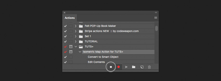
Inside the Action Set, create a New Action. Give it any name—for example, „Isometric Map Action„. 

create a new action

After that, press the Stop Recording button. That’s because, by default, after creating an action it automatically starts recording. We don’t want that to happen just yet.

stop recording

Select the „main” layer, because we don’t want this step to be recorded. For us, it will be the step performed by a user. The user decides which layer to select. 

select the layer main

Step 3

Now it’s time to click the Record button on our Actions panel. From this moment on, almost everything we’ll be doing within Photoshop will be recorded. After we are finished recording our action, we can run this action once again, to apply exactly the same working process on other images. 

start recording

3. How to Prepare for the Transforms

Step 1

Here we have a task. We need to slice the „main” layer into three parts vertically, and also we need to record these steps.

Create a Smart Object from the „main” layer. To do this, right click on it, and choose Convert to Smart Object. We are doing this because we need a brand new space for our further steps.

Convert to Smart Object

After that, double-click on the Smart Object layer to Edit the content. You’ll be switched to a new document. Here is the place where we’ll be working with our image.

Step 2

Now we want to make more free space around our image by increasing the canvas size. Go to Image > Canvas Size, and in the dialog window, instead of „Pixels”, choose „Percent” and input 200% for both sides. It will increase the canvas size proportionally.

expand the canvas size

Step 3

Here we’ll quickly go over and create an alignment template. This layer will help us later to align some of our map parts to the center of the canvas.

Create a new layer. To do this, click on the little „sheet of paper” icon at the very bottom of the Layers panel. After creating it, the layer will stick up above the „main” layer.

create a new layer

Hold Command-[ to move our newly created layer under the „main” layer. Rename the layer „template”.

rename the layer template

Fill this layer with any color you want by pressing Command-Backspace. For us, the color really doesn’t matter because the „template” layer is a temporary layer, and it will be deleted later.

Finally, we need to switch to the „main” layer, so that it will be selected. Press Option-] to switch to the „main” layer. When making actions, we need to make everything flexible, so that we can apply the process again in the future.

switching on to the main layer

4. How to Slice and Transform the Map Parts

Step 1

To cut the „main” layer into three equal parts, we actually need to make two cuts. We’ll be splitting the „main” layer using the Selection Tool. Make a selection around our layer by holding Command and clicking on the layer’s thumbnail. Then go to Select > Transform Selection.

make selection around the main layer

Now for a little bit of math. If we take 100% of our actual image size and divide it by 3, we get approximately 33.34%.  So this is exactly the value we want to see in the Width input field. Put in the value you see in the picture below. It’s important not to forget about the Reference point location. This is a snap point for the transforms. Choose the center-left snap point. 

enter the values

After you have input everything correctly, press the Enter key.

select the left part

Step 2

We are almost finished with this. Now we need to expand the current selection to the left a little bit, so that we’ll be 100% sure that we won’t cut any unexpected pixels around the cutting area. We do this because lurking pixels can cause problems in the future while transforming, and it is hard to identify them. 

Go to Select > Transform Selection. The reference point must be center-right, and then enter these dimensions in the fields: W:110%; H:110%;

Press Enter.

enter the values for the transform

Step 3

Before moving on, we need to do a little trick that I call „Clear Cut”. The whole idea of this trick is to cut the layer without transparent pixels on the edge of the cut. How do we do this? Go to Selection > Select and Mask. Then navigate to the right menu and enter the following values:

  • Radius: 0 px
  • Smooth: 0
  • Feather: 0.0 px
  • Contrast: 100% 
  • Shift Edge: 0%
  • Output To: Selection

Then click OK

enter the values for the select and mask

Right-click on the selection and from the drop-down menu choose Layer Via Cut.

layer via cut

Rename our newly cut layer and give it the name „1”. Press Option-[ to select the backward layer. Now the „main” layer is selected. 

Step 4

Here we have two separate layers. Basically, in this step, we’ll be doing all the same things as we did previously. The only difference is that we’ll be shrinking down the selection by half.

Make sure the „main” layer is selected. Once again, make a selection around the current layer by holding Command and clicking on the layer’s thumbnail. Alright, now we’ve got the selection around the layer. 

make selection for the layer main

Next, go to Select > Transform Selection. Let’s shrink down the selection by half. Type in the value of 50% in the Width input field. Don’t forget about the Reference point location, which must be center-left. 

enter the values

Press the Enter key.

Step 5

As I promised, the steps are pretty similar. And for this instance, we also need to expand a selection around the left side. Take a look at how we did it previously.

Go and grab Select > Transform Selection (the Reference point must be center-right), and then enter these values in the fields: W:110% H:110%. 

Press the Enter key.

enter the values for the middle part transform

For this part, also repeat the “Clear Cut” method as we did in Step 3 of the current section. 

Right click on the selection and from the drop-down menu, choose Layer Via Cut. Rename our newly cut layer and give it the name „2”. Press Option-[ to switch to the layer below. Rename it „3”

rename all three  layers

Step 6

We’ve now got three equal cut parts. Now, we are ready to transform two of them, namely “1” and “2”. What to do with the third one, you will know later. For now, let’s get into transforming.

Select layer “1”. Go to Edit > Transform and select Scale. Enter the following values:

  • W: 53.9%; 
  • H: 74.2%;  
  • <: 0.00; 
  • H: 0.00°; 
  • V: 45.5°; 

The Reference point is bottom-right. Press Enter.

transform the left part

Step 7

Select layer “2”. Go to Edit > Transform and select ScaleEnter the following values: 

  • W: 96.00%
  • H: 74.1%  
  • <: 0.00° 
  • H: 0.00° 
  • V: 12.8

The Reference point is bottom-left. Press Enter.

transform the middle part

5. How to Use the Align Tool

Step 1

As you might have noticed, now we have a problem. We can see the gap between the third untransformed layer and the rest of the layers. If we now transform the third layer, it won’t work for us.

In an ordinary situation, we would have transformed the third layer and then moved it to the left. But since we are recording the action, this method doesn’t work for us. So we need to make something more universal. This is to make sure that it will work for all kinds of image sizes.

Okay, now we need to make a multi-select. We are standing on layer “2”.  We want to select both layers: layer „2” and layer „1”. Hold down the Command key and click on layer “1” to add it to the selection. Now you should see both layers selected. 

select multiple layers one and two

Then we need to convert the selected layers into a Smart ObjectRight-click on one of two layers—it really doesn’t  matter on which one—and from the drop-down menu select Convert to Smart Object

convert to a smart Object two selected layers

Step 2

We can’t align objects easily one after another when recording an action. Maybe you’ll say that it’s simple, considering the current example, but it’s not exactly. You can succeed in aligning for the current image, but it won’t work for another. Hence, we need a very flexible method that would work for all kinds of images. 

Here’s a little trick. We need to align our smart object layer to the bottom left corner. 

aligning smart object to the bottom left corner

As we are continuing, we have our smart object layer already selected, and we need to add the “template” layer to this selection. Hold the Command key and click on the „template” layer.

Go and grab the Move Tool. Aligning in Photoshop goes about a layer that is bigger. Choose Align left edges—it will stick the Smart Object to the left side.

Next, click Align bottom edges. We placed it at the bottom of the canvas. 

align the smart object

Step 3

It’s time to align the third part of our map. 

Select the layer „3”. Then select the Marquee Selection Tool. Hold down the Command key and click on the Smart Object thumbnail to make the selection. 

make selection around the smart object

Select the Move Tool. Align layer „3” to the bottom side. Then align the layer to the left side. Lastly, align the layer to the right.

align layer to the right side

Press Command-D to deselect the current selection.

Go to Edit > Transform and choose Scale. Set the Reference point to Right. Then Go to  Edit > Transform and choose Flip Horizontal or in the Width input field enter the value of -100%

inverse the width

The last step will be mirroring the layer back. Go to  Edit > Transform and choose Flip Horizontal. 

flip the layer horizontal

Step 4

Select layer “3”. Go to Edit > Transform and select ScaleEnter the following values: 

  • W: 55.2% 
  • H: 74.1%
  • <: 0.00°
  • H: 0.00°
  • V: 46.00

Set the Reference point to bottom-left. Press Enter.

transform the right part

Step 5

For now, we have our map in a weird position. We need to rotate it to the position we actually need. 

Select layer “1”. Hold down the Command key and click on layer “2” so that both layers will be selected. Go to Edit > Transform and select Rotate.

Enter the following values: 

  • W: 100%
  • H: 100%
  • <: 51.6%
  • H: 0.00°
  • V: 0.00° 

Press Enter.

rotate the map surface

6. How to Release Parts Out of the Smart Object

Now we need to free up parts out of the smart object. We perform this step because we want to apply some shading styles to the middle part layer. So we want our parts to be separated.

Step 1

Select layer “1”. Right-click on the layer and from the drop-down menu, select New Smart Object via Copy

the new smart object via copy

Double click on the newly created layer to Edit the content 

double click to edit the content

In the opened document, select layer “2”.

select layer two

Press Delete (Backspace) to delete the layer “2”.

Close the current document and, while closing it, click the Save button. 

click the save button

Step 2

Next, rasterize the current layer we have just closed. Right-click on the layer and choose Rasterize layer. Rename it “1”. Press Option-[ to switch to the layer below.

For another Smart Object, the steps are pretty the same. Double-click on the current layer to Edit the contents.

In a newly opened document, select layer “1”. Press Backspace to delete layer “1”. Close the document and, while closing, click Save.

Rasterize the layer. Right-click on the layer and choose Rasterize layer. Rename it “2”

rasterize and rename Layer into layer two

7. Final Steps on the Map Surface

Step 1

In this short section, we are applying styles to the middle part of layer “2”. We want our map to look more realistic. So, we’ll add some shading to it.

Select layer “2”.  Double click on it to call up the Layer Styles window. Select the Color Overlay section. In this section, bring down the Opacity to 35%. Choose the color #000000 (pure black). 

Click OK.

set layer styles

Step 2

It’s time to center the map parts in the middle of our canvas. 

Select layer “1”. Add to the selection layers “2” and „3”. Do this by holding the Command key and clicking on layer “2” and then on layer „3”. We need all three layers to be selected.

Press Command-G to put all the selected layers into a group. Rename the group. Give it the name “All Parts”.

Notice that expanding groups is not a recordable feature in Photoshop. 

Expand the group by clicking on the little triangle on the left side of the group. After that, select layer “1”

This trick is particularly relevant in the automated mode because once we’ve done the group, we won’t be able to see layers anymore. But we still want to be able to pick up layers and to continue recording the action. So, when we click on layer „1”, we expand the group automatically, and Photoshop can see the layers again.

expand the group

Select the „All Parts” group. By holding the Command key, add to the layer selection the „template” layer. 

Select the Move Tool.

Step 3

In the menu, choose Align Vertical centers and then choose Align Horizontal Centers. Pay no attention if the „template” layer moves a little bit.

align vertical and horizontal

Select the „template” layer and delete it by pressing the Backspace key on your keyboard.

Go to Image > Trim. In the dialog, choose Based On > Transparent pixels, and in the Trim Away options, go with all directions: Top, Right, Left, Bottom

trim the transparent pixels

Expand the canvas a little bit. Go to Image > Canvas Size. In the dialog window, instead of pixels, choose percentages and input 200% for both sides. It will increase the canvas size proportionally. 

expand the canvas size

Step 4

We’ve got rid of the „template” layer. Now we need to create the background instead. Select layer “3”. Create a new layer. Click on the new layer icon at the very bottom of the Layers panel. Rename the layer “Background”. 

Move the layer backward by pressing Command-[. Set the foreground color to gray #444444. Use the keyboard shortcut Option-Delete (Backspace) to fill in the layer with the gray color.

choose the foreground color

8. How to Create a 3D Volume for the Map Surface

Step 1

This will be a starting point for creating the volume for the map.

Hold the Command key and select multiple layers: „1”„2”, and „3”. Press Command-E to merge the selected layers. 

merge the selected layers

Now we need to copy the merged layer twice. To do this, press Command-J twice. You should now see three copies. 

make three copies

Step 2

In these steps, we’ll be creating a 3D surface for our map.

Switch to the layer below by pressing Option-[. The layer below will be selected. Group the current layer (Command-G). Rename the group “Volume”. Switch to the layer below (Option-[).

Now we need to add the 3D volume effect. Select the Move tool first. Hold down the Option-Command keys and at the same time press the Up Arrow key six times. 

copy layer six times

Then click and select the group “Volume”, and merge it (Command-E).

Set Layer styles for this layer. Select the Color Overlay section. Next, bring down the Opacity to 35%. Choose the color #000000 (pure black). 

set layer styles

We need to move the face layer a little bit. Switch to the layer above: Option-]. Select the Move Tool and press the Up Arrow key seven times. 

moving the face layer to the top

Rename the layer and call it „Face”.

Step 3

The last step will be creating the „Shadow” layer for our map. Select the „background” layer. Press Option-] to move it to the layer above. 

Apply styles to it. Select Color Overlay. Set Opacity to 100%. Choose the color #000000. Click OK.

set layer styles

Rasterize this layer. 

rasterize layer style

Take the Move Tool and, using your mouse, move the current shadow layer down a bit. 

move the shadow down using mouse

Go to the filter Blur > Gaussian Blur. Set the Radius to 35.0 Pixels. 

apply gaussian blur filter

Step 4

Congratulations! We are finished! Now we can click the Stop Recording button. 

stop recording the action

Awesome Work, You’re Done!

This was a demonstration of the workflow on how to work with transformation actions. It isn’t one of the hardest things to do, but it’s not easy either. If you did everything correctly, now you have a fully working action, and you can apply it to any other images. 

The action building area is not as limited as you might think, so it’s definitely worth learning about if you have already started learning Photoshop. If you learn it, you’ll see how it will help you to save time in performing everyday tasks.

Feel free to ask me any questions down in the comments below. I wish you good luck with your experiments! 

Remember you can purchase this Isometric Map Mockup over on GraphicRiver.

How to Vector Hand Lettering

Post pobrano z: How to Vector Hand Lettering


In my course, Mastering Script Lettering, I showed you how to create beautiful script lettering by hand. But what if you want to convert your hand lettering into vector format?

In this video from the course, I show you exactly how to do that in Adobe Illustrator. Watch the video above to see the full vectoring process, and here’s a summary of the main steps:

  • Start by scanning your lettering and opening the image in Photoshop.
  • Adjust the levels and contrast so that you can see your lettering more clearly.
  • Bring it into Illustrator and make it 10% Opacity so that you can trace over it.
  • Vector each letter separately, so that you can later move the shapes around if need be.
  • Use the Pen Tool to trace each letter, placing anchor points on the „extrema”, the furthest points on each letter. You can see a full timelapse of my vectoring process in the video to get a clearer idea of how this works.
  • Also use the shape tools wherever possible—for example, I used the Ellipse Tool to create a circle for the „g” and then altered it to fit the letterform.
  • Go back through at the end, correcting any inconsistencies and making adjustments.
Vectoring script lettering

Watch the Full Course

The full course, Mastering Script Lettering, teaches you script lettering from the basics right up to advanced techniques. You’ll learn techniques such as:

  • angle
  • speed
  • weight
  • contrast
  • kerning
  • flourishing
  • vectoring
  • and more! 

You can take this course straight away with a subscription to Envato Elements. For a single low monthly fee, you get access not only to this course, but also to our growing library of over 1,000 video courses and industry-leading eBooks on Envato Tuts+. 

Plus you now get unlimited downloads from the huge Envato Elements library of 300,000+ photos and 34,000+ design assets and templates. Create with unique fonts, photos, graphics and templates, and deliver better projects faster.

Art History: Cubism

Post pobrano z: Art History: Cubism

Welcome
back to our series on art history! From the dreamy paintings of the Impressionist era, we
now venture onward to the early-20th-century art movement of Cubism.
Let’s see how history significantly affected the art of this time.

Man in a Hammock by Albert Gleizes

Cubism: The Movement

Cubism began during the early 1900s in Paris, France. At the time, artists Pablo Picasso and Georges Braque joined forces to explore this radical style of cube-inspired painting.

But the public wasn’t quite ready to let go of the past.

While most artists were still following the flowy trends of the Impressionist movement, Picasso and Braque worked tirelessly to build a philosophy around Cubism. Their work was seen as bizarre and maddening, but it only reflected their intense passion for analyzing objects, shapes, and colors.

Woman with a Fan by Jean Metzinger

Luckily, they never gave in to the naysayers, because now we have more amazing art styles like Futurism, Dada, and Art Deco as a result.

Let’s learn more about this movement by looking into the minds of the world’s Cubists.

Early Cubism

One of the most recognized names in art is Pablo Picasso. A Spanish painter with a passion for exploring many mediums, Picasso was fascinated with geometry during the earlier years of Cubism.

Seated Nude by Pablo Picasso

He and fellow Cubist Georges Braque took apart objects and analyzed them in terms of volume, shape, and color. They played with flat visuals that looked glaringly different from their peers, and developed paper collage work which explored three-dimensional planes.

Girl with a Mandolin by Pablo Picasso

Their work was very similar too. They both created monotone paintings of different subjects like love, music, and still life. Historians saw Cubism as a way to stamp out ambiguity. It forced the viewer to internalize the subject matter by limiting the color palette.

La guitare by Georges Braque
La Guitare by Georges Braque

At the same time as Picasso and Braque’s discoveries, other artists were emerging as well.

High Cubism

High Cubism came after 1909 when artists who mostly exhibited in non-academic salons in Paris explored a similar cube-inspired style. The group wanted to emphasize research into the expression of form in opposition to the realistic colors of the Neo-Impressionist movement.

LEscale by Andr Lhote
L’Escale by André Lhote

Artists at this time included André Lhote, Jean Metzinger, and Albert Gleizes. In contrast to earlier Cubists, these artists allowed the Impressionist era to influence their work. They painted vibrant geometric explorations of self-portraits and war-related themes.

Dancer in a caf by Jean Metzinger
Dancer in a café by Jean Metzinger

Soon the rules of art were pushed even further. The Section d’Or was a group of artists, sculptors, and critics associated with Cubism who believed that the movement was simply a continuation of the love for the golden ratio. They created abstract art with the purpose of skewing their subjects.

Paysage Cubiste by Albert Gleizes

Late Cubism

Art became even more abstract after 1914. Artists now began to emphasize overlapping planes and flat surfaces. Crystal Cubism, as it became, was created by artists who desperately needed to escape the realities of the Great War.

Soldier at a Game of Chess by Jean Metzinger

Though many artists continued to push through with Cubism, it started to decline after 1925. As a result of a shift towards more conservative values, artists dropped the bold colors and shapes for more conservative French styles. Today, it remains a major influence on modern art history.

Three Musicians by Pablo Picasso

Conclusion

Minimalism is nothing new. Artists have been adoring the simplicity of geometric shapes since way before the invention of modern design software. Though controversial at first, the art world responded to Cubism with many diverse art styles for years to come. Its wide range of culture and influence is a
true testament to
the evolution of art. And I hope you continue to learn more about these
amazing timelines on your own.

For more amazing tales of 20th century Cubism, dive into the links below for further reading. And
join me next month when we discuss the Harlem Renaissance.

The following sources were also included in this article: